MenuItemsChoice
目录

Design guidelines
Usage
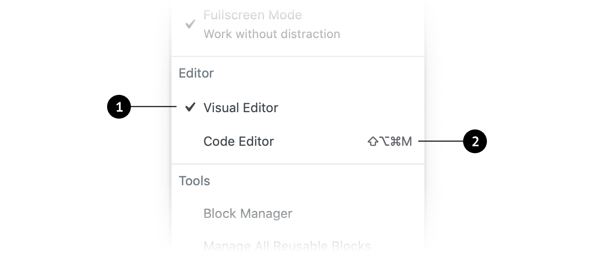
- A checkmark icon appears next to the choice when it’s enabled, and disappears when disabled.
- If an item in
MenuItemsChoicehas an associated keyboard shortcut, that should be displayed to the right of the menu title, aligned to the right side of the menu item. Selected choices should not have visible shortcuts, since they are already active.
When to use MenuItemsChoice
- Select a single option from a set of choices in a menu.
- Expose all available options.
Defaults
User control
Selecting an option by default communicates that the user is required to choose one in the set.
Expediting tasks
When one choice in a set of MenuItemsChoice is the most desirable or frequently selected, it’s helpful to select it by default. Doing this reduces the interaction cost and can save the user time and clicks.
The power of suggestion
Development guidelines
Usage
import { useState } from 'react';
import { MenuGroup, MenuItemsChoice } from '@wordpress/components';

const MyMenuItemsChoice = () => {
    const [ mode, setMode ] = useState( 'visual' );
    const choices = [
        {
            value: 'visual',
            label: 'Visual editor',
        },
        {
            value: 'text',
            label: 'Code editor',
        },
    ];

    return (
        <MenuGroup label="Editor">
            <MenuItemsChoice
                choices={ choices }
                value={ mode }
                onSelect={ ( newMode ) => setMode( newMode ) }
            />
        </MenuGroup>
    );
};