# Blocks

# Block Editor Handbook

Welcome to the Block Editor Handbook.

The [**Block Editor**](https://wordpress.org/gutenberg/) is a modern paradigm for WordPress site building and publishing. It uses a modular system of **blocks** to compose and format content and is designed to create rich and flexible layouts for websites and digital products.

The Block Editor consists of several primary elements, as shown in the following figure:

<img src="https://i0.wp.com/developer.wordpress.org/files/2026/06/overview-block-editor-2023-scaled.png?ssl=1" data-recalc-dims="1" decoding="async" alt="Quick view of the Block Editor" />

The elements highlighted are:

1.  **Inserter:** A panel for inserting blocks into the content canvas
2.  **Content canvas:** The content editor, which holds content created with blocks
3.  **Settings Panel:** A panel for configuring a block’s settings when selected or the settings of the post

Through the Block Editor, you create content modularly using blocks. Many [blocks](https://developer.wordpress.org/block-editor/reference-guides/core-blocks/) are available in WordPress by default, and you can also [create your own](https://developer.wordpress.org/block-editor/getting-started/create-block/).

A [block](https://developer.wordpress.org/block-editor/explanations/architecture/key-concepts/#blocks) is a discrete element such as a Paragraph, Heading, Media, or Embed. Each block is treated as a separate element with individual editing and format controls. When all these components are pieced together, they make up the content of the page or post, which is then [stored in the WordPress database](https://developer.wordpress.org/block-editor/explanations/architecture/data-flow/#serialization-and-parsing).

The Block Editor is the result of the work done on the [**Gutenberg project**](https://developer.wordpress.org/block-editor/getting-started/faq/#what-is-gutenberg), which aims to revolutionize the WordPress editing experience.

Besides offering an [enhanced editing experience](https://wordpress.org/gutenberg/) through visual content creation tools, the Block Editor is also a powerful developer platform with a [rich feature set of APIs](https://developer.wordpress.org/block-editor/reference-guides/) that allow it to be manipulated and extended in countless ways.

## Navigating this handbook

This handbook is focused on block development and is divided into five major sections.

- **[Getting Started](https://developer.wordpress.org/block-editor/getting-started/):** For those just starting out with block development, this is where you can get set up with a [development environment](https://developer.wordpress.org/block-editor/getting-started/devenv/) and learn the [fundamentals of block development](https://developer.wordpress.org/block-editor/getting-started/fundamentals/). Its [Quick Start Guide](https://developer.wordpress.org/block-editor/getting-started/quick-start-guide/) and [Tutorial: Build your first block](https://developer.wordpress.org/block-editor/getting-started/tutorial/) are great places to start learning block development.

- **[How-to Guides](https://developer.wordpress.org/block-editor/how-to-guides/):** Here, you can build on what you learned in the Getting Started section and learn how to solve particular problems. You will also find tutorials and example code to reuse in your own projects, such as [working with WordPress data](https://developer.wordpress.org/block-editor/how-to-guides/data-basics/) or [Curating the Editor Experience](https://developer.wordpress.org/block-editor/how-to-guides/curating-the-editor-experience/).

- **[Reference Guides](https://developer.wordpress.org/block-editor/reference-guides/):** This section is the heart of the handbook and is where you can get down to the nitty-gritty and look up the details of the particular API you’re working with or need information on. Among other things, the [Block API Reference](https://developer.wordpress.org/block-editor/reference-guides/block-api/) covers most of what you will want to do with a block, and each [component](https://developer.wordpress.org/block-editor/reference-guides/components/) and [package](https://developer.wordpress.org/block-editor/reference-guides/packages/) is also documented here. *Components are also documented via [Storybook](https://wordpress.github.io/gutenberg/?path=/story/docs-introduction--page).*

- **[Explanations](https://developer.wordpress.org/block-editor/explanations/):** This section enables you to go deeper and reinforce your practical knowledge with a theoretical understanding of the [Architecture](https://developer.wordpress.org/block-editor/explanations/architecture/) of the Block Editor.

- **[Contributor Guide](https://developer.wordpress.org/block-editor/contributors/):** Gutenberg is open-source software, and everyone is welcome to contribute to the project. This section details how to contribute, whether with [code](https://developer.wordpress.org/block-editor/contributors/code/), [design](https://developer.wordpress.org/block-editor/contributors/design/), [documentation](https://developer.wordpress.org/block-editor/contributors/documentation/), or in some other way.

## Further resources

This handbook should be considered the canonical resource for all things related to block development. However, there are other resources that can help you.

- **[WordPress Developer Blog](https://developer.wordpress.org/news/):** An ever-growing resource of technical articles covering specific topics related to block development and a wide variety of use cases. The blog is also an excellent way to [keep up with the latest developments in WordPress](https://developer.wordpress.org/news/tag/roundup/).
- **[Learn WordPress](https://learn.wordpress.org/):** The WordPress hub for learning resources where you can find courses like [Introduction to Block Development: Build your first custom block](https://learn.wordpress.org/course/introduction-to-block-development-build-your-first-custom-block/), [Converting a Shortcode to a Block](https://learn.wordpress.org/course/converting-a-shortcode-to-a-block/), or [Using the WordPress Data Layer](https://learn.wordpress.org/course/using-the-wordpress-data-layer/).
- **[WordPress.tv](https://wordpress.tv/):** A hub of WordPress-related videos (from talks at WordCamps to recordings of online workshops) curated and moderated by the WordPress community. You’re sure to find something to aid your learning about [block development](https://wordpress.tv/?s=block%20development&sort=newest) or the [Block Editor](https://wordpress.tv/?s=block%20editor&sort=relevance) here.
- **[Gutenberg repository](https://github.com/WordPress/gutenberg/):** Development of the Block Editor takes place on GitHub. The repository contains the code of interesting packages such as [`block-library`](https://github.com/WordPress/gutenberg/tree/trunk/packages/block-library/src) (core blocks) or [`components`](https://github.com/WordPress/gutenberg/tree/trunk/packages/components) (common UI elements). *The [block-development-examples](https://github.com/WordPress/block-development-examples) repository is another useful reference.*
- **[End User Documentation](https://wordpress.org/documentation/):** This documentation site is targeted to the end user (not developers), where you can also find documentation about the [Block Editor](https://wordpress.org/documentation/category/block-editor/) and [working with blocks](https://wordpress.org/documentation/article/work-with-blocks/).

## Are you in the right place?

The Block Editor Handbook is designed for those looking to create and develop for the Block Editor. However, it’s important to note that there are multiple other handbooks available within the [Developer Resources](https://developer.wordpress.org/) that you may find beneficial:

- [Theme Handbook](https://developer.wordpress.org/themes)
- [Plugin Handbook](https://developer.wordpress.org/plugins)
- [Common APIs Handbook](https://developer.wordpress.org/apis)
- [Advanced Administration Handbook](https://developer.wordpress.org/advanced-administration)
- [REST API Handbook](https://developer.wordpress.org/rest-api/)
- [Coding Standards Handbook](https://developer.wordpress.org/coding-standards)

# How-to Guides

The new editor is highly flexible, like most of WordPress. You can build custom blocks, modify the editor’s appearance, add special plugins, and much more.

## Creating blocks

The editor is about blocks, and the main extensibility API is the Block API. It allows you to create your own static blocks, [Dynamic Blocks](https://developer.wordpress.org/block-editor/how-to-guides/block-tutorial/creating-dynamic-blocks/) ( rendered on the server ) and also blocks capable of saving data to Post Meta for more structured content.

If you want to learn more about block creation, see the [Create a Block tutorial](https://developer.wordpress.org/block-editor/getting-started/devenv/get-started-with-create-block/) for the best place to start.

## Extending blocks

It is also possible to modify the behavior of existing blocks or even remove them completely using filters.

Learn more in the [Block Filters](https://developer.wordpress.org/block-editor/reference-guides/filters/block-filters/) section.

Specifically for `Query Loop` block, besides the available filters, there are more ways to extend it and create bespoke versions of it. Learn more in the [Extending the Query Loop block](https://developer.wordpress.org/block-editor/how-to-guides/block-tutorial/extending-the-query-loop-block/) section.

## Extending the Editor UI

Extending the editor UI can be accomplished with the `registerPlugin` API, allowing you to define all your plugin’s UI elements in one place.

Refer to the [Plugins](https://developer.wordpress.org/block-editor/reference-guide/packages/packages-plugins/) and [Edit Post](https://developer.wordpress.org/block-editor/reference-guide/packages/packages-edit-post/) section for more information.

You can also filter certain aspects of the editor; this is documented on the [Editor Filters](https://developer.wordpress.org/block-editor/reference-guides/filters/editor-filters/) page.

## Meta boxes

Porting PHP meta boxes to blocks or sidebar plugins is highly encouraged, learn how in the [meta box](https://developer.wordpress.org/block-editor/how-to-guides/metabox/) and [sidebar plugin](https://developer.wordpress.org/block-editor/how-to-guides/plugin-sidebar-0/) guides.

## Theme support

By default, blocks provide their styles to enable basic support for blocks in themes without any change. Themes can add/override these styles, or rely on defaults.

There are some advanced block features which require opt-in support in the theme. See [theme support](https://developer.wordpress.org/block-editor/how-to-guides/themes/theme-support/) and [how to filter global styles](https://developer.wordpress.org/block-editor/reference-guides/filters/global-styles-filters/).

## Autocomplete

Autocompleters within blocks may be extended and overridden. Learn more about the [autocomplete](https://developer.wordpress.org/block-editor/reference-guides/filters/autocomplete-filters/) filters.

## Block parsing and serialization

Posts in the editor move through a couple of different stages between being stored in `post_content` and appearing in the editor. Since the blocks themselves are data structures that live in memory it takes a parsing and serialization step to transform out from and into the stored format in the database.

Customizing the parser is an advanced topic that you can learn more about in the [Extending the Parser](https://developer.wordpress.org/block-editor/reference-guides/filters/parser-filters/) section.

# Reference Guides

## [Block API Reference](https://developer.wordpress.org/block-editor/reference-guides/block-api/)

- [Annotations](https://developer.wordpress.org/block-editor/reference-guides/block-api/block-annotations/)
- [API Versions](https://developer.wordpress.org/block-editor/reference-guides/block-api/block-api-versions/)
- [Attributes](https://developer.wordpress.org/block-editor/reference-guides/block-api/block-attributes/)
- [Context](https://developer.wordpress.org/block-editor/reference-guides/block-api/block-context/)
- [Deprecation](https://developer.wordpress.org/block-editor/reference-guides/block-api/block-deprecation/)
- [Edit and Save](https://developer.wordpress.org/block-editor/reference-guides/block-api/block-edit-save/)
- [Patterns](https://developer.wordpress.org/block-editor/reference-guides/block-api/block-patterns/)
- [Registration](https://developer.wordpress.org/block-editor/reference-guides/block-api/block-registration/)
- [Supports](https://developer.wordpress.org/block-editor/reference-guides/block-api/block-supports/)
- [Templates](https://developer.wordpress.org/block-editor/reference-guides/block-api/block-templates/)
- [Transformations](https://developer.wordpress.org/block-editor/reference-guides/block-api/block-transforms/)
- [Metadata](https://developer.wordpress.org/block-editor/reference-guides/block-api/block-metadata/)
- [Variations](https://developer.wordpress.org/block-editor/reference-guides/block-api/block-variations/)

## [Hooks Reference](https://developer.wordpress.org/block-editor/reference-guides/filters/)

- [Block Filters](https://developer.wordpress.org/block-editor/reference-guides/filters/block-filters/)
- [Editor Hooks](https://developer.wordpress.org/block-editor/reference-guides/filters/editor-filters/)
- [i18n Hooks](https://developer.wordpress.org/block-editor/reference-guides/filters/i18n-filters/)
- [Parser Hooks](https://developer.wordpress.org/block-editor/reference-guides/filters/parser-filters/)
- [Autocomplete](https://developer.wordpress.org/block-editor/reference-guides/filters/autocomplete-filters/)
- [Global Styles Hooks](https://developer.wordpress.org/block-editor/reference-guides/filters/global-styles-filters/)

## [SlotFills Reference](https://developer.wordpress.org/block-editor/reference-guides/slotfills/)

- [MainDashboardButton](https://developer.wordpress.org/block-editor/reference-guides/slotfills/main-dashboard-button/)
- [PluginBlockSettingsMenuItem](https://developer.wordpress.org/block-editor/reference-guides/slotfills/plugin-block-settings-menu-item/)
- [PluginDocumentSettingPanel](https://developer.wordpress.org/block-editor/reference-guides/slotfills/plugin-document-setting-panel/)
- [PluginMoreMenuItem](https://developer.wordpress.org/block-editor/reference-guides/slotfills/plugin-more-menu-item/)
- [PluginPostPublishPanel](https://developer.wordpress.org/block-editor/reference-guides/slotfills/plugin-post-publish-panel/)
- [PluginPostStatusInfo](https://developer.wordpress.org/block-editor/reference-guides/slotfills/plugin-post-status-info/)
- [PluginPrePublishPanel](https://developer.wordpress.org/block-editor/reference-guides/slotfills/plugin-pre-publish-panel/)
- [PluginSidebar](https://developer.wordpress.org/block-editor/reference-guides/slotfills/plugin-sidebar/)
- [PluginSidebarMoreMenuItem](https://developer.wordpress.org/block-editor/reference-guides/slotfills/plugin-sidebar-more-menu-item/)

## [Theme.json Reference](https://developer.wordpress.org/block-editor/reference-guides/theme-json-reference/)

- [Version 3 (latest)](https://developer.wordpress.org/block-editor/reference-guides/theme-json-reference/theme-json-living/)
- [Version 2](https://developer.wordpress.org/block-editor/reference-guides/theme-json-reference/theme-json-v2/)
- [Version 1](https://developer.wordpress.org/block-editor/reference-guides/theme-json-reference/theme-json-v1/)
- [Migrating to Newer Versions](https://developer.wordpress.org/block-editor/reference-guides/theme-json-reference/theme-json-migrations/)

## [RichText Reference](https://developer.wordpress.org/block-editor/reference-guides/richtext/)

## [Component Reference](https://developer.wordpress.org/block-editor/reference-guide/components/)

## [Package Reference](https://developer.wordpress.org/block-editor/reference-guides/packages/)

## [Data Module Reference](https://developer.wordpress.org/block-editor/reference-guides/data/)

- [**core**: WordPress Core Data](https://developer.wordpress.org/block-editor/reference-guides/data/data-core/)
  - [**core/annotations**: Annotations](https://developer.wordpress.org/block-editor/reference-guides/data/data-core-annotations/)
  - [**core/block-directory**: Block directory](https://developer.wordpress.org/block-editor/reference-guides/data/data-core-block-directory/)
  - [**core/block-editor**: The Block Editor’s Data](https://developer.wordpress.org/block-editor/reference-guides/data/data-core-block-editor/)
  - [**core/blocks**: Block Types Data](https://developer.wordpress.org/block-editor/reference-guides/data/data-core-blocks/)
  - [**core/customize-widgets**: Customize Widgets](https://developer.wordpress.org/block-editor/reference-guides/data/data-core-customize-widgets/)
  - [**core/edit-post**: The Editor’s UI Data](https://developer.wordpress.org/block-editor/reference-guides/data/data-core-edit-post/)
  - [**core/edit-site**: Edit Site](https://developer.wordpress.org/block-editor/reference-guides/data/data-core-edit-site/)
  - [**core/edit-widgets**: Edit Widgets](https://developer.wordpress.org/block-editor/reference-guides/data/data-core-edit-widgets/)
  - [**core/editor**: The Post Editor’s Data](https://developer.wordpress.org/block-editor/reference-guides/data/data-core-editor/)
  - [**core/keyboard-shortcuts**: The Keyboard Shortcuts Data](https://developer.wordpress.org/block-editor/reference-guides/data/data-core-keyboard-shortcuts/)
  - [**core/notices**: Notices Data](https://developer.wordpress.org/block-editor/reference-guides/data/data-core-notices/)
  - [**core/preferences**: Preferences](https://developer.wordpress.org/block-editor/reference-guides/data/data-core-preferences/)
  - [**core/rich-text**: Rich Text](https://developer.wordpress.org/block-editor/reference-guides/data/data-core-rich-text/)
  - [**core/viewport**: The Viewport Data](https://developer.wordpress.org/block-editor/reference-guides/data/data-core-viewport/)

# Explanations

## [Architecture](https://developer.wordpress.org/block-editor/explanations/architecture/)

- [Key Concepts](https://developer.wordpress.org/block-editor/explanations/architecture/key-concepts/)
- [Data Format And Data Flow](https://developer.wordpress.org/block-editor/explanations/architecture/data-flow/)
- [Modularity and WordPress Packages](https://developer.wordpress.org/block-editor/explanations/architecture/modularity/).
- [Block Editor Performance](https://developer.wordpress.org/block-editor/explanations/architecture/performance/).
- What are the design decisions behind the Data Module?
- [Why is Playwright the tool of choice for end-to-end tests?](https://developer.wordpress.org/block-editor/explanations/architecture/automated-testing/)
- [What’s the difference between the different editor packages? What’s the purpose of each package?](https://developer.wordpress.org/block-editor/explanations/architecture/modularity/#whats-the-difference-between-the-different-editor-packages-whats-the-purpose-of-each-package)
- [Template and template parts flows](https://developer.wordpress.org/block-editor/explanations/architecture/full-site-editing-templates/)

# Contributor Guide

Welcome to the Gutenberg Project Contributor Guide. This guide is here to help you get setup and start contributing to the project. If you have any questions, you’ll find us in the \#core-editor channel in the WordPress Core Slack, [free to join](https://make.wordpress.org/chat/).

Gutenberg is a sub-project of Core WordPress. Please see the [Core Contributor Handbook](https://make.wordpress.org/core/handbook/) for additional information.

## Sections

Find the section below based on what you are looking to contribute:

- **Code?** See the [developer section](https://developer.wordpress.org/block-editor/contributors/code/).

- **Design?** See the [design section](https://developer.wordpress.org/block-editor/contributors/design/).

- **Documentation?** See the [documentation section](https://developer.wordpress.org/block-editor/contributors/documentation/)

- **Triage Support?** See the [triaging issues section](https://developer.wordpress.org/block-editor/contributors/triage/)

- **Internationalization?** See the [localizing and translating section](https://developer.wordpress.org/block-editor/contributors/localizing/)

### Repository management

The Gutenberg project uses GitHub for managing code and tracking issues. Please see the following sections for the project methodologies using GitHub.

- [Issue Management](https://developer.wordpress.org/block-editor/contributors/repository-management/#issues)

- [Pull Requests](https://developer.wordpress.org/block-editor/contributors/repository-management/#pull-requests)

- [Teams and Projects](https://developer.wordpress.org/block-editor/contributors/repository-management/#teams)

## Guidelines

See the [Contributing Guidelines](https://github.com/WordPress/gutenberg/blob/HEAD/CONTRIBUTING.md) for the rules around contributing: This includes the code of conduct and licensing information.

# Getting Started

Welcome to the Getting Started documentation. From setting up your development environment and building your first block to understanding the fundamentals, this section is the perfect starting point if you are new to block development or want to improve your skills.

## Navigating this chapter

Use the following links to locate a topic within this chapter. If you have never built a block before, consider reading through the documentation in the order listed.

- **[Block Development Environment](https://developer.wordpress.org/block-editor/getting-started/devenv/):** Set up the right development environment to create blocks and get introduced to basic tools for block development such as [`wp-env`](https://developer.wordpress.org/block-editor/getting-started/devenv/get-started-with-wp-env/), [`create-block`](https://developer.wordpress.org/block-editor/getting-started/devenv/get-started-with-create-block/), and [`wp-scripts`](https://developer.wordpress.org/block-editor/getting-started/devenv/get-started-with-create-block/)
- **[Quick Start Guide](https://developer.wordpress.org/block-editor/getting-started/quick-start-guide/):** Get a custom block up and running in less than one minute.
- **[Tutorial: Build your first block](https://developer.wordpress.org/block-editor/getting-started/tutorial/):** Learn how to build a fully functional custom block from the ground up.
- **[Fundamentals of Block Development](https://developer.wordpress.org/block-editor/getting-started/fundamentals/):** Learn the most relevant concepts in block development.
- **[Glossary](https://developer.wordpress.org/block-editor/getting-started/glossary/):** A glossary of common terms you will encounter when working with the Block Editor.
- **[Frequently Asked Questions](https://developer.wordpress.org/block-editor/getting-started/faq/):** Common questions (and answers) that have come up from the last few years of Gutenberg’s development.

## Keeping up with the WordPress project

Once you have finished reviewing this chapter, you will have a solid understanding of blocks and how to develop for the Block Editor, but what’s next?

The WordPress project, and Gutenberg in particular, iterates quickly. Staying up-to-date on all the changes can be challenging. So, here are a few essential developer resources you should be aware of. Each person will have their own unique needs in keeping up with a project of this scale, so choose what’s right for you.

- **[WordPress Roadmap](https://wordpress.org/about/roadmap/):** The high-level roadmap for WordPress and Gutenberg.
- **[Make Core](https://make.wordpress.org/core/):** The primary blog for WordPress Core where all major project updates are posted.
- **[WordPress Slack](https://make.wordpress.org/chat/):** The official Slack community for all WordPress contributors is the hub for team meetings, ongoing conversations, and more. Make sure to join the `#core` and `#core-editor` channels.
- **[Gutenberg GitHub repository](https://github.com/WordPress/gutenberg/):** This is where all Block Editor development happens. Keeping a close eye on the repository will give you a real-time understanding of what’s being worked on by fellow contributors.
- **[Keeping up with Gutenberg](https://make.wordpress.org/core/handbook/references/keeping-up-with-gutenberg-index/):** A compilation of Gutenberg-related posts from the many [Make teams](https://make.wordpress.org/), including Core, Design, Meta, and Themes.
- **[“What’s new in Gutenberg?”](https://make.wordpress.org/core/tag/gutenberg-new/):** Biweekly posts published on Make Core with each Gutenberg release. They are a great way to review the most relevant new features and the full changelog.
- **[“What’s new for developers?”](https://developer.wordpress.org/news/):** Monthly posts on the WordPress Developer Blog that showcase the most important developer-related changes that happened in WordPress the previous month.

## Additional resources

For more resources on block development and extending the Block Editor, review the additional sections here in the Block Editor Handbook. Further practical examples are also available in the [block-development-examples](https://github.com/WordPress/block-development-examples) GitHub repository.

If you are looking for more educational content, check out [Learn WordPress](https://learn.wordpress.org/), where you can find [tutorials](https://learn.wordpress.org/tutorials/), [courses](https://learn.wordpress.org/courses/), and [online workshops](https://learn.wordpress.org/online-workshops/). Here is a selection of current offerings:

- [Intro to Block Development: Build Your First Custom Block](https://learn.wordpress.org/course/introduction-to-block-development-build-your-first-custom-block/)
- [Converting a Shortcode to a Block](https://learn.wordpress.org/course/converting-a-shortcode-to-a-block/)
- [Using the WordPress Data Layer](https://learn.wordpress.org/course/using-the-wordpress-data-layer/)
- [Registering Block Patterns](https://learn.wordpress.org/workshop/registering-block-patterns/)
- [Intro to Gutenberg Block Development](https://learn.wordpress.org/workshop/intro-to-gutenberg-block-development/)
- [Intro to Publishing with the Block Editor](https://learn.wordpress.org/workshop/intro-to-publishing-with-the-block-editor/)

# Get started with wp-env

The [@wordpress/env](https://www.npmjs.com/package/@wordpress/env) package (`wp-env`) lets you set up a local WordPress environment (site) for building and testing plugins and themes, without any additional configuration.

Before following this guide, install [Node.js development tools](https://developer.wordpress.org/block-editor/getting-started/devenv/#node-js-development-tools) if you have not already done so.

<img src="https://i0.wp.com/developer.wordpress.org/files/2023/10/wp-env-diagram.png?ssl=1" data-recalc-dims="1" decoding="async" alt="wp-env basics diagram" />

## Quick start

1.  Download, install, and start [Docker Desktop](https://www.docker.com/products/docker-desktop) following the instructions for your operating system.
2.  Run `npm -g install @wordpress/env` in the terminal to install `wp-env` globally.
3.  In the terminal, navigate to an existing plugin directory, theme directory, or a new working directory.
4.  Run `wp-env start` in the terminal to start the local WordPress environment.
5.  After the script runs, navigate to `http://localhost:8888/wp-admin` and log into the WordPress dashboard using username `admin` and password `password`.

## Set up Docker Desktop

The `wp-env` tool uses [Docker](https://www.docker.com/) to create a virtual machine that runs the local WordPress site. The Docker Desktop application is free for small businesses, personal use, education, and non-commercial open-source projects. See their [FAQ](https://docs.docker.com/desktop/faqs/general/#do-i-need-to-pay-to-use-docker-desktop) for more information.

Use the links below to download and install Docker Desktop for your operating system.

- [Docker Desktop for Mac](https://docs.docker.com/desktop/install/mac-install/)
- [Docker Desktop for Windows](https://docs.docker.com/desktop/install/windows-install/)
- [Docker Desktop for Linux](https://docs.docker.com/desktop/install/linux-install/)

If you are using a version of Ubuntu prior to 20.04.1, see the additional [troubleshooting notes](#ubuntu-docker-setup) below.

After successful installation, start the Docker Desktop application and follow the prompts to get set up. You should generally use the recommended (default) settings, and creating a Docker account is optional.

## Install and run `wp-env`

The `wp-env` tool is used to create a local WordPress environment with Docker. So, after you have set up Docker Desktop, open the terminal and install the `wp-env` by running the command:

``` sh
npm -g install @wordpress/env
```

This will install the `wp-env` globally, allowing the tool to be run from any directory. To confirm it’s installed and available, run `wp-env --version`, and the version number should appear.

Next, navigate to an existing plugin directory, theme directory, or a new working directory in the terminal and run:

``` sh
wp-env start
```

Once the script completes, you can access the local environment at: `http://localhost:8888`. Log into the WordPress dashboard using username `admin` and password `password`.

<div class="callout callout-tip">

Some projects, like Gutenberg, include their own specific `wp-env` configurations, and the documentation might prompt you to run `npm run wp-env start` instead.

</div>

For more information on controlling the Docker environment, see the [@wordpress/env package](https://developer.wordpress.org/block-editor/reference-guide/packages/packages-env/) readme.

### Where to run `wp-env`

The `wp-env` tool can run from practically anywhere. When using the script while developing a single plugin, `wp-env start` can mount and activate the plugin automatically when run from the directory containing the plugin. This also works for themes when run from the directory in which you are developing the theme.

A generic WordPress environment will be created if you run `wp-env start` from a directory that is not a plugin or theme. The script will display the following warning, but ignore if this is your intention.

    !! Warning: could not find a .wp-env.json configuration file and could not determine if 'DIR' is a WordPress installation, a plugin, or a theme.

You can also use the `.wp-env.json` configuration file to create an environment that works with multiple plugins and/or themes. See the [@wordpress/env package](https://developer.wordpress.org/block-editor/reference-guide/packages/packages-env/#wp-envjson) readme for more configuration details.

### Uninstall or reset `wp-env`

Here are a few instructions if you need to start over or want to remove what was installed.

- If you just want to reset and clean the WordPress database, run `wp-env clean all`
- To remove the local environment completely for a specific project, run `wp-env destroy`
- To globally uninstall the `wp-env` tool, run `npm -g uninstall @wordpress/env`

## Troubleshooting

### Common errors

When using `wp-env`, it’s common to get the error: `Error while running docker-compose command`

- Check that Docker Desktop is started and running.
- Check Docker Desktop dashboard for logs, restart, or remove existing virtual machines.
- Then try rerunning `wp-env start`.

If you see the error: `Host is already in use by another container`

- The container you are attempting to start is already running, or another container is. You can stop an existing container by running `wp-env stop` from the directory that you started it in.
- If you do not remember the directory where you started `wp-env`, you can stop all containers by running `docker stop $(docker ps -q)`. This will stop all Docker containers, so use with caution.
- Then try rerunning `wp-env start`.

### Ubuntu Docker setup

If you are using a version of Ubuntu prior to 20.04.1, you may encounter errors when setting up a local WordPress environment with `wp-env`.

To resolve this, start by following the [installation guide](https://docs.docker.com/install/linux/docker-ce/ubuntu/) from Docker. `docker-compose` is also required, which you may need to install separately. Refer to the [Docker compose documentation](https://docs.docker.com/compose/install/).

Once Docker and `wp-env` are installed, and assuming `wp-env` is configured globally, try running `wp-env start` in a directory. If you run into this error:

    ERROR: Couldn't connect to Docker daemon at http+docker://localhost - is it running?

    If it's at a non-standard location, specify the URL with the DOCKER_HOST environment variable.

First, make sure Docker is running. You can check by running `ps -ef | grep docker`, which should return something like:

    /usr/bin/dockerd -H fd:// --containerd=/run/containerd/containerd.sock

If Docker is not running, try starting the service by running `sudo systemctl start docker.service`.

If Docker is running, then it is not listening to how the WordPress environment is trying to communicate. Try adding the following service override file to include listening on `tcp`. See [this Docker documentation](https://docs.docker.com/config/daemon/remote-access/) on how to configure remote access for Docker daemon.

    # /etc/systemd/system/docker.service.d/override.conf
    [Service]
    ExecStart=
    ExecStart=/usr/bin/dockerd -H fd:// -H tcp://0.0.0.0:2376

Restart the service from the command-line:

    sudo systemctl daemon-reload
    sudo systemctl restart docker.service

After restarting the services, set the environment variable `DOCKER_HOST` and try starting `wp-env` with:

    export DOCKER_HOST=tcp://127.0.0.1:2376
    wp-env start

Your environment should now be set up at `http://localhost:8888`.

## Additional resources

- [@wordpress/env](https://www.npmjs.com/package/@wordpress/env) (Official documentation)
- [Docker Desktop](https://docs.docker.com/desktop) (Official documentation)
- [Quick and easy local WordPress development with wp-env](https://developer.wordpress.org/news/2023/03/quick-and-easy-local-wordpress-development-with-wp-env/) (WordPress Developer Blog)
- [wp-env: Simple Local Environments for WordPress](https://make.wordpress.org/core/2020/03/03/wp-env-simple-local-environments-for-wordpress/) (Make WordPress Core Blog)
- [`wp-env` Basics diagram](https://excalidraw.com/#json=8Tp55B-R6Z6-pNGtmenU6,_DeBR1IBxuHNIKPTVEaseA) (Excalidraw)

# Node.js development environment

When developing for the Block Editor, you will need [Node.js](https://nodejs.org/en) development tools along with a code editor and a local WordPress environment (see [Block Development Environment](https://developer.wordpress.org/block-editor/getting-started/devenv/)). Node.js (`node`) is an open-source runtime environment that allows you to execute JavaScript code from the terminal (also known as a command-line interface, CLI, or shell)

Installing `node` will automatically include the Node Package Manager (`npm`) and the Node Package eXecute (`npx`), two tools you will frequently use in block and plugin development.

Node Package Manager ([`npm`](https://docs.npmjs.com/cli/v10/commands/npm)) serves multiple purposes, including dependency management and script execution. It’s the recommended package manager and is extensively featured in all documentation.

The Node Package eXecute ([`npx`](https://docs.npmjs.com/cli/v10/commands/npx)) tool is used to run commands from packages without installing them globally and is commonly used when scaffolding blocks with the [`create-block`](https://developer.wordpress.org/block-editor/reference-guides/packages/packages-create-block/) package.

## Node.js installation on Mac and Linux (with `nvm`)

It’s recommended that you use [Node Version Manager](https://github.com/nvm-sh/nvm) (`nvm`) to install Node.js. This allows you to install and manage specific versions of `node`, which are installed locally in your home directory, avoiding any global permission issues.

Here are the quick instructions for installing `node` using `nvm` and setting the recommended Node.js version for block development. See the [complete installation guide](https://github.com/nvm-sh/nvm#installing-and-updating) for more details.

1.  Open the terminal and run the following to install `nvm`. On macOS, the required developer tools are not installed by default. Install them if prompted.

``` sh
curl -o- https://raw.githubusercontent.com/nvm-sh/nvm/v0.40.4/install.sh | bash
```

1.  Quit and restart the terminal.
2.  Run `nvm install --lts` in the terminal to install the latest [LTS](https://nodejs.org/en/about/previous-releases) (Long Term Support) version of Node.js.
3.  Run `node -v` and `npm -v` in the terminal to verify the installed `node` and `npm` versions.

If needed, you can also install specific versions of `node`. For example, install version 18 by running `nvm install 18`, and switch between different versions by running `nvm use [version-number]`. See the `nvm` [usage guide](https://github.com/nvm-sh/nvm#usage) for more details.

Some projects, like Gutenberg, include an [`.nvmrc`](https://github.com/WordPress/gutenberg/blob/trunk/.nvmrc) file which specifies the version of `node` that should be used. In this case, running `nvm use` will automatically select the correct version. If the version is not yet installed, you will get an error that tells you what version needs to be added. Run `nvm install [version-number]` followed by `nvm use`.

## Node.js installation on Windows and others

You can [download a Node.js installer](https://nodejs.org/en/download/) directly from the main Node.js website. The latest version is recommended. Installers are available for Windows and Mac, and binaries are available for Linux.

Microsoft also provides a [detailed guide](https://learn.microsoft.com/en-us/windows/dev-environment/javascript/nodejs-on-windows#install-nvm-windows-nodejs-and-npm) on how to install `nvm` and Node.js on Windows and WSL.

## Troubleshooting

If you encounter the error `zsh: command not found: nvm` when attempting to install `node`, you might need to create the default profile file.

The default shell is `zsh` on macOS, so create the profile file by running `touch ~/.zshrc` in the terminal. It’s fine to run if the file already exists. The default profile is `bash` for Ubuntu, including WSL, so use `touch ~/.bashrc` instead. Then repeat steps 2-4.

The latest `node` version should work for most development projects, but be aware that some packages and tools have specific requirements. If you encounter issues, you might need to install and use a previous `node` version. Also, make sure to check if the project has an `.nvmrc` and use the `node` version indicated.

## Additional resources

- [Node.js](https://nodejs.org/en) (Official documentation)
- [Node Version Manager](https://github.com/nvm-sh/nvm) (Official documentation)
- [Installing Node.js and npm for local WordPress development](https://learn.wordpress.org/tutorial/installing-node-js-and-npm-for-local-wordpress-development/) (Learn WordPress tutorial)

# Get started with create-block

Custom blocks for the Block Editor in WordPress are typically registered using plugins and are defined through a specific set of files. The [`@wordpress/create-block`](https://developer.wordpress.org/block-editor/reference-guides/packages/packages-create-block/) package is an officially supported tool to scaffold the structure of files needed to create and register a block. It generates all the necessary code to start a project and integrates a modern JavaScript build setup (using [`wp-scripts`](https://developer.wordpress.org/block-editor/getting-started/devenv/get-started-with-wp-scripts/)) with no configuration required.

The package is designed to help developers quickly set up a block development environment following WordPress best practices.

## Quick start

### Installation

Start by ensuring you have Node.js and `npm` installed on your computer. Review the [Node.js development environment](https://developer.wordpress.org/block-editor/getting-started/devenv/nodejs-development-environment/) guide if not.

You can use `create-block` to scaffold a block just about anywhere and then [use `wp-env`](https://developer.wordpress.org/block-editor/getting-started/devenv/get-started-with-wp-env/) from the inside of the generated plugin folder. This will create a local WordPress development environment with your new block plugin installed and activated.

If you have your own [local WordPress development environment](https://developer.wordpress.org/block-editor/getting-started/devenv/#local-wordpress-environment) already set up, navigate to the `plugins/` folder using the terminal.

Run the following command to scaffold an example block plugin:

``` bash
npx @wordpress/create-block@latest todo-list
cd todo-list
```

The `slug` provided (`todo-list`) defines the folder name for the scaffolded plugin and the internal block name.

Navigate to the Plugins page of our local WordPress installation and activate the “Todo List” plugin. The example block will then be available in the Editor.

### Basic usage

The `create-block` assumes you will use modern JavaScript (ESNext and JSX) to build your block. This requires a build step to compile the code into a format that browsers can understand. Luckily, the `wp-scripts` package handles this process for you. Refer to the [Get started with wp-scripts](https://developer.wordpress.org/block-editor/getting-started/devenv/get-started-with-wp-scripts) for an introduction to this package.

When `create-block` scaffolds the block, it installs `wp-scripts` and adds the most common scripts to the block’s `package.json` file. By default, those include:

``` json
{
    "scripts": {
        "build": "wp-scripts build",
        "format": "wp-scripts format",
        "lint:css": "wp-scripts lint-style",
        "lint:js": "wp-scripts lint-js",
        "packages-update": "wp-scripts packages-update",
        "plugin-zip": "wp-scripts plugin-zip",
        "start": "wp-scripts start"
    }
}
```

These scripts can then be run using the command `npm run {script name}`. The two scripts you will use most often are `start` and `build` since they handle the build step.

When working on your block, use the `npm run start` command. This will start a development server and automatically rebuild the block whenever any code change is detected.

When you are ready to deploy your block, use the `npm run build` command. This optimizes your code and makes it production-ready.

See the `wp-scripts` [package documentation](https://developer.wordpress.org/block-editor/packages/packages-scripts/) for more details about each available script.

## Alternate implementations

### Interactive mode

For developers who prefer a more guided experience, the `create-block` package provides an interactive mode. Instead of manually specifying all options upfront, like the `slug` in the above example, this mode will prompt you for inputs step-by-step.

To use this mode, run the command:

``` bash
npx @wordpress/create-block@latest
```

Follow the prompts to configure your block settings interactively.

### Quick start mode using options

If you’re already familiar with the `create-block` [options](https://developer.wordpress.org/block-editor/reference-guides/packages/packages-create-block/#options) and want a more streamlined setup, you can use quick start mode. This allows you to pass specific options directly in the command line, eliminating the need for interactive prompts.

For instance, to quickly create a block named “my-block” with a namespace of “my-plugin” that is a Dynamic block, use this command:

``` bash
npx @wordpress/create-block@latest --namespace="my-plugin" --slug="my-block" --variant="dynamic"
```

### Using templates

The `create-block` package also supports the use of templates, enabling you to create blocks based on predefined configurations and structures. This is especially useful when you have a preferred block structure or when you’re building multiple blocks with similar configurations.

To use a template, specify the `--template` option followed by the template name or path:

``` bash
npx @wordpress/create-block --template="my-custom-template"
```

Templates must be set up in advance so the `create-block` package knows where to find them. Learn more in the `create-block` [documentation](https://developer.wordpress.org/block-editor/reference-guides/packages/packages-create-block/#template), and review the [External Project Templates](https://developer.wordpress.org/block-editor/reference-guides/packages/packages-create-block/packages-create-block-external-template/) guide.

## Additional resources

- [Using the create-block tool](https://learn.wordpress.org/tutorial/using-the-create-block-tool/) (Learn WordPress tutorial)
- [@wordpress/create-block](https://developer.wordpress.org/block-editor/reference-guides/packages/packages-create-block/) (Official documentation)
- [@wordpress/scripts](https://developer.wordpress.org/block-editor/reference-guides/packages/packages-scripts/) (Official documentation)

# Get started with wp-scripts

The [`@wordpress/scripts`](https://developer.wordpress.org/block-editor/reference-guides/packages/packages-scripts/) package, commonly referred to as `wp-scripts`, is a set of configuration files and scripts that primarily aims to standardize and simplify the development process of WordPress projects that require a JavaScript build step.

A JavaScript build step refers to the process of transforming, bundling, and optimizing JavaScript source code and related assets into a format suitable for production environments. These build steps often take modern JavaScript (ESNext and JSX) and convert it to a version compatible with most browsers. They can also bundle multiple files into one, minify the code to reduce file size and perform various other tasks to optimize the code.

You will typically be working with ESNext and JSX when building for the Block Editor, and all examples in the Block Editor Handbook are written in these syntaxes. Learning how to set up a build step is essential. However, configuring the necessary tools like [webpack](https://webpack.js.org/), [Babel](https://babeljs.io/), and [ESLint](https://eslint.org/) can become complex. This is where `wp-scripts` comes in.

Here are a few things that `wp-scripts` can do:

- **Compilation:** Converts modern JavaScript (ESNext and JSX) into code compatible with most browsers, using Babel.
- **Bundling:** Uses webpack to combine multiple JavaScript files into a single bundle for better performance.
- **Code Linting:** Provides configurations for ESLint to help ensure code quality and conformity to coding standards.
- **Code Formatting:** Incorporates Prettier for automated code styling to maintain consistent code formatting across projects.
- **Sass Compilation:** Converts Sass (.scss or .sass) files to standard CSS.
- **Code Minification:** Reduces the size of the JavaScript code for production to ensure faster page loads.

The package abstracts away much of the initial setup, configuration, and boilerplate code associated with JavaScript development for modern WordPress. You can then focus on building blocks and Block Editor extensions.

## Quick start

<div class="callout callout-tip">

If you use [`@wordpress/create-block`](https://developer.wordpress.org/block-editor/getting-started/devenv/get-started-with-create-block/) package to scaffold the structure of files needed to create and register a block, you’ll also get a modern JavaScript build setup (using `wp-scripts`) with no configuration required, so you don’t need to worry about installing `wp-scripts` or enqueuing assets. Refer to [Get started with `create-block`](https://developer.wordpress.org/block-editor/getting-started/devenv/get-started-with-create-block/) for more details.

</div>

### Installation

Ensure you have Node.js and `npm` installed on your computer. Review the [Node.js development environment](https://developer.wordpress.org/block-editor/getting-started/devenv/nodejs-development-environment/) guide if not.

Then, create a project folder and ensure it contains a `package.json` file, a `build` folder, and an `src` folder. The `src` folder should also include an `index.js` file.

If you have not created a `package.json` file before, navigate to the project folder in the terminal and run the `npm init` command. An interactive prompt will walk you through the steps. Configure as you like, but when it asks for the “entry point”, enter `build/index.js`.

Of course, there are many ways to set up a project using `wp-scripts`, but this is the recommended approach used throughout the Block Editor Handbook.

Finally, install the `wp-scripts` package as a development dependency by running the command:

``` bash
npm install @wordpress/scripts --save-dev
```

Once the installation is complete, your project folder should look like this:

``` bash
example-project-folder/
├── build/
├── node_modules/ (autogenerated)
├── src/
│   └── index.js
├── package-lock.json (autogenerated)
└── package.json
```

### Basic usage

Once installed, you can run the predefined scripts provided with `wp-scripts` by referencing them in the scripts section of your `package.json` file. Here’s an example:

``` json
{
    "scripts": {
        "start": "wp-scripts start",
        "build": "wp-scripts build"
    }
}
```

These scripts can then be run using the command `npm run {script name}`.

### The build process with `wp-scripts`

The two scripts you will use most often are `start` and `build` since they handle the build step. See the [package documentation](https://developer.wordpress.org/block-editor/packages/packages-scripts/) for all options.

When working on your project, use the `npm run start` command. This will start a development server and automatically rebuild the project whenever any change is detected. Note that the compiled code in `build/index.js` will not be optimized.

When you are ready to deploy your project, use the `npm run build` command. This optimizes your code and makes it production-ready.

After the build finishes, you will see the compiled JavaScript file created at `build/index.js`.

A `build/index.asset.php` file will also be created in the build process, which contains an array of dependencies and a version number (for cache busting). Please, note that to register a block without this `wp-scripts` build process you’ll need to manually create `*.asset.php` dependencies files (see [example](https://github.com/WordPress/block-development-examples/tree/trunk/plugins/minimal-block-no-build-e621a6)).

### Enqueuing assets

If you register a block via `register_block_type` the scripts defined in `block.json` will be automatically enqueued (see [example](https://github.com/WordPress/block-development-examples/tree/trunk/plugins/minimal-block-ca6eda))

To manually enqueue files in the editor, in any other context, you can refer to the [Enqueueing assets in the Editor](https://developer.wordpress.org/block-editor/how-to-guides/enqueueing-assets-in-the-editor/) guide for more information, but here’s a typical implementation.

``` php
/**
 * Enqueue Editor assets.
 */
function example_project_enqueue_editor_assets() {
    $asset_file = include( plugin_dir_path( __FILE__ ) . 'build/index.asset.php');

    wp_enqueue_script(
        'example-editor-scripts',
        plugins_url( 'build/index.js', __FILE__ ),
        $asset_file['dependencies'],
        $asset_file['version']
    );
}
add_action( 'enqueue_block_editor_assets', 'example_project_enqueue_editor_assets' );
```

Here’s [an example](https://github.com/WordPress/block-development-examples/tree/trunk/plugins/data-basics-59c8f8) of manually enqueuing files in the editor.

## Next steps

While `start` and `build` will be the two most used scripts, several other useful tools come with `wp-scripts` that are worth exploring. Here’s a look at a few.

### Maintaining code quality

To help developers improve the quality of their code, `wp-scripts` comes pre-configured with tools like ESLint and Prettier. ESLint ensures your JavaScript adheres to best practices and the [WordPress coding standards](https://developer.wordpress.org/coding-standards/wordpress-coding-standards/), while Prettier automatically formats your code. The available scripts include:

``` json
{
    "scripts": {
        "format": "wp-scripts format",
        "lint:css": "wp-scripts lint-style",
        "lint:js": "wp-scripts lint-js",
    }
}
```

Regularly linting and formatting your code ensures it’s functional, clear, and maintainable for yourself and other developers.

### Running tests

`wp-scripts test-unit-js` runs your project’s installed [Vitest](https://vitest.dev/) for unit tests. For a new test setup, install Vitest 5 and Vite 8 as development dependencies:

``` sh
npm install --save-dev vitest@^5 vite@^8
```

If your project already uses Vite 7 or 8, keep it and install only `vitest@^5`.

`wp-scripts` also provides [Playwright](https://playwright.dev/) for end-to-end tests. Add these commands to `package.json`:

``` json
{
    "scripts": {
        "test:e2e": "wp-scripts test-e2e",
        "test:unit": "wp-scripts test-unit-js"
    }
}
```

Unit tests check individual functions or components. End-to-end tests check the application through user interactions.

For Vitest configuration and examples, including DOM and browser tests, see the [consumer migration guide](https://github.com/WordPress/gutenberg/blob/HEAD/packages/scripts/docs/vitest-migration.md). Existing Jest projects can use `wp-scripts test-unit-jest` and follow [Keep an existing Jest suite](https://github.com/WordPress/gutenberg/blob/HEAD/packages/scripts/docs/vitest-migration.md#keep-an-existing-jest-suite) for the required dependencies and configuration.

### Advanced configurations

While `wp-scripts` provides a solid default configuration, there might be cases where you need more specialized setups. The good news is `wp-scripts` is highly adaptable. For example, you can extend and override the default webpack configuration, allowing you to add loaders and plugins or modify almost any part of the build process. This flexibility ensures that as your project grows or its requirements change, `wp-scripts` can be tailored to your evolving needs.

See the `wp-scripts` [package documentation](https://developer.wordpress.org/block-editor/packages/packages-scripts/) for all configuration options.

## Additional resources

- [@wordpress/scripts](https://developer.wordpress.org/block-editor/reference-guides/packages/packages-scripts/) (Official documentation)
- [How webpack and WordPress packages interact](https://developer.wordpress.org/news/2023/04/how-webpack-and-wordpress-packages-interact/) (WordPress Developer Blog)

# Notices

Notices are informational UI displayed near the top of admin pages. WordPress core, themes, and plugins all use notices to indicate the result of an action, or to draw the user’s attention to necessary information.

In the classic editor, notices hooked onto the `admin_notices` action can render whatever HTML they’d like. In the block editor, notices are restricted to a more formal API.

## Notices in the Classic Editor

In the classic editor, here’s an example of the “Post draft updated” notice:

<img src="https://i0.wp.com/developer.wordpress.org/files/2026/06/classic-editor-notice.png?ssl=1" data-recalc-dims="1" decoding="async" alt="Post draft updated in the classic editor" />

Producing an equivalent “Post draft updated” notice would require code like this:

``` php
/**
 * Hook into the 'admin_notices' action to render
 * a generic HTML notice.
 */
function myguten_admin_notice() {
    $screen = get_current_screen();
    // Only render this notice in the post editor.
    if ( ! $screen || 'post' !== $screen->base ) {
        return;
    }
    // Render the notice's HTML.
    wp_admin_notice(
        sprintf( __( 'Post draft updated. <a href="%s" target="_blank">Preview post</a>' ), get_preview_post_link() ),
        array(
            'type'        => 'success',
            'dismissible' => true,
        )
    );
};
add_action( 'admin_notices', 'myguten_admin_notice' );
```

Importantly, the `admin_notices` hook allows a developer to render whatever HTML they’d like. One advantage is that the developer has a great amount of flexibility. The key disadvantage is that arbitrary HTML makes future iterations on notices more difficult, if not possible, because the iterations need to accommodate for arbitrary HTML. This is why the block editor has a formal API.

## Notices in the Block Editor

In the block editor, here’s an example of the “Post published” notice:

<img src="https://i0.wp.com/developer.wordpress.org/files/2026/06/block-editor-notice.png?ssl=1" data-recalc-dims="1" decoding="async" alt="Post published in the block editor" />

Producing an equivalent “Post published” notice would require code like this:

``` js
( function ( wp ) {
    wp.data.dispatch( 'core/notices' ).createNotice(
        'success', // Can be one of: success, info, warning, error.
        'Post published.', // Text string to display.
        {
            isDismissible: true, // Whether the user can dismiss the notice.
            // Any actions the user can perform.
            actions: [
                {
                    url: '#',
                    label: 'View post',
                },
            ],
        }
    );
} )( window.wp );
```

You’ll want to use this *Notices Data API* when producing a notice from within the JavaScript application lifecycle.

To better understand the specific code example above:

- `wp` is WordPress global window variable.
- `wp.data` is an object provided by the block editor for accessing the block editor data store.
- `wp.data.dispatch('core/notices')` accesses functionality registered to the block editor data store by the Notices package.
- `createNotice()` is a function offered by the Notices package to register a new notice. The block editor reads from the notice data store in order to know which notices to display.

Check out the [*Enqueueing assets in the Editor*](https://developer.wordpress.org/block-editor/how-to-guides/enqueueing-assets-in-the-editor/) tutorial for a primer on how to load your custom JavaScript into the block editor.

## Learn more

The block editor offers a complete API for generating notices. The official documentation is a great place to review what’s possible.

For a full list of the available actions and selectors, refer to the [Notices Data Handbook](https://developer.wordpress.org/block-editor/reference-guides/data/data-core-notices/) page.

# Blocks

The purpose of this tutorial is to step through the fundamentals of creating a new block type. Beginning with the simplest possible example, each new section will incrementally build upon the last to include more of the common functionality you could expect to need when implementing your own block types.

To follow along with this tutorial, you can download the [accompanying WordPress plugin](https://github.com/WordPress/block-development-examples) which includes all of the examples for you to try on your own site. At each step along the way, experiment by modifying the examples with your own ideas, and observe the effects they have on the block’s behavior.

> To find the latest version of the .zip file go to the repo’s [releases page](https://github.com/WordPress/block-development-examples/releases) and look in the latest release under ‘Assets’.

Code snippets are provided in two formats “JSX” and “Plain”. JSX refers to JavaScript code that uses JSX syntax which requires a build step. Plain refers to “classic” JavaScript that does not require building. You can change between them using tabs found above each code example. Using JSX, does require you to run [the JavaScript build step](https://developer.wordpress.org/block-editor/getting-started/fundamentals/javascript-in-the-block-editor/) to compile your code to a browser compatible format.

Note that it is not required to use JSX to create blocks or extend the editor, you can use classic JavaScript. However, once familiar with JSX and the build step, many developers tend to find it is easier to read and write, thus most code examples you’ll find use the JSX syntax.

# Feature Flags

‘Feature flags’ are variables that allow you to prevent specific code in the Gutenberg project from being shipped to WordPress core, and to run certain experimental features only in the plugin.

## Introducing `globalThis.IS_GUTENBERG_PLUGIN`

The `globalThis.IS_GUTENBERG_PLUGIN` is an environment variable whose value ‘flags’ whether code is running within the Gutenberg plugin.

When the codebase is built for the plugin, this variable will be set to `true`. When building for WordPress core, it will be set to `false` or `undefined`.

## Basic usage

### Exporting features

A plugin-only function or constant should be exported using the following ternary syntax:

``` js
function myPluginOnlyFeature() {
    // implementation
}

export const pluginOnlyFeature = globalThis.IS_GUTENBERG_PLUGIN
    ? myPluginOnlyFeature
    : undefined;
```

In the above example, the `pluginOnlyFeature` export will be `undefined` in non-plugin environments such as WordPress core.

### Importing features

If you’re attempting to import and call a plugin-only feature, be sure to wrap the function call in an `if` statement to avoid an error:

``` js
import { pluginOnlyFeature } from '@wordpress/foo';

if ( globalThis.IS_GUTENBERG_PLUGIN ) {
    pluginOnlyFeature();
}
```

## How it works

During the webpack build, instances of `globalThis.IS_GUTENBERG_PLUGIN` will be replaced using webpack’s [define plugin](https://webpack.js.org/plugins/define-plugin/).

For example, in the following code –

``` js
if ( globalThis.IS_GUTENBERG_PLUGIN ) {
    pluginOnlyFeature();
}
```

– the variable `globalThis.IS_GUTENBERG_PLUGIN` will be replaced with the boolean `true` during the plugin-only build:

``` js
if ( true ) {
    // Webpack has replaced `globalThis.IS_GUTENBERG_PLUGIN` with `true`
    pluginOnlyFeature();
}
```

This ensures that code within the body of the `if` statement will always be executed.

In WordPress core, the `globalThis.IS_GUTENBERG_PLUGIN` variable is replaced with `undefined`. The built code looks like this:

``` js
if ( undefined ) {
    // Webpack has replaced `globalThis.IS_GUTENBERG_PLUGIN` with `undefined`
    pluginOnlyFeature();
}
```

`undefined` evaluates to `false` so the plugin-only feature will not be executed.

### Dead code elimination

For production builds, webpack [‘minifies’](https://en.wikipedia.org/wiki/Minification_(programming)) the code, removing as much unnecessary JavaScript as it can.

One of the steps involves something known as ‘dead code elimination’. For example, when the following code is encountered, webpack determines that the surrounding `if` statement is unnecessary:

``` js
if ( true ) {
    pluginOnlyFeature();
}
```

The condition will always evaluate to `true`, so webpack removes it, leaving behind the code that was in the body:

``` js
pluginOnlyFeature(); // The `if` condition block has been removed. Only the body remains.
```

Similarly, when building for WordPress core, the condition in the following `if` statement always resolves to false:

``` js
if ( undefined ) {
    pluginOnlyFeature();
}
```

In this case, the minification process will remove the entire `if` statement including the body, ensuring plugin-only code is not included in WordPress core build.

## Frequently asked questions

### Why shouldn’t I assign the result of an expression involving `IS_GUTENBERG_PLUGIN` to a variable, e.g. `const isMyFeatureActive = ! Object.is( undefined, globalThis.IS_GUTENBERG_PLUGIN )`?

Introducing complexity may prevent webpack’s minifier from identifying and therefore eliminating dead code. Therefore it is recommended to use the examples in this document to ensure your feature flag functions as intended. For further details, see the [Dead Code Elimination](#dead-code-elimination) section.

# Development Platform

The Gutenberg Project is not only building a better editor for WordPress, but also creating a platform to build upon. This platform consists of a set of JavaScript packages and tools that you can use in your web application. [View the list of packages available on npm](https://www.npmjs.com/org/wordpress).

## UI components

The [WordPress Components package](https://developer.wordpress.org/block-editor/reference-guide/components/) contains a set of UI components you can use in your project. See the [WordPress Storybook site](https://wordpress.github.io/gutenberg/) for an interactive guide to the available components and settings.

Here is a quick example, how to use components in your project.

Install the dependency:

``` bash
npm install --save @wordpress/components
```

Usage in React:

``` jsx
import { Button } from '@wordpress/components';

function MyApp() {
    return <Button>Hello Button</Button>;
}
```

Many components include CSS to add style, you will need to include for the components to appear correctly. The component stylesheet can be found in `node_modules/@wordpress/components/build-style/style.css`, you can link directly or copy and include it in your project.

## Development scripts

The [`@wordpress/scripts` package](https://developer.wordpress.org/block-editor/reference-guide/packages/packages-scripts/) is a collection of reusable scripts for JavaScript development — includes scripts for building, linting, and testing — all with no additional configuration files.

Here is a quick example, on how to use `wp-scripts` tool in your project.

Install the dependency:

``` bash
npm install --save-dev @wordpress/scripts
```

You can then add a scripts section to your package.json file, for example:

``` json
    "scripts": {
        "build": "wp-scripts build",
        "format": "wp-scripts format",
        "lint:js": "wp-scripts lint-js",
        "start": "wp-scripts start"
    }
```

You can then use `npm run build` to build your project with all the default webpack settings already configured, likewise for formatting and linting. The `start` command is used for development mode. See the [`@wordpress/scripts` package](https://developer.wordpress.org/block-editor/reference-guide/packages/packages-scripts/) for full documentation.

For more info, see the [Working with JavaScript for the Block Editor guide](https://developer.wordpress.org/block-editor/getting-started/fundamentals/javascript-in-the-block-editor/) in the Block Editor Handbook.

## Block Editor

The [`@wordpress/block-editor` package](https://developer.wordpress.org/block-editor/packages/packages-block-editor/) allows you to create and use standalone block editors.

You can learn more by reading the [tutorial “Building a custom block editor”](https://developer.wordpress.org/block-editor/how-to-guides/platform/custom-block-editor/).

# Accessibility

Accessibility documentation for developers working on the Gutenberg Project.

For more information on accessibility and WordPress see the [Make WordPress Accessibility Handbook](https://make.wordpress.org/accessibility/handbook/) and the [Accessibility Team section](https://make.wordpress.org/accessibility/).

## Landmark regions

It is a best practice to include ALL content on the page in landmarks, so that screen reader users who rely on them to navigate from section to section do not lose track of content.

For setting up navigation between different regions, see the [navigateRegions package](https://developer.wordpress.org/block-editor/reference-guide/components/higher-order/navigate-regions/) for additional documentation.

Read more regarding landmark design from W3C:

- [General Principles of Landmark Design](https://www.w3.org/WAI/ARIA/apg/practices/landmark-regions/#x4-2-general-principles-of-landmark-design)
- [ARIA Landmarks Examples](https://www.w3.org/WAI/ARIA/apg/patterns/landmarks/)
- [HTML5 elements that by default define ARIA landmarks](https://www.w3.org/WAI/ARIA/apg/practices/landmark-regions/#x4-1-html-sectioning-elements)

# Internationalization

## What is internationalization?

Internationalization is the process to provide multiple language support to software, in this case WordPress. Internationalization is often abbreviated as **i18n**, where 18 stands for the number of letters between the first *i* and the last *n*.

Providing i18n support to your plugin and theme allows it to reach the largest possible audience, even without requiring you to provide the additional language translations. When you upload your software to WordPress.org, all JS and PHP files will automatically be parsed. Any detected translation strings are added to [translate.wordpress.org](https://translate.wordpress.org/) to allow the community to translate, ensuring WordPress plugins and themes are available in as many languages as possible.

For PHP, WordPress has a long established process, see [How to Internationalize Your Plugin](https://developer.wordpress.org/plugins/internationalization/how-to-internationalize-your-plugin/). The release of WordPress 5.0 brings a similar process for translation to JavaScript code.

## How to use i18n in JavaScript

WordPress 5.0 introduced the wp-i18n JavaScript package that provides the functions needed to add translatable strings as you would in PHP.

First, add **wp-i18n** as a dependency when registering your script:

``` php
<?php
/**
 * Plugin Name: Myguten Plugin
 * Text Domain: myguten
 */
function myguten_block_init() {
    wp_register_script(
        'myguten-script',
        plugins_url( 'block.js', __FILE__ ),
        array( 'wp-blocks', 'react', 'wp-i18n', 'wp-block-editor' )
    );

    register_block_type( 'myguten/simple', array(
        'api_version' => 3,
        'editor_script' => 'myguten-script',
    ) );
}
add_action( 'init', 'myguten_block_init' );
```

In your code, you can include the i18n functions. The most common function is **\_\_** (a double underscore) which provides translation of a simple string. Here is a basic block example:

``` js
import { __ } from '@wordpress/i18n';
import { registerBlockType } from '@wordpress/blocks';
import { useBlockProps } from '@wordpress/block-editor';

registerBlockType( 'myguten/simple', {
    apiVersion: 3,
    title: __( 'Simple Block', 'myguten' ),
    category: 'widgets',

    edit: () => {
        const blockProps = useBlockProps( { style: { color: 'red' } } );

        return <p { ...blockProps }>{ __( 'Hello World', 'myguten' ) }</p>;
    },

    save: () => {
        const blockProps = useBlockProps.save( { style: { color: 'red' } } );

        return <p { ...blockProps }>{ __( 'Hello World', 'myguten' ) }</p>;
    },
} );
```

In the above example, the function will use the first argument for the string to be translated. The second argument is the text domain which must match the text domain slug specified by your plugin.

Common functions available, these mirror their PHP counterparts are:

- `__( 'Hello World', 'my-text-domain' )` – Translate a certain string.
- `_n( '%s Comment', '%s Comments', numberOfComments, 'my-text-domain' )` – Translate and retrieve the singular or plural form based on the supplied number.
- `_x( 'Default', 'block style', 'my-text-domain' )` – Translate a certain string with some additional context.

<div class="callout callout-alert">

**Note:** Every string displayed to the user should be wrapped in an i18n function.

</div>

### Translating strings with HTML or embedded elements

When translating strings that contain HTML formatting elements (such as `<strong>`, `<em>`, or `<a>`), do not concatenate string fragments and avoid embedding raw HTML markup directly in translation strings. Concatenating fragments breaks translations because grammatical structure and word order differ across languages, while raw HTML complicates translation tools and introduces potential security issues.

Instead, use [`createInterpolateElement`](https://developer.wordpress.org/block-editor/reference-guides/packages/packages-element/#createinterpolateelement) from `@wordpress/element`. It safely interpolates React elements and components into translated strings containing placeholder tags:

``` js
import { __ } from '@wordpress/i18n';
import { createInterpolateElement } from '@wordpress/element';

const message = createInterpolateElement(
    __( 'Please visit the <link>documentation</link> for <strong>more details</strong>.', 'my-text-domain' ),
    {
        link: <a href="https://example.com" />,
        strong: <strong />,
    }
);
```

When using `createInterpolateElement`, ensure `'wp-element'` is included in your script dependencies array in `wp_register_script()` or `wp_enqueue_script()`.

After all strings in your code is wrapped, the final step is to tell WordPress your JavaScript contains translations, using the [wp_set_script_translations()](https://developer.wordpress.org/reference/functions/wp_set_script_translations/) function.

``` php
<?php
    function myguten_set_script_translations() {
        wp_set_script_translations( 'myguten-script', 'myguten' );
    }
    add_action( 'init', 'myguten_set_script_translations' );
```

This is all you need to make your plugin JavaScript code translatable.

When you set script translations for a handle WordPress will automatically figure out if a translations file exists on translate.wordpress.org, and if so ensure that it’s loaded into `wp.i18n` before your script runs. With translate.wordpress.org, plugin authors also do not need to worry about setting up their own infrastructure for translations and can rely on a global community with dozens of active locales. Read more about [WordPress Translations](https://make.wordpress.org/meta/handbook/documentation/translations/).

## Provide your own translations

You can create and ship your own translations with your plugin, if you have sufficient knowledge of the language(s) you can ensure the translations are available.

### Create the translation file

The translation files must be in the JED 1.x JSON format.

To create a JED translation file, first you need to extract the strings from the text. Typically, the language files all live in a directory called `languages` in your plugin. Using [WP-CLI](https://wp-cli.org/), you create a `.pot` file using the following command from within your plugin directory:

``` bash
mkdir languages
wp i18n make-pot ./ languages/myguten.pot
```

This will create the file `myguten.pot` which contains all the translatable strings from your project.

```
msgid ""
msgstr ""
"Project-Id-Version: Scratch Plugin\n"
"Report-Msgid-Bugs-To: https://wordpress.org/support/plugin/scratch\n"
"Last-Translator: FULL NAME <EMAIL@ADDRESS>\n"
"Language-Team: LANGUAGE <LL@li.org>\n"
"MIME-Version: 1.0\n"
"Content-Type: text/plain; charset=UTF-8\n"
"Content-Transfer-Encoding: 8bit\n"
"POT-Creation-Date: 2019-03-08T11:26:56-08:00\n"
"PO-Revision-Date: YEAR-MO-DA HO:MI+ZONE\n"
"X-Generator: WP-CLI 2.1.0\n"
"X-Domain: myguten\n"

#. Plugin Name of the plugin
msgid "Scratch Plugin"
msgstr ""

#: block.js:6
msgid "Simple Block"
msgstr ""

#: block.js:13
#: block.js:21
msgid "Hello World"
msgstr ""
```

Here, `msgid` is the string to be translated, and `msgstr` is the actual translation. In the POT file, `msgstr` will always be empty.

This POT file can then be used as the template for new translations. You should **copy the file** using the language code you are going to translate, this example will use the Esperanto (eo) language:

``` bash
cp myguten.pot myguten-eo.po
```

For this simple example, you can simply edit the `.po` file in your editor and add the translation to all the `msgstr` sets. For a larger, more complex set of translation, the [GlotPress](https://glotpress.blog/) and [Poedit](https://poedit.net/) tools exist to help.

You need also to add the `Language: eo` parameter. Here is full `myguten-eo.po` translated file

```
# Copyright (C) 2019
# This file is distributed under the same license as the Scratch Plugin plugin.
msgid ""
msgstr ""
"Project-Id-Version: Scratch Plugin\n"
"Report-Msgid-Bugs-To: https://wordpress.org/support/plugin/scratch\n"
"Last-Translator: Marcus Kazmierczak <marcus@mkaz.com>\n"
"Language-Team: Esperanto <marcus@mkaz.com>\n"
"Language: eo\n"
"MIME-Version: 1.0\n"
"Content-Type: text/plain; charset=UTF-8\n"
"Content-Transfer-Encoding: 8bit\n"
"POT-Creation-Date: 2019-02-18T07:20:46-08:00\n"
"PO-Revision-Date: 2019-02-18 08:16-0800\n"
"X-Generator: Poedit 2.2.1\n"
"X-Domain: myguten\n"

#. Plugin Name of the plugin
msgid "Scratch Plugin"
msgstr "Scratch kromprogrameto"

#: block.js:6
msgid "Simple Block"
msgstr "Simpla bloko"

#: block.js:13 block.js:21
msgid "Hello World"
msgstr "Saltuon mundo"
```

The last step to create the translation file is to convert the `myguten-eo.po` to the JSON format needed. For this, you can use WP-CLI’s [`wp i18n make-json` command](https://developer.wordpress.org/cli/commands/i18n/make-json/), which requires WP-CLI v2.2.0 and later.

``` bash
wp i18n make-json myguten-eo.po --no-purge
```

This will generate the JSON file `myguten-eo-[md5].json` with the contents:

``` json
{
    "translation-revision-date": "2019-04-26T13:30:11-07:00",
    "generator": "WP-CLI/2.2.0",
    "source": "block.js",
    "domain": "messages",
    "locale_data": {
        "messages": {
            "": {
                "domain": "messages",
                "lang": "eo",
                "plural-forms": "nplurals=2; plural=(n != 1);"
            },
            "Simple Block": [ "Simpla Bloko" ],
            "Hello World": [ "Salunton mondo" ]
        }
    }
}
```

### Load the translation file

The final part is to tell WordPress where it can look to find the translation file. The `wp_set_script_translations` function accepts an optional third argument that is the path it will first check for translations. For example:

``` php
<?php
    function myguten_set_script_translations() {
        wp_set_script_translations( 'myguten-script', 'myguten', plugin_dir_path( __FILE__ ) . 'languages' );
    }
    add_action( 'init', 'myguten_set_script_translations' );
```

WordPress will check for a file in that path with the format `${domain}-${locale}-${handle}.json` as the source of translations. Alternatively, instead of the registered handle you can use the md5 hash of the relative path of the file, `${domain}-${locale} in the form of ${domain}-${locale}-${md5}.json.`

Using `make-json` automatically names the file with the md5 hash, so it is ready as-is. You could rename the file to use the handle instead, in which case the file name would be `myguten-eo-myguten-script.json`.

### Test translations

You will need to set your WordPress installation to Esperanto language. Go to Settings \> General and change your site language to Esperanto.

With the language set, create a new post, add the block, and you will see the translations used.

### Filtering translations

The outputs of the translation functions (`__()`, `_x()`, `_n()`, and `_nx()`) are filterable, see [i18n Filters](https://developer.wordpress.org/block-editor/reference-guides/filters/i18n-filters/) for full information.

# Themes

The block editor provides a number of options for theme designers and developers, to interact with it, including theme-defined color settings, font size control, and much more.

## Types of themes

### Classic theme

In terms of block editor terminology this is any theme that defines its templates in the traditional `.php` file format, and that doesn’t have an `index.html` format template in the `/block-templates` or `/templates` folders. A `Classic` theme has the ability to provide configuration and styling options to the block editor, and block content, via [Theme Supports](https://developer.wordpress.org/block-editor/how-to-guides/themes/theme-support/), or by including a [theme.json](https://developer.wordpress.org/block-editor/how-to-guides/themes/global-settings-and-styles/) file. A theme does not have to be a `Block` theme in order to take advantage of some of the flexibility provided by the use of a `theme.json` file.

### Block theme

This is any theme that has, at a minimum, an `index.html` format template in the `/block-templates` or `/templates` folders, and with templates provided in form of block content markup. While many `Block` themes will make use of a `theme.json` file to provide configuration and styling settings, a `theme.json` is not a requirement of `Block` themes. The advantage of `Block` themes is that the block editor can be used to edit all areas of the site: headers, footers, sidebars, etc.

### Full site editing (FSE)

There isn’t an FSE specific theme type. In WordPress \> 5.9 FSE is enabled for any `Block` theme, ie. any theme that has an `index.html` format template in the `/block-templates` or `/templates` folders.

**Contents**

- [Global Settings (theme.json)](https://developer.wordpress.org/block-editor/how-to-guides/themes/global-settings-and-styles/)
- [Theme Support](https://developer.wordpress.org/block-editor/how-to-guides/themes/theme-support/)

# Widgets

The Gutenberg plugin replaces the Widgets Editor screen in WP Admin with a new screen based on the WordPress block editor.

**Contents**

- [Widgets Block Editor overview](https://developer.wordpress.org/block-editor/how-to-guides/widgets/overview/)
- [Restoring the old Widgets Editor](https://developer.wordpress.org/block-editor/how-to-guides/widgets/opting-out/)
- [Ensuring compatibility with the Legacy Widget block](https://developer.wordpress.org/block-editor/how-to-guides/widgets/legacy-widget-block/)

# Thunks in Core-Data

[Gutenberg 11.6](https://github.com/WordPress/gutenberg/pull/27276) added support for *thunks*. You can think of thunks as functions that can be dispatched:

``` js
// actions.js
export const myThunkAction = () => ( { select, dispatch } ) => {
    return "I'm a thunk! I can be dispatched, use selectors, and even dispatch other actions.";
};
```

## Why are thunks useful?

Thunks [expand the meaning of what a Redux action is](https://jsnajdr.wordpress.com/2021/10/04/motivation-for-thunks/). Before thunks, actions were purely functional and could only return and yield data. Common use cases such as interacting with the store or requesting API data from an action required using a separate [control](https://developer.wordpress.org/block-editor/reference-guides/packages/packages-data/#controls). You would often see code like:

``` js
export function* saveRecordAction( id ) {
    const record = yield controls.select( 'current-store', 'getRecord', id );
    yield { type: 'BEFORE_SAVE', id, record };
    const results = yield controls.fetch({ url: 'https://...', method: 'POST', data: record });
    yield { type: 'AFTER_SAVE', id, results };
    return results;
}

const controls = {
    select: // ...,
    fetch: // ...,
};
```

Side effects like store operations and fetch functions would be implemented outside of the action. Thunks provide an alternative to this approach. They allow you to use side effects inline, like this:

``` js
export const saveRecordAction = ( id ) => async ({ select, dispatch }) => {
    const record = select( 'current-store', 'getRecord', id );
    dispatch({ type: 'BEFORE_SAVE', id, record });
    const response = await fetch({ url: 'https://...', method: 'POST', data: record });
    const results = await response.json();
    dispatch({ type: 'AFTER_SAVE', id, results });
    return results;
}
```

This removes the need to implement separate controls.

### Thunks have access to the store helpers

Let’s take a look at an example from Gutenberg core. Prior to thunks, the `toggleFeature` action from the `@wordpress/interface` package was implemented like this:

``` js
export function* toggleFeature( scope, featureName ) {
    const currentValue = yield controls.select(
        interfaceStoreName,
        'isFeatureActive',
        scope,
        featureName
    );

    yield controls.dispatch(
        interfaceStoreName,
        'setFeatureValue',
        scope,
        featureName,
        ! currentValue
    );
}
```

Controls were the only way to `dispatch` actions and `select` data from the store.

With thunks, there is a cleaner way. This is how `toggleFeature` is implemented now:

``` js
export function toggleFeature( scope, featureName ) {
    return function ( { select, dispatch } ) {
        const currentValue = select.isFeatureActive( scope, featureName );
        dispatch.setFeatureValue( scope, featureName, ! currentValue );
    };
}
```

Thanks to the `select` and `dispatch` arguments, thunks may use the store directly without the need for generators and controls.

### Thunks can be async

Imagine a simple React app that allows you to set the temperature on a thermostat. It only has one input and one button. Clicking the button dispatches a `saveTemperatureToAPI` action with the value from the input.

If we used controls to save the temperature, the store definition would look like below:

``` js
const store = wp.data.createReduxStore( 'my-store', {
    actions: {
        saveTemperatureToAPI: function*( temperature ) {
            const result = yield { type: 'FETCH_JSON', url: 'https://...', method: 'POST', data: { temperature } };
            return result;
        }
    },
    controls: {
        async FETCH_JSON( action ) {
            const response = await window.fetch( action.url, {
                method: action.method,
                body: JSON.stringify( action.data ),
            } );
            return response.json();
        }
    },
    // reducers, selectors, ...
} );
```

While the code is reasonably straightforward, there is a level of indirection. The `saveTemperatureToAPI` action does not talk directly to the API, but has to go through the `FETCH_JSON` control.

Let’s see how this indirection can be removed with thunks:

``` js
const store = wp.data.createReduxStore( 'my-store', {
    actions: {
        saveTemperatureToAPI: ( temperature ) => async () => {
            const response = await window.fetch( 'https://...', {
                method: 'POST',
                body: JSON.stringify( { temperature } ),
            } );
            return await response.json();
        }
    },
    // reducers, selectors, ...
} );
```

That’s pretty cool! What’s even better is that resolvers are supported as well:

``` js
const store = wp.data.createReduxStore( 'my-store', {
    // ...
    selectors: {
        getTemperature: ( state ) => state.temperature
    },
    resolvers: {
        getTemperature: () => async ( { dispatch } ) => {
            const response = await window.fetch( 'https://...' );
            const result = await response.json();
            dispatch.receiveCurrentTemperature( result.temperature );
        }
    },
    // ...
} );
```

Support for thunks is included by default in every data store, just like the (now legacy) support for\
generators and controls.

## Thunks API

A thunk receives a single object argument with the following keys:

### select

An object containing the store’s selectors pre-bound to state, which means you don’t need to provide the state, only the additional arguments. `select` triggers the related resolvers, if any, but does not wait for them to finish. It just returns the current value even if it’s null.

If a selector is part of the public API, it’s available as a method on the select object:

``` js
const thunk = () => ( { select } ) => {
    // select is an object of the store’s selectors, pre-bound to current state:
    const temperature = select.getTemperature();
}
```

Since not all selectors are exposed on the store, `select` doubles as a function that supports passing a selector as an argument:

``` js
const thunk = () => ( { select } ) => {
    // select supports private selectors:
    const doubleTemperature = select( ( temperature ) => temperature * 2 );
}
```

### resolveSelect

`resolveSelect` is the same as `select`, except it returns a promise that resolves with the value provided by the related resolver.

``` js
const thunk = () => ( { resolveSelect } ) => {
    const temperature = await resolveSelect.getTemperature();
}
```

### dispatch

An object containing the store’s actions

If an action is part of the public API, it’s available as a method on the `dispatch` object:

``` js
const thunk = () => ( { dispatch } ) => {
    // dispatch is an object of the store’s actions:
    const temperature = await dispatch.retrieveTemperature();
}
```

Since not all actions are exposed on the store, `dispatch` doubles as a function that supports passing a Redux action as an argument:

``` js
const thunk = () => async ( { dispatch } ) => {
    // dispatch is also a function accepting inline actions:
    dispatch({ type: 'SET_TEMPERATURE', temperature: result.value });

    // thunks are interchangeable with actions
    dispatch( updateTemperature( 100 ) );

    // Thunks may be async, too. When they are, dispatch returns a promise
    await dispatch( ( ) => window.fetch( /* ... */ ) );
}
```

### registry

A registry provides access to other stores through its `dispatch`, `select`, and `resolveSelect` methods.\
These are very similar to the ones described above, with a slight twist. Calling `registry.select( storeName )` returns a function returning an object of selectors from `storeName`. This comes handy when you need to interact with another store. For example:

``` js
const thunk = () => ( { registry } ) => {
  const error = registry.select( 'core' ).getLastEntitySaveError( 'root', 'menu', menuId );
  /* ... */
}
```

# Formatting Toolbar API

## Overview

The Format API makes it possible for developers to add custom buttons to the formatting toolbar and have them apply a *format* to a text selection. Bold is an example of a standard button in the formatting toolbar.

<img src="https://i0.wp.com/developer.wordpress.org/files/2021/12/format-api-example.gif?ssl=1" data-recalc-dims="1" decoding="async" alt="Format API Toolbar animated example" />

In WordPress lingo, a *format* is a [HTML tag with text-level semantics](https://www.w3.org/TR/html5/textlevel-semantics.html#text-level-semantics-usage-summary) used to give some special meaning to a text selection. For example, in this tutorial, the button to be hooked into the format toolbar will wrap a particular text selection with the `<samp>` HTML tag.

## Before you start

This guide assumes you are already familiar with WordPress plugins and loading JavaScript with them, see the [Plugin Handbook](https://developer.wordpress.org/plugins/) or [JavaScript Tutorial](https://developer.wordpress.org/block-editor/getting-started/fundamentals/javascript-in-the-block-editor/) to brush up.

You will need:

- WordPress development environment
- A minimal plugin activated and setup ready to edit
- JavaScript setup for building and enqueuing

The [complete format-api example](https://github.com/WordPress/block-development-examples/tree/trunk/plugins/format-api-f14b86) is available that you can use as a reference for your setup.

## Step-by-step guide

The guide will refer to `src/index.js` as the JavaScript file where the changes are made. After each step, running `npm run build` creates `build/index.js` that is then loaded on the post editor screen.

### Step 1: Register a new format

The first step is to register the new format, add `src/index.js` with the following:

``` js
import { registerFormatType } from '@wordpress/rich-text';

registerFormatType( 'my-custom-format/sample-output', {
    title: 'Sample output',
    tagName: 'samp',
    className: null,
} );
```

The list of available format types is maintained in the `core/rich-text` store. You can query the store to check that your custom format is now available.

Run this code in your browser’s console to confirm:

``` js
wp.data.select( 'core/rich-text' ).getFormatTypes();
```

It’ll return an array containing the format types, including your own.

### Step 2: Add a button to the toolbar

With the format available, the next step is to add a button to the UI by registering a component for the edit property.

Using the `RichTextToolbarButton` component, update `src/index.js`:

``` js
import { registerFormatType } from '@wordpress/rich-text';
import { RichTextToolbarButton } from '@wordpress/block-editor';

const MyCustomButton = ( props ) => {
    return (
        <RichTextToolbarButton
            icon="editor-code"
            title="Sample output"
            onClick={ () => {
                console.log( 'toggle format' );
            } }
        />
    );
};

registerFormatType( 'my-custom-format/sample-output', {
    title: 'Sample output',
    tagName: 'samp',
    className: null,
    edit: MyCustomButton,
} );
```

Let’s check that everything is working as expected. Build and reload and then select any block containing text like for example the paragraph block. Confirm the new button was added to the format toolbar.

<img src="https://i0.wp.com/developer.wordpress.org/files/2021/12/format-api-toolbar.png?ssl=1" data-recalc-dims="1" decoding="async" alt="Toolbar with custom button" />

Click the button and check the console.log for the “toggle format” message.

If you do not see the button or message, double check you are building and loading the JavaScript properly; and check the console.log for any errors.

### Step 3: Apply a format when clicked

Next is to update the button to apply a format when clicked.

For our example, the `<samp>` tag format is binary – either a text selection has the tag or not, so we can use the `toggleFormat` method from the RichText package.

Update `src/index.js` changing the `onClick` action:

``` js
import { registerFormatType, toggleFormat } from '@wordpress/rich-text';
import { RichTextToolbarButton } from '@wordpress/block-editor';

const MyCustomButton = ( { isActive, onChange, value } ) => {
    return (
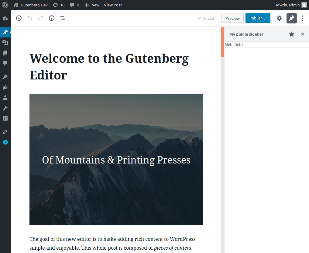
        <RichTextToolbarButton
            icon="editor-code"
            title="Sample output"
            onClick={ () => {
                onChange(
                    toggleFormat( value, {
                        type: 'my-custom-format/sample-output',
                    } )
                );
            } }
            isActive={ isActive }
        />
    );
};

registerFormatType( 'my-custom-format/sample-output', {
    title: 'Sample output',
    tagName: 'samp',
    className: null,
    edit: MyCustomButton,
} );
```

Confirm it is working: first build and reload, then make a text selection and click the button. Your browser will likely display that selection differently than the surrounding text.

You can also confirm by switching to HTML view (Code editor `Ctrl+Shift+Alt+M`) and see the text selection wrapped with `<samp>` HTML tags.

Use the `className` option when registering to add your own custom class to the tag. You can use that class and custom CSS to target that element and style as you wish.

### Step 4: Show the button only for specific blocks (Optional)

By default, the button is rendered on every rich text toolbar (image captions, buttons, paragraphs, etc). You can render the button only on blocks of a certain type by using [the data API](https://developer.wordpress.org/block-editor/reference-guides/packages/packages-data).

Here is an example that only shows the button for Paragraph blocks:

``` js
import { registerFormatType, toggleFormat } from '@wordpress/rich-text';
import { RichTextToolbarButton } from '@wordpress/block-editor';
import { useSelect } from '@wordpress/data';

function ConditionalButton( { isActive, onChange, value } ) {
    const selectedBlock = useSelect( ( select ) => {
        return select( 'core/block-editor' ).getSelectedBlock();
    }, [] );

    if ( selectedBlock && selectedBlock.name !== 'core/paragraph' ) {
        return null;
    }

    return (
        <RichTextToolbarButton
            icon="editor-code"
            title="Sample output"
            onClick={ () => {
                onChange(
                    toggleFormat( value, {
                        type: 'my-custom-format/sample-output',
                    } )
                );
            } }
            isActive={ isActive }
        />
    );
}

registerFormatType( 'my-custom-format/sample-output', {
    title: 'Sample output',
    tagName: 'samp',
    className: null,
    edit: ConditionalButton,
} );
```

### Step 5: Add a button outside of the dropdown (Optional)

Using the `RichTextToolbarButton` component, the button is added to the default dropdown menu. You can add the button directly to the toolbar by using the `BlockControls` component.

``` js
import { registerFormatType, toggleFormat } from '@wordpress/rich-text';
import { BlockControls } from '@wordpress/block-editor';
import { ToolbarGroup, ToolbarButton } from '@wordpress/components';

const MyCustomButton = ( { isActive, onChange, value } ) => {
    return (
        <BlockControls>
            <ToolbarGroup>
                <ToolbarButton
                    icon="editor-code"
                    title="Sample output"
                    onClick={ () => {
                        onChange(
                            toggleFormat( value, {
                                type: 'my-custom-format/sample-output',
                            } )
                        );
                    } }
                    isActive={ isActive }
                />
            </ToolbarGroup>
        </BlockControls>
    );
};

registerFormatType( 'my-custom-format/sample-output', {
    title: 'Sample output',
    tagName: 'samp',
    className: null,
    edit: MyCustomButton,
} );
```

## Troubleshooting

If you run into errors:

- Double check that you run `npm run build` first.
- Confirm no syntax errors or issues in build process.
- Confirm the JavaScript is loading in the editor.
- Check for any console error messages.

## Additional resources

Reference documentation used in this guide:

- RichText: [`registerFormatType`](https://developer.wordpress.org/block-editor/reference-guide/packages/packages-rich-text/#registerformattype)
- Components: [`RichTextToolbarButton`](https://developer.wordpress.org/block-editor/reference-guide/packages/packages-block-editor/#richtexttoolbarbutton)
- RichText: [`applyFormat`](https://developer.wordpress.org/block-editor/reference-guide/packages/packages-rich-text/#applyformat)
- RichText: [`removeFormat`](https://developer.wordpress.org/block-editor/reference-guide/packages/packages-rich-text/#removeformat)
- RichText: [`toggleFormat`](https://developer.wordpress.org/block-editor/reference-guide/packages/packages-rich-text/#toggleformat)

## Conclusion

The guide showed you how to add a button to the toolbar and have it apply a format to the selected text. Try it out and see what you can build with it in your next plugin.

Download the [format-api example](https://github.com/WordPress/block-development-examples/tree/trunk/plugins/format-api-f14b86) from the [block-development-examples](https://github.com/WordPress/block-development-examples) repository.

# Plugin Sidebar

## Overview

How to add a sidebar to your plugin. A sidebar is the region to the far right of the editor. Your plugin can add an additional icon next to the InspectorControls (gear icon) that can be expanded.

<img src="https://i0.wp.com/developer.wordpress.org/files/2026/06/sidebar-up-and-running.png?ssl=1" data-recalc-dims="1" decoding="async" alt="Example sidebar" />

*Note: this tutorial covers a custom sidebar, if you are looking to add controls to the sidebar see the [Block Toolbar and Settings Sidebar](https://developer.wordpress.org/block-editor/getting-started/fundamentals/block-in-the-editor/)*

## Before you start

The tutorial assumes you have an existing plugin setup and are ready to add PHP and JavaScript code. Please, refer to [Getting started with JavaScript](https://developer.wordpress.org/block-editor/getting-started/fundamentals/javascript-in-the-block-editor/) tutorial for an introduction to WordPress plugins and how to use JavaScript to extend the block editor.

## Step-by-step guide

### Step 1: Get a sidebar up and running

The first step is to tell the editor that there is a new plugin that will have its own sidebar. Use the [registerPlugin](https://developer.wordpress.org/block-editor/reference-guide/packages/packages-plugins/), [PluginSidebar](https://developer.wordpress.org/block-editor/reference-guide/packages/packages-editor/#pluginsidebar), and [createElement](https://developer.wordpress.org/block-editor/reference-guide/packages/packages-element/) utilities provided by the `@wordpress/plugins`, `@wordpress/editor`, and `react` packages, respectively.

Add the following code to a JavaScript file called `plugin-sidebar.js` and save it within your plugin’s directory:

``` js
( function ( wp, React ) {
    var el = React.createElement;
    var registerPlugin = wp.plugins.registerPlugin;
    var PluginSidebar = wp.editor.PluginSidebar;

    registerPlugin( 'my-plugin-sidebar', {
        render: function () {
            return el(
                PluginSidebar,
                {
                    name: 'my-plugin-sidebar',
                    icon: 'admin-post',
                    title: 'My plugin sidebar',
                },
                'Meta field'
            );
        },
    } );
} )( window.wp, window.React );
```

For this code to work, those utilities need to be available in the browser, so you must specify `wp-plugins`, `wp-editor`, and `react` as dependencies of your script.

Here is the PHP code to register your script and specify the dependencies:

``` php
<?php

/*
Plugin Name: Sidebar plugin
*/

function sidebar_plugin_register() {
    wp_register_script(
        'plugin-sidebar-js',
        plugins_url( 'plugin-sidebar.js', __FILE__ ),
        array( 'wp-plugins', 'wp-editor', 'react' )
    );
}
add_action( 'init', 'sidebar_plugin_register' );

function sidebar_plugin_script_enqueue() {
    wp_enqueue_script( 'plugin-sidebar-js' );
}
add_action( 'enqueue_block_editor_assets', 'sidebar_plugin_script_enqueue' );
```

After installing and activating this plugin, there is a new icon resembling a tack in the top-right of the editor. Upon clicking it, the plugin’s sidebar will be opened:

<img src="https://i0.wp.com/developer.wordpress.org/files/2026/06/sidebar-up-and-running.png?ssl=1" data-recalc-dims="1" decoding="async" alt="Sidebar Up and Running" />

### Step 2: Tweak the sidebar style and add controls

After the sidebar is up and running, the next step is to fill it up with the necessary components and basic styling.

To visualize and edit the meta field value you’ll use an input component. The `@wordpress/components` package contains many components available for you to reuse, and, specifically, the [TextControl](https://developer.wordpress.org/block-editor/reference-guide/components/text-control/) is aimed at creating an input field:

``` js
( function ( wp ) {
    var el = React.createElement;
    var registerPlugin = wp.plugins.registerPlugin;
    var PluginSidebar = wp.editor.PluginSidebar;
    var TextControl = wp.components.TextControl;

    registerPlugin( 'my-plugin-sidebar', {
        render: function () {
            return el(
                PluginSidebar,
                {
                    name: 'my-plugin-sidebar',
                    icon: 'admin-post',
                    title: 'My plugin sidebar',
                },
                el(
                    'div',
                    { className: 'plugin-sidebar-content' },
                    el( TextControl, {
                        label: 'Meta Block Field',
                        value: 'Initial value',
                        onChange: function ( content ) {
                            console.log( 'content changed to ', content );
                        },
                    } )
                )
            );
        },
    } );
} )( window.wp );
```

Update the `plugin-sidebar.js` with this new code. Notice that it uses a new utility called `wp.components` from the `@wordpress/components` package. Be sure to add `wp-components` to the dependencies in the `wp_register_script` function in the PHP file.

The code introduces:

- a CSS class `plugin-sidebar-content` to the `div` element to target styles,
- a `TextControl` component instead of the plain `'Meta field'` text.

With the new CSS class available you can add a little style. Create a new file in your plugin directory called `plugin-sidebar.css` with the following to give some padding:

``` css
.plugin-sidebar-content {
    padding: 16px;
}
```

Register the script and enqueue it to load with `enqueue_block_editor_assets` alongside the JavaScript file.

After those changes, the PHP code will look like this:

``` php
<?php

/*
Plugin Name: Sidebar example
*/

function sidebar_plugin_register() {
    wp_register_script(
        'plugin-sidebar-js',
        plugins_url( 'plugin-sidebar.js', __FILE__ ),
        array(
            'react',
            'wp-plugins',
            'wp-editor',
            'wp-components'
        )
    );
    wp_register_style(
        'plugin-sidebar-css',
        plugins_url( 'plugin-sidebar.css', __FILE__ )
    );
}
add_action( 'init', 'sidebar_plugin_register' );

function sidebar_plugin_script_enqueue() {
    wp_enqueue_script( 'plugin-sidebar-js' );
    wp_enqueue_style( 'plugin-sidebar-css' );
}
add_action( 'enqueue_block_editor_assets', 'sidebar_plugin_script_enqueue' );
```

Reload the editor and open the sidebar:

<img src="https://i0.wp.com/developer.wordpress.org/files/2026/06/sidebar-style-and-controls.png?ssl=1" data-recalc-dims="1" decoding="async" alt="Sidebar with style and controls" />

This code doesn’t let users store or retrieve data just yet, so the next steps will focus on how to connect it to the meta block field.

### Step 3: Register the meta field

To work with fields in the `post_meta` table, use the [register_post_meta](https://developer.wordpress.org/reference/functions/register_post_meta/). function to create a new field called `sidebar_plugin_meta_block_field`.

Note: this field needs to be available to the REST API because that’s how the block editor access data.

Add the PHP code in your plugins `init` callback function:

``` php
register_post_meta( 'post', 'sidebar_plugin_meta_block_field', array(
    'show_in_rest' => true,
    'single' => true,
    'type' => 'string',
) );
```

To confirm, query the block editor store to see the field is loaded. After implementing, reload the editor page and open your browser’s developer console. Use this JavaScript snippet in the console to confirm:

``` js
wp.data.select( 'core/editor' ).getCurrentPost().meta;
```

The function will return an object containing the registered meta field you registered.

If the code returns `undefined` make sure your post type supports `custom-fields`. Either when [registering the post](https://developer.wordpress.org/reference/functions/register_post_type/#supports) or with [add_post_type_support function](https://developer.wordpress.org/reference/functions/add_post_type_support/).

### Step 4: Initialize the input control

With the field available in the editor store, it can now be surfaced to the UI. We extract the input control to a function to keep the code clean as we add functionality.

``` js
( function ( wp ) {
    var el = React.createElement;
    var registerPlugin = wp.plugins.registerPlugin;
    var PluginSidebar = wp.editor.PluginSidebar;
    var TextControl = wp.components.TextControl;

    var MetaBlockField = function () {
        return el( TextControl, {
            label: 'Meta Block Field',
            value: 'Initial value',
            onChange: function ( content ) {
                console.log( 'content changed to ', content );
            },
        } );
    };

    registerPlugin( 'my-plugin-sidebar', {
        render: function () {
            return el(
                PluginSidebar,
                {
                    name: 'my-plugin-sidebar',
                    icon: 'admin-post',
                    title: 'My plugin sidebar',
                },
                el(
                    'div',
                    { className: 'plugin-sidebar-content' },
                    el( MetaBlockField )
                )
            );
        },
    } );
} )( window.wp );
```

We want to initialize the value in the `MetaBlockField` component with the value of `sidebar_plugin_meta_block_field`, and keep it updated when that value changes.

The `useSelect` function is used to fetch data when the component loads and will update if the data changes. Here is the code update with `useSelect`:

``` js
( function ( wp ) {
    var el = React.createElement;
    var registerPlugin = wp.plugins.registerPlugin;
    var PluginSidebar = wp.editor.PluginSidebar;
    var Text = wp.components.TextControl;
    var useSelect = wp.data.useSelect;

    var MetaBlockField = function () {
        var metaFieldValue = useSelect( function ( select ) {
            return select( 'core/editor' ).getEditedPostAttribute(
                'meta'
            )[ 'sidebar_plugin_meta_block_field' ];
        }, [] );

        return el( Text, {
            label: 'Meta Block Field',
            value: metaFieldValue,
            onChange: function ( content ) {
                console.log( 'content has changed to ', content );
            },
        } );
    };

    registerPlugin( 'my-plugin-sidebar', {
        render: function () {
            return el(
                PluginSidebar,
                {
                    name: 'my-plugin-sidebar',
                    icon: 'admin-post',
                    title: 'My plugin sidebar',
                },
                el(
                    'div',
                    { className: 'plugin-sidebar-content' },
                    el( MetaBlockField )
                )
            );
        },
    } );
} )( window.wp );
```

The `wp.data.useSelect` function is from the `@wordpress/data` package, so `wp-data` needs to be added as a dependency in the `wp_register_script` function in PHP.

Note: The `getEditedPostAttribute` call is used to retrieve the most recent values of the post, including user editions that haven’t been yet saved.

Confirm it’s working by updating the code, reloading, and opening the sidebar. The input’s content is no longer `Initial value` but a void string. Users can’t type values yet, but you can check that the component is updated if the value in the store changes. Open the browser’s console, execute

``` js
wp.data
    .dispatch( 'core/editor' )
    .editPost( { meta: { sidebar_plugin_meta_block_field: 'hello world!' } } );
```

You can observe the content changing in the input component.

### Step 5: Update the meta field when the input’s content changes

The last step is to update the meta field when the input content changes.\
The `useDispatch` function takes a store name as its only argument and returns methods that you can use to update the store, in this case we’ll use `editPost`

``` js
( function ( wp ) {
    var el = React.createElement;
    var registerPlugin = wp.plugins.registerPlugin;
    var PluginSidebar = wp.editor.PluginSidebar;
    var TextControl = wp.components.TextControl;
    var useSelect = wp.data.useSelect;
    var useDispatch = wp.data.useDispatch;

    var MetaBlockField = function ( props ) {
        var metaFieldValue = useSelect( function ( select ) {
            return select( 'core/editor' ).getEditedPostAttribute(
                'meta'
            )[ 'sidebar_plugin_meta_block_field' ];
        }, [] );

        var editPost = useDispatch( 'core/editor' ).editPost;

        return el( TextControl, {
            label: 'Meta Block Field',
            value: metaFieldValue,
            onChange: function ( content ) {
                editPost( {
                    meta: { sidebar_plugin_meta_block_field: content },
                } );
            },
        } );
    };

    registerPlugin( 'my-plugin-sidebar', {
        render: function () {
            return el(
                PluginSidebar,
                {
                    name: 'my-plugin-sidebar',
                    icon: 'admin-post',
                    title: 'My plugin sidebar',
                },
                el(
                    'div',
                    { className: 'plugin-sidebar-content' },
                    el( MetaBlockField )
                )
            );
        },
    } );
} )( window.wp );
```

After the update, when the user types, the input control calls `editPost` and updates the editor store on each keystroke.

Update the JavaScript, load the sidebar, and type in the input field. You can confirm it is saved by typing something in the input control and executing the JavaScript snippet in your browser’s development console:

``` js
wp.data.select( 'core/editor' ).getEditedPostAttribute( 'meta' )[
    'sidebar_plugin_meta_block_field'
];
```

The message displayed should be what you typed in the input.

When saving a post, you can confirm it is stored properly in the database by reloading after a save and confirming the input control is initialized with the last value you typed.

## Additional resources

Documentation for working with the [@wordpress/data package](https://developer.wordpress.org/block-editor/reference-guide/packages/packages-data/).

Functions used in this guide:

- [useSelect](https://developer.wordpress.org/block-editor/reference-guide/packages/packages-data/#useselect).
- [getEditedPostAttribute](https://developer.wordpress.org/block-editor/reference-guides/data/data-core-editor/#geteditedpostattribute)
- [useDispatch](https://developer.wordpress.org/block-editor/reference-guide/packages/packages-data/#usedispatch)

## Conclusion

You now have a custom sidebar that you can use to update `post_meta` content.

A complete example is available, download the [plugin-sidebar example](https://github.com/WordPress/block-development-examples/tree/trunk/plugins/plugin-sidebar-9ee4a6) from the [block-development-examples](https://github.com/WordPress/block-development-examples) repository.

### Note

If you have enabled Custom Fields in the ‘Panels’ page of the Editor ‘Preferences’ (via the three dots in top right), a field with the same name as the TextControl, in this case `sidebar_plugin_meta_block_field`, will also appear in the custom fields panel at the bottom of the editor window. These two fields have access to the same meta property.
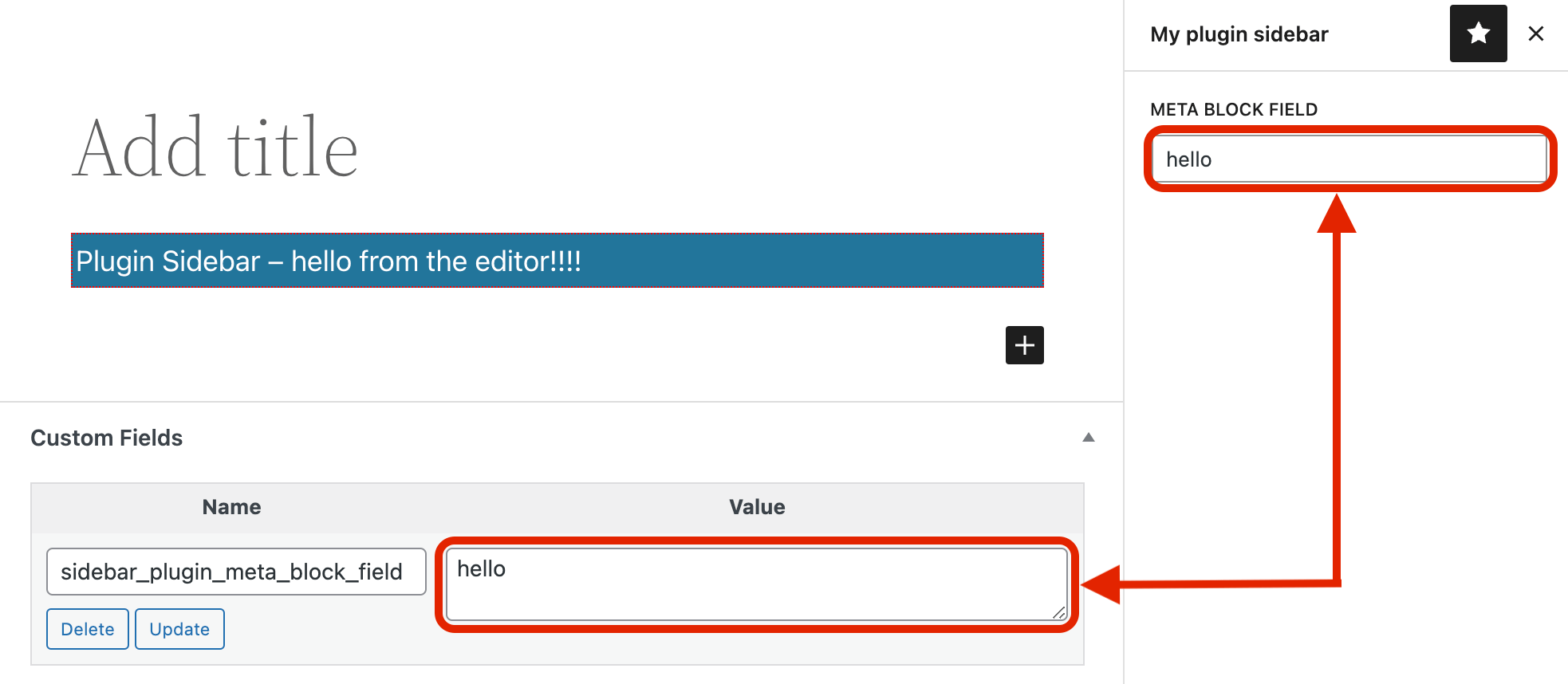
<img src="https://i0.wp.com/developer.wordpress.org/files/2026/06/plugin-sidebar-text-control-custom-field.png?ssl=1" data-recalc-dims="1" decoding="async" alt="Text Control and Custom Field" />

On saving the post the value in the TextControl will be saved first and the value in the custom field will be saved second, so that is the one that ends up persisting in the database. So if you change the value in the TextControl it is still the one in the custom field that ends up getting saved.

This problem does not exist if Custom Fields is not enabled.

If you need to have Custom Fields enabled and also have post meta in the sidebar there are two possible solutions:

1.  Precede the name of the meta field with an underscore, so the name in the above example would be `_sidebar_plugin_meta_block_field`. This indicates that the post meta should be treated as private so it will not be visible in the Custom Fields section of a post. With this solution an error will be generated when you save the post unless you add an `auth_callback` property to the `args` array passed to `register_post_meta` with a function that ultimately returns `true`. See the `args` documentation in the [post_meta](https://developer.wordpress.org/reference/functions/register_meta/#parameters) page for more info.
2.  In the TextControl’s `onChange` function, target the Value field textarea and set the value there to be the same as the value in the TextControl meta field. The value will then be identical in both places and so you can be assured that if the value is changed in the TextControl then it will still be saved to the database.

``` js
return el( TextControl, {
  label: 'Meta Block Field',
  value: metaFieldValue,
  onChange: function ( content ) {
    editPost( {
      meta: { sidebar_plugin_meta_block_field: content }
    })
    document.querySelector( {the-value-textarea} ).innerHTML = content;
  },
} );
```

# Meta Boxes

## Overview

Prior to the block editor, custom meta boxes were used to extend the editor. Now there are new ways to extend, giving more power to the developer and a better experience for the authors. It is recommended to port older custom meta boxes to one of these new methods to create a more unified and consistent experience for those using the editor.

The block editor does support most existing meta boxes, see [the backward compatibility section below](#backward-compatibility) for details .

If you are interested in working with the post meta outside the editor, check out the [Sidebar Tutorial](https://developer.wordpress.org/block-editor/how-to-guides/plugin-sidebar-0/).

### Use blocks to store meta

Typically, blocks store attribute values in the serialized block HTML. However, you can also create a block that saves its attribute values as post meta, that can be accessed programmatically anywhere in your template.

This guide shows how to create a block that prompts a user for a single value, and saves it to post meta.

## Before you start

This guide assumes you are already familiar with WordPress plugins, post meta, and basic JavaScript. Review the [Getting started with JavaScript tutorial](https://developer.wordpress.org/block-editor/getting-started/fundamentals/javascript-in-the-block-editor/) for an introduction.

The guide will walk through creating a basic block, but recommended to go through the [Create Block tutorial](https://developer.wordpress.org/block-editor/getting-started/tutorial/) for a deeper understanding of creating custom blocks.

You will need:

- WordPress development environment,
- A minimal plugin activated and ready to edit
- JavaScript setup for building and enqueuing

A [complete meta-block example](https://github.com/WordPress/block-development-examples/tree/trunk/plugins/meta-block-bb1e55) is available that you can use as a reference for your setup.

## Step-by-step guide

1.  [Register Meta Field](#step-1-register-meta-field)
2.  [Add Meta Block](#step-2-add-meta-block)
3.  [Use Post Meta Data](#step-3-use-post-meta-data)
4.  [Finishing Touches](#step-4-use-block-templates-optional)

### Step 1: Register meta field

A post meta field is a WordPress object used to store extra data about a post. You need to first register a new meta field prior to use. See Managing [Post Metadata](https://developer.wordpress.org/plugins/metadata/managing-post-metadata/) to learn more about post meta.

When registering the field, note the `show_in_rest` parameter. This ensures the data will be included in the REST API, which the block editor uses to load and save meta data. See the [`register_post_meta`](https://developer.wordpress.org/reference/functions/register_post_meta/) function definition for extra information.

Additionally, your post type needs to support `custom-fields` for `register_post_meta` function to work

To register the field, add the following to your PHP plugin:

``` php
<?php
// register custom meta tag field
function myguten_register_post_meta() {
    register_post_meta( 'post', 'myguten_meta_block_field', array(
        'show_in_rest' => true,
        'single' => true,
        'type' => 'string',
    ) );
}
add_action( 'init', 'myguten_register_post_meta' );
```

### Step 2: Add meta block

With the meta field registered in the previous step, next create a new block to display the field value to the user.

The hook `useEntityProp` can be used by the blocks to get or change meta values.

Add this code to the JavaScript `src/index.js`:

``` js
import { registerBlockType } from '@wordpress/blocks';
import { TextControl } from '@wordpress/components';
import { useSelect } from '@wordpress/data';
import { useEntityProp } from '@wordpress/core-data';
import { useBlockProps } from '@wordpress/block-editor';

registerBlockType( 'myguten/meta-block', {
    edit: ( { setAttributes, attributes } ) => {
        const blockProps = useBlockProps();
        const postType = useSelect(
            ( select ) => select( 'core/editor' ).getCurrentPostType(),
            []
        );

        const [ meta, setMeta ] = useEntityProp( 'postType', postType, 'meta' );

        const metaFieldValue = meta[ 'myguten_meta_block_field' ];
        const updateMetaValue = ( newValue ) => {
            setMeta( { ...meta, myguten_meta_block_field: newValue } );
        };

        return (
            <div { ...blockProps }>
                <TextControl
                    label="Meta Block Field"
                    value={ metaFieldValue }
                    onChange={ updateMetaValue }
                />
            </div>
        );
    },

    // No information saved to the block.
    // Data is saved to post meta via the hook.
    save: () => {
        return null;
    },
} );
```

Confirm this works by creating a post and add the Meta Block. You will see your field that you can type a value in. When you save the post, either as a draft or published, the post meta value will be saved too. You can verify by saving and reloading your draft, the form will still be filled in on reload.

You could also confirm the data is saved by checking the database table `wp_postmeta` and confirm the new post id contains the new field data.

**Troubleshooting**: Be sure to build your code between changes, you updated the PHP code from Step 1, and JavaScript files are enqueued. Check the build output and developer console for errors.

### Step 3: Use post meta data

You can use the post meta data stored in the last step in multiple ways.

#### Use post meta in PHP

The first example uses the value from the post meta field and appends it to the end of the post content wrapped in a `H4` tag.

``` php
function myguten_content_filter( $content ) {
    $value = get_post_meta( get_the_ID(), 'myguten_meta_block_field', true );
    if ( $value ) {
        return sprintf( "%s <h4> %s </h4>", $content, esc_html( $value ) );
    } else {
        return $content;
    }
}
add_filter( 'the_content', 'myguten_content_filter' );
```

#### Use post meta in a block

You can also use the post meta data in other blocks. For this example the data is loaded at the end of every Paragraph block when it is rendered, ie. shown to the user. You can replace this for any core or custom block types as needed.

In PHP, use the [register_block_type](https://developer.wordpress.org/reference/functions/register_block_type/) function to set a callback when the block is rendered to include the meta value.

``` php
function myguten_render_paragraph( $block_attributes, $content ) {
    $value = get_post_meta( get_the_ID(), 'myguten_meta_block_field', true );
    // check value is set before outputting
    if ( $value ) {
        return sprintf( "%s (%s)", $content, esc_html( $value ) );
    } else {
        return $content;
    }
}

register_block_type( 'core/paragraph', array(
    'api_version' => 3,
    'render_callback' => 'myguten_render_paragraph',
) );
```

### Step 4: Use block templates (optional)

One problem using a meta block is the block is easy for an author to forget, since it requires being added to each post. You solve this by using [block templates](https://developer.wordpress.org/block-editor/reference-guides/block-api/block-templates/). A block template is a predefined list of block items per post type. Templates allow you to specify a default initial state for a post type.

For this example, you use a template to automatically insert the meta block at the top of a post.

Add the following code to the `myguten-meta-block.php` file:

``` php
function myguten_register_template() {
    $post_type_object = get_post_type_object( 'post' );
    $post_type_object->template = array(
        array( 'myguten/meta-block' ),
    );
}
add_action( 'init', 'myguten_register_template' );
```

You can also add other block types in the array, including placeholders, or even lock down a post to a set of specific blocks. Templates are a powerful tool for controlling the editing experience, see the documentation linked above for more.

## Conclusion

This guide showed how using blocks you can read and write to post meta. See the section below for backward compatibility with existing meta boxes.

## Backward compatibility

### Testing, converting, and maintaining existing meta boxes

Before converting meta boxes to blocks, it may be easier to test if a meta box works with the block editor, and explicitly mark it as such.

If a meta box *doesn’t* work with the block editor, and updating it to work correctly is not an option, the next step is to add the `__block_editor_compatible_meta_box` argument to the meta box declaration:

``` php
add_meta_box( 'my-meta-box', 'My Meta Box', 'my_meta_box_callback',
    null, 'normal', 'high',
    array(
        '__block_editor_compatible_meta_box' => false,
    )
);
```

WordPress won’t show the meta box but a message saying that it isn’t compatible with the block editor, including a link to the Classic Editor plugin. By default, `__block_editor_compatible_meta_box` is `true`.

After a meta box is converted to a block, it can be declared as existing for backward compatibility:

``` php
add_meta_box( 'my-meta-box', 'My Meta Box', 'my_meta_box_callback',
    null, 'normal', 'high',
    array(
        '__back_compat_meta_box' => true,
    )
);
```

When the block editor is used, this meta box will no longer be displayed in the meta box area, as it now only exists for backward compatibility purposes. It will display as before in the classic editor.

### Meta box data collection

On each block editor page load, we register an action that collects the meta box data to determine if an area is empty. The original global state is reset upon collection of meta box data.

See [`register_and_do_post_meta_boxes`](https://developer.wordpress.org/reference/functions/register_and_do_post_meta_boxes/).

It will run through the functions and hooks that `post.php` runs to register meta boxes; namely `add_meta_boxes`, `add_meta_boxes_{$post->post_type}`, and `do_meta_boxes`.

Meta boxes are filtered to strip out any core meta boxes, standard custom taxonomy meta boxes, and any meta boxes that have declared themselves as only existing for backward compatibility purposes.

Then each location for this particular type of meta box is checked for whether it is active. If it is not empty a value of true is stored, if it is empty a value of false is stored. This meta box location data is then dispatched by the editor Redux store in `INITIALIZE_META_BOX_STATE`.

Ideally, this could be done at instantiation of the editor and help simplify this flow. However, it is not possible to know the meta box state before `admin_enqueue_scripts`, where we are calling `initializeEditor()`. This will have to do, unless we want to move `initializeEditor()` to fire in the footer or at some point after `admin_head`. With recent changes to editor bootstrapping this might now be possible. Test with ACF to make sure.

### Redux and React meta box management

When rendering the block editor, the meta boxes are rendered to a hidden div `#metaboxes`.

*The Redux store will hold all meta boxes as inactive by default*. When\
`INITIALIZE_META_BOX_STATE` comes in, the store will update any active meta box areas by setting the `isActive` flag to `true`. Once this happens React will check for the new props sent in by Redux on the `MetaBox` component. If that `MetaBox` is now active, instead of rendering null, a `MetaBoxArea` component will be rendered. The `MetaBox` component is the container component that mediates between the `MetaBoxArea` and the Redux Store. *If no meta boxes are active, nothing happens. This will be the default behavior, as all core meta boxes have been stripped.*

#### MetaBoxArea component

When the component renders it will store a reference to the meta boxes container and retrieve the meta boxes HTML from the prefetch location.

When the post is updated, only meta box areas that are active will be submitted. This prevents unnecessary requests. No extra revisions are created by the meta box submissions. A Redux action will trigger on `REQUEST_POST_UPDATE` for any active meta box. See `editor/effects.js`. The `REQUEST_META_BOX_UPDATES` action will set that meta box’s state to `isUpdating`. The `isUpdating` prop will be sent into the `MetaBoxArea` and cause a form submission.

When the meta box area is saving, we display an updating overlay, to prevent users from changing the form values while a save is in progress.

An example save url would look like:

`example.org/wp-admin/post.php?post=1&action=edit&meta-box-loader=1`

This url is automatically passed into React via a `_wpMetaBoxUrl` global variable.

This page mimics the `post.php` post form, so when it is submitted it will fire all of the normal hooks and actions, and have the proper global state to correctly fire any PHP meta box mumbo jumbo without needing to modify any existing code. On successful submission, React will signal a `handleMetaBoxReload` to remove the updating overlay.

### Common compatibility issues

Most PHP meta boxes should continue to work in the block editor, but some meta boxes that include advanced functionality could break. Here are some common reasons why meta boxes might not work as expected in the block editor:

- Plugins relying on selectors that target the post title, post content fields, and other metaboxes (of the old editor).
- Plugins relying on TinyMCE’s API because there’s no longer a single TinyMCE instance to talk to in the block editor.
- Plugins making updates to their DOM on “submit” or on “save”.

Please also note that if your plugin triggers a PHP warning or notice to be output on the page, this will cause the HTML document type (`<!DOCTYPE html>`) to be output incorrectly. This will cause the browser to render using “Quirks Mode”, which is a compatibility layer that gets enabled when the browser doesn’t know what type of document it is parsing. The block editor is not meant to work in this mode, but it can *appear* to be working just fine. If you encounter issues such as *meta boxes overlaying the editor* or other layout issues, please check the raw page source of your document to see that the document type definition is the first thing output on the page. There will also be a warning in the JavaScript console, noting the issue.

## Additional resources

- [Creating a custom block that stores post meta](https://developer.wordpress.org/news/2023/03/03/creating-a-custom-block-that-stores-post-meta/)

# Create your First App with Gutenberg Data

This tutorial aims to get you comfortable with the Gutenberg data layer. It guides you through building a simple React application that enables the user to manage their WordPress pages. The finished app will look like this:

[<img src="https://i0.wp.com/developer.wordpress.org/files/2026/06/part1-finished.jpg?ssl=1" data-recalc-dims="1" decoding="async" alt="Open demo in WordPress Playground" />](https://playground.wordpress.net/?blueprint-url=https://raw.githubusercontent.com/WordPress/block-development-examples/trunk/plugins/data-basics-59c8f8/_playground/blueprint.json "Opens demo in WordPress Playground")

You may review the [finished app](https://github.com/WordPress/block-development-examples/tree/trunk/plugins/data-basics-59c8f8) in the block-development-examples repository.

### Table of Contents

1.  [Setup](https://developer.wordpress.org/block-editor/how-to-guides/data-basics/1-data-basics-setup/)
2.  [Building a basic list of pages](https://developer.wordpress.org/block-editor/how-to-guides/data-basics/2-building-a-list-of-pages/)
3.  [Building an edit form](https://developer.wordpress.org/block-editor/how-to-guides/data-basics/3-building-an-edit-form/)
4.  [Building a *create page* form](https://developer.wordpress.org/block-editor/how-to-guides/data-basics/4-building-a-create-page-form/)
5.  [Adding a delete button](https://developer.wordpress.org/block-editor/how-to-guides/data-basics/5-adding-a-delete-button/)

# Curating the Editor Experience

Curating the editing experience in WordPress is important because it allows you to streamline the editing process, ensuring consistency and alignment with the site’s style and branding guidelines. It also makes it easier for users to create and manage content effectively without accidental modifications or layout changes. This leads to a more efficient and personalized experience.

The purpose of this guide is to offer various ways you can lock down and curate the experience of using WordPress, especially with the introduction of more design tools and the Site Editor.

In this section, you will learn:

1.  [**Block locking**](https://developer.wordpress.org/block-editor/how-to-guides/curating-the-editor-experience/block-locking): how to restrict user interactions with specific blocks in the Editor for better content control
2.  [**Patterns**](https://developer.wordpress.org/block-editor/how-to-guides/curating-the-editor-experience/patterns): about creating and implementing predefined block layouts to ensure design and content uniformity
3.  [**theme.json**](https://developer.wordpress.org/block-editor/how-to-guides/curating-the-editor-experience/theme-json): to configure global styles and settings for your theme using the theme.json file
4.  [**Filters and hooks**](https://developer.wordpress.org/block-editor/how-to-guides/curating-the-editor-experience/filters-and-hooks): about the essential filters and hooks used to modify the Editor
5.  [**Disabling Editor functionality**](https://developer.wordpress.org/block-editor/how-to-guides/curating-the-editor-experience/disable-editor-functionality): about additional ways to selectively disable features or components in the Editor to streamline the user experience

## Combining approaches

Remember that the approaches provided in the documentation above can be combined as you see fit. For example, you can provide custom patterns to use when creating a new page while also limiting the amount of customization that can be done to aspects of them, like only allowing specific preset colors to be used for the background of a Cover block or locking down what blocks can be deleted.

When considering the approaches to take, think about the specific ways you might want to both open up the experience and curate it.

## Additional resources

- [Builder Basics – Working with Templates in Full Site Editing (Part 3)](https://wordpress.tv/2022/05/24/nick-diego-builder-basics-working-with-templates-in-full-site-editing-part-3/)
- [Core Editor Improvement: Curated experiences with locking APIs & theme.json](https://make.wordpress.org/core/2022/02/09/core-editor-improvement-curated-experiences-with-locking-apis-theme-json/)
- [Learn WordPress session on Curating the Editor Experience](https://wordpress.tv/2022/07/22/nick-diego-curating-the-editor-experience/)

# Propagating updates for block types

This resource seeks to offer direction for those needing to provide updates to content, whether in a template for a theme, pattern, or a block over an entire site. Since each content type allows or disallows certain kind of synchronization, it’s important to know what’s possible before creating to make maintenance easier in the future.

## Recommendations on managing updates

### Establish early what content you expect to require updates

At a high level, it’s important to recognize that not every piece of content can be updated across the entire site and that the method of creation greatly impacts what’s possible. As a result, it’s critical to spend time ahead of creation determining what you expect to need updates and to put that content in the appropriate format. This will make a huge difference in terms of future maintenance.

### Embrace theme design at the block level

Block theme design requires a mindset shift from the previous approach of designing large sections of a theme and controlling them via updates. While a holistic view of a design is still important when creating a custom theme project, blocks require that themers approach design on a more atomic level. This means starting from the block itself, typically through theme.json customizations. **The goal is that each individual “atom” (i.e., block) can be moved around, edited, deleted, and put back together without the entire design falling apart.**

The more that you approach design at the block level, the less need there is to propagate updates to things like patterns and templates across the entire site. If the atomic pieces are in place, their layout should not matter.

## Content types (and how to properly update them)

### Blocks

How to manage block updates depends on the nature of the block itself. If the block depends on external data, then making it dynamic from start with the `render_callback` function is often a better choice as it provides more control. If the block’s structure is expected to change over time, then starting with the static block that uses `save()` method defining a default output is the recommended approach. Over time, it’s possible to go hybrid and include also the `render_callback` that can use the output from `save` as a fallback while processing an alternate output. Keep in mind that that flexibility and controls comes at the cost of additional processing during rendering. Another option is using static blocks that rely on managing updates with [block deprecations](https://developer.wordpress.org/block-editor/reference-guides/block-api/block-deprecation/). This will require you to manually update exist blocks. Depending on your needs and comfortability, either approach can work. **To get started on creating blocks and save time, [you can use the Create Block tool](https://developer.wordpress.org/block-editor/reference-guides/packages/packages-create-block/).**

### Patterns

**For content that you want updated later on, do not use patterns and instead rely on reusable blocks or template parts.** Patterns cannot be updated after you insert one into your site. For context, you can think of Patterns as more like sample/example/starter content. While Patterns exposed in the Inserter might evolve over time, those changes won’t be automatically applied to any current usage of the pattern. Once inserted, patterns become completely detached from the original pattern unlike Reusable block or Template Part block.

If needed, one potential workaround for patterns with custom styles is to add a class name to the wrapping block for a pattern. For example, the following adds a themeslug-special class to a Group block:

    <!-- wp:group {"className":"themeslug-special"} -->
    <div class="wp-block-group themeslug-special">
        <!-- Nested pattern blocks -->
    </div>
    <!-- /wp:group -->

It is not fool-proof because users can modify the class via the editor UI. However, because this setting is under the “Advanced” panel it is likely to stay intact in most instances. This gives theme authors some CSS control for some pattern types, allowing them to update existing uses. However, it does not prevent users from making massive alterations that cannot be updated.

### Synced Patterns

As the name suggests, these patterns are inherently synced across your site. Keep in mind that there are currently limitations with relying on synced patterns to handle certain updates since content, HTML structure, and styles will all stay in sync when updates happen. If you require more nuance than that, this is a key element to factor in and a dynamic block might be a better approach.

### Template parts and templates

Because block themes allow users to directly edit templates and template parts, how changes are managed need to be adjusted in light of the greater access given to users. For context, when templates or template parts are changed by the user, the updated templates from the theme update don’t show for the user. Only new users of the theme or users who have not yet edited a template are experiencing the updated template. If users haven’t modified the files then the changes you make on the file system will be reflected on the user’s sites – you just need to update the files and they’ll get the changes. However if they have made changes to their templates then the only way you can update their templates is to:

- Revert all their changes
- Update the templates and template parts in the database

Generally speaking, if a user has made changes to templates then it’s recommended to leave the templates as is, unless agreed upon with the user (ie in an agency setting).

One thing to be mindful of when updating templates is inserting references to new or different template parts. For example, the templates/page.html template could insert a parts/header.html part in version 1.0 but change that reference to parts/header-alt.html in version 2.0. Some developers may see this as a “workaround” in instances where users modified the original header.html. However, this is likely to break a user’s customized design since the page.html template would no longer reference the correct part unless they also modified and saved the page template.

Likewise, it is generally poor practice to delete template parts in theme updates. In this scenario, users could create custom top-level templates that include a call to the part and expect it to continue existing.

### Resources

- [Comparing Patterns, Template Parts, and Reusable Blocks](https://wordpress.org/documentation/article/comparing-patterns-template-parts-and-reusable-blocks/)
- [Block deprecation](https://developer.wordpress.org/block-editor/reference-guides/block-api/block-deprecation/)
- [Create Block tool](https://developer.wordpress.org/block-editor/reference-guides/packages/packages-create-block/)

# Enqueueing assets in the Editor

This guide is designed to be the definitive reference for enqueueing assets (scripts and styles) in the Editor. The approaches outlined here represent the recommended practices but keep in mind that this resource will evolve as WordPress does. Updates are encouraged.

The Site Editor always uses an iframe. Gutenberg 23.6 and WordPress 7.1 also always use an iframe for the Post Editor, regardless of the [`Block API version`](https://developer.wordpress.org/block-editor/reference-guides/block-api/block-metadata/) of blocks in the post content. WordPress 7.0 retains a conditional fallback to a non-iframe Post Editor. This guide assumes you are targeting the iframed Editor; refer to the backward compatibility section below when supporting older WordPress versions.

For more information about why the Editor is iframed, please revisit the post [Blocks in an iframed (template) editor](https://make.wordpress.org/core/2021/06/29/blocks-in-an-iframed-template-editor/).

## The Editor versus Editor content

Before enqueueing assets in the Editor, you must first identify what you are trying to target.

Do you want to add styling or JavaScript to the user-generated content (blocks) in the Editor? Or do you want to modify the Editor user interface (UI) components or interact with Editor APIs? This could include everything from creating custom block controls to registering block variations.

There are different hooks to use depending on the answers to these questions, and if you are building a block or a theme, there are additional approaches to consider. Refer to the designated sections below.

## Scenarios for enqueuing assets

### Editor scripts and styles

Whenever you need to enqueue assets for the Editor itself (i.e. not the user-generated content), you should use the [`enqueue_block_editor_assets`](https://developer.wordpress.org/reference/hooks/enqueue_block_editor_assets/) hook coupled with the standard [`wp_enqueue_script`](https://developer.wordpress.org/reference/functions/wp_enqueue_script/) and [`wp_enqueue_style`](https://developer.wordpress.org/reference/functions/wp_enqueue_style/) functions.

Examples might be adding custom inspector or toolbar controls, registering block styles and variations in JavaScript, registering Editor plugins, etc.

``` php
/**
 * Enqueue Editor assets.
 */
function example_enqueue_editor_assets() {
    wp_enqueue_script(
        'example-editor-scripts',
        plugins_url( 'editor-scripts.js', __FILE__ )
    );
    wp_enqueue_style(
        'example-editor-styles',
        plugins_url( 'editor-styles.css', __FILE__ )
    );
}
add_action( 'enqueue_block_editor_assets', 'example_enqueue_editor_assets' );
```

While not the recommended approach, it’s important to note that `enqueue_block_editor_assets` can be used to style Editor content for backward compatibility. See below for more details.

### Editor content scripts and styles

As of WordPress 6.3, all assets added through the [`enqueue_block_assets`](https://developer.wordpress.org/reference/hooks/enqueue_block_assets/) PHP action will also be enqueued in the iframed Editor. See [\#48286](https://github.com/WordPress/gutenberg/pull/48286) for more details.

This is the primary method you should use to enqueue assets for user-generated content (blocks), and this hook fires both in the Editor and on the front end of your site. It should not be used to add assets intended for the Editor UI or to interact with Editor APIs. See below for a note on backward compatibility.

There are instances where you may only want to add assets in the Editor and not on the front end. You can achieve this by using an [`is_admin()`](https://developer.wordpress.org/reference/functions/is_admin/) check.

``` php
/**
 * Enqueue content assets but only in the Editor.
 */
function example_enqueue_editor_content_assets() {
    if ( is_admin() ) {
        wp_enqueue_script(
            'example-editor-content-scripts',
            plugins_url( 'content-scripts.js', __FILE__ )
        );
        wp_enqueue_style(
            'example-editor-content-styles',
            plugins_url( 'content-styles.css', __FILE__ )
        );
    }
}
add_action( 'enqueue_block_assets', 'example_enqueue_editor_content_assets' );
```

You can also use the hook [`block_editor_settings_all`](https://developer.wordpress.org/reference/hooks/block_editor_settings_all/) to modify Editor settings directly. This method is a bit more complicated to implement but provides greater flexibility. It should only be used if `enqueue_block_assets` does not meet your needs.

The following example sets the default text color for all paragraphs to `green`.

``` php
/**
 * Modify the Editor settings by adding custom styles.
 *
 * @param array  $editor_settings An array containing the current Editor settings.
 * @param string $editor_context  The context of the editor.
 *
 * @return array Modified editor settings with the added custom CSS style.
 */
function example_modify_editor_settings( $editor_settings, $editor_context ) {
    $editor_settings["styles"][] = array(
        "css" => 'p { color: green }'
    );

    return $editor_settings;
}
add_filter( 'block_editor_settings_all', 'example_modify_editor_settings', 10,2 );
```

These styles are inlined in the `body` of the iframed Editor and prefixed by `.editor-styles-wrapper`. The resulting markup will look like this:

``` css
<style>.editor-styles-wrapper p { color: green; }</style>
```

Beginning in WordPress 6.3, you can also use this method of modifying Editor settings to change styles dynamically with JavaScript. See [\#52767](https://github.com/WordPress/gutenberg/pull/52767#top) for more details.

### Block scripts and styles

When building a block, `block.json` is the recommended way to enqueue all scripts and styles that are specifically required for the block itself. You are able to enqueue assets for the Editor, the front end, or both. See the [Block Metadata](https://developer.wordpress.org/block-editor/reference-guides/block-api/block-metadata/) article for more details.

### Theme scripts and styles

If you need to enqueue Editor JavaScript in a theme, you can use either `enqueue_block_assets` or `enqueue_block_editor_assets` as outlined above. Editor-specific stylesheets should almost always be added with [`add_editor_style()`](https://developer.wordpress.org/reference/functions/add_editor_style/) or [`wp_enqueue_block_style()`](https://developer.wordpress.org/reference/functions/wp_enqueue_block_style/).

The `wp_enqueue_block_style()` function allows you to load per-block stylesheets in the Editor and on the front end. Coupled with `theme.json`, this is one of the best methods of styling blocks. See the WordPress Developer Blog article [Leveraging theme.json and per-block styles for more performant themes](https://developer.wordpress.org/news/2022/12/leveraging-theme-json-and-per-block-styles-for-more-performant-themes/) for more details.

## Backward compatibility and known issues

As a general rule, when you enqueue assets in the iframed Editor, they will also be enqueued when the Editor is not iframed so long as you are using WordPress 6.3+. The opposite is not always true.

Suppose you are building a plugin or theme that requires backward compatibility to 6.2 or lower while maintaining compatibility with WordPress 6.3. In that case, you will not be able to use `enqueue_block_assets` since this hook does not enqueue assets in the content of the iframed Editor prior to 6.3.

As an alternative, you can use `enqueue_block_editor_assets` so long as the enqueued stylesheet contains at least one of the following selectors: `.editor-styles-wrapper`, `.wp-block`, or `.wp-block-*`. A warning message will be logged in the console, but the hook will apply the styles to the content of the Editor.

It’s also important to note that as of WordPress 6.3, assets enqueued by `enqueue_block_assets` are loaded both inside and outside Editor’s iframe for backward compatibility. Depending on the script libraries that you are trying to enqueue, this might cause problems. An ongoing discussion about this approach is happening in the Gutenberg [GitHub repository](https://github.com/WordPress/gutenberg/issues/53590).

If you experience issues using any of the methods outlined in this guide that have not been previously reported, please [submit an issue](https://github.com/WordPress/gutenberg/issues/new/choose) on GitHub.

# Client-Side Media Processing

## Overview

Client-side media processing handles image compression, resizing, format conversion, rotation, and thumbnail generation in the browser using WebAssembly, rather than on the server. It is enabled by default in WordPress 7.1 for supported browsers and transparently falls back to server-side processing when unavailable.

This guide covers how plugin and theme developers can interact with, customize, and troubleshoot client-side media processing.

For a deep dive into the architecture, see [Client-side media processing architecture](https://developer.wordpress.org/block-editor/explanations/architecture/client-side-media-architecture/).

## Requirements

Client-side media processing activates only when the browser, device, and network all meet the thresholds below. Every check must pass; if any fails, WordPress transparently falls back to server-side processing with no user-facing change.

### Browser

The pipeline depends on [`Document-Isolation-Policy`](https://developer.mozilla.org/en-US/docs/Web/API/Window/crossOriginIsolated) (DIP) to enable `SharedArrayBuffer`, which is currently limited to Chromium-based browsers.

| Browser | Minimum version | Notes |
|----|----|----|
| Chrome | 137+ | Full support via Document-Isolation-Policy. |
| Edge | 137+ | Full support via Document-Isolation-Policy. |
| Firefox | — | Not supported (no Document-Isolation-Policy support). |
| Safari | — | Not supported for the WASM pipeline; the HEIC canvas fallback still works. |

### Browser capabilities

In addition to a supported browser, these APIs must be available:

- **WebAssembly** — required for wasm-vips.
- **SharedArrayBuffer** — required for WASM threading (implies cross-origin isolation via DIP is active).
- **Web Worker** — required for the off-main-thread vips worker.
- **CSP allows `blob:` workers** — the `worker-src` directive must include `blob:` (see [Content Security Policy requirements](#content-security-policy-csp-requirements)).

### Device and network

| Requirement | Threshold | Reason |
|----|----|----|
| Device memory | \> 2 GB | WASM image processing holds the full image plus working buffers in memory; devices reporting ≤ 2 GB RAM are excluded to avoid out-of-memory crashes. |
| CPU cores | ≥ 2 | A WASM worker can monopolize a core during encode; at least two cores keeps the UI thread responsive. |
| Network connection | Not `2g`/`slow-2g`, Save-Data off | The ~13 MB worker download is gated to faster connections; `3g` and above are allowed. |

> **Note:** HEIC/HEIF decoding uses a separate, looser gate. It needs only `createImageBitmap` and `OffscreenCanvas`, so Safari can convert iPhone photos even though it can’t run the WASM pipeline. See [Supported file formats](#supported-file-formats).

For the full list of checks and the exact detection logic, see the [architecture documentation](https://developer.wordpress.org/block-editor/explanations/architecture/client-side-media-architecture/#feature-detection).

## Disabling client-side media processing

Use the `wp_client_side_media_processing_enabled` filter to disable client-side processing.

### Disable site-wide

``` php
add_filter( 'wp_client_side_media_processing_enabled', '__return_false' );
```

### Disable conditionally

``` php
add_filter( 'wp_client_side_media_processing_enabled', 'example_disable_for_non_admins' );

function example_disable_for_non_admins( $enabled ) {
    if ( ! current_user_can( 'manage_options' ) ) {
        return false;
    }
    return $enabled;
}
```

When disabled, all image processing reverts to the traditional server-side pipeline. No other changes are needed.

## Customizing image processing settings

Client-side processing respects existing WordPress image filters. These filters are read from the server via the REST API index and applied during client-side processing.

### Big image size threshold

The `big_image_size_threshold` filter controls the maximum dimension for uploaded images. Images larger than this threshold are scaled down. The default is 2560 pixels.

``` php
// Change the big image threshold to 1920px.
add_filter( 'big_image_size_threshold', function () {
    return 1920;
} );
```

This works the same way whether processing happens client-side or server-side.

### Image output format conversion

The `image_editor_output_format` filter controls automatic format conversion (e.g., converting JPEG uploads to WebP).

``` php
// Convert all JPEG uploads to WebP.
add_filter( 'image_editor_output_format', function ( $formats ) {
    $formats['image/jpeg'] = 'image/webp';
    return $formats;
} );
```

Client-side processing will apply this conversion before uploading sub-sized images. If a PNG has transparency and the target format is JPEG, the conversion is skipped to preserve the alpha channel.

UltraHDR JPEGs (photos with an embedded HDR gain map — the backwards-compatible HDR approach supported by Google’s UltraHDR, Apple’s Adaptive HDR, and Adobe’s tools) are also excluded from format conversion — converting to a different codec would strip the gain map. They upload unmodified, and their sub-sizes are generated as UltraHDR JPEGs with the gain map preserved. See the [architecture documentation](https://developer.wordpress.org/block-editor/explanations/architecture/client-side-media-architecture/#ultrahdr-jpeg) for details.

### Progressive/interlaced image output

The `image_save_progressive` filter controls whether images are saved with progressive (JPEG) or interlaced (PNG, GIF) encoding.

``` php
// Enable progressive JPEG output.
add_filter( 'image_save_progressive', function ( $interlaced, $mime_type ) {
    if ( 'image/jpeg' === $mime_type ) {
        return true;
    }
    return $interlaced;
}, 10, 2 );
```

### Metadata stripping

The `image_strip_meta` filter controls whether metadata is stripped from generated images. By default, generated sub-sizes keep only color profiles (and, for UltraHDR, gain maps), matching server-side behavior. Returning `false` keeps all metadata (EXIF, XMP, IPTC) on generated images:

``` php
// Keep all metadata on generated sub-sizes.
add_filter( 'image_strip_meta', '__return_false' );
```

### Maximum bit depth

The `image_max_bit_depth` filter caps the bit depth of generated images. By default, high-bit-depth AVIF sources (10- or 12-bit, common for HDR photos) keep their bit depth in generated sub-sizes; a lower cap reduces file size at the cost of dynamic range:

``` php
// Cap generated images at 8 bits per channel.
add_filter( 'image_max_bit_depth', function () {
    return 8;
} );
```

The client snaps the cap to the depths the AVIF encoder supports (8, 10, or 12 bits).

### Animated image sub-sizes

The `wp_generate_animated_image_subsizes` filter controls whether sub-sizes of animated GIF and WebP images keep their animation. By default they do, including cropped sizes such as `thumbnail`, which cut every frame with the same crop. Returning `false` generates sub-sizes from the first frame only, matching WordPress core’s server-side behavior:

``` php
// Generate static sub-sizes from the first frame of animated images.
add_filter( 'wp_generate_animated_image_subsizes', '__return_false' );
```

Animated sub-sizes take longer to encode and produce larger files than static ones; for long animations, each sub-size can approach the original file’s size. An animation too large to decode in the browser’s memory budget falls back to a static sub-size. Uploads that take the server-side path still produce static sub-sizes, as core has no animated resize support.

## Supported file formats

Client-side processing handles the following MIME types in the WASM/vips pipeline: `image/jpeg`, `image/png`, `image/gif`, `image/webp`, `image/avif`. Files outside this set fall through to one of two paths depending on type:

- **HEIC/HEIF** (`image/heic`, `image/heif`): the client decodes the file with `createImageBitmap`, an `HTMLImageElement`/`OffscreenCanvas` strategy, or a HEIC-container + WebCodecs `VideoDecoder` path (Chromium 107+ via the platform codec — VideoToolbox on macOS, the Microsoft HEVC Video Extension on Windows), exports a JPEG (`.jpg`, MIME `image/jpeg`), and lets the server generate sub-sizes from the JPEG. The original HEIC is kept as a companion file in `$metadata['original']` and deleted with the attachment.
- **Other** (video, audio, documents): the file is uploaded directly to the server with default parameters and standard server-side processing. No client-side step runs.

The set of MIME types eligible for the WASM pipeline is fixed at `CLIENT_SIDE_SUPPORTED_MIME_TYPES` in `packages/upload-media/src/store/constants.ts` — there is no public filter for adding or removing types.

## Animated GIF to video conversion

When an opaque animated GIF is uploaded, the editor converts it to a companion MP4 (or WebM) video. A “Display as video” toolbar control on the Image block then lets the user switch the block to a “GIF” variation of the Video block that plays like the original GIF. This reduces download size dramatically while preserving the look-and-feel of an animated GIF. Conversion happens client-side via the browser’s WebCodecs APIs and the `@wordpress/video-conversion` package; for the full pipeline see the [architecture documentation](https://developer.wordpress.org/block-editor/explanations/architecture/client-side-media-architecture/#animated-gif-to-video-conversion).

What plugin and theme developers should know:

- **The attachment stays a GIF.** An uploaded GIF remains a single `image/gif` attachment in the media library. The converted video and a first-frame poster are stored as *companion files*, recorded in `media_details.animated_video` and `media_details.animated_video_poster` — they are never separate attachments. They are removed automatically when the GIF attachment is deleted.
- **The front end renders a real video block.** The swap is a user-initiated block switch in the editor, not a render-time filter. The published content is a native `core/video` block (`<video autoplay loop muted playsinline poster>`), so there is no GIF-specific output filtering to account for.
- **Transparent GIFs are not converted.** A `<video>` cannot reproduce GIF transparency, so transparent animated GIFs upload as ordinary images with no companion.
- **It is opt-in and reversible.** The block is never switched automatically — users convert via the “Display as video” toolbar control on the Image block, and a “Display as GIF” control on the resulting video block switches it back to the original GIF.
- **Galleries, Media & Text, and Cover are unaffected.** Only standalone Image blocks offer the switch; GIFs inside a Gallery stay GIFs, and Media & Text / Cover media is untouched.
- **Browser support.** Conversion requires WebCodecs video encoding (`ImageDecoder` + `VideoEncoder`). Browsers without it — notably Firefox — transparently upload the original GIF instead, with no error.

There is no public filter to opt a site out of GIF conversion specifically; disabling client-side media processing entirely (see [Disabling client-side media processing](#disabling-client-side-media-processing)) also disables it.

## Working with the upload store (JavaScript)

Client-side media processing is managed by the `core/upload-media` data store. Plugin developers can use its public API to monitor and interact with uploads.

### Checking upload status

``` js
import { select } from '@wordpress/data';
import { store as uploadStore } from '@wordpress/upload-media';

// Check if any upload is in progress.
const uploading = select( uploadStore ).isUploading();

// Get all items in the upload queue.
const items = select( uploadStore ).getItems();
```

### Adding items to the upload queue

``` js
import { dispatch } from '@wordpress/data';
import { store as uploadStore } from '@wordpress/upload-media';

dispatch( uploadStore ).addItems( {
    files: [ file1, file2 ],
    onSuccess( attachment ) {
        console.log( 'Uploaded:', attachment.id );
    },
    onError( error ) {
        console.error( 'Upload failed:', error.message );
    },
    onBatchSuccess() {
        console.log( 'All files in batch uploaded.' );
    },
    additionalData: {
        post: postId,
    },
} );
```

### Available selectors

| Selector | Returns | Description |
|----|----|----|
| `isUploading()` | `boolean` | Whether any upload is currently active. |
| `isUploadingById( id )` | `boolean` | Whether a specific attachment ID is being uploaded. |
| `isUploadingByUrl( url )` | `boolean` | Whether a specific URL is being uploaded. |
| `getItems()` | `array` | All items in the upload queue. |
| `getSettings()` | `object` | Current upload settings (concurrency limits, allowed types, etc.). |

### Available actions

| Action | Description |
|----|----|
| `addItems( args )` | Add files to the upload queue. Accepts `files`, `onChange`, `onSuccess`, `onBatchSuccess`, `onError`, `additionalData`, `allowedTypes`. |
| `cancelItem( id, error )` | Cancel an in-progress upload and clean up resources. |
| `retryItem( id )` | Retry a failed upload. |

## Server-side plugin compatibility

When client-side processing is active, the `wp_generate_attachment_metadata` filter fires the same way it does for a server-side upload: once with context `'create'` during the initial upload, and again with `'update'` after WordPress calls the finalize endpoint (`POST /wp/v2/media/{id}/finalize`) once all client-side sub-size sideloads complete. Plugins that rely on this hook for watermarking, CDN sync, custom image sizes, or other post-processing continue to work without modification — write them idempotently so they handle both passes correctly.

This double-fire pattern is the same one WordPress uses for big-image uploads on the server, where sub-size generation is deferred and triggers a second `'update'` pass. Plugins that already work with big-image uploads accommodate it without changes.

If the finalize request fails, the error is logged but the upload still succeeds — finalization is best-effort so that a plugin failure does not block the user’s upload.

### Which hooks fire during a client-side upload

A client-side upload reaches the server as a series of REST requests, each firing the standard hooks (a complete audit across all supported image types is in [\#80210](https://github.com/WordPress/gutenberg/issues/80210)):

1.  **Create** (`POST /wp/v2/media`): the usual upload surface fires — `wp_handle_upload_prefilter`, `wp_check_filetype_and_ext`, `wp_handle_upload`, `add_attachment`, `rest_insert_attachment` / `rest_after_insert_attachment`, `wp_read_image_metadata`, and `wp_generate_attachment_metadata` (context `'create'`).
2.  **Sideload** (`POST /wp/v2/media/{id}/sideload`, once per generated file): `wp_handle_upload_prefilter` and `wp_handle_upload` fire for every client-generated sub-size, with the final file path. A plugin that needs to see each generated file (offloaders, optimizers) gets exactly one `wp_handle_upload` call per file. Companion files (the HEIC original, the animated GIF’s video and poster) go through the same endpoint and fire the same hooks.
3.  **Finalize** (`POST /wp/v2/media/{id}/finalize`): `wp_generate_attachment_metadata` (context `'update'`) fires with the complete `sizes` array — the “everything is done” signal.

### Hooks that no longer apply

Because decoding, scaling, and encoding happen in the browser, no server-side `WP_Image_Editor` is instantiated, and three hooks never fire on the client path:

- **`wp_image_editors`** — there is no server-side editor to swap out. If your site depends on a custom image editor implementation, disable client-side processing with the `wp_client_side_media_processing_enabled` filter.
- **`image_make_intermediate_size`** — use the per-sideload `wp_handle_upload` firing (above) to see each generated file, and the finalize pass for the complete metadata.
- **`image_memory_limit`** — PHP memory is not involved in client-side processing.

The other image-processing filters (`image_editor_output_format`, `wp_editor_set_quality`, `jpeg_quality`, `big_image_size_threshold`, `image_save_progressive`, `image_strip_meta`, `image_max_bit_depth`) continue to work: their values are read on the server and shipped to the client, which honors them during processing. See [Customizing image processing settings](#customizing-image-processing-settings).

### EXIF rotation

`wp_image_maybe_exif_rotate` still fires for images that carry an EXIF orientation, but the server forces its value to `false` during a client-side upload: the client applies the rotation itself, using the `exif_orientation` field from the upload response.

## Controlling image quality

Client-side encoding honors the same PHP filters that control server-side image quality — [`wp_editor_set_quality`](https://developer.wordpress.org/reference/hooks/wp_editor_set_quality/) and, for JPEG output, [`jpeg_quality`](https://developer.wordpress.org/reference/hooks/jpeg_quality/). The filtered values are carried to the client in the upload response’s size-aware `image_quality` field, so the same code that tunes server-side quality works unchanged:

``` php
/*
 * Size-aware: drop JPEG thumbnails (300px wide or less) to quality 60,
 * leave larger sizes untouched.
 */
add_filter(
    'wp_editor_set_quality',
    function ( $quality, $mime_type, $size ) {
        if ( 'image/jpeg' === $mime_type && isset( $size['width'] ) && $size['width'] <= 300 ) {
            return 60;
        }
        return $quality;
    },
    10,
    3
);
```

Quality uses the WordPress 1–100 scale; the client converts it to the 0–1 scale the vips worker expects and applies it per sub-size during resize and transcode. When the server does not report the field, the client falls back to a default of `0.82`. There is no separate JavaScript quality filter.

## Using the finalize endpoint

After all client-side thumbnail sideloads complete, the finalize endpoint triggers server-side post-processing:

    POST /wp/v2/media/{id}/finalize

This endpoint applies the `wp_generate_attachment_metadata` filter with context `'update'`, then saves the updated metadata. It requires `edit_post` and `upload_files` capabilities. This is the second of two passes during a client-side upload — see [Server-side plugin compatibility](#server-side-plugin-compatibility) for the full picture.

WordPress calls this endpoint automatically as part of the client-side upload pipeline. Plugin developers do not need to call it manually — it is documented here for context on how server-side hooks are preserved.

## Cross-origin isolation considerations

Client-side media processing requires `SharedArrayBuffer` for WASM threading. WordPress enables this automatically on block editor screens using [`Document-Isolation-Policy`](https://github.com/WICG/document-isolation-policy) (DIP), which provides per-document cross-origin isolation without affecting other iframes on the page.

### Impact on plugins

- **External resources**: Scripts, styles, images, audio, and video loaded from other origins keep working without a `crossorigin` attribute. `isolate-and-credentialless` loads them without credentials rather than blocking them, so resources behind a signed cookie or a logged-in session are the one case that breaks. WordPress does not add `crossorigin="anonymous"` to them, since that would force a CORS request that fails for hosts without `Access-Control-Allow-Origin` headers.
- **Third-party page builders**: DIP is skipped on admin pages with an `action` parameter other than `edit`, to avoid conflicts with page builders that rely on same-origin iframe access.
- **External images**: Importing an external image into the media library is handled server-side — the editor sends the image URL to `POST /wp/v2/media` (the `url` parameter) and the server downloads and sideloads the file. A browser cross-origin fetch would be subject to CORS and fails in a `credentialless` isolated document, so plugins importing remote media should use the same server-side path (exposed to the editor as the `mediaSideloadFromUrl` setting) rather than `fetch()`ing image bytes in the browser.

### Content Security Policy (CSP) requirements

If your site or plugin sets a Content Security Policy, the `worker-src` directive must include `blob:` to allow inline worker creation:

    Content-Security-Policy: worker-src 'self' blob:;

Without this, the WASM processing worker cannot be created and client-side processing will fall back to server-side.

### Checking isolation status

You can verify cross-origin isolation is active in the browser console:

``` js
console.log( window.crossOriginIsolated ); // true if isolation is active
```

## Using the sideload endpoint

The sideload endpoint allows uploading pre-processed image variants (thumbnails, scaled versions) to an existing attachment:

    POST /wp/v2/media/{id}/sideload

### Parameters

| Parameter | Type | Required | Description |
|----|----|----|----|
| `image_size` | string \| string\[\] | Yes | The image size name (e.g., `thumbnail`, `medium`, `large`, `scaled`, `original`). Pass an array to register a single physical file under multiple sizes that share dimensions. |
| `generate_sub_sizes` | boolean | No | Whether the server should generate additional sub-sizes from this upload. Default `true`. |
| `convert_format` | boolean | No | Whether to apply server-side format conversion via `image_editor_output_format`. Default `true`. |
| `replace_file` | boolean | No | When `true`, replaces the attachment’s main file with the uploaded file, updating the MIME type and metadata and deleting the old file. Default `false`. Used by the HEIC <span class="wp-exclude-emoji" aria-hidden="true">→</span> JPEG companion path. |

### Example

``` js
const formData = new FormData();
formData.append( 'file', thumbnailBlob, 'image-150x150.webp' );

await wp.apiFetch( {
    path: `/wp/v2/media/123/sideload?image_size=thumbnail`,
    method: 'POST',
    body: formData,
} );
```

This endpoint requires both `edit_post` and `upload_files` capabilities.

### Dimension validation

The endpoint checks that the uploaded file’s dimensions are appropriate for the `image_size` you declare. An `original` upload must match the attachment’s stored dimensions exactly; a regular registered size (`thumbnail`, `medium`, and so on) must not exceed that size’s registered width or height (with a 1px rounding tolerance); and every size must have positive dimensions. The `scaled`, `full`, and `original-heic` sizes are exempt from the maximum-dimension check. If validation fails, the uploaded file is discarded and the request returns a `400` response with one of `rest_upload_dimension_mismatch`, `rest_upload_invalid_dimensions`, or `rest_upload_unknown_size`.

## Troubleshooting

| Problem | Cause | Solution |
|----|----|----|
| Client-side processing not activating | Browser lacks Document-Isolation-Policy support | Client-side processing requires Chrome/Edge 137+. Check `window.crossOriginIsolated` in the browser console. |
| Client-side processing not activating on Chrome 137+ | `Document-Isolation-Policy` header not sent | Verify you’re editing a post or page (the header is skipped on admin pages with an `action` other than `edit`). Some third-party page builders may suppress the header. |
| CSP blocks worker creation | `worker-src` directive too restrictive | Add `blob:` to the `worker-src` CSP directive: `worker-src 'self' blob:` |
| Processing falls back on capable browser | Feature disabled server-side | Check that `wp_client_side_media_processing_enabled` filter is not returning `false`. |
| Large images cause browser to slow down | Insufficient device memory | Devices with ≤ 2 GB RAM are automatically excluded. Consider reducing the big image size threshold for your site. |
| Feature disabled on a low-spec laptop | Below 2 CPU cores or 2 GB RAM | These thresholds protect underpowered devices from out-of-memory crashes and are not configurable. Affected devices fall back to server-side processing. |
| Feature disabled on slow network | `2g`/`slow-2g` connection or Save-Data is on | The ~13 MB worker download is gated behind `effectiveType` and `saveData`. `3g` and faster connections are allowed. |
| HEIC upload error on a server without HEIC support | Server-side HEIC decoder missing | The client converts HEIC to JPEG before upload — this should not occur in browsers that match `isHeicCanvasSupported()`. Verify the browser provides `createImageBitmap` and `OffscreenCanvas`. |
| Upload fails with “image transcoding error” | Unsupported format or corrupt file | Verify the file is a supported format (JPEG, PNG, WebP, AVIF, GIF, HEIC). |
| Save Draft button stays disabled | Lock not released | Ensure all upload items have completed or been cancelled. The lock releases when the upload queue is empty. |
| Sideload request rejected with a 400 dimension error | Uploaded variant doesn’t match the declared `image_size` | The sideload endpoint validates dimensions. Make sure the file matches the size in `image_size`: an exact match for `original`, or within the registered maximum for a named size like `thumbnail`. |
| A plugin’s image-processing hook stopped running | Hook doesn’t fire on the client path | `wp_image_editors`, `image_make_intermediate_size`, and `image_memory_limit` never fire when processing happens in the browser. See [Hooks that no longer apply](#hooks-that-no-longer-apply) for replacements. |

## Debugging the WASM processor

The WASM image processor (wasm-vips) writes internal `stdout`/`stderr` messages (for example, non-actionable AVIF codec warnings) that are suppressed by default to keep the browser console clean. To capture this output while debugging, assign a function to `globalThis.__vipsDebug` before uploading:

``` js
globalThis.__vipsDebug = ( text ) => console.log( '[vips]', text );
```

Set it back to `undefined` when you’re done.

# Use styles and stylesheets

## Overview

A block typically inserts markup (HTML) into post content that you want to style in some way. This guide walks through a few different ways you can use CSS with the block editor and how to work with styles and stylesheets.

## Before you start

You will need a basic block and WordPress development environment to implement the examples shown in this guide. See the [Quick Start Guide](https://developer.wordpress.org/block-editor/getting-started/quick-start-guide/) or [block tutorial](https://developer.wordpress.org/block-editor/getting-started/tutorial/) to get set up.

## Methods to add style

The following are different methods you can use to add style to your block, either in the editor or when saved.

## Method 1: Inline style

The first method shows adding the style inline. This transforms the defined style into a property on the element inserted.

The `useBlockProps` React hook is used to set and apply properties on the block’s wrapper element. The following example shows how:

``` jsx
import { registerBlockType } from '@wordpress/blocks';
import { useBlockProps } from '@wordpress/block-editor';

registerBlockType( 'gutenberg-examples/example-02-stylesheets', {
    edit() {
        const greenBackground = {
            backgroundColor: '#090',
            color: '#fff',
            padding: '20px',
        };

        const blockProps = useBlockProps( { style: greenBackground } );

        return (
            <p { ...blockProps }>Hello World (from the editor, in green).</p>
        );
    },
    save() {
        const redBackground = {
            backgroundColor: '#900',
            color: '#fff',
            padding: '20px',
        };

        const blockProps = useBlockProps.save( { style: redBackground } );

        return (
            <p { ...blockProps }>Hello World (from the frontend, in red).</p>
        );
    },
} );
```

## Method 2: Block classname

The inline style works well for a small amount of CSS to apply. If you have much more than the above you will likely find that it is easier to manage with them in a separate stylesheet file.

The `useBlockProps` hooks includes the classname for the block automatically, it generates a name for each block using the block’s name prefixed with `wp-block-`, replacing the `/` namespace separator with a single `-`.

For example the block name: `gutenberg-examples/example-02-stylesheets` would get the classname: `wp-block-gutenberg-examples-example-02-stylesheets`. It might be a bit long but best to avoid conflicts with other blocks.

``` jsx
import { registerBlockType } from '@wordpress/blocks';
import { useBlockProps } from '@wordpress/block-editor';

registerBlockType( 'gutenberg-examples/example-02-stylesheets', {
    edit() {
        const blockProps = useBlockProps();

        return (
            <p { ...blockProps }>Hello World (from the editor, in green).</p>
        );
    },
    save() {
        const blockProps = useBlockProps.save();

        return (
            <p { ...blockProps }>Hello World (from the frontend, in red).</p>
        );
    },
} );
```

### Build or add dependency

In order to include the blockEditor as a dependency, make sure to run the build step, or update the asset php file.

Build the scripts and update the asset file which is used to keep track of dependencies and the build version.

``` bash
npm run build
```

### Enqueue stylesheets

Like scripts, you can enqueue your block’s styles using the `block.json` file.

Use the `editorStyle` property to a CSS file you want to load in the editor view only, use the `style` property for a CSS file you want to load both in the editor view and on the frontend when the block is used, and use the `viewStyle` property for a CSS file you want to load only on the frontend when the block is used.

It is worth noting that, if the editor content is iframed, both the `style` and `editorStyle` will load in the iframe. `editorStyle` will also load outside the iframe, so it can be used for editor content as well as UI.

For example:

``` json
{
    "apiVersion": 3,
    "name": "gutenberg-examples/example-02-stylesheets",
    "title": "Example: Stylesheets",
    "icon": "universal-access-alt",
    "category": "layout",
    "editorScript": "file:./block.js",
    "editorStyle": "file:./editor.css",
    "style": "file:./style.css"
}
```

So in your plugin directory, create an `editor.css` file to load in editor view:

``` css
/* green background */
.wp-block-gutenberg-examples-example-02-stylesheets {
    background: #090;
    color: white;
    padding: 20px;
}
```

And a `style.css` file to load on the frontend:

``` css
/* red background */
.wp-block-gutenberg-examples-example-02-stylesheets {
    background: #900;
    color: white;
    padding: 20px;
}
```

The files will automatically be enqueued when specified in the block.json.

<div class="callout callout-info">

If you are using \`@wordpress/scripts\` you will need to import your stylesheet within your corresponding JavaScript file in order for \`@wordpress/scripts\` to process the stylesheet.

Example:

– In \`edit.js\` you would place \`import ‘./editor.scss’;\`\
– In \`index.js\` you would place \`import ‘./style.scss’;\`\
– In \`view.js\` you would place \`import ‘./view.scss’;\` (interactive block template)

</div>

**Note:** If you have multiple files to include, you can use standard `wp_enqueue_style` functions like any other plugin or theme. You will want to use the following hooks for the block editor:

- `enqueue_block_editor_assets` – to load only in editor view
- `enqueue_block_assets` – loads both on frontend and editor view

## Conclusion

This guide showed a couple of different ways to apply styles to your block, by either inline or in its own style sheet. Both of these methods use the `useBlockProps` hook, see the [block wrapper reference documentation](https://developer.wordpress.org/block-editor/reference-guides/block-api/block-edit-save/#block-wrapper-props) for additional details.

See the complete [stylesheets-79a4c3](https://github.com/WordPress/block-development-examples/tree/trunk/plugins/stylesheets-79a4c3) code in the [block-development-examples repository](https://github.com/WordPress/block-development-examples).

# Creating dynamic blocks

Dynamic blocks are blocks that build their structure and content on the fly when the block is rendered on the front end.

There are two primary uses for dynamic blocks:

1.  Blocks where content should change even if a post has not been updated. One example from WordPress itself is the Latest Posts block. This block will update everywhere it is used when a new post is published.
2.  Blocks where updates to the code (HTML, CSS, JS) should be immediately shown on the front end of the website. For example, if you update the structure of a block by adding a new class, adding an HTML element, or changing the layout in any other way, using a dynamic block ensures those changes are applied immediately on all occurrences of that block across the site. (If a dynamic block is not used then when block code is updated Gutenberg’s [validation process](https://developer.wordpress.org/block-editor/reference-guides/block-api/block-edit-save/#validation) generally applies, causing users to see the validation message, “This block appears to have been modified externally”).

For many dynamic blocks, the `save` callback function should be returned as `null`, which tells the editor to save only the [block attributes](https://developer.wordpress.org/block-editor/reference-guides/block-api/block-attributes/) to the database. These attributes are then passed into the server-side rendering callback, so you can decide how to display the block on the front end of your site. When you return `null`, the editor will skip the block markup validation process, avoiding issues with frequently-changing markup.

If you are using [InnerBlocks](https://developer.wordpress.org/block-editor/how-to-guides/block-tutorial/nested-blocks-inner-blocks/) in a dynamic block you will need to save the `InnerBlocks` in the `save` callback function using `<InnerBlocks.Content/>`

You can also save an HTML representation of the block. If you provide a server-side rendering callback, this HTML will be replaced with the output of your callback, but will be rendered if your block is deactivated or your render callback is removed.

Block attributes can be used for any content or setting you want to save for that block. In the first example above, with the latest posts block, the number of latest posts you want to show could be saved as an attribute. Or in the second example, attributes can be used for each piece of content you want to show in the front end – such as heading text, paragraph text, an image, a URL, etc.

The following code example shows how to create a dynamic block that shows only the last post as a link.

``` jsx
import { registerBlockType } from '@wordpress/blocks';
import { useSelect } from '@wordpress/data';
import { useBlockProps } from '@wordpress/block-editor';

registerBlockType( 'gutenberg-examples/example-dynamic', {
    apiVersion: 3,
    title: 'Example: last post',
    icon: 'megaphone',
    category: 'widgets',

    edit: () => {
        const blockProps = useBlockProps();
        const posts = useSelect( ( select ) => {
            return select( 'core' ).getEntityRecords( 'postType', 'post' );
        }, [] );

        return (
            <div { ...blockProps }>
                { ! posts && 'Loading' }
                { posts && posts.length === 0 && 'No Posts' }
                { posts && posts.length > 0 && (
                    <a href={ posts[ 0 ].link }>
                        { posts[ 0 ].title.rendered }
                    </a>
                ) }
            </div>
        );
    },
} );
```

Because it is a dynamic block it doesn’t need to override the default `save` implementation on the client. Instead, it needs a server component. The contents in the front of your site depend on the function called by the `render_callback` property of `register_block_type`.

``` php
<?php

/**
 * Plugin Name: Gutenberg examples dynamic
 */

function gutenberg_examples_dynamic_render_callback( $block_attributes, $content ) {
    $recent_posts = wp_get_recent_posts( array(
        'numberposts' => 1,
        'post_status' => 'publish',
    ) );
    if ( count( $recent_posts ) === 0 ) {
        return 'No posts';
    }
    $post = $recent_posts[ 0 ];
    $post_id = $post['ID'];
    return sprintf(
        '<a class="wp-block-my-plugin-latest-post" href="%1$s">%2$s</a>',
        esc_url( get_permalink( $post_id ) ),
        esc_html( get_the_title( $post_id ) )
    );
}

function gutenberg_examples_dynamic() {
    // automatically load dependencies and version
    $asset_file = include( plugin_dir_path( __FILE__ ) . 'build/index.asset.php');

    wp_register_script(
        'gutenberg-examples-dynamic',
        plugins_url( 'build/block.js', __FILE__ ),
        $asset_file['dependencies'],
        $asset_file['version']
    );

    register_block_type( 'gutenberg-examples/example-dynamic', array(
        'api_version' => 3,
        'editor_script' => 'gutenberg-examples-dynamic',
        'render_callback' => 'gutenberg_examples_dynamic_render_callback'
    ) );

}
add_action( 'init', 'gutenberg_examples_dynamic' );
```

There are a few things to notice:

- The `edit` function still shows a representation of the block in the editor’s context (this could be very different from the rendered version, it’s up to the block’s author)
- The built-in `save` function just returns `null` because the rendering is performed server-side.
- The server-side rendering is a function taking the block and the block inner content as arguments, and returning the markup (quite similar to shortcodes)

**Note :** For common customization settings including color, border, spacing customization and more, you can rely on [block supports](https://developer.wordpress.org/block-editor/reference-guides/block-api/block-supports/) to provide such functionality in an efficient way.

## Live rendering in the block editor

Gutenberg 2.8 added the [`<ServerSideRender>`](https://developer.wordpress.org/block-editor/reference-guide/packages/packages-server-side-render/) block which enables rendering to take place on the server using PHP rather than in JavaScript.

*Server-side render is meant as a fallback; client-side rendering in JavaScript is always preferred (client rendering is faster and allows better editor manipulation).*

``` jsx
import { registerBlockType } from '@wordpress/blocks';
import ServerSideRender from '@wordpress/server-side-render';
import { useBlockProps } from '@wordpress/block-editor';

registerBlockType( 'gutenberg-examples/example-dynamic', {
    apiVersion: 3,
    title: 'Example: last post',
    icon: 'megaphone',
    category: 'widgets',

    edit: function ( props ) {
        const blockProps = useBlockProps();
        return (
            <div { ...blockProps }>
                <ServerSideRender
                    block="gutenberg-examples/example-dynamic"
                    attributes={ props.attributes }
                />
            </div>
        );
    },
} );
```

Note that this code uses the `wp-server-side-render` package but not `wp-data`. Make sure to update the dependencies in the PHP code. You can use wp-scripts to automatically build dependencies (see the [block-development-examples repo](https://github.com/WordPress/block-development-examples/tree/trunk/plugins/basic-esnext-a2ab62) for PHP code setup).

# Nested Blocks: Using InnerBlocks

You can create a single block that nests other blocks using the [InnerBlocks](https://github.com/WordPress/gutenberg/tree/HEAD/packages/block-editor/src/components/inner-blocks/README.md) component. This is used in the Columns block, Social Links block, or any block you want to contain other blocks.

Note: A single block can only contain one `InnerBlocks` component.

Here is the basic InnerBlocks usage.

``` js
import { registerBlockType } from '@wordpress/blocks';
import { InnerBlocks, useBlockProps } from '@wordpress/block-editor';

registerBlockType( 'gutenberg-examples/example-06', {
    // ...

    edit: () => {
        const blockProps = useBlockProps();

        return (
            <div { ...blockProps }>
                <InnerBlocks />
            </div>
        );
    },

    save: () => {
        const blockProps = useBlockProps.save();

        return (
            <div { ...blockProps }>
                <InnerBlocks.Content />
            </div>
        );
    },
} );
```

## Allowed blocks

Using the `allowedBlocks` prop, you can further limit, in addition to the `allowedBlocks` field in `block.json`, which blocks can be inserted as direct descendants of this block. It is useful to determine the list of allowed blocks dynamically, individually for each block. For example, determined by a block attribute:

``` js
const { allowedBlocks } = attributes;
//...
<InnerBlocks allowedBlocks={ allowedBlocks } />;
```

If the list of allowed blocks is always the same, prefer the [`allowedBlocks` block setting](#defining-a-children-block-relationship) instead.

## Orientation

By default, `InnerBlocks` expects its blocks to be shown in a vertical list. A valid use-case is to style inner blocks to appear horizontally, for instance by adding CSS flex or grid properties to the inner blocks wrapper. When blocks are styled in such a way, the `orientation` prop can be set to indicate that a horizontal layout is being used:

``` js
<InnerBlocks orientation="horizontal" />
```

Specifying this prop does not affect the layout of the inner blocks, but results in the block mover icons in the child blocks being displayed horizontally, and also ensures that drag and drop works correctly.

## Default block

By default `InnerBlocks` opens a list of permitted blocks via `allowedBlocks` when the block appender is clicked. You can modify the default block and its attributes that are inserted when the initial block appender is clicked by using the `defaultBlock` property. For example:

``` js
<InnerBlocks
    defaultBlock={
        { name: 'core/paragraph', attributes: { content: 'Lorem ipsum...' } }
    }
    directInsert
/>
```

Set `directInsert` to `true` to force the appender to insert the `defaultBlock` immediately, bypassing the inserter dropdown, including any registered inserter variations of that block type. Leave it unset (or `false`) to let the appender open the inserter so users can pick a variation.

Note: redundant when `allowedBlocks` resolves to a single block type with no variations, the appender already inserts directly.

## Template

Use the template property to define a set of blocks that prefill the InnerBlocks component when it has no existing content.. You can set attributes on the blocks to define their use. The example below shows a book review template using InnerBlocks component and setting placeholders values to show the block usage.

``` js
const MY_TEMPLATE = [
    [ 'core/image', {} ],
    [ 'core/heading', { placeholder: 'Book Title' } ],
    [ 'core/paragraph', { placeholder: 'Summary' } ],
];

//...

    edit: () => {
        return (
            <InnerBlocks
                template={ MY_TEMPLATE }
                templateLock="all"
            />
        );
    },
```

Use the `templateLock` property to lock down the template. Using `all` locks the template completely so no changes can be made. Using `insert` prevents additional blocks from being inserted, but existing blocks can be reordered. See [templateLock documentation](https://github.com/WordPress/gutenberg/tree/HEAD/packages/block-editor/src/components/inner-blocks/README.md#templatelock) for additional information.

### Post template

Unrelated to `InnerBlocks` but worth mentioning here, you can create a [post template](https://developer.wordpress.org/block-editor/developers/block-api/block-templates/) by post type, that preloads the block editor with a set of blocks.

The `InnerBlocks` template is for the component in the single block that you created, the rest of the post can include any blocks the user likes. Using a post template, can lock the entire post to just the template you define.

``` php
add_action( 'init', function() {
    $post_type_object = get_post_type_object( 'post' );
    $post_type_object->template = array(
        array( 'core/image' ),
        array( 'core/heading' )
    );
} );
```

## Using parent, ancestor and children relationships in blocks

A common pattern for using InnerBlocks is to create a custom block that will only be available if its parent block is inserted. This allows builders to establish a relationship between blocks, while limiting a nested block’s discoverability. There are three relationships that builders can use: `parent`, `ancestor` and `allowedBlocks`. The differences are:

- If you assign a `parent` then you’re stating that the nested block can only be used and inserted as a **direct descendant of the parent**.
- If you assign an `ancestor` then you’re stating that the nested block can only be used and inserted as a **descendent of the parent**.
- If you assign the `allowedBlocks` then you’re stating a relationship in the opposite direction, i.e., which blocks can be used and inserted as **direct descendants of this block**.

The key difference between `parent` and `ancestor` is `parent` has finer specificity, while an `ancestor` has greater flexibility in its nested hierarchy.

### Defining parent block relationship

An example of this is the Column block, which is assigned the `parent` block setting. This allows the Column block to only be available as a nested direct descendant in its parent Columns block. Otherwise, the Column block will not be available as an option within the block inserter. See [Column code for reference](https://github.com/WordPress/gutenberg/tree/HEAD/packages/block-library/src/column).

When defining a direct descendent block, use the `parent` block setting to define which block is the parent. This prevents the nested block from showing in the inserter outside of the InnerBlock it is defined for.

``` json
{
    "title": "Column",
    "name": "core/column",
    "parent": [ "core/columns" ],
    // ...
}
```

### Defining an ancestor block relationship

An example of this is the Comment Author Name block, which is assigned the `ancestor` block setting. This allows the Comment Author Name block to only be available as a nested descendant in its ancestral Comment Template block. Otherwise, the Comment Author Name block will not be available as an option within the block inserter. See [Comment Author Name code for reference](https://github.com/WordPress/gutenberg/tree/HEAD/packages/block-library/src/comment-author-name).

The `ancestor` relationship allows the Comment Author Name block to be anywhere in the hierarchical tree, and not *just* a direct child of the parent Comment Template block, while still limiting its availability within the block inserter to only be visible as an option to insert if the Comment Template block is available.

When defining a descendent block, use the `ancestor` block setting. This prevents the nested block from showing in the inserter outside of the InnerBlock it is defined for.

``` json
{
    "title": "Comment Author Name",
    "name": "core/comment-author-name",
    "ancestor": [ "core/comment-template" ],
    // ...
}
```

### Defining a children block relationship

An example of this is the Navigation block, which is assigned the `allowedBlocks` block setting. This makes only a certain subset of block types to be available as direct descendants of the Navigation block. See [Navigation code for reference](https://github.com/WordPress/gutenberg/tree/HEAD/packages/block-library/src/navigation).

The `allowedBlocks` setting can be extended by builders of custom blocks. The custom block can hook into the `blocks.registerBlockType` filter and add itself to the available children of the Navigation.

When defining a set of possible descendant blocks, use the `allowedBlocks` block setting. This limits what blocks are showing in the inserter when inserting a new child block.

``` json
{
    "title": "Navigation",
    "name": "core/navigation",
    "allowedBlocks": [ "core/navigation-link", "core/search", "core/social-links", "core/page-list", "core/spacer" ],
    // ...
}
```

## Using a React hook

You can use a react hook called `useInnerBlocksProps` instead of the `InnerBlocks` component. This hook allows you to take more control over the markup of inner blocks areas.

The `useInnerBlocksProps` is exported from the `@wordpress/block-editor` package same as the `InnerBlocks` component itself and supports everything the component does. It also works like the `useBlockProps` hook.

It is important to note that `useBlockProps` hook must be called *before* `useInnerBlocksProps`, otherwise `useBlockProps` will return empty object.

Here is the basic `useInnerBlocksProps` hook usage.

``` js
import { registerBlockType } from '@wordpress/blocks';
import { useBlockProps, useInnerBlocksProps } from '@wordpress/block-editor';

registerBlockType( 'gutenberg-examples/example-06', {
    // ...

    edit: () => {
        const blockProps = useBlockProps();
        const innerBlocksProps = useInnerBlocksProps();

        return (
            <div { ...blockProps }>
                <div {...innerBlocksProps} />
            </div>
        );
    },

    save: () => {
        const blockProps = useBlockProps.save();
        const innerBlocksProps = useInnerBlocksProps.save();

        return (
            <div { ...blockProps }>
                <div {...innerBlocksProps} />
            </div>
        );
    },
} );
```

This hook can also pass objects returned from the `useBlockProps` hook to the `useInnerBlocksProps` hook. This reduces the number of elements we need to create.

``` js
import { registerBlockType } from '@wordpress/blocks';
import { useBlockProps, useInnerBlocksProps } from '@wordpress/block-editor';

registerBlockType( 'gutenberg-examples/example-06', {
    // ...

    edit: () => {
        const blockProps = useBlockProps();
        const innerBlocksProps = useInnerBlocksProps( blockProps );

        return (
            <div {...innerBlocksProps} />
        );
    },

    save: () => {
        const blockProps = useBlockProps.save();
        const innerBlocksProps = useInnerBlocksProps.save( blockProps );

        return (
            <div {...innerBlocksProps} />
        );
    },
} );
```

The above code will render to the following markup in the editor:

``` html
<div>
    <!-- Inner Blocks get inserted here -->
</div>
```

Another benefit to using the hook approach is using the returned value, which is just an object, and deconstruct to get the react children from the object. This property contains the actual child inner blocks thus we can place elements on the same level as our inner blocks.

``` js
import { registerBlockType } from '@wordpress/blocks';
import { useBlockProps, useInnerBlocksProps } from '@wordpress/block-editor';

registerBlockType( 'gutenberg-examples/example-06', {
    // ...

    edit: () => {
        const blockProps = useBlockProps();
        const { children, ...innerBlocksProps } = useInnerBlocksProps( blockProps );

        return (
            <div {...innerBlocksProps}>
                { children }
                {/* Insert any arbitrary html here at the same level as the children */}
            </div>
        );
    },

    // ...
} );
```

``` html
<div>
    <!-- Inner Blocks get inserted here -->
    <!-- The custom html gets rendered on the same level -->
</div>
```

# Extending the Query Loop block

The Query Loop block is a powerful tool that allows users to cycle through a determined list of posts and display a certain set of blocks that will inherit the context of each of the posts in the list. For example, it can be set to cycle through all the posts of a certain category and for each of those posts display their featured image. And much more, of course!

But precisely because the Query Loop block is so powerful and allows for great customization, it can also be daunting. Most users wouldn’t want to be presented with the full capabilities of the Query Loop block, as most users wouldn’t be familiar with the concept of a “query” and its associated technical terms. Instead, most users will likely appreciate a pre-set version of the block, with fewer settings to adjust and clearer naming. The Post List variation offered by default is a good example of this practice: the user will be using the Query Loop block without being exposed to its technicalities, and will also be more likely to discover and understand the purpose of the block.

In the same manner, a lot of extenders might need a way to present bespoke versions of the block, with their own presets, additional settings and without customization options which are irrelevant to their use-case (often, for example, their custom post type). The Query Loop block offers very powerful ways to create such variations.

## Extending the block with variations

By registering your own block variation with some specific Query Loop block settings, you can have finer control over how it is presented, while still being able to use the full capabilities which the Query Loop block offers underneath. If you are not familiar with block variations, learn more about them [here](https://developer.wordpress.org/block-editor/reference-guides/block-api/block-variations/).

With the block variations API you can provide the default settings that make the most sense for your use-case.

In order to have a Query Loop variation properly working, we’ll need to:\
– Register the block variation for the `core/query` block with some default values\
– Define a layout for the block variation\
– Use the `namespace` attribute in the `isActive` block variation property

Let’s go on a journey, for example, of setting up a variation for a plugin which registers a `book` [custom post type](https://developer.wordpress.org/plugins/post-types/).

### 1. Offer sensible defaults

Your first step would be to create a variation which will be set up in such a way to provide a block variation which will display by default a list of books instead of blog posts. The full variation code will look something like this:

``` js
const MY_VARIATION_NAME = 'my-plugin/books-list';

registerBlockVariation( 'core/query', {
    name: MY_VARIATION_NAME,
    title: 'Books List',
    description: 'Displays a list of books',
    isActive: ( { namespace, query } ) => {
        return (
            namespace === MY_VARIATION_NAME
            && query.postType === 'book'
        );
    },
    icon: /** An SVG icon can go here*/,
    attributes: {
        namespace: MY_VARIATION_NAME,
        query: {
            perPage: 6,
            pages: 0,
            offset: 0,
            postType: 'book',
            order: 'desc',
            orderBy: 'date',
            author: '',
            search: '',
            exclude: [],
            sticky: '',
            inherit: false,
        },
    },
    scope: [ 'inserter' ],
    }
);
```

If that sounds like a lot, don’t fret, let’s go through each of the properties here and see why they are there and what they are doing.

Essentially, you would start with something like this:

``` js
registerBlockVariation( 'core/query', {
    name: 'my-plugin/books-list',
    attributes: {
        query: {
            /** ...more query settings if needed */
            postType: 'book',
        },
    },
} );
```

In this way, the users won’t have to choose the custom `postType` from the dropdown, and be already presented with the correct configuration.

A variation’s `query` replaces the block’s default `query` object instead of merging into it, so include every property your variation relies on, not only the ones you change. Always set `postType`: when it’s missing, the block queries posts, both in the editor and on the front end.

However, you might ask, how is a user going to find and insert this variation? Good question! To enable this, you should add:

``` js
{
    /** ...variation properties */
    scope: [ 'inserter' ],
}
```

In this way, your block will show up just like any other block while the user is in the editor and searching for it. At this point you might also want to add a custom icon, title and description to your variation, just like so:

``` js
{
    /** ...variation properties */
    title: 'Books List',
    description: 'Displays a list of books',
    icon: /* Your svg icon here */,
}
```

At this point, your custom variation will be virtually indistinguishable from a stand-alone block. Completely branded to your plugin, easy to discover and directly available to the user as a drop in.

However, your query loop variation won’t work just yet — we still need to define a layout so that it can render properly.

### 2. Customize your variation layout

Please note that the Query Loop block supports `'block'` as a string in the `scope` property. In theory, that’s to allow the variation to be picked up after inserting the block itself. Read more about the Block Variation Picker [here](https://github.com/WordPress/gutenberg/blob/HEAD/packages/block-editor/src/components/block-variation-picker/README.md).

However, it is **unadvisable** to use this currently, this is due to the Query Loop setup with patterns and `scope: [ 'block' ]` variations, all of the selected pattern’s attributes will be used except for `postType` and `inherit` query properties, which will likely lead to conflicts and non-functional variations.

To circumvent this, there two routes, the first one is to add your default `innerBlocks`, like so:

``` js
innerBlocks: [
    [
        'core/post-template',
        {},
        [ [ 'core/post-title' ], [ 'core/post-excerpt' ] ],
    ],
    [ 'core/query-pagination' ],
    [ 'core/query-no-results' ],
],
```

By having `innerBlocks` in your variation you essentially skip the setup phase of Query Loop block with suggested patterns and the block is inserted with these inner blocks as its starting content.

The other way would be to register patterns specific to your variation, which are going to be suggested in the setup, and replace flows of the block.

The Query Loop block determines if there is an active variation of itself and if there are specific patterns available for this variation. If there are, these patterns are going to be the only ones suggested to the user, without including the default ones for the original Query Loop block. Otherwise, if there are no such patterns, the default ones are going to be suggested.

In order for a pattern to be “connected” with a Query Loop variation, you should add the name of your variation prefixed with the Query Loop name (e.g. `core/query/$variation_name`) to the pattern’s `blockTypes` property. For more details about registering patterns [see here](https://developer.wordpress.org/block-editor/reference-guides/block-api/block-patterns/).

If you have not provided `innerBlocks` in your variation, there is also a way to suggest “connected” variations when the user selects `Start blank` in the setup phase. This is handled in a similar fashion with “connected” patterns, by checking if there is an active variation of Query Loop and if there are any connected variations to suggest.

In order for a variation to be connected to another Query Loop variation we need to define the `scope` attribute with `['block']` as value and the `namespace` attribute defined as an array. This array should contain the names(`name` property) of any variations they want to be connected to.

For example, if we have a Query Loop variation exposed to the inserter(`scope: ['inserter']`) with the name `products`, we can connect a scoped `block` variation by setting its `namespace` attribute to `['products']`. If the user selects this variation after having clicked `Start blank`, the namespace attribute will be overridden by the main inserter variation.

### 3. Making Gutenberg recognize your variation

There is one slight problem you might have realized after implementing this variation: while it is transparent to the user as they are inserting it, Gutenberg will still recognize the variation as a Query Loop block at its core and so, after its insertion, it will show up as a Query Loop block in the tree view of the editor, for instance.

We need a way to tell the editor that this block is indeed your specific variation. This is what the `isActive` property is made for: it’s a way to determine whether a certain variation is active based on the block’s attributes. You could use it like this:

``` js
{
    /** ...variation properties */
    isActive: ( { namespace, query } ) => {
        return (
            namespace === MY_VARIATION_NAME
            && query.postType === 'book'
        );
    },
}
```

You might be tempted to only compare the `postType` so that Gutenberg will recognize the block as your variation any time the `postType` matches `book`. This casts a net too wide, however, as other plugins might want to publish variations based on the `book` post type too, or we might just not want the variation to be recognized every time the user sets the type to `book` manually through the editor settings.

That’s why the Query Loop block exposes a special attribute called `namespace`. It really doesn’t do anything inside the block implementation, and it’s used as an easy and consistent way for extenders to recognize and scope their own variation. In addition, `isActive` also accepts just an array of strings with the attributes to compare. Often, `namespace` would be sufficient, so you would use it like so:

``` js
{
    /** ...variation properties */
    attributes: {
        /** ...variation attributes */
        namespace: 'my-plugin/books-list',
    },
    isActive: [ 'namespace' ],
}
```

Like so, Gutenberg will know that it is your specific variation only in the case it matches your custom namespace! So convenient!

## Extending the query

Even with all of this, your custom post type might have unique requirements: it might support certain custom attributes that you might want to filter and query for, or some other query parameters might be irrelevant or even completely unsupported! We have build the Query Loop block with such use-cases in mind, so let’s see how you can solve this problem.

### Disabling irrelevant or unsupported query controls

Let’s say you don’t use at all the `sticky` attribute in your books, so that would be totally irrelevant to the customization of your block. In order to not confuse the users as to what a setting might do, and only exposing a clear UX to them, we want this control to be unavailable. Furthermore, let’s say that you don’t use the `author` field at all, which generally indicates the person who has added that post to the database, instead you use a custom `bookAuthor` field. As such, not only keeping the `author` filter would be confusing, it would outright “break” your query.

For this reason, the Query Loop block variations support a property called `allowedControls`, which accepts an array of keys of the controls we want to display on the inspector sidebar. By default, we accept all the controls, but as soon as we provide an array to this property, we want to specify only the controls which are going to be relevant for us!

As of Gutenberg version 14.2, the following controls are available:

- `inherit` – Shows the toggle switch for allowing the query to be inherited directly from the template.
- `postType` – Shows a dropdown of available post types.
- `order` – Shows a dropdown to select the order of the query.
- `sticky` – Shows a dropdown to select how to handle sticky posts.
- `taxQuery` – Shows available taxonomies filters for the currently selected post type, including both inclusion and exclusion controls for each taxonomy.
- `author` – Shows an input field to filter the query by author.
- `search` – Shows an input field to filter the query by keywords.
- `format` – Shows an input field to filter the query by array/collection of [formats](https://developer.wordpress.org/advanced-administration/wordpress/post-formats/#supported-formats).
- `parents` – Shows an input field to filter the query using parent(s) entity.

In our case, the property would look like this:

``` js
{
    /** ...variation properties */
    allowedControls: [ 'inherit', 'order', 'taxQuery', 'search' ],
}
```

If you want to hide all the above available controls, you can set an empty array as a value of `allowedControls`.

Notice that we have also disabled the `postType` control. When the user selects our variation, why show them a confusing dropdown to change the post type? On top of that it might break the block as we can implement custom controls, as we’ll see shortly.

### Understanding the `taxQuery` structure

The `taxQuery` attribute supports both inclusion and exclusion of taxonomy terms. The structure looks like this:

``` js
{
    query: {
        taxQuery: {
            include: {
                category: [1, 2, 3], // Include posts with these category IDs.
                post_tag: [10, 20] // Include posts with these tag IDs.
            },
            exclude: {
                category: [5, 6], // Exclude posts with these category IDs.
                post_tag: [15] // Exclude posts with these tag IDs.
            }
        }
    }
}
```

When you use the `taxQuery` control in your variation, users will see both “\[Taxonomy\]” (inclusion) and “Exclude: \[Taxonomy\]” controls for each applicable taxonomy. The inclusion and exclusion are mutually exclusive in the UI – terms selected in one won’t appear as suggestions in the other.

### Adding additional controls

Because our plugin uses custom attributes that we need to query, we want to add our own controls to allow the users to select those instead of the ones we have just disabled from the core inspector controls. We can do this via a [React HOC](https://reactjs.org/docs/higher-order-components.html) hooked into a [block filter](https://developer.wordpress.org/block-editor/reference-guides/filters/block-filters/), like so:

``` jsx
import { InspectorControls } from '@wordpress/block-editor';

export const withBookQueryControls = ( BlockEdit ) => ( props ) => {
    // We only want to add these controls if it is our variation,
    // so here we can implement a custom logic to check for that, similar
    // to the `isActive` function described above.
    // The following assumes that you wrote a custom `isMyBooksVariation`
    // function to handle that.
    return isMyBooksVariation( props ) ? (
        <>
            <BlockEdit key="edit" { ...props } />
            <InspectorControls>
                <BookAuthorSelector /> { /** Our custom component */ }
            </InspectorControls>
        </>
    ) : (
        <BlockEdit key="edit" { ...props } />
    );
};

addFilter( 'editor.BlockEdit', 'core/query', withBookQueryControls );
```

Of course, you’ll be responsible for implementing the logic of your control (you might want to take a look at [`@wordpress/components`](https://www.npmjs.com/package/@wordpress/components) to make your controls fit seamlessly within the Gutenberg UI). Any extra parameter you assign within the `query` object inside the blocks attributes can be used to create a custom query according to your needs, with a little extra effort.

Currently, you’ll likely have to implement slightly different paths to make the query behave correctly both on the front-end side (i.e. on the end user’s side) and to show the correct preview on the editor side.

``` js
{
    /** ...variation properties */
    attributes: {
        /** ...variation attributes */
        query: {
            /** ...more query settings if needed */
            postType: 'book',
            /** Our custom query parameter */
            bookAuthor: 'J. R. R. Tolkien'
        }
    }
}
```

### Making your custom query work on the front-end side

The Query Loop block functions mainly through the Post Template block which receives the attributes and builds the query from there. Other first-class children of the Query Loop block (such as the Pagination block) behave in the same way. They build their query and then expose the result via the filter [`query_loop_block_query_vars`](https://developer.wordpress.org/reference/hooks/query_loop_block_query_vars/).

You can hook into that filter and modify your query accordingly. Just make sure you don’t cause side-effects to other Query Loop blocks by at least checking that you apply the filter only to your variation!

``` php
if( 'my-plugin/books-list' === $block[ 'attrs' ][ 'namespace' ] ) {
    add_filter(
        'query_loop_block_query_vars',
        function( $query ) {
            /** You can read your block custom query parameters here and build your query */
        },
    );
}
```

(In the code above, we assume you have some way to access the block, for example within a [`pre_render_block`](https://developer.wordpress.org/reference/hooks/pre_render_block/) filter, but the specific solution can be different depending on the use-case, so this is not a firm recommendation).

### Making your custom query work on the editor side

To finish up our custom variation, we might want the editor to react to changes in our custom query and display an appropriate preview accordingly. This is not required for a functioning block, but it enables a fully integrated user experience for the consumers of your block.

The Query Loop block fetches its posts to show the preview using the [WordPress REST API](https://developer.wordpress.org/rest-api/). Any extra parameter added to the `query` object will be passed as a query argument to the API. This means that these extra parameters should be either supported by the REST API, or be handled by custom filters such as the [`rest_{$this->post_type}_query`](https://developer.wordpress.org/reference/hooks/rest_this-post_type_query/) filter which allows you to hook into any API request for your custom post type. Like so:

``` php
add_filter(
    'rest_book_query',
    function( $args, $request ) {
        /** We can access our custom parameters from here */
        $book_author = $request->get_param( 'bookAuthor' );
        /** ...your custom query logic */
    }
);
```

And, just like that, you’ll have created a fully functional variation of the Query Loop block!

# Building a custom block editor

The WordPress block editor is a powerful tool that allows you to create and format content in various ways. It is powered, in part, by the [`@wordpress/block-editor`](https://developer.wordpress.org/block-editor/reference-guide/packages/packages-block-editor/) package, which is a JavaScript library that provides the core functionality of the editor.

This package can also be used to create custom block editors for virtually any other web application. This means that you can use the same blocks and block editing experience outside of WordPress.

<img src="https://i0.wp.com/developer.wordpress.org/files/2023/07/custom-block-editor.png?ssl=1" title="The Standalone Editor instance populated with example Blocks within a custom WordPress admin page." data-recalc-dims="1" decoding="async" alt="WordPress block editor showing content blocks and editing options" />

This flexibility and interoperability makes blocks a powerful tool for building and managing content across multiple applications. It also makes it simpler for developers to create content editors that work best for their users.

This guide covers the basics of creating your first custom block editor.

## Introduction

With its many packages and components, the Gutenberg codebase can be daunting at first. But at its core, it’s all about managing and editing blocks. So if you want to work on the editor, it’s essential to understand how block editing works at a fundamental level.

This guide will walk you through building a fully functioning, custom block editor “instance” within WordPress. Along the way, we’ll introduce you to the key packages and components, so you can see how the block editor works under the hood.

By the end of this article, you will have a solid understanding of the block editor’s inner workings and be well on your way to creating your own block editor instances.

<div class="callout callout-tip">

The code used throughout this guide is available for download in the [accompanying WordPress plugin](https://github.com/getdave/standalone-block-editor). The demo code in this plugin is an essential resource.

</div>

## Code syntax

The code snippets in this guide use JSX syntax. However, you could use plain JavaScript if you prefer. However, once familiar with JSX, many developers find it easier to read and write, so all code examples in the Block Editor Handbook use this syntax.

## What you’re going to be building

Throughout this guide, you will create an (almost) fully functioning block editor instance. The result will look something like this:

<img src="https://i0.wp.com/developer.wordpress.org/files/2023/07/custom-block-editor.png?ssl=1" data-recalc-dims="1" decoding="async" alt="The Standalone Editor instance populated with example Blocks within a custom WordPress admin page" />

While it looks similar, this editor will not be the same *Block Editor* you are familiar with when creating posts and pages in WordPress. Instead, it will be an entirely custom instance that will live within a custom WordPress admin page called “Block Editor.”

The editor will have the following features:

- Ability to add and edit all Core blocks.
- Familiar visual styles and main/sidebar layout.
- *Basic* block persistence between page reloads.

## Plugin setup and organization

The custom editor is going to be built as a WordPress plugin. To keep things simple, the plugin will be named `Standalone Block Editor Demo` because that is what it does.

The plugin file structure will look like this:

<img src="https://i0.wp.com/wordpress.org/gutenberg/files/2020/03/repo-files.png?ssl=1" title="Screenshot showing file structure of the Plugin at https://github.com/getdave/standalone-block-editor." data-recalc-dims="1" decoding="async" alt="Project directory listing with configuration and source files" />

Here is a brief summary of what’s going on:

- `plugin.php` – Standard plugin “entry” file with comment meta data, which requires `init.php`.
- `init.php` – Handles the initialization of the main plugin logic.
- `src/` (directory) – This is where the JavaScript and CSS source files will live. These files are *not* directly enqueued by the plugin.
- `webpack.config.js` – A custom Webpack config extending the defaults provided by the [`@wordpress/scripts`](https://developer.wordpress.org/block-editor/reference-guides/packages/packages-scripts/) npm package to allow for custom CSS styles (via Sass).

The only item not shown above is the `build/` directory, which is where the *compiled* JS and CSS files are outputted by `@wordpress/scripts`. These files are enqueued by the plugin separately.

<div class="callout callout-info">

Throughout this guide, filename references will be placed in a comment at the top of each code snippet so you can follow along.

</div>

With the basic file structure in place, let’s look at what packages will be needed.

## The “Core” of the editor

While the WordPress Editor is comprised of many moving parts, at its core is the [`@wordpress/block-editor`](https://developer.wordpress.org/block-editor/reference-guide/packages/packages-block-editor/) package, which is best summarized by its own `README` file:

> This module allows you to create and use standalone block editors.

Perfect, this is the main package you will use to create the custom block editor instance. But first, you need to create a home for the editor.

## Creating the custom “Block Editor” page

Let’s begin by creating a custom page within WordPress admin that will house the custom block editor instance.

<div class="callout callout-info">

If you’re already comfortable with the process of creating custom admin pages in WordPress, you might want to [skip ahead](#registering-and-rendering-the-custom-block-editor).

</div>

### Registering the page

To do this, you need to [register a custom admin page](https://developer.wordpress.org/reference/functions/add_menu_page/) using the standard WordPress [`add_menu_page()`](https://developer.wordpress.org/reference/functions/add_menu_page/) helper:

``` php
// File: init.php

add_menu_page(
    'Standalone Block Editor',         // Visible page name
    'Block Editor',                    // Menu label
    'edit_posts',                      // Required capability
    'getdavesbe',                      // Hook/slug of page
    'getdave_sbe_render_block_editor', // Function to render the page
    'dashicons-welcome-widgets-menus'  // Custom icon
);
```

The `getdave_sbe_render_block_editor` function will be used to render the contents of the admin page. As a reminder, the source code for each step is available in the [accompanying plugin](https://github.com/getdave/standalone-block-editor).

### Adding the target HTML

Since the block editor is a React-powered application, you need to output some HTML into the custom page where JavaScript can render the block editor.

Let’s use the `getdave_sbe_render_block_editor` function referenced in the step above.

``` php
// File: init.php

function getdave_sbe_render_block_editor() {
    ?>
    <div
        id="getdave-sbe-block-editor"
        class="getdave-sbe-block-editor"
    >
        Loading Editor...
    </div>
    <?php
}
```

The function outputs some basic placeholder HTML. Note the `id` attribute `getdave-sbe-block-editor`, which will be used shortly.

### Enqueuing JavaScript and CSS

With the target HTML in place, you can now enqueue some JavaScript and CSS so that they will run on the custom admin page.

To do this, let’s hook into [`admin_enqueue_scripts`](https://developer.wordpress.org/reference/hooks/admin_enqueue_scripts/).

First, you must ensure the custom code is only run on the custom admin page. So, at the top of the callback function, exit early if the page doesn’t match the page’s identifier:

``` php
// File: init.php

function getdave_sbe_block_editor_init( $hook ) {

    // Exit if not the correct page.
    if ( 'toplevel_page_getdavesbe' !== $hook ) {
        return;
    }
}

add_action( 'admin_enqueue_scripts', 'getdave_sbe_block_editor_init' );
```

With this in place, you can then safely register the main JavaScript file using the standard WordPress [`wp_enqueue_script()`](https://developer.wordpress.org/reference/functions/wp_enqueue_script/) function:

``` php
// File: init.php

wp_enqueue_script( $script_handle, $script_url, $script_asset['dependencies'], $script_asset['version'] );
```

To save time and space, the `$script_` variables assignment has been omitted. You can [review these here](https://github.com/getdave/standalone-block-editor/blob/974a59dcbc539a0595e8fa34670e75ec541853ab/init.php#L19).

Note the third argument for script dependencies, `$script_asset['dependencies']`. These dependencies are\
dynamically generated using [@wordpress/dependency-extraction-webpack-plugin](https://developer.wordpress.org/block-editor/packages/packages-dependency-extraction-webpack-plugin/) which will\
[ensure that](https://developer.wordpress.org/block-editor/packages/packages-scripts/#default-webpack-config) WordPress provided scripts are not included in the built\
bundle.

You also need to register both your custom CSS styles and the WordPress default formatting library to take advantage of some nice default styling:

``` php
// File: init.php

// Enqueue default editor styles.
wp_enqueue_style( 'wp-format-library' );

// Enqueue custom styles.
wp_enqueue_style(
    'getdave-sbe-styles',                       // Handle
    plugins_url( 'build/index.css', __FILE__ ), // Block editor CSS
    array( 'wp-edit-blocks' ),                  // Dependency to include the CSS after it
    filemtime( __DIR__ . '/build/index.css' )
);
```

### Inlining the editor settings

Looking at the `@wordpress/block-editor` package, you can see that it accepts a [settings object](https://github.com/WordPress/gutenberg/tree/4c472c3443513d070a50ba1e96f3a476861447b3/packages/block-editor#SETTINGS_DEFAULTS) to configure the default settings for the editor. These are available on the server side, so you need to expose them for use within JavaScript.

To do this, let’s [inline the settings object as JSON](https://github.com/getdave/standalone-block-editor/blob/974a59dcbc539a0595e8fa34670e75ec541853ab/init.php#L48) assigned to the global `window.getdaveSbeSettings` object:

``` php
// File: init.php

// Get custom editor settings.
$settings = getdave_sbe_get_block_editor_settings();

// Inline all settings.
wp_add_inline_script( $script_handle, 'window.getdaveSbeSettings = ' . wp_json_encode( $settings ) . ';' );
```

## Registering and rendering the custom block editor

With the PHP above in place to create the admin page, you’re now finally ready to use JavaScript to render a block editor into the page’s HTML.

Begin by opening the main `src/index.js` file. Then pull in the required JavaScript packages and import the CSS styles. Note that using Sass requires [extending](https://github.com/getdave/standalone-block-editor/blob/974a59dcbc539a0595e8fa34670e75ec541853ab/webpack.config.js#L13) the default `@wordpress/scripts` Webpack config.

``` js
// File: src/index.js
import { createRoot } from 'react-dom';
import domReady from '@wordpress/dom-ready';
import { registerCoreBlocks } from '@wordpress/block-library';
import Editor from './editor';
import './styles.scss';
```

Next, once the DOM is ready you will need to run a function which:

- Grabs the editor settings from `window.getdaveSbeSettings` (previously inlined from PHP).
- Registers all the Core WordPress blocks using `registerCoreBlocks`.
- Renders an `<Editor>` component into the waiting `<div>` on the custom admin page.

``` jsx
domReady( function () {
    const root = createRoot( document.getElementById( 'getdave-sbe-block-editor' ) );
    const settings = window.getdaveSbeSettings || {};
    registerCoreBlocks();
    root.render(
        <Editor settings={ settings } />
    );
} );
```

<div class="callout callout-info">

It is possible to render the editor from PHP without creating an unnecessary JS global. Check out the [Edit Site](https://href.li/?https://github.com/WordPress/gutenberg/blob/c6821d7e64a54eb322583a35daedc6c192ece850/lib/edit-site-page.php#L135) package in the Gutenberg plugin for an example of this.

</div>

## Reviewing the `<Editor>` component

Let’s take a closer look at the `<Editor>` component that was used in the code above and lives in `src/editor.js` of the [companion plugin](https://github.com/getdave/standalone-block-editor).

Despite its name, this is not the actual core of the block editor. Rather, it is a *wrapper* component that will contain the components that form the custom editor’s main body.

### Dependencies

The first thing to do inside `<Editor>` is to pull in some dependencies.

``` jsx
// File: src/editor.js

import Notices from 'components/notices';
import Header from 'components/header';
import Sidebar from 'components/sidebar';
import BlockEditor from 'components/block-editor';
```

The most important of these are the internal components `BlockEditor` and `Sidebar`, which will be covered shortly.

The remaining components consist mostly of static elements that form the editor’s layout and surrounding user interface (UI). These elements include the header and notice areas, among others.

### Editor render

With these components available, you can define the `<Editor>` component.

``` jsx
// File: src/editor.js

function Editor( { settings } ) {
    return (
        <DropZoneProvider>
            <div className="getdavesbe-block-editor-layout">
                <Notices />
                <Header />
                <Sidebar />
                <BlockEditor settings={ settings } />
            </div>
        </DropZoneProvider>
    );
}
```

In this process, the core of the editor’s layout is being scaffolded, along with a few specialized [context providers](https://react.dev/reference/react/createContext#provider) that make specific functionality available throughout the component hierarchy.

Let’s examine these in more detail:

- `<DropZoneProvider>` – Enables the use of [dropzones for drag and drop functionality](https://github.com/WordPress/gutenberg/tree/e38dbe958c04d8089695eb686d4f5caff2707505/packages/components/src/drop-zone)
- `<Notices>` – Provides a “snack bar” Notice that will be rendered if any messages are dispatched to the `core/notices` store
- `<Header>` – Renders the static title “Standalone Block Editor” at the top of the editor UI
- `<BlockEditor>` – The custom block editor component

### Keyboard navigation

With this basic component structure in place, the only remaining thing left to do\
is wrap everything in the [`navigateRegions` HOC](https://github.com/WordPress/gutenberg/tree/e38dbe958c04d8089695eb686d4f5caff2707505/packages/components/src/higher-order/navigate-regions) to provide keyboard navigation between the different “regions” in the layout.

``` jsx
// File: src/editor.js

export default navigateRegions( Editor );
```

## The custom `<BlockEditor>`

Now the core layouts and components are in place. It’s time to explore the custom implementation of the block editor itself.

The component for this is called `<BlockEditor>`, and this is where the magic happens.

Opening `src/components/block-editor/index.js` reveals that it’s the most complex component encountered thus far. A lot going on, so start by focusing on what is being rendered by the `<BlockEditor>` component:

``` js
// File: src/components/block-editor/index.js

return (
    <div className="getdavesbe-block-editor">
        <BlockEditorProvider
            value={ blocks }
            onInput={ updateBlocks }
            onChange={ persistBlocks }
            settings={ settings }
        >
            <Sidebar.InspectorFill>
                <BlockInspector />
            </Sidebar.InspectorFill>
            <BlockCanvas height="400px" />
        </BlockEditorProvider>
    </div>
);
```

The key components are `<BlockEditorProvider>` and `<BlockList>`. Let’s examine these.

### Understanding the `<BlockEditorProvider>` component

[`<BlockEditorProvider>`](https://github.com/WordPress/gutenberg/tree/e38dbe958c04d8089695eb686d4f5caff2707505/packages/block-editor/src/components/provider) is one of the most important components in the hierarchy. It establishes a new block editing context for a new block editor.

As a result, it is *fundamental* to the entire goal of this project.

The children of `<BlockEditorProvider>` comprise the UI for the block editor. These components then have access to data (via `Context`), enabling them to *render* and *manage* the blocks and their behaviors within the editor.

``` jsx
// File: src/components/block-editor/index.js

<BlockEditorProvider
    value={ blocks }           // Array of block objects
    onInput={ updateBlocks }   // Handler to manage Block updates
    onChange={ persistBlocks } // Handler to manage Block updates/persistence
    settings={ settings }      // Editor "settings" object
/>
```

#### `BlockEditor` props

You can see that `<BlockEditorProvider>` accepts an array of (parsed) block objects as its `value` prop and, when there’s a change detected within the editor, calls the `onChange` and/or `onInput` handler prop (passing the new Blocks as an argument).

Internally it does this by subscribing to the provided `registry` (via the [`withRegistryProvider` HOC](https://github.com/WordPress/gutenberg/blob/e38dbe958c04d8089695eb686d4f5caff2707505/packages/block-editor/src/components/provider/index.js#L158)), listening to block change events, determining whether the block changing was persistent, and then calling the appropriate `onChange|Input` handler accordingly.

For the purposes of this simple project, these features allow you to:

- Store the array of current blocks in state as `blocks`.
- Update the `blocks` state in memory on `onInput` by calling the hook setter\
  `updateBlocks(blocks)`.
- Handle basic persistence of blocks into `localStorage` using `onChange`. This is [fired when block updates are considered “committed”](https://github.com/WordPress/gutenberg/tree/HEAD/packages/block-editor/src/components/provider#onchange).

It’s also worth recalling that the component accepts a `settings` property. This is where you will add the editor settings inlined earlier as JSON within `init.php`. You can use these settings to configure features such as custom colors, available image sizes, and [much more](https://github.com/WordPress/gutenberg/tree/4c472c3443513d070a50ba1e96f3a476861447b3/packages/block-editor#SETTINGS_DEFAULTS).

### Understanding the `<BlockList>` component

Alongside `<BlockEditorProvider>` the next most interesting component is [`<BlockList>`](https://github.com/WordPress/gutenberg/blob/e38dbe958c04d8089695eb686d4f5caff2707505/packages/block-editor/src/components/block-list/index.js).

This is one of the most important components as it’s role is to **render a list of blocks into the editor**.

It does this in part thanks to being placed as a child of `<BlockEditorProvider>`, which affords it full access to all information about the state of the current blocks in the editor.

#### How does `BlockList` work?

Under the hood, `<BlockList>` relies on several other lower-level components in order to render the list of blocks.

The hierarchy of these components can be *approximated* as follows:

``` jsx
// Pseudo code for example purposes only.

<BlockList>
    /* renders a list of blocks from the rootClientId. */
    <BlockListBlock>
        /* renders a single block from the BlockList. */
        <BlockEdit>
            /* renders the standard editable area of a block. */
            <Component /> /* renders the block UI as defined by its `edit()` implementation.
            */
        </BlockEdit>
    </BlockListBlock>
</BlockList>
```

Here is roughly how this works together to render the list of blocks:

- `<BlockList>` loops over all the block `clientIds` and\
  renders each via [`<BlockListBlock />`](https://github.com/WordPress/gutenberg/blob/e38dbe958c04d8089695eb686d4f5caff2707505/packages/block-editor/src/components/block-list/block.js).
- `<BlockListBlock />`, in turn, renders the individual block\
  using its own subcomponent [`<BlockEdit>`](https://github.com/WordPress/gutenberg/blob/def076809d25e2ad680beda8b9205ab9dea45a0f/packages/block-editor/src/components/block-edit/index.js).
- Finally, the [block itself](https://github.com/WordPress/gutenberg/blob/def076809d25e2ad680beda8b9205ab9dea45a0f/packages/block-editor/src/components/block-edit/edit.js) is rendered using the `Component` placeholder component.

The `@wordpress/block-editor` package components are among the most complex and involved. Understanding them is crucial if you want to grasp how the editor functions at a fundamental level. Studying these components is strongly advised.

## Reviewing the sidebar

Also within the render of the `<BlockEditor>`, is the `<Sidebar>` component.

``` jsx
// File: src/components/block-editor/index.js

return (
    <div className="getdavesbe-block-editor">
        <BlockEditorProvider>
            <Sidebar.InspectorFill> /* <-- SIDEBAR */
                <BlockInspector />
            </Sidebar.InspectorFill>
            <BlockCanvas height="400px" />
        </BlockEditorProvider>
    </div>
);
```

This is used, in part, to display advanced block settings via the `<BlockInspector>` component.

``` jsx
<Sidebar.InspectorFill>
    <BlockInspector />
</Sidebar.InspectorFill>
```

However, the keen-eyed readers amongst you will have already noted the presence of a `<Sidebar>` component within the `<Editor>` (`src/editor.js`) component’s\
layout:

``` jsx
// File: src/editor.js
<Notices />
<Header />
<Sidebar /> // <-- What's this?
<BlockEditor settings={ settings } />
```

Opening the `src/components/sidebar/index.js` file, you can see that this is, in fact, the component rendered within `<Editor>` above. However, the implementation utilises\
Slot/Fill to expose a `Fill` (`<Sidebar.InspectorFill>`), which is subsequently imported and rendered inside of the `<BlockEditor>` component (see above).

With this in place, you then can render `<BlockInspector />` as a child of the `Sidebar.InspectorFill`. This has the result of allowing you to keep `<BlockInspector>` within the React context of `<BlockEditorProvider>` whilst allowing it to be rendered into the DOM in a separate location (i.e. in the `<Sidebar>`).

This might seem overly complex, but it is required in order for `<BlockInspector>` to have access to information about the current block. Without Slot/Fill, this setup would be extremely difficult to achieve.

And with that you have covered the render of you custom `<BlockEditor>`.

<div class="callout callout-tip">

[`<BlockInspector>`](https://github.com/WordPress/gutenberg/blob/def076809d25e2ad680beda8b9205ab9dea45a0f/packages/block-editor/src/components/block-inspector/index.js)\
itself actually renders a `Slot` for [`<InspectorControls>`](https://github.com/WordPress/gutenberg/tree/HEAD/packages/block-editor/src/components/inspector-controls). This is what allows you [render](https://github.com/WordPress/gutenberg/blob/def076809d25e2ad680beda8b9205ab9dea45a0f/packages/block-library/src/paragraph/edit.js#L127) a `<InspectorControls>` component inside\
the `edit()` definition for your block and have\
it display within the editor’s sidebar. Exploring this component in more detail is recommended.

</div>

## Block Persistence

You have come a long way on your journey to create a custom block editor. But there is one major area left to touch upon – block persistence. In other words, having your\
blocks saved and available *between* page refreshes.

<img src="https://i0.wp.com/developer.wordpress.org/files/2023/07/custom-block-editor-persistance.gif?ssl=1" title="Screencapture showing blocks being restored between page refreshes." data-recalc-dims="1" decoding="async" alt="WordPress custom block editor interface with various content blocks and editing options" />

As this is only an *experiment*, this guide has opted to utilize the browser’s `localStorage` API to handle saving block data. In a real-world scenario, you would likely choose a more reliable and robust system (e.g. a database).

That said, let’s take a closer look at how to handle save blocks.

### Storing blocks in state

Looking at the `src/components/block-editor/index.js` file, you will notice that some state has been created to store the blocks as an array:

``` jsx
// File: src/components/block-editor/index.js

const [ blocks, updateBlocks ] = useState( [] );
```

As mentioned earlier, `blocks` is passed to the “controlled” component `<BlockEditorProvider>` as its `value` prop. This “hydrates” it with an initial set of blocks. Similarly, the `updateBlocks` setter is hooked up to the `onInput` callback on `<BlockEditorProvider>`, which ensures that the block state is kept in sync with changes made to blocks within the editor.

### Saving block data

If you now turn your attention to the `onChange` handler, you will notice it is hooked up to a function `persistBlocks()` which is defined as follows:

``` js
// File: src/components/block-editor/index.js

function persistBlocks( newBlocks ) {
    updateBlocks( newBlocks );
    window.localStorage.setItem( 'getdavesbeBlocks', serialize( newBlocks ) );
}
```

This function accepts an array of “committed” block changes and calls the state setter `updateBlocks`. It also stores the blocks within LocalStorage under the key `getdavesbeBlocks`. In order to achieve this, the block data is serialized into [Gutenberg “Block Grammar”](https://developer.wordpress.org/block-editor/principles/key-concepts/#blocks) format, meaning it can be safely stored as a string.

If you open DeveloperTools and inspect the LocalStorage you will see serialized block data stored and updated as changes occur within the editor. Below is an example of the format:

    <!-- wp:heading -->
    <h2>An experiment with a standalone Block Editor in the WordPress admin</h2>
    <!-- /wp:heading -->

    <!-- wp:paragraph -->
    <p>This is an experiment to discover how easy (or otherwise) it is to create a standalone instance of the Block Editor in the WordPress admin.</p>
    <!-- /wp:paragraph -->

### Retrieving previous block data

Having persistence in place is all well and good, but it’s only useful if that data is retrieved and *restored* within the editor upon each full page reload.

Accessing data is a side effect, so you must use the `useEffect` hook to handle this.

``` jsx
// File: src/components/block-editor/index.js

useEffect( () => {
    const storedBlocks = window.localStorage.getItem( 'getdavesbeBlocks' );

    if ( storedBlocks && storedBlocks.length ) {
        updateBlocks( () => parse( storedBlocks ) );
        createInfoNotice( 'Blocks loaded', {
            type: 'snackbar',
            isDismissible: true,
        } );
    }
}, [] );
```

This handler:

- Grabs the serialized block data from local storage.
- Converts the serialized blocks back to JavaScript objects using the `parse()` utility.
- Calls the state setter `updateBlocks` causing the `blocks` value to be updated in state to reflect the blocks retrieved from LocalStorage.

As a result of these operations, the controlled `<BlockEditorProvider>` component is updated with the blocks restored from LocalStorage, causing the editor to show these blocks.

Finally, you will want to generate a notice – which will display in the `<Notice>` component as a “snackbar” notice – to indicate that the blocks have been restored.

## Wrapping up

Congratulations for completing this guide. You should now have a better understanding of how the block editor works under the hood.

The full code for the custom block editor you have just built is [available on GitHub](https://github.com/getdave/standalone-block-editor). Download and try it out for yourself. Experiment, then and take things even further.

# Block Design

The following are best practices for designing a new block, with recommendations and detailed descriptions of existing blocks to illustrate our approach to creating blocks.

## Best Practices

### The primary interface for a block is the content area of the block

Since the block itself represents what will actually appear on the site, interaction here hews closest to the principle of direct manipulation and will be most intuitive to the user. This should be thought of as the primary interface for adding and manipulating content and adjusting how it is displayed. There are two ways of interacting here:

1.  The placeholder content in the content area of the block can be thought of as a guide or interface for users to follow a set of instructions or “fill in the blanks”. For example, a block that embeds content from a 3rd-party service might contain controls for signing in to that service in the placeholder.
2.  After the user has added content, selecting the block can reveal additional controls to adjust or edit that content. For example, a signup block might reveal a control for hiding/showing subscriber count. However, this should be done in minimal ways, so as to avoid dramatically changing the size and display of a block when a user selects it (this could be disorienting or annoying).

### The Block Toolbar is a secondary place for required options & controls

Basic block settings won’t always make sense in the context of the placeholder/content UI. As a secondary option, options that are critical to the functionality of a block can live in the block toolbar. The Block Toolbar is still highly contextual and visible on all screen sizes. One notable constraint with the Block Toolbar is that it is icon-based UI, so any controls that live in the Block Toolbar need to be ones that can effectively be communicated via an icon or icon group.

### Group Block Toolbar controls with related items

The Block Toolbar groups controls in segments, hierarchically. The first segment contains block type controls, such as the block switcher, the drag handle, and the mover control. The second group contains common and specific block tools that affect the entire block, followed by inline formatting, and the “More” menu. Optionally “Meta” or “Other” groups can separate some tools in their own segment.

<img src="https://i0.wp.com/make.wordpress.org/design/files/2021/03/docs_block-toolbar-structure.png?ssl=1" data-recalc-dims="1" decoding="async" alt="A screenshot showing examples of block toolbar segment groupings." />

### The Settings Sidebar should only be used for advanced, tertiary controls

The Settings Sidebar is not visible by default on a small / mobile screen, and may also be collapsed in a desktop view. Therefore, it should not be relied on for anything that is necessary for the basic operation of the block. Pick good defaults, make important actions available in the block toolbar, and think of the Settings Sidebar as something that most users should not need to open.

In addition, use sections and headers in the Settings Sidebar if there are more than a handful of options, in order to allow users to easily scan and understand the options available.

Each Settings Sidebar comes with an “Advanced” section by default. This area houses an “Additional CSS Class” field, and should be used to house other power user controls.

## Setup state vs. live preview state

Setup states, sometimes referred to as “placeholders”, can be used to walk users through an initial process before showing the live preview state of the block. The setup process gathers information from the user that is needed to render the block. A block’s setup state is indicated with a grey background to provide clear differentiation for the user. Not all blocks have setup states — for example, the Paragraph block.

<img src="https://i0.wp.com/make.wordpress.org/design/files/2021/03/docs__gallery-setup-state.png?ssl=1" data-recalc-dims="1" decoding="async" alt="An example of an image block’s setup state on a grey background" />

A setup state is **not** necessary if:

- You can provide good default content in the block that will meet most people’s needs.
- That default content is easy to edit and customize.

Use a setup state if:

- There isn’t a clear default state that would work for most users.
- You need to gather input from the user that doesn’t have a 1-1 relationship with the live preview of the block (for example, if you need the user to input an API key to render content).
- You need more information from the user in order to render useful default content.

For blocks that do have setup states, once the user has gone through the setup process, the placeholder is replaced with the live preview state of that block.

<img src="https://i0.wp.com/make.wordpress.org/design/files/2018/12/gallery-live-preview.png?ssl=1" data-recalc-dims="1" decoding="async" alt="An example of the image gallery’s live preview state" />

When the block is selected, additional controls may be revealed to customize the block’s contents. For example, when the image gallery is selected, it reveals controls to remove or add images.

<img src="https://i0.wp.com/make.wordpress.org/design/files/2018/12/gallery-additional-controls.png?ssl=1" data-recalc-dims="1" decoding="async" alt="An example of additional controls being revealed on selection of a block." />

In most cases, a block’s setup state is only shown once and then further customization is done via the live preview state. However, in some cases it might be desirable to allow the user to return to the setup state — for example, if all the block content has been deleted or via a link from the block’s toolbar or sidebar.

## Do’s and Don’ts

### Block Toolbar

Group toolbar controls in logical segments. Don’t add a segment for each.

<img src="https://i0.wp.com/make.wordpress.org/design/files/2021/03/docs__block-toolbar-do-dont.png?ssl=1" data-recalc-dims="1" decoding="async" alt="A screenshot comparing a block toolbar with good vs. bad toolbar segment groupings." />

### Block identification

A block should have a straightforward, short name so users can easily find it in the block library. A block named “YouTube” is easy to find and understand. The same block, named “Embedded Video (YouTube)”, would be less clear and harder to find in the block library.

When referring to a block in documentation or UI, use title case for the block title and lowercase for the “block” descriptor. For example:

- Paragraph block
- Latest Posts block
- Media & Text block

Blocks should have an identifying icon, ideally using a single color. Try to avoid using the same icon used by an existing block. The core block icons are based on [Material Design Icons](https://fonts.google.com/icons). Look to that icon set, or to [Dashicons](https://developer.wordpress.org/resource/dashicons/) for style inspiration.

<img src="https://i0.wp.com/developer.wordpress.org/files/2022/01/blocks-do.png?ssl=1" data-recalc-dims="1" decoding="async" alt="A screenshot of the block library with concise block names" />\
**Do:**\
Use concise block names.

<img src="https://i0.wp.com/developer.wordpress.org/files/2022/01/blocks-dont.png?ssl=1" data-recalc-dims="1" decoding="async" alt="A screenshot of the block library with long, multi-line block names" />\
**Don’t:**\
Avoid long, multi-line block names.

### Block description

Every block should include a description that clearly explains the block’s function. The description will display in the Settings Sidebar.

You can add a description by using the description attribute in the [registerBlockType function](https://developer.wordpress.org/block-editor/reference-guides/block-api/block-registration/).

Stick to a single imperative sentence with an action + subject format. Examples:

- Start with the basic building block of all narrative.
- Introduce new sections and organize content to help visitors (and search engines) understand the structure of your content.
- Create a bulleted or numbered list.

<img src="https://i0.wp.com/developer.wordpress.org/files/2022/01/block-descriptions-do.png?ssl=1" data-recalc-dims="1" decoding="async" alt="A screenshot of a short block description" />\
**Do:**\
Use a short, simple block description.

<img src="https://i0.wp.com/developer.wordpress.org/files/2022/01/block-descriptions-dont.png?ssl=1" data-recalc-dims="1" decoding="async" alt="A screenshot of a long block description that includes branding" />\
**Don’t:**\
Avoid long descriptions and branding.

### Placeholders

If your block requires a user to configure some options before you can display it, you should provide an instructive placeholder state.

<img src="https://i0.wp.com/developer.wordpress.org/files/2022/01/placeholder-do.png?ssl=1" data-recalc-dims="1" decoding="async" alt="A screenshot of the Gallery block&#39;s placeholder" />\
**Do:**\
Provide an instructive placeholder state.

<img src="https://i0.wp.com/developer.wordpress.org/files/2022/01/placeholder-dont.png?ssl=1" data-recalc-dims="1" decoding="async" alt="An example Gallery block placeholder but with intense, distracting colors and no instructions" />\
**Don’t:**\
Avoid branding and relying on the title alone to convey instructions.

### Selected and unselected states

When unselected, your block should preview its content as closely to the front-end output as possible.

When selected, your block may surface additional options like input fields or buttons to configure the block directly, especially when they are necessary for basic operation.

<img src="https://i0.wp.com/developer.wordpress.org/files/2022/01/block-controls-do.png?ssl=1" data-recalc-dims="1" decoding="async" alt="A Google Maps block with inline, always-accessible controls required for the block to function" />\
**Do:**\
For controls that are essential for the operation of the block, provide them directly inside the block edit view.

<img src="https://i0.wp.com/developer.wordpress.org/files/2022/01/block-controls-dont.png?ssl=1" data-recalc-dims="1" decoding="async" alt="A Google Maps block with essential controls moved to the sidebar where they can be contextually hidden" />\
**Don’t:**\
Do not put controls that are essential to the block in the sidebar, otherwise the block will appear non-functional to mobile users or desktop users who have dismissed the sidebar.

### Advanced block settings

The “Block” tab of the Settings Sidebar can contain additional block options and configuration. Keep in mind that a user can dismiss the sidebar and never use it. You should not put critical options in the Sidebar.

<img src="https://i0.wp.com/developer.wordpress.org/files/2022/01/advanced-settings-do.png?ssl=1" data-recalc-dims="1" decoding="async" alt="A screenshot of the Paragraph block&#39;s advanced settings in the sidebar" />\
**Do:**\
Because the Drop Cap feature is not necessary for the basic operation of the block, you can put it to the Block tab as optional configuration.

### Consider mobile

Check how your block looks, feels, and works on as many devices and screen sizes as you can.

### Support Gutenberg’s dark background editor scheme

Check how your block looks with [dark backgrounds](https://developer.wordpress.org/block-editor/how-to-guides/themes/theme-support/#basic-colors) in the editor.

## Examples

To demonstrate some of these practices, here are a few annotated examples of default Gutenberg blocks:

### Paragraph

The most basic unit of the editor. The Paragraph block is a simple input field.

<img src="https://i0.wp.com/cldup.com/HVJe5bGZ8H-3000x3000.png?resize=3000%2C3000&amp;ssl=1" data-recalc-dims="1" decoding="async" width="3000" height="3000" alt="Paragraph block" />

#### Placeholder

- Simple placeholder text that reads “Type / to choose a block”. The placeholder disappears when the block is selected.

#### Selected state

- Block Toolbar: Has a switcher to perform transformations to headings, etc.
- Block Toolbar: Has basic text alignments
- Block Toolbar: Has inline formatting options, bold, italic, strikethrough, and link

### Image

Basic image block.

<img src="https://i0.wp.com/cldup.com/w6FNywNsj1-3000x3000.png?resize=3000%2C3000&amp;ssl=1" data-recalc-dims="1" decoding="async" width="3000" height="3000" alt="Image block placeholder" />

#### Placeholder

- A generic gray placeholder block with options to upload an image, drag and drop an image directly on it, or pick an image from the media library.

#### Selected state

- Block Toolbar: Alignments, including wide and full-width if the theme supports it.
- Block Toolbar: Edit Image, to open the Media Library
- Block Toolbar: Link button
- When an image is uploaded, a caption input field appears with a “Write caption…” placeholder text below the image:

<img src="https://i0.wp.com/cldup.com/6YYXstl_xX-3000x3000.png?resize=3000%2C3000&amp;ssl=1" data-recalc-dims="1" decoding="async" width="3000" height="3000" alt="Image Block" />

#### Block settings

- Has description: “They’re worth 1,000 words! Insert a single image.”
- Has options for changing or adding alt text and adding additional custom CSS classes.

*Future improvements to the Image block could include getting rid of the media modal in place of letting users select images directly from the placeholder itself. In general, try to avoid modals.*

### Latest Post

<img src="https://i0.wp.com/cldup.com/8lyAByDpy_-3000x3000.png?resize=3000%2C3000&amp;ssl=1" data-recalc-dims="1" decoding="async" width="3000" height="3000" alt="Latest Post Block" />

#### Placeholder

Has no placeholder as it works immediately upon insertion. The default inserted state shows the last 5 posts.

#### Selected state

- Block Toolbar: Alignments
- Block Toolbar: Options for picking list view or grid view

*Note that the Block Toolbar does not include the Block Chip in this case, since there are no similar blocks to switch to.*

#### Block settings

- Has description: “Display a list of your most recent posts.”
- Has options for post order, narrowing the list by category, changing the default number of posts to show, and showing the post date.

*Latest Posts is fully functional as soon as it’s inserted because it comes with good defaults.*

# Animation

Animation can help reinforce a sense of hierarchy and spatial orientation. This document goes into principles you should follow when you add animation.

## Principles

### Point of Origin

- Animation can help anchor an interface element. For example a menu can scale up from the button that opened it.
- Animation can help give a sense of place; for example a sidebar can animate in from the side, implying it was always hidden off-screen.
- Design your animations as if you’re working with real-world materials. Imagine your user interface elements are made of real materials — when not on screen, where are they? Use animation to help express that.

### Speed

- Animations should never block a user interaction. They should be fast, almost always complete in less than 0.2 seconds.
- A user should not have to wait for an animation to finish before they can interact.
- Animations should be performant. Use `transform` CSS properties when you can, these render elements on the GPU, making them smooth.
- If an animation can’t be made fast & performant, leave it out.

### Simple

- Don’t bounce if the material isn’t made of rubber.
- Don’t rotate, fold, or animate on a curved path. Keep it simple.

### Consistency

In creating consistent animations, we have to establish physical rules for how elements behave when animated. When all animations follow these rules, they feel consistent, related, and predictable. An animation should match user expectations, if it doesn’t, it’s probably not the right animation for the job.

Reuse animations if one already exists for your task.

## Accessibility Considerations

- Animations should be subtle. Be cognizant of users with [vestibular disorders triggered by motion](https://www.ncbi.nlm.nih.gov/pubmed/29017000).
- Don’t animate elements that are currently reporting content to adaptive technology (e.g., an `aria-live` region that’s receiving updates). This can cause confusion wherein the technology tries to parse a region that’s actively changing.
- Avoid animations that aren’t directly triggered by user behaviors.
- Whenever possible, ensure that animations respect the OS-level “Reduce Motion” settings. This can be done by utilizing the [`prefers-reduced-motion`](https://developer.mozilla.org/en-US/docs/Web/CSS/@media/prefers-reduced-motion) media query. In stylesheets, place `animation` and `transition` rules inside `@media not (prefers-reduced-motion)`, or use the `useReducedMotion` hook from `@wordpress/compose` when working with React.
- Autoplaying media counts as motion. Don’t start playback for a visitor who prefers reduced motion: use the `useReducedMotion` hook in editor components, or [`prefersReducedMotion()`](https://developer.wordpress.org/block-editor/reference-guide/packages/packages-block-library/src/utils/reduced-motion.js/) in a block view script, which runs outside React. Respecting the preference doesn’t replace a control, so anything that plays for more than a few seconds still needs a visible way to pause or stop it.

## Inventory of Reused Animations

The generic `Animate` component is used to animate different parts of the interface. See [the component documentation](https://developer.wordpress.org/block-editor/reference-guide/components/animate/) for more details about the available animations.

# Resources

## Figma

The [WordPress Design team](https://make.wordpress.org/design/) uses [Figma](https://www.figma.com/) to collaborate and share work. If you’d like to contribute, you can use [the WordPress Figma design library](https://make.wordpress.org/design/handbook/get-involved/tools-figma/) to make mockups. You can also join the [\#design channel](https://app.slack.com/client/T024MFP4J/C02S78ZAL) in [Slack](https://make.wordpress.org/chat/) and if you’d like to ask for advice or otherwise. Figma accounts are free, and with one you can use components from the shared libraries, or duplicate files to your draft if you need to make edits. Full edit access to the WordPress libraries is paid and reserved for the design team.

### How to contribute

### Resources for learning how to use Figma

[Getting started with Figma](https://help.figma.com/hc/en-us/categories/360002051613-Get-started)

[Top Online Tutorials to Learn Figma for UI/UX Design](https://medium.com/quick-design/top-online-tutorials-to-learn-figma-for-ui-ux-design-4e9c6721a72d)

[Take a Tour Around Figma](https://help.figma.com/hc/en-us/articles/15297425105303-Explore-design-files)

### Learning how to use files and projects

[Guide to files and projects](https://help.figma.com/hc/en-us/articles/1500005554982-Guide-to-files-and-projects)

[Video tutorial](https://www.youtube.com/watch?v=c5HS6smhq2E)

### Learning how to use components

[Guide to components in Figma](https://help.figma.com/hc/en-us/articles/360038662654-Guide-to-components-in-Figma)

### Learning how to use WordPress Figma libraries

**How to turn on the WordPress Components library in Figma**

<img src="https://i0.wp.com/wordpress.org/gutenberg/files/2019/08/figma-howtoturnonlibraries.gif?ssl=1" data-recalc-dims="1" decoding="async" alt="How to turn on Figma libraries gif" />

1.  Click the **Team Library** icon in the **Assets** Panel:

<img src="https://i0.wp.com/wordpress.org/gutenberg/files/2019/08/figma-turn-on-libraries-e1564770916643.png?ssl=1" data-recalc-dims="1" decoding="async" alt="Hovering over the team library icon" />

1.  The **Library** modal will open and allow you to view a list of available libraries. Toggle to *Enable* or *Disable* a specific library:

<img src="https://i0.wp.com/wordpress.org/gutenberg/files/2019/08/figma-libraries-e1564770879415.png?ssl=1" data-recalc-dims="1" decoding="async" alt="Switching on the WordPress components library in Figma" />

**How to refine or contribute to the WordPress components React library *(Coming soon)***

WordPress components in Figma mirror the live React components. Documentation for how to refine or contribute to WordPress components in React is coming soon.

If you have questions, please don’t hesitate to ask in the \#design channel on the WordPress community Slack.

# Block API Reference

Blocks are the fundamental element of the editor. They are the primary way in which plugins and themes can register their own functionality and extend the capabilities of the editor.

The following sections will walk you through the existing block APIs:

- [Annotations](https://developer.wordpress.org/block-editor/reference-guides/block-api/block-annotations/)
- [API Versions](https://developer.wordpress.org/block-editor/reference-guides/block-api/block-api-versions/)
- [Attributes](https://developer.wordpress.org/block-editor/reference-guides/block-api/block-attributes/)
- [Bindings](https://developer.wordpress.org/block-editor/reference-guides/block-api/block-bindings/)
- [Context](https://developer.wordpress.org/block-editor/reference-guides/block-api/block-context/)
- [Deprecation](https://developer.wordpress.org/block-editor/reference-guides/block-api/block-deprecation/)
- [Edit and Save](https://developer.wordpress.org/block-editor/reference-guides/block-api/block-edit-save/)
- [Metadata in block.json](https://developer.wordpress.org/block-editor/reference-guides/block-api/block-metadata/)
- [Patterns](https://developer.wordpress.org/block-editor/reference-guides/block-api/block-patterns/)
- [Registration](https://developer.wordpress.org/block-editor/reference-guides/block-api/block-registration/)
- [Selectors](https://developer.wordpress.org/block-editor/reference-guides/block-api/block-selectors/)
- [Styles](https://developer.wordpress.org/block-editor/reference-guides/block-api/block-styles/)
- [Supports](https://developer.wordpress.org/block-editor/reference-guides/block-api/block-supports/)
- [Transformations](https://developer.wordpress.org/block-editor/reference-guides/block-api/block-transforms/)
- [Templates](https://developer.wordpress.org/block-editor/reference-guides/block-api/block-templates/)
- [Variations](https://developer.wordpress.org/block-editor/reference-guides/block-api/block-variations/)

# Hooks Reference

[Hooks](https://developer.wordpress.org/plugins/hooks/) are a way for one piece of code to interact/modify another piece of code. They provide one way for plugins and themes to interact with the editor, but they’re also used extensively by WordPress Core itself.

There are two types of hooks: [Actions](https://developer.wordpress.org/plugins/hooks/actions/) and [Filters](https://developer.wordpress.org/plugins/hooks/filters/). In addition to PHP actions and filters, WordPress also provides a mechanism for registering and executing hooks in JavaScript. This functionality is also available on npm as the [@wordpress/hooks](https://www.npmjs.com/package/@wordpress/hooks) package, for general purpose use.

You can also learn more about both APIs: [PHP](https://developer.wordpress.org/reference/) and [JavaScript](https://developer.wordpress.org/block-editor/reference-guide/packages/packages-hooks/).

# SlotFills Reference

Slot and Fill are components that have been exposed to allow developers to inject items into some predefined places in the Gutenberg admin experience.\
Please see the [SlotFill component docs](https://developer.wordpress.org/block-editor/reference-guide/components/slot-fill/) for more details.

In order to use them, we must leverage the [@wordpress/plugins](https://developer.wordpress.org/block-editor/reference-guide/packages/packages-plugins/) api to register a plugin that will inject our items.

## Usage overview

In order to access the SlotFills, we need to do four things:

1.  Import the `registerPlugin` method from the `@wordpress/plugins` package.
2.  Import the SlotFill we want from the `@wordpress/editor'` package.
3.  Define a component to render our changes. Our changes/additions will be wrapped in the SlotFill component we imported.
4.  Register the plugin.

Here is an example using the `PluginPostStatusInfo` slotFill:

``` js
import { registerPlugin } from '@wordpress/plugins';
import { PluginPostStatusInfo } from '@wordpress/editor';

const PluginPostStatusInfoTest = () => (
    <PluginPostStatusInfo>
        <p>Post Status Info SlotFill</p>
    </PluginPostStatusInfo>
);

registerPlugin( 'post-status-info-test', { render: PluginPostStatusInfoTest } );
```

## Conditionally rendering SlotFill content

With the exception of [MainDashboardButton](https://developer.wordpress.org/block-editor/reference-guides/slotfills/main-dashboard-button/), every available SlotFill is exposed in both the Post Editor and Site Editor and any Fill that is registered will be rendered in both contexts. There are a number of approaches that can be implemented to conditionally render Fills.

### Restricting fills to the Post Editor

A fill can be restricted to the Post Editor by checking to see if the current post type object property `viewable` is set to `true`. Any post type not set to `viewable`, does not have an associated edit post screen and is a good indicator that the user is not in the Post Editor. The example below will render its content on the edit post screen for any registered post type.

``` js
import { registerPlugin } from '@wordpress/plugins';
import {
    PluginDocumentSettingPanel,
    store as editorStore,
} from '@wordpress/editor';
import { store as coreStore } from '@wordpress/core-data';
import { useSelect } from '@wordpress/data';
import { __ } from '@wordpress/i18n';

/**
 * The component to be rendered  as part of the plugin.
 */
const EditPostDocumentSettingPanel = () => {
    // Retrieve information about the current post type.
    const isViewable = useSelect( ( select ) => {
        const postTypeName = select( editorStore ).getCurrentPostType();
        const postTypeObject = select( coreStore ).getPostType( postTypeName );
        return postTypeObject?.viewable;
    }, [] );

    // If the post type is not viewable, then do not render the plugin.
    if ( ! isViewable ) {
        return null;
    }

    return (
        <PluginDocumentSettingPanel
            name="custom-panel"
            title={ __( 'Post Editor Example' ) }
            className="custom-panel"
        >
            <p>{ __( 'Only appears in the Edit Post screen' ) }</p>
        </PluginDocumentSettingPanel>
    );
};

registerPlugin( 'example-post-edit-only', {
    render: EditPostDocumentSettingPanel,
} );
```

### Restricting fills to certain post types.

The following example expands on the example above by creating an allow list of post types where the fill should be rendered. In this case, the fill is only rendered when editing pages.

``` js
import { registerPlugin } from '@wordpress/plugins';
import {
    PluginDocumentSettingPanel,
    store as editorStore,
} from '@wordpress/editor';
import { store as coreStore } from '@wordpress/core-data';
import { useSelect } from '@wordpress/data';
import { __, sprintf } from '@wordpress/i18n';

/**
 * The component to be rendered  as part of the plugin.
 */
const RestrictPostTypes = () => {
    // Retrieve information about the current post type.
    const { isViewable, postTypeName } = useSelect( ( select ) => {
        const postType = select( editorStore ).getCurrentPostType();
        const postTypeObject = select( coreStore ).getPostType( postType );
        return {
            isViewable: postTypeObject?.viewable,
            postTypeName: postType,
        };
    }, [] );

    // The list of post types that are allowed to render the plugin.
    const allowedPostTypes = [ 'page' ];

    // If the post type is not viewable or not in the allowed list, do not render the plugin.
    if ( ! isViewable || ! allowedPostTypes.includes( postTypeName ) ) {
        return null;
    }

    return (
        <PluginDocumentSettingPanel
            name="custom-panel"
            title={ __( 'Restrict Post Types Example' ) }
            className="custom-panel"
        >
            <p>
                { sprintf(
                    __(
                        'Only appears on Post Types that are in the allowed list. %s'
                    ),
                    allowedPostTypes.join( ', ' )
                ) }
            </p>
        </PluginDocumentSettingPanel>
    );
};

registerPlugin( 'example-restrict-post-types', {
    render: RestrictPostTypes,
} );
```

### Restricting fills to the Side Editor

To restrict fills to the Site Editor, the reverse logic is true. If the post type object’s `viewable` property is set to `true`, then the fill should not be rendered. The example below will render its content on any Site Editor screen.

``` js
import { registerPlugin } from '@wordpress/plugins';
import {
    PluginDocumentSettingPanel,
    store as editorStore,
} from '@wordpress/editor';
import { store as coreStore } from '@wordpress/core-data';
import { useSelect } from '@wordpress/data';
import { __ } from '@wordpress/i18n';

/**
 * The component to be rendered  as part of the plugin.
 */
const SiteEditorDocumentSettingPanel = () => {
    // Retrieve information about the current post type.
    const isViewable = useSelect( ( select ) => {
        const postTypeName = select( editorStore ).getCurrentPostType();
        const postTypeObject = select( coreStore ).getPostType( postTypeName );

        // A viewable post type is one than can be viewed in the WordPress admin. Internal ones are not set to viewable.
        return postTypeObject?.viewable;
    }, [] );

    // If the post type is viewable, do not render my fill
    if ( isViewable ) {
        return null;
    }

    return (
        <PluginDocumentSettingPanel
            name="custom-panel"
            title={ __( 'Site Editor Example' ) }
            className="custom-panel"
        >
            <p>{ __( 'Only appears in the Site Editor' ) }</p>
        </PluginDocumentSettingPanel>
    );
};

registerPlugin( 'example-site-editor', {
    render: SiteEditorDocumentSettingPanel,
} );
```

### Restricting fills to certain screens in the Site Editor.

This example builds on the example above by providing an allow list to control which screens a fill can be rendered within the Site Editor.

``` js
import { registerPlugin } from '@wordpress/plugins';
import {
    PluginDocumentSettingPanel,
    store as editorStore,
} from '@wordpress/editor';
import { store as coreStore } from '@wordpress/core-data';
import { useSelect } from '@wordpress/data';
import { __, sprintf } from '@wordpress/i18n';

/**
 * The component to be rendered  as part of the plugin.
 */
const SiteEditorDocumentSettingPanel = () => {
    // Allowed areas in the Site Editor.
    const allowedSiteEditorScreens = [
        'wp_template', // Templates
        'wp_block', // Patterns
        'wp_template_part', // Template Parts
    ];

    const { isViewable, postType } = useSelect( ( select ) => {
        const postTypeName = select( editorStore ).getCurrentPostType();
        const postTypeObject = select( coreStore ).getPostType( postTypeName );

        return {
            // A viewable post type is one than can be viewed in the WordPress admin. Internal ones are not set to viewable.
            isViewable: postTypeObject?.viewable,
            postType: postTypeName,
        };
    }, [] );

    // If the post type is viewable, do not render my plugin.
    if ( isViewable || ! allowedSiteEditorScreens.includes( postType ) ) {
        return null;
    }

    return (
        <PluginDocumentSettingPanel
            name="custom-panel"
            title={ __( 'Restricted to Site Editor screens' ) }
            className="custom-panel"
        >
            <p>
                { sprintf(
                    __(
                        'Only appears on Editor Screens that are in the allowed list. %s'
                    ),
                    allowedSiteEditorScreens.join( ', ' )
                ) }
            </p>
        </PluginDocumentSettingPanel>
    );
};

registerPlugin( 'example-site-editor-only', {
    render: SiteEditorDocumentSettingPanel,
} );
```

## How do they work?

SlotFills are created using `createSlotFill`. This creates two components, `Slot` and `Fill` which are then used to create a new component that is exported on the `wp.plugins` global.

**Definition of the `PluginPostStatusInfo` SlotFill** ([see core code](https://github.com/WordPress/gutenberg/blob/HEAD/packages/editor/src/components/plugin-post-status-info/index.jsx#L55))

``` js
/**
 * Defines as extensibility slot for the Summary panel.
 */
import { createSlotFill, PanelRow } from '@wordpress/components';

export const { Fill, Slot } = createSlotFill( 'PluginPostStatusInfo' );

const PluginPostStatusInfo = ( { children, className } ) => (
    <Fill>
        <PanelRow className={ className }>{ children }</PanelRow>
    </Fill>
);

PluginPostStatusInfo.Slot = Slot;

export default PluginPostStatusInfo;
```

This new Slot is then exposed in the editor. The example below is from core and represents the Summary panel.

As we can see, the `<PluginPostStatusInfo.Slot>` is wrapping all of the items that will appear in the panel.\
Any items that have been added via the SlotFill ( see the example above ), will be included in the `fills` parameter and be displayed in the end of the component.

See [core code](https://github.com/WordPress/gutenberg/tree/HEAD/packages/editor/src/components/sidebar/post-summary.jsx#L39).

``` js
export default function PostSummary( { onActionPerformed } ) {
    const { isRemovedPostStatusPanel } = useSelect( ( select ) => {
        // We use isEditorPanelRemoved to hide the panel if it was programmatically removed. We do
        // not use isEditorPanelEnabled since this panel should not be disabled through the UI.
        const { isEditorPanelRemoved } = select( editorStore );
        return {
            isRemovedPostStatusPanel: isEditorPanelRemoved( PANEL_NAME ),
        };
    }, [] );

    return (
        <PostPanelSection className="editor-post-summary">
            <PluginPostStatusInfo.Slot>
                { ( fills ) => (
                    <>
                        <Stack direction="column" gap="lg">
                            <PostCardPanel
                                onActionPerformed={ onActionPerformed }
                            />
                            <PostFeaturedImagePanel withPanelBody={ false } />
                            <PostExcerptPanel />
                            <Stack direction="column" gap="xs">
                                <PostContentInformation />
                                <PostLastEditedPanel />
                            </Stack>
                            { ! isRemovedPostStatusPanel && (
                                <Stack direction="column" gap="sm">
                                    <Stack direction="column" gap="xs">
                                        <PostStatusPanel />
                                        <PostSchedulePanel />
                                        <PostURLPanel />
                                        <PostAuthorPanel />
                                        <PostTemplatePanel />
                                        <PostDiscussionPanel />
                                        <PageAttributesPanel />
                                        <PostSyncStatus />
                                        <BlogTitle />
                                        <PostsPerPage />
                                        <SiteDiscussion />
                                        <PostFormatPanel />
                                        <PostStickyPanel />
                                    </Stack>
                                    <TemplateAreas />
                                    { fills }
                                </Stack>
                            ) }
                        </Stack>
                    </>
                ) }
            </PluginPostStatusInfo.Slot>
        </PostPanelSection>
    );
}
```

## Currently available SlotFills and examples

The following SlotFills are available in the `edit-post` or `editor` packages. Please refer to the individual items below for usage and example details:

- [MainDashboardButton](https://developer.wordpress.org/block-editor/reference-guides/slotfills/main-dashboard-button/)
- [PluginBlockSettingsMenuItem](https://developer.wordpress.org/block-editor/reference-guides/slotfills/plugin-block-settings-menu-item/)
- [PluginDocumentSettingPanel](https://developer.wordpress.org/block-editor/reference-guides/slotfills/plugin-document-setting-panel/)
- [PluginMoreMenuItem](https://developer.wordpress.org/block-editor/reference-guides/slotfills/plugin-more-menu-item/)
- [PluginPostPublishPanel](https://developer.wordpress.org/block-editor/reference-guides/slotfills/plugin-post-publish-panel/)
- [PluginPostStatusInfo](https://developer.wordpress.org/block-editor/reference-guides/slotfills/plugin-post-status-info/)
- [PluginPrePublishPanel](https://developer.wordpress.org/block-editor/reference-guides/slotfills/plugin-pre-publish-panel/)
- [PluginSidebar](https://developer.wordpress.org/block-editor/reference-guides/slotfills/plugin-sidebar/)
- [PluginSidebarMoreMenuItem](https://developer.wordpress.org/block-editor/reference-guides/slotfills/plugin-sidebar-more-menu-item/)

# RichText Reference

RichText is a component that allows developers to render a [`contenteditable` input](https://developer.mozilla.org/en-US/docs/Web/Guide/HTML/Editable_content), providing users with the option to format block content to make it bold, italics, linked, or use other formatting.

The RichText component is extremely powerful because it provides built-in functionality you won’t find in other components:

- **Consistent Styling in the Admin and Frontend:** The editable container can be set to any block-level element, such as a `div`, `h2` or `p` tag. This allows the styles you apply in style.css to more easily apply on the frontend and admin, without having to rewrite them in editor.css.
- **Cohesive Placeholder Text:** Before the user writes their content, it’s easy to include placeholder text that’s already styled to match the rest of the block editor.
- **Control Over Formatting Options:** It’s possible to dictate exactly which formatting options you want to allow for the RichText field. For example, you can dictate whether to allow the user to make text bold, italics or both.

Unlike other components that exist in the [Component Reference](https://developer.wordpress.org/block-editor/reference-guide/components/) section, RichText lives separately because it only makes sense within the block editor, and not within other areas of WordPress.

## Property reference

For a list of the possible properties to pass your RichText component, [check out the component documentation on GitHub](https://github.com/WordPress/gutenberg/blob/HEAD/packages/block-editor/src/components/rich-text/README.md).

## Core blocks using the RichText component

There are a number of core blocks using the RichText component. The JavaScript edit function linked below for each block can be used as a best practice reference while creating your own blocks.

- **[Button](https://github.com/WordPress/gutenberg/blob/HEAD/packages/block-library/src/button/edit.jsx):** RichText is used to enter the button’s text.
- **[Heading](https://github.com/WordPress/gutenberg/blob/HEAD/packages/block-library/src/heading/edit.jsx):** RichText is used to enter the heading’s text.
- **[Quote](https://github.com/WordPress/gutenberg/blob/HEAD/packages/block-library/src/quote/edit.jsx):** RichText is used in two places, for both the quotation and citation text.
- **[Search](https://github.com/WordPress/gutenberg/blob/HEAD/packages/block-library/src/search/edit.jsx):** RichText is used in two places, for both the label above the search field and the submit button text.

## Example

``` jsx
import { registerBlockType } from '@wordpress/blocks';
import { useBlockProps, RichText } from '@wordpress/block-editor';

registerBlockType( /* ... */, {
    // ...

    attributes: {
        content: {
            type: 'string',
            source: 'html',
            selector: 'h2',
        },
    },

    edit( { attributes, setAttributes } ) {
        const blockProps = useBlockProps();

        return (
            <RichText
                { ...blockProps }
                tagName="h2" // The tag here is the element output and editable in the admin
                value={ attributes.content } // Any existing content, either from the database or an attribute default
                allowedFormats={ [ 'core/bold', 'core/italic' ] } // Allow the content to be made bold or italic, but do not allow other formatting options
                onChange={ ( content ) => setAttributes( { content } ) } // Store updated content as a block attribute
                placeholder={ __( 'Heading...' ) } // Display this text before any content has been added by the user
            />
        );
    },

    save( { attributes } ) {
        const blockProps = useBlockProps.save();

        return <RichText.Content { ...blockProps } tagName="h2" value={ attributes.content } />; // Saves <h2>Content added in the editor...</h2> to the database for frontend display
    }
} );
```

## Common issues and solutions

While using the RichText component a number of common issues tend to appear.

### HTML formatting tags display in the content

If the HTML tags from text formatting such as `<strong>` or `<em>` are being escaped and displayed on the frontend of the site, this is likely due to an issue in your save function. Make sure your code looks something like `<RichText.Content tagName="h2" value={ heading } />` (JSX) within your save function instead of simply outputting the value with `<h2>{ heading }</h2>`.

### Unwanted formatting options still display

Before moving forward, consider if using the RichText component makes sense at all. Would it be better to use a basic `input` or `textarea` element? If you don’t think any formatting should be possible, these HTML tags may make more sense.

If you’d still like to use RichText, you can eliminate all of the formatting options by specifying the `withoutInteractiveFormatting` property.

If you want to limit the formats allowed, you can specify using `allowedFormats` property in your code, see the example above or [the component documentation](https://github.com/WordPress/gutenberg/blob/HEAD/packages/block-editor/src/components/rich-text/README.md#allowedformats-array) for details.

### Disable specific format types in Editor

The RichText component uses formats to display inline elements, for example images within the paragraph block. If you just want to disable a format from the editor, you can use the `unregisterFormatType` function. For example to disable inline images, use:

    wp.richText.unregisterFormatType( 'core/image' );

To apply, you would need to enqueue the above script in your plugin or theme. See the JavaScript tutorial for [how to load JavaScript in WordPress](https://developer.wordpress.org/block-editor/how-to-guides/javascript/loading-javascript/).

# Component Reference

This package includes a library of generic WordPress components to be used for creating common UI elements shared between screens and features of the WordPress dashboard.

## Installation

``` bash
npm install @wordpress/components --save
```

*This package assumes that your code will run in an **ES2015+** environment. If you’re using an environment that has limited or no support for such language features and APIs, you should include [the polyfill shipped in `@wordpress/babel-preset-default`](https://github.com/WordPress/gutenberg/tree/HEAD/packages/babel-preset-default#polyfill) in your code.*

## Setup

Many components require the package’s CSS stylesheet to be loaded.

### Within WordPress

To ensure proper load order, add the `wp-components` stylesheet as a dependency of your plugin’s stylesheet. See [wp_enqueue_style documentation](https://developer.wordpress.org/reference/functions/wp_enqueue_style/#parameters) for how to specify dependencies.

### Outside WordPress

Load the stylesheet in your application:

``` js
import '@wordpress/components/build-style/style.css';
```

The RTL version of the stylesheet is available at `@wordpress/components/build-style/style-rtl.css`.

## Usage

Within Gutenberg, these components can be accessed by importing from the `components` root directory:

``` jsx
import { Button } from '@wordpress/components';

export default function MyButton() {
    return <Button>Click Me!</Button>;
}
```

### Popovers

By default, the `Popover` component will render within an extra element appended to the body of the document.

If you want to precisely control where the popovers render, you will need to use the `Popover.Slot` component.

The following example illustrates how you can wrap a component using a\
`Popover` and have those popovers render to a single location in the DOM.

``` jsx
import { Popover, SlotFillProvider } from '@wordpress/components';
import { MyComponentWithPopover } from './my-component';

const Example = () => {
    <SlotFillProvider>
        <MyComponentWithPopover />
        <Popover.Slot />
    </SlotFillProvider>;
};
```

### TypeScript

This package exposes its own types for the components it exports, however it doesn’t export its own types for component props. If you need to extract the props type, please use `React.ComponentProps` to get the types from the element.

```
import type { ComponentProps } from 'react';
import { Button } from '@wordpress/components';

export default function MyButton( props: ComponentProps< typeof Button > ) {
    return <Button { ...props }>Click Me!</Button>;
}
```

## Docs & examples

You can browse the components docs and examples at <https://wordpress.github.io/gutenberg/>

## Contributing to this package

This is an individual package that’s part of the Gutenberg project. The project is organized as a monorepo. It’s made up of multiple self-contained software packages, each with a specific purpose. The packages in this monorepo are published to [npm](https://www.npmjs.com/) and used by [WordPress](https://make.wordpress.org/core/) as well as other software projects.

To find out more about contributing to this package or Gutenberg as a whole, please read the project’s main [contributor guide](https://github.com/WordPress/gutenberg/tree/HEAD/CONTRIBUTING.md).

This package also has its own [contributing information](https://github.com/WordPress/gutenberg/tree/HEAD/packages/components/CONTRIBUTING.md) where you can find additional details.

# Package Reference

WordPress exposes a list of JavaScript packages and tools for WordPress development.

For information on creating and managing packages in Gutenberg, see the [packages README](https://github.com/WordPress/gutenberg/blob/HEAD/packages/README.md). For details on the build system and package configuration, see the [@wordpress/build README](https://developer.wordpress.org/block-editor/reference-guide/packages/packages-wp-build/).

## Package Guidelines

Packages are the first layer of architecture in Gutenberg. Each package should have a single, clear purpose, include a README, document prerequisites and public APIs, and avoid utility/kitchen-sink patterns. Default to bundled packages unless globals or modules are necessary.

For complete guidelines, see the [package guidelines](https://github.com/WordPress/gutenberg/blob/HEAD/packages/README.md#package-guidelines) in the packages README.

## Using the packages via WordPress global

JavaScript packages are available as a registered script in WordPress and can be accessed using the `wp` global variable.

If you wanted to use the `PlainText` component from the block editor module, first you would specify `wp-block-editor` as a dependency when you enqueue your script:

``` php
wp_enqueue_script(
    'my-custom-block',
    plugins_url( $block_path, __FILE__ ),
    array( 'react', 'wp-blocks', 'wp-block-editor', 'wp-i18n' )
);
```

After the dependency is declared, you can access the module in your JavaScript code using the global `wp` like so:

``` js
const { PlainText } = wp.blockEditor;
```

## Using the packages via npm

All the packages are also available on [npm](https://www.npmjs.com/org/wordpress) if you want to bundle them in your code.

Using the same `PlainText` example, you would install the block editor module with npm:

``` bash
npm install @wordpress/block-editor --save
```

Once installed, you can access the component in your code using:

``` js
import { PlainText } from '@wordpress/block-editor';
```

## Testing JavaScript code from a specific major WordPress version

There is a way to quickly install a version of the individual WordPress package used with a given WordPress major version using [npm distribution tags](https://docs.npmjs.com/cli/v8/commands/npm-dist-tag) (example for WordPress `5.8.x`):

``` bash
npm install @wordpress/block-editor@wp-5.8
```

It’s also possible to update all existing WordPress packages in the project with a single command:

``` bash
npx @wordpress/scripts packages-update --dist-tag=wp-5.8
```

All major WordPress versions starting from `5.7.x` are supported (e.g., `wp-5.7` or `wp-6.0`). Each individual dist-tag always points to the latest bug fix release for that major version line.

# Data Module Reference

- [**core**: WordPress Core Data](https://developer.wordpress.org/block-editor/reference-guides/data/data-core/)
- [**core/annotations**: Annotations](https://developer.wordpress.org/block-editor/reference-guides/data/data-core-annotations/)
- [**core/block-directory**: Block directory](https://developer.wordpress.org/block-editor/reference-guides/data/data-core-block-directory/)
- [**core/block-editor**: The Block Editor’s Data](https://developer.wordpress.org/block-editor/reference-guides/data/data-core-block-editor/)
- [**core/blocks**: Block Types Data](https://developer.wordpress.org/block-editor/reference-guides/data/data-core-blocks/)
- [**core/commands**: Command Palette](https://developer.wordpress.org/block-editor/reference-guides/data/data-core-commands/)
- [**core/customize-widgets**: Customize Widgets](https://developer.wordpress.org/block-editor/reference-guides/data/data-core-customize-widgets/)
- [**core/edit-post**: The Editor’s UI Data](https://developer.wordpress.org/block-editor/reference-guides/data/data-core-edit-post/)
- [**core/edit-site**: Edit Site](https://developer.wordpress.org/block-editor/reference-guides/data/data-core-edit-site/)
- [**core/edit-widgets**: Edit Widgets](https://developer.wordpress.org/block-editor/reference-guides/data/data-core-edit-widgets/)
- [**core/editor**: The Post Editor’s Data](https://developer.wordpress.org/block-editor/reference-guides/data/data-core-editor/)
- [**core/keyboard-shortcuts**: The Keyboard Shortcuts Data](https://developer.wordpress.org/block-editor/reference-guides/data/data-core-keyboard-shortcuts/)
- [**core/notices**: Notices Data](https://developer.wordpress.org/block-editor/reference-guides/data/data-core-notices/)
- [**core/preferences**: Preferences](https://developer.wordpress.org/block-editor/reference-guides/data/data-core-preferences/)
- [**core/rich-text**: Rich Text](https://developer.wordpress.org/block-editor/reference-guides/data/data-core-rich-text/)
- [**core/viewport**: The Viewport Data](https://developer.wordpress.org/block-editor/reference-guides/data/data-core-viewport/)

# Core Blocks Reference

This page lists the blocks included in the block-library package.

- Items marked with a strikeout (~~strikeout~~) are explicitly disabled.
- Blocks marked with **Experimental:** true are only available when Gutenberg is active.
- Blocks marked with **Experimental:** fse are only available in the Site Editor.

\
**Deprecated blocks** — the following blocks are deprecated and should not be used in new content.

- [Comment Author Avatar (deprecated)](https://developer.wordpress.org/block-editor/reference-guides/core-blocks/core-blocks-theme/core-block-comment-author-avatar/) (`core/comment-author-avatar`) — Please use the Avatar block instead.
- [Author (deprecated)](https://developer.wordpress.org/block-editor/reference-guides/core-blocks/core-blocks-theme/core-block-post-author/) (`core/post-author`) — Please use the Avatar block, the Author Name block, and the Author Biography block instead.
- [Comment (deprecated)](https://developer.wordpress.org/block-editor/reference-guides/core-blocks/core-blocks-theme/core-block-post-comment/) (`core/post-comment`) — Please use the Comments block instead.
- [Text Columns (deprecated)](https://developer.wordpress.org/block-editor/reference-guides/core-blocks/core-blocks-design/core-block-text-columns/) (`core/text-columns`) — Please use the Columns block instead.

## Accordion

Displays a foldable layout that groups content in collapsible sections.

- **Name:** [core/accordion](https://developer.wordpress.org/block-editor/reference-guides/core-blocks/core-blocks-design/core-block-accordion/)
- **Category:** [design](https://developer.wordpress.org/block-editor/reference-guides/core-blocks/core-blocks-design/)
- **Allowed Blocks:** core/accordion-item
- **Supports:** align (full, wide), anchor, ariaLabel, background (backgroundImage, backgroundSize, gradient), color (background, button, gradients, heading, link, text), contentRole, interactivity, layout, listView, shadow, spacing (blockGap, margin, padding), typography (fontSize, lineHeight), ~~html~~
- **Attributes:** autoclose, headingLevel, iconPosition, levelOptions, showIcon

## Accordion Heading

Displays a heading that toggles the accordion panel.

- **Name:** [core/accordion-heading](https://developer.wordpress.org/block-editor/reference-guides/core-blocks/core-blocks-design/core-block-accordion-heading/)
- **Category:** [design](https://developer.wordpress.org/block-editor/reference-guides/core-blocks/core-blocks-design/)
- **Parent:** core/accordion-item
- **Supports:** anchor, background (gradient), color (background, gradients, text), interactivity, shadow, spacing (padding), typography (fontSize, lineHeight), ~~align~~, ~~lock~~, ~~visibility~~
- **Attributes:** iconPosition, level, openByDefault, showIcon, title

## Accordion Item

Wraps the heading and panel in one unit.

- **Name:** [core/accordion-item](https://developer.wordpress.org/block-editor/reference-guides/core-blocks/core-blocks-design/core-block-accordion-item/)
- **Category:** [design](https://developer.wordpress.org/block-editor/reference-guides/core-blocks/core-blocks-design/)
- **Parent:** core/accordion
- **Allowed Blocks:** core/accordion-heading, core/accordion-panel
- **Supports:** background (gradient), color (background, button, gradients, heading, link, text), contentRole, interactivity, layout (~~allowEditing~~), shadow, spacing (blockGap, margin, padding), typography (fontSize, lineHeight), ~~html~~
- **Attributes:** openByDefault

## Accordion Panel

Contains the hidden or revealed content beneath the heading.

- **Name:** [core/accordion-panel](https://developer.wordpress.org/block-editor/reference-guides/core-blocks/core-blocks-design/core-block-accordion-panel/)
- **Category:** [design](https://developer.wordpress.org/block-editor/reference-guides/core-blocks/core-blocks-design/)
- **Parent:** core/accordion-item
- **Supports:** allowedBlocks, background (backgroundImage, backgroundSize, gradient), color (background, button, gradients, heading, link, text), contentRole, interactivity, layout (~~allowEditing~~), shadow, spacing (blockGap, padding), typography (fontSize, lineHeight), ~~html~~, ~~lock~~, ~~visibility~~
- **Attributes:** templateLock

## Archives

Display a date archive of your posts.

- **Name:** [core/archives](https://developer.wordpress.org/block-editor/reference-guides/core-blocks/core-blocks-widgets/core-block-archives/)
- **Category:** [widgets](https://developer.wordpress.org/block-editor/reference-guides/core-blocks/core-blocks-widgets/)
- **Supports:** align, anchor, background (backgroundImage, backgroundSize, gradient), color (background, gradients, link, text), dimensions (minHeight), interactivity (clientNavigation), spacing (margin, padding), typography (fontSize, lineHeight), ~~html~~
- **Attributes:** displayAsDropdown, showLabel, showPostCounts, type

## Audio

Embed a simple audio player.

- **Name:** [core/audio](https://developer.wordpress.org/block-editor/reference-guides/core-blocks/core-blocks-media/core-block-audio/)
- **Category:** [media](https://developer.wordpress.org/block-editor/reference-guides/core-blocks/core-blocks-media/)
- **Supports:** align, anchor, color (link, ~~background~~, ~~text~~), interactivity (clientNavigation), spacing (margin, padding)
- **Attributes:** autoplay, blob, caption, id, loop, preload, src

## Avatar

Add a user’s avatar.

- **Name:** [core/avatar](https://developer.wordpress.org/block-editor/reference-guides/core-blocks/core-blocks-theme/core-block-avatar/)
- **Category:** [theme](https://developer.wordpress.org/block-editor/reference-guides/core-blocks/core-blocks-theme/)
- **Supports:** align, anchor, color (~~background~~, ~~text~~), filter (duotone), interactivity (clientNavigation), shadow, spacing (margin, padding), ~~alignWide~~, ~~html~~
- **Attributes:** isLink, linkTarget, size, userId

## Pattern

Reuse this design across your site.

- **Name:** [core/block](https://developer.wordpress.org/block-editor/reference-guides/core-blocks/core-blocks-reusable/core-block-block/)
- **Category:** [reusable](https://developer.wordpress.org/block-editor/reference-guides/core-blocks/core-blocks-reusable/)
- **Supports:** interactivity (clientNavigation), ~~customCSS~~, ~~customClassName~~, ~~html~~, ~~inserter~~, ~~renaming~~, ~~visibility~~
- **Attributes:** content, ref

## Breadcrumbs

Display a breadcrumb trail showing the path to the current page.

- **Name:** [core/breadcrumbs](https://developer.wordpress.org/block-editor/reference-guides/core-blocks/core-blocks-theme/core-block-breadcrumbs/)
- **Category:** [theme](https://developer.wordpress.org/block-editor/reference-guides/core-blocks/core-blocks-theme/)
- **Supports:** align (full, wide), anchor, background (gradient), color (background, gradients, link, text), interactivity (clientNavigation), spacing (margin, padding), typography (fontSize, lineHeight), ~~html~~
- **Attributes:** prefersTaxonomy, separator, showCurrentItem, showHomeItem, showOnHomePage

## Button

Prompt visitors to take action with a button-style link.

- **Name:** [core/button](https://developer.wordpress.org/block-editor/reference-guides/core-blocks/core-blocks-design/core-block-button/)
- **Category:** [design](https://developer.wordpress.org/block-editor/reference-guides/core-blocks/core-blocks-design/)
- **Parent:** core/buttons
- **Supports:** anchor, background (backgroundImage, backgroundSize, gradient), color (background, gradients, text), dimensions (width), interactivity (clientNavigation), shadow, spacing (padding), splitting, typography (fontSize, lineHeight, textAlign), ~~alignWide~~, ~~align~~, ~~reusable~~
- **Attributes:** backgroundColor, gradient, linkTarget, placeholder, rel, tagName, text, textColor, title, type, url

## Buttons

Prompt visitors to take action with a group of button-style links.

- **Name:** [core/buttons](https://developer.wordpress.org/block-editor/reference-guides/core-blocks/core-blocks-design/core-block-buttons/)
- **Category:** [design](https://developer.wordpress.org/block-editor/reference-guides/core-blocks/core-blocks-design/)
- **Allowed Blocks:** core/button
- **Supports:** align (full, wide), anchor, background (backgroundImage, backgroundSize, gradient), color (background, gradients, ~~text~~), contentRole, dimensions (minHeight, minWidth), interactivity (clientNavigation), layout (default, ~~allowInheriting~~, ~~allowSwitching~~), listView, shadow, spacing (blockGap, margin, padding), typography (fontSize, lineHeight), ~~html~~

## Calendar

A calendar of your site’s posts.

- **Name:** [core/calendar](https://developer.wordpress.org/block-editor/reference-guides/core-blocks/core-blocks-widgets/core-block-calendar/)
- **Category:** [widgets](https://developer.wordpress.org/block-editor/reference-guides/core-blocks/core-blocks-widgets/)
- **Supports:** align, anchor, color (background, link, text), interactivity (clientNavigation), typography (fontSize, lineHeight), ~~html~~
- **Attributes:** month, year

## Terms List

Display a list of all terms of a given taxonomy.

- **Name:** [core/categories](https://developer.wordpress.org/block-editor/reference-guides/core-blocks/core-blocks-widgets/core-block-categories/)
- **Category:** [widgets](https://developer.wordpress.org/block-editor/reference-guides/core-blocks/core-blocks-widgets/)
- **Supports:** align, anchor, background (backgroundImage, backgroundSize, gradient), color (background, gradients, link, text), interactivity (clientNavigation), shadow, spacing (margin, padding), typography (fontSize, lineHeight, textColumns), ~~html~~
- **Attributes:** displayAsDropdown, label, showEmpty, showHierarchy, showLabel, showOnlyTopLevel, showPostCounts, taxonomy

## Code

Display code snippets that respect your spacing and tabs.

- **Name:** [core/code](https://developer.wordpress.org/block-editor/reference-guides/core-blocks/core-blocks-text/core-block-code/)
- **Category:** [text](https://developer.wordpress.org/block-editor/reference-guides/core-blocks/core-blocks-text/)
- **Supports:** align (wide), anchor, background (backgroundImage, backgroundSize, gradient), color (background, gradients, text), dimensions (minHeight, minWidth), interactivity (clientNavigation), shadow, spacing (margin, padding), typography (fontSize, lineHeight)
- **Attributes:** content

## Column

A single column within a columns block.

- **Name:** [core/column](https://developer.wordpress.org/block-editor/reference-guides/core-blocks/core-blocks-design/core-block-column/)
- **Category:** [design](https://developer.wordpress.org/block-editor/reference-guides/core-blocks/core-blocks-design/)
- **Parent:** core/columns
- **Supports:** allowedBlocks, anchor, background (backgroundImage, backgroundSize, gradient), color (background, button, gradients, heading, link, text), interactivity (clientNavigation), layout, shadow, spacing (blockGap, padding), typography (fontSize, lineHeight), ~~html~~, ~~reusable~~
- **Attributes:** templateLock, verticalAlignment, width

## Columns

Display content in multiple columns, with blocks added to each column.

- **Name:** [core/columns](https://developer.wordpress.org/block-editor/reference-guides/core-blocks/core-blocks-design/core-block-columns/)
- **Category:** [design](https://developer.wordpress.org/block-editor/reference-guides/core-blocks/core-blocks-design/)
- **Allowed Blocks:** core/column
- **Supports:** align (full, wide), anchor, background (backgroundImage, backgroundSize, gradient), color (background, button, gradients, heading, link, text), dimensions (minHeight, minWidth), interactivity (clientNavigation), layout (default, ~~allowEditing~~, ~~allowInheriting~~, ~~allowSwitching~~), shadow, spacing (blockGap, margin, padding), typography (fontSize, lineHeight), ~~html~~
- **Attributes:** isStackedOnMobile, templateLock, verticalAlignment

## Comment Author Avatar (deprecated)

This block is deprecated. Please use the Avatar block instead.

- **Name:** [core/comment-author-avatar](https://developer.wordpress.org/block-editor/reference-guides/core-blocks/core-blocks-theme/core-block-comment-author-avatar/)
- **Experimental:** fse
- **Category:** [theme](https://developer.wordpress.org/block-editor/reference-guides/core-blocks/core-blocks-theme/)
- **Ancestor:** core/comment-template
- **Supports:** color (background, ~~text~~), interactivity (clientNavigation), spacing (margin, padding), ~~html~~, ~~inserter~~
- **Attributes:** height, width

## Comment Author Name

Displays the name of the author of the comment.

- **Name:** [core/comment-author-name](https://developer.wordpress.org/block-editor/reference-guides/core-blocks/core-blocks-theme/core-block-comment-author-name/)
- **Category:** [theme](https://developer.wordpress.org/block-editor/reference-guides/core-blocks/core-blocks-theme/)
- **Ancestor:** core/comment-template
- **Supports:** anchor, background (gradient), color (background, gradients, link, text), interactivity (clientNavigation), spacing (margin, padding), typography (fontSize, lineHeight, textAlign), ~~html~~
- **Attributes:** isLink, linkTarget

## Comment Content

Displays the contents of a comment.

- **Name:** [core/comment-content](https://developer.wordpress.org/block-editor/reference-guides/core-blocks/core-blocks-theme/core-block-comment-content/)
- **Category:** [theme](https://developer.wordpress.org/block-editor/reference-guides/core-blocks/core-blocks-theme/)
- **Ancestor:** core/comment-template
- **Supports:** anchor, background (gradient), color (background, button, gradients, heading, link, text), spacing (padding), typography (fontSize, lineHeight, textAlign), ~~html~~

## Comment Date

Displays the date on which the comment was posted.

- **Name:** [core/comment-date](https://developer.wordpress.org/block-editor/reference-guides/core-blocks/core-blocks-theme/core-block-comment-date/)
- **Category:** [theme](https://developer.wordpress.org/block-editor/reference-guides/core-blocks/core-blocks-theme/)
- **Ancestor:** core/comment-template
- **Supports:** anchor, background (gradient), color (background, gradients, link, text), interactivity (clientNavigation), spacing (margin, padding), typography (fontSize, lineHeight, textAlign), ~~html~~
- **Attributes:** format, isLink

## Comment Edit Link

Displays a link to edit the comment in the WordPress Dashboard. This link is only visible to users with the edit comment capability.

- **Name:** [core/comment-edit-link](https://developer.wordpress.org/block-editor/reference-guides/core-blocks/core-blocks-theme/core-block-comment-edit-link/)
- **Category:** [theme](https://developer.wordpress.org/block-editor/reference-guides/core-blocks/core-blocks-theme/)
- **Ancestor:** core/comment-template
- **Supports:** anchor, background (gradient), color (background, gradients, link, ~~text~~), interactivity (clientNavigation), spacing (margin, padding), typography (fontSize, lineHeight, textAlign), ~~html~~
- **Attributes:** linkTarget

## Comment Reply Link

Displays a link to reply to a comment.

- **Name:** [core/comment-reply-link](https://developer.wordpress.org/block-editor/reference-guides/core-blocks/core-blocks-theme/core-block-comment-reply-link/)
- **Category:** [theme](https://developer.wordpress.org/block-editor/reference-guides/core-blocks/core-blocks-theme/)
- **Ancestor:** core/comment-template
- **Supports:** anchor, background (gradient), color (background, gradients, link, ~~text~~), spacing (margin, padding), typography (fontSize, lineHeight, textAlign), ~~html~~

## Comment Template

Contains the block elements used to display a comment, like the title, date, author, avatar and more.

- **Name:** [core/comment-template](https://developer.wordpress.org/block-editor/reference-guides/core-blocks/core-blocks-design/core-block-comment-template/)
- **Category:** [design](https://developer.wordpress.org/block-editor/reference-guides/core-blocks/core-blocks-design/)
- **Parent:** core/comments
- **Supports:** align, anchor, interactivity (clientNavigation), spacing (margin, padding), typography (fontSize, lineHeight), ~~html~~, ~~reusable~~

## Comments

An advanced block that allows displaying post comments using different visual configurations.

- **Name:** [core/comments](https://developer.wordpress.org/block-editor/reference-guides/core-blocks/core-blocks-theme/core-block-comments/)
- **Category:** [theme](https://developer.wordpress.org/block-editor/reference-guides/core-blocks/core-blocks-theme/)
- **Supports:** align (full, wide), anchor, background (backgroundImage, backgroundSize, gradient), color (background, button, gradients, heading, link, text), spacing (margin, padding), typography (fontSize, lineHeight), ~~html~~
- **Attributes:** legacy, tagName

## Comments Pagination

Displays a paginated navigation to next/previous set of comments, when applicable.

- **Name:** [core/comments-pagination](https://developer.wordpress.org/block-editor/reference-guides/core-blocks/core-blocks-theme/core-block-comments-pagination/)
- **Category:** [theme](https://developer.wordpress.org/block-editor/reference-guides/core-blocks/core-blocks-theme/)
- **Parent:** core/comments
- **Allowed Blocks:** core/comments-pagination-previous, core/comments-pagination-numbers, core/comments-pagination-next
- **Supports:** align, anchor, background (gradient), color (background, gradients, link, text), interactivity (clientNavigation), layout (default, ~~allowInheriting~~, ~~allowSwitching~~), spacing (blockGap, margin, padding), typography (fontSize, lineHeight), ~~html~~, ~~reusable~~
- **Attributes:** paginationArrow

## Comments Next Page

Displays the next comment’s page link.

- **Name:** [core/comments-pagination-next](https://developer.wordpress.org/block-editor/reference-guides/core-blocks/core-blocks-theme/core-block-comments-pagination-next/)
- **Category:** [theme](https://developer.wordpress.org/block-editor/reference-guides/core-blocks/core-blocks-theme/)
- **Parent:** core/comments-pagination
- **Supports:** anchor, background (gradient), color (background, gradients, ~~text~~), interactivity (clientNavigation), spacing (padding), typography (fontSize, lineHeight), ~~html~~, ~~reusable~~
- **Attributes:** label

## Comments Page Numbers

Displays a list of page numbers for comments pagination.

- **Name:** [core/comments-pagination-numbers](https://developer.wordpress.org/block-editor/reference-guides/core-blocks/core-blocks-theme/core-block-comments-pagination-numbers/)
- **Category:** [theme](https://developer.wordpress.org/block-editor/reference-guides/core-blocks/core-blocks-theme/)
- **Parent:** core/comments-pagination
- **Supports:** anchor, background (gradient), color (background, gradients, ~~text~~), interactivity (clientNavigation), spacing (margin, padding), typography (fontSize, lineHeight), ~~html~~, ~~reusable~~

## Comments Previous Page

Displays the previous comment’s page link.

- **Name:** [core/comments-pagination-previous](https://developer.wordpress.org/block-editor/reference-guides/core-blocks/core-blocks-theme/core-block-comments-pagination-previous/)
- **Category:** [theme](https://developer.wordpress.org/block-editor/reference-guides/core-blocks/core-blocks-theme/)
- **Parent:** core/comments-pagination
- **Supports:** anchor, background (gradient), color (background, gradients, ~~text~~), interactivity (clientNavigation), spacing (padding), typography (fontSize, lineHeight), ~~html~~, ~~reusable~~
- **Attributes:** label

## Comments Title

Displays a title with the number of comments.

- **Name:** [core/comments-title](https://developer.wordpress.org/block-editor/reference-guides/core-blocks/core-blocks-theme/core-block-comments-title/)
- **Category:** [theme](https://developer.wordpress.org/block-editor/reference-guides/core-blocks/core-blocks-theme/)
- **Ancestor:** core/comments
- **Supports:** align, anchor, background (gradient), color (background, gradients, text), interactivity (clientNavigation), spacing (margin, padding), typography (fontSize, lineHeight, textAlign), ~~html~~
- **Attributes:** level, levelOptions, showCommentsCount, showPostTitle

## Cover

Add an image or video with a text overlay.

- **Name:** [core/cover](https://developer.wordpress.org/block-editor/reference-guides/core-blocks/core-blocks-media/core-block-cover/)
- **Category:** [media](https://developer.wordpress.org/block-editor/reference-guides/core-blocks/core-blocks-media/)
- **Supports:** align, allowedBlocks, anchor, color (button, heading, link, text, ~~background~~, ~~enableContrastChecker~~), dimensions (aspectRatio, minWidth), filter (duotone), interactivity (clientNavigation, interactive), layout (~~allowJustification~~), shadow, spacing (blockGap, margin, padding), typography (fontSize, lineHeight), ~~html~~
- **Attributes:** allowedVideoProviders, alt, backgroundType, contentPosition, customGradient, customOverlayColor, dimRatio, focalPoint, gradient, hasParallax, id, isDark, isRepeated, isUserOverlayColor, minHeight, minHeightUnit, overlayColor, poster, sizeSlug, tagName, templateLock, url, useFeaturedImage

## Details

Hide and show additional content.

- **Name:** [core/details](https://developer.wordpress.org/block-editor/reference-guides/core-blocks/core-blocks-text/core-block-details/)
- **Category:** [text](https://developer.wordpress.org/block-editor/reference-guides/core-blocks/core-blocks-text/)
- **Supports:** align (full, wide), allowedBlocks, anchor, background (backgroundImage, backgroundSize, gradient), color (background, button, gradients, heading, link, text), dimensions (minWidth), interactivity (clientNavigation), layout (~~allowEditing~~), shadow, spacing (blockGap, margin, padding), typography (fontSize, lineHeight), ~~html~~
- **Attributes:** name, placeholder, showContent, summary

## Embed

Add a block that displays content pulled from other sites, like Twitter or YouTube.

- **Name:** [core/embed](https://developer.wordpress.org/block-editor/reference-guides/core-blocks/core-blocks-embed/core-block-embed/)
- **Category:** [embed](https://developer.wordpress.org/block-editor/reference-guides/core-blocks/core-blocks-embed/)
- **Supports:** align, anchor, dimensions (minHeight, minWidth), interactivity (clientNavigation), spacing (margin, padding)
- **Attributes:** allowResponsive, caption, previewable, providerNameSlug, responsive, type, url

## File

Add a link to a downloadable file.

- **Name:** [core/file](https://developer.wordpress.org/block-editor/reference-guides/core-blocks/core-blocks-media/core-block-file/)
- **Category:** [media](https://developer.wordpress.org/block-editor/reference-guides/core-blocks/core-blocks-media/)
- **Supports:** align, anchor, background (backgroundImage, backgroundSize, gradient), color (background, gradients, link, ~~text~~), dimensions (minHeight, minWidth), interactivity, shadow, spacing (margin, padding), typography (fontSize, lineHeight)
- **Attributes:** blob, displayPreview, downloadButtonText, fileId, fileName, href, id, previewHeight, showDownloadButton, textLinkHref, textLinkTarget

## Footnotes

Display footnotes added to the page.

- **Name:** [core/footnotes](https://developer.wordpress.org/block-editor/reference-guides/core-blocks/core-blocks-text/core-block-footnotes/)
- **Category:** [text](https://developer.wordpress.org/block-editor/reference-guides/core-blocks/core-blocks-text/)
- **Supports:** anchor, background (backgroundImage, backgroundSize, gradient), color (background, link, text), dimensions (minHeight, minWidth), interactivity (clientNavigation), shadow, spacing (margin, padding), typography (fontSize, lineHeight), ~~html~~, ~~inserter~~, ~~multiple~~, ~~reusable~~

## Classic

Use the classic WordPress editor.

- **Name:** [core/freeform](https://developer.wordpress.org/block-editor/reference-guides/core-blocks/core-blocks-text/core-block-freeform/)
- **Category:** [text](https://developer.wordpress.org/block-editor/reference-guides/core-blocks/core-blocks-text/)
- **Supports:** ~~className~~, ~~customCSS~~, ~~customClassName~~, ~~lock~~, ~~renaming~~, ~~reusable~~, ~~visibility~~
- **Attributes:** content

## Gallery

Display multiple images in a rich gallery.

- **Name:** [core/gallery](https://developer.wordpress.org/block-editor/reference-guides/core-blocks/core-blocks-media/core-block-gallery/)
- **Category:** [media](https://developer.wordpress.org/block-editor/reference-guides/core-blocks/core-blocks-media/)
- **Allowed Blocks:** core/image
- **Supports:** align, anchor, background (backgroundImage, backgroundSize, gradient), color (background, gradients, ~~text~~), dimensions (minHeight, minWidth), filter (duotone), interactivity (clientNavigation), layout (allowEditing, allowSizingOnChildren, default, ~~allowInheriting~~, ~~allowJustification~~, ~~allowOrientation~~, ~~allowSwitching~~, ~~allowVerticalAlignment~~, ~~allowWrap~~), listView, shadow, spacing (blockGap, margin, padding), units (em, px, rem, vh, vw), ~~html~~
- **Attributes:** allowResize, aspectRatio, caption, columns, dynamicContent, fixedHeight, ids, imageCrop, images, linkTarget, linkTo, navigationButtonType, randomOrder, shortCodeTransforms, sizeSlug

## Group

Gather blocks in a layout container.

- **Name:** [core/group](https://developer.wordpress.org/block-editor/reference-guides/core-blocks/core-blocks-design/core-block-group/)
- **Category:** [design](https://developer.wordpress.org/block-editor/reference-guides/core-blocks/core-blocks-design/)
- **Supports:** align (full, wide), allowedBlocks, anchor, ariaLabel, background (backgroundImage, backgroundSize, gradient), color (background, button, gradients, heading, link, text), dimensions (minHeight, minWidth), interactivity (clientNavigation), layout (allowSizingOnChildren), position (sticky), shadow, spacing (blockGap, margin, padding), typography (fontSize, lineHeight, textColumns), ~~html~~
- **Attributes:** tagName, templateLock

## Heading

Introduce new sections and organize content to help visitors (and search engines) understand the structure of your content.

- **Name:** [core/heading](https://developer.wordpress.org/block-editor/reference-guides/core-blocks/core-blocks-text/core-block-heading/)
- **Category:** [text](https://developer.wordpress.org/block-editor/reference-guides/core-blocks/core-blocks-text/)
- **Supports:** \_\_unstablePasteTextInline, align (full, wide), anchor, background (backgroundClip, backgroundImage, backgroundSize, gradient), className, color (background, gradients, link, text), dimensions (minHeight, minWidth), interactivity (clientNavigation), shadow, spacing (margin, padding), splitting, typography (fitText, fontSize, lineHeight, textAlign, textIndent, textShadow)
- **Attributes:** content, level, levelOptions, placeholder

## Home Link

Create a link that always points to the homepage of the site. Usually not necessary if there is already a site title link present in the header.

- **Name:** [core/home-link](https://developer.wordpress.org/block-editor/reference-guides/core-blocks/core-blocks-design/core-block-home-link/)
- **Category:** [design](https://developer.wordpress.org/block-editor/reference-guides/core-blocks/core-blocks-design/)
- **Parent:** core/navigation
- **Supports:** anchor, background (backgroundImage, backgroundSize, gradient), dimensions (minHeight, minWidth), interactivity (clientNavigation), shadow, spacing (margin, padding), typography (fontSize, lineHeight), ~~html~~, ~~reusable~~
- **Attributes:** description, label, opensInNewTab

## Custom HTML

Add custom HTML code and preview it as you edit.

- **Name:** [core/html](https://developer.wordpress.org/block-editor/reference-guides/core-blocks/core-blocks-widgets/core-block-html/)
- **Category:** [widgets](https://developer.wordpress.org/block-editor/reference-guides/core-blocks/core-blocks-widgets/)
- **Supports:** interactivity (clientNavigation), listView, ~~className~~, ~~customCSS~~, ~~customClassName~~, ~~html~~, ~~visibility~~
- **Attributes:** content

## Icon

Insert an SVG icon.

- **Name:** [core/icon](https://developer.wordpress.org/block-editor/reference-guides/core-blocks/core-blocks-media/core-block-icon/)
- **Category:** [media](https://developer.wordpress.org/block-editor/reference-guides/core-blocks/core-blocks-media/)
- **Supports:** align (center, left, right), anchor, ariaLabel, background (backgroundImage, backgroundSize, gradient), color (background, text), dimensions (minHeight, minWidth, width), interactivity (clientNavigation), shadow, spacing (margin, padding), ~~html~~
- **Attributes:** flipHorizontal, flipVertical, icon, rotation

## Image

Insert an image to make a visual statement.

- **Name:** [core/image](https://developer.wordpress.org/block-editor/reference-guides/core-blocks/core-blocks-media/core-block-image/)
- **Category:** [media](https://developer.wordpress.org/block-editor/reference-guides/core-blocks/core-blocks-media/)
- **Supports:** align (center, full, left, right, wide), anchor, color (~~background~~, ~~text~~), filter (duotone), interactivity, shadow, spacing (margin)
- **Attributes:** alt, aspectRatio, blob, caption, focalPoint, height, href, id, isDecorative, lightbox, linkClass, linkDestination, linkTarget, rel, scale, sizeSlug, title, url, width

## Latest Comments

Display a list of your most recent comments.

- **Name:** [core/latest-comments](https://developer.wordpress.org/block-editor/reference-guides/core-blocks/core-blocks-widgets/core-block-latest-comments/)
- **Category:** [widgets](https://developer.wordpress.org/block-editor/reference-guides/core-blocks/core-blocks-widgets/)
- **Supports:** align, anchor, background (backgroundImage, backgroundSize, gradient), color (background, gradients, link, text), dimensions (minHeight, minWidth), interactivity (clientNavigation), shadow, spacing (margin, padding), typography (fontSize, lineHeight), ~~html~~
- **Attributes:** commentsToShow, displayAvatar, displayContent, displayDate

## Latest Posts

Display a list of your most recent posts.

- **Name:** [core/latest-posts](https://developer.wordpress.org/block-editor/reference-guides/core-blocks/core-blocks-widgets/core-block-latest-posts/)
- **Category:** [widgets](https://developer.wordpress.org/block-editor/reference-guides/core-blocks/core-blocks-widgets/)
- **Supports:** align, anchor, background (backgroundImage, backgroundSize, gradient), color (background, gradients, link, text), dimensions (minHeight, minWidth), interactivity (clientNavigation), layout, shadow, spacing (blockGap, margin, padding), typography (fontSize, lineHeight), ~~html~~
- **Attributes:** addLinkToFeaturedImage, categories, displayAuthor, displayFeaturedImage, displayPostContent, displayPostContentRadio, displayPostDate, excerptLength, featuredImageAlign, featuredImageSizeHeight, featuredImageSizeSlug, featuredImageSizeWidth, order, orderBy, postsToShow, selectedAuthor

## List

An organized collection of items displayed in a specific order.

- **Name:** [core/list](https://developer.wordpress.org/block-editor/reference-guides/core-blocks/core-blocks-text/core-block-list/)
- **Category:** [text](https://developer.wordpress.org/block-editor/reference-guides/core-blocks/core-blocks-text/)
- **Allowed Blocks:** core/list-item
- **Supports:** \_\_unstablePasteTextInline, align (full, wide), anchor, background (backgroundImage, backgroundSize, gradient), color (background, gradients, link, text), dimensions (minHeight, minWidth), interactivity (clientNavigation), listView, shadow, spacing (margin, padding), typography (fontSize, lineHeight), ~~html~~
- **Attributes:** ordered, placeholder, reversed, start, type, values

## List Item

An individual item within a list.

- **Name:** [core/list-item](https://developer.wordpress.org/block-editor/reference-guides/core-blocks/core-blocks-text/core-block-list-item/)
- **Category:** [text](https://developer.wordpress.org/block-editor/reference-guides/core-blocks/core-blocks-text/)
- **Parent:** core/list
- **Allowed Blocks:** core/list
- **Supports:** anchor, background (backgroundImage, backgroundSize, gradient), color (background, gradients, link, text), interactivity (clientNavigation), shadow, spacing (margin, padding), splitting, typography (fontSize, lineHeight), ~~className~~, ~~html~~
- **Attributes:** content, placeholder

## Login/out

Show login & logout links.

- **Name:** [core/loginout](https://developer.wordpress.org/block-editor/reference-guides/core-blocks/core-blocks-theme/core-block-loginout/)
- **Category:** [theme](https://developer.wordpress.org/block-editor/reference-guides/core-blocks/core-blocks-theme/)
- **Supports:** anchor, background (backgroundImage, backgroundSize, gradient), className, color (background, gradients, link, ~~text~~), contentRole, dimensions (minHeight, minWidth), interactivity (clientNavigation), shadow, spacing (margin, padding), typography (fontSize, lineHeight)
- **Attributes:** displayLoginAsForm, redirectToCurrent

## Math

Display mathematical notation using LaTeX.

- **Name:** [core/math](https://developer.wordpress.org/block-editor/reference-guides/core-blocks/core-blocks-text/core-block-math/)
- **Category:** [text](https://developer.wordpress.org/block-editor/reference-guides/core-blocks/core-blocks-text/)
- **Supports:** anchor, background (backgroundImage, backgroundSize, gradient), color (background, gradients, text), dimensions (minHeight, minWidth), interactivity (clientNavigation), shadow, spacing (margin, padding), typography (fontSize), ~~html~~
- **Attributes:** latex, mathML

## Media & Text

Set media and words side-by-side for a richer layout.

- **Name:** [core/media-text](https://developer.wordpress.org/block-editor/reference-guides/core-blocks/core-blocks-media/core-block-media-text/)
- **Category:** [media](https://developer.wordpress.org/block-editor/reference-guides/core-blocks/core-blocks-media/)
- **Supports:** align (full, wide), allowedBlocks, anchor, background (backgroundImage, backgroundSize, gradient), color (background, button, gradients, heading, link, text), dimensions (minHeight, minWidth), filter (duotone), interactivity (clientNavigation), shadow, spacing (margin, padding), typography (fontSize, lineHeight), ~~html~~
- **Attributes:** align, focalPoint, href, imageFill, isStackedOnMobile, linkClass, linkDestination, linkTarget, mediaAlt, mediaId, mediaLink, mediaPosition, mediaSizeSlug, mediaType, mediaUrl, mediaWidth, rel, useFeaturedImage, verticalAlignment

## Unsupported

Your site doesn’t include support for this block.

- **Name:** [core/missing](https://developer.wordpress.org/block-editor/reference-guides/core-blocks/core-blocks-text/core-block-missing/)
- **Category:** [text](https://developer.wordpress.org/block-editor/reference-guides/core-blocks/core-blocks-text/)
- **Supports:** interactivity (clientNavigation), ~~className~~, ~~customCSS~~, ~~customClassName~~, ~~html~~, ~~inserter~~, ~~lock~~, ~~renaming~~, ~~reusable~~, ~~visibility~~
- **Attributes:** originalContent, originalName, originalUndelimitedContent

## More

Content before this block is shown in the excerpt on blog and archive pages. Where a theme shows the full content instead, visitors get a “Read more” link to the rest of the post.

- **Name:** [core/more](https://developer.wordpress.org/block-editor/reference-guides/core-blocks/core-blocks-design/core-block-more/)
- **Category:** [design](https://developer.wordpress.org/block-editor/reference-guides/core-blocks/core-blocks-design/)
- **Supports:** interactivity (clientNavigation), ~~className~~, ~~customCSS~~, ~~customClassName~~, ~~html~~, ~~multiple~~, ~~visibility~~
- **Attributes:** customText, noTeaser

## Navigation

A collection of blocks that allow visitors to get around your site.

- **Name:** [core/navigation](https://developer.wordpress.org/block-editor/reference-guides/core-blocks/core-blocks-theme/core-block-navigation/)
- **Category:** [theme](https://developer.wordpress.org/block-editor/reference-guides/core-blocks/core-blocks-theme/)
- **Allowed Blocks:** core/navigation-link, core/search, core/social-links, core/page-list, core/spacer, core/home-link, core/icon, core/site-title, core/site-logo, core/navigation-submenu, core/loginout, core/buttons
- **Supports:** align (full, wide), anchor, ariaLabel, contentRole, inserter, interactivity, layout (allowSizingOnChildren, default, ~~allowInheriting~~, ~~allowSwitching~~, ~~allowVerticalAlignment~~), spacing (blockGap, units), typography (fontSize, lineHeight), ~~html~~, ~~renaming~~
- **Attributes:** \_\_unstableLocation, backgroundColor, customBackgroundColor, customOverlayBackgroundColor, customOverlayTextColor, customTextColor, hasIcon, icon, maxNestingLevel, overlay, overlayBackgroundColor, overlayMenu, overlayTextColor, ref, rgbBackgroundColor, rgbTextColor, showSubmenuIcon, submenuVisibility, templateLock, textColor

## Navigation Link

Add a page, link, or another item to your navigation.

- **Name:** [core/navigation-link](https://developer.wordpress.org/block-editor/reference-guides/core-blocks/core-blocks-design/core-block-navigation-link/)
- **Category:** [design](https://developer.wordpress.org/block-editor/reference-guides/core-blocks/core-blocks-design/)
- **Parent:** core/navigation
- **Allowed Blocks:** core/navigation-link, core/navigation-submenu, core/page-list
- **Supports:** anchor, interactivity (clientNavigation), typography (fontSize, lineHeight), ~~html~~, ~~renaming~~, ~~reusable~~
- **Attributes:** description, id, isTopLevelLink, kind, label, opensInNewTab, rel, title, type, url

## Navigation Overlay Close

A customizable button to close overlays.

- **Name:** [core/navigation-overlay-close](https://developer.wordpress.org/block-editor/reference-guides/core-blocks/core-blocks-design/core-block-navigation-overlay-close/)
- **Category:** [design](https://developer.wordpress.org/block-editor/reference-guides/core-blocks/core-blocks-design/)
- **Supports:** color (background, text, ~~gradients~~), dimensions (minHeight, minWidth), shadow, spacing (margin, padding), typography (fontSize, lineHeight)
- **Attributes:** displayMode, text

## Submenu

Add a submenu to your navigation.

- **Name:** [core/navigation-submenu](https://developer.wordpress.org/block-editor/reference-guides/core-blocks/core-blocks-design/core-block-navigation-submenu/)
- **Category:** [design](https://developer.wordpress.org/block-editor/reference-guides/core-blocks/core-blocks-design/)
- **Parent:** core/navigation
- **Supports:** anchor, interactivity (clientNavigation), shadow, typography (fontSize, lineHeight), ~~html~~, ~~reusable~~
- **Attributes:** description, id, isParentSubmenu, isTopLevelItem, kind, label, opensInNewTab, rel, title, type, url

## Page Break

Separate your content into a multi-page experience.

- **Name:** [core/nextpage](https://developer.wordpress.org/block-editor/reference-guides/core-blocks/core-blocks-design/core-block-nextpage/)
- **Category:** [design](https://developer.wordpress.org/block-editor/reference-guides/core-blocks/core-blocks-design/)
- **Parent:** core/post-content
- **Supports:** interactivity (clientNavigation), ~~className~~, ~~customCSS~~, ~~customClassName~~, ~~html~~, ~~visibility~~

## Page List

Display a list of all pages.

- **Name:** [core/page-list](https://developer.wordpress.org/block-editor/reference-guides/core-blocks/core-blocks-widgets/core-block-page-list/)
- **Category:** [widgets](https://developer.wordpress.org/block-editor/reference-guides/core-blocks/core-blocks-widgets/)
- **Allowed Blocks:** core/page-list-item
- **Supports:** anchor, background (backgroundImage, backgroundSize, gradient), color (background, gradients, link, text), contentRole, dimensions (minHeight, minWidth), interactivity (clientNavigation), shadow, spacing (margin, padding), typography (fontSize, lineHeight), ~~html~~, ~~reusable~~
- **Attributes:** parentPageID

## Page List Item

Displays a page inside a list of all pages.

- **Name:** [core/page-list-item](https://developer.wordpress.org/block-editor/reference-guides/core-blocks/core-blocks-widgets/core-block-page-list-item/)
- **Category:** [widgets](https://developer.wordpress.org/block-editor/reference-guides/core-blocks/core-blocks-widgets/)
- **Parent:** core/page-list
- **Supports:** anchor, contentRole, interactivity (clientNavigation), ~~html~~, ~~inserter~~, ~~lock~~, ~~reusable~~
- **Attributes:** hasChildren, id, label, link, title

## Paragraph

Start with the basic building block of all narrative.

- **Name:** [core/paragraph](https://developer.wordpress.org/block-editor/reference-guides/core-blocks/core-blocks-text/core-block-paragraph/)
- **Category:** [text](https://developer.wordpress.org/block-editor/reference-guides/core-blocks/core-blocks-text/)
- **Supports:** \_\_unstablePasteTextInline, align (full, wide), anchor, background (backgroundClip, backgroundImage, backgroundSize, gradient), color (background, gradients, link, text), dimensions (minHeight, minWidth), interactivity (clientNavigation), shadow, spacing (margin, padding), splitting, typography (fitText, fontSize, lineHeight, textAlign, textColumns, textIndent, textShadow), ~~className~~
- **Attributes:** content, direction, dropCap, placeholder

## Pattern Placeholder

Show a block pattern.

- **Name:** [core/pattern](https://developer.wordpress.org/block-editor/reference-guides/core-blocks/core-blocks-theme/core-block-pattern/)
- **Category:** [theme](https://developer.wordpress.org/block-editor/reference-guides/core-blocks/core-blocks-theme/)
- **Supports:** interactivity (clientNavigation), ~~html~~, ~~inserter~~, ~~renaming~~, ~~visibility~~
- **Attributes:** slug

## Playlist

Embed a simple playlist.

- **Name:** [core/playlist](https://developer.wordpress.org/block-editor/reference-guides/core-blocks/core-blocks-media/core-block-playlist/)
- **Category:** [media](https://developer.wordpress.org/block-editor/reference-guides/core-blocks/core-blocks-media/)
- **Allowed Blocks:** core/playlist-track
- **Supports:** align, anchor, background (backgroundImage, backgroundSize, gradient), color (background, gradients, link, text), dimensions (minHeight, minWidth), interactivity, shadow, spacing (margin, padding), typography (fontSize)
- **Attributes:** caption, order, showArtists, showImages, showNumbers, showPlayButtonArtwork, showTrackLength, showTracklist, type, waveformBackgroundColor, waveformBackgroundGradient, waveformColor, waveformGradient, waveformStyle

## Playlist track

Playlist track.

- **Name:** [core/playlist-track](https://developer.wordpress.org/block-editor/reference-guides/core-blocks/core-blocks-media/core-block-playlist-track/)
- **Category:** [media](https://developer.wordpress.org/block-editor/reference-guides/core-blocks/core-blocks-media/)
- **Parent:** core/playlist
- **Supports:** interactivity (clientNavigation), ~~html~~, ~~reusable~~
- **Attributes:** album, artist, blob, id, image, imageAlt, length, src, title, type

## Author (deprecated)

This block is deprecated. Please use the Avatar block, the Author Name block, and the Author Biography block instead.

- **Name:** [core/post-author](https://developer.wordpress.org/block-editor/reference-guides/core-blocks/core-blocks-theme/core-block-post-author/)
- **Category:** [theme](https://developer.wordpress.org/block-editor/reference-guides/core-blocks/core-blocks-theme/)
- **Supports:** anchor, color (background, gradients, link, text), filter (duotone), interactivity (clientNavigation), spacing (margin, padding), typography (fontSize, lineHeight), ~~html~~, ~~inserter~~
- **Attributes:** avatarSize, byline, isLink, linkTarget, showAvatar, showBio, textAlign

## Author Biography

The author biography.

- **Name:** [core/post-author-biography](https://developer.wordpress.org/block-editor/reference-guides/core-blocks/core-blocks-theme/core-block-post-author-biography/)
- **Category:** [theme](https://developer.wordpress.org/block-editor/reference-guides/core-blocks/core-blocks-theme/)
- **Supports:** anchor, background (gradient), color (background, gradients, link, text), interactivity (clientNavigation), spacing (margin, padding), typography (fontSize, lineHeight, textAlign, textColumns, textIndent)

## Author Name

The author name.

- **Name:** [core/post-author-name](https://developer.wordpress.org/block-editor/reference-guides/core-blocks/core-blocks-theme/core-block-post-author-name/)
- **Category:** [theme](https://developer.wordpress.org/block-editor/reference-guides/core-blocks/core-blocks-theme/)
- **Supports:** anchor, background (backgroundImage, backgroundSize, gradient), color (background, gradients, link, text), interactivity (clientNavigation), spacing (margin, padding), typography (fontSize, lineHeight, textAlign), ~~html~~
- **Attributes:** isLink, linkTarget

## Comment (deprecated)

This block is deprecated. Please use the Comments block instead.

- **Name:** [core/post-comment](https://developer.wordpress.org/block-editor/reference-guides/core-blocks/core-blocks-theme/core-block-post-comment/)
- **Experimental:** fse
- **Category:** [theme](https://developer.wordpress.org/block-editor/reference-guides/core-blocks/core-blocks-theme/)
- **Allowed Blocks:** core/avatar, core/comment-author-name, core/comment-content, core/comment-date, core/comment-edit-link, core/comment-reply-link
- **Supports:** interactivity (clientNavigation), ~~html~~, ~~inserter~~
- **Attributes:** commentId

## Comments Count

Display a post’s comments count.

- **Name:** [core/post-comments-count](https://developer.wordpress.org/block-editor/reference-guides/core-blocks/core-blocks-theme/core-block-post-comments-count/)
- **Category:** [theme](https://developer.wordpress.org/block-editor/reference-guides/core-blocks/core-blocks-theme/)
- **Supports:** anchor, background (gradient), color (background, gradients, text), interactivity (clientNavigation), spacing (margin, padding), typography (fontSize, lineHeight, textAlign), ~~html~~

## Comments Form

Display a post’s comments form.

- **Name:** [core/post-comments-form](https://developer.wordpress.org/block-editor/reference-guides/core-blocks/core-blocks-theme/core-block-post-comments-form/)
- **Category:** [theme](https://developer.wordpress.org/block-editor/reference-guides/core-blocks/core-blocks-theme/)
- **Supports:** anchor, background (backgroundImage, backgroundSize, gradient), color (background, button, gradients, heading, link, text), dimensions (minHeight, minWidth), spacing (margin, padding), typography (fontSize, lineHeight, textAlign), ~~html~~

## Comments Link

Displays the link to the current post comments.

- **Name:** [core/post-comments-link](https://developer.wordpress.org/block-editor/reference-guides/core-blocks/core-blocks-theme/core-block-post-comments-link/)
- **Category:** [theme](https://developer.wordpress.org/block-editor/reference-guides/core-blocks/core-blocks-theme/)
- **Supports:** anchor, color (background, link, ~~text~~), interactivity (clientNavigation), spacing (margin, padding), typography (fontSize, lineHeight, textAlign), ~~html~~

## Content

Displays the contents of a post or page.

- **Name:** [core/post-content](https://developer.wordpress.org/block-editor/reference-guides/core-blocks/core-blocks-theme/core-block-post-content/)
- **Category:** [theme](https://developer.wordpress.org/block-editor/reference-guides/core-blocks/core-blocks-theme/)
- **Supports:** align (full, wide), anchor, background (backgroundImage, backgroundSize, gradient), color (background, button, gradients, heading, link, text), dimensions (minHeight, minWidth), interactivity (clientNavigation), layout, shadow, spacing (blockGap, margin, padding), typography (fontSize, lineHeight, textAlign), ~~html~~
- **Attributes:** tagName

## Date

Display a custom date.

- **Name:** [core/post-date](https://developer.wordpress.org/block-editor/reference-guides/core-blocks/core-blocks-theme/core-block-post-date/)
- **Category:** [theme](https://developer.wordpress.org/block-editor/reference-guides/core-blocks/core-blocks-theme/)
- **Supports:** anchor, background (gradient), color (background, gradients, link, text), interactivity (clientNavigation), spacing (margin, padding), typography (fontSize, lineHeight, textAlign), ~~html~~
- **Attributes:** datetime, format, isLink

## Excerpt

Display the excerpt.

- **Name:** [core/post-excerpt](https://developer.wordpress.org/block-editor/reference-guides/core-blocks/core-blocks-theme/core-block-post-excerpt/)
- **Category:** [theme](https://developer.wordpress.org/block-editor/reference-guides/core-blocks/core-blocks-theme/)
- **Supports:** anchor, background (backgroundImage, backgroundSize, gradient), color (background, gradients, link, text), dimensions (minHeight, minWidth), interactivity (clientNavigation), shadow, spacing (margin, padding), typography (fontSize, lineHeight, textAlign, textColumns), ~~html~~
- **Attributes:** excerptLength, moreText, showMoreOnNewLine

## Featured Image

Display a post’s featured image.

- **Name:** [core/post-featured-image](https://developer.wordpress.org/block-editor/reference-guides/core-blocks/core-blocks-theme/core-block-post-featured-image/)
- **Category:** [theme](https://developer.wordpress.org/block-editor/reference-guides/core-blocks/core-blocks-theme/)
- **Supports:** align (center, full, left, right, wide), anchor, color (~~background~~, ~~text~~), filter (duotone), interactivity (clientNavigation), shadow, spacing (margin, padding), ~~html~~
- **Attributes:** aspectRatio, customGradient, customOverlayColor, dimRatio, gradient, height, isLink, linkTarget, overlayColor, rel, scale, sizeSlug, useFirstImageFromPost, width

## Post Navigation Link

Displays the next or previous post link that is adjacent to the current post.

- **Name:** [core/post-navigation-link](https://developer.wordpress.org/block-editor/reference-guides/core-blocks/core-blocks-theme/core-block-post-navigation-link/)
- **Category:** [theme](https://developer.wordpress.org/block-editor/reference-guides/core-blocks/core-blocks-theme/)
- **Supports:** anchor, background (backgroundImage, backgroundSize, gradient), color (background, link, text), dimensions (minHeight, minWidth), interactivity (clientNavigation), shadow, spacing (margin, padding), typography (fontSize, lineHeight, textAlign), ~~html~~, ~~reusable~~
- **Attributes:** arrow, label, linkLabel, showTitle, taxonomy, type

## Post Template

Contains the block elements used to render a post, like the title, date, featured image, content or excerpt, and more.

- **Name:** [core/post-template](https://developer.wordpress.org/block-editor/reference-guides/core-blocks/core-blocks-theme/core-block-post-template/)
- **Category:** [theme](https://developer.wordpress.org/block-editor/reference-guides/core-blocks/core-blocks-theme/)
- **Ancestor:** core/query
- **Supports:** align (full, wide), anchor, background (backgroundImage, backgroundSize, gradient), color (background, button, gradients, heading, link, text), dimensions (minHeight, minWidth), interactivity (clientNavigation), layout, shadow, spacing (blockGap, margin, padding), typography (fontSize, lineHeight), ~~html~~, ~~reusable~~

## Post Terms

Post terms.

- **Name:** [core/post-terms](https://developer.wordpress.org/block-editor/reference-guides/core-blocks/core-blocks-theme/core-block-post-terms/)
- **Category:** [theme](https://developer.wordpress.org/block-editor/reference-guides/core-blocks/core-blocks-theme/)
- **Supports:** anchor, background (backgroundImage, backgroundSize, gradient), color (background, gradients, link, text), dimensions (minHeight, minWidth), interactivity (clientNavigation), shadow, spacing (margin, padding), typography (fontSize, lineHeight, textAlign), ~~html~~
- **Attributes:** prefix, separator, suffix, term

## Time to Read

Show minutes required to finish reading the post. Can also show a word count.

- **Name:** [core/post-time-to-read](https://developer.wordpress.org/block-editor/reference-guides/core-blocks/core-blocks-theme/core-block-post-time-to-read/)
- **Category:** [theme](https://developer.wordpress.org/block-editor/reference-guides/core-blocks/core-blocks-theme/)
- **Supports:** anchor, background (backgroundImage, backgroundSize, gradient), color (background, gradients, text), dimensions (minHeight, minWidth), interactivity (clientNavigation), shadow, spacing (margin, padding), typography (fontSize, lineHeight, textAlign), ~~html~~
- **Attributes:** averageReadingSpeed, displayAsRange, displayMode

## Title

Displays the title of a post, page, or any other content-type.

- **Name:** [core/post-title](https://developer.wordpress.org/block-editor/reference-guides/core-blocks/core-blocks-theme/core-block-post-title/)
- **Category:** [theme](https://developer.wordpress.org/block-editor/reference-guides/core-blocks/core-blocks-theme/)
- **Supports:** align (full, wide), anchor, background (backgroundImage, backgroundSize, gradient), color (background, gradients, link, text), dimensions (minHeight, minWidth), interactivity (clientNavigation), shadow, spacing (margin, padding), typography (fitText, fontSize, lineHeight, textAlign), ~~html~~
- **Attributes:** isLink, level, levelOptions, linkTarget, placeholder, rel

## Preformatted

Add text that respects your spacing and tabs, and also allows styling.

- **Name:** [core/preformatted](https://developer.wordpress.org/block-editor/reference-guides/core-blocks/core-blocks-text/core-block-preformatted/)
- **Category:** [text](https://developer.wordpress.org/block-editor/reference-guides/core-blocks/core-blocks-text/)
- **Supports:** anchor, background (backgroundImage, backgroundSize, gradient), color (background, gradients, link, text), dimensions (minHeight, minWidth), interactivity (clientNavigation), shadow, spacing (margin, padding), typography (fontSize, lineHeight)
- **Attributes:** content

## Pullquote

Give special visual emphasis to a quote from your text.

- **Name:** [core/pullquote](https://developer.wordpress.org/block-editor/reference-guides/core-blocks/core-blocks-text/core-block-pullquote/)
- **Category:** [text](https://developer.wordpress.org/block-editor/reference-guides/core-blocks/core-blocks-text/)
- **Supports:** align (full, left, right, wide), anchor, background (backgroundImage, backgroundSize, gradient), color (background, gradients, link, text), dimensions (minHeight, minWidth), interactivity (clientNavigation), shadow, spacing (margin, padding), typography (fontSize, lineHeight, textAlign, textIndent)
- **Attributes:** citation, value

## Query Loop

An advanced block that allows displaying post types based on different query parameters and visual configurations.

- **Name:** [core/query](https://developer.wordpress.org/block-editor/reference-guides/core-blocks/core-blocks-theme/core-block-query/)
- **Category:** [theme](https://developer.wordpress.org/block-editor/reference-guides/core-blocks/core-blocks-theme/)
- **Supports:** align (full, wide), anchor, interactivity, layout, spacing (blockGap), ~~html~~
- **Attributes:** enhancedPagination, namespace, query, queryId, tagName

## No Results

Contains the block elements used to render content when no query results are found.

- **Name:** [core/query-no-results](https://developer.wordpress.org/block-editor/reference-guides/core-blocks/core-blocks-theme/core-block-query-no-results/)
- **Category:** [theme](https://developer.wordpress.org/block-editor/reference-guides/core-blocks/core-blocks-theme/)
- **Ancestor:** core/query
- **Supports:** align, anchor, background (backgroundImage, backgroundSize, gradient), color (background, button, gradients, heading, link, text), dimensions (minHeight, minWidth), interactivity (clientNavigation), shadow, spacing (margin, padding), typography (fontSize, lineHeight), ~~html~~, ~~reusable~~

## Pagination

Displays a paginated navigation to next/previous set of posts, when applicable.

- **Name:** [core/query-pagination](https://developer.wordpress.org/block-editor/reference-guides/core-blocks/core-blocks-theme/core-block-query-pagination/)
- **Category:** [theme](https://developer.wordpress.org/block-editor/reference-guides/core-blocks/core-blocks-theme/)
- **Ancestor:** core/query
- **Allowed Blocks:** core/query-pagination-previous, core/query-pagination-numbers, core/query-pagination-next
- **Supports:** align, anchor, background (gradient), color (background, gradients, link, text), interactivity (clientNavigation), layout (default, ~~allowInheriting~~, ~~allowSwitching~~), spacing (blockGap, margin, padding), typography (fontSize, lineHeight), ~~html~~, ~~reusable~~
- **Attributes:** paginationArrow, showLabel

## Next Page

Displays the next posts page link.

- **Name:** [core/query-pagination-next](https://developer.wordpress.org/block-editor/reference-guides/core-blocks/core-blocks-theme/core-block-query-pagination-next/)
- **Category:** [theme](https://developer.wordpress.org/block-editor/reference-guides/core-blocks/core-blocks-theme/)
- **Parent:** core/query-pagination
- **Supports:** anchor, background (gradient), color (background, gradients, ~~text~~), interactivity (clientNavigation), typography (fontSize, lineHeight), ~~html~~, ~~reusable~~
- **Attributes:** label

## Page Numbers

Displays a list of page numbers for pagination.

- **Name:** [core/query-pagination-numbers](https://developer.wordpress.org/block-editor/reference-guides/core-blocks/core-blocks-theme/core-block-query-pagination-numbers/)
- **Category:** [theme](https://developer.wordpress.org/block-editor/reference-guides/core-blocks/core-blocks-theme/)
- **Parent:** core/query-pagination
- **Supports:** anchor, background (gradient), color (background, gradients, ~~text~~), interactivity (clientNavigation), spacing (padding), typography (fontSize, lineHeight), ~~html~~, ~~reusable~~
- **Attributes:** midSize

## Previous Page

Displays the previous posts page link.

- **Name:** [core/query-pagination-previous](https://developer.wordpress.org/block-editor/reference-guides/core-blocks/core-blocks-theme/core-block-query-pagination-previous/)
- **Category:** [theme](https://developer.wordpress.org/block-editor/reference-guides/core-blocks/core-blocks-theme/)
- **Parent:** core/query-pagination
- **Supports:** anchor, background (gradient), color (background, gradients, ~~text~~), interactivity (clientNavigation), typography (fontSize, lineHeight), ~~html~~, ~~reusable~~
- **Attributes:** label

## Query Title

Display the query title.

- **Name:** [core/query-title](https://developer.wordpress.org/block-editor/reference-guides/core-blocks/core-blocks-theme/core-block-query-title/)
- **Category:** [theme](https://developer.wordpress.org/block-editor/reference-guides/core-blocks/core-blocks-theme/)
- **Supports:** align (full, wide), anchor, background (gradient), color (background, gradients, text), interactivity (clientNavigation), spacing (margin, padding), typography (fontSize, lineHeight, textAlign), ~~html~~
- **Attributes:** level, levelOptions, showPrefix, showSearchTerm, type

## Query Total

Display the total number of results in a query.

- **Name:** [core/query-total](https://developer.wordpress.org/block-editor/reference-guides/core-blocks/core-blocks-theme/core-block-query-total/)
- **Category:** [theme](https://developer.wordpress.org/block-editor/reference-guides/core-blocks/core-blocks-theme/)
- **Ancestor:** core/query
- **Supports:** align (full, wide), anchor, background (backgroundImage, backgroundSize, gradient), color (background, gradients, text), dimensions (minHeight, minWidth), interactivity (clientNavigation), shadow, spacing (margin, padding), typography (fontSize, lineHeight), ~~html~~
- **Attributes:** displayType

## Quote

Give quoted text visual emphasis. “In quoting others, we cite ourselves.” — Julio Cortázar

- **Name:** [core/quote](https://developer.wordpress.org/block-editor/reference-guides/core-blocks/core-blocks-text/core-block-quote/)
- **Category:** [text](https://developer.wordpress.org/block-editor/reference-guides/core-blocks/core-blocks-text/)
- **Supports:** align (full, left, right, wide), allowedBlocks, anchor, background (backgroundImage, backgroundSize, gradient), color (background, button, gradients, heading, link, text), dimensions (minHeight, minWidth), interactivity (clientNavigation), layout (~~allowEditing~~), shadow, spacing (blockGap, margin, padding), typography (fontSize, lineHeight), ~~html~~
- **Attributes:** citation, textAlign, value

## Read More

Displays the link of a post, page, or any other content-type.

- **Name:** [core/read-more](https://developer.wordpress.org/block-editor/reference-guides/core-blocks/core-blocks-theme/core-block-read-more/)
- **Category:** [theme](https://developer.wordpress.org/block-editor/reference-guides/core-blocks/core-blocks-theme/)
- **Supports:** anchor, background (backgroundImage, backgroundSize, gradient), color (background, gradients, text), dimensions (minHeight, minWidth), interactivity (clientNavigation), shadow, spacing (margin, padding), typography (fontSize, lineHeight), ~~html~~
- **Attributes:** content, linkTarget

## RSS

Display entries from any RSS or Atom feed.

- **Name:** [core/rss](https://developer.wordpress.org/block-editor/reference-guides/core-blocks/core-blocks-widgets/core-block-rss/)
- **Category:** [widgets](https://developer.wordpress.org/block-editor/reference-guides/core-blocks/core-blocks-widgets/)
- **Supports:** align, anchor, background (backgroundImage, backgroundSize, gradient), color (background, gradients, link, text), dimensions (minHeight, minWidth), interactivity (clientNavigation), shadow, spacing (margin, padding), ~~html~~
- **Attributes:** blockLayout, columns, displayAuthor, displayDate, displayExcerpt, excerptLength, feedURL, itemsToShow, openInNewTab, rel

## Search

Help visitors find your content.

- **Name:** [core/search](https://developer.wordpress.org/block-editor/reference-guides/core-blocks/core-blocks-widgets/core-block-search/)
- **Category:** [widgets](https://developer.wordpress.org/block-editor/reference-guides/core-blocks/core-blocks-widgets/)
- **Supports:** align (center, left, right), anchor, background (gradient), color (background, gradients, text), dimensions (minHeight, minWidth), interactivity, shadow, spacing (margin, padding), typography (fontSize, lineHeight), ~~html~~
- **Attributes:** buttonPosition, buttonText, buttonUseIcon, label, placeholder, query, showLabel, tagName, width, widthUnit

## Separator

Create a break between ideas or sections with a horizontal separator.

- **Name:** [core/separator](https://developer.wordpress.org/block-editor/reference-guides/core-blocks/core-blocks-design/core-block-separator/)
- **Category:** [design](https://developer.wordpress.org/block-editor/reference-guides/core-blocks/core-blocks-design/)
- **Supports:** align (center, full, wide), anchor, color (background, gradients, ~~enableContrastChecker~~, ~~text~~), interactivity (clientNavigation), spacing (margin)
- **Attributes:** opacity, tagName

## Shortcode

Insert additional custom elements with a WordPress shortcode.

- **Name:** [core/shortcode](https://developer.wordpress.org/block-editor/reference-guides/core-blocks/core-blocks-widgets/core-block-shortcode/)
- **Category:** [widgets](https://developer.wordpress.org/block-editor/reference-guides/core-blocks/core-blocks-widgets/)
- **Supports:** ~~className~~, ~~customCSS~~, ~~customClassName~~, ~~html~~, ~~visibility~~
- **Attributes:** text

## Site Logo

Display an image to represent this site. Update this block and the changes apply everywhere.

- **Name:** [core/site-logo](https://developer.wordpress.org/block-editor/reference-guides/core-blocks/core-blocks-theme/core-block-site-logo/)
- **Category:** [theme](https://developer.wordpress.org/block-editor/reference-guides/core-blocks/core-blocks-theme/)
- **Supports:** align, anchor, color (~~background~~, ~~text~~), filter (duotone), interactivity (clientNavigation), spacing (margin, padding), ~~alignWide~~, ~~html~~
- **Attributes:** isLink, linkTarget, shouldSyncIcon, width

## Site Tagline

Describe in a few words what this site is about. This is important for search results, sharing on social media, and gives overall clarity to visitors.

- **Name:** [core/site-tagline](https://developer.wordpress.org/block-editor/reference-guides/core-blocks/core-blocks-theme/core-block-site-tagline/)
- **Category:** [theme](https://developer.wordpress.org/block-editor/reference-guides/core-blocks/core-blocks-theme/)
- **Supports:** align (full, wide), anchor, background (backgroundImage, backgroundSize, gradient), color (background, gradients, text), contentRole, dimensions (minHeight, minWidth), interactivity (clientNavigation), shadow, spacing (margin, padding), typography (fitText, fontSize, lineHeight, textAlign), ~~html~~
- **Attributes:** level, levelOptions

## Site Title

Displays the name of this site. Update the block, and the changes apply everywhere it’s used. This will also appear in the browser title bar and in search results.

- **Name:** [core/site-title](https://developer.wordpress.org/block-editor/reference-guides/core-blocks/core-blocks-theme/core-block-site-title/)
- **Category:** [theme](https://developer.wordpress.org/block-editor/reference-guides/core-blocks/core-blocks-theme/)
- **Supports:** align (full, wide), anchor, background (backgroundImage, backgroundSize, gradient), color (background, gradients, link, text), dimensions (minHeight, minWidth), interactivity (clientNavigation), shadow, spacing (margin, padding), typography (fitText, fontSize, lineHeight, textAlign), ~~html~~
- **Attributes:** isLink, level, levelOptions, linkTarget

## Social Icon

Display an icon linking to a social profile or site.

- **Name:** [core/social-link](https://developer.wordpress.org/block-editor/reference-guides/core-blocks/core-blocks-widgets/core-block-social-link/)
- **Category:** [widgets](https://developer.wordpress.org/block-editor/reference-guides/core-blocks/core-blocks-widgets/)
- **Parent:** core/social-links
- **Supports:** anchor, interactivity (clientNavigation), ~~html~~, ~~reusable~~
- **Attributes:** label, rel, service, url

## Social Icons

Display icons linking to your social profiles or sites.

- **Name:** [core/social-links](https://developer.wordpress.org/block-editor/reference-guides/core-blocks/core-blocks-widgets/core-block-social-links/)
- **Category:** [widgets](https://developer.wordpress.org/block-editor/reference-guides/core-blocks/core-blocks-widgets/)
- **Allowed Blocks:** core/social-link
- **Supports:** align (center, left, right), anchor, background (gradient), color (background, gradients, ~~enableContrastChecker~~, ~~text~~), contentRole, interactivity (clientNavigation), layout (default, ~~allowInheriting~~, ~~allowSwitching~~, ~~allowVerticalAlignment~~), listView, shadow, spacing (blockGap, margin, padding, units), ~~html~~
- **Attributes:** customIconBackgroundColor, customIconColor, iconBackgroundColor, iconBackgroundColorValue, iconColor, iconColorValue, openInNewTab, showLabels, size

## Spacer

Add white space between blocks and customize its height.

- **Name:** [core/spacer](https://developer.wordpress.org/block-editor/reference-guides/core-blocks/core-blocks-design/core-block-spacer/)
- **Category:** [design](https://developer.wordpress.org/block-editor/reference-guides/core-blocks/core-blocks-design/)
- **Supports:** anchor, interactivity (clientNavigation), spacing (margin)
- **Attributes:** height, width

## Tab List

Display the tab buttons for a tabbed interface.

- **Name:** [core/tab-list](https://developer.wordpress.org/block-editor/reference-guides/core-blocks/core-blocks-design/core-block-tab-list/)
- **Category:** [design](https://developer.wordpress.org/block-editor/reference-guides/core-blocks/core-blocks-design/)
- **Parent:** core/tabs
- **Supports:** ariaLabel, background (backgroundImage, backgroundSize, gradient), color (background, text), layout (default, ~~allowOrientation~~, ~~allowVerticalAlignment~~, ~~allowWrap~~), shadow, spacing (blockGap, padding), typography (fontSize, lineHeight), ~~html~~, ~~lock~~, ~~visibility~~
- **Attributes:** tabs

## Tab Panel

Content for a tab in a tabbed interface.

- **Name:** [core/tab-panel](https://developer.wordpress.org/block-editor/reference-guides/core-blocks/core-blocks-design/core-block-tab-panel/)
- **Category:** [design](https://developer.wordpress.org/block-editor/reference-guides/core-blocks/core-blocks-design/)
- **Parent:** core/tab-panels
- **Supports:** anchor, background (backgroundImage, backgroundSize, gradient), color (background, button, heading, link, text), layout, shadow, spacing (blockGap, padding), typography (fontSize, lineHeight), ~~html~~, ~~visibility~~
- **Attributes:** label

## Tab Panels

Container for tab panel content in a tabbed interface.

- **Name:** [core/tab-panels](https://developer.wordpress.org/block-editor/reference-guides/core-blocks/core-blocks-design/core-block-tab-panels/)
- **Category:** [design](https://developer.wordpress.org/block-editor/reference-guides/core-blocks/core-blocks-design/)
- **Parent:** core/tabs
- **Allowed Blocks:** core/tab-panel
- **Supports:** background (backgroundImage, backgroundSize, gradient), color (background, button, heading, link, text), dimensions (minHeight), shadow, spacing (padding), typography (fontSize, lineHeight), ~~html~~, ~~lock~~, ~~visibility~~

## Table

Create structured content in rows and columns to display information.

- **Name:** [core/table](https://developer.wordpress.org/block-editor/reference-guides/core-blocks/core-blocks-text/core-block-table/)
- **Category:** [text](https://developer.wordpress.org/block-editor/reference-guides/core-blocks/core-blocks-text/)
- **Supports:** align, anchor, background (gradient), color (background, gradients, link, text), interactivity (clientNavigation), spacing (margin, padding), typography (fontSize, lineHeight, textAlign)
- **Attributes:** body, caption, foot, hasFixedLayout, head

## Table of Contents

Summarize your post with a list of headings. Add HTML anchors to Heading blocks to link them here.

- **Name:** [core/table-of-contents](https://developer.wordpress.org/block-editor/reference-guides/core-blocks/core-blocks-design/core-block-table-of-contents/)
- **Experimental:** true
- **Category:** [design](https://developer.wordpress.org/block-editor/reference-guides/core-blocks/core-blocks-design/)
- **Supports:** anchor, ariaLabel, background (backgroundImage, backgroundSize, gradient), color (background, gradients, link, text), interactivity (clientNavigation), shadow, spacing (margin, padding), typography (fontSize, lineHeight, textAlign), ~~html~~
- **Attributes:** maxLevel, onlyIncludeCurrentPage, ordered

## Tabs

Display content in a tabbed interface to help users navigate detailed content with ease.

- **Name:** [core/tabs](https://developer.wordpress.org/block-editor/reference-guides/core-blocks/core-blocks-design/core-block-tabs/)
- **Category:** [design](https://developer.wordpress.org/block-editor/reference-guides/core-blocks/core-blocks-design/)
- **Allowed Blocks:** core/tab-list, core/tab-panels
- **Supports:** align, anchor, background (backgroundImage, backgroundSize, gradient), color (background, button, heading, link, text), dimensions (minWidth), interactivity, layout (~~allowEditing~~), shadow, spacing (blockGap, margin, padding), typography (fontSize, lineHeight), ~~html~~
- **Attributes:** activeTabIndex, editorActiveTabIndex

## Tag Cloud

A cloud of popular keywords, each sized by how often it appears.

- **Name:** [core/tag-cloud](https://developer.wordpress.org/block-editor/reference-guides/core-blocks/core-blocks-widgets/core-block-tag-cloud/)
- **Category:** [widgets](https://developer.wordpress.org/block-editor/reference-guides/core-blocks/core-blocks-widgets/)
- **Supports:** align, anchor, background (backgroundImage, backgroundSize, gradient), color (background, link, ~~text~~), interactivity (clientNavigation), shadow, spacing (margin, padding), typography (lineHeight), ~~html~~
- **Attributes:** largestFontSize, numberOfTags, showTagCounts, smallestFontSize, taxonomy

## Template Part

Edit the different global regions of your site, like the header, footer, sidebar, or create your own.

- **Name:** [core/template-part](https://developer.wordpress.org/block-editor/reference-guides/core-blocks/core-blocks-theme/core-block-template-part/)
- **Category:** [theme](https://developer.wordpress.org/block-editor/reference-guides/core-blocks/core-blocks-theme/)
- **Supports:** align, interactivity (clientNavigation), ~~html~~, ~~renaming~~, ~~reusable~~
- **Attributes:** area, slug, tagName, theme

## Term Count

Displays the post count of a taxonomy term.

- **Name:** [core/term-count](https://developer.wordpress.org/block-editor/reference-guides/core-blocks/core-blocks-theme/core-block-term-count/)
- **Category:** [theme](https://developer.wordpress.org/block-editor/reference-guides/core-blocks/core-blocks-theme/)
- **Supports:** anchor, background (backgroundImage, backgroundSize, gradient), color (background, gradients, text), dimensions (minHeight, minWidth), interactivity (clientNavigation), shadow, spacing (margin, padding), typography (fontSize, lineHeight, textAlign), ~~html~~
- **Attributes:** bracketType

## Term Description

Display the description of categories, tags and custom taxonomies when viewing an archive.

- **Name:** [core/term-description](https://developer.wordpress.org/block-editor/reference-guides/core-blocks/core-blocks-theme/core-block-term-description/)
- **Category:** [theme](https://developer.wordpress.org/block-editor/reference-guides/core-blocks/core-blocks-theme/)
- **Supports:** align (full, wide), anchor, background (backgroundImage, backgroundSize, gradient), color (background, link, text), dimensions (minHeight, minWidth), interactivity (clientNavigation), shadow, spacing (margin, padding), typography (fontSize, lineHeight, textAlign), ~~html~~

## Term Name

Displays the name of a taxonomy term.

- **Name:** [core/term-name](https://developer.wordpress.org/block-editor/reference-guides/core-blocks/core-blocks-theme/core-block-term-name/)
- **Category:** [theme](https://developer.wordpress.org/block-editor/reference-guides/core-blocks/core-blocks-theme/)
- **Supports:** align (full, wide), anchor, background (backgroundImage, backgroundSize, gradient), color (background, gradients, link, text), dimensions (minHeight, minWidth), interactivity (clientNavigation), shadow, spacing (margin, padding), typography (fontSize, lineHeight, textAlign), ~~html~~
- **Attributes:** isLink, level, levelOptions

## Term Template

Contains the block elements used to render a taxonomy term, like the name, description, and more.

- **Name:** [core/term-template](https://developer.wordpress.org/block-editor/reference-guides/core-blocks/core-blocks-theme/core-block-term-template/)
- **Category:** [theme](https://developer.wordpress.org/block-editor/reference-guides/core-blocks/core-blocks-theme/)
- **Ancestor:** core/terms-query
- **Supports:** align (full, wide), anchor, background (backgroundImage, backgroundSize, gradient), color (background, button, gradients, heading, link, text), dimensions (minHeight, minWidth), interactivity (clientNavigation), layout, shadow, spacing (blockGap, margin, padding), typography (fontSize, lineHeight), ~~html~~, ~~reusable~~

## Terms Query

An advanced block that allows displaying taxonomy terms based on different query parameters and visual configurations.

- **Name:** [core/terms-query](https://developer.wordpress.org/block-editor/reference-guides/core-blocks/core-blocks-theme/core-block-terms-query/)
- **Category:** [theme](https://developer.wordpress.org/block-editor/reference-guides/core-blocks/core-blocks-theme/)
- **Supports:** align (full, wide), anchor, interactivity, layout, spacing (blockGap, margin, padding), ~~html~~
- **Attributes:** tagName, termQuery

## Text Columns (deprecated)

This block is deprecated. Please use the Columns block instead.

- **Name:** [core/text-columns](https://developer.wordpress.org/block-editor/reference-guides/core-blocks/core-blocks-design/core-block-text-columns/)
- **Category:** [design](https://developer.wordpress.org/block-editor/reference-guides/core-blocks/core-blocks-design/)
- **Supports:** interactivity (clientNavigation), ~~inserter~~
- **Attributes:** columns, content, width

## Poetry

Insert poetry. Use special spacing formats. Or quote song lyrics.

- **Name:** [core/verse](https://developer.wordpress.org/block-editor/reference-guides/core-blocks/core-blocks-text/core-block-verse/)
- **Category:** [text](https://developer.wordpress.org/block-editor/reference-guides/core-blocks/core-blocks-text/)
- **Supports:** anchor, background (backgroundImage, backgroundSize, gradient), color (background, gradients, link, text), dimensions (minHeight, minWidth), interactivity (clientNavigation), shadow, spacing (margin, padding), typography (fitText, fontSize, lineHeight, textAlign, textColumns, textIndent)
- **Attributes:** content

## Video

Embed a video from your media library or upload a new one.

- **Name:** [core/video](https://developer.wordpress.org/block-editor/reference-guides/core-blocks/core-blocks-media/core-block-video/)
- **Category:** [media](https://developer.wordpress.org/block-editor/reference-guides/core-blocks/core-blocks-media/)
- **Supports:** align, anchor, dimensions (minHeight, minWidth), filter (duotone), interactivity (clientNavigation, interactive), shadow, spacing (margin, padding)
- **Attributes:** autoplay, blob, caption, controls, height, id, loop, muted, playsInline, poster, preload, src, tracks, width

# Theme.json Reference

This reference guide lists the settings and style properties defined in the theme.json schema. See the [theme.json how to guide](https://developer.wordpress.org/block-editor/how-to-guides/themes/global-settings-and-styles/) for examples and guide on how to use the theme.json file in your theme.

- [Version 3 (latest)](https://developer.wordpress.org/block-editor/reference-guides/theme-json-reference/theme-json-living/)

## Older versions

- [Migrating to Newer Theme.json Versions](https://developer.wordpress.org/block-editor/reference-guides/theme-json-reference/theme-json-migrations/)
- [Version 1](https://developer.wordpress.org/block-editor/reference-guides/theme-json-reference/theme-json-v1/)
- [Version 2](https://developer.wordpress.org/block-editor/reference-guides/theme-json-reference/theme-json-v2/)

# Interactivity API Reference

The Interactivity API, [introduced in WordPress 6.5](https://make.wordpress.org/core/2024/02/19/merge-announcement-interactivity-api/), provides a standard way for developers to add interactions to the front end of their blocks. The API is also used in many Core WordPress blocks, including Search, Query, Navigation, and File.

This standard makes it easier for developers to create rich, interactive user experiences, from simple counters or pop-ups to more complex features like instant page navigation, instant search, shopping carts, or checkouts.

Blocks can share data, actions, and callbacks between them. This makes communication between blocks simpler and less error-prone. For example, clicking on an “add to cart” block can seamlessly update a separate “cart” block.

For more information about the genesis of the Interactivity API, check out the [original proposal](https://make.wordpress.org/core/2023/03/30/proposal-the-interactivity-api-a-better-developer-experience-in-building-interactive-blocks/). You can also review the [merge announcement](https://make.wordpress.org/core/2024/02/19/merge-announcement-interactivity-api/), the [status update post](https://make.wordpress.org/core/2023/08/15/status-update-on-the-interactivity-api/), and the official [Trac ticket](https://core.trac.wordpress.org/ticket/60356).

<div class="callout callout-info">

The Interactivity API is supported by the package [`@wordpress/interactivity`](https://developer.wordpress.org/block-editor/reference-guides/packages/packages-interactivity/) which is bundled in WordPress Core from v6.5

</div>

## Navigating the Interactivity API docs

Use the following links to locate the topic you’re interested in. If you have never worked with the Interactivity API before, consider reading through the following resources in the order listed.

- **[Requirements](#requirements-of-the-interactivity-api):** Check this section before you start creating your interactive blocks with the Interactivity API.
- **[Quick Start Guide](https://developer.wordpress.org/block-editor/reference-guides/interactivity-api/iapi-quick-start-guide/):** Get a custom block using the Interactivity API up and running in less than one minute.
- **[Tutorial: A first look at the Interactivity API](https://developer.wordpress.org/news/2024/04/11/a-first-look-at-the-interactivity-api/):** This article from the [WordPress Developer Blog](https://developer.wordpress.org/news/) is a great way to get introduced to the Interactivity API.
- **[Core Concepts](https://developer.wordpress.org/block-editor/reference-guides/interactivity-api/core-concepts/):** Gain a better understanding of concepts and mental models related to Interactivity API development from this section.
- **[Directives and Store](https://developer.wordpress.org/block-editor/reference-guides/interactivity-api/directives-and-store/):** To take a deep dive into how the API works internally, the list of Directives, and how the Store works.
- **[Docs and Examples](#docs-examples):** Additional resources to learn/read more about the Interactivity API.

To get a deeper understanding of what the Interactivity API is or find answers to questions you may have about this standard, check the following resources:

- **[About the Interactivity API](https://developer.wordpress.org/block-editor/reference-guides/interactivity-api/iapi-about/):** To learn more about the API Goals and the reasoning behind the use of a standard to add interactivity to blocks.
- **[Frequently Asked Questions](https://developer.wordpress.org/block-editor/reference-guides/interactivity-api/iapi-faq/):** To find responses to some frequently asked questions about the technology behind and alternatives.

## Requirements of the Interactivity API

Interactivity API is included in Core in WordPress 6.5. For versions below, you’ll need Gutenberg 17.5 or higher installed and activated in your WordPress installation.

It’s also important to highlight that the block creation workflow doesn’t change, and all the [prerequisites](https://developer.wordpress.org/block-editor/getting-started/devenv/) remain the same. These include:

- [Code Editor](https://developer.wordpress.org/block-editor/getting-started/devenv/#code-editor)
- [Node.js development tools](https://developer.wordpress.org/block-editor/getting-started/devenv/#node-js-development-tools)
- [Local WordPress environment (site)](https://developer.wordpress.org/block-editor/getting-started/devenv/#local-wordpress-environment)

You can start creating interactions once you set up a block development environment and run WordPress 6.5+ (or Gutenberg 17.5+).

### Code requirements

#### Add `interactivity` to your project

Install the Interactivity API to your project with the following command:

``` bash
npm install @wordpress/interactivity --save
```

Import the store into your `view.js`. Refer to the [store documentation](https://developer.wordpress.org/block-editor/reference-guides/interactivity-api/directives-and-store/#the-store) for more information.

``` js
import { store } from '@wordpress/interactivity';
```

#### Add `interactivity` support to `block.json`

To indicate that the block [supports](https://developer.wordpress.org/block-editor/reference-guides/block-api/block-supports/) the Interactivity API features, add `"interactivity": true` to the `supports` attribute of the block’s `block.json` file.

In `block.json`:

``` json
"supports": {
    "interactivity": true
},
```

Refer to the [`interactivity` support property docs](https://developer.wordpress.org/block-editor/reference-guides/block-api/block-supports/#interactivity) to get a more detailed description of this property.

#### Load Interactivity API JavaScript code with `viewScriptModule`

The Interactivity API provides the `@wordpress/interactivity` Script Module. JavaScript using the Interactivity API should be implemented as Script Modules so they can depend on `@wordpress/interactivity`. [Script Modules have been available since WordPress 6.5](https://make.wordpress.org/core/2024/03/04/script-modules-in-6-5/). Blocks can use [`viewScriptModule` block metadata](https://developer.wordpress.org/block-editor/reference-guides/block-api/block-metadata/#view-script-module) to enqueue their Script Modules easily:

In `block.json`:

``` json
{
    "viewScriptModule": "file:./view.js"
}
```

The use of `viewScriptModule` also requires the `--experimental-modules` flag for both the [`build`](https://developer.wordpress.org/block-editor/reference-guides/packages/packages-scripts/#build) and [`start`](https://developer.wordpress.org/block-editor/reference-guides/packages/packages-scripts/#start) scripts of `wp-scripts` to ensure a proper build of the Script Modules.

> **Note:** If you scaffolded your block using the [`@wordpress/create-block-interactive-template`](https://www.npmjs.com/package/@wordpress/create-block-interactive-template), this flag is already included in your `package.json` scripts and no manual configuration is needed.

If you need to add it manually, update your `package.json`:

``` json
{
    "scripts": {
        "build": "wp-scripts build --experimental-modules",
        "start": "wp-scripts start --experimental-modules"
    }
}
```

#### Add `wp-interactive` directive to a DOM element

To “activate” the Interactivity API in a DOM element (and its children), add the [`wp-interactive`](https://developer.wordpress.org/block-editor/reference-guides/packages/packages-interactivity/packages-interactivity-api-reference/#wp-interactive) directive to the DOM element in the block’s `render.php` or `save.js` files.

``` html
<div data-wp-interactive="myPlugin">
    <!-- Interactivity API zone -->
</div>
```

Refer to the [`wp-interactive` documentation](https://developer.wordpress.org/block-editor/reference-guides/interactivity-api/directives-and-store/#wp-interactive) for a more detailed description of this directive.

## Docs & Examples

Here you have some more resources to learn/read more about the Interactivity API:

- [WordPress 6.5 Dev Note](https://make.wordpress.org/core/2024/03/04/interactivity-api-dev-note/)
- [Merge announcement](https://make.wordpress.org/core/2024/02/19/merge-announcement-interactivity-api/)
- [Proposal: The Interactivity API – A better developer experience in building interactive blocks](https://make.wordpress.org/core/2023/03/30/proposal-the-interactivity-api-a-better-developer-experience-in-building-interactive-blocks/)
- [Interactivity API Discussions](https://github.com/WordPress/gutenberg/discussions/52882), especially the [showcase](https://github.com/WordPress/gutenberg/discussions/55642#discussioncomment-9667164) discussions.
- [wpmovies.dev](https://wpmovies.dev/) demo and its [wp-movies-demo](https://github.com/WordPress/wp-movies-demo) repo
- Examples using the Interactivity API at [block-development-examples](https://github.com/WordPress/block-development-examples):
  - [`my-first-interactive-block`](https://github.com/WordPress/block-development-examples/tree/trunk/plugins/my-first-interactive-block)
  - [`interactivity-api-countdown-3cd73e`](https://github.com/WordPress/block-development-examples/tree/trunk/plugins/interactivity-api-countdown-3cd73e)
  - [`interactivity-api-quiz-1835fa`](https://github.com/WordPress/block-development-examples/tree/trunk/plugins/interactivity-api-quiz-1835fa)

<div class="callout">

There’s a Tracking Issue opened to ease the coordination of the work related to the Interactivity API Docs: [Documentation for the Interactivity API – Tracking Issue \#53296](https://github.com/WordPress/gutenberg/issues/53296)

</div>

# View Configuration Reference

DataViews-powered admin screens (such as the Site Editor’s Pages, Templates, Template Parts, and Patterns screens) load their configuration from the server: what layout the screen uses by default, which fields are visible, the preconfigured views offered in the sidebar, and the fields of the Quick Edit form.

The configuration is built per entity — identified by its kind (e.g. `postType`) and name (e.g. `page`) — and can be customized through the dynamic `get_entity_view_config_{$kind}_{$name}` filter, where the dynamic portions are lowercased: the `postType`/`page` entity maps to the `get_entity_view_config_posttype_page` filter. The editor retrieves the result through the `/wp/v2/view-config?kind={kind}&name={name}` REST API endpoint.

Related docs:

- [Server-side view configuration filter](https://developer.wordpress.org/block-editor/how-to-guides/curating-the-editor-experience/filters-and-hooks/#server-side-view-configuration-filter): how to customize the configuration via the `get_entity_view_config_{$kind}_{$name}` filter and its methods (`merge`, `remove`, `replace`, `set`).
- [@wordpress/dataviews](https://developer.wordpress.org/block-editor/reference-guide/packages/packages-dataviews/) package.
- Storybook:
  - [DataViews](https://wordpress.github.io/gutenberg/?path=/docs/dataviews-dataviews--docs)
  - [DataViewsPicker](https://wordpress.github.io/gutenberg/?path=/docs/dataviews-dataviewspicker--docs)
  - [DataForm](https://wordpress.github.io/gutenberg/?path=/docs/dataviews-dataform--docs)
  - [Field types](https://wordpress.github.io/gutenberg/?path=/docs/dataviews-fieldtypes--docs)

This section lists the properties of the view configuration. It has four top-level keys:

- [`default_view`](#default_view): the view applied when the user has not made any changes.
- [`default_layouts`](#default_layouts): the layout types available to the user, and the view overrides each one applies.
- [`view_list`](#view_list): the preconfigured views displayed in the screen’s sidebar.
- [`form`](#form): the fields of the Quick Edit form.

## default_view

> The view object is the same structure the [DataViews component](https://developer.wordpress.org/block-editor/reference-guide/packages/packages-dataviews/#view-object) consumes; see its documentation for the complete list of view properties and filter operators. There are two properties from the DataViews API that cannot be configured via the server filter: `search` and `page`. These are URL-managed that are set by the editor when the user searches or paginates.

The default DataViews configuration for the screen: layout type, visible fields, sorting, filtering, and pagination. It is the view users see before they customize anything.

| Property | Description | Type |
|----|----|----|
| type | The layout type, one of `table`, `grid`, `list`, or `activity`. | `string` |
| fields | Ids of the fields that are visible, in display order. | `[ string ]` |
| titleField | Id of the field used as the record title. | `string` |
| mediaField | Id of the field used as the record media (e.g. featured image or preview). | `string` |
| descriptionField | Id of the field used as the record description. | `string` |
| showTitle | Whether the title is shown. Defaults to `true`. | `boolean` |
| showMedia | Whether the media is shown. Defaults to `true`. | `boolean` |
| showDescription | Whether the description is shown. Defaults to `true`. | `boolean` |
| showLevels | Whether to display hierarchical levels for the records (e.g. child pages indented under their parent). Defaults to `false`. | `boolean` |
| sort | The default sort: the field id and the direction (`asc` or `desc`). | `{ field, direction }` |
| filters | Filters applied to the dataset. A filter with `isLocked` set cannot be removed by the user. | `[ { field, operator, value, isLocked } ]` |
| perPage | Number of records per page. | `integer` |
| layout | Configuration specific to the selected layout type. See [`default_layouts`](#default_layouts). | `object` |

## default_layouts

The layout types the user can switch between. Each key is a layout type (`table`, `grid`, `list`, `activity`); a type that is not present is not offered in the UI. Each value is a partial view configuration applied when the user switches to that layout type — an empty array means the type is available with no overrides.

| Property | Description | Type |
|----|----|----|
| table | View overrides applied when the table layout is selected. | `object` |
| grid | View overrides applied when the grid layout is selected. | `object` |
| list | View overrides applied when the list layout is selected. | `object` |

Common overrides are `layout` (layout-specific configuration, such as per-field column `styles` for tables or `badgeFields` for grids) and view properties like `showMedia`. Table column `styles` are keyed by field id and apply to the columns listed in `fields`; the primary column (the one rendering `titleField`, `mediaField`, and `descriptionField`) takes the width the other columns leave over, so styles keyed by those field ids are ignored. When the view has no primary column, the last column in `fields` takes the leftover width instead:

``` php
$default_layouts = array(
    'table' => array(
        'showMedia' => false,
        'layout'    => array(
            'styles' => array(
                'author' => array( 'width' => '1%' ),
            ),
        ),
    ),
    'grid'  => array(
        'showMedia' => true,
        'layout'    => array(
            'badgeFields' => array( 'sync-status' ),
        ),
    ),
);
```

## view_list

The preconfigured views displayed in the screen’s sidebar (e.g. “All pages”, “Published”, “Drafts”). Each entry is:

| Property | Description | Type |
|----|----|----|
| title | Title of the view, displayed in the sidebar. | `string` |
| slug | Unique identifier for the view. Used as the member identity when merging patches. | `string` |
| view | Partial view configuration applied on top of `default_view` when the view is selected — typically locked `filters`, but any view property works. Optional. | `object` |

``` php
$view_list = array(
    array(
        'title' => __( 'All pages' ),
        'slug'  => 'all',
    ),
    array(
        'title' => __( 'Drafts' ),
        'slug'  => 'drafts',
        'view'  => array(
            'filters' => array(
                array(
                    'field'    => 'status',
                    'operator' => 'isAny',
                    'value'    => 'draft',
                    'isLocked' => true,
                ),
            ),
        ),
    ),
);
```

## form

> The form structure is shared with the [DataForm component](https://developer.wordpress.org/block-editor/reference-guide/packages/packages-dataviews/#form-object); see its documentation for the complete Form Field API, including the additional options of each layout type.

The DataForm configuration for the Quick Edit form: which fields are displayed, in which order, and how each one is laid out.

| Property | Description | Type |
|----|----|----|
| layout | The default layout for the form fields, e.g. `{ 'type' => 'panel' }`. | `{ type }` |
| fields | The fields of the form, in display order. Each entry is a field id, or an object for further configuration (see below). | `[ string \| object ]` |

A field declared as an object accepts:

| Property | Description | Type |
|----|----|----|
| id | Id of the field. Used as the member identity when merging patches. | `string` |
| label | Label displayed for the field, overriding the field’s own. | `string` |
| layout | How the field is rendered: `type` is one of `regular`, `panel`, `card`, or `row`, and `labelPosition` is one of `side`, `top`, or `none`. | `{ type, labelPosition }` |
| children | Fields combined under this entry, following the same shape as `fields`. | `[ string \| object ]` |

Only registered fields are rendered: a form entry whose field is not registered for the entity is dropped by the editor.

``` php
$form = array(
    'layout' => array( 'type' => 'panel' ),
    'fields' => array(
        array(
            'id'     => 'featured_media',
            'layout' => array(
                'type'          => 'regular',
                'labelPosition' => 'none',
            ),
        ),
        array(
            'id'       => 'status',
            'label'    => __( 'Status' ),
            'children' => array( 'status', 'password', 'sticky' ),
        ),
        'date',
        'author',
    ),
);
```

# Edit and Save

When registering a block with JavaScript on the client, the `edit` and `save` functions provide the interface for how a block is going to be rendered within the editor, how it will operate and be manipulated, and how it will be saved.

## Edit

The `edit` function describes the structure of your block in the context of the editor. This represents what the editor will render when the block is used.

``` jsx
import { useBlockProps } from '@wordpress/block-editor';

// ...
const blockSettings = {
    apiVersion: 3,

    // ...

    edit: () => {
        const blockProps = useBlockProps();

        return <div { ...blockProps }>Your block.</div>;
    },
};
```

### Block wrapper props

The first thing to notice here is the use of the `useBlockProps` React hook on the block wrapper element. In the example above, the block wrapper renders a “div” in the editor, but in order for the Gutenberg editor to know how to manipulate the block, add any extra classNames that are needed for the block… the block wrapper element should apply props retrieved from the `useBlockProps` react hook call. The block wrapper element should be a native DOM element, like `<div>` and `<table>`, or a React component that forwards any additional props to native DOM elements. Using a `<Fragment>` or `<ServerSideRender>` component, for instance, would be invalid.

If the element wrapper needs any extra custom HTML attributes, these need to be passed as an argument to the `useBlockProps` hook. For example to add a `my-random-classname` className to the wrapper, you can use the following code:

``` jsx
import { useBlockProps } from '@wordpress/block-editor';

// ...
const blockSettings = {
    apiVersion: 3,

    // ...

    edit: () => {
        const blockProps = useBlockProps( {
            className: 'my-random-classname',
        } );

        return <div { ...blockProps }>Your block.</div>;
    },
};
```

### attributes

The `edit` function also receives a number of properties through an object argument. You can use these properties to adapt the behavior of your block.

The `attributes` property surfaces all the available attributes and their corresponding values, as described by the `attributes` property when the block type was registered. See [attributes documentation](https://developer.wordpress.org/block-editor/reference-guides/block-api/block-attributes/) for how to specify attribute sources.

In this case, assuming we had defined an attribute of `content` during block registration, we would receive and use that value in our edit function:

``` js
edit: ( { attributes } ) => {
    const blockProps = useBlockProps();

    return <div { ...blockProps }>{ attributes.content }</div>;
};
```

The value of `attributes.content` will be displayed inside the `div` when inserting the block in the editor.

### isSelected

The isSelected property is a boolean that communicates whether the block is currently selected.

``` jsx
edit: ( { attributes, isSelected } ) => {
    const blockProps = useBlockProps();

    return (
        <div { ...blockProps }>
            Your block.
            { isSelected && (
                <span>Shows only when the block is selected.</span>
            ) }
        </div>
    );
};
```

### setAttributes

This function allows the block to update individual attributes based on user interactions.

``` jsx
edit: ( { attributes, setAttributes, isSelected } ) => {
    const blockProps = useBlockProps();

    // Simplify access to attributes
    const { content, mySetting } = attributes;

    // Toggle a setting when the user clicks the button
    const toggleSetting = () => setAttributes( { mySetting: ! mySetting } );
    return (
        <div { ...blockProps }>
            { content }
            { isSelected && (
                <button onClick={ toggleSetting }>Toggle setting</button>
            ) }
        </div>
    );
};
```

When using attributes that are objects or arrays it’s a good idea to copy or clone the attribute prior to updating it:

``` js
// Good - a new array is created from the old list attribute and a new list item:
const { list } = attributes;
const addListItem = ( newListItem ) =>
    setAttributes( { list: [ ...list, newListItem ] } );

// Bad - the list from the existing attribute is modified directly to add the new list item:
const { list } = attributes;
const addListItem = ( newListItem ) => {
    list.push( newListItem );
    setAttributes( { list } );
};
```

Why do this? In JavaScript, arrays and objects are passed by reference, so this practice ensures changes won’t affect other code that might hold references to the same data. Furthermore, the Gutenberg project follows the philosophy of the Redux library that [state should be immutable](https://redux.js.org/faq/immutable-data#what-are-the-benefits-of-immutability)—data should not be changed directly, but instead a new version of the data created containing the changes.

The `setAttributes` also supports an updater function as an argument. It must be a pure function, which takes current attributes as its only argument and returns updated attributes. This method is helpful when you want to update a value based on a previous state or when working with objects and arrays.

***Note:** Since WordPress 6.9.*

``` js
// Toggle a setting when the user clicks the button.
const toggleSetting = () =>
    setAttributes( ( currentAttr ) => ( {
        mySetting: ! currentAttr.mySetting,
    } ) );

// Add item to the list.
const addListItem = ( newListItem ) =>
    setAttributes( ( currentAttr ) => ( {
        list: [ ...currentAttr.list, newListItem ],
    } ) );
```

## Save

The `save` function defines the way in which the different attributes should be combined into the final markup, which is then serialized into `post_content`.

``` jsx
save: () => {
    const blockProps = useBlockProps.save();

    return <div { ...blockProps }> Your block. </div>;
};
```

For most blocks, the return value of `save` should be an [instance of WordPress Element](https://developer.wordpress.org/block-editor/reference-guide/packages/packages-element/) representing how the block is to appear on the front of the site.

*Note:* While it is possible to return a string value from `save`, it *will be escaped*. If the string includes HTML markup, the markup will be shown on the front of the site verbatim, not as the equivalent HTML node content. If you must return raw HTML from `save`, use `wp.element.RawHTML`. As the name implies, this is prone to [cross-site scripting](https://en.wikipedia.org/wiki/Cross-site_scripting) and therefore is discouraged in favor of a WordPress Element hierarchy whenever possible.

*Note:* The save function should be a pure and stateless function that depends only on the attributes used to invoke it. It shouldn’t use any APIs such as `useState` or `useEffect`, nor retrieve information from another source; for example, it is not possible to use the data module inside – `select( store ).selector( ... )`.\
This is because if the external information changes, the block may be flagged as invalid when the post is later edited ([read more about Validation](#validation)).

If there is a need to have other information as part of the save, developers can consider one of these two alternatives:

- Use [dynamic blocks](https://developer.wordpress.org/block-editor/how-to-guides/block-tutorial/creating-dynamic-blocks/) and dynamically retrieve the required information on the server.
- Store the external value as an attribute which is dynamically updated in the block’s `edit` function as changes occur.

For [dynamic blocks](https://developer.wordpress.org/block-editor/how-to-guides/block-tutorial/creating-dynamic-blocks/), the return value of `save` could represent a cached copy of the block’s content to be shown only in case the plugin implementing the block is ever disabled.

If left unspecified, the default implementation will save no markup in post content for the dynamic block, instead deferring this to always be calculated when the block is shown on the front of the site.

### block wrapper props

Like the `edit` function, when rendering static blocks, it’s important to add the block props returned by `useBlockProps.save()` to the wrapper element of your block. This ensures that the block class name is rendered properly in addition to any HTML attribute injected by the block supports API.

### attributes

As with `edit`, the `save` function also receives an object argument including attributes which can be inserted into the markup.

``` jsx
save: ( { attributes } ) => {
    const blockProps = useBlockProps.save();

    return <div { ...blockProps }>{ attributes.content }</div>;
};
```

When saving your block, you want to save the attributes in the same format specified by the attribute source definition. If no attribute source is specified, the attribute will be saved to the block’s comment delimiter. See the [Block Attributes documentation](https://developer.wordpress.org/block-editor/reference-guides/block-api/block-attributes/) for more details.

### innerBlocks

There is a second property in the props passed to the `save` function, `innerBlocks`. This property is typically used for internal operations, and there are very few scenarios where you would need to use it.

`innerBlocks`, when initialized, is an array containing object representations of nested blocks. In those rare cases where you might use this property,\
it can help you adjust how a block is rendered. For example, you could render a block differently based on the number of nested blocks or if a specific block type is present..

``` jsx
save: ( { attributes, innerBlocks } ) => {
    let { className, ...rest } = useBlockProps.save();

    // innerBlocks could also be an object - react element during initialization
    const numberOfInnerBlocks = innerBlocks?.length;
    if ( numberOfInnerBlocks > 1 ) {
        className = className + ( className ? ' ' : '' ) + 'more-than-one';
    };
    const blockProps =  { ...rest, className };

    return <div { ...blockProps }>{ attributes.content }</div>;
};
```

Here, an additional class is added to the block if number of inner blocks is greater than one, allowing for different styling of the block.

## Examples

Here are a couple examples of using attributes, edit, and save all together.

### Saving Attributes to Child Elements

``` jsx
attributes: {
    content: {
        type: 'string',
        source: 'html',
        selector: 'div'
    }
},

edit: ( { attributes, setAttributes } ) => {
    const blockProps = useBlockProps();
    const updateFieldValue = ( val ) => {
        setAttributes( { content: val } );
    }
    return (
        <div { ...blockProps }>
            <TextControl
                label='My Text Field'
                value={ attributes.content }
                onChange={ updateFieldValue }
            />
        </div>
    );
},

save: ( { attributes } ) => {
    const blockProps = useBlockProps.save();

    return <div { ...blockProps }> { attributes.content } </div>;
},
```

### Saving Attributes via Serialization

Ideally, the attributes saved should be included in the markup. However, there are times when this is not practical, so if no attribute source is specified the attribute is serialized and saved to the block’s comment delimiter.

This example could be for a dynamic block, such as the [Latest Posts block](https://github.com/WordPress/gutenberg/blob/HEAD/packages/block-library/src/latest-posts/index.js), which renders the markup server-side. The save function is still required, however in this case it simply returns null since the block is not saving content from the editor.

``` jsx
attributes: {
    postsToShow: {
        type: 'number',
    }
},

edit: ( { attributes, setAttributes } ) => {
    const blockProps = useBlockProps();

    return (
        <div { ...blockProps }>
            <TextControl
                label='Number Posts to Show'
                value={ attributes.postsToShow }
                onChange={ ( val ) => {
                    setAttributes( { postsToShow: parseInt( val ) } );
                }}
            />
        </div>
    );
},

save: () => {
    return null;
}
```

## Validation

When the editor loads, all blocks within post content are validated to determine their accuracy in order to protect against content loss. This is closely related to the saving implementation of a block, as a user may unintentionally remove or modify their content if the editor is unable to restore a block correctly. During editor initialization, the saved markup for each block is regenerated using the attributes that were parsed from the post’s content. If the newly-generated markup does not match what was already stored in post content, the block is marked as invalid. This is because we assume that unless the user makes edits, the markup should remain identical to the saved content.

If a block is detected to be invalid, the user will be prompted to choose how to handle the invalidation:

<img src="https://i0.wp.com/user-images.githubusercontent.com/7753001/88754471-4cf7e900-d191-11ea-9123-3cee20719d10.png?ssl=1" data-recalc-dims="1" decoding="async" alt="Invalid block prompt" />

Clicking the **Attempt Block Recovery** button will attempt a recovery action as much as possible.

Clicking the “3-dot” menu on the side of the block displays three options:

- **Resolve**: Open Resolve Block dialog box with two buttons:
  - **Convert to HTML**: Protects the original markup from the saved post content and converts the block from its original type to the HTML block type, enabling the user to modify the HTML markup directly.
  - **Convert to Blocks**: Protects the original markup from the saved post content and converts the block from its original type to the validated block type.
- **Convert to HTML**: Protects the original markup from the saved post content and converts the block from its original type to the HTML block type, enabling the user to modify the HTML markup directly.
- **Convert to Classic Block**: Protects the original markup from the saved post content as correct. Since the block will be converted from its original type to the Classic block type, it will no longer be possible to edit the content using controls available for the original block type.

### Validation FAQ

**How do blocks become invalid?**

The two most common sources of block invalidations are:

1.  A flaw in a block’s code would result in unintended content modifications. See the question below on how to debug block invalidation as a plugin author.
2.  You or an external editor changed the HTML markup of the block in such a way that it is no longer considered correct.

**I’m a plugin author. What should I do to debug why my blocks are being marked as invalid?**

Before starting to debug, be sure to familiarize yourself with the validation step described above documenting the process for detecting whether a block is invalid. A block is invalid if its regenerated markup does not match what is saved in post content, so often this can be caused by the attributes of a block being parsed incorrectly from the saved content.

If you’re using [attribute sources](https://developer.wordpress.org/block-editor/reference-guides/block-api/block-attributes/), be sure that attributes sourced from markup are saved exactly as you expect, and in the correct type (usually a `'string'` or `'number'`).

When a block is detected as invalid, a warning will be logged into your browser’s developer tools console. The warning will include specific details about the exact point at which a difference in markup occurred. Be sure to look closely at any differences in the expected and actual markups to see where problems are occurring.

**I’ve changed my block’s `save` behavior and old content now includes invalid blocks. How can I fix this?**

Refer to the guide on [Deprecated Blocks](https://developer.wordpress.org/block-editor/reference-guides/block-api/block-deprecation/) to learn more about how to accommodate legacy content in intentional markup changes.

# Attributes

Block attributes provide information about the data stored by a block. For example, rich content, a list of image URLs, a background color, or a button title.

A block can contain any number of attributes, and these are specified by the `attributes` field – an object where each key is the name of the attribute, and the value is the attribute definition.

The attribute definition will contain, at a minimum, either a `type` or an `enum`. There may be additional fields.

*Example*: Attributes object defining three attributes – `url`, `title`, and `size`.

``` js
{
    url: {
        type: 'string',
        source: 'attribute',
        selector: 'img',
        attribute: 'src',
    },
    title: {
        type: 'string',
    },
    size: {
        enum: [ 'large', 'small' ],
    },
}
```

When a block is parsed this definition will be used to extract data from the block content. Anything that matches will be available to your block through the `attributes` prop.

This parsing process can be summarized as:

1.  Extract value from the `source`.
2.  Check value matches the `type`, or is one of the `enum` values.

*Example*: Attributes available in the `edit` and function, using the above attributes definition.

``` js
function YourBlockEdit( { attributes } ) {
    return (
        <p>URL is { attributes.url }, title is { attributes.title }, and size is { attributes.size }.</p>
    )
}
```

The block is responsible for using the `save` function to ensure that all attributes with a `source` field are saved according to the attributes definition. This is not automatic.

Attributes without a `source` will be automatically saved in the block [comment delimiter](https://developer.wordpress.org/block-editor/explanations/architecture/key-concepts/#data-and-attributes).

For example, using the above attributes definition you would need to ensure that your `save` function has a corresponding img tag for the `url` attribute. The `title` and `size` attributes will be saved in the comment delimiter.

*Example*: Example `save` function that contains the `url` attribute.

``` js
function YourBlockSave( { attributes } ) {
    return (
        <img src={ attributes.url } />
    )
}
```

The saved HTML will contain the `title` and `size` in the comment delimiter, and the `url` in the `img` node.

``` html
<!-- block:your-block {"title":"hello world","size":"large"} -->
<img src="/image.jpg" />
<!-- /block:your-block -->
```

If an attribute changes over time then a [block deprecation](https://developer.wordpress.org/block-editor/reference-guides/block-api/block-deprecation/) can help migrate from an older attribute, or remove it entirely.

## Type validation

The `type` indicates the type of data that is stored by the attribute. It does not indicate where the data is stored, which is defined by the `source` field.

A `type` is required, unless an `enum` is provided. A `type` can be used with an `enum`.

The `type` field MUST be one of the following:

- `null`
- `boolean`
- `object`
- `array`
- `string`
- `integer`
- `number` (same as `integer`)

Note that the validity of an `object` is determined by your `source`. For an example, see the `query` details below.

## Enum validation

An attribute can be defined as one of a fixed set of values. This is specified by an `enum`, which contains an array of allowed values:

*Example*: Example `enum`.

``` js
{
    size: {
        enum: [ 'large', 'small', 'tiny' ]
    }
}
```

## Value source

Attribute sources are used to define how the attribute values are extracted from saved post content. They provide a mechanism to map from the saved markup to a JavaScript representation of a block.

The available `source` values are:\
– `(no value)` – when no `source` is specified then data is stored in the block’s [comment delimiter](https://developer.wordpress.org/block-editor/explanations/architecture/key-concepts/#data-and-attributes).\
– `attribute` – data is stored in an HTML element attribute.\
– `text` – data is stored in HTML text.\
– `html` – data is stored in HTML. This is typically used by `RichText`.\
– `query` – data is stored as an array of objects.\
– `meta` – data is stored in post meta (deprecated).

The `source` field is usually combined with a `selector` field. If no selector argument is specified, the source definition runs against the block’s root node. If a selector argument is specified, it will run against the matching element(s) within the block.

The `selector` can be an HTML tag, or anything queryable with [querySelector](https://developer.mozilla.org/en-US/docs/Web/API/Document/querySelector), such as a class or id attribute. Examples are given below.

For example, a `selector` of `img` will match an `img` element, and `img.class` will match an `img` element that has a class of `class`.

Under the hood, attribute sources are a superset of the functionality provided by [hpq](https://github.com/aduth/hpq), a small library used to parse and query HTML markup into an object shape.

To summarize, the `source` determines where data is stored in your content, and the `type` determines what that data is. To reduce the amount of data stored it is usually better to store as much data as possible within HTML rather than as attributes within the comment delimiter.

### `attribute` source

Use an `attribute` source to extract the value from an attribute in the markup. The attribute is specified by the `attribute` field, which must be supplied.

*Example*: Extract the `src` attribute from an image found in the block’s markup.

Saved content:

``` html
<div>
    Block Content

    <img src="https://lorempixel.com/1200/800/" />
</div>
```

Attribute definition:

``` js
{
    url: {
        type: 'string',
        source: 'attribute',
        selector: 'img',
        attribute: 'src',
    }
}
```

Attribute available in the block:

``` js
{ "url": "https://lorempixel.com/1200/800/" }
```

Most attributes from markup will be of type `string`. Numeric attributes in HTML are still stored as strings, and are not converted automatically.

*Example*: Extract the `width` attribute from an image found in the block’s markup.

Saved content:

``` html
<div>
    Block Content

    <img src="https://lorempixel.com/1200/800/" width="50" />
</div>
```

Attribute definition:

``` js
{
    width: {
        type: 'string',
        source: 'attribute',
        selector: 'img',
        attribute: 'width',
    }
}
```

Attribute available in the block:

``` js
{ "width": "50" }
```

The only exception is when checking for the existence of an attribute (for example, the `disabled` attribute on a `button`). In that case type `boolean` can be used and the stored value will be a boolean.

*Example*: Extract the `disabled` attribute from a button found in the block’s markup.

Saved content:

``` html
<div>
    Block Content

    <button type="button" disabled>Button</button>
</div>
```

Attribute definition:

``` js
{
    disabled: {
        type: 'boolean',
        source: 'attribute',
        selector: 'button',
        attribute: 'disabled',
    }
}
```

Attribute available in the block:

``` js
{ "disabled": true }
```

### `text` source

Use `text` to extract the inner text from markup. Note that HTML is returned according to the rules of [`textContent`](https://developer.mozilla.org/en-US/docs/Web/API/Node/textContent).

*Example*: Extract the `content` attribute from a figcaption element found in the block’s markup.

Saved content:

``` html
<figure>
    <img src="/image.jpg" />

    <figcaption>The inner text of the figcaption element</figcaption>
</figure>
```

Attribute definition:

``` js
{
    content: {
        type: 'string',
        source: 'text',
        selector: 'figcaption',
    }
}
```

Attribute available in the block:

``` js
{ "content": "The inner text of the figcaption element" }
```

Another example, using `text` as the source, and using `.my-content` class as the selector to extract text:

*Example*: Extract the `content` attribute from an element with `.my-content` class found in the block’s markup.

Saved content:

``` html
<div>
    <img src="/image.jpg" />

    <p class="my-content">The inner text of .my-content class</p>
</div>
```

Attribute definition:

``` js
{
    content: {
        type: 'string',
        source: 'text',
        selector: '.my-content',
    }
}
```

Attribute available in the block:

``` js
{ "content": "The inner text of .my-content class" }
```

### `html` source

Use `html` to extract the inner HTML from markup. Note that text is returned according to the rules of [`innerHTML`](https://developer.mozilla.org/en-US/docs/Web/API/Element/innerHTML).

*Example*: Extract the `content` attribute from a figcaption element found in the block’s markup.

Saved content:

``` html
<figure>
    <img src="/image.jpg" />

    <figcaption>The inner text of the <strong>figcaption</strong> element</figcaption>
</figure>
```

Attribute definition:

``` js
{
    content: {
        type: 'string',
        source: 'html',
        selector: 'figcaption',
    }
}
```

Attribute available in the block:

``` js
{ "content": "The inner text of the <strong>figcaption</strong> element" }
```

### `query` source

Use `query` to extract an array of values from markup. Entries of the array are determined by the `selector` argument, where each matched element within the block will have an entry structured corresponding to the second argument, an object of attribute sources.

The `query` field is effectively a nested block attributes definition. It is possible (although not necessarily recommended) to nest further.

*Example*: Extract `src` and `alt` from each image element in the block’s markup.

Saved content:

``` html
<div>
    <img src="https://lorempixel.com/1200/800/" alt="large image" />
    <img src="https://lorempixel.com/50/50/" alt="small image" />
</div>
```

Attribute definition:

``` js
{
    images: {
        type: 'array',
        source: 'query',
        selector: 'img',
        query: {
            url: {
                type: 'string',
                source: 'attribute',
                attribute: 'src',
            },
            alt: {
                type: 'string',
                source: 'attribute',
                attribute: 'alt',
            },
        }
    }
}
```

Attribute available in the block:

``` js
{
    "images": [
        { "url": "https://lorempixel.com/1200/800/", "alt": "large image" },
        { "url": "https://lorempixel.com/50/50/", "alt": "small image" }
    ]
}
```

### Meta source (deprecated)

<div class="callout callout-alert">

Although attributes may be obtained from a post’s meta, meta attribute sources are considered deprecated; [EntityProvider and related hook APIs](https://github.com/WordPress/gutenberg/blob/c367c4e2765f9e6b890d1565db770147efca5d66/packages/core-data/src/entity-provider.js) should be used instead, as shown in the [Create Meta Block how-to](https://developer.wordpress.org/block-editor/how-to-guides/metabox/#step-2-add-meta-block).

</div>

Attributes may be obtained from a post’s meta rather than from the block’s representation in saved post content. For this, an attribute is required to specify its corresponding meta key under the `meta` key.

Attribute definition:

``` js
{
    author: {
        type: 'string',
        source: 'meta',
        meta: 'author'
    },
},
```

From here, meta attributes can be read and written by a block using the same interface as any attribute:

``` js
edit( { attributes, setAttributes } ) {
    function onChange( event ) {
        setAttributes( { author: event.target.value } );
    }

    return <input value={ attributes.author } onChange={ onChange } type="text" />;
},
```

#### Considerations

By default, a meta field will be excluded from a post object’s meta. This can be circumvented by explicitly making the field visible:

``` php
function gutenberg_my_block_init() {
    register_post_meta( 'post', 'author', array(
        'show_in_rest' => true,
    ) );
}
add_action( 'init', 'gutenberg_my_block_init' );
```

Furthermore, be aware that WordPress defaults to:

- not treating a meta datum as being unique, instead returning an array of values;
- treating that datum as a string.

If either behavior is not desired, the same `register_post_meta` call can be complemented with the `single` and/or `type` parameters as follows:

``` php
function gutenberg_my_block_init() {
    register_post_meta( 'post', 'author_count', array(
        'show_in_rest' => true,
        'single' => true,
        'type' => 'integer',
    ) );
}
add_action( 'init', 'gutenberg_my_block_init' );
```

If you’d like to use an object or an array in an attribute, you can register a `string` attribute type and use JSON as the intermediary. Serialize the structured data to JSON prior to saving, and then deserialize the JSON string on the server. Keep in mind that you’re responsible for the integrity of the data; make sure to properly sanitize, accommodate missing data, etc.

Lastly, make sure that you respect the data’s type when setting attributes, as the framework does not automatically perform type casting of meta. Incorrect typing in block attributes will result in a post remaining dirty even after saving (*cf.* `isEditedPostDirty`, `hasEditedAttributes`). For instance, if `authorCount` is an integer, remember that event handlers may pass a different kind of data, thus the value should be cast explicitly:

``` js
function onChange( event ) {
    props.setAttributes( { authorCount: Number( event.target.value ) } );
}
```

## Default value

A block attribute can contain a default value, which will be used if the `type` and `source` do not match anything within the block content.

The value is provided by the `default` field, and the value should match the expected format of the attribute.

*Example*: Example `default` values.

``` js
{
    type: 'string',
    default: 'hello world'
}
```

``` js
{
    type: 'array',
    default: [
        { "url": "https://lorempixel.com/1200/800/", "alt": "large image" },
        { "url": "https://lorempixel.com/50/50/", "alt": "small image" }
    ]
}
```

``` js
{
    type: 'object',
    default: {
        width: 100,
        title: 'title'
    }
}
```

## Role

The `role` property designates an attribute as being of a particular conceptual type. This property can be applied to any attribute to provide semantic meaning about how the attribute should be handled.

Use `content` to designate the attribute as user-editable content. Blocks with attributes marked as `content` may be enabled for privileged editing in special circumstances such as content only locking.\
Use `local` to mark the attribute as temporary and non-persistable. Attributes marked as `local` are ignored by the Block Serializer and never saved to post content.

*Example*: `content` role used by the paragraph block.

``` js
{
    content: {
        type: 'string',
        source: 'html',
        selector: 'p',
        role: 'content',
    }
}
```

*Example*: `local` role used for temporary data.

``` js
{
    blob: {
        type: 'string',
        role: 'local',
    }
}
```

Learn more in the [WordPress 6.7 dev note](https://make.wordpress.org/core/2024/10/20/miscellaneous-block-editor-changes-in-wordpress-6-7/#stabilized-role-property-for-block-attributes).

# Templates

A block template is defined as a list of block items. Such blocks can have predefined attributes, placeholder content, and be static or dynamic. Block templates allow specifying a default initial state for an editor session.

The scope of templates include:

- Setting a default state dynamically on the client. (like `defaultBlock`)
- Registered as a default for a given post type.

Planned additions:

- Saved and assigned to pages as “page templates”.
- Defined in a `template.php` file or pulled from a custom post type (`wp_templates`) that is site specific.
- As the equivalent of the theme hierarchy.

## API

Templates can be declared in JS or in PHP as an array of blockTypes (block name and optional attributes).

The first example in PHP creates a template for posts that includes an image block to start, you can add as many or as few blocks to your template as needed.

PHP example:

``` php
<?php
function myplugin_register_template() {
    $post_type_object = get_post_type_object( 'post' );
    $post_type_object->template = array(
        array( 'core/image' ),
    );
}
add_action( 'init', 'myplugin_register_template' );
```

The following example in JavaScript creates a new block using [InnerBlocks](https://github.com/WordPress/gutenberg/blob/HEAD/packages/block-editor/src/components/inner-blocks/README.md) and templates, when inserted creates a set of blocks based off the template.

``` js
const el = React.createElement;
const { registerBlockType } = wp.blocks;
const { InnerBlocks } = wp.blockEditor;

const BLOCKS_TEMPLATE = [
    [ 'core/image', {} ],
    [ 'core/paragraph', { placeholder: 'Image Details' } ],
];

registerBlockType( 'myplugin/template', {
    title: 'My Template Block',
    category: 'widgets',
    edit: ( props ) => {
        return el( InnerBlocks, {
            template: BLOCKS_TEMPLATE,
            templateLock: false,
        } );
    },
    save: ( props ) => {
        return el( InnerBlocks.Content, {} );
    },
} );
```

See the [Meta Block Tutorial](https://developer.wordpress.org/block-editor/how-to-guides/metabox/#step-4-use-block-templates-optional) for a full example of a template in use.

## Block attributes

To find a comprehensive list of all block attributes that you can define in a template, consult the block’s `block.json` file, and look at the `attributes` and `supports` values.

For example, [packages/block-library/src/heading/block.json](https://github.com/WordPress/gutenberg/blob/c62ccd80c7c6abb85740cf8745439029bf0f4d35/packages/block-library/src/heading/block.json#L5-L25) shows that the block has a `level` attribute, and supports the `anchor` parameter.

If you don’t have the Gutenberg plugin installed, you can find `block.json` files inside `wp-includes/blocks/heading/block.json`.

## Custom post types

A custom post type can register its own template during registration:

``` php
function myplugin_register_book_post_type() {
    $args = array(
        'public' => true,
        'label'  => 'Books',
        'show_in_rest' => true,
        'template' => array(
            array( 'core/image', array(
                'align' => 'left',
            ) ),
            array( 'core/heading', array(
                'placeholder' => 'Add Author...',
            ) ),
            array( 'core/paragraph', array(
                'placeholder' => 'Add Description...',
            ) ),
        ),
    );
    register_post_type( 'book', $args );
}
add_action( 'init', 'myplugin_register_book_post_type' );
```

## Locking

Sometimes the intention might be to lock the template on the UI so that the blocks presented cannot be manipulated. This is achieved with a `template_lock` property.

``` php
function myplugin_register_template() {
    $post_type_object = get_post_type_object( 'post' );
    $post_type_object->template = array(
        array( 'core/paragraph', array(
            'placeholder' => 'Add Description...',
        ) ),
    );
    $post_type_object->template_lock = 'all';
}
add_action( 'init', 'myplugin_register_template' );
```

*Options:*

- `contentOnly` — prevents all operations. Additionally, the block types that don’t have content are hidden from the list view and can’t gain focus within the block list. Unlike the other lock types, this is not overridable by children.
- `all` — prevents all operations. It is not possible to insert new blocks, move existing blocks, or delete blocks.
- `insert` — prevents inserting or removing blocks, but allows moving existing blocks.

Lock settings can be inherited by InnerBlocks. If `templateLock` is not set in an InnerBlocks area, the locking of the parent InnerBlocks area is used. If the block is a top level block, the locking configuration of the current post type is used.

## Individual block locking

Alongside template level locking, you can lock individual blocks; you can do this using a `lock` attribute on the attributes level. Block-level lock takes priority over the `templateLock` feature. Currently, you can lock moving and removing blocks.

``` js
attributes: {
  // Prevent a block from being moved or removed.
  lock: {
    remove: true,
    move: true,
  }
}
```

*Options:*

- `remove` — Locks the ability of a block from being removed.
- `move` — Locks the ability of a block from being moved.

You can use this with `templateLock` to lock all blocks except a single block by using `false` in `remove` or `move`.

``` php
$template = array(
    array( 'core/image', array(
        'align' => 'left',
    ) ),
    array( 'core/heading', array(
        'placeholder' => 'Add Author...',
    ) ),
    // Allow a Paragraph block to be moved or removed.
    array( 'core/paragraph', array(
        'placeholder' => 'Add Description...',
        'lock' => array(
            'move'   => false,
            'remove' => false,
        ),
    ) ),
);
```

## Nested templates

Container blocks like the columns blocks also support templates. This is achieved by assigning a nested template to the block.

``` php
$template = array(
    array( 'core/paragraph', array(
        'placeholder' => 'Add a root-level paragraph',
    ) ),
    array( 'core/columns', array(), array(
        array( 'core/column', array(), array(
            array( 'core/image', array() ),
        ) ),
        array( 'core/column', array(), array(
            array( 'core/paragraph', array(
                'placeholder' => 'Add an inner paragraph'
            ) ),
        ) ),
    ) )
);
```

# Annotations

<div class="callout callout-alert">

**Note:** This API is experimental, that means it is subject to non-backward compatible changes or removal in any future version.

</div>

Annotations are a way to highlight a specific piece in a post created with the block editor. Examples of this include commenting on a piece of text and spellchecking. Both can use the annotations API to mark a piece of text.

## API

To see the API for yourself the easiest way is to have a block that is at least 200 characters long without formatting and putting the following in the console:

``` js
wp.data.dispatch( 'core/annotations' ).addAnnotation( {
    source: 'my-annotations-plugin',
    blockClientId: wp.data.select( 'core/block-editor' ).getBlockOrder()[ 0 ],
    richTextIdentifier: 'content',
    range: {
        start: 50,
        end: 100,
    },
} );
```

The start and the end of the range should be calculated based only on the text of the relevant `RichText`. For example, in the following HTML position 0 will refer to the position before the capital S:

``` html
<strong>Strong text</strong>
```

To help with determining the correct positions, the `wp.richText.create` method can be used. This will split a piece of HTML into text and formats.

All available properties can be found in the API documentation of the `addAnnotation` action.

The property `richTextIdentifier` is the identifier of the RichText instance the annotation applies to. This is necessary because blocks may have multiple rich text instances that are used to manage data for different attributes, so you need to pass this in order to highlight text within the correct one.

For example the Paragraph block only has a single RichText instance, with the identifier `content`. The quote block type has 2 RichText instances, so if you wish to highlight text in the citation, you need to pass `citation` as the `richTextIdentifier` when adding an annotation. To target the quote content, you need to use the identifier `value`. Refer to the source code of the block type to find the correct identifier.

## Block annotation

It is also possible to annotate a block completely. In that case just provide the `selector` property and set it to `block`. The default `selector` is `range`, which can be used for text annotation.

``` js
wp.data.dispatch( 'core/annotations' ).addAnnotation( {
    source: 'my-annotations-plugin',
    blockClientId: wp.data.select( 'core/block-editor' ).getBlockOrder()[ 0 ],
    selector: 'block',
} );
```

This doesn’t provide any styling out of the box, so you have to provide some CSS to make sure your annotation is shown:

``` css
.is-annotated-by-my-annotations-plugin {
    outline: 1px solid black;
}
```

## Text annotation

The text annotation is controlled by the `start` and `end` properties. Simple `start` and `end` properties don’t work for HTML, so these properties are assumed to be offsets within the `rich-text` internal structure. For simplicity you can think about this as if all HTML would be stripped out and then you calculate the `start` and the `end` of the annotation.

# API Versions

This document lists the changes made between the different API versions.

## Version 3 (\>= WordPress 6.3)

- WordPress 6.3 introduced the iframed post editor when all registered blocks use Block API version 3 or higher and no traditional meta boxes are present.
- WordPress 7.0 evaluates the blocks in the post content instead of all registered blocks when deciding whether to use the iframe.
- Gutenberg 23.6 and WordPress 7.1 always use the iframe for the post editor, regardless of the `apiVersion` of the blocks in the post content.

Adding version 3 support means that a block should work inside an iframe. Refer to the [iframe editor migration guide](https://developer.wordpress.org/block-editor/reference-guides/block-api/block-api-versions/block-migration-for-iframe-editor-compatibility/) for testing and migration guidance.

## Version 2 (\>= WordPress 5.6)

- To render the block element wrapper for the block’s `edit` implementation, the block author must use the `useBlockProps()` hook.
- The generated class names and styles are no longer added automatically to the saved markup for static blocks when `save` is processed. To include them, the block author must explicitly use `useBlockProps.save()` and add to their block wrapper.

## Version 1

Initial version.

# Context

Block context is a feature which enables ancestor blocks to provide values which can be consumed by descendent blocks within its own hierarchy. Those descendent blocks can inherit these values without resorting to hard-coded values and without an explicit awareness of the block which provides those values.

This is especially useful in full-site editing where, for example, the contents of a block may depend on the context of the post in which it is displayed. A blogroll template may show excerpts of many different posts. Using block context, there can still be one single “Post Excerpt” block which displays the contents of the post based on an inherited post ID.

If you are familiar with [React Context](https://react.dev/learn/passing-data-deeply-with-context), block context adopts many of the same ideas. In fact, the client-side block editor implementation of block context is a very simple application of React Context. Block context is also supported in server-side `render_callback` implementations, demonstrated in the examples below.

## Defining block context

Block context is defined in the registered settings of a block. A block can provide a context value, or consume a value it seeks to inherit.

### Providing block context

A block can provide a context value by assigning a `providesContext` property in its registered settings. This is an object which maps a context name to one of the block’s own attributes. The value corresponding to that attribute value is made available to descendent blocks and can be referenced by the same context name. Currently, block context only supports values derived from the block’s own attributes. This could be enhanced in the future to support additional sources of context values.

``` js
    attributes: {
        recordId: {
            type: 'number',
        },
    },

    providesContext: {
        'my-plugin/recordId': 'recordId',
    },
```

For a complete example, refer to the section below.

#### Include a namespace

As seen in the above example, it is recommended that you include a namespace as part of the name of the context key so as to avoid potential conflicts with other plugins or default context values provided by WordPress. The context namespace should be specific to your plugin, and in most cases can be the same as used in the name of the block itself.

### Consuming block context

A block can inherit a context value from an ancestor provider by assigning a `usesContext` property in its registered settings. This should be assigned as an array of the context names the block seeks to inherit.

``` js
registerBlockType('my-plugin/record-title', {
    title: 'Record Title',
    category: 'widgets',

    usesContext: ['my-plugin/recordId'],
```

## Using block context

Once a block has defined the context it seeks to inherit, this can be accessed in the implementation of `edit` (JavaScript) and `render_callback` (PHP). It is provided as an object (JavaScript) or associative array (PHP) of the context values which have been defined for the block. Note that a context value will only be made available if the block explicitly defines a desire to inherit that value.

Note: Block Context is not available to `save`.

### JavaScript

``` js
registerBlockType('my-plugin/record-title', {

    edit({ context }) {
        return 'The record ID: ' + context['my-plugin/recordId'];
    },
```

### PHP

A block’s context values are available from the `context` property of the `$block` argument passed as the third argument to the `render_callback` function.

``` php
register_block_type( 'my-plugin/record-title', array(
    'render_callback' => function( $attributes, $content, $block ) {
        return 'The current record ID is: ' . $block->context['my-plugin/recordId'];
    },
) );
```

## Example

1.  Create a `record` block.

<!-- -->

    npm init @wordpress/block --namespace my-plugin record
    cd record

1.  Edit `src/index.js`. Insert the `recordId` attribute and `providesContext` property in the `registerBlockType` function and add the registration of the `record-title` block at the bottom:

``` js
registerBlockType( 'my-plugin/record', {
    // ... cut ...

    attributes: {
        recordId: {
            type: 'number',
        },
    },

    providesContext: {
        'my-plugin/recordId': 'recordId',
    },

    /**
     * @see ./edit.js
     */
    edit: Edit,

    /**
     * @see ./save.js
     */
    save,
} );

registerBlockType( 'my-plugin/record-title', {
    title: 'Record Title',
    category: 'widgets',

    usesContext: [ 'my-plugin/recordId' ],

    edit( { context } ) {
        return 'The record ID: ' + context[ 'my-plugin/recordId' ];
    },

    save() {
        return null;
    },
} );
```

1.  Edit `src/edit.js` for the `record` block. Replace the `Edit` function with the following code:

``` js
import { TextControl } from '@wordpress/components';
import { InnerBlocks } from '@wordpress/block-editor';
import { __ } from '@wordpress/i18n';

export default function Edit( props ) {
    const MY_TEMPLATE = [ [ 'my-plugin/record-title', {} ] ];
    const {
        attributes: { recordId },
        setAttributes,
    } = props;
    return (
        <div>
            <TextControl
                label={ __( 'Record ID' ) }
                value={ recordId }
                onChange={ ( val ) =>
                    setAttributes( { recordId: Number( val ) } )
                }
            />
            <InnerBlocks template={ MY_TEMPLATE } templateLock="all" />
        </div>
    );
}
```

1.  Edit `src/save.js` for the `record` block. Replace the `save` function with the following code:

``` js
export default function save( props ) {
    return <p>The record ID: { props.attributes.recordId }</p>;
}
```

1.  Create a new post and add the `record` block. If you type a number in the text box, you’ll see the same number is shown in the `record-title` block below it.

<img src="https://i0.wp.com/user-images.githubusercontent.com/8876600/93000215-c8570380-f561-11ea-9bd0-0b2bd0ca1752.png?ssl=1" data-recalc-dims="1" decoding="async" alt="Block Context Example" />

# Deprecation

> This page provides a comprehensive guide to the principles and usage of the Deprecation API. For an introduction check out the [tutorial on the basics of block deprecation](https://developer.wordpress.org/news/2023/03/block-deprecation-a-tutorial/) which can be found on the [Developer Blog](https://developer.wordpress.org/news/).

When updating static blocks markup and attributes, block authors need to consider existing posts using the old versions of their block. To provide a good upgrade path, you can choose one of the following strategies:

- Do not deprecate the block and create a new one (a different name)
- Provide a “deprecated” version of the block allowing users opening these in the block editor to edit them using the updated block.

A block can have several deprecated versions. A deprecation will be tried if the current state of a parsed block is invalid, or if the deprecation defines an `isEligible` function that returns true.

Deprecations do not operate as a chain of updates in the way other software data updates, like database migrations, do. At first glance, it is easy to think that each deprecation is going to make the required changes to the data and then hand this new form of the block onto the next deprecation to make its changes. What happens instead is:

1.  If the current `save` method does not produce a valid block the first deprecation in the deprecations array is passed the original saved content.
2.  If its `save` method produces valid content this deprecation is used to parse the block attributes. If it has a `migrate` method it will also be run using the attributes parsed by the deprecation.
3.  If the first deprecation’s `save` method does not produce a valid block the subsequent deprecations in the array are tried until one producing a valid block is encountered.
4.  The attributes, and any innerBlocks, from the first deprecation to generate a valid block are then passed back to the current `save` method to generate new valid content for the block.
5.  At this point the current block should now be in a valid state and the deprecations workflow stops.

It is important to note that if a deprecation’s `save` method does not produce a valid block then it is skipped completely, including its `migrate` method, even if `isEligible` would return true for the given attributes. This means that if you have several deprecations for a block and want to perform a new migration, like moving content to `InnerBlocks`, you may need to update the `migrate` methods in multiple deprecations in order for the required changes to be applied to all previous versions of the block.

It is also important to note that if a deprecation’s `save` method imports additional functions from other files, changes to those files may accidentally change the behavior of the deprecation. You may want to add a snapshot copy of these functions to the deprecations file instead of importing them in order to avoid inadvertently breaking the deprecations.

For blocks with multiple deprecations, it may be easier to save each deprecation to a constant with the version of the block it applies to, and then add each of these to the block’s `deprecated` array. The deprecations in the array should be in reverse chronological order. This allows the block editor to attempt to apply the most recent and likely deprecations first, avoiding unnecessary and expensive processing.

**Example**

``` js
const v1 = {};
const v2 = {};
const v3 = {};
const deprecated = [ v3, v2, v1 ];
```

It is also recommended to keep [fixtures](https://github.com/WordPress/gutenberg/blob/HEAD/test/integration/fixtures/blocks/README.md) which contain the different versions of the block content to allow you to easily test that new deprecations and migrations are working across all previous versions of the block.

Deprecations are defined on a block type as its `deprecated` property, an array of deprecation objects where each object takes the form:

- `attributes` (Object): The [attributes definition](https://developer.wordpress.org/block-editor/reference-guides/block-api/block-attributes/) of the deprecated form of the block.
- `supports` (Object): The [supports definition](https://developer.wordpress.org/block-editor/reference-guides/block-api/block-registration/) of the deprecated form of the block.
- `save` (Function): The [save implementation](https://developer.wordpress.org/block-editor/reference-guides/block-api/block-edit-save/) of the deprecated form of the block.
- `migrate`: (Function, Optional). A function which, given the old attributes and inner blocks is expected to return either the new attributes or a tuple array of attributes and inner blocks compatible with the block. As mentioned above, a deprecation’s `migrate` will not be run if its `save` function does not return a valid block so you will need to make sure your migrations are available in all the deprecations where they are relevant.
  - *Parameters*
    - `attributes`: The block’s old attributes.
    - `innerBlocks`: The block’s old inner blocks.
  - *Return*
    - `Object | Array`: Either the updated block attributes or tuple array `[attributes, innerBlocks]`.
- `isEligible`: (Function, Optional). A function which returns `true` if the deprecation can handle the block migration even if the block is valid. It is particularly useful in cases where a block is technically valid even once deprecated, but still requires updates to its attributes or inner blocks. This function is **not** called when the results of all previous deprecations’ save functions were invalid.
  - *Parameters*
    - `attributes`: The raw block attributes as parsed from the serialized HTML, and before the block type code is applied.
    - `innerBlocks`: The block’s current inner blocks.
    - `data`: An object containing properties representing the block node and its resulting block object.
      - `data.blockNode`: The raw form of the block as a result of parsing the serialized HTML.
      - `data.block`: The block object, which is the result of applying the block type to the `blockNode`.
  - *Return*
    - `boolean`: Whether or not this otherwise valid block is eligible to be migrated by this deprecation.

<div class="callout callout-alert">

It’s important to note that `attributes`, `supports`, and `save` are not automatically inherited from the current version, since they can impact parsing and serialization of a block, so they must be defined on the deprecated object in order to be processed during a migration.

</div>

**Example**

``` js
const { registerBlockType } = wp.blocks;
const attributes = {
    text: {
        type: 'string',
        default: 'some random value',
    },
};
const supports = {
    className: false,
};

registerBlockType( 'gutenberg/block-with-deprecated-version', {
    // ... other block properties go here

    attributes,

    supports,

    save( props ) {
        return <div>{ props.attributes.text }</div>;
    },

    deprecated: [
        {
            attributes,

            supports,

            save( props ) {
                return <p>{ props.attributes.text }</p>;
            },
        },
    ],
} );
```

In the example above we updated the markup of the block to use a `div` instead of `p`.

## Changing the attributes set

Sometimes, you need to update the attributes set to rename or modify old attributes.

**Example**

``` js
const { registerBlockType } = wp.blocks;

registerBlockType( 'gutenberg/block-with-deprecated-version', {
    // ... other block properties go here

    attributes: {
        content: {
            type: 'string',
            default: 'some random value',
        },
    },

    save( props ) {
        return <div>{ props.attributes.content }</div>;
    },

    deprecated: [
        {
            attributes: {
                text: {
                    type: 'string',
                    default: 'some random value',
                },
            },

            migrate( { text } ) {
                return {
                    content: text,
                };
            },

            save( props ) {
                return <p>{ props.attributes.text }</p>;
            },
        },
    ],
} );
```

In the example above we updated the markup of the block to use a `div` instead of `p` and rename the `text` attribute to `content`.

## Changing the innerBlocks

Situations may exist where when migrating the block we may need to add or remove innerBlocks.\
E.g: a block wants to migrate a title attribute to a paragraph innerBlock.

**Example**

``` js
const { registerBlockType } = wp.blocks;

registerBlockType( 'gutenberg/block-with-deprecated-version', {
    // ... block properties go here

    save( props ) {
        return <p>{ props.attributes.title }</p>;
    },

    deprecated: [
        {
            attributes: {
                title: {
                    type: 'string',
                    source: 'html',
                    selector: 'p',
                },
            },

            migrate( attributes, innerBlocks ) {
                const { title, ...restAttributes } = attributes;

                return [
                    restAttributes,
                    [
                        createBlock( 'core/paragraph', {
                            content: attributes.title,
                            fontSize: 'large',
                        } ),
                        ...innerBlocks,
                    ],
                ];
            },

            save( props ) {
                return <p>{ props.attributes.title }</p>;
            },
        },
    ],
} );
```

In the example above we updated the block to use an inner Paragraph block with a title instead of a title attribute.

*Above are example cases of block deprecation. For more, real-world examples, check for deprecations in the [core block library](https://github.com/WordPress/gutenberg/tree/HEAD/packages/block-library/src). Core blocks have been updated across releases and contain simple and complex deprecations.*

# Metadata in block.json

Starting with the WordPress 5.8 release, we recommend using the `block.json` metadata file as the canonical way to register block types with both PHP (server-side) and JavaScript (client-side). Here is an example `block.json` file that would define the metadata for a plugin creating a notice block.

**Example:**

``` json
{
    "$schema": "https://schemas.wp.org/trunk/block.json",
    "apiVersion": 3,
    "name": "my-plugin/notice",
    "title": "Notice",
    "category": "text",
    "parent": [ "core/group" ],
    "icon": "star",
    "description": "Shows warning, error or success notices...",
    "keywords": [ "alert", "message" ],
    "version": "1.0.3",
    "textdomain": "my-plugin",
    "attributes": {
        "message": {
            "type": "string",
            "source": "html",
            "selector": ".message"
        }
    },
    "providesContext": {
        "my-plugin/message": "message"
    },
    "usesContext": [ "groupId" ],
    "selectors": {
        "root": ".wp-block-my-plugin-notice"
    },
    "supports": {
        "align": true
    },
    "styles": [
        { "name": "default", "label": "Default", "isDefault": true },
        { "name": "other", "label": "Other" }
    ],
    "example": {
        "attributes": {
            "message": "This is a notice!"
        }
    },
    "variations": [
        {
            "name": "example",
            "title": "Example",
            "attributes": {
                "message": "This is an example!"
            }
        }
    ],
    "editorScript": "file:./index.js",
    "script": "file:./script.js",
    "viewScript": [ "file:./view.js", "example-shared-view-script" ],
    "editorStyle": "file:./index.css",
    "style": [ "file:./style.css", "example-shared-style" ],
    "viewStyle": [ "file:./view.css", "example-view-style" ],
    "render": "file:./render.php"
}
```

## Benefits of using the metadata file

The block definition allows code sharing between JavaScript, PHP, and other languages when processing block types stored as JSON, and registering blocks with the `block.json` metadata file provides multiple benefits on top of it.

From a performance perspective, when themes support lazy loading assets, blocks registered with `block.json` will have their asset enqueuing optimized out of the box. The frontend CSS and JavaScript assets listed in the `style` or `script` properties will only be enqueued when the block is present on the page, resulting in reduced page sizes.

Furthermore, because the [Block Type REST API Endpoint](https://developer.wordpress.org/rest-api/reference/block-types/) can only list blocks registered on the server, registering blocks server-side is recommended; using the `block.json` file simplifies this registration.

The [WordPress Plugins Directory](https://wordpress.org/plugins/) can detect `block.json` files, highlight blocks included in plugins, and extract their metadata. If you wish to submit your block(s) to the Block Directory all blocks contained in your plugin must have a `block.json` file for the Block Directory to recognize them.

Development is improved by using a defined schema definition file. Supported editors can provide help like tooltips, autocomplete, and schema validation. To use the schema, add the following to the top of the `block.json`.

``` json
"$schema": "https://schemas.wp.org/trunk/block.json"
```

<div class="callout callout-info">

Check [Registration of a block](https://developer.wordpress.org/block-editor/getting-started/fundamentals-block-development/registration-of-a-block) to learn more about how to register a block using its metadata.

</div>

## Block API

This section describes all the properties that can be added to the `block.json` file to define the behavior and metadata of block types.

### API version

- Type: `number`
- Optional
- Localized: No
- Property: `apiVersion`
- Default: `1`

``` json
{ "apiVersion": 3 }
```

The version of the Block API used by the block. The most recent version is `3` and it was introduced in WordPress 6.3.

See [the API versions documentation](https://developer.wordpress.org/block-editor/reference-guides/block-api/block-api-versions/) for more details.

### Name

- Type: `string`
- Required
- Localized: No
- Property: `name`

``` json
{ "name": "core/heading" }
```

The name for a block is a unique string that identifies a block. Names have to be structured as `namespace/block-name`, where namespace is the name of your plugin or theme.

**Note:** A block name can only contain lowercase alphanumeric characters, dashes, and at most one forward slash to designate the plugin-unique namespace prefix. It must begin with a letter.

**Note:** This name is used on the comment delimiters as `<!-- wp:my-plugin/book -->`. Block types in the `core` namespace do not include a namespace when serialized.

### Title

- Type: `string`
- Required
- Localized: Yes
- Property: `title`

``` json
{ "title": "Heading" }
```

This is the display title for your block, which can be translated with our translation functions. The title will display in the Inserter and in other areas of the editor.

**Note:** To keep your block titles readable and accessible in the UI, try to avoid very long titles.

### Category

- Type: `string`
- Optional
- Localized: No
- Property: `category`

``` json
{ "category": "text" }
```

Blocks are grouped into categories to help users browse and discover them.

The core provided categories are:

- text
- media
- design
- widgets
- theme
- embed

Plugins and Themes can also register [custom block categories](https://developer.wordpress.org/block-editor/reference-guides/filters/block-filters/#managing-block-categories).

An implementation should expect and tolerate unknown categories, providing some reasonable fallback behavior (e.g. a “text” category).

### Parent

- Type: `string[]`
- Optional
- Localized: No
- Property: `parent`

``` json
{ "parent": [ "my-block/product" ] }
```

Setting `parent` lets a block require that it is only available when nested within the specified blocks. For example, you might want to allow an ‘Add to Cart’ block to only be available within a ‘Product’ block.

### Ancestor

- Type: `string[]`
- Optional
- Localized: No
- Property: `ancestor`
- Since: `WordPress 6.0.0`

``` json
{ "ancestor": [ "my-block/product" ] }
```

The `ancestor` property makes a block available inside the specified block types at any position of the ancestor block subtree. That allows, for example, to place a ‘Comment Content’ block inside a ‘Column’ block, as long as ‘Column’ is somewhere within a ‘Comment Template’ block. In comparison to the `parent` property blocks that specify their `ancestor` can be placed anywhere in the subtree whilst blocks with a specified `parent` need to be direct children.

### Allowed Blocks

- Type: `string[]`
- Optional
- Localized: No
- Property: `allowedBlocks`
- Since: `WordPress 6.5.0`

``` json
{ "allowedBlocks": [ "my-block/product" ] }
```

The `allowedBlocks` specifies which block types can be the direct children of the block. For example, a ‘List’ block can allow only ‘List Item’ blocks as children.

### Icon

- Type: `string`
- Optional
- Localized: No
- Property: `icon`

``` json
{ "icon": "smile" }
```

An icon property should be specified to make it easier to identify a block. These can be any of [WordPress’ Dashicons](https://developer.wordpress.org/resource/dashicons/) (slug serving also as a fallback in non-js contexts).

**Note:** It’s also possible to override this property on the client-side with the source of the SVG element. In addition, this property can be defined with JavaScript as an object containing background and foreground colors. These colors will appear with the icon when they are applicable e.g.: in the inserter. Custom SVG icons are automatically wrapped in the [wp.primitives.SVG](https://developer.wordpress.org/block-editor/reference-guide/packages/packages-primitives/) component to add accessibility attributes (aria-hidden, role, and focusable).

### Description

- Type: `string`
- Optional
- Localized: Yes
- Property: `description`

``` json
{
    "description": "Introduce new sections and organize content to help visitors"
}
```

This is a short description for your block, which can be translated with our translation functions. This will be shown in the block inspector.

### Keywords

- Type: `string[]`
- Optional
- Localized: Yes
- Property: `keywords`
- Default: `[]`

``` json
{ "keywords": [ "keyword1", "keyword2" ] }
```

Sometimes a block could have aliases that help users discover it while searching. For example, an image block could also want to be discovered by photo. You can do so by providing an array of unlimited terms (which are translated).

### Version

- Type: `string`
- Optional
- Localized: No
- Property: `version`
- Since: `WordPress 5.8.0`

``` json
{ "version": "1.0.3" }
```

The current version number of the block, such as 1.0 or 1.0.3. It’s similar to how plugins are versioned. This field might be used with block assets to control cache invalidation, and when the block author omits it, then the installed version of WordPress is used instead.

### Text Domain

- Type: `string`
- Optional
- Localized: No
- Property: `textdomain`
- Since: `WordPress 5.7.0`

``` json
{ "textdomain": "my-plugin" }
```

The [gettext](https://www.gnu.org/software/gettext/) text domain of the plugin/block. More information can be found in the [Text Domain](https://developer.wordpress.org/plugins/internationalization/how-to-internationalize-your-plugin/#text-domains) section of the [How to Internationalize your Plugin](https://developer.wordpress.org/plugins/internationalization/how-to-internationalize-your-plugin/) page.

### Attributes

- Type: `object`
- Optional
- Localized: No
- Property: `attributes`
- Default: `{}`

``` json
{
    "attributes": {
        "cover": {
            "type": "string",
            "source": "attribute",
            "selector": "img",
            "attribute": "src"
        },
        "author": {
            "type": "string",
            "source": "html",
            "selector": ".book-author"
        }
    }
}
```

Attributes provide the structured data needs of a block. They can exist in different forms when they are serialized, but they are declared together under a common interface.

See [the attributes documentation](https://developer.wordpress.org/block-editor/reference-guides/block-api/block-attributes/) for more details.

### Provides Context

- Type: `object`
- Optional
- Localized: No
- Property: `providesContext`
- Default: `{}`

Context provided for available access by descendants of blocks of this type, in the form of an object which maps a context name to one of the block’s own attributes.

See [the block context documentation](https://developer.wordpress.org/block-editor/reference-guides/block-api/block-context/) for more details.

``` json
{
    "providesContext": {
        "my-plugin/recordId": "recordId"
    }
}
```

### Context

- Type: `string[]`
- Optional
- Localized: No
- Property: `usesContext`
- Default: `[]`

Array of the names of context values to inherit from an ancestor provider.

See [the block context documentation](https://developer.wordpress.org/block-editor/reference-guides/block-api/block-context/) for more details.

``` json
{
    "usesContext": [ "message" ]
}
```

### Selectors

- Type: `object`
- Optional
- Localized: No
- Property: `selectors`
- Default: `{}`
- Since: `WordPress 6.3.0`

Any custom CSS selectors, keyed by `root`, feature, or sub-feature, to be used\
when generating block styles for theme.json (global styles) stylesheets.\
Providing custom selectors allows more fine grained control over which styles\
apply to what block elements, e.g. applying typography styles only to an inner\
heading while colors are still applied on the outer block wrapper etc.

See [the selectors documentation](https://developer.wordpress.org/block-editor/reference-guides/block-api/block-selectors/) for more details.

``` json
{
    "selectors": {
        "root": ".my-custom-block-selector",
        "color": {
            "text": ".my-custom-block-selector p"
        },
        "typography": {
            "root": ".my-custom-block-selector > h2",
            "text-decoration": ".my-custom-block-selector > h2 span"
        }
    }
}
```

### Supports

- Type: `object`
- Optional
- Localized: No
- Property: `supports`
- Default: `{}`

It contains a set of options to control features used in the editor. See [the supports documentation](https://developer.wordpress.org/block-editor/reference-guides/block-api/block-supports/) for more details.

### Block Styles

- Type: `array`
- Optional
- Localized: Yes (`label` only)
- Property: `styles`
- Default: `[]`

``` json
{
    "styles": [
        { "name": "default", "label": "Default", "isDefault": true },
        { "name": "other", "label": "Other" }
    ]
}
```

Block styles can be used to provide alternative styles to block. It works by adding a class name to the block’s wrapper. Using CSS, a theme developer can target the class name for the block style if it is selected.

Plugins and Themes can also register [custom block styles](https://developer.wordpress.org/block-editor/reference-guides/block-api/block-styles/) for existing blocks.

### Example

- Type: `object`
- Optional
- Localized: No
- Property: `example`

``` json
{
    "example": {
        "attributes": {
            "message": "This is a notice!"
        }
    }
}
```

It provides structured example data for the block. This data is used to construct a preview for the block to be shown in the Inspector Help Panel when the user mouses over the block.

See the [Example documentation](https://developer.wordpress.org/block-editor/reference-guides/block-api/block-registration/#example-optional) for more details.

### Variations

- Type: `object[]|WPDefinedPath` ([learn more](#wpdefinedpath))
- Optional
- Localized: Yes (`title`, `description`, and `keywords` of each variation only)
- Property: `variations`
- Since: `WordPress 5.9.0`

``` json
{
    "variations": [
        {
            "name": "example",
            "title": "Example",
            "attributes": {
                "level": 2,
                "message": "This is an example!"
            },
            "scope": [ "block" ],
            "isActive": [ "level" ]
        }
    ]
}
```

Block Variations is the API that allows a block to have similar versions of it, but all these versions share some common functionality. Each block variation is differentiated from the others by setting some initial attributes or inner blocks. Then at the time when a block is inserted these attributes and/or inner blocks are applied.

*Note: In JavaScript you can provide a function for the `isActive` property, and a React element for the `icon`. In the `block.json` file both only support strings*

Starting with version 6.7, it is possible to specify a PHP file in `block.json` that generates the list of block variations on the server side:

``` json
{ "variations": "file:./variations.php" }
```

That PHP file is expected to `return` an array that contains the block variations. Strings found in the variations returned from the PHP file will not be localized automatically; instead, use the `__()` function as usual.

For example:

``` php
<?php
// Generate variations for a Social Icon kind of block.

return array(
    array(
        'isDefault'  => true,
        'name'       => 'wordpress',
        'title'      => 'WordPress',
        'icon'       => 'wordpress',
        'attributes' => array(
            'service' => 'wordpress',
        ),
        'isActive'   => array( 'service' )
    ),
    array(
        'name'       => 'mail',
        'title'      => __( 'Mail' ),
        'keywords'   => array(
            __( 'email' ),
            __( 'e-mail' )
        ),
        'icon'       => 'mail',
        'attributes' => array(
            'service' => 'mail',
        ),
        'isActive'   => array( 'mail' )
    ),
);
```

See [the variations documentation](https://developer.wordpress.org/block-editor/reference-guides/block-api/block-variations/) for more details.

### Block Hooks

- Type: `object`
- Optional
- Property: `blockHooks`
- Since: `WordPress 6.4.0`

``` json
{
    "blockHooks": {
        "my-plugin/banner": "after"
    }
}
```

Block Hooks is an API that allows a block to automatically insert itself next to all instances of a given block type, in a relative position also specified by the “hooked” block. That is, a block can opt to be inserted before or after a given block type, or as its first or last child (i.e. to be prepended or appended to the list of its child blocks, respectively). Hooked blocks will appear both on the frontend and in the editor (to allow for customization by the user).

The key is the name of the block (`string`) to hook into, and the value is the position to hook into (`string`). Take a look at the [Block Hooks documentation](https://developer.wordpress.org/block-editor/reference-guides/block-api/block-registration/#blockhooks-optional) for more info about available configurations.

### Editor script

- Type: `WPDefinedAsset`\|`WPDefinedAsset[]` ([learn more](#wpdefinedasset))
- Optional
- Localized: No
- Property: `editorScript`

``` json
{ "editorScript": "file:./index.js" }
```

Block type editor scripts definition. They will only be enqueued in the context of the editor.

It’s possible to pass a script handle registered with the [`wp_register_script`](https://developer.wordpress.org/reference/functions/wp_register_script/) function, a path to a JavaScript file relative to the `block.json` file, or a list with a mix of both ([learn more](#wpdefinedasset)).

*Note: An option to pass also an array of editor scripts exists since WordPress `6.1.0`.*

### Script

- Type: `WPDefinedAsset`\|`WPDefinedAsset[]` ([learn more](#wpdefinedasset))
- Optional
- Localized: No
- Property: `script`

``` json
{ "script": "file:./script.js" }
```

Block type frontend and editor scripts definition. They will be enqueued both in the editor and when viewing the content on the front of the site.

It’s possible to pass a script handle registered with the [`wp_register_script`](https://developer.wordpress.org/reference/functions/wp_register_script/) function, a path to a JavaScript file relative to the `block.json` file, or a list with a mix of both ([learn more](#wpdefinedasset)).

*Note: An option to pass also an array of scripts exists since WordPress `6.1.0`.*

### View script

- Type: `WPDefinedAsset`\|`WPDefinedAsset[]` ([learn more](#wpdefinedasset))
- Optional
- Localized: No
- Property: `viewScript`
- Since: `WordPress 5.9.0`

``` json
{ "viewScript": [ "file:./view.js", "example-shared-view-script" ] }
```

Block type frontend scripts definition. They will be enqueued only when viewing the content on the front of the site.

It’s possible to pass a script handle registered with the [`wp_register_script`](https://developer.wordpress.org/reference/functions/wp_register_script/) function, a path to a JavaScript file relative to the `block.json` file, or a list with a mix of both ([learn more](#wpdefinedasset)).

*Note: An option to pass also an array of view scripts exists since WordPress `6.1.0`.*

### View script module

- Type: `WPDefinedAsset`\|`WPDefinedAsset[]` ([learn more](#wpdefinedasset))
- Optional
- Localized: No
- Property: `viewScriptModule`
- Since: `WordPress 6.5.0`

``` json
{ "viewScriptModule": [ "file:./view.js", "example-shared-script-module-id" ] }
```

Block type frontend script module definition. They will be enqueued only when viewing the content on the front of the site.

It’s possible to pass a script module ID registered with the [`wp_register_script_module`](https://developer.wordpress.org/reference/functions/wp_register_script_module/) function, a path to a JavaScript module relative to the `block.json` file, or a list with a mix of both ([learn more](#wpdefinedasset)).

WordPress scripts and WordPress script modules are not compatible at the moment. If frontend view assets depend on WordPress scripts, `viewScript` should be used. If they depend on WordPress script modules —the Interactivity API at this time— `viewScriptModule` should be used. [More functionality](https://core.trac.wordpress.org/ticket/60647) will gradually become available to Script Modules.

*Note: Available since WordPress `6.5.0`.*

### Editor style

- Type: `WPDefinedAsset`\|`WPDefinedAsset[]` ([learn more](#wpdefinedasset))
- Optional
- Localized: No
- Property: `editorStyle`

``` json
{ "editorStyle": "file:./index.css" }
```

Block type editor styles definition. They will only be enqueued in the context of the editor.

It’s possible to pass a style handle registered with the [`wp_register_style`](https://developer.wordpress.org/reference/functions/wp_register_style/) function, a path to a CSS file relative to the `block.json` file, or a list with a mix of both ([learn more](#wpdefinedasset)).

*Note: An option to pass also an array of editor styles exists since WordPress `5.9.0`.*

### Style

- Type: `WPDefinedAsset`\|`WPDefinedAsset[]` ([learn more](#wpdefinedasset))
- Optional
- Localized: No
- Property: `style`

``` json
{ "style": [ "file:./style.css", "example-shared-style" ] }
```

Block type frontend and editor styles definition. They will be enqueued both in the editor and when viewing the content on the front of the site.

It’s possible to pass a style handle registered with the [`wp_register_style`](https://developer.wordpress.org/reference/functions/wp_register_style/) function, a path to a CSS file relative to the `block.json` file, or a list with a mix of both ([learn more](#wpdefinedasset)).

*Note: An option to pass also an array of styles exists since WordPress `5.9.0`.*

### View Style

- Type: `WPDefinedAsset`\|`WPDefinedAsset[]` ([learn more](#wpdefinedasset))
- Optional
- Localized: No
- Property: `viewStyle`
- Since: `WordPress 6.5.0`

``` json
{ "viewStyle": [ "file:./view.css", "example-view-style" ] }
```

Block type frontend styles definition. They will be enqueued only when viewing the content on the front of the site.

It’s possible to pass a style handle registered with the [`wp_register_style`](https://developer.wordpress.org/reference/functions/wp_register_style/) function, a path to a CSS file relative to the `block.json` file, or a list with a mix of both ([learn more](#wpdefinedasset)).

Frontend-only styles are especially useful for interactive blocks, to style parts that will only be visible after a user performs some action and where those styles will never be needed in the editor. You can start with using the `style` property to put all your common styles in one stylesheet. Only when you need editor-specific styling or frontend-specific styling, you can expand to `editorStyle` and `viewStyle`, but still keep the common part of your styling in the main stylesheet.

### Render

- Type: `WPDefinedPath` ([learn more](#wpdefinedpath))
- Optional
- Localized: No
- Property: `render`
- Since: `WordPress 6.1.0`

``` json
{ "render": "file:./render.php" }
```

PHP file to use when rendering the block type on the server to show on the front end. The following variables are exposed to the file:

- `$attributes` (`array`): The block attributes.
- `$content` (`string`): The block default content.
- `$block` (`WP_Block`): The block instance.

An example implementation of the `render.php` file defined with `render` could look like:

``` php
<div <?php echo get_block_wrapper_attributes(); ?>>
    <?php echo esc_html( $attributes['label'] ); ?>
</div>
```

*Note: This file loads for every instance of the block type when rendering the page HTML on the server. Accounting for that is essential when declaring functions or classes in the file. The simplest way to avoid the risk of errors is to consume that shared logic from another file.*

## Assets

### `WPDefinedPath`

The `WPDefinedPath` type is a subtype of string, where the value represents a path to a JavaScript, CSS or PHP file relative to where the `block.json` file is located. The path provided must be prefixed with `file:`. This approach is based on how npm handles [local paths](https://docs.npmjs.com/files/package.json#local-paths) for packages.

**Example:**

In `block.json`:

``` json
{
    "render": "file:./render.php"
}
```

### `WPDefinedAsset`

It extends `WPDefinedPath` for JavaScript and CSS files. An alternative to the file path would be a script handle, script module ID, or style handle referencing an already registered asset using WordPress helpers.

**Example:**

In `block.json`:

``` json
{
    "editorScript": "file:./index.js",
    "script": "file:./script.js",
    "viewScriptModule": [
        "file:./view.js",
        "example-registered-script-module-id"
    ],
    "editorStyle": "file:./index.css",
    "style": [ "file:./style.css", "example-shared-style" ],
    "viewStyle": [ "file:./view.css", "example-view-style" ]
}
```

In the context of WordPress, when a block is registered with PHP, it will automatically register all scripts, script modules, and styles that are found in the `block.json` file and use file paths rather than asset handles.

That’s why the `WPDefinedAsset` type has to offer a way to mirror the parameters necessary to register scripts, script modules, and styles using [`wp_register_script`](https://developer.wordpress.org/reference/functions/wp_register_script/), [`wp_register_script_module`](https://developer.wordpress.org/reference/functions/wp_register_script_module/), and [`wp_register_style`](https://developer.wordpress.org/reference/functions/wp_register_style/), and then assign these as handles or script module IDs associated with the block.

It’s possible to provide an object which takes the following shape:

- `handle` (`string`) – the name of the script. If omitted, it will be auto-generated.
- `dependencies` (`string[]`\|`{ id: string, import?: 'dynamic'|'static' }[]`) – an array of registered script handles this script depends on. Script modules may use a simple string for static dependencies or the object form to indicate a dynamic dependency. Dynamic dependencies are dependencies that may or may not be used at runtime and are typically used with the dynamic `import('module-id')` syntax. Default value: `[]`.
- `version` (`string`\|`false`\|`null`) – string specifying the script version number, if it has one, which is added to the URL as a query string for cache busting purposes. If the version is set to `false`, a version number is automatically added equal to the currently installed WordPress version. If set to `null`, no version is added. Default value: `false`.

The definition is stored inside a separate PHP file which ends with `.asset.php` and is located next to the JS/CSS file listed in `block.json`. WordPress will automatically detect this file through pattern matching. This option is the preferred one as it is expected it will become an option to auto-generate those asset files with `@wordpress/scripts` package.

**Example:**

    build/
    ├─ block.json
    ├─ index.js
    └─ index.asset.php

In `block.json`:

``` json
{ "editorScript": "file:./index.js" }
```

In `build/index.asset.php`:

``` php
<?php
return array(
    'dependencies' => array(
        'react',
        'wp-blocks',
        'wp-i18n',
    ),
    'version'      => '3be55b05081a63d8f9d0ecb466c42cfd',
);
```

### Frontend enqueueing

Starting in the WordPress 5.8 release, it is possible to instruct WordPress to enqueue scripts and styles for a block type only when rendered on the frontend. It applies to the following asset fields in the `block.json` file:

- `script`
- `viewScript`
- `style`
- `viewStyle` (Added in WordPress 6.5.0)

## Internationalization

WordPress string discovery system can automatically translate fields marked in this document as translatable. First, you need to set the `textdomain` property in the `block.json` file that provides block metadata.

**Example:**

``` json
{
    "title": "My block",
    "description": "My block is fantastic",
    "keywords": [ "fantastic" ],
    "textdomain": "my-plugin"
}
```

### PHP

In PHP, localized properties will be automatically wrapped in `_x` function calls on the backend of WordPress when executing `register_block_type`. These translations get added as an inline script to the plugin’s script handle or to the `wp-block-library` script handle in WordPress core.

The way `register_block_type` processes translatable values is roughly equivalent to the following code snippet:

``` php
<?php
$metadata = array(
    'title'       => _x( 'My block', 'block title', 'my-plugin' ),
    'description' => _x( 'My block is fantastic!', 'block description', 'my-plugin' ),
    'keywords'    => array( _x( 'fantastic', 'block keyword', 'my-plugin' ) ),
);
```

Implementation follows the existing [get_plugin_data](https://developer.wordpress.org/reference/functions/get_plugin_data) function which parses the plugin contents to retrieve the plugin’s metadata, and it applies translations dynamically.

### JavaScript

In JavaScript, you can use `registerBlockType` method from `@wordpress/blocks` package and pass the metadata object loaded from `block.json` as the first param. All localized properties get automatically wrapped in `_x` (from `@wordpress/i18n` package) function calls similar to how it works in PHP.

**Example:**

``` js
import { registerBlockType } from '@wordpress/blocks';
import Edit from './edit';
import metadata from './block.json';

registerBlockType( metadata, {
    edit: Edit,
    // ...other client-side settings
} );
```

## Backward compatibility

The existing registration mechanism (both server side and frontend) will continue to work, it will serve as low-level implementation detail for the `block.json` based registration.

Once all details are ready, Core Blocks will be migrated iteratively and third-party blocks will see warnings appearing in the console to encourage them to refactor the block registration API used.

The following properties are going to be supported for backward compatibility reasons on the client-side only. Some of them might be replaced with alternative APIs in the future:

- `edit` – see the [Edit and Save](https://developer.wordpress.org/block-editor/reference-guides/block-api/block-edit-save/) documentation for more details.
- `save` – see the [Edit and Save](https://developer.wordpress.org/block-editor/reference-guides/block-api/block-edit-save/) documentation for more details.
- `transforms` – see the [Transforms](https://developer.wordpress.org/block-editor/reference-guides/block-api/block-registration/#transforms-optional) documentation for more details.
- `deprecated` – see the [Deprecated Blocks](https://developer.wordpress.org/block-editor/reference-guides/block-api/block-deprecation/) documentation for more details.
- `merge` – undocumented as of today. Its role is to handle merging multiple blocks into one.
- `getEditWrapperProps` – undocumented as well. Its role is to inject additional props to the block edit’s component wrapper.

**Example**:

``` js
import { registerBlockType } from '@wordpress/blocks';

registerBlockType( 'my-plugin/block-name', {
    edit: function () {
        // Edit definition goes here.
    },
    save: function () {
        // Save definition goes here.
    },
    getEditWrapperProps: function () {
        // Implementation goes here.
    },
} );
```

In the case of [dynamic blocks](https://developer.wordpress.org/block-editor/how-to-guides/block-tutorial/creating-dynamic-blocks/) supported by WordPress, it should still be possible to register the `render_callback` property using both [`register_block_type`](https://developer.wordpress.org/reference/functions/register_block_type/) functions on the server.

# Patterns

Block Patterns are predefined block layouts available from the patterns tab of the block inserter. Once inserted into content, the blocks are ready for additional or modified content and configuration.

## Block patterns

### register_block_pattern

The editor comes with several core block patterns. Theme and plugin authors can register additional custom block patterns using the `register_block_pattern` helper function.

The `register_block_pattern` helper function receives two arguments.\
– `title`: A machine-readable title with a naming convention of `namespace/title`.\
– `properties`: An array describing properties of the pattern.

The properties available for block patterns are:

- `title` (required): A human-readable title for the pattern.
- `content` (required): Block HTML Markup for the pattern.
- `description` (optional): A visually hidden text used to describe the pattern in the inserter. A description is optional but it is strongly encouraged when the title does not fully describe what the pattern does. The description will help users discover the pattern while searching.
- `categories` (optional): An array of registered pattern categories used to group block patterns. Block patterns can be shown on multiple categories. A category must be registered separately in order to be used here.
- `keywords` (optional): An array of aliases or keywords that help users discover the pattern while searching.
- `viewportWidth` (optional): An integer specifying the intended width of the pattern to allow for a scaled preview of the pattern in the inserter.
- `blockTypes` (optional): An array of block types that the pattern is intended to be used with. Each value needs to be the declared block’s `name`.
- `postTypes` (optional): An array of post types that the pattern is restricted to be used with. The pattern will only be available when editing one of the post types passed on the array. For all the other post types, the pattern is not available at all.
- `templateTypes` (optional): An array of template types where the pattern makes sense, for example, `404` if the pattern is for a 404 page, `single-post` if the pattern is for showing a single post.
- `inserter` (optional): By default, all patterns will appear in the inserter. To hide a pattern so that it can only be inserted programmatically, set the `inserter` to `false`.
- `source` (optional): A string that denotes the source of the pattern. For a plugin registering a pattern, pass the string `plugin`. For a theme, pass the string `theme`.

The following code sample registers a block pattern named `my-plugin/my-awesome-pattern`:

``` php
register_block_pattern(
    'my-plugin/my-awesome-pattern',
    array(
        'title'       => __( 'Two buttons', 'my-plugin' ),
        'description' => _x( 'Two horizontal buttons, the left button is filled in, and the right button is outlined.', 'Block pattern description', 'my-plugin' ),
        'content'     => "<!-- wp:buttons {\"align\":\"center\"} -->\n<div class=\"wp-block-buttons aligncenter\"><!-- wp:button {\"backgroundColor\":\"very-dark-gray\",\"borderRadius\":0} -->\n<div class=\"wp-block-button\"><a class=\"wp-block-button__link has-background has-very-dark-gray-background-color no-border-radius\">" . esc_html__( 'Button One', 'my-plugin' ) . "</a></div>\n<!-- /wp:button -->\n\n<!-- wp:button {\"textColor\":\"very-dark-gray\",\"borderRadius\":0,\"className\":\"is-style-outline\"} -->\n<div class=\"wp-block-button is-style-outline\"><a class=\"wp-block-button__link has-text-color has-very-dark-gray-color no-border-radius\">" . esc_html__( 'Button Two', 'my-plugin' ) . "</a></div>\n<!-- /wp:button --></div>\n<!-- /wp:buttons -->",
    )
);
```

Note that `register_block_pattern()` should be called from a handler attached to the `init` hook.

``` php
function my_plugin_register_my_patterns() {
  register_block_pattern( ... );
}

add_action( 'init', 'my_plugin_register_my_patterns' );
```

## Unregistering block patterns

### unregister_block_pattern

The `unregister_block_pattern` helper function allows a previously registered block pattern to be unregistered from a theme or plugin and receives one argument.

- `title`: The name of the block pattern to be unregistered.

The following code sample unregisters the block pattern named `my-plugin/my-awesome-pattern`:

``` php
unregister_block_pattern( 'my-plugin/my-awesome-pattern' );
```

*Note:*

`unregister_block_pattern()` should be called from a handler attached to the init hook.

``` php
function my_plugin_unregister_my_patterns() {
  unregister_block_pattern( ... );
}

add_action( 'init', 'my_plugin_unregister_my_patterns' );
```

## Block pattern categories

Block patterns can be grouped using categories. The block editor comes with bundled categories you can use on your custom block patterns. You can also register your own block pattern categories.

### register_block_pattern_category

The `register_block_pattern_category` helper function receives two arguments.

- `title`: A machine-readable title for the block pattern category.
- `properties`: An array describing properties of the pattern category.

The properties of the pattern categories include:

- `label` (required): A human-readable label for the pattern category.

The following code sample registers the category named `hero`:

``` php
register_block_pattern_category(
    'hero',
    array( 'label' => __( 'Hero', 'my-plugin' ) )
);
```

*Note:*

`register_block_pattern_category()` should be called from a handler attached to the init hook.

The category will not show under Patterns unless a pattern has been assigned to that category.

``` php
function my_plugin_register_my_pattern_categories() {
  register_block_pattern_category( ... );
}

add_action( 'init', 'my_plugin_register_my_pattern_categories' );
```

### unregister_block_pattern_category

The `unregister_block_pattern_category` helper function allows for a previously registered block pattern category to be unregistered from a theme or plugin and receives one argument.

- `title`: The name of the block pattern category to be unregistered.

The following code sample unregisters the category named `hero`:

``` php
unregister_block_pattern_category( 'hero' );
```

*Note:*

`unregister_block_pattern_category()` should be called from a handler attached to the init hook.

``` php
function my_plugin_unregister_my_pattern_categories() {
  unregister_block_pattern_category( ... );
}

add_action( 'init', 'my_plugin_unregister_my_pattern_categories' );
```

## Block patterns contextual to block types and pattern transformations

It is possible to attach a block pattern to one or more block types. This adds the block pattern as an available transform for that block type.

Currently, these transformations are available only to simple blocks (blocks without inner blocks). In order for a pattern to be suggested, **every selected block must be present in the block pattern**.

For instance:

``` php
register_block_pattern(
    'my-plugin/powered-by-wordpress',
    array(
        'title'      => __( 'Powered by WordPress', 'my-plugin' ),
        'blockTypes' => array( 'core/paragraph' ),
        'content'    => '<!-- wp:paragraph {"backgroundColor":"black","textColor":"white"} -->
        <p class="has-white-color has-black-background-color has-text-color has-background">Powered by WordPress</p>
        <!-- /wp:paragraph -->',
    )
);
```

The above code registers a block pattern named `my-plugin/powered-by-wordpress` and shows the pattern in the “transform menu” of paragraph blocks. The transformation result will keep the paragraph’s existing content and apply the other attributes – in this case, the background and text color.

As mentioned above, pattern transformations for simple blocks can also work if we have selected multiple blocks and there are matching contextual patterns to these blocks. Let’s see an example of a pattern where two block types are attached.

``` php
register_block_pattern(
    'my-plugin/powered-by-wordpress',
    array(
        'title'      => __( 'Powered by WordPress', 'my-plugin' ),
        'blockTypes' => array( 'core/paragraph', 'core/heading' ),
        'content'    => '<!-- wp:group -->
                        <div class="wp-block-group">
                        <!-- wp:heading {"fontSize":"large"} -->
                        <h2 class="has-large-font-size"><span style="color:#ba0c49" class="has-inline-color">Hi everyone</span></h2>
                        <!-- /wp:heading -->
                        <!-- wp:paragraph {"backgroundColor":"black","textColor":"white"} -->
                        <p class="has-white-color has-black-background-color has-text-color has-background">Powered by WordPress</p>
                        <!-- /wp:paragraph -->
                        </div><!-- /wp:group -->',
    )
);
```

In the above example, if we select **one of the two** block types, either a paragraph or a heading block, this pattern will be suggested by transforming the selected block using its content and will also add the remaining blocks from the pattern. If, on the other hand, we multi-select one paragraph and one heading block, both blocks will be transformed.

Blocks can also use these contextual block patterns in other places. For instance, when inserting a new Query Loop block, the user is provided with a list of all patterns attached to the block.

## Semantic block patterns

In block themes, you can also mark block patterns as “header” or “footer” patterns (template part areas). We call these “semantic block patterns”. These patterns are shown to the user when inserting or replacing header or footer template parts.

Example:

``` php
<?php
register_block_pattern(
    'my-plugin/my-header',
    array(
        'title'      => __( 'My Header', 'my-plugin' ),
        'categories' => array( 'header' ),
        // Assigning the pattern the "header" area.
        'blockTypes' => array( 'core/template-part/header' ),
        'content'    => 'Content of my block pattern',
    )
);
```

# Registration

Block registration API reference.

<div class="callout callout-alert">

You can use the functions documented on this page to register a block with JavaScript only on the client, but the recommended method is to register new block types also with PHP on the server using the \`block.json\` metadata file. See [metadata documentation for complete information](https://developer.wordpress.org/block-editor/reference-guides/block-api/block-metadata/)\
\
[Learn how to create your first block](https://developer.wordpress.org/block-editor/getting-started/create-block/) for the WordPress block editor. From setting up your development environment, tools, and getting comfortable with the new development model, this tutorial covers all you need to know to get started with creating blocks.

</div>

## `registerBlockType`

- **Type:** `Function`

Every block starts by registering a new block type definition. To register, you use the `registerBlockType` function from the [`wp-blocks` package](https://developer.wordpress.org/block-editor/reference-guide/packages/packages-blocks/#registerblocktype). The function takes two arguments, a block `name` and a block configuration object.

### Block Name

- **Type:** `String`

The name for a block is a unique string that identifies a block. Names have to be structured as `namespace/block-name`, where namespace is the name of your plugin or theme.

``` js
// Registering my block with a unique name
registerBlockType( 'my-plugin/book', {} );
```

*Note:* A block name can only contain lowercase alphanumeric characters and dashes, and must begin with a letter.

*Note:* This name is used on the comment delimiters as `<!-- wp:my-plugin/book -->`. Those blocks provided by core don’t include a namespace when serialized.

#### Important: Choose Your Namespace Carefully

Block names cannot be changed later without consequences. The block name is stored in the post content of every post using that block, so changing it requires editing all affected posts or running database scripts.

#### Namespace Best Practices

- Use your actual plugin/theme name: `my-awesome-plugin/block-name`
- Avoid generic names like `editorial/`, `block/`, or `create-block/`
- Use the same namespace for all blocks in your plugin/theme
- Make it unique to prevent conflicts with other plugins

``` js
// Good examples
registerBlockType( 'my-company-blocks/hero', {} );
registerBlockType( 'awesome-gallery-plugin/slideshow', {} );

// Avoid these
registerBlockType( 'create-block/example', {} ); // Too generic
registerBlockType( 'block/content', {} ); // Too generic
```

*Note:* `registerBlockCollection()` only works with blocks from a single namespace.

### Block configuration

- **Type:** `Object` \[ `{ key: value }` \]

A block requires a few properties to be specified before it can be registered successfully. These are defined through a configuration object, which includes the following:

#### title

- **Type:** `String`

This is the display title for your block, which can be translated with our translation functions. The title will display in the Inserter and in other areas of the editor.

``` js
// Our data object
title: __( 'Book' );
```

*Note:* To keep your block titles readable and accessible in the UI, try to avoid very long titles.

#### description (optional)

- **Type:** `String`

This is a short description for your block, which can be translated with our translation functions. This will be shown in the Block Tab in the Settings Sidebar.

``` js
description: __( 'Block showing a Book card.' );
```

#### category

- **Type:** `String` \[ text \| media \| design \| widgets \| theme \| embed \]

Blocks are grouped into categories to help users browse and discover them.

The core provided categories are:

- text
- media
- design
- widgets
- theme
- embed

``` js
// Assigning to the 'widgets' category
category: 'widgets',
```

Plugins and Themes can also register [custom block categories](https://developer.wordpress.org/block-editor/reference-guides/filters/block-filters/#managing-block-categories).

#### icon (optional)

- **Type:** `String` \| `Object`

An icon property should be specified to make it easier to identify a block. These can be any of [WordPress’ Dashicons](https://developer.wordpress.org/resource/dashicons/), or a custom `svg` element.

``` js
// Specifying a dashicon for the block
icon: 'book-alt',

// Specifying a custom svg for the block
icon: <svg viewBox="0 0 24 24" xmlns="http://www.w3.org/2000/svg"><path fill="none" d="M0 0h24v24H0V0z" /><path d="M19 13H5v-2h14v2z" /></svg>,
```

**Note:** Custom SVG icons are automatically wrapped in the [`wp.primitives.SVG` component](https://developer.wordpress.org/block-editor/reference-guide/packages/packages-primitives/) to add accessibility attributes (`aria-hidden`, `role`, and `focusable`).

An object can also be passed as icon, in this case, icon, as specified above, should be included in the src property.

Besides src the object can contain background and foreground colors, these colors will appear with the icon when they are applicable e.g.: in the inserter.

``` js
icon: {
    // Specifying a background color to appear with the icon e.g.: in the inserter.
    background: '#7e70af',
    // Specifying a color for the icon (optional: if not set, a readable color will be automatically defined)
    foreground: '#fff',
    // Specifying an icon for the block
    src: <svg viewBox="0 0 24 24" xmlns="http://www.w3.org/2000/svg"><path fill="none" d="M0 0h24v24H0V0z" /><path d="M19 13H5v-2h14v2z" /></svg>,
} ,
```

#### keywords (optional)

- **Type:** `Array`

Sometimes a block could have aliases that help users discover it while searching. For example, an `image` block could also want to be discovered by `photo`. You can do so by providing an array of terms (which can be translated).

``` js
// Make it easier to discover a block with keyword aliases.
// These can be localised so your keywords work across locales.
keywords: [ __( 'image' ), __( 'photo' ), __( 'pics' ) ],
```

#### styles (optional)

- **Type:** `Array`

Block styles can be used to provide alternative styles to block. It works by adding a class name to the block’s wrapper. Using CSS, a theme developer can target the class name for the block style if it is selected.

``` js
// Register block styles.
styles: [
    // Mark style as default.
    {
        name: 'default',
        label: __( 'Rounded' ),
        isDefault: true
    },
    {
        name: 'outline',
        label: __( 'Outline' )
    },
    {
        name: 'squared',
        label: __( 'Squared' )
    },
],
```

Plugins and Themes can also register [custom block styles](https://developer.wordpress.org/block-editor/reference-guides/block-api/block-styles/) for existing blocks.

#### attributes (optional)

- **Type:** `Object`

Attributes provide the structured data needs of a block. They can exist in different forms when they are serialized, but they are declared together under a common interface.

``` js
// Specifying my block attributes
attributes: {
    cover: {
        type: 'string',
        source: 'attribute',
        selector: 'img',
        attribute: 'src',
    },
    author: {
        type: 'string',
        source: 'html',
        selector: '.book-author',
    },
    pages: {
        type: 'number',
    },
},
```

- **See: [Attributes](https://developer.wordpress.org/block-editor/reference-guides/block-api/block-attributes/).**

#### example (optional)

- **Type:** `Object`

Example provides structured example data for the block. This data is used to construct a preview for the block to be shown in the Inspector Help Panel when the user mouses over the block and in the Styles panel when the block is selected.

The data provided in the example object should match the attributes defined. For example:

``` js
example: {
    attributes: {
        cover: 'https://example.com/image.jpg',
        author: 'William Shakespeare',
        pages: 500
    },
},
```

If `example` is not defined, the preview will not be shown. So even if no attributes are defined, setting an empty example object `example: {}` will trigger the preview to show.

It’s also possible to extend the block preview with inner blocks via `innerBlocks`. For example:

``` js
example: {
    attributes: {
        cover: 'https://example.com/image.jpg',
    },
    innerBlocks: [
        {
            name: 'core/paragraph',
            attributes: {
                /* translators: example text. */
                content: __(
                    'Lorem ipsum dolor sit amet, consectetur adipiscing elit. Praesent et eros eu felis.'
                ),
            },
        },
    ],
},
```

It’s also possible to define the width of the preview container in pixels via `viewportWidth`. For example:

``` js
example: {
    attributes: {
        cover: 'https://example.com/image.jpg',
    },
    viewportWidth: 800
},
```

#### variations (optional)

- **Type:** `Object[]`
- **Since**: `WordPress 5.9.0`

Similarly to how the block’s styles can be declared, a block type can define block variations that the user can pick from. The difference is that, rather than changing only the visual appearance, this field provides a way to apply initial custom attributes and inner blocks at the time when a block is inserted. See the [Block Variations API](https://developer.wordpress.org/block-editor/reference-guides/block-api/block-variations/) for more details.

#### supports (optional)

- ***Type:*** `Object`

Supports contains a set of options to control features used in the editor. See [the `supports` documentation](https://developer.wordpress.org/block-editor/reference-guides/block-api/block-supports/) for more details.

#### transforms (optional)

- **Type:** `Object`

Transforms provide rules for what a block can be transformed from and what it can be transformed to. A block can be transformed from another block, a shortcode, a regular expression, a file, or a raw DOM node. Take a look at the [Block Transforms API](https://developer.wordpress.org/block-editor/reference-guides/block-api/block-transforms/) for more info about each available transformation.

#### parent (optional)

- **Type:** `Array`
- **Default:** `undefined`

Blocks are able to be inserted into blocks that use [`InnerBlocks`](https://github.com/WordPress/gutenberg/blob/HEAD/packages/block-editor/src/components/inner-blocks/README.md) as nested content. Sometimes it is useful to restrict a block so that it is only available in a specific location. For example, you might want to allow an ‘Add to Cart’ block to only be available within a ‘Product’ block.

When `parent` is omitted, the block is not restricted by parent block type. Setting `parent` to an array of block names requires that the block is only available when nested directly inside one of the specified blocks.

``` js
// Only allow this block when it is nested directly in a Columns block
parent: [ 'core/columns' ],
```

#### ancestor (optional)

- **Type:** `Array`
- **Since**: `WordPress 6.0.0`

The `ancestor` property makes a block available inside the specified block types at any position of the ancestor block subtree. That allows, for example, to place a ‘Comment Content’ block inside a ‘Column’ block, as long as ‘Column’ is somewhere within a ‘Comment Template’ block. In comparison to the `parent` property, blocks that specify their `ancestor` can be placed anywhere in the subtree whilst blocks with a specified `parent` need to be direct children.

``` js
// Only allow this block when it is nested at any level in a Columns block.
ancestor: [ 'core/columns' ],
```

#### allowedBlocks (optional)

- **Type:** `Array`
- **Since**: `WordPress 6.5.0`

Setting the `allowedBlocks` property will limit which block types can be nested as direct children of the block.

``` js
// Only allow the Columns block to be nested as direct child of this block
allowedBlocks: [ 'core/columns' ],
```

#### blockHooks (optional)

- **Type:** `Object`
- **Since**: `WordPress 6.4.0`

Block Hooks is an API that allows a block to automatically insert itself next to all instances of a given block type, in a relative position also specified by the “hooked” block. That is, a block can opt to be inserted before or after a given block type, or as its first or last child (i.e. to be prepended or appended to the list of its child blocks, respectively). Hooked blocks will appear both on the frontend and in the editor (to allow for customization by the user).

The key is the name of the block (`string`) to hook into, and the value is the position to hook into (`string`). Allowed target values are:

- `before` – inject before the target block.
- `after` – inject after the target block.
- `firstChild` – inject before the first inner block of the target container block.
- `lastChild` – inject after the last inner block of the target container block.

``` js
{
    blockHooks: {
        'core/verse': 'before',
        'core/spacer': 'after',
        'core/column': 'firstChild',
        'core/group': 'lastChild',
    }
}
```

## Block collections

## `registerBlockCollection`

- **Type:** `Function`

Blocks can be added to collections, grouping together all blocks from the same origin

`registerBlockCollection` takes two parameters, `namespace` and an object of settings including `title` and `icon`.

### Namespace

- **Type:** `String`

This should match the namespace declared in the block name; the name of your plugin or theme.

### Settings

#### Title

- **Type:** `String`

This will display in the block inserter section, which will list all blocks in this collection.

#### Icon

- **Type:** `Object`

(Optional) An icon to display alongside the title in the block inserter.

``` js
// Registering a block collection
registerBlockCollection( 'my-plugin', { title: 'My Plugin' } );
```

# Supports

Block Supports is the API that allows a block to declare support for certain features.

Opting into any of these features will register additional attributes on the block and provide the UI to manipulate that attribute.

In order for the attribute to get applied to the block the generated properties get added to the wrapping element of the block. They get added to the object you get returned from the `useBlockProps` hook.

`BlockEdit` function:

``` js
function BlockEdit() {
    const blockProps = useBlockProps();

    return <div { ...blockProps }>Hello World!</div>;
}
```

`save` function:

``` js
function BlockEdit() {
    const blockProps = useBlockProps.save();

    return <div { ...blockProps }>Hello World!</div>;
}
```

For dynamic blocks that get rendered via a `render_callback` in PHP you can use the `get_block_wrapper_attributes()` function. It returns a string containing all the generated properties and needs to get output in the opening tag of the wrapping block element.

`render_callback` function:

``` php
function render_block() {
    $wrapper_attributes = get_block_wrapper_attributes();

    return sprintf(
        '<div %1$s>%2$s</div>',
        $wrapper_attributes,
        'Hello World!'
    );
}
```

## allowedBlocks

***Note:** Since WordPress 6.9.*

- Type: `boolean`
- Default value: `false`

This property adds UI controls which enable the user to select allowed child blocks for a block container. To use this feature, pass `attributes.allowedBlocks` as the `allowedBlocks` property in the options object of `useInnerBlocksProps`.

``` js
supports: {
    allowedBlocks: true
}
```

``` jsx
import { useBlockProps, useInnerBlocksProps } from '@wordpress/block-editor';

function Edit( { attributes } ) {
    const { allowedBlocks } = attributes;
    const blockProps = useBlockProps();
    const innerBlocksProps = useInnerBlocksProps( blockProps, {
        allowedBlocks
    } );
    return <div { ...innerBlocksProps } />;
}
```

## anchor

- Type: `boolean`
- Default value: `false`

Anchors let you link directly to a specific block on a page. This property adds a field to define an id for the block and a button to copy the direct link.

``` js
// Declare support for anchor links.
supports: {
    anchor: true
}
```

## autoRegister

- Type: `boolean`
- Default value: `false`

Enables [PHP-only blocks](https://developer.wordpress.org/block-editor/getting-started/fundamentals/registration-of-a-block/#php-only-blocks-with-auto-registration) to automatically appear in the block editor without requiring JavaScript registration. When set to `true`, blocks registered on the server with a `render_callback` will automatically be registered in the editor and use `ServerSideRender`. These blocks default to block API version 3 and are automatically upgraded if they’re using an older version.

``` php
register_block_type( 'my-plugin/server-block', array(
    'render_callback' => function( $attributes ) {
        $wrapper_attributes = get_block_wrapper_attributes();

        return sprintf(
            '<div %1$s>Server content</div>',
            $wrapper_attributes
        );
    },
    'supports' => array(
        'autoRegister' => true,
    ),
) );
```

## align

- Type: `boolean` or `array`
- Default value: `false`

This property adds block controls, which enable changes to a block’s alignment.

``` js
supports: {
    // Declare support for block's alignment.
    // This adds support for all the options:
    // left, center, right, wide, and full.
    align: true
}
```

``` js
supports: {
    // Declare support for specific alignment options.
    align: [ 'left', 'right', 'full' ]
}
```

When the block declares support for `align`, the attributes definition is extended to include an align attribute with a `string` type. By default, no alignment is assigned. The block can apply a default alignment by specifying its own `align` attribute with a default. For example:

``` js
attributes: {
    align: {
        type: 'string',
        default: 'right'
    }
}
```

## alignWide

- Type: `boolean`
- Default value: `true`

This property allows to enable [wide alignment](https://developer.wordpress.org/block-editor/how-to-guides/themes/theme-support/#wide-alignment) for your theme. To disable this behavior for a single block, set this flag to `false`.

``` js
supports: {
    // Remove the support for wide alignment.
    alignWide: false
}
```

## ariaLabel

- Type: `boolean`
- Default value: `false`

ARIA-labels let you define an accessible label for elements. This property allows enabling the definition of an aria-label for the block, without exposing a UI field.

``` js
supports: {
    // Add support for an aria label.
    ariaLabel: true
}
```

## background

***Note:** Since WordPress 6.5.*

- Type: `Object`
- Default value: `null`
- Subproperties
  - `backgroundImage`: type `boolean`, default value `false`
  - `backgroundSize`: type `boolean`, default value `false`
  - `backgroundClip`: type `boolean`, default value `false` *(since WordPress 7.2)*

This value signals that a block supports some of the CSS style properties related to background. When it does, the block editor will show UI controls for the user to set their values if [the theme declares support](https://developer.wordpress.org/block-editor/how-to-guides/themes/global-settings-and-styles/#opt-in-into-ui-controls).

`backgroundImage` adds UI controls which allow the user to select a background image.\
`backgroundSize` adds the FocalPointPicker to pick the position of the background image and allow the user to select the background size (cover, contain, fixed).\
`backgroundClip` sets which box the background is painted into, and can clip it to the block’s text.

``` js
supports: {
    background: {
        backgroundImage: true // Enable background image control.
        backgroundSize: true, // Enable background image + size control.
        backgroundClip: true // Enable background clip.
    }
}
```

Declaring `backgroundClip` alongside `gradient` gives the block a text gradient. The Typography panel then offers a Gradient control that fills the text, storing the gradient in `style.background.gradient` and `text` in `style.background.backgroundClip`. A block with a text gradient is not given the `has-background` class, because the gradient paints the text rather than the block’s background.

Which clip values may be used is a theme’s decision, through `settings.background.backgroundClip`. It takes `true` for every value, `false` for none, or an array naming the ones to allow, for example `[ "border-box", "text" ]`. A block declaring the support only stands in where a theme has not set it. The clip control appears only when a value other than `text` is allowed, since the Typography panel’s Gradient control already expresses the text value.

When a block declares support for a specific background property, its attributes definition is extended to include the `style` attribute.

When a background image is selected, the image data is stored in the `style.background.backgroundImage`.

When a background images is selected and its position or size are changed, the background-position is stored in the `style.background.backgroundPosition` and its background-size in `style.background.backgroundSize` attribute.

- `style`: an attribute of `object` type with no default assigned. This is added when `backgroundImage` or `backgroundSize` support is declared. It stores the custom values set by the user.
  - `background`: an attribute of `object` type.
    - `backgroundImage`: an attribute of `object` type, containing information about the selected image
      - `url`: type `string`, URL to the image
      - `id`: type `int`, media attachment ID
      - `source`: type `string`, at the moment the only value is `file`
      - `title`: type `string`, title of the media attachment
    - `backgroundPosition`: an attribute of `string` type, defining the background images position, selected by FocalPointPicker and used in CSS as the [`background-position`](https://developer.mozilla.org/en-US/docs/Web/CSS/background-position) value.
    - `backgroundSize`: an attribute of `string` type. defining the CSS [`background-size`](https://developer.mozilla.org/en-US/docs/Web/CSS/background-size) value.
    - `backgroundClip`: an attribute of `string` type, defining the CSS [`background-clip`](https://developer.mozilla.org/en-US/docs/Web/CSS/background-clip) value. One of `border-box`, `padding-box`, `content-box` or `text`.

The block can apply a default background image, position and size by specifying its own attribute with a default. For example:

``` js
attributes: {
    style: {
        background: {
            backgroundImage: {
                "url":"IMAGE_URL"
            }
            backgroundPosition:"50% 50%",
            backgroundSize: "cover"
        }
    }
}
```

## className

- Type: `boolean`
- Default value: `true`

By default, the class `.wp-block-your-block-name` is added to the root element of your saved markup. This helps by providing a consistent mechanism for styling blocks that themes and plugins can rely on. If, for whatever reason, a class is not desired on the markup, this functionality can be disabled.

``` js
supports: {
    // Remove the support for the generated className.
    className: false
}
```

## color

- Type: `Object`
- Default value: null
- Subproperties:
  - `background`: type `boolean`, default value `true`
  - `button`: type `boolean`, default value `false`
  - `enableContrastChecker`: type `boolean`, default value `true`
  - `gradients`: type `boolean`, default value `false`
  - `heading`: type `boolean`, default value `false`
  - `link`: type `boolean`, default value `false`
  - `text`: type `boolean`, default value `true`

This value signals that a block supports some of the properties related to color. When this value is present, the block editor will show UI controls for the user to set their values.

Note that the `background` and `text` keys have a default value of `true`, so if the `color` property is present they will also be considered enabled:

``` js
supports: {
    color: {
        // This also enables text and background UI controls.
        gradients: true // Enables the gradients UI control.
    }
}
```

It’s possible to disable them individually:

``` js
supports: {
    color: { // Text UI control is enabled.
        background: false, // Disables the background UI control.
        gradients: true // Enables the gradients UI control.
    }
}
```

### color.background

This property adds UI controls which allow the user to apply a solid background color to a block.

When color support is declared, this property is enabled by default (along with text), so simply setting color will enable background color.

``` js
supports: {
    color: true // Enables background and text color support.
}
```

To disable background support while keeping other color supports enabled, set to `false`.

``` js
supports: {
    color: {
        // Disables background support. Text color support is still enabled.
        background: false
    }
}
```

When the block declares support for `color.background`, the attributes definition is extended to include two new attributes: `backgroundColor` and `style`:

- `backgroundColor`: an attribute of `string` type with no default assigned.

  When a user chooses from the list of preset background colors, the preset slug is stored in the `backgroundColor` attribute.

  Background color presets are sourced from the `editor-color-palette` [theme support](https://developer.wordpress.org/block-editor/how-to-guides/themes/theme-support/#block-color-palettes).

  The block can apply a default preset background color by specifying its own attribute with a default. For example:

  ``` js
  attributes: {
      backgroundColor: {
          type: 'string',
          default: 'some-preset-background-slug',
      }
  }
  ```

- `style`: attribute of `object` type with no default assigned.

  When a custom background color is selected (i.e. using the custom color picker), the custom color value is stored in the `style.color.background` attribute.

  The block can apply a default custom background color by specifying its own attribute with a default. For example:

  ``` js
  attributes: {
      style: {
          type: 'object',
          default: {
              color: {
                  background: '#aabbcc',
              }
          }
      }
  }
  ```

### color.button

***Note:** Since WordPress 6.5.*

This property adds block controls which allow the user to set button colors (text, background) in a block. Button colors are disabled by default.

To enable button color support, set `color.button` to `true`.

``` js
supports: {
    color: {
        button: true
    }
}
```

Button color presets are sourced from the `editor-color-palette` [theme support](https://developer.wordpress.org/block-editor/how-to-guides/themes/theme-support/#block-color-palettes).

When the block declares support for `color.button`, the attributes definition is extended to include the `style` attribute:

- `style`: an attribute of `object` type with no default assigned.

  When a button color is selected, the color value is stored in the `style.elements.button.color.text` and `style.elements.button.color.background` attribute.

  The block can apply a default button colors by specifying its own attribute with a default. For example:

  ``` js
  attributes: {
      style: {
          type: 'object',
          default: {
              elements: {
                  button: {
                      color: {
                          text: 'var:preset|color|contrast',
                          background: '#000000',
                      }
                  }
              }
          }
      }
  }
  ```

### color.enableContrastChecker

***Note:** Since WordPress 6.5.*

Determines whether the contrast checker widget displays in the block editor UI.

The contrast checker appears only if the block declares support for color. It tests the readability of color combinations and warns if there is a potential issue. The property is enabled by default. Set to `false` to explicitly disable:

``` js
supports: {
    color: {
        enableContrastChecker: false
    }
}
```

### color.\_\_experimentalDuotone

***Note:** Deprecated since WordPress 6.3.*

This property has been replaced by [`filter.duotone`](#filter-duotone).

### color.gradients

This property adds UI controls which allow the user to apply a gradient background to a block.

``` js
supports: {
    color: {
        gradients: true,
        // Default values must be disabled if you don't want to use them with gradients.
        background: false,
        text: false
    }
}
```

Gradient presets are sourced from `editor-gradient-presets` [theme support](https://developer.wordpress.org/block-editor/how-to-guides/themes/theme-support/#block-gradient-presets).

When the block declares support for `color.gradient`, the attributes definition is extended to include two new attributes: `gradient` and `style`:

- `gradient`: an attribute of `string` type with no default assigned.

  When a user chooses from the list of preset gradients, the preset slug is stored in the `gradient` attribute.

  The block can apply a default preset gradient by specifying its own attribute with a default. For example:

  ``` js
  attributes: {
      gradient: {
          type: 'string',
          default: 'some-preset-gradient-slug',
      }
  }
  ```

- `style`: an attribute of `object` type with no default assigned.

  When a custom gradient is selected (i.e. using the custom gradient picker), the custom gradient value is stored in the `style.color.gradient` attribute.

  The block can apply a default custom gradient by specifying its own attribute with a default. For example:

  ``` js
  attributes: {
      style: {
          type: 'object',
          default: {
              color: {
                  gradient: 'linear-gradient(135deg,rgb(170,187,204) 0%,rgb(17,34,51) 100%)',
              }
          }
      }
  }
  ```

### color.heading

***Note:** Since WordPress 6.5.*

This property adds block controls which allow the user to set heading colors in a block. Heading colors are disabled by default.

To enable heading color support, set `color.heading` to `true`.

``` js
supports: {
    color: {
        // Enable heading color support.
        heading: true
    }
}
```

Heading color presets are sourced from the `editor-color-palette` [theme support](https://developer.wordpress.org/block-editor/how-to-guides/themes/theme-support/#block-color-palettes).

When the block declares support for `color.heading`, the attributes definition is extended to include the `style` attribute:

- `style`: an attribute of `object` type with no default assigned.

  When a heading color is selected, the color value is stored in the `style.elements.heading.color.text` and `style.elements.heading.color.background` attribute.

  The block can apply default heading colors by specifying its own attribute with a default. For example:

  ``` js
  attributes: {
      style: {
          type: 'object',
          default: {
              elements: {
                  heading: {
                      color: {
                          text: 'var:preset|color|contrast',
                          background: '#000000',
                      }
                  }
              }
          }
      }
  }
  ```

### color.link

This property adds block controls which allow the user to set link colors in a block. Link colors are disabled by default.

To enable link color support, set `color.link` to `true`.

``` js
supports: {
    color: {
        link: true
    }
}
```

Link color presets are sourced from the `editor-color-palette` [theme support](https://developer.wordpress.org/block-editor/how-to-guides/themes/theme-support/#block-color-palettes).

When the block declares support for `color.link`, the attributes definition is extended to include the `style` attribute:

- `style`: an attribute of `object` type with no default assigned.

  When a link color is selected, the color value is stored in the `style.elements.link.color.text` and `style.elements.link.:hover.color.text` attribute.

  The block can apply default link colors by specifying its own attribute with a default. For example:

  ``` js
  attributes: {
      style: {
          type: 'object',
          default: {
              elements: {
                  link: {
                      color: {
                          text: 'var:preset|color|contrast',
                      },
                      ":hover": {
                          color: {
                              text: "#000000"
                          }
                      }
                  }
              }
          }
      }
  }
  ```

### color.text

This property adds block controls which allow the user to set text color in a block.

When color support is declared, this property is enabled by default (along with background), so simply setting color will enable text color.

``` js
supports: {
    color: true // Enables background and text, but not link.
}
```

To disable text color support while keeping other color supports enabled, set `color.text` to `false`.

``` js
supports: {
    color: {
        // Disable text color support.
        text: false
    }
}
```

Text color presets are sourced from the `editor-color-palette` [theme support](https://developer.wordpress.org/block-editor/how-to-guides/themes/theme-support/#block-color-palettes).

When the block declares support for `color.text`, the attributes definition is extended to include two new attributes: `textColor` and `style`:

- `textColor`: an attribute of `string` type with no default assigned.

  When a user chooses from the list of preset text colors, the preset slug is stored in the `textColor` attribute.

  The block can apply a default preset text color by specifying its own attribute with a default. For example:

  ``` js
  attributes: {
      textColor: {
          type: 'string',
          default: 'some-preset-text-color-slug',
      }
  }
  ```

- `style`: an attribute of `object` type with no default assigned.

  When a custom text color is selected (i.e. using the custom color picker), the custom color value is stored in the `style.color.text` attribute.

  The block can apply a default custom text color by specifying its own attribute with a default. For example:

  ``` js
  attributes: {
      style: {
          type: 'object',
          default: {
              color: {
                  text: '#aabbcc',
              }
          }
      }
  }
  ```

## contentRole

***Note:** Since WordPress 6.9.*

- Type: `boolean`
- Default value: `false`

Marks the block itself as content. It is intended primarily for blocks that do not declare `content` attributes, or whose content is expressed only through their inner blocks. When enabled, content-only editing modes can still edit these blocks and allow inner blocks to be added or removed.

``` js
supports: {
    contentRole: true
}
```

## customClassName

- Type: `boolean`
- Default value: `true`

This property adds a field to define a custom className for the block’s wrapper.

``` js
supports: {
    // Remove the support for the custom className.
    customClassName: false
}
```

## dimensions

***Note:** Since WordPress 6.2.*

- Type: `Object`
- Default value: null
- Subproperties:
  - `aspectRatio`: type `boolean`, default value `false`
  - `height`: type `boolean`, default value `false`
  - `minHeight`: type `boolean`, default value `false`
  - `minWidth`: type `boolean`, default value `false`
  - `width`: type `boolean`, default value `false`

This value signals that a block supports some of the CSS style properties related to dimensions. When it does, the block editor will show UI controls for the user to set their values if [the theme declares support](https://developer.wordpress.org/block-editor/how-to-guides/themes/global-settings-and-styles/#opt-in-into-ui-controls).

``` js
supports: {
    dimensions: {
        aspectRatio: true, // Enable aspect ratio control.
        height: true, // Enable height control.
        minHeight: true, // Enable min height control.
        minWidth: true, // Enable min width control.
        width: true, // Enable width control.
    }
}
```

When a block declares support for a specific dimensions property, its attributes definition is extended to include the `style` attribute.

- `style`: an attribute of `object` type with no default assigned. This is added when `aspectRatio`, `height`, `minHeight`, `minWidth`, or `width` support is declared. It stores the custom values set by the user. For example:

``` js
attributes: {
    style: {
        dimensions: {
            aspectRatio: "16/9",
            height: "40vh",
            minHeight: "50vh",
            minWidth: "200px",
            width: "400px",
        }
    }
}
```

## editableRoot

- Type: `boolean`
- Default value: `false`

When set to `true`, the block declares that it keeps working when an ancestor\
element (the editor canvas) is the `contenteditable` editing host, with focus\
and the native selection residing there instead of on the block’s own editable\
elements. The editor uses this to keep the canvas editable while such a block\
is selected, enabling native partial selection across blocks. Blocks that rely\
on `event.target` or DOM focus pointing at their own elements should not\
declare this support.

## filter

- Type: `Object`
- Default value: null
- Subproperties:
  - `duotone`: type `boolean`, default value `false`

This value signals that a block supports some of the properties related to filters. When it does, the block editor will show UI controls for the user to set their values.

### filter.duotone

This property adds UI controls which allow the user to apply a duotone filter to\
a block or part of a block.

``` js
supports: {
    filter: {
        // Enable duotone support
        duotone: true
    }
},
selectors: {
    filter: {
        // Apply the filter to img elements inside the image block
        duotone: '.wp-block-image img'
    }
}
```

The filter can be applied to an element inside the block by setting the `selectors.filter.duotone` selector.

Duotone presets are sourced from `color.duotone` in [theme.json](https://developer.wordpress.org/block-editor/how-to-guides/themes/global-settings-and-styles/).

When the block declares support for `filter.duotone`, the attributes definition is extended to include the attribute `style`:

- `style`: an attribute of `object` type with no default assigned.

  The block can apply a default duotone color by specifying its own attribute with a default. For example:

  ``` js
  attributes: {
      style: {
          type: 'object',
          default: {
              color: {
                  duotone: [
                      '#FFF',
                      '#000'
                  ]
              }
          }
      }
  }
  ```

## html

- Type: `boolean`
- Default value: `true`

By default, a block’s markup can be edited individually. To disable this behavior, set `html` to `false`.

``` js
supports: {
    // Remove support for an HTML mode.
    html: false
}
```

## inserter

- Type: `boolean`
- Default value: `true`

By default, all blocks will appear in the inserter, block transforms menu, Style Book, etc. To hide a block from all parts of the user interface so that it can only be inserted programmatically, set `inserter` to `false`.

``` js
supports: {
    // Hide this block from the inserter.
    inserter: false
}
```

## interactivity

- Type: `boolean` or `object`
- Default value: `false`
- Subproperties:
  - `clientNavigation`: type `boolean`, default value `false`
  - `interactive`: type `boolean`, default value `false`

Indicates if the block is using Interactivity API features.

The `clientNavigation` sub-property indicates whether a block is compatible with the Interactivity API client-side navigation. See the [Client-Side Navigation Compatibility](https://developer.wordpress.org/block-editor/reference-guides/interactivity-api/core-concepts/client-side-navigation-compatibility/) guide for details.

The `interactive` sub-property indicates whether the block is using the Interactivity API directives.

If you set `supports.interactivity` to `true`, it is equivalent to setting both `supports.interactivity.clientNavigation` and `supports.interactivity.interactive` to `true` as well.

## layout

- Type: `boolean` or `Object`
- Default value: null
- Subproperties:
  - `default`: type `Object`, default value null
  - `allowSwitching`: type `boolean`, default value `false`
  - `allowEditing`: type `boolean`, default value `true`
  - `allowInheriting`: type `boolean`, default value `true`
  - `allowSizingOnChildren`: type `boolean`, default value `false`
  - `allowVerticalAlignment`: type `boolean`, default value `true`
  - `allowJustification`: type `boolean`, default value `true`
  - `allowOrientation`: type `boolean`, default value `true`
  - `allowWrap`: type `boolean`, default value `true`
  - `allowCustomContentAndWideSize`: type `boolean`, default value `true`

This value only applies to blocks that are containers for inner blocks. If set to `true` the layout type will be `flow`. For other layout types it’s necessary to set the `type` explicitly inside the `default` object.

Note that for layout to work correctly, the block it applies to should have a classname as its selector. That classname will be concatenated with a layout type string to form the layout selector.

### layout.default

- Type: `Object`
- Default value: null

Allows setting the `type` property to define what layout type is default for the block, and also default values for any properties inherent to that layout type. For example, for a `flex` layout, a default value can be set for `flexWrap`.

### layout.allowSwitching

- Type: `boolean`
- Default value: `false`

Exposes a switcher control that allows toggling between all existing layout types.

### layout.allowEditing

- Type: `boolean`
- Default value: `true`

Determines display of layout controls in the block sidebar. If set to false, layout controls will be hidden.

### layout.allowInheriting

- Type: `boolean`
- Default value: `true`

For the `flow` layout type only, determines display of the “Inner blocks use content width” toggle.

### layout.allowSizingOnChildren

- Type: `boolean`
- Default value: `false`

For the `flex` layout type only, determines display of sizing controls (Fit/Grow/Max width/Fixed) on all child blocks of the flex block.

### layout.allowVerticalAlignment

- Type: `boolean`
- Default value: `true`

For the `flex` layout type only, determines display of the vertical alignment control in the block toolbar.

### layout.allowJustification

- Type: `boolean`
- Default value: `true`

For the `flex` layout type, determines display of the justification control in the block toolbar and block sidebar. For the `constrained` layout type, determines display of justification control in the block sidebar.

### layout.allowOrientation

- Type: `boolean`
- Default value: `true`

For the `flex` layout type only, determines display of the orientation control in the block toolbar.

### layout.allowWrap

- Type: `boolean`
- Default value: `true`

For the `flex` layout type only, determines display of the “Allow to wrap to multiple lines” toggle in the block sidebar. When set to `false`, the wrap behavior is controlled by the `flexWrap` value in `layout.default`.

### layout.allowCustomContentAndWideSize

- Type: `boolean`
- Default value: `true`

For the `constrained` layout type only, determines display of the custom content and wide size controls in the block sidebar.

## listView

***Note:** Since WordPress 7.0.*

- Type: `boolean`
- Default value: `false`

Enables a List View panel in the block inspector for the block’s inner blocks.

When this support is enabled, the inspector shows a List View tree allowing users to inspect and manage the block’s inner blocks from the sidebar instead of only using the global document List View.

``` js
supports: {
    listView: true
}
```

The `listView` support only affects the editor UI and does not add any attributes to the block.

## lock

- Type: `boolean`
- Default value: `true`

A block may want to disable the ability to toggle the lock state. It can be locked/unlocked by a user from the block “Options” dropdown by default. To disable this behavior, set `lock` to `false`.

``` js
supports: {
    // Remove support for locking UI.
    lock: false
}
```

## multiple

- Type: `boolean`
- Default value: `true`

A non-multiple block can be inserted into each post, one time only. For example, the built-in ‘More’ block cannot be inserted again if it already exists in the post being edited. A non-multiple block’s icon is automatically dimmed (unclickable) to prevent multiple instances.

``` js
supports: {
    // Use the block just once per post
    multiple: false
}
```

## position

***Note:** Since WordPress 6.2.*

- Type: `Object`
- Default value: null
- Subproperties:
  - `sticky`: type `boolean`, default value `false`

This value signals that a block supports some of the CSS style properties related to position. When it does, the block editor will show UI controls for the user to set their values if [the theme declares support](https://developer.wordpress.org/block-editor/how-to-guides/themes/global-settings-and-styles/#opt-in-into-ui-controls).

Note that sticky position controls are currently only available for blocks set at the root level of the document. Setting a block to the `sticky` position will stick the block to its most immediate parent when the user scrolls the page.

``` js
supports: {
    position: {
        sticky: true // Enable selecting sticky position.
    }
}
```

When the block declares support for a specific position property, its attributes definition is extended to include the `style` attribute.

- `style`: an attribute of `object` type with no default assigned. This is added when `sticky` support is declared. It stores the custom values set by the user. For example:

``` js
attributes: {
    style: {
        position: {
            type: "sticky",
            top: "0px"
        }
    }
}
```

## renaming

***Note:** Since WordPress 6.5.*

- Type: `boolean`
- Default value: `true`

By default, a block can be renamed by a user from the block ‘Options’ dropdown or the ‘Advanced’ panel. To disable this behavior, set renaming to false.

``` js
supports: {
    // Don't allow the block to be renamed in the editor.
    renaming: false,
}
```

## reusable

- Type: `boolean`
- Default value: `true`

A block may want to disable the ability of being converted into a reusable block. By default all blocks can be converted to a reusable block. If supports reusable is set to false, the option to convert the block into a reusable block will not appear.

``` js
supports: {
    // Don't allow the block to be converted into a reusable block.
    reusable: false,
}
```

## shadow

***Note:** Since WordPress 6.5.*

- Type: `boolean`
- Default value: `false`

This property adds block controls which allow the user to set a box shadow for a block. Shadows are disabled by default.

``` js
supports: {
    shadow: true // Enable the box-shadow picker.
}
```

Shadow presets are sourced from the shadow presets defined in `theme.json`.

When the block declares support for `shadow`, the attributes definition is extended to include the `style` attribute:

- `style`: an attribute of `object` type with no default assigned.

  When a shadow is selected, the color value is stored in the `style.shadow`.

  The block can apply a default shadow by specifying its own attribute with a default. For example:

  ``` js
  attributes: {
      style: {
          type: 'object',
          default: {
              shadow: "var:preset|shadow|deep"
          }
      }
  }
  ```

## spacing

- Type: `Object`
- Default value: null
- Subproperties:
  - `margin`: type `boolean` or `array`, default value `false`
  - `padding`: type `boolean` or `array`, default value `false`
  - `blockGap`: type `boolean` or `array`, default value `false`

This value signals that a block supports some of the CSS style properties related to spacing. When it does, the block editor will show UI controls for the user to set their values if [the theme declares support](https://developer.wordpress.org/block-editor/how-to-guides/themes/theme-support/#spacing-control).

``` js
supports: {
    spacing: {
        margin: true,  // Enable margin UI control.
        padding: true, // Enable padding UI control.
        blockGap: true,  // Enables block spacing UI control for blocks that also use `layout`.
    }
}
```

When the block declares support for a specific spacing property, its attributes definition is extended to include the `style` attribute.

- `style`: an attribute of `object` type with no default assigned. This is added when `margin` or `padding` support is declared. It stores the custom values set by the user. For example:

``` js
attributes: {
    style: {
        margin: 'value',
        padding: {
            top: 'value',
        }
    }
}
```

A spacing property may define an array of allowable sides – ‘top’, ‘right’, ‘bottom’, ‘left’ – that can be configured. When such arbitrary sides are defined, only UI controls for those sides are displayed.

Axial sides are defined with the `vertical` and `horizontal` terms, and display a single UI control for each axial pair (for example, `vertical` controls both the top and bottom sides). A spacing property may support arbitrary individual sides **or** axial sides, but not a mix of both.

Note: `blockGap` accepts `vertical` and `horizontal` axial sides, which adjust gap column and row values. `blockGap` doesn’t support arbitrary sides.

``` js
supports: {
    spacing: {
        margin: [ 'top', 'bottom' ],             // Enable margin for arbitrary sides.
        padding: true,                           // Enable padding for all sides.
        blockGap: [ 'horizontal', 'vertical' ],  // Enables axial (column/row) block spacing controls
    }
}
```

## typography

- Type: `Object`
- Default value: `null`
- Subproperties:
  - `fontSize`: type `boolean`, default value `false`
  - `lineHeight`: type `boolean`, default value `false`
  - `textAlign`: type `boolean` or `array`, default value `false`
  - `textShadow`: type `boolean`, default value `false`

The presence of this object signals that a block supports some typography related properties. When it does, the block editor will show a typography UI allowing the user to control their values.

``` js
supports: {
    typography: {
        // Enable support and UI control for font-size.
        fontSize: true,
        // Enable support and UI control for line-height.
        lineHeight: true,
        // Enable support and UI control for text alignment.
        textAlign: true,
    },
}
```

### typography.fontSize

- Type: `boolean`
- Default value: `false`

This value signals that a block supports the font-size CSS style property. When it does, the block editor will show an UI control for the user to set its value.

The values shown in this control are the ones declared by the theme via the `editor-font-sizes` [theme support](https://developer.wordpress.org/block-editor/how-to-guides/themes/theme-support/#block-font-sizes), or the default ones if none are provided.

``` js
supports: {
    typography: {
        // Enable support and UI control for font-size.
        fontSize: true,
    },
}
```

When the block declares support for `fontSize`, the attributes definition is extended to include two new attributes: `fontSize` and `style`:

- `fontSize`: an attribute of `string` type with no default assigned. It stores any preset value selected by the user. The block can apply a default fontSize by specifying its own `fontSize` attribute with a default. For example:

``` js
attributes: {
    fontSize: {
        type: 'string',
        default: 'some-value',
    }
}
```

- `style`: an attribute of `object` type with no default assigned. It stores the custom values set by the user and is shared with other block supports such as color. The block can apply a default style by specifying its own `style` attribute with a default. For example:

``` js
attributes: {
    style: {
        type: 'object',
        default: {
            typography: {
                fontSize: 'value'
            }
        }
    }
}
```

### typography.lineHeight

- Type: `boolean`
- Default value: `false`

This value signals that a block supports the line-height CSS style property. When it does, the block editor will show an UI control for the user to set its value if [the theme declares support](https://developer.wordpress.org/block-editor/how-to-guides/themes/theme-support/#supporting-custom-line-heights).

``` js
supports: {
    typography: {
        // Enable support and UI control for line-height.
        lineHeight: true,
    },
}
```

When the block declares support for `lineHeight`, the attributes definition is extended to include a new attribute `style` of `object` type with no default assigned. It stores the custom value set by the user. The block can apply a default style by specifying its own `style` attribute with a default. For example:

``` js
attributes: {
    style: {
        type: 'object',
        default: {
            typography: {
                lineHeight: 'value'
            }
        }
    }
}
```

### typography.textAlign

***Note:** Since WordPress 6.6.*

- Type: `boolean` or `array`
- Default value: `false`

This property adds block toolbar controls which allow to change block’s text alignment.

``` js
supports: {
    typography: {
        // Declare support for block's text alignment.
        // This adds support for all the options:
        // left, center, right.
        textAlign: true
    }
}
```

``` js
supports: {
    typography: {
        // Declare support for specific text alignment options.
        textAlign: [ 'left', 'right' ]
    }
}
```

When the block declares support for `textAlign`, the attributes definition is extended to include a new attribute `style` of `object` type with no default assigned. It stores the custom value set by the user. The block can apply a default style by specifying its own `style` attribute with a default. For example:

``` js
attributes: {
    style: {
        type: 'object',
        default: {
            typography: {
                textAlign: 'value'
            }
        }
    }
}
```

### typography.textShadow

- Type: `boolean`
- Default value: `false`

This value signals that a block supports the text-shadow CSS style property. When it does, the block editor will show a UI control for the user to set its value if the theme declares support.

``` js
supports: {
    typography: {
        // Enable support and UI control for text-shadow.
        textShadow: true,
    },
}
```

When the block declares support for `textShadow`, the attributes definition is extended to include two new attributes: `textShadow` and `style`:

- `textShadow`: an attribute of `string` type with no default assigned. It stores any preset value selected by the user. The block can apply a default preset text shadow by specifying its own `textShadow` attribute with a default. For example:

``` js
attributes: {
    textShadow: {
        type: 'string',
        default: 'some-value',
    }
}
```

- `style`: an attribute of `object` type with no default assigned. It stores the custom value set by the user and is shared with other block supports such as color. The block can apply a default style by specifying its own `style` attribute with a default. For example:

``` js
attributes: {
    style: {
        type: 'object',
        default: {
            typography: {
                textShadow: 'value'
            }
        }
    }
}
```

## splitting

When set to `true`, `Enter` will split the block into two blocks. Note that this\
is only meant for simple text blocks such as paragraphs and headings with a\
single `RichText` field. RichText in the `edit` function *must* have an\
`identifier` prop that matches the attribute key of the text, so that it updates\
the selection correctly and we know where to split.

## visibility

***Note:** Since WordPress 6.9.*

- Type: `boolean`
- Default value: `true`

By default, a block can be hidden by a user from the block ‘Options’ dropdown. To disable this behavior, set visibility to false.

``` js
supports: {
    visibility: false,
}
```

# Transforms

Block Transforms is the API that allows a block to be transformed *from* and *to* other blocks, as well as *from* other entities. Existing entities that work with this API include shortcodes, files, regular expressions, and raw DOM nodes.

## Transform direction: `to` and `from`

A block declares which transformations it supports via the optional `transforms` key of the block configuration, whose subkeys `to` and `from` hold an array of available transforms for every direction. Example:

``` js
export const settings = {
    title: 'My Block Title',
    description: 'My block description',
    /* ... */
    transforms: {
        from: [
            /* supported from transforms */
        ],
        to: [
            /* supported to transforms */
        ],
    },
};
```

## Transformations types

This section goes through the existing types of transformations blocks support:

- block
- enter
- files
- prefix
- raw
- shortcode

### Block

This type of transformations support both *from* and *to* directions, allowing blocks to be converted into a different one. It has a corresponding UI control within the block toolbar.

A transformation of type `block` is an object that takes the following parameters:

- **type** *(string)*: the value `block`.
- **blocks** *(array)*: a list of known block types. It also accepts the wildcard value (`"*"`), meaning that the transform is available to *all* block types (eg: all blocks can transform into `core/group`).
- **transform** *(function)*: a callback that receives the attributes and inner blocks of the block being processed. It should return a block object or an array of block objects.
- **variationName** *(string, optional)*: the name of the target block variation when the transform creates a variation of the transformed block type. This lets the transform UI show the variation title and icon instead of the base block type.
- **isMatch** *(function, optional)*: a callback that receives the block attributes as the first argument and the block object as the second argument and should return a boolean. Returning `false` from this function will prevent the transform from being available and displayed as an option to the user.
- **isMultiBlock** *(boolean, optional)*: whether the transformation can be applied when multiple blocks are selected. If true, the `transform` function’s first parameter will be an array containing each selected block’s attributes, and the second an array of each selected block’s inner blocks. False by default.
- **priority** *(number, optional)*: controls the priority with which a transformation is applied, where a lower value will take precedence over higher values. This behaves much like a [WordPress hook](https://developer.wordpress.org/reference/#Hook_to_WordPress). Like hooks, the default priority is `10` when not otherwise set.
- **shortcuts** *(array, optional)*: keyboard shortcuts that apply the transform to the selected block. See [Keyboard shortcuts](#keyboard-shortcuts) below.

#### Keyboard shortcuts

A transform of type `block` can declare keyboard shortcuts, which are registered with the editor’s keyboard shortcuts store and listed in the keyboard shortcuts help modal. Pressing the key combination transforms the selected block, as long as the block is fully editable.

Each entry of `shortcuts` takes the following parameters:

- **name** *(string)*: a unique and machine-readable shortcut name, e.g. `core/block-editor/transform-heading-to-paragraph`.
- **description** *(string)*: a translated description, displayed in the keyboard shortcuts help modal.
- **keyCombination** *(object)*: the key combination that triggers the shortcut, as a `character` and an optional `modifier` (one of the modifiers supported by the [`wp-keycodes` package](https://developer.wordpress.org/block-editor/reference-guide/packages/packages-keycodes/), e.g. `access` or `primary`).
- **aliases** *(array, optional)*: alternative key combinations that trigger the same shortcut.
- **variationName** *(string, optional)*: the variation of the produced block the shortcut targets, defaulting to the transform’s own `variationName`. Declaring it per shortcut is what lets a single transform offer one shortcut per variation without appearing more than once in the block switcher.

On a `to` transform the shortcuts apply to the block declaring them, and produce the first entry of `blocks`. On a `from` transform they apply to any block listed in `blocks`, and produce the block declaring them.

**Example: transform a Heading block into a Paragraph block with <span class="kbd">Alt</span>+<span class="kbd">Shift</span>+<span class="kbd">0</span>**

``` js
transforms: {
    to: [
        {
            type: 'block',
            blocks: [ 'core/paragraph' ],
            shortcuts: [
                {
                    name: 'core/block-editor/transform-heading-to-paragraph',
                    description: __(
                        'Transform the selected heading into a paragraph.'
                    ),
                    keyCombination: { modifier: 'access', character: '0' },
                },
            ],
            transform: ( { content } ) => {
                return createBlock( 'core/paragraph', { content } );
            },
        },
    ],
},
```

**Example: transform any block into a specific heading level**

The Heading block hangs one shortcut per level on its single transform from Paragraph, so that <span class="kbd">Alt</span>+<span class="kbd">Shift</span>+<span class="kbd">2</span> on a paragraph produces an H2 while the block switcher still offers “Heading” once:

``` js
transforms: {
    from: [
        {
            type: 'block',
            blocks: [ 'core/paragraph' ],
            shortcuts: [ 1, 2, 3, 4, 5, 6 ].map( ( level ) => ( {
                name: `core/block-editor/transform-to-heading-${ level }`,
                description: /* … */,
                keyCombination: { modifier: 'access', character: `${ level }` },
                variationName: `h${ level }`,
            } ) ),
            transform: ( { content } ) =>
                createBlock( 'core/heading', { content } ),
        },
    ],
},
```

Key combinations are matched globally, so a combination already claimed by another block or by the editor itself will not reliably reach your transform. In development builds a warning is logged when two blocks declare the same combination.

To switch between variations of a block that is *already* of the target type, declare the shortcut on the [block variation](https://developer.wordpress.org/block-editor/reference-guides/block-api/block-variations/#using-shortcut) instead. A shortcut that should do both — reach the variation from another block type and switch to it within the type — is declared in both places under the same `name`.

**Example: from Paragraph block to Heading block**

To declare this transformation we add the following code into the heading block configuration, which uses the `createBlock` function from the [`wp-blocks` package](https://developer.wordpress.org/block-editor/reference-guide/packages/packages-blocks/#createblock).

``` js
transforms: {
    from: [
        {
            type: 'block',
            blocks: [ 'core/paragraph' ],
            transform: ( { content } ) => {
                return createBlock( 'core/heading', {
                    content,
                } );
            },
        },
    ]
},
```

**Example: blocks that have InnerBlocks**

A block with InnerBlocks can also be transformed from and to another block with InnerBlocks.

``` js
transforms: {
    to: [
        {
            type: 'block',
            blocks: [ 'some/block-with-innerblocks' ],
            transform: ( attributes, innerBlocks ) => {
                return createBlock(
                    'some/other-block-with-innerblocks',
                    attributes,
                    innerBlocks
                );
            },
        },
    ],
},
```

### Enter

This type of transformations support the *from* direction, allowing blocks to be created from some content introduced by the user. They’re applied in a new block line after the user has introduced some content and hit the ENTER key.

A transformation of type `enter` is an object that takes the following parameters:

- **type** *(string)*: the value `enter`.
- **regExp** *(RegExp)*: the Regular Expression to use as a matcher. If the value matches, the transformation will be applied.
- **transform** *(function)*: a callback that receives an object with a `content` field containing the value that has been entered. It should return a block object or an array of block objects.
- **priority** *(number, optional)*: controls the priority with which a transform is applied, where a lower value will take precedence over higher values. This behaves much like a [WordPress hook](https://developer.wordpress.org/reference/#Hook_to_WordPress). Like hooks, the default priority is `10` when not otherwise set.

**Example: from — to Separator block**

To create a separator block when the user types the hyphen three times and then hits the ENTER key we can use the following code:

``` js
transforms = {
    from: [
        {
            type: 'enter',
            regExp: /^-{3,}$/,
            transform: () => createBlock( 'core/separator' ),
        },
    ],
};
```

### Files

This type of transformations support the *from* direction, allowing blocks to be created from files dropped into the editor.

A transformation of type `files` is an object that takes the following parameters:

- **type** *(string)*: the value `files`.
- **transform** *(function)*: a callback that receives the array of files being processed. It should return a block object or an array of block objects.
- **isMatch** *(function, optional)*: a callback that receives the array of files being processed and should return a boolean. Returning `false` from this function will prevent the transform from being applied.
- **priority** *(number, optional)*: controls the priority with which a transform is applied, where a lower value will take precedence over higher values. This behaves much like a [WordPress hook](https://developer.wordpress.org/reference/#Hook_to_WordPress). Like hooks, the default priority is `10` when not otherwise set.

**Example: from file to File block**

To create a File block when the user drops a file into the editor we can use the following code:

``` js
transforms: {
    from: [
        {
            type: 'files',
            isMatch: ( files ) => files.length === 1,
            // By defining a lower priority than the default of 10,
            // we make that the File block to be created as a fallback,
            // if no other transform is found.
            priority: 15,
            transform: ( files ) => {
                const file = files[ 0 ];
                const blobURL = createBlobURL( file );
                // File will be uploaded in componentDidMount()
                return createBlock( 'core/file', {
                    href: blobURL,
                    fileName: file.name,
                    textLinkHref: blobURL,
                } );
            },
        },
    ],
}
```

### Prefix

This type of transformations support the *from* direction, allowing blocks to be created from some text typed by the user. They’re applied when, in a new block line, the user types some text and then adds a trailing space.

A transformation of type `prefix` is an object that takes the following parameters:

- **type** *(string)*: the value `prefix`.
- **prefix** *(string)*: the character or sequence of characters that match this transform.
- **transform** *(function)*: a callback that receives the content introduced. It should return a block object or an array of block objects.
- **priority** *(number, optional)*: controls the priority with which a transform is applied, where a lower value will take precedence over higher values. This behaves much like a [WordPress hook](https://developer.wordpress.org/reference/#Hook_to_WordPress). Like hooks, the default priority is `10` when not otherwise set.

**Example: from text to custom block**

If we want to create a custom block when the user types the question mark, we could use this code:

``` js
transforms: {
    from: [
        {
            type: 'prefix',
            prefix: '?',
            transform( content ) {
                return createBlock( 'my-plugin/question', {
                    content,
                } );
            },
        },
    ],
}
```

### Raw

This type of transformation supports the *from* direction, allowing blocks to be created from raw HTML nodes. They’re applied when the user executes the “Convert to Blocks” action from within the block setting UI menu, as well as when some content is pasted or dropped into the editor.

A transformation of type `raw` is an object that takes the following parameters:

- **type** *(string)*: the value `raw`.
- **transform** *(function, optional)*: a callback that receives the node being processed. It should return a block object or an array of block objects.
- **schema** *(object\|function, optional)*: defines an [HTML content model](https://html.spec.whatwg.org/multipage/dom.html#content-models) used to detect and process pasted contents. See [below](#schemas-and-content-models).
- **selector** *(string, optional)*: a CSS selector string to determine whether the element matches according to the [element.matches](https://developer.mozilla.org/en-US/docs/Web/API/Element/matches) method. The transform won’t be executed if the element doesn’t match. This is a shorthand and alternative to using `isMatch`, which, if present, will take precedence.
- **isMatch** *(function, optional)*: a callback that receives the node being processed and should return a boolean. Returning `false` from this function will prevent the transform from being applied.
- **priority** *(number, optional)*: controls the priority with which a transform is applied, where a lower value will take precedence over higher values. This behaves much like a [WordPress hook](https://developer.wordpress.org/reference/#Hook_to_WordPress). Like hooks, the default priority is `10` when not otherwise set.

**Example: from URLs to Embed block**

If we want to create an Embed block when the user pastes some URL in the editor, we could use this code:

``` js
transforms: {
    from: [
        {
            type: 'raw',
            isMatch: ( node ) =>
                node.nodeName === 'P' &&
                /^\s*(https?:\/\/\S+)\s*$/i.test( node.textContent ),
            transform: ( node ) => {
                return createBlock( 'core/embed', {
                    url: node.textContent.trim(),
                } );
            },
        },
    ],
}
```

#### Schemas and Content Models

When pasting content it’s possible to define a [content model](https://html.spec.whatwg.org/multipage/dom.html#content-models) that will be used to validate and process pasted content. It’s often the case that HTML pasted into the editor will contain a mixture of elements that *should* transfer as well as elements that *shouldn’t*. For example, consider pasting `<span class="time">12:04 pm</span>` into the editor. We want to copy `12:04 pm` and omit the `<span>` and its `class` attribute because those won’t carry the same meaning or structure as they originally did from where they were copied.

When writing `raw` transforms you can control this by supplying a `schema` which describes allowable content and which will be applied to clean up the pasted content before attempting to match with your block. The schemas are passed into [`cleanNodeList` from `@wordpress/dom`](https://github.com/wordpress/gutenberg/blob/trunk/packages/dom/src/dom/clean-node-list.ts); check there for a [complete description of the schema](https://github.com/wordpress/gutenberg/blob/trunk/packages/dom/src/dom/types.ts).

``` js
schema = { span: { children: { '#text': {} } } };
```

**Example: a custom content model**

Suppose we want to match the following HTML snippet and turn it into some kind of custom post preview block.

``` html
<div data-post-id="13">
    <h2>The Post Title</h2>
    <p>Some <em>great</em> content.</p>
</div>
```

We want to tell the editor to allow the inner `h2` and `p` elements. We do this by supplying the following schema. In this example we’re using the function form, which accepts an argument supplying `phrasingContentSchema` (as well as a boolean `isPaste` indicating if the transformation operation started with pasting text). The `phrasingContentSchema` is pre-defined to match HTML phrasing elements, such as `<strong>` and `<sup>` and `<kbd>`. Anywhere we expect\
a `<RichText />` component is a good place to allow phrasing content otherwise we’ll lose all text formatting on conversion.

``` js
schema = ({ phrasingContentSchema }) => ({
    div: {
        required: true,
        attributes: [ 'data-post-id' ],
        children: {
            h2: { children: phrasingContentSchema },
            p: { children: phrasingContentSchema }
        }
    }
})
```

When we successfully match this content every HTML attribute will be stripped away except for `data-post-id` and if we have other arrangements of HTML inside of a given `div` then it won’t match our transformer. Likewise we’d fail to match if we found an `<h3>` in there instead of an `<h2>`.

Schemas are most-important when wanting to match HTML snippets containing non-phrasing content, such as `<details>` with a `<summary>`. Without declaring the custom schema the editor will skip over these other constructions before attempting to run them through any block transforms.

### Shortcode

This type of transformations support the *from* direction, allowing blocks to be created from shortcodes. It’s applied as part of the `raw` transformation process.

A transformation of type `shortcode` is an object that takes the following parameters:

- **type** *(string)*: the value `shortcode`.
- **tag** *(string\|array)*: the shortcode tag or list of shortcode aliases this transform can work with.
- **transform** *(function, optional)*: a callback that receives the shortcode attributes as the first argument and the [WPShortcodeMatch](https://developer.wordpress.org/block-editor/reference-guide/packages/packages-shortcode/#next) as the second. It should return a block object or an array of block objects. When this parameter is defined, it will take precedence over the `attributes` parameter.
- **attributes** *(object, optional)*: object representing where the block attributes should be sourced from, according to the attributes shape defined by the [block configuration object](https://developer.wordpress.org/block-editor/reference-guides/block-api/block-registration/). If a particular attribute contains a `shortcode` key, it should be a function that receives the shortcode attributes as the first arguments and the [WPShortcodeMatch](https://developer.wordpress.org/block-editor/reference-guide/packages/packages-shortcode/#next) as second, and returns a value for the attribute that will be sourced in the block’s comment.
- **isMatch** *(function, optional)*: a callback that receives the shortcode attributes per the [Shortcode API](https://codex.wordpress.org/Shortcode_API) and should return a boolean. Returning `false` from this function will prevent the shortcode to be transformed into this block.
- **priority** *(number, optional)*: controls the priority with which a transform is applied, where a lower value will take precedence over higher values. This behaves much like a [WordPress hook](https://developer.wordpress.org/reference/#Hook_to_WordPress). Like hooks, the default priority is `10` when not otherwise set.

**Example: from shortcode to block using `transform`**

An existing shortcode can be transformed into its block counterpart using the `transform` method.

``` js
transforms: {
    from: [
        {
            type: 'shortcode',
            tag: 'video',
            transform( { named: { src } } ) {
                return createBlock( 'core/video', { src } );
            },
            // Prevent the shortcode to be converted
            // into this block when it doesn't
            // have the proper ID.
            isMatch( { named: { id } } ) {
                return id === 'my-id';
            },
        },
    ],
},
```

**Example: from shortcode to block using `attributes`**

An existing shortcode can be transformed into its block counterpart using the `attributes` parameters.

``` js
transforms: {
    from: [
        {
            type: 'shortcode',
            tag: 'youtube',
            attributes: {
                url: {
                    type: 'string',
                    source: 'attribute',
                    attribute: 'src',
                    selector: 'img',
                },
                align: {
                    type: 'string',
                    // The shortcode function will extract
                    // the shortcode atts into a value
                    // to be sourced in the block's comment.
                    shortcode: ( { named: { align = 'alignnone' } } ) => {
                        return align.replace( 'align', '' );
                    },
                },
            },
            // Prevent the shortcode to be converted
            // into this block when it doesn't
            // have the proper ID.
            isMatch( { named: { id } } ) {
                return id === 'my-id';
            },
        },
    ]
},
```

**Example: shortcode with wrapped content to block with InnerBlocks**

Shortcodes that wrap inner content (e.g. `[example]<p>Inner.</p>[/example]`) can be transformed into a block with InnerBlocks by passing `match.shortcode.content` through [`rawHandler`](https://developer.wordpress.org/block-editor/reference-guide/packages/packages-blocks/#rawhandler) inside `transform`.

``` js
transforms: {
    from: [
        {
            type: 'shortcode',
            tag: 'example',
            transform( attrs, match ) {
                const innerBlocks = rawHandler( {
                    HTML: match.shortcode.content || '',
                } );
                return createBlock(
                    'myplugin/example',
                    { att1: attrs.named.att1 || '' },
                    innerBlocks
                );
            },
        },
    ],
},
```

`rawHandler` recurses into the content, so nested shortcodes and HTML are converted to blocks the same way pasted content is.

## `ungroup` blocks

Via the optional `transforms` key of the block configuration, blocks can use the `ungroup` subkey to define the blocks that will replace the block being processed. These new blocks will usually be a subset of the existing inner blocks, but could also include new blocks.

If a block has an `ungroup` transform, it is eligible for ungrouping, without the requirement of being the default grouping block. The UI used to ungroup a block with this API is the same as the one used for the default grouping block. In order for the Ungroup button to be displayed, we must have a single grouping block selected, which also contains some inner blocks.

**ungroup** is a callback function that receives the attributes and inner blocks of the block being processed. It should return an array of block objects.

Example:

``` js
export const settings = {
    title: 'My grouping Block Title',
    description: 'My grouping block description',
    /* ... */
    transforms: {
        ungroup: ( attributes, innerBlocks ) =>
            innerBlocks.flatMap( ( innerBlock ) => innerBlock.innerBlocks ),
    },
};
```

# Variations

The Block Variations API allows you to define multiple versions (variations) of a block. A block variation differs from the original block by a set of initial attributes or inner blocks. When you insert the block variation into the Editor, these attributes and/or inner blocks are applied.

Variations are an excellent way to create iterations of existing blocks without building entirely new blocks from scratch.

To better understand this API, consider the Embed block. This block contains numerous variations for each type of embeddable content (WordPress, Youtube, etc.). Each Embed block variation shares the same underlying functionality for editing, saving, and so on. Besides the name and descriptive information, the main difference is the `providerNameSlug` attribute. Below is a simplified example of the variations in the Embed block. View the [source code](https://github.com/WordPress/gutenberg/blob/trunk/packages/block-library/src/embed/variations.js) for the complete specification.

``` js
variations: [
    {
        name: 'wordpress',
        title: 'WordPress',
        description: __( 'Embed a WordPress post.' ),
        attributes: { providerNameSlug: 'wordpress' },
    },
    {
        name: 'youtube',
        title: 'YouTube',
        description: __( 'Embed a YouTube video.' ),
        attributes: { providerNameSlug: 'youtube' },
    },
],
```

## Defining a block variation

A block variation is defined by an object that can contain the following fields:

- `name` (type `string`) – A unique and machine-readable name.
- `title` (optional, type `string`) – A human-readable variation title.
- `description` (optional, type `string`) – A human-readable variation description.
- `category` (optional, type `string`) – A category classification used in search interfaces to arrange block types by category.
- `keywords` (optional, type `string[]`) – An array of terms (which can be translated) that help users discover the variation while searching.
- `icon` (optional, type `string` \| `Object`) – An icon helping to visualize the variation. It can have the same shape as the block type.
- `attributes` (optional, type `Object`) – Values that override block attributes.
- `innerBlocks` (optional, type `Array[]`) – Initial configuration of nested blocks.
- `innerContent` (optional, type `Array`) – Static HTML fragments interleaved with inner blocks, where `null` entries mark the positions of the inner blocks within the static markup. Only applies to the Custom HTML block.
- `example` (optional, type `Object`) – Provides structured data for the block preview. Set to `undefined` to disable the preview. See the [Block Registration API](https://developer.wordpress.org/block-editor/reference-guides/block-api/block-registration/#example-optional) for more details.
- `scope` (optional, type `WPBlockVariationScope[]`) – Defaults to `block` and `inserter`. The list of scopes where the variation is applicable. Available options include:
  - `block` – Used by blocks to filter specific block variations. `Columns` and `Query` blocks have such variations, which are passed to the [experimental BlockVariationPicker](https://github.com/WordPress/gutenberg/blob/HEAD/packages/block-editor/src/components/block-variation-picker/README.md) component. This component handles displaying the variations and allows users to choose one of them.
  - `inserter` – Block variation is shown on the inserter.
  - `transform` – Block variation is shown in the component for variation transformations.
- `isDefault` (optional, type `boolean`) – Defaults to `false`. Indicates whether the current variation is the default one (details below).
- `isActive` (optional, type `Function|string[]`) – A function or an array of block attributes that is used to determine if the variation is active when the block is selected. The function accepts `blockAttributes` and `variationAttributes` (details below).
- `shortcut` (optional, type `Object`) – A keyboard shortcut that applies the variation to the selected block (details below).

<div class="callout callout-info">

You can technically create a block variation without a unique `name`, but this is **not** recommended. A unique `name` allows the Editor to differentiate between your variation and others that may exist. It also allows your variation to be unregistered as needed and has implications for the `isDefault` settings (details below).

</div>

## Creating a block variation

Block variations can be declared during a block’s registration by providing the `variations` key with a proper array of variation objects, as shown in the example above. See the [Block Registration API](https://developer.wordpress.org/block-editor/reference-guides/block-api/block-registration/) for more details.

To create a variation for an existing block, such as a Core block, use `wp.blocks.registerBlockVariation()`. This function accepts the name of the block and the object defining the variation.

``` js
wp.blocks.registerBlockVariation( 'core/embed', {
    name: 'custom-embed',
    attributes: { providerNameSlug: 'custom' },
} );
```

## Registering block variations in PHP

Block variations can also be registered from PHP using the `get_block_type_variations` filter hook. This approach is particularly useful when you need to dynamically generate variations based on registered post types, taxonomies, or other WordPress data.

Here’s an example of how to register a custom variation for the `core/image` block:

``` php
function my_custom_image_variation( $variations, $block_type ) {
    // Only modify variations for the image block
    if ( 'core/image' !== $block_type->name ) {
        return $variations;
    }

    // Add a custom variation
    $variations[] = array(
        'name'        => 'wide-image',
        'title'       => __( 'Wide image', 'textdomain' ),
        'description' => __( 'A wide image', 'textdomain' ),
        'scope'       => array( 'inserter' ),
        'isDefault'   => false,
        'attributes'  => array(
            'align' => 'wide', // Identifies the link type as custom
        ),
    );

    return $variations;
}
add_filter( 'get_block_type_variations', 'my_custom_image_variation', 10, 2 );
```

The `get_block_type_variations` filter is called when variations are requested for a block type. It receives two parameters:\
– `$variations`: An array of currently registered variations for the block type\
– `$block_type`: The full block type object

Note that variations registered through PHP will be merged with any variations registered through JavaScript using `registerBlockVariation()`.

<div class="callout callout-info">

Check the [How to register block variations with PHP](https://developer.wordpress.org/news/2024/03/how-to-register-block-variations-with-php/) blog post for more info about this

</div>

## Removing a block variation

Block variations can also be easily removed. To do so, use `wp.blocks.unregisterBlockVariation()`. This function accepts the name of the block and the `name` of the variation that should be unregistered.

``` js
wp.blocks.unregisterBlockVariation( 'core/embed', 'youtube' );
```

## Block variations versus block styles

The main difference between block styles and block variations is that a block style just applies a CSS class to the block, so it can be styled in an alternative way. See the [Block Styles API](https://developer.wordpress.org/block-editor/reference-guides/block-api/block-styles/) for more details.

If you want to apply initial attributes or inner blocks, this falls into block variation territory. It’s also possible to override the default block style using the `className` attribute when defining a block variation.

``` js
variations: [
    {
        name: 'blue',
        title: __( 'Blue Quote' ),
        isDefault: true,
        attributes: {
            color: 'blue',
            className: 'is-style-blue-quote'
        },
        icon: 'format-quote',
        isActive: ( blockAttributes, variationAttributes ) =>
            blockAttributes.color === variationAttributes.color
    },
],
```

## Using `isDefault`

By default, all variations will show up in the Inserter in addition to the original block type item. However, setting the `isDefault` flag for any variations listed will override the regular block type in the Inserter. This is a great tool for curating the Editor experience to your specific needs.

For example, if you want Media & Text block to display the image on the right by default, you could create a variation like this:

``` js
wp.blocks.registerBlockVariation( 'core/media-text', {
    name: 'media-text-media-right',
    title: __( 'Media & Text' ),
    isDefault: true,
    attributes: {
        mediaPosition: 'right',
    },
} );
```

### Caveats to using `isDefault`

While `isDefault` works great when overriding a block without existing variations, you may run into issues when other variations exist.

If another variation for the same block uses `isDefault`, your variation will not necessarily become the default. The Editor respects the first registered variation with `isDefault`, which might not be yours.

The solution is to unregister the other variation before registering your variation with `isDefault`. This caveat reinforces the recommendation always to provide variations with a unique `name`. Otherwise, the variation cannot be unregistered.

## Using `isActive`

While the `isActive` property is optional, it’s recommended. This API is used by the block editor to check which variation is active, and display the correct variation’s title, icon and description when an instance of the variation is selected in the editor.

If `isActive` is not set, the Editor cannot distinguish between an instance of the original block and your variation, so the original block information will be displayed.

The property can be set to either an array of strings (`string[]`), or a function. It is recommended to use the string array version whenever possible.

The `string[]` version is used to declare which of the block instance’s attributes should be compared to the given variation’s. Each attribute will be checked and the variation will be active if all of them match.

As an example, in the core Embed block, the `providerNameSlug` attribute is used to determine the embed provider (e.g. ‘youtube’ or ‘twitter’). The variations may be declared like this:

``` js
const variations = [
    {
        name: 'twitter',
        title: 'Twitter',
        icon: embedTwitterIcon,
        keywords: [ 'tweet', __( 'social' ) ],
        description: __( 'Embed a tweet.' ),
        patterns: [ /^https?:\/\/(www\.)?twitter\.com\/.+/i ],
        attributes: { providerNameSlug: 'twitter', responsive: true },
    },
    {
        name: 'youtube',
        title: 'YouTube',
        icon: embedYouTubeIcon,
        keywords: [ __( 'music' ), __( 'video' ) ],
        description: __( 'Embed a YouTube video.' ),
        patterns: [
            /^https?:\/\/((m|www)\.)?youtube\.com\/.+/i,
            /^https?:\/\/youtu\.be\/.+/i,
        ],
        attributes: { providerNameSlug: 'youtube', responsive: true },
    },
    // ...
];
```

The `isActive` property would then look like this:

``` js
isActive: [ 'providerNameSlug' ];
```

This will cause the block instance value for `providerNameSlug` to be compared to the value declared in the variation’s declaration (the values in the code snippet above) to determine which embed variation is active.

Nested object paths are also supported since WordPress `6.6.0`. For example, consider a block variation that has a `query` object as an attribute. It is possible to determine if the variation is active solely based on that object’s `postType` property (while ignoring all its other properties):

``` js
isActive: [ 'query.postType' ];
```

The function version of this property accepts a block instance’s `blockAttributes` as the first argument, and the `variationAttributes` declared for a variation as the second argument. These arguments can be used to determine if a variation is active by comparing them and returning a `true` or `false` (indicating whether this variation is inactive for this block instance).

Using the same example for the embed block, the function version would look like this:

``` js
isActive: ( blockAttributes, variationAttributes ) =>
    blockAttributes.providerNameSlug === variationAttributes.providerNameSlug,
```

### Specificity of `isActive` matches

*Note: Improved handling since WordPress `6.6.0`.*

If there are multiple variations whose `isActive` check matches a given block instance, and all of them are string arrays, then the variation with the highest *specificity* will be chosen. Consider the following example:

``` js
wp.blocks.registerBlockVariation( 'core/paragraph', {
    name: 'paragraph-red',
    title: 'Red Paragraph',
    attributes: {
        textColor: 'vivid-red',
    },
    isActive: [ 'textColor' ],
} );

wp.blocks.registerBlockVariation( 'core/paragraph', {
    name: 'paragraph-red-grey',
    title: 'Red/Grey Paragraph',
    attributes: {
        textColor: 'vivid-red',
        backgroundColor: 'cyan-bluish-gray',
    },
    isActive: [ 'textColor', 'backgroundColor' ],
} );
```

If a block instance has attributes `textColor: vivid-red` and `backgroundColor: cyan-bluish-gray`, both variations’ `isActive` criterion will match that block instance. In this case, the more *specific* match will be determined to be the active variation, where specificity is calculated as the length of each `isActive` array. This means that the `Red/Grey Paragraph` will be shown as the active variation.

Note that specificity cannot be determined for a matching variation if its `isActive` property is a function rather than a `string[]`. In this case, the first matching variation will be determined to be the active variation. For this reason, it is generally recommended to use a `string[]` rather than a `function` for the `isActive` property.

## Using `shortcut`

A variation can declare a keyboard shortcut that applies it to the selected block. The shortcut is registered with the editor’s keyboard shortcuts store and listed in the keyboard shortcuts help modal.

The `shortcut` object takes the following parameters:

- `name` (type `string`) – A unique and machine-readable shortcut name, e.g. `core/block-editor/transform-to-heading-2`.
- `description` (type `string`) – A translated description, displayed in the keyboard shortcuts help modal.
- `keyCombination` (type `Object`) – The key combination that triggers the shortcut, as a `character` and an optional `modifier` (one of the modifiers supported by the [`wp-keycodes` package](https://developer.wordpress.org/block-editor/reference-guide/packages/packages-keycodes/), e.g. `access` or `primary`).
- `aliases` (optional, type `Object[]`) – Alternative key combinations that trigger the same shortcut.

For example, the core Heading block gives each of its level variations a shortcut:

``` js
wp.blocks.registerBlockVariation( 'core/heading', {
    name: 'h2',
    title: 'Heading 2',
    attributes: { level: 2 },
    isActive: ( blockAttributes ) => blockAttributes.level === 2,
    shortcut: {
        name: 'core/block-editor/transform-to-heading-2',
        description: __( 'Transform the selected block into a heading 2.' ),
        keyCombination: { modifier: 'access', character: '2' },
    },
} );
```

The shortcut only applies to blocks that are already of the variation’s own block type: it sets the variation’s `attributes` on the selected block, and does nothing when `isActive` reports the variation as already active. In the example above, that is what lets the shortcut change the level of an existing Heading block.

To reach the variation from a *different* block type, declare the same shortcut on a [block transform](https://developer.wordpress.org/block-editor/reference-guides/block-api/block-transforms/#keyboard-shortcuts) that produces this block, giving it the same `name` and a `variationName` pointing back at the variation. The Heading block does both, which is why <span class="kbd">Alt</span>+<span class="kbd">Shift</span>+<span class="kbd">2</span> turns a Paragraph into an H2 as well as changing an existing heading’s level. Declaring one shortcut in several places is expected, as long as every declaration agrees on the key combination and description; the two can never both apply to the same selection.

Shortcuts only apply to blocks that are fully editable, and are ignored for blocks in a restricted editing mode such as content-only editing.

Key combinations are matched globally, so a combination already claimed by another block or by the editor itself will not reliably reach your variation. In development builds a warning is logged when two blocks declare the same combination.

# Styles

Block Styles allow alternative styles to be applied to existing blocks. They work by adding a className to the block’s wrapper. This className can be used to provide an alternative styling for the block if the block style is selected. See the [Use styles and stylesheets](https://developer.wordpress.org/block-editor/how-to-guides/block-tutorial/applying-styles-with-stylesheets/) for a full example on how to apply styles to a block.

*Example:*

``` js
wp.blocks.registerBlockStyle( 'core/quote', {
    name: 'fancy-quote',
    label: 'Fancy Quote',
} );
```

The example above registers a block style named `fancy-quote` to the `core/quote` block. When the user selects this block style from the styles selector, an `is-style-fancy-quote` className will be added to the block’s wrapper.

By adding `isDefault: true` you can mark the registered block style as the one that is recognized as active when no custom class name is provided. It also means that there will be no custom class name added to the HTML output for the style that is marked as default.

To remove a block style use `wp.blocks.unregisterBlockStyle()`.

*Example:*

``` js
wp.blocks.unregisterBlockStyle( 'core/quote', 'large' );
```

The above removes the block style named `large` from the `core/quote` block.

**Important:** When unregistering a block style, there can be a [race condition](https://en.wikipedia.org/wiki/Race_condition) on which code runs first: registering the style, or unregistering the style. You want your unregister code to run last. The way to do that is specify the component that is registering the style as a dependency, in this case `wp-edit-post`. Additionally, using `wp.domReady()` ensures the unregister code runs once the dom is loaded.

Enqueue your JavaScript with the following PHP code:

``` php
function myguten_enqueue() {
    wp_enqueue_script(
        'myguten-script',
        plugins_url( 'myguten.js', __FILE__ ),
        array( 'wp-blocks', 'wp-dom-ready', 'wp-edit-post' ),
        filemtime( plugin_dir_path( __FILE__ ) . '/myguten.js' )
    );
}
add_action( 'enqueue_block_editor_assets', 'myguten_enqueue' );
```

The JavaScript code in `myguten.js`:

``` js
wp.domReady( function () {
    wp.blocks.unregisterBlockStyle( 'core/quote', 'large' );
} );
```

## Server-side registration helper

While the samples provided do allow full control of block styles, they do require a considerable amount of code.

To simplify the process of registering and unregistering block styles, two server-side functions are also available: `register_block_style`, and `unregister_block_style`.

### register_block_style

The `register_block_style` function receives the name of the block as the first argument and an array describing properties of the style as the second argument.

The properties of the style array must include `name` and `label`:

- `name`: The identifier of the style used to compute a CSS class.
- `label`: A human-readable label for the style.

Besides the two mandatory properties, the styles properties array should also include an `inline_style` or a `style_handle` or a `style_data`property:

- `inline_style`: Contains inline CSS code that registers the CSS class required for the style.
- `style_handle`: Contains the handle to an already registered style that should be enqueued in places where block styles are needed.
- `style_data`: Contains a theme.json-like notation in an array of style properties.

It is also possible to set the `is_default` property to `true` to mark one of the block styles as the default one, should one be missing.

The following code sample registers a style for the quote block named “Blue Quote”, and provides an inline style that makes quote blocks with the “Blue Quote” style have blue color:

``` php
register_block_style(
    'core/quote',
    array(
        'name'         => 'blue-quote',
        'label'        => __( 'Blue Quote', 'textdomain' ),
        'inline_style' => '.wp-block-quote.is-style-blue-quote { color: blue; }',
    )
);
```

Alternatively, if a stylesheet was already registered which contains the CSS for the block style, it is possible to just pass the stylesheet’s handle so `register_block_style` function will make sure it is enqueued.

The following code sample provides an example of this use case:

``` php
wp_register_style( 'myguten-style', get_template_directory_uri() . '/custom-style.css' );

// ...

register_block_style(
    'core/quote',
    array(
        'name'         => 'fancy-quote',
        'label'        => __( 'Fancy Quote', 'textdomain' ),
        'style_handle' => 'myguten-style',
    )
);
```

Another way is using the `style_data`property, as in below code example. It adds a block style to the image block with an orange border and slightly rounded corners.

``` php
register_block_style(
       array( 'core/image' ),
       array(
           'name'         => 'orange-border',
           'label'        => __( 'Orange Border', 'pauli' ),
           'style_data'=> array(
                           'border' => array(
                           'color' => '#f5bc42',
                           'style' => 'solid',
                           'width' => '4px',
                           'radius' => '15px'
            )
        )
    )
);
```

Using the `style_data` property empowers the user to change it with the Global Styles UI via the **Editor \> Styles**. The `style_data`property was added in WordPress 6.6.

More information via WordPress 6.6 Dev Note: [Section Styles](https://make.wordpress.org/core/2024/06/24/section-styles/).\
Also on the WordPress Developer Blog: [Styling sections, nested elements, and more with Block Style Variations in WordPress 6.6](https://developer.wordpress.org/news/2024/06/styling-sections-nested-elements-and-more-with-block-style-variations-in-wordpress-6-6/)

### unregister_block_style

`unregister_block_style` allows unregistering a block style previously registered on the server using `register_block_style`.

The function’s first argument is the registered name of the block, and the name of the style as the second argument.

The following code sample unregisters the style named ‘fancy-quote’ from the quote block:

``` php
unregister_block_style( 'core/quote', 'fancy-quote' );
```

**Important:** The function `unregister_block_style` only unregisters styles that were registered on the server using `register_block_style`. The function does not unregister a style registered using client-side code.

# Selectors

Block Selectors is the API that allows blocks to customize the CSS selector used\
when their styles are generated.

A block may customize its CSS selectors at three levels: root, feature, and\
subfeature.

## Root selector

The root selector is the block’s primary CSS selector.

All blocks require a primary CSS selector for their style declarations to be\
included under. If one is not provided through the Block Selectors API, a\
default is generated in the form of `.wp-block-<name>`.

### Example

``` json
{
    ...
    "selectors": {
        "root": ".my-custom-block-selector"
    }
}
```

## Feature selectors

Feature selectors relate to styles for a block support, e.g. border, color,\
typography, etc.

A block may wish to apply the styles for specific features to different\
elements within a block. An example might be using colors on the block’s wrapper\
but applying the typography styles to an inner heading only.

### Example

``` json
{
    ...
    "selectors": {
        "root": ".my-custom-block-selector",
        "color": ".my-custom-block-selector",
        "typography": ".my-custom-block-selector > h2"
    }
}
```

## Subfeature selectors

These selectors relate to individual styles provided by a block support e.g.\
`background-color`

A subfeature can have styles generated under its own unique selector. This is\
especially useful where one block support subfeature can’t be applied to the\
same element as the support’s other subfeatures.

A great example of this is `text-decoration`. Web browsers render this style\
differently, making it difficult to override if added to a wrapper element. By\
assigning `text-decoration` a custom selector, its style can target only the\
elements to which it should be applied.

### Example

``` json
{
    ...
    "selectors": {
        "root": ".my-custom-block-selector",
        "color": ".my-custom-block-selector",
        "typography": {
            "root": ".my-custom-block-selector > h2",
            "text-decoration": ".my-custom-block-selector > h2 span"
        }
    }
}
```

## Custom CSS selector

The `css` selector controls which selector is used when generating a block’s\
custom CSS rules set via Global Styles. This maps to the\
`styles.blocks.<block-type>.css` property in theme.json.

If not set, the block’s root selector is used.

### Examples

As a string:

``` json
{
    ...
    "selectors": {
        "root": ".my-custom-block-selector",
        "css": ".my-custom-block-selector > .inner-wrapper"
    }
}
```

As an object with a `root` key:

``` json
{
    ...
    "selectors": {
        "root": ".my-custom-block-selector",
        "css": {
            "root": ".my-custom-block-selector > .inner-wrapper"
        }
    }
}
```

## Shorthand

Rather than specify a CSS selector for every subfeature, you can set a single\
selector as a string value for the relevant feature. This is the approach\
demonstrated for the `color` feature in the earlier examples above.

## Fallbacks

A selector that hasn’t been configured for a specific feature will fall back to\
the block’s root selector. Similarly, if a subfeature hasn’t had a custom\
selector set, it will fall back to its parent feature’s selector and, if unavailable, fall back further to the block’s root selector.

Rather than repeating selectors for multiple subfeatures, you can set the\
common selector as the parent feature’s `root` selector and only define the\
unique selectors for the subfeatures that differ.

### Example

``` json
{
    ...
    "selectors": {
        "root": ".my-custom-block-selector",
        "color": {
            "text": ".my-custom-block-selector p"
        },
        "typography": {
            "root": ".my-custom-block-selector > h2",
            "text-decoration": ".my-custom-block-selector > h2 span"
        }
    }
}
```

The `color.background-color` subfeature isn’t explicitly set in the above\
example. As the `color` feature also doesn’t define a `root` selector,\
`color.background-color` would be included under the block’s primary root\
selector, `.my-custom-block-selector`.

For a subfeature such as `typography.font-size`, it would fallback to its parent\
feature’s selector given that is present, i.e. `.my-custom-block-selector > h2`.

# Bindings

<div class="callout callout-alert">

Block Bindings API is only available for WordPress 6.5 and above.

</div>

The Block Bindings API lets you “bind” dynamic data to the block’s attributes, which are then reflected in the final HTML markup that is output to the browser on the front end.

An example could be connecting an Image block `url` attribute to a function that returns random images from an external API.

``` html
<!-- wp:image {
    "metadata":{
        "bindings":{
            "url":{
                "source":"my-plugin/get-random-images"
            }
        }
    }
} -->
```

## Compatible blocks and their attributes

Right now, not all block attributes are compatible with block bindings. There is some ongoing effort to increase this compatibility, but for now, this is the default list:

| Supported Blocks        | Supported Attributes         |
|-------------------------|------------------------------|
| core/image              | id, url, title, alt, caption |
| core/heading            | content                      |
| core/paragraph          | content                      |
| core/button             | url, text, linkTarget, rel   |
| core/navigation-link    | url                          |
| core/navigation-submenu | url                          |
| core/post-date          | datetime                     |

## Core Sources

WordPress includes several built-in block bindings sources that you can use without any custom registration:

- `core/post-meta`
- `core/post-data`
- `core/term-data`
- `core/pattern-overrides`

### core/post-meta

The `core/post-meta` source allows you to bind block attributes to post meta fields.

**Requirements:**

- Post meta must be registered with `show_in_rest => true`
- Post meta keys cannot start with an underscore (protected keys are not accessible)

**Example usage:**

First, register your post meta:

``` php
register_meta(
    'post',
    'my_custom_field',
    array(
        'show_in_rest' => true,
        'single'       => true,
        'type'         => 'string',
    )
);
```

Then bind it to a block attribute:

``` html
<!-- wp:paragraph {
    "metadata":{
        "bindings":{
            "content":{
                "source":"core/post-meta",
                "args":{"key":"my_custom_field"}
            }
        }
    }
} -->
<p>Fallback content</p>
<!-- /wp:paragraph -->
```

### core/post-data

***Note:** Since WordPress 6.9.*

The `core/post-data` source provides access to post data fields.

**Available fields:**

- `date` – The post publication date
- `modified` – The post last modified date
- `link` – The post permalink

**Example usage:**

``` html
<!-- wp:paragraph {
    "metadata":{
        "bindings":{
            "content":{
                "source":"core/post-data",
                "args":{"field":"date"}
            }
        }
    }
} -->
<p>Fallback content</p>
<!-- /wp:paragraph -->
```

### core/term-data

***Note:** Since WordPress 6.9.*

The `core/term-data` source provides access to taxonomy term data fields when term context is available. It requires `termId` and `taxonomy` to be available from block context to function properly.

#### Available Fields

| Field | Description | Example Output |
|----|----|----|
| `id` | Term ID | `123` |
| `name` | Term name | `Category Name` |
| `link` | URL to term archive | \`https://example.com/category/news\` |
| `slug` | URL-friendly slug | `category-slug` |
| `description` | Term description | `A description of the category` |
| `parent` | Parent term ID (hierarchical taxonomies) | `0` |
| `count` | Number of posts in this term | `5` |

#### Example Usage

**Display term names in a list:**

``` html
<!-- wp:terms-query {"termQuery":{"taxonomy":"category","perPage":5}} -->
<div class="wp-block-terms-query">
    <!-- wp:term-template {"layout":{"type":"default"}} -->
    <!-- wp:paragraph {"metadata":{"bindings":{"content":{"source":"core/term-data","args":{"field":"name"}}}}} -->
    <p>Category Name</p>
    <!-- /wp:paragraph -->
    <!-- /wp:term-template -->
</div>
<!-- /wp:terms-query -->
```

**Create linked term archives:**

``` html
<!-- wp:terms-query {"termQuery":{"taxonomy":"post_tag","perPage":10}} -->
<div class="wp-block-terms-query">
    <!-- wp:term-template {"layout":{"type":"default"}} -->
    <!-- wp:paragraph {"metadata":{"bindings":{"content":{"source":"core/term-data","args":{"field":"name"}}}}} -->
    <p><a href="#">Tag Name</a></p>
    <!-- /wp:paragraph -->
    <!-- /wp:term-template -->
</div>
<!-- /wp:terms-query -->
```

#### Context Requirements

The [`core/term-data`](https://github.com/WordPress/gutenberg/tree/trunk/packages/editor/src/bindings/term-data.js) source works in these contexts:

1.  **Any block providing term context** – Built-in blocks like [`core/term-template`](https://github.com/WordPress/gutenberg/tree/trunk/packages/block-library/src/term-template), or custom blocks that provide `termId` and `taxonomy` via block context
2.  **Navigation Blocks** – Special backwards compatibility handling for `core/navigation-link` and `core/navigation-submenu` (these read from block attributes instead of context)

### core/pattern-overrides

The `core/pattern-overrides` source enables pattern instances to have their content overridden on a per-instance basis. This is particularly useful for synced patterns where you want to allow specific blocks to be customized while keeping the rest of the pattern synchronized .

**How it works:**

- Pattern blocks can define which attributes are overridable using `metadata.bindings`
- Each pattern instance stores its override values in the `content` attribute
- The binding connects the block attribute to the override value using the block’s `metadata.name` as a key
- The context structure follows: `pattern/overrides → {block_name} → {attribute_name}`

**Example usage:**

In the pattern definition, mark blocks as overridable:

``` html
<!-- wp:paragraph {
   "metadata":{
      "bindings":{
         "content":{
            "source":"core/pattern-overrides"
         }
      },
      "name":"custom-heading"
   }
} -->
<p>Default heading text</p>
<!-- /wp:paragraph -->
```

When the pattern is instantiated, users can override the content for that specific instance:

``` html
<!-- wp:block {"ref":123,"content":{"custom-heading":{"content":"My custom heading text"}}} / -->
```

In this example:

- **`custom-heading`** is a unique identifier for the `core/paragraph` block within the `core/pattern-overrides` system.
- It acts as a key in the overrides context structure: `pattern/overrides → custom-heading → content`.
- This identifier allows multiple blocks of the same type (e.g., `core/paragraph`) within a pattern to have distinct, per-instance attribute overrides using `metadata.name`.

For instance, `"custom-heading"` links the specific paragraph block’s `content` attribute to its override value (`"My custom heading text"`) for a particular pattern instance.

### Extending supported attributes

***Note:** Since WordPress 6.9.*

Developers can extend the list of supported attributes using the `block_bindings_supported_attributes` filter. This filter allows adding support for additional block attributes.

There are two filters available:

- `block_bindings_supported_attributes`: A general filter that receives the supported attributes array and the block type name.
- `block_bindings_supported_attributes_{$block_type}`: A dynamic filter specific to a block type (e.g., `block_bindings_supported_attributes_core/image`).

Example of adding support for the `linkDestination` attribute on the Image block (attributes already supported by default are listed in the [Compatible blocks](#compatible-blocks-and-their-attributes) table above):

``` php
add_filter(
    'block_bindings_supported_attributes_core/image',
    function ( $supported_attributes ) {
        $supported_attributes[] = 'linkDestination';
        return $supported_attributes;
    }
);
```

Example of adding support for a custom block:

``` php
add_filter(
    'block_bindings_supported_attributes_my-plugin/my-block',
    function ( $supported_attributes ) {
        $supported_attributes[] = 'title';
        $supported_attributes[] = 'description';
        return $supported_attributes;
    }
);
```

This filter also affects which blocks and attributes are available for Pattern Overrides, as both features share the same underlying supported attributes configuration.

## Registering a custom source

Registering a source requires defining at least `name`, a `label` and a `callback` function that gets a value from the source and passes it back to a block attribute.

Once a source is registered, any supporting block’s `metadata.bindings` attribute can be configured to read a value from that source.

Registration can be done on the server via PHP or in the editor via JavaScript, and both can coexist.

The label defined in server registration will be overridden by the label defined in the editor.

### Server registration

Server registration allows applying a callback that will be executed on the frontend for the bound attribute.

The function to register a custom source is `register_block_bindings_source($name, $args)`:

- `name`: `string` that sets the unique ID for the custom source.
- `args`: `array` that contains:
  - `label`: `string` with the human-readable name of the custom source.
  - `uses_context`: `array` with the block context that is passed to the callback (optional).
  - `get_value_callback`: `function` that will run on the bound block’s render function. It accepts three arguments: `source_args`, `block_instance` and `attribute_name`. This value can be overridden with the filter `block_bindings_source_value`.

Note that `register_block_bindings_source()` should be called from a handler attached to the `init` hook.

Here is an example:

``` php
add_action(
    'init',
    function () {
        register_block_bindings_source(
            'wpmovies/visualization-date',
            array(
                'label'              => __( 'Visualization Date', 'custom-bindings' ),
                'get_value_callback' => function ( array $source_args, $block_instance ) {
                    $post_id = $block_instance->context['postId'];
                    if ( isset( $source_args['key'] ) ) {
                        return get_post_meta( $post_id, $source_args['key'], true );
                    }
                },
                'uses_context'       => array( 'postId' ),
            )
        );
    }
);
```

This example needs a `post_meta` registered, and, also, a filter can be used to return a default `$visualization_date` value, which will be shown in the next heading.

``` php
add_action(
    'init',
    function () {
        register_meta(
            'post',
            'wp_movies_visualization_date',
            array(
                'show_in_rest' => true,
                'single'       => true,
                'type'         => 'string',
                'label'        => __( 'Movie visualization date', 'custom-bindings' ),
            )
        );
    }
);
```

<div class="callout callout-alert">

**Note:** Post meta keys that begin with an underscore (e.g. \`\_example_key\`) are protected and cannot be used with Block Bindings. Additionally, post meta must be registered with \`show_in_rest = true\` to be available through the Block Bindings API.

</div>

#### Block bindings source value filter

***Note:** Since WordPress 6.7.*

The value returned by `get_value_callback` can be modified with the `block_bindings_source_value` filter.\
The filter has the following parameters:

- `value`: The value to be filtered.
- `name`: The name of the source.
- `source_args`: `array` containing source arguments.
- `block_instance`: The block instance object.
- `attribute_name`: The name of the attribute.

Example:

``` php
function wpmovies_format_visualization_date( $value, $name ) {
    // Prevent the filter to be applied to other sources.
    if ( $name !== 'wpmovies/visualization-date' ) {
        return $value;
    }
    if ( ! $value ) {
        return date( 'm/d/Y' );
    }
    return date( 'm/d/Y', strtotime( $value ) );
}

add_filter( 'block_bindings_source_value', 'wpmovies_format_visualization_date', 10, 2 );
```

#### Server registration Core examples

There are a few examples in Core that can be used as reference.

- Post Meta. [Source code](https://github.com/WordPress/wordpress-develop/blob/trunk/src/wp-includes/block-bindings/post-meta.php)
- Post Data. [Source code](https://github.com/WordPress/wordpress-develop/blob/trunk/src/wp-includes/block-bindings/post-data.php)
- Term Data. [Source code](https://github.com/WordPress/wordpress-develop/blob/trunk/src/wp-includes/block-bindings/term-data.php)
- Pattern overrides. [Source code](https://github.com/WordPress/wordpress-develop/blob/trunk/src/wp-includes/block-bindings/pattern-overrides.php)
- Twenty Twenty-Five theme. [Source code](https://github.com/WordPress/wordpress-develop/blob/trunk/src/wp-content/themes/twentytwentyfive/functions.php)

### Editor registration

***Note:** Since WordPress 6.7.*

Editor registration on the client allows defining what the bound block will do when the value is retrieved or when the value is edited.

The function to register a custom source is `registerBlockBindingsSource( args )`:

- `args`: `object` with the following structure:
  - `name`: `string` with the unique and machine-readable name.
  - `label`: `string` with the human readable name of the custom source. In case it was defined already on the server, the server label will be overridden by this one, in that case, it is not recommended to be defined here. (optional)
  - `usesContext`: `array` with the block context that the custom source may need. In case it was defined already on the server, it should not be defined here. (optional)
  - `getValues`: `function` that retrieves the values from the source. (optional)
  - `setValues`: `function` that allows updating the values connected to the source. (optional)
  - `canUserEditValue`: `function` to determine if the user can edit the value. The user won’t be able to edit by default. (optional)
  - `getFieldsList`: `function` that returns available fields for the UI dropdown selector. (*Since WordPress 6.9*) (optional)

This example will show a custom post meta date in the editor and, if it doesn’t exist, it will show today’s date. The user can edit the value of the date. (Caution: This example does not format the user input as a date—it’s only for educational purposes.)

``` js
import { registerBlockBindingsSource } from '@wordpress/blocks';
import { __ } from '@wordpress/i18n';
import { store as coreDataStore } from '@wordpress/core-data';

registerBlockBindingsSource( {
    name: 'wpmovies/visualization-date',
    label: __( 'Visualization Date', 'custom-bindings' ), // We can skip the label, as it was already defined in the server in the previous example.
    usesContext: [ 'postType' ], // We can skip postId, as it was already defined in the server in the previous example.
    getValues( { select, context } ) {
        let wpMoviesVisualizationDate;
        const { getEditedEntityRecord } = select( coreDataStore );
        if ( context?.postType && context?.postId ) {
            wpMoviesVisualizationDate = getEditedEntityRecord(
                'postType',
                context?.postType,
                context?.postId
            ).meta?.wp_movies_visualization_date;
        }
        if ( wpMoviesVisualizationDate ) {
            return {
                content: wpMoviesVisualizationDate,
            };
        }

        return {
            content: new Date().toLocaleDateString( 'en-US' ),
        };
    },
    setValues( { select, dispatch, context, bindings } ) {
        dispatch( coreDataStore ).editEntityRecord(
            'postType',
            context?.postType,
            context?.postId,
            {
                meta: {
                    wp_movies_visualization_date: bindings?.content?.newValue,
                },
            }
        );
    },
    canUserEditValue( { select, context } ) {
        return true;
    },
} );
```

#### getValues

The `getValues` function retrieves the value from the source on block loading. It receives an `object` as an argument with the following properties:

- `bindings` returns the bindings object of the specific source. It must have the attributes as a key, and the value can be a `string` or an `object` with arguments.
- `clientId` returns a `string` with the current block client ID.
- `context` returns an `object` of the current block context, defined in the `usesContext` property. [More about block context.](https://developer.wordpress.org/block-editor/reference-guides/block-api/block-context/).
- `select` returns an `object` of a given store’s selectors. [More info in their docs.](https://developer.wordpress.org/block-editor/reference-guides/packages/packages-data/#select).

The function must return an `object` with this structure:\
`{ 'block attribute' : value }`

#### setValues

The `setValues` function updates all the values of the source of the block bound. It receives an `object` as an argument with the following properties:

- `bindings` returns the bindings object of the specific source. It must have the attributes as a key, and the value can be a `string` or an `object` with arguments. This object contains a `newValue` property with the user’s input.
- `clientId` returns a `string` with the current block client ID.
- `context` returns an `object` of the current block context, defined in the `usesContext` property. [More about block context.](https://developer.wordpress.org/block-editor/reference-guides/block-api/block-context/).
- `dispatch` returns an `object` of the store’s action creators. [More about dispatch](https://developer.wordpress.org/block-editor/reference-guides/packages/packages-data/#dispatch).
- `select` returns an `object` of a given store’s selectors. [More info in their docs.](https://developer.wordpress.org/block-editor/reference-guides/packages/packages-data/#select).

#### getFieldsList

***Note:** Since WordPress 6.9.*

The `getFieldsList` function enables custom sources to appear in the Block Bindings UI dropdown selector. When a user selects an option from the dropdown, the source is automatically bound to the block attribute with the corresponding `args` from the selected field. This function must return an array of field objects that define the available binding options.

Each field object in the array should have the following properties:

- `label`: `string` that defines the label shown in the dropdown selector. Defaults to the source label if not provided.
- `type`: `string` that defines the attribute value type. It must match the attribute type it binds to; otherwise, it won’t appear in the UI. For example, an `id` attribute that accepts only numbers should only display fields that return numeric values.
- `args`: `object` that defines the source arguments that are applied when a user selects the field from the dropdown.

Example:

``` js
registerBlockBindingsSource( {
    name: 'my-plugin/custom-fields',
    label: 'Custom Fields',
    getFieldsList() {
        return [
            {
                label: 'Author Name',
                type: 'string',
                args: {
                    field: 'author_name',
                },
            },
            {
                label: 'Publication Year',
                type: 'string',
                args: {
                    field: 'publication_year',
                },
            },
            {
                label: 'Page Count',
                type: 'number',
                args: {
                    field: 'page_count',
                },
            },
        ];
    },
    getValues( { bindings } ) {
        // Implementation to retrieve values based on args.field
    },
} );
```

With this implementation, users will see “Author Name”, “Publication Year”, and “Page Count” as options in the Block Bindings UI dropdown when binding block attributes to your custom source.

<div class="callout callout-info">

Check the [Editor Bindings](https://github.com/WordPress/block-development-examples/tree/trunk/plugins/editor-bindings) example from the [Block Development Examples](https://github.com/WordPress/block-development-examples/) repo

</div>

#### Editor registration Core examples

There are a few examples in Core that can be used as reference.

- Post Meta. [Source code](https://github.com/WordPress/gutenberg/blob/5afd6c27bfba2be2e06b502257753fbfff1ae9f0/packages/editor/src/bindings/post-meta.js#L74-L146)
- Pattern overrides. [Source code](https://github.com/WordPress/gutenberg/blob/5afd6c27bfba2be2e06b502257753fbfff1ae9f0/packages/editor/src/bindings/pattern-overrides.js#L8-L100)

## Unregistering a source

***Note:** Since WordPress 6.7.*

`unregisterBlockBindingsSource` unregisters a block bindings source by providing its name.

``` js
import { unregisterBlockBindingsSource } from '@wordpress/blocks';

unregisterBlockBindingsSource( 'plugin/my-custom-source' );
```

## Getting all sources

***Note:** Since WordPress 6.7.*

`getBlockBindingsSources` returns all registered block bindings sources.

``` js
import { getBlockBindingsSources } from '@wordpress/blocks';

const registeredSources = getBlockBindingsSources();
```

## Getting one specific source

***Note:** Since WordPress 6.7.*

`getBlockBindingsSource` return a specific block bindings source by its name.

``` js
import { getBlockBindingsSource } from '@wordpress/blocks';

const blockBindingsSource = getBlockBindingsSource( 'plugin/my-custom-source' );
```

## Block Bindings Utils

***Note:** Since WordPress 6.7.*

UseBlockBindingUtils is a hook with two helpers that allows developers to edit the `metadata.bindings` attribute easily.

It accepts a `clientId` string as a parameter, if it is not set, the function will use the current block client ID from the context.

Example:

``` js
import { useBlockBindingsUtils } from '@wordpress/block-editor';

const { updateBlockBindings } = useBlockBindingsUtils('my-block-client-id-12345');
...
```

### updateBlockBindings

`updateBlockBindings` works similarly to `updateBlockAttributes`, and can be used to create, update, or remove specific connections.

``` js
import { useBlockBindingsUtils } from '@wordpress/block-editor';

const { updateBlockBindings } = useBlockBindingsUtils();

function updateBlockBindingsURLSource( url ) {
    updateBlockBindings( {
        url: {
            source: 'myplugin/new-source',
        },
    } );
}

// Remove binding from url attribute.
function removeBlockBindingsURLSource() {
    updateBlockBindings( { url: undefined } );
}
```

### removeAllBlockBindings

`removeAllBlockBindings` will remove all existing connections in a block by removing the `metadata.bindings` attribute.

``` js
import { useBlockBindingsUtils } from '@wordpress/block-editor';

const { removeAllBlockBindings } = useBlockBindingsUtils();

function clearBlockBindings() {
    removeAllBlockBindings();
}
```

# Block Filters

WordPress exposes several APIs that allow you to modify the behavior of existing blocks.

## Registration

Blocks in WordPress are typically registered on both the server and client side using `block.json` metadata. You can use the following filters to modify or extend block settings during their registration on the server with PHP and on the client with JavaScript. To learn more, refer to the [block registration](https://developer.wordpress.org/block-editor/getting-started/fundamentals/registration-of-a-block/) guide.

### `block_type_metadata`

Filters the raw metadata loaded from the `block.json` file when registering a block type on the server with PHP. It allows modifications to be applied before the metadata gets processed.

The callback function for this filter receives one parameter:

- `$metadata` (`array`): Metadata loaded from `block.json` for registering a block type.

The following example sets the `apiVersion` of all blocks to `2`.

``` php
function example_filter_metadata_registration( $metadata ) {
    $metadata['apiVersion'] = 2;
    return $metadata;
};
add_filter( 'block_type_metadata', 'example_filter_metadata_registration' );
```

Here’s a more robust example that disables background color and gradient support for Heading blocks. The `block_type_metadata` filter is excellent for [curating the Editor experience](https://developer.wordpress.org/block-editor/how-to-guides/curating-the-editor-experience/).

``` php
function example_disable_heading_background_color_and_gradients( $metadata ) {

    // Only apply the filter to Heading blocks.
    if ( ! isset( $metadata['name'] ) || 'core/heading' !== $metadata['name'] ) {
        return $metadata;
    }

    // Check if 'supports' key exists.
    if ( isset( $metadata['supports'] ) && isset( $metadata['supports']['color'] ) ) {

        // Remove Background color and Gradients support.
        $metadata['supports']['color']['background'] = false;
        $metadata['supports']['color']['gradients']  = false;
    }

    return $metadata;
}
add_filter( 'block_type_metadata', 'example_disable_heading_background_color_and_gradients' );
```

### `block_type_metadata_settings`

Filters the settings determined from the processed block type metadata. It makes it possible to apply custom modifications using the block metadata that isn’t handled by default.

The callback function for this filter receives two parameters:

- `$settings` (`array`): Array of determined settings for registering a block type.
- `$metadata` (`array`): Metadata loaded from the `block.json` file.

The following example increases the `apiVersion` for all blocks by `1`.

``` php
function example_filter_metadata_registration( $settings, $metadata ) {
    $settings['api_version'] = $metadata['apiVersion'] + 1;
    return $settings;
};
add_filter( 'block_type_metadata_settings', 'example_filter_metadata_registration', 10, 2 );
```

### `register_block_type_args`

Filters a block’s arguments array (`$args`) right before the block type is officially registered on the server.

The callback function for this filter receives two parameters:

- `$args` (`array`): Array of arguments for registering a block type.
- `$block_type` (`string`): Block type name including namespace.

`register_block_type_args` is the most low-level PHP filter available, and it will work for every block registered on the server. All settings defined on the server are propagated to the client with higher priority than those set in the client.

The following code will disable the color controls for Paragraph, Heading, List, and List Item blocks.

``` php
function example_disable_color_for_specific_blocks( $args, $block_type ) {

    // List of block types to modify.
    $block_types_to_modify = [
        'core/paragraph',
        'core/heading',
        'core/list',
        'core/list-item'
    ];

    // Check if the current block type is in the list.
    if ( in_array( $block_type, $block_types_to_modify, true ) ) {
        // Disable color controls.
        $args['supports']['color'] = array(
            'text'       => false,
            'background' => false,
            'link'       => false,
        );
    }

    return $args;
}
add_filter( 'register_block_type_args', 'example_disable_color_for_specific_blocks', 10, 2 );
```

### `blocks.registerBlockType`

Used to filter the block settings when registering the block on the client with JavaScript. It receives the block settings, the name of the registered block, and either null or the deprecated block settings (when applied to a registered deprecation) as arguments. This filter is also applied to each of a block’s deprecated settings.

The following example ensures that List blocks are saved with the canonical generated class name (`wp-block-list`):

``` js
function addListBlockClassName( settings, name ) {
    if ( name !== 'core/list' ) {
        return settings;
    }

    return {
        ...settings,
        supports: {
            ...settings.supports,
            className: true,
        },
    };
}

wp.hooks.addFilter(
    'blocks.registerBlockType',
    'my-plugin/class-names/list-block',
    addListBlockClassName
);
```

## Front end

The following PHP filters are available to change the output of a block on the front end.

### `render_block`

Filters the front-end content of any block. This filter has no impact on the behavior of blocks in the Editor.

The callback function for this filter receives three parameters:

- `$block_content` (`string`): The block content.
- `$block` (`array`): The full block, including name and attributes.
- `$instance` (`WP_Block`): The block instance.

In the following example, the class `example-class` is added to all Paragraph blocks on the front end. Here the [HTML API](https://make.wordpress.org/core/2023/03/07/introducing-the-html-api-in-wordpress-6-2/) is used to easily add the class instead of relying on regex.

``` php
function example_add_custom_class_to_paragraph_block( $block_content, $block ) {

    // Check if the block is a Paragraph block.
    if ( 'core/paragraph' === $block['blockName'] ) {

        // Add the custom class to the block content using the HTML API.
        $processor = new WP_HTML_Tag_Processor( $block_content );

        if ( $processor->next_tag( 'p' ) ) {
            $processor->add_class( 'example-class' );
        }

        return $processor->get_updated_html();
    }

    return $block_content;
}
add_filter( 'render_block', 'example_add_custom_class_to_paragraph_block', 10, 2 );
```

### `render_block_{namespace/block}`

Filters the front-end content of the defined block. This is just a simpler form of `render_block` when you only need to modify a specific block type.

The callback function for this filter receives three parameters:

- `$block_content` (`string`): The block content.
- `$block` (`array`): The full block, including name and attributes.
- `$instance` (`WP_Block`): The block instance.

In the following example, the class `example-class` is added to all Paragraph blocks on the front end. Notice that compared to the `render_block` example above, you no longer need to check the block type before modifying the content. Again, the [HTML API](https://make.wordpress.org/core/2023/03/07/introducing-the-html-api-in-wordpress-6-2/) is used instead of regex.

``` php
function example_add_custom_class_to_paragraph_block( $block_content, $block ) {

    // Add the custom class to the block content using the HTML API.
    $processor = new WP_HTML_Tag_Processor( $block_content );

    if ( $processor->next_tag( 'p' ) ) {
        $processor->add_class( 'example-class' );
    }

    return $processor->get_updated_html();
}
add_filter( 'render_block_core/paragraph', 'example_add_custom_class_to_paragraph_block', 10, 2 );
```

## Editor

The following JavaScript filters are available to change the behavior of blocks while editing in the Editor.

### `blocks.getSaveElement`

A filter that applies to the result of a block’s `save` function. This filter is used to replace or extend the element, for example using `React.cloneElement` to modify the element’s props, replace its children, or return an entirely new element.

The callback function for this filter receives three parameters:

- `element` (`Object`): The element to be modified and returned.
- `blockType` (`Object`): A block-type definition object.
- `attributes` (`Object`): The block’s attributes.

The following example wraps a Cover block in an outer container `div`.

``` js
function wrapCoverBlockInContainer( element, blockType, attributes ) {

    // Skip if element is undefined.
    if ( ! element ) {
        return;
    }

    // Only apply to Cover blocks.
    if ( blockType.name !== 'core/cover' ) {
        return element;
    }

    // Return the element wrapped in a div.
    return <div className="cover-block-wrapper">{ element }</div>;
}

wp.hooks.addFilter(
    'blocks.getSaveElement',
    'my-plugin/wrap-cover-block-in-container',
    wrapCoverBlockInContainer
);
```

### `blocks.getSaveContent.extraProps`

A filter that applies to all blocks returning a WP Element in the `save` function. This filter is used to add extra props to the root element of the `save` function. For example, you could add a className, an id, or any valid prop for this element.

The callback function for this filter receives three parameters:

- `props` (`Object`): The current `save` element’s props to be modified and returned.
- `blockType` (`Object`): A block-type definition object.
- `attributes` (`Object`): The block’s attributes.

The following example adds a red background by default to all blocks.

``` js
function addBackgroundColorStyle( props ) {
    return {
        ...props,
        style: { backgroundColor: 'red' },
    };
}

wp.hooks.addFilter(
    'blocks.getSaveContent.extraProps',
    'my-plugin/add-background-color-style',
    addBackgroundColorStyle
);
```

*Note:* A [block validation](https://developer.wordpress.org/block-editor/reference-guides/block-api/block-edit-save/#validation) error will occur if this filter modifies existing content the next time the post is edited. The Editor verifies that the content stored in the post matches the content output by the `save()` function.

To avoid this validation error, use `render_block` server-side to modify existing post content instead of this filter. See [render_block documentation](https://developer.wordpress.org/reference/hooks/render_block/).

### `blocks.getBlockDefaultClassName`

Generated HTML classes for blocks follow the `wp-block-{name}` nomenclature. This filter allows to provide an alternative class name.

``` js
// Our filter function.
function setBlockCustomClassName( className, blockName ) {
    return blockName === 'core/code' ? 'my-plugin-code' : className;
}

// Adding the filter.
wp.hooks.addFilter(
    'blocks.getBlockDefaultClassName',
    'my-plugin/set-block-custom-class-name',
    setBlockCustomClassName
);
```

### `blocks.switchToBlockType.transformedBlock`

Used to filter an individual transform result from block transformation. All of the original blocks are passed since transformations are many-to-many, not one-to-one.

### `blocks.getBlockAttributes`

Called immediately after the default parsing of a block’s attributes and before validation to allow a plugin to manipulate attribute values in time for validation and/or the initial values rendering of the block in the editor.

The callback function for this filter accepts 4 parameters:\
– `blockAttributes` (`Object`): All block attributes.\
– `blockType` (`Object`): The block type.\
– `innerHTML` (`string`): Raw block content.\
– `attributes` (`object`): Known block attributes (from delimiters).

In the example below, we use the `blocks.getBlockAttributes` filter to lock the position of all paragraph blocks on a page.

``` js
// Our filter function
function lockParagraphs( blockAttributes, blockType, innerHTML, attributes  ) {
    if('core/paragraph' === blockType.name) {
        blockAttributes['lock'] = {move: true}
    }
    return blockAttributes;
}

// Add the filter
wp.hooks.addFilter(
    'blocks.getBlockAttributes',
    'my-plugin/lock-paragraphs',
    lockParagraphs
);
```

### `editor.BlockEdit`

Used to modify the block’s `edit` component. It receives the original block `BlockEdit` component and returns a new wrapped component.

The following example adds a new Inspector panel for all blocks.

``` js
const { createHigherOrderComponent } = wp.compose;
const { InspectorControls } = wp.blockEditor;
const { PanelBody } = wp.components;

const withMyPluginControls = createHigherOrderComponent( ( BlockEdit ) => {
    return ( props ) => {
        return (
            <>
                <BlockEdit key="edit" { ...props } />
                <InspectorControls>
                    <PanelBody>My custom control</PanelBody>
                </InspectorControls>
            </>
        );
    };
}, 'withMyPluginControls' );

wp.hooks.addFilter(
    'editor.BlockEdit',
    'my-plugin/with-inspector-controls',
    withMyPluginControls
);
```

Note that as this hook is run for *all blocks*, consuming it has the potential for performance regressions, particularly around block selection metrics.

To mitigate this, consider whether any work you perform can be altered to run only under certain conditions.

For example, suppose you are adding components that only need to render when the block is *selected*. In that case, you can use the block’s “selected” state (`props.isSelected`) to conditionalize your rendering.

The following example adds a new Inspector panel for all blocks, but only when a block is selected.

``` js
const withMyPluginControls = createHigherOrderComponent( ( BlockEdit ) => {
    return ( props ) => {
        return (
            <>
                <BlockEdit { ...props } />
                { props.isSelected && (
                    <InspectorControls>
                        <PanelBody>My custom control</PanelBody>
                    </InspectorControls>
                ) }
            </>
        );
    };
}, 'withMyPluginControls' );
```

### `editor.BlockListBlock`

Used to modify the block’s wrapper component containing the block’s `edit` component and all toolbars. It receives the original `BlockListBlock` component and returns a new wrapped component.

The following example adds a unique class name to all blocks.

``` js
const { createHigherOrderComponent } = wp.compose;

const withClientIdClassName = createHigherOrderComponent(
    ( BlockListBlock ) => {
        return ( props ) => {
            return (
                <BlockListBlock
                    { ...props }
                    className={ 'block-' + props.clientId }
                />
            );
        };
    },
    'withClientIdClassName'
);

wp.hooks.addFilter(
    'editor.BlockListBlock',
    'my-plugin/with-client-id-class-name',
    withClientIdClassName
);
```

You can add new properties to the block’s wrapper component using the `wrapperProps` property of the returned component as shown in the following example.

``` js
const { createHigherOrderComponent } = wp.compose;
const withMyWrapperProp = createHigherOrderComponent( ( BlockListBlock ) => {
    return ( props ) => {
        const wrapperProps = {
            ...props.wrapperProps,
            'data-my-property': 'the-value',
        };
        return <BlockListBlock { ...props } wrapperProps={ wrapperProps } />;
    };
}, 'withMyWrapperProp' );

wp.hooks.addFilter(
    'editor.BlockListBlock',
    'my-plugin/with-my-wrapper-prop',
    withMyWrapperProp
);
```

### `editor.postContentBlockTypes`

Used to modify the list of blocks that should be enabled even when used inside a locked template. Any block that saves data to a post should be added here. An example of this is the Post Featured Image block. Often used in templates, this block should still allow selecting the image even when the template is locked.

The following example enables the fictitious block `namespace/example`.

``` js
const addExampleBlockToPostContentBlockTypes = ( blockTypes ) => {
    return [ ...blockTypes, 'namespace/example' ];
};

wp.hooks.addFilter(
    'editor.postContentBlockTypes',
    'my-plugin/post-content-block-types',
    addExampleBlockToPostContentBlockTypes
);
```

## Removing Blocks

### Using a deny list

Adding blocks is easy enough, and removing them is as easy. Plugin or theme authors can “unregister” blocks using a deny list in JavaScript.

Place the following code in a `my-plugin.js` file.

``` js
// my-plugin.js
import { unregisterBlockType } from '@wordpress/blocks';
import domReady from '@wordpress/dom-ready';

domReady( function () {
    unregisterBlockType( 'core/verse' );
} );
```

Then, load this script in the Editor using the following function.

``` php
<?php
// my-plugin.php

function my_plugin_deny_list_blocks() {
    wp_enqueue_script(
        'my-plugin-deny-list-blocks',
        plugins_url( 'my-plugin.js', __FILE__ ),
        array( 'wp-blocks', 'wp-dom-ready', 'wp-edit-post' )
    );
}
add_action( 'enqueue_block_editor_assets', 'my_plugin_deny_list_blocks' );
```

<div class="callout callout-warning">

When unregistering a block, there can be a [race condition](https://en.wikipedia.org/wiki/Race_condition) on which code runs first: registering the block or unregistering the block. You want your unregister code to run last. To do this, you must specify the component that is registering the block as a dependency, in this case, `wp-edit-post`. Additionally, using `wp.domReady()` ensures the unregister code runs once the dom is loaded.

</div>

### Using an allow list

If you want to disable all blocks except an allow list, you can adapt the script above like so:

``` js
// my-plugin.js

var allowedBlocks = [
    'core/paragraph',
    'core/image',
    'core/html',
    'core/freeform',
];

wp.blocks.getBlockTypes().forEach( function ( blockType ) {
    if ( allowedBlocks.indexOf( blockType.name ) === -1 ) {
        wp.blocks.unregisterBlockType( blockType.name );
    }
} );
```

## Hiding blocks from the inserter

### `allowed_block_types_all`

<div class="callout callout-warning">

Before WordPress 5.8, this hook was known as `allowed_block_types`, which is now deprecated. If you need to support older versions of WordPress, you might need a way to detect which filter should be used. You can check if `allowed_block_types` is safe to use by seeing if the `WP_Block_Editor_Context` class exists, which was introduced in 5.8.

</div>

On the server, you can filter the list of blocks shown in the inserter using the `allowed_block_types_all` filter. You can return either true (all block types supported), false (no block types supported), or an array of block type names to allow. You can also use the second provided parameter `$editor_context` to filter block types based on their content.

``` php
<?php
// my-plugin.php
function example_filter_allowed_block_types_when_post_provided( $allowed_block_types, $editor_context ) {
    if ( ! empty( $editor_context->post ) ) {
        return array( 'core/paragraph', 'core/heading' );
    }
    return $allowed_block_types;
}
add_filter( 'allowed_block_types_all', 'example_filter_allowed_block_types_when_post_provided', 10, 2 );
```

## Managing block categories

### `block_categories_all`

<div class="callout callout-warning">

Before WordPress 5.8, this hook was known as `block_categories`, which is now deprecated. If you need to support older versions of WordPress, you might need a way to detect which filter should be used. You can check if `block_categories` is safe to use by seeing if the `WP_Block_Editor_Context` class exists, which was introduced in 5.8.

</div>

It is possible to filter the list of default block categories using the `block_categories_all` filter. You can do it on the server by implementing a function which returns a list of categories. It is going to be used during block registration and to group blocks in the inserter. You can also use the second provided parameter `$editor_context` to filter the based on its content.

``` php
// my-plugin.php
function example_filter_block_categories_when_post_provided( $block_categories, $editor_context ) {
    if ( ! empty( $editor_context->post ) ) {
        array_push(
            $block_categories,
            array(
                'slug'  => 'custom-category',
                'title' => __( 'Custom Category', 'custom-plugin' ),
                'icon'  => null,
            )
        );
    }
    return $block_categories;
}
add_filter( 'block_categories_all', 'example_filter_block_categories_when_post_provided', 10, 2 );
```

### `wp.blocks.updateCategory`

You can also display an icon with your block category by setting an `icon` attribute. The value can be the slug of a [WordPress Dashicon](https://developer.wordpress.org/resource/dashicons/).

You can also set a custom icon in SVG format. To do so, the icon should be rendered and set on the frontend, so it can make use of WordPress SVG, allowing mobile compatibility and making the icon more accessible.

To set an SVG icon for the category shown in the previous example, add the following example JavaScript code to the Editor calling `wp.blocks.updateCategory` e.g:

``` js
( function () {
    var el = React.createElement;
    var SVG = wp.primitives.SVG;
    var circle = el( 'circle', {
        cx: 10,
        cy: 10,
        r: 10,
        fill: 'red',
        stroke: 'blue',
        strokeWidth: '10',
    } );
    var svgIcon = el(
        SVG,
        { width: 20, height: 20, viewBox: '0 0 20 20' },
        circle
    );
    wp.blocks.updateCategory( 'my-category', { icon: svgIcon } );
} )();
```

# Editor Hooks

WordPress exposes several APIs that allow you to modify the editor experience.

## Editor settings

One of the most common ways to modify the Editor is through the [`block_editor_settings_all`](https://developer.wordpress.org/reference/hooks/block_editor_settings_all/) PHP filter, which is applied before settings are sent to the initialized Editor. This filter allows plugin and theme authors extensive control over how the Editor behaves.

<div class="callout callout-warning">

Before WordPress 5.8, this hook was known as `block_editor_settings`, which is now deprecated. If you need to support older versions of WordPress, you might need a way to detect which filter should be used. You can check if `block_editor_settings` is safe to use by seeing if the `WP_Block_Editor_Context` class exists, which was introduced in 5.8.

</div>

The `block_editor_settings_all` hook passes two parameters to the callback function:

- `$settings` – An array of configurable settings for the Editor.
- `$context` – An instance of [`WP_Block_Editor_Context`](https://developer.wordpress.org/reference/classes/wp_block_editor_context/), an object that contains information about the current Editor.

The following example modifies the maximum upload file size. Add this to a plugin or your theme’s `functions.php` file to test it.

``` php
add_filter( 'block_editor_settings_all', 'example_filter_block_editor_settings_when_post_provided', 10, 2 );

function example_filter_block_editor_settings_when_post_provided( $editor_settings, $editor_context ) {
    if ( ! empty( $editor_context->post ) ) {
        $editor_settings['maxUploadFileSize'] = 12345;
    }
    return $editor_settings;
}
```

There are dozens of editor settings, too many to list in this documentation article, but here are a few examples of what you can do with the `block_editor_settings_all` filter.

<div class="callout callout-info">

To view all available settings, open the Editor and then open the console in your browser’s [Developer Tools](https://developer.wordpress.org/advanced-administration/debug/debug-javascript/#open-the-developer-tools). Enter the command `wp.data.select( 'core/block-editor' ).getSettings()` to display the current values for all Editor settings.

</div>

### Restrict code editor access

The `codeEditingEnabled`, which defaults to `true`, controls whether the user can access the code editor **in addition** to the visual editor. There may be instances where you don’t want certain users to be able to access this view.

If this setting is set to `false`, the user will not be able to switch between visual and code editor. The option in the settings menu will not be available, and the keyboard shortcut for switching editor types will not fire. Here’s an example:

``` php
add_filter( 'block_editor_settings_all', 'example_restrict_code_editor' );

function example_restrict_code_editor( $settings ) {
    $can_active_plugins = current_user_can( 'activate_plugins' );

    // Disable the Code Editor for users that cannot activate plugins (Administrators).
    if ( ! $can_active_plugins ) {
        $settings[ 'codeEditingEnabled' ] = false;
    }

    return $settings;
}
```

### Restrict visual editor access

Similar to the `codeEditingEnabled` setting, `richEditingEnabled` allows you to control who can access the visual editor. If `true`, the user can edit the content using the visual editor.

The setting defaults to the returned value of the [`user_can_richedit`](https://developer.wordpress.org/reference/functions/user_can_richedit/) function. It checks whether the user can access the visual editor and whether the user’s browser supports it.

### Restrict responsive editing

The `responsiveEditingEnabled` setting, which defaults to `true`, controls whether the “Responsive styles” option is available in the Editor’s View menu. When it is `false`, the option is not rendered, and the viewport state control in Global Styles is hidden as well, so users cannot target style changes at a single viewport. Pseudo states such as hover remain available. Responsive styles already defined in the theme or in Global Styles are unaffected.

``` php
add_filter( 'block_editor_settings_all', 'example_disable_responsive_editing' );

function example_disable_responsive_editing( $settings ) {
    $settings['responsiveEditingEnabled'] = false;
    return $settings;
}
```

### Restrict block states editing

The `blockStatesEditingEnabled` setting, which defaults to `true`, controls whether state controls for blocks are available in the block inspector and Global Styles. When it is `false`, those controls are not rendered, so users cannot apply block styles to states from those UIs. Viewport state controls are unaffected and remain controlled by `responsiveEditingEnabled`. State styles already saved in `theme.json`, in Global Styles, or in a block’s `style` attribute are unaffected.

``` php
add_filter( 'block_editor_settings_all', 'example_disable_block_states_editing' );

function example_disable_block_states_editing( $settings ) {
    $settings['blockStatesEditingEnabled'] = false;
    return $settings;
}
```

### Set a default image size

Images are set to the `large` image size by default in the Editor. You can modify this using the `imageDefaultSize` setting, which is especially useful if you have configured your own custom image sizes. The following example changes the default image size to `medium`.

``` php
add_filter( 'block_editor_settings_all', 'example_set_default_image_size' );

function example_set_default_image_size( $settings ) {
    $settings['imageDefaultSize'] = 'medium';
    return $settings;
}
```

### Disable Openverse

The [Openverse](https://openverse.org/) integration is enabled for all WordPress sites by default and is controlled by the `enableOpenverseMediaCategory` setting. To disable Openverse, apply the following filter:

``` php
add_filter( 'block_editor_settings_all', 'example_disable_openverse' );

function example_disable_openverse( $settings ) {
    $settings['enableOpenverseMediaCategory'] = false;
    return $settings;
}
```

### Disable the Font Library

The Font Library allows users to install new fonts on their site, which is enabled by default and is controlled by the `fontLibraryEnabled` setting. To disable the Font Library, apply the following filter:

``` php
add_filter( 'block_editor_settings_all', 'example_disable_font_library' );

function example_disable_font_library( $settings ) {
    $settings['fontLibraryEnabled'] = false;
    return $settings;
}
```

### Disable block inspector tabs

Most blocks display [two tabs](https://make.wordpress.org/core/2023/03/07/introduction-of-block-inspector-tabs/) in the Inspector, one for Settings and another for Styles. You can disable these tabs using the `blockInspectorTabs` setting.

``` php
add_filter( 'block_editor_settings_all', 'example_disable_inspector_tabs_by_default' );

function example_disable_inspector_tabs_by_default( $settings ) {
    $settings['blockInspectorTabs'] = array( 'default' => false );
    return $settings;
}
```

You can also modify which blocks have inspector tabs. Here’s an example that disables tabs for a specific block.

``` php
add_filter( 'block_editor_settings_all', 'example_disable_tabs_for_my_custom_block' );

function example_disable_tabs_for_my_custom_block( $settings ) {
    $current_tab_settings = _wp_array_get( $settings, array( 'blockInspectorTabs' ), array() );
    $settings['blockInspectorTabs'] = array_merge(
        $current_tab_settings,
        array( 'my-plugin/my-custom-block' => false )
    );

    return $settings;
}
```

## Block Directory

The Block Directory allows users to install new block plugins directly in the Editor from the WordPress.org [Plugin Directory](https://wordpress.org/plugins/browse/block/). You can disable this functionality by removing the action that enqueues it, which is `wp_enqueue_editor_block_directory_assets`. To do so, use [`remove_action`](https://developer.wordpress.org/reference/functions/remove_action/) like this:

``` php
remove_action( 'enqueue_block_editor_assets', 'wp_enqueue_editor_block_directory_assets' );
```

## Block patterns

Remote patterns, such as those from the WordPress.org [Pattern Directory](https://wordpress.org/patterns/), are available to users by default in the Editor. This functionality is controlled by `should_load_remote_block_patterns`, which defaults to `true`. You can disable remote patterns by setting the filter to false (`__return_false`).

``` php
add_filter( 'should_load_remote_block_patterns', '__return_false' );
```

## Editor features

The following filters are available to extend features in the Editor.

### `editor.PostFeaturedImage.imageSize`

You can use this filter to modify the image size displayed in the Post Featured Image component. It defaults to `'post-thumbnail'` and will fail back to the `full` image size when the specified image size doesn’t exist in the media object. It’s modeled after the `admin_post_thumbnail_size` filter in the Classic Editor.

``` js
import { addFilter } from '@wordpress/hooks';

const withImageSize = function ( size, mediaId, postId ) {
    return 'large';
};

addFilter(
    'editor.PostFeaturedImage.imageSize',
    'my-plugin/with-image-size',
    withImageSize
);
```

### `editor.PostPreview.interstitialMarkup`

You can also filter the interstitial message shown when generating previews. Here’s an example:

``` js
import { addFilter } from '@wordpress/hooks';

const customPreviewMessage = function () {
    return '<b>Post preview is being generated!</b>';
};

addFilter(
    'editor.PostPreview.interstitialMarkup',
    'my-plugin/custom-preview-message',
    customPreviewMessage
);
```

### `media.crossOrigin`

This filter is used to set or modify the `crossOrigin` attribute for foreign-origin media elements (i.e., `<audio>`, `<img>`, `<link>`, `<script>`, `<video>`). See this [article](https://developer.mozilla.org/en-US/docs/Web/HTML/Attributes/crossorigin) for more information on the `crossOrigin` attribute, its values, and how it applies to each element.

One example of it in action is in the Image block’s transform feature to allow cross-origin images to be used in a `<canvas>`. Here’s an example:

``` js
import { addFilter } from '@wordpress/hooks';

addFilter(
    'media.crossOrigin',
    'my-plugin/with-cors-media',
    // The callback accepts a second `mediaSrc` argument which references
    // the url to actual foreign media, useful if you want to decide
    // the value of crossOrigin based upon it.
    ( crossOrigin, mediaSrc ) => {
        if ( mediaSrc.startsWith( 'https://example.com' ) ) {
            return 'use-credentials';
        }
        return crossOrigin;
    }
);
```

## Editor REST API preload paths

You can use [`block_editor_rest_api_preload_paths`](https://developer.wordpress.org/reference/hooks/block_editor_rest_api_preload_paths/) to filter the array of REST API paths that will be used to preload common data to use with the block editor. Here’s an example:

``` php
add_filter( 'block_editor_rest_api_preload_paths', 'example_filter_block_editor_rest_api_preload_paths_when_post_provided', 10, 2 );

function example_filter_block_editor_rest_api_preload_paths_when_post_provided( $preload_paths, $editor_context ) {
    if ( ! empty( $editor_context->post ) ) {
        array_push( $preload_paths, array( '/wp/v2/blocks', 'OPTIONS' ) );
    }
    return $preload_paths;
}
```

## Client-side media processing

Client-side media processing handles image compression, resizing, format conversion, rotation, and thumbnail generation in the browser using WebAssembly. The following filters and parameters control its behavior.

For a full overview, see the [architecture explanation](https://developer.wordpress.org/block-editor/explanations/architecture/client-side-media-architecture/) and the [developer how-to guide](https://developer.wordpress.org/block-editor/how-to-guides/client-side-media/).

### `wp_client_side_media_processing_enabled`

This PHP filter controls whether client-side media processing is enabled. It defaults to `true`.

``` php
// Disable client-side media processing entirely.
add_filter( 'wp_client_side_media_processing_enabled', '__return_false' );
```

You can also disable it conditionally:

``` php
add_filter( 'wp_client_side_media_processing_enabled', 'example_disable_for_editors' );

function example_disable_for_editors( $enabled ) {
    if ( current_user_can( 'edit_posts' ) && ! current_user_can( 'manage_options' ) ) {
        return false;
    }
    return $enabled;
}
```

When disabled, all uploads revert to the traditional server-side processing pipeline.

### Filters respected by client-side processing

Client-side processing reads the following existing WordPress filters from the server via the REST API and applies them during browser-based image processing:

- **`big_image_size_threshold`** — Maximum image dimension before scaling. Images exceeding this threshold are scaled down client-side. Default: 2560px.
- **`image_editor_output_format`** — Maps input MIME types to output MIME types for automatic format conversion (e.g., JPEG <span class="wp-exclude-emoji" aria-hidden="true">→</span> WebP). Applied during client-side transcoding.
- **`image_save_progressive`** — Controls progressive (JPEG) or interlaced (PNG, GIF) encoding. Applied during client-side compression and format conversion.
- **`wp_image_maybe_exif_rotate`** — Controls EXIF-based image rotation. When client-side processing is active, server-side rotation is disabled and the client handles it instead.
- **`wp_editor_set_quality`** (and **`jpeg_quality`** for JPEG output) — Encode quality (1–100). The server resolves these filters per registered size and reports the result in the upload response’s size-aware `image_quality` field, which the client applies during sub-size resize and transcode. There is no separate JavaScript quality filter.
- **`image_strip_meta`** — Controls whether metadata is stripped from generated images. Exported on the REST index; when `false`, the client keeps all metadata (EXIF, XMP, IPTC) instead of stripping everything but color profiles (and HDR gain maps).
- **`image_max_bit_depth`** — Caps the bit depth of generated images (relevant for high-bit-depth AVIF/HDR sources). Exported on the REST index and honored by the client encoder, snapped to the depths the AVIF encoder supports (8, 10, or 12 bits).

> **Note:** Three server-side hooks never fire when client-side processing is active, because no server-side `WP_Image_Editor` is involved: `wp_image_editors`, `image_make_intermediate_size`, and `image_memory_limit`. See [Server-side plugin compatibility](https://developer.wordpress.org/block-editor/how-to-guides/client-side-media/#server-side-plugin-compatibility) in the how-to guide for replacement signals.
>
> **Note:** There is no filter for the set of MIME types eligible for client-side processing. The supported set is fixed at `CLIENT_SIDE_SUPPORTED_MIME_TYPES` (`image/jpeg`, `image/png`, `image/gif`, `image/webp`, `image/avif`) in `packages/upload-media/src/store/constants.ts`. Files outside this set fall through to server-side processing or, for HEIC/HEIF, to a separate canvas-based decode path.

### REST API parameters

Client-side processing uses these additional REST API parameters when uploading media:

- **`generate_sub_sizes`** (boolean, default: `true`) — When set to `false` on `POST /wp/v2/media`, the server skips thumbnail generation. Client-side processing sets this to `false` so it can generate and sideload thumbnails itself.
- **`convert_format`** (boolean, default: `true`) — When set to `false` on `POST /wp/v2/media` or `POST /wp/v2/media/{id}/sideload`, the server skips format conversion via the `image_editor_output_format` filter. Used when the client has already performed the conversion.
- **`url`** (string) — When passed to `POST /wp/v2/media` instead of a file body, the server downloads the remote image and sideloads it. Used to import external images into the media library without a browser cross-origin fetch, which fails in the cross-origin-isolated editor.

### Animated GIF to video conversion

Opaque animated GIFs are converted client-side to a companion MP4/WebM video, and a “Display as video” control on the Image block lets the user switch it to a “GIF” variation of the Video block. There is no dedicated filter for this behavior — it is governed by the same `wp_client_side_media_processing_enabled` master toggle above, and falls back to uploading the original GIF when the browser lacks WebCodecs video encoding. See the [architecture documentation](https://developer.wordpress.org/block-editor/explanations/architecture/client-side-media-architecture/#animated-gif-to-video-conversion) and the [how-to guide](https://developer.wordpress.org/block-editor/how-to-guides/client-side-media/#animated-gif-to-video-conversion) for details.

## Logging errors

A JavaScript error in a part of the UI shouldn’t break the whole app. To solve this problem for users, React library uses the concept of an [“error boundary”](https://react.dev/reference/react/Component#catching-rendering-errors-with-an-error-boundary). Error boundaries are React components that catch JavaScript errors anywhere in their child component tree and display a fallback UI instead of the component tree that crashed.

The `editor.ErrorBoundary.errorLogged` action allows you to hook into the [Error Boundaries](https://react.dev/reference/react/Component#catching-rendering-errors-with-an-error-boundary) and gives you access to the error object, along with React’s error info object, whose `componentStack` property describes where in the component tree the error was thrown.

You can use this action to get hold of the error object handled by the boundaries. For example, you may want to send them to an external error-tracking tool. Here’s an example:

``` js
import { addAction } from '@wordpress/hooks';

addAction(
    'editor.ErrorBoundary.errorLogged',
    'mu-plugin/error-capture-setup',
    ( error, errorInfo ) => {
        // Error is the exception's error object.
        // You can console.log it or send it to an external error-tracking tool.
        console.log ( error, errorInfo?.componentStack );
    }
);
```

# Parser Filters

When the editor is interacting with blocks, these are stored in memory as data structures comprising a few basic properties and attributes. Upon saving a working post we serialize these data structures into a specific HTML structure and save the resultant string into the `post_content` property of the post in the WordPress database. When we load that post back into the editor we have to make the reverse transformation to build those data structures from the serialized format in HTML.

The process of loading the serialized HTML into the editor is performed by the *block parser*. The formal specification for this transformation is encoded in the parsing expression grammar (PEG) inside the `@wordpress/block-serialization-spec-parser` package. The editor provides a default parser implementation of this grammar but there may be various reasons for replacing that implementation with a custom implementation. We can inject our own custom parser implementation through the appropriate filter.

## Server-side parser

Plugins have access to the parser if they want to process posts in their structured form instead of a plain HTML-as-string representation.

## Client-side parser

The editor uses the client-side parser while interactively working in a post. The plain HTML-as-string representation is sent to the browser by the backend and then the editor performs the first parse to initialize itself.

## Filters

To replace the server-side parser, use the `block_parser_class` filter. The filter transforms the string class name of a parser class. This class is expected to expose a `parse` method.

*Example:*

``` php
class EmptyParser {
  public function parse( $post_content ) {
    // return an empty document
    return array();
  }
}

function wpdocs_select_empty_parser( $prev_parser_class ) {
    return 'EmptyParser';
}

add_filter( 'block_parser_class', 'wpdocs_select_empty_parser', 10, 1 );
```

> **Note**: At the present time it’s not possible to replace the client-side parser.

# Autocomplete

The `editor.Autocomplete.completers` filter is for extending and overriding the list of autocompleters used by blocks.

The `Autocomplete` component found in `@wordpress/block-editor` applies this filter. The `@wordpress/components` package provides the foundational `Autocomplete` component that does not apply such a filter, but blocks should generally use the component provided by `@wordpress/block-editor`.

### Example

Here is an example of using the `editor.Autocomplete.completers` filter to add an acronym completer. You can find full documentation for the autocompleter interface with the `Autocomplete` component in the `@wordpress/components` package.

``` jsx
// Our completer
const acronymCompleter = {
    name: 'acronyms',
    triggerPrefix: '::',
    options: [
        { letters: 'FYI', expansion: 'For Your Information' },
        { letters: 'AFAIK', expansion: 'As Far As I Know' },
        { letters: 'IIRC', expansion: 'If I Recall Correctly' },
    ],
    getOptionKeywords( { letters, expansion } ) {
        const expansionWords = expansion.split( /\s+/ );
        return [ letters, ...expansionWords ];
    },
    getOptionLabel: acronym => acronym.letters,
    getOptionCompletion: ( { letters, expansion } ) => (
        <abbr title={ expansion }>{ letters }</abbr>,
    ),
};

// Our filter function
function appendAcronymCompleter( completers, blockName ) {
    return blockName === 'my-plugin/foo' ?
        [ ...completers, acronymCompleter ] :
        completers;
}

// Adding the filter
wp.hooks.addFilter(
    'editor.Autocomplete.completers',
    'my-plugin/autocompleters/acronym',
    appendAcronymCompleter
);
```

# i18n Filters

The i18n functions (`__()`, `_x()`, `_n()` and `_nx()`) provide translations of strings for use in your code. The values returned by these functions are filterable if you need to override them, using the following filters:

- `i18n.gettext`
- `i18n.gettext_with_context`
- `i18n.ngettext`
- `i18n.ngettext_with_context`

## Filter Arguments

The filters are passed the following arguments, in line with their PHP equivalents.

### i18n.gettext

``` jsx
function i18nGettextCallback( translation, text, domain ) {
    return translation;
}
```

### i18n.gettext_with_context

``` jsx
function i18nGettextWithContextCallback( translation, text, context, domain ) {
    return translation;
}
```

### i18n.ngettext

``` jsx
function i18nNgettextCallback( translation, single, plural, number, domain ) {
    return translation;
}
```

### i18n.ngettext_with_context

``` jsx
function i18nNgettextWithContextCallback(
    translation,
    single,
    plural,
    number,
    context,
    domain
) {
    return translation;
}
```

## Basic Example

Here is a simple example, using the `i18n.gettext` filter to override a specific translation.

``` jsx
// Define our filter callback.
function myPluginGettextFilter( translation, text, domain ) {
    if ( text === 'Create Reusable block' ) {
        return 'Save to MyOrg block library';
    }
    return translation;
}

// Adding the filter
wp.hooks.addFilter(
    'i18n.gettext',
    'my-plugin/override-add-to-reusable-blocks-label',
    myPluginGettextFilter
);
```

## Using ‘text domain’-specific filters

Filters that are specific to the text domain you’re operating on are generally preferred for performance reasons (since your callback will only be run for strings in the relevant text domain).

To attach to a text domain-specific filter append an underscore and the text-domain to the standard filter name. For example, if filtering a string where the text domain is “woocommerce”, you would use one of the following filters:

- `i18n.gettext_woocommerce`
- `i18n.gettext_with_context_woocommerce`
- `i18n.ngettext_woocommerce`
- `i18n.ngettext_with_context_woocommerce`

For example:

``` jsx
// Define our filter callback.
function myPluginGettextFilter( translation, text, domain ) {
    if ( text === 'You’ve fulfilled all your orders' ) {
        return 'All packed up and ready to go. Good job!';
    }
    return translation;
}

// Adding the filter
wp.hooks.addFilter(
    'i18n.gettext_woocommerce',
    'my-plugin/override-fulfilled-all-orders-text',
    myPluginGettextFilter
);
```

*Note*: To apply a filter where the text-domain is `undefined` (for example WordPress core strings), then use the name “default” to construct the filter name.

- `i18n.gettext_default`
- `i18n.gettext_with_context_default`
- `i18n.ngettext_default`
- `i18n.ngettext_with_context_default`

# Global Styles Filters

WordPress 6.1 has introduced some server-side filters to hook into the `theme.json` data provided at the different data layers:

- `wp_theme_json_data_default`: hooks into the default data provided by WordPress
- `wp_theme_json_data_blocks`: hooks into the data provided by the blocks
- `wp_theme_json_data_theme`: hooks into the data provided by the theme
- `wp_theme_json_data_user`: hooks into the data provided by the user

Each filter receives an instance of the `WP_Theme_JSON_Data` class with the data for the respective layer. To provide new data, the filter callback needs to use the `update_with( $new_data )` method, where `$new_data` is a valid `theme.json`-like structure. As with any `theme.json`, the new data needs to declare which `version` of the `theme.json` is using, so it can correctly be migrated to the runtime one, should it be different.

*Example:*

This is how to pass a new color palette for the theme and disable the text color UI:

``` php
function wpdocs_filter_theme_json_theme( $theme_json ){
    $new_data = array(
        'version'  => 2,
        'settings' => array(
            'color' => array(
                'text'       => false,
                'palette'    => array( /* New palette */
                    array(
                        'slug'  => 'foreground',
                        'color' => 'black',
                        'name'  => __( 'Foreground', 'theme-domain' ),
                    ),
                    array(
                        'slug'  => 'background',
                        'color' => 'white',
                        'name'  => __( 'Background', 'theme-domain' ),
                    ),
                ),
            ),
        ),
    );

    return $theme_json->update_with( $new_data );
}
add_filter( 'wp_theme_json_data_theme', 'wpdocs_filter_theme_json_theme' );
```

# MainDashboardButton

This slot allows replacing the default main dashboard button in the post editor. It is no longer available in the site editor as of WordPress 6.2.\
It’s used for returning back to main wp-admin dashboard when editor is in fullscreen mode.

<div class="callout callout-warning">

Please note that this SlotFill is still considered experimental and may change

</div>

## Examples

### Change the icon

This will replace the W icon button in the header with a close icon.

``` js
import { registerPlugin } from '@wordpress/plugins';
import { __experimentalMainDashboardButton as MainDashboardButton } from '@wordpress/edit-post';
import { close } from '@wordpress/icons';

const MainDashboardButtonTest = () => (
    <MainDashboardButton>
        <FullscreenModeClose icon={ close } />
    </MainDashboardButton>
);

registerPlugin( 'main-dashboard-button-test', {
    render: MainDashboardButtonTest,
} );
```

<img src="https://i0.wp.com/developer.wordpress.org/files/2024/08/main-dashboard-button-close-icon-example.png?ssl=1" title="Replace the W icon button in the header with a close icon" data-recalc-dims="1" decoding="async" alt="The edit post screen in fullscreen mode displaying a close icon instead of the default W" />

### Change the icon and link

This example will change the icon in the header to indicate an external link that will take the user to https://wordpress.org when clicked.

``` js
import { registerPlugin } from '@wordpress/plugins';
import {
    __experimentalFullscreenModeClose as FullscreenModeClose,
    __experimentalMainDashboardButton as MainDashboardButton,
} from '@wordpress/edit-post';
import { external } from '@wordpress/icons';

const MainDashboardButtonIconTest = () => (
    <MainDashboardButton>
        <FullscreenModeClose icon={ external } href="https://wordpress.org" />
    </MainDashboardButton>
);

registerPlugin( 'main-dashboard-button-icon-test', {
    render: MainDashboardButtonIconTest,
} );
```

<img src="https://i0.wp.com/developer.wordpress.org/files/2024/08/main-dashboard-button-external-link-example.png?ssl=1" title="Change the icon in the header to indicate an external link that will take the user to https://wordpress.org when clicked" data-recalc-dims="1" decoding="async" alt="The edit post screen in fullscreen mode displaying an external link icon instead of the default W" />

# PluginBlockSettingsMenuItem

This slot allows for adding a new item into the More Options area.\
This will either appear in the controls for each block or at the Top Toolbar depending on the users setting.

## Example

``` js
import { registerPlugin } from '@wordpress/plugins';
import { PluginBlockSettingsMenuItem } from '@wordpress/editor';

const PluginBlockSettingsMenuGroupTest = () => (
    <PluginBlockSettingsMenuItem
        allowedBlocks={ [ 'core/paragraph' ] }
        icon="smiley"
        label="Menu item text"
        onClick={ () => {
            alert( 'clicked' );
        } }
    />
);

registerPlugin( 'block-settings-menu-group-test', {
    render: PluginBlockSettingsMenuGroupTest,
} );
```

## Location

<img src="https://i0.wp.com/developer.wordpress.org/files/2026/06/plugin-block-settings-menu-item-screenshot.png?ssl=1" title="PluginBlockSettingsMenuItem Location" data-recalc-dims="1" decoding="async" alt="Location" />

# PluginDocumentSettingPanel

This SlotFill allows registering a UI to edit Document settings.

## Available Props

- **name** `string`: A string identifying the panel.
- **className** `string`: An optional class name added to the sidebar body.
- **title** `string`: Title displayed at the top of the sidebar.
- **icon** `(string|Element)`: The [Dashicon](https://developer.wordpress.org/resource/dashicons/) icon slug string, or an SVG WP element.

## Example

``` js
import { registerPlugin } from '@wordpress/plugins';
import { PluginDocumentSettingPanel } from '@wordpress/editor';

const PluginDocumentSettingPanelDemo = () => (
    <PluginDocumentSettingPanel
        name="custom-panel"
        title="Custom Panel"
        className="custom-panel"
    >
        Custom Panel Contents
    </PluginDocumentSettingPanel>
);

registerPlugin( 'plugin-document-setting-panel-demo', {
    render: PluginDocumentSettingPanelDemo,
    icon: 'palmtree',
} );
```

## Accessing a panel programmatically

Core and custom panels can be accessed programmatically using their panel name. The core panel names are:

- Summary Panel: `post-status`
- Categories Panel: `taxonomy-panel-category`
- Tags Panel: `taxonomy-panel-post_tag`
- Featured Image Panel: `featured-image`
- Excerpt Panel: `post-excerpt`
- DiscussionPanel: `discussion-panel`

Custom panels are namespaced with the plugin name that was passed to `registerPlugin`.\
In order to access the panels using function such as `toggleEditorPanelOpened` or `toggleEditorPanelEnabled` be sure to prepend the namespace.

To programmatically toggle panels, use the following:

``` js
import { useDispatch } from '@wordpress/data';
import { store as editorStore } from '@wordpress/editor';

const Example = () => {
    const { toggleEditorPanelOpened } = useDispatch( editorStore );
    return (
        <Button
            variant="primary"
            onClick={ () => {
                // Toggle the Summary panel
                toggleEditorPanelOpened( 'post-status' );

                // Toggle the Custom Panel introduced in the example above.
                toggleEditorPanelOpened(
                    'plugin-document-setting-panel-demo/custom-panel'
                );
            } }
        >
            Toggle Panels
        </Button>
    );
};
```

It is also possible to remove panels from the admin using the `removeEditorPanel` function by passing the name of the registered panel.

``` js
import { useDispatch } from '@wordpress/data';
import { store as editorStore } from '@wordpress/editor';

const Example = () => {
    const { removeEditorPanel } = useDispatch( editorStore );
    return (
        <Button
            variant="primary"
            onClick={ () => {
                // Remove the Featured Image panel.
                removeEditorPanel( 'featured-image' );

                // Remove the Custom Panel introduced in the example above.
                removeEditorPanel(
                    'plugin-document-setting-panel-demo/custom-panel'
                );
            } }
        >
            Toggle Panels
        </Button>
    );
};
```

# PluginMoreMenuItem

This slot will add a new item to the More Tools & Options section.

## Example

``` js
import { registerPlugin } from '@wordpress/plugins';
import { PluginMoreMenuItem } from '@wordpress/editor';
import { image } from '@wordpress/icons';

const MyButtonMoreMenuItemTest = () => (
    <PluginMoreMenuItem
        icon={ image }
        onClick={ () => {
            alert( 'Button Clicked' );
        } }
    >
        More Menu Item
    </PluginMoreMenuItem>
);

registerPlugin( 'more-menu-item-test', { render: MyButtonMoreMenuItemTest } );
```

## Location

<img src="https://i0.wp.com/developer.wordpress.org/files/2026/06/plugin-more-menu-item.png?ssl=1" data-recalc-dims="1" decoding="async" alt="Location" />

# PluginPostPublishPanel

This slot allows for injecting items into the bottom of the post-publish panel that appears after a post is published.

## Example

``` js
import { registerPlugin } from '@wordpress/plugins';
import { PluginPostPublishPanel } from '@wordpress/editor';

const PluginPostPublishPanelTest = () => (
    <PluginPostPublishPanel>
        <p>Post Publish Panel</p>
    </PluginPostPublishPanel>
);

registerPlugin( 'post-publish-panel-test', {
    render: PluginPostPublishPanelTest,
} );
```

## Location

<img src="https://i0.wp.com/developer.wordpress.org/files/2026/06/plugin-post-publish-panel.png?ssl=1" data-recalc-dims="1" decoding="async" alt="post publish panel" />

# PluginPostStatusInfo

This slots allows for the insertion of items in the Summary panel of the document sidebar.

## Example

``` js
import { registerPlugin } from '@wordpress/plugins';
import { PluginPostStatusInfo } from '@wordpress/editor';

const PluginPostStatusInfoTest = () => (
    <PluginPostStatusInfo>
        <p>Post Status Info SlotFill</p>
    </PluginPostStatusInfo>
);

registerPlugin( 'post-status-info-test', { render: PluginPostStatusInfoTest } );
```

## Location

<img src="https://i0.wp.com/developer.wordpress.org/files/2026/06/plugin-post-status-info-location.png?ssl=1" data-recalc-dims="1" decoding="async" alt="Location in the Summary panel" />

# PluginPrePublishPanel

This slot allows for injecting items into the bottom of the pre-publish panel that appears to confirm publishing after the user clicks “Publish”.

## Example

``` js
import { registerPlugin } from '@wordpress/plugins';
import { PluginPrePublishPanel } from '@wordpress/editor';

const PluginPrePublishPanelTest = () => (
    <PluginPrePublishPanel>
        <p>Pre Publish Panel</p>
    </PluginPrePublishPanel>
);

registerPlugin( 'pre-publish-panel-test', {
    render: PluginPrePublishPanelTest,
} );
```

## Location

<img src="https://i0.wp.com/developer.wordpress.org/files/2026/06/plugin-pre-publish-panel.png?ssl=1" data-recalc-dims="1" decoding="async" alt="Prepublish panel" />

# PluginSidebar

This slot allows adding items to the tool bar of either the Post or Site editor screens.\
Using this slot will add an icon to the toolbar that, when clicked, opens a panel with containing the items wrapped in the `<PluginSidebar />` component.\
Additionally, it will also create a `<PluginSidebarMoreMenuItem />` that will allow opening the panel from Options panel when clicked.

## Example

``` jsx
import { __ } from '@wordpress/i18n';
import { PluginSidebar } from '@wordpress/editor';
import {
    PanelBody,
    Button,
    TextControl,
    SelectControl,
} from '@wordpress/components';
import { registerPlugin } from '@wordpress/plugins';
import { useState } from '@wordpress/element';

const PluginSidebarExample = () => {
    const [ text, setText ] = useState( '' );
    const [ select, setSelect ] = useState( 'a' );

    return (
        <PluginSidebar
            name="plugin-sidebar-example"
            title={ __( 'My PluginSidebar' ) }
            icon={ 'smiley' }
        >
            <PanelBody>
                <h2>
                    { __( 'This is a heading for the PluginSidebar example.' ) }
                </h2>
                <p>
                    { __(
                        'This is some example text for the PluginSidebar example.'
                    ) }
                </p>
                <TextControl
                    label={ __( 'Text Control' ) }
                    value={ text }
                    onChange={ ( newText ) => setText( newText ) }
                />
                <SelectControl
                    label={ __( 'Select Control' ) }
                    value={ select }
                    options={ [
                        { value: 'a', label: 'Option A' },
                        { value: 'b', label: 'Option B' },
                        { value: 'c', label: 'Option C' },
                    ] }
                    onChange={ ( newSelect ) => setSelect( newSelect ) }
                />
                <Button variant="primary">{ __( 'Primary Button' ) } </Button>
            </PanelBody>
        </PluginSidebar>
    );
};

// Register the plugin.
registerPlugin( 'plugin-sidebar-example', { render: PluginSidebarExample } );
```

## Location

<img src="https://i0.wp.com/developer.wordpress.org/files/2024/08/plugin-sidebar-example.png?ssl=1" data-recalc-dims="1" decoding="async" alt="PluginSidebar example expanded" />

# PluginSidebarMoreMenuItem

This slot is used to allow the opening of a `<PluginSidebar />` panel from the Options dropdown.\
When a `<PluginSidebar />` is registered, a `<PluginSidebarMoreMenuItem />` is automatically registered using the title prop from the `<PluginSidebar />` and so it’s not required to use this slot to create the menu item.

## Example

This example shows how customize the text for the menu item instead of using the default text provided by the `<PluginSidebar />` title.

``` js
import { __ } from '@wordpress/i18n';
import { PluginSidebar, PluginSidebarMoreMenuItem } from '@wordpress/editor';
import {
    PanelBody,
    Button,
    TextControl,
    SelectControl,
} from '@wordpress/components';
import { registerPlugin } from '@wordpress/plugins';
import { useState } from '@wordpress/element';
import { image } from '@wordpress/icons';

const PluginSidebarMoreMenuItemTest = () => {
    const [ text, setText ] = useState( '' );
    const [ select, setSelect ] = useState( 'a' );
    return (
        <>
            <PluginSidebarMoreMenuItem target="sidebar-name" icon={ image }>
                { __( 'Custom Menu Item Text' ) }
            </PluginSidebarMoreMenuItem>
            <PluginSidebar
                name="sidebar-name"
                icon={ image }
                title="My Sidebar"
            >
                <PanelBody>
                    <h2>
                        { __(
                            'This is a heading for the PluginSidebar example.'
                        ) }
                    </h2>
                    <p>
                        { __(
                            'This is some example text for the PluginSidebar example.'
                        ) }
                    </p>
                    <TextControl
                        label={ __( 'Text Control' ) }
                        value={ text }
                        onChange={ ( newText ) => setText( newText ) }
                    />
                    <SelectControl
                        label={ __( 'Select Control' ) }
                        value={ select }
                        options={ [
                            { value: 'a', label: __( 'Option A' ) },
                            { value: 'b', label: __( 'Option B' ) },
                            { value: 'c', label: __( 'Option C' ) },
                        ] }
                        onChange={ ( newSelect ) => setSelect( newSelect ) }
                    />
                    <Button variant="primary">
                        { __( 'Primary Button' ) }{ ' ' }
                    </Button>
                </PanelBody>
            </PluginSidebar>
        </>
    );
};

registerPlugin( 'plugin-sidebar-more-menu-item-example', {
    render: PluginSidebarMoreMenuItemTest,
} );
```

## Location

<img src="https://i0.wp.com/developer.wordpress.org/files/2024/08/pluginsidebar-more-menu-item-1.gif?ssl=1" data-recalc-dims="1" decoding="async" alt="Interaction" />

# AlignmentMatrixControl

See the [WordPress Storybook](https://wordpress.github.io/gutenberg/?path=/docs/components-alignmentmatrixcontrol--docs) for more detailed, interactive documentation.

AlignmentMatrixControl components enable adjustments to horizontal and vertical alignments for UI.

``` jsx
import { AlignmentMatrixControl } from '@wordpress/components';
import { useState } from '@wordpress/element';

const Example = () => {
    const [ alignment, setAlignment ] = useState( 'center center' );

    return (
        <AlignmentMatrixControl
            value={ alignment }
            onChange={ setAlignment }
        />
    );
};
```

## Props

### `defaultValue`

- Type: `"center" | "top left" | "top center" | "top right" | "center left" | "center center" | "center right" | "bottom left" | "bottom center" | "bottom right"`
- Required: No
- Default: `'center center'`

If provided, sets the default alignment value.

### `label`

- Type: `string`
- Required: No
- Default: `'Alignment Matrix Control'`

Accessible label. If provided, sets the `aria-label` attribute of the\
underlying `grid` widget.

### `onChange`

- Type: `((newValue: AlignmentMatrixControlValue) => void)`
- Required: No

A function that receives the updated alignment value.

### `value`

- Type: `"center" | "top left" | "top center" | "top right" | "center left" | "center center" | "center right" | "bottom left" | "bottom center" | "bottom right"`
- Required: No

The current alignment value.

### `width`

- Type: `number`
- Required: No
- Default: `92`

If provided, sets the width of the control.

## Subcomponents

### AlignmentMatrixControl.Icon

#### Props

##### `disablePointerEvents`

- Type: `boolean`
- Required: No
- Default: `true`

If `true`, disables pointer events on the icon.

##### `value`

- Type: `"center" | "top left" | "top center" | "top right" | "center left" | "center center" | "center right" | "bottom left" | "bottom center" | "bottom right"`
- Required: No
- Default: `center`

The current alignment value.

# AnglePickerControl

See the [WordPress Storybook](https://wordpress.github.io/gutenberg/?path=/docs/components-anglepickercontrol--docs) for more detailed, interactive documentation.

`AnglePickerControl` is a React component to render a UI that allows users to\
pick an angle. Users can choose an angle in a visual UI with the mouse by\
dragging an angle indicator inside a circle or by directly inserting the\
desired angle in a text field.

``` jsx
import { useState } from '@wordpress/element';
import { AnglePickerControl } from '@wordpress/components';

function Example() {
  const [ angle, setAngle ] = useState( 0 );
  return (
    <AnglePickerControl
      value={ angle }
      onChange={ setAngle }
    />
  );
}
```

## Props

### `as`

- Type: `keyof IntrinsicElements | JSXElementConstructor<any>`
- Required: No

The HTML element or React component to render the component as.

### `label`

- Type: `string`
- Required: No
- Default: `__( 'Angle' )`

Label to use for the angle picker.

### `onChange`

- Type: `(value: number) => void`
- Required: Yes

A function that receives the new value of the input.

### `value`

- Type: `string | number`
- Required: Yes

The current value of the input. The value represents an angle in degrees\
and should be a value between 0 and 360.

# Animate

This component is deprecated. Write your own CSS animations instead, preferably using the [motion tokens](https://wordpress.github.io/gutenberg/?path=/docs/design-system-tokens-introduction--docs) available in `@wordpress/theme`.

Simple interface to introduce animations to components.

## Usage

``` jsx
import { Animate, Notice } from '@wordpress/components';

const MyAnimatedNotice = () => (
    <Animate type="slide-in" options={ { origin: 'top' } }>
        { ( { className } ) => (
            <Notice className={ className } status="success">
                <p>Animation finished.</p>
            </Notice>
        ) }
    </Animate>
);
```

## Props

| Name | Type | Default | Description |
|----|----|----|----|
| `type` | `string` | `undefined` | Type of the animation to use. |
| `options` | `object` | `{}` | Options of the chosen animation. |
| `children` | `function` | `undefined` | A callback receiving a list of props ( `className` ) to apply to the DOM element to animate. |

## Available Animation Types

### appear

This animation is meant for popover/modal content, such as menus appearing. It shows the height and width of the animated element scaling from 0 to full size, from its point of origin.

#### Options

| Name | Type | Default | Description |
|----|----|----|----|
| `origin` | `string` | `top center` | Point of origin (`top`, `bottom`,`middle right`, `left`, `center`). |

### loading

This animation is meant to be used to indicate that activity is happening in the background. It is an infinitely-looping fade from 50% to full opacity. This animation has no options, and should be removed as soon as its relevant operation is completed.

### slide-in

This animation is meant for sidebars and sliding menus. It shows the height and width of the animated element moving from a hidden position to its normal one.

#### Options

| Name     | Type     | Default | Description               |
|----------|----------|---------|---------------------------|
| `origin` | `string` | `left`  | Point of origin (`left`). |

# Autocomplete

This component is used to provide autocompletion support for a child input component.

## Props

The following props are used to control the behavior of the component.

### record

The rich text value object the autocompleter is being applied to.

- Required: Yes
- Type: `RichTextValue`

### onChange

A function to be called when an option is selected to insert into the existing text.

- Required: Yes
- Type: `( value: string ) => void`

### onReplace

A function to be called when an option is selected to replace the existing text.

- Required: Yes
- Type: `( values: RichTextValue[] ) => void`

### completers

An array of all of the completers to apply to the current element.

- Required: Yes
- Type: `Array< WPCompleter >`

### contentRef

A ref containing the editable element that will serve as the anchor for `Autocomplete`‘s `Popover`.

- Required: Yes
- `RefObject< HTMLElement | undefined >`

### children

A function that returns nodes to be rendered within the Autocomplete.

- Required: Yes
- Type: `Function`

### isSelected

Whether or not the Autocomplete component is selected, and if its `Popover` should be displayed.

- Required: Yes
- Type: `Boolean`

## Autocompleters

Autocompleters enable us to offer users options for completing text input. For example, Gutenberg includes a user autocompleter that provides a list of user names and completes a selection with a user mention like `@mary`.

Each completer declares:

- Its name.
- The text prefix that should trigger the display of completion options.
- Raw option data.
- How to render an option’s label.
- An option’s keywords, words that will be used to match an option with user input.
- What the completion of an option looks like, including whether it should be inserted in the text or used to replace the current block.

In addition, a completer may optionally declare:

- A class name to be applied to the completion menu.
- Whether it should apply to a specified text node.
- Whether the completer applies in a given context, defined via a Range before and a Range after the autocompletion trigger and query.

### The Completer Interface

#### name

The name of the completer. Useful for identifying a specific completer to be overridden via extensibility hooks. Each completer should have a unique name.

- Type: `String`
- Required: Yes

#### options

The raw options for completion. May be an array, a function that returns an array, or a function that returns a promise for an array.

Options may be of any type or shape. The completer declares how those options are rendered and what their completions should be when selected.

- Type: `Array|Function`
- Required: Yes

#### triggerPrefix

The string prefix that should trigger the completer. For example, Gutenberg’s block completer is triggered when the ‘/’ character is entered.

- Type: `String`
- Required: Yes

#### getOptionLabel

A function that returns the label for a given option. A label may be a string or a mixed array of strings, elements, and components.

- Type: `Function`
- Required: Yes

#### getOptionKeywords

A function that returns the keywords for the specified option.

- Type: `Function`
- Required: No

#### isOptionDisabled

A function that returns whether or not the specified option should be disabled. Disabled options cannot be selected.

- Type: `Function`
- Required: No

#### getOptionCompletion

A function that takes an option and responds with how the option should be completed. By default, the result is a value to be inserted in the text. However, a completer may explicitly declare how a completion should be treated by returning an object with `action` and `value` properties. The `action` declares what should be done with the `value`.

There are currently two supported actions:

- “insert-at-caret” – Insert the `value` into the text (the default completion action).
- “replace” – Replace the current block with the block specified in the `value` property.

#### allowContext

A function that takes a Range before and a Range after the autocomplete trigger and query text and returns a boolean indicating whether the completer should be considered for that context.

- Type: `Function`
- Required: No

#### className

A class name to apply to the autocompletion popup menu.

- Type: `String`
- Required: No

#### isDebounced

Whether to debounce the autocompleter. This setting only affects the `options` argument; it is ignored by the `useItems`.

- Type: `Boolean`
- Required: No

## Usage

The `Autocomplete` component is not currently intended to be used as a standalone component. It is used by other packages to provide autocompletion support for the block editor.

The block editor provides a separate, wrapped version of `Autocomplete` that supports the addition of custom completers via a filter.

To implement your own completer in the block editor you will:\
1\. Define the completer\
2\. Write a callback that will add your completer to the list of existing completers\
3\. Add a filter to the `editor.Autocomplete.completers` hook that will call your callback

The following example will add a contrived “fruits” autocompleter to the block editor. Note that in the callback it’s possible to limit this new completer to a specific block type. In this case, our “fruits” completer will only be available from the “core/paragraph” block type.

``` js
( function () {
    // Define the completer
    const fruits = {
        name: 'fruit',
        // The prefix that triggers this completer
        triggerPrefix: '~',
        // The option data
        options: [
            { visual: '🍎', name: 'Apple', id: 1 },
            { visual: '🍊', name: 'Orange', id: 2 },
            { visual: '🍇', name: 'Grapes', id: 3 },
            { visual: '🥭', name: 'Mango', id: 4 },
            { visual: '🍓', name: 'Strawberry', id: 5 },
            { visual: '🫐', name: 'Blueberry', id: 6 },
            { visual: '🍒', name: 'Cherry', id: 7 },
        ],
        // Returns a label for an option like "🍊 Orange"
        getOptionLabel: ( option ) => `${ option.visual } ${ option.name }`,
        // Declares that options should be matched by their name
        getOptionKeywords: ( option ) => [ option.name ],
        // Declares that the Grapes option is disabled
        isOptionDisabled: ( option ) => option.name === 'Grapes',
        // Declares completions should be inserted as abbreviations
        getOptionCompletion: ( option ) => option.visual,
    };

    // Define a callback that will add the custom completer to the list of completers
    function appendTestCompleters( completers, blockName ) {
        return blockName === 'core/paragraph'
            ? [ ...completers, fruits ]
            : completers;
    }

    // Trigger our callback on the `editor.Autocomplete.completers` hook
    wp.hooks.addFilter(
        'editor.Autocomplete.completers',
        'fruit-test/fruits',
        appendTestCompleters,
        11
    );
} )();
```

Finally, enqueue your JavaScript file as you would any other, as in the following plugin example:

``` php
<?php
/**
 * Plugin Name: Fruit Autocompleter
 * Plugin URI: https://github.com/WordPress/gutenberg
 * Author: Gutenberg Team
 */

/**
 * Registers a custom script for the plugin.
 */
function enqueue_fruit_autocompleter_plugin_script() {
    wp_enqueue_script(
        'fruit-autocompleter',
        plugins_url( '/index.js', __FILE__ ),
        array(
            'wp-hooks',
        ),
    );
}

add_action( 'init', 'enqueue_fruit_autocompleter_plugin_script' );
```

# BaseControl

See the [WordPress Storybook](https://wordpress.github.io/gutenberg/?path=/docs/components-basecontrol--docs) for more detailed, interactive documentation.

`BaseControl` is a low-level component used to generate labels and help text for components handling user inputs.

``` jsx
import { BaseControl, useBaseControlProps } from '@wordpress/components';

// Render a `BaseControl` for a textarea input
const MyCustomTextareaControl = ({ children, ...baseProps }) => (
    // `useBaseControlProps` is a convenience hook to get the props for the `BaseControl`
    // and the inner control itself. Namely, it takes care of generating a unique `id`,
    // properly associating it with the `label` and `help` elements.
    const { baseControlProps, controlProps } = useBaseControlProps( baseProps );

    return (
        <BaseControl { ...baseControlProps }>
            <textarea { ...controlProps }>
              { children }
            </textarea>
        </BaseControl>
    );
);
```

## Props

### `className`

- Type: `string`
- Required: No

### `children`

- Type: `ReactNode`
- Required: Yes

The content to be displayed within the `BaseControl`.

### `help`

- Type: `ReactNode`
- Required: No

Additional description for the control.

Only use for meaningful description or instructions for the control. An element containing the description will be programmatically associated to the BaseControl by the means of an `aria-describedby` attribute.

### `hideLabelFromVision`

- Type: `boolean`
- Required: No
- Default: `false`

If true, the label will only be visible to screen readers.

### `id`

- Type: `string`
- Required: No

The HTML `id` of the control element (passed in as a child to `BaseControl`) to which labels and help text are being generated.\
This is necessary to accessibly associate the label with that element.

The recommended way is to use the `useBaseControlProps` hook, which takes care of generating a unique `id` for you.\
Otherwise, if you choose to pass an explicit `id` to this prop, you are responsible for ensuring the uniqueness of the `id`.

### `label`

- Type: `ReactNode`
- Required: No

If this property is added, a label will be generated using label property as the content.

## Subcomponents

### BaseControl.VisualLabel

`BaseControl.VisualLabel` is used to render a purely visual label inside a `BaseControl` component.

It should only be used in cases where the children being rendered inside `BaseControl` are already accessibly labeled,\
e.g., a button, but we want an additional visual label for that section equivalent to the labels `BaseControl` would\
otherwise use if the `label` prop was passed.

``` jsx
import { BaseControl } from '@wordpress/components';

const MyBaseControl = () => (
    <BaseControl help="This button is already accessibly labeled.">
        <BaseControl.VisualLabel>Author</BaseControl.VisualLabel>
        <Button>Select an author</Button>
    </BaseControl>
);
```

#### Props

##### `as`

- Type: `keyof IntrinsicElements | JSXElementConstructor<any>`
- Required: No

The HTML element or React component to render the component as.

##### `children`

- Type: `ReactNode`
- Required: Yes

The content to be displayed within the `BaseControl.VisualLabel`.

# BoxControl

See the [WordPress Storybook](https://wordpress.github.io/gutenberg/?path=/docs/components-boxcontrol--docs) for more detailed, interactive documentation.

A control that lets users set values for top, right, bottom, and left. Can be\
used as an input control for values like `padding` or `margin`.

``` jsx
import { useState } from 'react';
import { BoxControl } from '@wordpress/components';

function Example() {
  const [ values, setValues ] = useState( {
    top: '50px',
    left: '10%',
    right: '10%',
    bottom: '50px',
  } );

  return (
    <BoxControl values={ values } onChange={ setValues } />
  );
};
```

## Props

### `allowReset`

- Type: `boolean`
- Required: No
- Default: `true`

If this property is true, a button to reset the box control is rendered.

### `id`

- Type: `string`
- Required: No

The id to use as a base for the unique HTML id attribute of the control.

### `inputProps`

- Type: `UnitControlPassthroughProps`
- Required: No
- Default: `{`\
  `min: 0,`\
  `}`

Props for the internal `UnitControl` components.

### `label`

- Type: `string`
- Required: No
- Default: `__( 'Box Control' )`

Heading label for the control.

### `onChange`

- Type: `(next: BoxControlValue) => void`
- Required: No
- Default: `() => {}`

A callback function when an input value changes.

### `presets`

- Type: `Preset[]`
- Required: No

Available presets to pick from.

### `presetKey`

- Type: `string`
- Required: No

The key of the preset to apply.\
If you provide a list of presets, you must provide a preset key to use.\
The format of preset selected values is going to be `var:preset|${ presetKey }|${ presetSlug }`

### `resetValues`

- Type: `BoxControlValue`
- Required: No
- Default: `{`\
  `top: undefined,`\
  `right: undefined,`\
  `bottom: undefined,`\
  `left: undefined,`\
  `}`

The `top`, `right`, `bottom`, and `left` box dimension values to use when the control is reset.

### `sides`

- Type: `readonly (keyof BoxControlValue | "horizontal" | "vertical")[]`
- Required: No

Collection of sides to allow control of. If omitted or empty, all sides will be available.

Allowed values are “top”, “right”, “bottom”, “left”, “vertical”, and “horizontal”.

### `splitOnAxis`

- Type: `boolean`
- Required: No
- Default: `false`

If this property is true, when the box control is unlinked, vertical and horizontal controls\
can be used instead of updating individual sides.

### `units`

- Type: `WPUnitControlUnit[]`
- Required: No
- Default: `CSS_UNITS`

Available units to select from.

### `values`

- Type: `BoxControlValue`
- Required: No

The current values of the control, expressed as an object of `top`, `right`, `bottom`, and `left` values.

# ButtonGroup

This component is deprecated. Use \`ToggleGroupControl\` instead.

ButtonGroup can be used to group any related buttons together. To emphasize related buttons, a group should share a common container.

<img src="https://i0.wp.com/wordpress.org/gutenberg/files/2018/12/s_96EC471FE9C9D91A996770229947AAB54A03351BDE98F444FD3C1BF0CED365EA_1541792995815_ButtonGroup.png?ssl=1" data-recalc-dims="1" decoding="async" alt="ButtonGroup component" />

## Design guidelines

### Usage

#### Selected action

<img src="https://i0.wp.com/wordpress.org/gutenberg/files/2018/12/s_96EC471FE9C9D91A996770229947AAB54A03351BDE98F444FD3C1BF0CED365EA_1544127594329_ButtonGroup-Do.png?ssl=1" data-recalc-dims="1" decoding="async" alt="ButtonGroup selection" />

**Do**\
Only one option in a button group can be selected and active at a time. Selecting one option deselects any other.

### Best practices

Button groups should:

- **Be clearly and accurately labeled.**
- **Clearly communicate that clicking or tapping will trigger an action.**
- **Use established colors appropriately.** For example, only use red buttons for actions that are difficult or impossible to undo.
- **Have consistent locations in the interface.**

### States

<img src="https://i0.wp.com/wordpress.org/gutenberg/files/2018/12/s_96EC471FE9C9D91A996770229947AAB54A03351BDE98F444FD3C1BF0CED365EA_1541792995815_ButtonGroup.png?ssl=1" data-recalc-dims="1" decoding="async" alt="ButtonGroup component" />

**Active and available button groups**

A button group’s state makes it clear which button is active. Hover and focus states express the available selection options for buttons in a button group.

**Disabled button groups**

Button groups that cannot be selected can either be given a disabled state, or be hidden.

## Development guidelines

### Usage

``` jsx
import { Button, ButtonGroup } from '@wordpress/components';

const MyButtonGroup = () => (
    <ButtonGroup>
        <Button variant="primary">Button 1</Button>
        <Button variant="primary">Button 2</Button>
    </ButtonGroup>
);
```

## Related components

- For individual buttons, use a `Button` component.

# Button

See the [WordPress Storybook](https://wordpress.github.io/gutenberg/?path=/docs/components-button--docs) for more detailed, interactive documentation.

Lets users take actions and make choices with a single click or tap.

``` jsx
import { Button } from '@wordpress/components';
const Mybutton = () => (
  <Button
    variant="primary"
    onClick={ handleClick }
  >
    Click here
  </Button>
);
```

## Props

### `__next40pxDefaultSize`

- Type: `boolean`
- Required: No
- Default: `false`

Start opting into the larger default height that will become the\
default size in a future version.

### `accessibleWhenDisabled`

- Type: `boolean`
- Required: No
- Default: `false`

Whether to keep the button focusable when disabled.

In most cases, it is recommended to set this to `true`. Disabling a control without maintaining focusability\
can cause accessibility issues, by hiding their presence from screen reader users,\
or by preventing focus from returning to a trigger element.

Learn more about the [focusability of disabled controls](https://www.w3.org/WAI/ARIA/apg/practices/keyboard-interface/#focusabilityofdisabledcontrols)\
in the WAI-ARIA Authoring Practices Guide.

### `children`

- Type: `ReactNode`
- Required: No

The button’s children.

### `description`

- Type: `string`
- Required: No

A visually hidden accessible description for the button.

### `disabled`

- Type: `boolean`
- Required: No

Whether the button is disabled. If `true`, this will force a `button` element\
to be rendered, even when an `href` is given.

In most cases, it is recommended to also set the `accessibleWhenDisabled` prop to `true`.

### `href`

- Type: `string`
- Required: Yes

If provided, renders `a` instead of `button`.

### `icon`

- Type: `IconType | null`
- Required: No

If provided, renders an Icon component inside the button.

### `iconPosition`

- Type: `"left" | "right"`
- Required: No
- Default: `'left'`

If provided with `icon`, sets the position of icon relative to the `text`.

### `iconSize`

- Type: `number`
- Required: No

If provided with `icon`, sets the icon size.\
Please refer to the Icon component for more details regarding\
the default value of its `size` prop.

### `isBusy`

- Type: `boolean`
- Required: No

Indicates activity while a action is being performed.

### `isDestructive`

- Type: `boolean`
- Required: No

Renders a red text-based button style to indicate destructive behavior.

### `isPressed`

- Type: `boolean`
- Required: No

Renders a pressed button style.

### `label`

- Type: `string`
- Required: No

Sets the `aria-label` of the component, if none is provided.\
Sets the Tooltip content if `showTooltip` is provided.

### `shortcut`

- Type: `string | { display: string; ariaLabel: string; }`
- Required: No

If provided with `showTooltip`, appends the Shortcut label to the tooltip content.\
If an object is provided, it should contain `display` and `ariaLabel` keys.

### `showTooltip`

- Type: `boolean`
- Required: No

If provided, renders a Tooltip component for the button.

### `size`

- Type: `"small" | "default" | "compact"`
- Required: No
- Default: `'default'`

The size of the button.

- `'default'`: For normal text-label buttons, unless it is a toggle button.
- `'compact'`: For toggle buttons, icon buttons, and buttons when used in context of either.
- `'small'`: For icon buttons associated with more advanced or auxiliary features.

If the deprecated `isSmall` prop is also defined, this prop will take precedence.

### `text`

- Type: `string`
- Required: No

If provided, displays the given text inside the button. If the button contains children elements, the text is displayed before them.

### `tooltipPosition`

- Type: `"top" | "middle" | "bottom" | "top center" | "top left" | "top right" | "middle center" | "middle left" | "middle right" | "bottom center" | ...`
- Required: No

If provided with `showTooltip`, sets the position of the tooltip.\
Please refer to the Tooltip component for more details regarding the defaults.

### `target`

- Type: `string`
- Required: No

If provided with `href`, sets the `target` attribute to the `a`.

### `variant`

- Type: `"link" | "primary" | "secondary" | "tertiary"`
- Required: No

Specifies the button’s style.

The accepted values are:

1.  `'primary'` (the primary button styles)
2.  `'secondary'` (the default button styles)
3.  `'tertiary'` (the text-based button styles)
4.  `'link'` (the link button styles)

# Card

`Card` provides a flexible and extensible content container.

## Usage

`Card` also provides a convenient set of [sub-components](#sub-components) such as `CardBody`, `CardHeader`, `CardFooter`, and more (see below).

``` jsx
import {
    Card,
    CardHeader,
    CardBody,
    CardFooter,
    __experimentalText as Text,
    __experimentalHeading as Heading,
} from '@wordpress/components';

function Example() {
    return (
        <Card>
            <CardHeader>
                <Heading level={ 4 }>Card Title</Heading>
            </CardHeader>
            <CardBody>
                <Text>Card Content</Text>
            </CardBody>
            <CardFooter>
                <Text>Card Footer</Text>
            </CardFooter>
        </Card>
    );
}
```

## Props

### `elevation`: `number`

Size of the elevation shadow, based on the Style system’s elevation system. This may be helpful in highlighting certain content. For more information, check out [`Elevation`](https://developer.wordpress.org/block-editor/reference-guide/components/elevation/).

- Required: No
- Default: `0`

### `isBorderless`: `boolean`

Renders without a border.

- Required: No
- Default: `false`

### `isRounded`: `boolean`

Renders with rounded corners.

- Required: No
- Default: `true`

### `size`: `string | object`

Determines the amount of padding within the component. Can be specified either as a single size token or as an object.

- Required: No

- Default: `medium`

- Allowed values:

  - Single size token: `none`, `xSmall`, `small`, `medium`, `large`
  - Object:

  ``` ts
  {
    blockStart: 'none' | 'xSmall' | 'small' | 'medium' | 'large';
    blockEnd: 'none' | 'xSmall' | 'small' | 'medium' | 'large';
    inlineStart: 'none' | 'xSmall' | 'small' | 'medium' | 'large';
    inlineEnd: 'none' | 'xSmall' | 'small' | 'medium' | 'large';
  }
  ```

### Inherited props

`Card` also inherits all of the [`Surface` props](https://developer.wordpress.org/block-editor/reference-guide/components/surface/#props).

## Sub-Components

This component provides a collection of sub-component that can be used to compose various interfaces.

- [`<CardBody />`](https://developer.wordpress.org/block-editor/reference-guide/components/card/card-body/)
- [`<CardDivider />`](https://developer.wordpress.org/block-editor/reference-guide/components/card/card-divider/)
- [`<CardFooter />`](https://developer.wordpress.org/block-editor/reference-guide/components/card/card-footer/)
- [`<CardHeader />`](https://developer.wordpress.org/block-editor/reference-guide/components/card/card-header/)
- [`<CardMedia />`](https://developer.wordpress.org/block-editor/reference-guide/components/card/card-media/)

### Sub-Components Example

``` jsx
import {
    Card,
    CardBody,
    CardDivider,
    CardFooter,
    CardHeader,
    CardMedia,
} from '@wordpress/components';

const Example = () => (
    <Card>
        <CardHeader>...</CardHeader>
        <CardBody>...</CardBody>
        <CardDivider />
        <CardBody>...</CardBody>
        <CardMedia>
            <img src="..." />
        </CardMedia>
        <CardFooter>...</CardFooter>
    </Card>
);
```

### Logical Padding Properties

The `size` prop supports logical properties that adapt to different writing directions:

- `blockStart` – Maps to `top` in horizontal writing modes
- `blockEnd` – Maps to `bottom` in horizontal writing modes
- `inlineStart` – Maps to `left` in horizontal left-to-right writing modes
- `inlineEnd` – Maps to `right` in horizontal left-to-right writing modes

``` jsx
import { Card, CardBody } from '@wordpress/components';

const Example = () => (
    <Card
        size={ {
            blockStart: 'large',
            blockEnd: 'small',
            inlineStart: 'medium',
            inlineEnd: 'medium',
        } }
    >
        <CardBody
            size={ {
                blockStart: 'small',
                inlineStart: 'large',
                inlineEnd: 'large',
            } }
        >
            Content with logical padding properties
        </CardBody>
    </Card>
);
```

### Context

`<Card />`‘s sub-components are connected to `<Card />` using [Context](https://react.dev/learn/passing-data-deeply-with-context). Certain props like `size` and `isBorderless` are passed through to some of the sub-components.

In the following example, the `<CardBody />` will render with a size of `small`:

``` jsx
import { Card, CardBody } from '@wordpress/components';

const Example = () => (
    <Card size="small">
        <CardBody>...</CardBody>
    </Card>
);
```

These sub-components are designed to be flexible. The Context props can be overridden by the sub-component(s) as required. In the following example, the last `<CardBody />` will render its specified size:

``` jsx
import { Card, CardBody } from '@wordpress/components';

const Example = () => (
    <Card size="small">
        <CardBody>...</CardBody>
        <CardBody>...</CardBody>
        <CardBody size="large">...</CardBody>
    </Card>
);
```

# CheckboxControl

Checkboxes allow the user to select one or more items from a set.

<img src="https://i0.wp.com/make.wordpress.org/design/files/2019/02/CheckboxControl.png?ssl=1" data-recalc-dims="1" decoding="async" alt="Selected and unselected checkboxes" />

## Design guidelines

### Usage

#### When to use checkboxes

Use checkboxes when you want users to:

- Select one or multiple items from a list.
- Open a list containing sub-selections.

<img src="https://i0.wp.com/make.wordpress.org/design/files/2019/02/select-from-list.png?ssl=1" data-recalc-dims="1" decoding="async" />

**Do**\
Use checkboxes when users can select multiple items from a list. They let users select more than one item.

<img src="https://i0.wp.com/make.wordpress.org/design/files/2019/02/many-form-toggles.png?ssl=1" data-recalc-dims="1" decoding="async" />

**Don’t**\
Don’t use toggles when a list consists of multiple options. Use checkboxes — they take up less space.

<img src="https://i0.wp.com/make.wordpress.org/design/files/2019/02/checkbox-sublist.gif?ssl=1" data-recalc-dims="1" decoding="async" />

Checkboxes can be used to open a list containing sub-selections.

#### Parent and child checkboxes

Checkboxes can have a parent-child relationship, with secondary options nested under primary options.

<img src="https://i0.wp.com/make.wordpress.org/design/files/2019/02/checkbox-parent.gif?ssl=1" data-recalc-dims="1" decoding="async" />

When the parent checkbox is *checked*, all the child checkboxes are checked. When a parent checkbox is *unchecked*, all the child checkboxes are unchecked.

<img src="https://i0.wp.com/make.wordpress.org/design/files/2019/02/mixed-checkbox.png?ssl=1" data-recalc-dims="1" decoding="async" />

If only a few child checkboxes are checked, the parent checkbox becomes a mixed checkbox.

## Development guidelines

### Usage

Render an author checkbox:

``` jsx
import { useState } from 'react';
import { CheckboxControl } from '@wordpress/components';

const MyCheckboxControl = () => {
    const [ isChecked, setChecked ] = useState( true );
    return (
        <CheckboxControl
            label="Is author"
            help="Is the user a author or not?"
            checked={ isChecked }
            onChange={ setChecked }
        />
    );
};
```

### Props

The set of props accepted by the component will be specified below.\
Props not included in this set will be applied to the input element.

#### `label`: `string`

A label for the input field, that appears at the side of the checkbox.\
The prop will be rendered as content a label element.\
If no prop is passed an empty label is rendered.

- Required: No

#### `help`: `string|Element`

If this property is added, a help text will be generated using help property as the content.

- Required: No

#### `checked`: `boolean`

If checked is true the checkbox will be checked. If checked is false the checkbox will be unchecked.\
If no value is passed the checkbox will be unchecked.

- Required: No

#### `onChange`: `function`

A function that receives the checked state (boolean) as input.

- Required: Yes

#### `indeterminate`: `boolean`

If indeterminate is true the state of the checkbox will be indeterminate.

- Required: No

## Related components

- To select one option from a set, and you want to show all the available options at once, use the `RadioControl` component.
- To toggle a single setting on or off, use the `FormToggle` component.

# ClipboardButton

This component is deprecated. Please use the \`useCopyToClipboard\` hook from the \`@wordpress/compose\` package instead.

With a clipboard button, users copy text (or other elements) with a single click or tap.

<img src="https://i0.wp.com/wordpress.org/gutenberg/files/2019/07/clipboard-button-2-1.png?ssl=1" data-recalc-dims="1" decoding="async" alt="Clipboard button component" />

## Usage

``` jsx
import { useState } from 'react';
import { ClipboardButton } from '@wordpress/components';

const MyClipboardButton = () => {
    const [ hasCopied, setHasCopied ] = useState( false );
    return (
        <ClipboardButton
            variant="primary"
            text="Text to be copied."
            onCopy={ () => setHasCopied( true ) }
            onFinishCopy={ () => setHasCopied( false ) }
        >
            { hasCopied ? 'Copied!' : 'Copy Text' }
        </ClipboardButton>
    );
};
```

## Props

The component accepts the following props:

### className

The class that will be added to the classes of the underlying `<Button>` component.

- Type: `string`
- Required: no

### text

The text that will be copied to the clipboard.

- Type: `string`
- Required: yes

### onCopy

The function that will be called when the text is copied.

- Type: `() => void`
- Required: yes

### onFinishCopy

The function that will be called when the text is copied and the copy animation is finished.

- Type: `() => void`
- Required: no

### Inherited props

Any additional props will be passed the underlying `<Button/>` component. See the [Button](https://developer.wordpress.org/block-editor/reference-guide/components/button/#props) component for more details on the available props.

# ColorIndicator

ColorIndicator is a React component that renders a specific color in a circle. It’s often used to summarize a collection of used colors in a child component.

### Single component

<img src="https://i0.wp.com/user-images.githubusercontent.com/881729/147558034-cba09db5-2f06-458b-a7b1-fd2f2ffb982a.png?ssl=1" data-recalc-dims="1" decoding="async" alt="simple color indicator" />

### Used in sidebar

<img src="https://i0.wp.com/user-images.githubusercontent.com/881729/147559177-69ce52e1-30dc-4f24-8483-ca2a580f434f.png?ssl=1" data-recalc-dims="1" decoding="async" alt="multiple color indicator" />

## Usage

``` jsx
import { ColorIndicator } from '@wordpress/components';

const MyColorIndicator = () => <ColorIndicator colorValue="#0073aa" />;
```

## Props

The component accepts the following props:

### `className`: `string`

Extra classes for the used `<span>` element. By default only `component-color-indicator` is added.

- Required: No

### `colorValue`: `CSSProperties[ 'background' ]`

The color of the indicator. Any value from the CSS [`background`](https://developer.mozilla.org/en-US/docs/Web/CSS/background) property is supported.

- Required: No

# ColorPalette

`ColorPalette` allows the user to pick a color from a list of pre-defined color entries.

## Usage

``` jsx
import { useState } from 'react';
import { ColorPalette } from '@wordpress/components';

const MyColorPalette = () => {
    const [ color, setColor ] = useState ( '#f00' )
    const colors = [
        { name: 'red', color: '#f00' },
        { name: 'white', color: '#fff' },
        { name: 'blue', color: '#00f' },
    ];

    return (
        <ColorPalette
            colors={ colors }
            value={ color }
            onChange={ ( color ) => setColor( color ) }
        />
    );
} );
```

If you’re using this component outside the editor, you can\
[ensure `Tooltip` positioning](https://developer.wordpress.org/block-editor/reference-guide/components/#popovers-and-tooltips)\
for the `ColorPalette`‘s color swatches, by rendering your `ColorPalette` with a\
`Popover.Slot` further up the element tree and within a\
`SlotFillProvider` overall.

## Props

The component accepts the following props.

### `clearable`: `boolean`

Whether the palette should have a clearing button.

- Required: No
- Default: `true`

### `colors`: `PaletteObject[] | ColorObject[]`

Array with the colors to be shown. When displaying multiple color palettes to choose from, the format of the array changes from an array of colors objects, to an array of color palettes.

- Required: No
- Default: `[]`

### `disableCustomColors`: `boolean`

Whether to allow the user to pick a custom color on top of the predefined\
choices (defined via the `colors` prop).

- Required: No
- Default: `false`

### `enableAlpha`: `boolean`

This controls whether the alpha channel will be offered when selecting custom\
colors.

- Required: No
- Default: `false`

### `headingLevel`: `1 | 2 | 3 | 4 | 5 | 6 | '1' | '2' | '3' | '4' | '5' | '6'`

The heading level.

- Required: No
- Default: `2`

### `value`: `string`

Currently active value.

- Required: No

### `onChange`: `OnColorChange`

Callback called when a color is selected.

- Required: Yes

### `presentation`: `'listbox' | 'toggle-buttons' | 'command-buttons'`

Controls the predefined swatches’ interaction and accessibility semantics.

- `listbox` uses one tab stop for the palette. Arrow keys move between options. Options expose selection with `aria-selected`.

- `toggle-buttons` uses a tab stop for each swatch. Swatches expose selection with `aria-pressed`.

- `command-buttons` uses a tab stop for each swatch. Swatches do not expose selection. The `value` and `selectedSlug` props do not mark predefined swatches as selected, and activating a swatch always calls `onChange` with that swatch. The `value` prop still controls the custom color picker.

- Required: No

- Default: `listbox`

### `loop`: `boolean`

Prevents arrow-key navigation from wrapping around. Only used with the `listbox` presentation.

- Required: No
- Default: `true`

# ColorPicker

`ColorPicker` is a color picking component based on `react-colorful`. It lets you pick a color visually or by manipulating the individual RGB(A), HSL(A) and Hex(8) color values.

## Usage

``` jsx
import { useState } from 'react';
import { ColorPicker } from '@wordpress/components';

function Example() {
    const [color, setColor] = useState();
    return (
        <ColorPicker
            color={color}
            onChange={setColor}
            enableAlpha
            defaultValue="#000"
        />
    );
}
```

## Props

### `color`: `string`

The current color value to display in the picker. Must be a hex or hex8 string.

- Required: No

### `onChange`: `(hex8Color: string) => void`

Fired when the color changes. Always passes a hex or hex8 color string.

- Required: No

### `enableAlpha`: `boolean`

When `true` the color picker will display the alpha channel both in the bottom inputs as well as in the color picker itself.

- Required: No
- Default: `false`

### `defaultValue`: `string | undefined`

An optional default value to use for the color picker.

- Required: No
- Default: `'#fff'`

### `copyFormat`: `'hex' | 'hsl' | 'rgb' | undefined`

The format to copy when clicking the displayed color format.

- Required: No

# ComboboxControl

`ComboboxControl` is an enhanced version of a [`SelectControl`](https://developer.wordpress.org/block-editor/reference-guide/components/select-control/), with the addition of being able to search for options using a search input.

## Design guidelines

These are the same as [the ones for `SelectControl`s](https://developer.wordpress.org/block-editor/reference-guide/components/select-control/#design-guidelines), but this component is better suited for when there are too many items to scroll through or load at once so you need to filter them based on user input.

## Development guidelines

### Usage

``` jsx
import { useState } from 'react';
import { ComboboxControl } from '@wordpress/components';

const options = [
    {
        value: 'small',
        label: 'Small',
    },
    {
        value: 'normal',
        label: 'Normal',
    },
    {
        value: 'large',
        label: 'Large',
    },
];

function MyComboboxControl() {
    const [ fontSize, setFontSize ] = useState();
    const [ filteredOptions, setFilteredOptions ] = useState( options );
    return (
        <ComboboxControl
            label="Font Size"
            value={ fontSize }
            onChange={ setFontSize }
            isLoading={ isLoading }
            options={ filteredOptions }
            onFilterValueChange={ ( inputValue ) =>
                setFilteredOptions(
                    options.filter( ( option ) =>
                        option.value === inputValue
                    )
                )
            }
        />
    );
}
```

### Props

#### label

The label for the control.

- Type: `String`
- Required: Yes

#### hideLabelFromVision

If true, the label will only be visible to screen readers.

- Type: `Boolean`
- Required: No

#### help

If this property is added, a help text will be generated using help property as the content.

- Type: `String`
- Required: No

#### options

The options that can be chosen from.

- Type: `Array<{ value: string, label: string, disabled?: boolean }>`
- Required: Yes

#### onFilterValueChange

Function called when the control’s search input value changes. The argument contains the next input value.

- Type: `( value: string ) => void`
- Required: No

#### onChange

Function called when the selected value changes.

- Type: `( value: string | null ) => void`
- Required: No

#### value

The current value of the control.

- Type: `string | null`
- Required: No

#### expandOnFocus

Automatically expand the dropdown when the control is focused.\
If the control is clicked, the dropdown will expand regardless of this prop.

- Type: `Boolean`
- Required: No
- Default: `true`

#### placeholder

If passed, the combobox input will show a placeholder string if no values are present.

- Type: `string`
- Required: No

#### isLoading

Show a spinner (and hide the suggestions dropdown) while data about the matching suggestions (ie the `options` prop) is loading

- Type: `Boolean`
- Required: No

#### \_\_experimentalRenderItem

Custom renderer invoked for each option in the suggestion list. The render prop receives as its argument an object containing, under the `item` key, the single option’s data (directly from the array of data passed to the `options` prop).

- Type: `( args: { item: object } ) => ReactNode`
- Required: No

## Related components

- Like this component, but without a search input, the [`CustomSelectControl`](https://developer.wordpress.org/block-editor/reference-guides/components/custom-select-control/) component.

- To select one option from a set, when you want to show all the available options at once, use the [`RadioControl`](https://developer.wordpress.org/block-editor/reference-guides/components/radio-control/) component.

- To select one or more items from a set, use the [`CheckboxControl`](https://developer.wordpress.org/block-editor/reference-guides/components/checkbox-control/) component.

- To toggle a single setting on or off, use the [`ToggleControl`](https://developer.wordpress.org/block-editor/reference-guides/components/toggle-control/) component.

# CustomSelectControl

`CustomSelectControl` allows users to select an item from a single-option menu just like [`SelectControl`](https://developer.wordpress.org/block-editor/reference-guide/components/select-control/), with the addition of being able to provide custom styles for each item in the menu. This means it does not use a native `<select>`, so should only be used if the custom styling is necessary.

## Design guidelines

These are the same as [the ones for `SelectControl`s](https://developer.wordpress.org/block-editor/reference-guide/components/select-control/#design-guidelines).

## Development guidelines

### Usage

``` jsx
import { useState } from 'react';
import { CustomSelectControl } from '@wordpress/components';

const options = [
    {
        key: 'small',
        name: 'Small',
        style: { fontSize: '50%' },
    },
    {
        key: 'normal',
        name: 'Normal',
        style: { fontSize: '100%' },
    },
    {
        key: 'large',
        name: 'Large',
        style: { fontSize: '200%' },
    },
    {
        key: 'huge',
        name: 'Huge',
        style: { fontSize: '300%' },
    },
];

function MyCustomSelectControl() {
    const [ , setFontSize ] = useState();
    return (
        <CustomSelectControl
            label="Font Size"
            options={ options }
            onChange={ ( { selectedItem } ) => setFontSize( selectedItem ) }
        />
    );
}

function MyControlledCustomSelectControl() {
    const [ fontSize, setFontSize ] = useState( options[ 0 ] );
    return (
        <CustomSelectControl
            label="Font Size"
            options={ options }
            onChange={ ( { selectedItem } ) => setFontSize( selectedItem ) }
            value={ options.find( ( option ) => option.key === fontSize.key ) }
        />
    );
}
```

### Props

#### `className`: `string`

Optional classname for the component.

- Required: No

#### `hideLabelFromVision`: `boolean`

Hide the label visually, while keeping available to assistive technology.

- Required: No

#### `describedBy`: `string`

Description for the select trigger button used by assistive technology. If no value is passed, the text “Currently selected: selectedItem.name” will be used fully translated.

- Required: No

#### `label`: `string`

Label for the control.

- Required: Yes

#### `onChange`: `( newValue: ChangeObject ) => void`

Function called with the control’s internal state changes. The `selectedItem` property contains the next selected item.

- Required: No

#### `options`: `Array< Option >`

The list of options that can be chosen from.

Options can provide custom styles through `style` and `className`. Hovered and keyboard-active options use the design system’s highlight colors so text stays readable. Custom text and background colors apply while the option is inactive; other custom styling remains in effect.

- Required: Yes

#### `size`: `'default' | 'small'`

The size of the control.

- Default: `'default'`
- Required: No

#### `showSelectedHint`: `boolean`

Show the hint of the selected item in the trigger button.

- Required: No

#### `value`: `Option`

Can be used to externally control the value of the control, like in the `MyControlledCustomSelectControl` example above.

- Required: No

#### `onMouseOver`: `MouseEventHandler< HTMLButtonElement >`

A handler for `mouseover` events on the trigger button.

- Required: No

#### `onMouseOut`: `MouseEventHandler< HTMLButtonElement >`

A handler for `mouseout` events on the trigger button.

- Required: No

#### `onFocus`: `FocusEventHandler< HTMLButtonElement >`

A handler for `focus` events on the trigger button.

- Required: No

#### `onBlur`: `FocusEventHandler< HTMLButtonElement >`

A handler for `blur` events on the trigger button.

- Required: No

## Related components

- Like this component, but implemented using a native `<select>` for when custom styling is not necessary, the `SelectControl` component.

- To select one option from a set, when you want to show all the available options at once, use the `Radio` component.

- To select one or more items from a set, use the `CheckboxControl` component.

- To toggle a single setting on or off, use the `ToggleControl` component.

- If you have a lot of items, `ComboboxControl` might be a better fit.

# Dashicon

## Usage

``` jsx
import { Dashicon } from '@wordpress/components';

const MyDashicon = () => (
    <div>
        <Dashicon icon="admin-home" />
        <Dashicon icon="products" />
        <Dashicon icon="wordpress" />
    </div>
);
```

# DateTime

DateTimePicker is a React component that renders a calendar and clock for date and time selection. The calendar and clock components can be accessed individually using the `DatePicker` and `TimePicker` components respectively.

<img src="https://i0.wp.com/wordpress.org/gutenberg/files/2019/07/date-time-picker.png?ssl=1" data-recalc-dims="1" decoding="async" alt="Date Time component" />

## Best practices

Date pickers should:

- Use smart defaults and highlight the current date.

## Usage

Render a DateTimePicker.

``` jsx
import { useState } from 'react';
import { DateTimePicker } from '@wordpress/components';

const MyDateTimePicker = () => {
    const [ date, setDate ] = useState( new Date() );

    return (
        <DateTimePicker
            currentDate={ date }
            onChange={ ( newDate ) => setDate( newDate ) }
            is12Hour={ true }
        />
    );
};
```

## Props

The component accepts the following props:

### `currentDate`: `Date | string | number | null`

The current date and time at initialization. Optionally pass in a `null` value to specify no date is currently selected.

- Required: No
- Default: today’s date

### `onChange`: `( date: string | null ) => void`

The function called when a new date or time has been selected. It is passed the `currentDate` as an argument.

- Required: No

### `is12Hour`: `boolean`

Whether we use a 12-hour clock. With a 12-hour clock, an AM/PM widget is displayed and the time format is assumed to be `MM-DD-YYYY` (as opposed to the default format `DD-MM-YYYY`).

- Type: `bool`
- Required: No
- Default: false

### `dateOrder`: `'dmy' | 'mdy' | 'ymd'`

The order of day, month, and year. This prop overrides the time format determined by `is12Hour` prop.

- Type: `string`
- Required: No
- Default: `'dmy'`

### `isInvalidDate`: `( date: Date ) => boolean`

A callback function which receives a Date object representing a day as an argument, and should return a Boolean to signify if the day is valid or not.

- Required: No

### `onMonthPreviewed`: `( date: string ) => void`

A callback invoked when selecting the previous/next month in the date picker. The callback receives the new month date in the ISO format as an argument.

- Required: No

### `events`: `{ date: Date }[]`

List of events to show in the date picker. Each event will appear as a dot on the day of the event.

- Type: `Array`
- Required: No

### `startOfWeek`: `number`

The day that the week should start on. 0 for Sunday, 1 for Monday, etc.

- Required: No
- Default: 0

# DimensionControl

<div class="callout callout-alert">

This component is deprecated.

</div>

<div class="callout callout-alert">

This feature is still experimental. “Experimental” means this is an early implementation subject to drastic and breaking changes.

</div>

`DimensionControl` is a component designed to provide a UI to control spacing and/or dimensions.

## Usage

``` jsx
import { useState } from 'react';
import { __experimentalDimensionControl as DimensionControl } from '@wordpress/components';

export default function MyCustomDimensionControl() {
    const [ paddingSize, setPaddingSize ] = useState( '' );

    return (
        <DimensionControl
            __nextHasNoMarginBottom
            __next40pxDefaultSize
            label={ 'Padding' }
            icon={ 'desktop' }
            onChange={ ( value ) => setPaddingSize( value ) }
            value={ paddingSize }
        />
    );
}
```

*Note:* by default, if you do not provide an initial `value` prop for the current dimension value, then no value will be selected (ie: there is no default dimension set).

## Props

### `label`

- **Type:** `string`
- **Required:** Yes

The human readable label for the control.

### `value`

- **Type:** `string`
- **Required:** No

The current value of the dimension UI control. If provided the UI with automatically select the value.

### `sizes`

- **Type:** `{ name: string; slug: string }[]`
- **Default:** See `packages/block-editor/src/components/dimension-control/sizes.ts`
- **Required:** No

An optional array of size objects in the following shape:

    [
        {
            name: __( 'Small' ),
            slug: 'small',
        },
            {
            name: __( 'Medium' ),
            slug: 'small',
        },
        // ...etc
    ]

By default a set of relative sizes (`small`, `medium`…etc) are provided. See `packages/block-editor/src/components/dimension-control/sizes.js`.

### `icon`

- **Type:** `string`
- **Required:** No

An optional dashicon to display before to the control label.

### `onChange`

- **Type:** `( value?: string ) => void;`
- **Required:** No
- **Arguments:**:
  - `size` – a string representing the selected size (eg: `medium`)

A callback which is triggered when a spacing size value changes (is selected/clicked).

### `className`

- **Type:** `string`
- **Default:** `''`
- **Required:** No

A string of classes to be added to the control component.

### `__next40pxDefaultSize`

- **Type:** `Boolean`
- **Required:** No
- **Default:** `false`

Start opting into the larger default height that will become the default size in a future version.

### `__nextHasNoMarginBottom`

- **Type:** `Boolean`
- **Required:** No
- **Default:** `false`

Start opting into the new margin-free styles that will become the default in a future version.

# Disabled

Disabled is a component which disables descendant tabbable elements and prevents pointer interaction.

## Usage

Assuming you have a form component, you can disable all form inputs by wrapping the form with `<Disabled>`.

``` jsx
import { useState } from 'react';
import { Button, Disabled, TextControl } from '@wordpress/components';

const MyDisabled = () => {
    const [ isDisabled, setIsDisabled ] = useState( true );

    let input = (
        <TextControl
            label="Input"
            onChange={ () => {} }
        />
    );
    if ( isDisabled ) {
        input = <Disabled>{ input }</Disabled>;
    }

    const toggleDisabled = () => {
        setIsDisabled( ( state ) => ! state );
    };

    return (
        <div>
            { input }
            <Button variant="primary" onClick={ toggleDisabled }>
                Toggle Disabled
            </Button>
        </div>
    );
};
```

A component can detect if it has been wrapped in a `<Disabled />` by accessing its [context](https://react.dev/learn/passing-data-deeply-with-context) using `Disabled.Context`.

``` jsx
function CustomButton( props ) {
    const isDisabled = useContext( Disabled.Context );
    return <button { ...props } style={ { opacity: isDisabled ? 0.5 : 1 } } />;
}
```

*Note: this component may not behave as expected in browsers that don’t support [the `inert` HTML attribute](https://developer.mozilla.org/en-US/docs/Web/API/HTMLElement/inert). We recommend adding [the official WICG polyfill](https://github.com/WICG/inert) when using this component in your project.*

### Props

The component accepts the following props:

#### isDisabled

Whether to disable all the descendant fields. Defaults to `true`.

- Type: `Boolean`
- Required: No
- Default: `true`

# Draggable

`Draggable` is a Component that provides a way to set up a cross-browser (including IE) customizable drag image and the transfer data for the drag event. It decouples the drag handle and the element to drag: use it by wrapping the component that will become the drag handle and providing the DOM ID of the element to drag.

Note that the drag handle needs to declare the `draggable="true"` property and bind the `Draggable`s `onDraggableStart` and `onDraggableEnd` event handlers to its own `onDragStart` and `onDragEnd` respectively. `Draggable` takes care of the logic to setup the drag image and the transfer data, but is not concerned with creating an actual DOM element that is draggable.

## Props

The component accepts the following props:

### `appendToOwnerDocument`: `boolean`

Whether to append the cloned element to the `ownerDocument` body. By default, elements sourced by id are appended to the element’s wrapper.

- Required: No
- Default: `false`

### `elementId`: `string`

The HTML id of the element to clone on drag.

- Required: Yes

### `onDragEnd`: `( event: DragEvent ) => void`

A function called when dragging ends. This callback receives the `event` object from the `dragend` event as its first parameter.

- Required: No
- Default: `noop`

### `onDragOver`: `( event: DragEvent ) => void`

A function called when the element being dragged is dragged over a valid drop target. This callback receives the `event` object from the `dragover` event as its first parameter.

- Required: No
- Default: `noop`

### `onDragStart`: `( event: DragEvent ) => void`

A function called when dragging starts. This callback receives the `event` object from the `dragstart` event as its first parameter.

- Required: No
- Default: `noop`

### `transferData`: `unknown`

Arbitrary data object attached to the drag and drop event.

- Required: Yes

## Usage

``` jsx
import { Draggable, Panel, PanelBody } from '@wordpress/components';
import { Icon, more } from '@wordpress/icons';

const MyDraggable = () => (
    <div id="draggable-panel">
        <Panel header="Draggable panel">
            <PanelBody>
                <Draggable elementId="draggable-panel" transferData={ {} }>
                    { ( { onDraggableStart, onDraggableEnd } ) => (
                        <div
                            className="example-drag-handle"
                            draggable
                            onDragStart={ onDraggableStart }
                            onDragEnd={ onDraggableEnd }
                        >
                            <Icon icon={ more } />
                        </div>
                    ) }
                </Draggable>
            </PanelBody>
        </Panel>
    </div>
);
```

In case you want to call your own `dragstart` / `dragend` event handlers as well, you can pass them to `Draggable` and it’ll take care of calling them after their own:

``` jsx
import { Draggable, Panel, PanelBody } from '@wordpress/components';
import { Icon, more } from '@wordpress/icons';

const MyDraggable = ( { onDragStart, onDragEnd } ) => (
    <div id="draggable-panel">
        <Panel header="Draggable panel">
            <PanelBody>
                <Draggable
                    elementId="draggable-panel"
                    transferData={ {} }
                    onDragStart={ onDragStart }
                    onDragEnd={ onDragEnd }
                >
                    { ( { onDraggableStart, onDraggableEnd } ) => (
                        <div
                            className="example-drag-handle"
                            draggable
                            onDragStart={ onDraggableStart }
                            onDragEnd={ onDraggableEnd }
                        >
                            <Icon icon={ more } />
                        </div>
                    ) }
                </Draggable>
            </PanelBody>
        </Panel>
    </div>
);
```

# DropZone

`DropZone` is a component creating a drop zone area taking the full size of its parent element. It supports dropping files, HTML content or any other HTML drop event.

## Usage

``` jsx
import { useState } from 'react';
import { DropZone } from '@wordpress/components';

const MyDropZone = () => {
    const [ hasDropped, setHasDropped ] = useState( false );

    return (
        <div>
            { hasDropped ? 'Dropped!' : 'Drop something here' }
            <DropZone
                onFilesDrop={ () => setHasDropped( true ) }
                onHTMLDrop={ () => setHasDropped( true ) }
                onDrop={ () => setHasDropped( true ) }
            />
        </div>
    );
}
```

## Props

The component accepts the following props:

### className

A CSS `class` to give to the wrapper element.

- Type: `String`
- Default: `undefined`

### label

A string to be shown within the drop zone area.

- Type: `String`
- Default: `Drop files to upload`

### onFilesDrop

The function is called when dropping a file into the `DropZone`. It receives an array of dropped files as an argument.

- Type: `Function`
- Required: No
- Default: `noop`

### onHTMLDrop

The function is called when dropping HTML into the `DropZone`. It receives the HTML being dropped as an argument.

- Type: `Function`
- Required: No
- Default: `noop`

### onDrop

The function is generic drop handler called if the `onFilesDrop` or `onHTMLDrop` are not called. It receives the drop `event` object as an argument.

- Type: `Function`
- Required: No
- Default: `noop`

# DropdownMenu

The DropdownMenu displays a list of actions (each contained in a MenuItem, MenuItemsChoice, or MenuGroup) in a compact way. It appears in a Popover after the user has interacted with an element (a button or icon) or when they perform a specific action.

When building for the Gutenberg repo, use `Menu` from `@wordpress/ui` instead. Otherwise, continue using `DropdownMenu` for now.

<img src="https://i0.wp.com/wordpress.org/gutenberg/files/2019/01/DropdownMenuExample.png?ssl=1" data-recalc-dims="1" decoding="async" alt="An expanded DropdownMenu, containing a list of MenuItems." />

## Anatomy

<img src="https://i0.wp.com/wordpress.org/gutenberg/files/2019/01/DropdownMenuAnatomy.png?ssl=1" data-recalc-dims="1" decoding="async" alt="Anatomy of a DropdownMenu." />

1.  Popover: a container component in which the DropdownMenu is wrapped.
2.  Parent button: the icon or button that is used to toggle the display of the Popover containing the DropdownMenu.
3.  MenuItem: the list items within the DropdownMenu.

## Design guidelines

### Usage

#### When to use a DropdownMenu

Use a DropdownMenu when you want users to:

- Choose an action or change a setting from a list, AND
- Only see the available choices contextually.

If you need to display all the available options at all times, consider using a Toolbar instead.

<img src="https://i0.wp.com/wordpress.org/gutenberg/files/2019/01/DropdownMenuDo.png?ssl=1" data-recalc-dims="1" decoding="async" alt="Use a DropdownMenu to display a list of actions after the user interacts with an icon." />

**Do**\
Use a DropdownMenu to display a list of actions after the user interacts with an icon.

<img src="https://i0.wp.com/wordpress.org/gutenberg/files/2019/01/DropdownMenuDont.png?ssl=1" data-recalc-dims="1" decoding="async" alt="Don’t use a DropdownMenu for important actions that should always be visible. Use a Toolbar instead." />

**Don’t**\
Don’t use a DropdownMenu for frequently used actions. Use a Toolbar instead.

#### Behavior

Generally, the parent button should have a triangular icon to the right of the icon or text to indicate that interacting with it will show a DropdownMenu. In rare cases where the parent button directly indicates that there’ll be more content (through the use of an ellipsis or “More” label), this can be omitted.

The parent button should retain the same visual styling regardless of whether the DropdownMenu is displayed or not.

Opening the menu with a pointer focuses the menu container without highlighting an item. Arrow keys then move focus into the menu. Opening it with Enter, Space, or ArrowDown focuses the first item. Set `popoverProps.focusOnMount` to override this default focus behavior.

#### Placement

The DropdownMenu should typically appear directly below, or below and to the left of, the parent button. If there isn’t enough space below to display the full DropdownMenu, it can be displayed instead above the parent button.

## Development guidelines

DropdownMenu is a React component to render an expandable menu of buttons. It is similar in purpose to a `<select>` element, with the distinction that it does not maintain a value. Instead, each option behaves as an action button.

### Usage

Render a Dropdown Menu with a set of controls:

``` jsx
import { DropdownMenu } from '@wordpress/components';
import {
    more,
    arrowLeft,
    arrowRight,
    arrowUp,
    arrowDown,
} from '@wordpress/icons';

const MyDropdownMenu = () => (
    <DropdownMenu
        icon={ more }
        label="Select a direction"
        controls={ [
            {
                title: 'Up',
                icon: arrowUp,
                onClick: () => console.log( 'up' ),
            },
            {
                title: 'Right',
                icon: arrowRight,
                onClick: () => console.log( 'right' ),
            },
            {
                title: 'Down',
                icon: arrowDown,
                onClick: () => console.log( 'down' ),
            },
            {
                title: 'Left',
                icon: arrowLeft,
                onClick: () => console.log( 'left' ),
            },
        ] }
    />
);
```

Alternatively, specify a `children` function which returns elements valid for use in a DropdownMenu: `MenuItem`, `MenuItemsChoice`, or `MenuGroup`.

``` jsx
import { DropdownMenu, MenuGroup, MenuItem } from '@wordpress/components';
import { more, arrowUp, arrowDown, trash } from '@wordpress/icons';

const MyDropdownMenu = () => (
    <DropdownMenu icon={ more } label="Select a direction">
        { ( { onClose } ) => (
            <>
                <MenuGroup>
                    <MenuItem icon={ arrowUp } onClick={ onClose }>
                        Move Up
                    </MenuItem>
                    <MenuItem icon={ arrowDown } onClick={ onClose }>
                        Move Down
                    </MenuItem>
                </MenuGroup>
                <MenuGroup>
                    <MenuItem icon={ trash } onClick={ onClose }>
                        Remove
                    </MenuItem>
                </MenuGroup>
            </>
        ) }
    </DropdownMenu>
);
```

### Props

The component accepts the following props:

#### `icon`: `string | null`

The [Dashicon](https://developer.wordpress.org/resource/dashicons/) icon slug to be shown in the collapsed menu button.

- Required: No
- Default: `"menu"`

See also: <https://developer.wordpress.org/resource/dashicons/>

#### `label`: `string`

A human-readable label to present as accessibility text on the focused collapsed menu button.

- Required: Yes

#### `controls:` `DropdownOption[] | DropdownOption[][]`

An array or nested array of objects describing the options to be shown in the expanded menu.

Each object should include an `icon` [Dashicon](https://developer.wordpress.org/resource/dashicons/) slug string, a human-readable `title` string, `isDisabled` boolean flag and an `onClick` function callback to invoke when the option is selected.

A valid DropdownMenu must specify a `controls` or `children` prop, or both.\
– Required: No

#### `children`: `( callbackProps: DropdownCallbackProps ) => ReactNode`

A [function render prop](https://reactjs.org/docs/render-props.html#using-props-other-than-render) which should return an element or elements valid for use in a DropdownMenu: `MenuItem`, `MenuItemsChoice`, or `MenuGroup`. Its first argument is a props object including the same values as given to a [`Dropdown`‘s `renderContent`](https://developer.wordpress.org/block-editor/reference-guide/components/dropdown/#rendercontent) (`isOpen`, `onToggle`, `onClose`).

A valid DropdownMenu must specify a `controls` or `children` prop, or both.

- Required: No

See also: <https://developer.wordpress.org/resource/dashicons/>

#### `className`: `string`

A class name to apply to the dropdown menu’s toggle element wrapper.

- Required: No

#### `popoverProps`: `DropdownProps[ 'popoverProps' ]`

Properties of `popoverProps` object will be passed as props to the nested `Popover` component.\
Use this object to modify props available for the `Popover` component that are not already exposed in the `DropdownMenu` component, e.g.: the direction in which the popover should open relative to its parent node set with `position` prop.

- Required: No

#### `toggleProps`: `ToggleProps`

Properties of `toggleProps` object will be passed as props to the nested `Button` component in the `renderToggle` implementation of the `Dropdown` component used internally.\
Use this object to modify props available for the `Button` component that are not already exposed in the `DropdownMenu` component, e.g.: the tooltip text displayed on hover set with `tooltip` prop.

- Required: No

#### `menuProps`: `NavigableContainerProps`

Properties of `menuProps` object will be passed as props to the nested `NavigableMenu` component in the `renderContent` implementation of the `Dropdown` component used internally.\
Use this object to modify props available for the `NavigableMenu` component that are not already exposed in the `DropdownMenu` component, e.g.: the orientation of the menu set with `orientation` prop.

- Required: No

#### `disableOpenOnArrowDown`: `boolean`

In some contexts, the arrow down key used to open the dropdown menu might need to be disabled—for example when that key is used to perform another action.

- Required: No
- Default: `false`

### `defaultOpen`: `boolean`

The open state of the dropdown menu when initially rendered. Use when you do not need to control its open state. It will be overridden by the `open` prop if it is specified on the component’s first render.

- Required: No

### `open`: `boolean`

The controlled open state of the dropdown menu. Must be used in conjunction with `onToggle`.

- Required: No

### `onToggle`: `( willOpen: boolean ) => void`

A callback invoked when the state of the dropdown changes from open to closed and vice versa.

- Required: No

# Dropdown

Dropdown is a React component to render a button that opens a floating content modal when clicked.

This component takes care of updating the state of the dropdown menu (opened/closed), handles closing the menu when clicking outside and uses render props to render the button and the content.

## Usage

``` jsx
import { Button, Dropdown } from '@wordpress/components';

const MyDropdown = () => (
    <Dropdown
        className="my-container-class-name"
        contentClassName="my-popover-content-classname"
        popoverProps={ { placement: 'bottom-start' } }
        renderToggle={ ( { isOpen, onToggle } ) => (
            <Button
                variant="primary"
                onClick={ onToggle }
                aria-expanded={ isOpen }
            >
                Toggle Popover!
            </Button>
        ) }
        renderContent={ () => <div>This is the content of the popover.</div> }
    />
);
```

## Props

The component accepts the following props. Props not included in this set will be applied to the element wrapping Popover content.

### `className`: `string`

className of the global container

- Required: No

### `contentClassName`: `string`

If you want to target the dropdown menu for styling purposes, you need to provide a contentClassName because it’s not being rendered as a child of the container node.

- Required: No

### `defaultOpen`: `boolean`

The open state of the dropdown when initially rendered. Use when you do not need to control its open state. It will be overridden by the `open` prop if it is specified on the component’s first render.

- Required: No

### `expandOnMobile`: `boolean`

Opt-in prop to show popovers fullscreen on mobile.

- Required: No
- Default: `false`

### `focusOnMount`: `'firstElement' | boolean`

By default, the *first tabbable element* in the popover will receive focus when it mounts. This is the same as setting this prop to `"firstElement"`.

Specifying a `true` value will focus the container instead.

Specifying a `false` value disables the focus handling entirely (this should only be done when an appropriately accessible substitute behavior exists).

- Required: No
- Default: `"firstElement"`

### `headerTitle`: `string`

Set this to customize the text that is shown in the dropdown’s header when it is fullscreen on mobile.

- Required: No

### `onClose`: `() => void`

A callback invoked when the popover should be closed.

- Required: No

### `open`: `boolean`

The controlled open state of the dropdown. Must be used in conjunction with `onToggle`.

- Required: No

### `onToggle`: `( willOpen: boolean ) => void`

A callback invoked when the state of the dropdown changes from open to closed and vice versa.

- Required: No

### `popoverProps`: `WordPressComponentProps< Omit< PopoverProps, 'children' > 'div', false >`

Properties of popoverProps object will be passed as props to the `Popover` component.

Use this object to access properties/features of the `Popover` component that are not already exposed in the `Dropdown` component, e.g.: the ability to have the popover without an arrow.

- Required: No

### `renderContent`: `( props: CallbackProps ) => ReactNode`

A callback invoked to render the content of the dropdown menu.

- `isOpen`: whether the dropdown menu is opened or not

- `onToggle`: A function switching the dropdown menu’s state from open to closed and vice versa

- `onClose`: A function that closes the menu if invoked

- Required: Yes

### `renderToggle`: `( props: CallbackProps ) => ReactNode`

A callback invoked to render the Dropdown Toggle Button.

Its props are the same as the `renderContent` props.

- Required: Yes

### `style`: `React.CSSProperties`

The style of the global container

- Required: No

# ExternalLink

Link to an external resource.

## Usage

``` jsx
import { ExternalLink } from '@wordpress/components';

const MyExternalLink = () => (
    <ExternalLink href="https://wordpress.org">WordPress.org</ExternalLink>
);
```

## Props

The component accepts the following props. Any other props will be passed through to the `a`.

### `children`: `ReactNode`

The content to be displayed within the link.

- Required: Yes

### `href`: `string`

The URL of the external resource.

- Required: Yes

# Flex

`Flex` is a primitive layout component that adaptively aligns child content horizontally or vertically. `Flex` powers components like `HStack` and `VStack`.

## Usage

`Flex` is used with any of its two sub-components, `FlexItem` and `FlexBlock`.

``` jsx
import { Flex, FlexBlock, FlexItem } from '@wordpress/components';

function Example() {
    return (
        <Flex>
            <FlexItem>
                <p>Code</p>
            </FlexItem>
            <FlexBlock>
                <p>Poetry</p>
            </FlexBlock>
        </Flex>
    );
}
```

## Props

### `align`: `CSSProperties['alignItems']`

Aligns children using CSS Flexbox `align-items`. Vertically aligns content if the `direction` is `row`, or horizontally aligns content if the `direction` is `column`.

- Required: No
- Default: `center`

### `direction`: `ResponsiveCSSValue<CSSProperties['flexDirection']>`

The direction flow of the children content can be adjusted with `direction`. `column` will align children vertically and `row` will align children horizontally.

- Required: No
- Default: `row`

### `expanded`: `boolean`

Expands to the maximum available width (if horizontal) or height (if vertical).

- Required: No
- Default: `true`

### `gap`: `number`

Spacing in between each child can be adjusted by using `gap`. The value of `gap` works as a multiplier to the library’s grid system (base of `4px`).

- Required: No
- Default: `2`

### `justify`: `CSSProperties['justifyContent']`

Horizontally aligns content if the `direction` is `row`, or vertically aligns content if the `direction` is `column`.

- Required: No
- Default: `space-between`

### `wrap`: `boolean`

Determines if children should wrap.

- Required: No
- Default: `false`

# FocalPointPicker

Focal Point Picker is a component which creates a UI for identifying the most important visual point of an image.

It addresses two common issues when displaying images in cropped containers. First, large background images can be cropped in undesirable ways, especially on smaller viewports such as mobile devices. Second, the CSS aspect-ratio property can inadvertently crop out the area of highest visual interest. This component allows the selection of the point with the most important visual information and returns it as a pair of numbers between 0 and 1. The output value can be applied to either CSS `background-position` (for elements with `background-image`) or `object-position` (for `<img>` / `<video>` elements rendered with `object-fit: cover`).

- Example focal point picker value: `{ x: 0.5, y: 0.1 }`;
- Corresponding CSS: `object-position: 50% 10%`;

## Usage

``` jsx
import { FocalPointPicker } from '@wordpress/components';
import { useState } from '@wordpress/element';

const Example = () => {
    const [ focalPoint, setFocalPoint ] = useState( {
        x: 0.5,
        y: 0.1,
    } );

    const url = '/path/to/image';

    /* Example function to render the CSS styles based on Focal Point Picker value */
    const style = {
        width: '100%',
        aspectRatio: '16 / 9',
        objectFit: 'cover',
        objectPosition: `${ focalPoint.x * 100 }% ${ focalPoint.y * 100 }%`,
    };

    return (
        <>
            <FocalPointPicker
                url={ url }
                value={ focalPoint }
                onDragStart={ setFocalPoint }
                onDrag={ setFocalPoint }
                onChange={ setFocalPoint }
            />
            <img src={ url } alt="" style={ style } />
        </>
    );
};
```

## Props

### `url`

- Type: `Text`
- Required: Yes

URL of the image or video to be displayed

### `autoPlay`

- Type: `Boolean`
- Required: No
- Default: `true`

Autoplays HTML5 video. This only applies to video sources (`url`).

### `value`

- Type: `Object`
- Required: Yes

The focal point. Should be an object containing `x` and `y` params.

### `onChange`

- Type: `Function`
- Required: Yes

Callback which is called when the focal point changes.

### `onDrag`

- Type: `Function`
- Required: No

Callback which is called repetitively during drag operations.

### `onDragEnd`

- Type: `Function`
- Required: No

Callback which is called at the end of drag operations.

### `onDragStart`

- Type: `Function`
- Required: No

Callback which is called at the start of drag operations.

### `resolvePoint`

- Type: `Function`
- Required: No

Function which is called before internal updates to the value state. It receives the upcoming value and may return a modified one.

# FocusableIframe

**Deprecated**

`<FocusableIframe />` is a component rendering an `iframe` element enhanced to support focus events. By default, it is not possible to detect when an iframe is focused or clicked within. This enhanced component uses a technique which checks whether the target of a window `blur` event is the iframe, inferring that this has resulted in the focus of the iframe. It dispatches an emulated [`FocusEvent`](https://developer.mozilla.org/en-US/docs/Web/API/FocusEvent) on the iframe element with event bubbling, so a parent component binding its own `onFocus` event will account for focus transitioning within the iframe.

## Usage

Use as you would a standard `iframe`. You may pass `onFocus` directly as the callback to be invoked when the iframe receives focus, or on an ancestor component since the event will bubble.

``` jsx
import { FocusableIframe } from '@wordpress/components';

const MyFocusableIframe = () => (
    <FocusableIframe
        src="/my-iframe-url"
        onFocus={ () => console.log( 'iframe is focused' ) }
    />
);
```

## Props

Any props aside from those listed below will be passed to the `FocusableIframe` will be passed through to the underlying `iframe` element.

### `onFocus`

- Type: `Function`
- Required: No

Callback to invoke when iframe receives focus. Passes an emulated `FocusEvent` object as the first argument.

### `iframeRef`

- Type: `React.Ref`
- Required: No

If a reference to the underlying DOM element is needed, pass `iframeRef` as the result of a `React.createRef` called from your component.

# FontSizePicker

FontSizePicker is a React component that renders a UI that allows users to select a font size.\
The component renders a user interface that allows the user to select predefined (common) font sizes and contains an option that allows users to select custom font sizes (by choosing the value) if that functionality is enabled.

## Usage

``` jsx
import { useState } from 'react';
import { FontSizePicker } from '@wordpress/components';
import { __ } from '@wordpress/i18n';

const fontSizes = [
    {
        name: __( 'Small' ),
        slug: 'small',
        size: 12,
    },
    {
        name: __( 'Big' ),
        slug: 'big',
        size: 26,
    },
];
const fallbackFontSize = 16;

const MyFontSizePicker = () => {
    const [ fontSize, setFontSize ] = useState( 12 );

    return (
        <FontSizePicker
            fontSizes={ fontSizes }
            value={ fontSize }
            fallbackFontSize={ fallbackFontSize }
            onChange={ ( newFontSize ) => {
                setFontSize( newFontSize );
            } }
        />
    );
};

...

<MyFontSizePicker />
```

## Props

The component accepts the following props:

### `disableCustomFontSizes`: `boolean`

If `true`, it will not be possible to choose a custom fontSize. The user will be forced to pick one of the pre-defined sizes passed in fontSizes.

- Required: no
- Default: `false`

### `fallbackFontSize`: `number`

If no value exists, this prop defines the starting position for the font size picker slider. Only relevant if `withSlider` is `true`.

- Required: No

### `fontSizes`: `FontSize[]`

An array of font size objects. The object should contain properties size, name, and slug.\
The property `size` contains a number with the font size value, in `px` or a string specifying the font size CSS property that should be used eg: “13px”, “1em”, or “clamp(12px, 5vw, 100px)”.\
The `name` property includes a label for that font size e.g.: `Small`.\
The `slug` property is a string with a unique identifier for the font size. Used for the class generation process.

**Note:** The slugs `default` and `custom` are reserved and cannot be used.

- Required: No
- Default: `[]`

### `onChange`: `( value: number | string | undefined, selectedItem?: FontSize ) => void`

A function that receives the new font size value.\
If onChange is called without any parameter, it should reset the value, attending to what reset means in that context, e.g., set the font size to undefined or set the font size a starting value.

- Required: Yes

### `units`: `string[]`

Available units for custom font size selection.

- Required: No
- Default: `[ 'px', 'em', 'rem', 'vw', 'vh' ]`

### `value`: `number | string`

The current font size value.

**Note**: For the `units` property to work, the current font size value must be specified as strings with units (e.g., `'12px'` instead of `12`). When the font size is provided as a number, the component operates in “unitless mode” where the `units` property has no effect.

- Required: No

### `valueMode`: `'literal' | 'slug'`

Determines how the `value` prop should be interpreted.

- `'literal'`: The `value` prop contains the actual font size value (number or string).

- `'slug'`: The `value` prop contains the slug of the selected font size.

- Required: No

- Default: `'literal'`

### `withReset`: `boolean`

If `true`, a reset button will be displayed alongside the input field when a custom font size is active. Has no effect when `disableCustomFontSizes` is `true`.

- Required: no
- Default: `true`

### `withSlider`: `boolean`

If `true`, a slider will be displayed alongside the input field when a custom font size is active. Has no effect when `disableCustomFontSizes` is `true`.

- Required: no
- Default: `false`

# FormFileUpload

See the [WordPress Storybook](https://wordpress.github.io/gutenberg/?path=/docs/components-formfileupload--docs) for more detailed, interactive documentation.

FormFileUpload allows users to select files from their local device.

``` jsx
import { FormFileUpload } from '@wordpress/components';

const MyFormFileUpload = () => (
  <FormFileUpload
    accept="image/*"
    onChange={ ( event ) => console.log( event.currentTarget.files ) }
  >
    Upload
  </FormFileUpload>
);
```

## Props

### `accept`

- Type: `string`
- Required: No

A string passed to the `input` element that tells the browser which\
[file types](https://developer.mozilla.org/en-US/docs/Web/HTML/Element/input/file#Unique_file_type_specifiers)\
can be uploaded by the user. e.g: `image/*,video/*`.

### `children`

- Type: `ReactNode`
- Required: No

Children are passed as children of `Button`.

### `icon`

- Type: `IconType | null`
- Required: No

The icon to render in the default button.

See the `Icon` component docs for more information.

### `multiple`

- Type: `boolean`
- Required: No
- Default: `false`

Whether to allow multiple selection of files or not.

### `onChange`

- Type: `ChangeEventHandler<HTMLInputElement, HTMLInputElement> | undefined`
- Required: Yes

Callback function passed directly to the `input` file element.

Select files will be available in `event.currentTarget.files`.

### `onClick`

- Type: `MouseEventHandler<HTMLInputElement>`
- Required: No

Callback function passed directly to the `input` file element.

This can be useful when you want to force a `change` event to fire when\
the user chooses the same file again. To do this, set the target value to\
an empty string in the `onClick` function.

``` jsx
<FormFileUpload
  onClick={ ( event ) => ( event.target.value = '' ) }
  onChange={ onChange }
>
  Upload
</FormFileUpload>
```

### `render`

- Type: `((arg: { openFileDialog: () => void; }) => ReactNode)`
- Required: No

Optional callback function used to render the UI.

If passed, the component does not render the default UI (a button) and\
calls this function to render it. The function receives an object with\
property `openFileDialog`, a function that, when called, opens the browser\
native file upload modal window.

# FormToggle

This component is deprecated. Use `Switch` from `@wordpress/ui` instead. See the [migration guide](https://wordpress.github.io/gutenberg/?path=/docs/components-togglecontrol--migration-guide).

FormToggle switches a single setting on or off.

<img src="https://i0.wp.com/wordpress.org/gutenberg/files/2019/01/Toggle.jpg?ssl=1" data-recalc-dims="1" decoding="async" alt="On and off FormToggles. The top toggle is on, while the bottom toggle is off." />

## Design guidelines

### Usage

#### When to use toggles

Use toggles when you want users to:

- Switch a single option on or off.
- Immediately activate or deactivate something.

<img src="https://i0.wp.com/wordpress.org/gutenberg/files/2019/01/Toggle-Do.jpg?ssl=1" data-recalc-dims="1" decoding="async" alt="FormToggle used for a “fixed background” setting" />

**Do**\
Use toggles to switch an option on or off.

<img src="https://i0.wp.com/wordpress.org/gutenberg/files/2019/01/Toggle-Dont.jpg?ssl=1" data-recalc-dims="1" decoding="async" alt="Radio used for a “fixed background” setting" />

**Don’t**\
Don’t use radio buttons for settings that toggle on and off.

Toggles are preferred when the user is not expecting to submit data, as is the case with checkboxes and radio buttons.

#### State

When the user slides a toggle thumb (1) to the other side of the track (2) and the state of the toggle changes, it’s been successfully toggled.

<img src="https://i0.wp.com/wordpress.org/gutenberg/files/2019/01/Toggle-Diagram.jpg?ssl=1" data-recalc-dims="1" decoding="async" alt="Diagram showing FormToggle states" />

#### Text label

Toggles should have clear inline labels so users know exactly what option the toggle controls, and whether the option is enabled or disabled.

Do not include any text (e.g. “on” or “off”) within the toggle element itself. The toggle alone should be sufficient to communicate the state.

### Behavior

When a user switches a toggle, its corresponding action takes effect immediately.

## Development guidelines

### Usage

``` jsx
import { useState } from 'react';
import { FormToggle } from '@wordpress/components';

const MyFormToggle = () => {
    const [ isChecked, setChecked ] = useState( true );

    return (
        <FormToggle
            checked={ isChecked }
            onChange={ () => setChecked( ( state ) => ! state ) }
        />
    );
};
```

### Props

The component accepts the following props:

#### `checked`: `boolean`

If checked is true the toggle will be checked. If checked is false the toggle will be unchecked.\
If no value is passed the toggle will be unchecked.

- Required: No

#### `disabled`: `boolean`

If disabled is true the toggle will be disabled and apply the appropriate styles.

- Required: No

#### `onChange`: `( event: ChangeEvent<HTMLInputElement> ) => void`

A callback function invoked when the toggle is clicked.

- Required: Yes

## Related components

- To select one option from a set, and you want to show them all the available options at once, use the `Radio` component.
- To select one or more items from a set, use the `CheckboxControl` component.
- To display a toggle with label and help text, use the `ToggleControl` component.

# FormTokenField

A `FormTokenField` is a field similar to the tags and categories fields in the interim editor chrome, or the “to” field in Mail on OS X. Tokens can be entered by typing them or selecting them from a list of suggested tokens.

Up to one hundred suggestions that match what the user has typed so far will be shown from which the user can pick from (auto-complete). Tokens are separated by the “,” character. Suggestions can be selected with the up or down arrows and added with the tab or enter key.

The `value` property is handled in a manner similar to controlled form components. See [Forms](https://react.dev/reference/react-dom/components#form-components) in the React Documentation for more information.

## Keyboard Accessibility

- `left arrow` – if input field is empty, move insertion point before previous token
- `right arrow` – if input field is empty, move insertion point after next token
- `up arrow` – select previous suggestion
- `down arrow` – select next suggestion
- `tab` / `enter` – if suggestion selected, insert suggestion as a new token; otherwise, insert value typed into input as new token
- `comma` – insert value typed into input as new token

## Properties

- `value` – An array of strings or objects to display as tokens in the field. If objects are present in the array, they **must** have a property of `value`. Here is an example object that could be passed in as a value:

``` javascript
{
    value: '(string) The value of the token.',
    status: "(string) One of 'error', 'validating', or 'success'. Applies styles to token."
    title: '(string) If not falsey, will add a title to the token.',
    onMouserEnter: '(function) Function to call when onMouseEnter event triggered on token.'
    onMouseLeave: '(function) Function to call when onMouseLeave is triggered on token.'
}
```

- `displayTransform` – Function to call to transform tokens for display. (In\
  the editor, this is needed to decode HTML entities embedded in tags –\
  otherwise entities like `&` in tag names are double-encoded like `&amp;`,\
  once by the REST API and once by React).
- `saveTransform` – Function to call to transform tokens for saving. The\
  default is to trim the token value. This function is also applied when\
  matching suggestions against the current value so that matching works\
  correctly with leading or trailing spaces. (In the editor, this is needed to\
  remove leading and trailing spaces from tag names, like wp-admin does.\
  Otherwise the REST API won’t save them.)
- `onChange` – Function to call when the tokens have changed. An array of new\
  tokens is passed to the callback.
- `onInputChange` – Function to call when the users types in the input field. It can be used to trigger autocomplete requests.
- `onFocus` – Function to call when the TokenField has been focused on. The event is passed to the callback. Useful for analytics.
- `suggestions` – An array of strings to present to the user as suggested\
  tokens.
- `maxSuggestions` – The maximum number of suggestions to display at a time.
- `tokenizeOnSpace` – If true, will add a token when `TokenField` is focused and `space` is pressed.
- `isBorderless` – When true, renders tokens as without a background.
- `maxLength` – If passed, `TokenField` will disable ability to add new tokens once number of tokens is greater than or equal to `maxLength`.
- `disabled` – When true, tokens are not able to be added or removed.
- `placeholder` – If passed, the `TokenField` input will show a placeholder string if no value tokens are present.
- `help` – Additional description for the control. Only use for meaningful description or instructions for the control. An element containing the description will be programmatically associated to the `FormTokenField` via `aria-describedby`. Defaults to a how-to message (e.g. *Separate with commas or the Enter key.*); pass an empty string to hide it.
- `messages` – Allows customizing the messages presented by screen readers in different occasions:
  - `added` – The user added a new token.
  - `removed` – The user removed an existing token.
  - `remove` – The user focused the button to remove the token.
  - `__experimentalInvalid` – The user tried to add a token that didn’t pass the validation.
- `__experimentalRenderItem` – Custom renderer invoked for each option in the suggestion list. The render prop receives as its argument an object containing, under the `item` key, the single option’s data (directly from the array of data passed to the `options` prop).
- `__experimentalExpandOnFocus` – If true, the suggestions list will be always expanded when the input field has the focus.
- `__experimentalShowHowTo` – **Deprecated.** Use the `help` prop instead. The `help` prop now defaults to the previous how-to text; if you were passing `__experimentalShowHowTo={ false }` to hide it, pass an empty string to `help` instead.
- `__experimentalValidateInput` – If passed, all introduced values will be validated before being added as tokens.
- `__experimentalAutoSelectFirstMatch` – If true, the select the first matching suggestion when the user presses the Enter key (or space when tokenizeOnSpace is true).
- `tokenizeOnBlur` – If true, add any incompleteTokenValue as a new token when the field loses focus.

## Usage

``` jsx
import { useState } from 'react';
import { FormTokenField } from '@wordpress/components';

const continents = [
    'Africa',
    'America',
    'Antarctica',
    'Asia',
    'Europe',
    'Oceania',
];

const MyFormTokenField = () => {
    const [ selectedContinents, setSelectedContinents ] = useState( [] );

    return (
        <FormTokenField
            value={ selectedContinents }
            suggestions={ continents }
            onChange={ ( tokens ) => setSelectedContinents( tokens ) }
        />
    );
};
```

# Guide

`Guide` is a React component that renders a *user guide* in a modal. The guide consists of several pages which the user can step through one by one. The guide is finished when the modal is closed or when the user clicks *Finish* on the last page of the guide.

## Usage

``` jsx
function MyTutorial() {
    const [ isOpen, setIsOpen ] = useState( true );

    if ( ! isOpen ) {
        return null;
    }

    return (
        <Guide
            onFinish={ () => setIsOpen( false ) }
            pages={ [
                {
                    content: <p>Welcome to the ACME Store!</p>,
                },
                {
                    image: <img src="https://acmestore.com/add-to-cart.png" />,
                    content: (
                        <p>
                            Click <i>Add to Cart</i> to buy a product.
                        </p>
                    ),
                },
            ] }
        />
    );
}
```

## Props

The component accepts the following props:

### className

A custom class to add to the modal.

- Type: `string`
- Required: No

### contentLabel

This property is used as the modal’s accessibility label. It is required for accessibility reasons.

- Type: `string`
- Required: Yes

### finishButtonText

Use this to customize the label of the *Finish* button shown at the end of the guide.

- Type: `string`
- Required: No
- Default: `'Finish'`

### nextButtonText

Use this to customize the label of the *Next* button shown on each page of the guide.

- Type: `string`
- Required: No
- Default: `'Next'`

### previousButtonText

Use this to customize the label of the *Previous* button shown on each page of the guide except the first.

- Type: `string`
- Required: No
- Default: `'Previous'`

### onFinish

A function which is called when the guide is finished. The guide is finished when the modal is closed or when the user clicks *Finish* on the last page of the guide.

- Type: `( event?: KeyboardEvent< HTMLDivElement > | SyntheticEvent ) => void`
- Required: Yes

### pages

A list of objects describing each page in the guide. Each object **must** contain a `'content'` property and may optionally contain a `'image'` property.

- Type: `{ content: ReactNode; image?: ReactNode; }[]`
- Required: No
- Default: `[]`

# NavigateRegions

`navigateRegions` is a React [higher-order component](https://facebook.github.io/react/docs/higher-order-components.html) adding keyboard navigation to switch between the different DOM elements marked as “regions” (role=”region”). These regions should be focusable (By adding a tabIndex attribute for example). For better accessibility, these elements must be properly labelled to briefly describe the purpose of the content in the region. For more details, see “Landmark Roles” in the [WAI-ARIA specification](https://www.w3.org/TR/wai-aria/) and “Landmark Regions” in the [ARIA Authoring Practices Guide](https://www.w3.org/WAI/ARIA/apg/practices/landmark-regions/).

## Example:

``` jsx
import { navigateRegions } from '@wordpress/components';

const MyComponentWithNavigateRegions = navigateRegions( () => (
    <div>
        <div role="region" tabIndex="-1" aria-label="Header">
            Header
        </div>
        <div role="region" tabIndex="-1" aria-label="Content">
            Content
        </div>
        <div role="region" tabIndex="-1" aria-label="Sidebar">
            Sidebar
        </div>
    </div>
) );
```

## Notes:

It’s important to note that an ARIA `role="region"` is an ARIA landmark role. It should be reserved for sections of content sufficiently important to have it listed in a summary of the page. Only use this ARIA role for the main sections of a page. All perceivable content should reside in a semantically meaningful landmark in order that content is not missed by the user.

# HigherOrder

This directory includes a library of generic Higher Order React Components.

[Learn more about Higher Order Components](https://facebook.github.io/react/docs/higher-order-components.html)

# WithConstrainedTabbing

`withConstrainedTabbing` is a React [higher-order component](https://facebook.github.io/react/docs/higher-order-components.html) adding the ability to constrain keyboard navigation with the Tab key within a component. For accessibility reasons, some UI components need to constrain Tab navigation, for example modal dialogs or similar UI. Use of this component is recommended only in cases where a way to navigate away from the wrapped component is implemented by other means, usually by pressing the Escape key or using a specific UI control, e.g. a “Close” button.

## Usage

Wrap your original component with `withConstrainedTabbing`.

``` jsx
import { useState } from 'react';
import {
    withConstrainedTabbing,
    TextControl,
    Button,
} from '@wordpress/components';

const ConstrainedTabbing = withConstrainedTabbing(
    ( { children } ) => children
);

const MyComponentWithConstrainedTabbing = () => {
    const [ isConstrainedTabbing, setIsConstrainedTabbing ] = useState( false );
    let form = (
        <form>
            <TextControl
                label="Input 1"
                onChange={ () => {} }
            />
            <TextControl
                label="Input 2"
                onChange={ () => {} }
            />
        </form>
    );
    if ( isConstrainedTabbing ) {
        form = <ConstrainedTabbing>{ form }</ConstrainedTabbing>;
    }

    const toggleConstrain = () => {
        setIsConstrainedTabbing( ( state ) => ! state );
    };

    return (
        <div>
            { form }
            <Button variant="secondary" onClick={ toggleConstrain }>
                { isConstrainedTabbing ? 'Disable' : 'Enable' } constrain
                tabbing
            </Button>
        </div>
    );
};
```

# WithFallbackStyles

## Usage

``` jsx
import { withFallbackStyles, Button } from '@wordpress/components';

const { getComputedStyle } = window;

const MyComponentWithFallbackStyles = withFallbackStyles(
    ( node, ownProps ) => {
        const buttonNode = node.querySelector( 'button' );
        return {
            fallbackBackgroundColor: getComputedStyle( buttonNode )
                .backgroundColor,
            fallbackTextColor: getComputedStyle( buttonNode ).color,
        };
    }
)( ( { fallbackTextColor, fallbackBackgroundColor } ) => (
    <div>
        <Button variant="primary">My button</Button>
        <div>Text color: { fallbackTextColor }</div>
        <div>Background color: { fallbackBackgroundColor }</div>
    </div>
) );
```

# WithFilters

`withFilters` is a part of [Native Gutenberg Extensibility](https://github.com/WordPress/gutenberg/issues/3330). It is also a React [higher-order component](https://facebook.github.io/react/docs/higher-order-components.html).

Wrapping a component with `withFilters` provides a filtering capability controlled externally by the `hookName`.

## Usage

``` jsx
import { withFilters } from '@wordpress/components';
import { addFilter } from '@wordpress/hooks';

const MyComponent = ( { title } ) => <h1>{ title }</h1>;

const ComponentToAppend = () => <div>Appended component</div>;

function withComponentAppended( FilteredComponent ) {
    return ( props ) => (
        <>
            <FilteredComponent { ...props } />
            <ComponentToAppend />
        </>
    );
}

addFilter(
    'MyHookName',
    'my-plugin/with-component-appended',
    withComponentAppended
);

const MyComponentWithFilters = withFilters( 'MyHookName' )( MyComponent );
```

`withFilters` expects a string argument which provides a hook name. It returns a function which can then be used in composing your component. The hook name allows plugin developers to customize or completely override the component passed to this higher-order component using `wp.hooks.addFilter` method.

It is also possible to override props by implementing a higher-order component which works as follows:

``` jsx
import { withFilters } from '@wordpress/components';
import { addFilter } from '@wordpress/hooks';

const MyComponent = ( { hint, title } ) => (
    <>
        <h1>{ title }</h1>
        <p>{ hint }</p>
    </>
);

function withHintOverridden( FilteredComponent ) {
    return ( props ) => (
        <FilteredComponent { ...props } hint="Overridden hint" />
    );
}

addFilter( 'MyHookName', 'my-plugin/with-hint-overridden', withHintOverridden );

const MyComponentWithFilters = withFilters( 'MyHookName' )( MyComponent );
```

# WithFocusOutside

`withFocusOutside` is a React [higher-order component](https://facebook.github.io/react/docs/higher-order-components.html) to enable behavior to occur when focus leaves an element. Since a `blur` event will fire in React even when focus transitions to another element in the same context, this higher-order component encapsulates the logic necessary to determine if focus has truly left the element.

## Usage

Wrap your original component with `withFocusOutside`, defining a `handleFocusOutside` instance method on the component class.

**Note:** `withFocusOutside` must only be used to wrap the `Component` class.

``` jsx
import { withFocusOutside, TextControl } from '@wordpress/components';

const MyComponentWithFocusOutside = withFocusOutside(
    class extends React.Component {
        handleFocusOutside() {
            console.log( 'Focus outside' );
        }

        render() {
            return (
                <div>
                    <TextControl onChange={ () => {} } />
                    <TextControl onChange={ () => {} } />
                </div>
            );
        }
    }
);
```

In the above example, the `handleFocusOutside` function is only called if focus leaves the element, and not if transitioning focus between the two inputs.

# WithFocusReturn

`withFocusReturn` is a higher-order component used typically in scenarios of short-lived elements (modals, dropdowns) where, upon the element’s unmounting, focus should be restored to the focused element which had initiated it being rendered.

## Usage

### `withFocusReturn`

``` jsx
import { useState } from 'react';
import { withFocusReturn, TextControl, Button } from '@wordpress/components';

const EnhancedComponent = withFocusReturn( () => (
    <div>
        Focus will return to the previous input when this component is unmounted
        <TextControl
            autoFocus={ true }
            onChange={ () => {} }
        />
    </div>
) );

const MyComponentWithFocusReturn = () => {
    const [ text, setText ] = useState( '' );
    const unmount = () => {
        document.activeElement.blur();
        setText( '' );
    };

    return (
        <div>
            <TextControl
                placeholder="Type something"
                value={ text }
                onChange={ ( value ) => setText( value ) }
            />
            { text && <EnhancedComponent /> }
            { text && (
                <Button variant="secondary" onClick={ unmount }>
                    Unmount
                </Button>
            ) }
        </div>
    );
};
```

`withFocusReturn` can optionally be called as a higher-order function creator. Provided an options object, a new higher-order function is returned.

Currently, the following options are supported:

#### `onFocusReturn`

An optional function which allows the developer to customize the focus return behavior. A return value of `false` should be returned from this function to indicate that the default focus return behavior should be skipped.

- Type: `Function`
- Required: No

*Example:*

``` jsx
function MyComponent() {
    return <textarea />;
}

const EnhancedMyComponent = withFocusReturn( {
    onFocusReturn() {
        document.getElementById( 'other-input' ).focus();
        return false;
    },
} )( MyComponent );
```

# WithNotices

`withNotices` is a React [higher-order component](https://facebook.github.io/react/docs/higher-order-components.html) used typically in adding the ability to post notice messages within the original component.

Wrapping the original component with `withNotices` encapsulates the component with the additional props `noticeOperations`, `noticeUI`, and `noticeList`.

**noticeOperations**\
Contains a number of useful functions to add notices to your site.

<a href="#createNotice" id="createNotice">#</a> **createNotice**\
Function passed down as a prop that adds a new notice.

*Parameters*

- *notice* `object`: Notice to add.

<a href="#createErrorNotice" id="createErrorNotice">#</a> **createErrorNotice**\
Function passed as a prop that adds a new error notice.

*Parameters*

- *msg* `string`: Error message of the notice.

<a href="#removeAllNotices" id="removeAllNotices">#</a> **removeAllNotices**\
Function that removes all notices.

<a href="#removeNotice" id="removeNotice">#</a> **removeNotice**\
Function that removes notice by ID.

*Parameters*

- *id* `string`: ID of notice to remove.

<a href="#noticeUi" id="noticeUi">#</a>**noticeUi**\
The rendered `NoticeList`.

<a href="#noticeList" id="noticeList">#</a>**noticeList**\
The array of notice objects to be displayed.

## Usage

``` jsx
import { withNotices, Button } from '@wordpress/components';

const MyComponentWithNotices = withNotices(
    ( { noticeOperations, noticeUI } ) => {
        const addError = () =>
            noticeOperations.createErrorNotice( 'Error message' );
        return (
            <div>
                { noticeUI }
                <Button variant="secondary" onClick={ addError }>
                    Add error
                </Button>
            </div>
        );
    }
);
```

# WithSpokenMessages

## Usage

``` jsx
import { withSpokenMessages, Button } from '@wordpress/components';

const MyComponentWithSpokenMessages = withSpokenMessages(
    ( { speak, debouncedSpeak } ) => (
        <div>
            <Button
                variant="secondary"
                onClick={ () => speak( 'Spoken message' ) }
            >
                Speak
            </Button>
            <Button
                variant="secondary"
                onClick={ () => debouncedSpeak( 'Delayed message' ) }
            >
                Debounced Speak
            </Button>
        </div>
    )
);
```

# Icon

See the [WordPress Storybook](https://wordpress.github.io/gutenberg/?path=/docs/components-icon--docs) for more detailed, interactive documentation.

Renders a raw icon without any initial styling or wrappers.

``` jsx
import { wordpress } from '@wordpress/icons';

<Icon icon={ wordpress } />
```

## Props

### `icon`

- Type: `IconType | null`
- Required: No
- Default: `null`

The icon to render. In most cases, you should use an icon from\
[the `@wordpress/icons` package](https://wordpress.github.io/gutenberg/?path=/story/icons-icon--library).

Other supported values are: component instances, functions,\
[Dashicons](https://developer.wordpress.org/resource/dashicons/)\
(specified as strings), and `null`.

The `size` value, as well as any other additional props, will be passed through.

### `size`

- Type: `number`
- Required: No
- Default: `'string' === typeof icon ? 20 : 24`

The size (width and height) of the icon.

Defaults to `20` when `icon` is a string (i.e. a Dashicon id), otherwise `24`.

# InputControl

This feature is still experimental. “Experimental” means this is an early implementation subject to drastic and breaking changes.

InputControl components let users enter and edit text. This is an experimental component intended to (in time) merge with or replace [TextControl](../text-control).

## Usage

``` js
import { __experimentalInputControl as InputControl } from '@wordpress/components';
import { useState } from 'react';

const Example = () => {
    const [ value, setValue ] = useState( '' );

    return (
        <InputControl
            value={ value }
            onChange={ ( nextValue ) => setValue( nextValue ?? '' ) }
        />
    );
};
```

## Props

### disabled

If true, the `input` will be disabled.

- Type: `Boolean`
- Required: No
- Default: `false`

### isPressEnterToChange

If true, the `ENTER` key press is required in order to trigger an `onChange`. If enabled, a change is also triggered when tabbing away (`onBlur`).

- Type: `Boolean`
- Required: No
- Default: `false`

### hideLabelFromVision

If true, the label will only be visible to screen readers.

- Type: `Boolean`
- Required: No

### label

If this property is added, a label will be generated using label property as the content.

- Type: `String`
- Required: No

### labelPosition

The position of the label (`top`, `side`, `bottom`, or `edge`).

- Type: `String`
- Required: No

### onChange

A function that receives the value of the input.

- Type: `Function`
- Required: Yes

### prefix

Renders an element on the left side of the input.

- Type: `React.ReactNode`
- Required: No

### size

Adjusts the size of the input.\
Sizes include: `default`, `small`

- Type: `String`
- Required: No
- Default: `default`

### suffix

Renders an element on the right side of the input.

- Type: `React.ReactNode`
- Required: No

### type

Type of the input element to render. Defaults to “text”.

- Type: `String`
- Required: No
- Default: “text”

### value

The current value of the input.

- Type: `String`
- Required: No

# IsolatedEventContainer

**Deprecated**

This is a container that prevents certain events from propagating outside of the container. This is used to wrap\
UI elements such as modals and popovers where the propagated event can cause problems. The event continues to work\
inside the component.

For example, a `mousedown` event in a modal container can propagate to the surrounding DOM, causing UI outside of the\
modal to be interacted with.

The current isolated events are:

- mousedown – This prevents UI interaction with other `mousedown` event handlers, such as selection

## Usage

Creates a custom component that won’t propagate `mousedown` events outside of the component.

``` jsx
import { IsolatedEventContainer } from '@wordpress/components';

const MyModal = () => {
    return (
        <IsolatedEventContainer
            className="component-some_component"
            onClick={ clickHandler }
        >
            <p>This is an isolated component</p>
        </IsolatedEventContainer>
    );
};
```

## Props

All props are passed as-is to the `<IsolatedEventContainer />`

# KeyboardShortcuts

`<KeyboardShortcuts />` is a component which handles keyboard sequences during the lifetime of the rendering element.

When passed children, it will capture key events which occur on or within the children. If no children are passed, events are captured on the document.

It uses the [Mousetrap](https://craig.is/killing/mice) library to implement keyboard sequence bindings.

## Example

Render `<KeyboardShortcuts />` with a `shortcuts` prop object:

``` jsx
import { useState } from 'react';
import { KeyboardShortcuts } from '@wordpress/components';

const MyKeyboardShortcuts = () => {
    const [ isAllSelected, setIsAllSelected ] = useState( false );
    const selectAll = () => {
        setIsAllSelected( true );
    };

    return (
        <div>
            <KeyboardShortcuts
                shortcuts={ {
                    'mod+a': selectAll,
                } }
            />
            [cmd/ctrl + A] Combination pressed? { isAllSelected ? 'Yes' : 'No' }
        </div>
    );
};
```

## Props

The component accepts the following props:

### children

Elements to render, upon whom key events are to be monitored.

- Type: `ReactNode`
- Required: No

### shortcuts

An object of shortcut bindings, where each key is a keyboard combination, the value of which is the callback to be invoked when the key combination is pressed.

- Type: `Object`
- Required: Yes

**Note:** The value of each shortcut should be a consistent function reference, not an anonymous function. Otherwise, the callback will not be correctly unbound when the component unmounts.

**Note:** The `KeyboardShortcuts` component will not update to reflect a changed `shortcuts` prop. If you need to change shortcuts, mount a separate `KeyboardShortcuts` element, which can be achieved by assigning a unique `key` prop.

### bindGlobal

By default, a callback will not be invoked if the key combination occurs in an editable field. Pass `bindGlobal` as `true` if the key events should be observed globally, including within editable fields.

- Type: `Boolean`
- Required: No

*Tip:* If you need some but not all keyboard events to be observed globally, simply render two distinct `KeyboardShortcuts` elements, one with and one without the `bindGlobal` prop.

### eventName

By default, a callback is invoked in response to the `keydown` event. To override this, pass `eventName` with the name of a specific keyboard event.

- Type: `String`
- Required: No

## References

- [Mousetrap documentation](https://craig.is/killing/mice)

# MenuGroup

`MenuGroup` wraps a series of related `MenuItem` components into a common section.

<img src="https://i0.wp.com/wordpress.org/gutenberg/files/2019/03/MenuGroup.png?ssl=1" data-recalc-dims="1" decoding="async" alt="MenuGroup Example" />

## Design guidelines

### Usage

A `MenuGroup` should be used to indicate that two or more individual MenuItems are related. When other menu items exist above or below a `MenuGroup`, the group should have a divider line between it and the adjacent item. A `MenuGroup` can optionally include a label to describe its contents.

<img src="https://i0.wp.com/wordpress.org/gutenberg/files/2019/03/MenuGroup-Anatomy.png?ssl=1" data-recalc-dims="1" decoding="async" alt="MenuGroup diagram with label and dividers" />

1.  `MenuGroup` label
2.  `MenuGroup` dividers

## Development guidelines

### Usage

``` jsx
import { MenuGroup, MenuItem } from '@wordpress/components';

const MyMenuGroup = () => (
    <MenuGroup label="Settings">
        <MenuItem>Setting 1</MenuItem>
        <MenuItem>Setting 2</MenuItem>
    </MenuGroup>
);
```

## Related Components

- `MenuGroup`s are intended to be used in a `DropDownMenu`.
- To use a single button in a menu, use `MenuItem`.
- To allow users to toggle between a set of menu options, use `MenuItemsChoice` inside of a `MenuGroup`.

# MenuItem

MenuItem is a component which renders a button intended to be used in combination with the [DropdownMenu component](https://developer.wordpress.org/block-editor/reference-guide/components/dropdown-menu/).

## Usage

``` jsx
import { useState } from 'react';
import { MenuItem } from '@wordpress/components';

const MyMenuItem = () => {
    const [ isActive, setIsActive ] = useState( true );

    return (
        <MenuItem
            icon={ isActive ? 'yes' : 'no' }
            isSelected={ isActive }
            onClick={ () => setIsActive( ( state ) => ! state ) }
        >
            Toggle
        </MenuItem>
    );
};
```

## Props

MenuItem supports the following props. Any additional props are passed through to the underlying [Button](https://developer.wordpress.org/block-editor/reference-guide/components/button/).

### `children`

- Type: `Element`
- Required: No

Element to render as child of button.

### `disabled`

- Type: `boolean`
- Required: No

Refer to documentation for [Button’s `disabled` prop](https://developer.wordpress.org/block-editor/reference-guide/components/button/#disabled-boolean).

### `info`

- Type: `string`
- Required: No

Text to use as description for button text.

### `icon`

- Type: `string`
- Required: No

Refer to documentation for [Button’s `icon` prop](https://developer.wordpress.org/block-editor/reference-guide/components/icon-button/#icon).

### `iconPosition`

- Type: `string`
- Required: No
- Default: `'right'`

Determines where to display the provided `icon`.

### `isSelected`

- Type: `boolean`
- Required: No

Whether or not the menu item is currently selected. `isSelected` is only taken into account when the `role` prop is either `"menuitemcheckbox"` or `"menuitemradio"`.

### `shortcut`

- Type: `string` or `object`
- Required: No

If shortcut is a string, it is expecting the display text. If shortcut is an object, it will accept the properties of `display` (string) and `ariaLabel` (string).

### `role`

- Type: `string`
- Require: No
- Default: `'menuitem'`

[Aria Spec](https://www.w3.org/TR/wai-aria-1.1/#aria-checked). If you need to have selectable menu items use menuitemradio for single select, and menuitemcheckbox for multiselect.

### `suffix`

- Type: `Element`
- Required: No

Allows for markup other than icons or shortcuts to be added to the menu item.

# MenuItemsChoice

`MenuItemsChoice` functions similarly to a set of `MenuItem`s, but allows the user to select one option from a set of multiple choices.

<img src="https://i0.wp.com/wordpress.org/gutenberg/files/2019/03/MenuItemsChoice.png?ssl=1" data-recalc-dims="1" decoding="async" alt="MenuItemsChoice Example" />

## Design guidelines

A `MenuItemsChoice` should be housed within in its own distinct `MenuGroup`, so that the set of options are distinct from nearby `MenuItems`.

### Usage

`MenuItemsChoice` is used in a `DropdownMenu` to present users with a set of options. When one option in a `MenuItemsChoice` is selected, the others are automatically deselected.

<img src="https://i0.wp.com/wordpress.org/gutenberg/files/2019/03/MenuItemsChoice-Checkbox-Keyboard-Shortcut.png?ssl=1" data-recalc-dims="1" decoding="async" alt="MenuItemsChoice Diagram" />

1.  A checkmark icon appears next to the choice when it’s enabled, and disappears when disabled.
2.  If an item in `MenuItemsChoice` has an associated keyboard shortcut, that should be displayed to the right of the menu title, aligned to the right side of the menu item. Selected choices should not have visible shortcuts, since they are already active.

#### When to use `MenuItemsChoice`

Use `MenuItemsChoice` when you want users to:

- Select a single option from a set of choices in a menu.
- Expose all available options.

`MenuItemsChoice` should not be used to toggle individual features on and off. For that, consider using a `FeatureToggle`.

#### Defaults

When using `MenuItemsChoice` , **one option should be selected by default** (i.e., when the page loads, in the case of a web application).

**User control**

Selecting an option by default communicates that the user is required to choose one in the set.

**Expediting tasks**

When one choice in a set of `MenuItemsChoice` is the most desirable or frequently selected, it’s helpful to select it by default. Doing this reduces the interaction cost and can save the user time and clicks.

**The power of suggestion**

Designs with a `MenuItemsChoice` option selected by default make a strong suggestion to the user. It can help them make the best decision and increase their confidence. (Use this guidance with caution, and only for good.)

## Development guidelines

### Usage

``` jsx
import { useState } from 'react';
import { MenuGroup, MenuItemsChoice } from '@wordpress/components';

const MyMenuItemsChoice = () => {
    const [ mode, setMode ] = useState( 'visual' );
    const choices = [
        {
            value: 'visual',
            label: 'Visual editor',
        },
        {
            value: 'text',
            label: 'Code editor',
        },
    ];

    return (
        <MenuGroup label="Editor">
            <MenuItemsChoice
                choices={ choices }
                value={ mode }
                onSelect={ ( newMode ) => setMode( newMode ) }
            />
        </MenuGroup>
    );
};
```

# Modal

Modals give users information and choices related to a task they’re trying to accomplish. They can contain critical information, require decisions, or involve multiple tasks.

<img src="https://i0.wp.com/wordpress.org/gutenberg/files/2019/04/Modal.png?ssl=1" data-recalc-dims="1" decoding="async" alt="An alert modal for trashing a post" />

## Design guidelines

### Usage

A modal is a type of floating window that appears in front of content to provide critical information or ask for a decision. Modals disable all other functionality when they appear. A modal remains on screen until the user confirms it, dismisses it, or takes the required action.

While modals can be an effective way to disclose additional controls or information, they can also be a source of interruption for the user. For this reason, always question whether a modal is necessary, and work to avoid the situations in which they are required.

#### Principles

- **Focused**. Modals pull user attention away from the rest of the screen to focus their attention, ensuring that the modal’s content is addressed.
- **Direct**. Modal text should communicate important information and be dedicated to helping the user appropriately complete a task.
- **Helpful**. Modals should appear in response to a user task or an action to offer relevant and contextual information.

#### When to use

Modals are used for:

- Errors that block normal operation.
- Critical information that requires a specific user task, decision, or acknowledgement.
- Contextual information that appears in response to a user task or action.

### Anatomy

<img src="https://i0.wp.com/wordpress.org/gutenberg/files/2019/04/Modal-diagram.png?ssl=1" data-recalc-dims="1" decoding="async" alt="A modal diagram with labels" />

1.  Container
2.  Title
3.  Supporting text
4.  Buttons
5.  Scrim
6.  Close button (optional)

### Modal box and scrim

A modal is a type of window. Access to the rest of the UI is disabled until the modal is addressed. All modals are interruptive by design – their purpose is to have the user focus on content, so the modal surface appears in front of all other surfaces.

To clarify that the rest of the screen is inaccessible and to focus attention on the modal, surfaces behind the modal are scrimmed — they get a temporary overlay to obscure their content and make it less prominent.

### Title

A modal’s purpose is communicated through its title and button text.\
All modals should have a title for accessibility reasons (the `contentLabel` prop can be used to set titles that aren’t visible).

Titles should:

- Contain a brief, clear statement or question
- Avoid apologies (“Sorry for the interruption”), alarm (“Warning!”), or ambiguity (“Are you sure?”).

<img src="https://i0.wp.com/wordpress.org/gutenberg/files/2019/04/Modal-do-1.png?ssl=1" data-recalc-dims="1" decoding="async" alt="A modal that asks &quot;Trash post?&quot;" />

**Do**\
This modal title poses a specific question, concisely explains the purpose the request, and provides clear actions.

<img src="https://i0.wp.com/wordpress.org/gutenberg/files/2019/04/Modal-dont-1.png?ssl=1" data-recalc-dims="1" decoding="async" alt="A modal that asks &quot;Are you sure?&quot;" />

**Don’t**\
This modal creates ambiguity, and therefore unease — it leaves the user unsure about how to respond, or causes them to second-guess their answer.

### Buttons

#### Side-by-side buttons (recommended)

Side-by-side buttons display two text buttons next to one another.

<img src="https://i0.wp.com/wordpress.org/gutenberg/files/2019/04/Modal-buttons.png?ssl=1" data-recalc-dims="1" decoding="async" alt="A modal with two buttons next to each other" />

#### Stacked or full-width buttons

Use stacked buttons when you need to accommodate longer button text. Always place confirming actions above dismissive actions.

<img src="https://i0.wp.com/wordpress.org/gutenberg/files/2019/04/Modal-buttons-stacked.png?ssl=1" data-recalc-dims="1" decoding="async" alt="A modal with two buttons stacked on top of each other" />

### Behavior

Modals appear without warning, requiring users to stop their current task. They should be used sparingly — not every choice or setting warrants this kind of abrupt interruption.

#### Position

Modals retain focus until dismissed or the user completes an action, like choosing a setting. They shouldn’t be obscured by other elements or appear partially on screen.

#### Scrolling

Most modal content should avoid scrolling. Scrolling is permissible if the modal content exceeds the height of the modal (e.g. a list component with many rows). When a modal scrolls, the modal title is pinned at the top and the buttons are pinned at the bottom. This ensures that content remains visible alongside the title and buttons, even while scrolling.

Modals don’t scroll with elements outside of the modal, like the background.

When viewing a scrollable list of options, the modal title and buttons remain fixed.

#### Dismissing modals

Modals are dismissible in three ways:

- Tapping outside of the modal
- Tapping the “Cancel” button
- Tapping the “Close” icon button, or pressing the `esc` key

If the user’s ability to dismiss a modal is disabled, they must choose a modal action to proceed.

## Development guidelines

The modal is used to create an accessible modal over an application.

**Note:** The API for this modal has been mimicked to resemble [`react-modal`](https://github.com/reactjs/react-modal).

### Usage

The following example shows you how to properly implement a modal. For the modal to properly work it’s important you implement the close logic for the modal properly.

``` jsx
import { useState } from 'react';
import { Button, Modal } from '@wordpress/components';

const MyModal = () => {
    const [ isOpen, setOpen ] = useState( false );
    const openModal = () => setOpen( true );
    const closeModal = () => setOpen( false );

    return (
        <>
            <Button variant="secondary" onClick={ openModal }>
                Open Modal
            </Button>
            { isOpen && (
                <Modal title="This is my modal" onRequestClose={ closeModal }>
                    <Button variant="secondary" onClick={ closeModal }>
                        My custom close button
                    </Button>
                </Modal>
            ) }
        </>
    );
};
```

### Props

The set of props accepted by the component will be specified below.\
Props not included in this set will be applied to the input elements.

#### `aria.describedby`: `string`

If this property is added, it will be added to the modal content `div` as `aria-describedby`.

- Required: No

#### `aria.labelledby`: `string`

If this property is added, it will be added to the modal content `div` as `aria-labelledby`.\
Use this when you are rendering the title yourself within the modal’s content area instead of using the `title` prop. This ensures the title is usable by assistive technology.

Titles are required for accessibility reasons, see `contentLabel` and `title` for other ways to provide a title.

- Required: No
- Default: if the `title` prop is provided, this will default to the id of the element that renders `title`

#### `bodyOpenClassName`: `string`

Class name added to the body element when the modal is open.\
If you use a custom class name, its styles must set `overflow: hidden` to preserve the Modal’s scroll lock.

- Required: No
- Default: `modal-open`

#### `className`: `string`

If this property is added, it will an additional class name to the modal content `div`.

- Required: No

#### `contentLabel`: `string`

If this property is added, it will be added to the modal content `div` as `aria-label`.

Titles are required for accessibility reasons, see `aria.labelledby` and `title` for other ways to provide a title.

- Required: No

#### `focusOnMount`: `boolean | 'firstElement'` \| ‘firstContentElement’

If this property is true, it will focus the first tabbable element rendered in the modal.

If this property is false, focus will not be transferred and it is the responsibility of the consumer to ensure accessible focus management.

If set to `firstElement` focus will be placed on the first tabbable element anywhere within the Modal.

If set to `firstContentElement`, focus will be placed on the first tabbable element within the Modal’s **content** (i.e. children).

- Required: No
- Default: `true`

#### headerActions

An optional React node intended to contain additional actions or other elements related to the modal, for example, buttons. Content is rendered in the top right corner of the modal and to the left of the close button, if visible.

- Required: No
- Default: `null`

#### `isDismissible`: `boolean`

If this property is set to false, the modal will not display a close icon and cannot be dismissed.

- Required: No
- Default: `true`

#### `isFullScreen`: `boolean`

This property when set to `true` will render a full screen modal.

- Required: No
- Default: `false`

#### `size`: `'small' | 'medium' | 'large' | 'fill'`

If this property is added it will cause the modal to render at a preset width, or expand to fill the screen. This prop will be ignored if `isFullScreen` is set to `true`.

- Required: No

Note: `Modal`‘s width can also be controlled by adjusting the width of the modal’s contents via CSS.

#### `onRequestClose`: “

This function is called to indicate that the modal should be closed.

- Required: Yes

#### `overlayClassName`: `string`

If this property is added, it will an additional class name to the modal overlay `div`.

- Required: No

#### `role`: `AriaRole`

If this property is added, it will override the default role of the modal.

- Required: No
- Default: `dialog`

#### `shouldCloseOnClickOutside`: `boolean`

If this property is added, it will determine whether the modal requests to close when a mouse click occurs outside of the modal content.

- Required: No
- Default: `true`

#### `shouldCloseOnEsc`: `boolean`

If this property is added, it will determine whether the modal requests to close when the escape key is pressed.

- Required: No
- Default: `true`

#### `style`: `CSSProperties`

If this property is added, it will be added to the modal frame `div`.

- Required: No

#### `title`: `string`

This property is used as the modal header’s title.

Titles are required for accessibility reasons, see `aria.labelledby` and `contentLabel` for other ways to provide a title.

- Required: No

#### `__experimentalHideHeader`: `boolean`

When set to `true`, the Modal’s header (including the icon, title and close button) will not be rendered. A `title` is then applied to the dialog as its `aria-label`, so the dialog keeps an accessible name.

*Warning*: This property is still experimental. “Experimental” means this is an early implementation subject to drastic and breaking changes.

- Required: No
- Default: `false`

## Related components

- To notify a user with a message of medium importance, use `Notice`.

# NavigableContainer

`NavigableContainer` is a React component to render a container navigable using the keyboard. Only things that are focusable can be navigated to. It will currently always be a `div`.

`NavigableContainer` is exported as two components: `NavigableMenu` and `TabbableContainer`. `NavigableContainer` itself is **not** exported. `NavigableMenu` and `TabbableContainer` have the props listed below. Any other props will be passed through to the `div`.

------------------------------------------------------------------------

## Props

These are the props that `NavigableMenu` and `TabbableContainer`. Any props which are specific to one component are labelled appropriately.

### `cycle`: `boolean`

A boolean which tells the component whether or not to cycle from the end back to the beginning and vice versa.

- Required: No
- default: `true`

### `eventToOffset`: `( event: KeyboardEvent ) => -1 | 0 | 1 | undefined`

(TabbableContainer only)\
Gets an offset, given an event.

- Required: No

### `onKeyDown`: `( event: KeyboardEvent ) => void`

A callback invoked on the keydown event.

- Required: No

### `onNavigate`: `( index: number, focusable: HTMLElement ) => void`

A callback invoked when the menu navigates to one of its children passing the index and child as an argument

- Required: No

### `orientation`: `'vertical' | 'horizontal' | 'both'`

(NavigableMenu only)\
The orientation of the menu. It could be “vertical”, “horizontal”, or “both”.

- Required: No
- Default: `"vertical"`

## Components

### NavigableMenu

A NavigableMenu allows movement up and down (or left and right) the component via the arrow keys. The `tab` key is not handled. The `orientation` prop is used to determine whether the arrow keys used are vertical, horizontal or both.

The `NavigableMenu` by default has a `menu` role and therefore, in order to function as expected, the component expects its children elements to have one of the following roles: `'menuitem' | 'menuitemradio' | 'menuitemcheckbox'`.

### TabbableContainer

This component is deprecated. For focus trapping, consider the `useConstrainedTabbing` hook from `@wordpress/compose`.

A `TabbableContainer` will only be navigated using the `tab` key. Every intended tabstop must have a tabIndex `0`.

### Usage

``` jsx
import {
    NavigableMenu,
    TabbableContainer,
    Button,
} from '@wordpress/components';

function onNavigate( index, target ) {
    console.log( `Navigates to ${ index }`, target );
}

const MyNavigableContainer = () => (
    <div>
        <span>Navigable Menu:</span>
        <NavigableMenu onNavigate={ onNavigate } orientation="horizontal">
            <Button variant="secondary">Item 1</Button>
            <Button variant="secondary">Item 2</Button>
            <Button variant="secondary">Item 3</Button>
        </NavigableMenu>

        <span>Tabbable Container:</span>
        <TabbableContainer onNavigate={ onNavigate }>
            <Button variant="secondary" tabIndex="0">
                Section 1
            </Button>
            <Button variant="secondary" tabIndex="0">
                Section 2
            </Button>
            <Button variant="secondary" tabIndex="0">
                Section 3
            </Button>
            <Button variant="secondary" tabIndex="0">
                Section 4
            </Button>
        </TabbableContainer>
    </div>
);
```

# Navigation

<div class="callout callout-alert">

This component is deprecated. Consider using \`Navigator\` instead.

</div>

<div class="callout callout-alert">

This feature is still experimental. “Experimental” means this is an early implementation subject to drastic and breaking changes.

</div>

Render a navigation list with optional groupings and hierarchy.

## Usage

``` jsx
import {
    __experimentalNavigation as Navigation,
    __experimentalNavigationGroup as NavigationGroup,
    __experimentalNavigationItem as NavigationItem,
    __experimentalNavigationMenu as NavigationMenu,
} from '@wordpress/components';

const MyNavigation = () => (
    <Navigation>
        <NavigationMenu title="Home">
            <NavigationGroup title="Group 1">
                <NavigationItem item="item-1" title="Item 1" />
                <NavigationItem item="item-2" title="Item 2" />
            </NavigationGroup>
            <NavigationGroup title="Group 2">
                <NavigationItem
                    item="item-3"
                    navigateToMenu="category"
                    title="Category"
                />
            </NavigationGroup>
        </NavigationMenu>

        <NavigationMenu
            backButtonLabel="Home"
            menu="category"
            parentMenu="root"
            title="Category"
        >
            <NavigationItem badge="1" item="child-1" title="Child 1" />
            <NavigationItem item="child-2" title="Child 2" />
        </NavigationMenu>
    </Navigation>
);
```

## Navigation Props

`Navigation` supports the following props.

### `activeItem`

- Type: `string`
- Required: No

The active item slug.

### `activeMenu`

- Type: `string`
- Required: No
- Default: “root”

The active menu slug.

### className

- Type: `string`
- Required: No

Optional className for the `Navigation` component.

### `onActivateMenu`

- Type: `function`
- Required: No

Sync the active menu between the external state and the Navigation’s internal state.

## Navigation Menu Props

`NavigationMenu` supports the following props.

### `backButtonLabel`

- Type: `string`
- Required: No
- Default: parent menu’s title or “Back”

The back button label used in nested menus. If not provided, the label will be inferred from the parent menu’s title.\
If for some reason the parent menu’s title is not available then it will default to “Back”.

### `onBackButtonClick`

- Type: `function`
- Required: No

A callback to handle clicking on the back button. If this prop is provided then the back button will be shown.

### className

- Type: `string`
- Required: No

Optional className for the `NavigationMenu` component.

### hasSearch

- Type: `boolean`
- Required: No

Enable the search feature on the menu title.

### `menu`

- Type: `string`
- Required: No
- Default: “root”

The unique identifier of the menu. The root menu can omit this, and it will default to “root”; all other menus need to specify it.

### onSearch

- Type: `( searchString: string ) => void;`
- Required: No

When `hasSearch` is active, this function handles the search input’s `onChange` event, making it controlled from the outside. It requires setting the `search` prop as well.

### isSearchDebouncing

- Type: `boolean`
- Required: No

Indicates whether the search is debouncing or not. In case of `true` the “No results found.” text is omitted. Used to prevent showing “No results found.” text between debounced searches.

### `parentMenu`

- Type: `string`
- Required: No

The parent menu slug; used by nested menus to indicate their parent menu.

### search

- Type: `string`
- Required: No

When `hasSearch` is active and `onSearch` is provided, this controls the value of the search input. Required when the `onSearch` prop is provided.

### `isEmpty`

- Type: `boolean`
- Required: No

Indicates whether the menu is empty or not. Used together with the `hideIfTargetMenuEmpty` prop of Navigation Item.

### `title`

- Type: `string`
- Required: No

The menu title. It’s also the field used by the menu search function.

### `titleAction`

- Type: `React.ReactNode`
- Required: No

Use this prop to render additional actions in the menu title.

## Navigation Group Props

`NavigationGroup` supports the following props.

### className

- Type: `string`
- Required: No

Optional className for the `NavigationGroup` component.

### `title`

- Type: `string`
- Required: No

The group title.

## Navigation Item Props

`NavigationItem` supports the following props.

### `badge`

- Type: `string|Number`
- Required: No

The item badge content.

### className

- Type: `string`
- Required: No

Optional className for the `NavigationItem` component.

### `href`

- Type: `string`
- Required: No

If provided, renders `a` instead of `button`.

### `icon`

- Type: `React.JSX.Element`
- Required: No

If no `children` are passed, this prop allows to specify a custom icon for the menu item.

### `item`

- Type: `string`
- Required: No

The unique identifier of the item.

### `navigateToMenu`

- Type: `string`
- Required: No

The child menu slug. If provided, clicking on the item will navigate to the target menu.

### `hideIfTargetMenuEmpty`

- Type: `boolean`
- Required: No

Indicates whether this item should be hidden if the menu specified in `navigateToMenu` is marked as empty in the `isEmpty` prop. Used together with the `isEmpty` prop of Navigation Menu.

### `onClick`

- Type: `React.MouseEventHandler`
- Required: No

A callback to handle clicking on a menu item.

### `isText`

- Type: `boolean`
- Required: No
- Default: false

If set to true then the menu item will only act as a text-only item rather than a button.

### `title`

- Type: `string`
- Required: No

The item title.

# Notice

Use Notices to communicate prominent messages to the user.

<img src="https://i0.wp.com/make.wordpress.org/design/files/2019/03/Notice-Screenshot-alt.png?ssl=1" data-recalc-dims="1" decoding="async" alt="Notice component" />

## Design guidelines

A Notice displays a succinct message. It can also offer the user options, like viewing a published post or updating a setting, and requires a user action to be dismissed.

Use Notices to communicate things that are important but don’t necessarily require action — a user can keep using the product even if they don’t choose to act on a Notice. They are less interruptive than a Modal.

### Usage

Notices display at the top of the screen, below any toolbars anchored to the top of the page. They’re persistent and non-modal. Since they don’t overlay the content, users can ignore or dismiss them, and choose when to interact with them.

Notices are color-coded to indicate the type of message being communicated:

- **Informational** notices are **blue** by default.
- **Success** notices are **green.**
- **Warning** notices are **yellow.**
- **Error** notices are **red.**

If an icon is included in the Notice, it should be color-coded to match the Notice state.

### Do’s and Don’ts

**Do** use a Notice when you want to communicate a message of medium importance.

<img src="https://i0.wp.com/make.wordpress.org/design/files/2019/03/Notice-Do-1-alt.png?ssl=1" data-recalc-dims="1" decoding="async" alt="A success Notice for updating a post" />

------------------------------------------------------------------------

**Don’t** use a Notice for a message that requires immediate attention and action from the user. Use a Modal for this instead.

<img src="https://i0.wp.com/make.wordpress.org/design/files/2019/03/Notice-Dont-1-alt.png?ssl=1" data-recalc-dims="1" decoding="async" alt="A Notice that requires an immediate action" />

------------------------------------------------------------------------

**Do** display Notices at the top of the screen, below any toolbars.

<img src="https://i0.wp.com/make.wordpress.org/design/files/2019/03/Notice-Do-2-alt.png?ssl=1" data-recalc-dims="1" decoding="async" alt="A success Notice for publishing a post" />

------------------------------------------------------------------------

**Don’t** show Notices on top of toolbars.

<img src="https://i0.wp.com/make.wordpress.org/design/files/2019/03/Notice-Dont-2-alt.png?ssl=1" data-recalc-dims="1" decoding="async" alt="A success Notice on top of the editor toolbar" />

------------------------------------------------------------------------

**Do** use color to indicate the type of message being communicated.

<img src="https://i0.wp.com/make.wordpress.org/design/files/2019/03/Notice-Do-3-alt.png?ssl=1" data-recalc-dims="1" decoding="async" alt="An error Notice using red" />

------------------------------------------------------------------------

**Don’t** apply any colors other than those for Warnings, Success, or Errors.

<img src="https://i0.wp.com/make.wordpress.org/design/files/2019/03/Notice-Dont-3-alt.png?ssl=1" data-recalc-dims="1" decoding="async" alt="An error Notice using purple" />

## Development guidelines

### Usage

To display a plain notice, pass `Notice` a string:

``` jsx
import { Notice } from '@wordpress/components';

const MyNotice = () => (
    <Notice status="error">An unknown error occurred.</Notice>
);
```

For more complex markup, you can pass any JSX element:

``` jsx
import { Notice } from '@wordpress/components';

const MyNotice = () => (
    <Notice status="error">
        <p>
            An error occurred: <code>{ errorDetails }</code>.
        </p>
    </Notice>
);
```

### Props

The following props are used to control the behavior of the component.

#### `children`: `ReactNode`

The displayed message of a notice. Also used as the spoken message for assistive technology, unless `spokenMessage` is provided as an alternative message.

- Required: Yes

#### `spokenMessage`: `ReactNode`

Used to provide a custom spoken message in place of the `children` default.

- Required: No
- Default: `children`

#### `status`: `'warning' | 'success' | 'error' | 'info'`

Determines the color of the notice: `warning` (yellow), `success` (green), `error` (red), or `'info'`. By default `'info'` will be blue.

- Required: No
- Default: `info`

#### `onRemove`: `() => void`

A function called to dismiss/remove the notice.

- Required: No
- Default: `noop`

#### `politeness`: `'polite' | 'assertive'`

A politeness level for the notice’s spoken message. Should be provided as one of the valid options for [an `aria-live` attribute value](https://www.w3.org/TR/wai-aria-1.1/#aria-live).

- A value of `'assertive'` is to be used for important, and usually time-sensitive, information. It will interrupt anything else the screen reader is announcing in that moment.
- A value of `'polite'` is to be used for advisory information. It should not interrupt what the screen reader is announcing in that moment (the “speech queue”) or interrupt the current task.

Note that this value should be considered a suggestion; assistive technologies may override it based on internal heuristics.

- Required: No
- Default: `'assertive'` or `'polite'`, based on the notice status.

#### `isDismissible`: `boolean`

Whether the notice should be dismissible or not

- Required: No
- Default: `true`

#### `onDismiss` : `() => void`

A deprecated alternative to `onRemove`. This prop is kept for compatibility reasons but should be avoided.

- Required: No
- Default: `noop`

#### `actions`: `Array<NoticeAction>`.

An array of notice actions. Each member object should contain:

- `label`: `string` containing the text of the button/link
- `url`: `string` (optional) The href URL for the action button. If provided, the action will render as an anchor tag.
- `onClick`: `( event: SyntheticEvent ) => void` (optional) Function to call when clicked. Can be used alongside `url`.
- `disabled`: `boolean` (optional) Whether the action button is disabled.
- `className`: `string` (optional) to add custom classes to the button styles.
- `noDefaultClasses`: `boolean` (optional) A value of `true` will remove all default styling.
- `variant`: `'primary' | 'secondary' | 'link'` (optional) You can denote a primary button action for a notice by passing a value of `primary`.

The default `variant` of an action button is `'secondary'` if only `onClick` is provided, or `'link'` if `url` is provided.

## Related components

- To create a more prominent message that requires action, use a Modal.
- For low priority, non-interruptive messages, use Snackbar.

# NumberControl

This feature is still experimental. “Experimental” means this is an early implementation subject to drastic and breaking changes.

NumberControl is an enhanced HTML [`input[type="number"]`](https://developer.mozilla.org/en-US/docs/Web/HTML/Element/input/number) element.

## Usage

``` jsx
import { __experimentalNumberControl as NumberControl } from '@wordpress/components';

const Example = () => {
    const [ value, setValue ] = useState( 10 );

    return (
        <NumberControl
            isShiftStepEnabled={ true }
            onChange={ setValue }
            shiftStep={ 10 }
            value={ value }
        />
    );
};
```

## Props

### dragDirection

Determines the drag axis to increment/decrement the value.\
Directions: `n` \| `e` \| `s` \| `w`

- Type: `String`
- Required: No
- Default: `n`

### dragThreshold

If `isDragEnabled` is true, this controls the amount of `px` to have been dragged before the value changes.

- Type: `Number`
- Required: No
- Default: `10`

### spinControls

The type of spin controls to display. These are buttons that allow the user to\
quickly increment and decrement the number.

- ‘none’ – Do not show spin controls.
- ‘native’ – Use browser’s native HTML `input` controls.
- ‘custom’ – Use plus and minus icon buttons.
  - Type: `String`
  - Required: No
  - Default: `'native'`

### isDragEnabled

If true, enables mouse drag gesture to increment/decrement the number value. Holding `SHIFT` while dragging will increase the value by the `shiftStep`.

- Type: `Boolean`
- Required: No

### isShiftStepEnabled

If true, pressing `UP` or `DOWN` along with the `SHIFT` key will increment the value by the `shiftStep` value.

- Type: `Boolean`
- Required: No
- Default: `true`

### label

If this property is added, a label will be generated using label property as the content.

- Type: `String`
- Required: No

### labelPosition

The position of the label (`top`, `side`, `bottom`, or `edge`).

- Type: `String`
- Required: No

### max

The maximum `value` allowed.

- Type: `Number`
- Required: No
- Default: `Infinity`

### min

The minimum `value` allowed.

- Type: `Number`
- Required: No
- Default: `-Infinity`

### onChange

Callback fired whenever the value of the input changes.

The callback receives two arguments:

1.  `newValue`: the new value of the input
2.  `extra`: an object containing, under the `event` key, the original browser event.

Note that the value received as the first argument of the callback is *not* guaranteed to be a valid value (e.g. it could be outside of the range defined by the \[`min`, `max`\] props, or it could not match the `step`). In order to check the value’s validity, check the `event.target?.validity.valid` property from the callback’s second argument.

- Type: `(newValue, extra) => void`
- Required: No

### required

If `true` enforces a valid number within the control’s min/max range. If `false` allows an empty string as a valid value.

- Type: `Boolean`
- Required: No
- Default: `false`

### shiftStep

Amount to increment by when the `SHIFT` key is held down. This shift value is a multiplier to the `step` value. For example, if the `step` value is `5`, and `shiftStep` is `10`, each jump would increment/decrement by `50`.

- Type: `Number`
- Required: No
- Default: `10`

### step

Amount by which the `value` is changed when incrementing/decrementing. It is also a factor in validation as `value` must be a multiple of `step` (offset by `min`, if specified) to be valid. Accepts the special string value `any` that voids the validation constraint and causes stepping actions to increment/decrement by `1`.

- Type: `Number | "any"`
- Required: No
- Default: `1`

# Panel

Panels expand and collapse multiple sections of content.

The `Panel` family is intended for the block inspector sidebar. For collapsible sections elsewhere, use the [`CollapsibleCard`](https://wordpress.github.io/gutenberg/?path=/docs/design-system-components-collapsiblecard--docs) component instead.

<img src="https://i0.wp.com/make.wordpress.org/design/files/2019/03/panel.png?ssl=1" data-recalc-dims="1" decoding="async" />

## Design guidelines

### Anatomy

A Panel is a single section of content that can be expanded or collapsed as needed.

<img src="https://i0.wp.com/make.wordpress.org/design/files/2019/03/panel-anatomy.png?ssl=1" data-recalc-dims="1" decoding="async" alt="Panel anatomy" />

1.  Panel
2.  Body
3.  Divider

### Usage

Panels show and hide details of list items by expanding and collapsing list content vertically. Panels help users see only the content they need.

#### When to use Panels

Use Panels when it’s helpful to:

- See an overview of multiple, related sections of content.
- Show and hide those sections as needed.
- Hide information that is lower priority that users don’t need to see all the time.
- View more than one section at a time.

Consider an alternative component when:

- There’s crucial information or error messages that require immediate action.
- You need to quickly switch between only a few sections (consider using Tabs instead).

### Behavior

#### Expand and collapse

Show and hide details of existing panel items by expanding and collapsing list content vertically.

<img src="https://i0.wp.com/make.wordpress.org/design/files/2019/03/panel-expand.gif?ssl=1" data-recalc-dims="1" decoding="async" />

Collapsible panels are indicated with a caret icon that is flipped when expanded. Carets are preferable over a plus or arrow icon, because a plus indicates addition, and arrows are closely related to navigation.

Panels should be expanded by default if the content is important or essential. Panels that are open by default should appear at the top.

## Development guidelines

The `Panel` creates a container with a header that can take collapsible `PanelBody` components to easily create a user friendly interface for affecting state and attributes.

### Usage

``` jsx
import { Panel, PanelBody, PanelRow } from '@wordpress/components';
import { more } from '@wordpress/icons';

const MyPanel = () => (
    <Panel header="My Panel">
        <PanelBody title="My Block Settings" icon={ more } initialOpen={ true }>
            <PanelRow>My Panel Inputs and Labels</PanelRow>
        </PanelBody>
    </Panel>
);
```

### Sub-Components

#### Panel

##### Props

###### `header`: `string`

The text that will be rendered as the title of the panel. Text will be rendered inside an\
`<h2>` tag.

- Required: No

###### `className`: `string`

The CSS class to apply to the wrapper element.

- Required: No

###### `children`: `React.ReactNode`

The content to display within the panel row.

- Required: Yes

------------------------------------------------------------------------

#### PanelBody

The `PanelBody` creates a collapsible container that can be toggled open or closed.

##### Props

###### `title`: `string`

Title text. It shows even when the component is closed.

- Required: No

###### `opened`: `boolean`

When set to `true`, the component will remain open regardless of the `initialOpen` prop and the\
panel will be prevented from being closed.

- Required: No

###### `className`: `string`

The CSS class to apply to the wrapper element.

- Required: No

###### `icon`: `React.JSX.Element`

An icon to be shown next to the title.

- Required: No

###### `onToggle`: `( next: boolean ) => void;`

A function that is called any time the component is toggled from its closed state to its\
opened state, or vice versa.

- Required: No
- Default: `noop`

###### `initialOpen`: `boolean`

Whether or not the panel will start open.

- Required: No
- Default: `true`

###### `children`: `| React.ReactNode | ( ( props: { opened: boolean } ) => React.ReactNode )`

The content to display in the `PanelBody`. If a function is provided for this prop, it will receive an object with the `opened` prop as an argument.

- Required: No

###### `buttonProps`: `WordPressComponentProps<Omit< ButtonAsButtonProps, 'icon' >, 'button', false>`

Props that are passed to the `Button` component in title within the `PanelBody`.

- Required: No
- Default: `{}`

###### `scrollAfterOpen`: `boolean`

Scrolls the content into view when visible. This improves the UX when multiple `PanelBody`\
components are stacked in a scrollable container.

- Required: No
- Default: `true`

------------------------------------------------------------------------

#### PanelRow

`PanelRow` is a generic container for rows within a `PanelBody`. It is a flex container with a top margin for spacing.

##### Props

###### `className`: `string`

The CSS class to apply to the wrapper element.

- Required: No

###### `children`: `React.ReactNode`

The content to display within the panel row.

- Required: No

##### Ref

PanelRow accepts a forwarded ref that will be added to the wrapper div. Usage:

`<PanelRow className="edit-post-post-schedule" ref={ panelRowRef }>`

------------------------------------------------------------------------

#### PanelHeader

`PanelHeader` renders the header for the `Panel`. This is used by the `Panel` component under the hood, so it does not typically need to be used.

##### Props

###### `label`: `string`

The text that will be rendered as the title of the `Panel`. Will be rendered in an `<h2>` tag.

- Required: No

###### `children`: `React.ReactNode`

The content to display within the panel row.

- Required: No

## Related components

- To divide related sections of content accessed by a horizontal menu, use [`Tabs` from `@wordpress/ui`](https://wordpress.github.io/gutenberg/?path=/docs/design-system-components-tabs--docs).

# Placeholder

## Usage

``` jsx
import { Placeholder } from '@wordpress/components';
import { more } from '@wordpress/icons';

const MyPlaceholder = () => <Placeholder icon={ more } label="Placeholder" />;
```

## Props

### `className`: `string`

Class to set on the container div.

- Required: No

### `icon`: `string|Function|Component|null`

If provided, renders an icon next to the label.

- Required: No

### `instructions`: `string`

Instructions of the placeholder.

- Required: No

### `isColumnLayout`: `boolean`

Changes placeholder children layout from flex-row to flex-column.

- Required: No

### `label`: `string`

Title of the placeholder.

- Required: No

### `notices`: `ReactNode`

A rendered notices list

- Required: No

### `preview`: `ReactNode`

Preview to be rendered in the placeholder.

- Required: No

### `withIllustration`: `boolean`

Outputs a placeholder illustration.

- Required: No

# Popover

`Popover` renders its content in a floating modal. If no explicit anchor is passed via props, it anchors to its parent element by default.

The behavior of the popover when it exceeds the viewport’s edges can be controlled via its props.

## Usage

Render a Popover adjacent to its container.

If a Popover is returned by your component, it will be shown. To hide the popover, simply omit it from your component’s render value.

``` jsx
import { useState } from 'react';
import { Button, Popover } from '@wordpress/components';

const MyPopover = () => {
    const [ isVisible, setIsVisible ] = useState( false );
    const toggleVisible = () => {
        setIsVisible( ( state ) => ! state );
    };

    return (
        <Button variant="secondary" onClick={ toggleVisible }>
            Toggle Popover!
            { isVisible && <Popover>Popover is toggled!</Popover> }
        </Button>
    );
};
```

In order to pass an explicit anchor, you can use the `anchor` prop. When doing so, **the anchor element should be stored in local state** rather than a plain React ref to ensure reactive updating when it changes.

``` jsx
import { useState } from 'react';
import { Button, Popover } from '@wordpress/components';

const MyPopover = () => {
    // Use internal state instead of a ref to make sure that the component
    // re-renders when the popover's anchor updates.
    const [ popoverAnchor, setPopoverAnchor ] = useState();
    const [ isVisible, setIsVisible ] = useState( false );
    const toggleVisible = () => {
        setIsVisible( ( state ) => ! state );
    };

    return (
        <p ref={ setPopoverAnchor }>Popover s anchor</p>
        <Button variant="secondary" onClick={ toggleVisible }>
            Toggle Popover!
        </Button>
        { isVisible && (
            <Popover
                anchor={ popoverAnchor }
            >
                Popover is toggled!
            </Popover>
        ) }
    );
};
```

By default Popovers render at the end of the body of your document. If you want Popover elements to render to a specific location on the page, you must render a `Popover.Slot` further up the element tree:

``` jsx
import { createRoot } from 'react-dom/client';
import { Popover } from '@wordpress/components';
import Content from './Content';

const app = document.getElementById( 'app' );
const root = createRoot( app );
root.render(
    <div>
        <Content />
        <Popover.Slot />
    </div>
);
```

## Props

The component accepts the following props. Props not included in this set will be applied to the element wrapping Popover content.

### `anchor`: `Element | VirtualElement | null`

The element that should be used by the `Popover` as its anchor. It can either be an `Element` or, alternatively, a `VirtualElement` — ie. an object with the `getBoundingClientRect()` and the `ownerDocument` properties defined.

The element should be stored in state rather than a plain ref to ensure reactive updating when it changes.

- Required: No

### `anchorRect`: `DomRectWithOwnerDocument`

*Note: this prop is deprecated. Please use the `anchor` prop instead.*

An object extending a `DOMRect` with an additional optional `ownerDocument` property, used to specify a fixed popover position.

- Required: No

### `anchorRef`: `Element | PopoverAnchorRefReference | PopoverAnchorRefTopBottom | Range`

*Note: this prop is deprecated. Please use the `anchor` prop instead.*

Used to specify a fixed popover position. It can be an `Element`, a React reference to an `element`, an object with a `top` and a `bottom` properties (both pointing to elements), or a `range`.

- Required: No

### `animate`: `boolean`

Whether the popover should animate when opening.

- Required: No
- Default: `true`

### `children`: `ReactNode`

The `children` elements rendered as the popover’s content.

- Required: Yes

### `expandOnMobile`: `boolean`

Show the popover fullscreen on mobile viewports.

- Required: No

### `flip`: `boolean`

Specifies whether the popover should flip across its axis if there isn’t space for it in the normal placement.

When using a ‘top’ placement, the popover will switch to a ‘bottom’ placement. When using a ‘left’ placement, the popover will switch to a ‘right’ placement.

The popover will retain its alignment of ‘start’ or ‘end’ when flipping.

- Required: No
- Default: `true`

### `focusOnMount`: `'firstElement' | boolean`

By default, the *first tabbable element* in the popover will receive focus when it mounts. This is the same as setting this prop to `"firstElement"`.

Specifying a `true` value will focus the container instead.

Specifying a `false` value disables the focus handling entirely (this should only be done when an appropriately accessible substitute behavior exists).

- Required: No
- Default: `"firstElement"`

### `onFocusOutside`: `( event: SyntheticEvent ) => void`

A callback invoked when the focus leaves the opened popover. This should only be provided in advanced use-cases when a popover should close under specific circumstances (for example, if the new `document.activeElement` is content of or otherwise controlling popover visibility).

When not provided, the `onClose` callback will be called instead.

- Required: No

### `getAnchorRect`: `( fallbackReferenceElement: Element | null ) => DomRectWithOwnerDocument`

*Note: this prop is deprecated. Please use the `anchor` prop instead.*

A function returning the same value as the one expected by the `anchorRect` prop, used to specify a dynamic popover position.

- Required: No

### `headerTitle`: `string`

Used to customize the header text shown when the popover is toggled to fullscreen on mobile viewports (see the `expandOnMobile` prop).

- Required: No

### `isAlternate`: `boolean`

*Note: this prop is deprecated. Please use the `variant` prop with the `'toolbar'` values instead.*

Used to enable a different visual style for the popover.

- Required: No

### `noArrow`: `boolean`

Used to show/hide the arrow that points at the popover’s anchor.

- Required: No
- Default: `true`

### `offset`: `number | { mainAxis?: number; crossAxis?: number }`

The distance (in px) between the anchor and the popover. A number displaces the popover along its main axis; pass an object to also displace it along its cross axis.

- Required: No

### `onClose`: `() => void`

A callback invoked when the popover should be closed.

- Required: No

### `placement`: `'top' | 'top-start' | 'top-end' | 'right' | 'right-start' | 'right-end' | 'bottom' | 'bottom-start' | 'bottom-end' | 'left' | 'left-start' | 'left-end' | 'overlay'`

Used to specify the popover’s position with respect to its anchor.

`overlay` is a special case that places the popover over the reference element.\
Please note that other placement related props may not behave as excepted.

- Required: No
- Default: `"bottom-start"`

### `position`: `[yAxis] [xAxis] [optionalCorner]`

*Note: use the `placement` prop instead when possible.*

Legacy way to specify the popover’s position with respect to its anchor.

Possible values:

- `yAxis`: `'top' | 'middle' | 'bottom'`
- `xAxis`: `'left' | 'center' | 'right'`
- `corner`: `'top' | 'right' | 'bottom' | 'left'`\
- Required: No

### `resize`: `boolean`

Adjusts the size of the popover to prevent its contents from going out of view when meeting the viewport edges.

**Note:** The `resize` and `shift` props are not intended to be used together. Enabling both can cause unexpected behavior.

- Required: No
- Default: `true`

### `shift`: `boolean`

Enables the `Popover` to shift in order to stay in view when meeting the viewport edges.

**Note:** The `shift` and `resize` props are not intended to be used together. If you enable `shift`, set `resize` to `false`.

- Required: No
- Default: `false`

### `variant`: `'toolbar' | 'unstyled'`

Specifies the popover’s style.

Leave undefined for the default style. Possible values are:\
– `unstyled`: The popover is essentially without any visible style, it has no background, border, outline or drop shadow, but the popover contents are still displayed.\
– `toolbar`: A style that has no elevation, but a high contrast with other elements. This matches the style of the [`Toolbar` component](https://developer.wordpress.org/block-editor/reference-guide/components/toolbar/).\
\
– Required: No

# QueryControls

## Development Guidelines

### Usage

``` jsx
import { useState } from 'react';
import { QueryControls } from '@wordpress/components';

const QUERY_DEFAULTS = {
    category: 1,
    categories: [
        {
            id: 1,
            name: 'Category 1',
            parent: 0,
        },
        {
            id: 2,
            name: 'Category 1b',
            parent: 1,
        },
        {
            id: 3,
            name: 'Category 2',
            parent: 0,
        },
    ],
    maxItems: 20,
    minItems: 1,
    numberOfItems: 10,
    order: 'asc',
    orderBy: 'title',
};

const MyQueryControls = () => {
    const [ query, setQuery ] = useState( QUERY_DEFAULTS );
    const { category, categories, maxItems, minItems, numberOfItems, order, orderBy } = query;

    const updateQuery = ( newQuery ) => {
        setQuery( { ...query, ...newQuery } );
    };

    return (
        <QueryControls
            { ...{ maxItems, minItems, numberOfItems, order, orderBy } }
            onOrderByChange={ ( newOrderBy ) => updateQuery( { orderBy: newOrderBy } ) }
            onOrderChange={ ( newOrder ) => updateQuery( { order: newOrder } ) }
            categoriesList={ categories }
            selectedCategoryId={ category }
            onCategoryChange={ ( newCategory ) => updateQuery( { category: newCategory } ) }
            onNumberOfItemsChange={ ( newNumberOfItems ) =>
                updateQuery( { numberOfItems: newNumberOfItems } )
            }
        />
    );
};
```

### Multiple category selector

The `QueryControls` component now supports multiple category selection, to replace the single category selection available so far. To enable it use the component with the new props instead: `categorySuggestions` in place of `categoriesList` and the `selectedCategories` array instead of `selectedCategoryId` like so:

``` jsx
const QUERY_DEFAULTS = {
    orderBy: 'title',
    order: 'asc',
    selectedCategories: [
        {
            id: 1,
            value: 'Category 1',
            parent: 0,
        },
        {
            id: 2,
            value: 'Category 1b',
            parent: 1,
        },
    ],
    categories: {
        'Category 1': {
            id: 1,
            name: 'Category 1',
            parent: 0,
        },
        'Category 1b': {
            id: 2,
            name: 'Category 1b',
            parent: 1,
        },
        'Category 2': {
            id: 3,
            name: 'Category 2',
            parent: 0,
        },
    },
    numberOfItems: 10,
};

const MyQueryControls = () => {
    const [ query, setQuery ] = useState( QUERY_DEFAULTS );
    const { orderBy, order, selectedCategories, categories, numberOfItems } = query;

    const updateQuery = ( newQuery ) => {
        setQuery( { ...query, ...newQuery } );
    };

    return (
        <QueryControls
            { ...{ orderBy, order, numberOfItems } }
            onOrderByChange={ ( newOrderBy ) => updateQuery( { orderBy: newOrderBy } ) }
            onOrderChange={ ( newOrder ) => updateQuery( { order: newOrder } ) }
            categorySuggestions={ categories }
            selectedCategories={ selectedCategories }
            onCategoryChange={ ( category ) => updateQuery( { selectedCategories: category } ) }
            onNumberOfItemsChange={ ( newNumberOfItems ) =>
                updateQuery( { numberOfItems: newNumberOfItems } )
            }
        />
    );
};
```

The format of the categories list also needs to be updated to match the expected type for the category suggestions.

### Props

#### `authorList`: `Author[]`

An array of the authors to select from.

- Required: No
- Platform: Web

#### `categoriesList`: `Category[]`

An array of categories. When passed in conjunction with the `onCategoryChange` prop, it causes the component to render UI that allows selecting one category at a time.

- Required: No
- Platform: Web

#### `categorySuggestions`: `Record< Category[ 'name' ], Category >`

An object of categories with the category name as the key. When passed in conjunction with the `onCategoryChange` prop, it causes the component to render UI that enables multiple selection.

- Required: No
- Platform: Web

#### `maxItems`: `number`

The maximum number of items.

- Required: No
- Default: 100
- Platform: Web

#### `minItems`: `number`

The minimum number of items.

- Required: No
- Default: 1
- Platform: Web

#### `numberOfItems`: `number`

The selected number of items to retrieve via the query.

- Required: No
- Platform: Web

#### `onAuthorChange`: `( newAuthor: string ) => void`

A function that receives the new author value. If not specified, the author controls are not rendered.

- Required: No
- Platform: Web

#### `onCategoryChange`: `( newCategory: string ) => void | FormTokenFieldProps[ 'onChange' ]`

A function that receives the new category value. If not specified, the category controls are not rendered.\
The function’s signature changes depending on whether multiple category selection is enabled or not.

- Required: No
- Platform: Web

#### `onNumberOfItemsChange`: `( newNumber?: number ) => void`

A function that receives the new number of items. If not specified, then the number of items range control is not rendered.

- Required: No
- Platform: Web

#### `onOrderChange`: `( newOrder: 'asc' | 'desc' ) => void`

A function that receives the new order value. If this prop or the `onOrderByChange` prop are not specified, then the order controls are not rendered.

- Required: No
- Platform: Web

#### `onOrderByChange`: `( newOrderBy: 'date' | 'title' ) => void`

A function that receives the new orderby value. If this prop or the `onOrderChange` prop are not specified, then the order controls are not rendered.

- Required: No
- Platform: Web

#### `order`: `'asc' | 'desc'`

The order in which to retrieve posts.

- Required: No
- Platform: Web

#### `orderBy`: `'date' | 'title' | 'menu_order'`

The meta key by which to order posts.

- Required: No
- Platform: Web

#### `orderByOptions`: `OrderByOption[]`

The meta key by which to order posts.

- Required: No
- Platform: Web

#### `selectedAuthorId`: `number`

The selected author ID.

- Required: No
- Platform: Web

#### `selectedCategories`: `Category[]`

The selected categories for the `categorySuggestions` prop.

- Required: No
- Platform: Web

#### `selectedCategoryId`: `number`

The selected category for the `categoriesList` prop.

- Required: No
- Platform: Web

# RadioControl

Use radio buttons when you want users to select one option from a set, and you want to show them all the available options at once.

<img src="https://i0.wp.com/make.wordpress.org/design/files/2018/11/radio.png?ssl=1" data-recalc-dims="1" decoding="async" />\
Selected and unselected radio buttons

## Design guidelines

### Usage

#### When to use radio buttons

Use radio buttons when you want users to:

- Select a single option from a list.
- Expose all available options.

If you have a list of available options that can be collapsed, consider using a dropdown menu instead, as dropdowns use less space. A country selection field, for instance, would be very large as a group of radio buttons and wouldn’t help the user gain more context by seeing all options at once.

#### Do

<img src="https://github.com/WordPress/gutenberg/assets/10128264/77da4e95-b038-43e7-bd29-11282cc2bac7" decoding="async" alt="Right: A screenshot showing two radio buttons for &quot;Author&quot; and &quot;Editor&quot;, one checked" />\
Use radio buttons when only one item can be selected from a list.

#### Don’t

<img src="https://github.com/WordPress/gutenberg/assets/10128264/214f37a8-2080-4c10-a4b5-b011e0875f18" decoding="async" alt="Wrong: A screenshot showing two checkboxes for &quot;Author&quot; and &quot;Editor&quot;, one checked" />\
Don’t use checkboxes when only one item can be selected from a list. Use radio buttons instead.

#### Defaults

When using radio buttons **one should be selected by default** (i.e., when the page loads, in the case of a web application).

##### User control

In most interactions, a user should be able to undo and redo their actions. With most selection controls you can un-choose a selection, but in this instance you cannot click or tap a selected radio button to deselect it—selecting is a final action. The finality isn’t conveyed when none are selected by default. Selecting a radio button by default communicates that the user is required to choose one in the set.

##### Expediting tasks

When one a choice in a set of radio buttons is the most desirable or frequently selected, it’s helpful to select it by default. Doing this reduces the interaction cost and can save the user time and clicks.

##### The power of suggestion

Designs with a radio button selected by default make a strong suggestion to the user. It can help them make the best decision and increase their confidence. (Use this guidance with caution, and only for good.)

## Development guidelines

### Usage

Render a user interface to select the user type using radio inputs.

``` jsx
import { RadioControl } from '@wordpress/components';
import { useState } from 'react';

const MyRadioControl = () => {
    const [ option, setOption ] = useState( 'a' );

    return (
        <RadioControl
            label="User type"
            help="The type of the current user"
            selected={ option }
            options={ [
                { label: 'Author', value: 'a' },
                { label: 'Editor', value: 'e' },
            ] }
            onChange={ ( value ) => setOption( value ) }
        />
    );
};
```

### Props

The component accepts the following props:

#### `help`: `string | Element`

If this property is added, a help text will be generated using help property as the content.

- Required: No

#### `hideLabelFromVision`: `boolean`

If true, the label will only be visible to screen readers.

- Required: No

#### `label`: `string`

If this property is added, a label will be generated using label property as the content.

- Required: No

#### `onChange`: `( value: string ) => void`

A function that receives the value of the new option that is being selected as input.

- Required: Yes

#### `options`: `{ label: string, value: string, description?: string, disabled?: boolean }[]`

An array of objects containing the value and label of the options.

- `label`: `string` The label to be shown to the user.

- `value`: `string` The internal value compared against select and passed to onChange.

- `description`: `string` Optional help text shown below the label.

- `disabled`: `boolean` Whether the option is disabled.

- Required: No

#### `selected`: `string`

The value property of the currently selected option.

- Required: No

## Related components

- To select one or more items from a set, use the `CheckboxControl` component.
- To toggle a single setting on or off, use the `ToggleControl` component.
- To format as a segmented button group, use the `ToggleGroupControl` component.

# RadioGroup

This component is deprecated. Consider using \`RadioControl\` or \`ToggleGroupControl\` instead.

This feature is still experimental. “Experimental” means this is an early implementation subject to drastic and breaking changes.

Use a RadioGroup component when you want users to select one option from a small set of options.

<img src="https://i0.wp.com/wordpress.org/gutenberg/files/2018/12/s_96EC471FE9C9D91A996770229947AAB54A03351BDE98F444FD3C1BF0CED365EA_1541792995815_ButtonGroup.png?ssl=1" data-recalc-dims="1" decoding="async" alt="RadioGroup component" />

## Design guidelines

### Usage

#### Selected action

Only one option in a radio group can be selected and active at a time. Selecting one option deselects any other.

### Best practices

Radio groups should:

- **Be clearly and accurately labeled.**
- **Clearly communicate that clicking or tapping will trigger an action.**
- **Use established colors appropriately.** For example, only use red buttons for actions that are difficult or impossible to undo.
- **Have consistent locations in the interface.**
- **Have a default option already selected.**

### States

#### Active and available radio groups

A radio group’s state makes it clear which option is active. Hover and focus states express the available selection options for buttons in a button group.

#### Disabled radio groups

Radio groups that cannot be selected can either be given a disabled state, or be hidden.

## Development guidelines

### Usage

#### Controlled

``` jsx
import { useState } from 'react';
import {
    __experimentalRadio as Radio,
    __experimentalRadioGroup as RadioGroup,
} from '@wordpress/components';

const MyControlledRadioRadioGroup = () => {
    const [ checked, setChecked ] = useState( '25' );
    return (
        <RadioGroup label="Width" onChange={ setChecked } checked={ checked }>
            <Radio value="25">25%</Radio>
            <Radio value="50">50%</Radio>
            <Radio value="75">75%</Radio>
            <Radio value="100">100%</Radio>
        </RadioGroup>
    );
};
```

#### Uncontrolled

When using the RadioGroup component as an uncontrolled component, the default value can be set with the `defaultChecked` prop.

``` jsx
import { useState } from 'react';
import {
    __experimentalRadio as Radio,
    __experimentalRadioGroup as RadioGroup,
} from '@wordpress/components';

const MyUncontrolledRadioRadioGroup = () => {
    return (
        <RadioGroup label="Width" defaultChecked="25">
            <Radio value="25">25%</Radio>
            <Radio value="50">50%</Radio>
            <Radio value="75">75%</Radio>
            <Radio value="100">100%</Radio>
        </RadioGroup>
    );
};
```

## Related components

- For simple buttons that are related, use a `ButtonGroup` component.
- For traditional radio options, use a `RadioControl` component.

# RangeControl

RangeControls are used to make selections from a range of incremental values.

<img src="https://i0.wp.com/make.wordpress.org/design/files/2018/12/rangecontrol.png?ssl=1" data-recalc-dims="1" decoding="async" alt="A RangeControl for volume" />

## Design guidelines

### Anatomy

A RangeControl can contain the following elements:

1.  **Rail**: The rail represents the entire surface area of the slider, from the minimum value selectable by the user to the maximum value selectable by the user. For left-to-right (LTR) languages, the minimum value appears on the far left, and the maximum value on the far right. For right-to-left (RTL) languages this orientation is reversed, with the minimum value on the far right and the maximum value on the far left.
2.  **Track**: The track represents the portion of the rail from the minimum value to the currently selected value.
3.  **Thumb**: The thumb slides along the track, displaying the selected value through its position.
4.  **Value entry field**: The value entry field displays the currently selected, specific numerical value.
5.  **Icon** (optional): An icon can be displayed before or after the slider.
6.  **Tick mark** (optional): Tick marks represent predetermined values to which the user can move the slider.

### Types

#### Continuous sliders

Continuous sliders allow users to select a value along a subjective range. They do not display the selected numeric value. Use them when displaying/editing the numeric value is not important, like volume.

#### Discrete sliders

Discrete sliders can be adjusted to a specific value by referencing its value entry field. Use them when it’s important to display/edit the numeric value, like text size.

Possible selections may be organized through the use of tick marks, which a thumb will snap to (or to which an input will round up or down).

### Behavior

- **Click and drag**: The slider is controlled by clicking the thumb and dragging it.
- **Click jump**: The slider is controlled by clicking the track.
- **Click and arrow**: The slider is controlled by clicking the thumb, then using arrow keys to move it.
- **Tab and arrow**: The slider is controlled by using the tab key to select the thumb of the desired slider, then using arrow keys to move it.
- **Value entry field**: Discrete sliders have value entry fields. After a text entry is made, the slider position automatically updates to reflect the new value.
- **Tick marks** (Optional) Discrete sliders can use evenly spaced tick marks along the slider track, and the thumb will snap to them. Each tick mark should change the setting in increments that are discernible to the user.

### Usage

RangeControls reflect a range of values along a track, from which users may select a single value. They are ideal for adjusting settings such as volume, opacity, or text size.

RangeControls can have icons on both ends of the track that reflect a range of values.

#### Immediate effects

Changes made with RangeControls are immediate, allowing a user to make adjustments until finding their preference. They shouldn’t be paired with settings that have delays in providing feedback.

<img src="https://i0.wp.com/make.wordpress.org/design/files/2018/12/rangecontrol-save-action.png?ssl=1" data-recalc-dims="1" decoding="async" alt="A RangeControl that requires a save action" />

**Don’t**\
Don’t use RangeControls if the effect isn’t immediate.

#### Current state

RangeControls reflect the current state of the settings they control.

#### Values

<img src="https://i0.wp.com/make.wordpress.org/design/files/2018/12/rangecontrol-field.png?ssl=1" data-recalc-dims="1" decoding="async" />

A RangeControl with an editable numeric value

**Editable numeric values**: Editable numeric values allow users to set the exact value of a RangeControl. After setting a value, the thumb position is immediately updated to match the new value.

<img src="https://i0.wp.com/make.wordpress.org/design/files/2018/12/rangecontrol-2-values.png?ssl=1" data-recalc-dims="1" decoding="async" alt="A RangeControl with only two values" />

**Don’t**\
RangeControls should only be used for choosing selections from a range of values (e.g., don’t use a RangeControl if there are only 2 values).

<img src="https://i0.wp.com/make.wordpress.org/design/files/2018/12/rangecontrol-disabled.png?ssl=1" data-recalc-dims="1" decoding="async" />

**Don’t**\
RangeControls should provide the full range of choices available for the user to select from (e.g., don’t disable only part of a RangeControl).

## Development guidelines

### Usage

Render a RangeControl to make a selection from a range of incremental values.

``` jsx
import { useState } from 'react';
import { RangeControl } from '@wordpress/components';

const MyRangeControl = () => {
    const [ columns, setColumns ] = useState( 2 );

    return (
        <RangeControl
            label="Columns"
            value={ columns }
            onChange={ ( value ) => setColumns( value ) }
            min={ 2 }
            max={ 10 }
        />
    );
};
```

## Props

The set of props accepted by the component will be specified below.\
Props not included in this set will be applied to the input elements.

### `afterIcon`: `string|Function|Component|null`

If this property is added, an [Icon component](https://developer.wordpress.org/block-editor/reference-guide/components/icon/) will be rendered after the slider with the icon equal to `afterIcon`.

For more information on `IconType` see the [Icon component](https://developer.wordpress.org/block-editor/reference-guide/components/icon/index.tsx/#L23).

- Required: No
- Platform: Web

### `allowReset`: `boolean`

If this property is true, a button to reset the slider is rendered.

- Required: No
- Default: `false`
- Platform: Web \| Mobile

### `beforeIcon`: `string|Function|Component|null`

If this property is added, an [Icon component](https://developer.wordpress.org/block-editor/reference-guide/components/icon/) will be rendered before the slider with the icon equal to `beforeIcon`.

For more information on `IconType` see the [Icon component](https://developer.wordpress.org/block-editor/reference-guide/components/icon/index.tsx/#L23).

- Required: No
- Platform: Web

### `color`: `CSSProperties['color']`

CSS color string for the `RangeControl` wrapper.

- Required: No
- Platform: Web

### `currentInput`: `number`

The current input to use as a fallback if `value` is currently `undefined`.

- Required: No
- Platform: Web

### `disabled`: `boolean`

Disables the `input`, preventing new values from being applied.

- Required: No
- Platform: Web

### `help`: `string|Element`

If this property is added, a help text will be generated using help property as the content.

- Required: No
- Platform: Web

### `hideLabelFromVision`: `boolean`

Provides control over whether the label will only be visible to screen readers.

- Required: No

### `icon`: `string`

An icon to be shown above the slider next to its container title.

- Required: No
- Platform: Mobile

### `initialPosition`: `number`

The slider starting position, used when no `value` is passed. The `initialPosition` will be clamped between the provided `min` and `max` prop values.

- Required: No
- Platform: Web \| Mobile

### `isShiftStepEnabled`: `boolean`

Passed as a prop to the `NumberControl` component and is only applicable if `withInputField` is true. If true, while the number input has focus, pressing `UP` or `DOWN` along with the `SHIFT` key will change the value by the `shiftStep` value.

- Required: No

### `label`: `string`

If this property is added, a label will be generated using label property as the content.

- Required: No
- Platform: Web \| Mobile

### `marks`: `Array|boolean`

Renders a visual representation of `step` ticks. Custom mark indicators can be provided by an `Array`.

Example:

``` jsx
const marks = [
    {
        value: 0,
        label: '0',
    },
    {
        value: 1,
        label: '1',
    },
    {
        value: 8,
        label: '8',
    },
    {
        value: 10,
        label: '10',
    },
];

const MyRangeControl() {
    return ( <RangeControl marks={ marks } min={ 0 } max={ 10 } step={ 1 } /> )
}
```

- Required: No
- Platform: Web

### `onBlur`: `FocusEventHandler< HTMLInputElement >`

Callback for when `RangeControl` input loses focus.

- Required: No
- Platform: Web

### `onChange`: `( value?: number ) => void`

A function that receives the new value. The value will be less than `max` and more than `min` unless a reset (enabled by `allowReset`) has occurred. In which case the value will be either that of `resetFallbackValue` if it has been specified or otherwise `undefined`.

- Required: No
- Platform: Web \| Mobile

### `onFocus`: `FocusEventHandler< HTMLInputElement >`

Callback for when `RangeControl` input gains focus.

- Required: No
- Platform: Web

### `onMouseLeave`: `MouseEventHandler< HTMLInputElement >`

Callback for when mouse exits the `RangeControl`.

- Required: No
- Platform: Web

### `onMouseMove`: `MouseEventHandler< HTMLInputElement >`

Callback for when mouse moves within the `RangeControl`.

- Required: No
- Platform: Web

### `min`: `number`

The minimum `value` allowed.

- Required: No
- Default: 0
- Platform: Web \| Mobile

### `max`: `number`

The maximum `value` allowed.

- Required: No
- Default: 100
- Platform: Web \| Mobile

### `railColor`: `CSSProperties[ 'color' ]`

CSS color string to customize the rail element’s background.

- Required: No
- Platform: Web

### `renderTooltipContent`: ( value ) =\> value

A way to customize the rendered UI of the value. Example:

``` jsx
const customTooltipContent = value => `${value}%`

const MyRangeControl() {
    return (<RangeControl renderTooltipContent={ customTooltipContent } />)
}
```

- Required: No
- Platform: Web

### `resetFallbackValue`: `number`

The value to revert to if the Reset button is clicked (enabled by `allowReset`)

- Required: No
- Platform: Web

### `separatorType`: `'none' | 'fullWidth' | 'topFullWidth'`

Define if separator line under/above control row should be disabled or full width. By default it is placed below excluding underline the control icon.

- Required: No
- Platform: Mobile

### `shiftStep`: `number`

Passed as a prop to the `NumberControl` component and is only applicable if `withInputField` and `isShiftStepEnabled` are both true and while the number input has focus. Acts as a multiplier of `step`.

- Required: No

### `showTooltip`: `boolean`

Forcing the Tooltip UI to show or hide. This is overridden to `false` when `step` is set to the special string value `any`.

- Required: No
- Platform: Web

### `size`: `'default' | 'compact'`

Adjusts the size of the control.

- Required: No
- Default: `'default'`

### `step`: `number | 'any'`

The minimum amount by which `value` changes. It is also a factor in validation as `value` must be a multiple of `step` (offset by `min`) to be valid. Accepts the special string value `any` that voids the validation constraint and overrides both `withInputField` and `showTooltip` props to `false`.

- Required: No
- Platform: Web

### `trackColor`: `CSSProperties[ 'color' ]`

CSS color string to customize the track element’s background.

- Required: No
- Platform: Web

### `type`: `string`

Define if the value selection should present a stepper control or a slider control in the bottom sheet on mobile. To use the stepper set the type value as `stepper`. Defaults to slider if no option is provided.

- Required: No
- Platform: Mobile

### `value`: `number`

The current value of the range slider.

- Required: No
- Platform: Web \| Mobile

### `withInputField`: `boolean`

Determines if the `input` number field will render next to the RangeControl. This is overridden to `false` when `step` is set to the special string value `any`.

- Required: No
- Platform: Web

## Related components

- To collect a numerical input in a text field, use the `TextControl` component.

# ResizableBox

ResizableBox is a wrapper around the [re-resizable package](https://github.com/bokuweb/re-resizable) with pre-defined classes and styles.

## Usage

Most options are passed directly through to [re-resizable](https://github.com/bokuweb/re-resizable) so you may wish to refer to their documentation. The primary differences in this component are that we set `handleClasses` (to use custom class names) and pass some null values to `handleStyles` (to unset some inline styles).

The example below shows how you might use `ResizableBox` to set a width and height inside a block’s `edit` component.

``` jsx
import { ResizableBox } from '@wordpress/components';

const Edit = ( props ) => {
    const {
        attributes: { height, width },
        setAttributes,
        toggleSelection,
    } = props;

    return (
        <ResizableBox
            size={ {
                height,
                width,
            } }
            minHeight="50"
            minWidth="50"
            enable={ {
                top: false,
                right: true,
                bottom: true,
                left: false,
                topRight: false,
                bottomRight: true,
                bottomLeft: false,
                topLeft: false,
            } }
            onResizeStop={ ( event, direction, elt, delta ) => {
                setAttributes( {
                    height: height + delta.height,
                    width: width + delta.width,
                } );
                toggleSelection( true );
            } }
            onResizeStart={ () => {
                toggleSelection( false );
            } }
        />
    );
};
```

### Props

| Name         | Type   | Default | Description                                   |
|--------------|--------|---------|-----------------------------------------------|
| `showHandle` | `bool` | `false` | Determines of the resize handles are visible. |

For additional props, check out [re-resizable](https://github.com/bokuweb/re-resizable#props).

# ResizeTooltip

ResizeTooltip displays the dimensions of an element whenever the width or height of the element changes.

## Usage

``` jsx
const Example = () => {
    return (
        <div style={ { position: 'relative' } }>
            <ResizeTooltip />
            ...
        </div>
    );
};
```

Be sure that the parent element containing `<ResizeTooltip />` has the `position` style property defined. This is important as `<ResizeTooltip />` uses `position` based techniques to determine size changes.

### Positions

`<ResizeTooltip />` has three positions;

- `bottom` (Default)
- `corner`

#### `bottom`

The `bottom` position (default) renders the dimensions label at the bottom-center of the (parent) element.

#### `corner`

The `corner` position renders the dimensions label in the top-right corner of the (parent) element.

## Props

### axis

Limits the label to render corresponding to the axis. By default, the label will automatically render based on both `x` and `y` changes.

- Type: `String`
- Required: No
- Values: `x` \| `y`

### fadeTimeout

Duration (in `ms`) before the label disappears after resize event.

- Type: `Number`
- Required: No
- Default: `180`

### isVisible

Determines if the label can render.

- Type: `Boolean`
- Required: No
- Default: `true`

### labelRef

Callback [Ref](https://react.dev/learn/manipulating-the-dom-with-refs) for the label element.

- Type: `Function`
- Required: No

### onMove

Callback function when the (observed) element resizes, specifically with a `mousemove` based event.

- Type: `Function`
- Required: No

### onResize

Callback function when the (observed) element resizes.

- Type: `Function`
- Required: No

### position

The positions for the label.

- Type: `String`
- Required: No
- Default: `corner`
- Values: `bottom` \| `corner`

### showPx

Renders a `PX` unit suffix after the width or height value in the label.

- Type: `Boolean`
- Required: No
- Default: `true`

### zIndex

The `z-index` style property for the label.

- Type: `Number`
- Required: No
- Default: `1000`

# ResponsiveWrapper

This component is deprecated. Use the CSS `aspect-ratio` property instead.

A wrapper component that maintains its aspect ratio when resized.

## Usage

``` jsx
import { ResponsiveWrapper } from '@wordpress/components';

const MyResponsiveWrapper = () => (
    <ResponsiveWrapper naturalWidth={ 2000 } naturalHeight={ 680 }>
        <img
            src="https://s.w.org/style/images/about/WordPress-logotype-standard.png"
            alt="WordPress"
        />
    </ResponsiveWrapper>
);
```

### Usage with `SVG` elements

When passing an `SVG` element as the `<ResponsiveWrapper />`‘s child, make sure that it has the `viewbox` and the `preserveAspectRatio` set.

When dealing with SVGs, it may not be possible to derive its `naturalWidth` and `naturalHeight` and therefore passing them as propertied to `<ResponsiveWrapper />`. In this case, the SVG simply keeps scaling up to fill its container, unless the `height` and `width` attributes are specified.

## Props

### `children`: `React.ReactElement`

The element to wrap.

- Required: Yes

### `isInline`: `boolean`

If true, the wrapper will be `span` instead of `div`.

- Required: No
- Default: `false`

### `naturalHeight`: `number`

The intrinsic height of the element to wrap. Will be used to determine the aspect ratio.

- Required: No

### `naturalWidth`: `number`

The intrinsic width of the element to wrap. Will be used to determine the aspect ratio.

- Required: No

# Sandbox

This component provides an isolated environment for arbitrary HTML via iframes.

## Usage

``` jsx
import { SandBox } from '@wordpress/components';

const MySandBox = () => (
    <SandBox html="<p>Content</p>" title="SandBox" type="embed" />
);
```

## Props

### `html`: `string`

The HTML to render in the body of the iframe document.

- Required: No
- Default: “”

### `onFocus`: `React.DOMAttributes< HTMLIFrameElement >[ 'onFocus' ]`

The `onFocus` callback for the iframe.

- Required: No

### `scripts`: `string[]`

An array of script URLs to inject as `<script>` tags into the bottom of the `<body>` of the iframe document.

- Required: No
- Default: \[\]

### `styles`: `string[]`

An array of CSS strings to inject into the `<head>` of the iframe document.

- Required: No
- Default: \[\]

### `title`: `string`

The `<title>` of the iframe document.

- Required: No
- Default: “”

### `type`: `string`

The CSS class name to apply to the `<html>` and `<body>` elements of the iframe.

- Required: No
- Default: “”

### `tabIndex`: `HTMLElement[ 'tabIndex' ]`

The `tabindex` the iframe should receive.

- Required: No

# ScrollLock

ScrollLock is a content-free React component for declaratively preventing scroll bleed from modal UI to the page body. This component applies a `lockscroll` class to the `document.documentElement` and `document.scrollingElement` elements to stop the body from scrolling. When it is present, the lock is applied.

## Usage

Declare scroll locking as part of modal UI.

``` jsx
import { useState } from 'react';
import { ScrollLock, Button } from '@wordpress/components';

const MyScrollLock = () => {
    const [ isScrollLocked, setIsScrollLocked ] = useState( false );

    const toggleLock = () => {
        setIsScrollLocked( ( locked ) => ! locked ) );
    };

    return (
        <div>
            <Button variant="secondary" onClick={ toggleLock }>
                Toggle scroll lock
            </Button>
            { isScrollLocked && <ScrollLock /> }
            <p>
                Scroll locked:
                <strong>{ isScrollLocked ? 'Yes' : 'No' }</strong>
            </p>
        </div>
    );
};
```

# SelectControl

SelectControl allow users to select from a single or multiple option menu. It functions as a wrapper around the browser’s native `<select>` element.

<img src="https://i0.wp.com/wordpress.org/gutenberg/files/2018/12/select.png?ssl=1" data-recalc-dims="1" decoding="async" alt="A “Link To” select with “none” selected." />

## Design guidelines

### Usage

#### When to use a select control

Use a select control when:

- You want users to select one or more options from a list.
- There is a strong default option.
- There is little available space.
- The contents of the hidden part of the menu are obvious from its label and the one selected item. For example, if you have an option menu labelled “Month:” with the item “January” selected, the user might reasonably infer that the menu contains the 12 months of the year without having to look.

If you have a shorter list of options, consider using RadioControl instead.

<img src="https://i0.wp.com/wordpress.org/gutenberg/files/2018/12/select-do-multiple.png?ssl=1" data-recalc-dims="1" decoding="async" />

**Do**\
Use selects when you have multiple options.

<img src="https://i0.wp.com/wordpress.org/gutenberg/files/2018/12/select-dont-binary.png?ssl=1" data-recalc-dims="1" decoding="async" />

**Don’t**\
Use selects for binary questions.

### Behavior

A SelectControl includes a double-arrow indicator. The menu appears layered over the select.

#### Opening and Closing

Once the menu is displayed onscreen, it remains open until the user chooses a menu item, clicks outside of the menu, or switches to another browser tab.

### Content Guidelines

#### Labels

Label the SelectControl with a text label above it, or to its left, using sentence capitalization. Clicking the label allows the user to focus directly on the select.

<img src="https://i0.wp.com/wordpress.org/gutenberg/files/2018/12/select-do-position.png?ssl=1" data-recalc-dims="1" decoding="async" />

**Do**\
Position the label above, or to the left of, the select.

<img src="https://i0.wp.com/wordpress.org/gutenberg/files/2018/12/select-dont-position.png?ssl=1" data-recalc-dims="1" decoding="async" />

**Don’t**\
Position the label centered over the select, or right aligned against the side of the select.

**Menu Items**

- Menu items should be short — ideally, single words — and use sentence capitalization.
- Do not use full sentences inside menu items.
- Ensure that menu items are ordered in a way that is most useful to users. Alphabetical or recency ordering is preferred.

<img src="https://i0.wp.com/wordpress.org/gutenberg/files/2018/12/select-do-options.png?ssl=1" data-recalc-dims="1" decoding="async" />

**Do**\
Use short menu items.

<img src="https://i0.wp.com/wordpress.org/gutenberg/files/2018/12/select-dont-options.png?ssl=1" data-recalc-dims="1" decoding="async" />

**Don’t**\
Use sentences in your menu.

## Development guidelines

### Usage

Render a user interface to select the size of an image.

``` jsx
import { useState } from 'react';
import { SelectControl } from '@wordpress/components';

const MySelectControl = () => {
    const [ size, setSize ] = useState( '50%' );

    return (
        <SelectControl
            label="Size"
            value={ size }
            options={ [
                { label: 'Big', value: '100%' },
                { label: 'Medium', value: '50%' },
                { label: 'Small', value: '25%' },
            ] }
            onChange={ ( newSize ) => setSize( newSize ) }
        />
    );
};
```

Render a user interface to select multiple users from a list.

``` jsx
<SelectControl
    multiple
    label={ __( 'User' ) }
    value={ this.state.users } // e.g: value = [ 'a', 'c' ]
    onChange={ ( users ) => {
        this.setState( { users } );
    } }
    options={ [
        { value: '', label: 'Select a User', disabled: true },
        { value: 'a', label: 'User A' },
        { value: 'b', label: 'User B' },
        { value: 'c', label: 'User c' },
    ] }
/>
```

Render a user interface to select items within groups

``` jsx
const [ item, setItem ] = useState( '' );

// ...

<SelectControl
    label={ __( 'My dinosaur' ) }
    value={ item } // e.g: value = 'a'
    onChange={ ( selection ) => { setItem( selection ) } }
>
    <optgroup label="Theropods">
        <option value="Tyrannosaurus">Tyrannosaurus</option>
        <option value="Velociraptor">Velociraptor</option>
        <option value="Deinonychus">Deinonychus</option>
    </optgroup>
    <optgroup label="Sauropods">
        <option value="Diplodocus">Diplodocus</option>
        <option value="Saltasaurus">Saltasaurus</option>
        <option value="Apatosaurus">Apatosaurus</option>
    </optgroup>
</SelectControl>
```

### Props

- The set of props accepted by the component will be specified below.
- Props not included in this set will be applied to the select element.
- One important prop to refer is `value`. If `multiple` is `true`, `value` should be an array with the values of the selected options.
- If `multiple` is `false`, `value` should be equal to the value of the selected option.

#### label

If this property is added, a label will be generated using label property as the content.

- Type: `String`
- Required: No

#### labelPosition

The position of the label (`top`, `side`, or `bottom`).

- Type: `String`
- Required: No

#### hideLabelFromVision

If true, the label will only be visible to screen readers.

- Type: `Boolean`
- Required: No

#### help

If this property is added, a help text will be generated using help property as the content.

- Type: `String|Element`
- Required: No

#### multiple

If this property is added, multiple values can be selected. The `value` passed should be an array.

In most cases, it is preferable to use the `FormTokenField` or `CheckboxControl` components instead.

- Type: `Boolean`
- Required: No

#### options

An array of objects containing the following properties, as well as any other `option` element attributes:

- `label`: (string) The label to be shown to the user.
- `value`: (string) The internal value used to choose the selected value. This is also the value passed to onChange when the option is selected.
- `disabled`: (boolean) Whether or not the option should have the disabled attribute.
- Type: `Array`
- Required: No

#### children

An alternative to the `options` prop.\
Use the `children` prop to have more control on the style of the items being rendered, like `optgroup`s or `options` and possibly avoid re-rendering due to the reference update on the `options` prop.\
– Type: `ReactNode`\
– Required: No

#### onChange

A function that receives the value of the new option that is being selected as input.\
If multiple is true the value received is an array of the selected value.\
If multiple is false the value received is a single value with the new selected value.

- Type: `function`
- Required: Yes

#### value

The value of the selected option. If `multiple` is true, the `value` should be an array with the values of the selected options.

- Type: `String|String[]`
- Required: No

#### variant

The style variant of the control.

- Type: `'default' | 'minimal'`
- Required: No
- Default: `'default'`

## Related components

- To select one option from a set, and you want to show them all the available options at once, use the `Radio` component.
- To select one or more items from a set, use the `CheckboxControl` component.
- To toggle a single setting on or off, use the `ToggleControl` component.

# SlotFill

`Slot` and `Fill` are a pair of components which enable developers to render React UI elsewhere in a React element tree, a pattern often referred to as “portal” rendering. It is a pattern for component extensibility, where a single `Slot` may be occupied by multiple `Fill`s rendered in different parts of the application.

Slot/Fill was originally inspired by the [`react-slot-fill` library](https://github.com/camwest/react-slot-fill).

## Usage

At the root of your application, you must render a `SlotFillProvider` which coordinates `Slot` and `Fill` rendering.

Then, render a `Slot` component anywhere in your application, giving it a `name`. The `name` is either a `string` or a symbol. Symbol names are useful for slots that are supposed to be private, accessible only to clients that have access to the symbol value.

Any `Fill` will render its UI in this `Slot` space, even if rendered elsewhere in the application.

You can either use the `Fill` component directly, or create a wrapper component (as in the following example) to hide the slot name from the consumer.

``` jsx
import {
    SlotFillProvider,
    Slot,
    Fill,
    Panel,
    PanelBody,
} from '@wordpress/components';

const MySlotFillProvider = () => {
    const MyPanelSlot = () => (
        <Panel header="Panel with slot">
            <PanelBody>
                <Slot name="MyPanelSlot" />
            </PanelBody>
        </Panel>
    );

    MyPanelSlot.Content = () => <Fill name="MyPanelSlot">Panel body</Fill>;

    return (
        <SlotFillProvider>
            <MyPanelSlot />
            <MyPanelSlot.Content />
        </SlotFillProvider>
    );
};
```

There is also the `createSlotFill` helper method which was created to simplify the process of matching the corresponding `Slot` and `Fill` components:

``` jsx
const { Fill, Slot } = createSlotFill( 'Toolbar' );

const ToolbarItem = () => <Fill>My item</Fill>;

const Toolbar = () => (
    <div className="toolbar">
        <Slot />
    </div>
);
```

## Props

The `SlotFillProvider` component does not accept any props (except `children`).

Both `Slot` and `Fill` accept a `name` string prop, where a `Slot` with a given `name` will render the `children` of any associated `Fill`s.

`Slot` accepts a `bubblesVirtually` prop which changes the method how the `Fill` children are rendered. With `bubblesVirtually`, the `Fill` is rendered using a React portal. That affects the event bubbling and React context propagation behaviour:

### `bubblesVirtually=false`

- events will bubble to their parents on the DOM hierarchy (native event bubbling)
- the React elements inside the `Fill` will be rendered with React context of the `Slot`
- renders the `Fill` elements directly, inside a `Fragment`, with no wrapper DOM element

### `bubblesVirtually=true`

- events will bubble to their virtual (React) parent in the React elements hierarchy
- the React elements inside the `Fill` will keep the React context of the `Fill` and its parents
- renders a wrapper DOM element inside which the `Fill` elements are rendered (used as an argument for React `createPortal`)

`Slot` with `bubblesVirtually=true` renders a wrapper DOM element (a `div` by default) and accepts additional props that customize this element, like `className` or `style`. You can also replace the `div` with another element by passing an `as` prop.

`Slot` **without** `bubblesVirtually` accepts an optional `children` prop, which is a function that receives `fills` array as a param. It allows you to perform additional processing: render a placeholder when there are no fills, or render a wrapper only when there are fills.

*Example*:

``` jsx
const Toolbar = ( { isMobile } ) => (
    <div className="toolbar">
        <Slot name="Toolbar">
            { ( fills ) => {
                return isMobile && fills.length > 3 ? (
                    <div className="toolbar__mobile-long">{ fills }</div>
                ) : (
                    fills
                );
            } }
        </Slot>
    </div>
);
```

Additional information (props) can also be passed from a `Slot` to a `Fill` by a combination of:\
1\. Adding a `fillProps` prop to the `Slot`.\
2\. Passing a function as `children` to the `Fill`. This function will receive the `fillProps` as an argument.

``` jsx
const { Fill, Slot } = createSlotFill( 'Toolbar' );

const ToolbarItem = () => (
    <Fill>
        { ( { hideToolbar } ) => {
            <Button onClick={ hideToolbar }>Hide</Button>;
        } }
    </Fill>
);

const Toolbar = () => {
    const hideToolbar = () => {
        console.log( 'Hide toolbar' );
    };
    return (
        <div className="toolbar">
            <Slot fillProps={ { hideToolbar } } />
        </div>
    );
};
```

# Snackbar

Use Snackbars to communicate low priority, non-interruptive messages to the user.

## Design guidelines

A Snackbar displays a succinct message that is cleared out after a small delay. It can also offer the user options, like viewing a published post but these options should also be available elsewhere in the UI.

## Development guidelines

### Usage

To display a plain snackbar, pass the message as a `children` prop:

``` jsx
const MySnackbarNotice = () => (
    <Snackbar>Post published successfully.</Snackbar>
);
```

For more complex markup, you can pass any JSX element:

``` jsx
const MySnackbarNotice = () => (
    <Snackbar>
        <p>
            An error occurred: <code>{ errorDetails }</code>.
        </p>
    </Snackbar>
);
```

### Props

The following props are used to control the display of the component.

#### `actions`: `NoticeAction[]`

An array of action objects. Each member object should contain a `label` and either a `url` link string or `onClick` callback function.

- Required: No
- Default: `[]`

#### `children`: `string`

The displayed message of a notice. Also used as the spoken message for assistive technology, unless `spokenMessage` is provided as an alternative message.

- Required: Yes

#### `explicitDismiss`: `boolean`

Whether to require user action to dismiss the snackbar. By default, this is dismissed on a timeout, without user interaction: after 6 seconds, or after 10 seconds when the snackbar has an action.

- Required: No
- Default: `false`

#### `icon`: `ReactNode`

The icon to render in the snackbar.

- Required: No
- Default: `null`

#### `listRef`: `RefObject< HTMLDivElement | null >`

A ref to the list that contains the snackbar.

- Required: No

#### `onDismiss`: `() => void`

A callback executed when the snackbar is dismissed. It is distinct from onRemove, which *looks* like a callback but is actually the function to call to remove the snackbar from the UI.

- Required: No

#### `onRemove`: `() => void`

Function called when dismissing the notice.

- Required: No

#### `politeness`: `'polite' | 'assertive'`

A politeness level for the notice’s spoken message. Should be provided as one of the valid options for [an `aria-live` attribute value](https://www.w3.org/TR/wai-aria-1.1/#aria-live). Note that this value should be considered a suggestion; assistive technologies may override it based on internal heuristics.

A value of `'assertive'` is to be used for important, and usually time-sensitive, information. It will interrupt anything else the screen reader is announcing in that moment.

A value of `'polite'` is to be used for advisory information. It should not interrupt what the screen reader is announcing in that moment (the “speech queue”) or interrupt the current task.

- Required: No
- Default: `'polite'`

#### `spokenMessage`: `string`

Used to provide a custom spoken message.

- Required: No
- Default: `children`

## Related components

- Use SnackbarList to display multiple snackbars.
- To create a prominent message that requires a higher-level of attention, use a Notice.

# Spinner

`Spinner` is a component used to notify users that their action is being processed.

## Usage

``` jsx
import { Spinner } from '@wordpress/components';

function Example() {
    return <Spinner />;
}
```

## Best practices

The spinner component should:

- Signal to users that the processing of their request is underway and will soon complete.

Check out the [Storybook page](https://wordpress.github.io/gutenberg/?path=/docs/components-spinner--docs) for a visual exploration of this component.

# TabPanel

TabPanel is a React component to render an ARIA-compliant TabPanel.

TabPanels organize content across different screens, data sets, and interactions. It has two sections: a list of tabs, and the view to show when tabs are chosen.

<img src="https://i0.wp.com/wordpress.org/gutenberg/files/2019/01/s_E36D9C9B8FFA15A1A8CE224E422535A12B016F88884089575F9998E52016A49F_1541785098230_TabPanel.png?ssl=1" data-recalc-dims="1" decoding="async" alt="The “Document” tab selected in the sidebar TabPanel." />

## Design guidelines

### Usage

TabPanels organize and allow navigation between groups of content that are related and at the same level of hierarchy.

#### Tabs in a set

As a set, all tabs are unified by a shared topic. For clarity, each tab should contain content that is distinct from all the other tabs in a set.

### Anatomy

<img src="https://i0.wp.com/wordpress.org/gutenberg/files/2019/01/s_E36D9C9B8FFA15A1A8CE224E422535A12B016F88884089575F9998E52016A49F_1541787297310_TabPanelAnatomy.png?ssl=1" data-recalc-dims="1" decoding="async" />

1.  Container
2.  Active text label
3.  Active tab indicator
4.  Inactive text label
5.  Tab item

#### Labels

Tab labels appear in a single row, in the same typeface and size. Use text labels that clearly and succinctly describe the content of a tab, and make sure that a set of tabs contains a cohesive group of items that share a common characteristic.

Tab labels can wrap to a second line, but do not add a second row of tabs.

#### Active tab indicators

To differentiate an active tab from an inactive tab, apply an underline and color change to the active tab’s text and icon.

<img src="https://i0.wp.com/wordpress.org/gutenberg/files/2019/01/s_E36D9C9B8FFA15A1A8CE224E422535A12B016F88884089575F9998E52016A49F_1541787691601_TabPanelActiveTab.png?ssl=1" data-recalc-dims="1" decoding="async" alt="An underline and color change differentiate an active tab from the inactive ones." />

### Behavior

Users can navigate between tabs by tapping the tab key on the keyboard.

### Placement

Place tabs above content. Tabs control the UI region displayed below them.

## Development guidelines

### Usage

``` jsx
import { TabPanel } from '@wordpress/components';

const onSelect = ( tabName ) => {
    console.log( 'Selecting tab', tabName );
};

const MyTabPanel = () => (
    <TabPanel
        className="my-tab-panel"
        activeClass="active-tab"
        onSelect={ onSelect }
        tabs={ [
            {
                name: 'tab1',
                title: 'Tab 1',
                className: 'tab-one',
            },
            {
                name: 'tab2',
                title: 'Tab 2',
                className: 'tab-two',
            },
        ] }
    >
        { ( tab ) => <p>{ tab.title }</p> }
    </TabPanel>
);
```

### Props

The component accepts the following props:

#### className

The class to give to the outer container for the TabPanel

- Type: `String`
- Required: No
- Default: ''

#### orientation

The orientation of the tablist (`vertical` or `horizontal`)

- Type: `String`
- Required: No
- Default: `horizontal`

#### onSelect

The function called when a tab has been selected. It is passed the `tabName` as an argument.

- Type: `Function`
- Required: No
- Default: `noop`

#### tabs

An array of objects containing the following properties:

- `name`: `(string)` Defines the key for the tab.
- `title`:`(string)` Defines the translated text for the tab.
- `className`:`(string)` Optional. Defines the class to put on the tab.
- `icon`:`(ReactNode)` Optional. When set, displays the icon in place of the tab title. The title is then rendered as an aria-label and tooltip.
- `disabled`:`(boolean)` Optional. Determines if the tab should be disabled or selectable.

> > **Note:** Other fields may be added to the object and accessed from the child function if desired.

- Type: `Array`
- Required: Yes

#### activeClass

The class to add to the active tab

- Type: `String`
- Required: No
- Default: `is-active`

#### initialTabName

The name of the tab to be selected upon mounting of component. If this prop is not set, the first tab will be selected by default.

- Type: `String`
- Required: No
- Default: none

#### selectOnMove

When `true`, the tab will be selected when receiving focus (automatic tab activation). When `false`, the tab will be selected only when clicked (manual tab activation). See the [official W3C docs](https://www.w3.org/WAI/ARIA/apg/patterns/tabpanel/) for more info.

- Type: `boolean`
- Required: No
- Default: `true`

#### children

A function which renders the tabviews given the selected tab. The function is passed the active tab object as an argument as defined the tabs prop.

- Type: (`Object`) =\> `Element`
- Required: Yes

# TextControl

TextControl components let users enter and edit text.

<img src="https://i0.wp.com/make.wordpress.org/design/files/2019/03/TextControl.png?ssl=1" data-recalc-dims="1" decoding="async" alt="Unfilled and filled TextControl components" />

## Design guidelines

### Usage

#### When to use TextControls

TextControls are best used for free text entry. If you have a set of predefined options you want users to select from, it’s best to use a more constrained component, such as a SelectControl, RadioControl, CheckboxControl, or RangeControl.

Because TextControls are single-line fields, they are not suitable for collecting long responses. For those, use a text area instead.

TextControls should:

- Stand out and indicate that users can input information.
- Have clearly differentiated states (selected/unselected, active/inactive).
- Make it easy to understand the requested information and to address any errors.
- Have visible labels; placeholder text is not an acceptable replacement for a label as it vanishes when users start typing.

### Anatomy

<img src="https://i0.wp.com/make.wordpress.org/design/files/2019/03/TextControl-Anatomy.png?ssl=1" data-recalc-dims="1" decoding="async" alt="Features of a TextControl component with numbered labels" />

1.  Label
2.  Input container
3.  Input text

#### Label text

Label text is used to inform users as to what information is requested for a text field. Every text field should have a label. Label text should be above the input field, and always visible.

#### Containers

Containers improve the discoverability of text fields by creating contrast between the text field and surrounding content.

<img src="https://i0.wp.com/make.wordpress.org/design/files/2019/03/TextControl-Do.png?ssl=1" data-recalc-dims="1" decoding="async" alt="A TextControl with a stroke around the container to clearly indicate the input area" />

**Do**\
A stroke around the container clearly indicates that users can input information.

<img src="https://i0.wp.com/make.wordpress.org/design/files/2019/03/TextControl-Dont.png?ssl=1" data-recalc-dims="1" decoding="async" alt="A TextControl without a clear visual marker to indicate the input area" />

**Don’t**\
Don’t use unclear visual markers to indicate a text field.

## Development guidelines

### Usage

Render a user interface to input the name of an additional css class.

``` js
import { useState } from 'react';
import { TextControl } from '@wordpress/components';

const MyTextControl = () => {
    const [ className, setClassName ] = useState( '' );

    return (
        <TextControl
            label="Additional CSS Class"
            value={ className }
            onChange={ ( value ) => setClassName( value ) }
        />
    );
};
```

### Props

The set of props accepted by the component will be specified below.\
Props not included in this set will be applied to the input element.

#### label

If this property is added, a label will be generated using label property as the content.

- Type: `String`
- Required: No

#### hideLabelFromVision

If true, the label will only be visible to screen readers.

- Type: `Boolean`
- Required: No

#### help

If this property is added, a help text will be generated using help property as the content.

- Type: `String`
- Required: No

#### type

Type of the input element to render. Defaults to “text”.

- Type: `String`
- Required: No
- Default: “text”

#### value

The current value of the input.

- Type: `String | Number`
- Required: Yes

#### className

The class that will be added with “components-base-control” to the classes of the wrapper div.\
If no className is passed only components-base-control is used.

- Type: `String`
- Required: No

#### onChange

A function that receives the value of the input.

- Type: `function`
- Required: Yes

## Related components

- To offer users more constrained options for input, use SelectControl, RadioControl, CheckboxControl, or RangeControl.

# TextHighlight

Highlights occurrences of a given string within another string of text. Wraps each match with a [`<mark>` tag](https://developer.mozilla.org/en-US/docs/Web/HTML/Element/mark) which provides browser default styling.

## Usage

Pass in the `text` and the `highlight` string to be matched against.

In the example below, the string `Gutenberg` would be highlighted twice.

``` jsx
import { TextHighlight } from '@wordpress/components';

const MyTextHighlight = () => (
    <TextHighlight
        text="Why do we like Gutenberg? Because Gutenberg is the best!"
        highlight="Gutenberg"
    />
);
```

## Props

The component accepts the following props.

### `highlight`: `string`

The string to search for and highlight within the `text`. Case insensitive. Multiple matches.

- Required: Yes
- Default: `''`

### `text`: `string`

The string of text to be tested for occurrences of then given `highlight`.

- Required: Yes
- Default: `''`

# Text

This feature is still experimental. “Experimental” means this is an early implementation subject to drastic and breaking changes.

`Text` is a core component that renders text in the library, using the library’s typography system.

## Usage

`Text` can be used to render any text-content, like an HTML `p` or `span`.

``` jsx
import { __experimentalText as Text } from '@wordpress/components';

function Example() {
    return <Text>Code is Poetry</Text>;
}
```

## Props

### adjustLineHeightForInnerControls

**Type**: `"large"`,`"medium"`,`"small"`,`"xSmall"`

Automatically calculate the appropriate line-height value for contents that render text and Control elements (e.g. `TextInput`).

``` jsx
import { __experimentalText as Text, TextInput } from '@wordpress/components';

function Example() {
    return (
        <Text adjustLineHeightForInnerControls={"small"}>
            Lorem ipsum dolor sit amet, consectetur
            <TextInput value="adipiscing elit..." />
        </Text>
    );
}
```

### align

**Type**: `CSSProperties['textAlign']`

Adjusts the text alignment.

``` jsx
import { __experimentalText as Text } from '@wordpress/components';

function Example() {
    return (
        <Text align="center" isBlock>
            Lorem ipsum dolor sit amet, consectetur adipiscing elit...
        </Text>
    );
}
```

### color

**Type**: `CSSProperties['color']`

Adjusts the text color.

### display

**Type**: `CSSProperties['display']`

Adjusts the CSS display.

### ellipsis

**Type**: `string`

The ellipsis string when `truncate` is set.

### ellipsizeMode

**Type**: `"auto"`,`"head"`,`"tail"`,`"middle"`

Determines where to truncate. For example, we can truncate text right in the middle. To do this, we need to set `ellipsizeMode` to `middle` and a text `limit`.

- `auto`: Trims content at the end automatically without a `limit`.
- `head`: Trims content at the beginning. Requires a `limit`.
- `middle`: Trims content in the middle. Requires a `limit`.
- `tail`: Trims content at the end. Requires a `limit`.

### highlightCaseSensitive

**Type**: `boolean`

Escape characters in `highlightWords` which are meaningful in regular expressions.

### highlightEscape

**Type**: `boolean`

Determines if `highlightWords` should be case sensitive.

### highlightSanitize

**Type**: `boolean`

Array of search words. String search terms are automatically cast to RegExps unless `highlightEscape` is true.

### highlightWords

**Type**: `any[]`

Letters or words within `Text` can be highlighted using `highlightWords`.

``` jsx
import { __experimentalText as Text } from '@wordpress/components';

function Example() {
    return (
        <Text highlightWords={ [ 'pi' ] }>
            Lorem ipsum dolor sit amet, consectetur adipiscing elit. Nunc ex
            neque, vulputate a diam et, luctus convallis lacus. Vestibulum ac
            mollis mi. Morbi id elementum massa. Suspendisse interdum auctor
            ligula eget cursus. In fermentum ultricies mauris, pharetra
            fermentum erat pellentesque id.
        </Text>
    );
}
```

### isBlock

**Type**: `boolean`

Sets `Text` to have `display: block`.

Note: text truncation only works when `isBlock` is `false`.

### isDestructive

**Type**: `boolean`

Renders a destructive color.

### limit

**Type**: `number`

Determines the max characters when `truncate` is set.

### lineHeight

**Type**: `CSSProperties['lineHeight']`

Adjusts all text line-height based on the typography system.

### numberOfLines

**Type**: `number`

Clamps the text content to the specific `numberOfLines`, adding the `ellipsis` at the end.

### optimizeReadabilityFor

**Type**: `CSSProperties['color']`

The `Text` color can be adapted to a background color for optimal readability. `optimizeReadabilityFor` can accept CSS variables, in addition to standard CSS color values (e.g. Hex, RGB, HSL, etc…).

``` jsx
import { __experimentalText as Text, View } from '@wordpress/components';

function Example() {
    const backgroundColor = 'blue';

    return (
        <View style={ { backgroundColor } }>
            <Text optimizeReadabilityFor={ backgroundColor }>
                Lorem ipsum dolor sit amet, consectetur adipiscing elit.
            </Text>
        </View>
    );
}
```

### size

**Type**: `CSSProperties['fontSize']`,`TextSize`

Adjusts text size based on the typography system. `Text` can render a wide range of font sizes, which are automatically calculated and adapted to the typography system. The `size` value can be a system preset, a `number`, or a custom unit value (`string`) such as `30em`.

``` jsx
import { __experimentalText as Text } from '@wordpress/components';

function Example() {
    return <Text size="largeTitle">Code is Poetry</Text>;
}
```

### truncate

**Type**: `boolean`

Enables text truncation. When `truncate` is set, we are able to truncate the long text in a variety of ways.

Note: text truncation won’t work if the `isBlock` property is set to `true`

``` jsx
import { __experimentalText as Text } from '@wordpress/components';

function Example() {
    return (
        <Text truncate>
            Lorem ipsum dolor sit amet, consectetur adipiscing elit. Nunc ex
            neque, vulputate a diam et, luctus convallis lacus. Vestibulum ac
            mollis mi. Morbi id elementum massa. Suspendisse interdum auctor
            ligula eget cursus. In fermentum ultricies mauris, pharetra
            fermentum erat pellentesque id.
        </Text>
    );
}
```

### upperCase

**Type**: `boolean`

Uppercases the text content.

### variant

**Type**: `"muted"`

Adjusts style variation of the text.

``` jsx
import { __experimentalText as Text } from '@wordpress/components';

function Example() {
    return <Text variant="muted">Code is Poetry</Text>;
}
```

### weight

**Type**: `CSSProperties['fontWeight']`,`TextWeight`

Adjusts font-weight of the text.

# TextareaControl

TextareaControls are TextControls that allow for multiple lines of text, and wrap overflow text onto a new line. They are a fixed height and scroll vertically when the cursor reaches the bottom of the field.

<img src="https://i0.wp.com/wordpress.org/gutenberg/files/2019/01/TextareaControl.png?ssl=1" data-recalc-dims="1" decoding="async" alt="An empty TextareaControl, and a focused TextareaControl with some content entered." />

## Design guidelines

### Usage

#### When to use TextareaControl

Use TextareaControl when you need to encourage users enter an amount of text that’s longer than a single line. (A bigger box can encourage people to be more verbose, where a smaller one encourages them to be succinct.)

TextareaControl should:

- Stand out from the background of the page and indicate that users can input information.
- Have clearly differentiated active/inactive states, including focus styling.
- Make it easy to understand and address any errors via clear and direct error notices.
- Make it easy to understand the requested information by using a clear and descriptive label.

#### When not to use TextareaControl

Do not use TextareaControl if you need to let users enter shorter answers (no longer than a single line), such as a phone number or name. In this case, you should use `Text Control`.

<img src="https://i0.wp.com/wordpress.org/gutenberg/files/2019/01/TextareaControl-Answers-Do.png?ssl=1" data-recalc-dims="1" decoding="async" />

**Do**

Use TextareaControl to let users to enter text longer than a single line.

<img src="https://i0.wp.com/wordpress.org/gutenberg/files/2019/01/TextareaControl-Answers-Dont.png?ssl=1" data-recalc-dims="1" decoding="async" />

**Don’t**

Use TextareaControl for shorter answers.

## Anatomy

<img src="https://i0.wp.com/wordpress.org/gutenberg/files/2019/01/TextareaControl-Anatomy.png?ssl=1" data-recalc-dims="1" decoding="async" />

1.  Container
2.  Label

### Containers

Containers improve the discoverability of text fields by creating contrast between the text field and surrounding content.

<img src="https://i0.wp.com/wordpress.org/gutenberg/files/2019/01/TextareaControl-Stroke-Do.png?ssl=1" data-recalc-dims="1" decoding="async" />

**Do**\
Use a stroke around the container, which clearly indicates that users can input information.

<img src="https://i0.wp.com/wordpress.org/gutenberg/files/2019/01/TextareaControl-Stroke-Dont.png?ssl=1" data-recalc-dims="1" decoding="async" />

**Don’t**\
Use unclear visual markers to indicate a text field.

### Label text

Label text is used to inform users as to what information is requested for a text field. Every text field should have a label. Label text should be above the input field, and always visible. Write labels in sentence capitalization.

### Error text

When text input isn’t accepted, an error message can display instructions on how to fix it. Error messages are displayed below the input line, replacing helper text until fixed.

<img src="https://i0.wp.com/wordpress.org/gutenberg/files/2019/01/TextareaControl-Error.png?ssl=1" data-recalc-dims="1" decoding="async" />

## Development guidelines

### Usage

``` jsx
import { useState } from 'react';
import { TextareaControl } from '@wordpress/components';

const MyTextareaControl = () => {
    const [ text, setText ] = useState( '' );

    return (
        <TextareaControl
            label="Text"
            help="Enter some text"
            value={ text }
            onChange={ ( value ) => setText( value ) }
        />
    );
};
```

### Props

The set of props accepted by the component will be specified below.

Props not included in this set will be applied to the textarea element.

#### `help`: `string | Element`

If this property is added, a help text will be generated using help property as the content.

- Required: No

#### `hideLabelFromVision`: `boolean`

If true, the label will only be visible to screen readers.

- Required: No

#### `label`: `string`

If this property is added, a label will be generated using label property as the content.

- Required: No

#### `onChange`: `( value: string ) => void`

A function that receives the new value of the textarea each time it changes.

- Required: Yes

#### `rows`: `number`

The number of rows the textarea should contain.

- Required: No
- Default: 4

#### `value`: `string`

The current value of the textarea.

- Required: Yes

## Related components

- For a field where users only enter one line of text, use the `TextControl` component.

# ToggleControl

ToggleControl is used to generate a toggle user interface.

## Usage

Render a user interface to change fixed background setting.

``` jsx
import { useState } from 'react';
import { ToggleControl } from '@wordpress/components';

const MyToggleControl = () => {
    const [ hasFixedBackground, setHasFixedBackground ] = useState( false );

    return (
        <ToggleControl
            label="Fixed Background"
            help={
                hasFixedBackground
                    ? 'Has fixed background.'
                    : 'No fixed background.'
            }
            checked={ hasFixedBackground }
            onChange={ (newValue) => {
                setHasFixedBackground( newValue );
            } }
        />
    );
};
```

## Props

The component accepts the following props:

### label

If this property is added, a label will be generated using label property as the content.

- Type: `String`
- Required: No

### help

If this property is added, a help text will be generated using help property as the content.\
For controlled components the `help` prop can also be a function which will return a help text\
dynamically depending on the boolean `checked` parameter.

- Type: `String|Element|Function`
- Required: No

### checked

If checked is true the toggle will be checked. If checked is false the toggle will be unchecked.\
If no value is passed the toggle will be an uncontrolled component with unchecked initial value.

- Type: `Boolean`
- Required: No

### disabled

If disabled is true the toggle will be disabled and apply the appropriate styles.

- Type: `Boolean`
- Required: No

### onChange

A function that receives the checked state (boolean) as input.

- Type: `function`
- Required: No

### className

The class that will be added with `components-base-control` and `components-toggle-control` to the classes of the wrapper div. If no className is passed only `components-base-control` and `components-toggle-control` are used.

- Type: `String`
- Required: No

# ToolbarButton

ToolbarButton can be used to add actions to a toolbar, usually inside a [Toolbar](https://developer.wordpress.org/block-editor/reference-guide/components/toolbar/) or [ToolbarGroup](https://developer.wordpress.org/block-editor/reference-guide/components/toolbar-group/) when used to create general interfaces. If you’re using it to add controls to your custom block, you should consider using [BlockControls](https://developer.wordpress.org/block-editor/getting-started/fundamentals/block-in-the-editor/).

It has similar features to the [Button](https://developer.wordpress.org/block-editor/reference-guide/components/button/) component. Using `ToolbarButton` will ensure the correct styling for a button in a toolbar, and also that keyboard interactions in a toolbar are consistent with the [WAI-ARIA toolbar pattern](https://www.w3.org/TR/wai-aria-practices/#toolbar).

## Usage

To create general interfaces, you’ll want to render ToolbarButton in a [Toolbar](https://developer.wordpress.org/block-editor/reference-guide/components/toolbar/) component.

``` jsx
import { Toolbar, ToolbarButton } from '@wordpress/components';
import { pencil } from '@wordpress/icons';

function MyToolbar() {
    return (
        <Toolbar label="Options">
            <ToolbarButton
                icon={ pencil }
                label="Edit"
                onClick={ () => alert( 'Editing' ) }
            />
        </Toolbar>
    );
}
```

### Inside BlockControls

If you’re working on a custom block and you want to add controls to the block toolbar, you should use [BlockControls](https://developer.wordpress.org/block-editor/getting-started/fundamentals/block-in-the-editor/) instead. Optionally wrapping it with [ToolbarGroup](https://developer.wordpress.org/block-editor/reference-guide/components/toolbar-group/).

``` jsx
import { BlockControls } from '@wordpress/block-editor';
import { ToolbarGroup, ToolbarButton } from '@wordpress/components';
import { pencil } from '@wordpress/icons';

function Edit() {
    return (
        <BlockControls>
            <ToolbarGroup>
                <ToolbarButton
                    icon={ pencil }
                    label="Edit"
                    onClick={ () => alert( 'Editing' ) }
                />
            </ToolbarGroup>
        </BlockControls>
    );
}
```

## Props

This component accepts [the same API of the Button](https://developer.wordpress.org/block-editor/reference-guide/components/button/#props) component in addition to:

#### `containerClassName`: `string`

An optional additional class name to apply to the button container.

- Required: No

#### `subscript`: `string`

An optional subscript for the button.

- Required: No

## Related components

- If you wish to implement a control to select options grouped as icon buttons you can use the [Toolbar](https://developer.wordpress.org/block-editor/reference-guide/components/toolbar/) component, which already handles this strategy.
- The ToolbarButton may be used with other elements such as [Dropdown](https://developer.wordpress.org/block-editor/reference-guide/components/dropdown/) to display options in a popover.

# ToolbarGroup

A ToolbarGroup can be used to create subgroups of controls inside a [Toolbar](https://developer.wordpress.org/block-editor/reference-guide/components/toolbar/toolbar/).

## Usage

``` jsx
import { Toolbar, ToolbarGroup, ToolbarButton } from '@wordpress/components';
import { paragraph, formatBold, formatItalic, link } from '@wordpress/icons';

function MyToolbar() {
    return (
        <Toolbar label="Options">
            <ToolbarGroup>
                <ToolbarButton icon={ paragraph } label="Paragraph" />
            </ToolbarGroup>
            <ToolbarGroup>
                <ToolbarButton icon={ formatBold } label="Bold" />
                <ToolbarButton icon={ formatItalic } label="Italic" />
                <ToolbarButton icon={ link } label="Link" />
            </ToolbarGroup>
        </Toolbar>
    );
}
```

### Props

ToolbarGroup will pass all HTML props to the underlying element.

## Related components

- ToolbarGroup may contain [ToolbarButton](https://developer.wordpress.org/block-editor/reference-guide/components/toolbar/toolbar-button/) and [ToolbarItem](https://developer.wordpress.org/block-editor/reference-guide/components/toolbar/toolbar-item/) as children.

# ToolbarItem

A ToolbarItem is a generic headless component that can be used to make any custom component a [Toolbar](https://developer.wordpress.org/block-editor/reference-guide/components/toolbar/) item. It should be inside a [Toolbar](https://developer.wordpress.org/block-editor/reference-guide/components/toolbar/) or [ToolbarGroup](https://developer.wordpress.org/block-editor/reference-guide/components/toolbar-group/) when used to create general interfaces. If you’re using it to add controls to your custom block, you should consider using [BlockControls](https://developer.wordpress.org/block-editor/getting-started/fundamentals/block-in-the-editor/).

## Usage

### `as` prop

You can use the `as` prop with a custom component or any HTML element.

``` jsx
import { Toolbar, ToolbarItem, Button } from '@wordpress/components';

function MyToolbar() {
    return (
        <Toolbar label="Options">
            <ToolbarItem as={ Button }>I am a toolbar button</ToolbarItem>
            <ToolbarItem as="button">I am another toolbar button</ToolbarItem>
        </Toolbar>
    );
}
```

### render prop

You can pass children as function to get the ToolbarItem props and pass them to another component.

``` jsx
import { Toolbar, ToolbarItem, DropdownMenu } from '@wordpress/components';
import { table } from '@wordpress/icons';

function MyToolbar() {
    return (
        <Toolbar label="Options">
            <ToolbarItem>
                { ( toolbarItemHTMLProps ) => (
                    <DropdownMenu
                        icon={ table }
                        toggleProps={ toolbarItemHTMLProps }
                        label={ 'Edit table' }
                        controls={ [] }
                    />
                ) }
            </ToolbarItem>
        </Toolbar>
    );
}
```

### Inside BlockControls

If you’re working on a custom block and you want to add controls to the block toolbar, you should use [BlockControls](https://developer.wordpress.org/block-editor/getting-started/fundamentals/block-in-the-editor/) instead. Optionally wrapping it with [ToolbarGroup](https://developer.wordpress.org/block-editor/reference-guide/components/toolbar-group/).

``` jsx
import { BlockControls } from '@wordpress/block-editor';
import { ToolbarGroup, ToolbarItem, Button } from '@wordpress/components';

function Edit() {
    return (
        <BlockControls>
            <ToolbarGroup>
                <ToolbarItem as={ Button }>I am a toolbar button</ToolbarItem>
            </ToolbarGroup>
        </BlockControls>
    );
}
```

## Related components

- ToolbarItem should be used inside [Toolbar](https://developer.wordpress.org/block-editor/reference-guide/components/toolbar/) or [ToolbarGroup](https://developer.wordpress.org/block-editor/reference-guide/components/toolbar-group/).
- If you want a simple toolbar button, consider using [ToolbarButton](https://developer.wordpress.org/block-editor/reference-guide/components/toolbar-button/) instead.

# Toolbar

Toolbar can be used to group related options. To emphasize groups of related icon buttons, a toolbar should share a common container.

<img src="https://i0.wp.com/wordpress.org/gutenberg/files/2019/01/s_96EC471FE9C9D91A996770229947AAB54A03351BDE98F444FD3C1BF0CED365EA_1541782974545_ButtonGroup.png?ssl=1" data-recalc-dims="1" decoding="async" alt="Toolbar component above an image block" />

## Design guidelines

### Usage

### Best practices

Toolbars should:

- **Clearly communicate that clicking or tapping will trigger an action.**
- **Use established colors appropriately.** For example, only use red for actions that are difficult or impossible to undo.
- When used with a block, have a consistent location above the block. **Otherwise, have a consistent location in the interface.**

<img src="https://i0.wp.com/wordpress.org/gutenberg/files/2019/01/s_D8D19E5A314C2D056B8CCC92B2DB5E27164936A0C5ED98A4C2DFDA650BE2A771_1542388042335_toolbar-block.png?ssl=1" data-recalc-dims="1" decoding="async" alt="A toolbar attached to the top left side of a block. (1. Toolbar, 2. Block)" />

### States

#### Active and available toolbars

A toolbar’s state makes it clear which icon button is active. Hover and focus states express the available selection options for icon buttons in a toolbar.

<img src="https://i0.wp.com/wordpress.org/gutenberg/files/2019/01/s_96EC471FE9C9D91A996770229947AAB54A03351BDE98F444FD3C1BF0CED365EA_1541784539545_ButtonGroup.png?ssl=1" data-recalc-dims="1" decoding="async" alt="Toolbar component" />

#### Disabled toolbars

Toolbars that cannot be selected can either be given a disabled state, or be hidden.

## Development guidelines

### Usage

``` jsx
import { Toolbar, ToolbarButton } from '@wordpress/components';
import { formatBold, formatItalic, link } from '@wordpress/icons';

function MyToolbar() {
    return (
        <Toolbar label="Options">
            <ToolbarButton icon={ formatBold } label="Bold" />
            <ToolbarButton icon={ formatItalic } label="Italic" />
            <ToolbarButton icon={ link } label="Link" />
        </Toolbar>
    );
}
```

### Props

Toolbar will pass all HTML props to the underlying element. Additionally, you can pass the custom props specified below.

#### `className`: `string`

Class to set on the container div.

- Required: No

#### `label`: `string`

An accessible label for the toolbar.

- Required: Yes

#### `variant`: `'unstyled' | undefined`

Specifies the toolbar’s style.

Leave undefined for the default style. Or `'unstyled'` which removes the border from the toolbar, but keeps the default popover style.

- Required: No
- Default: `undefined`

#### `orientation`: `'horizontal' | 'vertical'`

Specifies the toolbar’s orientation.

Leave undefined or ‘horizontal’ for horizontal orientation keyboard interactions, choose ‘vertical’ for the alternative.

- Required: No
- Default: `horizontal`

## Related components

- Toolbar may contain [ToolbarGroup](https://developer.wordpress.org/block-editor/reference-guide/components/toolbar-group/), [ToolbarButton](https://developer.wordpress.org/block-editor/reference-guide/components/toolbar-button/) and [ToolbarItem](https://developer.wordpress.org/block-editor/reference-guide/components/toolbar-Item/) as children.

# Tooltip

This component is deprecated. Use [`Tooltip` from `@wordpress/ui`](https://wordpress.github.io/gutenberg/?path=/docs/design-system-components-tooltip--docs) instead.

Tooltip is a React component to render floating help text relative to a node when it receives focus or it is hovered upon by a mouse. If the tooltip exceeds the bounds of the page in the direction it opens, its position will be flipped automatically.

## Usage

Render a Tooltip, passing as a child the element to which it should anchor:

``` jsx
import { Tooltip } from '@wordpress/components';

const MyTooltip = () => (
    <Tooltip text="More information">
        <div>Hover for more information</div>
    </Tooltip>
);
```

### Nested tooltips

In case one or more `Tooltip` components are rendered inside another `Tooltip` component, only the tooltip associated to the outermost `Tooltip` component will be rendered in the browser and shown to the user appropriately. The rest of the nested `Tooltip` components will simply no-op and pass-through their anchor.

## Props

The component accepts the following props:

#### `children`: `React.ReactElement`

The element to which the tooltip should anchor.

**NOTE:** Accepts only one child element.

- Required: Yes

#### `delay`: `number`

The amount of time in milliseconds to wait before showing the tooltip.

- Required: No
- Default: `700`

#### `hideOnClick`: `boolean`

Option to hide the tooltip when the anchor is clicked.

- Required: No
- Default: `true`

#### `placement`: `'top' | 'top-start' | 'top-end' | 'right' | 'right-start' | 'right-end' | 'bottom' | 'bottom-start' | 'bottom-end' | 'left' | 'left-start' | 'left-end'`

Used to specify the tooltip’s placement with respect to its anchor.

- Required: No
- Default: `'top'`

#### `position`: `string`

*Note: use the `placement` prop instead when possible.*

Legacy way to specify the popover’s position with respect to its anchor. Specify y- and x-axis as a space-separated string. Supports `'top'`, `'middle'`, `'bottom'` y axis, and `'left'`, `'center'`, `'right'` x axis.

- Required: No
- Default: `'top'`

#### `shortcut`: `string` \| `object`

An option for adding accessible keyboard shortcuts.

If shortcut is a string, it is expecting the display text. If shortcut is an object, it will accept the properties of `display`: `string` and `ariaLabel`: `string`.

- Required: No

#### `text`: `string`

The text shown in the tooltip when anchor element is focused or hovered.

- Required: No

# TreeGrid

This feature is still experimental. “Experimental” means this is an early implementation subject to drastic and breaking changes.

## Development guidelines

`TreeGrid`, `TreeGridRow`, and `TreeGridCell` are components used to create a tree hierarchy. They’re not visually styled components, but instead help with adding keyboard navigation and roving tabindex behaviors to tree grid structures.

A tree grid is a hierarchical 2 dimensional UI component, for example it could be used to implement a file system browser.

A tree grid allows the user to navigate using arrow keys. Up/down to navigate vertically across rows, and left/right to navigate horizontally between focusables in a row.

For more information on a tree grid, see the following links:

- https://www.w3.org/TR/wai-aria-practices/examples/treegrid/treegrid-1.html

### Usage

The `TreeGrid` renders both a `table` and `tbody` element, and is intended to be used with `TreeGridRow` (`tr`) and `TreeGridCell` (`td`) to build out a grid.

``` jsx
function TreeMenu() {
    return (
        <TreeGrid>
            <TreeGridRow level={ 1 } positionInSet={ 1 } setSize={ 2 }>
                <TreeGridCell>
                    { ( props ) => (
                        <Button onClick={ onSelect } { ...props }>Select</Button>
                    ) }
                </TreeGridCell>
                <TreeGridCell>
                    { ( props ) => (
                        <Button onClick={ onMove } { ...props }>Move</Button>
                    ) }
                </TreeGridCell>
            </TreeGridRow>
            <TreeGridRow level={ 1 } positionInSet={ 2 } setSize={ 2 }>
                <TreeGridCell>
                    { ( props ) => (
                        <Button onClick={ onSelect } { ...props }>Select</Button>
                    ) }
                </TreeGridCell>
                <TreeGridCell>
                    { ( props ) => (
                        <Button onClick={ onMove } { ...props }>Move</Button>
                    ) }
                </TreeGridCell>
            </TreeGridRow>
            <TreeGridRow level={ 2 } positionInSet={ 1 } setSize={ 1 }>
                <TreeGridCell>
                    { ( props ) => (
                        <Button onClick={ onSelect } { ...props }>Select</Button>
                    ) }
                </TreeGridCell>
                <TreeGridCell>
                    { ( props ) => (
                        <Button onClick={ onMove } { ...props }>Move</Button>
                    ) }
                </TreeGridCell>
            </TreeGridRow>
        </TreeGrid>
    );
}
```

### Sub-Components

#### TreeGrid

##### Props

Aside from the documented callback functions, any props specified will be passed to the `table` element rendered by `TreeGrid`.

`TreeGrid` should always have children.

###### `onFocusRow`: `( event: KeyboardEvent, startRow: HTMLElement, destinationRow: HTMLElement ) => void`

Callback that fires when focus is shifted from one row to another via the Up and Down keys. Callback is also fired on Home and End keys which move focus from the beginning row to the end row.\
The callback is passed the event, the start row element that the focus was on originally, and\
the destination row element after the focus has moved.

- Required: No

###### `onCollapseRow`: `( row: HTMLElement ) => void`

A callback that passes in the row element to be collapsed.

- Required: No

###### `onExpandRow`: `( row: HTMLElement ) => void`

A callback that passes in the row element to be expanded.

- Required: No

#### TreeGridRow

##### Props

Additional props other than those specified below will be passed to the `tr` element rendered by `TreeGridRow`, so for example, it is possible to also set a `className` on a row.

###### `level`: `number`

An integer value designating the level in the hierarchical tree structure. Counting starts at 1. A value of `1` indicates the root level of the structure.

- Required: Yes

###### `positionInSet`: `number`

An integer value that represents the position in the set. A set is the count of elements at a specific level. Counting starts at 1.

- Required: Yes

###### `setSize`: `number`

An integer value that represents the total number of items in the set, at this specific level of the hierarchy.

- Required: Yes

###### `isExpanded`: `boolean`

An optional value that designates whether a row is expanded or collapsed. Currently this value only sets the correct aria-expanded property on a row, it has no other built-in behavior.

If there is a need to implement `aria-expanded` elsewhere in the row, cell, or element within a cell, you may pass `isExpanded={ undefined }`. In order for keyboard navigation to continue working, add the `data-expanded` attribute with either `true`/`false`. This allows the `TreeGrid` component to still manage keyboard interactions while allowing the `aria-expanded` attribute to be placed elsewhere. See the example below.

- Required: No

``` jsx
function TreeMenu() {
    return (
        <TreeGrid>
            <TreeGridRow level={ 1 } positionInSet={ 1 } setSize={ 2 } isExpanded={ undefined } data-expanded={ false }>
                <TreeGridCell>
                    { ( props ) => (
                        <Button aria-expanded="false" onClick={ onSelect } { ...props }>Select</Button>
                    ) }
                </TreeGridCell>
            </TreeGridRow>
        </TreeGrid>
    );
}
```

### TreeGridCell

#### Props

`TreeGridCell` accepts no specific props. Any props specified will be passed to the `td` element rendered by `TreeGridCell`.

#### `children` as a function

`TreeGridCell` renders children using a function:

``` jsx
<TreeGridCell>
    { ( props ) => (
        <Button onClick={ doSomething } { ...props }>
            Do something
        </Button>
    ) }
</TreeGridCell>
```

Props passed as an argument to the render prop must be passed to the child focusable component/element within the cell. If a component is used, it must correctly handle the `onFocus`, `tabIndex`, and `ref` props, passing these to the element it renders. These props are used to handle the roving tabindex functionality of the tree grid.

## Related components

- This component implements `RovingTabIndex`.

# TreeSelect

See the [WordPress Storybook](https://wordpress.github.io/gutenberg/?path=/docs/components-treeselect--docs) for more detailed, interactive documentation.

Generates a hierarchical select input.

``` jsx
import { useState } from 'react';
import { TreeSelect } from '@wordpress/components';

const MyTreeSelect = () => {
    const [ page, setPage ] = useState( 'p21' );

    return (
        <TreeSelect
            label="Parent page"
            noOptionLabel="No parent page"
            onChange={ ( newPage ) => setPage( newPage ) }
            selectedId={ page }
            tree={ [
                {
                    name: 'Page 1',
                    id: 'p1',
                    children: [
                        { name: 'Descend 1 of page 1', id: 'p11' },
                        { name: 'Descend 2 of page 1', id: 'p12' },
                    ],
                },
                {
                    name: 'Page 2',
                    id: 'p2',
                    children: [
                        {
                            name: 'Descend 1 of page 2',
                            id: 'p21',
                            children: [
                                {
                                    name: 'Descend 1 of Descend 1 of page 2',
                                    id: 'p211',
                                },
                            ],
                        },
                    ],
                },
            ] }
        />
    );
}
```

## Props

### `children`

- Type: `ReactNode`
- Required: No

As an alternative to the `options` prop, `optgroup`s and `options` can be\
passed in as `children` for more customizability.

### `disabled`

- Type: `boolean`
- Required: No
- Default: `false`

If true, the `input` will be disabled.

### `hideLabelFromVision`

- Type: `boolean`
- Required: No
- Default: `false`

If true, the label will only be visible to screen readers.

### `help`

- Type: `ReactNode`
- Required: No

Additional description for the control.

Only use for meaningful description or instructions for the control. An element containing the description will be programmatically associated to the BaseControl by the means of an `aria-describedby` attribute.

### `label`

- Type: `ReactNode`
- Required: No

If this property is added, a label will be generated using label property as the content.

### `labelPosition`

- Type: `"top" | "bottom" | "side" | "edge"`
- Required: No
- Default: `'top'`

The position of the label.

### `noOptionLabel`

- Type: `string`
- Required: No

If this property is added, an option will be added with this label to represent empty selection.

### `onChange`

- Type: `((value: string, extra?: { event?: ChangeEvent<HTMLSelectElement, Element>; }) => void) | undefined`
- Required: No

A function that receives the value of the new option that is being selected as input.

### `options`

- Type: `readonly ({ label: string; value: string; } & Omit<OptionHTMLAttributes<HTMLOptionElement>, "label" | "value">)[]`
- Required: No

An array of option property objects to be rendered,\
each with a `label` and `value` property, as well as any other\
`<option>` attributes.

### `prefix`

- Type: `ReactNode`
- Required: No

Renders an element on the left side of the input.

By default, the prefix is aligned with the edge of the input border, with no padding.\
If you want to apply standard padding in accordance with the size variant, wrap the element in\
the provided `<InputControlPrefixWrapper>` component.

``` jsx
import {
  __experimentalInputControl as InputControl,
  __experimentalInputControlPrefixWrapper as InputControlPrefixWrapper,
} from '@wordpress/components';

<InputControl
  prefix={<InputControlPrefixWrapper>@</InputControlPrefixWrapper>}
/>
```

### `selectedId`

- Type: `string`
- Required: No

The id of the currently selected node.

### `size`

- Type: `"default" | "small" | "compact"`
- Required: No
- Default: `'default'`

Adjusts the size of the input.

### `suffix`

- Type: `ReactNode`
- Required: No

Renders an element on the right side of the input.

By default, the suffix is aligned with the edge of the input border, with no padding.\
If you want to apply standard padding in accordance with the size variant, wrap the element in\
the provided `<InputControlSuffixWrapper>` component.

``` jsx
import {
  __experimentalInputControl as InputControl,
  __experimentalInputControlSuffixWrapper as InputControlSuffixWrapper,
} from '@wordpress/components';

<InputControl
  suffix={<InputControlSuffixWrapper>%</InputControlSuffixWrapper>}
/>
```

### `tree`

- Type: `Tree[]`
- Required: No

An array containing the tree objects with the possible nodes the user can select.

### `variant`

- Type: `"default" | "minimal"`
- Required: No
- Default: `'default'`

The style variant of the control.

# UnitControl

This feature is still experimental. “Experimental” means this is an early implementation subject to drastic and breaking changes.

`UnitControl` allows the user to set a numeric quantity as well as a unit (e.g. `px`).

## Usage

``` jsx
import { useState } from 'react';
import { __experimentalUnitControl as UnitControl } from '@wordpress/components';

const Example = () => {
    const [ value, setValue ] = useState( '10px' );

    return <UnitControl onChange={ setValue } value={ value } />;
};
```

## Props

### `disableUnits`: `boolean`

If true, the unit `<select>` is hidden.

- Required: No
- Default: `false`

### `isPressEnterToChange`: `boolean`

If `true`, the `ENTER` key press is required in order to trigger an `onChange`. If enabled, a change is also triggered when tabbing away (`onBlur`).

- Required: No
- Default: `false`

### `isResetValueOnUnitChange`: `boolean`

If `true`, and the selected unit provides a `default` value, this value is set when changing units.

- Required: No
- Default: `false`

### `isUnitSelectTabbable`: `boolean`

Determines if the unit `<select>` is tabbable.

- Required: No
- Default: `true`

### `label`: `string`

If this property is added, a label will be generated using label property as the content.

- Required: No

### `labelPosition`: `string`

The position of the label (`top`, `side`, `bottom`, or `edge`).

- Required: No

### `onBlur`: `FocusEventHandler< HTMLInputElement | HTMLSelectElement >`

Callback invoked when either the quantity or unit inputs fire the `blur` event.

- Required: No

### `onFocus`: `FocusEventHandler< HTMLInputElement | HTMLSelectElement >`

Callback invoked when either the quantity or unit inputs fire the `focus` event.

- Required: No

### `onChange`: `UnitControlOnChangeCallback`

Callback when the `value` changes.

- Required: No

### `onUnitChange`: `UnitControlOnChangeCallback`

Callback when the `unit` changes.

- Required: No

### `size`: `string`

Adjusts the size of the input.\
Sizes include: `default`, `small`

- Required: No
- Default: `default`

### `unit`: `string`

Deprecated: Current unit value.\
Instead, provide a unit with a value through the `value` prop.

Example:

``` jsx
<UnitControl value="50%" />
```

- Required: No

### `units`: `WPUnitControlUnit[]`

Collection of available units.

- Required: No

Example:

``` jsx
import { useState } from 'react';
import { __experimentalUnitControl as UnitControl } from '@wordpress/components';

const Example = () => {
    const [ value, setValue ] = useState( '10px' );

    const units = [
        { value: 'px', label: 'px', default: 0 },
        { value: '%', label: '%', default: 10 },
        { value: 'em', label: 'em', default: 0 },
    ];

    return (
        <UnitControl onChange={ setValue } value={ value } units={ units } />
    );
};
```

A `default` value (in the example above, `10` for `%`), if defined, is set as the new `value` when a unit changes. This is helpful in scenarios where changing a unit may cause drastic results, such as changing from `px` to `vh`.

### `value`: `number | string`

Current value. If passed as a string, the current unit will be inferred from this value.\
For example, a `value` of `50%` will set the current unit to `%`.

Example:

``` jsx
<UnitControl value="50%" />
```

- Required: No

# VisuallyHidden

`VisuallyHidden` is a component used to render text intended to be visually hidden, but will show for alternate devices, for example a screen reader.

## Usage

``` jsx
import { VisuallyHidden } from '@wordpress/components';

function Example() {
    return (
        <VisuallyHidden>
            <label>Code is Poetry</label>
        </VisuallyHidden>
    );
}
```

## Best practices

The element that `VisuallyHidden` renders has the style `position: absolute`. When using this component be careful of the [stacking context](https://developer.mozilla.org/en-US/docs/Web/CSS/CSS_Positioning/Understanding_z_index/The_stacking_context). Even though `VisuallyHidden` isn’t visible, it can still affect layout. An example of this is that `VisuallyHidden` may ignore `overflow` styles of ancestor elements because it instead adopts the `overflow` of its stacking context. One known side-effect can be an unexpected scrollbar appearing. To fix this kind of issue, introduce a stacking context on a more immediate parent of `VisuallyHidden`. Adding `position: relative` is often an easy way to do this.

# DuotonePicker

## Usage

``` jsx
import { useState } from 'react';
import { DuotonePicker, DuotoneSwatch } from '@wordpress/components';

const DUOTONE_PALETTE = [
    { colors: [ '#8c00b7', '#fcff41' ], name: 'Purple and yellow', slug: 'purple-yellow' },
    { colors: [ '#000097', '#ff4747' ], name: 'Blue and red', slug: 'blue-red' },
];

const COLOR_PALETTE = [
    { color: '#ff4747', name: 'Red', slug: 'red' },
    { color: '#fcff41', name: 'Yellow', slug: 'yellow' },
    { color: '#000097', name: 'Blue', slug: 'blue' },
    { color: '#8c00b7', name: 'Purple', slug: 'purple' },
];

const Example = () => {
    const [ duotone, setDuotone ] = useState( [ '#000000', '#ffffff' ] );
    return (
        <>
            <DuotonePicker
                duotonePalette={ DUOTONE_PALETTE }
                colorPalette={ COLOR_PALETTE }
                value={ duotone }
                onChange={ setDuotone }
            />
            <DuotoneSwatch values={ duotone } />
        </>
    );
};
```

## DuotonePicker Props

### `colorPalette`

- Type: `Object[]`
- Required: Yes

Array of color presets of the form `{ color: '#000000', name: 'Black', slug: 'black' }`.

### `duotonePalette`

- Type: `Object[]`
- Required: Yes

Array of duotone presets of the form `{ colors: [ '#000000', '#ffffff' ], name: 'Grayscale', slug: 'grayscale' }`.

### `value`

- Type: `string[]`
- Required: Yes

An array of colors for the duotone effect.

### `selectedSlug`

- Type: `string`
- Required: No

The slug of the selected duotone preset. When a non-empty `selectedSlug` is given, selection is decided strictly by slug, which keeps two presets holding the same pair of colors apart. Presets whose slug does not match will not appear selected in this mode, even if their colors match `value`.

An empty string is treated the same as `undefined`: selection falls back to matching by color value.

### `onChange`

- Type: `(value: string[] | 'unset' | undefined, index?: number | undefined, slug?: string | undefined) => void`
- Required: Yes

The function called when the duotone colors change. It is passed the new `value` as an argument. When a preset from `duotonePalette` is picked, the second argument is its index and the third is its slug.

Both are omitted whenever no preset is being picked: the custom, unset and clear controls, and deselecting the currently selected preset, which reports `undefined` alone.

### `presentation`: `'listbox' | 'toggle-buttons' | 'command-buttons'`

Controls the predefined swatches’ interaction and accessibility semantics.

- `listbox` uses one tab stop for the picker. Arrow keys move between options. Options expose selection with `aria-selected`.

- `toggle-buttons` uses a tab stop for each swatch. Swatches expose selection with `aria-pressed`.

- `command-buttons` uses a tab stop for each swatch. Swatches do not expose selection. The `value` and `selectedSlug` props do not mark predefined swatches as selected, and activating a swatch always calls `onChange` with that swatch.

- Required: No

- Default: `listbox`

### `loop`: `boolean`

Prevents arrow-key navigation from wrapping around. Only used with the `listbox` presentation.

- Required: No
- Default: `true`

## DuotoneSwatch Props

### `values`

- Type: `string[] | null`
- Required: No

An array of colors to show or `null` to show the placeholder swatch icon.

# FlexBlock

A layout component to contain items of a fixed width within `Flex`.

## Usage

See [`flex/README.md#usage`](https://developer.wordpress.org/block-editor/reference-guide/components/flex/#usage) for how to use `FlexBlock`.

## Props

### `display`: `CSSProperties['display']`

The CSS display property of `FlexBlock`.

- Required: No

# FlexItem

A layout component to contain items of a fixed width within `Flex`.

## Usage

See [`flex/README.md#usage`](https://developer.wordpress.org/block-editor/reference-guide/components/flex/flex/#usage) for how to use `FlexItem`.

## Props

### `display`: `CSSProperties['display']`

The CSS display property of `FlexItem`.

- Required: No

### `isBlock`: `boolean`

Determines if `FlexItem` should render as an adaptive full-width block.

- Required: No
- Default: `false`

# Truncate

This feature is still experimental. “Experimental” means this is an early implementation subject to drastic and breaking changes.

`Truncate` is a typography primitive that trims text content. For almost all cases, it is recommended that `Text`, `Heading`, or `Subheading` is used to render text content. However, `Truncate` is available for custom implementations.

## Usage

``` jsx
import { __experimentalTruncate as Truncate } from '@wordpress/components';

function Example() {
    return (
        <Truncate>
            Lorem ipsum dolor sit amet, consectetur adipiscing elit. Nunc ex
            neque, vulputate a diam et, luctus convallis lacus. Vestibulum ac
            mollis mi. Morbi id elementum massa.
        </Truncate>
    );
}
```

## Props

### `children`: `ReactNode`

The children elements.

Note: text truncation will be attempted only if the `children` are either of type `string` or `number`. In any other scenarios, the component will not attempt to truncate the text, and will pass through the `children`.

- Required: Yes

### `ellipsis`: `string`

The ellipsis string when truncating the text by the `limit` prop’s value.

- Required: No
- Default: `…`

### `ellipsizeMode`: `'auto' | 'head' | 'tail' | 'middle' | 'none'`

Determines where to truncate. For example, we can truncate text right in the middle. To do this, we need to set `ellipsizeMode` to `middle` and a text `limit`.

- `auto`: Trims content at the end automatically without a `limit`.

- `head`: Trims content at the beginning. Requires a `limit`.

- `middle`: Trims content in the middle. Requires a `limit`.

- `tail`: Trims content at the end. Requires a `limit`.

- Required: No

- Default: `auto`

### `limit`: `number`

Determines the max number of characters to be displayed before the rest of the text gets truncated. Requires `ellipsizeMode` to assume values different from `auto` and `none`.

- Required: No
- Default: `0`

### `numberOfLines`: `number`

Clamps the text content to the specified `numberOfLines`, adding an ellipsis at the end. Note: this feature ignores the value of the `ellipsis` prop and always displays the default `…` ellipsis.

- Required: No
- Default: `0`

``` jsx
import { __experimentalTruncate as Truncate } from '@wordpress/components';

function Example() {
    return (
        <Truncate numberOfLines={ 2 }>
            Where the north wind meets the sea, there's a river full of memory.
            Sleep, my darling, safe and sound, for in this river all is found.
            In her waters, deep and true, lay the answers and a path for you.
            Dive down deep into her sound, but not too far or you'll be drowned
        </Truncate>
    );
}
```

# Heading

This feature is still experimental. “Experimental” means this is an early implementation subject to drastic and breaking changes.

`Heading` renders headings and titles using the library’s typography system.

## Usage

``` jsx
import { __experimentalHeading as Heading } from '@wordpress/components';

function Example() {
    return <Heading>Code is Poetry</Heading>;
}
```

## Props

`Heading` uses `Text` underneath, so we have access to all of `Text`‘s props except for:

- `size` which is replaced by `level`;
- `isBlock`‘s default value, which is `true` for the `Heading` component.

For a complete list of those props, check out [`Text`](https://developer.wordpress.org/block-editor/reference-guide/components/text/#props).

### `level`: `1 | 2 | 3 | 4 | 5 | 6 | '1' | '2' | '3' | '4' | '5' | '6'`

Passing any of the heading levels to `level` will both render the correct typographic text size as well as the semantic element corresponding to the level (`h1` for `1` for example).

- Required: No
- Default: `2`

# HStack

This feature is still experimental. “Experimental” means this is an early implementation subject to drastic and breaking changes.

`HStack` (Horizontal Stack) arranges child elements in a horizontal line.

## Usage

`HStack` can render anything inside.

``` jsx
import { __experimentalHStack as HStack } from '@wordpress/components';

function Example() {
    return (
        <HStack>
            <span>Code</span>
            <span>is</span>
            <span>Poetry</span>
        </HStack>
    );
}
```

## Props

### alignment

**Type**: `HStackAlignment` \| `CSS[ 'alignItems' ]`

Determines how the child elements are aligned.

- `top`: Aligns content to the top.
- `topLeft`: Aligns content to the top/left.
- `topRight`: Aligns content to the top/right.
- `left`: Aligns content to the left.
- `center`: Aligns content to the center.
- `right`: Aligns content to the right.
- `bottom`: Aligns content to the bottom.
- `bottomLeft`: Aligns content to the bottom/left.
- `bottomRight`: Aligns content to the bottom/right.
- `edge`: Justifies content to be evenly spread out up to the main axis edges of the container.
- `stretch`: Stretches content to the cross axis edges of the container.

### direction

**Type**: `FlexDirection`

The direction flow of the children content can be adjusted with `direction`. `column` will align children vertically and `row` will align children horizontally.

### expanded

**Type**: `boolean`

Expands to the maximum available width (if horizontal) or height (if vertical).

### justify

**Type**: `CSS['justifyContent']`

Horizontally aligns content if the `direction` is `row`, or vertically aligns content if the `direction` is `column`.\
In the example below, `flex-start` will align the children content to the left.

### spacing

**Type**: `CSS['width']`

The amount of space between each child element. Spacing in between each child can be adjusted by using `spacing`.\
The value of `spacing` works as a multiplier to the library’s grid system (base of `4px`).

### wrap

**Type**: `boolean`

Determines if children should wrap.

## Spacer

When a `Spacer` is used within an `HStack`, the `Spacer` adaptively expands to take up the remaining space.

``` jsx
import {
    __experimentalHStack as HStack,
    __experimentalSpacer as Spacer,
} from '@wordpress/components';

function Example() {
    return (
        <HStack>
            <span>Code</span>
            <Spacer>
                <span>is</span>
            </Spacer>
            <span>Poetry</span>
        </HStack>
    );
}
```

`Spacer` also be used in-between items to push them apart.

``` jsx
import {
    __experimentalHStack as HStack,
    __experimentalSpacer as Spacer,
} from '@wordpress/components';

function Example() {
    return (
        <HStack>
            <span>Code</span>
            <Spacer />
            <span>is</span>
            <span>Poetry</span>
        </HStack>
    );
}
```

# VStack

This feature is still experimental. “Experimental” means this is an early implementation subject to drastic and breaking changes.

`VStack` (or Vertical Stack) is a layout component that arranges child elements in a vertical line.

## Usage

`VStack` can render anything inside.

``` jsx
import { __experimentalVStack as VStack } from '@wordpress/components';

function Example() {
    return (
        <VStack>
            <span>Code</span>
            <span>is</span>
            <span>Poetry</span>
        </VStack>
    );
}
```

## Props

### `alignment`: `HStackAlignment | CSSProperties['alignItems']`

Determines how the child elements are aligned.

- `top`: Aligns content to the top.
- `topLeft`: Aligns content to the top/left.
- `topRight`: Aligns content to the top/right.
- `left`: Aligns content to the left.
- `center`: Aligns content to the center.
- `right`: Aligns content to the right.
- `bottom`: Aligns content to the bottom.
- `bottomLeft`: Aligns content to the bottom/left.
- `bottomRight`: Aligns content to the bottom/right.
- `edge`: Justifies content to be evenly spread out up to the main axis edges of the container.
- `stretch`: Stretches content to the cross axis edges of the container.

### `direction`: `FlexDirection`

The direction flow of the children content can be adjusted with `direction`. `column` will align children vertically and `row` will align children horizontally.

### `expanded`: `boolean`

Expands to the maximum available width (if horizontal) or height (if vertical).

### `justify`: `CSSProperties['justifyContent']`

Horizontally aligns content if the `direction` is `row`, or vertically aligns content if the `direction` is `column`.\
In the example below, `flex-start` will align the children content to the left.

### `spacing`: `CSSProperties['width']`

The amount of space between each child element. Spacing in between each child can be adjusted by using `spacing`.\
The value of `spacing` works as a multiplier to the library’s grid system (base of `4px`).

### `wrap`: `boolean`

Determines if children should wrap.

## Spacer

When a `Spacer` is used within an `VStack`, the `Spacer` adaptively expands to take up the remaining space.

``` jsx
import {
    __experimentalSpacer as Spacer,
    __experimentalVStack as VStack,
} from '@wordpress/components';

function Example() {
    return (
        <VStack>
            <span>Code</span>
            <Spacer>
                <span>is</span>
            </Spacer>
            <span>Poetry</span>
        </VStack>
    );
}
```

`Spacer` can also be used in-between items to push them apart.

``` jsx
import {
    __experimentalSpacer as Spacer,
    __experimentalVStack as VStack,
} from '@wordpress/components';

function Example() {
    return (
        <VStack>
            <span>Code</span>
            <Spacer />
            <span>is</span>
            <span>Poetry</span>
        </VStack>
    );
}
```

# ToolbarDropdownMenu

ToolbarDropdownMenu can be used to add actions to a toolbar, usually inside a [Toolbar](https://developer.wordpress.org/block-editor/reference-guide/components/toolbar/) or [ToolbarGroup](https://developer.wordpress.org/block-editor/reference-guide/components/toolbar-group/) when used to create general interfaces. If you’re using it to add controls to your custom block, you should consider using [BlockControls](https://developer.wordpress.org/block-editor/getting-started/fundamentals/block-in-the-editor/).

It has similar features to the [DropdownMenu](https://developer.wordpress.org/block-editor/reference-guide/components/dropdown-menu/) component. Using `ToolbarDropdownMenu` will ensure that keyboard interactions in a toolbar are consistent with the [WAI-ARIA toolbar pattern](https://www.w3.org/TR/wai-aria-practices/#toolbar).

## Usage

To create general interfaces, you’ll want to render ToolbarButton in a [Toolbar](https://developer.wordpress.org/block-editor/reference-guide/components/toolbar/) component.

``` jsx
import { Toolbar, ToolbarDropdownMenu } from '@wordpress/components';
import {
    more,
    arrowLeft,
    arrowRight,
    arrowUp,
    arrowDown,
} from '@wordpress/icons';

function MyToolbar() {
    return (
        <Toolbar label="Options">
            <ToolbarDropdownMenu
                icon={ more }
                label="Select a direction"
                controls={ [
                    {
                        title: 'Up',
                        icon: arrowUp,
                        onClick: () => console.log( 'up' ),
                    },
                    {
                        title: 'Right',
                        icon: arrowRight,
                        onClick: () => console.log( 'right' ),
                    },
                    {
                        title: 'Down',
                        icon: arrowDown,
                        onClick: () => console.log( 'down' ),
                    },
                    {
                        title: 'Left',
                        icon: arrowLeft,
                        onClick: () => console.log( 'left' ),
                    },
                ] }
            />
        </Toolbar>
    );
}
```

### Inside BlockControls

If you’re working on a custom block and you want to add controls to the block toolbar, you should use [BlockControls](https://developer.wordpress.org/block-editor/getting-started/fundamentals/block-in-the-editor/) instead.

``` jsx
import { BlockControls } from '@wordpress/block-editor';
import { Toolbar, ToolbarDropdownMenu } from '@wordpress/components';
import {
    more,
    arrowLeft,
    arrowRight,
    arrowUp,
    arrowDown,
} from '@wordpress/icons';

function Edit() {
    return (
        <BlockControls group="block">
            <ToolbarDropdownMenu
                icon={ more }
                label="Select a direction"
                controls={ [
                    {
                        title: 'Up',
                        icon: arrowUp,
                        onClick: () => console.log( 'up' ),
                    },
                    {
                        title: 'Right',
                        icon: arrowRight,
                        onClick: () => console.log( 'right' ),
                    },
                    {
                        title: 'Down',
                        icon: arrowDown,
                        onClick: () => console.log( 'down' ),
                    },
                    {
                        title: 'Left',
                        icon: arrowLeft,
                        onClick: () => console.log( 'left' ),
                    },
                ] }
            />
        </BlockControls>
    );
}
```

## Props

This component accepts [the same API of the DropdownMenu](https://developer.wordpress.org/block-editor/reference-guide/components/dropdown-menu/#props) component.

# Spacer

This feature is still experimental. “Experimental” means this is an early implementation subject to drastic and breaking changes.

`Spacer` is a primitive layout component that providers inner (`padding`) or outer (`margin`) space in-between components. It can also be used to adaptively provide space within an `HStack` or `VStack`.

## Usage

`Spacer` comes with a bunch of shorthand props to adjust `margin` and `padding`. The values of these props work as a multiplier to the library’s grid system (base of `4px`).

``` jsx
import {
    __experimentalSpacer as Spacer,
    __experimentalHeading as Heading,
    __experimentalView as View,
} from '@wordpress/components';

function Example() {
    return (
        <View>
            <Spacer>
                <Heading>WordPress.org</Heading>
            </Spacer>
            <Text>Code is Poetry</Text>
        </View>
    );
}
```

## Props

### `children`: `ReactNode`

The children elements.

- Required: No

### `margin`: `number`

Adjusts all margins.

- Required: No

### `marginBottom`: `number`

Adjusts bottom margin, potentially overriding the value from the more generic `margin` and `marginY` props.

- Required: No
- Default: `2`

### `marginLeft`: `number`

Adjusts left margin, potentially overriding the value from the more generic `margin` and `marginX` props.

- Required: No

### `marginRight`: `number`

Adjusts right margin, potentially overriding the value from the more generic `margin` and `marginX` props.

- Required: No

### `marginTop`: `number`

Adjusts top margin, potentially overriding the value from the more generic `margin` and `marginY` props.

- Required: No

### `marginX`: `number`

Adjusts left and right margins, potentially overriding the value from the more generic `margin` prop.

- Required: No

### `marginY`: `number`

Adjusts top and bottom margins, potentially overriding the value from the more generic `margin` prop.

- Required: No

### `padding`: `number`

Adjusts all padding.

- Required: No

### `paddingBottom`: `number`

Adjusts bottom padding, potentially overriding the value from the more generic `padding` and `paddingY` props.

- Required: No

### `paddingLeft`: `number`

Adjusts left padding, potentially overriding the value from the more generic `padding` and `paddingX` props.

- Required: No

### `paddingRight`: `number`

Adjusts right padding, potentially overriding the value from the more generic `padding` and `paddingX` props.

- Required: No

### `paddingTop`: `number`

Adjusts top padding, potentially overriding the value from the more generic `padding` and `paddingY` props.

- Required: No

### `paddingX`: `number`

Adjusts left and right padding, potentially overriding the value from the more generic `padding` prop.

- Required: No

### `paddingY`: `number`

Adjusts top and bottom padding, potentially overriding the value from the more generic `padding` prop.

- Required: No

# Grid

This feature is still experimental. “Experimental” means this is an early implementation subject to drastic and breaking changes.

`Grid` is a primitive layout component that can arrange content in a grid configuration.

## Usage

``` jsx
import {
    __experimentalGrid as Grid,
    __experimentalText as Text,
} from '@wordpress/components';

function Example() {
    return (
        <Grid columns={ 3 }>
            <Text>Code</Text>
            <Text>is</Text>
            <Text>Poetry</Text>
        </Grid>
    );
}
```

## Props

### `align`: `CSS['alignItems']`

Adjusts the block alignment of children.

- Required: No

### `alignment`: `GridAlignment`

Adjusts the horizontal and vertical alignment of children.

- Required: No

### `columnGap`: `CSSProperties['gridColumnGap']`

Adjusts the `grid-column-gap`.

- Required: No

### `columns`: `number`

Adjusts the number of columns of the `Grid`.

- Required: No
- Default: `2`

### `gap`: `number`

Gap between each child.

- Required: No
- Default: `3`

### `isInline`: `boolean`

Changes the CSS display from `grid` to `inline-grid`.

- Required: No

### `justify`: `CSS['justifyContent']`

Adjusts the inline alignment of children.

- Required: No

### `rowGap`: `CSSProperties['gridRowGap']`

Adjusts the `grid-row-gap`.

- Required: No

### `rows`: `number`

Adjusts the number of rows of the `Grid`.

- Required: No

### `templateColumns`: `CSS['gridTemplateColumns']`

Adjusts the CSS grid `template-columns`.

- Required: No

### `templateRows`: `CSS['gridTemplateRows']`

Adjusts the CSS grid `template-rows`.

- Required: No

# Divider

This component is deprecated. Prefer a `Separator` subcomponent such as `Menu.Separator` when the surrounding component provides one. Otherwise write your own CSS, preferably using the [design tokens](https://wordpress.github.io/gutenberg/?path=/docs/design-system-tokens-introduction--docs) available in `@wordpress/theme`.

`Divider` is a layout component that separates groups of related content.

## Usage

``` jsx
import {
    __experimentalDivider as Divider,
} from `@wordpress/components`;
import { Stack } from '@wordpress/ui';

function Example() {
    return (
        <Stack direction="column" gap="lg">
            <span>Some text here</span>
            <Divider />
            <span>Some more text here</span>
        </Stack>
    );
}
```

## Props

### `margin`: `number`

Adjusts all margins on the inline dimension.

- Required: No

### `marginEnd`: `number`

Adjusts the inline-end margin.

- Required: No

### `marginStart`: `number`

Adjusts the inline-start margin.

- Required: No

### `orientation`: `horizontal | vertical`

Divider’s orientation. When using inside a flex container, you may need to make sure the divider is `stretch` aligned in order for it to be visible.

- Required: No
- Default: `horizontal`

### Inherited props

`Divider` also inherits all of the [`Separator` props](https://ariakit.org/reference/separator#optional-props).

# ZStack

This component is deprecated. Write your own CSS instead.

## Usage

`ZStack` allows you to stack things along the Z-axis.

``` jsx
import { __experimentalZStack as ZStack } from '@wordpress/components';

function Example() {
    return (
        <ZStack offset={ 20 } isLayered>
            <ExampleImage />
            <ExampleImage />
            <ExampleImage />
        </ZStack>
    );
}
```

## Props

### `isLayered`: `boolean`

Layers children elements on top of each other (first: highest z-index, last: lowest z-index).

- Required: No
- Default: `true`

### `isReversed`: `boolean`

Reverse the layer ordering (first: lowest z-index, last: highest z-index).

- Required: No
- Default: `false`

### `offset`: `number`

The amount of space between each child element. Its value is automatically inverted (i.e. from positive to negative, and viceversa) when switching from LTR to RTL.

- Required: No
- Default: `0`

### `children`: `ReactNode`

The children to stack.

- Required: Yes

# Elevation

This component is deprecated. Use the [elevation tokens](https://wordpress.github.io/gutenberg/?path=/docs/foundations-design-language-elevation--page) from `@wordpress/base-styles` instead.

`Elevation` is a core component that renders shadow, using the component system’s shadow system.

## Usage

The shadow effect is generated using the `value` prop.

``` jsx
import {
    __experimentalElevation as Elevation,
    __experimentalText as Text,
} from '@wordpress/components';

function Example() {
    return (
        <div>
            <Text>Code is Poetry</Text>
            <Elevation value={ 5 } />
        </div>
    );
}
```

## Props

### `active`: `number`

Size of the shadow value when active (see the `value` and `isInteractive` props).

- Required: No

### `borderRadius`: `CSSProperties[ 'borderRadius' ]`

Renders the border-radius of the shadow.

- Required: No
- Default: `inherit`

### `focus`: `number`

Size of the shadow value when focused (see the `value` and `isInteractive`props).

- Required: No

### `hover`: `number`

Size of the shadow value when hovered (see the `value` and `isInteractive` props).

- Required: No

### `isInteractive`: `boolean`

Determines if `hover`, `active`, and `focus` shadow values should be automatically calculated and rendered.

- Required: No
- Default: `false`

### `offset`: `number`

Dimensional offsets (margin) for the shadow.

- Required: No
- Default: `0`

### `value`: `number`

Size of the shadow, based on the Style system’s elevation system. The `value` determines the strength of the shadow, which sense of depth.

In the example below, `isInteractive` is activated to give a better sense of depth.

``` jsx
import { __experimentalElevation as Elevation } from '@wordpress/components';

function Example() {
    return (
        <div>
            <Elevation isInteractive value={ 200 } />
        </div>
    );
}
```

- Required: No
- Default: `0`

# BaseField

<div class="callout callout-alert">

This feature is still experimental. “Experimental” means this is an early implementation subject to drastic and breaking changes.

</div>

`BaseField` is an internal (i.e., not exported in the `index.js`) primitive component used for building more complex fields like `TextField`. It provides error handling and focus styles for field components. It does *not* handle layout of the component aside from wrapping the field in a `Flex` wrapper.

## Usage

`BaseField` is primarily used as a hook rather than a component:

``` js
function useExampleField( props ) {
    const { as = 'input', ...baseProps } = useBaseField( props );

    const inputProps = {
        as,
        // more cool stuff here
    };

    return { inputProps, ...baseProps };
}

function ExampleField( props, forwardRef ) {
    const { preFix, affix, disabled, inputProps, ...baseProps } =
        useExampleField( props );

    return (
        <View { ...baseProps } disabled={ disabled }>
            { preFix }
            <View autocomplete="off" { ...inputProps } disabled={ disabled } />
            { affix }
        </View>
    );
}
```

## Props

### `disabled`: `boolean`

Whether the field is disabled.

- Required: No

### `hasError`: `boolean`

Renders an error style around the component.

- Required: No
- Default: `false`

### `isInline`: `boolean`

Renders a component that can be inlined in some text.

- Required: No
- Default: `false`

### `isSubtle`: `boolean`

Renders a subtle variant of the component.

- Required: No
- Default: `false`

# Scrollable

This component is deprecated. Write your own CSS instead.

`Scrollable` is a layout component that puts content in a scrollable container.

## Usage

``` jsx
import { __experimentalScrollable as Scrollable } from '@wordpress/components';

function Example() {
    return (
        <Scrollable style={ { maxHeight: 200 } }>
            <div style={ { height: 500 } }>...</div>
        </Scrollable>
    );
}
```

## Props

### `children`: `ReactNode`

The children elements.

- Required: Yes

### `scrollDirection`: `string`

Renders a scrollbar for a specific axis when content overflows.

- Required: No
- Default: `y`
- Allowed values: `x`, `y`, `auto`

### `smoothScroll`: `boolean`

Enables (CSS) smooth scrolling.

- Required: No
- Default: `false`

# Surface

This component is deprecated. Write your own CSS instead, preferably using the [design tokens](https://wordpress.github.io/gutenberg/?path=/docs/design-system-tokens-introduction--docs) available in `@wordpress/theme`.

`Surface` is a core component that renders a primary background color.

## Usage

In the example below, notice how the `Surface` renders in white (or dark gray if in dark mode).

``` jsx
import {
    __experimentalSurface as Surface,
    __experimentalText as Text,
} from '@wordpress/components';

function Example() {
    return (
        <Surface>
            <Text>Code is Poetry</Text>
        </Surface>
    );
}
```

## Props

### `backgroundSize`: `number`

- Required: No
- Default: `12`

Determines the grid size for “dotted” and “grid” variants.

### `borderBottom`: `boolean`

- Required: No
- Default: `false`

Renders a bottom border.

### `borderLeft`: `boolean`

- Required: No
- Default: `false`

Renders a left border.

### `borderRight`: `boolean`

- Required: No
- Default: `false`

Renders a right border.

### `borderTop`: `boolean`

- Required: No
- Default: `false`

Renders a top border.

### `variant`: `string`

- Required: No
- Default: `false`
- Allowed values: `primary`, `secondary`, `tertiary`, `dotted`, `grid`

Modifies the background color of `Surface`.

- `primary`: Used for almost all cases.
- `secondary`: Used as a secondary background for inner `Surface` components.
- `tertiary`: Used as the app/site wide background. Visible in **dark mode** only. Use case is rare.
- `grid`: Used to show a grid.
- `dotted`: Used to show a dots grid.

# CardBody

`CardBody` renders an optional content area for a [`Card`](https://developer.wordpress.org/block-editor/reference-guide/components/card/card/). Multiple `CardBody` components can be used within `Card` if needed.

## Usage

``` jsx
import { Card, CardBody } from '@wordpress/components';

const Example = () => (
    <Card>
        <CardBody>...</CardBody>
    </Card>
);
```

## Props

Note: This component is connected to [`Card`‘s Context](https://developer.wordpress.org/block-editor/reference-guide/components/card/card/#context). The value of the `size` prop is derived from the `Card` parent component (if there is one). Setting this prop directly on this component will override any derived values.

### `isScrollable`: `boolean`

Determines if the component is scrollable.

- Required: No
- Default: `false`

### `isShady`: `boolean`

Renders with a light gray background color.

- Required: No
- Default: `false`

### `size`: `string | object`

Determines the amount of padding within the component. Can be specified either as a single size token or as an object.

- Required: No

- Default: `medium`

- Allowed values:

- Single size token: `none`, `xSmall`, `small`, `medium`, `large`

- Object:

  ``` ts
  {
    blockStart: 'none' | 'xSmall' | 'small' | 'medium' | 'large';
    blockEnd: 'none' | 'xSmall' | 'small' | 'medium' | 'large';
    inlineStart: 'none' | 'xSmall' | 'small' | 'medium' | 'large';
    inlineEnd: 'none' | 'xSmall' | 'small' | 'medium' | 'large';
  }
  ```

# CardDivider

`CardDivider` renders an optional divider within a [`Card`](https://developer.wordpress.org/block-editor/reference-guide/components/card/card/). It is typically used to divide multiple `CardBody` components from each other.

## Usage

``` jsx
import { Card, CardBody, CardDivider } from '@wordpress/components';

const Example = () => (
    <Card>
        <CardBody>...</CardBody>
        <CardDivider />
        <CardBody>...</CardBody>
    </Card>
);
```

## Props

### Inherited props

`CardDivider` inherits all of the [`Divider` props](https://developer.wordpress.org/block-editor/reference-guide/components/divider/#props).

# CardFooter

`CardFooter` renders an optional footer within a [`Card`](https://developer.wordpress.org/block-editor/reference-guide/components/card/card/).

## Usage

``` jsx
import { Card, CardFooter } from '@wordpress/components';

const Example = () => (
    <Card>
        <CardBody>...</CardBody>
        <CardFooter>...</CardFooter>
    </Card>
);
```

### Flex

Underneath, `CardFooter` uses the [`Flex` layout component](https://developer.wordpress.org/block-editor/reference-guide/components/flex/flex/). This improves the alignment of child items within the component.

``` jsx
import {
    Button,
    Card,
    CardFooter,
    FlexItem,
    FlexBlock,
} from '@wordpress/components';

const Example = () => (
    <Card>
        <CardBody>...</CardBody>
        <CardFooter>
            <FlexBlock>Content</FlexBlock>
            <FlexItem>
                <Button>Action</Button>
            </FlexItem>
        </CardFooter>
    </Card>
);
```

Check out [the documentation](https://developer.wordpress.org/block-editor/reference-guide/components/flex/flex/) on `Flex` for more details on layout composition.

## Props

Note: This component is connected to [`Card`‘s Context](https://developer.wordpress.org/block-editor/reference-guide/components/card/card/#context). The value of the `size` and `isBorderless` props is derived from the `Card` parent component (if there is one). Setting these props directly on this component will override any derived values.

### `isBorderless`: `boolean`

Renders without a border.

- Required: No
- Default: `false`

### `isShady`: `boolean`

Renders with a light gray background color.

- Required: No
- Default: `false`

### `justify`: `CSSProperties[ 'justifyContent' ]`

See the documentation for the `justify` prop for the [`Flex` component](https://developer.wordpress.org/block-editor/reference-guide/components/flex/flex/#justify)

### `size`: `string | object`

Determines the amount of padding within the component. Can be specified either as a single size token or as an object.

- Required: No

- Default: `medium`

- Allowed values:

- Single size token: `none`, `xSmall`, `small`, `medium`, `large`

- Object:

  ``` ts
  {
    blockStart: 'none' | 'xSmall' | 'small' | 'medium' | 'large';
    blockEnd: 'none' | 'xSmall' | 'small' | 'medium' | 'large';
    inlineStart: 'none' | 'xSmall' | 'small' | 'medium' | 'large';
    inlineEnd: 'none' | 'xSmall' | 'small' | 'medium' | 'large';
  }
  ```

# CardHeader

`CardHeader` renders an optional header within a [`Card`](https://developer.wordpress.org/block-editor/reference-guide/components/card/card/).

## Usage

``` jsx
import { Card, CardHeader } from '@wordpress/components';

const Example = () => (
    <Card>
        <CardHeader>...</CardHeader>
        <CardBody>...</CardBody>
    </Card>
);
```

## Props

Note: This component is connected to [`Card`‘s Context](https://developer.wordpress.org/block-editor/reference-guide/components/card/card/#context). The value of the `size` and `isBorderless` props is derived from the `Card` parent component (if there is one). Setting these props directly on this component will override any derived values.

### `isBorderless`: `boolean`

Renders without a border.

- Required: No
- Default: `false`

### `isShady`: `boolean`

Renders with a light gray background color.

- Required: No
- Default: `false`

### `size`: `string | object`

Determines the amount of padding within the component. Can be specified either as a single size token or as an object.

- Required: No

- Default: `medium`

- Allowed values:

- Single size token: `none`, `xSmall`, `small`, `medium`, `large`

- Object:

  ``` ts
  {
    blockStart: 'none' |  'xSmall' | 'small' | 'medium' | 'large';
    blockEnd: 'none' | 'xSmall' | 'small' | 'medium' | 'large';
    inlineStart: 'none' | 'xSmall' | 'small' | 'medium' | 'large';
    inlineEnd: 'none' | 'xSmall' | 'small' | 'medium' | 'large';
  }
  ```

# CardMedia

`CardMedia` provides a container for full-bleed content within a [`Card`](https://developer.wordpress.org/block-editor/reference-guide/components/card/card/), such as images, video, or even just a background color.

## Usage

``` jsx
import { Card, CardBody, CardMedia } from '@wordpress/components';

const Example = () => (
    <Card>
        <CardMedia>
            <img src="..." />
        </CardMedia>
        <CardBody>...</CardBody>
    </Card>
);
```

## Placement

`CardMedia` can be placed in any order as a direct child of a `Card` (it can also exist as the only child component). The styles will automatically round the corners of the inner media element.

# Flyout

<div class="callout callout-alert">

This feature is still experimental. “Experimental” means this is an early implementation subject to drastic and breaking changes.

</div>

`Flyout` is a component to render a floating content modal. It is similar in purpose to a tooltip, but renders content of any sort, not only simple text.

## Usage

```
import { Button, __experimentalFlyout as Flyout, __experimentalText as Text } from '@wordpress/components';

function Example() {
    return (
        <Flyout trigger={ <Button>Show/Hide content</Button> }>
            <Text>Code is Poetry</Text>
        </Flyout>
    );
}
```

## Props

### `state`: `PopoverStateReturn`

- Required: No

### `label`: `string`

- Required: No

### `animated`: `boolean`

Determines if `Flyout` has animations.

- Required: No
- Default: `true`

### `animationDuration`: `boolean`

The duration of `Flyout` animations.

- Required: No
- Default: `160`

### `baseId`: `string`

ID that will serve as a base for all the items IDs. See https://reakit.io/docs/popover/#usepopoverstate

- Required: No
- Default: `160`

### `elevation`: `number`

Size of the elevation shadow. For more information, check out [`Card`](https://developer.wordpress.org/block-editor/reference-guide/components/card/card/#props).

- Required: No
- Default: `5`

### `maxWidth`: `CSSProperties[ 'maxWidth' ]`

Max-width for the `Flyout` element.

- Required: No
- Default: `360`

### `onVisibleChange`: `( ...args: any ) => void`

Callback for when the `visible` state changes.

- Required: No

### `trigger`: `FunctionComponentElement< any >`

Element that triggers the `visible` state of `Flyout` when clicked.

```
<Flyout trigger={<Button>Greet</Button>}>
    <Text>Hi! I'm Olaf!</Text>
</Flyout>
```

- Required: Yes

### `visible`: `boolean`

Whether `Flyout` is visible. See [the `Reakit` docs](https://reakit.io/docs/popover/#usepopoverstate) for more information.

- Required: No
- Default: `false`

### `placement`: `PopperPlacement`

Position of the popover element. See [the `popper` docs](https://popper.js.org/docs/v1/#popperplacements--codeenumcode) for more information.

- Required: No
- Default: `auto`

# SearchControl

SearchControl components let users display a search control.

Check out the [Storybook page](https://wordpress.github.io/gutenberg/?path=/docs/components-searchcontrol--docs) for a visual exploration of this component.

## Development guidelines

### Usage

Render a user interface to input the name of an additional css class.

``` jsx
import { useState } from 'react';
import { __ } from '@wordpress/i18n';
import { SearchControl } from '@wordpress/components';

function MySearchControl( { className, setState } ) {
    const [ searchInput, setSearchInput ] = useState( '' );

    return (
        <SearchControl
            label={ __( 'Search posts' ) }
            value={ searchInput }
            onChange={ setSearchInput }
        />
    );
}
```

### Props

The set of props accepted by the component will be specified below.\
Props not included in this set will be applied to the input element.

#### label

The accessible label for the input.

A label should always be provided as an accessibility best practice, even when a placeholder is defined\
and `hideLabelFromVision` is `true`.

- Type: `String`
- Required: No
- Default: `__( 'Search' )`

#### placeholder

If this property is added, a specific placeholder will be used for the input.

- Type: `String`
- Required: No
- Default: `__( 'Search' )`

#### value

The current value of the input.

- Type: `String`
- Required: No

#### className

The class that will be added to the classes of the wrapper div.

- Type: `String`
- Required: No

#### onChange

A function that receives the value of the input.

- Type: `function`
- Required: Yes

#### onClose

*Note: this prop is deprecated.*

When an `onClose` callback is provided, the search control will render a close button that will trigger the given callback.

Use this if you want the button to trigger your own logic to close the search field entirely, rather than just clearing the input value.

- Type: `function`
- Required: No

#### help

If this property is added, a help text will be generated using help property as the content.

- Type: `String|Element`
- Required: No

#### hideLabelFromVision

If true, the label will not be visible, but will be read by screen readers. Defaults to `true`.

- Type: `Boolean`
- Required: No
- Default: `true`

#### `size`: `'default'` \| `'compact'`

The size of the component.

- Required: No
- Default: `'default'`

## Related components

- To offer users more constrained options for input, use TextControl, SelectControl, RadioControl, CheckboxControl, or RangeControl.

# ItemGroup

This feature is still experimental. “Experimental” means this is an early implementation subject to drastic and breaking changes.

`ItemGroup` displays a list of `Item`s grouped and styled together.

## Usage

`ItemGroup` should be used in combination with the [`Item` sub-component](https://developer.wordpress.org/block-editor/reference-guide/components/item-group/item/).

``` jsx
import {
    __experimentalItemGroup as ItemGroup,
    __experimentalItem as Item,
} from '@wordpress/components';

function Example() {
    return (
        <ItemGroup>
            <Item>Code</Item>
            <Item>is</Item>
            <Item>Poetry</Item>
        </ItemGroup>
    );
}
```

## Props

### `isBordered`: `boolean`

Renders borders around each items.

- Required: No
- Default: `false`

### `isRounded`: `boolean`

Renders with rounded corners.

- Required: No
- Default: `true`

### `isSeparated`: `boolean`

Renders items individually. Even if `isBordered` is `false`, a border in between each item will be still be displayed.

- Required: No
- Default: `false`

### `size`: `'small' | 'medium' | 'large'`

Determines the amount of padding within the component.\
When not defined, it defaults to the value from the context (which is `medium` by default).

- Required: No
- Default: `medium`

### Context

The [`Item` sub-component](https://developer.wordpress.org/block-editor/reference-guide/components/item-group/item/) is connected to `<ItemGroup />` using [Context](https://reactjs.org/docs/context.html). Therefore, `Item` receives the `size` prop from the `ItemGroup` parent component.

In the following example, the `<Item />` will render with a size of `small`:

``` jsx
import {
    __experimentalItemGroup as ItemGroup,
    __experimentalItem as Item,
} from '@wordpress/components';

const Example = () => (
    <ItemGroup size="small">
        <Item>Item text</Item>
    </ItemGroup>
);
```

# Item

This feature is still experimental. “Experimental” means this is an early implementation subject to drastic and breaking changes.

`Item` is used in combination with `ItemGroup` to display a list of items grouped and styled together.

## Usage

`Item` should be used in combination with the [`ItemGroup` component](https://developer.wordpress.org/block-editor/reference-guide/components/item-group/item-group/).

``` jsx
import {
    __experimentalItemGroup as ItemGroup,
    __experimentalItem as Item,
} from '@wordpress/components';

function Example() {
    return (
        <ItemGroup>
            <Item>Code</Item>
            <Item>is</Item>
            <Item>Poetry</Item>
        </ItemGroup>
    );
}
```

## Props

### `onClick`: `React.MouseEventHandler<HTMLDivElement>`

Even handler for processing `click` events. When defined, the `Item` component will render as a `button` (unless differently specified via the `as` prop).

- Required: No

### `size`: `'small' | 'medium' | 'large'`

Determines the amount of padding within the component.

- Required: No
- Default: `medium`

### Context

`Item` is connected to [the `<ItemGroup />` parent component](https://developer.wordpress.org/block-editor/reference-guide/components/item-group/item-group/) using [Context](https://reactjs.org/docs/context.html). Therefore, `Item` receives the `size` prop from the `ItemGroup` parent component.

In the following example, the `<Item />` will render with a size of `small`:

``` jsx
import {
    __experimentalItemGroup as ItemGroup,
    __experimentalItem as Item,
} from '@wordpress/components';

const Example = () => (
    <ItemGroup size="small">
        <Item>...</Item>
    </ItemGroup>
);
```

# ToolsPanelHeader

This feature is still experimental. “Experimental” means this is an early implementation subject to drastic and breaking changes.

This component renders a tools panel’s header including a menu.

## Usage

This component is generated automatically by its parent\
`ToolsPanel`.

**In general, this should not be used directly.**

## Props

### `dropdownMenuProps`: `{}`

The dropdown menu props to configure the panel’s `DropdownMenu`.

- Type: `DropdownMenuProps`
- Required: No

### `headingLevel`: `1 | 2 | 3 | 4 | 5 | 6 | '1' | '2' | '3' | '4' | '5' | '6'`

The heading level of the panel’s header.

- Required: No
- Default: `2`

### `label`: `string`

Text to be displayed within the panel header. It is also passed along as the\
`label` for the panel header’s `DropdownMenu`.

- Required: Yes

### `resetAll`: `() => void`

The `resetAll` prop provides the callback to execute when the “Reset all” menu\
item is selected. Its purpose is to facilitate resetting any control values\
for items contained within this header’s panel.

- Required: Yes

### `toggleItem`: `( label: string ) => void`

This is executed when an individual control’s menu item is toggled. It\
will update the panel’s menu item state and call the panel item’s `onSelect` or\
`onDeselect` callbacks as appropriate.

- Required: Yes

# ToolsPanelItem

This feature is still experimental. “Experimental” means this is an early\
implementation subject to drastic and breaking changes.

This component acts as a wrapper and controls the display of items to be contained\
within a ToolsPanel. An item is displayed if it is flagged as a default control\
or the corresponding panel menu item, provided via context, is toggled on for\
this item.

## Usage

See [`tools-panel/README.md#usage`](https://developer.wordpress.org/block-editor/reference-guide/components/tools-panel/tools-panel/)\
for how to use `ToolsPanelItem`.

## Props

### `defaultShown`: `boolean`

For optional items only, this determines whether the item is shown on first\
render even when `hasValue()` is `false`. An item is always shown while it has\
a value, so this only controls the initial state of items without one.

- Required: No
- Default: `false`

### `hasValue`: `() => boolean`

This is called when building the `ToolsPanel` menu to determine the item’s\
initial checked state.

- Required: Yes

### `isShownByDefault`: `boolean`

This prop identifies the current item as being displayed by default. This means\
it will show regardless of whether it has a value set or is toggled on in the\
panel’s menu.

- Required: No
- Default: `false`

### `label`: `string`

The supplied label is dual purpose.\
It is used as:

1.  the human-readable label for the panel’s dropdown menu
2.  a key to locate the corresponding item in the panel’s menu context to\
    determine if the panel item should be displayed.

A panel item’s `label` should be unique among all items within a single panel.

- Required: Yes

### `onDeselect`: `() => void`

Called when this item is deselected in the `ToolsPanel` menu. This is normally\
used to reset the panel item control’s value.

- Required: No

### `onSelect`: `() => void`

A callback to take action when this item is selected in the `ToolsPanel` menu.

- Required: No

### `onShownChange`: `( isShown: boolean ) => void`

A callback executed when the user shows or hides the item via the panel’s menu,\
passed `true` when it was shown and `false` when it was hidden.

Unlike `onDeselect`, this fires whether or not the item has a value, and only in\
response to an explicit menu action. Visibility changes with another cause do\
not trigger it, such as an item becoming visible because it received a value or\
because `defaultShown` was set, or hiding because `Reset all` ran.

Items flagged with `isShownByDefault` are always visible and stay so when\
toggled off, so this is never called for them.

- Required: No

#### Choosing between `onShownChange`, `onSelect` and `onDeselect`

`onSelect` and `onDeselect` are unchanged, so a single menu action may call one\
of them alongside `onShownChange`:

| User action | Callbacks called |
|----|----|
| Shows an optional item that has no value | `onShownChange( true )`, `onSelect` |
| Hides an optional item that has no value | `onShownChange( false )` |
| Hides an optional item that has a value | `onShownChange( false )`, `onDeselect` |

Use `onShownChange` to track or persist whether the user wants an item visible,\
and `onDeselect` to reset the control’s value. They answer different questions,\
so avoid wiring the same handler to both, which would handle one menu action\
twice.

### `panelId`: `string | null`

Panel items will ensure they are only registering with their intended panel by\
comparing the `panelId` props set on both the item and the panel itself, or if the `panelId` is explicitly `null`. This\
allows items to be injected from a shared source.

- Required: No

### `resetAllFilter`: `( attributes?: any ) => any`

A `ToolsPanel` will collect each item’s `resetAllFilter` and pass an array of\
these functions through to the panel’s `resetAll` callback. They can then be\
iterated over to perform additional tasks.

- Required: No
- Default: `() => {}`

# ToolsPanel

This feature is still experimental. “Experimental” means this is an early\
implementation subject to drastic and breaking changes.

These panels provide progressive discovery options for their children. For\
example the controls provided via block supports.

## Development guidelines

The `ToolsPanel` creates a container with a header including a\
dropdown menu. The menu is generated automatically from the panel’s children\
matching the `ToolsPanelItem` component type.

Each menu item allows for the display of the corresponding child to be\
toggled on or off. The control’s `onSelect` and `onDeselect` callbacks are fired\
allowing for greater control over the child e.g. resetting block attributes when\
a block support control is toggled off.

Whether a child control is initially displayed or not is dependent upon\
if there has previously been a value set or the child has been flagged as\
displaying by default through the `isShownByDefault` prop. Determining whether a\
child has a value is done via the `hasValue` function provided through the\
child’s props.

Components that are not wrapped within a `ToolsPanelItem` are still rendered\
however they will not be represented within, or controlled by, the `ToolsPanel`\
menu. An example scenario that benefits from this could be displaying\
introduction or help text within a panel.

### ToolsPanel Layout

The `ToolsPanel` has a two-column grid layout. By default, `ToolsPanelItem`\
components within the panel are styled to span both columns as this fits the\
majority of use-cases. Most non-control elements, such as help text, will be\
rendered as children of the related control’s `ToolsPanelItem` and not require\
additional styling.

Suppose an element is related to multiple controls (e.g. a contrast checker), or\
the panel itself (e.g. a panel description). In that case, these will be\
rendered into the panel without a wrapping `ToolsPanelItem`. They’ll then only\
span a single column by default. If this is undesirable, those elements will\
likely need a small style tweak, e.g. `grid-column: 1 / -1;`

The usage example below will illustrate a non-`ToolsPanelItem` description\
paragraph, controls that should display in a single row, and others spanning\
both columns.

## Usage

``` jsx
import {
    BoxControl,
    __experimentalToolsPanel as ToolsPanel,
    __experimentalToolsPanelItem as ToolsPanelItem,
    __experimentalUnitControl as UnitControl,
} from '@wordpress/components';
import { useState } from '@wordpress/element';
import { __ } from '@wordpress/i18n';
import styles from './style.module.scss';

export function DimensionPanel() {
    const [ height, setHeight ] = useState();
    const [ width, setWidth ] = useState();
    const [ padding, setPadding ] = useState();
    const [ margin, setMargin ] = useState();

    const resetAll = () => {
        setHeight( undefined );
        setWidth( undefined );
        setPadding( undefined );
        setMargin( undefined );
    };

    return (
        <ToolsPanel label={ __( 'Dimensions' ) } resetAll={ resetAll }>
            <div className={ styles[ 'panel-description' ] }>
                Select dimensions or spacing related settings from the menu for
                additional controls.
            </div>
            <ToolsPanelItem
                className={ styles[ 'single-column-item' ] }
                hasValue={ () => !! height }
                label={ __( 'Height' ) }
                onDeselect={ () => setHeight( undefined ) }
                isShownByDefault
            >
                <UnitControl
                    __next40pxDefaultSize
                    label={ __( 'Height' ) }
                    onChange={ setHeight }
                    value={ height }
                />
            </ToolsPanelItem>
            <ToolsPanelItem
                className={ styles[ 'single-column-item' ] }
                hasValue={ () => !! width }
                label={ __( 'Width' ) }
                onDeselect={ () => setWidth( undefined ) }
                isShownByDefault
            >
                <UnitControl
                    __next40pxDefaultSize
                    label={ __( 'Width' ) }
                    onChange={ setWidth }
                    value={ width }
                />
            </ToolsPanelItem>
            <ToolsPanelItem
                hasValue={ () => !! padding }
                label={ __( 'Padding' ) }
                onDeselect={ () => setPadding( undefined ) }
            >
                <BoxControl
                    label={ __( 'Padding' ) }
                    onChange={ setPadding }
                    values={ padding }
                    allowReset={ false }
                />
            </ToolsPanelItem>
            <ToolsPanelItem
                hasValue={ () => !! margin }
                label={ __( 'Margin' ) }
                onDeselect={ () => setMargin( undefined ) }
            >
                <BoxControl
                    label={ __( 'Margin' ) }
                    onChange={ setMargin }
                    values={ margin }
                    allowReset={ false }
                />
            </ToolsPanelItem>
        </ToolsPanel>
    );
}
```

Add these styles to `style.module.scss`. The repeated selector keeps the single-column override above ToolsPanelItem’s default full-width rule, regardless of stylesheet order.

``` scss
.panel-description {
    grid-column: span 2;
}

.single-column-item.single-column-item {
    grid-column: span 1;
}
```

## Props

### `hasInnerWrapper`: `boolean`

Flags that the items in this ToolsPanel will be contained within an inner\
wrapper element allowing the panel to lay them out accordingly.

- Required: No
- Default: `false`

### `dropdownMenuProps`: `{}`

The popover props to configure panel’s `DropdownMenu`.

- Type: `DropdownMenuProps`
- Required: No

### `headingLevel`: `1 | 2 | 3 | 4 | 5 | 6 | '1' | '2' | '3' | '4' | '5' | '6'`

The heading level of the panel’s header.

- Required: No
- Default: `2`

### `label`: `string`

Text to be displayed within the panel’s header and as the `aria-label` for the\
panel’s dropdown menu.

- Required: Yes

### `panelId`: `string | null`

If a `panelId` is set, it is passed through the `ToolsPanelContext` and used\
to restrict panel items. When a `panelId` is set, items can only register\
themselves if the `panelId` is explicitly `null` or the item’s `panelId` matches\
exactly.

- Required: No

### `resetAll`: `( filters?: ResetAllFilter[] ) => void`

A function to call when the `Reset all` menu option is selected. As an argument, it receives an array containing the `resetAllFilter` callbacks of all the valid registered `ToolsPanelItems`.

- Required: Yes

### `shouldRenderPlaceholderItems`: `boolean`

Advises the `ToolsPanel` that all of its `ToolsPanelItem` children should render\
placeholder content (instead of `null`) when they are toggled off and hidden.

Note that placeholder items won’t apply the `className` that would be\
normally applied to a visible `ToolsPanelItem` via the `className` prop.

- Required: No
- Default: `false`

# ToggleGroupControl

This feature is still experimental. “Experimental” means this is an early implementation subject to drastic and breaking changes.

`ToggleGroupControl` is a form component that lets users choose options represented in horizontal segments. To render options for this control use [`ToggleGroupControlOption`](https://developer.wordpress.org/block-editor/reference-guide/components/toggle-group-control/toggle-group-control-option/) component.

This component is intended for selecting a single persistent value from a set of options, similar to a how a radio button group would work. If you simply want a toggle to switch between views, use [`Tabs` from `@wordpress/ui`](https://wordpress.github.io/gutenberg/?path=/docs/design-system-components-tabs--docs) instead.

Only use this control when you know for sure the labels of items inside won’t wrap. For items with longer labels, you can consider a [`SelectControl`](https://developer.wordpress.org/block-editor/reference-guide/components/select-control/) or a [`CustomSelectControl`](https://developer.wordpress.org/block-editor/reference-guide/components/custom-select-control/) component instead.

## Usage

``` js
import {
    __experimentalToggleGroupControl as ToggleGroupControl,
    __experimentalToggleGroupControlOption as ToggleGroupControlOption,
} from '@wordpress/components';

function Example() {
    return (
        <ToggleGroupControl label="my label" value="vertical" isBlock>
            <ToggleGroupControlOption value="horizontal" label="Horizontal" />
            <ToggleGroupControlOption value="vertical" label="Vertical" />
        </ToggleGroupControl>
    );
}
```

## Props

### `help`: `ReactNode`

If this property is added, a help text will be generated using help property as the content.

- Required: No

### `hideLabelFromVision`: `boolean`

If true, the label will only be visible to screen readers.

- Required: No
- Default: `false`

### `isAdaptiveWidth`: `boolean`

Determines if segments should be rendered with equal widths.

- Required: No
- Default: `false`

### `isDeselectable`: `boolean`

Whether an option can be deselected by clicking it again.

- Required: No
- Default: `false`

### `isBlock`: `boolean`

Renders `ToggleGroupControl` as a (CSS) block element, spanning the entire width of the available space. This is the recommended style when the options are text-based and not icons.

- Required: No
- Default: `false`

### `label`: `string`

Label for the form element.

- Required: Yes

### `onChange`: `( value?: string | number ) => void`

Callback when a segment is selected.

- Required: No
- Default: `() => {}`

### `value`: `string | number`

The value of the `ToggleGroupControl`.

- Required: No

### `disabled`: `boolean`

If true, every option is unselectable. The selected value is left as-is.

- Required: No
- Default: `false`

# Navigator

`Navigator` is a collection components that allow rendering nested views/panels/menus (via the `Navigator.Screen` component) and navigate between them (via the `Navigator.Button` and `Navigator.BackButton` components).

## Usage

``` jsx
import { Navigator } from '@wordpress/components';

const MyNavigation = () => (
    <Navigator initialPath="/">
        <Navigator.Screen path="/">
            <p>This is the home screen.</p>
            <Navigator.Button path="/child">
                Navigate to child screen.
            </Navigator.Button>
        </Navigator.Screen>
        <Navigator.Screen path="/child">
            <p>This is the child screen.</p>
            <Navigator.BackButton>Go back</Navigator.BackButton>
        </Navigator.Screen>
    </Navigator>
);
```

### Hierarchical `path`s

`Navigator` assumes that screens are organized hierarchically according to their `path`, which should follow a URL-like scheme where each path segment starts with and is separated by the `/` character.

`Navigator` will treat “back” navigations as going to the parent screen — it is, therefore, the responsibility of the consumer of the component to create the correct screen hierarchy.

For example:

- `/` is the root of all paths. There should always be a screen with `path="/"`;
- `/parent/child` is a child of `/parent`;
- `/parent/child/grand-child` is a child of `/parent/child`;
- `/parent/:param` is a child of `/parent` as well;
- if the current screen has a `path="/parent/child/grand-child"`, when going “back” `Navigator` will try to recursively navigate the path hierarchy until a matching screen (or the root `/`) is found.

### Height and animations

Due to how `Navigator.Screen` animations work, it is recommended that the `Navigator` component is assigned a `height` to prevent some potential UI jumps while moving across screens.

### Individual components

`Navigator` is comprised of four individual components:

- `Navigator`: a wrapper component and context provider. It holds the main logic for hiding and showing screens.
- `Navigator.Screen`: represents a single view/screen/panel;
- `Navigator.Button`: renders a button that allows navigating to a different `Navigator.Screen`;
- `Navigator.BackButton`: renders a button that allows navigating to the parent `Navigator.Screen` (see the section above about hierarchical paths).

For advanced usages, consumers can use the `useNavigator` hook.

#### `Navigator`

##### Props

###### `initialPath`: `string`

The initial active path.

- Required: Yes

###### `children`: `string`

The children elements.

- Required: Yes

#### `Navigator.Screen`

##### Props

###### `path`: `string`

The screen’s path, matched against the current path stored in the navigator.

`Navigator` assumes that screens are organized hierarchically according to their `path`, which should follow a URL-like scheme where each path segment starts with and is separated by the `/` character.

`Navigator` will treat “back” navigations as going to the parent screen — it is, therefore, the responsibility of the consumer of the component to create the correct screen hierarchy.

For example:

- `/` is the root of all paths. There should always be a screen with `path="/"`.

- `/parent/child` is a child of `/parent`.

- `/parent/child/grand-child` is a child of `/parent/child`.

- `/parent/:param` is a child of `/parent` as well.

- if the current screen has a `path` with value `/parent/child/grand-child`, when going “back” `Navigator` will try to recursively navigate the path hierarchy until a matching screen (or the root `/`) is found.

- Required: Yes

###### `children`: `string`

The children elements.

- Required: Yes

#### `Navigator.Button`

##### Props

###### `path`: `string`

The path of the screen to navigate to. The value of this prop needs to be [a valid value for an HTML attribute](https://html.spec.whatwg.org/multipage/syntax.html#attributes-2).

- Required: Yes

###### `attributeName`: `string`

The HTML attribute used to identify the `Navigator.Button`, which is used by `Navigator` to restore focus.

- Required: No
- Default: `id`

###### `children`: `string`

The children elements.

- Required: No

###### Inherited props

`Navigator.Button` also inherits all of the [`Button` props](https://developer.wordpress.org/block-editor/reference-guide/components/button/#props), except for `href` and `target`.

#### `Navigator.BackButton`

##### Props

###### `children`: `string`

The children elements.

- Required: No

###### Inherited props

`Navigator.BackButton` also inherits all of the [`Button` props](https://developer.wordpress.org/block-editor/reference-guide/components/button/#props), except for `href` and `target`.

#### `useNavigator`

You can retrieve a `navigator` instance by using the `useNavigator` hook.

##### Props

The `navigator` instance has a few properties:

###### `goTo`: `( path: string, options: NavigateOptions ) => void`

The `goTo` function allows navigating to a given path. The second argument can augment the navigation operations with different options.

The available options are:

- `focusTargetSelector`: `string`. An optional property used to specify the CSS selector used to restore focus on the matching element when navigating back;
- `isBack`: `boolean`. An optional property used to specify whether the navigation should be considered as backwards (thus enabling focus restoration when possible, and causing the animation to be backwards too);
- `skipFocus`: `boolean`. An optional property used to opt out of `Navigator`‘s focus management, useful when the consumer of the component wants to manage focus themselves;

###### `goBack`: `( path: string, options: NavigateOptions ) => void`

The `goBack` function allows navigating to the parent screen. Parent/child navigation only works if the paths you define are hierarchical (see note above).

When a match is not found, the function will try to recursively navigate the path hierarchy until a matching screen (or the root `/`) is found.

The available options are the same as for the `goTo` method, except for the `isBack` property, which is not available for the `goBack` method.

###### `location`: `NavigatorLocation`

The `location` object represents the current location, and has a few properties:

- `path`: `string`. The path associated to the location.
- `isBack`: `boolean`. A flag that is `true` when the current location was reached by navigating backwards.
- `isInitial`: `boolean`. A flag that is `true` only for the initial location.

###### `params`: `Record< string, string | string[] >`

The parsed record of parameters from the current location. For example if the current screen path is `/product/:productId` and the location is `/product/123`, then `params` will be `{ productId: '123' }`.

# ToggleGroupControlOption

This feature is still experimental. “Experimental” means this is an early implementation subject to drastic and breaking changes.

`ToggleGroupControlOption` is a form component and is meant to be used as a child of [`ToggleGroupControl`](https://developer.wordpress.org/block-editor/reference-guide/components/toggle-group-control/toggle-group-control/).

## Usage

``` js
import {
    __experimentalToggleGroupControl as ToggleGroupControl,
    __experimentalToggleGroupControlOption as ToggleGroupControlOption,
} from '@wordpress/components';

function Example() {
    return (
        <ToggleGroupControl label="my label" value="vertical" isBlock>
            <ToggleGroupControlOption
                value="horizontal"
                label="Horizontal"
                showTooltip={ true }
            />
            <ToggleGroupControlOption value="vertical" label="Vertical" />
        </ToggleGroupControl>
    );
}
```

## Props

### `label`: `string`

Label for the option. If needed, the `aria-label` prop can be used in addition to specify a different label for assistive technologies.

- Required: Yes

### `value`: `string | number`

The value of the `ToggleGroupControlOption`.

- Required: Yes

### `showTooltip`: `boolean`

Whether to show a tooltip when hovering over the option. The tooltip will attempt to use the `aria-label` prop text first, then the `label` prop text if no `aria-label` prop is found.

- Required: No

### `disabled`: `boolean`

If true, this option is unselectable.

- Required: No
- Default: `false`

# ConfirmDialog

See the [WordPress Storybook](https://wordpress.github.io/gutenberg/?path=/docs/components-confirmdialog--docs) for more detailed, interactive documentation.

`ConfirmDialog` is built on top of [`Modal`](https://developer.wordpress.org/block-editor/reference-guide/components/modal/)\
and displays a confirmation dialog, with *confirm* and *cancel* buttons.

The dialog is confirmed by clicking the *confirm* button or by pressing the `Enter` key.\
It is cancelled (closed) by clicking the *cancel* button, by pressing the `ESC` key, or by\
clicking outside the dialog focus (i.e. the overlay).

`ConfirmDialog` has two main modes: controlled and uncontrolled.

### Uncontrolled mode

Allows the component to be used standalone, just by declaring it as part of another React\
component’s render method:

- It will be automatically open (displayed) upon mounting.
- It will be automatically closed when clicking the *cancel* button, by pressing the `ESC`\
  key, or by clicking outside the dialog focus (i.e. the overlay).
- `onCancel` is not mandatory but can be passed. Even if passed, the dialog will still be\
  able to close itself.

Activating this mode is as simple as omitting the `isOpen` prop. The only mandatory prop\
in this case is the `onConfirm` callback. The message is passed as the `children`.

``` jsx
import { __experimentalConfirmDialog as ConfirmDialog } from '@wordpress/components';

function Example() {
    return (
        <ConfirmDialog onConfirm={ () => console.debug( 'Confirmed!' ) }>
            Are you sure? <strong>This action cannot be undone!</strong>
        </ConfirmDialog>
    );
}
```

### Controlled mode

Let the parent component control when the dialog is open/closed. It’s activated when a\
boolean value is passed to `isOpen`:

- It will not be automatically closed. You need to let it know when to open/close by\
  updating the value of the `isOpen` prop.
- Both `onConfirm` and the `onCancel` callbacks are mandatory props in this mode.
- You’ll want to update the state that controls `isOpen` from the `onCancel` and\
  `onConfirm` callbacks.

``` jsx
import { useState } from '@wordpress/element';
import { __experimentalConfirmDialog as ConfirmDialog } from '@wordpress/components';

function Example() {
    const [ isOpen, setIsOpen ] = useState( true );

    const handleConfirm = () => {
        console.debug( 'Confirmed!' );
        setIsOpen( false );
    };

    const handleCancel = () => {
        console.debug( 'Cancelled!' );
        setIsOpen( false );
    };

    return (
        <ConfirmDialog
            isOpen={ isOpen }
            onConfirm={ handleConfirm }
            onCancel={ handleCancel }
        >
            Are you sure? <strong>This action cannot be undone!</strong>
        </ConfirmDialog>
    );
}
```

## Props

### `__experimentalHideHeader`

- Type: `boolean`
- Required: No
- Default: `true`

Whether the underlying `Modal` should hide its header, `title` included.

### `children`

- Type: `ReactNode`
- Required: Yes

The actual message for the dialog. It’s passed as children and any valid `ReactNode` is accepted.

### `confirmButtonText`

- Type: `string`
- Required: No

The optional custom text to display as the confirmation button’s label.

### `cancelButtonText`

- Type: `string`
- Required: No

The optional custom text to display as the cancellation button’s label.

### `isOpen`

- Type: `boolean`
- Required: No

Defines if the dialog is open (displayed) or closed (not rendered/displayed).\
It also implicitly toggles the controlled mode if set or the uncontrolled mode if it’s not set.

### `isBusy`

- Type: `boolean`
- Required: No

Indicates activity while an action is being performed.\
When `true`, the confirm button will show a busy state.\
Both buttons will be disabled.

### `onConfirm`

- Type: `(event: DialogInputEvent) => void`
- Required: Yes

The callback that’s called when the user confirms.\
A confirmation can happen when the `OK` button is clicked or when `Enter` is pressed.

### `onCancel`

- Type: `((event: DialogInputEvent) => void)`
- Required: No

The callback that’s called when the user cancels. A cancellation can happen\
when the `Cancel` button is clicked, when the `ESC` key is pressed, or when\
a click outside of the dialog focus is detected (i.e. in the overlay).

It’s not required if `isOpen` is not set (uncontrolled mode), as the component\
will take care of closing itself, but you can still pass a callback if something\
must be done upon cancelling (the component will still close itself in this case).

If `isOpen` is set (controlled mode), then it’s required, and you need to set\
the state that defines `isOpen` to `false` as part of this callback if you want the\
dialog to close when the user cancels.

### `size`

- Type: `"small" | "fill" | "medium" | "large"`
- Required: No

Size of the underlying Modal. See `Modal`‘s `size` prop.

### `title`

- Type: `string`
- Required: No

The title of the underlying `Modal`: its accessible name, and the\
visible heading unless `__experimentalHideHeader` is `true`.

# GradientPicker

See the [WordPress Storybook](https://wordpress.github.io/gutenberg/?path=/docs/components-gradientpicker--docs) for more detailed, interactive documentation.

GradientPicker is a React component that renders a color gradient picker to\
define a multi step gradient. There’s either a *linear* or a *radial* type\
available.

``` jsx
import { useState } from 'react';
import { GradientPicker } from '@wordpress/components';

const MyGradientPicker = () => {
  const [ gradient, setGradient ] = useState( null );

  return (
    <GradientPicker
      value={ gradient }
      onChange={ ( currentGradient ) => setGradient( currentGradient ) }
      gradients={ [
        {
          name: 'JShine',
          gradient:
            'linear-gradient(135deg,#12c2e9 0%,#c471ed 50%,#f64f59 100%)',
          slug: 'jshine',
        },
        {
          name: 'Moonlit Asteroid',
          gradient:
            'linear-gradient(135deg,#0F2027 0%, #203A43 0%, #2c5364 100%)',
          slug: 'moonlit-asteroid',
        },
        {
          name: 'Rastafarie',
          gradient:
            'linear-gradient(135deg,#1E9600 0%, #FFF200 0%, #FF0000 100%)',
          slug: 'rastafari',
        },
      ] }
    />
  );
};
```

## Props

### `__experimentalIsRenderedInSidebar`

- Type: `boolean`
- Required: No
- Default: `false`

Whether this is rendered in the sidebar.

### `aria-label`

- Type: `string`
- Required: No

A label to identify the purpose of the control.

### `aria-labelledby`

- Type: `string`
- Required: No

An ID of an element to provide a label for the control.

### `className`

- Type: `string`
- Required: No

The class name added to the wrapper.

### `clearable`

- Type: `boolean`
- Required: No
- Default: `true`

Whether the palette should have a clearing button or not.

### `disableCustomGradients`

- Type: `boolean`
- Required: No
- Default: `false`

If true, the gradient picker will not be displayed and only defined\
gradients from `gradients` will be shown.

### `enableAlpha`

- Type: `boolean`
- Required: No
- Default: `true`

Whether to enable alpha transparency options in the picker.

### `gradients`

- Type: `GradientsProp`
- Required: No
- Default: `[]`

An array of objects as predefined gradients displayed above the gradient\
selector. Alternatively, if there are multiple sets (or ‘origins’) of\
gradients, you can pass an array of objects each with a `name` and a\
`gradients` array which will in turn contain the predefined gradient objects.

### `headingLevel`

- Type: `1 | 2 | 3 | 4 | 5 | 6 | "1" | "2" | "3" | "4" | ...`
- Required: No
- Default: `2`

The heading level. Only applies in cases where gradients are provided\
from multiple origins (i.e. when the array passed as the `gradients` prop\
contains two or more items).

### `loop`

- Type: `boolean`
- Required: No
- Default: `true`

Prevents keyboard interaction from wrapping around.\
Only used with the `listbox` presentation.

### `onChange`

- Type: `(currentGradient: string | undefined, index?: number | undefined, slug?: string | undefined) => void`
- Required: Yes

The function called when a new gradient has been defined. It is passed\
the `currentGradient` as an argument. When a predefined gradient is\
selected, the second argument is its index (or, for multiple-origin\
gradients, the origin index) and the third argument is its slug.

### `presentation`

- Type: `"listbox" | "toggle-buttons" | "command-buttons"`
- Required: No
- Default: `'listbox'`

How predefined gradient swatches behave and are exposed to assistive\
technology.

- `listbox` uses one tab stop and arrow-key navigation, and exposes\
  selection with `aria-selected`.
- `toggle-buttons` gives each swatch a tab stop and exposes selection with\
  `aria-pressed`.
- `command-buttons` gives each swatch a tab stop and exposes no selection\
  state. `value` and `selectedSlug` do not mark predefined swatches as\
  selected, and activating a swatch always calls `onChange` with that\
  swatch. `value` still controls the custom gradient picker.

### `selectedSlug`

- Type: `string`
- Required: No

The slug of the currently selected predefined gradient.

When set to a non-empty string, selection is determined by slug rather\
than by gradient value, which correctly handles palettes where two\
entries share the same gradient. Entries whose slug does not match will\
not appear selected in this mode, even if their gradient value matches\
`value`.

An empty string is treated the same as `undefined`: selection falls\
back to matching by gradient value.

### `value`

- Type: `string | null`
- Required: No
- Default: `'linear-gradient(135deg,rgba(6,147,227,1) 0%,rgb(155,81,224) 100%)'`

The current value of the gradient. Pass a css gradient string (See default value for example).\
Optionally pass in a `null` value to specify no gradient is currently selected.

# BorderControl

An input control for a border’s color, style, and width.

## Development guidelines

The `BorderControl` brings together internal sub-components which allow users to\
set the various properties of a border. The first sub-component, a\
`BorderDropdown` contains options representing border color and style. The\
border width is controlled via a `UnitControl` and an optional `RangeControl`.

Border radius is not covered by this control as it may be desired separate to\
color, style, and width. For example, the border radius may be absorbed under\
a “shape” abstraction.

## Usage

``` jsx
import { useState } from 'react';
import { BorderControl } from '@wordpress/components';
import { __ } from '@wordpress/i18n';

const colors = [
    { name: 'Blue 20', color: '#72aee6' },
    // ...
];

const MyBorderControl = () => {
    const [ border, setBorder ] = useState();

    return (
        <BorderControl
            colors={ colors }
            label={ __( 'Border' ) }
            onChange={ setBorder }
            value={ border }
        />
    );
};
```

If you’re using this component outside the editor, you can\
[ensure `Tooltip` positioning](https://developer.wordpress.org/block-editor/reference-guide/components/#popovers-and-tooltips)\
for the `BorderControl`‘s color and style options, by rendering your\
`BorderControl` with a `Popover.Slot` further up the element tree and within a\
`SlotFillProvider` overall.

## Props

### `colors`: `( PaletteObject | ColorObject )[]`

An array of color definitions. This may also be a multi-dimensional array where\
colors are organized by multiple origins.

Each color may be an object containing a `name` and `color` value.

- Required: No
- Default: `[]`

### `disableCustomColors`: `boolean`

This toggles the ability to choose custom colors.

- Required: No

### `disableUnits`: `boolean`

This controls whether unit selection should be disabled.

- Required: No

### `enableAlpha`: `boolean`

This controls whether the alpha channel will be offered when selecting\
custom colors.

- Required: No
- Default: `true`

### `enableStyle`: `boolean`

This controls whether to support border style selection.

- Required: No
- Default: `true`

### `hideLabelFromVision`: `boolean`

Provides control over whether the label will only be visible to screen readers.

- Required: No

### `isCompact`: `boolean`

This flags the `BorderControl` to render with a more compact appearance. It\
restricts the width of the control and prevents it from expanding to take up\
additional space.

- Required: No

### `label`: `string`

If provided, a label will be generated using this as the content.

*Whether it is visible only to screen readers is controlled via\
`hideLabelFromVision`.*

- Required: No

### `onChange`: `( value?: Object ) => void`

A callback function invoked when the border value is changed via an interaction\
that selects or clears, border color, style, or width.

*Note: the value may be `undefined` if a user clears all border properties.*

- Required: Yes

### `shouldSanitizeBorder`: `boolean`

If opted into, sanitizing the border means that if no width or color have been\
selected, the border style is also cleared and `undefined` is returned as the\
new border value.

- Required: No
- Default: `true`

### `value`: `Object`

An object representing a border or `undefined`. Used to set the current border\
configuration for this component.

Example:

``` js
 {
    color: '#72aee6',
    style: 'solid',
    width: '2px,
}
```

- Required: No

### `width`: `CSSProperties[ 'width' ]`

Controls the visual width of the `BorderControl`. It has no effect if the\
`isCompact` prop is set to `true`.

- Required: No

### `withSlider`: `boolean`

Flags whether this `BorderControl` should also render a `RangeControl` for\
additional control over a border’s width.

- Required: No

# BorderBoxControl

An input control for the color, style, and width of the border of a box. The\
border can be customized as a whole, or individually for each side of the box.

## Development guidelines

The `BorderBoxControl` effectively has two view states. The first, a “linked”\
view, allows configuration of a flat border via a single `BorderControl`.\
The second, a “split” view, contains a `BorderControl` for each side\
as well as a visualizer for the currently selected borders. Each view also\
contains a button to toggle between the two.

When switching from the “split” view to “linked”, if the individual side\
borders are not consistent, the “linked” view will display any border properties\
selections that are consistent while showing a mixed state for those that\
aren’t. For example, if all borders had the same color and style but different\
widths, then the border dropdown in the “linked” view’s `BorderControl` would\
show that consistent color and style but the “linked” view’s width input would\
show “Mixed” placeholder text.

## Usage

``` jsx
import { useState } from 'react';
import { BorderBoxControl } from '@wordpress/components';
import { __ } from '@wordpress/i18n';

const colors = [
    { name: 'Blue 20', color: '#72aee6' },
    // ...
];

const MyBorderBoxControl = () => {
    const defaultBorder = {
        color: '#72aee6',
        style: 'dashed',
        width: '1px',
    };
    const [ borders, setBorders ] = useState( {
        top: defaultBorder,
        right: defaultBorder,
        bottom: defaultBorder,
        left: defaultBorder,
    } );
    const onChange = ( newBorders ) => setBorders( newBorders );

    return (
        <BorderBoxControl
            colors={ colors }
            label={ __( 'Borders' ) }
            onChange={ onChange }
            value={ borders }
        />
    );
};
```

If you’re using this component outside the editor, you can\
[ensure `Tooltip` positioning](https://developer.wordpress.org/block-editor/reference-guide/components/#popovers-and-tooltips)\
for the `BorderBoxControl`‘s color and style options, by rendering your\
`BorderBoxControl` with a `Popover.Slot` further up the element tree and within\
a `SlotFillProvider` overall.

## Props

### `colors`: `( PaletteObject | ColorObject )[]`

An array of color definitions. This may also be a multi-dimensional array where\
colors are organized by multiple origins.

Each color may be an object containing a `name` and `color` value.

- Required: No
- Default: `[]`

### `disableCustomColors`: `boolean`

This toggles the ability to choose custom colors.

- Required: No

### `enableAlpha`: `boolean`

This controls whether the alpha channel will be offered when selecting\
custom colors.

- Required: No
- Default: `false`

### `enableStyle`: `boolean`

This controls whether to support border style selections.

- Required: No
- Default: `true`

### `hideLabelFromVision`: `boolean`

Provides control over whether the label will only be visible to screen readers.

- Required: No

### `label`: `string`

If provided, a label will be generated using this as the content. A visible\
label is rendered in a row alongside the linked/unlinked toggle; when there is\
no visible label the toggle is rendered beside the border inputs instead.

*Whether it is visible only to screen readers is controlled via\
`hideLabelFromVision`.*

- Required: No

### `onChange`: `( value?: Object ) => void`

A callback function invoked when any border value is changed. The value received\
may be a “flat” border object, one that has properties defining individual side\
borders, or `undefined`.

*Note: The will be `undefined` if a user clears all borders.*

- Required: Yes

### `popoverPlacement`: `string`

The position of the color popovers relative to the control wrapper.

By default, popovers are displayed relative to the button that initiated the popover. By supplying a popover placement, you force the popover to display in a specific location.

The available base placements are ‘top’, ‘right’, ‘bottom’, ‘left’. Each of these base placements has an alignment in the form -start and -end. For example, ‘right-start’, or ‘bottom-end’. These allow you to align the tooltip to the edges of the button, rather than centering it.

- Required: No

### `popoverOffset`: `number | { mainAxis?: number; crossAxis?: number }`

The space between the popover and the control wrapper. A number displaces the popover along its main axis; pass an object to also displace it along its cross axis.

- Required: No

### `value`: `Object`

An object representing the current border configuration.

This may be a “flat” border where the object has `color`, `style`, and `width`\
properties or a “split” border which defines the previous properties but for\
each side; `top`, `right`, `bottom`, and `left`.

Examples:

``` js
const flatBorder = { color: '#72aee6', style: 'solid', width: '1px' };
const splitBorders = {
    top: { color: '#72aee6', style: 'solid', width: '1px' },
    right: { color: '#e65054', style: 'dashed', width: '2px' },
    bottom: { color: '#68de7c', style: 'solid', width: '1px' },
    left: { color: '#f2d675', style: 'dotted', width: '1em' },
};
```

- Required: No

# ToggleGroupControlOptionBase

This feature is still experimental. “Experimental” means this is an early implementation subject to drastic and breaking changes.

`ToggleGroupControlOptionBase` is a form component and is meant to be used as an internal, generic component for any children of [`ToggleGroupControl`](https://developer.wordpress.org/block-editor/reference-guide/components/toggle-group-control/toggle-group-control/).

## Props

### `children`: `ReactNode`

The children elements.

- Required: Yes

### `value`: `string | number`

The value of the `ToggleGroupControlOptionBase`.

- Required: Yes

### `showTooltip`: `boolean`

Whether to show a tooltip when hovering over the option. The tooltip will only show if a label for it is provided using the `aria-label` prop.

- Required: No

# ToggleGroupControlOptionIcon

This feature is still experimental. “Experimental” means this is an early implementation subject to drastic and breaking changes.

`ToggleGroupControlOptionIcon` is a form component which is meant to be used as a child of [`ToggleGroupControl`](https://developer.wordpress.org/block-editor/reference-guide/components/toggle-group-control/toggle-group-control/) and displays an icon.

## Usage

``` js
import {
    __experimentalToggleGroupControl as ToggleGroupControl,
    __experimentalToggleGroupControlOptionIcon as ToggleGroupControlOptionIcon,
} from '@wordpress/components';
import { formatLowercase, formatUppercase } from '@wordpress/icons';

function Example() {
    return (
        <ToggleGroupControl>
            <ToggleGroupControlOptionIcon
                value="uppercase"
                icon={ formatUppercase }
                label="Uppercase"
            />
            <ToggleGroupControlOptionIcon
                value="lowercase"
                icon={ formatLowercase }
                label="Lowercase"
            />
        </ToggleGroupControl>
    );
}
```

## Props

### `value`: `string | number`

The value of the `ToggleGroupControlOption`.

- Required: Yes

### `icon`: `Component`

Icon displayed as the content of the option. Usually one of the icons from the `@wordpress/icons` package, or a custom React `<svg>` icon.

- Required: Yes

### `label`: `string`

The text to accessibly label the icon option. Will also be shown in a tooltip.

- Required: Yes

### `disabled`: `boolean`

If true, this option is unselectable.

- Required: No
- Default: `false`

# CircularOptionPicker

This component is not exported, and therefore can only be used internally to the \`@wordpress/components\` package.

`CircularOptionPicker` is a component that displays a set of options as circular buttons.

## Usage

``` jsx
import { useState } from 'react';
import { CircularOptionPicker } from '../circular-option-picker';

const Example = () => {
    const [ currentColor, setCurrentColor ] = useState();
    const colors = [
        { color: '#f00', name: 'Red' },
        { color: '#0f0', name: 'Green' },
        { color: '#00f', name: 'Blue' },
    ];
    const colorOptions = (
        <>
            { colors.map( ( { color, name }, index ) => {
                return (
                    <CircularOptionPicker.Option
                        key={ `${ color }-${ index }` }
                        tooltipText={ name }
                        style={ { backgroundColor: color, color } }
                        isSelected={ index === currentColor }
                        onClick={ () => setCurrentColor( index ) }
                    />
                );
            } ) }
        </>
    );
    return (
        <CircularOptionPicker
                options={ colorOptions }
                actions={
                    <CircularOptionPicker.ButtonAction
                        onClick={ () => setCurrentColor( undefined ) }
                    >
                        { 'Clear' }
                    </CircularOptionPicker.ButtonAction>
                }
            />
    );
};
```

## Props

### `className`: `string`

A CSS class to apply to the wrapper element.

- Required: No

### `actions`: `ReactNode`

The action(s) to be rendered after the options, such as a ‘clear’ button as seen in `ColorPalette`.

Usually a `CircularOptionPicker.ButtonAction` or `CircularOptionPicker.DropdownLinkAction` component.

- Required: No

### `options`: `ReactNode`

The options to be rendered, such as color swatches.

Usually a `CircularOptionPicker.Option` component.

- Required: No

### `children`: `ReactNode`

The child elements.

- Required: No

### `presentation`: `'listbox' | 'toggle-buttons' | 'command-buttons'`

Controls the swatches’ interaction and accessibility semantics.

- `listbox` uses one tab stop for the picker. Arrow keys move between options. Options expose selection with `aria-selected`.

- `toggle-buttons` uses a tab stop for each swatch. Swatches expose selection with `aria-pressed`.

- `command-buttons` uses a tab stop for each swatch. Swatches do not expose selection. Use this presentation when each swatch runs a command, such as opening an editor.

- Required: No

- Default: `listbox`

### `loop`: `boolean`

Prevents arrow-key navigation from wrapping around. Only used with the `listbox` presentation.

- Required: No
- Default: `true`

### `aria-labelledby`: `string`

The ID reference list of one or more elements that label the wrapper element.

- Required: No

### `aria-label`: `string`

The label for the wrapper element. Not used if an ‘aria-labelledby’ is provided.

- Required: No
- Default: `Custom color picker`

## Subcomponents

### `CircularOptionPicker.ButtonAction`

A `ButtonAction` is an action that is rendered as a button alongside the options themselves.

A common use case is a ‘clear’ button to deselect the currently selected option.

#### Props

##### `className`: `string`

A CSS class to apply to the underlying `Button` component.

- Required: No

##### `children`: `ReactNode`

The button’s children.

- Required: No

##### Inherited props

`CircularOptionPicker.ButtonAction` also inherits all of the [`Button` props](https://developer.wordpress.org/block-editor/reference-guide/components/button/#props), except for `href` and `target`.

### `CircularOptionPicker.DropdownLinkAction`

`CircularOptionPicker.DropdownLinkAction` is an action that’s hidden behind a dropdown toggle. The button is formatted as a link and rendered as an `anchor` element.

#### Props

##### `className`: `string`

A CSS class to apply to the underlying `Dropdown` component.

- Required: No

##### `linkText`: `string`

The text to be displayed on the button.

- Required: Yes

##### `dropdownProps`: `object`

The props for the underlying `Dropdown` component.

Inherits all of the [`Dropdown` props](https://developer.wordpress.org/block-editor/reference-guide/components/dropdown/#props), except for `className` and `renderToggle`.

- Required: Yes

##### `buttonProps`: `object`

Props for the underlying `Button` component.

Inherits all of the [`Button` props](https://developer.wordpress.org/block-editor/reference-guide/components/button/#props), except for `href`, `target`, and `children`.

- Required: No

# ProgressBar

This component is deprecated since WordPress 7.3 and scheduled for removal in WordPress 7.5. Use \`Progress\` from \`@wordpress/ui\` instead. See the [migration guide](https://wordpress.github.io/gutenberg/?path=/docs/components-progressbar--migration-guide).

A simple horizontal progress bar component.

Supports two modes: determinate and indeterminate. A progress bar is determinate when a specific progress value has been specified (from 0 to 100), and indeterminate when a value hasn’t been specified.

## Usage

Basic usage:

``` jsx
import { ProgressBar } from '@wordpress/components';

const MyLoadingComponent = () => {
    return <ProgressBar />;
};
```

You can also make it determinate by passing a `value` (from 0 to 100) representing the progress:

``` jsx
import { ProgressBar } from '@wordpress/components';

const MyLoadingComponent = ( { progress } ) => {
    return <ProgressBar value={ progress } />;
};
```

You can customize its appearance by passing a custom CSS class name to `className`.

``` css
.my-custom-progress-bar {
    width: 100%;
}
```

``` jsx
import { ProgressBar } from '@wordpress/components';

const MyLoadingComponent = () => {
    return <ProgressBar className="my-custom-progress-bar" />;
};
```

### Props

The component accepts the following props:

#### `value`: `number`

The progress value, a number from 0 to 100.\
If a `value` is not specified, the progress bar will be considered indeterminate.

- Required: No

#### `className`: `string`

A CSS class to apply to the underlying `div` element, serving as a progress bar track.

- Required: No

#### Inherited props

Any additional props will be passed the underlying `<progress/>` element.

# Composite

`Composite` provides a single tab stop on the page and allows navigation through the focusable descendants with arrow keys. This abstract component is based on the [WAI-ARIA Composite Role⁠](https://w3c.github.io/aria/#composite).

## Usage

``` jsx
import { Composite } from '@wordpress/components';

<Composite>
  <Composite.Group>
    <Composite.GroupLabel>Label</Composite.GroupLabel>
    <Composite.Item>Item 1</Composite.Item>
    <Composite.Item>Item 2</Composite.Item>
  </CompositeGroup>
</Composite>
```

## Components

### `Composite`

Renders a composite widget.

#### Props

##### `activeId`: `string | null`

The current active item `id`. The active item is the element within the composite widget that has either DOM or virtual focus (in case the `virtualFocus` prop is enabled).

- `null` represents the base composite element (the one with a [composite role](https://w3c.github.io/aria/#composite)). Users will be able to navigate out of it using arrow keys.

- If `activeId` is initially set to `null`, the base composite element itself will have focus and users will be able to navigate to it using arrow keys.

- Required: no

##### `defaultActiveId`: `string | null`

The composite item id that should be active by default when the composite widget is rendered. If `null`, the composite element itself will have focus and users will be able to navigate to it using arrow keys. If `undefined`, the first enabled item will be focused.

- Required: no

##### `setActiveId`: `((activeId: string | null | undefined) => void)`

A callback that gets called when the `activeId` state changes.

- Required: no

##### `focusLoop`: `boolean | 'horizontal' | 'vertical' | 'both'`

Determines how the focus behaves when the user reaches the end of the composite widget.

On one-dimensional composite widgets:

- `true` loops from the last item to the first item and vice-versa.
- `horizontal` loops only if `orientation` is `horizontal` or not set.
- `vertical` loops only if `orientation` is `vertical` or not set.
- If `activeId` is initially set to `null`, the composite element will be focused in between the last and first items.

On two-dimensional composite widgets (ie. when using `CompositeRow`):

- `true` loops from the last row/column item to the first item in the same row/column and vice-versa. If it’s the last item in the last row, it moves to the first item in the first row and vice-versa.

- `horizontal` loops only from the last row item to the first item in the same row.

- `vertical` loops only from the last column item to the first item in the column row.

- If `activeId` is initially set to `null`, vertical loop will have no effect as moving down from the last row or up from the first row will focus on the composite element.

- If `focusWrap` matches the value of `focusLoop`, it’ll wrap between the last item in the last row or column and the first item in the first row or column and vice-versa.

- Required: no

- Default: `false`

##### `focusShift`: `boolean`

**Works only on two-dimensional composite widgets**.

If enabled, moving up or down when there’s no next item or when the next item is disabled will shift to the item right before it.

- Required: no
- Default: `false`

##### `focusWrap`: `boolean`

**Works only on two-dimensional composite widgets**.

If enabled, moving to the next item from the last one in a row or column\
will focus on the first item in the next row or column and vice-versa.

- `true` wraps between rows and columns.

- `horizontal` wraps only between rows.

- `vertical` wraps only between columns.

- If `focusLoop` matches the value of `focusWrap`, it’ll wrap between the\
  last item in the last row or column and the first item in the first row or\
  column and vice-versa.

- Required: no

- Default: `false`

##### `virtualFocus`: `boolean`

If enabled, the composite element will act as an [`aria-activedescendant`](https://www.w3.org/WAI/ARIA/apg/practices/keyboard-interface/#kbd_focus_activedescendant)\
container instead of [roving tabindex](https://www.w3.org/WAI/ARIA/apg/practices/keyboard-interface/#kbd_roving_tabindex). DOM focus will remain on the composite element while its items receive\
virtual focus.

In both scenarios, the item in focus will carry the `data-active-item` attribute.

- Required: no
- Default: `false`

##### `orientation`: `'horizontal' | 'vertical' | 'both'`

Defines the orientation of the composite widget. If the composite has a single row or column (one-dimensional), the `orientation` value determines which arrow keys can be used to move focus:

- `both`: all arrow keys work.
- `horizontal`: only left and right arrow keys work.
- `vertical`: only up and down arrow keys work.

It doesn’t have any effect on two-dimensional composites.

- Required: no
- Default: `both`

##### `rtl`: `boolean`

Determines how the `store`‘s `next` and `previous` functions will behave. If `rtl` is set to `true`, they will be inverted.

This only affects the composite widget behavior. You still need to set `dir="rtl"` on HTML/CSS.

- Required: no
- Default: `false`

##### `render`: `RenderProp<React.HTMLAttributes<any> & { ref?: React.Ref<any> | undefined; }> | React.ReactElement<any, string | React.JSXElementConstructor<any>>`

Allows the component to be rendered as a different HTML element or React component. The value can be a React element or a function that takes in the original component props and gives back a React element with the props merged.

- Required: no

##### `focusable`: `boolean`

Makes the component a focusable element. When this element gains keyboard focus, it gets a `data-focus-visible` attribute and triggers the `onFocusVisible` prop.

The component supports the `disabled` prop even for those elements not supporting the native `disabled` attribute. Disabled elements may be still accessible via keyboard by using the `accessibleWhenDisabled` prop.

Non-native focusable elements will lose their focusability entirely. However, native focusable elements will retain their inherent focusability.

- Required: no

##### `disabled`: `boolean`

Determines if the element is disabled. This sets the `aria-disabled` attribute accordingly, enabling support for all elements, including those that don’t support the native `disabled` attribute.

This feature can be combined with the `accessibleWhenDisabled` prop to\
make disabled elements still accessible via keyboard.

**Note**: For this prop to work, the `focusable` prop must be set to\
`true`, if it’s not set by default.

- Required: no
- Default: `false`

##### `accessibleWhenDisabled`: `boolean`

Indicates whether the element should be focusable even when it is\
`disabled`.

This is important when discoverability is a concern. For example:

> A toolbar in an editor contains a set of special smart paste functions\
> that are disabled when the clipboard is empty or when the function is not\
> applicable to the current content of the clipboard. It could be helpful to\
> keep the disabled buttons focusable if the ability to discover their\
> functionality is primarily via their presence on the toolbar.

Learn more on [Focusability of disabled\
controls](https://www.w3.org/WAI/ARIA/apg/practices/keyboard-interface/#focusabilityofdisabledcontrols).

- Required: no

##### `onFocusVisible`: `(event: SyntheticEvent<HTMLElement>) => void`

Custom event handler invoked when the element gains focus through keyboard interaction or a key press occurs while the element is in focus. This is the programmatic equivalent of the `data-focus-visible` attribute.

**Note**: For this prop to work, the `focusable` prop must be set to `true` if it’s not set by default.

- Required: no

##### `children`: `React.ReactNode`

The contents of the component.

- Required: no

### `Composite.Group`

Renders a group element for composite items.

##### `render`: `RenderProp<React.HTMLAttributes<any> & { ref?: React.Ref<any> | undefined; }> | React.ReactElement<any, string | React.JSXElementConstructor<any>>`

Allows the component to be rendered as a different HTML element or React component. The value can be a React element or a function that takes in the original component props and gives back a React element with the props merged.

- Required: no

##### `children`: `React.ReactNode`

The contents of the component.

- Required: no

### `Composite.GroupLabel`

Renders a label in a composite group. This component must be wrapped with `Composite.Group` so the `aria-labelledby` prop is properly set on the composite group element.

##### `render`: `RenderProp<React.HTMLAttributes<any> & { ref?: React.Ref<any> | undefined; }> | React.ReactElement<any, string | React.JSXElementConstructor<any>>`

Allows the component to be rendered as a different HTML element or React component. The value can be a React element or a function that takes in the original component props and gives back a React element with the props merged.

- Required: no

##### `children`: `React.ReactNode`

The contents of the component.

- Required: no

### `Composite.Item`

Renders a composite item.

##### `accessibleWhenDisabled`: `boolean`

Indicates whether the element should be focusable even when it is\
`disabled`.

This is important when discoverability is a concern. For example:

> A toolbar in an editor contains a set of special smart paste functions\
> that are disabled when the clipboard is empty or when the function is not\
> applicable to the current content of the clipboard. It could be helpful to\
> keep the disabled buttons focusable if the ability to discover their\
> functionality is primarily via their presence on the toolbar.

Learn more on [Focusability of disabled\
controls](https://www.w3.org/WAI/ARIA/apg/practices/keyboard-interface/#focusabilityofdisabledcontrols).

- Required: no

##### `render`: `RenderProp<React.HTMLAttributes<any> & { ref?: React.Ref<any> | undefined; }> | React.ReactElement<any, string | React.JSXElementConstructor<any>>`

Allows the component to be rendered as a different HTML element or React component. The value can be a React element or a function that takes in the original component props and gives back a React element with the props merged.

- Required: no

##### `children`: `React.ReactNode`

The contents of the component.

- Required: no

### `Composite.Row`

Renders a composite row. Wrapping `Composite.Item` elements within `Composite.Row` will create a two-dimensional composite widget, such as a grid.

##### `render`: `RenderProp<React.HTMLAttributes<any> & { ref?: React.Ref<any> | undefined; }> | React.ReactElement<any, string | React.JSXElementConstructor<any>>`

Allows the component to be rendered as a different HTML element or React component. The value can be a React element or a function that takes in the original component props and gives back a React element with the props merged.

- Required: no

##### `children`: `React.ReactNode`

The contents of the component.

- Required: no

### `Composite.Hover`

Renders an element in a composite widget that receives focus on mouse move and loses focus to the composite base element on mouse leave. This should be combined with the `Composite.Item` component.

##### `render`: `RenderProp<React.HTMLAttributes<any> & { ref?: React.Ref<any> | undefined; }> | React.ReactElement<any, string | React.JSXElementConstructor<any>>`

Allows the component to be rendered as a different HTML element or React component. The value can be a React element or a function that takes in the original component props and gives back a React element with the props merged.

- Required: no

##### `children`: `React.ReactNode`

The contents of the component.

- Required: no

### `Composite.Typeahead`

Renders a component that adds typeahead functionality to composite components. Hitting printable character keys will move focus to the next composite item that begins with the input characters.

##### `render`: `RenderProp<React.HTMLAttributes<any> & { ref?: React.Ref<any> | undefined; }> | React.ReactElement<any, string | React.JSXElementConstructor<any>>`

Allows the component to be rendered as a different HTML element or React component. The value can be a React element or a function that takes in the original component props and gives back a React element with the props merged.

- Required: no

##### `children`: `React.ReactNode`

The contents of the component.

- Required: no

### `Composite.Context`

The React context used by the composite components. It can be used by to access the composite store, and to forward the context when composite sub-components are rendered across portals (ie. `SlotFill` components) that would not otherwise forward the context to the `Fill` children.

# DateCalendar

🔒 This component is locked as a [private API](https://developer.wordpress.org/block-editor/reference-guides/packages/packages-private-apis/). We do not yet recommend using this outside of the Gutenberg project.

`DateCalendar` is a React component that provides a customizable calendar interface for **single date** selection.

The component is built with accessibility in mind and follows ARIA best practices for calendar widgets. It provides keyboard navigation, screen reader support, and customizable labels for internationalization.

## Usage example

```
import { DateCalendar } from '@wordpress/components';

function MyComponent() {
    const [ selected, setSelected ] = useState< Date >( new Date() );

    return <DateCalendar selected={ selected } onSelect={ setSelected } />;
}
```

## Props

These props are shared between both single date and date range calendar modes.

### `required`

- Type: `boolean`
- Required: No
- Default: `false`

Whether the selection is required. When `true`, there always needs to be a date selected.

### `selected`

- Type: `Date | undefined | null`
- Required: No

The selected date.

### `onSelect`

- Type: `(selected: Date | undefined, triggerDate: Date, modifiers: Modifiers, e: React.MouseEvent | React.KeyboardEvent) => void`
- Required: No

Event handler when a day is selected.

### `defaultSelected`

- Type: `Date`
- Required: No

The default selected date (for uncontrolled usage).

### `defaultMonth`

- Type: `Date`
- Required: No
- Default: Current month

The initial month to show in the calendar view (uncontrolled).

### `month`

- Type: `Date`
- Required: No

The month displayed in the calendar view (controlled). Use together with `onMonthChange` to change the month programmatically.

### `numberOfMonths`

- Type: `number`
- Required: No
- Default: `1`

The number of months displayed at once.

### `startMonth`

- Type: `Date`
- Required: No

The earliest month to start the month navigation.

### `endMonth`

- Type: `Date`
- Required: No

The latest month to end the month navigation.

### `autoFocus`

- Type: `boolean`
- Required: No

Focus the first selected day (if set) or today’s date (if not disabled). Use this prop when you need to focus the calendar after a user action (e.g. opening the dialog with the calendar).

### `disabled`

- Type: `Matcher | Matcher[] | undefined`
- Required: No

Specify which days are disabled. Using `true` will disable all dates. See the [Matcher Types](#matcher-types) section for more details.

### `disableNavigation`

- Type: `boolean`
- Required: No

Disable the navigation buttons.

### `labels`

- Type: `object`
- Required: No

Use custom labels for internationalization. All labels are optional and have sensible defaults:

``` typescript
{
  labelNav?: () => string; // Navigation toolbar label
  labelGrid?: (date: Date) => string; // Month grid label (default: "LLLL y")
  labelGridcell?: (date: Date, modifiers?: Modifiers) => string; // Grid cell label
  labelNext?: (month: Date | undefined) => string; // Next month button label
  labelPrevious?: (month: Date | undefined) => string; // Previous month button label
  labelDayButton?: (date: Date, modifiers?: Modifiers) => string; // Day button label
  labelWeekday?: (date: Date) => string; // Weekday label
}
```

**Important: For a correct localized experience, consumers should make sure the locale used for the translated labels and `locale` prop are consistent.**

### `locale`

- Type: `Locale`
- Required: No
- Default: `enUS` from `@date-fns/locale`

The locale object used to localize dates. Pass a locale from `@date-fns/locale` to localize the calendar.

**Important: For a correct localized experience, consumers should make sure the locale used for the translated labels and `locale` prop are consistent.**

### `weekStartsOn`

- Type: `0 | 1 | 2 | 3 | 4 | 5 | 6 | undefined`
- Required: No
- Default: Based on the `locale` prop

The index of the first day of the week (0 – Sunday). Overrides the locale’s setting.

### `onMonthChange`

- Type: `(month: Date) => void`
- Required: No

Event fired when the user navigates between months.

### `timeZone`

- Type: `string`
- Required: No

The time zone (IANA or UTC offset) to use in the calendar. See [Wikipedia](https://en.wikipedia.org/wiki/List_of_tz_database_time_zones) for possible values.

When working with time zones, use the `TZDate` object exported by this package instead of the native `Date` object.

```
import { DateCalendar, TZDate } from '@wordpress/components';

export function WithTimeZone() {
    const timeZone = 'America/New_York';
    const [ selected, setSelected ] = useState< Date | undefined >(
        new TZDate( 2024, 12, 10, timeZone ) // Use `TZDate` instead of `Date`
    );
    return (
        <DateCalendar
            timeZone={ timeZone }
            selected={ selected }
            onSelect={ setSelected }
        />
    );
}
```

### `role`

- Type: `'application' | 'dialog' | undefined`
- Required: No
- Default: `'application'`

The role attribute to add to the container element.

## Matcher Types

The calendar component uses a flexible matching system to determine which days should be disabled or have specific modifiers. Here are the available matcher types:

### Boolean Matcher

``` typescript
const booleanMatcher: Matcher = true; // Will always match the day
```

### Date Matcher

``` typescript
const dateMatcher: Matcher = new Date(); // Will match today's date
```

### Array Matcher

``` typescript
const arrayMatcher: Matcher = [
    new Date( 2019, 1, 2 ),
    new Date( 2019, 1, 4 ),
]; // Will match the days in the array
```

### Date After Matcher

``` typescript
const afterMatcher: DateAfter = { after: new Date( 2019, 1, 2 ) }; // Will match days after the 2nd of February 2019
```

### Date Before Matcher

``` typescript
const beforeMatcher: DateBefore = { before: new Date( 2019, 1, 2 ) }; // Will match days before the 2nd of February 2019
```

### Date Interval Matcher

``` typescript
const intervalMatcher: DateInterval = {
    after: new Date( 2019, 1, 2 ),
    before: new Date( 2019, 1, 5 ),
}; // Will match the days between the 2nd and the 5th of February 2019 (exclusive)
```

### Date Range Matcher

``` typescript
const rangeMatcher: DateRange = {
    from: new Date( 2019, 1, 2 ),
    to: new Date( 2019, 1, 5 ),
}; // Will match the days between the 2nd and the 5th of February 2019 (inclusive)
```

### Day of Week Matcher

``` typescript
const dayOfWeekMatcher: DayOfWeek = { dayOfWeek: 0 }; // Will match Sundays
const weekendMatcher: DayOfWeek = { dayOfWeek: [ 0, 6 ] }; // Will match weekends
```

### Function Matcher

``` typescript
const functionMatcher: Matcher = ( day: Date ) => {
    return day.getMonth() === 2; // Will match when month is March
};
```

# DateRangeCalendar

🔒 This component is locked as a [private API](https://developer.wordpress.org/block-editor/reference-guides/packages/packages-private-apis/). We do not yet recommend using this outside of the Gutenberg project.

`DateRangeCalendar` is a React component that provides a customizable calendar interface for **date range** selection.

The component is built with accessibility in mind and follows ARIA best practices for calendar widgets. It provides keyboard navigation, screen reader support, and customizable labels for internationalization.

## Usage example

```
import { DateRangeCalendar } from '@wordpress/components';

type DateRange = {
    from: Date | undefined;
    to?: Date | undefined;
};

function MyComponent() {
    const [ selected, setSelected ] = useState< DateRange >( {
        from: new Date( date.getFullYear(), date.getMonth(), 1 ),
        to: new Date(),
    } );

    return <DateRangeCalendar selected={ selected } onSelect={ setSelected } />;
}
```

## Props

These props are shared between both single date and date range calendar modes.

### `required`

- Type: `boolean`
- Required: No
- Default: `false`

Whether the selection is required. When `true`, there always needs to be a date selected.

### `selected`

- Type: `DateRange | undefined | null`
- Required: No

The selected date range. A `DateRange` object has the following shape:

``` typescript
{
  from: Date | undefined;
  to?: Date | undefined;
}
```

### `onSelect`

- Type: `(selected: DateRange | undefined, triggerDate: Date, modifiers: Modifiers, e: React.MouseEvent | React.KeyboardEvent) => void`
- Required: No

Event handler when the selection changes. The `selected` parameter will contain the new date range.

### `defaultSelected`

- Type: `DateRange`
- Required: No

The default selected range (for uncontrolled usage).

### `excludeDisabled`

- Type: `boolean`
- Required: No

When `true`, the range will reset when including a disabled day. This is useful to prevent users from selecting ranges that include unavailable dates.

### `min`

- Type: `number`
- Required: No

The minimum number of days to include in the range. If a user tries to select a range shorter than this, the selection will be adjusted to meet the minimum requirement.

### `max`

- Type: `number`
- Required: No

The maximum number of days to include in the range. If a user tries to select a range longer than this, the selection will be adjusted to meet the maximum requirement.

### `defaultMonth`

- Type: `Date`
- Required: No
- Default: Current month

The initial month to show in the calendar view (uncontrolled).

### `month`

- Type: `Date`
- Required: No

The month displayed in the calendar view (controlled). Use together with `onMonthChange` to change the month programmatically.

### `numberOfMonths`

- Type: `number`
- Required: No
- Default: `1`

The number of months displayed at once.

### `startMonth`

- Type: `Date`
- Required: No

The earliest month to start the month navigation.

### `endMonth`

- Type: `Date`
- Required: No

The latest month to end the month navigation.

### `autoFocus`

- Type: `boolean`
- Required: No

Focus the first selected day (if set) or today’s date (if not disabled). Use this prop when you need to focus the calendar after a user action (e.g. opening the dialog with the calendar).

### `disabled`

- Type: `Matcher | Matcher[] | undefined`
- Required: No

Specify which days are disabled. Using `true` will disable all dates. See the [Matcher Types](#matcher-types) section for more details.

### `disableNavigation`

- Type: `boolean`
- Required: No

Disable the navigation buttons.

### `labels`

- Type: `object`
- Required: No

Use custom labels for internationalization. All labels are optional and have sensible defaults:

``` typescript
{
  labelNav?: () => string; // Navigation toolbar label
  labelGrid?: (date: Date) => string; // Month grid label (default: "LLLL y")
  labelGridcell?: (date: Date, modifiers?: Modifiers) => string; // Grid cell label
  labelNext?: (month: Date | undefined) => string; // Next month button label
  labelPrevious?: (month: Date | undefined) => string; // Previous month button label
  labelDayButton?: (date: Date, modifiers?: Modifiers) => string; // Day button label
  labelWeekday?: (date: Date) => string; // Weekday label
}
```

**Important: For a correct localized experience, consumers should make sure the locale used for the translated labels and `locale` prop are consistent.**

### `locale`

- Type: `Locale`
- Required: No
- Default: `enUS` from `@date-fns/locale`

The locale object used to localize dates. Pass a locale from `@date-fns/locale` to localize the calendar.

**Important: For a correct localized experience, consumers should make sure the locale used for the translated labels and `locale` prop are consistent.**

### `weekStartsOn`

- Type: `0 | 1 | 2 | 3 | 4 | 5 | 6 | undefined`
- Required: No
- Default: Based on the `locale` prop

The index of the first day of the week (0 – Sunday). Overrides the locale’s setting.

### `onMonthChange`

- Type: `(month: Date) => void`
- Required: No

Event fired when the user navigates between months.

### `timeZone`

- Type: `string`
- Required: No

The time zone (IANA or UTC offset) to use in the calendar. See [Wikipedia](https://en.wikipedia.org/wiki/List_of_tz_database_time_zones) for possible values.

When working with time zones, use the `TZDate` object exported by this package instead of the native `Date` object.

```
import { DateRangeCalendar, TZDate } from '@wordpress/components';

export function WithTimeZone() {
    const timeZone = 'America/New_York';
    const [ selected, setSelected ] = useState< Date | undefined >( {
        from: new TZDate( 2024, 12, 10, timeZone ), // Use `TZDate` instead of `Date`
        to: new TZDate( 2024, 12, 8, timeZone ), // Use `TZDate` instead of `Date`
    } );
    return (
        <DateRangeCalendar
            timeZone={ timeZone }
            selected={ selected }
            onSelect={ setSelected }
        />
    );
}
```

### `role`

- Type: `'application' | 'dialog' | undefined`
- Required: No
- Default: `'application'`

The role attribute to add to the container element.

## Matcher Types

The calendar component uses a flexible matching system to determine which days should be disabled or have specific modifiers. Here are the available matcher types:

### Boolean Matcher

``` typescript
const booleanMatcher: Matcher = true; // Will always match the day
```

### Date Matcher

``` typescript
const dateMatcher: Matcher = new Date(); // Will match today's date
```

### Array Matcher

``` typescript
const arrayMatcher: Matcher = [
    new Date( 2019, 1, 2 ),
    new Date( 2019, 1, 4 ),
]; // Will match the days in the array
```

### Date After Matcher

``` typescript
const afterMatcher: DateAfter = { after: new Date( 2019, 1, 2 ) }; // Will match days after the 2nd of February 2019
```

### Date Before Matcher

``` typescript
const beforeMatcher: DateBefore = { before: new Date( 2019, 1, 2 ) }; // Will match days before the 2nd of February 2019
```

### Date Interval Matcher

``` typescript
const intervalMatcher: DateInterval = {
    after: new Date( 2019, 1, 2 ),
    before: new Date( 2019, 1, 5 ),
}; // Will match the days between the 2nd and the 5th of February 2019 (exclusive)
```

### Date Range Matcher

``` typescript
const rangeMatcher: DateRange = {
    from: new Date( 2019, 1, 2 ),
    to: new Date( 2019, 1, 5 ),
}; // Will match the days between the 2nd and the 5th of February 2019 (inclusive)
```

### Day of Week Matcher

``` typescript
const dayOfWeekMatcher: DayOfWeek = { dayOfWeek: 0 }; // Will match Sundays
const weekendMatcher: DayOfWeek = { dayOfWeek: [ 0, 6 ] }; // Will match weekends
```

### Function Matcher

``` typescript
const functionMatcher: Matcher = ( day: Date ) => {
    return day.getMonth() === 2; // Will match when month is March
};
```

# DatePicker

DatePicker is a React component that renders a calendar for date selection. It can be used independently or as part of the `DateTimePicker` component.

## Usage

Render a DatePicker.

``` jsx
import { useState } from 'react';
import { DatePicker } from '@wordpress/components';

const MyDatePicker = () => {
    const [ date, setDate ] = useState( new Date() );

    return (
        <DatePicker
            currentDate={ date }
            onChange={ ( newDate ) => setDate( newDate ) }
        />
    );
};
```

## Props

The component accepts the following props:

### `currentDate`: `Date | string | number | null`

The current date at initialization. Optionally pass in a `null` value to specify no date is currently selected.

- Required: No
- Default: today’s date

### `onChange`: `( date: string ) => void`

The function called when a new date has been selected. It is passed the `currentDate` as an argument.

- Required: No

### `events`: `{ date: Date }[]`

List of events to show in the date picker. Each event will appear as a dot on the day of the event.

- Required: No

### `isInvalidDate`: `( date: Date ) => boolean`

A callback function which receives a Date object representing a day as an argument, and should return a Boolean to signify if the day is valid or not.

- Required: No

### `onMonthPreviewed`: `( date: string ) => void`

A callback invoked when selecting the previous/next month in the date picker. The callback receives the new month date in the ISO format as an argument.

- Required: No

### `startOfWeek`: `0 | 1 | 2 | 3 | 4 | 5 | 6`

The day that the week should start on. 0 for Sunday, 1 for Monday, etc.

- Required: No
- Default: 0

# TimePicker

TimePicker is a React component that renders form inputs for time and date selection. It can be used independently or as part of the `DateTimePicker` component.

**Note:** `TimePicker` also exposes a compound sub-component, `TimePicker.TimeInput`, which can be used independently to render a time input field without the full picker UI.

## Usage

Render a TimePicker.

``` jsx
import { useState } from 'react';
import { TimePicker } from '@wordpress/components';

const MyTimePicker = () => {
    const [ time, setTime ] = useState( new Date() );

    return (
        <TimePicker
            currentTime={ time }
            onChange={ ( newTime ) => setTime( newTime ) }
            is12Hour
        />
    );
};
```

## Props

The component accepts the following props:

### `currentTime`: `Date | string | number | null`

The current time at initialization. Optionally pass in a `null` value to specify no time is currently selected.

- Required: No
- Default: current time

### `onChange`: `( time: string ) => void`

The function called when a new time has been selected. It is passed the time as an ISO-formatted string.

- Required: No

### `is12Hour`: `boolean`

Whether we use a 12-hour clock. With a 12-hour clock, an AM/PM widget is displayed.

- Required: No
- Default: false

### `dateOrder`: `'dmy' | 'mdy' | 'ymd'`

The order of day, month, and year. This prop overrides the time format determined by `is12Hour` prop.

- Required: No
- Default: `'dmy'` (or `'mdy'` when `is12Hour` is `true`)

### `hideLabelFromVision`: `boolean`

Whether to visually hide field labels while keeping them accessible to screen readers.

- Required: No
- Default: false

## TimePicker.TimeInput

A standalone time input component. Values are passed as an object in 24-hour format (`{ hours: number, minutes: number }`).

### Usage

``` jsx
import { useState } from 'react';
import { TimePicker } from '@wordpress/components';

const MyTimeInput = () => {
    const [ time, setTime ] = useState( { hours: 13, minutes: 30 } );

    return (
        <TimePicker.TimeInput
            value={ time }
            onChange={ setTime }
            label="Time"
        />
    );
};
```

### Props

#### `value`: `{ hours: number, minutes: number }`

The time input value in 24-hour format.

- Required: No

#### `defaultValue`: `{ hours: number, minutes: number }`

An optional default value for the control when used in uncontrolled mode. If left `undefined`, the current time will be used.

- Required: No

#### `onChange`: `( time: { hours: number, minutes: number } ) => void`

Called when the time changes. Receives the new value as an object with `hours` and `minutes`.

- Required: No

#### `is12Hour`: `boolean`

Whether to use a 12-hour clock. With a 12-hour clock, an AM/PM widget is displayed.

- Required: No

#### `label`: `string`

The label for the time input.

- Required: No

# ContentEditableControl

🔒 This component is locked as a [private API](https://developer.wordpress.org/block-editor/reference-guides/packages/packages-private-apis/). We do not yet recommend using this outside of the Gutenberg project.

See the [WordPress Storybook](https://wordpress.github.io/gutenberg/?path=/docs/components-contenteditablecontrol--docs) for more detailed, interactive documentation.

A presentational `contentEditable` form control: a labeled editable element\
rendered with the chrome (`BaseControl` + label) shared by the other form\
controls in the package.

Unlike the in-canvas `RichText` from `@wordpress/block-editor`, this control\
is intended for standalone form fields (DataForms, sidebar inputs, etc.).\
It is deliberately **presentational only** and has no `@wordpress/rich-text`\
dependency: the editable behavior (value, formatting, keyboard shortcuts)\
and any focus/selection tracking are owned by the consumer, which wires them\
through the forwarded ref and native event props (see the richtext DataForm\
control in `@wordpress/dataviews` for the canonical assembly).

``` jsx
// The rich-text "assembly" lives in the consumer.
<ContentEditableControl
    label="Caption"
    ref={ mergedRef }
    onFocus={ onEditableFocus }
    onBlur={ onEditableBlur }
/>
```

## Props

### `className`

- Type: `string`
- Required: No

### `disabled`

- Type: `boolean`
- Required: No
- Default: `false`

Whether the field is non-editable. A disabled field exposes\
`aria-disabled`, leaves the tab order, and keeps focus if it had it.

### `hideLabelFromVision`

- Type: `boolean`
- Required: No
- Default: `false`

If true, the label will only be visible to screen readers.

### `help`

- Type: `ReactNode`
- Required: No

Additional description for the control.

Only use for meaningful description or instructions for the control. An element containing the description will be programmatically associated to the BaseControl by the means of an `aria-describedby` attribute.

### `label`

- Type: `string`
- Required: Yes

Label text for the control.

### `placeholder`

- Type: `string`
- Required: No

Placeholder text shown while the element has no content. Exposed to\
assistive technology via `aria-placeholder` and drawn by the stylesheet\
when the element is empty.

### `required`

- Type: `boolean`
- Required: No
- Default: `false`

Whether the field is required. Exposed to assistive technology via\
`aria-required`.

# @wordpress/a11y

Accessibility utilities for WordPress.

## Installation

Install the module

``` bash
npm install @wordpress/a11y --save
```

*This package assumes that your code will run in an **ES2015+** environment. If you’re using an environment that has limited or no support for such language features and APIs, you should include [the polyfill shipped in `@wordpress/babel-preset-default`](https://github.com/WordPress/gutenberg/tree/HEAD/packages/babel-preset-default#polyfill) in your code.*

## API

### setup

Create the live regions.

### speak

Allows you to easily announce dynamic interface updates to screen readers using ARIA live regions. This module is inspired by the `speak` function in `wp-a11y.js`.

*Usage*

``` js
import { speak } from '@wordpress/a11y';

// For polite messages that shouldn't interrupt what screen readers are currently announcing.
speak( 'The message you want to send to the ARIA live region' );

// For assertive messages that should interrupt what screen readers are currently announcing.
speak( 'The message you want to send to the ARIA live region', 'assertive' );
```

*Parameters*

- *message* `string`: The message to be announced by assistive technologies.
- *ariaLive* `['polite' | 'assertive']`: The politeness level for aria-live; default: ‘polite’.

### Background

For context I’ll quote [this article on WordPress.org](https://make.wordpress.org/accessibility/2015/04/15/let-wordpress-speak-new-in-wordpress-4-2/) by [@joedolson](https://github.com/joedolson):

> #### Why.
>
> In modern web development, updating discrete regions of a screen with JavaScript is common. The use of AJAX responses in modern JavaScript-based User Interfaces allows web developers to create beautiful interfaces similar to Desktop applications that don’t require pages to reload or refresh.
>
> JavaScript can create great usability improvements for most users – but when content is updated dynamically, it has the potential to introduce accessibility issues. This is one of the steps you can take to handle that problem.
>
> #### What.
>
> When a portion of a page is updated with JavaScript, the update is usually highlighted with animation and bright colors, and is easy to see. But if you don’t have the ability to see the screen, you don’t know this has happened, unless the updated region is marked as an ARIA-live region.
>
> If this isn’t marked, there’s no notification for screen readers. But it’s also possible that all the region content will be announced after an update, if the ARIA live region is too large. You want to provide users with just a simple, concise message.
>
> #### How.
>
> That’s what `wp.a11y.speak()` is meant for. It’s a simple tool that creates and appends an ARIA live notifications area to the element where developers can dispatch text messages. Assistive technologies will automatically announce any text change in this area. This ARIA live region has an ARIA role of “status” so it has an implicit aria-live value of polite and an implicit aria-atomic value of true.
>
> This means assistive technologies will notify users of updates but generally do not interrupt the current task, and updates take low priority. If you’re creating an application with higher priority updates (such as a notification that their current session is about to expire, for example), then you’ll want to create your own method with an aria-live value of assertive.

## Browser support

See <https://make.wordpress.org/core/handbook/best-practices/browser-support/>

## Contributing to this package

This is an individual package that’s part of the Gutenberg project. The project is organized as a monorepo. It’s made up of multiple self-contained software packages, each with a specific purpose. The packages in this monorepo are published to [npm](https://www.npmjs.com/) and used by [WordPress](https://make.wordpress.org/core/) as well as other software projects.

To find out more about contributing to this package or Gutenberg as a whole, please read the project’s main [contributor guide](https://github.com/WordPress/gutenberg/tree/HEAD/CONTRIBUTING.md).

# @wordpress/annotations

Annotate content in the Gutenberg editor.

## Installation

Install the module

``` bash
npm install @wordpress/annotations --save
```

*This package assumes that your code will run in an **ES2015+** environment. If you’re using an environment that has limited or no support for such language features and APIs, you should include [the polyfill shipped in `@wordpress/babel-preset-default`](https://github.com/WordPress/gutenberg/tree/HEAD/packages/babel-preset-default#polyfill) in your code.*

## Getting Started

You need to include `wp-annotations` as a dependency of the JavaScript file in which you wish to use the Annotations API.

## Usage

[See this page for more detailed usage instructions](https://developer.wordpress.org/block-editor/developers/block-api/block-annotations).

## Contributing to this package

This is an individual package that’s part of the Gutenberg project. The project is organized as a monorepo. It’s made up of multiple self-contained software packages, each with a specific purpose. The packages in this monorepo are published to [npm](https://www.npmjs.com/) and used by [WordPress](https://make.wordpress.org/core/) as well as other software projects.

To find out more about contributing to this package or Gutenberg as a whole, please read the project’s main [contributor guide](https://github.com/WordPress/gutenberg/tree/HEAD/CONTRIBUTING.md).

# @wordpress/api-fetch

Utility to make WordPress REST API requests. It’s a wrapper around `window.fetch`.

## Installation

Install the module

``` bash
npm install @wordpress/api-fetch --save
```

*This package assumes that your code will run in an **ES2015+** environment. If you’re using an environment that has limited or no support for such language features and APIs, you should include [the polyfill shipped in `@wordpress/babel-preset-default`](https://github.com/WordPress/gutenberg/tree/HEAD/packages/babel-preset-default#polyfill) in your code.*

## Usage

### GET

``` js
import apiFetch from '@wordpress/api-fetch';

apiFetch( { path: '/wp/v2/posts' } ).then( ( posts ) => {
    console.log( posts );
} );
```

### GET with Query Args

``` js
import apiFetch from '@wordpress/api-fetch';
import { addQueryArgs } from '@wordpress/url';

const queryParams = { include: [1,2,3] }; // Return posts with ID = 1,2,3.

apiFetch( { path: addQueryArgs( '/wp/v2/posts', queryParams ) } ).then( ( posts ) => {
    console.log( posts );
} );
```

### POST

``` js
apiFetch( {
    path: '/wp/v2/posts/1',
    method: 'POST',
    data: { title: 'New Post Title' },
} ).then( ( res ) => {
    console.log( res );
} );
```

### Options

`apiFetch` supports and passes through all [options of the `fetch` global](https://developer.mozilla.org/en-US/docs/Web/API/WindowOrWorkerGlobalScope/fetch).

Additionally, the following options are available:

#### `path` (`string`)

Shorthand to be used in place of `url`, appended to the REST API root URL for the current site.

#### `url` (`string`)

Absolute URL to the endpoint from which to fetch. The request still goes through the registered middlewares, so see [Requests to other sites](#requests-to-other-sites) before pointing it at another site.

#### `parse` (`boolean`, default `true`)

Unlike `fetch`, the `Promise` return value of `apiFetch` will resolve to the parsed JSON result. Disable this behavior by passing `parse` as `false`.

#### `data` (`object`)

Sent on `POST` or `PUT` requests only. Shorthand to be used in place of `body`, accepts an object value to be stringified to JSON.

### Requests to other sites

`apiFetch` is meant for the REST API of the WordPress site the script runs on. Whenever WordPress loads the package it registers the root URL and nonce middlewares, so with the default fetch handler every request, including one made with a full `url`, is sent with the current user’s `X-WP-Nonce` header and with cookies (`credentials: 'include'`). A WordPress site on another origin cannot validate that nonce and rejects the request with a `403` `rest_cookie_invalid_nonce` error, even for public endpoints, and other origins may refuse a credentialed cross-origin request altogether.

Use `window.fetch` for requests to other sites, or make them from the server. A browser request to another site still needs that site to allow the cross-origin request; a WordPress site does so through the CORS headers its REST API sends by default.

``` js
import apiFetch from '@wordpress/api-fetch';

// Same site: goes through the middlewares.
apiFetch( { path: '/wp/v2/posts' } ).then( ( posts ) => {
    console.log( posts );
} );

// Another site: use fetch directly.
window
    .fetch( 'https://example.com/wp-json/wp/v2/posts' )
    .then( ( response ) => response.json() )
    .then( ( posts ) => {
        console.log( posts );
    } );
```

### Aborting a request

Aborting a request can be achieved through the use of [`AbortController`](https://developer.mozilla.org/en-US/docs/Web/API/AbortController) in the same way as you would when using the native `fetch` API.

For legacy browsers that don’t support `AbortController`, you can either:

- Provide your own polyfill of `AbortController` if you still want it to be abortable.
- Ignore it as shown in the example below.

**Example**

``` js
const controller =
    typeof AbortController === 'undefined' ? undefined : new AbortController();

apiFetch( { path: '/wp/v2/posts', signal: controller?.signal } ).catch(
    ( error ) => {
        // If the browser doesn't support AbortController then the code below will never log.
        // However, in most cases this should be fine as it can be considered to be a progressive enhancement.
        if ( error.name === 'AbortError' ) {
            console.log( 'Request has been aborted' );
        }
    }
);

controller?.abort();
```

### Middlewares

the `api-fetch` package supports middlewares. Middlewares are functions you can use to wrap the `apiFetch` calls to perform any pre/post process to the API requests.

**Example**

``` js
import apiFetch from '@wordpress/api-fetch';

apiFetch.use( ( options, next ) => {
    const start = Date.now();
    const result = next( options );
    result.then( () => {
        console.log( 'The request took ' + ( Date.now() - start ) + 'ms' );
    } );
    return result;
} );
```

### Removing middlewares

`apiFetch.unregister` removes a middleware by reference, and returns whether it was registered. Built-in middlewares can be removed too, as long as they are exposed on `apiFetch`.

``` js
import apiFetch from '@wordpress/api-fetch';

// Send `DELETE` as `DELETE`, rather than as a `POST` carrying an `X-HTTP-Method-Override` header.
apiFetch.unregister( apiFetch.httpV1Middleware );
```

Removal is global. Every `apiFetch` call on the page loses the middleware, so only remove a middleware you registered yourself, or a built-in whose behavior the whole page can do without. `httpV1Middleware` in particular exists so that requests keep working on servers and firewalls that reject `PATCH`, `PUT` and `DELETE`; removing it can break saving on those sites.

### Built-in middlewares

The `api-fetch` package provides built-in middlewares you can use to provide a `nonce` and a custom `rootURL`.

**Nonce middleware**

``` js
import apiFetch from '@wordpress/api-fetch';

const nonce = 'nonce value';
apiFetch.use( apiFetch.createNonceMiddleware( nonce ) );
```

The function returned by `createNonceMiddleware` includes a `nonce` property corresponding to the actively used nonce. You may also assign to this property if you have a fresh nonce value to use.

**Root URL middleware**

``` js
import apiFetch from '@wordpress/api-fetch';

const rootURL = 'http://my-wordpress-site/wp-json/';
apiFetch.use( apiFetch.createRootURLMiddleware( rootURL ) );
```

### Custom fetch handler

The `api-fetch` package uses `window.fetch` for making the requests but you can use a custom fetch handler by using the `setFetchHandler` method. The custom fetch handler will receive the `options` passed to the `apiFetch` calls.

**Example**

The example below uses a custom fetch handler for making all the requests with [`axios`](https://github.com/axios/axios).

``` js
import apiFetch from '@wordpress/api-fetch';
import axios from 'axios';

apiFetch.setFetchHandler( ( options ) => {
    const { url, path, data, method } = options;

    return axios( {
        url: url || path,
        method,
        data,
    } );
} );
```

The default handler remains available, so it can be restored later.

``` js
apiFetch.setFetchHandler( apiFetch.defaultFetchHandler );
```

## Contributing to this package

This is an individual package that’s part of the Gutenberg project. The project is organized as a monorepo. It’s made up of multiple self-contained software packages, each with a specific purpose. The packages in this monorepo are published to [npm](https://www.npmjs.com/) and used by [WordPress](https://make.wordpress.org/core/) as well as other software projects.

To find out more about contributing to this package or Gutenberg as a whole, please read the project’s main [contributor guide](https://github.com/WordPress/gutenberg/tree/HEAD/CONTRIBUTING.md).

# @wordpress/autop

JavaScript port of WordPress’s automatic paragraph function `autop` and the `removep` reverse behavior.

## Installation

Install the module

``` bash
npm install @wordpress/autop --save
```

*This package assumes that your code will run in an **ES2015+** environment. If you’re using an environment that has limited or no support for such language features and APIs, you should include [the polyfill shipped in `@wordpress/babel-preset-default`](https://github.com/WordPress/gutenberg/tree/HEAD/packages/babel-preset-default#polyfill) in your code.*

### API

#### autop

Replaces double line-breaks with paragraph elements.

A group of regex replaces used to identify text formatted with newlines and replace double line-breaks with HTML paragraph tags. The remaining linebreaks after conversion become `<br />` tags, unless br is set to ‘false’.

*Usage*

``` js
import { autop } from '@wordpress/autop';
autop( 'my text' ); // "<p>my text</p>"
```

*Parameters*

- *text* `string`: The text which has to be formatted.
- *br* `boolean`: Optional. If set, will convert all remaining line- breaks after paragraphing. Default true.

*Returns*

- `string`: Text which has been converted into paragraph tags.

#### removep

Replaces `<p>` tags with two line breaks. “Opposite” of autop().

Replaces `<p>` tags with two line breaks except where the `<p>` has attributes. Unifies whitespace. Indents `<li>`, `<dt>` and `<dd>` for better readability.

*Usage*

``` js
import { removep } from '@wordpress/autop';
removep( '<p>my text</p>' ); // "my text"
```

*Parameters*

- *html* `string`: The content from the editor.

*Returns*

- `string`: The content with stripped paragraph tags.

## Contributing to this package

This is an individual package that’s part of the Gutenberg project. The project is organized as a monorepo. It’s made up of multiple self-contained software packages, each with a specific purpose. The packages in this monorepo are published to [npm](https://www.npmjs.com/) and used by [WordPress](https://make.wordpress.org/core/) as well as other software projects.

To find out more about contributing to this package or Gutenberg as a whole, please read the project’s main [contributor guide](https://github.com/WordPress/gutenberg/tree/HEAD/CONTRIBUTING.md).

# @wordpress/babel-plugin-import-jsx-pragma

Babel transform plugin for automatically injecting an import to be used as the pragma for the [React JSX Transform plugin](https://babeljs.io/docs/babel-plugin-transform-react-jsx).

[JSX](https://reactjs.org/docs/jsx-in-depth.html) is merely a syntactic sugar for a function call, typically to `React.createElement` when used with [React](https://reactjs.org/). As such, it requires that the function referenced by this transform be within the scope of the file where the JSX occurs. In a typical React project, this means React must be imported in any file where JSX exists.

**Babel Plugin Import JSX Pragma** automates this process by introducing the necessary import automatically wherever JSX exists, allowing you to use JSX in your code without thinking to ensure the transformed function is within scope. It respects existing import statements, as well as scope variable declarations.

## Installation

Install the module to your project using [npm](https://www.npmjs.com/).

``` bash
npm install @wordpress/babel-plugin-import-jsx-pragma
```

**Note**: This package requires Node.js version with long-term support status (check [Active LTS or Maintenance LTS releases](https://nodejs.org/en/about/previous-releases)). It is not compatible with older versions.

## Usage

Refer to the [Babel Plugins documentation](https://babeljs.io/docs/plugins) if you don’t yet have experience working with Babel plugins.

Include `@wordpress/babel-plugin-import-jsx-pragma` (and [@babel/plugin-transform-react-jsx](https://babeljs.io/docs/babel-plugin-transform-react-jsx/)) as plugins in your Babel configuration. If you don’t include both you will receive errors when encountering JSX tokens.

``` js
// .babelrc.js
module.exports = {
    plugins: [
        '@wordpress/babel-plugin-import-jsx-pragma',
        '@babel/plugin-transform-react-jsx',
    ],
};
```

*Note:* `@wordpress/babel-plugin-import-jsx-pragma` is included in `@wordpress/babel-preset-default` (default preset for WordPress development) starting from `v4.0.0`. If you are using this preset, you shouldn’t include this plugin in your Babel config.

## Options

As the `@babel/plugin-transform-react-jsx` plugin offers options to customize the `pragma` to which the transform references, there are equivalent options to assign for customizing the imports generated.

For example, if you are using the `react` package, you may want to use the following configuration:

``` js
// .babelrc.js
module.exports = {
    plugins: [
        [
            '@wordpress/babel-plugin-import-jsx-pragma',
            {
                scopeVariable: 'createElement',
                scopeVariableFrag: 'Fragment',
                source: 'react',
                isDefault: false,
            },
        ],
        [
            '@babel/plugin-transform-react-jsx',
            {
                pragma: 'createElement',
                pragmaFrag: 'Fragment',
            },
        ],
    ],
};
```

### `scopeVariable`

*Type:* String

Name of variable required to be in scope for use by the JSX pragma. For the default pragma of React.createElement, the React variable must be within scope.

### `scopeVariableFrag`

*Type:* String

Name of variable required to be in scope for `<></>` `Fragment` JSX. Named `<Fragment />` elements\
expect Fragment to be in scope and will not add the import.

### `source`

*Type:* String

The module from which the scope variable is to be imported when missing.

### `isDefault`

*Type:* Boolean

Whether the scopeVariable is the default import of the source module. Note that this has no impact\
on `scopeVariableFrag`.

## Contributing to this package

This is an individual package that’s part of the Gutenberg project. The project is organized as a monorepo. It’s made up of multiple self-contained software packages, each with a specific purpose. The packages in this monorepo are published to [npm](https://www.npmjs.com/) and used by [WordPress](https://make.wordpress.org/core/) as well as other software projects.

To find out more about contributing to this package or Gutenberg as a whole, please read the project’s main [contributor guide](https://github.com/WordPress/gutenberg/tree/HEAD/CONTRIBUTING.md).

# @wordpress/babel-plugin-makepot

Babel plugin used to scan JavaScript files for use of localization functions. It then compiles these into a [gettext POT formatted](https://en.wikipedia.org/wiki/Gettext) file as a template for translation. By default the output file will be written to `gettext.pot` of the root project directory. This can be overridden using the `"output"` option of the plugin.

``` json
{
    "plugins": [
        [
            "@wordpress/babel-plugin-makepot",
            { "output": "languages/myplugin.pot" }
        ]
    ]
}
```

## Installation

Install the module:

``` bash
npm install @wordpress/babel-plugin-makepot --save-dev
```

**Note**: This package requires Node.js version with long-term support status (check [Active LTS or Maintenance LTS releases](https://nodejs.org/en/about/previous-releases)). It is not compatible with older versions.

## Contributing to this package

This is an individual package that’s part of the Gutenberg project. The project is organized as a monorepo. It’s made up of multiple self-contained software packages, each with a specific purpose. The packages in this monorepo are published to [npm](https://www.npmjs.com/) and used by [WordPress](https://make.wordpress.org/core/) as well as other software projects.

To find out more about contributing to this package or Gutenberg as a whole, please read the project’s main [contributor guide](https://github.com/WordPress/gutenberg/tree/HEAD/CONTRIBUTING.md).

# @wordpress/babel-preset-default

Default [Babel](https://babeljs.io/) preset for WordPress development.

The preset includes configuration which enable language features and syntax extensions targeted for support by WordPress. This includes [ECMAScript proposals](https://github.com/tc39/proposals) which have reached [Stage 4 (“Finished”)](https://tc39.es/process-document/), as well as the [JSX syntax extension](https://react.dev/learn/writing-markup-with-jsx). For more information, refer to the [JavaScript Coding Guidelines](https://github.com/WordPress/gutenberg/blob/HEAD/docs/contributors/code/coding-guidelines.md#javascript).

## Installation

Install the module

``` bash
npm install @wordpress/babel-preset-default --save-dev
```

**Note**: This package requires Node.js version with long-term support status (check [Active LTS or Maintenance LTS releases](https://nodejs.org/en/about/previous-releases)). It is not compatible with older versions.

### Usage

There are a number of methods to configure Babel. See [Babel’s Configuration documentation](https://babeljs.io/docs/en/configuration) for more information. To use this preset, simply reference `@wordpress/babel-preset-default` in the `presets` option in your Babel configuration.

For example, using `.babelrc`:

``` json
{
    "presets": [ "@wordpress/babel-preset-default" ]
}
```

#### Extending Configuration

This preset is an opinionated configuration. If you would like to add to or change this configuration, you can do so by expanding your Babel configuration to include plugins or presets which override those included through this preset. It may help to familiarize yourself [the implementation of the configuration](https://github.com/WordPress/gutenberg/blob/HEAD/packages/babel-preset-default/index.js) to see which specific plugins are enabled by default through this preset.

For example, if you’d like to use a new language feature proposal which has not reached the stability requirements of WordPress, you can add those as additional plugins in your Babel configuration:

``` json
{
    "presets": [ "@wordpress/babel-preset-default" ],
    "plugins": [ "@babel/plugin-transform-class-properties" ]
}
```

### Polyfill

There is a complementary `build/polyfill.js` (minified version – `build/polyfill.min.js`) file available that polyfills ECMAScript features missing in the [browsers supported](https://make.wordpress.org/core/handbook/best-practices/browser-support/) by the WordPress project ([\#31279](https://github.com/WordPress/gutenberg/pull/31279)). It’s a drop-in replacement for the deprecated `@babel/polyfill` package, and it’s also based on [`core-js`](https://github.com/zloirock/core-js) project.

This needs to be included in some cases, if the features being used require polyfills. You can either prepend it to your compiled code or include it in a `<script>` before it.

#### TC39 Proposals

If you need to use a proposal that is not Stage 4, this polyfill will not automatically import those for you. You will have to import those from another polyfill like [`core-js`](https://github.com/zloirock/core-js) individually.

## Contributing to this package

This is an individual package that’s part of the Gutenberg project. The project is organized as a monorepo. It’s made up of multiple self-contained software packages, each with a specific purpose. The packages in this monorepo are published to [npm](https://www.npmjs.com/) and used by [WordPress](https://make.wordpress.org/core/) as well as other software projects.

To find out more about contributing to this package or Gutenberg as a whole, please read the project’s main [contributor guide](https://github.com/WordPress/gutenberg/tree/HEAD/CONTRIBUTING.md).

# @wordpress/base-styles

Base SCSS utilities and variables for WordPress.

Note: This package requires [Dart Sass](https://www.npmjs.com/package/sass) to compile. When using this package, make sure you are using Sass version 1.23.0 or later, which is based on Dart Sass.

## Installation

Install the module

``` bash
npm install @wordpress/base-styles --save-dev
```

## Usage

In your application’s SCSS file, include styles like so:

``` scss
@use '@wordpress/base-styles/colors';
@use '@wordpress/base-styles/variables';
@use '@wordpress/base-styles/mixins';
@use '@wordpress/base-styles/breakpoints';
@use '@wordpress/base-styles/animations';
@use '@wordpress/base-styles/z-index';
@use '@wordpress/base-styles/default-custom-properties';
```

Make sure to use namespaces when accessing utilities, variables, functions, etc. For example:

``` scss
.selector {
    color: colors.$gray-300;

    @include mixins.break-medium() {
        font-size: variables.$font-size-large;
    }
}
```

### CSS Admin Themes

The package also includes a built version of the output generated by the `wordpress-admin-schemes()` mixin which can be used directly in your project. The CSS file is located at `node_modules/@wordpress/base-styles/build-style/admin-schemes.css`.

## Tokens

The variables below are the SCSS tokens that `@wordpress/components` and the editor use for elevation and border radius. New UI should use the CSS design tokens from [`@wordpress/theme`](https://github.com/WordPress/gutenberg/tree/HEAD/packages/theme) instead; these remain for existing SCSS.

### Elevation tokens

Each value is meant to be used as a `box-shadow`.

| Variable | Value |
|----|----|
| `$elevation-x-small` | `0 1px 1px rgba(0, 0, 0, 0.03), 0 1px 2px rgba(0, 0, 0, 0.02), 0 3px 3px rgba(0, 0, 0, 0.02), 0 4px 4px rgba(0, 0, 0, 0.01)` |
| `$elevation-small` | `0 1px 2px rgba(0, 0, 0, 0.05), 0 2px 3px rgba(0, 0, 0, 0.04), 0 6px 6px rgba(0, 0, 0, 0.03), 0 8px 8px rgba(0, 0, 0, 0.02)` |
| `$elevation-medium` | `0 2px 3px rgba(0, 0, 0, 0.05), 0 4px 5px rgba(0, 0, 0, 0.04), 0 12px 12px rgba(0, 0, 0, 0.03), 0 16px 16px rgba(0, 0, 0, 0.02)` |
| `$elevation-large` | `0 5px 15px rgba(0, 0, 0, 0.08), 0 15px 27px rgba(0, 0, 0, 0.07), 0 30px 36px rgba(0, 0, 0, 0.04), 0 50px 43px rgba(0, 0, 0, 0.02)` |

``` scss
@use '@wordpress/base-styles/variables';

.card {
    box-shadow: variables.$elevation-small;
}
```

### Radius tokens

Each value is meant to be used as a `border-radius`.

| Variable | Value | Applied to |
|----|----|----|
| `$radius-x-small` | `1px` | Elements like buttons nested within primitives like inputs. |
| `$radius-small` | `2px` | Most primitives. |
| `$radius-medium` | `4px` | Containers with smaller padding, such as menus and popovers. |
| `$radius-large` | `8px` | Containers with larger padding, such as cards and modals. |
| `$radius-full` | `9999px` | Pills. |
| `$radius-round` | `50%` | Circles and ovals. |

``` scss
@use '@wordpress/base-styles/variables';

.pill {
    border-radius: variables.$radius-full;
}
```

## Contributing to this package

This is an individual package that’s part of the Gutenberg project. The project is organized as a monorepo. It’s made up of multiple self-contained software packages, each with a specific purpose. The packages in this monorepo are published to [npm](https://www.npmjs.com/) and used by [WordPress](https://make.wordpress.org/core/) as well as other software projects.

To find out more about contributing to this package or Gutenberg as a whole, please read the project’s main [contributor guide](https://github.com/WordPress/gutenberg/tree/HEAD/CONTRIBUTING.md).

# @wordpress/blob

Blob utilities for WordPress.

## Installation

Install the module

``` bash
npm install @wordpress/blob --save
```

## API

### createBlobURL

Create a blob URL from a file.

*Parameters*

- *file* `File`: The file to create a blob URL for.

*Returns*

- `string`: The blob URL.

### downloadBlob

Downloads a file, e.g., a text or readable stream, in the browser. Appropriate for downloading smaller file sizes, e.g., \\\< 5 MB.

Example usage:

``` js
const fileContent = JSON.stringify(
    {
        title: 'My Post',
    },
    null,
    2
);
const filename = 'file.json';

downloadBlob( filename, fileContent, 'application/json' );
```

*Parameters*

- *filename* `string`: File name.
- *content* `BlobPart`: File content (BufferSource \| Blob \| string).
- *contentType* `string`: (Optional) File mime type. Default is `''`.

### getBlobByURL

Retrieve a file based on a blob URL. The file must have been created by `createBlobURL` and not removed by `revokeBlobURL`, otherwise it will return `undefined`.

*Parameters*

- *url* `string`: The blob URL.

*Returns*

- `File | undefined`: The file for the blob URL.

### getBlobTypeByURL

Retrieve a blob type based on URL. The file must have been created by `createBlobURL` and not removed by `revokeBlobURL`, otherwise it will return `undefined`.

*Parameters*

- *url* `string`: The blob URL.

*Returns*

- `string | undefined`: The blob type.

### isBlobURL

Check whether a url is a blob url.

*Parameters*

- *url* `string | undefined`: The URL.

*Returns*

- `boolean`: Is the url a blob url?

### revokeBlobURL

Remove the resource and file cache from memory.

*Parameters*

- *url* `string`: The blob URL.

## Contributing to this package

This is an individual package that’s part of the Gutenberg project. The project is organized as a monorepo. It’s made up of multiple self-contained software packages, each with a specific purpose. The packages in this monorepo are published to [npm](https://www.npmjs.com/) and used by [WordPress](https://make.wordpress.org/core/) as well as other software projects.

To find out more about contributing to this package or Gutenberg as a whole, please read the project’s main [contributor guide](https://github.com/WordPress/gutenberg/tree/HEAD/CONTRIBUTING.md).

# @wordpress/block-directory

Package used to extend editor with block directory features to search and install blocks.

> This package is meant to be used only with WordPress core. Feel free to use it in your own project but please keep in mind that it might never get fully documented.

## Installation

Install the module

``` bash
npm install @wordpress/block-directory --save
```

*This package assumes that your code will run in an **ES2015+** environment. If you’re using an environment that has limited or no support for such language features and APIs, you should include [the polyfill shipped in `@wordpress/babel-preset-default`](https://github.com/WordPress/gutenberg/tree/HEAD/packages/babel-preset-default#polyfill) in your code.*

## Usage

This package builds a standalone JS file. When loaded on a page with the block editor, it extends the block inserter to search for blocks from WordPress.org.

To do this, it uses the `__unstableInserterMenuExtension`, a slot-fill area hooked into the block types list. When the user runs a search and there are no results currently installed, it fires off a request to WordPress.org for matching blocks. These are listed for the user to install with a one-click process that [installs, activates, and injects the block into the post.](./src/store/actions.js#L49) When the post is saved, if the block was not used, it will be [silently uninstalled](./src/store/actions.js#L129) to avoid clutter.

See also the API endpoints for searching WordPress.org: `/wp/v2/block-directory/search`, and installing & activating plugins: `/wp/v2/plugins/`.

## Actions

The following set of dispatching action creators are available on the object returned by `wp.data.dispatch( 'core/block-directory' )`:

### addInstalledBlockType

Returns an action object used to add a block type to the “newly installed” tracking list.

*Parameters*

- *item* `Object`: The block item with the block id and name.

*Returns*

- `Object`: Action object.

### clearErrorNotice

Sets the error notice to empty for specific block.

*Parameters*

- *blockId* `string`: The ID of the block plugin. eg: my-block

*Returns*

- `Object`: Action object.

### fetchDownloadableBlocks

Returns an action object used in signalling that the downloadable blocks have been requested and are loading.

*Parameters*

- *filterValue* `string`: Search string.

*Returns*

- `Object`: Action object.

### installBlockType

Action triggered to install a block plugin.

*Parameters*

- *block* `Object`: The block item returned by search.

*Returns*

- `boolean`: Whether the block was successfully installed & loaded.

### receiveDownloadableBlocks

Returns an action object used in signalling that the downloadable blocks have been updated.

*Parameters*

- *downloadableBlocks* `Array`: Downloadable blocks.
- *filterValue* `string`: Search string.

*Returns*

- `Object`: Action object.

### removeInstalledBlockType

Returns an action object used to remove a block type from the “newly installed” tracking list.

*Parameters*

- *item* `string`: The block item with the block id and name.

*Returns*

- `Object`: Action object.

### setErrorNotice

Sets an error notice to be displayed to the user for a given block.

*Parameters*

- *blockId* `string`: The ID of the block plugin. eg: my-block
- *message* `string`: The message shown in the notice.
- *isFatal* `boolean`: Whether the user can recover from the error.

*Returns*

- `Object`: Action object.

### setIsInstalling

Returns an action object used to indicate install in progress.

*Parameters*

- *blockId* `string`:
- *isInstalling* `boolean`:

*Returns*

- `Object`: Action object.

### uninstallBlockType

Action triggered to uninstall a block plugin.

*Parameters*

- *block* `Object`: The blockType object.

## Selectors

The following selectors are available on the object returned by `wp.data.select( 'core/block-directory' )`:

### getDownloadableBlocks

Returns the available uninstalled blocks.

*Parameters*

- *state* `Object`: Global application state.
- *filterValue* `string`: Search string.

*Returns*

- `Array`: Downloadable blocks.

### getErrorNoticeForBlock

Returns the error notice for a given block.

*Parameters*

- *state* `Object`: Global application state.
- *blockId* `string`: The ID of the block plugin. eg: my-block

*Returns*

- `string|boolean`: The error text, or false if no error.

### getErrorNotices

Returns all block error notices.

*Parameters*

- *state* `Object`: Global application state.

*Returns*

- `Object`: Object with error notices.

### getInstalledBlockTypes

Returns the block types that have been installed on the server in this session.

*Parameters*

- *state* `Object`: Global application state.

*Returns*

- `Array`: Block type items

### getNewBlockTypes

Returns block types that have been installed on the server and used in the current post.

*Parameters*

- *state* `Object`: Global application state.

*Returns*

- `Array`: Block type items.

### getUnusedBlockTypes

Returns the block types that have been installed on the server but are not used in the current post.

*Parameters*

- *state* `Object`: Global application state.

*Returns*

- `Array`: Block type items.

### isInstalling

Returns true if a block plugin install is in progress.

*Parameters*

- *state* `Object`: Global application state.
- *blockId* `string`: Id of the block.

*Returns*

- `boolean`: Whether this block is currently being installed.

### isRequestingDownloadableBlocks

Returns true if application is requesting for downloadable blocks.

*Parameters*

- *state* `Object`: Global application state.
- *filterValue* `string`: Search string.

*Returns*

- `boolean`: Whether a request is in progress for the blocks list.

## Contributing to this package

This is an individual package that’s part of the Gutenberg project. The project is organized as a monorepo. It’s made up of multiple self-contained software packages, each with a specific purpose. The packages in this monorepo are published to [npm](https://www.npmjs.com/) and used by [WordPress](https://make.wordpress.org/core/) as well as other software projects.

To find out more about contributing to this package or Gutenberg as a whole, please read the project’s main [contributor guide](https://github.com/WordPress/gutenberg/tree/HEAD/CONTRIBUTING.md).

# @wordpress/block-editor

This module allows you to create and use standalone block editors.

## Installation

Install the module

``` bash
npm install @wordpress/block-editor --save
```

*This package assumes that your code will run in an **ES2015+** environment. If you’re using an environment that has limited or no support for such language features and APIs, you should include [the polyfill shipped in `@wordpress/babel-preset-default`](https://github.com/WordPress/gutenberg/tree/HEAD/packages/babel-preset-default#polyfill) in your code.*

## Usage

``` js
import { useState } from 'react';
import {
    BlockCanvas,
    BlockEditorProvider,
    BlockList,
} from '@wordpress/block-editor';

function MyEditorComponent() {
    const [ blocks, updateBlocks ] = useState( [] );

    return (
        <BlockEditorProvider
            value={ blocks }
            onInput={ ( blocks ) => updateBlocks( blocks ) }
            onChange={ ( blocks ) => updateBlocks( blocks ) }
        >
            <BlockCanvas height="400px" />
        </BlockEditorProvider>
    );
}

// Make sure to load the block editor stylesheets too
// import '@wordpress/components/build-style/style.css';
// import '@wordpress/block-editor/build-style/style.css';
```

In this example, we’re instantiating a block editor. A block editor is composed by a `BlockEditorProvider` wrapper component where you pass the current array of blocks and on each change the `onInput` or `onChange` callbacks are called depending on whether the change is considered persistent or not.

Inside `BlockEditorProvider`, you can nest any of the available `@wordpress/block-editor` UI components to build the UI of your editor.

In the example above we’re rendering the `BlockList` to show and edit the block list. For instance we could add a custom sidebar and use the `BlockInspector` component to be able to edit the advanced settings for the currently selected block. (See the [API](#api) for the list of all the available components).

The `BlockTools` component is used to render the toolbar for a selected block.

In the example above, there’s no registered block type, in order to use the block editor successfully make sure to register some block types. For instance, registering the core block types can be done like so:

``` js
import { registerCoreBlocks } from '@wordpress/block-library';

registerCoreBlocks();

// Make sure to load the block stylesheets too
// import '@wordpress/block-library/build-style/style.css';
// import '@wordpress/block-library/build-style/editor.css';
// import '@wordpress/block-library/build-style/theme.css';
```

## API

Any components in this package that have a counterpart in [@wordpress/components](https://developer.wordpress.org/block-editor/reference-guide/components/) are an extension of those components.

Unless you’re [creating an editor](https://developer.wordpress.org/block-editor/how-to-guides/platform/custom-block-editor/), it is recommended that the components in @wordpress/components should be used rather than the ones in this package as these components have been customized for use in an editor and may result in unexpected behaviour if used outside of this context.

### AlignmentControl

*Related*

- <https://github.com/WordPress/gutenberg/blob/HEAD/packages/block-editor/src/components/alignment-control/README.md>

### AlignmentToolbar

*Related*

- <https://github.com/WordPress/gutenberg/blob/HEAD/packages/block-editor/src/components/alignment-control/README.md>

### Autocomplete

*Related*

- <https://github.com/WordPress/gutenberg/blob/HEAD/packages/block-editor/src/components/autocomplete/README.md>

### BlockAlignmentControl

*Related*

- <https://github.com/WordPress/gutenberg/blob/HEAD/packages/block-editor/src/components/block-alignment-control/README.md>

### BlockAlignmentToolbar

*Related*

- <https://github.com/WordPress/gutenberg/blob/HEAD/packages/block-editor/src/components/block-alignment-control/README.md>

### BlockBindingsAttributeControl

Renders a control for viewing and editing a block attribute binding.

*Parameters*

- *root0* `Object`: Component props.
- *root0.attribute* `string`: The block attribute name.
- *root0.binding* `[Object]`: The current block binding.
- *root0.blockName* `string`: The block type name.

*Returns*

- `Element`: The block attribute binding control.

### BlockBindingsSourceFieldsList

Undocumented declaration.

### BlockBreadcrumb

Block breadcrumb component, displaying the hierarchy of the current block selection as a breadcrumb.

*Parameters*

- *props* `Object`: Component props.
- *props.rootLabelText* `[string]`: Translated label for the root element of the breadcrumb trail.
- *props.className* `[string]`: Additional class name for the breadcrumb navigation.

*Returns*

- `React.JSX.Element`: Block Breadcrumb.

### BlockCanvas

BlockCanvas component is a component used to display the canvas of the block editor. What we call the canvas is an iframe containing the block list that you can manipulate. The component is also responsible of wiring up all the necessary hooks to enable the keyboard navigation across blocks in the editor and inject content styles into the iframe.

*Usage*

``` jsx
function MyBlockEditor() {
    const [ blocks, updateBlocks ] = useState( [] );
    return (
        <BlockEditorProvider
            value={ blocks }
            onInput={ updateBlocks }
            onChange={ persistBlocks }
        >
            <BlockCanvas height="400px" />
        </BlockEditorProvider>
    );
}
```

*Parameters*

- *props* `Object`: Component props.
- *props.height* `string`: Canvas height, defaults to 300px.
- *props.styles* `Array`: Content styles to inject into the iframe.
- *props.children* `Element`: Content of the canvas, defaults to the BlockList component.

*Returns*

- `Element`: Block Breadcrumb.

### BlockColorsStyleSelector

Undocumented declaration.

### BlockContextProvider

Component which merges passed value with current consumed block context.

*Related*

- <https://github.com/WordPress/gutenberg/blob/HEAD/packages/block-editor/src/components/block-context/README.md>

*Parameters*

- *props* `BlockContextProviderProps`:

### BlockControls

Undocumented declaration.

### BlockEdit

Undocumented declaration.

### BlockEditorKeyboardShortcuts

Undocumented declaration.

### BlockEditorProvider

Undocumented declaration.

### BlockFormatControls

Undocumented declaration.

### BlockIcon

*Related*

- <https://github.com/WordPress/gutenberg/blob/HEAD/packages/block-editor/src/components/block-icon/README.md>

### BlockInspector

*Related*

- <https://github.com/WordPress/gutenberg/blob/HEAD/packages/block-editor/src/components/block-inspector/README.md>

### BlockList

Undocumented declaration.

### BlockMover

*Related*

- <https://github.com/WordPress/gutenberg/blob/HEAD/packages/block-editor/src/components/block-mover/README.md>

### BlockNavigationDropdown

Undocumented declaration.

### BlockPopover

*Related*

- <https://github.com/WordPress/gutenberg/blob/HEAD/packages/block-editor/src/components/block-popover/README.md>

### BlockPreview

BlockPreview renders a preview of a block or array of blocks.

*Related*

- <https://github.com/WordPress/gutenberg/blob/HEAD/packages/block-editor/src/components/block-preview/README.md>

*Parameters*

- *preview* `Object`: options for how the preview should be shown
- *preview.blocks* `Array|Object`: A block instance (object) or an array of blocks to be previewed.
- *preview.viewportWidth* `number`: Width of the preview container in pixels. Controls at what size the blocks will be rendered inside the preview. Default: 700.

*Returns*

- `Component`: The component to be rendered.

### BlockSelectionClearer

Undocumented declaration.

### BlockSettingsMenu

Undocumented declaration.

### BlockSettingsMenuControls

*Related*

- <https://github.com/WordPress/gutenberg/blob/HEAD/packages/block-editor/src/components/block-settings-menu-controls/README.md>

*Parameters*

- *props* `Object`: Fill props.

*Returns*

- `Element`: Element.

### BlockStyles

Undocumented declaration.

### BlockTitle

Renders the block’s configured title as a string, or empty if the title cannot be determined.

*Usage*

``` jsx
<BlockTitle
    clientId="afd1cb17-2c08-4e7a-91be-007ba7ddc3a1"
    maximumLength={ 17 }
/>
```

*Parameters*

- *props* `Object`:
- *props.clientId* `string`: Client ID of block.
- *props.maximumLength* `number|undefined`: The maximum length that the block title string may be before truncated.
- *props.context* `string|undefined`: The context to pass to `getBlockLabel`.

*Returns*

- `React.JSX.Element`: Block title.

### BlockToolbar

Renders the block toolbar.

*Related*

- <https://github.com/WordPress/gutenberg/blob/HEAD/packages/block-editor/src/components/block-toolbar/README.md>

*Parameters*

- *props* `Object`: Components props.
- *props.hideDragHandle* `boolean`: Show or hide the Drag Handle for drag and drop functionality.
- *props.variant* `string`: Style variant of the toolbar, also passed to the Dropdowns rendered from Block Toolbar Buttons.

### BlockTools

Renders block tools (the block toolbar, select/navigation mode toolbar, the insertion point and a slot for the inline rich text toolbar). Must be wrapped around the block content and editor styles wrapper or iframe.

*Parameters*

- *\$0* `Object`: Props.
- *\$0.children* `Object`: The block content and style container.
- *\$0.\_\_unstableContentRef* `Object`: Ref holding the content scroll container.

### BlockVerticalAlignmentControl

*Related*

- <https://github.com/WordPress/gutenberg/blob/HEAD/packages/block-editor/src/components/block-vertical-alignment-control/README.md>

### BlockVerticalAlignmentToolbar

*Related*

- <https://github.com/WordPress/gutenberg/blob/HEAD/packages/block-editor/src/components/block-vertical-alignment-control/README.md>

### ButtonBlockAppender

*Related*

- <https://github.com/WordPress/gutenberg/blob/HEAD/packages/block-editor/src/components/button-block-appender/README.md>

### ButtonBlockerAppender

> **Deprecated**

Use `ButtonBlockAppender` instead.

### ColorPalette

Undocumented declaration.

### ColorPaletteControl

Undocumented declaration.

### ContrastChecker

*Related*

- <https://github.com/WordPress/gutenberg/blob/HEAD/packages/block-editor/src/components/contrast-checker/README.md>

### CopyHandler

> **Deprecated**

*Parameters*

- *props* `Object`:

### createCustomColorsHOC

A higher-order component factory for creating a ‘withCustomColors’ HOC, which handles color logic for class generation color value, retrieval and color attribute setting.

Use this higher-order component to work with a custom set of colors.

*Usage*

``` jsx
const CUSTOM_COLORS = [
    { name: 'Red', slug: 'red', color: '#ff0000' },
    { name: 'Blue', slug: 'blue', color: '#0000ff' },
];
const withCustomColors = createCustomColorsHOC( CUSTOM_COLORS );
// ...
export default compose(
    withCustomColors( 'backgroundColor', 'borderColor' ),
    MyColorfulComponent
);
```

*Parameters*

- *colorsArray* `Array`: The array of color objects (name, slug, color, etc… ).

*Returns*

- `Function`: Higher-order component.

### DefaultBlockAppender

Undocumented declaration.

### DimensionControl

DimensionControl renders a linked unit control and range control for adjusting dimensions of a block.

*Related*

- <https://github.com/WordPress/gutenberg/blob/HEAD/packages/block-editor/src/components/dimension-control/README.md>

*Parameters*

- *props* `Object`:
- *props.label* `?string`: A label for the control.
- *props.onChange* `( value: string ) => void`: Called when the dimension value changes.
- *props.value* `string|number`: The current dimension value.
- *props.placeholder* `?string`: Placeholder text for the custom-value input.
- *props.className* `?string`: Additional CSS class on the wrapping fieldset.
- *props.dimensionSizes* `?Object`: Optional dimension size presets. Falls back to settings from the store.

*Returns*

- `Component`: The component to be rendered.

### FontSizePicker

*Related*

- <https://github.com/WordPress/gutenberg/blob/HEAD/packages/block-editor/src/components/font-sizes/README.md>

### getBackgroundClassesAndStyles

Provides the CSS class names and inline styles for a block’s background support attributes.

*Parameters*

- *attributes* `Object`: Block attributes.

*Returns*

- `Object`: Background block support derived CSS classes & styles.

### getColorClassName

Returns a class based on the context a color is being used and its slug.

*Parameters*

- *colorContextName* `string`: Context/place where color is being used e.g: background, text etc…
- *colorSlug* `string`: Slug of the color.

*Returns*

- `?string`: String with the class corresponding to the color in the provided context. Returns undefined if either colorContextName or colorSlug are not provided.

### getColorObjectByAttributeValues

Provided an array of color objects as set by the theme or by the editor defaults, and the values of the defined color or custom color returns a color object describing the color.

*Parameters*

- *colors* `Array`: Array of color objects as set by the theme or by the editor defaults.
- *definedColor* `?string`: A string containing the color slug.
- *customColor* `?string`: A string containing the customColor value.

*Returns*

- `?Object`: If definedColor is passed and the name is found in colors, the color object exactly as set by the theme or editor defaults is returned. Otherwise, an object that just sets the color is defined.

### getColorObjectByColorValue

Provided an array of color objects as set by the theme or by the editor defaults, and a color value returns the color object matching that value or undefined.

*Parameters*

- *colors* `Array`: Array of color objects as set by the theme or by the editor defaults.
- *colorValue* `?string`: A string containing the color value.

*Returns*

- `?Object`: Color object included in the colors array whose color property equals colorValue. Returns undefined if no color object matches this requirement.

### getComputedFluidTypographyValue

Computes a fluid font-size value that uses clamp(). A minimum and maximum font size OR a single font size can be specified.

If a single font size is specified, it is scaled up and down using a logarithmic scale.

*Usage*

``` js
// Calculate fluid font-size value from a minimum and maximum value.
const fontSize = getComputedFluidTypographyValue( {
    minimumFontSize: '20px',
    maximumFontSize: '45px',
} );
// Calculate fluid font-size value from a single font size.
const fontSize = getComputedFluidTypographyValue( {
    fontSize: '30px',
} );
```

*Parameters*

- *args* `Object`:
- *args.minimumViewportWidth* `?string`: Minimum viewport size from which type will have fluidity. Optional if fontSize is specified.
- *args.maximumViewportWidth* `?string`: Maximum size up to which type will have fluidity. Optional if fontSize is specified.
- *args.fontSize* `[string|number]`: Size to derive maximumFontSize and minimumFontSize from, if necessary. Optional if minimumFontSize and maximumFontSize are specified.
- *args.maximumFontSize* `?string`: Maximum font size for any clamp() calculation. Optional.
- *args.minimumFontSize* `?string`: Minimum font size for any clamp() calculation. Optional.
- *args.scaleFactor* `?number`: A scale factor to determine how fast a font scales within boundaries. Optional.
- *args.minimumFontSizeLimit* `?string`: The smallest a calculated font size may be. Optional.

*Returns*

- `string|null`: A font-size value using clamp().

### getCustomValueFromPreset

Converts a spacing preset into a custom value.

*Parameters*

- *value* `string`: Value to convert
- *spacingSizes* `Array`: Array of the current spacing preset objects

*Returns*

- `string`: Mapping of the spacing preset to its equivalent custom value.

### getDimensionsClassesAndStyles

Provides the CSS class names and inline styles for a block’s dimensions support attributes.

*Parameters*

- *attributes* `Object`: Block attributes.

*Returns*

- `Object`: Dimensions block support derived CSS classes & styles.

### getFontSize

Returns the font size object based on an array of named font sizes and the namedFontSize and customFontSize values. If namedFontSize is undefined or not found in fontSizes an object with just the size value based on customFontSize is returned.

*Parameters*

- *fontSizes* `Array`: Array of font size objects containing at least the “name” and “size” values as properties.
- *fontSizeAttribute* `?string`: Content of the font size attribute (slug).
- *customFontSizeAttribute* `?number`: Contents of the custom font size attribute (value).

*Returns*

- `?Object`: If fontSizeAttribute is set and an equal slug is found in fontSizes it returns the font size object for that slug. Otherwise, an object with just the size value based on customFontSize is returned.

### getFontSizeClass

Returns a class based on fontSizeName.

*Parameters*

- *fontSizeSlug* `string`: Slug of the fontSize.

*Returns*

- `string | undefined`: String with the class corresponding to the fontSize passed. The class is generated by appending ‘has-‘ followed by fontSizeSlug in kebabCase and ending with ‘-font-size’.

### getFontSizeObjectByValue

Returns the corresponding font size object for a given value.

*Parameters*

- *fontSizes* `Array`: Array of font size objects.
- *value* `number`: Font size value.

*Returns*

- `Object`: Font size object.

### getGradientSlugByValue

Retrieves the gradient slug per slug.

*Parameters*

- *gradients* `Array`: Gradient Palette
- *value* `string`: Gradient value

*Returns*

- `string`: Gradient slug.

### getGradientValueBySlug

Retrieves the gradient value per slug.

*Parameters*

- *gradients* `Array`: Gradient Palette
- *slug* `string`: Gradient slug

*Returns*

- `string`: Gradient value.

### getPxFromCssUnit

> **Deprecated**

This function was accidentally exposed for mobile/native usage.

*Returns*

- `string`: Empty string.

### getSpacingPresetCssVar

Converts a spacing preset into a custom value.

*Parameters*

- *value* `string`: Value to convert.

*Returns*

- `string | undefined`: CSS var string for given spacing preset value.

### getStyleForState

Returns the style object for the selected block style state.

*Usage*

``` js
const state = { viewport: '@mobile' };
const stateStyle = getStyleForState( attributes.style, state ) || {};
```

*Parameters*

- *style* `Object`: The block style object.
- *selectedState* `Object`: Selected block style state.

*Returns*

- `Object`: The style object for the selected state, if found.

### getTypographyClassesAndStyles

Provides the CSS class names and inline styles for a block’s typography support attributes.

*Parameters*

- *attributes* `Object`: Block attributes.
- *settings* `Object|boolean`: Merged theme.json settings

*Returns*

- `Object`: Typography block support derived CSS classes & styles.

### HeadingLevelDropdown

Dropdown for selecting a heading level (1 through 6) or paragraph (0).

*Parameters*

- *props* `HeadingLevelDropdownProps`: Component props.

*Returns*

- `ReactElement`: The toolbar.

### HeightControl

> **Deprecated** Use DimensionControl instead.

HeightControl renders a linked unit control and range control for adjusting the height of a block.

*Related*

- <https://github.com/WordPress/gutenberg/blob/HEAD/packages/block-editor/src/components/height-control/README.md>

*Parameters*

- *props* `Object`:
- *props.label* `?string`: A label for the control.
- *props.onChange* `( value: string ) => void`: Called when the height changes.
- *props.value* `string|number`: The current height value.

*Returns*

- `Component`: The component to be rendered.

### InnerBlocks

*Related*

- <https://github.com/WordPress/gutenberg/blob/HEAD/packages/block-editor/src/components/inner-blocks/README.md>

### Inserter

Undocumented declaration.

### InspectorAdvancedControls

Undocumented declaration.

### InspectorControls

*Related*

- <https://github.com/WordPress/gutenberg/blob/HEAD/packages/block-editor/src/components/inspector-controls/README.md>

### isValueSpacingPreset

Checks is given value is a spacing preset.

*Parameters*

- *value* `string`: Value to check

*Returns*

- `boolean`: Return true if value is string in format var:preset\|spacing\|.

### JustifyContentControl

*Related*

- <https://github.com/WordPress/gutenberg/blob/HEAD/packages/block-editor/src/components/justify-content-control/README.md>

### JustifyToolbar

*Related*

- <https://github.com/WordPress/gutenberg/blob/HEAD/packages/block-editor/src/components/justify-content-control/README.md>

### LineHeightControl

*Related*

- <https://github.com/WordPress/gutenberg/blob/HEAD/packages/block-editor/src/components/line-height-control/README.md>

### LinkControl

Renders a link control. A link control is a controlled input which maintains a value associated with a link (HTML anchor element) and relevant settings for how that link is expected to behave.

### Usage Patterns

The component does not support a fully controlled implementation, but it does support an observable implementation.

### Uncontrolled (default)

The component manages its own search input state:

``` jsx
<LinkControl value={ link } onChange={ setLink } />
```

### Observable

Observe input changes without controlling the value:

``` jsx
<LinkControl
    value={ link }
    onChange={ setLink }
    onInputChange={ ( newValue ) => console.log( newValue ) }
/>
```

### Uncontrolled with Initial Value

Pre-populate the search input with a default value:

``` jsx
<LinkControl
    value={ link }
    onChange={ setLink }
    inputValue="wordpress"
    onInputChange={ ( newValue ) => console.log( newValue ) }
/>
```

*Parameters*

- *props* `LinkControlProps`: Component props.

### MediaPlaceholder

*Related*

- <https://github.com/WordPress/gutenberg/blob/HEAD/packages/block-editor/src/components/media-placeholder/README.md>

### MediaReplaceFlow

*Related*

- <https://github.com/WordPress/gutenberg/blob/HEAD/packages/block-editor/src/components/media-replace-flow/README.md>

### MediaUpload

*Related*

- <https://github.com/WordPress/gutenberg/blob/HEAD/packages/block-editor/src/components/media-upload/README.md>

### MediaUploadCheck

*Related*

- <https://github.com/WordPress/gutenberg/blob/HEAD/packages/block-editor/src/components/media-upload/README.md>

### MultiSelectScrollIntoView

> **Deprecated**

Scrolls the multi block selection end into view if not in view already. This is important to do after selection by keyboard.

### NavigableToolbar

Undocumented declaration.

### ObserveTyping

*Related*

- <https://github.com/WordPress/gutenberg/blob/HEAD/packages/block-editor/src/components/observe-typing/README.md>

### PanelColorSettings

Undocumented declaration.

### PlainText

Render an auto-growing textarea allow users to fill any textual content.

*Related*

- <https://github.com/WordPress/gutenberg/blob/HEAD/packages/block-editor/src/components/plain-text/README.md>

*Usage*

``` jsx
import { registerBlockType } from '@wordpress/blocks';
import { PlainText } from '@wordpress/block-editor';

registerBlockType( 'my-plugin/example-block', {
    // ...

    attributes: {
        content: {
            type: 'string',
        },
    },

    edit( { className, attributes, setAttributes } ) {
        return (
            <PlainText
                className={ className }
                value={ attributes.content }
                onChange={ ( content ) => setAttributes( { content } ) }
            />
        );
    },
} );
```

*Parameters*

- *props* `Object`: Component props.
- *props.value* `string`: String value of the textarea.
- *props.onChange* `Function`: Function called when the text value changes.
- *props.ref* `[Object]`: The component forwards the `ref` property to the `textarea` element.

*Returns*

- `Element`: Plain text component

### privateApis

Private `@wordpress/block-editor` APIs.

### RecursionProvider

A React context provider for use with the `useHasRecursion` hook to prevent recursive renders.

Wrap block content with this provider and provide the same `uniqueId` prop as used with `useHasRecursion`.

*Parameters*

- *props* `Object`:
- *props.uniqueId* `*`: Any value that acts as a unique identifier for a block instance.
- *props.blockName* `string`: Optional block name.
- *props.children* `React.JSX.Element`: React children.

*Returns*

- `React.JSX.Element`: A React element.

### RichText

*Related*

- <https://github.com/WordPress/gutenberg/blob/HEAD/packages/block-editor/src/components/rich-text/README.md>

### RichTextShortcut

Undocumented declaration.

### RichTextToolbarButton

Undocumented declaration.

### setStyleForState

Returns a style object with the selected block style state updated.

*Usage*

``` js
const state = { viewport: '@mobile' };
const stateStyle = getStyleForState( attributes.style, state ) || {};
setAttributes( {
    style: setStyleForState( attributes.style, state, {
        ...stateStyle,
        dimensions: { ...stateStyle.dimensions, minHeight: '50vh' },
    } ),
} );
```

*Parameters*

- *style* `Object`: The block style object.
- *selectedState* `Object`: Selected block style state.
- *newStyle* `Object`: New style for the selected state.

*Returns*

- `Object`: The updated style object.

### SETTINGS_DEFAULTS

The default editor settings

*Type Definition*

- *SETTINGS_DEFAULT* `Object`

*Properties*

- *alignWide* `boolean`: Enable/Disable Wide/Full Alignments
- *supportsLayout* `boolean`: Enable/disable layouts support in container blocks.
- *imageEditing* `boolean`: Image Editing settings set to false to disable.
- *imageSizes* `Array`: Available image sizes
- *maxWidth* `number`: Max width to constraint resizing
- *allowedBlockTypes* `boolean|Array`: Allowed block types
- *hasFixedToolbar* `boolean`: Whether or not the editor toolbar is fixed
- *distractionFree* `boolean`: Whether or not the editor UI is distraction free
- *focusMode* `boolean`: Whether the focus mode is enabled or not
- *styles* `Array`: Editor Styles
- *keepCaretInsideBlock* `boolean`: Whether caret should move between blocks in edit mode
- *bodyPlaceholder* `string`: Empty post placeholder
- *titlePlaceholder* `string`: Empty title placeholder
- *canLockBlocks* `boolean`: Whether the user can manage Block Lock state
- *codeEditingEnabled* `boolean`: Whether or not the user can switch to the code editor
- *blockStatesEditingEnabled* `boolean`: Whether or not block style states editing is enabled
- *generateAnchors* `boolean`: Enable/Disable auto anchor generation for Heading blocks
- *enableOpenverseMediaCategory* `boolean`: Enable/Disable the Openverse media category in the inserter.
- *clearBlockSelection* `boolean`: Whether the block editor should clear selection on mousedown when a block is not clicked.
- *\_\_experimentalCanUserUseUnfilteredHTML* `boolean`: Whether the user should be able to use unfiltered HTML or the HTML should be filtered e.g., to remove elements considered insecure like iframes.
- *\_\_experimentalBlockDirectory* `boolean`: Whether the user has enabled the Block Directory
- *\_\_experimentalBlockPatterns* `Array`: Array of objects representing the block patterns
- *\_\_experimentalBlockPatternCategories* `Array`: Array of objects representing the block pattern categories

### SkipToSelectedBlock

*Related*

- <https://github.com/WordPress/gutenberg/blob/HEAD/packages/block-editor/src/components/skip-to-selected-block/README.md>

### store

Store definition for the block editor namespace.

*Related*

- <https://github.com/WordPress/gutenberg/blob/HEAD/packages/data/README.md#createReduxStore>

### storeConfig

Block editor data store configuration.

*Related*

- <https://github.com/WordPress/gutenberg/blob/HEAD/packages/data/README.md#registerStore>

### ToolSelector

This component has been deprecated and no longer renders anything.

### transformStyles

Applies a series of CSS rule transforms to wrap selectors inside a given class and/or rewrite URLs depending on the parameters passed.

*Parameters*

- *styles* `EditorStyle[]`: CSS rules.
- *wrapperSelector* Wrapper selector.
- *transformOptions* `TransformOptions`: Additional options for style transformation.

*Returns*

- converted rules.

### Typewriter

Ensures that the text selection keeps the same vertical distance from the viewport during keyboard events within this component. The vertical distance can vary. It is the last clicked or scrolled to position.

### URLInput

Text field for entering a URL, with an autocomplete list of matching posts, pages and other link suggestions.

*Related*

- <https://github.com/WordPress/gutenberg/blob/HEAD/packages/block-editor/src/components/url-input/README.md>

*Parameters*

- *props* `Object`: Component props.

### URLInputButton

*Related*

- <https://github.com/WordPress/gutenberg/blob/HEAD/packages/block-editor/src/components/url-input/README.md>

### URLPopover

*Related*

- <https://github.com/WordPress/gutenberg/blob/HEAD/packages/block-editor/src/components/url-popover/README.md>

### useBackgroundProps

Derives the background related props for a block from its background block support attributes.

Prefer this in edit components so editor settings can be resolved later without a new API.

*Parameters*

- *attributes* `Object`: Block attributes.

*Returns*

- `Object`: ClassName & style props from background block support.

### useBlockBindingsUtils

Retrieves the existing utils needed to update the block `bindings` metadata. They can be used to create, modify, or remove connections from the existing block attributes.

It contains the following utils:

- `updateBlockBindings`: Updates the value of the bindings connected to block attributes. It can be used to remove a specific binding by setting the value to `undefined`.
- `removeAllBlockBindings`: Removes the bindings property of the `metadata` attribute.

*Usage*

``` js
import { useBlockBindingsUtils } from '@wordpress/block-editor';
const { updateBlockBindings, removeAllBlockBindings } = useBlockBindingsUtils();

// Update url and alt attributes.
updateBlockBindings( {
    url: {
        source: 'core/post-meta',
        args: {
            key: 'url_custom_field',
        },
    },
    alt: {
        source: 'core/post-meta',
        args: {
            key: 'text_custom_field',
        },
    },
} );

// Remove binding from url attribute.
updateBlockBindings( { url: undefined } );

// Remove bindings from all attributes.
removeAllBlockBindings();
```

*Parameters*

- *clientId* `?string`: Optional block client ID. If not set, it will use the current block client ID from the context.

*Returns*

- `?BlockBindingsUtils`: Object containing the block bindings utils.

*Changelog*

`6.7.0` Introduced in WordPress core.

### useBlockCommands

Undocumented declaration.

### useBlockDisplayInformation

Hook used to try to find a matching block variation and return the appropriate information for display reasons. In order to to try to find a match we need to things: 1. Block’s client id to extract it’s current attributes. 2. A block variation should have set `isActive` prop to a proper function.

If for any reason a block variation match cannot be found, the returned information come from the Block Type. If no blockType is found with the provided clientId, returns null.

*Parameters*

- *clientId* `string`: Block’s client id.

*Returns*

- `?BlockDisplayInformation`: Block’s display information, or `null` when the block or its type not found.

### useBlockEditContext

The `useBlockEditContext` hook provides information about the block this hook is being used in. It returns an object with the `name`, `isSelected` state, and the `clientId` of the block. It is useful if you want to create custom hooks that need access to the current blocks clientId but don’t want to rely on the data getting passed in as a parameter.

*Returns*

- `Object`: Block edit context

### useBlockEditingMode

Allows a block to restrict the user interface that is displayed for editing that block and its inner blocks.

*Usage*

``` js
function MyBlock( { attributes, setAttributes } ) {
    useBlockEditingMode( 'disabled' );
    return <div { ...useBlockProps() }></div>;
}
```

`mode` can be one of three options:

- `'disabled'`: Prevents editing the block entirely, i.e. it cannot be\
  selected.
- `'contentOnly'`: Hides all non-content UI, e.g. auxiliary controls in the\
  toolbar, the block movers, block settings.
- `'default'`: Allows editing the block as normal.

The mode is inherited by all of the block’s inner blocks, unless they have\
their own mode.

If called outside of a block context, the mode is applied to all blocks.

*Parameters*

- *mode* `?BlockEditingMode`: The editing mode to apply. If undefined, the current editing mode is not changed.

*Returns*

- `BlockEditingMode`: The current editing mode.

### useBlockProps

This hook is used to lightly mark an element as a block element. The element should be the outermost element of a block. Call this hook and pass the returned props to the element to mark as a block. If you define a ref for the element, it is important to pass the ref to this hook, which the hook in turn will pass to the component through the props it returns. Optionally, you can also pass any other props through this hook, and they will be merged and returned.

Use of this hook on the outermost element of a block is required if using API \>= v2.

*Usage*

``` js
import { useBlockProps } from '@wordpress/block-editor';

export default function Edit() {
    const blockProps = useBlockProps( {
        className: 'my-custom-class',
        style: {
            color: '#222222',
            backgroundColor: '#eeeeee',
        },
    } );

    return <div { ...blockProps }></div>;
}
```

*Parameters*

- *props* `Object`: Optional. Props to pass to the element. Must contain the ref if one is defined.
- *options* `Object`: Options for internal use only.
- *options.\_\_unstableIsHtml* `boolean`:

*Returns*

- `Object`: Props to pass to the element to mark as a block.

### useCachedTruthy

Keeps an up-to-date copy of the passed value and returns it. If value becomes falsy, it will return the last truthy copy.

*Parameters*

- *value* `any`:

*Returns*

- `any`: value

### useHasRecursion

A React hook for keeping track of blocks previously rendered up in the block tree. Blocks susceptible to recursion can use this hook in their `Edit` function to prevent said recursion.

Use this with the `RecursionProvider` component, using the same `uniqueId` value for both the hook and the provider.

*Parameters*

- *uniqueId* `*`: Any value that acts as a unique identifier for a block instance.
- *blockName* `string`: Optional block name.

*Returns*

- `boolean`: A boolean describing whether the provided id has already been rendered.

### useInnerBlocksProps

This hook is used to lightly mark an element as an inner blocks wrapper element. Call this hook and pass the returned props to the element to mark as an inner blocks wrapper, automatically rendering inner blocks as children. If you define a ref for the element, it is important to pass the ref to this hook, which the hook in turn will pass to the component through the props it returns. Optionally, you can also pass any other props through this hook, and they will be merged and returned.

*Related*

- <https://github.com/WordPress/gutenberg/blob/HEAD/packages/block-editor/src/components/inner-blocks/README.md>

*Parameters*

- *props* `Object`: Optional. Props to pass to the element. Must contain the ref if one is defined.
- *options* `Object`: Optional. Inner blocks options.

### useSetting

> **Deprecated** 6.5.0 Use useSettings instead.

Hook that retrieves the given setting for the block instance in use.

It looks up the setting first in the block instance hierarchy. If none is found, it’ll look it up in the block editor settings.

*Usage*

``` js
const isEnabled = useSetting( 'typography.dropCap' );
```

*Parameters*

- *path* `string`: The path to the setting.

*Returns*

- `any`: Returns the value defined for the setting.

### useSettings

Hook that retrieves the given settings for the block instance in use.

It looks up the settings first in the block instance hierarchy. If none are found, it’ll look them up in the block editor settings.

*Usage*

``` js
const [ fixed, sticky ] = useSettings( 'position.fixed', 'position.sticky' );
```

*Parameters*

- *paths* `string[]`: The paths to the settings.

*Returns*

- `any[]`: Returns the values defined for the settings.

### useStyleOverride

Override a block editor settings style. Leave the ID blank to create a new style.

*Parameters*

- *override* `Object`: Override object.
- *override.id* `?string`: Id of the style override, leave blank to create a new style.
- *override.css* `string`: CSS to apply.

### Warning

*Related*

- <https://github.com/WordPress/gutenberg/blob/HEAD/packages/block-editor/src/components/warning/README.md>

### withColorContext

Undocumented declaration.

### withColors

A higher-order component, which handles color logic for class generation color value, retrieval and color attribute setting.

For use with the default editor/theme color palette.

*Usage*

``` jsx
export default compose(
    withColors( 'backgroundColor', { textColor: 'color' } ),
    MyColorfulComponent
);
```

*Parameters*

- *colorTypes* `...(Object|string)`: The arguments can be strings or objects. If the argument is an object, it should contain the color attribute name as key and the color context as value. If the argument is a string the value should be the color attribute name, the color context is computed by applying a kebab case transform to the value. Color context represents the context/place where the color is going to be used. The class name of the color is generated using ‘has’ followed by the color name and ending with the color context all in kebab case e.g: has-green-background-color.

*Returns*

- `Function`: Higher-order component.

### withFontSizes

Higher-order component, which handles font size logic for class generation, font size value retrieval, and font size change handling.

*Parameters*

- *fontSizeNames* `...(Object|string)`: The arguments should all be strings. Each string contains the font size attribute name e.g: ‘fontSize’.

*Returns*

- `Function`: Higher-order component.

### WritingFlow

Handles selection and navigation across blocks. This component should be wrapped around BlockList.

*Parameters*

- *props* `Object`: Component properties.
- *props.children* `Element`: Children to be rendered.

## Contributing to this package

This is an individual package that’s part of the Gutenberg project. The project is organized as a monorepo. It’s made up of multiple self-contained software packages, each with a specific purpose. The packages in this monorepo are published to [npm](https://www.npmjs.com/) and used by [WordPress](https://make.wordpress.org/core/) as well as other software projects.

To find out more about contributing to this package or Gutenberg as a whole, please read the project’s main [contributor guide](https://github.com/WordPress/gutenberg/tree/HEAD/CONTRIBUTING.md).

# @wordpress/block-library

Block library for the WordPress editor.

## Installation

Install the module

``` bash
npm install @wordpress/block-library --save
```

*This package assumes that your code will run in an **ES2015+** environment. If you’re using an environment that has limited or no support for such language features and APIs, you should include [the polyfill shipped in `@wordpress/babel-preset-default`](https://github.com/WordPress/gutenberg/tree/HEAD/packages/babel-preset-default#polyfill) in your code.*

## API

### registerCoreBlocks

Function to register core blocks provided by the block editor.

*Usage*

``` js
import { registerCoreBlocks } from '@wordpress/block-library';

registerCoreBlocks();
```

*Parameters*

- *blocks* `Array`: An optional array of the core blocks being registered.

## Registering individual blocks

1.  When you only care about registering the block when file gets imported:

    ``` js
    import '@wordpress/block-library/build-module/verse/init';
    ```

2.  When you want to use the reference to the block after it gets automatically registered:

    ``` js
    import verseBlock from '@wordpress/block-library/build-module/verse/init';
    ```

3.  When you need a full control over when the block gets registered:

    ``` js
    import { init } from '@wordpress/block-library/build-module/verse';

    const verseBlock = init();
    ```

## Contributing to this package

This is an individual package that’s part of the Gutenberg project. The project is organized as a monorepo. It’s made up of multiple self-contained software packages, each with a specific purpose. The packages in this monorepo are published to [npm](https://www.npmjs.com/) and used by [WordPress](https://make.wordpress.org/core/) as well as other software projects.

To find out more about contributing to this package or Gutenberg as a whole, please read the project’s main [contributor guide](https://github.com/WordPress/gutenberg/tree/HEAD/CONTRIBUTING.md).

### Adding new blocks

⚠️ Adding new blocks to this package **requires** additional steps!

1.  Do not forget to register a new core block in the [`index.jsx`](https://github.com/WordPress/gutenberg/blob/trunk/packages/block-library/src/index.jsx) file of this package. For example, if you were to add the new core block called `core/blinking-paragraph`, you would have to add something like:

    ``` js
    // packages/block-library/src/index.jsx
    import * as blinkingParagraph from './blinking-paragraph';
    ```

    Then add `blinkingParagraph` to the list in the `getAllBlocks()` function.

    If it’s experimental, add the following property to `block.json`:

    ``` json
    {
        "__experimental": "true"
    }
    ```

2.  Register the block in the `gutenberg_reregister_core_block_types()` function of the [`lib/blocks.php`](https://github.com/WordPress/gutenberg/blob/trunk/lib/blocks.php) file. Add it to the `block_folders` array if it’s a [static block](https://developer.wordpress.org/block-editor/getting-started/glossary/#static-block) or to the `block_names` array if it’s a [dynamic block](https://developer.wordpress.org/block-editor/getting-started/glossary/#dynamic-block).

3.  Add `init.js` file to the directory of the new block:

    ``` js
    import { init } from './';

    export default init();
    ```

    This file is used when using the option to register individual block from the `@wordpress/block-library` package.

4.  If the block exposes a script module on the front end, it must be included in the package’s `package.json` file in the `wpScriptModules` object. This will include the script module when it’s bundled for use in WordPress. See [the packages README for more details.](../README.md):

    ``` json
    {
        "name": "@wordpress/block-library",
        "wpScriptModuleExports": {
            "./blinking-paragraph/view": "./build-module/blinking-paragraph/view.js",
            "./image/view": "./build-module/image/view.js"
            // Add any new script modules here.
        }
    }
    ```

    For every dynamic block, you need to manually enqueue the view script module in `render_callback` of the block, example:

    ``` php
    function render_block_core_blinking_paragraph( $attributes, $content ) {
        $should_load_view_script = ! empty( $attributes['isInteractive'] );
        if ( $should_load_view_script ) {
            wp_enqueue_script_module( '@wordpress/block-library/blinking-paragraph' );
        }

        return $content;
    }
    ```

### Naming convention for PHP functions

All PHP function names declared within the subdirectories of the `packages/block-library/src/` directory should start with one of the following prefixes:

- `block_core_<directory_name>`
- `render_block_core_<directory_name>`
- `register_block_core_<directory_name>`

In this context, `<directory_name>` represents the name of the directory where the corresponding `.php` file is located.\
The directory name is converted to lowercase, and any characters except for letters and digits are replaced with underscores.

#### Example:

For the PHP functions declared in the `packages/block-library/src/my-block/index.php` file, the correct prefixes would be:

- `block_core_my_block`
- `render_block_core_my_block`
- `register_block_core_my_block`

#### Using plugin-specific prefixes/suffixes

Unlike in [PHP code in the /lib directory](https://github.com/WordPress/gutenberg/blob/trunk/lib/README.md), you should generally avoid applying plugin-specific prefixes/suffixes such as `gutenberg_` to functions and other code in block PHP files.

There are times, however, when blocks may need to use Gutenberg functions even when a Core-equivalent exists, for example, where a Gutenberg function relies on code that is only available in the plugin.

In such cases, you can use the corresponding Core `wp_` function in the block PHP code, and add its name to a list of prefixed functions in the package.json.

At build time, Webpack will search for `wp_` functions in that list and replace them with their `gutenberg_` equivalents. This process ensures that the plugin calls the `gutenberg_` functions, but the block will still call the Core `wp_` function when updates are back ported.

Webpack assumes that, prefixes aside, the functions’ names are identical: `wp_get_something_useful()` will be replaced with `gutenberg_get_something_useful()`.

# @wordpress/block-serialization-default-parser

This library contains the default block serialization parser implementations for WordPress documents. It provides native PHP and JavaScript parsers that implement the specification from [`@wordpress/block-serialization-spec-parser`](https://github.com/WordPress/gutenberg/tree/HEAD/packages/block-serialization-spec-parser/README.md) and which normally operates on the document stored in `post_content`.

## Installation

Install the module

``` bash
npm install @wordpress/block-serialization-default-parser --save
```

*This package assumes that your code will run in an **ES2015+** environment. If you’re using an environment that has limited or no support for such language features and APIs, you should include [the polyfill shipped in `@wordpress/babel-preset-default`](https://github.com/WordPress/gutenberg/tree/HEAD/packages/babel-preset-default#polyfill) in your code.*

## API

### parse

Parser function, that converts input HTML into a block based structure.

*Usage*

Input post:

``` html
<!-- wp:columns {"columns":3} -->
<div class="wp-block-columns has-3-columns">
    <!-- wp:column -->
    <div class="wp-block-column">
        <!-- wp:paragraph -->
        <p>Left</p>
        <!-- /wp:paragraph -->
    </div>
    <!-- /wp:column -->

    <!-- wp:column -->
    <div class="wp-block-column">
        <!-- wp:paragraph -->
        <p><strong>Middle</strong></p>
        <!-- /wp:paragraph -->
    </div>
    <!-- /wp:column -->

    <!-- wp:column -->
    <div class="wp-block-column"></div>
    <!-- /wp:column -->
</div>
<!-- /wp:columns -->
```

Parsing code:

``` js
import { parse } from '@wordpress/block-serialization-default-parser';

parse( post ) ===
    [
        {
            blockName: 'core/columns',
            attrs: {
                columns: 3,
            },
            innerBlocks: [
                {
                    blockName: 'core/column',
                    attrs: null,
                    innerBlocks: [
                        {
                            blockName: 'core/paragraph',
                            attrs: null,
                            innerBlocks: [],
                            innerHTML: '\n<p>Left</p>\n',
                        },
                    ],
                    innerHTML: '\n<div class="wp-block-column"></div>\n',
                },
                {
                    blockName: 'core/column',
                    attrs: null,
                    innerBlocks: [
                        {
                            blockName: 'core/paragraph',
                            attrs: null,
                            innerBlocks: [],
                            innerHTML: '\n<p><strong>Middle</strong></p>\n',
                        },
                    ],
                    innerHTML: '\n<div class="wp-block-column"></div>\n',
                },
                {
                    blockName: 'core/column',
                    attrs: null,
                    innerBlocks: [],
                    innerHTML: '\n<div class="wp-block-column"></div>\n',
                },
            ],
            innerHTML:
                '\n<div class="wp-block-columns has-3-columns">\n\n\n\n</div>\n',
        },
    ];
```

*Parameters*

- *doc* `string`: The HTML document to parse.

*Returns*

- `ParsedBlock[]`: A block-based representation of the input HTML.

## Theory

### What is different about this one from the spec-parser?

This is a recursive-descent parser that scans linearly once through the input document. Instead of directly recursing it utilizes a trampoline mechanism to prevent stack overflow. It minimizes data copying and passing through the use of globals for tracking state through the parse. Between every token (a block comment delimiter) we can instrument the parser and intervene should we want to; for example we might put a hard limit on how long we can be parsing a document or provide additional debugging diagnostics for a document.

The spec parser is defined via a *Parsing Expression Grammar* (PEG) which answers many questions inherently that we must answer explicitly in this parser. The goal for this implementation is to match the characteristics of the PEG so that it can be directly swapped out and so that the only changes are better runtime performance and memory usage.

### How does it work?

Every serialized Gutenberg document is nominally an HTML document which, in addition to normal HTML, may also contain specially designed HTML comments — the block comment delimiters — which separate and isolate the blocks serialized in the document.

This parser attempts to create a state-machine around the transitions triggered from those delimiters — the “tokens” of the grammar. Every time we find one we should only be doing either of:

- enter a new block;
- exit out of a block.

Those actions have different effects depending on the context; for instance, when we exit a block we either need to add it to the output block list *or* we need to append it as the next `innerBlock` on the parent block below it in the block stack (the place where we track open blocks). The details are documented below.

The biggest challenge in this parser is making the right accounting of indices required to construct the `innerHTML` values for each block at every level of nesting depth. We take a simple approach:

- Start each newly opened block with an empty `innerHTML`.
- Whenever we push a first block into the `innerBlocks` list, add the content from where the content of the parent block started to where this inner block starts.
- Whenever we push another block into the `innerBlocks` list, add the content from where the previous inner block ended to where this inner block starts.
- When we close out an open block, add the content from where the last inner block ended to where the closing block delimiter starts.
- If there are no inner blocks then we take the entire content between the opening and closing block comment delimiters as the `innerHTML`.

### I meant, how does it perform?

This parser operates much faster than the generated parser from the specification. Because we know more about the parsing than the PEG does we can take advantage of several tricks to improve our speed and memory usage:

- We only have one or two distinct tokens, depending on how you look at it, and they are all readily matched via a regular expression. Instead of parsing on a character-per-character basis we can allow the PCRE RegExp engine to skip over large swaths of the document for us in order to find those tokens.
- Since `preg_match()` takes an `offset` parameter we can crawl through the input without passing copies of the input text on every step. We can track our position in the string and only pass a number instead.
- Not copying all those strings means that we’ll also skip many memory allocations.

Further, tokenizing with a RegExp brings an additional advantage. The parser generated by the PEG provides predictable performance characteristics in exchange for control over tokenization rules — it doesn’t allow us to define RegExp patterns in the rules so as to guard against *e.g.* cataclysmic backtracking that would break the PEG guarantees.

However, since our “token language” of the block comment delimiters is *regular* and *can* be trivially matched with RegExp patterns, we can do that here and then something magical happens: we jump out of PHP or JavaScript and into a highly-optimized RegExp engine written in C or C++ on the host system. We thereby leave the virtual machine and its overhead.

## Contributing to this package

This is an individual package that’s part of the Gutenberg project. The project is organized as a monorepo. It’s made up of multiple self-contained software packages, each with a specific purpose. The packages in this monorepo are published to [npm](https://www.npmjs.com/) and used by [WordPress](https://make.wordpress.org/core/) as well as other software projects.

To find out more about contributing to this package or Gutenberg as a whole, please read the project’s main [contributor guide](https://github.com/WordPress/gutenberg/tree/HEAD/CONTRIBUTING.md).

# @wordpress/block-serialization-spec-parser

This library contains the grammar file (`grammar.pegjs`) for WordPress posts which is a block serialization *specification* which is used to generate the actual *parser* which is also bundled in this package.

PEG parser generators are available in many languages, though different libraries may require some translation of this grammar into their syntax. For more information see:

- [PEG.js](https://github.com/pegjs/pegjs)
- [Parsing expression grammar](https://en.wikipedia.org/wiki/Parsing_expression_grammar)

## Installation

Install the module

``` bash
npm install @wordpress/block-serialization-spec-parser --save
```

## Usage

``` js
import { parse } from '@wordpress/block-serialization-spec-parser';

parse( '<!-- wp:core/more --><!--more--><!-- /wp:core/more -->' );
// [{"attrs": null, "blockName": "core/more", "innerBlocks": [], "innerHTML": "<!--more-->"}]
```

## Contributing to this package

This is an individual package that’s part of the Gutenberg project. The project is organized as a monorepo. It’s made up of multiple self-contained software packages, each with a specific purpose. The packages in this monorepo are published to [npm](https://www.npmjs.com/) and used by [WordPress](https://make.wordpress.org/core/) as well as other software projects.

To find out more about contributing to this package or Gutenberg as a whole, please read the project’s main [contributor guide](https://github.com/WordPress/gutenberg/tree/HEAD/CONTRIBUTING.md).

# @wordpress/blocks

“Block” is the abstract term used to describe units of markup that, composed together, form the content or layout of a webpage. The idea combines concepts of what in WordPress today we achieve with shortcodes, custom HTML, and embed discovery into a single consistent API and user experience.

For more context, refer to [*What Are Little Blocks Made Of?*](https://make.wordpress.org/design/2017/01/25/what-are-little-blocks-made-of/) from the [Make WordPress Design](https://make.wordpress.org/design/) blog.

<div class="callout callout-alert">

[Learn how to create your first block](https://developer.wordpress.org/block-editor/getting-started/create-block/) for the WordPress block editor. From setting up your development environment, tools, and getting comfortable with the new development model, this tutorial covers all you need to know to get started with creating blocks.

</div>

## Installation

Install the module

``` bash
npm install @wordpress/blocks --save
```

*This package assumes that your code will run in an **ES2015+** environment. If you’re using an environment that has limited or no support for such language features and APIs, you should include [the polyfill shipped in `@wordpress/babel-preset-default`](https://github.com/WordPress/gutenberg/tree/HEAD/packages/babel-preset-default#polyfill) in your code.*

## API

### cloneBlock

Given a block object, returns a copy of the block object, optionally merging new attributes and/or replacing its inner blocks.

*Parameters*

- *block* `Block`: Block instance.
- *mergeAttributes* `Record< string, unknown >`: Block attributes.
- *newInnerBlocks* `Block[]`: Nested blocks.

*Returns*

- `Block`: A cloned block.

### cloneSanitizedBlock

Given a block object, returns a copy of the block object while sanitizing its attributes, optionally merging new attributes and/or replacing its inner blocks.

*Parameters*

- *block* `Block`: Block instance.
- *mergeAttributes* `Record< string, unknown >`: Block attributes.
- *newInnerBlocks* `Block[]`: Nested blocks.

*Returns*

- `Block`: A cloned block.

### createBlock

Returns a block object given its type and attributes.

*Parameters*

- *name* `string`: Block name.
- *attributes* `Record< string, unknown >`: Block attributes.
- *innerBlocks* `Block[]`: Nested blocks.
- *innerContent* `Array< string | null >`: Static HTML fragments interleaved with inner blocks, where `null` entries mark inner block positions. Only applies to the Custom HTML block.

*Returns*

- `Block`: Block object.

### createBlocksFromInnerBlocksTemplate

Given an array of InnerBlocks templates or Block Objects, returns an array of created Blocks from them. It handles the case of having InnerBlocks as Blocks by converting them to the proper format to continue recursively.

*Parameters*

- *innerBlocksOrTemplate* `Array< Block | TemplateBlock >`: Nested blocks or InnerBlocks templates.

*Returns*

- `Block[]`: Array of Block objects.

### doBlocksMatchTemplate

Checks whether a list of blocks matches a template by comparing the block names.

*Parameters*

- *blocks* `Block[]`: Block list.
- *template* `TemplateItem[]`: Block template.

*Returns*

- `boolean`: Whether the list of blocks matches a templates.

### findTransform

Given an array of transforms, returns the highest-priority transform where the predicate function returns a truthy value. A higher-priority transform is one with a lower priority value (i.e. first in priority order). Returns null if the transforms set is empty or the predicate function returns a falsey value for all entries.

*Parameters*

- *transforms* `T[]`: Transforms to search.
- *predicate* `( transform: T ) => boolean`: Function returning true on matching transform.

*Returns*

- `T | null`: Highest-priority transform candidate.

### getBlockAttributes

Returns the block attributes of a registered block node given its type.

*Parameters*

- *blockTypeOrName* `string | BlockType`: Block type or name.
- *innerHTML* `string | Node | undefined`: Raw block content.
- *attributes* `Record< string, unknown >`: Known block attributes (from delimiters).

*Returns*

- `Record< string, unknown >`: All block attributes.

### getBlockAttributesNamesByRole

Filter block attributes by `role` and return their names.

*Parameters*

- *name* `string`: Block attribute’s name.
- *role* `string`: The role of a block attribute.

*Returns*

- `string[]`: The attribute names that have the provided role.

### getBlockBindingsSource

Returns a registered block bindings source by its name.

*Parameters*

- *name* `string`: Block bindings source name.

*Returns*

- `BlockBindingsSource | undefined`: Block bindings source.

*Changelog*

`6.7.0` Introduced in WordPress core.

### getBlockBindingsSources

Returns all registered block bindings sources.

*Returns*

- `Record< string, BlockBindingsSource >`: Block bindings sources.

*Changelog*

`6.7.0` Introduced in WordPress core.

### getBlockContent

Given a block object, returns the Block’s Inner HTML markup.

*Parameters*

- *block* `Block`: Block instance.

*Returns*

- `string`: HTML.

### getBlockDefaultClassName

Returns the block’s default classname from its name.

*Parameters*

- *blockName* `string`: The block name.

*Returns*

- `string`: The block’s default class.

### getBlockFromExample

Undocumented declaration.

### getBlockMenuDefaultClassName

Returns the block’s default menu item classname from its name.

*Parameters*

- *blockName* `string`: The block name.

*Returns*

- `string`: The block’s default menu item class.

### getBlockSupport

Returns the block support value for a feature, if defined.

*Parameters*

- *nameOrType* `string | BlockType`: Block name or type object
- *feature* `string | string[]`: Feature to retrieve, as a dot-separated path or an array of path segments
- *defaultSupports* `unknown`: Default value to return if not explicitly defined

*Returns*

- `unknown`: Block support value

### getBlockTransforms

Returns normal block transforms for a given transform direction, optionally for a specific block by name, or an empty array if there are no transforms. If no block name is provided, returns transforms for all blocks. A normal transform object includes `blockName` as a property.

*Parameters*

- *direction* `'to' | 'from'`: Transform direction (“to”, “from”).
- *blockTypeOrName* `string | BlockType`: Block type or name.

*Returns*

- `NormalizedBlockTransform[]`: Block transforms for direction.

### getBlockType

Returns a registered block type.

*Parameters*

- *name* `string`: Block name.

*Returns*

- `BlockType | undefined`: Block type.

### getBlockTypes

Returns all registered blocks.

*Returns*

- `BlockType[]`: Block settings.

### getChildBlockNames

Returns an array with the child blocks of a given block.

*Parameters*

- *blockName* `string`: Name of block (example: “latest-posts”).

*Returns*

- `string[]`: Array of child block names.

### getDefaultBlockName

Retrieves the default block name.

*Returns*

- `string | null`: Block name.

### getFreeformContentHandlerName

Retrieves name of block handling non-block content, or undefined if no handler has been defined.

*Returns*

- `string | null`: Block name.

### getGroupingBlockName

Retrieves name of block used for handling grouping interactions.

*Returns*

- `string | null`: Block name.

### getPhrasingContentSchema

Undocumented declaration.

### getPossibleBlockTransformations

Returns an array of block types that the set of blocks received as argument can be transformed into.

*Parameters*

- *blocks* `Block[]`: Blocks array.

*Returns*

- `BlockTypeWithTransformMetadata[]`: Block types that the blocks argument can be transformed to.

### getSaveContent

Given a block type containing a save render implementation and attributes, returns the static markup to be saved.

*Parameters*

- *blockTypeOrName* `string | BlockType | undefined | null`: Block type or name.
- *attributes* `Record< string, unknown >`: Block attributes.
- *innerBlocks* `Block[]`: Nested blocks.

*Returns*

- `string`: Save content.

### getSaveElement

Given a block type containing a save render implementation and attributes, returns the enhanced element to be saved or string when raw HTML expected.

*Parameters*

- *blockTypeOrName* `string | BlockType`: Block type or name.
- *attributes* `Record< string, unknown >`: Block attributes.
- *innerBlocks* `Block[] | ReactElement`: Nested blocks, or an element to render in their place.

*Returns*

- `unknown`: Save element or raw HTML string.

### getUnregisteredTypeHandlerName

Retrieves name of block handling unregistered block types, or undefined if no handler has been defined.

*Returns*

- `string | null`: Block name.

### hasBlockSupport

Returns true if the block defines support for a feature, or false otherwise.

*Parameters*

- *nameOrType* `string | BlockType`: Block name or type object.
- *feature* `string | string[]`: Feature to test, as a dot-separated path or an array of path segments.
- *defaultSupports* `boolean`: Whether feature is supported by default if not explicitly defined.

*Returns*

- `boolean`: Whether block supports feature.

### hasChildBlocks

Returns a boolean indicating if a block has child blocks or not.

*Parameters*

- *blockName* `string`: Name of block (example: “latest-posts”).

*Returns*

- `boolean`: True if a block contains child blocks and false otherwise.

### hasChildBlocksWithInserterSupport

Returns a boolean indicating if a block has at least one child block with inserter support.

*Parameters*

- *blockName* `string`: Block type name.

*Returns*

- `boolean`: True if a block contains at least one child blocks with inserter support and false otherwise.

### isReusableBlock

Determines whether or not the given block is a reusable block. This is a special block type that is used to point to a global block stored via the API.

*Parameters*

- *blockOrType* `{ name: string; } | null | undefined`: Block or Block Type to test.

*Returns*

- `boolean`: Whether the given block is a reusable block.

### isTemplatePart

Determines whether or not the given block is a template part. This is a special block type that allows composing a page template out of reusable design elements.

*Parameters*

- *blockOrType* `{ name: string; } | null | undefined`: Block or Block Type to test.

*Returns*

- `boolean`: Whether the given block is a template part.

### isUnmodifiedBlock

Determines whether the block’s attributes are equal to the default attributes which means the block is unmodified.

*Parameters*

- *block* `Block`: Block Object.
- *role* `string`: Optional role to filter attributes for modification check.

*Returns*

- `boolean`: Whether the block is an unmodified block.

### isUnmodifiedDefaultBlock

Determines whether the block is a default block and its attributes are equal to the default attributes which means the block is unmodified.

*Parameters*

- *block* `Block`: Block Object
- *role* `string`: Optional role to filter attributes for modification check.

*Returns*

- `boolean`: Whether the block is an unmodified default block.

### isValidBlockContent

> **Deprecated** Use validateBlock instead to avoid data loss.

Returns true if the parsed block is valid given the input content. A block is considered valid if, when serialized with assumed attributes, the content matches the original value.

Logs to console in development environments when invalid.

*Parameters*

- *blockTypeOrName* `BlockType | string`: Block type.
- *attributes* `Record< string, unknown >`: Parsed block attributes.
- *originalBlockContent* `string`: Original block content.

*Returns*

- `boolean`: Whether block is valid.

### isValidIcon

Function that checks if the parameter is a valid icon.

*Parameters*

- *icon* `unknown`: Parameter to be checked.

*Returns*

- `boolean`: True if the parameter is a valid icon and false otherwise.

### normalizeIconObject

Function that receives an icon as set by the blocks during the registration and returns a new icon object that is normalized so we can rely on just on possible icon structure in the codebase.

*Parameters*

- *icon* `BlockTypeIcon | undefined`: Render behavior of a block type icon; one of a Dashicon slug, an element, or a component.

*Returns*

- `BlockTypeIconDescriptor`: Object describing the icon.

### parse

Utilizes an optimized token-driven parser based on the Gutenberg grammar spec defined through a parsing expression grammar to take advantage of the regular cadence provided by block delimiters — composed syntactically through HTML comments — which, given a general HTML document as an input, returns a block list array representation.

This is a recursive-descent parser that scans linearly once through the input document. Instead of directly recursing it utilizes a trampoline mechanism to prevent stack overflow. This initial pass is mainly interested in separating and isolating the blocks serialized in the document and manifestly not in the content within the blocks.

*Related*

- <https://developer.wordpress.org/block-editor/packages/packages-block-serialization-default-parser/>

*Parameters*

- *content* `string`: The post content.
- *options* `ParseOptions`: Extra options for handling block parsing.

*Returns*

- `Block[]`: Block list.

### parseWithAttributeSchema

Given a block’s raw content and an attribute’s schema returns the attribute’s value depending on its source.

*Parameters*

- *innerHTML* `string | Node | undefined`: Block’s raw content.
- *attributeSchema* `BlockAttribute`: Attribute’s schema.

*Returns*

- `unknown`: Attribute value.

### pasteHandler

Converts an HTML string to known blocks. Strips everything else.

*Parameters*

- *options* `RawHandlerOptions`:
- *options.HTML* `RawHandlerOptions[ 'HTML' ]`: The HTML to convert.
- *options.plainText* `RawHandlerOptions[ 'plainText' ]`: Plain text version.
- *options.mode* `RawHandlerOptions[ 'mode' ]`: Handle content as blocks or inline content. \_ ‘AUTO’: Decide based on the content passed. \_ ‘INLINE’: Always handle as inline content, and return string. \* ‘BLOCKS’: Always handle as blocks, and return array of blocks.
- *options.tagName* `RawHandlerOptions[ 'tagName' ]`: The tag into which content will be inserted.

*Returns*

- `Block[] | string`: A list of blocks or a string, depending on `handlerMode`.

### privateApis

Undocumented declaration.

### rawHandler

Converts an HTML string to known blocks.

*Usage*

``` js
import { rawHandler } from '@wordpress/blocks';

const blocks = rawHandler( { HTML: '<p>Hello</p><p>World</p>' } );
```

*Parameters*

- *options* `{ HTML?: string; }`: Options.
- *options.HTML* `string`: The HTML to convert.

*Returns*

- `Block[]`: A list of blocks.

### registerBlockBindingsSource

Registers a new block bindings source with an object defining its behavior. Once registered, the source is available to be connected to the supported block attributes.

*Usage*

``` js
import { _x } from '@wordpress/i18n';
import { registerBlockBindingsSource } from '@wordpress/blocks';

registerBlockBindingsSource( {
    name: 'plugin/my-custom-source',
    label: _x( 'My Custom Source', 'block bindings source' ),
    usesContext: [ 'postType' ],
    getValues: getSourceValues,
    setValues: updateMyCustomValuesInBatch,
    canUserEditValue: () => true,
} );
```

*Parameters*

- *source* `BlockBindingsSource`: Object describing a block bindings source.

*Changelog*

`6.7.0` Introduced in WordPress core.

### registerBlockCollection

Registers a new block collection to group blocks in the same namespace in the inserter.

*Usage*

``` js
import { __ } from '@wordpress/i18n';
import { registerBlockCollection, registerBlockType } from '@wordpress/blocks';

// Register the collection.
registerBlockCollection( 'my-collection', {
    title: __( 'Custom Collection' ),
} );

// Register a block in the same namespace to add it to the collection.
registerBlockType( 'my-collection/block-name', {
    title: __( 'My First Block' ),
    edit: () => <div>{ __( 'Hello from the editor!' ) }</div>,
    save: () => <div>'Hello from the saved content!</div>,
} );
```

*Parameters*

- *namespace* `string`: The namespace to group blocks by in the inserter; corresponds to the block namespace.
- *settings* `{ title: string; icon?: Icon; }`: The block collection settings.
- *settings.title* `string`: The title to display in the block inserter.
- *settings.icon* `Icon`: The icon to display in the block inserter.

### registerBlockStyle

Registers a new block style for the given block types.

For more information on connecting the styles with CSS [the official documentation](https://developer.wordpress.org/block-editor/reference-guides/block-api/block-styles/#styles).

*Usage*

``` js
import { __ } from '@wordpress/i18n';
import { registerBlockStyle } from '@wordpress/blocks';
import { Button } from '@wordpress/components';

const ExampleComponent = () => {
    return (
        <Button
            onClick={ () => {
                registerBlockStyle( 'core/quote', {
                    name: 'fancy-quote',
                    label: __( 'Fancy Quote' ),
                } );
            } }
        >
            { __( 'Add a new block style for core/quote' ) }
        </Button>
    );
};
```

*Parameters*

- *blockNames* `string | string[]`: Name of blocks e.g. “core/latest-posts” or `[“core/group”, “core/columns”]`.
- *styleVariation* `BlockStyle | BlockStyle[]`: Object containing `name` which is the class name applied to the block and `label` which identifies the variation to the user.

### registerBlockType

Registers a new block provided a unique name and an object defining its behavior. Once registered, the block is made available as an option to any editor interface where blocks are implemented.

For more in-depth information on registering a custom block see the [Create a block tutorial](https://developer.wordpress.org/block-editor/getting-started/create-block/).

*Usage*

``` js
import { __ } from '@wordpress/i18n';
import { registerBlockType } from '@wordpress/blocks';

registerBlockType( 'namespace/block-name', {
    title: __( 'My First Block' ),
    edit: () => <div>{ __( 'Hello from the editor!' ) }</div>,
    save: () => <div>Hello from the saved content!</div>,
} );
```

*Parameters*

- *blockNameOrMetadata* `string | BlockConfiguration< Attributes >`: Block type name or its metadata.
- *settings* `Partial< SettingsBlockConfiguration< Attributes > >`: Block settings.

*Returns*

- `BlockType | undefined`: The block, if it has been successfully registered; otherwise `undefined`.

### registerBlockVariation

Registers a new block variation for the given block type.

For more information on block variations see [the official documentation](https://developer.wordpress.org/block-editor/reference-guides/block-api/block-variations/) .

*Usage*

``` js
import { __ } from '@wordpress/i18n';
import { registerBlockVariation } from '@wordpress/blocks';
import { Button } from '@wordpress/components';

const ExampleComponent = () => {
    return (
        <Button
            onClick={ () => {
                registerBlockVariation( 'core/embed', {
                    name: 'custom',
                    title: __( 'My Custom Embed' ),
                    attributes: { providerNameSlug: 'custom' },
                } );
            } }
         >
             __( 'Add a custom variation for core/embed' ) }
        </Button>
    );
};
```

*Parameters*

- *blockName* `string`: Name of the block (example: “core/columns”).
- *variation* `BlockVariation | BlockVariation[]`: Object describing a block variation.

### sanitizeBlockAttributes

Ensure attributes contains only values defined by block type, and merge default values for missing attributes.

*Parameters*

- *name* `string`: The block’s name.
- *attributes* `Record< string, unknown >`: The block’s attributes.

*Returns*

- `Record< string, unknown >`: The sanitized attributes.

### serialize

Takes a block or set of blocks and returns the serialized post content.

*Parameters*

- *blocks* `Block | Block[]`: Block(s) to serialize.
- *options* `BlockSerializationOptions`: Serialization options.

*Returns*

- `string`: The post content.

### serializeRawBlock

Serializes a block node into the native HTML-comment-powered block format. CAVEAT: This function is intended for re-serializing blocks as parsed by valid parsers and skips any validation steps. This is NOT a generic serialization function for in-memory blocks. For most purposes, see the following functions available in the `@wordpress/blocks` package:

*Related*

- serializeBlock
- serialize For more on the format of block nodes as returned by valid parsers:
- `@wordpress/block-serialization-default-parser` package
- `@wordpress/block-serialization-spec-parser` package

*Parameters*

- *rawBlock* `RawBlock`: A block node as returned by a valid parser.
- *options* `[SerializeRawBlockOptions]`: Serialization options.

*Returns*

- `string`: An HTML string representing a block.

### setCategories

Sets the block categories.

*Usage*

``` js
import { __ } from '@wordpress/i18n';
import { store as blocksStore, setCategories } from '@wordpress/blocks';
import { useSelect } from '@wordpress/data';
import { Button } from '@wordpress/components';

const ExampleComponent = () => {
    // Retrieve the list of current categories.
    const blockCategories = useSelect(
        ( select ) => select( blocksStore ).getCategories(),
        []
    );

    return (
        <Button
            onClick={ () => {
                // Add a custom category to the existing list.
                setCategories( [
                    ...blockCategories,
                    { title: 'Custom Category', slug: 'custom-category' },
                ] );
            } }
        >
            { __( 'Add a new custom block category' ) }
        </Button>
    );
};
```

*Parameters*

- *categories* `BlockCategory[]`: Block categories.

### setDefaultBlockName

Assigns the default block name.

*Usage*

``` js
import { setDefaultBlockName } from '@wordpress/blocks';

const ExampleComponent = () => {
    return (
        <Button onClick={ () => setDefaultBlockName( 'core/heading' ) }>
            { __( 'Set the default block to Heading' ) }
        </Button>
    );
};
```

*Parameters*

- *name* `string`: Block name.

### setFreeformContentHandlerName

Assigns name of block for handling non-block content.

*Parameters*

- *blockName* `string`: Block name.

### setGroupingBlockName

Assigns name of block for handling block grouping interactions.

This function lets you select a different block to group other blocks in instead of the default `core/group` block. This function must be used in a component or when the DOM is fully loaded. See <https://developer.wordpress.org/block-editor/reference-guides/packages/packages-dom-ready/>

*Usage*

``` js
import { setGroupingBlockName } from '@wordpress/blocks';

const ExampleComponent = () => {
    return (
        <Button onClick={ () => setGroupingBlockName( 'core/columns' ) }>
            { __( 'Wrap in columns' ) }
        </Button>
    );
};
```

*Parameters*

- *name* `string`: Block name.

### setUnregisteredTypeHandlerName

Assigns name of block handling unregistered block types.

*Parameters*

- *blockName* `string`: Block name.

### store

Store definition for the blocks namespace.

*Related*

- <https://github.com/WordPress/gutenberg/blob/HEAD/packages/data/README.md#createReduxStore>

### switchToBlockType

Switch one or more blocks into one or more blocks of the new block type.

*Parameters*

- *blocks* `Block[] | Block`: Blocks array or block object.
- *name* `string`: Block name.
- *variationName* `string`: Optional target block variation name.

*Returns*

- `Block[] | null`: Array of blocks or null.

### synchronizeBlocksWithTemplate

Synchronize a block list with a block template.

Synchronizing a block list with a block template means that we loop over the blocks keep the block as is if it matches the block at the same position in the template (If it has the same name) and if doesn’t match, we create a new block based on the template. Extra blocks not present in the template are removed.

*Parameters*

- *blocks* `Block[]`: Block list.
- *template* `TemplateItem[]`: Block template.

*Returns*

- `Block[]`: Updated Block list.

### unregisterBlockBindingsSource

Unregisters a block bindings source by providing its name.

*Usage*

``` js
import { unregisterBlockBindingsSource } from '@wordpress/blocks';

unregisterBlockBindingsSource( 'plugin/my-custom-source' );
```

*Parameters*

- *name* `string`: The name of the block bindings source to unregister.

*Changelog*

`6.7.0` Introduced in WordPress core.

### unregisterBlockStyle

Unregisters a block style for the given block.

*Usage*

``` js
import { __ } from '@wordpress/i18n';
import { unregisterBlockStyle } from '@wordpress/blocks';
import { Button } from '@wordpress/components';

const ExampleComponent = () => {
    return (
        <Button
            onClick={ () => {
                unregisterBlockStyle( 'core/quote', 'plain' );
            } }
        >
            { __( 'Remove the "Plain" block style for core/quote' ) }
        </Button>
    );
};
```

*Parameters*

- *blockName* `string`: Name of block (example: “core/latest-posts”).
- *styleVariationName* `string`: Name of class applied to the block.

### unregisterBlockType

Unregisters a block.

*Usage*

``` js
import { __ } from '@wordpress/i18n';
import { unregisterBlockType } from '@wordpress/blocks';

const ExampleComponent = () => {
    return (
        <Button
            onClick={ () => unregisterBlockType( 'my-collection/block-name' ) }
        >
            { __( 'Unregister my custom block.' ) }
        </Button>
    );
};
```

*Parameters*

- *name* `string`: Block name.

*Returns*

- `BlockType | undefined`: The previous block value, if it has been successfully unregistered; otherwise `undefined`.

### unregisterBlockVariation

Unregisters a block variation defined for the given block type.

*Usage*

``` js
import { __ } from '@wordpress/i18n';
import { unregisterBlockVariation } from '@wordpress/blocks';
import { Button } from '@wordpress/components';

const ExampleComponent = () => {
    return (
        <Button
            onClick={ () => {
                unregisterBlockVariation( 'core/embed', 'youtube' );
            } }
        >
            { __( 'Remove the YouTube variation from core/embed' ) }
        </Button>
    );
};
```

*Parameters*

- *blockName* `string`: Name of the block (example: “core/columns”).
- *variationName* `string | string[]`: Name of the variation defined for the block.

### updateCategory

Updates a category.

*Usage*

``` js
import { __ } from '@wordpress/i18n';
import { updateCategory } from '@wordpress/blocks';
import { Button } from '@wordpress/components';

const ExampleComponent = () => {
    return (
        <Button
            onClick={ () => {
                updateCategory( 'text', { title: __( 'Written Word' ) } );
            } }
        >
            { __( 'Update Text category title' ) }
        </Button>
    );
};
```

*Parameters*

- *slug* `string`: Block category slug.
- *category* `Partial< BlockCategory >`: Object containing the category properties that should be updated.

### validateBlock

Returns an object with `isValid` property set to `true` if the parsed block is valid given the input content. A block is considered valid if, when serialized with assumed attributes, the content matches the original value. If block is invalid, this function returns all validations issues as well.

*Parameters*

- *block* `Block`: Block object.
- *blockTypeOrName* `BlockType | string`: Block type or name, inferred from block if not given.

*Returns*

- `[ boolean, LoggerItem[] ]`: Validation results.

### withBlockContentContext

> **Deprecated**

A Higher Order Component used to inject BlockContent using context to the wrapped component.

*Parameters*

- *OriginalComponent* `T`: The component to enhance.

*Returns*

- `T`: The same component.

## Contributing to this package

This is an individual package that’s part of the Gutenberg project. The project is organized as a monorepo. It’s made up of multiple self-contained software packages, each with a specific purpose. The packages in this monorepo are published to [npm](https://www.npmjs.com/) and used by [WordPress](https://make.wordpress.org/core/) as well as other software projects.

To find out more about contributing to this package or Gutenberg as a whole, please read the project’s main [contributor guide](https://github.com/WordPress/gutenberg/tree/HEAD/CONTRIBUTING.md).

# @wordpress/browserslist-config

[WordPress Browserslist](https://make.wordpress.org/core/handbook/best-practices/browser-support/) shareable config for [Browserslist](https://www.npmjs.com/package/browserslist).

## Installation

Install the module

```
$ npm install browserslist @wordpress/browserslist-config --save-dev
```

**Note**: This package requires Node.js version with long-term support status (check [Active LTS or Maintenance LTS releases](https://nodejs.org/en/about/previous-releases)). It is not compatible with older versions.

## Usage

Add this to your `package.json` file:

``` json
"browserslist": [
    "extends @wordpress/browserslist-config"
]
```

Alternatively, add this to `.browserslistrc` file:

    extends @wordpress/browserslist-config

This package when imported returns an array of supported browsers, for more configuration examples including Autoprefixer, Babel, ESLint, PostCSS, and stylelint see the [Browserslist examples](https://github.com/ai/browserslist-example#browserslist-example) repo.

## Contributing to this package

This is an individual package that’s part of the Gutenberg project. The project is organized as a monorepo. It’s made up of multiple self-contained software packages, each with a specific purpose. The packages in this monorepo are published to [npm](https://www.npmjs.com/) and used by [WordPress](https://make.wordpress.org/core/) as well as other software projects.

To find out more about contributing to this package or Gutenberg as a whole, please read the project’s main [contributor guide](https://github.com/WordPress/gutenberg/tree/HEAD/CONTRIBUTING.md).

# @wordpress/components

This package includes a library of generic WordPress components to be used for creating common UI elements shared between screens and features of the WordPress dashboard.

## Installation

``` bash
npm install @wordpress/components --save
```

*This package assumes that your code will run in an **ES2015+** environment. If you’re using an environment that has limited or no support for such language features and APIs, you should include [the polyfill shipped in `@wordpress/babel-preset-default`](https://github.com/WordPress/gutenberg/tree/HEAD/packages/babel-preset-default#polyfill) in your code.*

## Setup

Many components require the package’s CSS stylesheet to be loaded.

### Within WordPress

To ensure proper load order, add the `wp-components` stylesheet as a dependency of your plugin’s stylesheet. See [wp_enqueue_style documentation](https://developer.wordpress.org/reference/functions/wp_enqueue_style/#parameters) for how to specify dependencies.

### Outside WordPress

Load the stylesheet in your application:

``` js
import '@wordpress/components/build-style/style.css';
```

The RTL version of the stylesheet is available at `@wordpress/components/build-style/style-rtl.css`.

## Usage

Within Gutenberg, these components can be accessed by importing from the `components` root directory:

``` jsx
import { Button } from '@wordpress/components';

export default function MyButton() {
    return <Button>Click Me!</Button>;
}
```

### Popovers

By default, the `Popover` component will render within an extra element appended to the body of the document.

If you want to precisely control where the popovers render, you will need to use the `Popover.Slot` component.

The following example illustrates how you can wrap a component using a\
`Popover` and have those popovers render to a single location in the DOM.

``` jsx
import { Popover, SlotFillProvider } from '@wordpress/components';
import { MyComponentWithPopover } from './my-component';

const Example = () => {
    <SlotFillProvider>
        <MyComponentWithPopover />
        <Popover.Slot />
    </SlotFillProvider>;
};
```

### TypeScript

This package exposes its own types for the components it exports, however it doesn’t export its own types for component props. If you need to extract the props type, please use `React.ComponentProps` to get the types from the element.

```
import type { ComponentProps } from 'react';
import { Button } from '@wordpress/components';

export default function MyButton( props: ComponentProps< typeof Button > ) {
    return <Button { ...props }>Click Me!</Button>;
}
```

## Docs & examples

You can browse the components docs and examples at <https://wordpress.github.io/gutenberg/>

## Contributing to this package

This is an individual package that’s part of the Gutenberg project. The project is organized as a monorepo. It’s made up of multiple self-contained software packages, each with a specific purpose. The packages in this monorepo are published to [npm](https://www.npmjs.com/) and used by [WordPress](https://make.wordpress.org/core/) as well as other software projects.

To find out more about contributing to this package or Gutenberg as a whole, please read the project’s main [contributor guide](https://github.com/WordPress/gutenberg/tree/HEAD/CONTRIBUTING.md).

This package also has its own [contributing information](https://github.com/WordPress/gutenberg/tree/HEAD/packages/components/CONTRIBUTING.md) where you can find additional details.

# @wordpress/compose

The `compose` package is a collection of handy [Hooks](https://react.dev/reference/react/hooks) and [Higher Order Components](https://legacy.reactjs.org/docs/higher-order-components.html) (HOCs) you can use to wrap your WordPress components and provide some basic features like: state, instance id, pure…

The `compose` function is inspired by [flowRight](https://lodash.com/docs/#flowRight) from Lodash and works the same way. It comes from functional programming, and allows you to compose any number of functions. You might also think of this as layering functions; `compose` will execute the last function first, then sequentially move back through the previous functions passing the result of each function upward.

An example that illustrates it for two functions:

``` js
const compose = ( f, g ) => x
    => f( g( x ) );
```

Here’s a simplified example of **compose** in use from Gutenberg’s [`PluginSidebar` component](https://github.com/WordPress/gutenberg/blob/HEAD/packages/editor/src/components/plugin-sidebar/index.jsx):

Using compose:

``` js
const applyWithSelect = withSelect( ( select, ownProps ) => {
    return doSomething( select, ownProps );
} );
const applyWithDispatch = withDispatch( ( dispatch, ownProps ) => {
    return doSomethingElse( dispatch, ownProps );
} );

export default compose(
    withPluginContext,
    applyWithSelect,
    applyWithDispatch
)( PluginSidebarMoreMenuItem );
```

Without `compose`, the code would look like this:

``` js
const applyWithSelect = withSelect( ( select, ownProps ) => {
    return doSomething( select, ownProps );
} );
const applyWithDispatch = withDispatch( ( dispatch, ownProps ) => {
    return doSomethingElse( dispatch, ownProps );
} );

export default withPluginContext(
    applyWithSelect( applyWithDispatch( PluginSidebarMoreMenuItem ) )
);
```

## Installation

Install the module

``` bash
npm install @wordpress/compose --save
```

*This package assumes that your code will run in an **ES2015+** environment. If you’re using an environment that has limited or no support for such language features and APIs, you should include [the polyfill shipped in `@wordpress/babel-preset-default`](https://github.com/WordPress/gutenberg/tree/HEAD/packages/babel-preset-default#polyfill) in your code.*

## API

For more details, you can refer to each Higher Order Component’s README file. [Available components are located here.](https://github.com/WordPress/gutenberg/tree/HEAD/packages/compose/src)

### compose

Composes multiple higher-order components into a single higher-order component. Performs right-to-left function composition, where each successive invocation is supplied the return value of the previous.

This is inspired by `lodash`‘s `flowRight` function.

*Related*

- <https://lodash.com/docs/4#flow-right>

### createHigherOrderComponent

Given a function mapping a component to an enhanced component and modifier name, returns the enhanced component augmented with a generated displayName.

*Parameters*

- *mapComponent* `( Inner: TInner ) => TOuter`: Function mapping component to enhanced component.
- *modifierName* `string`: Seed name from which to generated display name.

*Returns*

- Component class with generated display name assigned.

### debounce

A simplified and properly typed version of lodash’s `debounce`, that always uses timers instead of sometimes using rAF.

Creates a debounced function that delays invoking `func` until after `wait` milliseconds have elapsed since the last time the debounced function was invoked. The debounced function comes with a `cancel` method to cancel delayed `func` invocations and a `flush` method to immediately invoke them. Provide `options` to indicate whether `func` should be invoked on the leading and/or trailing edge of the `wait` timeout. The `func` is invoked with the last arguments provided to the debounced function. Subsequent calls to the debounced function return the result of the last `func` invocation.

**Note:** If `leading` and `trailing` options are `true`, `func` is invoked on the trailing edge of the timeout only if the debounced function is invoked more than once during the `wait` timeout.

If `wait` is `0` and `leading` is `false`, `func` invocation is deferred until the next tick, similar to `setTimeout` with a timeout of `0`.

*Parameters*

- *func* `Function`: The function to debounce.
- *wait* `number`: The number of milliseconds to delay.
- *options* `Partial< DebounceOptions >`: The options object.
- *options.leading* `boolean`: Specify invoking on the leading edge of the timeout.
- *options.maxWait* `number`: The maximum time `func` is allowed to be delayed before it’s invoked.
- *options.trailing* `boolean`: Specify invoking on the trailing edge of the timeout.

*Returns*

- Returns the new debounced function.

### ifCondition

Higher-order component creator, creating a new component which renders if the given condition is satisfied or with the given optional prop name.

*Usage*

``` ts
type Props = { foo: string };
const Component = ( props: Props ) => <div>{ props.foo }</div>;
const ConditionalComponent = ifCondition( ( props: Props ) => props.foo.length !== 0 )( Component );
<ConditionalComponent foo="" />; // => null
<ConditionalComponent foo="bar" />; // => <div>bar</div>;
```

*Parameters*

- *predicate* `( props: Props ) => boolean`: Function to test condition.

*Returns*

- Higher-order component.

### observableMap

A constructor (factory) for `ObservableMap`, a map-like key/value data structure where the individual entries are observable: using the `subscribe` method, you can subscribe to updates for a particular keys. Each subscriber always observes one specific key and is not notified about any unrelated changes (for different keys) in the `ObservableMap`.

*Returns*

- `ObservableMap< K, V >`: A new instance of the `ObservableMap` type.

### pipe

Composes multiple higher-order components into a single higher-order component. Performs left-to-right function composition, where each successive invocation is supplied the return value of the previous.

This is inspired by `lodash`‘s `flow` function.

*Related*

- <https://lodash.com/docs/4#flow>

### privateApis

Private `@wordpress/compose` APIs.

### pure

> **Deprecated** Use `memo` or `PureComponent` instead.

Given a component returns the enhanced component augmented with a component only re-rendering when its props/state change

### throttle

A simplified and properly typed version of lodash’s `throttle`, that always uses timers instead of sometimes using rAF.

Creates a throttled function that only invokes `func` at most once per every `wait` milliseconds. The throttled function comes with a `cancel` method to cancel delayed `func` invocations and a `flush` method to immediately invoke them. Provide `options` to indicate whether `func` should be invoked on the leading and/or trailing edge of the `wait` timeout. The `func` is invoked with the last arguments provided to the throttled function. Subsequent calls to the throttled function return the result of the last `func` invocation.

**Note:** If `leading` and `trailing` options are `true`, `func` is invoked on the trailing edge of the timeout only if the throttled function is invoked more than once during the `wait` timeout.

If `wait` is `0` and `leading` is `false`, `func` invocation is deferred until the next tick, similar to `setTimeout` with a timeout of `0`.

*Parameters*

- *func* `Function`: The function to throttle.
- *wait* `number`: The number of milliseconds to throttle invocations to.
- *options* `Partial< ThrottleOptions >`: The options object.
- *options.leading* `boolean`: Specify invoking on the leading edge of the timeout.
- *options.trailing* `boolean`: Specify invoking on the trailing edge of the timeout.

*Returns*

- Returns the new throttled function.

### useAsyncList

React hook returns an array which items get asynchronously appended from a source array. This behavior is useful if we want to render a list of items asynchronously for performance reasons.

*Parameters*

- *list* `T[]`: Source array.
- *config* `AsyncListConfig`: Configuration object.

*Returns*

- `T[]`: Async array.

### useConstrainedTabbing

In Dialogs/modals, the tabbing must be constrained to the content of the wrapper element. This hook adds the behavior to the returned ref.

*Usage*

``` ts
import { useConstrainedTabbing } from '@wordpress/compose';

const ConstrainedTabbingExample = () => {
    const constrainedTabbingRef = useConstrainedTabbing()
    return (
        <div ref={ constrainedTabbingRef }>
            <Button />
            <Button />
        </div>
    );
}
```

*Returns*

- `React.RefCallback< Element >`: Element Ref.

### useCopyOnClick

> **Deprecated**

Copies the text to the clipboard when the element is clicked.

*Parameters*

- *ref* `RefObject< string | Element | NodeListOf< Element > | null >`: Reference with the element.
- *text* `string | ( () => string )`: The text to copy.
- *timeout* `number`: Optional timeout to reset the returned state. 4 seconds by default.

*Returns*

- `boolean`: Whether or not the text has been copied. Resets after the timeout.

### useCopyToClipboard

Copies the given text to the clipboard when the element is clicked.

*Parameters*

- *text* `string | ( () => string )`: The text to copy. Use a function if not already available and expensive to compute.
- *onSuccess* `() => void`: Called when the text is copied. Runs even after the element unmounts, so other UI can update.
- *onError* `() => void`: Called when copying fails. Runs even after the element unmounts, so other UI can update.

*Returns*

- `RefCallback< T >`: A ref to assign to the target element.

### useDebounce

Debounces a function similar to Lodash’s `debounce`. A new debounced function will be returned and any scheduled calls cancelled if any of the arguments change, including the function to debounce, so please wrap functions created on render in components in `useCallback`.

*Related*

- <https://lodash.com/docs/4#debounce>

*Parameters*

- *fn* `TFunc`: The function to debounce.
- *wait* `number`: The number of milliseconds to delay.
- *options* `Partial< DebounceOptions >`: The options object.

*Returns*

- `DebouncedFunc< TFunc >`: Debounced function.

### useDebouncedInput

Helper hook for input fields that need to debounce the value before using it.

*Parameters*

- *defaultValue* The default value to use.

*Returns*

- `[ string, ( value: string ) => void, string ]`: The input value, the setter and the debounced input value.

### useDisabled

In some circumstances, such as block previews, all focusable DOM elements (input fields, links, buttons, etc.) need to be disabled. This hook adds the behavior to disable nested DOM elements to the returned ref.

If you can, prefer the use of the inert HTML attribute.

*Usage*

``` js
import { useDisabled } from '@wordpress/compose';

const DisabledExample = () => {
    const disabledRef = useDisabled();
    return (
        <div ref={ disabledRef }>
            <a href="#">This link will have tabindex set to -1</a>
            <input
                placeholder="This input will have the disabled attribute added to it."
                type="text"
            />
        </div>
    );
};
```

*Parameters*

- *config* `Object`: Configuration object.
- *config.isDisabled* `boolean=`: Whether the element should be disabled.

*Returns*

- `React.RefCallback<HTMLElement>`: Element Ref.

### useEvent

Creates a stable callback function that has access to the latest state and can be used within event handlers and effect callbacks. Throws when used in the render phase.

*Usage*

```
function Component( props ) {
    const onClick = useEvent( props.onClick );
    useEffect( () => {
        onClick();
        // Won't trigger the effect again when props.onClick is updated.
    }, [ onClick ] );
    // Won't re-render Button when props.onClick is updated (if `Button` is
    // wrapped in `React.memo`).
    return <Button onClick={ onClick } />;
}
```

*Parameters*

- *callback* `T`: The callback function to wrap.

### useFocusableIframe

Dispatches a bubbling focus event when the iframe receives focus. Use `onFocus` as usual on the iframe or a parent element.

*Returns*

- `RefCallback< HTMLIFrameElement >`: Ref to pass to the iframe.

### useFocusOnMount

Determines focus behavior when the element mounts.

*Usage*

``` js
import { useFocusOnMount } from '@wordpress/compose';

const WithFocusOnMount = () => {
    const ref = useFocusOnMount();
    return (
        <div ref={ ref }>
            <Button />
            <Button />
        </div>
    );
};
```

*Parameters*

- *focusOnMount* `useFocusOnMount.Mode`: Behavioral mode. Defaults to `"firstElement"` which focuses the first tabbable element within; `"firstInputElement"` focuses the first value control within; `true` focuses the element itself; `false` does nothing.

*Returns*

- Ref callback.

### useFocusReturn

Adds the unmount behavior of returning focus to the element which had it previously as is expected for roles like menus or dialogs.

*Usage*

``` ts
import { useFocusReturn } from '@wordpress/compose';

const WithFocusReturn = () => {
    const ref = useFocusReturn()
    return (
        <div ref={ ref }>
            <Button />
            <Button />
        </div>
    );
}
```

*Parameters*

- *onFocusReturn* `() => void`: Overrides the default return behavior.

*Returns*

- `React.RefCallback< HTMLElement >`: Element Ref.

### useInstanceId

Specify the useInstanceId *function* signatures.

More accurately, useInstanceId distinguishes between three different signatures:

1.  When only object is given, the returned value is a number
2.  When object and prefix is given, the returned value is a string
3.  When preferredId is given, the returned value is the type of preferredId

*Parameters*

- *object* `object`: Object reference to create an id for.

### useIsomorphicLayoutEffect

Preferred over direct usage of `useLayoutEffect` when supporting server rendered components (SSR) because currently React throws a warning when using useLayoutEffect in that environment.

### useKeyboardShortcut

Attach a keyboard shortcut handler.

*Related*

- <https://craig.is/killing/mice#api.bind> for information about the `callback` parameter.

*Parameters*

- *shortcuts* `string[] | string`: Keyboard Shortcuts.
- *callback* `( e: ExtendedKeyboardEvent, combo: string ) => void`: Shortcut callback.
- *options* `Partial< KeyboardShortcutConfig >`: Shortcut options.
- *options.bindGlobal* `Partial< KeyboardShortcutConfig >[ 'bindGlobal' ]`:
- *options.eventName* `Partial< KeyboardShortcutConfig >[ 'eventName' ]`:
- *options.isDisabled* `Partial< KeyboardShortcutConfig >[ 'isDisabled' ]`:
- *options.target* `Partial< KeyboardShortcutConfig >[ 'target' ]`:

### useMediaQuery

Runs a media query and returns its value when it changes.

*Parameters*

- *query* `[string]`: Media Query.
- *view* `[Window | undefined]`: Window instance, else default to global window

*Returns*

- `boolean`: return value of the media query.

### useMergeRefs

Merges refs into one ref callback.

It also ensures that the merged ref callbacks are only called when they change (as a result of a `useCallback` dependency update) OR when the ref value changes, just as React does when passing a single ref callback to the component.

As expected, if you pass a new function on every render, the ref callback will be called after every render.

If you don’t wish a ref callback to be called after every render, wrap it with `useCallback( callback, dependencies )`. When a dependency changes, the old ref callback will be called with `null` and the new ref callback will be called with the same value.

Inner ref callbacks may return a cleanup function (React 19’s ref callback cleanup pattern). When a ref callback returns a function, that function is invoked at teardown (node change, dependency change, or unmount) **instead of** the callback being called with `null`. Callbacks that do not return a cleanup continue to receive `null` on teardown as before.

It’s also possible to *disable* a ref (and its behaviour) by simply not passing the ref.

``` jsx
const ref = useCallback( ( node ) => {
  node.addEventListener( ... );
  return () => {
    node.removeEventListener( ... );
  };
}, [ ...dependencies ] );
const otherRef = useRef();
const mergedRefs = useMergeRefs( [
  enabled && ref,
  otherRef,
] );
return <div ref={ mergedRefs } />;
```

*Parameters*

- *refs* `Array< Ref< T > | RefObject< T | null | undefined > | false | undefined >`: The refs to be merged.

*Returns*

- `RefCallback< T >`: The merged ref callback.

### useObservableValue

React hook that lets you observe an entry in an `ObservableMap`. The hook returns the current value corresponding to the key, or `undefined` when there is no value stored. It also observes changes to the value and triggers an update of the calling component in case the value changes.

*Parameters*

- *map* `ObservableMap< K, V >`: The `ObservableMap` to observe.
- *name* `K`: The map key to observe.

*Returns*

- `V | undefined`: The value corresponding to the map key requested.

### usePrevious

Use something’s value from the previous render. Based on <https://usehooks.com/usePrevious/>.

*Parameters*

- *value* `T`: The value to track.

*Returns*

- `T | undefined`: The value from the previous render.

### useReducedMotion

Hook returning whether the user has a preference for reduced motion.

*Returns*

- `boolean`: Reduced motion preference value.

### useRefEffect

Effect-like ref callback. Just like with `useEffect`, this allows you to return a cleanup function to be run if the ref changes or one of the dependencies changes. The ref is provided as an argument to the callback functions. The main difference between this and `useEffect` is that the `useEffect` callback is not called when the ref changes, but this is. Pass the returned ref callback as the component’s ref and merge multiple refs with `useMergeRefs`.

It’s worth noting that if the dependencies array is empty, there’s not strictly a need to clean up event handlers for example, because the node is to be removed. It *is* necessary if you add dependencies because the ref callback will be called multiple times for the same node.

*Parameters*

- *callback* `( node: TElement ) => ( () => void ) | void`: Callback with ref as argument.
- *dependencies* `DependencyList`: Dependencies of the callback.

*Returns*

- `RefCallback< TElement | null >`: Ref callback.

### useResizeObserver

Sets up a [`ResizeObserver`](https://developer.mozilla.org/en-US/docs/Web/API/Resize_Observer_API) for an HTML or SVG element.

Pass the returned setter as a callback ref to the React element you want to observe, or use it in layout effects for advanced use cases.

*Usage*

```
const setElement = useResizeObserver(
    ( resizeObserverEntries ) => console.log( resizeObserverEntries ),
    { box: 'border-box' }
);
<div ref={ setElement } />;

// The setter can be used in other ways, for example:
useLayoutEffect( () => {
    setElement( document.querySelector( `data-element-id="${ elementId }"` ) );
}, [ elementId ] );
```

*Parameters*

- *callback* `ResizeObserverCallback`: The `ResizeObserver` callback – [MDN docs](https://developer.mozilla.org/en-US/docs/Web/API/ResizeObserver/ResizeObserver#callback).
- *options* `ResizeObserverOptions`: Options passed to `ResizeObserver.observe` when called – [MDN docs](https://developer.mozilla.org/en-US/docs/Web/API/ResizeObserver/observe#options). Changes will be ignored.

### useStateWithHistory

useState with undo/redo history.

*Parameters*

- *initialValue* `T`: Initial value.

*Returns*

- Value, setValue, hasUndo, hasRedo, undo, redo.

### useThrottle

Throttles a function similar to Lodash’s `throttle`. A new throttled function will be returned and any scheduled calls cancelled if any of the arguments change, including the function to throttle, so please wrap functions created on render in components in `useCallback`.

*Related*

- <https://lodash.com/docs/4#throttle>

*Parameters*

- *fn* `TFunc`: The function to throttle.
- *wait* `number`: The number of milliseconds to throttle invocations to.
- *options* `ThrottleOptions`: The options object.

*Returns*

- `DebouncedFunc< TFunc >`: Throttled function.

### useViewportMatch

Returns true if the viewport matches the given query, or false otherwise.

*Usage*

``` ts
useViewportMatch( 'huge', '<' );
useViewportMatch( 'medium' );
```

*Parameters*

- *breakpoint* `Breakpoint`: Breakpoint size name.
- *operator* `ViewportOperator`: Viewport operator.
- *view* `Window | undefined`: Window instance in which to perform viewport matching.

*Returns*

- `boolean`: Whether viewport matches query.

### useWarnOnChange

Hook that performs a shallow comparison between the previous value of an object and the new one, if there’s a difference, it prints it to the console. This is useful in performance related work, to check why a component re-renders.

*Usage*

```
function MyComponent( props: Record< string, any > ) {
    useWarnOnChange( props );

    return 'Something';
}
```

*Parameters*

- *object* `Record< string, any > | any[]`: Object which changes to compare.
- *prefix* `string`: Just a prefix to show when console logging.

### withGlobalEvents

> **Deprecated**

Higher-order component creator which, given an object of DOM event types and values corresponding to a callback function name on the component, will create or update a window event handler to invoke the callback when an event occurs. On behalf of the consuming developer, the higher-order component manages unbinding when the component unmounts, and binding at most a single event handler for the entire application.

*Parameters*

- *eventTypesToHandlers* `Partial< Record< keyof GlobalEventHandlersEventMap, string > >`: Object with keys of DOM event type, the value a name of the function on the original component’s instance which handles the event.

*Returns*

- Higher-order component.

### withInstanceId

A Higher Order Component used to provide a unique instance ID by component.

### withSafeTimeout

A higher-order component used to provide and manage delayed function calls that ought to be bound to a component’s lifecycle.

### withState

> **Deprecated** Use `useState` instead.

A Higher Order Component used to provide and manage internal component state via props.

*Parameters*

- *initialState* `[Object]`: Optional initial state of the component.

*Returns*

- `WithStateHOC< TState >`: A higher order component wrapper accepting a component that takes the state props + its own props + `setState` and returning a component that only accepts the own props.

## Contributing to this package

This is an individual package that’s part of the Gutenberg project. The project is organized as a monorepo. It’s made up of multiple self-contained software packages, each with a specific purpose. The packages in this monorepo are published to [npm](https://www.npmjs.com/) and used by [WordPress](https://make.wordpress.org/core/) as well as other software projects.

To find out more about contributing to this package or Gutenberg as a whole, please read the project’s main [contributor guide](https://github.com/WordPress/gutenberg/tree/HEAD/CONTRIBUTING.md).

# @wordpress/core-data

Core Data is a [data module](https://github.com/WordPress/gutenberg/tree/HEAD/packages/data/README.md) intended to simplify access to and manipulation of core WordPress entities. It registers its own store and provides a number of selectors which resolve data from the WordPress REST API automatically, along with dispatching action creators to manipulate data. Core data is shipped with [`TypeScript definitions for WordPress data types`](https://github.com/WordPress/gutenberg/tree/HEAD/packages/core-data/src/entity-types/README.md).

Used in combination with features of the data module such as [`subscribe`](https://github.com/WordPress/gutenberg/tree/HEAD/packages/data/README.md#subscribe-function) or [higher-order components](https://github.com/WordPress/gutenberg/tree/HEAD/packages/data/README.md#higher-order-components), it enables a developer to easily add data into the logic and display of their plugin.

## Installation

Install the module

``` bash
npm install @wordpress/core-data --save
```

*This package assumes that your code will run in an **ES2015+** environment. If you’re using an environment that has limited or no support for such language features and APIs, you should include [the polyfill shipped in `@wordpress/babel-preset-default`](https://github.com/WordPress/gutenberg/tree/HEAD/packages/babel-preset-default#polyfill) in your code.*

## Requirements

TypeScript consumers require TypeScript 5 or newer.

## Example

Below is an example of a component which simply renders a list of authors:

``` jsx
const { useSelect } = wp.data;

function MyAuthorsListBase() {
    const authors = useSelect( ( select ) => {
        return select( 'core' ).getUsers( { who: 'authors' } );
    }, [] );

    if ( ! authors ) {
        return null;
    }

    return (
        <ul>
            { authors.map( ( author ) => (
                <li key={ author.id }>{ author.name }</li>
            ) ) }
        </ul>
    );
}
```

## What’s an entity?

An entity represents a data source. Each item within the entity is called an entity record. Available entities are defined in `rootEntitiesConfig` at ./src/entities.js.

As of right now, the default entities defined by this package map to the [REST API handbook](https://developer.wordpress.org/rest-api/reference/), though there is nothing in the design that prevents it from being used to interact with any other API.

What follows is a description of some of the properties of `rootEntitiesConfig`.

### Connecting the entity with the data source

#### baseURL

- Type: string.
- Example: `'/wp/v2/users'`.

This property maps the entity to a given endpoint, taking its relative URL as value.

#### baseURLParams

- Type: `object`.
- Example: `{ context: 'edit' }`.

Additional parameters to the request, added as a query string. Each property will be converted into a field/value pair. For example, given the `baseURL: '/wp/v2/users'` and the `baseURLParams: { context: 'edit' }` the URL would be `/wp/v2/users?context=edit`.

#### key

- Type: `string`.
- Example: `'slug'`.

The entity engine aims to convert the API response into a number of entity records. Responses can come in different shapes, which are processed differently.

Responses that represent a single object map to a single entity record. For example:

``` json
{
    "title": "...",
    "description": "...",
    "...": "..."
}
```

Responses that represent a collection shaped as an array, map to as many entity records as elements of the array. For example:

``` json
[
    { "id": 1, "name": "...", "...": "..." },
    { "id": 2, "name": "...", "...": "..." },
    { "id": 3, "name": "...", "...": "..." }
]
```

There are also cases in which a response represents a collection shaped as an object, whose key is one of the property’s values. Each of the nested objects should be its own entity record. For this case not to be confused with single object/entities, the entity configuration must provide the property key that holds the value acting as the object key. In the following example, the `slug` property’s value is acting as the object key, hence the entity config must declare `key: 'slug'` for each nested object to be processed as an individual entity record:

``` json
{
    "publish": { "slug": "publish", "name": "Published", "...": "..." },
    "draft": { "slug": "draft", "name": "Draft", "...": "..." },
    "future": { "slug": "future", "name": "Future", "...": "..." }
}
```

### Interacting with entity records

Entity records are unique. For entities that are collections, it’s assumed that each record has an `id` property which serves as an identifier to manage it. If the entity defines a `key`, that property would be used as its identifier instead of the assumed `id`.

#### name

- Type: `string`.
- Example: `user`.

The name of the entity. To be used in the utilities that interact with it (selectors, actions, hooks).

#### kind

- Type: `string`.
- Example: `root`.

Entities can be grouped by `kind`. To be used in the utilities that interact with them (selectors, actions, hooks).

The package provides general methods to interact with the entities (`getEntityRecords`, `getEntityRecord`, etc.) by leveraging the `kind` and `name` properties:

``` js
// Get the record collection for the user entity.
wp.data.select( 'core' ).getEntityRecords( 'root', 'user' );

// Get a single record for the user entity.
wp.data.select( 'core' ).getEntityRecord( 'root', 'user', recordId );
```

#### plural

- Type: `string`.
- Example: `statuses`.

In addition to the general utilities (`getEntityRecords`, `getEntityRecord`, etc.), the package dynamically creates nicer-looking methods to interact with the entity records of the `root` kind, both the collection and single records. Compare the general and nicer-looking methods as follows:

``` js
// Collection
wp.data.select( 'core' ).getEntityRecords( 'root', 'user' );
wp.data.select( 'core' ).getUsers();

// Single record
wp.data.select( 'core' ).getEntityRecord( 'root', 'user', recordId );
wp.data.select( 'core' ).getUser( recordId );
```

Sometimes, the pluralized form of an entity is not regular (it is not formed by adding a `-s` suffix). The `plural` property of the entity config allows to declare an alternative pluralized form for the dynamic methods created for the entity. For example, given the `status` entity that declares the `statuses` plural, there are the following methods created for it:

``` js
// Collection
wp.data.select( 'core' ).getStatuses();

// Single record
wp.data.select( 'core' ).getStatus( recordId );
```

## Syncing entity records (private)

The store offers a private extension point for real-time collaboration with an entity sync manager. When one is registered, the store tells it when a record is loaded, edited, saved, and deleted, and lets it take over undo. The store itself knows nothing about how the syncing works.

The interface lives in `src/entity-sync.ts`. `registerEntitySyncManager( manager )` and `getEntitySyncManager()` are internal to the package for now and are not exposed. Only one manager can be registered at a time. The `EntitySyncManager` type documents the interface.

## Actions

The following set of dispatching action creators are available on the object returned by `wp.data.dispatch( 'core' )`:

### addEntities

Returns an action object used in adding new entities.

*Parameters*

- *entities* `Array< EntityConfig >`: Entities received.

*Returns*

- `ActionOf< 'ADD_ENTITIES' >`: Action object.

### clearEntityRecordEdits

Action triggered to clear all edits from an entity record.

*Parameters*

- *kind* `string`: Kind of the entity.
- *name* `string`: Name of the entity.
- *recordId* `number | string`: Is omitted for keyless entities.

*Returns*

- Action object.

### deleteEntityRecord

Action triggered to delete an entity record.

*Parameters*

- *kind* `string`: Kind of the deleted entity.
- *name* `string`: Name of the deleted entity.
- *recordId* `string | number`: Record ID of the deleted entity.
- *query* `Query | null`: Special query parameters for the DELETE API call.
- *options* `DeleteEntityRecordOptions`: Delete options.
- *options.\_\_unstableFetch* `DeleteEntityRecordOptions[ '__unstableFetch' ]`: Internal use only. Function to call instead of `apiFetch()`. Must return a promise.
- *options.throwOnError* `DeleteEntityRecordOptions[ 'throwOnError' ]`: If false, this action suppresses all the exceptions. Defaults to false.

### editEntityRecord

Returns an action object that triggers an edit to an entity record.

*Parameters*

- *kind* `string`: Kind of the edited entity record.
- *name* `string`: Name of the edited entity record.
- *recordId* `number | string | undefined`: Pass `undefined` for keyless entities.
- *edits* `object`: The edits.
- *options* `EditEntityRecordOptions`: Options for the edit.
- *options.undoIgnore* `EditEntityRecordOptions[ 'undoIgnore' ]`: Whether to ignore the edit in undo history or not.
- *options.isCached* `EditEntityRecordOptions[ 'isCached' ]`: Whether the edit is transient (e.g. typing). Transient edits are staged and eventually merged into the preceding undo level instead of creating a new one.

*Returns*

- Action object.

### receiveDefaultTemplateId

Returns an action object used to set the template for a given query.

*Parameters*

- *query* `Query`: The lookup query.
- *templateId* `string`: The resolved template id.

*Returns*

- `ActionOf< 'RECEIVE_DEFAULT_TEMPLATE' >`: Action object.

### receiveEntityRecords

Returns an action object used in signalling that entity records have been received.

*Parameters*

- *kind* `string`: Kind of the received entity record.
- *name* `string`: Name of the received entity record.
- *records* `object | Array< object >`: Records received.
- *query* `Query | null | undefined`: Query Object.
- *invalidateCache* `boolean | null`: Should invalidate query caches.
- *edits* `object | null | undefined`: Edits to reset.
- *meta* `QueriedMeta | null | undefined`: Meta information about pagination.

*Returns*

- Action object.

### receiveNavigationFallbackId

Returns an action object signalling that the fallback Navigation Menu id has been received.

*Parameters*

- *fallbackId* `number | null | undefined`: the id of the fallback Navigation Menu

*Returns*

- `ActionOf< 'RECEIVE_NAVIGATION_FALLBACK_ID' >`: Action object.

### receiveRevisions

Action triggered to receive revision items.

*Parameters*

- *kind* `string`: Kind of the received entity record revisions.
- *name* `string`: Name of the received entity record revisions.
- *recordKey* `number | string`: The key of the entity record whose revisions you want to fetch.
- *records* `object | Array< object >`: Revisions received.
- *query* `Query | null`: Query Object.
- *invalidateCache* `boolean | null`: Should invalidate query caches.
- *meta* `QueriedMeta | null`: Meta information about pagination.

### receiveThemeSupports

> **Deprecated** since WP 5.9, this is not useful anymore, use the selector directly.

Returns an action object used in signalling that the index has been received.

*Returns*

- `{ type: 'DO_NOTHING'; }`: Action object.

### receiveUploadPermissions

> **Deprecated** since WP 5.9, use receiveUserPermission instead.

Returns an action object used in signalling that Upload permissions have been received.

*Parameters*

- *hasUploadPermissions* `boolean`: Does the user have permission to upload files?

*Returns*

- `ActionOf< 'RECEIVE_USER_PERMISSION' >`: Action object.

### redo

Action triggered to redo the last undone edit to an entity record, if any.

### saveEditedEntityRecord

Action triggered to save an entity record’s edits.

*Parameters*

- *kind* `string`: Kind of the entity.
- *name* `string`: Name of the entity.
- *recordId* `number | string`: Is omitted for keyless entities.
- *options* `SaveEntityRecordOptions`: Saving options.

### saveEntityRecord

Action triggered to save an entity record.

*Parameters*

- *kind* `string`: Kind of the received entity.
- *name* `string`: Name of the received entity.
- *record* `object`: Record to be saved.
- *options* `SaveEntityRecordOptions`: Saving options.
- *options.isAutosave* `SaveEntityRecordOptions[ 'isAutosave' ]`: Whether this is an autosave.
- *options.\_\_unstableFetch* `SaveEntityRecordOptions[ '__unstableFetch' ]`: Internal use only. Function to call instead of `apiFetch()`. Must return a promise.
- *options.throwOnError* `SaveEntityRecordOptions[ 'throwOnError' ]`: If false, this action suppresses all the exceptions. Defaults to false.

### undo

Action triggered to undo the last edit to an entity record, if any.

## Selectors

The following selectors are available on the object returned by `wp.data.select( 'core' )`:

### canUser

Returns whether the current user can perform the given action on the given REST resource.

Calling this may trigger an OPTIONS request to the REST API via the `canUser()` resolver.

<https://developer.wordpress.org/rest-api/reference/>

*Parameters*

- *state* `State`: Data state.
- *action* `string`: Action to check. One of: ‘create’, ‘read’, ‘update’, ‘delete’.
- *resource* `string | EntityResource`: Entity resource to check. Accepts entity object `{ kind: 'postType', name: 'attachment', id: 1 }` or REST base as a string – `media`.
- *id* `EntityRecordKey`: Optional ID of the rest resource to check.

*Returns*

- `boolean | undefined`: Whether or not the user can perform the action, or `undefined` if the OPTIONS request is still being made.

### canUserEditEntityRecord

Returns whether the current user can edit the given entity.

Calling this may trigger an OPTIONS request to the REST API via the `canUser()` resolver.

<https://developer.wordpress.org/rest-api/reference/>

*Parameters*

- *state* `State`: Data state.
- *kind* `string`: Entity kind.
- *name* `string`: Entity name.
- *recordId* `EntityRecordKey`: Record’s id.

*Returns*

- `boolean | undefined`: Whether or not the user can edit, or `undefined` if the OPTIONS request is still being made.

### getAuthors

> **Deprecated** since 11.3. Callers should use `select( 'core' ).getUsers({ who: 'authors' })` instead.

Returns all available authors.

*Parameters*

- *state* `State`: Data state.
- *query* `GetRecordsHttpQuery`: Optional object of query parameters to include with request. For valid query parameters see the [Users page](https://developer.wordpress.org/rest-api/reference/users/) in the REST API Handbook and see the arguments for [List Users](https://developer.wordpress.org/rest-api/reference/users/#list-users) and [Retrieve a User](https://developer.wordpress.org/rest-api/reference/users/#retrieve-a-user).

*Returns*

- `ET.User[]`: Authors list.

### getAutosave

Returns the autosave for the post and author.

*Parameters*

- *state* `State`: State tree.
- *postType* `string`: The type of the parent post.
- *postId* `EntityRecordKey`: The id of the parent post.
- *authorId* `EntityRecordKey`: The id of the author.

*Returns*

- `EntityRecord | undefined`: The autosave for the post and author.

### getAutosaves

Returns the latest autosaves for the post.

May return multiple autosaves since the backend stores one autosave per author for each post.

*Parameters*

- *state* `State`: State tree.
- *postType* `string`: The type of the parent post.
- *postId* `EntityRecordKey`: The id of the parent post.

*Returns*

- `Array< any > | undefined`: An array of autosaves for the post, or undefined if there is none.

### getBlockPatternCategories

Retrieve the list of registered block pattern categories.

*Parameters*

- *state* `State`: Data state.

*Returns*

- `Array< any >`: Block pattern category list.

### getBlockPatterns

Retrieve the list of registered block patterns.

*Parameters*

- *state* `State`: Data state.

*Returns*

- `Array< any >`: Block pattern list.

### getCurrentTheme

Return the current theme.

*Parameters*

- *state* `State`: Data state.

*Returns*

- `any`: The current theme.

### getCurrentThemeGlobalStylesRevisions

> **Deprecated** since WordPress 6.5.0. Callers should use `select( 'core' ).getRevisions( 'root', 'globalStyles', ${ recordKey } )` instead, where `recordKey` is the id of the global styles parent post.

Returns the revisions of the current global styles theme.

*Parameters*

- *state* `State`: Data state.

*Returns*

- `Array< object > | null`: The current global styles.

### getCurrentUser

Returns the current user.

*Parameters*

- *state* `State`: Data state.

*Returns*

- `ET.User< 'view' >`: Current user object.

### getDefaultTemplateId

Returns the default template use to render a given query.

*Parameters*

- *state* `State`: Data state.
- *query* `TemplateQuery`: Query.

*Returns*

- `string`: The default template id for the given query.

### getEditedEntityRecord

Returns the specified entity record, merged with its edits.

*Parameters*

- *state* `State`: State tree.
- *kind* `string`: Entity kind.
- *name* `string`: Entity name.
- *recordId* `EntityRecordKey`: Is omitted for keyless entities.

*Returns*

- `ET.Updatable< EntityRecord > | false`: The entity record, merged with its edits.

### getEmbedPreview

Returns the embed preview for the given URL.

*Parameters*

- *state* `State`: Data state.
- *url* `string`: Embedded URL.

*Returns*

- `any`: Undefined if the preview has not been fetched, otherwise, the preview fetched from the embed preview API.

### getEntitiesByKind

> **Deprecated** since WordPress 6.0. Use getEntitiesConfig instead

Returns the loaded entities for the given kind.

*Parameters*

- *state* `State`: Data state.
- *kind* `string`: Entity kind.

*Returns*

- `Array< any >`: Array of entities with config matching kind.

### getEntitiesConfig

Returns the loaded entities for the given kind.

*Parameters*

- *state* `State`: Data state.
- *kind* `string`: Entity kind.

*Returns*

- `Array< any >`: Array of entities with config matching kind.

### getEntity

> **Deprecated** since WordPress 6.0. Use getEntityConfig instead

Returns the entity config given its kind and name.

*Parameters*

- *state* `State`: Data state.
- *kind* `string`: Entity kind.
- *name* `string`: Entity name.

*Returns*

- `any`: Entity config

### getEntityConfig

Returns the entity config given its kind and name.

*Parameters*

- *state* `State`: Data state.
- *kind* `string`: Entity kind.
- *name* `string`: Entity name.

*Returns*

- `any`: Entity config

### getEntityRecord

Returns the Entity’s record object by key. Returns `null` if the value is not yet received, undefined if the value entity is known to not exist, or the entity object if it exists and is received.

*Parameters*

- *state* `State`: State tree
- *kind* `string`: Entity kind.
- *name* `string`: Entity name.
- *recordId* `EntityRecordKey`: Is omitted for keyless entities.
- *query* `GetRecordsHttpQuery`: Optional query. If requesting specific fields, fields must always include the ID. For valid query parameters see the [Reference](https://developer.wordpress.org/rest-api/reference/) in the REST API Handbook and select the entity kind. Then see the arguments available “Retrieve a \[Entity kind\]”.

*Returns*

- `EntityRecord | undefined`: Record.

### getEntityRecordEdits

Returns the specified entity record’s edits.

*Parameters*

- *state* `State`: State tree.
- *kind* `string`: Entity kind.
- *name* `string`: Entity name.
- *recordId* `EntityRecordKey`: Is omitted for keyless entities.

*Returns*

- `Optional< any >`: The entity record’s edits.

### getEntityRecordNonTransientEdits

Returns the specified entity record’s non transient edits.

Transient edits don’t create an undo level, and are not considered for change detection. They are defined in the entity’s config.

*Parameters*

- *state* `State`: State tree.
- *kind* `string`: Entity kind.
- *name* `string`: Entity name.
- *recordId* `EntityRecordKey`: Is omitted for keyless entities.

*Returns*

- `Optional< any >`: The entity record’s non transient edits.

### getEntityRecords

Returns the Entity’s records.

*Parameters*

- *state* `State`: State tree
- *kind* `string`: Entity kind.
- *name* `string`: Entity name.
- *query* `GetRecordsHttpQuery`: Optional terms query. If requesting specific fields, fields must always include the ID. For valid query parameters see the [Reference](https://developer.wordpress.org/rest-api/reference/) in the REST API Handbook and select the entity kind. Then see the arguments available for “List \[Entity kind\]s”.

*Returns*

- `EntityRecord[] | null`: Records.

### getEntityRecordsTotalItems

Returns the Entity’s total available records for a given query (ignoring pagination).

*Parameters*

- *state* `State`: State tree
- *kind* `string`: Entity kind.
- *name* `string`: Entity name.
- *query* `GetRecordsHttpQuery`: Optional terms query. If requesting specific fields, fields must always include the ID. For valid query parameters see the [Reference](https://developer.wordpress.org/rest-api/reference/) in the REST API Handbook and select the entity kind. Then see the arguments available for “List \[Entity kind\]s”.

*Returns*

- `number | null`: number \| null.

### getEntityRecordsTotalPages

Returns the number of available pages for the given query.

*Parameters*

- *state* `State`: State tree
- *kind* `string`: Entity kind.
- *name* `string`: Entity name.
- *query* `GetRecordsHttpQuery`: Optional terms query. If requesting specific fields, fields must always include the ID. For valid query parameters see the [Reference](https://developer.wordpress.org/rest-api/reference/) in the REST API Handbook and select the entity kind. Then see the arguments available for “List \[Entity kind\]s”.

*Returns*

- `number | null`: number \| null.

### getLastEntityDeleteError

Returns the specified entity record’s last delete error.

*Parameters*

- *state* `State`: State tree.
- *kind* `string`: Entity kind.
- *name* `string`: Entity name.
- *recordId* `EntityRecordKey`: Record ID.

*Returns*

- `any`: The entity record’s save error.

### getLastEntitySaveError

Returns the specified entity record’s last save error.

*Parameters*

- *state* `State`: State tree.
- *kind* `string`: Entity kind.
- *name* `string`: Entity name.
- *recordId* `EntityRecordKey`: Is omitted for keyless entities.

*Returns*

- `any`: The entity record’s save error.

### getRawEntityRecord

Returns the entity’s record object by key, with its attributes mapped to their raw values.

*Parameters*

- *state* `State`: State tree.
- *kind* `string`: Entity kind.
- *name* `string`: Entity name.
- *recordId* `EntityRecordKey`: Is omitted for keyless entities.

*Returns*

- `EntityRecord | undefined`: Object with the entity’s raw attributes.

### getRedoEdit

> **Deprecated** since 6.3

Returns the next edit from the current undo offset for the entity records edits history, if any.

*Parameters*

- *state* `State`: State tree.

*Returns*

- `Optional< any >`: The edit.

### getReferenceByDistinctEdits

Returns a new reference when edited values have changed. This is useful in inferring where an edit has been made between states by comparison of the return values using strict equality.

*Usage*

    const hasEditOccurred = (
       getReferenceByDistinctEdits( beforeState ) !==
       getReferenceByDistinctEdits( afterState )
    );

*Parameters*

- *state* Editor state.

*Returns*

- A value whose reference will change only when an edit occurs.

### getRevision

Returns a single, specific revision of a parent entity.

*Parameters*

- *state* `State`: State tree
- *kind* `string`: Entity kind.
- *name* `string`: Entity name.
- *recordKey* `EntityRecordKey`: The key of the entity record whose revisions you want to fetch.
- *revisionKey* `EntityRecordKey`: The revision’s key.
- *query* `GetRecordsHttpQuery`: Optional query. If requesting specific fields, fields must always include the ID. For valid query parameters see revisions schema in [the REST API Handbook](https://developer.wordpress.org/rest-api/reference/). Then see the arguments available “Retrieve a \[entity kind\]”.

*Returns*

- `RevisionRecord | Record< PropertyKey, never > | undefined`: Record.

### getRevisions

Returns an entity’s revisions.

*Parameters*

- *state* `State`: State tree
- *kind* `string`: Entity kind.
- *name* `string`: Entity name.
- *recordKey* `EntityRecordKey`: The key of the entity record whose revisions you want to fetch.
- *query* `GetRecordsHttpQuery`: Optional query. If requesting specific fields, fields must always include the ID. For valid query parameters see revisions schema in [the REST API Handbook](https://developer.wordpress.org/rest-api/reference/). Then see the arguments available “Retrieve a \[Entity kind\]”.

*Returns*

- `RevisionRecord[] | null`: Record.

### getThemeSupports

Return theme supports data in the index.

*Parameters*

- *state* `State`: Data state.

*Returns*

- `any`: Index data.

### getUndoEdit

> **Deprecated** since 6.3

Returns the previous edit from the current undo offset for the entity records edits history, if any.

*Parameters*

- *state* `State`: State tree.

*Returns*

- `Optional< any >`: The edit.

### getUserPatternCategories

Retrieve the registered user pattern categories.

*Parameters*

- *state* `State`: Data state.

*Returns*

- `Array< UserPatternCategory >`: User patterns category array.

### getUserQueryResults

Returns all the users returned by a query ID.

*Parameters*

- *state* `State`: Data state.
- *queryID* `string`: Query ID.

*Returns*

- `ET.User< 'edit' >[]`: Users list.

### hasEditsForEntityRecord

Returns true if the specified entity record has edits, and false otherwise.

*Parameters*

- *state* `State`: State tree.
- *kind* `string`: Entity kind.
- *name* `string`: Entity name.
- *recordId* `EntityRecordKey`: Is omitted for keyless entities.

*Returns*

- `boolean`: Whether the entity record has edits or not.

### hasEntityRecord

Returns true if a record has been received for the given set of parameters, or false otherwise.

Note: This action does not trigger a request for the entity record from the API if it’s not available in the local state.

*Parameters*

- *state* `State`: State tree
- *kind* `string`: Entity kind.
- *name* `string`: Entity name.
- *recordId* `EntityRecordKey`: Is omitted for keyless entities.
- *query* `GetRecordsHttpQuery`: Optional query.

*Returns*

- `boolean`: Whether an entity record has been received.

### hasEntityRecords

Returns true if records have been received for the given set of parameters, or false otherwise.

*Parameters*

- *state* `State`: State tree
- *kind* `string`: Entity kind.
- *name* `string`: Entity name.
- *query* `GetRecordsHttpQuery`: Optional terms query. For valid query parameters see the [Reference](https://developer.wordpress.org/rest-api/reference/) in the REST API Handbook and select the entity kind. Then see the arguments available for “List \[Entity kind\]s”.

*Returns*

- `boolean`: Whether entity records have been received.

### hasFetchedAutosaves

Returns true if the REST request for autosaves has completed.

*Parameters*

- *state* `State`: State tree.
- *postType* `string`: The type of the parent post.
- *postId* `EntityRecordKey`: The id of the parent post.

*Returns*

- `boolean`: True if the REST request was completed. False otherwise.

### hasRedo

Returns true if there is a next edit from the current undo offset for the entity records edits history, and false otherwise.

*Parameters*

- *state* `State`: State tree.

*Returns*

- `boolean`: Whether there is a next edit or not.

### hasRevision

Returns true if a revision has been received for the given set of parameters, or false otherwise.

Note: This does not trigger a request for the revision from the API if it’s not available in the local state.

*Parameters*

- *state* `State`: State tree
- *kind* `string`: Entity kind.
- *name* `string`: Entity name.
- *recordKey* `EntityRecordKey`: The key of the entity record whose revision you want to check.
- *revisionKey* `EntityRecordKey`: The revision’s key.
- *query* `GetRecordsHttpQuery`: Optional query.

*Returns*

- `boolean`: Whether a revision has been received.

### hasUndo

Returns true if there is a previous edit from the current undo offset for the entity records edits history, and false otherwise.

*Parameters*

- *state* `State`: State tree.

*Returns*

- `boolean`: Whether there is a previous edit or not.

### isAutosavingEntityRecord

Returns true if the specified entity record is autosaving, and false otherwise.

*Parameters*

- *state* `State`: State tree.
- *kind* `string`: Entity kind.
- *name* `string`: Entity name.
- *recordId* `EntityRecordKey`: Record ID.

*Returns*

- `boolean`: Whether the entity record is autosaving or not.

### isDeletingEntityRecord

Returns true if the specified entity record is deleting, and false otherwise.

*Parameters*

- *state* `State`: State tree.
- *kind* `string`: Entity kind.
- *name* `string`: Entity name.
- *recordId* `EntityRecordKey`: Record ID.

*Returns*

- `boolean`: Whether the entity record is deleting or not.

### isPreviewEmbedFallback

Determines if the returned preview is an oEmbed link fallback.

WordPress can be configured to return a simple link to a URL if it is not embeddable. We need to be able to determine if a URL is embeddable or not, based on what we get back from the oEmbed preview API.

*Parameters*

- *state* `State`: Data state.
- *url* `string`: Embedded URL.

*Returns*

- `boolean`: Is the preview for the URL an oEmbed link fallback.

### isRequestingEmbedPreview

Returns true if a request is in progress for embed preview data, or false otherwise.

*Parameters*

- *state* `State`: Data state.
- *url* `string`: URL the preview would be for.

*Returns*

- `boolean`: Whether a request is in progress for an embed preview.

### isSavingEntityRecord

Returns true if the specified entity record is saving, and false otherwise.

*Parameters*

- *state* `State`: State tree.
- *kind* `string`: Entity kind.
- *name* `string`: Entity name.
- *recordId* `EntityRecordKey`: Is omitted for keyless entities.

*Returns*

- `boolean`: Whether the entity record is saving or not.

## Hooks

The following set of react hooks available to import from the `@wordpress/core-data` package:

### useEntityBlockEditor

Hook that returns block content getters and setters for the nearest provided entity of the specified type.

The return value has the shape `[ blocks, onInput, onChange ]`. `onInput` is for block changes that don’t create undo levels or dirty the post, non-persistent changes, and `onChange` is for persistent changes. They map directly to the props of a `BlockEditorProvider` and are intended to be used with it, or similar components or hooks.

*Parameters*

- *kind* `string`: The entity kind.
- *name* `string`: The entity name.
- *options* `EntityBlockEditorOptions`:
- *options.id* `EntityBlockEditorOptions[ 'id' ]`: An entity ID to use instead of the context-provided one.

*Returns*

- `EntityBlockEditorResult`: The block array and setters.

### useEntityId

Hook that returns the ID for the nearest provided entity of the specified type.

*Parameters*

- *kind* `string`: The entity kind.
- *name* `string`: The entity name.

### useEntityProp

Hook that returns the value and a setter for the specified property of the nearest provided entity of the specified type.

*Parameters*

- *kind* `string`: The entity kind.
- *name* `string`: The entity name.
- *prop* `string`: The property name.
- *\_id* `number | string`: An entity ID to use instead of the context-provided one.

*Returns*

- `EntityPropResult< Value, FullValue >`: An array where the first item is the property value, the second is the setter and the third is the full value object from REST API containing more information like `raw`, `rendered` and `protected` props.

### useEntityRecord

Resolves the specified entity record.

*Usage*

``` js
import { useEntityRecord } from '@wordpress/core-data';

function PageTitleDisplay( { id } ) {
    const { record, isResolving } = useEntityRecord( 'postType', 'page', id );

    if ( isResolving ) {
        return 'Loading...';
    }

    return record.title;
}

// Rendered in the application:
// <PageTitleDisplay id={ 1 } />
```

In the above example, when `PageTitleDisplay` is rendered into an\
application, the page and the resolution details will be retrieved from\
the store state using `getEntityRecord()`, or resolved if missing.

``` js
import { useCallback } from 'react';
import { useDispatch } from '@wordpress/data';
import { __ } from '@wordpress/i18n';
import { TextControl } from '@wordpress/components';
import { store as noticeStore } from '@wordpress/notices';
import { useEntityRecord } from '@wordpress/core-data';

function PageRenameForm( { id } ) {
    const page = useEntityRecord( 'postType', 'page', id );
    const { createSuccessNotice, createErrorNotice } =
        useDispatch( noticeStore );

    const setTitle = useCallback(
        ( title ) => {
            page.edit( { title } );
        },
        [ page.edit ]
    );

    if ( page.isResolving ) {
        return 'Loading...';
    }

    async function onRename( event ) {
        event.preventDefault();
        try {
            await page.save();
            createSuccessNotice( __( 'Page renamed.' ), {
                type: 'snackbar',
            } );
        } catch ( error ) {
            createErrorNotice( error.message, { type: 'snackbar' } );
        }
    }

    return (
        <form onSubmit={ onRename }>
            <TextControl
                label={ __( 'Name' ) }
                value={ page.editedRecord.title }
                onChange={ setTitle }
            />
            <button type="submit">{ __( 'Save' ) }</button>
        </form>
    );
}

// Rendered in the application:
// <PageRenameForm id={ 1 } />
```

In the above example, updating and saving the page title is handled\
via the `edit()` and `save()` mutation helpers provided by\
`useEntityRecord()`;

*Parameters*

- *kind* `string`: Kind of the entity, e.g. `root` or a `postType`. See rootEntitiesConfig in ../entities.ts for a list of available kinds.
- *name* `string`: Name of the entity, e.g. `plugin` or a `post`. See rootEntitiesConfig in ../entities.ts for a list of available names.
- *recordId* `string | number`: ID of the requested entity record.
- *options* `Options`: Optional hook options.

*Returns*

- `EntityRecordResolution< RecordType >`: Entity record data.

*Changelog*

`6.1.0` Introduced in WordPress core.

### useEntityRecords

Resolves the specified entity records.

*Usage*

``` js
import { useEntityRecords } from '@wordpress/core-data';

function PageTitlesList() {
    const { records, isResolving } = useEntityRecords( 'postType', 'page' );

    if ( isResolving ) {
        return 'Loading...';
    }

    return (
        <ul>
            { records.map( ( page ) => (
                <li>{ page.title }</li>
            ) ) }
        </ul>
    );
}

// Rendered in the application:
// <PageTitlesList />
```

In the above example, when `PageTitlesList` is rendered into an\
application, the list of records and the resolution details will be retrieved from\
the store state using `getEntityRecords()`, or resolved if missing.

*Parameters*

- *kind* `string`: Kind of the entity, e.g. `root` or a `postType`. See rootEntitiesConfig in ../entities.ts for a list of available kinds.
- *name* `string`: Name of the entity, e.g. `plugin` or a `post`. See rootEntitiesConfig in ../entities.ts for a list of available names.
- *queryArgs* `Record< string, unknown >`: Optional HTTP query description for how to fetch the data, passed to the requested API endpoint.
- *options* `Options`: Optional hook options.

*Returns*

- `EntityRecordsResolution< RecordType >`: Entity records data.

*Changelog*

`6.1.0` Introduced in WordPress core.

### useResourcePermissions

Resolves resource permissions.

*Usage*

``` js
import { useResourcePermissions } from '@wordpress/core-data';

function PagesList() {
    const { canCreate, isResolving } = useResourcePermissions( {
        kind: 'postType',
        name: 'page',
    } );

    if ( isResolving ) {
        return 'Loading ...';
    }

    return (
        <div>
            { canCreate ? <button>+ Create a new page</button> : false }
            // ...
        </div>
    );
}

// Rendered in the application:
// <PagesList />
```

``` js
import { useResourcePermissions } from '@wordpress/core-data';

function Page( { pageId } ) {
    const { canCreate, canUpdate, canDelete, isResolving } =
        useResourcePermissions( {
            kind: 'postType',
            name: 'page',
            id: pageId,
        } );

    if ( isResolving ) {
        return 'Loading ...';
    }

    return (
        <div>
            { canCreate ? <button>+ Create a new page</button> : false }
            { canUpdate ? <button>Edit page</button> : false }
            { canDelete ? <button>Delete page</button> : false }
            // ...
        </div>
    );
}

// Rendered in the application:
// <Page pageId={ 15 } />
```

In the above example, when `PagesList` is rendered into an\
application, the appropriate permissions and the resolution details will be retrieved from\
the store state using `canUser()`, or resolved if missing.

*Parameters*

- *resource* `string | EntityResource`: Entity resource to check. Accepts entity object `{ kind: 'postType', name: 'attachment', id: 1 }` or REST base as a string – `media`.
- *id* `IdType`: Optional ID of the resource to check, e.g. 10. Note: This argument is discouraged when using an entity object as a resource to check permissions and will be ignored.

*Returns*

- `ResourcePermissionsResolution< IdType >`: Entity records data.

*Changelog*

`6.1.0` Introduced in WordPress core.

### WithPermissions

Utility type that adds permissions to any record type.

## Contributing to this package

This is an individual package that’s part of the Gutenberg project. The project is organized as a monorepo. It’s made up of multiple self-contained software packages, each with a specific purpose. The packages in this monorepo are published to [npm](https://www.npmjs.com/) and used by [WordPress](https://make.wordpress.org/core/) as well as other software projects.

To find out more about contributing to this package or Gutenberg as a whole, please read the project’s main [contributor guide](https://github.com/WordPress/gutenberg/tree/HEAD/CONTRIBUTING.md).

# @wordpress/create-block-tutorial-template

This is a template for [`@wordpress/create-block`](https://github.com/WordPress/gutenberg/tree/HEAD/packages/create-block/README.md) that creates an example “Copyright Date” block. This block is used in the official WordPress block development [Quick Start Guide](https://developer.wordpress.org/block-editor/getting-started/quick-start-guide).

## Usage

This block template can be used by running the following command:

``` bash
npx @wordpress/create-block --template @wordpress/create-block-tutorial-template
```

Use the default options when prompted in the terminal.

## Contributing to this package

This is an individual package that’s part of the Gutenberg project. The project is organized as a monorepo. It’s made up of multiple self-contained software packages, each with a specific purpose. The packages in this monorepo are published to [npm](https://www.npmjs.com/) and used by [WordPress](https://make.wordpress.org/core/) as well as other software projects.

To find out more about contributing to this package or Gutenberg as a whole, please read the project’s main [contributor guide](https://github.com/WordPress/gutenberg/tree/HEAD/CONTRIBUTING.md).

# @wordpress/create-block

Create Block is an **officially supported tool for scaffolding a WordPress plugin that registers a block**. It generates PHP, JS, CSS code, and everything you need to start the project. It also integrates a modern build setup with no configuration.

*It is largely inspired by [create-react-app](https://create-react-app.dev/docs/getting-started). Major kudos to [@gaearon](https://github.com/gaearon), the whole Facebook team, and the React community.*

> **Blocks are the fundamental elements of modern WordPress sites**. Introduced in [WordPress 5.0](https://wordpress.org/news/2018/12/bebo/), they allow [page and post builder-like functionality](https://wordpress.org/gutenberg/) to every up-to-date WordPress website.
>
> *Learn more about the [Block API at the Gutenberg HandBook](https://developer.wordpress.org/block-editor/developers/block-api/block-registration/).*

## Quick start

``` bash
$ npx @wordpress/create-block@latest todo-list
$ cd todo-list
$ npm start
```

The `slug` provided (`todo-list` in the example) defines the folder name for the scaffolded plugin and the internal block name. The WordPress plugin generated must [be installed manually](https://wordpress.org/documentation/article/manage-plugins/#manual-plugin-installation-1).

*(requires `node` version `>=22.13.0`)*

> [Watch a video introduction to create-block on Learn.wordpress.org](https://learn.wordpress.org/tutorial/using-the-create-block-tool/)

## Usage

The `create-block` command generates a project with PHP, JS, and CSS code for registering a block with a WordPress plugin.

``` bash
$ npx @wordpress/create-block@latest [options] [slug]
```

<img src="https://i0.wp.com/user-images.githubusercontent.com/699132/103872910-4de15f00-50cf-11eb-8c74-67ca91a8c1a4.gif?ssl=1" data-recalc-dims="1" decoding="async" alt="Demo" />

> The name for a block is a unique string that identifies a block. Block Names are structured as `namespace`/`slug`, where namespace is the name of your plugin or theme.
>
> In most cases, we recommended pairing blocks with WordPress plugins rather than themes, because only using plugin ensures that all blocks still work when your theme changes.

### Interactive Mode

When no `slug` is provided, the script will run in interactive mode and will start prompting for the input required (`slug`, title, namespace…) to scaffold the project.

### `namespace`

By default, blocks are created with the `create-block` namespace. You should specify your own unique namespace:

``` bash
$ npx @wordpress/create-block@latest my-block --namespace=my-namespace
```

This creates `my-namespace/my-block` instead of `create-block/my-block`.

If you’ve already created a block, update the namespace in:\
– `block.json` – the `name` property

### `slug`

The use of `slug` is optional.

When provided it triggers the *quick mode*, where this `slug` is used:

- as the block slug (required for its identification)
- as the output location (folder name) for scaffolded files
- as the name of the WordPress plugin.

The rest of the configuration is set to all default values unless overridden with some options listed below.

### `options`

``` bash
-V, --version                output the version number
-t, --template <name>        project template type name; allowed values: "standard" (default), "es5", the name of an external npm package, or the path to a local directory
--variant                    choose a block variant as defined by the template
--no-plugin                  scaffold block files only
--target-dir <directory>     the directory where the files will be scaffolded, defaults to the slug
--namespace <value>          internal namespace for the block name
--title <value>              display title for the block and the WordPress plugin
--short-description <value>  short description for the block and the WordPress plugin
--category <name>            category name for the block
--wp-scripts                 enable integration with `@wordpress/scripts` package
--no-wp-scripts              disable integration with `@wordpress/scripts` package
--wp-env                     enable integration with `@wordpress/env` package
--textdomain <value>         text domain for internationalization
-h, --help                   output usage information
```

#### `--template`

This argument specifies an *external npm package* as a template.

``` bash
$ npx @wordpress/create-block@latest --template my-template-package
```

This argument also allows to pick a *local directory* as a template.

``` bash
$ npx @wordpress/create-block@latest --template ./path/to/template-directory
```

#### `--variant`

With this argument, `create-block` will generate a [dynamic block](https://developer.wordpress.org/block-editor/getting-started/glossary/#dynamic-block) based on the built-in template.

``` bash
$ npx @wordpress/create-block@latest --variant dynamic
```

#### `--no-plugin`

With this argument, the `create-block` package runs in *No plugin mode* which only scaffolds block files into the current directory.

``` bash
$ npx @wordpress/create-block@latest --no-plugin
```

#### `--wp-env`

With this argument, the `create-block` package will add to the generated plugin the configuration and the script to run [`wp-env` package](https://developer.wordpress.org/block-editor/reference-guides/packages/packages-env/) within the plugin. This will allow you to easily set up a local WordPress environment (via Docker) for building and testing the generated plugin.

``` bash
$ npx @wordpress/create-block@latest --wp-env
```

#### `--textdomain`

With this argument, the `create-block` package will a generate a block with the provided text domain. If not specified, the block’s slug is used as the default text domain.

``` bash
$ npx @wordpress/create-block@latest --textdomain my-custom-domain
```

#### `--help`

With this argument, the `create-block` package outputs usage information.

``` bash
$ npx @wordpress/create-block@latest --help
```

## Available commands in the scaffolded project

The plugin folder created when executing this command, is a node package with a modern build setup that requires no configuration.

A set of scripts is available from inside that folder (provided by the `scripts` package) to make your work easier. [Click here](https://github.com/WordPress/gutenberg/tree/HEAD/packages/scripts#available-scripts) for a full description of these commands.

*Note: You don’t need to install or configure tools like [webpack](https://webpack.js.org), [Babel](https://babeljs.io) or [ESLint](https://eslint.org) yourself. They are preconfigured and hidden so that you can focus on coding.*

For example, running the `start` script from inside the generated folder (`npm start`) would automatically start the build for development.

## External Project Templates

[Click here](https://developer.wordpress.org/block-editor/reference-guides/packages/packages-create-block/packages-create-block-external-template/) for information on External Project Templates

## Contributing to this package

This is an individual package that’s part of the Gutenberg project. The project is organized as a monorepo. It’s made up of multiple self-contained software packages, each with a specific purpose. The packages in this monorepo are published to [npm](https://www.npmjs.com/) and used by [WordPress](https://make.wordpress.org/core/) as well as other software projects.

To find out more about contributing to this package or Gutenberg as a whole, please read the project’s main [contributor guide](https://github.com/WordPress/gutenberg/tree/HEAD/CONTRIBUTING.md).

# @wordpress/custom-templated-path-webpack-plugin

> **DEPRECATED for webpack v5**: please use [`output.filename`](https://webpack.js.org/configuration/output/#outputfilename) instead.

Webpack plugin for creating custom path template tags. Extend the [default set of template tags](https://webpack.js.org/configuration/output/#output-filename) with your own custom behavior. Hooks into Webpack’s compilation process to allow you to replace tags with a substitute value.

## Installation

Install the module

``` bash
npm install @wordpress/custom-templated-path-webpack-plugin --save-dev
```

**Note**: This package requires Node.js 12.0.0 or later. It is not compatible with older versions. It works only with webpack v4.

## Usage

Construct an instance of `CustomTemplatedPathPlugin` in your Webpack configurations `plugins` entry, passing an object where keys correspond to the template tag name. The value for each key is a function passed the original intended path and data corresponding to the asset.

The following example creates a new `basename` tag to substitute the basename of each entry file in the build output file. When compiled, the built file will be output as `build-entry.js`.

``` js
const { basename } = require( 'path' );
const CustomTemplatedPathPlugin = require( '@wordpress/custom-templated-path-webpack-plugin' );

module.exports = {
    // ...

    entry: './entry',

    output: {
        filename: 'build-[basename].js',
    },

    plugins: [
        new CustomTemplatedPathPlugin( {
            basename( path, data ) {
                let rawRequest;

                const entryModule = get( data, [ 'chunk', 'entryModule' ], {} );
                switch ( entryModule.type ) {
                    case 'javascript/auto':
                        rawRequest = entryModule.rawRequest;
                        break;

                    case 'javascript/esm':
                        rawRequest = entryModule.rootModule.rawRequest;
                        break;
                }

                if ( rawRequest ) {
                    return basename( rawRequest );
                }

                return path;
            },
        } ),
    ],
};
```

For more examples, refer to Webpack’s own [`TemplatedPathPlugin.js`](https://github.com/webpack/webpack/blob/v4.1.1/lib/TemplatedPathPlugin.js), which implements the base set of template tags.

## Contributing to this package

This is an individual package that’s part of the Gutenberg project. The project is organized as a monorepo. It’s made up of multiple self-contained software packages, each with a specific purpose. The packages in this monorepo are published to [npm](https://www.npmjs.com/) and used by [WordPress](https://make.wordpress.org/core/) as well as other software projects.

To find out more about contributing to this package or Gutenberg as a whole, please read the project’s main [contributor guide](https://github.com/WordPress/gutenberg/tree/HEAD/CONTRIBUTING.md).

# @wordpress/customize-widgets

Widgets blocks in Customizer Module for WordPress.

> This package is meant to be used only with WordPress core. Feel free to use it in your own project but please keep in mind that it might never get fully documented.

## Installation

Install the module

``` bash
npm install @wordpress/customize-widgets
```

*This package assumes that your code will run in an **ES2015+** environment. If you’re using an environment that has limited or no support for such language features and APIs, you should include [the polyfill shipped in `@wordpress/babel-preset-default`](https://github.com/WordPress/gutenberg/tree/HEAD/packages/babel-preset-default#polyfill) in your code.*

## Technical implementation details

The new Widgets Customizer replaces `Appearance > Customize > Widgets` with block-based editors. The original Customizer is a Backbone app, but the new editor is a React app. One of the challenges is to integrate them together but make sure features from both sides still work.

We extend the Customizer’s sections and controls in the `/controls` directory and inject some custom logic for the editor. We use React portal to render each editor in its section to reuse most of the styles and scripts provided by the Customizer.

`components/sidebar-block-editor` is the entry point for each widget area’s block editor. `component/sidebar-block-editor/sidebar-adapter.js` is an adapter to talk to [the Customize API](https://developer.wordpress.org/themes/customize-api/) and transform widget objects into widget instances.

`components/sidebar-block-editor/use-sidebar-block-editor.js` is a custom React Hook to integrate the adapter into React and handle most of the translations between blocks and widgets. These allow us to implement basic editing features as well as real-time preview in a backwards-compatible way.

Whenever the blocks change, we run through each block to determine if there are created, edited, or deleted blocks. We then convert them to their widget counterparts and call the Customize API to update them.

For React developers, this can be thought of as a custom reconciler or a custom renderer for the Customizer. But instead of targeting DOM as the render target, we are targeting WordPress widgets using the Customize API.

This is not the typical way the block editor is intended to be used. As a result, we have to also implement some missing features such as undo/redo and custom focus control. It is still a goal to make the block editor as easy to integrate into different systems as possible, so the integration in the Widgets Customizer can be a good experience for us to reflect some drawbacks in our current API and potentially improve them in the future.

## Contributing to this package

This is an individual package that’s part of the Gutenberg project. The project is organized as a monorepo. It’s made up of multiple self-contained software packages, each with a specific purpose. The packages in this monorepo are published to [npm](https://www.npmjs.com/) and used by [WordPress](https://make.wordpress.org/core/) as well as other software projects.

To find out more about contributing to this package or Gutenberg as a whole, please read the project’s main [contributor guide](https://github.com/WordPress/gutenberg/tree/HEAD/CONTRIBUTING.md).

# @wordpress/data-controls

The data controls module is a module intended to simplify implementation of common controls used with the [`@wordpress/data`](https://github.com/WordPress/gutenberg/tree/HEAD/packages/data/README.md) package.

**Note:** It is assumed that the registry being used has the controls plugin enabled on it (see [more details on controls here](https://github.com/WordPress/gutenberg/tree/HEAD/packages/data#controls))

## Installation

Install the module

``` bash
npm install @wordpress/data-controls --save
```

*This package assumes that your code will run in an **ES2015+** environment. If you’re using an environment that has limited or no support for such language features and APIs, you should include [the polyfill shipped in `@wordpress/babel-preset-default`](https://github.com/WordPress/gutenberg/tree/HEAD/packages/babel-preset-default#polyfill) in your code.*

The following controls are available on the object returned by the module:

## API

### apiFetch

Dispatches a control action for triggering an api fetch call.

*Usage*

``` js
import { apiFetch } from '@wordpress/data-controls';

// Action generator using apiFetch
export function* myAction() {
    const path = '/v2/my-api/items';
    const items = yield apiFetch( { path } );
    // do something with the items.
}
```

*Parameters*

- *request* `Object`: Arguments for the fetch request.

*Returns*

- `Object`: The control descriptor.

### controls

The default export is what you use to register the controls with your custom store.

*Usage*

``` js
import { controls } from '@wordpress/data-controls';
import { registerStore } from '@wordpress/data';
import reducer from './reducer';
import * as selectors from './selectors';
import * as actions from './actions';
import * as resolvers from './resolvers';

registerStore( 'my-custom-store', {
    reducer,
    controls,
    actions,
    selectors,
    resolvers,
} );
```

*Returns*

- `Object`: An object for registering the default controls with the store.

### dispatch

Control for dispatching an action in a registered data store. Alias for the `dispatch` control in the `@wordpress/data` package.

*Parameters*

- *storeNameOrDescriptor* `string | StoreDescriptor`: The store object or identifier.
- *actionName* `string`: The action name.
- *args* `any[]`: Arguments passed without change to the `@wordpress/data` control.

### select

Control for resolving a selector in a registered data store. Alias for the `resolveSelect` built-in control in the `@wordpress/data` package.

*Parameters*

- *storeNameOrDescriptor* `string | StoreDescriptor`: The store object or identifier.
- *selectorName* `string`: The selector name.
- *args* `any[]`: Arguments passed without change to the `@wordpress/data` control.

### syncSelect

Control for calling a selector in a registered data store. Alias for the `select` built-in control in the `@wordpress/data` package.

*Parameters*

- *storeNameOrDescriptor* `string | StoreDescriptor`: The store object or identifier.
- *selectorName* `string`: The selector name.
- *args* `any[]`: Arguments passed without change to the `@wordpress/data` control.

## Contributing to this package

This is an individual package that’s part of the Gutenberg project. The project is organized as a monorepo. It’s made up of multiple self-contained software packages, each with a specific purpose. The packages in this monorepo are published to [npm](https://www.npmjs.com/) and used by [WordPress](https://make.wordpress.org/core/) as well as other software projects.

To find out more about contributing to this package or Gutenberg as a whole, please read the project’s main [contributor guide](https://github.com/WordPress/gutenberg/tree/HEAD/CONTRIBUTING.md).

# @wordpress/data

WordPress’ data module serves as a hub to manage application state for both plugins and WordPress itself, providing tools to manage data within and between distinct modules. It is designed as a modular pattern for organizing and sharing data: simple enough to satisfy the needs of a small plugin, while scalable to serve the requirements of a complex single-page application.

The data module is built upon and shares many of the same core principles of [Redux](https://redux.js.org/), but shouldn’t be mistaken as merely *Redux for WordPress*, as it includes a few of its own [distinguishing characteristics](#comparison-with-redux). As you read through this guide, you may find it useful to reference the Redux documentation — particularly [its glossary](https://redux.js.org/glossary) — for more detail on core concepts.

## Installation

Install the module

``` bash
npm install @wordpress/data --save
```

*This package assumes that your code will run in an **ES2015+** environment. If you’re using an environment that has limited or no support for such language features and APIs, you should include [the polyfill shipped in `@wordpress/babel-preset-default`](https://github.com/WordPress/gutenberg/tree/HEAD/packages/babel-preset-default#polyfill) in your code.*

## Registering a Store

Use the `register` function to add your own store to the centralized data registry. This function accepts one argument – a store descriptor that can be created with `createReduxStore` factory function. `createReduxStore` accepts two arguments: a name to identify the module, and a configuration object with values describing how your state is represented, modified, and accessed. At a minimum, you must provide a reducer function describing the shape of your state and how it changes in response to actions dispatched to the store.

``` js
import apiFetch from '@wordpress/api-fetch';
import { createReduxStore, register } from '@wordpress/data';

const DEFAULT_STATE = {
    prices: {},
    discountPercent: 0,
};

const actions = {
    setPrice( item, price ) {
        return {
            type: 'SET_PRICE',
            item,
            price,
        };
    },

    startSale( discountPercent ) {
        return {
            type: 'START_SALE',
            discountPercent,
        };
    },
};

const store = createReduxStore( 'my-shop', {
    reducer( state = DEFAULT_STATE, action ) {
        switch ( action.type ) {
            case 'SET_PRICE':
                return {
                    ...state,
                    prices: {
                        ...state.prices,
                        [ action.item ]: action.price,
                    },
                };

            case 'START_SALE':
                return {
                    ...state,
                    discountPercent: action.discountPercent,
                };
        }

        return state;
    },

    actions,

    selectors: {
        getPrice( state, item ) {
            const { prices, discountPercent } = state;
            const price = prices[ item ];

            return price * ( 1 - 0.01 * discountPercent );
        },
    },

    resolvers: {
        getPrice: ( item ) => async ({ dispatch }) => { {
            const path = '/wp/v2/prices/' + item;
            const price = await apiFetch( { path } );
            dispatch.setPrice( item, price );
        },
    },
} );

register( store );
```

The return value of `createReduxStore` is the `StoreDescriptor` object that contains two properties:

- `name` (`string`) – the name of the store
- `instantiate` (`Function`) – it returns a [Redux-like store object](https://redux.js.org/basics/store) with the following methods:
  - `getState()`: Returns the state value of the registered reducer
    - *Redux parallel:* [`getState`](https://redux.js.org/api/store#getstate)
  - `subscribe( listener: Function )`: Registers a function called any time the value of state changes.
    - *Redux parallel:* [`subscribe`](https://redux.js.org/api/store#subscribelistener)
  - `dispatch( action: Object )`: Given an action object, calls the registered reducer and updates the state value.
    - *Redux parallel:* [`dispatch`](https://redux.js.org/api/store#dispatchaction)

### Redux Store Options

#### `reducer`

A [**reducer**](https://redux.js.org/basics/reducers) is a function accepting the previous `state` and `action` as arguments and returns an updated `state` value.

#### `actions`

The **`actions`** object should describe all [action creators](https://redux.js.org/glossary#action-creator) available for your store. An action creator is a function that optionally accepts arguments and returns an action object to dispatch to the registered reducer. *Dispatching actions is the primary mechanism for making changes to your state.*

#### `selectors`

The **`selectors`** object includes a set of functions for accessing and deriving state values. A selector is a function which accepts state and optional arguments and returns some value from state. *Calling selectors is the primary mechanism for retrieving data from your state*, and serve as a useful abstraction over the raw data which is typically more susceptible to change and less readily usable as a [normalized object](https://redux.js.org/recipes/structuring-reducers/normalizing-state-shape#designing-a-normalized-state).

#### `resolvers`

A **resolver** is a side-effect for a selector. If your selector result may need to be fulfilled from an external source, you can define a resolver such that the first time the selector is called, the fulfillment behavior is effected.

The `resolvers` option should be passed as an object where each key is the name of the selector to act upon, the value a function which receives the same arguments passed to the selector, excluding the state argument. It can then dispatch as necessary to fulfill the requirements of the selector, taking advantage of the fact that most data consumers will subscribe to subsequent state changes (by `subscribe` or `withSelect`).

Resolvers, in combination with [thunks](https://github.com/WordPress/gutenberg/blob/trunk/docs/how-to-guides/thunks.md#thunks-can-be-async), can be used to implement asynchronous data flows for your store.

##### Object-form resolvers

A resolver can be defined as an object with a `fulfill` method and optional `isFulfilled` and `shouldInvalidate` methods:

``` js
resolvers: {
    getPage: {
        fulfill: ( id ) => async ( { dispatch } ) => {
            const data = await fetchPage( id );
            dispatch( { type: 'RECEIVE_PAGE', id, data } );
        },
        isFulfilled: ( state, id ) => !! state.pages[ id ],
        shouldInvalidate: ( action, id ) => action.type === 'INVALIDATE_PAGE' && action.id === id,
    },
},
```

A resolver can also be a plain function with `isFulfilled` or `shouldInvalidate` assigned as properties. It will be normalized into the `{ fulfill, isFulfilled, shouldInvalidate }` object form internally.

**`isFulfilled( state, ...args )`** lets you override the `hasFinishedResolution` meta selector for a given set of args. Normally, a resolver is skipped only when the resolution metadata records that it has already run for those args. With `isFulfilled`, you can look at the actual store state and decide that the data is already there: for example because it was loaded by a different resolver or preloaded server-side. When `isFulfilled` returns `true`, the `fulfill` method is not called and no resolution metadata is written.

**`shouldInvalidate( action, ...args )`** is called on every dispatched action for each set of args that has already been resolved. If it returns `true`, the resolution for those args is invalidated, causing the resolver to run again on the next selector call. This is useful for automatically re-fetching data when a related action signals that the cached result may be stale.

#### `controls` (deprecated)

To handle asynchronous data flows, it is recommended to use [thunks](https://github.com/WordPress/gutenberg/blob/trunk/docs/how-to-guides/thunks.md#thunks-can-be-async) instead of `controls`.

View *controls* explanation

A *control* defines the execution flow behavior associated with a specific action type. Before [thunks](https://github.com/WordPress/gutenberg/blob/trunk/docs/how-to-guides/thunks.md#thunks-can-be-async), controls were used to implement asynchronous data flows for your store. By defining your action creator or resolvers as a generator which yields specific controlled action types, the execution will proceed as defined by the control handler.

The *controls* option should be passed as an object where each key is the name of the action type to act upon, the value a function which receives the original action object. It should returns either a promise which is to resolve when evaluation of the action should continue, or a value. The value or resolved promise value is assigned on the return value of the yield assignment. If the control handler returns undefined, the execution is not continued.

Refer to the [documentation of *@wordpress/redux-routine*](https://github.com/WordPress/gutenberg/tree/HEAD/packages/redux-routine/README.md) for more information.\

#### `initialState`

An optional preloaded initial state for the store. You may use this to restore some serialized state value or a state generated server-side.

## Generic Stores

The `@wordpress/data` module offers a more advanced and generic interface for the purposes of integrating other data systems and situations where more direct control over a data system is needed. In this case, a data store will need to be implemented outside of `@wordpress/data` and then plugged in via three functions:

- `getSelectors()`: Returns an object of selector functions, pre-mapped to the store.
- `getActions()`: Returns an object of action functions, pre-mapped to the store.
- `subscribe( listener: Function )`: Registers a function called any time the value of state changes.
  - Behaves as Redux [`subscribe`](https://redux.js.org/api/store#subscribelistener)\
    with the following differences:
    - Doesn’t have to implement an unsubscribe, since the registry never uses it.\
      – Only has to support one listener (the registry).

By implementing the above interface for your custom store, you gain the benefits of using the registry and the `withSelect` and `withDispatch` higher order components in your application code. This provides seamless integration with existing and alternative data systems.

Integrating an existing redux store with its own reducers, store enhancers and middleware can be accomplished as follows:

*Example:*

``` js
import { register } from '@wordpress/data';
import existingSelectors from './existing-app/selectors';
import existingActions from './existing-app/actions';
import createStore from './existing-app/store';

const reduxStore = createStore();

const mapValues = ( obj, callback ) =>
    Object.entries( obj ).reduce(
        ( acc, [ key, value ] ) => ( {
            ...acc,
            [ key ]: callback( value ),
        } ),
        {}
    );

const boundSelectors = mapValues(
    existingSelectors,
    ( selector ) =>
        ( ...args ) =>
            selector( reduxStore.getState(), ...args )
);

const boundActions = mapValues(
    existingActions,
    ( action ) =>
        ( ...args ) =>
            reduxStore.dispatch( action( ...args ) )
);

const genericStore = {
    name: 'existing-app',
    instantiate: () => ( {
        getSelectors: () => boundSelectors,
        getActions: () => boundActions,
        subscribe: reduxStore.subscribe,
    } ),
};

register( genericStore );
```

It is also possible to implement a completely custom store from scratch:

*Example:*

``` js
import { register } from '@wordpress/data';

function customStore() {
    return {
        name: 'custom-data',
        instantiate: () => {
            const listeners = new Set();
            const prices = { hammer: 7.5 };

            function storeChanged() {
                for ( const listener of listeners ) {
                    listener();
                }
            }

            function subscribe( listener ) {
                listeners.add( listener );
                return () => listeners.delete( listener );
            }

            const selectors = {
                getPrice( itemName ) {
                    return prices[ itemName ];
                },
            };

            const actions = {
                setPrice( itemName, price ) {
                    prices[ itemName ] = price;
                    storeChanged();
                },
            };

            return {
                getSelectors: () => selectors,
                getActions: () => actions,
                subscribe,
            };
        },
    };
}

register( customStore );
```

## Comparison with Redux

The data module shares many of the same [core principles](https://redux.js.org/introduction/three-principles) and [API method naming](https://redux.js.org/api/api-reference) of [Redux](https://redux.js.org/). In fact, it is implemented atop Redux. Where it differs is in establishing a modularization pattern for creating separate but interdependent stores, and in codifying conventions such as selector functions as the primary entry point for data access.

The [higher-order components](#higher-order-components) were created to complement this distinction. The intention with splitting `withSelect` and `withDispatch` — where in React Redux they are combined under `connect` as `mapStateToProps` and `mapDispatchToProps` arguments — is to more accurately reflect that dispatch is not dependent upon a subscription to state changes, and to allow for state-derived values to be used in `withDispatch` (via [higher-order component composition](https://github.com/WordPress/gutenberg/tree/HEAD/packages/compose/README.md)).

The data module also has built-in solutions for handling asynchronous side-effects, through [resolvers](#resolvers) and [thunks](https://github.com/WordPress/gutenberg/blob/trunk/docs/how-to-guides/thunks.md#thunks-can-be-async). These differ slightly from [standard redux async solutions](https://redux.js.org/advanced/async-actions) like [`redux-thunk`](https://github.com/gaearon/redux-thunk) or [`redux-saga`](https://redux-saga.js.org/).

Specific implementation differences from Redux and React Redux:

- In Redux, a `subscribe` listener is called on every dispatch, regardless of whether the value of state has changed.
  - In `@wordpress/data`, a subscriber is only called when state has changed.
- In React Redux, a `mapStateToProps` function must return an object.
  - In `@wordpress/data`, a `withSelect` mapping function can return `undefined` if it has no props to inject.
- In React Redux, the `mapDispatchToProps` argument can be defined as an object or a function.
  - In `@wordpress/data`, the `withDispatch` higher-order component creator must be passed a function.

## API

### AsyncModeProvider

Context Provider Component used to switch the data module component rerendering between Sync and Async modes.

*Usage*

``` js
import { useSelect, AsyncModeProvider } from '@wordpress/data';
import { store as blockEditorStore } from '@wordpress/block-editor';

function BlockCount() {
    const count = useSelect( ( select ) => {
        return select( blockEditorStore ).getBlockCount();
    }, [] );

    return count;
}

function App() {
    return (
        <AsyncModeProvider value={ true }>
            <BlockCount />
        </AsyncModeProvider>
    );
}
```

In this example, the BlockCount component is rerendered asynchronously.\
It means if a more critical task is being performed (like typing in an input),\
the rerendering is delayed until the browser becomes IDLE.\
It is possible to nest multiple levels of AsyncModeProvider to fine-tune the rendering behavior.

*Parameters*

- *props.value* `boolean`: Enable Async Mode.

### combineReducers

The combineReducers helper function turns an object whose values are different reducing functions into a single reducing function you can pass to registerReducer.

*Usage*

``` js
import { combineReducers, createReduxStore, register } from '@wordpress/data';

const prices = ( state = {}, action ) => {
    return action.type === 'SET_PRICE'
        ? {
                ...state,
                [ action.item ]: action.price,
            }
        : state;
};

const discountPercent = ( state = 0, action ) => {
    return action.type === 'START_SALE' ? action.discountPercent : state;
};

const store = createReduxStore( 'my-shop', {
    reducer: combineReducers( {
        prices,
        discountPercent,
    } ),
} );
register( store );
```

*Type*

- `import('./types').combineReducers`

*Parameters*

- *reducers* `Object`: An object whose values correspond to different reducing functions that need to be combined into one.

*Returns*

- `Function`: A reducer that invokes every reducer inside the reducers object, and constructs a state object with the same shape.

### controls

Undocumented declaration.

### createReduxStore

Creates a data store descriptor for the provided Redux store configuration containing properties describing reducer, actions, selectors, controls and resolvers.

*Usage*

``` js
import { createReduxStore } from '@wordpress/data';

const store = createReduxStore( 'demo', {
    reducer: ( state = 'OK' ) => state,
    selectors: {
        getValue: ( state ) => state,
    },
} );
```

*Parameters*

- *key* `string`: Unique namespace identifier.
- *options* `ReduxStoreConfig< State, Actions, Selectors >`: Registered store options, with properties describing reducer, actions, selectors, and resolvers.

*Returns*

- `StoreDescriptor< ReduxStoreConfig< State, Actions, Selectors > >`: Store Object.

### createRegistry

Creates a new store registry, given an optional object of initial store configurations.

*Parameters*

- *storeConfigs* `Record< string, ReduxStoreConfig< any, any, any > >`: Initial store configurations.
- *parent* `DataRegistry | null`: Parent registry.

*Returns*

- `DataRegistry`: Data registry.

### createRegistryControl

Creates a control function that takes additional curried argument with the `registry` object. While a regular control has signature

``` js
( action ) => iteratorOrPromise;
```

where the control works with the `action` that it’s bound to, a registry control has signature:

``` js
( registry ) => ( action ) => iteratorOrPromise;
```

A registry control is typically used to select data or dispatch an action to a registered store.

When registering a control created with `createRegistryControl` with a store, the store knows which calling convention to use when executing the control.

*Parameters*

- *registryControl* `T & { isRegistryControl?: boolean; }`: Function receiving a registry object and returning a control.

*Returns*

- Registry control that can be registered with a store.

### createRegistrySelector

Creates a selector function that takes additional curried argument with the registry `select` function. While a regular selector has signature

``` js
( state, ...selectorArgs ) => result;
```

that allows to select data from the store’s `state`, a registry selector has signature:

``` js
( select ) =>
    ( state, ...selectorArgs ) =>
        result;
```

that supports also selecting from other registered stores.

*Usage*

``` js
import { store as coreStore } from '@wordpress/core-data';
import { store as editorStore } from '@wordpress/editor';

const getCurrentPostId = createRegistrySelector( ( select ) => ( state ) => {
    return select( editorStore ).getCurrentPostId();
} );

const getPostEdits = createRegistrySelector( ( select ) => ( state ) => {
    // calling another registry selector just like any other function
    const postType = getCurrentPostType( state );
    const postId = getCurrentPostId( state );
    return select( coreStore ).getEntityRecordEdits(
        'postType',
        postType,
        postId
    );
} );
```

Note how the `getCurrentPostId` selector can be called just like any other function,\
(it works even inside a regular non-registry selector) and we don’t need to pass the\
registry as argument. The registry binding happens automatically when registering the selector\
with a store.

*Parameters*

- *registrySelector* `( select: ) => Selector`: Function receiving a registry `select` function and returning a state selector.

*Returns*

- `RegistrySelector< Selector >`: Registry selector that can be registered with a store.

### createSelector

Creates a memoized selector that caches the computed values according to the array of “dependants” and the selector parameters, and recomputes the values only when any of them changes.

See The documentation for the `rememo` package from which the `createSelector` function is reexported.

*Type*

- `( selector: S, getDependants: GetDependants ) => S & EnhancedSelector`

### dispatch

Given a store descriptor, returns an object of the store’s action creators. Calling an action creator will cause it to be dispatched, updating the state value accordingly.

Note: Action creators returned by the dispatch will return a promise when they are called.

Warning: This global `dispatch` function only works with the default registry. It will not work with custom `RegistryProvider` or `BlockEditorProvider` contexts. In React components, prefer the `useDispatch` hook instead, which is registry-aware.

*Usage*

``` js
import { dispatch } from '@wordpress/data';
import { store as myCustomStore } from 'my-custom-store';

dispatch( myCustomStore ).setPrice( 'hammer', 9.75 );
```

*Parameters*

- *storeNameOrDescriptor* `StoreNameOrDescriptor`: The store descriptor. The legacy calling convention of passing the store name is also supported.

*Returns*

- `DispatchReturn< StoreNameOrDescriptor >`: Object containing the action creators.

### EnhancedSelector

Undocumented declaration.

### GetDependants

Undocumented declaration.

### keyedReducer

Higher-order reducer creator which creates a combined reducer object, keyed by a property on the action object.

*Usage*

``` js
import { keyedReducer } from '@wordpress/data';

const itemsByContext = keyedReducer( 'context' )( ( state = [], action ) => {
    switch ( action.type ) {
        case 'ADD_ITEM':
            return [ ...state, action.item ];
    }
    return state;
} );
```

*Parameters*

- *actionProperty* `string`: Action property by which to key object.

*Returns*

- Higher-order reducer.

### plugins

Object of available plugins to use with a registry.

*Related*

- [use](#use)

### register

Registers a standard `@wordpress/data` store descriptor.

*Usage*

``` js
import { createReduxStore, register } from '@wordpress/data';

const store = createReduxStore( 'demo', {
    reducer: ( state = 'OK' ) => state,
    selectors: {
        getValue: ( state ) => state,
    },
} );
register( store );
```

*Parameters*

- *store* `StoreDescriptor`: Store descriptor.

### registerGenericStore

> **Deprecated** Use `register( storeDescriptor )` instead.

Registers a generic store instance.

*Parameters*

- *name* `string`: Store registry name.
- *store* `Object`: Store instance (`{ getSelectors, getActions, subscribe }`).

### registerStore

> **Deprecated** Use `register` instead.

Registers a standard `@wordpress/data` store.

*Parameters*

- *storeName* `string`: Unique namespace identifier for the store.
- *options* `Object`: Store description (reducer, actions, selectors, resolvers).

*Returns*

- `Object`: Registered store object.

### RegistryConsumer

A custom React context consumer exposing the provided `registry` to children components. Used along with the RegistryProvider.

You can read more about the React context API here: <https://react.dev/learn/passing-data-deeply-with-context#step-3-provide-the-context>

*Usage*

``` js
import {
  RegistryProvider,
  RegistryConsumer,
  createRegistry
} from '@wordpress/data';

const registry = createRegistry( {} );

const App = ( { props } ) => {
  return <RegistryProvider value={ registry }>
    <div>Hello There</div>
    <RegistryConsumer>
      { ( registry ) => (
        <ComponentUsingRegistry
                { ...props }
              registry={ registry }
      ) }
    </RegistryConsumer>
  </RegistryProvider>
}
```

### RegistryProvider

A custom Context provider for exposing the provided `registry` to children components via a consumer.

See [RegistryConsumer](#registryconsumer) documentation for example.

### resolveSelect

Given a store descriptor, returns an object containing the store’s selectors pre-bound to state so that you only need to supply additional arguments, and modified so that they return promises that resolve to their eventual values, after any resolvers have ran.

*Usage*

``` js
import { resolveSelect } from '@wordpress/data';
import { store as myCustomStore } from 'my-custom-store';

resolveSelect( myCustomStore ).getPrice( 'hammer' ).then( console.log );
```

*Parameters*

- *storeNameOrDescriptor* `StoreDescriptor|string`: The store descriptor. The legacy calling convention of passing the store name is also supported.

*Returns*

- `CurriedSelectorsResolveOf< T >`: Object containing the store’s promise-wrapped selectors.

### select

Given a store descriptor, returns an object of the store’s selectors. The selector functions are been pre-bound to pass the current state automatically. As a consumer, you need only pass arguments of the selector, if applicable.

Warning: This global `select` function only works with the default registry. It will not work with custom `RegistryProvider` or `BlockEditorProvider` contexts. In React components, prefer the `useSelect` hook instead, which is registry-aware.

*Usage*

``` js
import { select } from '@wordpress/data';
import { store as myCustomStore } from 'my-custom-store';

select( myCustomStore ).getPrice( 'hammer' );
```

*Parameters*

- *storeNameOrDescriptor* `string | T`: The store descriptor. The legacy calling convention of passing the store name is also supported.

*Returns*

- `CurriedSelectorsOf< T >`: Object containing the store’s selectors.

### subscribe

Given a listener function, the function will be called any time the state value of one of the registered stores has changed. If you specify the optional `storeNameOrDescriptor` parameter, the listener function will be called only on updates on that one specific registered store.

This function returns an `unsubscribe` function used to stop the subscription.

*Usage*

``` js
import { subscribe } from '@wordpress/data';

const unsubscribe = subscribe( () => {
    // You could use this opportunity to test whether the derived result of a
    // selector has subsequently changed as the result of a state update.
} );

// Later, if necessary...
unsubscribe();
```

*Parameters*

- *listener* `Function`: Callback function.
- *storeNameOrDescriptor* `string|StoreDescriptor?`: Optional store name.

### suspendSelect

Given a store descriptor, returns an object containing the store’s selectors pre-bound to state so that you only need to supply additional arguments, and modified so that they throw promises in case the selector is not resolved yet.

*Parameters*

- *storeNameOrDescriptor* `StoreDescriptor|string`: The store descriptor. The legacy calling convention of passing the store name is also supported.

*Returns*

- `Object`: Object containing the store’s suspense-wrapped selectors.

### use

Extends a registry to inherit functionality provided by a given plugin. A plugin is an object with properties aligning to that of a registry, merged to extend the default registry behavior.

*Parameters*

- *plugin* `Object`: Plugin object.

### useDispatch

A custom react hook returning the current registry dispatch actions creators.

Note: The component using this hook must be within the context of a RegistryProvider.

*Usage*

This illustrates a pattern where you may need to retrieve dynamic data from\
the server via the `useSelect` hook to use in combination with the dispatch\
action.

``` jsx
import { useCallback } from 'react';
import { useDispatch, useSelect } from '@wordpress/data';
import { store as myCustomStore } from 'my-custom-store';

function Button( { onClick, children } ) {
    return (
        <button type="button" onClick={ onClick }>
            { children }
        </button>
    );
}

const SaleButton = ( { children } ) => {
    const { stockNumber } = useSelect(
        ( select ) => select( myCustomStore ).getStockNumber(),
        []
    );
    const { startSale } = useDispatch( myCustomStore );
    const onClick = useCallback( () => {
        const discountPercent = stockNumber > 50 ? 10 : 20;
        startSale( discountPercent );
    }, [ stockNumber ] );
    return <Button onClick={ onClick }>{ children }</Button>;
};

// Rendered somewhere in the application:
//
// <SaleButton>Start Sale!</SaleButton>
```

*Parameters*

- *storeNameOrDescriptor* `StoreNameOrDescriptor`: Optionally provide the name of the store or its descriptor from which to retrieve action creators. If not provided, the registry.dispatch function is returned instead.

*Returns*

- `UseDispatchReturn< StoreNameOrDescriptor >`: The dispatch function or action creators for the store.

### useRegistry

A custom React hook exposing the registry context for use.

This exposes the `registry` value provided via the [Registry Provider](#registryprovider) to a component implementing this hook.

It acts similarly to the `useContext` React hook.

Note: Generally speaking, `useRegistry` is a low level hook that in most cases won’t be needed for implementation. Most interactions with the `@wordpress/data` API can be performed via the `useSelect` hook, or the `withSelect` and `withDispatch` higher order components.

*Usage*

``` js
import { RegistryProvider, createRegistry, useRegistry } from '@wordpress/data';

const registry = createRegistry( {} );

const SomeChildUsingRegistry = ( props ) => {
    const registry = useRegistry();
    // ...logic implementing the registry in other react hooks.
};

const ParentProvidingRegistry = ( props ) => {
    return (
        <RegistryProvider value={ registry }>
            <SomeChildUsingRegistry { ...props } />
        </RegistryProvider>
    );
};
```

*Returns*

- `DataRegistry`: A custom React hook exposing the registry context value.

### useSelect

Custom react hook for retrieving props from registered selectors.

In general, this custom React hook follows the [rules of hooks](https://react.dev/reference/rules/rules-of-hooks).

*Usage*

``` js
import { useSelect } from '@wordpress/data';
import { store as myCustomStore } from 'my-custom-store';

function HammerPriceDisplay( { currency } ) {
    const price = useSelect(
        ( select ) => {
            return select( myCustomStore ).getPrice( 'hammer', currency );
        },
        [ currency ]
    );
    return new Intl.NumberFormat( 'en-US', {
        style: 'currency',
        currency,
    } ).format( price );
}

// Rendered in the application:
// <HammerPriceDisplay currency="USD" />
```

In the above example, when `HammerPriceDisplay` is rendered into an\
application, the price will be retrieved from the store state using the\
`mapSelect` callback on `useSelect`. If the currency prop changes then\
any price in the state for that currency is retrieved. If the currency prop\
doesn’t change and other props are passed in that do change, the price will\
not change because the dependency is just the currency.

When data is only used in an event callback, the data should not be retrieved\
on render, so it may be useful to get the selectors function instead.

**Don’t use `useSelect` this way when calling the selectors in the render\
function because your component won’t re-render on a data change.**

``` js
import { useSelect } from '@wordpress/data';
import { store as myCustomStore } from 'my-custom-store';

function Paste( { children } ) {
    const { getSettings } = useSelect( myCustomStore );
    function onPaste() {
        // Do something with the settings.
        const settings = getSettings();
    }
    return <div onPaste={ onPaste }>{ children }</div>;
}
```

*Parameters*

- *mapSelect* `T`: Function called on every state change. The returned value is exposed to the component implementing this hook. The function receives the `registry.select` method on the first argument and the `registry` on the second argument. When a store key is passed, all selectors for the store will be returned. This is only meant for usage of these selectors in event callbacks, not for data needed to create the element tree.
- *deps* `unknown[]`: If provided, this memoizes the mapSelect so the same `mapSelect` is invoked on every state change unless the dependencies change.

*Returns*

- `UseSelectReturn< T >`: The selected data or store selectors.

### useSuspenseSelect

A variant of the `useSelect` hook that has the same API, but is a compatible Suspense-enabled data source.

*Parameters*

- *mapSelect* `T`: Function called on every state change. The returned value is exposed to the component using this hook. The function receives the `registry.suspendSelect` method as the first argument and the `registry` as the second one.
- *deps* `unknown[]`: A dependency array used to memoize the `mapSelect` so that the same `mapSelect` is invoked on every state change unless the dependencies change.

*Returns*

- `ReturnType< T >`: Data object returned by the `mapSelect` function.

### withDispatch

Higher-order component used to add dispatch props using registered action creators.

*Usage*

``` jsx
function Button( { onClick, children } ) {
    return (
        <button type="button" onClick={ onClick }>
            { children }
        </button>
    );
}

import { withDispatch } from '@wordpress/data';
import { store as myCustomStore } from 'my-custom-store';

const SaleButton = withDispatch( ( dispatch, ownProps ) => {
    const { startSale } = dispatch( myCustomStore );
    const { discountPercent } = ownProps;

    return {
        onClick() {
            startSale( discountPercent );
        },
    };
} )( Button );

// Rendered in the application:
//
// <SaleButton discountPercent="20">Start Sale!</SaleButton>
```

In the majority of cases, it will be sufficient to use only two first params\
passed to `mapDispatchToProps` as illustrated in the previous example.\
However, there might be some very advanced use cases where using the\
`registry` object might be used as a tool to optimize the performance of\
your component. Using `select` function from the registry might be useful\
when you need to fetch some dynamic data from the store at the time when the\
event is fired, but at the same time, you never use it to render your\
component. In such scenario, you can avoid using the `withSelect` higher\
order component to compute such prop, which might lead to unnecessary\
re-renders of your component caused by its frequent value change.\
Keep in mind, that `mapDispatchToProps` must return an object with functions\
only.

``` jsx
function Button( { onClick, children } ) {
    return (
        <button type="button" onClick={ onClick }>
            { children }
        </button>
    );
}

import { withDispatch } from '@wordpress/data';
import { store as myCustomStore } from 'my-custom-store';

const SaleButton = withDispatch( ( dispatch, ownProps, { select } ) => {
    // Stock number changes frequently.
    const { getStockNumber } = select( myCustomStore );
    const { startSale } = dispatch( myCustomStore );
    return {
        onClick() {
            const discountPercent = getStockNumber() > 50 ? 10 : 20;
            startSale( discountPercent );
        },
    };
} )( Button );

// Rendered in the application:
//
//  <SaleButton>Start Sale!</SaleButton>
```

*Note:* It is important that the `mapDispatchToProps` function always\
returns an object with the same keys. For example, it should not contain\
conditions under which a different value would be returned.

*Parameters*

- *mapDispatchToProps* `( dispatch: DataRegistry[ 'dispatch' ], ownProps: Record< string, unknown >, registry: DataRegistry ) => Record< string, ( , ...args: never[] ) => unknown >`: A function of returning an object of prop names where value is a dispatch-bound action creator, or a function to be called with the component’s props and returning an action creator.

*Returns*

- Enhanced component with merged dispatcher props.

### withRegistry

Higher-order component which renders the original component with the current registry context passed as its `registry` prop.

### withSelect

Higher-order component used to inject state-derived props using registered selectors.

*Usage*

``` js
import { withSelect } from '@wordpress/data';
import { store as myCustomStore } from 'my-custom-store';

function PriceDisplay( { price, currency } ) {
    return new Intl.NumberFormat( 'en-US', {
        style: 'currency',
        currency,
    } ).format( price );
}

const HammerPriceDisplay = withSelect( ( select, ownProps ) => {
    const { getPrice } = select( myCustomStore );
    const { currency } = ownProps;

    return {
        price: getPrice( 'hammer', currency ),
    };
} )( PriceDisplay );

// Rendered in the application:
//
//  <HammerPriceDisplay currency="USD" />
```

In the above example, when `HammerPriceDisplay` is rendered into an\
application, it will pass the price into the underlying `PriceDisplay`\
component and update automatically if the price of a hammer ever changes in\
the store.

*Parameters*

- *mapSelectToProps* `( select: SelectFunction, ownProps: Record< string, unknown >, registry: DataRegistry ) => Record< string, unknown >`: Function called on every state change, expected to return object of props to merge with the component’s own props.

*Returns*

- Enhanced component with merged state data props.

### batch

The `batch` method allows multiple store updates to occur simultaneously, reducing unnecessary executions of selectors and component re-renders during sequential state changes.

In WordPress data applications, dispatching consecutive actions typically triggers store listeners and runs selectors, which can lead to re-renders. The `batch` method pauses these listeners and only activates them once at the end, ensuring selectors run only once with the final state.

This method is particularly effective for optimizing performance with expensive selectors, ensuring atomic operations across multiple stores, and creating single undo/redo entries for several synchronous updates.

Unlike React’s built-in batching or React Redux’s `batch` function, `registry.batch` operates at the store listener level, completely avoiding unnecessary selector computations.

*Usage*

``` js
import { useRegistry } from '@wordpress/data';

function Component() {
    const registry = useRegistry();

    function handleComplexUpdate() {
        // Without batch: listeners are called 3 times, which can result in multiple component re-renders.
        // With batch: notifies listeners once, resulting in a single component re-render as needed.
        registry.batch( () => {
            registry.dispatch( 'someStore' ).someAction();
            registry.dispatch( 'someStore' ).someOtherAction();
            registry.dispatch( 'someStore' ).thirdAction();
        } );
    }

    return <button onClick={ handleComplexUpdate }>Update</button>;
}
```

## Selectors

The following selectors are available on the object returned by `wp.data.select( 'core' )`.

*Example*

``` js
import { store as coreDataStore } from '@wordpress/core-data';
import { useSelect } from '@wordpress/data';

function Component() {
    const result = useSelect( ( select ) => {
        const query = { per_page: 20 };
        const selectorArgs = [ 'postType', 'page', query ];

        return {
            pages: select( coreDataStore ).getEntityRecords( ...selectorArgs ),
            hasStartedResolution: select( coreDataStore ).hasStartedResolution(
                'getEntityRecords', // _selectorName_
                selectorArgs
            ),
            hasFinishedResolution: select(
                coreDataStore
            ).hasFinishedResolution( 'getEntityRecords', selectorArgs ),
            isResolving: select( coreDataStore ).isResolving(
                'getEntityRecords',
                selectorArgs
            ),
        };
    } );

    if ( result.hasStartedResolution ) {
        return <>Fetching data...</>;
    }

    if ( result.isResolving ) {
        return (
            <>
                {
                    // show a spinner
                 }
            </>
        );
    }

    if ( result.hasFinishedResolution ) {
        return (
            <>
                {
                    // data is ready
                 }
            </>
        );
    }
}
```

### hasFinishedResolution

Returns true if resolution has completed for a given selector name, and arguments set.

*Parameters*

- *state* `State`: Data state.
- *selectorName* `string`: Selector name.
- *args* `unknown[]?`: Arguments passed to selector.

*Returns*

- `boolean`: Whether resolution has completed.

### hasStartedResolution

Returns true if resolution has already been triggered for a given selector name, and arguments set.

*Parameters*

- *state* `State`: Data state.
- *selectorName* `string`: Selector name.
- *args* `unknown[]?`: Arguments passed to selector.

*Returns*

- `boolean`: Whether resolution has been triggered.

### isResolving

Returns true if resolution has been triggered but has not yet completed for a given selector name, and arguments set.

*Parameters*

- *state* `State`: Data state.
- *selectorName* `string`: Selector name.
- *args* `unknown[]?`: Arguments passed to selector.

*Returns*

- `boolean`: Whether resolution is in progress.

### Normalizing Selector Arguments

In specific circumstances it may be necessary to normalize the arguments passed to a given *call* of a selector/resolver pairing.

Each resolver has [its resolution status cached in an internal state](https://github.com/WordPress/gutenberg/blob/e244388d8669618b76c966cc33d48df9156c2db6/packages/data/src/redux-store/metadata/reducer.ts#L39) where the [key is the arguments supplied to the selector](https://github.com/WordPress/gutenberg/blob/e244388d8669618b76c966cc33d48df9156c2db6/packages/data/src/redux-store/metadata/utils.ts#L48) at *call* time.

For example for a selector with a single argument, the related resolver would generate a cache key of: `[ 123 ]`.

[This cache is used to determine the resolution status of a given resolver](https://github.com/WordPress/gutenberg/blob/e244388d8669618b76c966cc33d48df9156c2db6/packages/data/src/redux-store/metadata/selectors.js#L22-L29) which is used to [avoid unwanted additional invocations of resolvers](https://github.com/WordPress/gutenberg/blob/e244388d8669618b76c966cc33d48df9156c2db6/packages/data/src/redux-store/index.js#L469-L474) (which often undertake “expensive” operations such as network requests).

As a result it’s important that arguments remain *consistent* when calling the selector. For example, by *default* these two calls will not be cached using the same key, even though they are likely identical:

``` js
// Arg as number
getSomeDataById( 123 );

// Arg as string
getSomeDataById( '123' );
```

This is an opportunity to utilize the `normalizeArgs` property to guarantee consistency by protecting callers from passing incorrect types.

`normalizeArgs` was previously named `__unstableNormalizeArgs`, and the old name still works.

#### Example

The *3rd* argument of the following selector is intended to be a `Number`:

``` js
const getItemsSelector = ( state, name, type, id ) => {
    return state.items[ name ][ type ][ id ] || null;
};
```

However, it is possible that the `id` parameter will be passed as a `String`. In this case, the `normalizeArgs` method (property) can be defined on the *selector* to coerce the arguments to the desired type even if they are provided “incorrectly”:

``` js
// Define normalization method.
getItemsSelector.normalizeArgs = ( args ) => {
    const newArgs = [ ...args ];
    // "id" argument at the 2nd index
    if ( newArgs[ 2 ] && typeof newArgs[ 2 ] === 'string' ) {
        newArgs[ 2 ] = Number( newArgs[ 2 ] );
    }

    return newArgs;
};
```

With this in place the following code will behave consistently:

``` js
const getItemsSelector = ( state, name, type, id ) => {
    // here 'id' is now guaranteed to be a number.
    return state.items[ name ][ type ][ id ] || null;
};

const getItemsResolver = ( name, type, id ) => {
    // 'id' is also guaranteed to be a number in the resolver.
    return {};
};

registry.registerStore( 'store', {
    // ...
    selectors: {
        getItems: getItemsSelector,
    },
    resolvers: {
        getItems: getItemsResolver,
    },
} );

// Call with correct number type.
registry.select( 'store' ).getItems( 'foo', 'bar', 54 );

// Call with the wrong string type, **but** here we have avoided an
// unwanted resolver call because '54' is guaranteed to have been
// coerced to a number by the `normalizeArgs` method.
registry.select( 'store' ).getItems( 'foo', 'bar', '54' );
```

Ensuring consistency of arguments for a given selector call is [an important optimization to help improve performance in the data layer](https://github.com/WordPress/gutenberg/pull/52120). However, this type of problem can be usually be avoided by ensuring selectors don’t use variable types for their arguments.

### Sharing a Resolution Between Selector Calls

`normalizeArgs` changes the arguments for the selector and the resolver together, so it can only coerce values the selector still needs. Sometimes a selector takes an argument the resolver has no use for, and every call that differs only in that argument should share one resolution.

Define `getResolutionArgs` on the *resolver* to say which arguments the resolution is keyed by. It runs after `normalizeArgs`. Its result is the resolution cache key, and it is what `fulfill`, `isFulfilled` and `shouldInvalidate` are called with. The selector keeps its own arguments.

For example, `canUser( action, resource )` answers one action at a time, but a single request returns the permissions for every action on the resource. Leaving `action` out of the resolution arguments makes all the calls for a resource share one request:

``` js
const canUserResolver =
    ( resource ) =>
    async ( { dispatch } ) => {
        // Fetches the permissions for every action at once.
        dispatch.receivePermissions( await fetchPermissions( resource ) );
    };

canUserResolver.getResolutionArgs = ( action, resource ) => [ resource ];

registry.registerStore( 'store', {
    // ...
    selectors: {
        canUser: ( state, action, resource ) =>
            state.permissions[ resource ]?.[ action ],
    },
    resolvers: {
        canUser: canUserResolver,
    },
} );

// One request, and both calls wait for it.
await registry.resolveSelect( 'store' ).canUser( 'create', 'media' );
await registry.resolveSelect( 'store' ).canUser( 'read', 'media' );
```

Resolution metadata is keyed by these arguments too, so code calling `startResolution`, `finishResolution(s)` or `invalidateResolution` for such a selector has to pass them. Above that means `dispatch.finishResolution( 'canUser', [ 'media' ] )`, not `[ 'create', 'media' ]`.

## Going further

- [What is WordPress Data?](https://unfoldingneurons.com/2020/what-is-wordpress-data/)

## Contributing to this package

This is an individual package that’s part of the Gutenberg project. The project is organized as a monorepo. It’s made up of multiple self-contained software packages, each with a specific purpose. The packages in this monorepo are published to [npm](https://www.npmjs.com/) and used by [WordPress](https://make.wordpress.org/core/) as well as other software projects.

To find out more about contributing to this package or Gutenberg as a whole, please read the project’s main [contributor guide](https://github.com/WordPress/gutenberg/tree/HEAD/CONTRIBUTING.md).

# @wordpress/date

Date module for WordPress.

## Installation

Install the module

``` bash
npm install @wordpress/date --save
```

*This package assumes that your code will run in an **ES2015+** environment. If you’re using an environment that has limited or no support for such language features and APIs, you should include [the polyfill shipped in `@wordpress/babel-preset-default`](https://github.com/WordPress/gutenberg/tree/HEAD/packages/babel-preset-default#polyfill) in your code.*

## API

### date

Formats a date (like `date()` in PHP).

*Related*

- <https://en.wikipedia.org/wiki/List_of_tz_database_time_zones>
- <https://en.wikipedia.org/wiki/ISO_8601#Time_offsets_from_UTC>

*Parameters*

- *dateFormat* `string`: PHP-style formatting string. See [php.net/date](https://www.php.net/manual/en/function.date.php).
- *dateValue* `Moment | Date | string | number`: Date object or string, parsable by moment.js.
- *timezone* `string`: Timezone to output result in or a UTC offset. Defaults to timezone from site.

*Returns*

- `string`: Formatted date in English.

### dateI18n

Formats a date (like `wp_date()` in PHP), translating it into site’s locale.

Backward Compatibility Notice: if `timezone` is set to `true`, the function behaves like `gmdateI18n`.

*Related*

- <https://en.wikipedia.org/wiki/List_of_tz_database_time_zones>
- <https://en.wikipedia.org/wiki/ISO_8601#Time_offsets_from_UTC>

*Parameters*

- *dateFormat* `string`: PHP-style formatting string. See [php.net/date](https://www.php.net/manual/en/function.date.php).
- *dateValue* `Moment | Date | string | number`: Date object or string, parsable by moment.js.
- *timezone* `string | number | boolean`: Timezone to output result in or a UTC offset. Defaults to timezone from site. Notice: `boolean` is effectively deprecated, but still supported for backward compatibility reasons.

*Returns*

- Formatted date.

### format

Formats a date. Does not alter the date’s timezone.

*Parameters*

- *dateFormat* `string`: PHP-style formatting string. See [php.net/date](https://www.php.net/manual/en/function.date.php).
- *dateValue* `Moment | Date | string | number`: Date object or string, parsable by moment.js.

*Returns*

- Formatted date.

### getDate

Create and return a JavaScript Date Object from a date string in the WP timezone.

*Parameters*

- *dateString* `string | null`: Date formatted in the WP timezone.

*Returns*

- Date

### getSettings

Returns the currently defined date settings.

*Returns*

- `DateSettings`: Settings, including locale data.

### gmdate

Formats a date (like `date()` in PHP), in the UTC timezone.

*Parameters*

- *dateFormat* `string`: PHP-style formatting string. See [php.net/date](https://www.php.net/manual/en/function.date.php).
- *dateValue* `Moment | Date | string | number`: Date object or string, parsable by moment.js.

*Returns*

- Formatted date in English.

### gmdateI18n

Formats a date (like `wp_date()` in PHP), translating it into site’s locale and using the UTC timezone.

*Parameters*

- *dateFormat* `string`: PHP-style formatting string. See [php.net/date](https://www.php.net/manual/en/function.date.php).
- *dateValue* `Moment | Date | string | number`: Date object or string, parsable by moment.js.

*Returns*

- Formatted date.

### humanTimeDiff

Returns a human-readable time difference between two dates, like <a href="https://developer.wordpress.org/reference/functions/human_time_diff/" rel="function">human_time_diff()</a> in PHP.

*Parameters*

- *from* `Moment | Date | string | number`: From date, in the WP timezone.
- *to* `Moment | Date | string | number`: To date, formatted in the WP timezone.

*Returns*

- Human-readable time difference.

### isInTheFuture

Check whether a date is considered in the future according to the WordPress settings.

*Parameters*

- *dateValue* `Date | string | number`: Date String or Date object in the Defined WP Timezone.

*Returns*

- Is in the future.

### setSettings

Adds a locale to moment, using the format supplied by `wp_localize_script()`.

*Parameters*

- *dateSettings* `DateSettings`: Settings, including locale data.

## Contributing to this package

This is an individual package that’s part of the Gutenberg project. The project is organized as a monorepo. It’s made up of multiple self-contained software packages, each with a specific purpose. The packages in this monorepo are published to [npm](https://www.npmjs.com/) and used by [WordPress](https://make.wordpress.org/core/) as well as other software projects.

To find out more about contributing to this package or Gutenberg as a whole, please read the project’s main [contributor guide](https://github.com/WordPress/gutenberg/tree/HEAD/CONTRIBUTING.md).

# @wordpress/dependency-extraction-webpack-plugin

This webpack plugin serves two purposes:

- Externalize dependencies that are available as shared scripts or modules on WordPress sites.
- Add an asset file for each entry point that declares an object with the list of WordPress script or module dependencies for the entry point. The asset file also contains the current version calculated for the current source code.

This allows JavaScript bundles produced by webpack to leverage WordPress style dependency sharing without an error-prone process of manually maintaining a dependency list.

Version 5 of this plugin adds support for module bundling. [Webpack’s `output.module` option](https://webpack.js.org/configuration/output/#outputmodule) should\
be used to opt-in to this behavior. This plugin will adapt it’s behavior based on the\
`output.module` option, producing an asset file suitable for use with the WordPress Module API.

Consult the [webpack website](https://webpack.js.org) for additional information on webpack concepts.

## Installation

Install the module

``` bash
npm install @wordpress/dependency-extraction-webpack-plugin --save-dev
```

**Note**: This package requires Node.js version with long-term support status (check [Active LTS or Maintenance LTS releases](https://nodejs.org/en/about/previous-releases)). It also requires webpack 5.0.0 or newer. It is not compatible with older versions.

## Usage

### Webpack

Use this plugin as you would other webpack plugins:

``` js
// webpack.config.js
const DependencyExtractionWebpackPlugin = require( '@wordpress/dependency-extraction-webpack-plugin' );

module.exports = {
    // …snip
    plugins: [ new DependencyExtractionWebpackPlugin() ],
};
```

**Note:** Multiple instances of the plugin are not supported and may produced unexpected results. If you plan to extend the webpack configuration from `@wordpress/scripts` with your own `DependencyExtractionWebpackPlugin`, be sure to remove the default instance of the plugin:

``` js
const defaultConfig = require( '@wordpress/scripts/config/webpack.config' );
const webpackConfig = {
    ...defaultConfig,
    plugins: [
        ...defaultConfig.plugins.filter(
            ( plugin ) =>
                plugin.constructor.name !== 'DependencyExtractionWebpackPlugin'
        ),
        new DependencyExtractionWebpackPlugin( {
            injectPolyfill: true,
            requestToExternal( request ) {
                /* My externals */
            },
        } ),
    ],
};
```

### Behavior with scripts

Each entry point in the webpack bundle will include an asset file that declares the WordPress script dependencies that should be enqueued. This file also contains the unique version hash calculated based on the content of the entry point’s files, including any extracted styles.

The asset file name mirrors the emitted JavaScript file name, replacing the file extension with `.asset.php` or `.asset.json` depending on the configured `outputFormat`. Because it follows the webpack `output.filename` setting, a single unnamed entry produces `main.asset.php` by default, and an output such as `index.min.js` produces `index.min.asset.php`.

For example, for an entry named `entrypoint`:

    // Entry `entrypoint`
    import { Component } from 'react';

    // Webpack will produce a JavaScript output file, for example output/entrypoint.js
    /* bundled JavaScript output */

    // Webpack will also produce a matching asset file, for example
    // output/entrypoint.asset.php, declaring script dependencies
    <?php return array('dependencies' => array('react'), 'version' => 'dd4c2dc50d046ed9d4c063a7ca95702f');

The generated asset file name is based on the emitted JavaScript output file name. For example, if webpack is configured with `output.filename: 'bunny-plugin-[name].min.js'`, an `entrypoint` entry creates `output/bunny-plugin-entrypoint.min.asset.php`.

By default, the following module requests are handled:

| Request                      | Global               | Script handle |
|------------------------------|----------------------|---------------|
| `@babel/runtime/regenerator` | `regeneratorRuntime` | `wp-polyfill` |
| `@wordpress/*`               | `wp['*']`            | `wp-*`        |
| `jquery`                     | `jQuery`             | `jquery`      |
| `lodash-es`                  | `lodash`             | `lodash`      |
| `lodash`                     | `lodash`             | `lodash`      |
| `moment`                     | `moment`             | `moment`      |
| `react-dom`                  | `ReactDOM`           | `react-dom`   |
| `react`                      | `React`              | `react`       |

**Note:** This plugin overlaps with the functionality provided by [webpack `externals`](https://webpack.js.org/configuration/externals). This plugin is intended to extract script handles from bundle compilation so that a list of script dependencies does not need to be manually maintained. If you don’t need to extract a list of script dependencies, use the `externals` option directly.

This plugin is compatible with `externals`, but they may conflict. For example, adding `{ externals: { '@wordpress/blob': 'wp.blob' } }` to webpack configuration will effectively hide the `@wordpress/blob` module from the plugin and it will not be included in dependency lists.

### Behavior with script modules

**Warning:** Script modules support is considered experimental at this time.

This section describes the behavior of this package to bundle ECMAScript modules and generate asset\
files suitable for use with the WordPress Script Modules API.

Some of this plugin’s options change, and webpack requires configuration to output script modules. Refer to\
[webpack’s documentation](https://webpack.js.org/configuration/output/#outputmodule) for up-to-date details.

``` js
const webpackConfig = {
    ...defaultConfig,

    // These lines are necessary to enable module compilation at time-of-writing:
    output: { module: true },
    experiments: { outputModule: true },

    plugins: [
        ...defaultConfig.plugins.filter(
            ( plugin ) =>
                plugin.constructor.name !== 'DependencyExtractionWebpackPlugin'
        ),
        new DependencyExtractionWebpackPlugin( {
            // With modules, use `requestToExternalModule`:
            requestToExternalModule( request ) {
                if ( request === 'my-registered-module' ) {
                    return request;
                }
            },
        } ),
    ],
};
```

Each entry point in the webpack bundle will include an asset file that declares the WordPress script module dependencies that should be enqueued. This file also contains the unique version hash calculated based on the content of the entry point’s files, including any extracted styles.

For example, for an entry named `entrypoint`:

    // Entry `entrypoint`
    import { store, getContext } from '@wordpress/interactivity';

    // Webpack will produce a JavaScript output file, for example output/entrypoint.js
    /* bundled JavaScript output */

    // Webpack will also produce a matching asset file, for example
    // output/entrypoint.asset.php, declaring script module dependencies
    <?php return array('dependencies' => array('@wordpress/interactivity'), 'version' => 'dd4c2dc50d046ed9d4c063a7ca95702f');

By default, the following script module requests are handled:

| Request                    |
|----------------------------|
| `@wordpress/interactivity` |

(`@wordpress/interactivity` is currently the only available WordPress script module.)

**Note:** This plugin overlaps with the functionality provided by [webpack `externals`](https://webpack.js.org/configuration/externals). This plugin is intended to extract script module identifiers from bundle compilation so that a list of script module dependencies does not need to be manually maintained. If you don’t need to extract a list of script module dependencies, use the `externals` option directly.

This plugin is compatible with `externals`, but they may conflict. For example, adding `{ externals: { '@wordpress/blob': 'wp.blob' } }` to webpack configuration will effectively hide the `@wordpress/blob` module from the plugin and it will not be included in dependency lists.

#### Options

An object can be passed to the constructor to customize the behavior, for example:

``` js
module.exports = {
    plugins: [
        new DependencyExtractionWebpackPlugin( { injectPolyfill: true } ),
    ],
};
```

##### `outputFormat`

- Type: string
- Default: `php`

The output format for the generated asset file. There are two options available: ‘php’ or ‘json’.

##### `outputFilename`

- Type: string \| function
- Default: null

The filename for the generated asset file. Accepts the same values as the Webpack `output.filename` option.

##### `combineAssets`

- Type: boolean
- Default: `false`

By default, one asset file is created for each entry point. When this flag is set to `true`, all information about assets is combined into a single `assets.(json|php)` file generated in the output directory.

##### `combinedOutputFile`

- Type: string
- Default: `null`

This option is useful only when the `combineAssets` option is enabled. It allows providing a custom output file for the generated single assets file. It’s possible to provide a path that is relative to the output directory.

##### `useDefaults`

- Type: boolean
- Default: `true`

Pass `useDefaults: false` to disable the default request handling.

##### `injectPolyfill`

- Type: boolean
- Default: `false`

Force `wp-polyfill` to be included in each entry point’s dependency list. This would be the same as adding `import '@wordpress/polyfill';` to each entry point.

**Note**: This option is not available with script modules.

##### `externalizedReport`

- Type: boolean \| string
- Default: `false`

Report all externalized dependencies as an array in JSON format. It could be used for further manual or automated inspection.\
You can provide a filename, or set it to `true` to report to a default `externalized-dependencies.json`.

##### `requestToExternal`

**Note**: This option is not available with script modules. See [`requestToExternalModule`](#requestToExternalModule) for module usage.

- Type: function

`requestToExternal` allows the module handling to be customized. The function should accept a module request string and may return a string representing the global variable to use. An array of strings may be used to access globals via an object path, e.g. `wp.i18n` may be represented as `[ 'wp', 'i18n' ]`.

`requestToExternal` provided via configuration has precedence over default external handling. Unhandled requests will be handled by the default unless `useDefaults` is set to `false`.

``` js
/**
 * Externalize 'my-module'
 *
 * @param {string} request Requested module
 *
 * @return {(string|undefined)} Script global
 */
function requestToExternal( request ) {
    // Handle imports like `import myModule from 'my-module'`
    if ( request === 'my-module' ) {
        // Expect to find `my-module` as myModule in the global scope:
        return 'myModule';
    }
}

module.exports = {
    plugins: [ new DependencyExtractionWebpackPlugin( { requestToExternal } ) ],
};
```

##### `requestToExternalModule`

**Note**: This option is only available with script modules. See [`requestToExternal`](#requestToExternal) for script usage.

- Type: function

`requestToExternalModule` allows the script module handling to be customized. The function should accept a script module request string and may return a string representing the script module to use. Often, the script module will have the same name.

`requestToExternalModule` provided via configuration has precedence over default external handling. Unhandled requests will be handled by the default unless `useDefaults` is set to `false`.

``` js
/**
 * Externalize 'my-module'
 *
 * @param {string} request Requested script module
 *
 * @return {(string|boolean|undefined)} Script module ID
 */
function requestToExternalModule( request ) {
    // Handle imports like `import myModule from 'my-module'`
    if ( request === 'my-module' ) {
        // Import should be of the form `import { something } from "myModule";` in the final bundle.
        return 'myModule';
    }

    // If the script module ID in source is the same as the external script module, `true` can be returned.
    return request === 'external-module-id-no-change-required';
}

module.exports = {
    plugins: [
        new DependencyExtractionWebpackPlugin( { requestToExternalModule } ),
    ],
};
```

##### `requestToHandle`

**Note**: This option is not available with script modules. It has no corresponding module configuration.

- Type: function

All of the external modules handled by the plugin are expected to be WordPress script dependencies\
and will be added to the dependency list. `requestToHandle` allows the script handle included in the dependency list to be customized.

If no string is returned, the script handle is assumed to be the same as the request.

`requestToHandle` provided via configuration has precedence over the defaults. Unhandled requests will be handled by the default unless `useDefaults` is set to `false`.

``` js
/**
 * Map 'my-module' request to 'my-module-script-handle'
 *
 * @param {string} request Requested module
 *
 * @return {(string|undefined)} Script global
 */
function requestToHandle( request ) {
    // Handle imports like `import myModule from 'my-module'`
    if ( request === 'my-module' ) {
        // `my-module` depends on the script with the 'my-module-script-handle' handle.
        return 'my-module-script-handle';
    }
}

module.exports = {
    plugins: [ new DependencyExtractionWebpackPlugin( { requestToHandle } ) ],
};
```

##### `requestToExternal` and `requestToHandle`

The functions `requestToExternal` and `requestToHandle` allow this module to handle arbitrary modules.

`requestToExternal` is necessary to handle any module and maps a module request to a global name.

`requestToHandle` maps the same module request to a script handle, the strings that will be included in the `entrypoint.asset.php` files.

### WordPress

Enqueue your script as usual and read the script dependencies dynamically:

``` php
$script_path       = 'path/to/script.js';
$script_asset_path = 'path/to/script.asset.php';
$script_asset      = file_exists( $script_asset_path )
    ? require( $script_asset_path )
    : array( 'dependencies' => array(), 'version' => filemtime( $script_path ) );
$script_url = plugins_url( $script_path, __FILE__ );
wp_enqueue_script( 'script', $script_url, $script_asset['dependencies'], $script_asset['version'] );
```

Or with modules (the Script Module API is only available in WordPress \> 6.5):

``` php
$module_path       = 'path/to/module.js';
$module_asset_path = 'path/to/module.asset.php';
$module_asset      = file_exists( $module_asset_path )
    ? require( $module_asset_path )
    : array( 'dependencies' => array(), 'version' => filemtime( $module_path ) );
$module_url = plugins_url( $module_path, __FILE__ );
wp_register_script_module( 'my-module', $module_url, $module_asset['dependencies'], $module_asset['version'] );
wp_enqueue_script_module( 'my-module' );
```

## Contributing to this package

This is an individual package that’s part of the Gutenberg project. The project is organized as a monorepo. It’s made up of multiple self-contained software packages, each with a specific purpose. The packages in this monorepo are published to [npm](https://www.npmjs.com/) and used by [WordPress](https://make.wordpress.org/core/) as well as other software projects.

To find out more about contributing to this package or Gutenberg as a whole, please read the project’s main [contributor guide](https://github.com/WordPress/gutenberg/tree/HEAD/CONTRIBUTING.md).

# @wordpress/deprecated

Deprecation utility for WordPress. Logs a message to notify developers about a deprecated feature.

## Installation

Install the module

``` bash
npm install @wordpress/deprecated --save
```

*This package assumes that your code will run in an **ES2015+** environment. If you’re using an environment that has limited or no support for such language features and APIs, you should include [the polyfill shipped in `@wordpress/babel-preset-default`](https://github.com/WordPress/gutenberg/tree/HEAD/packages/babel-preset-default#polyfill) in your code.*

## Hook

The `deprecated` action is fired with three parameters: the name of the deprecated feature, the options object passed to deprecated, and the message sent to the console.

*Example:*

``` js
import { addAction } from '@wordpress/hooks';

function addDeprecationAlert( message, { version } ) {
    alert( `Deprecation: ${ message }. Version: ${ version }` );
}

addAction(
    'deprecated',
    'my-plugin/add-deprecation-alert',
    addDeprecationAlert
);
```

## API

### default

Logs a message to notify developers about a deprecated feature.

*Usage*

``` js
import deprecated from '@wordpress/deprecated';

deprecated( 'Eating meat', {
    since: '2019.01.01',
    version: '2020.01.01',
    alternative: 'vegetables',
    plugin: 'the earth',
    hint: 'You may find it beneficial to transition gradually.',
} );

// Logs: 'Eating meat is deprecated since version 2019.01.01 and will be removed from the earth in version 2020.01.01. Please use vegetables instead. Note: You may find it beneficial to transition gradually.'
```

*Parameters*

- *feature* `string`: Name of the deprecated feature.
- *options* `[DeprecatedOptions]`: Personalisation options

### logged

Object map tracking messages which have been logged, for use in ensuring a message is only logged once.

*Type*

- `Record< string, true >`

## Unit testing deprecations

Each deprecation message is logged only once per loaded instance of this package. The exported `logged` object tracks the full message text. Resetting a console spy does not clear this state.

Gutenberg’s internal Vitest setup clears `logged` before each test in Node, jsdom, and Browser Mode. Suites do not need their own deprecation-history cleanup. If every test that triggers a deprecation asserts the warning, no interaction with `logged` is needed. A message still logs only once within a test. See [Expected console calls](https://developer.wordpress.org/block-editor/contributors/code/testing-overview/#expected-console-calls).

For a suite that exercises a deprecated feature, mark its message as logged in `beforeEach` to suppress it during tests of other behavior. Delete that entry before testing the warning itself.

This example uses Vitest and the `toHaveWarnedWith` matcher provided by Gutenberg’s test setup:

``` js
import { beforeEach, describe, expect, it } from 'vitest';
import deprecated, { logged } from '@wordpress/deprecated';

const DEPRECATION_MESSAGE = 'legacyFeature is deprecated.';

describe( 'legacyFeature', () => {
    beforeEach( () => {
        logged[ DEPRECATION_MESSAGE ] = true;
    } );

    it( 'warns that the feature is deprecated', () => {
        delete logged[ DEPRECATION_MESSAGE ];
        deprecated( 'legacyFeature' );

        expect( console ).toHaveWarnedWith( DEPRECATION_MESSAGE );
    } );
} );
```

Setting a `logged` entry also prevents the `deprecated` action from firing. Leave the entry absent when testing that action.

If your test setup does not clear `logged`, an earlier test can prevent a later test from observing the same warning. Delete the entries for messages your suite uses in `beforeEach` and `afterEach` to keep tests independent. For tests that suppress a warning, set its entry in `beforeEach` instead of deleting it. Limit cleanup to the messages the suite uses.

## Contributing to this package

This is an individual package that’s part of the Gutenberg project. The project is organized as a monorepo. It’s made up of multiple self-contained software packages, each with a specific purpose. The packages in this monorepo are published to [npm](https://www.npmjs.com/) and used by [WordPress](https://make.wordpress.org/core/) as well as other software projects.

To find out more about contributing to this package or Gutenberg as a whole, please read the project’s main [contributor guide](https://github.com/WordPress/gutenberg/tree/HEAD/CONTRIBUTING.md).

# @wordpress/docgen

`docgen` helps you to generate the *public API* of your code. Given an entry point file, it outputs the ES6 export statements and their corresponding JSDoc comments in human-readable format. It also supports TypeScript.

Some characteristics:

- If the export statement doesn’t contain any JSDoc, it’ll look up for JSDoc up to the declaration.
- It can resolve relative dependencies, either files or directories. For example, `import default from './dependency'` will find `dependency.js` or `dependency/index.js`
- For TypeScript support, all types must be explicitly annotated because `docgen` parses TypeScript without running the TypeScript compiler or inferring types. For example, all function return types must be explicitly annotated if they are to be documented by `docgen`.

## Installation

Install the module

``` bash
npm install @wordpress/docgen --save-dev
```

**Note**: This package requires Node.js version with long-term support status (check [Active LTS or Maintenance LTS releases](https://nodejs.org/en/about/previous-releases)). It is not compatible with older versions.

## Usage

``` bash
npm exec --no -- docgen <entry-point.js>
```

This command will generate a file named `entry-point-api.md` containing all the exports and their JSDoc comments.

### CLI options

- **–formatter** `(String)`: A path to a custom formatter to control the contents of the output file. It should be a CommonJS module that exports a function that takes as input:
  - *rootDir* `(String)`: current working directory as seen by docgen.
  - *docPath* `(String)`: path of the output document to generate.
  - *symbols* `(Array)`: the symbols found.
- **–ignore** `(RegExp)`: A regular expression used to ignore symbols whose name match it.
- **–output** `(String)`: Output file that will contain the API documentation.
- **–to-section** `(String)`: Append generated documentation to this section in the Markdown output. To be used by the default Markdown formatter. Depends on `--output` and bypasses the custom `--formatter` passed, if any.
- **–to-token**: Embed generated documentation within the start and end tokens in the Markdown output. To be used by the default Markdown formatter.Depends on `--output` and bypasses the custom `--formatter` passed, if any.
  - Start token: `<!-- START TOKEN(Autogenerated API docs) -->`
  - End token: `<!-- END TOKEN(Autogenerated API docs) -->`
- **–use-token** `(String)`: This options allows you to customize the string between the tokens. For example, `--use-token my-api` will look up for the start token `<!-- START TOKEN(my-api) -->` and the end token `<!-- END TOKEN(my-api) -->`. Depends on `--to-token`.
- **–debug**: Run in debug mode, which outputs some intermediate files useful for debugging.

### Supported syntax

`@wordpress/docgen` supports JavaScript, JSX, and TypeScript without configuration. TypeScript parsing follows the `.ts`, `.tsx`, `.mts`, and `.cts` file extensions. JSX is supported in JavaScript and `.tsx` files.

Project Babel configuration is not loaded. Custom Babel parser plugins are not supported. Convert sources that require them, such as Flow, to JavaScript or TypeScript before generating documentation.

## Examples

### Default export

Entry point `index.js`:

``` js
/**
 * Adds two numbers.
 *
 * @param {number} term1 First number.
 * @param {number} term2 Second number.
 * @return {number} The result of adding the two numbers.
 */
export default function addition( term1, term2 ) {
    // Implementation would go here.
}
```

Output of `npm exec --no -- docgen index.js` would be `index-api.js`:

``` markdown
# API

## default

[example.js#L8-L10](example.js#L8-L10)

Adds two numbers.

**Parameters**

- **term1** `number`: First number.
- **term2** `number`: Second number.

**Returns**

`number` The result of adding the two numbers.
```

### Named export

Entry point `index.js`:

``` js
/**
 * Adds two numbers.
 *
 * @param {number} term1 First number.
 * @param {number} term2 Second number.
 * @return {number} The result of adding the two numbers.
 */
function addition( term1, term2 ) {
    return term1 + term2;
}

/**
 * Adds two numbers.
 *
 * @deprecated Use `addition` instead.
 *
 * @param {number} term1 First number.
 * @param {number} term2 Second number.
 * @return {number} The result of adding the two numbers.
 */
function count( term1, term2 ) {
    return term1 + term2;
}

export { count, addition };
```

Output of `npm exec --no -- docgen index.js` would be `index-api.js`:

``` markdown
# API

## addition

[example.js#L25-L25](example.js#L25-L25)

Adds two numbers.

**Parameters**

- **term1** `number`: First number.
- **term2** `number`: Second number.

**Returns**

`number` The result of adding the two numbers.

## count

[example.js#L25-L25](example.js#L25-L25)

> **Deprecated** Use `addition` instead.

Adds two numbers.

**Parameters**

- **term1** `number`: First number.
- **term2** `number`: Second number.

**Returns**

`number` The result of adding the two numbers.
```

### Namespace export

Let the entry point be `index.js`:

``` js
export * from './count';
```

with `./count/index.js` contents being:

``` js
/**
 * Subtracts two numbers.
 *
 * @example
 *
 * ```js
 * const result = subtraction( 5, 2 );
 * console.log( result ); // Will log 3
 * ```
 *
 * @param {number} term1 First number.
 * @param {number} term2 Second number.
 * @return {number} The result of subtracting the two numbers.
 */
export function subtraction( term1, term2 ) {
    return term1 - term2;
}

/**
 * Adds two numbers.
 *
 * @example
 *
 * ```js
 * const result = addition( 5, 2 );
 * console.log( result ); // Will log 7
 * ```
 *
 * @param {number} term1 First number.
 * @param {number} term2 Second number.
 * @return {number} The result of adding the two numbers.
 */
export function addition( term1, term2 ) {
    // Implementation would go here.
    return term1 - term2;
}
```

Output of `npm exec --no -- docgen index.js` would be `index-api.js`:

```` markdown
# API

## addition

[example-module.js#L1-L1](example-module.js#L1-L1)

Adds two numbers.

**Usage**

```js
const result = addition( 5, 2 );
console.log( result ); // Will log 7
```

**Parameters**

- **term1** `number`: First number.
- **term2** `number`: Second number.

**Returns**

`number` The result of adding the two numbers.

## subtraction

[example-module.js#L1-L1](example-module.js#L1-L1)

Subtracts two numbers.

**Usage**

```js
const result = subtraction( 5, 2 );
console.log( result ); // Will log 3
```

**Parameters**

- **term1** `number`: First number.
- **term2** `number`: Second number.

**Returns**

`number` The result of subtracting the two numbers.
````

### TypeScript support

Entry point `index.ts`:

``` js
/**
 * Adds two numbers.
 *
 * @param term1 First number.
 * @param term2 Second number.
 * @return The result of adding the two numbers.
 */
export default function addition( term1: number, term2: number ): number {
    // Implementation would go here.
}
```

Output of `npm exec --no -- docgen index.ts` would be `index-api.js`:

``` markdown
# API

## default

[example.js#L8-L10](example.js#L8-L10)

Adds two numbers.

**Parameters**

- **term1** `number`: First number.
- **term2** `number`: Second number.

**Returns**

`number` The result of adding the two numbers.
```

## Contributing to this package

This is an individual package that’s part of the Gutenberg project. The project is organized as a monorepo. It’s made up of multiple self-contained software packages, each with a specific purpose. The packages in this monorepo are published to [npm](https://www.npmjs.com/) and used by [WordPress](https://make.wordpress.org/core/) as well as other software projects.

To find out more about contributing to this package or Gutenberg as a whole, please read the project’s main [contributor guide](https://github.com/WordPress/gutenberg/tree/HEAD/CONTRIBUTING.md).

# @wordpress/dom-ready

Execute callback after the DOM is loaded.

## Installation

Install the module

``` bash
npm install @wordpress/dom-ready --save
```

*This package assumes that your code will run in an **ES2015+** environment. If you’re using an environment that has limited or no support for such language features and APIs, you should include [the polyfill shipped in `@wordpress/babel-preset-default`](https://github.com/WordPress/gutenberg/tree/HEAD/packages/babel-preset-default#polyfill) in your code.*

## API

### default

Specify a function to execute when the DOM is fully loaded.

*Usage*

``` js
import domReady from '@wordpress/dom-ready';

domReady( function () {
    //do something after DOM loads.
} );
```

*Parameters*

- *callback* `VoidFunction`: A function to execute after the DOM is ready.

## Browser support

See <https://make.wordpress.org/core/handbook/best-practices/browser-support/>

## Contributing to this package

This is an individual package that’s part of the Gutenberg project. The project is organized as a monorepo. It’s made up of multiple self-contained software packages, each with a specific purpose. The packages in this monorepo are published to [npm](https://www.npmjs.com/) and used by [WordPress](https://make.wordpress.org/core/) as well as other software projects.

To find out more about contributing to this package or Gutenberg as a whole, please read the project’s main [contributor guide](https://github.com/WordPress/gutenberg/tree/HEAD/CONTRIBUTING.md).

# @wordpress/dom

DOM utilities module for WordPress.

## Installation

Install the module

``` bash
npm install @wordpress/dom --save
```

## API

### computeCaretRect

Get the rectangle for the selection in a container.

*Parameters*

- *win* `Window`: The window of the selection.

*Returns*

- `DOMRect | null`: The rectangle.

### ContentSchema

Schema of the content allowed inside an element, keyed by tag name.

### documentHasSelection

Check whether the current document has a selection. This includes focus in input fields, textareas, and general rich-text selection.

*Parameters*

- *doc* `Document`: The document to check.

*Returns*

- `boolean`: True if there is selection, false if not.

### documentHasTextSelection

Check whether the current document has selected text. This applies to ranges of text in the document, and not selection inside `<input>` and `<textarea>` elements.

See: <https://developer.mozilla.org/en-US/docs/Web/API/Window/getSelection#Related_objects>.

*Parameters*

- *doc* `Document`: The document to check.

*Returns*

- `boolean`: True if there is selection, false if not.

### documentHasUncollapsedSelection

Check whether the current document has any sort of (uncollapsed) selection. This includes ranges of text across elements and any selection inside textual `<input>` and `<textarea>` elements.

*Parameters*

- *doc* `Document`: The document to check.

*Returns*

- `boolean`: Whether there is any recognizable text selection in the document.

### focus

Object grouping `focusable` and `tabbable` utils under the keys with the same name.

### getFilesFromDataTransfer

Gets all files from a DataTransfer object.

*Parameters*

- *dataTransfer* `DataTransfer`: DataTransfer object to inspect.

*Returns*

- `File[]`: An array containing all files.

### getOffsetParent

Returns the closest positioned element, or null under any of the conditions of the offsetParent specification. Unlike offsetParent, this function is not limited to HTMLElement and accepts any Node (e.g. Node.TEXT_NODE).

*Related*

- <https://drafts.csswg.org/cssom-view/#dom-htmlelement-offsetparent>

*Parameters*

- *node* `Node`: Node from which to find offset parent.

*Returns*

- `Node | null`: Offset parent.

### getPhrasingContentSchema

Get schema of possible paths for phrasing content.

*Related*

- <https://developer.mozilla.org/en-US/docs/Web/Guide/HTML/Content_categories#Phrasing_content>

*Parameters*

- *context* `[string]`: Set to “paste” to exclude invisible elements and sensitive data.

*Returns*

- `ContentSchema`: Schema.

### getRectangleFromRange

Get the rectangle of a given Range. Returns `null` if no suitable rectangle can be found. Use instead of `Range.getBoundingClientRect()`, which is often broken, especially for collapsed ranges.

*Parameters*

- *range* `Range`: The range.

*Returns*

- `DOMRect | null`: The rectangle.

### getScrollContainer

Given a DOM node, finds the closest scrollable container node or the node itself, if scrollable.

*Parameters*

- *node* `Element | null`: Node from which to start.
- *direction* `'vertical' | 'horizontal' | 'all'`: Direction of scrollable container to search for (‘vertical’, ‘horizontal’, ‘all’). Defaults to ‘vertical’.

*Returns*

- `Element | undefined`: Scrollable container node, if found.

### insertAfter

Given two DOM nodes, inserts the former in the DOM as the next sibling of the latter.

*Parameters*

- *newNode* `Node`: Node to be inserted.
- *referenceNode* `Node`: Node after which to perform the insertion.

### isEmpty

Recursively checks if an element is empty. An element is not empty if it contains text or contains elements with attributes such as images.

*Parameters*

- *element* `Node`: The element to check.

*Returns*

- `boolean`: Whether or not the element is empty.

### isEntirelySelected

Check whether the contents of the element have been entirely selected. Returns true if there is no possibility of selection.

*Parameters*

- *element* `HTMLElement`: The element to check.

*Returns*

- `boolean`: True if entirely selected, false if not.

### isFormElement

Detects if element is a form element.

*Parameters*

- *element* `Element | null | undefined`: The element to check.

*Returns*

- `boolean`: True if form element and false otherwise.

### isHorizontalEdge

Check whether the selection is horizontally at the edge of the container.

*Parameters*

- *container* `HTMLElement`: Focusable element.
- *isReverse* `boolean`: Set to true to check left, false for right.

*Returns*

- `boolean`: True if at the horizontal edge, false if not.

### isNumberInput

Check whether the given element is an input field of type number.

*Parameters*

- *node* `Node`: The HTML node.

*Returns*

- `node is HTMLInputElement`: True if the node is number input.

### isPhrasingContent

Find out whether or not the given node is phrasing content.

*Related*

- <https://developer.mozilla.org/en-US/docs/Web/Guide/HTML/Content_categories#Phrasing_content>

*Parameters*

- *node* `Node`: The node to test.

*Returns*

- `boolean`: True if phrasing content, false if not.

### isRTL

Whether the element’s text direction is right-to-left.

*Parameters*

- *element* `Element`: The element to check.

*Returns*

- `boolean`: True if rtl, false if ltr.

### isSelectionForward

Returns true if the given selection object is in the forward direction, or false otherwise.

*Related*

- <https://developer.mozilla.org/en-US/docs/Web/API/Node/compareDocumentPosition>

*Parameters*

- *selection* `Selection`: Selection object to check.

*Returns*

- `boolean`: Whether the selection is forward.

### isTextContent

*Parameters*

- *node* `Node`:

*Returns*

- `boolean`: Node is text content

### isTextField

Check whether the given element is a text field, where text field is defined by the ability to select within the input, or that it is contenteditable.

See: <https://html.spec.whatwg.org/#textFieldSelection>

*Parameters*

- *node* `Node`: The HTML element.

*Returns*

- `node is HTMLElement`: True if the element is an text field, false if not.

### isVerticalEdge

Check whether the selection is vertically at the edge of the container.

*Parameters*

- *container* `HTMLElement`: Focusable element.
- *isReverse* `boolean`: Set to true to check top, false for bottom.

*Returns*

- `boolean`: True if at the vertical edge, false if not.

### placeCaretAtHorizontalEdge

Places the caret at start or end of a given element.

*Parameters*

- *container* `HTMLElement`: Focusable element.
- *isReverse* `boolean`: True for end, false for start.

### placeCaretAtVerticalEdge

Places the caret at the top or bottom of a given element.

*Parameters*

- *container* `HTMLElement`: Focusable element.
- *isReverse* `boolean`: True for bottom, false for top.
- *rect* `[DOMRect]`: The rectangle to position the caret with.

### remove

Given a DOM node, removes it from the DOM.

*Parameters*

- *node* `Node`: Node to be removed.

### removeInvalidHTML

Given a schema, unwraps or removes nodes, attributes and classes on HTML.

*Parameters*

- *HTML* `string`: The HTML to clean up.
- *schema* `Schema`: Schema for the HTML.
- *inline* `[boolean]`: Whether to clean for inline mode.

*Returns*

- `string`: The cleaned up HTML.

### replace

Given two DOM nodes, replaces the former with the latter in the DOM.

*Parameters*

- *processedNode* `Element`: Node to be removed.
- *newNode* `Element`: Node to be inserted in its place.

### replaceTag

Replaces the given node with a new node with the given tag name.

*Parameters*

- *node* `Element`: The node to replace
- *tagName* `string`: The new tag name.

*Returns*

- `Element`: The new node.

### safeHTML

Strips scripts and on\* attributes from HTML.

*Parameters*

- *html* `string`: HTML to sanitize.

*Returns*

- `string`: The sanitized HTML.

### Schema

Schema that `cleanNodeList` and `removeInvalidHTML` clean HTML against, keyed by tag name.

### SchemaItem

The rules for a single tag in a `Schema`.

### SemanticElementDefinition

The attributes and children allowed for an element in a `ContentSchema`.

### unwrap

Unwrap the given node. This means any child nodes are moved to the parent.

*Parameters*

- *node* `Node`: The node to unwrap.

### wrap

Wraps the given node with a new node with the given tag name.

*Parameters*

- *newNode* `Element`: The node to insert.
- *referenceNode* `Element`: The node to wrap.

## Contributing to this package

This is an individual package that’s part of the Gutenberg project. The project is organized as a monorepo. It’s made up of multiple self-contained software packages, each with a specific purpose. The packages in this monorepo are published to [npm](https://www.npmjs.com/) and used by [WordPress](https://make.wordpress.org/core/) as well as other software projects.

To find out more about contributing to this package or Gutenberg as a whole, please read the project’s main [contributor guide](https://github.com/WordPress/gutenberg/tree/HEAD/CONTRIBUTING.md).

# @wordpress/e2e-tests

This package contains test plugins and mu-plugins used by E2E tests in WordPress.

**Note**: The E2E tests themselves have been migrated to Playwright and are now located in `/test/e2e/`.

## Contents

- `/plugins/` – Test plugins used by E2E tests
- `/mu-plugins/` – Must-use plugins for test environment configuration
- `/assets/` – Test assets (images, etc.)

## Usage

These plugins and mu-plugins are automatically loaded in the test environment via `wp-env`. They provide test fixtures and functionality needed for various E2E test scenarios.

For information about writing E2E tests, see the [E2E testing guide](https://github.com/WordPress/gutenberg/tree/HEAD/docs/contributors/code/e2e/README.md).

## Contributing to this package

This is an individual package that’s part of the Gutenberg project. The project is organized as a monorepo. It’s made up of multiple self-contained software packages, each with a specific purpose. The packages in this monorepo are published to [npm](https://www.npmjs.com/) and used by [WordPress](https://make.wordpress.org/core/) as well as other software projects.

To find out more about contributing to this package or Gutenberg as a whole, please read the project’s main [contributor guide](https://github.com/WordPress/gutenberg/tree/HEAD/CONTRIBUTING.md).

# @wordpress/edit-post

Edit Post Module for WordPress.

> This package is meant to be used only with WordPress core. Feel free to use it in your own project but please keep in mind that it might never get fully documented.

## Installation

Install the module

``` bash
npm install @wordpress/edit-post
```

*This package assumes that your code will run in an **ES2015+** environment. If you’re using an environment that has limited or no support for such language features and APIs, you should include [the polyfill shipped in `@wordpress/babel-preset-default`](https://github.com/WordPress/gutenberg/tree/HEAD/packages/babel-preset-default#polyfill) in your code.*

## Extending the post editor UI

Extending the editor UI can be accomplished with the `registerPlugin` API, allowing you to define all your plugin’s UI elements in one place.

Refer to [the plugins module documentation](https://github.com/WordPress/gutenberg/tree/HEAD/packages/plugins/README.md) for more information.

The components exported through the API can be used with the `registerPlugin` ([see documentation](https://github.com/WordPress/gutenberg/tree/HEAD/packages/plugins/README.md)) API.\
They can be found in the global variable `wp.editPost` when defining `wp-edit-post` as a script dependency.

## API

### initializeEditor

Initializes and returns an instance of Editor.

*Parameters*

- *id* `string`: Unique identifier for editor instance.
- *postType* `string`: Post type of the post to edit.
- *postId* `Object`: ID of the post to edit.
- *settings* `?Object`: Editor settings object.
- *initialEdits* `Object`: Programmatic edits to apply initially, to be considered as non-user-initiated (bypass for unsaved changes prompt).

### PluginBlockSettingsMenuItem

*Related*

- PluginBlockSettingsMenuItem in `@wordpress/editor` package.

### PluginDocumentSettingPanel

*Related*

- PluginDocumentSettingPanel in `@wordpress/editor` package.

### PluginMoreMenuItem

*Related*

- PluginMoreMenuItem in `@wordpress/editor` package.

### PluginPostPublishPanel

*Related*

- PluginPostPublishPanel in `@wordpress/editor` package.

### PluginPostStatusInfo

*Related*

- PluginPostStatusInfo in `@wordpress/editor` package.

### PluginPrePublishPanel

*Related*

- PluginPrePublishPanel in `@wordpress/editor` package.

### PluginSidebar

*Related*

- PluginSidebar in `@wordpress/editor` package.

### PluginSidebarMoreMenuItem

*Related*

- PluginSidebarMoreMenuItem in `@wordpress/editor` package.

### reinitializeEditor

Used to reinitialize the editor after an error. Now it’s a deprecated noop function.

### store

Store definition for the edit post namespace.

*Related*

- <https://github.com/WordPress/gutenberg/blob/HEAD/packages/data/README.md#createReduxStore>

*Type*

- `Object`

## Contributing to this package

This is an individual package that’s part of the Gutenberg project. The project is organized as a monorepo. It’s made up of multiple self-contained software packages, each with a specific purpose. The packages in this monorepo are published to [npm](https://www.npmjs.com/) and used by [WordPress](https://make.wordpress.org/core/) as well as other software projects.

To find out more about contributing to this package or Gutenberg as a whole, please read the project’s main [contributor guide](https://github.com/WordPress/gutenberg/tree/HEAD/CONTRIBUTING.md).

# @wordpress/edit-site

Edit Site Page Module for WordPress.

> This package is meant to be used only with WordPress core. Feel free to use it in your own project but please keep in mind that it might never get fully documented.

## Installation

``` bash
npm install @wordpress/edit-site
```

## Usage

``` js
import { initialize } from '@wordpress/edit-site';
import blockEditorSettings from './block-editor-settings';

initialize( '#editor-root', blockEditorSettings );
```

*This package assumes that your code will run in an **ES2015+** environment. If you’re using an environment that has limited or no support for such language features and APIs, you should include [the polyfill shipped in `@wordpress/babel-preset-default`](https://github.com/WordPress/gutenberg/tree/HEAD/packages/babel-preset-default#polyfill) in your code.*

## Contributing to this package

This is an individual package that’s part of the Gutenberg project. The project is organized as a monorepo. It’s made up of multiple self-contained software packages, each with a specific purpose. The packages in this monorepo are published to [npm](https://www.npmjs.com/) and used by [WordPress](https://make.wordpress.org/core/) as well as other software projects.

To find out more about contributing to this package or Gutenberg as a whole, please read the project’s main [contributor guide](https://github.com/WordPress/gutenberg/tree/HEAD/CONTRIBUTING.md).

# @wordpress/edit-widgets

Widgets Page Module for WordPress.

> This package is meant to be used only with WordPress core. Feel free to use it in your own project but please keep in mind that it might never get fully documented.

## Batch processing

This package contains the first version of what may eventually become `@wordpress/batch-processing` package. Once imported, `core/__experimental-batch-processing` store gets registered. As the name says – it is highly experimental and considered a private API for now.

## Installation

Install the module

``` bash
npm install @wordpress/edit-widgets
```

*This package assumes that your code will run in an **ES2015+** environment. If you’re using an environment that has limited or no support for such language features and APIs, you should include [the polyfill shipped in `@wordpress/babel-preset-default`](https://github.com/WordPress/gutenberg/tree/HEAD/packages/babel-preset-default#polyfill) in your code.*

## How this works

The new Widgets screen in WordPress admin is another block editor, just like the Post editor or the experimental site editor. Hence it will be referred often as the Widgets editor.

This editor manages widget areas and offers a way to add Gutenberg blocks to them, in addition to regular widgets. To support both widgets and blocks, the editor employs a translation mechanism between widget storage and block grammar.

There is a widget block that acts as a block UI for the widget data. This block is instantiated by default with a list of all available widgets to choose from. The block wraps its functionality in two modes: edit and preview based on the selected widget. The widget block’s edit mode shows the standard Widget form, while the preview does a server-side render of the widget.

There is a block widget that acts as a storage mechanism for blocks added to widget areas. This widget is a special case of the HTML widget, where the block data is stored as it is rendered by the block’s save function. All blocks added to widget areas are stored as these special HTML widgets, in one type of widget, the block widget.

This mechanism, using a widget block to edit widgets as blocks and a block widget to store blocks as widgets, ensures 100% compatibility with the old Widgets screen. Thus, if the new Widget editor, which is block-based, breaks some widgets’ functionality that depends on the admin page’s HTML structure or jQuery events, it is easy to revert to the old screen and continue to edit the legacy widgets.

Being just a block editor, the Widgets editor needs REST API entity management endpoints. For support, two new endpoints have been added: ./widgets and /sidebars. The ./widgets endpoint is used to load and save widgets and retrieve a server-side render of the widget’s edit form. The /sidebars endpoint is used to list widget areas and assign or remove a widget to or from a widget area. There is also an /widget-types endpoint listing what kind widgets are available, e.g. text widget, calendar widget etc

In order to make the experience as seamless as possible for users, the following “magic” happens in the Widgets editor:

- for every available widget, a variation of the widget block is registered so that the user can see and search by the exact name of what they need
- all widgets that have a block equivalent (a block that fulfills the same function) can be made not available as a widget block variation via a filter
- all core widgets that have a block equivalent are not available as a widget block variation

## Contributing to this package

This is an individual package that’s part of the Gutenberg project. The project is organized as a monorepo. It’s made up of multiple self-contained software packages, each with a specific purpose. The packages in this monorepo are published to [npm](https://www.npmjs.com/) and used by [WordPress](https://make.wordpress.org/core/) as well as other software projects.

To find out more about contributing to this package or Gutenberg as a whole, please read the project’s main [contributor guide](https://github.com/WordPress/gutenberg/tree/HEAD/CONTRIBUTING.md).

# @wordpress/editor

This module utilizes components from the `@wordpress/block-editor` package. Having an awareness of the concept of a WordPress post, it associates the loading and saving mechanism of the value representing blocks to a post and its content. It also provides various components relevant for working with a post object in the context of an editor (e.g., a post title input component). This package can support editing posts of any post type and does not assume that rendering happens in any particular WordPress screen or layout arrangement.

## Installation

Install the module

``` bash
npm install @wordpress/editor --save
```

*This package assumes that your code will run in an **ES2015+** environment. If you’re using an environment that has limited or no support for such language features and APIs, you should include [the polyfill shipped in `@wordpress/babel-preset-default`](https://github.com/WordPress/gutenberg/tree/HEAD/packages/babel-preset-default#polyfill) in your code.*

## How it works

The logic flow concerning the editor includes: inferring a block representation of the post content (parsing); describing the state of a post (representation); rendering of the post to the DOM (rendering); attaching controls to manipulate the content a.k.a blocks (UI).

<img src="https://docs.google.com/drawings/d/1iuownt5etcih7rMMvPvh0Mny8zUA1Z28saxjxaWmfJ0/pub?w=1234&amp;h=453" decoding="async" alt="Diagram" />

The goal of the editor element is to let the user manipulate the content of their posts in a deterministic way—organized through the presence of blocks of content. Usually, in a declarative flow, the pieces that compose a post would be represented in a certain order and the machine would be able to generate an output view from it with the necessary UI controls. However, we don’t begin in WordPress with a representation of the state of the post that is conductive to this expression nor one that even has any knowledge of blocks because content is stored in a serialized way in a single field.

Such a crucial step is handled by the grammar parsing which takes the serialized content of the post and infers an ordered block list using, preferably, syntax hints present in HTML comments. The editor is initialized with a state representation of the block nodes generated by the parsing of the raw content of a post element: `wp.blocks.parse( post.content.raw )`.

The *visual editor* is thus a component that contains and renders the list of block nodes from the internal state into the page. This removes any trace of imperative handling when it comes to finding a block and manipulating a block. As a matter of fact, the visual editor or the text editor are just two different—equally valid—views of the same representation of state. The internal representation of the post content is updated as blocks are updated and it is serialized back to be saved in `post_content`.

Individual blocks are handled by the `VisualBlock` component, which attaches event handlers and renders the `edit` function of a block definition to the document with the corresponding attributes and local state. The `edit` function is the markup shape of a component while in editing mode.

## Components

Because many blocks share the same complex behaviors, reusable components are made available to simplify implementations of your block’s `edit` function.

### `BlockControls`

When returned by your block’s `edit` implementation, renders a toolbar of icon buttons. This is useful for block-level modifications to be made available when a block is selected. For example, if your block supports alignment, you may want to display alignment options in the selected block’s toolbar.

Example:

``` js
( function ( editor, React ) {
    var el = React.createElement,
        BlockControls = editor.BlockControls,
        AlignmentToolbar = editor.AlignmentToolbar;

    function edit( props ) {
        return [
            // Controls: (only visible when block is selected)
            el(
                BlockControls,
                { key: 'controls' },
                el( AlignmentToolbar, {
                    value: props.align,
                    onChange: function ( nextAlign ) {
                        props.setAttributes( { align: nextAlign } );
                    },
                } )
            ),

            // Block content: (with alignment as attribute)
            el(
                'p',
                { key: 'text', style: { textAlign: props.align } },
                'Hello World!'
            ),
        ];
    }
} )( window.wp.editor, window.React );
```

Note in this example that we render `AlignmentToolbar` as a child of the `BlockControls` element. This is another pre-configured component you can use to simplify block text alignment.

Alternatively, you can create your own toolbar controls by passing an array of `controls` as a prop to the `BlockControls` component. Each control should be an object with the following properties:

- `icon: string` – Slug of the Dashicon to be shown in the control’s toolbar button
- `title: string` – A human-readable localized text to be shown as the tooltip label of the control’s button
- `subscript: ?string` – Optional text to be shown adjacent the button icon as subscript (for example, heading levels)
- `isActive: ?boolean` – Whether the control should be considered active / selected. Defaults to `false`.

To create divisions between sets of controls within the same `BlockControls` element, passing `controls` instead as a nested array (array of arrays of objects). A divider will be shown between each set of controls.

### `RichText`

Render a rich [`contenteditable` input](https://developer.mozilla.org/en-US/docs/Web/Guide/HTML/Editable_content), providing users the option to add emphasis to content or links to content. It behaves similarly to a [controlled component](https://facebook.github.io/react/docs/forms.html#controlled-components), except that `onChange` is triggered less frequently than would be expected from a traditional `input` field, usually when the user exits the field.

The following properties (non-exhaustive list) are made available:

- `value: string` – Markup value of the field. Only valid markup is\
  allowed, as determined by `inline` value and available controls.
- `onChange: Function` – Callback handler when the value of the field changes,\
  passing the new value as its only argument.
- `placeholder: string` – A text hint to be shown to the user when the field\
  value is empty, similar to the\
  [`input` and `textarea` attribute of the same name](https://developer.mozilla.org/en-US/docs/Learn/HTML/Forms/HTML5_updates#The_placeholder_attribute).

Example:

``` js
( function ( editor, React ) {
    var el = React.createElement,
        RichText = editor.RichText;

    function edit( props ) {
        function onChange( value ) {
            props.setAttributes( { text: value } );
        }

        return el( RichText, {
            value: props.attributes.text,
            onChange: onChange,
        } );
    }

    // blocks.registerBlockType( ..., { edit: edit, ... } );
} )( window.wp.editor, window.React );
```

## API

### AlignmentToolbar

> **Deprecated** since 5.3, use `wp.blockEditor.AlignmentToolbar` instead.

### Autocomplete

> **Deprecated** since 5.3, use `wp.blockEditor.Autocomplete` instead.

### AutosaveMonitor

Monitors the changes made to the edited post and triggers autosave if necessary.

The post is autosaved every `interval` seconds while there is something new to save. A failed autosave to the server is retried every `interval` seconds.

*Usage*

``` jsx
<AutosaveMonitor interval={ 30 } />
```

*Parameters*

- *props* `Object`: The component props.
- *props.interval* `[number]`: Time in seconds between checks. Defaults to the editor’s `autosaveInterval` setting.
- *props.autosave* `[Function]`: Function to call when changes need to be saved. Defaults to the editor store’s `autosave` action.

### BlockAlignmentToolbar

> **Deprecated** since 5.3, use `wp.blockEditor.BlockAlignmentToolbar` instead.

### BlockControls

> **Deprecated** since 5.3, use `wp.blockEditor.BlockControls` instead.

### BlockEdit

> **Deprecated** since 5.3, use `wp.blockEditor.BlockEdit` instead.

### BlockEditorKeyboardShortcuts

> **Deprecated** since 5.3, use `wp.blockEditor.BlockEditorKeyboardShortcuts` instead.

### BlockFormatControls

> **Deprecated** since 5.3, use `wp.blockEditor.BlockFormatControls` instead.

### BlockIcon

> **Deprecated** since 5.3, use `wp.blockEditor.BlockIcon` instead.

### BlockInspector

> **Deprecated** since 5.3, use `wp.blockEditor.BlockInspector` instead.

### BlockList

> **Deprecated** since 5.3, use `wp.blockEditor.BlockList` instead.

### BlockMover

> **Deprecated** since 5.3, use `wp.blockEditor.BlockMover` instead.

### BlockNavigationDropdown

> **Deprecated** since 5.3, use `wp.blockEditor.BlockNavigationDropdown` instead.

### BlockSelectionClearer

> **Deprecated** since 5.3, use `wp.blockEditor.BlockSelectionClearer` instead.

### BlockSettingsMenu

> **Deprecated** since 5.3, use `wp.blockEditor.BlockSettingsMenu` instead.

### BlockTitle

> **Deprecated** since 5.3, use `wp.blockEditor.BlockTitle` instead.

### BlockToolbar

> **Deprecated** since 5.3, use `wp.blockEditor.BlockToolbar` instead.

### CharacterCount

Renders the character count of the post content.

*Returns*

- `number`: The character count.

### cleanForSlug

Performs some basic cleanup of a string for use as a post slug

This replicates some of what <a href="https://developer.wordpress.org/reference/functions/sanitize_title/" rel="function">sanitize_title()</a> does in WordPress core, but is only designed to approximate what the slug will be.

Converts Latin-1 Supplement and Latin Extended-A letters to basic Latin letters. Removes combining diacritical marks. Converts whitespace, periods, and forward slashes to hyphens. Removes any remaining non-word characters except hyphens and underscores. Converts remaining string to lowercase. It does not account for octets, HTML entities, or other encoded characters.

*Parameters*

- *string* `string`: Title or slug to be processed

*Returns*

- `string`: Processed string

### ColorPalette

> **Deprecated** since 5.3, use `wp.blockEditor.ColorPalette` instead.

### ContrastChecker

> **Deprecated** since 5.3, use `wp.blockEditor.ContrastChecker` instead.

### CopyHandler

> **Deprecated** since 5.3, use `wp.blockEditor.CopyHandler` instead.

### createCustomColorsHOC

> **Deprecated** since 5.3, use `wp.blockEditor.createCustomColorsHOC` instead.

### DefaultBlockAppender

> **Deprecated** since 5.3, use `wp.blockEditor.DefaultBlockAppender` instead.

### DocumentBar

This component renders a navigation bar at the top of the editor. It displays the title of the current document, a back button (if applicable), and a command center button. It also handles different states of the document, such as “not found” or “unsynced”.

*Usage*

``` jsx
<DocumentBar />
```

*Parameters*

- *props* `Object`: The component props.
- *props.title* `string`: A title for the document, defaulting to the document or template title currently being edited.
- *props.icon* `IconType`: An icon for the document, no default. (A default icon indicating the document post type is no longer used.)

*Returns*

- `React.ReactNode`: The rendered DocumentBar component.

### DocumentOutline

Renders a document outline component.

*Parameters*

- *props* `Object`: Props.
- *props.onSelect* `Function`: Function to be called when an outline item is selected
- *props.hasOutlineItemsDisabled* `boolean`: Indicates whether the outline items are disabled.

*Returns*

- `React.ReactNode`: The rendered component.

### DocumentOutlineCheck

Component check if there are any headings (core/heading blocks) present in the document.

*Parameters*

- *props* `Object`: Props.
- *props.children* `React.ReactNode`: Children to be rendered.

*Returns*

- `React.ReactNode`: The component to be rendered or null if there are headings.

### EditorHistoryRedo

Renders the redo button for the editor history.

*Parameters*

- *props* `Object`: – Props.
- *ref* `Ref`: – Forwarded ref.

*Returns*

- `React.ReactNode`: The rendered component.

### EditorHistoryUndo

Renders the undo button for the editor history.

*Parameters*

- *props* `Object`: – Props.
- *ref* `Ref`: – Forwarded ref.

*Returns*

- `React.ReactNode`: The rendered component.

### EditorKeyboardShortcuts

Handles the keyboard shortcuts for the editor.

It provides functionality for various keyboard shortcuts such as toggling editor mode, toggling distraction-free mode, undo/redo, saving the post, toggling list view, and toggling the sidebar.

### EditorKeyboardShortcutsRegister

Component for registering editor keyboard shortcuts.

*Returns*

- `Element`: The component to be rendered.

### EditorNotices

> **Deprecated** since 7.0, use `wp.notices.InlineNotices` instead.

### EditorProvider

This component establishes a new post editing context, and serves as the entry point for a new post editor (or post with template editor).

It supports a large number of post types, including post, page, templates, custom post types, patterns, template parts.

All modification and changes are performed to the `@wordpress/core-data` store.

*Usage*

``` jsx
<EditorProvider
    post={ post }
    settings={ settings }
    __unstableTemplate={ template }
>
    { children }
</EditorProvider>
```

*Parameters*

- *props* `Object`: The component props.
- *props.post* `[Object]`: The post object to edit. This is required.
- *props.\_\_unstableTemplate* `[Object]`: The template object wrapper the edited post. This is optional and can only be used when the post type supports templates (like posts and pages).
- *props.settings* `[Object]`: The settings object to use for the editor. This is optional and can be used to override the default settings.
- *props.children* `[React.ReactNode]`: Children elements for which the BlockEditorProvider context should apply. This is optional.

*Returns*

- `React.ReactNode`: The rendered EditorProvider component.

### EditorSnackbars

> **Deprecated** since 7.0, use `wp.notices.SnackbarNotices` instead.

### EntitiesSavedStates

Undocumented declaration.

### ErrorBoundary

ErrorBoundary is used to catch JavaScript errors anywhere in a child component tree, log those errors, and display a fallback UI.

It uses the lifecycle methods getDerivedStateFromError and componentDidCatch to catch errors in a child component tree.

getDerivedStateFromError is used to render a fallback UI after an error has been thrown, and componentDidCatch is used to log error information.

### FontSizePicker

> **Deprecated** since 5.3, use `wp.blockEditor.FontSizePicker` instead.

### getColorClassName

> **Deprecated** since 5.3, use `wp.blockEditor.getColorClassName` instead.

### getColorObjectByAttributeValues

> **Deprecated** since 5.3, use `wp.blockEditor.getColorObjectByAttributeValues` instead.

### getColorObjectByColorValue

> **Deprecated** since 5.3, use `wp.blockEditor.getColorObjectByColorValue` instead.

### getFontSize

> **Deprecated** since 5.3, use `wp.blockEditor.getFontSize` instead.

### getFontSizeClass

> **Deprecated** since 5.3, use `wp.blockEditor.getFontSizeClass` instead.

### InnerBlocks

> **Deprecated** since 5.3, use `wp.blockEditor.InnerBlocks` instead.

### Inserter

> **Deprecated** since 5.3, use `wp.blockEditor.Inserter` instead.

### InspectorAdvancedControls

> **Deprecated** since 5.3, use `wp.blockEditor.InspectorAdvancedControls` instead.

### InspectorControls

> **Deprecated** since 5.3, use `wp.blockEditor.InspectorControls` instead.

### linkAutocompleter

A link completer for posts and pages.

*Type*

- `Object`

### LocalAutosaveMonitor

Monitors local autosaves of a post in the editor. It uses several hooks and functions to manage autosave behavior:

- `useAutosaveNotice` hook: Manages the creation of a notice prompting the user to restore a local autosave, if one exists.
- `useAutosavePurge` hook: Ejects a local autosave after a successful save occurs.
- `hasSessionStorageSupport` function: Checks if the current environment supports browser sessionStorage.
- `LocalAutosaveMonitor` component: Uses the `AutosaveMonitor` component to perform autosaves at a specified interval.

The module also checks for sessionStorage support and conditionally exports the `LocalAutosaveMonitor` component based on that.

### MediaPlaceholder

> **Deprecated** since 5.3, use `wp.blockEditor.MediaPlaceholder` instead.

### MediaUpload

> **Deprecated** since 5.3, use `wp.blockEditor.MediaUpload` instead.

### mediaUpload

Upload a media file when the file upload button is activated. Wrapper around uploadMedia() that injects the current post ID.

*Parameters*

- *\$0* `Object`: Parameters object passed to the function.
- *\$0.additionalData* `?Object`: Additional data to include in the request.
- *\$0.allowedTypes* `string`: Array with the types of media that can be uploaded, if unset all types are allowed.
- *\$0.filesList* `Array`: List of files.
- *\$0.maxUploadFileSize* `?number`: Maximum upload size in bytes allowed for the site.
- *\$0.onError* `Function`: Function called when an error happens.
- *\$0.onFileChange* `Function`: Function called each time a file or a temporary representation of the file is available.
- *\$0.onSuccess* `Function`: Function called after the final representation of the file is available.
- *\$0.multiple* `boolean`: Whether to allow multiple files to be uploaded.
- *\$0.isTransportOnly* `boolean`: Whether the caller owns the upload lifecycle UX (progress tracking and save locking) and uses this function only as its server transport. Set by the `@wordpress/upload-media` queue, which counts its own items for the progress snackbar and locks saving via `useUploadSaveLock`.

### MediaUploadCheck

> **Deprecated** since 5.3, use `wp.blockEditor.MediaUploadCheck` instead.

### MultiSelectScrollIntoView

> **Deprecated** since 5.3, use `wp.blockEditor.MultiSelectScrollIntoView` instead.

### NavigableToolbar

> **Deprecated** since 5.3, use `wp.blockEditor.NavigableToolbar` instead.

### ObserveTyping

> **Deprecated** since 5.3, use `wp.blockEditor.ObserveTyping` instead.

### PageAttributesCheck

Wrapper component that renders its children only if the post type supports page attributes.

*Parameters*

- *props* `Object`: – The component props.
- *props.children* `React.ReactNode`: – The child components to render.

*Returns*

- `React.ReactNode`: The rendered child components or null if page attributes are not supported.

### PageAttributesOrder

Renders the Page Attributes Order component. A number input in an editor interface for setting the order of a given page. The component is now not used in core but was kept for backward compatibility.

*Returns*

- `React.ReactNode`: The rendered component.

### PageAttributesPanel

Renders the Page Attributes Panel component.

*Returns*

- `React.ReactNode`: The rendered component.

### PageAttributesParent

Renders the Page Attributes Parent component. A dropdown menu in an editor interface for selecting the parent page of a given page.

*Returns*

- `React.ReactNode`: The component to be rendered. Return null if post type is not hierarchical.

### PageTemplate

Provides a dropdown menu for selecting and managing post templates.

The dropdown menu includes a button for toggling the menu, a list of available templates, and options for creating and editing templates.

*Returns*

- `React.ReactNode`: The rendered ClassicThemeControl component.

### PanelColorSettings

> **Deprecated** since 5.3, use `wp.blockEditor.PanelColorSettings` instead.

### PlainText

> **Deprecated** since 5.3, use `wp.blockEditor.PlainText` instead.

### PluginBlockSettingsMenuItem

Renders a new item in the block settings menu.

*Usage*

``` js
// Using ES5 syntax
var __ = wp.i18n.__;
var PluginBlockSettingsMenuItem = wp.editor.PluginBlockSettingsMenuItem;

function doOnClick() {
    // To be called when the user clicks the menu item.
}

function MyPluginBlockSettingsMenuItem() {
    return React.createElement( PluginBlockSettingsMenuItem, {
        allowedBlocks: [ 'core/paragraph' ],
        icon: 'dashicon-name',
        label: __( 'Menu item text' ),
        onClick: doOnClick,
    } );
}
```

``` jsx
// Using ESNext syntax
import { __ } from '@wordpress/i18n';
import { PluginBlockSettingsMenuItem } from '@wordpress/editor';

const doOnClick = () => {
    // To be called when the user clicks the menu item.
};

const MyPluginBlockSettingsMenuItem = () => (
    <PluginBlockSettingsMenuItem
        allowedBlocks={ [ 'core/paragraph' ] }
        icon="dashicon-name"
        label={ __( 'Menu item text' ) }
        onClick={ doOnClick }
    />
);
```

*Parameters*

- *props* `Object`: Component props.
- *props.allowedBlocks* `[Array]`: An array containing a list of block names for which the item should be shown. If not present, it’ll be rendered for any block. If multiple blocks are selected, it’ll be shown if and only if all of them are in the allowed list.
- *props.icon* `[WPBlockTypeIconRender]`: The [Dashicon](https://developer.wordpress.org/resource/dashicons/) icon slug string, or an SVG WP element.
- *props.label* `string`: The menu item text.
- *props.onClick* `Function`: Callback function to be executed when the user click the menu item.
- *props.small* `[boolean]`: Whether to render the label or not.
- *props.role* `[string]`: The ARIA role for the menu item.

*Returns*

- `React.ReactNode`: The rendered component.

### PluginDocumentSettingPanel

Renders items below the Status & Availability panel in the Document Sidebar.

*Usage*

``` js
// Using ES5 syntax
var el = React.createElement;
var __ = wp.i18n.__;
var registerPlugin = wp.plugins.registerPlugin;
var PluginDocumentSettingPanel = wp.editor.PluginDocumentSettingPanel;

function MyDocumentSettingPlugin() {
    return el(
        PluginDocumentSettingPanel,
        {
            className: 'my-document-setting-plugin',
            title: 'My Panel',
            name: 'my-panel',
        },
        __( 'My Document Setting Panel' )
    );
}

registerPlugin( 'my-document-setting-plugin', {
    render: MyDocumentSettingPlugin,
} );
```

``` jsx
// Using ESNext syntax
import { registerPlugin } from '@wordpress/plugins';
import { PluginDocumentSettingPanel } from '@wordpress/editor';

const MyDocumentSettingTest = () => (
    <PluginDocumentSettingPanel
        className="my-document-setting-plugin"
        title="My Panel"
        name="my-panel"
    >
        <p>My Document Setting Panel</p>
    </PluginDocumentSettingPanel>
);

registerPlugin( 'document-setting-test', { render: MyDocumentSettingTest } );
```

*Parameters*

- *props* `Object`: Component properties.
- *props.name* `string`: Required. A machine-friendly name for the panel.
- *props.className* `[string]`: An optional class name added to the row.
- *props.title* `[string]`: The title of the panel
- *props.icon* `[WPBlockTypeIconRender]`: The [Dashicon](https://developer.wordpress.org/resource/dashicons/) icon slug string, or an SVG WP element, to be rendered when the sidebar is pinned to toolbar.
- *props.children* `React.ReactNode`: Children to be rendered

*Returns*

- `React.ReactNode`: The component to be rendered.

### PluginMoreMenuItem

Renders a menu item in `Plugins` group in `More Menu` drop down, and can be used to as a button or link depending on the props provided. The text within the component appears as the menu item label.

*Usage*

``` js
// Using ES5 syntax
var __ = wp.i18n.__;
var PluginMoreMenuItem = wp.editor.PluginMoreMenuItem;
var moreIcon = wp.element.createElement( 'svg' ); //... svg element.

function onButtonClick() {
    alert( 'Button clicked.' );
}

function MyButtonMoreMenuItem() {
    return wp.element.createElement(
        PluginMoreMenuItem,
        {
            icon: moreIcon,
            onClick: onButtonClick,
        },
        __( 'My button title' )
    );
}
```

``` jsx
// Using ESNext syntax
import { __ } from '@wordpress/i18n';
import { PluginMoreMenuItem } from '@wordpress/editor';
import { more } from '@wordpress/icons';

function onButtonClick() {
    alert( 'Button clicked.' );
}

const MyButtonMoreMenuItem = () => (
    <PluginMoreMenuItem icon={ more } onClick={ onButtonClick }>
        { __( 'My button title' ) }
    </PluginMoreMenuItem>
);
```

*Parameters*

- *props* `Object`: Component properties.
- *props.children* `[React.ReactNode]`: Children to be rendered.
- *props.href* `[string]`: When `href` is provided then the menu item is represented as an anchor rather than button. It corresponds to the `href` attribute of the anchor.
- *props.icon* `[WPBlockTypeIconRender]`: The [Dashicon](https://developer.wordpress.org/resource/dashicons/) icon slug string, or an SVG WP element, to be rendered to the left of the menu item label.
- *props.onClick* `[Function]`: The callback function to be executed when the user clicks the menu item.
- *props.other* `[...*]`: Any additional props are passed through to the underlying menu item component, except for `as`, which is deprecated and ignored.

*Returns*

- `React.ReactNode`: The rendered component.

### PluginPostPublishPanel

Renders provided content to the post-publish panel in the publish flow (side panel that opens after a user publishes the post).

*Usage*

``` jsx
// Using ESNext syntax
import { __ } from '@wordpress/i18n';
import { PluginPostPublishPanel } from '@wordpress/editor';

const MyPluginPostPublishPanel = () => (
    <PluginPostPublishPanel
        className="my-plugin-post-publish-panel"
        title={ __( 'My panel title' ) }
        initialOpen={ true }
    >
        { __( 'My panel content' ) }
    </PluginPostPublishPanel>
);
```

*Parameters*

- *props* `Object`: Component properties.
- *props.className* `[string]`: An optional class name added to the panel.
- *props.title* `[string]`: Title displayed at the top of the panel.
- *props.initialOpen* `[boolean]`: Whether to have the panel initially opened. When no title is provided it is always opened.
- *props.icon* `[WPBlockTypeIconRender]`: The [Dashicon](https://developer.wordpress.org/resource/dashicons/) icon slug string, or an SVG WP element, to be rendered when the sidebar is pinned to toolbar.
- *props.children* `React.ReactNode`: Children to be rendered

*Returns*

- `React.ReactNode`: The rendered component.

### PluginPostStatusInfo

Renders a row in the Summary panel of the Document sidebar. It should be noted that this is named and implemented around the function it serves and not its location, which may change in future iterations.

*Usage*

``` js
// Using ES5 syntax
var __ = wp.i18n.__;
var PluginPostStatusInfo = wp.editor.PluginPostStatusInfo;

function MyPluginPostStatusInfo() {
    return React.createElement(
        PluginPostStatusInfo,
        {
            className: 'my-plugin-post-status-info',
        },
        __( 'My post status info' )
    );
}
```

``` jsx
// Using ESNext syntax
import { __ } from '@wordpress/i18n';
import { PluginPostStatusInfo } from '@wordpress/editor';

const MyPluginPostStatusInfo = () => (
    <PluginPostStatusInfo className="my-plugin-post-status-info">
        { __( 'My post status info' ) }
    </PluginPostStatusInfo>
);
```

*Parameters*

- *props* `Object`: Component properties.
- *props.className* `[string]`: An optional class name added to the row.
- *props.children* `React.ReactNode`: Children to be rendered.

*Returns*

- `React.ReactNode`: The rendered component.

### PluginPrePublishPanel

Renders provided content to the pre-publish side panel in the publish flow (side panel that opens when a user first pushes “Publish” from the main editor).

*Usage*

``` jsx
// Using ESNext syntax
import { __ } from '@wordpress/i18n';
import { PluginPrePublishPanel } from '@wordpress/editor';

const MyPluginPrePublishPanel = () => (
    <PluginPrePublishPanel
        className="my-plugin-pre-publish-panel"
        title={ __( 'My panel title' ) }
        initialOpen={ true }
    >
        { __( 'My panel content' ) }
    </PluginPrePublishPanel>
);
```

*Parameters*

- *props* `Object`: Component props.
- *props.className* `[string]`: An optional class name added to the panel.
- *props.title* `[string]`: Title displayed at the top of the panel.
- *props.initialOpen* `[boolean]`: Whether to have the panel initially opened. When no title is provided it is always opened.
- *props.icon* `[WPBlockTypeIconRender]`: The [Dashicon](https://developer.wordpress.org/resource/dashicons/) icon slug string, or an SVG WP element, to be rendered when the sidebar is pinned to toolbar. If `false` is passed, no icon will be rendered.
- *props.children* `React.ReactNode`: Children to be rendered

*Returns*

- `React.ReactNode`: The rendered component.

### PluginPreviewMenuItem

Renders a menu item in the Preview dropdown, which can be used as a button or link depending on the props provided. The text within the component appears as the menu item label.

*Usage*

``` jsx
import { __ } from '@wordpress/i18n';
import { PluginPreviewMenuItem } from '@wordpress/editor';
import { external } from '@wordpress/icons';

function onPreviewClick() {
    // Handle preview action
}

const ExternalPreviewMenuItem = () => (
    <PluginPreviewMenuItem icon={ external } onClick={ onPreviewClick }>
        { __( 'Preview in new tab' ) }
    </PluginPreviewMenuItem>
);
registerPlugin( 'external-preview-menu-item', {
    render: ExternalPreviewMenuItem,
} );
```

*Parameters*

- *props* `Object`: Component properties.
- *props.children* `[React.ReactNode]`: Children to be rendered.
- *props.href* `[string]`: When `href` is provided, the menu item is rendered as an anchor instead of a button. It corresponds to the `href` attribute of the anchor.
- *props.icon* `[WPBlockTypeIconRender]`: The icon to be rendered to the left of the menu item label. Can be a Dashicon slug or an SVG WP element.
- *props.onClick* `[Function]`: The callback function to be executed when the user clicks the menu item.
- *props.other* `[...*]`: Any additional props are passed through to the underlying menu item component, except for `as`, which is deprecated and ignored.

*Returns*

- `React.ReactNode`: The rendered menu item component.

### PluginSidebar

Renders a sidebar when activated. The contents within the `PluginSidebar` will appear as content within the sidebar. It also automatically renders a corresponding `PluginSidebarMenuItem` component when `isPinnable` flag is set to `true`. If you wish to display the sidebar, you can with use the `PluginSidebarMoreMenuItem` component or the `wp.data.dispatch` API:

``` js
wp.data
    .dispatch( 'core/edit-post' )
    .openGeneralSidebar( 'plugin-name/sidebar-name' );
```

*Related*

- PluginSidebarMoreMenuItem

*Usage*

``` js
// Using ES5 syntax
var __ = wp.i18n.__;
var el = React.createElement;
var PanelBody = wp.components.PanelBody;
var PluginSidebar = wp.editor.PluginSidebar;
var moreIcon = React.createElement( 'svg' ); //... svg element.

function MyPluginSidebar() {
    return el(
        PluginSidebar,
        {
            name: 'my-sidebar',
            title: 'My sidebar title',
            icon: moreIcon,
        },
        el( PanelBody, {}, __( 'My sidebar content' ) )
    );
}
```

``` jsx
// Using ESNext syntax
import { __ } from '@wordpress/i18n';
import { PanelBody } from '@wordpress/components';
import { PluginSidebar } from '@wordpress/editor';
import { more } from '@wordpress/icons';

const MyPluginSidebar = () => (
    <PluginSidebar name="my-sidebar" title="My sidebar title" icon={ more }>
        <PanelBody>{ __( 'My sidebar content' ) }</PanelBody>
    </PluginSidebar>
);
```

*Parameters*

- *props* `Object`: Element props.
- *props.name* `string`: A string identifying the sidebar. Must be unique for every sidebar registered within the scope of your plugin.
- *props.children* `[React.ReactNode]`: Children to be rendered.
- *props.className* `[string]`: An optional class name added to the sidebar body.
- *props.title* `string`: Title displayed at the top of the sidebar.
- *props.isPinnable* `[boolean]`: Whether to allow to pin sidebar to the toolbar. When set to `true` it also automatically renders a corresponding menu item.
- *props.icon* `[WPBlockTypeIconRender]`: The [Dashicon](https://developer.wordpress.org/resource/dashicons/) icon slug string, or an SVG WP element, to be rendered when the sidebar is pinned to toolbar.

### PluginSidebarMoreMenuItem

Renders a menu item in `Plugins` group in `More Menu` drop down, and can be used to activate the corresponding `PluginSidebar` component. The text within the component appears as the menu item label.

*Usage*

``` js
// Using ES5 syntax
var __ = wp.i18n.__;
var PluginSidebarMoreMenuItem = wp.editor.PluginSidebarMoreMenuItem;
var moreIcon = React.createElement( 'svg' ); //... svg element.

function MySidebarMoreMenuItem() {
    return React.createElement(
        PluginSidebarMoreMenuItem,
        {
            target: 'my-sidebar',
            icon: moreIcon,
        },
        __( 'My sidebar title' )
    );
}
```

``` jsx
// Using ESNext syntax
import { __ } from '@wordpress/i18n';
import { PluginSidebarMoreMenuItem } from '@wordpress/editor';
import { more } from '@wordpress/icons';

const MySidebarMoreMenuItem = () => (
    <PluginSidebarMoreMenuItem target="my-sidebar" icon={ more }>
        { __( 'My sidebar title' ) }
    </PluginSidebarMoreMenuItem>
);
```

*Parameters*

- *props* `Object`: Component props.
- *props.target* `string`: A string identifying the target sidebar you wish to be activated by this menu item. Must be the same as the `name` prop you have given to that sidebar.
- *props.children* `[React.ReactNode]`: Children to be rendered.
- *props.icon* `[WPBlockTypeIconRender]`: The [Dashicon](https://developer.wordpress.org/resource/dashicons/) icon slug string, or an SVG WP element, to be rendered to the left of the menu item label.

*Returns*

- `React.ReactNode`: The rendered component.

### PostAuthor

Renders the control for selecting the post author.

*Returns*

- `React.ReactNode`: The rendered component.

### PostAuthorCheck

Wrapper component that renders its children only if the post type supports the author.

*Parameters*

- *props* `Object`: The component props.
- *props.children* `React.ReactNode`: Children to be rendered.

*Returns*

- `React.ReactNode`: The component to be rendered. Return `null` if the post type doesn’t supports the author or if there are no authors available.

### PostAuthorPanel

Renders the Post Author Panel component.

*Returns*

- `React.ReactNode`: The rendered component.

### PostComments

A form for managing comment status.

*Returns*

- `React.ReactNode`: The rendered PostComments component.

### PostDiscussionPanel

This component allows to update comment and pingback settings for the current post. Internally there are checks whether the current post has support for the above and if the `discussion-panel` panel is enabled.

*Returns*

- `React.ReactNode`: The rendered PostDiscussionPanel component.

### PostExcerpt

Renders an editable textarea for the post excerpt. Templates, template parts and patterns use the `excerpt` field as a description semantically. Additionally templates and template parts override the `excerpt` field as `description` in REST API. So this component handles proper labeling and updating the edited entity.

*Parameters*

- *props* `Object`: – Component props.
- *props.hideLabelFromVision* `[boolean]`: – Whether to visually hide the textarea’s label.
- *props.updateOnBlur* `[boolean]`: – Whether to update the post on change or use local state and update on blur.

### PostExcerptCheck

Component for checking if the post type supports the excerpt field.

*Parameters*

- *props* `Object`: Props.
- *props.children* `React.ReactNode`: Children to be rendered.

*Returns*

- `React.ReactNode`: The rendered component.

### PostExcerptPanel

Is rendered if the post type supports excerpts and allows editing the excerpt.

*Returns*

- `React.ReactNode`: The rendered PostExcerptPanel component.

### PostFeaturedImage

Renders the component for managing the featured image of a post.

*Parameters*

- *props* `Object`: Props.
- *props.currentPostId* `number`: ID of the current post.
- *props.featuredImageId* `number`: ID of the featured image.
- *props.onUpdateImage* `Function`: Function to call when the image is updated.
- *props.onRemoveImage* `Function`: Function to call when the image is removed.
- *props.media* `Object`: The media object representing the featured image.
- *props.postType* `string`: Post type.
- *props.noticeUI* `Element`: UI for displaying notices.
- *props.noticeOperations* `Object`: Operations for managing notices.

*Returns*

- `Element`: Component to be rendered .

### PostFeaturedImageCheck

Wrapper component that renders its children only if the post type supports a featured image and the theme supports post thumbnails.

*Parameters*

- *props* `Object`: Props.
- *props.children* `React.ReactNode`: Children to be rendered.

*Returns*

- `React.ReactNode`: The rendered component.

### PostFeaturedImagePanel

Renders the panel for the post featured image.

*Parameters*

- *props* `Object`: Props.
- *props.withPanelBody* `boolean`: Whether to include the panel body. Default true.

*Returns*

- `React.ReactNode`: The component to be rendered. Return Null if the editor panel is disabled for featured image.

### PostFormat

`PostFormat` a component that allows changing the post format while also providing a suggestion for the current post.

*Usage*

``` jsx
<PostFormat />
```

*Returns*

- `React.ReactNode`: The rendered PostFormat component.

### PostFormatCheck

Component check if there are any post formats.

*Parameters*

- *props* `Object`: The component props.
- *props.children* `React.ReactNode`: The child elements to render.

*Returns*

- `React.ReactNode`: The rendered component or null if post formats are disabled.

### PostLastRevision

Renders the component for displaying the last revision of a post.

*Returns*

- `React.ReactNode`: The rendered component.

### PostLastRevisionCheck

Wrapper component that renders its children if the post has more than one revision.

*Parameters*

- *props* `Object`: Props.
- *props.children* `React.ReactNode`: Children to be rendered.

*Returns*

- `React.ReactNode`: Rendered child components if post has more than one revision, otherwise null.

### PostLastRevisionPanel

Renders the panel for displaying the last revision of a post.

*Returns*

- `React.ReactNode`: The rendered component.

### PostLockedModal

A modal component that is displayed when a post is locked for editing by another user. The modal provides information about the lock status and options to take over or exit the editor.

*Returns*

- `React.ReactNode`: The rendered PostLockedModal component.

### PostPendingStatus

A component for displaying and toggling the pending status of a post.

*Returns*

- `React.ReactNode`: The rendered component.

### PostPendingStatusCheck

This component checks the publishing status of the current post. If the post is already published or the user doesn’t have the capability to publish, it returns null.

*Parameters*

- *props* `Object`: Component properties.
- *props.children* `React.ReactNode`: Children to be rendered.

*Returns*

- `React.ReactNode`: The rendered child elements or null if the post is already published or the user doesn’t have the capability to publish.

### PostPingbacks

Renders a control for enabling or disabling pingbacks and trackbacks in a WordPress post.

### PostPreviewButton

Renders a button that opens a new window or tab for the preview, writes the interstitial message to this window, and then navigates to the actual preview link. The button is not rendered if the post is not viewable and disabled if the post is not saveable.

*Parameters*

- *props* `Object`: The component props.
- *props.className* `string`: The class name for the button.
- *props.textContent* `string`: The text content for the button.
- *props.forceIsAutosaveable* `boolean`: Whether to force autosave.
- *props.role* `string`: The role attribute for the button.
- *props.onPreview* `Function`: The callback function for preview event.

*Returns*

- `React.ReactNode`: The rendered button component.

### PostPublishButton

Renders the publish button.

### PostPublishButtonLabel

Renders the label for the publish button.

*Returns*

- `string`: The label for the publish button.

### PostPublishPanel

Renders a panel for publishing a post.

*Parameters*

- *props* `Object`: Component props.
- *props.forceIsDirty* `[boolean]`: Whether to force the dirty state.
- *props.onClose* `()=>void`: Called when the panel requests to close.
- *props.PostPublishExtension* `[React.ComponentType]`: Component rendered after publishing.
- *props.PrePublishExtension* `[React.ComponentType]`: Component rendered before publishing.

*Returns*

- `React.JSX.Element`: The post publish panel.

### PostSavedState

Component showing whether the post is saved or not and providing save buttons.

*Parameters*

- *props* `Object`: Component props.
- *props.forceIsDirty* `?boolean`: Whether to force the post to be marked as dirty.

*Returns*

- `React.ComponentType`: The component.

### PostSchedule

Renders the PostSchedule component. It allows the user to schedule a post.

*Parameters*

- *props* `Object`: Props.
- *props.onClose* `Function`: Function to close the component.

*Returns*

- `React.ReactNode`: The rendered component.

### PostScheduleCheck

Wrapper component that renders its children only if post has a publish action.

*Parameters*

- *props* `Object`: Props.
- *props.children* `React.ReactNode`: Children to be rendered.

*Returns*

- `React.ReactNode`: – The component to be rendered or null if there is no publish action.

### PostScheduleLabel

Renders the PostScheduleLabel component.

*Parameters*

- *props* `Object`: Props.

*Returns*

- `React.ReactNode`: The rendered component.

### PostSchedulePanel

Renders the Post Schedule Panel component.

*Returns*

- `React.ReactNode`: The rendered component.

### PostSticky

Renders the PostSticky component. It provides a checkbox control for the sticky post feature.

*Returns*

- `React.ReactNode`: The rendered component.

### PostStickyCheck

Wrapper component that renders its children only if post has a sticky action.

*Parameters*

- *props* `Object`: Props.
- *props.children* `React.ReactNode`: Children to be rendered.

*Returns*

- `React.ReactNode`: The component to be rendered or null if post type is not ‘post’ or hasStickyAction is false.

### PostSwitchToDraftButton

Renders a button component that allows the user to switch a post to draft status.

*Returns*

- `React.ReactNode`: The rendered component.

### PostSyncStatus

Renders the sync status of a post.

*Returns*

- `React.ReactNode`: The rendered sync status component.

### PostTaxonomies

Renders the taxonomies associated with a post.

*Parameters*

- *props* `Object`: The component props.
- *props.taxonomyWrapper* `Function`: The wrapper function for each taxonomy component.

*Returns*

- `Array`: An array of JSX elements representing the visible taxonomies.

### PostTaxonomiesCheck

Renders the children components only if the current post type has taxonomies.

*Parameters*

- *props* `Object`: The component props.
- *props.children* `React.ReactNode`: The children components to render.

*Returns*

- `React.ReactNode`: The rendered children components or null if the current post type has no taxonomies.

### PostTaxonomiesFlatTermSelector

Renders a flat term selector component.

*Parameters*

- *props* `Object`: The component props.
- *props.slug* `string`: The slug of the taxonomy.

*Returns*

- `React.ReactNode`: The rendered flat term selector component.

### PostTaxonomiesHierarchicalTermSelector

Hierarchical term selector.

*Parameters*

- *props* `Object`: Component props.
- *props.slug* `string`: Taxonomy slug.

*Returns*

- `Element`: Hierarchical term selector component.

### PostTaxonomiesPanel

Component that renders the post taxonomies panel.

*Returns*

- `React.ReactNode`: The rendered component.

### PostTemplatePanel

Displays the template controls based on the current editor settings and user permissions.

*Returns*

- `React.ReactNode`: The rendered PostTemplatePanel component.

### PostTextEditor

Displays the Post Text Editor along with content in Visual and Text mode.

*Returns*

- `React.ReactNode`: The rendered PostTextEditor component.

### PostTitle

Renders the `PostTitle` component.

*Parameters*

- *\_* `Object`: Unused parameter.
- *forwardedRef* `Element`: Forwarded ref for the component.

*Returns*

- `React.ReactNode`: The rendered PostTitle component.

### PostTitleRaw

Undocumented declaration.

### PostTrash

Displays the Post Trash Button and Confirm Dialog in the Editor.

*Parameters*

- *An* `?{onActionPerformed: Object}`: object containing the onActionPerformed function.

*Returns*

- `React.ReactNode`: The rendered PostTrash component.

### PostTrashCheck

Wrapper component that renders its children only if the post can be trashed.

*Parameters*

- *props* `Object`: The component props.
- *props.children* `React.ReactNode`: The child components.

*Returns*

- `React.ReactNode`: The rendered child components or null if the post can’t be trashed.

### PostTypeSupportCheck

A component which renders its own children only if the current editor post type supports one of the given `supportKeys` prop.

*Parameters*

- *props* `Object`: Props.
- *props.children* `React.ReactNode`: Children to be rendered if post type supports.
- *props.supportKeys* `(string|string[])`: String or string array of keys to test.

*Returns*

- `React.ReactNode`: The component to be rendered.

### PostURL

Renders the `PostURL` component.

*Usage*

``` jsx
<PostURL />
```

*Parameters*

- *props* `{ onClose: () => void }`: The props for the component.
- *props.onClose* `() => void`: Callback function to be executed when the popover is closed.

*Returns*

- `React.ReactNode`: The rendered PostURL component.

### PostURLCheck

Check if the post URL is valid and visible.

*Parameters*

- *props* `Object`: The component props.
- *props.children* `React.ReactNode`: The child components.

*Returns*

- `React.ReactNode`: The child components if the post URL is valid and visible, otherwise null.

### PostURLLabel

Represents a label component for a post URL.

*Returns*

- `React.ReactNode`: The PostURLLabel component.

### PostURLPanel

Renders the `PostURLPanel` component.

*Returns*

- `React.ReactNode`: The rendered PostURLPanel component.

### PostVisibility

Allows users to set the visibility of a post.

*Parameters*

- *props* `Object`: The component props.
- *props.onClose* `Function`: Function to call when the popover is closed.

*Returns*

- `React.ReactNode`: The rendered component.

### PostVisibilityCheck

Determines if the current post can be edited (published) and passes this information to the provided render function.

*Parameters*

- *props* `Object`: The component props.
- *props.render* `Function`: Function to render the component. Receives an object with a `canEdit` property.

*Returns*

- `React.ReactNode`: The rendered component.

### PostVisibilityLabel

Returns the label for the current post visibility setting.

*Returns*

- `string`: Post visibility label.

### privateApis

Undocumented declaration.

### registerEntityAction

> **Deprecated** since Gutenberg 24.3. Register the action in PHP on the `wp_entity_actions_api_init` action instead, with a script module for its JavaScript parts.

Has no effect: every action of an entity is registered on the server.

Register the action in PHP on the `wp_entity_actions_api_init` action instead, with a script module for the parts PHP cannot serialize (`callback`, `RenderModal`, `isEligible`…).

*Parameters*

- *kind* `string`: Entity kind.
- *name* `string`: Entity name.
- *config* `Action`: Action configuration.

### registerEntityField

> **Deprecated** since Gutenberg 24.3. Register the field in PHP with `wp_register_entity_fields()` instead.

Has no effect: the fields of an entity are registered on the server.

Register the field in PHP, with `wp_register_entity_fields()` on the `wp_entity_fields_api_init` action, and with a script module for the parts PHP cannot serialize (`render`, `Edit`, `getElements`…).

*Parameters*

- *kind* `string`: Entity kind.
- *name* `string`: Entity name.
- *config* `Field`: Field configuration.

### RichText

> **Deprecated** since 5.3, use `wp.blockEditor.RichText` instead.

### RichTextShortcut

> **Deprecated** since 5.3, use `wp.blockEditor.RichTextShortcut` instead.

### RichTextToolbarButton

> **Deprecated** since 5.3, use `wp.blockEditor.RichTextToolbarButton` instead.

### ServerSideRender

Undocumented declaration.

### SkipToSelectedBlock

> **Deprecated** since 5.3, use `wp.blockEditor.SkipToSelectedBlock` instead.

### store

Store definition for the editor namespace.

*Related*

- <https://github.com/WordPress/gutenberg/blob/HEAD/packages/data/README.md#createReduxStore>

### storeConfig

Post editor data store configuration.

*Related*

- <https://github.com/WordPress/gutenberg/blob/HEAD/packages/data/README.md#registerStore>

### TableOfContents

Renders a table of contents component.

*Parameters*

- *props* `Object`: The component props.
- *props.hasOutlineItemsDisabled* `boolean`: Whether outline items are disabled.
- *props.repositionDropdown* `boolean`: Whether to reposition the dropdown.
- *ref* `Element.ref`: The component’s ref.

*Returns*

- `React.ReactNode`: The rendered table of contents component.

### TextEditorGlobalKeyboardShortcuts

Handles the keyboard shortcuts for the editor.

It provides functionality for various keyboard shortcuts such as toggling editor mode, toggling distraction-free mode, undo/redo, saving the post, toggling list view, and toggling the sidebar.

### ThemeSupportCheck

Checks if the current theme supports specific features and renders the children if supported.

*Parameters*

- *props* `Object`: The component props.
- *props.children* `React.ReactNode`: The children to render if the theme supports the specified features.
- *props.supportKeys* `string|string[]`: The key(s) of the theme support(s) to check.

*Returns*

- `React.ReactNode`: The rendered children if the theme supports the specified features, otherwise null.

### TimeToRead

Component for showing Time To Read in Content.

*Returns*

- `React.ReactNode`: The rendered TimeToRead component.

### transformStyles

Undocumented declaration.

### unregisterEntityAction

> **Deprecated** since Gutenberg 24.3. Unregister the action in PHP on the `wp_entity_actions_api_init` action instead.

Has no effect: every action of an entity is registered on the server.

Unregister the action in PHP on the `wp_entity_actions_api_init` action instead.

*Parameters*

- *kind* `string`: Entity kind.
- *name* `string`: Entity name.
- *actionId* `string`: Action ID.

### unregisterEntityField

> **Deprecated** since Gutenberg 24.3. Unregister the field in PHP with `wp_unregister_entity_fields()` instead.

Has no effect: the fields of an entity are registered on the server.

Unregister the field in PHP, with `wp_unregister_entity_fields()` on the `wp_entity_fields_api_init` action.

*Parameters*

- *kind* `string`: Entity kind.
- *name* `string`: Entity name.
- *fieldId* `string`: Field ID.

### UnsavedChangesWarning

Warns the user if there are unsaved changes before leaving the editor. Compatible with Post Editor and Site Editor.

*Returns*

- `React.ReactNode`: The component.

### URLInput

> **Deprecated** since 5.3, use `wp.blockEditor.URLInput` instead.

### URLInputButton

> **Deprecated** since 5.3, use `wp.blockEditor.URLInputButton` instead.

### URLPopover

> **Deprecated** since 5.3, use `wp.blockEditor.URLPopover` instead.

### useEntitiesSavedStatesIsDirty

Undocumented declaration.

### usePostScheduleLabel

Custom hook to get the label for post schedule.

*Parameters*

- *options* `Object`: Options for the hook.
- *options.full* `boolean`: Whether to get the full label or not. Default is false.

*Returns*

- `string`: The label for post schedule.

### usePostURLLabel

Custom hook to get the label for the post URL.

*Returns*

- `string`: The filtered and decoded post URL label.

### usePostVisibilityLabel

Get the label for the current post visibility setting.

*Returns*

- `string`: Post visibility label.

### userAutocompleter

A user mentions completer.

*Type*

- `Object`

### VisualEditorGlobalKeyboardShortcuts

Handles the keyboard shortcuts for the editor.

It provides functionality for various keyboard shortcuts such as toggling editor mode, toggling distraction-free mode, undo/redo, saving the post, toggling list view, and toggling the sidebar.

### Warning

> **Deprecated** since 5.3, use `wp.blockEditor.Warning` instead.

### withColorContext

> **Deprecated** since 5.3, use `wp.blockEditor.createCustomColorsHOC` instead.

### withColors

> **Deprecated** since 5.3, use `wp.blockEditor.withColors` instead.

### withFontSizes

> **Deprecated** since 5.3, use `wp.blockEditor.withFontSizes` instead.

### WordCount

Renders the word count of the post content.

*Returns*

- `React.ReactNode`: The rendered WordCount component.

### WritingFlow

> **Deprecated** since 5.3, use `wp.blockEditor.WritingFlow` instead.

## Contributing to this package

This is an individual package that’s part of the Gutenberg project. The project is organized as a monorepo. It’s made up of multiple self-contained software packages, each with a specific purpose. The packages in this monorepo are published to [npm](https://www.npmjs.com/) and used by [WordPress](https://make.wordpress.org/core/) as well as other software projects.

To find out more about contributing to this package or Gutenberg as a whole, please read the project’s main [contributor guide](https://github.com/WordPress/gutenberg/tree/HEAD/CONTRIBUTING.md).

# @wordpress/element

Element is a package that builds on top of [React](https://reactjs.org/) and provide a set of utilities to work with React components and React elements.

## Installation

Install the module

``` bash
npm install @wordpress/element --save
```

*This package assumes that your code will run in an **ES2015+** environment. If you’re using an environment that has limited or no support for such language features and APIs, you should include [the polyfill shipped in `@wordpress/babel-preset-default`](https://github.com/WordPress/gutenberg/tree/HEAD/packages/babel-preset-default#polyfill) in your code.*

## Why React?

At the risk of igniting debate surrounding any single “best” front-end framework, the choice to use any tool should be motivated specifically to serve the requirements of the system. In modeling the concept of a [block](https://github.com/WordPress/gutenberg/tree/HEAD/packages/blocks/README.md), we observe the following technical requirements:

- An understanding of a block in terms of its underlying values (in the [random image example](https://github.com/WordPress/gutenberg/tree/HEAD/packages/blocks/README.md#example), a category)
- A means to describe the UI of a block given these values

At its most basic, React provides a simple input / output mechanism. **Given a set of inputs (“props”), a developer describes the output to be shown on the page.** This is most elegantly observed in its [function components](https://reactjs.org/docs/components-and-props.html#functional-and-class-components). React serves the role of reconciling the desired output with the current state of the page.

The offerings of any framework necessarily become more complex as these requirements increase; many front-end frameworks prescribe ideas around page routing, retrieving and updating data, and managing layout. React is not immune to this, but the introduced complexity is rarely caused by React itself, but instead managing an arrangement of supporting tools. By moving these concerns out of sight to the internals of the system (WordPress core code), we can minimize the responsibilities of plugin authors to a small, clear set of touch points.

## API

### Children

Object that provides utilities for dealing with React children.

### cloneElement

Creates a copy of an element with extended props.

*Parameters*

- *element* `Element`: Element
- *props* `?Object`: Props to apply to cloned element

*Returns*

- `Element`: Cloned element.

### Component

A base class to create WordPress Components (Refs, state and lifecycle hooks)

### concatChildren

Concatenate two or more React children objects.

*Parameters*

- *childrenArguments* `ReactNode[][]`: – Array of children arguments (array of arrays/strings/objects) to concatenate.

*Returns*

- `ReactNode[]`: The concatenated value.

### createContext

Creates a context object containing two components: a provider and consumer.

*Parameters*

- *defaultValue* `Object`: A default data stored in the context.

*Returns*

- `Object`: Context object.

### createElement

Returns a new element of given type. Type can be either a string tag name or another function which itself returns an element.

*Parameters*

- *type* `?(string|Function)`: Tag name or element creator
- *props* `Object`: Element properties, either attribute set to apply to DOM node or values to pass through to element creator
- *children* `...Element`: Descendant elements

*Returns*

- `Element`: Element.

### createInterpolateElement

This function creates an interpolated element from a passed in string with specific tags matching how the string should be converted to an element via the conversion map value.

*Usage*

For example, for the given string:

“This is a string with a link and a self-closing\
tag”

You would have something like this as the conversionMap value:

``` js
{
    span: <span />,
    a: <a href={ 'https://github.com' } />,
    CustomComponentB: <CustomComponent />,
}
```

*Parameters*

- *interpolatedString* `Input`: The interpolation string to be parsed.
- *conversionMap* `ConversionMap< InterpolationString< Input > >`: The map used to convert the string to a react element.

*Returns*

- `ReactElement`: A wp element.

### createPortal

Creates a portal into which a component can be rendered.

*Related*

- <https://react.dev/reference/react-dom/createPortal>

### createRef

Returns an object tracking a reference to a rendered element via its `current` property as either a DOMElement or Element, dependent upon the type of element rendered with the ref attribute.

*Returns*

- `Object`: Ref object.

### createRoot

Creates a new React root for the target DOM node.

*Related*

- <https://react.dev/reference/react-dom/client/createRoot>

*Changelog*

`6.2.0` Introduced in WordPress core.

### findDOMNode

Finds the dom node of a React component.

*Parameters*

- *component* `React.ComponentType`: Component’s instance.

### flushSync

Forces React to flush any updates inside the provided callback synchronously.

*Related*

- <https://react.dev/reference/react-dom/flushSync>

### forwardRef

Component enhancer used to enable passing a ref to its wrapped component. Pass a function argument which receives `props` and `ref` as its arguments, returning an element using the forwarded ref. The return value is a new component which forwards its ref.

*Parameters*

- *forwarder* `Function`: Function passed `props` and `ref`, expected to return an element.

*Returns*

- `Component`: Enhanced component.

### Fragment

A component which renders its children without any wrapping element.

### hydrate

> **Deprecated** since WordPress 6.2.0. Use `hydrateRoot` instead.

Hydrates a given element into the target DOM node.

*Related*

- <https://react.dev/reference/react-dom/hydrate>

### hydrateRoot

Creates a new React root for the target DOM node and hydrates it with a pre-generated markup.

*Related*

- <https://react.dev/reference/react-dom/client/hydrateRoot>

*Changelog*

`6.2.0` Introduced in WordPress core.

### isEmptyElement

Checks if the provided WP element is empty.

*Parameters*

- *element* `unknown`: WP element to check.

*Returns*

- `boolean`: True when an element is considered empty.

### isValidElement

Checks if an object is a valid React Element.

*Parameters*

- *objectToCheck* `Object`: The object to be checked.

*Returns*

- `boolean`: true if objectToTest is a valid React Element and false otherwise.

### lazy

*Related*

- <https://react.dev/reference/react/lazy>

### memo

*Related*

- <https://react.dev/reference/react/memo>

### Platform

Component used to detect the current Platform being used. Use Platform.OS === ‘web’ to detect if running on web environment.

Here is an example of how to use the select method:

*Usage*

``` js
import { Platform } from '@wordpress/element';

const placeholderLabel = Platform.select( {
    web: __(
        'Drag images, upload new ones or select files from your library.'
    ),
    default: __( 'Add media' ),
} );
```

### PureComponent

*Related*

- <https://react.dev/reference/react/PureComponent>

### RawHTML

Component used to render unescaped HTML.

Note: The `renderElement` serializer will remove the `div` wrapper unless non-children props are present; typically when preparing a block for saving.

*Usage*

``` jsx
import { RawHTML } from '@wordpress/element';

const Component = () => (
    <RawHTML>
        <h3>Hello world</h3>
    </RawHTML>
);
// Edit: <div><h3>Hello world</h3></div>
// save: <h3>Hello world</h3>
```

*Parameters*

- *props* `RawHTMLProps`: Children should be a string of HTML or an array of strings. Other props will be passed through to the div wrapper.

*Returns*

- Dangerously-rendering component.

### render

> **Deprecated** since WordPress 6.2.0. Use `createRoot` instead.

Renders a given element into the target DOM node.

*Related*

- <https://react.dev/reference/react-dom/render>

### renderToString

Serializes a React element to string.

*Parameters*

- *element* `React.ReactNode`:
- *context* `any`:
- *legacyContext* `Record< string, any >`:

### startTransition

*Related*

- <https://react.dev/reference/react/startTransition>

### StrictMode

Component that activates additional checks and warnings for its descendants.

### Suspense

*Related*

- <https://react.dev/reference/react/Suspense>

### switchChildrenNodeName

Switches the nodeName of all the elements in the children object.

*Parameters*

- *children* `ReactNode`: Children object.
- *nodeName* `string`: Node name.

*Returns*

- `ReactNode`: The updated children object.

### unmountComponentAtNode

> **Deprecated** since WordPress 6.2.0. Use `root.unmount()` instead.

Removes any mounted element from the target DOM node.

*Related*

- <https://react.dev/reference/react-dom/unmountComponentAtNode>

### useCallback

*Related*

- <https://react.dev/reference/react/useCallback>

### useContext

*Related*

- <https://react.dev/reference/react/useContext>

### useDebugValue

*Related*

- <https://react.dev/reference/react/useDebugValue>

### useDeferredValue

*Related*

- <https://react.dev/reference/react/useDeferredValue>

### useEffect

*Related*

- <https://react.dev/reference/react/useEffect>

### useId

*Related*

- <https://react.dev/reference/react/useId>

### useImperativeHandle

*Related*

- <https://react.dev/reference/react/useImperativeHandle>

### useInsertionEffect

*Related*

- <https://react.dev/reference/react/useInsertionEffect>

### useLayoutEffect

*Related*

- <https://react.dev/reference/react/useLayoutEffect>

### useMemo

*Related*

- <https://react.dev/reference/react/useMemo>

### useReducer

*Related*

- <https://react.dev/reference/react/useReducer>

### useRef

*Related*

- <https://react.dev/reference/react/useRef>

### useState

*Related*

- <https://react.dev/reference/react/useState>

### useSyncExternalStore

*Related*

- <https://react.dev/reference/react/useSyncExternalStore>

### useTransition

*Related*

- <https://react.dev/reference/react/useTransition>

## Contributing to this package

This is an individual package that’s part of the Gutenberg project. The project is organized as a monorepo. It’s made up of multiple self-contained software packages, each with a specific purpose. The packages in this monorepo are published to [npm](https://www.npmjs.com/) and used by [WordPress](https://make.wordpress.org/core/) as well as other software projects.

To find out more about contributing to this package or Gutenberg as a whole, please read the project’s main [contributor guide](https://github.com/WordPress/gutenberg/tree/HEAD/CONTRIBUTING.md).

# @wordpress/env

`wp-env` lets you easily set up a local WordPress environment for building and testing plugins and themes. It’s simple to install and requires no configuration.

## Quick (tl;dr) instructions

Ensure that Docker is running, then:

``` sh
$ cd /path/to/a/wordpress/plugin
$ npm -g i @wordpress/env
$ wp-env start
```

The local environment will be available at http://localhost:8888 (Username: `admin`, Password: `password`).

The database credentials are: user `root`, password `password`. For a comprehensive guide on connecting directly to the database, refer to [Accessing the MySQL Database](https://github.com/WordPress/gutenberg/blob/trunk/docs/contributors/code/getting-started-with-code-contribution.md#accessing-the-mysql-database).

## Prerequisites

`wp-env` relies on a few commonly used developer tools:

- **Docker**. `wp-env` is powered by Docker by default. There are instructions available for installing Docker on [Windows](https://docs.docker.com/desktop/install/windows-install/) (we recommend the WSL2 backend), [macOS](https://docs.docker.com/docker-for-mac/install/), and [Linux](https://docs.docker.com/desktop/install/linux-install/).
- **Node.js**. `wp-env` is written as a Node script. We recommend using a Node version manager like [nvm](https://github.com/nvm-sh/nvm) to install the latest LTS version. Alternatively, you can [download it directly here](https://nodejs.org/en/download).
- **git**. Git is used for downloading software from source control, such as WordPress, plugins, and themes. [You can find the installation instructions here.](https://git-scm.com/book/en/v2/Getting-Started-Installing-Git)

## Experimental runtimes

Besides Docker, `wp-env` has two experimental runtimes that don’t need Docker. Once started with a runtime, wp-env will automatically detect and use the same runtime for subsequent commands (`stop`, `destroy`, etc.) until the environment is destroyed.

### WordPress Playground Runtime

[WordPress Playground](https://wordpress.github.io/wordpress-playground/) runs WordPress entirely in WebAssembly, eliminating the need for Docker.

To use the Playground runtime:

``` sh
$ wp-env start --runtime=playground
```

The Playground runtime is ideal for quick testing or environments where Docker is unavailable. However, it lacks some features available in the Docker runtime, such as the `run` command for executing arbitrary commands.

### PHP Runtime

The PHP runtime serves WordPress with the PHP installed on your computer, using PHP’s built-in web server and a SQLite database. It needs no Docker and starts in seconds. PHP must be on your `PATH`, with the `pdo_sqlite` extension.

``` sh
$ wp-env start --runtime=php
```

WordPress is copied from the configured `core` source into the work directory, and plugins, themes and mappings are linked into it, so changes to your files show up straight away. When the plugins, themes, mappings or core in the config change, the next start builds the site again, keeping the database and uploads. After changing the files of a local `core` folder, run `wp-env start --update`. `wp-env reset` restores the database to how it was right after installation. Run it again with another `WP_ENV_PORT` to change the port. On Windows, PHP’s built-in server handles one request at a time, so pages with many requests load slower.

### Runtime comparison

| Feature                | Docker | Playground  | PHP                    |
|------------------------|--------|-------------|------------------------|
| Requires Docker        | Yes    | No          | No                     |
| Xdebug                 | Yes    | Yes         | No                     |
| SPX profiling          | Yes    | No          | No                     |
| phpMyAdmin             | Yes    | Yes         | No                     |
| MySQL database         | Yes    | No (SQLite) | No (SQLite)            |
| Multisite              | Yes    | Yes         | No                     |
| Custom PHP version     | Yes    | Yes         | No (the installed PHP) |
| Custom MariaDB version | Yes    | No (SQLite) | No (SQLite)            |
| Plugin/theme mounting  | Yes    | Yes         | Yes                    |
| `wp-env run` command   | Yes    | No          | No                     |
| `wp-env logs` command  | Yes    | No          | Yes, without `--watch` |

## Installation

### Installation as a global package

After confirming that the prerequisites are installed, you can install `wp-env` globally like so:

``` sh
$ npm -g i @wordpress/env
```

You’re now ready to use `wp-env`!

### Installation as a local package

If your project already has a package.json, it’s also possible to use `wp-env` as a local package. First install `wp-env` locally as a dev dependency:

``` sh
$ npm i @wordpress/env --save-dev
```

If you have also installed `wp-env` globally, running it will automatically execute the local, project-level package. Alternatively, you can execute the `wp-env` installed in your project with [`npm exec`](https://docs.npmjs.com/cli/commands/npm-exec). As an example: `npm exec --no -- wp-env start --update`. The `--no` flag keeps npm from downloading a package when `wp-env` is missing locally.

If you don’t wish to use the global installation or `npm exec`, modify your `package.json` and add an extra command to npm `scripts` (https://docs.npmjs.com/misc/scripts):

``` json
"scripts": {
    "wp-env": "wp-env"
}
```

When installing `wp-env` in this way, all `wp-env` commands detailed in these docs must be prefixed with `npm run`, for example:

``` sh
# You must add another double dash to pass flags to the script (wp-env) rather than to npm itself
$ npm run wp-env start -- --update
```

instead of:

``` sh
$ wp-env start --update
```

## Usage

### Starting the environment

First, ensure that Docker is running. You can do this by clicking on the Docker icon in the system tray or menu bar.

Then, change to a directory that contains a WordPress plugin or theme:

``` sh
$ cd ~/gutenberg
```

Then, start the local environment:

``` sh
$ wp-env start
```

Finally, navigate to http://localhost:8888 in your web browser to see WordPress running with the local WordPress plugin or theme running and activated. Default login credentials are username: `admin` password: `password`.

### Stopping the environment

To stop the local environment:

``` sh
$ wp-env stop
```

## Troubleshooting common problems

Many common problems can be fixed by running through the following troubleshooting steps in order:

### 1. Check that `wp-env` is running

First, check that `wp-env` is running. One way to do this is to have Docker print a table with the currently running containers:

``` sh
$ docker ps
```

In this table, by default, you should see two entries: `wordpress` with port 8888 and `mariadb`.

### 2. Check the port number

By default `wp-env` uses port 8888, meaning that the local environment will be available at http://localhost:8888.

You can configure the port that `wp-env` uses so that it doesn’t clash with another server by specifying the `WP_ENV_PORT` environment variable when starting `wp-env`:

``` sh
$ WP_ENV_PORT=3333 wp-env start
```

Running `docker ps` and inspecting the `PORTS` column allows you to determine which port `wp-env` is currently using.

You may also specify the port numbers in your `.wp-env.json` file, but the environment variables will take precedence.

### 3. Restart `wp-env` with updates

Restarting `wp-env` will restart the underlying Docker containers which can fix many issues.

To restart `wp-env`, just run `wp-env start` again. It will automatically stop and start the container. If you also pass the `--update` argument, it will download updates and configure WordPress again.

``` sh
$ wp-env start --update
```

### 4. Restart Docker

Restarting Docker will restart the underlying Docker containers and volumes which can fix many issues.

To restart Docker:

1.  Click on the Docker icon in the system tray or menu bar.
2.  Select *Restart*.

Once restarted, start `wp-env` again:

``` sh
$ wp-env start
```

### 5. Reset the database

Resetting the database which the local environment uses can fix many issues, especially when they are related to the WordPress installation.

To reset the database:

**⚠️ WARNING: This will permanently delete any posts, pages, media, etc. in the local WordPress installation.**

``` sh
$ wp-env reset all
$ wp-env start
```

### 6. Destroy everything and start again 🔥

When all else fails, you can use `wp-env destroy` to forcibly remove all of the underlying Docker containers, volumes, and files. This will allow you to start from scratch.

To do so:

**⚠️ WARNING: This will permanently delete any posts, pages, media, etc. in the local WordPress installation.**

``` sh
$ wp-env destroy
# This new instance is a fresh start with no existing data:
$ wp-env start
```

## Using included WordPress PHPUnit test files

Out of the box `wp-env` includes the [WordPress’ PHPUnit test files](https://develop.svn.wordpress.org/trunk/tests/phpunit/) corresponding to the version of WordPress installed. There is an environment variable, `WP_TESTS_DIR`, which points to the location of these files within each container. By including these files in the environment, we remove the need for you to use a package or install and mount them yourself. If you do not want to use these files, you should ignore the `WP_TESTS_DIR` environment variable and load them from the location of your choosing.

### Customizing the `wp-tests-config.php` file

While we do provide a default `wp-tests-config.php` file within the environment, there may be cases where you want to use your own. WordPress provides a `WP_TESTS_CONFIG_FILE_PATH` constant that you can use to change the `wp-config.php` file used for testing. Set this to a desired path in your `bootstrap.php` file and the file you’ve chosen will be used instead of the one included in the environment.

## Using `composer`, `phpunit`, and `wp-cli` tools.

For ease of use, Composer, PHPUnit, and wp-cli are available in the environment. To run these executables, use `wp-env run <container> <tool> <command>`. For example, `wp-env run cli composer install`, or `wp-env run cli phpunit`. You can also access various shells like `wp-env run cli bash` or `wp-env run cli wp shell`.

The `cli` and `wordpress` containers share a database and mapped volumes, but more tools are available in the `cli` container. For test isolation, use `--config` with a separate config file to run a parallel environment (see [Running parallel environments](#running-parallel-environments)).

By default, the cwd of the run command is the root of the WordPress install. If you’re working on a plugin, you likely need to pass `--env-cwd` to make sure composer/phpunit commands are executed relative to the plugin you’re working on. For example, `wp-env run cli --env-cwd=wp-content/plugins/gutenberg composer install`.

To make this easier, it’s often helpful to add scripts in your `package.json` file:

``` json
{
    "scripts": {
        "composer": "wp-env run cli --env-cwd=wp-content/plugins/gutenberg composer"
    }
}
```

Then, `npm run composer install` would run composer install in the environment. You could also do this for phpunit, wp-cli, etc.

## Using Xdebug

Xdebug is installed in the wp-env environment, but it is turned off by default. To enable Xdebug, you can use the `--xdebug` flag with the `wp-env start` command. Here is a reference to how the flag works:

``` sh
# Sets the Xdebug mode to "debug" (for step debugging):
wp-env start --xdebug

# Sets the Xdebug mode to "off":
wp-env start

# Enables each of the Xdebug modes listed:
wp-env start --xdebug=profile,trace,debug
```

When you’re running `wp-env` using `npm run`, like when working in the Gutenberg repo or when `wp-env` is a local project dependency, don’t forget to add an extra double dash before the `--xdebug` command:

``` sh
npm run wp-env start -- --xdebug
# Alternatively, run the installed binary directly:
npm exec --no -- wp-env start --xdebug
```

If you forget about that, the `--xdebug` parameter will be passed to npm instead of the `wp-env start` command and it will be ignored.

You can see a reference on each of the Xdebug modes and what they do in the [Xdebug documentation](https://xdebug.org/docs/all_settings#mode).

*Since we are only installing Xdebug 3, Xdebug is only supported for PHP versions greater than or equal to 7.2 (the default). Xdebug won’t be installed if `phpVersion` is set to a legacy version.*

### Xdebug IDE support

To connect to Xdebug from your IDE, you can use these IDE settings. This bit of JSON was tested for VS Code’s `launch.json` format (which you can [learn more about here](https://code.visualstudio.com/docs/editor/debugging#_launchjson-attributes)) along with [this PHP Debug extension](https://marketplace.visualstudio.com/items?itemName=felixfbecker.php-debug). Its path mapping also points to a specific plugin — you should update this to point to the source you are working with inside of the wp-env instance.

You should only have to translate `port` and `pathMappings` to the format used by your own IDE.

``` json
{
    "name": "Listen for XDebug",
    "type": "php",
    "request": "launch",
    "port": 9003,
    "pathMappings": {
        "/var/www/html/wp-content/plugins/gutenberg": "${workspaceFolder}/"
    }
}
```

After you create a `.vscode/launch.json` file in your repository, you probably want to add it to your [global gitignore file](https://docs.github.com/en/get-started/getting-started-with-git/ignoring-files#configuring-ignored-files-for-all-repositories-on-your-computer) so that it stays private for you and is not committed to the repository.

Once your IDEs Xdebug settings have been enabled, you should just have to launch the debugger, put a breakpoint on any line of PHP code, and then refresh your browser!

Here is a summary:

1.  Start wp-env with xdebug enabled: `wp-env start --xdebug`
2.  Install a suitable Xdebug extension for your IDE if it does not include one already.
3.  Configure the IDE debugger to use port `9003` and the correct source files in wp-env.
4.  Launch the debugger and put a breakpoint on any line of PHP code.
5.  Refresh the URL wp-env is running at and the breakpoint should trigger.

## Command reference

`wp-env` creates generated files in the `wp-env` home directory. By default, this is `~/.wp-env`. The exception is Linux, where files are placed at `~/wp-env` [for compatibility with Snap Packages](https://github.com/WordPress/gutenberg/issues/20180#issuecomment-587046325). The `wp-env` home directory contains a subdirectory for each project named `/$md5_of_project_path`. To change the `wp-env` home directory, set the `WP_ENV_HOME` environment variable. For example, running `WP_ENV_HOME="something" wp-env start` will download the project files to the directory `./something/$md5_of_project_path` (relative to the current directory).

### Global options

These options apply to all `wp-env` commands:

    --debug    Enable debug output.                      [boolean] [default: false]
    --config   Path to a custom .wp-env.json configuration file.           [string]

The `--config` option allows you to use a custom configuration file instead of the default `.wp-env.json`. This is useful for running multiple parallel environments from the same directory. Each config file gets its own isolated set of Docker containers and data.

When using a custom config file, the override file is derived from its name by inserting `.override` before the extension. For example:\
– `--config=.wp-env.test.json` will look for `.wp-env.test.override.json`\
– `--config=staging.json` will look for `staging.override.json`\
– `--config=./configs/dev.wp-env.json` will look for `./configs/dev.wp-env.override.json`

Override files for custom configs work the same way as `.wp-env.override.json` does for the default config (see [.wp-env.override.json](#wp-envoverridejson)).

#### Running parallel environments

You can run multiple wp-env environments from the same folder by using different config files and ports:

``` sh
# Start first environment with default config
wp-env start

# Start second environment with custom config on different ports
WP_ENV_PORT=8890 wp-env start --config=./staging.json

# Check status of each environment
wp-env status
wp-env status --config=./staging.json

# Stop specific environment
wp-env stop --config=./staging.json
```

Each config file gets its own isolated Docker containers and data, so changes in one environment don’t affect the other.

### `wp-env start`

The start command installs and initializes the WordPress environment, which includes downloading any specified remote sources. By default, `wp-env` will not update or re-configure the environment except when the configuration file changes. Tell `wp-env` to update sources and apply the configuration options again with `wp-env start --update`. This will not overwrite any existing content.

``` sh
wp-env start

Starts WordPress for development on port 8888 (​http://localhost:8888​)
(override with WP_ENV_PORT). The current working directory must be a
WordPress installation, a plugin, a theme, or contain a .wp-env.json file. After
first install, use the '--update' flag to download updates to mapped sources and
to re-apply WordPress configuration options.

Options:
  --debug    Enable debug output.                     [boolean] [default: false]
  --update   Download source updates and apply WordPress configuration.
                                                      [boolean] [default: false]
  --runtime  Select the runtime to use. "docker" uses Docker containers,
             "playground" uses WordPress Playground (experimental), "php" uses
             the PHP installed on this computer (experimental).
                                  [string] [choices: "docker", "playground", "php"]
  --xdebug   Enables Xdebug. If not passed, Xdebug is turned off. If no modes
             are set, uses "debug". You may set multiple Xdebug modes by passing
             them in a comma-separated list: `--xdebug=develop,coverage`. See
             https://xdebug.org/docs/all_settings#mode for information about
             Xdebug modes.                                              [string]
  --spx      Enables SPX profiling. If not passed, SPX is turned off. If no
             mode is set, uses "enabled". SPX is a simple profiling extension
             with a built-in web UI. See
             https://github.com/NoiseByNorthwest/php-spx for more information.
                                                                        [string]
  --scripts    Execute any configured lifecycle scripts.
                                                      [boolean] [default: true]
  --auto-port  Automatically find available ports when configured ports are
               busy.                                  [boolean]
```

### `wp-env stop`

``` sh
wp-env stop

Stops running WordPress for development and frees the ports.

Options:
  --debug            Enable debug output.             [boolean] [default: false]
```

### `wp-env reset [environment]`

``` sh
wp-env reset [environment]

Resets the WordPress databases.

Positionals:
  environment  Which environments' databases to reset.
      [string] [choices: "all", "development", "tests"] [default: "development"]

Options:
  --debug    Enable debug output.                     [boolean] [default: false]
  --scripts  Execute any configured lifecycle scripts. [boolean] [default: true]
```

### `wp-env run <container> [command...]`

The run command can be used to open shell sessions, invoke WP-CLI commands, or run any arbitrary commands inside of a container.

<div class="callout callout-alert">

In some cases `wp-env run` may conflict with options that you are passing to the container.\
When this happens, `wp-env` will treat the option as its own and take action accordingly.\
For example, if you try `wp-env run cli php --help`, you will receive the `wp-env` help text.

You can get around this by passing any conflicting options after a double dash. `wp-env` will not process anything after\
the double dash and will simply pass it on to the container. To get the PHP help text you would use `wp-env run cli php -- --help`.

</div>

``` sh
wp-env run <container> [command...]

Runs an arbitrary command in one of the underlying Docker containers. A double
dash can be used to pass arguments to the container without parsing them. This
is necessary if you are using an option that is defined below. You can use
`bash` to open a shell session and both `composer` and `phpunit` are available
in all WordPress and CLI containers. WP-CLI is also available in the CLI
containers.

Positionals:
  container  The Docker service to run the command on.
            [string] [required] [choices: "mysql", "wordpress", "cli", "composer",
                                                                     "phpmyadmin"]
  command    The command to run.                                      [required]

Options:
  --debug    Enable debug output.                     [boolean] [default: false]
  --env-cwd  The command's working directory inside of the container. Paths
             without a leading slash are relative to the WordPress root.
                                                         [string] [default: "."]
```

For example:

#### Displaying the users on the development instance:

``` sh
wp-env run cli wp user list
⠏ Running `wp user list` in 'cli'.

ID      user_login      display_name    user_email      user_registered roles
1       admin   admin   wordpress@example.com   2020-03-05 10:45:14     administrator

✔ Ran `wp user list` in 'cli'. (in 2s 374ms)
```

#### Creating a post on the development instance:

``` sh
wp-env run cli "wp post create --post_type=page --post_title='Ready'"

ℹ Starting 'wp post create --post_type=page --post_title='Ready'' on the cli container.

Success: Created post 5.
✔ Ran `wp post create --post_type=page --post_title='Ready'` in 'cli'. (in 3s 293ms)
```

#### Opening the WordPress shell and running PHP commands:

``` sh
wp-env run cli wp shell
ℹ Starting 'wp shell' on the cli container. Exit the WordPress shell with ctrl-c.

wp> echo( 'hello world!' );
hello world!
wp> ^C
✔ Ran `wp shell` in 'cli'. (in 16s 400ms)
```

#### Installing a plugin or theme on the development instance

``` sh
wp-env run cli wp plugin install custom-post-type-ui

Creating 500cd328b649d63e882d5c4695871d04_cli_run ... done
Installing Custom Post Type UI (1.9.2)
Downloading installation package from https://downloads.wordpress.org/plugin/custom-post-type-ui.zip...
The authenticity of custom-post-type-ui.zip could not be verified as no signature was found.
Unpacking the package...
Installing the plugin...
Plugin installed successfully.
Success: Installed 1 of 1 plugins.
✔ Ran `plugin install custom-post-type-ui` in 'cli'. (in 6s 483ms)
```

#### Changing the permalink structure

Pretty permalinks are enabled by default using the `/%year%/%monthnum%/%day%/%postname%/` structure, matching the WordPress core behavior on fresh installs. You can change the structure if needed:

**Examples**

To set the permalink to just the post name:

    wp-env run cli "wp rewrite structure /%postname%/"

To set the permalink to the year, month, and post name:

    wp-env run cli "wp rewrite structure /%year%/%monthnum%/%postname%/"

### `wp-env cleanup`

``` sh
wp-env cleanup

Cleanup the WordPress environment. Removes docker containers, volumes, networks,
and local files, but preserves docker images for faster re-starts.

Options:
  --debug    Enable debug output.                     [boolean] [default: false]
  --scripts  Execute any configured lifecycle scripts. [boolean] [default: true]
  --force    Skip the confirmation prompt.            [boolean] [default: false]
```

### `wp-env destroy`

``` sh
wp-env destroy

Destroy the WordPress environment. Deletes docker containers, volumes, networks,
and images associated with the WordPress environment and removes local files.

Options:
  --debug    Enable debug output.                     [boolean] [default: false]
  --scripts  Execute any configured lifecycle scripts. [boolean] [default: true]
  --force    Skip the confirmation prompt.            [boolean] [default: false]
```

### `wp-env logs [environment]`

``` sh
wp-env logs

displays PHP and Docker logs for given WordPress environment.

Positionals:
  environment  Which environment to display the logs from.
                          [string] [choices: "development"] [default: "development"]

Options:
  --debug    Enable debug output.                     [boolean] [default: false]
  --watch    Watch for logs as they happen.            [boolean] [default: true]
```

### `wp-env status`

Get the status of the wp-env environment including whether it’s running, URLs, ports, and configuration.

Example:

``` sh
$ wp-env status

status: running
    - runtime: docker
    - install path: /home/user/.wp-env/63263e6506becb7b8613b02d42280a49
    - config: /home/user/my-plugin

environment:
        - url: http://localhost:8888
        - multisite: no
        - xdebug: off
        - http port: 8888
        - mysql port: 13306
```

``` sh
$ wp-env status --help
Get the status of the wp-env environment including URLs, ports, and configuration.

Options:
  --debug    Enable debug output.                      [boolean] [default: false]
  --json     Output status as JSON.                    [boolean] [default: false]
```

## .wp-env.json

You can customize the WordPress installation, plugins and themes that the development environment will use by specifying a `.wp-env.json` file in the directory that you run `wp-env` from.

To enable editor autocomplete and validation, add a `$schema` key:

``` json
{
    "$schema": "https://schemas.wp.org/trunk/wp-env.json",
    "plugins": [ "." ]
}
```

`.wp-env.json` supports the following fields:

| Field | Type | Default | Description |
|----|----|----|----|
| `"core"` | `string\|null` | `null` | The WordPress installation to use. If `null` is specified, `wp-env` will use the latest production release of WordPress. |
| `"phpVersion"` | `string\|null` | `null` | The PHP version to use. If `null` is specified, `wp-env` will use the default version used with production release of WordPress. |
| `"mariadbVersion"` | `string\|null` | `null` | The MariaDB version to use: `"lts"`, `"latest"`, or a version such as `"10.11"`. If `null` is specified, `lts` is used. |
| `"plugins"` | `string[]` | `[]` | A list of plugins to install and activate in the environment. |
| `"themes"` | `string[]` | `[]` | A list of themes to install in the environment. |
| `"port"` | `integer` | `8888` | The port number to use for the installation. |
| `"testsEnvironment"` | `boolean` | `false` | *Deprecated.* Whether to create a separate test environment with its own database and containers. Use `--config` with a separate config file instead. |
| `"testsPort"` | `integer` | `8889` | The port number for the test site. |
| `"autoPort"` | `boolean` | `false` | Whether to automatically find available HTTP ports when configured ports are busy. |
| `"config"` | `Object` | See below. | Mapping of wp-config.php constants to their desired values. |
| `"mappings"` | `Object` | `"{}"` | Mapping of WordPress directories to local directories to be mounted in the WordPress instance. |
| `"mysqlPort"` | `integer` | `null` (randomly assigned) | The MySQL port number to expose. |
| `"phpmyadmin"` | `boolean` | `false` | Whether to enable phpMyAdmin for database management. |
| `"phpmyadminPort"` | `integer` | `null` (randomly assigned) | The port number for phpMyAdmin (Docker only). Setting this also enables phpMyAdmin. |
| `"multisite"` | `boolean` | `false` | Whether to set up a multisite installation. |
| `"lifecycleScripts"` | `Object` | `"{}"` | Mapping of commands that should be executed at certain points in the lifecycle. |

*Note: the port number environment variable (`WP_ENV_PORT`) takes precedence over the .wp-env.json value.*

### Automatic Port Selection

By default, `wp-env` uses fixed ports (`8888` for development, `8889` for tests). If a port is busy, Docker will report an error at start time.

To opt in to automatic port selection, pass the `--auto-port` flag:

``` sh
wp-env start --auto-port
```

When `--auto-port` (or `"autoPort": true`) is enabled and a configured port is busy, `wp-env` scans upward from the configured port to find the next available one (for example: `8888`, `8889`, `8890`, …). Automatic port selection is disabled when `CI` is set.

Several types of strings can be passed into the `core`, `plugins`, `themes`, and `mappings` fields.

| Type | Format | Example(s) |
|----|----|----|
| Relative path | `.<path>\|~<path>` | `"./a/directory"`, `"../a/directory"`, `"~/a/directory"` |
| Absolute path | `/<path>\|<letter>:\<path>` | `"/a/directory"`, `"C:\\a\\directory"` |
| GitHub repository | `<owner>/<repo>[/<path>][#<ref>]` | `"WordPress/WordPress"`, `"WordPress/gutenberg#trunk"`, `WordPress/themes/my-theme#my-branch`; if no branch is provided wp-env will fall back to the repo’s default branch |
| SSH repository | `ssh://user@host/<owner>/<repo>.git[#<ref>]` | `"ssh://git@github.com/WordPress/WordPress.git"` |
| ZIP File | `http[s]://<host>/<path>.zip` | `"https://wordpress.org/wordpress-5.4-beta2.zip"` |

Remote sources will be downloaded into a temporary directory located in `~/.wp-env`.

Additionally, the key `env` is available to override any of the above options on the development environment. For example, take the following `.wp-env.json` file:

``` json
{
    "plugins": [ "." ],
    "config": {
        "KEY_1": true,
        "KEY_2": false
    },
    "env": {
        "development": {
            "themes": [ "./one-theme" ]
        }
    }
}
```

Here, `cwd` will be mapped as a plugin, `one-theme` will be mapped as a theme, KEY_1 will be set to true, and KEY_2 will be set to false.

For running a separate test environment, use `--config` with a separate config file instead of `env.tests` (see [Running parallel environments](#running-parallel-environments)).

## .wp-env.override.json

Any fields here will take precedence over .wp-env.json. This file is useful when ignored from version control, to persist local development overrides. Note that options like `plugins` and `themes` are not merged. As a result, if you set `plugins` in your override file, this will override all of the plugins listed in the base-level config. The only keys which are merged are `config` and `mappings`. This means that you can set your own wp-config values without losing any of the default values.

When using `--config` with a custom config file, the override file name is derived by inserting `.override` before the extension. For example, `.wp-env.test.json` will look for `.wp-env.test.override.json`.

## Default wp-config values.

On the development instance, these wp-config values are defined by default:

    WP_DEBUG: true,
    SCRIPT_DEBUG: true,
    WP_PHP_BINARY: 'php',
    WP_TESTS_EMAIL: 'admin@example.org',
    WP_TESTS_TITLE: 'Test Blog',
    WP_TESTS_DOMAIN: 'localhost',
    WP_SITEURL: 'http://localhost',
    WP_HOME: 'http://localhost',

These can be overridden by setting a value within the `config` configuration. Setting it to `null` will prevent the constant being defined entirely.

The values referencing a URL include the specified port. So if you set `port: 2000`, `WP_HOME` (for example) will be \`http://localhost:2000\`.

## Lifecycle Scripts

Using the `lifecycleScripts` option in `.wp-env.json` will allow you to set arbitrary commands to be executed at certain points in the lifecycle. This configuration\
can also be overridden using `WP_ENV_LIFECYCLE_SCRIPT_{LIFECYCLE_EVENT}` environment variables, with the remainder being the all-caps snake_case name of the option, for\
example, `WP_ENV_LIFECYCLE_SCRIPT_AFTER_START`. Keep in mind that these will be executed on both fresh and existing environments, so, ensure any commands you\
build won’t break on subsequent executions.

- `afterStart`: Runs after `wp-env start` has finished setting up the environment.
- `afterReset`: Runs after `wp-env reset` has finished resetting the environment.
- `afterCleanup`: Runs after `wp-env cleanup` has cleaned up the environment.
- `afterDestroy`: Runs after `wp-env destroy` has destroyed the environment.

## Examples

### Latest stable WordPress + current directory as a plugin

This is useful for plugin development.

``` json
{
    "core": null,
    "plugins": [ "." ]
}
```

### Latest development WordPress + current directory as a plugin

This is useful for plugin development when upstream Core changes need to be tested. This can also be set via the environment variable `WP_ENV_CORE`.

``` json
{
    "core": "WordPress/WordPress#master",
    "plugins": [ "." ]
}
```

### Local `wordpress-develop` + current directory as a plugin

This is useful for working on plugins and WordPress Core at the same time.

If you are running a *build* of `wordpress-develop`, point `core` to the `build` directory.

``` json
{
    "core": "../wordpress-develop/build",
    "plugins": [ "." ]
}
```

If you are running `wordpress-develop` in a dev mode (e.g. the watch command `dev` or the dev build `build:dev`), then point `core` to the `src` directory.

``` json
{
    "core": "../wordpress-develop/src",
    "plugins": [ "." ]
}
```

### A complete testing environment

This is useful for integration testing: that is, testing how old versions of WordPress and different combinations of plugins and themes impact each other.

``` json
{
    "core": "WordPress/WordPress#5.2.0",
    "plugins": [ "WordPress/wp-lazy-loading", "WordPress/classic-editor" ],
    "themes": [ "WordPress/theme-experiments" ]
}
```

### Add mu-plugins and other mapped directories

You can add mu-plugins via the mapping config. The mapping config also allows you to mount a directory to any location in the wordpress install, so you could even mount a subdirectory. Note here that theme-1, will not be activated.

``` json
{
    "plugins": [ "." ],
    "mappings": {
        "wp-content/mu-plugins": "./path/to/local/mu-plugins",
        "wp-content/themes": "./path/to/local/themes",
        "wp-content/themes/specific-theme": "./path/to/local/theme-1"
    }
}
```

### Avoid activating plugins or themes on the instance

Since all plugins in the `plugins` key are activated by default, you should use the `mappings` key to avoid this behavior. This might be helpful if you have a test plugin that should not be activated all the time.

``` json
{
    "plugins": [ "." ],
    "mappings": {
        "wp-content/plugins/my-test-plugin": "./path/to/test/plugin"
    }
}
```

### Map a plugin only in a specific environment

If you need a plugin active in one environment but not another, use `--config` with a separate config file. For example, create a `test.wp-env.json` that includes an extra test plugin:

``` json
{
    "plugins": [ ".", "path/to/test/plugin" ],
    "port": 8889
}
```

Then start it with `wp-env start --config=test.wp-env.json`.

### Custom Port Numbers

You can tell `wp-env` to use a custom port number so that your instance does not conflict with other `wp-env` instances.

``` json
{
    "plugins": [ "." ],
    "port": 4013
}
```

These can also be set via environment variables:

- `WP_ENV_PORT` to override the development environment’s web server’s port.
- `WP_ENV_TESTS_PORT` to override the testing environment’s web server’s port.
- phpMyAdmin is not enabled by default. Enable it with `"phpmyadmin": true` in `.wp-env.json`. The Docker runtime port can also be overridden via `WP_ENV_PHPMYADMIN_PORT`.
- By default, MySQL isn’t exposed to the host, which means no chance of port conflicts. But this can also be overridden via `WP_ENV_MYSQL_PORT`.

### Specific PHP Version

You can tell `wp-env` to use a specific PHP version for compatibility and testing. This can also be set via the environment variable `WP_ENV_PHP_VERSION`.

``` json
{
    "phpVersion": "7.2",
    "plugins": [ "." ]
}
```

### Specific MariaDB Version

You can tell `wp-env` which MariaDB version the database should run, for compatibility and testing. Use `"lts"`, `"latest"`, or a version such as `"10.11"` or `"11.4.2"`. This can also be set via the environment variable `WP_ENV_MARIADB_VERSION`, which applies to every environment. The Playground runtime uses SQLite and ignores this option.

``` json
{
    "mariadbVersion": "10.11",
    "plugins": [ "." ]
}
```

MariaDB cannot start on a database last used by a newer version. When that happens, `wp-env start` stops with an error that names both versions. To switch to a lower version, run `wp-env cleanup` first. It removes the environment’s Docker containers, volumes, and local files, not only the databases, so everything is recreated on the next start.

**Note:** MariaDB 5.5 images are not published for ARM processors. Apple silicon devices can still run version 5.5 under emulation by setting `DOCKER_DEFAULT_PLATFORM=linux/amd64` before running `wp-env start`. Be aware that every container in the environment runs under emulation, not only the database, so the whole environment runs more slowly.

### Multisite support

You can tell `wp-env` if the site should be multisite enabled.

``` json
{
    "multisite": true,
    "plugins": [ "." ]
}
```

### Node Lifecycle Script

This is useful for performing some actions after setting up the environment, such as bootstrapping an E2E test environment.

``` json
{
    "lifecycleScripts": {
        "afterStart": "node tests/e2e/bin/setup-env.js"
    }
}
```

### Advanced PHP settings

You can set PHP settings by mapping an `.htaccess` file. This maps an `.htaccess` file to the WordPress root (`/var/www/html`) from the directory in which you run `wp-env`.

``` json
{
    "mappings": {
        ".htaccess": ".htaccess"
    }
}
```

Then, your .htaccess file can contain various settings like this:

    # Note: the default upload value is 1G.
    php_value post_max_size 2G
    php_value upload_max_filesize 2G
    php_value memory_limit 2G

This is useful if there are options you’d like to add to `php.ini`, which is difficult to access in this environment.

### Using SPX Profiling

SPX is a simple profiling extension for PHP that provides low-overhead profiling with a built-in web UI. When enabled with `--spx`, you can access the SPX profiling interface to analyze your application’s performance.

To enable SPX profiling:

``` sh
wp-env start --spx
```

Once enabled, you can access the SPX web UI by visiting any page in your WordPress environment with the query parameters `?SPX_KEY=dev&SPX_UI_URI=/`. For example:

- \`http://localhost:8888/?SPX_KEY=dev&SPX_UI_URI=/\`

From the SPX interface, you can:\
– Enable profiling for subsequent requests\
– View flame graphs and performance metrics\
– Analyze function call timelines\
– Examine memory usage and other performance data

SPX provides a more lightweight alternative to Xdebug for profiling, with minimal performance overhead and an intuitive web-based interface.

## Contributing to this package

This is an individual package that’s part of the Gutenberg project. The project is organized as a monorepo. It’s made up of multiple self-contained software packages, each with a specific purpose. The packages in this monorepo are published to [npm](https://www.npmjs.com/) and used by [WordPress](https://make.wordpress.org/core/) as well as other software projects.

To find out more about contributing to this package or Gutenberg as a whole, please read the project’s main [contributor guide](https://github.com/WordPress/gutenberg/tree/HEAD/CONTRIBUTING.md).

# @wordpress/escape-html

Escape HTML utils.

## Installation

Install the module

``` bash
npm install @wordpress/escape-html
```

*This package assumes that your code will run in an **ES2015+** environment. If you’re using an environment that has limited or no support for such language features and APIs, you should include [the polyfill shipped in `@wordpress/babel-preset-default`](https://github.com/WordPress/gutenberg/tree/HEAD/packages/babel-preset-default#polyfill) in your code.*

## API

### escapeAmpersand

Returns a string with ampersands escaped. Note that this is an imperfect implementation, where only ampersands which do not appear as a pattern of named, decimal, or hexadecimal character references are escaped. Invalid named references (i.e. ambiguous ampersand) are still permitted.

*Related*

- <https://w3c.github.io/html/syntax.html#character-references>
- <https://w3c.github.io/html/syntax.html#ambiguous-ampersand>
- <https://w3c.github.io/html/syntax.html#named-character-references>

*Parameters*

- *value* `string`: Original string.

*Returns*

- `string`: Escaped string.

### escapeAttribute

Returns an escaped attribute value.

*Related*

- <https://w3c.github.io/html/syntax.html#elements-attributes> “\[…\] the text cannot contain an ambiguous ampersand \[…\] must not contain\
  any literal U+0022 QUOTATION MARK characters (“)”

Note we also escape the greater than symbol, as this is used by wptexturize to\
split HTML strings. This is a WordPress specific fix

Note that if a resolution for Trac#45387 comes to fruition, it is no longer\
necessary for `__unstableEscapeGreaterThan` to be used.

Note we also escape the less-than symbol to prevent HTML injection vulnerabilities\
and parsing issues, particularly for users without the unfiltered_html capability.

See: <https://core.trac.wordpress.org/ticket/45387>

*Parameters*

- *value* `string`: Attribute value.

*Returns*

- `string`: Escaped attribute value.

### escapeEditableHTML

Returns an escaped Editable HTML element value. This is different from `escapeHTML`, because for editable HTML, ALL ampersands must be escaped in order to render the content correctly on the page.

*Parameters*

- *value* `string`: Element value.

*Returns*

- `string`: Escaped HTML element value.

### escapeHTML

Returns an escaped HTML element value.

*Related*

- <https://w3c.github.io/html/syntax.html#writing-html-documents-elements> “the text must not contain the character U+003C LESS-THAN SIGN (\\\<) or an\
  ambiguous ampersand.”

*Parameters*

- *value* `string`: Element value.

*Returns*

- `string`: Escaped HTML element value.

### escapeLessThan

Returns a string with less-than sign replaced.

*Parameters*

- *value* `string`: Original string.

*Returns*

- `string`: Escaped string.

### escapeQuotationMark

Returns a string with quotation marks replaced.

*Parameters*

- *value* `string`: Original string.

*Returns*

- `string`: Escaped string.

### isValidAttributeName

Returns true if the given attribute name is valid, or false otherwise.

*Parameters*

- *name* `string`: Attribute name to test.

*Returns*

- `boolean`: Whether attribute is valid.

## Contributing to this package

This is an individual package that’s part of the Gutenberg project. The project is organized as a monorepo. It’s made up of multiple self-contained software packages, each with a specific purpose. The packages in this monorepo are published to [npm](https://www.npmjs.com/) and used by [WordPress](https://make.wordpress.org/core/) as well as other software projects.

To find out more about contributing to this package or Gutenberg as a whole, please read the project’s main [contributor guide](https://github.com/WordPress/gutenberg/tree/HEAD/CONTRIBUTING.md).

# @wordpress/eslint-plugin

[ESLint](https://eslint.org/) plugin including configurations and custom rules for WordPress development.

## Installation

Install the module

``` bash
npm install @wordpress/eslint-plugin --save-dev
```

**Note**: This package requires Node.js version with long-term support status (check [Active LTS or Maintenance LTS releases](https://nodejs.org/en/about/previous-releases)). It is not compatible with older versions.

## Usage

**Minimum ESLint version:** `^9.0.0 || ^10.0.0`

> **Upgrading from an older version?** See the [ESLint v10 migration guide](https://github.com/WordPress/gutenberg/blob/HEAD/docs/how-to-guides/eslint-v10-migration.md) for a comprehensive walkthrough of the breaking changes, migration steps, and troubleshooting.

### Flat config (ESLint v9+, recommended)

Create an `eslint.config.mjs` file in your project root:

``` js
import wordpress from '@wordpress/eslint-plugin';

export default [ ...wordpress.configs.recommended ];
```

You can add your own overrides after the spread:

``` js
import wordpress from '@wordpress/eslint-plugin';

export default [
    ...wordpress.configs.recommended,
    {
        rules: {
            // your custom rule overrides
        },
    },
];
```

Refer to the [ESLint flat config documentation](https://eslint.org/docs/latest/use/configure/configuration-files) for more information.

### Legacy eslintrc (ESLint v9 only, deprecated)

If you are still using ESLint v9 with the legacy `.eslintrc.*` format, a compatibility wrapper is available:

``` js
// .eslintrc.js
const wordpress = require( '@wordpress/eslint-plugin/eslintrc' );

module.exports = wordpress.configs.recommended;
```

All config presets are available through the wrapper (e.g., `wordpress.configs.esnext`, `wordpress.configs[ 'recommended-with-formatting' ]`).

> **Note:** The eslintrc wrapper is deprecated and will be removed in the next major version. ESLint v10 does not support `.eslintrc.*` files at all. Please migrate to flat config.

### About the recommended preset

The `recommended` preset will include rules governing an ES2015+ environment, and includes rules from the [`eslint-plugin-jsdoc`](https://github.com/gajus/eslint-plugin-jsdoc), [`eslint-plugin-jsx-a11y`](https://github.com/jsx-eslint/eslint-plugin-jsx-a11y), [`eslint-plugin-react`](https://github.com/yannickcr/eslint-plugin-react), and other similar plugins.

This preset offers an optional integration with the [`eslint-plugin-prettier`](https://github.com/prettier/eslint-plugin-prettier) package that runs [Prettier](https://prettier.io) code formatter and reports differences as individual ESLint issues. You can activate it by installing the [`prettier`](https://www.npmjs.com/package/prettier) package separately with:

``` bash
npm install prettier --save-dev
```

Finally, this ruleset also includes an optional integration with the [`@typescript-eslint/eslint-plugin`](https://github.com/typescript-eslint/typescript-eslint) package that enables ESLint to support [TypeScript](https://www.typescriptlang.org) language. You can activate it by installing the [`typescript`](https://www.npmjs.com/package/typescript) package separately with:

``` bash
npm install typescript --save-dev
```

There is also `recommended-with-formatting` ruleset for projects that want to ensure that [Prettier](https://prettier.io) and [TypeScript](https://www.typescriptlang.org) integration is never activated. This preset has the native ESLint code formatting rules enabled instead.

### Rulesets

Alternatively, you can opt-in to only the more granular rulesets offered by the plugin. These include:

- `custom` – custom rules for WordPress development.
- `es5` – rules for legacy ES5 environments.
- `esnext` – rules for ES2015+ environments.
- `i18n` – rules for internationalization.
- `jsdoc` – rules for JSDoc comments.
- `jsx-a11y` – rules for accessibility in JSX.
- `react` – rules for React components.
- `test-e2e` – rules for end-to-end tests written in Puppeteer.
- `test-unit` – recommended rules for Vitest tests with explicit imports, allowing titles passed through variables. This changes from Jest at the 27.0.0 major release boundary. Jest consumers can configure `eslint-plugin-jest` directly. See the [migration guide](https://github.com/WordPress/gutenberg/blob/HEAD/packages/scripts/docs/vitest-migration.md).
- `test-playwright` – rules for end-to-end tests written in Playwright.

For example, if your project does not use React, you could use only the ESNext rules:

``` js
// eslint.config.mjs
import wordpress from '@wordpress/eslint-plugin';

export default [ ...wordpress.configs.esnext ];
```

These rules can be used additively, so you could spread both `esnext` and `custom` rulesets, but omit the `react` and `jsx-a11y` configurations.

The granular rulesets will not define any environment globals. As such, if they are required for your project, you will need to define them yourself.

### Rules

| Rule | Description | Recommended |
|----|----|----|
| [data-no-store-string-literals](https://github.com/WordPress/gutenberg/tree/HEAD/packages/eslint-plugin/docs/rules/data-no-store-string-literals.md) | Discourage passing string literals to reference data stores. |  |
| [dependency-group](https://github.com/WordPress/gutenberg/tree/HEAD/packages/eslint-plugin/docs/rules/dependency-group.md) | Enforce dependencies docblocks formatting. |  |
| [i18n-ellipsis](https://github.com/WordPress/gutenberg/tree/HEAD/packages/eslint-plugin/docs/rules/i18n-ellipsis.md) | Disallow using three dots in translatable strings. | ✓ |
| [i18n-hyphenated-range](https://github.com/WordPress/gutenberg/tree/HEAD/packages/eslint-plugin/docs/rules/i18n-hyphenated-range.md) | Disallow hyphenated numerical ranges in translatable strings. |  |
| [i18n-no-collapsible-whitespace](https://github.com/WordPress/gutenberg/tree/HEAD/packages/eslint-plugin/docs/rules/i18n-no-collapsible-whitespace.md) | Disallow collapsible whitespace in translatable strings. | ✓ |
| [i18n-no-flanking-whitespace](https://github.com/WordPress/gutenberg/tree/HEAD/packages/eslint-plugin/docs/rules/i18n-no-flanking-whitespace.md) | Disallow leading or trailing whitespace in translatable strings. |  |
| [i18n-no-placeholders-only](https://github.com/WordPress/gutenberg/tree/HEAD/packages/eslint-plugin/docs/rules/i18n-no-placeholders-only.md) | Prevent using only placeholders in translatable strings. | ✓ |
| [i18n-no-variables](https://github.com/WordPress/gutenberg/tree/HEAD/packages/eslint-plugin/docs/rules/i18n-no-variables.md) | Enforce string literals as translation function arguments. | ✓ |
| [i18n-text-domain](https://github.com/WordPress/gutenberg/tree/HEAD/packages/eslint-plugin/docs/rules/i18n-text-domain.md) | Enforce passing valid text domains. | ✓ |
| [i18n-translator-comments](https://github.com/WordPress/gutenberg/tree/HEAD/packages/eslint-plugin/docs/rules/i18n-translator-comments.md) | Enforce adding translator comments. | ✓ |
| [no-base-control-with-label-without-id](https://github.com/WordPress/gutenberg/tree/HEAD/packages/eslint-plugin/docs/rules/no-base-control-with-label-without-id.md) | Disallow the usage of BaseControl component with a label prop set but omitting the id property. | ✓ |
| [no-dom-globals-in-constructor](https://github.com/WordPress/gutenberg/tree/HEAD/packages/eslint-plugin/docs/rules/no-dom-globals-in-constructor.md) | Disallow use of DOM globals in class constructors. |  |
| [no-dom-globals-in-module-scope](https://github.com/WordPress/gutenberg/tree/HEAD/packages/eslint-plugin/docs/rules/no-dom-globals-in-module-scope.md) | Disallow use of DOM globals in module scope. |  |
| [no-dom-globals-in-react-cc-render](https://github.com/WordPress/gutenberg/tree/HEAD/packages/eslint-plugin/docs/rules/no-dom-globals-in-react-cc-render.md) | Disallow use of DOM globals in React class component render methods. |  |
| [no-dom-globals-in-react-fc](https://github.com/WordPress/gutenberg/tree/HEAD/packages/eslint-plugin/docs/rules/no-dom-globals-in-react-fc.md) | Disallow use of DOM globals in the render cycle of a React function component. |  |
| [no-ds-tokens](https://github.com/WordPress/gutenberg/tree/HEAD/packages/eslint-plugin/docs/rules/no-ds-tokens.md) | Disallow any usage of `--wpds-*` CSS custom properties. |  |
| `no-global-active-element` | Disallow accessing the active element via `document.activeElement`. | ✓ |
| `no-global-get-selection` | Disallow accessing the selection via `window.getSelection`. | ✓ |
| [no-setting-ds-tokens](https://github.com/WordPress/gutenberg/tree/HEAD/packages/eslint-plugin/docs/rules/no-setting-ds-tokens.md) | Disallow setting any CSS custom property beginning with `--wpds-`. | ✓ |
| [no-unknown-ds-tokens](https://github.com/WordPress/gutenberg/tree/HEAD/packages/eslint-plugin/docs/rules/no-unknown-ds-tokens.md) | Prevent use of non-existing `--wpds-*` variables. | ✓ |
| [components-no-missing-40px-size-prop](https://github.com/WordPress/gutenberg/tree/HEAD/packages/eslint-plugin/docs/rules/components-no-missing-40px-size-prop.md) | Disallow missing `__next40pxDefaultSize` prop on `@wordpress/components` components. | ✓ |
| [components-no-unsafe-button-disabled](https://github.com/WordPress/gutenberg/tree/HEAD/packages/eslint-plugin/docs/rules/components-no-unsafe-button-disabled.md) | Disallow using `disabled` on Button without `accessibleWhenDisabled`. | ✓ |
| [no-unsafe-render-order](https://github.com/WordPress/gutenberg/tree/HEAD/packages/eslint-plugin/docs/rules/no-unsafe-render-order.md) | Prevent unsafe `render` composition orders that silently remove semantics. | ✓ |
| [no-i18n-in-save](https://github.com/WordPress/gutenberg/tree/HEAD/packages/eslint-plugin/docs/rules/no-i18n-in-save.md) | Disallow translation functions in block save methods. |  |
| [no-non-module-stylesheet-imports](https://github.com/WordPress/gutenberg/tree/HEAD/packages/eslint-plugin/docs/rules/no-non-module-stylesheet-imports.md) | Disallow importing non-module stylesheets from JavaScript files. |  |
| [no-unmerged-classname](https://github.com/WordPress/gutenberg/tree/HEAD/packages/eslint-plugin/docs/rules/no-unmerged-classname.md) | Disallow unmerged `className` in components that spread rest props. |  |
| [no-unguarded-get-range-at](https://github.com/WordPress/gutenberg/tree/HEAD/packages/eslint-plugin/docs/rules/no-unguarded-get-range-at.md) | Disallow the usage of unguarded `getRangeAt` calls. | ✓ |
| [no-unsafe-wp-apis](https://github.com/WordPress/gutenberg/tree/HEAD/packages/eslint-plugin/docs/rules/no-unsafe-wp-apis.md) | Disallow the usage of unsafe APIs from `@wordpress/*` packages | ✓ |
| [use-recommended-components](https://github.com/WordPress/gutenberg/tree/HEAD/packages/eslint-plugin/docs/rules/use-recommended-components.md) | Encourage the use of recommended UI components in a WordPress environment. |  |
| [no-unused-vars-before-return](https://github.com/WordPress/gutenberg/tree/HEAD/packages/eslint-plugin/docs/rules/no-unused-vars-before-return.md) | Disallow assigning variable values if unused before a return. | ✓ |
| [no-wp-process-env](https://github.com/WordPress/gutenberg/tree/HEAD/packages/eslint-plugin/docs/rules/no-wp-process-env.md) | Disallow legacy usage of WordPress variables via `process.env` like `process.env.SCRIPT_DEBUG`. | ✓ |
| [react-no-unsafe-timeout](https://github.com/WordPress/gutenberg/tree/HEAD/packages/eslint-plugin/docs/rules/react-no-unsafe-timeout.md) | Disallow unsafe `setTimeout` in component. |  |
| [use-import-as](https://github.com/WordPress/gutenberg/tree/HEAD/packages/eslint-plugin/docs/rules/use-import-as.md) | Enforce configured `as` names for specific named imports and unlocked private APIs. |  |
| [valid-sprintf](https://github.com/WordPress/gutenberg/tree/HEAD/packages/eslint-plugin/docs/rules/valid-sprintf.md) | Enforce valid sprintf usage. | ✓ |
| [wp-global-usage](https://github.com/WordPress/gutenberg/tree/HEAD/packages/eslint-plugin/docs/rules/wp-global-usage.md) | Enforce correct usage of WordPress globals like `globalThis.SCRIPT_DEBUG`. |  |

### Migrating from eslintrc to flat config

If you are upgrading from a previous version that used `.eslintrc.*` files:

1.  Replace your `.eslintrc.*` file with an `eslint.config.mjs` file.

2.  Change `extends` arrays to import + spread:

    ``` js
    // Old (.eslintrc.js)
    module.exports = {
        extends: [ 'plugin:@wordpress/eslint-plugin/recommended' ],
    };

    // New (eslint.config.mjs)
    import wordpress from '@wordpress/eslint-plugin';
    export default [ ...wordpress.configs.recommended ];
    ```

3.  Convert `overrides` to separate config objects with `files` patterns.

4.  Replace `env` with `languageOptions.globals` using the [`globals`](https://www.npmjs.com/package/globals) package.

5.  Delete your `.eslintignore` file and move patterns into an `ignores` config object.

6.  Update rule prefixes in inline comments: `eslint-comments/*` has been renamed to `@eslint-community/eslint-comments/*`. For example:

    ``` diff
    - /* eslint-disable eslint-comments/no-unlimited-disable */
    + /* eslint-disable @eslint-community/eslint-comments/no-unlimited-disable */
    ```

7.  Remove any `/* eslint-env */` comments — they are no longer supported in ESLint v10. Use `languageOptions.globals` in your config instead.

For a comprehensive walkthrough with examples and troubleshooting, see the [Gutenberg ESLint v10 migration guide](https://github.com/WordPress/gutenberg/blob/HEAD/docs/how-to-guides/eslint-v10-migration.md). See also the [ESLint migration guide](https://eslint.org/docs/latest/use/configure/migration-guide) for general flat config details.

## Contributing to this package

This is an individual package that’s part of the Gutenberg project. The project is organized as a monorepo. It’s made up of multiple self-contained software packages, each with a specific purpose. The packages in this monorepo are published to [npm](https://www.npmjs.com/) and used by [WordPress](https://make.wordpress.org/core/) as well as other software projects.

To find out more about contributing to this package or Gutenberg as a whole, please read the project’s main [contributor guide](https://github.com/WordPress/gutenberg/tree/HEAD/CONTRIBUTING.md).

# @wordpress/format-library

Format library for the WordPress editor.

## Installation

Install the module

``` bash
npm install @wordpress/format-library --save
```

*This package assumes that your code will run in an **ES2015+** environment. If you’re using an environment that has limited or no support for such language features and APIs, you should include [the polyfill shipped in `@wordpress/babel-preset-default`](https://github.com/WordPress/gutenberg/tree/HEAD/packages/babel-preset-default#polyfill) in your code.*

## Contributing to this package

This is an individual package that’s part of the Gutenberg project. The project is organized as a monorepo. It’s made up of multiple self-contained software packages, each with a specific purpose. The packages in this monorepo are published to [npm](https://www.npmjs.com/) and used by [WordPress](https://make.wordpress.org/core/) as well as other software projects.

To find out more about contributing to this package or Gutenberg as a whole, please read the project’s main [contributor guide](https://github.com/WordPress/gutenberg/tree/HEAD/CONTRIBUTING.md).

# @wordpress/hooks

A lightweight & efficient EventManager for JavaScript.

## Installation

Install the module

``` bash
npm install @wordpress/hooks --save
```

*This package assumes that your code will run in an **ES2015+** environment. If you’re using an environment that has limited or no support for such language features and APIs, you should include [the polyfill shipped in `@wordpress/babel-preset-default`](https://github.com/WordPress/gutenberg/tree/HEAD/packages/babel-preset-default#polyfill) in your code.*

### Usage

In your JavaScript project, use hooks as follows:

``` javascript
import { createHooks } from '@wordpress/hooks';

myObject.hooks = createHooks();
myObject.hooks.addAction(); //etc...
```

#### The global instance

In the above example, we are creating a custom instance of the `Hooks` object and registering hooks there. The package also creates a default global instance that’s accessible through the `defaultHooks` named exports, and its methods are also separately exported one-by-one.

In the WordPress context, that enables API functions to be called via the global `wp.hooks` object, like `wp.hooks.addAction()`, etc.

One notable difference between the JS and PHP hooks API is that in the JS version, `addAction()` and `addFilter()` also need to include a namespace as the second argument. Namespace uniquely identifies a callback in the form `vendor/plugin/function`.

### API Usage

- `createHooks()`
- `addAction( 'hookName', 'namespace', callback, priority )`
- `addFilter( 'hookName', 'namespace', callback, priority )`
- `removeAction( 'hookName', 'namespace' )`
- `removeFilter( 'hookName', 'namespace' )`
- `removeAllActions( 'hookName' )`
- `removeAllFilters( 'hookName' )`
- `doAction( 'hookName', arg1, arg2, moreArgs, finalArg )`
- `doActionAsync( 'hookName', arg1, arg2, moreArgs, finalArg )`
- `applyFilters( 'hookName', content, arg1, arg2, moreArgs, finalArg )`
- `applyFiltersAsync( 'hookName', content, arg1, arg2, moreArgs, finalArg )`
- `doingAction( 'hookName' )`
- `doingFilter( 'hookName' )`
- `didAction( 'hookName' )`
- `didFilter( 'hookName' )`
- `hasAction( 'hookName', 'namespace' )`
- `hasFilter( 'hookName', 'namespace' )`
- `actions`
- `filters`
- `defaultHooks`

## Parameters

### hookName

Should be a non empty string containing only numbers, letters, dashes, periods and underscores. Also, the hook name cannot begin with `__`.

- Type: `String`
- Required: Yes

### namespace

Should be a non empty string containing only numbers, letters, dashes, periods, underscores and slashes. It should take the form `vendor/plugin/function`.

- Type: `String`
- Required: Yes

### Events on action/filter add or remove

Whenever an action or filter is added or removed, a matching `hookAdded` or `hookRemoved` action is triggered.

- `hookAdded` action is triggered when `addFilter()` or `addAction()` method is called, passing values for `hookName`, `functionName`, `callback` and `priority`.
- `hookRemoved` action is triggered when `removeFilter()` or `removeAction()` method is called, passing values for `hookName` and `functionName`.

### The `all` hook

In non-minified builds developers can register a filter or action that will be called on *all* hooks, for example: `addAction( 'all', 'namespace', callbackFunction );`. Useful for debugging, the code supporting the `all` hook is stripped from the production code for performance reasons.

## Contributing to this package

This is an individual package that’s part of the Gutenberg project. The project is organized as a monorepo. It’s made up of multiple self-contained software packages, each with a specific purpose. The packages in this monorepo are published to [npm](https://www.npmjs.com/) and used by [WordPress](https://make.wordpress.org/core/) as well as other software projects.

To find out more about contributing to this package or Gutenberg as a whole, please read the project’s main [contributor guide](https://github.com/WordPress/gutenberg/tree/HEAD/CONTRIBUTING.md).

# @wordpress/html-entities

HTML entity utilities for WordPress.

## Installation

Install the module

``` bash
npm install @wordpress/html-entities --save
```

*This package assumes that your code will run in an **ES2015+** environment. If you’re using an environment that has limited or no support for such language features and APIs, you should include [the polyfill shipped in `@wordpress/babel-preset-default`](https://github.com/WordPress/gutenberg/tree/HEAD/packages/babel-preset-default#polyfill) in your code.*

## API

### decodeEntities

Decodes the HTML entities from a given string.

*Usage*

``` js
import { decodeEntities } from '@wordpress/html-entities';

const result = decodeEntities( '&aacute;' );
console.log( result ); // result will be "á"
```

*Parameters*

- *html* `string`: String that contain HTML entities.

*Returns*

- `string`: The decoded string.

## Contributing to this package

This is an individual package that’s part of the Gutenberg project. The project is organized as a monorepo. It’s made up of multiple self-contained software packages, each with a specific purpose. The packages in this monorepo are published to [npm](https://www.npmjs.com/) and used by [WordPress](https://make.wordpress.org/core/) as well as other software projects.

To find out more about contributing to this package or Gutenberg as a whole, please read the project’s main [contributor guide](https://github.com/WordPress/gutenberg/tree/HEAD/CONTRIBUTING.md).

# @wordpress/i18n

Internationalization utilities for client-side localization. See [How to Internationalize Your Plugin](https://developer.wordpress.org/plugins/internationalization/how-to-internationalize-your-plugin/) for server-side documentation.

## Installation

Install the module:

``` bash
npm install @wordpress/i18n --save
```

*This package assumes that your code will run in an **ES2015+** environment. If you’re using an environment that has limited or no support for such language features and APIs, you should include [the polyfill shipped in `@wordpress/babel-preset-default`](https://github.com/WordPress/gutenberg/tree/HEAD/packages/babel-preset-default#polyfill) in your code.*

## Usage

``` js
import { sprintf, _n } from '@wordpress/i18n';

sprintf( _n( '%d hat', '%d hats', 4, 'text-domain' ), 4 );
// 4 hats
```

For a complete example, see the [Internationalization section of the Block Editor Handbook](https://developer.wordpress.org/block-editor/developers/internationalization/).

## API

### createI18n

Create an i18n instance

*Parameters*

- *initialData* `[LocaleData< TextDomain >]`: Locale data configuration.
- *initialDomain* `[TextDomain]`: Domain for which configuration applies.
- *hooks* `[Hooks]`: Hooks implementation.

*Returns*

- `I18n< TextDomain >`: I18n instance.

### defaultI18n

Default, singleton instance of `I18n`.

### getLocaleData

Returns locale data by domain in a Jed-formatted JSON object shape.

*Related*

- <http://messageformat.github.io/Jed/>

*Parameters*

- *domain* `[ string | undefined ]`: Domain for which to get the data.

*Returns*

- `LocaleData`: Locale data.

### hasTranslation

Check if there is a translation for a given string (in singular form).

*Parameters*

- *single* `string`: Singular form of the string to look up.
- *context* `string`: Context information for the translators.
- *domain* `string`: Domain to retrieve the translated text.

*Returns*

- `boolean`: Whether the translation exists or not.

### isRTL

Check if current locale is RTL.

**RTL (Right To Left)** is a locale property indicating that text is written from right to left. For example, the `he` locale (for Hebrew) specifies right-to-left. Arabic (ar) is another common language written RTL. The opposite of RTL, LTR (Left To Right) is used in other languages, including English (`en`, `en-US`, `en-GB`, etc.), Spanish (`es`), and French (`fr`).

*Returns*

- `boolean`: Whether locale is RTL.

### resetLocaleData

Resets all current Tannin instance locale data and sets the specified locale data for the domain. Accepts data in a Jed-formatted JSON object shape.

*Related*

- <http://messageformat.github.io/Jed/>

*Parameters*

- *data* `[LocaleData]`: Locale data configuration.
- *domain* `[string | undefined]`: Domain for which configuration applies.

### setLocaleData

Merges locale data into the Tannin instance by domain. Accepts data in a Jed-formatted JSON object shape.

*Related*

- <http://messageformat.github.io/Jed/>

*Parameters*

- *data* `[LocaleData ]`: Locale data configuration.
- *domain* `[string | undefined]`: Domain for which configuration applies.

### sprintf

Returns a formatted string.

*Related*

- <https://www.npmjs.com/package/@tannin/sprintf>

*Parameters*

- *format* `T | TransformedText< T >`: The format of the string to generate.
- *args* `DistributeSprintfArgs< T >`: Arguments to apply to the format.

*Returns*

- `TransformedText< T >`: The formatted string.

### subscribe

Subscribes to changes of locale data

*Parameters*

- *callback* `SubscribeCallback`: Subscription callback

*Returns*

- `UnsubscribeCallback`: Unsubscribe callback

### \_n

Translates and retrieves the singular or plural form based on the supplied number.

*Related*

- <https://developer.wordpress.org/reference/functions/_n/>

*Parameters*

- *single* `Single`: The text to be used if the number is singular.
- *plural* `Plural`: The text to be used if the number is plural.
- *number* `number`: The number to compare against to use either the singular or plural form.
- *domain* `string | undefined`: Domain to retrieve the translated text.

*Returns*

- `TransformedText<Single | Plural>`: The translated singular or plural form.

### \_nx

Translates and retrieves the singular or plural form based on the supplied number, with gettext context.

*Related*

- <https://developer.wordpress.org/reference/functions/_nx/>

*Parameters*

- *single* `Single`: The text to be used if the number is singular.
- *plural* `Plural`: The text to be used if the number is plural.
- *number* `number`: The number to compare against to use either the singular or plural form.
- *context* `string`: Context information for the translators.
- *domain* `[string | undefined]`: Domain to retrieve the translated text.

*Returns*

- `TransformedText<Single | Plural>`: The translated singular or plural form.

### \_x

Retrieve translated string with gettext context.

*Related*

- <https://developer.wordpress.org/reference/functions/_x/>

*Parameters*

- *text* `Text`: Text to translate.
- *context* `string`: Context information for the translators.
- *domain* `string | undefined`: Domain to retrieve the translated text.

*Returns*

- `TransformedText<Text>`: Translated context string without pipe.

### \_\_

Retrieve the translation of text.

*Related*

- <https://developer.wordpress.org/reference/functions/__/>

*Parameters*

- *text* `Text`: Text to translate.
- *domain* `string | undefined`: Domain to retrieve the translated text.

*Returns*

- `TransformedText<Text>`: Translated text.

## Contributing to this package

This is an individual package that’s part of the Gutenberg project. The project is organized as a monorepo. It’s made up of multiple self-contained software packages, each with a specific purpose. The packages in this monorepo are published to [npm](https://www.npmjs.com/) and used by [WordPress](https://make.wordpress.org/core/) as well as other software projects.

To find out more about contributing to this package or Gutenberg as a whole, please read the project’s main [contributor guide](https://github.com/WordPress/gutenberg/tree/HEAD/CONTRIBUTING.md).

# @wordpress/icons

WordPress Icons Library.

## Installation

Install the module:

``` bash
npm install @wordpress/icons --save
```

*This package assumes that your code will run in an **ES2015+** environment. If you’re using an environment that has limited or no support for such language features and APIs, you should include [the polyfill shipped in `@wordpress/babel-preset-default`](https://github.com/WordPress/gutenberg/tree/HEAD/packages/babel-preset-default#polyfill) in your code.*

## Usage

``` js
import { Icon, check } from '@wordpress/icons';

<Icon icon={ check } />;
```

### Stroke scaling

Stroke-based icons scale their stroke width with their size. An icon with a 24×24 viewBox and a stroke width of 1.5 renders a 1px stroke at 16px, a 1.25px stroke at 20px, and a 1.5px stroke at 24px.

You can adjust the stroke width with the standard SVG `strokeWidth` prop. Its value is in viewBox units and scales with the icon. For example, `<Icon icon={ check } size={ 16 } strokeWidth={ 3 } />` renders a 2px stroke. This does not affect fill-based icons.

### Recoloring

Use CSS `color`. Icons follow it through `currentColor` on `fill` or `stroke`.

A growing subset of the library is stroke-based. Those icons set `fill: none` as an inline style on the outer `<svg>`, so a `fill` prop or an ordinary CSS `fill` rule does not recolor them. Pass `style={ { fill: value } }` only when you intend to replace that intrinsic fill.

`Icon` merges a consumer `style` with the icon’s own styles. The consumer value wins for the same property.

## Props

| Name | Type | Default | Description |
|----|----|----|----|
| `size` | `integer` | `24` | Size of icon in pixels. |
| `style` | `object` |  | Merged with the icon’s intrinsic styles. Consumer properties take precedence. |

## Docs & examples

You can browse the icons docs and examples at [https://wordpress.github.io/gutenberg/?path=/docs/icons-icon–default](https://wordpress.github.io/gutenberg/?path=/docs/icons-icon--default)

## Adding new icons

To add a new icon to the library, follow these steps:

1.  **Add the SVG file**: Place your SVG file in the `src/library/` directory. The filename should be in kebab-case (e.g., `my-new-icon.svg`). Stroke-based icons should use `stroke="currentColor"` on the stroked shapes. Omit `vector-effect` so the stroke width scales with the icon. The build script only accepts `fill: none` as an inline style.

2.  **TypeScript files are auto-generated**: The TypeScript component files (`.tsx`) are automatically generated by the build script from the SVG files. You do not need to manually create or edit these files.

3.  **Add the icon to `manifest.json`**: Add an entry for your new icon in `src/manifest.json`. The entry should include:

    - `slug`: The icon identifier (should match the SVG filename without the `.svg` extension)
    - `label`: The human-readable label for the icon. Use Title Case (for example, `My New Icon`).
    - `filePath`: The relative path to the SVG file (e.g., `library/my-new-icon.svg`)
    - `collections` (optional): The collections the icon is registered in once it ships to WordPress Core. Omit it to keep the icon in the JS library only. **Important**: Once an icon ships to WordPress Core, removing it is difficult, so carefully consider this field before setting it. The available collections are:
      - `core`: the public collection. Its icons are exposed through the SVG Icons API, which makes them selectable in the Icon block.
      - `core-admin`: the collection the WordPress admin interface renders from. It is not public, so its icons are never exposed through the REST API or selectable in the Icon block, and unregistering `core` cannot take them away from the admin interface.
    - `keywords` (optional): An array of additional translatable search terms for the icon (e.g. `[ "hamburger", "navigation" ]` for a Menu icon).
    - `dashicons` (optional): An array of the Dashicon class names the icon replaces in the admin interface, with the closest match first (e.g. `[ "dashicons-edit", "dashicons-edit-large" ]` for the Pencil icon). Only icons in the `core-admin` collection may set it, and each Dashicon is replaced by at most one icon.

4.  **Do not edit `manifest.php`**: The `manifest.php` file is automatically generated from `manifest.json` by the build script. Do not edit it manually, as your changes will be overwritten when the build runs.

After adding your icon, run `npm run build` to generate the TypeScript files and update `manifest.php`.

## Contributing to this package

This is an individual package that’s part of the Gutenberg project. The project is organized as a monorepo. It’s made up of multiple self-contained software packages, each with a specific purpose. The packages in this monorepo are published to [npm](https://www.npmjs.com/) and used by [WordPress](https://make.wordpress.org/core/) as well as other software projects.

To find out more about contributing to this package or Gutenberg as a whole, please read the project’s main [contributor guide](https://github.com/WordPress/gutenberg/tree/HEAD/CONTRIBUTING.md).

# @wordpress/interface

<div class="callout callout-alert">

This package is still experimental. “Experimental” means this is an early implementation subject to drastic and breaking changes.

</div>

The Interface Package contains the basis to start a new WordPress screen as Edit Post or Edit Site. The package offers a data store and a set of components. The store is useful to contain common data required by a screen (e.g., active areas). The information is persisted across screen reloads. The components allow one to implement functionality like a sidebar or menu items. Third-party plugins can extend them by default.

## Installation

Install the module

``` bash
npm install @wordpress/interface --save
```

*This package assumes that your code will run in an **ES2015+** environment. If you’re using an environment that has limited or no support for such language features and APIs, you should include [the polyfill shipped in `@wordpress/babel-preset-default`](https://github.com/WordPress/gutenberg/tree/HEAD/packages/babel-preset-default#polyfill) in your code.*

## API Usage

### Complementary Areas

This component was named after a [complementary landmark](https://www.w3.org/TR/wai-aria-practices/examples/landmarks/complementary.html) – a supporting section of the document, designed to be complementary to the main content at a similar level in the DOM hierarchy, but remains meaningful when separated from the main content.

`ComplementaryArea` and `ComplementaryArea.Slot` form a slot fill pair to render complementary areas. Multiple `ComplementaryArea` components representing different complementary areas may be rendered at the same time, but only one appears on the slot depending on which complementary area is enabled.

It is possible to control which complementary is enabled by using the store:

Below are some examples of how to control the active complementary area using the store:

``` js
wp.data
    .select( 'core/interface' )
    .getActiveComplementaryArea( 'core' );
// -> "edit-post/document"

wp.data
    .dispatch( 'core/interface' )
    .enableComplementaryArea( 'core', 'edit-post/block' );

wp.data
    .select( 'core/interface' )
    .getActiveComplementaryArea( 'core' );
// -> "edit-post/block"

wp.data
    .dispatch( 'core/interface' )
    .disableComplementaryArea( 'core' );

wp.data
    .select( 'core/interface' )
    .getActiveComplementaryArea( 'core' );
// -> null
```

### Pinned Items

`PinnedItems` and `PinnedItems.Slot` form a slot fill pair to render pinned items (or areas) that act as a list of favorites similar to browser extensions listed in the Chrome Menu.

Example usage: `ComplementaryArea` component makes use of `PinnedItems` and automatically adds a pinned item for the complementary areas marked as a favorite.

``` js
wp.data.select( 'core/interface' ).isItemPinned( 'core', 'edit-post-block-patterns/block-patterns-sidebar' );
// -> false

wp.data.dispatch( 'core/interface' ).pinItem( 'core', 'edit-post-block-patterns/block-patterns-sidebar' );

wp.data.select( 'core/interface' ).isItemPinned( 'core', 'edit-post-block-patterns/block-patterns-sidebar' );
// -> true

wp.data.dispatch( 'core/interface' ).unpinItem( 'core', 'edit-post-block-patterns/block-patterns-sidebar' );

wp.data.select( 'core/interface' ).isItemPinned( 'core', 'edit-post-block-patterns/block-patterns-sidebar' ); -> false
```

### Preferences

The interface package provides some helpers for implementing editor preferences.

#### Features

Features are boolean values used for toggling specific editor features on or off.

Set the default values for any features on editor initialization:

``` js
import { dispatch } from '@wordpress/data';
import { store as interfaceStore } from '@wordpress/interface';

function initialize() {
    // ...

    dispatch( interfaceStore ).setFeatureDefaults(
        'namespace/editor-or-plugin-name',
        {
            myFeatureName: true,
        }
    );

    // ...
}
```

Use the `toggleFeature` action and the `isFeatureActive` selector to toggle features within your app:

``` js
wp.data
    .select( 'core/interface' )
    .isFeatureActive( 'namespace/editor-or-plugin-name', 'myFeatureName' ); // true
wp.data
    .dispatch( 'core/interface' )
    .toggleFeature( 'namespace/editor-or-plugin-name', 'myFeatureName' );
wp.data
    .select( 'core/interface' )
    .isFeatureActive( 'namespace/editor-or-plugin-name', 'myFeatureName' ); // false
```

## Contributing to this package

This is an individual package that’s part of the Gutenberg project. The project is organized as a monorepo. It’s made up of multiple self-contained software packages, each with a specific purpose. The packages in this monorepo are published to [npm](https://www.npmjs.com/) and used by [WordPress](https://make.wordpress.org/core/) as well as other software projects.

To find out more about contributing to this package or Gutenberg as a whole, please read the project’s main [contributor guide](https://github.com/WordPress/gutenberg/tree/HEAD/CONTRIBUTING.md).

# @wordpress/is-shallow-equal

A function for performing a shallow comparison between two objects or arrays. Two values have shallow equality when all of their members are strictly equal to the corresponding member of the other.

## Usage

The default export of `@wordpress/is-shallow-equal` is a function which accepts two objects or arrays:

``` js
import isShallowEqual from '@wordpress/is-shallow-equal';

isShallowEqual( { a: 1 }, { a: 1, b: 2 } );
// ⇒ false

isShallowEqual( { a: 1 }, { a: 1 } );
// ⇒ true

isShallowEqual( [ 1 ], [ 1, 2 ] );
// ⇒ false

isShallowEqual( [ 1 ], [ 1 ] );
// ⇒ true
```

You can import a specific implementation if you already know the types of values you are working with:

``` js
import { isShallowEqualArrays } from '@wordpress/is-shallow-equal';
import { isShallowEqualObjects } from '@wordpress/is-shallow-equal';
```

Shallow comparison differs from deep comparison by the fact that it compares members from each as being strictly equal to the other, meaning that arrays and objects will be compared by their *references*, not by their values (see also [*Object Equality in JavaScript*.](https://adripofjavascript.com/blog/drips/object-equality-in-javascript.html)) In situations where nested objects must be compared by value, consider using [`fast-deep-equal`](https://github.com/epoberezkin/fast-deep-equal) instead.

``` js
import isShallowEqual from '@wordpress/is-shallow-equal';
import fastDeepEqual from 'fast-deep-equal/es6'; // deep comparison

let object = { a: 1 };

isShallowEqual( [ { a: 1 } ], [ { a: 1 } ] );
// ⇒ false

fastDeepEqual( [ { a: 1 } ], [ { a: 1 } ] );
// ⇒ true

isShallowEqual( [ object ], [ object ] );
// ⇒ true
```

## Rationale

Shallow equality utilities are already a dime a dozen. Since these operations are often at the core of critical hot code paths, the WordPress contributors had specific requirements that were found to only be partially satisfied by existing solutions.

In particular, it should…

1.  …consider non-primitive yet referentially-equal members values as equal.
    - Eliminates [`is-equal-shallow`](https://www.npmjs.com/package/is-equal-shallow) as an option.
2.  …offer a single function through which to interface, regardless of value type.
    - Eliminates [`shallow-equal`](https://www.npmjs.com/package/shallow-equal) as an option.
3.  …be barebones; only providing the basic functionality of shallow equality.
    - Eliminates [`shallow-equals`](https://www.npmjs.com/package/shallow-equals) as an option.
4.  …anticipate and optimize for referential sameness as equal.
    - Eliminates [`is-equal-shallow`](https://www.npmjs.com/package/is-equal-shallow) and [`shallow-equals`](https://www.npmjs.com/package/shallow-equals) as options.
5.  …be intended for use in non-Facebook projects.
    - Eliminates [`fbjs/lib/shallowEqual`](https://www.npmjs.com/package/fbjs) as an option.
6.  …be the most performant implementation.
    - See [Benchmarks](#benchmarks).

## Benchmarks

The following results are historical: they were produced under Node v10.15.3 (LTS) on a MacBook Pro (Late 2016) 2.9 GHz Intel Core i7, and the script that generated them has since been removed.

> `@wordpress/is-shallow-equal (type specific) (object, equal) x 4,519,009 ops/sec ±1.09% (90 runs sampled)` \>`@wordpress/is-shallow-equal (type specific) (object, same) x 795,527,700 ops/sec ±0.24% (93 runs sampled)` \>`@wordpress/is-shallow-equal (type specific) (object, unequal) x 4,841,640 ops/sec ±0.94% (93 runs sampled)` \>`@wordpress/is-shallow-equal (type specific) (array, equal) x 106,393,795 ops/sec ±0.16% (94 runs sampled)` \>`@wordpress/is-shallow-equal (type specific) (array, same) x 800,741,511 ops/sec ±0.22% (95 runs sampled)` \>`@wordpress/is-shallow-equal (type specific) (array, unequal) x 49,178,977 ops/sec ±1.99% (82 runs sampled)`
>
> `@wordpress/is-shallow-equal (object, equal) x 4,449,367 ops/sec ±0.31% (91 runs sampled)` \>`@wordpress/is-shallow-equal (object, same) x 796,677,179 ops/sec ±0.23% (94 runs sampled)` \>`@wordpress/is-shallow-equal (object, unequal) x 4,989,529 ops/sec ±0.30% (91 runs sampled)` \>`@wordpress/is-shallow-equal (array, equal) x 44,840,546 ops/sec ±1.18% (89 runs sampled)` \>`@wordpress/is-shallow-equal (array, same) x 794,344,723 ops/sec ±0.24% (91 runs sampled)` \>`@wordpress/is-shallow-equal (array, unequal) x 49,860,115 ops/sec ±1.73% (85 runs sampled)`
>
> `shallowequal (object, equal) x 3,702,126 ops/sec ±0.87% (92 runs sampled)` \>`shallowequal (object, same) x 796,649,597 ops/sec ±0.21% (92 runs sampled)` \>`shallowequal (object, unequal) x 4,027,885 ops/sec ±0.31% (96 runs sampled)` \>`shallowequal (array, equal) x 1,684,977 ops/sec ±0.37% (94 runs sampled)` \>`shallowequal (array, same) x 794,287,091 ops/sec ±0.26% (91 runs sampled)` \>`shallowequal (array, unequal) x 1,738,554 ops/sec ±0.29% (91 runs sampled)`
>
> `shallow-equal (type specific) (object, equal) x 4,669,656 ops/sec ±0.34% (92 runs sampled)` \>`shallow-equal (type specific) (object, same) x 799,610,214 ops/sec ±0.20% (95 runs sampled)` \>`shallow-equal (type specific) (object, unequal) x 4,908,591 ops/sec ±0.49% (93 runs sampled)` \>`shallow-equal (type specific) (array, equal) x 104,711,254 ops/sec ±0.65% (91 runs sampled)` \>`shallow-equal (type specific) (array, same) x 798,454,281 ops/sec ±0.29% (94 runs sampled)` \>`shallow-equal (type specific) (array, unequal) x 48,764,338 ops/sec ±1.48% (84 runs sampled)`
>
> `is-equal-shallow (object, equal) x 5,068,750 ops/sec ±0.28% (92 runs sampled)` \>`is-equal-shallow (object, same) x 17,231,997 ops/sec ±0.42% (92 runs sampled)` \>`is-equal-shallow (object, unequal) x 5,524,878 ops/sec ±0.41% (92 runs sampled)` \>`is-equal-shallow (array, equal) x 1,067,063 ops/sec ±0.40% (92 runs sampled)` \>`is-equal-shallow (array, same) x 1,074,356 ops/sec ±0.20% (94 runs sampled)` \>`is-equal-shallow (array, unequal) x 1,758,859 ops/sec ±0.44% (92 runs sampled)`
>
> `shallow-equals (object, equal) x 8,380,550 ops/sec ±0.31% (90 runs sampled)` \>`shallow-equals (object, same) x 27,583,073 ops/sec ±0.60% (91 runs sampled)` \>`shallow-equals (object, unequal) x 8,954,268 ops/sec ±0.71% (92 runs sampled)` \>`shallow-equals (array, equal) x 104,437,640 ops/sec ±0.22% (96 runs sampled)` \>`shallow-equals (array, same) x 141,850,542 ops/sec ±0.25% (93 runs sampled)` \>`shallow-equals (array, unequal) x 47,964,211 ops/sec ±1.51% (84 runs sampled)`
>
> `fbjs/lib/shallowEqual (object, equal) x 3,366,709 ops/sec ±0.35% (93 runs sampled)` \>`fbjs/lib/shallowEqual (object, same) x 794,825,194 ops/sec ±0.24% (94 runs sampled)` \>`fbjs/lib/shallowEqual (object, unequal) x 3,612,268 ops/sec ±0.37% (94 runs sampled)` \>`fbjs/lib/shallowEqual (array, equal) x 1,613,800 ops/sec ±0.23% (90 runs sampled)` \>`fbjs/lib/shallowEqual (array, same) x 794,861,384 ops/sec ±0.24% (93 runs sampled)` \>`fbjs/lib/shallowEqual (array, unequal) x 1,648,398 ops/sec ±0.77% (92 runs sampled)`

## Contributing to this package

This is an individual package that’s part of the Gutenberg project. The project is organized as a monorepo. It’s made up of multiple self-contained software packages, each with a specific purpose. The packages in this monorepo are published to [npm](https://www.npmjs.com/) and used by [WordPress](https://make.wordpress.org/core/) as well as other software projects.

To find out more about contributing to this package or Gutenberg as a whole, please read the project’s main [contributor guide](https://github.com/WordPress/gutenberg/tree/HEAD/CONTRIBUTING.md).

# @wordpress/jest-console

Custom [Jest](https://jestjs.io/) matchers for the [Console](https://developer.mozilla.org/en-US/docs/Web/API/Console)\
object to test JavaScript code in WordPress.

This package converts `console.error`, `console.info`, `console.log` and `console.warn` functions into mocks and tracks their calls.\
It also enforces usage of one of the related matchers whenever tested code calls one of the mentioned `console` methods.\
It means that you need to assert with `.toHaveErrored()` or `.toHaveErroredWith( arg1, arg2, ... )` when `console.error`\
gets executed, and use the corresponding methods when `console.info`, `console.log` or `console.warn` are called.\
Your test will fail otherwise! This is a conscious design decision which helps to detect deprecation warnings when\
upgrading dependent libraries or smaller errors when refactoring code.

## Installation

Install the module:

``` bash
npm install @wordpress/jest-console --save-dev
```

**Note**: This package requires Node.js version with long-term support status (check [Active LTS or Maintenance LTS releases](https://nodejs.org/en/about/previous-releases)). It is not compatible with older versions.

### Setup

The simplest setup is to use Jest’s `setupFilesAfterEnv` config option:

``` js
"jest": {
  "setupFilesAfterEnv": [
    "@wordpress/jest-console"
  ]
},
```

### Usage

### `.toHaveErrored()`

Use `.toHaveErrored` to ensure that `console.error` function was called.

For example, let’s say you have a `drinkAll( flavor )` function that makes you drink all available beverages.\
You might want to check if function calls `console.error` for `'octopus'` instead, because `'octopus'` flavor is really\
weird and why would anything be octopus-flavored? You can do that with this test suite:

``` js
describe( 'drinkAll', () => {
    test( 'drinks something lemon-flavored', () => {
        drinkAll( 'lemon' );
        expect( console ).not.toHaveErrored();
    } );

    test( 'errors when something is octopus-flavored', () => {
        drinkAll( 'octopus' );
        expect( console ).toHaveErrored();
    } );
} );
```

### `.toHaveErroredWith( arg1, arg2, ... )`

Use `.toHaveErroredWith` to ensure that `console.error` function was called with\
specific arguments.

For example, let’s say you have a `drinkAll( flavor )` function again makes you drink all available beverages.\
You might want to check if function calls `console.error` with a specific message for `'octopus'` instead, because\
`'octopus'` flavor is really weird and why would anything be octopus-flavored? To make sure this works, you could write:

``` js
describe( 'drinkAll', () => {
    test( 'errors with message when something is octopus-flavored', () => {
        drinkAll( 'octopus' );
        expect( console ).toHaveErroredWith(
            'Should I really drink something that is octopus-flavored?'
        );
    } );
} );
```

### `.toHaveInformed()`

Use `.toHaveInformed` to ensure that `console.info` function was called.

Almost identical usage as `.toHaveErrored()`.

### `.toHaveInformedWith( arg1, arg2, ... )`

Use `.toHaveInformedWith` to ensure that `console.info` function was called with\
specific arguments.

Almost identical usage as `.toHaveErroredWith()`.

### `.toHaveLogged()`

Use `.toHaveLogged` to ensure that `console.log` function was called.

Almost identical usage as `.toHaveErrored()`.

### `.toHaveLoggedWith( arg1, arg2, ... )`

Use `.toHaveLoggedWith` to ensure that `console.log` function was called with\
specific arguments.

Almost identical usage as `.toHaveErroredWith()`.

### `.toHaveWarned()`

Use `.toHaveWarned` to ensure that `console.warn` function was called.

Almost identical usage as `.toHaveErrored()`.

### `.toHaveWarnedWith( arg1, arg2, ... )`

Use `.toHaveWarneddWith` to ensure that `console.warn` function was called with\
specific arguments.

Almost identical usage as `.toHaveErroredWith()`.

## Contributing to this package

This is an individual package that’s part of the Gutenberg project. The project is organized as a monorepo. It’s made up of multiple self-contained software packages, each with a specific purpose. The packages in this monorepo are published to [npm](https://www.npmjs.com/) and used by [WordPress](https://make.wordpress.org/core/) as well as other software projects.

To find out more about contributing to this package or Gutenberg as a whole, please read the project’s main [contributor guide](https://github.com/WordPress/gutenberg/tree/HEAD/CONTRIBUTING.md).

# @wordpress/jest-preset-default

Default [Jest](https://jestjs.io/) preset for WordPress development.

## Installation

Install the module

``` bash
npm install @wordpress/jest-preset-default --save-dev
```

**Note**: This package requires Node.js version with long-term support status (check [Active LTS or Maintenance LTS releases](https://nodejs.org/en/about/previous-releases)). It is not compatible with older versions.

## Setup

### Via `jest.config.json` or `jest` field in `package.json`

``` json
{
    "preset": "@wordpress/jest-preset-default"
}
```

### Usage

#### Brief explanations of options included

- `moduleNameMapper` – all `css` and `scss` files containing CSS styles will be stubbed out.
- `modulePaths` – the root dir of the project is used as a location to search when resolving modules.
- `setupFiles` – runs code before each test which sets up global variables required in the testing environment.
- `setupFilesAfterEnv` – runs code which adds improved support for `Console` object and `React` components to the testing framework before each test.
- `testEnvironment` – enabled the `jsdom` environment for all tests by default.
- `testMatch` – searches for tests in `/test/` and `/__tests__/` subfolders, and also matches all files with a `.test.*` suffix. It detects test files with a `.js`, `.jsx`, `.ts` or `.tsx` suffix. Compared to default Jest configuration, it doesn’t match files with the `.spec.*` suffix.
- `testPathIgnorePatterns` – excludes `node_modules` and `vendor` directories from searching for test files.
- `transform` – keeps the default [babel-jest](https://github.com/facebook/jest/tree/HEAD/packages/babel-jest) transformer.

#### Using enzyme

Historically, this package used to use `enzyme`, but support was dropped in favor of `@testing-library/react`, primary reason being unblocking the upgrade to React 18.

If you wish to use `enzyme`, you can still use it by manually providing the React 17 adapter, by following the steps below.

To install the enzyme dependency, run:

``` bash
npm install --save enzyme
```

To install the React 17 adapter dependency, run:

``` bash
npm install --save @wojtekmaj/enzyme-adapter-react-17
```

To use the React 17 adapter, use this in your [`setupFilesAfterEnv`](https://jestjs.io/docs/configuration#setupfilesafterenv-array) configuration:

``` javascript
// It "mocks" enzyme, so that we can delay loading of
// the utility functions until enzyme is imported in tests.
// Props to @gdborton for sharing this technique in his article:
// https://medium.com/airbnb-engineering/unlocking-test-performance-migrating-from-mocha-to-jest-2796c508ec50.
let mockEnzymeSetup = false;

jest.mock( 'enzyme', () => {
    const actualEnzyme = jest.requireActual( 'enzyme' );
    if ( ! mockEnzymeSetup ) {
        mockEnzymeSetup = true;

        // Configure enzyme 3 for React, from docs: http://airbnb.io/enzyme/docs/installation/index.html
        const Adapter = jest.requireActual(
            '@wojtekmaj/enzyme-adapter-react-17'
        );
        actualEnzyme.configure( { adapter: new Adapter() } );
    }
    return actualEnzyme;
} );
```

If you also use snapshot tests with `enzyme`, you might want to add support for serializing them, through the `enzyme-to-json` package.

To install the dependency, run:

``` bash
npm install --save enzyme-to-json
```

Finally, you should add `enzyme-to-json/serializer` to the array of [`snapshotSerializers`](https://jestjs.io/docs/configuration#snapshotserializers-arraystring):

``` javascript
{
    snapshotSerializers: [ 'enzyme-to-json/serializer' ];
}
```

## Contributing to this package

This is an individual package that’s part of the Gutenberg project. The project is organized as a monorepo. It’s made up of multiple self-contained software packages, each with a specific purpose. The packages in this monorepo are published to [npm](https://www.npmjs.com/) and used by [WordPress](https://make.wordpress.org/core/) as well as other software projects.

To find out more about contributing to this package or Gutenberg as a whole, please read the project’s main [contributor guide](https://github.com/WordPress/gutenberg/tree/HEAD/CONTRIBUTING.md).

# @wordpress/keyboard-shortcuts

Keyboard shortcuts is a generic package that allows registering and modifying shortcuts.

## Installation

Install the module

``` bash
npm install @wordpress/keyboard-shortcuts --save
```

*This package assumes that your code will run in an **ES2015+** environment. If you’re using an environment that has limited or no support for such language features and APIs, you should include [the polyfill shipped in `@wordpress/babel-preset-default`](https://github.com/WordPress/gutenberg/tree/HEAD/packages/babel-preset-default#polyfill) in your code.*

## API

### ShortcutProvider

Handles callbacks added to context by `useShortcut`. Adding a provider allows to register contextual shortcuts that are only active when a certain part of the UI is focused.

*Parameters*

- *props* `ShortcutProviderProps`: Props to pass to `div`.

*Returns*

- Component.

### store

Store definition for the keyboard shortcuts namespace.

*Related*

- <https://github.com/WordPress/gutenberg/blob/HEAD/packages/data/README.md#createReduxStore>

### useShortcut

Attach a keyboard shortcut handler.

*Parameters*

- *name* `string`: Shortcut name.
- *callback* `( event: KeyboardEvent ) => void`: Shortcut callback.
- *options* `UseShortcutOptions`: Shortcut options.
- *options.isDisabled* `UseShortcutOptions[ 'isDisabled' ]`: Whether to disable the shortcut.

## Contributing to this package

This is an individual package that’s part of the Gutenberg project. The project is organized as a monorepo. It’s made up of multiple self-contained software packages, each with a specific purpose. The packages in this monorepo are published to [npm](https://www.npmjs.com/) and used by [WordPress](https://make.wordpress.org/core/) as well as other software projects.

To find out more about contributing to this package or Gutenberg as a whole, please read the project’s main [contributor guide](https://github.com/WordPress/gutenberg/tree/HEAD/CONTRIBUTING.md).

# @wordpress/keycodes

Keycodes utilities for WordPress, used to check the key pressed in events like `onKeyDown`. Contains keycodes constants for keyboard keys like `DOWN`, `UP`, `ENTER`, etc.

## Installation

Install the module

``` bash
npm install @wordpress/keycodes --save
```

*This package assumes that your code will run in an **ES2015+** environment. If you’re using an environment that has limited or no support for such language features and APIs, you should include [the polyfill shipped in `@wordpress/babel-preset-default`](https://github.com/WordPress/gutenberg/tree/HEAD/packages/babel-preset-default#polyfill) in your code.*

## Usage

Check which key was used in an `onKeyDown` event:

``` js
import { DOWN, ENTER } from '@wordpress/keycodes';

// [...]

onKeyDown( event ) {
    const { keyCode } = event;

    if ( keyCode === DOWN ) {
        alert( 'You pressed the down arrow!' );
    } else if ( keyCode === ENTER ) {
        alert( 'You pressed the enter key!' );
    } else {
        alert( 'You pressed another key.' );
    }
}
```

## API

### ALT

Keycode for ALT key.

### ariaKeyShortcut

An object that contains functions to get shortcuts in a format compatible with the [`aria-keyshortcuts` HTML attribute](https://developer.mozilla.org/en-US/docs/Web/Accessibility/ARIA/Reference/Attributes/aria-keyshortcuts).

**Note**: The provided shortcut character strings (ie. not the modifiers) should follow the values specified in the [UI Events KeyboardEvent key Values spec](https://www.w3.org/TR/uievents-key/) — for example, “Enter”, “Tab”, “ArrowRight”, “PageDown”, “Escape”, “Plus”, or “F1”. The spacebar key should be represented with the “Space” string (an exception to the UI Events KeyboardEvent key Values spec).

*Related*

- <https://www.w3.org/TR/wai-aria-1.2/#aria-keyshortcuts>
- <https://developer.mozilla.org/en-US/docs/Web/Accessibility/ARIA/Reference/Attributes/aria-keyshortcuts>
- <https://www.w3.org/TR/uievents-key/>

*Usage*

``` js
// Assuming macOS:
ariaKeyShortcut.primary( 'm' );
// "Meta+M"

ariaKeyShortcut.primaryAlt( 'm' );
// "Meta+Alt+M"

// Assuming Windows:
ariaKeyShortcut.primary( 'm' );
// "Control+M"

ariaKeyShortcut.primaryAlt( 'm' );
// "Control+Alt+M"

ariaKeyShortcut.primaryShift( 'del' );
// "Control+Shift+Delete"
```

### BACKSPACE

Keycode for BACKSPACE key.

### COMMAND

Keycode for COMMAND/META key.

### CTRL

Keycode for CTRL key.

### DELETE

Keycode for DELETE key.

### displayShortcut

An object that contains functions to display shortcuts.

*Usage*

``` js
// Assuming macOS:
displayShortcut.primary( 'm' );
// "⌘M"
```

Keyed map of functions to display shortcuts.

### displayShortcutList

Return an array of the parts of a keyboard shortcut chord for display.

*Usage*

``` js
// Assuming macOS:
displayShortcutList.primary( 'm' );
// [ "⌘", "M" ]
```

Keyed map of functions to shortcut sequences.

### DOWN

Keycode for DOWN key.

### END

Keycode for END key.

### ENTER

Keycode for ENTER key.

### ESCAPE

Keycode for ESCAPE key.

### F10

Keycode for F10 key.

### HOME

Keycode for HOME key.

### isAppleOS

Return true if platform is MacOS.

*Parameters*

- *\_window* `Window`: window object by default; used for DI testing.

*Returns*

- `boolean`: True if MacOS; false otherwise.

### isKeyboardEvent

An object that contains functions to check if a keyboard event matches a predefined shortcut combination.

*Usage*

``` js
// Assuming an event for ⌘M key press:
isKeyboardEvent.primary( event, 'm' );
// true
```

Keyed map of functions to match events.

### keyboardShortcut

An object that contains functions returning the three values used to display and describe a keyboard shortcut: its display string, its `aria-keyshortcuts` value and its plain-text label.

The raw representation is not included; use `rawShortcut` for that.

Use it in place of calling `displayShortcut`, `ariaKeyShortcut` and `shortcutAriaLabel` separately, for example to build the `shortcut` prop of the `@wordpress/ui` components.

*Usage*

``` js
// Assuming macOS:
keyboardShortcut.primaryShift( 'm' );
// {
//   displayShortcut: "⇧⌘M",
//   ariaKeyShortcut: "Shift+Meta+M",
//   label: "Shift Command M",
// }
```

Keyed map of functions to shortcut display values.

### LEFT

Keycode for LEFT key.

### modifiers

Object that contains functions that return the available modifier depending on platform.

*Type*

- `WPModifierHandler< WPModifier >`

### PAGEDOWN

Keycode for PAGEDOWN key.

### PAGEUP

Keycode for PAGEUP key.

### rawShortcut

An object that contains functions to get raw shortcuts.

These are intended for use with the KeyboardShortcuts.

*Usage*

``` js
// Assuming macOS:
rawShortcut.primary( 'm' );
// "meta+m"
```

### RIGHT

Keycode for RIGHT key.

### SHIFT

Keycode for SHIFT key.

### shortcutAriaLabel

An object that contains functions to return an aria label for a keyboard shortcut.

*Usage*

``` js
// Assuming macOS:
shortcutAriaLabel.primary( '.' );
// "Command + Period"
```

Keyed map of functions to shortcut ARIA labels.

### SPACE

Keycode for SPACE key.

### TAB

Keycode for TAB key.

### UP

Keycode for UP key.

### withIgnoreIMEEvents

A higher-order function that wraps a keyboard event handler to ensure it is not an IME event.

In CJK languages, an IME (Input Method Editor) is used to input complex characters. During an IME composition, keyboard events (e.g. Enter or Escape) can be fired which are intended to control the IME and not the application. These events should be ignored by any application logic.

*Parameters*

- *handler* `( event: E ) => void`: The keyboard event handler to execute after ensuring it was not an IME event.

*Returns*

- A wrapped version of the given event handler that ignores IME events.

### ZERO

Keycode for ZERO key.

## Contributing to this package

This is an individual package that’s part of the Gutenberg project. The project is organized as a monorepo. It’s made up of multiple self-contained software packages, each with a specific purpose. The packages in this monorepo are published to [npm](https://www.npmjs.com/) and used by [WordPress](https://make.wordpress.org/core/) as well as other software projects.

To find out more about contributing to this package or Gutenberg as a whole, please read the project’s main [contributor guide](https://github.com/WordPress/gutenberg/tree/HEAD/CONTRIBUTING.md).

# @wordpress/lazy-import

Import an NPM module, even if not installed locally or defined as a dependency of the project. Uses a locally installed package if available. Otherwise, the package will be downloaded dynamically on-demand.

## Installation

Install the module

``` bash
npm install @wordpress/lazy-import --save
```

*This package assumes that your code will run in an **ES2015+** environment. If you’re using an environment that has limited or no support for such language features and APIs, you should include [the polyfill shipped in `@wordpress/babel-preset-default`](https://github.com/WordPress/gutenberg/tree/HEAD/packages/babel-preset-default#polyfill) in your code.*

## Requirements

NPM 6.9.0 or newer is required, since it uses the [package aliases feature](https://github.com/npm/rfcs/blob/latest/implemented/0001-package-aliases.md) to maintain multiple versions of the same package.

## Usage

Usage is intended to mimic the behavior of the [dynamic `import` function](https://developer.mozilla.org/en-US/docs/Web/JavaScript/Reference/Statements/import#Dynamic_Imports), receiving the name (and optional version specifier) of an NPM package and returning a promise which resolves to the required module.

***Note:** Currently, this alignment to `import` is superficial, and the module resolution still uses [CommonJS `require`](https://nodejs.org/docs/latest-v12.x/api/modules.html#modules_require_id), rather than the newer [ES Modules support](https://nodejs.org/docs/latest-v16.x/api/esm.html). Future versions of this package will likely support ES Modules, once an LTS release of Node.js including unflagged ES Modules support becomes available.*

The string passed to `lazyImport` can be formatted exactly as you would provide to `npm install`, including an optional version specifier (including [version ranges](https://docs.npmjs.com/misc/semver#ranges)). If the version specifier is omitted, it will be treated as equivalent to `*`, using the version of a locally installed package if available, otherwise installing the latest available version.

``` js
const lazyImport = require( '@wordpress/lazy-import' );

lazyImport( 'is-equal-shallow@^0.1.3' ).then( ( isEqualShallow ) => {
    console.log( isEqualShallow( { a: true, b: true }, { a: true, b: true } ) );
    // true
} );
```

If you’re using Node v14.3.0 or newer, you can also take advantage of [top-level await](https://v8.dev/features/top-level-await) to simplify top-level imports:

``` js
const lazyImport = require( '@wordpress/lazy-import' );

const isEqualShallow = await lazyImport( 'is-equal-shallow@^0.1.3' );
console.log( isEqualShallow( { a: true, b: true }, { a: true, b: true } ) );
// true
```

`lazyImport` optionally accepts a second argument, an options object:

``` js
const lazyImport = require( '@wordpress/lazy-import' );

function onInstall() {
    console.log( 'Installing…' );
}

lazyImport( 'fbjs@^1.0.0', {
    localPath: './lib/shallowEqual',
    onInstall,
} ).then( /* ... */ );
```

Note that `lazyImport` can throw an error when offline and unable to install the dependency using NPM. You may want to anticipate this and provide remediation steps for a failed install, such as logging a warning message:

``` js
try {
    await lazyImport( 'is-equal-shallow@^0.1.3' );
} catch ( error ) {
    if ( error.code === 'ENOTFOUND' ) {
        console.log( 'Unable to connect to NPM registry!' );
    }
}
```

### Options

#### `localPath`

- Type: `string`
- Required: No

Local path pointing to a file or directory that can be used when other script than `main` needs to be imported.

#### `onInstall`

- Type: `Function`
- Required: No

Function to call if and when the module is being installed. Since installation can cause a delay in script execution, this can be useful to output logging information or display a spinner.

An installation can be assumed to finish once the returned promise is resolved.

## Contributing to this package

This is an individual package that’s part of the Gutenberg project. The project is organized as a monorepo. It’s made up of multiple self-contained software packages, each with a specific purpose. The packages in this monorepo are published to [npm](https://www.npmjs.com/) and used by [WordPress](https://make.wordpress.org/core/) as well as other software projects.

To find out more about contributing to this package or Gutenberg as a whole, please read the project’s main [contributor guide](https://github.com/WordPress/gutenberg/tree/HEAD/CONTRIBUTING.md).

# @wordpress/library-export-default-webpack-plugin

> **DEPRECATED for webpack v5**: please use [`output.library.export`](https://webpack.js.org/configuration/output/#outputlibraryexport) instead.

Webpack plugin for exporting `default` property for selected libraries which use ES6 Modules. Implementation is based on the Webpack’s core plugin [ExportPropertyMainTemplatePlugin](https://github.com/webpack/webpack/blob/51b0df77e4f366163730ee465f01458bfad81f34/lib/ExportPropertyMainTemplatePlugin.js). The only difference is that this plugin allows to include all entry point names where the default export of your entry point will be assigned to the library target.

## Installation

Install the module

```
npm install @wordpress/library-export-default-webpack-plugin --save
```

**Note**: This package requires Node.js 12.0.0 or later. It is not compatible with older versions. It works only with webpack v4.

## Usage

Construct an instance of `LibraryExportDefaultPlugin` in your Webpack configurations plugins entry, passing an array where values correspond to the entry point name.

The following example selects `boo` entry point to be updated by the plugin. When compiled, the built file will ensure that `default` value exported for the chunk will be assigned to the global variable `wp.boo`. `foo` chunk will remain untouched.

```
const LibraryExportDefaultPlugin = require( '@wordpress/library-export-default-webpack-plugin' );

module.exports = {
    // ...

    entry: {
        boo: './packages/boo',
        foo: './packages/foo',
    },

    output: {
        filename: 'build/[name].js',
        path: __dirname,
        library: [ 'wp', '[name]' ],
        libraryTarget: 'this',
    },

    plugins: [ new LibraryExportDefaultPlugin( [ 'boo' ] ) ],
};
```

## Contributing to this package

This is an individual package that’s part of the Gutenberg project. The project is organized as a monorepo. It’s made up of multiple self-contained software packages, each with a specific purpose. The packages in this monorepo are published to [npm](https://www.npmjs.com/) and used by [WordPress](https://make.wordpress.org/core/) as well as other software projects.

To find out more about contributing to this package or Gutenberg as a whole, please read the project’s main [contributor guide](https://github.com/WordPress/gutenberg/tree/HEAD/CONTRIBUTING.md).

# @wordpress/list-reusable-blocks

Package used to add import/export links to the listing page of the reusable blocks.

> This package is meant to be used only with WordPress core. Feel free to use it in your own project but please keep in mind that it might never get fully documented.

## Installation

Install the module

``` bash
npm install @wordpress/list-reusable-blocks --save
```

*This package assumes that your code will run in an **ES2015+** environment. If you’re using an environment that has limited or no support for such language features and APIs, you should include [the polyfill shipped in `@wordpress/babel-preset-default`](https://github.com/WordPress/gutenberg/tree/HEAD/packages/babel-preset-default#polyfill) in your code.*

## Contributing to this package

This is an individual package that’s part of the Gutenberg project. The project is organized as a monorepo. It’s made up of multiple self-contained software packages, each with a specific purpose. The packages in this monorepo are published to [npm](https://www.npmjs.com/) and used by [WordPress](https://make.wordpress.org/core/) as well as other software projects.

To find out more about contributing to this package or Gutenberg as a whole, please read the project’s main [contributor guide](https://github.com/WordPress/gutenberg/tree/HEAD/CONTRIBUTING.md).

# @wordpress/media-utils

The media utils package provides a set of artifacts to abstract media functionality that may be useful in situations where there is a need to deal with media uploads or with the media library, e.g., artifacts that extend or implement a block-editor.\
This package is meant to be used by the WordPress core. It may not work as expected outside WordPress usages.

## Installation

Install the module

``` bash
npm install @wordpress/media-utils --save
```

*This package assumes that your code will run in an **ES2015+** environment. If you’re using an environment that has limited or no support for such language features and APIs, you should include [the polyfill shipped in `@wordpress/babel-preset-default`](https://github.com/WordPress/gutenberg/tree/HEAD/packages/babel-preset-default#polyfill) in your code.*

## API

### Attachment

Undocumented declaration.

### MediaUpload

Undocumented declaration.

### privateApis

Private `@wordpress/media-utils` APIs.

### RestAttachment

Undocumented declaration.

### SubSizeData

Undocumented declaration.

### transformAttachment

Transforms an attachment object from the REST API shape into the shape expected by the block editor and other consumers.

*Parameters*

- *attachment* `RestAttachment`: REST API attachment object.

### uploadMedia

Upload a media file when the file upload button is activated or when adding a file to the editor via drag & drop.

*Parameters*

- *\$0* `UploadMediaArgs`: Parameters object passed to the function.
- *\$0.allowedTypes* `UploadMediaArgs[ 'allowedTypes' ]`: Array with the types of media that can be uploaded, if unset all types are allowed.
- *\$0.additionalData* `UploadMediaArgs[ 'additionalData' ]`: Additional data to include in the request.
- *\$0.filesList* `UploadMediaArgs[ 'filesList' ]`: List of files.
- *\$0.maxUploadFileSize* `UploadMediaArgs[ 'maxUploadFileSize' ]`: Maximum upload size in bytes allowed for the site.
- *\$0.onError* `UploadMediaArgs[ 'onError' ]`: Function called when an error happens.
- *\$0.onFileChange* `UploadMediaArgs[ 'onFileChange' ]`: Function called each time a file or a temporary representation of the file is available.
- *\$0.wpAllowedMimeTypes* `UploadMediaArgs[ 'wpAllowedMimeTypes' ]`: List of allowed mime types and file extensions.
- *\$0.signal* `UploadMediaArgs[ 'signal' ]`: Abort signal.
- *\$0.multiple* `UploadMediaArgs[ 'multiple' ]`: Whether to allow multiple files to be uploaded.

### validateFileSize

Verifies whether the file is within the file upload size limits for the site.

*Parameters*

- *file* `File`: File object.
- *maxUploadFileSize* `number`: Maximum upload size in bytes allowed for the site.

### validateMimeType

Verifies if the caller (e.g. a block) supports this mime type.

*Parameters*

- *file* `File`: File object.
- *allowedTypes* `string[]`: List of allowed mime types.

### validateMimeTypeForUser

Verifies if the user is allowed to upload this mime type.

*Parameters*

- *file* `File`: File object.
- *wpAllowedMimeTypes* `Record< string, string > | null`: List of allowed mime types and file extensions.

## Usage

### uploadMedia

Media upload util is a function that allows the invokers to upload files to the WordPress media library.\
As an example, provided that `myFiles` is an array of file objects, `handleFileChange` on onFileChange is a function that receives an array of objects containing the description of WordPress media items and `handleFileError` is a function that receives an object describing a possible error, the following code uploads a file to the WordPress media library:

``` js
wp.mediaUtils.utils.uploadMedia( {
    filesList: myFiles,
    onFileChange: handleFileChange,
    onError: handleFileError,
} );
```

The following code uploads a file named foo.txt with foo as content to the media library and alerts its URL:

``` js
wp.mediaUtils.utils.uploadMedia( {
    filesList: [ new File( [ 'foo' ], 'foo.txt', { type: 'text/plain' } ) ],
    onFileChange: ( [ fileObj ] ) => alert( fileObj.url ),
    onError: console.error,
} );
```

Beware that first onFileChange is called with temporary blob URLs and then with the final URL’s this allows to show the result in an optimistic UI as if the upload was already completed. E.g.: when uploading an image, one can show the image right away in the UI even before the upload is complete.

### MediaUpload

Media upload component provides a UI button that allows users to open the WordPress media library. It is normally used in conjunction with the filter `editor.MediaUpload`.\
The component follows the interface specified in <https://github.com/WordPress/gutenberg/blob/HEAD/packages/block-editor/src/components/media-upload/README.md>, and more details regarding its usage can be checked there.

## Contributing to this package

This is an individual package that’s part of the Gutenberg project. The project is organized as a monorepo. It’s made up of multiple self-contained software packages, each with a specific purpose. The packages in this monorepo are published to [npm](https://www.npmjs.com/) and used by [WordPress](https://make.wordpress.org/core/) as well as other software projects.

To find out more about contributing to this package or Gutenberg as a whole, please read the project’s main [contributor guide](https://github.com/WordPress/gutenberg/tree/HEAD/CONTRIBUTING.md).

# @wordpress/notices

State management and UI components for notices.

## Installation

Install the module

``` bash
npm install @wordpress/notices
```

*This package assumes that your code will run in an **ES2015+** environment. If you’re using an environment that has limited or no support for such language features and APIs, you should include [the polyfill shipped in `@wordpress/babel-preset-default`](https://github.com/WordPress/gutenberg/tree/HEAD/packages/babel-preset-default#polyfill) in your code.*

## Usage

When imported, the notices module registers a data store on the `core/notices` namespace. In WordPress, this is accessed from `wp.data.dispatch( 'core/notices' )`.

For more information about consuming from a data store, refer to [the `@wordpress/data` documentation on *Data Access and Manipulation*](https://github.com/WordPress/gutenberg/tree/HEAD/packages/data/README.md#data-access-and-manipulation).

For a full list of actions and selectors available in the `core/notices` namespace, refer to the [*Notices Data* Handbook page](https://github.com/WordPress/gutenberg/tree/HEAD/docs/reference-guides/data/data-core-notices.md).

## Components

The package also exports ready-to-use notice UI components powered by the `core/notices` store.

### `InlineNotices`

Renders notice lists for notices with type `default`:

- non-dismissible notices in a pinned list.
- dismissible notices in a removable list.

`children` are rendered inside the dismissible list.

*Props*

- `children: ReactNode` (optional): Additional content rendered in the dismissible notice list.
- `className: string` (optional): Extra class name added to the inline notices wrapper.
- `pinnedNoticesClassName: string` (optional): Extra class name added to the pinned list.
- `dismissibleNoticesClassName: string` (optional): Extra class name added to the dismissible list.
- `context: string` (optional): Notice context to read and remove notices from. Defaults to `default`.

### `SnackbarNotices`

Renders notices with type `snackbar` using `SnackbarList`.

- It renders the last three snackbar notices.
- Dismiss actions are wired to `removeNotice`.

*Props*

- `className: string` (optional): Extra class name added to the snackbar list.
- `context: string` (optional): Notice context to read and remove notices from. Defaults to `default`.

## Example

``` jsx
import { useDispatch } from '@wordpress/data';
import {
    InlineNotices,
    SnackbarNotices,
    store as noticesStore,
} from '@wordpress/notices';

function AppNotices() {
    const { createSuccessNotice } = useDispatch( noticesStore );
    const noticeContext = 'my-plugin/screen';

    return (
        <>
            <button
                onClick={ () =>
                    createSuccessNotice( 'Saved successfully.', {
                        type: 'snackbar',
                        context: noticeContext,
                    } )
                }
            >
                Create snackbar notice
            </button>

            <InlineNotices
                pinnedNoticesClassName="my-plugin-notices__pinned"
                dismissibleNoticesClassName="my-plugin-notices__dismissible"
                context={ noticeContext }
            />
            <SnackbarNotices
                className="my-plugin-notices__snackbar"
                context={ noticeContext }
            />
        </>
    );
}
```

## Contributing to this package

This is an individual package that’s part of the Gutenberg project. The project is organized as a monorepo. It’s made up of multiple self-contained software packages, each with a specific purpose. The packages in this monorepo are published to [npm](https://www.npmjs.com/) and used by [WordPress](https://make.wordpress.org/core/) as well as other software projects.

To find out more about contributing to this package or Gutenberg as a whole, please read the project’s main [contributor guide](https://github.com/WordPress/gutenberg/tree/HEAD/CONTRIBUTING.md).

# @wordpress/npm-package-json-lint-config

WordPress [npm-package-json-lint](https://github.com/tclindner/npm-package-json-lint) shareable configuration.

## Installation

Install the module

```
$ npm install @wordpress/npm-package-json-lint-config
```

**Note**: This package requires Node.js version with long-term support status (check [Active LTS or Maintenance LTS releases](https://nodejs.org/en/about/previous-releases)). It is not compatible with older versions.

## Usage

Add this to your `package.json` file:

``` json
"npmpackagejsonlint": {
    "extends": "@wordpress/npm-package-json-lint-config",
},
```

Or to a `.npmpackagejsonlintrc.json` file in the root of your repo:

``` json
{
    "extends": "@wordpress/npm-package-json-lint-config"
}
```

To add, modify, or override any [npm-package-json-lint](https://github.com/tclindner/npm-package-json-lint/wiki) rules add this to your `package.json` file:

``` json
"npmpackagejsonlint": {
    "extends": "@wordpress/npm-package-json-lint-config",
    "rules": {
        "valid-values-author": [
            "error",
            [
                "WordPress"
            ]
        ]
    }
},
```

Or to a `.npmpackagejsonlintrc.json` file in the root of your repo:

``` json
{
    "extends": "@wordpress/npm-package-json-lint-config",
    "rules": {
        "require-publishConfig": "error",
        "valid-values-author": [ "error", [ "WordPress" ] ]
    }
}
```

## Contributing to this package

This is an individual package that’s part of the Gutenberg project. The project is organized as a monorepo. It’s made up of multiple self-contained software packages, each with a specific purpose. The packages in this monorepo are published to [npm](https://www.npmjs.com/) and used by [WordPress](https://make.wordpress.org/core/) as well as other software projects.

To find out more about contributing to this package or Gutenberg as a whole, please read the project’s main [contributor guide](https://github.com/WordPress/gutenberg/tree/HEAD/CONTRIBUTING.md).

# @wordpress/nux

The NUX module is deprecated. It remains available as a no-op compatibility package so existing imports, script handles, and `core/nux` data-store access do not crash.

New code should use `Guide` from `@wordpress/components` to show user guides.

## Contributing to this package

This is an individual package that’s part of the Gutenberg project. The project is organized as a monorepo. It’s made up of multiple self-contained software packages, each with a specific purpose. The packages in this monorepo are published to [npm](https://www.npmjs.com/) and used by [WordPress](https://make.wordpress.org/core/) as well as other software projects.

To find out more about contributing to this package or Gutenberg as a whole, please read the project’s main [contributor guide](https://github.com/WordPress/gutenberg/tree/HEAD/CONTRIBUTING.md).

# @wordpress/plugins

Plugins module for WordPress.

## Installation

Install the module

``` bash
npm install @wordpress/plugins --save
```

*This package assumes that your code will run in an **ES2015+** environment. If you’re using an environment that has limited or no support for such language features and APIs, you should include [the polyfill shipped in `@wordpress/babel-preset-default`](https://github.com/WordPress/gutenberg/tree/HEAD/packages/babel-preset-default#polyfill) in your code.*

### Plugins API

#### getPlugin

Returns a registered plugin settings.

*Parameters*

- *name* `string`: Plugin name.

*Returns*

- `WPPlugin | undefined`: Plugin setting.

#### getPlugins

Returns all registered plugins without a scope or for a given scope.

*Parameters*

- *scope* `string`: The scope to be used when rendering inside a plugin area. No scope by default.

*Returns*

- `WPPlugin[]`: The list of plugins without a scope or for a given scope.

#### PluginArea

A component that renders all plugin fills in a hidden div.

*Usage*

``` js
// Using ES5 syntax
var el = React.createElement;
var PluginArea = wp.plugins.PluginArea;

function Layout() {
    return el( 'div', { scope: 'my-page' }, 'Content of the page', PluginArea );
}
```

``` js
// Using ESNext syntax
import { PluginArea } from '@wordpress/plugins';

const Layout = () => (
    <div>
        Content of the page
        <PluginArea scope="my-page" />
    </div>
);
```

*Parameters*

- *props* `{ scope?: string; onError?: ( name: WPPlugin[ 'name' ], error: Error ) => void; }`:
- *props.scope* `string`:
- *props.onError* `( name: WPPlugin[ 'name' ], error: Error ) => void`:

*Returns*

- `Component`: The component to be rendered.

#### registerPlugin

Registers a plugin to the editor.

*Usage*

``` js
// Using ES5 syntax
var el = React.createElement;
var Fragment = wp.element.Fragment;
var PluginSidebar = wp.editor.PluginSidebar;
var PluginSidebarMoreMenuItem = wp.editor.PluginSidebarMoreMenuItem;
var registerPlugin = wp.plugins.registerPlugin;
var moreIcon = React.createElement( 'svg' ); //... svg element.

function Component() {
    return el(
        Fragment,
        {},
        el(
            PluginSidebarMoreMenuItem,
            {
                target: 'sidebar-name',
            },
            'My Sidebar'
        ),
        el(
            PluginSidebar,
            {
                name: 'sidebar-name',
                title: 'My Sidebar',
            },
            'Content of the sidebar'
        )
    );
}
registerPlugin( 'plugin-name', {
    icon: moreIcon,
    render: Component,
    scope: 'my-page',
} );
```

``` js
// Using ESNext syntax
import { PluginSidebar, PluginSidebarMoreMenuItem } from '@wordpress/editor';
import { registerPlugin } from '@wordpress/plugins';
import { more } from '@wordpress/icons';

const Component = () => (
    <>
        <PluginSidebarMoreMenuItem target="sidebar-name">
            My Sidebar
        </PluginSidebarMoreMenuItem>
        <PluginSidebar name="sidebar-name" title="My Sidebar">
            Content of the sidebar
        </PluginSidebar>
    </>
);

registerPlugin( 'plugin-name', {
    icon: more,
    render: Component,
    scope: 'my-page',
} );
```

*Parameters*

- *name* `string`: A string identifying the plugin. Must be unique across all registered plugins.
- *settings* `PluginSettings`: The settings for this plugin.

*Returns*

- `PluginSettings | null`: The final plugin settings object.

#### unregisterPlugin

Unregisters a plugin by name.

*Usage*

``` js
// Using ES5 syntax
var unregisterPlugin = wp.plugins.unregisterPlugin;

unregisterPlugin( 'plugin-name' );
```

``` js
// Using ESNext syntax
import { unregisterPlugin } from '@wordpress/plugins';

unregisterPlugin( 'plugin-name' );
```

*Parameters*

- *name* `string`: Plugin name.

*Returns*

- `WPPlugin | undefined`: The previous plugin settings object, if it has been successfully unregistered; otherwise `undefined`.

#### usePluginContext

A hook that returns the plugin context.

*Returns*

- `PluginContext`: Plugin context

#### withPluginContext

> **Deprecated** 6.8.0 Use `usePluginContext` hook instead.

A Higher Order Component used to inject Plugin context to the wrapped component.

*Parameters*

- *mapContextToProps* `( context: PluginContext, props: T ) => T & PluginContext`: Function called on every context change, expected to return object of props to merge with the component’s own props.

*Returns*

- `Component`: Enhanced component with injected context as props.

## Contributing to this package

This is an individual package that’s part of the Gutenberg project. The project is organized as a monorepo. It’s made up of multiple self-contained software packages, each with a specific purpose. The packages in this monorepo are published to [npm](https://www.npmjs.com/) and used by [WordPress](https://make.wordpress.org/core/) as well as other software projects.

To find out more about contributing to this package or Gutenberg as a whole, please read the project’s main [contributor guide](https://github.com/WordPress/gutenberg/tree/HEAD/CONTRIBUTING.md).

# @wordpress/postcss-plugins-preset

PostCSS sharable plugins preset for WordPress development.

## Installation

Install the module

``` bash
npm install @wordpress/postcss-plugins-preset --save
```

**Note**: This package requires Node.js version with long-term support status (check [Active LTS or Maintenance LTS releases](https://nodejs.org/en/about/previous-releases)). It is not compatible with older versions.

## Contributing to this package

This is an individual package that’s part of the Gutenberg project. The project is organized as a monorepo. It’s made up of multiple self-contained software packages, each with a specific purpose. The packages in this monorepo are published to [npm](https://www.npmjs.com/) and used by [WordPress](https://make.wordpress.org/core/) as well as other software projects.

To find out more about contributing to this package or Gutenberg as a whole, please read the project’s main [contributor guide](https://github.com/WordPress/gutenberg/tree/HEAD/CONTRIBUTING.md).

# @wordpress/postcss-themes

PostCSS plugin to generate theme colors.

## Installation

Install the module

``` bash
npm install @wordpress/postcss-themes --save
```

**Note**: This package requires Node.js version with long-term support status (check [Active LTS or Maintenance LTS releases](https://nodejs.org/en/about/previous-releases)). It is not compatible with older versions.

## Contributing to this package

This is an individual package that’s part of the Gutenberg project. The project is organized as a monorepo. It’s made up of multiple self-contained software packages, each with a specific purpose. The packages in this monorepo are published to [npm](https://www.npmjs.com/) and used by [WordPress](https://make.wordpress.org/core/) as well as other software projects.

To find out more about contributing to this package or Gutenberg as a whole, please read the project’s main [contributor guide](https://github.com/WordPress/gutenberg/tree/HEAD/CONTRIBUTING.md).

# @wordpress/prettier-config

WordPress Prettier shareable config for [Prettier](https://prettier.io).

## Installation

Install the module

```
$ npm install @wordpress/prettier-config --save-dev
```

**Note**: This package requires Node.js version with long-term support status (check [Active LTS or Maintenance LTS releases](https://nodejs.org/en/about/previous-releases)). It is not compatible with older versions.

## Usage

Add this to your `package.json` file:

``` json
"prettier": "@wordpress/prettier-config"
```

Alternatively, add this to `.prettierrc` file:

    "@wordpress/prettier-config"

Or add this to `.prettierrc.js` file:

``` js
module.exports = require( '@wordpress/prettier-config' );
```

## Contributing to this package

This is an individual package that’s part of the Gutenberg project. The project is organized as a monorepo. It’s made up of multiple self-contained software packages, each with a specific purpose. The packages in this monorepo are published to [npm](https://www.npmjs.com/) and used by [WordPress](https://make.wordpress.org/core/) as well as other software projects.

To find out more about contributing to this package or Gutenberg as a whole, please read the project’s main [contributor guide](https://github.com/WordPress/gutenberg/tree/HEAD/CONTRIBUTING.md).

# @wordpress/primitives

Primitives to be used cross-platform.

## Installation

Install the module

``` bash
npm install @wordpress/primitives --save
```

## Usage

``` js
import { SVG, Path } from '@wordpress/primitives';

const myElement = (
    <SVG
        width="18"
        height="18"
        viewBox="0 0 18 18"
        xmlns="http://www.w3.org/2000/svg"
    >
        <Path d="M4.5 9l5.6-5.7 1.4 1.5L7.3 9l4.2 4.2-1.4 1.5L4.5 9z" />
    </SVG>
);
```

*This package assumes that your code will run in an **ES2015+** environment. If you’re using an environment that has limited or no support for such language features and APIs, you should include [the polyfill shipped in `@wordpress/babel-preset-default`](https://github.com/WordPress/gutenberg/tree/HEAD/packages/babel-preset-default#polyfill) in your code.*

## Contributing to this package

This is an individual package that’s part of the Gutenberg project. The project is organized as a monorepo. It’s made up of multiple self-contained software packages, each with a specific purpose. The packages in this monorepo are published to [npm](https://www.npmjs.com/) and used by [WordPress](https://make.wordpress.org/core/) as well as other software projects.

To find out more about contributing to this package or Gutenberg as a whole, please read the project’s main [contributor guide](https://github.com/WordPress/gutenberg/tree/HEAD/CONTRIBUTING.md).

# @wordpress/priority-queue

This module allows you to run a queue of callback while on the browser’s idle time making sure the higher-priority work is performed first.

## Installation

Install the module

``` bash
npm install @wordpress/priority-queue --save
```

*This package assumes that your code will run in an **ES2015+** environment. If you’re using an environment that has limited or no support for such language features and APIs, you should include [the polyfill shipped in `@wordpress/babel-preset-default`](https://github.com/WordPress/gutenberg/tree/HEAD/packages/babel-preset-default#polyfill) in your code.*

## API

### createQueue

Creates a context-aware queue that only executes the last task of a given context.

*Usage*

``` js
import { createQueue } from '@wordpress/priority-queue';

const queue = createQueue();

// Context objects.
const ctx1 = {};
const ctx2 = {};

// For a given context in the queue, only the last callback is executed.
queue.add( ctx1, () => console.log( 'This will be printed first' ) );
queue.add( ctx2, () => console.log( "This won't be printed" ) );
queue.add( ctx2, () => console.log( 'This will be printed second' ) );
```

*Returns*

- `WPPriorityQueue`: Queue object with `add`, `flush` and `reset` methods.

## Contributing to this package

This is an individual package that’s part of the Gutenberg project. The project is organized as a monorepo. It’s made up of multiple self-contained software packages, each with a specific purpose. The packages in this monorepo are published to [npm](https://www.npmjs.com/) and used by [WordPress](https://make.wordpress.org/core/) as well as other software projects.

To find out more about contributing to this package or Gutenberg as a whole, please read the project’s main [contributor guide](https://github.com/WordPress/gutenberg/tree/HEAD/CONTRIBUTING.md).

# @wordpress/project-management-automation

This is a [GitHub Action](https://help.github.com/en/categories/automating-your-workflow-with-github-actions) which contains various automation to assist with managing the Gutenberg GitHub repository:

- [First Time Contributor](https://github.com/WordPress/gutenberg/tree/HEAD/packages/project-management-automation/lib/tasks/first-time-contributor): Adds the “First Time Contributor” label to pull requests merged on behalf of contributors that have not previously made a contribution, and prompts the user to link their GitHub account to their WordPress.org profile if necessary for release notes credit.
- [Add Milestone](https://github.com/WordPress/gutenberg/tree/HEAD/packages/project-management-automation/lib/tasks/add-milestone): Assigns the plugin release milestone to a pull request once it is merged.
- [Assign Fixed Issues](https://github.com/WordPress/gutenberg/tree/HEAD/packages/project-management-automation/lib/tasks/assign-fixed-issues): Adds assignee for issues which are marked to be “Fixed” by a pull request, and adds the “In Progress” label.

# Installation and usage

To use the action, include it in your workflow configuration file:

``` yaml
on: pull_request
jobs:
    pull-request-automation:
        runs-on: ubuntu-latest
        steps:
            - uses: WordPress/gutenberg/packages/project-management-automation@trunk
              with:
                  github_token: ${{ secrets.GITHUB_TOKEN }}
```

# API

## Inputs

- `github_token`: Required. GitHub API token to use for making API requests. This should be stored as a secret in the GitHub repository.

## Outputs

Each is empty unless the event it belongs to produced it, so a consumer should check before using one.

- `welcome-prompt`: Message welcoming a first-time contributor. Set when a pull request is opened by someone whose first it is.
- `first-time-contributor-prompt`: Message asking a first-time contributor to link their WordPress.org profile. Set on a push that merged their first pull request, and only when no profile was found for them.
- `first-time-contributor-pr-number`: Pull request the account link prompt belongs to. Set alongside `first-time-contributor-prompt`, since a push payload carries no pull request number of its own.

## Contributing to this package

This is an individual package that’s part of the Gutenberg project. The project is organized as a monorepo. It’s made up of multiple self-contained software packages, each with a specific purpose. The packages in this monorepo are published to [npm](https://www.npmjs.com/) and used by [WordPress](https://make.wordpress.org/core/) as well as other software projects.

To find out more about contributing to this package or Gutenberg as a whole, please read the project’s main [contributor guide](https://github.com/WordPress/gutenberg/tree/HEAD/CONTRIBUTING.md).

# @wordpress/react-i18n

React bindings for [`@wordpress/i18n`](../i18n).

## Installation

Install the module:

``` sh
npm install @wordpress/react-i18n
```

*This package assumes that your code will run in an **ES2015+** environment. If you’re using an environment that has limited or no support for such language features and APIs, you should include [the polyfill shipped in `@wordpress/babel-preset-default`](https://github.com/WordPress/gutenberg/tree/HEAD/packages/babel-preset-default#polyfill) in your code.*

## API

### I18nProvider

The `I18nProvider` should be mounted above any localized components:

*Usage*

``` js
import { createI18n } from '@wordpress/i18n';
import { I18nProvider } from '@wordpress/react-i18n';
const i18n = createI18n();

ReactDom.render(
    <I18nProvider i18n={ i18n }>
        <App />
    </I18nProvider>,
    el
);
```

You can also instantiate the provider without the `i18n` prop. In that case it will use the\
default `I18n` instance exported from `@wordpress/i18n`.

*Parameters*

- *props* `I18nProviderProps`: i18n provider props.

*Returns*

- Children wrapped in the I18nProvider.

### useI18n

React hook providing access to i18n functions. It exposes the `__`, `_x`, `_n`, `_nx`, `isRTL` and `hasTranslation` functions from [`@wordpress/i18n`](../i18n). Refer to their documentation there.

*Usage*

``` js
import { useI18n } from '@wordpress/react-i18n';

function MyComponent() {
    const { __ } = useI18n();
    return __( 'Hello, world!' );
}
```

### withI18n

React higher-order component that passes the i18n translate functions (the same set as exposed by the `useI18n` hook) to the wrapped component as props.

*Usage*

``` js
import { withI18n } from '@wordpress/react-i18n';

function MyComponent( { __ } ) {
    return __( 'Hello, world!' );
}

export default withI18n( MyComponent );
```

*Parameters*

- *InnerComponent* `ComponentType< P >`: React component to be wrapped and receive the i18n functions like `__`

*Returns*

- `FunctionComponent< PropsAndI18n< P > >`: The wrapped component

## Contributing to this package

This is an individual package that’s part of the Gutenberg project. The project is organized as a monorepo. It’s made up of multiple self-contained software packages, each with a specific purpose. The packages in this monorepo are published to [npm](https://www.npmjs.com/) and used by [WordPress](https://make.wordpress.org/core/) as well as other software projects.

To find out more about contributing to this package or Gutenberg as a whole, please read the project’s main [contributor guide](https://github.com/WordPress/gutenberg/tree/HEAD/CONTRIBUTING.md).

# @wordpress/redux-routine

Redux middleware for generator coroutines.

## Installation

Install Node if you do not already have it available.

Install the module to your project using `npm`:

``` bash
npm install @wordpress/redux-routine
```

`@wordpress/redux-routine` leverages both Promises and Generators, two modern features of the JavaScript language. If you need to support older browsers (Internet Explorer 11 or earlier), you will need to provide your own polyfills.

## Usage

The default export of `@wordpress/redux-routine` is a function which, given an object of control handlers, returns a Redux middleware function.

For example, consider a common case where we need to issue a network request. We can define the network request as a control handler when creating our middleware.

``` js
import { combineReducers, createStore, applyMiddleware } from 'redux';
import createMiddleware from '@wordpress/redux-routine';

const middleware = createMiddleware( {
    async FETCH_JSON( action ) {
        const response = await window.fetch( action.url );
        return response.json();
    },
} );

function temperature( state = null, action ) {
    switch ( action.type ) {
        case 'SET_TEMPERATURE':
            return action.temperature;
    }

    return state;
}

const reducer = combineReducers( { temperature } );

const store = createStore( reducer, applyMiddleware( middleware ) );

function* retrieveTemperature() {
    const result = yield { type: 'FETCH_JSON', url: 'https://' };
    return { type: 'SET_TEMPERATURE', temperature: result.value };
}

store.dispatch( retrieveTemperature() );
```

In this example, when we dispatch `retrieveTemperature`, it will trigger the control handler to take effect, issuing the network request and assigning the result into the `result` variable. Only once the\
request has completed does the action creator proceed to return the `SET_TEMPERATURE` action type.

## API

### Controls

Object of control handlers keyed by action type.

### default

Creates a Redux middleware, given an object of controls where each key is an action type for which to act upon, the value a function which returns either a promise which is to resolve when evaluation of the action should continue, or a value. The value or resolved promise value is assigned on the return value of the yield assignment, including when the result is undefined.

*Parameters*

- *controls* `Controls`: Object of control handlers.

*Returns*

- `Middleware< RoutineDispatch >`: Co-routine runtime

### RoutineDispatch

Dispatches a generator through the co-routine runtime.

## Motivation

`@wordpress/redux-routine` shares many of the same motivations as other similar generator-based Redux side effects solutions, including `redux-saga`. Where it differs is in being less opinionated by virtue of its minimalism. It includes no default controls, offers no tooling around splitting logic flows, and does not include any error handling out of the box. This is intended in promoting approachability to developers who seek to bring asynchronous or conditional continuation flows to their applications without a steep learning curve.

The primary motivations include, among others:

- **Testability**: Since an action creator yields plain action objects, the behavior of their resolution can be easily substituted in tests.
- **Controlled flexibility**: Control flows can be implemented without sacrificing the expressiveness and intentionality of an action type. Other solutions like thunks or promises promote ultimate flexibility, but at the expense of maintainability manifested through deep coupling between action types and incidental implementation.
- A **common domain language** for expressing data flows: Since controls are centrally defined, it requires the conscious decision on the part of a development team to decide when and how new control handlers are added.

## Testing

Since your action creators will return an iterable generator of plain action objects, they are trivial to test.

Consider again our above example:

``` js
function* retrieveTemperature() {
    const result = yield { type: 'FETCH_JSON', url: 'https://' };
    return { type: 'SET_TEMPERATURE', temperature: result.value };
}
```

A test case (using Node’s `assert` built-in module) may be written as:

``` js
import { deepEqual } from 'assert';

const action = retrieveTemperature();

deepEqual( action.next().value, {
    type: 'FETCH_JSON',
    url: 'https://',
} );

const jsonResult = { value: 10 };
deepEqual( action.next( jsonResult ).value, {
    type: 'SET_TEMPERATURE',
    temperature: 10,
} );
```

If your action creator does not assign the yielded result into a variable, you can also use `Array.from` to create an array from the result of the action creator.

## Contributing to this package

This is an individual package that’s part of the Gutenberg project. The project is organized as a monorepo. It’s made up of multiple self-contained software packages, each with a specific purpose. The packages in this monorepo are published to [npm](https://www.npmjs.com/) and used by [WordPress](https://make.wordpress.org/core/) as well as other software projects.

To find out more about contributing to this package or Gutenberg as a whole, please read the project’s main [contributor guide](https://github.com/WordPress/gutenberg/tree/HEAD/CONTRIBUTING.md).

# @wordpress/reusable-blocks

The reusable blocks module is deprecated. It remains available as a no-op compatibility package so existing imports, script handles, and `core/reusable-blocks` data-store access do not crash.

`ReusableBlocksMenuItems` renders nothing, and the store’s selectors and actions (`__experimentalConvertBlockToStatic`, `__experimentalConvertBlocksToReusable`, `__experimentalDeleteReusableBlock`, `__experimentalSetEditingReusableBlock`, `__experimentalIsEditingReusableBlock`) are inert.

Reusable blocks (patterns) are `wp_block` entities, managed through `@wordpress/core-data`. That covers entity operations only; there is no public replacement for the conversion utilities or menu items.

## Contributing to this package

This is an individual package that’s part of the Gutenberg project. The project is organized as a monorepo. It’s made up of multiple self-contained software packages, each with a specific purpose. The packages in this monorepo are published to [npm](https://www.npmjs.com/) and used by [WordPress](https://make.wordpress.org/core/) as well as other software projects.

To find out more about contributing to this package or Gutenberg as a whole, please read the project’s main [contributor guide](https://github.com/WordPress/gutenberg/tree/HEAD/CONTRIBUTING.md).

# @wordpress/rich-text

This module contains helper functions to convert HTML or a DOM tree into a rich text value and back, and to modify the value with functions that are similar to `String` methods, plus some additional ones for formatting.

## Installation

Install the module

``` bash
npm install @wordpress/rich-text
```

*This package assumes that your code will run in an **ES2015+** environment. If you’re using an environment that has limited or no support for such language features and APIs, you should include [the polyfill shipped in `@wordpress/babel-preset-default`](https://github.com/WordPress/gutenberg/tree/HEAD/packages/babel-preset-default#polyfill) in your code.*

## Usage

The Rich Text package is designed to aid in the manipulation of plain text strings in order that they can represent complex formatting.

By using a `RichTextValue` value object (referred to from here on as `value`) it is possible to separate text from formatting, thereby affording the ability to easily search and manipulate rich formats.

Examples of rich formats include:

- bold, italic, superscript (etc)
- links
- unordered/ordered lists

### The RichTextValue object

The value object is comprised of the following:

- `text` – the string of text to which rich formats are to be applied.
- `formats` – a sparse array of the same length as `text` that is filled with [formats](https://developer.wordpress.org/block-editor/how-to-guides/format-api/) (e.g. `core/link`, `core/bold` etc.) at the positions where the text is formatted.
- `start` – an index in the `text` representing the *start* of the currently active selection.
- `end` – an index in the `text` representing the *end* of the currently active selection.

You should not attempt to create your own `value` objects. Rather you should rely on the built in methods of the `@wordpress/rich-text` package to build these for you.

It is important to understand how a value represents richly formatted text. Here is an example to illustrate.

If `text` is formatted from position 2-5 in bold (`core/bold`) and from position 2-8 with a link (`core/link`), then you’ll find:

- arrays within the sparse array at positions 2-5 that include the `core/bold` format
- arrays within the sparse array at positions 2-8 that include the `core/link` format

Here’s how that would look:

``` js
{
  text: 'Hello world', // length 11
  formats: [
    [], // 0
    [],
    [ // 2
      {
        type: 'core/bold',
      },
      {
        type: 'core/link',
      }
    ],
    [
      {
        type: 'core/bold',
      },
      {
        type: 'core/link',
      }
    ],
    [
      {
        type: 'core/bold',
      },
      {
        type: 'core/link',
      }
    ],
    [
      {
        type: 'core/bold',
      },
      {
        type: 'core/link',
      }
    ],
    [ // 6
      {
        type: 'core/link',
      }
    ]
    [
      {
        type: 'core/link',
      }
    ],
    [
      {
        type: 'core/link',
      }
    ],
    [], // 9
    [], // 10
    [], // 11
  ]
}
```

### Selections

Let’s continue to consider the above example with the text `Hello world`.

If, as a user, I make a selection of the word `Hello` this would result in a value object with `start` and `end` as `0` and `5` respectively.

In general, this is useful for knowing which portion of the text is selected. However, we need to consider that selections may also be “collapsed”.

#### Collapsed selections

A collapsed selection is one where `start` and `end` values are *identical* (e.g. `start: 4, end: 4`). This happens when no characters are selected, but there is a caret present. This most often occurs when a user places the cursor/caret within a string of text but does not make a selection.

Given that the selection has no “range” (i.e. there is no difference between `start` and `end` indices), finding the currently selected portion of text from collapsed values can be challenging.

## API

### applyFormat

Apply a format object to a Rich Text value from the given `startIndex` to the given `endIndex`. Indices are retrieved from the selection if none are provided.

*Parameters*

- *value* `RichTextValue`: Value to modify.
- *format* `RichTextFormat`: Format to apply.
- *startIndex* Start index.
- *endIndex* End index.

*Returns*

- `RichTextValue`: A new value with the format applied.

### concat

Combine all Rich Text values into one. This is similar to `String.prototype.concat`.

*Parameters*

- *values* `RichTextContent[]`: Objects to combine.

*Returns*

- `RichTextValue`: A new value combining all given records.

### create

Create a RichText value from an `Element` tree (DOM), an HTML string or a plain text string, with optionally a `Range` object to set the selection. If called without any input, an empty value will be created. The optional functions can be used to filter out content.

A value will have the following shape, which you are strongly encouraged not to modify without the use of helper functions:

``` js
{
  text: string,
  formats: Array,
  replacements: Array,
  ?start: number,
  ?end: number,
}
```

As you can see, text and formatting are separated. `text` holds the text, including any replacement characters for objects and lines. `formats`, `objects` and `lines` are all sparse arrays of the same length as `text`. It holds information about the formatting at the relevant text indices. Finally `start` and `end` state which text indices are selected. They are only provided if a `Range` was given.

*Parameters*

- *options* `[{ element?: Element; text?: string; html?: string | RichTextData; range?: Range | null; __unstableIsEditableTree?: boolean; }]`: Optional named arguments.
- *options.element* `[Element]`: Element to create value from.
- *options.text* `[string]`: Text to create value from.
- *options.html* `[string | RichTextData]`: HTML to create value from.
- *options.range* `[Range | null]`: Range to create value from.
- *options.\_\_unstableIsEditableTree* `[boolean]`:

*Returns*

- `RichTextValue`: A rich text value.

### EventCallbacksSet

A Set of callbacks that format types register for an event.

### getActiveFormat

Gets the format object by type at the start of the selection. This can be used to get e.g. the URL of a link format at the current selection, but also to check if a format is active at the selection. Returns undefined if there is no format at the selection.

*Parameters*

- *value* `RichTextValue`: Value to inspect.
- *formatType* `string`: Format type to look for.

*Returns*

- `RichTextFormat | undefined`: Active format object of the specified type, or undefined.

### getActiveFormats

Gets the all format objects at the start of the selection.

*Parameters*

- *value* `RichTextValue`: Value to inspect.
- *EMPTY_ACTIVE_FORMATS* `RichTextFormatList`: Array to return if there are no active formats.

*Returns*

- `RichTextFormatList`: Active format objects.

### getActiveObject

Gets the active object, if there is any.

*Parameters*

- *value* `RichTextValue`: Value to inspect.

*Returns*

- `RichTextFormat|void`: Active object, or undefined.

### getTextContent

Get the textual content of a Rich Text value. This is similar to `Element.textContent`.

*Parameters*

- *value* `Pick<RichTextValue, 'text'>`: Value to use.

*Returns*

- `string`: The text content.

### insert

Insert a Rich Text value, an HTML string, or a plain text string, into a Rich Text value at the given `startIndex`. Any content between `startIndex` and `endIndex` will be removed. Indices are retrieved from the selection if none are provided. Without a selection, the value is appended.

*Parameters*

- *value* `RichTextValue`: Value to modify.
- *valueToInsert* `RichTextContent | string`: Value to insert.
- *startIndex* Start index.
- *endIndex* End index.

*Returns*

- `RichTextValue & { start: number; end: number; }`: A new value with the value inserted.

### insertObject

Insert a format as an object into a Rich Text value at the given `startIndex`. Any content between `startIndex` and `endIndex` will be removed. Indices are retrieved from the selection if none are provided.

*Parameters*

- *value* `RichTextValue`: Value to modify.
- *formatToInsert* `RichTextFormat`: Format to insert as object.
- *startIndex* `[number]`: Start index.
- *endIndex* `[number]`: End index.

*Returns*

- `RichTextValue`: A new value with the object inserted.

### isCollapsed

Check if the selection of a Rich Text value is collapsed or not. Collapsed means that no characters are selected, but there is a caret present. If there is no selection, `undefined` will be returned. This is similar to `window.getSelection().isCollapsed()`.

*Parameters*

- *props* `RichTextValue`: The rich text value to check.
- *props.start* `RichTextValue[ 'start' ]`:
- *props.end* `RichTextValue[ 'end' ]`:

*Returns*

- `boolean | undefined`: True if the selection is collapsed, false if not, undefined if there is no selection.

### isEmpty

Check if a Rich Text value is Empty, meaning it contains no text or any objects (such as images).

*Parameters*

- *value* `RichTextValue`: Value to use.

*Returns*

- `boolean`: True if the value is empty, false if not.

### join

Combine an array of Rich Text values into one, optionally separated by `separator`, which can be a Rich Text value, HTML string, or plain text string. This is similar to `Array.prototype.join`.

*Parameters*

- *values* `RichTextContent[]`: An array of values to join.
- *separator* `[string | RichTextContent]`: Separator string or value.

*Returns*

- `RichTextValue`: A new combined value.

### privateApis

Private `@wordpress/rich-text` APIs.

### registerFormatType

Registers a new format provided a unique name and an object defining its behavior.

*Parameters*

- *name* `string`: Format name.
- *settings* `Omit< FormatType, 'name' >`: Format settings. `name` is injected from the first argument.

*Returns*

- `FormatType | undefined`: The format, if it has been successfully registered; otherwise `undefined`.

### remove

Remove content from a Rich Text value between the given `startIndex` and `endIndex`. Indices are retrieved from the selection if none are provided.

*Parameters*

- *value* `RichTextValue`: Value to modify.
- *startIndex* `[number]`: Start index.
- *endIndex* `[number]`: End index.

*Returns*

- `RichTextValue`: A new value with the content removed.

### removeFormat

Remove any format object from a Rich Text value by type from the given `startIndex` to the given `endIndex`. Indices are retrieved from the selection if none are provided.

*Parameters*

- *value* `RichTextValue`: Value to modify.
- *formatType* `string`: Format type to remove.
- *startIndex* Start index.
- *endIndex* End index.

*Returns*

- `RichTextValue`: A new value with the format applied.

### replace

Search a Rich Text value and replace the match(es) with `replacement`. This is similar to `String.prototype.replace`.

*Parameters*

- *value* `RichTextValue`: The value to modify.
- *pattern* `RegExp|string`: A RegExp object or literal. Can also be a string. It is treated as a verbatim string and is not interpreted as a regular expression. Only the first occurrence will be replaced.
- *replacement* `Function|string|RichTextValue`: The match or matches are replaced with the specified value, the value returned by the specified function, or the given rich text value.

*Returns*

- `RichTextValue`: A new value with replacements applied.

### RichTextContent

The text, formats and replacements of a `RichTextValue`, without the selection.

### RichTextData

The RichTextData class is used to instantiate a wrapper around rich text values, with methods that can be used to transform or manipulate the data.

- Create an empty instance: `new RichTextData()`.
- Create one from an HTML string: `RichTextData.fromHTMLString(`\
  `'<em>hello</em>' )`.
- Create one from a wrapper HTMLElement: `RichTextData.fromHTMLElement(`\
  `document.querySelector( 'p' ) )`.
- Create one from plain text: `RichTextData.fromPlainText( '1\n2' )`.
- Create one from a rich text value: `new RichTextData( { text: '...',`\
  `formats: [ ... ] } )`.

### RichTextFormat

A single format, such as `core/bold`, applied to a range of characters within a `RichTextValue`. See main `@wordpress/rich-text` documentation for more information.

### RichTextFormatList

The formats applied to a single character of a `RichTextValue`.

### RichTextValue

An object which represents a formatted string. See main `@wordpress/rich-text` documentation for more information.

### slice

Slice a Rich Text value from `startIndex` to `endIndex`. Indices are retrieved from the selection if none are provided. This is similar to `String.prototype.slice`.

*Parameters*

- *value* `RichTextValue`: Value to modify.
- *startIndex* Start index.
- *endIndex* End index.

*Returns*

- `RichTextValue`: A new extracted value.

### split

Split a Rich Text value in two at the given `startIndex` and `endIndex`, or split at the given separator. This is similar to `String.prototype.split`. Indices are retrieved from the selection if none are provided.

*Parameters*

- *richTextValue* `RichTextValue`: Value to split.
- *string* `[number | string]`: Start index, or string at which to split.
- *endIndex* `[number]`: End index, when splitting at indices.

*Returns*

- `RichTextValue[] | undefined`: An array of new values.

### store

Store definition for the rich-text namespace.

*Related*

- <https://github.com/WordPress/gutenberg/blob/HEAD/packages/data/README.md#createReduxStore>

### toggleFormat

Toggles a format object to a Rich Text value at the current selection.

*Parameters*

- *value* `RichTextValue`: Value to modify.
- *format* `RichTextFormat`: Format to apply or remove.

*Returns*

- `RichTextValue`: A new value with the format applied or removed.

### toHTMLString

Create an HTML string from a Rich Text value.

*Parameters*

- *options* `{ value: RichTextValue; preserveWhiteSpace?: boolean; }`: Named arguments.
- *options.value* `RichTextValue`: Rich text value.
- *options.preserveWhiteSpace* `[boolean]`: Preserves newlines if true.

*Returns*

- `string`: HTML string.

### unregisterFormatType

Unregisters a format.

*Parameters*

- *name* `string`: Format name.

*Returns*

- `FormatType | undefined`: The previous format value, if it has been successfully unregistered; otherwise `undefined`.

### useAnchor

This hook, to be used in a format type’s Edit component, returns the active element that is formatted, or a virtual element for the selection range if no format is active. The returned value is meant to be used for positioning UI, e.g. by passing it to the `Popover` component via the `anchor` prop.

*Parameters*

- *obj* `{ editableContentElement: HTMLElement | null; settings?: FormatType; }`: Named parameters.
- *obj.editableContentElement* `HTMLElement | null`: The element containing the editable content.
- *obj.settings* `FormatType`: The format type’s settings.

*Returns*

- `Element | VirtualAnchorElement | undefined | null`: The active element or selection range.

### useAnchorRef

This hook, to be used in a format type’s Edit component, returns the active element that is formatted, or the selection range if no format is active. The returned value is meant to be used for positioning UI, e.g. by passing it to the `Popover` component.

*Parameters*

- *options* `Object`: Named parameters.
- *options.ref* `RefObject<HTMLElement>`: React ref of the element containing the editable content.
- *options.value* `RichTextValue`: Value to check for selection.
- *options.settings* `FormatType`: The format type’s settings.

*Returns*

- `Element|Range`: The active element or selection range.

## Contributing to this package

This is an individual package that’s part of the Gutenberg project. The project is organized as a monorepo. It’s made up of multiple self-contained software packages, each with a specific purpose. The packages in this monorepo are published to [npm](https://www.npmjs.com/) and used by [WordPress](https://make.wordpress.org/core/) as well as other software projects.

To find out more about contributing to this package or Gutenberg as a whole, please read the project’s main [contributor guide](https://github.com/WordPress/gutenberg/tree/HEAD/CONTRIBUTING.md).

# @wordpress/scripts

This is a collection of reusable scripts tailored for WordPress development. For convenience, every tool provided in this package comes with an integrated recommended configuration.

When working seamlessly, sophisticated command-line interfaces help to turn work with a project into a more pleasant experience. However, it’s a misleading assumption that developers can easily pick the proper tools in the first place and then ensure that they play along with each other, including all their extensions. Besides, it’s still not enough because developers are left on their own to keep all configurations and dependent tools up to date. This problem multiplies when they support more than one project which shares the same setup.

Fortunately, there is a pattern that can simplify maintainers life – reusable scripts. The idea boils down to moving all the necessary configurations and scripts to one single tool dependency. In most cases, it should be possible to accomplish all tasks using the default settings, but some customization is allowed, too. With all that in place, updating all projects should become a very straightforward task.

*This package is inspired by [react-scripts](https://www.npmjs.com/package/react-scripts) and [kcd-scripts](https://www.npmjs.com/package/kcd-scripts).*

## Installation

You only need to install one npm module:

``` bash
npm install @wordpress/scripts --save-dev
```

**Note**: This package requires Node.js version with long-term support status (check [Active LTS or Maintenance LTS releases](https://nodejs.org/en/about/previous-releases)). It is not compatible with older versions.

## Setup

This package offers a command-line interface and exposes a binary called `wp-scripts` so you can call it directly with `npm exec --no -- wp-scripts`. However, this module is designed to be configured using the `scripts` section in the `package.json` file of your project. This comprehensive example demonstrates the most of the capabilities included.

*Example:*

``` json
{
    "scripts": {
        "build": "wp-scripts build",
        "check-engines": "wp-scripts check-engines",
        "check-licenses": "wp-scripts check-licenses",
        "format": "wp-scripts format",
        "lint:css": "wp-scripts lint-style",
        "lint:js": "wp-scripts lint-js",
        "lint:md:docs": "wp-scripts lint-md-docs",
        "lint:pkg-json": "wp-scripts lint-pkg-json",
        "packages-update": "wp-scripts packages-update",
        "plugin-zip": "wp-scripts plugin-zip",
        "start": "wp-scripts start",
        "test:e2e": "wp-scripts test-e2e",
        "test:unit": "wp-scripts test-unit-js"
    }
}
```

It might also be a good idea to get familiar with [Working with JavaScript for the Block Editor](https://developer.wordpress.org/block-editor/getting-started/fundamentals/javascript-in-the-block-editor/) for setting up a development environment to use ESNext syntax. It gives a very in-depth explanation of how to use the [build](#build) and [start](#start) scripts.

## Updating to New Release

To update an existing project to a new version of `@wordpress/scripts`, open the [changelog](https://developer.wordpress.org/block-editor/reference-guide/packages/packages-scripts/CHANGELOG/), find the version you’re currently on (check `package.json` in the top-level directory of your project), and apply the migration instructions for the newer versions.

In most cases bumping the `@wordpress/scripts` version in `package.json` and running `npm install` in the root folder of your project should be enough, but it’s good to check the [changelog](https://developer.wordpress.org/block-editor/reference-guide/packages/packages-scripts/CHANGELOG/) for potential breaking changes. There is also `packages-update` script included in this package that aims to automate the process of updating WordPress dependencies in your projects.

We commit to keeping the breaking changes minimal so you can upgrade `@wordpress/scripts` as seamless as possible.

## Available Scripts

### `build`

Transforms your code according the configuration provided so it’s ready for production and optimized for the best performance.

*This script exits after producing a single build. For incremental builds, better suited for development, see the [start](#start) script.*

#### Usage

*Example:*

``` json
{
    "scripts": {
        "build": "wp-scripts build",
        "build:custom": "wp-scripts build entry-one.js entry-two.js --output-path=custom",
        "build:copy-php": "wp-scripts build --webpack-copy-php",
        "build:custom-directory": "wp-scripts build --source-path=custom-directory"
    }
}
```

This is how you execute the script with presented setup:

- `npm run build` – builds the code for production.
- `npm run build:custom` – builds the code for production with two entry points and a custom output directory. Paths for custom entry points are relative to the project root.
- `npm run build:copy-php` – builds the code for production and opts into copying all PHP files from the `src` directory and its subfolders to the output directory. By default, only PHP files listed in the `render` and `variations` fields in the detected `block.json` files get copied.
- `npm run build:custom-directory` – builds the code for production using the `custom-directory` as the source code directory.

This script automatically use the optimized config but sometimes you may want to specify some custom options:

- `--webpack-bundle-analyzer` – enables visualization for the size of webpack output files with an interactive zoomable treemap.
- `--webpack-copy-php` – enables copying all PHP files from the source directory ( default is `src` ) and its subfolders to the output directory.
- `--webpack-no-externals` – disables scripts’ assets generation, and omits the list of default externals.
- `--blocks-manifest` – generates a PHP file containing block metadata from all `block.json` files in the project. This is useful for enhancing performance when registering multiple block types, as it allows you to use `wp_register_block_metadata_collection()` and `wp_register_block_types_from_metadata_collection()` in WordPress.
- `--source-path` – allows customization of the source directory. The default is the project root `.` when [entry points are listed](#listing-entry-points) in the command, or `src` otherwise.
- `--output-path` – allows customization of the output directory. The default is the `build` folder.

Experimental support for the block.json `viewScriptModule` field is available via the\
`--experimental-modules` option. With this option enabled, script and module fields will all be\
compiled. The `viewScriptModule` field is analogous to the `viewScript` field, but will compile a module\
and should be registered in WordPress using the Modules API.

Learn more about [using build scripts](#using-build-scripts) to optimize the development experience based on your specific needs.

#### Advanced information

This script uses [webpack](https://webpack.js.org/) behind the scenes. It’ll look for a webpack config in the top-level directory of your package and will use it if it finds one. If none is found, it’ll use the default config provided by `@wordpress/scripts` packages. Learn more in the [Advanced Usage](#advanced-usage) section.

### `build-blocks-manifest`

This script generates a PHP file containing block metadata from all `block.json` files in the project. This is useful for enhancing performance when registering multiple block types, as it allows you to use `wp_register_block_metadata_collection()` and `wp_register_block_types_from_metadata_collection()` in WordPress.

Usage: `wp-scripts build-blocks-manifest [options]`

Options:

- `--input`: Specify the input directory (default: ‘build’)
- `--output`: Specify the output file path (default: ‘build/blocks-manifest.php’)

Example:

``` bash
wp-scripts build-blocks-manifest --input=src --output=dist/blocks-manifest.php
```

This command will scan the specified input directory for `block.json` files,\
compile their metadata into a single PHP file, and output it to the specified\
location. You can then use this file with\
`wp_register_block_metadata_collection()` in your plugin:

``` php
wp_register_block_metadata_collection(
    plugin_dir_path( __FILE__ ) . 'dist',
    plugin_dir_path( __FILE__ ) . 'dist/blocks-manifest.php'
);
```

Using this approach can improve performance when registering multiple block\
types, especially for plugins with several custom blocks. Note that this\
feature is only available in WordPress 6.7 and later versions.

Alternatively, you can use `wp_register_block_types_from_metadata_collection()`\
to have all block types from your plugin automatically registered in the same\
function call. This way you no longer need to call `register_block_type()` for\
every block type in your plugin.

``` php
wp_register_block_types_from_metadata_collection(
    plugin_dir_path( __FILE__ ) . 'dist',
    plugin_dir_path( __FILE__ ) . 'dist/blocks-manifest.php'
);
```

Note that this feature is only available in WordPress 6.8 and later versions.

### `check-engines`

Checks if the current `node`, `npm` (or `yarn`) versions match the given [semantic version](https://semver.org/) ranges. If the given version is not satisfied, information about installing the needed version is printed and the program exits with an error code.

*Example:*

``` json
{
    "scripts": {
        "check-engines": "wp-scripts check-engines"
    }
}
```

This is how you execute the script with presented setup:

- `npm run check-engines` – checks installed versions of the tools listed in the `engines` field of your project’s `package.json`, falling back to the `node` version required by this package.

#### Advanced information

It uses [check-node-version](https://www.npmjs.com/package/check-node-version) behind the scenes with the recommended configuration provided. When your project has no `engines` field, it checks the Node.js version required by this package. You can specify your own ranges as described in [check-node-version docs](https://www.npmjs.com/package/check-node-version). Learn more in the [Advanced Usage](#advanced-usage) section.

### `check-licenses`

Validates that all dependencies of a project are compatible with the project’s own license.

*Example:*

``` json
{
    "scripts": {
        "check-licenses": "wp-scripts check-licenses --prod --gpl2 --ignore=abab"
    }
}
```

*Flags*:

- `--prod` (or `--production`): When present, validates only `dependencies` and not `devDependencies`
- `--dev` (or `--development`): When present, validates only `devDependencies` and not `dependencies`
- `--gpl2`: Validates against [GPLv2 license compatibility](https://www.gnu.org/licenses/license-list.en.html)
- `--ignore=a,b,c`: A comma-separated set of package names to ignore for validation. This is intended to be used primarily in cases where a dependency’s `license` field is malformed. It’s assumed that any `ignored` package argument would be manually vetted for compatibility by the project owner.

### `format`

It helps to enforce coding style guidelines for your files (enabled by default for JavaScript, JSON, TypeScript, YAML) by formatting source code in a consistent way.

*Example:*

``` json
{
    "scripts": {
        "format": "wp-scripts format",
        "format:src": "wp-scripts format ./src"
    }
}
```

This is how you execute the script with presented setup:

- `npm run format` – formats files in the entire project’s directories.
- `npm run format:src` – formats files in the project’s `src` subfolder’s directories.

When you run commands similar to the `npm run format:src` example above, you can provide a file, a directory, or `glob` syntax or any combination of them.

By default, files located in `build`, `node_modules`, and `vendor` folders are ignored. You can customize the list of ignored files and directories by adding them to a `.prettierignore` file in your project.

### `lint-js`

Helps enforce coding style guidelines for your JavaScript and TypeScript files.

*Example:*

``` json
{
    "scripts": {
        "lint:js": "wp-scripts lint-js",
        "lint:js:src": "wp-scripts lint-js ./src"
    }
}
```

This is how you execute the script with presented setup:

- `npm run lint:js` – lints JavaScript and TypeScript files in the entire project’s directories.
- `npm run lint:js:src` – lints JavaScript and TypeScript files in the project’s `src` subfolder’s directories.

When you run commands similar to the `npm run lint:js:src` example above, you can provide a file, a directory, or `glob` syntax or any combination of them. See [more examples](https://eslint.org/docs/user-guide/command-line-interface).

By default, files located in `build`, `node_modules`, and `vendor` folders are ignored.

#### Advanced information

It uses [ESLint](https://eslint.org/) with the set of recommended rules defined in [@wordpress/eslint-plugin](https://www.npmjs.com/package/@wordpress/eslint-plugin) npm package. It detects flat config files (`eslint.config.*`) first, falling back to legacy `.eslintrc.*` files if present. You can override default rules with your own as described in the [ESLint configuration docs](https://eslint.org/docs/latest/use/configure/). Learn more in the [Advanced Usage](#advanced-usage) section.

**Breaking changes in ESLint v10:**

- The default config path has changed from `config/.eslintrc.js` to `config/eslint.config.cjs`. If you were extending the default config, update your import path.
- The `--ignore-path` CLI flag was removed along with the eslintrc system. Use `ignores` arrays in your flat config instead.
- Legacy `.eslintrc.*` fallback detection is deprecated and will be removed in a future version. Migrate to `eslint.config.*` files.

### `lint-pkg-json`

Helps enforce standards for your `package.json` files.

*Example:*

``` json
{
    "scripts": {
        "lint:pkg-json": "wp-scripts lint-pkg-json",
        "lint:pkg-json:src": "wp-scripts lint-pkg-json ./src"
    }
}
```

This is how you execute those scripts using the presented setup:

- `npm run lint:pkg-json` – lints `package.json` file in the entire project’s directories.
- `npm run lint:pkg-json:src` – lints `package.json` file in the project’s `src` subfolder’s directories.

When you run commands similar to the `npm run lint:pkg-json:src` example above, you can provide one or multiple directories to scan as well. See [more examples](https://github.com/tclindner/npm-package-json-lint/blob/HEAD/README.md#examples).

By default, files located in `build`, `node_modules`, and `vendor` folders are ignored.

#### Advanced information

It uses [npm-package-json-lint](https://www.npmjs.com/package/npm-package-json-lint) with the set of recommended rules defined in [@wordpress/npm-package-json-lint-config](https://www.npmjs.com/package/@wordpress/npm-package-json-lint-config) npm package. You can override default rules with your own as described in [npm-package-json-lint wiki](https://github.com/tclindner/npm-package-json-lint/wiki). Learn more in the [Advanced Usage](#advanced-usage) section.

### `lint-md-docs`

Uses markdownlint to lint the markup of markdown files to enforce standards.

*Example:*

``` json
{
    "scripts": {
        "lint:md:docs": "wp-scripts lint-md-docs"
    }
}
```

This is how you execute the script with presented setup:

- `npm run lint:md:docs` – lints markdown files in the entire project’s directories.

By default, files located in `build`, `node_modules`, and `vendor` folders are ignored.

#### Advanced information

It uses [markdownlint](https://github.com/DavidAnson/markdownlint) with the [.markdownlint.json](https://developer.wordpress.org/block-editor/reference-guide/packages/packages-scripts/config/.markdownlint.json/) configuration. This configuration tunes the linting rules to match WordPress standard, you can override with your own config, see [markdownlint-cli](https://github.com/igorshubovych/markdownlint-cli/) for command-line parameters.

### `lint-style`

Helps enforce coding style guidelines for your style files.

*Example:*

``` json
{
    "scripts": {
        "lint:style": "wp-scripts lint-style",
        "lint:css:src": "wp-scripts lint-style 'src/**/*.css'"
    }
}
```

This is how you execute the script with presented setup:

- `npm run lint:style` – lints CSS, PCSS, and SCSS files in the entire project’s directories.
- `npm run lint:css:src` – lints only CSS files in the project’s `src` subfolder’s directories.

When you run commands similar to the `npm run lint:css:src` example above, be sure to include the quotation marks around file globs. This ensures that you can use the powers of [globby](https://github.com/sindresorhus/globby) (like the `**` globstar) regardless of your shell. See [more examples](https://github.com/stylelint/stylelint/blob/HEAD/docs/user-guide/cli.md#examples).

By default, files located in `build`, `node_modules`, and `vendor` folders are ignored.

#### Advanced information

It uses [stylelint](https://github.com/stylelint/stylelint) with the [@wordpress/stylelint-config](https://www.npmjs.com/package/@wordpress/stylelint-config) configuration per the [WordPress CSS Coding Standards](https://developer.wordpress.org/coding-standards/wordpress-coding-standards/css/). You can override them with your own rules as described in [stylelint user guide](https://stylelint.io/user-guide/configure). Learn more in the [Advanced Usage](#advanced-usage) section.

### `packages-update`

Updates the WordPress packages used in the project to their latest version.

*Example:*

``` json
{
    "scripts": {
        "packages-update": "wp-scripts packages-update",
        "postpackages-update": "npm run build"
    }
}
```

This script provides the following custom options:

- `--dist-tag` – allows specifying a custom dist-tag when updating npm packages. Defaults to `latest`. This is especially useful when using [`@wordpress/dependency-extraction-webpack-plugin`](https://www.npmjs.com/package/@wordpress/dependency-extraction-webpack-plugin). It lets installing the npm dependencies at versions used by the given WordPress major version for local testing, etc. Example: `wp-scripts packages-update --dist-tag=wp-6.0`.

#### Advanced information

The command detects project dependencies that have name starting with `@wordpress/` by scanning the `package.json` file. By default, it executes `npm install @wordpress/package1@latest @wordpress/package2@latest ... --save` to change the package versions to the latest one. You can chose a different dist-tag than `latest` by using the `--dist-tag` option when running the command.

### `plugin-zip`

Creates a zip file for a WordPress plugin.

*Example:*

``` json
{
    "scripts": {
        "plugin-zip": "wp-scripts plugin-zip"
    }
}
```

By default, it uses [Plugin Handbook best practices](https://developer.wordpress.org/plugins/plugin-basics/best-practices/#file-organization) to discover files.

#### Advanced information

In the case where the plugin author wants to customize the files included in the zip file, they can provide the `files` field in the `package.json` file as documented in the [`npm-packlist`](https://www.npmjs.com/package/npm-packlist) package, example:

``` json
{
    "files": [ "dir" ]
}
```

It reuses the same logic as `npm pack` command to create an npm package tarball.

This is how you create a custom root folder inside the zip file.

- When updating a plugin, WordPress expects a folder in the root of the zip file which matches the plugin name. So be aware that this may affect the plugin update process.
- `--root-folder` – Add a custom root folder to the zip file.
- `npm run plugin-zip` – By default, unzipping your plugin’s zip file will result in a folder with the same name as your plugin.
- `npm run plugin-zip --root-folder='custom-directory'` – Your plugin’s zip file will be unzipped into a folder named `custom-directory`.
- `npm run plugin-zip --no-root-folder` – This will create a zip file that has no folder inside, your plugin files will be unzipped directly into the target directory.

### `start`

Transforms your code according the configuration provided so it’s ready for development. The script will automatically rebuild if you make changes to the code, and you will see the build errors in the console.

*For single builds, better suited for production, see the [build](#build) script.*

#### Usage

*Example:*

``` json
{
    "scripts": {
        "start": "wp-scripts start",
        "start:hot": "wp-scripts start --hot",
        "start:custom": "wp-scripts start entry-one.js entry-two.js --output-path=custom",
        "start:copy-php": "wp-scripts start --webpack-copy-php",
        "start:custom-directory": "wp-scripts start --source-path=custom-directory"
    }
}
```

This is how you execute the script with presented setup:

- `npm start` – starts the build for development.
- `npm run start:hot` – starts the build for development with “Fast Refresh”. The page will automatically reload if you make changes to the files.
- `npm run start:custom` – starts the build for development which contains two entry points and a custom output directory. Paths for custom entry points are relative to the project root.
- `npm run start:copy-php` – starts the build for development and opts into copying all PHP files from the `src` directory and its subfolders to the output directory. By default, only PHP files listed in the `render` and `variations` fields in the detected `block.json` files get copied.
- `npm run start:custom-directory` – builds the code for production using the `custom-directory` as the source code directory.

This script automatically use the optimized config but sometimes you may want to specify some custom options:

- `--hot` – enables “Fast Refresh”. The page will automatically reload if you make changes to the code. *For now, it requires that WordPress has the [`SCRIPT_DEBUG`](https://developer.wordpress.org/advanced-administration/debug/debug-wordpress/#script_debug) flag enabled and the [Gutenberg](https://wordpress.org/plugins/gutenberg/) plugin installed.*
- `--no-watch` – Starts the build for development without starting the watcher.
- `--webpack-bundle-analyzer` – enables visualization for the size of webpack output files with an interactive zoomable treemap.
- `--webpack-copy-php` – enables copying all PHP files from the source directory ( default is `src` ) and its subfolders to the output directory.
- `--webpack-devtool` – controls how source maps are generated. See options at https://webpack.js.org/configuration/devtool/#devtool.
- `--webpack-no-externals` – disables scripts’ assets generation, and omits the list of default externals.
- `--blocks-manifest` – generates a PHP file containing block metadata from all `block.json` files in the project. This is useful for enhancing performance when registering multiple block types, as it allows you to use `wp_register_block_metadata_collection()` and `wp_register_block_types_from_metadata_collection()` in WordPress.
- `--source-path` – allows customization of the source directory. The default is the project root `.` when [entry points are listed](#listing-entry-points) in the command, or `src` otherwise.
- `--output-path` – allows customization of the output directory. The default is the `build` folder.

Experimental support for the block.json `viewScriptModule` field is available via the\
`--experimental-modules` option. With this option enabled, script and module fields will all be\
compiled. The `viewScriptModule` field is analogous to the `viewScript` field, but will compile a module\
and should be registered in WordPress using the Modules API.

Learn more about [using build scripts](#using-build-scripts) to optimize the development experience based on your specific needs.

#### Advanced information

This script uses [webpack](https://webpack.js.org/) behind the scenes. It’ll look for a webpack config in the top-level directory of your package and will use it if it finds one. If none is found, it’ll use the default config provided by `@wordpress/scripts` packages. Learn more in the [Advanced Usage](#advanced-usage) section.

### `test-unit-js`

Runs the consumer’s installed [Vitest](https://vitest.dev/) once. Install the test runner in the project that owns the tests.

For a new test setup, install Vitest 5 and Vite 8:

``` sh
npm install --save-dev vitest@^5 vite@^8
```

If your project already uses Vite 7 or 8, keep it and install only `vitest@^5`.

``` json
{
    "scripts": {
        "test:unit": "wp-scripts test-unit-js",
        "test:unit:help": "wp-scripts test-unit-js --help",
        "test:unit:watch": "wp-scripts test-unit-js --watch",
        "test:unit:debug": "wp-scripts test-unit-js --inspect-brk --no-file-parallelism",
        "test:unit:update": "wp-scripts test-unit-js --update"
    }
}
```

The default environment is Node. Vitest APIs must be imported explicitly. Vitest discovers `*.test.*` and `*.spec.*` files. A file named `test/index.js` needs renaming or an explicit `test.include` pattern in the consumer config.

Vitest discovers `vitest.config.*`, then `vite.config.*`, in the current working directory. A Vitest config takes precedence over a Vite config; it does not merge the two automatically. Use `--config path/to/config.mjs` to select another file. ESM and TypeScript configs use Vite’s config loader. Jest config files and the `jest` field in `package.json` do not configure this command.

`@wordpress/scripts` supplies no Vitest preset, shared setup, DOM environment, React transform, aliases, console assertions, or CSS mocks. See the [consumer migration guide](https://github.com/WordPress/gutenberg/blob/HEAD/packages/scripts/docs/vitest-migration.md) for tested Node, jsdom, and Browser Mode examples, dependencies, and support ranges.

### `test-unit-jest`

Maintenance-only adapter for a project-installed Jest 30. It forwards Jest CLI arguments and preserves its exit status, with `NODE_ENV` and `BABEL_ENV` set to `test`. Vitest remains the default through `test-unit-js`. There is no scheduled removal of this adapter.

``` sh
npm install --save-dev jest@30.5.0
```

Use `wp-scripts test-unit-jest` in your npm test command. Jest discovers your project’s configuration; pass `--config` for custom filenames such as `jest-unit.config.js`. Scripts no longer bundles Jest, jsdom, the WordPress Jest preset, its Babel transformer, or its GitHub Actions reporter.

Existing suites can keep using the published WordPress Jest packages. Maintenance covers this adapter and the documented legacy setup. New testing features target Vitest.

The default `wp-scripts lint-js` config also switches to Vitest. The [Jest upgrade checklist](https://github.com/WordPress/gutenberg/blob/HEAD/packages/scripts/docs/vitest-migration.md#keep-an-existing-jest-suite) covers test commands, dependencies, Jest configuration, and a complete ESLint configuration. You can keep your Jest tests without installing Vitest or Vite.

### `test-e2e`

*Alias*: `test-playwright`

Launches the End-To-End (E2E) test runner, powered by [Playwright](https://playwright.dev/). It provides a high-level API to control a headless browser. `test-playwright` remains available as an alias that runs the same command.

Refer to the [Getting Started guide](https://playwright.dev/docs/writing-tests) to learn how to write tests.

*Example:*

``` json
{
    "scripts": {
        "test:e2e": "wp-scripts test-e2e",
        "test:e2e:help": "wp-scripts test-e2e --help",
        "test:e2e:debug": "wp-scripts test-e2e --debug"
    }
}
```

This is how you execute those scripts using the presented setup:

- `npm run test:e2e` – runs all tests.
- `npm run test:e2e:help` – prints all available options to configure the test runner.
- `npm run test:e2e:debug` – runs all tests interactively with the Playwright inspector.
- `npm run test:e2e FILE_NAME` – runs a specific test file.
- `npm run test:e2e -- --watch` – runs all tests interactively with watch mode and enhanced debugging.

By default, Playwright looks for JavaScript or TypeScript files with `.test` or `.spec` suffix in the project root-level `/specs` folder, for example `/specs/login-screen.wrong-credentials.spec.ts`.

This script automatically detects the best config to start Playwright, but sometimes you may need to specify custom options.\
To do so, you can add a file called `playwright.config.ts` or `playwright.config.js` in the top-level directory of your package (at the same level as your `package.json`).

#### Test Environment

The tests run against the site at the `WP_BASE_URL` environment variable. When it is not set and [`@wordpress/env`](https://www.npmjs.com/package/@wordpress/env) is installed, they run against the `wp-env` environment configured in the current directory: its tests environment if the config enables one, and otherwise its development environment. As with `wp-env start`, the port comes from `.wp-env.json` merged with `.wp-env.override.json` and any `WP_ENV_*` environment variables, so each project can have its own ports. Without either, the tests run against \`http://localhost:8889\`.

If you start the environment for the tests from a custom config file with `wp-env --config`, pass the same file with `--wp-env-config=<path>`. Its path is resolved relative to the current directory, as with `wp-env --config`, and its override file is merged in too, for example `.wp-env.test.override.json` for `.wp-env.test.json`:

``` json
{
    "scripts": {
        "env:test": "wp-env --config .wp-env.test.json",
        "test:e2e": "wp-scripts test-e2e --wp-env-config=.wp-env.test.json"
    }
}
```

#### Failed Test Artifacts

When tests fail, snapshots will be taken of the page and stored in the `artifacts/` directory at the root of your project. These snapshots may help debug failed tests during development or when running tests in a CI environment.

The `artifacts/` directory can be customized by setting the `WP_ARTIFACTS_PATH` environment variable to the relative path of the desired directory within your project’s root. For example: to change the default directory from `artifacts/` to `my/custom/artifacts`, you could use `WP_ARTIFACTS_PATH=my/custom/artifacts npm run test:e2e`.

#### Advanced information

You are able to use all of Playwright’s [CLI options](https://playwright.dev/docs/test-cli#reference). You can also run `./node_modules/.bin/wp-scripts test-e2e --help` or `npm run test:e2e:help` (as mentioned above) to view all the available options. Learn more in the [Advanced Usage](#advanced-usage) section.

## Passing Node.js options

`wp-scripts` supports the full array of [Node.js CLI options](https://nodejs.org/api/cli.html). They can be passed after the `wp-scripts` command and before the script name.

``` sh
wp-scripts [NODE_OPTIONS] script
```

### Debugging tests

For Vitest tests, pass `--inspect-brk --no-file-parallelism` after `test-unit-js`. Vitest then opens the inspector in the test worker. Passing `--inspect-brk` before the command inspects the wrapper process instead.

Tests can be debugged by any [inspector client](https://nodejs.org/en/docs/guides/debugging-getting-started/#inspector-clients) that supports the [Chrome DevTools Protocol](https://chromedevtools.github.io/devtools-protocol/).

For unit tests, keep the inspector flags after `test-unit-js` so they reach the Vitest worker. See the [consumer migration guide](https://github.com/WordPress/gutenberg/blob/HEAD/packages/scripts/docs/vitest-migration.md) for the complete command setup.

Google Chrome and Visual Studio Code are used as examples below.

#### Debugging in Google Chrome

Place `debugger;` statements in any test and run `wp-scripts test-unit-js --inspect-brk --no-file-parallelism` (or `npm run test:unit:debug` from above).

Then open `about:inspect` in Google Chrome and select `inspect` on your process.

The test worker pauses before execution so you can attach the debugger. Resume execution in the developer tools. When Vitest reaches a `debugger;` statement, execution pauses again so you can inspect the scope and call stack.

#### Debugging in Visual Studio Code

Debugging npm scripts is supported out of the box for Visual Studio Code as of [version 1.23](https://code.visualstudio.com/blogs/2018/07/12/introducing-logpoints-and-auto-attach#_npm-scripts-and-debugging) and can be used to debug Vitest unit tests.

Make sure `wp-scripts test-unit-js --inspect-brk --no-file-parallelism` is saved as `test:unit:debug` in your `package.json` file to run tests in Visual Studio Code.

When debugging, set a breakpoint in your tests by clicking on a line in the editor’s left margin by the line numbers.

Then open npm scripts in the explorer or run `Explorer: Focus on NPM Scripts View` in the command palette to see the npm scripts. To start the tests, click the debug icon next to `test:unit:debug`.

The tests will start running, and execution will pause on your selected line so you can inspect the current scope and call stack within the editor.

See [Debugging in Visual Studio Code](https://code.visualstudio.com/Docs/editor/debugging) for more details on using the Visual Studio Code debugger.

## Using build scripts

The `build` and `start` commands use [webpack](https://webpack.js.org/) behind the scenes. webpack is used to bundle and optimize code for web applications, enabling developers to manage dependencies efficiently, enhance performance, and simplify the development workflow.

### Listing entry points

The simplest way to list JavaScript entry points is to pass them as arguments for the command.

*Example:*

``` bash
wp-scripts build entry-one.js entry-two.js
```

The default location for the source files is the project’s root. In effect, the command above will look for `entry-one.js` and `entry-two.js` in the project’s root and output the generated files into the `build` directory.

### Automatic block.json detection and the source code directory

A convenient alternative for blocks is using automatic entry point detection. In that case, the source code directory (the default is `./src`) and its subdirectories are scanned for the existence of `block.json` files. If one or more are found, the JavaScript files listed in metadata are treated as entry points and will be output into corresponding folders in the `build` directory. The script fields in `block.json` should pass relative paths to `block.json` in the same folder.

*Example:*

``` json
{
    "editorScript": "file:index.js",
    "script": "file:script.js",
    "viewScript": "file:view.js"
}
```

This allows for the creation of multiple blocks that use a single build process triggered with a simple command:

``` bash
wp-scripts build
```

The source directory can be customized using the `--source-path` flag and the output directory with the `--output-path` flag.

### Fallback entry point

The fallback entry point is `src/index.js` (other supported extensions: `.jsx`, `.ts`, and `.tsx`) in case there is no `block.json` file found. In that scenario, the output generated will be written to `build/index.js`.

### Importing styles in JavaScript

*Example:*

``` scss
// index.scss
$body-color: red;

.wp-block-my-block {
    color: $body-color;
}
```

``` css
/* style.css */
.wp-block-my-block {
    background-color: black;
}
```

``` js
// index.js
import './index.pcss';
import './index.scss';
import './style.css';
```

When you run the build using the default command `wp-scripts build` (also applies to `start`) in addition to the JavaScript file `index.js` generated in the `build` folder, you should see two more files:

1.  `index.css` – all imported CSS files are bundled into one chunk named after the entry point, which defaults to `index.js`, and thus the file created becomes `index.css`. This is for styles used only in the editor.
2.  `style-index.css` – imported `style.css` file(s) (applies to PCSS, SASS and SCSS extensions) get bundled into one `style-index.css` file that is meant to be used both on the front-end and in the editor.

For example, when the project has two entry points:

``` bash
wp-scripts build entry-one.js entry-two.js
```

In that case, the CSS generated based on import statements in the JavaScript code will follow the names of the entry points: `entry-one.css` and `entry-two.css`.

*Important:* Avoid using `style` keyword in an entry point name, this might break your build process.

You can also bundle CSS modules by prefixing `.module` to the extension, e.g. `style.module.scss`. Otherwise, these files are handled like all other `style.scss`. They will also be extracted into `style-index.css`.

### Using fonts and images

It is possible to reference font (`woff`, `woff2`, `eot`, `ttf` and `otf`) and image (`bmp`, `png`, `jpg`, `jpeg`, `gif` and `wepb`) files from CSS that is controlled by webpack as explained in the previous section.

*Example:*

``` css
/* style.css */
@font-face {
    font-family: Gilbert;
    src: url( ../assets/gilbert-color.otf );
}
.wp-block-my-block {
    background-color: url( ../assets/block-background.png );
    font-family: Gilbert;
}
```

### Using SVG

*Example:*

``` js
import starUrl, { ReactComponent as Star } from './star.svg';

const App = () => (
    <div>
        <img src={ starUrl } alt="star" />
        <Star />
    </div>
);
```

## Advanced Usage

This package should generally be used with the set of recommended config files. While it’s possible to override every config file provided, if you have to do it, your use case is far more complicated than anticipated. If that happens, it would be better to avoid using the whole abstraction layer and set up your project with full control over the tooling used.

### Default webpack config

`@wordpress/scripts` bundles the default webpack config used as a base by the WordPress editor. These are the defaults:

- [Entry](https://webpack.js.org/configuration/entry-context/#entry): the entry points for your project get detected by scanning all script fields in `block.json` files located in the `src` directory. The fallback entry point is `src/index.js` (other supported extensions: `.jsx`, `.ts`, and `.tsx`) in case there is no `block.json` file found.
- [Output](https://webpack.js.org/configuration/output): `build/[name].js`, for example: `build/index.js`, or `build/my-block/index.js`.
- [Loaders](https://webpack.js.org/loaders/):
  - [`babel-loader`](https://webpack.js.org/loaders/babel-loader/) allows transpiling JavaScript and TypeScript files using Babel and webpack.
  - [`@svgr/webpack`](https://www.npmjs.com/package/@svgr/webpack) and [`url-loader`](https://webpack.js.org/loaders/url-loader/) makes it possible to handle SVG files in JavaScript code.
  - [`css-loader`](https://webpack.js.org/loaders/css-loader/) chained with [`postcss-loader`](https://webpack.js.org/loaders/postcss-loader/) and [sass-loader](https://webpack.js.org/loaders/sass-loader/) let webpack process CSS, SASS or SCSS files referenced in JavaScript files.
- [Plugins](https://webpack.js.org/configuration/plugins) (among others):
  - [`CopyWebpackPlugin`](https://webpack.js.org/plugins/copy-webpack-plugin/) copies all `block.json` files discovered in the `src` directory to the build directory.
  - [`MiniCssExtractPlugin`](https://webpack.js.org/plugins/mini-css-extract-plugin/) extracts CSS into separate files. It creates a CSS file per JavaScript entry point which contains CSS.
  - [`@wordpress/dependency-extraction-webpack-plugin`](https://developer.wordpress.org/block-editor/reference-guide/packages/packages-dependency-extraction-webpack-plugin/) is used with the default configuration to ensure that WordPress provided scripts are not included in the built bundle.

### Provide your own webpack config

Should there be any situation where you want to provide your own webpack config, you can do so. The `build` and `start` commands will use your provided file when:

- the command receives a `--config` argument. Example: `wp-scripts build --config my-own-webpack-config.js`.
- there is a file called `webpack.config.js` or `webpack.config.babel.js` in the top-level directory of your project (at the same level as `package.json`).

#### Extending the webpack config

To extend the provided webpack config, or replace subsections within the provided webpack config, you can provide your own `webpack.config.js` file, `require` the provided `webpack.config.js` file, and use the [`spread` operator](https://developer.mozilla.org/en-US/docs/Web/JavaScript/Reference/Operators/Spread_syntax) to import all of or part of the provided configuration.

In the example below, a `webpack.config.js` file is added to the root folder extending the provided webpack config to include custom logic to parse module’s source and convert it to a JavaScript object using [`toml`](https://www.npmjs.com/package/toml). It may be useful to import toml or other non-JSON files as JSON, without specific loaders:

``` javascript
const toml = require( 'toml' );
const defaultConfig = require( '@wordpress/scripts/config/webpack.config' );

module.exports = {
    ...defaultConfig,
    module: {
        ...defaultConfig.module,
        rules: [
            ...defaultConfig.module.rules,
            {
                test: /.toml/,
                type: 'json',
                parser: {
                    parse: toml.parse,
                },
            },
        ],
    },
};
```

If you follow this approach, please, be aware that:

- You should keep using the `wp-scripts` commands (`start` and `build`). Do not use `webpack` directly.
- Future versions of this package may change what webpack and Babel plugins we bundle, default configs, etc. Should those changes be necessary, they will be registered in the [package’s CHANGELOG](https://developer.wordpress.org/block-editor/reference-guide/packages/packages-scripts/CHANGELOG/), so make sure to read it before upgrading.

## Contributing to this package

This is an individual package that’s part of the Gutenberg project. The project is organized as a monorepo. It’s made up of multiple self-contained software packages, each with a specific purpose. The packages in this monorepo are published to [npm](https://www.npmjs.com/) and used by [WordPress](https://make.wordpress.org/core/) as well as other software projects.

To find out more about contributing to this package or Gutenberg as a whole, please read the project’s main [contributor guide](https://github.com/WordPress/gutenberg/tree/HEAD/CONTRIBUTING.md).

# @wordpress/server-side-render

ServerSideRender is a component used for server-side rendering a preview of dynamic blocks to display in the editor. Server-side rendering in a block’s `edit` function should be limited to blocks that are heavily dependent on existing PHP rendering logic that is heavily intertwined with data, particularly when there are no endpoints available.

ServerSideRender may also be used when a legacy block is provided as a backward compatibility measure, rather than needing to re-write the deprecated code that the block may depend on.

ServerSideRender should be regarded as a fallback or legacy mechanism, it is not appropriate for developing new features against.

New blocks should be built in conjunction with any necessary REST API endpoints, so that JavaScript can be used for rendering client-side in the `edit` function. This gives the best user experience, instead of relying on using the PHP `render_callback`. The logic necessary for rendering should be included in the endpoint, so that both the client-side JavaScript and server-side PHP logic should require a minimal amount of differences.

> This package is meant to be used only with WordPress core. Feel free to use it in your own project but please keep in mind that it might never get fully documented.

## Installation

Install the module

``` bash
npm install @wordpress/server-side-render --save
```

*This package assumes that your code will run in an **ES2015+** environment. If you’re using an environment that has limited or no support for such language features and APIs, you should include [the polyfill shipped in `@wordpress/babel-preset-default`](https://github.com/WordPress/gutenberg/tree/HEAD/packages/babel-preset-default#polyfill) in your code.*

## API

### default

> **Deprecated** Use `ServerSideRender` non-default export instead.

A compatibility layer for the `ServerSideRender` component when used with `wp` global namespace.

*Usage*

``` js
import ServerSideRender from '@wordpress/server-side-render';
```

### ServerSideRender

A component that renders server-side content for blocks.

Note: URL query will include the current post ID when applicable. This is useful for blocks that depend on the context of the current post for rendering.

*Usage*

``` jsx
import { ServerSideRender } from '@wordpress/server-side-render';
// Legacy import for WordPress 6.8 and earlier
// import { default as ServerSideRender } from '@wordpress/server-side-render';

function Example() {
    return (
        <ServerSideRender
            block="core/archives"
            attributes={ { showPostCounts: true } }
            urlQueryArgs={ { customArg: 'value' } }
            className="custom-class"
        />
    );
}
```

*Parameters*

- *props* `ServerSideRenderWithPostIdProps`: Component props.
- *props.urlQueryArgs* `ServerSideRenderWithPostIdProps[ 'urlQueryArgs' ]`: Additional query arguments to append to the request URL.

*Returns*

- The rendered server-side content.

### useServerSideRender

A hook for server-side rendering a preview of dynamic blocks to display in the editor.

Handles fetching server-rendered previews for blocks, managing loading states, and automatically debouncing requests to prevent excessive API calls. It supports both GET and POST requests, with POST requests used for larger attribute payloads.

*Usage*

Basic usage:

``` jsx
import { RawHTML } from '@wordpress/element';
import { useServerSideRender } from '@wordpress/server-side-render';

function MyServerSideRender( { attributes, block } ) {
    const { content, status, error } = useServerSideRender( {
        attributes,
        block,
    } );

    if ( status === 'loading' ) {
        return <div>Loading...</div>;
    }

    if ( status === 'error' ) {
        return <div>Error: { error }</div>;
    }

    return <RawHTML>{ content }</RawHTML>;
}
```

*Parameters*

- *args* `UseServerSideRenderArgs`: The hook configuration object.

*Returns*

- `ServerSideRenderResponse`: The server-side render response object.

## Output

Output uses the block’s `render_callback` function, set when defining the block.

## API Endpoint

The API endpoint for getting the output for ServerSideRender is `/wp/v2/block-renderer/:block`. It will use the block’s `render_callback` method.

If you pass `attributes` to `ServerSideRender`, the block must also be registered and have its attributes defined in PHP.

``` php
register_block_type(
    'core/archives',
    array(
        'api_version' => 3,
        'attributes'      => array(
            'showPostCounts'    => array(
                'type'      => 'boolean',
                'default'   => false,
            ),
            'displayAsDropdown' => array(
                'type'      => 'boolean',
                'default'   => false,
            ),
        ),
        'render_callback' => 'render_block_core_archives',
    )
);
```

## Contributing to this package

This is an individual package that’s part of the Gutenberg project. The project is organized as a monorepo. It’s made up of multiple self-contained software packages, each with a specific purpose. The packages in this monorepo are published to [npm](https://www.npmjs.com/) and used by [WordPress](https://make.wordpress.org/core/) as well as other software projects.

To find out more about contributing to this package or Gutenberg as a whole, please read the project’s main [contributor guide](https://github.com/WordPress/gutenberg/tree/HEAD/CONTRIBUTING.md).

# @wordpress/shortcode

Shortcode module for WordPress.

## Installation

Install the module

``` bash
npm install @wordpress/shortcode --save
```

*This package assumes that your code will run in an **ES2015+** environment. If you’re using an environment that has limited or no support for such language features and APIs, you should include [the polyfill shipped in `@wordpress/babel-preset-default`](https://github.com/WordPress/gutenberg/tree/HEAD/packages/babel-preset-default#polyfill) in your code.*

## API

### attrs

Parse shortcode attributes.

Shortcodes accept many types of attributes. These can chiefly be divided into named and numeric attributes:

Named attributes are assigned on a key/value basis, while numeric attributes are treated as an array.

Named attributes can be formatted as either `name="value"`, `name='value'`, or `name=value`. Numeric attributes can be formatted as `"value"` or just `value`.

*Parameters*

- *text* `string`: Serialised shortcode attributes.

*Returns*

- `ShortcodeAttrs`: Parsed shortcode attributes.

### default

Creates a shortcode instance.

To access a raw representation of a shortcode, pass an `options` object, containing a `tag` string, a string or object of `attrs`, a string indicating the `type` of the shortcode (‘single’, ‘self-closing’, or ‘closed’), and a `content` string.

*Type*

- `Shortcode`

### fromMatch

Generate a Shortcode Object from a RegExp match.

Accepts a `match` object from calling `regexp.exec()` on a `RegExp` generated by `regexp()`. `match` can also be set to the `arguments` from a callback passed to `regexp.replace()`.

*Parameters*

- *match* `Match`: Match array.

*Returns*

- `ShortcodeInstance`: Shortcode instance.

### next

Find the next matching shortcode.

*Parameters*

- *tag* `string`: Shortcode tag.
- *text* `string`: Text to search.
- *index* `number`: Index to start search from.

*Returns*

- `ShortcodeMatch | undefined`: Matched information.

### regexp

Generate a RegExp to identify a shortcode.

The base regex is functionally equivalent to the one found in `get_shortcode_regex()` in `wp-includes/shortcodes.php`.

Capture groups:

1.  An extra `[` to allow for escaping shortcodes with double `[[]]`
2.  The shortcode name
3.  The shortcode argument list
4.  The self closing `/`
5.  The content of a shortcode when it wraps some content.
6.  The closing tag.
7.  An extra `]` to allow for escaping shortcodes with double `[[]]`

*Parameters*

- *tag* `string`: Shortcode tag.

*Returns*

- `RegExp`: Shortcode RegExp.

### replace

Replace matching shortcodes in a block of text.

*Parameters*

- *tag* `string`: Shortcode tag.
- *text* `string`: Text to search.
- *callback* `ReplaceCallback`: Function to process the match and return replacement string.

*Returns*

- Text with shortcodes replaced.

### string

Generate a string from shortcode parameters.

Creates a shortcode instance and returns a string.

Accepts the same `options` as the `shortcode()` constructor, containing a `tag` string, a string or object of `attrs`, a boolean indicating whether to format the shortcode using a `single` tag, and a `content` string.

*Parameters*

- *options* `ShortcodeOptions`: Shortcode options.

*Returns*

- `string`: String representation of the shortcode.

## Contributing to this package

This is an individual package that’s part of the Gutenberg project. The project is organized as a monorepo. It’s made up of multiple self-contained software packages, each with a specific purpose. The packages in this monorepo are published to [npm](https://www.npmjs.com/) and used by [WordPress](https://make.wordpress.org/core/) as well as other software projects.

To find out more about contributing to this package or Gutenberg as a whole, please read the project’s main [contributor guide](https://github.com/WordPress/gutenberg/tree/HEAD/CONTRIBUTING.md).

# @wordpress/stylelint-config

[stylelint](https://stylelint.io/) configuration rules to ensure your CSS is compliant with the [WordPress CSS Coding Standards](https://developer.wordpress.org/coding-standards/wordpress-coding-standards/css/).

## Installation

``` bash
$ npm install @wordpress/stylelint-config --save-dev
```

**Note**: This package requires Node.js version with long-term support status (check [Active LTS or Maintenance LTS releases](https://nodejs.org/en/about/previous-releases)). It is not compatible with older versions.

## Usage

If you’ve installed `@wordpress/stylelint-config` locally within your project, just set your `stylelint` config to:

``` json
{
    "extends": "@wordpress/stylelint-config"
}
```

If you’ve globally installed `@wordpress/stylelint-config` using the `-g` flag, then you’ll need to use the absolute path to `@wordpress/stylelint-config` in your config:

``` json
{
    "extends": "/absolute/path/to/@wordpress/stylelint-config"
}
```

## Presets

In addition to the default preset, there is also a SCSS preset and 2 stylistic variant presets.

### SCSS

This preset extends both `@wordpress/stylelint-config` and [`stylelint-config-recommended-scss`](https://github.com/kristerkari/stylelint-config-recommended-scss).

``` json
{
    "extends": [ "@wordpress/stylelint-config/scss" ]
}
```

### Stylistic

This preset extends `@wordpress/stylelint-config` and adds stylistic rules such as `indentation`.

``` json
{
    "extends": [ "@wordpress/stylelint-config/stylistic" ]
}
```

### SCSS Stylistic

This preset extends`@wordpress/stylelint-config`, `@wordpress/stylelint-config/stylistic` and `@wordpress/stylelint-config/scss`, and adapts some stylistic rules for SCSS.

``` json
{
    "extends": [ "@wordpress/stylelint-config/scss-stylistic" ]
}
```

## Extending the config

Simply add a `"rules"` key to your config and add your overrides there.

For example, to change the `indentation` to four spaces and turn off the `number-leading-zero` rule:

``` json
{
    "extends": "@wordpress/stylelint-config/stylistic",
    "rules": {
        "@stylistic/indentation": 4,
        "@stylistic/number-leading-zero": null
    }
}
```

### `custom-property-pattern`

The preset disallows `--_gcd-*` and `--_wp-*` custom properties. These are private and will break at any time.

Stylelint does not merge `custom-property-pattern` values. If your project already sets this rule, the preset ban is replaced — include `(?!_(?:gcd|wp)-)` in your pattern if you want to keep it, for example:

``` json
{
    "extends": "@wordpress/stylelint-config",
    "rules": {
        "custom-property-pattern": "^(?!_(?:gcd|wp)-)my-prefix-.+"
    }
}
```

## Contributing to this package

This is an individual package that’s part of the Gutenberg project. The project is organized as a monorepo. It’s made up of multiple self-contained software packages, each with a specific purpose. The packages in this monorepo are published to [npm](https://www.npmjs.com/) and used by [WordPress](https://make.wordpress.org/core/) as well as other software projects.

To find out more about contributing to this package or Gutenberg as a whole, please read the project’s main [contributor guide](https://github.com/WordPress/gutenberg/tree/HEAD/CONTRIBUTING.md).

# @wordpress/token-list

Constructable, plain JavaScript [DOMTokenList](https://developer.mozilla.org/en-US/docs/Web/API/DOMTokenList) implementation, supporting non-browser runtimes.

## Installation

Install the module

``` bash
npm install @wordpress/token-list
```

*This package assumes that your code will run in an **ES2015+** environment. If you’re using an environment that has limited or no support for such language features and APIs, you should include [the polyfill shipped in `@wordpress/babel-preset-default`](https://github.com/WordPress/gutenberg/tree/HEAD/packages/babel-preset-default#polyfill) in your code.*

## Usage

Construct a new token list, optionally with an initial value. A value with an interface matching DOMTokenList is returned.

``` js
import TokenList from '@wordpress/token-list';

const tokens = new TokenList( 'abc def' );
tokens.add( 'ghi' );
tokens.remove( 'def' );
tokens.replace( 'abc', 'xyz' );
console.log( tokens.value );
// "xyz ghi"
```

All [methods of DOMTokenList](https://developer.mozilla.org/en-US/docs/Web/API/DOMTokenList#Methods) are implemented.

Note the following implementation divergences from the [specification](https://dom.spec.whatwg.org/#domtokenlist):

- `TokenList#supports` will always return true, regardless of the token passed.
- `TokenList#add` and `TokenList#remove` will simply disregard the empty string argument or whitespace of a token argument, rather than [throwing an error](https://dom.spec.whatwg.org/#dom-domtokenlist-add).
- An item cannot be referenced by its index as a property. Use `TokenList#item` instead.

## Browser Support

While it could be used in one’s implementation, this is not intended to serve as a polyfill for `Element#classList` or other instances of `DOMTokenList`.

The implementation of the `DOMTokenList` interface provided through `@wordpress/token-list` is broadly compatible in environments supporting ES5 (IE8 and newer). That being said, due to its internal implementation leveraging arrays for `TokenList#entries`, `TokenList#forEach`, `TokenList#keys`, and `TokenList#values`, you may need to assure that these functions are supported or polyfilled if you intend to use them.

- https://developer.mozilla.org/en-US/docs/Web/JavaScript/Reference/Global_Objects/Array/entries#Browser_compatibility
- https://developer.mozilla.org/en-US/docs/Web/JavaScript/Reference/Global_Objects/Array/values#Browser_compatibility

TokenList’s own internal implementation of the `DOMTokenList` interface does not leverage any of these functions, so it is not necessary to polyfill them for basic usage.

## Contributing to this package

This is an individual package that’s part of the Gutenberg project. The project is organized as a monorepo. It’s made up of multiple self-contained software packages, each with a specific purpose. The packages in this monorepo are published to [npm](https://www.npmjs.com/) and used by [WordPress](https://make.wordpress.org/core/) as well as other software projects.

To find out more about contributing to this package or Gutenberg as a whole, please read the project’s main [contributor guide](https://github.com/WordPress/gutenberg/tree/HEAD/CONTRIBUTING.md).

# @wordpress/url

A collection of utilities to manipulate URLs.

## Installation

Install the module

``` bash
npm install @wordpress/url --save
```

*This package assumes that your code will run in an **ES2015+** environment. If you’re using an environment that has limited or no support for such language features and APIs, you should include [the polyfill shipped in `@wordpress/babel-preset-default`](https://github.com/WordPress/gutenberg/tree/HEAD/packages/babel-preset-default#polyfill) in your code.*

## Usage

### addQueryArgs

Appends arguments as querystring to the provided URL. If the URL already includes query arguments, the arguments are merged with (and take precedent over) the existing set.

*Usage*

``` js
const newURL = addQueryArgs( 'https://google.com', { q: 'test' } ); // https://google.com/?q=test
```

*Parameters*

- *url* `string`: URL to which arguments should be appended. If omitted, only the resulting querystring is returned.
- *args* `Record< string, unknown >`: Query arguments to apply to URL.

*Returns*

- `string`: URL with arguments applied.

### buildQueryString

Generates URL-encoded query string using input query data.

It is intended to behave equivalent as PHP’s `http_build_query`, configured with encoding type PHP_QUERY_RFC3986 (spaces as `%20`).

*Usage*

``` js
const queryString = buildQueryString( {
    simple: 'is ok',
    arrays: [ 'are', 'fine', 'too' ],
    objects: {
        evenNested: {
            ok: 'yes',
        },
    },
} );
// "simple=is%20ok&arrays%5B0%5D=are&arrays%5B1%5D=fine&arrays%5B2%5D=too&objects%5BevenNested%5D%5Bok%5D=yes"
```

*Parameters*

- *data* `Record< string, unknown >`: Data to encode.

*Returns*

- `string`: Query string.

### cleanForSlug

Performs some basic cleanup of a string for use as a post slug.

This replicates what `sanitize_title()` does in WordPress core when saving a post, without the `sanitize_title` filters and the locale-specific transliterations of `remove_accents()`, so it can only approximate what the slug will be. It works on decoded characters, while WordPress returns the slug percent-encoded, and keeps percent-encoded octets as they are. Like WordPress, it keeps what fits in 200 percent-encoded characters.

Converts accented letters to basic Latin letters, and strips HTML tags and entities. Converts spaces, periods, forward slashes, dashes and wide spaces to hyphens. Strips the punctuation and invisible characters WordPress strips, and any other ASCII character that isn’t a letter, a number, an underscore or a hyphen. Keeps other characters, such as letters of other scripts and emoji. Converts the string to lowercase.

*Parameters*

- *string* `string`: Title or slug to be processed.

*Returns*

- `string`: Processed string.

### filterURLForDisplay

Returns a URL for display.

*Usage*

``` js
const displayUrl = filterURLForDisplay(
    'https://www.wordpress.org/gutenberg/'
); // wordpress.org/gutenberg
const imageUrl = filterURLForDisplay(
    'https://www.wordpress.org/wp-content/uploads/img.png',
    20
); // …ent/uploads/img.png
```

*Parameters*

- *url* `string`: Original URL.
- *maxLength* `number | null`: URL length.

*Returns*

- `string`: Displayed URL.

### getAuthority

Returns the authority part of the URL.

*Usage*

``` js
const authority1 = getAuthority( 'https://wordpress.org/help/' ); // 'wordpress.org'
const authority2 = getAuthority( 'https://localhost:8080/test/' ); // 'localhost:8080'
```

*Parameters*

- *url* `string`: The full URL.

*Returns*

- `string | void`: The authority part of the URL.

### getFilename

Returns the filename part of the URL.

*Usage*

``` js
const filename1 = getFilename( 'http://localhost:8080/this/is/a/test.jpg' ); // 'test.jpg'
const filename2 = getFilename( '/this/is/a/test.png' ); // 'test.png'
```

*Parameters*

- *url* `string`: The full URL.

*Returns*

- `string | void`: The filename part of the URL.

### getFragment

Returns the fragment part of the URL.

*Usage*

``` js
const fragment1 = getFragment(
    'http://localhost:8080/this/is/a/test?query=true#fragment'
); // '#fragment'
const fragment2 = getFragment(
    'https://wordpress.org#another-fragment?query=true'
); // '#another-fragment'
```

*Parameters*

- *url* `string`: The full URL

*Returns*

- `string | void`: The fragment part of the URL.

### getPath

Returns the path part of the URL.

*Usage*

``` js
const path1 = getPath( 'http://localhost:8080/this/is/a/test?query=true' ); // 'this/is/a/test'
const path2 = getPath( 'https://wordpress.org/help/faq/' ); // 'help/faq'
```

*Parameters*

- *url* `string`: The full URL.

*Returns*

- `string | void`: The path part of the URL.

### getPathAndQueryString

Returns the path part and query string part of the URL.

*Usage*

``` js
const pathAndQueryString1 = getPathAndQueryString(
    'http://localhost:8080/this/is/a/test?query=true'
); // '/this/is/a/test?query=true'
const pathAndQueryString2 = getPathAndQueryString(
    'https://wordpress.org/help/faq/'
); // '/help/faq'
```

*Parameters*

- *url* `string`: The full URL.

*Returns*

- `string`: The path part and query string part of the URL.

### getProtocol

Returns the protocol part of the URL.

*Usage*

``` js
const protocol1 = getProtocol( 'tel:012345678' ); // 'tel:'
const protocol2 = getProtocol( 'https://wordpress.org' ); // 'https:'
```

*Parameters*

- *url* `string`: The full URL.

*Returns*

- `string | void`: The protocol part of the URL.

### getQueryArg

Returns a single query argument of the url

*Usage*

``` js
const foo = getQueryArg( 'https://wordpress.org?foo=bar&bar=baz', 'foo' ); // bar
```

*Parameters*

- *url* `string`: URL.
- *arg* `string`: Query arg name.

*Returns*

- `QueryArgParsed | undefined`: Query arg value.

### getQueryArgs

Returns an object of query arguments of the given URL. If the given URL is invalid or has no querystring, an empty object is returned.

*Usage*

``` js
const foo = getQueryArgs( 'https://wordpress.org?foo=bar&bar=baz' );
// { "foo": "bar", "bar": "baz" }
```

*Parameters*

- *url* `string`: URL.

*Returns*

- `QueryArgs`: Query args object.

### getQueryString

Returns the query string part of the URL.

*Usage*

``` js
const queryString = getQueryString(
    'http://localhost:8080/this/is/a/test?query=true#fragment'
); // 'query=true'
```

*Parameters*

- *url* `string`: The full URL.

*Returns*

- `string | void`: The query string part of the URL.

### hasQueryArg

Determines whether the URL contains a given query arg.

*Usage*

``` js
const hasBar = hasQueryArg( 'https://wordpress.org?foo=bar&bar=baz', 'bar' ); // true
```

*Parameters*

- *url* `string`: URL.
- *arg* `string`: Query arg name.

*Returns*

- `boolean`: Whether or not the URL contains the query arg.

### isEmail

Determines whether the given string looks like an email.

*Usage*

``` js
const isEmail = isEmail( 'hello@wordpress.org' ); // true
```

*Parameters*

- *email* `string`: The string to scrutinise.

*Returns*

- `boolean`: Whether or not it looks like an email.

### isPhoneNumber

Determines whether the given string looks like a phone number.

*Usage*

``` js
const isPhoneNumber = isPhoneNumber( '+1 (555) 123-4567' ); // true
```

*Parameters*

- *phoneNumber* `string`: The string to scrutinize.

*Returns*

- `boolean`: Whether or not it looks like a phone number.

### isURL

Determines whether the given string looks like a URL.

*Related*

- <https://url.spec.whatwg.org/>
- <https://url.spec.whatwg.org/#valid-url-string>

*Usage*

``` js
const isURL = isURL( 'https://wordpress.org' ); // true
```

*Parameters*

- *url* `string`: The string to scrutinise.

*Returns*

- `boolean`: Whether or not it looks like a URL.

### isValidAuthority

Checks for invalid characters within the provided authority.

*Usage*

``` js
const isValid = isValidAuthority( 'wordpress.org' ); // true
const isNotValid = isValidAuthority( 'wordpress#org' ); // false
```

*Parameters*

- *authority* `string`: A string containing the URL authority.

*Returns*

- `boolean`: True if the argument contains a valid authority.

### isValidFragment

Checks for invalid characters within the provided fragment.

*Usage*

``` js
const isValid = isValidFragment( '#valid-fragment' ); // true
const isNotValid = isValidFragment( '#invalid-#fragment' ); // false
```

*Parameters*

- *fragment* `string`: The url fragment.

*Returns*

- `boolean`: True if the argument contains a valid fragment.

### isValidPath

Checks for invalid characters within the provided path.

*Usage*

``` js
const isValid = isValidPath( 'test/path/' ); // true
const isNotValid = isValidPath( '/invalid?test/path/' ); // false
```

*Parameters*

- *path* `string`: The URL path.

*Returns*

- `boolean`: True if the argument contains a valid path

### isValidProtocol

Tests if a url protocol is valid.

*Usage*

``` js
const isValid = isValidProtocol( 'https:' ); // true
const isNotValid = isValidProtocol( 'https :' ); // false
```

*Parameters*

- *protocol* `string`: The url protocol.

*Returns*

- `boolean`: True if the argument is a valid protocol (e.g. http:, tel:).

### isValidQueryString

Checks for invalid characters within the provided query string.

*Usage*

``` js
const isValid = isValidQueryString( 'query=true&another=false' ); // true
const isNotValid = isValidQueryString( 'query=true?another=false' ); // false
```

*Parameters*

- *queryString* `string`: The query string.

*Returns*

- `boolean`: True if the argument contains a valid query string.

### normalizePath

Given a path, returns a normalized path where equal query parameter values will be treated as identical, regardless of order they appear in the original text.

*Parameters*

- *path* `string`: Original path.

*Returns*

- `string`: Normalized path.

### prependHTTP

Prepends “http://” to a url, if it looks like something that is meant to be a TLD.

*Usage*

``` js
const actualURL = prependHTTP( 'wordpress.org' ); // http://wordpress.org
```

*Parameters*

- *url* `string`: The URL to test.

*Returns*

- `string`: The updated URL.

### prependHTTPS

Prepends “https://” to a url, if it looks like something that is meant to be a TLD.

Note: this will not replace “http://” with “\<https://”\>.

*Usage*

``` js
const actualURL = prependHTTPS( 'wordpress.org' ); // https://wordpress.org
```

*Parameters*

- *url* `string`: The URL to test.

*Returns*

- `string`: The updated URL.

### removeQueryArgs

Removes arguments from the query string of the url

*Usage*

``` js
const newUrl = removeQueryArgs(
    'https://wordpress.org?foo=bar&bar=baz&baz=foobar',
    'foo',
    'bar'
); // https://wordpress.org?baz=foobar
```

*Parameters*

- *url* `string`: URL.
- *args* `string[]`: Query Args.

*Returns*

- `string`: Updated URL.

### safeDecodeURI

Safely decodes a URI with `decodeURI`. Returns the URI unmodified if `decodeURI` throws an error.

*Usage*

``` js
const badUri = safeDecodeURI( '%z' ); // does not throw an Error, simply returns '%z'
```

*Parameters*

- *uri* `string`: URI to decode.

*Returns*

- `string`: Decoded URI if possible.

### safeDecodeURIComponent

Safely decodes a URI component with `decodeURIComponent`. Returns the URI component unmodified if `decodeURIComponent` throws an error.

*Parameters*

- *uriComponent* `string`: URI component to decode.

*Returns*

- `string`: Decoded URI component if possible.

## Contributing to this package

This is an individual package that’s part of the Gutenberg project. The project is organized as a monorepo. It’s made up of multiple self-contained software packages, each with a specific purpose. The packages in this monorepo are published to [npm](https://www.npmjs.com/) and used by [WordPress](https://make.wordpress.org/core/) as well as other software projects.

To find out more about contributing to this package or Gutenberg as a whole, please read the project’s main [contributor guide](https://github.com/WordPress/gutenberg/tree/HEAD/CONTRIBUTING.md).

# @wordpress/viewport

Viewport is a module for responding to changes in the browser viewport size. It registers its own [data module](https://github.com/WordPress/gutenberg/tree/HEAD/packages/data/README.md), updated in response to browser media queries on a standard set of supported breakpoints. This data and the included higher-order components can be used in your own modules and components to implement viewport-dependent behaviors.

## Installation

Install the module

``` bash
npm install @wordpress/viewport --save
```

*This package assumes that your code will run in an **ES2015+** environment. If you’re using an environment that has limited or no support for such language features and APIs, you should include [the polyfill shipped in `@wordpress/babel-preset-default`](https://github.com/WordPress/gutenberg/tree/HEAD/packages/babel-preset-default#polyfill) in your code.*

## Usage

The standard set of breakpoint thresholds is as follows:

| Name     | Pixel Width |
|----------|-------------|
| `huge`   | 1440        |
| `wide`   | 1280        |
| `large`  | 960         |
| `medium` | 782         |
| `small`  | 600         |
| `mobile` | 480         |

### Data Module

The Viewport module registers itself under the `core/viewport` data namespace and is exposed from the package as `store`.

``` js
import { select } from '@wordpress/data';
import { store } from '@wordpress/viewport';

const isSmall = select( store ).isViewportMatch( '< medium' );
```

The `isViewportMatch` selector accepts a single string argument `query`. It consists of an optional operator and breakpoint name, separated with a space. The operator can be `<` or `>=`, defaulting to `>=`.

``` js
import { select } from '@wordpress/data';
import { store } from '@wordpress/viewport';

const { isViewportMatch } = select( store );
const isSmall = isViewportMatch( '< medium' );
const isWideOrHuge = isViewportMatch( '>= wide' );
// Equivalent:
//  const isWideOrHuge = isViewportMatch( 'wide' );
```

### Higher-Order Components

This package provides a set of HOCs to author components whose behavior should vary depending on the viewport.

#### ifViewportMatches

Higher-order component creator, creating a new component which renders if the viewport query is satisfied.

*Related*

- withViewportMatches

*Usage*

``` jsx
function MyMobileComponent() {
    return <div>I'm only rendered on mobile viewports!</div>;
}

MyMobileComponent = ifViewportMatches( '< small' )( MyMobileComponent );
```

*Parameters*

- *query* `ViewportQuery`: Viewport query.

*Returns*

- Higher-order component.

#### store

Store definition for the viewport namespace.

*Related*

- <https://github.com/WordPress/gutenberg/blob/HEAD/packages/data/README.md#createReduxStore>

#### withViewportMatch

Higher-order component creator, creating a new component which renders with the given prop names, where the value passed to the underlying component is the result of the query assigned as the object’s value.

*Related*

- isViewportMatch

*Usage*

``` jsx
function MyComponent( { isMobile } ) {
    return <div>Currently: { isMobile ? 'Mobile' : 'Not Mobile' }</div>;
}

MyComponent = withViewportMatch( { isMobile: '< small' } )( MyComponent );
```

*Parameters*

- *queries* `ViewportQueries`: Object of prop name to viewport query.

*Returns*

- Higher-order component.

## Contributing to this package

This is an individual package that’s part of the Gutenberg project. The project is organized as a monorepo. It’s made up of multiple self-contained software packages, each with a specific purpose. The packages in this monorepo are published to [npm](https://www.npmjs.com/) and used by [WordPress](https://make.wordpress.org/core/) as well as other software projects.

To find out more about contributing to this package or Gutenberg as a whole, please read the project’s main [contributor guide](https://github.com/WordPress/gutenberg/tree/HEAD/CONTRIBUTING.md).

# @wordpress/warning

Utility for warning messages to the console based on a passed condition.

## Installation

Install the module

``` bash
npm install @wordpress/warning --save
```

*This package assumes that your code will run in an **ES2015+** environment. If you’re using an environment that has limited or no support for such language features and APIs, you should include [the polyfill shipped in `@wordpress/babel-preset-default`](https://github.com/WordPress/gutenberg/tree/HEAD/packages/babel-preset-default#polyfill) in your code.*

## Reducing bundle size

Literal strings aren’t minified. Keeping them in your production bundle may increase the bundle size significantly.

To prevent that, you should:

1.  Put `@wordpress/warning/babel-plugin` into your [babel config](https://babeljs.io/docs/plugins#plugin-options) or use [`@wordpress/babel-preset-default`](https://www.npmjs.com/package/@wordpress/babel-preset-default), which already includes the babel plugin.

    This will make sure your `warning` calls are wrapped within a condition that checks if `SCRIPT_DEBUG === true`.

2.  Use [UglifyJS](https://github.com/mishoo/UglifyJS2), [Terser](https://github.com/terser/terser) or any other JavaScript parser that performs [dead code elimination](https://en.wikipedia.org/wiki/Dead_code_elimination). This is usually used in conjunction with JavaScript bundlers, such as [webpack](https://github.com/webpack/webpack).

    When parsing the code in `production` mode, the `warning` call will be removed altogether.

## API

### default

Shows a warning with `message` if environment is not `production`.

*Usage*

``` js
import warning from '@wordpress/warning';

function MyComponent( props ) {
  if ( ! props.title ) {
    warning( '`props.title` was not passed' );
  }
  ...
}
```

*Parameters*

- *message* `string`: Message to show in the warning.

## Contributing to this package

This is an individual package that’s part of the Gutenberg project. The project is organized as a monorepo. It’s made up of multiple self-contained software packages, each with a specific purpose. The packages in this monorepo are published to [npm](https://www.npmjs.com/) and used by [WordPress](https://make.wordpress.org/core/) as well as other software projects.

To find out more about contributing to this package or Gutenberg as a whole, please read the project’s main [contributor guide](https://github.com/WordPress/gutenberg/tree/HEAD/CONTRIBUTING.md).

# @wordpress/wordcount

WordPress word count utility.

## Installation

Install the module

``` bash
npm install @wordpress/wordcount --save
```

*This package assumes that your code will run in an **ES2015+** environment. If you’re using an environment that has limited or no support for such language features and APIs, you should include [the polyfill shipped in `@wordpress/babel-preset-default`](https://github.com/WordPress/gutenberg/tree/HEAD/packages/babel-preset-default#polyfill) in your code.*

## API

### count

Count some words.

*Usage*

``` ts
import { count } from '@wordpress/wordcount';
const numberOfWords = count( 'Words to count', 'words', {} );
```

*Parameters*

- *text* `string`: The text being processed
- *type* `Strategy`: The type of count. Accepts ‘words’, ‘characters_excluding_spaces’, or ‘characters_including_spaces’.
- *userSettings* `UserSettings`: Custom settings object.

*Returns*

- `number`: The word or character count.

## Contributing to this package

This is an individual package that’s part of the Gutenberg project. The project is organized as a monorepo. It’s made up of multiple self-contained software packages, each with a specific purpose. The packages in this monorepo are published to [npm](https://www.npmjs.com/) and used by [WordPress](https://make.wordpress.org/core/) as well as other software projects.

To find out more about contributing to this package or Gutenberg as a whole, please read the project’s main [contributor guide](https://github.com/WordPress/gutenberg/tree/HEAD/CONTRIBUTING.md).

# @wordpress/widgets

This package contains common functionality used by the widgets block editor in the Widgets screen and the Customizer.

> This package is meant to be used only with WordPress core. Feel free to use it in your own project but please keep in mind that it might never get fully documented.

## Installation

Install the module

``` bash
npm install @wordpress/widgets
```

*This package assumes that your code will run in an **ES2015+** environment. If you’re using an environment that has limited or no support for such language features and APIs, you should include [the polyfill shipped in `@wordpress/babel-preset-default`](https://github.com/WordPress/gutenberg/tree/HEAD/packages/babel-preset-default#polyfill) in your code.*

## Contributing to this package

This is an individual package that’s part of the Gutenberg project. The project is organized as a monorepo. It’s made up of multiple self-contained software packages, each with a specific purpose. The packages in this monorepo are published to [npm](https://www.npmjs.com/) and used by [WordPress](https://make.wordpress.org/core/) as well as other software projects.

To find out more about contributing to this package or Gutenberg as a whole, please read the project’s main [contributor guide](https://github.com/WordPress/gutenberg/tree/HEAD/CONTRIBUTING.md).

# @wordpress/readable-js-assets-webpack-plugin

Generate a readable non-minified JS file for each `.min.js` asset. The end result is that for each JS entrypoint, we get a set of readable and non-minimized `.js` file and a minimized `.min.js`. This allows Gutenberg to follow the WordPress convention of adding a `.min.js` suffix to minimized JS files, while still providing a readable and unminized files that play well with the WordPress i18n machinery. Consult the [webpack website](https://webpack.js.org) for additional information on webpack concepts.

## Installation

Install the module

``` bash
npm install @wordpress/readable-js-assets-webpack-plugin --save-dev
```

**Note**: This package requires Node.js version with long-term support status (check [Active LTS or Maintenance LTS releases](https://nodejs.org/en/about/previous-releases)). It is not compatible with older versions.

## Usage

### Webpack

Use this plugin as you would other webpack plugins:

``` js
// webpack.config.js
const ReadableJsAssetsWebpackPlugin = require( '@wordpress/readable-js-assets-webpack-plugin' );

module.exports = {
    // …snip
    plugins: [ new ReadableJsAssetsWebpackPlugin() ],
};
```

**Note:**

- Multiple instances of the plugin are not supported and may produced unexpected results;
- It assumes your webpack pipeline is already generating a `.min.js` JS asset file for each JS entry-point.

## Contributing to this package

This is an individual package that’s part of the Gutenberg project. The project is organized as a monorepo. It’s made up of multiple self-contained software packages, each with a specific purpose. The packages in this monorepo are published to [npm](https://www.npmjs.com/) and used by [WordPress](https://make.wordpress.org/core/) as well as other software projects. To find out more about contributing to this package or Gutenberg as a whole, please read the project’s main [contributor guide](https://github.com/WordPress/gutenberg/tree/HEAD/CONTRIBUTING.md).

# @wordpress/style-engine

The Style Engine aims to provide a consistent API for rendering styling for blocks across both client-side and server-side applications.

Initially, it will offer a single, centralized agent responsible for generating block styles, and, in later phases, it will also assume the responsibility of processing and rendering optimized frontend CSS.

## Please note

This package is new as of WordPress 6.1 and therefore in its infancy.

Upcoming tasks on the roadmap include, but are not limited to, the following:

- Consolidate global and block style rendering and enqueuing (ongoing)
- Explore pre-render CSS rule processing with the intention of deduplicating other common and/or repetitive block styles. (ongoing)
- Extend the scope of semantic class names and/or design token expression, and encapsulate rules into stable utility classes.
- Explore pre-render CSS rule processing with the intention of deduplicating other common and/or repetitive block styles.
- Propose a way to control hierarchy and specificity, and make the style hierarchy cascade accessible and predictable. This might include preparing for CSS cascade layers until they become more widely supported, and allowing for opt-in support in Gutenberg via theme.json.
- Refactor all blocks to consistently use the “style” attribute for all customizations, that is, deprecate preset-specific attributes such as `attributes.fontSize`.

For more information about the roadmap, please refer to [Block editor styles: initiatives and goals](https://make.wordpress.org/core/2022/06/24/block-editor-styles-initiatives-and-goals/) and the [GitHub project board](https://github.com/orgs/WordPress/projects/19).

If you’re making changes or additions to the Style Engine, please take a moment to read the [notes on contributing](https://github.com/WordPress/gutenberg/tree/HEAD/packages/style-engine/CONTRIBUTING.md).

## Backend API

### <a href="https://developer.wordpress.org/reference/functions/wp_style_engine_get_styles/" rel="function">wp_style_engine_get_styles()</a>

Global public function to generate styles from a single style object, e.g., the value of a [block’s attributes.style object](https://developer.wordpress.org/block-editor/reference-guides/theme-json-reference/theme-json-living/#styles) or the [top level styles in theme.json](https://developer.wordpress.org/block-editor/reference-guides/block-api/block-supports/).

See also [Using the Style Engine to generate block supports styles](https://github.com/WordPress/gutenberg/tree/HEAD/packages/style-engine/docs/using-the-style-engine-with-block-supports.md).

*Parameters*

- *\$block_styles* `array` A block’s `attributes.style` object or the top level styles in theme.json
- *\$options* `array<string|boolean>` An array of options to determine the output.
  - *context* `string` An identifier describing the origin of the style object, e.g., ‘block-supports’ or ‘global-styles’. Default is ‘block-supports’. When both `context` and `selector` are set, the Style Engine will store the CSS rules using the `context` as a key.
  - *convert_vars_to_classnames* `boolean` Whether to skip converting CSS var:? values to var( –wp–preset–\* ) values. Default is `false`.
  - *selector* `string` When a selector is passed, `generate()` will return a full CSS rule `$selector { ...rules }`, otherwise a concatenated string of properties and values.

*Returns*\
`array<string|array>|null`

``` php
array(
    'css'           => (string) A CSS ruleset or declarations block formatted to be placed in an HTML `style` attribute or tag.
    'declarations'  => (array) An array of property/value pairs representing parsed CSS declarations.
    'classnames'    => (string) Classnames separated by a space.
);
```

It will return compiled CSS declarations for inline styles, or, where a selector is provided, a complete CSS rule.

To enqueue a style for rendering in the site’s frontend, the `$options` array requires the following:

1.  **selector (string)** – this is the CSS selector for your block style CSS declarations.
2.  **context (string)** – this tells the Style Engine where to store the styles. Styles in the same context will be stored together.

`wp_style_engine_get_styles` will return the compiled CSS and CSS declarations array.

#### Usage

As mentioned, `wp_style_engine_get_styles()` is useful whenever you wish to generate CSS and/or classnames from a **block’s style object**. A good example is [using the Style Engine to generate block supports styles](https://github.com/WordPress/gutenberg/tree/HEAD/packages/style-engine/docs/using-the-style-engine-with-block-supports.md).

In the following snippet, we’re taking the style object from a block’s attributes and passing it to the Style Engine to get the styles. By passing a `context` in the options, the Style Engine will store the styles for later retrieval, for example, should you wish to batch enqueue a set of CSS rules.

``` php
$block_attributes =  array(
     'style' => array(
        'spacing' => array( 'padding' => '100px' ),
     ),
);

$styles = wp_style_engine_get_styles(
    $block_attributes['style'],
    array(
        'selector' => '.a-selector',
        'context'  => 'block-supports',
    )
);
print_r( $styles );

/*
array(
    'css'          => '.a-selector{padding:100px}'
    'declarations' => array( 'padding' => '100px' )
)
*/
```

### <a href="https://developer.wordpress.org/reference/functions/wp_style_engine_get_stylesheet_from_css_rules/" rel="function">wp_style_engine_get_stylesheet_from_css_rules()</a>

Use this function to compile and return a stylesheet for any CSS rules. The Style Engine will automatically merge declarations and combine selectors.

This function acts as a CSS compiler, but will also register the styles in a store where a `context` string is passed in the options.

*Parameters*

- *\$css_rules* `array<array>`
- *\$options* `array<string|bool>` An array of options to determine the output.
  - *context* `string` An identifier describing the origin of the style object, e.g., ‘block-supports’ or ‘global-styles’. Default is ‘block-supports’. When set, the Style Engine will attempt to store the CSS rules.
  - *prettify* `bool` Whether to add new lines and indents to output. Default is to inherit the value of the global constant `SCRIPT_DEBUG`, if it is defined.
  - *optimize* `bool` Whether to optimize the CSS output, e.g., combine rules. Default is `false`.

*Returns*\
`string` A compiled CSS string based on `$css_rules`.

#### Usage

Useful for when you wish to compile a bespoke set of CSS rules from a series of selector + declaration items.

The Style Engine will return a sanitized stylesheet. By passing a `context` identifier in the options, the Style Engine will store the styles for later retrieval, for example, should you wish to batch enqueue a set of CSS rules.

You can call `wp_style_engine_get_stylesheet_from_css_rules()` multiple times, and, so long as your styles use the same `context` identifier, they will be stored together.

``` php
$styles = array(
    array(
        'selector'     => '.wp-pumpkin',
        'declarations' => array( 'color' => 'orange' )
    ),
    array(
        'selector'     => '.wp-tomato',
        'declarations' => array( 'color' => 'red' )
    ),
    array(
        'selector'     => '.wp-tomato',
        'declarations' => array( 'padding' => '100px' )
    ),
);

$stylesheet = wp_style_engine_get_stylesheet_from_css_rules(
    $styles,
    array(
        'context' => 'block-supports', // Indicates that these styles should be stored with block supports CSS.
    )
);
print_r( $stylesheet ); // .wp-pumpkin{color:orange}.wp-tomato{color:red;padding:100px}
```

It’s also possible to build simple, nested CSS rules using the `rules_group` key.

``` php
$styles = array(
    array(
        'rules_group'  => '@media (min-width: 80rem)',
        'selector'     => '.wp-carrot',
        'declarations' => array( 'color' => 'orange' )
    ),
    array(
        'rules_group'  => '@media (min-width: 80rem)',
        'selector'     => '.wp-tomato',
        'declarations' => array( 'color' => 'red' )
    ),
);

$stylesheet = wp_style_engine_get_stylesheet_from_css_rules(
    $styles,
    array(
        'context' => 'block-supports', // Indicates that these styles should be stored with block supports CSS.
    )
);
print_r( $stylesheet ); // @media (min-width: 80rem){.wp-carrot{color:orange}}@media (min-width: 80rem){.wp-tomato{color:red;}}
```

### <a href="https://developer.wordpress.org/reference/functions/wp_style_engine_get_stylesheet_from_context/" rel="function">wp_style_engine_get_stylesheet_from_context()</a>

Returns compiled CSS from a stored context, if found.

*Parameters*

- *\$store_name* `string` An identifier describing the origin of the style object, e.g., ‘block-supports’ or ‘ global-styles’. Default is ‘block-supports’.
- *\$options* `array<bool>` An array of options to determine the output.
  - *prettify* `bool` Whether to add new lines and indents to output. Default is to inherit the value of the global constant `SCRIPT_DEBUG`, if it is defined.
  - *optimize* `bool` Whether to optimize the CSS output, e.g., combine rules. Default is `false`.

*Returns*\
`string` A compiled CSS string from the stored CSS rules.

#### Usage

Use this function to generate a stylesheet using all the styles stored under a specific context identifier.

A use case would be when you wish to enqueue all stored styles for rendering to the frontend. The Style Engine will merge and deduplicate styles upon retrieval.

``` php
// First, let's gather and register our styles.
$styles = array(
    array(
        'selector'     => '.wp-apple',
        'declarations' => array( 'color' => 'green' )
    ),
);

wp_style_engine_get_stylesheet_from_css_rules(
    $styles,
    array(
        'context' => 'fruit-styles',
    )
);

// Later, we fetch compiled rules from context store.
$stylesheet = wp_style_engine_get_stylesheet_from_context( 'fruit-styles' );

print_r( $stylesheet ); // .wp-apple{color:green;}

if ( ! empty( $stylesheet ) ) {
    wp_register_style( 'my-stylesheet', false, array(), true, true );
    wp_add_inline_style( 'my-stylesheet', $stylesheet );
    wp_enqueue_style( 'my-stylesheet' );
}
```

## Installation (JS only)

Install the module

``` bash
npm install @wordpress/style-engine --save
```

*This package assumes that your code will run in an **ES2015+** environment. If you’re using an environment that has limited or no support for such language features and APIs, you should include [the polyfill shipped in `@wordpress/babel-preset-default`](https://github.com/WordPress/gutenberg/tree/HEAD/packages/babel-preset-default#polyfill) in your code.*

## Usage

### compileCSS

Generates a stylesheet for a given style object and selector.

*Usage*

``` js
import { compileCSS } from '@wordpress/style-engine';

// With a selector, a full stylesheet string is returned.
compileCSS(
    { spacing: { padding: '10px', margin: '12px' } },
    { selector: '.my-block' }
);
// '.my-block { margin: 12px; padding: 10px; }'

// Without a selector, inline declarations are returned.
compileCSS( { spacing: { padding: '10px', margin: '12px' } } );
// 'margin: 12px; padding: 10px;'
```

*Parameters*

- *style* `Style`: Style object, for example, the value of a block’s attributes.style object or the top level styles in theme.json
- *options* `StyleOptions`: Options object with settings to adjust how the styles are generated.

*Returns*

- `string`: A generated stylesheet or inline style declarations.

*Changelog*

`6.1.0` Introduced in WordPress core.

### GeneratedCSSRule

A single CSS rule produced by `getCSSRules`.

### getCSSRules

Returns a JSON representation of the generated CSS rules.

*Usage*

``` js
import { getCSSRules } from '@wordpress/style-engine';

getCSSRules(
    { spacing: { padding: '10px', margin: '12px' } },
    { selector: '.my-block' }
);
// [
//   { selector: '.my-block', key: 'margin', value: '12px' },
//   { selector: '.my-block', key: 'padding', value: '10px' },
// ]
```

*Parameters*

- *style* `Style`: Style object, for example, the value of a block’s attributes.style object or the top level styles in theme.json
- *options* `StyleOptions`: Options object with settings to adjust how the styles are generated.

*Returns*

- `GeneratedCSSRule[]`: A collection of objects containing the selector, if any, the CSS property key (camelcase) and parsed CSS value.

*Changelog*

`6.1.0` Introduced in WordPress core.

### getCSSValueFromRawStyle

Returns a WordPress CSS custom var value from incoming style preset value, if one is detected.

The preset value is a string and follows the pattern `var:description|context|slug`.

Example:

`getCSSValueFromRawStyle( 'var:preset|color|heavenlyBlue' )` // returns ‘var(–wp–preset–color–heavenly-blue)’

*Parameters*

- *styleValue* `StyleValue`: A string representing a raw CSS value. Non-strings won’t be processed.

*Returns*

- `StyleValue`: A CSS custom var value if the incoming style value is a preset value.

### Style

A block or theme style object accepted by `compileCSS` and `getCSSRules`.

### StyleOptions

Options for `compileCSS` and `getCSSRules`.

### VALID_BACKGROUND_CLIP_VALUES

The values `background-clip` accepts. Anything else generates no CSS.

## Glossary

A guide to the terms and variable names referenced by the Style Engine package.

Block style (Gutenberg internal)  
An object comprising a block’s style attribute that contains a block’s style values. E.g., `{ spacing: { margin: '10px' }, color: { ... }, ... }`

Context  
An identifier for a group of styles that share a common origin or purpose, e.g., ‘block-supports’ or ‘global-styles’. The context is also used as a key to fetch CSS rules from the store.

CSS declaration or (CSS property declaration)  
A CSS property paired with a CSS value. E.g., `color: pink`

CSS declarations block  
A set of CSS declarations usually paired with a CSS selector to create a CSS rule.

CSS property  
Identifiers that describe stylistic, modifiable features of an HTML element. E.g., `border`, `font-size`, `width`…

CSS rule  
A CSS selector followed by a CSS declarations block inside a set of curly braces. Usually found in a CSS stylesheet.

CSS selector (or CSS class selector)  
The first component of a CSS rule, a CSS selector is a pattern of elements, classnames or other terms that define the element to which the rule’s CSS definitions apply. E.g., `p.my-cool-classname > span`. A CSS selector matches HTML elements based on the contents of the “class” attribute. See <a href="https://developer.mozilla.org/en-US/docs/Web/CSS/CSS_Selectors" target="_blank">MDN CSS selectors article</a>.

CSS stylesheet  
A collection of CSS rules contained within a file or within an <a href="https://developer.mozilla.org/en-US/docs/Web/HTML/Element/style" target="_blank">HTML style tag</a>.

CSS value  
The value of a CSS property. The value determines how the property is modified. E.g., the `10vw` in `height: 10vw`.

CSS variables (vars) or CSS custom properties  
Properties, whose values can be reused in other CSS declarations. Set using custom property notation (e.g., `--wp--preset--olive: #808000;`) and accessed using the `var()` function (e.g., `color: var( --wp--preset--olive );`). See <a href="https://developer.mozilla.org/en-US/docs/Web/CSS/Using_CSS_custom_properties" target="_blank">MDN article on CSS custom properties</a>.

Global styles (Gutenberg internal)  
A merged block styles object containing values from a theme’s theme.json and user styles settings.

Inline styles  
Inline styles are CSS declarations that affect a single HTML element, contained within a style attribute

Processor  
Performs compilation and optimization on stored CSS rules. See the class \`<a href="https://developer.wordpress.org/reference/classes/wp_style_engine_processor/" rel="class">WP_Style_Engine_Processor</a>\`.

Store  
A data object that contains related styles. See the class \`<a href="https://developer.wordpress.org/reference/classes/wp_style_engine_css_rules_store/" rel="class">WP_Style_Engine_CSS_Rules_Store</a>\`.

# @wordpress/preferences

A key/value store for application preferences.

## Installation

Install the module

``` bash
npm install @wordpress/preferences --save
```

*This package assumes that your code will run in an **ES2015+** environment. If you’re using an environment that has limited or no support for such language features and APIs, you should include [the polyfill shipped in `@wordpress/babel-preset-default`](https://github.com/WordPress/gutenberg/tree/HEAD/packages/babel-preset-default#polyfill) in your code.*

## Key concepts

### Scope

Many API calls require a ‘scope’ parameter that acts like a namespace. If you have multiple parameters with the same key but they apply to different parts of your application, using scopes is the best way to segregate them.

### Key

Each preference is set against a key that should be a string.

### Value

Values can be of any type, but the types supported may be limited by the persistence layer configure. For example if preferences are saved to browser localStorage in JSON format, only JSON serializable types should be used.

### Defaults

Defaults are the value returned when a preference is `undefined`. These are not persisted, they are only kept in memory. They should be during the initialization of an application.

## Examples

### Data store

Set the default preferences for any features on initialization by dispatching an action:

``` js
import { dispatch } from '@wordpress/data';
import { store as preferencesStore } from '@wordpress/preferences';

function initialize() {
    // ...

    dispatch( preferencesStore ).setDefaults(
        'namespace/editor-or-plugin-name',
        {
            myBooleanFeature: true,
        }
    );

    // ...
}
```

Use the `get` selector to get a preference value, and the `set` action to update a preference:

``` js
wp.data
    .select( 'core/preferences' )
    .get( 'namespace/editor-or-plugin-name', 'myPreferenceName' ); // 1
wp.data
    .dispatch( 'core/preferences' )
    .set( 'namespace/editor-or-plugin-name', 'myPreferenceName', 2 );
wp.data
    .select( 'core/preferences' )
    .get( 'namespace/editor-or-plugin-name', 'myPreferenceName' ); // 2
```

Use the `toggle` action to flip a boolean preference between `true` and `false`:

``` js
wp.data
    .select( 'core/preferences' )
    .get( 'namespace/editor-or-plugin-name', 'myPreferenceName' ); // true
wp.data
    .dispatch( 'core/preferences' )
    .toggle( 'namespace/editor-or-plugin-name', 'myPreferenceName' );
wp.data
    .select( 'core/preferences' )
    .get( 'namespace/editor-or-plugin-name', 'myPreferenceName' ); // false
```

#### Setting up a persistence layer

By default, this package only stores values in-memory. But it can be configured to persist preferences to browser storage or a database via an optional persistence layer.

Use the `setPersistenceLayer` action to configure how the store persists its preference values.

``` js
wp.data.dispatch( 'core/preferences' ).setPersistenceLayer( {
    // `get` is asynchronous to support persisting preferences using a REST API.
    // it will immediately be called by `setPersistenceLayer` and the returned
    // value used as the initial state of the preferences.
    async get() {
        return JSON.parse( window.localStorage.getItem( 'MY_PREFERENCES' ) );
    },

    // `set` is synchronous. It's ok to use asynchronous code, but the
    // preferences store won't wait for a promise to resolve, the function is
    // 'fire and forget'.
    set( preferences ) {
        window.localStorage.setItem(
            'MY_PREFERENCES',
            JSON.stringify( preferences )
        );
    },
} );
```

For application that persist data to an asynchronous API, a concern is that loading preferences can lead to slower application start up.

A recommendation is to pre-load any persistence layer data and keep it in a local cache particularly if you’re using an asynchronous API to persist data.

Note: currently `get` is called only when `setPersistenceLayer` is triggered. This may change in the future, so it’s sensible to optimize `get` using a local cache, as shown in the example below.

``` js
// Preloaded data from the server.
let cache = preloadedData;
wp.data.dispatch( 'core/preferences' ).setPersistenceLayer( {
    async get() {
        if ( cache ) {
            return cache;
        }

        // Call to a made-up async API.
        return await api.preferences.get();
    },
    set( preferences ) {
        cache = preferences;
        api.preferences.set( { data: preferences } );
    },
} );
```

### Components

The `PreferenceToggleMenuItem` components can be used with a `DropdownMenu` to implement a menu for changing preferences.

``` jsx
function MyEditorMenu() {
    return (
        <DropdownMenu>
            { () => (
                <MenuGroup label={ __( 'Features' ) }>
                    <PreferenceToggleMenuItem
                        scope="namespace/editor-or-plugin-name"
                        name="myPreferenceName"
                        label={ __( 'My feature' ) }
                        info={ __( 'A really awesome feature' ) }
                        messageActivated={ __( 'My feature activated' ) }
                        messageDeactivated={ __( 'My feature deactivated' ) }
                    />
                </MenuGroup>
            ) }
        </DropdownMenu>
    );
}
```

## API Reference

### Actions

The following set of dispatching action creators are available on the object returned by `wp.data.dispatch( 'core/preferences' )`:

#### set

Returns an action object used in signalling that a preference should be set to a value

*Parameters*

- *scope* `string`: The preference scope (e.g. core/edit-post).
- *name* `string`: The preference name.
- *value* `*`: The value to set.

*Returns*

- `SetAction`: Action object.

#### setDefaults

Returns an action object used in signalling that preference defaults should be set.

*Parameters*

- *scope* `string`: The preference scope (e.g. core/edit-post).
- *defaults* `ScopedDefaults`: A key/value map of preference names to values.

*Returns*

- `SetDefaultsAction`: Action object.

#### setPersistenceLayer

Sets the persistence layer.

When a persistence layer is set, the preferences store will:

- call `get` immediately and update the store state to the value returned.
- call `set` with all preferences whenever a preference changes value.

`setPersistenceLayer` should ideally be dispatched at the start of an application’s lifecycle, before any other actions have been dispatched to the preferences store.

*Parameters*

- *persistenceLayer* `WPPreferencesPersistenceLayer< D >`: The persistence layer.

*Returns*

- `Promise< SetPersistenceLayerAction< D > >`: Action object.

#### toggle

Returns an action object used in signalling that a preference should be toggled.

*Parameters*

- *scope* `string`: The preference scope (e.g. core/edit-post).
- *name* `string`: The preference name.

### Selectors

The following selectors are available on the object returned by `wp.data.select( 'core/preferences' )`:

#### get

Returns a boolean indicating whether a preference is active for a particular scope.

*Parameters*

- *state* `StoreState`: The store state.
- *scope* `string`: The scope of the feature (e.g. core/edit-post).
- *name* `string`: The name of the feature.

*Returns*

- `*`: Is the feature enabled?

## Contributing to this package

This is an individual package that’s part of the Gutenberg project. The project is organized as a monorepo. It’s made up of multiple self-contained software packages, each with a specific purpose. The packages in this monorepo are published to [npm](https://www.npmjs.com/) and used by [WordPress](https://make.wordpress.org/core/) as well as other software projects.

To find out more about contributing to this package or Gutenberg as a whole, please read the project’s main [contributor guide](https://github.com/WordPress/gutenberg/tree/HEAD/CONTRIBUTING.md).

# @wordpress/preferences-persistence

Persistence utilities for `wordpress/preferences`.

Includes a persistence layer that saves data to WordPress user meta via the REST API. If for any reason data cannot be saved to the database, this persistence layer also uses local storage as a fallback.

## Installation

Install the module

``` bash
npm install @wordpress/preferences-persistence --save
```

*This package assumes that your code will run in an **ES2015+** environment. If you’re using an environment that has limited or no support for such language features and APIs, you should include [the polyfill shipped in `@wordpress/babel-preset-default`](https://github.com/WordPress/gutenberg/tree/HEAD/packages/babel-preset-default#polyfill) in your code.*

## Usage

Call the `create` function to create a persistence layer.

``` js
const persistenceLayer = create();
```

Next, configure the preferences package to use this persistence layer:

``` js
wp.data( 'core/preferences' ).setPersistenceLayer( persistenceLayer );
```

## Reference

### create

Creates a persistence layer that stores data in WordPress user meta via the REST API.

*Parameters*

- *options* `[CreateOptions]`:
- *options.preloadedData* `[PreferencesData|null]`: Any persisted preferences data that should be preloaded. When set, the persistence layer will avoid fetching data from the REST API.
- *options.localStorageRestoreKey* `[string]`: The key to use for restoring the localStorage backup, used when the persistence layer calls `localStorage.getItem` or `localStorage.setItem`.
- *options.requestDebounceMS* `[number]`: Debounce requests to the API so that they only occur at minimum every `requestDebounceMS` milliseconds, and don’t swamp the server. Defaults to 2500ms.

*Returns*

- `PersistenceLayer`: A persistence layer for WordPress user meta.

## Contributing to this package

This is an individual package that’s part of the Gutenberg project. The project is organized as a monorepo. It’s made up of multiple self-contained software packages, each with a specific purpose. The packages in this monorepo are published to [npm](https://www.npmjs.com/) and used by [WordPress](https://make.wordpress.org/core/) as well as other software projects.

To find out more about contributing to this package or Gutenberg as a whole, please read the project’s main [contributor guide](https://github.com/WordPress/gutenberg/tree/HEAD/CONTRIBUTING.md).

# @wordpress/experiments

`@wordpress/experiments` enables sharing private `__experimental` APIs across `@wordpress` packages without\
[publicly exposing them to WordPress extenders](https://make.wordpress.org/core/2022/08/10/proposal-stop-merging-experimental-apis-from-gutenberg-to-wordpress-core/#respond).

## Getting started

Every `@wordpress` package wanting to privately access or expose experimental APIs must opt-in to `@wordpress/experiments`:

``` js
// In packages/block-editor/experiments.js:
import { __dangerousOptInToUnstableAPIsOnlyForCoreModules } from '@wordpress/experiments';
export const { lock, unlock } =
    __dangerousOptInToUnstableAPIsOnlyForCoreModules(
        'I know using unstable features means my plugin or theme will inevitably break on the next WordPress release.',
        '@wordpress/block-editor' // Name of the package calling __dangerousOptInToUnstableAPIsOnlyForCoreModules,
                                  // (not the name of the package whose APIs you want to access)
    );
```

Each package may only opt in once. The function name communicates that plugins are not supposed to use it.

The function will throw an error if the following conditions are not met:

1.  The first argument must exactly match the required consent string: `'I know using unstable features means my plugin or theme will inevitably break on the next WordPress release.'`.
2.  The second argument must be a known `@wordpress` package that hasn’t yet opted into `@wordpress/experiments`

Once the opt-in is complete, the obtained `lock()` and `unlock()` utilities enable hiding `__experimental` APIs from the naked eye:

``` js
// Say this object is exported from a package:
export const publicObject = {};

// However, this string is internal and should not be publicly available:
const __experimentalString = '__experimental information';

// Solution: lock the string "inside" of the object:
lock( publicObject, __experimentalString );

// The string is not nested in the object and cannot be extracted from it:
console.log( publicObject );
// {}

// The only way to access the string is by "unlocking" the object:
console.log( unlock( publicObject ) );
// "__experimental information"

// lock() accepts all data types, not just strings:
export const anotherObject = {};
lock( anotherObject, function __experimentalFn() {} );
console.log( unlock( anotherObject ) );
// function __experimentalFn() {}
```

Use `lock()` and `unlock()` to privately distribute the `__experimental` APIs across `@wordpress` packages:

``` js
// In packages/package1/index.js:
import { lock } from './experiments';

export const experiments = {};
/* Attach private data to the exported object */
lock(experiments, {
    __experimentalFunction: function() {},
});

// In packages/package2/index.js:
import { experiments } from '@wordpress/package1';
import { unlock } from './experiments';

const {
    __experimentalFunction
} = unlock( experiments );
```

## Shipping experimental APIs

See the [Experimental and Unstable APIs chapter of Coding Guidelines](https://developer.wordpress.org/block-editor/contributors/code/coding-guidelines/) to learn how `lock()` and `unlock()` can help\
you ship private experimental functions, arguments, components, properties, actions, selectors.

## Technical limitations

A determined developer who would want to use the private experimental APIs at all costs would have to:

- Realize a private importing system exists
- Read the code where the risks would be spelled out in capital letters
- Explicitly type out he or she is aware of the consequences
- Pretend to register a `@wordpress` package (and trigger an error as soon as the real package is loaded)

Dangerously opting in to using these APIs by theme and plugin developers is not recommended. Furthermore, the WordPress Core philosophy to strive to maintain backward compatibility for third-party developers **does not apply** to experimental APIs registered via this package.

The consent string for opting in to these APIs may change at any time and without notice. This change will break existing third-party code. Such a change may occur in either a major or minor release.

## Contributing to this package

This is an individual package that’s part of the Gutenberg project. The project is organized as a monorepo. It’s made up of multiple self-contained software packages, each with a specific purpose. The packages in this monorepo are published to [npm](https://www.npmjs.com/) and used by [WordPress](https://make.wordpress.org/core/) as well as other software projects.

To find out more about contributing to this package or Gutenberg as a whole, please read the project’s main [contributor guide](https://github.com/WordPress/gutenberg/tree/HEAD/CONTRIBUTING.md).

# @wordpress/private-apis

`@wordpress/private-apis` enables sharing private `__experimental` APIs across `@wordpress` packages without\
[publicly exposing them to WordPress extenders](https://make.wordpress.org/core/2022/08/10/proposal-stop-merging-experimental-apis-from-gutenberg-to-wordpress-core/#respond).

## Getting started

Every `@wordpress` package wanting to privately access or expose experimental APIs must opt-in to `@wordpress/private-apis`:

``` js
// In packages/block-editor/private-apis.js:
import { __dangerousOptInToUnstableAPIsOnlyForCoreModules } from '@wordpress/private-apis';
export const { lock, unlock } =
    __dangerousOptInToUnstableAPIsOnlyForCoreModules(
        'I acknowledge private features are not for use in themes or plugins and doing so will break in the next version of WordPress.',
        '@wordpress/block-editor' // Name of the package calling __dangerousOptInToUnstableAPIsOnlyForCoreModules,
        // (not the name of the package whose APIs you want to access)
    );
```

Each package may only opt in once. The function name communicates that plugins are not supposed to use it.

The function will throw an error if the following conditions are not met:

1.  The first argument must exactly match the required consent string: `'I acknowledge private features are not for use in themes or plugins and doing so will break in the next version of WordPress.'`.
2.  The second argument must be a known `@wordpress` package that hasn’t yet opted into `@wordpress/private-apis`

Once the opt-in is complete, the obtained `lock()` and `unlock()` utilities enable hiding `__experimental` APIs from the naked eye:

``` js
// Say this object is exported from a package:
export const publicObject = {};

// However, this string is internal and should not be publicly available:
const __experimentalString = '__experimental information';

// Solution: lock the string "inside" of the object:
lock( publicObject, __experimentalString );

// The string is not nested in the object and cannot be extracted from it:
console.log( publicObject );
// {}

// The only way to access the string is by "unlocking" the object:
console.log( unlock( publicObject ) );
// "__experimental information"

// lock() accepts all data types, not just strings:
export const anotherObject = {};
lock( anotherObject, function __experimentalFn() {} );
console.log( unlock( anotherObject ) );
// function __experimentalFn() {}
```

Use `lock()` and `unlock()` to privately distribute the `__experimental` APIs across `@wordpress` packages:

``` js
// In packages/package1/index.js:
import { lock } from './lock-unlock';

export const privateApis = {};
/* Attach private data to the exported object */
lock( privateApis, {
    __experimentalFunction: function () {},
} );

// In packages/package2/index.js:
import { privateApis } from '@wordpress/package1';
import { unlock } from './lock-unlock';

const { __experimentalFunction } = unlock( privateApis );
```

## Shipping experimental APIs

See the [Experimental and Unstable APIs chapter of Coding Guidelines](https://developer.wordpress.org/block-editor/contributors/code/coding-guidelines/) to learn how `lock()` and `unlock()` can help\
you ship private experimental functions, arguments, components, properties, actions, selectors.

## Technical limitations

A determined developer who would want to use the private experimental APIs at all costs would have to:

- Realize a private importing system exists
- Read the code where the risks would be spelled out in capital letters
- Explicitly type out he or she is aware of the consequences
- Pretend to register a `@wordpress` package (and trigger an error as soon as the real package is loaded)

Dangerously opting in to using these APIs by theme and plugin developers is not recommended. Furthermore, the WordPress Core philosophy to strive to maintain backward compatibility for third-party developers **does not apply** to experimental APIs registered via this package.

The consent string for opting in to these APIs may change at any time and without notice. This change will break existing third-party code. Such a change may occur in either a major or minor release.

## Contributing to this package

This is an individual package that’s part of the Gutenberg project. The project is organized as a monorepo. It’s made up of multiple self-contained software packages, each with a specific purpose. The packages in this monorepo are published to [npm](https://www.npmjs.com/) and used by [WordPress](https://make.wordpress.org/core/) as well as other software projects.

To find out more about contributing to this package or Gutenberg as a whole, please read the project’s main [contributor guide](https://github.com/WordPress/gutenberg/tree/HEAD/CONTRIBUTING.md).

<img src="https://i0.wp.com/s.w.org/style/images/codeispoetry.png?ssl=1" data-recalc-dims="1" decoding="async" alt="Code is Poetry." />

### Updating the consent string

The consent string for unlocking private APIs is intended to change on a regular basis. To update the consent string:

1.  Come up with a new consent string, the string should mention that themes or plugins opting in to unstable and private features will break in future versions of WordPress.
2.  Ensure the consent string has not being used previously.
3.  Append the new string to the history list below.
4.  Replace the consent string in the following locations:
    - twice in the documentation above
    - in the `src/implementation.js` file of this package
    - in the `src/lock-unlock.js` file located in packages consuming private APIs
    - search the full code base for any other occurrences

**Note**: The consent string is not used for user facing content and as such should *not* be made translatable via the internationalization features of WordPress.

Updating the consent string is considered a task and can be done during the late stages of a WordPress release.

#### Consent string history

The final string in this list is the current version.

1.  I know using unstable features means my plugin or theme will inevitably break on the next WordPress release.
2.  I know using unstable features means my theme or plugin will inevitably break in the next version of WordPress.
3.  I acknowledge private features are not for use in themes or plugins and doing so will break in the next version of WordPress.

# @wordpress/commands

Commands is a generic package that allows registering and modifying commands to be displayed using the commands menu, also called the Command Palette. The Command Palette can be accessed in the Editor using `cmd+k`.

## Types of commands

There are two ways to register commands: static or dynamic. Both methods receive a command object as an argument, which provides:

- `name`: A unique machine-readable name for the command
- `label`: A human-readable label
- `icon`: An SVG icon
- `callback`: A callback function that is called when the command is selected
- `category`: (Optional) The category of the command. See [Command categories](#command-categories) below
- `context`: (Optional) The context of the command
- `keywords`: (Optional) An array of keywords for search matching

### Static commands

Static commands can be registered using the `wp.data.dispatch( wp.commands.store ).registerCommand` action or using the `wp.commands.useCommand` React hook. Static commands are commonly used to perform a specific action. These could include adding a new page or opening a section of the Editor interface, such as opening the Editor Preferences modal. See the `useCommand` [code example](#usecommand) below.

### Dynamic commands

Dynamic commands, on the other hand, are registered using “command loaders”, `wp.commands.useCommandLoader`. These loaders are needed when the command list depends on a search term entered by the user in the Command Palette input or when some commands are only available when some conditions are met.

For example, when a user types “contact”, the Command Palette needs to filter the available pages using that input to try and find the Contact page. See the `useCommandLoader` [code example](#usecommandloader) below.

## Contextual commands

Static and dynamic commands can be contextual. This means that in a given context (for example, when navigating the Site Editor or editing a template), some specific commands are given more priority and are visible as soon as you open the Command Palette. Also, when typing the Command Palette, these contextual commands are shown above the rest of the commands.

At the moment, three contexts have been implemented:

- `site-editor`: This is the context that is set when you are navigating in the site editor (sidebar visible).
- `entity-edit`: This is the context that is set when you are editing a document (template, template part or page).
- `block-selection-edit`: This is the context that is set when a block is selected.

As the usage of the Command Palette expands, more contexts will be added.

Attaching a command or command loader to a given context is as simple as adding the `context` property (with the right context value from the available contexts above) to the `useCommand` or `useCommandLoader` calls.

## Command categories

Each command can be assigned a `category` that describes what kind of action it performs. Categories are used by the Command Palette to visually differentiate commands. The following categories are available:

- `command`: Executes code or toggles a command (e.g., Add block, duplicating a block).
- `view`: Navigates to an area in the admin or opens a panel (e.g., “Go to: Templates”).
- `edit`: Navigates to edit a document (e.g., editing a template, editing a page).
- `action`: A generic fallback for commands that don’t fit the other categories. This is also the default when an invalid category is provided.

If no `category` is specified, the command will have `action` set. If an invalid value is provided, a warning is emitted in development mode and the category defaults to `action`.

A category can also supply a fallback icon, used when the command passes no `icon` of its own: `view` falls back to an arrow, so that navigating somewhere reads the same way throughout the palette. Commands in that category are expected to rely on the fallback rather than pass an icon, unless their own icon says something the arrow cannot, such as opening a new tab.

## WordPress Data API

The Command Palette also offers a number of [selectors and actions](https://developer.wordpress.org/block-editor/reference-guides/data/data-core-commands/) to manipulate its state, which include:

- Retrieving the registered commands and command loaders using the following selectors `getCommands` and `getCommandLoader`
- Checking if the Command Palette is open using the `isOpen` selector.
- Programmatically open or close the Command Palette using the `open` and `close` actions.

See the [Commands Data](https://developer.wordpress.org/block-editor/reference-guides/data/data-core-commands/) documentation for more information.

## Installation

Install the module

``` bash
npm install @wordpress/commands --save
```

*This package assumes that your code will run in an **ES2015+** environment. If you’re using an environment that has limited or no support for such language features and APIs, you should include [the polyfill shipped in `@wordpress/babel-preset-default`](https://github.com/WordPress/gutenberg/tree/HEAD/packages/babel-preset-default#polyfill) in your code.*

*This package requires the following stylesheets to be included for proper styling:*

``` css
/* From node_modules: */
@import '@wordpress/components/build-style/style.css';
@import '@wordpress/commands/build-style/style.css';
```

## API

### CommandCategory

The category of a command: `command`, `view`, `edit`, `action` or `workflow`.

### CommandConfig

Configuration of a command registered with `useCommand` or `useCommands`.

### CommandLoaderConfig

Configuration of a command loader registered with `useCommandLoader`.

### CommandLoaderHook

A hook that receives the search term and returns the matching commands and whether they are still loading.

### RegisterableCommandCategory

The categories a command or command loader can be registered with: `command`, `view`, `edit` or `action`.

### store

Store definition for the commands namespace.

*Related*

- <https://github.com/WordPress/gutenberg/blob/HEAD/packages/data/README.md#createReduxStore>

*Usage*

``` js
import { store as commandsStore } from '@wordpress/commands';
import { useDispatch } from '@wordpress/data';
...
const { open: openCommandCenter } = useDispatch( commandsStore );
```

### useCommand

Attach a command to the command palette. Used for static commands.

*Usage*

``` js
import { useCommand } from '@wordpress/commands';
import { plus } from '@wordpress/icons';

useCommand( {
    name: 'myplugin/my-command-name',
    label: __( 'Add new post' ),
    icon: plus,
    category: 'command',
    callback: ( { close } ) => {
        document.location.href = 'post-new.php';
        close();
    },
} );
```

*Parameters*

- *command* `CommandConfig`: command config.

### useCommandLoader

Attach a command loader to the command palette. Used for dynamic commands.

The palette always calls the most recent `hook`. Changing the `hook` instance doesn’t re-render the palette.

*Usage*

``` js
import { __ } from '@wordpress/i18n';
import { addQueryArgs } from '@wordpress/url';
import { useCommandLoader } from '@wordpress/commands';
import { page } from '@wordpress/icons';
import { useSelect } from '@wordpress/data';
import { store as coreStore } from '@wordpress/core-data';
import { useMemo } from '@wordpress/element';

function usePageSearchCommandLoader( { search } ) {
    // Retrieve the pages for the "search" term.
    const { records, isLoading } = useSelect(
        ( select ) => {
            const { getEntityRecords } = select( coreStore );
            const query = {
                search: !! search ? search : undefined,
                per_page: 10,
                orderby: search ? 'relevance' : 'date',
            };
            return {
                records: getEntityRecords( 'postType', 'page', query ),
                isLoading: ! select( coreStore ).hasFinishedResolution(
                    'getEntityRecords',
                    [ 'postType', 'page', query ]
                ),
            };
        },
        [ search ]
    );

    // Create the commands.
    const commands = useMemo( () => {
        return ( records ?? [] ).slice( 0, 10 ).map( ( record ) => {
            return {
                name: record.title?.rendered + ' ' + record.id,
                label: record.title?.rendered
                    ? record.title?.rendered
                    : __( '(no title)' ),
                icon: page,
                category: 'edit',
                callback: ( { close } ) => {
                    const args = {
                        p: '/page',
                        postId: record.id,
                    };
                    document.location = addQueryArgs( 'site-editor.php', args );
                    close();
                },
            };
        } );
    }, [ records ] );

    return {
        commands,
        isLoading,
    };
}

useCommandLoader( {
    name: 'myplugin/page-search',
    hook: usePageSearchCommandLoader,
} );
```

*Parameters*

- *loader* `CommandLoaderConfig`: command loader config.

### useCommands

Attach multiple commands to the command palette. Used for static commands.

*Usage*

``` js
import { useCommands } from '@wordpress/commands';
import { plus, pencil } from '@wordpress/icons';

useCommands( [
    {
        name: 'myplugin/add-post',
        label: __( 'Add new post' ),
        icon: plus,
        category: 'command',
        callback: ( { close } ) => {
            document.location.href = 'post-new.php';
            close();
        },
    },
    {
        name: 'myplugin/edit-posts',
        label: __( 'Edit posts' ),
        icon: pencil,
        category: 'view',
        callback: ( { close } ) => {
            document.location.href = 'edit.php';
            close();
        },
    },
] );
```

*Parameters*

- *commands* `CommandConfig[]`: Array of command configs.

## Contributing to this package

This is an individual package that’s part of the Gutenberg project. The project is organized as a monorepo. It’s made up of multiple self-contained software packages, each with a specific purpose. The packages in this monorepo are published to [npm](https://www.npmjs.com/) and used by [WordPress](https://make.wordpress.org/core/) as well as other software projects.

To find out more about contributing to this package or Gutenberg as a whole, please read the project’s main [contributor guide](https://github.com/WordPress/gutenberg/tree/HEAD/CONTRIBUTING.md).

# @wordpress/router

Router is a generic package that allows to use browser routing in WordPress packages.

## Installation

Install the module

``` bash
npm install @wordpress/router --save
```

*This package assumes that your code will run in an **ES2015+** environment. If you’re using an environment that has limited or no support for such language features and APIs, you should include [the polyfill shipped in `@wordpress/babel-preset-default`](https://github.com/WordPress/gutenberg/tree/HEAD/packages/babel-preset-default#polyfill) in your code.*

## API

### privateApis

Undocumented declaration.

## Contributing to this package

This is an individual package that’s part of the Gutenberg project. The project is organized as a monorepo. It’s made up of multiple self-contained software packages, each with a specific purpose. The packages in this monorepo are published to [npm](https://www.npmjs.com/) and used by [WordPress](https://make.wordpress.org/core/) as well as other software projects.

To find out more about contributing to this package or Gutenberg as a whole, please read the project’s main [contributor guide](https://github.com/WordPress/gutenberg/tree/HEAD/CONTRIBUTING.md).

# @wordpress/core-commands

This package includes a list of reusable WordPress Admin commands. These commands can be used in multiple WP Admin pages.

## Installation

Install the module

``` bash
npm install @wordpress/core-commands --save
```

*This package assumes that your code will run in an **ES2015+** environment. If you’re using an environment that has limited or no support for such language features and APIs, you should include [the polyfill shipped in `@wordpress/babel-preset-default`](https://github.com/WordPress/gutenberg/tree/HEAD/packages/babel-preset-default#polyfill) in your code.*

## API

### initializeCommandPalette

Initializes the Command Palette.

*Parameters*

- *settings* `Object`: Command palette settings.

### privateApis

Undocumented declaration.

## Contributing to this package

This is an individual package that’s part of the Gutenberg project. The project is organized as a monorepo. It’s made up of multiple self-contained software packages, each with a specific purpose. The packages in this monorepo are published to [npm](https://www.npmjs.com/) and used by [WordPress](https://make.wordpress.org/core/) as well as other software projects.

To find out more about contributing to this package or Gutenberg as a whole, please read the project’s main [contributor guide](https://github.com/WordPress/gutenberg/tree/HEAD/CONTRIBUTING.md).

# @wordpress/e2e-test-utils-playwright

End-To-End (E2E) Playwright test utils for WordPress.

*It works properly with the minimum version of Gutenberg `9.2.0` or the minimum version of WordPress `5.6.0`.*

<div class="callout callout-alert">

This package is still under active development. Documentation might not be up-to-date, and the `v0.x` version can introduce breaking changes without a detailed migration guide. Early adopters are encouraged to use a [lock file](https://docs.npmjs.com/cli/v9/configuring-npm/package-lock-json) to prevent unexpected breakages.

</div>

## Installation

Install the module

``` bash
npm install @wordpress/e2e-test-utils-playwright --save-dev
```

**Note**: This package requires Node.js version with long-term support status (check [Active LTS or Maintenance LTS releases](https://nodejs.org/en/about/previous-releases)). It is not compatible with older versions.

## API

### test

The extended Playwright’s [test](https://playwright.dev/docs/api/class-test) module with the `admin`, `editor`, `pageUtils` and the `requestUtils` fixtures.

### expect

The Playwright/Jest’s [expect](https://jestjs.io/docs/expect) function.

### Admin

End to end test utilities for WordPress admin’s user interface.

``` js
const admin = new Admin( { page, pageUtils } );
await admin.visitAdminPage( 'options-general.php' );
```

### Editor

End to end test utilities for the WordPress Block Editor.

To use these utilities, instantiate them within each test file:

``` js
test.use( {
    editor: async ( { page }, use ) => {
        await use( new Editor( { page } ) );
    },
} );
```

Within a test or test utility, use the `canvas` property to select elements within the iframe canvas:

``` js
await editor.canvas.locator( 'role=document[name="Paragraph block"i]' );
```

### PageUtils

Generic Playwright utilities for interacting with web pages.

``` js
const pageUtils = new PageUtils( { page } );
await pageUtils.pressKeys( 'primary+a' );
```

### RequestUtils

Playwright utilities for interacting with the WordPress REST API.

Create a request utils instance.

``` js
const requestUtils = await RequestUtils.setup( {
    user: {
        username: 'admin',
        password: 'password',
    },
} );
```

## Contributing to this package

This is an individual package that’s part of the Gutenberg project. The project is organized as a monorepo. It’s made up of multiple self-contained software packages, each with a specific purpose. The packages in this monorepo are published to [npm](https://www.npmjs.com/) and used by [WordPress](https://make.wordpress.org/core/) as well as other software projects.

To find out more about contributing to this package or Gutenberg as a whole, please read the project’s main [contributor guide](https://github.com/WordPress/gutenberg/tree/HEAD/CONTRIBUTING.md).

# @wordpress/interactivity

The package `@wordpress/interactivity` contains the logic that enables the Interactivity API which was [introduced in WordPress Core in v6.5](https://make.wordpress.org/core/2024/02/19/merge-announcement-interactivity-api/). This means this package is already bundled in Core in any version of WordPress higher than v6.5.

<div class="callout callout-info">

Check the [Interactivity API Reference docs in the Block Editor handbook](https://developer.wordpress.org/block-editor/reference-guides/interactivity-api/) to learn more about the Interactivity API.

</div>

## Installation

Install the Interactivity API using the command:

``` bash
npm install @wordpress/interactivity --save
```

This step is only required if you use the Interactivity API outside WordPress.

Within WordPress, the package is already bundled in Core. To ensure it’s loaded, add `@wordpress/interactivity` to the dependency array of the script module. This process is often done automatically with tools like [`wp-scripts`](https://developer.wordpress.org/block-editor/getting-started/devenv/get-started-with-wp-scripts/).

Furthermore, this package assumes your code will run in an **ES2015+** environment. If you’re using an environment with limited or no support for such language features and APIs, you should include the polyfill shipped in [`@wordpress/babel-preset-default`](https://github.com/WordPress/gutenberg/tree/HEAD/packages/babel-preset-default#polyfill) in your code.

## License

Interactivity API proposal, as part of Gutenberg and the WordPress project is free software, and is released under the terms of the GNU General Public License version 2 or (at your option) any later version. See [LICENSE.md](https://github.com/WordPress/gutenberg/blob/trunk/LICENSE.md) for complete license.

# @wordpress/create-block-interactive-template

This is a template for [`@wordpress/create-block`](https://github.com/WordPress/gutenberg/tree/HEAD/packages/create-block/README.md) to create interactive blocks.

## Usage

This block template can be used by running the following command:

``` bash
npx @wordpress/create-block --template @wordpress/create-block-interactive-template
```

It requires at least WordPress 6.5 or Gutenberg 17.7.

## Variants

This template exposes three variants. Use the `--variant` flag to select one:

### `default`

The standard interactive block scaffold. Uses the Interactivity API to demonstrate reactive state, context, and DOM event handling.

``` bash
npx @wordpress/create-block --template @wordpress/create-block-interactive-template --variant default
```

This is also the variant used when no `--variant` flag is provided.

### `typescript`

Same as `default` but the view script (`view.ts`) is written in TypeScript, with fully typed store state and context.

``` bash
npx @wordpress/create-block --template @wordpress/create-block-interactive-template --variant typescript
```

### `client-side-navigation`

Demonstrates client-side navigation powered by `@wordpress/interactivity-router`. The block renders a quote navigator whose Prev / Next links swap page content without a full reload. A client-side stopwatch running outside the router region proves that no full page reload occurred.

``` bash
npx @wordpress/create-block --template @wordpress/create-block-interactive-template --variant client-side-navigation
```

This variant adds `@wordpress/interactivity-router` as an additional npm dependency.

## Contributing to this package

This is an individual package that’s part of the Gutenberg project. The project is organized as a monorepo. It’s made up of multiple self-contained software packages, each with a specific purpose. The packages in this monorepo are published to [npm](https://www.npmjs.com/) and used by [WordPress](https://make.wordpress.org/core/) as well as other software projects.

To find out more about contributing to this package or Gutenberg as a whole, please read the project’s main [contributor guide](https://github.com/WordPress/gutenberg/tree/HEAD/CONTRIBUTING.md).

# @wordpress/sync

Sync entity data between peers for real-time collaboration using [CRDT](https://en.wikipedia.org/wiki/Conflict-free_replicated_data_type) documents.

This package provides the syncing layer for real-time collaboration in the WordPress editor. It is built on [Yjs](https://docs.yjs.dev/), a CRDT implementation that enables multiple users to edit shared data concurrently without conflicts.

See [CODE.md](https://github.com/WordPress/gutenberg/tree/HEAD/packages/sync/CODE.md) for architecture details.

## Installation

Install the module

``` bash
npm install @wordpress/sync --save
```

## API

### Awareness

The Awareness protocol should not be considered a public API. It is a third-party library that will experience breaking changes in the future.

In general, awareness for core entity types is implemented by the `core-data` package and third-party Yjs providers should not provide their own awareness implementation. However, it may be desirable for custom entities to have a custom awareness implementation.

### ConnectionErrorCode

Error codes reported by a sync provider when its connection fails.

### CRDT_DOC_META_PERSISTENCE_KEY

Key of the in-memory meta entry marking a CRDT document as loaded from persistence. It is not synced or persisted.

### CRDT_RECORD_MAP_KEY

Root-level key for the map that holds the entity record data.

### createSyncManager

Creates the sync manager, which orchestrates the lifecycle of syncing entity records: it creates Yjs documents, connects to providers, creates awareness instances, and coordinates with the `core-data` store. Exported for `@wordpress/core-data`; plugins don’t need it.

### Delta

Quill Delta implementation used to describe rich text changes.

### LOCAL_EDITOR_ORIGIN

Origin string for CRDT document changes originating from the local editor.

### LOCAL_UNDO_IGNORED_ORIGIN

Origin string for CRDT document changes that should be synced but not recorded in the undo history (e.g. status changes during publish).

### retrySyncConnection

Retries the HTTP polling connection now instead of waiting for the next automatic retry. Exported for `@wordpress/core-data`; plugins don’t need it.

### Y

Yjs should not be considered a public API. It is a third-party library that *will* experience breaking changes in the future.

`@wordpress/sync` is a bundled package: each consumer bundles its own copy, and no `wp.sync` global or `wp-sync` script handle is exposed by WordPress. Two Yjs instances operating on the same document cause silent data corruption:

<https://github.com/yjs/yjs/issues/438>

For that reason, sync providers registered via the `sync.providers` filter must not bundle their own copy of Yjs. Each provider creator receives the Yjs module used by the editor as the `Y` property of its options, alongside `ydoc` and `awareness`, and must operate on documents through that instance.

A provider that bundles third-party code importing `yjs` directly (for example `y-websocket`) can share the editor’s Yjs instance through a shim module. The shim re-exports the Yjs symbols the bundled code uses and fills them in at runtime from the `Y` option:

``` ts
// yjs-shim.js
export let Doc;
export let applyUpdate;
export let encodeStateAsUpdate;
export let encodeStateVector;

export function setYjsModule( Y ) {
    ( { Doc, applyUpdate, encodeStateAsUpdate, encodeStateVector } = Y );
}
```

The build then aliases the `yjs` module specifier to the shim, so bundled dependencies resolve their Yjs imports to it instead of packaging a second copy. For example, with webpack:

``` ts
resolve: {
  alias: {
    yjs: path.resolve( __dirname, 'src/yjs-shim.js' ),
  },
},
```

Finally, the provider creator initializes the shim before using any of the bundled code:

``` ts
import { WebsocketProvider } from 'y-websocket';
import { setYjsModule } from './yjs-shim';

const createProvider = async ( { awareness, ydoc, Y } ) => {
    setYjsModule( Y );

    const provider = new WebsocketProvider( url, room, ydoc, { awareness } );
    // ...
};
```

See `packages/e2e-tests/plugins/rtc-websocket-provider` for a complete working example.

### YJS_VERSION

The major version of Yjs that is bundled and exported by this package. This can be used by third-party code to ensure that they are targeting a compatible version of Yjs.

## Contributing to this package

This is an individual package that’s part of the Gutenberg project. The project is organized as a monorepo. It’s made up of multiple self-contained software packages, each with a specific purpose. The packages in this monorepo are published to [npm](https://www.npmjs.com/) and used by [WordPress](https://make.wordpress.org/core/) as well as other software projects.

To find out more about contributing to this package or Gutenberg as a whole, please read the project’s main [contributor guide](https://github.com/WordPress/gutenberg/tree/HEAD/CONTRIBUTING.md).

# @wordpress/patterns

> **Note**\
> This package is currently only used internally by the Gutenberg project to manage the creation and editing of user patterns using the `wp_block` CPT in the context of the block editor. The likes of the `PatternsMenuItems` component expect to be rendered within a `BlockEditorProvider` in order to work.

## Installation

Install the module

``` bash
npm install @wordpress/patterns --save
```

*This package assumes that your code will run in an **ES2015+** environment. If you’re using an environment that has limited or no support for such language features and APIs, you should include [the polyfill shipped in `@wordpress/babel-preset-default`](https://github.com/WordPress/gutenberg/tree/HEAD/packages/babel-preset-default#polyfill) in your code.*

## Components

This package doesn’t currently have any publicly exported components.

## Contributing to this package

This is an individual package that’s part of the Gutenberg project. The project is organized as a monorepo. It’s made up of multiple self-contained software packages, each with a specific purpose. The packages in this monorepo are published to [npm](https://www.npmjs.com/) and used by [WordPress](https://make.wordpress.org/core/) as well as other software projects.

To find out more about contributing to this package or Gutenberg as a whole, please read the project’s main [contributor guide](https://github.com/WordPress/gutenberg/tree/HEAD/CONTRIBUTING.md).

# @wordpress/undo-manager

A simple undo manager.

## Installation

Install the module

``` bash
npm install @wordpress/undo-manager --save
```

## API

### createUndoManager

Creates an undo manager.

*Returns*

- `UndoManager< T >`: Undo manager.

## Contributing to this package

This is an individual package that’s part of the Gutenberg project. The project is organized as a monorepo. It’s made up of multiple self-contained software packages, each with a specific purpose. The packages in this monorepo are published to [npm](https://www.npmjs.com/) and used by [WordPress](https://make.wordpress.org/core/) as well as other software projects.

To find out more about contributing to this package or Gutenberg as a whole, please read the project’s main [contributor guide](https://github.com/WordPress/gutenberg/tree/HEAD/CONTRIBUTING.md).

# @wordpress/dataviews

This package offers three React components and a few utilities to work with a list of data:

- `DataViews`: to render the dataset using different types of layouts (table, grid, list) and interaction capabilities (search, filters, sorting, etc.).
- `DataViewsPicker`: to render the dataset optimized for selection or picking of items.
- `DataForm`: to edit the items of the dataset.

## Installation

Install the module

``` bash
npm install @wordpress/dataviews --save
```

## Setup

This package requires CSS from this package and from multiple dependency packages.

### Within WordPress

To ensure proper load order, add the `wp-components` stylesheet as a dependency of your plugin’s stylesheet. See [wp_enqueue_style documentation](https://developer.wordpress.org/reference/functions/wp_enqueue_style/#parameters) for how to specify dependencies.

### Outside WordPress

Install and load these stylesheets in your application:

``` bash
npm install @wordpress/dataviews @wordpress/theme @wordpress/components
```

``` js
import '@wordpress/theme/design-tokens.css';
import '@wordpress/components/build-style/style.css';
import '@wordpress/dataviews/build-style/style.css';
```

RTL versions of the stylesheets are available in the same paths, but with `-rtl` appended to the filename (`style-rtl.css`). The design tokens stylesheet is universal and does not have a separate RTL version.

## `DataViews`

<div class="callout callout-info">

At [WordPress Gutenberg’s Storybook](https://wordpress.github.io/gutenberg/) there’s an [example implementation of the Dataviews component](https://wordpress.github.io/gutenberg/?path=/docs/dataviews-dataviews--docs).

</div>

### Usage

The `DataViews` component receives data and some other configuration to render the dataset. It’ll call the `onChangeView` callback every time the user has interacted with the dataset in some way (sorted, filtered, changed layout, etc.):

<img src="https://i0.wp.com/developer.wordpress.org/files/2024/09/368600071-20aa078f-7c3d-406d-8dd0-8b764addd22a.png?ssl=1" title="DataViews flow" data-recalc-dims="1" decoding="async" alt="DataViews flow" />

<div class="callout callout-info">

If you’re trying to use the DataViews component in a WordPress plugin or theme and you are building your scripts using the \`@wordpress/scripts\` package, you need to import the components from \`@wordpress/dataviews/wp\` instead of \`@wordpress/dataviews\`.

</div>

Example:

``` jsx
import { DataViews } from '@wordpress/dataviews';

const Example = () => {
    const onChangeView = () => {
        /* React to user changes. */
    };

    return (
        <DataViews
            data={ data }
            fields={ fields }
            view={ view }
            onChangeView={ onChangeView }
            defaultLayouts={ defaultLayouts }
            actions={ actions }
            paginationInfo={ paginationInfo }
        />
    );
};
```

### Properties

#### `data`: `Object[]`

A one-dimensional array of objects.

Example:

``` js
const data = [
    {
        id: 1,
        title: 'Title',
        author: 'Admin',
        date: '2012-04-23T18:25:43.511Z',
    },
    {
        /* ... */
    },
];
```

The data can come from anywhere, from a static JSON file to a dynamic source like a HTTP Request. It’s the consumer’s responsibility to query the data source appropriately and update the dataset based on the user’s choices for sorting, filtering, etc.

Each record should have an `id` that identifies them uniquely. If they don’t, the consumer should provide the `getItemId` property to `DataViews`: a function that returns an unique identifier for the record.

#### `getItemId`: `function`

A function that receives an item and returns a unique identifier for it.

It’s optional. The field will get a default implementation by `DataViews` that returns the value of the `item[ id ]`.

Example:

``` js
// Custom getItemId function.
{
    getItemId={ ( item ) => item.name ?? item.id }
}
```

#### `getItemLevel`: `function`

A function that receives an item and returns its hierarchical level. It’s optional, but this property must be passed for DataViews to display the hierarchical levels of the data if `view.showLevels` is true.

Example:

``` js
// Example implementation
{
    getItemLevel={ ( item ) => item.level }
}
```

#### `fields`: `Object[]`

The fields describe the visible items for each record in the dataset and how they behave (how to sort them, display them, etc.). See “Fields API” for a description of every property.

Example:

``` js
const STATUSES = [
    { value: 'draft', label: __( 'Draft' ) },
    { value: 'future', label: __( 'Scheduled' ) },
    { value: 'pending', label: __( 'Pending Review' ) },
    { value: 'private', label: __( 'Private' ) },
    { value: 'publish', label: __( 'Published' ) },
    { value: 'trash', label: __( 'Trash' ) },
];
const AUTHORS = [
    { value: 1, label: 'Admin' },
    { value: 2, label: 'User' },
];

const fields = [
    {
        id: 'title',
        type: 'text',
        label: 'Title',
        enableHiding: false,
    },
    {
        id: 'date',
        type: 'date',
        label: 'Date',
    },
    {
        id: 'author',
        type: 'integer',
        label: 'Author',
        render: ( { item } ) => {
            return AUTHORS.find( ( { value } ) => value === item.author )?.label ??
            item.author,
        },
        elements: AUTHORS,
        filterBy: {
            operators: [ 'is', 'isNot' ],
        },
        enableSorting: false,
    },
    {
        id: 'status',
        type: 'text',
        label: 'Status',
        getValue: ( { item } ) =>
            STATUSES.find( ( { value } ) => value === item.status )?.label ??
            item.status,
        elements: STATUSES,
        filterBy: {
            operators: [ 'isAny' ],
        },
        enableSorting: false,
    },
];
```

#### `view`: `Object`

The view object configures how the dataset is visible to the user.

Example:

``` js
const view = {
    type: 'table',
    search: '',
    filters: [
        { field: 'author', operator: 'is', value: 2 },
        { field: 'status', operator: 'isAny', value: [ 'publish', 'draft' ] },
    ],
    page: 1,
    perPage: 5,
    sort: {
        field: 'date',
        direction: 'desc',
    },
    titleField: 'title',
    fields: [ 'author', 'status' ],
    layout: {},
};
```

Properties:

- `type`: view type, one of `table`, `grid`, `list`, `activity`, `pickerTable`, `pickerGrid`, `pickerActivity`. See “Layout types”.
- `search`: the text search applied to the dataset.
- `filters`: the filters applied to the dataset. Each item describes:
  - `field`: which field this filter is bound to.
  - `operator`: which type of filter it is. See “Operator types”.
  - `value`: the actual value selected by the user.
  - `isLocked`: whether the filter is locked (cannot be edited by the user).
- `perPage`: number of records to show per page.
- `page`: the page that is visible.
- `startPosition`: the first item to load when infinite scroll is enabled. Used instead of `page`.
- `sort`:
  - `field`: the field used for sorting the dataset.
  - `direction`: the direction to use for sorting, one of `asc` or `desc`.
- `titleField`: The id of the field representing the title of the record.
- `mediaField`: The id of the field representing the media of the record.
- `descriptionField`: The id of the field representing the description of the record.
- `showTitle`: Whether the title should be shown in the UI. `true` by default.
- `showMedia`: Whether the media should be shown in the UI. `true` by default.
- `showDescription`: Whether the description should be shown in the UI. `true` by default.
- `showLevels`: Whether to display the hierarchical levels for the data. `false` by default. See related `getItemLevel` DataView prop.
- `groupBy`:
  - `field`: the field used for grouping the dataset.
  - `direction`: the direction to use for sorting the groups, one of `asc` or `desc`. Default `asc`.
  - `showLabel`: whether to show the field label in the group header. `true` by default.
- `infiniteScrollEnabled`: whether infinite scroll is enabled. `false` by default.
- `fields`: a list of remaining field `id` that are visible in the UI and the specific order in which they are displayed.
- `layout`: config that is specific to a particular layout type.

##### Properties of `layout`

| Props / Layout | `table` | `pickerTable` | `grid` | `pickerGrid` | `list` | `activity` |
|----------------|---------|---------------|--------|--------------|--------|------------|
| `density`      | ✓       | ✓             | ✓      | ✓            | ✓      | ✓          |
| `enableMoving` | ✓       | ✓             |        |              |        |            |
| `styles`       | ✓       | ✓             |        |              |        |            |
| `badgeFields`  |         |               | ✓      | ✓            |        |            |
| `previewSize`  |         |               | ✓      | ✓            |        |            |
| `aspectRatio`  | ✓       |               | ✓      |              |        |            |
| `mediaFit`     |         |               | ✓      | ✓            |        |            |

`table` and `pickerTable` layouts:

- `density`: one of `comfortable`, `balanced`, or `compact`. Configures the size and spacing of the layout.
- `enableMoving`: whether the table columns should display moving controls.
- `styles`: additional `width`, `maxWidth`, `minWidth`, `align` styles for the columns listed in `fields`, keyed by field id. The `align` property accepts `'start'`, `'center'`, or `'end'`. Neither layout applies these styles to the primary column (the one that renders `titleField`, `mediaField`, and `descriptionField`). In the `table` layout, that column is the flexible one: the table sizes every other column to fit its content and gives the primary column whatever width is left, so a `width` or `maxWidth` set on it would not be honored by the browser’s table layout, and long titles are truncated instead. When the `table` view has no primary column, the last column in `fields` takes the leftover width in the same way. The `pickerTable` layout lets the browser share the width among all columns, but it does not apply the styles to the primary column either.
- `aspectRatio` (`table` only): one of the preset ratios `'1/1'`, `'4/3'`, `'3/4'`, `'3/2'`, `'2/3'`, `'16/9'`, or `'9/16'`, applied to the primary column’s media preview. Defaults to `'1/1'`.

**For column alignment (`align` property), follow these guidelines:**\
Right-align (`'end'`) whenever the cell value is fundamentally quantitative—numbers, decimals, currency, percentages—so that digits and decimal points line up, aiding comparison and calculation. Otherwise, default to left-alignment (`'start'`) for all other types (text, codes, labels, dates).

`grid` and `pickerGrid` layout:

- `badgeFields`: a list of field’s `id` to render without label and styled as badges.
- `density`: one of `comfortable`, `balanced`, or `compact`. Configures the gap between items in the grid.
- `previewSize`: a `number` representing the size of the preview.
- `aspectRatio` (`grid` only): one of the preset ratios `'1/1'`, `'4/3'`, `'3/4'`, `'3/2'`, `'2/3'`, `'16/9'`, or `'9/16'`, applied uniformly to every item preview, keeping rows aligned. Defaults to `'1/1'`.
- `mediaFit`: how the media field fills the preview box, either `'cover'` (crop it to fill) or `'contain'` (fit the whole media inside, letterboxing it so its own aspect ratio stays visible). The box keeps the shape set by `aspectRatio` either way, so rows stay aligned, and takes a neutral background under `'contain'` so a letterboxed preview still reads as a single item. Defaults to `'cover'`. To let users switch this themselves, pass `config={ { mediaFitControl: true } }` to `DataViews` or `DataViewsPicker`, which adds an “Original aspect ratio” toggle to the view options.

`list` layout:

- `density`: one of `comfortable`, `balanced`, or `compact`. Configures the size and spacing of the layout.

`activity` layout:

- `density`: one of `comfortable`, `balanced`, or `compact`. Configures the size and spacing of the layout.

#### `onChangeView`: `function`

Callback executed when the view has changed. It receives the new view object as a parameter.

The view is a representation of the visible state of the dataset: what type of layout is used to display it (table, grid, etc.), how the dataset is filtered, and how it is sorted or paginated. The consumer is responsible for using the view config to query the data provider and ensure the user decisions (sort, pagination, filters, etc.) are respected.

The following example shows how a view object is used to query the WordPress REST API via the entities abstraction. The same can be done with any other data provider.

``` js
function MyCustomPageTable() {
    const [ view, setView ] = useState( {
        type: 'table',
        perPage: 5,
        page: 1,
        sort: {
            field: 'date',
            direction: 'desc',
        },
        search: '',
        filters: [
            { field: 'author', operator: 'is', value: 2 },
            {
                field: 'status',
                operator: 'isAny',
                value: [ 'publish', 'draft' ],
            },
        ],
        titleField: 'title',
        fields: [ 'author', 'status' ],
        layout: {},
    } );

    const queryArgs = useMemo( () => {
        const filters = {};
        view.filters.forEach( ( filter ) => {
            if ( filter.field === 'status' && filter.operator === 'isAny' ) {
                filters.status = filter.value;
            }
            if ( filter.field === 'author' && filter.operator === 'is' ) {
                filters.author = filter.value;
            }
        } );
        return {
            per_page: view.perPage,
            page: view.page,
            _embed: 'author',
            order: view.sort?.direction,
            orderby: view.sort?.field,
            search: view.search,
            ...filters,
        };
    }, [ view ] );

    const { records } = useEntityRecords( 'postType', 'page', queryArgs );

    return (
        <DataViews
            data={ records }
            view={ view }
            onChangeView={ setView }
            // ...
        />
    );
}
```

#### `actions`: `Object[]`

A list of actions that can be performed on the dataset. See “Actions API” for more details.

Example:

``` js
const actions = [
    {
        id: 'view',
        label: 'View',
        isPrimary: true,
        icon: <Icon icon={ view } />,
        isEligible: ( item ) => item.status === 'published',
        callback: ( items ) => {
            console.log( 'Viewing item:', items[ 0 ] );
        },
    },
    {
        id: 'edit',
        label: 'Edit',
        icon: <Icon icon={ edit } />,
        supportsBulk: true,
        callback: ( items ) => {
            console.log( 'Editing items:', items );
        },
    },
    {
        id: 'delete',
        label: 'Delete',
        supportsBulk: true,
        RenderModal: ( { items, closeModal, onActionPerformed } ) => (
            <div>
                <p>Are you sure you want to delete { items.length } item(s)?</p>
                <Button
                    variant="primary"
                    onClick={ () => {
                        console.log( 'Deleting items:', items );
                        onActionPerformed();
                        closeModal();
                    } }
                >
                    Confirm Delete
                </Button>
            </div>
        ),
    },
];
```

#### `paginationInfo`: `Object`

- `totalItems`: the total number of items in the datasets.
- `totalPages`: the total number of pages, taking into account the total items in the dataset and the number of items per page provided by the user.

#### `search`: `boolean`

Whether the search input is enabled. `true` by default.

#### `searchLabel`: `string`

What text to show in the search input. “Search” by default.

#### `isLoading`: `boolean`

Whether the data is loading. `false` by default.

#### `defaultLayouts`: `Object`

This property limits the available layout and provides layout information about active view types. If empty, this enables all layout types (see “Layout Types”) with empty layout data.

For example, this is how you’d enable only the table and grid layout type and set whether those layouts show media by default:

``` js
const defaultLayouts = {
    table: {
        showMedia: false,
    },
    grid: {
        showMedia: true,
    },
};
```

The `defaultLayouts` property should be an object that includes properties named `table`, `grid`, `list`, `activity`, `pickerTable`, `pickerGrid`, and `pickerActivity`. These properties are applied to the view object each time the user switches to the corresponding layout.

#### `selection`: `string[]`

The list of selected items’ ids.

If `selection` and `onChangeSelection` are provided, the `DataViews` component behaves like a controlled component. Otherwise, it behaves like an uncontrolled component.

Note: `DataViews` still requires at least one bulk action to make items selectable.

#### `onChangeSelection`: `function`

Callback that signals the user selected one of more items. It receives the list of selected items’ IDs as a parameter.

If `selection` and `onChangeSelection` are provided, the `DataViews` component behaves like a controlled component. Otherwise, it behaves like an uncontrolled component.

Note: `DataViews` still requires at least one bulk action to make items selectable.

#### `isItemClickable`: `function`

A function that determines if a media field or a primary field is clickable. It receives an item as an argument and returns a boolean value indicating whether the item can be clicked.

Note that layouts may still decide not to render clickable primary and media fields. For example, the `list` layout has a different interaction model and doesn’t enable this feature.

#### `onClickItem`: `function`

A function that is called when an item is clicked. It receives the item as a parameter.

#### `renderItemLink`: `React.ComponentType`

A render function used to render clickable items.

It can render regular links, but also allows integration with routing libraries (like TanStack Router or React Router).

The component receives the following props:

- `item`: The data item that was clicked
- Additional standard HTML anchor props (className, style, etc.)

``` jsx
// Then use it in DataViews
<DataViews
    // ...other props
    renderItemLink={ ( { item, ...props } ) => (
        <Link to={ `/sites/${ item.slug }` } preload="intent" { ...props } />
    ) }
/>
```

#### `header`: React component

React component to be rendered next to the view config button.

#### `config`: { perPageSizes: number\[\], mediaFitControl?: boolean }

Optional. Pass an object with a list of `perPageSizes` to control the available item counts per page (defaults to `[10, 20, 50, 100]`). `perPageSizes` needs to have a minimum of 2 items and a maximum of 6, otherwise the UI component won’t be displayed.

Set `mediaFitControl` to `true` to add an “Original aspect ratio” toggle to the view options of grid layouts, letting users switch item previews between cropped (`cover`) and fitted (`contain`). See the `mediaFit` layout property. It is off by default, since cropping to a uniform shape suits datasets whose previews are already consistent. The control is also hidden when the view renders no media field.

#### `empty`: React node

An element to display when the `data` prop is empty. Defaults to `<p>No results</p>`.

#### `onReset`: `( () => void ) | false`

Callback function to reset the view to its default state, or `false` to indicate the view is not modified.

- Type: `function` or `false`
- Optional

This prop controls the “Reset view” button in the view configuration dropdown:

- When `undefined` (not provided): No reset functionality is shown. Use this when view persistence is not supported.
- When `false`: The “Reset view” button is shown but disabled. Use this when view persistence is supported but the current view matches the default (not modified).
- When a function: The “Reset view” button is shown and enabled. A blue dot indicator appears on the view options button to signal that the view has been modified. The function is called when the user clicks the reset button.

Example:

``` jsx
const { view, setView, isModified, resetToDefault } = useView( 'my-view-key' );

<DataViews
    data={ data }
    view={ view }
    onChangeView={ setView }
    onReset={ isModified ? resetToDefault : false }
    // ...other props
/>
```

### Styling

These are the CSS Custom Properties that can be used to tweak the appearance of the component:

`--wp-dataviews-color-background`: sets the background color.

### Composition modes

The `DataViews` component supports two composition modes:

- **Controlled**: This is the default usage mode. `DataViews` renders a full layout out-of-the-box — including search, filters, view switcher, layout grid or table, actions, and pagination. It’s the simplest way to get started and requires minimal setup.

- **Free composition**: This mode gives developers full control over the layout. You can compose your own UI using internal components — placing them exactly where they’re needed in your interface. This is useful for more advanced or custom layouts, while still relying on the same shared context for user interactions.

The component automatically detects the mode based on the `children` prop. If no `children` are passed, `DataViews` renders its internal layout (controlled mode). If `children` are provided, the component switches to free composition mode, skipping the default layout entirely.

In both modes, user interactions update the same `view` object and share the same behavior. Free composition components rely on context state and don’t require additional props to work, making them safe to use without extra boilerplate.

### Free composition

When you pass the `children` prop to the `DataViews` component, it enters free composition mode. In this mode, `DataViews` no longer renders its built-in layout — instead, it acts as a wrapper that provides access to internal state and shared behavior through context.

This allows you to build your own layout from scratch using the subcomponents exposed by `DataViews`. Each subcomponent automatically connects to the shared context, so you don’t need to wire props manually. You can arrange these components however you want and combine them with your own custom elements.

This pattern enables full layout flexibility while keeping the data logic centralized.

The following components are available directly under `DataViews`:

- `DataViews.Search`
- `DataViews.FiltersToggle`
- `DataViews.FiltersToggled`
- `DataViews.Filters`
- `DataViews.Layout`
- `DataViews.LayoutSwitcher`
- `DataViews.Pagination`
- `DataViews.BulkActionToolbar` (deprecated)
- `DataViews.ViewConfig`

Bulk actions are now rendered within the built-in table and grid layouts ([\#82730](https://github.com/WordPress/gutenberg/pull/82730)). `DataViews.BulkActionToolbar` remains available for compatibility but renders nothing, so you can remove it from custom compositions.

#### example

``` jsx
import DataViews from '@wordpress/dataviews';
import { __ } from '@wordpress/i18n';

const CustomLayout = () => {
    // Declare data, fields, etc.

    return (
        <DataViews
            data={ data }
            fields={ fields }
            view={ view }
            onChangeView={ onChangeView }
            paginationInfo={ paginationInfo }
            defaultLayouts={ { table: {} } }
        >
            <h1>{ __( 'Free composition' ) }</h1>
            <DataViews.Search />
            <DataViews.FiltersToggle />
            <DataViews.FiltersToggled />
            <DataViews.Layout />
            <DataViews.Pagination />
        </DataViews>
    );
};
```

> You can render only the pieces you need, rearrange them freely, or combine them with custom components.

### Accessibility considerations

All `DataViews` subcomponents are designed with accessibility in mind — including keyboard interactions, focus management, and semantic roles. Components like `Search`, `Pagination`, `FiltersToggle`, and `FiltersToggled` already handle these responsibilities internally and can be safely used in custom layouts.

When using free composition, developers are responsible for the outer structure of the layout.

Developers don’t need to worry about the internal accessibility logic for individual features. The core behaviors — like search semantics, filter toggles, or pagination focus — are encapsulated.

`FiltersToggle` controls the visibility of the filters panel, and `Filters` renders the actual filters inside it. They work together and should always be used as a pair. While their internal behavior is accessible by default, how they’re positioned and grouped in custom layouts may affect the overall experience — especially for assistive technologies. Extra care is recommended.

## `DataViewsPicker`

<div class="callout callout-info">

At [WordPress Gutenberg’s Storybook](https://wordpress.github.io/gutenberg/) there’s an [example implementation of the DataviewsPicker component](https://wordpress.github.io/gutenberg/?path=/docs/dataviews-dataviewspicker--docs).

</div>

### Usage

The `DataViewsPicker` component is very similar to the regular `DataViews` component, but is optimized for selection or picking of items.

The component behaves differently to a regular `DataViews` component in the following ways:

- The items in the view are rendered using the `listbox` and `option` aria roles.
- Holding the `ctrl` or `cmd` key isn’t required for multi-selection of items. The entire item can be clicked to select or deselect it.
- Individual items do not display any actions. All actions appear in the footer as text buttons.
- Selection is maintained across multiple pages when the component is paginated.

There are also a few differences in the implementation:

- Only the `pickerGrid`, `pickerTable`, and `pickerActivity` layout types are supported for `DataViewsPicker`. These layouts are similar to the regular `grid`, `table`, and `activity` layouts respectively.
- The picker component is used as a ‘controlled’ component, so `selection` and `onChangeSelection` should be provided as props. This is so that implementers can access the full range of selected items across pages.
- An optional `itemListLabel` prop can be supplied to the `DataViewsPicker` component. This is added as an `aria-label` to the `listbox` element, and should be supplied if there’s no heading element associated with the `DataViewsPicker` UI.
- The `isItemClickable`, `renderItemLink` and `onClickItem` prop are unsupported for `DataViewsPicker`.
- To implement a multi-selection picker, ensure all actions are declared with `supportsBulk: true`. For single selection use `supportsBulk: false`. When a mixture of bulk and non-bulk actions are provided, the component falls back to single selection.
- Only the `callback` style of action is supported. `RenderModal` is unsupported.
- An action’s `isEligible` callback disables its footer button when no selected item is eligible, and the callback receives only the eligible items.
- The `isPrimary` option for an action is used to render a `primary` variant of `Button` that can be used as a main call to action.

Example:

``` jsx
const Example = () => {
    // When using DataViewsPicker, `selection` should be managed so that the component is 'controlled'.
    const [ selection, setSelection ] = useState( [] );

    // Both actions have `supportsBulk: true`, so the `DataViewsPicker` will allow multi-selection.
    const actions = [
        {
            id: 'confirm',
            label: 'Confirm',
            isPrimary: true,
            supportsBulk: true,
            callback() {
                window.alert( selection.join( ', ' ) );
            },
        },
        {
            id: 'cancel',
            label: 'Cancel',
            supportsBulk: true,
            callback() {
                setSelection( [] );
            },
        },
    ];

    return (
        <DataViewsPicker
            actions={ actions }
            data={ data }
            fields={ fields }
            view={ view }
            onChangeView={ onChangeView }
            defaultLayouts={ defaultLayouts }
            paginationInfo={ paginationInfo }
            selection={ selection }
            onChangeSelection={ setSelection }
        />
    );
};
```

### Properties

The `DataViewsPicker` component accepts most of the same properties as `DataViews`, with some key differences noted below.

#### `data`: `Object[]`

Same as `DataViews`. A one-dimensional array of objects.

#### `fields`: `Object[]`

Same as `DataViews`. The fields describe the visible items for each record in the dataset. See “Fields API” for a description of every property.

#### `view`: `Object`

Same as `DataViews`. The view object configures how the dataset is visible to the user. Note that only the `pickerGrid`, `pickerTable`, and `pickerActivity` layout types are supported.

#### `onChangeView`: `function`

Same as `DataViews`. Callback executed when the view has changed.

#### `actions`: `Object[]`

A list of actions that can be performed on the dataset. See “Actions API” for more details.

**Important differences from `DataViews`:**

- Only `callback` style actions are supported. `RenderModal` is unsupported.
- An action’s `isEligible` callback disables its footer button when no selected item is eligible; the callback receives only the eligible items.
- The `isPrimary` option is used to render a `primary` variant of `Button`.
- To implement multi-selection, ensure all actions have `supportsBulk: true`. For single selection use `supportsBulk: false`.

#### `paginationInfo`: `Object`

Same as `DataViews`. Contains `totalItems` and `totalPages` properties.

#### `search`: `boolean`

Same as `DataViews`. Whether the search input is enabled. `true` by default.

#### `searchLabel`: `string`

Same as `DataViews`. What text to show in the search input. “Search” by default.

#### `isLoading`: `boolean`

Same as `DataViews`. Whether the data is loading. `false` by default.

#### `defaultLayouts`: `Record< string, view >`

Limits the available layouts. Only `pickerGrid`, `pickerTable`, and `pickerActivity` are supported for `DataViewsPicker`.

Example:

``` js
const defaultLayouts = {
    pickerGrid: {
        showTitle: false,
    },
    pickerTable: {},
};
```

#### `selection`: `string[]`

**Required** for `DataViewsPicker`. The list of selected items’ ids.

Unlike `DataViews`, the picker component must be used as a controlled component, so this prop is required along with `onChangeSelection`.

#### `onChangeSelection`: `function`

**Required** for `DataViewsPicker`. Callback that signals the user selected one or more items. It receives the list of selected items’ IDs as a parameter.

#### `getItemId`: `function`

Same as `DataViews`. A function that receives an item and returns a unique identifier for it. Optional, defaults to returning `item.id`.

#### `itemListLabel`: `string`

Optional. An accessible label for the list of items. This is added as an `aria-label` to the `listbox` element, and should be supplied if there’s no heading element associated with the `DataViewsPicker` UI.

Example:

``` js
{
    itemListLabel: 'Select a page';
}
```

#### `config`: { perPageSizes: number\[\], mediaFitControl?: boolean }

Same as `DataViews`. Optional. Pass an object with a list of `perPageSizes` to control the available item counts per page, and `mediaFitControl` to offer the “Original aspect ratio” toggle in the view options of grid layouts.

#### `empty`: React node

Same as `DataViews`. An element to display when the `data` prop is empty.

#### `children`: React node

Optional. Custom UI to render instead of the default picker layout. When provided, you can use the same subcomponents as `DataViews` for free composition, plus the picker’s own `DataViewsPicker.Footer`, `DataViewsPicker.BulkActionToolbar`, `DataViewsPicker.Actions`, `DataViewsPicker.PageSelect` and `DataViewsPicker.PageNavigation`, the page select and the previous/next buttons on their own. `DataViewsPicker.Footer` and `DataViewsPicker.Pagination` render their children in place of their default contents, so a picker can compose its footer from the parts it has room for:

``` jsx
<DataViewsPicker.Footer>
    <DataViewsPicker.Pagination>
        <DataViewsPicker.PageSelect />
    </DataViewsPicker.Pagination>
    <DataViewsPicker.Actions />
</DataViewsPicker.Footer>
```

Placing a composed footer is the consumer’s business, so each of those parts takes a `className` too, as `DataViews.Layout` does, and a footer can be laid out from the consumer’s own stylesheet without wrapping its parts in extra elements.

**Unsupported properties:**

The following `DataViews` properties are **not supported** by `DataViewsPicker`:

- `isItemClickable`
- `renderItemLink`
- `onClickItem`
- `getItemLevel`
- `header`

## `DataForm`

<div class="callout callout-info">

At [WordPress Gutenberg’s Storybook](https://wordpress.github.io/gutenberg/) there’s and [example implementation of the DataForm component](https://wordpress.github.io/gutenberg/?path=/docs/dataviews-dataform--docs).

</div>

### Usage

``` jsx
const Example = () => {
    // Declare data, fields, etc.

    return (
        <DataForm
            data={ data }
            fields={ fields }
            form={ form }
            onChange={ onChange }
        />
    );
};
```

### Properties

#### `data`: `Object`

A single item to be edited.

It can be thought of as a single record coming from the `data` property of `DataViews` — though it doesn’t need to be. It can be totally separated or a mix of records if your app supports bulk editing.

#### `fields`: `Object[]`

The fields describe which parts of the data are visible and how they behave (how to edit them, validate them, etc.). See “Fields API” for a description of every property.

Example:

``` js
const fields = [
    {
        id: 'title',
        type: 'text',
        label: 'Title',
    },
    {
        id: 'date',
        type: 'datetime',
        label: 'Date',
    },
    {
        id: 'author',
        type: 'text',
        label: 'Author',
        elements: [
            { value: 1, label: 'Admin' },
            { value: 2, label: 'User' },
        ],
    },
];
```

#### `form`: `Object`

- `layout`: an object describing the layout used to render the top-level fields present in `fields`. See `layout` prop in “Form Field API”.
- `fields`: a list of fields ids that should be rendered. Field ids can also be defined as an object and allow you to define a `layout`, `labelPosition` or `children` if displaying combined fields. See “Form Field API” for a description of every property.

Example:

``` js
const form = {
    layout: {
        type: 'panel',
        labelPosition: 'side',
    },
    fields: [
        'title',
        'data',
        {
            id: 'status',
            label: 'Status & Visibility',
            children: [ 'status', 'password' ],
        },
        {
            id: 'featured_media',
            layout: 'regular',
        },
    ],
};
```

#### `onChange`: `function`

Callback function that receives an object with the edits done by the user.

Example:

``` js
const data = {
    id: 1,
    title: 'Title',
    author: 'Admin',
    date: '2012-04-23T18:25:43.511Z',
};

const onChange = ( edits ) => {
    /*
     * edits will contain user edits.
     * For example, if the user edited the title
     * edits will be:
     *
     * {
     *   title: 'New title'
     * }
     *
     */
};

return (
    <DataForm
        data={ data }
        fields={ fields }
        form={ form }
        onChange={ onChange }
    />
);
```

### validity

Object that determines the validation status of each field. There’s a `useFormValidity` hook that can be used to create the validity object — see the utility below. This section documents the `validity` object in case you want to create it via other means.

The top-level props of the `validity` object are the field IDs. Fields declare their validity status for each of the validation rules supported: `required`, `elements`, `pattern`, `minLength`, `maxLength`, `min`, `max`, `custom`. If a rule is valid, it should not be present in the object; if a field is valid for all the rules, it should not be present in the object either.

A field’s validity can also contain a `children` property (`Record<string, FieldValidity>`) for nested field validity when using combined fields.

For example:

``` json
{
    "title": {
        "required": {
            "type": "invalid"
        }
    },
    "author": {
        "elements": {
            "type": "invalid",
            "message": "Value must be one of the elements."
        }
    },
    "slug": {
        "pattern": {
            "type": "invalid",
            "message": "Must match the required pattern."
        }
    },
    "description": {
        "minLength": {
            "type": "invalid",
            "message": "Must be at least 10 characters."
        },
        "maxLength": {
            "type": "invalid",
            "message": "Must be at most 200 characters."
        }
    },
    "price": {
        "min": {
            "type": "invalid",
            "message": "Must be at least 0."
        },
        "max": {
            "type": "invalid",
            "message": "Must be at most 9999."
        }
    },
    "publisher": {
        "custom": {
            "type": "validating",
            "message": "Validating..."
        }
    },
    "isbn": {
        "custom": {
            "type": "valid",
            "message": "Valid."
        }
    }
}
```

Each rule, can have a `type` and a `message`.

The `message` is the text to be displayed in the UI controls. The message for the `required` rule is optional, and the built-in browser message will be used if not provided.

The `type` can be:

- `validating`: when the value is being validated (e.g., custom async rule)
- `invalid`: when the value is invalid according to the rule
- `valid`: when the value *became* valid after having been invalid (e.g., custom async rule)

Note the `valid` status. This is useful for displaying a “Valid.” message when the field transitions from invalid to valid. The `useFormValidity` hook implements this only for the custom async validation.

## Utilities

### `filterSortAndPaginate`

Utility to apply the view config (filters, search, sorting, and pagination) to a dataset client-side.

Parameters:

- `data`: the dataset, as described in the “data” property of DataViews.
- `view`: the view config, as described in the “view” property of DataViews.
- `fields`: the fields config, as described in the “fields” property of DataViews.

Returns an object containing:

- `data`: the new dataset, with the view config applied.
- `paginationInfo`: object containing the following properties:
  - `totalItems`: total number of items for the current view config.
  - `totalPages`: total number of pages for the current view config.

### `useFormValidity`

Hook to determine the form validation status.

Parameters:

- `item`: the item being edited.
- `fields`: the fields config, as described in the “fields” property of DataViews.
- `form`: the form config, as described in the “form” property of DataViews.

Returns an object containing:

- `isValid`: a boolean indicating if the form is valid.
- `validity`: an object containing the errors. Each property is a field ID, containing a description of each error type. See `validity` prop for more info. For example:

``` js
{
    fieldId: {
        required: {
            type: 'invalid',
            message: 'Required.' // Optional
        },
        elements: {
            type: 'invalid',
            message: 'Value must be one of the elements.' // Optional
        },
        pattern: {
            type: 'invalid',
            message: 'Must match the required pattern.'
        },
        minLength: {
            type: 'invalid',
            message: 'Must be at least 10 characters.'
        },
        maxLength: {
            type: 'invalid',
            message: 'Must be at most 200 characters.'
        },
        min: {
            type: 'invalid',
            message: 'Must be at least 0.'
        },
        max: {
            type: 'invalid',
            message: 'Must be at most 9999.'
        },
        custom: {
            type: 'validating',
            message: 'Validating...'
        }
    }
}
```

## Actions API

### `id`

The unique identifier of the action.

- Type: `string`
- Required
- Example: `move-to-trash`

### `label`

The user facing description of the action.

Provide a translated label without an ellipsis. DataViews adds a translated ellipsis when an action with `RenderModal` is displayed in a menu. Buttons and default modal headings use the label without this added punctuation. Callback actions use the label unchanged in menus.

For compatibility, DataViews recognizes common trailing ellipses in existing labels: `…`, `⋯`, and runs of three or more periods, ideographic full stops, or fullwidth full stops, including repeated ellipses and surrounding whitespace. It preserves these labels in menus without adding another ellipsis and removes the recognized suffix from buttons. This is a best-effort fallback, not a complete parser for every language. Migrate existing labels to text without an ellipsis rather than relying on this detection. Default modal headings still use the supplied label unchanged.

- Type: `string | function`
- Required
- Example:

``` js
{
    label: 'Trash'
}
```

or

``` js
{
    label: ( items ) => ( items.length > 1 ? 'Delete items' : 'Delete item' );
}
```

### `isPrimary`

Whether the action should be displayed inline (primary) or only displayed in the “More actions” menu (secondary).

- Type: `boolean`
- Optional

### `icon`

Icon to show for primary actions.

- Type: SVG element
- Required for primary actions, optional for secondary actions.

### `isEligible`

Function that determines whether the action can be performed for a given record.

- Type: `function`
- Optional. If not present, action is considered eligible for all items.
- Example:

``` js
{
    isEligible: ( item ) => item.status === 'published';
}
```

### `supportsBulk`

Whether the action can operate over multiple items at once.

- Type: `boolean`
- Optional
- Default: `false`

### `disabled`

Whether the action is disabled.

- Type: `boolean`
- Optional
- Default: `false`

### `context`

The context the action is limited to: `list` for the lists of items. Without it, the action shows everywhere. DataViews does not filter the actions by context: the consumer does, before passing them.

- Type: `string`
- Optional
- One of: `list`

### `callback`

Function that performs the required action.

- Type: `function`
- Either `callback` or `RenderModal` must be provided. If `RenderModal` is provided, `callback` will be ignored
- Example:

``` js
{
    callback: ( items, { registry, onActionPerformed } ) => {
        // Perform action.
        onActionPerformed?.( items );
    };
}
```

### `RenderModal`

Component to render UI in a modal for the action.

- Type: `ReactElement`
- Either `callback` or `RenderModal` must be provided. If `RenderModal` is provided, `callback` will be ignored.
- Example:

``` jsx
{
    RenderModal: ( { items, closeModal, onActionPerformed } ) => {
        const onSubmit = ( event ) => {
            event.preventDefault();
            // Perform action.
            closeModal?.();
            onActionPerformed?.( items );
        };
        return (
            <form onSubmit={ onSubmit }>
                <p>Modal UI</p>
                <Stack direction="row">
                    <Button variant="tertiary" onClick={ closeModal }>
                        Cancel
                    </Button>
                    <Button variant="primary" type="submit">
                        Submit
                    </Button>
                </Stack>
            </form>
        );
    };
}
```

### `hideModalHeader`

Controls visibility of the modal’s header when using `RenderModal`.

- Type: `boolean`
- Optional
- When false and using `RenderModal`, the action’s label is used in modal header

### `modalHeader`

The header text to show in the modal.

- Type: `string | (items: Item[]) => string`
- Optional
- If a function is provided, it receives the selected items as an argument and should return the header text

### `modalSize`

Specifies the size of the modal window when displaying action content using `RenderModal`.

- Type: `string`
- Optional
- Default: `'medium'`
- One of: `'small'`, `'medium'`, `'large'`, `'fill'`

Example:

``` js
{
    modalSize: 'large';
}
```

### `modalFocusOnMount`

Specifies the focus on mount property of the modal.

- Type: `boolean` \| `string`
- Optional
- Default: `true`
- One of: `true` \| `false` \| `'firstElement'` \| `'firstContentElement'`

Example:

``` js
{
    modalFocusOnMount: 'firstContentElement';
}
```

## Fields API

### `id`

The unique identifier of the field.

- Type: `string`.
- Required.

Example:

``` js
{
    id: 'title',
}
```

### `type`

Field type. One of `text`, `integer`, `number`, `datetime`, `date`, `time`, `media`, `boolean`, `email`, `password`, `telephone`, `color`, `url`, `array`.

- Type: `string`.
- Optional.
- By declaring a type, the field gets a default implementation for all the necessary functions (sorting, render, editing, etc.).

Example:

``` js
{
    id: 'title',
    type: 'text',
}
```

### `label`

The field’s name. This will be used across the UI.

- Type: `string`.
- Optional.
- Defaults to the `id` value.

Example:

``` js
{
    id: 'title',
    type: 'text',
    label: 'Title',
}
```

### `header`

React element used by some layouts (table, grid) to display the field name — useful to add icons, etc.

- Type: `string` \| React element.
- Optional.
- Defaults to the `label` value.

Example:

``` js
{
    id: 'title',
    type: 'text',
    header: (
        <Stack direction="row" gap="xs" justify="start">
            <Icon icon={ icon } />
            <span>Title</span>
        </Stack>
    ),
}
```

### `description`

A string describing the field’s purpose or usage. Used to provide context in Edit mode, etc.

- Type: `string`.
- Optional.

### `placeholder`

A string used as a placeholder in Edit mode, etc.

- Type: `string`.
- Optional.

### `getValue` and `setValue`

These functions control how field values are read from and written to your data structure.

Both functions are optional and automatically generated from the field’s `id` when not provided. The `id` is treated as a dot-notation path (e.g., `"user.profile.name"` accesses `item.user.profile.name`).

#### `getValue`

Function that extracts the field value from an item. This value is used to sort, filter, and display the field.

- Type: `function`.
- Optional.
- Args:
  - `item`: the data item to be processed.
- Returns the field’s value.

#### `setValue`

Function that creates a partial item object with updated field values. This is used by DataForm for editing operations and determines the structure of data passed to the `onChange` callback.

- Type: `function`.
- Optional.
- Args:
  - `item`: the current item being edited.
  - `value`: the new value to be set for the field.
- Returns a partial item object with the changes to be applied.

#### Simple field access

For basic field access, you only need to specify the field `id`. Both `getValue` and `setValue` are automatically generated:

``` js
// Data structure
const item = {
    title: 'Hello World',
    author: 'John Doe'
};

// Field definition
{
    id: 'title',
    type: 'text',
    label: 'Title'
    // getValue: automatically becomes ( { item } ) => item.title
    // setValue: automatically becomes ( { value } ) => ( { title: value } )
}
```

#### Nested data access

Use dot notation in the field `id` to access nested properties:

``` js
// Data structure
const item = {
    user: {
        profile: {
            name: 'John Doe',
            email: 'john@example.com'
        }
    }
};

// Field definition - using dot notation (automatic)
{
    id: 'user.profile.name',
    type: 'text',
    label: 'User Name'
    // getValue: automatically becomes ( { item } ) => item.user.profile.name
    // setValue: automatically becomes ( { value } ) => ( { user: { profile: { name: value } } } )
}

// Alternative - using simple ID with custom functions
{
    id: 'userName',
    type: 'text',
    label: 'User Name',
    getValue: ( { item } ) => item.user.profile.name,
    setValue: ( { value } ) => ( {
        user: {
            profile: { name: value }
        }
    } )
}
```

#### Custom data transformation

Provide custom `getValue` and `setValue` functions when you need to transform data between the storage format and display format:

``` js
// Data structure
const item = {
    user: {
        preferences: {
            notifications: true
        }
    }
};

// Field definition - transform boolean to string options
{
    id: 'notifications',
    type: 'boolean',
    label: 'Notifications',
    Edit: 'radio',
    elements: [
        { label: 'Enabled', value: 'enabled' },
        { label: 'Disabled', value: 'disabled' }
    ],
    getValue: ( { item } ) =>
        item.user.preferences.notifications === true ? 'enabled' : 'disabled',
    setValue: ( { value } ) => ( {
        user: {
            preferences: { notifications: value === 'enabled' }
        }
    } )
}
```

### `getValueFormatted`

Function that formats the field value for display by computing it from the field’s `format` configuration. The formatted value is used for consistent value presentation across different contexts. For example, by the default `render` implementation provided by the field types and by the filter components that display values.

- Type: `function`.
- Optional.
- Each field `type` provides a default implementation that formats values appropriately (e.g., considers weekStartsOn for date, thousand separators for number, etc.).
- Args:
  - `item`: the data item containing the value.
  - `field`: the normalized field configuration.
- Returns the formatted value for display (typically a string).

Example of some custom `getValueFormatted` functions:

``` js
// Format a number as currency
{
    id: 'price',
    type: 'number',
    label: 'Price',
    getValueFormatted: ( { item, field } ) => {
        const value = field.getValue( { item } );
        if ( value === null || value === undefined ) {
            return '';
        }

        return `$${ value.toFixed( field.format.decimals ) }`;
    }
}
```

``` js
// Format a date with custom logic
{
    id: 'publishDate',
    type: 'date',
    label: 'Published',
    getValueFormatted: ( { item, field } ) => {
        const value = field.getValue( { item } );
        if ( ! value ) {
            return 'Not published';
        }

        const date = new Date( value );
        const now = new Date();
        const diffDays = Math.floor( ( now - date ) / ( 1000 * 60 * 60 * 24 ) );
        if ( diffDays === 0 ) {
            return 'Today';
        }
        if ( diffDays === 1 ) {
            return 'Yesterday';
        }
        return `${ diffDays } days ago`;
    }
}
```

### `render`

React component that renders the field.

- Type: React component.
- Optional.
- The field `type` provides a default render that uses `getValueFormatted` for value display and `elements` for label lookup (if provided).
- Props
  - `item` value to be processed.
  - `field` the own field config. Useful to access `getValue`, `elements`, etc.
  - `config` object containing configuration options for the field. It’s optional. So far, the only object property available is `sizes`: in fields that are set to be the media field, layouts can pass down the expected size reserved for them so that the field can react accordingly.
- Returns a React element that represents the field’s value.

Example of a custom render function:

``` js
{
    id: 'title',
    type: 'text',
    label: 'Title',
    render: ( { item, field, config } ) => {
        /* React element to be displayed. */
    };
}
```

### `Edit`

React component that renders the control to edit the field.

- Type: `string` \| `object` \| React component.
- Optional.
- The field `type` provides a default implementation.

Fields that provide a `type` will have a default Edit control:

``` js
{
    id: 'categories',
    type: 'text',
    label: 'Categories',
}
```

Field authors can override the default Edit control by providing a string that maps to one of the bundled UI controls: `array`, `checkbox`, `color`, `date`, `datetime`, `email`, `integer`, `number`, `password`, `radio`, `select`, `telephone`, `text`, `textarea`, `time`, `toggle`, `toggleGroup`, or `url`.

``` js
{
    id: 'categories',
    type: 'text',
    label: 'Categories',
    Edit: 'radio',
}
```

Additionally, some of the bundled Edit controls are configurable via a config object:

- `textarea` configuration:

``` js
{
    id: 'description',
    type: 'text',
    label: 'Description',
    Edit: {
        control: 'textarea',
        rows: 5
    }
}
```

- `text` configuration:

``` js
{
    id: 'title',
    type: 'text',
    label: 'Title',
    Edit: {
        control: 'text',
        prefix: ReactComponent,
        prefixPadding: 'minimal',
        suffix: 'USD',
    }
}
```

`prefix` and `suffix` are a string or a React component, rendered inside the input’s prefix and suffix slots, which handle padding and vertical alignment, so a component should contain only the content. `prefixPadding` and `suffixPadding` are `default` (the default) or `minimal`; use `minimal` when the slot contains an icon or a button.

- `datetime` configuration:

``` js
{
    id: 'date',
    type: 'datetime',
    label: 'Date',
    Edit: {
        control: 'datetime',
        compact: true
    }
}
```

Finally, the field author can always provide its own custom `Edit` control. It receives the following props:

- `data`: the item to be processed
- `field`: the field definition
- `onChange`: the callback with the updates
- `hideLabelFromVision`: boolean representing if the label should be hidden
- `markWhenOptional`: boolean indicating whether to label the control as “optional” when the field is not required, instead of showing “required”
- `operator`: the currently selected filter operator for this field. Used by DataViews filters to determine which control to render based on the operator type
- `validity`: object representing the validity of the field’s value (see validity section)
- `config`: object representing extra config for the component:
  - `prefix`: a string or a React component to be rendered as a prefix
  - `prefixPadding`: the padding of the prefix slot, `default` (the default) or `minimal` (text control)
  - `suffix`: a string or a React component to be rendered as a suffix
  - `suffixPadding`: the padding of the suffix slot, `default` (the default) or `minimal` (text control)
  - `rows`: the number of rows to display (e.g., in the text area component)
  - `compact`: whether to render a compact version without the calendar widget (datetime control)

``` js
{
    id: 'time',
    type: 'datetime',
    label: 'Time of day',
    Edit: ( {
        data,
        field,
        onChange,
        hideLabelFromVision,
        validity,
        config,
    } ) => {
        const value = field.getValue( { item: data } );

        return (
            <CustomTimePicker
                value={ value }
                onChange={ onChange }
                hideLabelFromVision
            />
        );
    };
}
```

### `readOnly`

Boolean indicating that the field doesn’t have an Edit be rendered as read-only in Edit contexts. Read-only fields use the `render` function instead of their `Edit` component to display their value (e.g., in DataForm). This is different from disabled fields (see `isDisabled`) that still render their Edit component but are situationally disabled.

- Type: `boolean`.
- Optional.
- Defaults to `false`.

### `isDisabled`

Whether the field should be disabled in Edit contexts (e.g., DataForm). Unlike read-only fields (see `readOnly`), disabled fields have an Edit component, but the control is situationally disabled.

- Type: `boolean` or `function`.
- Optional.
- Args
  - `item`: the data to be processed
  - `field`: the field definition
- Returns a `boolean` indicating if the field should be disabled (`true`) or not (`false`).

This can be useful to disable fields based on the state of other fields. For example, a `password` field can be disabled depending on the value of the `status` field:

``` js
{
 id: 'status',
 type: 'text',
 label: 'Status',
 elements: [
  { value: 'public', label: 'Public' },
  { value: 'private', label: 'Private' },
 ],
},
{
 id: 'password',
 type: 'password',
 label: 'Password',
 isDisabled: ( { item } ) => item.status === 'private',
},
```

### `sort`

Function to sort the records.

- Type: `function`.
- Optional.

When the field declares a type, it gets a default sort function:

``` js
{
    id: 'title',
    type: 'text',
    label: 'Title',
}
```

The default sorting can be overridden by providing a custom sort function. It takes the following arguments:

- `a`: the value of the field (as returned by `getValue`) for the first item to compare
- `b`: the value of the field (as returned by `getValue`) for the second item to compare
- `direction`: either `asc` (ascending) or `desc` (descending)

It should return a number where:

- a negative value indicates that `a` should come before `b`
- a positive value indicates that `a` should come after `b`
- 0 indicates that `a` and `b` are considered equal

``` js
{
    id: 'title',
    type: 'text',
    label: 'Title',
    sort: ( a, b, direction ) => {
        return direction === 'asc'
            ? a.localeCompare( b )
            : b.localeCompare( a );
    };
}
```

### `isValid`

Object that contains the validation rules for the field. If a rule is not met, the control will be marked as invalid and a message will be displayed.

- `required`: boolean indicating whether the field is required or not. Disabled by default.
- `elements`: boolean restricting selection to the provided list of elements only. Enabled by default. The `array` Edit control uses it to restrict the input values.
- `pattern`: a regex pattern string that the field value must match.
- `minLength`: minimum string length for the field value.
- `maxLength`: maximum string length for the field value.
- `min`: minimum numeric value for the field.
- `max`: maximum numeric value for the field.
- `custom`: a function that validates a field’s value. If the value is invalid, the function should return a string explaining why the value is invalid. Otherwise, the function must return null.

Fields that define a type come with default validation for the type. For example, the `integer` type ensures that the value is a valid integer:

``` js
{
    id: 'itemsSold',
    type: 'integer',
    label: 'Items sold',
}
```

The validation rules can be overridden by the field author. For example, to set the field as required, or to provide a custom validation so that only even numbers are valid:

``` js
{
    id: 'itemsSold',
    type: 'integer',
    label: 'Items sold',
    isValid: {
        required: true,
        custom: ( item: Item, field: NormalizedField<Item> ) => {
            if ( field.getValue({ item }) % 2 !== 0 ) {
                return 'Integer must be an even number.';
            }

            return null;
        }
    }
}
```

Fields that define their own Edit component have access to the validation rules via the `field.isValid` object:

``` js
{
    id: 'itemsSold',
    type: 'integer',
    label: 'Items sold',
    Edit: ( { field } ) => {
        return <input required={ !! field.isValid.required } />;
    };
}
```

### `isVisible`

Function that indicates if the field should be visible.

- Type: `function`.
- Optional.
- Args
  - `item`: the data to be processed
- Returns a `boolean` indicating if the field should be visible (`true`) or not (`false`).

A field hidden through `isVisible` is not validated: its validation rules are skipped while it is hidden and re-applied when it becomes visible again.

This can be useful to hide fields based on the state of other fields. For example, a `staticHomepage` field can be hidden depending on the value of the `homepageDisplay` field:

``` js
{
    id: 'homepageDisplay',
    type: 'text',
    label: 'Homepage display',
    elements: [
        { value: 'latest', label: 'Latest post' },
        { value: 'static', label: 'Static page' },
    ],
},
{
    id: 'staticHomepage',
    type: 'text',
    label: 'Static homepage',
    elements: [
        { value: 'welcome', label: 'Welcome to my website' },
        { value: 'about', label: 'About' },
    ],
    isVisible: ( item ) => item.homepageDisplay === 'static',
},
```

### `enableSorting`

Boolean indicating if the field is sortable.

- Type: `boolean`.
- Optional.
- Defaults to `true`.

Example to disable sorting by a field:

``` js
{
    id: 'title',
    type: 'text',
    label: 'Title',
    enableSorting: false,
}
```

### `enableHiding`

Boolean indicating if the field can be hidden.

- Type: `boolean`.
- Optional.
- Defaults to `true`.

Example to disable hiding of a field:

``` js
{
    id: 'title',
    type: 'text',
    label: 'Title',
    enableHiding: false,
}
```

### `enableGlobalSearch`

Boolean indicating if the field is searchable.

- Type: `boolean`.
- Optional.
- Defaults to `false`.

Example to enable global search for a field:

``` js
{
    id: 'title',
    type: 'text',
    label: 'Title',
    enableGlobalSearch: true,
}
```

### `elements`

List of valid values for a field. If provided, the field’s filter will use these as predefined options to chose from.

- Type: `array` of objects.
- Optional.
- Each object can have the following properties:
  - `value`: the value to match against the field’s value. (Required)
  - `label`: the name to display to users. (Required)
  - `description`: optional, a longer description of the item.

Example:

``` js
{
    id: 'selectedProduct',
    type: 'integer',
    label: 'Selected product',
    elements: [
        { value: '1', label: 'Product A' },
        { value: '2', label: 'Product B' },
        { value: '3', label: 'Product C' },
        { value: '4', label: 'Product D' },
    ]
}
```

### `getElements`

Async function that fetches elements only when they are needed, enabling lazy loading. It returns a promise that resolves to an array of elements.

Note this function may be called many times in the lifetime of the DataViews/DataForm component. For example, if elements are used in the `render` method of a field, it’ll trigger as many times as records displayed in the page. It’s the consumer responsibility to cache the results to avoid unnecessary costly operations (network requests, etc.).

``` js
{
    id: 'selectedProduct',
    type: 'integer',
    label: 'Selected product',
    getElements: () => {
        return Promise.resolve( [
            { value: '1', label: 'Product A' },
            { value: '2', label: 'Product B' },
            { value: '3', label: 'Product C' },
            { value: '4', label: 'Product D' },
        ] );
    }
}
```

### `filterBy`

Configuration of the filters. Set to `false` to opt the field out of filtering entirely.

- Type: `object` \| `boolean`.
- Optional.
- If `false`, the field will not be available for filtering.
- If an object, it can have the following properties:
  - `operators`: the list of operators supported by the field. See “operators” below.
  - `isPrimary`: boolean, optional. Indicates if the filter is primary. A primary filter is always visible and is not listed in the “Add filter” component, except for the list layout where it behaves like a secondary filter.

By default, fields have filtering enabled by using the field’s `Edit` function:

``` js
{
    id: 'product',
    type: 'text',
    label: 'Product',
}
```

If the field provides `elements`, the filter will use those as predefined options instead:

``` js
{
    id: 'product',
    type: 'text',
    label: 'Title',
    elements: [
        { value: 'a', label: 'Product A' },
        { value: 'b', label: 'Product B' },
        { value: 'c', label: 'Product C' },
        { value: 'd', label: 'Product D' },
    ]
}
```

A field can opt-out of filtering by setting `filterBy` to `false`:

``` js
{
    id: 'product',
    type: 'text',
    label: 'Product',
    filterBy: false;
}
```

Fields can declare its filter as primary, which means it’ll always be visible and can’t be removed by the user:

``` js
{
    id: 'title',
    type: 'text',
    label: 'Title',
    filterBy: {
        isPrimary: true;
    }
}
```

Filters come with default operators per field type, but this is configurable by the field. For example, a field can enable only single-selection operators for the filter:

``` js
{
    id: 'product',
    type: 'text',
    label: 'Product',
    elements: [
        { value: 'a', label: 'Product A' },
        { value: 'b', label: 'Product B' },
        { value: 'c', label: 'Product C' },
        { value: 'd', label: 'Product D' },
    ],
    filterBy: {
        operators: [ `is`, `isNot` ];
    }
}
```

Or multi-selection operators:

``` js
{
    id: 'product',
    type: 'text',
    label: 'Product',
    elements: [
        { value: 'a', label: 'Product A' },
        { value: 'b', label: 'Product B' },
        { value: 'c', label: 'Product C' },
        { value: 'd', label: 'Product D' },
    ],
    filterBy: {
        operators: [ `isAny`, `isNone` ];
    }
}
```

The next table lists all available operators:

| Operator | Description | Example |
|----|----|----|
| `after` | The result is after a given date. | Date is after: 2024-01-01 |
| `afterInc` | The result is after a given date, including the date. | Date is on or after: 2024-01-01 |
| `before` | The result is before a given date. | Date is before: 2024-01-01 |
| `beforeInc` | The result is before a given date, including the date. | Date is on or before: 2024-01-01 |
| `between` | The result is between two values. | Count between (inc): 10 and 180 |
| `contains` | The result contains the given substring. | Title contains: Mars |
| `greaterThan` | The result is numerically greater than a single value. | Age is greater than: 65 |
| `greaterThanOrEqual` | The result is numerically greater than or equal to a single value. | Age is greater than or equal to: 65 |
| `inThePast` | The result is within the last N units (days, weeks, months, or years) from now. | Orders in the past: 7 days |
| `isAll` | The result includes all values in the list. | Category includes all: Book, Review, Science Fiction |
| `isAny` | The result includes some values in the list. | Author includes: Admin, Editor |
| `isNone` | The result does not include some values in the list. | Author excludes: Admin, Editor |
| `is` | The result is equal to a single value. | Author is: Admin |
| `isNot` | The result is not equal to a single value. | Author is not: Admin |
| `lessThan` | The result is numerically less than a single value. | Age is less than: 18 |
| `lessThanOrEqual` | The result is numerically less than or equal to a single value. | Age is less than or equal to: 18 |
| `notContains` | The result does not contain the given substring. | Description doesn’t contain: photo |
| `notOn` | The result is not on a given date (date inequality using proper date parsing). | Date is not: 2024-01-01 |
| `on` | The result is on a given date (date equality using proper date parsing). | Date is: 2024-01-01 |
| `over` | The result is older than N units (days, weeks, months, or years) from now. | Orders over: 7 days ago |
| `startsWith` | The result starts with the given substring. | Title starts with: Mar |

Some operators are single-selection: `is`, `isNot`, `on`, `notOn`, `lessThan`, `greaterThan`, `lessThanOrEqual`, `greaterThanOrEqual`, `before`, `after`, `beforeInc`, `afterInc`, `contains`, `notContains`, and `startsWith`. Others are multi-selection: `isAny`, `isNone`, `isAll`. A filter cannot mix single-selection & multi-selection operators; if a single-selection operator is present in the list of valid operators, the multi-selection ones will be discarded, and the filter won’t allow selecting more than one item.

Valid operators per field type:

- array: `isAny`, `isNone`, `isAll`.
- boolean: `is`, `isNot`.
- color: `is`, `isNot`, `isAny`, `isNone`.
- date: `on`, `notOn`, `before`, `beforeInc`, `after`, `afterInc`, `inThePast`, `over`, `between`.
- datetime: `on`, `notOn`, `before`, `beforeInc`, `after`, `afterInc`, `inThePast`, `over`.
- email: `is`, `isNot`, `contains`, `notContains`, `startsWith`, `isAny`, `isNone`.
- integer: `is`, `isNot`, `lessThan`, `greaterThan`, `lessThanOrEqual`, `greaterThanOrEqual`, `between`, `isAny`, `isNone`.
- media: none.
- number: `is`, `isNot`, `lessThan`, `greaterThan`, `lessThanOrEqual`, `greaterThanOrEqual`, `between`, `isAny`, `isNone`.
- password: none.
- telephone: `is`, `isNot`, `contains`, `notContains`, `startsWith`, `isAny`, `isNone`.
- text: `is`, `isNot`, `contains`, `notContains`, `startsWith`, `isAny`, `isNone`.
- time: `on`, `notOn`, `before`, `beforeInc`, `after`, `afterInc`, `between`.
- url: `is`, `isNot`, `contains`, `notContains`, `startsWith`, `isAny`, `isNone`.
- fields with no type: any operator.

`time` shares the ordering operators with `date` and `datetime`, which compare temporal values generically: a date or datetime compares by its position on the calendar, a time by its position within the day. Comparisons are precision-insensitive, so a filter for `'09:00'` matches a stored `'09:00:00'`.

`inThePast` and `over` are the exception, and are not valid for `time`: they measure backwards from now, which a time of day has no way to anchor to.

### `format`

Display format configuration for fields. Supported for `datetime`, `date`, `time`, `number`, and `integer` fields. This configuration affects how the field is displayed in the `render` method, the `Edit` control, and filter controls.

- Type: `object`.
- Optional.

For `datetime` fields:\
– Properties:\
– `datetime`: The format string using PHP date format (e.g., `'M j, Y g:i a'` for `'Jan 1, 2021 2:30 pm'`). Optional, defaults to WordPress date format settings.\
– `weekStartsOn`: Specifies the first day of the week for calendar controls. One of 0, 1, 2, 3, 4, 5, 6. Optional, defaults to WordPress “Week Starts On” setting, whose value is 0 (Sunday).

Example:

``` js
{
    id: 'createdAt',
    type: 'datetime',
    label: 'Created At',
    format: {
        datetime: 'M j, Y g:i a',
        weekStartsOn: 1,
    },
}
```

For `date` fields:\
– Properties:\
– `date`: The format string using PHP date format (e.g., ‘F j, Y’ for ‘March 10, 2023’). Optional, defaults to WordPress “Date Format” setting.\
– `weekStartsOn`: Specifies the first day of the week for calendar controls. One of 0, 1, 2, 3, 4, 5, 6. Optional, defaults to WordPress “Week Starts On” setting, whose value is 0 (Sunday).

Example:

``` js
{
    id: 'publishDate',
    type: 'date',
    label: 'Publish Date',
    format: {
        date: 'F j, Y',
        weekStartsOn: 1,
    },
}
```

For `time` fields:

- Properties:
  - `time`: The format string using PHP date format (e.g., `'g:i a'` for `'2:30 pm'`). Optional, defaults to WordPress “Time Format” setting.

Whether the `Edit` control offers a seconds field follows this format: it does when the format string renders seconds (e.g. `'H:i:s'`), and does not otherwise.

Use time tokens only. Because a time carries no date, date and timezone tokens have nothing meaningful to render and will emit the placeholder date the value is internally anchored to — `'F j, Y g:i a'` renders `'January 1, 2000 2:30 pm'`. Use `datetime` if the field needs a date.

Example:

``` js
{
    id: 'opensAt',
    type: 'time',
    label: 'Opens At',
    format: {
        time: 'g:i a',
    },
}
```

A `time` value is a time of day with no date attached, stored as `HH:mm` or `HH:mm:ss` (RFC 3339 `partial-time`). Values are wall-clock: a trailing UTC offset is accepted but ignored rather than applied, and the value renders identically no matter which timezone the visitor is in. If a time needs to denote a specific instant, use `datetime` instead.

For `number` fields:

- Properties:
  - `separatorThousand`: The character used as thousand separator (e.g., ‘,’ for ‘1,234’). Optional, defaults to ‘,’.
  - `separatorDecimal`: The character used as decimal separator (e.g., ‘.’ for ‘1.23’). Optional, defaults to ‘.’.
  - `decimals`: Number of decimal places to display (0-100). Optional, defaults to 2.

Example:

``` js
{
    id: 'price',
    type: 'number',
    label: 'Price',
    format: {
        separatorThousand: ',',
        separatorDecimal: '.',
        decimals: 2,
    },
}
```

For `integer` fields:

- Properties:
  - `separatorThousand`: The character used as thousand separator (e.g., ‘,’ for ‘1,234’). Optional, defaults to ‘,’.

Example:

``` js
{
    id: 'quantity',
    type: 'integer',
    label: 'Quantity',
    format: {
        separatorThousand: ',',
    },
}
```

## Form Field API

### `id`

The unique identifier of the field.

- Type: `string`.
- Required.

Example:

``` js
{
    id: 'field_id';
}
```

### `layout`

Represents the type of layout used to render the field. It’ll be one of Regular, Panel, Card, Row, or Details. This prop is the same as the `form.layout` prop.

#### Regular

- `type`: `regular`. Required.
- `labelPosition`: one of `side`, `top`, or `none`. Optional. `top` by default.

For example:

``` js
{
    id: 'field_id',
    layout: {
        type: 'regular',
        labelPosition: 'side'
    },
}
```

#### Panel

- `type`: `panel`. Required.
- `labelPosition`: one of `side`, `top`, or `none`. Optional. `side` by default.
- `editVisibility`: one of `always`, or `on-hover`. Optional. `on-hover` by default.
- `showPlaceholderIfEmpty`: boolean. Optional. `false` by default. Whether the summary shows the field’s `placeholder` instead of its `render` output when the field’s value is `undefined`, `null`, or an empty string.
- `openAs`: one of `dropdown`, `modal`. Optional. `dropdown` by default.
- `summary`: Summary field configuration. Optional. Specifies which field(s) to display in the panel header. Can be:
  - A string (single field ID)
  - An array of strings (multiple field IDs)

When no summary fields are explicitly configured, the panel automatically determines which fields to display using this priority:

1.  Use `summary` fields if they exist
2.  Fall back to the field definition that matches the form field’s id
3.  If the form field id doesn’t exist, pick the first child field
4.  If no field definition is found, return empty summary fields

For example:

``` js
{
    id: 'field_id',
    layout: {
        type: 'panel',
        labelPosition: 'top'
    },
}
```

#### Card

- `type`: `card`. Required.
- `isOpened`: boolean. Optional. `true` by default.
- `withHeader`: boolean. Optional. `true` by default.
- `summary`: Summary field configuration. Optional. Specifies which field(s) to display in the card header. Can be:
  - A string (single field ID)
  - An array of strings (multiple field IDs)
  - An array of objects for per-field visibility control `[{ id: string, visibility: 'always' | 'when-collapsed' }]`
- `isCollapsible`: boolean. Optional. `true` by default. Specifies whether the card can be collapsed.

Cards can be collapsed while visible, so you can control when summary fields appear:

- `'always'`: Show the field in both expanded and collapsed states.
- `'when-collapsed'`: Show the field only when the card is collapsed. This is the default.

For example:

``` js
{
    id: 'field_id',
    layout: {
        type: 'card',
        isOpened: false,
        withHeader: true,
    },
}
```

#### Row

- `type`: `row`. Required.
- `alignment`: one of `start`, `center`, or `end`. Optional. `center` by default.
- `styles`: an object mapping field IDs to style objects. Each style object supports a `flex` property (any valid CSS `flex` value) to control how the field sizes within the row. Optional.

The Row layout displays fields horizontally in a single row. It’s particularly useful for grouping related fields that should be displayed side by side. This layout can be used both as a top-level form layout and for individual field groups.

For example:

``` js
{
    id: 'field_id',
    layout: {
        type: 'row',
        alignment: 'start',
        styles: {
            field1: { flex: '1 1 auto' },
            field2: { flex: '0 0 200px' },
        },
    },
}
```

#### Details

- `type`: `details`. Required.
- `summary`: Summary field configuration. Optional. Specifies which field to display in the details summary. A string (single field ID)

The Details layout renders the field inside a collapsible `<details>` HTML element. The `summary` property controls the text shown in the disclosure summary.

For example:

``` js
{
    id: 'field_id',
    layout: {
        type: 'details',
        summary: 'summaryFieldId'
    },
}
```

### `label`

The label used when displaying a combined field, this requires the use of `children` as well.

- Type: `string`.

Example:

``` js
{
    id: 'field_id',
    label: 'Combined Field',
    children: [ 'field1', 'field2' ]
}
```

### `description`

A string describing the form field’s purpose or usage. Used to provide additional context.

- Type: `string`.
- Optional.

Example:

``` js
{
    id: 'field_id',
    label: 'Status & Visibility',
    description: 'Control the publish status and visibility of the post.',
    children: [ 'status', 'password' ],
}
```

### `children`

Groups a set of fields defined within children. For example if you want to display multiple fields within the Panel dropdown you can use children ( see example ).

- Type: `Array< string | FormField >`.

Example:

``` js
{
    id: 'status',
    layout: {
        type: 'panel',
    },
    label: 'Combined Field',
    children: [ 'field1', 'field2' ],
}
```

## Contributing to this package

This is an individual package that’s part of the Gutenberg project. The project is organized as a monorepo. It’s made up of multiple self-contained software packages, each with a specific purpose. The packages in this monorepo are published to [npm](https://www.npmjs.com/) and used by [WordPress](https://make.wordpress.org/core/) as well as other software projects.

To find out more about contributing to this package or Gutenberg as a whole, please read the project’s main [contributor guide](https://github.com/WordPress/gutenberg/tree/HEAD/CONTRIBUTING.md).

# @wordpress/interactivity-router

The package `@wordpress/interactivity-router` enables loading content from other pages without a full page reload. Currently, the only supported mode is “region-based”. Full “client-side navigation” is still in experimental phase.

The package defines an Interactivity API store with the `core/router` namespace, exposing state and 2 actions: `navigate` and `prefetch` to handle client-side navigation.

The `@wordpress/interactivity-router` package was [introduced in WordPress Core in v6.5](https://make.wordpress.org/core/2024/02/19/merge-announcement-interactivity-api/). This means this package is already bundled in Core in any version of WordPress higher than v6.5.

<div class="callout callout-info">

For a comprehensive guide on how client-side navigation works, including getting started, block compatibility, and advanced use cases, see the [Client-Side Navigation guide](https://developer.wordpress.org/block-editor/reference-guides/interactivity-api/core-concepts/client-side-navigation/). To learn how to ensure your blocks are compatible with client-side navigation, see the [Client-Side Navigation Compatibility guide](https://developer.wordpress.org/block-editor/reference-guides/interactivity-api/core-concepts/client-side-navigation-compatibility/).

</div>

<div class="callout callout-info">

Check the [Interactivity API Reference docs in the Block Editor handbook](https://developer.wordpress.org/block-editor/reference-guides/interactivity-api/) to learn more about the Interactivity API.

</div>

## Usage

The package is intended to be imported dynamically in the `view.js` files of interactive blocks. This is done in order to reduce the JS bundle size on the initial page load.

``` js
/* view.js */

import { store, withSyncEvent } from '@wordpress/interactivity';

// This is how you would typically use the navigate() action in your block.
store( 'my-namespace/myblock', {
    actions: {
        // The withSyncEvent() utility needs to be used because preventDefault() requires synchronous event access.
        goToPage: withSyncEvent( function* ( e ) {
            e.preventDefault();

            // We import the package dynamically to reduce the initial JS bundle size.
            // Async actions are defined as generators so the import() must be called with `yield`.
            const { actions } =
                yield import( '@wordpress/interactivity-router' );
            yield actions.navigate( e.target.href );
        } ),
    },
} );
```

Now, you can call `actions.navigate()` in your block’s `view.js` file to navigate to a different page or e.g. pass it to a `data-wp-on--click` attribute.

When loaded, this package [adds the following state and actions](https://github.com/WordPress/gutenberg/blob/ed7d78652526270b63976d7a970dba46a2bfcbb0/packages/interactivity-router/src/index.ts#L212) to the `core/router` store:

``` js
const { state, actions } = store( 'core/router', {
    state: {
        url: window.location.href,
        // `navigating` and `initiator` are also part of the store's state,
        // but they are written by `navigate()` instead of being declared
        // here, so both read `undefined` until the first navigation.
    },
    actions: {
        *navigate(href, options) {...},
        prefetch(url, options) {...},
    }
})
```

Beyond the current URL, the store’s state describes the navigation itself: whether one is in flight (`state.navigating`) and who started it (`state.initiator`). See [State](#state) below.

<div class="callout callout-tip">

The core “Query Loop” block is [using this package](https://github.com/WordPress/gutenberg/blob/cd701e94ceffea7ef2f423274a2f77025bcfa1a6/packages/block-library/src/query/view.js#L35) to provide the [region-based navigation](https://github.com/WordPress/gutenberg/blob/cd701e94ceffea7ef2f423274a2f77025bcfa1a6/packages/block-library/src/query/index.php#L33).

</div>

### Directives

#### `data-wp-router-region`

It defines a region that is updated on navigation. It requires a unique ID as the value and must be used alongside `data-wp-interactive` to receive the proper namespace. Router regions can be placed anywhere within interactive regions, including nested interactive elements.

<div class="callout callout-warning">

When adding `data-wp-router-region` to a child element inside a parent with `data-wp-interactive`, always include `data-wp-interactive` on the child element as well. This is required for the router region to function correctly.

</div>

The value can be a string with the region ID, or a JSON object containing the `id` and an optional `attachTo` property.

Example:

``` html
<div data-wp-interactive="myblock" data-wp-router-region="main-list">
    <ul>
        <li><a href="/post-1">Post 1</a></li>
        <li><a href="/post-2">Post 2</a></li>
        <li><a href="/post-3">Post 3</a></li>
    </ul>
    <a data-wp-on--click="actions.navigate" href="/page/2">Page 2</a>
</div>
```

Navigation ignores a router region inside the [inert content](https://developer.wordpress.org/block-editor/reference-guides/interactivity-api/directives-and-store/#inert-content) of a [`data-wp-html`](https://developer.wordpress.org/block-editor/reference-guides/interactivity-api/directives-and-store/#wp-html) element, whether that’s the server-rendered fallback or HTML the directive inserted, as if the region had no `data-wp-router-region` attribute. `data-wp-html` on a router region itself doesn’t make the region’s content inert, because `data-wp-router-region` takes precedence. See [Where to place router regions](https://developer.wordpress.org/block-editor/reference-guides/interactivity-api/core-concepts/client-side-navigation/#where-to-place-router-regions) in the Client-Side Navigation guide.

The `attachTo` property is a CSS selector that points to the parent element where the new router region should be rendered. This is useful for regions that may not exist on the initial page but are present on subsequent pages, like a modal or an overlay. The router uses the first element on the current page that matches the selector, skipping any element with [inert `data-wp-html` content](https://developer.wordpress.org/block-editor/reference-guides/interactivity-api/directives-and-store/#inert-content) and anything inside that content.

When navigating between pages:

- If a region exists on both the current and the new page, its content is updated, and `attachTo` doesn’t move it. If the new page’s `attachTo` has no usable element, though, the region shows nothing, as if the new page didn’t have it.
- If a region without `attachTo` exists on the new page but not on the current one, it is not added to the DOM.
- If a region with `attachTo` exists on the new page but not on the current one, it is created and appended to the parent element specified in `attachTo`.
- If the new page’s `attachTo` has no usable element, the region isn’t attached, and the rest of the navigation completes as if the new page didn’t have the region: the other regions update, the title and URL change, and no error is thrown. There’s no usable element when the selector matches nothing, when every match has inert `data-wp-html` content or is inside it, or when the selector isn’t valid. The router resolves `attachTo` every time it renders the page, including on Back and Forward, so a later render can still attach the region.
- If a region exists on the current page but not on the new one, it is removed from the DOM. `attachTo` is ignored in this case.

The router ignores `attachTo` for a region that the initial page declared with `attachTo`: on every later page, that region behaves as a regular router region.

Example with `attachTo`:

``` html
<div
    data-wp-interactive="myblock"
    data-wp-router-region='{ "id": "myblock/overlay", "attachTo": "body" }'
>
    I'm in a new region!
</div>
```

### Actions

#### `navigate`

Navigates to the specified page.

This function normalizes the passed `href`, fetches the page HTML if needed, and updates any interactive regions whose contents have changed in the new page. It also creates a new entry in the browser session history.

**Params**

``` js
navigate( href: string, options: NavigateOptions = {} )
```

- `href`: The page `href`.
- `options`: Options object.
  - `force`: If `true`, it forces re-fetching the URL. `navigate()` always caches the page, so if the page has been navigated to before, it will be used. Default is `false`.
  - `html`: HTML string to be used instead of fetching the requested URL.
  - `replace`: If `true`, it replaces the current entry in the browser session history. Default is `false`.
  - `timeout`: Time until the navigation is aborted, in milliseconds. Default is `10000`.
  - `loadingAnimation`: Whether an animation should be shown while navigating. Default to `true`.
  - `screenReaderAnnouncement`: Whether a message for screen readers should be announced while navigating. Default to `true`.
  - `initiator`: Identifies who initiated this navigation, published on `state.initiator` for as long as it is in flight. A nonempty string is used verbatim and always wins. `null` suppresses attribution, so `state.initiator` reads `null` throughout. If omitted (the default), the initiator is derived from the ambient directive scope: the id of the nearest `data-wp-router-region` enclosing the element whose directive called the action, including that element itself, or `null` when there is none. Any other value (an empty string, a number, an object, `false`) is treated as `null` and, with `SCRIPT_DEBUG` enabled, logs a warning; it never falls back to deriving the initiator.

#### `prefetch`

Prefetches the page for the passed URL. The page is cached and can be used for navigation.

The function normalizes the URL and stores internally the fetch promise, to avoid triggering a second fetch for an ongoing request.

**Params**

``` js
prefetch( url: string, options: PrefetchOptions = {} )
```

- `url`: The page `url`.
- `options`: Options object.
  - `force`: If `true`, forces fetching the URL again.
  - `html`: HTML string to be used instead of fetching the requested URL.

### State

All three properties are reactive, so reading them inside a directive or a `watch()` callback subscribes to their changes.

- `state.url` (`string`): Synchronized with the current URL.
- `state.navigating` (`boolean | undefined`): Truthy while a client-side navigation is in flight. The start is published as soon as the navigation enters the client-side pipeline, without waiting for the destination page; the end is published after the new content has been committed to the DOM, on a later frame, and the delay between the commit and the end is unbounded. A navigation that falls back to a full page load mid-flight keeps it truthy while the browser replaces the document, and resets it to `false` if the document is still there 10 seconds later; a navigation that throws while rendering ends normally, with the page possibly only partially updated. In both cases the end promises no new content. Neither the `loadingAnimation` nor the `screenReaderAnnouncement` option affects it: they change the built-in feedback, not this key.
- `state.initiator` (`string | null | undefined`): Identifies who started the navigation that is in flight — the value resolved from `navigate()`‘s [`initiator` option](#navigate), or `null` when the navigation has no identifiable initiator, as is the case for back/forward traversals, for calls made with no directive scope, and for calls made from inside a `watch()` that reacts to `state.navigating`, `state.initiator` or `state.url` (such a call does not inherit the initiator of the navigation it reacts to). The end of a navigation does not clear it: it keeps that navigation’s value until the next navigation starts, or until a back/forward traversal that reloads the document clears it to `null`.

Neither `navigating` nor `initiator` is declared when the store is registered, so both read `undefined` until the first client-side navigation writes them, and on pages where the router module never loads. Consume them by truthiness — `if ( state.navigating )` and `state.initiator === myRegionId` — rather than comparing against `false` or `null`. Note that a binding such as `data-wp-bind--aria-busy="state.navigating"` renders no attribute at all while the value is `undefined`, rather than `aria-busy="false"`.

A derived `state.initiator` carries the region’s id, not the raw `data-wp-router-region` attribute text. For [the JSON object form](#data-wp-router-region) it is the value of the `id` property, a `namespace::` prefix is stripped, and an empty or non-string id reads `null` rather than an empty string. Compare against the id you gave the region, spelled exactly as you gave it.

For the full semantics — which navigations are covered and which produce no transition at all, what overlapping navigations do to both readings, and which directive to read them from — see [Reacting to the navigation lifecycle](https://developer.wordpress.org/block-editor/reference-guides/interactivity-api/core-concepts/client-side-navigation/#reacting-to-the-navigation-lifecycle) in the Client-Side Navigation guide.

## Installation

Install the module:

``` bash
npm install @wordpress/interactivity-router --save
```

This step is only required if you use the Interactivity API outside WordPress.

Within WordPress, the package is already bundled in Core. To ensure it’s enqueued, add `@wordpress/interactivity-router` to the dependency array of the script module. This process is often done automatically with tools like [`wp-scripts`](https://developer.wordpress.org/block-editor/getting-started/devenv/get-started-with-wp-scripts/).

Furthermore, this package assumes your code will run in an **ES2015+** environment. If you’re using an environment with limited or no support for such language features and APIs, you should include the polyfill shipped in [`@wordpress/babel-preset-default`](https://github.com/WordPress/gutenberg/tree/HEAD/packages/babel-preset-default#polyfill) in your code.

## License

Interactivity API proposal, as part of Gutenberg and the WordPress project is free software, and is released under the terms of the GNU General Public License version 2 or (at your option) any later version. See [LICENSE.md](https://github.com/WordPress/gutenberg/blob/trunk/LICENSE.md) for complete license.

# @wordpress/fields

This package provides core elements for the DataView library, designed to simplify the creation and management of data display elements in WordPress.

## Installation

Install the module

``` bash
npm install @wordpress/fields --save
```

## Setup

This package requires CSS from this package and from multiple dependency packages.

### Within WordPress

To ensure proper load order, add the `wp-components` stylesheet as a dependency of your plugin’s stylesheet. See [wp_enqueue_style documentation](https://developer.wordpress.org/reference/functions/wp_enqueue_style/#parameters) for how to specify dependencies.

WordPress registers no handle for this package’s own stylesheet, so load it with your plugin’s script:

``` js
import '@wordpress/fields/build-style/style.css';
```

### Outside WordPress

Install and load these stylesheets in your application:

``` bash
npm install @wordpress/fields @wordpress/theme @wordpress/components
```

``` js
import '@wordpress/theme/design-tokens.css';
import '@wordpress/components/build-style/style.css';
import '@wordpress/fields/build-style/style.css';
```

RTL versions of the stylesheets are available in the same paths, but with `-rtl` appended to the filename (`style-rtl.css`). The design tokens stylesheet is universal and does not have a separate RTL version.

## Usage

### MediaEdit

A media edit control component that provides a media picker UI with upload functionality for selecting WordPress media attachments. Supports both the traditional WordPress media library and the experimental DataViews media modal.

This component is intended to be used as the `Edit` property of a field definition when registering fields with `registerEntityField` from `@wordpress/editor`.

*Usage*

```
import { MediaEdit } from '@wordpress/fields';
import type { DataFormControlProps } from '@wordpress/dataviews';

const featuredImageField = {
    id: 'featured_media',
    type: 'media',
    label: 'Featured Image',
    Edit: ( props: DataFormControlProps< MyPostType > ) => (
        <MediaEdit { ...props } allowedTypes={ [ 'image' ] } />
    ),
};
```

*Parameters*

- *props* `MediaEditProps<Item>`: – The component props.
- *props.data* `Item`: – The item being edited.
- *props.field* `Object`: – The field configuration with getValue and setValue methods.
- *props.onChange* `Function`: – Callback function when the media selection changes.
- *props.allowedTypes* `[string[]]`: – Array of allowed media types. Use `['*']` to allow all file types. Default `['image']`.
- *props.multiple* `[boolean]`: – Whether to allow multiple media selections. Default `false`.
- *props.hideLabelFromVision* `[boolean]`: – Whether the label should be hidden from vision.
- *props.isExpanded* `[boolean]`: – Whether to render in an expanded form. Default `false`.

*Returns*

- `React.JSX.Element`: The media edit control component.

### MediaEditProps

Undocumented declaration.

## Contributing to this package

This is an individual package that’s part of the Gutenberg project. The project is organized as a monorepo. It’s made up of multiple self-contained software packages, each with a specific purpose. The packages in this monorepo are published to [npm](https://www.npmjs.com/) and used by [WordPress](https://make.wordpress.org/core/) as well as other software projects.

To find out more about contributing to this package or Gutenberg as a whole, please read the project’s main [contributor guide](https://github.com/WordPress/gutenberg/tree/HEAD/CONTRIBUTING.md).

# @wordpress/upload-media

<div class="callout callout-alert">

This package is still experimental. “Experimental” means this is an early implementation subject to drastic and breaking changes.

</div>

This module is a media upload handler with a queue-like system that is implemented using a custom `@wordpress/data` store.

Such a system is useful for additional client-side processing of media files (e.g. image compression) before uploading them to a server.

It is typically used by `@wordpress/block-editor` but can also be leveraged outside of it.

## Installation

Install the module

``` bash
npm install @wordpress/upload-media --save
```

## Usage

This is a basic example of how one can interact with the upload data store:

``` js
import { store as uploadStore } from '@wordpress/upload-media';
import { dispatch } from '@wordpress/data';

dispatch( uploadStore ).updateSettings( /* ... */ );
dispatch( uploadStore ).addItems( [ /* ... */ ] );
```

Refer to the API reference below or the TypeScript types for further help.

## API Reference

### Actions

The following set of dispatching action creators are available on the object returned by `wp.data.dispatch( 'core/upload-media' )`:

#### addItems

Adds a new item to the upload queue.

*Parameters*

- *\$0* `AddItemsArgs`:
- *\$0.files* `AddItemsArgs[ 'files' ]`: Files
- *\$0.onChange* `[AddItemsArgs[ 'onChange' ]]`: Function called each time a file or a temporary representation of the file is available.
- *\$0.onSuccess* `[AddItemsArgs[ 'onSuccess' ]]`: Function called after the file is uploaded.
- *\$0.onBatchSuccess* `[AddItemsArgs[ 'onBatchSuccess' ]]`: Function called after a batch of files is uploaded.
- *\$0.onError* `[AddItemsArgs[ 'onError' ]]`: Function called when an error happens.
- *\$0.additionalData* `[AddItemsArgs[ 'additionalData' ]]`: Additional data to include in the request.
- *\$0.allowedTypes* `[AddItemsArgs[ 'allowedTypes' ]]`: Array with the types of media that can be uploaded, if unset all types are allowed.

#### cancelItem

Cancels an item in the queue based on an error.

If the error is retryable and the item hasn’t exceeded the maximum retry attempts, it will be scheduled for automatic retry instead of being cancelled.

*Parameters*

- *id* `QueueItemId`: Item ID.
- *error* `Error`: Error instance.
- *silent* Whether to cancel the item silently, without invoking its `onError` callback.

#### executeRetry

Executes a scheduled retry for an item.

This is called by the timer set in scheduleRetry. It verifies the item is still in PendingRetry status before proceeding with the retry.

*Parameters*

- *id* `QueueItemId`: Item ID.

#### retryItem

Retries a failed item in the queue.

*Parameters*

- *id* `QueueItemId`: Item ID.

#### scheduleRetry

Schedules an automatic retry for a failed item.

Uses exponential backoff with jitter to determine the retry delay. The item will be placed in PendingRetry status and automatically retried after the calculated delay.

*Parameters*

- *id* `QueueItemId`: Item ID.
- *error* `Error`: The error that caused the failure.

### Selectors

The following selectors are available on the object returned by `wp.data.select( 'core/upload-media' )`:

#### getItems

Returns all items currently being uploaded.

*Parameters*

- *state* `State`: Upload state.

*Returns*

- `QueueItem[]`: Queue items.

#### getSettings

Returns the media upload settings.

*Parameters*

- *state* `State`: Upload state.

*Returns*

- `Settings`: Settings

#### isUploading

Determines whether any upload is currently in progress.

*Parameters*

- *state* `State`: Upload state.

*Returns*

- `boolean`: Whether any upload is currently in progress.

#### isUploadingById

Determines whether an upload is currently in progress given an attachment ID.

*Parameters*

- *state* `State`: Upload state.
- *attachmentId* `number`: Attachment ID.

*Returns*

- `boolean`: Whether upload is currently in progress for the given attachment.

#### isUploadingByUrl

Determines whether an upload is currently in progress given an attachment URL.

*Parameters*

- *state* `State`: Upload state.
- *url* `string`: Attachment URL.

*Returns*

- `boolean`: Whether upload is currently in progress for the given attachment.

# @wordpress/views

A lightweight package for managing DataViews view state with persistence using WordPress preferences.

The `@wordpress/views` package provides:

- **Persistence**: Automatically saves and restores DataViews state using `@wordpress/preferences`
- **View Modification Detection**: Tracks when views differ from their default state
- **Reset Functionality**: Simple reset to default view capability
- **Clean Integration**: Drop-in replacement for manual view state management

## Installation

Install the module

``` bash
npm install @wordpress/views --save
```

## API Reference

### loadView

Async function for loading view state in route loaders.

Resolves the same layers `useView` does, so a route loader and the hook that takes over from it agree on the view.

*Parameters*

- *config* `ViewConfig`: Configuration object for loading the view.
- *config.kind* `ViewConfig`: Entity kind (e.g., ‘postType’, ‘taxonomy’, ‘root’).
- *config.name* `ViewConfig`: Specific entity name.
- *config.slug* `ViewConfig`: View identifier.
- *config.defaultView* `ViewConfig`: Default view configuration.
- *config.defaultLayouts* `ViewConfig`: Default layout configurations keyed by layout type.
- *config.activeViewOverrides* `ViewConfig`: View overrides applied on top but never persisted.
- *config.queryParams* `ViewConfig`: Object with `page` and/or `search` from URL.

*Returns*

- Promise resolving to the loaded view object.

### useView

Hook for managing DataViews view state with local persistence.

Only the properties the user actually modified are persisted: every other property keeps resolving out of the layers below, so a change to the default view, to the layout defaults or to the active view overrides keeps showing through.

*Parameters*

- *config* `ViewConfig`: Configuration object for loading the view.

*Returns*

- `UseViewReturn`: Object with current view, modification state, and update functions.

### useViewConfig

A hook that retrieves the view configuration for a given entity from the core data store.

*Parameters*

- *params* `Object`:
- *params.kind* `string`: The kind of the entity.
- *params.name* `string`: The name of the entity.
- *params.fields* `[?(string|string[])]`: Subset of top-level config properties to request, as an array or a comma-separated string (mapped to the REST API `_fields` parameter). When omitted, the full config is requested.

*Returns*

- `Object`: An object containing the `default_view`, `default_layouts`, `view_list`, and `form` configuration for the entity.

# @wordpress/admin-ui

UI components for building consistent admin page layouts.

While `@wordpress/ui` provides low-level, generic UI components that can be composed in flexible arrangements for building admin features, the purpose of this package is to guarantee consistency in the common page structure of an admin page layout. This includes high-level abstractions for a page, its sidebar, header, navigation, and other standardized page layout elements. The goal of standardizing these layouts is to provide a cohesive and predictable experience for users.

## Installation

Install the module

``` bash
npm install @wordpress/admin-ui --save
```

## Setup

This package requires CSS from multiple dependency packages.

### Within WordPress

To ensure proper load order, add the `wp-components` stylesheet as a dependency of your plugin’s stylesheet. See [wp_enqueue_style documentation](https://developer.wordpress.org/reference/functions/wp_enqueue_style/#parameters) for how to specify dependencies.

### Outside WordPress

Install and load these stylesheets in your application:

``` bash
npm install @wordpress/admin-ui @wordpress/theme @wordpress/components
```

``` js
import '@wordpress/theme/design-tokens.css';
import '@wordpress/components/build-style/style.css';
```

RTL versions of the stylesheets are available in the same paths, but with `-rtl` appended to the filename (`style-rtl.css`). The design tokens stylesheet is universal and does not have a separate RTL version.

## API

### Breadcrumbs

Renders a breadcrumb navigation trail.

All items except the last one must provide a `to` prop for navigation. In development mode, an error is thrown when a non-last item is missing `to`. The last item represents the current page and its `to` prop is optional. Only the last item (when it has no `to` prop) is rendered as an `h1`.

*Usage*

``` jsx
<Breadcrumbs
    items={ [
        { label: 'Home', to: '/' },
        { label: 'Settings', to: '/settings' },
        { label: 'General' },
    ] }
/>
```

*Parameters*

- *props* `BreadcrumbsProps`:
- *props.items* `BreadcrumbsProps[ 'items' ]`: The breadcrumb items to display.

### getAdminThemeColors

Reads the active WordPress admin color scheme from the `admin-color-*` body class and returns its primary and background colors. Intended to seed a `ThemeProvider` (`color` prop) so the design system matches the user’s chosen admin color scheme.

*Returns*

- `AdminThemeColors`: The primary and background colors for the active admin color scheme.

### NavigableRegion

Undocumented declaration.

### Page

Undocumented declaration.

## Contributing to this package

This is an individual package that’s part of the Gutenberg project. The project is organized as a monorepo. It’s made up of multiple self-contained software packages, each with a specific purpose. The packages in this monorepo are published to [npm](https://www.npmjs.com/) and used by [WordPress](https://make.wordpress.org/core/) as well as other software projects.

To find out more about contributing to this package or Gutenberg as a whole, please read the project’s main [contributor guide](https://github.com/WordPress/gutenberg/tree/HEAD/CONTRIBUTING.md).

# @wordpress/latex-to-mathml

Convert LaTeX math syntax to MathML.

## Installation

Install the module:

``` bash
npm install @wordpress/latex-to-mathml --save
```

## Usage

``` js
import latexToMathML from '@wordpress/latex-to-mathml';

// Convert LaTeX to MathML (display mode, for block equations)
const mathML = latexToMathML( 'E = mc^2' );

// Convert LaTeX to MathML (inline mode)
const inlineMathML = latexToMathML( 'x^2', { displayMode: false } );
```

## API

### `latexToMathML( latex, options )`

Converts LaTeX math syntax to MathML.

#### Parameters

- `latex` (`string`): The LaTeX string to convert.
- `options` (`Object`): Optional conversion options.
  - `displayMode` (`boolean`): Whether to render in display mode (block) or inline mode. Default: `true`.

#### Returns

- (`string`): The MathML string.

#### Throws

- Will throw an error if the LaTeX syntax is invalid.

## Contributing to this package

This is an individual package that’s part of the Gutenberg project. The project is organized as a monorepo. It’s made up of multiple self-contained software packages, each with a specific purpose. The packages in this monorepo are published to [npm](https://www.npmjs.com/) and used by [WordPress](https://make.wordpress.org/core/) as well as other software projects.

To find out more about contributing to this package or Gutenberg as a whole, please read the project’s main [contributor guide](https://github.com/WordPress/gutenberg/tree/HEAD/CONTRIBUTING.md).

# @wordpress/global-styles-engine

A generic library for reading and writing global styles data structures (theme.json format).

## Overview

This is a framework-agnostic utility library that provides functions for manipulating global styles objects. It handles the complex nested structure of theme.json format, including block-specific styles and settings.

## API

### Reading Data

#### `getStyle(globalStyles, path, blockName?, shouldDecodeEncode?)`

Get a style value from the global styles object.

``` typescript
// Get global text color
const textColor = getStyle( globalStyles, 'color.text' );

// Get button background color
const buttonBg = getStyle( globalStyles, 'color.background', 'core/button' );

// Get raw value without CSS variable resolution
const rawValue = getStyle( globalStyles, 'color.text', undefined, false );
```

#### `getSetting(globalStyles, path, blockName?)`

Get a setting value with fallback hierarchy (block-specific <span class="wp-exclude-emoji" aria-hidden="true">→</span> global).

``` typescript
// Get global color palette
const colors = getSetting( globalStyles, 'color.palette' );

// Get paragraph-specific font sizes
const fontSizes = getSetting(
    globalStyles,
    'typography.fontSizes',
    'core/paragraph'
);
```

### Writing Data

#### `setStyle(globalStyles, path, newValue, blockName?)`

Immutably set a style value. Returns a new global styles object.

``` typescript
// Set global text color
const updated = setStyle( globalStyles, 'color.text', '#333333' );

// Set button background color
const updated = setStyle(
    globalStyles,
    'color.background',
    '#0073aa',
    'core/button'
);
```

#### `setSetting(globalStyles, path, newValue, blockName?)`

Immutably set a setting value. Returns a new global styles object.

``` typescript
// Set global color palette
const updated = setSetting( globalStyles, 'color.palette', newPalette );

// Set block-specific settings
const updated = setSetting(
    globalStyles,
    'typography.fontSizes',
    sizes,
    'core/heading'
);
```

### Utility Functions

#### `getPalettes(globalStyles)`

Extract color palettes organized by origin (theme, custom, default).

#### `generateGlobalStyles(globalStyles)`

Generate CSS from global styles object.

#### `mergeGlobalStyles(base, user)`

Merge multiple global styles objects with proper precedence.

## Data Structure

The global styles object follows the theme.json schema:

``` typescript
{
  styles: {
    color: { text: '#000', background: '#fff' },
    typography: { fontSize: '16px' },
    elements: {
      button: { color: { background: 'blue' } }
    },
    blocks: {
      'core/paragraph': { color: { text: '#333' } }
    }
  },
  settings: {
    color: { palette: [...] },
    typography: { fontSizes: [...] },
    blocks: {
      'core/paragraph': { color: { text: true } }
    }
  }
}
```

## Features

- **Immutable Updates**: All setter functions return new objects
- **Type Safety**: Full TypeScript support
- **CSS Variable Resolution**: Automatic resolution of CSS custom properties
- **Block-Specific Styles**: Support for block and element-specific styling
- **Fallback Hierarchy**: Smart fallback from block <span class="wp-exclude-emoji" aria-hidden="true">→</span> global <span class="wp-exclude-emoji" aria-hidden="true">→</span> default settings
- **Framework Agnostic**: No dependencies on React, WordPress, or other frameworks

## Usage

This library is designed to be used as the foundation for any global styles editing interface. It provides the core data manipulation functions while remaining completely generic and reusable.

It is a prerequisite for use that blocks and their styles be globally registered, because block styles are fetched from the global blocks store.

# @wordpress/theme

A theming package that’s part of the WordPress Design System. It has two parts:

- **Design Tokens**: A comprehensive system of design tokens for colors, spacing, typography, and more.
- **Theme System**: A flexible theming provider for consistent theming across applications.

This package is not a WordPress block theme, site theme, or `theme.json` API. It provides the WordPress Design System’s design tokens and React theming primitives for JavaScript packages and applications.

## Documentation

This README is the entry point for package consumers. It covers how to load design tokens and use `ThemeProvider`.

- To use design tokens and `ThemeProvider`, start here.
- To pick the right design token or browse every available token, see the generated [Design Tokens Reference](https://github.com/WordPress/gutenberg/blob/trunk/packages/theme/docs/tokens.md).
- To edit token source files, see the [Design Tokens Maintainer’s Guide](https://github.com/WordPress/gutenberg/blob/trunk/packages/theme/tokens/README.md).
- To validate token usage or inject fallback values at build time, see [`@wordpress/theme-build-tools`](https://github.com/WordPress/gutenberg/tree/HEAD/packages/theme-build-tools/README.md).

## Public API

| Entrypoint | Supported use |
|----|----|
| `@wordpress/theme` | `ThemeProvider` and the generated token scale types, such as `PaddingSize` and `GapSize`. Derive provider props and callback types from the component as shown below. |
| `@wordpress/theme/design-tokens.css` | Default semantic `--wpds-*` custom properties. Load once per document. |
| `@wordpress/theme/design-tokens.js` | Default token-name array, plus `tokens` metadata and `groups` named exports. Does not load styles. |

The `privateApis` export exists for temporary compatibility with older WordPress bundles. It is not a supported consumer API. Token source JSON, ramp builders, generated fallback maps, and other paths not listed in the package’s `exports` are implementation details.

Runtime APIs supplied by WordPress follow its [backward compatibility policy](https://developer.wordpress.org/block-editor/contributors/code/backward-compatibility/). Installing a newer npm package does not upgrade the runtime supplied by WordPress. Check the target WordPress version before using a runtime API. Tooling entrypoints such as `@wordpress/theme/design-tokens.js` and `@wordpress/theme-build-tools` use the installed npm packages. Removing or renaming semantic tokens is a compatibility change; meaningful value changes belong in the changelog.

To inspect token names in development tooling:

``` js
import { tokens } from '@wordpress/theme/design-tokens.js';

const tokenNames = Object.keys( tokens );
const isKnownToken = tokenNames.includes( '--wpds-dimension-gap-sm' );
```

To inspect token metadata and default values:

``` js
import { tokens, groups } from '@wordpress/theme/design-tokens.js';

const brand = tokens[ '--wpds-color-background-interactive-brand-strong' ];
// brand.modes.default.css: '#3858e9'
// brand.fallback: 'var(--wp-admin-theme-color, #3858e9)'

const radiusTokenNames = groups.border.groups.radius.tokens;
const fontFamilyTokenNames = groups.typography.groups[ 'font-family' ].tokens;
```

`tokens` is keyed by semantic CSS custom property name. Each entry has `$description`, `$type`, `group`, `fallback`, and `modes.default`, containing the resolved DTCG `$value` and CSS string `css`. `group` identifies the top-level namespace, such as `border`, `color`, or `typography`.

`groups` preserves the source token hierarchy, keyed by top-level namespace. Each group has a `tokens` array of CSS custom property names belonging directly to it and a `groups` object containing its child groups. These are empty when the group has no direct tokens or children, respectively. A group that has a `$description` in the token source also exposes it as `$description`, for example `groups.dimension.groups.gap.$description`.

`modes.default` contains build-time defaults and does not reflect theme overrides. Use CSS custom properties to follow the current theme. `fallback` is the expression used by the build plugins when a token variable is unavailable and can differ from the default value, as shown above.

Literal token types are preserved in TypeScript declarations, allowing narrowing by `$type`.

To build a fallback map for a custom plugin:

``` js
import { tokens } from '@wordpress/theme/design-tokens.js';

const tokenFallbacks = Object.fromEntries(
    Object.entries( tokens ).map( ( [ name, token ] ) => [
        name,
        token.fallback,
    ] )
);
```

## Design Tokens

Design tokens are named values that describe the visual purpose of a value. Rather than hardcoding values like `#3858e9` or `16px`, use semantic custom properties like `--wpds-color-background-interactive-brand-strong` or `--wpds-dimension-padding-2xl`.

The **[Design Tokens Reference](https://github.com/WordPress/gutenberg/blob/trunk/packages/theme/docs/tokens.md)** explains the naming pattern, how to choose a token, and the complete generated list of available design tokens.

### Using Design Tokens

Design tokens are delivered as CSS custom properties (e.g. `var(--wpds-color-foreground-content-neutral)`). To use them, a stylesheet defining the token values must be loaded on the page.

The [`ThemeProvider`](#theme-provider) component can be used to customize token values like colors for a specific part of your application.

#### Delivery model

The design system splits token delivery into two complementary layers:

- **Static stylesheet (`design-tokens.css`)** — defines the default value for every `--wpds-*` custom property at the document `:root`. Loaded once per document (the main page, *and* each iframe you render React into). Provides a working baseline even before any JavaScript runs.
- **Runtime `<ThemeProvider>`** — applies per-instance overrides for a subtree, on top of the static defaults. Use it to override individual settings (e.g. `color.primary`, `cursor.control`).

#### Within WordPress

Stylesheets are managed on your behalf in standard WordPress admin and editor screens. WordPress registers the design tokens stylesheet as the `wp-theme` style handle and loads it where WordPress admin and editor packages already depend on the shared base styles. This includes the admin page and the block editor’s content iframe.

If your plugin renders a separate app shell, iframe, popup window, or package bundle outside those WordPress-managed style dependencies, enqueue the `wp-theme` stylesheet in that document instead of bundling `@wordpress/theme/design-tokens.css` into your plugin. See the [wp_enqueue_style documentation](https://developer.wordpress.org/reference/functions/wp_enqueue_style/#parameters) for how to specify stylesheet dependencies.

#### Outside WordPress

Outside of WordPress, install and load the design tokens stylesheet to support the full range of theming capabilities:

``` sh
npm install @wordpress/theme
```

``` js
import '@wordpress/theme/design-tokens.css';
```

The package’s JavaScript entrypoints are ESM-only and require Node.js `>=22.13.0`. Use `import` syntax from ESM or TypeScript configuration files.

TypeScript consumers require TypeScript 5 or newer.

This stylesheet is universal and does not have a separate RTL version.

If your application renders React content into additional documents (an iframe, a popup window, etc.), each of those documents needs the same stylesheet loaded in its own `<head>`. See [Across documents (iframes and other portals)](#across-documents-iframes-and-other-portals).

### Developer Tools

The [`@wordpress/theme-build-tools`](https://github.com/WordPress/gutenberg/tree/HEAD/packages/theme-build-tools/README.md) package provides Stylelint plugins to validate token usage and build plugins to inject generated fallback values. `@wordpress/build` applies the build plugins automatically.

### Accessibility

The semantic color tokens are designed so the default foreground/background pairs used by the design system meet [WCAG AA text contrast](https://www.w3.org/WAI/WCAG22/Understanding/contrast-minimum.html). Components still need to choose the correct semantic pair for the UI state they render, and must not rely on color alone to convey information.

Design tokens do not replace component-level accessibility handling:

- **Forced colors:** components are still responsible for `forced-colors` overrides where native high-contrast rendering would otherwise hide borders, icons, focus rings, or state indicators.
- **Reduced motion:** motion tokens provide shared durations and easing curves, but consuming components are still responsible for respecting `prefers-reduced-motion` for non-essential animations.

For example, define non-essential transitions only when the user has not requested reduced motion:

``` css
@media not ( prefers-reduced-motion ) {
    .example {
        transition-property: opacity;
        transition-duration: var( --wpds-motion-duration-md );
        transition-timing-function: var( --wpds-motion-easing-subtle );
    }
}
```

## Theme Provider

The `ThemeProvider` is a React component that should wrap your application to provide design tokens and theme context to the child UI components. It accepts a set of customizable seed values and automatically generates a set of design tokens, which are exposed as CSS custom properties for use throughout the application.

```
import { ThemeProvider } from '@wordpress/theme';

function App() {
    return (
        <ThemeProvider color={ { primary: 'blue' } }>
            { /* Your app content */ }
        </ThemeProvider>
    );
}
```

When a setting is omitted, it inherits from the closest parent `ThemeProvider`. If there is no parent value, the prebuilt defaults from the design-tokens stylesheet apply.

`ThemeProvider` does not accept wrapper customization props such as `className`, `style`, `as`, `render`, or `ref`.

The `color` prop accepts an object with the following optional properties:

- `primary`: The primary/accent seed color (default: `'#3858e9'`).
- `background`: The background seed color (default: `'#fcfcfc'`).

Both properties accept a fully opaque sRGB-parseable string: a hex value (e.g. `#3858e9`), an `rgb()`/`rgba()` string, or a CSS named color (e.g. `'blue'`). Non-opaque alpha values, `transparent`, and other CSS color spaces (e.g. `hsl()`, `oklch()`, `lab()`) are not accepted and will throw an error.

The seed values guide the generated color ramps but are not guaranteed to appear unchanged in the resulting tokens. The ramp builder may adjust their lightness to meet its contrast targets.

Use `onColorWarnings` to receive structured warnings after the provider calculates its colors. Warnings identify generated ramp steps or semantic foreground/background pairs that do not meet their contrast targets:

``` js
<ThemeProvider
    color={ {
        primary: '#ff0000',
        background: '#0000ff',
    } }
    onColorWarnings={ ( warnings ) => {
        // Format or display the warnings for your users.
    } }
>
    { /* Your app content */ }
</ThemeProvider>
```

The callback reports failures from the generated ramp checks and a defined set of semantic foreground/background pairs. It does not validate every possible token pairing. It receives an empty array when all checked targets are met. Ramp warnings identify the affected ramp and step. Contrast warnings identify the semantic foreground/background token pair and include the required and achieved contrast values. React may invoke the callback more than once in development under Strict Mode.

The contrast warnings also cover the focus-ring color and the resting and active strong brand fills against all three neutral surfaces and the brand surface at a 3:1 minimum. They use the final generated colors after seed adjustments. These checks report failures without adjusting the colors. Text pairs retain their 4.5:1 minimum.

For example, with the default primary `#3858e9` and background `#1e1e1e`, the resting strong brand fill has 2.97:1 contrast against `background.surface.neutral` and 2.76:1 against `background.surface.neutral-strong`. The focus ring, active fill, and text pairs still meet their targets. Choose a different primary or background seed to resolve the reported pair; for example, the default primary with background `#000000` meets these checked contrast targets.

### TypeScript props and warnings

Derive types from the public component instead of importing package internals:

``` ts
import type { ComponentProps } from 'react';
import { ThemeProvider } from '@wordpress/theme';

type ThemeProviderProps = ComponentProps< typeof ThemeProvider >;
type OnColorWarnings = NonNullable< ThemeProviderProps[ 'onColorWarnings' ] >;
type ThemeProviderColorWarning = Parameters< OnColorWarnings >[ 0 ][ number ];

const onColorWarnings: OnColorWarnings = ( warnings ) => {
    for ( const warning of warnings ) {
        if ( warning.type === 'contrast' ) {
            console.log( warning.foregroundToken, warning.achievedContrast );
        } else {
            console.log( warning.ramp, warning.step );
        }
    }
};
```

The derived warning type is a union. Check `type` before accessing the fields specific to ramp or contrast warnings. Derive individual settings in the same way, for example `ThemeProviderProps[ 'cornerRadius' ]`.

### Cursor and corner radius

The `cursor` prop accepts an object with the following optional properties:

- `control`: The cursor style for interactive controls that are not links (e.g. buttons, checkboxes, and toggles). Accepts `'default'` or `'pointer'` (default: `'pointer'`).

The `cornerRadius` prop sets the overall roundness preset for the theme subtree. Accepts `'none'` (square corners), `'subtle'`, `'moderate'`, or `'pronounced'` (most rounded) (default: `'subtle'`). This scales the primitive `--wpds-border-radius-*` tokens for the provider subtree. The preset sets the overall amount of roundness, not an individual border-radius token size.

### Light and dark themes

`ThemeProvider` has no light or dark mode. It accepts color seeds and turns them into semantic design tokens. Consumers define light and dark themes by choosing those seeds: a light background seed makes the generated color ramp favor darker contrasting colors, while a dark background seed makes it favor lighter contrasting colors. The primary seed controls the accent color rather than the overall light or dark appearance.

### Nesting Providers

The provider can be used recursively to override or modify the theme for a specific subtree.

```
<ThemeProvider color={ { background: 'white' } }>
    { /* light-themed UI components */ }
    <ThemeProvider color={ { background: '#1e1e1e' } }>
        { /* dark-themed UI components */ }
        <ThemeProvider color={ { primary: 'red' } }>
            { /* dark-themed with red accent */ }
        </ThemeProvider>
    </ThemeProvider>
    { /* light-themed UI components */ }
</ThemeProvider>
```

The `ThemeProvider` redefines some of the design system tokens. Components consuming semantic design system tokens will automatically follow the chosen theme. Note that the tokens are defined and inherited using the CSS cascade, and therefore the DOM tree, not the React tree. This is very important when using React portals.

### `isRoot` and the containing document

By default, the styles a `<ThemeProvider>` emits are scoped to the provider’s wrapper `<div>`, so overrides apply only to its subtree.

Setting `isRoot` additionally hoists those overrides to the containing document’s `:root`, so anything rendered into that document — including overlays portalled outside the provider’s React tree — picks them up.

```
<ThemeProvider color={ { primary: '#a00' } } isRoot>
    { /* …app… */ }
</ThemeProvider>
```

Use `isRoot` on the top-level provider for an application or page. It’s also the recommended pattern for the topmost provider rendered into a separate document (iframe, popup window).

Render at most one root provider per document. Multiple `isRoot` providers that share the same document are unsupported because each one would try to define the document-level token values. Nested and sibling providers can still be used normally when `isRoot` is omitted, and separate documents can each have their own root provider.

The static design-tokens stylesheet still provides the default values; `isRoot` is only needed when you want a `<ThemeProvider>`‘s overrides to reach the whole document.

### Across documents (iframes and other portals)

When you render React content into a different document (typically an iframe), two things must be true for design tokens to work correctly in that document:

1.  **The design-tokens stylesheet is present in the document’s `<head>`.** This is the static `:root` block that defines every `--wpds-*` custom property.

    Inside WordPress, this is enqueued automatically for both the admin page and the block editor’s content iframe.

    For custom iframes, the consumer is responsible for loading it in the iframe document. Within WordPress, enqueue the `wp-theme` stylesheet for that document. Outside WordPress, import `@wordpress/theme/design-tokens.css` from a stylesheet that the iframe already loads, or inject the CSS string directly.

2.  **CSS Module styles are registered in the iframe document.** Styles from CSS Modules built with `@wordpress/build` are injected at runtime through `@wordpress/style-runtime`. Wrap the iframe subtree in `<StyleProvider document={ iframeDocument }>` so registered styles reach that document’s `<head>` before children measure layout.

The canonical pattern combines both with a `<ThemeProvider isRoot>` to apply any overrides to the iframe’s `:root`:

```
import { __experimentalStyleProvider as StyleProvider } from '@wordpress/components';
import { ThemeProvider } from '@wordpress/theme';
import { createPortal } from 'react-dom';

function IframeContent( { iframeDocument, children } ) {
    return createPortal(
        <StyleProvider document={ iframeDocument }>
            <ThemeProvider isRoot color={ { primary: '#a00' } }>
                { children }
            </ThemeProvider>
        </StyleProvider>,
        iframeDocument.body
    );
}
```

The static stylesheet inside the iframe provides every default; `<ThemeProvider isRoot>` adds (or omits) overrides on top, exactly like in the main document.

### Legacy compatibility

The public token surface is the semantic `--wpds-*` custom properties documented in the [Design Tokens Reference](https://github.com/WordPress/gutenberg/blob/trunk/packages/theme/docs/tokens.md).

`@wordpress/theme` may also maintain legacy compatibility aliases for existing WordPress admin and `@wordpress/components` internals. Those aliases are transitional implementation details, including the `--wp-components-*` namespace, and are not a supported API for consumers. New code should use semantic `--wpds-*` design tokens instead.

### Building

This package is built in two steps. When `npm run build` is run at the root of the repo, it will first run the “prebuild” step of this package, which is defined in the `build` script of this package’s package.json.

This step will:

1.  Generate default color ramps.
2.  Generate primitive tokens.
3.  Build CSS and JavaScript token files.
4.  Update the design tokens documentation.
5.  Generate complete Figma border collection mode files in `prebuilt/figma`.
6.  Format all generated files.

The files generated in this step will all be committed to the repo.

After the prebuild step, the package will be built into its final form via the repo’s standard package build script.

## Contributing to this package

This is an individual package that’s part of the Gutenberg project. The project is organized as a monorepo. It’s made up of multiple self-contained software packages, each with a specific purpose. The packages in this monorepo are published to [npm](https://www.npmjs.com/) and used by [WordPress](https://make.wordpress.org/core/) as well as other software projects.

To find out more about contributing to this package or Gutenberg as a whole, please read the project’s main [contributor guide](https://github.com/WordPress/gutenberg/tree/HEAD/CONTRIBUTING.md).

# @wordpress/global-styles-ui

UI components for managing WordPress Global Styles.

## Installation

Install the module:

``` bash
npm install @wordpress/global-styles-ui --save
```

## Usage

``` js
import { GlobalStylesUI } from '@wordpress/global-styles-ui';

function MyComponent() {
    return (
        <GlobalStylesUI
            value={ userStyles }
            baseValue={ themeStyles }
            onChange={ handleChange }
        />
    );
}
```

## API

### GlobalStylesUI

Main component for the Global Styles editor interface.

**Props:**

- `value` (GlobalStylesConfig): User’s custom global styles
- `baseValue` (GlobalStylesConfig): Theme’s default global styles
- `onChange` (Function): Callback when styles change
- `path` (string, optional): Current navigation path
- `onPathChange` (Function, optional): Callback when path changes
- `fontLibraryEnabled` (boolean, optional): Enable font library features
- `serverCSS` (array, optional): Server CSS styles
- `serverSettings` (object, optional): Server settings

## Contributing

See [CONTRIBUTING.md](../../CONTRIBUTING.md) for details.

# @wordpress/build

Build tool for WordPress plugins.

## Description

`@wordpress/build` is an opinionated build system designed for WordPress plugins. It provides:

- **Transpilation**: Converts TypeScript/JSX source code to both CommonJS (`build/`) and ESM (`build-module/`) formats using Rolldown
- **Style Compilation**: Processes SCSS files and CSS modules, generating LTR and RTL versions
- **Bundling**: Creates browser-ready bundles for WordPress scripts and modules
- **PHP Generation**: Automatically generates PHP registration files for scripts, modules, and styles
- **Watch Mode**: Incremental rebuilds during development

## Installation

``` bash
npm install @wordpress/build --save-dev
```

## Usage

### Production Build

``` bash
wp-build
```

or via npm script:

``` json
{
    "scripts": {
        "build": "wp-build"
    }
}
```

### Development Mode (Watch)

``` bash
wp-build --watch
```

or via npm script:

``` json
{
    "scripts": {
        "dev": "wp-build --watch"
    }
}
```

### Build Concurrency

By default, `wp-build` limits concurrent Rolldown build jobs to half of the available CPU parallelism, rounded up. This prevents large projects from starting every package, route, and widget bundle at once.

### Testing Generated Styles

Generated CSS output skips automatic style injection in Node-based environments\
when `NODE_ENV` is `test` and `process` is defined. Browsers have no `process`,\
so they always receive styles. Node-based DOM implementations such as jsdom do\
not reliably support modern CSS features, so tests that need actual styles in\
the DOM should run in a browser environment.

## Browser support

JavaScript and CSS builds use [Browserslist](https://github.com/browserslist/browserslist)\
when specifying build targets. You can either [provide your own](https://github.com/browserslist/browserslist#config-file),\
or the default [`@wordpress/browserslist-config`](https://www.npmjs.com/package/@wordpress/browserslist-config)\
will be used to follow [WordPress browser support](https://make.wordpress.org/core/handbook/best-practices/browser-support/).

## Package Configuration

Configure your `package.json` with the following optional fields:

### `wpScript`

Controls whether the package is exposed as a bundled WordPress script/module and accessible via the configured global variable.

- **`true`**: The package will be bundled and exposed as a WordPress script. It will be available in WordPress as part of the configured global (e.g., `wp.blockEditor`, `wp.data`, or a custom global name if configured differently).

- **Omitted or `false` (default)**: The package will not be exposed as a WordPress script. Use this for packages designed solely as dependencies for other packages. The package can still be used as a dependency via npm imports by other packages.

``` json
{
    "wpScript": true
}
```

For more details on when to omit or set this to `false`, see the [package guidelines](../README.md#when-to-omit-or-set-wpscript-to-false).

### `wpScriptModuleExports`

Define script module entry points:

``` json
{
    "wpScriptModuleExports": {
        "./interactivity": "./build-module/interactivity/index.js"
    }
}
```

### `wpScriptDefaultExport`

Handle default export wrapping:

``` json
{
    "wpScriptDefaultExport": true
}
```

### `wpScriptExtraDependencies`

Additional script dependencies:

``` json
{
    "wpScriptExtraDependencies": [ "wp-polyfill" ]
}
```

### `wpStyleEntryPoints`

Custom SCSS entry point patterns:

``` json
{
    "wpStyleEntryPoints": {
        "style": "src/style.scss"
    }
}
```

### `wpCopyFiles`

Files to copy with optional PHP transformations:

``` json
{
    "wpCopyFiles": [
        {
            "from": "src/index.php",
            "to": "build/index.php",
            "transform": "php"
        }
    ]
}
```

### `wpWorkers`

Worker bundle definitions for packages that need self-contained Web Worker files.\
Workers are bundled with all dependencies included and can be loaded via Blob URLs.

**String shorthand** — entry path only:

``` json
{
    "wpWorkers": {
        "./worker": "./src/worker.ts"
    }
}
```

**Object format** — entry path with module resolve redirects:

``` json
{
    "wpWorkers": {
        "./worker": {
            "entry": "./src/worker.ts",
            "resolve": {
                "vips-es6.js": "vips.js"
            }
        }
    }
}
```

The `resolve` map redirects module loads during bundling. Keys are filename\
patterns to match; values are replacement filenames in the same directory.\
This is useful when a dependency’s ES module entry point uses `import.meta.url`,\
which fails in Blob URL Worker contexts. By redirecting to an alternative\
entry point (e.g., a CommonJS version), the issue is avoided.

## Root Configuration

Configure your root `package.json` with a `wpPlugin` object to control global namespace and externalization behavior:

### `wpPlugin.name`

Name used to prefix generated PHP functions. Must follow function name rules in PHP, i.e. valid name starts with a letter or underscore, followed by any number of letters, numbers, or underscores.

``` json
{
    "wpPlugin": {
        "name": "myPlugin"
    }
}
```

### `wpPlugin.scriptGlobal`

The global variable name for your packages (e.g., `"wp"`, `"myPlugin"`). Set to `false` to disable global exposure:

``` json
{
    "wpPlugin": {
        "scriptGlobal": "myPlugin"
    }
}
```

### `wpPlugin.packageNamespace`

The package scope to match for global exposure (without `@` prefix). Only packages matching `@{packageNamespace}/*` will expose globals:

``` json
{
    "wpPlugin": {
        "scriptGlobal": "myPlugin",
        "packageNamespace": "my-plugin"
    }
}
```

### `wpPlugin.handlePrefix`

The prefix used for WordPress script handles in `.asset.php` files (e.g., `wp-data`, `my-plugin-editor`). Defaults to `packageNamespace`:

``` json
{
    "wpPlugin": {
        "scriptGlobal": "myPlugin",
        "packageNamespace": "my-plugin",
        "handlePrefix": "mp"
    }
}
```

With this configuration:

- `@my-plugin/editor` <span class="wp-exclude-emoji" aria-hidden="true">→</span> `window.myPlugin.editor` with handle `mp-editor`
- `@my-plugin/data` <span class="wp-exclude-emoji" aria-hidden="true">→</span> `window.myPlugin.data` with handle `mp-data`

### `wpPlugin.externalNamespaces`

Additional package namespaces to externalize (consume as externals, not expose). Each namespace must be an object with `global` and optional `handlePrefix`:

``` json
{
    "wpPlugin": {
        "externalNamespaces": {
            "woo": {
                "global": "woo",
                "handlePrefix": "woocommerce"
            },
            "acme": {
                "global": "acme",
                "handlePrefix": "acme-plugin"
            }
        }
    }
}
```

This allows your packages to consume third-party dependencies as externals:

- `import { Cart } from '@woo/cart'` <span class="wp-exclude-emoji" aria-hidden="true">→</span> `window.woo.cart` with handle `woocommerce-cart`
- `import { Button } from '@acme/ui'` <span class="wp-exclude-emoji" aria-hidden="true">→</span> `window.acme.ui` with handle `acme-plugin-ui`
- Dependencies are tracked in `.asset.php` files

If `handlePrefix` is omitted, it defaults to the namespace key (e.g., `"woo"` <span class="wp-exclude-emoji" aria-hidden="true">→</span> `woo-cart`).

### `wpPlugin.pages` (Experimental)

Define admin pages that support routes. Each page gets generated PHP functions for route registration and can be extended by other plugins.

Pages can be defined as simple strings or as objects with initialization modules:

``` json
{
    "wpPlugin": {
        "pages": [
            "my-admin-page",
            {
                "id": "my-other-page",
                "init": [ "@my-plugin/my-page-init" ]
            }
        ]
    }
}
```

**Page Configuration:**

- **String format**: `"my-admin-page"` – Simple page with no init modules
- **Object format**: `{ "id": "page-slug", "init": ["@scope/package"], "capability": "edit_theme_options", "experimental": true }` – Page with optional init modules
  - **`id`** (required): The page slug used in WordPress admin URLs
  - **`init`** (optional): Array of script module IDs to execute during page initialization
  - **`capability`** (optional, default `manage_options`): Capability a user needs to view the page. Full-page mode enforces this itself, since it renders outside the menu page callback flow; match it to the capability used when registering the page’s menu entry.
  - **`experimental`** (optional, default `false`): When `true`, the page is excluded from WordPress Core builds (`IS_WORDPRESS_CORE=true`), along with any route that belongs only to experimental pages.

**Generated Files:**

This generates two page modes:

- `build/pages/my-admin-page/page.php` – Full-page mode (takes over entire admin screen with custom sidebar)
- `build/pages/my-admin-page/page-wp-admin.php` – WP-Admin mode (integrates within standard wp-admin interface)
- `build/pages.php` – Loader for all pages

Each mode provides route/menu registration functions and a render callback. Routes are automatically registered for both modes.

**Boot module:**

Pages boot through the `@wordpress/boot` script module, which ships with WordPress Core 7.0+ and the Gutenberg plugin. Plugins do not need their own `packages/boot`.

The generated page files use a plugin-local `build/modules/boot/index.min.asset.php` if it exists, and Core’s copy in `wp-includes/js/dist/script-modules/boot/` otherwise. If neither is available, the page enqueues nothing and shows only the “This screen requires JavaScript” notice.

**Registering a menu item for WP-Admin mode:**

WP-Admin mode integrates within the standard WordPress admin interface (keeping the sidebar and header). Menu items should be registered with a simple slug and callback:

``` php
add_submenu_page(
    'themes.php',                                      // Parent menu
    __( 'My Page', 'my-plugin' ),                     // Page title
    __( 'My Page', 'my-plugin' ),                     // Menu title
    'edit_theme_options',                              // Capability
    'my-admin-page-wp-admin',                          // Menu slug (simple)
    'my_plugin_my_admin_page_wp_admin_render_page'     // Callback from generated PHP (prefixed)
);
```

Note: The callback function name is prefixed with your plugin name (from `wpPlugin.name` in root `package.json`). For example, if your plugin name is `my-plugin`, the function will be `my_plugin_my_admin_page_wp_admin_render_page`.

The page slug is `my-admin-page-wp-admin` (your page ID + `-wp-admin`). WordPress routes all requests to this callback, and the JavaScript router handles internal navigation.

**Deep linking with the `p` query parameter:**

Users and extensions can link directly to specific routes using the `p` query parameter:

``` php
// Link to a specific route
$url = admin_url( 'admin.php?page=my-admin-page-wp-admin&p=' . urlencode( '/settings' ) );
```

When the page loads, the JavaScript boot system reads the `p` parameter and navigates to that route automatically.

**Registering a menu item for full-page mode:**

Full-page mode takes over the entire admin screen with a custom sidebar:

``` php
add_menu_page( 'Title', 'Menu', 'capability', 'my-admin-page', 'my_plugin_my_admin_page_render_page', 'icon', 20 );
```

**Init Modules:**\
Init modules are JavaScript packages that execute during page initialization, after menu items and routes are registered and before the app renders. They’re ideal for:

- Adding icons to menu items (icons can’t be passed from PHP)
- Registering command palette entries

**Creating an Init Module:**

In `packages/my-page-init/package.json`:

``` json
{
    "name": "@my-plugin/my-page-init",
    "wpScriptModuleExports": "./build-module/index.js",
    "dependencies": {
        "@wordpress/boot": "file:../boot",
        "@wordpress/data": "file:../data",
        "@wordpress/icons": "file:../icons"
    }
}
```

In `packages/my-page-init/src/index.ts`:

``` typescript
import { home, styles } from '@wordpress/icons';
import { dispatch } from '@wordpress/data';
import { store as bootStore } from '@wordpress/boot';

/**
 * Initialize page - this function is mandatory.
 * All init modules must export an 'init' function.
 */
export async function init() {
    // Add icons to menu items
    dispatch( bootStore ).updateMenuItem( 'home', { icon: home } );
    dispatch( bootStore ).updateMenuItem( 'styles', { icon: styles } );
}
```

The `init()` function is **mandatory** – all init modules must export this named function. Init modules are loaded as static dependencies and executed sequentially after the boot system registers menu items and routes, before the app renders.

### Example: WordPress Core (Gutenberg)

``` json
{
    "wpPlugin": {
        "scriptGlobal": "wp",
        "packageNamespace": "wordpress"
    }
}
```

This configuration:

- Packages like `@wordpress/data` expose `window.wp.data`
- Packages like `@wordpress/block-editor` expose `window.wp.blockEditor`
- All packages can consume `@wordpress/*` as externals

### Example: Third-Party Plugin

``` json
{
    "wpPlugin": {
        "name": "acme",
        "scriptGlobal": "acme",
        "packageNamespace": "acme"
    }
}
```

This configuration:

- Packages like `@acme/editor` expose `window.acme.editor`
- Packages like `@acme/data` expose `window.acme.data`
- All packages can still consume `@wordpress/*` <span class="wp-exclude-emoji" aria-hidden="true">→</span> `window.wp.*`
- All packages can still consume vendors (react, lodash) <span class="wp-exclude-emoji" aria-hidden="true">→</span> `window.React`, `window.lodash`

### Behavior

- **Packages with `wpScript: true` matching the namespace**: Bundled with global exposure
- **Packages with `wpScript: true` not matching the namespace**: Bundled without global exposure
- **Dependencies**: `@wordpress/*` packages are always externalized to `wp.*` globals
- **Vendors**: React, lodash, jQuery, moment are always externalized to their standard globals
- **Asset files**: `.asset.php` files are always generated for WordPress dependency management

## SVG imports

SVG files can be imported from JavaScript. The file is inlined into the JavaScript and the import resolves to a `data:` URI:

``` js
import logo from './logo.svg';

const Example = () => <img src={ logo } alt="" />;
```

Because the SVG travels with the JavaScript, it works in bundles and in transpiled packages (`build/`, `build-module/`) without a public path or an extra file to ship. Other image formats are not supported yet.

## Output Structure

The built tool generates several files in the `build/` directory, but the primary output is the PHP registration file.

Make sure to include the generated PHP file in your plugin file.

``` php
require_once plugin_dir_path( __FILE__ ) . 'build/build.php';
```

## Routes (Experimental)

Routes provide a file-based routing system for WordPress admin pages. Each route must be associated with a page defined in `wpPlugin.pages` (see above). Create a `routes/` directory at your repository root with subdirectories for each route.

### Route Structure

    routes/
      home/
        package.json    # Route configuration
        stage.tsx       # Main content component
        inspector.tsx   # Optional sidebar component
        canvas.tsx      # Optional custom canvas component
        route.tsx       # Optional lifecycle hooks (beforeLoad, loader, canvas)

### Route Configuration

In `routes/{route-name}/package.json`:

``` json
{
    "route": {
        "path": "/",
        "page": "my-admin-page"
    }
}
```

For routes that should appear on multiple pages:

``` json
{
    "route": {
        "path": "/settings",
        "page": [ "my-admin-page", "other-page" ]
    }
}
```

The `page` field can be either:

- **String**: Route belongs to a single page
- **Array**: Route appears on multiple pages (the build system will register the route for each page)

Each page ID must match one of the pages defined in `wpPlugin.pages` in your root `package.json`. This tells the build system which page(s) this route belongs to. It can also map to existing pages registered by other plugins.

Multi-page routes are useful for shared functionality across different admin pages, such as settings routes accessible from both a main page and a dedicated settings page.

Routes inherit their experimental status from their pages: a route is excluded from WordPress Core builds only when every page it belongs to is marked `"experimental": true` in `wpPlugin.pages`.

### Components

**stage.tsx** – Main content (required):

```
export const stage = () => <div>Content</div>;
```

**inspector.tsx** – Sidebar content (optional):

```
export const inspector = () => <div>Inspector</div>;
```

**canvas.tsx** – Custom canvas component (optional):

```
export const canvas = () => <div>Custom Canvas</div>;
```

The canvas is a full-screen area typically used for editor previews. To use a custom canvas, export it from `canvas.tsx` and return `null` from `route.canvas()`.

### Lifecycle hooks (`route.tsx`)

Export a `route` object with optional hooks. Each hook receives `{ params, search }` — path parameters and query string values from the URL.

- **`beforeLoad`** — Runs before navigation completes. Use for auth checks, validation, or redirects. Throw `redirect()` or `notFound()` from `@wordpress/route` to abort navigation.
- **`loader`** — Runs while the route is loading. Use to preload data (for example, `resolveSelect` from `@wordpress/data`) so `stage` components can read from the store without a loading state. May return an object whose properties are merged into the route’s loader data. For data that must be available before the JavaScript application loads, use [`rest_preload_api_request()`](https://developer.wordpress.org/reference/functions/rest_preload_api_request/) in your page’s PHP render callback instead.
- **`canvas`** — Runs in parallel with `loader`. Controls which canvas is rendered depending on return values:
  - `CanvasData` (`{ postType, postId, isPreview?, editLink? }`) <span class="wp-exclude-emoji" aria-hidden="true">→</span> default WordPress editor canvas
  - `null` <span class="wp-exclude-emoji" aria-hidden="true">→</span> custom `canvas.tsx` component (if provided)
  - `undefined` or omitted <span class="wp-exclude-emoji" aria-hidden="true">→</span> no canvas

```
export const route = {
    beforeLoad: ( { params, search } ) => {
        // Pre-navigation validation, auth checks
    },
    loader: ( { params, search } ) => {
        // Data preloading
    },
    canvas: ( { params, search } ) => {
        // Return CanvasData to use default canvas (editor)
        return {
            postType: params.type,
            postId: params.id,
            isPreview: true,
            editLink: `/types/${ params.type }/edit/${ params.id }`,
        };

        // Return null to use custom canvas.tsx component
        // return null;

        // Return undefined to show no canvas
        // return undefined;
    },
};
```

### Routes build output

The build system generates:

- `build/routes/{route-name}/content.js` – Bundled stage/inspector/canvas components
- `build/routes/{route-name}/route.js` – Bundled lifecycle hooks (if present)
- `build/routes/registry.php` – Route registry data
- `build/routes.php` – Route registration logic

The boot package in Gutenberg will automatically use these routes and make them available.

## Widgets (Experimental)

> \[!NOTE\]\
> Widgets are still experimental. “Experimental” means this is an early implementation subject to drastic and breaking changes.

Widgets provide a file-based discovery system for building self-contained UI components that are registered as WordPress script modules. Each widget lives in its own directory under `widgets/` at the repository root.

### Widget Structure

```
widgets/
  hello-world/
    widget.json       # Static discovery metadata (required)
    widget.ts         # Runtime values entry point (optional)
    render.tsx        # UI component entry point (optional)
    style.module.css  # Optional styles, imported from render.tsx and injected at runtime
    package.json      # Optional npm dependencies manifest
```

### Why two entries?

Widgets use a dual-entry pattern, similar in spirit to how blocks split metadata between `block.json` and `edit.js`:

| Concern | Lives in | Reason |
|----|----|----|
| Identity (`name`) | `widget.json` | server needs it to register; the record carries it to the client |
| Translatable metadata (`title`, `description`, `help`, `keywords`) | `widget.json` | translated server-side via `textdomain`, so the host receives localized strings without a JS runtime |
| Framing (`category`, `presentation`) | `widget.json` | plain JSON the host reads without a JS runtime |
| Icon and actions (`icon`, `actions`) | `widget.json` | plain JSON; the icon is a registered name resolved client-side, action labels are translated server-side via `textdomain` |
| Attribute schema (types, options, labels, `relevance`) | `widget.json` | plain JSON; labels translated server-side via `textdomain`; a `widget.ts` entry with the same `id` adds what JSON cannot express |
| `example` attributes | `widget.json` | plain JSON; a `widget.ts` `example` wins when its values need code |
| Attribute props that need code | `widget.ts` | runtime values |

Rule of thumb: anything the host needs before loading a widget’s module — identity, translatable copy, framing, attribute schema, example attributes — goes in `widget.json`, which the build forwards to `build/widgets/registry.php` and exposes through the REST API. Anything that needs code (an attribute’s `Edit` component or custom validator, an `example` with runtime values) goes in `widget.ts`.

### `widget.json` — static discovery metadata

``` json
{
    "name": "my-plugin/hello-world",
    "title": "Hello World",
    "description": "A simple example widget.",
    "help": {
        "content": "A short note for compact surfaces such as tooltips."
    },
    "example": {
        "attributes": { "greeting": "World", "showDate": true }
    },
    "category": "demo",
    "textdomain": "my-plugin"
}
```

**Fields:**

- **`name`** (required): Namespaced identifier (e.g., `"my-plugin/hello-world"`)
- **`title`** (optional): Human-readable title. Translated server-side using `textdomain`.
- **`description`** (optional): Short description. Translated server-side using `textdomain`.
- **`help`** (optional): Contextual help note for compact surfaces. An object with `content` (may carry `<em>`/`<strong>`) and optional `links` (`label`, `href`). Translated server-side using `textdomain`.
- **`icon`** (optional): Registered icon name (`collection/icon-name`), resolved client-side through the site’s icon registry. A name that does not match the shape is dropped at registration.
- **`actions`** (optional): Declarative actions, each with `id`, `label` and `href`, plus optional `icon`, `relevance` (`high`, `medium`, `low`), `download` and `openInNewTab`. Labels are translated server-side using `textdomain`. A relative `href` naming a file in the widget directory resolves to its URL at registration; `data:` and `javascript:` hrefs are rejected.
- **`keywords`** (optional): Search aliases. Translated server-side using `textdomain`.
- **`attributes`** (optional): Attribute schema, one entry per attribute with the JSON-expressible subset of a DataViews `Field` (`id`, `type`, `label`, `elements`, `isValid` without `custom`, …) plus an optional `relevance` (`high`, `medium`, `low`). `type` may name a registered field type. `label`, `header`, `description`, `placeholder`, and option labels and descriptions are translated server-side using `textdomain`.
- **`example`** (optional): Structured example, `{ "attributes": { … } }`: the attributes hosts preview the widget with, and apply to a new instance created without any. JSON values only; an `example` in `widget.ts` wins over it.
- **`category`** (optional): Grouping category for filtering
- **`presentation`** (optional): Rendering intent (`framed`, `content-bleed`, `full-bleed`)
- **`textdomain`** (optional): Gettext text domain for translating `title`, `description`, `help`, `keywords`, action labels and attribute labels

### `widget.ts` — runtime values

Optional. Exports a default object with what needs code: attribute entries that add an `Edit` component or a custom validator to a `widget.json` attribute with the same `id`, and an `example` whose values only exist at runtime, which wins over the `widget.json` one. The build system injects the `render_module` handle at registration time, so authors don’t need to declare it.

``` ts
import type { WidgetAttributeField } from '@wordpress/widget-primitives';
import { GreetingControl } from './greeting-control';

type HelloWorldAttributes = {
    greeting: string;
    showDate: boolean;
};

const widget = {
    attributes: [ { id: 'greeting', Edit: GreetingControl } ] satisfies Partial<
        WidgetAttributeField< HelloWorldAttributes >
    >[],
};

export default widget;
```

Entries merge by `id` with the `widget.json` schema: the JSON value wins a shared key, the module adds the rest, and `isValid` merges rule by rule so JSON rules and a module `custom` validator coexist. A widget whose attributes and example are plain data needs no `widget.ts`.

### `render.tsx` — UI component

The render entry receives `attributes` matching the schema declared in `widget.json` and, when the host allows edits, `setAttributes`. Styles are imported from the entry, as a CSS Module (`style.module.css`) or a plain `.css` / `.scss` file, and injected at runtime.

```
interface HelloWorldRenderProps {
    attributes: {
        greeting?: string;
        showDate?: boolean;
    };
}

export default function HelloWorld( { attributes }: HelloWorldRenderProps ) {
    return (
        <div>
            Hello, { attributes.greeting ?? 'World' }!
            { attributes.showDate && (
                <time>{ new Date().toLocaleDateString() }</time>
            ) }
        </div>
    );
}
```

All non-JSON entries are optional. Either entry may use any of `.js`, `.jsx`, `.mjs`, `.cjs`, `.ts`, `.tsx`, `.mts` or `.cts`; ship one file per entry.

### Widgets Build Output

The build system generates:

- `build/widgets/{widget-name}/render.min.js` + `render.js` — Bundled UI component (ESM), when the widget ships a `render.*` entry
- `build/widgets/{widget-name}/render.min.asset.php` — Asset metadata for render module
- `build/widgets/{widget-name}/widget.min.js` + `widget.js` — Bundled metadata (ESM), when the widget ships a `widget.*` entry
- `build/widgets/{widget-name}/widget.min.asset.php` — Asset metadata for widget module
- `build/widgets/registry.php` — Widget registry data
- `build/widgets.php` — Script module registration logic

### PHP Registration

The generated `widgets.php` registers each widget’s entries as script modules via `wp_register_script_module()`. Module handles follow the pattern:

```
{handlePrefix}/widgets/{widget-dir-name}/render
{handlePrefix}/widgets/{widget-dir-name}/widget
```

Registration is hooked into the `init` action. The `SCRIPT_DEBUG` constant controls whether minified (`.min.js`) or non-minified (`.js`) files are loaded.

### Watch Mode

In development (`wp-build --watch`), widget source files are watched for changes. When a file inside `widgets/{name}/` changes, only that widget is rebuilt.

## Contributing to this package

This is an individual package that’s part of the Gutenberg project. The project is organized as a monorepo. It’s made up of multiple self-contained software packages, each with a specific purpose.

The packages in this monorepo are published to [npm](https://www.npmjs.com/) and used by [WordPress](https://make.wordpress.org/core/) as well as other software projects.

To find out more about contributing to this package or Gutenberg as a whole, please read the project’s main [contributor guide](https://github.com/WordPress/gutenberg/tree/HEAD/CONTRIBUTING.md).

## License

GPL-2.0-or-later © The WordPress Contributors

# @wordpress/boot

Minimal boot package for WordPress admin pages.\
It renders a single-page React application into an admin screen\
and wires up its routes, menu items, and startup modules.

## Installation

Install the module

``` bash
npm install @wordpress/boot --save
```

## Usage

The package exposes two entry points, one per admin page layout.\
A page’s generated PHP imports `@wordpress/boot` and calls the matching\
function with the page configuration.\
The pages themselves are declared through the [`@wordpress/build` pages configuration](https://github.com/WordPress/gutenberg/tree/HEAD/packages/wp-build/README.md).

### `init`

Boots a full-screen application that takes over the admin screen with its own sidebar navigation. Used by pages generated in full-page mode (`page.php`).

``` js
import { init } from '@wordpress/boot';

init( {
    mountId: 'my-page-app',
    menuItems,
    routes,
    initModules,
    dashboardLink,
} );
```

### `initSinglePage`

Boots an application embedded inside the standard wp-admin chrome, without the full-screen sidebar. Used by pages generated in wp-admin mode (`page-wp-admin.php`).

``` js
import { initSinglePage } from '@wordpress/boot';

initSinglePage( {
    mountId: 'my-page-app',
    routes,
    initModules,
} );
```

Both functions follow the same startup sequence:

1.  Register the page’s `menuItems` and `routes` in the store.
2.  Run the page’s init modules (see below).
3.  Render the application into `mountId`.

Boot’s internal shell is private. Consumers can style the mount element and\
their own route content. Boot does not provide stable styling hooks or\
replacement hooks for its internal layout, navigation, and surface elements.

## Init modules

Init modules are script modules that run a one-time setup step at page startup, after menu items and routes are registered and before the app renders. They are useful for tasks that cannot be expressed in the page’s static PHP configuration, such as assigning menu-item icons or registering core-data entities.

Pass them as the `initModules` array. Each module must export an async `init` function:

``` js
export async function init() {
    // One-time startup work.
}
```

Init modules are declared per page through the `wpPlugin.pages[].init` build configuration, which loads them as static dependencies and forwards their IDs to `init` and `initSinglePage`. See the [`@wordpress/build` init modules documentation](https://github.com/WordPress/gutenberg/tree/HEAD/packages/wp-build/README.md) for the configuration details.

## Contributing to this package

This is an individual package that’s part of the Gutenberg project. The project is organized as a monorepo. It’s made up of multiple self-contained software packages, each with a specific purpose. The packages in this monorepo are published to [npm](https://www.npmjs.com/) and used by [WordPress](https://make.wordpress.org/core/) as well as other software projects.

To find out more about contributing to this package or Gutenberg as a whole, please read the project’s main [contributor guide](https://github.com/WordPress/gutenberg/tree/HEAD/CONTRIBUTING.md).

# @wordpress/asset-loader

Utility to dynamically load WordPress scripts and styles with dependency resolution.

## Overview

This package provides a function to dynamically inject WordPress assets (scripts and styles) into the DOM with:

- **Dependency resolution** – Respects WordPress dependency graphs via topological sort
- **Parallel loading** – External scripts load in parallel for performance
- **Sequential execution** – Inline scripts execute in the correct order
- **Inline scripts/styles** – Supports before/after inline content per handle
- **WordPress compatibility** – Mimics `wp_enqueue_script`/`wp_enqueue_style` behavior

## Installation

Install the module:

``` bash
npm install @wordpress/asset-loader --save
```

## Usage

### Basic Usage

``` typescript
import loadAssets from '@wordpress/asset-loader';

const assets = {
    scripts: {
        'wp-blocks': {
            src: 'https://example.com/wp-includes/js/dist/blocks.min.js',
            deps: [ 'wp-element', 'wp-data' ],
            version: '1.0.0',
            in_footer: true,
        },
    },
    styles: {
        'wp-block-library': {
            src: 'https://example.com/wp-includes/css/dist/block-library/style.min.css',
            deps: [],
            version: '1.0.0',
            media: 'all',
        },
    },
    inline_scripts: {
        before: {},
        after: {
            'wp-blocks': 'wp.blocks.registerBlockType(...)',
        },
    },
    inline_styles: {
        before: {},
        after: {},
    },
};

await loadAssets(
    assets.scripts,
    assets.inline_scripts,
    assets.styles,
    assets.inline_styles
);
```

### With @wordpress/core-data

``` typescript
import { resolveSelect } from '@wordpress/data';
import { store as coreDataStore } from '@wordpress/core-data';
import { unlock } from './lock-unlock';
import loadAssets from '@wordpress/asset-loader';

async function loadEditorAssets() {
    // Get assets from the REST API endpoint
    const assets = await unlock(
        resolveSelect( coreDataStore )
    ).getEditorAssets();

    // Load them into the DOM
    await loadAssets(
        assets.scripts || {},
        assets.inline_scripts || { before: {}, after: {} },
        assets.styles || {},
        assets.inline_styles || { before: {}, after: {} }
    );
}
```

## API

### loadAssets(scriptsData, inlineScripts, stylesData, inlineStyles)

Loads WordPress assets with dependency resolution.

#### Parameters

- **scriptsData** `Record<string, Script>` – Map of script handles to script data
- **inlineScripts** `Record<'before' | 'after', Record<string, string | string[]>>` – Inline scripts
- **stylesData** `Record<string, Style>` – Map of style handles to style data
- **inlineStyles** `Record<'before' | 'after', Record<string, string | string[]>>` – Inline styles

#### Returns

`Promise<void>` – Resolves when all assets are loaded and executed

#### Types

``` typescript
type Script = {
    src: string;
    deps?: string[];
    version?: string;
    in_footer?: boolean;
};

type Style = {
    src: string;
    deps?: string[];
    version?: string;
    media?: string;
};
```

## How It Works

1.  **Topological Sort** – Orders assets based on dependencies using depth-first search
2.  **Stylesheet Loading** – Loads CSS files in dependency order with inline styles
3.  **Script Loading** – Separates head/body scripts based on `in_footer` flag
4.  **Parallel Execution** – External scripts load in parallel (with `async=false` for order)
5.  **Inline Scripts** – Execute after their corresponding external scripts load

## Contributing

See [CONTRIBUTING.md](../../CONTRIBUTING.md).

## License

GPL-2.0-or-later

# @wordpress/lazy-editor

Lazy-loading editor component with automatic asset and settings management.

## Overview

This package provides a single `<Editor>` component that handles all the complexity of loading and initializing the WordPress block editor. It automatically:

- **Loads editor assets** – Fetches and injects scripts and styles with proper dependency resolution
- **Loads editor settings** – Retrieves editor configuration from the REST API
- **Resolves global styles** – Applies theme.json styles based on the current template
- **Manages template contexts** – Automatically determines the correct template for the post being edited
- **Shows loading states** – Displays a spinner while assets and settings are being loaded

## Installation

Install the module:

``` bash
npm install @wordpress/lazy-editor --save
```

## Usage

### Basic Usage

```
import { Editor } from '@wordpress/lazy-editor';

function App() {
    return <Editor postType="page" postId="123" />;
}
```

That’s it! The component handles everything internally:\
1\. Resolves the template ID from the post type and ID\
2\. Resolves the styles ID from the template\
3\. Loads editor settings from `/wp-block-editor/v1/settings`\
4\. Loads editor assets from `/wp-block-editor/v1/assets`\
5\. Injects scripts and styles into the DOM\
6\. Renders the editor when ready

### With Different Post Types

```
// Edit a post
<Editor postType="post" postId="42" />

// Edit a page
<Editor postType="page" postId="123" />

// Edit a template
<Editor postType="wp_template" postId="index" />

// Edit a custom post type
<Editor postType="product" postId="789" />
```

## Contributing

See [CONTRIBUTING.md](../../CONTRIBUTING.md).

## License

GPL-2.0-or-later

# @wordpress/ui

<div class="callout callout-alert">

This package is still experimental. “Experimental” means this is an early implementation subject to drastic and breaking changes.

</div>

A package that provides React UI components for the WordPress Design System, built on themeable design tokens.

While similar in scope to `@wordpress/components`, there are a few key differences:

- `@wordpress/components` grew organically as a collection of unrelated UI elements for WordPress screens. In contrast, this package is an implementation of a design system that guarantees user- and developer-facing cohesion between components.
- Unlike `@wordpress/components`, this package is not bundled as a WordPress script available on the `window.wp` global and is instead distributed as an npm package that follows [semantic versioning](https://semver.org/) for release changes.

`@wordpress/theme`, `@wordpress/ui`, and `@wordpress/icons` form the foundational layer of the Design System. Higher-level compositional packages, including `@wordpress/dataviews` and `@wordpress/admin-ui`, build common solutions from those foundations. See the version-matched [Design System introduction](../../storybook/stories/design-system/introduction.mdx) in a Gutenberg checkout, or the [latest copy on Gutenberg trunk](https://github.com/WordPress/gutenberg/blob/trunk/storybook/stories/design-system/introduction.mdx) when reading this package outside the monorepo.

This package includes many common UI components, but equivalent components can still live in `@wordpress/components`. For current component-by-component guidance, including when an existing `@wordpress/components` component remains the recommended choice, see the version-matched [`use-recommended-components` rule documentation](../eslint-plugin/docs/rules/use-recommended-components.md) in a Gutenberg checkout, or the [latest copy on Gutenberg trunk](https://github.com/WordPress/gutenberg/blob/trunk/packages/eslint-plugin/docs/rules/use-recommended-components.md) when reading this package outside the monorepo.

This is a companion to the `@wordpress/theme` package that provides:

- **Design Tokens**: A comprehensive system of design tokens for colors, spacing, typography, and more
- **Theme System**: A flexible theming provider for consistent theming across applications

## Installation

Install using NPM:

``` bash
npm install @wordpress/ui
```

## Setup

As an implementation of the design system and companion to the `@wordpress/theme` package, these components depend on CSS custom properties defined by the theme package. What you need to set up depends on whether you’re building for a WordPress context, and how much of the theming features you want to use.

### Within standard WordPress editor screens

In standard WordPress editor screens (such as the post editor or the site editor), stylesheets, isolation styles, and layout styles are managed centrally by Gutenberg. You don’t need to add any setup yourself — and you should avoid doing so in this shared context to prevent conflicts.

### Elsewhere

The components ship with built-in fallback values for all CSS custom properties, so they work out of the box without any theme setup. For full theming capabilities, it’s recommended that you install and load the design tokens stylesheet:

``` bash
npm install @wordpress/theme
```

``` js
import '@wordpress/theme/design-tokens.css';
```

This stylesheet is universal and does not have a separate RTL version.

To ensure that portaled popovers appear correctly, add these isolation styles to your application’s layout root element:

``` css
.root {
    isolation: isolate;
}
```

In order to support overlay elements such as backdrops to correctly cover the whole browser viewport even when scrolled, add the following style to your global styles:

``` css
body {
    position: relative;
}
```

Components in this package use [CSS cascade layers](https://developer.mozilla.org/en-US/docs/Learn_web_development/Core/Styling_basics/Cascade_layers) when defining their styles, which can conflict in some applications which apply styles on bare element selectors (for example, `input { border-color: #aaa; }`). You should avoid these kinds of bare element selector styling if you can, preferring CSS classes instead where possible.

If you need to customize the cascade layer order relative to your own CSS cascade layers, the component styles are scoped under the `wp-ui` layer, which you can use when defining your own layer order:

``` css
@layer wp-ui, example-app;
```

#### Mixing with `@wordpress/components`

If your app pairs `@wordpress/ui` with `@wordpress/components` overlays and bundles both packages directly (i.e. without relying on the `window.wp.components` global exposed by WordPress’s script-loader), call `useEnableWpCompatOverlaySlot()` once from a long-lived root component:

```
import { useEnableWpCompatOverlaySlot } from '@wordpress/ui';

function App() {
    useEnableWpCompatOverlaySlot();
    return <YourApp />;
}
```

This opts the app into a shared body-level overlay container so `@wordpress/ui` overlays reliably stack above `@wordpress/components` overlays. The opt-in is one-way and idempotent. It is shared across React roots and `@wordpress/ui` package copies in the same window and remains enabled after the calling component unmounts. Explicit portal containers still take precedence. It is not needed in standard WordPress editor screens, where the slot auto-enables based on `window.wp.components`.

## Usage

### Component names

Component names describe what the component is, with modifiers for its appearance or purpose. `IconButton` is a button that displays an icon. `ButtonLink` is a link styled as a button. `Dialog.CloseIconButton`, `Drawer.CloseIconButton`, and `Notice.CloseIconButton` provide icon buttons for close or dismiss actions.

Compound components group related parts under one name. For example, `ButtonLink.Icon` renders an icon inside `ButtonLink`, and `Menu.LinkItem` is a link item within a menu. See [Component naming](https://github.com/WordPress/gutenberg/tree/HEAD/packages/ui/CONTRIBUTING.md#component-naming) for contributor guidance.

### Basic Component Usage

```
import { Stack } from '@wordpress/ui';

function MyComponent() {
    return (
        <Stack gap="sm">
            <div>Item 1</div>
            <div>Item 2</div>
        </Stack>
    );
}
```

## Core Design Principles

All components in the design system follow consistent patterns for maximum flexibility and developer experience:

### Custom Rendering

Every component supports the `render` prop for complete control over the underlying HTML element:

```
import { Stack } from '@wordpress/ui';

function MyComponent() {
    // Render Stack as a <section /> instead of the default <div />
    return <Stack render={ <section /> }>{ /* ... */ }</Stack>;
}
```

### Ref Forwarding

All components forward refs to their underlying DOM elements:

```
import { useRef } from '@wordpress/element';
import { Stack } from '@wordpress/ui';

function MyComponent() {
    const stackRef = useRef< HTMLDivElement >( null );

    return <Stack ref={ stackRef }>{ /* ... */ }</Stack>;
}
```

### Automatic `className` Merging

Components merge provided `className` props with their internal styles:

```
import { Stack } from '@wordpress/ui';

function MyComponent() {
    // Your custom CSS className is merged with component styles
    return <Stack className="my-custom-class">{ /* ... */ }</Stack>;
}
```

### Controlled and Uncontrolled Modes

Interactive components that manage internal state (such as open/closed, selected value, etc.) follow a consistent prop naming convention that supports both **controlled** and **uncontrolled** usage.

#### Prop naming pattern

For a given state `x`, the convention is:

| Prop | Purpose |
|----|----|
| `defaultX` | Sets the initial value in **uncontrolled** mode. The component manages subsequent state changes internally. |
| `x` | Sets the current value in **controlled** mode. The consumer is responsible for updating the value in response to changes. |
| `onXChange` | Callback invoked when the state changes. Receives the new value as its first argument. Works in both controlled and uncontrolled modes. |

For example, a component with an open/closed state would expose:

- `defaultOpen` — initial open state (uncontrolled)
- `open` — current open state (controlled)
- `onOpenChange` — called when the open state changes

And a component with a selectable value would expose:

- `defaultValue` — initial value (uncontrolled)
- `value` — current value (controlled)
- `onValueChange` — called when the value changes

#### Uncontrolled usage

In uncontrolled mode, the component manages its own state. Use `defaultX` to set the initial value, and optionally `onXChange` to react to changes:

```
import { Tabs } from '@wordpress/ui';

function MyTabs() {
    return (
        <Tabs.Root
            defaultValue="tab1"
            onValueChange={ ( value ) => console.log( value ) }
        >
            <Tabs.List>
                <Tabs.Tab value="tab1">Tab 1</Tabs.Tab>
                <Tabs.Tab value="tab2">Tab 2</Tabs.Tab>
            </Tabs.List>
            <Tabs.Panel value="tab1">Content 1</Tabs.Panel>
            <Tabs.Panel value="tab2">Content 2</Tabs.Panel>
        </Tabs.Root>
    );
}
```

#### Controlled usage

In controlled mode, the consumer owns the state and passes it via `x`. State changes are handled through `onXChange`:

```
import { useState } from '@wordpress/element';
import { CollapsibleCard } from '@wordpress/ui';

function MyCard() {
    const [ isOpen, setIsOpen ] = useState( false );

    return (
        <CollapsibleCard.Root open={ isOpen } onOpenChange={ setIsOpen }>
            <CollapsibleCard.Header>Details</CollapsibleCard.Header>
            <CollapsibleCard.Content>
                Collapsible content here.
            </CollapsibleCard.Content>
        </CollapsibleCard.Root>
    );
}
```

When both `x` and `defaultX` are provided, `x` takes precedence and the component behaves in controlled mode. When neither is provided, the component uses its own internal default (typically documented via a `@default` JSDoc tag on the `defaultX` prop).

#### Difference from native `onChange`

The `onXChange` callback is distinct from the native DOM `onChange` event handler. Native `onChange` fires a `React.ChangeEvent` tied to a specific DOM element, while `onXChange` provides the new **value** directly — making it simpler to use and consistent across all components, including compound and non-form components.

Components that wrap native form elements may still support native event handlers (like `onChange`, `onInput`) for interoperability, but `onXChange` is the recommended approach within this package.

For guidance on implementing this pattern in new components, see [Controlled and uncontrolled props](https://github.com/WordPress/gutenberg/tree/HEAD/packages/ui/CONTRIBUTING.md#controlled-and-uncontrolled-props).

## Contributing to this package

This is an individual package that’s part of the Gutenberg project. The project is organized as a monorepo. It’s made up of multiple self-contained software packages, each with a specific purpose. The packages in this monorepo are published to [npm](https://www.npmjs.com/) and used by [WordPress](https://make.wordpress.org/core/) as well as other software projects.

To find out more about contributing to this package or Gutenberg as a whole, please read the project’s main [contributor guide](https://github.com/WordPress/gutenberg/tree/HEAD/CONTRIBUTING.md).

# @wordpress/route

Routing utilities for WordPress admin interfaces, providing a shared instance of TanStack Router.

## Installation

Install the module:

``` bash
npm install @wordpress/route --save
```

## Usage

This package provides a shared instance of TanStack Router to ensure consistent routing across WordPress admin interfaces.

### Public API

The following hooks and components are available for use in routes:

``` js
import { Link, useNavigate, useParams, useRouter, useSearch } from '@wordpress/route';

function MyRoute() {
    const params = useParams();
    const navigate = useNavigate();
    const search = useSearch();

    return (
        <div>
            <Link to="/other-route">Go to other route</Link>
            <button onClick={() => navigate({ to: '/somewhere' })}>
                Navigate
            </button>
        </div>
    );
}
```

### Private API

The boot package uses private APIs for router setup. These should not be used by individual routes.

## Contributing to this package

This is an individual package that’s part of the Gutenberg project. The project is organized as a monorepo. It’s made up of multiple self-contained software packages, each with a specific purpose.

To find out more about contributing to this package or Gutenberg as a whole, please read the [project’s main contributor guide](https://github.com/WordPress/gutenberg/blob/HEAD/CONTRIBUTING.md).

# @wordpress/abilities

Client library for the WordPress Abilities API, providing a standardized way to discover and execute WordPress capabilities.

## Table of Contents

- [Installation](#installation)
- [Usage](#usage)
- [API Reference](#api-reference)
- [Development and Testing](#development-and-testing)

## Installation

The client is currently available as a part of the Composer package.

### As a WordPress Script

When the Abilities API is installed, the client is automatically registered and enqueue in the admin.

## Usage

``` javascript
// In your WordPress plugin or theme JavaScript
const { getAbilities, getAbility, executeAbility } = wp.abilities;
// or import { getAbilities, getAbility, executeAbility } from '@wordpress/abilities'; depending on your setup

// Get all abilities
const abilities = getAbilities();

// Get a specific ability
const ability = getAbility( 'my-plugin/my-ability' );

// Execute an ability
const result = await executeAbility( 'my-plugin/my-ability', {
    param1: 'value1',
    param2: 'value2',
} );
```

### Using with React and WordPress Data

The client includes a data store that integrates with `@wordpress/data` for use in React components:

``` javascript
import { useSelect } from '@wordpress/data';
import { store as abilitiesStore } from '@wordpress/abilities';

function MyComponent() {
    const abilities = useSelect(
        ( select ) => select( abilitiesStore ).getAbilities(),
        []
    );

    const specificAbility = useSelect(
        ( select ) =>
            select( abilitiesStore ).getAbility( 'my-plugin/my-ability' ),
        []
    );

    return (
        <div>
            <h2>All Abilities</h2>
            <ul>
                { abilities.map( ( ability ) => (
                    <li key={ ability.name }>
                        <strong>{ ability.label }</strong>:{ ' ' }
                        { ability.description }
                    </li>
                ) ) }
            </ul>
        </div>
    );
}
```

## API Reference

### Functions

#### `getAbilities( args: AbilitiesQueryArgs = {} ): Ability[]`

Returns all registered abilities. Optionally filter by category slug.

``` javascript
// Get all abilities
const abilities = getAbilities();
console.log( `Found ${ abilities.length } abilities` );

// Get abilities in a specific category
const dataAbilities = getAbilities( { category: 'data-retrieval' } );
console.log( `Found ${ dataAbilities.length } data retrieval abilities` );
```

#### `getAbility( name: string ): Ability | undefined`

Returns a specific ability by name, or undefined if not found.

``` javascript
const ability = getAbility( 'my-plugin/create-post' );
if ( ability ) {
    console.log( `Found ability: ${ ability.label }` );
}
```

#### `getAbilityCategories(): AbilityCategory[]`

Returns all registered ability categories. Categories are used to organize abilities into logical groups.

``` javascript
const categories = getAbilityCategories();
console.log( `Found ${ categories.length } categories` );

categories.forEach( ( category ) => {
    console.log( `${ category.label }: ${ category.description }` );
} );
```

#### `getAbilityCategory( slug: string ): AbilityCategory | undefined`

Returns a specific ability category by slug, or undefined if not found.

``` javascript
const category = getAbilityCategory( 'data-retrieval' );
if ( category ) {
    console.log( `Found category: ${ category.label }` );
    console.log( `Description: ${ category.description }` );
}
```

#### `registerAbility( ability: Ability ): void`

Registers a client-side ability. Client abilities are executed locally in the browser and must include a callback function and a valid category.

``` javascript
import { registerAbility } from '@wordpress/abilities';

registerAbility( {
    name: 'my-plugin/navigate',
    label: 'Navigate to URL',
    description: 'Navigates to a URL within WordPress admin',
    category: 'navigation',
    input_schema: {
        type: 'object',
        properties: {
            url: { type: 'string' },
        },
        required: [ 'url' ],
    },
    callback: async ( { url } ) => {
        window.location.href = url;
        return { success: true };
    },
} );
```

#### `registerAbilityCategory( slug: string, args: AbilityCategoryArgs ): void`

Registers a client-side ability category. This is useful when registering client-side abilities that introduce new categories not defined by the server.

``` javascript
import { registerAbilityCategory } from '@wordpress/abilities';

// Register a new category
registerAbilityCategory( 'block-editor', {
    label: 'Block Editor',
    description: 'Abilities for interacting with the WordPress block editor',
} );

// Register a category with optional metadata
registerAbilityCategory( 'custom-category', {
    label: 'Custom Category',
    description: 'A category for custom abilities',
    meta: {
        color: '#ff0000',
    },
} );

// Then register abilities using the new category
registerAbility( {
    name: 'my-plugin/insert-block',
    label: 'Insert Block',
    description: 'Inserts a block into the editor',
    category: 'block-editor', // Uses the client-registered category
    callback: async ( { blockType } ) => {
        // Implementation
        return { success: true };
    },
} );
```

#### `unregisterAbilityCategory( slug: string ): void`

Unregisters an ability category from the store.

``` javascript
import { unregisterAbilityCategory } from '@wordpress/abilities';

unregisterAbilityCategory( 'block-editor' );
```

#### `unregisterAbility( name: string ): void`

Unregisters a client-side ability from the store.

``` javascript
import { unregisterAbility } from '@wordpress/abilities';

unregisterAbility( 'my-plugin/navigate' );
```

#### `executeAbility( name: string, input?: Record<string, any> ): Promise<any>`

Executes an ability with optional input parameters.

``` javascript
// Execute an ability
const result = await executeAbility( 'my-plugin/create-item', {
    title: 'New Item',
    content: 'Item content',
} );
```

### Store Selectors

When using with `@wordpress/data`:

- `getAbilities( args: AbilitiesQueryArgs = {} )` – Returns all abilities from the store, optionally filtered by query arguments
- `getAbility( name: string )` – Returns a specific ability from the store
- `getAbilityCategories()` – Returns all categories from the store
- `getAbilityCategory( slug: string )` – Returns a specific category from the store

``` javascript
import { useSelect } from '@wordpress/data';
import { store as abilitiesStore } from '@wordpress/abilities';

function MyComponent() {
    // Get all abilities
    const allAbilities = useSelect(
        ( select ) => select( abilitiesStore ).getAbilities(),
        []
    );

    // Get all categories
    const categories = useSelect(
        ( select ) => select( abilitiesStore ).getAbilityCategories(),
        []
    );

    // Get abilities in a specific category
    const dataAbilities = useSelect(
        ( select ) =>
            select( abilitiesStore ).getAbilities( {
                category: 'data-retrieval',
            } ),
        []
    );

    // Get a specific category
    const dataCategory = useSelect(
        ( select ) =>
            select( abilitiesStore ).getAbilityCategory( 'data-retrieval' ),
        []
    );

    return (
        <div>
            <h2>All Abilities ({ allAbilities.length })</h2>
            <h2>Categories ({ categories.length })</h2>
            <ul>
                { categories.map( ( category ) => (
                    <li key={ category.slug }>
                        <strong>{ category.label }</strong>:{ ' ' }
                        { category.description }
                    </li>
                ) ) }
            </ul>
            <h2>{ dataCategory?.label } Abilities</h2>
            <ul>
                { dataAbilities.map( ( ability ) => (
                    <li key={ ability.name }>{ ability.label }</li>
                ) ) }
            </ul>
        </div>
    );
}
```

## Contributing to this package

This is an individual package that’s part of the Gutenberg project. The project is organized as a monorepo. It’s made up of multiple self-contained software packages, each with a specific purpose. The packages in this monorepo are published to [npm](https://www.npmjs.com/) and used by [WordPress](https://make.wordpress.org/core/) as well as other software projects.

To find out more about contributing to this package or Gutenberg as a whole, please read the project’s main [contributor guide](https://github.com/WordPress/gutenberg/tree/HEAD/CONTRIBUTING.md).

# @wordpress/image-cropper

An implementation of [react-easy-crop](https://www.npmjs.com/package/react-easy-crop).

## Current features

- **Image Cropping**: Interactive aspect ratio-based crop area with drag and resize functionality
- **Rotation**: Rotate images in 90-degree increments
- **Zoom Control**: Zoom in/out with configurable min/max limits
- **Aspect Ratio**: Set and maintain specific aspect ratios
- **Flip Controls**: Horizontal and vertical image flipping
- **State Management**: Centralized state management with React Context
- **Custom Reset State**: Configure custom initial states for reset operations

## Future features

- \[ \] Freeform cropping

## Installation

Install the module

``` bash
npm install @wordpress/image-cropper --save
```

## API

### Components

- `ImageCropper` – The main cropping component that provides the cropping canvas.

```
interface ImageCropperProps {
    src: string; // Image source URL
    onLoad?: ( mediaSize: MediaSize ) => void; // Callback when image loads with media dimensions
    minZoom?: number; // Minimum zoom level (default: 1)
    maxZoom?: number; // Maximum zoom level (default: 5)
}
```

- `ImageCropperProvider` – Context provider for state management. This component implements the React Context pattern to share cropper state across your application. It manages all internal cropper state including crop position, zoom levels, rotation, flip transformations, aspect ratios, and media dimensions. Any component that needs to read or modify cropper state must be a descendant of this provider. The provider also handles state persistence and provides methods for resetting to custom initial states.

### Hooks

- `useImageCropper` – Provides access to all cropper state and methods.

```
import { useImageCropper } from '@wordpress/image-cropper';

const {
    // Unified state object
    cropperState, // Complete cropper state { crop, croppedArea, croppedAreaPixels, zoom, rotation, aspectRatio, flip, mediaSize }
    setCropperState, // Set multiple state properties at once

    // Actions
    reset, // Reset all changes (uses resetState if set)
    setResetState, // Set custom reset state
    getCroppedImage, // Get cropped image as data URL

    // Reset state
    resetState, // Current reset state configuration
    isDirty, // Whether the state is dirty based on resetState or default settings
} = useImageCropper();
```

### Types

- `ImageCropperState` – State interface for cropper data
- `ImageCropperProps` – Props interface for ImageCropper component
- `ImageCropperContextValue` – Context value interface
- `Flip` – Flip state interface
- `Point`, `Area`, `MediaSize` – Re-exported from react-easy-crop

### Utilities

- `normalizeRotation` – Utility function to normalize rotation values to 0-360 degrees

```
import { normalizeRotation } from '@wordpress/image-cropper';

const normalized = normalizeRotation( -90 ); // Returns 270
const normalized2 = normalizeRotation( 450 ); // Returns 90
```

## Usage

### Basic Implementation

The image cropper provides the core cropping functionality without any built-in UI controls. You must implement your own tools using the `useImageCropper` hook.

```
import {
    ImageCropper,
    ImageCropperProvider,
    useImageCropper,
} from '@wordpress/image-cropper';

function ImageEditor() {
    return (
        <ImageCropperProvider>
            <div className="image-editor">
                <ImageCropper
                    src="https://example.com/image.jpg"
                    className="image-cropper"
                    onLoad={ ( mediaSize ) =>
                        console.log( 'Image loaded', mediaSize )
                    }
                />
                <ImageEditorTools />
            </div>
        </ImageCropperProvider>
    );
}

function ImageEditorTools() {
    const { cropperState, setCropperState, reset, setResetState } =
        useImageCropper();

    const { zoom, rotation, aspectRatio, flip, mediaSize, croppedArea } =
        cropperState;

    const handleSave = () => {
        console.log( 'Cropper state:', {
            crop: croppedArea,
            zoom,
            rotation,
            aspectRatio,
            flip,
        } );
        // Apply the crop state to your image
    };

    return (
        <div className="image-editor-tools">
            <button
                onClick={ () => setCropperState( { rotation: rotation + 90 } ) }
            >
                Rotate Right
            </button>
            <button
                onClick={ () => setCropperState( { rotation: rotation - 90 } ) }
            >
                Rotate Left
            </button>
            <button
                onClick={ () =>
                    setCropperState( {
                        flip: { ...flip, horizontal: ! flip.horizontal },
                    } )
                }
            >
                Flip Horizontal
            </button>
            <button
                onClick={ () =>
                    setCropperState( {
                        flip: { ...flip, vertical: ! flip.vertical },
                    } )
                }
            >
                Flip Vertical
            </button>
            <button onClick={ handleSave }>Apply Changes</button>
            <button onClick={ reset }>Reset</button>
        </div>
    );
}
```

### Advanced Usage with Custom Reset State

You can configure a custom initial state that will be used when the reset function is called:

```
function ImageEditorWithCustomReset() {
    const { setResetState, reset } = useImageCropper();

    // Set custom reset state
    useEffect( () => {
        setResetState( {
            rotation: 90,
            zoom: 1.5,
            aspectRatio: 16 / 9,
            flip: { horizontal: false, vertical: false },
        } );
    }, [ setResetState ] );

    return (
        <div>
            { /* Your cropper components */ }
            <button onClick={ reset }>Reset to Custom State</button>
        </div>
    );
}
```

# @wordpress/media-fields

This package provides reusable field definitions for displaying and editing media attachment properties in WordPress DataViews. It’s primarily intended for internal use within Gutenberg and may change significantly between releases.

## Usage

### Available Fields

This package exports field definitions for common media attachment properties:

- `altTextField` – Alternative text for images
- `captionField` – Media caption text
- `descriptionField` – Detailed description
- `filenameField` – File name (read-only)
- `filesizeField` – File size with human-readable formatting
- `mediaDimensionsField` – Image dimensions (width × height)
- `mediaThumbnailField` – Thumbnail preview
- `mimeTypeField` – MIME type display

### Using Media Fields in DataViews

``` jsx
import {
    altTextField,
    captionField,
    filesizeField,
} from '@wordpress/media-fields';
import { DataViews } from '@wordpress/dataviews';

const fields = [
    altTextField,
    captionField,
    filesizeField,
];

export function MyMediaLibrary( { items } ) {
    return (
        <DataViews
            data={ items }
            fields={ fields }
            view={ view }
            onChangeView={ setView }
        />
    );
}
```

## Contributing to this package

This package is part of the Gutenberg project. To find out more about contributing to this package or Gutenberg as a whole, please read the project’s main [contributor guide](https://github.com/WordPress/gutenberg/tree/HEAD/CONTRIBUTING.md).

# @wordpress/core-abilities

WordPress core abilities integration for the Abilities API.

This package provides the integration layer between the `@wordpress/abilities` package and WordPress REST API. It fetches and registers all abilities and categories from the WordPress server.

## Installation

Install the module:

``` bash
npm install @wordpress/core-abilities --save
```

*This package assumes that your code will run in an ES2015+ environment. If you’re using an environment that has limited or no support for such language features and/or APIs, you should include the polyfill shipped in `@wordpress/babel-preset-default` in your code.*

## Usage

This package is designed to be loaded as a script module on WordPress admin pages. When loaded, it automatically:

1.  Fetches all ability categories from `/wp-abilities/v1/categories`
2.  Registers them with `@wordpress/abilities`
3.  Fetches all abilities from `/wp-abilities/v1/abilities`
4.  Registers them with a `callback` that handles execution via REST API

Simply import the package to initialize the WordPress abilities:

``` js
import '@wordpress/core-abilities';
```

Initialization is asynchronous because categories and abilities are fetched from the REST API. To wait for registration to finish before calling `getAbilities()` or `executeAbility()`, await the exported `ready` promise:

``` js
import { ready } from '@wordpress/core-abilities';
import { getAbilities, executeAbility } from '@wordpress/abilities';

await ready;

console.log( getAbilities() );
console.log( await executeAbility( 'core/get-site-info' ) );
```

To defer the network requests until a feature actually needs abilities, import the package dynamically from that feature — the module (and therefore its requests) only loads when the `import()` call runs:

``` js
await import( '@wordpress/core-abilities' );
```

## Contributing to this package

This is an individual package that’s part of the Gutenberg project. The project is organized as a monorepo. It’s made up of multiple self-contained software packages, each with a specific purpose. The packages in this monorepo are published to [npm](https://www.npmjs.com/) and used by [WordPress](https://make.wordpress.org/core/) as well as other software projects.

To find out more about contributing to this package or Gutenberg as a whole, please read the project’s main [contributor guide](https://github.com/WordPress/gutenberg/tree/HEAD/CONTRIBUTING.md).

# @wordpress/media-editor

Media editor components for WordPress.

## Installation

``` bash
npm install @wordpress/media-editor --save
```

*This package assumes that your code will run in an **ES2015+** environment. If you’re using an environment that has limited or no support for such language features and APIs, you should include [the polyfill shipped in `@wordpress/babel-preset-default`](https://github.com/WordPress/gutenberg/tree/HEAD/packages/babel-preset-default#polyfill) in your code.*

## Usage

``` jsx
import {
    MediaEditorProvider,
    MediaPreview,
    MediaForm,
    type Field,
} from '@wordpress/media-editor';
import { useSelect, useDispatch } from '@wordpress/data';
import { store as coreStore } from '@wordpress/core-data';

function MyMediaEditor( { mediaId } ) {
    const media = useSelect(
        ( select ) =>
            select( coreStore ).getEditedEntityRecord(
                'postType',
                'attachment',
                mediaId
            ),
        [ mediaId ]
    );

    const { editEntityRecord } = useDispatch( coreStore );

    const handleChange = ( updates ) => {
        editEntityRecord( 'postType', 'attachment', mediaId, updates );
    };

    // Define fields using the Field type from @wordpress/dataviews
    const fields: Field[] = [
        { id: 'title', label: 'Title', type: 'text' },
        { id: 'alt_text', label: 'Alt Text', type: 'text' },
        { id: 'caption', label: 'Caption', type: 'textarea' },
        { id: 'description', label: 'Description', type: 'textarea' },
    ];

    return (
        <MediaEditorProvider
            value={ media }
            onChange={ handleChange }
            settings={ { fields } }
        >
            <div style={ { display: 'flex', gap: '24px' } }>
                <div style={ { flex: 1 } }>
                    <MediaPreview />
                </div>
                <div style={ { width: '360px' } }>
                    <MediaForm />
                </div>
            </div>
        </MediaEditorProvider>
    );
}
```

## API

### `<MediaEditorProvider>`

Context provider that supplies media data and actions to child components.

**Props:**

- `value`: (optional) Media object from the WordPress REST API
- `onChange`: (optional) Callback when media is updated `(updates: Partial<Media>) => void`. If not provided, the MediaEditor can be used in a read-only mode, which is useful for preview-only scenarios where editing is not needed.
- `settings`: (optional) Configuration object
  - `settings.fields`: Array of field definitions (uses `Field` type from `@wordpress/dataviews`)
  - `settings.form`: (optional) Form the fields are laid out with (uses `Form` type from `@wordpress/dataviews`). When omitted, `MediaForm` uses a default layout of the core attachment fields.
- `children`: Child components

### `<MediaPreview>`

Displays a preview of the media file. Automatically detects and renders images, videos, audio, or generic files based on MIME type.

**Props:**

Accepts any props that will be spread onto the preview container element (useful for click handlers, accessibility attributes, etc.)

### `<MediaForm>`

Form for editing media metadata using `DataForm` from `@wordpress/dataviews`.

**Props:**

- `form`: Optional form configuration (uses `Form` type from `@wordpress/dataviews`), which takes precedence over `settings.form` of the provider. When neither is set, the form lays out the core attachment fields (`title`, `alt_text`, `caption`, `description`, `date`, `author`, `filename`, `mime_type`, `filesize`, `media_dimensions`, `attached_to`) in a fixed order, and leaves out any other field.
- `header`: Optional header content to display above the form

## TypeScript

This package is written in TypeScript and exports all relevant types:

``` typescript
import type {
    Media,
    MediaEditorProviderProps,
    MediaPreviewProps,
    MediaFormProps,
    Field,
    Form,
} from '@wordpress/media-editor';
```

## Contributing to this package

This is an individual package that’s part of the Gutenberg project. The project is organized as a monorepo. It’s made up of multiple self-contained software packages, each with a specific purpose. The packages in this monorepo are published to [npm](https://www.npmjs.com/) and used by [WordPress](https://make.wordpress.org/core/) as well as other software projects.

To find out more about contributing to this package or Gutenberg as a whole, please read the project’s main [contributor guide](https://github.com/WordPress/gutenberg/tree/HEAD/CONTRIBUTING.md).

# @wordpress/vips

Helper package to interact with [`wasm-vips`](https://github.com/kleisauke/wasm-vips).

## Installation

Install the module

``` bash
npm install @wordpress/vips --save
```

## Requirements

TypeScript consumers require TypeScript 5 or newer.

## API Reference

### cancelOperations

Cancels all ongoing image operations for a given item ID.

The onProgress callbacks check for an IDs existence in this list, killing the process if it’s absent.

*Parameters*

- *id* `ItemId`: Item ID.

*Returns*

- boolean Whether any operation was cancelled.

### compressImage

Compresses an existing image using vips.

*Parameters*

- *id* `ItemId`: Item ID.
- *buffer* `ArrayBuffer`: Original file buffer.
- *type* `string`: Mime type.
- *options* `ConvertImageOptions`: Compression options.

*Returns*

- `Promise< ArrayBuffer | ArrayBufferLike >`: Compressed file data.

### convertImageFormat

Converts an image to a different format using vips.

*Parameters*

- *id* `ItemId`: Item ID.
- *buffer* `ArrayBuffer`: Original file buffer.
- *inputType* `string`: Input mime type.
- *outputType* `string`: Output mime type.
- *options* `ConvertImageOptions`: Conversion options.

### encodePixelsAsJpeg

Encodes raw RGBA pixels as a JPEG, optionally carrying over the EXIF block from the file the pixels were decoded from.

This backs the HEIC upload path: wasm-vips ships no HEVC decoder, so the browser decodes HEIC to pixels with its platform codecs, and a canvas re-encode would drop all metadata. libvips reads the source’s EXIF from the container header alone, so no HEVC decoding is needed here either.

*Parameters*

- *id* `ItemId`: Item ID.
- *pixels* `ArrayBuffer`: Tightly packed 8-bit RGBA pixel data, as returned by `ImageData.data`.
- *width* `number`: Image width in pixels.
- *height* `number`: Image height in pixels.
- *options* `EncodePixelsOptions`: Encoding options.

*Returns*

- `Promise< ArrayBuffer | ArrayBufferLike >`: JPEG file data.

### getUltraHdrInfo

Probes a JPEG to determine whether it is an UltraHDR image with an embedded gain map.

Returns dimensions and HDR headroom on success, or `null` if the buffer is not a valid UltraHDR JPEG (no gain map, decode failure, or unsupported format).

*Parameters*

- *buffer* `ArrayBuffer`: Image buffer.

*Returns*

- `Promise< UltraHdrInfo | null >`: UltraHDR info, or null when the buffer is not UltraHDR.

### hasTransparency

Determines whether an image has visible transparency.

Channel presence alone is not enough: PNG encoders often retain an alpha channel even when every pixel is fully opaque, and animated GIFs declare a transparent color index for disposal-method frame compositing without ever rendering a visibly transparent pixel. This check loads the first frame (any transparency there is visible — there is no previous frame to inherit from) and samples the alpha channel for an actually-transparent pixel.

*Parameters*

- *buffer* `ArrayBuffer`: Original file object.

*Returns*

- `Promise< boolean >`: Whether any pixel in the image is partially or fully transparent.

### resizeImage

Resizes an image using vips.

UltraHDR JPEGs are auto-detected and preserved: libvips’s `uhdrload*` has higher priority than `jpegload*`, so `newFromBuffer`/`thumbnailBuffer` decode the gain map alongside the base image, and `jpegsave*` delegates to `uhdrsave*` on output when a gain map is attached.

Sub-sizes of animated GIF and WebP images keep every frame when `preserveAnimation` is set, as it is by default from the `wp_generate_animated_image_subsizes` filter. Cropped sizes cut every frame with the same rectangle. Animations whose decoded frames would not fit the WASM heap flatten to the first frame, so the upload gets a static sub-size rather than failing. See <https://github.com/WordPress/gutenberg/issues/80383>.

Without `preserveAnimation`, sub-sizes are generated from the first frame only, matching WordPress core’s server-side behavior: both GD and Imagick flatten animated images when resizing. Re-encoding every frame takes longer, and can produce sub-sizes larger than the original file. See <https://github.com/WordPress/gutenberg/issues/80266>.

*Parameters*

- *id* `ItemId`: Item ID.
- *buffer* `ArrayBuffer`: Original file buffer.
- *type* `string`: Mime type.
- *resize* `ImageSizeCrop`: Resize options.
- *options* `ResizeImageOptions`: Additional resize options.

*Returns*

- `Promise< { buffer: ArrayBuffer | ArrayBufferLike; width: number; height: number; originalWidth: number; originalHeight: number; } >`: Processed file data plus the old and new dimensions.

### rotateImage

Rotates an image based on EXIF orientation value.

EXIF orientation values: 1 = Normal (no rotation needed) 2 = Flipped horizontally 3 = Rotated 180° 4 = Flipped vertically 5 = Rotated 90° CCW and flipped horizontally 6 = Rotated 90° CW 7 = Rotated 90° CW and flipped horizontally 8 = Rotated 90° CCW

*Parameters*

- *id* `ItemId`: Item ID.
- *buffer* `ArrayBuffer`: Original file buffer.
- *type* `string`: Mime type.
- *orientation* `number`: EXIF orientation value (1-8).

*Returns*

- `Promise< { buffer: ArrayBuffer | ArrayBufferLike; width: number; height: number; } >`: Rotated file data plus the new dimensions.

### vipsCancelOperations

Cancels all ongoing image operations for a given item ID.

The onProgress callbacks check for an IDs existence in this list, killing the process if it’s absent.

*Parameters*

- *id* `ItemId`: Item ID.

*Returns*

- boolean Whether any operation was cancelled.

### vipsCompressImage

Compresses an existing image using vips.

*Parameters*

- *id* `ItemId`: Item ID.
- *buffer* `ArrayBuffer`: Original file buffer.
- *type* `string`: Mime type.
- *options* `ConvertImageOptions`: Compression options.

*Returns*

- `Promise< ArrayBuffer | ArrayBufferLike >`: Compressed file data.

### vipsConvertImageFormat

Converts an image to a different format using vips.

*Parameters*

- *id* `ItemId`: Item ID.
- *buffer* `ArrayBuffer`: Original file buffer.
- *inputType* `string`: Input mime type.
- *outputType* `string`: Output mime type.
- *options* `ConvertImageOptions`: Conversion options.

### vipsEncodePixelsAsJpeg

Encodes raw RGBA pixels as a JPEG, optionally carrying over the EXIF block from the file the pixels were decoded from.

This backs the HEIC upload path: wasm-vips ships no HEVC decoder, so the browser decodes HEIC to pixels with its platform codecs, and a canvas re-encode would drop all metadata. libvips reads the source’s EXIF from the container header alone, so no HEVC decoding is needed here either.

*Parameters*

- *id* `ItemId`: Item ID.
- *pixels* `ArrayBuffer`: Tightly packed 8-bit RGBA pixel data, as returned by `ImageData.data`.
- *width* `number`: Image width in pixels.
- *height* `number`: Image height in pixels.
- *options* `EncodePixelsOptions`: Encoding options.

*Returns*

- `Promise< ArrayBuffer | ArrayBufferLike >`: JPEG file data.

### vipsGetUltraHdrInfo

Probes a JPEG to determine whether it is an UltraHDR image with an embedded gain map.

Returns dimensions and HDR headroom on success, or `null` if the buffer is not a valid UltraHDR JPEG (no gain map, decode failure, or unsupported format).

*Parameters*

- *buffer* `ArrayBuffer`: Image buffer.

*Returns*

- `Promise< UltraHdrInfo | null >`: UltraHDR info, or null when the buffer is not UltraHDR.

### vipsHasTransparency

Determines whether an image has visible transparency.

Channel presence alone is not enough: PNG encoders often retain an alpha channel even when every pixel is fully opaque, and animated GIFs declare a transparent color index for disposal-method frame compositing without ever rendering a visibly transparent pixel. This check loads the first frame (any transparency there is visible — there is no previous frame to inherit from) and samples the alpha channel for an actually-transparent pixel.

*Parameters*

- *buffer* `ArrayBuffer`: Original file object.

*Returns*

- `Promise< boolean >`: Whether any pixel in the image is partially or fully transparent.

### vipsResizeImage

Resizes an image using vips.

UltraHDR JPEGs are auto-detected and preserved: libvips’s `uhdrload*` has higher priority than `jpegload*`, so `newFromBuffer`/`thumbnailBuffer` decode the gain map alongside the base image, and `jpegsave*` delegates to `uhdrsave*` on output when a gain map is attached.

Sub-sizes of animated GIF and WebP images keep every frame when `preserveAnimation` is set, as it is by default from the `wp_generate_animated_image_subsizes` filter. Cropped sizes cut every frame with the same rectangle. Animations whose decoded frames would not fit the WASM heap flatten to the first frame, so the upload gets a static sub-size rather than failing. See <https://github.com/WordPress/gutenberg/issues/80383>.

Without `preserveAnimation`, sub-sizes are generated from the first frame only, matching WordPress core’s server-side behavior: both GD and Imagick flatten animated images when resizing. Re-encoding every frame takes longer, and can produce sub-sizes larger than the original file. See <https://github.com/WordPress/gutenberg/issues/80266>.

*Parameters*

- *id* `ItemId`: Item ID.
- *buffer* `ArrayBuffer`: Original file buffer.
- *type* `string`: Mime type.
- *resize* `ImageSizeCrop`: Resize options.
- *options* `ResizeImageOptions`: Additional resize options.

*Returns*

- `Promise< { buffer: ArrayBuffer | ArrayBufferLike; width: number; height: number; originalWidth: number; originalHeight: number; } >`: Processed file data plus the old and new dimensions.

### vipsRotateImage

Rotates an image based on EXIF orientation value.

EXIF orientation values: 1 = Normal (no rotation needed) 2 = Flipped horizontally 3 = Rotated 180° 4 = Flipped vertically 5 = Rotated 90° CCW and flipped horizontally 6 = Rotated 90° CW 7 = Rotated 90° CW and flipped horizontally 8 = Rotated 90° CCW

*Parameters*

- *id* `ItemId`: Item ID.
- *buffer* `ArrayBuffer`: Original file buffer.
- *type* `string`: Mime type.
- *orientation* `number`: EXIF orientation value (1-8).

*Returns*

- `Promise< { buffer: ArrayBuffer | ArrayBufferLike; width: number; height: number; } >`: Rotated file data plus the new dimensions.

# @wordpress/worker-threads

Utilities for type-safe Web Worker communication with RPC (Remote Procedure Call).

This package provides a simple and efficient way to communicate between the main thread and Web Workers, automatically handling:

- Promise-based async method calls
- Automatic transferable detection (ArrayBuffer, etc.)
- Type-safe API with full TypeScript support
- Error propagation from worker to main thread

## Installation

Install the module:

``` bash
npm install @wordpress/worker-threads
```

## Usage

### Worker Thread

Create a worker file that exposes methods to the main thread:

``` typescript
// worker.ts
import { expose } from '@wordpress/worker-threads/worker';

const api = {
    async processImage( buffer: ArrayBuffer, quality: number ): Promise<ArrayBuffer> {
        // ... image processing logic
        return resultBuffer;
    },

    async calculateSum( a: number, b: number ): Promise<number> {
        return a + b;
    },
};

expose( api );

// Export the type for use with wrap() on the main thread
export type WorkerAPI = typeof api;
```

### Main Thread

Wrap the worker to get a type-safe proxy:

``` typescript
// main.ts
import { wrap, terminate } from '@wordpress/worker-threads';
import type { WorkerAPI } from './worker';

// Create the worker
const worker = new Worker( new URL( './worker.js', import.meta.url ), {
    type: 'module',
} );

// Wrap it to get the RPC proxy
const api = wrap<WorkerAPI>( worker );

// Call methods as async functions
const result = await api.processImage( imageBuffer, 0.82 );
const sum = await api.calculateSum( 1, 2 );

// Clean up when done
terminate( api );
```

## API Reference

### Main Thread API

#### `wrap<T>( worker: Worker ): Remote<T>`

Wraps a Worker to provide a type-safe RPC interface. The returned proxy object allows calling methods on the worker as if they were local async functions.

#### `terminate( remote: Remote<unknown> ): void`

Terminates a wrapped worker and cleans up resources. Any pending calls will be rejected.

### Worker Thread API

#### `expose<T>( target: T ): void`

Exposes an object’s methods to be called from the main thread. Should be called once in the worker script.

### Types

#### `Remote<T>`

A type that converts all methods of `T` to their async versions. Each method returns `Promise<Awaited<ReturnType>>`.

## Features

### Automatic Transferable Detection

The package automatically detects and transfers `ArrayBuffer` and other transferable objects, providing zero-copy performance for large data:

``` typescript
// ArrayBuffers are automatically transferred, not copied
const result = await api.processImage( largeImageBuffer );
```

### Error Handling

Errors thrown in the worker are properly propagated to the main thread:

``` typescript
try {
    await api.riskyOperation();
} catch ( error ) {
    console.error( 'Worker error:', error.message );
}
```

### TypeScript Support

Full type inference for method signatures:

``` typescript
// TypeScript knows the return type and parameter types
const result: ArrayBuffer = await api.processImage( buffer, 0.82 );
```

## Contributing to this package

This is an individual package that’s part of the Gutenberg project. The project is organized as a monorepo. It’s made up of multiple self-contained software packages, each with a specific purpose. The packages in this monorepo are published to [npm](https://www.npmjs.com/) and used by [WordPress](https://make.wordpress.org/core/) as well as other software projects.

To find out more about contributing to this package or Gutenberg as a whole, please read the project’s main [contributor guide](https://github.com/WordPress/gutenberg/tree/HEAD/CONTRIBUTING.md).

# @wordpress/design-system-mcp

The Design System MCP server is still experimental. “Experimental” means this is an early implementation subject to drastic and breaking changes.

An [MCP (Model Context Protocol)](https://modelcontextprotocol.io/) server for the WordPress Design System. Provides AI agents with component documentation, usage examples, and design tokens.

By using the MCP server, you can be confident that your AI agents are correctly following the latest design system guidance when asking questions like:

- Which components should be used for a given interaction or user interface, like a button or a dropdown
- How to implement those components in code, following sample code from the design system documentation
- How to implement new components following the design system styling standards with design tokens
- How to compose those components into an interaction, following the design system patterns, like confirming a destructive action or wording an error message

Without the MCP server, an AI agent may produce a functional and convincing result, but there’s a higher risk that its resources are out-of-date or inaccurate, and it may try to use components which are no longer recommended for use. Since AI agents are unable to read [the WordPress Gutenberg Storybook documentation](https://wordpress.github.io/gutenberg/), the MCP server provides an alternative, machine-readable interface to that same information.

## Setup

### Claude Code

``` bash
claude mcp add wordpress-design-system -- npx -y --ignore-scripts --min-release-age=2 @wordpress/design-system-mcp@latest
```

### OpenAI Codex

The [Codex CLI](https://developers.openai.com/codex/cli) must be installed first.

``` bash
codex mcp add wordpress-design-system -- npx -y --ignore-scripts --min-release-age=2 @wordpress/design-system-mcp@latest
```

### Cursor

[<img src="https://cursor.com/deeplink/mcp-install-dark.svg" decoding="async" alt="Install MCP Server" />](https://cursor.com/en-US/install-mcp?name=wordpress-design-system&config=eyJjb21tYW5kIjoibnB4IC15IC0taWdub3JlLXNjcmlwdHMgLS1taW4tcmVsZWFzZS1hZ2U9MiBAd29yZHByZXNzL2Rlc2lnbi1zeXN0ZW0tbWNwQGxhdGVzdCJ9)

### Other (Claude Desktop, VS Code)

Add to your MCP client configuration (`mcp.json` or equivalent):

``` json
{
    "mcpServers": {
        "wordpress-design-system": {
            "command": "npx",
            "args": [
                "-y",
                "--ignore-scripts",
                "--min-release-age=2",
                "@wordpress/design-system-mcp@latest"
            ]
        }
    }
}
```

Configuration instructions for common clients:

- [VSCode](https://code.visualstudio.com/docs/agent-customization/mcp-servers#_configure-the-mcpjson-file)
- [Claude Desktop](https://modelcontextprotocol.io/docs/develop/connect-local-servers#installing-the-filesystem-server)
  - This guide is for the “filesystem” server, but you can substitute the `mcpServers` entry from the snippet above and the rest of the instructions still apply.

## Importing the package

Most people only need the setup instructions above. To embed the server in your own tooling, install the `@wordpress/design-system-mcp` package from npm:

``` bash
npm install @wordpress/design-system-mcp
```

The package is ESM-only and requires Node.js 22.13.0 or newer. It exports `createServer`, which returns a ready-to-connect MCP server, and the `parseComponents` and `parseComponentDetail` helpers. TypeScript consumers that import the package require TypeScript 5 or newer.

## Contributing

The Design System MCP server is published as the `@wordpress/design-system-mcp` package, an individual package that’s part of the [Gutenberg project](https://github.com/WordPress/gutenberg). The project is organized as a monorepo. It’s made up of multiple self-contained software packages, each with a specific purpose. The packages in this monorepo are published to [npm](https://www.npmjs.com/org/wordpress) and used by [WordPress](https://make.wordpress.org/core/) as well as by the broader JavaScript ecosystem.

To find out more about contributing to the Design System MCP server or Gutenberg as a whole, please read the project’s main [contributor guide](https://github.com/WordPress/gutenberg/tree/HEAD/CONTRIBUTING.md).

# @wordpress/style-runtime

Runtime helpers for registering styles and injecting them into one or more documents.

CSS module imports are evaluated as JavaScript module side effects. By default,\
that means generated style tags are inserted into the root document. This works\
for most screens, but it does not cover styles for components rendered inside\
another document, such as an iframe canvas.

`@wordpress/style-runtime` keeps a shared registry of style text and target\
documents. Build tooling can register compiled styles when CSS modules are\
imported, while host components can register additional documents that should\
receive those styles.

## Usage

Generated CSS module output registers styles with a stable hash:

``` js
import { registerStyle } from '@wordpress/style-runtime';

registerStyle( 'style-hash', '.example{color:red;}' );
```

Hosts that render package components into another document register that\
document as a style target:

``` js
import { registerDocument } from '@wordpress/style-runtime';

const unregisterDocument = registerDocument( iframe.contentDocument );

// Later, when the document is no longer used:
unregisterDocument();
```

When a document is registered, all previously registered styles are injected\
into it. Future styles are injected into every registered document.

The runtime coordinates separately bundled copies of this package through a\
reserved `globalThis.__wpStyleRuntime` object. Consumers should use the public\
APIs below instead of reading or writing that global directly.

## API

### `registerStyle`

Registers CSS text under a stable hash and injects it into all registered\
documents. The hash is used to deduplicate style tags, so the same style is not\
inserted more than once per document.

Registered styles are retained for the lifetime of the page so they can be\
replayed into documents that are registered later.

``` js
import { registerStyle } from '@wordpress/style-runtime';

registerStyle( 'style-hash', '.example{color:red;}' );
```

### `registerDocument`

Registers a document as a style injection target and returns a cleanup\
function. Documents are reference-counted, so the same document can be\
registered by multiple providers and will only stop receiving future styles\
after every registration has been cleaned up.

``` js
import { registerDocument } from '@wordpress/style-runtime';

const cleanup = registerDocument( document );

cleanup();
```

## Contributing to this package

This is an individual package that’s part of the Gutenberg project. The project is organized as a monorepo. It’s made up of multiple self-contained software packages, each with a specific purpose. The packages in this monorepo are published to [npm](https://www.npmjs.com/) and used by [WordPress](https://make.wordpress.org/core/) as well as other software projects.

To find out more about contributing to this package or Gutenberg as a whole, please read the project’s main [contributor guide](https://github.com/WordPress/gutenberg/tree/HEAD/CONTRIBUTING.md).

# @wordpress/grid

<div class="callout callout-alert">

This package is still experimental. “Experimental” means this is an early implementation subject to drastic and breaking changes.

</div>

A collection of grid layout components for arranging tiles in\
dashboard-style surfaces.

This package exposes two components, each implementing a different\
layout model:

- **`DashboardGrid`** is a 2D packed grid: tiles declare explicit\
  `(width, height)` spans in column/row units and can span multiple\
  columns and rows.
- **`DashboardLanes`** is a masonry-style surface aligned with the\
  emerging WebKit spec [`display: grid-lanes`](https://webkit.org/blog/17660/introducing-css-grid-lanes/).\
  Tiles declare a column span only; heights are driven by content;\
  placement follows a source-ordered, shortest-lane skyline with a\
  `flow-tolerance` tiebreaker.

## Installation

Install the module:

``` bash
npm install @wordpress/grid --save
```

*This package assumes that your code will run in an **ES2015+** environment.\
If you’re using an environment that has limited or no support for such\
language features and APIs, you should include [the polyfill shipped in\
`@wordpress/babel-preset-default`](https://github.com/WordPress/gutenberg/tree/HEAD/packages/babel-preset-default#polyfill)\
in your code.*

## Setup

Component styles are CSS Modules injected at runtime when a component\
mounts; there is no stylesheet to enqueue or import.

Visual defaults (tile gap, elevation, motion, placeholder strokes)\
read the design tokens that `@wordpress/theme` publishes as\
`--wpds-*` CSS custom properties.

### Within standard WordPress editor screens

In standard WordPress editor screens (such as the post editor or the\
site editor), the design tokens stylesheet is managed centrally by\
Gutenberg. You don’t need to add any setup yourself.

### Elsewhere

Install and load the design tokens stylesheet in your application:

``` bash
npm install @wordpress/theme
```

``` js
import '@wordpress/theme/design-tokens.css';
```

Without the tokens the components stay functional, but gaps,\
elevations, and interaction visuals lose their intended values.\
Alternatively, define the `--wpds-*` custom properties the package\
consumes yourself.

## Choosing a component

| Need | Use |
|----|----|
| Fixed-cell tile dashboard, content fills its cell. | `DashboardGrid` |
| Masonry / waterfall surface, content drives height. | `DashboardLanes` |
| Static layout primitive (no per-item state, no drag). | `__experimentalGrid` from `@wordpress/components` |

Both components here are higher-level: the user (not the developer)\
places and resizes tiles, and the result is emitted through\
`onChangeLayout`. For a static CSS Grid with no spans, drag, or\
per-item state, use `__experimentalGrid` from `@wordpress/components`.

------------------------------------------------------------------------

## `DashboardGrid`

A 2D packed grid where each child has an explicit column and row\
span.

### Usage

``` jsx
import { DashboardGrid } from '@wordpress/grid';

const layout = [
    { key: 'a', width: 2, height: 2 },
    { key: 'b', width: 4, height: 1 },
    { key: 'c', width: 'fill', height: 1 },
    { key: 'd', width: 'full', height: 1 },
];

function Dashboard() {
    const [ current, setCurrent ] = useState( layout );

    return (
        <DashboardGrid
            layout={ current }
            columns={ 6 }
            editMode
            onChangeLayout={ setCurrent }
        >
            <div key="a">Tile A</div>
            <div key="b">Tile B</div>
            <div key="c">Tile C</div>
            <div key="d">Tile D</div>
        </DashboardGrid>
    );
}
```

Each child **must** have a `key` prop that matches an entry in the\
`layout` array. Children without a matching layout entry render at\
the end of the grid without explicit placement and fall through\
CSS Grid’s auto-flow.

### Layout model

``` ts
interface DashboardGridLayoutItem {
    key: string; // matches child key
    width?: number | 'fill' | 'full'; // column span (see below)
    height?: number; // rows to span
    order?: number; // lower values render first (responsive mode)
    draggable?: boolean; // default true; false pins it: no drag, holds its index
    resizable?: boolean; // default true: can be resized in edit mode
}
```

`width` is a discriminated value:

- `number`: span that many columns (clamped to the grid’s column count).
- `'fill'`: fill the remaining columns in the current row.
- `'full'`: span every column and force a row break; an `itemLimits` maximum caps the span.

`'fill'` is resolved per-row against the remaining free space.

### Props

| Prop | Type | Default | Description |
|----|----|----|----|
| `layout` | `DashboardGridLayoutItem[]` | — | Required. Positions and sizes keyed by child `key`. |
| `children` | `ReactNode` | — | Required. Each child needs a `key` matching a layout entry. |
| `columns` | `number \| ColumnSteps` | `6` | Column count, or a count per container width (`{ 0: 1, 600: 2, 960: 4 }`; a step can be `'auto'`). Caps the count when `minColumnWidth` is set. See [Columns](#columns). |
| `minColumnWidth` | `number` | — | Per-column floor in pixels: the count drops on narrow containers so no column is narrower, down to one. Alone, as many columns as fit. |
| `rowHeight` | `number \| 'auto'` | `'auto'` | Row height in pixels, or `'auto'` to let content size rows. |
| `itemLimits` | `Record< string, GridItemLimits >` | — | Per-item minimum and maximum tile sizes in pixels, keyed by layout item key. See [Size limits](#size-limits). |
| `editMode` | `boolean` | `false` | Enables drag-to-reorder and resize handles. |
| `onChangeLayout` | `( layout ) => void` | — | Fired when the user commits a drag or resize. |
| `onPreviewLayout` | `( layout ) => void` | — | Fired continuously during a drag or resize with the in-progress layout. Use for live feedback; `onChangeLayout` still emits the committed result. |
| `renderResizeHandle` | `ComponentType< ResizeHandleRenderProps >` | — | Override the default corner-triangle resize handle. See [Custom resize handle](#custom-resize-handle). |
| `renderDragPreview` | `ComponentType< DragPreviewRenderProps >` | — | Wrap the dragged-clone visual mounted inside `<DragOverlay>`. See [Custom drag preview](#custom-drag-preview). |
| `renderGridOverlay` | `ComponentType< GridOverlayRenderProps >` | — | Override the default edit-mode overlay that visualizes the column and row tracks. Receives the resolved `columns`, `rows`, `rowHeight`, and `isActive`. |
| `className` | `string` | — | Extra class on the grid root. |
| `style` | `CSSProperties` | — | Inline styles on the grid root; the grid’s own layout styles win over them. |

`DashboardGrid` forwards refs to its root `<div>`, and standard\
`<div>` attributes (`id`, `aria-*`, `data-*`, event handlers,\
`style`, etc.) flow through. The grid’s own layout styles\
(`gridTemplateColumns`, `gridAutoRows`) override any user-supplied\
`style` for those properties. Tile gap is owned by a design-system\
token; override it with `--wp-grid-gap` (see [Theming with CSS\
variables](#theming-with-css-variables)).

#### Child-level props

Children render with the layout entry that matches their `key`. An\
optional prop read off the child lets you keep controls interactive\
while edit mode is on:

| Child prop | Type | Description |
|----|----|----|
| `actionableArea` | `ReactNode` | Content rendered above the draggable surface of the grid item. Useful for close buttons, menus, or links that must stay clickable in edit mode. |

### Columns

`columns` and `minColumnWidth` compose. Both surfaces measure their own width with a `ResizeObserver` and resolve the count from it.

A number renders that many columns at every width:

``` jsx
<DashboardGrid layout={ layout } columns={ 12 }>
    { children }
</DashboardGrid>
```

A `ColumnSteps` map renders a count from each container width up: one column from 0px, two from 600px, four from 960px.

``` jsx
<DashboardGrid layout={ layout } columns={ { 0: 1, 600: 2, 960: 4 } }>
    { children }
</DashboardGrid>
```

Below the smallest key, that step’s count applies, so a map that starts at `0` states every width.

`minColumnWidth` is a per-column floor in pixels. Alone, the surface fits as many columns of at least that width as the container allows. With `columns`, the count is capped by the number or the step, and lowered whenever a column would end up narrower than the floor.

``` jsx
<DashboardGrid layout={ layout } columns={ 4 } minColumnWidth={ 240 }>
    { children }
</DashboardGrid>
```

A step can be `'auto'`: from that width up there is no cap, and the floor alone decides the count. Below it the steps still fix the count. Without a floor, an `'auto'` step is skipped and the count below it holds.

``` jsx
<DashboardGrid
    layout={ layout }
    columns={ { 0: 1, 600: 2, 960: 'auto' } }
    minColumnWidth={ 240 }
>
    { children }
</DashboardGrid>
```

A count is rounded down and never below one. A count that is not a finite number, or a step that is neither a count nor `'auto'`, is ignored.

Layout items can provide an `order` to control display order independently of array position.

#### Edit mode

When `editMode` is true:

- Items become draggable (powered by `@dnd-kit`). The original tile\
  stays in place as a dashed placeholder while a clone follows the\
  cursor through `<DragOverlay>`.
- A resize handle appears on the bottom-right of each item. A\
  solid outline previews the target size as the cursor moves.
- While any tile is dragging or resizing, `actionableArea` content\
  on every tile is set `inert` so hovers on other tiles can’t steal\
  the gesture.
- `onChangeLayout` fires after drop or resize with the new layout.
- `onPreviewLayout` fires continuously during the interaction for\
  live feedback; the committed layout is still emitted via\
  `onChangeLayout`.
- Sibling tiles animate into their new positions when the layout\
  reflows.

------------------------------------------------------------------------

## `DashboardLanes`

A masonry-style surface aligned with `display: grid-lanes`. Items\
declare a column span; heights are driven by content; placement\
follows a source-ordered, shortest-lane skyline with a\
`flow-tolerance` tiebreaker.

The layout model and the placement algorithm are described in\
[Introducing CSS Grid Lanes](https://webkit.org/blog/17660/introducing-css-grid-lanes/)\
on the WebKit blog. This package implements the same model in\
JavaScript so it works today on browsers that do not yet support\
`display: grid-lanes` natively; the skyline + tolerance core is\
adapted from Simon Willison’s\
[CSS Grid Lanes Polyfill](https://tools.simonwillison.net/grid-lanes-polyfill.js)\
(MIT). Once native support lands across browsers, the polyfill can\
be removed without any public API change.

### Usage

``` jsx
import { DashboardLanes } from '@wordpress/grid';

const layout = [
    { key: 'a' },
    { key: 'hero', width: 2 },
    { key: 'b' },
    { key: 'c' },
];

function Pinboard() {
    const [ current, setCurrent ] = useState( layout );

    return (
        <DashboardLanes
            layout={ current }
            columns={ 4 }
            editMode
            onChangeLayout={ setCurrent }
        >
            <Tile key="a">A</Tile>
            <Tile key="hero">Hero (spans 2 lanes)</Tile>
            <Tile key="b">B</Tile>
            <Tile key="c">C</Tile>
        </DashboardLanes>
    );
}
```

Each child **must** have a `key` prop that matches an entry in the\
`layout` array. Children without a matching layout entry render at\
the end of the surface without explicit placement and fall through\
the lanes auto-flow.

### Layout model

``` ts
interface DashboardLanesLayoutItem {
    key: string; // matches child key
    width?: number; // lanes to span (default 1)
    lane?: number; // 0-indexed: pin to a specific lane
    order?: number; // lower values render first
    draggable?: boolean; // default true; false pins it: no drag, holds its index
    resizable?: boolean; // default true: can be resized in edit mode
}
```

There is no `height` field: lanes pack tiles vertically using each\
tile’s intrinsic content height.

There is no `'fill'`: with auto-placement, no item is “left over”\
in a row; the algorithm always finds a lane.

`'full'` (span the entire surface width) is expressed by setting\
`width` to the lane count.

To anchor a tile to a specific column, set `lane` to its 0-indexed\
position. Pinned tiles are placed before auto-placed ones, so auto\
items flow around them; out-of-range values (negative, or beyond\
`columns - width`) are clamped.

### Props

| Prop | Type | Default | Description |
|----|----|----|----|
| `layout` | `DashboardLanesLayoutItem[]` | — | Required. Span and order keyed by child `key`. |
| `children` | `ReactNode` | — | Required. Each child needs a `key` matching a layout entry. |
| `columns` | `number \| ColumnSteps` | `6` | Lane count, or a count per container width (`{ 0: 1, 600: 2, 960: 4 }`; a step can be `'auto'`). Caps the count when `minColumnWidth` is set. See [Columns](#columns). |
| `minColumnWidth` | `number` | — | Per-lane floor in pixels: the count drops on narrow containers so no lane is narrower, down to one. Alone, as many lanes as fit. |
| `flowTolerance` | `number` | `16` | Pixel tolerance for source-order tiebreaking when two candidate lanes have similar baselines. Larger values keep tiles closer to reading order at the cost of bigger empty regions. |
| `rowUnit` | `number` | `4` | Snap unit for the polyfill’s `grid-row-start` math. Smaller values produce sharper placement at the cost of a larger implicit row count. Ignored on browsers with native `display: grid-lanes` support. |
| `itemLimits` | `Record< string, GridItemWidthLimits >` | — | Per-item minimum and maximum tile widths in pixels, keyed by layout item key. See [Size limits](#size-limits). |
| `editMode` | `boolean` | `false` | Enables drag-to-reorder and horizontal resize. |
| `onChangeLayout` | `( layout ) => void` | — | Fired when the user commits a drag or resize. |
| `onPreviewLayout` | `( layout ) => void` | — | Fired continuously during a drag or resize. |
| `renderResizeHandle` | `ComponentType< ResizeHandleRenderProps >` | — | Override the default side-grip resize handle. See [Custom resize handle](#custom-resize-handle). |
| `renderDragPreview` | `ComponentType< DragPreviewRenderProps >` | — | Wrap the dragged-clone visual mounted inside `<DragOverlay>`. See [Custom drag preview](#custom-drag-preview). |
| `renderGridOverlay` | `ComponentType< GridOverlayRenderProps >` | — | Override the default edit-mode overlay that visualizes the lane tracks. Receives the resolved `columns` and `isActive`; lanes pass no row metrics because heights are content-driven. |
| `className` | `string` | — | Extra class on the surface root. |
| `style` | `CSSProperties` | — | Inline styles on the surface root; the surface’s own layout styles win over them. |

### Native vs polyfill

`DashboardLanes` checks `CSS.supports( 'display', 'grid-lanes' )`\
once at mount.

- When supported (Safari 26+, others as the spec ships), the\
  component emits `display: grid-lanes` and the spec’s CSS, and lets\
  the engine handle layout. The placement layer mounts no per-tile\
  observers; the only `ResizeObserver` left is the container-width\
  one used for responsive mode and resize-step math.
- When unsupported, an internal hook (`useLanePlacement`) measures\
  each tile’s height with a `ResizeObserver`, runs the source-ordered\
  shortest-lane algorithm, and emits explicit `grid-column-start`\
  and `grid-row-start` / `grid-row-end: span N` values on each tile.

The same DOM contract is preserved in both paths; the visual is the\
same.

### Edit mode

Drag-to-reorder works the same as in `DashboardGrid`. Resize is\
**horizontal-only**: tile heights are content-driven, so there is\
no vertical resize gesture. The default handle is a vertical bar\
centered on the trailing edge; the cursor is `ew-resize`.

Sibling tiles animate into their new positions when the layout\
reflows.

------------------------------------------------------------------------

## Shared topics

### Performance

`onPreviewLayout` re-renders the parent on every gesture frame. To\
keep the components’ internal children walk from re-running each\
frame, **memoize the children array** when its content is stable:

``` jsx
const tiles = useMemo(
    () => layout.map( ( item ) => <Tile key={ item.key }>...</Tile> ),
    [ layout ]
);

return (
    <DashboardLanes layout={ layout } editMode onPreviewLayout={ ... }>
        { tiles }
    </DashboardLanes>
);
```

Without it the surface still works but walks the children on every\
preview update; the overhead is minor up to ~50 tiles and grows\
from there. For `DashboardLanes`, placement runs in a\
`useLayoutEffect` throttled to one frame per measurement burst.

### Size limits

`itemLimits` declares per-item floors and ceilings in pixels, keyed by\
layout item key:

``` jsx
<DashboardGrid
    layout={ layout }
    rowHeight={ 80 }
    itemLimits={ {
        chart: { minWidth: 320, minHeight: 200 },
        note: { maxWidth: 500 },
    } }
>
    { tiles }
</DashboardGrid>
```

Each surface quantizes a limit to whole tracks of its current\
geometry: minimums round up, maximums round down, and a quantized\
minimum wins over a smaller quantized maximum. The result bounds the\
rendered span and the resize gesture, so a resize never commits a\
span outside it.

Limits are not written into the layout. A stored span outside the\
limits renders bounded while the stored data stays untouched, so a\
limit change applies to every existing layout. A resize commits the\
resized tile at its new span and a reorder commits only the order;\
every other tile keeps its stored span, even while it renders bounded.

`'full'` and `'fill'` widths respect a maximum: `'full'` renders at the\
capped span and places like a fixed item of that width, and `'fill'`\
reserves at least its minimum and never exceeds its maximum.\
Height limits apply when `rowHeight` is numeric and stay open with\
`'auto'` rows. `DashboardLanes` takes `GridItemWidthLimits`: lane\
heights are content-driven.

### Accessibility

Drag-to-reorder is operable from the keyboard via `@dnd-kit`‘s\
keyboard sensor:

- In edit mode, `Tab` to focus a draggable tile.
- `Space` to pick it up.
- Arrow keys to move it between positions.
- `Space` to drop, or `Escape` to cancel.

Resize handles are currently pointer-only.

### Custom resize handle

Both components accept a `renderResizeHandle` prop to override the\
default visual. The surface owns the resize math (column/row\
stepping, throttled delta loop, layout commit) and passes the\
gesture wiring (`ref`, `listeners`, `attributes`) as props for the\
consumer to spread on the element that should receive pointer\
events. The dnd-kit `<DndContext>` for the resize gesture is\
internal to the handle wrapper; consumers do not need to mount\
their own.

``` jsx
import { Icon } from '@wordpress/ui';
import { resizeCornerNE } from '@wordpress/icons';

function CustomResizeHandle( {
    ref,
    listeners,
    attributes,
    verticalResizable,
} ) {
    return (
        <div
            ref={ ref }
            { ...listeners }
            { ...attributes }
            style={ {
                position: 'absolute',
                bottom: 4,
                insetInlineEnd: 4,
                cursor: verticalResizable ? 'nwse-resize' : 'ew-resize',
            } }
        >
            <Icon icon={ resizeCornerNE } size={ 16 } />
        </div>
    );
}

<DashboardGrid
    layout={ layout }
    editMode
    renderResizeHandle={ CustomResizeHandle }
>
    { tiles }
</DashboardGrid>;
```

The component receives:

| Prop | Type | Description |
|----|----|----|
| `ref` | `( node ) => void` | dnd-kit ref; assign on the gesture-bearing element. |
| `listeners` | `SyntheticListenerMap \| undefined` | Pointer/keyboard listeners; spread on the same element. |
| `attributes` | `DraggableAttributes` | Accessibility/dnd-kit attributes; spread alongside `listeners`. |
| `verticalResizable` | `boolean` | False on `DashboardLanes` and on `DashboardGrid` with `rowHeight: 'auto'`. Useful for adapting cursor or visual cue. |
| `isResizing` | `boolean` | True while the user is actively dragging this handle. Use it to swap colors, icons, or transforms during the gesture. |
| `itemId` | `string` | Owning tile’s `key`. |

The handle is only mounted while the surface is in edit mode\
(`editMode={ true }`), so the custom component never has to\
short-circuit on a disabled state.

### Custom drag preview

While a tile is being dragged, dnd-kit clones it into a `<DragOverlay>`\
that follows the cursor. Both surfaces wrap that clone with a thin\
**functional frame** (`scale`, `cursor: grabbing`, `pointer-events:`\
`none`) that advertises the lift, but they do not impose visual\
chrome on top: any styles the consumer applied to the tile children\
carry through to the dragged clone unchanged.

When the dragged state should look structurally different from the\
persistent tile (a stronger shadow, a different border, an extra\
badge…), pass a `renderDragPreview` component. The surface mounts\
it inside the functional frame and supplies the cloned children\
plus the active tile’s `key`:

``` jsx
import { DashboardGrid } from '@wordpress/grid';
import type { DragPreviewRenderProps } from '@wordpress/grid';

function DragPreview( { children }: DragPreviewRenderProps ) {
    return (
        <div className="my-tile-while-dragging">
            { children }
        </div>
    );
}

<DashboardGrid
    layout={ layout }
    editMode
    renderDragPreview={ DragPreview }
>
    { tiles }
</DashboardGrid>;
```

The component receives:

| Prop | Type | Description |
|----|----|----|
| `children` | `ReactNode` | The cloned tile content the surface mounts inside `<DragOverlay>`. Place it where the visual wrapper expects the tile body. |
| `itemId` | `string` | Owning tile’s `key`. Useful when chrome varies by tile. |

For token-only tweaks (lift scale, placeholder opacity, outline\
color, placeholder radius), prefer the [CSS variables](#theming-with-css-variables)\
below; reach for `renderDragPreview` only when the dragged state\
needs markup the persistent tile does not have.

### Theming with CSS variables

Both surfaces expose a small set of CSS custom properties for\
visuals that need to flex between consumers without writing a render\
prop. Override them on any ancestor of the surface root (or on the\
root itself via `style`). All values fall back to sensible defaults.

| Variable | Default | Applies to |
|----|----|----|
| `--wp-grid-gap` | `var(--wpds-dimension-gap-xl)` | Gap between tiles on `DashboardGrid`, `DashboardLanes`, and the edit overlay. |
| `--wp-grid-drag-preview-scale` | `1.05` | Lift scale of the drag-preview functional frame. Set to `1` to disable the lift. |
| `--wp-grid-drag-preview-radius` | `0` | Border radius of the drag-preview functional frame so the lift shadow follows the consumer’s tile shape. |
| `--wp-grid-placeholder-opacity` | `0.4` | Opacity of the placeholder tile (the original item while a drag is in flight). |
| `--wp-grid-placeholder-outline-style` | `dashed` | Outline style of the drag placeholder (for example `solid` or `dotted`). |
| `--wp-grid-resize-preview-outline-style` | `solid` | Border style of the resize-preview overlay (for example `dashed` or `dotted`). |
| `--wp-grid-placeholder-outline-color` | `var(--wpds-color-stroke-interactive-brand)` | Outline color of the placeholder and of the resize-preview overlay. |
| `--wp-grid-placeholder-radius` | `0` | Border radius of the placeholder, used to match the consumer’s tile shape so the outline traces the right silhouette. |
| `--wp-grid-overlay-tile-bg` | `var(--wpds-color-background-surface-neutral-weak)` | Background of the marker tiles painted by the default edit-mode overlay. |

------------------------------------------------------------------------

## Contributing to this package

This is an individual package that’s part of the Gutenberg project.\
The project is organized as a monorepo. It’s made up of multiple\
self-contained software packages, each with a specific purpose. The\
packages in this monorepo are published to [npm](https://www.npmjs.com/)\
and used by [WordPress](https://make.wordpress.org/core/) as well as\
other software projects.

To find out more about contributing to this package or Gutenberg as a\
whole, please read the project’s main\
[contributor guide](https://github.com/WordPress/gutenberg/tree/HEAD/CONTRIBUTING.md).

# @wordpress/widget-primitives

<div class="callout callout-alert">

This package is still experimental. “Experimental” means this is an early implementation subject to drastic and breaking changes.

</div>

The host-agnostic toolkit for widgets: the contract types that define what a\
widget is, plus the runtime to discover widget types and resolve their render\
modules.

## Installation

Install the module:

``` bash
npm install @wordpress/widget-primitives --save
```

*This package assumes that your code will run in an **ES2015+** environment.\
If you’re using an environment that has limited or no support for such\
language features and APIs, you should include [the polyfill shipped in\
`@wordpress/babel-preset-default`](https://github.com/WordPress/gutenberg/tree/HEAD/packages/babel-preset-default#polyfill)\
in your code.*

## Setup

This package ships no stylesheets; there is nothing to enqueue or import.

The contract types, `<WidgetRender>`, and `useWidgetTypes()` work in any\
React application. The host fetches the widget-module records however it\
wants and passes them in; `useWidgetTypes( records )` imports each record’s\
metadata module, when it declares one, and returns the resolved `WidgetType[]`.

On a WordPress site the records come from the `/wp/v2/widget-modules` REST\
endpoint, exposed while the `gutenberg-dashboard-widgets` experiment is\
enabled. The dashboard reads it through a `@wordpress/core-data` entity and\
passes the records to the hook.

An empty list of records resolves to an empty `widgetTypes` with\
`isResolvingWidgetTypes` set to `false`. Passing `null` (or `undefined`) keeps\
the hook in its loading state: `widgetTypes` is empty and\
`isResolvingWidgetTypes` stays `true`.

## Public API

### `<WidgetRender>`

It’s the entry point for any host that mounts a widget. It resolves the render module via a host-provided `resolveWidgetModule` and mounts the component using the `attributes` / `setAttributes` contract. It also lends the subtree the type’s identity for `useWidgetIdentity`.

Error handling and chrome stay with the host, which wraps the lazy render in a `Suspense` boundary.

### `useWidgetIdentity()`

It is how a mounted widget reads its type’s identity consistently — today the translated `title`. `WidgetRender` provides it from the `widgetType` it already holds, so any host that mounts through that entry point needs no extra wiring. Absent a provider, the hook returns `{}`. The Widget Identity Storybook page covers the contract and the flow.

### `useWidgetTypes( records )`

It takes host-supplied records (`WidgetModuleRecord[]`, or `null` while loading) and imports each one’s metadata module when it declares one. A record without one resolves from its own fields. It returns `[ widgetTypes, isResolvingWidgetTypes ]`; the flag stays `true` until they resolve.

### `useWidgetActions( actions )`

It declares the actions a mounted widget wants its host to place. The list is that call’s whole set: an action that does not apply is left out. Several components of one widget can each call it; `WidgetRender` joins their lists before the host sees them.

A runtime action carrying a declared action’s `id` takes its place, keeping the declared `icon` and `relevance` it leaves out.

The list is compared by value, so it can be written inline, and a callback always runs its latest version. The hook returns `false` when the host has no `actions` capability, and the widget keeps rendering its own affordance.

### `HostLink`

It’s how a consumer mounts a link target, and the only piece of the seam most consumers touch: the host’s `Link` when `match` recognizes the target, a plain anchor otherwise. A target that opens a new document never routes, which it reads off the anchor props: a `download` other than `false`, or the `_blank` target a UI link resolves `openInNewTab` into.

It takes `href` plus anchor props and composes through the `render` prop of a UI link, which merges its own anchor props in.

### `WidgetHostProvider` / `useWidgetHost`

It’s the seam itself: the embedding application provides what only it knows as a `WidgetHost` bag of optional capabilities. The provider merges its value over the inherited one; an absent capability degrades to the host-agnostic behavior.

The first capability is `links` (`WidgetHostLinks`): `match` resolves a href to an in-app route (a string, path and query as the router takes them, or `null` for anything the application does not own), and `Link` is the router’s primitive, which must render a real anchor and forward `ref` to it.

Applications mount the provider. `useWidgetHost` reads the bag directly, for a capability no component covers yet or an answer a consumer needs before it renders.

`HostLink` reaches the anchor through that ref: a link that drops it is skipped by keyboard navigation and loses its tooltip. The Widget Host Storybook page carries the one test that pins it.

The second capability is `actions` (`WidgetHostActions`): `declare` takes the runtime actions of one instance. A host that places actions binds it where it mounts the widget’s render.

### Contract types

`WidgetType`, `WidgetName`, `WidgetIcon`, `WidgetRenderProps`, `ResolveWidgetModule`, `WidgetModuleRecord`, and `WidgetAttributeRecord`. `WidgetIcon` is a rendered SVG element that hosts pass to their icon primitive as-is; in `widget.json` a widget declares a registered icon name instead, resolved before it reaches hosts. `WidgetAttributeRecord` is an attribute as `widget.json` declares it: the JSON-expressible subset of a DataViews `Field`.

### `WidgetAttributeField< Item >`

It’s an authoring helper for a `widget.ts` entry: a DataViews `Field` whose `id` is narrowed to the widget’s attribute keys.\
Its optional `relevance` hint (`'high' | 'medium' | 'low'`) marks attributes a host may promote to a prominent surface.\
`useWidgetTypes` merges such an entry by `id` over the one `widget.json` declares, so the module only carries what JSON cannot express; `isValid` merges rule by rule, so a module `custom` validator survives the JSON rules.

### `WidgetAction`

It’s a declarative verb a widget type exposes: an envelope (`id`, `label`, optional `icon` and `relevance`) plus exactly one fulfillment, named by the key carrying it.\
Today the only key is `href`, a link target, with optional `download` / `openInNewTab`.\
`data:` and `javascript:` hrefs are rejected at registration. Prefer a file next to the widget, an absolute URL, or `downloadBlob` for generated content.

The widget names the intent and how it is fulfilled; the host mounts the primitive and owns placement.

`WidgetCallbackAction` is the runtime-only form: the same envelope with a `callback` function as fulfillment. `WidgetRuntimeAction` is either form, and `WidgetActionEnvelope` the identity both share.

### Field types

`registerFieldType( definition )` names a reusable field type — `{ name: 'location', baseType: 'text', Edit, ... }`, typed by `FieldTypeDefinition`. Those attributes reference via `type`.

`useWidgetTypes` resolves those references into the plain per-field `Field` props DataViews understands, inheriting the rest from `baseType`.

### Icons

`registerIconResolver( resolver )` registers how a registered icon name (`"icon": "core/calendar"` in `widget.json`) becomes a renderable element. The application registers it once; `useWidgetTypes` resolves references while assembling each `WidgetType`, so hosts only receive renderable icons. An unresolvable reference degrades to no icon.

## Architecture

For how the full pipeline fits together (authoring, build, server registry, and\
hosts), see the\
[dashboard widget system architecture document](https://github.com/WordPress/gutenberg/blob/HEAD/docs/explanations/architecture/dashboard-widgets.md).

## Contributing to this package

This is an individual package that’s part of the Gutenberg project. The project is organized as a monorepo. It’s made up of multiple self-contained software packages, each with a specific purpose. The packages in this monorepo are published to [npm](https://www.npmjs.com/) and used by [WordPress](https://make.wordpress.org/core/) as well as other software projects.

To find out more about contributing to this package or Gutenberg as a whole, please read the project’s main [contributor guide](https://github.com/WordPress/gutenberg/tree/HEAD/CONTRIBUTING.md).

# @wordpress/widget-dashboard

<div class="callout callout-alert">

This package is still experimental. “Experimental” means this is an early implementation subject to drastic and breaking changes. While it is published as 0.x, breaking changes may ship in minor releases.

This prerelease depends on WordPress core-private APIs and is built to run inside WordPress core. It is not yet safe to install and run as a standalone npm dependency from an external plugin.

</div>

Stateless rendering engine for widget dashboards. `WidgetDashboard` renders an editable grid of widget instances behind a consumer-controlled edit mode: drag-to-reorder, resize, a modal inserter, per-widget settings, and command-palette integration.

The engine owns no data. Widget types flow in through the `widgetTypes` prop (see [`@wordpress/widget-primitives`](https://github.com/WordPress/gutenberg/tree/HEAD/packages/widget-primitives)), the consumer owns the committed `layout` array, and in-progress edits accumulate in an internal staging layer until the user commits them, at which point `onLayoutChange` fires with the updated array. Grid placement renders through [`@wordpress/grid`](https://github.com/WordPress/gutenberg/tree/HEAD/packages/grid).

For how the widget system fits together (authoring, build, server registry, hosts), see the [dashboard widget system architecture document](https://github.com/WordPress/gutenberg/blob/HEAD/docs/explanations/architecture/dashboard-widgets.md).

## Installation

Install the module:

``` bash
npm install @wordpress/widget-dashboard --save
```

*This package assumes that your code will run in an **ES2015+** environment.\
If you’re using an environment that has limited or no support for such\
language features and APIs, you should include [the polyfill shipped in\
`@wordpress/babel-preset-default`](https://github.com/WordPress/gutenberg/tree/HEAD/packages/babel-preset-default#polyfill)\
in your code.*

## Setup

Component styles are CSS Modules injected at runtime when a component mounts; there is no stylesheet to enqueue or import.

Visual defaults read the design tokens that `@wordpress/theme` publishes as `--wpds-*` CSS custom properties. In WordPress screens managed by Gutenberg the tokens stylesheet is loaded centrally and no setup is needed. Elsewhere, install and load it in your application:

``` bash
npm install @wordpress/theme
```

``` js
import '@wordpress/theme/design-tokens.css';
```

## Usage

```
import { useState } from '@wordpress/element';
import { WidgetDashboard } from '@wordpress/widget-dashboard';

function Dashboard() {
    const [ layout, setLayout ] = useState( defaultLayout );

    return (
        <WidgetDashboard
            layout={ layout }
            onLayoutChange={ setLayout }
            widgetTypes={ widgetTypes }
        />
    );
}
```

`<WidgetDashboard>` renders `<WidgetDashboard.Widgets />` by default. Pass `children` to compose the dashboard — header, empty state, footer — around the grid:

```
<WidgetDashboard
    layout={ layout }
    onLayoutChange={ setLayout }
    widgetTypes={ widgetTypes }
>
    <WidgetDashboard.NoWidgetsState>
        <p>{ __( 'No widgets yet.' ) }</p>
    </WidgetDashboard.NoWidgetsState>
    <WidgetDashboard.Widgets />
</WidgetDashboard>
```

## Composition

The dashboard is built from two kinds of parts:

- **Triggers and chrome you arrange.** `Actions`, `Widgets`, `WidgetChrome`, `NoWidgetsState`, and `Commands` are compound components; compose them as `children` to place them in your layout.
- **Overlays the engine mounts.** The widget inserter, the per-widget settings editor, and the reset confirmation are mounted by the engine and driven by shared UI state. Triggers open them only through that state — the “Add widget” button and the command palette both open the inserter — so there is no overlay to place in the tree.

Omitting `children` renders the default arrangement. When you pass `children`, the overlays mount regardless of what you compose.

## Properties

#### `layout`: `DashboardWidget[]`

Widget instances to render. Each instance carries a stable `uuid`, a `type` reference, optional `attributes`, and a `placement` describing its slot in the grid. The consumer owns this state.

#### `onLayoutChange`: `( layout: DashboardWidget[] ) => void`

Called when the user commits in-progress edits via the Done action. Receives the full layout array as it should be persisted. In-progress mutations (reorder, resize, add, remove, attribute edits) accumulate in the dashboard’s internal staging layer and do not fire this callback until commit.

#### `onLayoutReset`: `() => void`

Optional. Reset action surfaced by `<WidgetDashboard.Actions />` and the command palette. When omitted, the reset entry points are disabled.

#### `widgetTypes`: `WidgetType[]`

The widget types available to the dashboard. The dashboard never queries a store directly — consumers scope and filter via this prop.

#### `isResolvingWidgetTypes`: `boolean`

Optional. When `true`, widget types are still loading: instances whose type is not yet in `widgetTypes` show a loading state instead of a missing state.

#### `editMode`: `boolean`

When `true`, the grid enables drag and resize. Defaults to `false`.

#### `onEditChange`: `( next: boolean ) => void`

Optional. Called when edit mode toggles via `WidgetDashboard.Actions` (or any consumer-built toggle). When omitted, `WidgetDashboard.Actions` renders nothing.

#### `resolveWidgetModule`: `( moduleId: string ) => Promise< { default: ComponentType } >`

Optional. Maps a `WidgetType.renderModule` id to the React component that renders the widget. Defaults to a dynamic `import( /* webpackIgnore */ moduleId )`. Override for tests, Storybook, or remote-URL loading.

#### `gridSettings`: `WidgetGridSettings`

Optional. Grid model configuration; see [Grid settings](#grid-settings). Defaults to `DEFAULT_GRID`.

#### `children`: `ReactNode`

Optional. Composition slot for the dashboard’s triggers and chrome. When omitted, the engine renders the default arrangement: the empty state, the actions, the widgets grid, and the command palette integration. The engine-mounted overlays are present either way.

## Compound components

#### `<WidgetDashboard.Widgets />`

Iterates `layout`, renders each entry through `<WidgetDashboard.WidgetChrome />`, and feeds the resulting tree into the underlying grid (`@wordpress/grid`).

#### `<WidgetDashboard.WidgetChrome />`

Per-instance wrapper. Provides widget identity to the render tree via context and hosts the widget’s render module under a `Suspense` boundary and an error boundary. The instance is read from `layout`; consumers don’t pass it manually.

#### `<WidgetDashboard.NoWidgetsState>`

Renders its children only when `layout` is empty. Pair it with `<WidgetDashboard.Widgets />` so the empty state shows up in place of the grid until widgets are added.

#### `<WidgetDashboard.Actions />`

Edit-mode toggle: a “Customize” button while `editMode` is off, and “Add widget”, “Cancel”, “Done” while it is on. The buttons and the more-actions menu are triggers: “Customize” and “Done” fire `onEditChange`, “Add widget” opens the inserter, and “Reset to default” opens the reset confirmation. Returns `null` when the dashboard is mounted without `onEditChange`, so surfaces that don’t expose edit mode can keep `Actions` in their tree unconditionally. The Customize button also needs the policy to allow `customize`; Done and Cancel stay available while already customizing.

#### `<WidgetDashboard.Commands />`

Command palette integration. It registers the dashboard’s commands through `@wordpress/commands` (customize, add widgets, reset to default) and sets the active command context. It renders nothing, and surfaces wherever the host application mounts the command palette. Ships in the default arrangement; when passing custom children, compose it to keep the integration. The customize command, and the add-widgets command outside edit mode, follow the policy’s `customize` answer.

#### `<WidgetDashboard.Policy>`

Governs what users may do on the dashboards below it: whether Customize is offered, which widget types the inserter lists, and which instances can be removed, moved, resized, or edited. Unlike the other compound components, it mounts around `<WidgetDashboard>`. See [Governance](#governance).

`<Page>` from `@wordpress/admin-ui` exposes an `actions` slot used across admin screens (DataViews, WidgetDashboard, …). Plug `Actions` straight into it:

```
import { Page } from '@wordpress/admin-ui';

<WidgetDashboard
    layout={ layout }
    onLayoutChange={ setLayout }
    widgetTypes={ widgetTypes }
    editMode={ editMode }
    onEditChange={ setEditMode }
>
    <Page
        title={ __( 'My Dashboard' ) }
        actions={ <WidgetDashboard.Actions /> }
    >
        <WidgetDashboard.Widgets />
    </Page>
    <WidgetDashboard.Commands />
</WidgetDashboard>;
```

`<Page>` is optional. The compound renders inside any container, so a bare `<header>` or custom chrome works just as well.

## Inserting widgets

The “Add widget” button in `<WidgetDashboard.Actions />` opens a modal inserter. It lists the `widgetTypes` prop as a grid of live previews (each preview renders the type’s `example` attributes through its own render module), supports search, and exposes a “Select” action with bulk support so users can insert one or several widgets in a single layout change. A `<WidgetDashboard.Policy>` above the dashboard narrows the listing through the `insert` operation; without one, every entry is offered.

On confirmation, the inserter creates instances (using each type’s `example.attributes` as the initial values) and appends them to the staged layout. The dialog closes after a successful insertion or when the user dismisses it.

## Governance

The engine knows which operations a user can perform on it. It does not know who the user is or what the application allows. `<WidgetDashboard.Policy>` is the seam through which the application answers, with a single callback:

``` ts
type CanPerformDashboardOperation = (
    request: DashboardOperationRequest
) => boolean;

type DashboardOperationRequest =
    | { operation: 'customize' }
    | { operation: 'reset' }
    | { operation: 'insert'; widgetType: WidgetType }
    | {
            operation: 'remove' | 'move' | 'resize' | 'edit';
            widget: DashboardWidget;
            widgetType?: WidgetType;
      };
```

Each request names the operation and carries its subject, so a branch on `request.operation` narrows the rest of the object. Instance requests carry the placed widget and its type, absent when the type is not registered:

```
<WidgetDashboard.Policy
    canPerform={ ( request ) => {
        switch ( request.operation ) {
            case 'customize':
                return canEditLayout;
            case 'insert':
                return request.widgetType.category === activeSection;
            case 'remove':
                return ! request.widget.attributes?.pinned;
            default:
                return true;
        }
    } }
>
    <WidgetDashboard { ...props } />
</WidgetDashboard.Policy>
```

| Operation | Subject | What it gates |
|----|----|----|
| `customize` | none | The Customize button, the `core/dashboard/customize` command, the `core/dashboard/add-widgets` command outside edit mode, and the automatic entry into customize mode on an empty layout. |
| `reset` | none | The Reset to default entry in the overflow menu, the `core/dashboard/reset-to-default` command, and the confirmation prompt they open. A denied reset is hidden, not disabled. |
| `insert` | `widgetType` | Whether the inserter offers the type; a rejected type keeps rendering where already placed. The Add widget button and command show only while some registered type is insertable. |
| `remove` | `widget`, `widgetType?` | The Remove control in customize mode. |
| `move` | `widget`, `widgetType?` | Dragging the tile in customize mode. A denied tile is pinned: it holds its index while the other tiles reorder around it; a change ahead of it can still reflow the cell it lands in. |
| `resize` | `widget`, `widgetType?` | The resize handle and the width menu. |
| `edit` | `widget`, `widgetType?` | Attribute editing: the inline fields and the settings trigger in the header, the settings surface, and the widget’s `setAttributes`, which is absent when denied so the widget renders read-only. |

The engine resolves the policy once, in its provider, and every surface asks that resolved answer, so further sources join at the same point without touching the surfaces.

The staging layer enforces the same answers. Every mutation is diffed per instance on arrival, whichever trigger staged it, and each change the policy denies is re-asserted before it lands: a removed locked instance returns at its index, a denied move holds its index, a denied resize keeps its spans, a denied edit keeps its attributes, and a new instance of a rejected type is dropped. What the interface hides, the staging layer rejects.

Instance operations carry `widgetType` only while that type is still in `widgetTypes`. A plugin that is gone, or a render module that failed to load, leaves the field absent: the engine still asks, because the instance is still on the board, but a policy that keys its locks on the type has nothing to match. Locks that must survive that case belong on the instance itself. The same absence is why a new instance of an unregistered type is not dropped: there is no type to ask about.

Rules of the contract:

- **Return `true` for operations you do not govern.** Policies compose restrictively, so a default `false` would deny every operation added later.
- **Mount it around `<WidgetDashboard>`, not inside.** The engine mounts the inserter outside the `children` subtree, so a policy placed inside `children` has no effect. One provider can cover several dashboards.
- **Nested policies only narrow.** An operation is allowed when every enclosing policy allows it; an inner policy cannot re-grant what an outer one denied. Without a policy, every operation is allowed.
- **The callback is called during render.** Keep it synchronous, and memoize it when it derives from state; a new function re-evaluates the dashboard, even with the inserter open.

The policy governs the interface: it decides what the dashboard offers, not what the server accepts. A host that must enforce permissions does so where the layout persists. And it never reaches widget bodies: a widget asks the server about its own entities, and reads the application’s decisions only as the presence or absence of what the host lends it.

## Grid settings

The dashboard supports two grid models, configured through the `gridSettings` prop: the 2D packed `grid` model, where tiles declare explicit spans over uniform rows, and the content-driven `masonry` model, where heights follow content and resize is horizontal-only. The settings are read-only for the dashboard: there is no in-dashboard editing UI. The consumer owns the values and their persistence.

The exported kit for handling them:

- `WidgetGridSettings` — discriminated union of the per-model settings shapes.
- `DEFAULT_GRID` — canonical default settings, applied when `gridSettings` is omitted.
- `normalizeGridSettings( settings, defaultRowHeight )` — fills an absent or invalid `rowHeight` with the default. Run it over stored payloads before passing them in.
- `ROW_HEIGHT_PRESETS` / `DEFAULT_ROW_HEIGHT` — suggested row heights (`small`, `medium`, `large`) for hosts that offer a choice. Any positive `rowHeight` is honored; a tile’s stored `height` counts rows of that size.
- `WIDGET_DASHBOARD_COLUMN_COUNT` — wide-container count of the default policy, the one used when the host sets neither `gridSettings.columns` nor `gridSettings.minColumnWidth`: one column from 0px, two from 600px, four from 960px, carried by `DEFAULT_GRID.columns`. A default, not a ceiling.

The column policy is the host’s, and it travels to the `@wordpress/grid` surface untouched. `gridSettings.columns` is a count at every width, or a count per container width: `{ 0: 1, 600: 2, 960: 4 }` renders one column from 0px, two from 600px, four from 960px, and a step can be `'auto'` to lift the cap from that width up and leave the count to the floor; with no floor set, the step is skipped and the count below it holds, and a map left with no count at all is unset. `gridSettings.minColumnWidth` is a per-column floor in pixels: the surface fits as many columns as the container allows at that width, capped by `columns` when set, down to one. Counts are floored at one with no ceiling. The package applies no steps of its own: a host that wants the count to change with the container width states the steps in `columns`.

```
<WidgetDashboard
    layout={ layout }
    onLayoutChange={ setLayout }
    widgetTypes={ widgetTypes }
    gridSettings={ { model: 'masonry' } }
/>
```

## Tile spacing

The tile chrome is a `Card` whose padding defaults to `--wpds-dimension-padding-lg`. Hosts can tighten or relax it by setting two custom properties at `:root`:

``` css
:root {
    --wp-widget-dashboard-tile-padding: var( --wpds-dimension-padding-2xl );
}
```

`--wp-widget-dashboard-tile-padding` controls the padding of the tile surface. `--wp-widget-dashboard-tile-header-gap` controls the space between the tile header and the body; it follows the tile padding unless set apart. Use `--wpds-*` spacing tokens as values. The floating header of full-bleed tiles and the picker previews follow the same properties.

`:root` rather than a dashboard wrapper matters for the picker: it mounts in a dialog under `document.body`, which a wrapper’s custom properties never reach.

## How this host translates the contract

This engine is one host implementation of `@wordpress/widget-primitives`. It maps contract fields to host-owned UI as follows.

### Identity and help

When a widget type declares `help`, the tile chrome surfaces its `content` and optional `links` in a infotip beside the title.

### Attribute editing

A widget declares importance per attribute through `relevance` (`'high' | 'medium' | 'low'`, absent means `'low'`). The declaration states importance, not placement; this host maps it to two surfaces:

- **Prominent surface**: `relevance: 'high'` fields render as bare inline controls in the tile header, for in-context edits.
- **Settings surface**: the full schema, opened from the settings trigger. The trigger shows only when some attribute is not promoted; otherwise it would repeat the prominent surface.

The prominent surface holds only while it fits. The header measures the space it can grant its toolbar; when the promoted fields’ natural width exceeds it, they collapse into a dropdown holding them as a form. The settings trigger is not part of the collapse: it stays in the toolbar whenever non-promoted attributes exist. The presentation follows the measurement both ways: widen the tile and the fields return inline.

Edits on any surface stage through the engine’s internal layer and reach `onLayoutChange` on commit. Prominent-surface and dropdown edits publish on a shared auto-save debounce; the settings surface publishes on Save.

### Actions

Actions carry the same `relevance` scale, mapped to surfaces of decreasing prominence:

- **Footer, leading**: `relevance: 'high'` actions render as text links in a persistent strip under the widget body, a declared icon riding as prefix.
- **Footer, trailing**: `relevance: 'medium'` actions render as compact affordances: icon-only links when the action declares an icon, text links otherwise.
- **More menu**: the rest collapse into the three-dots menu in the tile header.

Every link affordance is a real anchor. Full-bleed widgets have no footer, so all of their actions stay in the menu.

A mounted widget adds to that list at runtime through `useWidgetActions` from `@wordpress/widget-primitives`. The engine merges what it declares with the type’s actions by `id` and routes the result on the same scale.

A `callback` action mounts a button, or a menu item in the More menu, disabled while a promise it returns settles.

## Authoring widgets

Widget render modules receive only what they need to render and edit:

``` ts
interface WidgetRenderProps< Item = unknown > {
    attributes: Item;
    setAttributes?: ( next: Partial< Item > ) => void;
}
```

`setAttributes` flows back through the staging layer and reaches `onLayoutChange` on commit. Removal, badges, and error chrome are not part of this contract — those belong to the consumer.

## Types

- `DashboardWidget` — a placement of a widget on the dashboard. Carries `uuid`, `type`, `attributes`, `placement`.
- `WidgetGridSettings` — grid model configuration; see [Grid settings](#grid-settings).
- `DashboardOperationRequest` / `CanPerformDashboardOperation` — the policy contract; see [Governance](#governance). `DashboardInstanceOperation` and `DashboardInstanceOperationRequest` name the per-instance half.

The widget contract types (`WidgetName`, `WidgetType`, `WidgetRenderProps`, `ResolveWidgetModule`) are defined in `@wordpress/widget-primitives` and imported from there directly; this engine does not re-export them.

## Contributing to this package

This is an individual package that’s part of the Gutenberg project.\
The project is organized as a monorepo. It’s made up of multiple\
self-contained software packages, each with a specific purpose. The\
packages in this monorepo are published to [npm](https://www.npmjs.com/)\
and used by [WordPress](https://make.wordpress.org/core/) as well as\
other software projects.

To find out more about contributing to this package or Gutenberg as a\
whole, please read the project’s main\
[contributor guide](https://github.com/WordPress/gutenberg/tree/HEAD/CONTRIBUTING.md).

# @wordpress/video-conversion

Client-side video conversion package used by `@wordpress/upload-media`. It currently converts animated GIFs to MP4/WebM during media upload.

This package is not used directly. When an animated GIF is uploaded, its frames are decoded using the browser’s native `ImageDecoder` API and re-encoded via WebCodecs (`VideoEncoder`) using the [mediabunny](https://github.com/Vanilagy/mediabunny) library as an internal implementation detail. All processing runs inside a Web Worker to keep the main thread responsive.

## Installation

Install the module:

``` bash
npm install @wordpress/video-conversion --save
```

## Requirements

- **WebCodecs support**: the browser must expose `ImageDecoder` and `VideoEncoder` (available in Chromium-based browsers and Safari 16.4+).
- **Web Workers support**: the browser must support Web Workers.
- **TypeScript support**: TypeScript consumers require TypeScript 5 or newer.

## API Reference

### cancelOperations

Cancels all ongoing operations for a given item ID.

Cancellation takes effect at async boundaries (waiting for the lock, encoder-support check, decoder completion, between frames).

*Parameters*

- *id* `ItemId`: Item ID.

*Returns*

- `Promise< boolean >`: Whether an operation was cancelled.

### convertGifToVideo

Converts an animated GIF to a video file (MP4 or WebM).

Decodes GIF frames via the browser ImageDecoder (honoring per-frame delays) and re-encodes them with mediabunny / WebCodecs.

Accepts the GIF as a Blob so the bytes are read once, here in the worker, instead of being materialized on the main thread and transferred. An ArrayBuffer is still accepted for direct callers and tests.

*Parameters*

- *id* `ItemId`: Item ID.
- *gifSource* `ArrayBuffer | Blob`: GIF file as a Blob/File or ArrayBuffer.
- *outputMimeType* `string`: Output MIME type (‘video/mp4’ or ‘video/webm’).
- *maxDimensions* `number`: Optional maximum dimension for downscaling.
- *maxTotalPixels* `number`: Optional budget for total decoded pixels (width × height × frame count) beyond which the conversion is rejected with SIZE_LIMIT_ERROR_PREFIX. Defaults to DEFAULT_MAX_TOTAL_PIXELS; `0` disables.

*Returns*

- `Promise< ArrayBuffer >`: Encoded video buffer.

### DEFAULT_MAX_TOTAL_PIXELS

Default budget for total decoded pixels (width × height × frame count) beyond which conversion is not attempted.

Conversion cost is roughly proportional to the total number of decoded pixels. 300 megapixels approximates what a mid-range machine converts within the ~30s the caller is willing to wait (e.g. a 1920×1080 GIF at ~145 frames); anything larger would likely be abandoned anyway, so it is cheaper to not start. Pass `0` to disable the check.

### SIZE_LIMIT_ERROR_PREFIX

Message prefix for GIFs skipped because they exceed the total-pixel budget.

Starts with UNSUPPORTED_ERROR_PREFIX so existing consumers treat the skip as a graceful fallback (keep the uploaded GIF, no companion video); the longer prefix lets consumers distinguish it, e.g. to log a warning. Like UNSUPPORTED_ERROR_PREFIX, the contract is the message prefix because only the message string survives the worker boundary.

### UNSUPPORTED_ERROR_PREFIX

Message prefix for “unsupported but graceful” outcomes (no WebCodecs, unsupported codec). Consumers detect this prefix and fall back to uploading the original GIF instead of surfacing a hard error.

The contract is the message *prefix*, not the Error type: the worker RPC layer (comctx) serializes a thrown error to its `message` string only – the Error subclass, `name`, and `stack` do not survive the worker boundary.

# @wordpress/kebab-case

Convert strings to kebab-case, matching WordPress Core’s [`_wp_to_kebab_case()`](https://developer.wordpress.org/reference/functions/_wp_to_kebab_case/).

This package exists because no off-the-shelf library matches the semantics of WordPress Core’s `_wp_to_kebab_case()` function, which WordPress needs to preserve for backwards compatibility.

## Installation

Install the module

``` bash
npm install @wordpress/kebab-case --save
```

## Usage

### `kebabCase`

Converts any string to kebab-case.

The conversion is designed to match WordPress Core’s [`_wp_to_kebab_case()`](https://developer.wordpress.org/reference/functions/_wp_to_kebab_case/) function (and, transitively, Lodash’s [`_.kebabCase()`](https://lodash.com/docs/4.17.15#kebabCase)): the package’s test suite covers every test case of the Core function. These semantics differ from other kebab-case implementations in how numbers are handled (`'white23'` becomes `'white-23'`, `'font2xl'` becomes `'font-2-xl'`, yet `'white4th'` stays `'white-4th'`).

``` js
import { kebabCase } from '@wordpress/kebab-case';

kebabCase( 'whiteToWhite' ); // 'white-to-white'
kebabCase( 'white2white' ); // 'white-2-white'
kebabCase( 'font2xl' ); // 'font-2-xl'
kebabCase( '#ffffff' ); // 'ffffff'
kebabCase( "i've done" ); // 'ive-done'
```

## API

### kebabCase

Converts any string to kebab case. Backwards compatible with Lodash’s `_.kebabCase()`. Backwards compatible with `_wp_to_kebab_case()`.

*Related*

- <https://lodash.com/docs/4.17.15#kebabCase>
- <https://developer.wordpress.org/reference/functions/_wp_to_kebab_case/>

*Parameters*

- *str* `unknown`: String to convert.

*Returns*

- Kebab-cased string

## Contributing to this package

This is an individual package that’s part of the Gutenberg project. The project is organized as a monorepo. It’s made up of multiple self-contained software packages, each with a specific purpose. The packages in this monorepo are published to [npm](https://www.npmjs.com/) and used by [WordPress](https://make.wordpress.org/core/) as well as other software projects.

To find out more about contributing to this package or Gutenberg as a whole, please read the project’s main [contributor guide](https://github.com/WordPress/gutenberg/tree/HEAD/CONTRIBUTING.md).

# @wordpress/react-inert-value

Return a React `inert` prop value that works under both React 18 and React 19.

React 19 treats `inert` as a boolean attribute. React 18 does not know about `inert` and ignores `inert={ true }`, so the prop has to be the string `'true'` instead. This package returns the value that the running React version will render as the `inert` HTML attribute.

## Installation

Install the module

``` bash
npm install @wordpress/react-inert-value --save
```

## Usage

### `inertValue`

``` js
import { inertValue } from '@wordpress/react-inert-value';

<div inert={ inertValue( true ) } />;
```

## API

### inertValue

Returns a value for the `inert` prop that the running version of React renders as the `inert` HTML attribute.

React 19 handles `inert` as a boolean attribute, while React 18 knows nothing about `inert` and ignores `inert={ true }`, so it has to be given the string `'true'` instead.

The return type describes what React 19 types accept. React 18 doesn’t support `inert` HTML attribute at all, so a TypeScript call site still needs a `@ts-expect-error` annotation.

Inspired by the helper of the same name in the Base UI library.

*Parameters*

- *value* `boolean`: Boolean value for the `inert` prop.

*Returns*

- `boolean | undefined`: The actual value to pass to the `inert` prop.

## Contributing to this package

This is an individual package that’s part of the Gutenberg project. The project is organized as a monorepo. It’s made up of multiple self-contained software packages, each with a specific purpose. The packages in this monorepo are published to [npm](https://www.npmjs.com/) and used by [WordPress](https://make.wordpress.org/core/) as well as other software projects.

To find out more about contributing to this package or Gutenberg as a whole, please read the project’s main [contributor guide](https://github.com/WordPress/gutenberg/tree/HEAD/CONTRIBUTING.md).

# @wordpress/core-actions

The actions WordPress core registers for its entities, such as “Rename”, “Duplicate” or “Move to trash”. They are shown in the DataViews lists of the site editor and in the inspector of the editor.

WordPress registers them on the server through the entity actions API, like a plugin registers its own: the data of each action, such as its label, is registered in PHP, and its JavaScript parts, such as its callback or its modal, are in a script module. The editor reads the actions of an entity from the `/wp/v2/entity-actions` REST API route, imports the script modules the route lists, and merges each action with its JavaScript parts. The actions moved here from `@wordpress/fields`.

## Collections

The actions of this package live in folders of `src`, one per collection:

- `post_type_supports`: the default actions of every post type (`delete-post`, `duplicate-post`, `move-to-trash`, `order-pages`, `permanently-delete`, `rename-post`, `reset-post`, `restore`, `view-post`, and `view-post-revisions`).
- `page`: the actions pages have on top of the defaults (`set-as-homepage` and `set-as-posts-page`).
- `wp_block`: the actions patterns have on top of the defaults (`duplicate-pattern` and `export-pattern`).
- `wp_template_part`: the actions template parts have on top of the defaults (`duplicate-template-part`).

Each action has a folder named after its id, with the data of the action in `action.php` and its JavaScript parts in `action.tsx`. The `index.ts` of each collection is its script module, whose default export maps the id of each action to its JavaScript parts.

`src/index.php` registers the actions of each post type exposed in the REST API, on the `wp_entity_actions_api_init` action at priority 0, so a plugin hooking it at the default priority can remove or replace them:

- `view-post`, for the viewable post types.
- `view-post-revisions`, for the post types supporting `revisions`.
- `duplicate-post`, for the post types the user can create, except templates, template parts, and patterns. Only in the Gutenberg plugin.
- `duplicate-template-part`, for template parts, when the user can create them and the theme is a block theme.
- `duplicate-pattern`, for patterns, when the user can create them.
- `rename-post`, for the post types supporting `title`.
- `order-pages`, for the post types supporting `page-attributes`.
- `export-pattern`, for patterns.
- `restore`, `reset-post`, `delete-post`, `move-to-trash`, and `permanently-delete`, for every post type. Each one checks which posts it applies to.
- `set-as-homepage` and `set-as-posts-page`, for pages, when the user can manage the site options and the theme has no `front-page` template. Each one applies to the pages whose REST response has its link, `wp:action-set-homepage` or `wp:action-set-posts-page`, which the server adds to the published pages that are neither the homepage nor the posts page.

The actions are registered in that order, which is the order they are shown in, for the current user: the actions depending on what the user can do are only registered for the users who can. The Gutenberg plugin copies the PHP files into its build, with its `gutenberg_` prefix.

## Prerequisites

The modules use the `wp.*` globals the `wp-editor` script loads, such as `wp.data` and `wp.components`, so they only run on pages that load the editor script. They are dynamic module dependencies of `wp-editor`, which adds them to the import map of every page loading it.

## Usage

The package provides the `@wordpress/core-actions/post_type_supports`, `@wordpress/core-actions/page`, `@wordpress/core-actions/wp_block`, and `@wordpress/core-actions/wp_template_part` script modules. Their default export maps the id of each action to the properties of the DataViews action that PHP cannot serialize, which complete the action the `/wp/v2/entity-actions` route returns:

``` js
const { default: actions } = await import(
    '@wordpress/core-actions/post_type_supports'
);
const renamePost = { ...actionFromTheServer, ...actions[ 'rename-post' ] };
```

A plugin replacing a core action unregisters it, then registers it again with its changes and with the script module of the core action, so the action keeps its JavaScript parts. Merging the changes into the definition `wp_unregister_entity_actions()` returns keeps the rest of the core action, such as its modal options, and registering only when something was unregistered keeps the action away from the users WordPress does not register it for:

``` php
add_action( 'wp_entity_actions_api_init', function () {
    $removed = wp_unregister_entity_actions( 'postType', 'page', array( 'move-to-trash' ) );
    if ( ! $removed ) {
        return;
    }
    wp_register_entity_actions(
        'acme',
        'postType',
        'page',
        array(
            array_merge(
                $removed[0],
                array( 'label' => __( 'Move to the bin', 'acme' ) )
            ),
        ),
        '@wordpress/core-actions/post_type_supports'
    );
} );
```

The actions are shown in registration order, so an action registered again moves to the end of the actions of the entity. A property the script module provides takes precedence over the one registered in PHP: the label of `view-post-revisions`, which shows the number of revisions, comes from its module.

## Contributing to this package

This is an individual package that’s part of the Gutenberg project. The project is organized as a monorepo. It’s made up of multiple self-contained software packages, each with a specific purpose. The packages in this monorepo are published to [npm](https://www.npmjs.com/) and used by [WordPress](https://make.wordpress.org/core/) as well as other software projects.

To find out more about contributing to this package or Gutenberg as a whole, please read the project’s main [contributor guide](https://github.com/WordPress/gutenberg/tree/HEAD/CONTRIBUTING.md).

# @wordpress/theme-build-tools

Build plugins and Stylelint plugins for the WordPress Design System design tokens provided by [`@wordpress/theme`](https://github.com/WordPress/gutenberg/tree/HEAD/packages/theme/README.md).

- The [Stylelint plugins](#stylelint-plugins) validate `--wpds-*` design token usage in CSS.
- The [build plugins](#build-plugins) inject the generated fallback values into `var(--wpds-*)` references, for PostCSS, Lightning CSS, esbuild, and Vite.

The token names and fallback values come from the `@wordpress/theme` package, which is an optional peer dependency, so they match the design tokens stylesheet of the version you installed. If `@wordpress/theme` is not installed, the plugins do nothing: the build plugins leave `var(--wpds-*)` references unchanged, and `no-unknown-ds-tokens` reports nothing.

## Installation

``` sh
npm install @wordpress/theme-build-tools @wordpress/theme --save-dev
```

Install the tool you use the plugins with (`stylelint`, `postcss`, `lightningcss`, `esbuild`, or `vite`) as well; they are optional peer dependencies.

The package’s entrypoints are ESM-only and require Node.js `>=22.13.0`. Use `import` syntax from ESM or TypeScript configuration files.

## Stylelint Plugins

These rules validate design token usage in CSS. Enable them in your Stylelint configuration:

``` json
{
    "plugins": [
        "@wordpress/theme-build-tools/stylelint-plugins/no-unknown-ds-tokens",
        "@wordpress/theme-build-tools/stylelint-plugins/no-setting-wpds-custom-properties",
        "@wordpress/theme-build-tools/stylelint-plugins/no-token-fallback-values"
    ],
    "rules": {
        "plugin-wpds/no-unknown-ds-tokens": true,
        "plugin-wpds/no-setting-wpds-custom-properties": true,
        "plugin-wpds/no-token-fallback-values": true
    }
}
```

### `plugin-wpds/no-unknown-ds-tokens`

Reports references to unknown `--wpds-*` tokens.

### `plugin-wpds/no-setting-wpds-custom-properties`

Reports definitions or overrides in the `--wpds-*` namespace.

### `plugin-wpds/no-token-fallback-values`

Reports manual fallbacks that can drift from the generated values.

## Build Plugins

The build plugins inject generated fallbacks into bare `var(--wpds-*)` references so components still render when the design tokens stylesheet is unavailable. For example, `var(--wpds-color-foreground-content-neutral)` becomes `var(--wpds-color-foreground-content-neutral, #1e1e1e)`.

`@wordpress/build` already applies these plugins automatically. You only need to configure them manually for custom build setups.

| Export | Tool | Scope |
|----|----|----|
| `@wordpress/theme-build-tools/postcss-plugins/postcss-ds-token-fallbacks` | PostCSS | CSS |
| `@wordpress/theme-build-tools/lightningcss-plugins/lightningcss-ds-token-fallbacks` | Lightning CSS | CSS |
| `@wordpress/theme-build-tools/esbuild-plugins/esbuild-ds-token-fallbacks` | esbuild | JS/TS |
| `@wordpress/theme-build-tools/vite-plugins/vite-ds-token-fallbacks` | Vite | JS/TS |

Existing fallbacks are unchanged. An unknown token in a bare reference in transformed values fails the build.

The JavaScript plugins treat token references in string values, JSX attribute values, and static template parts as CSS. This includes tagged templates such as `String.raw`. They leave comments, regular expressions, property names, module paths, JSX text, and TypeScript types unchanged. Token names assembled across template expressions are not resolved. As before, a token reference in a runtime message string is also treated as CSS.

Files the JavaScript parser cannot read are left unchanged for the downstream compiler. To add fallbacks in Vite files that use custom syntax, configure the syntax-stripping plugin with `enforce: 'pre'` and list it before the token fallback plugin.

Both JavaScript plugins preserve source maps. The Vite plugin runs before JavaScript and TypeScript compilation and supports module IDs with query strings. It skips `?raw` and `?url` imports so their exported file contents and URLs stay unchanged.

### PostCSS

``` js
// postcss.config.mjs
import dsTokenFallbacks from '@wordpress/theme-build-tools/postcss-plugins/postcss-ds-token-fallbacks';

export default {
    plugins: [ dsTokenFallbacks ],
};
```

### Lightning CSS

``` js
import { transform, composeVisitors } from 'lightningcss';
import dsTokenFallbacks from '@wordpress/theme-build-tools/lightningcss-plugins/lightningcss-ds-token-fallbacks';

const { code } = transform( {
    filename: 'styles.css',
    code: Buffer.from( css ),
    visitor: composeVisitors( [ dsTokenFallbacks ] ),
} );
```

The visitor preserves CSS Modules [`from global`](https://lightningcss.dev/css-modules.html#local-css-variables) references such as `var(--wpds-dimension-gap-sm from global)` when it adds a fallback. Custom properties inside generated fallbacks, including `--wp-admin-*` variables, also remain global so admin overrides still apply.

### esbuild

``` js
import dsTokenFallbacks from '@wordpress/theme-build-tools/esbuild-plugins/esbuild-ds-token-fallbacks';

await esbuild.build( {
    plugins: [ dsTokenFallbacks ],
    // …
} );
```

### Vite

The Vite setup uses both the Vite plugin (for JS/TS) and the PostCSS plugin (for CSS):

``` ts
// vite.config.ts
import dsTokenFallbacks from '@wordpress/theme-build-tools/postcss-plugins/postcss-ds-token-fallbacks';
import dsTokenFallbacksJs from '@wordpress/theme-build-tools/vite-plugins/vite-ds-token-fallbacks';

export default defineConfig( {
    plugins: [ dsTokenFallbacksJs() ],
    css: {
        postcss: {
            plugins: [ dsTokenFallbacks ],
        },
    },
} );
```

## Contributing to this package

This is an individual package that’s part of the Gutenberg project. The project is organized as a monorepo. It’s made up of multiple self-contained software packages, each with a specific purpose. The packages in this monorepo are published to [npm](https://www.npmjs.com/) and used by [WordPress](https://make.wordpress.org/core/) as well as other software projects.

To find out more about contributing to this package or Gutenberg as a whole, please read the project’s main [contributor guide](https://github.com/WordPress/gutenberg/tree/HEAD/CONTRIBUTING.md).

# External Project Templates

Are you looking for a way to share your project configuration? Creating an external project template hosted on npm or located in a local directory is possible. These npm packages can provide custom `.mustache` files that replace default files included in the tool for the WordPress plugin or/and the block. It’s also possible to override default configuration values used during the scaffolding process.

## Project Template Configuration

Providing the main file (`index.js` by default) for the package that returns a configuration object is mandatory. Several options allow customizing the scaffolding process.

### `pluginTemplatesPath`

This optional field allows overriding file templates related to **the WordPress plugin shell**. The path points to a location with template files ending with the `.mustache` extension (nested folders are also supported). When not set, the tool uses its own set of templates.

*Example:*

``` js
const { join } = require( 'path' );

module.exports = {
    pluginTemplatesPath: join( __dirname, 'plugin-templates' ),
};
```

### `blockTemplatesPath`

This optional field allows overriding file templates related to **the individual block**. The path points to a location with template files ending with the `.mustache` extension (nested folders are also supported). When not set, the tool uses its own set of templates.

*Example:*

``` js
const { join } = require( 'path' );

module.exports = {
    blockTemplatesPath: join( __dirname, 'block-templates' ),
};
```

### `assetsPath`

This setting is useful when your template scaffolds a WordPress plugin that uses static assets like images or fonts, which should not be processed. It provides the path pointing to the location where assets are located. They will be copied to the `assets` subfolder in the generated plugin.

*Example:*

``` js
const { join } = require( 'path' );

module.exports = {
    assetsPath: join( __dirname, 'plugin-assets' ),
};
```

### `defaultValues`

It is possible to override the default template configuration using the `defaultValues` field.

*Example:*

``` js
module.exports = {
    defaultValues: {
        slug: 'my-fantastic-block',
        title: 'My fantastic block',
        dashicon: 'palmtree',
        version: '1.2.3',
    },
};
```

The following configurable variables are used with the template files. Template authors can change default values to use when users don’t provide their data.

**Project**:

- `wpScripts` (default: `true`) – enables integration with the `@wordpress/scripts` package and adds common scripts to the `package.json`.
- `wpEnv` (default: `false`) – enables integration with the `@wordpress/env` package and adds the `env` script to the `package.json`.
- `customScripts` (default: {}) – the list of custom scripts to add to `package.json` . It also allows overriding default scripts.
- `npmDependencies` (default: `[]`) – the list of remote npm packages to be installed in the project with [`npm install`](https://docs.npmjs.com/cli/v8/commands/npm-install) when `wpScripts` is enabled.
- `npmDevDependencies` (default: `[]`) – the list of remote npm packages to be installed in the project with [`npm install --save-dev`](https://docs.npmjs.com/cli/v8/commands/npm-install) when `wpScripts` is enabled.
- `customPackageJSON` (no default) – allows definition of additional properties for the generated package.json file.

**Plugin header and readme fields** (learn more about [header requirements](https://developer.wordpress.org/plugins/plugin-basics/header-requirements/) and [readmes](https://developer.wordpress.org/plugins/wordpress-org/how-your-readme-txt-works/)):

- `pluginURI` (no default) – the home page of the plugin.
- `version` (default: `'0.1.0'`) – the current version number of the plugin.
- `requiresAtLeast` (default: `'6.8'`) – the lowest WordPress version that the plugin will work on.
- `requiresPHP` (default: `'7.4'`) – the minimum required PHP version for use with this plugin.
- `testedUpTo` (default: `'6.8'`) – the highest WordPress version that the plugin has been tested against.
- `author` (default: `'The WordPress Contributors'`) – the name of the plugin author(s).
- `license` (default: `'GPL-2.0-or-later'`) – the short name of the plugin’s license.
- `licenseURI` (default: `'https://www.gnu.org/licenses/gpl-2.0.html'`) – a link to the full text of the license.
- `domainPath` (no default) – a custom domain path for the translations ([more info](https://developer.wordpress.org/plugins/internationalization/how-to-internationalize-your-plugin/#domain-path)).
- `updateURI:` (no default) – a custom update URI for the plugin ([related dev note](https://make.wordpress.org/core/2021/06/29/introducing-update-uri-plugin-header-in-wordpress-5-8/)).

**Block metadata** ([learn more](https://developer.wordpress.org/block-editor/reference-guides/block-api/block-metadata/)):

- `folderName` (default: `src`) – the location for the `block.json` file and other optional block files generated from block templates included in the folder set with the `blockTemplatesPath` setting.
- `$schema` (default: \`https://schemas.wp.org/trunk/block.json\`) – the schema URL used for block validation.
- `apiVersion` (default: `2`) – the block API version ([related dev note](https://make.wordpress.org/core/2020/11/18/block-api-version-2/)).
- `slug` (no default) – the block slug used for identification in the block name.
- `namespace` (default: `'create-block'`) – the internal namespace for the block name.
- `title` (no default) – a display title for your block.
- `description` (no default) – a short description for your block.
- `dashicon` (no default) – an icon property that makes it easier to identify a block ([available values](https://developer.wordpress.org/resource/dashicons/)).
- `category` (default: `'widgets'`) – blocks are grouped into categories to help users browse and discover them. The categories provided by core are `text`, `media`, `design`, `widgets`, `theme`, and `embed`.
- `textdomain` (defaults to the `slug` value) – the text domain used to make strings translatable ([more info](https://developer.wordpress.org/plugins/internationalization/how-to-internationalize-your-plugin/#text-domains)).
- `attributes` (no default) – block attributes ([more details](https://developer.wordpress.org/block-editor/developers/block-api/block-attributes/)).
- `supports` (no default) – optional block extended support features ([more details](https://developer.wordpress.org/block-editor/developers/block-api/block-supports/).
- `editorScript` (default: `'file:./index.js'`) – an editor script definition.
- `editorStyle` (default: `'file:./index.css'`) – an editor style definition.
- `style` (default: `'file:./style-index.css'`) – a frontend and editor style definition.
- `render` (no default) – a path to the PHP file used when rendering the block type on the server before presenting on the front end.
- `customBlockJSON` (no default) – allows definition of additional properties for the generated block.json file.
- `transformer` (default: `( view ) => view` ) – a function that receives all variables generated by the create-block tool and returns an object of values. This function provides the ability to modify existing values and add new variables.

#### `transformer` examples

This examples adds a generated value to the slug variable.

``` js
transformer: ( view ) => {
    const hex = getRandomHexCode();
      return {
         ...view,
         slug: `${ view.slug }-${ hex }`,
      };
},
```

This example creates a new custom variable that can be used in the associated mustache templates as `{{customVariable}}`

``` js
transformer: ( view ) => {
      return {
         ...view,
         customVariable: `Custom Value`,
      };
},
```

### `variants`

Variants are used to create variations for a template. Variants can override any `defaultValues` by providing their own.

``` js
module.exports = {
    defaultValues: {
        slug: 'my-fantastic-block',
        title: 'My fantastic block',
        dashicon: 'palmtree',
        version: '1.2.3',
    },
    variants: {
        primary: {},
        secondary: {
            title: 'My fantastic block - secondary variant',
        },
    },
};
```

Variants are accessed using the `--variant` flag, i.e`--variant secondary`.

If no variant is provided, the first variant is used if any are defined.

Mustache variables are created for variants that can be used to conditionally output content in files. The format is `{{isVARIANT_NAMEVariant}}`.

``` mustache
{{#isPrimaryVariant}}
This content is only rendered if `--variant primary` is passed.
{{/isPrimaryVariant}}

{{#isSecondaryVariant}}
This content is only rendered if `--variant secondary` is passed.
{{/isSecondaryVariant}}
```

Variants can also define their own files by defining `pluginTemplatesPath`, `blockTemplatesPath`, or `assetsPath`. If these are defined, they will override the paths defined by the project template. In the case that a variant doesn’t need some of the files defined by the template, `null` can be passed to the appropriate variable to skip scaffolding those files.

``` js
module.exports = {
    defaultValues: {
        slug: 'my-fantastic-block',
        title: 'My fantastic block',
        dashicon: 'palmtree',
        version: '1.2.3',
    },
    variants: {
        primary: {},
        secondary: {
            title: 'My fantastic block - secondary variant',
            blockTemplatesPath: join(
                __dirname,
                'custom-path',
                'block-templates'
            ),
            assetsPath: null, // Will not scaffold any assets files even if defined by the main template.
        },
    },
};
```

# WordPress Core Data

Namespace: `core`.

## Dynamically generated selectors

There are a number of user-friendly selectors that are wrappers of the more generic `getEntityRecord` and `getEntityRecords` that can be used to retrieve information for the various entities.

### getPostType

Returns the information for a given post type.

*Usage*

    import { useSelect } from '@wordpress/data';
    import { store as coreDataStore } from '@wordpress/core-data';

    const postType = useSelect(
        ( select ) => select( coreDataStore ).getPostType( 'post' )

        // Equivalent to: select( coreDataStore ).getEntityRecord( 'root', 'postType', 'post' )
    );

*Parameters*

- postType `string`

*Returns*

- `EntityRecord | undefined`: Record.

### getPostTypes

Returns the information for post types.

*Usage*

    import { useSelect } from '@wordpress/data';
    import { store as coreDataStore } from '@wordpress/core-data';

    const postTypes = useSelect( ( select ) => {
        return select( coreDataStore ).getPostTypes( { per_page: 4 } );

        // Equivalent to:
        // select( coreDataStore ).getEntityRecords( 'root', 'postType', { per_page: 4 } );
    } );

*Parameters*

- *query* `GetRecordsHttpQuery`: Optional terms query. If requesting specific fields, fields must always include the ID. For valid query parameters see the [Reference](https://developer.wordpress.org/rest-api/reference/) in the REST API Handbook and select the entity kind. Then see the arguments available for “List \[Entity kind\]s”.

*Returns*

- `EntityRecord[] | null`: Records.

### getTaxonomy

Returns information for a given taxonomy.

*Usage*

    import { useSelect } from '@wordpress/data';
    import { store as coreDataStore } from '@wordpress/core-data';

    const taxonomy = useSelect( ( select ) => {
        return select( coreDataStore ).getTaxonomy( 'category' );

        // Equivalent to:
        // select( coreDataStore ).getEntityRecord( 'root', 'taxonomy', 'category' );
    } );

*Parameters*

- taxonomy `string`

*Returns*

- `EntityRecord | undefined`: Record.

### getTaxonomies

Returns information for taxonomies.

*Usage*

    import { useSelect } from '@wordpress/data';
    import { store as coreDataStore } from '@wordpress/core-data';

    const taxonomies = useSelect( ( select ) => {
        return select( coreDataStore ).getTaxonomies( { type: 'post' } );

        // Equivalent to:
        // select( coreDataStore ).getEntityRecords( 'root', 'taxonomy', { type: 'post' } );
    } );

*Parameters*

- *query* `GetRecordsHttpQuery`: Optional terms query. If requesting specific fields, fields must always include the ID. For valid query parameters see the [Reference](https://developer.wordpress.org/rest-api/reference/) in the REST API Handbook and select the entity kind. Then see the arguments available for “List \[Entity kind\]s”.

*Returns*

- `EntityRecord[] | null`: Records.

## Other Selectors

### canUser

Returns whether the current user can perform the given action on the given REST resource.

Calling this may trigger an OPTIONS request to the REST API via the `canUser()` resolver.

<https://developer.wordpress.org/rest-api/reference/>

*Parameters*

- *state* `State`: Data state.
- *action* `string`: Action to check. One of: ‘create’, ‘read’, ‘update’, ‘delete’.
- *resource* `string | EntityResource`: Entity resource to check. Accepts entity object `{ kind: 'postType', name: 'attachment', id: 1 }` or REST base as a string – `media`.
- *id* `EntityRecordKey`: Optional ID of the rest resource to check.

*Returns*

- `boolean | undefined`: Whether or not the user can perform the action, or `undefined` if the OPTIONS request is still being made.

### canUserEditEntityRecord

Returns whether the current user can edit the given entity.

Calling this may trigger an OPTIONS request to the REST API via the `canUser()` resolver.

<https://developer.wordpress.org/rest-api/reference/>

*Parameters*

- *state* `State`: Data state.
- *kind* `string`: Entity kind.
- *name* `string`: Entity name.
- *recordId* `EntityRecordKey`: Record’s id.

*Returns*

- `boolean | undefined`: Whether or not the user can edit, or `undefined` if the OPTIONS request is still being made.

### getAuthors

> **Deprecated** since 11.3. Callers should use `select( 'core' ).getUsers({ who: 'authors' })` instead.

Returns all available authors.

*Parameters*

- *state* `State`: Data state.
- *query* `GetRecordsHttpQuery`: Optional object of query parameters to include with request. For valid query parameters see the [Users page](https://developer.wordpress.org/rest-api/reference/users/) in the REST API Handbook and see the arguments for [List Users](https://developer.wordpress.org/rest-api/reference/users/#list-users) and [Retrieve a User](https://developer.wordpress.org/rest-api/reference/users/#retrieve-a-user).

*Returns*

- `ET.User[]`: Authors list.

### getAutosave

Returns the autosave for the post and author.

*Parameters*

- *state* `State`: State tree.
- *postType* `string`: The type of the parent post.
- *postId* `EntityRecordKey`: The id of the parent post.
- *authorId* `EntityRecordKey`: The id of the author.

*Returns*

- `EntityRecord | undefined`: The autosave for the post and author.

### getAutosaves

Returns the latest autosaves for the post.

May return multiple autosaves since the backend stores one autosave per author for each post.

*Parameters*

- *state* `State`: State tree.
- *postType* `string`: The type of the parent post.
- *postId* `EntityRecordKey`: The id of the parent post.

*Returns*

- `Array< any > | undefined`: An array of autosaves for the post, or undefined if there is none.

### getBlockPatternCategories

Retrieve the list of registered block pattern categories.

*Parameters*

- *state* `State`: Data state.

*Returns*

- `Array< any >`: Block pattern category list.

### getBlockPatterns

Retrieve the list of registered block patterns.

*Parameters*

- *state* `State`: Data state.

*Returns*

- `Array< any >`: Block pattern list.

### getCurrentTheme

Return the current theme.

*Parameters*

- *state* `State`: Data state.

*Returns*

- `any`: The current theme.

### getCurrentThemeGlobalStylesRevisions

> **Deprecated** since WordPress 6.5.0. Callers should use `select( 'core' ).getRevisions( 'root', 'globalStyles', ${ recordKey } )` instead, where `recordKey` is the id of the global styles parent post.

Returns the revisions of the current global styles theme.

*Parameters*

- *state* `State`: Data state.

*Returns*

- `Array< object > | null`: The current global styles.

### getCurrentUser

Returns the current user.

*Parameters*

- *state* `State`: Data state.

*Returns*

- `ET.User< 'view' >`: Current user object.

### getDefaultTemplateId

Returns the default template use to render a given query.

*Parameters*

- *state* `State`: Data state.
- *query* `TemplateQuery`: Query.

*Returns*

- `string`: The default template id for the given query.

### getEditedEntityRecord

Returns the specified entity record, merged with its edits.

*Parameters*

- *state* `State`: State tree.
- *kind* `string`: Entity kind.
- *name* `string`: Entity name.
- *recordId* `EntityRecordKey`: Is omitted for keyless entities.

*Returns*

- `ET.Updatable< EntityRecord > | false`: The entity record, merged with its edits.

### getEmbedPreview

Returns the embed preview for the given URL.

*Parameters*

- *state* `State`: Data state.
- *url* `string`: Embedded URL.

*Returns*

- `any`: Undefined if the preview has not been fetched, otherwise, the preview fetched from the embed preview API.

### getEntitiesByKind

> **Deprecated** since WordPress 6.0. Use getEntitiesConfig instead

Returns the loaded entities for the given kind.

*Parameters*

- *state* `State`: Data state.
- *kind* `string`: Entity kind.

*Returns*

- `Array< any >`: Array of entities with config matching kind.

### getEntitiesConfig

Returns the loaded entities for the given kind.

*Parameters*

- *state* `State`: Data state.
- *kind* `string`: Entity kind.

*Returns*

- `Array< any >`: Array of entities with config matching kind.

### getEntity

> **Deprecated** since WordPress 6.0. Use getEntityConfig instead

Returns the entity config given its kind and name.

*Parameters*

- *state* `State`: Data state.
- *kind* `string`: Entity kind.
- *name* `string`: Entity name.

*Returns*

- `any`: Entity config

### getEntityConfig

Returns the entity config given its kind and name.

*Parameters*

- *state* `State`: Data state.
- *kind* `string`: Entity kind.
- *name* `string`: Entity name.

*Returns*

- `any`: Entity config

### getEntityRecord

Returns the Entity’s record object by key. Returns `null` if the value is not yet received, undefined if the value entity is known to not exist, or the entity object if it exists and is received.

*Parameters*

- *state* `State`: State tree
- *kind* `string`: Entity kind.
- *name* `string`: Entity name.
- *recordId* `EntityRecordKey`: Is omitted for keyless entities.
- *query* `GetRecordsHttpQuery`: Optional query. If requesting specific fields, fields must always include the ID. For valid query parameters see the [Reference](https://developer.wordpress.org/rest-api/reference/) in the REST API Handbook and select the entity kind. Then see the arguments available “Retrieve a \[Entity kind\]”.

*Returns*

- `EntityRecord | undefined`: Record.

### getEntityRecordEdits

Returns the specified entity record’s edits.

*Parameters*

- *state* `State`: State tree.
- *kind* `string`: Entity kind.
- *name* `string`: Entity name.
- *recordId* `EntityRecordKey`: Is omitted for keyless entities.

*Returns*

- `Optional< any >`: The entity record’s edits.

### getEntityRecordNonTransientEdits

Returns the specified entity record’s non transient edits.

Transient edits don’t create an undo level, and are not considered for change detection. They are defined in the entity’s config.

*Parameters*

- *state* `State`: State tree.
- *kind* `string`: Entity kind.
- *name* `string`: Entity name.
- *recordId* `EntityRecordKey`: Is omitted for keyless entities.

*Returns*

- `Optional< any >`: The entity record’s non transient edits.

### getEntityRecords

Returns the Entity’s records.

*Parameters*

- *state* `State`: State tree
- *kind* `string`: Entity kind.
- *name* `string`: Entity name.
- *query* `GetRecordsHttpQuery`: Optional terms query. If requesting specific fields, fields must always include the ID. For valid query parameters see the [Reference](https://developer.wordpress.org/rest-api/reference/) in the REST API Handbook and select the entity kind. Then see the arguments available for “List \[Entity kind\]s”.

*Returns*

- `EntityRecord[] | null`: Records.

### getEntityRecordsTotalItems

Returns the Entity’s total available records for a given query (ignoring pagination).

*Parameters*

- *state* `State`: State tree
- *kind* `string`: Entity kind.
- *name* `string`: Entity name.
- *query* `GetRecordsHttpQuery`: Optional terms query. If requesting specific fields, fields must always include the ID. For valid query parameters see the [Reference](https://developer.wordpress.org/rest-api/reference/) in the REST API Handbook and select the entity kind. Then see the arguments available for “List \[Entity kind\]s”.

*Returns*

- `number | null`: number \| null.

### getEntityRecordsTotalPages

Returns the number of available pages for the given query.

*Parameters*

- *state* `State`: State tree
- *kind* `string`: Entity kind.
- *name* `string`: Entity name.
- *query* `GetRecordsHttpQuery`: Optional terms query. If requesting specific fields, fields must always include the ID. For valid query parameters see the [Reference](https://developer.wordpress.org/rest-api/reference/) in the REST API Handbook and select the entity kind. Then see the arguments available for “List \[Entity kind\]s”.

*Returns*

- `number | null`: number \| null.

### getLastEntityDeleteError

Returns the specified entity record’s last delete error.

*Parameters*

- *state* `State`: State tree.
- *kind* `string`: Entity kind.
- *name* `string`: Entity name.
- *recordId* `EntityRecordKey`: Record ID.

*Returns*

- `any`: The entity record’s save error.

### getLastEntitySaveError

Returns the specified entity record’s last save error.

*Parameters*

- *state* `State`: State tree.
- *kind* `string`: Entity kind.
- *name* `string`: Entity name.
- *recordId* `EntityRecordKey`: Is omitted for keyless entities.

*Returns*

- `any`: The entity record’s save error.

### getRawEntityRecord

Returns the entity’s record object by key, with its attributes mapped to their raw values.

*Parameters*

- *state* `State`: State tree.
- *kind* `string`: Entity kind.
- *name* `string`: Entity name.
- *recordId* `EntityRecordKey`: Is omitted for keyless entities.

*Returns*

- `EntityRecord | undefined`: Object with the entity’s raw attributes.

### getRedoEdit

> **Deprecated** since 6.3

Returns the next edit from the current undo offset for the entity records edits history, if any.

*Parameters*

- *state* `State`: State tree.

*Returns*

- `Optional< any >`: The edit.

### getReferenceByDistinctEdits

Returns a new reference when edited values have changed. This is useful in inferring where an edit has been made between states by comparison of the return values using strict equality.

*Usage*

    const hasEditOccurred = (
       getReferenceByDistinctEdits( beforeState ) !==
       getReferenceByDistinctEdits( afterState )
    );

*Parameters*

- *state* Editor state.

*Returns*

- A value whose reference will change only when an edit occurs.

### getRevision

Returns a single, specific revision of a parent entity.

*Parameters*

- *state* `State`: State tree
- *kind* `string`: Entity kind.
- *name* `string`: Entity name.
- *recordKey* `EntityRecordKey`: The key of the entity record whose revisions you want to fetch.
- *revisionKey* `EntityRecordKey`: The revision’s key.
- *query* `GetRecordsHttpQuery`: Optional query. If requesting specific fields, fields must always include the ID. For valid query parameters see revisions schema in [the REST API Handbook](https://developer.wordpress.org/rest-api/reference/). Then see the arguments available “Retrieve a \[entity kind\]”.

*Returns*

- `RevisionRecord | Record< PropertyKey, never > | undefined`: Record.

### getRevisions

Returns an entity’s revisions.

*Parameters*

- *state* `State`: State tree
- *kind* `string`: Entity kind.
- *name* `string`: Entity name.
- *recordKey* `EntityRecordKey`: The key of the entity record whose revisions you want to fetch.
- *query* `GetRecordsHttpQuery`: Optional query. If requesting specific fields, fields must always include the ID. For valid query parameters see revisions schema in [the REST API Handbook](https://developer.wordpress.org/rest-api/reference/). Then see the arguments available “Retrieve a \[Entity kind\]”.

*Returns*

- `RevisionRecord[] | null`: Record.

### getThemeSupports

Return theme supports data in the index.

*Parameters*

- *state* `State`: Data state.

*Returns*

- `any`: Index data.

### getUndoEdit

> **Deprecated** since 6.3

Returns the previous edit from the current undo offset for the entity records edits history, if any.

*Parameters*

- *state* `State`: State tree.

*Returns*

- `Optional< any >`: The edit.

### getUserPatternCategories

Retrieve the registered user pattern categories.

*Parameters*

- *state* `State`: Data state.

*Returns*

- `Array< UserPatternCategory >`: User patterns category array.

### getUserQueryResults

Returns all the users returned by a query ID.

*Parameters*

- *state* `State`: Data state.
- *queryID* `string`: Query ID.

*Returns*

- `ET.User< 'edit' >[]`: Users list.

### hasEditsForEntityRecord

Returns true if the specified entity record has edits, and false otherwise.

*Parameters*

- *state* `State`: State tree.
- *kind* `string`: Entity kind.
- *name* `string`: Entity name.
- *recordId* `EntityRecordKey`: Is omitted for keyless entities.

*Returns*

- `boolean`: Whether the entity record has edits or not.

### hasEntityRecord

Returns true if a record has been received for the given set of parameters, or false otherwise.

Note: This action does not trigger a request for the entity record from the API if it’s not available in the local state.

*Parameters*

- *state* `State`: State tree
- *kind* `string`: Entity kind.
- *name* `string`: Entity name.
- *recordId* `EntityRecordKey`: Is omitted for keyless entities.
- *query* `GetRecordsHttpQuery`: Optional query.

*Returns*

- `boolean`: Whether an entity record has been received.

### hasEntityRecords

Returns true if records have been received for the given set of parameters, or false otherwise.

*Parameters*

- *state* `State`: State tree
- *kind* `string`: Entity kind.
- *name* `string`: Entity name.
- *query* `GetRecordsHttpQuery`: Optional terms query. For valid query parameters see the [Reference](https://developer.wordpress.org/rest-api/reference/) in the REST API Handbook and select the entity kind. Then see the arguments available for “List \[Entity kind\]s”.

*Returns*

- `boolean`: Whether entity records have been received.

### hasFetchedAutosaves

Returns true if the REST request for autosaves has completed.

*Parameters*

- *state* `State`: State tree.
- *postType* `string`: The type of the parent post.
- *postId* `EntityRecordKey`: The id of the parent post.

*Returns*

- `boolean`: True if the REST request was completed. False otherwise.

### hasRedo

Returns true if there is a next edit from the current undo offset for the entity records edits history, and false otherwise.

*Parameters*

- *state* `State`: State tree.

*Returns*

- `boolean`: Whether there is a next edit or not.

### hasRevision

Returns true if a revision has been received for the given set of parameters, or false otherwise.

Note: This does not trigger a request for the revision from the API if it’s not available in the local state.

*Parameters*

- *state* `State`: State tree
- *kind* `string`: Entity kind.
- *name* `string`: Entity name.
- *recordKey* `EntityRecordKey`: The key of the entity record whose revision you want to check.
- *revisionKey* `EntityRecordKey`: The revision’s key.
- *query* `GetRecordsHttpQuery`: Optional query.

*Returns*

- `boolean`: Whether a revision has been received.

### hasUndo

Returns true if there is a previous edit from the current undo offset for the entity records edits history, and false otherwise.

*Parameters*

- *state* `State`: State tree.

*Returns*

- `boolean`: Whether there is a previous edit or not.

### isAutosavingEntityRecord

Returns true if the specified entity record is autosaving, and false otherwise.

*Parameters*

- *state* `State`: State tree.
- *kind* `string`: Entity kind.
- *name* `string`: Entity name.
- *recordId* `EntityRecordKey`: Record ID.

*Returns*

- `boolean`: Whether the entity record is autosaving or not.

### isDeletingEntityRecord

Returns true if the specified entity record is deleting, and false otherwise.

*Parameters*

- *state* `State`: State tree.
- *kind* `string`: Entity kind.
- *name* `string`: Entity name.
- *recordId* `EntityRecordKey`: Record ID.

*Returns*

- `boolean`: Whether the entity record is deleting or not.

### isPreviewEmbedFallback

Determines if the returned preview is an oEmbed link fallback.

WordPress can be configured to return a simple link to a URL if it is not embeddable. We need to be able to determine if a URL is embeddable or not, based on what we get back from the oEmbed preview API.

*Parameters*

- *state* `State`: Data state.
- *url* `string`: Embedded URL.

*Returns*

- `boolean`: Is the preview for the URL an oEmbed link fallback.

### isRequestingEmbedPreview

Returns true if a request is in progress for embed preview data, or false otherwise.

*Parameters*

- *state* `State`: Data state.
- *url* `string`: URL the preview would be for.

*Returns*

- `boolean`: Whether a request is in progress for an embed preview.

### isSavingEntityRecord

Returns true if the specified entity record is saving, and false otherwise.

*Parameters*

- *state* `State`: State tree.
- *kind* `string`: Entity kind.
- *name* `string`: Entity name.
- *recordId* `EntityRecordKey`: Is omitted for keyless entities.

*Returns*

- `boolean`: Whether the entity record is saving or not.

## Actions

### addEntities

Returns an action object used in adding new entities.

*Parameters*

- *entities* `Array< EntityConfig >`: Entities received.

*Returns*

- `ActionOf< 'ADD_ENTITIES' >`: Action object.

### clearEntityRecordEdits

Action triggered to clear all edits from an entity record.

*Parameters*

- *kind* `string`: Kind of the entity.
- *name* `string`: Name of the entity.
- *recordId* `number | string`: Is omitted for keyless entities.

*Returns*

- Action object.

### deleteEntityRecord

Action triggered to delete an entity record.

*Parameters*

- *kind* `string`: Kind of the deleted entity.
- *name* `string`: Name of the deleted entity.
- *recordId* `string | number`: Record ID of the deleted entity.
- *query* `Query | null`: Special query parameters for the DELETE API call.
- *options* `DeleteEntityRecordOptions`: Delete options.
- *options.\_\_unstableFetch* `DeleteEntityRecordOptions[ '__unstableFetch' ]`: Internal use only. Function to call instead of `apiFetch()`. Must return a promise.
- *options.throwOnError* `DeleteEntityRecordOptions[ 'throwOnError' ]`: If false, this action suppresses all the exceptions. Defaults to false.

### editEntityRecord

Returns an action object that triggers an edit to an entity record.

*Parameters*

- *kind* `string`: Kind of the edited entity record.
- *name* `string`: Name of the edited entity record.
- *recordId* `number | string | undefined`: Pass `undefined` for keyless entities.
- *edits* `object`: The edits.
- *options* `EditEntityRecordOptions`: Options for the edit.
- *options.undoIgnore* `EditEntityRecordOptions[ 'undoIgnore' ]`: Whether to ignore the edit in undo history or not.
- *options.isCached* `EditEntityRecordOptions[ 'isCached' ]`: Whether the edit is transient (e.g. typing). Transient edits are staged and eventually merged into the preceding undo level instead of creating a new one.

*Returns*

- Action object.

### receiveDefaultTemplateId

Returns an action object used to set the template for a given query.

*Parameters*

- *query* `Query`: The lookup query.
- *templateId* `string`: The resolved template id.

*Returns*

- `ActionOf< 'RECEIVE_DEFAULT_TEMPLATE' >`: Action object.

### receiveEntityRecords

Returns an action object used in signalling that entity records have been received.

*Parameters*

- *kind* `string`: Kind of the received entity record.
- *name* `string`: Name of the received entity record.
- *records* `object | Array< object >`: Records received.
- *query* `Query | null | undefined`: Query Object.
- *invalidateCache* `boolean | null`: Should invalidate query caches.
- *edits* `object | null | undefined`: Edits to reset.
- *meta* `QueriedMeta | null | undefined`: Meta information about pagination.

*Returns*

- Action object.

### receiveNavigationFallbackId

Returns an action object signalling that the fallback Navigation Menu id has been received.

*Parameters*

- *fallbackId* `number | null | undefined`: the id of the fallback Navigation Menu

*Returns*

- `ActionOf< 'RECEIVE_NAVIGATION_FALLBACK_ID' >`: Action object.

### receiveRevisions

Action triggered to receive revision items.

*Parameters*

- *kind* `string`: Kind of the received entity record revisions.
- *name* `string`: Name of the received entity record revisions.
- *recordKey* `number | string`: The key of the entity record whose revisions you want to fetch.
- *records* `object | Array< object >`: Revisions received.
- *query* `Query | null`: Query Object.
- *invalidateCache* `boolean | null`: Should invalidate query caches.
- *meta* `QueriedMeta | null`: Meta information about pagination.

### receiveThemeSupports

> **Deprecated** since WP 5.9, this is not useful anymore, use the selector directly.

Returns an action object used in signalling that the index has been received.

*Returns*

- `{ type: 'DO_NOTHING'; }`: Action object.

### receiveUploadPermissions

> **Deprecated** since WP 5.9, use receiveUserPermission instead.

Returns an action object used in signalling that Upload permissions have been received.

*Parameters*

- *hasUploadPermissions* `boolean`: Does the user have permission to upload files?

*Returns*

- `ActionOf< 'RECEIVE_USER_PERMISSION' >`: Action object.

### redo

Action triggered to redo the last undone edit to an entity record, if any.

### saveEditedEntityRecord

Action triggered to save an entity record’s edits.

*Parameters*

- *kind* `string`: Kind of the entity.
- *name* `string`: Name of the entity.
- *recordId* `number | string`: Is omitted for keyless entities.
- *options* `SaveEntityRecordOptions`: Saving options.

### saveEntityRecord

Action triggered to save an entity record.

*Parameters*

- *kind* `string`: Kind of the received entity.
- *name* `string`: Name of the received entity.
- *record* `object`: Record to be saved.
- *options* `SaveEntityRecordOptions`: Saving options.
- *options.isAutosave* `SaveEntityRecordOptions[ 'isAutosave' ]`: Whether this is an autosave.
- *options.\_\_unstableFetch* `SaveEntityRecordOptions[ '__unstableFetch' ]`: Internal use only. Function to call instead of `apiFetch()`. Must return a promise.
- *options.throwOnError* `SaveEntityRecordOptions[ 'throwOnError' ]`: If false, this action suppresses all the exceptions. Defaults to false.

### undo

Action triggered to undo the last edit to an entity record, if any.

# Annotations

Namespace: `core/annotations`.

<div class="callout callout-alert">

This package is still experimental. “Experimental” means this is an early implementation subject to drastic and breaking changes.

</div>

## Selectors

Nothing to document.

## Actions

Nothing to document.

# Block Types Data

Namespace: `core/blocks`.

## Selectors

### getActiveBlockVariation

Returns the active block variation for a given block based on its attributes. Variations are determined by their `isActive` property. Which is either an array of block attribute keys or a function.

In case of an array of block attribute keys, the `attributes` are compared to the variation’s attributes using strict equality check.

In case of function type, the function should accept a block’s attributes and the variation’s attributes and determines if a variation is active. A function that accepts a block’s attributes and the variation’s attributes and determines if a variation is active.

*Usage*

``` js
import { __ } from '@wordpress/i18n';
import { store as blocksStore } from '@wordpress/blocks';
import { store as blockEditorStore } from '@wordpress/block-editor';
import { useSelect } from '@wordpress/data';

const ExampleComponent = () => {
    // This example assumes that a core/embed block is the first block in the Block Editor.
    const activeBlockVariation = useSelect( ( select ) => {
        // Retrieve the list of blocks.
        const [ firstBlock ] = select( blockEditorStore ).getBlocks();

        // Return the active block variation for the first block.
        return select( blocksStore ).getActiveBlockVariation(
            firstBlock.name,
            firstBlock.attributes
        );
    }, [] );

    return activeBlockVariation && activeBlockVariation.name === 'spotify' ? (
        <p>{ __( 'Spotify variation' ) }</p>
    ) : (
        <p>{ __( 'Other variation' ) }</p>
    );
};
```

*Parameters*

- *state* `BlockStoreState`: Data state.
- *blockName* `string`: Name of block (example: “core/columns”).
- *attributes* `Record< string, unknown >`: Block attributes used to determine active variation.
- *scope* `BlockVariationScope`: Block variation scope name.
- *innerContent* `Array< string | null >`: Block inner content used to determine the active variation for blocks (such as the Custom HTML block) whose variations declare static inner content.

*Returns*

- `BlockVariation | undefined`: Active block variation.

### getBlockStyles

Returns block styles by block name.

*Usage*

``` js
import { store as blocksStore } from '@wordpress/blocks';
import { useSelect } from '@wordpress/data';

const ExampleComponent = () => {
    const buttonBlockStyles = useSelect(
        ( select ) => select( blocksStore ).getBlockStyles( 'core/button' ),
        []
    );

    return (
        <ul>
            { buttonBlockStyles &&
                buttonBlockStyles.map( ( style ) => (
                    <li key={ style.name }>{ style.label }</li>
                ) ) }
        </ul>
    );
};
```

*Parameters*

- *state* `BlockStoreState`: Data state.
- *name* `string`: Block type name.

*Returns*

- `BlockStyle[]`: Block Styles.

### getBlockSupport

Returns the block support value for a feature, if defined.

*Usage*

``` js
import { __, sprintf } from '@wordpress/i18n';
import { store as blocksStore } from '@wordpress/blocks';
import { useSelect } from '@wordpress/data';

const ExampleComponent = () => {
    const paragraphBlockSupportValue = useSelect(
        ( select ) =>
            select( blocksStore ).getBlockSupport( 'core/paragraph', 'anchor' ),
        []
    );

    return (
        <p>
            { sprintf(
                __( 'core/paragraph supports.anchor value: %s' ),
                paragraphBlockSupportValue
            ) }
        </p>
    );
};
```

*Parameters*

- *state* `BlockStoreState`: Data state.
- *nameOrType* `string | BlockType`: Block name or type object
- *feature* `string | string[]`: Feature to retrieve
- *defaultSupports* `unknown`: Default value to return if not explicitly defined

*Returns*

- `unknown`: Block support value

### getBlockType

Returns a block type by name.

*Usage*

``` js
import { store as blocksStore } from '@wordpress/blocks';
import { useSelect } from '@wordpress/data';

const ExampleComponent = () => {
    const paragraphBlock = useSelect(
        ( select ) => ( select ) =>
            select( blocksStore ).getBlockType( 'core/paragraph' ),
        []
    );

    return (
        <ul>
            { paragraphBlock &&
                Object.entries( paragraphBlock.supports ).map(
                    ( blockSupportsEntry ) => {
                        const [ propertyName, value ] = blockSupportsEntry;
                        return (
                            <li
                                key={ propertyName }
                            >{ `${ propertyName } : ${ value }` }</li>
                        );
                    }
                ) }
        </ul>
    );
};
```

*Parameters*

- *state* `BlockStoreState`: Data state.
- *name* `string`: Block type name.

*Returns*

- `BlockType | undefined`: Block Type.

### getBlockTypes

Returns all the available block types.

*Usage*

``` js
import { store as blocksStore } from '@wordpress/blocks';
import { useSelect } from '@wordpress/data';

const ExampleComponent = () => {
    const blockTypes = useSelect(
        ( select ) => select( blocksStore ).getBlockTypes(),
        []
    );

    return (
        <ul>
            { blockTypes.map( ( block ) => (
                <li key={ block.name }>{ block.title }</li>
            ) ) }
        </ul>
    );
};
```

*Parameters*

- *state* `BlockStoreState`: Data state.

*Returns*

- `BlockType[]`: Block Types.

### getBlockVariations

Returns block variations by block name.

*Usage*

``` js
import { store as blocksStore } from '@wordpress/blocks';
import { useSelect } from '@wordpress/data';

const ExampleComponent = () => {
    const socialLinkVariations = useSelect(
        ( select ) =>
            select( blocksStore ).getBlockVariations( 'core/social-link' ),
        []
    );

    return (
        <ul>
            { socialLinkVariations &&
                socialLinkVariations.map( ( variation ) => (
                    <li key={ variation.name }>{ variation.title }</li>
                ) ) }
        </ul>
    );
};
```

*Parameters*

- *state* `BlockStoreState`: Data state.
- *blockName* `string`: Block type name.
- *scope* `BlockVariationScope`: Block variation scope name.

*Returns*

- `BlockVariation[] | undefined`: Block variations.

### getCategories

Returns all the available block categories.

*Usage*

``` js
import { store as blocksStore } from '@wordpress/blocks';
import { useSelect } from '@wordpress/data';

const ExampleComponent = () => {
    const blockCategories = useSelect(
        ( select ) => select( blocksStore ).getCategories(),
        []
    );

    return (
        <ul>
            { blockCategories.map( ( category ) => (
                <li key={ category.slug }>{ category.title }</li>
            ) ) }
        </ul>
    );
};
```

*Parameters*

- *state* `BlockStoreState`: Data state.

*Returns*

- `BlockCategory[]`: Categories list.

### getChildBlockNames

Returns an array with the child blocks of a given block.

*Usage*

``` js
import { store as blocksStore } from '@wordpress/blocks';
import { useSelect } from '@wordpress/data';

const ExampleComponent = () => {
    const childBlockNames = useSelect(
        ( select ) =>
            select( blocksStore ).getChildBlockNames( 'core/navigation' ),
        []
    );

    return (
        <ul>
            { childBlockNames &&
                childBlockNames.map( ( child ) => (
                    <li key={ child }>{ child }</li>
                ) ) }
        </ul>
    );
};
```

*Parameters*

- *state* `BlockStoreState`: Data state.
- *blockName* `string`: Block type name.

*Returns*

- `string[]`: Array of child block names.

### getCollections

Returns all the available collections.

*Usage*

``` js
import { store as blocksStore } from '@wordpress/blocks';
import { useSelect } from '@wordpress/data';

const ExampleComponent = () => {
    const blockCollections = useSelect(
        ( select ) => select( blocksStore ).getCollections(),
        []
    );

    return (
        <ul>
            { Object.values( blockCollections ).length > 0 &&
                Object.values( blockCollections ).map( ( collection ) => (
                    <li key={ collection.title }>{ collection.title }</li>
                ) ) }
        </ul>
    );
};
```

*Parameters*

- *state* `BlockStoreState`: Data state.

*Returns*

- `Record< string, BlockCollection >`: Collections list.

### getDefaultBlockName

Returns the name of the default block name.

*Usage*

``` js
import { __, sprintf } from '@wordpress/i18n';
import { store as blocksStore } from '@wordpress/blocks';
import { useSelect } from '@wordpress/data';

const ExampleComponent = () => {
    const defaultBlockName = useSelect(
        ( select ) => select( blocksStore ).getDefaultBlockName(),
        []
    );

    return (
        defaultBlockName && (
            <p>
                { sprintf( __( 'Default block name: %s' ), defaultBlockName ) }
            </p>
        )
    );
};
```

*Parameters*

- *state* `BlockStoreState`: Data state.

*Returns*

- `string | null`: Default block name.

### getDefaultBlockVariation

Returns the default block variation for the given block type. When there are multiple variations annotated as the default one, the last added item is picked. This simplifies registering overrides. When there is no default variation set, it returns the first item.

*Usage*

``` js
import { __, sprintf } from '@wordpress/i18n';
import { store as blocksStore } from '@wordpress/blocks';
import { useSelect } from '@wordpress/data';

const ExampleComponent = () => {
    const defaultEmbedBlockVariation = useSelect(
        ( select ) =>
            select( blocksStore ).getDefaultBlockVariation( 'core/embed' ),
        []
    );

    return (
        defaultEmbedBlockVariation && (
            <p>
                { sprintf(
                    __( 'core/embed default variation: %s' ),
                    defaultEmbedBlockVariation.title
                ) }
            </p>
        )
    );
};
```

*Parameters*

- *state* `BlockStoreState`: Data state.
- *blockName* `string`: Block type name.
- *scope* `BlockVariationScope`: Block variation scope name.

*Returns*

- `BlockVariation | undefined`: The default block variation.

### getFreeformFallbackBlockName

Returns the name of the block for handling non-block content.

*Usage*

``` js
import { __, sprintf } from '@wordpress/i18n';
import { store as blocksStore } from '@wordpress/blocks';
import { useSelect } from '@wordpress/data';

const ExampleComponent = () => {
    const freeformFallbackBlockName = useSelect(
        ( select ) => select( blocksStore ).getFreeformFallbackBlockName(),
        []
    );

    return (
        freeformFallbackBlockName && (
            <p>
                { sprintf(
                    __( 'Freeform fallback block name: %s' ),
                    freeformFallbackBlockName
                ) }
            </p>
        )
    );
};
```

*Parameters*

- *state* `BlockStoreState`: Data state.

*Returns*

- `string | null`: Name of the block for handling non-block content.

### getGroupingBlockName

Returns the name of the block for handling the grouping of blocks.

*Usage*

``` js
import { __, sprintf } from '@wordpress/i18n';
import { store as blocksStore } from '@wordpress/blocks';
import { useSelect } from '@wordpress/data';

const ExampleComponent = () => {
    const groupingBlockName = useSelect(
        ( select ) => select( blocksStore ).getGroupingBlockName(),
        []
    );

    return (
        groupingBlockName && (
            <p>
                { sprintf(
                    __( 'Default grouping block name: %s' ),
                    groupingBlockName
                ) }
            </p>
        )
    );
};
```

*Parameters*

- *state* `BlockStoreState`: Data state.

*Returns*

- `string | null`: Name of the block for handling the grouping of blocks.

### getUnregisteredFallbackBlockName

Returns the name of the block for handling unregistered blocks.

*Usage*

``` js
import { __, sprintf } from '@wordpress/i18n';
import { store as blocksStore } from '@wordpress/blocks';
import { useSelect } from '@wordpress/data';

const ExampleComponent = () => {
    const unregisteredFallbackBlockName = useSelect(
        ( select ) => select( blocksStore ).getUnregisteredFallbackBlockName(),
        []
    );

    return (
        unregisteredFallbackBlockName && (
            <p>
                { sprintf(
                    __( 'Unregistered fallback block name: %s' ),
                    unregisteredFallbackBlockName
                ) }
            </p>
        )
    );
};
```

*Parameters*

- *state* `BlockStoreState`: Data state.

*Returns*

- `string | null`: Name of the block for handling unregistered blocks.

### hasBlockSupport

Returns true if the block defines support for a feature, or false otherwise.

*Usage*

``` js
import { __, sprintf } from '@wordpress/i18n';
import { store as blocksStore } from '@wordpress/blocks';
import { useSelect } from '@wordpress/data';

const ExampleComponent = () => {
    const paragraphBlockSupportClassName = useSelect( ( select ) =>
        select( blocksStore ).hasBlockSupport( 'core/paragraph', 'className' ),
        []
    );

    return (
        <p>
            { sprintf(
                __( 'core/paragraph supports custom class name?: %s' ),
                paragraphBlockSupportClassName
            ) }
        /p>
    );
};
```

*Parameters*

- *state* `BlockStoreState`: Data state.
- *nameOrType* `string | BlockType`: Block name or type object.
- *feature* `string | string[]`: Feature to test.
- *defaultSupports* `unknown`: Whether feature is supported by default if not explicitly defined.

*Returns*

- `boolean`: Whether block supports feature.

### hasChildBlocks

Returns a boolean indicating if a block has child blocks or not.

*Usage*

``` js
import { __, sprintf } from '@wordpress/i18n';
import { store as blocksStore } from '@wordpress/blocks';
import { useSelect } from '@wordpress/data';

const ExampleComponent = () => {
    const navigationBlockHasChildBlocks = useSelect(
        ( select ) => select( blocksStore ).hasChildBlocks( 'core/navigation' ),
        []
    );

    return (
        <p>
            { sprintf(
                __( 'core/navigation has child blocks: %s' ),
                navigationBlockHasChildBlocks
            ) }
        </p>
    );
};
```

*Parameters*

- *state* `BlockStoreState`: Data state.
- *blockName* `string`: Block type name.

*Returns*

- `boolean`: True if a block contains child blocks and false otherwise.

### hasChildBlocksWithInserterSupport

Returns a boolean indicating if a block has at least one child block with inserter support.

*Usage*

``` js
import { __, sprintf } from '@wordpress/i18n';
import { store as blocksStore } from '@wordpress/blocks';
import { useSelect } from '@wordpress/data';

const ExampleComponent = () => {
    const navigationBlockHasChildBlocksWithInserterSupport = useSelect(
        ( select ) =>
            select( blocksStore ).hasChildBlocksWithInserterSupport(
                'core/navigation'
            ),
        []
    );

    return (
        <p>
            { sprintf(
                __(
                    'core/navigation has child blocks with inserter support: %s'
                ),
                navigationBlockHasChildBlocksWithInserterSupport
            ) }
        </p>
    );
};
```

*Parameters*

- *state* `BlockStoreState`: Data state.
- *blockName* `string`: Block type name.

*Returns*

- `boolean`: True if a block contains at least one child blocks with inserter support and false otherwise.

### isMatchingSearchTerm

Returns true if the block type by the given name or object value matches a search term, or false otherwise.

*Usage*

``` js
import { __, sprintf } from '@wordpress/i18n';
import { store as blocksStore } from '@wordpress/blocks';
import { useSelect } from '@wordpress/data';

const ExampleComponent = () => {
    const termFound = useSelect(
        ( select ) =>
            select( blocksStore ).isMatchingSearchTerm(
                'core/navigation',
                'theme'
            ),
        []
    );

    return (
        <p>
            { sprintf(
                __(
                    'Search term was found in the title, keywords, category or description in block.json: %s'
                ),
                termFound
            ) }
        </p>
    );
};
```

*Parameters*

- *state* `BlockStoreState`: Blocks state.
- *nameOrType* `string | BlockType`: Block name or type object.
- *searchTerm* `string`: Search term by which to filter.

*Returns*

- `boolean`: Whether block type matches search term.

## Actions

The actions in this package shouldn’t be used directly. Instead, use the functions listed in the public API [here](https://developer.wordpress.org/block-editor/reference-guide/packages/packages-blocks/)

### reapplyBlockTypeFilters

Signals that all block types should be computed again. It uses stored unprocessed block types and all the most recent list of registered filters.

It addresses the issue where third party block filters get registered after third party blocks. A sample sequence: 1. Filter A. 2. Block B. 3. Block C. 4. Filter D. 5. Filter E. 6. Block F. 7. Filter G. In this scenario some filters would not get applied for all blocks because they are registered too late.

# The Block Editor’s Data

Namespace: `core/block-editor`.

## Selectors

### areInnerBlocksControlled

Checks if a given block has controlled inner blocks.

*Parameters*

- *state* `Object`: Global application state.
- *clientId* `string`: The block to check.

*Returns*

- `boolean`: True if the block has controlled inner blocks.

### canEditBlock

Determines if the given block is allowed to be edited.

*Parameters*

- *state* `Object`: Editor state.
- *clientId* `string`: The block client Id.

*Returns*

- `boolean`: Whether the given block is allowed to be edited.

### canInsertBlocks

Determines if the given blocks are allowed to be inserted into the block list.

*Parameters*

- *state* `Object`: Editor state.
- *clientIds* `string[]`: The block client IDs to be inserted.
- *rootClientId* `?string`: Optional root client ID of block list.

*Returns*

- `boolean`: Whether the given blocks are allowed to be inserted.

### canInsertBlockType

Determines if the given block type is allowed to be inserted into the block list.

*Parameters*

- *state* `Object`: Editor state.
- *blockName* `string`: The name of the block type, e.g.’ core/paragraph’.
- *rootClientId* `?string`: Optional root client ID of block list.

*Returns*

- `boolean`: Whether the given block type is allowed to be inserted.

### canLockBlockType

Determines if the given block type can be locked/unlocked by a user.

*Parameters*

- *state* `Object`: Editor state.
- *nameOrType* `(string|Object)`: Block name or type object.

*Returns*

- `boolean`: Whether a given block type can be locked/unlocked.

### canMoveBlock

Determines if the given block is allowed to be moved.

*Parameters*

- *state* `Object`: Editor state.
- *clientId* `string`: The block client Id.

*Returns*

- `boolean`: Whether the given block is allowed to be moved.

### canMoveBlocks

Determines if the given blocks are allowed to be moved.

*Parameters*

- *state* `Object`: Editor state.
- *clientIds* `string`: The block client IDs to be moved.

*Returns*

- `boolean`: Whether the given blocks are allowed to be moved.

### canRemoveBlock

Determines if the given block is allowed to be deleted.

*Parameters*

- *state* `Object`: Editor state.
- *clientId* `string`: The block client Id.

*Returns*

- `boolean`: Whether the given block is allowed to be removed.

### canRemoveBlocks

Determines if the given blocks are allowed to be removed.

*Parameters*

- *state* `Object`: Editor state.
- *clientIds* `string[]`: The block client IDs to be removed.

*Returns*

- `boolean`: Whether the given blocks are allowed to be removed.

### didAutomaticChange

Returns true if the last change was an automatic change, false otherwise.

*Parameters*

- *state* `Object`: Global application state.

*Returns*

- `boolean`: Whether the last change was automatic.

### getAdjacentBlockClientId

Returns the client ID of the block adjacent one at the given reference startClientId and modifier directionality. Defaults start startClientId to the selected block, and direction as next block. Returns null if there is no adjacent block.

*Parameters*

- *state* `Object`: Editor state.
- *startClientId* `?string`: Optional client ID of block from which to search.
- *modifier* `?number`: Directionality multiplier (1 next, -1 previous).

*Returns*

- `?string`: Return the client ID of the block, or null if none exists.

### getAllowedBlocks

Returns the list of allowed inserter blocks for inner blocks children.

*Parameters*

- *state* `Object`: Editor state.
- *rootClientId* `?string`: Optional root client ID of block list.

*Returns*

- `Array?`: The list of allowed block types.

### getBlock

Returns a block given its client ID. This is a parsed copy of the block, containing its `blockName`, `clientId`, and current `attributes` state. This is not the block’s registration settings, which must be retrieved from the blocks module registration store.

getBlock recurses through its inner blocks until all its children blocks have been retrieved, with one exception: the children of an “inner block controller” are not part of its tree, so `innerBlocks` usually comes back empty even though the block clearly has children in the editor. Never rely on a controller’s `innerBlocks`; ask for its children directly:

``` js
getBlock( syncedPatternClientId ).innerBlocks; // Usually [].
getBlocks( syncedPatternClientId ); // The pattern's blocks.
```

A block is an inner block controller when its children belong to, and are synced with, an entity other than the one being edited. Synced patterns (`core/block`) and template parts (`core/template-part`) are the usual examples: each owns its own blocks, and editing them saves to that pattern or template part, not to the post or template it sits in. Leaving their children out of the tree is what keeps the two entities separate, so walking a template’s blocks stops at a template part placed inside it.

`areInnerBlocksControlled( clientId )` tells whether a block is such a controller.

*Parameters*

- *state* `Object`: Editor state.
- *clientId* `string`: Block client ID.

*Returns*

- `Object`: Parsed block object.

### getBlockAttributes

Returns a block’s attributes given its client ID, or null if no block exists with the client ID.

*Parameters*

- *state* `Object`: Editor state.
- *clientId* `string`: Block client ID.

*Returns*

- `?Object`: Block attributes.

### getBlockCount

Returns the number of blocks currently present in the post.

*Parameters*

- *state* `Object`: Editor state.
- *rootClientId* `?string`: Optional root client ID of block list.

*Returns*

- `number`: Number of blocks in the post.

### getBlockEditingMode

Returns the block editing mode for a given block.

The mode can be one of three options:

- `'disabled'`: Prevents editing the block entirely, i.e. it cannot be selected.
- `'contentOnly'`: Hides all non-content UI, e.g. auxiliary controls in the toolbar, the block movers, block settings.
- `'default'`: Allows editing the block as normal.

Blocks can set a mode using the `useBlockEditingMode` hook.

The mode is inherited by all of the block’s inner blocks, unless they have their own mode.

A template lock can also set a mode. If the template lock is `'contentOnly'`, the block’s mode is overridden to `'contentOnly'` if the block has a content role attribute, or `'disabled'` otherwise.

*Related*

- useBlockEditingMode

*Parameters*

- *state* `Object`: Global application state.
- *clientId* `string`: The block client ID, or `''` for the root container.

*Returns*

- `BlockEditingMode`: The block editing mode. One of `'disabled'`, `'contentOnly'`, or `'default'`.

### getBlockHierarchyRootClientId

Given a block client ID, returns the root of the hierarchy from which the block is nested, return the block itself for root level blocks.

*Parameters*

- *state* `Object`: Editor state.
- *clientId* `string`: Block from which to find root client ID.

*Returns*

- `string`: Root client ID

### getBlockIndex

Returns the index at which the block corresponding to the specified client ID occurs within the block order, or `-1` if the block does not exist.

*Parameters*

- *state* `Object`: Editor state.
- *clientId* `string`: Block client ID.

*Returns*

- `number`: Index at which block exists in order.

### getBlockInsertionPoint

Returns the location of the insertion cue. Defaults to the last index.

*Parameters*

- *state* `Object`: Editor state.

*Returns*

- `Object`: Insertion point object with `rootClientId`, `index`.

### getBlockListSettings

Returns the Block List settings of a block, if any exist.

*Parameters*

- *state* `Object`: Editor state.
- *clientId* `?string`: Block client ID.

*Returns*

- `?Object`: Block settings of the block if set.

### getBlockMode

Returns the block’s editing mode, defaulting to “visual” if not explicitly assigned.

*Parameters*

- *state* `Object`: Editor state.
- *clientId* `string`: Block client ID.

*Returns*

- `Object`: Block editing mode.

### getBlockName

Returns a block’s name given its client ID, or null if no block exists with the client ID.

*Parameters*

- *state* `Object`: Editor state.
- *clientId* `string`: Block client ID.

*Returns*

- `string`: Block name.

### getBlockNamesByClientId

Given an array of block client IDs, returns the corresponding array of block names.

*Parameters*

- *state* `Object`: Editor state.
- *clientIds* `string[]`: Client IDs for which block names are to be returned.

*Returns*

- `string[]`: Block names.

### getBlockOrder

Returns an array containing all block client IDs in the editor in the order they appear. Optionally accepts a root client ID of the block list for which the order should be returned, defaulting to the top-level block order.

*Parameters*

- *state* `Object`: Editor state.
- *rootClientId* `?string`: Optional root client ID of block list.

*Returns*

- `Array`: Ordered client IDs of editor blocks.

### getBlockParents

Given a block client ID, returns the list of all its parents from top to bottom.

*Parameters*

- *state* `Object`: Editor state.
- *clientId* `string`: Block from which to find root client ID.
- *ascending* `boolean`: Order results from bottom to top (true) or top to bottom (false).

*Returns*

- `Array`: ClientIDs of the parent blocks.

### getBlockParentsByBlockName

Given a block client ID and a block name, returns the list of all its parents from top to bottom, filtered by the given name(s). For example, if passed ‘core/group’ as the blockName, it will only return parents which are group blocks. If passed `[ 'core/group', 'core/cover']`, as the blockName, it will return parents which are group blocks and parents which are cover blocks.

*Parameters*

- *state* `Object`: Editor state.
- *clientId* `string`: Block from which to find root client ID.
- *blockName* `string|string[]`: Block name(s) to filter.
- *ascending* `boolean`: Order results from bottom to top (true) or top to bottom (false).

*Returns*

- `Array`: ClientIDs of the parent blocks.

### getBlockRootClientId

Given a block client ID, returns the root block from which the block is nested, an empty string for top-level blocks, or null if the block does not exist.

*Parameters*

- *state* `Object`: Editor state.
- *clientId* `string`: Block from which to find root client ID.

*Returns*

- `?string`: Root client ID, if exists

### getBlocks

Returns all block objects for the current post being edited as an array in the order they appear in the post. Note that this will exclude child blocks of nested inner block controllers.

*Parameters*

- *state* `Object`: Editor state.
- *rootClientId* `?string`: Optional root client ID of block list.

*Returns*

- `Object[]`: Post blocks.

### getBlocksByClientId

Given an array of block client IDs, returns the corresponding array of block objects.

*Parameters*

- *state* `Object`: Editor state.
- *clientIds* `string[]`: Client IDs for which blocks are to be returned.

*Returns*

- `WPBlock[]`: Block objects.

### getBlocksByName

Returns all blocks that match a blockName. Results include nested blocks.

*Parameters*

- *state* `Object`: Global application state.
- *blockName* `string[]`: Block name(s) for which clientIds are to be returned.

*Returns*

- `Array`: Array of clientIds of blocks with name equal to blockName.

### getBlockSelectionEnd

Returns the current block selection end. This value may be null, and it may represent either a singular block selection or multi-selection end. A selection is singular if its start and end match.

*Parameters*

- *state* `Object`: Global application state.

*Returns*

- `?string`: Client ID of block selection end.

### getBlockSelectionStart

Returns the current block selection start. This value may be null, and it may represent either a singular block selection or multi-selection start. A selection is singular if its start and end match.

*Parameters*

- *state* `Object`: Global application state.

*Returns*

- `?string`: Client ID of block selection start.

### getBlockTransformItems

Determines the items that appear in the available block transforms list.

Each item object contains what’s necessary to display a menu item in the transform list and handle its selection.

The ‘frecency’ property is a heuristic (<https://en.wikipedia.org/wiki/Frecency>) that combines block usage frequency and recency.

Items are returned ordered descendingly by their ‘frecency’.

*Parameters*

- *state* `Object`: Editor state.
- *blocks* `Object|Object[]`: Block object or array objects.
- *rootClientId* `?string`: Optional root client ID of block list.

*Returns*

- `WPEditorTransformItem[]`: Items that appear in inserter.

*Type Definition*

- *WPEditorTransformItem* `Object`

*Properties*

- *id* `string`: Unique identifier for the item.
- *name* `string`: The type of block to create.
- *variationName* `?string`: The target block variation name.
- *title* `string`: Title of the item, as it appears in the inserter.
- *icon* `string`: Dashicon for the item, as it appears in the inserter.
- *isDisabled* `boolean`: Whether or not the user should be prevented from inserting this item.
- *frecency* `number`: Heuristic that combines frequency and recency.

### getClientIdsOfDescendants

Returns an array containing the clientIds of all descendants of the blocks given. Returned ids are ordered first by the order of the ids given, then by the order that they appear in the editor.

*Parameters*

- *state* `Object`: Global application state.
- *rootIds* `string|string[]`: Client ID(s) for which descendant blocks are to be returned.

*Returns*

- `Array`: Client IDs of descendants.

### getClientIdsWithDescendants

Returns an array containing the clientIds of the top-level blocks and their descendants of any depth (for nested blocks). Ids are returned in the same order that they appear in the editor.

*Parameters*

- *state* `Object`: Global application state.

*Returns*

- `Array`: ids of top-level and descendant blocks.

### getDirectInsertBlock

Returns the block to be directly inserted by the block appender.

*Parameters*

- *state* `Object`: Editor state.
- *rootClientId* `?string`: Optional root client ID of block list.

*Returns*

- `WPDirectInsertBlock|undefined`: The block type to be directly inserted.

*Type Definition*

- *WPDirectInsertBlock* `Object`

*Properties*

- *name* `string`: The type of block.
- *attributes* `?Object`: Attributes to pass to the newly created block.

### getDraggedBlockClientIds

Returns the client ids of any blocks being directly dragged.

This does not include children of a parent being dragged.

*Parameters*

- *state* `Object`: Global application state.

*Returns*

- `string[]`: Array of dragged block client ids.

### getFirstMultiSelectedBlockClientId

Returns the client ID of the first block in the multi-selection set, or null if there is no multi-selection.

*Parameters*

- *state* `Object`: Editor state.

*Returns*

- `?string`: First block client ID in the multi-selection set.

### getGlobalBlockCount

Returns the total number of blocks, or the total number of blocks with a specific name in a post. The number returned includes nested blocks.

*Parameters*

- *state* `Object`: Global application state.
- *blockName* `?string`: Optional block name, if specified only blocks of that type will be counted.

*Returns*

- `number`: Number of blocks in the post, or number of blocks with name equal to blockName.

### getHoveredBlockClientId

> **Deprecated**

Returns the currently hovered block.

### getInserterItems

Determines the items that appear in the inserter. Includes both static items (e.g. a regular block type) and dynamic items (e.g. a reusable block).

Each item object contains what’s necessary to display a button in the inserter and handle its selection.

The ‘frecency’ property is a heuristic (<https://en.wikipedia.org/wiki/Frecency>) that combines block usage frequency and recency.

Items are returned ordered descendingly by their ‘utility’ and ‘frecency’.

*Parameters*

- *state* `Object`: Editor state.
- *rootClientId* `?string`: Optional root client ID of block list.

*Returns*

- `WPEditorInserterItem[]`: Items that appear in inserter.

*Type Definition*

- *WPEditorInserterItem* `Object`

*Properties*

- *id* `string`: Unique identifier for the item.
- *name* `string`: The type of block to create.
- *initialAttributes* `Object`: Attributes to pass to the newly created block.
- *title* `string`: Title of the item, as it appears in the inserter.
- *icon* `string`: Dashicon for the item, as it appears in the inserter.
- *category* `string`: Block category that the item is associated with.
- *keywords* `string[]`: Keywords that can be searched to find this item.
- *isDisabled* `boolean`: Whether or not the user should be prevented from inserting this item.
- *frecency* `number`: Heuristic that combines frequency and recency.

### getLastMultiSelectedBlockClientId

Returns the client ID of the last block in the multi-selection set, or null if there is no multi-selection.

*Parameters*

- *state* `Object`: Editor state.

*Returns*

- `?string`: Last block client ID in the multi-selection set.

### getLowestCommonAncestorWithSelectedBlock

Given a block client ID, returns the lowest common ancestor with selected client ID.

*Parameters*

- *state* `Object`: Editor state.
- *clientId* `string`: Block from which to find common ancestor client ID.

*Returns*

- `string`: Common ancestor client ID or undefined

### getMultiSelectedBlockClientIds

Returns the current multi-selection set of block client IDs, or an empty array if there is no multi-selection.

*Parameters*

- *state* `Object`: Editor state.

*Returns*

- `Array`: Multi-selected block client IDs.

### getMultiSelectedBlocks

Returns the current multi-selection set of blocks, or an empty array if there is no multi-selection.

*Parameters*

- *state* `Object`: Editor state.

*Returns*

- `Array`: Multi-selected block objects.

### getMultiSelectedBlocksEndClientId

Returns the client ID of the block which ends the multi-selection set, or null if there is no multi-selection.

This is not necessarily the last client ID in the selection.

*Related*

- getLastMultiSelectedBlockClientId

*Parameters*

- *state* `Object`: Editor state.

*Returns*

- `?string`: Client ID of block ending multi-selection.

### getMultiSelectedBlocksStartClientId

Returns the client ID of the block which begins the multi-selection set, or null if there is no multi-selection.

This is not necessarily the first client ID in the selection.

*Related*

- getFirstMultiSelectedBlockClientId

*Parameters*

- *state* `Object`: Editor state.

*Returns*

- `?string`: Client ID of block beginning multi-selection.

### getNextBlockClientId

Returns the next block’s client ID from the given reference start ID. Defaults start to the selected block. Returns null if there is no next block.

*Parameters*

- *state* `Object`: Editor state.
- *startClientId* `?string`: Optional client ID of block from which to search.

*Returns*

- `?string`: Adjacent block’s client ID, or null if none exists.

### getPatternsByBlockTypes

Returns the list of patterns based on their declared `blockTypes` and a block’s name. Patterns can use `blockTypes` to integrate in work flows like suggesting appropriate patterns in a Placeholder state(during insertion) or blocks transformations.

*Parameters*

- *state* `Object`: Editor state.
- *blockNames* `string|string[]`: Block’s name or array of block names to find matching patterns.
- *rootClientId* `?string`: Optional target root client ID.

*Returns*

- `Array`: The list of matched block patterns based on declared `blockTypes` and block name.

### getPreviousBlockClientId

Returns the previous block’s client ID from the given reference start ID. Defaults start to the selected block. Returns null if there is no previous block.

*Parameters*

- *state* `Object`: Editor state.
- *startClientId* `?string`: Optional client ID of block from which to search.

*Returns*

- `?string`: Adjacent block’s client ID, or null if none exists.

### getSelectedBlock

Returns the currently selected block, or null if there is no selected block.

*Usage*

``` js
import { select } from '@wordpress/data';
import { store as blockEditorStore } from '@wordpress/block-editor';

// Set initial active block client ID
let activeBlockClientId = null;

const getActiveBlockData = () => {
    const activeBlock = select( blockEditorStore ).getSelectedBlock();

    if ( activeBlock && activeBlock.clientId !== activeBlockClientId ) {
        activeBlockClientId = activeBlock.clientId;

        // Get active block name and attributes
        const activeBlockName = activeBlock.name;
        const activeBlockAttributes = activeBlock.attributes;

        // Log active block name and attributes
        console.log( activeBlockName, activeBlockAttributes );
    }
};

// Subscribe to changes in the editor
// wp.data.subscribe(() => {
// getActiveBlockData()
// })

// Update active block data on click
// onclick="getActiveBlockData()"
```

*Parameters*

- *state* `Object`: Global application state.

*Returns*

- `?Object`: Selected block.

### getSelectedBlockClientId

Returns the currently selected block client ID, or null if there is no selected block.

*Parameters*

- *state* `Object`: Editor state.

*Returns*

- `?string`: Selected block client ID.

### getSelectedBlockClientIds

Returns the current selection set of block client IDs (multiselection or single selection).

*Parameters*

- *state* `Object`: Editor state.

*Returns*

- `Array`: Multi-selected block client IDs.

### getSelectedBlockCount

Returns the number of blocks currently selected in the post.

*Parameters*

- *state* `Object`: Global application state.

*Returns*

- `number`: Number of blocks selected in the post.

### getSelectedBlocksInitialCaretPosition

Returns the initial caret position for the selected block. This position is to used to position the caret properly when the selected block changes. If the current block is not a RichText, having initial position set to 0 means “focus block”

*Parameters*

- *state* `Object`: Global application state.

*Returns*

- `0|-1|null`: Initial position.

### getSelectedBlockStyleState

Returns the selected style state for a block’s style controls.

*Parameters*

- *state* `Object`: Global application state.
- *clientId* `string`: The block client ID.

*Returns*

- `Object`: The selected block style state.

### getSelectionEnd

Returns the current selection end block client ID, attribute key and text offset.

*Parameters*

- *state* `Object`: Block editor state.

*Returns*

- `WPBlockSelection`: Selection end information.

### getSelectionStart

Returns the current selection start block client ID, attribute key and text offset.

*Parameters*

- *state* `Object`: Block editor state.

*Returns*

- `WPBlockSelection`: Selection start information.

### getSettings

Returns the editor settings.

*Parameters*

- *state* `Object`: Editor state.

*Returns*

- `Object`: The editor settings object.

### getTemplate

Returns the defined block template

*Parameters*

- *state* `boolean`:

*Returns*

- `?Array`: Block Template.

### getTemplateLock

Returns the defined block template lock. Optionally accepts a root block client ID as context, otherwise defaulting to the global context.

*Parameters*

- *state* `Object`: Editor state.
- *rootClientId* `?string`: Optional block root client ID.

*Returns*

- `string|false`: Block Template Lock

### hasBlockMovingClientId

> **Deprecated**

Returns whether block moving mode is enabled.

### hasDraggedInnerBlock

Returns true if one of the block’s inner blocks is dragged.

*Parameters*

- *state* `Object`: Editor state.
- *clientId* `string`: Block client ID.
- *deep* `boolean`: Perform a deep check.

*Returns*

- `boolean`: Whether the block has an inner block dragged

### hasInserterItems

Determines whether there are items to show in the inserter.

*Parameters*

- *state* `Object`: Editor state.
- *rootClientId* `?string`: Optional root client ID of block list.

*Returns*

- `boolean`: Items that appear in inserter.

### hasMultiSelection

Returns true if a multi-selection has been made, or false otherwise.

*Parameters*

- *state* `Object`: Editor state.

*Returns*

- `boolean`: Whether multi-selection has been made.

### hasSelectedBlock

Returns true if there is a single selected block, or false otherwise.

*Parameters*

- *state* `Object`: Editor state.

*Returns*

- `boolean`: Whether a single block is selected.

### hasSelectedBlockStyleState

Returns whether a non-default style state is selected for a block.

*Parameters*

- *state* `Object`: Global application state.
- *clientId* `string`: The block client ID.

*Returns*

- `boolean`: Whether a non-default block style state is selected.

### hasSelectedInnerBlock

Returns true if one of the block’s inner blocks is selected.

*Parameters*

- *state* `Object`: Editor state.
- *clientId* `string`: Block client ID.
- *deep* `boolean`: Perform a deep check.

*Returns*

- `boolean`: Whether the block has an inner block selected

### isAncestorBeingDragged

Returns whether a parent/ancestor of the block is being dragged.

*Parameters*

- *state* `Object`: Global application state.
- *clientId* `string`: Client id for block to check.

*Returns*

- `boolean`: Whether the block’s ancestor is being dragged.

### isAncestorMultiSelected

Returns true if an ancestor of the block is multi-selected, or false otherwise.

*Parameters*

- *state* `Object`: Editor state.
- *clientId* `string`: Block client ID.

*Returns*

- `boolean`: Whether an ancestor of the block is in multi-selection set.

### isBlockBeingDragged

Returns whether the block is being dragged.

Only returns true if the block is being directly dragged, not if the block is a child of a parent being dragged. See `isAncestorBeingDragged` for child blocks.

*Parameters*

- *state* `Object`: Global application state.
- *clientId* `string`: Client id for block to check.

*Returns*

- `boolean`: Whether the block is being dragged.

### isBlockHighlighted

Returns true if the current highlighted block matches the block clientId.

*Parameters*

- *state* `Object`: Global application state.
- *clientId* `string`: The block to check.

*Returns*

- `boolean`: Whether the block is currently highlighted.

### isBlockInsertionPointVisible

Returns true if the block insertion point is visible.

*Parameters*

- *state* `Object`: Global application state.

*Returns*

- `?boolean`: Whether the insertion point is visible or not.

### isBlockMultiSelected

Returns true if the client ID occurs within the block multi-selection, or false otherwise.

*Parameters*

- *state* `Object`: Editor state.
- *clientId* `string`: Block client ID.

*Returns*

- `boolean`: Whether block is in multi-selection set.

### isBlockSelected

Returns true if the block corresponding to the specified client ID is currently selected and no multi-selection exists, or false otherwise.

*Parameters*

- *state* `Object`: Editor state.
- *clientId* `string`: Block client ID.

*Returns*

- `boolean`: Whether block is selected and multi-selection exists.

### isBlockValid

Returns whether a block is valid or not.

*Parameters*

- *state* `Object`: Editor state.
- *clientId* `string`: Block client ID.

*Returns*

- `boolean`: Is Valid.

### isBlockVisible

Tells if the block is visible on the canvas or not.

*Parameters*

- *state* `Object`: Global application state.
- *clientId* `Object`: Client Id of the block.

*Returns*

- `boolean`: True if the block is visible.

### isBlockWithinSelection

Returns true if the block corresponding to the specified client ID is currently selected but isn’t the last of the selected blocks. Here “last” refers to the block sequence in the document, *not* the sequence of multi-selection, which is why `state.selectionEnd` isn’t used.

*Parameters*

- *state* `Object`: Editor state.
- *clientId* `string`: Block client ID.

*Returns*

- `boolean`: Whether block is selected and not the last in the selection.

### isCaretWithinFormattedText

> **Deprecated**

Returns true if the caret is within formatted text, or false otherwise.

*Returns*

- `boolean`: Whether the caret is within formatted text.

### isDraggingBlocks

Returns true if the user is dragging blocks, or false otherwise.

*Parameters*

- *state* `Object`: Global application state.

*Returns*

- `boolean`: Whether user is dragging blocks.

### isFirstMultiSelectedBlock

Returns true if a multi-selection exists, and the block corresponding to the specified client ID is the first block of the multi-selection set, or false otherwise.

*Parameters*

- *state* `Object`: Editor state.
- *clientId* `string`: Block client ID.

*Returns*

- `boolean`: Whether block is first in multi-selection.

### isGroupable

Indicates if the provided blocks(by client ids) are groupable. We need to have at least one block, have a grouping block name set and be able to remove these blocks.

*Parameters*

- *state* `Object`: Global application state.
- *clientIds* `string[]`: Block client ids. If not passed the selected blocks client ids will be used.

*Returns*

- `boolean`: True if the blocks are groupable.

### isLastBlockChangePersistent

Returns true if the most recent block change is be considered persistent, or false otherwise. A persistent change is one committed by BlockEditorProvider via its `onChange` callback, in addition to `onInput`.

*Parameters*

- *state* `Object`: Block editor state.

*Returns*

- `boolean`: Whether the most recent block change was persistent.

### isMultiSelecting

Whether in the process of multi-selecting or not. This flag is only true while the multi-selection is being selected (by mouse move), and is false once the multi-selection has been settled.

*Related*

- hasMultiSelection

*Parameters*

- *state* `Object`: Global application state.

*Returns*

- `boolean`: True if multi-selecting, false if not.

### isSelectionEnabled

Selector that returns if multi-selection is enabled or not.

*Parameters*

- *state* `Object`: Global application state.

*Returns*

- `boolean`: True if it should be possible to multi-select blocks, false if multi-selection is disabled.

### isTyping

Returns true if the user is typing, or false otherwise.

*Parameters*

- *state* `Object`: Global application state.

*Returns*

- `boolean`: Whether user is typing.

### isUngroupable

Indicates if a block is ungroupable. A block is ungroupable if it is a single grouping block with inner blocks. If a block has an `ungroup` transform, it is also ungroupable, without the requirement of being the default grouping block. Additionally a block can only be ungrouped if it has inner blocks and can be removed. Section blocks are not ungroupable.

*Parameters*

- *state* `Object`: Global application state.
- *clientId* `string`: Client Id of the block. If not passed the selected block’s client id will be used.

*Returns*

- `boolean`: True if the block is ungroupable.

### isValidTemplate

Returns whether the blocks matches the template or not.

*Parameters*

- *state* `boolean`:

*Returns*

- `?boolean`: Whether the template is valid or not.

### wasBlockJustInserted

Tells if the block with the passed clientId was just inserted.

*Parameters*

- *state* `Object`: Global application state.
- *clientId* `Object`: Client Id of the block.
- *source* `?string`: Optional insertion source of the block.

*Returns*

- `boolean`: True if the block matches the last block inserted from the specified source.

## Actions

### clearSelectedBlock

Action that clears the block selection.

*Returns*

- `Object`: Action object.

### duplicateBlocks

Action that duplicates a list of blocks.

*Parameters*

- *clientIds* `string[]`:
- *updateSelection* `boolean`:

### enterFormattedText

> **Deprecated**

Returns an action object used in signalling that the caret has entered formatted text.

*Returns*

- `Object`: Action object.

### exitFormattedText

> **Deprecated**

Returns an action object used in signalling that the user caret has exited formatted text.

*Returns*

- `Object`: Action object.

### flashBlock

Action that “flashes” the block with a given `clientId` by rhythmically highlighting it.

*Parameters*

- *clientId* `string`: Target block client ID.
- *timeout* `number`: Duration in milliseconds to keep the highlight. Defaults to 150ms.

### hideInsertionPoint

Action that hides the insertion point.

### hoverBlock

> **Deprecated**

Returns an action object used in signalling that the block with the specified client ID has been hovered.

### insertAfterBlock

Action that inserts a default block after a given block.

*Parameters*

- *clientId* `string`:

### insertBeforeBlock

Action that inserts a default block before a given block.

*Parameters*

- *clientId* `string`:

### insertBlock

Action that inserts a single block, optionally at a specific index respective a root block list.

Only allowed blocks are inserted. The action may fail silently for blocks that are not allowed or if a templateLock is active on the block list.

*Parameters*

- *block* `Object`: Block object to insert.
- *index* `?number`: Index at which block should be inserted.
- *rootClientId* `?string`: Optional root client ID of block list on which to insert.
- *updateSelection* `?boolean`: If true block selection will be updated. If false, block selection will not change. Defaults to true.
- *initialPosition* `0|-1|null`: Initial focus position. Setting it to null prevent focusing the inserted block.
- *meta* `?Object`: Optional Meta values to be passed to the action object.

*Returns*

- `Object`: Action object.

### insertBlocks

Action that inserts an array of blocks, optionally at a specific index respective a root block list.

Only allowed blocks are inserted. The action may fail silently for blocks that are not allowed or if a templateLock is active on the block list.

*Parameters*

- *blocks* `Object[]`: Block objects to insert.
- *index* `?number`: Index at which block should be inserted.
- *rootClientId* `?string`: Optional root client ID of block list on which to insert.
- *updateSelection* `?boolean`: If true block selection will be updated. If false, block selection will not change. Defaults to true.
- *initialPosition* `0|-1|null`: Initial focus position. Setting it to null prevent focusing the inserted block.
- *meta* `?Object`: Optional Meta values to be passed to the action object.

*Returns*

- `Object`: Action object.

### insertDefaultBlock

Action that adds a new block of the default type to the block list.

*Parameters*

- *attributes* `?Object`: Optional attributes of the block to assign.
- *rootClientId* `?string`: Optional root client ID of block list on which to append.
- *index* `?number`: Optional index where to insert the default block.

### mergeBlocks

Action that merges two blocks.

*Parameters*

- *firstBlockClientId* `string`: Client ID of the first block to merge.
- *secondBlockClientId* `string`: Client ID of the second block to merge.

### moveBlocksDown

Undocumented declaration.

### moveBlocksToPosition

Action that moves given blocks to a new position.

*Parameters*

- *clientIds* `?string`: The client IDs of the blocks.
- *fromRootClientId* `?string`: Root client ID source.
- *toRootClientId* `?string`: Root client ID destination.
- *index* `number`: The index to move the blocks to.

### moveBlocksUp

Undocumented declaration.

### moveBlockToPosition

Action that moves given block to a new position.

*Parameters*

- *clientId* `?string`: The client ID of the block.
- *fromRootClientId* `?string`: Root client ID source.
- *toRootClientId* `?string`: Root client ID destination.
- *index* `number`: The index to move the block to.

### multiSelect

Action that changes block multi-selection.

*Parameters*

- *start* `string`: First block of the multi selection.
- *end* `string`: Last block of the multiselection.
- *\_\_experimentalInitialPosition* `number|null`: Optional initial position. Pass as null to skip focus within editor canvas.

### receiveBlocks

> **Deprecated**

Returns an action object used in signalling that blocks have been received. Unlike resetBlocks, these should be appended to the existing known set, not replacing.

*Parameters*

- *blocks* `Object[]`: Array of block objects.

*Returns*

- `Object`: Action object.

### registerInserterMediaCategory

Registers a new inserter media category. Once registered, the media category is available in the inserter’s media tab.

The following interfaces are used:

*Type Definition*

- *InserterMediaRequest* `Object`: Interface for inserter media requests.

*Properties*

- *per_page* `number`: How many items to fetch per page.
- *page* `[number]`: Which page of results to fetch. Defaults to the first page.
- *search* `string`: The search term to use for filtering the results.

*Type Definition*

- *InserterMediaItem* `Object`: Interface for inserter media responses. Any media resource should map their response to this interface, in order to create the core WordPress media blocks (image, video, audio).

*Properties*

- *title* `string`: The title of the media item.
- *url* \`string: The source url of the media item.
- *previewUrl* `[string]`: The preview source url of the media item to display in the media list.
- *id* `[number]`: The WordPress id of the media item.
- *sourceId* `[number|string]`: The id of the media item from external source.
- *alt* `[string]`: The alt text of the media item.
- *caption* `[string]`: The caption of the media item.

*Type Definition*

- *InserterMediaResponse* `Object`: Interface for paginated inserter media responses. A media category’s `fetch` may return this instead of a plain array to opt into pagination, in which case the media tab renders paging controls for the category.

*Properties*

- *mediaItems* `InserterMediaItem[]`: The media items for the requested page.
- *totalItems* `number`: The total number of items across all pages.
- *totalPages* `number`: The total number of pages available.

*Usage*

``` js
wp.data.dispatch( 'core/block-editor' ).registerInserterMediaCategory( {
    name: 'openverse',
    labels: {
        name: 'Openverse',
        search_items: 'Search Openverse',
    },
    mediaType: 'image',
    async fetch( query = {} ) {
        const defaultArgs = {
            mature: false,
            excluded_source: 'flickr,inaturalist,wikimedia',
            license: 'pdm,cc0',
        };
        const finalQuery = { ...query, ...defaultArgs };
        // Sometimes you might need to map the supported request params according to `InserterMediaRequest`.
        // interface. In this example the `search` query param is named `q`.
        const mapFromInserterMediaRequest = {
            per_page: 'page_size',
            search: 'q',
        };
        const url = new URL( 'https://api.openverse.org/v1/images/' );
        Object.entries( finalQuery ).forEach( ( [ key, value ] ) => {
            const queryKey = mapFromInserterMediaRequest[ key ] || key;
            url.searchParams.set( queryKey, value );
        } );
        const response = await window.fetch( url, {
            headers: {
                'User-Agent': 'WordPress/inserter-media-fetch',
            },
        } );
        const jsonResponse = await response.json();
        const results = jsonResponse.results;
        return results.map( ( result ) => ( {
            ...result,
            // If your response result includes an `id` prop that you want to access later, it should
            // be mapped to `InserterMediaItem`'s `sourceId` prop. This can be useful if you provide
            // a report URL getter.
            // Additionally you should always clear the `id` value of your response results because
            // it is used to identify WordPress media items.
            sourceId: result.id,
            id: undefined,
            caption: result.caption,
            previewUrl: result.thumbnail,
        } ) );
    },
    getReportUrl: ( { sourceId } ) =>
        `https://wordpress.org/openverse/image/${ sourceId }/report/`,
    isExternalResource: true,
} );
```

*Parameters*

- *category* `InserterMediaCategory`: The inserter media category to register.

*Type Definition*

- *InserterMediaCategory* `Object`: Interface for inserter media category.

*Properties*

- *name* `string`: The name of the media category, that should be unique among all media categories.
- *labels* `Object`: Labels for the media category.
- *labels.name* `string`: General name of the media category. It’s used in the inserter media items list.
- *labels.search_items* `[string]`: Label for searching items. Default is ‘Search Posts’ / ‘Search Pages’.
- *mediaType* `('image'|'audio'|'video')`: The media type of the media category.
- *fetch* `(InserterMediaRequest) => Promise<InserterMediaItem[]|InserterMediaResponse>`: The function to fetch media items for the category. Returning an `InserterMediaResponse` instead of a plain array opts the category into pagination.
- *getReportUrl* `[(InserterMediaItem) => string]`: If the media category supports reporting media items, this function should return the report url for the media item. It accepts the `InserterMediaItem` as an argument.
- *isExternalResource* `[boolean]`: If the media category is an external resource, this should be set to true. This is used to avoid making a request to the external resource when checking whether the category has any media items to display in the media tab.
- *emptyMessage* `[string]`: Optional message shown in place of the generic “No results found.” when the source has no items and there is no active search. Providing it also keeps the source in the tab list while empty, so the message stays reachable.

### removeBlock

Returns an action object used in signalling that the block with the specified client ID is to be removed.

*Parameters*

- *clientId* `string`: Client ID of block to remove.
- *selectPrevious* `boolean`: True if the previous block should be selected when a block is removed.

*Returns*

- `Object`: Action object.

### removeBlocks

Yields action objects used in signalling that the blocks corresponding to the set of specified client IDs are to be removed.

*Parameters*

- *clientIds* `string|string[]`: Client IDs of blocks to remove.
- *selectPrevious* `boolean`: True if the previous block or the immediate parent (if no previous block exists) should be selected when a block is removed.

### replaceBlock

Action that replaces a single block with one or more replacement blocks.

*Parameters*

- *clientId* `(string|string[])`: Block client ID to replace.
- *block* `(Object|Object[])`: Replacement block(s).

*Returns*

- `Object`: Action object.

### replaceBlocks

Action that replaces given blocks with one or more replacement blocks.

*Parameters*

- *clientIds* `(string|string[])`: Block client ID(s) to replace.
- *blocks* `(Object|Object[])`: Replacement block(s).
- *indexToSelect* `[number]`: Index of replacement block to select.
- *initialPosition* `[0|-1|null]`: Index of caret after in the selected block after the operation.
- *meta* `[?Object]`: Optional Meta values to be passed to the action object.

*Returns*

- `Object`: Action object.

### replaceInnerBlocks

Returns an action object used in signalling that the inner blocks with the specified client ID should be replaced.

*Parameters*

- *rootClientId* `string`: Client ID of the block whose InnerBlocks will re replaced.
- *blocks* `Object[]`: Block objects to insert as new InnerBlocks
- *updateSelection* `?boolean`: If true block selection will be updated. If false, block selection will not change. Defaults to false.
- *initialPosition* `0|-1|null`: Initial block position.

*Returns*

- `Object`: Action object.

### resetBlocks

Action that resets blocks state to the specified array of blocks, taking precedence over any other content reflected as an edit in state.

*Parameters*

- *blocks* `Array`: Array of blocks.

### resetSelection

Returns an action object used in signalling that selection state should be reset to the specified selection.

*Parameters*

- *selectionStart* `WPBlockSelection`: The selection start.
- *selectionEnd* `WPBlockSelection`: The selection end.
- *initialPosition* `0|-1|null`: Initial block position.

*Returns*

- `Object`: Action object.

### selectBlock

Returns an action object used in signalling that the block with the specified client ID has been selected, optionally accepting a position value reflecting its selection directionality. An initialPosition of -1 reflects a reverse selection.

*Parameters*

- *clientId* `string`: Block client ID.
- *initialPosition* `0|-1|null`: Optional initial position. Pass -1 to reflect reverse selection or `null` to prevent focusing the block.

*Returns*

- `Object`: Action object.

### selectionChange

Action that changes the position of the user caret.

*Parameters*

- *clientId* `string|Selection`: The selected block client ID.
- *attributeKey* `string`: The selected block attribute key.
- *startOffset* `number`: The start offset.
- *endOffset* `number`: The end offset.

*Returns*

- `Object`: Action object.

### selectNextBlock

Yields action objects used in signalling that the block following the given clientId should be selected.

*Parameters*

- *clientId* `string`: Block client ID.

### selectPreviousBlock

Yields action objects used in signalling that the block preceding the given clientId (or optionally, its first parent from bottom to top) should be selected.

*Parameters*

- *clientId* `string`: Block client ID.
- *fallbackToParent* `boolean`: If true, select the first parent if there is no previous block.

### setBlockEditingMode

Sets the block editing mode for a given block.

*Related*

- useBlockEditingMode

*Parameters*

- *clientId* `string`: The block client ID, or `''` for the root container.
- *mode* `BlockEditingMode`: The block editing mode. One of `'disabled'`, `'contentOnly'`, or `'default'`.

*Returns*

- `Object`: Action object.

### setBlockMovingClientId

> **Deprecated**

Set the block moving client ID.

*Returns*

- `Object`: Action object.

### setBlockVisibility

Action that sets whether given blocks are visible on the canvas.

*Parameters*

- *updates* `Record<string,boolean>`: For each block’s clientId, its new visibility setting.

### setHasControlledInnerBlocks

Action that sets whether a block has controlled inner blocks.

*Parameters*

- *clientId* `string`: The block’s clientId.
- *hasControlledInnerBlocks* `boolean`: True if the block’s inner blocks are controlled.

### setTemplateValidity

Action that resets the template validity.

*Parameters*

- *isValid* `boolean`: template validity flag.

*Returns*

- `Object`: Action object.

### showInsertionPoint

Action that shows the insertion point.

*Parameters*

- *rootClientId* `?string`: Optional root client ID of block list on which to insert.
- *index* `?number`: Index at which block should be inserted.
- *\_\_unstableOptions* `?Object`: Additional options.

*Returns*

- `Object`: Action object.

*Properties*

- *\_\_unstableWithInserter* `boolean`: Whether or not to show an inserter button.
- *operation* `'insert'|'replace'`: The operation to perform when applied, either ‘insert’ or ‘replace’ for now.

### startDraggingBlocks

Returns an action object used in signalling that the user has begun to drag blocks.

*Parameters*

- *clientIds* `string[]`: An array of client ids being dragged

*Returns*

- `Object`: Action object.

### startMultiSelect

Action that starts block multi-selection.

*Returns*

- `Object`: Action object.

### startTyping

Returns an action object used in signalling that the user has begun to type.

*Returns*

- `Object`: Action object.

### stopDraggingBlocks

Returns an action object used in signalling that the user has stopped dragging blocks.

*Returns*

- `Object`: Action object.

### stopMultiSelect

Action that stops block multi-selection.

*Returns*

- `Object`: Action object.

### stopTyping

Returns an action object used in signalling that the user has stopped typing.

*Returns*

- `Object`: Action object.

### synchronizeTemplate

Action that synchronizes the template with the list of blocks.

*Returns*

- `Object`: Action object.

### toggleBlockHighlight

Action that toggles the highlighted block state.

*Parameters*

- *clientId* `string`: The block’s clientId.
- *isHighlighted* `boolean`: The highlight state.

### toggleBlockMode

Returns an action object used to toggle the block editing mode between visual and HTML modes.

*Parameters*

- *clientId* `string`: Block client ID.

*Returns*

- `Object`: Action object.

### toggleSelection

Action that enables or disables block selection.

*Parameters*

- *isSelectionEnabled* `[boolean]`: Whether block selection should be enabled.

*Returns*

- `Object`: Action object.

### unsetBlockEditingMode

Clears the block editing mode for a given block.

*Related*

- useBlockEditingMode

*Parameters*

- *clientId* `string`: The block client ID, or `''` for the root container.

*Returns*

- `Object`: Action object.

### updateBlock

Action that updates the block with the specified client ID.

*Parameters*

- *clientId* `string`: Block client ID.
- *updates* `Object`: Block attributes to be merged.

*Returns*

- `Object`: Action object.

### updateBlockAttributes

Action that updates attributes of multiple blocks with the specified client IDs.

*Parameters*

- *clientIds* `string|string[]`: Block client IDs.
- *attributes* `Object`: Block attributes to be merged. Should be keyed by clientIds if `options.uniqueByBlock` is true.
- *options* `Object`: Updating options.
- *options.uniqueByBlock* `[boolean]`: Whether each block in clientIds array has a unique set of attributes.

*Returns*

- `Object`: Action object.

### updateBlockListSettings

Action that changes the nested settings of the given block(s).

*Parameters*

- *clientId* `string | SettingsByClientId`: Client ID of the block whose nested setting are being received, or object of settings by client ID.
- *settings* `Object`: Object with the new settings for the nested block.

*Returns*

- `Object`: Action object

### updateSettings

Action that updates the block editor settings.

*Parameters*

- *settings* `Object`: Updated settings

*Returns*

- `Object`: Action object

### validateBlocksToTemplate

Block validity is a function of blocks state (at the point of a reset) and the template setting. As a compromise to its placement across distinct parts of state, it is implemented here as a side effect of the block reset action.

*Parameters*

- *blocks* `Array`: Array of blocks.

# The Post Editor’s Data

Namespace: `core/editor`.

## Selectors

### canInsertBlockType

*Related*

- canInsertBlockType in core/block-editor store.

### canUserUseUnfilteredHTML

Returns whether or not the user has the unfiltered_html capability.

*Parameters*

- *state* `Object`: Editor state.

*Returns*

- `boolean`: Whether the user can or can’t post unfiltered HTML.

### didPostSaveRequestFail

Returns true if a previous post save was attempted but failed, or false otherwise.

*Parameters*

- *state* `Object`: Global application state.

*Returns*

- `boolean`: Whether the post save failed.

### didPostSaveRequestSucceed

Returns true if a previous post save was attempted successfully, or false otherwise.

*Parameters*

- *state* `Object`: Global application state.

*Returns*

- `boolean`: Whether the post was saved successfully.

### getActivePostLock

Returns the active post lock.

*Parameters*

- *state* `Object`: Global application state.

*Returns*

- `Object`: The lock object.

### getAdjacentBlockClientId

*Related*

- getAdjacentBlockClientId in core/block-editor store.

### getAutosaveAttribute

> **Deprecated** since 5.6. Callers should use the `getAutosave( postType, postId, userId )` selector from the ‘@wordpress/core-data’ package and access properties on the returned autosave object using getPostRawValue.

Returns an attribute value of the current autosave revision for a post, or null if there is no autosave for the post.

*Parameters*

- *state* `Object`: Global application state.
- *attributeName* `string`: Autosave attribute name.

*Returns*

- `*`: Autosave attribute value.

### getBlock

*Related*

- getBlock in core/block-editor store.

### getBlockAttributes

*Related*

- getBlockAttributes in core/block-editor store.

### getBlockCount

*Related*

- getBlockCount in core/block-editor store.

### getBlockHierarchyRootClientId

*Related*

- getBlockHierarchyRootClientId in core/block-editor store.

### getBlockIndex

*Related*

- getBlockIndex in core/block-editor store.

### getBlockInsertionPoint

*Related*

- getBlockInsertionPoint in core/block-editor store.

### getBlockListSettings

*Related*

- getBlockListSettings in core/block-editor store.

### getBlockMode

*Related*

- getBlockMode in core/block-editor store.

### getBlockName

*Related*

- getBlockName in core/block-editor store.

### getBlockOrder

*Related*

- getBlockOrder in core/block-editor store.

### getBlockRootClientId

*Related*

- getBlockRootClientId in core/block-editor store.

### getBlocks

*Related*

- getBlocks in core/block-editor store.

### getBlocksByClientId

*Related*

- getBlocksByClientId in core/block-editor store.

### getBlockSelectionEnd

*Related*

- getBlockSelectionEnd in core/block-editor store.

### getBlockSelectionStart

*Related*

- getBlockSelectionStart in core/block-editor store.

### getClientIdsOfDescendants

*Related*

- getClientIdsOfDescendants in core/block-editor store.

### getClientIdsWithDescendants

*Related*

- getClientIdsWithDescendants in core/block-editor store.

### getCurrentPost

Returns the post currently being edited in its last known saved state, not including unsaved edits. Returns an object containing relevant default post values if the post has not yet been saved.

*Parameters*

- *state* `Object`: Global application state.

*Returns*

- `Object`: Post object.

### getCurrentPostAttribute

Returns an attribute value of the saved post.

*Parameters*

- *state* `Object`: Global application state.
- *attributeName* `string`: Post attribute name.

*Returns*

- `*`: Post attribute value.

### getCurrentPostId

Returns the ID of the post currently being edited, or null if the post has not yet been saved.

*Parameters*

- *state* `Object`: Global application state.

*Returns*

- `?(number|string)`: The current post ID (number) or template slug (string).

### getCurrentPostLastRevisionId

Returns the last revision ID of the post currently being edited, or null if the post has no revisions.

*Parameters*

- *state* `Object`: Global application state.

*Returns*

- `?number`: ID of the last revision.

### getCurrentPostRevisionsCount

Returns the number of revisions of the post currently being edited.

*Parameters*

- *state* `Object`: Global application state.

*Returns*

- `number`: Number of revisions.

### getCurrentPostType

Returns the post type of the post currently being edited.

*Usage*

``` js
const currentPostType = wp.data.select( 'core/editor' ).getCurrentPostType();
```

*Parameters*

- *state* `Object`: Global application state.

*Returns*

- `string`: Post type.

### getCurrentTemplateId

Returns the template ID currently being rendered/edited

*Parameters*

- *state* `Object`: Global application state.

*Returns*

- `?string`: Template ID.

### getDeviceType

Returns the current editing canvas device type.

*Parameters*

- *state* `Object`: Global application state.

*Returns*

- `string`: Device type.

### getEditedPostAttribute

Returns a single attribute of the post being edited, preferring the unsaved edit if one exists, but falling back to the attribute for the last known saved state of the post.

*Usage*

``` js
// Get specific media size based on the featured media ID
// Note: change sizes?.large for any registered size
const getFeaturedMediaUrl = useSelect( ( select ) => {
    const getFeaturedMediaId =
        select( 'core/editor' ).getEditedPostAttribute( 'featured_media' );
    const media = select( 'core' ).getEntityRecord(
        'postType',
        'attachment',
        getFeaturedMediaId
    );

    return (
        media?.media_details?.sizes?.large?.source_url ||
        media?.source_url ||
        ''
    );
}, [] );
```

*Parameters*

- *state* `Object`: Global application state.
- *attributeName* `string`: Post attribute name.

*Returns*

- `*`: Post attribute value.

### getEditedPostContent

Returns the content of the post being edited.

*Parameters*

- *state* `Object`: Global application state.

*Returns*

- `string`: Post content.

### getEditedPostPreviewLink

Returns the post preview link

*Parameters*

- *state* `Object`: Global application state.

*Returns*

- `string | undefined`: Preview Link.

### getEditedPostSlug

Returns the slug for the post being edited: the edited or saved slug if one is set, otherwise the slug derived from the current title, which is what WordPress uses when the post is published. Returns an empty string for a post with neither.

The server-generated slug isn’t used: it comes from the saved title, so it lags behind title edits, and for a new post it comes from the `Auto Draft` placeholder.

*Parameters*

- *state* `Object`: Editor state.

*Returns*

- `string`: The current slug to be displayed in the editor

### getEditedPostVisibility

Returns the current visibility of the post being edited, preferring the unsaved value if different than the saved post. The return value is one of “private”, “password”, or “public”.

*Parameters*

- *state* `Object`: Global application state.

*Returns*

- `string`: Post visibility.

### getEditorBlocks

Return the current block list.

*Parameters*

- *state* `Object`:

*Returns*

- `Array`: Block list.

### getEditorMode

Returns the current editing mode.

*Parameters*

- *state* `Object`: Global application state.

*Returns*

- `string`: Editing mode.

### getEditorSelection

Returns the current selection.

*Parameters*

- *state* `Object`:

*Returns*

- `WPBlockSelection`: The selection end.

### getEditorSelectionEnd

> **Deprecated** since Gutenberg 10.0.0.

Returns the current selection end.

*Parameters*

- *state* `Object`:

*Returns*

- `WPBlockSelection`: The selection end.

### getEditorSelectionStart

> **Deprecated** since Gutenberg 10.0.0.

Returns the current selection start.

*Parameters*

- *state* `Object`:

*Returns*

- `WPBlockSelection`: The selection start.

### getEditorSettings

Returns the post editor settings.

*Parameters*

- *state* `Object`: Editor state.

*Returns*

- `Object`: The editor settings object.

### getFirstMultiSelectedBlockClientId

*Related*

- getFirstMultiSelectedBlockClientId in core/block-editor store.

### getGlobalBlockCount

*Related*

- getGlobalBlockCount in core/block-editor store.

### getInserterItems

*Related*

- getInserterItems in core/block-editor store.

### getLastMultiSelectedBlockClientId

*Related*

- getLastMultiSelectedBlockClientId in core/block-editor store.

### getMultiSelectedBlockClientIds

*Related*

- getMultiSelectedBlockClientIds in core/block-editor store.

### getMultiSelectedBlocks

*Related*

- getMultiSelectedBlocks in core/block-editor store.

### getMultiSelectedBlocksEndClientId

*Related*

- getMultiSelectedBlocksEndClientId in core/block-editor store.

### getMultiSelectedBlocksStartClientId

*Related*

- getMultiSelectedBlocksStartClientId in core/block-editor store.

### getNextBlockClientId

*Related*

- getNextBlockClientId in core/block-editor store.

### getPermalink

Returns the permalink for the post.

*Parameters*

- *state* `Object`: Editor state.

*Returns*

- `?string`: The permalink, or null if the post is not viewable.

### getPermalinkParts

Returns the permalink for a post, split into its three parts: the prefix, the postName, and the suffix.

*Parameters*

- *state* `Object`: Editor state.

*Returns*

- `Object`: An object containing the prefix, postName, and suffix for the permalink, or null if the post is not viewable.

### getPostEdits

Returns any post values which have been changed in the editor but not yet been saved.

*Parameters*

- *state* `Object`: Global application state.

*Returns*

- `Object`: Object of key value pairs comprising unsaved edits.

### getPostLockUser

Returns details about the post lock user.

*Parameters*

- *state* `Object`: Global application state.

*Returns*

- `Object`: A user object.

### getPostTypeLabel

Returns a post type label depending on the current post.

*Parameters*

- *state* `Object`: Global application state.

*Returns*

- `string|undefined`: The post type label if available, otherwise undefined.

### getPreviousBlockClientId

*Related*

- getPreviousBlockClientId in core/block-editor store.

### getRenderingMode

Returns the post editor’s rendering mode.

*Parameters*

- *state* `Object`: Editor state.

*Returns*

- `string`: Rendering mode.

### getSelectedBlock

*Related*

- getSelectedBlock in core/block-editor store.

### getSelectedBlockClientId

*Related*

- getSelectedBlockClientId in core/block-editor store.

### getSelectedBlockCount

*Related*

- getSelectedBlockCount in core/block-editor store.

### getSelectedBlocksInitialCaretPosition

*Related*

- getSelectedBlocksInitialCaretPosition in core/block-editor store.

### getStateBeforeOptimisticTransaction

> **Deprecated** since Gutenberg 9.7.0.

Returns state object prior to a specified optimist transaction ID, or `null` if the transaction corresponding to the given ID cannot be found.

### getSuggestedPostFormat

Returns a suggested post format for the current post, inferred only if there is a single block within the post and it is of a type known to match a default post format. Returns null if the format cannot be determined.

*Returns*

- `?string`: Suggested post format.

### getTemplate

*Related*

- getTemplate in core/block-editor store.

### getTemplateLock

*Related*

- getTemplateLock in core/block-editor store.

### hasChangedContent

Returns true if content includes unsaved changes, or false otherwise.

*Parameters*

- *state* `Object`: Editor state.

*Returns*

- `boolean`: Whether content includes unsaved changes.

### hasEditorRedo

Returns true if any future editor history snapshots exist, or false otherwise.

*Parameters*

- *state* `Object`: Global application state.

*Returns*

- `boolean`: Whether redo history exists.

### hasEditorUndo

Returns true if any past editor history snapshots exist, or false otherwise.

*Parameters*

- *state* `Object`: Global application state.

*Returns*

- `boolean`: Whether undo history exists.

### hasInserterItems

*Related*

- hasInserterItems in core/block-editor store.

### hasMultiSelection

*Related*

- hasMultiSelection in core/block-editor store.

### hasNonPostEntityChanges

Returns true if there are unsaved edits for entities other than the editor’s post, and false otherwise.

*Parameters*

- *state* `Object`: Global application state.

*Returns*

- `boolean`: Whether there are edits or not.

### hasSelectedBlock

*Related*

- hasSelectedBlock in core/block-editor store.

### hasSelectedInnerBlock

*Related*

- hasSelectedInnerBlock in core/block-editor store.

### inSomeHistory

> **Deprecated** since Gutenberg 9.7.0.

Returns true if an optimistic transaction is pending commit, for which the before state satisfies the given predicate function.

### isAncestorMultiSelected

*Related*

- isAncestorMultiSelected in core/block-editor store.

### isAutosavingPost

Returns true if the post is autosaving, or false otherwise.

*Parameters*

- *state* `Object`: Global application state.

*Returns*

- `boolean`: Whether the post is autosaving.

### isBlockInsertionPointVisible

*Related*

- isBlockInsertionPointVisible in core/block-editor store.

### isBlockMultiSelected

*Related*

- isBlockMultiSelected in core/block-editor store.

### isBlockSelected

*Related*

- isBlockSelected in core/block-editor store.

### isBlockValid

*Related*

- isBlockValid in core/block-editor store.

### isBlockWithinSelection

*Related*

- isBlockWithinSelection in core/block-editor store.

### isCaretWithinFormattedText

*Related*

- isCaretWithinFormattedText in core/block-editor store.

### isCleanNewPost

Returns true if there are no unsaved values for the current edit session and if the currently edited post is new (has never been saved before).

*Parameters*

- *state* `Object`: Global application state.

*Returns*

- `boolean`: Whether new post and unsaved values exist.

### isCurrentPostPending

Returns true if post is pending review.

*Parameters*

- *state* `Object`: Global application state.

*Returns*

- `boolean`: Whether current post is pending review.

### isCurrentPostPublished

Return true if the current post has already been published.

*Parameters*

- *state* `Object`: Global application state.
- *currentPost* `[Object]`: Explicit current post for bypassing registry selector.

*Returns*

- `boolean`: Whether the post has been published.

### isCurrentPostScheduled

Returns true if post is already scheduled.

*Parameters*

- *state* `Object`: Global application state.

*Returns*

- `boolean`: Whether current post is scheduled to be posted.

### isDeletingPost

Returns true if the post is currently being deleted, or false otherwise.

*Parameters*

- *state* `Object`: Editor state.

*Returns*

- `boolean`: Whether post is being deleted.

### isEditedPostAutosaveable

Returns true if the post can be autosaved, or false otherwise.

*Parameters*

- *state* `Object`: Global application state.
- *autosave* `Object`: A raw autosave object from the REST API.

*Returns*

- `boolean`: Whether the post can be autosaved.

### isEditedPostBeingScheduled

Return true if the post being edited is being scheduled. Preferring the unsaved status values.

*Parameters*

- *state* `Object`: Global application state.

*Returns*

- `boolean`: Whether the post has been published.

### isEditedPostDateFloating

Returns whether the current post should be considered to have a “floating” date (i.e. that it would publish “Immediately” rather than at a set time).

Unlike in the PHP backend, the REST API returns a full date string for posts where the 0000-00-00T00:00:00 placeholder is present in the database. To infer that a post is set to publish “Immediately” we check whether the date and modified date are the same.

*Parameters*

- *state* `Object`: Editor state.

*Returns*

- `boolean`: Whether the edited post has a floating date value.

### isEditedPostDirty

Returns true if there are unsaved values for the current edit session, or false if the editing state matches the saved or new post.

*Parameters*

- *state* `Object`: Global application state.

*Returns*

- `boolean`: Whether unsaved values exist.

### isEditedPostEmpty

Returns true if the edited post has content. A post has content if it has at least one saveable block or otherwise has a non-empty content property assigned.

*Parameters*

- *state* `Object`: Global application state.

*Returns*

- `boolean`: Whether post has content.

### isEditedPostNew

Returns true if the currently edited post is yet to be saved, or false if the post has been saved.

*Parameters*

- *state* `Object`: Global application state.

*Returns*

- `boolean`: Whether the post is new.

### isEditedPostPublishable

Return true if the post being edited can be published.

*Parameters*

- *state* `Object`: Global application state.

*Returns*

- `boolean`: Whether the post can been published.

### isEditedPostSaveable

Returns true if the post can be saved, or false otherwise. A post must contain a title, an excerpt, or non-empty content to be valid for save.

*Parameters*

- *state* `Object`: Global application state.

*Returns*

- `boolean`: Whether the post can be saved.

### isEditorPanelEnabled

Returns true if the given panel is enabled, or false otherwise. Panels are enabled by default.

*Parameters*

- *state* `Object`: Global application state.
- *panelName* `string`: A string that identifies the panel.

*Returns*

- `boolean`: Whether or not the panel is enabled.

### isEditorPanelOpened

Returns true if the given panel is open, or false otherwise. Panels are closed by default.

*Parameters*

- *state* `Object`: Global application state.
- *panelName* `string`: A string that identifies the panel.

*Returns*

- `boolean`: Whether or not the panel is open.

### isEditorPanelRemoved

Returns true if the given panel was programmatically removed, or false otherwise. All panels are not removed by default.

*Parameters*

- *state* `Object`: Global application state.
- *panelName* `string`: A string that identifies the panel.

*Returns*

- `boolean`: Whether or not the panel is removed.

### isFirstMultiSelectedBlock

*Related*

- isFirstMultiSelectedBlock in core/block-editor store.

### isInserterOpened

Returns true if the inserter is opened.

*Parameters*

- *state* `Object`: Global application state.

*Returns*

- `boolean`: Whether the inserter is opened.

### isListViewOpened

Returns true if the list view is opened.

*Parameters*

- *state* `Object`: Global application state.

*Returns*

- `boolean`: Whether the list view is opened.

### isMultiSelecting

*Related*

- isMultiSelecting in core/block-editor store.

### isPermalinkEditable

Returns whether the permalink is editable or not.

*Parameters*

- *state* `Object`: Editor state.

*Returns*

- `boolean`: Whether or not the permalink is editable.

### isPostAutosavingLocked

Returns whether post autosaving is locked.

*Usage*

``` jsx
import { __ } from '@wordpress/i18n';
import { store as editorStore } from '@wordpress/editor';
import { useSelect } from '@wordpress/data';

const ExampleComponent = () => {
    const isAutoSavingLocked = useSelect(
        ( select ) => select( editorStore ).isPostAutosavingLocked(),
        []
    );

    return isAutoSavingLocked ? (
        <p>{ __( 'Post auto saving is locked' ) }</p>
    ) : (
        <p>{ __( 'Post auto saving is not locked' ) }</p>
    );
};
```

*Parameters*

- *state* `Object`: Global application state.

*Returns*

- `boolean`: Is locked.

### isPostLocked

Returns whether the post is locked.

*Parameters*

- *state* `Object`: Global application state.

*Returns*

- `boolean`: Is locked.

### isPostLockTakeover

Returns whether the edition of the post has been taken over.

*Parameters*

- *state* `Object`: Global application state.

*Returns*

- `boolean`: Is post lock takeover.

### isPostSavingLocked

Returns whether post saving is locked.

*Usage*

``` jsx
import { __ } from '@wordpress/i18n';
import { store as editorStore } from '@wordpress/editor';
import { useSelect } from '@wordpress/data';

const ExampleComponent = () => {
    const isSavingLocked = useSelect(
        ( select ) => select( editorStore ).isPostSavingLocked(),
        []
    );

    return isSavingLocked ? (
        <p>{ __( 'Post saving is locked' ) }</p>
    ) : (
        <p>{ __( 'Post saving is not locked' ) }</p>
    );
};
```

*Parameters*

- *state* `Object`: Global application state.

*Returns*

- `boolean`: Is locked.

### isPreviewingPost

Returns true if the post is being previewed, or false otherwise.

*Parameters*

- *state* `Object`: Global application state.

*Returns*

- `boolean`: Whether the post is being previewed.

### isPublishingPost

Returns true if the post is being published, or false otherwise.

*Parameters*

- *state* `Object`: Global application state.

*Returns*

- `boolean`: Whether post is being published.

### isPublishSidebarEnabled

Returns whether the pre-publish panel should be shown or skipped when the user clicks the “publish” button.

*Returns*

- `boolean`: Whether the pre-publish panel should be shown or not.

### isPublishSidebarOpened

Returns true if the publish sidebar is opened.

*Parameters*

- *state* `Object`: Global application state

*Returns*

- `boolean`: Whether the publish sidebar is open.

### isSavingNonPostEntityChanges

Returns true if non-post entities are currently being saved, or false otherwise.

*Parameters*

- *state* `Object`: Global application state.

*Returns*

- `boolean`: Whether non-post entities are being saved.

### isSavingPost

Returns true if the post is currently being saved, or false otherwise.

*Parameters*

- *state* `Object`: Global application state.

*Returns*

- `boolean`: Whether post is being saved.

### isSelectionEnabled

*Related*

- isSelectionEnabled in core/block-editor store.

### isTyping

*Related*

- isTyping in core/block-editor store.

### isValidTemplate

*Related*

- isValidTemplate in core/block-editor store.

## Actions

### autosave

Action that autosaves the current post. This includes server-side autosaving (default) and client-side (a.k.a. local) autosaving (e.g. on the Web, the post might be committed to Session Storage).

*Parameters*

- *options* `[Object]`: Extra flags to identify the autosave.
- *options.local* `[boolean]`: Whether to perform a local autosave.

### clearSelectedBlock

*Related*

- clearSelectedBlock in core/block-editor store.

### closePublishSidebar

Returns an action object used in signalling that the user closed the publish sidebar.

*Returns*

- `Object`: Action object.

### createUndoLevel

> **Deprecated** Since WordPress 6.0

Action that creates an undo history record.

### disablePublishSidebar

Disables the publish sidebar.

### editPost

Returns an action object used in signalling that attributes of the post have been edited.

*Usage*

``` js
// Update the post title
wp.data.dispatch( 'core/editor' ).editPost( { title: `${ newTitle }` } );
```

*Parameters*

- *edits* `Object`: Post attributes to edit.
- *options* `[Object]`: Options for the edit.

*Returns*

- `Object`: Action object

### enablePublishSidebar

Enable the publish sidebar.

### enterFormattedText

*Related*

- enterFormattedText in core/block-editor store.

### exitFormattedText

*Related*

- exitFormattedText in core/block-editor store.

### hideInsertionPoint

*Related*

- hideInsertionPoint in core/block-editor store.

### insertBlock

*Related*

- insertBlock in core/block-editor store.

### insertBlocks

*Related*

- insertBlocks in core/block-editor store.

### insertDefaultBlock

*Related*

- insertDefaultBlock in core/block-editor store.

### lockPostAutosaving

Action that locks post autosaving.

*Usage*

    // Lock post autosaving with the lock key `mylock`:
    wp.data.dispatch( 'core/editor' ).lockPostAutosaving( 'mylock' );

*Parameters*

- *lockName* `string`: The lock name.

*Returns*

- `Object`: Action object

### lockPostSaving

Action that locks post saving.

*Usage*

    const { subscribe } = wp.data;

    const initialPostStatus = wp.data.select( 'core/editor' ).getEditedPostAttribute( 'status' );

    // Only allow publishing posts that are set to a future date.
    if ( 'publish' !== initialPostStatus ) {

        // Track locking.
        let locked = false;

        // Watch for the publish event.
        let unssubscribe = subscribe( () => {
            const currentPostStatus = wp.data.select( 'core/editor' ).getEditedPostAttribute( 'status' );
            if ( 'publish' !== currentPostStatus ) {

                // Compare the post date to the current date, lock the post if the date isn't in the future.
                const postDate = new Date( wp.data.select( 'core/editor' ).getEditedPostAttribute( 'date' ) );
                const currentDate = new Date();
                if ( postDate.getTime() <= currentDate.getTime() ) {
                    if ( ! locked ) {
                        locked = true;
                        wp.data.dispatch( 'core/editor' ).lockPostSaving( 'futurelock' );
                    }
                } else {
                    if ( locked ) {
                        locked = false;
                        wp.data.dispatch( 'core/editor' ).unlockPostSaving( 'futurelock' );
                    }
                }
            }
        } );
    }

*Parameters*

- *lockName* `string`: The lock name.

*Returns*

- `Object`: Action object

### mergeBlocks

*Related*

- mergeBlocks in core/block-editor store.

### moveBlocksDown

*Related*

- moveBlocksDown in core/block-editor store.

### moveBlocksUp

*Related*

- moveBlocksUp in core/block-editor store.

### moveBlockToPosition

*Related*

- moveBlockToPosition in core/block-editor store.

### multiSelect

*Related*

- multiSelect in core/block-editor store.

### openPublishSidebar

Returns an action object used in signalling that the user opened the publish sidebar.

*Returns*

- `Object`: Action object

### receiveBlocks

*Related*

- receiveBlocks in core/block-editor store.

### redo

Action that restores last popped state in undo history.

### refreshPost

> **Deprecated** Since WordPress 6.0.

Action for refreshing the current post.

### removeBlock

*Related*

- removeBlock in core/block-editor store.

### removeBlocks

*Related*

- removeBlocks in core/block-editor store.

### removeEditorPanel

Returns an action object used to remove a panel from the editor.

*Parameters*

- *panelName* `string`: A string that identifies the panel to remove.

*Returns*

- `Object`: Action object.

### replaceBlock

*Related*

- replaceBlock in core/block-editor store.

### replaceBlocks

*Related*

- replaceBlocks in core/block-editor store.

### resetBlocks

*Related*

- resetBlocks in core/block-editor store.

### resetEditorBlocks

Returns an action object used to signal that the blocks have been updated.

*Parameters*

- *blocks* `Array`: Block Array.
- *options* `[Object]`: Optional options.

### resetPost

> **Deprecated** Since WordPress 6.0.

Returns an action object used in signalling that the latest version of the post has been received, either by initialization or save.

### savePost

Action for saving the current post in the editor.

*Parameters*

- *options* `[Object]`:

### selectBlock

*Related*

- selectBlock in core/block-editor store.

### setDeviceType

Action that changes the width of the editing canvas.

*Parameters*

- *deviceType* `string`:

*Returns*

- `Object`: Action object.

### setEditedPost

Returns an action that sets the current post Type and post ID.

*Parameters*

- *postType* `string`: Post Type.
- *postId* `string`: Post ID.

*Returns*

- `Object`: Action object.

### setIsInserterOpened

Returns an action object used to open/close the inserter.

*Parameters*

- *value* `boolean|Object`: Whether the inserter should be opened (true) or closed (false). To specify an insertion point, use an object.
- *value.rootClientId* `string`: The root client ID to insert at.
- *value.insertionIndex* `number`: The index to insert at.
- *value.filterValue* `string`: A query to filter the inserter results.
- *value.onSelect* `Function`: A callback when an item is selected.
- *value.tab* `string`: The tab to open in the inserter.
- *value.category* `string`: The category to initialize in the inserter.

*Returns*

- `Object`: Action object.

### setIsListViewOpened

Returns an action object used to open/close the list view.

*Parameters*

- *isOpen* `boolean`: A boolean representing whether the list view should be opened or closed.

*Returns*

- `Object`: Action object.

### setRenderingMode

Returns an action used to set the rendering mode of the post editor. We support multiple rendering modes:

- `post-only`: This mode extracts the post blocks from the template and renders only those. The idea is to allow the user to edit the post/page in isolation without the wrapping template.
- `template-locked`: This mode renders both the template and the post blocks but the template blocks are locked and can’t be edited. The post blocks are editable.

*Parameters*

- *mode* `string`: Mode (one of ‘post-only’ or ‘template-locked’).

### setTemplateValidity

*Related*

- setTemplateValidity in core/block-editor store.

### setupEditor

Returns an action generator used in signalling that editor has initialized with the specified post object and editor settings.

*Parameters*

- *post* `Object`: Post object.
- *edits* `Object`: Initial edited attributes object.
- *template* `[Array]`: Block Template.

### setupEditorState

> **Deprecated**

Setup the editor state.

*Parameters*

- *post* `Object`: Post object.

### showInsertionPoint

*Related*

- showInsertionPoint in core/block-editor store.

### startMultiSelect

*Related*

- startMultiSelect in core/block-editor store.

### startTyping

*Related*

- startTyping in core/block-editor store.

### stopMultiSelect

*Related*

- stopMultiSelect in core/block-editor store.

### stopTyping

*Related*

- stopTyping in core/block-editor store.

### switchEditorMode

Triggers an action used to switch editor mode.

*Parameters*

- *mode* `string`: The editor mode.

### synchronizeTemplate

*Related*

- synchronizeTemplate in core/block-editor store.

### toggleBlockMode

*Related*

- toggleBlockMode in core/block-editor store.

### toggleDistractionFree

Action that toggles Distraction free mode. Distraction free mode expects there are no sidebars, as due to the z-index values set, you can’t close sidebars.

*Parameters*

- *options* `[Object]`: Optional configuration object
- *options.createNotice* `[boolean]`: Whether to create a notice

### toggleEditorPanelEnabled

Returns an action object used to enable or disable a panel in the editor.

*Parameters*

- *panelName* `string`: A string that identifies the panel to enable or disable.

*Returns*

- `Object`: Action object.

### toggleEditorPanelOpened

Opens a closed panel and closes an open panel.

*Parameters*

- *panelName* `string`: A string that identifies the panel to open or close.

### togglePublishSidebar

Returns an action object used in signalling that the user toggles the publish sidebar.

*Returns*

- `Object`: Action object

### toggleSelection

*Related*

- toggleSelection in core/block-editor store.

### toggleSpotlightMode

Action that toggles the Spotlight Mode view option.

### toggleTopToolbar

Action that toggles the Top Toolbar view option.

### trashPost

Action for trashing the current post in the editor.

*Parameters*

- *options* `[Object]`: Options.
- *options.force* `[boolean]`: Whether to delete the post permanently instead of moving it to the trash.

### undo

Action that pops a record from undo history and undoes the edit.

### unlockPostAutosaving

Action that unlocks post autosaving.

*Usage*

    // Unlock post saving with the lock key `mylock`:
    wp.data.dispatch( 'core/editor' ).unlockPostAutosaving( 'mylock' );

*Parameters*

- *lockName* `string`: The lock name.

*Returns*

- `Object`: Action object

### unlockPostSaving

Action that unlocks post saving.

*Usage*

    // Unlock post saving with the lock key `mylock`:
    wp.data.dispatch( 'core/editor' ).unlockPostSaving( 'mylock' );

*Parameters*

- *lockName* `string`: The lock name.

*Returns*

- `Object`: Action object

### updateBlock

*Related*

- updateBlock in core/block-editor store.

### updateBlockAttributes

*Related*

- updateBlockAttributes in core/block-editor store.

### updateBlockListSettings

*Related*

- updateBlockListSettings in core/block-editor store.

### updateEditorSettings

Undocumented declaration.

### updatePost

> **Deprecated** since Gutenberg 9.7.0.

Returns an action object used in signalling that a patch of updates for the latest version of the post have been received.

*Returns*

- `Object`: Action object.

### updatePostLock

Action that locks the editor.

*Parameters*

- *lock* `Object`: Details about the post lock status, user, and nonce.

*Returns*

- `Object`: Action object.

# The Editor’s UI Data

Namespace: `core/edit-post`.

## Selectors

### areMetaBoxesInitialized

Returns true if meta boxes are initialized.

*Parameters*

- *state* `Object`: Global application state.

*Returns*

- `boolean`: Whether meta boxes are initialized.

### getActiveGeneralSidebarName

Returns the current active general sidebar name, or null if there is no general sidebar active. The active general sidebar is a unique name to identify either an editor or plugin sidebar.

Examples:

- `edit-post/document`
- `my-plugin/insert-image-sidebar`

*Parameters*

- *state* `Object`: Global application state.

*Returns*

- `?string`: Active general sidebar name.

### getActiveMetaBoxLocations

Returns an array of active meta box locations.

*Parameters*

- *state* `Object`: Post editor state.

*Returns*

- `string[]`: Active meta box locations.

### getAllMetaBoxes

Returns the list of all the available meta boxes.

*Parameters*

- *state* `Object`: Global application state.

*Returns*

- `Array`: List of meta boxes.

### getEditedPostTemplate

Retrieves the template of the currently edited post.

*Returns*

- `?Object`: Post Template.

### getEditorMode

Returns the current editing mode.

*Parameters*

- *state* `Object`: Global application state.

*Returns*

- `string`: Editing mode.

### getHiddenBlockTypes

Returns an array of blocks that are hidden.

*Returns*

- `Array`: A list of the hidden block types

### getMetaBoxesPerLocation

Returns the list of all the available meta boxes for a given location.

*Parameters*

- *state* `Object`: Global application state.
- *location* `string`: Meta box location to test.

*Returns*

- `?Array`: List of meta boxes.

### getPreference

*Parameters*

- *state* `Object`: Global application state.
- *preferenceKey* `string`: Preference Key.
- *defaultValue* `*`: Default Value.

*Returns*

- `*`: Preference Value.

### getPreferences

Returns the preferences (these preferences are persisted locally).

*Parameters*

- *state* `Object`: Global application state.

*Returns*

- `Object`: Preferences Object.

### hasMetaBoxes

Returns true if the post is using Meta Boxes

*Parameters*

- *state* `Object`: Global application state

*Returns*

- `boolean`: Whether there are metaboxes or not.

### isEditingTemplate

> **Deprecated**

Returns true if the template editing mode is enabled.

### isEditorPanelEnabled

> **Deprecated**

Returns true if the given panel is enabled, or false otherwise. Panels are enabled by default.

*Parameters*

- *state* `Object`: Global application state.
- *panelName* `string`: A string that identifies the panel.

*Returns*

- `boolean`: Whether or not the panel is enabled.

### isEditorPanelOpened

> **Deprecated**

Returns true if the given panel is open, or false otherwise. Panels are closed by default.

*Parameters*

- *state* `Object`: Global application state.
- *panelName* `string`: A string that identifies the panel.

*Returns*

- `boolean`: Whether or not the panel is open.

### isEditorPanelRemoved

> **Deprecated**

Returns true if the given panel was programmatically removed, or false otherwise. All panels are not removed by default.

*Parameters*

- *state* `Object`: Global application state.
- *panelName* `string`: A string that identifies the panel.

*Returns*

- `boolean`: Whether or not the panel is removed.

### isEditorSidebarOpened

Returns true if the editor sidebar is opened.

*Parameters*

- *state* `Object`: Global application state

*Returns*

- `boolean`: Whether the editor sidebar is opened.

### isFeatureActive

Returns whether the given feature is enabled or not.

*Parameters*

- *state* `Object`: Global application state.
- *feature* `string`: Feature slug.

*Returns*

- `boolean`: Is active.

### isInserterOpened

> **Deprecated**

Returns true if the inserter is opened.

*Parameters*

- *state* `Object`: Global application state.

*Returns*

- `boolean`: Whether the inserter is opened.

### isListViewOpened

Returns true if the list view is opened.

*Parameters*

- *state* `Object`: Global application state.

*Returns*

- `boolean`: Whether the list view is opened.

### isMetaBoxLocationActive

Returns true if there is an active meta box in the given location, or false otherwise.

*Parameters*

- *state* `Object`: Post editor state.
- *location* `string`: Meta box location to test.

*Returns*

- `boolean`: Whether the meta box location is active.

### isMetaBoxLocationVisible

Returns true if a metabox location is active and visible

*Parameters*

- *state* `Object`: Post editor state.
- *location* `string`: Meta box location to test.

*Returns*

- `boolean`: Whether the meta box location is active and visible.

### isModalActive

> **Deprecated** since WP 6.3 use `core/interface` store’s selector with the same name instead.

Returns true if a modal is active, or false otherwise.

*Parameters*

- *state* `Object`: Global application state.
- *modalName* `string`: A string that uniquely identifies the modal.

*Returns*

- `boolean`: Whether the modal is active.

### isPluginItemPinned

Returns true if the plugin item is pinned to the header. When the value is not set it defaults to true.

*Parameters*

- *state* `Object`: Global application state.
- *pluginName* `string`: Plugin item name.

*Returns*

- `boolean`: Whether the plugin item is pinned.

### isPluginSidebarOpened

Returns true if the plugin sidebar is opened.

*Parameters*

- *state* `Object`: Global application state.

*Returns*

- `boolean`: Whether the plugin sidebar is opened.

### isPublishSidebarOpened

> **Deprecated**

Returns true if the publish sidebar is opened.

*Parameters*

- *state* `Object`: Global application state

*Returns*

- `boolean`: Whether the publish sidebar is open.

### isSavingMetaBoxes

Returns true if the Meta Boxes are being saved.

*Parameters*

- *state* `Object`: Global application state.

*Returns*

- `boolean`: Whether the metaboxes are being saved.

## Actions

### closeGeneralSidebar

Returns an action object signalling that the user closed the sidebar.

### closeModal

> **Deprecated** since WP 6.3 use `core/interface` store’s action with the same name instead.

Returns an action object signalling that the user closed a modal.

*Returns*

- `Object`: Action object.

### closePublishSidebar

> **Deprecated**

Returns an action object used in signalling that the user closed the publish sidebar.

*Returns*

- `Object`: Action object.

### hideBlockTypes

Update the provided block types to be hidden.

*Parameters*

- *blockNames* `string[]`: Names of block types to hide.

### initializeMetaBoxes

Initializes WordPress `postboxes` script and the logic for saving meta boxes.

### metaBoxUpdatesFailure

Returns an action object used to signal a failed meta box update.

*Returns*

- `Object`: Action object.

### metaBoxUpdatesSuccess

Returns an action object used to signal a successful meta box update.

*Returns*

- `Object`: Action object.

### openGeneralSidebar

Returns an action object used in signalling that the user opened an editor sidebar.

*Parameters*

- *name* `?string`: Sidebar name to be opened.

### openModal

> **Deprecated** since WP 6.3 use `core/interface` store’s action with the same name instead.

Returns an action object used in signalling that the user opened a modal.

*Parameters*

- *name* `string`: A string that uniquely identifies the modal.

*Returns*

- `Object`: Action object.

### openPublishSidebar

> **Deprecated**

Returns an action object used in signalling that the user opened the publish sidebar.

*Returns*

- `Object`: Action object

### removeEditorPanel

> **Deprecated**

Returns an action object used to remove a panel from the editor.

*Parameters*

- *panelName* `string`: A string that identifies the panel to remove.

*Returns*

- `Object`: Action object.

### requestMetaBoxUpdates

Update a metabox.

### setAvailableMetaBoxesPerLocation

Stores info about which Meta boxes are available in which location.

*Parameters*

- *metaBoxesPerLocation* `Object`: Meta boxes per location.

### setIsEditingTemplate

> **Deprecated**

Returns an action object used to switch to template editing.

### setIsInserterOpened

> **Deprecated**

Returns an action object used to open/close the inserter.

*Parameters*

- *value* `boolean|Object`: Whether the inserter should be opened (true) or closed (false).

### setIsListViewOpened

> **Deprecated**

Returns an action object used to open/close the list view.

*Parameters*

- *isOpen* `boolean`: A boolean representing whether the list view should be opened or closed.

### showBlockTypes

Update the provided block types to be visible.

*Parameters*

- *blockNames* `string[]`: Names of block types to show.

### switchEditorMode

> **Deprecated**

Triggers an action used to switch editor mode.

*Parameters*

- *mode* `string`: The editor mode.

### toggleDistractionFree

> **Deprecated**

Action that toggles Distraction free mode. Distraction free mode expects there are no sidebars, as due to the z-index values set, you can’t close sidebars.

### toggleEditorPanelEnabled

> **Deprecated**

Returns an action object used to enable or disable a panel in the editor.

*Parameters*

- *panelName* `string`: A string that identifies the panel to enable or disable.

*Returns*

- `Object`: Action object.

### toggleEditorPanelOpened

> **Deprecated**

Opens a closed panel and closes an open panel.

*Parameters*

- *panelName* `string`: A string that identifies the panel to open or close.

### toggleFeature

Triggers an action used to toggle a feature flag.

*Parameters*

- *feature* `string`: Feature name.

### toggleFullscreenMode

Action that toggles the Fullscreen Mode view option.

### togglePinnedPluginItem

Triggers an action object used to toggle a plugin name flag.

*Parameters*

- *pluginName* `string`: Plugin name.

### togglePublishSidebar

> **Deprecated**

Returns an action object used in signalling that the user toggles the publish sidebar.

*Returns*

- `Object`: Action object

### updatePreferredStyleVariations

> **Deprecated**

Returns an action object used in signaling that a style should be auto-applied when a block is created.

# Notices Data

Namespace: `core/notices`.

## Selectors

### getNotices

Returns all notices as an array, optionally for a given context. Defaults to the global context.

*Usage*

``` js
import { useSelect } from '@wordpress/data';
import { store as noticesStore } from '@wordpress/notices';

const ExampleComponent = () => {
    const notices = useSelect( ( select ) =>
        select( noticesStore ).getNotices()
    );
    return (
        <ul>
            { notices.map( ( notice ) => (
                <li key={ notice.ID }>{ notice.content }</li>
            ) ) }
        </ul>
    );
};
```

*Parameters*

- *state* `Record< string, Array< Notice > >`: Notices state.
- *context* `string`: Optional grouping context.

*Returns*

- Array of notices.

## Actions

### createErrorNotice

Returns an action object used in signalling that an error notice is to be created. Refer to `createNotice` for options documentation.

*Related*

- createNotice

*Usage*

``` js
import { __ } from '@wordpress/i18n';
import { useDispatch } from '@wordpress/data';
import { store as noticesStore } from '@wordpress/notices';
import { Button } from '@wordpress/components';

const ExampleComponent = () => {
    const { createErrorNotice } = useDispatch( noticesStore );
    return (
        <Button
            onClick={ () =>
                createErrorNotice( __( 'An error occurred!' ), {
                    type: 'snackbar',
                    explicitDismiss: true,
                } )
            }
        >
            { __(
                'Generate a snackbar error notice with explicit dismiss button.'
            ) }
        </Button>
    );
};
```

*Parameters*

- *content* `string`: Notice message.
- *options* `NoticeOptions`: Optional notice options.

*Returns*

- Action object.

### createInfoNotice

Returns an action object used in signalling that an info notice is to be created. Refer to `createNotice` for options documentation.

*Related*

- createNotice

*Usage*

``` js
import { __ } from '@wordpress/i18n';
import { useDispatch } from '@wordpress/data';
import { store as noticesStore } from '@wordpress/notices';
import { Button } from '@wordpress/components';

const ExampleComponent = () => {
    const { createInfoNotice } = useDispatch( noticesStore );
    return (
        <Button
            onClick={ () =>
                createInfoNotice( __( 'Something happened!' ), {
                    isDismissible: false,
                } )
            }
        >
            { __( 'Generate a notice that cannot be dismissed.' ) }
        </Button>
    );
};
```

*Parameters*

- *content* `string`: Notice message.
- *options* `NoticeOptions`: Optional notice options.

*Returns*

- Action object.

### createNotice

Returns an action object used in signalling that a notice is to be created.

*Usage*

``` js
import { __ } from '@wordpress/i18n';
import { useDispatch } from '@wordpress/data';
import { store as noticesStore } from '@wordpress/notices';
import { Button } from '@wordpress/components';

const ExampleComponent = () => {
    const { createNotice } = useDispatch( noticesStore );
    return (
        <Button
            onClick={ () => createNotice( 'success', __( 'Notice message' ) ) }
        >
            { __( 'Generate a success notice!' ) }
        </Button>
    );
};
```

*Parameters*

- *status* Notice status (“info” if undefined is passed).
- *content* `string`: Notice message.
- *options* `NoticeOptions`: Optional notice options.

*Returns*

- `Extract< ReducerAction, { type: 'CREATE_NOTICE'; } >`: Action object.

### createSuccessNotice

Returns an action object used in signalling that a success notice is to be created. Refer to `createNotice` for options documentation.

*Related*

- createNotice

*Usage*

``` js
import { __ } from '@wordpress/i18n';
import { useDispatch } from '@wordpress/data';
import { store as noticesStore } from '@wordpress/notices';
import { Button } from '@wordpress/components';

const ExampleComponent = () => {
    const { createSuccessNotice } = useDispatch( noticesStore );
    return (
        <Button
            onClick={ () =>
                createSuccessNotice( __( 'Success!' ), {
                    type: 'snackbar',
                    icon: '🔥',
                } )
            }
        >
            { __( 'Generate a snackbar success notice!' ) }
        </Button>
    );
};
```

*Parameters*

- *content* `string`: Notice message.
- *options* `NoticeOptions`: Optional notice options.

*Returns*

- Action object.

### createWarningNotice

Returns an action object used in signalling that a warning notice is to be created. Refer to `createNotice` for options documentation.

*Related*

- createNotice

*Usage*

``` js
import { __ } from '@wordpress/i18n';
import { useDispatch } from '@wordpress/data';
import { store as noticesStore } from '@wordpress/notices';
import { Button } from '@wordpress/components';

const ExampleComponent = () => {
    const { createWarningNotice, createInfoNotice } =
        useDispatch( noticesStore );
    return (
        <Button
            onClick={ () =>
                createWarningNotice( __( 'Warning!' ), {
                    onDismiss: () => {
                        createInfoNotice(
                            __( 'The warning has been dismissed!' )
                        );
                    },
                } )
            }
        >
            { __( 'Generates a warning notice with onDismiss callback' ) }
        </Button>
    );
};
```

*Parameters*

- *content* `string`: Notice message.
- *options* `NoticeOptions`: Optional notice options.

*Returns*

- Action object.

### removeAllNotices

Removes all notices from a given context. Defaults to the default context.

*Usage*

``` js
import { __ } from '@wordpress/i18n';
import { useDispatch, useSelect } from '@wordpress/data';
import { store as noticesStore } from '@wordpress/notices';
import { Button } from '@wordpress/components';

export const ExampleComponent = () => {
    const notices = useSelect( ( select ) =>
        select( noticesStore ).getNotices()
    );
    const { removeAllNotices } = useDispatch( noticesStore );
    return (
        <>
            <ul>
                { notices.map( ( notice ) => (
                    <li key={ notice.id }>{ notice.content }</li>
                ) ) }
            </ul>
            <Button onClick={ () => removeAllNotices() }>
                { __( 'Clear all notices', 'woo-gutenberg-products-block' ) }
            </Button>
            <Button onClick={ () => removeAllNotices( 'snackbar' ) }>
                { __(
                    'Clear all snackbar notices',
                    'woo-gutenberg-products-block'
                ) }
            </Button>
        </>
    );
};
```

*Parameters*

- *noticeType* The context to remove all notices from.
- *context* `string`: The optional context to remove all notices from.

*Returns*

- `Extract< ReducerAction, { type: 'REMOVE_ALL_NOTICES'; } >`: Action object.

### removeNotice

Returns an action object used in signalling that a notice is to be removed.

*Usage*

``` js
import { __ } from '@wordpress/i18n';
import { useDispatch } from '@wordpress/data';
import { store as noticesStore } from '@wordpress/notices';
import { Button } from '@wordpress/components';

const ExampleComponent = () => {
    const notices = useSelect( ( select ) =>
        select( noticesStore ).getNotices()
    );
    const { createWarningNotice, removeNotice } = useDispatch( noticesStore );

    return (
        <>
            <Button
                onClick={ () =>
                    createWarningNotice( __( 'Warning!' ), {
                        isDismissible: false,
                    } )
                }
            >
                { __( 'Generate a notice' ) }
            </Button>
            { notices.length > 0 && (
                <Button onClick={ () => removeNotice( notices[ 0 ].id ) }>
                    { __( 'Remove the notice' ) }
                </Button>
            ) }
        </>
    );
};
```

*Parameters*

- *id* `string`: Notice unique identifier.
- *context* `string`: Optional context (grouping) in which the notice is intended to appear. Defaults to ‘default’ context.

*Returns*

- `Extract< ReducerAction, { type: 'REMOVE_NOTICE'; } >`: Action object.

### removeNotices

Returns an action object used in signalling that several notices are to be removed.

*Usage*

``` js
import { __ } from '@wordpress/i18n';
import { useDispatch, useSelect } from '@wordpress/data';
import { store as noticesStore } from '@wordpress/notices';
import { Button } from '@wordpress/components';

const ExampleComponent = () => {
    const notices = useSelect( ( select ) =>
        select( noticesStore ).getNotices()
    );
    const { removeNotices } = useDispatch( noticesStore );
    return (
        <>
            <ul>
                { notices.map( ( notice ) => (
                    <li key={ notice.id }>{ notice.content }</li>
                ) ) }
            </ul>
            <Button
                onClick={ () =>
                    removeNotices( notices.map( ( { id } ) => id ) )
                }
            >
                { __( 'Clear all notices' ) }
            </Button>
        </>
    );
};
```

*Parameters*

- *ids* `Array< string >`: List of unique notice identifiers.
- *context* `string`: Optional context (grouping) in which the notices are intended to appear. Defaults to ‘default’ context.

*Returns*

- `Extract< ReducerAction, { type: 'REMOVE_NOTICES'; } >`: Action object.

# The NUX (New User Experience) Data

Namespace: `core/nux`.

## Selectors

### areTipsEnabled

Returns whether or not tips are globally enabled.

*Parameters*

- *state* `Object`: Global application state.

*Returns*

- `boolean`: Whether tips are globally enabled.

### getAssociatedGuide

Returns an object describing the guide, if any, that the given tip is a part of.

*Parameters*

- *state* `Object`: Global application state.
- *tipId* `string`: The tip to query.

*Returns*

- `?NUXGuideInfo`: Information about the associated guide.

### isTipVisible

Determines whether or not the given tip is showing. Tips are hidden if they are disabled, have been dismissed, or are not the current tip in any guide that they have been added to.

*Parameters*

- *state* `Object`: Global application state.
- *tipId* `string`: The tip to query.

*Returns*

- `boolean`: Whether or not the given tip is showing.

## Actions

### disableTips

Returns an action object that, when dispatched, prevents all tips from showing again.

*Returns*

- `Object`: Action object.

### dismissTip

Returns an action object that, when dispatched, dismisses the given tip. A dismissed tip will not show again.

*Parameters*

- *id* `string`: The tip to dismiss.

*Returns*

- `Object`: Action object.

### enableTips

Returns an action object that, when dispatched, makes all tips show again.

*Returns*

- `Object`: Action object.

### triggerGuide

Returns an action object that, when dispatched, presents a guide that takes the user through a series of tips step by step.

*Parameters*

- *tipIds* `string[]`: Which tips to show in the guide.

*Returns*

- `Object`: Action object.

# The Viewport Data

Namespace: `core/viewport`.

## Selectors

### isViewportMatch

Returns true if the viewport matches the given query, or false otherwise.

*Usage*

``` js
import { store as viewportStore } from '@wordpress/viewport';
import { useSelect } from '@wordpress/data';
import { __ } from '@wordpress/i18n';
const ExampleComponent = () => {
    const isMobile = useSelect(
        ( select ) => select( viewportStore ).isViewportMatch( '< small' ),
        []
    );

    return isMobile ? (
        <div>{ __( 'Mobile' ) }</div>
    ) : (
        <div>{ __( 'Not Mobile' ) }</div>
    );
};
```

*Parameters*

- *state* `ViewportState`: Viewport state object.
- *query* `ViewportQuery`: Query string. Includes operator and breakpoint name, space separated. Operator defaults to \>=.

*Returns*

- `boolean`: Whether viewport matches query.

## Actions

The actions in this package shouldn’t be used directly.

Nothing to document.

# Block directory

Namespace: `core/block-directory`.

## Selectors

### getDownloadableBlocks

Returns the available uninstalled blocks.

*Parameters*

- *state* `Object`: Global application state.
- *filterValue* `string`: Search string.

*Returns*

- `Array`: Downloadable blocks.

### getErrorNoticeForBlock

Returns the error notice for a given block.

*Parameters*

- *state* `Object`: Global application state.
- *blockId* `string`: The ID of the block plugin. eg: my-block

*Returns*

- `string|boolean`: The error text, or false if no error.

### getErrorNotices

Returns all block error notices.

*Parameters*

- *state* `Object`: Global application state.

*Returns*

- `Object`: Object with error notices.

### getInstalledBlockTypes

Returns the block types that have been installed on the server in this session.

*Parameters*

- *state* `Object`: Global application state.

*Returns*

- `Array`: Block type items

### getNewBlockTypes

Returns block types that have been installed on the server and used in the current post.

*Parameters*

- *state* `Object`: Global application state.

*Returns*

- `Array`: Block type items.

### getUnusedBlockTypes

Returns the block types that have been installed on the server but are not used in the current post.

*Parameters*

- *state* `Object`: Global application state.

*Returns*

- `Array`: Block type items.

### isInstalling

Returns true if a block plugin install is in progress.

*Parameters*

- *state* `Object`: Global application state.
- *blockId* `string`: Id of the block.

*Returns*

- `boolean`: Whether this block is currently being installed.

### isRequestingDownloadableBlocks

Returns true if application is requesting for downloadable blocks.

*Parameters*

- *state* `Object`: Global application state.
- *filterValue* `string`: Search string.

*Returns*

- `boolean`: Whether a request is in progress for the blocks list.

## Actions

### addInstalledBlockType

Returns an action object used to add a block type to the “newly installed” tracking list.

*Parameters*

- *item* `Object`: The block item with the block id and name.

*Returns*

- `Object`: Action object.

### clearErrorNotice

Sets the error notice to empty for specific block.

*Parameters*

- *blockId* `string`: The ID of the block plugin. eg: my-block

*Returns*

- `Object`: Action object.

### fetchDownloadableBlocks

Returns an action object used in signalling that the downloadable blocks have been requested and are loading.

*Parameters*

- *filterValue* `string`: Search string.

*Returns*

- `Object`: Action object.

### installBlockType

Action triggered to install a block plugin.

*Parameters*

- *block* `Object`: The block item returned by search.

*Returns*

- `boolean`: Whether the block was successfully installed & loaded.

### receiveDownloadableBlocks

Returns an action object used in signalling that the downloadable blocks have been updated.

*Parameters*

- *downloadableBlocks* `Array`: Downloadable blocks.
- *filterValue* `string`: Search string.

*Returns*

- `Object`: Action object.

### removeInstalledBlockType

Returns an action object used to remove a block type from the “newly installed” tracking list.

*Parameters*

- *item* `string`: The block item with the block id and name.

*Returns*

- `Object`: Action object.

### setErrorNotice

Sets an error notice to be displayed to the user for a given block.

*Parameters*

- *blockId* `string`: The ID of the block plugin. eg: my-block
- *message* `string`: The message shown in the notice.
- *isFatal* `boolean`: Whether the user can recover from the error.

*Returns*

- `Object`: Action object.

### setIsInstalling

Returns an action object used to indicate install in progress.

*Parameters*

- *blockId* `string`:
- *isInstalling* `boolean`:

*Returns*

- `Object`: Action object.

### uninstallBlockType

Action triggered to uninstall a block plugin.

*Parameters*

- *block* `Object`: The blockType object.

# Customize Widgets

Namespace: `core/customize-widgets`.

## Selectors

### isInserterOpened

Returns true if the inserter is opened.

*Usage*

``` js
import { store as customizeWidgetsStore } from '@wordpress/customize-widgets';
import { __ } from '@wordpress/i18n';
import { useSelect } from '@wordpress/data';

const ExampleComponent = () => {
    const { isInserterOpened } = useSelect(
        ( select ) => select( customizeWidgetsStore ),
        []
    );

    return isInserterOpened()
        ? __( 'Inserter is open' )
        : __( 'Inserter is closed.' );
};
```

*Parameters*

- *state* `Object`: Global application state.

*Returns*

- `boolean`: Whether the inserter is opened.

## Actions

### setIsInserterOpened

Returns an action object used to open/close the inserter.

*Usage*

``` js
import { useState } from 'react';
import { store as customizeWidgetsStore } from '@wordpress/customize-widgets';
import { __ } from '@wordpress/i18n';
import { useDispatch } from '@wordpress/data';
import { Button } from '@wordpress/components';

const ExampleComponent = () => {
    const { setIsInserterOpened } = useDispatch( customizeWidgetsStore );
    const [ isOpen, setIsOpen ] = useState( false );

    return (
        <Button
            onClick={ () => {
                setIsInserterOpened( ! isOpen );
                setIsOpen( ! isOpen );
            } }
        >
            { __( 'Open/close inserter' ) }
        </Button>
    );
};
```

*Parameters*

- *value* `boolean|Object`: Whether the inserter should be opened (true) or closed (false). To specify an insertion point, use an object.
- *value.rootClientId* `string`: The root client ID to insert at.
- *value.insertionIndex* `number`: The index to insert at.

*Returns*

- `Object`: Action object.

# Edit Site

Namespace: `core/edit-site`.

## Selectors

### getCanUserCreateMedia

Returns whether the current user can create media or not.

*Parameters*

- *state* `Object`: Global application state.

*Returns*

- `Object`: Whether the current user can create media or not.

### getCurrentTemplateNavigationPanelSubMenu

> **Deprecated**

### getCurrentTemplateTemplateParts

> **Deprecated**

Returns the template parts and their blocks for the current edited template.

*Parameters*

- *state* `Object`: Global application state.

*Returns*

- `Array`: Template parts and their blocks in an array.

### getEditedPostContext

> **Deprecated**

Returns the edited post’s context object.

*Parameters*

- *state* `Object`: Global application state.

*Returns*

- `Object`: Page.

### getEditedPostId

> **Deprecated**

Returns the ID of the currently edited template or template part.

*Parameters*

- *state* `Object`: Global application state.

*Returns*

- `?string`: Post ID.

### getEditedPostType

> **Deprecated**

Returns the current edited post type (wp_template or wp_template_part).

*Parameters*

- *state* `Object`: Global application state.

*Returns*

- `?TemplateType`: Template type.

### getEditorMode

Returns the current editing mode.

*Parameters*

- *state* `Object`: Global application state.

*Returns*

- `string`: Editing mode.

### getHomeTemplateId

> **Deprecated**

### getNavigationPanelActiveMenu

> **Deprecated**

### getPage

> **Deprecated**

Returns the current page object.

*Parameters*

- *state* `Object`: Global application state.

*Returns*

- `Object`: Page.

### getReusableBlocks

Returns any available Reusable blocks.

*Parameters*

- *state* `Object`: Global application state.

*Returns*

- `Array`: The available reusable blocks.

### getSettings

Returns the site editor settings.

*Parameters*

- *state* `Object`: Global application state.

*Returns*

- `Object`: Settings.

### hasPageContentFocus

> **Deprecated**

Whether or not the editor allows only page content to be edited.

*Returns*

- `boolean`: Whether or not focus is on editing page content.

### isFeatureActive

> **Deprecated**

Returns whether the given feature is enabled or not.

*Parameters*

- *state* `Object`: Global application state.
- *featureName* `string`: Feature slug.

*Returns*

- `boolean`: Is active.

### isInserterOpened

> **Deprecated**

Returns true if the inserter is opened.

*Parameters*

- *state* `Object`: Global application state.

*Returns*

- `boolean`: Whether the inserter is opened.

### isListViewOpened

Returns true if the list view is opened.

*Parameters*

- *state* `Object`: Global application state.

*Returns*

- `boolean`: Whether the list view is opened.

### isNavigationOpened

> **Deprecated**

### isPage

> **Deprecated**

Whether or not the editor has a page loaded into it.

*Related*

- setPage

*Parameters*

- *state* `Object`: Global application state.

*Returns*

- `boolean`: Whether or not the editor has a page loaded into it.

### isSaveViewOpened

Returns the current opened/closed state of the save panel.

*Parameters*

- *state* `Object`: Global application state.

*Returns*

- `boolean`: True if the save panel should be open; false if closed.

## Actions

### addTemplate

> **Deprecated**

Action that adds a new template and sets it as the current template.

*Parameters*

- *template* `Object`: The template.

*Returns*

- `Object`: Action object used to set the current template.

### closeGeneralSidebar

Action that closes the sidebar.

### openGeneralSidebar

Action that opens an editor sidebar.

*Parameters*

- *name* `?string`: Sidebar name to be opened.

### openNavigationPanelToMenu

> **Deprecated**

Opens the navigation panel and sets its active menu at the same time.

### removeTemplate

Action that removes a template.

*Parameters*

- *template* `Object`: The template object.

### revertTemplate

Reverts a template to its original theme-provided file.

*Parameters*

- *template* `Object`: The template to revert.
- *options* `[Object]`:
- *options.allowUndo* `[boolean]`: Whether to allow the user to undo reverting the template. Default true.

### setEditedEntity

> **Deprecated**

Action that sets an edited entity.

*Parameters*

- *postType* `string`: The entity’s post type.
- *postId* `string`: The entity’s ID.
- *context* `Object`: The entity’s context.

*Returns*

- `Object`: Action object.

### setEditedPostContext

> **Deprecated**

Set’s the current block editor context.

*Parameters*

- *context* `Object`: The context object.

*Returns*

- `Object`: Action object.

### setHasPageContentFocus

Sets whether or not the editor allows only page content to be edited.

*Parameters*

- *hasPageContentFocus* `boolean`: True to allow only page content to be edited, false to allow template to be edited.

### setHomeTemplateId

> **Deprecated**

### setIsInserterOpened

> **Deprecated**

Returns an action object used to open/close the inserter.

*Parameters*

- *value* `boolean|Object`: Whether the inserter should be opened (true) or closed (false).

### setIsListViewOpened

> **Deprecated**

Returns an action object used to open/close the list view.

*Parameters*

- *isOpen* `boolean`: A boolean representing whether the list view should be opened or closed.

### setIsNavigationPanelOpened

> **Deprecated**

Sets whether the navigation panel should be open.

### setIsSaveViewOpened

Sets whether the save view panel should be open.

*Parameters*

- *isOpen* `boolean`: If true, opens the save view. If false, closes it. It does not toggle the state, but sets it directly.

### setNavigationMenu

> **Deprecated**

Action that sets a navigation menu.

*Parameters*

- *navigationMenuId* `string`: The Navigation Menu Post ID.

*Returns*

- `Object`: Action object.

### setNavigationPanelActiveMenu

> **Deprecated**

Action that sets the active navigation panel menu.

*Returns*

- `Object`: Action object.

### setPage

> **Deprecated**

Resolves the template for a page and displays both. If no path is given, attempts to use the postId to generate a path like `?p=${ postId }`.

*Returns*

- `Object`: Action object.

### setTemplate

Action that sets a template, optionally fetching it from REST API.

*Returns*

- `Object`: Action object.

### setTemplatePart

> **Deprecated**

Action that sets a template part.

*Parameters*

- *templatePartId* `string`: The template part ID.

*Returns*

- `Object`: Action object.

### switchEditorMode

> **Deprecated**

Triggers an action used to switch editor mode.

*Parameters*

- *mode* `string`: The editor mode.

### toggleDistractionFree

> **Deprecated**

Action that toggles Distraction free mode. Distraction free mode expects there are no sidebars, as due to the z-index values set, you can’t close sidebars.

### toggleFeature

Dispatches an action that toggles a feature flag.

*Parameters*

- *featureName* `string`: Feature name.

### updateSettings

Returns an action object used to update the settings.

*Parameters*

- *settings* `Object`: New settings.

*Returns*

- `Object`: Action object.

# Edit Widgets

Namespace: `core/edit-widgets`.

## Selectors

### canInsertBlockInWidgetArea

Returns true if a block can be inserted into a widget area.

*Parameters*

- *state* `Array`: The open state of the widget areas.
- *blockName* `string`: The name of the block being inserted.

*Returns*

- `boolean`: True if the block can be inserted in a widget area.

### getEditedWidgetAreas

Returns all edited widget area entity records.

*Returns*

- `Object[]`: List of edited widget area entity records.

### getIsWidgetAreaOpen

Gets whether the widget area is opened.

*Parameters*

- *state* `Array`: The open state of the widget areas.
- *clientId* `string`: The clientId of the widget area.

*Returns*

- `boolean`: True if the widget area is open.

### getParentWidgetAreaBlock

Given a child client id, returns the parent widget area block.

*Parameters*

- *clientId* `string`: The client id of a block in a widget area.

*Returns*

- `WPBlock`: The widget area block.

### getReferenceWidgetBlocks

Returns all blocks representing reference widgets.

*Parameters*

- *referenceWidgetName* `string`: Optional. If given, only reference widgets with this name will be returned.

*Returns*

- `Array`: List of all blocks representing reference widgets

### getWidget

Returns API widget data for a particular widget ID.

*Parameters*

- *id* `number`: Widget ID.

*Returns*

- `Object`: API widget data for a particular widget ID.

### getWidgetAreaForWidgetId

Returns widgetArea containing a block identify by given widgetId

*Parameters*

- *widgetId* `string`: The ID of the widget.

*Returns*

- `Object`: Containing widget area.

### getWidgetAreas

Returns all API widget areas.

*Returns*

- `Object[]`: API List of widget areas.

### getWidgets

Returns all API widgets.

*Returns*

- `Object[]`: API List of widgets.

### isInserterOpened

Returns true if the inserter is opened.

*Parameters*

- *state* `Object`: Global application state.

*Returns*

- `boolean`: Whether the inserter is opened.

### isListViewOpened

Returns true if the list view is opened.

*Parameters*

- *state* `Object`: Global application state.

*Returns*

- `boolean`: Whether the list view is opened.

### isSavingWidgetAreas

Returns true if any widget area is currently being saved.

*Returns*

- `boolean`: True if any widget area is currently being saved. False otherwise.

### isWidgetSavingLocked

Returns whether widget saving is locked.

*Usage*

``` jsx
import { __ } from '@wordpress/i18n';
import { store as widgetStore } from '@wordpress/edit-widgets';
import { useSelect } from '@wordpress/data';

const ExampleComponent = () => {
    const isSavingLocked = useSelect(
        ( select ) => select( widgetStore ).isWidgetSavingLocked(),
        []
    );

    return isSavingLocked ? (
        <p>{ __( 'Widget saving is locked' ) }</p>
    ) : (
        <p>{ __( 'Widget saving is not locked' ) }</p>
    );
};
```

*Parameters*

- *state* `Object`: Global application state.

*Returns*

- `boolean`: Is locked.

## Actions

### closeGeneralSidebar

Returns an action object signalling that the user closed the sidebar.

*Returns*

- `Object`: Action creator.

### lockWidgetSaving

Returns an action object used to signal that widget saving is locked.

*Usage*

``` js
import { store as widgetStore } from '@wordpress/edit-widgets';
import { useDispatch } from '@wordpress/data';

const ExampleComponent = () => {
    const { lockWidgetSaving } = useDispatch( widgetStore );
    return (
        <Button onClick={ () => lockWidgetSaving( 'lockName' ) }>
            { __( 'Lock Widget Saving' ) }
        </Button>
    );
};
```

*Parameters*

- *lockName* `string`: The lock name.

*Returns*

- `Object`: Action object

### moveBlockToWidgetArea

Action that handles moving a block between widget areas

*Parameters*

- *clientId* `string`: The clientId of the block to move.
- *widgetAreaId* `string`: The id of the widget area to move the block to.

### persistStubPost

Persists a stub post with given ID to core data store. The post is meant to be in-memory only and shouldn’t be saved via the API.

*Parameters*

- *id* `string`: Post ID.
- *blocks* `Array`: Blocks the post should consist of.

*Returns*

- `Object`: The post object.

### saveEditedWidgetAreas

Converts all the blocks from edited widget areas into widgets, and submits a batch request to save everything at once.

Creates a snackbar notice on either success or error.

*Returns*

- `Function`: An action creator.

### saveWidgetArea

Converts all the blocks from a widget area specified by ID into widgets, and submits a batch request to save everything at once.

*Parameters*

- *widgetAreaId* `string`: ID of the widget area to process.

*Returns*

- `Function`: An action creator.

### saveWidgetAreas

Converts all the blocks from specified widget areas into widgets, and submits a batch request to save everything at once.

*Parameters*

- *widgetAreas* `Object[]`: Widget areas to save.

*Returns*

- `Function`: An action creator.

### setIsInserterOpened

Returns an action object used to open/close the inserter.

*Parameters*

- *value* `boolean|Object`: Whether the inserter should be opened (true) or closed (false). To specify an insertion point, use an object.
- *value.rootClientId* `string`: The root client ID to insert at.
- *value.insertionIndex* `number`: The index to insert at.

*Returns*

- `Object`: Action object.

### setIsListViewOpened

Returns an action object used to open/close the list view.

*Parameters*

- *isOpen* `boolean`: A boolean representing whether the list view should be opened or closed.

*Returns*

- `Object`: Action object.

### setIsWidgetAreaOpen

Sets the open state of the widget area.

*Parameters*

- *clientId* `string`: The clientId of the widget area.
- *isOpen* `boolean`: Whether the widget area should be opened.

*Returns*

- `Object`: Action.

### setWidgetAreasOpenState

Sets the open state of all the widget areas.

*Parameters*

- *widgetAreasOpenState* `Object`: The open states of all the widget areas.

*Returns*

- `Object`: Action.

### setWidgetIdForClientId

Sets the clientId stored for a particular widgetId.

*Parameters*

- *clientId* `number`: Client id.
- *widgetId* `number`: Widget id.

*Returns*

- `Object`: Action.

### unlockWidgetSaving

Returns an action object used to signal that widget saving is unlocked.

*Usage*

``` js
import { store as widgetStore } from '@wordpress/edit-widgets';
import { useDispatch } from '@wordpress/data';

const ExampleComponent = () => {
    const { unlockWidgetSaving } = useDispatch( widgetStore );
    return (
        <Button onClick={ () => unlockWidgetSaving( 'lockName' ) }>
            { __( 'Unlock Widget Saving' ) }
        </Button>
    );
};
```

*Parameters*

- *lockName* `string`: The lock name.

*Returns*

- `Object`: Action object

# The Keyboard Shortcuts Data

Namespace: `core/keyboard-shortcuts`.

## Selectors

### getAllShortcutKeyCombinations

Returns the shortcuts that include aliases for a given shortcut name.

*Usage*

``` js
import { store as keyboardShortcutsStore } from '@wordpress/keyboard-shortcuts';
import { useSelect } from '@wordpress/data';
import { createInterpolateElement } from '@wordpress/element';
import { sprintf } from '@wordpress/i18n';

const ExampleComponent = () => {
    const allShortcutKeyCombinations = useSelect(
        ( select ) =>
            select( keyboardShortcutsStore ).getAllShortcutKeyCombinations(
                'core/editor/next-region'
            ),
        []
    );

    return (
        allShortcutKeyCombinations.length > 0 && (
            <ul>
                { allShortcutKeyCombinations.map(
                    ( { character, modifier }, index ) => (
                        <li key={ index }>
                            { createInterpolateElement(
                                sprintf(
                                    'Character: <code>%s</code> / Modifier: <code>%s</code>',
                                    character,
                                    modifier
                                ),
                                {
                                    code: <code />,
                                }
                            ) }
                        </li>
                    )
                ) }
            </ul>
        )
    );
};
```

*Parameters*

- *state* `Object`: Global state.
- *name* `string`: Shortcut name.

*Returns*

- `ShortcutKeyCombination[]`: Key combinations.

### getAllShortcutRawKeyCombinations

Returns the raw representation of all the keyboard combinations of a given shortcut name.

*Usage*

``` js
import { store as keyboardShortcutsStore } from '@wordpress/keyboard-shortcuts';
import { useSelect } from '@wordpress/data';
import { createInterpolateElement } from '@wordpress/element';
import { sprintf } from '@wordpress/i18n';

const ExampleComponent = () => {
    const allShortcutRawKeyCombinations = useSelect(
        ( select ) =>
            select( keyboardShortcutsStore ).getAllShortcutRawKeyCombinations(
                'core/editor/next-region'
            ),
        []
    );

    return (
        allShortcutRawKeyCombinations.length > 0 && (
            <ul>
                { allShortcutRawKeyCombinations.map(
                    ( shortcutRawKeyCombination, index ) => (
                        <li key={ index }>
                            { createInterpolateElement(
                                sprintf(
                                    ' <code>%s</code>',
                                    shortcutRawKeyCombination
                                ),
                                {
                                    code: <code />,
                                }
                            ) }
                        </li>
                    )
                ) }
            </ul>
        )
    );
};
```

*Parameters*

- *state* `Object`: Global state.
- *name* `string`: Shortcut name.

*Returns*

- `string[]`: Shortcuts.

### getCategoryShortcuts

Returns the shortcut names list for a given category name.

*Usage*

``` js
import { store as keyboardShortcutsStore } from '@wordpress/keyboard-shortcuts';
import { useSelect } from '@wordpress/data';

const ExampleComponent = () => {
    const categoryShortcuts = useSelect(
        ( select ) =>
            select( keyboardShortcutsStore ).getCategoryShortcuts( 'block' ),
        []
    );

    return (
        categoryShortcuts.length > 0 && (
            <ul>
                { categoryShortcuts.map( ( categoryShortcut ) => (
                    <li key={ categoryShortcut }>{ categoryShortcut }</li>
                ) ) }
            </ul>
        )
    );
};
```

*Parameters*

- *state* `Object`: Global state.
- *name* `string`: Category name.

*Returns*

- `string[]`: Shortcut names.

### getKeyboardShortcut

Returns the three values used to display and describe the main key combination of a registered shortcut: its display string, its `aria-keyshortcuts` value and its plain-text label. Returns `null` when no shortcut is registered under the name.

The raw representation and aliases are not included; use `getShortcutRepresentation` and `getShortcutAliases` for those.

The returned object can be passed to the `shortcut` prop of the `@wordpress/ui` components.

*Usage*

``` js
import { store as keyboardShortcutsStore } from '@wordpress/keyboard-shortcuts';
import { useSelect } from '@wordpress/data';
import { Menu } from '@wordpress/ui';

const ExampleComponent = () => {
    const shortcut = useSelect(
        ( select ) =>
            select( keyboardShortcutsStore ).getKeyboardShortcut(
                'core/editor/next-region'
            ),
        []
    );

    return (
        <Menu.Item shortcut={ shortcut ?? undefined }>
            <Menu.ItemLabel>Next region</Menu.ItemLabel>
        </Menu.Item>
    );
};
```

*Parameters*

- *state* `Object`: Global state.
- *name* `string`: Shortcut name.

*Returns*

- `WPKeyboardShortcut?`: Shortcut display values.

### getShortcutAliases

Returns the aliases for a given shortcut name.

*Usage*

``` js
import { store as keyboardShortcutsStore } from '@wordpress/keyboard-shortcuts';
import { useSelect } from '@wordpress/data';
import { createInterpolateElement } from '@wordpress/element';
import { sprintf } from '@wordpress/i18n';
const ExampleComponent = () => {
    const shortcutAliases = useSelect(
        ( select ) =>
            select( keyboardShortcutsStore ).getShortcutAliases(
                'core/editor/next-region'
            ),
        []
    );

    return (
        shortcutAliases.length > 0 && (
            <ul>
                { shortcutAliases.map( ( { character, modifier }, index ) => (
                    <li key={ index }>
                        { createInterpolateElement(
                            sprintf(
                                'Character: <code>%s</code> / Modifier: <code>%s</code>',
                                character,
                                modifier
                            ),
                            {
                                code: <code />,
                            }
                        ) }
                    </li>
                ) ) }
            </ul>
        )
    );
};
```

*Parameters*

- *state* `Object`: Global state.
- *name* `string`: Shortcut name.

*Returns*

- `ShortcutKeyCombination[]`: Key combinations.

### getShortcutDescription

Returns the shortcut description given its name.

*Usage*

``` js
import { store as keyboardShortcutsStore } from '@wordpress/keyboard-shortcuts';
import { useSelect } from '@wordpress/data';
import { __ } from '@wordpress/i18n';
const ExampleComponent = () => {
    const shortcutDescription = useSelect(
        ( select ) =>
            select( keyboardShortcutsStore ).getShortcutDescription(
                'core/editor/next-region'
            ),
        []
    );

    return shortcutDescription ? (
        <div>{ shortcutDescription }</div>
    ) : (
        <div>{ __( 'No description.' ) }</div>
    );
};
```

*Parameters*

- *state* `Object`: Global state.
- *name* `string`: Shortcut name.

*Returns*

- `?string`: Shortcut description.

### getShortcutKeyCombination

Returns the main key combination for a given shortcut name.

*Usage*

``` js
import { store as keyboardShortcutsStore } from '@wordpress/keyboard-shortcuts';
import { useSelect } from '@wordpress/data';
import { createInterpolateElement } from '@wordpress/element';
import { sprintf } from '@wordpress/i18n';
const ExampleComponent = () => {
    const { character, modifier } = useSelect(
        ( select ) =>
            select( keyboardShortcutsStore ).getShortcutKeyCombination(
                'core/editor/next-region'
            ),
        []
    );

    return (
        <div>
            { createInterpolateElement(
                sprintf(
                    'Character: <code>%s</code> / Modifier: <code>%s</code>',
                    character,
                    modifier
                ),
                {
                    code: <code />,
                }
            ) }
        </div>
    );
};
```

*Parameters*

- *state* `Object`: Global state.
- *name* `string`: Shortcut name.

*Returns*

- `ShortcutKeyCombination?`: Key combination.

### getShortcutRepresentation

Returns a string representing the main key combination for a given shortcut name.

*Usage*

``` js
import { store as keyboardShortcutsStore } from '@wordpress/keyboard-shortcuts';
import { useSelect } from '@wordpress/data';
import { sprintf } from '@wordpress/i18n';

const ExampleComponent = () => {
    const { display, raw, ariaLabel } = useSelect( ( select ) => {
        return {
            display: select( keyboardShortcutsStore ).getShortcutRepresentation(
                'core/editor/next-region'
            ),
            raw: select( keyboardShortcutsStore ).getShortcutRepresentation(
                'core/editor/next-region',
                'raw'
            ),
            ariaLabel: select(
                keyboardShortcutsStore
            ).getShortcutRepresentation(
                'core/editor/next-region',
                'ariaLabel'
            ),
        };
    }, [] );

    return (
        <ul>
            <li>{ sprintf( 'display string: %s', display ) }</li>
            <li>{ sprintf( 'raw string: %s', raw ) }</li>
            <li>{ sprintf( 'ariaLabel string: %s', ariaLabel ) }</li>
        </ul>
    );
};
```

*Parameters*

- *state* `Object`: Global state.
- *name* `string`: Shortcut name.
- *representation* `keyof FORMATTING_METHODS`: Type of representation (display, raw, ariaLabel).

*Returns*

- `?string`: Shortcut representation.

## Actions

### registerShortcut

Returns an action object used to register a new keyboard shortcut.

*Usage*

``` js
import { useEffect } from 'react';
import { store as keyboardShortcutsStore } from '@wordpress/keyboard-shortcuts';
import { useSelect, useDispatch } from '@wordpress/data';
import { __ } from '@wordpress/i18n';

const ExampleComponent = () => {
    const { registerShortcut } = useDispatch( keyboardShortcutsStore );

    useEffect( () => {
        registerShortcut( {
            name: 'custom/my-custom-shortcut',
            category: 'my-category',
            description: __( 'My custom shortcut' ),
            keyCombination: {
                modifier: 'primary',
                character: 'j',
            },
        } );
    }, [] );

    const shortcut = useSelect(
        ( select ) =>
            select( keyboardShortcutsStore ).getShortcutKeyCombination(
                'custom/my-custom-shortcut'
            ),
        []
    );

    return shortcut ? (
        <p>{ __( 'Shortcut is registered.' ) }</p>
    ) : (
        <p>{ __( 'Shortcut is not registered.' ) }</p>
    );
};
```

*Parameters*

- *config* `ShortcutConfig`: Shortcut config.

*Returns*

- `Object`: action.

### unregisterShortcut

Returns an action object used to unregister a keyboard shortcut.

*Usage*

``` js
import { useEffect } from 'react';
import { store as keyboardShortcutsStore } from '@wordpress/keyboard-shortcuts';
import { useSelect, useDispatch } from '@wordpress/data';
import { __ } from '@wordpress/i18n';

const ExampleComponent = () => {
    const { unregisterShortcut } = useDispatch( keyboardShortcutsStore );

    useEffect( () => {
        unregisterShortcut( 'core/editor/next-region' );
    }, [] );

    const shortcut = useSelect(
        ( select ) =>
            select( keyboardShortcutsStore ).getShortcutKeyCombination(
                'core/editor/next-region'
            ),
        []
    );

    return shortcut ? (
        <p>{ __( 'Shortcut is not unregistered.' ) }</p>
    ) : (
        <p>{ __( 'Shortcut is unregistered.' ) }</p>
    );
};
```

*Parameters*

- *name* `string`: Shortcut name.

*Returns*

- `Object`: action.

# Preferences

Namespace: `core/preferences`.

## Selectors

### get

Returns a boolean indicating whether a preference is active for a particular scope.

*Parameters*

- *state* `StoreState`: The store state.
- *scope* `string`: The scope of the feature (e.g. core/edit-post).
- *name* `string`: The name of the feature.

*Returns*

- `*`: Is the feature enabled?

## Actions

### set

Returns an action object used in signalling that a preference should be set to a value

*Parameters*

- *scope* `string`: The preference scope (e.g. core/edit-post).
- *name* `string`: The preference name.
- *value* `*`: The value to set.

*Returns*

- `SetAction`: Action object.

### setDefaults

Returns an action object used in signalling that preference defaults should be set.

*Parameters*

- *scope* `string`: The preference scope (e.g. core/edit-post).
- *defaults* `ScopedDefaults`: A key/value map of preference names to values.

*Returns*

- `SetDefaultsAction`: Action object.

### setPersistenceLayer

Sets the persistence layer.

When a persistence layer is set, the preferences store will:

- call `get` immediately and update the store state to the value returned.
- call `set` with all preferences whenever a preference changes value.

`setPersistenceLayer` should ideally be dispatched at the start of an application’s lifecycle, before any other actions have been dispatched to the preferences store.

*Parameters*

- *persistenceLayer* `WPPreferencesPersistenceLayer< D >`: The persistence layer.

*Returns*

- `Promise< SetPersistenceLayerAction< D > >`: Action object.

### toggle

Returns an action object used in signalling that a preference should be toggled.

*Parameters*

- *scope* `string`: The preference scope (e.g. core/edit-post).
- *name* `string`: The preference name.

# Reusable blocks

Namespace: `core/reusable-blocks`.

<div class="callout callout-alert">

This package is still experimental. “Experimental” means this is an early implementation subject to drastic and breaking changes.

</div>

## Selectors

Nothing to document.

## Actions

Nothing to document.

# Rich Text

Namespace: `core/rich-text`.

## Selectors

### getFormatType

Returns a format type by name.

*Usage*

``` js
import { __, sprintf } from '@wordpress/i18n';
import { store as richTextStore } from '@wordpress/rich-text';
import { useSelect } from '@wordpress/data';

const ExampleComponent = () => {
   const { getFormatType } = useSelect(
       ( select ) => select( richTextStore ),
       []
   );

   const boldFormat = getFormatType( 'core/bold' );

   return boldFormat ? (
       <ul>
           { Object.entries( boldFormat )?.map( ( [ key, value ] ) => (
               <li>
                   { key } : { value }
               </li>
          ) ) }
      </ul>
   ) : (
       __( 'Not Found' )
   ;
};
```

*Parameters*

- *state* `State`: Data state.
- *name* `string`: Format type name.

*Returns*

- `FormatType | undefined`: Format type.

### getFormatTypeForBareElement

Gets the format type, if any, that can handle a bare element (without a data-format-type attribute), given the tag name of this element.

*Usage*

``` js
import { __, sprintf } from '@wordpress/i18n';
import { store as richTextStore } from '@wordpress/rich-text';
import { useSelect } from '@wordpress/data';

const ExampleComponent = () => {
    const { getFormatTypeForBareElement } = useSelect(
        ( select ) => select( richTextStore ),
        []
    );

    const format = getFormatTypeForBareElement( 'strong' );

    return format && <p>{ sprintf( __( 'Format name: %s' ), format.name ) }</p>;
};
```

*Parameters*

- *state* `State`: Data state.
- *bareElementTagName* `string`: The tag name of the element to find a format type for.

*Returns*

- `FormatType | undefined`: Format type.

### getFormatTypeForClassName

Gets the format type, if any, that can handle an element, given its classes.

*Usage*

``` js
import { __, sprintf } from '@wordpress/i18n';
import { store as richTextStore } from '@wordpress/rich-text';
import { useSelect } from '@wordpress/data';

const ExampleComponent = () => {
    const { getFormatTypeForClassName } = useSelect(
        ( select ) => select( richTextStore ),
        []
    );

    const format = getFormatTypeForClassName( 'has-inline-color' );

    return format && <p>{ sprintf( __( 'Format name: %s' ), format.name ) }</p>;
};
```

*Parameters*

- *state* `State`: Data state.
- *elementClassName* `string`: The classes of the element to find a format type for.

*Returns*

- `FormatType | undefined`: Format type.

### getFormatTypes

Returns all the available format types.

*Usage*

``` js
import { __, sprintf } from '@wordpress/i18n';
import { store as richTextStore } from '@wordpress/rich-text';
import { useSelect } from '@wordpress/data';

const ExampleComponent = () => {
    const { getFormatTypes } = useSelect(
        ( select ) => select( richTextStore ),
        []
    );

    const availableFormats = getFormatTypes();

    return availableFormats ? (
        <ul>
            { availableFormats?.map( ( format ) => (
                <li>{ format.name }</li>
            ) ) }
        </ul>
    ) : (
        __( 'No Formats available' )
    );
};
```

*Parameters*

- *state* `State`: Data state.

*Returns*

- `FormatType[]`: Format types.

## Actions

Nothing to document.

# The Commands Data

Namespace: `core/commands`.

## Selectors

### getCommandLoaders

Returns the registered command loaders.

*Parameters*

- *state* `State`: State tree.
- *contextual* `boolean`: Whether to return only contextual command loaders.

*Returns*

- The list of registered command loaders.

### getCommands

Returns the registered static commands.

*Parameters*

- *state* `State`: State tree.
- *contextual* `boolean`: Whether to return only contextual commands.

*Returns*

- The list of registered commands.

### getContext

Returns whether the active context.

*Parameters*

- *state* `State`: State tree.

*Returns*

- Context.

### isOpen

Returns whether the command palette is open.

*Parameters*

- *state* `State`: State tree.

*Returns*

- Returns whether the command palette is open.

## Actions

### close

Closes the command palette.

*Returns*

- action.

### open

Opens the command palette.

*Returns*

- action.

### registerCommand

Returns an action object used to register a new command.

*Parameters*

- *config* `CommandConfig`: Command config.

*Returns*

- action.

### registerCommandLoader

Register command loader.

*Parameters*

- *config* `CommandLoaderConfig`: Command loader config.

*Returns*

- action.

### unregisterCommand

Returns an action object used to unregister a command.

*Parameters*

- *name* `string`: Command name.

*Returns*

- action.

### unregisterCommandLoader

Unregister command loader hook.

*Parameters*

- *name* `string`: Command loader name.

*Returns*

- action.

# User Interface

## The Block Editor

The block editor’s general layout uses a bar at the top, with content below.

<img src="https://i0.wp.com/developer.wordpress.org/files/2026/09/gutenberg-docs-editor-interface.png?ssl=1" data-recalc-dims="1" decoding="async" alt="Editor Interface" />

The **Toolbar** contains document-level actions: Editor/Select modes, save status, global actions for undo/redo/insert, the settings toggle, and publish options.

The **Content Area** contains the document itself.

The **Settings Sidebar** contains additional settings for the document (tags, categories, schedule etc.) and for blocks in the “Block” tab. A cog button in the toolbar hides the Settings Sidebar, allowing the user to enjoy a more immersive writing experience. On small screens, the sidebar is hidden by default.

## The Block

The block itself is the most basic unit of the editor. Generally speaking, everything is a block. Users build posts and pages using blocks, mimicking the vertical flow of the underlying HTML markup.

By surfacing each section of the document as a manipulatable block, we surface block-specific features contextually. This is inspired by desktop app conventions, and allows for a breadth of advanced features without weighing down the UI.

A selected block shows a number of contextual actions:

<img src="https://i0.wp.com/developer.wordpress.org/files/2026/09/gutenberg-docs-block-interface.png?ssl=1" data-recalc-dims="1" decoding="async" alt="Block Interface" />

The block interface has basic actions. The block editor aims for good, common defaults, so users should be able to create a complete document without actually needing the advanced actions in the Settings Sidebar.

**The Block Toolbar** highlights commonly-used actions. The **Block Icon** lives in the block toolbar, and contains high-level controls for the selected block. It primarily allows users to transform a block into another type of compatible block. Some blocks also use the block icon for users to choose from a set of alternate block styles.

The **Block Formatting** options let users adjust block-level settings, and the **Inline Formatting** options allow adjustments to elements inside the block. When a block is long, the block toolbar pins itself to the top of the screen as the user scrolls down the page.

Blocks can be moved up and down via the **Block Mover** icons. Additional block actions are available via an ellipsis menu: deleting and duplicating blocks, as well as **advanced actions** like “Edit as HTML” and “Convert to Reusable Block.”

An unselected block does not show the block toolbar or any other contextual controls. In effect, an unselected block is a preview of the content itself:

<img src="https://i0.wp.com/developer.wordpress.org/files/2026/09/gutenberg-docs-unselected-block.png?ssl=1" data-recalc-dims="1" decoding="async" alt="Unselected Block" />

Please note that selection and focus can be different. An image block can be selected while the focus is on the caption field.

## Settings Sidebar

<img src="https://i0.wp.com/developer.wordpress.org/files/2026/09/gutenberg-docs-settings-sidebar.png?ssl=1" data-recalc-dims="1" decoding="async" alt="Settings Sidebar" />

The sidebar has two tabs, Document and Block:

- The **Document Tab** shows metadata and settings for the post or page being edited.
- The **Block Tab** shows metadata and settings for the currently selected block.

Each tab has sets of editable fields (**Sidebar Sections**) that users can toggle open or closed.

If a block requires advanced configuration, those settings should live in the Settings Sidebar. Don’t put anything in the sidebar block tab that is necessary for the basic operation of your block; your user might dismiss the sidebar for an immersive writing experience. Pick good defaults, and make important actions available in the block toolbar.

Actions that could go in the block tab of the sidebar could be:

- Drop cap, for text
- Number of columns for galleries
- Number of posts, or category, in the “Latest Posts” block
- Any configuration that you don’t need access to in order to perform basic tasks

## Block Library

<img src="https://i0.wp.com/developer.wordpress.org/files/2026/09/gutenberg-docs-block-library.png?ssl=1" data-recalc-dims="1" decoding="async" alt="Block Library" />

The **Block Library** appears when someone inserts a block, whether via the toolbar, or contextually within the content area. Inside, blocks are organized into expandable sections. The block library’s search bar auto-filters the list of blocks as the user types. Users can choose a block by selecting the **Block Button** or the **Block Name**.

# Architecture

Let’s look at the big picture and the architectural and UX principles of the block editor and the Gutenberg repository.

## Editor

- [Key concepts](https://developer.wordpress.org/block-editor/explanations/architecture/key-concepts/).
- [Data format and data flow](https://developer.wordpress.org/block-editor/explanations/architecture/data-flow/).
- [Entities and undo/redo](https://developer.wordpress.org/block-editor/explanations/architecture/entities/).
- [Site editing templates](https://developer.wordpress.org/block-editor/explanations/architecture/full-site-editing-templates/).
- [Styles in the editor](https://developer.wordpress.org/block-editor/explanations/architecture/styles/).
- [Performance](https://developer.wordpress.org/block-editor/explanations/architecture/performance/).
- [Client-side media processing](https://developer.wordpress.org/block-editor/explanations/architecture/client-side-media-architecture/).

## Gutenberg repository

- [Modularity and WordPress Packages](https://developer.wordpress.org/block-editor/explanations/architecture/modularity/).
- [Understand the repository folder structure](https://developer.wordpress.org/block-editor/contributors/folder-structure/).
- [Why is Playwright the tool of choice for end-to-end tests?](https://developer.wordpress.org/block-editor/explanations/architecture/automated-testing/).

# History

A set of links and resources covering the history of the Gutenberg project, how it got started, sources of inspiration, and initial thinking.

## Inspiration

A community [Editor Experience Survey](https://make.wordpress.org/core/2017/04/07/editor-experience-survey-results/) was conducted in early 2017, which reinforced the need for a new editing experience in WordPress.

This is a list of historical articles and products that influenced the Gutenberg project and the creation of the Block Editor.

- [Parrot: an integrated site builder and editor concept for WordPress](https://intenseminimalism.com/2017/parrot-an-integrated-site-builder-and-editor-concept-for-wordpress/)
- LivingDocs
- Apple Keynote
- Slack
- Google Sites v2

### Gutenberg updates and feature overviews

- [Themes of the Future](https://wordpress.tv/2021/01/21/eileen-violini-themes-of-the-future-the-new-frontier-of-gutenberg-block-based-themes-and-theme-development/), Eileen Violini (January 2021)
- [Status Check: Site Editing & Customization](https://make.wordpress.org/core/2020/12/10/status-check-site-editing-and-customization/), Matías Ventura Bausero (December 2020)
- [State of the Word 2020 FSE Demo](https://youtu.be/QI3qCoiuG3w?t=1279), Matt Mullenweg (December 2020)
- [Embrace the Modularity](https://riad.blog/2020/01/28/embrace-the-modularity/), Riad Benguella (January 2020)
- [State of the Word 2019 Gutenberg Demo](https://www.youtube.com/watch?v=LezbkeV059Q), Matt Mullenweg (December 2019)
- [Growing JavaScript Skills with WordPress](https://gziolo.pl/2019/07/15/growing-javascript-skills-with-wordpress/) at JavaScript for WordPress conference (July 2019)
- [Beyond Gutenberg](https://wordpress.tv/2018/07/09/matias-ventura-beyond-gutenberg/), Matías Ventura Bausero (July 2018)
- [Anatomy of a block: Gutenberg design patterns](https://wordpress.tv/2018/07/08/tammie-lister-anatomy-of-a-block-gutenberg-design-patterns/), Tammie Lister (July 2018)
- [The Language of Gutenberg](https://lamda.blog/2018/04/22/the-language-of-gutenberg/), Miguel Fonseca (April 2018)
- [State of the Word 2017 Gutenberg Demo](https://youtu.be/XOY3ZUO6P0k?t=2100), Matt Mullenweg with demo by Matías Ventura Bausero (December 2017)
- [Gutenberg, or the Ship of Theseus](https://matiasventura.com/post/gutenberg-or-the-ship-of-theseus/), Matías Ventura Bausero (October 2017)
- [We Called It Gutenberg for a Reason](https://ma.tt/2017/08/we-called-it-gutenberg-for-a-reason/), Matt Mullenweg (August 2017)
- [How Gutenberg is Changing WordPress Development](https://riad.blog/2017/10/06/how-gutenberg-is-changing-wordpress-development/), Riad Benguella (October 2017)
- [Revised suggested roadmap for Gutenberg and Customization](https://make.wordpress.org/core/2017/08/11/revised-suggested-roadmap-for-gutenberg-and-customization/), Tammie Lister (August 2017)
- [Discovering Gutenberg and next steps](https://make.wordpress.org/core/2017/08/08/discovering-gutenberg-and-next-steps/), Tammie Lister (August 2017)
- [How Gutenberg Will Shape the Future of WordPress](https://www.linkedin.com/pulse/gutenberg-morten-rand-hendriksen/), Morten Rand-Henrikson (August 2017)

You can also view this [Index of Gutenberg related posts](https://make.wordpress.org/core/handbook/references/keeping-up-with-gutenberg-index/) for more resources.

# Key Concepts

## Blocks

Blocks are an abstract unit for structuring and interacting with content. When composed together they create the content for a webpage. Everything from a paragraph, to a video, to the site title is represented as a block.

Blocks come in many different forms but also provide a consistent interface. They can be inserted, moved, reordered, copied, duplicated, transformed, deleted, dragged, and combined. Blocks can also be reused, allowing them to be shared across posts and post types and/or used multiple times in the same post. If it helps, you can think of blocks as a more graceful shortcode, with rich formatting tools for users to compose content.

The settings and content of a block can be customized in three main places: the block canvas, the block toolbar, and the block inspector.

### Composability

Blocks are meant to be combined in different ways. Blocks are hierarchical in that a block can be nested within another block. Nested blocks and its container are also called *children* and *parent* respectively. For example, a *Columns* block can be the parent block to multiple child blocks in each of its columns. The API that governs child block usage is named `InnerBlocks`.

### Data and attributes

Blocks understand content as attributes and are serializable to HTML. To this point, there is a new Block Grammar. Distilled, the block grammar is an HTML comment, either a self-closing tag or with a beginning tag and ending tag. In the main tag, depending on the block type and user customizations, there can be a JSON object. This raw form of the block is referred to as serialized.

``` html
<!-- wp:paragraph {"key": "value"} -->
<p>Welcome to the world of blocks.</p>
<!-- /wp:paragraph -->
```

Blocks can be static or dynamic. Static blocks contain rendered content and an object of Attributes used to re-render based on changes. Dynamic blocks require server-side data and rendering while the post content is being generated (rendering).

Each block contains Attributes or configuration settings, which can be sourced from raw HTML in the content via meta or other customizable origins.

More on [Data format and data flow](https://developer.wordpress.org/block-editor/explanations/architecture/data-flow/).

### Block transforms

Blocks have the ability to be transformed into other block types. This allows basic operations like converting a paragraph into a heading, but also more intricate ones like multiple images becoming a gallery. Block transforms work for single blocks and for multi-block selections. Internal block variations are also possible transformation targets.

### Block variations

Given a block type, a block variation is a predefined set of its initial attributes. This API allows creating a single block from which multiple configurations are possible. Variations provide different possible interfaces, including showing up as entirely new blocks in the library, or as presets when inserting a new block. Read [the API documentation](https://developer.wordpress.org/block-editor/reference-guides/block-api/block-registration/#variations-optional) for more details.

**More on blocks**

- **[Block API](https://developer.wordpress.org/block-editor/reference-guides/block-api/)**
- **[Tutorial: Building A Custom Block](https://developer.wordpress.org/block-editor/getting-started/devenv/get-started-with-create-block/)**

## Reusable blocks

A reusable blocks is **an instance** of a block (or multiple blocks) that can be inserted and edited in multiples places, remaining in sync everywhere. If a reusable block is edited in one place, those changes are reflected across all posts and pages that block is used. Examples of reusable blocks include a block consisting of a heading whose content and a custom color that would be appear on multiple pages of the site and sidebar widgets that would appear on every page.

Any edits to a reusable block will appear on every other use of that block, saving time from having to make the same edit on different posts.

Internally, reusable blocks are stored as a hidden post type (`wp_block`) and are dynamic blocks that “ref” or reference the `post_id` and return the `post_content` for that block.

## Patterns

A [block pattern](https://developer.wordpress.org/block-editor/reference-guides/block-api/block-patterns/) is a group of blocks that have been combined together creating a design pattern. These design patterns provide a starting point for building more advanced pages and layouts quickly, instead of inserting individual blocks. A block pattern can be as small as a single block or as large as a full page of content. Unlike reusable blocks, once a pattern is inserted it doesn’t remain in sync with the original content as the blocks contained are meant to be edited and customized by the user. Underneath the surface, patterns are just regular blocks composed together. Themes can register patterns to offer users quick starting points with a design language familiar to that theme’s aesthetics.

## Templates

While the post editor concentrates on the content of a post, the [template](https://developer.wordpress.org/block-editor/reference-guides/block-api/block-templates/) editor allows declaring and editing an entire site using blocks, from header to footer. Templates are broken down between templates (that describe a full page) and template parts (that describe reusable areas within a template, including semantic areas like header, sidebar, and footer).

These templates and template parts can be composed together and registered by a theme. They are also entirely editable by users using the block editor; a collection of blocks that interact with different properties and settings of the site (like the site title, description, logo, navigation, etc) are especially useful when editing templates and template parts. Customized templates are saved in a `wp_template` post type. Block templates include both static pages and dynamic ones, like archives, singular, home, 404, etc.

Note: custom post types can also be initialized with a starting `post_content` template that should not be confused with the theme template system described above.

More on [Site editing templates](https://developer.wordpress.org/block-editor/explanations/architecture/full-site-editing-templates/).

## Styles

Styles, formerly known as Global Styles and as such referenced in the code, is both an interface that users access through the editor and a configuration system done through [a `theme.json` file](https://developer.wordpress.org/block-editor/how-to-guides/themes/global-settings-and-styles/). This file absorbs most of the configuration aspects usually scattered through various `add_theme_support` calls to simplify communicating with the editor. It thus aims to improve declaring what settings should be enabled, what specific tools a theme offers (like a custom color palette), the available design tools present, and an infrastructure that allows to coordinate the styles coming from WordPress, the active theme, and the user.

Learn more about [Global Styles](https://developer.wordpress.org/block-editor/explanations/architecture/styles/#global-styles).

# Data Flow and Data Format

## The format

A block editor post is the proper block-aware representation of a post: a collection of semantically consistent descriptions of what each block is and what its essential data is. This representation only ever exists in memory. It is the [chase](https://en.wikipedia.org/wiki/Chase_(printing)) in the typesetter’s workshop, ever-shifting as [sorts](https://en.wikipedia.org/wiki/Sort_(typesetting)) are attached and repositioned.

A block editor post is not the artifact it produces, namely the `post_content`. The latter is the printed page, optimized for the reader but retaining its invisible markings for later editing.

The input and output of the block editor is a tree of block objects with the current format:

``` js
const value = [ block1, block2, block3 ];
```

### The block object

Each block object has an id, a set of attributes and potentially a list of child blocks.

``` js
const block = {
    clientId, // unique string identifier.
    type, // The block type (paragraph, image...)
    attributes, // (key, value) set of attributes representing the direct properties/content of the current block.
    innerBlocks, // An array of child blocks or inner blocks.
};
```

Note the attributes keys and types, the allowed inner blocks are defined by the block type. For example, the core quote block has a `cite` string attribute representing the cite content while a heading block has a numeric `level` attribute, representing the level of the heading (1 to 6).

During the lifecycle of the block in the editor, the block object can receive extra metadata:

- `isValid`: A boolean representing whether the block is valid or not;
- `originalContent`: The original HTML serialization of the block.

**Examples**

``` js
// A simple paragraph block.
const paragraphBlock1 = {
    clientId: '51828be1-5f0d-4a6b-8099-f4c6f897e0a3',
    type: 'core/paragraph',
    attributes: {
        content: 'This is the <strong>content</strong> of the paragraph block',
        dropCap: true,
    },
};

// A separator block.
const separatorBlock = {
    clientId: '51828be1-5f0d-4a6b-8099-f4c6f897e0a4',
    type: 'core/separator',
    attributes: {},
};

// A columns block with a paragraph block on each column.
const columnsBlock = {
    clientId: '51828be1-5f0d-4a6b-8099-f4c6f897e0a7',
    type: 'core/columns',
    attributes: {},
    innerBlocks: [
        {
            clientId: '51828be1-5f0d-4a6b-8099-f4c6f897e0a5',
            type: 'core/column',
            attributes: {},
            innerBlocks: [ paragraphBlock1 ],
        },
        {
            clientId: '51828be1-5f0d-4a6b-8099-f4c6f897e0a6',
            type: 'core/column',
            attributes: {},
            innerBlocks: [ paragraphBlock2 ],
        },
    ],
};
```

## Serialization and parsing

<img src="https://docs.google.com/drawings/d/1iuownt5etcih7rMMvPvh0Mny8zUA1Z28saxjxaWmfJ0/pub?w=1234&amp;h=453" decoding="async" alt="Diagram" />

This data model, however, is something that lives in memory while editing a post. It’s not visible to the page viewer when rendered, just like a printed page has no trace of the structure of the letters that produced it in the press.

Since the whole WordPress ecosystem has an expectation for receiving HTML when rendering or editing a post, the block editor transforms its data into something that can be saved in `post_content` through serialization. This assures that there’s a single source of truth for the content, and that this source remains readable and compatible with all the tools that interact with WordPress content at the present. Were we to store the object tree separately, we would face the risk of `post_content` and the tree getting out of sync and the problem of data duplication in both places.

Thus, the serialization process converts the block tree into HTML using HTML comments as explicit block delimiters—which can contain the attributes in non-HTML form. This is the act of printing invisible marks on the printed page that leave a trace of the original structured intention.

This is one end of the process. The other is how to recreate the collection of blocks whenever a post is to be edited again. A formal grammar defines how the serialized representation of a block editor post should be loaded, just as some basic rules define how to turn the tree into an HTML-like string. The block editor’s posts aren’t designed to be edited by hand; they aren’t designed to be edited as HTML documents because the block editor posts aren’t HTML in essence.

They just happen, incidentally, to be stored inside of `post_content` in a way in which they require no transformation in order to be viewable by any legacy system. It’s true that loading the stored HTML into a browser without the corresponding machinery might degrade the experience, and if it included dynamic blocks of content, the dynamic elements may not load, server-generated content may not appear, and interactive content may remain static. However, it at least protects against not being able to view block editor posts on themes and installations that are blocks-unaware, and it provides the most accessible way to the content. In other words, the post remains mostly intact even if the saved HTML is rendered as is.

### Delimiters and parsing expression grammar

We chose instead to try to find a way to keep the formality, explicitness, and unambiguity in the existing HTML syntax. Within the HTML there were a number of options.

Of these options, a novel approach was suggested: by storing data in HTML comments, we would know that we wouldn’t break the rest of the HTML in the document, that browsers should ignore it, and that we could simplify our approach to parsing the document.

Unique to HTML comments is the fact that they cannot legitimately exist in ambiguous places, such as inside of HTML attributes like `<img alt='data-id="14"'>`. Comments are also quite permissive. Whereas HTML attributes are complicated to parse properly, comments are quite easily described by a leading `<!--` followed by anything except `--` until the first `-->`. This simplicity and permissiveness means that the parser can be implemented in several ways without needing to understand HTML properly, and we have the liberty to use more convenient syntax inside of the comment—we only need to escape double-hyphen sequences. We take advantage of this in how we store block attributes: as JSON literals inside the comment.

After running this through the parser, we’re left with a simple object we can manipulate idiomatically, and we don’t have to worry about escaping or unescaping the data. It’s handled for us through the serialization process. Because the comments are so different from other HTML tags and because we can perform a first-pass to extract the top-level blocks, we don’t actually depend on having fully valid HTML!

This has dramatic implications for how simple and performant we can make our parser. These explicit boundaries also protect damage in a single block from bleeding into other blocks or tarnishing the entire document. It also allows the system to identify unrecognized blocks before rendering them.

*N.B.:* The defining aspects of blocks are their semantics and the isolation mechanism they provide: in other words, their identity. On the other hand, where their data is stored is a more liberal aspect. Blocks support more than just static local data (via JSON literals inside the HTML comment or within the block’s HTML), and more mechanisms (*e.g.*, global blocks or otherwise resorting to storage in complementary `WP_Post` objects) are expected. See [attributes](https://developer.wordpress.org/block-editor/reference-guides/block-api/block-attributes/) for details.

### The anatomy of a serialized block

When blocks are saved to the content after the editing session, its attributes—depending on the nature of the block—are serialized to these explicit comment delimiters.

``` html
<!-- wp:image -->
<figure class="wp-block-image"><img src="source.jpg" alt="" /></figure>
<!-- /wp:image -->
```

A purely dynamic block that is to be server-rendered before display could look like this:

``` html
<!-- wp:latest-posts {"postsToShow":4,"displayPostDate":true} /-->
```

## The data lifecycle

In summary, the block editor workflow parses the saved document to an in-memory tree of blocks, using token delimiters to help. During editing, all manipulations happen within the block tree. The process ends by serializing the blocks back to the `post_content`.

The workflow process relies on a serialization/parser pair to persist posts. Hypothetically, the post data structure could be stored using a plugin or retrieved from a remote JSON file to be converted to the block tree.

# Modularity

The WordPress block editor is based around the idea that you can combine independent blocks together to write your post or build your page. Blocks can also use and interact with each other. This makes it very modular and flexible.

But the Block Editor does not embrace modularity for its behavior and output only. The Gutenberg repository is also built from the ground up as several reusable and independent modules or packages, that, combined together, lead to the application and interface we all know. These modules are known as [WordPress packages](https://www.npmjs.com/org/wordpress) and are published and updated regularly on the npm package repository.

These packages are used to power the Block Editor, but they can be used to power any page in the WordPress Admin or outside.

## Why?

Using a modular architecture has several benefits for all the actors involved:

- Each package is an independent unit and has a well defined public API that is used to interact with other packages and third-party code. This makes it easier for **Core Contributors** to reason about the codebase. They can focus on a single package at a time, understand it and make updates while knowing exactly how these changes could impact all the other parts relying on the given package.
- A module approach is also beneficial to the **end-user**. It allows to selectively load scripts on different WordPress Admin pages while keeping the bundle size contained. For instance, if we use the components package to power our plugin’s settings page, there’s no need to load the block-editor package on that page.
- This architecture also allows **third-party developers** to reuse these packages inside and outside the WordPress context by using these packages as npm or WordPress script dependencies.

## Types of packages

Almost everything in the Gutenberg repository is built into a package. We can split these packages into two different types:

### Production packages

These are the packages that ship in WordPress itself as JavaScript scripts. These constitute the actual production code that runs on your browsers. As an example, there’s a `components` package serving as a reusable set of React components used to prototype and build interfaces quickly. There’s also an `api-fetch` package that can be used to call WordPress Rest APIs.

Third-party developers can use these production packages in two different ways:

- If you’re building a JavaScript application, website, page that runs outside of the context of WordPress, you can consume these packages like any other JavaScript package in the npm registry.

<!-- -->

    npm install @wordpress/components

``` js
import { Button } from '@wordpress/components';

function MyApp() {
    return <Button>Nice looking button</Button>;
}
```

- If you’re building a plugin that runs on WordPress, you’d probably prefer consuming the package that ships with WordPress itself. This allows multiple plugins to reuse the same packages and avoid code duplication. In WordPress, these packages are available as WordPress scripts with a handle following this format `wp-package-name` (e.g. `wp-components`). Once you add the script to your own WordPress plugin scripts dependencies, the package will be available on the `wp` global variable.

``` php
// myplugin.php
// Example of script registration depending on the "components" and "element packages.
wp_register_script( 'myscript', 'pathtomyscript.js', array ('wp-components', "react" ) );
```

``` js
// Using the package in your scripts
const { Button } = wp.components;

function MyApp() {
    return <Button>Nice looking button</Button>;
}
```

Script dependencies definition can be a tedious task for developers. Mistakes and oversight can happen easily. If you want to learn how you can automate this task. Check the [@wordpress/scripts](https://developer.wordpress.org/block-editor/packages/packages-scripts/#build) and [@wordpress/dependency-extraction-webpack-plugin](https://developer.wordpress.org/block-editor/packages/packages-dependency-extraction-webpack-plugin/) documentation.

#### Packages with stylesheets

Some production packages provide stylesheets to function properly.

- If you’re using the package as an npm dependency, the stylesheets will be available on the `build-style` folder of the package. Make sure to load this style file on your application.
- If you’re working in the context of WordPress, you’ll have to enqueue these stylesheets or add them to your stylesheets dependencies. The stylesheet handles are the same as the script handles.

In the context of existing WordPress pages, if you omit to define the scripts or styles dependencies properly, your plugin might still work properly if these scripts and styles are already loaded there by WordPress or by other plugins, but it’s highly recommended to define all your dependencies exhaustively if you want to avoid potential breakage in future versions.

#### Packages with data stores

Some WordPress production packages define data stores to handle their state. These stores can also be used by third-party plugins and themes to retrieve data and to manipulate it. The name of these data stores is also normalized following this format `core/package-name` (E.g. the `@wordpress/block-editor` package defines and uses the `core/block-editor` data store).

If you’re using one of these stores to access and manipulate WordPress data in your plugins, don’t forget to add the corresponding WordPress script to your own script dependencies for your plugin to work properly. (For instance, if you’re retrieving data from the `core/block-editor` store, you should add the `wp-block-editor` package to your script dependencies like shown above).

### Development packages

These are packages used in development mode to help developers with daily tasks to develop, build and ship JavaScript applications, WordPress plugins and themes. They include tools for linting your codebase, building it, testing it…

## Editor packages

<img src="https://i0.wp.com/developer.wordpress.org/files/2026/06/modules.png?ssl=1" data-recalc-dims="1" decoding="async" alt="Post Editor Modules Architecture" />

### What’s the difference between the different editor packages? What’s the purpose of each package?

It’s often surprising to new contributors to discover that the post editor is constructed as a layered abstraction of three separate packages `@wordpress/edit-post`, `@wordpress/editor`, and `@wordpress/block-editor`.

The above [Why?](#why) section should provide some context for how individual packages aim to satisfy specific requirements. That applies to these packages as well:

- `@wordpress/block-editor` provides components for implementing a block editor, operating on a primitive value of an array of block objects. It makes no assumptions for how this value is saved, and has no awareness (or requirement) of a WordPress site.
- `@wordpress/editor` is the enhanced version of the block editor for WordPress posts. It utilizes components from the `@wordpress/block-editor` package. Having an awareness of the concept of a WordPress post, it associates the loading and saving mechanism of the value representing blocks to a post and its content. It also provides various components relevant for working with a post object in the context of an editor (e.g., a post title input component). This package can support editing posts of any post type and does not assume that rendering happens in any particular WordPress screen or layout arrangement.
- `@wordpress/edit-post` is the implementation of the “New Post” (“Edit Post”) screen in the WordPress admin. It is responsible for the layout of the various components provided by `@wordpress/editor` and `@wordpress/block-editor`, with full awareness of how it is presented in the specific screen in the WordPress administrative dashboard.

Structured this way, these packages can be used in a variety of combinations outside the use-case of the “New Post” screen:

- A `@wordpress/edit-site` or `@wordpress/edit-widgets` package can serve as similar implementations of a “Site Editor” or “Widgets Editor”, in much the same way as `@wordpress/edit-post`.
- `@wordpress/editor` could be used in the implementation of the “Reusable Block” block, since it is essentially a nested block editor associated with the post type `wp_block`.
- `@wordpress/block-editor` could be used independently from WordPress, or with a completely different save mechanism. For example, it could be used for a comments editor for posts of a site.

## Going further

- [Package Reference](https://developer.wordpress.org/block-editor/reference-guides/packages/)

# Performance

Performance is a key feature for editor applications and the Block editor is not an exception.

## Metrics

To ensure the block editor stays performant across releases and development, we monitor some key metrics using [performance benchmark job](#the-performance-benchmark-job).

Some of the main important metrics are:

- **Loading Time:** The time it takes to load an editor page. This includes time the server takes to respond, times to first paint, first contentful paint, DOM content load complete, load complete and first block render (both in post and site).
- **Typing Time:** The time it takes for the browser to respond while typing on the editor.
- **Block Selection Time:** The time it takes for the browser to respond after a user selects block. (Inserting a block is also equivalent to selecting a block. Monitoring the selection is sufficient to cover both metrics).

## Key performance decisions and solutions

**Data Module Async Mode**

The Data Module of the WordPress Packages and the Block Editor is based on Redux. It means the state is kept globally and whenever a change happens, the components (UI) relying on that state may update.

As the number of rendered components grows (for example on long posts), the performance suffers because of the global state acting as an event dispatcher to all components. This is a common pitfall in Redux applications and the issue is solved on Gutenberg using the Data Modules Async Mode.

The Async mode is the idea that you can decide whether to refresh/rerender a part of the React component tree synchronously or asynchronously.

Rendering asynchronously in this context means that if a change is triggered in the global state, the subscribers (components) are not called synchronously, instead, we wait for the browser to be idle and perform the updates to React Tree.

Based on the idea that **when editing a given block, it is very rare that an update to that block affects other parts of the content**, the block editor canvas only renders the selected block is synchronous mode, all the remaining blocks are rendered asynchronously. This ensures that the editor stays responsive as the post grows.

## The performance benchmark job

A tool to compare performance across multiple branches/tags/commits is provided. You can run it locally like so: `npm exec --no release-cli -- perf [branches]`, example:

``` sh
npm exec --no release-cli -- perf trunk v8.1.0 v8.0.0
```

On pull requests, the base branch column (for example `trunk`) is measured at the commit the pull request is based on, not at the current tip of the branch, so both columns match what the merge commit was built from.

Pass `--suites` with a comma separated list of spec names (`test/performance/specs/*.spec.js` without the extension) to run a subset of the suites. The CI workflow uses it to split the suites into shards that run in parallel, each shard measuring all branches on the same runner. It also builds the plugins once in a separate job and passes them to each shard with `--plugins-dir <dir>` (a prebuilt plugin per branch in `<dir>/<sanitized branch name>`), which makes the command use the current checkout as the test runner instead of cloning and building.

To get the most accurate results, it’s is important to use the exact same version of the tests and environment (theme…) when running the tests, the only thing that need to be different between the branches is the Gutenberg plugin version (or branch used to build the plugin).

To achieve that the command first prepares the following folder structure:

    │
    ├── test/performance/specs/*
    |   The actual performance tests to run
    │
    ├── test/emptytheme
    |   The theme used for the tests environment. (site editor)
    │
    │── envs/branch1/.wp-env.json
    │   The wp-env config file for branch1 (similar to all other branches except the plugin folder).
    │── envs/branch1/plugin
    │   A built clone of the Gutenberg plugin for branch1 (git checkout branch1)
    │
    └── envs/branchX
        The structure of perf-envs/branch1 is duplicated for all other branches.

Once the directory above is in place, the performance command loop over the performance test suites (post editor and site editor) and does the following:

1.  Start the environment for `branch1`
2.  Run the performance test for the current suite
3.  Stop the environment for `branch1`
4.  Repeat the first 3 steps for all other branches
5.  Compute medians for all the performance metrics of the current suite.

Once all the test suites are executed, a summary report is printed.

## Tracking performance using CodeVitals.

The performance results for each commit are pushed to codevitals and can be seen on the [Gutenberg dashboard there](https://www.codevitals.run/project/gutenberg). The graphs allow us to track the evolution of a given metric over time.

It’s thus very important to ensure that the metric being computed is stable. Meaning, if you run the same test twice with the same code and environment, you’ll get results that are close.

Our performance job runs GitHub CI which means that we can’t trust the consistency of the numbers that we get between two similar job runs. GitHub CI may allocate different CPU and memory resources for us over time for instance. To alleviate this problem, each time we run the performance job on the trunk branch, we compare the current commit’s performance to a fixed reference commit hash, which allows us to track the relative difference between the current commit and the reference commit consistently regardless of environment changes.

### Update the reference commit

Gutenberg supports only two WP versions, this impacts the performance job in two ways:

- The base WP version used to run the performance job needs to be updated, when the minimum version supported by Gutenberg changes. In order to do that, we rely on the `Tested up to` flag of the plugin’s `readme.txt` file. So each time that flag is changed, the version used for the performance job is changed as well.

- Updating the WP version used for performance jobs means that there’s a high chance that the reference commit used for performance test stability becomes incompatible with the WP version that is used. So every time, the `Tested up to` flag is updated in the `readme.txt` is changed, we also have to update the reference commit that is used in `tools/release/resolve-performance-branches.mjs`.

The new reference commit hash that is chosen needs to meet the following requirements:

- Be compatible with the new WP version used in the “Tested up to” flag.
- Is already tracked on “codevitals.run” for all existing metrics.

### Update `wordpress-develop`

When releasing a plugin update that changes the minimum required version of WordPress, the end-to-end test GitHub Actions workflow in Core SVN will need to be updated for any branch losing support. Otherwise, the first run of that workflow on that branch following the release will fail.

A plugin version can be pinned in the workflow by adding the `gutenberg-version` input to the test matrix. [Core-59221](https://core.trac.wordpress.org/changeset/59221) is an example of this change for the 6.4 branch.

**Note:** Always use the final release including bug fixes (ie. `x.y.2` or `x.y.3`). If the final release is not yet known, create a [Trac ticket](https://core.trac.wordpress.org/ticket/62488) so it’s not forgotten.

**A simple way to choose commit is to pick a very recent commit on trunk with a passing performance job.**

## Going further

- [Journey towards a performant editor](https://riad.blog/2020/02/14/a-journey-towards-a-performant-web-editor/)

# Automated Testing

## Why is Playwright the tool of choice for end-to-end tests?

There exists a rich ecosystem of tooling available for web-based end-to-end automated testing. Gutenberg uses [Playwright](https://playwright.dev/) as its end-to-end testing framework. The project previously used [Puppeteer](https://pptr.dev/) but has since fully migrated to Playwright. Here are the reasons Playwright was chosen:

- **Multi-browser support**. Playwright supports Chromium, Firefox, and WebKit out of the box, providing broader browser coverage compared to Puppeteer’s Chrome-only approach.
- **Built-in test runner**. `@playwright/test` provides a powerful test runner with parallel execution, [fixtures](https://playwright.dev/docs/test-fixtures), and auto-waiting, reducing flakiness and improving developer experience.
- **Auto-waiting and web-first assertions**. Playwright automatically waits for elements to be actionable before performing actions, reducing the need for manual `waitFor*` calls while still surfacing legitimate performance issues that affect users.
- **Better debugging tools**. Playwright offers a [trace viewer](https://playwright.dev/docs/trace-viewer), [UI mode](https://playwright.dev/docs/test-ui-mode), and a built-in [inspector](https://playwright.dev/docs/debug#playwright-inspector) for step-by-step debugging.
- **Fixtures over global variables**. Playwright’s fixture model injects `page`, `browser`, and other parameters into tests, making it easier to work with multiple pages or tabs and to run tests in parallel.
- **Page Object Model**. Playwright encourages the [Page Object Model](https://playwright.dev/docs/pom) pattern for reusable utility functions, improving test readability and maintainability.

For more details on writing end-to-end tests, see the [End-to-End Testing guide](https://developer.wordpress.org/block-editor/contributors/code/e2e/).

# Site Editing Templates

## Template and template part flows

This document will explain the internals of how templates and templates parts are rendered in the frontend and edited in the backend.

## Storage

Just like the regular templates, the block templates live initially as files in the theme folder but the main difference is that the user can edit these templates in the UI in the Site Editor.

When a user edits a template (or template-part), the initial theme template file is kept as is but a forked version of the template is saved to the `wp_template` custom post type (or `wp_template_part` for template parts).

These capabilities mean that at any point in time, a mix of template files (from the theme) and CPT templates (the edited templates) are used to render the frontend of the site.

## Synchronization

In order to simplify the algorithm used to edit and render the templates from two different places, we performed an operation called “template synchronization”.

The synchronization consists of duplicating the theme templates in the `wp_template` (and `wp_template_part`) custom templates with an `auto-draft` status. When a user edits these templates, the status is updated to `publish`.

This means:

- The rendering/fetching of templates only need to consider the custom post type templates. It is not necessary to fetch the template files from the theme folder directly. The synchronization will ensure these are duplicated in the CPT.
- Untouched theme templates have the `auto-draft` status.
- Edited theme templates have the `publish` status.

The synchronization is important for two different flows:

- When editing the template and template parts, the site editor frontend fetches the edited and available templates through the REST API. This means that for all `GET` API requests performed to the `wp-templates` and `wp-template-parts` endpoint synchronization is required.
- When rendering a template (sometimes referred to as “resolving a template”): this is the algorithm that WordPress follows to traverse the template hierarchy and find the right template to render for the current page being loaded.
- When exporting a block theme, we need to export all its templates back as files. The synchronization is required to simplify the operation and only export the CPT templates.

## Switching themes

Since block themes make use of templates that can refer to each other and that can be saved to a custom post type, it becomes possible to mix templates and template parts from different themes. For example:

- A user might like the “header” template part of theme A and would like to use it in theme B.
- A user might like the “contact” template from theme A and would like to use it in theme B.

Enabling these flows will require well thought UIs and experience. For the current phase of Full-site editing, we’re starting by forbidding these possibilities and making template and template-parts theme specific.

That said, it is still important to keep track of where the template and template part come from initially. From which theme, it’s based. We do so by saving a `theme` post meta containing the theme identifier for each template and template part CPT entry.

In the future, we might consider allowing the user to mix template and template parts with different `theme` post meta values.

# Styles in the Editor

This document introduces the main concepts related to styles that affect the user content in the block editor. It points to the relevant reference guides and tutorials for readers to dig deeper into each one of the ideas presented. It’s aimed to block authors and people working in the block editor project.

## HTML and CSS

By creating a post in the block editor, the user is creating a number of artifacts: an HTML document plus a number of CSS stylesheets, either embedded in the document or external.

The final HTML document is the result of a few things:

- the [WordPress templates](https://developer.wordpress.org/themes/basics/template-files/) provided by the theme, either via PHP (classic theme) or via HTML templates (block theme) ([learn more](https://developer.wordpress.org/themes/block-themes/#differences-and-similarities-between-classic-themes-and-block-themes) about the differences)
- the [blocks](https://developer.wordpress.org/block-editor/reference-guides/core-blocks/) and patterns in use that come with a predefined structure (HTML markup)
- the user modifications to the content: adding content, transforming existing content (convert a given paragraph into a heading), or modifying it (attaching a class or inline styles to a block)

The stylesheets loaded in the front end include:

- **Blocks**. The stylesheets that come with the block. In the front end, you can find a single stylesheet with all block styles defined by WordPress (`wp-block-library-*` ) or separate stylesheets per block in use (as in `wp-block-group-*`, `wp-block-columns-*`, etc). See [this note](https://make.wordpress.org/core/2021/07/01/block-styles-loading-enhancements-in-wordpress-5-8/) for the full details.
- **Global styles**. These styles are generated on the fly by using data coming from a theme.json file: see [note](https://make.wordpress.org/core/2021/06/25/introducing-theme-json-in-wordpress-5-8/), [reference](https://developer.wordpress.org/block-editor/reference-guides/theme-json-reference/), and [how to guide](https://developer.wordpress.org/block-editor/how-to-guides/themes/global-settings-and-styles/). Specifically, it merges the contents of the theme.json from WordPress, the theme.json from the theme (if it has one), and the user data provided via the global styles sidebar in the site editor. The result of processing this data is an embedded stylesheet whose id is `global-styles-inline-css`.
- **Theme**. Historically, themes have enqueued their own stylesheets, where the id is based on the theme name, as in `twentytwentytwo-style-css`. In addition to having their own stylesheets they can now declare a theme.json file containing styles that will be part of the stylesheet generated by global styles.
- **User**. Some of the user actions in the editor will generate style content. This is the case for features such as duotone, layout, or link color.
- **Other**. WordPress and plugins can also enqueue stylesheets.

## Block styles

Since the introduction of the block editor in WordPress 5.0, there were tools for the users to “add styles” to specific blocks. By using these tools, the user would attach new classes or inline styles to the blocks, modifying their visual aspect.

By default, blocks come with a given HTML markup. Think of the paragraph block, for example:

``` html
<p></p>
```

In its simplest form, any style rule that targets the `p` selector will apply styles to this block, whether it comes from a block, a theme, etc.

The user may change the state of this block by applying different styles: a text alignment, a color, a font size, a line height, etc. These states are reflected in the HTML markup of the block in the form of HTML attributes, mainly through the `class` or `style` attributes, though it can be any other the block author sees fit.

After some user modifications to the block, the initial markup may become something like this:

``` html
<p class="has-color has-green-color has-font-size has-small-font-size my-custom-class"
    style="line-height: 1em"></p>
```

This is what we refer to as “user-provided block styles”, also know as “local styles” or “serialized styles”. Essentially, each tool (font size, color, etc) ends up adding some classes and/or inline styles to the block markup. The CSS styling for these classes is part of the block, global, or theme stylesheets.

The ability to modify a block state coupled with the fact that a block can live within any other block (think of a paragraph within a group), creates a vast amount of potential states and style possibilities.

### From UI controls to HTML markup

If you follow the [block tutorial](https://developer.wordpress.org/block-editor/how-to-guides/block-tutorial/) you can learn up about the different parts of the [block API](https://developer.wordpress.org/block-editor/reference-guides/block-api/) presented here in more detail and also build your own block. This is an introduction to the general concepts of how a block can let users edit its state.

To build an experience like the one described above a block author needs a few pieces:

1.  **A UI control**. It presents the user some choices, for example, to be able to change the font size of the block. The control takes care of reading the data from the block (does this block already have a font size assigned?) and other data it needs (what are the font sizes a user can use in this block?). See available [component library](https://developer.wordpress.org/block-editor/reference-guides/components/).
2.  **A block attribute**. The block needs to hold data to know which modifications were applied to it: whether it has been given a font size already for example. See how blocks can define [attributes](https://developer.wordpress.org/block-editor/reference-guides/block-api/block-attributes/).
3.  **Access to style data**. A control may need external information about the styles available for a given block: the list of colors, or the list of font sizes, for example. These are called “style presets”, as they are a preselection of styles usually defined by the theme, although WordPress provides some defaults. Check the [list of data](https://developer.wordpress.org/block-editor/reference-guides/theme-json-reference/theme-json-living/#settings) a theme can provide to the editor and how a block author can get access to it via [useSettings](https://developer.wordpress.org/block-editor/reference-guides/packages/packages-block-editor/#usesettings).
4.  **Serialize the user style into HTML markup**. Upon a user action, the block HTML markup needs to be updated accordingly (apply the proper class or inline style). This process is called serialization and it is the [edit, save](https://developer.wordpress.org/block-editor/reference-guides/block-api/block-edit-save/), and [render_callback](https://developer.wordpress.org/block-editor/how-to-guides/block-tutorial/creating-dynamic-blocks/) functions’ responsibility: these functions take block data and convert it into HTML.

In essence, these are the essential mechanics a block author needs to care about for their block to be able to be styled by the user. While this can be done completely manually, there’s an API that automates this process for common style needs: block supports.

### Block Supports API

[Block Supports](https://developer.wordpress.org/block-editor/reference-guides/block-api/block-supports/) is an API that allows a block to declare what features it supports. By adding some info to their [block.json file](https://developer.wordpress.org/block-editor/reference-guides/block-api/block-metadata/), the block tells the system what kind of actions a user can do to it.

For example:

``` json
{
    "name": "core/paragraph",
    "...": "...",
    "supports": {
        "typography": {
            "fontSize": true
        }
    }
}
```

The paragraph declares support for font size in its `block.json`. This means the block will show a UI control for users to tweak its font size, unless it’s disabled by the theme (learn more about how themes can disable UI controls in [the `theme.json` reference](https://developer.wordpress.org/block-editor/reference-guides/theme-json-reference/)). The system will also take care of setting up the UI control data (the font size of the block if it has one already assigned, the list of available font sizes to show), and will serialize the block data into HTML markup upon user changes (attach classes and inline styles appropriately).

By using the block supports mechanism via `block.json`, the block author is able to create the same experience as before just by writing a couple of lines. Check the [block supports api](https://developer.wordpress.org/block-editor/reference-guides/block-api/block-supports/) for adding block supports to static or dynamic blocks.

Besides the benefit of having to do less work to achieve the same results, there’s a few other advantages:

- the style information of the block becomes available for the native mobile apps and in the server
- the block will use the UI controls other blocks use for the same styles, creating a more coherent user experience
- the UI controls in use by the block will be automatically updated as they are improved, without the block author having to do anything

### Current limitations of the Block Supports API

While the Block Supports API provides value, it also comes with some limitations a block author needs to be aware of. To better visualize what they are, let’s run with the following example of a table block:

``` html
<table>
    <thead>
        <tr>
            <th>Header</th>
        </tr>
    </thead>
    <tbody>
        <tr>
            <th>First</th>
        </tr>
        <tr>
            <th>Second</th>
        </tr>
    </tbody>
    <tfoot>
        <tr>
            <th>Footer</th>
        </tr>
    </tfoot>
</table>
```

1.  **Only one style type per block.**

One of the limitations is that, from all the [styles available](https://developer.wordpress.org/block-editor/reference-guides/block-api/block-supports/), there can be only one instance of any them in use by the block. Following the example, the table block can only have a single font size. If the block author wanted to have three different font sizes (head, body, and footer) it can’t do it using the current block supports API. See [this issue](https://github.com/WordPress/gutenberg/issues/33255) for more detailed info and ways forward.

1.  **Styles are serialized to the outermost HTML node of the block, the wrapper.**

The block supports API only serializes the font size value to the wrapper, resulting in the following HTML `<table class="has-small-font-size">` . The current block supports API doesn’t serialize this value to a different node, for example, the `<tbody>`.

This is an active area of work you can follow [in the tracking issue](https://github.com/WordPress/gutenberg/issues/38167). The linked proposal is exploring a different way to serialize the user changes: instead of each block support serializing its own data (for example, classes such as `has-small-font-size`, `has-green-color`) the idea is the block would get a single class instead (for example, `wp-style-UUID`) and the CSS styling for that class will be generated in the server by WordPress.

While work continues in that proposal, there’s an escape hatch, an experimental option block authors can use. Any block support can skip the serialization to HTML markup by using `__experimentalSkipSerialization`. For example:

``` json
{
    "name": "core/paragraph",
    "...": "...",
    "supports": {
        "typography": {
            "fontSize": true,
            "__experimentalSkipSerialization": true
        }
    }
}
```

This means that the typography block support will do all of the things (create a UI control, bind the block attribute to the control, etc) except serializing the user values into the HTML markup. The classes and inline styles will not be automatically applied to the wrapper and it is the block author’s responsibility to implement this in the `edit`, `save`, and `render_callback` functions. See [this issue](https://github.com/WordPress/gutenberg/issues/28913) for examples of how it was done for some blocks provided by WordPress.

Note that, if `__experimentalSkipSerialization` is enabled for a group (typography, color, spacing) it affects *all* block supports within this group. In the example above *all* the properties within the `typography` group will be affected (e.g. `fontSize`, `lineHeight`, `fontFamily` .etc).

To enable for a *single* property only, you may use an array to declare which properties are to be skipped. In the example below, only `fontSize` will skip serialization, leaving other items within the `typography` group (e.g. `lineHeight`, `fontFamily` .etc) unaffected.

``` json
{
    "name": "core/paragraph",
    "...": "...",
    "supports": {
        "typography": {
            "fontSize": true,
            "lineHeight": true,
            "__experimentalSkipSerialization": [ "fontSize" ]
        }
    }
}
```

Support for this feature was [added in this PR](https://github.com/WordPress/gutenberg/pull/36293).

## Global styles

Global Styles refers to a mechanism that generates site-wide styles. Unlike the block styles described in the previous section, these are not serialized into the post content and are not attached to the block HTML. Instead, the output of this system is a new stylesheet with id `global-styles-inline-css`.

This mechanism was [introduced in WordPress 5.8](https://make.wordpress.org/core/2021/06/25/introducing-theme-json-in-wordpress-5-8/). At the time, it only took data from WordPress and the active theme. WordPress 5.9 expanded the system to also take style data from users.

This is the general data flow:

<img src="https://i0.wp.com/developer.wordpress.org/files/2026/06/global-styles-input-output.png?ssl=1" data-recalc-dims="1" decoding="async" alt="Data flow of Global Styles" />

The process of generating the stylesheet has, in essence, three steps:

1.  Gather data: the `theme.json` file [bundled with WordPress](https://github.com/WordPress/wordpress-develop/blob/trunk/src/wp-includes/theme.json), the `theme.json` file of the active theme if it exists, and the user’s styles provided via the global styles UI in the site editor.
2.  Consolidate data: the structured information from different origins -WordPress defaults, theme, and user- is normalized and merged into a single structure.
3.  Convert data into a stylesheet: convert the internal representation into CSS style rules and enqueue them as a stylesheet.

### Gather data

The data can come from three different origins: WordPress defaults, the active theme, or the user. All three of them use the same [`theme.json` format](https://developer.wordpress.org/block-editor/reference-guides/theme-json-reference/).

Data from WordPress and the active theme is retrieved from the corresponding `theme.json` file. Data from the user is pulled from the database, where it’s stored after the user saves the changes they did via the global styles sidebar in the site editor.

### Consolidate data

The goal of this phase is to build a consolidated structure.

There are two important processes going on in this phase. First, the system needs to normalize all the incoming data, as different origins may be using different versions of the `theme.json` format. For example, a theme may be using [v1](https://developer.wordpress.org/block-editor/reference-guides/theme-json-reference/theme-json-v1/) while the WordPress base is using [the latest version](https://developer.wordpress.org/block-editor/reference-guides/theme-json-reference/theme-json-living/). Second, the system needs to decide how to merge the input into a single structure. This will be the focus of the following sections.

#### Styles

Different parts of the incoming `theme.json` structure are treated differently. The data present in the `styles` section is blended together following this logic: user data overrides theme data, and theme data overrides WordPress data.

For example, if we had the following three `theme.json` structures coming from WordPress, the theme, and the user respectively:

``` json
{
    "styles": {
        "color": {
            "background": "<WordPress value>"
        },
        "typography": {
            "fontSize": "<WordPress value>"
        }
    }
}
```

``` json
{
    "styles": {
        "typography": {
            "fontSize": "<theme value>",
            "lineHeight": "<theme value>"
        }
    }
}
```

``` json
{
    "styles": {
        "typography": {
            "lineHeight": "<user value>"
        }
    }
}
```

The result after the consolidation would be:

``` json
{
    "styles": {
        "color": {
            "background": "<WordPress value>"
        },
        "typography": {
            "fontSize": "<theme value>",
            "lineHeight": "<user value>"
        }
    }
}
```

#### Settings

The `settings` section works differently than styles. Most of the settings are only used to configure the editor and have no effect on the global styles. Only a few of them are part of the resulting stylesheet: the presets.

Presets are the predefined styles that are shown to the user in different parts of the UI: the color palette or the font sizes, for example. They comprise the following settings: `color.duotone`, `color.gradients`, `color.palette`, `typography.fontFamilies`, `typography.fontSizes`. Unlike `styles`, presets from an origin don’t override values from other origins. Instead, all of them are stored in the consolidated structure.

For example, if we have the following `theme.json` structures coming from WordPress, the theme, and the user respectively:

``` json
{
    "settings": {
        "color": {
            "palette": [ "<WordPress values>" ],
            "gradients": [ "<WordPress values>" ]
        }
    }
}
```

``` json
{
    "settings": {
        "color": {
            "palette": [ "<theme values>" ]
        },
        "typography": {
            "fontFamilies": [ "<theme values>" ]
        }
    }
}
```

``` json
{
    "settings": {
        "color": {
            "palette": [ "<user values>" ]
        }
    }
}
```

The result after the consolidation would be:

``` json
{
    "settings": {
        "color": {
            "palette": {
                "default": [ "<WordPress values>" ],
                "theme": [ "<theme values>" ],
                "user": [ "<user values>" ]
            },
            "gradients": {
                "default": [ "<WordPress values>" ]
            }
        },
        "typography": {
            "fontFamilies": {
                "theme": [ "<theme values>" ]
            }
        }
    }
}
```

### From data to styles

The last phase of generating the stylesheet is converting the consolidated data into CSS style rules.

#### Styles to CSS rules

The `styles` section can be thought of as a structured representation of CSS rules, each chunk representing a CSS rule:

- A key/value in theme.json maps to a CSS declaration (`property: value`).
- The CSS selector for a given chunk is generated based on its semantics:
  - The top-level section uses the `body` selector.
  - The top-level elements use an ID selector matching the HTML element they represent (for example, `h1` or `a`).
  - Blocks use the default class name they generate (`core/group` becomes `.wp-block-group`) unless they explicitly set a different one using their `block.json` (`core/paragraph` becomes `p`). See the “Current limits” section for more about this.
  - Elements within a block use the concatenation of the block and element selector.

For example, the following `theme.json` structure:

``` json
{
    "styles": {
        "typography": {
            "fontSize": "<top-level value>"
        },
        "elements": {
            "h1": {
                "typography": {
                    "fontSize": "<h1 value>"
                }
            }
        },
        "blocks": {
            "core/paragraph": {
                "color": {
                    "text": "<paragraph value>"
                }
            },
            "core/group": {
                "color": {
                    "text": "<group value>"
                },
                "elements": {
                    "h1": {
                        "color": {
                            "text": "<h1 within group value>"
                        }
                    }
                }
            }
        }
    }
}
```

is converted to the following CSS:

``` css
body {
    font-size: <top-level value>;
}
h1 {
    font-size: <h1 value>;
}
p {
    color: <paragraph value>;
}
.wp-block-group {
    color: <group value>;
}
.wp-block-group h1 {
    color: <h1 within group value>;
}
```

#### Settings to CSS rules

From the `settings` section, all the values of any given presets will be converted to a CSS Custom Property that follows this naming structure: `--wp--preset--<category>-<slug>`. The selectors follow the same rules described in the styles section above.

For example, the following theme.json

``` json
{
    "settings": {
        "color": {
            "palette": {
                "default": [
                    {
                        "slug": "vivid-red",
                        "value": "#cf2e2e",
                        "name": "Vivid Red"
                    }
                ],
                "theme": [
                    {
                        "slug": "foreground",
                        "value": "#000",
                        "name": "Foreground"
                    }
                ]
            }
        },
        "blocks": {
            "core/site-title": {
                "color": {
                    "palette": {
                        "theme": [
                            {
                                "slug": "foreground",
                                "value": "#1a4548",
                                "name": "Foreground"
                            }
                        ]
                    }
                }
            }
        }
    }
}
```

Will be converted to the following CSS style rule:

``` CSS
body {
  --wp--preset--color--vivid-red: #cf2e2e;
  --wp--preset--color--foreground: #000;
}

.wp-block-site-title {
  --wp--preset--color--foreground: #1a4548;
}
```

In addition to the CSS Custom Properties, all presets but duotone generate CSS classes for each value. The example above will generate the following CSS classes as well:

``` CSS
/* vivid-red */
.has-vivid-red-color { color: var(--wp--preset--color--vivid-red) !important; }
.has-vivid-red-background-color { background-color: var(--wp--preset--color--vivid-red) !important; }
.has-vivid-red-border-color { border-color: var(--wp--preset--color--vivid-red) !important; }

/* foreground */
.has-foreground-color { color: var(--wp--preset--color--foreground) !important; }
.has-foreground-background-color { background-color: var(--wp--preset--color--foreground) !important; }
.has-foreground-border-color { border-color: var(--wp--preset--color--foreground) !important; }

/* foreground within site title*/
.wp-block-site-title .has-foreground-color { color: var(--wp--preset--color--foreground) !important; }
.wp-block-site-title .has-foreground-background-color { background-color: var(--wp--preset--color--foreground) !important; }
.wp-block-site-title .has-foreground-border-color { border-color: var(--wp--preset--color--foreground) !important; }
```

### Current limitations of the Global Styles API

#### 1. **Setting a different CSS selector for blocks requires server-registration**

By default, the selector assigned to a block is `.wp-block-<block-name>`. However, blocks can change this should they need. They can provide a CSS selector via the `__experimentalSelector` property in its `block.json`.

If blocks do this, they need to be registered in the server using the `block.json`, otherwise, the global styles code doesn’t have access to that information and will use the default CSS selector for the block.

#### 2. **Can’t target different HTML nodes for different styles**

Every chunk of styles can only use a single selector.

This is particularly relevant if the block is using `__experimentalSkipSerialization` to serialize the different style properties to different nodes other than the wrapper. See “Current limitations of blocks supports” for more.

#### 3. **Only a single property per block**

Similarly to block supports, there can be only one instance of any style in use by the block. For example, the block can only have a single font size. See related “Current limitations of block supports”.

#### 4. **Only blocks using block supports are shown in the Global Styles UI**

The global styles UI in the site editor has a screen for per-block styles. The list of blocks is generated dynamically using the block supports from the `block.json` of blocks. If a block wants to be listed there, it needs to use the block supports mechanism.

## Layout styles

In addition to styles at the individual block level and in global styles, there is the concept of layout styles that are output for both blocks-based and classic themes.

The layout block support outputs common layout styles that are shared between blocks used for creating layouts. Layout styles are useful for providing common styling for any block that is a container for other blocks. Examples of blocks that depend on these layout styles include Group, Row, Columns, Buttons, and Social Icons. The feature is enabled in core blocks via the `layout` setting under `supports` in a block’s `block.json` file.

There are two primary places where Layout styles are output:

### Base layout styles

Base layout styles are those styles that are common to all blocks that opt in to a particular layout type. Examples of common base layout styling include setting `display: flex` for blocks that use the Flex layout type (such as Buttons and Social Icons), and providing default max-width for constrained layouts.

Base layout styles are output from within [the main PHP class](https://github.com/WordPress/wordpress-develop/blob/trunk/src/wp-includes/class-wp-theme-json.php) that handles global styles, and form part of the global styles stylesheet. In order to provide support for core blocks in classic themes, these styles are always output, irrespective of whether the theme provides its own `theme.json` file.

Common layout definitions are stored in [the core layout block support file](https://github.com/WordPress/wordpress-develop/blob/trunk/src/wp-includes/block-supports/layout.php).

### Individual layout styles

When a block that opts in to layout support is rendered, two things are processed and added to the output via [`layout.php`](https://github.com/WordPress/wordpress-develop/blob/trunk/src/wp-includes/block-supports/layout.php):

- Semantic class names are added to the block markup to indicate which layout settings are in use. For example, `is-layout-flow` is for blocks (such as Group) that use the default/flow layout, and `is-content-justification-right` is added when a user sets a block to use right justification.
- Individual styles are generated for non-default layout values that are set on the individual block being rendered. These styles are attached to the block via a container class name using the form `wp-container-$id` where the `$id` is a [unique number](https://developer.wordpress.org/reference/functions/wp_unique_id/).

### Available layout types

There are currently four layout types in use:

- Default/Flow: Items are stacked vertically. The parent container block’s display value isn’t specified, so that it may use the default value for that HTML element. For most elements that will usually be `block`. The spacing between children is handled via vertical margins.
- Constrained: Items are stacked vertically, using the same spacing logic as the Flow layout. Features constrained widths for child content, outputting widths for standard content size and wide size. Defaults to using global `contentSize` and `wideSize` values set in `settings.layout` in the `theme.json`.
- Flex: Items are displayed using a Flexbox layout. Defaults to a horizontal orientation. Spacing between children is handled via the `gap` CSS property.
- Grid: Items are displayed using a Grid layout. Defaults to an `auto-fill` approach to column generation but can also be set to a fixed number of columns. Spacing between children is handled via the `gap` CSS property.

For controlling spacing between blocks, and enabling block spacing controls see: [What is blockGap and how can I use it?](https://developer.wordpress.org/block-editor/how-to-guides/themes/global-settings-and-styles/#what-is-blockgap-and-how-can-i-use-it).

### Targeting layout or container blocks from themes

The layout block support is designed to enable control over layout features from within the block and site editors. Where possible, try to use the features of the blocks to determine particular layout requirements rather than relying upon additional stylesheets.

For themes that wish to target container blocks in order to add or adjust particular styles, the block’s class name is often the best class name to use. Class names such as `wp-block-group` or `wp-block-columns` are usually reliable class names for targeting a particular block. In addition to block and layout classnames, there is also a classname composed of block and layout together: for example, for a Group block with a constrained layout it will be `wp-block-group-is-layout-constrained`.

For targeting a block that uses a particular layout type, avoid targeting `wp-container-` as container classes may not always be present in the rendered markup.

#### Semantic class names

Work is currently underway to expand stable semantic classnames in Layout block support output. The task is being discussed in [this issue](https://github.com/WordPress/gutenberg/issues/38719).

The current semantic class names that can be output by the Layout block support are:

- `is-layout-flow`: Blocks that use the Default/Flow layout type.
- `is-layout-constrained`: Blocks that use the Constrained layout type.
- `is-layout-flex`: Blocks that use the Flex layout type.
- `is-layout-grid`: Blocks that used the Grid layout type.
- `wp-container-$id`: Where `$id` is a semi-random number. A container class that only exists when the block contains non-default Layout values. This class should not be used directly for any CSS targeting as it may or may not be present.
- `is-horizontal`: When a block explicitly sets `orientation` to `horizontal`.
- `is-vertical`: When a block explicitly sets `orientation` to `vertical`.
- `is-content-justification-left`: When a block explicitly sets `justifyContent` to `left`.
- `is-content-justification-center`: When a block explicitly sets `justifyContent` to `center`.
- `is-content-justification-right`: When a block explicitly sets `justifyContent` to `right`.
- `is-content-justification-space-between`: When a block explicitly sets `justifyContent` to `space-between`.
- `is-nowrap`: When a block explicitly sets `flexWrap` to `nowrap`.

### Opting out of generated layout styles

Layout styles output is switched on by default because the styles are required by core structural blocks. However, themes can opt out of generated block layout styles while retaining semantic class name output by using the `disable-layout-styles` block support. Such themes will be responsible for providing all their own layout styles. See [the entry under Theme Support](https://developer.wordpress.org/block-editor/how-to-guides/themes/theme-support/#disabling-base-layout-styles).

# Entities and Undo/Redo

The WordPress editors, whether it’s the Post or Site Editor, manipulate what we call entity records. These are objects that represent a post, a page, a user, a term, a template, etc. They are the data that is stored in the database, and that is manipulated by the editor. Each editor can fetch, edit, and save multiple entity records at the same time.

For instance, when opening a page in the Site Editor:

- You can edit properties of the page itself (title, content, etc.)
- You can edit properties of the template of the page (content of the template, design, etc.)
- You can edit properties of template parts (header, footer) used with the template.

The editor keeps track of all these modifications and orchestrates the saving of all these modified records. This happens within the `@wordpress/core-data` package.

## Editing entities

To be able to edit an entity, you need to first fetch it and load it into the `core-data` store. For example, the following code loads the post with ID 1 into the store. (The entity is the post, the post 1 is the entity record).

``` js
wp.data.select( 'core' ).getEntityRecord( 'postType', 'post', 1 );
```

Once the entity is loaded, you can edit it. For example, the following code sets the title of the post to “Hello World”. For each fetched entity record, the `core-data` store keeps track of the following:

- **The “persisted” record:** The last state of the record as it was fetched from the backend.
- **A list of “edits”:** Unsaved local modifications for one or several properties of the record.

The package also exposes a set of actions to manipulate the fetched entity records.

To edit an entity record, you can call `editEntityRecord`, which takes the entity type, the entity ID, and the new entity record as parameters. The following example sets the title of the post with ID 1 to “Hello World”.

``` js
wp.data.dispatch( 'core' ).editEntityRecord( 'postType', 'post', 1, { title: 'Hello World' } );
```

Once you have edited an entity record, you can save it. The following code saves the post with ID 1.

``` js
wp.data.dispatch( 'core' ).saveEditedEntityRecord( 'postType', 'post', 1 );
```

## Undo/Redo

Since the WordPress editors allow multiple entity records to be edited at the same time, the `core-data` package keeps track of all the entity records that have been fetched and edited in a common undo/redo stack. Each step in the undo/redo stack contains a list of “edits” that should be undone or redone at the same time when calling the `undo` or `redo` action.

And to be able to perform both undo and redo operations properly, each modification in the list of edits contains the following information:

- **Entity kind and name:** Each entity in core-data is identified by the pair *(kind, name)*. This corresponds to the identifier of the modified entity.
- **Entity Record ID:** The ID of the modified record.
- **Property:** The name of the modified property.
- **From:** The previous value of the property (needed to apply the undo operation).
- **To:** The new value of the property (needed to apply the redo operation).

For example, let’s say a user edits the title of a post, followed by a modification to the post slug, and then a modification of the title of a reusable block used with the post. The following information is stored in the undo/redo stack:

- `[ { kind: 'postType', name: 'post', id: 1, property: 'title', from: '', to: 'Hello World' } ]`
- `[ { kind: 'postType', name: 'post', id: 1, property: 'slug', from: 'Previous slug', to: 'This is the slug of the hello world post' } ]`
- `[ { kind: 'postType', name: 'wp_block', id: 2, property: 'title', from: 'Reusable Block', to: 'Awesome Reusable Block' } ]`

The store also keeps track of a “pointer” to the current “undo/redo” step. By default, the pointer always points to the last item in the stack. This pointer is updated when the user performs an undo or redo operation.

### Cached changes

The undo/redo core behavior also supports what we call “cached modifications”. These are modifications that are not stored in the undo/redo stack right away. For instance, when a user starts typing in a text field, the value of the field is modified in the store, but this modification is not stored in the undo/redo stack until after the user moves to the next word or after a few milliseconds. This is done to avoid creating a new undo/redo step for each character typed by the user.

Cached changes are kept outside the undo/redo stack in what is called a “cache” of modifications, and these modifications are only stored in the undo/redo stack when we explicitly call `__unstableCreateUndoLevel` or when the next modification is not a cached one.

By default, all calls to `editEntityRecord` are considered “non-cached” unless the `isCached` option is passed as true. Example:

``` js
wp.data.dispatch( 'core' ).editEntityRecord( 'postType', 'post', 1, { title: 'Hello World' }, { isCached: true } );
```

# The Dashboard Widget System

<div class="callout callout-alert">

The widget system is experimental and ships behind the \`gutenberg-dashboard-widgets\` experiment. APIs and file conventions may change.

</div>

This document explains how the pieces of the dashboard widget system relate to each other: the authoring convention, the build pipeline, the server-side registry, the client contract published as `@wordpress/widget-primitives`, and the hosts that render widgets.

## Overview

A widget passes through several stages, each owned by a different part of the codebase:

<img src="https://i0.wp.com/developer.wordpress.org/files/2026/06/dashboard-widgets-pipeline.png?ssl=1" data-recalc-dims="1" decoding="async" alt="The widget pipeline: from the widgets folder, through the build and the server registry, to the client package and hosts" />

Each stage hands the next a single artifact and nothing else: a folder convention, then the build manifest (`build/widgets/registry.php`), then the in-memory registry (`WP_Widget_Type_Registry`), then a REST record, then a `WidgetType`. No stage reaches into how another works.

That separation lets each stage evolve independently. It is also why the client contract lives in its own package.

## Authoring: a widget is a folder

A widget is a directory under `widgets/`, discovered by convention; there is no registration call to write:

    widgets/hello-world/
    ├── widget.json        static metadata (name, title, description, help, icon, actions, attributes, example, keywords, category, presentation, textdomain)
    ├── widget.ts          optional metadata module: default-exports the attribute props and example values that need code
    ├── render.tsx         render module: default-exports the React component
    ├── style.module.css   optional, injected at runtime by the build
    └── report.csv         optional static asset; action `href`s resolve it only where `widgets/` ships

The split between `widget.json` and `widget.ts` is deliberate. `widget.json` is build-time input: plain JSON the pipeline can read without executing code, including the translatable strings (`title`, `description`, `help`, `keywords`, attribute labels) the server localizes through `textdomain`.

Unlike the other translatable strings, `help` is an object: `content` plus optional `links`, meant for compact surfaces such as tooltips.

`actions`: declarative verbs (`id`, `label`, optional `icon` and `relevance`, plus exactly one fulfillment key). Today the only key is `href`, a link target, with optional `download` / `openInNewTab`. Hosts mount the primitive and place it; the dashboard routes by `relevance`: `'high'` and `'medium'` to a persistent footer, the rest to a “More” menu. A relative `href` that exists under `widgets/{name}/` becomes a plugin URL at registration; missing relative non-admin files are dropped. `data:` and `javascript:` hrefs are rejected. Prefer absolute URLs for assets that must work in the plugin zip (which does not ship `widgets/`).

`icon`: a registered icon name (`collection/icon-name`), resolved client-side through the site’s Icons API. Malformed names are dropped at registration.

`attributes`: the schema hosts render settings from, one entry per attribute with the JSON-expressible subset of a DataViews `Field` (`id`, `type`, `label`, `elements`, `isValid` without `custom`, …) plus an optional `relevance` hint. `type` may name a registered field type. Labels, headers, descriptions, placeholders, and option labels and descriptions are translated server-side.

`example`: the attributes hosts preview the widget with, and apply to a new instance created without any, as `{ "attributes": { … } }`. JSON values only, and not translated: example values are data.

`widget.ts` is the live half of the metadata: values that only exist in JavaScript, such as an attribute’s `Edit` component or custom validator, or `example` values that need code. It is optional: a widget declared entirely by its manifest ships none, and resolves from its record alone.

Its render component receives the widget’s `attributes` and, optionally, `setAttributes`:

```
export default function HelloWorld( { attributes } ) { ... }
```

## Build: from folders to script modules

`@wordpress/build` (`packages/wp-build/`) is the generic build tool for packages, routes, and widgets. For widgets specifically, it:

1.  Discovers every directory under `widgets/` and reads its `widget.json`.
2.  Compiles up to two ES script modules per widget: `render` (from `render.*`) and `widget` (from `widget.*`). Either may be absent; a missing source file produces no module. Each compiled module ships an `*.asset.php` listing its module dependencies and a cache-busting version.
3.  Emits `build/widgets/registry.php`, the manifest: one entry per widget with its directory name, metadata, and which modules were built.
4.  Emits `build/widgets.php`, which at `init` calls `wp_register_script_module()` for every built module, with IDs derived from the folder name (`<prefix>/widgets/<dir>/render` and `<prefix>/widgets/<dir>/widget`).

## The server registry

`WP_Widget_Type_Registry` (`lib/experimental/dashboard-widgets/`) is a singleton, hydrated at `init` from the manifest. Each entry becomes a `WP_Widget_Type` with `name`, `render_module`, `widget_module`, `presentation`, `category`, `icon`, `example`, and the translatable `title`, `description`, `help`, `actions`, `attributes`, and `keywords` (localized at registration time using the widget’s `textdomain`).

The hydration is a deterministic copy, with no filters in between. The `widgets/` folder is the single source of widget authorship in this codebase.

The registry is the server’s authoritative list of widget types for the site. Two consumers read it:

- The REST controller (`WP_REST_Widget_Modules_Controller`) exposes it at `/wp/v2/widget-modules`, returning `{ name, render_module, widget_module, presentation, category, title, description, help, icon, actions, attributes, example, keywords }` per record.
- The dashboard page hooks its `dashboard-wp-admin_boot_dependencies` filter, a per-page instance of the generic `{page-slug}-wp-admin_boot_dependencies`, and adds every registered module to its import map as a `dynamic` dependency. A dynamic dependency is reachable by `import()` but never executed eagerly.

Registration only makes the modules known to WordPress; loading them is a separate, per-host decision. Dynamic `import()` against the import map is how the dashboard loads widgets today. A host can load them another way: enqueue a module eagerly (`wp_enqueue_script_module()`), declare it as a `static` dependency of its own module, or, outside WordPress, skip the import map and resolve modules through its own `ResolveWidgetModule`.

The registry exists as a class, rather than having REST read the manifest directly, so the *source* of widget types stays an implementation detail. Today that source is only the build manifest. A future source, such as a plugin-facing registration API, would target the registry without touching the build pipeline.

## The client contract: `@wordpress/widget-primitives`

Everything after the REST record is the job of [`@wordpress/widget-primitives`](https://github.com/WordPress/gutenberg/tree/HEAD/packages/widget-primitives), the contract both widget authors and hosts share. Its full surface (the contract types, the discovery hook, and the render component) is covered in the *Widget Primitives / Introduction* story. In the pipeline it does two things.

`useWidgetTypes( records )` takes the host-supplied records, imports each record’s `widget_module` for the live metadata, and merges it with the record into `WidgetType[]`. A record without a metadata module resolves from its own fields, as long as it carries a `render_module`. The record’s `presentation`, `category`, `title`, `description`, `help`, `actions`, `attributes`, and `keywords`, all sourced from `widget.json` (with `title`, `description`, `help`, `actions`, `attributes`, and `keywords` localized server-side), win over the module’s value. `attributes` merges per entry by `id`: the record wins a shared key, a module entry adds what JSON cannot express, `isValid` merges rule by rule, and module-only entries follow. `example` is the exception: the module’s wins, and the record’s stands in only when the module declares none, so values that need code stay in the module. The record’s `icon` is a registered icon name: the hook resolves it through the application-registered resolver (`registerIconResolver`), and the resolved element wins over a module’s element. The hook reaches for no store or endpoint; a host such as the dashboard reads its own `widgetModule` core-data entity (backed by `/wp/v2/widget-modules`) and passes the records in.

An attribute may also reference a field type by name (`"type": "location"`). The application registers those definitions up front through `registerFieldType()` (the dashboard route registers its own on boot), and `useWidgetTypes` resolves every named reference through that registry while building each `WidgetType`: the registered definition supplies the field’s behavior on top of its DataViews `baseType`, and hosts receive plain DataViews fields. The widget declaration stays serializable; resolution happens once, at this boundary.

`<WidgetRender>` then resolves a `WidgetType.renderModule` through a host-provided `ResolveWidgetModule` and mounts the component with the `attributes` / `setAttributes` contract. On a WordPress page the resolver can be as simple as `( id ) => import( id )`; hosts with other loading strategies supply their own.

It also lends the subtree a filtered slice of the type’s identity. `useWidgetIdentity` is how consumers read that data consistently — today the translated `title`, for example when naming content inside the widget — without depending on host-specific discovery.

For what a widget declares through that contract, layer by layer, see [Anatomy of a widget type](https://github.com/WordPress/gutenberg/blob/HEAD/packages/widget-primitives/src/stories/anatomy.md).

## Hosts

The dashboard engine ([`@wordpress/widget-dashboard`](https://github.com/WordPress/gutenberg/tree/HEAD/packages/widget-dashboard), mounted by `routes/dashboard/`) is the host this repository ships today. It shows what a host owns:

- Registers the `widgetModule` core-data entity in its page init module, which `@wordpress/boot` runs before the dashboard renders.
- Reads the entity’s records and passes them to `useWidgetTypes( records )`.
- Owns the layout array and its persistence.
- Wraps every instance in its own chrome: header, toolbars, error boundary, Suspense fallback.
- Passes `resolveWidgetModule` down through its context, overridable for tests and Storybook.
- Provides the `links` host capability at its route layer: an action href it recognizes as one of its own routes mounts the router’s link and navigates client-side.
- Lends each instance the `actions` host capability: the actions a mounted widget declares through `useWidgetActions` join the declared ones in its chrome.

Governance is separate from rendering: a `WidgetDashboard.Policy` mounted above one or several dashboards answers `canPerform` for each operation (entering customize mode, offering a widget type in the inserter, removing, moving, resizing, or editing an instance), without touching the registry that keeps placed widgets rendering.

The same `WidgetType` could be rendered by any other host, and where and how to render belongs entirely to the host. Every host is a consumer of the package, but not every consumer is a host: tests, Storybook, or a picker that only lists widget types consume the same contract without rendering anything.

## Why a standalone package

The pipeline above splits in one place: everything up to the REST endpoint is WordPress infrastructure, and everything after `WidgetType[]` is a host concern. The contract in between is small, stable, and needed by both sides, which is the shape of a package:

- Widget authors depend on it to type their metadata and render components.
- Hosts depend on it to discover and mount widgets without knowing how they were built or registered.
- Neither side needs the other’s dependencies: the package keeps its own footprint minimal (`element`, plus type-only `dataviews`); discovery is data-source agnostic, so it no longer depends on `core-data`/`data`.

# Client-Side Media Processing

## Introduction

The goal of client-side media is to provide the highest quality media processing to all WordPress sites. WordPress today relies on the web server – and image processing libraries like GD or Imagick – to handle image uploads. This approach depends entirely on the server environment – so not all users get the same experience. Client-side media processing is a new feature shipping in WordPress 7.1 that shifts image processing to the browser where it performs compression, resizing, format conversion, rotation, and “thumbnail” generation before uploading media to the server. Best in class media handling is now provided out of the box using modern web capabilities and native browser APIs.

Key benefits include:

- **Consistent processing**: All users get the same high-quality image processing powered by [libvips](https://www.libvips.org/) via WebAssembly, regardless of their host or server. WordPress can ship new or updated library versions in any release, so users always get the latest improvements when they update.
- **Reduced server load**: Image processing is offloaded to the user’s device, freeing server resources.
- **No PHP memory limits**: Server-side image processing is often constrained by PHP’s memory limit, causing failures with large images.
- **Faster downloads**: libvips generally produces better-compressed JPEGs than GD/Imagick and supports all modern formats, so generated images are smaller and load faster.

When client-side processing is not available (unsupported browser, insufficient device resources, or explicitly disabled), WordPress transparently falls back to traditional server-side processing with no user intervention required.

## Upload flow

Both paths converge at `wp_generate_attachment_metadata`, so server-side plugins see the same lifecycle regardless of which path was taken (for a detailed comparison of which hooks fire on each path, see [Hook firing: client path vs server path](#hook-firing-client-path-vs-server-path)):

<img src="https://raw.githubusercontent.com/WordPress/gutenberg/HEAD/docs/assets/client-side-media-upload-flow.svg" decoding="async" alt="Upload flow: the client-side path (WASM worker processing plus the sideload endpoint) and the server-side path (POST /wp/v2/media plus PHP thumbnails) both converge at wp_generate_attachment_metadata" />

## Architecture overview

The client-side media processing pipeline flows through several layers:

<img src="https://raw.githubusercontent.com/WordPress/gutenberg/HEAD/docs/assets/client-side-media-architecture-overview.svg" decoding="async" alt="Architecture overview: the block editor calls mediaUpload() from @wordpress/media-utils, which hands off to the @wordpress/upload-media store, which orchestrates the @wordpress/vips web worker and the REST API endpoints" />

## Three-package split

Client-side media processing is split across three packages, each with a distinct responsibility:

### `@wordpress/upload-media` — Queue and orchestration

The `core/upload-media` data store manages the upload queue and coordinates the processing pipeline. It:

- Maintains a queue of items with statuses (queued, processing, paused, uploaded, error).
- Enforces concurrency limits (max 5 concurrent uploads, max 2 concurrent image processing operations).
- Chains operations sequentially per item: prepare <span class="wp-exclude-emoji" aria-hidden="true">→</span> transcode <span class="wp-exclude-emoji" aria-hidden="true">→</span> upload <span class="wp-exclude-emoji" aria-hidden="true">→</span> thumbnail generation <span class="wp-exclude-emoji" aria-hidden="true">→</span> sideload <span class="wp-exclude-emoji" aria-hidden="true">→</span> finalize.
- Handles batch grouping, progress tracking, retry logic, and error handling. Failed network requests are retried automatically with exponential backoff and jitter (up to 4 total attempts) before an error is surfaced.
- Manages blob URLs for image previews and revokes them after use.

**Key source files:**

- `packages/upload-media/src/store/` — Redux-like store with actions, selectors, and reducer.
- `packages/upload-media/src/feature-detection.ts` — Browser capability checks.

### `@wordpress/vips` — WASM image processing

A JavaScript wrapper around [wasm-vips](https://github.com/kleisauke/wasm-vips) (a WebAssembly compilation of libvips). It runs in a Web Worker to avoid blocking the main thread and provides:

- Format conversion (JPEG, PNG, WebP, AVIF, GIF).
- Resizing and cropping with smart crop support.
- EXIF orientation-based rotation.
- Transparency detection (to avoid converting transparent PNGs to JPEG).
- Compression with configurable quality (0–1, default `0.82`).

**Key source files:**

- `packages/vips/src/index.ts` — Core processing functions.
- `packages/vips/src/worker.ts` — Web Worker entry point dynamically imported by the loader.
- `packages/vips/src/vips-worker.ts` — Worker wrapper with lazy initialization.
- `packages/vips/src/loader.ts` — Minimal loader for WordPress script module discovery.

### `@wordpress/media-utils` — HTTP transport

Provides the `uploadMedia()` and `sideloadMedia()` functions that handle the actual HTTP requests to the WordPress REST API. This package is responsible for file upload, sideload requests, and communicating server responses back to the upload store.

## Processing pipeline

When a user uploads an image in the block editor, the following pipeline executes:

<img src="https://raw.githubusercontent.com/WordPress/gutenberg/HEAD/docs/assets/client-side-media-processing-pipeline.svg" decoding="async" alt="The six-step processing pipeline: prepare, transcode (optional), upload the original, generate thumbnails, sideload sub-sizes, and finalize" />

### 1. Prepare

The `prepareItem()` operation examines the file type and determines which operations to run. For images supported by the WASM processor, the full pipeline is used. For other file types (video, audio, documents), the file is uploaded directly to the server with standard server-side processing.

### 2. Transcode (optional)

If the site is configured to convert image formats (e.g., JPEG <span class="wp-exclude-emoji" aria-hidden="true">→</span> WebP via the `image_editor_output_format` filter), the `transcodeImageItem()` operation converts the image using `@wordpress/vips`. Special handling exists for PNGs with transparency — these are not converted to JPEG to preserve the alpha channel.

### 3. Upload original

The `uploadItem()` operation uploads the (optionally transcoded) image to the server via the REST API. The request includes `generate_sub_sizes: false` to tell the server *not* to generate thumbnails, since the client will handle that.

### 4. Thumbnail generation

After the upload completes, the server responds with `missing_image_sizes` — a list of thumbnail sizes that still need to be generated. The `generateThumbnails()` operation creates sideload items for each missing size.

Sizes are deduplicated by their effective output dimensions before processing. When a theme registers an image size with the same width/height/crop as a built-in size (for example, Twenty Eleven’s `large` matches WordPress core’s `medium_large` at 768×1024), the client generates one physical file and tells the server to register it under both names by passing an array to the sideload route’s `image_size` parameter. This matches how the server-side path handles duplicate dimensions and avoids producing extra files.

For images that exceed the `big_image_size_threshold` (default: 2560px), a scaled version is also generated and sideloaded. The unscaled original is what gets uploaded first (step 3); sub-size filenames derive from that original basename, and only the scaled full-size copy carries the `-scaled` suffix. This matches WordPress core’s `wp_create_image_subsizes()` naming.

If the original image requires EXIF rotation (orientation ≠ 1), a rotated version is generated and sideloaded as well.

### 5. Sideload sub-sizes

Each thumbnail is processed client-side (resize/crop <span class="wp-exclude-emoji" aria-hidden="true">→</span> optional format conversion) and then uploaded to the server via the sideload endpoint (`POST /wp/v2/media/{id}/sideload`). The server stores each sub-size in the attachment metadata, registering it under each size name supplied in `image_size`.

To prevent race conditions, sideload uploads to the same post are serialized — if one item is being sideloaded, other items targeting the same post are paused until the sideload completes.

### 6. Finalize

After all sideloads for an item complete, the `finalizeItem()` operation calls `POST /wp/v2/media/{id}/finalize`. This endpoint applies the `wp_generate_attachment_metadata` filter with context `'update'` so server-side plugins (watermarking, CDN sync, custom metadata processing, etc.) can post-process the attachment after all sub-sizes are written.

The filter was already fired once with context `'create'` during the initial upload, so plugins see two passes per client-side upload. This double-fire pattern matches how WordPress handles big-image uploads on the server, where sub-size generation is deferred and triggers a second `'update'` pass.

The finalize step uses a gate: if any child sideloads are still pending, the operation waits. Once the last sideload completes, it triggers the parent item’s pending Finalize operation.

If the finalize request fails, the error is logged but the upload is still considered successful — finalization is best-effort so that a plugin failure doesn’t block the user’s upload.

## Image quality resolution

Client-side encoding honors the same PHP filters that govern server-side image quality: [`wp_editor_set_quality`](https://developer.wordpress.org/reference/hooks/wp_editor_set_quality/) and, for JPEG output, the still-supported [`jpeg_quality`](https://developer.wordpress.org/reference/hooks/jpeg_quality/).

When an upload completes, the attachment REST response carries a size-aware `image_quality` field. The server resolves the output MIME type the same way `WP_Image_Editor::set_quality()` does (after `image_editor_output_format`), then applies the filters with the full image dimensions for `default` and each registered sub-size’s dimensions, reporting a size under `sizes` only when its filtered value diverges from `default`:

```
"image_quality": {
    "default": 82,
    "sizes": { "thumbnail": 60 }
}
```

The client converts the 1–100 WordPress scale to the 0–1 scale the vips worker expects and applies the per-size value during sub-size resize and transcode. When the field is absent (an older server), the client falls back to the hardcoded default of `0.82`.

## Hook firing: client path vs server path

Moving image processing into the browser changes where some server-side hooks fire, and whether they fire at all. The overall contract is preserved, though: the client path fires all of the core upload-lifecycle hooks a server-side upload fires, in the same relative order. The findings below come from a complete audit of every hook fired during upload, run for all supported image types on both paths ([\#80210](https://github.com/WordPress/gutenberg/issues/80210)).

A client-side upload reaches the server as a series of REST requests, and each request fires its own hooks:

- **Create** (`POST /wp/v2/media`, the original file): the standard upload surface fires as usual, including `wp_handle_upload_prefilter`, `wp_check_filetype_and_ext`, `wp_handle_upload`, `add_attachment`, `rest_insert_attachment` / `rest_after_insert_attachment`, `wp_read_image_metadata`, and `wp_generate_attachment_metadata` with context `'create'` (before any client-generated sub-sizes exist).
- **Sideload** (`POST /wp/v2/media/{id}/sideload`, once per generated file): each client-generated sub-size goes through the standard upload handler, so `wp_handle_upload_prefilter` and `wp_handle_upload` fire once per file, with the final file path. Companion files (the HEIC original, the animated GIF’s video and poster) go through the same endpoint and fire the same per-file hooks. The REST upload paths always use the `upload` action, so `wp_handle_sideload_prefilter` does not fire on either path.
- **Finalize** (`POST /wp/v2/media/{id}/finalize`): `wp_generate_attachment_metadata` fires a second time with context `'update'` and the complete `sizes` array – see [Finalize](#6-finalize).

### Filters that fire in a new role

Because encoding happens in the browser, several image-processing filters are no longer consulted while an image file is being written. They still fire, and their values still control the pipeline, but they are consumed when the server computes the settings sent to the client (the REST index and the upload response) rather than during encoding:

| Filter | Where the value is used |
|----|----|
| `image_editor_output_format` | Builds the per-MIME output format map applied by the client. |
| `wp_editor_set_quality` / `jpeg_quality` | Resolved per registered size into the upload response’s `image_quality` field. |
| `big_image_size_threshold` | Shipped to the client via the REST index; scaling happens in the browser. |
| `image_save_progressive` | Read at upload time; the client applies progressive/interlaced encoding accordingly. |
| `image_strip_meta` | Exported on the REST index; when it returns `false`, the client keeps all metadata on generated images. |
| `image_max_bit_depth` | Exported on the REST index; the client caps the output bit depth of generated images accordingly. |
| `wp_generate_animated_image_subsizes` | Exported on the REST index; when it returns `true` (the default), sub-sizes of animated images keep their animation, cropped ones included. `false` flattens them to the first frame. |
| `intermediate_image_sizes` / `intermediate_image_sizes_advanced` | Consumed when computing registered sizes and `missing_image_sizes`. |

Callbacks on these filters keep working, but they run at settings-computation time instead of once per encode, so they may see different argument values or invocation counts than on the server path.

### Hooks that do not fire on the client path

Three hooks are intrinsic to server-side image editing and never fire on the client path:

| Hook | Why it cannot fire | What to use instead |
|----|----|----|
| `wp_image_editors` | No server-side `WP_Image_Editor` is instantiated. | Sites that depend on a custom image editor implementation can disable the feature via `wp_client_side_media_processing_enabled`. |
| `image_make_intermediate_size` | Sub-sizes are not generated by a server-side editor. | `wp_handle_upload` fires once per sideloaded sub-size file, and the finalize pass of `wp_generate_attachment_metadata` delivers the complete metadata. |
| `image_memory_limit` | PHP memory is not involved in image processing. | Not needed – processing happens in the browser. |

These are intentionally left silent: firing them artificially would mislead plugins into thinking they can alter files that were already encoded in the browser.

### EXIF rotation

`wp_image_maybe_exif_rotate` still fires on the create request for images that carry an EXIF orientation, but the media endpoint forces its value to `false` while handling a client-side upload: the client reads the orientation from the `exif_orientation` response field and applies the rotation itself (see [Thumbnail generation](#4-thumbnail-generation)).

## WASM module loading

The WASM worker bundle is loaded lazily — only when the first image needs processing:

1.  **Loader discovery**: `@wordpress/vips/loader` is a thin module that dynamically imports `@wordpress/vips/worker`, so WordPress’s script module system can discover the dependency without pulling the WASM binary into the initial editor bundle.

2.  **Worker creation**: A Web Worker is spawned from an inline blob URL on first use. `vips.wasm` and `vips-heif.wasm` are inlined as base64 data URLs at build time, avoiding separate file downloads and WASM MIME-type issues.

3.  **Single instance**: `getVips()` caches a promise so concurrent first-time calls share one initialization. The worker stays alive across uploads and is terminated by `terminateVipsWorker()` when the upload queue empties or when it is recycled (see Memory management below).

4.  **Memory management**: WASM linear memory can only grow, never shrink (and with wasm-vips 0.0.19 it grows up to 2 GiB, although growth can fail on memory-constrained devices), so the pipeline actively limits how much it accumulates:

    - The libvips operation cache is disabled at startup (`Cache.max(0)`). libvips otherwise caches the results of previous operations, which grows WASM memory unbounded across a batch of uploads and can trigger out-of-memory crashes.
    - The worker is recycled (terminated and recreated on next use) after every 50 completed vips operations, counting both successes and failures so a burst of failures can’t bypass the budget. Recycling is deferred while any operation is still in flight so an active worker is never killed mid-operation.
    - Emscripten’s `setAutoDeleteLater(true)` handles automatic cleanup, and each operation also runs a manual cleanup after completion. Operations are tracked in an `inProgressOperations` set so they can be cancelled mid-flight via a progress-callback kill switch.

5.  **Batch thumbnail generation**: `batchResizeImage()` decodes the source image once with `newFromBuffer()` and calls `image.copyMemory()` to materialize the pixels in WASM memory. Each sub-size is then generated by `thumbnailImage()` against the in-memory copy and written directly to the output format.

## Cross-origin isolation

Client-side media processing requires `SharedArrayBuffer` for WASM threading, which browsers only expose in [cross-origin isolated](https://developer.mozilla.org/en-US/docs/Web/API/Window/crossOriginIsolated) contexts.

### PHP headers

WordPress sends the `Document-Isolation-Policy` (DIP) header on block editor screens for Chromium 137+:

    Document-Isolation-Policy: isolate-and-credentialless

This header provides per-document cross-origin isolation which is required to use the SharedArrayBuffer capability. Client-side media uses this capability to run the processing in a separate worker thread, which improves performance and avoids blocking the main thread during image processing.

The header is sent by `gutenberg_send_document_isolation_policy_header()` (in `lib/media/load.php`) on the `load-post.php`, `load-post-new.php`, `load-site-editor.php`, and `load-widgets.php` screens. DIP is skipped on admin pages with an `action` parameter other than `edit` to avoid conflicts with page builders that rely on same-origin iframe access.

The `gutenberg_use_document_isolation_policy` filter can be used to control whether DIP is applied. Disabling DIP will also disable client-side media processing, since the WASM worker cannot run without SharedArrayBuffer.

### No `crossorigin` attribute injection

`isolate-and-credentialless` loads cross-origin subresources without credentials instead of blocking them, so scripts, styles, images, audio, and video from other origins work without a `crossorigin` attribute. WordPress therefore does not add one. Forcing `crossorigin="anonymous"` would turn each load into a CORS request, which fails for any resource served without `Access-Control-Allow-Origin` headers, such as media offloaded to a CDN or an Image block pointing at a third-party URL.

The attribute is only needed when script reads the pixels of a cross-origin image or video frame back out of a canvas, and only when the origin serves CORS headers. Code with that need sets `crossOrigin` on the element it creates, optionally through the `media.crossOrigin` filter, rather than relying on page-wide injection.

### External images

Importing an external image into the media library (the Image block’s “Upload to Media Library” action and the pre-publish “External media” panel) does not fetch the image bytes in the browser. A browser cross-origin fetch is subject to CORS — and fails outright in a `credentialless` isolated document — so the editor instead POSTs the image URL to `POST /wp/v2/media` (the `url` parameter) and the server downloads and sideloads the file, the same primitive behind core’s `media_sideload_image()`. The editor exposes this path through the `mediaSideloadFromUrl` block editor setting.

### Browser support

Client-side media processing is limited to Chromium-based browsers that support `Document-Isolation-Policy`:

| Browser | Minimum Version | Notes |
|----|----|----|
| Chrome | 137+ | Full support via Document-Isolation-Policy. |
| Edge | 137+ | Full support via Document-Isolation-Policy. |
| Firefox | — | Not supported. |
| Safari | — | Not supported for the WASM pipeline; the HEIC canvas fallback still works. |

Browsers that do not support DIP fall back automatically to server-side processing.

## Feature detection

Before enabling client-side processing, the browser’s capabilities are checked in `packages/upload-media/src/feature-detection.ts`. All checks must pass; failure at any point causes a transparent fallback to server-side processing.

| Check | Threshold | Reason |
|----|----|----|
| WebAssembly available | — | Required for wasm-vips |
| SharedArrayBuffer available | — | Required for WASM threading (implies Document-Isolation-Policy is active) |
| Web Worker available | — | Required for the off-main-thread vips worker |
| Device memory | \> 2 GB | WASM image processing can hold the full image in memory plus working buffers; very low-memory devices can OOM |
| Hardware concurrency | ≥ 2 CPU cores | WASM workers can monopolize a core for tens of seconds during encode |
| Network connection | not `2g`/`slow-2g`, no Save-Data | Avoid the ~13 MB worker download on connections that can’t bear it |
| CSP allows `blob:` workers | — | Required for inline worker creation; verified by attempting to construct a worker from a blob URL |

The PHP-side feature flag (`wp_client_side_media_processing_enabled` filter) is also checked before any JavaScript feature detection runs. The Document-Isolation-Policy header is only sent on Chromium 137+, which short-circuits the JavaScript path on browsers that don’t support cross-origin isolation through DIP.

A separate `isHeicCanvasSupported()` check (`createImageBitmap` + `OffscreenCanvas`) gates the HEIC fallback path. This runs independently of full VIPS support so Safari (which can’t run the WASM pipeline but can decode HEIC natively) can still handle iPhone photos in the browser.

## Supported formats

The following formats are processed in the WASM/vips pipeline (`CLIENT_SIDE_SUPPORTED_MIME_TYPES`):

| Format | Read | Write | Transparency | Animation | Progressive/Interlace |
|--------|------|-------|--------------|-----------|-----------------------|
| JPEG   | Yes  | Yes   | No           | No        | Yes                   |
| PNG    | Yes  | Yes   | Yes          | No        | Yes                   |
| WebP   | Yes  | Yes   | Yes          | Yes       | No                    |
| AVIF   | Yes  | Yes   | Yes          | No        | No                    |
| GIF    | Yes  | Yes   | No           | Yes       | Yes                   |

Notes:\
– AVIF encoding uses `effort: 2` to balance encoding speed with quality.\
– High-bit-depth AVIF sources (10- or 12-bit, common for HDR photos) keep their bit depth in generated sub-sizes instead of being silently truncated to 8-bit.\
– Animated GIF and WebP images preserve all frames when the full-size image is compressed or converted to a format that supports animation. Sub-sizes keep the animation too, cropped ones included; the `wp_generate_animated_image_subsizes` filter can turn that off to generate them from the first frame only, matching core’s server-side behavior.\
– Opaque animated GIFs are additionally converted to a companion video (MP4/WebM) outside the vips pipeline — see [Animated GIF to video conversion](#animated-gif-to-video-conversion) below.\
– PNG-to-JPEG conversion is skipped when the PNG has transparency.\
– AVIF uploads bypass the server’s `wp_prevent_unsupported_mime_type_uploads` check when `generate_sub_sizes=false`, so a host without server-side AVIF support can still accept client-processed AVIF files.\
– UltraHDR JPEGs keep their HDR gain maps through sub-size generation — see [UltraHDR JPEG](#ultrahdr-jpeg) below.

### UltraHDR JPEG

UltraHDR JPEGs embed an ISO 21496-1 gain map alongside a standard SDR base image. Gain maps are a new, backwards-compatible way of adding HDR data to SDR images, supported by Google (UltraHDR), Apple (Adaptive HDR), and Adobe (Camera Raw, Lightroom, and Photoshop). SDR displays simply show the base image, while HDR displays apply the gain map to recover the full dynamic range. The pipeline detects gain maps in JPEG files regardless of which camera or app produced them.

When a JPEG is uploaded, the client probes it for a gain map (`getUltraHdrInfo()` in `@wordpress/vips`, backed by libvips’s `uhdrload` loader). When a gain map is found:

- **The original uploads unmodified.** No transcoding or re-encoding touches the main file, so the full HDR data reaches the media library intact.
- **Sub-sizes keep their gain maps.** Resize operations route through libvips’s `uhdrload`/`uhdrsave` pipeline, which decodes the gain map alongside the base image. The gain map is scaled and cropped in lockstep with the base image and saved with `keep: 'icc|gainmap'`, so every generated thumbnail is itself a valid UltraHDR JPEG.
- **Format conversion is skipped.** The `image_editor_output_format` mapping is not applied to UltraHDR sources — converting to a different codec would strip the gain map.

The probe is skipped for images routed to the server by the large-image gate, since only the client-side resize path preserves gain maps.

### HEIC/HEIF

HEIC/HEIF is handled via a canvas-based fallback path rather than wasm-vips, since the HEVC codec used by HEIC has patent/licensing restrictions that prevent shipping a decoder in the browser bundle.

When a HEIC file is uploaded, the client tries three decoding strategies in order:

1.  **`createImageBitmap()`** — Works in Safari (which can decode HEIC via macOS platform codecs) and any future browser that adds HEIC to its image pipeline.
2.  **OS-licensed image decoders via `HTMLImageElement` <span class="wp-exclude-emoji" aria-hidden="true">→</span> `OffscreenCanvas`** — A second-tier path for browsers with platform HEIC support.
3.  **HEIC container parsing + WebCodecs `VideoDecoder`** — Chromium 107+ can decode HEVC bitstreams via the platform codec (VideoToolbox on macOS, the Microsoft HEVC Video Extension on Windows) even without HEIC image support. The client parses the ISOBMFF container, extracts the HEVC tiles, and re-assembles them on a canvas.

The decoded image is exported as a JPEG (`.jpg`, MIME `image/jpeg`) and uploaded with the original HEIC kept as a companion file in `$metadata['original']`. The server is responsible for sub-size generation in this path (`generate_sub_sizes: true`, `convert_format: true`), so the `image_editor_output_format` mapping is preserved for the JPEG sub-sizes.

## Animated GIF to video conversion

Animated GIFs are large and inefficient compared to modern video. When an opaque animated GIF is uploaded, the client converts it to an MP4 (or WebM) video so it plays like the original GIF but downloads far less data. This is a distinct pipeline from the wasm-vips image path described above — it uses the browser’s native [WebCodecs](https://developer.mozilla.org/en-US/docs/Web/API/WebCodecs_API) APIs plus the [mediabunny](https://www.npmjs.com/package/mediabunny) library rather than libvips.

### `@wordpress/video-conversion` package

Conversion lives in a dedicated package that mirrors the `@wordpress/vips` worker pattern: a Web Worker is bundled with mediabunny and exposed to the main thread through a Comlink-style proxy, so the memory-intensive encode runs off the main thread.

**Key source files:**

- `packages/video-conversion/src/index.ts` — The `convertGifToVideo()` frame pipeline.
- `packages/video-conversion/src/worker.ts` — Worker API surface (Comlink endpoint).
- `packages/video-conversion/src/video-conversion-worker.ts` — Worker host wrapper.
- `packages/video-conversion/src/loader.ts` — Thin loader for WordPress script-module discovery.

### Conversion pipeline

<img src="https://raw.githubusercontent.com/WordPress/gutenberg/HEAD/docs/assets/client-side-media-gif-to-video.svg" decoding="async" alt="The GIF to video conversion pipeline: detect an opaque animated GIF, decode frames with ImageDecoder, encode with the WebCodecs VideoEncoder and mediabunny, store the video and poster as companion files, and offer a block switch in the editor" />

1.  **Detection.** `isAnimatedGif()` (in `packages/upload-media/src/utils.ts`) inspects the GIF89a Graphic Control Extension blocks to confirm the file is actually animated. Transparent GIFs are excluded — a `<video>` cannot reproduce GIF transparency — so they upload as a normal image with no companion.
2.  **Decode.** The browser’s `ImageDecoder` decodes each GIF frame, honoring the real per-frame `delay` values (defaulting to the GIF spec’s 100ms / 10fps when a frame reports none).
3.  **Encode.** Each decoded `VideoFrame` is fed to mediabunny’s `VideoSampleSource` and encoded via the WebCodecs `VideoEncoder` — `avc` (H.264) into an `Mp4OutputFormat`, or `vp9` into a `WebMOutputFormat`. Output dimensions are forced even, as the codecs require.
4.  **Store as companion files.** The converted video and a static first-frame poster are sideloaded as **companion files** of the original GIF attachment (the same model as the HEIC original), recorded in `media_details.animated_video` and `media_details.animated_video_poster`. The GIF remains a single `image/gif` attachment — the video and poster are never separate attachments.

The operation is wired into the upload store as `OperationType.TranscodeGif` with its own `transcodeGifItem()` action, chained from `prepareItem()`. It runs with a **video processing concurrency limit of 1** (tracked by `getActiveVideoProcessingCount()`), independent of the image-processing limit, because the encode is memory-intensive.

### Editor block switch

Unlike HEIC (which only swaps the stored file), the GIF<span class="wp-exclude-emoji" aria-hidden="true">→</span>video conversion offers to change the *block* in the editor — there is no render-time PHP filter.

- **A “GIF” variation of the Video block.** `core/video` declares two variations, “Video” and “GIF”, distinguished purely by their attribute combination — the GIF variation is `! controls && loop && autoplay && muted && playsInline` (`isGifVariation()` in `packages/block-library/src/video/variations.js`). No new block attribute is introduced. The variation is scoped to `block` + `transform` (not the inserter), since it represents a converted GIF rather than something inserted directly. Its editor preview autoplays, loops, and is muted, so it behaves like the original GIF.
- **Opt-in switch.** The block is never replaced automatically. Once the companion video is available, a **standalone** `core/image` block shows a “Display as video” toolbar control (`AnimatedGifConvertControl` in `packages/block-library/src/image/animated-gif-convert-control.js`) that replaces it with the Video block’s GIF variation playing the companion. The control is not offered inside a **Gallery** (a gallery only accepts image blocks); **Media & Text** and **Cover** are unaffected because their media is not a `core/image` block. A `.gif`-URL gate prevents non-GIF images from triggering an attachment fetch just to look for a companion.
- **Fully reversible.** A “Display as GIF” toolbar control on the GIF video block switches it back to the original `core/image`, so the round-trip works in both directions.
- **Native front-end rendering.** Because the converted block is a real `core/video`, it serializes a native `<video autoplay loop muted playsinline poster>` and renders on the front end with no filtering.

### Browser support and fallback

The conversion path requires WebCodecs encode, which is gated on `typeof ImageDecoder !== 'undefined' && typeof VideoEncoder !== 'undefined'` at `prepareItem` time, plus a per-codec `canEncodeVideo()` check. When WebCodecs is unavailable (for example Firefox, which lacks `VideoEncoder`), the worker returns an `Unsupported` error and the original GIF is left in the queue to upload as-is. Like the rest of client-side media, the fallback is transparent.

### PHP

The PHP footprint is minimal (`lib/media/animated-gif-to-video.php` plus an enqueue and a sideload allowance):

- Enqueues the `@wordpress/video-conversion/loader` script module in the editor (`lib/client-assets.php`).
- Allows the converted video and poster as valid sideload sizes on the attachment (`class-gutenberg-rest-attachments-controller.php`).
- Cleans up the sideloaded companion video and poster when their attachment is deleted (`gutenberg_delete_animated_gif_video()` on the `delete_attachment` hook), since core’s `wp_delete_attachment_files()` does not know about them. Deletion is delegated to `wp_delete_file_from_directory()`, scoped to the uploads directory.

## Fallback behavior

Client-side media processing is designed with transparent fallback. When the browser does not support WASM processing — or when the feature is disabled — uploads proceed through the traditional server-side path:

1.  The file is uploaded to `POST /wp/v2/media` with default parameters.
2.  The server generates thumbnails using `wp_generate_attachment_metadata()`.
3.  Server-side image processing uses GD or Imagick as configured.
4.  The user experience is identical — no errors or additional prompts.

The fallback is automatic and requires no configuration.

## REST API extensions

Client-side media processing extends the WordPress REST API in several ways:

### New request parameters

| Parameter | Endpoint | Type | Default | Description |
|----|----|----|----|----|
| `generate_sub_sizes` | `POST /wp/v2/media`, `POST /wp/v2/media/{id}/sideload` | boolean | `true` | When `false`, the server skips thumbnail generation. The client generates and sideloads thumbnails itself. |
| `convert_format` | `POST /wp/v2/media`, `POST /wp/v2/media/{id}/sideload` | boolean | `true` | When `false`, the server skips format conversion via the `image_editor_output_format` filter. |
| `replace_file` | `POST /wp/v2/media/{id}/sideload` | boolean | `false` | When `true`, replaces the attachment’s main file with the sideloaded file, updating the MIME type and metadata and deleting the old file. Used for the HEIC <span class="wp-exclude-emoji" aria-hidden="true">→</span> JPEG companion path. |
| `image_size` | `POST /wp/v2/media/{id}/sideload` | string \| string\[\] | — | The image size name (e.g., `thumbnail`, `medium`, `scaled`, `original`). An array of names registers a single physical file under multiple sizes that share dimensions. |
| `url` | `POST /wp/v2/media` | string | — | When present (instead of a file body), the server downloads the remote image with `download_url()` and sideloads it with `media_handle_sideload()`. Used to import external images without a browser cross-origin fetch — see [External images](#external-images) below. |

When `generate_sub_sizes` is `false`, the following server-side filters are also temporarily disabled:\
– `intermediate_image_sizes_advanced` — Prevents sub-size generation.\
– `fallback_intermediate_image_sizes` — Prevents fallback size generation.\
– `wp_image_maybe_exif_rotate` — Prevents server-side EXIF rotation (client handles it).\
– `big_image_size_threshold` — Prevents server-side big image scaling (client handles it).

### New response fields

| Field | Type | Description |
|----|----|----|
| `exif_orientation` | integer | EXIF orientation value (1–8). A value other than 1 indicates the image needs rotation. |
| `missing_image_sizes` | array | List of registered image size names that have not yet been generated for this attachment. |
| `filename` | string | Original attachment file name. |
| `filesize` | integer | Attachment file size in bytes. |
| `image_quality` | object | Size-aware encode quality (1–100) from the `wp_editor_set_quality` filter: `{ default, sizes }`, where `sizes` lists only the registered sizes whose filtered value diverges from `default`. See [Image quality resolution](#image-quality-resolution). |

### Sideload endpoint

    POST /wp/v2/media/{id}/sideload

Uploads a processed image variant (thumbnail, scaled version, or rotated original) to an existing attachment. The `image_size` parameter specifies which variant is being uploaded and accepts any registered image size name, plus `original` and `scaled`.

Before writing the file to the attachment metadata, the endpoint validates that the uploaded dimensions are appropriate for the declared `image_size`. Every size must have positive dimensions; an `original` upload must match the attachment’s stored original dimensions exactly; and a regular registered size must not exceed that size’s registered width or height (with a 1px tolerance for rounding). The `scaled`, `full`, and `original-heic` sizes are exempt from the maximum-dimension check. When validation fails, the uploaded file is deleted and the request returns a `400` error: `rest_upload_dimension_mismatch`, `rest_upload_invalid_dimensions`, or `rest_upload_unknown_size`. This prevents a mis-sized file (for example, a full-resolution image sideloaded under the `thumbnail` size name) from corrupting the attachment’s responsive image set.

### Finalize endpoint

    POST /wp/v2/media/{id}/finalize

Applies the `wp_generate_attachment_metadata` filter with context `'update'` after all client-side operations (upload, thumbnail generation, sideloads) are complete. The filter was already fired once with `'create'` during the initial upload — this second pass is what lets server-side plugins (watermarking, CDN sync, custom image sizes) see the full sub-size metadata.

The endpoint requires `edit_post` and `upload_files` capabilities. It reads the existing attachment metadata, applies the filter, saves the result, and returns the refreshed attachment record. The editor consumes this response to update the block’s stored media URL to the final server-side file, for example the `-scaled` copy generated for images that exceed `big_image_size_threshold`. Without this refresh the block would keep the unscaled original’s URL, which would prevent `wp_calculate_image_srcset()` from matching the sub-size files and emit no `srcset` on the front end.

### REST index media settings

When client-side processing is enabled, the REST API root index (`GET /`) is augmented (for users with `upload_files` capability) with:

- `image_sizes` — All registered image sizes with dimensions and crop settings, derived from `wp_get_registered_image_subsizes()`.
- `image_size_threshold` — The current `big_image_size_threshold` filter value.
- `image_strip_meta` — The current `image_strip_meta` filter value. When `false`, the client keeps all metadata (EXIF, XMP, IPTC) on generated images instead of stripping everything but color profiles (and HDR gain maps).
- `image_max_bit_depth` — The current `image_max_bit_depth` filter value. Caps the bit depth of client-generated images; relevant for high-bit-depth AVIF sources.
- `generate_animated_image_subsizes` — The current `wp_generate_animated_image_subsizes` filter value. When `true` (the default), sub-sizes of animated images keep their animation instead of flattening to the first frame.

Other server-side filters (`image_editor_output_format`, `image_save_progressive`) are read at upload time on the server rather than exposed via the index. The set of MIME types eligible for client-side processing is fixed at `CLIENT_SIDE_SUPPORTED_MIME_TYPES` (JPEG, PNG, GIF, WebP, AVIF) — there is no public filter for this list.

## Concurrency

The upload store enforces two separate concurrency limits to balance performance and resource usage:

| Limit | Default | Reason |
|----|----|----|
| Max concurrent uploads | 5 | Uploads are network-bound and can run in parallel. |
| Max concurrent image processing operations | 2 | WASM image processing is memory-intensive. Running too many operations simultaneously risks out-of-memory crashes. |

When a concurrency limit is reached, new items wait in the queue. As operations complete, pending items are automatically dequeued and processed.

Additionally, sideload uploads to the same WordPress post are serialized to prevent race conditions in attachment metadata updates. If one sideload is in progress for a post, other sideloads targeting the same post are paused until the first completes.

## Upload progress

While uploads are in flight, the editor shows a snackbar with batch progress (`UploadProgressSnackbar` in `@wordpress/editor`). The component is a controller that manages a notice through the notices store, so it positions and stacks with every other editor snackbar. It reads from two sources so progress is reported on both paths:

- The `core/upload-media` queue for client-side processing, counting only original user-uploaded files (generated sub-sizes and thumbnails are ignored).
- An editor-local tracker populated by the editor’s `mediaUpload` wrapper for the traditional server-side path.

A spinner accompanies the text while uploads run; when the last upload finishes it briefly becomes a checkmark before the snackbar dismisses. For accessibility, `wp.a11y.speak()` announces once when uploads start and once when they complete, avoiding per-tick chatter.

## Post-save locking

While uploads are in flight, the editor takes a post-saving lock so the user can’t publish or save a draft that references attachments which haven’t finished sideloading. Both the legacy upload path and the client-side path share this behavior:

- `useUploadSaveLock` watches the `core/upload-media` store and dispatches `lockPostSaving`/`unlockPostSaving` against the editor store as items enter and leave the queue.
- The legacy (`uploadMedia`-only) path also locks via `UploadSaveLockWrapper`, which counts active uploads instead of tracking a queue.

The Save Draft button, Publish button, and `Ctrl/Cmd+S` shortcut all check `isPostSavingLocked()`. The lock releases when all items are uploaded or any in-flight item is cancelled.

## See also

- [Client-side media processing how-to guide](https://developer.wordpress.org/block-editor/how-to-guides/client-side-media/) — practical guidance for plugin and theme developers (disabling, customizing, and debugging the feature).
- [Editor filters reference: Client-side media processing](https://developer.wordpress.org/block-editor/reference-guides/filters/editor-filters/#client-side-media-processing) — full filter and REST API parameter reference.

# Blocks are the Interface

At the core of Gutenberg lies the concept of the block. From a technical point of view, blocks both raise the level of abstraction from a single document to a collection of meaningful elements, and they replace ambiguity—inherent in HTML—with explicit structure.

From a user perspective, blocks allow any kind of content, media, or functionality to be directly added to their site in a more consistent and usable way. The “add block” button gives the user access to an entire library of options all in one place, rather than having to hunt through menus or know shortcodes.

But most importantly, Gutenberg is built on the principle of *direct manipulation*, which means that the primary options for how an element is displayed are controlled *in the context of the block itself*. This is a big shift from the traditional WordPress model, where options that were often buried deep in layers of navigation menus controlled the elements on a page through indirect mechanisms.

So, for example, a user can add an image, write its caption, change its width and layout, add a link around it, all from within the block interface in the canvas. The same principle should apply to more complex blocks, like a “navigation menu”, with the user being able to add, edit, move, and finalize the full presentation of their navigation.

- Users only need to learn one interface — the block — to add and edit everything on their site. Users shouldn’t have to write shortcodes, custom HTML, or understand hidden mechanisms to embed content.
- Gutenberg makes core features more discoverable, reducing hard-to-find “Mystery meat.” WordPress supports a large number of blocks and 30+ embeds. Let’s increase their visibility.

## Building blocks

What does this mean for designers and developers? The block structure plus the principle of direct manipulation mean thinking differently about how to design and develop WordPress components. Let’s take another look at the architecture of a block:

<img src="https://i0.wp.com/cldup.com/LQrPNubkJY.png?ssl=1" data-recalc-dims="1" decoding="async" alt="Gutenberg Blueprint" />

### The primary interface for a block is the content area of the block.

The placeholder content in the content area of the block can be thought of as a guide or interface for users to follow a set of instructions or “fill in the blanks” (more on placeholders later). Since the content area represents what will actually appear on the site, interaction here hews closest to the principle of direct manipulation and will be most intuitive to the user. This should be thought of as the primary interface for adding and manipulating content and adjusting how it is displayed.

### The block toolbar is the place for critical options that can’t be incorporated into placeholder UI.

Basic block settings won’t always make sense in the context of the placeholder / content UI. As a secondary option, options that are critical to the functionality of a block can live in the block toolbar. The block toolbar is one step removed from direct manipulation, but is still highly contextual and visible on all screen sizes, so it is a great secondary option.

### The Settings Sidebar should only be used for advanced, tertiary controls.

The Settings Sidebar is not visible by default on a small / mobile screen, and may also be collapsed even in a desktop view. Therefore, it should not be relied on for anything that is necessary for the basic operation of the block. Pick good defaults, make important actions available in the block toolbar, and think of the sidebar as something that only power users may discover.

# Working with WordPress Design System packages

The [Design System introduction](/storybook/stories/design-system/introduction.mdx)\
lists its foundational and compositional packages. This guide focuses on\
`@wordpress/components`, `@wordpress/ui`, and `@wordpress/theme`, the public\
packages contributors must compare during the current component transition.\
`@wordpress/components` remains supported, even though the introduction\
distinguishes it from the newer Design System packages.

## Choose the work boundary

Use the public packages when building a Gutenberg feature, plugin, or\
standalone application. An application consumer may use public package\
entrypoints, documented props, semantic `--wpds-*` tokens, and public\
theming/setup APIs. It must not depend on package-private source paths, CSS\
modules, Base UI implementation details, private API bridges, or a Gutenberg\
checkout.

Do not treat an API as private only because its name starts with\
`__experimental`. Legacy experimental APIs shipped by WordPress can carry\
public compatibility obligations. Verify their status against the\
[canonical API boundary guidance](https://developer.wordpress.org/block-editor/contributors/code/coding-guidelines/#legacy-experimental-apis-plugin-only-apis-and-private-apis).

Use the package contribution workflows when changing `packages/components`, `packages/ui`, or `packages/theme`. A package change must consider its published API and users beyond the Gutenberg call sites. When a change includes both package code and application code, check both contracts. Keep product-specific behavior in the consuming package; add shared behavior to the Design System only when it belongs in a reusable component or token.

If the public surface cannot meet a product need, document the behavior,\
affected consumers, attempted composition, and proposed public contract. Do\
not bypass that decision with a package-private import.

## Check the target version

For a Gutenberg change, use the proposed source and its dependencies. Check other versions when the consuming application runs a different package or WordPress release:

1.  If the application bundles the package, check the installed package version.
2.  If WordPress provides the package at runtime, check the application’s minimum supported WordPress version. Verify that version provides the required export and script or style handle.

Build tools call the second case “externalized”: the package is not included in the application bundle. When the source of the runtime dependency is unclear, inspect the build configuration and generated asset metadata. The default [`@wordpress/dependency-extraction-webpack-plugin`](https://developer.wordpress.org/block-editor/reference-guide/packages/packages-dependency-extraction-webpack-plugin/) externalizes many WordPress packages.

Use the package documentation as the source of durable facts:

- [Design System introduction](/storybook/stories/design-system/introduction.mdx)\
  for current package roles and layering
- [`@wordpress/components` README](https://developer.wordpress.org/block-editor/reference-guide/components/)
- [`@wordpress/ui` README](https://developer.wordpress.org/block-editor/reference-guide/packages/packages-ui/)
- [`@wordpress/theme` README](https://developer.wordpress.org/block-editor/reference-guide/packages/packages-theme/)
- [Design Tokens Reference](https://developer.wordpress.org/block-editor/reference-guide/packages/packages-theme/docs/tokens/)

Use evidence for the state it actually describes:

- The deployed checkout or runtime is authoritative for available exports,\
  styles, and runtime behavior. An installed package proves compile-time\
  types, not an externalized runtime API.
- In a review, establish whether the checkout is the base, proposed head, or another revision. Read the diff with the corresponding source. An unapplied diff is not evidence that its new API is missing, and a head checkout is not evidence of the old behavior.
- The Design System MCP server and current Storybook describe current\
  recommendations. They do not prove that an older target exports an API.

## Build with public packages

Choose an existing public component and composition before introducing an\
application-local custom control.

### Choose a recommended component

`@wordpress/components` remains supported. The transition to `@wordpress/ui`\
happens component by component, so select the recommended package for each\
component. Do not treat either package’s age as a universal selection rule or\
migrate mechanically from one package to the other.

For the current package versions, use the maintained recommendation sources\
instead of copying component mappings into documentation or agent instructions:

1.  When available, query the\
    [WordPress Design System MCP server](https://developer.wordpress.org/block-editor/reference-guide/packages/packages-design-system-mcp/)\
    with `get_components`, then use `get_component_details` for the relevant\
    component. Its component catalog is generated from the curated Storybook\
    manifest and returns the currently recommended package and import.
2.  Otherwise, inspect the maintained `ALLOWLIST` and `DENYLIST` in the\
    [`use-recommended-components` ESLint rule source](https://developer.wordpress.org/block-editor/reference-guide/packages/packages-eslint-plugin/rules/use-recommended-components.js/).\
    Its [documentation](https://developer.wordpress.org/block-editor/reference-guide/packages/packages-eslint-plugin/docs/rules/use-recommended-components/)\
    explains rule behavior and links migration guides.
3.  When the rule does not cover a component, inspect that component’s\
    `*.story.*` source file in the target checkout. Use its `componentStatus` and\
    notes. The [rendered Storybook](https://wordpress.github.io/gutenberg/) is a\
    human-readable companion, but the source file is available to agents and can\
    be checked against the target version. That status is more authoritative\
    than an `experimental` tag or component prefix.

For an application on older package versions, use the corresponding version of\
those sources and verify the choice against its installed exports, types, and\
documentation. Preserve behavioral, styling, accessibility, and compatibility\
parity when migrating an existing component.

For forms that edit a dataset, consider [`DataForm`](https://developer.wordpress.org/block-editor/reference-guide/packages/packages-dataviews/#dataform). For inline validation, read the [Validated Form Controls overview](https://developer.wordpress.org/block-editor/reference-guide/packages/packages-ui/src/form/with-validation/stories/overview.mdx/), including its status and limitations, and verify the target-version exports. Choose based on the form’s state and validation needs rather than replacing individual controls without checking the whole form.

Use semantic `--wpds-*` custom properties for Design System interface styling.\
Use `--wp--preset--*` custom properties for `theme.json` presets and\
block-facing styles. Token names and values change over time, so do not copy a\
token inventory into a guide, application convention, or skill.

Prefer component props when they already express the styling intent. For custom styles, use the Design System MCP server’s `get_design_tokens` when available. Without MCP, use the [Design Tokens Reference](https://developer.wordpress.org/block-editor/reference-guide/packages/packages-theme/docs/tokens/#how-to-pick-a-token). Choose a token by semantic purpose and state, not by matching its current raw value. Not every CSS literal needs a token. Use the active theme’s `theme.json` presets when styling blocks or content previews, including previews inside the editor.

### Setup depends on the document

Standard WordPress editor screens manage shared styles centrally. A separate application, iframe, or popup window can require its own stylesheet and theming setup. Inventory which public packages render in each document, then follow the applicable package setup guidance:

- [`@wordpress/components`](https://developer.wordpress.org/block-editor/reference-guide/components/)
- [`@wordpress/ui`](https://developer.wordpress.org/block-editor/reference-guide/packages/packages-ui/#setup)
- [`@wordpress/theme`](https://developer.wordpress.org/block-editor/reference-guide/packages/packages-theme/#across-documents-iframes-and-other-portals)

Apply setup only for packages that render there rather than copying a combined\
recipe into every document.

A [React portal](https://react.dev/reference/react-dom/createPortal) changes DOM placement and can remain in the same document. Inspect its actual container and `ownerDocument` before adding document setup. CSS selectors and inherited custom properties follow the DOM tree, so a class on a toolbar or a nested theme provider may not reach a popup portaled outside that subtree. Apply product-specific popup styling through documented props or a class on the popup itself. Verify that its stylesheet is present in the destination document.

Follow the [`ThemeProvider` nesting and root guidance](https://developer.wordpress.org/block-editor/reference-guide/packages/packages-theme/#nesting-providers) when overlays need theme overrides. Do not add an `isRoot` provider for every overlay; it changes document-level tokens, and only one root provider is supported per document.

When an application directly bundles `@wordpress/components` and\
`@wordpress/ui`, follow the `@wordpress/ui` README’s documented overlay\
compatibility setup. Test overlays and focus in their actual rendering\
documents.

## Change a package safely

Identify the affected consumers and a relevant component or token precedent. For a new capability, establish why existing public composition is insufficient. For a bug fix or internal refactor, identify the contract to restore or preserve. Follow the source guidance for the package being changed:

- [`@wordpress/components` contribution guide](https://developer.wordpress.org/block-editor/reference-guide/components/CONTRIBUTING/)
- [`@wordpress/ui` contribution guide](https://developer.wordpress.org/block-editor/reference-guide/packages/packages-ui/CONTRIBUTING/)
- [`@wordpress/theme` package guide](https://developer.wordpress.org/block-editor/reference-guide/packages/packages-theme/)
- [Design Tokens Maintainer’s Guide](https://developer.wordpress.org/block-editor/reference-guide/packages/packages-theme/tokens/)

Keep implementation details distinct from public API. For public changes,\
decide and document compatibility, migration, release, generated-output, and\
consumer implications. Verify CSS and interaction behavior in a browser where\
unit tests cannot establish cascade order, focus geometry, or portal behavior.

When changing a contract between a bundled Design System package and a dependency supplied separately by WordPress, follow [Testing published packages across WordPress versions](https://developer.wordpress.org/block-editor/contributors/code/package-runtime-compatibility/). Check the supported entrypoints and version pairings affected by that contract. An unrelated internal edit does not need this matrix.

Before declaring package work complete, check the requirements affected by the change:

- Public exports and types, including declarations that resolve through the package’s declared dependencies.
- Semantics, states, interaction, refs, compatibility, and migration.
- Focused tests and stories, public documentation, and component recommendation metadata when status or exports change.
- Generated output and the changelog required by the [package policy](https://developer.wordpress.org/block-editor/reference-guide/packages/packages-/#maintaining-changelogs).

An internal refactor does not automatically need new stories or public documentation. Explain unresolved requirements without adding a checklist of unrelated surfaces to every contribution.

### Compare contracts before replacing an API

Compare the affected old and new behavior before removing, renaming, or replacing a component, prop, token, or extension point. Include accepted values and defaults, controlled and uncontrolled state, callback arguments, rendered semantics, ref targets, styling hooks, and keyboard or focus behavior where they apply. A compact comparison table can help with a multi-part migration.

Search consumers beyond the changed package. Migrating all repository call sites does not prove compatibility for plugins or other npm consumers. Check documented extension points, such as SlotFill children and render callbacks, against the values and compositions they previously accepted. An adapter that handles built-in callers may not handle third-party input. If external usage cannot be established, state that limit and make any retirement of supported behavior explicit.

Before removing or changing a public API, use [Veloria](https://veloria.dev/) to look for usage in WordPress.org plugins and themes. Search relevant identifiers, hooks, styling hooks, and common access patterns, then inspect matches in context. Record the search scope and relevant results. Matches can demonstrate compatibility impact; no matches do not prove that removal is safe. Private code, commercial products distributed elsewhere, and usages obscured by compilation or dynamic access may remain undiscovered. Use this evidence alongside the API’s support policy and migration options.

For tokens, compare semantic purpose and affected modes as well as default values. Follow the [token source guide](https://developer.wordpress.org/block-editor/reference-guide/packages/packages-theme/tokens/) and [build procedure](https://developer.wordpress.org/block-editor/reference-guide/packages/packages-theme/#building), then inspect the generated assets and consumers affected by the change. Two tokens with equal values in one theme are not necessarily interchangeable.

## Replace a legacy component

When `@wordpress/ui` provides a replacement for a `@wordpress/components` component, the replacement happens in the stages below. Each stage lists the condition to meet before it starts, the changes that belong together, and what a reviewer should check. A small replacement can combine adjacent stages in one pull request. `@wordpress/components` remains supported, so a legacy component can stay supported and not recommended indefinitely.

A new component with a similar name is not necessarily a replacement. Use [Compare contracts before replacing an API](#compare-contracts-before-replacing-an-api) to decide whether it covers the legacy component’s use cases, and which differences a migration guide must explain.

### 1. Alias the legacy import

Add a `WC*` alias as soon as a public `@wordpress/ui` export has the same name as a `@wordpress/components` export, including a private API of `@wordpress/components`. The alias depends only on the name collision. It does not depend on the new component’s status, or on whether the new component replaces the legacy one.

Add the mapping to the `@wordpress/use-import-as` configuration in [`tools/eslint/config.mjs`](/tools/eslint/config.mjs), and rename every existing import, including destructuring from `unlock( privateApis )`. The alias is a convention of this repository, so it needs no changes to the `@wordpress/components` documentation or changelog.

### 2. Try the replacement in Gutenberg

Before recommending the new component, migrate a handful of Gutenberg consumers that represent different uses of the legacy component. Readiness judged without real consumers has tended to be optimistic. These migrations find gaps in the new API while it can still change, and they provide the material for the migration guide.

Mark each of these imports as intentional early adoption with an `eslint-disable-next-line` directive on the import specifier, as described in the rule’s [inline exceptions](https://developer.wordpress.org/block-editor/reference-guide/packages/packages-eslint-plugin/docs/rules/use-recommended-components/#inline-exceptions). Fix gaps in `@wordpress/ui` itself rather than working around them in the consumer. When the APIs differ, start a `migration-guide.mdx` story in the legacy component’s `stories` directory. A reviewer should check behavioral and visual parity with the legacy component in each migrated consumer.

### 3. Recommend the replacement

Recommend the new component when its API is stable, known blockers such as overlay compatibility or accessibility issues are resolved, it looks and behaves consistently next to `@wordpress/components` in the same interface, and the trial migrations left no unresolved gaps.

Make these changes in one pull request, so that the recommendation sources stay consistent:

- Follow [Component status](https://developer.wordpress.org/block-editor/reference-guide/packages/packages-ui/CONTRIBUTING/#component-status) to mark the new component `recommended`, move the `manifest` tag from the legacy story to the new one, update the `use-recommended-components` allowlist, and regenerate the manifest snapshot.
- Mark the legacy component `not-recommended` in its story, and add it to the rule’s `DENYLIST` with a message that names the replacement. A `not-recommended` status and a denylist entry always change together.
- Finish the migration guide and link it from the [rule documentation](https://developer.wordpress.org/block-editor/reference-guide/packages/packages-eslint-plugin/docs/rules/use-recommended-components/#migration-guides).
- Remove the early-adoption directives from the trial migrations, and add the remaining legacy imports to `tools/eslint/suppressions.json`.
- Add changelog entries for changes that package consumers see, such as new lint errors from `@wordpress/eslint-plugin`.

A reviewer should check that the Storybook statuses, `manifest` tags, allowlist, and denylist agree, that the denylist message names a public alternative, and that the migration guide covers behavioral differences such as defaults and submitted form values, not only renamed props.

### 4. Migrate other consumers selectively

Do not migrate the remaining Gutenberg consumers only because a replacement is recommended. Each migration takes time to review and risks regressions. Migrate a consumer when you are already changing its file, when the new component brings a tangible benefit to that consumer, or when the legacy component is headed toward deprecation, which requires migrating every direct consumer first.

When a migration is its own pull request, keep it focused, such as on one area of the editor. After each migration, run `npm run lint:js:prune-suppressions` and commit the reduced counts. A reviewer should check parity against the migration guide, including overlays that render next to `@wordpress/components` overlays.

### 5. Decide whether to deprecate

Whether to deprecate a legacy component is a separate decision for each component. Recommending a replacement does not by itself require a deprecation.

To deprecate, follow the [soft-deprecation steps](https://developer.wordpress.org/block-editor/reference-guide/components/CONTRIBUTING/#compatibility). Before deprecating, look for plugin and theme usage as described in [Compare contracts before replacing an API](#compare-contracts-before-replacing-an-api). Add the runtime warning only after Gutenberg no longer imports the component directly, because the warnings fail tests that check the console. When another `@wordpress/components` component still renders the legacy one, export a warning adapter from the package entry point and keep the internal component silent, as in [\#83040](https://github.com/WordPress/gutenberg/pull/83040).

The deprecation pull request:

- Calls `deprecated()` from `@wordpress/deprecated` with `since`, the planned removal `version`, and the `alternative`.
- Sets the removal `version` according to how widely plugins and themes use the component. It is usually at least two major WordPress versions after `since`, such as `since: '7.3'` with removal in `7.5`.
- Adds a deprecation notice to the component’s README.
- Moves the story under `Deprecated`, with a stable story `id` so that existing links continue to work.
- Adds a `@wordpress/components` changelog entry.
- Has the **Needs Dev Note** label, so that the deprecation is announced in the WordPress release’s developer notes. See the [dev note workflow](https://developer.wordpress.org/block-editor/contributors/code/backward-compatibility/#dev-note-workflow).

A reviewer should check that no Gutenberg screen logs the warning, including through other components that render the legacy one.

## Verify the affected behavior

Select verification from the changed contract and the [testing overview](https://developer.wordpress.org/block-editor/contributors/code/testing-overview/#folder-structure). Use existing coverage where it proves the behavior. Keep state and structural checks in jsdom; use Browser Mode or a reproducible browser check for computed styles, layout, native focus, scrolling, and transitions. Load the styles used by the real consumer. Class assertions, mocked geometry, and snapshots alone do not prove visual parity.

Do not add or request tests just because coverage is absent. Rely on a third-party dependency’s tests for behavior it owns and that the change leaves intact. Focus local coverage on our transformations, overrides, state handling, and integration where they introduce a concrete regression risk. Identify the supported use case, likely failure, and consequence before adding a test, then choose the smallest check not already covered. Avoid duplicating dependency suites, enumerating every prop combination, or building fixtures for speculative edge cases. Weigh realistic likelihood and impact together; an uncommon supported use case can still matter when failure has a serious consequence.

For interaction changes, check the keyboard and pointer paths, accessible names, state transitions, dismissal, or focus return that our changes can affect. Use existing coverage of unchanged behavior. Compare accessibility requirements with the applicable [ARIA Authoring Practices](https://www.w3.org/WAI/ARIA/apg/), [ARIA specification](https://www.w3.org/TR/wai-aria-1.2/), or [WCAG](https://www.w3.org/TR/WCAG22/). A passing automated check is evidence for the rules it checks, not proof of complete accessibility.

For style or token changes, select conditions based on the declarations or token modes being changed. Relevant cases can include light and dark themes, nested providers, density, RTL, forced colors, reduced motion, long or translated content, zoom, or constrained containers; this is not a required test matrix. Inspect composed consumers where their overrides or layout can change the result. Check whether a responsive decision depends on the viewport or the component’s container before choosing a breakpoint or measurement API.

Run the repository’s applicable lint, type, generation, and build checks. Distinguish verified results from manual steps that have not been run. A blocked browser check limits a parity claim; it does not by itself prove a defect.

# Copy Guidelines

## Longer Text

Guidelines for writing multi-line/step instructions or narrative introductions/orientation to pages or features.

This will obviously vary quite a lot depending on the context, but here are some general tips:

#### ONE: Contractions are your friends!

They’re more conversational, and a simple way to make text sound friendlier and less formal. (And they save a bit of space as well: a win-win.)

#### TWO: Cut phrases that inflate your word count without actually adding meaning.

This happens frequently in two specific instances. First, when writing in the passive voice:

> This block can be used to display single images.

Any time you see phrases like “can be” or “is used”: halt. You’re writing in the passive voice. Try going active for a snappier (and shorter) sentence:

> This block displays single images.

Second, this happens when we hedge instead of making declarative statements:

> The gallery block can help you display multiple images in an elegant layout.

Does it or doesn’t it? We’re making this software: we’re allowed to be declarative about what it is and does:

> The gallery block displays multiple images in an elegant layout.

We also all do this a lot with the phrase “allows you to.”

> Preformatted text allows you to keep your tabs and line breaks.

Features don’t allow anyone to do anything; they’re just tools that do specific things to achieve an end. Just say what they do:

> Preformatted text preserves your tabs and line breaks.

The more direct sentences are almost always clearer. Scan your copy for the words “can,” “be,” “might,” “allows you to,” and “helps”—they’re the most common culprits, and looking for those words specifically is a way to locate phrasing you can tighten up.

#### THREE: Beware of “simple,” “easy,” and “just.”

It is not for us to decide what is simple: it’s for the user to decide. If we say something is easy and the user doesn’t have an easy experience, it undermines their trust in us and what we’re building. The same goes for “just”—many of us know to avoid “simple,” but still use “just” all the time. “Just click here.” “Just enter your username.” It’s the same thing: it implies that something will be no big deal, but we can’t know what the user will find to be a big deal.

It’s also safer and more helpful to be specific. “Easy” and “simple” are shorthand for explanations that we haven’t written; whenever you see them, take a minute to think about what they’re standing in for. Maybe “It’s easy to add a block by hitting ‘enter’” really means “You can add more content to the page without taking your hands off the keyboard.” Great! Say the specific thing instead of relying on “easy.”

This isn’t to say that you should banish these words from your vocabulary. You might want to write a tooltip describing how the cover image block now requires less configuration, or an email about how we’re building a tool for quick creation of custom blocks, and you could legitimately say that the cover image block has been simplified or that we’re working to make custom block creation easier—there, the terms are descriptive and relative. But be on the lookout for ways you might be using (or overusing) them to make absolute claims that something is easy or simple, and use those as opportunities to be more specific and clear.

#### FOUR: Look out for “we.”

Any time text or instructions use “we” a lot, it means the focus of the text is on the people behind the software and not the people using the software. Sometimes that’s what you actually want—but it’s usually not. The focus should typically be on the user, what they need, and how they benefit rather than “what we did” or “what we want.”

We’re the only ones that care about what we did or want; the user just wants software that works. If you see a lot of “we”s, think about whether you should reframe what you’re writing to focus on the benefits to and successes of the user.

## Bulleted Lists

Guidelines for (duh) writing bulleted lists.

#### ONE: Keep sentence structures parallel across all bullets.

Parallel structure makes lists easier to read quickly—their predictability takes some cognitive load off the reader.

GOOD:

> What can you do with this block? Lots of things!
>
> - Add a quote.
> - Highlight a link.
> - Display multiple images.
> - Create a bulleted list.

Every bullet is a full sentence, and ends with a period. (If your list is a bunch of one- or two-word items, those can often just turn into a single regular sentence—easier to read, and space-saving.) Every line begins with a verb that tells the user what the block can do. The subject of the sentence is always the user.

A user can absorb this list quickly because once they read the first item, they understand how to read the rest and know what information they’ll find.

LESS GOOD:

> What can you do with this block? Lots of things!
>
> - You can add a quote.
> - Highlighting a link you love.
> - It displays multiple images. Nice for galleries!
> - Bulleted lists

Here, every line has different phrasing (some start with a verb, some with a noun) and the subject of the sentence changes (sometimes it’s you, sometimes it’s the block). Some lines have added description, some don’t. There’s an incomplete sentence, and punctuation is inconsistent.

Reading this list takes more work because the reader has to parse each bullet anew. They can’t assume each bullet will contain similar information.

Note: this doesn’t mean every bullet has to be super short and start with an action verb! “Predictable” doesn’t have to mean “simple.” It just means that each bullet should have the same sentence structure. This list would also be fine:

> What can you do with this block? Lots of things!
>
> - Try adding a quote. Sometimes someone else said things best!
> - Use it to highlight a link you love—sharing links is the currency of the internet.
> - Create a gallery that displays multiple images, and show off your best photos.

Here, each bullet starts with a more user-focused verb and includes a piece of supplemental information for more interest. The punctuation varies a bit, which keeps the lines from feeling too formulaic, but since the basic structure of each is the same, they remain easy to read.

#### TWO: When in doubt, start with a verb. (But not always the same verb.)

Do you have to start with a verb? No. But if you’re at a loss, you usually can’t go wrong with a verb (especially since bulleted lists are often describing a series of actions or possible actions).

In a simple list that’s meant to be purely instructional (e.g., in UI copy where you just need the user to make a decision), it might be fine to start every bullet with the same verb:

> To continue, choose an action:
>
> - Add a simple text block.
> - Add a pullquote block.
> - Add an image block.

If your list is more persuasive (e.g., trying to convince someone to use a feature by listing its benefits) or includes multi-step instructions, you’ll want to vary your verbs to keep the reader engaged with more interesting language, as in the example above:

> What can you do with this block? Lots of things!
>
> - Try adding a quote. Sometimes someone else said things best!
> - Use it to highlight a link you love—sharing links is the currency of the internet.
> - Create a gallery that displays multiple images, and show off your best photos.

These aren’t hard-and-fast rules—you might choose the use the same verb in a persuasive list to be more focused and powerful, for example. But they’re good starting places for solid lists.

#### THREE: When something’s clearly a list, you don’t have to tell us it’s a list.

GOOD:

> What can you do with this block? Lots of things!
>
> - Add a quote.
> - Highlight a link you love.
> - Display multiple images.

LESS GOOD:

> What can you do with this block? Lots of things! Here are some examples of ways you can use it.
>
> - You can add a quote.
> - Highlighting a link you love.
> - It displays multiple images. Nice for galleries!

Find the balance between being as clear as possible and trusting a user. On one hand, we know that people don’t always read instructions; on the other, redundancy can make the user feel like we think they’re stupid.

#### FOUR: Bold is sometimes your friend.

Use it to focus readers on the key information in a bulleted list. This is especially useful when your bullets include some supplemental but ultimately secondary information.

“Key information” is, well, key: bold draws the eye, so stick to the most vital piece of information in a given bullet:

> What can you do with this block? Lots of things!
>
> - Try adding a **quote**. Sometimes someone else said things best!
> - Use it to highlight a **link** you love—sharing links is the currency of the internet.
> - Create a **gallery** that displays multiple images, and show off your best photos.

On the flipside, bolding too many things creates visual confusion:

> **What can you do with this block?** Lots of things!
>
> - Try adding a **quote**. Sometimes someone else said things best!
> - Use it to highlight a **link** you love—sharing **links** is the currency of the internet.
> - Create a **gallery** that displays **multiple images**, and show off your best **photos**.

When lists are short and basic, don’t bother—bolding just adds busy-ness.

> What can you do with this block? Lots of things!
>
> - Add a **quote**.
> - Highlight a **link**.
> - Display multiple **images**.

The lack of words creates its own focus; you don’t have to add any more.

## UI Descriptions

Guidelines for writing one-line feature descriptions, or short descriptions to clarify options.

#### ONE: Clarity above all!

If the user doesn’t understand what using a particular option will result in, it doesn’t matter how clever your pun is. Wordplay and idioms are frequently unclear, and easily misunderstood. If you use them at all, they should be as supplemental information— never to explain the main idea—and they should be something you’re fairly certain will be understandable to a pretty wide range of people.

#### TWO: Refer back to section one, and look out for those bulk-adding phrases.

Active voice is typically the better way to go, and cutting out the bulky phrasing is particularly important when you’ve got limited space and you need people to be able to make decisions and act. Often you can shorten a UI instruction phrase to be both shorter and clearer:

> When you click X, Y happens.

vs.

> Click X to do Y.

While it can feel like adding the extra words helps walk a user through the product, the extra words just serve to obscure the point being communicated:

> When you click the “settings” button, the pop-up will display the advanced settings that are available.

vs.

> Click “settings” to access the advanced settings.

Similar phrases are “Once you do X…” or “If you want to do X…” Sometimes there are decision points where “If you want to do X…” is entirely appropriate because there are different paths the user can take based on their goal. But, we often use it to mean “Here is a thing you can do,” which you can express more simply as: “To do X…”

#### THREE: Be specific.

When an action depends on the user having completed some prior action, be specific about what’s required and what happens next. We often default to “when you’re ready.”\
Ready for what? Be specific about whatever the prerequisites are.

“When you’re ready” can mean:

- When you want to add another block”
- When you’re satisfied with your post”
- After you’ve finished proofreading your post”
- When you’d like to add a featured image”
- After you’ve configured all the settings”

And when something means everything, it actually means nothing. The more specific instructions are, the more useful they are, and the more trust the person following them will have in the product.

#### FOUR: This is still writing. It should have personality and interest.

Clarity above all, yes, and space is often limited here—but UI text can still be interesting to read.

Single lines of description can still be complete sentences.

> List. Numbered or bulleted.

vs.

> Add a list, either numbered or bulleted.

You can still use contractions.

> Add a list. We will provide formatting options.

vs.

> Add a bulleted list—we’ll give you some formatting options.

You can still use punctuation—em dashes, colons, semicolons—to control the flow of your words, link ideas, and create pauses.

> List. Numbered or bulleted.

vs.

> Add a list—numbered or bulleted. Your choice!

You can still try to avoid jargon in favor of plain language.

> Add unordered or ordered list.

vs.

> Add a list, either numbered or bulleted.

(And because it bears repeating: no wordplay, please! “Personality” can—and in UI instructions, should—be subtle. We’re talking about text that sounds like it was said by a human being, not forced attempts at whimsy.)

#### FIVE: Pay attention to capitalization.

When it comes to headlines and subheads, there are two ways to capitalize:

In Title Case, the First Letter of Almost Every Word Is Capitalized

In sentence case, only the first letter of the line is capitalized

Feature names and dashboard sections typically use title case (think “Site Stats” or “Recently Published”), whereas feature labels typically use sentence case (like “Show buttons on” or “Comment Likes are,” where “Likes” is capitalized because it’s the feature name, but the overall label is using sentence case).

When you’re looking at a full page of UI copy, make sure you’re being consistent across all of it, and that all similar kinds of copy—headlines, tooltips, buttons, etc.—are using the same case.

## Error Messaging

Guidelines for writing error messages that are understandable and useful.

#### ONE: Don’t ignore voice/tone in error messaging—they communicate a lot.

Voice and tone can say as much as the individual words themselves. Error messages have to convey a significant amount of information and usually need to be fairly short, but try not to sacrifice tone, or to go too far in either a negative or positive direction.

Let’s say someone’s trying to publish a post, but their user role doesn’t allow them to do that. Here are some ways we could—but should not—communicate that:

> Your user role is incorrect.

Here, we sound distant and uncaring.

> Stop! You do not have permission to do this.

Here, we sound unnecessarily alarmist and stern.

> Oopsie, we can’t let you do that!

Here, we sound too cute.

We can stay direct, positive, and friendly, even in error messages. How? With tips two through four!

#### TWO: Whenever possible, offer a path to resolution.

A good error message doesn’t just alert someone to the fact that something is wrong.

> Your user role is incorrect.

Okay, fine. Why does that matter? What do I do about it? How does this message help me? I need to know why my user role matters, and how to get the role I need so I can complete the action I want to complete. An error message that doesn’t provide any instruction leaves the user without a path forward; they can’t avoid repeating the action that led to the error if we don’t tell them now.

#### THREE: Don’t lean on jargon to cut down on words when space is tight.

> Your user role is incorrect. Contact a site administrator.

Maybe we’re getting somewhere here: now I know there’s something I can do about things, which is good.

Then again, maybe we’re not: I still don’t know what my role is, or why it matters. Also, now I’m not sure what a site administrator is, who mine is, or how to contact them.

All the information in this error message is technically entirely correct, but that doesn’t mean it communicates anything useful. If the goal is understanding and resolution, technical accuracy doesn’t always get us there.

“Your account does not have permission to publish posts” doesn’t use the language of the user roles UI, but it does explain what’s gone wrong and I can understand it even if I don’t know what a user role is. And since I understand, I’m also better placed to understand the resolution, even if the message ended here: I can see that I need to get permission.

Consistency with existing UI language is great, but not when it gets in the way of understanding.

#### FOUR: Don’t assume people understand where the error came from.

> Your user role is incorrect.

It might seem obvious to us that the user got this message when they tried to publish something or change a setting that they don’t have permission for. It might not be so obvious to the user: people click around a lot, especially when we’re unsure how to do something, and we don’t always remember what page or setting we were just looking at (or why!).

A good error message also includes some context that orients the user. “Your account does not have permission to publish posts” reminds them that they were trying to publish a post, and that that’s the particular stumbling block that caused the error.

#### FIVE: Remember that a message can disappear before it’s been read.

By default a snackbar clears itself about six seconds after it appears, whether or not anyone has finished reading. That’s the budget for the whole message, and it doesn’t stretch to fit a longer one.

So keep a snackbar short enough to take in at a glance—one line is a good target. Counting characters isn’t much help here, because translations often run longer than the English original: a message that sits on one line for you can wrap to three somewhere else.

> Failed to process the uploaded file because its format could not be determined. Please convert it to a supported format and try uploading it again.

vs.

> That file couldn’t be read. Try converting it to JPEG or PNG.

And when someone really does need to read a message and act on it, don’t leave it on that six second timer. Either keep the snackbar up until it’s dismissed, or use a notice that stays put by design.

# Triage

To keep the repository healthy, it needs to be triaged regularly. **Triage is the practice of reviewing existing issues and pull requests to make sure they’re relevant, actionable, and have all the information they need**. Anyone can help triage, although you’ll need to be a member of the triage team for the Gutenberg repository to modify an issue’s labels or edit its title.

> Besides this page, the [How to do triage on GitHub](https://learn.wordpress.org/tutorial/how-to-do-triage-on-github/) tutorial is another great resource to get introduced to triage

## Join the triage team

The triage team is an open group of people with a particular role of making sure triage is done consistently across the Gutenberg repo. There are various types of triage which happen:

- Regular self triage sessions done by members on their own time.
- Organized triage sessions done as a group at a set time. You can [review the meetings page](https://make.wordpress.org/meetings/) to find these triage sessions and appropriate slack channels.
- Focused triage sessions on a specific board, label or feature.

These are the expectations of being a triage team member:

- You are expected to do some triage even if it is self triage at least once a week.
- As you can, try to join organized triage sessions.
- If you join the triage team to focus on a specific label or board, the expectation is that your focus will be there. Please make this known to fellow triage team members.

If you would like to join this team, simply ask in \#core-editor [Slack](https://make.wordpress.org/chat/) at any time.

## Triage your first issues

To start simply choose from one of these filtered lists below. Note: You can find most of these filters by selecting the “Sort” option from the [overall Issues page](https://github.com/wordpress/gutenberg/issues).

- **All Gutenberg issues [without an assigned label](https://github.com/WordPress/gutenberg/issues?q=is%3Aopen+is%3Aissue+no%3Alabel+sort%3Aupdated-asc)**. Triaging by simply adding labels helps people focused on certain aspects of Gutenberg find relevant issues easier and start working on them.
- **All Gutenberg pull requests [without an assigned label](https://github.com/WordPress/gutenberg/pulls?q=is%3Aopen+is%3Apr+no%3Alabel)**. This requires a level of comfortability with code. For more guidance on which labels are best to use, please [review this section on labeling pull requests](https://developer.wordpress.org/block-editor/contributors/repository-management/#pull-requests) for contributors. You can also always check with the person authoring the pull request to make sure the labels match what they are intending to do.
- **[The least recently updated](https://github.com/WordPress/gutenberg/issues?q=is%3Aopen+is%3Aissue+sort%3Aupdated-asc) Gutenberg issues**. Triaging issues that are getting old and possibly out of date keeps important work from being overlooked.
- **All Gutenberg issues [with no comments](https://github.com/wordpress/gutenberg/issues?q=is%3Aissue+is%3Aopen+comments%3A0+)**. Triaging this list helps make sure all issues are acknowledged, and can help identify issues that may need more information or discussion before they are actionable.
- **[The least commented](https://github.com/wordpress/gutenberg/issues?q=is%3Aissue+is%3Aopen+sort%3Acomments-asc) on Gutenberg issues**. Triaging this list helps the community figure out what things might still need traction for certain proposals.
- **[The most commented](https://github.com/wordpress/gutenberg/issues?q=is%3Aissue+is%3Aopen+sort%3Acomments-desc) on Gutenberg issues**. If you feel comfortable chiming in and the conversation has stagnated, the best way to triage these kinds of issues is to summarize the discussion thus far and do your best to identify action items, blockers, etc. Triaging this list allows finding solutions to important and complex issues to move forward.
- You can also **create your own custom set of filters on GitHub**. If you have a filter you think might be useful for the community, feel free to submit a PR to add it to this list.

## General triage process

When triaging, either one of the lists above or issues in general, work through issues one-by-one. Here are some steps you can perform for each issue:

1.  First **search for duplicates**. If the issue is duplicate, close it by commenting with “Duplicate of \#” and add any relevant new details to the existing issue. (Don’t forget to search for duplicates among closed issues as well!).
2.  If the **issue is missing labels, add some** to better categorize it (requires proper permissions given after joining the triage team). A good starting place when adding labels is to apply one of the labels prefixed \[Type\] (e.g. \[Type\] Enhancement or \[Type\] Bug) to indicate what kind of issue it is. After that consider adding more descriptive labels. If the issue concerns a particular core block, add one of the labels prefixed \[Block\]. Or if the issue affects a particular feature there are \[Feature\] labels. Finally, there are labels that affect particular interest areas, like Accessibility and Internationalization. You can view all possible labels [here](https://github.com/WordPress/gutenberg/labels).
3.  If the **title doesn’t communicate the issue clearly enough, edit it for clarity** (requires proper permissions). Specifically, we’d recommend having the main feature the issue relates to in the beginning of the title ([example](https://github.com/WordPress/gutenberg/issues/6193)) and for the title to generally be as succinct yet descriptive as possible ([example](https://github.com/WordPress/gutenberg/issues/6193)).
4.  If it’s a **bug report, test to confirm the report or add the `Needs Testing` label**. If there is not enough information to confirm the report, add the `[Status] Needs More Info` label and ask for the details needed. It’s particularly beneficial when a bug report has steps for reproduction so ask the reporter to add those if they’re missing.
5.  **Remove the `[Status] Needs More Info` when is no longer needed**, for example if the author of the issue has responded with enough details.
6.  **Close the inactive `[Status] Needs More Info` issues with a note** if the author didn’t respond in 2+ weeks.
7.  If there was a conversation on the issue but **no actionable steps identified, follow up with the participants to see what’s actionable**. Make sure to @ each participant when responding in a comment.
8.  If you feel comfortable triaging the issue further, then you can also:
    - Check that the bug report is valid by debugging it to see if you can track down the technical specifics.
    - Check if the issue is missing some detail and see if you can fill in those details. For instance, if a bug report is missing visual detail, it’s helpful to reproduce the issue locally and upload a screenshot or GIF.
    - Consider adding the Good First Issue label if you believe this is a relatively easy issue for a first-time contributor to try to solve.

**Commonly used labels**

Generally speaking, the following labels are very useful for triaging issues and will likely be the ones you use the most consistently. You can view all possible labels [here](https://github.com/WordPress/gutenberg/labels).

| Label | Reason |
|----|----|
| `[Type] Bug` | When an intended feature is broken. |
| `[Type] Enhancement` | When someone is suggesting an enhancement to a current feature. |
| `[Type] Help Request` | When someone is asking for general help with setup/implementation. |
| `Needs Technical Feedback` | When you see new features or API changes proposed. |
| `Needs More Info` | When it’s not clear what the issue is or it would help to provide additional details. |
| `Needs Testing` | When a new issue needs to be confirmed or old bugs seem like they are no longer relevant. |

**Determining priority labels**

If you have enough knowledge about the report at hand and feel confident in doing so, you can consider adding priority. Note that it’s on purpose that no priority label infers a normal level.

| Label | Reason |
|----|----|
| `Priority: High` | Fits one of the current focuses and is causing a major broken experience (including flow, visual bugs and blocks). |
| `Priority: Low` | Enhancements that aren’t part of focuses, niche bugs, problems with old browsers. |

## Closing issues

Issues are closed for the following reasons:

- A PR and/or latest release resolved the reported issue.
- Duplicate of a current report.
- Help request that is best handled in the WordPress.org forums.
- An issue that’s not able to be replicated.
- An issue that needs more information that the author of the issue hasn’t responded to for 2+ weeks.
- An item that is determined as unable to be fixed or is working as intended.

## Specific triages

### Release specific triage

Here are some guidelines to follow when doing triage specifically around the time of a release. This is important to differentiate compared to general triage so problematic, release blocking bugs are properly identified and solutions are found.

- **If a bug is introduced in a release candidate (RC) and it’s going to break many workflows**, add it to the version milestone and flag in the [\#core-editor](https://wordpress.slack.com/archives/C02QB2JS7) channel in WordPress.org slack.
- **If a bug was introduced in the most recent version, and a next RC hasn’t yet happened**, ideally the developers can push to fix it prior to RC! The amount of push for a fix should scale proportional to the potential of breakage. In this case, add to the RC milestone and, if deemed urgent, ping in the [\#core-editor](https://wordpress.slack.com/archives/C02QB2JS7) channel in WordPress.org slack.
- **If a bug wasn’t introduced in the most recent version**, do not add a milestone. Instead, use labels like `[Priority] High` if it’s a pressing issue, and if needed you can call attention to it in the weekly core meetings.

### Design specific triage

Along with the general triage flows listed previously, there are some specific additions to the flows for more design-centric triage for design minded folks participating in triage.

- PR testing and reviews: this should be your first stop for daily self triage.
- Label `Needs Design Feedback`: check if the issue does need design feedback and, if possible, give it. You can organize this by priority, project boards or by least commented. Once there are enough opinions, please remove this label and decide on next steps (ie adding the Needs Design label).
- Label `Needs Design`: Does it really need a design? Does this fit a focus? If it has a design mark as `Needs Design Feedback` to better categorize the issue.

Reminders:

- Ask for screenshots as needed.
- Ask for iterations and note any changes before merging.
- If the issue isn’t in a board, check to see if it doesn’t fit in a specific focus.
- If the issue/pull has not been prioritized yet, consider adding a priority label to help move the issue forward.

For more detailed information about weekly design triage and to join in, please [review this guide](https://make.wordpress.org/design/handbook/workflows/weekly-gutenberg-design-triage/).

# Accessibility Testing

This is a guide on how to test accessibility on Gutenberg. This is a living document that can be improved over time with new approaches and techniques.

## Getting started

Make sure you have set up your local environment following the instructions on [Getting Started](https://developer.wordpress.org/block-editor/contributors/code/getting-started-with-code-contribution/).

## Keyboard testing

In addition to mouse, make sure the interface is fully accessible for keyboard-only users. Try to interact with your changes using only the keyboard:

- Make sure interactive elements can receive focus using <span class="kbd">Tab</span>, <span class="kbd">Shift+Tab</span> or arrow keys.
- Buttons should be activable by pressing <span class="kbd">Enter</span> and <span class="kbd">Space</span>.
- Radio buttons and checkboxes should be checked by pressing <span class="kbd">Space</span>, but not <span class="kbd">Enter</span>.

If the elements can be focused using arrow keys, but not <span class="kbd">Tab</span> or <span class="kbd">Shift+Tab</span>, consider grouping them using one of the [WAI-ARIA composite subclass roles](https://www.w3.org/TR/wai-aria-1.1/#composite), such as [`toolbar`](https://www.w3.org/TR/wai-aria-1.1/#toolbar), [`menu`](https://www.w3.org/TR/wai-aria-1.1/#menu) and [`listbox`](https://www.w3.org/TR/wai-aria-1.1/#listbox).

If the interaction is complex or confusing to you, consider that it’s also going to impact keyboard-only users.

## Screen reader testing

According to the [WebAIM: Screen Reader User Survey \#8 Results](https://webaim.org/projects/screenreadersurvey8/#usage), these are the most common screen reader and browser combinations:

| Screen Reader & Browser     | \# of Respondents | % of Respondents |
|-----------------------------|-------------------|------------------|
| JAWS with Chrome            | 259               | 21.4%            |
| NVDA with Firefox           | 237               | 19.6%            |
| NVDA with Chrome            | 218               | 18.0%            |
| JAWS with Internet Explorer | 139               | 11.5%            |
| VoiceOver with Safari       | 110               | 9.1%             |
| JAWS with Firefox           | 71                | 5.9%             |
| VoiceOver with Chrome       | 36                | 3.0%             |
| NVDA with Internet Explorer | 14                | 1.2%             |
| Other combinations          | 126               | 10.4%            |

When testing with screen readers, try to use some of the combinations at the top of this list. For example, when testing with VoiceOver, it’s preferable to use Safari.

### NVDA with Firefox

[NVDA](https://www.nvaccess.org/about-nvda/) is a free screen reader for Windows and [the most popular one](https://webaim.org/projects/screenreadersurvey8/#primary).

After installing it, you can activate NVDA by opening the app as you would do with other programs. An icon will appear on the System Tray where you have access to more options. It’s recommended to enable the “Speech viewer” dialog so it’s easier to demonstrate what’s being announced by NVDA when you take screenshots.

<img src="https://i0.wp.com/user-images.githubusercontent.com/3068563/108868727-428db880-75d5-11eb-84a9-2c0b749a22ad.png?w=640&amp;ssl=1" data-recalc-dims="1" decoding="async" alt="NVDA options with Speech viewer enabled" />

While in the Gutenberg editor, with NVDA activated, you can press <span class="kbd">Insert+F7</span> to open the Elements List where you can find elements grouped by their types, such as links, headings, form fields, buttons and landmarks.

<img src="https://i0.wp.com/user-images.githubusercontent.com/3068563/109054067-33356a80-76bc-11eb-83d4-e0c536c30d22.png?w=640&amp;ssl=1" data-recalc-dims="1" decoding="async" alt="NVDA Elements List dialog" />

Make sure the elements have proper labels and prefer to navigate through landmarks and then use <span class="kbd">Tab</span> and arrow keys to move through the elements within the landmarks.

### VoiceOver with Safari

[VoiceOver](https://support.apple.com/guide/voiceover-guide/welcome/web) is the native screen reader on macOS. You can enable it on System Preferences \> Accessibility \> VoiceOver \> Enable VoiceOver or by quickly pressing Touch ID three times while holding the Command key.

<img src="https://i0.wp.com/user-images.githubusercontent.com/3068563/107645175-2560fd80-6c57-11eb-9e07-365c798869d8.png?w=720&amp;ssl=1" data-recalc-dims="1" decoding="async" alt="macOS accessibility preferences panel" />

While in the Gutenberg editor, with VoiceOver activated, you can press <span class="kbd">Control+Option+U</span> to open the Rotor and find more easily the different regions and elements on the page. This is also a good way to make sure elements are labelled correctly. If a name on this list doesn’t make sense, it should be improved.

<img src="https://i0.wp.com/user-images.githubusercontent.com/3068563/107646280-8e954080-6c58-11eb-8481-72e051d73973.gif?w=640&amp;ssl=1" data-recalc-dims="1" decoding="async" alt="Navigating through form controls and landmarks using the VoiceOver Rotor" />

Prefer to select a region or another larger area to begin with instead of individual elements on the Rotor so you can better test the navigation within that region.

Once you find the region you want to interact with, you can use <span class="kbd">Control+Option</span> plus right or left arrow keys to move to the next or previous elements on the page. Then, follow the instructions that VoiceOver will announce.

# Folder Structure

The following snippet explains how the Gutenberg repository is structured omitting irrelevant or obvious items with further explanations:

    │
    ├── LICENSE
    ├── README.md
    ├── SECURITY.md
    ├── CONTRIBUTING.md
    │
    ├── .editorconfig
    ├── eslint.config.mjs
    ├── .jshintignore
    ├── prettier.config.mjs
    ├── .stylelintignore
    ├── .stylelintrc.js
    ├── .markdownlintignore
    ├── .npmpackagejsonlintrc.json
    ├── phpcs.xml.dist
    │   Dot files and config files used to configure the various linting tools
    │   used in the repository (PHP, JS, styles...).
    │
    ├── .browserslistrc
    ├── jsconfig.json
    ├── tsconfig.json
    ├── tsconfig.build.json
    ├── webpack.config.js
    │   Transpilation and bundling Config files.
    │
    ├── .wp-env.json
    │   Config file for the development and testing environment.
    │   Includes WordPress and the Gutenberg plugin.
    │
    ├── composer.lock
    ├── composer.json
    │   Handling of PHP dependencies. Essentially used for development tools.
    │   The production code don't use external PHP dependencies.
    │
    ├── package-lock.json
    ├── package.json
    │   Handling of JavaScript dependencies. Both for development tools and
    │   production dependencies.
    │   The package.json also serves to define common tasks and scripts
    |   used for day to day development.
    │
    ├── changelog.txt
    ├── readme.txt
    │   Readme and Changelog of the Gutenberg plugin hosted on the WordPress
    │   plugin repository.
    │
    ├── gutenberg.php
    │   Entry point of the Gutenberg plugin.
    │
    ├── .github/*
    │   Config of the different GitHub features (issues and PR templates, CI, owners).
    │
    ├── tools/docs
    │   Tools for generating Gutenberg documentation (manifest generator, API docs, block library list, component docs, theme reference).
    │
    ├── tools/build-scripts
    │   Build orchestration scripts for the Gutenberg monorepo (@wordpress/build-scripts).
    │
    ├── tools/release
    │   CLI tool used to perform the Gutenberg plugin release and the npm releases as well.
    │
    ├── docs/*.md
    │   Set of documentation pages composing the [Block editor handbook](https://developer.wordpress.org/block-editor/).
    │
    ├── lib
    │   PHP Source code of the Gutenberg plugin.
    │
    ├── lib/compat/wordpress-x.x
    │   PHP code that was included in WordPress on the WordPress X.X version.
    │   It is kept to ensure plugin compatibility with older WordPress versions.
    │
    ├── packages
    │   Source code of the WordPress packages.
    │   Packages can be:
    │    - Production JavaScript scripts and styles loaded on WordPress
    │      and the Gutenberg plugin or distributed as npm packages.
    │    - Development tools available on npm.
    │
    ├── packages/{packageName}/package.json
    │   Dependencies of the current package.
    │
    ├── packages/{packageName}/CHANGELOG.md
    ├── packages/{packageName}/README.md
    │
    ├── packages/{packageName}/src/**/*.js
    ├── packages/{packageName}/src/**/*.scss
    │   Source code of a given package.
    |
    ├── packages/{packageName}/src/**/*.test.js
    │   JavaScript unit tests.
    |
    ├── packages/{packageName}/src/**/{ComponentName}/index.js
    │   Entry point of a given component.
    |
    ├── packages/{packageName}/src/**/{ComponentName}/style.scss
    │   Style entry point for a given component.
    │
    ├── packages/{packageName}/src/**/{ComponentName}/stories/*.jsx
    │   Component Stories to load on the Gutenberg storybook.
    │
    ├── phpunit
    │   Unit tests for the PHP code of the Gutenberg plugin.
    │
    ├── storybook
    │   Config of the [Gutenberg Storybook](https://wordpress.github.io/gutenberg/).
    │
    ├── test/integration
    │   Set of WordPress packages integration tests.
    │
    ├── test/native
    │   Configuration for the Gutenberg Mobile unit tests.
    │
    ├── test/unit
    │   Configuration for the Packages unit tests.
    │
    ├── test/e2e
    │   End-2-end tests of the Gutenberg plugin.
    │
    ├── test/performance
    │   Performance metrics. Results are tracked on the [Gutenberg performance dashboard](https://codevitals.run/project/gutenberg).
    │
    ├── tools/eslint
    │   Configuration files for the ESLint linter.
    │
    ├── tools/webpack
    │   Configuration files for the webpack build.

# Gutenberg versions in WordPress

With each major release of WordPress a new version of Gutenberg is included. This has caused confusion over time as people have tried to figure out how to best debug problems and report bugs appropriately. To make this easier we have made this document to serve as a canonical list of the Gutenberg versions integrated into each major WordPress release. Of note, during the beta period of a WordPress release, additional bug fixes from later Gutenberg releases than those noted are added into the WordPress release where it is needed. If you want details about what’s in each Gutenberg release outside of the high level items shared as part of major WordPress releases, please review the [release notes shared on Make Core](https://make.wordpress.org/core/tag/gutenberg-new/).

Also note that during WordPress point versions (e.g. 6.8.1, 6.8.2, etc.) additional bug fixes from later Gutenberg releases than those noted are added into the WordPress release where it is needed. So for example, WordPress 6.8 ships with Gutenberg 20.4, but 6.8.1, 6.8.2, and 6.8.3 also include very specific bug fixes from Gutenberg versions after 20.4. But the base version remains 20.4. This started to apply since Gutenberg 4.8 and WordPress 5.1 onwards.

If anything looks incorrect here, please bring it up in \#core-editor in [WordPress.org slack](https://make.wordpress.org/chat/).

| Gutenberg Version | WordPress Version |
|-------------------|-------------------|
| 23.6              | 7.1.X             |
| 22.6              | 7.0.X             |
| 21.9              | 6.9.X             |
| 20.4              | 6.8.X             |
| 19.3              | 6.7.X             |
| 18.5              | 6.6.X             |
| 17.7              | 6.5.X             |
| 16.7              | 6.4.X             |
| 16.1              | 6.3.X             |
| 15.1              | 6.2.X             |
| 14.1              | 6.1.X             |
| 13.0              | 6.0.X             |
| 11.9              | 5.9.X             |
| 10.7              | 5.8.X             |
| 9.9               | 5.7.X             |
| 9.2               | 5.6.X             |
| 8.5               | 5.5.X             |
| 7.5               | 5.4.X             |
| 6.5               | 5.3.X             |
| 5.4               | 5.2.X             |
| 4.8               | 5.1.X             |
| 4.7.1             | 5.0.3-5.0.22      |
| 4.7.0             | 5.0.2             |
| 4.6.1             | 5.0.0-5.0.1       |

# Design Contributions

A guide on how to get started contributing design to the Gutenberg project.

For guidance on consuming or maintaining the WordPress Design System packages,\
see [Working with WordPress Design System packages](https://developer.wordpress.org/block-editor/contributors/design/design-system-packages/).

## Discussions

The [Make WordPress Design blog](https://make.wordpress.org/design/) is the primary spot for the latest information around WordPress Design Team: including announcements, product goals, meeting notes, meeting agendas, and more.

Real-time discussions for design take place in the `#design` channel in [Make WordPress Slack](https://make.wordpress.org/chat) (registration required). Weekly meetings for the Design team are on Wednesdays at 19:00UTC.

## How can designers contribute?

The Gutenberg project uses GitHub for managing code and tracking issues. The main repository is at: <https://github.com/WordPress/gutenberg>.

If you’d like to contribute to the design or front-end, feel free to contribute to tickets labeled [Needs Design](https://github.com/WordPress/gutenberg/issues?q=is%3Aissue+is%3Aopen+label%3A%22Needs+Design%22) or [Needs Design Feedback](https://github.com/WordPress/gutenberg/issues?q=is%3Aissue+is%3Aopen+label%3A%22Needs+Design+Feedback%22). We could use your thoughtful replies, mockups, animatics, sketches, doodles. Proposed changes are best done as minimal and specific iterations on the work that precedes it so we can compare.

The [WordPress Design team](https://make.wordpress.org/design/) uses [Figma](https://www.figma.com/) to collaborate and share work. If you’d like to contribute, join the [\#design channel](https://wordpress.slack.com/messages/design/) in [Slack](https://make.wordpress.org/chat/) and ask the team to set you up with a free Figma account. This will give you access to a helpful [library of components](https://www.figma.com/file/ZtN5xslEVYgzU7Dd5CxgGZwq/WordPress-Components?node-id=0%3A1) used in WordPress.

## Principles

This section outlines the design principles and patterns of the editor interface—to explain the background of the design, inform future improvements, and help people design great blocks.

<img src="https://i0.wp.com/developer.wordpress.org/files/2026/06/gutenberg-logo-black.png?w=200&amp;ssl=1" data-recalc-dims="1" decoding="async" alt="Gutenberg Logo" />

The Gutenberg logo was made by [Cristel Rossignol](https://twitter.com/cristelrossi), and is released under the GPL license. [Download the SVG logo](https://raw.githubusercontent.com/WordPress/gutenberg/HEAD/docs/contributors/assets/gutenberg-logo-black.svg).

### Goal of Gutenberg

Gutenberg’s all-encompassing goal is a post- and page-building experience that makes it easy to create rich layouts. The block editor was the first product launched following this methodology for working with content.

From the [kickoff post](https://make.wordpress.org/core/2017/01/04/focus-tech-and-design-leads/):

> The editor will endeavor to create a new page and post building experience that makes writing rich posts effortless, and has “blocks” to make easy what today might take shortcodes, custom HTML, or “mystery meat” embed discovery.

We can extract a few key principles from this:

- **Authoring rich posts is a key strength of WordPress.**
- **Blocks will unify features and types of interaction under a single interface.** Users shouldn’t have to write shortcodes, custom HTML, or paste URLs to embed. Users only need to learn how the block works in order to use all of its features.
- **Make core features more discoverable**, reducing hard-to-find “Mystery meat.” WordPress supports a large number of blocks and 30+ embeds. Let’s increase their visibility.

### Why

One thing that sets WordPress apart from other systems is that it allows users to create as rich a post layout as they can imagine — as long as they know HTML and CSS and build a custom theme.

Gutenberg reshapes the editor into a tool that allows users to write rich posts and build beautiful layouts in a few clicks — no technical knowledge needed. WordPress will become a powerful and flexible content tool that’s accessible to all.

### Vision

Gutenberg wants to make it easier to author rich content. This means ensuring good defaults, bundling advanced layout options into blocks, and making the most important actions immediately available. Authoring content with WordPress should be accessible to anyone.

**Everything on a WordPress website becomes a block:** text, images, galleries, widgets, shortcodes, and even chunks of custom HTML, whether added by plugins or otherwise. Users will only have to learn a single interface —— the block interface.

**All blocks are created equal.** They all live in the same inserter interface. Recency, search, tabs, and grouping ensure that the most-used blocks are within easy reach.

**Drag-and-drop is secondary.** For greater accessibility and platform compatibility, drag-and-drop interactions are used as an additive enhancement on top of explicit actions like click, tab, and space.

**Placeholders are key.** If a block can have a neutral placeholder state, it should. An image placeholder block shows a button to open the media library, and a text placeholder block shows a writing prompt. By embracing placeholders we can predefine editable layouts, so all users have to do is fill in the blanks.

**Direct manipulation is intuitive.** The block interface allows users to manipulate content directly on the page. Plugin and theme authors will support and extend this experience by building their own custom blocks.

**Code editing shouldn’t be necessary for customization.** Customizing traditionally required complicated markup, and complicated markup is easy to break. With Gutenberg, customizing becomes more intuitive — and safer. A developer will be able to provide custom blocks that directly render portions of a layout (a three column grid of features, for instance) and clearly specify what can be directly edited by the user. That means the user can update text, swap images, reduce the number of columns, without having to ask a developer, or worrying about breaking things.

# Documentation Contributions

A guide on how to get started contributing documentation to the Gutenberg project.

## Discussions

The [Make WordPress Docs blog](https://make.wordpress.org/docs/) is the primary spot for the latest information around WordPress documentation, including announcements, product goals, meeting notes, meeting agendas, and more.

Real-time discussions for documentation take place in the `#docs` channel in [Make WordPress Slack](https://make.wordpress.org/chat) (registration required). Weekly meetings for the Documentation team are on Tuesdays at 14:00UTC.

The Gutenberg project uses GitHub for managing code and tracking issues. The main repository is at: <https://github.com/WordPress/gutenberg>. To find documentation issues to work on, browse [issues with documentation label](https://github.com/WordPress/gutenberg/issues?utf8=%E2%9C%93&q=is%3Aopen+is%3Aissue+label%3A%22%5BType%5D+Documentation%22+).

## Documentation types

There are two major sets of documentation for the Gutenberg project:

1.  [User documentation](https://wordpress.org/documentation/article/wordpress-block-editor/) is information on how to use the Editor as an author publishing posts. For contributing to user docs, follow the docs blog or ask in the \#docs Slack channel to understand the current priorities.
2.  [Block editor handbook](https://developer.wordpress.org/block-editor/) is everything related to the Gutenberg project including: developing, extending, and—what you are reading right now—contributing specific to Gutenberg.

The rest of this document covers contributing to the block editor handbook.

## Block editor handbook process

The block editor handbook is a mix of markdown files in the `/docs/` directory of the [Gutenberg project repository](https://github.com/WordPress/gutenberg/) and generated documentation from the packages.

An automated job publishes the docs every 15 minutes to the [block editor handbook site](https://developer.wordpress.org/block-editor/).

See [the Git Workflow](https://developer.wordpress.org/block-editor/contributors/code/git-workflow/) documentation for how to use git to deploy changes using pull requests. Additionally, see the [video walk-through](https://wordpress.tv/2020/09/02/marcus-kazmierczak-contribute-developer-documentation-to-gutenberg/) and the accompanying [slides for contributing documentation to Gutenberg](https://mkaz.blog/wordpress/contribute-developer-documentation-to-gutenberg/).

### Handbook structure

The handbook is organized into four sections based on the functional types of documents. [The Documentation System](https://documentation.divio.com/) does a great job explaining the needs and functions of each type, but in short, they are:

- **Getting started tutorials** – full lessons that take learners step by step to complete an objective, for example the [create a block tutorial](https://developer.wordpress.org/block-editor/getting-started/devenv/get-started-with-create-block/).
- **How-to guides** – short lessons specific to completing a small specific task, for example [how to add a button to the block toolbar](https://developer.wordpress.org/block-editor/how-to-guides/format-api/).
- **Reference guides** – API documentation, purely functional descriptions,
- **Explanations** – longer documentation focused on learning, not a specific task.

### Templates

A [how-to guide template](https://raw.githubusercontent.com/WordPress/gutenberg/trunk/docs/contributors/documentation/how-to-guide-template.md) is available to provide a common structure to guides. If starting a new how-to guide, copy the markdown from the template to get started.

The template is based on examples from The Good Docs Project. See their [template repository](https://github.com/thegooddocsproject/templates) for additional examples to help you create quality documentation.

### Update a document

To update an existing page:

1.  Check out the Gutenberg repository.
2.  Create a branch to work, for example `docs/update-contrib-guide`.
3.  Make the necessary changes to the existing document.
4.  Commit your changes.
5.  Create a pull request using the [\[Type\] Developer Documentation](https://github.com/WordPress/gutenberg/labels/%5BType%5D%20Developer%20Documentation) label.

### Create a new document

To add a new document requires a working JavaScript development environment to build the documentation, see the [Working with JavaScript for the Block Editor](https://developer.wordpress.org/block-editor/getting-started/fundamentals/javascript-in-the-block-editor/) guide:

1.  Create a Markdown file in the [docs](https://github.com/WordPress/gutenberg/tree/HEAD/docs) folder, use lower-case, no spaces, if needed a dash separator, and `.md` extension.
2.  Add content using markdown notation. All documents require one and only `h1` tag.
3.  Add document entry to the [toc.json](https://github.com/WordPress/gutenberg/blob/HEAD/docs/toc.json) hierarchy. See existing entries for format.
4.  Run `npm run docs:build` to update `manifest.json`.
5.  Commit `manifest.json` with other files updated.

If you forget to run, `npm run docs:build` your PR will fail the static analysis check since the `manifest.json` file is an uncommitted local change that must be committed.

### Documenting packages

Package documentation is generated automatically by the documentation tool by pulling the contents of the README.md file located in the root of the package. Sometimes, however, it is preferable to split the contents of the README into smaller, easier-to-read portions.

This can be accomplished by creating a `docs` directory in the package and adding `toc.json` file that contains references other markdown files also contained in the `docs` directory. The `toc.json` file should contain an array of pages to be added as sub-pages of the main README file. The formatting follows the [`manifest.json`](https://github.com/WordPress/gutenberg/blob/HEAD/docs/manifest.json) file that is generated automatically.

In order for these pages to be nested under the main package name, be sure to set the `parent` property correctly. See the example below that adds child pages to the [`@wordpress/create-block` section](https://developer.wordpress.org/block-editor/reference-guides/packages/packages-create-block/).

``` json
[
    {
        "title": "@wordpress/create-block External Template",
        "slug": "packages-create-block-external-template",
        "markdown_source": "../packages/create-block/docs/external-template.md",
        "parent": "packages-create-block"
    }
]
```

### Using links

It’s likely at some point, you’ll want to link to other internal documentation pages. It’s worth emphasizing all documents can be browsed in different contexts:

- Block editor handbook
- GitHub website
- npm website

To create links that work in all contexts, you must use absolute path links without the \`https://github.com/WordPress/gutenberg\` prefix. You can reference files using the following patterns:

- `/docs/*.md`
- `/packages/*/README.md`
- `/packages/components/src/**/README.md`

This way, they will be properly handled in all three aforementioned contexts.

Use the full directory and filename from the Gutenberg repository, not the published path; the Block Editor Handbook creates short URLs—you can see this in the tutorials section. Likewise, the `readme.md` portion is dropped in the handbook but should be included in the links.

An example, the link to this page is: `/docs/contributors/documentation/README.md`

<div class="callout callout-warning">

**Note:** The usual link transformation is not applied to links in callouts. See below.

</div>

### Code examples

The code example in markdown should be wrapped in three tick marks “\` and should additionally include a language specifier. See this [GitHub documentation around fenced code blocks](https://help.github.com/en/github/writing-on-github/creating-and-highlighting-code-blocks).

A unique feature to the Gutenberg documentation is the `codetabs` toggle, this allows two versions of code to be shown at once. This is used for showing both `JSX` and `Plain` code samples.

Here is an example `codetabs` section:

```` md
    \{\% codetabs \%\}
    \{\% JSX \%\}
    ```js
    // JSX code here
    ```
    \{\% Plain \%\}
    ```js
    // Plain code here
    ```
    \{\% end \%\}
````

The preferred format for code examples is JSX. This should be the default view. The example placed first in source will be shown as the default.

**Note:** It is not required to include plain JavaScript code examples for every guide. The recommendation is to include plain code for beginner tutorials or short examples, but the majority of code in Gutenberg packages and across the larger React and JavaScript ecosystem are in JSX that requires a build process.

### Callout notices

The Block Editor handbook supports the same [notice styles as other WordPress handbooks](https://make.wordpress.org/docs/handbook/documentation-team-handbook/handbooks-style-and-formatting-guide/#formatting). However, the shortcode implementation is not ideal with the different locations the block editor handbook documentation is published (npm, GitHub).

The recommended way to implement in markdown is to use the raw HTML and `callout callout-LEVEL` classes. For example:

``` html
<div class="callout callout-info">This is an **info** callout.</div>
```

The following classes are available: `info`, `tip`, `alert`, `warning`

``` html
<div class="callout callout-tip">
This is a **tip** callout.
</div>

<div class="callout callout-info">
This is an **info** callout.
</div>

<div class="callout callout-alert">
This is an **alert** callout.
</div>

<div class="callout callout-warning">
This is a **warning** callout.
</div>
```

Note: In callout notices, links also need to be HTML `<a href=""></a>` notations.\
The usual link transformation is not applied to links in callouts.\
For instance, to reach the Getting started \> Create Block page, the URL in GitHub is\
https://github.com/WordPress/gutenberg/blob/trunk/docs/getting-started/devenv/get-started-with-create-block.md/\
and will have to be hardcoded for the endpoint in the Block Editor Handbook as\
`<a href="https://developer.wordpress.org/block-editor/getting-started/create-block/">https://developer.wordpress.org/block-editor/getting-started/create-block/</a>`\
to link correctly in the handbook.

### Line wrapping

Do not hard-wrap prose. Keep each paragraph, list item, and table row on a single line and let your editor soft-wrap it on screen. There is no line length limit for documentation; the `MD013` rule is disabled in the project’s markdownlint configuration.

Hard-wrapped text renders the same, but it makes later edits hard to review: changing one word reflows the paragraph and the diff then covers every line of it instead of the line that actually changed.

Hard wrapping is also an accessibility problem in the source file. A screen reader reads a plain text file line by line and a braille display shows it one line at a time, so a sentence broken across four lines arrives as four fragments, and most screen readers cannot navigate source text by sentence to piece it back together. A sentence kept on one line means reading a line gives a complete thought. The Google developer documentation style guide gives the same rule: [“Don’t force line breaks (hard returns) within sentences and paragraphs.”](https://developers.google.com/style/accessibility)

Keep line breaks where Markdown needs them, such as between list items and table rows, and never reflow fenced code blocks.

### Editor config

You should configure your editor to use Prettier to auto-format markdown documents. See the [Getting Started documentation](https://developer.wordpress.org/block-editor/contributors/code/getting-started-with-code-contribution/) for complete details.

An example config for using Visual Studio Code and the Prettier extensions:

``` json
"[[markdown]]": {
    "editor.defaultFormatter": "esbenp.prettier-vscode",
    "editor.formatOnSave": true
},
```

<div class="callout callout-info">

Depending on where you are viewing this document, the brackets may show as double. The proper format is just a single bracket.

</div>

### Images

Images displayed in the Block Editor Handbook must be hosted in the [developer.wordpress.org](https://developer.wordpress.org/) Media Library, not linked from GitHub.

Images linked directly from GitHub (for example, URLs starting with \`https://raw.githubusercontent.com\`) are subject to rate limiting and can fail to load once the documentation is synced to the Block Editor Handbook. Hosting them in the Media Library avoids this.

To add an image:

1.  Upload the image to the Media Library on developer.wordpress.org. This requires additional permissions—if you don’t have access, ask in the `#docs` channel in [Make WordPress Slack](https://make.wordpress.org/chat) for assistance.
2.  Copy the URL of the uploaded image. It should look something like \`https://developer.wordpress.org/files/2026/06/your-image.png\`.
3.  Reference the image in markdown using that URL, with descriptive alt text.

For example:

``` md
![Descriptive alt text](https://developer.wordpress.org/files/2026/06/your-image.png)
```

<div class="callout callout-info">

The Media Library does not accept SVG uploads. If an SVG is **displayed** in the handbook, upload a raster version (such as a PNG) to the Media Library and reference that. Only keep an SVG in the repository and link to it directly when it is meant to be **downloaded** (for example, a logo offered as a vector file)—a download link isn’t fetched on every page render, so it isn’t affected by the rate limiting.

</div>

### Video embeds

Videos in the Block Editor Handbook need to be hosted on the [WordPress YouTube channel](https://www.youtube.com/@WordPress) as unlisted videos. This process requires additional permissions. Reach out in the \#marketing Slack channel for assistance.

Once the video has been uploaded to YouTube, retrieve the video embed link. It should look something like this:

    https://www.youtube.com/embed/nrut8SfXA44?si=YxvmHmAoYx-BDCog

Then, place the following code where you want the video to be embedded in the documentation. Update the embed link and video title accordingly.

``` html
<iframe width="960" height="540" src="[Video embed link]" title="[Video title]" frameborder="0" allow="accelerometer; autoplay; clipboard-write; encrypted-media; gyroscope; picture-in-picture; web-share" allowfullscreen="true"></iframe>
```

<div class="callout callout-info">

Videos should have an aspect ratio of `16:9` and be filmed at the highest resolution possible.

</div>

## Resources

- [Copy Guidelines](https://developer.wordpress.org/block-editor/contributors/documentation/copy-guide/) for writing instructions, documentation, or other contributions to the Gutenberg project.

- [Tone and Voice Guide](https://make.wordpress.org/docs/handbook/documentation-team-handbook/tone-and-voice-guide/) from WordPress Documentation.

# Code Contributions

A guide on how to get started contributing code to the Gutenberg project.

## Discussions

The [Make WordPress Core blog](https://make.wordpress.org/core/) is the primary spot for the latest information around WordPress development, including announcements, product goals, meeting notes, meeting agendas, and more.

Development discussions take place in real-time in the `#core-editor` and `#core-js` channels in [Make WordPress Slack](https://make.wordpress.org/chat) (registration required).

## Development Hub

The Gutenberg project uses GitHub to manage code and track issues. The main repository is at: <https://github.com/WordPress/gutenberg>.

Browse [the issues list](https://github.com/wordpress/gutenberg/issues) to find issues to work on. The [good first issue](https://github.com/wordpress/gutenberg/issues?q=is%3Aopen+is%3Aissue+label%3A%22Good+First+Issue%22) and [good first review](https://github.com/WordPress/gutenberg/pulls?q=is%3Aopen+is%3Apr+label%3A%22Good+First+Review%22) labels are good starting points.

## Contributor resources

- [Getting Started](https://developer.wordpress.org/block-editor/contributors/code/getting-started-with-code-contribution/) documents getting your development environment setup, this includes your test site and developer tools suggestions.
- [Git Workflow](https://developer.wordpress.org/block-editor/contributors/code/git-workflow/) documents the git process for deploying changes using pull requests.
- [Coding Guidelines](https://developer.wordpress.org/block-editor/contributors/code/coding-guidelines/) outline additional patterns and conventions used in the Gutenberg project.
- [Testing Overview](https://developer.wordpress.org/block-editor/contributors/code/testing-overview/) for PHP and JavaScript development in Gutenberg.
- [Accessibility Testing](https://developer.wordpress.org/block-editor/contributors/accessibility-testing/) documents the process of testing accessibility in Gutenberg.
- [Managing Packages](https://developer.wordpress.org/block-editor/contributors/code/managing-packages/) documents the process for managing the npm packages.
- [Testing Published Packages Across WordPress Versions](https://developer.wordpress.org/block-editor/contributors/code/package-runtime-compatibility/) explains how to test package bundles that load dependencies from WordPress.
- [Workspace Development](https://developer.wordpress.org/block-editor/contributors/code/workspace-development/) explains how to create and work with internal workspaces under `tools/` and `test/`, and why dependencies belong in a workspace rather than at the repo root.
- [Agents and Skills](https://developer.wordpress.org/block-editor/contributors/code/agents-and-skills/) explains how instructions for AI coding agents (`AGENTS.md` files and `.agents/skills/`) are organized, and what to consider before adding more.
- [Gutenberg Release Process](https://developer.wordpress.org/block-editor/contributors/code/release/) – a checklist for the different types of releases for the Gutenberg project.

# Repository Management

This is a living document explaining how we collaboratively manage the Gutenberg repository. If you’d like to suggest a change, please open an issue for discussion or submit a pull request to the document.

This document covers:

- [Issues](#issues)
  - [Labels](#labels)
  - [Milestones](#milestones)
  - [Triaging Issues](#triaging-issues)
- [Pull Requests](#pull-requests)
  - [Code Review](#code-review)
  - [Design Review](#design-review)
  - [Merging Pull Requests](#merging-pull-requests)
  - [Closing Pull Requests](#closing-pull-requests)
  - [How To Get Your Pull Request Reviewed?](https://developer.wordpress.org/block-editor/contributors/code/how-to-get-your-pull-request-reviewed/)
- [Projects](#projects)

## Issues

A healthy issue list is one where issues are relevant and actionable. *Relevant* in the sense that they relate to the project’s current priorities. *Actionable* in the sense that it’s clear what action(s) need to be taken to resolve the issue.

Any issues that are irrelevant or not actionable should be closed, because they get in the way of making progress on the project. Imagine the issue list as a desk: the more clutter you have on it, the more difficult it is to use the space to get work done.

### Labels

All issues should have [one or more labels](https://github.com/WordPress/gutenberg/labels).

Workflow labels start with “Needs” and may be applied as needed. Ideally, each workflow label will have a group that follows it, such as the Accessibility Team for `Needs Accessibility Feedback`, the Testing Team for `Needs Testing`, etc.

[Priority High](https://github.com/WordPress/gutenberg/labels/%5BPriority%5D%20High) and [Priority OMGWTFBBQ](https://github.com/WordPress/gutenberg/labels/%5BPriority%5D%20OMGWTFBBQ) issues should have an assignee and/or be in an active milestone.

Help requests or ‘how to’ questions should be posted in a relevant support forum as a first step. If something might be a bug but it’s not clear, the Support Team or a forum volunteer can help troubleshoot the case to help get all the right information needed for an effective bug report.

Here are some labels you might commonly see:

- [Good First Issue](https://github.com/WordPress/gutenberg/labels/Good%20First%20Issue) – Issues identified as good for new contributors to work on. Comment to note that you intend to work on the issue and reference the issue number in the pull request you submit.
- [Good First Review](https://github.com/WordPress/gutenberg/labels/Good%20First%20Review) – Pull requests identified as good for new contributors who are interested in doing code reviews.
- [Require PR update](https://github.com/WordPress/gutenberg/labels/Require%20PR%20update) – Applied by committers to a pull request whose change requires all open pull requests to update once it merges (see [Required changes from trunk](https://developer.wordpress.org/block-editor/contributors/code/required-changes-from-trunk/)).
- [Needs Accessibility Feedback](https://github.com/WordPress/gutenberg/labels/Needs%20Accessibility%20Feedback) – Changes that impact accessibility and need corresponding review (e.g. markup changes).
- [Needs Design Feedback](https://github.com/WordPress/gutenberg/labels/Needs%20Design%20Feedback) – Changes that modify the design or user experience in some way and need sign-off.
- [\[Type\] Bug](https://github.com/WordPress/gutenberg/labels/%5BType%5D%20Bug) – An existing feature is broken in some way.
- [\[Type\] Enhancement](https://github.com/WordPress/gutenberg/labels/%5BType%5D%20Enhancement) – Gutenberg would be better with this improvement added.
- [\[Type\] Plugin Interoperability](https://github.com/WordPress/gutenberg/labels/%5BType%5D%20Plugin%20Interoperability) – Documentation of a conflict between Gutenberg and a plugin or extension. The plugin author should be informed and provided documentation on how to address.
- [\[Status\] Needs More Info](https://github.com/WordPress/gutenberg/labels/%5BStatus%5D%20Needs%20More%20Info) – The issue needs more information in order to be actionable and relevant. Typically this requires follow-up from the original reporter.

[Check out the label directory](https://github.com/WordPress/gutenberg/labels) for a listing of all labels.

### Milestones

We put issues into [milestones](https://github.com/wordpress/gutenberg/milestones) to better categorize them. Issues are added to milestones starting with `WordPress` and pull requests are added to milestones ending in `(Gutenberg)`.

Here are some milestones you might see:

- [WordPress X.Y](https://github.com/WordPress/gutenberg/milestone/70): Tasks that should be done for future WordPress releases.
- [X.Y (Gutenberg)](https://github.com/WordPress/gutenberg/milestone/85): PRs targeted for the Gutenberg Plugin X.Y release.
- [Future](https://github.com/WordPress/gutenberg/milestone/35): this is something that is confirmed by everyone as a good thing but doesn’t fall into other criteria.

### Triaging issues

To keep the issue list healthy, it needs to be triaged regularly. *Triage* is the practice of reviewing existing issues to make sure they’re relevant, actionable, and have all the information they need.

Anyone can help triage, although you’ll need contributor permission on the Gutenberg repository to modify an issue’s labels or edit its title.

See the [Triage Contributors guide](https://developer.wordpress.org/block-editor/contributors/triage/) for details.

## Pull requests

Gutenberg follows a feature branch pull request workflow for all code and documentation changes. At a high-level, the process looks like this:

1.  Check out a new feature branch locally.
2.  Make your changes, testing thoroughly.
3.  Commit your changes when you’re happy with them, and push the branch.
4.  Open your pull request.
5.  If you are a regular contributor with proper access, label and name your pull request appropriately (see below).

For labeling and naming pull requests, here are guidelines to consider that make compiling the changelog more efficient and organized. These guidelines are particularly relevant for regular contributors. Don’t let getting the following right be a blocker for sharing your work – mistakes are expected and easy to fix!

- When working on experimental screens and features, apply the `[Type] Experimental` label instead of `Feature`, `Enhancement`, etc.
- When working on new features to technical packages (scripts, create-block, adding react hooks, etc), apply the `[Type] New API` label instead of `Feature`, `Enhancement`, etc.
- When fixing a bug or making an enhancement to an internal tool used in the project, apply the `[Type] Build Tooling` instead of `Bugs`, `Enhancement`, etc
- In pull request titles, instead of describing the code change done to fix an issue, consider referring to the actual bug being fixed instead. For example: instead of saying “Check for nullable object in component”, it would be preferable to say “Fix editor breakage when clicking the copy block button”.

Along with this process, there are a few important points to mention:

- Non-trivial pull requests should be preceded by a related issue that defines the problem to solve and allows for discussion of the most appropriate solution before actually writing code.
- To make it far easier to merge your code, each pull request should only contain one conceptual change. Keeping contributions atomic keeps the pull request discussion focused on one topic and makes it possible to approve changes on a case-by-case basis.
- Separate pull requests can address different items or todos from their linked issue, there’s no need for a single pull request to cover a single issue if the issue is non-trivial.

### Code review

Every pull request goes through a manual code review, in addition to automated tests. The objectives for the code review are best thought of as:

- Correct — Does the change do what it’s supposed to?
- Secure — Would a nefarious party find some way to exploit this change?
- Readable — Will your future self be able to understand this change months down the road?
- Elegant — Does the change fit aesthetically within the overall style and architecture?
- Altruistic — How does this change contribute to the greater whole?

*As a reviewer*, your feedback should be focused on the idea, not the person. Seek to understand, be respectful, and focus on constructive dialog.

*As a contributor*, your responsibility is to learn from suggestions and iterate your pull request should it be needed based on feedback. Seek to collaborate and produce the best possible contribution to the greater whole.

Code reviews are encouraged by everyone who is willing to attempt one. If you review a pull request and are confident in the changes, approve it. If you don’t feel totally confident it is ready for merging, add your review with a comment that says it should have another set of eyes on it before final approval. This can help filter out obvious bugs and simplify reviews for core members. Following the later reviews will also help improve your reviewing confidence in the future.

If you are not yet comfortable leaving a full review, try commenting on a PR. Questions about functionality or the reasoning behind a change are helpful too. You could also comment on changes to parts of the code you understand, without leaving a full review.

If you struggle with getting a review, see: [How To Get Your Pull Request Reviewed?](https://developer.wordpress.org/block-editor/contributors/code/how-to-get-your-pull-request-reviewed/)

### Design review

If your pull request impacts the design/UI, you need to label appropriately to alert design. To request a design review, add the [Needs Design Feedback](https://github.com/WordPress/gutenberg/labels/Needs%20Design%20Feedback) label to your PR. If there are any PRs that require an update to the design/UI, please use the [Figma Library Update](https://github.com/WordPress/gutenberg/labels/Figma%20Library%20Update) label.

As a guide, changes that should be reviewed:

- A change based on a previous design, to confirm the design is still valid with the change.
- Anything that changes something visually.
- If you just want design feedback on an idea or exploration.

### Merging pull requests

A pull request can generally be merged once it is:

- Deemed a worthwhile change to the codebase.
- In compliance with all relevant code review criteria.
- Covered by sufficient tests, as necessary.
- Vetted against all potential edge cases.
- Changelog entries were properly added.
- Reviewed by someone other than the original author.
- [Rebased](https://developer.wordpress.org/block-editor/contributors/code/git-workflow/#keeping-your-branch-up-to-date) onto the latest version of the `trunk` branch.

The final pull request merge decision is made by the **@wordpress/gutenberg-core** team.

All members of the WordPress organization on GitHub have the ability to review and merge pull requests. If you have reviewed a PR and are confident in the code, approve the pull request and comment pinging **@wordpress/gutenberg-core** or a specific core member who has been involved in the PR. Once they confirm there are no objections, you are free to merge the PR into trunk.

Most pull requests will be automatically assigned a release milestone, but please make sure your merged pull request was assigned one. Doing so creates the historical legacy of what code landed when, and makes it possible for all project contributors (even non-technical ones) to access this information.

### Closing pull requests

Sometimes, a pull request may not be mergeable, no matter how much additional effort is applied to it (e.g. out of scope). In these cases, it’s best to communicate with the contributor graciously while describing why the pull request was closed, this encourages productive future involvement.

Make sure to:

1.  Thank the contributor for their time and effort.
2.  Fully explain the reasoning behind the decision to close the pull request.
3.  Link to as much supporting documentation as possible.

If you’d like a template to follow:

> Thanks \_\_\_\_ for the time you’ve spent on this pull request.
>
> I’m closing this pull request because \_\_\_\_. To clarify further, \_\_\_\_.
>
> For more details, please see \_\_\_\_ and \_\_\_\_.

## Teams

Two GitHub teams are used in the project.

- Gutenberg Core: A team composed of people that are actively involved in the project: attending meetings regularly, participating in triage sessions, performing reviews regularly, working on features and bug fixes and performing plugin and npm releases.

- Gutenberg: A team composed of contributors with at least 2–3 meaningful contributions to the project.

If you meet this criterion of several meaningful contributions having been accepted into the repository and would like to be added to the Gutenberg team, feel free to ask in the [\#core-editor Slack channel](https://make.wordpress.org/chat/).

## Projects

We use [GitHub projects](https://github.com/WordPress/gutenberg/projects) to keep track of details that aren’t immediately actionable, but that we want to keep around for future reference.

# Localizing Gutenberg

The Gutenberg plugin is translated via the general plugin translation system (GlotPress) at https://translate.wordpress.org. Review the [GlotPress translation process documentation](https://make.wordpress.org/polyglots/handbook/tools/glotpress-translate-wordpress-org/) for additional information.

To translate Gutenberg in your locale or language, [select your locale here](https://translate.wordpress.org/projects/wp-plugins/gutenberg) and translate *Development* (which contains the plugin’s string) and/or *Development Readme* (please translate what you see in the Details tab of the [plugin page](https://wordpress.org/plugins/gutenberg/)).

A Global Translation Editor (GTE) or Project Translation Editor (PTE) with suitable rights will process your translations in due time.

Language packs are automatically generated once 95% of the plugin’s strings are translated and approved for a locale.

The inclusion of Gutenberg into WordPress core means that more than 51% of WordPress installations running a translated WordPress installation have Gutenberg’s translated strings compiled into the core language pack as well.

# Getting Started With Code Contribution

The following guide is for setting up your local environment to contribute to the Gutenberg project. There is significant overlap between an environment to contribute and an environment used to extend the WordPress block editor. You can review the [Development Environment tutorial](https://developer.wordpress.org/block-editor/getting-started/devenv/) for additional setup information.

## Prerequisites

- Node.js\
  Gutenberg is a JavaScript project that requires [Node.js](https://nodejs.org/). The project is currently built using Node.js v24 and npm v11. Though best efforts are made to always use the Active LTS version of Node.js, this will not always be the case. For more details, please refer to the [Node.js release schedule](https://github.com/nodejs/Release#release-schedule).

We recommend using the [Node Version Manager](https://github.com/nvm-sh/nvm) (nvm) since it is the easiest way to install and manage node for macOS, Linux, and Windows 10 using WSL2. See [our Development Tools guide](https://developer.wordpress.org/block-editor/getting-started/devenv/#node-js-development-tools) or the Nodejs site for additional installation instructions.

- Git\
  Gutenberg is using git for source control. Make sure you have an updated version of git installed on your computer, as well as a GitHub account. You can read the [Git Workflow](https://developer.wordpress.org/block-editor/contributors/code/git-workflow/) to learn more about using git and GitHub with Gutenberg

- \[Recommended\] Docker Desktop\
  We recommend using the [wp-env package](https://developer.wordpress.org/block-editor/reference-guide/packages/packages-env/) for setting WordPress environment locally. You’ll need to install Docker to use `wp-env`. See the [Development Environment tutorial for additional details](https://developer.wordpress.org/block-editor/getting-started/devenv/).

  > Note: To install Docker on Windows 10 Home Edition, follow the [install instructions from Docker for Windows with WSL2](https://docs.docker.com/docker-for-windows/wsl/).

As an alternative to Docker setup, you can use [Local](https://localwp.com/), [WampServer](https://wampserver.aviatechno.net/), or [MAMP](https://www.mamp.info/), or even use a remote server.

- GitHub CLI\
  Although not a requirement, the [GitHub CLI](https://cli.github.com/) can be very useful in helping you checkout pull requests locally. Both from the Gutenberg repo and forked repos. This can be a major time saver while code reviewing and testing pull requests.

## Getting the Gutenberg code

Fork the Gutenberg repository, clone it to your computer and add the WordPress repository as upstream.

``` bash
$ git clone https://github.com/YOUR_GITHUB_USERNAME/gutenberg.git
$ cd gutenberg
$ git remote add upstream https://github.com/WordPress/gutenberg.git
```

## Building Gutenberg as a plugin

Install the Gutenberg dependencies and build your code in development mode:

``` bash
npm install
npm run dev
```

### Set up each worktree

Install dependencies in each fresh Git worktree before you build, test, lint, or commit. Do not reuse `node_modules` or generated package files from a worktree whose `package-lock.json` is at a different revision. Results from that setup might not match the current checkout.

If you install dependencies with `--ignore-scripts`, run `npm run prepare` before committing so Husky installs the repository Git hooks. If a focused command needs generated package files, build the affected package in the current worktree before you interpret its result.

There are two ways to build your code. While developing, you probably will want to use `npm run dev` to run continuous builds automatically as source files change. The dev build also includes additional warnings and errors to help troubleshoot while developing. Once you are happy with your changes, you can run `npm run build` to create optimized production build.

Once built, Gutenberg is ready to be used as a WordPress plugin!

## Local WordPress Environment

To test a WordPress plugin, you need to have WordPress itself installed. If you already have a WordPress environment setup, use the above Gutenberg build as a standard WordPress plugin by putting the gutenberg directory in your wp-content/plugins/ directory.

If you do not have a local WordPress environment setup, follow the steps in the rest of this section to create one.

### Using Docker and wp-env

The [wp-env package](https://developer.wordpress.org/block-editor/reference-guide/packages/packages-env/) was developed with the Gutenberg project as a quick way to create a standard WordPress environment using Docker. It is also published as the `@wordpress/env` npm package.

By default, `wp-env` can run in a plugin directory to create and run a WordPress environment, mounting and activating the plugin automatically. You can also configure `wp-env` to use existing installs, multiple plugins, or themes. See the [wp-env package](https://developer.wordpress.org/block-editor/reference-guide/packages/packages-env/#wp-envjson) for complete documentation.

Make sure Docker is running, and start `wp-env` from within the gutenberg directory:

``` bash
npm run wp-env start
```

This script will create a Docker instance behind the scenes with the latest WordPress Docker image, and then will map the Gutenberg plugin code from your local copy to the environment as a Docker volume. This way, any changes you make to the code locally are reflected immediately in the WordPress instance.

> Note: `npm run` will use the `wp-env` / `WordPress` version specified within the Gutenberg project, making sure you are running the latest wp-env version.

To stop the running environment:

``` bash
npm run wp-env stop
```

If everything went well, you should see the following message in your terminal:

``` bash
WordPress development site started at http://localhost:8888/
MySQL is listening on port 51220

 ✔ Done! (in 261s 898ms)
```

And if you open Docker dashboard by rightclicking the icon in the menu bar(on Mac) or system tray (on Linux and Windows) and selecting ‘Dashboard’, you will see that the script has downloaded some Docker Images, and is running a Docker Container with fully functional WordPress installation:\
<img src="https://i0.wp.com/cldup.com/mt9cKES-YZ.png?ssl=1" data-recalc-dims="1" decoding="async" alt="Screenshot of the WordPress Docker Container Running" />\
<img src="https://i0.wp.com/cldup.com/bNpgaRSkcG.png?ssl=1" data-recalc-dims="1" decoding="async" alt="Screenshot of the Downloaded Docker Images for WordPress Development Environment" />

To destroy the install completely:

``` bash
npm run wp-env destroy
```

Explore the [package documentation](https://developer.wordpress.org/block-editor/reference-guide/packages/packages-env/) for additional commands.

#### Accessing the Local WordPress Install

The WordPress installation should now be available at \`http://localhost:8888\`

You can access the Dashboard at: `` http://localhost:8888/wp-admin/` using **Username**: ``admin`, **Password**:`password\`. You’ll notice the Gutenberg plugin installed and activated, this is your local build.

#### Accessing the MySQL Database

phpMyAdmin is available by default for the Gutenberg project. You can access the MySQL Database at: \`http://localhost:9000/\`.

If you want to access the database through another tool, you will first need the connection details. To do this:

1.  In a terminal, navigate to your local Gutenberg repo.
2.  Run `npm run wp-env start` – various information about the `wp-env` environment should be logged into the terminal.
3.  In the output from step 2, look for information about the *MySQL* port:\
    For example:

> MySQL is listening on port {MYSQL_PORT_NUMBER}

1.  Copy / make a note of this port number (note this will change each time `wp-env` restarts).
2.  You can now connect to the MySQL instance using the following details (being sure to replace `{MYSQL_PORT_NUMBER}` with the port number from step three):

<!-- -->

    Host: 127.0.0.1
    Username: root
    Password: password
    Database: wordpress
    Port: {MYSQL_PORT_NUMBER}

**Please note**: the MySQL port number will change each time `wp-env` restarts. If you find you can no longer access your database, simply repeat the steps above to find the new port number and restore your connection.

**Tip**: [Sequel Ace](https://sequel-ace.com/) is a useful GUI tool for accessing a MySQL database. Other tools are available and documented in this [article on accessing the WordPress database](https://developer.wordpress.org/advanced-administration/before-install/creating-database/).

#### Troubleshooting

If you run into an issue, check the [troubleshooting section in `wp-env` documentation](https://developer.wordpress.org/block-editor/reference-guide/packages/packages-env/#troubleshooting-common-problems).

### Using Local or MAMP

As an alternative to Docker and `wp-env`, you can also use [Local](https://localwp.com/), [WampServer](https://wampserver.aviatechno.net/), or [MAMP](https://www.mamp.info/) to run a local WordPress environment. To do so clone and install Gutenberg as a regular plugin in your installation by creating a symlink or copying the directory to the proper `wp-content/plugins` directory.

You will also need some extra configuration to be able to run the e2e tests.

Change the current directory to the plugins folder and symlink all e2e test plugins:

``` bash
ln -s gutenberg/packages/e2e-tests/plugins/* .
```

You’ll need to run this again if new plugins are added. To run e2e tests:

``` bash
WP_BASE_URL=http://localhost:8888/gutenberg/ npm run test:e2e
```

#### Caching of PHP files

You’ll need to disable OPCache in order to correctly work on PHP files. To fix:

- Go to **MAMP \> Preferences \> PHP**
- Under **Cache**, select **off**
- Confirm with **OK**

#### Incoming connections

By default, the web server (Apache) launched by MAMP will listen to all incoming connections, not just local ones. This means that anyone on the same local network (and, in certain cases, anyone on the Internet) can access your web server. This may be intentional and useful for testing sites on other devices, but most often this can be a privacy or security issue. Keep this in mind and don’t store sensitive information in this server.

While it is possible to fix this, you should fix it at your own risk, since it breaks MAMP’s ability to parse web server configurations and, as a result, makes MAMP think that Apache is listening to the wrong port. Consider switching away from MAMP. Otherwise, you can use the following:

- Edit `/Applications/MAMP/conf/apache/httpd.conf`
- Change `Listen 8888` to `Listen 127.0.0.1:8888`

#### Linking to other directories

You may like to create links in your `plugins` and `themes` directories to other folders, e.g.

- wp-content/plugins/gutenberg -\> ~/projects/gutenberg
- wp-content/themes/twentytwenty -\> ~/projects/twentytwenty

If so, you need to instruct Apache to allow following such links:

- Open or start a new file at `/Applications/MAMP/htdocs/.htaccess`
- Add the following line: `Options +SymLinksIfOwnerMatch`

#### Using WP-CLI

Tools like MAMP tend to configure MySQL to use ports other than the default 3306, often preferring 8889. This may throw off WP-CLI, which will fail after trying to connect to the database. To remedy this, edit `wp-config.php` and change the `DB_HOST` constant from `define( 'DB_HOST', 'localhost' )` to `define( 'DB_HOST', '127.0.0.1:8889' )`.

### On a remote server

You can use a remote server in development by building locally and then uploading the built files as a plugin to the remote server.

To build: open a terminal (or if on Windows, a command prompt) and navigate to the repository you cloned. Now type `npm ci` to get the dependencies all set up. Once that finishes, you can type `npm run build`.

After building the cloned gutenberg directory contains the complete plugin, you can upload the entire repository to your `wp-content/plugins` directory and activate the plugin from the WordPress admin.

Another way to upload after building is to run `npm run build:plugin-zip`, which creates a `gutenberg.zip` that you can use to install Gutenberg through the WordPress admin.

## Storybook

> Storybook is an open source tool for developing UI components in isolation for React, React Native and more. It makes building stunning UIs organized and efficient.

The Gutenberg repository also includes [Storybook](https://storybook.js.org/) integration that allows testing and developing in a WordPress-agnostic context. This is very helpful for developing reusable components and trying generic JavaScript modules without any backend dependency.

You can launch Storybook by running `npm run storybook:dev` locally. It will open in your browser automatically.

You can also test Storybook for the current `trunk` branch on GitHub Pages: <https://wordpress.github.io/gutenberg/>

## Developer tools

We recommend configuring your editor to automatically check for syntax and lint errors. This will help you save time as you develop by automatically fixing minor formatting issues. The repository includes settings for Visual Studio Code, Cursor, and Zed. Other editors can use the same root formatting and lint configuration files. Formatting on save and automatic fixes are personal preferences; configure them in your editor’s user settings if you want them.

### Visual Studio Code

Install the [recommended extensions](https://github.com/WordPress/gutenberg/blob/HEAD/.vscode/extensions.json). The optional [`.vscode/settings.dist.jsonc`](https://github.com/WordPress/gutenberg/blob/HEAD/.vscode/settings.dist.jsonc) template selects the repository’s native TypeScript and formatting tools, configures ESLint suppression hints, and targets PHP 7.4. Copy it to `.vscode/settings.json`, or merge its entries into your existing workspace settings. The repository does not install or update that file automatically. If you previously used the managed settings, replace that copy with the new template to remove its old save and exclusion defaults.

Open a JavaScript or TypeScript file to activate the TypeScript 7 extension. When it asks whether to use the workspace TypeScript version, choose **Allow**; otherwise it keeps using its bundled version.

### Cursor

Cursor supports the same `.vscode` settings template and extension recommendations. Follow the [Visual Studio Code setup](#visual-studio-code) above. In Cursor’s Extensions view, search for `@id:TypeScriptTeam.native-preview` and make sure the **TypeScript 7** extension is installed and enabled. [Cursor uses its own marketplace proxy](https://cursor.com/help/customization/extensions), where extension availability can differ from Open VSX.

Open a JavaScript or TypeScript file to activate the extension, then choose **Allow** if it prompts you to use the workspace TypeScript 7 version.

### Zed

Install dependencies with `npm install` and `composer install`, then open the repository root in Zed. Copy the optional [`.zed/settings.dist.json`](https://github.com/WordPress/gutenberg/blob/HEAD/.zed/settings.dist.json) template to `.zed/settings.json`, or merge its entries into your existing project settings. Like the VS Code template, it takes effect only after you copy or merge it. The local settings file is ignored by Git, and the repository does not install or update it automatically.

Install **TypeScript Language Server** (`tsgo`), **PHP** (`php`), **PHPCS** (`phpcs`), **Stylelint** (`stylelint`), and **SCSS & SASS** (`scss`) through **zed: extensions** in the Command Palette. Zed includes ESLint support and reads `.editorconfig` without an extension. Make sure `node` and `php` are available on your `PATH`.

The settings select the repository’s native TypeScript language server and target PHP 7.4. Use **editor: format** to format JavaScript and TypeScript with WordPress Prettier, CSS and SCSS with Stylelint, and PHP with PHPCS. The integrations discover the root npm tools and Composer’s `vendor/bin` executables automatically. Zed’s bundled ESLint server does not support suppression hints; use `npm run lint:js` for the repository’s suppression-aware results.

### EditorConfig

[EditorConfig](https://editorconfig.org/) defines a standard configuration for setting up your editor, for example using tabs instead of spaces. You should install the [EditorConfig for VS Code](https://marketplace.visualstudio.com/items?itemName=editorconfig.editorconfig) extension and it will automatically configure your editor to match the rules defined in [.editorconfig](https://github.com/WordPress/gutenberg/blob/HEAD/.editorconfig).

### ESLint

[ESLint](https://eslint.org/) statically analyzes the code to find problems. The lint rules are integrated in the continuous integration process and must pass to be able to commit. With an editor integration enabled, ESLint will use the [eslint.config.mjs](https://github.com/WordPress/gutenberg/blob/HEAD/eslint.config.mjs) file in the root of the Gutenberg repository to highlight issues as you develop.

If you use Visual Studio Code, use the extension and settings listed in the [Visual Studio Code](#visual-studio-code) section above. For other editors, see the [ESLint editor integration docs](https://eslint.org/docs/user-guide/integrations).

### Prettier

[Prettier](https://prettier.io/) is a tool that allows you to define an opinionated format, and automate fixing the code to match that format. Prettier and ESLint are similar, Prettier is more about formatting and style, while ESLint is for detecting coding errors.

Editor integrations use the `prettier.config.mjs` file included in the root of the Gutenberg repository. The config is included from the [@wordpress/prettier-config](https://developer.wordpress.org/block-editor/reference-guide/packages/packages-prettier-config/) package. If you use Visual Studio Code, use the extension and settings listed in the [Visual Studio Code](#visual-studio-code) section above.

For other editors, see [Prettier’s Editor Integration docs](https://prettier.io/docs/en/editors.html).

### TypeScript

[**TypeScript**](https://www.typescriptlang.org/) is a typed superset of JavaScript language. The Gutenberg project uses TypeScript to detect type-based errors and improve developer experience through editor integrations. If you use Visual Studio Code, TypeScript support is built-in, otherwise see [TypeScript Editor Support](https://github.com/Microsoft/TypeScript/wiki/TypeScript-Editor-Support) for editor integrations.

# Git Workflow

This documentation is intended to help you get started using git with Gutenberg. Git is a powerful source code management tool; to learn git deeply, check out the [Pro Git book](https://git-scm.com/book/en/v2) available free online under CC BY-NC-SA 3.0 license.

If you are unfamiliar with using git, it is worthwhile to explore and play with it. Try out the [git tutorial](https://git-scm.com/docs/gittutorial) as well as the [git user manual](https://git-scm.com/docs/user-manual) for help getting started.

The Gutenberg project follows a standard pull request process for contributions. See GitHub’s documentation for [additional details about pull requests](https://docs.github.com/en/github/collaborating-with-issues-and-pull-requests).

## Overview

An overview of the process for contributors is:

- Fork the Gutenberg repository.
- Clone the forked repository.
- Create a new branch.
- Make code changes.
- Confirm tests pass.
- Commit the code changes within the newly created branch.
- Push the branch to the forked repository.
- Submit a pull request to the Gutenberg repository.

See the [repository management document](https://developer.wordpress.org/block-editor/contributors/repository-management/) for additional information on how the Gutenberg project uses GitHub.

## Git Workflow Walkthrough

The workflow for code and documentation is the same, since both are managed in GitHub. You can watch a [video walk-through of contributing documentation](https://wordpress.tv/2020/09/02/marcus-kazmierczak-contribute-developer-documentation-to-gutenberg/) and the accompanying [tutorial for contributing to Gutenberg](https://mkaz.blog/wordpress/contribute-developer-documentation-to-gutenberg/).

Here is a visual overview of the Git workflow:

<img src="https://i0.wp.com/developer.wordpress.org/files/2020/09/git-workflow.png?ssl=1" data-recalc-dims="1" decoding="async" alt="Visual Overview of Git Workflow" />

**Step 1**: Go to the Gutenberg repository on GitHub and click Fork. This creates a copy of the main Gutenberg repository to your account.

<img src="https://i0.wp.com/developer.wordpress.org/files/2020/09/gutenberg-fork.png?ssl=1" data-recalc-dims="1" decoding="async" alt="Screenshot showing fork button on GitHub" />

**Step 2**: Clone your forked repository locally. It is located at: \`https://github.com/YOUR-USER-NAME/gutenberg\`. Cloning copies all the files to your computer. Open a terminal and run:

``` bash
git clone https://github.com/YOUR-USER-NAME/gutenberg
```

This will create a directory called `gutenberg` with all the files for the project. It might take a couple of minutes because it is downloading the entire history of the Gutenberg project.

**Step 3**: Create a branch for your change (see below for branch naming). For this example, the branch name is the complete string: `update/my-branch`

``` bash
git switch -c update/my-branch
```

**Step 4**: Make the code changes. Build, confirm, and test your change thoroughly. See [coding guidelines](https://developer.wordpress.org/block-editor/contributors/code/coding-guidelines/) and [testing overview](https://developer.wordpress.org/block-editor/contributors/code/testing-overview/) for guidance.

**Step 5**: Commit your change with a [good commit message](https://make.wordpress.org/core/handbook/best-practices/commit-messages/). This will commit your change to your local copy of the repository.

``` bash
git commit -m "Your Good Commit Message" path/to/FILE
```

**Step 6**: Push your change up to GitHub. The change will be pushed to your fork of the repository on the GitHub

``` bash
git push -u origin update/my-branch
```

**Step 7**: Go to your forked repository on GitHub — it will automatically detect the change and give you a link to create a pull request.

<img src="https://i0.wp.com/developer.wordpress.org/files/2020/09/pull-request-create.png?ssl=1" data-recalc-dims="1" decoding="async" alt="Screenshot showing pull request link" />

**Step 8**: Create the pull request. This will create the request on the WordPress Gutenberg repository to integrate the change from your forked repository.

**Step 9**: Keep up with new activity on the pull request. If any additional changes or updates are requested, then make the changes locally and push them up, following Steps 4-6.

Do not make a new pull request for updates; by pushing your change to your repository it will update the same PR. In this sense, the PR is a pointer on the WordPress Gutenberg repository to your copy. So when you update your copy, the PR is also updated.

That’s it! Once approved and merged, your change will be incorporated into the main repository. 🎉

## Branch naming

You should name your branches using a prefixes and short description, like this: `[type]/[change]`.

Suggested prefixes:

- `add/` = add a new feature
- `try/` = experimental feature, “tentatively add”
- `update/` = update an existing feature
- `remove/` = remove an existing feature
- `fix/` = fix an existing issue

For example, `add/gallery-block` means you’re working on adding a new gallery block.

## Keeping your branch up to date

When many different people are working on a project simultaneously, pull requests can go stale quickly. A “stale” pull request is one that is no longer up to date with the main line of development, and it needs to be updated before it can be merged into the project.

There are two ways to do this: merging and rebasing. In Gutenberg, the recommendation is to rebase. Rebasing means rewriting your changes as if they’re happening on top of the main line of development. This ensures the commit history is always clean and linear. Rebasing can be performed as many times as needed while you’re working on a pull request. **Do share your work early on** by opening a pull request and keeping your history rebase as you progress.

The main line of development is known as the `trunk` branch. If you have a pull-request branch that cannot be merged into `trunk` due to a conflict (this can happen for long-running pull requests), then in the course of rebasing you’ll have to manually resolve any conflicts in your local copy. Learn more in [section *Perform a rebase*](https://github.com/edx/edx-platform/wiki/How-to-Rebase-a-Pull-Request#perform-a-rebase) of *How to Rebase a Pull Request*.

Once you have resolved any conflicts locally you can update the pull request with `git push --force-with-lease`. Using the `--force-with-lease` parameter is important to guarantee that you don’t accidentally overwrite someone else’s work.

To sum it up, you need to fetch any new changes in the repository, rebase your branch on top of `trunk`, and push the result back to the repository. These are the corresponding commands:

``` sh
git fetch
git rebase trunk
git push --force-with-lease origin your-branch-name
```

## Keeping your fork up to date

Working on pull request starts with forking the Gutenberg repository, your separate working copy. Which can easily go out of sync as new pull requests are merged into the main repository. Here your working repository is a `fork` and the main Gutenberg repository is `upstream`. When working on new pull request you should always update your fork before you do `git checkout -b my-new-branch` to work on a feature or fix.

You will need to add an `upstream` remote in order to keep your fork updated.

``` sh
git remote add upstream https://github.com/WordPress/gutenberg.git
git remote -v
origin  git@github.com:your-account/gutenberg.git (fetch)
origin  git@github.com:your-account/gutenberg.git (push)
upstream    https://github.com/WordPress/gutenberg.git (fetch)
upstream    https://github.com/WordPress/gutenberg.git (push)
```

To sync your fork, you first need to fetch the upstream changes and merge them into your local copy:

``` sh
git fetch upstream
git checkout trunk
git merge upstream/trunk
```

Once your local copy is updated, push your changes to update your fork on GitHub:

    git push

The above commands will update your `trunk` branch from *upstream*. To update any other branch replace `trunk` with the respective branch name.

## Miscellaneous

### Git archeology

When looking for a commit that introduced a specific change, it might be helpful to ignore revisions that only contain styling or formatting changes.

Fortunately, newer versions of `git` gained the ability to skip commits in history:

    git blame --ignore-rev f63053cace3c02e284f00918e1854284c85b9132 -L 66,73 packages/api-fetch/src/middlewares/media-upload.js

All styling and formatting revisions are tracked using the `.git-blame-ignore-revs` file in the Gutenberg repository. You can use this file to ignore them all at once:

    git blame --ignore-revs-file .git-blame-ignore-revs -L 66,73 packages/api-fetch/src/middlewares/media-upload.js

# Coding Guidelines

This living document serves to prescribe coding guidelines specific to the Gutenberg project. Base coding guidelines follow the [WordPress Coding Standards](https://developer.wordpress.org/coding-standards/wordpress-coding-standards/). The following sections outline additional patterns and conventions used in the Gutenberg project.

## CSS

### Naming

To avoid class name collisions, class names **must** adhere to the following guidelines, which are loosely inspired by the [BEM (Block, Element, Modifier) methodology](https://bem.info/en/methodology/).

All class names assigned to an element must be prefixed with the name of the package, followed by a dash and the name of the directory in which the component resides. Any descendent of the component’s root element must append a dash-delimited descriptor, separated from the base by two consecutive underscores `__`.

- Root element: `package-directory`
- Child elements: `package-directory__descriptor-foo-bar`

The root element is considered to be the highest ancestor element returned by the default export in the `index.js`. Notably, if your folder contains multiple files, each with their own default exported component, only the element rendered by that of `index.js` can be considered the root. All others should be treated as descendents.

**Example:**

Consider the following component located at `packages/components/src/notice/index.js`:

``` jsx
export default function Notice( { children, onRemove, actions = [] } ) {
    return (
        <div className="components-notice">
            <div className="components-notice__content">{ children }</div>
            { actions.length > 0 && (
                <div className="components-notice__actions">
                    { /* action buttons */ }
                </div>
            ) }
            <Button
                className="components-notice__dismiss"
                icon={ closeSmall }
                label={ __( 'Dismiss this notice' ) }
                onClick={ onRemove }
            />
        </div>
    );
}
```

Optional regions exposed via props should use additional `__descriptor` classes on direct descendants of the root, following the same pattern as the other child elements in the example above.

Components may be assigned with class names that indicate states (for example, an “active” tab or an “opened” panel). These modifiers should be applied as a separate class name, prefixed as an adjective expression by `is-` (`is-active` or `is-opened`). In rare cases, you may encounter variations of the modifier prefix, usually to improve readability (`has-warning`). Because a modifier class name is not contextualized to a specific component, it should always be written in stylesheets as accompanying the component being modified (`.components-panel.is-opened`).

**Example:**

Consider a panel that can be expanded. The [`clsx` package](https://www.npmjs.com/package/clsx) can be a helpful utility for conditionally applying modifier class names.

``` jsx
import clsx from 'clsx';

export default function Panel( { children, isExpanded } ) {
    const classes = clsx( 'components-panel', {
        'is-expanded': isExpanded,
    } );

    return <div className={ classes }>{ /* ... */ }</div>;
}
```

A component’s class name should **never** be used outside its own folder (with rare exceptions such as [`_z-index.scss`](https://github.com/WordPress/gutenberg/blob/HEAD/packages/base-styles/_z-index.scss)). If you need to inherit styles of another component in your own components, you should render an instance of that other component. At worst, you should duplicate the styles within your own component’s stylesheet. This is intended to improve maintainability by isolating shared components as a reusable interface, reducing the surface area of similar UI elements by adapting a limited set of common components to support a varied set of use-cases.

#### SCSS file naming conventions for blocks

The build process will split SCSS from within the blocks library directory into two separate CSS files when Webpack runs.

Styles placed in a `style.scss` file will be built into `blocks/build/style.css`, to load on the front end theme as well as in the editor. If you need additional styles specific to the block’s display in the editor, add them to an `editor.scss`.

Examples of styles that appear in both the theme and the editor include gallery columns and drop caps.

## JavaScript

All new code in Gutenberg should be written in [TypeScript](https://www.typescriptlang.org/), with a `.ts` file extension, or a `.tsx` file extension for files including JSX syntax.

There are some exceptions where writing plain JavaScript (`.js`) is permitted:

- If the code is expected to be run directly in the browser or by Node.js in environments where TypeScript syntax is not supported. Note that as of Node.js v22.18.0 and newer, [TypeScript files containing erasable syntax can be executed directly by the Node.js runtime](https://nodejs.org/learn/typescript/run-natively).
- If authoring new code in an existing `.js` or `.jsx` file. Migrating existing files to the equivalent `.ts` or `.tsx` is encouraged if it is trivial to do so.
- If authoring new files in a package that has no `tsconfig.json` yet, such that the new file would not have reasonable access to existing package typings. Packages with a `tsconfig.json` reject new JavaScript files (`.js`, `.jsx`, `.mjs`, `.cjs`) under `src` and `test` through the `gutenberg/use-typescript` ESLint rule, as do `routes/` and `tools/`, with the files that predate the rule listed in `tools/eslint/suppressions.json`.

JavaScript in Gutenberg uses modern language features of the [ECMAScript language specification](https://www.ecma-international.org/ecma-262/) as well as the [JSX language syntax extension](https://react.dev/learn/writing-markup-with-jsx). These are enabled through a combination of preset configurations, notably [`@wordpress/babel-preset-default`](https://github.com/WordPress/gutenberg/tree/HEAD/packages/babel-preset-default) which is used as a preset in the project’s [Babel](https://babeljs.io/) configuration.

While the [staged process](https://tc39.es/process-document/) for introducing a new JavaScript language feature offers an opportunity to use new features before they are considered complete, **the Gutenberg project and the `@wordpress/babel-preset-default` configuration will only target support for proposals which have reached Stage 4 (“Finished”)**.

### Imports

In the Gutenberg project, we use [the ES2015 import syntax](https://developer.mozilla.org/en-US/docs/Web/JavaScript/Reference/Statements/import) to enable us to create modular code with clear separations between code of a specific feature, code shared across distinct WordPress features, and third-party dependencies.

Imports can reference third-party packages, WordPress packages, or local files.

Write imports as one contiguous block. Do not separate dependency types with comments or blank lines.

#### External dependencies

An external dependency is third-party code that is not maintained by WordPress contributors, but instead [included in WordPress as a default script](https://developer.wordpress.org/reference/functions/wp_enqueue_script/#default-scripts-and-js-libraries-included-and-registered-by-wordpress) or referenced from an outside package manager like [npm](https://www.npmjs.com/).

Example:

``` js
import moment from 'moment';
```

#### WordPress dependencies

To encourage reusability between features, our JavaScript is split into domain-specific modules which [`export`](https://developer.mozilla.org/en-US/docs/Web/JavaScript/Reference/Statements/export) one or more functions or objects. In the Gutenberg project, we’ve distinguished these modules under top-level directories. Each module serve an independent purpose, and often code is shared between them. For example, in order to localize its text, editor code will need to include functions from the `i18n` module.

Example:

``` js
import { __ } from '@wordpress/i18n';
```

#### Internal dependencies

Within a specific feature, code is organized into separate files and folders. As is the case with external and WordPress dependencies, you can bring this code into scope by using the `import` keyword. The main distinction here is that when importing internal files, you should use relative paths specific to top-level directory you’re working in.

Example:

``` js
import VisualEditor from '../visual-editor';
```

### Legacy experimental APIs, plugin-only APIs, and private APIs

#### Legacy experimental APIs

Historically, Gutenberg has used the `__experimental` and `__unstable` prefixes to indicate that a given API is not yet stable and may be subject to change. This is a legacy convention which should be avoided in favor of the plugin-only API pattern or a private API pattern described below.

The problem with using the prefixes was that these APIs rarely got stabilized or removed. As of June 2022, WordPress Core contained 280 publicly exported experimental APIs merged from the Gutenberg plugin during the major WordPress releases. Many plugins and themes started relying on these experimental APIs for essential features that couldn’t be accessed in any other way.

The legacy `__experimental` APIs can’t be removed on a whim anymore. They became a part of the WordPress public API and fall under the [WordPress Backwards Compatibility policy](https://developer.wordpress.org/block-editor/contributors/code/backward-compatibility/). Removing them involves a deprecation process. It may be relatively easy for some APIs, but it may require effort and span multiple WordPress releases for others.

All in all, don’t use the `__experimental` prefix for new APIs. Use plugin-only APIs and private APIs instead.

#### Plugin-only APIs

Plugin-only APIs are temporary values exported from a module whose existence is either pending future revision or provides an immediate means to an end.

*To External Consumers:*

**There is no support commitment for plugin-only APIs.** They can and will be removed or changed without advance warning, including as part of a minor or patch release. As an external consumer, you should avoid these APIs.

*To Project Contributors:*

An **plugin-only API** is one which is planned for eventual public availability, but is subject to further experimentation, testing, and discussion. It should be made stable or removed at the earliest opportunity.

Plugin-only APIs are excluded from WordPress Core and only available in the Gutenberg Plugin:

``` js
// Using globalThis.IS_GUTENBERG_PLUGIN allows Webpack to exclude this
// export from WordPress core:
if ( globalThis.IS_GUTENBERG_PLUGIN ) {
    export { doSomethingExciting } from './api';
}
```

The public interface of such APIs is not yet finalized. Aside from references within the code, these APIs should neither be documented nor mentioned in any CHANGELOG. They should effectively be considered to not exist from an external perspective. In most cases, they should only be exposed to satisfy requirements between packages maintained in this repository.

While a plugin-only API may often stabilize into a publicly-available API, there is no guarantee that it will.

#### Private APIs

Each `@wordpress` package wanting to privately access or expose private APIs can\
do so by opting-in to `@wordpress/private-apis`:

``` js
// In packages/block-editor/private-apis.js:
import { __dangerousOptInToUnstableAPIsOnlyForCoreModules } from '@wordpress/private-apis';
export const { lock, unlock } =
    __dangerousOptInToUnstableAPIsOnlyForCoreModules(
        'I acknowledge private features are not for use in themes or plugins and doing so will break in the next version of WordPress.',
        '@wordpress/block-editor' // Name of the package calling __dangerousOptInToUnstableAPIsOnlyForCoreModules,
        // (not the name of the package whose APIs you want to access)
    );
```

Each `@wordpress` package may only opt-in once. The process clearly communicates the extenders are not supposed\
to use it. This document will focus on the usage examples, but you can [find out more about the `@wordpress/private-apis` package in the its README.md](https://developer.wordpress.org/block-editor/reference-guide/packages/packages-private-apis/).

Once the package opted-in, you can use the `lock()` and `unlock()` utilities:

``` js
// Say this object is exported from a package:
export const publicObject = {};

// However, this string is internal and should not be publicly available:
const privateString = 'private information';

// Solution: lock the string "inside" of the object:
lock( publicObject, privateString );

// The string is not nested in the object and cannot be extracted from it:
console.log( publicObject );
// {}

// The only way to access the string is by "unlocking" the object:
console.log( unlock( publicObject ) );
// "private information"

// lock() accepts all data types, not just strings:
export const anotherObject = {};
lock( anotherObject, function privateFn() {} );
console.log( unlock( anotherObject ) );
// function privateFn() {}
```

Keep reading to learn how to use `lock()` and `unlock()` to avoid publicly exporting\
different kinds of `private` APIs.

##### Private selectors and actions

You can attach private selectors and actions to a public store:

``` js
// In packages/package1/store.js:
import { privateHasContentRoleAttribute } from './private-selectors';
import { privateToggleFeature } from './private-actions';
// The `lock` function is exported from the internal private-apis.js file where
// the opt-in function was called.
import { lock, unlock } from './lock-unlock';

export const store = registerStore( /* ... */ );
// Attach a private action to the exported store:
unlock( store ).registerPrivateActions( {
    privateToggleFeature,
} );

// Attach a private action to the exported store:
unlock( store ).registerPrivateSelectors( {
    privateHasContentRoleAttribute,
} );
```

``` js
// In packages/package2/MyComponent.js:
import { store } from '@wordpress/package1';
import { useSelect } from '@wordpress/data';
// The `unlock` function is exported from the internal private-apis.js file where
// the opt-in function was called.
import { unlock } from './lock-unlock';

function MyComponent() {
    const hasRole = useSelect(
        ( select ) =>
            // Use the private selector:
            unlock( select( store ) ).privateHasContentRoleAttribute()
        // Note the unlock() is required. This line wouldn't work:
        // select( store ).privateHasContentRoleAttribute()
    );

    // Use the private action:
    unlock( useDispatch( store ) ).privateToggleFeature();

    // ...
}
```

##### Private functions, classes, and variables

``` js
// In packages/package1/index.js:
import { lock } from './lock-unlock';

export const privateApis = {};
/* Attach private data to the exported object */
lock( privateApis, {
    privateCallback: function () {},
    privateReactComponent: function PrivateComponent() {
        return <div />;
    },
    privateClass: class PrivateClass {},
    privateVariable: 5,
} );
```

``` js
// In packages/package2/index.js:
import { privateApis } from '@wordpress/package1';
import { unlock } from './lock-unlock';

const {
    privateCallback,
    privateReactComponent,
    privateClass,
    privateVariable,
} = unlock( privateApis );
```

Remember to always register the private actions and selectors on the **registered** store.

Sometimes that’s easy:

``` js
export const store = createReduxStore( STORE_NAME, storeConfig() );
// `register` uses the same `store` object created from `createReduxStore`.
register( store );
unlock( store ).registerPrivateActions( {
    // ...
} );
```

However some package might call both `createReduxStore` **and** `registerStore`. In this case, always choose the store that gets registered:

``` js
export const store = createReduxStore( STORE_NAME, {
    ...storeConfig,
    persist: [ 'preferences' ],
} );
const registeredStore = registerStore( STORE_NAME, {
    ...storeConfig,
    persist: [ 'preferences' ],
} );
unlock( registeredStore ).registerPrivateActions( {
    // ...
} );
```

#### Private function arguments

To add a private argument to a stable function you’ll need\
to prepare a stable and a private version of that function.\
Then, export the stable function and `lock()` the unstable function\
inside it:

``` js
// In @wordpress/package1/index.js:
import { lock } from './lock-unlock';

// A private function contains all the logic
function privateValidateBlocks( formula, privateIsStrict ) {
    let isValid = false;
    // ...complex logic we don't want to duplicate...
    if ( privateIsStrict ) {
        // ...
    }
    // ...complex logic we don't want to duplicate...

    return isValid;
}

// The stable public function is a thin wrapper that calls the
// private function with the private features disabled
export function validateBlocks( blocks ) {
    privateValidateBlocks( blocks, false );
}

export const privateApis = {};
lock( privateApis, { privateValidateBlocks } );
```

``` js
// In @wordpress/package2/index.js:
import { privateApis as package1PrivateApis } from '@wordpress/package1';
import { unlock } from './lock-unlock';

// The private function may be "unlocked" given the stable function:
const { privateValidateBlocks } = unlock( package1PrivateApis );
privateValidateBlocks( blocks, true );
```

#### Private React component properties

To add a private argument to a stable component you’ll need\
to prepare a stable and a private version of that component.\
Then, export the stable function and `lock()` the unstable function\
inside it:

``` js
// In @wordpress/package1/index.js:
import { lock } from './lock-unlock';

// The private component contains all the logic
const PrivateMyButton = ( { title, privateShowIcon = true } ) => {
    // ...complex logic we don't want to duplicate...

    return (
        <button>
            { privateShowIcon && <Icon src={ someIcon } /> } { title }
        </button>
    );
};

// The stable public component is a thin wrapper that calls the
// private component with the private features disabled
export const MyButton = ( { title } ) => (
    <PrivateMyButton title={ title } privateShowIcon={ false } />
);

export const privateApis = {};
lock( privateApis, { PrivateMyButton } );
```

``` js
// In @wordpress/package2/index.js:
import { privateApis } from '@wordpress/package1';
import { unlock } from './lock-unlock';

// The private component may be "unlocked" given the stable component:
const { PrivateMyButton } = unlock( privateApis );
export function MyComponent() {
    return <PrivateMyButton data={ data } privateShowIcon={ true } />;
}
```

#### Private editor settings

WordPress extenders cannot update the private block settings on their own. The `updateSettings()` actions of the `@wordpress/block-editor` store will filter out all the settings that are **not** a part of the public API. The only way to actually store them is via the private action `__experimentalUpdateSettings()`.

To privatize a block editor setting, add it to the `privateSettings` list in [/packages/block-editor/src/store/private-actions.ts](https://developer.wordpress.org/block-editor/reference-guide/packages/packages-block-editor/src/store/private-actions.ts/):

``` js
const privateSettings = [
    'inserterMediaCategories',
    // List a block editor setting here to make it private
];
```

#### Private block.json and theme.json APIs

As of today, there is no way to restrict the `block.json` and `theme.json` APIs\
to the Gutenberg codebase. In the future, however, the new private APIs\
will only apply to the core WordPress blocks and plugins and themes will not be\
able to access them.

#### Inline small actions in thunks

Finally, instead of introducing a new action creator, consider using a [thunk](https://developer.wordpress.org/block-editor/how-to-guides/thunks/):

``` js
export function toggleFeature( scope, featureName ) {
    return function ( { dispatch } ) {
        dispatch( { type: '__private_BEFORE_TOGGLE' } );
        // ...
    };
}
```

### Exposing private APIs publicly

Some private APIs could benefit from community feedback and it makes sense to expose them to WordPress extenders. At the same time, it doesn’t make sense to turn them into a public API in WordPress core. What should you do?

You can re-export that private API as a plugin-only API to expose it publicly only in the Gutenberg plugin:

``` js
// This function can't be used by extenders in any context:
function privateEverywhere() {}

// This function can be used by extenders with the Gutenberg plugin but not in vanilla WordPress Core:
function privateInCorePublicInPlugin() {}

// Gutenberg treats both functions as private APIs internally:
const privateApis = {};
lock( privateApis, { privateEverywhere, privateInCorePublicInPlugin } );

// The privateInCorePublicInPlugin function is explicitly exported,
// but this export will not be merged into WordPress core thanks to
// the globalThis.IS_GUTENBERG_PLUGIN check.
if ( globalThis.IS_GUTENBERG_PLUGIN ) {
    export const privateInCorePublicInPlugin =
        unlock( privateApis ).privateInCorePublicInPlugin;
}
```

### Objects

When possible, use [shorthand notation](https://developer.mozilla.org/en-US/docs/Web/JavaScript/Reference/Operators/Object_initializer#New_notations_in_ECMAScript_2015) when defining object property values:

``` js
const a = 10;

// Bad:
const object = {
    a: a,
    performAction: function () {
        // ...
    },
};

// Good:
const object = {
    a,
    performAction() {
        // ...
    },
};
```

### Strings

String literals should be declared with single-quotes *unless* the string itself contains a single-quote that would need to be escaped–in that case: use a double-quote. If the string contains a single-quote *and* a double-quote, you can use ES6 template strings to avoid escaping the quotes.

**Note:** The single-quote character (`'`) should never be used in place of an apostrophe (`’`) for words like `it’s` or `haven’t` in user-facing strings. For test code it’s still encouraged to use a real apostrophe.

In general, avoid backslash-escaping quotes:

``` js
// Bad:
const name = "Matt";
// Good:
const name = 'Matt';

// Bad:
const pet = "Matt's dog";
// Also bad (not using an apostrophe):
const pet = "Matt's dog";
// Good:
const pet = 'Matt’s dog';
// Also good:
const oddString = "She said 'This is odd.'";
```

You should use ES6 Template Strings over string concatenation whenever possible:

``` js
const name = 'Stacey';

// Bad:
alert( 'My name is ' + name + '.' );
// Good:
alert( `My name is ${ name }.` );
```

### Optional chaining

[Optional chaining](https://developer.mozilla.org/en-US/docs/Web/JavaScript/Reference/Operators/Optional_chaining) is a new language feature introduced in version 2020 of the ECMAScript specification. While the feature can be very convenient for property access on objects which are potentially null-ish (`null` or `undefined`), there are a number of common pitfalls to be aware of when using optional chaining. These may be issues that linting and/or type-checking can help protect against at some point in the future. In the meantime, you will want to be cautious of the following items:

- When negating (`!`) the result of a value which is evaluated with optional chaining, you should be observant that in the case that optional chaining reaches a point where it cannot proceed, it will produce a [falsy value](https://developer.mozilla.org/en-US/docs/Glossary/Falsy) that will be transformed to `true` when negated. In many cases, this is not an expected result.
  - Example: `const hasFocus = ! nodeRef.current?.contains( document.activeElement );` will yield `true` if `nodeRef.current` is not assigned.
  - See related issue: [\#21984](https://github.com/WordPress/gutenberg/issues/21984)
  - See similar ESLint rule: [`no-unsafe-negation`](https://eslint.org/docs/rules/no-unsafe-negation)
- When assigning a boolean value, observe that optional chaining may produce values which are [falsy](https://developer.mozilla.org/en-US/docs/Glossary/Falsy) (`undefined`, `null`), but not strictly `false`. This can become an issue when the value is passed around in a way where it is expected to be a boolean (`true` or `false`). While it’s a common occurrence for booleans—since booleans are often used in ways where the logic considers truthiness and falsyness broadly—these issues can also occur for other optional chaining when eagerly assuming a type resulting from the end of the property access chain. [Type-checking](https://github.com/WordPress/gutenberg/blob/HEAD/packages/README.md#typescript) may help in preventing these sorts of errors.
  - Example: `document.body.classList.toggle( 'has-focus', nodeRef.current?.contains( document.activeElement ) );` may wrongly *add* the class, since [the second argument is optional](https://developer.mozilla.org/en-US/docs/Web/API/DOMTokenList/toggle). If `undefined` is passed, it would not unset the class as it would when `false` is passed.
  - Example: `<input value={ state.selected?.value.trim() } />` may inadvertently cause warnings in React by toggling between [controlled and uncontrolled inputs](https://reactjs.org/docs/uncontrolled-components.html). This is an easy trap to fall into when eagerly assuming that a result of `trim()` will always return a string value, overlooking the fact the optional chaining may have caused evaluation to abort earlier with a value of `undefined`.

### React components

It is preferred to implement all components as [function components](https://react.dev/learn/your-first-component), using [hooks](https://react.dev/reference/react/hooks) to manage component state and lifecycle. With the exception of [error boundaries](https://react.dev/reference/react/Component#catching-rendering-errors-with-an-error-boundary), you should never encounter a situation where you must use a class component. Note that the [WordPress guidance on Code Refactoring](https://make.wordpress.org/core/handbook/contribute/code-refactoring/) applies here: There needn’t be a concentrated effort to update class components in bulk. Instead, consider it as a good refactoring opportunity in combination with some other change.

## JavaScript documentation using JSDoc

Gutenberg follows the [WordPress JavaScript Documentation Standards](https://make.wordpress.org/core/handbook/best-practices/inline-documentation-standards/javascript/), with additional guidelines relevant for its distinct use of [import semantics](https://developer.wordpress.org/block-editor/contributors/code/coding-guidelines/#imports) in organizing files, and automated documentation generation using [`@wordpress/docgen`](https://github.com/WordPress/gutenberg/tree/HEAD/packages/docgen).

For additional guidance, consult the [JSDoc Official Documentation](https://jsdoc.app/index.html).

### Custom types

<div class="callout callout-warning">

Prefer defining types using TypeScript syntax when possible. This guidance applies to files which have not yet been migrated to TypeScript.

</div>

Define custom types using the [JSDoc `@typedef` tag](https://jsdoc.app/tags-typedef.html).

A custom type should include a description, and should always include its base type.

Custom types should be named as succinctly as possible, while still retaining clarity of meaning and avoiding conflict with other global or scoped types. A `WP` prefix should be applied to all custom types. Avoid superfluous or redundant prefixes and suffixes (for example, a `Type` suffix, or `Custom` prefix). Custom types are not global by default, so a custom type does not need to be excessively specific to a particular package. However, they should be named with enough specificity to avoid ambiguity or name collisions when brought into the same scope as another type.

``` js
/**
 * A block selection object.
 *
 * @typedef WPBlockSelection
 *
 * @property {string} clientId     A block client ID.
 * @property {string} attributeKey A block attribute key.
 * @property {number} offset       An attribute value offset, based on the rich
 *                                 text value.
 */
```

Note that there is no `{Object}` between `@typedef` and the type name. As `@property`s below tells us that it is a type for objects, it is recommend to not use `{Object}` when you want to define types for your objects.

Custom types can also be used to describe a set of predefined options. While the [type union](https://jsdoc.app/tags-type.html) can be used with literal values as an inline type, it can be difficult to align tags while still respecting a maximum line length of 80 characters. Using a custom type to define a union type can afford the opportunity to describe the purpose of these options, and helps to avoid these line length issues.

``` js
/**
 * Named breakpoint sizes.
 *
 * @typedef {'huge'|'wide'|'large'|'medium'|'small'|'mobile'} WPBreakpoint
 */
```

Note the use of quotes when defining a set of string literals. As in the [JavaScript Coding Standards](https://make.wordpress.org/core/handbook/best-practices/coding-standards/javascript/), single quotes should be used when assigning a string literal either as the type or as a [default function parameter](#nullable-undefined-and-void-types), or when [specifying the path](#importing-and-exporting-types) of an imported type.

### Importing and exporting types

<div class="callout callout-warning">

Prefer importing and exporting types using TypeScript syntax when possible. This guidance applies to files which have not yet been migrated to TypeScript.

</div>

Use the [TypeScript `import` function](https://www.typescriptlang.org/docs/handbook/jsdoc-supported-types.html#import-types) to import type declarations from other files or third-party dependencies.

Since an imported type declaration can occupy an excess of the available line length and become verbose when referenced multiple times, you are encouraged to create an alias of the external type using a `@typedef` declaration at the top of the file, immediately following [the `import` groupings](https://developer.wordpress.org/block-editor/contributors/code/coding-guidelines/#imports).

``` js
/** @typedef {import('@wordpress/data').WPDataRegistry} WPDataRegistry */
```

Note that all custom types defined in another file can be imported.

When considering which types should be made available from a WordPress package, the `@typedef` statements in the package’s entry point script should be treated as effectively the same as its public API. It is important to be aware of this, both to avoid unintentionally exposing internal types on the public interface, and as a way to expose the public types of a project.

``` js
// packages/data/src/index.js

/** @typedef {import('./registry').WPDataRegistry} WPDataRegistry */
```

In this snippet, the `@typedef` will support the usage of the previous example’s `import('@wordpress/data')`.

#### External dependencies

Many third-party dependencies will distribute their own TypeScript typings. For these, the `import` semantics should “just work”.

<img src="https://i0.wp.com/user-images.githubusercontent.com/1779930/70167742-62198800-1695-11ea-9c21-82a91d4a60e2.png?ssl=1" data-recalc-dims="1" decoding="async" alt="Working Example: &lt;code&gt;import&lt;/code&gt; type" />

If you use a [TypeScript integration](https://github.com/Microsoft/TypeScript/wiki/TypeScript-Editor-Support) for your editor, you can typically see that this works if the type resolves to anything other than the fallback `any` type.

For packages which do not distribute their own TypeScript types, you are welcomed to install and use the [DefinitelyTyped](https://definitelytyped.org/) community-maintained types definitions, if one exists.

### Generic types

<div class="callout callout-warning">

Prefer annotating types using TypeScript syntax when possible. This guidance applies to files which have not yet been migrated to TypeScript.

</div>

When documenting a generic type such as `Object`, `Function`, `Promise`, etc., always include details about the expected record types.

``` js
// Bad:

/** @type {Object} */
/** @type {Function} */
/** @type {Promise} */

// Good:

/** @type {Record<string,number>} */ /* or */ /** @type {{[setting:string]:any}} */
/** @type {(key:string)=>boolean} */
/** @type {Promise<string>} */
```

When an object is used as a dictionary, you can define its type in 2 ways: indexable interface (`{[setting:string]:any}`) or `Record`. When the name of the key for an object provides hints for developers what to do like `setting`, use indexable interface. If not, use `Record`.

The function expression here uses TypeScript’s syntax for function types, which can be useful in providing more detailed information about the names and types of the expected parameters. For more information, consult the [TypeScript `@type` tag function recommendations](https://www.typescriptlang.org/docs/handbook/jsdoc-supported-types.html#type).

In more advanced cases, you may define your own custom types as a generic type using the [TypeScript `@template` tag](https://www.typescriptlang.org/docs/handbook/jsdoc-supported-types.html#template).

Similar to the “Custom Types” advice concerning type unions and with literal values, you can consider to create a custom type `@typedef` to better describe expected key values for object records, or to extract a complex function signature.

``` js
/**
 * An apiFetch middleware handler. Passed the fetch options, the middleware is
 * expected to call the `next` middleware once it has completed its handling.
 *
 * @typedef {(options:WPAPIFetchOptions,next:WPAPIFetchMiddleware)=>void} WPAPIFetchMiddleware
 */
```

``` js
/**
 * Named breakpoint sizes.
 *
 * @typedef {"huge"|"wide"|"large"|"medium"|"small"|"mobile"} WPBreakpoint
 */

/**
 * Hash of breakpoint names with pixel width at which it becomes effective.
 *
 * @type {Record<WPBreakpoint,number>}
 */
const BREAKPOINTS = { huge: 1440 /* , ... */ };
```

### Nullable, undefined, and void types

<div class="callout callout-warning">

Prefer using TypeScript types when possible. This guidance applies to files which have not yet been migrated to TypeScript.

</div>

You can express a nullable type using a leading `?`. Use the nullable form of a type only if you’re describing either the type or an explicit `null` value. Do not use the nullable form as an indicator of an optional parameter.

``` js
/**
 * Returns a configuration value for a given key, if exists. Returns null if
 * there is no configured value.
 *
 * @param {string} key Configuration key to retrieve.
 *
 * @return {?*} Configuration value, if exists.
 */
function getConfigurationValue( key ) {
    return config.hasOwnProperty( key ) ? config[ key ] : null;
}
```

Similarly, use the `undefined` type only if you’re expecting an explicit value of `undefined`.

``` js
/**
 * Returns true if the next HTML token closes the current token.
 *
 * @param {WPHTMLToken}           currentToken Current token to compare with.
 * @param {WPHTMLToken|undefined} nextToken    Next token to compare against.
 *
 * @return {boolean} True if `nextToken` closes `currentToken`, false otherwise.
 */
```

If a parameter is optional, use the [square-bracket notation](https://jsdoc.app/tags-param.html#optional-parameters-and-default-values). If an optional parameter has a default value which can be expressed as a [default parameter](https://developer.mozilla.org/en-US/docs/Web/JavaScript/Reference/Functions/Default_parameters) in the function expression, it is not necessary to include the value in JSDoc. If the function parameter has an effective default value which requires complex logic and cannot be expressed using the default parameters syntax, you can choose to include the default value in the JSDoc.

``` js
/**
 * Renders a toolbar.
 *
 * @param {Object} props             Component props.
 * @param {string} [props.className] Class to set on the container `<div />`.
 */
```

When a function does not include a `return` statement, it is said to have a `void` return value. It is not necessary to include a `@return` tag if the return type is `void`.

If a function has multiple code paths where some (but not all) conditions result in a `return` statement, you can document this as a union type including the `void` type.

``` js
/**
 * Returns a configuration value for a given key, if exists.
 *
 * @param {string} key Configuration key to retrieve.
 *
 * @return {*|void} Configuration value, if exists.
 */
function getConfigurationValue( key ) {
    if ( config.hasOwnProperty( key ) ) {
        return config[ key ];
    }
}
```

When documenting a [function type](#generic-types), you must always include the `void` return value type, as otherwise the function is inferred to return a mixed (“any”) value, not a void result.

``` js
/**
 * An apiFetch middleware handler. Passed the fetch options, the middleware is
 * expected to call the `next` middleware once it has completed its handling.
 *
 * @typedef {(options:WPAPIFetchOptions,next:WPAPIFetchMiddleware)=>void} WPAPIFetchMiddleware
 */
```

### Documenting examples

Because the documentation generated using the `@wordpress/docgen` tool will include `@example` tags if they are defined, it is considered a best practice to include usage examples for functions and components. This is especially important for documented members of a package’s public API.

When documenting an example, use the markdown `` \`\`\` `` code block to demarcate the beginning and end of the code sample. An example can span multiple lines.

``` js
/**
 * Given the name of a registered store, returns an object of the store's
 * selectors. The selector functions are been pre-bound to pass the current
 * state automatically. As a consumer, you need only pass arguments of the
 * selector, if applicable.
 *
 * @param {string} name Store name.
 *
 * @example
 * ```js
 * select( 'my-shop' ).getPrice( 'hammer' );
 * ```
 *
 * @return {Record<string,WPDataSelector>} Object containing the store's
 *                                         selectors.
 */
```

### Documenting React components

<div class="callout callout-warning">

Component prop types should be written using TypeScript syntax when possible. This guidance applies to files which have not yet been migrated to TypeScript.

</div>

When possible, all components should be implemented as [function components](https://react.dev/learn/your-first-component), using [hooks](https://react.dev/reference/react/hooks) for managing component lifecycle and state.

Documenting a function component should be treated the same as any other function. The primary caveat in documenting a component is being aware that the function typically accepts only a single argument (the “props”), which may include many property members. Use the [dot syntax for parameter properties](https://jsdoc.app/tags-param.html#parameters-with-properties) to document individual prop types.

``` js
/**
 * Renders the block's configured title as a string, or empty if the title
 * cannot be determined.
 *
 * @example
 *
 * ```jsx
 * <BlockTitle clientId="afd1cb17-2c08-4e7a-91be-007ba7ddc3a1" />
 * ```
 *
 * @param {Object} props
 * @param {string} props.clientId Client ID of block.
 *
 * @return {?string} Block title.
 */
```

For class components, there is no recommendation for documenting the props of the component. Gutenberg does not use or endorse the [`propTypes` static class member](https://react.dev/reference/react/Component#static-proptypes).

## PHP

We use\
[`phpcs` (PHP_CodeSniffer)](https://github.com/PHPCSStandards/PHP_CodeSniffer) with the [WordPress Coding Standards ruleset](https://github.com/WordPress-Coding-Standards/WordPress-Coding-Standards) to run a lot of automated checks against all PHP code in this project. This ensures that we are consistent with WordPress PHP coding standards.

The easiest way to use PHPCS is [local environment](https://developer.wordpress.org/block-editor/contributors/code/getting-started-with-code-contribution/#local-wordpress-environment). Once that’s installed, you can check your PHP by running `npm run lint:php`.

If you prefer to install PHPCS locally, you should use `composer`. [Install `composer`](https://getcomposer.org/download/) on your computer, then run `composer install`. This will install `phpcs` and `WordPress-Coding-Standards` which you can then run via `composer lint`.

## GitHub Actions workflow files

GitHub Actions workflows operate in a privileged software supply chain environment, therefore all workflow files must adhere to a high degree of quality and security standards.

These files are statically scanned when modified using [Actionlint](https://github.com/rhysd/actionlint) and [Zizmor](https://github.com/zizmorcore/zizmor). Actionlint scans the YAML workflow files within the `.github/workflows` directory, while Zizmor additionally scans any action file (`action.yml`) located anywhere in the repository. It’s recommended that you install both of these tools locally using a package manager to run prior to submitting changes to workflow or action files.

- [GitHub Actions Workflow Standards for WordPress](https://developer.wordpress.org/coding-standards/wordpress-coding-standards/github-actions/)
- [Actionlint installations instructions](https://github.com/rhysd/actionlint/blob/main/docs/install.md)
- [Zizmor installation instructions](https://docs.zizmor.sh/installation/)

To run Actionlint:

    actionlint

To run Zizmor for all workflow files (note the trailing period):

    zizmor .

**Note:** A workflow run failure will not occur when issues are detected by Zizmor. Instead, the generated report is submitted to GitHub Code Scanning and surfaced through a status check and inline annotations contextually within a pull request. Some locally reported issues may be ignored based on the repository’s configured Code Scanning settings.

# Testing Overview

Gutenberg contains both PHP and JavaScript code, and encourages testing and code style linting for both.

## Why test?

Aside from the joy testing will bring to your life, tests are important not only because they help to ensure that our application behaves as it should, but also because they provide concise examples of how to use a piece of code.

Tests are also part of our code base, which means we apply to them the same standards we apply to all our application code.

As with all code, tests have to be maintained. Writing tests for the sake of having a test isn’t the goal – rather we should try to strike the right balance between covering expected and unexpected behaviours, speedy execution and code maintenance.

When writing tests consider the following:

- What behaviour(s) are we testing?
- What errors are likely to occur when we run this code?
- Does the test test what we think it is testing? Or are we introducing false positives/negatives?
- Is it readable? Will other contributors be able to understand how our code behaves by looking at its corresponding test?

## JavaScript testing

JavaScript unit and integration tests use [Vitest](https://vitest.dev/). Import `describe`, `test`, `expect`, hooks, and `vi` explicitly from `vitest`. Globals are disabled. Gutenberg’s shared setup is internal; external projects should follow the [consumer migration guide](https://github.com/WordPress/gutenberg/blob/HEAD/packages/scripts/docs/vitest-migration.md).

### Setup and commands

Start with the [development prerequisites](https://developer.wordpress.org/block-editor/contributors/code/getting-started-with-code-contribution/#prerequisites), then run these commands from the repository root:

``` sh
npm ci
npm run build
npm exec --no --workspace @wordpress/unit-tests -- playwright install chromium
```

Chromium is required for the full suite because it includes Browser Mode tests. A local WordPress site is not required for JavaScript unit tests.

``` sh
# Lint, then run the complete Vitest suite once.
npm test

# Run the complete suite once without linting.
npm run test:unit

# Focus on a file or directory, optionally filtering by test name.
npm run test:unit -- packages/escape-html/src/test/index.ts
npm run test:unit -- packages/escape-html/src/test/index.ts -t escapeAttribute

# Watch a focused set and rerun it after edits. Press q to quit.
npm run test:unit:watch -- packages/escape-html/src/test/index.ts

# Update snapshots for matching tests, then review the generated diff.
npm run test:unit:update -- path/to/tests

# Pause a Node or jsdom test worker until a debugger connects.
npm run test:unit:debug -- packages/escape-html/src/test/index.ts
```

Paths filter discovered files; `-t` filters test names. Use `--project=node`, `--project=jsdom`, or `--project=browser` to select an environment. These filters do not change the environment selected by the filename. For example, `npm run test:unit -- --project=browser` runs the Browser suite.

`npm run test:unit:vitest` and its watch/update variants remain compatible aliases. Gutenberg-owned tests run only through Vitest. External projects that keep Jest can use the public `wp-scripts test-unit-jest` adapter and follow the [consumer migration guide](https://github.com/WordPress/gutenberg/blob/HEAD/packages/scripts/docs/vitest-migration.md#keep-an-existing-jest-suite).

Run `npm run lint` independently for code style checks. [ESLint](https://eslint.org/) enforces JavaScript rules; `npm run typecheck` checks TypeScript and checked JavaScript, including tests and stories. `npm run build` emits declarations but does not typecheck. Run `npm run test:unit:routing` and `npm run test:unit:conventions` to check discovery, imports, and environment conventions. Configure an [editor linting integration](https://developer.wordpress.org/block-editor/contributors/code/getting-started-with-code-contribution/) for feedback while editing.

### Routing and infrastructure checks

`npm run test:unit:routing` compares live Vitest discovery with the repository’s test-file patterns. Each discovered test must belong to exactly one project, selected by its filename. The check rejects missing tests, duplicate ownership, per-file environment overrides, and obsolete Jest runner infrastructure. It does not depend on a fixed test count or migration metadata. The required `All` CI check runs it.

`npm run test:unit:conventions` checks explicit Vitest imports, workspace dependencies, the TypeScript test graph, environment conventions, and isolation defaults. Keep the existing Node 24/26 matrix, four Node/jsdom shards per runtime, one Chromium job on Node 24, timezone checks, and Storybook smoke coverage when changing test infrastructure.

`npm run test:unit:vitest:shuffled` shuffles files and tests inside each file. CI uses `GITHUB_RUN_NUMBER` as the seed across all Node/jsdom shards and the Chromium job. Each new workflow run uses a different seed; rerunning that workflow keeps the same seed. Each job logs its seed and a reproduction command. Use the same checkout and Node.js version when reproducing a failure.

Locally, Vitest chooses a seed from the current time unless you pass `--sequence.seed`. Supply the seed from a CI log to reproduce its ordering, retaining the project and shard arguments shown there. For example:

``` sh
npm run test:unit:vitest:shuffled -- --sequence.seed=12345 --project=node --project=jsdom --shard=1/4
npm run test:unit:vitest:shuffled -- --sequence.seed=12345 --project=browser
```

A new seed can expose an existing test-order dependency on an unrelated pull request. When this happens, reproduce the failure with the logged seed and fix the shared state or missing setup and cleanup. Do not push an unrelated change just to get a different seed. If a fix cannot be made promptly, report the failure with its seed, commit, Node.js version, project, and shard, and agree on a temporary quarantine with the maintainers. Keep any quarantine limited to the affected test and link a tracking issue for the fix and removal of the quarantine. Rerun the original failing seed to verify the fix.

#### Public tooling consumers

Run `npm run test:unit:consumers` to pack the public tooling, install it outside the workspace, and exercise the documented configuration and commands. The check covers Vitest and the maintenance-only Jest adapter independently of Gutenberg’s unit-test runner. Preserve the dependencies that these isolated consumers install, including the published WordPress Jest preset and Babel transformer.

- `--vite=<version>` selects a supported Vite version.
- `--browser` includes Chromium and generated CSS coverage.
- `--node=/absolute/path/to/node` selects the consumer runtime.
- `--lockfile=/path/to/package-lock.json` replays an earlier consumer resolution while repacking the changed packages. Also verify fresh installs so a lockfile does not hide peer conflicts.
- `--scripts=<published-version>` and `--eslint-plugin=<published-version>` verify registry releases. Packed-source checks do not replace this release verification.

The check reports the actual Node, Vite, Vitest, and build versions. Verify the supported Node/Vite combinations and record the released versions and results with the tooling change. The [package release guide](https://developer.wordpress.org/block-editor/contributors/code/release/package-release-and-core-updates/) describes the protected publication process. Remaining migration release and npm deprecation gates are tracked in [\#80855](https://github.com/WordPress/gutenberg/issues/80855).

### Folder structure

Keep your tests in a `test` folder in your working directory. The test file should have the same name as the test subject file.

Use `*.jsdom.test.*` for DOM structure, semantics, events, state, and other deterministic behavior that does not depend on browser rendering. Use `*.browser.test.*` for generated and computed styles, cascade, responsive behavior, layout, geometry, rendered visibility, animation, scrolling, native focusability and Tab order, pointer behavior, caret geometry, `ResizeObserver`, and media queries.

In direct React Browser Mode tests, import and await `render` or `renderHook` from `vitest-browser-react`. Import `userEvent` from `vitest/browser` and prefer locators for asynchronous browser state. Testing Library query helpers can remain when Browser Mode has no equivalent, but use the Browser Mode React renderer. The shared `initializeEditor` integration helper is the existing renderer exception.

Supplied rectangles, observer notifications, and timers can remain in jsdom when they are deliberate inputs to algorithm or lifecycle tests. A browser API in setup alone does not establish that the assertions need Browser Mode. Keep exceptions specific and remove them when no longer needed.

Browser Mode loads only CSS imported by the test graph or its setup. Import a package’s global Sass explicitly when the assertion depends on styles that WordPress normally enqueues separately. Keep deterministic browser API mocks local to nonvisual tests and restore them afterwards.

Leave Node-compatible test names without an environment suffix. Every new test runs in Vitest automatically. The filename selects its environment. Do not use per-file environment overrides.

```
+-- test
|   +-- bar.test.js
+-- bar.js
```

Only test files (with at least one test case) should live directly under `/test`. If you need to add external mocks or fixtures, place them in a sub folder, for example:

- `test/mocks/[file-name].js`
- `test/fixtures/[file-name].js`

### Importing tests

Given the previous folder structure, try to use relative paths when importing of the **code you’re testing**, as opposed to using project paths.

Recommended:

`import { bar } from '../bar';`

Avoid this pattern:

`import { bar } from 'components/foo/bar';`

It will make your life easier should you decide to relocate your code to another position in the application directory.

### Describing tests

Use a `describe` block to group test cases. Each test case should ideally describe one behaviour only.

In test cases, try to describe in plain words the expected behaviour. For UI components, this might entail describing expected behaviour from a user perspective rather than explaining code internals.

Recommended:

``` javascript
import { describe, test } from 'vitest';

describe( 'CheckboxWithLabel', () => {
    test( 'checking checkbox should disable the form submit button', () => {
        ...
    } );
} );
```

Avoid this pattern:

``` javascript
import { describe, test } from 'vitest';

describe( 'CheckboxWithLabel', () => {
    test( 'checking checkbox should set this.state.disableButton to `true`', () => {
        ...
    } );
} );
```

### Setup and teardown methods

Vitest provides [setup and teardown methods](https://vitest.dev/guide/learn/setup-teardown) that allow you to perform tasks *before* and *after* each or all of your tests, or tests within a specific `describe` block.

These methods can handle asynchronous code to allow setup that you normally cannot do inline. As with [asynchronous tests](https://vitest.dev/guide/learn/async), return a Promise or use `async`/`await`. Vitest waits for completion:

``` javascript
import { afterAll, beforeAll } from 'vitest';

// one-time setup for *all* tests
beforeAll( () =>
    someAsyncAction().then( ( resp ) => {
        window.someGlobal = resp;
    } )
);

// one-time teardown for *all* tests
afterAll( () => {
    window.someGlobal = null;
} );
```

`afterEach` and `afterAll` provide a perfect (and preferred) way to ‘clean up’ after our tests, for example, by resetting state data.

Avoid placing clean up code after assertions since, if any of those tests fail, the clean up won’t take place and may cause failures in unrelated tests.

Vitest resets mock implementations and call history, restores spies, resets stubbed globals and environment variables, and restores real timers between tests. Configure required mock implementations in each test’s setup hooks. Imported module state is not reset automatically. Reset it explicitly or use `vi.resetModules()` when a fresh module instance is required. Do not disable module isolation or enable global Vitest APIs.

`wpVitest` is an explicit opt-in for jsdom suites that need hoist-safe helpers inside `vi.hoisted()`.

### Expected console calls

Gutenberg’s internal Vitest setup clears `@wordpress/deprecated`‘s logged-message history before each test. A message still logs only once within a test. Suites do not need their own deprecation-history cleanup. To suppress a known deprecation in behavior tests, set its `logged` entry in `beforeEach` and delete that entry in the test that asserts the warning.

Gutenberg’s internal Vitest setup fails a test when `console.error`, `console.warn`, `console.info`, or `console.log` has calls that the test did not explicitly expect. Use `toHaveErroredWith`, `toHaveWarnedWith`, `toHaveInformedWith`, or `toHaveLoggedWith` with specific arguments. Asymmetric matchers such as `expect.objectContaining` are supported.

``` js
expect( console ).toHaveWarnedWith( 'The setting is deprecated.' );
```

A successful positive assertion accounts for every matching call already in the mock history, including duplicates. It leaves the history intact, so repeated assertions and separate call-count checks still work. Other calls, including a later call with the same arguments, need their own assertion. Negative assertions and failed assertions do not account for any calls.

The argument-free matchers, such as `toHaveWarned()`, remain supported for compatibility and account for all calls to that method already in the history. A broad assertion can therefore still hide an unrelated call. Prefer specific arguments so only matching calls are accounted for. Standard spy assertions such as `toHaveBeenCalledWith` do not account for console calls in this helper.

The check runs after the test and its cleanup hooks, so assertions in `afterEach` are supported. Clearing, resetting, or restoring a mock does not excuse unaccounted calls. Assert expected calls before clearing their history. Accounting starts fresh for each test, including after a failed check.

### Mocking dependencies

#### Dependency injection

Passing dependencies to a function as arguments can often make your code simpler to test. Where possible, avoid referencing dependencies in a higher scope.

Avoid this pattern:

``` javascript
import VALID_VALUES_LIST from './constants';

function isValueValid( value ) {
    return VALID_VALUES_LIST.includes( value );
}
```

Here we’d have to import and use a value from `VALID_VALUES_LIST` in order to pass:

`expect( isValueValid( VALID_VALUES_LIST[ 0 ] ) ).toBe( true );`

The above assertion is testing two behaviours: 1) that the function can detect an item in a list, and 2) that it can detect an item in `VALID_VALUES_LIST`.

But what if we don’t care what’s stored in `VALID_VALUES_LIST`, or if the list is fetched via an HTTP request, and we only want to test whether `isValueValid` can detect an item in a list?

Recommended:

``` javascript
function isValueValid( value, validValuesList = [] ) {
    return validValuesList.includes( value );
}
```

Because we’re passing the list as an argument, we can pass mock `validValuesList` values in our tests and, as a bonus, test a few more scenarios:

`expect( isValueValid( 'hulk', [ 'batman', 'superman' ] ) ).toBe( false );`

`expect( isValueValid( 'hulk', null ) ).toBe( false );`

`expect( isValueValid( 'hulk', [] ) ).toBe( false );`

`expect( isValueValid( 'hulk', [ 'iron man', 'hulk' ] ) ).toBe( true );`

#### Imported dependencies

Often our code will use methods and properties from imported external and internal libraries in multiple places, which makes passing around arguments messy and impracticable. For these cases, use `vi.mock` to replace a module’s exports.

This example uses a named export in `config.js` and a module that reads it:

``` javascript
// config.js
export const isEnabled = () => false;
```

``` javascript
// bilbo.js
import { isEnabled } from './config';

export const isBilboVisible = () => ! isEnabled( 'the-ring' );
```

``` javascript
// test/bilbo.test.js
import { beforeEach, describe, expect, test, vi } from 'vitest';
import { isEnabled } from '../config';
import { isBilboVisible } from '../bilbo';

vi.mock( import( '../config' ), () => ( {
    isEnabled: vi.fn(),
} ) );

beforeEach( () => {
    vi.mocked( isEnabled ).mockReturnValue( false );
} );

describe( 'The bilbo module', () => {
    test( 'shows Bilbo when the ring is disabled', () => {
        expect( isBilboVisible() ).toBe( true );
    } );

    test( 'hides Bilbo when the ring is enabled', () => {
        vi.mocked( isEnabled ).mockImplementationOnce(
            ( name ) => name === 'the-ring'
        );
        expect( isBilboVisible() ).toBe( false );
    } );
} );
```

`vi.mock` is hoisted. Return an object with the exports being replaced, including a `default` key for default exports. Use `vi.hoisted` if a factory needs shared mock values. Gutenberg resets mock implementations and restores spies between tests, so configure mocks in `beforeEach` or the test body. Imported module state is separate; reset it explicitly when needed.

### Testing globals

Use `vi.spyOn` for an existing method and restore it after the test. This jsdom example replaces `window.open` locally:

``` javascript
// test/window.jsdom.test.js
import { afterEach, expect, test, vi } from 'vitest';

afterEach( () => {
    vi.restoreAllMocks();
} );

test( 'opens the requested page', () => {
    const open = vi.spyOn( window, 'open' ).mockReturnValue( null );
    window.open( '/example' );
    expect( open ).toHaveBeenCalledWith( '/example' );
} );
```

Use `vi.stubGlobal` or `vi.stubEnv` when replacing a global or environment value. Keep deterministic browser mocks local to jsdom tests and restore them. Do not mock layout or browser interaction to avoid Browser Mode.

### User interactions

For deterministic jsdom behavior, use React Testing Library and `@testing-library/user-event`. Gutenberg supplies DOM matcher setup and React cleanup. This example checks the value reported by a DOM change event, without asserting layout or native focus behavior:

``` jsx
// test/input.jsdom.test.jsx
import { expect, test, vi } from 'vitest';
import { render, screen } from '@testing-library/react';
import userEvent from '@testing-library/user-event';

test( 'reports the typed value', async () => {
    const user = userEvent.setup();
    const onChange = vi.fn();
    render(
        <input
            aria-label="Title"
            onChange={ ( event ) => onChange( event.target.value ) }
        />
    );

    await user.type(
        screen.getByRole( 'textbox', { name: 'Title' } ),
        'Hello'
    );
    expect( onChange ).toHaveBeenLastCalledWith( 'Hello' );
} );
```

Use Browser Mode for native interaction or rendered behavior. Import and await `render` or `renderHook` from `vitest-browser-react`. Import `userEvent` from `vitest/browser`, and await its actions. Prefer locators and `await expect.element( locator )` for asynchronous browser state. Testing Library query helpers can remain where Browser Mode has no equivalent; its React renderer is reserved for jsdom and the shared integration helper below.

``` jsx
// test/button.browser.test.jsx
import { expect, test, vi } from 'vitest';
import { userEvent } from 'vitest/browser';
import { render } from 'vitest-browser-react';

test( 'calls the handler when Save is clicked', async () => {
    const onClick = vi.fn();
    const screen = await render( <button onClick={ onClick }>Save</button> );

    await userEvent.click( screen.getByRole( 'button', { name: 'Save' } ) );
    expect( onClick ).toHaveBeenCalledTimes( 1 );
} );
```

Use synthetic `fireEvent` only when constructing a particular event is the behavior under test. Do not substitute it for browser interaction.

### Integration testing for block UI

Integration tests render the components needed for a block or editor behavior as a group. They run with the unit-test commands. Their filename selects jsdom or Browser Mode. The tests render blocks in a [`special instance of the block editor`](https://github.com/WordPress/gutenberg/blob/trunk/test/integration/helpers/integration-test-editor.jsx#L60).

This approach tests most block editor behavior without the full end-to-end framework. Use Browser Mode when an integration test depends on browser rendering or native input. Keep end-to-end tests for behavior that requires a complete WordPress site or navigation between pages.

[`The Cover block`](https://github.com/WordPress/gutenberg/blob/trunk/packages/block-library/src/cover/test/edit.browser.test.js) is an example of a block that uses this level of testing to provide coverage for a large percentage of the editor interactions.

To set up a Browser Mode integration test:

``` js
import { initializeEditor } from 'test/integration/helpers/integration-test-editor';

async function setup( attributes ) {
    const testBlock = { name: 'core/cover', attributes };
    return initializeEditor( testBlock );
}
```

The `initializeEditor` function returns the output of the `@testing-library/react` `render` method. This shared helper is the remaining exception to the standard Browser Mode renderer. New direct React Browser Mode tests must import and await `render` from `vitest-browser-react`. The helper also accepts an array of block metadata objects, allowing you to set up the editor with multiple blocks.

The integration test editor module also exports a `selectBlock` which can be used to select the block to be tested by the aria-label on the block wrapper, eg. “Block: Cover”.

### Snapshot testing

This is an overview of [snapshot testing](https://vitest.dev/guide/snapshot) and how to best leverage snapshot tests.

#### TL;DR Broken snapshots

When a snapshot test fails, it just means that a component’s rendering has changed. If that was unintended, then the snapshot test just prevented a bug 😊

However, if the change was intentional, follow these steps to update the snapshot. Run the following to update the snapshots:

``` sh
# Update snapshots for matching unit or integration tests.
npm run test:unit:update -- path/to/tests

# Update snapshot for e2e tests
npm run test:e2e -- --update-snapshots path/to/spec
```

1.  Review the diff and ensure the changes are expected and intentional.
2.  Commit.

#### What are snapshots?

Snapshots are just a representation of some data structure generated by tests. Snapshots are stored in files and committed alongside the tests. When the tests are run, the data structure generated is compared with the snapshot on file.

It’s very easy to make a snapshot:

``` js
import { expect, test } from 'vitest';

test( 'foobar test', () => {
    const foobar = { foo: 'bar' };

    expect( foobar ).toMatchSnapshot();
} );
```

This is the produced snapshot:

``` js
exports[ `foobar test 1` ] = `
{
  "foo": "bar",
}
`;
```

You should never create or modify a snapshot directly, they are generated and updated by tests.

#### Advantages

- Trivial and concise to add tests.
- Protect against unintentional changes.
- Simple to work with.
- Reveal internal structures without running the application.

#### Disadvantages

- Not expressive.
- Only catch issues when changes are introduced.
- Are problematic for anything non-deterministic.

#### Use cases

Snapshots can record changes to a component’s structure during a refactor. This jsdom example uses a local component and explicit Vitest imports:

``` jsx
import { describe, expect, test } from 'vitest';
import { render, screen } from '@testing-library/react';

function SolarSystem( { planets = false } ) {
    return <div>{ planets && <span>Mars</span> }</div>;
}

describe( 'SolarSystem', () => {
    test( 'should render', () => {
        const { container } = render( <SolarSystem /> );

        expect( container ).toMatchSnapshot();
    } );

    test( 'should contain mars if planets is true', () => {
        const { container } = render( <SolarSystem planets /> );

        expect( container ).toMatchSnapshot();
        expect( screen.getByText( /mars/i ) ).toBeInTheDocument();
    } );
} );
```

Reducer tests are also a great fit for snapshots. They are often large, complex data structures that shouldn’t change unexpectedly, exactly what snapshots excel at!

#### Working with snapshots

You might be blindsided by CI tests failing when snapshots don’t match. You’ll need to [update snapshots](https://vitest.dev/guide/snapshot#updating-snapshots) if the changes are expected:

``` sh
npm run test:unit:update -- path/to/tests
```

The path is optional, but specifying one runs only matching tests and avoids updating unrelated snapshots. Review the diff before committing it.

Keep the focused watch command running as you work:

``` sh
npm run test:unit:watch -- path/to/tests
```

When a snapshot test fails in watch mode, press `u` to update it.

#### Pain points

Non-deterministic tests may not make consistent snapshots, so beware. When working with anything random, time-based, or otherwise non-deterministic, snapshots will be problematic.

Connected components are tricky to work with. To snapshot a connected component you’ll probably want to export the unconnected component:

``` js
// my-component.js
export { MyComponent };
export default connect( mapStateToProps )( MyComponent );

// test/my-component.js
import { MyComponent } from '..';
// run those MyComponent tests…
```

The connected props will need to be manually provided. This is a good opportunity to audit the connected state.

#### Best practices

If you’re starting a refactor, snapshots are quite nice, you can add them as the first commit on a branch and watch as they evolve.

Snapshots themselves don’t express anything about what we expect. Snapshots are best used in conjunction with other tests that describe our expectations, like in the example above:

``` jsx
import { expect, test } from 'vitest';
import { render, screen } from '@testing-library/react';

function SolarSystem( { planets = false } ) {
    return <div>{ planets && <span>Mars</span> }</div>;
}

test( 'should contain mars if planets is true', () => {
    const { container } = render( <SolarSystem planets /> );

    // Snapshot will catch unintended changes
    expect( container ).toMatchSnapshot();

    // This is what we actually expect to find in our test
    expect( screen.getByText( /mars/i ) ).toBeInTheDocument();
} );
```

Prefer direct assertions for the behavior that changes between two states. `@testing-library/jest-dom` remains supported; its name does not make it a Jest runner dependency.

Test rendered styles in Browser Mode. Node and jsdom use a CSS-module proxy, so their snapshots cannot establish computed style behavior. Browser Mode loads styles imported by the test graph. Import a package’s global stylesheet explicitly when WordPress normally enqueues it separately. For a test in `packages/components/src/button/test/`, for example:

``` jsx
import { expect, test } from 'vitest';
import { render } from 'vitest-browser-react';
import Button from '../';
import '../style.scss';

test( 'loads the button stylesheet', async () => {
    const screen = await render( <Button __next40pxDefaultSize>Save</Button> );
    await expect
        .element( screen.getByRole( 'button', { name: 'Save' } ) )
        .toHaveStyle( { height: '40px' } );
} );
```

### Debugging Vitest unit tests

For a Node or jsdom test, run the focused `npm run test:unit:debug -- path/to/test` command. It uses `--inspect-brk --no-file-parallelism --watch=false`, pauses the worker before test execution, and prints its inspector address. Open `chrome://inspect` or attach a [Node inspector client](https://nodejs.org/en/learn/getting-started/debugging#inspector-clients). Resume execution, then use breakpoints or `debugger;` in the test. See the [scripts debugger instructions](https://developer.wordpress.org/block-editor/reference-guide/packages/packages-scripts/#debugging-tests).

For Browser Mode, run a focused test with a visible browser and open its developer tools:

``` sh
npm run test:unit:watch -- path/to/example.browser.test.jsx --browser.headless=false
```

Use the browser’s debugger for browser code; the Node inspector command targets Node workers.

### Browser Mode failure artifacts

The **JavaScript Browser (Chromium, Node.js 24)** job in the **Unit Tests** workflow uploads failure screenshots. Download the `vitest-browser-failures` artifact from the workflow run’s summary page within three days of the run. The artifact is only uploaded when the job fails and files exist; a failure before browser tests start might have no artifact.

Tracing is off by default. For a focused diagnostic run, select **Run workflow**, choose the failing branch, and enter one repository-relative `*.browser.test.*` file in **browser-trace-file**. The Browser job runs that file with Playwright tracing and retains its trace if the file fails or raises an unhandled browser error. Other jobs keep their usual scope. This is a separate diagnostic run, so its result does not establish that the full Browser suite passes.

The artifact preserves these directories relative to the local `test-results/` directory:

- `vitest-attachments/failure-screenshots/`: automatic failure screenshots.
- `vitest-browser-screenshots/`: screenshots taken with Browser Mode’s screenshot API, if present.
- `vitest-browser-traces/`: `.trace.zip` archives for failed files, preserving their repository-relative paths.

Test output identifies the files for each failure. Open PNG screenshots with an image viewer. To inspect a trace, use an absolute path to the extracted ZIP:

``` sh
npm exec --no --workspace @wordpress/unit-tests -- playwright show-trace /absolute/path/to/example.trace.zip
```

The [Playwright Trace Viewer](https://playwright.dev/docs/trace-viewer) shows recorded Playwright actions, DOM snapshots, screenshots, and network activity. Each archive covers one test file, including its setup and teardown. Use the test failure output to identify the relevant actions; JavaScript assertions are not recorded as Playwright actions.

To record the same diagnostics locally:

``` sh
WP_VITEST_BROWSER_TRACE=1 npm run test:unit -- --project=browser path/to/example.browser.test.jsx
```

Omit `WP_VITEST_BROWSER_TRACE` to measure the same run without tracing. Tracing adds runtime and temporary disk usage even for passing files. Recordings from files that pass without unhandled errors are discarded without exporting a ZIP. Each traced run clears the previous trace output; screenshots from earlier local failures can remain. Tracing uses the worker’s existing browser context and preserves Vitest’s per-file iframe isolation. If an earlier file’s recording is still active when the context is reused, it is retained before the next trace starts. Tracing does not add retries. Do not combine it with Vitest’s `--browser.trace` option, which controls a separate tracing implementation.

## End-to-end testing

End-to-end tests use [Playwright](https://playwright.dev/) as the testing framework. See the dedicated [End-to-End Testing guide](https://developer.wordpress.org/block-editor/contributors/code/e2e/) for best practices and detailed instructions.

### Using wp-env

If you’re using the built-in [local environment](https://developer.wordpress.org/block-editor/contributors/code/getting-started-with-code-contribution/#local-wordpress-environment), you can run the e2e tests locally using this command:

``` bash
npm run test:e2e
```

or interactively

``` bash
npm run test:e2e -- --ui
```

### Scenario testing

If you find that end-to-end tests pass when run locally, but fail in GitHub Actions, you may be able to isolate a CPU- or network-bound race condition by simulating a slow CPU or network:

``` bash
THROTTLE_CPU=4 npm run test:e2e
```

`THROTTLE_CPU` is a slowdown factor (in this example, a 4x slowdown multiplier)

See [Chrome docs: setCPUThrottlingRate](https://chromedevtools.github.io/devtools-protocol/tot/Emulation#method-setCPUThrottlingRate)

``` sh
SLOW_NETWORK=true npm run test:e2e
```

`SLOW_NETWORK` emulates a network speed equivalent to “Fast 3G” in the Chrome devtools.

See [Chrome docs: emulateNetworkConditions](https://chromedevtools.github.io/devtools-protocol/tot/Network#method-emulateNetworkConditions) and [NetworkManager.js](https://github.com/ChromeDevTools/devtools-frontend/blob/80c102878fd97a7a696572054007d40560dcdd21/front_end/sdk/NetworkManager.js#L252-L274)

``` sh
OFFLINE=true npm run test:e2e
```

`OFFLINE` emulates network disconnection.

See [Chrome docs: emulateNetworkConditions](https://chromedevtools.github.io/devtools-protocol/tot/Network#method-emulateNetworkConditions)

### Core block testing

Every core block is required to have at least one set of fixture files for its main save function and one for each deprecation. These fixtures test the parsing and serialization of the block. See [the integration tests fixtures readme](https://github.com/wordpress/gutenberg/blob/HEAD/test/integration/fixtures/blocks/README.md) for more information and instructions.

### Flaky tests

A test is considered to be **flaky** when it can pass and fail across multiple retry attempts without any code changes. We auto retry failed tests at most **twice** on CI to detect them, and report them, together with their errors, as a single comment on the pull request via the [`report-flaky-tests`](https://github.com/WordPress/gutenberg/tree/trunk/packages/report-flaky-tests) GitHub action. Note that a test that failed three times in a row is not counted as a flaky test and will not be reported, and that flaky tests are only reported on pull requests.

## PHP testing

Tests for PHP use [PHPUnit](https://phpunit.de/) as the testing framework. If you’re using the built-in [local environment](https://developer.wordpress.org/block-editor/contributors/code/getting-started-with-code-contribution/#local-wordpress-environment), you can run the PHP tests locally using this command:

``` bash
npm run test:php
```

To re-run tests automatically when files change (similar to Vitest), run:

``` sh
npm run test:php:watch
```

*Note: The phpunit commands require `wp-env` to be running and composer dependencies to be installed. The package script will start wp-env for you if it is not already running.*

In other environments, run `composer run test` and `composer run test:watch`.

Code style in PHP is enforced using [PHP_CodeSniffer](https://github.com/PHPCSStandards/PHP_CodeSniffer). It is recommended that you install PHP_CodeSniffer and the [WordPress Coding Standards for PHP_CodeSniffer](https://github.com/WordPress-Coding-Standards/WordPress-Coding-Standards#installation) ruleset using [Composer](https://getcomposer.org/). With Composer installed, run `composer install` from the project directory to install dependencies. The above `npm run test:php` will execute both unit tests and code linting. Code linting can be verified independently by running `npm run lint:php`.

To run unit tests only, without the linter, use `npm run test:unit:php` instead.

### Testing Prefixed Functions

Gutenberg’s build system automatically prefixes PHP functions with `gutenberg_` to avoid conflicts with WordPress Core. When writing tests for block functions, you must test the **built (prefixed) versions** of functions, not the source versions.

If the tests are backported to WordPress Core, then they must be updated to test the non-prefixed functions.

#### Writing Tests for Prefixed Functions & Classes

Always test the built (prefixed) function names and class names in your PHPUnit tests:

``` php
// phpunit/blocks/my-block-test.php
class My_Block_Test extends WP_UnitTestCase {
    public function test_my_function() {
        // Test the built function (with gutenberg_ prefix)
        $result = gutenberg_block_core_my_block_render_function( $args );
        $this->assertEquals( $expected, $result );
    }

    public function test_my_class() {
        // Test the built class (with _Gutenberg suffix)
        $handler = new WP_Example_Block_Handler_Gutenberg();
        $result = $handler->process( $input );
        $this->assertEquals( $expected, $result );
    }
}
```

For more detailed information about the build system and function prefixing, see the [Build System: Function Prefixing and Block Loading](https://developer.wordpress.org/block-editor/contributors/code/build-system-function-prefixing/) documentation.

## Performance testing

To ensure that the editor stays performant as we add features, we monitor the impact pull requests and releases can have on some key metrics including:

- The time it takes to load the editor.
- The time it takes for the browser to respond when typing.
- The time it takes to select a block.

Performance tests are end-to-end tests running the editor and capturing these measures. Make sure you have an e2e testing environment ready.

To set up the e2e testing environment, checkout the Gutenberg repository and switch to the branch that you would like to test. Run the following command to prepare the environment.

``` sh
nvm use && npm install
npm run build
```

To run the tests run the following command:

``` sh
npm run test:performance
```

This gives you the result for the current branch/code on the running environment.

In addition to that, you can also compare the metrics across branches (or tags or commits) by running the following command `npm exec --no release-cli -- perf [branches]`, example:

``` sh
npm exec --no release-cli -- perf trunk v8.1.0 v8.0.0
```

Finally, you can pass an additional `--tests-branch` argument to specify which branch’s performance test files you’d like to run. This is particularly useful when modifying/extending the perf tests:

``` sh
npm exec --no release-cli -- perf trunk v8.1.0 v8.0.0 --tests-branch add/perf-tests-coverage
```

**Note** This command needs may take some time to perform the benchmark. While running make sure to avoid using your computer or have a lot of background process to minimize external factors that can impact the results across branches.

# Scripts

The editor provides several vendor and internal scripts to plugin developers. Script names, handles, and descriptions are documented in the table below.

## WordPress scripts

The editor includes a number of packages to enable various pieces of functionality. Plugin developers can utilize them to create blocks, editor plugins, or generic plugins.

| Script Name | Handle | Description |
|----|----|----|
| [Blob](https://developer.wordpress.org/block-editor/reference-guide/packages/packages-blob/) | wp-blob | Blob utilities |
| [Block Library](https://developer.wordpress.org/block-editor/reference-guide/packages/packages-block-library/) | wp-block-library | Block library for the editor |
| [Blocks](https://developer.wordpress.org/block-editor/reference-guide/packages/packages-blocks/) | wp-blocks | Block creations |
| [Block Serialization Default Parser](https://developer.wordpress.org/block-editor/reference-guide/packages/packages-block-serialization-default-parser/) | wp-block-serialization-default-parser | Default block serialization parser implementations for WordPress documents |
| [Block Serialization Spec Parser](https://developer.wordpress.org/block-editor/reference-guide/packages/packages-block-serialization-spec-parser/) | wp-block-serialization-spec-parser | Grammar file (grammar.pegjs) for WordPress posts |
| [Components](https://developer.wordpress.org/block-editor/reference-guide/components/) | wp-components | Generic components to be used for creating common UI elements |
| [Compose](https://developer.wordpress.org/block-editor/reference-guide/packages/packages-compose/) | wp-compose | Collection of handy Higher Order Components (HOCs) |
| [Core Data](https://developer.wordpress.org/block-editor/reference-guide/packages/packages-core-data/) | wp-core-data | Simplify access to and manipulation of core WordPress entities |
| [Data](https://developer.wordpress.org/block-editor/reference-guide/packages/packages-data/) | wp-data | Data module serves as a hub to manage application state for both plugins and WordPress itself |
| [Date](https://developer.wordpress.org/block-editor/reference-guide/packages/packages-date/) | wp-date | Date module for WordPress |
| [Deprecated](https://developer.wordpress.org/block-editor/reference-guide/packages/packages-deprecated/) | wp-deprecated | Utility to log a message to notify developers about a deprecated feature |
| [Dom](https://developer.wordpress.org/block-editor/reference-guide/packages/packages-dom/) | wp-dom | DOM utilities module for WordPress |
| [Dom Ready](https://developer.wordpress.org/block-editor/reference-guide/packages/packages-dom-ready/) | wp-dom-ready | Execute callback after the DOM is loaded |
| [Editor](https://developer.wordpress.org/block-editor/reference-guide/packages/packages-editor/) | wp-editor | Building blocks for WordPress editors |
| [Edit Post](https://developer.wordpress.org/block-editor/reference-guide/packages/packages-edit-post/) | wp-edit-post | Edit Post Module for WordPress |
| [Element](https://developer.wordpress.org/block-editor/reference-guide/packages/packages-element/) | wp-element | Element is, quite simply, an abstraction layer atop [React](https://reactjs.org/) |
| [Escape Html](https://developer.wordpress.org/block-editor/reference-guide/packages/packages-escape-html/) | wp-escape-html | Escape HTML utils |
| [Hooks](https://developer.wordpress.org/block-editor/reference-guide/packages/packages-hooks/) | wp-hooks | A lightweight and efficient EventManager for JavaScript |
| [Html Entities](https://developer.wordpress.org/block-editor/reference-guide/packages/packages-html-entities/) | wp-html-entities | HTML entity utilities for WordPress |
| [I18N](https://developer.wordpress.org/block-editor/reference-guide/packages/packages-i18n/) | wp-i18n | Internationalization utilities for client-side localization |
| [Is Shallow Equal](https://developer.wordpress.org/block-editor/reference-guide/packages/packages-is-shallow-equal/) | wp-is-shallow-equal | A function for performing a shallow comparison between two objects or arrays |
| [Keycodes](https://developer.wordpress.org/block-editor/reference-guide/packages/packages-keycodes/) | wp-keycodes | Keycodes utilities for WordPress, used to check the key pressed in events like `onKeyDown` |
| [List Reusable blocks](https://developer.wordpress.org/block-editor/reference-guide/packages/packages-list-reusable-blocks/) | wp-list-reusable-blocks | Package used to add import/export links to the listing page of the reusable blocks |
| [Plugins](https://developer.wordpress.org/block-editor/reference-guide/packages/packages-plugins/) | wp-plugins | Plugins module for WordPress |
| [Redux Routine](https://developer.wordpress.org/block-editor/reference-guide/packages/packages-redux-routine/) | wp-redux-routine | Redux middleware for generator coroutines |
| [Rich Text](https://developer.wordpress.org/block-editor/reference-guide/packages/packages-rich-text/) | wp-rich-text | Helper functions to convert HTML or a DOM tree into a rich text value and back |
| [Shortcode](https://developer.wordpress.org/block-editor/reference-guide/packages/packages-shortcode/) | wp-shortcode | Shortcode module for WordPress |
| [Token List](https://developer.wordpress.org/block-editor/reference-guide/packages/packages-token-list/) | wp-token-list | Constructable, plain JavaScript [DOMTokenList](https://developer.mozilla.org/en-US/docs/Web/API/DOMTokenList) implementation, supporting non-browser runtimes |
| [URL](https://developer.wordpress.org/block-editor/reference-guide/packages/packages-url/) | wp-url | A collection of utilities to manipulate URLs |
| [Viewport](https://developer.wordpress.org/block-editor/reference-guide/packages/packages-viewport/) | wp-viewport | Module for responding to changes in the browser viewport size |
| [Wordcount](https://developer.wordpress.org/block-editor/reference-guide/packages/packages-wordcount/) | wp-wordcount | WordPress word count utility |

## Vendor scripts

The editor also uses some popular third-party packages and scripts. Plugin developers can use these scripts as well without bundling them in their code (and increasing file sizes).

| Script Name | Handle | Description |
|----|----|----|
| [React](https://reactjs.org) | react | React is a JavaScript library for building user interfaces |
| [React Dom](https://reactjs.org/docs/react-dom.html) | react-dom | Serves as the entry point to the DOM and server renderers for React, intended to be paired with React |
| [Moment](https://momentjs.com/) | moment | Parse, validate, manipulate, and display dates and times in JavaScript |
| [Lodash](https://lodash.com) | lodash | Lodash is a JavaScript library which provides utility functions for common programming tasks |

## Polyfill scripts

The editor also provides polyfills for certain features that may not be available in all modern browsers.

It is recommended to use the main `wp-polyfill` script handle which takes care of loading all the below mentioned polyfills.

| Script Name | Handle | Description |
|----|----|----|
| [Babel Polyfill](https://babeljs.io/docs/en/babel-polyfill) | wp-polyfill | Emulate a full ES2015+ environment. Main script to load all the below mentioned additional polyfills |
| [Fetch Polyfill](https://www.npmjs.com/package/whatwg-fetch) | wp-polyfill-fetch | Polyfill that implements a subset of the standard Fetch specification |
| [Promise Polyfill](https://www.npmjs.com/package/promise-polyfill) | wp-polyfill-promise | Lightweight ES6 Promise polyfill for the browser and node |
| [Formdata Polyfill](https://www.npmjs.com/package/formdata-polyfill) | wp-polyfill-formdata | Polyfill conditionally replaces the native implementation |
| [Node Contains Polyfill](https://www.npmjs.com/package/polyfill-library) | wp-polyfill-node-contains | Polyfill for Node.contains |
| [Element Closest Polyfill](https://www.npmjs.com/package/element-closest) | wp-polyfill-element-closest | Return the closest element matching a selector up the DOM tree |

## Bundling and code sharing

When using a JavaScript bundler like [webpack](https://webpack.js.org/), the scripts mentioned here can be excluded from the bundle and provided by WordPress in the form of script dependencies see [`wp_enqueue_script`](https://developer.wordpress.org/reference/functions/wp_enqueue_script/#default-scripts-included-and-registered-by-wordpress).

The [`@wordpress/dependency-extraction-webpack-plugin`](https://github.com/WordPress/gutenberg/tree/HEAD/packages/dependency-extraction-webpack-plugin) provides a webpack plugin to help extract WordPress dependencies from bundles. The `@wordpress/scripts` [`build`](https://github.com/WordPress/gutenberg/tree/HEAD/packages/scripts#build) script includes the plugin by default.

# Managing Packages

This repository uses [npm workspaces](https://docs.npmjs.com/cli/v10/using-npm/workspaces) to manage WordPress packages and [lerna](https://lerna.js.org/) to publish them to [npm](https://www.npmjs.com/). This enforces certain steps in the workflow which are described in details in [packages](https://github.com/WordPress/gutenberg/blob/HEAD/packages/README.md) documentation.

Add a short entry to the package’s `CHANGELOG.md` for changes that affect consumers. Follow [Maintaining Changelogs](https://developer.wordpress.org/block-editor/reference-guide/packages/packages-/#maintaining-changelogs) for scope and formatting.

Publishing WordPress packages to npm is automated by synchronizing it with the bi-weekly Gutenberg plugin RC1 release. You can learn more about this process and other ways to publish new versions of npm packages in the [Gutenberg Release Process document](https://developer.wordpress.org/block-editor/contributors/code/release/#publication-of-packages).

## Internal workspaces (tools and tests)

The repository also contains internal workspaces under `tools/` and `test/` for development tooling and test infrastructure. When you need to add a new tool, script, or dependency for repo-level work, create a workspace under `tools/` (or add to an existing one) instead of adding dependencies to the root `package.json`. See the [Workspace Development guide](https://developer.wordpress.org/block-editor/contributors/code/workspace-development/) for the conversion pattern, CI conventions, and reference examples.

## Supply chain policy

`.npmrc` opts in to the npm v12 defaults that refuse git references (`EALLOWGIT`) and tarball URLs (`EALLOWREMOTE`), and extends that to local tarball files (`EALLOWFILE`). Local directories stay at the npm default, which gates nothing here: the `file:` links between workspaces resolve as workspaces rather than directory dependencies.

Install scripts are opt-in: every dependency that ships one is recorded in `allowScripts` in the root `package.json`, and `strict-allow-scripts` fails the install with `ESTRICTALLOWSCRIPTS` on anything missing from that list. Every entry is `false`, so nothing compiles on install. `test/ai-development` installs with `--prefix`, so it carries its own copy of the policy.

`allowScripts` covers dependencies only, so workspace lifecycle scripts such as the `@wordpress/icons` `prepare` still run. npm v12 skips them under `install-strategy=linked` with no error ([npm/cli#9982](https://github.com/npm/cli/issues/9982)), so moving to npm v12 means invoking them from the root `postinstall` instead.

When an install fails that way, read the script, then edit `allowScripts` by hand and commit the `package.json` change. Use the package name on its own to cover every version, or `name@version` to pin an approval to the version you reviewed:

``` json
"allowScripts": {
    "some-package": false,
    "another-package@1.2.3": true
}
```

Do not use the `npm install-scripts` subcommands until an npm release ships [npm/cli#9941](https://github.com/npm/cli/pull/9941). All of them read the hoisted layout, so under `install-strategy=linked` they misbehave: `ls` reports covered packages as uncovered, `prune` deletes every entry as unused, and `approve` and `deny` write unusable `node_modules/.store` paths instead of the package name.

# Gutenberg Release Process

The [Gutenberg repository](https://github.com/WordPress/gutenberg) on GitHub is used to perform several types of releases. This page provides an overview of the different release processes and guides you to the appropriate documentation for each type.

## Prerequisites

Before you begin any release process, there are some requirements that must be met in order to successfully release a stable version of the Gutenberg plugin. You will need to:

- Be a member of the [Gutenberg development team](https://developer.wordpress.org/block-editor/contributors/repository-management/#teams). This gives you the ability to launch the GitHub actions that are related to the release process and to backport pull requests (PRs) to the release branch.
- Have write permissions on the [Make WordPress Core](https://make.wordpress.org/core) blog. This allows you to draft the release post.
- Obtain approval from a member of the Gutenberg Core team in order to upload the new version Gutenberg to the WordPress.org plugin directory.

## Plugin Releases

Plugin releases involve creating and publishing new versions of the Gutenberg plugin to the WordPress.org plugin directory. This process includes creating release candidates, testing, and final publication.

For detailed instructions on how to perform plugin releases, see the [Gutenberg plugin releases](https://developer.wordpress.org/block-editor/contributors/code/release/plugin-release/).

## Publication of Packages

Package publication involves releasing updated versions of WordPress packages to npm. This process includes synchronizing with plugin releases, WordPress core updates, and standalone bugfix releases.

For comprehensive instructions on package releases and WordPress Core updates, see the [Packages releases to NPM and WordPress Core updates](https://developer.wordpress.org/block-editor/contributors/code/release/package-release-and-core-updates/).

# React Native mobile editor

The Gutenberg repository includes the source for the [React Native](https://reactnative.dev/) based editor for mobile.

## Project status

The React Native mobile editor is currently unmaintained on `trunk` and is known to be broken following the upgrade to React 19 ([\#61521](https://github.com/WordPress/gutenberg/pull/61521)). React 19 is not compatible with the current Gutenberg Mobile setup, and there is little to no active work on Gutenberg Mobile while the WP Mobile project explores paths forward for the block editor in the mobile apps. See the [tracking issue (#71336)](https://github.com/WordPress/gutenberg/issues/71336) for background.

If a fix is required for the existing Gutenberg Mobile build, branch from the most recent React Native release — tag [`rnmobile/1.121.0`](https://github.com/WordPress/gutenberg/releases/tag/rnmobile%2F1.121.0) at commit [`e63b8b8`](https://github.com/WordPress/gutenberg/commit/e63b8b8be7bdc5e9dd2781c597e918a7be212fe5) (see [\#63744](https://github.com/WordPress/gutenberg/pull/63744)) — and cut a minor release from there. New work targeting `trunk` to restore React Native compatibility should be coordinated with the WP Mobile team beforehand.

## Mind the mobile

Contributors need to ensure that they update any affected native mobile files during code refactorings because we cannot yet rely on automated tooling to do this for us. For example, renaming a function or a prop should also be performed in the native modules too, otherwise, the mobile client will break. We have added some mobile specific CI tests as safeguards in place in PRs, but we’re still far from done. Please bear with us and thank you in advance. ❤️🙇‍

## Native mobile specific files

The majority of the code shared with native mobile is in the very same JavaScript module and SASS style files. In the cases where the code paths need to diverge, a `.native.js` or `.native.scss` variant of the file is created. In some cases, platform specific files can be also found for Android (`.android.js`) or iOS (`.ios.js`).

## Running Gutenberg Mobile on Android and iOS

For instructions on how to run the **Gutenberg Mobile Demo App** on Android or iOS, see [Getting Started for the React Native based Mobile Gutenberg](https://developer.wordpress.org/block-editor/contributors/code/react-native/getting-started-react-native/)

Also, the mobile client is packaged and released via the [official WordPress apps](https://wordpress.org/mobile/). Even though the build pipeline is slightly different then the mobile demo apps and lives in its own repo for now ([here’s the native mobile repo](https://github.com/wordpress-mobile/gutenberg-mobile)), the source code itself is taken directly from this repo and the “web” side codepaths.

## Native mobile E2E tests in Continuous Integration

If you encounter a failed Android/iOS test on your pull request, we recommend the following steps:

1.  Re-running the failed GitHub Action job ([guide for how to re-run](https://docs.github.com/en/actions/configuring-and-managing-workflows/managing-a-workflow-run#viewing-your-workflow-history)) – This should fix failed tests the majority of the time.
2.  You can check if the test is failing locally by following the steps to run the E2E test on your machine from the [E2E testing documentation](https://developer.wordpress.org/block-editor/reference-guide/packages/packages-react-native-editor/__device-tests__/).
3.  In addition to reading the logs from the E2E test, you can download a video recording from the Artifacts section of the GitHub job that may have additional useful information.
4.  Check if any changes in your PR would require corresponding changes to `.native.js` versions of files.
5.  Lastly, if you’re stuck on a failing mobile test, feel free to reach out to contributors on Slack in the \#mobile or \#core-editor chats in the WordPress Core Slack, [free to join](https://make.wordpress.org/chat/).

## Debugging the native mobile unit tests

Follow the instructions in [Native mobile testing](https://developer.wordpress.org/block-editor/contributors/code/react-native/integration-test-guide/) to locally debug the native mobile unit tests when needed.

## Internationalization (i18n)

Further information about this topic can be found in the [React Native Internationalization Guide](https://developer.wordpress.org/block-editor/contributors/code/react-native/internationalization-guide/).

# Backward Compatibility

Historically, WordPress has been known for preserving backward compatibility across versions. Gutenberg follows this example wherever possible in its production public APIs. There are rare occasions where breaking backward compatibility is unavoidable and in those cases the breakage:

- Should be constrained as much as possible to a small surface area of the API.
- Should be documented as clearly as possible to third-party developers using Dev Notes.

## What qualifies as a production public API

The Gutenberg code base is composed of two different types of packages:

- **production packages**: these are packages that are shipped as WordPress scripts (example: wp-components, wp-editor…).
- **development packages**: these are made up of developer tools that can be used by third-party developers to lint, test, format and build their themes and plugins (example: @wordpress/scripts, @wordpress/env…). Typically, these are consumed as npm dependencies in third-party projects.

Backward compatibility guarantees only apply to the production packages, as updates happen through WordPress upgrades.

Production packages use the `wp` global variable to provide APIs to third-party developers. These APIs can be JavaScript functions, variables and React components.

### How to preserve backward compatibility for a JavaScript function

- The name of the function should not change.
- The order of the arguments of the function should not change.
- The function’s returned value type should not change.
- Changes to arguments (new arguments, modification of semantics) are possible if we guarantee that all previous calls are still possible.

### How to preserve backward compatibility for a React Component

- The name of the component should not change.
- The props of the component should not be removed.
- Existing prop values should continue to be supported. If a component accepts a function as a prop, we can update the component to accept a new type for the same prop, but it shouldn’t break existing usage.
- Adding new props is allowed.
- React Context dependencies can only be added or removed if we ensure the previous context contract is not breaking.

### How to preserve backward compatibility for a Block

- Existing usage of the block should not break or be marked as invalid when the editor is loaded.
- The styling of the existing blocks should be guaranteed.
- Markup changes should be limited to the minimum possible, but if a block needs to change its saved markup, making previous versions invalid, a [**deprecated version**](https://developer.wordpress.org/block-editor/reference-guides/block-api/block-deprecation/) of the block should be added.

## Class names and DOM updates

Class names and DOM nodes used inside the tree of React components are not considered part of the public API and can be modified.

Changes to these should be done with caution as it can affect the styling and behavior of third-party code (Even if they should not rely on these in the first place). Keep the old ones if possible. If not, document the changes and write a dev note.

## Deprecations

As the project evolves, flaws of existing APIs are discovered, or updates are required to support new features. When this happens, we try to guarantee that existing APIs don’t break and build new alternative APIs.

To encourage third-party developers to adopt the new APIs instead, we can use the [**deprecated**](https://developer.wordpress.org/block-editor/reference-guide/packages/packages-deprecated/) helper to show a message explaining the deprecation and propose the alternative whenever the old API is used.

Make it more clear when the feature was deprecated. Use the `since` and `plugin` options of the helper method.

Example:

``` js
deprecated( 'wp.components.ClipboardButton', {
    since: '10.3',
    plugin: 'Gutenberg',
    alternative: 'wp.compose.useCopyToClipboard',
} );
```

## Dev notes

Dev notes are [posts published on the make/core site](https://make.wordpress.org/core/tag/dev-notes/) prior to WordPress releases to inform third-party developers about important changes to the developer APIs, these changes can include:

- New APIs.
- Changes to existing APIs that might affect existing plugins and themes. (Example: classname changes…)
- Unavoidable backward compatibility breakage, with reasoning and migration flows.
- Important deprecations (even without breakage), with reasoning and migration flows.

### Dev note workflow

- When working on a pull request and the need for a dev note is discovered, add the **Needs Dev Note** label to the PR.
- If possible, add a comment to the PR explaining why the dev note is needed.
- When the first beta of the upcoming WordPress release is shipped, go through the list of merged PRs included in the release that are tagged with the **Needs Dev Note** label.
- For each one of these PRs, write a dev note and coordinate with the WordPress release leads to publish the dev note.
- Once the dev note for a PR is published, remove the **Needs Dev Note** label from the PR.

# Deprecations

For features included in the Gutenberg plugin, the deprecation policy is intended to support backward compatibility for two minor plugin releases, when possible. Features and code included in a stable release of WordPress are not included in this deprecation timeline, and are instead subject to the [versioning policies of the WordPress project](https://make.wordpress.org/core/handbook/about/release-cycle/version-numbering/). The current deprecations are listed below and are grouped by *the version at which they will be removed completely*. If your plugin depends on these behaviors, you must update to the recommended alternative before the noted version.

## Unreleased

- `wp.editor.registerEntityField` and `wp.editor.unregisterEntityField` are deprecated since Gutenberg 24.3 and have no effect: the fields of an entity are registered on the server. Register and unregister fields in PHP instead, with `wp_register_entity_fields()` and `wp_unregister_entity_fields()` on the `wp_entity_fields_api_init` action, and a script module for the parts PHP cannot serialize (`render`, `Edit`, `getElements`…). Both functions remain exported, so existing calls keep working and only log a deprecation warning.
- `wp.blocks.isValidBlockContent` has been removed. Please use `wp.blocks.validateBlock` instead.

## 24.5

- `wp.editor.registerEntityAction` and `wp.editor.unregisterEntityAction`, deprecated since 24.3 and available only in the Gutenberg plugin, have no effect: every action of an entity is registered on the server. Register and unregister actions in PHP on the `wp_entity_actions_api_init` action instead, with a script module for the parts PHP cannot serialize (`callback`, `RenderModal`, `isEligible`…).

## 11.0.0

- `wp.blocks.registerBlockTypeFromMetadata` method has been removed. Use `wp.blocks.registerBlockType` method instead.

## 10.3.0

- Passing a tuple of components with `as` prop to `ActionItem.Slot` component is no longer supported. Please pass a component with `as` prop instead. Example:\
  “\`diff\
  \<ActionItem.Slot\
  name=”my/slot”\
  label={ \_\_( ‘My slot’ ) }
  - as={ \[ MenuGroup, MenuItem \] }
  - as={ MenuGroup }\
    /\>\
    “\`

## 9.7.0

- `leftSidebar` prop in `InterfaceSkeleton` component has been removed. Use `secondarySidebar` prop instead.

## 8.6.0

- Block API integration with [Block Context](https://developer.wordpress.org/block-editor/reference-guides/block-api/block-context/) was updated. When registering a block use `usesContext` and `providesContext` pair in JavaScript files and `uses_context` and `provides_context` pair in PHP files instead of previous pair `context` and `providesContext`.

## 8.3.0

- The PHP function `gutenberg_get_post_from_context` has been removed. Use [Block Context](https://developer.wordpress.org/block-editor/reference-guides/block-api/block-context/) instead.
- The old Block Pattern APIs `register_pattern`/`unregister_pattern` have been removed. Use the [new functions](https://developer.wordpress.org/block-editor/reference-guides/block-api/block-patterns/#register_block_pattern) instead.

## 5.5.0

- The PHP function `gutenberg_init` has been removed.
- The PHP function `is_gutenberg_page` has been removed. Use [`WP_Screen::is_block_editor`](https://developer.wordpress.org/reference/classes/wp_screen/is_block_editor/) instead.
- The PHP function `the_gutenberg_project` has been removed.
- The PHP function `gutenberg_default_post_format_template` has been removed.
- The PHP function `gutenberg_get_available_image_sizes` has been removed.
- The PHP function `gutenberg_get_autosave_newer_than_post_save` has been removed.
- The PHP function `gutenberg_editor_scripts_and_styles` has been removed.

## 5.4.0

- The PHP function `gutenberg_load_plugin_textdomain` has been removed.
- The PHP function `gutenberg_get_jed_locale_data` has been removed.
- The PHP function `gutenberg_load_locale_data` has been removed.

## 5.3.0

- The PHP function `gutenberg_redirect_to_classic_editor_when_saving_posts` has been removed.
- The PHP function `gutenberg_revisions_link_to_editor` has been removed.
- The PHP function `gutenberg_remember_classic_editor_when_saving_posts` has been removed.
- The PHP function `gutenberg_can_edit_post_type` has been removed. Use [`use_block_editor_for_post_type`](https://developer.wordpress.org/reference/functions/use_block_editor_for_post_type/) instead.
- The PHP function `gutenberg_can_edit_post` has been removed. Use [`use_block_editor_for_post`](https://developer.wordpress.org/reference/functions/use_block_editor_for_post/) instead.

## 5.2.0

- The PHP function `gutenberg_parse_blocks` has been removed. Use [`parse_blocks`](https://developer.wordpress.org/reference/functions/parse_blocks/) instead.
- The PHP function `get_dynamic_blocks_regex` has been removed.
- The PHP function `gutenberg_render_block` has been removed. Use [`render_block`](https://developer.wordpress.org/reference/functions/render_block/) instead.
- The PHP function `strip_dynamic_blocks` has been removed. For use in excerpt preparation, consider [`excerpt_remove_blocks`](https://developer.wordpress.org/reference/functions/excerpt_remove_blocks/) instead.
- The PHP function `strip_dynamic_blocks_add_filter` has been removed.
- The PHP function `strip_dynamic_blocks_remove_filter` has been removed.
- The PHP function `gutenberg_post_has_blocks` has been removed. Use [`has_blocks`](https://developer.wordpress.org/reference/functions/has_blocks/) instead.
- The PHP function `gutenberg_content_has_blocks` has been removed. Use [`has_blocks`](https://developer.wordpress.org/reference/functions/has_blocks/) instead.
- The PHP function `gutenberg_register_rest_routes` has been removed.
- The PHP function `gutenberg_add_taxonomy_visibility_field` has been removed.
- The PHP function `gutenberg_get_taxonomy_visibility_data` has been removed.
- The PHP function `gutenberg_add_permalink_template_to_posts` has been removed.
- The PHP function `gutenberg_add_block_format_to_post_content` has been removed.
- The PHP function `gutenberg_add_target_schema_to_links` has been removed.
- The PHP function `gutenberg_register_post_prepare_functions` has been removed.
- The PHP function `gutenberg_silence_rest_errors` has been removed.
- The PHP function `gutenberg_filter_post_type_labels` has been removed.
- The PHP function `gutenberg_preload_api_request` has been removed. Use [`rest_preload_api_request`](https://developer.wordpress.org/reference/functions/rest_preload_api_request/) instead.
- The PHP function `gutenberg_remove_wpcom_markdown_support` has been removed.
- The PHP function `gutenberg_add_gutenberg_post_state` has been removed.
- The PHP function `gutenberg_bulk_post_updated_messages` has been removed.
- The PHP function `gutenberg_kses_allowedtags` has been removed.
- The PHP function `gutenberg_add_responsive_body_class` has been removed.
- The PHP function `gutenberg_add_edit_link_filters` has been removed.
- The PHP function `gutenberg_add_edit_link` has been removed.
- The PHP function `gutenberg_block_bulk_actions` has been removed.
- The PHP function `gutenberg_replace_default_add_new_button` has been removed.
- The PHP function `gutenberg_content_block_version` has been removed. Use [`block_version`](https://developer.wordpress.org/reference/functions/block_version/) instead.
- The PHP function `gutenberg_get_block_categories` has been removed. Use [`get_block_categories`](https://developer.wordpress.org/reference/functions/get_block_categories/) instead.
- The PHP function `register_tinymce_scripts` has been removed. Use [`wp_register_tinymce_scripts`](https://developer.wordpress.org/reference/functions/wp_register_tinymce_scripts/) instead.
- The PHP function `gutenberg_register_post_types` has been removed.
- The `gutenberg` theme support option has been removed. Use [`align-wide`](https://developer.wordpress.org/block-editor/developers/themes/theme-support/#wide-alignment) instead.
- The PHP function `gutenberg_prepare_blocks_for_js` has been removed. Use [`get_block_editor_server_block_settings`](https://developer.wordpress.org/reference/functions/get_block_editor_server_block_settings/) instead.
- The PHP function `gutenberg_load_list_reusable_blocks` has been removed.
- The PHP function `_gutenberg_utf8_split` has been removed. Use `_mb_substr` instead.
- The PHP function `gutenberg_disable_editor_settings_wpautop` has been removed.
- The PHP function `gutenberg_add_rest_nonce_to_heartbeat_response_headers` has been removed.
- The PHP function `gutenberg_check_if_classic_needs_warning_about_blocks` has been removed.
- The PHP function `gutenberg_warn_classic_about_blocks` has been removed.
- The PHP function `gutenberg_show_privacy_policy_help_text` has been removed.
- The PHP function `gutenberg_common_scripts_and_styles` has been removed. Use [`wp_common_block_scripts_and_styles`](https://developer.wordpress.org/reference/functions/wp_common_block_scripts_and_styles/) instead.
- The PHP function `gutenberg_enqueue_registered_block_scripts_and_styles` has been removed. Use [`wp_enqueue_registered_block_scripts_and_styles`](https://developer.wordpress.org/reference/functions/wp_enqueue_registered_block_scripts_and_styles/) instead.
- The PHP function `gutenberg_meta_box_save` has been removed.
- The PHP function `gutenberg_meta_box_save_redirect` has been removed.
- The PHP function `gutenberg_filter_meta_boxes` has been removed.
- The PHP function `gutenberg_intercept_meta_box_render` has been removed.
- The PHP function `gutenberg_override_meta_box_callback` has been removed.
- The PHP function `gutenberg_show_meta_box_warning` has been removed.
- The PHP function `the_gutenberg_metaboxes` has been removed. Use [`the_block_editor_meta_boxes`](https://developer.wordpress.org/reference/functions/the_block_editor_meta_boxes/) instead.
- The PHP function `gutenberg_meta_box_post_form_hidden_fields` has been removed. Use [`the_block_editor_meta_box_post_form_hidden_fields`](https://developer.wordpress.org/reference/functions/the_block_editor_meta_box_post_form_hidden_fields/) instead.
- The PHP function `gutenberg_toggle_custom_fields` has been removed.
- The PHP function `gutenberg_collect_meta_box_data` has been removed. Use [`register_and_do_post_meta_boxes`](https://developer.wordpress.org/reference/functions/register_and_do_post_meta_boxes/) instead.
- `window._wpLoadGutenbergEditor` has been removed. Use `window._wpLoadBlockEditor` instead. Note: This is a private API, not intended for public use. It may be removed in the future.
- The PHP function `gutenberg_get_script_polyfill` has been removed. Use [`wp_get_script_polyfill`](https://developer.wordpress.org/reference/functions/wp_get_script_polyfill/) instead.
- The PHP function `gutenberg_add_admin_body_class` has been removed. Use the `.block-editor-page` class selector in your stylesheets if you need to scope styles to the block editor screen.

## 4.5.0

- `Dropdown.refresh()` has been deprecated as the contained `Popover` is now automatically refreshed.
- `wp.editor.PostPublishPanelToggle` has been deprecated in favor of `wp.editor.PostPublishButton`.

## 4.4.0

- `wp.date.getSettings` has been removed. Please use `wp.date.__experimentalGetSettings` instead.
- `wp.compose.remountOnPropChange` has been removed.
- The following editor store actions have been removed: `createNotice`, `removeNotice`, `createSuccessNotice`, `createInfoNotice`, `createErrorNotice`, `createWarningNotice`. Use the equivalent actions by the same name from the `@wordpress/notices` module.
- The id prop of wp.nux.DotTip has been removed. Please use the tipId prop instead.
- `wp.blocks.isValidBlock` has been removed. Please use `wp.blocks.isValidBlockContent` instead but keep in mind that the order of params has changed.
- `wp.data` `registry.registerReducer` has been deprecated. Use `registry.registerStore` instead.
- `wp.data` `registry.registerSelectors` has been deprecated. Use `registry.registerStore` instead.
- `wp.data` `registry.registerActions` has been deprecated. Use `registry.registerStore` instead.
- `wp.data` `registry.registerResolvers` has been deprecated. Use `registry.registerStore` instead.
- `moment` has been removed from the public API for the date module.

## 4.3.0

- `isEditorSidebarPanelOpened` selector (`core/edit-post`) has been removed. Please use `isEditorPanelEnabled` instead.
- `toggleGeneralSidebarEditorPanel` action (`core/edit-post`) has been removed. Please use `toggleEditorPanelOpened` instead.
- `wp.components.PanelColor` component has been removed. Please use `wp.editor.PanelColorSettings` instead.
- `wp.editor.PanelColor` component has been removed. Please use `wp.editor.PanelColorSettings` instead.

## 4.2.0

- Writing resolvers as async generators has been removed. Use the controls plugin instead.
- `wp.components.AccessibleSVG` component has been removed. Please use `wp.components.SVG` instead.
- The `wp.editor.UnsavedChangesWarning` component no longer accepts a `forceIsDirty` prop.
- `setActiveMetaBoxLocations` action (`core/edit-post`) has been removed.
- `initializeMetaBoxState` action (`core/edit-post`) has been removed.
- `wp.editPost.initializeEditor` no longer returns an object. Use the `setActiveMetaBoxLocations` action (`core/edit-post`) in place of the existing object’s `initializeMetaBoxes` function.
- `setMetaBoxSavedData` action (`core/edit-post`) has been removed.
- `getMetaBoxes` selector (`core/edit-post`) has been removed. Use `getActiveMetaBoxLocations` selector (`core/edit-post`) instead.
- `getMetaBox` selector (`core/edit-post`) has been removed. Use `isMetaBoxLocationActive` selector (`core/edit-post`) instead.
- Attribute type coercion has been removed. Omit the source to preserve type via serialized comment demarcation.
- `mediaDetails` in object passed to `onFileChange` callback of `wp.editor.mediaUpload`. Please use `media_details` property instead.
- `wp.components.CodeEditor` has been removed. Used `wp.codeEditor` directly instead.
- `wp.blocks.setUnknownTypeHandlerName` has been removed. Please use `setFreeformContentHandlerName` and `setUnregisteredTypeHandlerName` instead.
- `wp.blocks.getUnknownTypeHandlerName` has been removed. Please use `getFreeformContentHandlerName` and `getUnregisteredTypeHandlerName` instead.
- The Reusable blocks Data API was marked as experimental as it’s subject to change in the future.

## 4.1.0

- `wp.data.dispatch( 'core/editor' ).checkTemplateValidity` has been removed. Validity is verified automatically upon block reset.

## 4.0.0

- `wp.editor.RichTextProvider` has been removed. Please use `wp.data.select( 'core/editor' )` methods instead.
- `wp.components.Draggable` as a DOM node drag handler has been removed. Please, use `wp.components.Draggable` as a wrap component for your DOM node drag handler.
- `wp.i18n.getI18n` has been removed. Use `__`, `_x`, `_n`, or `_nx` instead.
- `wp.i18n.dcnpgettext` has been removed. Use `__`, `_x`, `_n`, or `_nx` instead.

## 3.9.0

- RichText `getSettings` prop has been removed. The `unstableGetSettings` prop is available if continued use is required. Unstable APIs are strongly discouraged to be used, and are subject to removal without notice.
- RichText `onSetup` prop has been removed. The `unstableOnSetup` prop is available if continued use is required. Unstable APIs are strongly discouraged to be used, and are subject to removal without notice.
- `wp.editor.getColorName` has been removed. Please use `wp.editor.getColorObjectByColorValue` instead.
- `wp.editor.getColorClass` has been renamed. Please use `wp.editor.getColorClassName` instead.
- `value` property in color objects passed by `wp.editor.withColors` has been removed. Please use color property instead.
- The Subheading block has been removed. Please use the Paragraph block instead.
- `wp.blocks.getDefaultBlockForPostFormat` has been removed.

## 3.8.0

- `wp.components.withContext` has been removed. Please use `wp.element.createContext` instead. See: https://react.dev/reference/react/createContext.
- `wp.coreBlocks.registerCoreBlocks` has been removed. Please use `wp.blockLibrary.registerCoreBlocks` instead.
- `wp.editor.DocumentTitle` component has been removed.
- `getDocumentTitle` selector (`core/editor`) has been removed.

## 3.7.0

- `wp.components.withAPIData` has been removed. Please use the Core Data module or `wp.apiFetch` directly instead.
- `wp.data.dispatch("core").receiveTerms` has been deprecated. Please use `wp.data.dispatch("core").receiveEntityRecords` instead.
- `getCategories` resolver has been deprecated. Please use `getEntityRecords` resolver instead.
- `wp.data.select("core").getTerms` has been deprecated. Please use `wp.data.select("core").getEntityRecords` instead.
- `wp.data.select("core").getCategories` has been deprecated. Please use `wp.data.select("core").getEntityRecords` instead.
- `wp.data.select("core").isRequestingCategories` has been deprecated. Please use `wp.data.select("core/data").isResolving` instead.
- `wp.data.select("core").isRequestingTerms` has been deprecated. Please use `wp.data.select("core").isResolving` instead.
- `wp.data.restrictPersistence`, `wp.data.setPersistenceStorage` and `wp.data.setupPersistence` has been removed. Please use the data persistence plugin instead.

## 3.6.0

- `wp.editor.editorMediaUpload` has been removed. Please use `wp.editor.mediaUpload` instead.
- `wp.utils.getMimeTypesArray` has been removed.
- `wp.utils.mediaUpload` has been removed. Please use `wp.editor.mediaUpload` instead.
- `wp.utils.preloadImage` has been removed.
- `supports.wideAlign` has been removed from the Block API. Please use `supports.alignWide` instead.
- `wp.blocks.isSharedBlock` has been removed. Use `wp.blocks.isReusableBlock` instead.
- `fetchSharedBlocks` action (`core/editor`) has been removed. Use `fetchReusableBlocks` instead.
- `receiveSharedBlocks` action (`core/editor`) has been removed. Use `receiveReusableBlocks` instead.
- `saveSharedBlock` action (`core/editor`) has been removed. Use `saveReusableBlock` instead.
- `deleteSharedBlock` action (`core/editor`) has been removed. Use `deleteReusableBlock` instead.
- `updateSharedBlockTitle` action (`core/editor`) has been removed. Use `updateReusableBlockTitle` instead.
- `convertBlockToSaved` action (`core/editor`) has been removed. Use `convertBlockToReusable` instead.
- `getSharedBlock` selector (`core/editor`) has been removed. Use `getReusableBlock` instead.
- `isSavingSharedBlock` selector (`core/editor`) has been removed. Use `isSavingReusableBlock` instead.
- `isFetchingSharedBlock` selector (`core/editor`) has been removed. Use `isFetchingReusableBlock` instead.
- `getSharedBlocks` selector (`core/editor`) has been removed. Use `getReusableBlocks` instead.

## 3.5.0

- `wp.components.ifCondition` has been removed. Please use `wp.compose.ifCondition` instead.
- `wp.components.withGlobalEvents` has been removed. Please use `wp.compose.withGlobalEvents` instead.
- `wp.components.withInstanceId` has been removed. Please use `wp.compose.withInstanceId` instead.
- `wp.components.withSafeTimeout` has been removed. Please use `wp.compose.withSafeTimeout` instead.
- `wp.components.withState` has been removed. Please use `wp.compose.withState` instead.
- `wp.element.pure` has been removed. Please use `wp.compose.pure` instead.
- `wp.element.compose` has been removed. Please use `wp.compose.compose` instead.
- `wp.element.createHigherOrderComponent` has been removed. Please use `wp.compose.createHigherOrderComponent` instead.
- `wp.utils.buildTermsTree` has been removed.
- `wp.utils.decodeEntities` has been removed. Please use `wp.htmlEntities.decodeEntities` instead.
- All references to a block’s `uid` have been replaced with equivalent props and selectors for `clientId`.
- The `wp.editor.MediaPlaceholder` component `onSelectUrl` prop has been renamed to `onSelectURL`.
- The `wp.editor.UrlInput` component has been renamed to `wp.editor.URLInput`.
- The Text Columns block has been removed. Please use the Columns block instead.
- `InnerBlocks` grouped layout is removed. Use intermediary nested inner blocks instead. See Columns / Column block for reference implementation.
- `RichText` explicit `element` format removed. Please use the compatible `children` format instead.

## 3.4.0

- `focusOnMount` prop in the `Popover` component has been changed from `Boolean`-only to an enum-style property that accepts `"firstElement"`, `"container"`, or `false`. Please convert any `<Popover focusOnMount />` usage to `<Popover focusOnMount="firstElement" />`.
- `wp.utils.keycodes` utilities are removed. Please use `wp.keycodes` instead.
- Block `id` prop in `edit` function removed. Please use block `clientId` prop instead.
- `property` source removed. Please use equivalent `text`, `html`, or `attribute` source, or comment attribute instead.

## 3.3.0

- `useOnce: true` has been removed from the Block API. Please use `supports.multiple: false` instead.
- Serializing components using `componentWillMount` lifecycle method. Please use the constructor instead.
- `blocks.Autocomplete.completers` filter removed. Please use `editor.Autocomplete.completers` instead.
- `blocks.BlockEdit` filter removed. Please use `editor.BlockEdit` instead.
- `blocks.BlockListBlock` filter removed. Please use `editor.BlockListBlock` instead.
- `blocks.MediaUpload` filter removed. Please use `editor.MediaUpload` instead.

## 3.2.0

- `wp.data.withRehydratation` has been renamed to `wp.data.withRehydration`.
- The `wp.editor.ImagePlaceholder` component is removed. Please use `wp.editor.MediaPlaceholder` instead.
- `wp.utils.deprecated` function removed. Please use `wp.deprecated` instead.
- `wp.utils.blob` removed. Please use `wp.blob` instead.
- `getInserterItems`: the `allowedBlockTypes` argument was removed and the `parentUID` argument was added.
- `getFrecentInserterItems` selector removed. Please use `getInserterItems` instead.
- `getSupportedBlocks` selector removed. Please use `canInsertBlockType` instead.

## 3.1.0

- All components in `wp.blocks.*` are removed. Please use `wp.editor.*` instead.
- `wp.blocks.withEditorSettings` is removed. Please use the data module to access the editor settings `wp.data.select( "core/editor" ).getEditorSettings()`.
- All DOM utils in `wp.utils.*` are removed. Please use `wp.dom.*` instead.
- `isPrivate: true` has been removed from the Block API. Please use `supports.inserter: false` instead.
- `wp.utils.isExtraSmall` function removed. Please use `wp.viewport` module instead.
- `getEditedPostExcerpt` selector removed (`core/editor`). Use `getEditedPostAttribute( 'excerpt' )` instead.

## 3.0.0

- `wp.blocks.registerCoreBlocks` function removed. Please use `wp.coreBlocks.registerCoreBlocks` instead.
- Raw TinyMCE event handlers for `RichText` have been deprecated. Please use [documented props](https://github.com/WordPress/gutenberg/blob/v3.0.0/editor/components/rich-text/README.md), ancestor event handler, or onSetup access to the internal editor instance event hub instead.

## 2.8.0

- `Original autocompleter interface in wp.components.Autocomplete` updated. Please use `latest autocompleter interface` instead. See [autocomplete](https://github.com/WordPress/gutenberg/blob/v2.8.0/components/autocomplete/README.md) for more info.
- `getInserterItems`: the `allowedBlockTypes` argument is now mandatory.
- `getFrecentInserterItems`: the `allowedBlockTypes` argument is now mandatory.

## 2.7.0

- `wp.element.getWrapperDisplayName` function removed. Please use `wp.element.createHigherOrderComponent` instead.

## 2.6.0

- `wp.blocks.getBlockDefaultClassname` function removed. Please use `wp.blocks.getBlockDefaultClassName` instead.
- `wp.blocks.Editable` component removed. Please use the `wp.blocks.RichText` component instead.

## 2.5.0

- Returning raw HTML from block `save` is unsupported. Please use the `wp.element.RawHTML` component instead.
- `wp.data.query` higher-order component removed. Please use `wp.data.withSelect` instead.

## 2.4.0

- `wp.blocks.BlockDescription` component removed. Please use the `description` block property instead.
- `wp.blocks.InspectorControls.*` components removed. Please use `wp.components.*` components instead.
- `wp.blocks.source.*` matchers removed. Please use the declarative attributes instead. See [block attributes](https://developer.wordpress.org/block-editor/reference-guides/block-api/block-attributes/) for more info.
- `wp.data.select( 'selector', ...args )` removed. Please use `wp.data.select( reducerKey' ).*` instead.
- `wp.blocks.MediaUploadButton` component removed. Please use `wp.blocks.MediaUpload` component instead.

# How To Get Your Pull Request Reviewed?

Sometimes we publish a Pull Request and no one [reviews](https://developer.wordpress.org/block-editor/contributors/repository-management/#code-review) our work. What to do?

Attracting a review largely isn’t about the code – it is about making the reviewing easy.

If you published a Pull Request that isn’t getting any comments or reviews, try one of the strategies used by core contributors:

## Create the smallest reasonable PRs

Approving a 2000-line-long PR takes months and feels overwhelming.

Approving a 50-line long PR takes days or hours and feels easy.

Large batches slow you down. Ship your work in small chunks to merge more and learn faster.

## Share relevant context:

Clarify:\
\* What problem are you solving?\
\* How does your PR solve it?\
\* What feedback do you need?\
\* What’s out of scope?\
\* What’s unintuitive?\
\* How to test?

Summarize any related issues and PRs.

It’s easier than asking others to go and figure it out.

## Make your PR exciting

All contributions are competing for attention. Make your stand out.

The easiest way? Say why it matters:

❌ A new react hook to get data\
✅ `useEntityRecord`: get data with 10x less boilerplate

Then prove it with code examples, visuals, and screencasts.

## Show your work

Post a link to your PR in related issues & PRs.

Ping commenters of related issues, previous committers, and tech leads.

Bring it up on the \#core-editor channel of the WordPress.org slack. The easiest way to get feedback is to speak out during the [open floor section](https://make.wordpress.org/core/tag/core-editor-agenda/) of the weekly [Core Editor meeting](https://developer.wordpress.org/block-editor/getting-started/).

Assign relevant labels, milestones, and projects (or ask someone).

## Review the work of others

It’s the easiest way to get on others’ radar.

Look up the PRs of commenters of related issues, previous committers, and tech leads. Then review them.

Is their work unfamiliar? Do:

- Take some time to understand it
- Propose a pair programming session
- Skip, go for the next PR

## Reduce risk with clarity

Risk adds friction – an approval can backfire later.

Clarity is like grease. Clearly document:

- What risks are involved? Why take them?
- Why is this PR the best solution?
- How can the risk be minimized?
- What else has been tried?

## Follow the attention

Some PRs naturally get more traction than others.

Double down on these.

Some Issues are more topical than others (e.g. those listed in the goals for an upcoming release) and thus will garner more attention. By focusing on these it will be easier to attract reviewers.

How to get there quickly? Help with an active project from the WordPress roadmap

# Workspace Development

The Gutenberg repository is an [npm workspaces](https://docs.npmjs.com/cli/v10/using-npm/workspaces) monorepo. Beyond the published `@wordpress/*` packages under `packages/`, the repo also contains internal workspaces for development tools (`tools/*`), test infrastructure (`test/*`), and related projects (`storybook`, `widgets/*`, `routes/*`).

This guide explains how to add or modify those internal workspaces, and why dependencies should land in a workspace rather than in the root `package.json`.

## Why workspaces, not root dependencies

Anything added to the root `package.json` becomes implicitly available to every workspace in the repo, which makes it hard to tell which workspace actually needs a given dependency. Keeping root lean has several benefits:

- **Separation of concerns.** Each workspace declares the dependencies it needs to function, making the relationship between code and dependencies explicit.
- **Cleaner root.** The root `package.json` only contains repo-wide tooling (lint, format, type-check, git hooks, monorepo orchestration). Reviewing dependency changes is easier when the root is small.
- **Fewer merge conflicts.** Contributors can update a workspace’s dependencies without touching the root.
- **Phantom dependency prevention.** The repository uses npm’s isolated install strategy (`install-strategy = "linked"` in `.npmrc`, adopted in [\#83847](https://github.com/WordPress/gutenberg/pull/83847)). Dependencies are stored in `node_modules/.store/` and symlinked only into the workspaces that declare them, so a workspace cannot import a dependency it never declared. Root dependencies are the exception: Node still finds them by walking up to the root `node_modules`, which is another reason to keep the root lean.

The default answer for “where does this dependency go?” is **a workspace**, not the root. If you find yourself reaching for the root `package.json`, consider whether the dependency can live in:

- An **existing workspace** under `tools/` or `test/` that already covers the use case (for example, `@wordpress/eslint-tools`, `@wordpress/release-tools`, `@wordpress/validation-tools`, `@wordpress/unit-tests`).
- A **new workspace** under `tools/` (or `test/` for test infrastructure) if no existing one fits.

## Where workspaces live

| Location | Purpose |
|----|----|
| `packages/*` | Published `@wordpress/*` npm packages. See [Managing Packages](https://developer.wordpress.org/block-editor/contributors/code/managing-packages/). |
| `tools/*` | Internal development tools (ESLint config, release CLI, API doc generator, validation, etc.). Not published to npm. |
| `test/*` | Test infrastructure (unit, integration, e2e, performance, native, storybook-playwright). |
| `storybook` | The Gutenberg Storybook host. |
| `routes/*` | Editor route entry points. |
| `widgets/*` | Widget bundles. |

The set of registered workspace globs lives in the `"workspaces"` array of the root `package.json`. Any directory matched by an existing glob (for example, `tools/*`) is picked up automatically once it contains a `package.json`.

## Creating a new workspace

This pattern was established in [\#74640](https://github.com/WordPress/gutenberg/pull/74640) (Storybook conversion) and is the model for subsequent conversions.

### 1. Add a `package.json` in the workspace directory

For an internal tool that is not published to npm:

``` json
{
    "name": "@wordpress/<workspace-name>",
    "version": "0.0.0",
    "description": "<short description>",
    "private": true,
    "author": "The WordPress Contributors",
    "license": "GPL-2.0-or-later",
    "homepage": "https://github.com/WordPress/gutenberg/tree/HEAD/tools/<workspace-name>",
    "repository": {
        "type": "git",
        "url": "git+https://github.com/WordPress/gutenberg.git",
        "directory": "tools/<workspace-name>"
    },
    "bugs": {
        "url": "https://github.com/WordPress/gutenberg/issues"
    },
    "devDependencies": {},
    "scripts": {}
}
```

Notes:

- Use `"private": true` for workspaces that should never be published.
- List only the dependencies this workspace actually imports or executes.
- To depend on another workspace in the monorepo, use a `file:` reference (for example, `"@wordpress/scripts": "file:../../packages/scripts"`).

### 2. (Optional) Add a `tsconfig.json`

If the workspace contains TypeScript, extend the shared base config:

``` json
{
    "extends": "@wordpress/monorepo-tools/tsconfig/base.json",
    "compilerOptions": {
        "rootDir": "./",
        "outDir": "./build"
    },
    "include": [ "./**/*.ts" ]
}
```

Then add a project reference for the new workspace in the root `tsconfig.json`.

### 3. Register the workspace (if needed)

If the new workspace lives under a path already covered by a glob in the root `package.json` (for example, `tools/*`), it is registered automatically. Otherwise, add an entry in `workspaces` in the root `package.json`.

### 4. Expose scripts from the repo root

Forward any scripts contributors should run from the repo root using `npm run --workspace`:

``` json
"scripts": {
    "my-task": "npm run --workspace @wordpress/<workspace-name> my-task --"
}
```

The trailing `--` forwards extra CLI arguments through to the workspace script (for example, `npm run my-task -- --watch`).

### 5. Add a README

Include a `README.md` in the workspace directory describing what the workspace does, the scripts it exposes, and any non-obvious setup.

### 6. Update CI workflows

CI workflows under `.github/workflows/` should invoke the workspace through the root `npm run` wrappers added in step 4, rather than `cd`-ing into the workspace directory. Keeping CI aligned with the root scripts means contributors run the same commands locally that CI runs.

``` yaml
- run: npm ci
- run: npm run my-task
```

## Working with workspaces day-to-day

### Adding or removing a dependency in a workspace

Always scope dependency changes to the workspace that uses them:

``` bash
npm install <package> --workspace @wordpress/<workspace-name>
npm uninstall <package> --workspace @wordpress/<workspace-name>
```

These commands update the workspace’s `package.json` and the root `package-lock.json`, without touching the root `package.json`.

### Running a workspace script

From the repo root:

``` bash
npm run <script> --workspace @wordpress/<workspace-name>
```

Or, if a root-level forwarding script exists (see step 4 above):

``` bash
npm run <root-script>
```

### Running a script across all workspaces

To run the same script in every workspace that defines it:

``` bash
npm run --if-present --workspaces <script>
```

The root `prelint:js` script is one example of this pattern.

# Agents and Skills

The Gutenberg repository ships instructions for AI coding agents: `AGENTS.md` files and an `.agents/skills/` directory. This document explains how they are organized and what to consider before adding more.

## Guiding principle: improve the documentation first

Before adding anything to an agent file, ask whether the information would help human contributors too. If it would, it belongs in the public documentation, and the agent files should point to it.

Agent-only files are easy to let rot: missed details and stale information linger because nobody audits them, while public docs are continuously read and corrected by contributors. Duplicating documentation into agent files also means the two copies silently diverge. Agent files should route to canonical docs, never fork their content.

## How agent instructions are organized

Agent instructions follow **progressive discovery** — an agent reads only what its current task needs:

- **Root [`AGENTS.md`](https://github.com/WordPress/gutenberg/blob/trunk/AGENTS.md)** is loaded in every agent session. It stays lean and routes to public contributor documentation.
- **Directory `AGENTS.md`** files (for example [`packages/components/AGENTS.md`](https://github.com/WordPress/gutenberg/blob/trunk/packages/components/AGENTS.md)) are loaded when an agent works with files in that directory. They hold rules scoped to that directory only.
- **Skills** ([`.agents/skills/<domain>/SKILL.md`](https://github.com/WordPress/gutenberg/tree/trunk/.agents/skills)) are thin, task-scoped guidance — procedures, checklists, or decision trees. Native skill discovery uses each skill’s frontmatter description to choose one when its task matches.
- **Linked docs and references** are read only when a procedure step points to them — they carry no cost until then, so depth belongs there.
- **Compatibility instruction files** (for example, `CLAUDE.md`) are one-line `@AGENTS.md` redirects; the content always lives in `AGENTS.md`.

This structure controls context bloat. The root `AGENTS.md` is a fixed cost in every session, so keep it lean. Skill bodies are read when relevant, so keep them thin and procedural. Everything linked one hop away is effectively free.

## Supported agents

Codex discovers the repository skill catalog natively. Claude Code uses a generated compatibility view. Installing dependencies updates that view when it contains only catalog entries; it leaves the view unchanged when it finds unmatched local entries. No other agent-specific view is currently configured.

## Creating skills

Create repository skills in [`.agents/skills/<domain>/SKILL.md`](https://github.com/WordPress/gutenberg/tree/trunk/.agents/skills), following the shared Agent Skills format described below. After adding, removing, or changing a skill, run `npm run agents:setup` to apply the catalog to all supported agents. It asks before replacing unmatched generated skill entries; then start a new agent session so it discovers the updated catalog.

## Where does new guidance belong?

Work down this list and stop at the first match:

1.  **Public documentation** — if the information helps humans too (it usually does), improve the docs and have agent files point there.
2.  **Root `AGENTS.md`** — only for facts nearly every task needs: environment setup and universal pitfalls.
3.  **A directory `AGENTS.md`** — for rules an agent must know when working in one specific directory.
4.  **A skill** — for guidance scoped to a kind of task rather than a location: a procedure, checklist, or decision tree an agent should follow when doing that work (running tests, releasing a package, scaffolding a block).

## Skill conventions

These conventions use the shared Agent Skills format:

- One directory per domain: `.agents/skills/<domain>/`, lowercase kebab-case.
- `SKILL.md` starts with YAML frontmatter containing only `name` (matching the directory) and `description`. Phrase the description as a trigger: “Use when …”.
- Keep the body short and procedural. Link to depth rather than inlining it, and keep every linked file one hop from `SKILL.md`.
- Link a doc the agent **must** read as part of the procedure step that needs it (“read the \[guide\] before writing your first body”). In testing, if an agent finds a skill that matches its task, it will focus on that task rather than re-considering generalized “read the relevant docs” files from AGENTS.md.
- An optional `.agents/skills/<domain>/references/` directory holds agent-specific depth that has no home in the public docs.

The [testing skill](https://github.com/WordPress/gutenberg/blob/trunk/.agents/skills/testing/SKILL.md) and its [`references/` directory](https://github.com/WordPress/gutenberg/tree/trunk/.agents/skills/testing/references) are the live example of these conventions. In skeleton form, a skill looks like:

``` md
---
name: <domain>
description: Use when <the tasks that should trigger reading this skill>.
---

# <Domain>

<What the root AGENTS.md already covers is not repeated here.>

## <Procedure step shared by every sub-area>

…

## By sub-area

-   **<Sub-area>**: read [references/<sub-area>.md](references/<sub-area>.md).
```

Walking through how the live testing skill applies these conventions:

- The `description` is what an agent matches against when deciding whether to read the skill, so it names the tasks that should trigger it (“writing, running, or debugging tests…”).
- The body routes rather than explains: one line per kind of work, each pointing at a `references/` file one hop away.
- A procedure step that applies to every sub-area (planning the test list with the author) lives once in the skill body, not repeated in each reference — each fact has one home, at the highest level where it applies everywhere below.
- Each reference file holds only the agent-specific rules for its area and links to the canonical docs for depth. For example, [`references/e2e.md`](https://github.com/WordPress/gutenberg/blob/trunk/.agents/skills/testing/references/e2e.md) says “stay headless; never use `--headed` or `--ui`” — modes the e2e guide rightly recommends to humans but which would hang an agent’s session — and then links to that guide for authoring practices.
- Nothing restates the root `AGENTS.md` — every agent already has it loaded.
- This is progressive disclosure end to end: the description is always visible, the body is read when a testing task starts, and each reference is read only when the work is actually of that kind.

## Checklist for adding a skill

1.  Confirm the public docs can’t cover it — improve them first if they can.
2.  Create `.agents/skills/<domain>/SKILL.md` following the conventions above.
3.  Run `npm run lint:md:docs`.

# Testing published packages across WordPress versions

A plugin can bundle one `@wordpress/*` package while loading its dependencies from WordPress. The bundled package and its WordPress dependencies can then come from different releases.

For example, a plugin might bundle a newer `@wordpress/dataviews` package but run on a WordPress version that provides an older `@wordpress/components` package. The reverse can also happen: an older plugin bundle can run on a newer WordPress version.

Use this guide when a change affects parts that can update separately, such as:

- A public or private API.
- A package dependency or entrypoint.
- Package registration or a check, such as an allowlist or opt-in, that decides whether an entrypoint can load.
- A compatibility fallback.

If the package and all its dependencies always ship together, you do not need the four-version test matrix. Public API changes still need the existing-consumer check below.

## Map what runs in production

Start by recording:

- Which packages are included in the plugin or application bundle.
- Which dependencies are loaded from WordPress.
- The oldest WordPress version the plugin or application supports.
- Older bundle versions that maintained plugins or applications still use.

Check every affected entrypoint. An entrypoint is an import path with its own build, such as the main package import or a `/wp` import.

Check package metadata, build settings, generated asset files, and dependency extraction. Dependency extraction decides which packages the bundle leaves for WordPress to load.

Do not rely only on package names or source imports. They do not show what the production build contains. Publishing a new package also does not update bundles that are already deployed.

## Choose the versions to test

For the old package, start with the last release before the change. Include earlier releases when maintained consumers still use them.

For WordPress, start with the oldest supported version and the version that contains the proposed change. Add intermediate versions when they expose a different API or load a different entrypoint.

If a combination is outside the support policy, state that clearly. Record the package version, entrypoint, or WordPress version that consumers must use instead.

## Test an existing consumer

For a public API change, use representative consumer code with the candidate package:

1.  Compile it against the package’s published TypeScript declarations.
2.  Build it with its normal build settings.
3.  Exercise the changed behaviour.

Updating call sites inside the Gutenberg repository proves that the new API works. It does not prove that existing consumers still work or have a migration path.

## Test four version combinations

When WordPress supplies a dependency, test both mixed-version combinations:

| Bundle | WordPress dependency | What to confirm |
|----|----|----|
| Old | Old | Existing behaviour still works. |
| Old | New | The new dependency still supports the old bundle. |
| New | Old | The new bundle works on every supported WordPress version. |
| New | New | The new code works as intended. |

Use the built package for these checks. Unbuilt source is not the code that consumers install.

### Check the build

For each required combination and entrypoint:

1.  Install the exact package versions in an isolated consumer.
2.  Compile against their published TypeScript declarations.
3.  Build with the consumer’s real dependency extraction settings.
4.  Check the generated dependencies and exported APIs.
5.  In the relevant WordPress version, confirm that registration and other load checks select the expected entrypoint.

### Check the behaviour

Run the affected behaviour on the relevant WordPress version. Include the fallback path when the change adds one.

Also check state that must come from the same package copy. React contexts, private API locks, registries, and symbols are common examples. Identical exports do not make separate package copies share the same state.

Record every required combination as `pass`, `fail`, or `unverified`. A source test or mock can show which branch runs, but it cannot reproduce dependency extraction, separate package copies, or an older WordPress runtime.

## Ship changes in a safe order

The two mixed-version combinations need different protections:

- **New bundle with old WordPress:** Check whether the API exists before using it, provide a fallback, or explicitly raise the minimum supported WordPress version.
- **Old bundle with new WordPress:** Keep the old API or compatibility path until maintained consumers no longer need it.

When old and new APIs can coexist, use this release order:

1.  Add the new API to the WordPress-supplied package. Keep the old API while supported bundles still need it.
2.  Update the bundled package to prefer the new API and fall back when an older WordPress version does not provide it.
3.  Prevent new code from using the old API outside the fallback.
4.  Publish the required npm and WordPress releases before removing either compatibility path.

Check whether the API exists instead of comparing version strings. Keep the fallback in one place in the bundled package.

Remove a private compatibility API and the bundle’s fallback as separate release changes. Before each removal, repeat the consumer and version checks. A planned removal version is a review point, not proof that deployed bundles have updated.

## Keep public and private APIs distinct

Production public APIs follow the [backward compatibility policy](https://developer.wordpress.org/block-editor/contributors/code/backward-compatibility/).

New bundled packages must not use private APIs. Repository lint and bundle checks flag new direct and indirect use, but they cannot change older bundles that are already deployed.

Private APIs can be removed. A temporary compatibility path does not make a private API public. Keep it only while a supported older bundle needs it. Remove it after the replacement has shipped and the required combinations pass, or make the support change explicit.

## Recognize package identity problems

An export fallback cannot fix a package identity problem. A React context created by one package copy cannot provide a value to a consumer using another copy. A private API lock created by one copy has the same limitation.

For these cases, use an API that does not share package-local state. Otherwise, change the entrypoint or supported WordPress version so both sides use the same package copy.

## Examples from Gutenberg

### ThemeProvider

The `ThemeProvider` change in [\#78958](https://github.com/WordPress/gutenberg/pull/78958) made the API public and removed its private path in the same release. Published bundles broke.

[\#79594](https://github.com/WordPress/gutenberg/pull/79594) restored the private path. [\#79620](https://github.com/WordPress/gutenberg/pull/79620) then kept both paths while consumers migrated.

### DataViews

The [DataViews cleanup discussion in \#81230](https://github.com/WordPress/gutenberg/issues/81230#issuecomment-5358110498) found the reverse problem. An older bundled `@wordpress/dataviews` package could still request a private `@wordpress/components` API after a newer WordPress runtime removed it.

[\#82221](https://github.com/WordPress/gutenberg/pull/82221) restored the opt-in for those older bundles. A bundled `@wordpress/private-apis` copy still cannot unlock an object created by a different runtime copy.

# Required changes from trunk

The `Required changes from trunk` status check ensures open pull requests contain the latest required repo-wide infrastructure changes from `trunk` (toolchain bumps like a Node.js upgrade, or repo-wide formatting and linting changes) before they can be merged. This prevents a pull request based on an older commit from passing CI against an outdated toolchain or reintroducing old-style code.

## How it works

A movable git ref, `refs/baselines/required-trunk-changes`, points at the last `trunk` commit that every open pull request must contain. The check passes when that commit is an ancestor of the pull request head, and fails otherwise. While the ref does not exist, nothing is required, and a pull request passes as soon as anything stamps it. Statuses written before it went missing stay as they are until a refresh at `scope: all` revisits them.

The baseline moves only through explicit maintainer intent, in one of two ways:

- Merging a pull request that carries the `Require PR update` label, or
- Dispatching the `Required changes from trunk` workflow with `mode: move-baseline`.

When the baseline moves, every open pull request ends up showing the verdict it now warrants.

The ref lives outside `refs/heads/` and `refs/tags/` on purpose: nothing fetches it unless asked, so a move never disturbs a `git pull`, starts no workflow, and no branch cleanup tool removes it. `git ls-remote origin 'refs/baselines/*'` shows where it points.

## Limits

- Each refresh writes at most 300 statuses. A move rewrites the pull requests showing green, so a large one takes a few `trunk` pushes to land: a run that stops on that budget says so, and the next `trunk` push, or a dispatch, continues where it left off.
- A pull request that never received a status shows as “Expected”, which also blocks merging. Its own next update gives it a real one, except on a Dependabot pull request: every run Dependabot triggers gets a read-only token, so those wait for the backfill that runs every four hours, which stamps whatever still carries no status.
- A pull request whose head moves while a refresh is running is deferred rather than stamped at a stale head. The push that moved it reports its own status.

## My pull request has a red “Required changes from trunk” status. What do I do?

Update your branch past the current baseline, using either method:

- Merge the latest `trunk` into your branch, or
- Rebase your branch onto the latest `trunk`.

Pushing the update re-runs the check and turns it green. The failing status links to the compare view of exactly what your branch is missing.

## The `Require PR update` label

Committers apply the `Require PR update` label to a pull request whose change invalidates all open pull requests, such as a toolchain bump or a repo-wide formatting change. When such a pull request merges, the baseline moves and all open pull requests must update.

## Maintainer runbook

The `Required changes from trunk` workflow exposes a `mode` dispatch input: `auto` behaves like a `trunk` push, moving the baseline only if a labeled merge earned it and then refreshing, `move-baseline` forces a move to the current `trunk` HEAD and then refreshes, and `refresh-pr-statuses` only refreshes open pull request statuses, which is the retry path after an interrupted run.

A `scope` input picks which open pull requests `mode: refresh-pr-statuses` covers: `corrections` visits the ones showing green, the only ones a forward move can turn red; `unstamped` visits the ones carrying no status yet, which is what the backfill running every four hours uses; and `all` visits every open pull request. The other two modes pick their own scope, `corrections` for `auto` and `all` for `move-baseline`.

Moving the baseline backwards is the exception. It can turn a failing pull request green, so it refreshes at scope `all`, which a `trunk` push does not continue. Re-dispatch with `mode: refresh-pr-statuses` and `scope: all` until a run ends green with nothing remaining. A run that deferred or failed a pull request still reports it as accounted for, so it can say nothing remains while being red.

### Initial setup

The workflow blocks nothing until these one-time steps are completed, in order:

1.  Create the `Require PR update` label.
2.  Let a refresh run with no baseline ref: dispatch with `mode: refresh-pr-statuses` and `scope: unstamped`. The passes it writes prove the token and permissions before anything can block. It stops on its write budget long before it reaches every pull request, which step 4 finishes.
3.  Seed the baseline: dispatch the workflow with `mode: move-baseline`, which seeds it at the current `trunk` HEAD. To seed at an earlier commit, push that commit to the ref directly: `git push origin <sha>:refs/baselines/required-trunk-changes`.
4.  Re-dispatch with `mode: refresh-pr-statuses` and `scope: all` until a run ends green with nothing remaining. Step 3 writes nothing when it seeds the ref by direct push, so the passes from step 2 have to be revisited too, not only the pull requests still carrying no status.
5.  Ask a repository admin to add the `Required changes from trunk` commit status (source: GitHub Actions) to the trunk ruleset’s required status checks.

Rulesets cannot cover `refs/baselines/`, so anyone with write access can move or delete the ref. The tooling only ever fast-forwards it, apart from a forced move, which is also how a baseline left pointing off `trunk` is repaired; in that state the refresh passes the pull requests it reaches rather than blocking them, and the statuses already written stay until it reaches them. To roll the check back, remove `Required changes from trunk` from the required status checks; existing statuses become informational immediately.

The workflow lives in `.github/workflows/required-changes-from-trunk.yml` and runs the [`pr-baseline` action](https://github.com/marketplace/actions/pr-baseline), whose [documentation](https://github.com/mawesomedev/mawesome/tree/main/packages/pr-baseline/docs) covers permissions, rate limits and edge cases in full.

# End-to-End Testing

This living document serves to prescribe instructions and best practices for writing end-to-end (E2E) tests with Playwright in the Gutenberg project.

## Running tests

``` bash
# Run all available tests.
npm run test:e2e

# Run in headed mode.
npm run test:e2e -- --headed

# Run tests with specific browsers (`chromium`, `firefox`, or `webkit`).
npm run test:e2e -- --project=webkit --project=firefox

# Run a single test file.
npm run test:e2e -- <path_to_test_file> # E.g., npm run test:e2e -- site-editor/title.spec.js

# Debugging.
npm run test:e2e -- --debug
```

If you’re developing in Linux, it currently requires testing Webkit browsers in headed mode. If you don’t want to or can’t run it with the GUI (e.g. if you don’t have a graphic interface), prepend the command with [`xvfb-run`](https://manpages.ubuntu.com/manpages/xenial/man1/xvfb-run.1.html) to run it in a virtual environment.

``` bash
# Run all available tests.
xvfb-run npm run test:e2e

# Only run webkit tests.
xvfb-run -- npm run test:e2e -- --project=webkit
```

If you’re already editing in VS Code, you may find the [Playwright extension](https://playwright.dev/docs/getting-started-vscode) helpful for running, writing and debugging tests.

## Best practices

Read the [best practices](https://playwright.dev/docs/best-practices) guide for Playwright.

### Forbid `$`, use `locator` instead

In fact, any API that returns `ElementHandle` is [discouraged](https://playwright.dev/docs/api/class-page#page-query-selector). This includes `$`, `$$`, `$eval`, `$$eval`, etc. [`Locator`](https://playwright.dev/docs/api/class-locator) is a much better API and can be used with playwright’s [assertions](https://playwright.dev/docs/api/class-locatorassertions). This also works great with Page Object Model since that locator is lazy and doesn’t return a promise.

### Use accessible selectors

Use [`getByRole`](https://playwright.dev/docs/locators#locate-by-role) to construct the query wherever possible. It enables us to write accessible queries without having to rely on internal implementations.

``` js
// Select a button which includes the accessible name "Hello World" (case-insensitive).
page.getByRole( 'button', { name: 'Hello World' } );
```

It can also be chained to perform complex queries:

``` js
// Select an option with a name "Buttons" under the "Block Library" region.
page.getByRole( 'region', { name: 'Block Library' } )
    .getByRole( 'option', { name: 'Buttons' } )
```

See the [official documentation](https://playwright.dev/docs/locators) for more info on how to use them.

### Selectors are strict by default

To encourage better practices for querying elements, selectors are [strict](https://playwright.dev/docs/api/class-browser#browser-new-page-option-strict-selectors) by default, meaning that it will throw an error if the query returns more than one element.

### Inline simple utility helper function

Most utility functions are simple enough to be inlined directly in tests. With the help of accessible selectors, simple utils are easier to write now. For utils that only take place on a certain page, use Page Object Model instead. Otherwise, only create an util if the action is complex and repetitive enough.

### Favor Page Object Model over utils

As mentioned above, [Page Object Model](https://playwright.dev/docs/pom) is the preferred way to create reusable utility functions on a certain page.

The rationale behind using a POM is to group utils under namespaces to be easier to discover and use. In fact, `PageUtils` in the `e2e-test-utils-playwright` package is also a POM, which avoids the need for global variables, and utils can reference each other with `this`.

### Restify actions to clear or set states

It’s slow to set states manually before or after tests, especially when they’re repeated multiple times between tests. It’s recommended to set them via API calls. Use `requestUtils.rest` and `requestUtils.batchRest` instead to call the [REST API](https://developer.wordpress.org/rest-api/reference/) (and add them to `requestUtils` if needed). We should still add a test for manually setting them, but that should only be tested once.

### Avoid global variables

In the previous E2E setup, `page` and `browser` were global variables, which made working with multiple pages or parallel tests harder.

`@playwright/test` uses fixtures to inject `page`, `browser`, and other parameters into tests.

### Make explicit assertions

We can insert as many assertions in one test as needed. It’s better to make explicit assertions whenever possible. For instance, if we want to assert that a button exists before clicking on it, we can do `expect( locator ).toBeVisible()` before performing `locator.click()`. This makes the tests flow better and easier to read

## Common pitfalls

### [Overusing snapshots](https://github.com/WordPress/gutenberg/tree/HEAD/docs/contributors/code/e2e/overusing-snapshots.md)

## Cross-browser testing

By default, tests are only run in chromium. You can *tag* tests to run them in different browsers. Use `@browser` anywhere in the test title to run it in that browser. Tests will always run in chromium by default, append `-chromium` to disable testing in chromium. Available browsers are `chromium`, `firefox`, and `webkit`.

``` js
test( 'I will run in @firefox and @webkit (and chromium by default)', async ( { page } ) => {
    // ...
} );

test( 'I will only run in @firefox but not -chromium', async ( { page } ) => {
    // ...
} );

test.describe( 'Grouping tests (@webkit, -chromium)', () => {
    test( 'I will only run in webkit', async ( { page } ) => {
        // ...
    } );
} );
```

# Cherry-picking automation

`npm run other:cherry-pick` automates cherry-picking Pull Requests with a specific label into the **current branch**.

It’s especially useful for major WordPress releases as by default the script looks for merged Pull Requests with the `Backport to WP Beta/RC` label.

You can also use it in different scenarios by passing a custom label as the first argument. See the Gutenberg plugin release example at the end of this document.

Running `npm run other:cherry-pick` yields the following prompt:

    You are on branch "wp/6.2".
    This script will:
    • Cherry-pick the merged PRs labeled as "Backport to WP Beta/RC" to this branch
    • Ask whether you want to push this branch
    • Comment on each PR
    • Remove the label from each PR

    The last two actions will be performed USING YOUR GITHUB ACCOUNT that you've
    linked to your GitHub CLI (gh command)

    Do you want to proceed? (Y/n)

Here’s what happens once you agree:

    Trying to cherry-pick one by one..

    $ git pull origin wp/6.2 --rebase...
    $ git fetch origin trunk...

    Found the following PRs to cherry-pick:
       #41198 – Site Editor: Set min-width for styles preview

    Fetching commit IDs... Done!
       #41198 – 860a39665c318d33027d – Site Editor: Set min-width for...

    Trying to cherry-pick one by one...

    Cherry-picking round 1:
        cherry-pick commit: afe9b757b4  for PR: #41198 – Site Editor: Set min-width for...
    Cherry-picking finished!

    Summary:
        1 PRs got cherry-picked cleanly
        0 PRs failed

    About to push to origin/wp/6.2
    Do you want to proceed? (Y/n)

This run was successful, yay! You can use this moment to confirm the correct PRs were cherry-picked.

What if the cherry-picks didn’t apply cleanly? The script would apply the rest and retry.\
If some cherry-picks still failed, the script would skip them and let you know which conflicts require a manual resolution.

Either way, here’s what happens once you proceed past the cherry-picking stage:

    Pushing to origin/wp/6.2
    Commenting and removing labels...
      41198: I just cherry-picked this PR to the wp/6.2 branch to get it included in the next release: afe9b757b4
    Done!

The commenting part is optional and only possible if you have the [`gh` console utility](https://cli.github.com/) installed.

### Can I use a different label than `Backport to WP Beta/RC`?

Yes! Pass it as the first argument:

    npm run other:cherry-pick "Another Label"

### Can I preview the cherry-picks before pushing?

Yes! Pass `--dry-run` to list the PRs that would be cherry-picked without pushing, commenting, or removing labels:

``` bash
npm run other:cherry-pick -- --dry-run "Backport to Gutenberg RC"
```

### How can I use it for a Gutenberg plugin release?

    # Switch to the release branch
    git checkout release/X.Y

    # Cherry-pick all the merged PRs with a relevant backport label
    npm run other:cherry-pick "Backport to Gutenberg RC"

### Future improvements

In the future, it would be great if the script automatically selected the\
relevant label based on the currently selected branch:

- release/X.Y – plugin release – “Backport to Gutenberg RC”
- wp/X.Y – WP release – “Backport to WP Beta/RC”

# Gutenberg plugin releases

## Quick Reference

### Timeline

- Release RC1 on milestone date, generally Wednesday
- Release stable version, the following Wednesday

### General Release Process

#### Step 1: Setup

- Create a [release issue](https://github.com/WordPress/gutenberg/issues/new?template=New_release.md) using the template. This is optional but will help you go through the process step by step
- Review all PRs in the milestone and add proper labels (`[Type] Bug`, `[Type] Enhancement`, etc.)
- Test the changelog: `npm run other:changelog -- --milestone="Gutenberg X.Y"`

#### Step 2: Build the Release

- Announce in [\#core-editor](https://wordpress.slack.com/messages/C02QB2JS7) Slack channel
- Go to GitHub Actions <span class="wp-exclude-emoji" aria-hidden="true">→</span> [Build Plugin Zip workflow](https://github.com/WordPress/gutenberg/actions/workflows/build-plugin-zip.yml)
- Keep the `Use workflow from` option set to `trunk` (default)
- Type `rc` for release candidate OR `stable` for final release
- Click `Run workflow`
- When the release draft is generated in [GitHub Releases](https://github.com/WordPress/gutenberg/releases), publish it for the workflow to continue
- For RC1 releases only: get team approval to publish @wordpress packages to npm – ask in [\#core-editor](https://wordpress.slack.com/messages/C02QB2JS7) if needed ([see details](#publishing-the-wordpress-packages-to-npm))
- For stable releases only: wait for team approval to upload to WordPress.org – this is the last step of the workflow for the plugin to be deployed to the plugin directory ([example](https://github.com/WordPress/gutenberg/actions/runs/18559811968))
- If you are able to approve the release yourself, go to the [Update Changelog and upload Gutenberg plugin to WordPress.org plugin repo](https://github.com/WordPress/gutenberg/actions/workflows/upload-release-to-plugin-repo.yml) action in order to do so. Click into the pending workflow and approve it.
- Once that workflow completes successfully, go to the [plugin directory](https://wordpress.org/plugins/developers/releases/) to approve the release.

#### Step 3: Edit the Release Notes

- Find the draft in [GitHub Releases](https://github.com/WordPress/gutenberg/releases)
- Clean up the changelog: fix spelling, move miscategorized items, combine related PRs
- Remove mobile-only changes and reverted PRs

#### Step 4: Write Release Post

- Use the [Google Doc template](https://docs.google.com/document/d/1D-MTOCmL9eMlP9TDTXqlzuKVOg_ghCPm9_whHFViqMk/edit)
- Highlight 3-5 key features from the release
- Publish on [make.wordpress.org/core](https://make.wordpress.org/core/) after stable release is live

### Additional Release Candidates and Minor Versions (X.Y.Z)

For urgent fixes after RC1 or critical bug fixes between major releases:

#### Cherry-pick Bug Fixes

- For new RCs: Use PRs labeled `Backport to Gutenberg RC`
- For minor releases: Use PRs labeled `Backport to Gutenberg Minor Release`
- **Note:** You must be a member of the [Gutenberg Core Team](https://github.com/orgs/WordPress/teams/gutenberg-core) or work with one to cherry-pick to release branches
- Checkout the appropriate release branch: `git checkout release/X.Y`
- Run: `npm run other:cherry-pick "[Label Name]"` (or request a member of the [Gutenberg Core Team](https://github.com/orgs/WordPress/teams/gutenberg-core) to run it)
- Reassign PRs to correct milestone (e.g., from `12.6` to `12.5`) **before** running the workflow

#### Run Release Workflow

- Go to [Build Plugin Zip workflow](https://github.com/WordPress/gutenberg/actions/workflows/build-plugin-zip.yml)
- Select `trunk` if no RC exists for the next version, otherwise select the release branch from `Use workflow from` dropdown
- Type `stable` in the text input field
- Continue with steps 2-4 from the general release process above

------------------------------------------------------------------------

## Detailed Process

The first step in releasing a stable version of the Gutenberg plugin is to [create an issue](https://github.com/WordPress/gutenberg/issues/new?template=New_release.md) in the Gutenberg repository. The issue template is called “Gutenberg Release,” and it contains a checklist for the complete release process, from release candidate to changelog curation to cherry-picking, stable release, and release post. The issue for [Gutenberg 21.2](https://github.com/WordPress/gutenberg/issues/70662) is a good example.

The checklist helps you coordinate with developers and other teams involved in the release process. It ensures that all of the necessary steps are completed and that everyone is aware of the schedule and important milestones.

## Release schedule

A new major version of Gutenberg is released approximately every two weeks. The current and next versions are tracked in [GitHub milestones](https://github.com/WordPress/gutenberg/milestones), along with the date when each version will be tagged.

**On the date of the current milestone**, also called the tagging date, the first release candidate (RC) of Gutenberg is published. This is a pre-release version of the plugin that is made available for testing by plugin authors and users. If any regressions are found, a new RC can be published.

Release candidates are versioned incrementally, starting with `-rc.1`, then `-rc.2`, and so on. As soon as the first RC (RC1) is published, preparation for the release post begins.

**One week after the RC1**, the stable version is created based on the last RC and any necessary regression fixes. Once the stable version is released, the release post is published.

If critical bugs are discovered in stable versions of the plugin, patch versions can be released at any time.

## Release management

Each major Gutenberg release is run by a release manager, also known as a release lead. This individual, or small team of individuals, is responsible for the release of Gutenberg with support from the broader [Gutenberg development team](https://developer.wordpress.org/block-editor/contributors/repository-management/#teams).

The release manager is responsible for initiating all release activities, and their approval is required for any changes to the release plan. In the event of an emergency or if the release manager is unavailable, other team members may take appropriate action, but they should keep the release manager informed.

<div class="callout callout-tip">

If you are a member of the [Gutenberg development team](https://developer.wordpress.org/block-editor/contributors/repository-management/#teams) and are interested in leading a Gutenberg release, reach out in the [\#core-editor](https://wordpress.slack.com/messages/C02QB2JS7) Slack channel.

</div>

## Preparing a release

The plugin release process is mostly automated and happens on GitHub. You do not need to run any steps locally on your machine. However, it’s a good idea to have a local copy of Gutenberg for changelog preparation, general testing, and in case multiple release candidates are required. But more on that later.

Here is an [11-minute video](https://youtu.be/TnSgJd3zpJY) that demonstrates the plugin release process. If you are unfamiliar with the process, we recommend watching the video first. The process is also documented in the following paragraphs, which provide more detailed instructions.

### Organizing and labeling milestone PRs

<div class="callout callout-info">

**Quick reference**

- Ensure all PRs are properly labeled.
- Each PR must have one label prefixed by `[Type]`.

</div>

The first step in preparing a Gutenberg release is to organize all PRs assigned to the current [milestone](https://github.com/WordPress/gutenberg/milestones) and ensure that each is properly labeled. [Labels](https://github.com/WordPress/gutenberg/labels) are used to automatically generate the changelog, and changing the labels on PRs is much faster than reorganizing an existing changelog in the release section afterward.

To test the changelog automation that will be run as part of the release workflow, you can use the following command in your local copy of Gutenberg using the milestone of the stable release version you are working on:

    npm run other:changelog -- --milestone="Gutenberg 16.2"

The output of this command is the changelog for the provided milestone, which in the above example is Gutenberg 16.2. You can copy and paste the output into a Markdown document, which will make it easier to view and allow you to follow the links to each PR.

All PRs should have a label prefixed by `[Type]` as well as labels for sub-categories. The two most common labels are `[Type] Bug` and `[Type] Enhancement`. When reviewing the generated changelog, pay close attention to the following:

- **Enhancements:** Look for PRs that don’t have any subcategories attached.
- **Bug fixes:** Also look for PRs that don’t have any subcategories attached.
- **Various:** PRs in this section don’t have any labels at all.

Update the labels on each PR as needed. You can continue generating the changelog until you are comfortable proceeding. Now you are ready to start the release candidate workflow.

<div class="callout callout-tip">

You can see how the changelog is generated from the PR labels in the [changelog.js](https://github.com/WordPress/gutenberg/blob/trunk/tools/release/commands/changelog.js) file.

</div>

### Running the release workflow

<div class="callout callout-info">

**Quick reference**

- Announce in [\#core-editor](https://wordpress.slack.com/messages/C02QB2JS7) that you are about to start the release workflow.
- Run the [Build Gutenberg Plugin Zip](https://github.com/WordPress/gutenberg/actions/workflows/build-plugin-zip.yml) workflow.

</div>

Before you begin, announce in [\#core-editor](https://wordpress.slack.com/messages/C02QB2JS7) Slack channel that you are about to start the workflow and indicate whether you are releasing a stable version of Gutenberg or an RC.

Then go to the Gutenberg repository, click on the Actions tab, and then locate the [Build Gutenberg Plugin Zip](https://github.com/WordPress/gutenberg/actions/workflows/build-plugin-zip.yml) action. Note the blue banner that says, “This workflow has a `workflow_dispatch` event trigger.” Expand the “Run workflow” dropdown on its right-hand side.

<img src="https://i0.wp.com/developer.wordpress.org/files/2023/07/image-3-1.png?ssl=1" data-recalc-dims="1" decoding="async" alt="Run workflow dropdown for the plugin release" />

To release an RC version of the plugin, enter `rc`in the text field. To release a stable version, enter `stable`. In each case, press the button “Run workflow”.

This will trigger a GitHub Actions (GHA) workflow that will bump the plugin version, build the Gutenberg plugin `.zip` file, create a release draft, and attach the plugin `.zip` file. This part of the process typically takes about six minutes. The workflow will appear at the top of the list, right under the blue banner. Once it is finished, the workflow’s status icon will change from a yellow dot to a green checkmark. You can follow along for a more detailed view by clicking on the workflow.

### Publishing the @wordpress packages to NPM

As part of the release workflow, all of the @wordpress packages are published to NPM. After the [Build Gutenberg Plugin Zip](https://github.com/WordPress/gutenberg/actions/workflows/build-plugin-zip.yml) action has created the draft release, you may see a message that the [Publish npm packages](https://github.com/WordPress/gutenberg/actions/workflows/publish-npm-packages.yml) action requires someone with appropriate permissions to trigger it.

A member of the [Gutenberg Release](https://github.com/orgs/WordPress/teams/gutenberg-release), [Gutenberg Core](https://github.com/orgs/WordPress/teams/gutenberg-core), or [WordPress Core](https://github.com/orgs/WordPress/teams/wordpress-core) teams must [approve the deployment](https://docs.github.com/en/actions/how-tos/managing-workflow-runs-and-deployments/managing-deployments/reviewing-deployments#approving-or-rejecting-a-job). If needed, ask in [\#core-editor](https://wordpress.slack.com/messages/C02QB2JS7) for someone to approve. This step is only needed for RC1 releases.

### Viewing the release draft

As soon as the workflow has finished, you’ll find the release draft under [Gutenberg Releases](https://github.com/WordPress/gutenberg/releases). The draft is pre-populated with changelog entries based on previous RCs for this version and any changes that have since been cherry-picked to the release branch. Thus, when releasing the first stable version of a series, delete any RC version headers (that are only there for your information) and move the more recent changes to the correct section (see below).

### Curating the release changelog

The best time to work on the changelog is when it is first created during the release candidate workflow. This is when the changelog automation is called, and the first version of the changelog becomes available. The changelog process is mostly automated, but it depends heavily on the proper labeling of the PRs in the milestone, as mentioned above.

The stable release process takes the changelogs of the RCs and adds them to the stable release. However, there is one important thing to note: the stable release only “remembers” the first version of the changelog, which is the version that was available when RC1 was published. Any subsequent changes to the changelog of RC1 will not be included in the stable release.

That means if you curate the whole changelog before you publish RC1, you won’t have to work on it for the stable release, except for the few items of subsequent RC2 or RC3 releases that will also be added to the stable release.

Once the release changelog is available in the draft, take some time to read the notes and edit them to make sure they are easy to read and accurate. Don’t rush this part. It’s important to make sure the release notes are as organized as possible, but you don’t have to finish them all at once. You can save the draft and come back to it later.

If you’re worried that people won’t be able to access the release candidate version until you publish the release, you can share the release artifact with the [\#core-editor](https://wordpress.slack.com/messages/C02QB2JS7) Slack channel. This will give people access to the release candidate version while you finish curating the changelog.

Here are some additional tips for preparing clear and concise changelogs:

- Move all entries under the `Various` section to a more appropriate section.
- Fix spelling errors or clarify wording. Phrasing should be easy to understand where the intended audience is those who use the plugin or are keeping up with ongoing development.
- Create new groupings as applicable, and move pull requests between.
- When multiple PRs relate to the same task (such as a follow-up pull request), try to combine them into a single entry. Good examples for this are PRs around removing Lodash for performance purposes, replacement of Puppeteer E2E tests with Playwright or efforts to convert public components to TypeScript.
- If subtasks of a related set of PRs are substantial, consider organizing as entries in a nested list.
- Remove PRs that revert other PRs in the same release if the net change in code is zero.
- Remove all PRs that only update the mobile app. The only exception to this rule is if the mobile app pull request also updates functionality for the web.
- If a subheader only has one PR listed, remove the subheader and move the PR to the next matching subheader with more than one item listed.

### Creating release candidate patches (cherry-picking)

<div class="callout callout-info">

**Quick reference**

- Ensure all PRs that need cherry-picking have the `Backport to Gutenberg RC` label.
- In your local clone of the Gutenberg repository, switch to the release branch: `git checkout release/X.Y`
- Cherry-pick all merged PRs using the automated script: `npm run other:cherry-pick "Backport to Gutenberg RC"`

</div>

After an RC is published but before the final stable release, some bugs related to the release might be fixed and committed to `trunk`. The stable release will not automatically include these fixes. Including them is a manual process, which is called cherry-picking.

There are a couple of ways you might be made aware of these bugs as a release manager:

- Contributors may add the `Backport to Gutenberg RC` label to a closed PR. [Do a search for any of these PRs](https://github.com/WordPress/gutenberg/pulls?q=is%3Apr+label%3A%22Backport+to+Gutenberg+RC%22+is%3Aclosed) before publishing the final release.
- You may receive a direct message or a ping in the [\#core-editor](https://wordpress.slack.com/messages/C02QB2JS7) Slack channel notifying you of PRs that need to be included in the RC. Even when this is the case, the `Backport to Gutenberg RC` should always be added to the PR.

#### Automated cherry-picking

The cherry-picking process can be automated with the `npm run other:cherry-pick "[Insert Label]"` script, which is included in Gutenberg. You will need to use the label `Backport to Gutenberg RC` when running the command and ensure all PRs that need cherry-picking have the label assigned.

<div class="callout callout-warning">

To cherry-pick PRs, you must clone (not fork) the Gutenberg repository and have write access. Only members of the [**Gutenberg Core** team](https://developer.wordpress.org/block-editor/contributors/repository-management/#teams) have the necessary permissions to push directly to release branches.

</div>

#### For “Gutenberg Core” members with push access

Once you have cloned the Gutenberg repository to your local development environment, begin by switching to the release branch:

    git checkout release/X.Y

Next, cherry-pick all the merged PRs with the appropriate backport label:

    npm run other:cherry-pick "Backport to Gutenberg RC"

Behind the scenes, the script will:

- Cherry-pick all PRs with the label `Backport to Gutenberg RC`
- Add them to the release milestone
- `git push` all changes to the release branch
- Add a comment to the PR indicating it’s been cherry-picked
- Remove the label `Backport to Gutenberg RC` from the PR

To preview the cherry-picks without pushing or changing PRs, add `--dry-run`:

``` bash
npm run other:cherry-pick -- --dry-run "Backport to Gutenberg RC"
```

Here is a screenshot of the process:

<img src="https://i0.wp.com/developer.wordpress.org/files/2023/07/image-7.png?ssl=1" data-recalc-dims="1" decoding="async" alt="Automated cherry-picking" />

#### Alternative process for contributors who are not members of the “Gutenberg Core” team

If you don’t have write access to push directly to release branches, you can use this alternative approach **from your fork**:

1.  Ensure you have a fork of the Gutenberg repository and add the upstream remote:

        git remote add upstream https://github.com/WordPress/gutenberg.git
        git fetch upstream

2.  Create a new branch based on the upstream release branch:

        git checkout -b backport-fixes-X.Y.Z upstream/release/X.Y

3.  Manually cherry-pick each PR commit (in chronological order):

        git cherry-pick [SHA]

    (The automated script won’t work from a fork as it requires push access to the main repository)

4.  Push your branch to your fork:

        git push origin backport-fixes-X.Y.Z

5.  Create a pull request from your fork targeting the `release/X.Y` branch in the main repository and request review from a member of the [Gutenberg Core](https://github.com/orgs/WordPress/teams/gutenberg-core) team

6.  Once approved and merged, coordinate with a member of the [Gutenberg Core](https://github.com/orgs/WordPress/teams/gutenberg-core) team or release lead to continue the release process

Alternatively, you can ask a member of the [Gutenberg Core](https://github.com/orgs/WordPress/teams/gutenberg-core) team to run the cherry-pick command for you in the [\#core-editor](https://wordpress.slack.com/messages/C02QB2JS7) Slack channel.

#### Manual cherry-picking

If you need to handle cherry-picking one at a time and one step at a time, you can follow this sequence manually. After checking out the corresponding release branch:

1.  Cherry-pick each PR (in chronological order) using `git cherry-pick [SHA]`.
2.  When done, push the changes to GitHub using `git push`.
3.  Remove the `Backport to Gutenberg RC` label and update the milestone to the current release for all cherry-picked PRs.

To find the `[SHA]` for a pull request, open the PR, and you’ll see a message “`[Username]` merged commit `[SHA]` into `trunk`” near the end.

<img src="https://i0.wp.com/developer.wordpress.org/files/2023/07/image-5.png?ssl=1" data-recalc-dims="1" decoding="async" alt="Manual cherry-picking" />

If the cherry-picked fixes deserve another release candidate before the stable version is published, create one by following the instructions above. Let other contributors know that a new release candidate has been released in the [\#core-editor](https://wordpress.slack.com/messages/C02QB2JS7) Slack channel.

### Publishing the release

<div class="callout callout-info">

**Quick reference**

- In the release draft, press the “Publish release” button.
- If publishing RC1, approve the npm publishing job in the [Build Gutenberg Plugin Zip](https://github.com/WordPress/gutenberg/actions/workflows/build-plugin-zip.yml) workflow.
- If publishing a stable release, get approval from a member of the [Gutenberg Release](https://github.com/orgs/WordPress/teams/gutenberg-release), [Gutenberg Core](https://github.com/orgs/WordPress/teams/gutenberg-core), or the [WordPress Core](https://github.com/orgs/WordPress/teams/wordpress-core) teams to upload the new plugin version to the WordPress.org plugin repository (SVN).
- Once uploaded, confirm that the latest version can be downloaded and updated from the WordPress plugin dashboard.

</div>

Only once you’re happy with the shape of the changelog in the release draft, press the “Publish release” button.

Note that you do not need to change the “Release label” option above the button. If you are publishing an RC, “Pre-release” will automatically be selected, and “Latest” will be selected if you are publishing the stable version.

<img src="https://i0.wp.com/raw.githubusercontent.com/WordPress/gutenberg/HEAD/docs/assets/github-release-label.png?ssl=1" data-recalc-dims="1" decoding="async" alt="Release label options in the GitHub release form" />

Publishing the release will create a `git` tag for the version, publish the release, and trigger [another GHA workflow](https://github.com/WordPress/gutenberg/actions/workflows/upload-release-to-plugin-repo.yml) with a twofold purpose:

1.  Use the release notes that you just edited to update `changelog.txt`, and
2.  Upload the new plugin version to the WordPress.org plugin repository (SVN) (only if you’re releasing a stable version).

The last step needs approval by a member of either the [Gutenberg Release](https://github.com/orgs/WordPress/teams/gutenberg-release), [Gutenberg Core](https://github.com/orgs/WordPress/teams/gutenberg-core), or the [WordPress Core](https://github.com/orgs/WordPress/teams/wordpress-core) teams. These teams get a notification email when the release is ready to be approved, but if time is of the essence, you can ask in the `#core-editor` Slack channel or ping the [Gutenberg Release team](https://github.com/orgs/WordPress/teams/gutenberg-release) to accelerate the process. Reaching out before launching the release process so that somebody is ready to approve is recommended. Locate the [“Upload Gutenberg plugin to WordPress.org plugin repo” workflow](https://github.com/WordPress/gutenberg/actions/workflows/upload-release-to-plugin-repo.yml) for the new version, and have it [approved](https://docs.github.com/en/actions/how-tos/managing-workflow-runs-and-deployments/managing-deployments/reviewing-deployments#approving-or-rejecting-a-job).

Once approved, the new Gutenberg version will be available to WordPress users all over the globe. Once uploaded, confirm that the latest version can be downloaded and updated from the WordPress plugin dashboard.

The final step is to write a release post on [make.wordpress.org/core](https://make.wordpress.org/core/). You can find some tips on that below.

## Troubleshooting the release

> The plugin was published to the WordPress.org plugin directory but the workflow failed.

This has happened occasionally, see [this one](https://github.com/WordPress/gutenberg/actions/runs/16325916698/job/46115920213) for example.

It’s important to check that:

- the plugin from the directory works as expected
- the ZIP contents (see [Downloads](https://plugins.trac.wordpress.org/browser/gutenberg/)) looks correct (doesn’t have anything obvious missing)
- the [Gutenberg SVN repo](https://plugins.trac.wordpress.org/browser/gutenberg/) has the expected `trunk` contents and a matching `tags/X.Y.Z` folder (see [the log](https://plugins.trac.wordpress.org/browser/gutenberg/))

The WordPress.org upload workflow replaces SVN `trunk`, copies that local `trunk` checkout to `tags/$VERSION`, then commits `trunk` and `tags/$VERSION` together. Releases for older versions only import `tags/$VERSION`.

After publication, the workflow exports the expected SVN paths at one revision and compares every file with the prepared release, including the updated stable tag and changelog. It retries verification for up to 15 minutes to allow changes to become readable. A failed commit response is treated as success only when this comparison succeeds. The workflow also verifies existing tags before accepting them, without overwriting them or repeating an uncertain write.

A successful verification reports the SVN revision in the logs and job summary. It confirms SVN contents, not whether WordPress.org has finished generating or distributing the plugin ZIP. If verification fails, use the logged SVN or file differences to investigate. Matching version headers alone are not proof of a complete deployment. A later rerun can also fail verification if its prepared changelog differs from the published one.

Before rerunning the workflow or any mutating SVN command, inspect the existing SVN state and avoid creating a second tag for the same version.

Either substitute `SVN_USERNAME`, `SVN_PASSWORD`, and `VERSION` for the proper values or set them as global environment variables first:

``` sh
# CHECK WHETHER THE SVN TAG ALREADY EXISTS
# A file listing means YES.
# An error mentioning a "non-existent" path (W160013/E200009) means NO,
# and means you can safely create the tag.
svn list https://plugins.svn.wordpress.org/gutenberg/tags/$VERSION --username "$SVN_USERNAME" --password "$SVN_PASSWORD"

# CHECK WHETHER SVN TRUNK ALREADY CONTAINS THE INTENDED RELEASE
svn cat https://plugins.svn.wordpress.org/gutenberg/trunk/readme.txt | grep "Stable tag: $VERSION"
svn cat https://plugins.svn.wordpress.org/gutenberg/trunk/gutenberg.php | grep "Version: $VERSION"
```

Also confirm the matching GitHub release and `v$VERSION` tag still exist. If either is missing, stop and restore the GitHub release state before running SVN recovery commands; the SVN commands below only repair WordPress.org plugin repository state.

If SVN `trunk` already contains the intended release but `tags/$VERSION` is missing, create the tag from the current SVN `trunk`:

``` sh
# COPY CURRENT TRUNK INTO THE NEW TAGS FOLDER
svn copy https://plugins.svn.wordpress.org/gutenberg/trunk https://plugins.svn.wordpress.org/gutenberg/tags/$VERSION -m "Tagging version $VERSION" --no-auth-cache --non-interactive  --username "$SVN_USERNAME" --password "$SVN_PASSWORD"
```

Ask around if you need help with any of this.

## Documenting the release

Documenting the release is led by the release manager with the help of [Gutenberg development team](https://developer.wordpress.org/block-editor/contributors/repository-management/#teams) members. This process is comprised of a series of sequential steps that, because of the number of people involved, and the coordination required, need to adhere to a timeline between the RC and stable releases. Stable Gutenberg releases happen on Wednesdays, one week after the initial RC.

<div class="callout callout-info">

**Timeline**

1.  Make a copy of the [Google Doc Template for release posts](https://docs.google.com/document/d/1D-MTOCmL9eMlP9TDTXqlzuKVOg_ghCPm9_whHFViqMk/edit) – Wednesday to Friday
2.  Select the release highlights – Friday to Monday
3.  Request release assets (images, videos) from the Design team once highlights are finalized – Friday to Monday
4.  Draft the release post and request peer review – Monday to Wednesday
5.  Publishing the post after the stable version is released – Wednesday

</div>

### Selecting the release highlights

Once the changelog is cleaned up, the next step is to choose a few changes to highlight in the release post. These highlights usually focus on new features and enhancements, including performance and accessibility ones, but can also include important API changes or critical bug fixes.

Given the big scope of Gutenberg and the high number of PRs merged in each milestone, it is not uncommon to overlook impactful changes worth highlighting; because of this, this step is a collaborative effort between the release manager and other Gutenberg development team members. If you don’t know what to pick, reach out to others on the team for assistance.

### Release assets

The release post has a few visual assets that need to be organized. For the post’s featured image, use the same image as the previous release used. It should already be in the media library called ‘gb-featured’.

There’s also a banner in the post body, which can be added via a synced pattern called ‘Gutenberg What’s New Banner’. Insert this pattern and update the text to the correct version number.

The highlighted features also require visual assets. For a high profile feature you can request visual assets from the Design team. For other features you can create the assets yourself if you’re comfortable. To request assets from design, reach out in the [\#design](https://wordpress.slack.com/archives/C02S78ZAL) Slack channel, and an example post for 15.8 can be found [here](https://wordpress.slack.com/archives/C02S78ZAL/p1684161811926279). The assets will be provided in a [Google Drive folder](https://drive.google.com/drive/folders/1U8bVbjOc0MekWjpMjNaVFVhHFEzQkYLB) assigned to the specific release.

When creating visual assets for a WordPress release, use animations (video or GIF) or static images to showcase the highlights. Use [previous release posts](https://make.wordpress.org/core/tag/gutenberg-new/) as a guide, and keep in mind that animations are better for demonstrating workflows, while more direct highlights can be shown with an image. When creating assets, avoid using copyrighted material and disable browser plugins that can be seen in the browser canvas.

### Drafting the release post

The release manager is responsible for drafting the release post based on the [Google Doc Template](https://docs.google.com/document/d/1D-MTOCmL9eMlP9TDTXqlzuKVOg_ghCPm9_whHFViqMk/edit). That said, because of the nature of the release post content, responsibilities can be divided up and delegated to other team members if agreed upon in advance. Once the draft is complete, ask for peer review.

### Publishing the release post

Once the post content is ready, an author with permission to post on [make.wordpress.org/core](https://make.wordpress.org/core/) will create a new draft and import the content. The post should include the following tags:

- [\#block-editor](https://make.wordpress.org/core/tag/block-editor/)
- [\#core-editor](https://make.wordpress.org/core/tag/core-editor/)
- [\#gutenberg](https://make.wordpress.org/core/tag/gutenberg/)
- [\#gutenberg-new](https://make.wordpress.org/core/tag/gutenberg-new/)

The author should then enable public preview on the post and ask for a final peer review. This is encouraged by the [make/core posting guidelines](https://make.wordpress.org/core/handbook/best-practices/post-comment-guidelines/#peer-review).

Finally, the post should be published after the stable version is released and is available on WordPress.org. This will help external media to echo and amplify the release.

## Call for volunteer for the next release

After you’ve completed the release, post in \#core-editor slack channel asking for volunteers to handle the next Gutenberg release.

See an example of that [here](https://wordpress.slack.com/archives/C02QB2JS7/p1751595983193709).

## Creating minor releases

Occasionally it’s necessary to create a minor release (i.e. X.Y.**Z**) of the Plugin. This is usually done to expedite fixes for bad regressions or bugs. The `Backport to Gutenberg Minor Release` is usually used to identify PRs that need to be included in a minor release, but as release coordinator you may also be notified more informally through slack. Even so, it’s good to ensure all relevant PRs have the correct label.

As you proceed with the following process, it’s worth bearing in mind that such minor releases are not created as branches in their own right (e.g. `release/12.5.0`) but are simply [tags](https://github.com/WordPress/gutenberg/releases/tag/v12.5.1).

The method for minor releases is nearly identical to the main Plugin release process (see above) but has some notable exceptions. Please make sure to read *the entire* guide before proceeding.

### Updating the release branch

The minor release should only contain the *specific commits* required. To do this you should checkout the previous *major* stable (i.e. non-RC) release branch (e.g. `release/12.5`) locally and then cherry pick any commits that you require into that branch.

<div class="callout callout-alert">

If an RC already exists for a new version, you **need** to cherry-pick the same commits in the respective release branch, as they will not be included automatically. E.g.: If you’re about to release a new minor release for 12.5 and just cherry-picked into `release/12.5`, but 12.6.0-rc.1 is already out, then you need to cherry-pick the same commits into the `release/12.6` branch, or they won’t be included in subsequent releases for 12.6! Usually it’s best to coordinate this process with the release coordinator for the next release.

</div>

The cherry-picking process can be automated with the [`npm run other:cherry-pick`](https://developer.wordpress.org/block-editor/contributors/code/auto-cherry-picking/) script, but be sure to use the `Backport to Gutenberg Minor Release` label when running the script.

You must also ensure that all PRs being included are assigned to the GitHub Milestone on which the minor release is based. Bear in mind, that when PRs are *merged* they are automatically assigned a milestone for the next *stable* release. Therefore you will need to go back through each PR in GitHub and re-assign the Milestone.

For example, if you are releasing version `12.5.4`, then all PRs picked for that release must be unassigned from the `12.6` Milestone and instead assigned to the `12.5` Milestone.

If the milestone has no unreleased pull requests, the workflow still publishes the release draft, but its notes are replaced by a placeholder explaining how to write them by hand. Verify that every cherry-picked PR is assigned to the release milestone, then generate the changelog locally and paste it into the draft. Do not generate the notes from a different milestone.

Once cherry picking is complete, you can also remove the `Backport to Gutenberg Minor Release` label from the PRs.

Once you have the stable release branch in order and the correct Milestone assigned to your PRs you can *push the branch to GitHub* and continue with the release process using the GitHub website GUI.

### Running the minor release

<img src="https://i0.wp.com/developer.wordpress.org/files/2023/07/image-1.png?ssl=1" data-recalc-dims="1" decoding="async" alt="Run workflow dropdown for the plugin release" />

Go to Gutenberg’s GitHub repository’s Actions tab, and locate the [“Build Gutenberg Plugin Zip” action](https://github.com/WordPress/gutenberg/actions/workflows/build-plugin-zip.yml).

**Important:** The branch you select in the “Use workflow from” dropdown determines which release branch the workflow will use to create the minor release.

#### When to select `trunk`:

If the **previous release was stable** (e.g., `12.5.0`, `12.5.1`) and **no RC exists for the next major version** (e.g., no `12.6.0-rc.1`):\
– Leave `Use workflow from` as `Branch: trunk`\
– Type `stable` in the text input field\
– The workflow will automatically increment the patch version (e.g., `12.5.1` <span class="wp-exclude-emoji" aria-hidden="true">→</span> `12.5.2`)

#### When to select the release branch:

If **an RC already exists for the next major version** (e.g., `12.6.0-rc.1` exists and you need to release `12.5.1`):\
– Select the stable release branch from the `Use workflow from` dropdown (e.g., `release/12.5`)\
– Type `stable` in the text input field\
– Failure to do this will cause the workflow to release the next major stable version instead of a minor release

#### Creating a minor release for previous stable releases

It is possible to create a minor release for any release branch even after a more recent stable release has been published. This can be done for *any* previous release branches, allowing more flexibility in delivering updates to users. In the past, users had to wait for the next stable release, potentially taking days. Now, fixes can be swiftly shipped to any previous release branches as required.

The process is identical to the one documented above when an RC is already out: choose a previous release branch, type `stable`, and click “Run workflow”. The release will be published on the GitHub releases page for Gutenberg and to the WordPress core repository SVN as a `tag` under <https://plugins.svn.wordpress.org/gutenberg/tags/>. The SVN `trunk` directory will not be touched.

**IMPORTANT:** When publishing the draft created by the [“Build Plugin Zip” workflow](https://github.com/WordPress/gutenberg/actions/workflows/build-plugin-zip.yml), make sure to leave the “Set as last release” checkbox unchecked. If it is left checked by accident, the [“Upload Gutenberg plugin to WordPress.org plugin” workflow](https://github.com/WordPress/gutenberg/actions/workflows/upload-release-to-plugin-repo.yml) will still correctly upload it **as a tag (and will *not* replace the `trunk` version)** to the WordPress plugin repository SVN – the workflow will perform some version arithmetic to determine how the plugin should be shipped – but you’ll still need to fix the state on GitHub by setting the right release as `latest` on the [releases](https://github.com/WordPress/gutenberg/releases/) page!

### Troubleshooting

> The release draft says that the changelog could not be generated automatically

No unreleased pull requests were found in the release milestone, so there was nothing to pre-populate the notes with. The workflow does not fail: the version bump, the plugin ZIP, and the release draft are created as usual, and only the notes are missing, so there is no need to rerun it.

This is expected when the release genuinely contains no pull requests, such as a security release whose commits were pushed straight to the release branch, or a re-release of a version that is already published. Write the release notes by hand, replacing the placeholder.

If pull requests were expected, they are probably still assigned to another milestone:

1.  Verify that every cherry-picked PR is assigned to the release milestone. If the milestone has been closed, you may reopen it for the release.
2.  Generate the changelog locally with `npm run other:changelog -- --milestone="Gutenberg X.Y" --unreleased`.
3.  Replace the placeholder text in the draft with the output, and curate it as usual.

Do not use a different milestone. Before publishing, manually verify that the PRs shown in the changelog match those cherry-picked to the release branch.

Always replace the placeholder before publishing the release: whatever the release notes contain is committed to `changelog.txt` and shipped to WordPress.org.

> The draft release only contains 1 asset file. Other releases have x3.

This is expected. The draft release will contain only the plugin zip. Only once the release is published will the remaining assets be generated and added to the release.

> Do I need to publish point releases to WordPress.org?

Yes. The method for this is identical to the main Plugin release process. You will need a member of the Gutenberg Core team the Gutenberg Release team to approve the release workflow.

> The release process failed to cherry-pick version bump commit to the trunk branch.

First, confirm that the step failed by checking the latest commits on `trunk` do not include the version bump commit. Then revert the version bump commit on the release branch – `git revert --no-edit {commitHash}`. Finally, push the changes and start the release process again.

# Packages releases to NPM and WordPress Core updates

The Gutenberg repository follows the [WordPress SVN repository’s](https://make.wordpress.org/core/handbook/about/release-cycle/) branching strategy for every major WordPress release. In addition to that, it also contains two other special branches that control npm publishing workflows:

- The `wp/latest` branch contains the same version of packages as those published to npm with the `latest` distribution tag. The goal here is to have this branch synchronized with the last Gutenberg plugin release, and the only exception would be an unplanned [bugfix release](#standalone-bugfix-package-releases).
- The `wp/next` branch contains the same version of packages as those published to npm with the `next` distribution tag. It always gets synchronized with the `trunk` branch. Projects should use those packages for development or testing purposes only.
- A Gutenberg branch `wp/X.Y` (example `wp/6.2`) targeting a specific WordPress major release (including its further minor increments) gets created based on the current Gutenberg plugin release branch `release/X.Y` (example `release/15.1`) shortly after the last release planned for inclusion in the next major WordPress release.

Release types and their schedule:

- [Synchronizing Gutenberg Plugin](#synchronizing-the-gutenberg-plugin) (`latest` dist tag) – publishing happens automatically every two weeks based on the newly created `release/X.Y` (example `release/12.8`) branch with the RC1 version of the Gutenberg plugin.
- [WordPress Releases](#wordpress-releases) (`wp-X.Y` dist tag, example `wp-6.2`) – publishing gets triggered on demand from the `wp/X.Y` (example `wp/6.2`) branch. Once we reach the point in the WordPress major release cycle (shortly before Beta 1) where we only cherry-pick commits from the Gutenberg repository to the WordPress core, we use `wp/X.Y` branch (created from `release/X.Y` branch, example `release/15.1`) for npm publishing with the `wp-X.Y` dist-tag. It’s also possible to use older branches to backport bug or security fixes to the corresponding older versions of WordPress Core.
- [Development Releases](#development-releases) (`next` dist tag) – it is also possible to perform development releases at any time when there is a need to test the upcoming changes.

There is also an option to perform [Standalone Bugfix Package Releases](#standalone-bugfix-package-releases) at will. It should be reserved only for critical bug fixes or security releases that must be published to *npm* outside of regular cycles.

## Synchronizing the Gutenberg plugin

For each Gutenberg plugin release, we also publish to npm an updated version of WordPress packages. This is automated with the [Release Tool](https://github.com/WordPress/gutenberg/blob/trunk/.github/workflows/build-plugin-zip.yml) that handles releases for the Gutenberg plugin. A successful RC1 release triggers the npm publishing job, and this needs to be approved by a Gutenberg Core team member. Locate the [“Build Gutenberg Plugin Zip” workflow](https://github.com/WordPress/gutenberg/actions/workflows/build-plugin-zip.yml) for the new version, and have it [approved](https://docs.github.com/en/actions/how-tos/managing-workflow-runs-and-deployments/managing-deployments/reviewing-deployments#approving-or-rejecting-a-job).

We deliberately update the `wp/latest` branch within the Gutenberg repo with the content from the Gutenberg release `release/X.Y` (example `release/12.7`) branch at the time of the Gutenberg RC1 release. This is done to ensure that the `wp/latest` branch is as close as possible to the latest version of the Gutenberg plugin. It also practically removes the chances of conflicts while backporting to `trunk` commits with updates applied during publishing to `package.json` and `CHANGELOG.md` files. In the past, we had many issues in that aspect when doing npm publishing after the regular Gutenberg release a week later. When publishing the new package versions to npm, we pick at least the `minor` version bump to account for future bugfix or security releases.

Behind the scenes, all steps are automated via `npm exec --no release-cli -- npm-latest`. For the record, the manual process would look very close to the following steps:

1.  Ensure the WordPress `trunk` branch is open for enhancements.
2.  Get the last published Gutenberg release branch with `git fetch`.
3.  Check out the `wp/latest` branch.
4.  Remove all files from the current branch: `git rm -r .`.
5.  Check out all the files from the release branch: `git checkout release/x.x -- .`.
6.  Commit all changes to the `wp/latest` branch with `git commit -m "Merge changes published in the Gutenberg plugin vX.X release"` and push to the repository.
7.  Update the `CHANGELOG.md` files of the packages with the new publish version calculated and commit to the `wp/latest` branch. Assuming the package versions are written using this format `major.minor.patch`, make sure to bump at least the `minor` version bumps gets applied. For example, if the CHANGELOG of the package to be released indicates that the next unreleased version is `5.6.1`, choose `5.7.0` as a version in case of `minor` version. This is important as the patch version numbers should be reserved in case bug fixes are needed for a minor WordPress release (see below).
8.  Log-in to npm via the console: `npm login`. Note that you should have 2FA enabled.
9.  From the `wp/latest` branch, install npm dependencies with `npm ci`.
10. Run the script `npm exec --no -- lerna publish --no-private`.
    - When asked for the version numbers to choose for each package pick the values of the updated CHANGELOG files.
    - You’ll be asked for your One-Time Password (OTP) a couple of times. This is the code from the 2FA authenticator app you use. Depending on how many packages are to be released you may be asked for more than one OTP, as they tend to expire before all packages are released.
    - If the publishing process ends up incomplete (perhaps because it timed-out or a bad OTP was introduced), inspect npm state before resuming with [`npm exec --no -- lerna publish from-package`](https://lerna.js.org/docs/features/version-and-publish#from-package). See [Recovering from a partial npm publish](#recovering-from-a-partial-npm-publish).
11. Finally, now that the npm packages are published, cherry-pick the commits created by lerna (“Publish” and the CHANGELOG update) into the `trunk` branch of Gutenberg.

### Recovering from a partial npm publish

If npm publishing fails part-way through, do not assume every target package version is still unpublished. Some expected versions may already exist on npm while the release branch, package tags, or dist-tags still need recovery.

Before restarting any mutating step, inspect the npm registry state for the packages listed in the failed job. Do not infer the remaining work from the package where the job stopped; retries or manual recovery attempts can leave a non-contiguous set of package versions published.

First, re-run the failed workflow with the same release type. Before it prepares another release, the release tool looks for the commit and package tags saved by the failed run. If it finds them, it checks out that exact commit and resumes publication, Git metadata, or finalization from the last verified state.

Prepared state is stored under a namespace for the target release branch:

- `latest` and `bugfix`: `refs/npm-release/wp-latest/*`
- `next`: `refs/npm-release/wp-next/*`
- WordPress `X.Y`: `refs/npm-release/wp-X.Y/*`

Inspect all prepared releases, or one target, without changing them:

``` sh
git ls-remote --refs origin 'refs/npm-release/*'
git ls-remote --refs origin 'refs/npm-release/wp-latest/*'
```

Do not delete prepared state to bypass an unknown or incomplete release. Re-run the matching release type first. If registry, release-branch, and package-tag checks prove that the prepared release is complete or no longer needed, delete each exact ref returned by `git ls-remote` individually:

``` sh
git push origin --delete '<exact-ref-from-git-ls-remote>'
```

For one package:

``` sh
git rev-parse HEAD
npm view @wordpress/components@X.Y.Z version gitHead --json
npm dist-tag ls @wordpress/components
```

To inspect all package versions from the current release branch:

``` sh
git rev-parse HEAD
npm exec --no -- lerna list --json --no-private | jq -r '.[] | "\(.name)@\(.version)"' | while read package_version; do
    package="${package_version%@*}"
    version="${package_version##*@}"
    echo "$package@$version"
    npm view "$package@$version" version gitHead --json || true
    npm dist-tag ls "$package"
done
```

Resume manually only when each target already on npm reports the expected version, its registry `gitHead` matches the prepared release commit printed by `git rev-parse HEAD`, and the expected dist-tag points to it. If the workflow has no prepared state to resume, continue either with [`npm exec --no -- lerna publish from-package`](https://lerna.js.org/docs/features/version-and-publish#from-package), which publishes local package versions that are not yet on npm and skips the ones that already made it, or the workflow’s generated recovery command when one is printed.

When a workflow run prints branch or package-tag recovery commands after npm publishing succeeds but Git metadata publication fails, prefer those run-specific commands over starting a fresh release.

## WordPress releases

The following workflow is needed when bug or security fixes need to be backported into WordPress Core. This can happen in a few use-cases:

- During the `beta` and `RC` periods of the WordPress release cycle when `wp/X.Y` (example `wp/5.7`) branch for the release is already present.
- For WordPress minor releases and WordPress security releases (example `5.1.1`).

1.  Check out the relevant WordPress major branch (If the minor release is `5.2.1`, check out `wp/5.2`).
2.  Create a feature branch from that branch, and cherry-pick the merge commits for the needed bug fixes onto it. The cherry-picking process can be automated with the [`npm run other:cherry-pick`](https://developer.wordpress.org/block-editor/contributors/code/auto-cherry-picking/) script.
3.  Create a Pull Request from this branch targeting the WordPress major branch used above.
4.  Merge the Pull Request using the “Rebase and Merge” button to keep the history of the commits.

Now, the `wp/X.Y` branch is ready for publishing npm packages. In order to start the process, go to Gutenberg’s GitHub repository’s Actions tab, and locate the [“Publish npm packages” action](https://github.com/WordPress/gutenberg/actions/workflows/publish-npm-packages.yml). Note the blue banner that says “This workflow has a `workflow_dispatch` event trigger.”, and expand the “Run workflow” dropdown on its right hand side.

<img src="https://i0.wp.com/developer.wordpress.org/files/2023/07/image-2.png?ssl=1" data-recalc-dims="1" decoding="async" alt="Run workflow dropdown for npm publishing" />

To publish packages to npm for the WordPress major release, select `trunk` as the branch to run the workflow from (this means that the script used to run the workflow comes from the trunk branch, though the packages themselves will published from the release branch as long as the correct “Release type” is selected below), then select `wp` from the “Release type” dropdown and enter `X.Y` (example `5.2`) in the “WordPress major release” input field. Finally, press the green “Run workflow” button. It triggers the npm publishing job, and this needs to be approved by a Gutenberg Core team member. Locate the [“Publish npm packages” action](https://github.com/WordPress/gutenberg/actions/workflows/publish-npm-packages.yml) for the current publishing, and have it [approved](https://docs.github.com/en/actions/how-tos/managing-workflow-runs-and-deployments/managing-deployments/reviewing-deployments#approving-or-rejecting-a-job).

For the record, the manual process would look like the following:

1.  Check out the WordPress branch used before (example `wp/5.2`).
2.  `git pull`.
3.  Install npm dependencies with `npm ci`.
4.  Run the `npm exec --no -- lerna publish patch --no-private --dist-tag wp-5.2` command (see more in [package release process](https://github.com/WordPress/gutenberg/blob/HEAD/packages/README.md#releasing-packages)) but when asked for the version numbers to choose for each package, (assuming the package versions are written using this format `major.minor.patch`) make sure to bump only the `patch` version number. For example, if the last published package version for this WordPress branch was `5.6.0`, choose `5.6.1` as a version.

**Note:** For WordPress `5.0` and WordPress `5.1`, a different release process was used. This means that when choosing npm package versions targeting these two releases, you won’t be able to use the next `patch` version number as it may have been already used. You should use the “metadata” modifier for these. For example, if the last published package version for this WordPress branch was `5.6.1`, choose `5.6.1+patch.1` as a version.

1.  Optionally update the `CHANGELOG.md` files of the published packages with the new released versions and commit to the corresponding branch (Example `wp/5.2`).
2.  Cherry-pick the CHANGELOG update commits, if any, into the `trunk` branch of Gutenberg.

Now, the npm packages should be ready and a patch can be created and committed into the corresponding WordPress SVN branch.

## Standalone bugfix package releases

The following workflow is needed when packages require bug fixes or security releases to be published to *npm* outside of a regular release cycle.

Note: Both the `trunk` and `wp/latest` branches are restricted and can only be *pushed* to by the Gutenberg Core team.

Identify the commit hashes from the pull requests that need to be ported from the repo `trunk` branch to `wp/latest`

The `wp/latest` branch now needs to be prepared to release and publish the packages to *npm*.

Open a terminal and perform the following steps:

1.  `git checkout trunk`
2.  `git pull`
3.  `git checkout wp/latest`
4.  `git pull`

Before porting commits check that the `wp/latest` branch does not have any outstanding packages waiting to be published:

1.  `git checkout wp/latest`
2.  `npm ci`
3.  `npm exec --no -- lerna updated`

Now *cherry-pick* the commits from `trunk` to `wp/latest`, use `-m 1 commithash` if the commit was a pull request merge commit:

1.  `git cherry-pick -m 1 cb150a2`
2.  `git push`

Whilst waiting for the GitHub actions build for `wp/latest`[branch to pass](https://github.com/WordPress/gutenberg/actions?query=branch%3Awp%2Ftrunk), identify and begin updating the `CHANGELOG.md` files:

1.  `git checkout wp/latest`

2.  `npm ci`

3.  `npm exec --no -- lerna updated`\
    Example:

    ```
    npm exec --no -- lerna updated
    @wordpress/e2e-tests
    @wordpress/jest-preset-default
    @wordpress/scripts
    lerna success found 3 packages ready to publish
    ```

Check the versions listed in the current `CHANGELOG.md` file, looking through the commit history of a package e.g [@wordpress/scripts](https://github.com/WordPress/gutenberg/commits/HEAD/packages/scripts) and look out for *“chore(release): publish”* and *“Update changelogs”* commits to determine recent version bumps, then looking at the commits since the most recent release should aid with discovering what changes have occurred since the last release.

Note: You may discover the current version of each package is not up to date, if so updating the previously released versions would be appreciated.

Now, the `wp/latest` branch is ready for publishing npm packages. In order to start the process, go to Gutenberg’s GitHub repository’s Actions tab, and locate the [“Publish npm packages” action](https://github.com/WordPress/gutenberg/actions/workflows/publish-npm-packages.yml). Note the blue banner that says “This workflow has a `workflow_dispatch` event trigger.”, and expand the “Run workflow” dropdown on its right hand side.

<img src="https://i0.wp.com/developer.wordpress.org/files/2023/07/image-6.png?ssl=1" data-recalc-dims="1" decoding="async" alt="Run workflow dropdown for npm publishing" />

To publish packages to npm with bugfixes, select `bugfix` from the “Release type” dropdown and leave empty “WordPress major release” input field. Finally, press the green “Run workflow” button. It triggers the npm publishing job, and this needs to be approved by a Gutenberg Core team member. Locate the [“Publish npm packages” action](https://github.com/WordPress/gutenberg/actions/workflows/publish-npm-packages.yml) for the current publishing, and have it [approved](https://docs.github.com/en/actions/how-tos/managing-workflow-runs-and-deployments/managing-deployments/reviewing-deployments#approving-or-rejecting-a-job).

Behind the scenes, the rest of the process is automated with `npm exec --no release-cli -- npm-bugfix` command. For the record, the manual process would look very close to the following steps:

1.  Check out the `wp/latest` branch.
2.  Update the `CHANGELOG.md` files of the packages with the new publish version calculated and commit to the `wp/latest` branch.
3.  Log-in to npm via the console: `npm login`. Note that you should have 2FA enabled.
4.  From the `wp/latest` branch, install npm dependencies with `npm ci`.
5.  Run the script `npm exec --no -- lerna publish --no-private`.
    - When asked for the version numbers to choose for each package pick the values of the updated CHANGELOG files.
    - You’ll be asked for your One-Time Password (OTP) a couple of times. This is the code from the 2FA authenticator app you use. Depending on how many packages are to be released you may be asked for more than one OTP, as they tend to expire before all packages are released.
    - If the publishing process ends up incomplete (perhaps because it timed-out or a bad OTP was introduced), inspect npm state before resuming with [`npm exec --no -- lerna publish from-package`](https://lerna.js.org/docs/features/version-and-publish#from-package). See [Recovering from a partial npm publish](#recovering-from-a-partial-npm-publish).
6.  Finally, now that the npm packages are published, cherry-pick the commits created by lerna (“Publish” and the CHANGELOG update) into the `trunk` branch of Gutenberg.

## Development releases

As noted in the [Synchronizing Gutenberg Plugin](#synchronizing-the-gutenberg-plugin) section, packages publishing happens every two weeks from the `wp/latest` branch. It’s also possible to use the development release to test the upcoming changes present in the `trunk` branch at any time. We are taking advantage of [package distribution tags](https://docs.npmjs.com/cli/v7/commands/npm-dist-tag) that make it possible to consume the future version of the codebase according to npm guidelines:

> By default, the `latest` tag is used by npm to identify the current version of a package, and `npm install <pkg>` (without any `@<version>` or `@<tag>` specifier) installs the `latest` tag. Typically, projects only use the `latest` tag for stable release versions, and use other tags for unstable versions such as prereleases.

In our case, we use the `next` distribution tag for code. Developers that want to install such a version of the package need to type:

``` bash
npm install @wordpress/components@next
```

In order to start the publishing process for development version of npm packages, go to Gutenberg’s GitHub repository’s Actions tab, and locate the [“Publish npm packages” action](https://github.com/WordPress/gutenberg/actions/workflows/publish-npm-packages.yml). Note the blue banner that says “This workflow has a `workflow_dispatch` event trigger.”, and expand the “Run workflow” dropdown on its right hand side.

<img src="https://i0.wp.com/developer.wordpress.org/files/2023/07/image-4.png?ssl=1" data-recalc-dims="1" decoding="async" alt="Run workflow dropdown for npm publishing" />

To publish development packages to npm, select `development` from the “Release type” dropdown and leave empty “WordPress major release” input field. Finally, press the green “Run workflow” button. It triggers the npm publishing job, and this needs to be approved by a Gutenberg Core team member. Locate the [“Publish npm packages” action](https://github.com/WordPress/gutenberg/actions/workflows/publish-npm-packages.yml) for the current publishing, and have it [approved](https://docs.github.com/en/actions/how-tos/managing-workflow-runs-and-deployments/managing-deployments/reviewing-deployments#approving-or-rejecting-a-job).

Behind the scenes, the release process is fully automated via `npm exec --no release-cli -- npm-next` command. It ensures\
the `wp/next` branch is synchronized with the latest release branch (`release/X.Y`) created for the Gutenberg plugin. To avoid version collisions, development releases include a timestamp, for example, `@wordpress/block-editor@5.2.10-next.v.202607130915.0`.

# Migrating Blocks for iframe Editor Compatibility

## Overview

The iframe integration is part of an ongoing effort to modernize the editing experience. The Gutenberg plugin always runs the post editor inside an iframe, building upon the original iframe migration in the template editor. WordPress Core is moving toward the same behavior.

This guide encourages migration of blocks to API version 3 in preparation for the planned iframe integration of the post editor. It helps verify in advance that blocks work in the iframe editor and assists in updating blocks so they work correctly in the iframe environment.

## What is the iframe editor?

### Benefits of the iframe editor

From a technical perspective, the iframe editor provides several important benefits:

- **Style isolation**: Admin styles no longer affect the editor content, eliminating the need to reset admin CSS rules. Content styles no longer affect the admin screen, so block and theme CSS rules no longer need to be prefixed.
- **Viewport-relative units**: Viewport-relative CSS units (`vw`, `vh`) work correctly. The dimensions of the editor content are usually not the same as the dimensions of the admin page, so without an iframe, units like `vw` would be relative to the admin page.
- **Media queries**: Media queries work natively without needing workarounds, which were fragile.
- **Easier development**: Block and theme authors benefit because styles from the front-end can be dropped in with very little, if anything, to adjust. This also applies to lighter blocks, where the editor DOM structure matches the front-end.
- **Selection handling**: With a separate window for the editor content, it’s possible for the selection in the editor to remain visible while also having a (collapsed) selection in the editor UI, for example an input field for a URL.

The iframed post editor will make life easier for block and theme authors by reducing styling conflicts and improving layout accuracy.

### When does the post editor work as an iframe?

While most editors, including the template editor, already work as iframes, WordPress 7.0 retains a conditional fallback for backward compatibility (determined by [the useShouldIframe hook](https://github.com/WordPress/gutenberg/blob/cd4fae71551e0ebf27472da1d7bbdfce91a131ec/packages/edit-post/src/components/layout/use-should-iframe.js#L16)):

- **If the Gutenberg plugin is enabled:** The editor always works as an iframe.
- **If the Gutenberg plugin is not enabled:** The editor works as an iframe when any of the following is true: the device type is not `Desktop` (for example, tablet or mobile previews), the current post type is `wp_template` or `wp_block`, zoom-out mode is active, or all blocks present in the post content have `apiVersion` 3 or higher.

In WordPress 7.0 without the Gutenberg plugin, keeping a block at `apiVersion` 2 can trigger the non-iframe fallback when that block is present in the post. This is only a temporary compatibility path: it does not apply when the Gutenberg plugin is enabled and is planned for removal in WordPress 7.1. Blocks should migrate to `apiVersion` 3 after they have been tested in the iframe editor.

### When will the post editor work as an iframe?

**In Gutenberg 23.6 and WordPress 7.1, the post editor always works as an iframe, regardless of the `apiVersion` of the blocks in the post content.** The conditional fallback to a non-iframe editor is removed, so blocks with `apiVersion` 2 or lower always run inside the iframe.

Ahead of this, to encourage developers to test in the iframe editor, WordPress 6.9 introduces a browser console warning when blocks are registered with `apiVersion` 2 or lower, and updates the [block.json schema](https://github.com/WordPress/gutenberg/blob/trunk/schemas/json/block.json) to only allow `apiVersion: 3`. For details, see [Preparing the post editor for full iframe integration](https://make.wordpress.org/core/2025/11/12/preparing-the-post-editor-for-full-iframe-integration/).

In WordPress 7.0, the iframe condition is evaluated against the `apiVersion` of *blocks actually inserted in the post content*, instead of *all registered blocks*. The iframe is still not enforced: if a block with `apiVersion` 2 or lower is in the content, the post editor falls back to a non-iframe editor. For details, see [Iframed editor changes in WordPress 7.0](https://make.wordpress.org/core/2026/02/24/iframed-editor-changes-in-wordpress-7-0/).

## How to test your blocks in the iframe post editor

All core blocks already use `apiVersion` 3. After testing your block in the iframe editor, update it to `apiVersion` 3.

The simplest way to test is with Gutenberg 23.6 or later, where the post editor always uses the iframe. In WordPress 7.0 without the Gutenberg plugin, the editor may fall back to a non-iframe editor when the post contains a block using `apiVersion` 2 or lower.

## Technical considerations for the iframe editor

Most blocks should work in the iframe editor without modification, but the following technical considerations and things to be aware of are documented below.

### Document and window

The iframe will have a different `document` and `window` than the admin page, which is now the parent window. Editor scripts are loaded in the admin page, so accessing the `document` or `window` to do something with the content will no longer work.

Most blocks written in React should continue to work properly, except if you rely on `document` or `window`. To fix, you need to create a ref to access the relative document ([`ownerDocument`](https://developer.mozilla.org/en-US/docs/Web/API/Node/ownerDocument)) or window ([`defaultView`](https://developer.mozilla.org/en-US/docs/Web/API/Document/defaultView)). Regardless of the iframe, it is good practice to do this and avoid the use of globals.

### Using useRef

``` javascript
import { __ } from '@wordpress/i18n';
import { useBlockProps } from '@wordpress/block-editor';
import { useRef, useEffect } from '@wordpress/element';

export default function Edit() {
    const ref = useRef();

    useEffect( () => {
        const { ownerDocument } = ref.current;
        const { defaultView } = ownerDocument;
        defaultView.addEventListener( ... );
        return () => {
            defaultView.removeEventListener( ... );
        };
    }, [] );

    const blockProps = useBlockProps( { ref } );

    return (
        <div { ...blockProps }>
            Hello world!
        </div>
    );
}
```

### Using useRefEffect (recommended)

If you attach event handlers, remember that the `useEffect` callback will not be called if the ref changes, so it is good practice to use the new `useRefEffect` API, which *will* call the given callback if the ref changes in addition to any dependencies passed.

``` javascript
import { __ } from '@wordpress/i18n';
import { useBlockProps } from '@wordpress/block-editor';
import { useRefEffect } from '@wordpress/compose';

export default function Edit() {
    const ref = useRefEffect( ( element ) => {
        const { ownerDocument } = element;
        const { defaultView } = ownerDocument;
        defaultView.addEventListener( ... );
        return () => {
            defaultView.removeEventListener( ... );
        };
    }, [] );

    const blockProps = useBlockProps( { ref } );

    return (
        <div { ...blockProps }>
            Hello world!
        </div>
    );
}
```

### Other frameworks and libraries

For the editor, scripts such as jQuery are loaded in the parent window (admin page), which is fine. When using these to interact with a block in the iframe, you should pass the element reference.

``` javascript
import { __ } from '@wordpress/i18n';
import { useBlockProps } from '@wordpress/block-editor';
import { useRefEffect } from '@wordpress/compose';
import jQuery from 'jquery';

export default function Edit() {
    const ref = useRefEffect( ( element ) => {
        jQuery( element ).masonry( … );
        return () => {
            jQuery( element ).masonry( 'destroy' );
        }
    }, [] );

    const blockProps = useBlockProps( { ref } );

    return (
        <div { ...blockProps }>
            Hello world!
        </div>
    );
}
```

### What if the library uses global window or document and it’s out of your control?

Submit an issue or PR for the library to use `ownerDocument` and `defaultView` instead of the globals. Ideally, any library should allow initialization with an element in an iframe as the target. It’s never impossible. Feel free to contact us to mention the issue.

In the meantime, you can use the script that is loaded inside the iframe. We’ve loaded all front-end scripts in the iframe to fix these cases, but note that ideally you shouldn’t use scripts loaded in the iframe at all. You can use `defaultView` to access the script.

``` javascript
import { __ } from '@wordpress/i18n';
import { useBlockProps } from '@wordpress/block-editor';
import { useRefEffect } from '@wordpress/compose';
import jQuery from 'jquery';

export default function Edit() {
    const ref = useRefEffect( ( element ) => {
        const { ownerDocument } = element;
        const { defaultView } = ownerDocument;

        // Use the script loaded in the iframe.
        // Scripts are loaded asynchronously, so check if the script is loaded.
        // After the dependencies have loaded, the block will re-render.
        if ( ! defaultView.jQuery ) {
            return;
        }

        defaultView.jQuery( element ).masonry( … );
        return () => {
            defaultView.jQuery( element ).masonry( 'destroy' );
        }
    } );

    const blockProps = useBlockProps( { ref } );

    return (
        <div { ...blockProps }>
            Hello world!
        </div>
    );
}
```

### Patching a library

When an external library references the global `document` or `window` and you cannot wait for an upstream fix, you can apply your own patch to make it iframe compatible. The following steps use [patch-package](https://www.npmjs.com/package/patch-package) to keep the patch under version control (assuming npm):

1.  Edit the library’s code directly in `node_modules` to make it work, replacing global `document` / `window` references with `ownerDocument` / `defaultView` derived from the block’s element. For example, for `@panzoom/panzoom`, edit `node_modules/@panzoom/panzoom/dist/panzoom.es.js`.
2.  Install `patch-package`:\
    `bash`\
    `npm add -D patch-package`
3.  Generate the patch for the library:\
    `bash`\
    `npm exec --no -- patch-package @panzoom/panzoom`
4.  Add a `postinstall` script to your `package.json` so the patch is applied automatically after every install:\
    `json`\
    `"scripts": {`\
    `"postinstall": "patch-package"`\
    `}`
5.  Commit the generated `.patch` file (in the `patches` directory) and the updated `package.json` to version control.

The patch typically replaces global references with the element’s `ownerDocument`. For example, the patch for `@panzoom/panzoom` looks like this:

``` diff
 function isAttached(node) {
+    var { ownerDocument } = node;
     var currentNode = node;
     while (currentNode && currentNode.parentNode) {
-        if (currentNode.parentNode === document)
+        if (currentNode.parentNode === ownerDocument)
             return true;
         currentNode =
             currentNode.parentNode instanceof ShadowRoot
@@ function Panzoom(elem, options) {
         bound = true;
+        var { ownerDocument } = elem;
         onPointer('down', options.canvas ? parent : elem, handleDown);
-        onPointer('move', document, handleMove, { passive: true });
-        onPointer('up', document, handleUp, { passive: true });
+        onPointer('move', ownerDocument, handleMove, { passive: true });
+        onPointer('up', ownerDocument, handleUp, { passive: true });
     }
```

Even when patching works, prefer submitting an upstream issue or PR so the library supports iframe environments natively.

# Theme Support

The new Blocks include baseline support in all themes, enhancements to opt-in to and the ability to extend and customize.

There are a few new concepts to consider when building themes:

- **Editor Color Palette** – A default set of colors is provided, but themes can register their own and optionally lock users into picking from the defined palette.
- **Editor Text Size Palette** – A default set of sizes is provided, but themes can register their own and optionally lock users into picking from preselected sizes.
- **Responsive Embeds** – Themes must opt-in to responsive embeds.
- **Frontend & Editor Styles** – To get the most out of blocks, theme authors will want to make sure Core styles look good and opt-in, or write their own styles to best fit their theme.
- **Block Tools** – Themes can opt-in to several block tools like line height, custom units.
- **Core Block Patterns** – Themes can opt-out of the default block patterns.

By default, blocks provide their styles to enable basic support for blocks in themes without any change. They also [provide opt-in opinionated styles](#default-block-styles). Themes can add/override these styles, or they can provide no styles at all, and rely fully on what the blocks provide.

Some advanced block features require opt-in support in the theme itself as it’s difficult for the block to provide these styles, they may require some architecting of the theme itself, in order to work well.

To opt-in for one of these features, call `add_theme_support` in the `functions.php` file of the theme. For example:

``` php
function mytheme_setup_theme_supported_features() {
    add_theme_support( 'editor-color-palette', array(
        array(
            'name'  => esc_attr__( 'strong magenta', 'themeLangDomain' ),
            'slug'  => 'strong-magenta',
            'color' => '#a156b4',
        ),
        array(
            'name'  => esc_attr__( 'light grayish magenta', 'themeLangDomain' ),
            'slug'  => 'light-grayish-magenta',
            'color' => '#d0a5db',
        ),
        array(
            'name'  => esc_attr__( 'very light gray', 'themeLangDomain' ),
            'slug'  => 'very-light-gray',
            'color' => '#eee',
        ),
        array(
            'name'  => esc_attr__( 'very dark gray', 'themeLangDomain' ),
            'slug'  => 'very-dark-gray',
            'color' => '#444',
        ),
    ) );
}

add_action( 'after_setup_theme', 'mytheme_setup_theme_supported_features' );
```

## Opt-in features

## Default block styles

Core blocks include default structural styles. These are loaded in both the editor and the front end by default. An example of these styles is the CSS that powers the columns block. Without these rules, the block would result in a broken layout containing no columns at all.

### Opinionated block styles

The block editor allows themes to opt in to slightly more opinionated styles for the front end. An example of these styles is the default color bar to the left of blockquotes. If you’d like to use these opinionated styles in a classic theme, add theme support for `wp-block-styles`:

``` php
add_theme_support( 'wp-block-styles' );
```

You can see the CSS that will be included in the [block library theme file](https://github.com/WordPress/gutenberg/blob/trunk/packages/block-library/src/theme.scss).

For block themes or themes providing a `theme.json` file, it is not recommended to use this theme support. Instead, to ensure there is no styling conflict between global styles rules and block styles, add the desired block styles to the theme’s `theme.json` file.

### Wide Alignment:

Some blocks such as the image block have the possibility to define a “wide” or “full” alignment by adding the corresponding classname to the block’s wrapper ( `alignwide` or `alignfull` ). A theme can opt-in for this feature by calling:

``` php
add_theme_support( 'align-wide' );
```

For more information about this function, see [the developer docs on `add_theme_support()`](https://developer.wordpress.org/reference/functions/add_theme_support/).

### Wide Alignments and Floats

It can be difficult to create a responsive layout that accommodates wide images, a sidebar, a centered column, and floated elements that stay within that centered column.

The block editor adds additional markup to floated images to make styling them easier.

Here’s the markup for an `Image` with a caption:

``` html
<figure class="wp-block-image">
    <img src="..." alt="" width="200px" />
    <figcaption>Short image caption.</figcaption>
</figure>
```

Here’s the markup for a left-floated image:

``` html
<div class="wp-block-image">
    <figure class="alignleft">
        <img src="..." alt="" width="200px" />
        <figcaption>Short image caption.</figcaption>
    </figure>
</div>
```

Here’s an example [codepen](https://codepen.io/joen/pen/zLWvrW) using the above markup to achieve a responsive layout that features a sidebar, wide images, and floated elements with bounded captions.

### Block Color Palettes

Different blocks have the possibility of customizing colors. The block editor provides a default palette, but a theme can overwrite it and provide its own:

``` php
add_theme_support( 'editor-color-palette', array(
    array(
        'name'  => esc_attr__( 'strong magenta', 'themeLangDomain' ),
        'slug'  => 'strong-magenta',
        'color' => '#a156b4',
    ),
    array(
        'name'  => esc_attr__( 'light grayish magenta', 'themeLangDomain' ),
        'slug'  => 'light-grayish-magenta',
        'color' => '#d0a5db',
    ),
    array(
        'name'  => esc_attr__( 'very light gray', 'themeLangDomain' ),
        'slug'  => 'very-light-gray',
        'color' => '#eee',
    ),
    array(
        'name'  => esc_attr__( 'very dark gray', 'themeLangDomain' ),
        'slug'  => 'very-dark-gray',
        'color' => '#444',
    ),
) );
```

`name` is a human-readable label (demonstrated above) that appears in the tooltip and provides a meaningful description of the color to users. It is especially important for those who rely on screen readers or would otherwise have difficulty perceiving the color. `slug` is a unique identifier for the color and is used to generate the CSS classes used by the block editor color palette. `color` is the hexadecimal code to specify the color.

Some colors change dynamically — such as “Primary” and “Secondary” color — such as in the Twenty Nineteen theme and cannot be described programmatically. In spite of that, it is still advisable to provide meaningful `name`s for at least the default values when applicable.

The colors will be shown in order on the palette, and there’s no limit to how many can be specified.

Themes are responsible for creating the classes that apply the colors in different contexts. Core blocks use “color”, “background-color”, and “border-color” contexts. So to correctly apply “strong magenta” to all contexts of core blocks a theme should implement the classes itself. The class name is built appending ‘has-‘, followed by the class name *using* kebab case and ending with the context name.

``` css
.has-strong-magenta-color {
    color: #a156b4;
}

.has-strong-magenta-background-color {
    background-color: #a156b4;
}

.has-strong-magenta-border-color {
    border-color: #a156b4;
}
```

Starting in WordPress 5.9, to override color values defined by core, themes without a `theme.json` have to set their values via CSS Custom Properties instead of providing the classes. The CSS Custom Properties use the following naming `--wp--preset--color--<slug>`. See more info in [this devnote](https://make.wordpress.org/core/2022/01/08/updates-for-settings-styles-and-theme-json/). For example:

``` css
:root {
    --wp--preset--color--cyan-bluish-gray: <new_value>;
    --wp--preset--color--pale-pink: <new_value>;
}
```

### Block Gradient Presets

Different blocks have the possibility of selecting from a list of predefined gradients. The block editor provides a default gradient presets, but a theme can overwrite them and provide its own:

``` php
add_theme_support(
    'editor-gradient-presets',
    array(
        array(
            'name'     => esc_attr__( 'Vivid cyan blue to vivid purple', 'themeLangDomain' ),
            'gradient' => 'linear-gradient(135deg,rgba(6,147,227,1) 0%,rgb(155,81,224) 100%)',
            'slug'     => 'vivid-cyan-blue-to-vivid-purple'
        ),
        array(
            'name'     => esc_attr__( 'Vivid green cyan to vivid cyan blue', 'themeLangDomain' ),
            'gradient' => 'linear-gradient(135deg,rgba(0,208,132,1) 0%,rgba(6,147,227,1) 100%)',
            'slug'     =>  'vivid-green-cyan-to-vivid-cyan-blue',
        ),
        array(
            'name'     => esc_attr__( 'Light green cyan to vivid green cyan', 'themeLangDomain' ),
            'gradient' => 'linear-gradient(135deg,rgb(122,220,180) 0%,rgb(0,208,130) 100%)',
            'slug'     => 'light-green-cyan-to-vivid-green-cyan',
        ),
        array(
            'name'     => esc_attr__( 'Luminous vivid amber to luminous vivid orange', 'themeLangDomain' ),
            'gradient' => 'linear-gradient(135deg,rgba(252,185,0,1) 0%,rgba(255,105,0,1) 100%)',
            'slug'     => 'luminous-vivid-amber-to-luminous-vivid-orange',
        ),
        array(
            'name'     => esc_attr__( 'Luminous vivid orange to vivid red', 'themeLangDomain' ),
            'gradient' => 'linear-gradient(135deg,rgba(255,105,0,1) 0%,rgb(207,46,46) 100%)',
            'slug'     => 'luminous-vivid-orange-to-vivid-red',
        ),
    )
);
```

`name` is a human-readable label (demonstrated above) that appears in the tooltip and provides a meaningful description of the gradient to users. It is especially important for those who rely on screen readers or would otherwise have difficulty perceiving the color. `gradient` is a CSS value of a gradient applied to a background-image of the block. Details of valid gradient types can be found in the [mozilla documentation](https://developer.mozilla.org/en-US/docs/Web/CSS/CSS_Images/Using_CSS_gradients). `slug` is a unique identifier for the gradient and is used to generate the CSS classes used by the block editor.

Themes are responsible for creating the classes that apply the gradients. So to correctly apply “Vivid cyan blue to vivid purple” a theme should implement the following class:

``` css
.has-vivid-cyan-blue-to-vivid-purple-gradient-background {
    background: linear-gradient(
        135deg,
        rgba( 6, 147, 227, 1 ) 0%,
        rgb( 155, 81, 224 ) 100%
    );
}
```

Starting in WordPress 5.9, to override gradient values defined by core, themes without a `theme.json` have to set their values via CSS Custom Properties instead of providing the classes. The CSS Custom Properties use the following naming `--wp--preset--gradient--<slug>`. See more info in [this devnote](https://make.wordpress.org/core/2022/01/08/updates-for-settings-styles-and-theme-json/). For example:

``` css
:root {
    --wp--preset--gradient--vivid-cyan-blue-to-vivid-purple: <new_value>;
    --wp--preset--gradient--light-green-cyan-to-vivid-green-cyan: <new_value>;
}
```

### Block Font Sizes

Blocks may allow the user to configure the font sizes they use, e.g., the paragraph block. The block provides a default set of font sizes, but a theme can overwrite it and provide its own:

``` php
add_theme_support( 'editor-font-sizes', array(
    array(
        'name' => esc_attr__( 'Small', 'themeLangDomain' ),
        'size' => 12,
        'slug' => 'small'
    ),
    array(
        'name' => esc_attr__( 'Regular', 'themeLangDomain' ),
        'size' => 16,
        'slug' => 'regular'
    ),
    array(
        'name' => esc_attr__( 'Large', 'themeLangDomain' ),
        'size' => 36,
        'slug' => 'large'
    ),
    array(
        'name' => esc_attr__( 'Huge', 'themeLangDomain' ),
        'size' => 50,
        'slug' => 'huge'
    )
) );
```

The font sizes are rendered on the font size picker in the order themes provide them.

Themes are responsible for creating the classes that apply the correct font size styles.\
The class name is built appending ‘has-‘, followed by the font size name *using* kebab case and ending with `-font-size`.

As an example for the regular font size, a theme may provide the following class.

``` css
.has-regular-font-size {
    font-size: 16px;
}
```

<div class="callout callout-info">

**Note:** The slugs \`default\` and \`custom\` are reserved and cannot be used by themes.

</div>

Starting in WordPress 5.9, to override font size values defined by core, themes without a `theme.json` have to set their values via CSS Custom Properties instead of providing the classes. The CSS Custom Properties use the following naming `--wp--preset--font-size--<slug>`. See more info in [this devnote](https://make.wordpress.org/core/2022/01/08/updates-for-settings-styles-and-theme-json/). For example:

``` css
:root {
    --wp--preset--font-size--small: <new_value>;
    --wp--preset--font-size--large: <new_value>;
}
```

### Disabling custom font sizes

Themes can disable the ability to set custom font sizes with the following code:

``` php
add_theme_support( 'disable-custom-font-sizes' );
```

When set, users will be restricted to the default sizes provided in the block editor or the sizes provided via the `editor-font-sizes` theme support setting.

### Disabling custom colors in block Color Palettes

By default, the color palette offered to blocks allows the user to select a custom color different from the editor or theme default colors.

Themes can disable this feature using:

``` php
add_theme_support( 'disable-custom-colors' );
```

This flag will make sure users are only able to choose colors from the `editor-color-palette` the theme provided or from the editor default colors if the theme did not provide one.

### Disabling custom gradients

Themes can disable the ability to set a custom gradient with the following code:

``` php
add_theme_support( 'disable-custom-gradients' );
```

When set, users will be restricted to the default gradients provided in the block editor or the gradients provided via the `editor-gradient-presets` theme support setting.

### Disabling base layout styles

***Note:** Since WordPress 6.1.*

Themes can opt out of generated block layout styles that provide default structural styles for core blocks including Group, Columns, Buttons, and Social Icons. By using the following code, these themes commit to providing their own structural styling, as using this feature will result in core blocks displaying incorrectly in both the editor and site frontend:

``` php
add_theme_support( 'disable-layout-styles' );
```

For themes looking to customize `blockGap` styles or block spacing, see [the developer docs on Global Settings & Styles](https://developer.wordpress.org/block-editor/how-to-guides/themes/global-settings-and-styles/#what-is-blockgap-and-how-can-i-use-it).

### Supporting custom line heights

Some blocks like paragraph and headings support customizing the line height. Themes can enable support for this feature with the following code:

``` php
add_theme_support( 'custom-line-height' );
```

### Support custom units

In addition to pixels, users can use other units to define sizes, paddings… The available units are: px, em, rem, vh, vw. Themes can disable support for this feature with the following code:

``` php
add_theme_support( 'custom-units', array() );
```

Themes can also filter the available custom units.

``` php
add_theme_support( 'custom-units', 'rem', 'em' );
```

### Disabling the default block patterns.

WordPress comes with a number of block patterns built-in, themes can opt-out of the bundled patterns and provide their own set using the following code:

``` php
remove_theme_support( 'core-block-patterns' );
```

## Editor styles

The block editor supports the theme’s [editor styles](https://codex.wordpress.org/Editor_Style), however it works a little differently than in the classic editor.

In the classic editor, the editor stylesheet is loaded directly into the iframe of the WYSIWYG editor, with no changes. The block editor uses an iframe for the Site Editor and, in Gutenberg 23.6, for the Post Editor. WordPress Core versions before 7.1 can still fall back to a non-iframe Post Editor in some configurations. To keep editor styles scoped to the content across these contexts, WordPress selectively rewrites or adjusts certain CSS selectors. This also allows the block editor to use your editor style in block variation previews.

For example, if you write `body { ... }` in your editor style, this is rewritten to `.editor-styles-wrapper { ... }`. This also means that you should *not* target any of the editor class names directly.

Because it works a little differently, you need to opt-in to this by adding an extra snippet to your theme, in addition to the add_editor_style function:

``` php
add_theme_support( 'editor-styles' );
```

You shouldn’t need to change your editor styles too much; most themes can add the snippet above and get similar results in the classic editor and inside the block editor.

### Enqueuing the editor style

Use the `add_editor_style` function to enqueue and load CSS on the editor screen. For the classic editor, this was the only function needed to add style to the editor. For the new block editor, you first need to `add_theme_support( 'editor-styles');` mentioned above.

``` php
add_editor_style( 'style-editor.css' );
```

Adding that to your `functions.php` file will add the stylesheet `style-editor.css` to the queue of stylesheets to be loaded in the editor.

### Basic colors

You can style the editor like any other webpage. Here’s how to change the background color and the font color to blue:

``` css
/* Add this to your `style-editor.css` file */
body {
    background-color: #d3ebf3;
    color: #00005d;
}
```

### Changing the width of the editor

To change the main column width of the editor, add the following CSS to `style-editor.css`:

``` css
/* Main column width */
.wp-block {
    max-width: 720px;
}

/* Width of "wide" blocks */
.wp-block[data-align='wide'] {
    max-width: 1080px;
}

/* Width of "full-wide" blocks */
.wp-block[data-align='full'] {
    max-width: none;
}
```

You can use those editor widths to match those in your theme. You can use any CSS width unit, including `%` or `px`.

Further reading: [Applying Styles with Stylesheets](https://developer.wordpress.org/block-editor/how-to-guides/block-tutorial/applying-styles-with-stylesheets/).

## Responsive embedded content

The embed blocks automatically apply styles to embedded content to reflect the aspect ratio of content that is embedded in an iFrame. A block styled with the aspect ratio responsive styles would look like:

``` html
<figure class="wp-embed-aspect-16-9 wp-has-aspect-ratio">...</figure>
```

To make the content resize and keep its aspect ratio, the `<body>` element needs the `wp-embed-responsive` class. This is not set by default, and requires the theme to opt in to the `responsive-embeds` feature:

``` php
add_theme_support( 'responsive-embeds' );
```

## Spacing control

Some blocks can have padding controls. This is off by default, and requires the theme to opt in by declaring support:

``` php
add_theme_support( 'custom-spacing' );
```

## Link color control

Link support has been made stable as part of WordPress 5.8. It’s `false` by default and themes can enable it via the [theme.json file](https://developer.wordpress.org/block-editor/how-to-guides/curating-the-editor-experience/theme-json/):

``` json
{
    "settings": {
        "color": {
            "link": true
        }
    }
}
```

> Alternatively, with the Gutenberg plugin active, the old legacy support `add_theme_support( 'experimental-link-color' )` would also work. This fallback would be removed when the Gutenberg plugin requires WordPress 5.9 as the minimum version.

When the user sets the link color of a block, a new style will be added in the form of:

``` css
.wp-elements-<uuid> a {
    color: <link-color> !important;
}
```

where

- `<uuid>` is a random number
- `<link-color>` is either `var(--wp--preset--color--slug)` (if the user selected a preset value) or a raw color value (if the user selected a custom value)

The block will get attached the class `.wp-elements-<uuid>`.

## Appearance Tools

Use this setting to enable the following Global Styles settings:

- background: backgroundImage, backgroundSize, gradient
- border: color, radius, style, width
- color: link, heading, button, caption
- spacing: blockGap, margin, padding
- typography: lineHeight, textColumns
- dimensions: aspectRatio, height, minHeight, minWidth, width
- position: sticky

``` php
add_theme_support( 'appearance-tools' );
```

## Border

Use this to enable all border settings:

``` php
add_theme_support( 'border' );
```

## Link color

Use this to enable the link color setting:

``` php
add_theme_support( 'link-color' );
```

## Block Based Template Parts

Block Based Template parts allow administrators to edit parts of the site using blocks. This is off by default, and requires the theme to opt in by declaring support:

``` php
add_theme_support( 'block-template-parts' );
```

This feature is only relevant for non block based themes, as block based themes already support block based template parts as part of the site editor.

The standalone template part editor does not allow editors to create new, or delete existing template parts. This is because the theme manually needs to include the template part in the PHP template.

You can find out more about block based template parts in the [themes handbook block template and template parts section](https://developer.wordpress.org/themes/block-themes/templates-and-template-parts/#block-c5fa39a2-a27d-4bd2-98d0-dc6249a0801a).

# Global Settings & Styles (theme.json)

WordPress 5.8 comes with [a new mechanism](https://make.wordpress.org/core/2021/06/25/introducing-theme-json-in-wordpress-5-8/) to configure the editor that enables a finer-grained control and introduces the first step in managing styles for future WordPress releases: the `theme.json` file.

## Rationale

The Block Editor API has evolved at different velocities and there are some growing pains, specially in areas that affect themes. Examples of this are: the ability to [control the editor programmatically](https://make.wordpress.org/core/2020/01/23/controlling-the-block-editor/), or [a block style system](https://github.com/WordPress/gutenberg/issues/9534) that facilitates user, theme, and core style preferences.

This describes the current efforts to consolidate the various APIs related to styles into a single point – a `theme.json` file that should be located inside the root of the theme directory.

### Settings for the block editor

Instead of the proliferation of theme support flags or alternative methods, the `theme.json` files provides a canonical way to define the settings of the block editor. These settings includes things like:

- What customization options should be made available or hidden from the user.
- What are the default colors, font sizes… available to the user.
- Defines the default layout of the editor (widths and available alignments).

### Settings can be controlled per block

For more granularity, these settings also work at the block level in `theme.json`.

Examples of what can be achieved are:

- Use a particular preset for a block (e.g.: table) but the common one for the rest of blocks.
- Enable font size UI controls for all blocks but the headings block.
- etc.

### Styles are managed

By using the `theme.json` file to set style properties in a structured way, the Block Editor can “manage” the CSS that comes from different origins (user, theme, and core CSS). For example, if a theme and a user set the font size for paragraphs, we only enqueue the style coming from the user and not the theme’s.

Some of the advantages are:

- Reduce the amount of CSS enqueued.
- Prevent specificity wars.

### CSS Custom Properties: presets & custom

There are some areas of styling that would benefit from having shared values that can change across a site.

To address this need, we’ve started to experiment with CSS Custom Properties, aka CSS Variables, in some places:

- **Presets**: [color palettes](https://developer.wordpress.org/block-editor/how-to-guides/themes/theme-support/#block-color-palettes), [font sizes](https://developer.wordpress.org/block-editor/how-to-guides/themes/theme-support/#block-font-sizes), or [gradients](https://developer.wordpress.org/block-editor/how-to-guides/themes/theme-support/#block-gradient-presets) declared by the theme are converted to CSS Custom Properties and enqueued both the front-end and the editors.

<div class="code-tabs">

Input

Output

<div class="code-tab-block Input is-active">

``` json
{
    "version": 3,
    "settings": {
        "color": {
            "palette": [
                {
                    "name": "Black",
                    "slug": "black",
                    "color": "#000000"
                },
                {
                    "name": "White",
                    "slug": "white",
                    "color": "#ffffff"
                }
            ]
        }
    }
}
```

</div>

<div class="code-tab-block Output">

``` css
body {
    --wp--preset--color--black: #000000;
    --wp--preset--color--white: #ffffff;
}
```

</div>

</div>

- **Custom properties**: there’s also a mechanism to create your own CSS Custom Properties.

<div class="code-tabs">

Input

Output

<div class="code-tab-block Input is-active">

``` json
{
    "version": 3,
    "settings": {
        "custom": {
            "line-height": {
                "body": 1.7,
                "heading": 1.3
            }
        }
    }
}
```

</div>

<div class="code-tab-block Output">

``` css
body {
    --wp--custom--line-height--body: 1.7;
    --wp--custom--line-height--heading: 1.3;
}
```

</div>

</div>

## Specification

This specification is the same for the three different origins that use this format: core, themes, and users. Themes can override core’s defaults by creating a file called `theme.json`. Users, via the site editor, will also be able to override theme’s or core’s preferences via a user interface that is being worked on.

``` json
{
    "version": 3,
    "settings": {},
    "styles": {},
    "customTemplates": {},
    "templateParts": {}
}
```

### Version

This field describes the format of the `theme.json` file. The latest version is [version 3](https://developer.wordpress.org/block-editor/reference-guides/theme-json-reference/theme-json-living/) introduced in WordPress 6.6.

New versions are introduced when a breaking change needs to be made. This allows theme authors to choose when to opt-in to the breaking changes and migrate their theme.json files to the new format.

Older versions of `theme.json` are backwards-compatible and will continue to work with newer versions of WordPress and the Gutenberg plugin. However new features will be developed on the latest version.

Follow the instructions in [migrating to newer versions](https://developer.wordpress.org/block-editor/reference-guides/theme-json-reference/theme-json-migrations/) for details on updating to the latest version.

### Settings

<div class="callout callout-alert">

The Gutenberg plugin extends the settings available from WordPress 5.8, so they can be used with other WordPress versions and they go through a maturation process before being ported to core.

The tabs below show WordPress 5.8 supported settings and the ones supported by the Gutenberg plugin.

</div>

The settings section has the following structure:

<div class="code-tabs">

WordPress

Gutenberg

<div class="code-tab-block WordPress is-active">

``` json
{
    "version": 3,
    "settings": {
        "border": {
            "radius": false,
            "color": false,
            "style": false,
            "width": false
        },
        "color": {
            "custom": true,
            "customDuotone": true,
            "customGradient": true,
            "duotone": [],
            "gradients": [],
            "link": false,
            "palette": [],
            "text": true,
            "background": true,
            "defaultGradients": true,
            "defaultPalette": true
        },
        "custom": {},
        "layout": {
            "contentSize": "800px",
            "wideSize": "1000px"
        },
        "spacing": {
            "margin": false,
            "padding": false,
            "blockGap": null,
            "units": [ "px", "em", "rem", "vh", "vw" ]
        },
        "typography": {
            "customFontSize": true,
            "lineHeight": false,
            "dropCap": true,
            "fluid": false,
            "fontStyle": true,
            "fontWeight": true,
            "letterSpacing": true,
            "textDecoration": true,
            "textTransform": true,
            "fontSizes": [],
            "fontFamilies": []
        },
        "blocks": {
            "core/paragraph": {
                "color": {},
                "custom": {},
                "layout": {},
                "spacing": {},
                "typography": {}
            },
            "core/heading": {},
            "etc": {}
        }
    }
}
```

</div>

<div class="code-tab-block Gutenberg">

``` json
{
    "version": 3,
    "settings": {
        "appearanceTools": false,
        "border": {
            "color": false,
            "radius": false,
            "style": false,
            "width": false
        },
        "color": {
            "background": true,
            "custom": true,
            "customDuotone": true,
            "customGradient": true,
            "defaultGradients": true,
            "defaultPalette": true,
            "duotone": [],
            "gradients": [],
            "link": false,
            "palette": [],
            "text": true
        },
        "custom": {},
        "dimensions": {
            "aspectRatio": false,
            "height": false,
            "minHeight": false,
            "minWidth": false,
            "width": false,
        },
        "layout": {
            "contentSize": "800px",
            "wideSize": "1000px"
        },
        "spacing": {
            "blockGap": null,
            "margin": false,
            "padding": false,
            "customSpacingSize": true,
            "units": [ "px", "em", "rem", "vh", "vw" ],
            "spacingScale": {
                "operator": "*",
                "increment": 1.5,
                "steps": 7,
                "mediumStep": 1.5,
                "unit": "rem"
            },
            "spacingSizes": []
        },
        "typography": {
            "customFontSize": true,
            "dropCap": true,
            "fluid": false,
            "fontFamilies": [],
            "fontSizes": [],
            "fontStyle": true,
            "fontWeight": true,
            "letterSpacing": true,
            "lineHeight": false,
            "textAlign": true,
            "textColumns": false,
            "textDecoration": true,
            "textIndent": true,
            "textTransform": true
        },
        "blocks": {
            "core/paragraph": {
                "border": {},
                "color": {},
                "custom": {},
                "layout": {},
                "spacing": {},
                "typography": {}
            },
            "core/heading": {},
            "etc": {}
        }
    }
}
```

</div>

</div>

Each block can configure any of these settings separately, providing a more fine-grained control over what exists via `add_theme_support`. The settings declared at the top-level affect to all blocks, unless a particular block overwrites it. It’s a way to provide inheritance and configure all blocks at once.

Note, however, that not all settings are relevant for all blocks. The settings section provides an opt-in/opt-out mechanism for themes, but it’s the block’s responsibility to add support for the features that are relevant to it. For example, if a block doesn’t implement the `dropCap` feature, a theme can’t enable it for such a block through `theme.json`.

### Opt-in into UI controls

There’s one special setting property, `appearanceTools`, which is a boolean and its default value is false. Themes can use this setting to enable the following ones:

- background: backgroundImage, backgroundSize
- border: color, radius, style, width
- color: link
- dimensions: aspectRatio, height, minHeight, minWidth, width
- position: sticky
- spacing: blockGap, margin, padding
- typography: lineHeight

#### Backward compatibility with add_theme_support

To retain backward compatibility, the existing `add_theme_support` declarations that configure the block editor are retrofit in the proper categories for the top-level section. For example, if a theme uses `add_theme_support('disable-custom-colors')`, it’ll be the same as setting `settings.color.custom` to `false`. If the `theme.json` contains any settings, these will take precedence over the values declared via `add_theme_support`. This is the complete list of equivalences:

| add_theme_support | theme.json setting |
|----|----|
| `custom-line-height` | Set `typography.lineHeight` to `true`. |
| `custom-spacing` | Set `spacing.padding` to `true`. |
| `custom-units` | Provide the list of units via `spacing.units`. |
| `disable-custom-colors` | Set `color.custom` to `false`. |
| `disable-custom-font-sizes` | Set `typography.customFontSize` to `false`. |
| `disable-custom-gradients` | Set `color.customGradient` to `false`. |
| `editor-color-palette` | Provide the list of colors via `color.palette`. |
| `editor-font-sizes` | Provide the list of font size via `typography.fontSizes`. |
| `editor-gradient-presets` | Provide the list of gradients via `color.gradients`. |
| `editor-spacing-sizes` | Provide the list of spacing sizes via `spacing.spacingSizes`. |
| `appearance-tools` | Set `appearanceTools` to `true`. |
| `border` | Set `border: color, radius, style, width` to `true`. |
| `link-color` | Set `color.link` to `true`. |

#### Presets

Presets are part of the settings section. They are values that are shown to the user via some UI controls. By defining them via `theme.json` the engine can do more for themes, such as automatically translate the preset name or enqueue the corresponding CSS classes and custom properties.

The following presets can be defined via `theme.json`:

- `color.duotone`: doesn’t generate classes or custom properties.
- `color.gradients`: generates a single class and custom property per preset value.
- `color.palette`:
  - generates 3 classes per preset value: color, background-color, and border-color.
  - generates a single custom property per preset value.
- `spacing.spacingSizes`/`spacing.spacingScale`: generates a single custom property per preset value.
- `typography.fontSizes`: generates a single class and custom property per preset value.
- `typography.fontFamilies`: generates a single custom property per preset value.
- `typography.textShadowPresets`: generates a single class and custom property per preset value.

The naming schema for the classes and the custom properties is as follows:

- Custom Properties: `--wp--preset--{preset-category}--{preset-slug}` such as `--wp--preset--color--black`
- Classes: `.has-{preset-slug}-{preset-category}` such as `.has-black-color`.

<div class="code-tabs">

Input

Output

<div class="code-tab-block Input is-active">

``` json
{
    "version": 3,
    "settings": {
        "color": {
            "duotone": [
                {
                    "colors": [ "#000", "#FFF" ],
                    "slug": "black-and-white",
                    "name": "Black and White"
                }
            ],
            "gradients": [
                {
                    "slug": "blush-bordeaux",
                    "gradient": "linear-gradient(135deg,rgb(254,205,165) 0%,rgb(254,45,45) 50%,rgb(107,0,62) 100%)",
                    "name": "Blush bordeaux"
                },
                {
                    "slug": "blush-light-purple",
                    "gradient": "linear-gradient(135deg,rgb(255,206,236) 0%,rgb(152,150,240) 100%)",
                    "name": "Blush light purple"
                }
            ],
            "palette": [
                {
                    "slug": "strong-magenta",
                    "color": "#a156b4",
                    "name": "Strong magenta"
                },
                {
                    "slug": "very-dark-grey",
                    "color": "rgb(131, 12, 8)",
                    "name": "Very dark grey"
                }
            ]
        },
        "typography": {
            "fontFamilies": [
                {
                    "fontFamily": "-apple-system,BlinkMacSystemFont,\"Segoe UI\",Roboto,Oxygen-Sans,Ubuntu,Cantarell, \"Helvetica Neue\",sans-serif",
                    "slug": "system-font",
                    "name": "System Font"
                },
                {
                    "fontFamily": "Helvetica Neue, Helvetica, Arial, sans-serif",
                    "slug": "helvetica-arial",
                    "name": "Helvetica or Arial"
                }
            ],
            "fontSizes": [
                {
                    "slug": "big",
                    "size": 32,
                    "name": "Big"
                },
                {
                    "slug": "x-large",
                    "size": 46,
                    "name": "Large"
                }
            ]
        },
        "spacing": {
            "spacingScale": {
                "operator": "*",
                "increment": 1.5,
                "steps": 7,
                "mediumStep": 1.5,
                "unit": "rem"
            },
            "spacingSizes": [
                {
                    "slug": "40",
                    "size": "1rem",
                    "name": "Small"
                },
                {
                    "slug": "50",
                    "size": "1.5rem",
                    "name": "Medium"
                },
                {
                    "slug": "60",
                    "size": "2rem",
                    "name": "Large"
                }
            ]
        },
        "blocks": {
            "core/group": {
                "color": {
                    "palette": [
                        {
                            "slug": "black",
                            "color": "#000000",
                            "name": "Black"
                        },
                        {
                            "slug": "white",
                            "color": "#ffffff",
                            "name": "White"
                        }
                    ]
                }
            }
        }
    }
}
```

</div>

<div class="code-tab-block Output">

``` css
/* Top-level custom properties */
body {
    --wp--preset--color--strong-magenta: #a156b4;
    --wp--preset--color--very-dark-grey: #444;
    --wp--preset--gradient--blush-bordeaux: linear-gradient( 135deg, rgb( 254, 205, 165 ) 0%, rgb( 254, 45, 45 ) 50%, rgb( 107, 0, 62 ) 100% );
    --wp--preset--gradient--blush-light-purple: linear-gradient( 135deg, rgb( 255, 206, 236 ) 0%, rgb( 152, 150, 240 ) 100% );
    --wp--preset--font-size--x-large: 46;
    --wp--preset--font-size--big: 32;
    --wp--preset--font-family--helvetica-arial: Helvetica Neue, Helvetica, Arial, sans-serif;
    --wp--preset--font-family--system: -apple-system,BlinkMacSystemFont,\"Segoe UI\",Roboto,Oxygen-Sans,Ubuntu,Cantarell, \"Helvetica Neue\",sans-serif;
    --wp--preset--spacing--20: 0.44rem;
    --wp--preset--spacing--30: 0.67rem;
    --wp--preset--spacing--40: 1rem;
    --wp--preset--spacing--50: 1.5rem;
    --wp--preset--spacing--60: 2.25rem;
    --wp--preset--spacing--70: 3.38rem;
    --wp--preset--spacing--80: 5.06rem;
}

/* Block-level custom properties (bounded to the group block) */
.wp-block-group {
    --wp--preset--color--black: #000000;
    --wp--preset--color--white: #ffffff;
}

/* Top-level classes */
.has-strong-magenta-color { color: #a156b4 !important; }
.has-strong-magenta-background-color { background-color: #a156b4 !important; }
.has-strong-magenta-border-color { border-color: #a156b4 !important; }
.has-very-dark-grey-color { color: #444 !important; }
.has-very-dark-grey-background-color { background-color: #444 !important; }
.has-very-dark-grey-border-color { border-color: #444 !important; }
.has-blush-bordeaux-background { background: linear-gradient( 135deg, rgb( 254, 205, 165 ) 0%, rgb( 254, 45, 45 ) 50%, rgb( 107, 0, 62 ) 100% ) !important; }
.has-blush-light-purple-background { background: linear-gradient( 135deg, rgb( 255, 206, 236 ) 0%, rgb( 152, 150, 240 ) 100% ) !important; }
.has-big-font-size { font-size: 32; }
.has-normal-font-size { font-size: 16; }

/* Block-level classes (bounded to the group block, wrapped in :where() to keep the same specificity as top-level classes) */
:where(.wp-block-group).has-black-color { color: #a156b4 !important; }
:where(.wp-block-group).has-black-background-color { background-color: #a156b4 !important; }
:where(.wp-block-group).has-black-border-color { border-color: #a156b4 !important; }
:where(.wp-block-group).has-white-color { color: #444 !important; }
:where(.wp-block-group).has-white-background-color { background-color: #444 !important; }
:where(.wp-block-group).has-white-border-color { border-color: #444 !important; }
```

</div>

</div>

To maintain backward compatibility, the presets declared via `add_theme_support` will also generate the CSS Custom Properties. If the `theme.json` contains any presets, these will take precedence over the ones declared via `add_theme_support`.

Preset classes are attached to the content of a post by some user action. That’s why the engine will add `!important` to these, because user styles should take precedence over theme styles.

#### Custom

In addition to create CSS Custom Properties for the presets, the `theme.json` also allows for themes to create their own, so they don’t have to be enqueued separately. Any values declared within the `custom` field will be transformed to CSS Custom Properties following this naming schema: `--wp--custom--<variable-name>`.

For example:

<div class="code-tabs">

Input

Output

<div class="code-tab-block Input is-active">

``` json
{
    "version": 3,
    "settings": {
        "custom": {
            "baseFont": 16,
            "lineHeight": {
                "small": 1.2,
                "medium": 1.4,
                "large": 1.8
            }
        },
        "blocks": {
            "core/group": {
                "custom": {
                    "baseFont": 32
                }
            }
        }
    }
}
```

</div>

<div class="code-tab-block Output">

``` css
body {
    --wp--custom--base-font: 16;
    --wp--custom--line-height--small: 1.2;
    --wp--custom--line-height--medium: 1.4;
    --wp--custom--line-height--large: 1.8;
}
.wp-block-group {
    --wp--custom--base-font: 32;
}
```

</div>

</div>

Note that the name of the variable is created by adding `--` in between each nesting level and `camelCase` fields are transformed to `kebab-case`.

#### Settings examples

- Enable custom colors only for the paragraph block:

``` json
{
    "version": 3,
    "settings": {
        "color": {
            "custom": false
        },
        "blocks": {
            "core/paragraph": {
                "color": {
                    "custom": true
                }
            }
        }
    }
}
```

- Disable border radius for the button block:

``` json
{
    "version": 3,
    "settings": {
        "blocks": {
            "core/button": {
                "border": {
                    "radius": false
                }
            }
        }
    }
}
```

- Provide the group block a different palette than the rest:

``` json
{
    "version": 3,
    "settings": {
        "color": {
            "palette": [
                {
                    "slug": "black",
                    "color": "#000000",
                    "name": "Black"
                },
                {
                    "slug": "white",
                    "color": "#FFFFFF",
                    "name": "White"
                },
                {
                    "slug": "red",
                    "color": "#FF0000",
                    "name": "Red"
                },
                {
                    "slug": "green",
                    "color": "#00FF00",
                    "name": "Green"
                },
                {
                    "slug": "blue",
                    "color": "#0000FF",
                    "name": "Blue"
                }
            ]
        },
        "blocks": {
            "core/group": {
                "color": {
                    "palette": [
                        {
                            "slug": "black",
                            "color": "#000000",
                            "name": "Black"
                        },
                        {
                            "slug": "white",
                            "color": "#FFF",
                            "name": "White"
                        }
                    ]
                }
            }
        }
    }
}
```

### Styles

<div class="callout callout-alert">

The Gutenberg plugin extends the styles available from WordPress 5.8, so they can be used with other WordPress versions and they go through a maturation process before being ported to core.

The tabs below show WordPress 5.8 supported styles and the ones supported by the Gutenberg plugin.

</div>

Each block declares which style properties it exposes via the [block supports mechanism](https://developer.wordpress.org/block-editor/reference-guides/block-api/block-supports/). The support declarations are used to automatically generate the UI controls for the block in the editor. Themes can use any style property via the `theme.json` for any block ― it’s the theme’s responsibility to verify that it works properly according to the block markup, etc.

<div class="code-tabs">

WordPress

Gutenberg

<div class="code-tab-block WordPress is-active">

``` json
{
    "version": 3,
    "styles": {
        "border": {
            "radius": "value",
            "color": "value",
            "style": "value",
            "width": "value"
        },
        "filter": {
            "duotone": "value"
        },
        "color": {
            "background": "value",
            "gradient": "value",
            "text": "value"
        },
        "spacing": {
            "blockGap": "value",
            "margin": {
                "top": "value",
                "right": "value",
                "bottom": "value",
                "left": "value",
            },
            "padding": {
                "top": "value",
                "right": "value",
                "bottom": "value",
                "left": "value"
            }
        },
        "typography": {
            "fontSize": "value",
            "fontStyle": "value",
            "fontWeight": "value",
            "letterSpacing": "value",
            "lineHeight": "value",
            "textDecoration": "value",
            "textTransform": "value"
        },
        "elements": {
            "link": {
                "border": {},
                "color": {},
                "spacing": {},
                "typography": {}
            },
            "h1": {},
            "h2": {},
            "h3": {},
            "h4": {},
            "h5": {},
            "h6": {}
        },
        "blocks": {
            "core/group": {
                "border": {},
                "color": {},
                "spacing": {},
                "typography": {},
                "elements": {
                    "link": {},
                    "h1": {},
                    "h2": {},
                    "h3": {},
                    "h4": {},
                    "h5": {},
                    "h6": {}
                }
            },
            "etc": {}
        }
    }
}
```

</div>

<div class="code-tab-block Gutenberg">

``` json
{
    "version": 3,
    "styles": {
        "border": {
            "color": "value",
            "radius": "value",
            "style": "value",
            "width": "value"
        },
        "color": {
            "background": "value",
            "gradient": "value",
            "text": "value"
        },
        "dimensions": {
            "aspectRatio": "value",
            "height": "value"
            "minHeight": "value"
            "minWidth": "value"
            "width": "value"
        },
        "filter": {
            "duotone": "value"
        },
        "spacing": {
            "blockGap": "value",
            "margin": {
                "top": "value",
                "right": "value",
                "bottom": "value",
                "left": "value"
            },
            "padding": {
                "top": "value",
                "right": "value",
                "bottom": "value",
                "left": "value"
            }
        },
        "typography": {
            "fontFamily": "value",
            "fontSize": "value",
            "fontStyle": "value",
            "fontWeight": "value",
            "letterSpacing": "value",
            "lineHeight": "value",
            "textColumns": "value",
            "textDecoration": "value",
            "textTransform": "value"
        },
        "elements": {
            "link": {
                "border": {},
                "color": {},
                "spacing": {},
                "typography": {}
            },
            "h1": {},
            "h2": {},
            "h3": {},
            "h4": {},
            "h5": {},
            "h6": {},
            "heading": {},
            "button": {},
            "caption": {}
        },
        "blocks": {
            "core/group": {
                "border": {},
                "color": {},
                "dimensions": {},
                "spacing": {},
                "typography": {},
                "elements": {
                    "link": {},
                    "h1": {},
                    "h2": {},
                    "h3": {},
                    "h4": {},
                    "h5": {},
                    "h6": {}
                }
            },
            "etc": {}
        }
    }
}
```

</div>

</div>

### Top-level styles

Styles found at the top-level will be enqueued using the `body` selector.

<div class="code-tabs">

Input

Output

<div class="code-tab-block Input is-active">

``` json
{
    "version": 3,
    "styles": {
        "color": {
            "text": "var(--wp--preset--color--primary)"
        }
    }
}
```

</div>

<div class="code-tab-block Output">

``` css
body {
    color: var( --wp--preset--color--primary );
}
```

</div>

</div>

### Block styles

Styles found within a block will be enqueued using the block selector.

By default, the block selector is generated based on its name such as `.wp-block-<blockname-without-namespace>`. For example, `.wp-block-group` for the `core/group` block. There are some blocks that want to opt-out from this default behavior. They can do so by explicitly telling the system which selector to use for them via the `__experimentalSelector` key within the `supports` section of its `block.json` file. Note that the block needs to be registered server-side for the `__experimentalSelector` field to be available to the style engine.

<div class="code-tabs">

Input

Output

<div class="code-tab-block Input is-active">

``` json
{
    "version": 3,
    "styles": {
        "color": {
            "text": "var(--wp--preset--color--primary)"
        },
        "blocks": {
            "core/paragraph": {
                "color": {
                    "text": "var(--wp--preset--color--secondary)"
                }
            },
            "core/group": {
                "color": {
                    "text": "var(--wp--preset--color--tertiary)"
                }
            }
        }
    }
}
```

</div>

<div class="code-tab-block Output">

``` css
body {
    color: var( --wp--preset--color--primary );
}
p { /* The core/paragraph opts out from the default behaviour and uses p as a selector. */
    color: var( --wp--preset--color--secondary );
}
.wp-block-group {
    color: var( --wp--preset--color--tertiary );
}
```

</div>

</div>

#### Referencing a style

A block can be styled using a reference to a root level style. This feature is supported by Gutenberg.\
If you register a background color for the root using styles.color.background:

``` JSON
"styles": {
        "color": {
            "background": "var(--wp--preset--color--primary)"
        }
    }
```

You can use `ref: "styles.color.background"` to reuse the style for a block:

``` JSON
{
    "color": {
        "text": { "ref": "styles.color.background" }
    }
}
```

#### Element styles

In addition to top-level and block-level styles, there’s the concept of elements that can be used in both places. There’s a closed set of them:

Supported by Gutenberg:

- `button`: maps to the `wp-element-button` CSS class. Also maps to `wp-block-button__link` for backwards compatibility.
- `caption`: maps to the `.wp-element-caption, .wp-block-audio figcaption, .wp-block-embed figcaption, .wp-block-gallery figcaption, .wp-block-image figcaption, .wp-block-table figcaption, .wp-block-video figcaption` CSS classes.
- `heading`: maps to all headings, the `h1 to h6` CSS selectors.

Supported by WordPress:

- `h1`: maps to the `h1` CSS selector.
- `h2`: maps to the `h2` CSS selector.
- `h3`: maps to the `h3` CSS selector.
- `h4`: maps to the `h4` CSS selector.
- `h5`: maps to the `h5` CSS selector.
- `h6`: maps to the `h6` CSS selector.
- `link`: maps to the `a` CSS selector.

If they’re found in the top-level the element selector will be used. If they’re found within a block, the selector to be used will be the element’s appended to the corresponding block.

<div class="code-tabs">

Input

Output

<div class="code-tab-block Input is-active">

``` json
{
    "version": 3,
    "styles": {
        "typography": {
            "fontSize": "var(--wp--preset--font-size--normal)"
        },
        "elements": {
            "h1": {
                "typography": {
                    "fontSize": "var(--wp--preset--font-size--huge)"
                }
            },
            "h2": {
                "typography": {
                    "fontSize": "var(--wp--preset--font-size--big)"
                }
            },
            "h3": {
                "typography": {
                    "fontSize": "var(--wp--preset--font-size--medium)"
                }
            }
        },
        "blocks": {
            "core/group": {
                "elements": {
                    "h2": {
                        "typography": {
                            "fontSize": "var(--wp--preset--font-size--small)"
                        }
                    },
                    "h3": {
                        "typography": {
                            "fontSize": "var(--wp--preset--font-size--smaller)"
                        }
                    }
                }
            }
        }
    }
}
```

</div>

<div class="code-tab-block Output">

``` css
body {
    font-size: var( --wp--preset--font-size--normal );
}
h1 {
    font-size: var( --wp--preset--font-size--huge );
}
h2 {
    font-size: var( --wp--preset--font-size--big );
}
h3 {
    font-size: var( --wp--preset--font-size--medium );
}
.wp-block-group h2 {
    font-size: var( --wp--preset--font-size--small );
}
.wp-block-group h3 {
    font-size: var( --wp--preset--font-size--smaller );
}
```

</div>

</div>

##### Element pseudo selectors

Pseudo selectors are supported for these elements:

- `link` and `button`: `:hover`, `:focus`, `:focus-visible`, `:visited`, `:active`, `:link`, `:any-link`.
- `textInput`: `:required`, `:user-valid`, `:user-invalid`, `:focus`, `:focus-visible`, and the `::placeholder` pseudo-element.
- `select`: `:hover`, `:focus`, `:focus-visible`, `:active`.

``` json
"elements": {
        "link": {
            "color": {
                "text": "green"
            },
            ":hover": {
                "color": {
                    "text": "hotpink"
                }
            }
        }
    }
```

`:user-valid` and `:user-invalid` only match after a visitor has interacted with the field, so empty required fields aren’t marked as invalid when the page loads. `::placeholder` styles the placeholder text, not the field itself:

``` json
"elements": {
        "textInput": {
            ":user-invalid": {
                "border": {
                    "color": "#d63638"
                }
            },
            "::placeholder": {
                "color": {
                    "text": "#757575"
                }
            }
        }
    }
```

#### Responsive styles

Block styles can be scoped to two named breakpoints: `@mobile` and `@tablet`. Any style property that is valid at the block or element level can be nested under one of these keys.

| Key       | Media query applied               |
|-----------|-----------------------------------|
| `@mobile` | `@media (width <= 480px)`         |
| `@tablet` | `@media (480px < width <= 782px)` |

Themes can override the default breakpoint widths with `settings.viewport.mobile` and `settings.viewport.tablet`. Breakpoint values can use `px`, `em`, or `rem` units.

If only one valid breakpoint is configured, the breakpoint keeps its viewport key and uses a single max-width query. For example, a theme with only `settings.viewport.tablet` will expose `@tablet` styles using `@media (width <= value)`.

``` json
{
    "version": 3,
    "settings": {
        "viewport": {
            "mobile": "640px",
            "tablet": "960px"
        }
    }
}
```

Responsive overrides can be placed directly on a block node:

``` json
{
    "version": 3,
    "styles": {
        "blocks": {
            "core/group": {
                "color": {
                    "text": "black"
                },
                "@mobile": {
                    "color": {
                        "text": "hotpink"
                    }
                }
            }
        }
    }
}
```

``` css
:root :where(.wp-block-group) { color: black; }
@media (width <= 480px) { :root :where(.wp-block-group) { color: hotpink; } }
```

A breakpoint can also carry styles for a block’s elements, including their pseudo selectors:

``` json
{
    "version": 3,
    "styles": {
        "blocks": {
            "core/group": {
                "elements": {
                    "link": {
                        "color": { "text": "blue" },
                        ":hover": {
                            "color": { "text": "navy" }
                        }
                    }
                },
                "@mobile": {
                    "elements": {
                        "link": {
                            "color": { "text": "red" },
                            ":hover": {
                                "color": { "text": "darkred" }
                            }
                        }
                    }
                }
            }
        }
    }
}
```

``` css
:root :where(.wp-block-group a:where(:not(.wp-element-button))) { color: blue; }
@media (width <= 480px) { :root :where(.wp-block-group a:where(:not(.wp-element-button))) { color: red; } }
:root :where(.wp-block-group a:where(:not(.wp-element-button)):hover) { color: navy; }
@media (width <= 480px) { :root :where(.wp-block-group a:where(:not(.wp-element-button)):hover) { color: darkred; } }
```

Responsive overrides are always output after the default styles they override, so the cascade order is preserved without needing to increase specificity.

#### Variations

A block can have a “style variation,” as defined in the [block.json specification](https://developer.wordpress.org/block-editor/reference-guides/block-api/block-registration/#styles-optional). Theme authors can define the style attributes for an existing style variation using the `theme.json` file. Styles for unregistered style variations will be ignored.

Note that variations are a “block concept”—they only exist when bound to blocks. The `theme.json` specification respects this distinction by only allowing `variations` at the block level, not the top level. It’s also worth highlighting that only variations defined in the `block.json` file of the block or via `register_block_style` on the server are considered “registered” for `theme.json` styling purposes.

For example, this is how to provide styles for the existing `plain` variation for the `core/quote` block:

``` json
{
    "version": 3,
    "styles": {
        "blocks": {
            "core/quote": {
                "variations": {
                    "plain": {
                        "color": {
                            "background": "red"
                        }
                    }
                }
            }
        }
    }
}
```

The resulting CSS output is:

``` css
.wp-block-quote.is-style-plain {
    background-color: red;
}
```

It is also possible for multiple block types to share the same variation styles. There are two recommended ways to define such shared styles:

1.  `theme.json` partial files
2.  programmatically, using `register_block_style`

##### Variation Theme.json Partials

Like theme style variation partials, those for block style variations reside within a theme’s `/styles` directory. However, they are differentiated from theme style variations by the introduction of a top-level property called `blockTypes`. The `blockTypes` property is an array of block types for which the block style variation has been registered.

Additionally, a `slug` property is available to provide consistency between the different sources that may define block style variations and to decouple the `slug` from the translatable `title` property.

The following is an example of a `theme.json` partial that defines styles for the “Variation A” block style for the Group, Columns, and Media & Text block types:

``` json
{
    "$schema": "https://schemas.wp.org/trunk/theme.json",
    "version": 3,
    "title": "Variation A",
    "slug": "variation-a",
    "blockTypes": [ "core/group", "core/columns", "core/media-text" ],
    "styles": {
        "color": {
            "background": "#eed8d3",
            "text": "#201819"
        },
        "elements": {
            "heading": {
                "color": {
                    "text": "#201819"
                }
            }
        },
        "blocks": {
            "core/group": {
                "color": {
                    "background": "#825f58",
                    "text": "#eed8d3"
                },
                "elements": {
                    "heading": {
                        "color": {
                            "text": "#eed8d3"
                        }
                    }
                }
            }
        }
    }
}
```

##### Programmatically Registering Variation Styles

As an alternative to `theme.json` partials, you can register variation styles at the same time as registering the variation itself through `register_block_style`. This is done by registering the block style for an array of block types while also passing a “style object” within the `style_data` option.

The example below registers a “Green” variation for the Group and Columns blocks. Note that the style object passed via `style_data` follows the same shape as the `styles` property of a `theme.json` partial.

``` php
register_block_style(
    array( 'core/group', 'core/columns' ),
    array(
        'name'       => 'green',
        'label'      => __( 'Green' ),
        'style_data' => array(
            'color'    => array(
                'background' => '#4f6f52',
                'text'       => '#d2e3c8',
            ),
            'blocks'   => array(
                'core/group' => array(
                    'color' => array(
                        'background' => '#739072',
                        'text'       => '#e3eedd',
                    ),
                ),
            ),
            'elements' => array(
                'link'   => array(
                    'color'  => array(
                        'text' => '#ead196',
                    ),
                    ':hover' => array(
                        'color' => array(
                            'text' => '#ebd9b4',
                        ),
                    ),
                ),
            ),
        ),
    )
);
```

### customTemplates

<div class="callout callout-alert">

Supported in WordPress from version 5.9.

</div>

Within this field themes can list the custom templates present in the `templates` folder. For example, for a custom template named `my-custom-template.html`, the `theme.json` can declare what post types can use it and what’s the title to show the user:

- name: mandatory.
- title: mandatory, translatable.
- postTypes: optional, only applies to the `page` by default.

``` json
{
    "version": 3,
    "customTemplates": [
        {
            "name": "my-custom-template",
            "title": "The template title",
            "postTypes": [
                "page",
                "post",
                "my-cpt"
            ]
        }
    ]
}
```

### templateParts

<div class="callout callout-alert">

Supported in WordPress from version 5.9.

</div>

Within this field themes can list the template parts present in the `parts` folder. For example, for a template part named `my-template-part.html`, the `theme.json` can declare the area term for the template part entity which is responsible for rendering the corresponding block variation (Header block, Footer block, etc.) in the editor. Defining this area term in the json will allow the setting to persist across all uses of that template part entity, as opposed to a block attribute that would only affect one block. Defining area as a block attribute is not recommended as this is only used ‘behind the scenes’ to aid in bridging the gap between placeholder flows and entity creation.

Currently block variations exist for “header” and “footer” values of the area term, any other values and template parts not defined in the json will default to the general template part block. Variations will be denoted by specific icons within the editor’s interface, will default to the corresponding semantic HTML element for the wrapper (this can also be overridden by the `tagName` attribute set on the template part block), and will contextualize the template part allowing more custom flows in future editor improvements.

- name: mandatory.
- title: optional, translatable.
- area: optional, will be set to `uncategorized` by default and trigger no block variation.

``` json
{
    "version": 3,
    "templateParts": [
        {
            "name": "my-template-part",
            "title": "Header",
            "area": "header"
        }
    ]
}
```

### patterns

<div class="callout callout-alert">

Supported in WordPress from version 6.0.

</div>

Within this field themes can list patterns to register from [Pattern Directory](https://wordpress.org/patterns/). The `patterns` field is an array of pattern `slugs` from the Pattern Directory. Pattern slugs can be extracted by the `url` in single pattern view at the Pattern Directory. For example in this url `` https://wordpress.org/patterns/pattern/partner-logos` the slug is ``partner-logos\`.

``` json
{
    "version": 3,
    "patterns": [ "short-text-surrounded-by-round-images", "partner-logos" ]
}
```

## Developing with theme.json

It can be difficult to remember the theme.json settings and properties and which versions of WordPress support which settings while you develop, so it can be helpful to use the provided JSON schema for theme.json.

Many code editors support JSON schema and can provide help like tooltips, autocomplete, or schema validation right in your editor.

Theme.json schemas for each WordPress version are available at `` https://schemas.wp.org/wp/{{version}}/theme.json`. For example a schema for WordPress 5.8 is available at ``https://schemas.wp.org/wp/5.8/theme.json\`. To ensure that you’re only using features available to your users, it’s best to use the oldest version that your theme supports.

The latest schema including all the latest changes from the Gutenberg plugin is available at \`https://schemas.wp.org/trunk/theme.json\`.

Check your editor’s documentation for JSON schema support. In Visual Studio Code, for example, you need to add `"$schema": "https://schemas.wp.org/wp/x.x/theme.json"` as a top-level property of your theme.json file, but other editors may be configured differently.

<img src="https://i0.wp.com/developer.wordpress.org/files/2021/11/theme-json-schema-updated.gif?ssl=1" data-recalc-dims="1" decoding="async" alt="Example using validation with schema" />

## Frequently Asked Questions

### The naming schema of CSS Custom Properties

One thing you may have noticed is the naming schema used for the CSS Custom Properties the system creates, including the use of double hyphen, `--`, to separate the different “concepts”. Take the following examples.

**Presets** such as `--wp--preset--color--black` can be divided into the following chunks:

- `--wp`: prefix to namespace the CSS variable.
- `preset`: indicates that this is a CSS variable that belongs to the presets.
- `color`: indicates which preset category the variable belongs to. It can be `color`, `font-size`, `gradients`.
- `black`: the `slug` of the particular preset value.

**Custom** properties such as `--wp--custom--line-height--body`, which can be divided into the following chunks:

- `--wp`: prefix to namespace the CSS variable.
- `custom`: indicates that this is a “free-form” CSS variable created by the theme.
- `line-height--body`: the result of converting the “custom” object keys into a string.

The `--` as a separator has two functions:

- Readability, for human understanding. It can be thought as similar to the BEM naming schema, it separates “categories”.
- Parsability, for machine understanding. Using a defined structure allows machines to understand the meaning of the property `--wp--preset--color--black`: it’s a value bounded to the color preset whose slug is “black”, which then gives us room to do more things with them.

### Why using `--` as a separator?

We could have used any other separator, such as a single `-`.

However, that’d have been problematic, as it’d have been impossible to tell how `--wp-custom-line-height-template-header` should be converted back into an object, unless we force theme authors not to use `-` in their variable names.

By reserving `--` as a category separator and let theme authors use `-` for word-boundaries, the naming is clearer: `--wp--custom--line-height--template-header`.

### How settings under “custom” create new CSS Custom Properties

The algorithm to create CSS Variables out of the settings under the “custom” key works this way:

This is for clarity, but also because we want a mechanism to parse back a variable name such `--wp--custom--line-height--body` to its object form in theme.json. We use the same separation for presets.

For example:

<div class="code-tabs">

Input

Output

<div class="code-tab-block Input is-active">

``` json
{
    "version": 3,
    "settings": {
        "custom": {
            "lineHeight": {
                "body": 1.7
            },
            "font-primary": "-apple-system, BlinkMacSystemFont, 'Segoe UI', Roboto, Oxygen-Sans, Ubuntu, Cantarell, 'Helvetica Neue', sans-serif"
        }
    }
}
```

</div>

<div class="code-tab-block Output">

``` css
body {
    --wp--custom--line-height--body: 1.7;
    --wp--custom--font-primary: "-apple-system, BlinkMacSystemFont, 'Segoe UI', Roboto, Oxygen-Sans, Ubuntu, Cantarell, 'Helvetica Neue', sans-serif";
}
```

</div>

</div>

A few notes about this process:

- `camelCased` keys are transformed into its `kebab-case` form, as to follow the CSS property naming schema. Example: `lineHeight` is transformed into `line-height`.
- Keys at different depth levels are separated by `--`. That’s why `line-height` and `body` are separated by `--`.
- You shouldn’t use `--` in the names of the keys within the `custom` object. Example, **don’t do** this:

``` json
{
    "version": 3,
    "settings": {
        "custom": {
            "line--height": { // DO NOT DO THIS
                "body": 1.7
            }
        }
    }
}
```

### Global Stylesheet

In WordPress 5.8, the CSS for some of the presets defined by WordPress (font sizes, colors, and gradients) was loaded twice for most themes: in the block-library stylesheet plus in the global stylesheet. Additionally, there were slight differences in the CSS in both places.

In WordPress 5.9 release, CSS of presets are consolidated into the global stylesheet, that is now loaded for all themes. Each preset value generates a single CSS Custom Property and a class, as in:

``` css
/* CSS Custom Properties for the preset values */
body {
  --wp--preset--<PRESET_TYPE>--<PRESET_SLUG>: <DEFAULT_VALUE>;
  --wp--preset--color--pale-pink: #f78da7;
  --wp--preset--font-size--large: 36px;
  /* etc. */
}

/* CSS classes for the preset values */
.has-<PRESET_SLUG>-<PRESET_TYPE> { ... }
.has-pale-pink-color { color: var(--wp--preset--color--pale-pink) !important; }
.has-large-font-size { font-size: var(--wp--preset--font-size--large) !important; }
```

For themes to override the default values they can use the `theme.json` and provide the same slug. Themes that do not use a `theme.json` can still override the default values by enqueuing some CSS that sets the corresponding CSS Custom Property.

`Example` (sets a new value for the default large font size):

``` css
body {
 --wp--preset--font-size--large: <NEW_VALUE>;
}
```

### Specificity for link colors provided by the user

In WordPress 5.8, when a user selected a link color for a specific block we attached a class to that block in the form of `.wp-element-<ID>` and then enqueued the following style:

``` css
.wp-element-<ID> a { color: <USER_COLOR_VALUE> !important; }
```

While this preserved user preferences at all times, the specificity was too strong and conflicted with some blocks with legit uses of an HTML element that shouldn’t be considered links. To [address this issue](https://github.com/WordPress/gutenberg/pull/34689), in WordPress 5.9 release, the `!important` was removed and updated the corresponding blocks to style the a elements with a specificity higher than the user link color, which now is:

``` css
.wp-element-<ID> a { color: <USER_COLOR_VALUE>; }
```

As a result of this change, it’s now the block author and theme author’s responsibility to make sure the user choices are respected at all times and that the link color provided by the user (specificity 011) is not overridden.

### What is blockGap and how can I use it?

For blocks that contain inner blocks, such as Group, Columns, Buttons, and Social Icons, `blockGap` controls the spacing between inner blocks. For `blockGap` to work, the block must also opt in to the [`layout` block support](https://developer.wordpress.org/block-editor/reference-guides/block-api/block-supports/#layout), which provides layout styles that can be adjusted via the block spacing controls. Depending on the layout of the block, the `blockGap` value will be output as either a vertical margin or a `gap` value. In the editor, the control for the `blockGap` value is called *Block spacing*, located in the Dimensions panel.

``` json
{
    "version": 3,
    "settings": {
        "spacing": {
            "blockGap": true,
        }
    },
    "styles": {
        "spacing": {
            "blockGap": "1.5rem"
        }
    }
}
```

The setting for `blockGap` is either a boolean or `null` value and is `null` by default. This allows an extra level of control over style output. The `settings.spacing.blockGap` setting in a `theme.json` file accepts the following values:

- `true`: Opt into displaying *Block spacing* controls in the editor UI and output `blockGap` styles.
- `false`: Opt out of displaying *Block spacing* controls in the editor UI, with `blockGap` styles stored in `theme.json` still being rendered. This allows themes to use `blockGap` values without allowing users to make changes within the editor.
- `null` (default): Opt out of displaying *Block spacing* controls, *and* prevent the output of `blockGap` styles.

The value defined for the root `styles.spacing.blockGap` style is also output as a CSS property, named `--wp--style--block-gap`.

### Why does it take so long to update the styles in the browser?

When you are actively developing with theme.json you may notice it takes 30+ seconds for your changes to show up in the browser, this is because `theme.json` is cached. To remove this caching issue, set either [`WP_DEBUG`](https://developer.wordpress.org/advanced-administration/debug/debug-wordpress/#wp_debug) or [`SCRIPT_DEBUG`](https://developer.wordpress.org/advanced-administration/debug/debug-wordpress/#script_debug) to ‘true’ in your [`wp-config.php`](https://developer.wordpress.org/advanced-administration/wordpress/wp-config/). This tells WordPress to skip the cache and always use fresh data.

# Widgets Block Editor overview

## Widgets Block Editor

The new Widgets Editor is a WordPress feature which upgrades widget areas to allow using blocks alongside widgets. It offers a new widget management experience built using the familiar WordPress block editor.

You can access the new Widgets Editor by navigating to Appearance <span class="wp-exclude-emoji" aria-hidden="true">→</span> Widgets or Appearance <span class="wp-exclude-emoji" aria-hidden="true">→</span> Customize <span class="wp-exclude-emoji" aria-hidden="true">→</span> Widgets and choose a widget area.

The Widgets Block Editor allows you to insert blocks and widgets into any of the [Widget Areas or Sidebars](https://developer.wordpress.org/themes/functionality/sidebars/) defined by the site’s active theme, via a standalone editor or through the Customizer.

### Customizer Widgets Block Editor

The new Widgets Editor also replaces the Widgets section in the Customizer with the new block-based editor.

You can access the Customizer Widgets Block Editor by navigating to Appearance <span class="wp-exclude-emoji" aria-hidden="true">→</span> Customize, selecting Widgets, and then selecting a Widget Area.

Using the new Widgets Editor through the Customizer goes beyond inserting blocks and widgets into a selected Widget Area, making use of the live preview of the changes, to the right of the editor, and of all the other Customizer specific features such as scheduling and sharing changes.

## Compatibility

Widgets that were added to a Widget Area before the new Widgets Editor will continue to work – via the Legacy Widget block.

The Legacy Widget block is the compatibility mechanism which allows us to edit and preview changes to a classic widget within the new block based Widgets Editor.

Any third party widgets registered by plugins can still be inserted in widget areas by adding and setting them up through a Legacy Widget block.

The Widgets Editor stores blocks using an underlying “Block” widget that is invisible to the user. This means that plugins and themes will continue to work normally, and that the Widgets Block Editor can be disabled without any data loss.

Themes may disable the Widgets Block Editor using `remove_theme_support( 'widgets-block-editor' )`.

Users may disable the Widgets Block Editor by installing the [Classic Widgets plugin](https://wordpress.org/plugins/classic-widgets/).

# Restoring the classic Widgets Editor

There are several ways to disable the new Widgets Block Editor.

## Using `remove_theme_support`

Themes may disable the Widgets Block Editor by calling `remove_theme_support( 'widgets-block-editor' )`.

For example, a theme may have the following PHP code in `functions.php`.

``` php
function example_theme_support() {
    remove_theme_support( 'widgets-block-editor' );
}
add_action( 'after_setup_theme', 'example_theme_support' );
```

## Using the Classic Widgets plugin

End users may disable the Widgets Block Editor by installing and activating the [Classic Widgets plugin](https://wordpress.org/plugins/classic-widgets/).

With this plugin installed, the Widgets Block Editor can be toggled on and off by deactivating and activating the plugin.

## Using a filter

the `use_widgets_block_editor` filter controls whether or not the Widgets Block Editor is enabled.

For example, a site administrator may include the following PHP code in a mu-plugin to disable the Widgets Block Editor.

``` php
add_filter( 'use_widgets_block_editor', '__return_false' );
```

For more advanced uses, you may supply your own function. In this example, the Widgets Block Editor is disabled for a specific user.

``` php
function example_use_widgets_block_editor( $use_widgets_block_editor ) {
    if ( 123 === get_current_user_id() ) {
        return false;
    }
    return $use_widgets_block_editor;
}
add_filter( 'use_widgets_block_editor', 'example_use_widgets_block_editor' );
```

# About the Legacy Widget block

The Legacy Widget block allows users to add, edit and preview third party widgets that are registered by plugins and widgets that were added using the classic Widgets Editor.

Third party widgets can be added by inserting a Legacy Widget block using the block inserter and selecting the widget from the block’s dropdown.

Third party widgets may also be added by searching for the name of the widget in the block inserter and selecting the widget. A variation of the Legacy Widget block will be inserted.

## Compatibility with the Legacy Widget block

### The `widget-added` event

The Legacy Widget block will display the widget’s form in a way similar to the Customizer, and so is compatible with most third party widgets.

If the widget uses JavaScript in its form, it is important that events are added to the DOM after the `'widget-added'` jQuery event is triggered on `document`.

For example, a widget might want to show a “Password” field when the “Change password” checkbox is checked.

``` js
( function ( $ ) {
    $( document ).on( 'widget-added', function ( $event, $control ) {
        $control.find( '.change-password' ).on( 'change', function () {
            var isChecked = $( this ).prop( 'checked' );
            $control.find( '.password' ).toggleClass( 'hidden', ! isChecked );
        } );
    } );
} )( jQuery );
```

Note that all of the widget’s event handlers are added in the `widget-added` callback.

### Displaying “No preview available.”

The Legacy Widget block will display a preview of the widget when the Legacy Widget block is not selected.

A “No preview available.” message is automatically shown by the Legacy Widget block when the widget’s `widget()` function does not render anything or only renders empty HTML elements.

Widgets may take advantage of this by returning early from `widget()` when a preview should not be displayed.

``` php
class ExampleWidget extends WP_Widget {
    ...
    public function widget( $instance ) {
        if ( ! isset( $instance['name'] ) ) {
            // Name is required, so display nothing if we don't have it.
            return;
        }
        ?>
        <h3>Name: <?php echo esc_html( $instance['name'] ); ?></h3>
        ...
        <?php
    }
    ...
}
```

### Allowing migration to a block

You can allow users to easily migrate a Legacy Widget block containing a specific widget to a block or multiple blocks. This allows plugin authors to phase out their widgets in favour of blocks which are more intuitive and can be used in more places.

The following steps show how to do this.

#### 1) Display the widget’s instance in the REST API

First, we need to tell WordPress that it is OK to display your widget’s instance array in the REST API.

This can be safely done if:

- You know that all of the values stored by your widget in `$instance` can be represented as JSON; and
- You know that your widget does not store any private data in `$instance` that should be kept hidden from users that have permission to customize the site.

If it is safe to do so, then include a widget option named `show_instance_in_rest` with its value set to `true` when registering your widget.

``` php
class ExampleWidget extends WP_Widget {
    ...
    /**
     * Sets up the widget
     */
    public function __construct() {
        $widget_ops = array(
            // ...other options here
            'show_instance_in_rest' => true,
            // ...other options here
        );
        parent::__construct( 'example_widget', 'ExampleWidget', $widget_ops );
    }
    ...
}
```

This allows the block editor and other REST API clients to see your widget’s instance array by accessing `instance.raw` in the REST API response.

Note that [versions of WordPress prior to 5.8.0 allowed you to enable this feature by setting `$show_instance_in_rest` to `true`](https://core.trac.wordpress.org/ticket/53332) in the class that extends `WP_Widget`.

``` php
class ExampleWidget extends WP_Widget {
    ...
    public $show_instance_in_rest = true;
    ...
}
```

This is now deprecated in favour of the widget option method.

#### 2) Add a block transform

Now, we can define a [block transform](https://developer.wordpress.org/block-editor/reference-guides/block-api/block-transforms/) which tells the block editor what to replace the Legacy Widget block containing your widget with.

This is done by adding JavaScript code to your block’s definition. In this example, we define a transform that turns a widget with ID `'example_widget'` into a block with name `'example/block'`.

``` js
transforms: {
    from: [
        {
            type: 'block',
            blocks: [ 'core/legacy-widget' ],
            isMatch: ( { idBase, instance } ) => {
                if ( ! instance?.raw ) {
                    // Can't transform if raw instance is not shown in REST API.
                    return false;
                }
                return idBase === 'example_widget';
            },
            transform: ( { instance } ) => {
                return createBlock( 'example/block', {
                    name: instance.raw.name,
                } );
            },
        },
    ]
},
```

#### 3) Hide the widget from the Legacy Widget block

As a final touch, we can tell the Legacy Widget block to hide your widget from the “Select widget” dropdown and from the block inserter. This encourages users to use the block that replaces your widget.

This can be done using the `widget_types_to_hide_from_legacy_widget_block` filter.

``` php
function hide_example_widget( $widget_types ) {
    $widget_types[] = 'example_widget';
    return $widget_types;
}
add_filter( 'widget_types_to_hide_from_legacy_widget_block', 'hide_example_widget' );
```

## Using the Legacy Widget block in other block editors (Advanced)

You may optionally allow the Legacy Widget block in other block editors such as\
the WordPress post editor. This is not enabled by default.

First, ensure that any styles and scripts required by the legacy widgets are\
loaded onto the page. A convenient way of doing this is to manually perform all\
of the hooks that ordinarily run when a user browses to the widgets WP Admin\
screen.

``` php
add_action( 'admin_print_styles', function() {
    if ( get_current_screen()->is_block_editor() ) {
        do_action( 'admin_print_styles-widgets.php' );
    }
} );
add_action( 'admin_print_scripts', function() {
    if ( get_current_screen()->is_block_editor() ) {
        do_action( 'load-widgets.php' );
        do_action( 'widgets.php' );
        do_action( 'sidebar_admin_setup' );
        do_action( 'admin_print_scripts-widgets.php' );
    }
} );
add_action( 'admin_print_footer_scripts', function() {
    if ( get_current_screen()->is_block_editor() ) {
        do_action( 'admin_print_footer_scripts-widgets.php' );
    }
} );
add_action( 'admin_footer', function() {
    if ( get_current_screen()->is_block_editor() ) {
        do_action( 'admin_footer-widgets.php' );
    }
} );
```

Then, register the Legacy Widget block using `registerLegacyWidgetBlock` which\
is defined in the `@wordpress/widgets` package.

``` php
add_action( 'enqueue_block_editor_assets', function() {
    wp_enqueue_script( 'wp-widgets' );
    wp_add_inline_script( 'wp-widgets', 'wp.widgets.registerLegacyWidgetBlock()' );
} );
```

# Block Development Environment

This guide will help you set up the right development environment to create blocks and other plugins that extend and modify the Block Editor in WordPress.

A block development environment includes the tools you need on your computer to successfully develop for the Block Editor. The three essential requirements are:

- [Code editor](#code-editor)
- [Node.js development tools](#node-js-development-tools)
- [Local WordPress environment](#local-wordpress-environment)

<div class="callout callout-info">

To contribute to the Gutenberg project itself, refer to the additional documentation in the [code contribution guide](https://developer.wordpress.org/block-editor/contributors/code/getting-started-with-code-contribution).

</div>

## Code editor

A code editor is used to write code. You can use whichever editor you’re most comfortable with. The key is having a way to open, edit, and save text files.

If you do not already have a preferred code editor, [Visual Studio Code](https://code.visualstudio.com/) (VS Code) is a popular choice for JavaScript development among Core contributors. It works well across the three major platforms (Windows, Linux, and Mac), is open-source, and is actively maintained by Microsoft. VS Code also has a vibrant community providing plugins and extensions, including many for WordPress development.

## Node.js development tools

Node.js (`node`) is an open-source runtime environment that allows you to execute JavaScript outside of the web browser. While Node.js is not required for all WordPress JavaScript development, it’s essential when working with modern JavaScript tools and developing for the Block Editor.

Node.js and its accompanying development tools allow you to:

- Install and run WordPress packages needed for Block Editor development, such as `wp-scripts`
- Set up local WordPress environments with `wp-env` and `@wp-playground/cli`
- Use the latest ECMAScript features and write code in ESNext
- Lint, format, and test JavaScript code
- Scaffold custom blocks with the `create-block` package

The list goes on. While modern JavaScript development can be challenging, WordPress provides several tools, like [`wp-scripts`](https://developer.wordpress.org/block-editor/getting-started/devenv/get-started-with-wp-scripts/) and [`create-block`](https://developer.wordpress.org/block-editor/getting-started/devenv/get-started-with-create-block/), that streamline the process and are made possible by Node.js development tools.

**The recommended Node.js version for block development is [Active LTS](https://nodejs.org/en/about/previous-releases) (Long Term Support)**. However, there are times when you need to use different versions. A Node.js version manager tool like `nvm` is strongly recommended and allows you to change your `node` version when required. You will also need Node Package Manager (`npm`) and the Node Package eXecute (`npx`) to work with some WordPress packages. Both are installed automatically with Node.js.

To be able to use the Node.js tools and [packages provided by WordPress](https://github.com/WordPress/gutenberg/tree/trunk/packages) for block development, you’ll need to set a proper Node.js runtime environment on your machine. To learn more about how to do this, refer to the links below.

- [Install Node.js for Mac and Linux](https://developer.wordpress.org/block-editor/getting-started/devenv/nodejs-development-environment/#node-js-installation-on-mac-and-linux-with-nvm)
- [Install Node.js for Windows](https://developer.wordpress.org/block-editor/getting-started/devenv/nodejs-development-environment/#node-js-installation-on-windows-and-others)

## Local WordPress environment

A local WordPress environment (site) provides a controlled, efficient, and secure space for development, allowing you to build and test your code before deploying it to a production site. The same [requirements](https://en-gb.wordpress.org/about/requirements/) for WordPress apply to local sites.

In the broader WordPress community, many tools are available for setting up a local WordPress environment on your computer. The Block Editor Handbook covers `wp-env`, which is open-source and maintained by the WordPress project itself. It’s also the recommended tool for Gutenberg development.

Refer to the [Get started with `wp-env`](https://developer.wordpress.org/block-editor/getting-started/devenv/get-started-with-wp-env/) guide for setup instructions.

<div class="callout callout-info">

Throughout the Handbook, you may also see references to [`@wp-playground/cli`](https://github.com/WordPress/wordpress-playground/tree/trunk/packages/playground/cli). This is a lightweight tool powered by [WordPress Playground](https://developer.wordpress.org/playground/) that streamlines setting up a simple local WordPress environment. This tool is great for quickly testing WordPress releases, blocks, plugins, and themes.

</div>

This list is not exhaustive, but here are several additional options to choose from if you prefer not to use `wp-env`:

- [WordPress Studio](https://developer.wordpress.com/studio/)
- [Local](https://localwp.com/)
- [XAMPP](https://www.apachefriends.org/)
- [MAMP](https://www.mamp.info/en/mamp/mac/)
- [Varying Vagrant Vagrants](https://varyingvagrantvagrants.org/) (VVV)

# Glossary

## Attribute sources

An object describing the attributes shape of a block. The keys can be named as most appropriate to describe the state of a block type. The value for each key is a function which describes the strategy by which the attribute value should be extracted from the content of a saved post’s content. When processed, a new object is created, taking the form of the keys defined in the attribute sources, where each value is the result of the attribute source function.

## Attributes

The object representation of the current state of a block in post content. When loading a saved post, this is determined by the attribute sources for the block type. These values can change over time during an editing session when the user modifies a block, and are used when determining how to serialize the block.

## Block

The abstract term used to describe units of markup that, composed together, form the content or layout of a webpage. The idea combines concepts of what in WordPress today we achieve with shortcodes, custom HTML, and embed discovery into a single consistent API and user experience.

## Block Styles

The CSS styles that are part of the block, either via its stylesheet or via the block markup itself. For example, a class attached to the block markup is considered block styles.

Compare to [Global Styles](#global-styles). In contraposition to Global Styles, block styles are sometimes referred to as [Local Styles](#local-styles).

Learn more about [Block Styles](https://developer.wordpress.org/block-editor/explanations/architecture/styles/#block-styles).

## Block Supports

An API for blocks to declare what features they support. By declaring support for a feature, the API would add additional [attributes](#attributes) to the block and matching UI controls for most of the existing block supports.

See [Block Supports reference documentation](https://developer.wordpress.org/block-editor/reference-guides/block-api/block-supports/) for a deep dive into the API.

## Block Theme

A theme built in block forward way that allows Full Site Editing to work. The core of a block theme are its block templates and block template parts. To date, block theme templates have been HTML files of block markup that map to templates from the standard WordPress template hierarchy.

## Block categories

These are not a WordPress taxonomy but instead are used internally to sort blocks in the Block Library.

## Block ~Inserter~ Library

Primary interface for selecting from the available blocks, triggered by plus icon buttons on Blocks or in the top-left of the editor interface.

## Block name

A unique identifier for a block type, consisting of a plugin-specific namespace and a short label describing the block’s intent. e.g. `core/image`

## Block Templates

A template is a pre-defined arrangement of blocks, possibly with predefined attributes or placeholder content. You can provide a template for a post type, to give users a starting point when creating a new piece of content, or inside a custom block with the `InnerBlocks` component. At their core, templates are simply HTML files of block markup that map to templates from the standard WordPress template hierarchy, for example index, single or archive. This helps control the front-end defaults of a site that are not edited via the Page Editor or the Post Editor. See the [templates documentation](https://developer.wordpress.org/block-editor/reference-guides/block-api/block-templates/) for more information.

## Block Template Parts

Building on Block Templates, these parts help set structure for reusable items like a Footer or Header that one typically sees in a WordPress site. They are primarily site structure and are never to be mixed with the post content editor. With Full Site Editing and block based themes, users can create their own arbitrary Template Parts, save those in the database for their site, and reuse them throughout their site. Template parts are equivalent – in blocks – of theme template parts. They are generally defined by a theme first, carry some semantic meaning (could be swapped between themes such as a header), and can only be inserted in the site editor context (within “templates”).

## Block type

In contrast with the blocks composing a particular post, a block type describes the blueprint by which any block of that type should behave. So while there may be many images within a post, each behaves consistent with a unified image block type definition.

## Classic block

A block which embeds the TinyMCE editor as a block, TinyMCE was the base of the previous core editor. Older content created prior to the block editor will be loaded in to a single Classic block.

## Dynamic block

A type of block in which the content may change and cannot be determined at the time of saving a post, instead calculated any time the post is shown on the front of a site. These blocks may save fallback content or no content at all in their JavaScript implementation, instead deferring to a PHP block implementation for runtime rendering.

## Full Site Editing

This refers to a collection of features that ultimately allows users to edit their entire website using blocks as the starting point. This feature set includes everything from block patterns to global styles to templates to design tools for blocks (and more). First released in WordPress 5.9.

## Global Styles

The CSS styles generated by WordPress and enqueued as an embedded stylesheet in the front end of the site. The stylesheet ID is `global-styles-inline-css`. The contents of this stylesheet come from the default `theme.json` of WordPress, the theme’s `theme.json`, and the styles provided by the user via the global styles sidebar in the site editor.

See [theme.json reference docs](https://developer.wordpress.org/block-editor/reference-guides/theme-json-reference/), the [how to guide](https://developer.wordpress.org/block-editor/how-to-guides/themes/global-settings-and-styles/), and an introduction to [styles in the block editor](https://developer.wordpress.org/block-editor/explanations/architecture/styles/).

Compare to [block styles](#block-styles).

## Inspector

Deprecated term. See [Settings Sidebar.](#settings-sidebar)

## Local Styles

See [Block Styles](#block-styles).

## Navigation Block

A block that allows you to edit a site’s navigation menu, both in terms of structure and design.

## Patterns

Patterns are predefined layouts of blocks that can be inserted as starter content that are meant to be changed by the user every time. Once inserted, they exist as a local save and are not global.

## Post settings

A sidebar region containing metadata fields for the post, including scheduling, visibility, terms, and featured image.

## Query Block

A block that replicates the classic <a href="https://developer.wordpress.org/reference/classes/wp_query/" rel="class">WP_Query</a> and allows for further customization with additional functionality.

## Reusable block

A block that is saved and then can be shared as a reusable, repeatable piece of content.

## RichText

A common component enabling rich content editing including bold, italics, hyperlinks, etc.

## Serialization

The process of converting a block’s attributes object into HTML markup, which occurs each time a block is edited.

## Settings Sidebar

The panel on the right that contains the document and block settings. The sidebar is toggled using the Settings gear icon. Block settings are shown when a block is selected, otherwise document settings are shown.

## Site Editor

The cohesive experience that allows you to directly edit and navigate between various templates, template parts, styling options, and more.

## Static block

A type of block where the content of which is known at the time of saving a post. A static block will be saved with HTML markup directly in post content.

## Template Editing Mode

A scaled down direct editing experience allowing you to edit/change/create the template a post/page uses.

## Theme Blocks

Blocks that accomplish everything possible in traditional templates using template tags (ex: Post Author Block). A full list can be found [here](https://github.com/WordPress/gutenberg/issues/22724).

## TinyMCE

[TinyMCE](https://www.tinymce.com/) is a web-based JavaScript WYSIWYG (What You See Is What You Get) editor.

## Toolbar

A set of button controls. In the context of a block, usually referring to the toolbar of block controls shown above the selected block.

# Frequently Asked Questions

What follows is a set of questions that have come up from the last few years of Gutenberg development. If you have any questions you’d like to have answered and included here, [just open up a GitHub issue](https://github.com/WordPress/gutenberg/issues) with your question. We’d love the chance to answer and provide clarity to questions we might not have thought to answer. For a look back historically, please see Matt’s November 2018 post [WordPress 5.0: A Gutenberg FAQ](https://ma.tt/2018/11/a-gutenberg-faq/).

## The Gutenberg Project

### What is Gutenberg?

“Gutenberg” is the name of the project to create a new editor experience for WordPress — contributors have been working on it since January 2017 and it’s one of the most significant changes to WordPress in years. It’s built on the idea of using “blocks” to write and design posts and pages. This will serve as the foundation for future improvements to WordPress, including blocks as a way not just to design posts and pages, but also entire sites. The overall goal is to simplify the first-time user experience of WordPress — for those who are writing, editing, publishing, and designing web pages. The editing experience is intended to give users a better visual representation of what their post or page will look like when they hit publish. Originally, this was the kickoff goal:

> The editor will endeavor to create a new page and post building experience that makes writing rich posts effortless, and has “blocks” to make it easy what today might take shortcodes, custom HTML, or “mystery meat” embed discovery.

Key takeaways include the following points:

- Authoring richly laid-out posts is a key strength of WordPress.
- By embracing blocks as an interaction paradigm, we can unify multiple different interfaces into one. Instead of learning how to write shortcodes and custom HTML, or pasting URLs to embed media, there’s a common, reliable flow for inserting any kind of content.
- “Mystery meat” refers to hidden features in software, features that you have to discover. WordPress already supports a large number of blocks and 30+ embeds, so let’s surface them.

Gutenberg is developed on [GitHub](https://github.com/WordPress/gutenberg) under the WordPress organization. The block editor has been available in core WordPress since 5.0. If you want to test upcoming features from Gutenberg project, it is [available in the plugin repository](https://wordpress.org/plugins/gutenberg/).

### What’s on the roadmap long term?

There are four phases of Gutenberg which you can see on the [official WordPress roadmap](https://wordpress.org/about/roadmap/). As of writing this, we’re currently in phase 2:

1.  Easier Editing — Already available in WordPress since 5.0, with ongoing improvements.
2.  Customization — Full Site editing, Block Patterns, Block Directory, Block based themes.
3.  Collaboration — A more intuitive way to co-author content
4.  Multi-lingual — Core implementation for Multi-lingual sites

### When was Gutenberg started?

The editor focus started in early 2017 with the first three months spent designing, planning, prototyping, and testing prototypes, to help us inform how to approach this project. The first plugin was launched during WordCamp Europe in June 2017.

### When was Gutenberg merged into WordPress?

Gutenberg was first merged into [WordPress 5.0](https://wordpress.org/news/2018/12/bebo/) in December 2018. See [the versions in WordPress page](https://developer.wordpress.org/block-editor/principles/versions-in-wordpress/) for a complete list of Gutenberg plugin versions merged into WordPress core releases.

### WordPress is already the world’s most popular publishing platform. Why change the editor at all?

The Editor is where most of the action happens in WordPress’s daily use, and it was a place where we could polish and perfect the block experience in a contained environment. Further, as an open-source project, we believe that it is critical for WordPress to continue to innovate and keep working to make the core experience intuitive and enjoyable for all users. As a community project, Gutenberg has the potential to do just that, and we’re excited to pursue this goal together. If you’d like to test, contribute, or offer feedback, we welcome you to [share what you find on GitHub](https://github.com/WordPress/gutenberg/issues).

## The Editing Experience

### What are “blocks” and why are we using them?

The classic WordPress editor is an open text window—it’s always been a wonderful blank canvas for writing, but when it comes to building posts and pages with images, multimedia, embedded content from social media, polls, and other elements, it required a mix of different approaches that were not always intuitive:

- Media library/HTML for images, multimedia and approved files.
- Pasted links for embeds.
- Shortcodes for specialized assets from plugins.
- Featured images for the image at the top of a post or page.
- Excerpts for subheadings.
- Widgets for content on the side of a page.

As we thought about these uses and how to make them obvious and consistent, we began to embrace the concept of “blocks.” All of the above items could be blocks: easy to search and understand, and easy to dynamically shift around the page. The block concept is very powerful, and when designed thoughtfully, can offer an outstanding editing and publishing experience. Ultimately, the idea with blocks is to create a new common language across WordPress, a new way to connect users to plugins, and replace a number of older content types — things like shortcodes and widgets — that one usually has to be well-versed in the idiosyncrasies of WordPress to understand.

### What is the writing experience like?

Our goal with Gutenberg is not just to create a seamless post- and page-building experience. We also want to ensure that it provides a seamless writing experience. To test this out yourself, [head to this demo and give it a try](https://wordpress.org/gutenberg/)!

### Is Gutenberg built on top of TinyMCE?

No. [TinyMCE](https://www.tinymce.com/) is only used for the “Classic” block.

### Are there Keyboard Shortcuts for Gutenberg?

Yes. There are a lot! There is a help modal showing all available keyboard shortcuts.

You can see the whole list going to the top right corner menu of the new editor and clicking on “Keyboard Shortcuts” (or by using the keyboard shortcut <span class="kbd">Shift</span>+<span class="kbd">Alt</span>+<span class="kbd">H</span> on Linux/Windows and <span class="kbd">⌃</span><span class="kbd">⌥</span><span class="kbd">H</span> on macOS).

Here is a brief animation illustrating how to find and use the keyboard shortcuts:

<img src="https://i0.wp.com/make.wordpress.org/core/files/2020/07/keyboard-shortcuts.gif?ssl=1" data-recalc-dims="1" decoding="async" alt="GIF showing how to access keyboard shortcuts" />

### Does Gutenberg support columns?

Yes, a columns block is available in Gutenberg.

### Does Gutenberg support nested blocks?

Yes, it is supported. You can have multiple levels of nesting – blocks within blocks within blocks. See the [Nested Block Tutorial](https://developer.wordpress.org/block-editor/tutorials/block-tutorial/nested-blocks-inner-blocks/) for more information.

### Does drag and drop work for rearranging blocks?

Yes, you can drag and drop blocks to rearrange their order.

## The Development Experience

### How do I make my own block?

The best place to start is the [Create a Block Tutorial](https://developer.wordpress.org/block-editor/getting-started/create-block/).

### Does Gutenberg involve editing posts/pages in the front end?

No, we are designing Gutenberg primarily as a replacement for the post and page editing screens. That said, front-end editing is often confused with an editor that looks exactly like the front end. And that is something that Gutenberg will allow as themes customize individual blocks and provide those styles to the editor. Since content is designed to be distributed across so many different experiences—from desktop and mobile to full-text feeds and syndicated article platforms—we believe it’s not ideal to create or design posts from just one front-end experience.

### Given Gutenberg is built in JavaScript, how do old meta boxes (PHP) work?

See the [Meta Box Tutorial](https://developer.wordpress.org/block-editor/how-to-guides/metabox/) for more information on using Meta boxes with the new block editor.

### How can plugins extend the Gutenberg UI?

The main extension point we want to emphasize is creating new blocks. Blocks are added to the block editor using plugins, see the [Build your first block Tutorial](https://developer.wordpress.org/block-editor/getting-started/tutorial/) to get started.

### Are Custom Post Types still supported?

Indeed. There are multiple ways in which custom post types can leverage Gutenberg. The plan is to allow them to specify the blocks they support, as well as defining a default block for the post type. It’s not currently the case, but if a post type disables the content field, the “advanced” section at the bottom would fill the page.

## Styles

### Can themes *style* blocks?

Yes. Blocks can provide their own styles, which themes can add to or override, or they can provide no styles at all and rely fully on what the theme provides.

### How do block styles work in both the front-end and back-end?

Blocks are able to provide base structural CSS styles, and themes can add styles on top of this. Some blocks, like a Separator (`<hr/>`), likely don’t need any front-end styles, while others, like a Gallery, need a few.

Other features, like the new *wide* and *full-wide* alignment options, are simply CSS classes applied to blocks that offer this alignment. We are looking at how a theme can opt into this feature, for example using `add_theme_support`.

This is currently a work in progress and we recommend reviewing the [block based theme documentation](https://developer.wordpress.org/themes/block-themes/) to learn more.

### What are block variations? Are they the same as block styles?

No, [block variations](https://developer.wordpress.org/block-editor/reference-guides/block-api/block-variations/) are different versions of a single base block, sharing a similar functionality but with slight differences in their implementation or settings (attributes, InnerBlocks, etc.). Block variations are transparent for users, and once there is a registered block variation, it will appear as a new block. For example, the `embed` block registers different block variations to embed content from specific providers.

Meanwhile, [block styles](https://developer.wordpress.org/block-editor/reference-guides/block-api/block-styles/) allow you to provide alternative styles to existing blocks, and they work by adding a `className` to the block’s wrapper. Once a block has registered block styles, a block style selector will appear in its sidebar so that users can choose among the different registered styles.

### How do editor styles work?

Regular editor styles are opt-in and work as is in most cases. Themes can also load extra stylesheets by using the following hook:

``` php
function gutenbergtheme_editor_styles() {
    wp_enqueue_style( 'gutenbergtheme-blocks-style', get_template_directory_uri() . '/blocks.css');
}
add_action( 'enqueue_block_editor_assets', 'gutenbergtheme_editor_styles' );
```

*See:* [Editor Styles](https://developer.wordpress.org/block-editor/how-to-guides/themes/theme-support/#editor-styles)

## Compatibility

### What browsers does Gutenberg support?

Gutenberg works in modern browsers.

The [list of supported browsers can be found in the Make WordPress handbook](https://make.wordpress.org/core/handbook/best-practices/browser-support/). The term “modern browsers” generally refers to the *current and previous two versions* of each major browser.

Since WordPress 5.8, Gutenberg no longer supports any version of Internet Explorer.

### Should I be concerned that Gutenberg will make my plugin obsolete?

The goal of Gutenberg is not to put anyone out of business. It’s to evolve WordPress so there’s more business to be had in the future, for everyone.

Aside from enabling a rich post and page building experience, a meta goal is to *move WordPress forward* as a platform. Not only by modernizing the UI, but by modernizing the foundation.

We realize it’s a big change. We also think there will be many new opportunities for plugins. WordPress is likely to ship with a range of basic blocks, but there will be plenty of room for highly tailored premium plugins to augment existing blocks or add new blocks to the mix.

### Is it possible to opt out of Gutenberg for my site?

There is a “Classic” block, which is virtually the same as the current editor, except in block form.

There is also the [Classic Editor plugin](https://wordpress.org/plugins/classic-editor/) which restores the previous editor, see the plugin for more information. The WordPress Core team has committed to supporting the Classic Editor plugin [until December 2021](https://make.wordpress.org/core/2018/11/07/classic-editor-plugin-support-window/).

### How do custom TinyMCE buttons work in Gutenberg?

Custom TinyMCE buttons still work in the “Classic” block, which is a block version of the classic editor you know today.

Gutenberg comes with a new universal inserter tool, which gives you access to every block available, searchable, sorted by recency and categories. This inserter tool levels the playing field for every plugin that adds content to the editor, and provides a single interface to learn how to use.

### How do shortcodes work in Gutenberg?

Shortcodes continue to work as they do now.

However we see the block as an evolution of the `[shortcode]`. Instead of having to type out code, you can use the universal inserter tray to pick a block and get a richer interface for both configuring the block and previewing it. We would recommend people eventually upgrade their shortcodes to be blocks.

### Should I move shortcodes to content blocks?

We think so for a variety of reasons including but not limited to:

- Blocks have visual editing built-in which creates a more rich, dynamic experience for building your site.
- Blocks are simply html and don’t persist things the browser doesn’t understand on the front-end. In comparison, if you disable a plugin that powers a shortcode, you end up with strange visuals on the front-end (often just showing the shortcode in plain text).
- Blocks will be discovered more readily with the launch of the block directory in a way shortcodes never could be allowing for more people to get more functionality.

Ultimately, Blocks are designed to be visually representative of the final look, and, with the launch of the Block Directory in 5.5, they will become the expected way in which users will discover and insert content in WordPress.

## Miscellaneous

### Is Gutenberg made to be properly accessible?

Accessibility is not an afterthought. Not every aspect of Gutenberg is accessible at the moment. You can check logged issues [here](https://github.com/WordPress/gutenberg/labels/Accessibility%20%28a11y%29). We understand that WordPress is for everyone, and that accessibility is about inclusion. This is a key value for us.

If you would like to contribute to the accessibility of Gutenberg, we can always use more people to test and contribute.

### How is data stored? I’ve seen HTML comments. What is their purpose?

Our approach—as outlined in [the technical overview introduction](https://make.wordpress.org/core/2017/01/17/editor-technical-overview/)—is to augment the existing data format in a way that doesn’t break the decade-and-a-half-fabric of content WordPress provides. In other terms, this optimizes for a format that prioritizes human readability (the HTML document of the web) and easy-to-render-anywhere over a machine convenient file (JSON in post-meta) that benefits the editing context primarily.

This also [gives us the flexibility](https://github.com/WordPress/gutenberg/issues/1516) to store those blocks that are inherently separate from the content stream (reusable pieces like widgets or small post type elements) elsewhere, and just keep token references for their placement.

We suggest you look at the [Gutenberg key concepts](https://developer.wordpress.org/block-editor/explanations/architecture/key-concepts/) to learn more about how this aspect of the project works.

### How can I parse the post content back out into blocks in PHP or JS?

In JS:

``` js
var blocks = wp.blocks.parse( postContent );
```

In PHP:

``` php
$blocks = parse_blocks( $post_content );
```

# Quick Start Guide

This guide is designed to demonstrate the basic principles of block development in WordPress using a hands-on approach. Following the steps below, you will create a custom block plugin that uses modern JavaScript (ESNext and JSX) in a matter of minutes. The example block displays the copyright symbol (©) and the current year, the perfect addition to any website’s footer. You can see these steps in action through this short video demonstration.

## Scaffold the block plugin

Start by ensuring you have Node.js and `npm` installed on your computer. Review the [Node.js development environment](https://developer.wordpress.org/block-editor/getting-started/devenv/nodejs-development-environment/) guide if not.

Next, use the [`@wordpress/create-block`](https://developer.wordpress.org/block-editor/reference-guides/packages/packages-create-block/) package and the [`@wordpress/create-block-tutorial-template`](https://developer.wordpress.org/block-editor/reference-guides/packages/packages-create-block-tutorial-template/) template to scaffold the complete “Copyright Date Block” plugin.

<div class="callout callout-info">

You can use `create-block` to scaffold a block just about anywhere and then use [`wp-env`](https://developer.wordpress.org/block-editor/getting-started/devenv/get-started-with-wp-env/) inside the generated plugin folder. This will create a local WordPress development environment with your new block plugin installed and activated.\
If you already have your own [local WordPress development environment](https://developer.wordpress.org/block-editor/getting-started/devenv/#local-wordpress-environment), navigate to the `plugins/` folder using the terminal.

</div>

Choose the folder where you want to create the plugin, and then execute the following command in the terminal from within that folder:

``` sh
npx @wordpress/create-block copyright-date-block --template @wordpress/create-block-tutorial-template
```

The `slug` provided (`copyright-date-block`) defines the folder name for the scaffolded plugin and the internal block name.

Navigate to the Plugins page of your local WordPress installation and activate the “Copyright Date Block” plugin. The example block will then be available in the Editor.

## Basic usage

With the plugin activated, you can explore how the block works. Use the following command to move into the newly created plugin folder and start the development process.

``` sh
cd copyright-date-block && npm start
```

When `create-block` scaffolds the block, it installs `wp-scripts` and adds the most common scripts to the block’s `package.json` file. Refer to the [Get started with wp-scripts](https://developer.wordpress.org/block-editor/getting-started/devenv/get-started-with-wp-scripts/) article for an introduction to this package.

The `npm start` command will start a development server and watch for changes in the block’s code, rebuilding the block whenever modifications are made.

When you are finished making changes, run the `npm run build` command. This optimizes the block code and makes it production-ready.

## View the block in action

You can use any local WordPress development environment to test your new block, but the scaffolded plugin includes configuration for `wp-env`. You must have [Docker](https://www.docker.com/products/docker-desktop) already installed and running on your machine, but if you do, run the `npm run env start` command.

Once the script finishes running, you can access the local environment at: `http://localhost:8888`. Log into the WordPress dashboard using username `admin` and password `password`. The plugin will already be installed and activated. Open the Editor or Site Editor, and insert the Copyright Date Block as you would any other block.

Visit the [Getting started](https://developer.wordpress.org/block-editor/getting-started/devenv/get-started-with-wp-env/) guide to learn more about `wp-env`.

## Additional resources

- [Get started with create-block](https://developer.wordpress.org/block-editor/getting-started/devenv/get-started-with-create-block/)
- [Get started with wp-scripts](https://developer.wordpress.org/block-editor/getting-started/devenv/get-started-with-wp-scripts/)
- [Get started with wp-env](https://developer.wordpress.org/block-editor/getting-started/devenv/get-started-with-wp-env/)

# Fundamentals of Block Development

This section provides an introduction to the most relevant concepts in block development. Use the following links to learn more:

1.  **[File structure of a block](https://developer.wordpress.org/block-editor/getting-started/fundamentals/file-structure-of-a-block):** The purpose of each file that composes a block plugin, the relationships between them, and their role in the block output.
2.  **[`block.json`](https://developer.wordpress.org/block-editor/getting-started/fundamentals/block-json):** How a block is defined using its `block.json` metadata and some relevant properties of this file (such as `attributes` and `supports`).
3.  **[Registration of a block](https://developer.wordpress.org/block-editor/getting-started/fundamentals/registration-of-a-block):** How a block is registered on both the server and in the client.
4.  **[Block wrapper](https://developer.wordpress.org/block-editor/getting-started/fundamentals/block-wrapper):** How to apply the proper attributes to the block’s markup wrapper.
5.  **[The block in the Editor](https://developer.wordpress.org/block-editor/getting-started/fundamentals/block-in-the-editor):** How a block, as a React component, is loaded in the Block Editor and an overview of its structure.
6.  **[Markup representation of a block](https://developer.wordpress.org/block-editor/getting-started/fundamentals/markup-representation-block):** How blocks are represented in the database, theme templates, and patterns.
7.  **[Static or Dynamic rendering of a block](https://developer.wordpress.org/block-editor/getting-started/fundamentals/static-dynamic-rendering):** How blocks generate their front-end output either dynamically or statically.
8.  **[JavaScript in the Block Editor](https://developer.wordpress.org/block-editor/getting-started/fundamentals/javascript-in-the-block-editor):** How to work with modern JavaScript when developing for the Block Editor.

# Tutorial: Build your first block

In this tutorial, you will build a “Copyright Date Block”—a basic yet practical block that displays the copyright symbol (©), the current year, and an optional starting year. This type of content is commonly used in website footers.

The tutorial will guide you through the complete process, from scaffolding the block plugin using the [`create-block`](https://developer.wordpress.org/block-editor/getting-started/devenv/get-started-with-create-block/) package to modifying each file. While previous WordPress development experience is beneficial, it’s not a prerequisite for this tutorial.

By the end of this guide, you will have a clear understanding of block development fundamentals and the necessary skills to create your own WordPress blocks.

## What you’re going to build

Here’s a quick look at what you’re going to build.

<img src="https://i0.wp.com/developer.wordpress.org/files/2023/12/block-tutorial-1.png?ssl=1" data-recalc-dims="1" decoding="async" alt="What you&#39;re going to build" />

You can also interact with the finished project in [WordPress Playground](https://playground.wordpress.net/?blueprint-url=https://raw.githubusercontent.com/WordPress/block-development-examples/trunk/plugins/copyright-date-block-09aac3/_playground/blueprint.json) or use the [Quick Start Guide](https://developer.wordpress.org/block-editor/getting-started/quick-start-guide/) to install the complete block plugin in your local WordPress environment.

## Prerequisites

To complete this tutorial, you will need:

1.  Code editor
2.  Node.js development tools
3.  Local WordPress environment

If you don’t have one or more of these items, the [Block Development Environment](https://developer.wordpress.org/block-editor/getting-started/devenv/) documentation will help you get started. Come back here once you are all set up.

<div class="callout callout-info">

This tutorial uses [`wp-env`](https://developer.wordpress.org/block-editor/getting-started/devenv/get-started-with-wp-env/) to create a local WordPress development environment. However, feel free to use any development environment that meets the abovementioned prerequisites.

</div>

## Scaffolding the block

The first step in creating the Copyright Date Block is to scaffold the initial block structure using the [`@wordpress/create-block`](https://developer.wordpress.org/block-editor/reference-guides/packages/packages-create-block/) package.

<div class="callout callout-info">

Review the [Get started with create-block](https://developer.wordpress.org/block-editor/getting-started/devenv/get-started-with-create-block/) documentation for an introduction to using this package.

</div>

You can use `create-block` from just about any directory (folder) on your computer and then use `wp-env` to create a local WordPress development environment with your new block plugin installed and activated.

Therefore, choose a directory to place the block plugin or optionally create a new folder called “Block Tutorial”. Open your terminal and `cd` to this directory. Then run the following command.

<div class="callout callout-info">

If you are not using `wp-env`, instead, navigate to the `plugins/` folder in your local WordPress installation using the terminal and run the following command.

</div>

``` bash
npx @wordpress/create-block@latest copyright-date-block --variant=dynamic
cd copyright-date-block
```

After executing this command, you’ll find a new directory named `copyright-date-block` in the plugins folder. This directory contains all the initial files needed to start customizing your block.

This command also sets up the basic structure of your block, with `copyright-date-block` as its slug. This slug uniquely identifies your block within WordPress.

<div class="callout callout-info">

You might have noticed that the command uses the `--variant=dynamic` flag. This tells `create-block` you want to scaffold a dynamically rendered block. Later in this tutorial, you will learn about dynamic and static rendering and add static rendering to this block.

</div>

Navigate to the Plugins page in the WordPress admin and confirm that the plugin is active. Then, create a new page or post and ensure you can insert the Copyright Date Block. It should look like this once inserted.

<img src="https://i0.wp.com/developer.wordpress.org/files/2023/12/block-tutorial-2.png?ssl=1" data-recalc-dims="1" decoding="async" alt="The scaffolded block in the Editor" />

## Reviewing the files

Before we begin modifying the scaffolded block, it’s important to review the plugin’s file structure. Open the plugin folder in your code editor.

<img src="https://i0.wp.com/developer.wordpress.org/files/2023/12/block-tutorial-3.png?ssl=1" data-recalc-dims="1" decoding="async" alt="The files that make up the block plugin" />

Next, look at the [File structure of a block](https://developer.wordpress.org/block-editor/getting-started/fundamentals/file-structure-of-a-block/) documentation for a thorough overview of what each file does. Don’t worry if this is overwhelming right now. You will learn how to use each file throughout this tutorial.

<div class="callout callout-info">

Since you scaffolded a dynamic block, you will not see a `save.js` file. Later in the tutorial, you will add this file to the plugin to enable static rendering, so stay tuned.

</div>

## Initial setup

Let’s start by creating the simplest Copyright Date Block possible, which will be a dynamically rendered block that simply displays the copyright symbol (©) and the current year. We’ll also add a few controls allowing the user to modify font size and text color.

Before proceeding to the following steps, run `npm run start` in the terminal from within the plugin directory. This command will watch each file in the `/src` folder for changes. The block’s build files will be updated each time you save a file.

Check out the [Working with JavaScript for the Block Editor](https://developer.wordpress.org/block-editor/getting-started/fundamentals/javascript-in-the-block-editor/) documentation to learn more.

### Updating block.json

Open the `block.json` file in the `/src` folder.

``` json
{
    "$schema": "https://schemas.wp.org/trunk/block.json",
    "apiVersion": 3,
    "name": "create-block/copyright-date-block",
    "version": "0.1.0",
    "title": "Copyright Date Block",
    "category": "widgets",
    "icon": "smiley",
    "description": "Example block scaffolded with Create Block tool.",
    "example": {},
    "supports": {
        "html": false
    },
    "textdomain": "copyright-date-block",
    "editorScript": "file:./index.js",
    "editorStyle": "file:./index.css",
    "style": "file:./style-index.css",
    "render": "file:./render.php",
    "viewScript": "file:./view.js"
}
```

<div class="callout callout-info">

Review the [block.json](https://developer.wordpress.org/block-editor/getting-started/fundamentals/block-json/) documentation for an introduction to this file.

</div>

Since this scaffolding process created this file, it requires some updating to suit the needs of the Copyright Date Block.

#### Modifying the block identity

Begin by removing the icon and adding a more appropriate description. You will add a custom icon later.

1.  Remove the line for `icon`
2.  Update the description to “Display your site’s copyright date.”
3.  Save the file

After you refresh the Editor, you should now see that the block no longer has the smiley face icon, and its description has been updated.

<img src="https://i0.wp.com/developer.wordpress.org/files/2023/12/block-tutorial-4.png?ssl=1" data-recalc-dims="1" decoding="async" alt="The block in the Editor with updated information" />

#### Adding block supports

Next, let’s add a few [block supports](https://developer.wordpress.org/block-editor/reference-guides/block-api/block-supports/) so that the user can control the font size and text color of the block.

<div class="callout callout-tip">

You should always try to use native block supports before building custom functionality. This approach provides users with a consistent editing experience across blocks, and your block benefits from Core functionality with only a few lines of code.

</div>

Update the [`supports`](https://developer.wordpress.org/block-editor/getting-started/fundamentals/block-json/#enable-ui-settings-panels-for-the-block-with-supports) section of the `block.json` file to look like this.

``` json
"supports": {
    "color": {
        "background": false,
        "text": true
    },
    "html": false,
    "typography": {
        "fontSize": true
    }
},
```

Note that when you enable text color support with `"text": true`, the background color is also enabled by default. You are welcome to keep it enabled, but it’s not required for this tutorial, so you can manually set `"background": false`.

Save the file and select the block in the Editor. You will now see both Color and Typography panels in the Settings Panel. Try modifying the settings and see what happens.

<img src="https://i0.wp.com/developer.wordpress.org/files/2023/12/block-tutorial-5.png?ssl=1" data-recalc-dims="1" decoding="async" alt="The block in the Editor with block supports" />

#### Removing unnecessary code

For simplicity, the styling for the Copyright Date Block will be controlled entirely by the color and typography block supports. This block also does not have any front-end JavaScript. Therefore, you don’t need to specify stylesheets or a `viewScript` in the `block.json` file.

1.  Remove the line for `editorStyle`
2.  Remove the line for `style`
3.  Remove the line for `viewScript`
4.  Save the file

Refresh the Editor, and you will see that the block styling now matches your current theme.

<img src="https://i0.wp.com/developer.wordpress.org/files/2023/12/block-tutorial-6.png?ssl=1" data-recalc-dims="1" decoding="async" alt="The block in the Editor without default styling" />

#### Putting it all together

Your final `block.json` file should look like this:

``` json
{
    "$schema": "https://schemas.wp.org/trunk/block.json",
    "apiVersion": 3,
    "name": "create-block/copyright-date-block",
    "version": "0.1.0",
    "title": "Copyright Date Block",
    "category": "widgets",
    "description": "Display your site's copyright date.",
    "example": {},
    "supports": {
        "color": {
            "background": false,
            "text": true
        },
        "html": false,
        "typography": {
            "fontSize": true
        }
    },
    "textdomain": "copyright-date-block",
    "editorScript": "file:./index.js",
    "render": "file:./render.php"
}
```

### Updating index.js

Before you start building the functionality of the block itself, let’s do a bit more cleanup and add a custom icon to the block.

Open the [`index.js`](https://developer.wordpress.org/block-editor/getting-started/fundamentals/file-structure-of-a-block/#index-js) file. This is the main JavaScript file of the block and is used to register it on the client. You can learn more about client-side and server-side registration in the [Registration of a block](https://developer.wordpress.org/block-editor/getting-started/fundamentals/registration-of-a-block/) documentation.

Start by looking at the [`registerBlockType`](https://developer.wordpress.org/block-editor/reference-guides/block-api/block-registration/) function. This function accepts the name of the block, which we are getting from the imported `block.json` file, and the block configuration object.

``` js
import Edit from './edit';
import metadata from './block.json';

registerBlockType( metadata.name, {
    edit: Edit,
} );
```

By default, the object just includes the `edit` property, but you can add many more, including `icon`. While most of these properties are already defined in `block.json`, you need to specify the icon here to use a custom SVG.

#### Adding a custom icon

Using the calendar icon from the [Gutenberg Storybook](https://wordpress.github.io/gutenberg/?path=/story/icons-icon--library), add the SVG to the function like so:

``` js
const calendarIcon = (
    <svg
        viewBox="0 0 24 24"
        xmlns="http://www.w3.org/2000/svg"
        aria-hidden="true"
        focusable="false"
    >
        <path d="M19 3H5c-1.1 0-2 .9-2 2v14c0 1.1.9 2 2 2h14c1.1 0 2-.9 2-2V5c0-1.1-.9-2-2-2zm.5 16c0 .3-.2.5-.5.5H5c-.3 0-.5-.2-.5-.5V7h15v12zM9 10H7v2h2v-2zm0 4H7v2h2v-2zm4-4h-2v2h2v-2zm4 0h-2v2h2v-2zm-4 4h-2v2h2v-2zm4 0h-2v2h2v-2z"></path>
    </svg>
);

registerBlockType( metadata.name, {
    icon: calendarIcon,
    edit: Edit
} );
```

<div class="callout callout-tip">

All block icons should be 24 pixels square. Note the `viewBox` parameter above.

</div>

Save the `index.js` file and refresh the Editor. You will now see the calendar icon instead of the default.

<img src="https://i0.wp.com/developer.wordpress.org/files/2023/12/block-tutorial-7.png?ssl=1" data-recalc-dims="1" decoding="async" alt="The block in the Editor a custom icon" />

At this point, the block’s icon and description are correct, and block supports allow you to change the font size and text color. Now, it’s time to move on to the actual functionality of the block.

### Updating edit.js

The [`edit.js`](https://developer.wordpress.org/block-editor/getting-started/fundamentals/file-structure-of-a-block/#edit-js) file controls how the block functions and appears in the Editor. Right now, the user sees the message “Copyright Date Block – hello from the editor!”. Let’s change that.

Open the file and see that the `Edit()` function returns a paragraph tag with the default message.

``` js
export default function Edit() {
    return (
        <p { ...useBlockProps() }>
            { __(
                'Copyright Date Block – hello from the editor!',
                'copyright-date-block-demo'
            ) }
        </p>
    );
}
```

It looks a bit more complicated than it is.

- [`useBlockProps()`](https://developer.wordpress.org/block-editor/reference-guides/block-api/block-edit-save/#block-wrapper-props) outputs all the necessary CSS classes and styles in the [block’s wrapper](https://developer.wordpress.org/block-editor/getting-started/fundamentals/block-wrapper/#the-edit-components-markup) needed by the Editor, which includes the style provided by the block supports you added earlier
- [`__()`](https://developer.wordpress.org/block-editor/reference-guides/packages/packages-i18n/) is used for the internationalization of text strings

<div class="callout callout-info">

Review the [block wrapper](https://developer.wordpress.org/block-editor/getting-started/fundamentals/block-wrapper/) documentation for an introductory guide on how to ensure the block’s markup wrapper has the proper attributes.

</div>

As a reminder, the main purpose of this block is to display the copyright symbol (©) and the current year. So, you first need to get the current year in string form, which can be done with the following code.

``` js
const currentYear = new Date().getFullYear().toString();
```

Next, update the function to display the correct information.

``` js
export default function Edit() {
    const currentYear = new Date().getFullYear().toString();

    return (
        <p { ...useBlockProps() }>© { currentYear }</p>
    );
}
```

Save the `edit.js` file and refresh the Editor. You will now see the copyright symbol (©) followed by the current year.

<img src="https://i0.wp.com/developer.wordpress.org/files/2023/12/block-tutorial-8.png?ssl=1" data-recalc-dims="1" decoding="async" alt="The block in the Editor displays the correct content" />

### Updating render.php

While the block is working properly in the Editor, the default block message is still being displayed on the front end. To fix this, open the [`render.php`](https://developer.wordpress.org/block-editor/getting-started/fundamentals/file-structure-of-a-block/#render-php) file, and you will see the following.

``` php
<?php
...
?>
<p <?php echo get_block_wrapper_attributes(); ?>>
    <?php esc_html_e( 'Copyright Date Block – hello from a dynamic block!', 'copyright-date-block' ); ?>
</p>
```

Similar to the `useBlockProps()` function in the Editor, [`get_block_wrapper_attributes()`](https://developer.wordpress.org/reference/functions/get_block_wrapper_attributes/) outputs all the necessary CSS classes and styles in the [block’s wrapper](https://developer.wordpress.org/block-editor/getting-started/fundamentals/block-wrapper/#the-server-side-render-markup). Only the content needs to be updated.

You can use `date( "Y" )` to get the current year in PHP, and your `render.php` should look like this.

``` php
<?php
...
?>
<p <?php echo get_block_wrapper_attributes(); ?>>© <?php echo date( "Y" ); ?></p>
```

Save the file and confirm that the block appears correctly in the Editor and on the front end.

### Cleaning up

When you use the `create-block` package to scaffold a block, it might include files that you don’t need. In the case of this tutorial, the block doesn’t use stylesheets or front end JavaScript. Clean up the plugin’s `src/` folder with the following actions.

1.  In the `edit.js` file, remove the lines that import `editor.scss`
2.  In the `index.js` file, remove the lines that import `style.scss`
3.  Delete the editor.scss, style.scss, and view.js files

Finally, make sure that there are no unsaved changes and then terminate the `npm run start` command. Run `npm run build` to optimize your code and make it production-ready.

You have built a fully functional WordPress block, but let’s not stop here. In the next sections, we’ll add functionality and enable static rendering.

## Adding block attributes

The Copyright Date Block you have built shows the current year, but what if you wanted to display a starting year as well?

<img src="https://i0.wp.com/developer.wordpress.org/files/2023/12/block-tutorial-1.png?ssl=1" data-recalc-dims="1" decoding="async" alt="What you&#39;re going to build" />

This functionality would require users to enter their starting year somewhere on the block. They should also have the ability to toggle it on or off.

You could implement this in different ways, but all would require [block attributes](https://developer.wordpress.org/block-editor/reference-guides/block-api/block-attributes/). Attributes allow you to store custom data for the block that can then be used to modify the block’s markup.

To enable this starting year functionality, you will need one attribute to store the starting year and another that will be used to tell WordPress whether the starting year should be displayed or not.

### Updating block.json

Block attributes are generally specified in the [`block.json`](https://developer.wordpress.org/block-editor/getting-started/fundamentals/block-json/#data-storage-in-the-block-with-attributes) file. So open up the file and add the following section after the `example` property.

``` json
"example": {},
"attributes": {
    "showStartingYear": {
        "type": "boolean"
    },
    "startingYear": {
        "type": "string"
    }
},
```

You must indicate the `type` when defining attributes. In this case, the `showStartingYear` should be true or false, so it’s set to `boolean`. The `startingYear` is just a string.

Save the file, and you can now move on to the Editor.

### Updating edit.js

Open the `edit.js` file. You will need to accomplish two tasks.

- Add a user interface that allows the user to enter a starting year, toggle the functionality on or off, and store these settings as attributes.
- Update the block to display the correct content depending on the defined attributes.

#### Adding the user interface

Earlier in this tutorial, you added block supports that automatically created Color and Typography panels in the Settings Sidebar of the block. You can create your own custom panels using the `InspectorControls` component.

##### Inspector controls

The `InspectorControls` belongs to the [`@wordpress/block-editor`](https://developer.wordpress.org/block-editor/reference-guides/packages/packages-block-editor/) package, so you can import it into the `edit.js` file by adding the component name on line 14. The result should look like this.

``` js
import { InspectorControls, useBlockProps } from '@wordpress/block-editor';
```

Next, update the Edit function to return the current block content and an `InspectorControls` component that includes the text “Testing.” You can wrap everything in a [Fragment](https://react.dev/reference/react/Fragment) (`<></>`) to ensure proper JSX syntax. The result should look like this.

``` js
export default function Edit() {
    const currentYear = new Date().getFullYear().toString();

    return (
        <>
            <InspectorControls>
                Testing
            </InspectorControls>
            <p { ...useBlockProps() }>© { currentYear }</p>
        </>
    );
}
```

Save the file and refresh the Editor. When selecting the block, you should see the “Testing” message in the Settings Sidebar.

<img src="https://i0.wp.com/developer.wordpress.org/files/2023/12/block-tutorial-9.png?ssl=1" data-recalc-dims="1" decoding="async" alt="The Setting Sidebar now displays the message" />

##### Components and panels

Now, let’s use a few more Core components to add a custom panel and the user interface for the starting year functionality. You will want to import [`PanelBody`](https://developer.wordpress.org/block-editor/reference-guides/components/panel/#panelbody), [`TextControl`](https://developer.wordpress.org/block-editor/reference-guides/components/text-control/), and [`ToggleControl`](https://developer.wordpress.org/block-editor/reference-guides/components/toggle-control/) from the [`@wordpress/components`](https://developer.wordpress.org/block-editor/reference-guides/packages/packages-components/) package.

Add the following line below the other imports in the `edit.js` file.

``` js
import { PanelBody, TextControl, ToggleControl } from '@wordpress/components';
```

Then wrap the “Testing” message in the `PanelBody` component and set the `title` parameter to “Settings”. Refer to the [component documentation](https://developer.wordpress.org/block-editor/reference-guides/components/panel/#panelbody) for additional parameter options.

``` js
export default function Edit() {
    const currentYear = new Date().getFullYear().toString();

    return (
        <>
            <InspectorControls>
                <PanelBody title={ __( 'Settings', 'copyright-date-block' ) }>
                    Testing
                </PanelBody>
            </InspectorControls>
            <p { ...useBlockProps() }>© { currentYear }</p>
        </>
    );
}
```

Save the file and refresh the Editor. You should now see the new Settings panel.

<img src="https://i0.wp.com/developer.wordpress.org/files/2023/12/block-tutorial-10.png?ssl=1" data-recalc-dims="1" decoding="async" alt="The Setting Sidebar now displays a custom panel" />

##### Text control

The next step is to replace the “Testing” message with a `TextControl` component that allows the user to set the `startingYear` attribute. However, you must include two parameters in the `Edit()` function before doing so.

- `attributes` is an object that contains all the attributes for the block
- `setAttributes` is a function that allows you to update the value of an attribute

With these parameters included, you can fetch the `showStartingYear` and `startingYear` attributes.

Update the top of the `Edit()` function to look like this.

``` js
export default function Edit( { attributes, setAttributes } ) {
    const { showStartingYear, startingYear } = attributes;
    ...
```

<div class="callout callout-tip">

To see all the attributes associated with the Copyright Date Block, add `console.log( attributes );` at the top of the `Edit()` function. This can be useful when building and testing a custom block.

</div>

Now, you can remove the “Testing” message and add a `TextControl`. It should include:

1.  A `label` property set to “Starting year”
2.  A `value` property set to the attribute `startingYear`
3.  An `onChange` property that updates the `startingYear` attribute whenever the value changes

Putting it all together, the `Edit()` function should look like the following.

``` js
export default function Edit( { attributes, setAttributes } ) {
    const { showStartingYear, startingYear } = attributes;
    const currentYear = new Date().getFullYear().toString();

    return (
        <>
            <InspectorControls>
                <PanelBody title={ __( 'Settings', 'copyright-date-block' ) }>
                    <TextControl
                        label={ __(
                            'Starting year',
                            'copyright-date-block'
                        ) }
                        value={ startingYear || '' }
                        onChange={ ( value ) =>
                            setAttributes( { startingYear: value } )
                        }
                    />
                </PanelBody>
            </InspectorControls>
            <p { ...useBlockProps() }>© { currentYear }</p>
        </>
    );
}
```

<div class="callout callout-tip">

You may have noticed that the `value` property has a value of `startingYear || ''`. The symbol `||` is called the [Logical OR](https://developer.mozilla.org/en-US/docs/Web/JavaScript/Reference/Operators/Logical_OR) (logical disjunction) operator. This prevents warnings in React when the `startingYear` is empty. See [Controlled and uncontrolled components](https://react.dev/learn/sharing-state-between-components#controlled-and-uncontrolled-components) for details.

</div>

Save the file and refresh the Editor. Confirm that a text field now exists in the Settings panel. Add a starting year and confirm that when you update the page, the value is saved.

<img src="https://i0.wp.com/developer.wordpress.org/files/2023/12/block-tutorial-11.gif?ssl=1" data-recalc-dims="1" decoding="async" alt="A live look at editing the new Starting Year field in the Settings Sidebar" />

##### Toggle control

Next, let’s add a toggle that will turn the starting year functionality on or off. You can do this with a `ToggleControl` component that sets the `showStartingYear` attribute. It should include:

1.  A `label` property set to “Show starting year”
2.  A `checked` property set to the attribute `showStartingYear`
3.  An `onChange` property that updates the `showStartingYear` attribute whenever the toggle is checked or unchecked

You can also update the “Starting year” text input so it’s only displayed when `showStartingYear` is `true`, which can be done using the `&&` logical operator.

The `Edit()` function should look like the following.

``` js
export default function Edit( { attributes, setAttributes } ) {
    const { showStartingYear, startingYear } = attributes;
    const currentYear = new Date().getFullYear().toString();

    return (
        <>
            <InspectorControls>
                <PanelBody title={ __( 'Settings', 'copyright-date-block' ) }>
                    <ToggleControl
                        checked={ !! showStartingYear }
                        label={ __(
                            'Show starting year',
                            'copyright-date-block'
                        ) }
                        onChange={ () =>
                            setAttributes( {
                                showStartingYear: ! showStartingYear,
                            } )
                        }
                    />
                    { showStartingYear && (
                        <TextControl
                            label={ __(
                                'Starting year',
                                'copyright-date-block'
                            ) }
                            value={ startingYear || '' }
                            onChange={ ( value ) =>
                                setAttributes( { startingYear: value } )
                            }
                        />
                    ) }
                </PanelBody>
            </InspectorControls>
            <p { ...useBlockProps() }>© { currentYear }</p>
        </>
    );
}
```

Save the file and refresh the Editor. Confirm that clicking the toggle displays the text input, and when you update the page, the toggle remains active.

<img src="https://i0.wp.com/developer.wordpress.org/files/2023/12/block-tutorial-12.gif?ssl=1" data-recalc-dims="1" decoding="async" alt="A live look at editing the new Show Starting Year toggle in the Settings Sidebar" />

#### Updating the block content

So far, you have created the user interface for adding a starting year and updating the associated block attributes. Now you need to actually update the block content in the Editor.

Let’s create a new variable called `displayDate`. When `showStartingYear` is `true` and the user has provided a `startingYear`, the `displayDate` should include the `startingYear` and the `currentYear` separated by an em dash. Otherwise, just display the `currentYear`.

The code should look something like this.

``` js
let displayDate;

if ( showStartingYear && startingYear ) {
    displayDate = startingYear + '–' + currentYear;
} else {
    displayDate = currentYear;
}
```

<div class="callout callout-tip">

When you declare a variable with `let`, it means that the variable may be reassigned later. Declaring a variable with `const` means that the variable will never change. You could rewrite this code using `const`. It’s just a matter of personal preference.

</div>

Next, you just need to update the block content to use the `displayDate` instead of the `currentYear` variable.

The `Edit()` function should look like the following.

``` js
export default function Edit( { attributes, setAttributes } ) {
    const { showStartingYear, startingYear } = attributes;
    const currentYear = new Date().getFullYear().toString();

    let displayDate;

    if ( showStartingYear && startingYear ) {
            displayDate = startingYear + '–' + currentYear;
    } else {
        displayDate = currentYear;
    }

    return (
        <>
            <InspectorControls>
                <PanelBody title={ __( 'Settings', 'copyright-date-block' ) }>
                    <ToggleControl
                        checked={ !! showStartingYear }
                        label={ __(
                            'Show starting year',
                            'copyright-date-block'
                        ) }
                        onChange={ () =>
                            setAttributes( {
                                showStartingYear: ! showStartingYear,
                            } )
                        }
                    />
                    { showStartingYear && (
                        <TextControl
                            label={ __(
                                'Starting year',
                                'copyright-date-block'
                            ) }
                            value={ startingYear || '' }
                            onChange={ ( value ) =>
                                setAttributes( { startingYear: value } )
                            }
                        />
                    ) }
                </PanelBody>
            </InspectorControls>
            <p { ...useBlockProps() }>© { displayDate }</p>
        </>
    );
}
```

Save the file and refresh the Editor. Confirm that the block content updates correctly when you make changes in the Settings panel.

<img src="https://i0.wp.com/developer.wordpress.org/files/2023/12/block-tutorial-13.gif?ssl=1" data-recalc-dims="1" decoding="async" alt="A live look at the block content being updated by the new fields in the Setting Sidebar" />

### Updating render.php

While the Editor looks great, the starting year functionality has yet to be added to the front end. Let’s fix that by updating the `render.php` file.

Start by adding a variable called `$display_date` and replicate what you did in the `Edit()` function above.

This variable should display the value of the `startingYear` attribute and the `$current_year` variable separated by an em dash, or just the `$current_year` if the `showStartingYear` attribute is `false`.

<div class="callout callout-tip">

Three variables are exposed in `render.php`, which you can use to customize the block’s output:

- `$attributes` (array): The block attributes.
- `$content` (string): The block default content.
- `$block` (<a href="https://developer.wordpress.org/reference/classes/wp_block/" rel="class">WP_Block</a>): The block instance.

</div>

The code should look something like this.

``` php
if ( ! empty( $attributes['startingYear'] ) && ! empty( $attributes['showStartingYear'] ) ) {
    $display_date = $attributes['startingYear'] . '–' . $current_year;
} else {
    $display_date = $current_year;
}
```

Next, you just need to update the block content to use the `$display_date` instead of the `$current_year` variable.

Your final `render.php` file should look like this.

``` php
<?php
$current_year = date( "Y" );

if ( ! empty( $attributes['startingYear'] ) && ! empty( $attributes['showStartingYear'] ) ) {
    $display_date = $attributes['startingYear'] . '–' . $current_year;
} else {
    $display_date = $current_year;
}
?>
<p <?php echo get_block_wrapper_attributes(); ?>>
    © <?php echo esc_html( $display_date ); ?>
</p>
```

Save the file and confirm that the correct block content is now appearing on the front end of your site.

You have now successfully built a dynamically rendered custom block that utilizes block supports, core WordPress components, and custom attributes. In many situations, this is as far as you would need to go for a block displaying the copyright date with some additional functionality.

In the next section, however, you will add static rendering to the block. This exercise will illustrate how block data is stored in WordPress and provide a fallback should this plugin ever be inadvertently disabled.

## Adding static rendering

A block can utilize dynamic rendering, static rendering, or both. The block you have built so far is dynamically rendered. Its block markup and associated attributes are stored in the database, but its HTML output is not.

Statically rendered blocks will always store the block markup, attributes, and output in the database. Blocks can also store static output in the database while being further enhanced dynamically on the front end, a combination of both methods.

You will see the following if you switch to the Code editor from within the Editor.

``` html
<!-- wp:create-block/copyright-date-block {"showStartingYear":true,"startingYear":"2017"} /-->
```

Compare this to a statically rendered block like the Paragraph block.

``` html
<!-- wp:paragraph -->
<p>This is a test.</p>
<!-- /wp:paragraph -->
```

The HTML of the paragraph is stored in post content and saved in the database.

You can learn more about dynamic and static rendering in the [Fundamentals documentation](https://developer.wordpress.org/block-editor/getting-started/fundamentals/static-dynamic-rendering/). While most blocks are either dynamically or statically rendered, you can build a block that utilizes both methods.

### Why add static rendering?

When you add static rendering to a dynamically rendered block, the `render.php` file will still control the output on the front end, but the block’s HTML content will be saved in the database. This means that the content will remain if the plugin is ever removed from the site. In the case of this Copyright Date Block, the content will revert to a Custom HTML block that you can easily convert to a Paragraph block.

<img src="https://i0.wp.com/developer.wordpress.org/files/2023/12/block-tutorial-14.png?ssl=1" data-recalc-dims="1" decoding="async" alt="An error message in the Editor when a block type no longer exists" />

While not necessary in all situations, adding static rendering to a dynamically rendered block can provide a helpful fallback should the plugin ever be disabled unintentionally.

Also, consider a situation where the block markup is included in a block pattern or theme template. If a user installs that theme or uses the pattern without the Copyright Date Block installed, they will get a notice that the block is not available, but the content will still be displayed.

Adding static rendering is also a good exploration of how block content is stored and rendered in WordPress.

### Adding a save function

Start by adding a new file named `save.js` to the `src/` folder. In this file, add the following.

``` js
import { useBlockProps } from '@wordpress/block-editor';

export default function save() {
    return (
        <p { ...useBlockProps.save() }>
            { 'Copyright Date Block – hello from the saved content!' }
        </p>
    );
}
```

This should look similar to the original `edit.js` file, and you can refer to the [block wrapper](https://developer.wordpress.org/block-editor/getting-started/fundamentals/block-wrapper/#the-save-components-markup) documentation for additional information.

Next, in the `index.js` file, import this `save()` function and add a save property to the `registerBlockType()` function. Here’s a simplified view of the updated file.

``` js
import save from './save';

...

registerBlockType( metadata.name, {
    icon: calendarIcon,
    edit: Edit,
    save
} );
```

<div class="callout callout-tip">

When defining properties of an object, if the property name and the variable name are the same, you can use shorthand property names. This is why the code above uses `save` instead of `save: save`.

</div>

Save both `save.js` and `index.js` files and refresh the Editor. It should look like this.

<img src="https://i0.wp.com/developer.wordpress.org/files/2023/12/block-tutorial-15.png?ssl=1" data-recalc-dims="1" decoding="async" alt="A block validation error message in the Editor" />

Don’t worry, the error is expected. If you open the inspector in your browser, you should see the following message.

<img src="https://i0.wp.com/developer.wordpress.org/files/2023/12/block-tutorial-16.png?ssl=1" data-recalc-dims="1" decoding="async" alt="A block validation error message in the console" />

This block validation error occurs because the `save()` function returns block content, but no HTML is stored in the block markup since the previously saved block was dynamic. Remember that this is what the markup currently looks like.

``` html
<!-- wp:create-block/copyright-date-block {"showStartingYear":true,"startingYear":"2017"} /-->
```

You will see more of these errors as you update the `save()` function in subsequent steps. Just click “Attempt Block Recovery” and update the page.

After performing block recovery, open the Code editor and you will see the markup now looks like this.

``` html
<!-- wp:create-block/copyright-date-block {"showStartingYear":true,"startingYear":"2017"} -->
<p class="wp-block-create-block-copyright-date-block">Copyright Date Block – hello from the saved content!</p>
<!-- /wp:create-block/copyright-date-block -->
```

You will often encounter block validation errors when building a block with static rendering, and that’s ok. The output of the `save()` function must match the HTML in the post content exactly, which may end up out of sync as you add functionality. So long as there are no validation errors when you’re completely finished building the block, you will be all set.

### Updating save.js

Next, let’s update the output of the `save()` function to display the correct content. Start by copying the same approach used in `edit.js`.

1.  Add the `attributes` parameter to the function
2.  Define the `showStartingYear` and `startingYear` variables
3.  Define a `currentYear` variable
4.  Define a `displayDate` variable depending on the values of `currentYear`, `showStartingYear`, and `startingYear`

The result should look like this.

``` js
export default function save( { attributes } ) {
    const { showStartingYear, startingYear } = attributes;
    const currentYear = new Date().getFullYear().toString();

    let displayDate;

    if ( showStartingYear && startingYear ) {
        displayDate = startingYear + '–' + currentYear;
    } else {
        displayDate = currentYear;
    }

    return (
        <p { ...useBlockProps.save() }>© { displayDate }</p>
    );
}
```

Save the file and refresh the Editor. Click “Attempt Block Recovery” and update the page. Check the Code editor, and the block markup should now look something like this.

``` html
<!-- wp:create-block/copyright-date-block {"showStartingYear":true,"startingYear":"2017"} -->
<p class="wp-block-create-block-copyright-date-block">© 2017–2023</p>
<!-- /wp:create-block/copyright-date-block -->
```

At this point, it might look like you’re done. The block content is now saved as HTML in the database and the output on the front end is dynamically rendered. However, there are still a few things that need to be addressed.

Consider the situation where the user added the block to a page in 2023 and then went back to edit the page in 2024. The front end will update as expected, but in the Editor, there will be a block validation error. The `save()` function knows that it’s 2024, but the block content saved in the database still says 2023.

Let’s fix this in the next section.

### Handling dynamic content in statically rendered blocks

Generally, you want to avoid dynamic content in statically rendered blocks. This is part of the reason why the term “dynamic” is used when referring to dynamic rendering.

That said, in this tutorial, you are combining both rendering methods, and you just need a bit more code to avoid any block validation errors when the year changes.

The root of the issue is that the `currentYear` variable is set dynamically in the `save()` function. Instead, this should be a static variable within the function, which can be solved with an additional attribute.

#### Adding a new attribute

Open the `block.json` file and add a new attribute called `fallbackCurrentYear` with the type `string`. The `attributes` section of the file should now look like this.

``` json
"attributes": {
    "fallbackCurrentYear": {
        "type": "string"
    },
    "showStartingYear": {
        "type": "boolean"
    },
    "startingYear": {
        "type": "string"
    }
},
```

Next, open the `save.js` file and use the new `fallbackCurrentYear` attribute in place of `currentYear`. Your updated `save()` function should look like this.

``` js
export default function save( { attributes } ) {
    const { fallbackCurrentYear, showStartingYear, startingYear } = attributes;

    let displayDate;

    if ( showStartingYear && startingYear ) {
        displayDate = startingYear + '–' + fallbackCurrentYear;
    } else {
        displayDate = fallbackCurrentYear;
    }

    return (
        <p { ...useBlockProps.save() }>© { displayDate }</p>
    );
}
```

Now, what happens if the `fallbackCurrentYear` is undefined?

Before the `currentYear` was defined within the function, so the `save()` function always had content to return, even if `showStartingYear` and `startingYear` were undefined.

Instead of returning just the copyright symbol, let’s add a condition that if `fallbackCurrentYear` is not set, return `null`. It’s generally better to save no HTML in the database than incomplete data.

The final `save()` function should look like this.

``` js
export default function save( { attributes } ) {
    const { fallbackCurrentYear, showStartingYear, startingYear } = attributes;

    if ( ! fallbackCurrentYear ) {
        return null;
    }

    let displayDate;

    if ( showStartingYear && startingYear ) {
        displayDate = startingYear + '–' + fallbackCurrentYear;
    } else {
        displayDate = fallbackCurrentYear;
    }

    return (
        <p { ...useBlockProps.save() }>© { displayDate }</p>
    );
}
```

Save both the `block.json` and `save.js` files; you won’t need to make any more changes.

#### Setting the attribute in edit.js

The `save()` function now uses the new `fallbackCurrentYear`, so it needs to be set somewhere. Let’s use the `Edit()` function.

Open the `edit.js` file and start by defining the `fallbackCurrentYear` variable at the top of the `Edit()` function alongside the other attributes. Next, review what’s happening in the function.

When the block loads in the Editor, the `currentYear` variable is defined. The function then uses this variable to set the content of the block.

Now, let’s set the `fallbackCurrentYear` attribute to the `currentYear` when the block loads if the attribute is not already set.

``` js
if ( currentYear !== fallbackCurrentYear ) {
    setAttributes( { fallbackCurrentYear: currentYear } );
}
```

This will work but can be improved by ensuring this code only runs once when the block is initialized. To do so, you can use the [`useEffect`](https://react.dev/reference/react/useEffect) React hook. Refer to the React documentation for more information about how to use this hook.

First, import `useEffect` with the following code.

``` js
import { useEffect } from 'react';
```

Then wrap the `setAttribute()` code above in a `useEffect` and place this code after the `currentYear` definition in the `Edit()` function. The result should look like this.

``` js
export default function Edit( { attributes, setAttributes } ) {
    const { fallbackCurrentYear, showStartingYear, startingYear } = attributes;

    // Get the current year and make sure it's a string.
    const currentYear = new Date().getFullYear().toString();

    // When the block loads, set the fallbackCurrentYear attribute to the
    // current year if it's not already set.
    useEffect( () => {
        if ( currentYear !== fallbackCurrentYear ) {
            setAttributes( { fallbackCurrentYear: currentYear } );
        }
    }, [ currentYear, fallbackCurrentYear, setAttributes ] );

    ...
```

When the block is initialized in the Editor, the `fallbackCurrentYear` attribute will be immediately set. This value will then be available to the `save()` function, and the correct block content will be displayed without block validation errors.

The one caveat is when the year changes. If a Copyright Date Block was added to a page in 2023 and then edited in 2024, the `fallbackCurrentYear` attribute will no longer equal the `currentYear`, and the attribute will be automatically updated to `2024`. This will update the HTML returned by the `save()` function.

You will not get any block validation errors, but the Editor will detect that changes have been made to the page and prompt you to update.

#### Optimizing render.php

The final step is to optimize the `render.php` file. If the `currentYear` and the `fallbackCurrentYear` attribute are the same, then there is no need to dynamically create the block content. It is already saved in the database and is available in the `render.php` file via the `$content` variable.

Therefore, update the file to render the generated content if `currentYear` and `fallbackCurrentYear` do not match.

``` php
$current_year = date( "Y" );

// Determine which content to display.
if ( isset( $attributes['fallbackCurrentYear'] ) && $attributes['fallbackCurrentYear'] === $current_year ) {

    // The current year is the same as the fallback, so use the block content saved in the database (by the save.js function).
    $block_content = $content;
} else {

    // The current year is different from the fallback, so render the updated block content.
    if ( ! empty( $attributes['startingYear'] ) && ! empty( $attributes['showStartingYear'] ) ) {
        $display_date = $attributes['startingYear'] . '–' . $current_year;
    } else {
        $display_date = $current_year;
    }

    $block_content = '<p ' . get_block_wrapper_attributes() . '>© ' . esc_html( $display_date ) . '</p>';
}

echo wp_kses_post( $block_content );
```

That’s it! You now have a block that utilizes both dynamic and static rendering.

## Wrapping up

Congratulations on completing this tutorial and building your very own Copyright Date Block. Throughout this journey, you have gained a solid foundation in WordPress block development and are now ready to start building your own blocks.

For final reference, the complete code for this tutorial is available in the [Block Development Examples](https://github.com/WordPress/block-development-examples/tree/trunk/plugins/copyright-date-block-09aac3) repository on GitHub.

Now, whether you’re now looking to refine your skills, tackle more advanced projects, or stay updated with the latest WordPress trends, the following resources will help you improve your block development skills:

- [Block Development Environment](https://developer.wordpress.org/block-editor/getting-started/devenv/)
- [Fundamentals of Block Development](https://developer.wordpress.org/block-editor/getting-started/fundamentals/)
- [WordPress Developer Blog](https://developer.wordpress.org/news/)
- [Block Development Examples](https://github.com/WordPress/block-development-examples) \| GitHub repository

Remember, every expert was once a beginner. Keep learning, experimenting, and, most importantly, have fun building with WordPress.

# Getting Started for the React Native based Mobile Gutenberg

Welcome! This is the Getting Started guide for the native mobile port of the block editor, targeting Android and iOS devices. Overall, it’s a React Native library to be used in parent greenfield or brownfield apps. Continue reading for information on how to build, test, and run it.

> **Heads up:** The React Native mobile editor is currently unmaintained on `trunk` and is known to be broken following the upgrade to React 19 ([\#61521](https://github.com/WordPress/gutenberg/pull/61521)). To build a working demo app or patch the existing Gutenberg Mobile build, check out the most recent React Native release — tag [`rnmobile/1.121.0`](https://github.com/WordPress/gutenberg/releases/tag/rnmobile%2F1.121.0) at commit [`e63b8b8`](https://github.com/WordPress/gutenberg/commit/e63b8b8be7bdc5e9dd2781c597e918a7be212fe5) (see [\#63744](https://github.com/WordPress/gutenberg/pull/63744)) — and work from there. See the [project status notice](https://developer.wordpress.org/block-editor/contributors/code/react-native/#project-status) for details.

## Prerequisites

For a developer experience closer to the one the project maintainers current have, make sure you have the following tools installed:

- git
- [nvm](https://github.com/nvm-sh/nvm)
- Node.js and npm (use nvm to install them)
- [Android Studio](https://developer.android.com/studio/) to be able to compile the Android version of the app
- [Xcode](https://developer.apple.com/xcode/) to be able to compile the iOS app
- CocoaPods (`sudo gem install cocoapods`) needed to fetch React and third-party dependencies.

Note that the OS platform used by the maintainers is macOS but the tools and setup should be usable in other platforms too.

## Clone the project

``` sh
git clone https://github.com/WordPress/gutenberg.git
```

## Set up

Note that the commands described here should be run in the top-level directory of the cloned project. Before running the demo app, you need to download and install the project dependencies. This is done via the following command:

``` sh
nvm install
npm ci
npm run native preios
```

## Run

``` sh
npm run native start:reset
```

Runs the packager (Metro) in development mode. The packager stays running to serve the app bundle to the clients that request it.

With the packager running, open another terminal window and use the following command to compile and run the Android app:

``` sh
npm run native android
```

The app should now open in a connected device or a running emulator and fetch the JavaScript code from the running packager.

To compile and run the iOS variant of the app using the *default* simulator device, use:

``` sh
npm run native ios
```

which will attempt to open your app in the iOS Simulator if you’re on a Mac and have it installed.

### Running on other iOS device simulators

To compile and run the app using a different device simulator, use the following, noting the double sets of `--` to pass the simulator option down to the `react-native` CLI.

``` sh
npm run native ios -- -- --simulator="DEVICE_NAME"
```

For example, if you’d like to run in an iPhone Xs Max, try:

``` sh
npm run native ios -- -- --simulator="iPhone Xs Max"
```

To see a list of all of your available iOS devices, use `xcrun simctl list devices`.

### Customizing the demo Editor

By default, the Demo editor renders most of the supported core blocks. This is helpful to showcase the editor’s capabilities, but can be distracting when focusing on a specific block or feature. One can customize the editor’s initial state by leveraging the `native.block_editor_props` hook in a `packages/react-native-editor/src/setup-local.js` file.

Example setup-local.js

``` js
/**
 * WordPress dependencies
 */
import { addFilter } from '@wordpress/hooks';

export default () => {
    addFilter(
        'native.block_editor_props',
        'core/react-native-editor',
        ( props ) => {
            return {
                ...props,
                initialHtml,
            };
        }
    );
};

const initialHtml = `
<!-- wp:heading -->
<h2 class="wp-block-heading">Just a Heading</h2>
<!-- /wp:heading -->
`;
```

### Troubleshooting

If the Android emulator doesn’t start correctly, or compiling fails with `Could not initialize class org.codehaus.groovy.runtime.InvokerHelper` or similar, it may help to double check the set up of your development environment against the latest requirements in [React Native’s documentation](https://reactnative.dev/docs/environment-setup). With Android Studio, for example, you will need to configure the `ANDROID_HOME` environment variable and ensure that your version of JDK matches the latest requirements.

Some times, and especially when tweaking anything in the `package.json`, Babel configuration (`.babelrc`) or the Jest configuration (`jest.config.js`), your changes might seem to not take effect as expected. On those times, you might need to stop the metro bunder process and restart it with `npm run native start:reset`. Other times, you might want to reinstall the NPM packages from scratch and the `npm run native clean:install` script can be handy.

## Developing with Visual Studio Code

Although you’re not required to use Visual Studio Code for developing gutenberg-mobile, it is the recommended IDE and we have some configuration for it.

When you first open the project in Visual Studio, you will be prompted to install some recommended extensions. This will help with some things like type checking and debugging.

One of the extensions we are using is the [React Native Tools](https://marketplace.visualstudio.com/items?itemName=vsmobile.vscode-react-native). This allows you to run the packager from VSCode or launch the application on iOS or Android. It also adds some debug configurations so you can set breakpoints and debug the application directly from VSCode. Take a look at the [extension documentation](https://marketplace.visualstudio.com/items?itemName=vsmobile.vscode-react-native) for more details.

## Unit tests

Use the following command to run the test suite:

``` sh
npm run test:native
```

It will run the [jest](https://github.com/facebook/jest) test runner on your tests. The tests are running on the desktop against Node.js.

To run the tests with debugger support, start it with the following CLI command:

``` sh
npm run test:native:debug
```

Then, open `chrome://inspect` in Chrome to attach the debugger (look into the “Remote Target” section). While testing/developing, feel free to sprinkle `debugger` statements anywhere in the code that you’d like the debugger to break.

## Writing and running unit tests

This project is set up to use [jest](https://jestjs.io/) for tests. You can configure whatever testing strategy you like, but jest works out of the box. Create test files in directories called `__tests__` or with the `.test.js` extension to have the files loaded by jest. See an example test [here](https://github.com/WordPress/gutenberg/blob/HEAD/packages/react-native-editor/src/test/api-fetch-setup.test.js). The [jest documentation](https://jestjs.io/docs/getting-started) is also a wonderful resource, as is the [React Native testing tutorial](https://jestjs.io/docs/tutorial-react-native).

## End-to-end tests

In addition to unit tests, the Mobile Gutenberg (MG) project relies upon end-to-end (E2E) tests to automate testing critical flows in an environment similar to that of an end user. We generally prefer unit tests due to their speed and ease of maintenance. However, assertions that require OS-level features (e.g. complex gestures, text selection) or visual regression testing (e.g. dark mode, contrast levels) we use E2E tests.

The E2E tests are found in the [`packages/react-native-editor/__device-tests__`](https://developer.wordpress.org/block-editor/reference-guide/packages/packages-react-native-editor/__device-tests__/) directory. Additional documentation on running and contributing to these tests can be found in the [tests directory](https://developer.wordpress.org/block-editor/reference-guide/packages/packages-react-native-editor/__device-tests__/#readme).

# React Native Integration Test Guide

## What’s an integration test?

Integration testing is defined as a type of testing where different parts are tested as a group. In our case, the parts that we want to test are the different components that are required to be rendered for a specific block or editor logic. In the end, they are very similar to unit tests as they are run with the same command using the Jest library. The main difference is that for the integration tests, we’re going to use a specific library [`react-native-testing-library`](https://testing-library.com/docs/react-native-testing-library/intro/) for testing how the editor renders the different components.

## Anatomy of an integration test

A test can be structured with the following parts:

- [Setup](#setup)
- [Rendering](#rendering)
- [Query elements](#query-elements)
- [Fire events](#fire-events)
- [Expect correct element behaviour](#expect-correct-element-behaviour)
- [Cleanup](#cleanup)

We also include examples of common tasks as well as tips in the following sections:

- [Helpers](#helpers)
- [Common flows](#common-flows)
- [Tools](#tools)
- [Common pitfalls and caveats](#common-pitfalls-and-caveats)

## Setup

This part usually is covered by using the Jest callbacks `beforeAll` and `beforeEach`, the purpose is to prepare everything that the test might require like registering blocks or mocking parts of the logic.

Here is an example of a common pattern if we expect all core blocks to be available:

``` js
beforeAll( () => {
    // Register all core blocks
    registerCoreBlocks();
} );
```

## Rendering

Before introducing the testing logic, we have to render the components that we want to test on. Depending on if we want to use the scoped component or entire editor approach, this part will be different.

### Using the Scoped Component approach

Here is an example of rendering the Cover block (extracted from [this code](https://github.com/WordPress/gutenberg/blob/86cd187873984f80ddeeec3e82454b486dd1860f/packages/block-library/src/cover/test/edit.native.js#L82-L91)):

``` js
// This import points to the index file of the block
import { metadata, settings, name } from '../index';

...

const setAttributes = jest.fn();
const attributes = {
    backgroundType: IMAGE_BACKGROUND_TYPE,
    focalPoint: { x: '0.25', y: '0.75' },
    hasParallax: false,
    overlayColor: { color: '#000000' },
    url: 'mock-url',
};

...

// Simplified tree to render Cover edit within slot
const CoverEdit = ( props ) => (
    <SlotFillProvider>
        <BlockEdit isSelected name={ name } clientId={ 0 } { ...props } />
        <BottomSheetSettings isVisible />
    </SlotFillProvider>
);

const { getByText, findByText } = render(
    <CoverEdit
        attributes={ {
            ...attributes,
            url: undefined,
            backgroundType: undefined,
        } }
        setAttributes={ setAttributes }
    />
);
```

### Using the Entire Editor approach

Here is an example of rendering the Buttons block (extracted from [this code](https://github.com/WordPress/gutenberg/blob/9201906891a68ca305daf7f8b6cd006e2b26291e/packages/block-library/src/buttons/test/edit.native.js#L32-L39)):

``` js
const initialHtml = `<!-- wp:buttons -->
<div class="wp-block-buttons"><!-- wp:button {"style":{"border":{"radius":"5px"}}} -->
<div class="wp-block-button"><a class="wp-block-button__link" style="border-radius:5px" >Hello</a></div>
<!-- /wp:button --></div>
<!-- /wp:buttons -->`;
const { getByLabelText } = initializeEditor( {
    initialHtml,
} );
```

## Query elements

Once the components are rendered, it’s time to query them. An important note about this topic is that we should test from the user’s perspective, this means that ideally we should query by elements that the user has access to like texts or accessibility labels.

When querying we should follow this priority order:

1.  `getByText`: querying by text is the closest flow we can do from the user’s perspective, as text is the visual clue for them to identify elements.
2.  `getByLabelText`: in some cases, we want to query elements that don’t provide text so in this case we can fallback to the accessibility label.
3.  `getByTestId`: if none of the previous options fit and/or we don’t have any visual element that we can rely upon, we have to fallback to a specific test id, which can be defined using the `testID` attribute (see [here](https://github.com/WordPress/gutenberg/blob/e5b387b19ffc50555f52ea5f0b415ab846896def/packages/block-editor/src/components/block-types-list/index.native.js#L80) for an example).

Here are some examples:

``` js
const mediaLibraryButton = getByText( 'WordPress Media Library' );
```

``` js
const missingBlock = getByLabelText( /Unsupported Block\. Row 1/ );
```

``` js
const radiusSlider = getByTestId( 'Slider Border Radius' );
```

Note that either a plain string or a regular expression can be passed into these queries. A regular expression is best for querying part of a string (e.g. any element whose accessibility label contains `Unsupported Block. Row 1`). Note that special characters such as `.` need to be escaped.

### Use of `find` queries

After rendering the components or firing an event, side effects might happen due to potential state updates so the element we’re looking for might not be yet rendered. In this case, we would need to wait for the element to be available and for this purpose, we can use the `find*` versions of query functions, which internally use `waitFor` and periodically check whether the element appeared or not.

Here are some examples:

``` js
const mediaLibraryButton = await findByText( 'WordPress Media Library' );
```

``` js
const missingBlock = await findByLabelText( /Unsupported Block\. Row 1/ );
```

``` js
const radiusSlider = await findByTestId( 'Slider Border Radius' );
```

In most cases we’ll use the `find*` functions, but it’s important to note that it should be restricted to those queries that actually require waiting for the element to be available.

### `within` queries

It’s also possible to query elements contained in other elements via the `within` function, here is an example:

``` js
const missingBlock = await findByLabelText( /Unsupported Block\. Row 1/ );
const translatedTableTitle = within( missingBlock ).getByText( 'Tabla' );
```

## Fire events

As important as querying an element is to trigger events to simulate the user interaction, for this purpose we can use the `fireEvent` function ([documentation](https://callstack.github.io/react-native-testing-library/docs/api#fireevent)).

Here is an example of a press event:

**Press event:**

``` js
fireEvent.press( settingsButton );
```

We can also trigger any type of event, including custom events, in the following example you can see how we trigger the `onValueChange` event ([code reference](https://github.com/WordPress/gutenberg/blob/520cbd9d2af4bbc275d388edf92a6cadb685de56/packages/components/src/mobile/bottom-sheet/range-cell.native.js#L227)) for the Slider component:

**Custom event – onValueChange:**

``` js
fireEvent( heightSlider, 'valueChange', '50' );
```

## Expect correct element behaviour

After querying elements and firing events, we must verify that the logic works as expected. For this purpose we can use the same `expect` function from Jest that we use in unit tests. It is recommended to use the custom `toBeVisible` matcher to ensure the element is defined, is a valid React element, and visible.

Here is an example:

``` js
const translatedTableTitle = within( missingBlock ).getByText( 'Tabla' );
expect( translatedTableTitle ).toBeVisible();
```

Additionally when rendering the entire editor, we can also verify if the HTML output is what we expect:

``` js
expect( getEditorHtml() ).toBe(
    '<!-- wp:spacer {"height":50} -->\n<div style="height:50px" aria-hidden="true" class="wp-block-spacer"></div>\n<!-- /wp:spacer -->'
);
```

## Cleanup

And finally, we have to clean up any potential modifications we’ve made that could affect the following tests. Here is an example of a typical cleanup after registering blocks that implies unregistering all blocks:

``` js
afterAll( () => {
    // Clean up registered blocks
    getBlockTypes().forEach( ( block ) => {
        unregisterBlockType( block.name );
    } );
} );
```

## Helpers

In the spirit of making easier writing integration tests for the native version, you can find a list of helper functions in [this README](https://github.com/WordPress/gutenberg/blob/HEAD/test/native/integration-test-helpers/README.md).

## Common flows

### Query a block

A common way to query a block is by its accessibility label, here is an example:

``` js
const spacerBlock = await waitFor( () =>
    getByLabelText( /Spacer Block\. Row 1/ )
);
```

For further information about the accessibility label of a block, you can check the code of the [function `getAccessibleBlockLabel`](https://github.com/WordPress/gutenberg/blob/520cbd9d2af4bbc275d388edf92a6cadb685de56/packages/blocks/src/api/utils.js#L167-L234).

### Add a block

Here is an example of how to insert a Paragraph block:

``` js
// Open the inserter menu
fireEvent.press( await findByLabelText( 'Add block' ) );

const blockList = getByTestId( 'InserterUI-Blocks' );
// onScroll event used to force the FlatList to render all items
fireEvent.scroll( blockList, {
    nativeEvent: {
        contentOffset: { y: 0, x: 0 },
        contentSize: { width: 100, height: 100 },
        layoutMeasurement: { width: 100, height: 100 },
    },
} );

// Insert a Paragraph block
fireEvent.press( await findByText( `Paragraph` ) );
```

### Open block settings

The block settings can be accessed by tapping the “Open Settings” button after selecting the block, here is an example:

``` js
fireEvent.press( block );

const settingsButton = await findByLabelText( 'Open Settings' );
fireEvent.press( settingsButton );
```

#### Using the Scoped Component approach

When using the scoped component approach, we need first to render the `SlotFillProvider` and the `BottomSheetSettings` (note that we’re passing the `isVisible` prop to force the bottom sheet to be displayed) along with the block:

``` js
<SlotFillProvider>
    <BlockEdit isSelected name={ name } clientId={ 0 } { ...props } />
    <BottomSheetSettings isVisible />
</SlotFillProvider>
```

See examples:

- [Cover block](https://github.com/WordPress/gutenberg/blob/b403b977b029911f46247012fa2dcbc42a5aa3cf/packages/block-library/src/cover/test/edit.native.js#L37-L42)

### FlatList items

The `FlatList` component renders its items depending on the scroll position, the view and content size. This means that when rendering this component it might happen that some of the items can’t be queried because they haven’t been rendered yet. To address this issue we have to explicitly fire an event to make the `FlatList` render all the items.

Here is an example of the FlatList used for rendering the block list in the inserter menu:

``` js
const blockList = getByTestId( 'InserterUI-Blocks' );
// onScroll event used to force the FlatList to render all items
fireEvent.scroll( blockList, {
    nativeEvent: {
        contentOffset: { y: 0, x: 0 },
        contentSize: { width: 100, height: 100 },
        layoutMeasurement: { width: 100, height: 100 },
    },
} );
```

### Sliders

Sliders found in bottom sheets should be queried using their `testID`:

``` js
const radiusSlider = await findByTestId( 'Slider Border Radius' );
fireEvent( radiusSlider, 'valueChange', '30' );
```

Note that a slider’s `testID` is “Slider ” + label. So for a slider with a label of “Border Radius”, `testID` is “Slider Border Radius”.

### Selecting an inner block

One caveat when adding blocks is that if they contain inner blocks, these inner blocks are not rendered. The following example shows how we can make a Buttons block render its inner Button blocks (assumes we’ve already obtained a reference to the Buttons block as `buttonsBlock`):

``` js
const innerBlockListWrapper = await within( buttonsBlock ).findByTestId(
    'block-list-wrapper'
);
fireEvent( innerBlockListWrapper, 'layout', {
    nativeEvent: {
        layout: {
            width: 100,
        },
    },
} );

const buttonInnerBlock = await within( buttonsBlock ).findByLabelText(
    /Button Block\. Row 1/
);
fireEvent.press( buttonInnerBlock );
```

## Tools

### Using the Accessibility Inspector

If you have trouble locating an element’s identifier, you may wish to use Xcode’s Accessibility Inspector. Most identifiers are cross-platform, so even though the tests are run on Android by default, the Accessibility Inspector can be used to find the right identifier.

<img src="https://i0.wp.com/raw.githubusercontent.com/WordPress/gutenberg/trunk/docs/assets/xcode-accessibility-inspector-screenshot.png?ssl=1" data-recalc-dims="1" decoding="async" alt="Screenshot of the Xcode Accessibility Inspector app. The screenshot shows how to choose the correct target in the device dropdown, enable target mode, and locate accessibility labels after tapping on screen elements" />

## Common pitfalls and caveats

### False positives when omitting `await` before `waitFor` function

Omitting the `await` before a `waitFor` can lead to scenarios where tests pass but are not testing the intended behaviour. For example, if `toBeDefined` is used to assert the result of a call to `waitFor`, the assertion will pass because `waitFor` returns a value, even though it is not the `ReactTestInstance` we meant to check for. For this reason, it is recommended to use the custom matcher `toBeVisible` which guards against this type of false positive.

### `waitFor` timeout

The default timeout for the `waitFor` function is set to 1000 ms, so far this value is enough for all the render logic we’re testing, however, if while testing we notice that an element requires more time to be rendered we should increase it.

### Replace current UI unit tests

Some components already have unit tests that cover component rendering, although it’s not mandatory, in these cases, it would be nice to analyze the potential migration to an integration test.

In case we want to keep both, we’ll add the word “integration” to the integration test file to avoid naming conflicts, here is an example: [packages/block-library/src/missing/test/edit-integration.native.js](https://github.com/WordPress/gutenberg/blob/9201906891a68ca305daf7f8b6cd006e2b26291e/packages/block-library/src/missing/test/edit-integration.native.js).

### Platform selection

By default, all tests run in Jest use the Android platform, so in case we need to test a specific behaviour related to a different platform, we would need to support platform test files.

In case we only need to test logic controlled by the Platform object, we can mock the module with the following code (in this case it’s changing the platform to iOS):

``` js
jest.mock( 'Platform', () => {
    const Platform = jest.requireActual( 'Platform' );
    Platform.OS = 'ios';
    Platform.select = jest.fn().mockImplementation( ( select ) => {
        const value = select[ Platform.OS ];
        return ! value ? select.default : value;
    } );
    return Platform;
} );
```

# Setup guide for React Native development (macOS)

Are you interested in contributing to the native mobile editor? This guide is a detailed walk through designed to get you up and running!

Note that these instructions are primarily focused on the macOS environment. For other environments, [the React Native quickstart documentation](https://reactnative.dev/docs/environment-setup) has helpful pointers and steps for getting set up.

## Clone Gutenberg

``` sh
git clone git@github.com:WordPress/gutenberg.git
```

### Install node and npm

If you’re working in multiple JS projects, a node version manager may make sense. A manager will let you switch between different node and npm versions of your choosing.

We recommend [nvm](https://github.com/nvm-sh/nvm).

After installing nvm, run the following from the top-level directory of the cloned project:

``` sh
nvm install 'lts/*'
nvm alias default 'lts/*' # sets this as the default when opening a new terminal
nvm use # switches to the project settings
```

Then install dependencies:

    npm ci

### Do you have an older existing Gutenberg checkout?

If you have an existing Gutenberg checkout be sure to fully clean `node_modules` and re-install dependencies.\
This may help avoid errors in the future.

``` sh
npm run distclean
npm ci
```

## iOS

### CocoaPods

[CocoaPods](https://guides.cocoapods.org/using/getting-started.html) is required to fetch React and third-party dependencies. The steps to install it vary depending on how Ruby is managed on your machine.

#### System Ruby

If you’re using the default Ruby available with MacOS, you’ll need to use the `sudo` command to install gems like Cocoapods:

    sudo gem install cocoapods

Note, Mac M1 is not directly compatible with Cocoapods. If you encounter issues, try running these commands to install the ffi package, which will enable pods to be installed with the proper architecture:

    sudo arch -x86_64 gem install ffi
    arch -x86_64 pod install

#### Ruby Manager

It may not be necessary to manually install Cocoapods or the `ffi` package if you’re using a Ruby Version manager. Please refer to your chosen manager’s documentation for guidance.

[`rbenv`](https://github.com/rbenv/rbenv) is the recommended manager if you’re running Gutenberg from within [the WordPress iOS app](https://github.com/wordpress-mobile/WordPress-iOS) (vs. only the demo app).

### Set up Xcode

Install [Xcode](https://developer.apple.com/xcode/) via the app store and then open it up:

- Accept the license agreement.
- Verify that `Xcode > Preferences > Locations > Command Line Tools` points to the current Xcode version.

<img src="https://i0.wp.com/developer.wordpress.org/files/2021/10/xcode-command-line-tools.png?ssl=1" data-recalc-dims="1" decoding="async" alt="Screenshot of Xcode command line tools settings." />

### react-native doctor

[react-native doctor](https://reactnative.dev/blog/2019/11/18/react-native-doctor) can be used to identify anything that’s missing from your development environment. From your Gutenberg checkout, or relative to `/packages/react-native-editor` folder, run:

``` sh
npx @react-native-community/cli doctor
```

<img src="https://i0.wp.com/developer.wordpress.org/files/2021/10/react-native-doctor.png?ssl=1" data-recalc-dims="1" decoding="async" alt="Screenshot of react-native-community/cli doctor tool running in the terminal." />

See if `doctor` can fix both “common” and “iOS” issues. (Don’t worry if “Android” still has ❌s at this stage, we’ll get to those later!)

### Run the demo app

Once all common and iOS issues are resolved, try:

    npm run native start:reset #starts metro

In another terminal type:

    npm run native ios

After waiting for everything to build, the demo app should be running from the iOS simulator:

<img src="https://i0.wp.com/developer.wordpress.org/files/2021/10/iOS-Simulator.png?ssl=1" data-recalc-dims="1" decoding="async" alt="Screenshot of the block editor in iOS simulator." />

## Android

### Java Development Kit (JDK)

The JDK recommended in [the React Native documentation](https://reactnative.dev/docs/environment-setup) is called Azul Zulu. It can be installed using [Homebrew](https://brew.sh/). To install it, run the following commands in a terminal after installing Homebrew:

    brew tap homebrew/cask-versions
    brew install --cask zulu11

If you already have a JDK installed on your system, it should be JDK 11 or newer.

### Set up Android Studio

To compile the Android app, [download Android Studio](https://developer.android.com/studio).

Next, open an existing project and select the Gutenberg folder you cloned.

From here, click on the cube icon that’s highlighted in the following screenshot to access the SDK Manager. Another way to the SDK Manager is to navigate to `Tools > SDK Manager`:

<img src="https://i0.wp.com/developer.wordpress.org/files/2021/10/react-native-package-manager.png?ssl=1" data-recalc-dims="1" decoding="async" alt="Screenshot highlighting where the package manager button is located in Android Studio." />

We can download SDK platforms, packages and other tools on this screen. Specific versions are hidden behind the “Show package details” checkbox, check it, since our build requires specific versions for E2E and development:

<img src="https://i0.wp.com/developer.wordpress.org/files/2021/10/react-native-show-package-details.png?ssl=1" data-recalc-dims="1" decoding="async" alt="Screenshot of the package manager in Android Studio, highlighting the Show Package Details checkbox." />

Check all related packages from [build.gradle](https://github.com/WordPress/gutenberg/blob/trunk/packages/react-native-editor/android/build.gradle). Then click on “Apply” to download items. There may be other related dependencies from build.gradle files in node_modules.

If you don’t want to dig through files, stack traces will complain of missing packages, but it does take quite a number of tries if you go through this route.

<img src="https://i0.wp.com/developer.wordpress.org/files/2021/10/react-native-editor-build-gradle.png?ssl=1" data-recalc-dims="1" decoding="async" alt="Screenshot of the build.gradle configuration file." />

<img src="https://i0.wp.com/developer.wordpress.org/files/2021/10/react-native-sdk.png?ssl=1" data-recalc-dims="1" decoding="async" alt="Screenshot of the package manager displaying SDK Platforms." />

<img src="https://i0.wp.com/developer.wordpress.org/files/2021/10/react-native-sdk-tools.png?ssl=1" data-recalc-dims="1" decoding="async" alt="Screenshot of the package manager displaying SDK Tools." />

### Update Paths

Export the following env variables and update \$PATH. We can normally add this to our `~/.zshrc` file if we’re using zsh\
in our terminal, or `~/.bash_profile` if the terminal is still using bash.

``` sh
### Java that comes with Android Studio:
export JAVA_HOME=/Applications/Android\ Studio.app/Contents/jre/Contents/Home
### Android Home is configurable in Android Studio. Go to Preferences > System Settings > Android SDK
export ANDROID_HOME=$HOME/Library/Android/sdk
export PATH=$PATH:$ANDROID_HOME/emulator
export PATH=$PATH:$ANDROID_HOME/tools
export PATH=$PATH:$ANDROID_HOME/tools/bin
export PATH=$PATH:$ANDROID_HOME/platform-tools
```

Save then source, or open a new terminal to pick up changes.

``` sh
source ~/.zshrc
```

or

``` sh
source ~/.bash_profile
```

If the SDK path can’t be found, you can verify its location by visiting Android Studio \> Preferences \> System Settings \> Android SDK

<img src="https://i0.wp.com/developer.wordpress.org/files/2021/10/sdk-path.png?ssl=1" data-recalc-dims="1" decoding="async" alt="Screenshot of where the SDK Path may be found in Android Studio." />

### Create a new device image

Next, let’s create a virtual device image. Click on the phone icon with an android to the bottom-right.

<img src="https://i0.wp.com/developer.wordpress.org/files/2021/10/react-native-android-device-manager-button.png?ssl=1" data-recalc-dims="1" decoding="async" alt="Screenshot of where to find the android device manager button." />

This brings up the “Android Virtual Device Manager” or (AVD). Click on “Create Virtual Device”. Pick a phone type of your choice:

<img src="https://i0.wp.com/developer.wordpress.org/files/2021/10/react-native-android-select-hardware.png?ssl=1" data-recalc-dims="1" decoding="async" alt="Screenshot of the Virtual Device Configuration setup." />

Pick the target SDK version. This is the targetSdkVersion set in the [build.gradle](https://github.com/WordPress/gutenberg/blob/trunk/packages/react-native-editor/android/build.gradle) file.

<img src="https://i0.wp.com/developer.wordpress.org/files/2021/10/react-native-adv-system-image.png?ssl=1" data-recalc-dims="1" decoding="async" alt="Screenshot of picking a system image in the Android Device Manager workflow." />

There are some advanced settings we can toggle, but these are optional. Click finish.

### Run the demo app

Start metro:

    npm run native start:reset

In another terminal run the following to launch the demo app in the Android emulator (if the emulator isn’t already running, it’ll also be launched as part of this command):

    npm run native android

After a bit of a wait, we’ll see something like this:

<img src="https://i0.wp.com/developer.wordpress.org/files/2021/10/android-simulator.png?ssl=1" data-recalc-dims="1" decoding="async" alt="Screenshot of a the block editor in Android Simulator." />

## Unit Tests

``` sh
npm run test:native
```

## Integration Tests

[Appium](https://appium.io/) has it own doctor tool. Run this with:

``` sh
npx appium-doctor
```

<img src="https://i0.wp.com/developer.wordpress.org/files/2021/10/CleanShot-2021-10-27-at-15.20.16.png?ssl=1" data-recalc-dims="1" decoding="async" alt="Screenshot of the appium-doctor tool running in the terminal." />

Resolve any required dependencies.

### iOS Integration Tests

If we know we can run the iOS local environment without issue, E2Es for iOS are straightforward. Stop any running metro processes. This was launched previously with `npm run native start:reset`.

Then in terminal type:

``` sh
npm run native test:e2e:ios:local
```

Passing a filename should also work to run a subset of tests:

``` sh
npm run native test:e2e:ios:local gutenberg-editor-paragraph.test.js
```

If all things go well, it should look like:

### Android Integration Tests

**Create a new virtual device()** that matches the device specified in [packages/react-native-editor/**device-tests**/helpers/caps.js](https://github.com/WordPress/gutenberg/blob/trunk/packages/react-native-editor/__device-tests__/helpers/caps.js#L30) At the time of this writing, this would be a Pixel 3 XL image, using Android 9 (API 28).

Start the virtual device first. Go back to the AVD by clicking on the phone icon, then click the green play button.

<img src="https://i0.wp.com/developer.wordpress.org/files/2021/10/adv-integration.png?ssl=1" data-recalc-dims="1" decoding="async" alt="A screenshot of how to start the Android Simulator." />

Make sure no metro processes are running. This was launched previously with `npm run native start:reset`.

Then in a terminal run:

``` sh
npm run native test:e2e:android:local
```

Passing a filename should also work to run a subset of tests:

    npm run native test:e2e:android:local gutenberg-editor-paragraph.test.js

After a bit of a wait we should see:

<img src="https://i0.wp.com/developer.wordpress.org/files/2021/10/CleanShot-2021-10-27-at-15.28.22.png?ssl=1" data-recalc-dims="1" decoding="async" alt="A screenshot of block editor integration tests in Android Simulator." />

# React Native Internationalization Guide

The native version of the editor references two types of string:\
1\. Strings used in web and native platforms.\
2\. Strings used only in the native platform.

Regarding the first type, these strings are translated following the same process described for the web version in [this guide](https://github.com/WordPress/gutenberg/blob/trunk/docs/how-to-guides/internationalization.md), however for the latter, it’s required to provide your own translations.

## Extract strings only used in the native platform

In order to identify these strings, you can use the script [`extract-used-strings`](https://github.com/WordPress/gutenberg/blob/trunk/packages/react-native-editor/bin/extract-used-strings.js) located in `packages/react-native-editor/bin/extract-used-strings.js` to generate a JSON object that contains all the strings referenced including the platforms where they are used, as well as the files that reference it. Here you can see the format:

     {
        "gutenberg": {
          "<string>": {
            "string": String value.
            "stringPlural": String value with its plural form. [optional]
            "comments": Comments for translators. [default value is an empty string]
            "reference": Array containing the paths of the source files that reference the string.
            "platforms": Array containing the platforms where the string is being used, values are "android" | "ios" | "web".
          },
          ...
        },
        "other-domain-plugin": {
          ...
        },
        ...
    }

This command also supports passing extra plugins, in case the React Native bundle of the editor is generated including other plugins.

It’s important to note that the JSON object contains all used strings, so in order to identify the ones only used in the native platform, it’s required to provide your own script/process to extract them. This can easily be done by going through the strings and filtering out the ones that include the “web” platform.

### NPM command

Extract used strings:

``` sh
npm run native i18n:extract-used-strings -- "$PWD/used-strings.json"
```

***NOTE:** We need to pass absolute paths, otherwise it uses `packages/react-native-editor` as root path for relative paths.*

Extract used strings including extra plugins:

``` sh
npm run native i18n:extract-used-strings -- "$PWD/used-strings.json" "domain-plugin-1" <PLUGIN-1_SOURCE_PATH> "domain-plugin-2" <PLUGIN-2_SOURCE_PATH> ...
```

## Providing own translations (for strings only used in native platform)

Once you have the list of used strings in the native platform, the strings have to be translated, however, this process is out of the scope of the native version so you have to provide your own translations.

The process for injecting the translations data into the editor is via the `translations` initial prop which is passed to the editor during its initialization:\
– [Android reference](https://github.com/WordPress/gutenberg/blob/72854b4d6b09bd7fb7f996a5c55dd3cc0613ddf8/packages/react-native-bridge/android/react-native-bridge/src/main/java/org/wordpress/mobile/WPAndroidGlue/GutenbergProps.kt#L34)\
– [iOS reference](https://github.com/WordPress/gutenberg/blob/72854b4d6b09bd7fb7f996a5c55dd3cc0613ddf8/packages/react-native-bridge/ios/GutenbergBridgeDataSource.swift#L39-L43)

The mechanism for integrating the provided translations to the mobile client, via the mentioned `translations` initial prop, is not described here, as it’s specific to the mobile client and could be achieved in different ways. Nevertheless, it’s important that they’re provided by the mentioned initial prop, as the editor is in charge of merging them with the translations already included in the editor.

**NOTE:** Keep in mind that those strings that match with ones already included in the editor will be overridden.

## Fetch translations (for strings used in web and native platforms)

A translation file is basically a JSON object that contains key-value items with the translation for each individual string. This content is fetched from [translate.wordpress.org](https://translate.wordpress.org/) that holds translations for WordPress and a list of different plugins like Gutenberg.

These files can be cached under a folder and optimized. Additionally, an index file is generated that acts as the entry point to import and fetches the plugin translations.

Fetched translations contain all the translatable plugin strings, including those not used in the native version of the editor. The file sizes, however, can be reduced by filtering out the strings not referenced in the used strings JSON file.

By default, when installing dependencies, un-optimized translations might be downloaded for Gutenberg and located in the `i18n-cache` folder if the cache is not present.

The strings included in these translation files are imported in the editor upon its initialization ([reference](https://github.com/WordPress/gutenberg/blob/154918b5770ac07c851169eaa35961c636eac5ba/packages/react-native-editor/src/index.js#L43-L49)) and will be merged with the extra translations provided by the `translations` initial prop.

### NPM command

Fetch un-optimized translations:

``` sh
npm run native i18n:fetch-translations -- "gutenberg" <OUTPUT_PATH>
```

***NOTE:** We need to pass absolute paths, otherwise it uses `packages/react-native-editor` as root path for relative paths.*

Fetch optimized translations:

``` sh
npm run native i18n:fetch-translations -- "gutenberg" <OUTPUT_PATH> <USED_STRINGS_FILE>
```

# Design Blocks

\
– [Accordion](https://developer.wordpress.org/block-editor/reference-guides/core-blocks/core-blocks-design/core-block-accordion/) — `core/accordion`: Displays a foldable layout that groups content in collapsible sections.\
– [Accordion Heading](https://developer.wordpress.org/block-editor/reference-guides/core-blocks/core-blocks-design/core-block-accordion-heading/) — `core/accordion-heading`: Displays a heading that toggles the accordion panel.\
– [Accordion Item](https://developer.wordpress.org/block-editor/reference-guides/core-blocks/core-blocks-design/core-block-accordion-item/) — `core/accordion-item`: Wraps the heading and panel in one unit.\
– [Accordion Panel](https://developer.wordpress.org/block-editor/reference-guides/core-blocks/core-blocks-design/core-block-accordion-panel/) — `core/accordion-panel`: Contains the hidden or revealed content beneath the heading.\
– [Button](https://developer.wordpress.org/block-editor/reference-guides/core-blocks/core-blocks-design/core-block-button/) — `core/button`: Prompt visitors to take action with a button-style link.\
– [Buttons](https://developer.wordpress.org/block-editor/reference-guides/core-blocks/core-blocks-design/core-block-buttons/) — `core/buttons`: Prompt visitors to take action with a group of button-style links.\
– [Column](https://developer.wordpress.org/block-editor/reference-guides/core-blocks/core-blocks-design/core-block-column/) — `core/column`: A single column within a columns block.\
– [Columns](https://developer.wordpress.org/block-editor/reference-guides/core-blocks/core-blocks-design/core-block-columns/) — `core/columns`: Display content in multiple columns, with blocks added to each column.\
– [Comment Template](https://developer.wordpress.org/block-editor/reference-guides/core-blocks/core-blocks-design/core-block-comment-template/) — `core/comment-template`: Contains the block elements used to display a comment, like the title, date, author, avatar and more.\
– [Group](https://developer.wordpress.org/block-editor/reference-guides/core-blocks/core-blocks-design/core-block-group/) — `core/group`: Gather blocks in a layout container.\
– [Home Link](https://developer.wordpress.org/block-editor/reference-guides/core-blocks/core-blocks-design/core-block-home-link/) — `core/home-link`: Create a link that always points to the homepage of the site. Usually not necessary if there is already a site title link present in the header.\
– [More](https://developer.wordpress.org/block-editor/reference-guides/core-blocks/core-blocks-design/core-block-more/) — `core/more`: Content before this block is shown in the excerpt on blog and archive pages. Where a theme shows the full content instead, visitors get a “Read more” link to the rest of the post.\
– [Navigation Link](https://developer.wordpress.org/block-editor/reference-guides/core-blocks/core-blocks-design/core-block-navigation-link/) — `core/navigation-link`: Add a page, link, or another item to your navigation.\
– [Navigation Overlay Close](https://developer.wordpress.org/block-editor/reference-guides/core-blocks/core-blocks-design/core-block-navigation-overlay-close/) — `core/navigation-overlay-close`: A customizable button to close overlays.\
– [Submenu](https://developer.wordpress.org/block-editor/reference-guides/core-blocks/core-blocks-design/core-block-navigation-submenu/) — `core/navigation-submenu`: Add a submenu to your navigation.\
– [Page Break](https://developer.wordpress.org/block-editor/reference-guides/core-blocks/core-blocks-design/core-block-nextpage/) — `core/nextpage`: Separate your content into a multi-page experience.\
– [Separator](https://developer.wordpress.org/block-editor/reference-guides/core-blocks/core-blocks-design/core-block-separator/) — `core/separator`: Create a break between ideas or sections with a horizontal separator.\
– [Spacer](https://developer.wordpress.org/block-editor/reference-guides/core-blocks/core-blocks-design/core-block-spacer/) — `core/spacer`: Add white space between blocks and customize its height.\
– [Tab List](https://developer.wordpress.org/block-editor/reference-guides/core-blocks/core-blocks-design/core-block-tab-list/) — `core/tab-list`: Display the tab buttons for a tabbed interface.\
– [Tab Panel](https://developer.wordpress.org/block-editor/reference-guides/core-blocks/core-blocks-design/core-block-tab-panel/) — `core/tab-panel`: Content for a tab in a tabbed interface.\
– [Tab Panels](https://developer.wordpress.org/block-editor/reference-guides/core-blocks/core-blocks-design/core-block-tab-panels/) — `core/tab-panels`: Container for tab panel content in a tabbed interface.\
– [Table of Contents](https://developer.wordpress.org/block-editor/reference-guides/core-blocks/core-blocks-design/core-block-table-of-contents/) — `core/table-of-contents`: Summarize your post with a list of headings. Add HTML anchors to Heading blocks to link them here.\
– [Tabs](https://developer.wordpress.org/block-editor/reference-guides/core-blocks/core-blocks-design/core-block-tabs/) — `core/tabs`: Display content in a tabbed interface to help users navigate detailed content with ease.

# Embed Blocks

\
– [Embed](https://developer.wordpress.org/block-editor/reference-guides/core-blocks/core-blocks-embed/core-block-embed/) — `core/embed`: Add a block that displays content pulled from other sites, like Twitter or YouTube.

# Media Blocks

\
– [Audio](https://developer.wordpress.org/block-editor/reference-guides/core-blocks/core-blocks-media/core-block-audio/) — `core/audio`: Embed a simple audio player.\
– [Cover](https://developer.wordpress.org/block-editor/reference-guides/core-blocks/core-blocks-media/core-block-cover/) — `core/cover`: Add an image or video with a text overlay.\
– [File](https://developer.wordpress.org/block-editor/reference-guides/core-blocks/core-blocks-media/core-block-file/) — `core/file`: Add a link to a downloadable file.\
– [Gallery](https://developer.wordpress.org/block-editor/reference-guides/core-blocks/core-blocks-media/core-block-gallery/) — `core/gallery`: Display multiple images in a rich gallery.\
– [Icon](https://developer.wordpress.org/block-editor/reference-guides/core-blocks/core-blocks-media/core-block-icon/) — `core/icon`: Insert an SVG icon.\
– [Image](https://developer.wordpress.org/block-editor/reference-guides/core-blocks/core-blocks-media/core-block-image/) — `core/image`: Insert an image to make a visual statement.\
– [Media & Text](https://developer.wordpress.org/block-editor/reference-guides/core-blocks/core-blocks-media/core-block-media-text/) — `core/media-text`: Set media and words side-by-side for a richer layout.\
– [Playlist](https://developer.wordpress.org/block-editor/reference-guides/core-blocks/core-blocks-media/core-block-playlist/) — `core/playlist`: Embed a simple playlist.\
– [Playlist track](https://developer.wordpress.org/block-editor/reference-guides/core-blocks/core-blocks-media/core-block-playlist-track/) — `core/playlist-track`: Playlist track.\
– [Video](https://developer.wordpress.org/block-editor/reference-guides/core-blocks/core-blocks-media/core-block-video/) — `core/video`: Embed a video from your media library or upload a new one.

# Reusable Blocks

\
– [Pattern](https://developer.wordpress.org/block-editor/reference-guides/core-blocks/core-blocks-reusable/core-block-block/) — `core/block`: Reuse this design across your site.

# Text Blocks

\
– [Code](https://developer.wordpress.org/block-editor/reference-guides/core-blocks/core-blocks-text/core-block-code/) — `core/code`: Display code snippets that respect your spacing and tabs.\
– [Details](https://developer.wordpress.org/block-editor/reference-guides/core-blocks/core-blocks-text/core-block-details/) — `core/details`: Hide and show additional content.\
– [Footnotes](https://developer.wordpress.org/block-editor/reference-guides/core-blocks/core-blocks-text/core-block-footnotes/) — `core/footnotes`: Display footnotes added to the page.\
– [Classic](https://developer.wordpress.org/block-editor/reference-guides/core-blocks/core-blocks-text/core-block-freeform/) — `core/freeform`: Use the classic WordPress editor.\
– [Heading](https://developer.wordpress.org/block-editor/reference-guides/core-blocks/core-blocks-text/core-block-heading/) — `core/heading`: Introduce new sections and organize content to help visitors (and search engines) understand the structure of your content.\
– [List](https://developer.wordpress.org/block-editor/reference-guides/core-blocks/core-blocks-text/core-block-list/) — `core/list`: An organized collection of items displayed in a specific order.\
– [List Item](https://developer.wordpress.org/block-editor/reference-guides/core-blocks/core-blocks-text/core-block-list-item/) — `core/list-item`: An individual item within a list.\
– [Math](https://developer.wordpress.org/block-editor/reference-guides/core-blocks/core-blocks-text/core-block-math/) — `core/math`: Display mathematical notation using LaTeX.\
– [Unsupported](https://developer.wordpress.org/block-editor/reference-guides/core-blocks/core-blocks-text/core-block-missing/) — `core/missing`: Your site doesn’t include support for this block.\
– [Paragraph](https://developer.wordpress.org/block-editor/reference-guides/core-blocks/core-blocks-text/core-block-paragraph/) — `core/paragraph`: Start with the basic building block of all narrative.\
– [Preformatted](https://developer.wordpress.org/block-editor/reference-guides/core-blocks/core-blocks-text/core-block-preformatted/) — `core/preformatted`: Add text that respects your spacing and tabs, and also allows styling.\
– [Pullquote](https://developer.wordpress.org/block-editor/reference-guides/core-blocks/core-blocks-text/core-block-pullquote/) — `core/pullquote`: Give special visual emphasis to a quote from your text.\
– [Quote](https://developer.wordpress.org/block-editor/reference-guides/core-blocks/core-blocks-text/core-block-quote/) — `core/quote`: Give quoted text visual emphasis. “In quoting others, we cite ourselves.” — Julio Cortázar\
– [Table](https://developer.wordpress.org/block-editor/reference-guides/core-blocks/core-blocks-text/core-block-table/) — `core/table`: Create structured content in rows and columns to display information.\
– [Poetry](https://developer.wordpress.org/block-editor/reference-guides/core-blocks/core-blocks-text/core-block-verse/) — `core/verse`: Insert poetry. Use special spacing formats. Or quote song lyrics.

# Theme Blocks

\
– [Avatar](https://developer.wordpress.org/block-editor/reference-guides/core-blocks/core-blocks-theme/core-block-avatar/) — `core/avatar`: Add a user’s avatar.\
– [Breadcrumbs](https://developer.wordpress.org/block-editor/reference-guides/core-blocks/core-blocks-theme/core-block-breadcrumbs/) — `core/breadcrumbs`: Display a breadcrumb trail showing the path to the current page.\
– [Comment Author Name](https://developer.wordpress.org/block-editor/reference-guides/core-blocks/core-blocks-theme/core-block-comment-author-name/) — `core/comment-author-name`: Displays the name of the author of the comment.\
– [Comment Content](https://developer.wordpress.org/block-editor/reference-guides/core-blocks/core-blocks-theme/core-block-comment-content/) — `core/comment-content`: Displays the contents of a comment.\
– [Comment Date](https://developer.wordpress.org/block-editor/reference-guides/core-blocks/core-blocks-theme/core-block-comment-date/) — `core/comment-date`: Displays the date on which the comment was posted.\
– [Comment Edit Link](https://developer.wordpress.org/block-editor/reference-guides/core-blocks/core-blocks-theme/core-block-comment-edit-link/) — `core/comment-edit-link`: Displays a link to edit the comment in the WordPress Dashboard. This link is only visible to users with the edit comment capability.\
– [Comment Reply Link](https://developer.wordpress.org/block-editor/reference-guides/core-blocks/core-blocks-theme/core-block-comment-reply-link/) — `core/comment-reply-link`: Displays a link to reply to a comment.\
– [Comments](https://developer.wordpress.org/block-editor/reference-guides/core-blocks/core-blocks-theme/core-block-comments/) — `core/comments`: An advanced block that allows displaying post comments using different visual configurations.\
– [Comments Pagination](https://developer.wordpress.org/block-editor/reference-guides/core-blocks/core-blocks-theme/core-block-comments-pagination/) — `core/comments-pagination`: Displays a paginated navigation to next/previous set of comments, when applicable.\
– [Comments Next Page](https://developer.wordpress.org/block-editor/reference-guides/core-blocks/core-blocks-theme/core-block-comments-pagination-next/) — `core/comments-pagination-next`: Displays the next comment’s page link.\
– [Comments Page Numbers](https://developer.wordpress.org/block-editor/reference-guides/core-blocks/core-blocks-theme/core-block-comments-pagination-numbers/) — `core/comments-pagination-numbers`: Displays a list of page numbers for comments pagination.\
– [Comments Previous Page](https://developer.wordpress.org/block-editor/reference-guides/core-blocks/core-blocks-theme/core-block-comments-pagination-previous/) — `core/comments-pagination-previous`: Displays the previous comment’s page link.\
– [Comments Title](https://developer.wordpress.org/block-editor/reference-guides/core-blocks/core-blocks-theme/core-block-comments-title/) — `core/comments-title`: Displays a title with the number of comments.\
– [Login/out](https://developer.wordpress.org/block-editor/reference-guides/core-blocks/core-blocks-theme/core-block-loginout/) — `core/loginout`: Show login & logout links.\
– [Navigation](https://developer.wordpress.org/block-editor/reference-guides/core-blocks/core-blocks-theme/core-block-navigation/) — `core/navigation`: A collection of blocks that allow visitors to get around your site.\
– [Pattern Placeholder](https://developer.wordpress.org/block-editor/reference-guides/core-blocks/core-blocks-theme/core-block-pattern/) — `core/pattern`: Show a block pattern.\
– [Author Biography](https://developer.wordpress.org/block-editor/reference-guides/core-blocks/core-blocks-theme/core-block-post-author-biography/) — `core/post-author-biography`: The author biography.\
– [Author Name](https://developer.wordpress.org/block-editor/reference-guides/core-blocks/core-blocks-theme/core-block-post-author-name/) — `core/post-author-name`: The author name.\
– [Comments Count](https://developer.wordpress.org/block-editor/reference-guides/core-blocks/core-blocks-theme/core-block-post-comments-count/) — `core/post-comments-count`: Display a post’s comments count.\
– [Comments Form](https://developer.wordpress.org/block-editor/reference-guides/core-blocks/core-blocks-theme/core-block-post-comments-form/) — `core/post-comments-form`: Display a post’s comments form.\
– [Comments Link](https://developer.wordpress.org/block-editor/reference-guides/core-blocks/core-blocks-theme/core-block-post-comments-link/) — `core/post-comments-link`: Displays the link to the current post comments.\
– [Content](https://developer.wordpress.org/block-editor/reference-guides/core-blocks/core-blocks-theme/core-block-post-content/) — `core/post-content`: Displays the contents of a post or page.\
– [Date](https://developer.wordpress.org/block-editor/reference-guides/core-blocks/core-blocks-theme/core-block-post-date/) — `core/post-date`: Display a custom date.\
– [Excerpt](https://developer.wordpress.org/block-editor/reference-guides/core-blocks/core-blocks-theme/core-block-post-excerpt/) — `core/post-excerpt`: Display the excerpt.\
– [Featured Image](https://developer.wordpress.org/block-editor/reference-guides/core-blocks/core-blocks-theme/core-block-post-featured-image/) — `core/post-featured-image`: Display a post’s featured image.\
– [Post Navigation Link](https://developer.wordpress.org/block-editor/reference-guides/core-blocks/core-blocks-theme/core-block-post-navigation-link/) — `core/post-navigation-link`: Displays the next or previous post link that is adjacent to the current post.\
– [Post Template](https://developer.wordpress.org/block-editor/reference-guides/core-blocks/core-blocks-theme/core-block-post-template/) — `core/post-template`: Contains the block elements used to render a post, like the title, date, featured image, content or excerpt, and more.\
– [Post Terms](https://developer.wordpress.org/block-editor/reference-guides/core-blocks/core-blocks-theme/core-block-post-terms/) — `core/post-terms`: Post terms.\
– [Time to Read](https://developer.wordpress.org/block-editor/reference-guides/core-blocks/core-blocks-theme/core-block-post-time-to-read/) — `core/post-time-to-read`: Show minutes required to finish reading the post. Can also show a word count.\
– [Title](https://developer.wordpress.org/block-editor/reference-guides/core-blocks/core-blocks-theme/core-block-post-title/) — `core/post-title`: Displays the title of a post, page, or any other content-type.\
– [Query Loop](https://developer.wordpress.org/block-editor/reference-guides/core-blocks/core-blocks-theme/core-block-query/) — `core/query`: An advanced block that allows displaying post types based on different query parameters and visual configurations.\
– [No Results](https://developer.wordpress.org/block-editor/reference-guides/core-blocks/core-blocks-theme/core-block-query-no-results/) — `core/query-no-results`: Contains the block elements used to render content when no query results are found.\
– [Pagination](https://developer.wordpress.org/block-editor/reference-guides/core-blocks/core-blocks-theme/core-block-query-pagination/) — `core/query-pagination`: Displays a paginated navigation to next/previous set of posts, when applicable.\
– [Next Page](https://developer.wordpress.org/block-editor/reference-guides/core-blocks/core-blocks-theme/core-block-query-pagination-next/) — `core/query-pagination-next`: Displays the next posts page link.\
– [Page Numbers](https://developer.wordpress.org/block-editor/reference-guides/core-blocks/core-blocks-theme/core-block-query-pagination-numbers/) — `core/query-pagination-numbers`: Displays a list of page numbers for pagination.\
– [Previous Page](https://developer.wordpress.org/block-editor/reference-guides/core-blocks/core-blocks-theme/core-block-query-pagination-previous/) — `core/query-pagination-previous`: Displays the previous posts page link.\
– [Query Title](https://developer.wordpress.org/block-editor/reference-guides/core-blocks/core-blocks-theme/core-block-query-title/) — `core/query-title`: Display the query title.\
– [Query Total](https://developer.wordpress.org/block-editor/reference-guides/core-blocks/core-blocks-theme/core-block-query-total/) — `core/query-total`: Display the total number of results in a query.\
– [Read More](https://developer.wordpress.org/block-editor/reference-guides/core-blocks/core-blocks-theme/core-block-read-more/) — `core/read-more`: Displays the link of a post, page, or any other content-type.\
– [Site Logo](https://developer.wordpress.org/block-editor/reference-guides/core-blocks/core-blocks-theme/core-block-site-logo/) — `core/site-logo`: Display an image to represent this site. Update this block and the changes apply everywhere.\
– [Site Tagline](https://developer.wordpress.org/block-editor/reference-guides/core-blocks/core-blocks-theme/core-block-site-tagline/) — `core/site-tagline`: Describe in a few words what this site is about. This is important for search results, sharing on social media, and gives overall clarity to visitors.\
– [Site Title](https://developer.wordpress.org/block-editor/reference-guides/core-blocks/core-blocks-theme/core-block-site-title/) — `core/site-title`: Displays the name of this site. Update the block, and the changes apply everywhere it’s used. This will also appear in the browser title bar and in search results.\
– [Template Part](https://developer.wordpress.org/block-editor/reference-guides/core-blocks/core-blocks-theme/core-block-template-part/) — `core/template-part`: Edit the different global regions of your site, like the header, footer, sidebar, or create your own.\
– [Term Count](https://developer.wordpress.org/block-editor/reference-guides/core-blocks/core-blocks-theme/core-block-term-count/) — `core/term-count`: Displays the post count of a taxonomy term.\
– [Term Description](https://developer.wordpress.org/block-editor/reference-guides/core-blocks/core-blocks-theme/core-block-term-description/) — `core/term-description`: Display the description of categories, tags and custom taxonomies when viewing an archive.\
– [Term Name](https://developer.wordpress.org/block-editor/reference-guides/core-blocks/core-blocks-theme/core-block-term-name/) — `core/term-name`: Displays the name of a taxonomy term.\
– [Term Template](https://developer.wordpress.org/block-editor/reference-guides/core-blocks/core-blocks-theme/core-block-term-template/) — `core/term-template`: Contains the block elements used to render a taxonomy term, like the name, description, and more.\
– [Terms Query](https://developer.wordpress.org/block-editor/reference-guides/core-blocks/core-blocks-theme/core-block-terms-query/) — `core/terms-query`: An advanced block that allows displaying taxonomy terms based on different query parameters and visual configurations.

# Widgets Blocks

\
– [Archives](https://developer.wordpress.org/block-editor/reference-guides/core-blocks/core-blocks-widgets/core-block-archives/) — `core/archives`: Display a date archive of your posts.\
– [Calendar](https://developer.wordpress.org/block-editor/reference-guides/core-blocks/core-blocks-widgets/core-block-calendar/) — `core/calendar`: A calendar of your site’s posts.\
– [Terms List](https://developer.wordpress.org/block-editor/reference-guides/core-blocks/core-blocks-widgets/core-block-categories/) — `core/categories`: Display a list of all terms of a given taxonomy.\
– [Custom HTML](https://developer.wordpress.org/block-editor/reference-guides/core-blocks/core-blocks-widgets/core-block-html/) — `core/html`: Add custom HTML code and preview it as you edit.\
– [Latest Comments](https://developer.wordpress.org/block-editor/reference-guides/core-blocks/core-blocks-widgets/core-block-latest-comments/) — `core/latest-comments`: Display a list of your most recent comments.\
– [Latest Posts](https://developer.wordpress.org/block-editor/reference-guides/core-blocks/core-blocks-widgets/core-block-latest-posts/) — `core/latest-posts`: Display a list of your most recent posts.\
– [Page List](https://developer.wordpress.org/block-editor/reference-guides/core-blocks/core-blocks-widgets/core-block-page-list/) — `core/page-list`: Display a list of all pages.\
– [Page List Item](https://developer.wordpress.org/block-editor/reference-guides/core-blocks/core-blocks-widgets/core-block-page-list-item/) — `core/page-list-item`: Displays a page inside a list of all pages.\
– [RSS](https://developer.wordpress.org/block-editor/reference-guides/core-blocks/core-blocks-widgets/core-block-rss/) — `core/rss`: Display entries from any RSS or Atom feed.\
– [Search](https://developer.wordpress.org/block-editor/reference-guides/core-blocks/core-blocks-widgets/core-block-search/) — `core/search`: Help visitors find your content.\
– [Shortcode](https://developer.wordpress.org/block-editor/reference-guides/core-blocks/core-blocks-widgets/core-block-shortcode/) — `core/shortcode`: Insert additional custom elements with a WordPress shortcode.\
– [Social Icon](https://developer.wordpress.org/block-editor/reference-guides/core-blocks/core-blocks-widgets/core-block-social-link/) — `core/social-link`: Display an icon linking to a social profile or site.\
– [Social Icons](https://developer.wordpress.org/block-editor/reference-guides/core-blocks/core-blocks-widgets/core-block-social-links/) — `core/social-links`: Display icons linking to your social profiles or sites.\
– [Tag Cloud](https://developer.wordpress.org/block-editor/reference-guides/core-blocks/core-blocks-widgets/core-block-tag-cloud/) — `core/tag-cloud`: A cloud of popular keywords, each sized by how often it appears.

# Theme.json Version 3 Reference (latest)

> This is the living specification for **version 3** of `theme.json`. This version works with WordPress 6.6 or later, and the latest Gutenberg plugin.
>
> There are some related documents that you may be interested in:\
> – the [theme.json v1](https://developer.wordpress.org/block-editor/reference-guides/theme-json-reference/theme-json-v1/) specification,\
> – the [theme.json v2](https://developer.wordpress.org/block-editor/reference-guides/theme-json-reference/theme-json-v2/) specification, and\
> – the [reference to migrate from older theme.json versions](https://developer.wordpress.org/block-editor/reference-guides/theme-json-reference/theme-json-migrations/).

This reference guide lists the settings and style properties defined in the `theme.json` schema. See the [theme.json how to guide](https://developer.wordpress.org/block-editor/how-to-guides/themes/global-settings-and-styles/) for examples and guidance on how to use the `theme.json` file in your theme.

## JSON Schema

This documentation was generated from the JSON schema for theme.json.

The latest schema for version 3, including all the latest changes from the Gutenberg plugin, is available at `https://schemas.wp.org/trunk/theme.json`.

Theme.json schemas for each WordPress version are available at `https://schemas.wp.org/wp/{{version}}/theme.json`.\
For example, a schema for WordPress 5.8 is available at `https://schemas.wp.org/wp/5.8/theme.json`.

See [Developing with theme.json](https://developer.wordpress.org/block-editor/how-to-guides/themes/global-settings-and-styles/#developing-with-themejson) for how to use the JSON schema in your editor.

## settings

Settings for the block editor and individual blocks. These include things like:\
– Which customization options should be available to the user.\
– The default colors, font sizes… available to the user.\
– CSS custom properties and class names used in styles.\
– And the default layout of the editor (widths and available alignments).

### useRootPaddingAwareAlignments

Enables root padding (the values from `styles.spacing.padding`) to be applied to the contents of full-width blocks instead of the root block.

Please note that when using this setting, `styles.spacing.padding` should always be set as an object with `top`, `right`, `bottom`, `left` values declared separately.

**Note:** Top-level only property. Not available in blocks.

------------------------------------------------------------------------

### appearanceTools

Setting that enables the following UI tools:

- background: backgroundImage, backgroundSize
- border: color, radius, style, width
- color: link, heading, button, caption
- dimensions: aspectRatio, height, minHeight, minWidth, width
- position: sticky
- spacing: blockGap, margin, padding
- typography: lineHeight

------------------------------------------------------------------------

### background

Settings related to background.

| Property | Description | Type | Default |
|----|----|----|----|
| backgroundImage | Allow users to set a background image. | `boolean` | `false` |
| backgroundSize | Allow users to set values related to the size of a background image, including size, position, and repeat controls. | `boolean` | `false` |
| gradient | Allow users to set a gradient background. | `boolean` | `false` |
| backgroundClip | Allow users to set background clip. Pass true for all methods, or an array of CSS values: \[“text”, “padding-box”, “border-box”, “content-box”\]. | `boolean`, `[ string ]` |  |

------------------------------------------------------------------------

### blockVisibility

Settings related to block visibility.

| Property | Description | Type | Default |
|----|----|----|----|
| allowEditing | Whether block visibility can be edited in the editor. Set to `false` to hide the block visibility controls. Saved block visibility attributes are always rendered regardless of this setting. | `boolean` | `true` |

------------------------------------------------------------------------

### border

Settings related to borders.

| Property | Description | Type | Default |
|----|----|----|----|
| color | Allow users to set custom border colors. | `boolean` | `false` |
| radius | Allow users to set custom border radius. | `boolean` | `false` |
| style | Allow users to set custom border styles. | `boolean` | `false` |
| width | Allow users to set custom border widths. | `boolean` | `false` |
| radiusSizes | Border radius size presets for the border radius selector. | `[ { name, slug, size } ]` |  |

------------------------------------------------------------------------

### color

Settings related to colors.

| Property | Description | Type | Default |
|----|----|----|----|
| background | Allow users to set background colors. | `boolean` | `true` |
| custom | Allow users to select custom colors. | `boolean` | `true` |
| customDuotone | Allow users to create custom duotone filters. | `boolean` | `true` |
| customGradient | Allow users to create custom gradients. | `boolean` | `true` |
| defaultDuotone | Allow users to choose filters from the default duotone filter presets. | `boolean` | `true` |
| defaultGradients | Allow users to choose colors from the default gradients. | `boolean` | `true` |
| defaultPalette | Allow users to choose colors from the default palette. | `boolean` | `true` |
| duotone | Duotone presets for the duotone picker. | `[ { name, slug, colors } ]` |  |
| gradients | Gradient presets for the gradient picker. | `[ { name, slug, gradient } ]` |  |
| link | Allow users to set link colors in a block. | `boolean` | `false` |
| palette | Color palette presets for the color picker. | `[ { name, slug, color } ]` |  |
| text | Allow users to set text colors in a block. | `boolean` | `true` |
| heading | Allow users to set heading colors in a block. | `boolean` | `true` |
| button | Allow users to set button colors in a block. | `boolean` | `true` |
| caption | Allow users to set caption colors in a block. | `boolean` | `true` |

------------------------------------------------------------------------

### dimensions

Settings related to dimensions.

| Property | Description | Type | Default |
|----|----|----|----|
| aspectRatio | Allow users to set an aspect ratio. | `boolean` | `false` |
| defaultAspectRatios | Allow users to choose aspect ratios from the default set of aspect ratios. | `boolean` | `true` |
| aspectRatios | Allow users to define aspect ratios for some blocks. | `[ { name, slug, ratio } ]` |  |
| height | Allow users to set custom height. | `boolean` | `false` |
| minHeight | Allow users to set custom minimum height. | `boolean` | `false` |
| minWidth | Allow users to set custom minimum width. | `boolean` | `false` |
| width | Allow users to set custom width. | `boolean` | `false` |
| dimensionSizes | Dimension size presets for dimension block supports. | `[ { name, slug, size } ]` |  |

------------------------------------------------------------------------

### layout

Settings related to layout.

| Property | Description | Type | Default |
|----|----|----|----|
| contentSize | Sets the max-width of the content. | `string` |  |
| wideSize | Sets the max-width of wide (`.alignwide`) content. Also used as the maximum viewport when calculating fluid font sizes | `string` |  |
| allowEditing | Disable the layout UI controls. | `boolean` | `true` |
| allowCustomContentAndWideSize | Enable or disable the custom content and wide size controls. | `boolean` | `true` |

------------------------------------------------------------------------

### lightbox

Settings related to the lightbox.

| Property | Description | Type | Default |
|----|----|----|----|
| enabled | Defines whether the lightbox is enabled or not. | `boolean` |  |
| allowEditing | Defines whether to show the Lightbox UI in the block editor. If set to `false`, the user won’t be able to change the lightbox settings in the block editor. | `boolean` |  |

------------------------------------------------------------------------

### position

Settings related to position.

| Property | Description                         | Type      | Default |
|----------|-------------------------------------|-----------|---------|
| sticky   | Allow users to set sticky position. | `boolean` | `false` |

------------------------------------------------------------------------

### shadow

Settings related to shadows.

| Property | Description | Type | Default |
|----|----|----|----|
| defaultPresets | Allow users to choose shadows from the default shadow presets. | `boolean` | `true` |
| presets | Shadow presets for the shadow picker. | `[ { name, slug, shadow } ]` |  |

------------------------------------------------------------------------

### spacing

Settings related to spacing.

| Property | Description | Type | Default |
|----|----|----|----|
| blockGap | Enables `--wp--style--block-gap` to be generated from styles.spacing.blockGap. | `boolean`, `null` | `null` |
| margin | Allow users to set a custom margin. | `boolean` | `false` |
| padding | Allow users to set a custom padding. | `boolean` | `false` |
| units | List of units the user can use for spacing values. | `[ string ]` | `["px","em","rem","vh","vw","%"]` |
| customSpacingSize | Allow users to set custom space sizes. | `boolean` | `true` |
| defaultSpacingSizes | Allow users to choose space sizes from the default space size presets. | `boolean` | `true` |
| spacingSizes | Space size presets for the space size selector. | `[ { name, slug, size } ]` |  |
| spacingScale | Settings to auto-generate space size presets for the space size selector. | `{ operator, increment, steps, mediumStep, unit }` |  |

------------------------------------------------------------------------

### typography

Settings related to typography.

| Property | Description | Type | Default |
|----|----|----|----|
| defaultFontSizes | Allow users to choose font sizes from the default font size presets. | `boolean` | `true` |
| customFontSize | Allow users to set custom font sizes. | `boolean` | `true` |
| fontStyle | Allow users to set custom font styles. | `boolean` | `true` |
| fontWeight | Allow users to set custom font weights. | `boolean` | `true` |
| fluid | Enables fluid typography and allows users to set global fluid typography parameters. | `boolean`, `{ minFontSize, maxViewportWidth, minViewportWidth }` | `false` |
| letterSpacing | Allow users to set custom letter spacing. | `boolean` | `true` |
| lineHeight | Allow users to set custom line height. | `boolean` | `false` |
| textIndent | Allow users to set custom line indent. | `boolean`, `string` | `"subsequent"` |
| textAlign | Allow users to set the text align. | `boolean` | `true` |
| textColumns | Allow users to set the number of text columns. | `boolean` | `false` |
| textDecoration | Allow users to set custom text decorations. | `boolean` | `true` |
| textShadow | Allow users to set custom text shadows. | `boolean` | `true` |
| defaultTextShadowPresets | Allow users to choose text shadows from the default text shadow presets. | `boolean` | `true` |
| textShadowPresets | Text shadow presets for the text shadow picker. | `[ { name, slug, textShadow } ]` |  |
| writingMode | Allow users to set the writing mode. | `boolean` | `false` |
| textTransform | Allow users to set custom text transforms. | `boolean` | `true` |
| dropCap | Enable drop cap. | `boolean` | `true` |
| fontSizes | Font size presets for the font size selector. | `[ { name, slug, size, fluid } ]` |  |
| fontFamilies | Font family presets for the font family selector. | `[ { name, slug, fontFamily, fontFace } ]` |  |

------------------------------------------------------------------------

### viewport

Viewport breakpoint settings used for responsive block styles and block visibility. Invalid breakpoint values are ignored. If only one valid breakpoint is declared, it remains keyed by its configured viewport and uses a single max-width query. If neither breakpoint is valid, the default breakpoints are used. If `mobile` is greater than or equal to `tablet`, only the `mobile` breakpoint is used.

| Property | Description | Type | Default |
|----|----|----|----|
| mobile | Maximum viewport width for mobile styles. | `string` | `"480px"` |
| tablet | Maximum viewport width for tablet styles. Tablet styles apply above the mobile width and up to this width when both breakpoints are configured, or up to this width when tablet is the only valid breakpoint. | `string` | `"782px"` |

------------------------------------------------------------------------

### custom

Generate custom CSS custom properties of the form `--wp--custom--{key}--{nested-key}: {value};`. `camelCased` keys are transformed to `kebab-case` as to follow the CSS property naming schema. Keys at different depth levels are separated by `--`, so keys should not include `--` in the name.

------------------------------------------------------------------------

## styles

Organized way to set CSS properties. Styles in the top-level will be added in the `body` selector.

In a block style variation partial (a theme.json file with a `blockTypes` property), the styles are scoped to the listed block types instead, and the responsive (`@mobile`, `@tablet`) and pseudo-selector (`:hover`, `:focus`, `:focus-visible`, `:active`) states available to block style variations are also allowed at this level.

### background

Background styles.

| Property | Description | Type |
|----|----|----|
| backgroundImage | Sets the `background-image` CSS property. | `string`, `{ ref }`, `{ url }` |
| backgroundPosition | Sets the `background-position` CSS property. | `string`, `{ ref }` |
| backgroundRepeat | Sets the `background-repeat` CSS property. | `string`, `{ ref }` |
| backgroundSize | Sets the `background-size` CSS property. | `string`, `{ ref }` |
| backgroundAttachment | Sets the `background-attachment` CSS property. | `string`, `{ ref }` |
| backgroundClip | Sets the `background-clip` CSS property. One of `border-box`, `padding-box`, `content-box` or `text`. | `string`, `{ ref }` |

------------------------------------------------------------------------

### border

Border styles.

| Property | Description | Type |
|----|----|----|
| color | Sets the `border-color` CSS property. | `string`, `{ ref }` |
| radius | Sets the `border-radius` CSS property. | `string`, `{ ref }`, `{ topLeft, topRight, bottomLeft, bottomRight }` |
| style | Sets the `border-style` CSS property. | `string`, `{ ref }` |
| width | Sets the `border-width` CSS property. | `string`, `{ ref }` |
| top |  | `{ color, style, width }` |
| right |  | `{ color, style, width }` |
| bottom |  | `{ color, style, width }` |
| left |  | `{ color, style, width }` |

------------------------------------------------------------------------

### color

Color styles.

| Property   | Description                               | Type                |
|------------|-------------------------------------------|---------------------|
| background | Sets the `background-color` CSS property. | `string`, `{ ref }` |
| gradient   | Sets the `background` CSS property.       | `string`, `{ ref }` |
| text       | Sets the `color` CSS property.            | `string`, `{ ref }` |

------------------------------------------------------------------------

### css

Sets custom CSS to apply styling not covered by other theme.json properties.

------------------------------------------------------------------------

### dimensions

Dimensions styles.

| Property    | Description                           | Type                |
|-------------|---------------------------------------|---------------------|
| aspectRatio | Sets the `aspect-ratio` CSS property. | `string`, `{ ref }` |
| height      | Sets the `height` CSS property.       | `string`, `{ ref }` |
| minHeight   | Sets the `min-height` CSS property.   | `string`, `{ ref }` |
| minWidth    | Sets the `min-width` CSS property.    | `string`, `{ ref }` |
| width       | Sets the `width` CSS property.        | `string`, `{ ref }` |

------------------------------------------------------------------------

### filter

CSS and SVG filter styles.

| Property | Description              | Type                |
|----------|--------------------------|---------------------|
| duotone  | Sets the duotone filter. | `string`, `{ ref }` |

------------------------------------------------------------------------

### outline

Outline styles.

| Property | Description                             | Type                |
|----------|-----------------------------------------|---------------------|
| color    | Sets the `outline-color` CSS property.  | `string`, `{ ref }` |
| offset   | Sets the `outline-offset` CSS property. | `string`, `{ ref }` |
| style    | Sets the `outline-style` CSS property.  | `string`, `{ ref }` |
| width    | Sets the `outline-width` CSS property.  | `string`, `{ ref }` |

------------------------------------------------------------------------

### shadow

Box shadow styles.

------------------------------------------------------------------------

### spacing

Spacing styles.

| Property | Description | Type |
|----|----|----|
| blockGap | Sets the `--wp--style--block-gap` CSS custom property when settings.spacing.blockGap is true. | `string`, `{ ref }` |
| margin | Margin styles. | `{ top, right, bottom, left }` |
| padding | Padding styles. | `{ top, right, bottom, left }` |

------------------------------------------------------------------------

### typography

Typography styles.

| Property | Description | Type |
|----|----|----|
| fontFamily | Sets the `font-family` CSS property. | `string`, `{ ref }` |
| fontSize | Sets the `font-size` CSS property. | `string`, `{ ref }` |
| fontStyle | Sets the `font-style` CSS property. | `string`, `{ ref }` |
| fontWeight | Sets the `font-weight` CSS property. | `string`, `{ ref }` |
| letterSpacing | Sets the `letter-spacing` CSS property. | `string`, `{ ref }` |
| lineHeight | Sets the `line-height` CSS property. | `string`, `{ ref }` |
| textIndent | Sets the `text-indent` CSS property. | `string`, `{ ref }` |
| textAlign | Sets the `text-align` CSS property. | `string`, `{ ref }` |
| textColumns | Sets the `column-count` CSS property. | `string`, `{ ref }` |
| textDecoration | Sets the `text-decoration` CSS property. | `string`, `{ ref }` |
| textShadow | Sets the `text-shadow` CSS property. | `string`, `{ ref }` |
| writingMode | Sets the `writing-mode` CSS property. | `string`, `{ ref }` |
| textTransform | Sets the `text-transform` CSS property. | `string`, `{ ref }` |

------------------------------------------------------------------------

## customTemplates

Additional metadata for custom templates defined in the templates folder.

| Property | Description | Type |
|----|----|----|
| name | Filename, without extension, of the template in the templates folder. | `string` |
| title | Title of the template, translatable. | `string` |
| postTypes | List of post types that can use this custom template. | `[ string ]` |

## templateParts

Additional metadata for template parts defined in the parts folder.

| Property | Description | Type |
|----|----|----|
| name | Filename, without extension, of the template in the parts folder. | `string` |
| title | Title of the template, translatable. | `string` |
| area | The area the template part is used for. Block variations for `header` and `footer` values exist and will be used when the area is set to one of those. | `string` |

## patterns

An array of pattern slugs to be registered from the Pattern Directory.

Type: `[ string ]`.

# Theme.json Version 1 Reference

> This is the specification for **version 1** of `theme.json`. This version works with WordPress 5.8 or later.

<div class="callout callout-alert">

Theme.json version 2 has been released with WordPress 5.9. WordPress will continue to support theme.json version 1. However new features will only be added to \[new versions\](https://developer.wordpress.org/block-editor/reference-guides/theme-json-reference/theme-json-living/).

When you are ready to upgrade, see the \[theme.json migration guide\](https://developer.wordpress.org/block-editor/reference-guides/theme-json-reference/theme-json-migrations/#migrating-from-v1-to-v2) for details on updating to the latest version.

</div>

This reference guide lists the settings and style properties defined in the `theme.json` schema. See the [theme.json how to guide](https://developer.wordpress.org/block-editor/how-to-guides/themes/global-settings-and-styles/) for examples and guidance on how to use the `theme.json` file in your theme.

## JSON Schema

The last schema for version 1 is available at \`https://schemas.wp.org/wp/5.8/theme.json\`.

Theme.json schemas for each WordPress version are available at `` https://schemas.wp.org/wp/{{version}}/theme.json`. For example a schema for WordPress 5.8 is available at ``https://schemas.wp.org/wp/5.8/theme.json\`.

See [Developing with theme.json](https://developer.wordpress.org/block-editor/how-to-guides/themes/global-settings-and-styles/#developing-with-themejson) for how to use the JSON schema in your editor.

## Settings

### border

Settings related to borders.

| Property     | Type    | Default | Props |
|--------------|---------|---------|-------|
| customRadius | boolean | false   |       |

------------------------------------------------------------------------

### color

Settings related to colors.

| Property       | Type    | Default | Props                |
|----------------|---------|---------|----------------------|
| custom         | boolean | true    |                      |
| customDuotone  | boolean | true    |                      |
| customGradient | boolean | true    |                      |
| duotone        | array   |         | colors, name, slug   |
| gradients      | array   |         | gradient, name, slug |
| link           | boolean | false   |                      |
| palette        | array   |         | color, name, slug    |

------------------------------------------------------------------------

### layout

Settings related to layout.

| Property    | Type   | Default | Props |
|-------------|--------|---------|-------|
| contentSize | string |         |       |
| wideSize    | string |         |       |

------------------------------------------------------------------------

### spacing

Settings related to spacing.

| Property      | Type    | Default           | Props |
|---------------|---------|-------------------|-------|
| customMargin  | boolean | false             |       |
| customPadding | boolean | false             |       |
| units         | array   | px,em,rem,vh,vw,% |       |

------------------------------------------------------------------------

### typography

Settings related to typography.

| Property         | Type    | Default | Props            |
|------------------|---------|---------|------------------|
| customFontSize   | boolean | true    |                  |
| customLineHeight | boolean | false   |                  |
| dropCap          | boolean | true    |                  |
| fontSizes        | array   |         | name, size, slug |

------------------------------------------------------------------------

### custom

Generate custom CSS custom properties of the form `--wp--custom--{key}--{nested-key}: {value};`. `camelCased` keys are transformed to `kebab-case` as to follow the CSS property naming schema. Keys at different depth levels are separated by `--`, so keys should not include `--` in the name.

------------------------------------------------------------------------

## Styles

### border

Border styles.

| Property | Type   | Props |
|----------|--------|-------|
| radius   | string |       |

------------------------------------------------------------------------

### color

Color styles.

| Property   | Type   | Props |
|------------|--------|-------|
| background | string |       |
| gradient   | string |       |
| text       | string |       |

------------------------------------------------------------------------

### spacing

Spacing styles.

| Property | Type   | Props                    |
|----------|--------|--------------------------|
| margin   | object | bottom, left, right, top |
| padding  | object | bottom, left, right, top |

------------------------------------------------------------------------

### typography

Typography styles.

| Property   | Type   | Props |
|------------|--------|-------|
| fontSize   | string |       |
| lineHeight | string |       |

# Migrating Theme.json to Newer Versions

This guide documents the changes between different `theme.json` versions and how to upgrade. Using older versions will continue to be supported. Upgrading is recommended because new development will continue in the newer versions.

## Migrating from v1 to v2

Upgrading to v2 enables some new features and adjusts the naming of some old features to be more consistent with one another.

### How to migrate from v1 to v2:

1.  Update `version` to `2`.
2.  Rename the properties that were updated (see below) if you’re using them.

Refer to the [dev note for the release](https://make.wordpress.org/core/2022/01/08/updates-for-settings-styles-and-theme-json/) and the [reference documents](https://developer.wordpress.org/block-editor/reference-guides/theme-json-reference/) for the respective v1 and v2 versions.

### Renamed properties

| v1                                     | v2                               |
|----------------------------------------|----------------------------------|
| `settings.border.customRadius`         | `settings.border.radius`         |
| `settings.spacing.customMargin`        | `settings.spacing.margin`        |
| `settings.spacing.customPadding`       | `settings.spacing.padding`       |
| `settings.typography.customLineHeight` | `settings.typography.lineHeight` |

### New properties

New top-level properties: `customTemplates`, `templateParts`.

Additions to settings:

- `settings.appearanceTools`
- `settings.border.color`
- `settings.border.style`
- `settings.border.width`
- `settings.color.background`
- `settings.color.defaultGradients`
- `settings.color.defaultPalette`
- `settings.color.text`
- `settings.spacing.blockGap`
- `settings.typography.fontFamilies`
- `settings.typography.fontStyle`
- `settings.typography.fontWeight`
- `settings.typography.letterSpacing`
- `settings.typography.textColumns`
- `settings.typography.textDecoration`
- `settings.typography.textTransform`

Additions to styles:

- `styles.border.color`
- `styles.border.style`
- `styles.border.width`
- `styles.filter.duotone`
- `styles.spacing.blockGap`
- `styles.typography.fontFamily`
- `styles.typography.fontStyle`
- `styles.typography.fontWeight`
- `styles.typography.letterSpacing`
- `styles.typography.textColumns`
- `styles.typography.textDecoration`
- `styles.typography.textTransform`

### Changes to property values

The default font sizes provided by core (`settings.typography.fontSizes`) have been updated. The Normal and Huge sizes (with `normal` and `huge` slugs) have been removed from the list, and Extra Large (`x-large` slug) has been added. When the UI controls show the default values provided by core, Normal and Huge will no longer be present. However, their CSS classes and CSS Custom Properties are still enqueued to make sure existing content that uses them still works as expected.

## Migrating from v2 to v3

Upgrading to v3 adjusts preset defaults to be more consistent with one another.

### How to migrate from v2 to v3:

1.  Update `version` to `3`.
2.  Configure the changed defaults (see below).

### Changed defaults

#### `settings.typography.defaultFontSizes`

In theme.json v2, the default font sizes were only shown when theme sizes were not defined. A theme providing font sizes with the same slugs as the defaults would always override them.

The default `fontSizes` slugs are: `small`, `medium`, `large`, `x-large`, and `xx-large`.

The new `defaultFontSizes` option gives control over showing default font sizes and preventing those defaults from being overridden.

- When set to `true` it will show the default font sizes and prevent them from being overridden by the theme.
- When set to `false` it will hide the default font sizes and allow the theme to use the default slugs.

It is `true` by default when switching to v3. This is to be consistent with how other `default*` options work such as `settings.color.defaultPalette`, but differs from the behavior in v2.

To keep behavior similar to v2 with a v3 theme.json:\
\* If you do not have any `fontSizes` defined, `defaultFontSizes` can be left out or set to `true`.\
\* If you have some `fontSizes` defined, set `defaultFontSizes` to `false`.

#### `settings.spacing.defaultSpacingSizes`

In theme.json v2, there are two settings that could be used to set theme level spacing sizes: `settings.spacing.spacingSizes` and `settings.spacing.spacingScale`. Setting both `spacingSizes` *and* `spacingScale` would only use the values from `spacingSizes`. And setting either of them would always replace the entire set of default spacing sizes provided by WordPress.

The default `spacingSizes` slugs provided by WordPress are: `20`, `30`, `40`, `50`, `60`, `70`, and `80`.

The new `defaultSpacingSizes` option gives control over showing default spacing sizes and preventing those defaults from being overridden.

- When set to `true` it will show the default spacing sizes and prevent them from being overridden by the theme.
- When set to `false` it will hide the default spacing sizes and allow the theme to use the default slugs.

`defaultSpacingSizes` is `true` by default when switching to v3. This is to be consistent with how other `default*` options work such as `settings.color.defaultPalette`, but differs from the behavior in v2.

Additionally, in v3 both `spacingSizes` and `spacingScale` can be set at the same time. Presets defined in `spacingSizes` with slugs matching the generated presets from `spacingSizes` will override the generated ones.

To keep behavior similar to v2 with a v3 theme.json:\
\* If you do not have any `spacingSizes` presets or `spacingScale` config defined, `defaultSpacingSizes` can be left out or set to `true`.\
\* If you disabled default spacing sizes by setting `spacingScale` to `{ "steps": 0 }`, remove the `spacingScale` config and set `defaultSpacingSizes` to `false`.\
\* If you defined only one of either `spacingScale` or `spacingSizes` for your presets, set `defaultSpacingSizes` to `false`.\
\* If you defined both `spacingScale` and `spacingSizes`, remove the `spacingSizes` config *and* set `defaultSpacingSizes` to `false`.

# Available Styles Options

New styles options are integrated into theme.json on a regular basis. Knowing the style options available through theme.json or the styles editor at any given time can be challenging. To clarify, the table below indicates the WordPress version when each theme.json styles option became available and when a corresponding control was added to the user interface to allow management of the style from the Styles editor.

## Styles keys

| Key                               | theme.json Since | Style Editor Since |
|-----------------------------------|:----------------:|:------------------:|
| `color.gradient`                  |       5.8        |        5.9         |
| `color.background`                |       5.8        |        5.9         |
| `color.text`                      |       5.8        |        5.9         |
| `border.color`                    |       5.9        |        5.9         |
| `border.width`                    |       5.9        |        5.9         |
| `border.style`                    |       5.9        |        5.9         |
| `border.radius`                   |       5.8        |        5.9         |
| `border.radius.topLeft`           |       5.9        |        5.9         |
| `border.radius.topRight`          |       5.9        |        5.9         |
| `border.radius.bottomLeft`        |       5.9        |        5.9         |
| `border.radius.bottomRight`       |       5.9        |        5.9         |
| `border.top.color`                |       6.1        |        6.1         |
| `border.top.width`                |       6.1        |        6.1         |
| `border.top.style`                |       6.1        |        6.1         |
| `border.right.color`              |       6.1        |        6.1         |
| `border.right.width`              |       6.1        |        6.1         |
| `border.right.style`              |       6.1        |        6.1         |
| `border.bottom.color`             |       6.1        |        6.1         |
| `border.bottom.width`             |       6.1        |        6.1         |
| `border.bottom.style`             |       6.1        |        6.1         |
| `border.left.color`               |       6.1        |        6.1         |
| `border.left.width`               |       6.1        |        6.1         |
| `border.left.style`               |       6.1        |        6.1         |
| `typography.fontFamily`           |       5.9        |        5.9         |
| `typography.fontSize`             |       5.8        |        5.9         |
| `typography.fontStyle`            |       5.9        |        5.9         |
| `typography.fontWeight`           |       5.9        |        5.9         |
| `typography.letterSpacing`        |       5.9        |        5.9         |
| `typography.lineHeight`           |       5.8        |        5.9         |
| `typography.textAlign`            |       6.6        |        6.6         |
| `typography.textColumns`          |       6.1        |        N/A         |
| `typography.textDecoration`       |       5.9        |        6.2         |
| `typography.textIndent`           |       7.0        |        7.0         |
| `typography.textShadow`           |       7.1        |        N/A         |
| `typography.textTransform`        |       5.9        |        6.0         |
| `typography.writingMode`          |       6.3        |        6.3         |
| `spacing.padding`                 |       5.9        |        5.9         |
| `spacing.padding.top`             |       5.8        |        5.9         |
| `spacing.padding.right`           |       5.8        |        5.9         |
| `spacing.padding.left`            |       5.8        |        5.9         |
| `spacing.padding.bottom`          |       5.8        |        5.9         |
| `spacing.margin`                  |       5.9        |        5.9         |
| `spacing.margin.top`              |       5.8        |        5.9         |
| `spacing.margin.right`            |       5.8        |        5.9         |
| `spacing.margin.left`             |       5.8        |        5.9         |
| `spacing.margin.bottom`           |       5.8        |        5.9         |
| `spacing.blockGap`                |       5.9        |        5.9         |
| `background.backgroundAttachment` |       6.7        |        6.7         |
| `background.backgroundImage`      |       6.4        |        6.5         |
| `background.backgroundPosition`   |       6.6        |        6.6         |
| `background.backgroundRepeat`     |       6.6        |        6.6         |
| `background.backgroundSize`       |       6.6        |        6.6         |
| `dimensions.aspectRatio`          |       6.5        |        6.6         |
| `dimensions.height`               |       7.0        |        N/A         |
| `dimensions.minHeight`            |       6.2        |        N/A         |
| `dimensions.minWidth`             |       7.1        |        7.1         |
| `dimensions.width`                |       7.0        |        N/A         |
| `outline.color`                   |       6.2        |        N/A         |
| `outline.offset`                  |       6.2        |        N/A         |
| `outline.style`                   |       6.2        |        N/A         |
| `outline.width`                   |       6.2        |        N/A         |
| `filter.duotone`                  |       5.9        |        N/A         |
| `shadow`                          |       6.1        |        6.2         |

# Theme.json Version 2 Reference

> This is the specification for **version 2** of `theme.json`. This version works with WordPress 5.9 or later.

<div class="callout callout-alert">

Theme.json version 3 has been released with WordPress 6.6. WordPress will continue to support theme.json version 2. However new features will only be added to \[new versions\](https://developer.wordpress.org/block-editor/reference-guides/theme-json-reference/theme-json-living/).

When you are ready to upgrade, see the \[theme.json migration guide\](https://developer.wordpress.org/block-editor/reference-guides/theme-json-reference/theme-json-migrations/#migrating-from-v2-to-v3) for details on updating to the latest version.

</div>

This reference guide lists the settings and style properties defined in the `theme.json` schema. See the [theme.json how to guide](https://developer.wordpress.org/block-editor/how-to-guides/themes/global-settings-and-styles/) for examples and guidance on how to use the `theme.json` file in your theme.

## JSON Schema

This documentation was generated from the JSON schema for theme.json.

The last schema for version 2 is available at \`https://schemas.wp.org/wp/6.5/theme.json\`.

Theme.json schemas for each WordPress version are available at `` https://schemas.wp.org/wp/{{version}}/theme.json`. For example a schema for WordPress 5.9 is available at ``https://schemas.wp.org/wp/5.9/theme.json\`.

See [Developing with theme.json](https://developer.wordpress.org/block-editor/how-to-guides/themes/global-settings-and-styles/#developing-with-themejson) for how to use the JSON schema in your editor.

## Settings

### appearanceTools

Setting that enables the following UI tools:

- background: backgroundImage, backgroundSize
- border: color, radius, style, width
- color: link
- dimensions: aspectRatio, minHeight
- position: sticky
- spacing: blockGap, margin, padding
- typography: lineHeight

------------------------------------------------------------------------

### useRootPaddingAwareAlignments

Enables root padding (the values from `styles.spacing.padding`) to be applied to the contents of full-width blocks instead of the root block.

Please note that when using this setting, `styles.spacing.padding` should always be set as an object with `top`, `right`, `bottom`, `left` values declared separately.

------------------------------------------------------------------------

### border

Settings related to borders.

| Property | Type    | Default | Props |
|----------|---------|---------|-------|
| color    | boolean | false   |       |
| radius   | boolean | false   |       |
| style    | boolean | false   |       |
| width    | boolean | false   |       |

------------------------------------------------------------------------

### shadow

Settings related to shadows.

| Property       | Type    | Default | Props              |
|----------------|---------|---------|--------------------|
| defaultPresets | boolean | true    |                    |
| presets        | array   |         | name, shadow, slug |

------------------------------------------------------------------------

### color

Settings related to colors.

| Property         | Type    | Default | Props                |
|------------------|---------|---------|----------------------|
| background       | boolean | true    |                      |
| custom           | boolean | true    |                      |
| customDuotone    | boolean | true    |                      |
| customGradient   | boolean | true    |                      |
| defaultDuotone   | boolean | true    |                      |
| defaultGradients | boolean | true    |                      |
| defaultPalette   | boolean | true    |                      |
| duotone          | array   |         | colors, name, slug   |
| gradients        | array   |         | gradient, name, slug |
| link             | boolean | false   |                      |
| palette          | array   |         | color, name, slug    |
| text             | boolean | true    |                      |
| heading          | boolean | true    |                      |
| button           | boolean | true    |                      |

------------------------------------------------------------------------

### background

Settings related to background.

| Property        | Type    | Default | Props |
|-----------------|---------|---------|-------|
| backgroundImage | boolean | false   |       |

------------------------------------------------------------------------

### dimensions

Settings related to dimensions.

| Property    | Type    | Default | Props |
|-------------|---------|---------|-------|
| aspectRatio | boolean | false   |       |
| minHeight   | boolean | false   |       |

------------------------------------------------------------------------

### layout

Settings related to layout.

| Property                      | Type    | Default | Props |
|-------------------------------|---------|---------|-------|
| contentSize                   | string  |         |       |
| wideSize                      | string  |         |       |
| allowEditing                  | boolean | true    |       |
| allowCustomContentAndWideSize | boolean | true    |       |

------------------------------------------------------------------------

### lightbox

Settings related to the lightbox.

| Property     | Type    | Default | Props |
|--------------|---------|---------|-------|
| enabled      | boolean |         |       |
| allowEditing | boolean |         |       |

------------------------------------------------------------------------

### position

Settings related to position.

| Property | Type    | Default | Props |
|----------|---------|---------|-------|
| sticky   | boolean | false   |       |

------------------------------------------------------------------------

### spacing

Settings related to spacing.

| Property          | Type          | Default           | Props            |
|-------------------|---------------|-------------------|------------------|
| blockGap          | boolean, null | null              |                  |
| margin            | boolean       | false             |                  |
| padding           | boolean       | false             |                  |
| units             | array         | px,em,rem,vh,vw,% |                  |
| customSpacingSize | boolean       | true              |                  |
| spacingSizes      | array         |                   | name, size, slug |
| spacingScale      | object        |                   |                  |

------------------------------------------------------------------------

### typography

Settings related to typography.

| Property | Type | Default | Props |
|----|----|----|----|
| customFontSize | boolean | true |  |
| fontStyle | boolean | true |  |
| fontWeight | boolean | true |  |
| fluid | object, boolean | false | *{maxViewportWidth, minFontSize, minViewportWidth}* |
| letterSpacing | boolean | true |  |
| lineHeight | boolean | false |  |
| textColumns | boolean | false |  |
| textDecoration | boolean | true |  |
| writingMode | boolean | false |  |
| textTransform | boolean | true |  |
| dropCap | boolean | true |  |
| fontSizes | array |  | fluid, name, size, slug |
| fontFamilies | array |  | fontFace, fontFamily, name, slug |

------------------------------------------------------------------------

### custom

Generate custom CSS custom properties of the form `--wp--custom--{key}--{nested-key}: {value};`. `camelCased` keys are transformed to `kebab-case` as to follow the CSS property naming schema. Keys at different depth levels are separated by `--`, so keys should not include `--` in the name.

------------------------------------------------------------------------

## Styles

### border

Border styles.

| Property | Type           | Props               |
|----------|----------------|---------------------|
| color    | string, object |                     |
| radius   | string, object |                     |
| style    | string, object |                     |
| width    | string, object |                     |
| top      | object         | color, style, width |
| right    | object         | color, style, width |
| bottom   | object         | color, style, width |
| left     | object         | color, style, width |

------------------------------------------------------------------------

### color

Color styles.

| Property   | Type           | Props |
|------------|----------------|-------|
| background | string, object |       |
| gradient   | string, object |       |
| text       | string, object |       |

------------------------------------------------------------------------

### dimensions

Dimensions styles

| Property    | Type           | Props |
|-------------|----------------|-------|
| aspectRatio | string, object |       |
| minHeight   | string, object |       |

------------------------------------------------------------------------

### spacing

Spacing styles.

| Property | Type           | Props                    |
|----------|----------------|--------------------------|
| blockGap | string, object |                          |
| margin   | object         | bottom, left, right, top |
| padding  | object         | bottom, left, right, top |

------------------------------------------------------------------------

### typography

Typography styles.

| Property       | Type           | Props |
|----------------|----------------|-------|
| fontFamily     | string, object |       |
| fontSize       | string, object |       |
| fontStyle      | string, object |       |
| fontWeight     | string, object |       |
| letterSpacing  | string, object |       |
| lineHeight     | string, object |       |
| textColumns    | string         |       |
| textDecoration | string, object |       |
| writingMode    | string, object |       |
| textTransform  | string, object |       |

------------------------------------------------------------------------

### filter

CSS and SVG filter styles.

| Property | Type           | Props |
|----------|----------------|-------|
| duotone  | string, object |       |

------------------------------------------------------------------------

### shadow

Box shadow styles.

------------------------------------------------------------------------

### outline

Outline styles.

| Property | Type           | Props |
|----------|----------------|-------|
| color    | string, object |       |
| offset   | string, object |       |
| style    | string, object |       |
| width    | string, object |       |

------------------------------------------------------------------------

### css

Sets custom CSS to apply styling not covered by other theme.json properties.

------------------------------------------------------------------------

## customTemplates

Additional metadata for custom templates defined in the templates folder.

Type: `object`.

| Property | Description | Type |
|----|----|----|
| name | Filename, without extension, of the template in the templates folder. | string |
| title | Title of the template, translatable. | string |
| postTypes | List of post types that can use this custom template. | array |

## templateParts

Additional metadata for template parts defined in the parts folder.

Type: `object`.

| Property | Description | Type |
|----|----|----|
| name | Filename, without extension, of the template in the parts folder. | string |
| title | Title of the template, translatable. | string |
| area | The area the template part is used for. Block variations for `header` and `footer` values exist and will be used when the area is set to one of those. | string |

## Patterns

An array of pattern slugs to be registered from the Pattern Directory.\
Type: `array`.

# Setup

We will build the application as a WordPress plugin, which means you need to have WordPress itself installed. One way to do this is by following the instructions on the [Getting Started](https://developer.wordpress.org/block-editor/contributors/code/getting-started-with-code-contribution/) page. Once your setup is complete, you can follow along with the rest of this tutorial.

Also, this tutorial will lean heavily on Redux concepts such as state, actions, and selectors. If you are not familiar with them, you may want to start by reviewing [Getting Started With Redux](https://redux.js.org/introduction/getting-started).

## Creating a plugin

We’ll do all the development inside of a WordPress plugin. Let’s start by creating a `wp-content/plugins/my-first-gutenberg-app` directory in your local WordPress environment. We will need to create four files inside that directory:

- my-first-gutenberg-app.php – to create a new admin page
- src/index.js – for our JavaScript application
- src/style.css – for the minimal stylesheet
- package.json – for the build process

Go ahead and create these files using the following snippets:

**src/index.js:**

``` js
import { createRoot } from 'react-dom';
import './style.css';

function MyFirstApp() {
    return <span>Hello from JavaScript!</span>;
}

const root = createRoot( document.getElementById( 'my-first-gutenberg-app' ) );
window.addEventListener(
    'load',
    function () {
        root.render(
            <MyFirstApp />,
        );
    },
    false
);
```

**src/style.css:**

``` css
.toplevel_page_my-first-gutenberg-app #wpcontent {
    background: #fff;
    height: 1000px;
}
button .components-spinner {
    width: 15px;
    height: 15px;
    margin-top: 0;
    margin-bottom: 0;
    margin-left: 0;
}
.form-buttons {
    display: flex;
}
.my-gutenberg-form .form-buttons {
    margin-top: 20px;
    margin-left: 1px;
}
.form-error {
    color: #cc1818;
}
.form-buttons button {
    margin-right: 4px;
}
.form-buttons .components-spinner {
    margin-top: 0;
}
#my-first-gutenberg-app {
    max-width: 500px;
}
#my-first-gutenberg-app ul,
#my-first-gutenberg-app ul li {
    list-style-type: disc;
}
#my-first-gutenberg-app ul {
    padding-left: 20px;
}
#my-first-gutenberg-app .components-search-control__input {
    height: 36px;
    margin-left: 0;
}

#my-first-gutenberg-app .list-controls {
    display: flex;
    width: 100%;
}

#my-first-gutenberg-app .list-controls .components-search-control {
    flex-grow: 1;
    margin-right: 8px;
}
```

**my-first-gutenberg-app.php:**

``` php
<?php
/**
 * Plugin Name: My first Gutenberg App
 *
 */

function my_admin_menu() {
    // Create a new admin page for our app.
    add_menu_page(
        __( 'My first Gutenberg app', 'gutenberg' ),
        __( 'My first Gutenberg app', 'gutenberg' ),
        'manage_options',
        'my-first-gutenberg-app',
        function () {
            echo '
            <h2>Pages</h2>
            <div id="my-first-gutenberg-app"></div>
        ';
        },
        'dashicons-schedule',
        3
    );
}

add_action( 'admin_menu', 'my_admin_menu' );

function load_custom_wp_admin_scripts( $hook ) {
    // Load only on ?page=my-first-gutenberg-app.
    if ( 'toplevel_page_my-first-gutenberg-app' !== $hook ) {
        return;
    }

    // Load the required WordPress packages.

    // Automatically load imported dependencies and assets version.
    $asset_file = include plugin_dir_path( __FILE__ ) . 'build/index.asset.php';

    // Enqueue CSS dependencies.
    foreach ( $asset_file['dependencies'] as $style ) {
        wp_enqueue_style( $style );
    }

    // Load our app.js.
    wp_register_script(
        'my-first-gutenberg-app',
        plugins_url( 'build/index.js', __FILE__ ),
        $asset_file['dependencies'],
        $asset_file['version']
    );
    wp_enqueue_script( 'my-first-gutenberg-app' );

    // Load our style.css.
    wp_register_style(
        'my-first-gutenberg-app',
        plugins_url( 'build/style-index.css', __FILE__ ),
        array(),
        $asset_file['version']
    );
    wp_enqueue_style( 'my-first-gutenberg-app' );
}

add_action( 'admin_enqueue_scripts', 'load_custom_wp_admin_scripts' );
```

**package.json:**

``` json
{
  "name": "09-code-data-basics-esnext",
  "version": "1.1.0",
  "private": true,
  "description": "My first Gutenberg App",
  "author": "The WordPress Contributors",
  "license": "GPL-2.0-or-later",
  "keywords": [
    "WordPress",
    "block"
  ],
  "homepage": "https://github.com/WordPress/gutenberg-examples/",
  "repository": "git+https://github.com/WordPress/gutenberg-examples.git",
  "bugs": {
    "url": "https://github.com/WordPress/gutenberg-examples/issues"
  },
  "main": "build/index.js",
  "devDependencies": {
    "@wordpress/scripts": "^24.0.0"
  },
  "scripts": {
    "build": "wp-scripts build",
    "format": "wp-scripts format",
    "lint:js": "wp-scripts lint-js",
    "packages-update": "wp-scripts packages-update",
    "start": "wp-scripts start"
  }
}
```

## Setting up the build pipeline

This tutorial will proceed assuming the reader is familiar with ESNext syntax and the concept of build tools (like webpack). If that sounds confusing, you may want to review the [Working with JavaScript for the Block Editor](https://developer.wordpress.org/block-editor/getting-started/fundamentals/javascript-in-the-block-editor/) guide first.

To install the build tool, navigate to the plugin directory using your terminal and run `npm install`.

Once all the dependencies are in place, all that’s left is to run `npm start` and voila! A watcher will run in the terminal. You can then edit away in your text editor; after each save, it will automatically build.

## Testing if it worked

If you now go to the Plugins page, you should see a plugin called **My first Gutenberg App**. Go ahead and activate it. A new menu item labeled *My first Gutenberg app* should show up. Once you click it, you will see a page that says *Hello from JavaScript!*:

<img src="https://i0.wp.com/developer.wordpress.org/files/2026/06/hello-from-js.jpg?ssl=1" data-recalc-dims="1" decoding="async" />

Congratulations! You are now ready to start building the app!

## What’s next?

- Previous part: [Introduction](https://developer.wordpress.org/block-editor/how-to-guides/data-basics/)
- Next part: [Building a basic list of pages](https://developer.wordpress.org/block-editor/how-to-guides/data-basics/2-building-a-list-of-pages/)
- (optional) Review the [finished app](https://github.com/WordPress/block-development-examples/tree/trunk/plugins/data-basics-59c8f8) in the block-development-examples repository

# Building a list of pages

In this part, we will build a filterable list of all WordPress pages. This is what the app will look like at the end of this section:

<img src="https://i0.wp.com/developer.wordpress.org/files/2026/06/part1-finished.jpg?ssl=1" data-recalc-dims="1" decoding="async" alt="Searchable WordPress pages list" />

Let’s see how we can get there step by step.

## Step 1: Build the PagesList component

Let’s start by building a minimal React component to display the list of pages:

``` js
function MyFirstApp() {
    const pages = [{ id: 'mock', title: 'Sample page' }]
    return <PagesList pages={ pages }/>;
}

function PagesList( { pages } ) {
    return (
        <ul>
            { pages?.map( page => (
                <li key={ page.id }>
                    { page.title }
                </li>
            ) ) }
        </ul>
    );
}
```

Note that this component does not fetch any data yet, only presents the hardcoded list of pages. When you refresh the page, you should see the following:

<img src="https://i0.wp.com/developer.wordpress.org/files/2026/06/simple-list.jpg?ssl=1" data-recalc-dims="1" decoding="async" alt="WordPress pages list showing Sample page" />

## Step 2: Fetch the data

The hard-coded sample page isn’t very useful. We want to display your actual WordPress pages so let’s fetch the actual list of pages from the [WordPress REST API](https://developer.wordpress.org/rest-api/).

Before we start, let’s confirm we actually have some pages to fetch. Within WPAdmin, Navigate to Pages using the sidebar menu and ensure it shows at least four or five Pages:

<img src="https://i0.wp.com/developer.wordpress.org/files/2026/06/pages-list.jpg?ssl=1" data-recalc-dims="1" decoding="async" alt="WordPress admin Pages list" />

If it doesn’t, go ahead and create a few pages – you can use the same titles as on the screenshot above. Be sure to *publish* and not just *save* them.

Now that we have the data to work with, let’s dive into the code. We will take advantage of the [`@wordpress/core-data`](https://github.com/WordPress/gutenberg/tree/trunk/packages/core-data) package which provides resolvers, selectors, and actions to work with the WordPress core API. `@wordpress/core-data` builds on top of the [`@wordpress/data`](https://github.com/WordPress/gutenberg/tree/trunk/packages/data) package.

To fetch the list of pages, we will use the [`getEntityRecords`](https://developer.wordpress.org/block-editor/reference-guides/data/data-core/#getentityrecords) selector. In broad strokes, it will issue the correct API request, cache the results, and return the list of the records we need. Here’s how to use it:

``` js
wp.data.select( 'core' ).getEntityRecords( 'postType', 'page' )
```

If you run that following snippet in your browser’s dev tools, you will see it returns `null`. Why? The pages are only requested by the `getEntityRecords` resolver after first running the *selector*. If you wait a moment and re-run it, it will return the list of all pages.

*Note: To run this type of command directly make sure your browser is displaying an instance of the block editor (any page will do). Otherwise the `select( 'core' )` function won’t be available, and you’ll get an error.*

Similarly, the `MyFirstApp` component needs to re-run the selector once the data is available. That’s exactly what the `useSelect` hook does:

``` js
import { useSelect } from '@wordpress/data';
import { store as coreDataStore } from '@wordpress/core-data';

function MyFirstApp() {
    const pages = useSelect(
        select =>
            select( coreDataStore ).getEntityRecords( 'postType', 'page' ),
        []
    );
    // ...
}

function PagesList({ pages }) {
    // ...
    <li key={page.id}>
        {page.title.rendered}
    </li>
    // ...
}
```

Note that we use an `import` statement inside index.js. This enables the plugin to automatically load the dependencies using `wp_enqueue_script`. Any references to `coreDataStore` are compiled to the same `wp.data` reference we use in browser’s devtools.

`useSelect` takes two arguments: a callback and dependencies. In broad strokes, it re-runs the callback whenever either the dependencies or the underlying data store changes. You can learn more about [useSelect](https://developer.wordpress.org/block-editor/reference-guide/packages/packages-data/#useselect) in the [data module documentation](https://developer.wordpress.org/block-editor/reference-guide/packages/packages-data/#useselect).

Putting it together, we get the following code:

``` js
import { useSelect } from '@wordpress/data';
import { store as coreDataStore } from '@wordpress/core-data';
import { decodeEntities } from '@wordpress/html-entities';

function MyFirstApp() {
    const pages = useSelect(
        select =>
            select( coreDataStore ).getEntityRecords( 'postType', 'page' ),
        []
    );
    return <PagesList pages={ pages }/>;
}

function PagesList( { pages } ) {
    return (
        <ul>
            { pages?.map( page => (
                <li key={ page.id }>
                    { decodeEntities( page.title.rendered ) }
                </li>
            ) ) }
        </ul>
    )
}
```

Note that post title may contain HTML entities like `&aacute;`, so we need to use the [`decodeEntities`](https://developer.wordpress.org/block-editor/reference-guides/packages/packages-html-entities/) function to replace them with the symbols they represent like `á`.

Refreshing the page should display a list similar to this one:

<img src="https://i0.wp.com/developer.wordpress.org/files/2026/06/fetch-the-data.jpg?ssl=1" data-recalc-dims="1" decoding="async" alt="List of website pages" />

## Step 3: Turn it into a table

``` js
function PagesList( { pages } ) {
    return (
        <table className="wp-list-table widefat fixed striped table-view-list">
            <thead>
                <tr>
                    <th>Title</th>
                </tr>
            </thead>
            <tbody>
                { pages?.map( page => (
                    <tr key={ page.id }>
                        <td>{ decodeEntities( page.title.rendered ) }</td>
                    </tr>
                ) ) }
            </tbody>
        </table>
    );
}
```

<img src="https://i0.wp.com/developer.wordpress.org/files/2026/06/make-a-table.jpg?ssl=1" data-recalc-dims="1" decoding="async" alt="Table listing website page titles" />

## Step 4: Add a search box

The list of pages is short for now; however, the longer it grows, the harder it is to work with. WordPress admins typically solves this problem with a search box – let’s implement one too!

Let’s start by adding a search field:

``` js
import { useState } from 'react';
import { SearchControl } from '@wordpress/components';

function MyFirstApp() {
    const [searchTerm, setSearchTerm] = useState( '' );
    // ...
    return (
        <div>
            <SearchControl
                onChange={ setSearchTerm }
                value={ searchTerm }
            />
            {/* ... */ }
        </div>
    )
}
```

Note that instead of using an `input` tag, we took advantage of the [SearchControl](https://developer.wordpress.org/block-editor/reference-guides/components/search-control/) component. This is what it looks like:

<img src="https://i0.wp.com/developer.wordpress.org/files/2026/06/filter-field.jpg?ssl=1" data-recalc-dims="1" decoding="async" alt="Searchable list of WordPress pages" />

The field starts empty, and the contents are stored in the `searchTerm` state value. If you aren’t familiar with the [useState](https://react.dev/reference/react/useState) hook, you can learn more in [React’s documentation](https://react.dev/reference/react/useState).

We can now request only the pages matching the `searchTerm`.

After checking with the [WordPress API documentation](https://developer.wordpress.org/rest-api/reference/pages/), we see that the [/wp/v2/pages](https://developer.wordpress.org/rest-api/reference/pages/) endpoint accepts a `search` query parameter and uses it to *limit results to those matching a string*. But how can we use it? We can pass custom query parameters as the third argument to `getEntityRecords` as below:

``` js
wp.data.select( 'core' ).getEntityRecords( 'postType', 'page', { search: 'home' } )
```

Running that snippet in your browser’s dev tools will trigger a request to `/wp/v2/pages?search=home` instead of just `/wp/v2/pages`.

Let’s mirror this in our `useSelect` call as follows:

``` js
import { useSelect } from '@wordpress/data';
import { store as coreDataStore } from '@wordpress/core-data';

function MyFirstApp() {
    // ...
    const { pages } = useSelect( select => {
        const query = {};
        if ( searchTerm ) {
            query.search = searchTerm;
        }
        return {
            pages: select( coreDataStore ).getEntityRecords( 'postType', 'page', query )
        }
    }, [searchTerm] );

    // ...
}
```

The `searchTerm` is now used as a `search` query parameter when provided. Note that `searchTerm` is also specified inside the list of `useSelect` dependencies to make sure `getEntityRecords` is re-run when the `searchTerm` changes.

Finally, here’s how `MyFirstApp` looks once we wire it all together:

``` js
import { useState } from 'react';
import { createRoot } from 'react-dom';
import { SearchControl } from '@wordpress/components';
import { useSelect } from '@wordpress/data';
import { store as coreDataStore } from '@wordpress/core-data';

function MyFirstApp() {
    const [searchTerm, setSearchTerm] = useState( '' );
    const pages = useSelect( select => {
        const query = {};
        if ( searchTerm ) {
            query.search = searchTerm;
        }
        return select( coreDataStore ).getEntityRecords( 'postType', 'page', query );
    }, [searchTerm] );

    return (
        <div>
            <SearchControl
                onChange={ setSearchTerm }
                value={ searchTerm }
            />
            <PagesList pages={ pages }/>
        </div>
    )
}
```

Voila! We can now filter the results:

<img src="https://i0.wp.com/developer.wordpress.org/files/2026/06/filter.jpg?ssl=1" data-recalc-dims="1" decoding="async" alt="Filtered WordPress pages list showing About us" />

### Using core-data instead vs calling the API directly

Let’s take a pause for a moment to consider the downsides of an alternative approach we could have taken – working with the API directly. Imagine we sent the API requests directly:

``` js
import apiFetch from '@wordpress/api-fetch';
function MyFirstApp() {
    // ...
    const [pages, setPages] = useState( [] );
    useEffect( () => {
        const url = '/wp-json/wp/v2/pages?search=' + searchTerm;
        apiFetch( { url } )
            .then( setPages )
    }, [searchTerm] );
    // ...
}
```

Working outside of core-data, we would need to solve two problems here.

Firstly, out-of-order updates. Searching for “About” would trigger five API requests filtering for `A`, `Ab`, `Abo`, `Abou`, and `About`. These requests could finish in a different order than they started. It is possible that *search=A* would resolve after *search=About* and thus we’d display the wrong data.

Gutenberg data helps by handling the asynchronous part behind the scenes. `useSelect` remembers the most recent call and returns only the data we expect.

Secondly, every keystroke would trigger an API request. If you typed `About`, deleted it, and retyped it, it would issue 10 requests in total even though we could reuse the data.

Gutenberg data helps by caching the responses to API requests triggered by `getEntityRecords()` and reuses them on subsequent calls. This is especially important when other components rely on the same entity records.

All in all, the utilities built into core-data are designed to solve the typical problems so that you can focus on your application instead.

## Step 5: Loading Indicator

There is one problem with our search feature. We can’t be quite sure whether it’s still searching or showing no results:

<img src="https://i0.wp.com/developer.wordpress.org/files/2026/06/unclear-status.jpg?ssl=1" data-recalc-dims="1" decoding="async" alt="No matching WordPress pages found for search query" />

A few messages like *Loading…* or *No results* would clear it up. Let’s implement them! First, `PagesList` has to be aware of the current status:

``` js
import { SearchControl, Spinner } from '@wordpress/components';
function PagesList( { hasResolved, pages } ) {
    if ( !hasResolved ) {
        return <Spinner/>
    }
    if ( !pages?.length ) {
        return <div>No results</div>
    }
    // ...
}

function MyFirstApp() {
    // ...

    return (
        <div>
            // ...
            <PagesList hasResolved={ hasResolved } pages={ pages }/>
        </div>
    )
}
```

Note that instead of building a custom loading indicator, we took advantage of the [Spinner](https://developer.wordpress.org/block-editor/reference-guides/components/spinner/) component.

We still need to know whether the pages selector `hasResolved` or not. We can find out using the `hasFinishedResolution` selector:

`wp.data.select('core').hasFinishedResolution( 'getEntityRecords', [ 'postType', 'page', { search: 'home' } ] )`

It takes the name of the selector and the *exact same arguments you passed to that selector* and returns either `true` if the data was already loaded or `false` if we’re still waiting. Let’s add it to `useSelect`:

``` js
import { useSelect } from '@wordpress/data';
import { store as coreDataStore } from '@wordpress/core-data';

function MyFirstApp() {
    // ...
    const { pages, hasResolved } = useSelect( select => {
        // ...
        return {
            pages: select( coreDataStore ).getEntityRecords( 'postType', 'page', query ),
            hasResolved:
                select( coreDataStore ).hasFinishedResolution( 'getEntityRecords', ['postType', 'page', query] ),
        }
    }, [searchTerm] );

    // ...
}
```

There is just one last problem. It is easy to make a typo and end up passing different arguments to `getEntityRecords` and `hasFinishedResolution`. It is critical that they are identical. We can remove this risk by storing the arguments in a variable:

``` js
import { useSelect } from '@wordpress/data';
import { store as coreDataStore } from '@wordpress/core-data';
function MyFirstApp() {
    // ...
    const { pages, hasResolved } = useSelect( select => {
        // ...
        const selectorArgs = [ 'postType', 'page', query ];
        return {
            pages: select( coreDataStore ).getEntityRecords( ...selectorArgs ),
            hasResolved:
                select( coreDataStore ).hasFinishedResolution( 'getEntityRecords', selectorArgs ),
        }
    }, [searchTerm] );

    // ...
}
```

And voilà! That’s it.

### Wiring it all together

All the pieces are in place, great! Here’s the complete JavaScript code of our app:

``` js
import { useState } from 'react';
import { createRoot } from 'react-dom';
import { SearchControl, Spinner } from '@wordpress/components';
import { useSelect } from '@wordpress/data';
import { store as coreDataStore } from '@wordpress/core-data';
import { decodeEntities } from '@wordpress/html-entities';
import './style.css';

function MyFirstApp() {
    const [ searchTerm, setSearchTerm ] = useState( '' );
    const { pages, hasResolved } = useSelect(
        ( select ) => {
            const query = {};
            if ( searchTerm ) {
                query.search = searchTerm;
            }
            const selectorArgs = [ 'postType', 'page', query ];
            return {
                pages: select( coreDataStore ).getEntityRecords(
                    ...selectorArgs
                ),
                hasResolved: select( coreDataStore ).hasFinishedResolution(
                    'getEntityRecords',
                    selectorArgs
                ),
            };
        },
        [ searchTerm ]
    );

    return (
        <div>
            <SearchControl onChange={ setSearchTerm } value={ searchTerm } />
            <PagesList hasResolved={ hasResolved } pages={ pages } />
        </div>
    );
}

function PagesList( { hasResolved, pages } ) {
    if ( ! hasResolved ) {
        return <Spinner />;
    }
    if ( ! pages?.length ) {
        return <div>No results</div>;
    }

    return (
        <table className="wp-list-table widefat fixed striped table-view-list">
            <thead>
                <tr>
                    <td>Title</td>
                </tr>
            </thead>
            <tbody>
                { pages?.map( ( page ) => (
                    <tr key={ page.id }>
                        <td>{ decodeEntities( page.title.rendered ) }</td>
                    </tr>
                ) ) }
            </tbody>
        </table>
    );
}

const root = createRoot(
    document.querySelector( '#my-first-gutenberg-app' )
);
window.addEventListener(
    'load',
    function () {
        root.render(
            <MyFirstApp />
        );
    },
    false
);
```

All that’s left is to refresh the page and enjoy the brand new status indicator:

<img src="https://i0.wp.com/developer.wordpress.org/files/2026/06/indicator.jpg?ssl=1" data-recalc-dims="1" decoding="async" alt="Loading indicator shown while searching WordPress pages" />\
<img src="https://i0.wp.com/developer.wordpress.org/files/2026/06/no-results.jpg?ssl=1" data-recalc-dims="1" decoding="async" alt="No results found for page search query in WordPress" />

## What’s next?

- **Previous part:** [Setup](https://developer.wordpress.org/block-editor/how-to-guides/data-basics/1-data-basics-setup/)
- **Next part:** [Building an edit form](https://developer.wordpress.org/block-editor/how-to-guides/data-basics/3-building-an-edit-form/)
- (optional) Review the [finished app](https://github.com/WordPress/block-development-examples/tree/trunk/plugins/data-basics-59c8f8) in the block-development-examples repository

# Building an edit form

This part is about adding an *Edit* feature to our app. Here’s a glimpse of what we’re going to build:

<img src="https://i0.wp.com/developer.wordpress.org/files/2026/06/form-finished.png?ssl=1" data-recalc-dims="1" decoding="async" />

### Step 1: Add an *Edit* button

We can’t have an *Edit* form without an *Edit* button, so let’s start by adding one to our `PagesList` component:

``` js
import { Button } from '@wordpress/components';
import { decodeEntities } from '@wordpress/html-entities';

const PageEditButton = () => (
    <Button variant="primary">
        Edit
    </Button>
)

function PagesList( { hasResolved, pages } ) {
    if ( ! hasResolved ) {
        return <Spinner />;
    }
    if ( ! pages?.length ) {
        return <div>No results</div>;
    }

    return (
        <table className="wp-list-table widefat fixed striped table-view-list">
            <thead>
                <tr>
                    <td>Title</td>
                    <td style={{width: 120}}>Actions</td>
                </tr>
            </thead>
            <tbody>
                { pages?.map( ( page ) => (
                    <tr key={page.id}>
                        <td>{ decodeEntities( page.title.rendered ) }</td>
                        <td>
                            <PageEditButton pageId={ page.id } />
                        </td>
                    </tr>
                ) ) }
            </tbody>
        </table>
    );
}
```

The only change in `PagesList` is the additional column labeled *Actions*:

<img src="https://i0.wp.com/developer.wordpress.org/files/2026/06/edit-button.png?ssl=1" data-recalc-dims="1" decoding="async" />

### Step 2: Display an *Edit* form

Our button looks nice but doesn’t do anything yet. To display an edit form, we need to have one first – let’s create it:

``` js
import { Button, TextControl } from '@wordpress/components';
function EditPageForm( { pageId, onCancel, onSaveFinished } ) {
    return (
        <div className="my-gutenberg-form">
            <TextControl
                value=''
                label='Page title:'
            />
            <div className="form-buttons">
                <Button onClick={ onSaveFinished } variant="primary">
                    Save
                </Button>
                <Button onClick={ onCancel } variant="tertiary">
                    Cancel
                </Button>
            </div>
        </div>
    );
}
```

Now let’s make the button display the form we just created. As this tutorial is not focused on web design, we will wire the two together using a component that requires the least amount of code: [`Modal`](https://developer.wordpress.org/block-editor/reference-guides/components/modal/). Let’s update `PageEditButton` accordingly:

``` js
import { Button, Modal, TextControl } from '@wordpress/components';

function PageEditButton({ pageId }) {
    const [ isOpen, setOpen ] = useState( false );
    const openModal = () => setOpen( true );
    const closeModal = () => setOpen( false );
    return (
        <>
            <Button
                onClick={ openModal }
                variant="primary"
            >
                Edit
            </Button>
            { isOpen && (
                <Modal onRequestClose={ closeModal } title="Edit page">
                    <EditPageForm
                        pageId={pageId}
                        onCancel={closeModal}
                        onSaveFinished={closeModal}
                    />
                </Modal>
            ) }
        </>
    )
}
```

When you click the *Edit* button now, you should see the following modal:

<img src="https://i0.wp.com/developer.wordpress.org/files/2026/06/form-scaffold.png?ssl=1" data-recalc-dims="1" decoding="async" />

Great! We now have a basic user interface to work with.

### Step 3: Populate the form with page details

We want the `EditPageForm` to display the title of the currently edited page. You may have noticed that it doesn’t receive a `page` prop, only `pageId`. That’s okay. Gutenberg Data allows us to easily access entity records from any component.

In this case, we need to use the [`getEntityRecord`](https://developer.wordpress.org/block-editor/reference-guides/data/data-core/#getentityrecord) selector. The list of records is already available thanks to the `getEntityRecords` call in `MyFirstApp`, so there won’t even be any additional HTTP requests involved – we’ll get the cached record right away.

Here’s how you can try it in your browser’s dev tools:

``` js
wp.data.select( 'core' ).getEntityRecord( 'postType', 'page', 9 );  // Replace 9 with an actual page ID
```

Let’s update `EditPageForm` accordingly:

``` js
function EditPageForm( { pageId, onCancel, onSaveFinished } ) {
    const page = useSelect(
        select => select( coreDataStore ).getEntityRecord( 'postType', 'page', pageId ),
        [pageId]
    );
    return (
        <div className="my-gutenberg-form">
            <TextControl
                label='Page title:'
                value={ page.title.rendered }
            />
            { /* ... */ }
        </div>
    );
}
```

Now it should look like this:

<img src="https://i0.wp.com/developer.wordpress.org/files/2026/06/form-populated.png?ssl=1" data-recalc-dims="1" decoding="async" />

### Step 4: Making the Page title field editable

There’s one problem with our *Page title* field: you can’t edit it. It receives a fixed `value` but doesn’t update it when typing. We need an `onChange` handler.

You may have seen a pattern similar to this one in other React apps. It’s known as a [“controlled component”](https://reactjs.org/docs/forms.html#controlled-components):

``` js
function VanillaReactForm({ initialTitle }) {
    const [title, setTitle] = useState( initialTitle );
    return (
        <TextControl
            value={ title }
            onChange={ setTitle }
        />
    );
}
```

Updating entity records in Gutenberg Data is similar but instead of using `setTitle` to store in local (component level) state, we use the `editEntityRecord` action which stores the updates in the *Redux* state. Here’s how you can try it out in your browser’s dev tools:

``` js
// We need a valid page ID to call editEntityRecord, so let's get the first available one using getEntityRecords.
const pageId = wp.data.select( 'core' ).getEntityRecords( 'postType', 'page' )[0].id;

// Update the title
wp.data.dispatch( 'core' ).editEntityRecord( 'postType', 'page', pageId, { title: 'updated title' } );
```

At this point, you may ask *how* is `editEntityRecord` better than `useState`? The answer is that it offers a few features you wouldn’t otherwise get.

Firstly, we can save the changes as easily as we retrieve the data and ensure that all caches will be correctly updated.

Secondly, the changes applied via `editEntityRecord` are easily undo-able via the `undo` and `redo` actions.

Lastly, because the changes live in the *Redux* state, they are “global” and can be accessed by other components. For example, we could make the `PagesList` display the currently edited title.

To that last point, let’s see what happens when we use `getEntityRecord` to access the entity record we just updated:

``` js
wp.data.select( 'core' ).getEntityRecord( 'postType', 'page', pageId ).title
```

It doesn’t reflect the edits. What’s going on?

Well, `<PagesList />` renders the data returned by `getEntityRecord()`. If `getEntityRecord()` reflected the updated title, then anything the user types in the `TextControl` would be immediately displayed inside `<PagesList />`, too. This is not what we want. The edits shouldn’t leak outside the form until the user decides to save them.

Gutenberg Data solves this problem by making a distinction between *Entity Records* and *Edited Entity Records*. *Entity Records* reflect the data from the API and ignore any local edits, while *Edited Entity Records* also have all the local edits applied on top. Both co-exist in the Redux state at the same time.

Let’s see what happens if we call `getEditedEntityRecord`:

``` js
wp.data.select( 'core' ).getEditedEntityRecord( 'postType', 'page', pageId ).title
// "updated title"

wp.data.select( 'core' ).getEntityRecord( 'postType', 'page', pageId ).title
// { "rendered": "<original, unchanged title>", "raw": "..." }
```

As you can see, the `title` of an Entity Record is an object, but the `title` of an Edited Entity record is a string.

This is no accident. Fields like `title`, `excerpt`, and `content` may contain [shortcodes](https://developer.wordpress.org/apis/handbook/shortcode/) or [dynamic blocks](https://developer.wordpress.org/block-editor/how-to-guides/block-tutorial/creating-dynamic-blocks/), which means they can only be rendered on the server. For such fields, the REST API exposes both the `raw` markup *and* the `rendered` string. For example, in the block editor, `content.rendered` could used as a visual preview, and `content.raw` could be used to populate the code editor.

So why is the `content` of an Edited Entity Record a string? Since JavaScript is not be able to properly render arbitrary block markup, it stores only the `raw` markup without the `rendered` part. And since that’s a string, the entire field becomes a string.

We can now update `EditPageForm` accordingly. We can access the actions using the [`useDispatch`](https://developer.wordpress.org/block-editor/reference-guide/packages/packages-data/#usedispatch) hook similarly to how we use `useSelect` to access selectors:

``` js
import { useDispatch } from '@wordpress/data';

function EditPageForm( { pageId, onCancel, onSaveFinished } ) {
    const page = useSelect(
        select => select( coreDataStore ).getEditedEntityRecord( 'postType', 'page', pageId ),
        [ pageId ]
    );
    const { editEntityRecord } = useDispatch( coreDataStore );
    const handleChange = ( title ) => editEntityRecord( 'postType', 'page', pageId, { title } );

    return (
        <div className="my-gutenberg-form">
            <TextControl
                label="Page title:"
                value={ page.title }
                onChange={ handleChange }
            />
            <div className="form-buttons">
                <Button onClick={ onSaveFinished } variant="primary">
                    Save
                </Button>
                <Button onClick={ onCancel } variant="tertiary">
                    Cancel
                </Button>
            </div>
        </div>
    );
}
```

We added an `onChange` handler to keep track of edits via the `editEntityRecord` action and then changed the selector to `getEditedEntityRecord` so that `page.title` always reflects the changes.

This is what it looks like now:

<img src="https://i0.wp.com/developer.wordpress.org/files/2026/06/form-editable.png?ssl=1" data-recalc-dims="1" decoding="async" />

### Step 5: Saving the form data

Now that we can edit the page title let’s also make sure we can save it. In Gutenberg data, we save changes to the WordPress REST API using the `saveEditedEntityRecord` action. It sends the request, processes the result, and updates the cached data in the Redux state.

Here’s an example you may try in your browser’s dev tools:

``` js
// Replace 9 with an actual page ID
wp.data.dispatch( 'core' ).editEntityRecord( 'postType', 'page', 9, { title: 'updated title' } );
wp.data.dispatch( 'core' ).saveEditedEntityRecord( 'postType', 'page', 9 );
```

The above snippet saved a new title. Unlike before, `getEntityRecord` now reflects the updated title:

``` js
// Replace 9 with an actual page ID
wp.data.select( 'core' ).getEntityRecord( 'postType', 'page', 9 ).title.rendered
// "updated title"
```

Entity records are updated to reflect any saved changes right after the REST API request is finished.

This is how the `EditPageForm` looks like with a working *Save* button:

``` js
function EditPageForm( { pageId, onCancel, onSaveFinished } ) {
    // ...
    const { saveEditedEntityRecord } = useDispatch( coreDataStore );
    const handleSave = () => saveEditedEntityRecord( 'postType', 'page', pageId );

    return (
        <div className="my-gutenberg-form">
            {/* ... */}
            <div className="form-buttons">
                <Button onClick={ handleSave } variant="primary">
                    Save
                </Button>
                {/* ... */}
            </div>
        </div>
    );
}
```

It works, but there’s still one thing to fix: the form modal doesn’t automatically close because we never call `onSaveFinished`. Lucky for us, `saveEditedEntityRecord` returns a promise that resolves once the save operation is finished. Let’s take advantage of it in `EditPageForm`:

``` js
function EditPageForm( { pageId, onCancel, onSaveFinished } ) {
    // ...
    const handleSave = async () => {
        await saveEditedEntityRecord( 'postType', 'page', pageId );
        onSaveFinished();
    };
    // ...
}
```

### Step 6: Handle errors

We optimistically assumed that a *save* operation would always succeed. Unfortunately, it may fail in many ways:

- The website can be down
- The update may be invalid
- The page could have been deleted by someone else in the meantime

To tell the user when any of these happens, we have to make two adjustments. We don’t want to close the form modal when the update fails. The promise returned by `saveEditedEntityRecord` is resolved with an updated record only if the update actually worked. When something goes wrong, it resolves with an empty value. Let’s use it to keep the modal open:

``` js
function EditPageForm( { pageId, onSaveFinished } ) {
    // ...
    const handleSave = async () => {
        const updatedRecord = await saveEditedEntityRecord( 'postType', 'page', pageId );
        if ( updatedRecord ) {
            onSaveFinished();
        }
    };
    // ...
}
```

Great! Now, let’s display an error message. The failure details can be grabbed using the `getLastEntitySaveError` selector:

``` js
// Replace 9 with an actual page ID
wp.data.select( 'core' ).getLastEntitySaveError( 'postType', 'page', 9 )
```

Here’s how we can use it in `EditPageForm`:

``` js
function EditPageForm( { pageId, onSaveFinished } ) {
    // ...
    const { lastError, page } = useSelect(
        select => ({
            page: select( coreDataStore ).getEditedEntityRecord( 'postType', 'page', pageId ),
            lastError: select( coreDataStore ).getLastEntitySaveError( 'postType', 'page', pageId )
        }),
        [ pageId ]
    )
    // ...
    return (
        <div className="my-gutenberg-form">
            {/* ... */}
            { lastError ? (
                <div className="form-error">
                    Error: { lastError.message }
                </div>
            ) : false }
            {/* ... */}
        </div>
    );
}
```

Great! `EditPageForm` is now fully aware of errors.

Let’s see that error message in action. We’ll trigger an invalid update and let it fail. The post title is hard to break, so let’s set a `date` property to `-1` instead – that’s a guaranteed validation error:

``` js
function EditPageForm( { pageId, onCancel, onSaveFinished } ) {
    // ...
    const handleChange = ( title ) => editEntityRecord( 'postType', 'page', pageId, { title, date: -1 } );
    // ...
}
```

Once you refresh the page, open the form, change the title, and hit save, you should see the following error message:

<img src="https://i0.wp.com/developer.wordpress.org/files/2026/06/form-error.png?ssl=1" data-recalc-dims="1" decoding="async" />

Fantastic! We can now **restore the previous version of `handleChange`** and move on to the next step.

### Step 7: Status indicator

There is one last problem with our form: no visual feedback. We can’t be quite sure whether the *Save* button worked until either the form disappears or an error message shows.

We’re going to clear it up and communicate two states to the user: *Saving* and *No changes detected*. The relevant selectors are `isSavingEntityRecord` and `hasEditsForEntityRecord`. Unlike `getEntityRecord`, they never issue any HTTP requests but only return the current entity record state.

Let’s use them in `EditPageForm`:

``` js
function EditPageForm( { pageId, onSaveFinished } ) {
    // ...
    const { isSaving, hasEdits, /* ... */ } = useSelect(
        select => ({
            isSaving: select( coreDataStore ).isSavingEntityRecord( 'postType', 'page', pageId ),
            hasEdits: select( coreDataStore ).hasEditsForEntityRecord( 'postType', 'page', pageId ),
            // ...
        }),
        [ pageId ]
    )
}
```

We can now use `isSaving` and `hasEdits` to display a spinner when saving is in progress and grey out the save button when there are no edits:

``` js
function EditPageForm( { pageId, onSaveFinished } ) {
    // ...
    return (
        // ...
        <div className="form-buttons">
            <Button onClick={ handleSave } variant="primary" disabled={ ! hasEdits || isSaving }>
                { isSaving ? (
                    <>
                        <Spinner/>
                        Saving
                    </>
                ) : 'Save' }
            </Button>
            <Button
                onClick={ onCancel }
                variant="tertiary"
                disabled={ isSaving }
            >
                Cancel
            </Button>
        </div>
        // ...
    );
}
```

Note that we disable the *save* button when there are no edits and when the page is currently being saved. This is to prevent the user from accidentally pressing the button twice.

Also, interrupting a *save* in progress is not supported by `@wordpress/data` so we also conditionally disabled the *cancel* button.

Here’s what it looks like in action:

<img src="https://i0.wp.com/developer.wordpress.org/files/2026/06/form-inactive.png?ssl=1" data-recalc-dims="1" decoding="async" />\
<img src="https://i0.wp.com/developer.wordpress.org/files/2026/06/form-spinner.png?ssl=1" data-recalc-dims="1" decoding="async" />

### Wiring it all together

All the pieces are in place, great! Here’s everything we built in this chapter in one place:

``` js
import { useDispatch } from '@wordpress/data';
import { Button, Modal, TextControl } from '@wordpress/components';

function PageEditButton( { pageId } ) {
    const [ isOpen, setOpen ] = useState( false );
    const openModal = () => setOpen( true );
    const closeModal = () => setOpen( false );
    return (
        <>
            <Button onClick={ openModal } variant="primary">
                Edit
            </Button>
            { isOpen && (
                <Modal onRequestClose={ closeModal } title="Edit page">
                    <EditPageForm
                        pageId={ pageId }
                        onCancel={ closeModal }
                        onSaveFinished={ closeModal }
                    />
                </Modal>
            ) }
        </>
    );
}

function EditPageForm( { pageId, onCancel, onSaveFinished } ) {
    const { page, lastError, isSaving, hasEdits } = useSelect(
        ( select ) => ( {
            page: select( coreDataStore ).getEditedEntityRecord( 'postType', 'page', pageId ),
            lastError: select( coreDataStore ).getLastEntitySaveError( 'postType', 'page', pageId ),
            isSaving: select( coreDataStore ).isSavingEntityRecord( 'postType', 'page', pageId ),
            hasEdits: select( coreDataStore ).hasEditsForEntityRecord( 'postType', 'page', pageId ),
        } ),
        [ pageId ]
    );

    const { saveEditedEntityRecord, editEntityRecord } = useDispatch( coreDataStore );
    const handleSave = async () => {
        const savedRecord = await saveEditedEntityRecord( 'postType', 'page', pageId );
        if ( savedRecord ) {
            onSaveFinished();
        }
    };
    const handleChange = ( title ) =>  editEntityRecord( 'postType', 'page', page.id, { title } );

    return (
        <div className="my-gutenberg-form">
            <TextControl
                label="Page title:"
                value={ page.title }
                onChange={ handleChange }
            />
            { lastError ? (
                <div className="form-error">Error: { lastError.message }</div>
            ) : (
                false
            ) }
            <div className="form-buttons">
                <Button
                    onClick={ handleSave }
                    variant="primary"
                    disabled={ ! hasEdits || isSaving }
                >
                    { isSaving ? (
                        <>
                            <Spinner/>
                            Saving
                        </>
                    ) : 'Save' }
                </Button>
                <Button
                    onClick={ onCancel }
                    variant="tertiary"
                    disabled={ isSaving }
                >
                    Cancel
                </Button>
            </div>
        </div>
    );
}
```

## What’s next?

- **Previous part:** [Building a list of pages](https://developer.wordpress.org/block-editor/how-to-guides/data-basics/2-building-a-list-of-pages/)
- **Next part:** [Building a Create Page form](https://developer.wordpress.org/block-editor/how-to-guides/data-basics/4-building-a-create-page-form/)
- (optional) Review the [finished app](https://github.com/WordPress/block-development-examples/tree/trunk/plugins/data-basics-59c8f8) in the block-development-examples repository

# Building a Create page form

In the [previous part](https://developer.wordpress.org/block-editor/how-to-guides/data-basics/3-building-an-edit-form/) we created an *Edit page* feature, and in this part we will add a *Create page* feature. Here’s a glimpse of what we’re going to build:

<img src="https://i0.wp.com/developer.wordpress.org/files/2026/06/create-form-with-text.png?ssl=1" data-recalc-dims="1" decoding="async" />

### Step 1: Add a *Create a new page* button

Let’s start by building a button to display the *create page* form. It’s similar to an *Edit* button we have built in the [part 3](https://developer.wordpress.org/block-editor/how-to-guides/data-basics/3-building-an-edit-form/):

``` js
import { useDispatch } from '@wordpress/data';
import { Button, Modal, TextControl } from '@wordpress/components';

function CreatePageButton() {
    const [isOpen, setOpen] = useState( false );
    const openModal = () => setOpen( true );
    const closeModal = () => setOpen( false );
    return (
        <>
            <Button onClick={ openModal } variant="primary">
                Create a new Page
            </Button>
            { isOpen && (
                <Modal onRequestClose={ closeModal } title="Create a new page">
                    <CreatePageForm
                        onCancel={ closeModal }
                        onSaveFinished={ closeModal }
                    />
                </Modal>
            ) }
        </>
    );
}

function CreatePageForm() {
    // Empty for now
    return <div/>;
}
```

Great! Now let’s make `MyFirstApp` display our shiny new button:

``` js
function MyFirstApp() {
    // ...
    return (
        <div>
            <div className="list-controls">
                <SearchControl onChange={ setSearchTerm } value={ searchTerm }/>
                <CreatePageButton/>
            </div>
            <PagesList hasResolved={ hasResolved } pages={ pages }/>
        </div>
    );
}
```

The final result should look as follows:

<img src="https://i0.wp.com/developer.wordpress.org/files/2026/06/create-button.png?ssl=1" data-recalc-dims="1" decoding="async" />

### Step 2: Extract a controlled PageForm

Now that the button is in place, we can focus entirely on building the form. This tutorial is about managing data, so we will not build a complete page editor. Instead, the form will only contain one field: post title.

Luckily, the `EditPageForm` we built in [part three](https://developer.wordpress.org/block-editor/how-to-guides/data-basics/3-building-an-edit-form/) already takes us 80% of the way there. The bulk of the user interface is already available, and we will reuse it in the `CreatePageForm`. Let’s start by extracting the form UI into a separate component:

``` js
function EditPageForm( { pageId, onCancel, onSaveFinished } ) {
    // ...
    return (
        <PageForm
            title={ page.title }
            onChangeTitle={ handleChange }
            hasEdits={ hasEdits }
            lastError={ lastError }
            isSaving={ isSaving }
            onCancel={ onCancel }
            onSave={ handleSave }
        />
    );
}

function PageForm( { title, onChangeTitle, hasEdits, lastError, isSaving, onCancel, onSave } ) {
    return (
        <div className="my-gutenberg-form">
            <TextControl
                label="Page title:"
                value={ title }
                onChange={ onChangeTitle }
            />
            { lastError ? (
                <div className="form-error">Error: { lastError.message }</div>
            ) : (
                false
            ) }
            <div className="form-buttons">
                <Button
                    onClick={ onSave }
                    variant="primary"
                    disabled={ !hasEdits || isSaving }
                >
                    { isSaving ? (
                        <>
                            <Spinner/>
                            Saving
                        </>
                    ) : 'Save' }
                </Button>
                <Button
                    onClick={ onCancel }
                    variant="tertiary"
                    disabled={ isSaving }
                >
                    Cancel
                </Button>
            </div>
        </div>
    );
}
```

This code quality change should not alter anything about how the application works. Let’s try to edit a page just to be sure:

<img src="https://i0.wp.com/developer.wordpress.org/files/2026/06/edit-page-form.png?ssl=1" data-recalc-dims="1" decoding="async" />

Great! The edit form is still there, and now we have a building block to power the new `CreatePageForm`.

### Step 3: Build a CreatePageForm

The only thing that `CreatePageForm` component must do is to provide the following seven properties needed to render the `PageForm` component:

- title
- onChangeTitle
- hasEdits
- lastError
- isSaving
- onCancel
- onSave

Let’s see how we can do that:

#### Title, onChangeTitle, hasEdits

The `EditPageForm` updated and saved an existing entity record that lived in the Redux state. Because of that, we relied on the `editedEntityRecords` selector.

In case of the `CreatePageForm` however, there is no pre-existing entity record. There is only an empty form. Anything that the user types is local to that form, which means we can keep track of it using the React’s `useState` hook:

``` js
function CreatePageForm( { onCancel, onSaveFinished } ) {
    const [title, setTitle] = useState();
    const handleChange = ( title ) => setTitle( title );
    return (
        <PageForm
            title={ title }
            onChangeTitle={ setTitle }
            hasEdits={ !!title }
            { /* ... */ }
        />
    );
}
```

#### onSave, onCancel

In the `EditPageForm`, we dispatched the `saveEditedEntityRecord('postType', 'page', pageId )` action to save the edits that lived in the Redux state.

In the `CreatePageForm` however, we do not have any edits in the Redux state, nor we do have a `pageId`. The action we need to dispatch in this case is called [`saveEntityRecord`](https://developer.wordpress.org/block-editor/reference-guides/data/data-core/#saveentityrecord) (without the word *Edited* in the name) and it accepts an object representing the new entity record instead of a `pageId`.

The data passed to `saveEntityRecord` is sent via a POST request to the appropriate REST API endpoint. For example, dispatching the following action:

``` js
saveEntityRecord( 'postType', 'page', { title: "Test" } );
```

Triggers a POST request to the [`/wp/v2/pages` WordPress REST API](https://developer.wordpress.org/rest-api/reference/pages/) endpoint with a single field in the request body: `title=Test`.

Now that we know more about `saveEntityRecord`, let’s use it in `CreatePageForm`.

``` js
function CreatePageForm( { onSaveFinished, onCancel } ) {
    // ...
    const { saveEntityRecord } = useDispatch( coreDataStore );
    const handleSave = async () => {
        const savedRecord = await saveEntityRecord(
            'postType',
            'page',
            { title }
        );
        if ( savedRecord ) {
            onSaveFinished();
        }
    };
    return (
        <PageForm
            { /* ... */ }
            onSave={ handleSave }
            onCancel={ onCancel }
        />
    );
}
```

There is one more detail to address: our newly created pages are not yet picked up by the `PagesList`. Accordingly to the REST API documentation, the `/wp/v2/pages` endpoint creates (`POST` requests) pages with `status=draft` by default, but *returns* (`GET` requests) pages with `status=publish`. The solution is to pass the `status` parameter explicitly:

``` js
function CreatePageForm( { onSaveFinished, onCancel } ) {
    // ...
    const { saveEntityRecord } = useDispatch( coreDataStore );
    const handleSave = async () => {
        const savedRecord = await saveEntityRecord(
            'postType',
            'page',
            { title, status: 'publish' }
        );
        if ( savedRecord ) {
            onSaveFinished();
        }
    };
    return (
        <PageForm
            { /* ... */ }
            onSave={ handleSave }
            onCancel={ onCancel }
        />
    );
}
```

Go ahead and apply that change to your local `CreatePageForm` component, and let’s tackle the remaining two props.

#### lastError, isSaving

The `EditPageForm` retrieved the error and progress information via the `getLastEntitySaveError` and `isSavingEntityRecord` selectors. In both cases, it passed the following three arguments: `( 'postType', 'page', pageId )`.

In `CreatePageForm` however, we do not have a `pageId`. What now? We can skip the `pageId` argument to retrieve the information about the entity record without any id – this will be the newly created one. The `useSelect` call is thus very similar to the one from `EditPageForm`:

``` js
function CreatePageForm( { onCancel, onSaveFinished } ) {
    // ...
    const { lastError, isSaving } = useSelect(
        ( select ) => ( {
            // Notice the missing pageId argument:
            lastError: select( coreDataStore )
                .getLastEntitySaveError( 'postType', 'page' ),
            // Notice the missing pageId argument
            isSaving: select( coreDataStore )
                .isSavingEntityRecord( 'postType', 'page' ),
        } ),
        []
    );
    // ...
    return (
        <PageForm
            { /* ... */ }
            lastError={ lastError }
            isSaving={ isSaving }
        />
    );
}
```

And that’s it! Here’s what our new form looks like in action:

<img src="https://i0.wp.com/developer.wordpress.org/files/2026/06/create-saving.png?ssl=1" data-recalc-dims="1" decoding="async" />\
<img src="https://i0.wp.com/developer.wordpress.org/files/2026/06/created-item.png?ssl=1" data-recalc-dims="1" decoding="async" />

### Wiring it all together

Here’s everything we built in this chapter in one place:

``` js
function CreatePageForm( { onCancel, onSaveFinished } ) {
    const [title, setTitle] = useState();
    const { lastError, isSaving } = useSelect(
        ( select ) => ( {
            lastError: select( coreDataStore )
                .getLastEntitySaveError( 'postType', 'page' ),
            isSaving: select( coreDataStore )
                .isSavingEntityRecord( 'postType', 'page' ),
        } ),
        []
    );

    const { saveEntityRecord } = useDispatch( coreDataStore );
    const handleSave = async () => {
        const savedRecord = await saveEntityRecord(
            'postType',
            'page',
            { title, status: 'publish' }
        );
        if ( savedRecord ) {
            onSaveFinished();
        }
    };

    return (
        <PageForm
            title={ title }
            onChangeTitle={ setTitle }
            hasEdits={ !!title }
            onSave={ handleSave }
            lastError={ lastError }
            onCancel={ onCancel }
            isSaving={ isSaving }
        />
    );
}

function EditPageForm( { pageId, onCancel, onSaveFinished } ) {
    const { page, lastError, isSaving, hasEdits } = useSelect(
        ( select ) => ( {
            page: select( coreDataStore ).getEditedEntityRecord( 'postType', 'page', pageId ),
            lastError: select( coreDataStore ).getLastEntitySaveError( 'postType', 'page', pageId ),
            isSaving: select( coreDataStore ).isSavingEntityRecord( 'postType', 'page', pageId ),
            hasEdits: select( coreDataStore ).hasEditsForEntityRecord( 'postType', 'page', pageId ),
        } ),
        [pageId]
    );

    const { saveEditedEntityRecord, editEntityRecord } = useDispatch( coreDataStore );
    const handleSave = async () => {
        const savedRecord = await saveEditedEntityRecord( 'postType', 'page', pageId );
        if ( savedRecord ) {
            onSaveFinished();
        }
    };
    const handleChange = ( title ) => editEntityRecord( 'postType', 'page', page.id, { title } );

    return (
        <PageForm
            title={ page.title }
            onChangeTitle={ handleChange }
            hasEdits={ hasEdits }
            lastError={ lastError }
            isSaving={ isSaving }
            onCancel={ onCancel }
            onSave={ handleSave }
        />
    );
}

function PageForm( { title, onChangeTitle, hasEdits, lastError, isSaving, onCancel, onSave } ) {
    return (
        <div className="my-gutenberg-form">
            <TextControl
                label="Page title:"
                value={ title }
                onChange={ onChangeTitle }
            />
            { lastError ? (
                <div className="form-error">Error: { lastError.message }</div>
            ) : (
                false
            ) }
            <div className="form-buttons">
                <Button
                    onClick={ onSave }
                    variant="primary"
                    disabled={ !hasEdits || isSaving }
                >
                    { isSaving ? (
                        <>
                            <Spinner/>
                            Saving
                        </>
                    ) : 'Save' }
                </Button>
                <Button
                    onClick={ onCancel }
                    variant="tertiary"
                    disabled={ isSaving }
                >
                    Cancel
                </Button>
            </div>
        </div>
    );
}
```

All that’s left is to refresh the page and enjoy the form:

<img src="https://i0.wp.com/developer.wordpress.org/files/2026/06/create-form-with-text.png?ssl=1" data-recalc-dims="1" decoding="async" />

## What’s next?

- **Next part:** [Adding a delete button](https://developer.wordpress.org/block-editor/how-to-guides/data-basics/5-adding-a-delete-button/)
- **Previous part:** [Building an edit form](https://developer.wordpress.org/block-editor/how-to-guides/data-basics/3-building-an-edit-form/)
- (optional) Review the [finished app](https://github.com/WordPress/block-development-examples/tree/trunk/plugins/data-basics-59c8f8) in the block-development-examples repository

# Adding a delete button

In the [previous part](https://developer.wordpress.org/block-editor/how-to-guides/data-basics/3-building-an-edit-form/) we added an ability to create new pages,\
and in this part we will add a *Delete* feature to our app.

Here’s a glimpse of what we’re going to build:

<img src="https://i0.wp.com/developer.wordpress.org/files/2026/06/delete-button.png?ssl=1" data-recalc-dims="1" decoding="async" />

### Step 1: Add a *Delete* button

Let’s start by creating the `DeletePageButton` component and updating the user interface of our `PagesList` component:

``` js
import { Button } from '@wordpress/components';
import { decodeEntities } from '@wordpress/html-entities';

const DeletePageButton = () => (
    <Button variant="primary">
        Delete
    </Button>
)

function PagesList( { hasResolved, pages } ) {
    if ( ! hasResolved ) {
        return <Spinner />;
    }
    if ( ! pages?.length ) {
        return <div>No results</div>;
    }

    return (
        <table className="wp-list-table widefat fixed striped table-view-list">
            <thead>
                <tr>
                    <td>Title</td>
                    <td style={{width: 190}}>Actions</td>
                </tr>
            </thead>
            <tbody>
                { pages?.map( ( page ) => (
                    <tr key={page.id}>
                        <td>{ decodeEntities( page.title.rendered ) }</td>
                        <td>
                            <div className="form-buttons">
                                <PageEditButton pageId={ page.id } />
                                {/* ↓ This is the only change in the PagesList component */}
                                <DeletePageButton pageId={ page.id }/>
                            </div>
                        </td>
                    </tr>
                ) ) }
            </tbody>
        </table>
    );
}
```

This is what the PagesList should look like now:

<img src="https://i0.wp.com/developer.wordpress.org/files/2026/06/delete-button.png?ssl=1" data-recalc-dims="1" decoding="async" />

### Step 2: Wire the button to a delete action

In Gutenberg data, we delete entity records from the WordPress REST API using the `deleteEntityRecord` action. It sends the request, processes the result, and updates the cached data in the Redux state.

Here’s how you can try deleting entity records in your browser’s dev tools:

``` js
// We need a valid page ID to call deleteEntityRecord, so let's get the first available one using getEntityRecords.
const pageId = wp.data.select( 'core' ).getEntityRecords( 'postType', 'page' )[0].id;

// Now let's delete that page:
const promise = wp.data.dispatch( 'core' ).deleteEntityRecord( 'postType', 'page', pageId );

// promise gets resolved or rejected when the API request succeeds or fails.
```

Once the REST API request is finished, you will notice one of the pages has disappeared from the list. This is because that list is populated by the `useSelect()` hook and the `select( coreDataStore ).getEntityRecords( 'postType', 'page' )` selector. Anytime the underlying data changes, the list gets re-rendered with fresh data. That’s pretty convenient!

Let’s dispatch that action when `DeletePageButton` is clicked:

``` js
const DeletePageButton = ({ pageId }) => {
    const { deleteEntityRecord } = useDispatch( coreDataStore );
    const handleDelete = () => deleteEntityRecord( 'postType', 'page', pageId );
    return (
        <Button variant="primary" onClick={ handleDelete }>
            Delete
        </Button>
    );
}
```

### Step 3: Add visual feedback

It may take a few moments for the REST API request to finish after clicking the *Delete* button. Let’s communicate that with a `<Spinner />` component similarly to what we did in the previous parts of this tutorial.

We’ll need the `isDeletingEntityRecord` selector for that. It is similar to the `isSavingEntityRecord` selector we’ve already seen in [part 3](https://developer.wordpress.org/block-editor/how-to-guides/data-basics/3-building-an-edit-form/): it returns `true` or `false` and never issues any HTTP requests:

``` js
const DeletePageButton = ({ pageId }) => {
    // ...
    const { isDeleting } = useSelect(
        select => ({
            isDeleting: select( coreDataStore ).isDeletingEntityRecord( 'postType', 'page', pageId ),
        }),
        [ pageId ]
    )
    return (
        <Button variant="primary" onClick={ handleDelete } disabled={ isDeleting }>
            { isDeleting ? (
                <>
                    <Spinner />
                    Deleting...
                </>
            ) : 'Delete' }
        </Button>
    );
}
```

Here’s what it looks like in action:

<img src="https://i0.wp.com/developer.wordpress.org/files/2026/06/deleting-in-progress.png?ssl=1" data-recalc-dims="1" decoding="async" />

### Step 4: Handle errors

We optimistically assumed that a *delete* operation would always succeed. Unfortunately, under the hood, it is a REST API request that can fail in many ways:

- The website can be down.
- The delete request may be invalid.
- The page could have been deleted by someone else in the meantime.

To tell the user when any of these errors happen, we need to extract the error information using the `getLastEntityDeleteError` selector:

``` js
// Replace 9 with an actual page ID
wp.data.select( 'core' ).getLastEntityDeleteError( 'postType', 'page', 9 )
```

Here’s how we can apply it in `DeletePageButton`:

``` js
import { useEffect } from 'react';
const DeletePageButton = ({ pageId }) => {
    // ...
    const { error, /* ... */ } = useSelect(
        select => ( {
            error: select( coreDataStore ).getLastEntityDeleteError( 'postType', 'page', pageId ),
            // ...
        } ),
        [pageId]
    );
    useEffect( () => {
        if ( error ) {
            // Display the error
        }
    }, [error] )

    // ...
}
```

The `error` object comes from the `@wordpress/api-fetch` and contains information about the error. It has the following properties:

- `message` – a human-readable error message such as `Invalid post ID`.
- `code` – a string-based error code such as `rest_post_invalid_id`. To learn about all possible error codes you’d need to refer to the [`/v2/pages` endpoint’s source code](https://github.com/WordPress/wordpress-develop/blob/2648a5f984b8abf06872151898e3a61d3458a628/src/wp-includes/rest-api/endpoints/class-wp-rest-revisions-controller.php#L226-L230).
- `data` (optional) – error details, contains the `code` property containing the HTTP response code for the failed request.

There are many ways to turn that object into an error message, but in this tutorial, we will display the `error.message`.

WordPress has an established pattern of displaying status information using the `Snackbar` component. Here’s what it looks like **in the Widgets editor**:

<img src="https://i0.wp.com/developer.wordpress.org/files/2026/06/snackbar-example.png?ssl=1" data-recalc-dims="1" decoding="async" />

Let’s use the same type of notifications in our plugin! There are two parts to this:

1.  Displaying notifications
2.  Dispatching notifications

#### Displaying notifications

Our application only knows how to display pages but does not know how to display notifications. Let’s tell it!

WordPress conveniently provides us with all the React components we need to render notifications. A [component called `Snackbar`](https://wordpress.github.io/gutenberg/?path=/story/components-snackbar--default) represents a single notification:

<img src="https://i0.wp.com/developer.wordpress.org/files/2026/06/snackbar.png?ssl=1" data-recalc-dims="1" decoding="async" />

We won’t use `Snackbar` directly, though. We’ll use `SnackbarNotices` from `@wordpress/notices`, which can display multiple notices using smooth animations and automatically hide them after a few seconds. In fact, WordPress uses the same component in the Widgets editor and other wp-admin pages!

Let’s create our own `Notifications` components:

``` js
import { SnackbarNotices } from '@wordpress/notices';

function Notifications() {
    return <SnackbarNotices className="notifications__snackbar" />;
}
```

The basic structure is in place. `SnackbarNotices` reads from the notices store automatically, so all you need to do is render it once in your app:

``` js
function MyFirstApp() {
    // ...
    return (
        <div>
            {/* ... */}
            <Notifications />
        </div>
    );
}
```

This tutorial is focused on managing the pages and won’t discuss the above snippet in detail. If you’re interested in the details of `@wordpress/notices`, the [handbook page](https://developer.wordpress.org/block-editor/reference-guides/data/data-core-notices/) is a good place to start.

Now we’re ready to tell the user about any errors that may have occurred.

#### Dispatching notifications

With the SnackbarNotices component in place, we’re ready to dispatch some notifications! Here’s how:

``` js
import { useEffect } from 'react';
import { store as noticesStore } from '@wordpress/notices';
function DeletePageButton( { pageId } ) {
    const { createSuccessNotice, createErrorNotice } = useDispatch( noticesStore );
    // useSelect returns a list of selectors if you pass the store handle
    // instead of a callback:
    const { getLastEntityDeleteError } = useSelect( coreDataStore )
    const handleDelete = async () => {
        const success = await deleteEntityRecord( 'postType', 'page', pageId);
        if ( success ) {
            // Tell the user the operation succeeded:
            createSuccessNotice( "The page was deleted!", {
                type: 'snackbar',
            } );
        } else {
            // We use the selector directly to get the fresh error *after* the deleteEntityRecord
            // have failed.
            const lastError = getLastEntityDeleteError( 'postType', 'page', pageId );
            const message = ( lastError?.message || 'There was an error.' ) + ' Please refresh the page and try again.'
            // Tell the user how exactly the operation has failed:
            createErrorNotice( message, {
                type: 'snackbar',
            } );
        }
    }
    // ...
}
```

Great! `DeletePageButton` is now fully aware of errors. Let’s see that error message in action. We’ll trigger an invalid delete and let it fail. One way to do this is to multiply the `pageId` by a large number:

``` js
function DeletePageButton( { pageId, onCancel, onSaveFinished } ) {
    pageId = pageId * 1000;
    // ...
}
```

Once you refresh the page and click any `Delete` button, you should see the following error message:

<img src="https://i0.wp.com/developer.wordpress.org/files/2026/06/snackbar-error.png?ssl=1" data-recalc-dims="1" decoding="async" />

Fantastic! We can now **remove the `pageId = pageId * 1000;` line.**

Let’s now try actually deleting a page. Here’s what you should see after refreshing your browser and clicking the Delete button:

<img src="https://i0.wp.com/developer.wordpress.org/files/2026/06/snackbar-success.png?ssl=1" data-recalc-dims="1" decoding="async" />

And that’s it!

### Wiring it all together

All the pieces are in place, great! Here’s all the changes we’ve made in this chapter:

``` js
import { useState, useEffect } from 'react';
import { useSelect, useDispatch } from '@wordpress/data';
import { Button, Modal, TextControl } from '@wordpress/components';

function MyFirstApp() {
    const [searchTerm, setSearchTerm] = useState( '' );
    const { pages, hasResolved } = useSelect(
        ( select ) => {
            const query = {};
            if ( searchTerm ) {
                query.search = searchTerm;
            }
            const selectorArgs = ['postType', 'page', query];
            const pages = select( coreDataStore ).getEntityRecords( ...selectorArgs );
            return {
                pages,
                hasResolved: select( coreDataStore ).hasFinishedResolution(
                    'getEntityRecords',
                    selectorArgs,
                ),
            };
        },
        [searchTerm],
    );

    return (
        <div>
            <div className="list-controls">
                <SearchControl onChange={ setSearchTerm } value={ searchTerm }/>
                <PageCreateButton/>
            </div>
            <PagesList hasResolved={ hasResolved } pages={ pages }/>
            <Notifications />
        </div>
    );
}

function Notifications() {
    return <SnackbarNotices className="notifications__snackbar" />;
}

function PagesList( { hasResolved, pages } ) {
    if ( !hasResolved ) {
        return <Spinner/>;
    }
    if ( !pages?.length ) {
        return <div>No results</div>;
    }

    return (
        <table className="wp-list-table widefat fixed striped table-view-list">
            <thead>
                <tr>
                    <td>Title</td>
                    <td style={ { width: 190 } }>Actions</td>
                </tr>
            </thead>
            <tbody>
                { pages?.map( ( page ) => (
                    <tr key={ page.id }>
                        <td>{ page.title.rendered }</td>
                        <td>
                            <div className="form-buttons">
                                <PageEditButton pageId={ page.id }/>
                                <DeletePageButton pageId={ page.id }/>
                            </div>
                        </td>
                    </tr>
                ) ) }
            </tbody>
        </table>
    );
}

function DeletePageButton( { pageId } ) {
    const { createSuccessNotice, createErrorNotice } = useDispatch( noticesStore );
    // useSelect returns a list of selectors if you pass the store handle
    // instead of a callback:
    const { getLastEntityDeleteError } = useSelect( coreDataStore )
    const handleDelete = async () => {
        const success = await deleteEntityRecord( 'postType', 'page', pageId);
        if ( success ) {
            // Tell the user the operation succeeded:
            createSuccessNotice( "The page was deleted!", {
                type: 'snackbar',
            } );
        } else {
            // We use the selector directly to get the error at this point in time.
            // Imagine we fetched the error like this:
            //     const { lastError } = useSelect( function() { /* ... */ } );
            // Then, lastError would be null inside of handleDelete.
            // Why? Because we'd refer to the version of it that was computed
            // before the handleDelete was even called.
            const lastError = getLastEntityDeleteError( 'postType', 'page', pageId );
            const message = ( lastError?.message || 'There was an error.' ) + ' Please refresh the page and try again.'
            // Tell the user how exactly the operation have failed:
            createErrorNotice( message, {
                type: 'snackbar',
            } );
        }
    }

    const { deleteEntityRecord } = useDispatch( coreDataStore );
    const { isDeleting } = useSelect(
        select => ( {
            isDeleting: select( coreDataStore ).isDeletingEntityRecord( 'postType', 'page', pageId ),
        } ),
        [ pageId ]
    );

    return (
        <Button variant="primary" onClick={ handleDelete } disabled={ isDeleting }>
            { isDeleting ? (
                <>
                    <Spinner />
                    Deleting...
                </>
            ) : 'Delete' }
        </Button>
    );
}
```

## What’s next?

- **Previous part:** [Building a *Create page form*](https://developer.wordpress.org/block-editor/how-to-guides/data-basics/4-building-a-create-page-form/)
- (optional) Review the [finished app](https://github.com/WordPress/block-development-examples/tree/trunk/plugins/data-basics-59c8f8) in the block-development-examples repository

# @wordpress/style-engine Using the Style Engine to generate block supports styles

[Block supports](https://developer.wordpress.org/block-editor/reference-guides/block-api/block-supports/) is the API that allows a block to declare support for certain features.

Where a block declares support for a specific style group or property, e.g., “spacing” or “spacing.padding”, the block’s attributes are extended to include a **style object**.

For example:

``` json
{
    "attributes": {
        "style": {
            "spacing": {
                "margin": {
                    "top": "10px"
                },
                "padding": "1em"
            },
            "typography": {
                "fontSize": "2.2rem"
            }
        }
    }
}
```

Using this object, the Style Engine can generate the classes and CSS required to style the block element.

The global function `wp_style_engine_get_styles` accepts a style object as its first argument, and will output compiled CSS and an array of CSS declaration property/value pairs.

``` php
$block_styles =  array(
    'spacing' => array( 'padding' => '10px', 'margin' => array( 'top' => '1em') ),
    'typography' => array( 'fontSize' => '2.2rem' ),
);
$styles = wp_style_engine_get_styles(
    $block_styles
);
print_r( $styles );

/*
array(
    'css'          => 'padding:10px;margin-top:1em;font-size:2.2rem',
    'declarations' => array( 'padding' => '10px', 'margin-top' => '1em', 'font-size' => '2.2rem' )
)
*/
```

## Use case

When [registering a block support](https://developer.wordpress.org/reference/classes/wp_block_supports/register/), it is possible to pass an ‘apply’ callback in the block support config array to add or extend block support attributes with “class” or “style” properties.

If a block has opted into the block support, the values of “class” and “style” will be applied to the block element’s “class” and “style” attributes accordingly when rendered in the frontend HTML. Note, this applies only to server-side rendered blocks, for example, the [Site Title block](https://developer.wordpress.org/block-editor/reference-guides/core-blocks/#site-title).

The callback receives `$block_type` and `$block_attributes` as arguments. The `style` attribute within `$block_attributes` only contains the raw style object, if any styles have been set for the block, and not any CSS or classnames to be applied to the block’s HTML elements.

Here is where `wp_style_engine_get_styles` comes in handy: it will generate CSS and, if appropriate, classnames to be added to the “style” and “class” HTML attributes in the final rendered block markup.

Here is a *very* simplified version of how the [color block support](https://github.com/WordPress/gutenberg/tree/HEAD/lib/block-supports/colors.php) works:

``` php
function gutenberg_apply_colors_support( $block_type, $block_attributes ) {
    // Get the color styles from the style object.
    $block_color_styles = isset( $block_attributes['style']['color'] ) ? $block_attributes['style']['color'] : null;

    // Since we only want the color styles, pass the color styles only to the Style Engine.
    $styles = wp_style_engine_get_styles( array( 'color' => $block_color_styles ) );

    // Return the generated styles to be applied to the block's HTML element.
    return array(
        'style' => $styles['css'],
        'class' => $styles['classnames']
    );
}

// Register the block support.
WP_Block_Supports::get_instance()->register(
    'colors',
    array(
        'register_attribute' => 'gutenberg_register_colors_support',
        'apply'              => 'gutenberg_apply_colors_support',
    )
);
```

The Style Engine generates styles for the following core block supports:

- background
- border
- color
- dimensions
- shadow
- spacing
- typography

## Checking for block support and skip serialization

Before passing the block style object to the Style Engine, you’ll need to take into account:

1.  whether the theme has elected to support a particular block style, and
2.  whether a block has elected to “skip serialization” of that particular block style, that is, opt-out of automatic application of styles to the block’s element (usually in order to do it via the block’s internals). See the [block API documentation](https://developer.wordpress.org/block-editor/explanations/architecture/styles/#block-supports-api) for further information.

If a block either:

- has no support for a style, or
- skips serialization of that style

it’s likely that you’ll want to remove those style values from the style object before passing it to the Style Engine with help of two functions:

- wp_should_skip_block_supports_serialization()
- <a href="https://developer.wordpress.org/reference/functions/block_has_support/" rel="function">block_has_support()</a>

We can now update the “apply” callback code above so that we’ll only return “style” and “class”, where a block has support, and it doesn’t skip serialization:

``` php
function gutenberg_apply_colors_support( $block_type, $block_attributes ) {
    // The return value.
    $attributes = array();

    // Return early if the block skips all serialization for block supports.
    if ( wp_should_skip_block_supports_serialization( $block_type, 'color' ) ) {
        return $attributes;
    }

    // Checks for support and skip serialization.
    $has_text_support                        = block_has_support( $block_type, array( 'color', 'text' ), false );
    $has_background_support                  = block_has_support( $block_type, array( 'color', 'background' ), false );
    $skips_serialization_of_color_text       = wp_should_skip_block_supports_serialization( $block_type, 'color', 'text' );
    $skips_serialization_of_color_background = wp_should_skip_block_supports_serialization( $block_type, 'color', 'background' );

    // Get the color styles from the style object.
    $block_color_styles = isset( $block_attributes['style']['color'] ) ? $block_attributes['style']['color'] : null;

    // The mutated styles object we're going to pass to wp_style_engine_get_styles().
    $color_block_styles = array();

    // Set the color style values according to whether the block has support and does not skip serialization.
    $color_block_styles['text']       = null;
    $color_block_styles['background'] = null;
    if ( $has_text_support && ! $skips_serialization_of_color_text ) {
        $color_block_styles['text'] = $block_color_styles['text'] ?? null;
    }
    if ( $has_background_support && ! $skips_serialization_of_color_background ) {
        $color_block_styles['background'] = $block_color_styles['background'] ?? null;
    }

    // Pass the color styles, excluding those that have no support or skip serialization, to the Style Engine.
    $styles = wp_style_engine_get_styles( array( 'color' => $color_block_styles ) );

    // Return the generated styles to be applied to the block's HTML element.
    return array(
        'style' => $styles['css'],
        'class' => $styles['classnames']
    );
}
```

## Generating classnames and CSS custom selectors from presets

Many of theme.json’s presets will generate both CSS custom properties and CSS rules (consisting of a selector and the CSS declarations) on the frontend.

Styling a block using these presets normally involves adding the selector to the “className” attribute of the block.

For styles that can have preset values, such as text color and font family, the Style Engine knows how to construct the classnames using the preset slug.

To discern CSS values from preset values, the Style Engine expects a special format.

Preset values must follow the pattern `var:preset|<PRESET_TYPE>|<PRESET_SLUG>`.

When the Style Engine encounters these values, it will parse them and create a CSS value of `var(--wp--preset--font-size--small)` and/or generate a classname if required.

Example:

``` php
// Let's say the block attributes styles contain a fontSize preset slug of "small".
// $block_attributes['fontSize'] = 'var:preset|font-size|small';
$preset_font_size        = "var:preset|font-size|{$block_attributes['fontSize']}";
// Now let's say the block attributes styles contain a backgroundColor preset slug of "blue".
// $block_attributes['backgroundColor'] = 'var:preset|color|blue';
$preset_background_color = "var:preset|color|{$block_attributes['backgroundColor']}";

$block_styles =  array(
    'typography' => array( 'fontSize' => $preset_font_size ),
    'color'      => array( 'background' => $preset_background_color ),
    'spacing'    => array( 'padding' => '10px', 'margin' => array( 'top' => '1em') ),
);

$styles = wp_style_engine_get_styles(
    $block_styles
);
print_r( $styles );

/*
array(
    'css'          => 'background-color:var(--wp--preset--color--blue);padding:10px;margin-top:1em;font-size:var(--wp--preset--font-size--small);',
    'declarations' => array(
        'background-color' => 'var(--wp--preset--color--blue)',
        'padding' => '10px',
        'margin-top' => '1em',
        'font-size' => 'var(--wp--preset--font-size--small)',
    ),
    'classnames'   => 'has-background has-blue-background-color has-small-font-size',
)
*/
```

If you don’t want the Style Engine to output the CSS custom vars in the generated CSS string as well, which you might not if you’re applying both the CSS rules and classnames to the block element, you can pass `'convert_vars_to_classnames' => true` in the options array.

This flag means “convert the vars to classnames and don’t output the vars to the CSS”. The Style Engine will therefore **only** generate the required classnames and omit the CSS custom vars in the CSS.

Using the above example code, observe the different output when we pass the option:

``` php
$options = array(
    'convert_vars_to_classnames' => true,
);

$styles = wp_style_engine_get_styles(
    $block_styles,
    $options
);
print_r( $styles );

/*
array(
    'css'          => 'padding:10px;margin-top:1em;',
    'declarations' => array(
        'padding' => '10px',
        'margin-top' => '1em',
    ),
    'classnames'   => 'has-background has-blue-background-color has-small-font-size',
)
*/
```

Read more about [global styles](https://developer.wordpress.org/block-editor/explanations/architecture/styles/#global-styles) and [preset CSS custom properties](https://developer.wordpress.org/block-editor/how-to-guides/themes/global-settings-and-styles.md#css-custom-properties-presets-custom) and [theme supports](https://developer.wordpress.org/block-editor/how-to-guides/themes/theme-support/).

# theme.json

A theme’s theme.json file is one of the best ways to curate the Editor experience and will likely be the first tool you use before reaching for more sophisticated solutions.

## Providing default controls/options

Since theme.json acts as a configuration tool, there are numerous ways to define at a granular level what options are available. This section will use duotone as an example since it showcases a feature that cuts across a few blocks and allows for varying levels of access.

*Duotone with Core options and customization available for each image related block:*

``` json
{
    "version": 3,
    "settings": {
        "color": {
            "customDuotone": true,
            "duotone": [
            ]
        }
    }
}
```

*Duotone with theme defined color options, Core options, and customization available for each image related block:*

``` json
{
    "version": 3,
    "settings": {
        "color": {
            "duotone": [
                {
                    "colors": [ "#000000", "#ffffff" ],
                    "slug": "foreground-and-background",
                    "name": "Foreground and background"
                },
                {
                    "colors": [ "#000000", "#ff0200" ],
                    "slug": "foreground-and-secondary",
                    "name": "Foreground and secondary"
                },
                {
                    "colors": [ "#000000", "#7f5dee" ],
                    "slug": "foreground-and-tertiary",
                    "name": "Foreground and tertiary"
                },
            ]
        }
    }
}
```

*Duotone with defined default options and all customization available for the Post Featured Image block:*

``` json
{
    "version": 3,
    "settings": {
        "color": {
            "custom": true,
            "customDuotone": true
        },
        "blocks": {
            "core/post-featured-image": {
                "color": {
                    "duotone": [
                        {
                            "colors": [ "#282828", "#ff5837" ],
                            "slug": "black-and-orange",
                            "name": "Black and Orange"
                        },
                        {
                            "colors": [ "#282828", "#0288d1" ],
                            "slug": "black-and-blue", 
                            "name": "Black and Blue"
                        }
                    ],
                    "customDuotone": true,
                    "custom": true
                }
            }
        }
    }
}
```

*Duotone with only defined default options and core options available for the Post Featured Image block (no customization):*

``` json
{
    "version": 3,
    "settings": {
        "color": {
            "custom": true,
            "customDuotone": true
        },  
        "blocks": {
            "core/post-featured-image": {
                "color": {
                    "duotone": [
                        {
                            "colors": [ "#282828", "#ff5837" ],
                            "slug": "black-and-orange",
                            "name": "Black and Orange"
                        },
                        {
                            "colors": [ "#282828", "#0288d1" ],
                            "slug": "black-and-blue",
                            "name": "Black and Blue"
                        }
                    ],
                    "customDuotone": false,
                    "custom": false
                }
            }
        } 
    }
}
```

## Limiting interface options with theme.json

### Limit options on a per-block basis

Beyond defining default values, using theme.json allows you to also remove options entirely and instead rely on what the theme has set in place. Below is a visual showing two extremes with the same paragraph block:

<img src="https://i0.wp.com/developer.wordpress.org/files/2026/06/Locking-comparison-visual.png?ssl=1" data-recalc-dims="1" decoding="async" alt="Image of restricted interface" />

Continuing the examples with duotone, this means you could allow full access to all Duotone functionality for Image blocks and only limit the Post Featured Image block like so:

``` json
{
    "version": 3,
    "settings": {
        "color": {
            "custom": true,
            "customDuotone": true
        },
        "blocks": {
            "core/image": {
                "color": {
                    "duotone": [],
                    "customDuotone": true,
                    "custom": true
                }
            },
            "core/post-featured-image": {
                "color": {
                    "duotone": [],
                    "customDuotone": false,
                    "custom": false
                }
            }
        }
    }
}
```

You can read more about how best to [turn on/off options with theme.json here](https://developer.wordpress.org/block-editor/how-to-guides/themes/global-settings-and-styles/).

### Disable inherit default layout

To disable the “Inherit default layout” setting for container blocks like the Group block, remove the following section:

``` json
"layout": {
    "contentSize": null,
    "wideSize": null
},
```

### Limit options globally

When using theme.json in a block or classic theme, these settings will stop the default color and typography controls from being enabled globally, greatly limiting what’s possible:

``` json
{
    "version": 3,
    "settings": {
        "layout": {
            "contentSize": "750px"
        },
        "color": {
            "background": false,
            "custom": false,
            "customDuotone": false,
            "customGradient": false,
            "defaultGradients": false,
            "defaultPalette": false,
            "text": false
        },
        "typography": {
            "customFontSize": false,
            "dropCap": false,
            "fontStyle": false,
            "fontWeight": false,
            "letterSpacing": false,
            "lineHeight": false,
            "textDecoration": false,
            "textTransform": false
        }
    }
}
```

To enable something from the above, just set whatever value you want to change to `true` for more granularity.

# Block Locking API

The Block Locking API allows you to restrict actions on specific blocks within the Editor. This API can be used to prevent users from moving, removing, or editing certain blocks, ensuring layout consistency and content integrity.

## Lock the ability to move or remove specific blocks

Users can lock and unlock blocks via the Editor. The locking UI has options for preventing blocks from being moved within the content canvas or removed:

<img src="https://i0.wp.com/developer.wordpress.org/files/2026/06/Locking-interface.png?ssl=1" data-recalc-dims="1" decoding="async" alt="Image of locking interface" />

Keep in mind that you can apply locking options to blocks nested inside of a containing block by turning on the “Apply to all blocks inside” option. However, you cannot mass lock blocks otherwise.

## Lock the ability to edit certain blocks

Alongside the ability to lock moving or removing blocks, the [Navigation Block](https://github.com/WordPress/gutenberg/pull/44739) and [Reusable block](https://github.com/WordPress/gutenberg/pull/39950) have an additional capability: lock the ability to edit the contents of the block. This locks the ability to make changes to any blocks inside of either block type.

## Apply block locking to patterns or templates

When building patterns or templates, theme authors can use these same UI tools to set the default locked state of blocks. For example, a theme author could lock various pieces of a header. Keep in mind that by default, users with editing access can unlock these blocks. [Here’s an example of a pattern](https://gist.github.com/annezazu/acee30f8b6e8995e1b1a52796e6ef805) with various blocks locked in different ways and here’s more context on [creating a template with locked blocks](https://make.wordpress.org/core/2022/02/09/core-editor-improvement-curated-experiences-with-locking-apis-theme-json/). You can build these patterns in the Editor itself, including adding locking options, before following the [documentation to register them](https://developer.wordpress.org/block-editor/reference-guides/block-api/block-patterns/).

## Apply content-only editing in patterns or templates

This functionality was introduced in WordPress 6.1. In contrast to block locking, which disables the ability to move or remove blocks, content-only editing is both designed for use at the pattern or template level and hides all design tools, while still allowing for the ability to edit the content of the blocks. This provides a great way to simplify the interface for users and preserve a design. When this option is added, the following changes occur:

- Non-content child blocks (containers, spacers, columns, etc) are hidden from list view, un-clickable on the canvas, and entirely un-editable.
- The Inspector will display a list of all child ‘content’ blocks. Clicking a block in this list reveals its settings panel.
- The main List View only shows content blocks, all at the same level regardless of actual nesting.
- Children blocks within the overall content locked container are automatically move / remove locked.
- Additional child blocks cannot be inserted, further preserving the design and layout.
- There is a link in the block toolbar to ‘Modify’ that a user can toggle on/off to have access to the broader design tools. Currently, it’s not possibly to programmatically remove this option.

This option can be applied to Columns, Cover, and Group blocks as well as third-party blocks that have the templateLock attribute in its block.json. To adopt this functionality, you need to use `"templateLock":"contentOnly"`. [Here’s an example of a pattern](https://gist.github.com/annezazu/d62acd2514cea558be6cea97fe28ff3c) with this functionality in place. For more information, please [review the relevant documentation](https://developer.wordpress.org/block-editor/reference-guides/block-api/block-templates/#locking).

Note: There is no UI in place to manage content locking and it must be managed at the code level.

## Change permissions to control locking ability

Agencies and plugin authors can offer an even more curated experience by limiting which users have [permission to lock and unlock blocks](https://make.wordpress.org/core/2022/05/05/block-locking-settings-in-wordpress-6-0/). By default, anyone who is an administrator will have access to lock and unlock blocks.

Developers can add a filter to the [block_editor_settings_all](https://developer.wordpress.org/reference/hooks/block_editor_settings_all/) hook to configure permissions around locking blocks. The hook passes two parameters to the callback function:

- `$settings` – An array of configurable settings for the Editor.
- `$context` – An instance of <a href="https://developer.wordpress.org/reference/classes/wp_block_editor_context/" rel="class">WP_Block_Editor_Context</a>, an object that contains information about the current Editor.

Specifically, developers can alter the `$settings['canLockBlocks']` value by setting it to `true` or `false`, typically by running through one or more conditional checks.

The following example disables block locking permissions for all users when editing a page:

``` php
add_filter( 'block_editor_settings_all', function( $settings, $context ) {
    if ( $context->post && 'page' === $context->post->post_type ) {
        $settings['canLockBlocks'] = false;
    }

    return $settings;
}, 10, 2 );
```

Another common use case may be to only allow users who can edit the visual design of the site (theme editing) to lock or unlock blocks. Now, the best option would be to test against the `edit_theme_options` capability, as shown in the following code snippet:

``` php
add_filter( 'block_editor_settings_all', function( $settings ) {
    $settings['canLockBlocks'] = current_user_can( 'edit_theme_options' );

    return $settings;
} );
```

Developers may use any type of conditional check to determine who can lock/unlock blocks. This is merely a small sampling of what is possible via the filter hook.

# Patterns

Block [patterns](https://developer.wordpress.org/block-editor/reference-guides/block-api/block-patterns/) are one of the best ways to provide users with unique and curated editing experiences.

## Prioritize starter patterns for any post type

When a user creates new content, regardless of post type, they are met with an empty canvas. However, that experience can be improved thanks to the option to have patterns from a specific type prioritized upon creation of a new piece of content. The modal appears each time the user creates a new item when there are patterns on their website that declare support for the `core/post-content` block types. By default, WordPress does not include any of these patterns, so the modal will not appear without at least two of these post content patterns being added.

To opt into this, include `core/post-content` in the Block Types for your pattern. From there, you can control which post types the pattern should show up for via the Post Types option. Here’s an example of a pattern that would appear when creating a new post.

``` php
<?php
 /**
  * Title: New Event Announcement
  * Slug: twentytwentytwo/new-event-announcement
  * Block Types: core/post-content
  * Post Types: post
  * Categories: featured, text
  */
?>

<!-- wp:heading {"lock":{"move":false,"remove":true}} -->
<h2>Details</h2>
<!-- /wp:heading -->

<!-- wp:heading {"lock":{"move":false,"remove":true}} -->
<h2>Directions</h2>
<!-- /wp:heading -->

<!-- wp:heading {"lock":{"move":false,"remove":true}} -->
<h2>RSVP</h2>
<!-- /wp:heading -->

<!-- wp:paragraph {"lock":{"move":true,"remove":true}} -->
<p>To RSVP, please join the #fse-outreach-experiment in Make Slack. </p>
<!-- /wp:paragraph -->

<!-- wp:buttons -->
<div class="wp-block-buttons"><!-- wp:button {"lock":{"move":true,"remove":false}} -->
<div class="wp-block-button"><a class="wp-block-button__link wp-element-button">Learn more</a></div>
<!-- /wp:button --></div>
<!-- /wp:buttons -->

<!-- wp:cover {"useFeaturedImage":true,"dimRatio":80,"overlayColor":"primary","contentPosition":"center center","align":"full"} -->
<div class="wp-block-cover alignfull"><span aria-hidden="true" class="wp-block-cover__background has-primary-background-color has-background-dim-80 has-background-dim"></span><div class="wp-block-cover__inner-container"><!-- wp:paragraph {"align":"center","placeholder":"Write titleā¦","fontSize":"large"} -->
<p class="has-text-align-center has-large-font-size">We hope to see you there!</p>
<!-- /wp:paragraph --></div></div>
<!-- /wp:cover -->
```

Read more about this functionality in the [Page creation patterns in WordPress 6.0 dev note](https://make.wordpress.org/core/2022/05/03/page-creation-patterns-in-wordpress-6-0/) and [note that WordPress 6.1 brought this functionality to all post types](https://make.wordpress.org/core/2022/10/10/miscellaneous-editor-changes-for-wordpress-6-1/#start-content-patterns-for-all-post-types).

## Prioritize starter patterns for template creation

In the same way patterns can be prioritized for new posts or pages, the same experience can be added to the template creation process. When patterns declare support for the ‘templateTypes’ property, the patterns will appear anytime a template that matches the designation is created, along with the options to start from a blank state or use the current fallback of the template. By default, WordPress does not include any of these patterns.

To opt into this, a pattern needs to specify a property called `templateTypes`, which is an array containing the templates where the patterns can be used as the full content. Here’s an example of a pattern that would appear when creating a 404 template:

``` php
register_block_pattern(
  'wp-my-theme/404-template-pattern',
  array(
      'title'         => __( '404 Only template pattern', 'wp-my-theme' ),
      'templateTypes' => array( '404' ),
      'content'       => '<!-- wp:paragraph {"align":"center","fontSize":"x-large"} --><p class="has-text-align-center has-x-large-font-size">404 pattern</p><!-- /wp:paragraph -->',
  )
);
```

Read more about this functionality in the [Patterns on the create a new template modal in the WordPress 6.3 dev note](https://make.wordpress.org/core/2023/07/18/miscellaneous-editor-changes-in-wordpress-6-3/#patterns-on-the-create-a-new-template-modal).

## Lock patterns

As mentioned in the prior section on Locking APIs, aspects of patterns themselves can be locked so that the important aspects of the design can be preserved. [Here’s an example of a pattern](https://gist.github.com/annezazu/acee30f8b6e8995e1b1a52796e6ef805) with various blocks locked in different ways. You can build these patterns in the editor itself, including adding locking options, before [following the documentation to register them](https://developer.wordpress.org/block-editor/reference-guides/block-api/block-patterns/).

## Prioritize specific patterns from the Pattern Directory

With WordPress 6.0 themes can register patterns from [Pattern Directory](https://wordpress.org/patterns/) through theme.json. To accomplish this, themes should use the new patterns top level key in theme.json. Within this field, themes can list patterns to register from the Pattern Directory. The patterns field is an array of pattern slugs from the Pattern Directory. Pattern slugs can be extracted by the url in a single pattern view at the Pattern Directory. Example: This url https://wordpress.org/patterns/pattern/partner-logos the slug is partner-logos.

``` json
{
    "patterns": [ "short-text-surrounded-by-round-images", "partner-logos" ]
}
```

The content creator will then find the respective Pattern in the inserter “Patterns” tab in the categories that match the categories from the Pattern Directory.

## Additional resources

- [Using template patterns to build multiple homepage designs](https://developer.wordpress.org/news/2023/04/13/using-template-patterns-to-build-multiple-homepage-designs/) (WordPress Developer Blog)

# Filters and hooks

The Editor provides numerous filters and hooks that allow you to modify the editing experience. Here are a few.

## Editor settings

One of the most common ways to modify the Editor is through the [`block_editor_settings_all`](https://developer.wordpress.org/reference/hooks/block_editor_settings_all/) PHP filter, which is applied before settings are sent to the initialized Editor.

The `block_editor_settings_all` hook passes two parameters to the callback function:

- `$settings` – An array of [configurable settings](https://developer.wordpress.org/block-editor/reference-guides/filters/editor-filters/#editor-settings) for the Editor.
- `$context` – An instance of [`WP_Block_Editor_Context`](https://developer.wordpress.org/reference/classes/wp_block_editor_context/), an object that contains information about the current Editor.

The following example disables the Code Editor for users who cannot activate plugins (Administrators). Add this to a plugin or your theme’s `functions.php` file to test it.

``` php
add_filter( 'block_editor_settings_all', 'example_restrict_code_editor' );

function example_restrict_code_editor( $settings ) {
    $can_active_plugins = current_user_can( 'activate_plugins' );

    // Disable the Code Editor for users that cannot activate plugins (Administrators).
    if ( ! $can_active_plugins ) {
        $settings[ 'codeEditingEnabled' ] = false;
    }

    return $settings;
}
```

For more examples, check out the [Editor Hooks](https://developer.wordpress.org/block-editor/reference-guides/filters/editor-filters/) documentation that includes the following use cases:

- [Set a default image size](https://developer.wordpress.org/block-editor/reference-guides/filters/editor-filters/#set-a-default-image-size)
- [Disable Openverse](https://developer.wordpress.org/block-editor/reference-guides/filters/editor-filters/#disable-openverse)
- [Disable the Font Library](https://developer.wordpress.org/block-editor/reference-guides/filters/editor-filters/#disable-the-font-library)
- [Restrict responsive editing](https://developer.wordpress.org/block-editor/reference-guides/filters/editor-filters/#restrict-responsive-editing)
- [Restrict block states editing](https://developer.wordpress.org/block-editor/reference-guides/filters/editor-filters/#restrict-block-states-editing)
- [Disable block inspector tabs](https://developer.wordpress.org/block-editor/reference-guides/filters/editor-filters/#disable-block-inspector-tabs)

## Server-side theme.json filters

The theme.json file is a great way to control interface options, but it only allows for global or block-level modifications, which can be limiting in some scenarios.

For instance, in the previous section, color and typography controls were disabled globally using theme.json. But let’s say you want to enable color settings for users who are Administrators.

To provide more flexibility, WordPress 6.1 introduced server-side filters allowing you to customize theme.json data at four different data layers.

- [`wp_theme_json_data_default`](https://developer.wordpress.org/reference/hooks/wp_theme_json_data_default/) – Hooks into the default data provided by WordPress
- [`wp_theme_json_data_blocks`](https://developer.wordpress.org/reference/hooks/wp_theme_json_data_blocks/) – Hooks into the data provided by blocks.
- [`wp_theme_json_data_theme`](https://developer.wordpress.org/reference/hooks/wp_theme_json_data_theme/) – Hooks into the data provided by the current theme.
- [`wp_theme_json_data_user`](https://developer.wordpress.org/reference/hooks/wp_theme_json_data_user/) – Hooks into the data provided by the user.

In the following example, the data from the current theme’s theme.json file is updated using the `wp_theme_json_data_theme` filter. Color controls are restored if the current user is an Administrator.

``` php
// Disable color controls for all users except Administrators.
function example_filter_theme_json_data_theme( $theme_json ){
    $is_administrator = current_user_can( 'edit_theme_options' );

    if ( $is_administrator ) {
        $new_data = array(
            'version'  => 2,
            'settings' => array(
                'color' => array(
                    'background'       => true,
                    'custom'           => true,
                    'customDuotone'    => true,
                    'customGradient'   => true,
                    'defaultGradients' => true,
                    'defaultPalette'   => true,
                    'text'             => true,
                ),
            ),
        );
    }

    return $theme_json->update_with( $new_data );
}
add_filter( 'wp_theme_json_data_theme', 'example_filter_theme_json_data_theme' );
```

The filter receives an instance of the `WP_Theme_JSON_Data class` with the data for the respective layer. Then, you pass new data in a valid theme.json-like structure to the `update_with( $new_data )` method. A theme.json version number is required in `$new_data`.

## Server-side view configuration filter

DataViews-powered screens (such as the Pages list and its Quick Edit form) take their configuration from the server. A dynamic filter, `get_entity_view_config_{$kind}_{$name}`, lets you customize that configuration for a specific entity, where the dynamic portions are the entity kind (e.g. `postType`) and name (e.g. `page`), lowercased — so the `postType`/`page` entity maps to the `get_entity_view_config_posttype_page` filter.

Right now, the filter is in use by the following Site Editor screens:

| Page      | Filter name                                        |
|-----------|----------------------------------------------------|
| Pages     | `get_entity_view_config_posttype_page`             |
| Templates | `get_entity_view_config_posttype_wp_template`      |
| Parts     | `get_entity_view_config_posttype_wp_template_part` |
| Patterns  | `get_entity_view_config_posttype_wp_block`         |

There are four aspects to configure for each entity (and screen):

- `default_view`: the default DataViews configuration (e.g., what fields are visible, what is the default sort order, etc.)
- `default_layouts`: the default DataViews layouts (e.g., what layouts are available for the user to choose from)
- `view_list`: the preconfigured views displayed in the sidebar (e.g. “All”, “Published”, “Drafts”, etc.)
- `form`: the DataForm configuration used for the Quick Edit form (e.g. which fields are displayed in the form and their order)

See the [View Configuration Reference](https://developer.wordpress.org/block-editor/reference-guides/view-config-reference/) for a description of every property.

Each filter callback receives a `Gutenberg_View_Config_Data` object with the config for the given entity, which it can change by calling its methods (see below) and **return the object**.

For example, update the view config for the Pages screen by hooking into this filter:

``` php
function example_filter_page_view_config( $data ) {
    // Modify the configuration...

    return $data;
}
add_filter( 'get_entity_view_config_posttype_page', 'example_filter_page_view_config' );
```

### Filter priority

Hook the callback at the default priority (`10`) or later. Priorities below `10` are reserved for WordPress Core, which uses them to build the configuration a screen starts from. A callback registered earlier than that runs before Core has finished assembling the config, so its changes are overwritten.

### Update entries with `merge`

Filter callbacks receive a `Gutenberg_View_Config_Data` object that encodes the current view config for the entity. To update the given configuration, call its `merge( $patch, $version )` method where:

- `$patch`, an array containing the new data to be merged into the existing configuration.
- `$version`, an integer, is the version of the data being merged. It should be `1` for now.

For example, the following filter callback is applied to the *Pages* screen. It makes the default view type a grid, sorts the grid by ascending title, and makes the `date` field visible (in addition to the existing fields). It also appends `my_custom_field` to the Quick Edit `form`, keeping the form’s existing fields (note that registering a field from the server is not yet possible).

Entries merged into a list are always appended to the end of it; choosing where a new entry lands is not supported yet.

``` php
function example_filter_page_view_config( $data ) {
    $patch = array(
        'default_view' => array(
            'type'   => 'grid',
            'sort'   => array(
                'field'     => 'title',
                'direction' => 'asc',
            ),
            'fields' => array( 'date' ),
        ),
        'form'         => array(
            'fields' => array( 'my_custom_field' ),
        ),
    );
    $data->merge( $patch, 1 );

    return $data;
}
add_filter( 'get_entity_view_config_posttype_page', 'example_filter_page_view_config' );
```

### Remove entries with `remove`

The `Gutenberg_View_Config_Data` object has a `remove( $spec, $version )` method that allows you to remove entries from the configuration.

- `$spec`, an array that specifies which entries to remove.
- `$version`, an integer, the version of the data being modified. It should be `1` for now.

The following filter callback applies to the *Pages* screen. It removes the `status` field from the list of visible fields in DataViews, and the `format` field from the Quick Edit form:

``` php
function example_page_view_config_remove( $data ) {
    $spec = array(
        'default_view' => array(
            'fields' => array( 'status' ),
        ),
        'form'         => array(
            'fields' => array( 'format' ),
        ),
    );
    $data->remove( $spec, 1 );

    return $data;
}
add_filter( 'get_entity_view_config_posttype_page', 'example_page_view_config_remove' );
```

### Update entries with `replace`

There’s also a `replace( $patch, $version )` method. It works similar to `merge` except for one difference: how they treat numerical indexed arrays (e.g., `fields => array( 'date', 'author' )`). Where `merge` will add new items to the indexed array, `replace` will substitute the entire list.

For example, this code uses `merge` to add `date` to the list of visible fields and append `my_custom_field` to the Quick Edit form, keeping the current entries in both:

``` php
function example_filter_page_view_config( $data ) {
    $patch = array(
        'default_view' => array(
            'fields' => array( 'date' ),
        ),
        'form'         => array(
            'fields' => array( 'my_custom_field' ),
        ),
    );
    $data->merge( $patch, 1 );

    return $data;
}
add_filter( 'get_entity_view_config_posttype_page', 'example_filter_page_view_config' );
```

However, this code uses `replace` to substitute the list of visible fields with just `date`, and the Quick Edit form’s entire field list with `date` and `my_custom_field`:

``` php
function example_filter_page_view_config( $data ) {
    $patch = array(
        'default_view' => array(
            'fields' => array( 'date' ),
        ),
        'form'         => array(
            'fields' => array( 'date', 'my_custom_field' ),
        ),
    );
    $data->replace( $patch, 1 );

    return $data;
}
add_filter( 'get_entity_view_config_posttype_page', 'example_filter_page_view_config' );
```

### Set entries with `set`

There’s also a `set( $patch, $version )` method:

- `$patch`, an array containing the new values for the top-level keys it names.
- `$version`, an integer, the version of the data being modified. It should be `1` for now.

Like `merge` and `replace`, `set` only touches the top-level keys the patch names. The difference is depth. Where `merge` and `replace` merge a named key’s value into the current one key by key, `set` swaps the whole value in wholesale, dropping whatever the key held before.

Use it when a callback owns a key and wants to pin it to an exact shape, without the inherited default leaking through a key-by-key merge.

For example, this code applied to the *Pages* screen makes `default_view` and `form` exactly the given configurations, discarding any other properties they had (`default_view`‘s page size, filters, etc., and the form’s default fields and layout):

``` php
function example_filter_page_view_config( $data ) {
    $patch = array(
        'default_view' => array(
            'type'   => 'grid',
            'fields' => array( 'date' ),
        ),
        'form'         => array(
            'layout' => array( 'type' => 'panel' ),
            'fields' => array( 'excerpt', 'date', 'my_custom_field' ),
        ),
    );
    $data->set( $patch, 1 );

    return $data;
}
add_filter( 'get_entity_view_config_posttype_page', 'example_filter_page_view_config' );
```

## Client-side (Editor) filters

WordPress 6.2 introduced a new client-side filter allowing you to modify block-level [theme.json settings](https://developer.wordpress.org/block-editor/reference-guides/theme-json-reference/theme-json-living/#settings) before the Editor is rendered.

The filter is called `blockEditor.useSetting.before` and can be used in the JavaScript code as follows:

``` js
import { addFilter } from '@wordpress/hooks';

/**
 * Limit the Column block's spacing options to pixels.
 */
addFilter(
    'blockEditor.useSetting.before',
    'example/useSetting.before',
    ( settingValue, settingName, clientId, blockName ) => {
        if ( blockName === 'core/column' && settingName === 'spacing.units' ) {
            return [ 'px' ];
        }
        return settingValue;
    }
);
```

This example will restrict the available spacing units for the Column block to just pixels. As discussed above, a similar restriction could be applied using theme.json filters or directly in a theme’s theme.json file using block-level settings.

However, the `blockEditor.useSetting.before` filter is unique because it allows you to modify settings according to the block’s location, neighboring blocks, the current user’s role, and more. The possibilities for customization are extensive.

In the following example, text color controls are disabled for the Heading block whenever the block is placed inside of a Media & Text block.

``` js
import { select } from '@wordpress/data';
import { addFilter } from '@wordpress/hooks';

/**
 * Disable text color controls on Heading blocks when placed inside of Media & Text blocks.
 */
addFilter(
    'blockEditor.useSetting.before',
    'example/useSetting.before',
    ( settingValue, settingName, clientId, blockName ) => {
        if ( blockName === 'core/heading' ) {
            const { getBlockParents, getBlockName } =
                select( 'core/block-editor' );
            const blockParents = getBlockParents( clientId, true );
            const inMediaText = blockParents.some(
                ( ancestorId ) =>
                    getBlockName( ancestorId ) === 'core/media-text'
            );

            if ( inMediaText && settingName === 'color.text' ) {
                return false;
            }
        }

        return settingValue;
    }
);
```

## Block Filters

Beyond curating the Editor itself, there are many ways that you can modify individual blocks. Perhaps you want to disable particular block supports like background color or define which settings should be displayed by default on specific blocks.

One of the most commonly used filters is [`block_type_metadata`](https://developer.wordpress.org/reference/hooks/block_type_metadata/). It allows you to filter the raw metadata loaded from a block’s `block.json` file when a block type is registered on the server with PHP.

The filter takes one parameter:

- `$metadata` (`array`) – metadata loaded from `block.json` for registering a block type.

The `$metadata` array contains everything you might want to know about a block, from its description and [attributes](https://developer.wordpress.org/block-editor/reference-guides/block-api/block-attributes/) to block [supports](https://developer.wordpress.org/block-editor/reference-guides/block-api/block-supports/).

In the following example, background color and gradient support are disabled for Heading blocks.

``` php
function example_disable_heading_background_color_and_gradients( $metadata ) {

    // Only apply the filter to Heading blocks.
    if ( ! isset( $metadata['name'] ) || 'core/heading' !== $metadata['name'] ) {
        return $metadata;
    }

    // Check if 'supports' key exists.
    if ( isset( $metadata['supports'] ) && isset( $metadata['supports']['color'] ) ) {

        // Remove Background color and Gradients support.
        $metadata['supports']['color']['background'] = false;
        $metadata['supports']['color']['gradients']  = false;
    }

    return $metadata;
}
add_filter( 'block_type_metadata', 'example_disable_heading_background_color_and_gradients' );
```

You can learn more about the available block filters in the [Block Filters](https://developer.wordpress.org/block-editor/reference-guides/filters/block-filters/) documentation.

## Additional resources

- [How to modify theme.json data using server-side filters](https://developer.wordpress.org/news/2023/07/05/how-to-modify-theme-json-data-using-server-side-filters/) (WordPress Developer Blog)
- [Curating the Editor experience with client-side filters](https://developer.wordpress.org/news/2023/05/24/curating-the-editor-experience-with-client-side-filters/) (WordPress Developer Blog)

# Disable Editor functionality

This page is dedicated to the many ways you can disable specific functionality in the Post Editor and Site Editor that are not covered in other areas of the curation documentation.

## Restrict block options

There might be times when you don’t want access to a block at all to be available for users. To control what’s available in the inserter, you can take two approaches: [an allow list](https://developer.wordpress.org/block-editor/reference-guides/filters/block-filters/#using-an-allow-list) that disables all blocks except those on the list or a [deny list that unregisters specific blocks](https://developer.wordpress.org/block-editor/reference-guides/filters/block-filters/#using-a-deny-list).

## Curate heading levels

Core WordPress blocks with a heading level dropdown include support for the `levelOptions` attribute. This applies to the Heading, Site Title, Site Tagline, Query Title, Post Title, and Comments Title blocks. The `levelOptions` attribute accepts an array of numbers corresponding to heading levels, where `1` represents H1, `2` represents H2, and so on.

This attribute allows you to specify which heading levels should appear in the dropdown UI, providing a lightweight curation method that does not require block deprecations. Any existing heading levels are preserved in the markup, while `levelOptions` only affects the UI display.

You can apply this attribute directly in the block markup, a technique that will be commonly used in block templates, template parts, and patterns. For example, the following markup disables H1, H2, and H6 in the Heading block by setting `"levelOptions":[3,4,5]`.

``` html
<!-- wp:heading {"level":3,"levelOptions":[3,4,5],"className":"wp-block-heading"} -->
<h3 class="wp-block-heading">Markup example</h3>
<!-- /wp:heading -->
```

You can also use [block filters](https://developer.wordpress.org/block-editor/reference-guides/filters/block-filters/) to set the default value of this attribute globally or for specific blocks. The example below disables H1, H2, and H6 for all Heading blocks. You can further customize this by restricting certain heading levels based on conditions like user capabilities.

``` php
function example_modify_heading_levels_globally( $args, $block_type ) {

    if ( 'core/heading' !== $block_type ) {
        return $args;
    }

    // Remove H1, H2, and H6.
    $args['attributes']['levelOptions']['default'] = [ 3, 4, 5 ];

    return $args;
}
add_filter( 'register_block_type_args', 'example_modify_heading_levels_globally', 10, 2 );
```

## Disable the Pattern Directory

To fully remove patterns bundled with WordPress core from being accessed in the Inserter, the following can be added to your `functions.php` file:

``` php
function example_theme_support() {
    remove_theme_support( 'core-block-patterns' );
}
add_action( 'after_setup_theme', 'example_theme_support' );
```

## Disable block variations

Some Core blocks are actually [block variations](https://developer.wordpress.org/block-editor/reference-guides/block-api/block-variations/). A great example is the Row and Stack blocks, which are actually variations of the Group block. If you want to disable these “blocks”, you actually need to disable the respective variations.

Block variations are registered using JavaScript and need to be disabled with JavaScript. The code below will disable the Row variation.

``` js
wp.domReady( () => {
    wp.blocks.unregisterBlockVariation( 'core/group', 'group-row' );
});
```

Assuming the code was placed in a `disable-variations.js` file located in the root of your theme folder, you can enqueue this file in the theme’s `functions.php` using the code below.

``` php
function example_disable_variations_script() {
    wp_enqueue_script(
        'example-disable-variations-script',
        get_template_directory_uri() . '/disable-variations.js',
        array( 'wp-dom-ready' ),
        wp_get_theme()->get( 'Version' ),
        true
    );
}
add_action( 'enqueue_block_editor_assets', 'example_disable_variations_script' );
```

## Disable block styles

There are a few Core blocks that include their own [block styles](https://developer.wordpress.org/block-editor/reference-guides/block-api/block-styles/). An example is the Image block, which includes a block style for rounded images called “Rounded”. You many not want your users to round images, or you might prefer to use the border-radius control instead of the block style. Either way, it’s easy to disable any unwanted block styles.

Unlike block variations, you can register styles in either JavaScript or PHP. If a style was registered in JavaScript, it must be disabled with JavaScript. If registered using PHP, the style can be disabled with either. All Core block styles are registered in JavaScript.

So, you would use the following code to disable the “Rounded” block style for the Image block.

``` js
wp.domReady( () => {
    wp.blocks.unregisterBlockStyle( 'core/image', 'rounded' );
});
```

This JavaScript should be enqueued much like the block variation example above. Refer to the [block styles](https://developer.wordpress.org/block-editor/reference-guides/block-api/block-styles/) documentation for how to register and unregister styles using PHP.

## Disable access to the Code Editor

The Code Editor allows you to view the underlying block markup for a page or post. While this view is handy for experienced users, you can inadvertently break block markup by editing content. Add the following to your `functions.php` file to restrict access.

``` php
function example_restrict_code_editor_access( $settings ) {
    $settings[ 'codeEditingEnabled' ] = false;

    return $settings;
}
add_filter( 'block_editor_settings_all', 'example_restrict_code_editor_access' );
```

This code prevents all users from accessing the Code Editor. You could also add [capability](https://wordpress.org/documentation/article/roles-and-capabilities/) checks to disable access for specific users.

## Disable responsive editing

The “Responsive styles” option in the View menu lets users apply style changes to a single viewport only. If you want style edits to always apply to every viewport, add the following to your `functions.php` file.

``` php
function example_disable_responsive_editing( $settings ) {
    $settings[ 'responsiveEditingEnabled' ] = false;

    return $settings;
}
add_filter( 'block_editor_settings_all', 'example_disable_responsive_editing' );
```

Responsive styles already defined in `theme.json` or in Global Styles continue to be applied on the front end.

## Disable block states editing

The state controls for blocks in the block inspector and Global Styles let users apply block styles to states. To hide those controls, add the following to your `functions.php` file.

``` php
function example_disable_block_states_editing( $settings ) {
    $settings[ 'blockStatesEditingEnabled' ] = false;

    return $settings;
}
add_filter( 'block_editor_settings_all', 'example_disable_block_states_editing' );
```

State styles already saved in `theme.json`, in Global Styles, or in a block’s `style` attribute continue to be applied in the editor and on the front end. This setting does not affect viewport state controls, which are controlled by `responsiveEditingEnabled`.

## Disable formatting options for RichText blocks

Blocks that support [RichText](https://developer.wordpress.org/block-editor/reference-guides/richtext/) come with the default formatting options provided by WordPress.

Formatting options need to be disabled with JavaScript using `unregisterFormatType`. The code below will globally disable the Inline Image, Language, Keyboard Input, Subscript, and Superscript options.

``` js
wp.domReady( () => {
    wp.richText.unregisterFormatType( 'core/image' );
    wp.richText.unregisterFormatType( 'core/language' );
    wp.richText.unregisterFormatType( 'core/keyboard' );
    wp.richText.unregisterFormatType( 'core/subscript' );
    wp.richText.unregisterFormatType( 'core/superscript' );
});
```

This JavaScript should be enqueued much like the block variation example above.

# Migration guide

This document outlines a typical flow of migrating a Jest + Puppeteer test to Playwright. Note that the migration process is also a good opportunity to refactor or rewrite parts of the tests. Please read the [best practices](https://github.com/WordPress/gutenberg/tree/HEAD/docs/contributors/code/e2e/README.md#best-practices) guide before starting the migration.

## Migration steps for tests

1.  Choose a test suite to migrate in `packages/e2e-tests/specs`, rename `.test.js` into `.spec.js` and put it in the same folder structure inside `test/e2e/specs`.
2.  Require the test helpers from `@wordpress/e2e-test-utils-playwright`:\
    `js`\
    `const { test, expect } = require( '@wordpress/e2e-test-utils-playwright' );`
3.  Change all occurrences of `describe`, `beforeAll`, `beforeEach`, `afterEach` and `afterAll` with the `test.` prefix. For instance, `describe` turns into `test.describe`.
4.  Use the [fixtures API](https://playwright.dev/docs/test-fixtures) to require previously global variables like `page` and `browser`.
5.  Delete all the imports of `e2e-test-utils`. Instead, use the fixtures API to directly get the `admin`, `editor`, `pageUtils` and `requestUtils`. (However, `admin`, `editor` and `pageUtils` are not allowed in `beforeAll` and `afterAll`, rewrite them using `requestUtils` instead.)
6.  If there’s a missing util, try to inline the operations directly in the test if there are only a few steps. If you think it deserves to be implemented as a test util, then follow the [guide](#migration-steps-for-test-utils) below.
7.  Manually migrate other details in the tests following the proposed [best practices](https://github.com/WordPress/gutenberg/tree/HEAD/docs/contributors/code/e2e/README.md#best-practices). Note that even though the differences in the API of Playwright and Puppeteer are similar, some manual changes are still required.

## Migration steps for test utils

Before migrating a test utility function, think twice about whether it’s necessary. Playwright offers a lot of readable and powerful APIs which make a lot of the utils obsolete. Try implementing the same thing inline directly in the test first. Only follow the below guide if that doesn’t work for you. Some examples of utils that deserve to be implemented in the `e2e-test-utils-playwright` package include complex browser APIs (like `pageUtils.dragFiles` and `pageUtils.pressKeys`) and APIs that set states (`requestUtils.*`).

<div class="callout callout-info">

The `e2e-test-utils-playwright` package is not meant to be a drop-in replacement of the Jest + Puppeteer’s `e2e-test-utils` package. Some utils are only created to ease the migration process, but they are not necessarily required.

</div>

Playwright utilities are organized a little differently from those in the `e2e-test-utils` package. The `e2e-test-utils-playwright` package has the following folders that utils are divided up into:\
– `admin` – Utilities related to WordPress admin or WordPress admin’s user interface (e.g. `visitAdminPage`).\
– `editor` – Utilities for the block editor (e.g. `clickBlockToolbarButton`).\
– `pageUtils` – General utilities for interacting with the browser (e.g. `pressKeys`).\
– `requestUtils` – Utilities for making REST API requests (e.g. `activatePlugin`). These utilities are used for setup and teardown of tests.

1.  Copy the existing file in `e2e-test-utils` and paste it in the `admin`, `editor`, `page` or `request` folder in `e2e-test-utils-playwright` depending on the type of util.
2.  Update any parts of the util that need to be rewritten:
    - The `page` and `browser` variables are available in `admin`, `editor` and `pageUtils` as `this.page` and `this.browser`.
    - All the other utils in the same class are available in `this` and bound to the same instance. You can remove any `import` statements and use `this` to access them.
    - Consider updating the util to use TypeScript if you’re comfortable doing so.
3.  Import the newly migrated util in `index.ts` and put it inside the `Admin`/`Editor`/`PageUtils`/`RequestUtils` class as an instance field.

# Overusing snapshots

Take a look at the below code. Could you understand what the test is trying to do at first glance?

``` js
await editor.insertBlock( { name: 'core/quote' } );
await page.keyboard.type( '1' );
await page.keyboard.press( 'Enter' );

expect( await editor.getEditedPostContent() ).toMatchSnapshot();

await page.keyboard.press( 'Backspace' );
await page.keyboard.type( '2' );

expect( await editor.getEditedPostContent() ).toMatchSnapshot();
```

This is borrowed from the real code in gutenberg, with the test title and the comments removed and refactored into Playwright. Ideally, E2E tests should be self-documented and readable to end users; in the end, they are trying to resemble how end users interact with the app. However, there are a couple of red flags in the code.

## Problems with snapshot testing

Popularized by Jest, [snapshot testing](https://jestjs.io/docs/snapshot-testing) is a great tool to help test our app *when it makes sense*. However, probably because it’s so powerful, it’s often overused by developers. There are already multiple [articles](https://kentcdodds.com/blog/effective-snapshot-testing) about this. In this particular case, snapshot testing fails to reflect the developer’s intention. It’s not clear what the assertions are about without looking into other information. This makes the code harder to understand and creates a mental overhead for all the other readers other than the one who wrote it. As readers, we have to jump around the code to fully understand them. The added complexity of the code discourages contributors from changing the test to fit their needs. It could sometimes even confuse the authors and make them accidentally [commit the wrong snapshots](https://github.com/WordPress/gutenberg/pull/42780#discussion_r949865612).

Here’s the same test with the test title and comments. Now you know what these assertions are actually about.

``` js
it( 'can be split at the end', async () => {
    // ...

    // Expect empty paragraph outside quote block.
    expect( await getEditedPostContent() ).toMatchSnapshot();

    // ...

    // Expect the paragraph to be merged into the quote block.
    expect( await getEditedPostContent() ).toMatchSnapshot();
} );
```

The developer’s intention is a bit more readable, but it still feels disconnected from the test. You might be tempted to try [inline snapshots](https://jestjs.io/docs/snapshot-testing#inline-snapshots), which do solve the issue of having to jump around files, but they’re still not self-documented nor explicit. We can do better.

## The solution

Instead of writing the assertions in comments, we can try directly writing them out explicitly. With the help of `editor.getBlocks`, we can rewrite them into simpler and atomic assertions.

``` js
// ...

// Expect empty paragraph outside quote block.
await expect.poll( editor.getBlocks ).toMatchObject( [
    {
        name: 'core/quote',
        innerBlocks: [
            {
                name: 'core/paragraph',
                attributes: { content: '1' },
            },
        ],
    },
    {
        name: 'core/paragraph',
        attributes: { content: '' },
    }
] );

// ...

// Expect the paragraph to be merged into the quote block.
await expect.poll( editor.getBlocks ).toMatchObject( [ {
    name: 'core/quote',
    innerBlocks: [
        {
            name: 'core/paragraph',
            attributes: { content: '1' },
        },
        {
            name: 'core/paragraph',
            attributes: { content: '2' },
        },
    ],
} ] );
```

These assertions are more readable and explicit. You can add additional assertions or split existing ones into multiple ones to highlight their importance. Whether to keep the comments is up to you, but it’s usually fine to omit them when the code is already readable without them.

## Snapshot variants

Due to the lack of inline snapshots in Playwright, some migrated tests are using string assertions (`toBe`) to simulate similar effects without having to create dozens of snapshot files.

``` js
expect( await editor.getEditedPostContent() ).toBe( `<!-- wp:paragraph -->
<p>Paragraph</p>
<!-- /wp:paragraph -->` );
```

We can consider this pattern as a variant of snapshot testing, and we should follow the same rule when writing them. It’s often better to rewrite them using `editor.getBlocks` or other methods to make explicit assertions.

``` js
await expect.poll( editor.getBlocks ).toMatchObject( [ {
    name: 'core/paragraph',
    attributes: { content: 'Paragraph' },
} ] );
```

## What about test coverage?

Comparing the explicit assertions to snapshot testing, we’re definitely losing some test coverage in this test. Snapshot testing is still useful when we want to assert the full serialized content of the block. Fortunately, though, some tests in the integration test already assert the [full content](https://github.com/WordPress/gutenberg/blob/trunk/test/integration/fixtures/blocks/README.md) of each core block. They run in Node.js, making them way faster than repeating the same test in Playwright. Running 273 test cases in my machine only costs about 5.7 seconds. These sorts of tests work great at the unit or integration level, and we can run them much faster without losing test coverage.

## Best practices

Snapshot testing should rarely be required in E2E tests, often there are better alternatives that leverage explicit assertions. For times when there isn’t any other suitable alternative, we should follow the best practices when using them.

### Avoid huge snapshots

Huge snapshots are hard to read and difficult to review. Moreover, when everything is important then nothing is important. Huge snapshots prevent us from focusing on the important parts of the snapshots.

### Avoid repetitive snapshots

If you find yourself creating multiple snapshots of similar contents in the same test, then it’s probably a sign that you want to make more atomic assertions instead. Rethink what you want to test, if the first snapshot is only just a reference for the second one, then what you want is likely the **difference** between the snapshots. Store the first result in a variable and assert the difference between the results instead.

## Further readings

- [Effective Snapshot Testing – Kent C. Dodds](https://kentcdodds.com/blog/effective-snapshot-testing)
- [Common Testing Mistakes – Kent C. Dodds](https://kentcdodds.com/blog/common-testing-mistakes)

# File structure of a block

When developing custom blocks for WordPress, it’s best practice to register them within plugins rather than themes. This strategy guarantees that your blocks stay accessible, even when users switch themes. While there might be situations where embedding blocks directly into a theme could be appropriate, this guide focuses on blocks housed within a plugin. Specifically, it details the file structure as produced by the [`create-block`](https://developer.wordpress.org/block-editor/getting-started/devenv/get-started-with-create-block/) tool.

Adhering to the `create-block` tool’s structure is not mandatory, but it serves as a reliable reference. The files it generates encompass everything needed for a block’s definition and registration. Following this structure can help maintain consistency and ensure your blocks are well-organized and easy to maintain.

[<img src="https://i0.wp.com/developer.wordpress.org/files/2023/11/file-structure-block.png?ssl=1" data-recalc-dims="1" decoding="async" alt="Open File Structure of a Block diagram image" />](https://i0.wp.com/developer.wordpress.org/files/2023/11/file-structure-block.png?ssl=1 "Open File Structure of a Block diagram image")

## `<plugin-file>.php`

When creating a block in a WordPress plugin, you register the block on the server in the main PHP file of the plugin. For plugins built with `wp-scripts` (WordPress 6.8+), the recommended approach is to use [`wp_register_block_types_from_metadata_collection()`](https://developer.wordpress.org/reference/functions/wp_register_block_types_from_metadata_collection/), which registers all blocks from a generated `blocks-manifest.php` file in a single call. For simpler setups or older WordPress versions, you can use [`register_block_type()`](https://developer.wordpress.org/reference/functions/register_block_type/) to register individual blocks. See [Registration of a block](https://developer.wordpress.org/block-editor/getting-started/fundamentals/registration-of-a-block/) for full details on all available registration methods.

<div class="callout callout-info">

For more on creating a WordPress plugin, refer to the documentation on [Plugin Basics](https://developer.wordpress.org/plugins/plugin-basics/) and the [Header Requirements](https://developer.wordpress.org/plugins/plugin-basics/header-requirements/) for the main PHP file.

</div>

## `package.json`

The `package.json` file is used to configure a Node.js project, which is technically what a block plugin is. In this file, you define the `npm` dependencies of the block and the scripts used for local development.

## `src` folder

In a standard project, the `src` (source) folder contains the raw, uncompiled code, including JavaScript, CSS, and other assets necessary for developing the block. This is where you write and edit your block’s source code, utilizing modern JavaScript features and JSX for React components.

The [build process](https://developer.wordpress.org/block-editor/getting-started/fundamentals/javascript-in-the-block-editor/#javascript-with-a-build-process) provided by `wp-scripts` will then take the files from this folder and generate the production-ready files in the project’s `build` folder.

### `block.json`

The `block.json` file contains the [block’s metadata](https://developer.wordpress.org/block-editor/reference-guides/block-api/block-metadata/), streamlining its definition and registration across client-side and server-side environments.

This file includes the block name, description, [attributes](https://developer.wordpress.org/block-editor/reference-guides/block-api/block-attributes/), [supports](https://developer.wordpress.org/block-editor/reference-guides/block-api/block-supports/), and more, as well as the locations of essential files responsible for the block’s functionality, appearance, and styling.

When a build process is applied, the `block.json` file and the other generated files are moved to a designated folder, often the `build` folder. Consequently, the file paths specified within `block.json` point to these processed, bundled versions of the files.

A few of the most important properties that can be defined in a `block.json` are:

- **[`editorScript`](https://developer.wordpress.org/block-editor/reference-guides/block-api/block-metadata/#editor-script):** Usually set with the path of a bundled `index.js` file that was built from `src/index.js`.
- **[`style`](https://developer.wordpress.org/block-editor/reference-guides/block-api/block-metadata/#style):** Usually set with the path of a bundled `style-index.css` file that was built from `src/style.(css|scss|sass)`.
- **[`editorStyle`](https://developer.wordpress.org/block-editor/reference-guides/block-api/block-metadata/#editor-style):** Usually set with the path of a bundled `index.css` that was built from `src/editor.(css|scss|sass)`.
- **[`render`](https://developer.wordpress.org/block-editor/reference-guides/block-api/block-metadata/#render):** Usually set with the path of a bundled `render.php` that was copied from `src/render.php`.
- **[`viewScript`](https://developer.wordpress.org/block-editor/reference-guides/block-api/block-metadata/#view-script):** Usually set with the path of a bundled `view.js` that was built from `src/view.js`.

[<img src="https://i0.wp.com/developer.wordpress.org/files/2023/11/file-structure-build-output.png?ssl=1" data-recalc-dims="1" decoding="async" alt="Open Build Output Diagram in excalidraw" />](https://excalidraw.com/#json=c22LROgcG4JkD-7SkuE-N,rQW_ViJBq0Yk3qhCgqD6zQ "Open Build Output Diagram in excalidraw")

### `index.js`

The `index.js` file (or any other file defined in the `editorScript` property of `block.json`) is the entry point file for JavaScript that should only get loaded in the Block Editor. It’s responsible for calling the `registerBlockType` function to register the block on the client and typically imports the `edit.js` and `save.js` files to get the functions required for block registration.

### `edit.js`

The `edit.js` file contains the React component responsible for rendering the block’s editing user interface, allowing users to interact with and customize the block’s content and settings in the Block Editor. This component gets passed to the [`edit`](https://developer.wordpress.org/block-editor/reference-guides/block-api/block-edit-save/#edit) property of the `registerBlockType` function in the `index.js` file.

### `save.js`

The `save.js` exports the function that returns the static HTML markup that gets saved to the WordPress database. This function gets passed to the [`save`](https://developer.wordpress.org/block-editor/reference-guides/block-api/block-edit-save/#save) property of the `registerBlockType` function in the `index.js` file.

### `style.(css|scss|sass)`

A `style` file with extensions `.css`, `.scss`, or `.sass` contains the styles of the block that will be loaded in both the Block Editor and on the front end. In the build process, this file is converted into `style-index.css`, which is usually defined using the [`style`](https://developer.wordpress.org/block-editor/reference-guides/block-api/block-metadata/#style) property in `block.json`

<div class="callout callout-info">

The webpack configuration used internally by `wp-scripts` includes a [css-loader](https://webpack.js.org/loaders/css-loader/) chained with [postcss-loader](https://webpack.js.org/loaders/postcss-loader/) and [sass-loader](https://webpack.js.org/loaders/sass-loader/) that allows it to process CSS, SASS or SCSS files. Check [Default webpack config](https://developer.wordpress.org/block-editor/reference-guides/packages/packages-scripts/#default-webpack-config) for more info

</div>

### `editor.(css|scss|sass)`

An `editor` file with extensions `.css`, `.scss`, or `.sass` contains the additional styles applied to the block in the Block Editor. You will often use this file for styles specific to the block’s user interface. This file is converted to `index.css` during the build process, usually defined using the `editorStyle` property in `block.json`.

### `render.php`

The `render.php` file (or any other file defined in the [`render`](https://developer.wordpress.org/block-editor/reference-guides/block-api/block-metadata/#render) property of `block.json`) defines the server-side process that returns the markup for the block when there is a request from the front end. If defined, this file will take precedence over other ways to render the block’s markup on the front end.

### `view.js`

The `view.js` file (or any other file defined in the [`viewScript`](https://developer.wordpress.org/block-editor/reference-guides/block-api/block-metadata/#view-script) property of `block.json`) will be loaded in the front end when the block is displayed.

## `build` folder

The `build` folder contains the compiled and optimized versions of the code from the `src` folder. These files are generated from the [build process](https://developer.wordpress.org/block-editor/getting-started/devenv/get-started-with-wp-scripts/#the-build-process-with-wp-scripts), triggered by the `build` or `start` commands of `wp-scripts`.

This transformation process includes minification, transpilation from modern JavaScript to a version compatible with a wider range of browsers, and bundling of assets for efficient loading. WordPress ultimately enqueues and uses the `build` folder’s contents to render the block in the Block Editor and on the front end.

<div class="callout callout-info">

You can use `webpack-src-dir` and `output-path` option of `wp-scripts` build commands to [customize the entry and output points](https://developer.wordpress.org/block-editor/reference-guides/packages/packages-scripts/#automatic-block-json-detection-and-the-source-code-directory).

</div>

## Additional resources

- [Diagram featuring the file structure of a block](https://excalidraw.com/#json=YYpeR-kY1ZMhFKVZxGhMi,mVZewfwNAh_oL-7bj4gmdw)

# Registration of a block

Blocks in WordPress are typically bundled in a plugin and registered on both the server and client-side using `block.json` metadata.

While it’s possible to register blocks solely on the client-side, best practices strongly advise registering them on both the server and client. This dual registration is crucial for enabling server-side features such as Dynamic Rendering, Block Supports, Block Hooks, and Style Variations. Without server-side registration, these functionalities will not operate correctly.

For instance, if you want a block [to be styled via `theme.json`](https://developer.wordpress.org/themes/global-settings-and-styles/settings/blocks/), it must be registered on the server. Otherwise, the block won’t recognize or apply any styles assigned to it in `theme.json`.

The following diagram details the registration process for a block.

[<img src="https://i0.wp.com/developer.wordpress.org/files/2023/11/block-registration-e1700493399839.png?ssl=1" data-recalc-dims="1" decoding="async" alt="Open Block Registration diagram image" />](https://i0.wp.com/developer.wordpress.org/files/2023/11/block-registration-e1700493399839.png?ssl=1 "Open Block Registration diagram image")

## Registering a block with PHP (server-side)

Block registration on the server takes place in the main plugin PHP file, hooked on [`init`](https://developer.wordpress.org/reference/hooks/init/). WordPress provides several functions for this, depending on your needs and the minimum WordPress version you target.

### Registering all blocks at once with a metadata collection (recommended)

Since WordPress 6.8, the recommended way to register blocks is [`wp_register_block_types_from_metadata_collection()`](https://developer.wordpress.org/reference/functions/wp_register_block_types_from_metadata_collection/). This function registers all block types defined in a `blocks-manifest.php` file in a single call, replacing the need for individual `register_block_type()` calls.

The `blocks-manifest.php` file is automatically generated by the [`wp-scripts build-blocks-manifest`](https://developer.wordpress.org/block-editor/reference-guides/packages/packages-scripts/#build-blocks-manifest) command (or by passing the `--blocks-manifest` flag to the `build` and `start` commands). It compiles metadata from all `block.json` files in your project into a single PHP file.

``` php
function my_plugin_register_blocks() {
    wp_register_block_types_from_metadata_collection(
        __DIR__ . '/build',
        __DIR__ . '/build/blocks-manifest.php'
    );
}
add_action( 'init', 'my_plugin_register_blocks' );
```

This is the approach used by the [`create-block`](https://developer.wordpress.org/block-editor/getting-started/devenv/get-started-with-create-block/) scaffolding tool. It improves performance by avoiding reading multiple `block.json` files from disk, and it simplifies your plugin’s registration code—especially for plugins with multiple blocks.

<div class="callout callout-info">

`wp_register_block_types_from_metadata_collection()` requires WordPress 6.8 or later. See the [WordPress 6.8 dev note](https://make.wordpress.org/core/2025/03/13/more-efficient-block-type-registration-in-6-8/) for more details.

</div>

### Registering a metadata collection separately (WordPress 6.7+)

If you need more control over how individual blocks are registered (for example, to pass different `$args` to each block), you can use [`wp_register_block_metadata_collection()`](https://developer.wordpress.org/reference/functions/wp_register_block_metadata_collection/) to register the manifest first, then call `register_block_type()` for each block individually. WordPress will read each block’s metadata from the already-loaded manifest instead of from disk.

``` php
function my_plugin_register_blocks() {
    wp_register_block_metadata_collection(
        __DIR__ . '/build',
        __DIR__ . '/build/blocks-manifest.php'
    );

    register_block_type( __DIR__ . '/build/block-one' );
    register_block_type( __DIR__ . '/build/block-two', array(
        'render_callback' => 'my_plugin_render_block_two',
    ) );
}
add_action( 'init', 'my_plugin_register_blocks' );
```

<div class="callout callout-info">

`wp_register_block_metadata_collection()` requires WordPress 6.7 or later. See the [WordPress 6.7 dev note](https://make.wordpress.org/core/2024/10/17/new-block-type-registration-apis-to-improve-performance-in-wordpress-6-7/) for more details.

</div>

### Registering a single block with `register_block_type()`

The [`register_block_type()`](https://developer.wordpress.org/reference/functions/register_block_type/) function registers a single block type by reading metadata from a `block.json` file. This remains a valid approach, particularly for plugins with a single block or when targeting WordPress versions older than 6.7.

This function primarily uses two parameters:

- **`$block_type` (`string`):** The path to the directory containing the `block.json` file, or the full path to the metadata file if it has a different name.

- **`$args` (`array`):** An optional array of additional arguments for the block type. This can include a `render_callback` as an alternative to the `render` property in `block.json`.

During the development process, the `block.json` file is typically moved from the `src` (source) directory to the `build` directory as part of compiling your code. Therefore, when registering your block, ensure the `$block_type` path points to the `block.json` file within the `build` directory.

The `register_block_type()` function returns the registered block type (`WP_Block_Type`) on success or `false` on failure. Here is a simple example using the `render_callback`.

``` php
register_block_type(
    __DIR__ . '/build',
    array(
        'render_callback' => 'render_block_core_notice',
    )
);
```

Here is a more complete example, including the `init` hook.

``` php
function minimal_block_ca6eda___register_block() {
    register_block_type( __DIR__ . '/build' );
}
add_action( 'init', 'minimal_block_ca6eda___register_block' );
```

*See the [full block example](https://github.com/WordPress/block-development-examples/tree/trunk/plugins/minimal-block-ca6eda) of the [code above](https://github.com/WordPress/block-development-examples/blob/trunk/plugins/minimal-block-ca6eda/plugin.php)*

### PHP-only blocks with auto-registration

For blocks that only need server-side rendering, you can register them exclusively in PHP using the [`autoRegister`](https://developer.wordpress.org/block-editor/reference-guides/block-api/block-supports/#autoregister) flag and a `render_callback`. These blocks automatically appear in the editor without requiring any JavaScript registration or client-side code and use [dynamic rendering](https://developer.wordpress.org/block-editor/getting-started/fundamentals/static-dynamic-rendering/).

``` php
register_block_type( 'my-plugin/server-block', array(
    'render_callback' => function( $attributes ) {
        $wrapper_attributes = get_block_wrapper_attributes();

        return sprintf(
            '<div %1$s>Server content</div>',
            $wrapper_attributes
        );
    },
    'supports' => array(
        'autoRegister' => true,
        'color' => array(
            'background' => true,
        ),
    ),
) );
```

## Registering a block with JavaScript (client-side)

When the block has already been registered on the server and unless using [PHP-only auto-registered blocks](#php-only-blocks-with-auto-registration), you only need to register the client-side settings in JavaScript using the [`registerBlockType`](https://developer.wordpress.org/block-editor/reference-guides/packages/packages-blocks/#registerblocktype) method from the `@wordpress/blocks` package. You just need to make sure you use the same block name as defined in the block’s `block.json` file. Here’s an example:

``` js
import { registerBlockType } from '@wordpress/blocks';

registerBlockType( 'my-plugin/notice', {
    edit: Edit,
    // ...other client-side settings
} );
```

While it’s generally advised to register blocks on the server using PHP for the benefits outlined in the [“Benefits using the metadata file”](https://developer.wordpress.org/block-editor/reference-guides/block-api/block-metadata/#benefits-using-the-metadata-file) section, you can opt to register a block solely on the client-side. The `registerBlockType` method allows you to register a block type using metadata.

The function accepts two parameters:

- **`blockNameOrMetadata` (`string`\|`Object`):** This can either be the block type’s name as a string or an object containing the block’s metadata, which is typically loaded from the `block.json` file.
- **`settings` (`Object`):** This is an object containing the block’s client-side settings.

<div class="callout callout-tip">

You can import the contents of the `block.json` file (or any other `.json` file) directly into your JavaScript files if you’re using a build process, such as the one provided by [`wp-scripts`](https://developer.wordpress.org/block-editor/getting-started/devenv/get-started-with-wp-scripts/#the-build-process-with-wp-scripts).

</div>

The `settings` object passed as the second parameter includes many properties, but these are the two most important ones:

- **`edit`:** The React component that gets used in the Editor for our block.
- **`save`:** The function that returns the static HTML markup that gets saved to the database.

The `registerBlockType()` function returns the registered block type (`WPBlock`) on success or `undefined` on failure. Here’s an example:

``` js
import { registerBlockType } from '@wordpress/blocks';
import { useBlockProps } from '@wordpress/block-editor';
import metadata from './block.json';

const Edit = () => <p { ...useBlockProps() }>Hello World - Block Editor</p>;
const save = () => <p { ...useBlockProps.save() }>Hello World - Frontend</p>;

registerBlockType( metadata.name, {
    edit: Edit,
    save,
} );
```

*See the [full block example](https://github.com/WordPress/block-development-examples/tree/trunk/plugins/minimal-block-ca6eda) of the [code above](https://github.com/WordPress/block-development-examples/blob/trunk/plugins/minimal-block-ca6eda/src/index.js)*

## Additional resources

- [`wp_register_block_types_from_metadata_collection` PHP function](https://developer.wordpress.org/reference/functions/wp_register_block_types_from_metadata_collection/) (WordPress 6.8+)
- [`wp_register_block_metadata_collection` PHP function](https://developer.wordpress.org/reference/functions/wp_register_block_metadata_collection/) (WordPress 6.7+)
- [`register_block_type` PHP function](https://developer.wordpress.org/reference/functions/register_block_type/)
- [`registerBlockType` JS function](https://developer.wordpress.org/block-editor/reference-guides/packages/packages-blocks/#registerblocktype)
- [More efficient block type registration in 6.8](https://make.wordpress.org/core/2025/03/13/more-efficient-block-type-registration-in-6-8/) \| WordPress Core dev note
- [New block type registration APIs in 6.7](https://make.wordpress.org/core/2024/10/17/new-block-type-registration-apis-to-improve-performance-in-wordpress-6-7/) \| WordPress Core dev note
- [Why a block needs to be registered in both the server and the client?](https://github.com/WordPress/gutenberg/discussions/55884) \| GitHub Discussion
- [Block Registration diagram](https://excalidraw.com/#json=PUQu7jpvbKsUHYfpHWn7s,61QnhpZtjykp3s44lbUN_g)

# Working with JavaScript for the Block Editor

Developing blocks for the Block Editor often involves using modern JavaScript (ESNext and JSX), and most examples here in the Block Editor Handbook are written in these syntaxes.

However, this form of JavaScript must be transformed into a browser-compatible format, necessitating a build step. This process transforms, bundles, and optimizes JavaScript source code and related assets into a format suitable for production environments.

## JavaScript with a build process

Using a build process for block development unlocks the full potential of modern JavaScript, facilitating the use of ESNext and JSX.

[ESNext](https://developer.mozilla.org/en-US/docs/Web/JavaScript/JavaScript_technologies_overview#standardization_process) refers to JavaScript’s most recent syntax and features. [JSX](https://react.dev/learn/writing-markup-with-jsx) is a syntax extension developed by the React project that enables you to write JavaScript that resembles HTML.

Since browsers cannot directly execute ESNext and JSX, these syntaxes must be transformed into browser-compatible JavaScript.

[webpack](https://webpack.js.org/concepts/why-webpack/) is a pluggable tool that processes and bundles JavaScript for browser compatibility. [Babel](https://babeljs.io/), a plugin for webpack, converts ESNext and JSX into standard JavaScript.

Configuring webpack and Babel can be challenging, so it’s recommended that you use the [`@wordpress/scripts`](https://developer.wordpress.org/block-editor/reference-guides/packages/packages-scripts/) package. This tool simplifies development by preconfiguring both, so you rarely need to write custom webpack or Babel configurations.

For an introduction, refer to the [Get started with wp-scripts](https://developer.wordpress.org/block-editor/getting-started/devenv/get-started-with-wp-scripts/) guide.

### An overview of `wp-scripts`

The diagram below provides an overview of the build process when using the `wp-scripts` package. It’s designed to work out of the box with [standard configurations](https://developer.wordpress.org/block-editor/getting-started/devenv/get-started-with-wp-scripts/#basic-usage) for development and production environments.

[<img src="https://i0.wp.com/developer.wordpress.org/files/2023/11/build-process.png?ssl=1" data-recalc-dims="1" decoding="async" alt="Open Build Process diagram image" />](https://i0.wp.com/developer.wordpress.org/files/2023/11/build-process.png?ssl=1 "Open Build Process diagram image")

- **Production Mode (`npm run build`):** In this mode, `wp-scripts` compiles your JavaScript, minifying the output to reduce file size and improve loading times in the browser. This is ideal for deploying your code to a live site.

- **Development Mode (`npm start`):** This mode is tailored for active development. It skips minification for easier debugging, generates source maps for better error tracking, and watches your source files for changes. When a change is detected, it automatically rebuilds the affected files, allowing you to see updates in real-time.

The `wp-scripts` package also facilitates the use of JavaScript modules, allowing code distribution across multiple files and resulting in a streamlined bundle after the build process. The [block-development-example](https://github.com/WordPress/block-development-examples/tree/trunk/plugins/data-basics-59c8f8) GitHub repository provides some good examples.

<div class="callout callout-tip">

In most situations, no customization will be needed, but you can provide a [`webpack.config.js`](https://developer.wordpress.org/block-editor/reference-guides/packages/packages-scripts/#provide-your-own-webpack-config) when using `wp-scripts` to modify the build process to suit your needs.

</div>

## JavaScript without a build process

Integrating JavaScript into your WordPress projects without a build process can be the most straightforward approach in specific scenarios. This is particularly true for projects that don’t leverage JSX or other advanced JavaScript features requiring compilation.

When you opt out of a build process, you interact directly with WordPress’s [JavaScript APIs](https://developer.wordpress.org/block-editor/reference-guides/packages/) through the global `wp` object. This means that all the methods and packages provided by WordPress are readily available, but with one caveat: you must manually manage script dependencies. This is done by adding [the handle](https://developer.wordpress.org/block-editor/contributors/code/scripts/) of each corresponding package to the dependency array of your enqueued JavaScript file.

For example, suppose you’re creating a script that registers a new block [variation](https://developer.wordpress.org/block-editor/reference-guides/block-api/block-variations/) using the `registerBlockVariation` function from the [`blocks`](https://developer.wordpress.org/block-editor/reference-guide/packages/packages-blocks/) package. You must include `wp-blocks` in your script’s dependency array. This guarantees that the `wp.blocks.registerBlockVariation` method is available and defined by the time your script executes.

In the following example, the `wp-blocks` dependency is defined when enqueuing the `variations.js` file.

``` php
function example_enqueue_block_variations() {
    wp_enqueue_script(
        'example-enqueue-block-variations',
        get_template_directory_uri() . '/assets/js/variations.js',
        array( 'wp-blocks' ),
        wp_get_theme()->get( 'Version' ),
        false
    );
}
add_action( 'enqueue_block_editor_assets', 'example_enqueue_block_variations' );
```

Then in the `variations.js` file, you can register a new variation for the Media & Text block like so:

``` js
wp.blocks.registerBlockVariation(
    'core/media-text',
    {
        name: 'media-text-custom',
        title: 'Media & Text Custom',
        attributes: {
            align: 'wide',
            backgroundColor: 'tertiary'
        },
    }
);
```

For scripts that need to run in the Block Editor, make sure you use the [`enqueue_block_editor_assets`](https://developer.wordpress.org/reference/hooks/enqueue_block_editor_assets/) hook coupled with the standard [`wp_enqueue_script`](https://developer.wordpress.org/reference/functions/wp_enqueue_script/) function.

Refer to [Enqueueing assets in the Editor](https://developer.wordpress.org/block-editor/how-to-guides/enqueueing-assets-in-the-editor/) for more information.

<div class="callout callout-tip">

Open your browser’s dev tools and try running `wp.data.select('core/editor').getBlocks()` in the console when editing a post or when using the Site Editor. This command will return all available blocks.

</div>

## Additional resources

- [Package reference](https://developer.wordpress.org/block-editor/reference-guides/packages/)
- [Get started with wp-scripts](https://developer.wordpress.org/block-editor/getting-started/devenv/get-started-with-wp-scripts/)
- [Enqueueing assets in the Editor](https://developer.wordpress.org/block-editor/how-to-guides/enqueueing-assets-in-the-editor/)
- [WordPress package handles](https://developer.wordpress.org/block-editor/contributors/code/scripts/)
- [JavaScript reference](https://developer.mozilla.org/en-US/docs/Web/JavaScript) \| MDN Web Docs
- [block-development-examples](https://github.com/WordPress/block-development-examples) \| GitHub repository
- [block-theme-examples](https://github.com/wptrainingteam/block-theme-examples) \| GitHub repository
- [How webpack and WordPress packages interact](https://developer.wordpress.org/news/2023/04/how-webpack-and-wordpress-packages-interact/) \| Developer Blog
- [Build process diagram](https://excalidraw.com/#json=4aNG9JUti3pMnsfoga35b,ihEAI8p5dwkpjWr6gQmjuw)

# block.json

The `block.json` file simplifies the process of defining and registering a block by using the same block’s definition in JSON format to register the block on both the server and the client (Block Editor).

The diagram below details the basic structure of the `block.json` file.

[<img src="https://i0.wp.com/developer.wordpress.org/files/2023/11/block-json.png?ssl=1" data-recalc-dims="1" decoding="async" alt="Open block.json diagram image" />](https://i0.wp.com/developer.wordpress.org/files/2023/11/block-json.png?ssl=1 "Open block.json diagram image")

<div class="callout callout-info">

To view a complete block example and its associated [`block.json`](https://github.com/WordPress/block-development-examples/blob/trunk/plugins/block-supports-6aa4dd/src/block.json) file, visit the [Block Development Examples](https://github.com/WordPress/block-development-examples/tree/trunk/plugins/block-supports-6aa4dd) GitHub repository.

</div>

Besides simplifying a block’s registration, using a `block.json` has [several benefits](https://developer.wordpress.org/block-editor/reference-guides/block-api/block-metadata/#benefits-using-the-metadata-file), including improved performance.

The [Metadata in block.json](https://developer.wordpress.org/block-editor/reference-guides/block-api/block-metadata/) documentation has a comprehensive guide on all the properties you can use in a `block.json` file for a block. This article will cover the most common options, which allow you to specify:

- The block’s basic metadata.
- The files that dictate the block’s functionality, appearance, and output.
- How data is stored within the block.
- The block’s setting panels within the user interface.

## Basic metadata of a block

Using `block.json` properties, you can define how the block will be uniquely identified and what information is displayed in the Block Editor. These properties include:

- **[`apiVersion`](https://developer.wordpress.org/block-editor/reference-guides/block-api/block-metadata/#api-version):** Specifies the [API](https://developer.wordpress.org/block-editor/reference-guides/block-api/block-api-versions/) version the block uses. Use the latest version unless you have specific requirements.
- **[`name`](https://developer.wordpress.org/block-editor/reference-guides/block-api/block-metadata/#name):** The unique name of the block, including namespace (e.g., `my-plugin/my-custom-block`).
- **[`title`](https://developer.wordpress.org/block-editor/reference-guides/block-api/block-metadata/#title):** The display title for the block, shown in the Inserter.
- **[`category`](https://developer.wordpress.org/block-editor/reference-guides/block-api/block-metadata/#category):** The category under which the block appears in the Inserter. Common categories include `text`, `media`, `design`, `widgets`, and `theme`.
- **[`icon`](https://developer.wordpress.org/block-editor/reference-guides/block-api/block-metadata/#icon):** An icon representing the block in the Inserter. This can be a [Dashicon](https://developer.wordpress.org/resource/dashicons) slug or a custom SVG icon.
- **[`description`](https://developer.wordpress.org/block-editor/reference-guides/block-api/block-metadata/#description):** A short description of the block, providing more context than the title.
- **[`keywords`](https://developer.wordpress.org/block-editor/reference-guides/block-api/block-metadata/#keywords):** An array of keywords to help users find the block when searching.
- **[`textdomain`](https://developer.wordpress.org/block-editor/reference-guides/block-api/block-metadata/#text-domain):** The text domain for the block, used for internationalization.

## Files for the block’s behavior, output, or style

The `block.json` file also allows you to specify the essential files for a block’s functionality:

- **[`editorScript`](https://developer.wordpress.org/block-editor/reference-guides/block-api/block-metadata/#editor-script):** A JavaScript file or files for use only in the Block Editor.
- **[`editorStyle`](https://developer.wordpress.org/block-editor/reference-guides/block-api/block-metadata/#editor-style):** A CSS file or files for styling within the Block Editor.
- **[`script`](https://developer.wordpress.org/block-editor/reference-guides/block-api/block-metadata/#script):** A JavaScript file or files loaded in both the Block Editor and the front end.
- **[`style`](https://developer.wordpress.org/block-editor/reference-guides/block-api/block-metadata/#style):** A CSS file or files applied in both the Block Editor and the front end.
- **[`viewScript`](https://developer.wordpress.org/block-editor/reference-guides/block-api/block-metadata/#view-script):** A JavaScript file or files intended solely for the front end.

For all these properties, you can provide a [file path](https://developer.wordpress.org/block-editor/reference-guides/block-api/block-metadata/#wpdefinedpath) (starting with `file:`), a [handle](https://developer.wordpress.org/block-editor/reference-guides/block-api/block-metadata/#wpdefinedasset) that has been registered using `wp_register_script` or `wp_register_style`, or an array combining both options.

Additionally, the [`render`](https://developer.wordpress.org/block-editor/reference-guides/block-api/block-metadata/#render) property, [introduced on WordPress 6.1](https://make.wordpress.org/core/2022/10/12/block-api-changes-in-wordpress-6-1/), specifies the path to a PHP template file responsible for generating a [dynamically rendered](https://developer.wordpress.org/block-editor/getting-started/fundamentals/static-dynamic-rendering/) block’s front-end markup. This approach is used if a `$render_callback` function is not provided to the `register_block_type()` function.

## Using block `attributes` to store data

Block [attributes](https://developer.wordpress.org/block-editor/reference-guides/block-api/block-metadata/#attributes) are settings or data assigned to blocks. They can determine various aspects of a block, such as its content, layout, style, and any other specific information you need to store along with your block’s structure. If the user changes a block, such as modifying the font size, you need a way to persist these changes. Attributes are the solution.

When registering a new block type, the `attributes` property of `block.json` describes the custom data the block requires and how they’re stored in the database. This allows the Block Editor to parse these values correctly and pass the `attributes` to the block’s `Edit` component and `save` function.

Here’s an example of three attributes defined in `block.json`:

``` json
"attributes": {
    "fallbackCurrentYear": {
        "type": "string"
    },
    "showStartingYear": {
        "type": "boolean"
    },
    "startingYear": {
        "type": "string"
    }
},
```

Blocks are “delimited” using HTML-style comment tags that contain specific JSON-like attributes. These delimiters make it possible to recognize block boundaries and parse block attributes when rendering post content or editing a post in the Block Editor.

The code example below demonstrates the attributes defined in the block delimiter.

``` html
<!-- wp:block-development-examples/copyright-date-block-09aac3 {"fallbackCurrentYear":"2023","showStartingYear":true,"startingYear":"2020"} -->
<p class="wp-block-block-development-examples-copyright-date-block-09aac3">© 2020–2023</p>
<!-- /wp:block-development-examples/copyright-date-block-09aac3 -->
```

All attributes are serialized and stored in the block’s delimiter by default, but this can be configured to suit your needs. Check out the [Understanding Block Attributes](https://developer.wordpress.org/news/2023/09/understanding-block-attributes/) article to learn more.

### Reading and updating attributes

These [attributes](https://developer.wordpress.org/block-editor/reference-guides/block-api/block-edit-save/#attributes) are passed to the block’s `Edit` React component for display in the Block Editor, to the `save` function for generating the markup that gets stored in the database, and to any server-side rendering definition for the block.

The `Edit` component uniquely possesses the ability to modify these attributes through the [`setAttributes`](https://developer.wordpress.org/block-editor/reference-guides/block-api/block-edit-save/#setattributes) function.

The following diagram details how attributes are stored, read, and updated in a typical block.

[<img src="https://i0.wp.com/developer.wordpress.org/files/2023/11/attributes.png?ssl=1" data-recalc-dims="1" decoding="async" alt="Open Attributes diagram image" />](https://i0.wp.com/developer.wordpress.org/files/2023/11/attributes.png?ssl=1 "Open Attributes diagram image")

*See how the attributes are passed to the [`Edit`](https://github.com/WordPress/block-development-examples/blob/trunk/plugins/copyright-date-block-09aac3/src/edit.js) component, the [`save`](https://github.com/WordPress/block-development-examples/blob/trunk/plugins/copyright-date-block-09aac3/src/save.js) function, and [`render.php`](https://github.com/WordPress/block-development-examples/blob/trunk/plugins/copyright-date-block-09aac3/src/render.php) in this [complete block example](https://github.com/WordPress/block-development-examples/tree/trunk/plugins/copyright-date-block-09aac3).*

For more information about attributes and how to use them in your custom blocks, visit the [Attributes API](https://developer.wordpress.org/block-editor/reference-guides/block-api/block-attributes/) reference page.

## Using block supports to enable settings and styles

Many blocks, including Core blocks, offer similar customization options, such as background color, text color, and padding adjustments.

The [`supports`](https://developer.wordpress.org/block-editor/reference-guides/block-api/block-metadata/#supports) property in `block.json` allows a block to declare support for a set of these common customization options. When enabled, users of the block can then adjust things like color or padding directly from the Settings Sidebar.

Leveraging these predefined block supports helps ensure your block behaves consistently with Core blocks, eliminating the need to recreate similar functionalities from scratch.

Here’s an example of color supports defined in `block.json`:

``` json
"supports": {
    "color": {
        "text": true,
        "link": true,
        "background": true
    }
}
```

The use of block supports generates a set of properties that need to be manually added to the [wrapping element of the block](https://developer.wordpress.org/block-editor/getting-started/fundamentals/block-wrapper/). This ensures they’re properly stored as part of the block data and taken into account when generating the markup of the block that will be delivered to the front end.

The following code demonstrates how the attributes and CSS classes generated by enabling block supports are stored in the markup representation of the block.

``` html
<!-- wp:block-development-examples/block-supports-6aa4dd {"backgroundColor":"contrast","textColor":"accent-4"} -->
<p class="wp-block-block-development-examples-block-supports-6aa4dd has-accent-4-color has-contrast-background-color has-text-color has-background">Hello World</p>
<!-- /wp:block-development-examples/block-supports-6aa4dd -->
```

*See the [complete block example](https://github.com/WordPress/block-development-examples/tree/trunk/plugins/block-supports-6aa4dd) of the [code above](https://github.com/WordPress/block-development-examples/blob/trunk/plugins/block-supports-6aa4dd/src/block.json).*

For more information about supports and how to use them in your custom blocks, visit the [Supports API](https://developer.wordpress.org/block-editor/reference-guides/block-api/block-supports/) reference page.

## Additional resources

- [block.json diagram](https://excalidraw.com/#json=v1GrIkGsYGKv8P14irBy6,Yy0vl8q7DTTL2VsH5Ww27A)
- [Attributes diagram](https://excalidraw.com/#json=pSgCZy8q9GbH7r0oz2fL1,MFCLd6ddQHqi_UqNp5ZSgg)

# The block wrapper

Every block in the Block Editor is contained within an HTML wrapper, which must have specific attributes to function correctly both in the Editor and on the front end. As developers, we can directly manipulate this markup, and WordPress offers tools like `useBlockProps()` to modify the attributes added to a block’s wrapper.

Ensuring proper attributes to the block wrapper is especially important when using custom styling or features like [block supports](https://developer.wordpress.org/block-editor/reference-guides/block-api/block-supports/).

A block in WordPress can be defined with three distinct types of markup, each serving a unique role:

- **Editor Markup:** This is the visual representation of the block within the Block Editor. It’s defined using an `Edit` React component when the block is registered on the client side via [`registerBlockType`](https://developer.wordpress.org/block-editor/reference-guides/block-api/block-registration/#registerblocktype).
- **Save Markup:** This markup is what gets saved to the database when the block’s content is saved. It’s specified through a `save` function, also provided to `registerBlockType` during block registration. If the block doesn’t utilize dynamic rendering, this saved markup is what will be displayed on the front end.
- **Dynamic Render Markup:** When a block’s content needs to be generated dynamically, this markup comes into play. It’s defined server-side, either through a `render_callback` function in [`register_block_type`](https://developer.wordpress.org/reference/functions/register_block_type/) or a [`render.php`](https://developer.wordpress.org/block-editor/reference-guides/block-api/block-metadata/#render) file specified in `block.json`. If present, this markup overrides any saved markup and is used for the block’s front-end display.

For both the [`Edit` component and the `save` function](https://developer.wordpress.org/block-editor/reference-guides/block-api/block-edit-save/), it’s important to use a wrapper element that’s a standard DOM element (like a `<div>`) or a React component that passes all additional props to native DOM elements. Using React Fragments (`<Fragment>`) or the `<ServerSideRender>` component won’t work for these wrappers.

## Editor markup

The [`useBlockProps()`](https://developer.wordpress.org/block-editor/reference-guides/packages/packages-block-editor/#useblockprops) hook, provided by the [`@wordpress/block-editor`](https://developer.wordpress.org/block-editor/reference-guides/packages/packages-block-editor) package, is used to define the outer markup of a block in the `Edit` component.

This hook simplifies several tasks, including:

- Assigning a unique `id` to the block’s HTML structure.
- Adding various accessibility and `data-` attributes for enhanced functionality and information.
- Incorporating classes and inline styles that reflect the block’s custom settings. By default, this includes:
  - The `wp-block` class for general block styling.
  - A block-specific class that combines the block’s namespace and name, ensuring unique and targeted styling capabilities.

In the following example, the Editor markup of the block is defined in the `Edit` component using the `useBlockProps()` hook.

``` js
const Edit = () => <p { ...useBlockProps() }>Hello World - Block Editor</p>;

registerBlockType( ..., {
    edit: Edit
} );
```

*See the [full block example](https://github.com/WordPress/block-development-examples/tree/trunk/plugins/minimal-block-ca6eda) of the [code above](https://github.com/WordPress/block-development-examples/blob/trunk/plugins/minimal-block-ca6eda/src/index.js).*

The markup of the block in the Block Editor could look like this, where the classes and attributes are applied automatically:

``` html
<p
    tabindex="0"
    id="block-4462939a-b918-44bb-9b7c-35a0db5ab8fe"
    role="document"
    aria-label="Block: Minimal Gutenberg Block ca6eda"
    data-block="4462939a-b918-44bb-9b7c-35a0db5ab8fe"
    data-type="block-development-examples/minimal-block-ca6eda"
    data-title="Minimal Gutenberg Block ca6eda"
    class="
        block-editor-block-list__block
        wp-block
        is-selected
        wp-block-block-development-examples-minimal-block-ca6eda
    "
>Hello World - Block Editor</p>
```

In a block’s `Edit` component, use the `useBlockProps()` hook to include additional classes and attributes by passing them as arguments. (See [example](https://github.com/WordPress/block-development-examples/blob/trunk/plugins/stylesheets-79a4c3/src/edit.js))

When you enable features using the `supports` property, any corresponding classes or attributes are included in the object returned by `useBlockProps` automatically.

## Save markup

When saving the markup in the database, it’s important to add the props returned by `useBlockProps.save()` to the wrapper element of your block. `useBlockProps.save()` ensures that the block class name is rendered correctly in addition to any HTML attributes injected by the block supports API.

Consider the following code that registers a block in the client. Notice how it defines the markup that should be used when editing the block and when the block is saved in the database.

``` js
const Edit = () => <p { ...useBlockProps() }>Hello World - Block Editor</p>;
const save = () => <p { ...useBlockProps.save() }>Hello World - Frontend</p>;

registerBlockType( ..., {
    edit: Edit,
    save,
} );
```

*See the [full block example](https://github.com/WordPress/block-development-examples/tree/trunk/plugins/minimal-block-ca6eda) of the [code above](https://github.com/WordPress/block-development-examples/blob/trunk/plugins/minimal-block-ca6eda/src/index.js).*

The markup of the block on the front end could look like this, where the class is applied automatically:

``` html
<p class="wp-block-block-development-examples-minimal-block-ca6eda">Hello World – Frontend</p>
```

If you want to add any additional classes or attributes to the `save` function of the block, they should be passed as an argument of `useBlockProps.save()`. (See [example](https://github.com/WordPress/block-development-examples/blob/trunk/plugins/stylesheets-79a4c3/src/save.js))

When you add `supports` for any feature, the proper classes get added to the object returned by the `useBlockProps.save()` hook. Text and background color classes have been added to the Paragraph block in the example below.

``` html
<p class="
    wp-block-block-development-examples-block-supports-6aa4dd
    has-accent-4-color
    has-contrast-background-color
    has-text-color
    has-background
">Hello World</p>
```

The [example block](https://github.com/WordPress/block-development-examples/tree/trunk/plugins/block-supports-6aa4dd) that generated this HTML is available in the [Block Development Examples](https://github.com/WordPress/block-development-examples) repository.

## Dynamic render markup

In dynamic blocks, where the front-end markup is rendered server-side, you can utilize the [`get_block_wrapper_attributes()`](https://developer.wordpress.org/reference/functions/get_block_wrapper_attributes/) function to output the necessary classes and attributes just like you would use `useBlockProps.save()` in the `save` function. (See [example](https://github.com/WordPress/block-development-examples/blob/f68640f42d993f0866d1879f67c73910285ca114/plugins/block-dynamic-rendering-64756b/src/render.php#L11))

``` php
<p <?php echo get_block_wrapper_attributes(); ?>>
    <?php esc_html_e( 'Block with Dynamic Rendering – hello!!!', 'block-development-examples' ); ?>
</p>
```

# The block in the Editor

The Block Editor is a React Single Page Application (SPA). Every block in the Editor is displayed through a React component defined in the `edit` property of the settings object used to [register the block](https://developer.wordpress.org/block-editor/getting-started/fundamentals/registration-of-a-block/#registering-a-block-with-javascript-client-side) on the client.

The `props` object received by the block’s `Edit` React component includes:

- **[`attributes`](https://developer.wordpress.org/block-editor/reference-guides/block-api/block-edit-save/#attributes):** An object of all the block’s attributes.
- **[`setAttributes`](https://developer.wordpress.org/block-editor/reference-guides/block-api/block-edit-save/#setattributes):** A method to update the attributes object.
- **[`isSelected`](https://developer.wordpress.org/block-editor/reference-guides/block-api/block-edit-save/#isselected):** A boolean value that communicates whether the block is currently selected

WordPress provides many built-in standard components that can be used to define the block interface in the Editor. These built-in components are available via packages such as [`@wordpress/components`](https://developer.wordpress.org/block-editor/reference-guides/packages/packages-components/) and [`@wordpress/block-editor`](https://developer.wordpress.org/block-editor/reference-guides/packages/packages-block-editor/).

<div class="callout">

The WordPress Gutenberg project uses [Storybook](https://wordpress.github.io/gutenberg/?path=/docs/docs-introduction--page) to document the user interface components that are available in WordPress packages.

</div>

Custom settings controls for the block in the Block Toolbar or the Settings Sidebar can also be defined through this `Edit` React component via built-in components such as:

- [`InspectorControls`](https://github.com/WordPress/gutenberg/blob/HEAD/packages/block-editor/src/components/inspector-controls/README.md)
- [`BlockControls`](https://github.com/WordPress/gutenberg/tree/trunk/packages/block-editor/src/components/block-controls)

## Built-in components

The package [`@wordpress/components`](https://developer.wordpress.org/block-editor/reference-guides/packages/packages-components/) includes a library of generic WordPress components to create common UI elements for the Block Editor and the WordPress dashboard. Some of the most commonly used components from this package are:

- [`TextControl`](https://wordpress.github.io/gutenberg/?path=/docs/components-textcontrol--docs)
- [`Panel`](https://wordpress.github.io/gutenberg/?path=/docs/components-panel--docs)
- [`ToggleControl`](https://wordpress.github.io/gutenberg/?path=/docs/components-togglecontrol--docs)
- [`ExternalLink`](https://wordpress.github.io/gutenberg/?path=/docs/components-externallink--docs)

The package [`@wordpress/block-editor`](https://developer.wordpress.org/block-editor/reference-guides/packages/packages-block-editor/) includes a library of components and hooks for the Block Editor, including those to define custom settings controls for the block. Some of the components most commonly used from this package are:

- [`RichText`](https://github.com/WordPress/gutenberg/blob/HEAD/packages/block-editor/src/components/rich-text/README.md)
- [`BlockControls`](https://github.com/WordPress/gutenberg/tree/trunk/packages/block-editor/src/components/block-controls)
- [`InspectorControls`](https://github.com/WordPress/gutenberg/blob/HEAD/packages/block-editor/src/components/inspector-controls/README.md)
- [`InnerBlocks`](https://github.com/WordPress/gutenberg/blob/HEAD/packages/block-editor/src/components/inner-blocks/README.md)

<div class="callout callout-info">

The package [`@wordpress/block-editor`](https://developer.wordpress.org/block-editor/reference-guides/packages/packages-block-editor/) also provides the tools to create and use standalone block editors.

</div>

A good workflow when using a component for the Block Editor is:

- Import the component from a WordPress package.
- Add the corresponding code for the component to your project in JSX format.
- Most built-in components will be used to set [block attributes](https://developer.wordpress.org/block-editor/getting-started/fundamentals/block-json/#using-attributes-to-store-block-data), so define any necessary attributes in `block.json` and create event handlers to update those attributes with `setAttributes` in your component.
- Adapt the code to be serialized and stored in the database if needed.

## Block Controls: Block Toolbar and Settings Sidebar

To simplify block customization and ensure a consistent user experience, there are several built-in UI patterns to help generate the Editor preview of a block.

The image below details the Block Toolbar and the Settings Sidebar of a selected Paragraph block.

<img src="https://i0.wp.com/developer.wordpress.org/files/2023/12/block-toolbar-settings-sidebar.png?ssl=1" data-recalc-dims="1" decoding="async" alt="Diagram showing the Block Toolbar and the Settings Sidebar when a Paragraph block is selected" />

### Block Toolbar

When the user selects a block, a number of control buttons may be shown in a toolbar above the selected block. Some of these block-level controls may be included automatically, but you can also customize the toolbar to include controls specific to your block type. If the return value of your block type’s `Edit` function includes a `BlockControls` element, those controls will be shown in the selected block’s toolbar.

``` jsx
export default function Edit( { className, attributes: attr, setAttributes } ) {

    const onChangeContent = ( newContent ) => {
        setAttributes( { content: newContent } );
    };

    const onChangeAlignment = ( newAlignment ) => {
        setAttributes( {
            alignment: newAlignment === undefined ? 'none' : newAlignment,
        } );
    };

    return (
        <div { ...useBlockProps() }>
            <BlockControls>
                <ToolbarGroup>
                    <AlignmentToolbar
                        value={ attr.alignment }
                        onChange={ onChangeAlignment }
                    />
                </ToolbarGroup>
            </BlockControls>

            <RichText
                className={ className }
                style={ { textAlign: attr.alignment } }
                tagName="p"
                onChange={ onChangeContent }
                value={ attr.content }
            />
        </div>
    );
}
```

*See the [full block example](https://github.com/WordPress/block-development-examples/tree/trunk/plugins/block-toolbar-ab967f) of the [code above](https://github.com/WordPress/block-development-examples/blob/trunk/plugins/block-toolbar-ab967f/src/edit.js).*

Note that `BlockControls` is only visible when the block is currently selected and in visual editing mode. `BlockControls` are not shown when editing a block in HTML editing mode.

### Settings Sidebar

The Settings Sidebar is used to display less-often-used settings or those that require more screen space. The Settings Sidebar should be used for **block-level settings only** and is shown when a block is selected.

If a setting only affects selected content inside a block, such as “bolding” text, **do not place the setting inside the Settings Sidebar**. Use a toolbar instead. The Settings Sidebar is displayed even when editing a block in HTML mode, so it should only contain block-level settings.

Similar to rendering a toolbar, if you include an `InspectorControls` component in the `return` value of your block type’s `Edit` function, those controls will be shown in the Settings Sidebar region.

``` jsx
export default function Edit( { attributes, setAttributes } ) {
    const onChangeBGColor = ( hexColor ) => {
        setAttributes( { bg_color: hexColor } );
    };

    const onChangeTextColor = ( hexColor ) => {
        setAttributes( { text_color: hexColor } );
    };

    return (
        <div { ...useBlockProps() }>
            <InspectorControls key="setting">
                <div>
                    <fieldset>
                        <legend className="blocks-base-control__label">
                            { __( 'Background color', 'block-development-examples' ) }
                        </legend>
                        <ColorPalette // Element Tag for Gutenberg standard color selector
                            onChange={ onChangeBGColor } // onChange event callback
                        />
                    </fieldset>
                    <fieldset>
                        <legend className="blocks-base-control__label">
                            { __( 'Text color', 'block-development-examples' ) }
                        </legend>
                        <ColorPalette
                            onChange={ onChangeTextColor }
                        />
                    </fieldset>
                </div>
            </InspectorControls>
            <TextControl
                value={ attributes.message }
                onChange={ ( val ) => setAttributes( { message: val } ) }
                style={ {
                    backgroundColor: attributes.bg_color,
                    color: attributes.text_color,
                } }
            />
        </div>
    );
}
```

*See the [full block example](https://github.com/WordPress/block-development-examples/tree/trunk/plugins/settings-sidebar-82c525) of the [code above](https://github.com/WordPress/block-development-examples/blob/trunk/plugins/settings-sidebar-82c525/src/edit.js).*

Block controls rendered in both the toolbar and sidebar will also be available when multiple blocks of the same type are selected.

<div class="callout callout-note">

For common customization settings, including color, border, spacing, and more, you can rely on [block supports](https://developer.wordpress.org/block-editor/getting-started/fundamentals/block-json/#enable-ui-settings-panels-for-the-block-with-supports) instead of a custom solution. Block supports provide a consistent UI with the same functionality as other Core blocks.

</div>

## Additional resources

- [Storybook for WordPress components](https://wordpress.github.io/gutenberg/?path=/docs/docs-introduction--page)
- [@wordpress/block-editor](https://developer.wordpress.org/block-editor/reference-guides/packages/packages-block-editor/)
- [@wordpress/components](https://developer.wordpress.org/block-editor/reference-guides/packages/packages-components/)
- [`InspectorControls`](https://github.com/WordPress/gutenberg/blob/HEAD/packages/block-editor/src/components/inspector-controls/README.md)
- [`BlockControls`](https://github.com/WordPress/gutenberg/tree/trunk/packages/block-editor/src/components/block-controls)

# Markup representation of a block

Blocks are stored in the database or within HTML templates using a unique [HTML-based syntax](https://developer.wordpress.org/block-editor/explanations/architecture/key-concepts/#data-and-attributes), distinguished by HTML comments that serve as clear block delimiters. This ensures that block markup is technically valid HTML.

Here are a few guidelines for the markup that defines a block:

- Core blocks begin with the `wp:` prefix, followed by the block name (e.g., `wp:image`). Notably, the `core` namespace is omitted.
- Custom blocks begin with the `wp:` prefix, followed by the block namespace and name (e.g., `wp:namespace/name`).
- The comment can be a single line, self-closing, or wrapper for HTML content.
- Block settings and attributes are stored as a JSON object inside the block comment.

The following is the simplified markup representation of an Image block:

``` html
<!-- wp:image {"sizeSlug":"large"} -->
<figure class="wp-block-image size-large">
    <img src="source.jpg" alt="" />
</figure>
<!-- /wp:image -->
```

The markup for a block is crucial both in the Block Editor and for displaying the block on the front end:

- WordPress analyzes the block’s markup within the Editor to extract its data and present the editable version to the user.
- On the front end, WordPress again parses the markup to extract data and render the final HTML output.

<div class="callout callout-tip">

Refer to the [Data Flow](https://developer.wordpress.org/block-editor/explanations/architecture/data-flow/) article for a more in-depth look at how block data is parsed in WordPress.

</div>

When a block is saved, the `save` function—defined when the [block is registered in the client](https://developer.wordpress.org/block-editor/getting-started/fundamentals/registration-of-a-block/#registration-of-the-block-with-javascript-client-side)—is executed to generate the markup stored in the database, wrapped in block delimiter comments. For dynamically rendered blocks, which typically set `save` to `null`, only a placeholder comment with block attributes is saved.

Here is the markup representation of a dynamically rendered block (`save` = `null`). Notice there is no HTML markup besides the comment.

``` html
<!-- wp:latest-posts {"postsToShow":4,"displayPostDate":true} /-->
```

When a block has a `save` function, the Block Editor checks that the markup created by the `save` function is identical to the block’s markup saved to the database:

- Discrepancies will trigger a [validation error](https://developer.wordpress.org/block-editor/reference-guides/block-api/block-edit-save/#validation), often due to changes in the `save` function’s output.
- Developers can address potential validation issues by implementing [block deprecations](https://developer.wordpress.org/block-editor/reference-guides/block-api/block-deprecation/) to account for changes.

As the example above shows, the stored markup is minimal for dynamically rendered blocks. Generally, this is just a delimiter comment containing block attributes, which is not subject to the Block Editor’s validation. This approach reflects the dynamic nature of these blocks, where the actual HTML is generated server-side and is not stored in the database.

## Additional resources

- [Data Flow and Data Format](https://developer.wordpress.org/block-editor/explanations/architecture/data-flow/)
- [Static vs. dynamic blocks: What’s the difference?](https://developer.wordpress.org/news/2023/02/27/static-vs-dynamic-blocks-whats-the-difference/) \| Developer Blog
- [Block deprecation – a tutorial](https://developer.wordpress.org/news/2023/03/10/block-deprecation-a-tutorial/) \| Developer Blog
- [Introduction to Templates \> Block markup](https://developer.wordpress.org/themes/templates/introduction-to-templates/#block-markup) \| Theme Handbook

# Static or Dynamic rendering of a block

A block’s front-end markup can either be dynamically generated server-side upon request (dynamic blocks) or statically generated during the save process in the Block Editor (static blocks). This article explores each method.

<div class="callout callout-tip">

The post [Static vs. dynamic blocks: What’s the difference?](https://developer.wordpress.org/news/2023/02/27/static-vs-dynamic-blocks-whats-the-difference/) provides a great introduction to this topic.

</div>

## Static rendering

Blocks with “static rendering” produce front-end output that is fixed and stored in the database upon saving. These blocks rely solely on their `save` function to define their [HTML markup](https://developer.wordpress.org/block-editor/getting-started/fundamentals/markup-representation-block/), which remains unchanged unless manually edited in the Block Editor.

If a block does not use a dynamic rendering method—meaning it doesn’t generate content on the fly via PHP when the page loads—it’s considered a “static block.”

The diagram below illustrates how static block content is saved in the database and then retrieved and rendered as HTML on the front end.

<img src="https://i0.wp.com/developer.wordpress.org/files/2024/01/static-rendering.png?ssl=1" data-recalc-dims="1" decoding="async" alt="Blocks with static rendering diagram" />

### How to define static rendering for a block

The `save` function, which can be defined when [registering a block on the client](https://developer.wordpress.org/block-editor/getting-started/fundamentals/registration-of-a-block/#registration-of-the-block-with-javascript-client-side), specifies the block’s HTML structure that gets saved in the database whenever you save the block in the Editor. This saved HTML is then used to display the block on the front end.

Blocks in WordPress are encapsulated within special comment tags that serve as unique [block delimiters](https://developer.wordpress.org/block-editor/getting-started/fundamentals/markup-representation-block/). However, only the HTML defined in the static block’s `save` function—excluding these delimiters—is rendered.

**View an example of static rendering in the Preformatted block**

The following [`save` function](https://github.com/WordPress/gutenberg/blob/trunk/packages/block-library/src/preformatted/save.jsx) for the [Preformatted](https://github.com/WordPress/gutenberg/tree/trunk/packages/block-library/src/preformatted) core block looks like this:

``` js
import { RichText, useBlockProps } from '@wordpress/block-editor';

export default function save( { attributes } ) {
    const { content } = attributes;

    return (
        <pre { ...useBlockProps.save() }>
            <RichText.Content value={ content } />
        </pre>
    );
}
```

The function generates the following markup representation of the block when `attributes.content` has the value `"This is some preformatted text"`:

``` html
<!-- wp:preformatted -->
<pre class="wp-block-preformatted">This is some preformatted text</pre>
<!-- /wp:preformatted -->
```

On the front end, the block will return the following markup. Notice how the delimiters are no longer present.

``` html
<pre class="wp-block-preformatted">This is some preformatted text</pre>
```

Dynamic blocks, which we’ll explore in the following section, can specify an initial HTML structure through a `save` function, similar to static blocks. However, dynamic blocks primarily rely on server-side rendering to generate their content. If, for any reason, the dynamic rendering isn’t available—perhaps due to the block’s plugin being deactivated—the system will fall back to using the HTML structure saved in the database to display the block on the front end.

For a practical demonstration of how this works, refer to the [Building your first block](https://developer.wordpress.org/block-editor/getting-started/tutorial/) tutorial. Specifically, the [Adding static rendering](https://developer.wordpress.org/block-editor/getting-started/tutorial/#adding-static-rendering) section illustrates how a block can have both a saved HTML structure and dynamic rendering capabilities.

<div class="callout callout-info">

WordPress provides mechanisms like the [`render_block`](https://developer.wordpress.org/reference/functions/render_block/) and the [`render_callback`](https://developer.wordpress.org/block-editor/how-to-guides/block-tutorial/creating-dynamic-blocks/) function to alter the saved HTML of a block before it appears on the front end. These tools offer developers the capability to customize block output dynamically, catering to complex and interactive user experiences.

</div>

Additional examples of WordPress blocks that use static rendering, meaning their output is fixed at the time of saving and doesn’t rely on server-side processing, include:

- [Separator](https://github.com/WordPress/gutenberg/blob/trunk/packages/block-library/src/separator/save.jsx)
- [Spacer](https://github.com/WordPress/gutenberg/blob/trunk/packages/block-library/src/spacer/save.jsx)
- [Button](https://github.com/WordPress/gutenberg/blob/trunk/packages/block-library/src/button/save.jsx)

## Dynamic rendering

Blocks with “dynamic rendering” are designed to generate their content and structure in real-time when requested on the front end. Unlike static blocks, which have a fixed HTML structure saved in the database, “dynamic blocks” rely on server-side processing to construct their output dynamically, making them highly versatile and suitable for content that needs to be updated frequently or is dependent on external data.

The diagram below illustrates how the representation of a dynamic block is saved in the database and then retrieved and dynamically rendered as HTML on the front end.

<img src="https://i0.wp.com/developer.wordpress.org/files/2024/01/dynamic-rendering.png?ssl=1" data-recalc-dims="1" decoding="async" alt="Blocks with dynamic rendering diagram" />

There are some common use cases for dynamic blocks:

1.  **Blocks where content should change even if a post has not been updated:** An example is the [Latest Posts](https://github.com/WordPress/gutenberg/tree/trunk/packages/block-library/src/latest-posts) block, which will automatically update whenever a new post is published.
2.  **Blocks where updates to the markup should be immediately shown on the front end:** If you update the structure of a block by adding a new class, adding an HTML element, or changing the layout in any other way, using a dynamic block ensures those changes are applied immediately on all occurrences of that block across the site. Without dynamic blocks, similar updates could trigger [validation errors](https://developer.wordpress.org/block-editor/reference-guides/block-api/block-edit-save/#validation) in the Block Editor.

### How to define dynamic rendering for a block

A block can define dynamic rendering in two main ways:

1.  Using the `render_callback` argument that can be passed to the [`register_block_type()`](https://developer.wordpress.org/block-editor/getting-started/fundamentals/registration-of-a-block/#registration-of-the-block-with-php-server-side) function. This is needed for [PHP-only blocks](https://developer.wordpress.org/block-editor/getting-started/fundamentals/registration-of-a-block/#php-only-blocks-with-auto-registration).
2.  Using a separate PHP file usually named `render.php`. This file’s path should be defined using the [`render`](https://developer.wordpress.org/block-editor/getting-started/fundamentals/block-json/#files-for-the-blocks-behavior-output-or-style) property in the `block.json` file.

Both of these methods receive the following data:

- `$attributes`: The array of attributes for the block.
- `$content`: The markup of the block as stored in the database, if any.
- `$block`: The instance of the [WP_Block](https://developer.wordpress.org/reference/classes/wp_block/) class that represents the rendered block ([metadata of the block](https://developer.wordpress.org/block-editor/reference-guides/block-api/block-metadata/)).

**View an example of dynamic rendering in the Site Title block**

The [Site Title](https://github.com/WordPress/gutenberg/tree/trunk/packages/block-library/src/site-title) block uses the following [`render_callback`](https://github.com/WordPress/gutenberg/blob/trunk/packages/block-library/src/site-title/index.php):

``` php
function render_block_core_site_title( $attributes ) {
    $site_title = get_bloginfo( 'name' );
    if ( ! $site_title ) {
        return;
    }

    $tag_name = 'h1';
    $classes  = empty( $attributes['textAlign'] ) ? '' : "has-text-align-{$attributes['textAlign']}";
    if ( isset( $attributes['style']['elements']['link']['color']['text'] ) ) {
        $classes .= ' has-link-color';
    }

    if ( isset( $attributes['level'] ) ) {
        $tag_name = 0 === $attributes['level'] ? 'p' : 'h' . (int) $attributes['level'];
    }

    if ( $attributes['isLink'] ) {
        $aria_current = is_home() || ( is_front_page() && 'page' === get_option( 'show_on_front' ) ) ? ' aria-current="page"' : '';
        $link_target  = ! empty( $attributes['linkTarget'] ) ? $attributes['linkTarget'] : '_self';

        $site_title = sprintf(
            '<a href="%1$s" target="%2$s" rel="home"%3$s>%4$s</a>',
            esc_url( home_url() ),
            esc_attr( $link_target ),
            $aria_current,
            esc_html( $site_title )
        );
    }
    $wrapper_attributes = get_block_wrapper_attributes( array( 'class' => trim( $classes ) ) );

    return sprintf(
        '<%1$s %2$s>%3$s</%1$s>',
        $tag_name,
        $wrapper_attributes,
        // already pre-escaped if it is a link.
        $attributes['isLink'] ? $site_title : esc_html( $site_title )
    );
}
```

However, there is no `save` function defined for this block, as you can see from its [`index.js`](https://github.com/WordPress/gutenberg/blob/trunk/packages/block-library/src/site-title/index.js) file, which means the markup representation of the block in the database looks like this:

``` html
<!-- wp:site-title /-->
```

On the front end, the `render_callback` is used to dynamically render the markup for the block depending on the specific values on the server at the time the block is requested. These values include the current site title, URL, link target, etc.

    <h1 class="wp-block-site-title"><a href="https://www.wp.org" target="_self" rel="home">My WordPress Website</a></h1>

### HTML representation of dynamic blocks in the database (`save`)

For dynamic blocks, the `save` callback function can return just `null`, which tells the editor to save only the block delimiter comment (along with any existing [block attributes](https://developer.wordpress.org/block-editor/reference-guides/block-api/block-attributes/)) to the database. These attributes are then passed into the server-side rendering callback, which will determine how to display the block on the front end of your site.

When `save` is `null`, the Block Editor will skip the [block markup validation process](https://developer.wordpress.org/block-editor/reference-guides/block-api/block-edit-save/#validation), avoiding issues with frequently changing markup.

Blocks with dynamic rendering can also save an HTML representation of the block as a backup. If you provide a server-side rendering callback, the HTML representing the block in the database will be replaced with the output of your callback but will be rendered if your block is deactivated (the plugin that registers the block is uninstalled), or your render callback is removed.

In some cases, the block saves an HTML representation of the block and uses a dynamic rendering to fine-tune this markup if some conditions are met. Some examples of core blocks using this approach are:

- The [Cover](https://github.com/WordPress/gutenberg/blob/trunk/packages/block-library/src/cover) block [saves](https://github.com/WordPress/gutenberg/blob/trunk/packages/block-library/src/cover/save.jsx) a full HTML representation of the block in the database. This markup is processed via a [`render_callback`](https://github.com/WordPress/gutenberg/blob/22741661998834e69db74ad863705ee2ce97b446/packages/block-library/src/cover/index.php#L74), which [dynamically injects](https://github.com/WordPress/gutenberg/blob/22741661998834e69db74ad863705ee2ce97b446/packages/block-library/src/cover/index.php#L16) the featured image if the “Use featured image” setting is enabled.
- The [Image](https://github.com/WordPress/gutenberg/blob/trunk/packages/block-library/src/image) block also [saves](https://github.com/WordPress/gutenberg/blob/trunk/packages/block-library/src/image/save.jsx) its HTML representation in the database. This markup is processed via a [`render_callback`](https://github.com/WordPress/gutenberg/blob/22741661998834e69db74ad863705ee2ce97b446/packages/block-library/src/image/index.php#L363), which [adds additional attributes](https://github.com/WordPress/gutenberg/blob/22741661998834e69db74ad863705ee2ce97b446/packages/block-library/src/image/index.php#L18) to the markup if specific conditions are met.

If you are using [InnerBlocks](https://developer.wordpress.org/block-editor/how-to-guides/block-tutorial/nested-blocks-inner-blocks/) in a dynamic block, you will need to save the `InnerBlocks` in the `save` callback function using `<InnerBlocks.Content/>`.

## Additional resources

- [Static vs. dynamic blocks: What’s the difference?](https://developer.wordpress.org/news/2023/02/27/static-vs-dynamic-blocks-whats-the-difference/) \| Developer Blog
- [Block deprecation – a tutorial](https://developer.wordpress.org/news/2023/03/10/block-deprecation-a-tutorial/) \| Developer Blog

# Quick start guide

This guide will help you build a basic block that demonstrates the Interactivity API in WordPress.

## Prerequisites

You will need a WordPress development environment to install and activate the plugin you build in this guide. Refer to the [Development Environment setup guide](https://developer.wordpress.org/block-editor/getting-started/devenv/) for details on how to get started.

## Scaffold an interactive block

Start by ensuring you have Node.js and `npm` installed on your computer. Review the [Node.js development environment](https://developer.wordpress.org/block-editor/getting-started/devenv/nodejs-development-environment/) guide if not.

Next, use the [`@wordpress/create-block`](https://developer.wordpress.org/block-editor/reference-guides/packages/packages-create-block/) package and the [`@wordpress/create-block-interactive-template`](https://www.npmjs.com/package/@wordpress/create-block-interactive-template) template to scaffold the complete “My First Interactive Block” plugin.

Choose the folder where you want to create the plugin, and then execute the following command in the terminal from within that folder:

``` bash
npx @wordpress/create-block@latest my-first-interactive-block --template @wordpress/create-block-interactive-template
```

The slug provided (`my-first-interactive-block`) defines the folder name for the scaffolded plugin and the internal block name.

## Basic usage

Once the plugin is scaffolded, navigate into the newly created plugin folder and start the development process with the following command:

``` bash
cd my-first-interactive-block && npm start
```

When `create-block` scaffolds the block, it installs `wp-scripts` and adds the most common scripts to the block’s `package.json` file. Refer to the [Get started with wp-scripts](https://developer.wordpress.org/block-editor/getting-started/devenv/get-started-with-wp-scripts/) article for an introduction to this package.

The `npm start` command will start a development server and watch for changes in the block’s code, rebuilding the block whenever modifications are made.

When you are finished making changes, run the `npm run build` command. This optimizes the block code and makes it production-ready.

## View the block in action

If you have a local WordPress installation already running, you can launch the commands above inside the `plugins` folder of that installation. If not, you can use [`@wp-playground/cli`](https://github.com/WordPress/wordpress-playground/tree/trunk/packages/playground/cli) to launch a WordPress site with the plugin installed by executing the following command from the plugin’s folder (`my-first-interactive-block`).

``` bash
npx @wp-playground/cli server --auto-mount
```

You should be able to insert the “My First Interactive Block” block into any post and see how it behaves in the front end when published.

<div class="callout callout-info">

To get more advanced examples of using the Interactivity API you can check the following resources:

- [Docs & Examples](https://developer.wordpress.org/block-editor/reference-guides/interactivity-api/#docs-examples)
- [Getting Started – and other learning resources](https://github.com/WordPress/gutenberg/discussions/52894)
- [Interactivity API showcase](https://github.com/WordPress/gutenberg/discussions/55642)

</div>

# About the Interactivity API

The Interactivity API is **a [standard](#why-a-standard) system of [directives](#why-directives), based on declarative code, for [adding frontend interactivity to blocks](#api-goals)**.

**Directives extend HTML with special attributes** that tell the Interactivity API to attach a specified behavior to a DOM element or even to transform it. For those familiar with [Alpine.js](https://alpinejs.dev/), it’s a similar approach but explicitly designed to work seamlessly with WordPress.

## API Goals

The main goal of the Interactivity API is to **provide a standard and simple way to handle the frontend interactivity of Gutenberg blocks**.

A standard makes it **easier for developers to create rich, interactive user experiences**, from simple cases like counters or popups to more complex features like instant page navigation, instant search, or carts and checkouts.

All these user experiences are technically possible right now without the Interactivity API. However, the more complex the user experience and the more blocks interact with each other, the harder it becomes for developers to build and maintain sites. There are a lot of challenges they have to figure out themselves. The API aims to provide out-of-the-box means for supporting these kinds of interactions.

To address this challenge the following requirements/goals for the Interactivity API were defined:

- **Block-first and PHP-first**: The API must work well with PHP and the current block system, including dynamic blocks, widely extended in WordPress. It must support server-side rendering. Server-rendered HTML and client-hydrated HTML must be exactly the same. This is important for SEO and the user experience.
- **Backward compatible**: The API must be compatible with WordPress hooks, which could, for example, modify server-rendered HTML. It must also be compatible with internationalization and existing JS libraries on the site (such as jQuery).
- **Optional and gradual adoption**: Related to the previous point, the API must remain optional. It should be possible to adopt it gradually, meaning that interactive blocks not using this API can coexist with those using it.
- **Declarative and reactive**: The API must use declarative code, listen to changes in the data, and update only the parts of the DOM that depend on that data.
- **Performant**: The runtime must be fast and lightweight to ensure the best user experience.
- **Extensible**: In the same way WordPress focuses on extensibility, this new system must provide extensibility patterns to cover most use cases.
- **Atomic and composable**: Having small reusable parts that can be combined to create more complex systems is required to create flexible and scalable solutions.
- **Compatible with the existing block development tooling**: The API must be integrated with the existing block-building tools without requiring additional tooling or configuration by the developer.

Apart from all these requirements, integrating **client-side navigation** on top of any solution should be easy and performant. Client-side navigation is the process of navigating between site pages without reloading the entire page, which is one of the most impressive user experiences demanded by web developers. For that reason, this functionality should be compatible with this new system.

## Why directives?

Directives are the result of deep [research into different possibilities and approaches](https://developer.wordpress.org/block-editor/reference-guides/interactivity-api/iapi-faq/#what-approaches-have-been-considered-instead-of-using-directives). We’ve found that this design covers the requirements most effectively.

### Block-first and PHP-friendly

The API is designed for the world of blocks and takes WordPress history of being closely attached to web standards to heart.

As directives are HTML attributes, they are perfect for dynamic blocks and PHP.

*Dynamic block example*

``` html
<div
  data-wp-interactive="wpmovies"
  <?php echo wp_interactivity_data_wp_context( array( 'isOpen' => false ) ); ?>
  data-wp-watch="callbacks.logIsOpen"
>
  <button
    data-wp-on--click="actions.toggle"
    data-wp-bind--aria-expanded="context.isOpen"
    aria-controls="p-1"
  >
    Toggle
  </button>

  <p id="p-1" data-wp-bind--hidden="!context.isOpen">
    This element is now visible!
  </p>
</div>
```

As you can see, directives like [`data-wp-on--click`](https://developer.wordpress.org/block-editor/reference-guides/interactivity-api/directives-and-store/#wp-on) or [`data-wp-bind--hidden`](https://developer.wordpress.org/block-editor/reference-guides/interactivity-api/directives-and-store/#wp-bind) are added as custom HTML attributes. WordPress can process this HTML on the server, handling the directives’ logic and creating the appropriate markup.

### Backward compatible

As the Interactivity API works perfectly with server-side rendering, you can use all the WordPress APIs, including:

- **WordPress filters and actions**: You can keep using WordPress hooks to modify the HTML or even to modify directives. Additionally, existing hooks will keep working as expected.
- **Core Translation API**: e.g. `__()` and `_e()`. You can use it to translate the text in the HTML (as you normally would) and even use those APIs on the server side of your directives.

### Optional and gradual adoption

The Interactivity API pipeline promotes **progressive enhancement** by building on top of WordPress’s solid foundation and patterns.

For example, blocks with directives can coexist with other (interactive or non-interactive) blocks. This means that if there are other blocks on the page using other frameworks like jQuery, everything will work as expected.

<div class="callout callout-warning">

Full-page client-side navigation with the Interactivity API will be an exception to this compatibility with other libraries rule. See [Client-side navigation](#client-side-navigation) for more details.

</div>

### Declarative and reactive

The Interactivity API follows an approach similar to other popular JS frameworks by separating state, actions, and callbacks and defining them declaratively. Why declaratively?

Declarative code describes **what** a program should do, while imperative code describes **how** the program should do it. Using a declarative approach, the UI automatically updates in response to changes in the underlying data. With an imperative approach, you must manually update the UI whenever the data changes. Compare the two code examples:

*Imperative code*

``` html
<button id="toggle-button">Toggle Element</button>
<p>This element is now visible!</p>
<script>
    const button = document.getElementById( 'toggle-button' );

    button.addEventListener( 'click', () => {
        const element = document.getElementById( 'element' );
        if ( element ) {
            element.remove();
        } else {
            const newElement = document.createElement( 'p' );
            newElement.textContent = 'This element is visible';
            document.body.appendChild( newElement );
        }
    } );
</script>
```

*Declarative code*

This is the same use case shared above but serves as an example of declarative code using this new system. The JavaScript logic is defined in the `view.js` file of the block, and adds the directives to the markup in the `render.php`.

``` js
// view.js file

import { store, getContext } from '@wordpress/interactivity';

store( 'wpmovies', {
    actions: {
        toggle: () => {
            const context = getContext();
            context.isOpen = ! context.isOpen;
        },
    },
} );
```

``` php
<?php // render.php ?>

<div
  data-wp-interactive="wpmovies"
  <?php echo wp_interactivity_data_wp_context( array( 'isOpen' => false ) ); ?>
>
  <button
    data-wp-on--click="actions.toggle"
    data-wp-bind--aria-expanded="context.isOpen"
    aria-controls="p-1"
  >
    Toggle
  </button>

  <p id="p-1" data-wp-bind--hidden="!context.isOpen">
    This element is now visible!
  </p>
</div>
```

Using imperative code may be easier when creating simple user experiences, but it becomes much more difficult as applications become more complex. The Interactivity API must cover all use cases, from the simplest to the most challenging. That’s why a declarative approach using directives better fits the Interactivity API.

### Performant

The API has been designed to be as performant as possible:

- **The runtime code needed for the directives is just ~10 KB**, and it only needs to be loaded once for all the blocks.
- **The scripts will load without blocking the page rendering**.

### Extensible

Directives can be added, removed, or modified directly from the HTML. For example, users could use the [`render_block` filter](https://developer.wordpress.org/reference/hooks/render_block/) to modify the HTML and its behavior.

### Atomic and composable

Each directive controls a small part of the DOM, and you can combine multiple directives to create rich, interactive user experiences.

### Compatible with the existing block development tooling

The API works out of the box with standard block-building tools like [`wp-scripts`](https://developer.wordpress.org/block-editor/reference-guides/packages/packages-scripts/). The only requirement for `wp-scripts` to properly build the [Script Modules](https://make.wordpress.org/core/2024/03/04/script-modules-in-6-5/) using the Interactivity API is the use of the –experimental-modules flag for both [`build`](https://developer.wordpress.org/block-editor/reference-guides/packages/packages-scripts/#build) and [`start`](https://developer.wordpress.org/block-editor/reference-guides/packages/packages-scripts/#start) scripts.

### Client-side navigation

The Interactivity API comes with built-in primitives for adding client-side navigation to your site. This functionality is completely optional, but it opens the possibility to create these user experiences without having to opt out of the WordPress rendering system.

*Please, visit the [Client-Side Navigation](https://developer.wordpress.org/block-editor/reference-guides/interactivity-api/core-concepts/client-side-navigation/) guide to learn more about how to use the Interactivity Router and implement client-side navigation in your blocks.*

## Why a standard?

Blocks using the Interactivity API and interactive blocks using other approaches like jQuery can coexist, and everything will work as expected. However, the Interactivity API comes with some benefits for your interactive blocks:

- **Blocks can communicate with each other easily**. With a standard, this communication is handled by default. When different blocks use different approaches to frontend interactivity, inter-block communication becomes more complex and almost impossible when different developers create blocks.
- **Composability and compatibility**: You can combine interactive blocks, and nest them in structures with defined behaviors. Thanks to following the same standard, they are fully cross-compatible. If each block used a different approach to interactivity, they would likely break.
- **Fewer KBs will be sent to the browser**. If each plugin author uses a different JS framework, more code will be loaded in the front end. If all the blocks use the same one, the code is reused.
- If all the blocks on a page use this standard, **site-wide features like client-side navigation can be enabled**.

Additionally, with a standard, **WordPress can absorb the maximum amount of complexity from the developer** because it will handle most of what’s needed to create an interactive block.

*Complexities absorbed by the standard*

<img src="https://i0.wp.com/make.wordpress.org/core/files/2023/03/standard-graph.png?ssl=1" data-recalc-dims="1" decoding="async" alt="Two columns table comparing some aspects with and without a standard. Without a standard, block developers have to take care of everything, while having a standard. Totally handled by the standard: Tooling, hydration, integrating it with WordPress, SSR of the interactive parts, inter-block communication, and frontend performance. Partially handled: Security, accessibility, and best practices. Developer responsibility: Block logic. In the without a standard column, everything is under the developer responsibility." />

With this absorption, less knowledge is required to create interactive blocks, and developers have fewer decisions to worry about.

By adopting a standard, learning from other interactive blocks is simpler, and fosters collaboration and code reusability. As a result, the development process is leaner and friendlier to less experienced developers.

# Frequently Asked Questions

## How does the Interactivity API work under the hood?

Its three main components are:

- [Preact](https://preactjs.com/) combined with [Preact Signals](https://preactjs.com/guide/v10/signals/) for hydration, client logic, and client-side navigation.
- HTML Directives that can be understood by both the client and server.
- Server-side logic, handled by the [HTML_Tag_Processor](https://make.wordpress.org/core/2023/03/07/introducing-the-html-api-in-wordpress-6-2/).

## Why Preact to build the directives system? Why not React or another JavaScript framework?

Preact has a number of advantages over React and other JavaScript frameworks like Vue, Svelte, or Solid in the context of the frontend (which is the focus of the Interactivity API):

- It’s small: 8kB, including [hooks](https://preactjs.com/guide/v10/hooks/) and [signals](https://preactjs.com/blog/introducing-signals/).
- It gives us DOM diffing out of the box.
- It’s extremely extensible through their Option Hooks. They use that extensibility for the hooks (preact/hooks), compatibility with React (preact/compat) and their signals (@preact/signals). Basically, everything but the DOM diffing algorithm.
- Its core team has been great and very helpful. They are also interested in enhancing this “island-based” usage of Preact.

## Is Gutenberg going to move from React to Preact since the Interactivity API uses it?

No. At the moment, there are no plans to make that transition. The requirements and advantages of the editor, as a fully interactive application, are quite different. Preact does have a [`@preact/compat`](https://preactjs.com/guide/v10/switching-to-preact/) package that enables full compatibility with the React ecosystem, and many large web applications use it. However, using Preact in the block editor would not offer advantages like it does on the frontend in the Interactivity API.

## What approaches have been considered instead of using directives?

Many alternative approaches were considered. Here’s a brief summary of some of them:

### React and other JavaScript frameworks

React was considered first because Gutenberg developers are familiar with it. Other popular JS frameworks like Svelte, Vue.js, or Angular were also considered, but none of them (including React) are PHP-friendly or compatible with WordPress hooks or internationalization.

### Alpine.js

Alpine.js is a great framework, and it inspired a lot of functionality in the Interactivity API. However, it doesn’t support server-side rendering of its [directives](https://github.com/alpinejs/alpine/tree/d7f9d641f7a763c56c598d118bd189a406a22383/packages/docs/src/en/directives), and having a similar system tailored for WordPress blocks has many benefits.

Preact was chosen instead of Alpine.js for numerous reasons. It has a smaller size, better performance (especially with the addition of [signals](https://preactjs.com/guide/v10/signals/)), and custom directives are written with Preact’s declarative syntax and tooling (hooks, signals). Preact is also more battle-tested and has a larger community than Alpine.js. Additionally, it is compatible with React (for sharing client-side rendered components from the Editor) and provides the fastest DOM diffing algorithm out of the box, including UI state preservation.

Furthermore, with Preact operating in the background, the Interactivity API manages “the final layer” so it can be better adapted to WordPress requirements. For example, JavaScript expressions are not allowed inside directives to avoid security risks and ensure compliance with strict security policies, and all WordPress directives are spec-compliant HTML attributes.

<div class="callout callout-info">

Have a look at the conversation at [“Why Preact instead of Alpine?”](https://github.com/WordPress/gutenberg/discussions/53022#discussioncomment-4696611) to learn more about this.

</div>

### Plain JavaScript

See the answer below.

### Template DSL

The possibility of creating a [DSL](https://en.wikipedia.org/wiki/Domain-specific_language) for writing interactive templates was also researched. The code written in that Template DSL would then be compiled into both JavaScript and PHP. However, creating a production-grade Template compiler is complex and would be a large and risky investment of effort. This approach is still being considered for the future, with the directives serving as a compilation target.

## Why should I, as a block developer, use the Interactivity API rather than React?

Using React on the frontend doesn’t work smoothly with server rendering in PHP. Every approach that uses React to render blocks has to load content using client-side JavaScript. If you only render your blocks on the client, it typically results in a poor user experience because the user stares at empty placeholders and spinners while waiting for content to load.

Using JS in PHP extensions (like v8js) is also possible, but unfortunately PHP extensions are not backward compatible and can only be used when there’s a PHP fallback.

Now, it’s possible to server-render a block in PHP **and** use React to render the same block on the frontend. However, this results in a poor developer experience because the logic has to be duplicated across the PHP and React parts. Not only that, but you have now exposed yourself to subtle bugs caused by WordPress hooks!

Imagine installing a third-party plugin with a hook (filter) that modifies the server-rendered HTML. Let’s say this filter adds a single CSS class to your block’s HTML. That CSS class will be present in the server-rendered markup. On the frontend, your block will render again in React, but now the content will not include that CSS class because there is no way to apply WordPress hooks to React-rendered content!

On the other hand, the Interactivity API is designed to work perfectly with WordPress hooks because directives enhance the server-rendered HTML with behaviors. This also means it works out of the box with WordPress backend APIs like i18n.

To summarize, using the Interactivity API rather than just using React comes with these benefits:

- If you use React, your interactive blocks must generate the same markup on the client as they do on the server in PHP. Using the Interactivity API, there is no such requirement as directives are added to server-rendered HTML.
- The Interactivity API is PHP-friendlier. It works out of the box with WordPress hooks or other server functionalities such as internationalization. For example, with React, you can’t know which hooks are applied on the server, and their modifications would be overwritten after hydration.
- All the benefits of [using a standard](https://developer.wordpress.org/block-editor/reference-guides/interactivity-api/iapi-about/#why-a-standard).

## What are the benefits of Interactivity API over just using jQuery or vanilla JavaScript?

The main difference is that the Interactivity API is **declarative and reactive**, so writing and maintaining complex interactive experiences should become much easier. Additionally, it has been **specially designed to work with blocks**, providing a standard that comes with the benefits mentioned above, like inter-block communication, compatibility, or site-wide features such as [client-side navigation](https://developer.wordpress.org/block-editor/reference-guides/interactivity-api/core-concepts/client-side-navigation/).

Finally, comparing it with jQuery, **the Interactivity API runtime is ~10 KB**, which is much more lightweight. Actually, there is an ongoing effort to remove heavy frameworks like jQuery across the WordPress ecosystem, and this would help in this regard.

## Do I need to know React, PHP, and this Interactivity API?

If you want to add frontend interactivity to your blocks using this API, the short answer is yes. If your block is not interactive, the block creation workflow will remain exactly the same.

The Interactivity API introduces a new standard method to facilitate the integration of interactive behaviors into the frontend part of WordPress. This means that you still need to use React to handle the editor part of your blocks.

On the other hand, if you want to create an interactive block, with the Interactivity API you don’t have to deal with complex topics like tooling, integration with WordPress, inter-block communication, or the server-side rendering of the interactive parts.

## Can the Interactivity API be used beyond a block?

Absolutely, yes, it is not limited to blocks. You’ll see a lot of mentions of how the Interactivity API provides a standard for creating interactive blocks, but that’s only because that’s the most common use case. More generally speaking, the Interactivity API standard can be used to add “interactive behaviors” to the front end of any part of WordPress.

See the [`wp_interactivity_process_directives` function](https://developer.wordpress.org/reference/functions/wp_interactivity_process_directives/) for details on using the Interactivity API outside of blocks with arbitrary HTML.

## Does this mean I must migrate all my interactive blocks to use this API?

No. Blocks outside the Interactivity API can coexist with blocks using it. However, as explained above, keep in mind that there are some benefits for blocks that use the API:

- **Blocks can communicate with each other easily**. With a standard, this communication is handled by default. When different blocks use different approaches to frontend interactivity, inter-block communication becomes more complex and gets almost impossible when separate developers create blocks.
- **Composability and compatibility**: You can combine interactive blocks, nest them in structures with defined behaviors, and, thanks to following the same standard, they are fully cross-compatible. If each block were to use a different approach to interactivity, they would likely break.
- **Fewer KBs will be sent to the browser**. If each plugin author uses a different JS framework, more code will be loaded in the frontend. If all the blocks use the same one, the code is reused.
- If all the blocks on a page use this standard, site-wide features like client-side navigation can be enabled.

## What are the performance implications of using this API? Is it worth loading the Interactivity API for very simple use cases?

The API has been designed with performance in mind, so it shouldn’t be a problem:

- **The runtime code needed for the directives is just ~10 KB**, and it only needs to be loaded once for all the blocks.
- **All the script modules that belong to the Interactivity API (including the `view.js` files) will load without blocking the page rendering.**
- See [discussion \#52723](https://github.com/WordPress/gutenberg/discussions/52723) for context on the possibility of **delaying the scripts loading once the block is in the viewport**. This way, the initial load would be optimized without affecting the user experience.

## Does it work with the Core Translation API?

As the Interactivity API works perfectly with server-side rendering, you can use all the WordPress APIs including [`__()`](https://developer.wordpress.org/reference/functions/__/) and [`_e()`](https://developer.wordpress.org/reference/functions/_e/). You can use it to translate the text in the HTML (as you normally would) and even use it inside the store when [using `wp_interactivity_state()` on the server side](https://developer.wordpress.org/block-editor/reference-guides/interactivity-api/directives-and-store/#setting-the-store). It might look something like this:

``` php
// render.php
wp_interactivity_state( 'favoriteMovies', array(
      "1" => array(
        "id" => "123-abc",
        "movieName" => __("someMovieName", "textdomain")
      ),
) );
```

A translation API compatible with script modules is needed for the Interactivity API. See [\#60234](https://core.trac.wordpress.org/ticket/60234) for context on this effort.

## I’m concerned about XSS; can JavaScript be injected into directives?

No. The Interactivity API only allows for [References](https://developer.wordpress.org/block-editor/reference-guides/interactivity-api/directives-and-store/#values-of-directives-are-references-to-store-properties) to be passed as values to the directives. This way, there is no need to eval() full JavaScript expressions, so it’s not possible to perform XSS attacks.

## Does this work with Custom Security Policies?

Yes. The Interactivity API does not use [`eval()`](https://developer.mozilla.org/en-US/docs/Web/JavaScript/Reference/Global_Objects/eval) or the [`Function()`](https://developer.mozilla.org/en-US/docs/Web/JavaScript/Reference/Global_Objects/Function/Function) constructor, so it doesn’t violate the [`unsafe-eval`](https://developer.mozilla.org/en-US/docs/Web/HTTP/Headers/Content-Security-Policy#unsafe_keyword_values) content security policy. It is also designed to work with any [custom content security policy](https://developer.wordpress.org/apis/security/).

## Can you use directives to make AJAX/REST-API requests?

Sure. Actions and callbacks called by directives can do anything a JavaScript function can, including making API requests.

# Core Concepts

This section provides some guides on important concepts and mental models related to Interactivity API development. Use the following links to learn more:

1.  **[The Reactive and Declarative mindset](https://developer.wordpress.org/block-editor/reference-guides/interactivity-api/core-concepts/the-reactive-and-declarative-mindset/):** This guide covers core concepts of reactivity and declarativeness, providing a foundation for effective use of the Interactivity API.

2.  **[Understanding global state, local context, derived state and config](https://developer.wordpress.org/block-editor/reference-guides/interactivity-api/core-concepts/understanding-global-state-local-context-derived-state-and-config/):** The guide explains how to effectively use global state, local context, and derived state within the Interactivity API emphasizing the importance of choosing the appropriate state management technique based on the scope and requirements of your data.

3.  **[Server-side rendering: Processing directives on the server](https://developer.wordpress.org/block-editor/reference-guides/interactivity-api/core-concepts/server-side-rendering/):** The Interactivity API allows WordPress to use server-side rendering to create interactive and state-aware HTML, smoothly connected with client-side features while maintaining performance and SEO benefits.

4.  **[Using TypeScript](https://developer.wordpress.org/block-editor/reference-guides/interactivity-api/core-concepts/using-typescript/):** This guide will walk you through the process of using TypeScript with Interactivity API stores, covering everything from basic type definitions to advanced techniques for handling complex store structures.

5.  **[Client-Side Navigation](https://developer.wordpress.org/block-editor/reference-guides/interactivity-api/core-concepts/client-side-navigation/):** This guide explains how to use the `@wordpress/interactivity-router` package to implement client-side navigation, enabling faster page transitions by updating only the parts of the page that change.

6.  **[Client-Side Navigation Compatibility](https://developer.wordpress.org/block-editor/reference-guides/interactivity-api/core-concepts/client-side-navigation-compatibility/):** This guide explains how to declare that a block is compatible with client-side navigation and what to consider when evaluating compatibility.

# Directives and Store

<div class="callout callout-alert">

Interactivity API is only available for WordPress 6.5 and above.

</div>

To add interactions to blocks using the Interactivity API, developers can use:

- **Directives:** Added to the markup to add specific behavior to the DOM elements of the block
- **Store:** Contains the logic and data (state, actions, side effects, etc.) needed for the behavior

DOM elements are connected to data stored in the state and context through directives. If data in the state or context change directives will react to those changes, updating the DOM accordingly (see [diagram](https://excalidraw.com/#json=T4meh6lltJh6TCX51NTIu,DmIhxYSGFTL_ywZFbsmuSw)).

<img src="https://i0.wp.com/make.wordpress.org/core/files/2024/02/interactivity-state-directives.png?ssl=1" data-recalc-dims="1" decoding="async" alt="State &amp; Directives" />

## What are directives?

Directives are custom attributes that are added to the markup of your block to add behavior to its DOM elements. This can be done in the `render.php` file (for dynamic blocks) or the `save.js` file (for static blocks).

Interactivity API directives use the `data-` prefix. Here’s an example of directives used in HTML markup.

``` html
<div
    data-wp-interactive="myPlugin"
    data-wp-context='{ "isOpen": false }'
    data-wp-watch="callbacks.logIsOpen"
>
    <button
        data-wp-on--click="actions.toggle"
        data-wp-bind--aria-expanded="context.isOpen"
        aria-controls="p-1"
    >
        Toggle
    </button>

    <p id="p-1" data-wp-bind--hidden="!context.isOpen">
        This element is now visible!
    </p>
</div>
```

Directives can also be injected dynamically using the [HTML Tag Processor](https://make.wordpress.org/core/2023/03/07/introducing-the-html-api-in-wordpress-6-2).

With directives, you can directly manage interactions such as side effects, state, event handlers, attributes, or content.

## List of Directives

### `wp-interactive`

The `wp-interactive` directive “activates” the interactivity for the DOM element and its children through the Interactivity API (directives and store). The directive includes a namespace to reference a specific store, that can be set as a `string` or an `object`.

``` html
<!-- Let's make this element and its children interactive and set the namespace -->
<div
    data-wp-interactive="myPlugin"
    data-wp-context='{ "myColor" : "red", "myBgColor": "yellow" }'
>
    <p>
        I'm interactive now,
        <span data-wp-style--background-color="context.myBgColor"
            >and I can use directives!</span
        >
    </p>
    <div>
        <p>
            I'm also interactive,
            <span data-wp-style--color="context.myColor"
                >and I can also use directives!</span
            >
        </p>
    </div>
</div>

<!-- This is also valid -->
<div
    data-wp-interactive='{ "namespace": "myPlugin" }'
    data-wp-context='{ "myColor" : "red", "myBgColor": "yellow" }'
>
    <p>
        I'm interactive now,
        <span data-wp-style--background-color="context.myBgColor"
            >and I can use directives!</span
        >
    </p>
    <div>
        <p>
            I'm also interactive,
            <span data-wp-style--color="context.myColor"
                >and I can also use directives!</span
            >
        </p>
    </div>
</div>
```

<div class="callout callout-info">

The use of `data-wp-interactive` is a requirement for the Interactivity API “engine” to work. In the following examples the `data-wp-interactive` has not been added for the sake of simplicity.

</div>

### `wp-context`

It provides a **local** state available to a specific HTML node and its children.

The `wp-context` directive accepts a stringified JSON as a value.

``` php
// render.php
<div data-wp-context='{ "post": { "id": <?php echo $post->ID; ?> } }' >
  <button data-wp-on--click="actions.logId" >
    Click Me!
  </button>
</div>
```

*See store used with the directive above*

``` js
store( 'myPlugin', {
    actions: {
        logId: () => {
            const { post } = getContext();
            console.log( post.id );
        },
    },
} );
```

Different contexts can be defined at different levels, and deeper levels will merge their own context with any parent one:

``` html
<div data-wp-context='{ "foo": "bar" }'>
    <span data-wp-text="context.foo"><!-- Will output: "bar" --></span>

    <div data-wp-context='{ "bar": "baz" }'>
        <span data-wp-text="context.foo"><!-- Will output: "bar" --></span>

        <div data-wp-context='{ "foo": "bob" }'>
            <span data-wp-text="context.foo"><!-- Will output: "bob" --></span>
        </div>
    </div>
</div>
```

### `wp-bind`

This directive allows setting HTML attributes on elements based on a boolean or string value. It follows the syntax `data-wp-bind--attribute`.

``` html
<li data-wp-context='{ "isMenuOpen": false }'>
    <button
        data-wp-on--click="actions.toggleMenu"
        data-wp-bind--aria-expanded="context.isMenuOpen"
    >
        Toggle
    </button>
    <div data-wp-bind--hidden="!context.isMenuOpen">
        <span>Title</span>
        <ul>
            SUBMENU ITEMS
        </ul>
    </div>
</li>
```

*See store used with the directive above*

``` js
store( 'myPlugin', {
    actions: {
        toggleMenu: () => {
            const context = getContext();
            context.isMenuOpen = ! context.isMenuOpen;
        },
    },
} );
```

The `wp-bind` directive is executed:

- When the element is created
- Each time there’s a change on any of the properties of the `state` or `context` involved in getting the final value of the directive (inside the callback or the expression passed as reference)

When `wp-bind` directive references a callback to get its final value:

- The `wp-bind` directive will be executed each time there’s a change on any of the properties of the `state` or `context` used inside this callback.
- The returned value in the callback function is used to change the value of the associated attribute.

The `wp-bind` will do different things when the DOM element is applied, depending on its value:

- If the value is `true`, the attribute is added: `<div attribute>`
- If the value is `false`, the attribute is removed: `<div>`
- If the value is a string, the attribute is added with its value assigned: `<div attribute="value">`
- If the attribute name starts with `aria-` or `data-` and the value is boolean (either `true` or `false`), the attribute is added to the DOM with the boolean value assigned as a string: `<div aria-attribute="true">`

Event handler attributes cannot be bound: a directive whose suffix starts with `on`, like `data-wp-bind--onclick`, is ignored. Use the [`wp-on`](#wp-on) directive to attach an event handler.

### `wp-class`

This directive adds or removes a class to an HTML element, depending on a boolean value. It follows the syntax `data-wp-class--classname`.

``` html
<div>
    <li
        data-wp-context='{ "isSelected": false }'
        data-wp-on--click="actions.toggleSelection"
        data-wp-class--selected="context.isSelected"
    >
        Option 1
    </li>
    <li
        data-wp-context='{ "isSelected": false }'
        data-wp-on--click="actions.toggleSelection"
        data-wp-class--selected="context.isSelected"
    >
        Option 2
    </li>
</div>
```

*See store used with the directive above*

``` js
store( 'myPlugin', {
    actions: {
        toggleSelection: () => {
            const context = getContext();
            context.isSelected = ! context.isSelected;
        },
    },
} );
```

The `wp-class` directive is executed:

- When the element is created
- Each time there’s a change on any of the properties of the `state` or `context` involved in getting the final value of the directive (inside the callback or the expression passed as reference)

The boolean value received by the directive is used to toggle (add when `true` or remove when `false`) the associated class name from the `class` attribute.

It’s important to note that when using the `wp-class` directive, it’s recommended to use kebab-case for class names instead of camelCase. This is because HTML attributes are not case-sensitive, and HTML will treat `data-wp-class--isDark` the same as `data-wp-class--isdark` or `DATA-WP-CLASS--ISDARK`.

So, for example, use the class name `is-dark` instead of `isDark` and `data-wp-class--is-dark` instead of `data-wp-class--isDark`:

``` html
<!-- Recommended -->
<div data-wp-class--is-dark="context.isDarkMode">
    <!-- ... -->
</div>

<!-- Not recommended -->
<div data-wp-class--isDark="context.isDarkMode">
    <!-- ... -->
</div>
```

``` css
/* Recommended */
.is-dark {
    /* ... */
}

/* Not recommended */
.isDark {
    /* ... */
}
```

### `wp-style`

This directive adds or removes inline style to an HTML element, depending on its value. It follows the syntax `data-wp-style--css-property`.

``` html
<div data-wp-context='{ "color": "red" }'>
    <button data-wp-on--click="actions.toggleContextColor">
        Toggle Color Text
    </button>
    <p data-wp-style--color="context.color">Hello World!</p>
</div>
```

*See store used with the directive above*

``` js
store( 'myPlugin', {
    actions: {
        toggleContextColor: () => {
            const context = getContext();
            context.color = context.color === 'red' ? 'blue' : 'red';
        },
    },
} );
```

The `wp-style` directive is executed:

- When the element is created
- Each time there’s a change on any of the properties of the `state` or `context` involved in getting the final value of the directive (inside the callback or the expression passed as reference)

The value received by the directive is used to add or remove the style attribute with the associated CSS property:

- If the value is `false`, the style attribute is removed: `<div>`
- If the value is a string, the attribute is added with its value assigned: `<div style="css-property: value;">`

### `wp-text`

It sets the inner text of an HTML element.

``` html
<div data-wp-context='{ "text": "Text 1" }'>
    <span data-wp-text="context.text"></span>
    <button data-wp-on--click="actions.toggleContextText">
        Toggle Context Text
    </button>
</div>
```

*See store used with the directive above*

``` js
store( 'myPlugin', {
    actions: {
        toggleContextText: () => {
            const context = getContext();
            context.text = context.text === 'Text 1' ? 'Text 2' : 'Text 1';
        },
    },
} );
```

The `wp-text` directive is executed:

- When the element is created
- Each time there’s a change on any of the properties of the `state` or `context` involved in getting the final value of the directive (inside the callback or the expression passed as reference)

The returned value is used to change the inner content of the element: `<div>value</div>`.

### `wp-html`

It sets the inner HTML of an element from a value created with `asDangerousHTML()`, exported from `@wordpress/interactivity`. Because rendering arbitrary HTML is a security concern, a plain string is never rendered as HTML, by design: the plugin’s JavaScript has to explicitly opt in.

``` html
<div data-wp-interactive="myPlugin">
    <article data-wp-html="state.description">
        <p>Loading description.</p>
    </article>
</div>
```

``` js
import { asDangerousHTML, store } from '@wordpress/interactivity';

store( 'myPlugin', {
    state: {
        get description() {
            return asDangerousHTML(
                '<p>A <strong>formatted</strong> description.</p>'
            );
        },
    },
} );
```

#### Values

The element shows what its reference resolves to, calling it first when it is a function:

- A value returned by `asDangerousHTML()` renders its HTML.
- A pending value, which is server-computed derived state that the client hasn’t defined yet, keeps the current content. This is how the server-rendered fallback stays visible while a store loads.
- The object `{ "wpServerHtml": true }`, which stands for an `asDangerousHTML()` value in the page’s data, keeps the current content the same way, whether it comes from `state`, `context` or a [`data-wp-each`](#wp-each) item. It never renders anything itself: other properties it carries are ignored.
- `null` and `undefined` empty the element. So do a path that doesn’t exist and a getter or function that throws.
- Anything else, including plain strings and other objects, empties the element, and a warning is shown in development mode.

To keep showing the fallback, return a pending value, not `null`. After [client-side navigation](https://developer.wordpress.org/block-editor/reference-guides/interactivity-api/core-concepts/client-side-navigation/), the element follows its value on the new page. Known limitation: when that value is `{ "wpServerHtml": true }`, the element keeps the content it had before navigating instead of the new page’s server-rendered content.

#### Inert content

Inside an interactive region (an element with `data-wp-interactive`, or any of its descendants), the Interactivity API doesn’t process the directives or hydrate the interactive islands within the element’s content. This covers the server-rendered fallback and the inserted HTML alike. Outside any interactive region, the attribute does nothing and the element is plain markup. Client-side navigation ignores router regions in this content too; see [Where to place router regions](https://developer.wordpress.org/block-editor/reference-guides/interactivity-api/core-concepts/client-side-navigation/#where-to-place-router-regions).

#### Conflicts with other directives

On the same element as `data-wp-text`, `data-wp-each` or `data-wp-router-region`, `data-wp-html` is ignored, and the element behaves as it does without it. A warning is shown in development mode.

#### Security contract

- **`asDangerousHTML()` does not sanitize.** It performs no processing at all on the HTML it’s given — the same responsibility a developer takes on using React’s `dangerouslySetInnerHTML`. Treating untrusted input as trusted here is an XSS risk. Never pass it raw user-supplied content or a `context` value directly: `context` is meant for selecting *which* trusted markup to show (e.g. an ID or a flag), while the actual HTML should come from `state`, computed by your plugin’s own code from a source it trusts (its own bundled markup, or a response from an endpoint it controls).
- **The returned value is opaque and identity-based, not content-based.** It carries no inspectable trace of the HTML it wraps. Adding it to `data-wp-context`, spreading it into a new object, or serializing it as JSON does not carry the “trusted” marker along with it — only a `wp-html` reference that resolves directly to the exact value `asDangerousHTML()` returned is ever rendered.
- **Trusted Types.**
  - The package creates no policy. Pass `asDangerousHTML( policy.createHTML( markup ) )`.
  - A rejected value empties the element, and a warning is shown in development mode.
  - Known limitation: elements created after hydration, such as `data-wp-each` items, whose value is pending or `{ "wpServerHtml": true }` must have an empty fallback on sites enforcing Trusted Types.
- **“Inert” means inert to the Interactivity API only.** The inserted content is still live browser HTML. Content that isn’t safe to render as HTML isn’t made safe by going through `wp-html`.

### `wp-on`

<div class="callout callout-info">

This directive runs asynchronously by default to improve performance. If you need synchronous access to the `event` object, use [`withSyncEvent()`](#withsyncevent) to wrap your action. For async actions that also need synchronous event access, you can combine `withSyncEvent()` with a [generator function](#async-actions) that yields to the main thread after calling the synchronous API.

</div>

This directive runs code on dispatched DOM events like `click` or `keyup`. The syntax is `data-wp-on--[event]` (like `data-wp-on--click` or `data-wp-on--keyup`).

``` html
<button data-wp-on--click="actions.logTime">Click Me!</button>
```

*See store used with the directive above*

``` js
store( 'myPlugin', {
    actions: {
        logTime: () => {
            console.log( new Date() );
        },
    },
} );
```

The `wp-on` directive is executed each time the associated event is triggered.

The callback passed as the reference receives [the event](https://developer.mozilla.org/en-US/docs/Web/API/Event) (`event`), and the returned value by this callback is ignored.

You can attach several callbacks to the same event of a DOM element by using the syntax `data-wp-on--[event]---[unique-id]` (note the three hyphens before the unique ID). Everything between `data-wp-on--` and the three hyphens is used as the event name, so `data-wp-on--click--counter` listens for an event named `click--counter`, not for `click`.

``` html
<button
    data-wp-on--click="actions.logTime"
    data-wp-on--click---counter="actions.countClick"
>
    Click Me!
</button>
```

### `wp-on-window`

<div class="callout callout-info">

This directive runs asynchronously by default to improve performance. If you need synchronous access to the `event` object, use [`withSyncEvent()`](#withsyncevent) to wrap your action. For async actions that also need synchronous event access, you can combine `withSyncEvent()` with a [generator function](#async-actions) that yields to the main thread after calling the synchronous API.

</div>

This directive allows you to attach global window events like `resize`, `copy`, and `focus` and then execute a defined callback when those happen.

[List of supported window events.](https://developer.mozilla.org/en-US/docs/Web/API/Window#events)

The syntax of this directive is `data-wp-on-window--[window-event]` (like `data-wp-on-window--resize` or `data-wp-on-window--languagechange`).

``` html
<div data-wp-on-window--resize="callbacks.logWidth"></div>
```

*See store used with the directive above*

``` js
store( 'myPlugin', {
    callbacks: {
        logWidth() {
            console.log( 'Window width: ', window.innerWidth );
        },
    },
} );
```

The callback passed as the reference receives [the event](https://developer.mozilla.org/en-US/docs/Web/API/Event) (`event`), and the returned value by this callback is ignored. When the element is removed from the DOM, the event listener is also removed.

You can attach several callbacks to the same window event by using the syntax `data-wp-on-window--[window-event]---[unique-id]` (note the three hyphens before the unique ID), like `data-wp-on-window--resize---log-width`.

### `wp-on-document`

<div class="callout callout-info">

This directive runs asynchronously by default to improve performance. If you need synchronous access to the `event` object, use [`withSyncEvent()`](#withsyncevent) to wrap your action. For async actions that also need synchronous event access, you can combine `withSyncEvent()` with a [generator function](#async-actions) that yields to the main thread after calling the synchronous API.

</div>

This directive allows you to attach global document events like `scroll`, `mousemove`, and `keydown` and then execute a defined callback when those happen.

[List of supported document events.](https://developer.mozilla.org/en-US/docs/Web/API/Document#events)

The syntax of this directive is `data-wp-on-document--[document-event]` (like `data-wp-on-document--keydown` or `data-wp-on-document--selectionchange`).

``` html
<div data-wp-on-document--keydown="callbacks.logKeydown"></div>
```

*See store used with the directive above*

``` js
store( 'myPlugin', {
    callbacks: {
        logKeydown( event ) {
            console.log( 'Key pressed: ', event.key );
        },
    },
} );
```

The callback passed as the reference receives [the event](https://developer.mozilla.org/en-US/docs/Web/API/Event) (`event`), and the returned value by this callback is ignored. When the element is removed from the DOM, the event listener is also removed.

You can attach several callbacks to the same document event by using the syntax `data-wp-on-document--[document-event]---[unique-id]` (note the three hyphens before the unique ID), like `data-wp-on-document--keydown---log-key`.

### `wp-watch`

It runs a callback **when the node is created and runs it again when the state or context changes**.

You can attach several side effects to the same DOM element by using the syntax `data-wp-watch---[unique-id]` (note the three hyphens before the unique ID).

The `unique-id` doesn’t need to be unique globally. It just needs to be different from the other unique IDs of the `wp-watch` directives of that DOM element.

``` html
<div data-wp-context='{ "counter": 0 }' data-wp-watch="callbacks.logCounter">
    <p>Counter: <span data-wp-text="context.counter"></span></p>
    <button data-wp-on--click="actions.increaseCounter">+</button>
    <button data-wp-on--click="actions.decreaseCounter">-</button>
</div>
```

*See store used with the directive above*

``` js
store( 'myPlugin', {
    actions: {
        increaseCounter: () => {
            const context = getContext();
            context.counter++;
        },
        decreaseCounter: () => {
            const context = getContext();
            context.counter--;
        },
    },
    callbacks: {
        logCounter: () => {
            const { counter } = getContext();
            console.log( 'Counter is ' + counter + ' at ' + new Date() );
        },
    },
} );
```

The `wp-watch` directive is executed:

- When the element is created
- Each time that any of the properties of the `state` or `context` used inside the callback changes

The `wp-watch` directive can return a function. If it does, the returned function is used as cleanup logic, i.e., it will run just before the callback runs again, and it will run again when the element is removed from the DOM.

As a reference, some use cases for this directive may be:

- Logging
- Changing the title of the page
- Setting the focus on an element with `.focus()`.
- Changing the state or context when certain conditions are met

If you need a similar reactive callback that is not tied to a specific DOM element but runs at the store level, you can use the [`watch()` function](#watch).

### `wp-init`

This directive runs a callback **only when the node is created**.

You can attach several `wp-init` to the same DOM element by using the syntax `data-wp-init---[unique-id]` (note the three hyphens before the unique ID).

The `unique-id` doesn’t need to be unique globally. It just needs to be different from the other unique IDs of the `wp-init` directives of that DOM element.

``` html
<div data-wp-init="callbacks.logTimeInit">
    <p>Hi!</p>
</div>
```

Here’s another example with several `wp-init` directives on the same DOM element.

``` html
<form
    data-wp-init---log="callbacks.logTimeInit"
    data-wp-init---focus="callbacks.focusFirstElement"
>
    <input type="text" />
</form>
```

*See store used with the directive above*

``` js
import { store, getElement } from '@wordpress/interactivity';

store( 'myPlugin', {
    callbacks: {
        logTimeInit: () => console.log( `Init at ` + new Date() ),
        focusFirstElement: () => {
            const { ref } = getElement();
            ref.querySelector( 'input:first-child' ).focus();
        },
    },
} );
```

The `wp-init` can return a function. If it does, the returned function will run when the element is removed from the DOM.

### `wp-run`

This directive runs the passed callback **during the node’s render execution**.

You can use and compose hooks like `useState`, `useWatch`, or `useEffect` inside the passed callback and create your own logic, providing more flexibility than previous directives.

You can attach several `wp-run` to the same DOM element by using the syntax `data-wp-run---[unique-id]` (note the three hyphens before the unique ID).

The `unique-id` doesn’t need to be unique globally. It just needs to be different from the other unique IDs of the `wp-run` directives of that DOM element.

``` html
<div data-wp-run="callbacks.logInView">
    <p>Hi!</p>
</div>
```

*See store used with the directive above*

``` js
import {
    getElement,
    store,
    useState,
    useEffect,
} from '@wordpress/interactivity';

// Unlike `data-wp-init` and `data-wp-watch`, you can use any hooks inside
// `data-wp-run` callbacks.
const useInView = () => {
    const [ inView, setInView ] = useState( false );
    useEffect( () => {
        const { ref } = getElement();
        const observer = new IntersectionObserver( ( [ entry ] ) => {
            setInView( entry.isIntersecting );
        } );
        observer.observe( ref );
        return () => ref && observer.unobserve( ref );
    }, [] );
    return inView;
};

store( 'myPlugin', {
    callbacks: {
        logInView: () => {
            const isInView = useInView();
            useEffect( () => {
                if ( isInView ) {
                    console.log( 'Inside' );
                } else {
                    console.log( 'Outside' );
                }
            } );
        },
    },
} );
```

It’s important to note that, similar to (P)React components, the `ref` from `getElement()` is `null` during the first render. To properly access the DOM element reference, you typically need to use an effect-like hook such as `useEffect`, `useInit`, or `useWatch`. This ensures that the `getElement()` runs after the component has been mounted and the `ref` is available.

### `wp-key`

The `wp-key` directive assigns a unique key to an element to help the Interactivity API identify it when iterating through arrays of elements. This becomes important if your array elements can move (e.g., due to sorting), get inserted, or get deleted. A well-chosen key value helps the Interactivity API infer what exactly has changed in the array, allowing it to make the correct updates to the DOM.

The key should be a string that uniquely identifies the element among its siblings. Typically, it is used on repeated elements like list items. For example:

``` html
<ul>
    <li data-wp-key="unique-id-1">Item 1</li>
    <li data-wp-key="unique-id-2">Item 2</li>
</ul>
```

But it can also be used on other elements:

``` html
<div>
    <a data-wp-key="previous-page" ...>Previous page</a>
    <a data-wp-key="next-page" ...>Next page</a>
</div>
```

When the list is re-rendered, the Interactivity API will match elements by their keys to determine if an item was added/removed/reordered. Elements without keys might be recreated unnecessarily.

### `wp-each`

The `wp-each` directive is intended to render a list of elements. The directive can be used in `<template>` tags, being the value a path to an array stored in the global state or the context. The content inside the `<template>` tag is the template used to render each of the items.

Each item is included in the context under the `item` name by default, so directives inside the template can access the current item.

For example, let’s consider the following HTML.

``` html
<ul data-wp-context='{ "list": [ "hello", "hola", "olá" ] }'>
    <template data-wp-each="context.list">
        <li data-wp-text="context.item"></li>
    </template>
</ul>
```

It would generate the following output:

``` html
<ul data-wp-context='{ "list": [ "hello", "hola", "olá" ] }'>
    <li data-wp-text="context.item">hello</li>
    <li data-wp-text="context.item">hola</li>
    <li data-wp-text="context.item">olá</li>
</ul>
```

The prop that holds the item in the context can be changed by passing a suffix to the directive name. In the following example, the default prop changes from `item` to `greeting`.

``` html
<ul data-wp-context='{ "list": [ "hello", "hola", "olá" ] }'>
    <template data-wp-each--greeting="context.list">
        <li data-wp-text="context.greeting"></li>
    </template>
</ul>
```

By default, it uses each element as the key for the rendered nodes, but you can also specify a path to retrieve the key if necessary, e.g., when the list contains objects.

For that, you must use `data-wp-each-key` in the `<template>` tag and not `data-wp-key` inside the template content. This is because `data-wp-each` creates a context provider wrapper around each rendered item, and those wrappers are the ones that need the `key` property.

``` html
<ul
    data-wp-context='{
  "list": [
    { "id": "en", "value": "hello" },
    { "id": "es", "value": "hola" },
    { "id": "pt", "value": "olá" }
  ]
}'
>
    <template
        data-wp-each--greeting="context.list"
        data-wp-each-key="context.greeting.id"
    >
        <li data-wp-text="context.greeting.value"></li>
    </template>
</ul>
```

### `wp-each-child`

For server-side rendered lists, another directive called `data-wp-each-child` ensures hydration works as expected. This directive is added automatically when the directive is processed on the server.

``` html
<ul data-wp-context='{ "list": [ "hello", "hola", "olá" ] }'>
    <template data-wp-each--greeting="context.list">
        <li data-wp-text="context.greeting"></li>
    </template>
    <li data-wp-each-child>hello</li>
    <li data-wp-each-child>hola</li>
    <li data-wp-each-child>olá</li>
</ul>
```

Inside an interactive region, interactive islands inside server-rendered `data-wp-each-child` items aren’t hydrated on their own. They initialize as part of the items the list renders.

## Values of directives are references to store properties

The value assigned to a directive is a string pointing to a specific state, action, or side effect.

In the following example, a getter is used to define the `state.isPlaying` derived value.

``` js
const { state } = store( 'myPlugin', {
    state: {
        currentVideo: '',
        get isPlaying() {
            return state.currentVideo !== '';
        },
    },
} );
```

And then, the string value `"state.isPlaying"` is used to assign the result of this selector to `data-wp-bind--hidden`.

``` html
<div data-wp-bind--hidden="!state.isPlaying" ...>
    <iframe ...></iframe>
</div>
```

The `!` operator negates the referenced value. It only works with values, such as state, context, or derived state defined with a getter. If the reference points to a function, such as an action or a callback, the function is not called and the directive receives `undefined` instead (with a warning when `SCRIPT_DEBUG` is enabled). To negate the result of a computation, define it as derived state with a getter and negate that.

These values assigned to directives are **references** to a particular property in the store. They are wired to the directives automatically so that each directive “knows” what store element refers to, without any additional configuration.

Note that, by default, references point to properties in the current namespace, which is the one specified by the closest ancestor with a `data-wp-interactive` attribute. If you need to access a property from a different namespace, you can explicitly set the namespace where the property accessed is defined. The syntax is `namespace::reference`, replacing `namespace` with the appropriate value.

The example below is getting `state.isPlaying` from `otherPlugin` instead of `myPlugin`:

``` html
<div data-wp-interactive="myPlugin">
    <div data-wp-bind--hidden="otherPlugin::!state.isPlaying" ...>
        <iframe ...></iframe>
    </div>
</div>
```

## The store

The store is used to create the logic (actions, side effects, etc.) linked to the directives and the data used inside that logic (state, derived state, etc.).

**The store is usually created in the `view.js` file of each block**, although the state can be initialized from the `render.php` of the block.

### Elements of the store

#### State

It defines data available to the HTML nodes of the page. It is important to differentiate between two ways to define the data:

- **Global state**: It is defined using the `store()` function with the `state` property, and the data is available to all the HTML nodes of the page.
- **Context/Local State**: It is defined using the `data-wp-context` directive in an HTML node, and the data is available to that HTML node and its children. It can be accessed using the `getContext` function inside of an action, derived state or side effect.

``` html
<div data-wp-context='{ "someText": "Hello World!" }'>
    <!-- Access global state -->
    <span data-wp-text="state.someText"></span>

    <!-- Access local state (context) -->
    <span data-wp-text="context.someText"></span>
</div>
```

``` js
const { state } = store( 'myPlugin', {
    state: {
        someText: 'Hello Universe!',
    },
    actions: {
        someAction: () => {
            state.someText; // Access or modify global state - "Hello Universe!"

            const context = getContext();
            context.someText; // Access or modify local state (context) - "Hello World!"
        },
    },
} );
```

#### Actions

Actions are just regular JavaScript functions. Usually triggered by the `data-wp-on` directive (using event listeners) or other actions.

``` ts
const { state, actions } = store( 'myPlugin', {
    actions: {
        selectItem: ( id ) => {
            const context = getContext();
            // `id` is optional here, so this action can be used in a directive.
            state.selected = id || context.id;
        },
        otherAction: () => {
            // but it can also be called from other actions.
            actions.selectItem( 123 ); // it works and type is correct
        },
    },
} );
```

##### Async actions

Async actions should use generators instead of async/await.

In async functions, the control is passed to the function itself. The caller of the function has no way to know if the function is awaiting, and more importantly, if the await is resolved and the function has resumed execution. We need that information to be able to restore the scope.

Imagine a block that has two buttons. One lives inside a context that has `isOpen: true` and the other `isOpen: false`:

``` html
<div data-wp-context='{ "isOpen": true }'>
    <button data-wp-on--click="actions.someAction">Click</button>
</div>

<div data-wp-context='{ "isOpen": false }'>
    <button data-wp-on--click="actions.someAction">Click</button>
</div>
```

If the action is async and needs to await a long delay.

- The user clicks the first button.
- The scope points to the first context, where `isOpen: true`.
- The first access to `state.isOpen` is correct because `state.isOpen` is a getter that calls `getContext()`, which returns the context for the current scope.
- The action starts awaiting a long delay.
- Before the action resumes, the user clicks the second button.
- The scope is changed to the second context, where `isOpen: false`.
- The first access to `state.isOpen` in the second action is correct because `getContext()` returns the context for the current scope.
- The second action starts awaiting a long delay.
- The first action finishes awaiting and resumes its execution.
- The second access to `state.isOpen` of the first action is incorrect, because the scope was changed by the second button click, so `getContext()` now returns the wrong context.

We need to be able to know when async actions start awaiting and resume operations, so we can restore the proper scope, and that’s what generators do.

The store will work fine if it is written like this:

``` js
const { state } = store( 'myPlugin', {
    state: {
        get isOpen() {
            return getContext().isOpen;
        },
    },
    actions: {
        someAction: function* () {
            state.isOpen; // This context is correct because it's synchronous.
            yield longDelay(); // With generators, the caller controls when to resume this function.
            state.isOpen; // This context is correct because we restored the proper scope before we resumed the function.
        },
    },
} );
```

You may want to add multiple such `yield` points in your action if it is doing a lot of work.

As mentioned above with [`wp-on`](#wp-on), [`wp-on-window`](#wp-on-window), and [`wp-on-document`](#wp-on-document), an async action should be used whenever the `async` versions of the aforementioned directives cannot be used due to the action requiring synchronous access to the `event` object. Synchronous access is required whenever the action needs to call `event.preventDefault()`, `event.stopPropagation()`, or `event.stopImmediatePropagation()`.

To ensure that the action code does not contribute to a long task, you may manually yield to the main thread after calling the synchronous event API. The Interactivity API provides the `splitTask()` function for that purpose, which implements yielding in a cross-browser compatible way. Here is an example:

``` js
import { splitTask } from '@wordpress/interactivity';

store( 'myPlugin', {
    actions: {
        handleClick: withSyncEvent( function* ( event ) {
            event.preventDefault();
            yield splitTask();
            doTheWork();
        } ),
    },
} );
```

You may notice the use of the [`withSyncEvent()`](#withsyncevent) utility function in this example. This is necessary due to an ongoing effort to handle store actions asynchronously by default, unless they require synchronous event access (which this example does due to the call to `event.preventDefault()`). Otherwise a deprecation warning will be triggered, and in a future release the behavior will change accordingly.

#### Side Effects

Automatically react to state changes. Usually triggered by `data-wp-watch` or `data-wp-init` directives.

#### Derived state

They return a computed version of the state. They can access both `state` and `context`.

``` js
// view.js
const { state } = store( 'myPlugin', {
    state: {
        amount: 34,
        defaultCurrency: 'EUR',
        currencyExchange: {
            USD: 1.1,
            GBP: 0.85,
        },
        get amountInUSD() {
            return state.currencyExchange[ 'USD' ] * state.amount;
        },
        get amountInGBP() {
            return state.currencyExchange[ 'GBP' ] * state.amount;
        },
    },
} );
```

### Accessing data in callbacks

The **`store`** contains all the store properties, like `state`, `actions` or `callbacks`. They are returned by the `store()` call, so you can access them by destructuring it:

``` js
const { state, actions } = store( 'myPlugin', {
    // ...
} );
```

The `store()` function can be called multiple times and all the store parts will be merged together:

``` js
store( 'myPlugin', {
    state: {
        someValue: 1,
    },
} );

const { state } = store( 'myPlugin', {
    actions: {
        someAction() {
            state.someValue; // = 1
        },
    },
} );
```

<div class="callout callout-info">

All `store()` calls with the same namespace return the same references, i.e., the same `state`, `actions`, etc., containing the result of merging all the store parts passed.

</div>

- To access the context inside an action, derived state, or side effect, you can use the `getContext` function.
- To access the reference, you can use the `getElement` function.

``` js
const { state } = store( 'myPlugin', {
    state: {
        get someDerivedValue() {
            const context = getContext();
            const { ref } = getElement();
            // ...
        },
    },
    actions: {
        someAction() {
            const context = getContext();
            const { ref } = getElement();
            // ...
        },
    },
    callbacks: {
        someEffect() {
            const context = getContext();
            const { ref } = getElement();
            // ...
        },
    },
} );
```

This approach enables some functionalities that make directives flexible and powerful:

- Actions and side effects can read and modify the state and the context.
- Actions and state in blocks can be accessed by other blocks.
- Actions and side effects can do anything a regular JavaScript function can do, like access the DOM or make API requests.
- Side effects automatically react to state changes.

### Setting the store

#### On the client side

*In the `view.js` file of each block* the developer can define both the state and the elements of the store referencing functions like actions, side effects or derived state.

The `store` method used to set the store in JavaScript can be imported from `@wordpress/interactivity`.

``` js
// store
import { store, getContext } from '@wordpress/interactivity';

store( 'myPlugin', {
    actions: {
        toggle: () => {
            const context = getContext();
            context.isOpen = ! context.isOpen;
        },
    },
    callbacks: {
        logIsOpen: () => {
            const { isOpen } = getContext();
            // Log the value of `isOpen` each time it changes.
            console.log( `Is open: ${ isOpen }` );
        },
    },
} );
```

#### On the server side

The state can also be initialized on the server using the `wp_interactivity_state()` function. You would typically do this in the `render.php` file of your block (the `render.php` templates were [introduced](https://make.wordpress.org/core/2022/10/12/block-api-changes-in-wordpress-6-1/) in WordPress 6.1).

The state defined on the server with `wp_interactivity_state()` gets merged with the stores defined in the view.js files.

The `wp_interactivity_state` function receives two arguments, a `string` with the namespace that will be used as a reference and an [associative array](https://www.php.net/manual/en/language.types.array.php) containing the values.

*Example of store initialized from the server with a `state` = `{ someValue: 123 }`*

``` php
// render.php
wp_interactivity_state( 'myPlugin', array (
    'someValue' => get_some_value()
));
```

Initializing the state in the server also allows you to use any WordPress API. For example, you could use the Core Translation API to translate part of your state:

``` php
// render.php
wp_interactivity_state( 'favoriteMovies', array(
      "1" => array(
        "id" => "123-abc",
        "movieName" => __("someMovieName", "textdomain")
      ),
) );
```

### Private stores

A given store namespace can be marked as private, thus preventing its content to be accessed from other namespaces. The mechanism to do so is by adding a `lock` option to the `store()` call, as shown in the example below. This way, further executions of `store()` with the same locked namespace will throw an error, meaning that the namespace can only be accessed where its reference was returned from the first `store()` call. This is especially useful for developers who want to hide part of their plugin stores so it doesn’t become accessible for extenders.

``` js
const { state } = store(
    'myPlugin/private',
    { state: { messages: [ 'private message' ] } },
    { lock: true }
);

// The following call throws an Error!
store( 'myPlugin/private', {
    /* store part */
} );
```

There is also a way to unlock private stores: instead of passing a boolean, you can use a string as the `lock` value. Such a string can then be used in subsequent `store()` calls to the same namespace to unlock its content. Only the code knowing the string lock will be able to unlock the protected store namespaced. This is useful for complex stores defined in multiple JS modules.

``` js
const { state } = store(
    'myPlugin/private',
    { state: { messages: [ 'private message' ] } },
    { lock: PRIVATE_LOCK }
);

// The following call works as expected.
store(
    'myPlugin/private',
    {
        /* store part */
    },
    { lock: PRIVATE_LOCK }
);
```

### Store client methods

Apart from the store function, there are also some methods that allows the developer to access data on their store functions.

- [`getContext()`](#getcontext)
- [`getElement()`](#getelement)
- [`getServerContext()`](#getservercontext)
- [`getServerState()`](#getserverstate)

#### getContext()

Retrieves the context inherited by the element evaluating a function from the store. The returned value depends on the element and the namespace where the function calling `getContext()` exists. It can also take an optional namespace argument to retrieve the context of a specific interactive region.

``` js
const context = getContext( 'namespace' );
```

- `namespace` (optional): A string that matches the namespace of an interactive region. If not provided, it retrieves the context of the current interactive region.

``` php
// render.php
<div data-wp-interactive="myPlugin" data-wp-context='{ "isOpen": false }'>
    <button data-wp-on--click="actions.log">Log</button>
</div>
```

``` js
// store
import { store, getContext } from '@wordpress/interactivity';

store( 'myPlugin', {
    actions: {
        log: () => {
            const context = getContext();
            // Logs "false"
            console.log( 'context => ', context.isOpen );

            // With namespace argument.
            const myPluginContext = getContext( 'myPlugin' );
            // Logs "false"
            console.log( 'myPlugin isOpen => ', myPluginContext.isOpen );
        },
    },
} );
```

#### getElement()

Retrieves a representation of the element that the action is bound to or called from. Such representation is read-only, and contains a reference to the DOM element, its props and a local reactive state.\
It returns an object with two keys:

##### ref

`ref` is the reference to the DOM element as an [HTMLElement](https://developer.mozilla.org/en-US/docs/Web/API/HTMLElement). It is equivalent to `useRef` in Preact or React, so it can be `null` when `ref` has not been attached to the actual DOM element yet, i.e., when it is being hydrated or mounted.

##### attributes

`attributes` is an object that contains the attributes of the element. In the button example:

``` js
// store
import { store, getElement } from '@wordpress/interactivity';

store( 'myPlugin', {
    actions: {
        log: () => {
            const element = getElement();
            // Logs attributes
            console.log( 'element attributes => ', element.attributes );
        },
    },
} );
```

The code will log:

``` json
{
    "data-wp-on--click": 'actions.log',
    "children": ['Log'],
    "onclick": event => { evaluate(entry, event); }
}
```

#### getServerContext()

This function is analogous to `getContext()`, but with 2 key differences:

1.  Whenever [`actions.navigate()`](https://developer.wordpress.org/block-editor/reference-guides/packages/packages-interactivity-router/#actions) from [`@wordpress/interactivity-router`](https://developer.wordpress.org/block-editor/reference-guides/packages/packages-interactivity-router/) is called, the object returned by `getServerContext()` is updated. This is useful when you want to update the context of a block based on **new** context coming from the page loaded via `actions.navigate()`. This new context is embedded in the HTML of the page loaded via `actions.navigate()`.
2.  The object returned by `getServerContext()` is a deep clone (snapshot) of the server context, so modifying it will not affect the original server data.

The server context cannot be directly used in directives, but you can use callbacks to subscribe to its changes.

``` js
const serverContext = getServerContext( 'namespace' );
```

- `namespace` (optional): A string that matches the namespace of an interactive region. If not provided, it retrieves the server context of the current interactive region.

Example usage:

``` js
store( 'myPlugin', {
    callbacks: {
        updateServerContext() {
            const context = getContext();
            const serverContext = getServerContext();
            // Override some property with the new value that came from the server.
            context.overridableProp = serverContext.overridableProp;
        },
    },
} );
```

#### getServerState()

Retrieves the server state of an interactive region.

This function serves the same purpose as `getServerContext()`, but it returns the **state** instead of the **context**.

The object returned is a deep clone (snapshot) of the server state, so modifying it will not affect the original server data. It includes the state defined in PHP with `wp_interactivity_state()`. When using [`actions.navigate()`](https://developer.wordpress.org/block-editor/reference-guides/packages/packages-interactivity-router/#actions) from [`@wordpress/interactivity-router`](https://developer.wordpress.org/block-editor/reference-guides/packages/packages-interactivity-router/), the object returned by `getServerState()` is updated to reflect the changes in its properties, without affecting the state returned by `store()`. Directives can subscribe to those changes to update the state if needed.

``` js
const serverState = getServerState( 'namespace' );
```

- `namespace` (optional): A string that matches the namespace of an interactive region. If not provided, it retrieves the server state of the current interactive region.

Example usage:

``` js
const { state } = store( 'myStore', {
    callbacks: {
        updateServerState() {
            const serverState = getServerState();
            // Override some property with the new value that came from the server.
            state.overridableProp = serverState.overridableProp;
        },
    },
} );
```

#### How server context and state merging works during navigation

During navigation, the data returned by both `getServerContext()` and `getServerState()` is fully replaced with the values from the new page. In contrast, the related client data (context or state) is “soft merged”—existing client-side properties are preserved, and only new properties from the server are added. This ensures that new blocks or components introduced by navigation can initialize with server-provided values, while client-side changes made by users remain intact. If you need to update existing client properties with data from the server (i.e., overwrite values), call `getServerContext()` or `getServerState()` within your callbacks and manually overwrite the relevant properties.

If you subscribe to any value returned by `getServerContext()` or `getServerState()` within a callback, that callback will be invoked on every navigation event—regardless of whether that value has changed. This makes it possible to reliably reset or update client-side data as needed whenever navigation occurs.

### withScope()

Actions can depend on the scope when they are called, e.g., when you call `getContext()` or `getElement()`.

When the Interactivity API runtime execute callbacks, the scope is set automatically. However, if you call an action from a callback that is not executed by the runtime, like in a `setInterval()` callback, you need to ensure that the scope is properly set. Use the `withScope()` function to ensure the scope is properly set in these cases.

An example, where `actions.nextImage` would trigger an undefined error without the wrapper:

``` js
store( 'mySliderPlugin', {
    callbacks: {
        initSlideShow: () => {
            setInterval(
                withScope( () => {
                    actions.nextImage();
                } ),
                3_000
            );
        },
    },
} );
```

### withSyncEvent()

Actions that require synchronous access to the `event` object need to use the `withSyncEvent()` function to annotate their handler callback. This is necessary due to an ongoing effort to handle store actions asynchronously by default, unless they require synchronous event access. Therefore, as of Gutenberg 20.4 / WordPress 6.8 all actions that require synchronous event access need to use the `withSyncEvent()` function. Otherwise a deprecation warning will be triggered, and in a future release the behavior will change accordingly.

Only very specific event methods and properties require synchronous access, so it is advised to only use `withSyncEvent()` when necessary. The following event methods and properties require synchronous access:

- `event.currentTarget`
- `event.preventDefault()`
- `event.stopImmediatePropagation()`
- `event.stopPropagation()`

Here is an example, where one action requires synchronous event access while the other actions do not:

``` js
// store
import { store, withSyncEvent } from '@wordpress/interactivity';

store( 'myPlugin', {
    actions: {
        // `event.preventDefault()` requires synchronous event access.
        preventNavigation: withSyncEvent( ( event ) => {
            event.preventDefault();
        } ),

        // `event.target` does not require synchronous event access.
        logTarget: ( event ) => {
            console.log( 'event target => ', event.target );
        },

        // Not using `event` at all does not require synchronous event access.
        logSomething: () => {
            console.log( 'something' );
        },
    },
} );
```

You can also use `withSyncEvent()` with generator functions (async actions). This is useful when you need both synchronous event access and asynchronous operations:

``` js
import { store, withSyncEvent } from '@wordpress/interactivity';

store( 'myPlugin', {
    actions: {
        // Combining withSyncEvent with a generator function for async operations.
        navigate: withSyncEvent( function* ( event ) {
            event.preventDefault();
            const { actions } = yield import(
                '@wordpress/interactivity-router'
            );
            yield actions.navigate( event.target.href );
        } ),
    },
} );
```

### watch()

Subscribes to changes in any signal accessed inside the callback, re-running the callback whenever those signals change. Returns a cleanup function to stop watching.

Unlike `data-wp-watch`, which is a directive tied to a DOM element’s lifecycle, the `watch()` function is a programmatic API that can be used anywhere in your JavaScript code, independently of the DOM.

The callback runs without a directive scope, even when you call `watch()` from inside an action or a callback that has one. `getContext()` and `getElement()` are therefore not available inside it, and calling them throws, exactly as it does in a `setTimeout()` callback. Use `watch()` for work that only reads the store, and `data-wp-watch` when the callback needs the element or its context.

``` js
import { store, watch } from '@wordpress/interactivity';

const { state } = store( 'myPlugin', {
    state: {
        counter: 0,
    },
    actions: {
        increment: () => {
            state.counter++;
        },
    },
} );

// Watch for changes to any state accessed inside the callback.
watch( () => {
    console.log( 'Counter is ' + state.counter );
} );

// The callback runs immediately and logs "Counter is 0".
// Each time `state.counter` changes, it will re-run.
```

The `watch()` function returns an `unwatch` function that, when called, stops the watcher and prevents further re-runs:

``` js
const unwatch = watch( () => {
    console.log( 'Counter is ' + state.counter );
} );

// At a later point, when you want to stop watching:
unwatch();
```

The callback passed to `watch()` can also return a cleanup function. This cleanup function runs just before the callback re-executes due to a signal change, and also when the watcher is disposed of via `unwatch()`:

``` js
const unwatch = watch( () => {
    const handler = () => {
        /* ... */
    };
    document.addEventListener( 'click', handler );

    // This cleanup runs before the next re-execution, or when
    // `unwatch()` is called.
    return () => {
        document.removeEventListener( 'click', handler );
    };
} );
```

## Server functions

The Interactivity API comes with handy functions that allow you to initialize and reference configuration options on the server. This is necessary to feed the initial data that the Server Directive Processing will use to modify the HTML markup before it’s sent to the browser. It is also a great way to leverage many of WordPress’s APIs, like nonces, AJAX, and translations.

### wp_interactivity_config

`wp_interactivity_config` allows you to set or get a configuration array, referenced to a store namespace.\
The configuration is also available on the client, but it is static information.

Consider it a global setting for interactions of a site, that won’t be updated on user interactions.

An example of setting:

``` php
    wp_interactivity_config( 'myPlugin', array( 'showLikeButton' => is_user_logged_in() ) );
```

An example of getting:

``` php
  wp_interactivity_config( 'myPlugin' );
```

This config can be retrieved on the client:

``` js
// view.js

const { showLikeButton } = getConfig();
```

### wp_interactivity_state

`wp_interactivity_state` allows the initialization of the global state on the server, which will be used to process the directives on the server and then will be merged with any global state defined in the client.

Initializing the global state on the server also allows you to use many critical WordPress APIs, including [AJAX](https://developer.wordpress.org/plugins/javascript/ajax/), or [nonces](https://developer.wordpress.org/plugins/javascript/enqueuing/#nonce).

The `wp_interactivity_state` function receives two arguments, a string with the namespace that will be used as a reference and an associative array containing the values.

Here is an example of passing the WP Admin AJAX endpoint with a nonce.

``` php
// render.php

wp_interactivity_state(
    'myPlugin',
    array(
        'ajaxUrl' => admin_url( 'admin-ajax.php' ),
        'nonce'   => wp_create_nonce( 'myPlugin_nonce' ),
    ),
);
```

``` js
// view.js

const { state } = store( 'myPlugin', {
    actions: {
        *doSomething() {
            try {
                const formData = new FormData();
                formData.append( 'action', 'do_something' );
                formData.append( '_ajax_nonce', state.nonce );

                const data = yield fetch( state.ajaxUrl, {
                    method: 'POST',
                    body: formData,
                } ).then( ( response ) => response.json() );
                console.log( 'Server data!', data );
            } catch ( e ) {
                // Something went wrong!
            }
        },
    },
} );
```

### wp_interactivity_process_directives

`wp_interactivity_process_directives` returns the updated HTML after the directives have been processed.

It is the Core function of the Interactivity API server side rendering part, and is public so any HTML can be processed, whether it is a block or not.

This code

``` php
wp_interactivity_state( 'myPlugin', array( 'greeting' => 'Hello, World!' ) );
$html_content = '<div data-wp-text="myPlugin::state.greeting"></div>';
$processed_html = wp_interactivity_process_directives( $html_content );
echo $processed_html;
```

will output:

``` html
<div data-wp-text="myPlugin::state.greeting">Hello, World!</div>
```

### wp_interactivity_data_wp_context

`wp_interactivity_data_wp_context` returns a stringified JSON of a context directive.\
This function is the recommended way to print the `data-wp-context` attribute in the server side rendered markup.

``` php

$my_context = array(
    'counter' => 0,
    'isOpen'  => true,
);
?>
<div
 <?php echo wp_interactivity_data_wp_context( $my_context ); ?>
>
</div>
```

will output:

``` html
<div data-wp-context='{"counter":0,"isOpen":true}'></div>
```

# The Reactive and Declarative mindset

The Interactivity API is a reactive and declarative framework, similar to other modern frameworks like React, Vue, Svelte, or Alpine. When working with the Interactivity API, adopting the right mindset is crucial for maximizing its potential. This guide will explain the core concepts of reactivity and declarativeness, providing a foundation for effective use of the Interactivity API.

## Declarative vs. imperative

**Declarative Programming** describes *what* a program should accomplish. It focuses on the desired outcome without explicitly listing commands or steps to achieve that result. In contrast, **imperative programming** specifies *how* to accomplish tasks by explicitly stating each step to manipulate the program’s state.

### The imperative approach

In the early days of web development, the imperative approach was predominant. This method involves manually updating the DOM with JavaScript to reflect changes.

Take, for example, this interactive block with two buttons and a paragraph:

- **The show/hide button**: Toggles paragraph visibility and enables/disables the “Activate” button.
- **The activate/deactivate button**: Toggles the paragraph’s text and color between “active” (green) and “inactive” (red).

``` html
<div id="my-interactive-plugin">
    <button
        id="show-hide-btn"
        aria-expanded="false"
        aria-controls="status-paragraph"
    >
        show
    </button>
    <button id="activate-btn" disabled>activate</button>
    <p id="status-paragraph" class="inactive" hidden>this is inactive</p>
</div>

<style>
    .active {
        color: green;
    }
    .inactive {
        color: red;
    }
</style>

<script>
    const showHideBtn = document.getElementById( 'show-hide-btn' );
    const activateBtn = document.getElementById( 'activate-btn' );
    const statusParagraph = document.getElementById( 'status-paragraph' );

    showHideBtn.addEventListener( 'click', () => {
        if ( statusParagraph.hasAttribute( 'hidden' ) ) {
            statusParagraph.removeAttribute( 'hidden' );
            showHideBtn.textContent = 'hide';
            showHideBtn.setAttribute( 'aria-expanded', 'true' );
            activateBtn.removeAttribute( 'disabled' );
        } else {
            if ( statusParagraph.classList.contains( 'active' ) ) {
                statusParagraph.textContent = 'this is inactive';
                statusParagraph.classList.remove( 'active' );
                activateBtn.textContent = 'activate';
            }
            statusParagraph.setAttribute( 'hidden', true );
            showHideBtn.textContent = 'show';
            showHideBtn.setAttribute( 'aria-expanded', 'false' );
            activateBtn.setAttribute( 'disabled', true );
        }
    } );

    activateBtn.addEventListener( 'click', () => {
        if ( activateBtn.textContent === 'activate' ) {
            statusParagraph.textContent = 'this is active';
            statusParagraph.classList.remove( 'inactive' );
            statusParagraph.classList.add( 'active' );
            activateBtn.textContent = 'deactivate';
        } else {
            statusParagraph.textContent = 'this is inactive';
            statusParagraph.classList.remove( 'active' );
            statusParagraph.classList.add( 'inactive' );
            activateBtn.textContent = 'activate';
        }
    } );
</script>
```

As you can see, for each condition, you have to use JavaScript to modify everything in the DOM that has changed, taking into account the previous state.

### The declarative approach

The declarative approach simplifies the process by focusing on *what* should happen. The UI updates automatically in response to changes in state. Here is a similar example using the Interactivity API’s declarative approach:

``` html
<div id="my-interactive-plugin" data-wp-interactive="myInteractivePlugin">
    <button
        data-wp-on--click="actions.toggleVisibility"
        data-wp-bind--aria-expanded="state.isVisible"
        data-wp-text="state.visibilityText"
        aria-controls="status-paragraph"
    >
        show
    </button>
    <button
        data-wp-on--click="actions.toggleActivation"
        data-wp-bind--disabled="!state.isVisible"
        data-wp-text="state.activationText"
    >
        activate
    </button>
    <p
        id="status-paragraph"
        data-wp-bind--hidden="!state.isVisible"
        data-wp-class--active="state.isActive"
        data-wp-class--inactive="!state.isActive"
        data-wp-text="state.paragraphText"
    >
        this is inactive
    </p>
</div>

<style>
    .active {
        color: green;
    }
    .inactive {
        color: red;
    }
</style>
```

``` js
import { store } from '@wordpress/interactivity';

const { state } = store( 'myInteractivePlugin', {
    state: {
        isVisible: false,
        isActive: false,
        get visibilityText() {
            return state.isVisible ? 'hide' : 'show';
        },
        get activationText() {
            return state.isActive ? 'deactivate' : 'activate';
        },
        get paragraphText() {
            return state.isActive ? 'this is active' : 'this is inactive';
        },
    },
    actions: {
        toggleVisibility() {
            state.isVisible = ! state.isVisible;
            if ( ! state.isVisible ) state.isActive = false;
        },
        toggleActivation() {
            state.isActive = ! state.isActive;
        },
    },
} );
```

In this declarative example, the UI automatically updates based on the current state. All you have to do as developers is to declare the necessary state, any derived state, the actions that modify the state, and which parts of the DOM depend on which parts of the state. The framework takes care of making all the necessary updates to the DOM so that it is always in sync with the current state. The logic remains simple and maintainable regardless of the number of elements controlled by the framework.

### Can you spot the bug?

In the imperative example, a bug has been intentionally introduced for didactic purposes. Can you find it? It’s not easy!

Show me the answer!

In the case that the Show button is pressed first, then the Activate button, and finally the Hide button, it doesn’t add the `inactive` class using `statusParagraph.classList.add('inactive');`. Therefore, the next time the user presses Show, the paragraph will not appear in red.

These types of bugs are very common in imperative code because you have to manually control all the conditions. On the other hand, they do not exist in declarative code because the framework takes care of updating the DOM and never forgets about anything.

### Benefits of the declarative approach

As demonstrated, the imperative approach requires detailed steps and direct manipulation of the DOM, which can quickly become complex and hard to maintain as the interactivity complexity grows. The more possible states and elements there are, the more conditional logic needs to be added, making the code exponentially more complicated. The declarative approach, on the other hand, simplifies the process by managing the state and letting the framework handle the DOM updates. This leads to more readable, maintainable, and scalable code.

## Reactivity

The Interactivity API is a declarative framework thanks to its leverage of reactivity. In a reactive system, changes to the data automatically trigger updates in the user interface, ensuring that the view always reflects the current state of the application.

### How reactivity works

The Interactivity API uses a fine-grained reactivity system. Here’s how it works:

1.  **Reactive State**: In the Interactivity API, both the global state and the local context are reactive. This means that when either of these data sources changes, any parts of the UI that depend on them will automatically update.

    - **Global state**: This is global data that can be accessed throughout your interactive blocks.
    - **Local context**: This is local data that is specific to a particular element and its children.
    - **Derived State**: In addition to basic state properties, you can define computed properties that automatically update when their dependencies change.

    *Please, visit the [Understanding global state, local context, derived state and config](https://developer.wordpress.org/block-editor/reference-guides/interactivity-api/core-concepts/understanding-global-state-local-context-derived-state-and-config/) guide to learn more about how to work with the different types of reactive state in the Interactivity API.*

2.  **Actions**: These are functions, usually triggered by event handlers, that mutate the global state or local context.

3.  **Reactive Bindings**: HTML elements are bound to reactive state values using special attributes like `data-wp-bind`, `data-wp-text`, or `data-wp-class`.

4.  **Automatic Updates**: When the actions mutate the global state or local context, the Interactivity API automatically updates all the parts of the DOM that depend on that state (either directly or through the derived state).

Let’s break down these concepts by reviewing the previous example:

``` js
const { state } = store( 'myInteractivePlugin', {
    state: {
        isVisible: false,
        isActive: false,
        get visibilityText() {
            return state.isVisible ? 'hide' : 'show';
        },
        // ... other derived state
    },
    actions: {
        toggleVisibility() {
            state.isVisible = ! state.isVisible;
        },
        // ... other actions
    },
} );
```

In this code:

- `isVisible` and `isActive` are basic state properties.
- `visibilityText` is a derived state that automatically updates when `isVisible` changes.
- `toggleVisibility` is an action that modifies the state.

The HTML bindings look like this:

``` html
<button
    data-wp-on--click="actions.toggleVisibility"
    data-wp-text="state.visibilityText"
    data-wp-bind--aria-expanded="state.isVisible"
>
    show
</button>
```

Here’s how reactivity works in practice:

1.  When the button is clicked, it triggers the `toggleVisibility` action.
2.  This action updates `state.isVisible`.
3.  The Interactivity API detects this change and automatically:
    - Updates the button’s text content (because of `data-wp-text="state.visibilityText"`).
    - Changes the `aria-expanded` attribute (due to `data-wp-bind--aria-expanded="state.isVisible"`).
    - Updates any other parts of the DOM that depend on `isVisible` or `visibilityText`.

### Mutability vs immutability

Unlike many other reactive frameworks, **the Interactivity API does not require the use of immutability** when updating the global state or the local context. You can directly mutate objects and arrays, and the reactivity system will still work as expected. This can lead to more intuitive and straightforward code in many cases.

For example, you can push a new item to an array like this:

``` js
const { state } = store( 'myArrayPlugin', {
    state: {
        list: [ 'item 1', 'item 2' ],
    },
    actions: {
        addItem() {
            // Preferred — direct mutation:
            state.list.push( 'new item' );

            // Unnecessary — this works, but it's more complex and can cause unnecessary rerenders.
            state.list = [ ...state.list, 'new item' ];
        },
    },
} );
```

There’s no need to create a new array or use the spread operator as you might in other frameworks. The Interactivity API will detect this change and update any parts of the UI that depend on `state.list`.

### Reactive side effects

In addition to automatically updating the UI, the Interactivity API allows you to perform side effects when reactive data changes using directives like `data-wp-watch`. Side effects are useful for tasks like logging, making API calls, or updating other parts of your application that aren’t directly tied to the UI.

Here’s an example of how you might use `data-wp-watch`:

``` html
<div
    data-wp-interactive="myCounterPlugin"
    data-wp-context='{ "counter": 0 }'
    data-wp-watch="callbacks.logCounter"
>
    <p>Counter: <span data-wp-text="context.counter"></span></p>
    <button data-wp-on--click="actions.increment">Increment</button>
</div>
```

``` js
import { store, getContext } from '@wordpress/interactivity';

store( 'myCounterPlugin', {
    actions: {
        increment() {
            const context = getContext();
            context.counter += 1;
        },
    },
    callbacks: {
        logCounter: () => {
            const context = getContext();
            console.log( `The counter is now: ${ context.counter }` );
        },
    },
} );
```

In this example:

1.  The `data-wp-context` directive adds a local context with a property `counter` whose value is `0`.
2.  The `data-wp-watch` directive is set to `callbacks.logCounter`.
3.  Every time `context.counter` changes, the `logCounter` callback will be executed.
4.  The `logCounter` callback logs the current counter to the console.

This allows you to create declarative side effects that automatically run in response to data changes. Some other use cases for `data-wp-watch` might include:

- Saving data to `localStorage` when the data changes.
- Sending analytics events.
- Changing the focus for accessibility purposes.
- Updating the page title, meta tags, or `<body>` attributes.
- Triggering animations.

## Conclusion

As you continue to work with the Interactivity API, remember to think in terms of state, actions, and side effects. Define your data, describe how it should change, and let the Interactivity API handle the rest. This mental shift may take some time, especially if you’re used to more imperative programming styles, but by embracing it, you’ll unlock the full potential of the Interactivity API to create truly dynamic and interactive WordPress blocks that delight your users.

# Server-side rendering: Processing directives on the server

WordPress has always been built on the foundation of server-side rendering. Traditionally, when a user requests a WordPress page, the server processes the PHP code, queries the database, and generates the HTML markup that is sent to the browser.

In recent years, modern JavaScript frameworks like Vue, React, or Svelte have revolutionized the way we build web applications. These frameworks provide reactive and declarative programming models that enable developers to create dynamic, interactive user interfaces with ease.

However, when it comes to server-side rendering, these frameworks require a JavaScript-based server, such as NodeJS, to execute their code and generate the initial HTML. This means that PHP-based servers, like WordPress, cannot directly utilize these frameworks without sacrificing their native PHP rendering capabilities. This limitation poses a challenge for WordPress developers who want to leverage the power of reactive and declarative programming while still benefiting from WordPress’s traditional server-side rendering strengths. The Interactivity API bridges this gap by bringing [reactive and declarative programming principles](https://developer.wordpress.org/block-editor/reference-guides/interactivity-api/core-concepts/the-reactive-and-declarative-mindset/) to WordPress without compromising its server-side rendering foundation.

In this guide, we’ll explore how the Interactivity API processes directives on the server, enabling WordPress to deliver interactive, state-aware HTML from the initial page load, while setting the stage for seamless client-side interactivity.

## Processing the directives on the server

The Interactivity API’s Server Directive Processing capabilities enable WordPress to generate the initial HTML with the correct interactive state, providing a faster initial render. After the initial server-side render, the Interactivity API’s client-side JavaScript takes over, enabling dynamic updates and interactions without requiring full page reloads. This approach combines the best of both worlds: the SEO and performance benefits of traditional WordPress server-side rendering, and the dynamic, reactive user interfaces offered by modern JavaScript frameworks.

To understand how the Server Directive Processing works, let’s start with an example where a list of fruits is rendered using the `data-wp-each` directive.

The following are the necessary steps to ensure that the directives are correctly processed by the Server Directive Processing of the Interactivity API during the server-side rendering of WordPress.

- **1. Mark the block as interactive**

  First, to enable the server processing of the interactive block’s directives, you must add `supports.interactivity` to the `block.json`:

  ``` json
  {
      "supports": {
          "interactivity": true
      }
  }
  ```

- **2. Initialize the global state or local context**

  Then, you must initialize either the global state or the local context that will be used during the server-side rendering of the page.

  If you are using global state, you must use the `wp_interactivity_state` function:

  ``` php
  wp_interactivity_state( 'myFruitPlugin', array(
    'fruits' => array( 'Apple', 'Banana', 'Cherry' )
  ));
  ```

  If you are using local context, the initial values are defined with the `data-wp-context` directive itself, either by:

  - Adding it directly to the HTML.

    ``` html
    <ul data-wp-context='{ "fruits": ["Apple", "Banana", "Cherry"] }'>
        ...
    </ul>
    ```

  - Using the `wp_interactivity_data_wp_context` helper.

    ``` php
    <?php
    $context = array( 'fruits' => array( 'Apple', 'Banana', 'Cherry' ) );
    ?>

    <ul <?php echo wp_interactivity_data_wp_context( $context ); ?>>
      ...
    </ul>
    ```

- **3. Define the interactive elements using directives**

  Next, you need to add the necessary directives to the HTML markup.

  ``` html
  <ul data-wp-interactive="myFruitPlugin">
      <template data-wp-each="state.fruits">
          <li data-wp-text="context.item"></li>
      </template>
  </ul>
  ```

  In this example:

  - The `data-wp-interactive` directive activates the interactivity for the DOM element and its children.
  - The `data-wp-each` directive is used to render a list of elements. The directive can be used in `<template>` tags, with the value being a reference path to an array stored in the global state or the local context.
  - The `data-wp-text` directive sets the inner text of an HTML element. Here, it points to `context.item`, which is where the `data-wp-each` directive stores each item of the array.

  The exact same directives can also be used when using local context instead of global state. The only difference is that `data-wp-each` points to `context.fruits` instead of `state.fruits`:

  ``` html
  <ul
      data-wp-interactive="myFruitPlugin"
      data-wp-context='{ "fruits": [ "Apple", "Banana", "Cherry" ] }'
  >
      <template data-wp-each="context.fruits">
          <li data-wp-text="context.item"></li>
      </template>
  </ul>
  ```

That’s it! Once you’ve set up your interactive block with `supports.interactivity`, initialized your global state or local context, and added the directives to the HTML markup, the Interactivity API will take care of the rest. There’s no additional code required from the developer to process these directives on the server side.

Behind the scenes, WordPress uses the `wp_interactivity_process_directives` function to find and process the directives in the HTML markup of your block. This function uses the HTML API to make the necessary changes to the markup, based on the found directives and the initial global state and/or local context.

As a result, the HTML markup sent to the browser is already in its final form, with all directives correctly processed. This means that when the page first loads in the browser, it already contains the correct initial state of all interactive elements, without needing any JavaScript to modify it.

This is how the final HTML markup of the fruit list example would look like (directives omitted):

``` html
<ul>
    <li>Apple</li>
    <li>Banana</li>
    <li>Cherry</li>
</ul>
```

As you can see, the `data-wp-each` directive has generated a `<li>` element for each fruit in the array, and the `data-wp-text` directive has been processed, populating each `<li>` with the correct fruit name.

## Manipulating the global state and local context in the client

One of the key strengths of the Interactivity API is how it bridges the gap between server-side rendering and client-side interactivity. To do so, the global state and local context initialized on the server are also serialized and made available to the Interactivity API stores in the client, allowing the application to continue functioning and manipulating the DOM dynamically.

Let’s extend this example to include a button that the user can click to add a new fruit to the list:

``` html
<button data-wp-on--click="actions.addMango">Add Mango</button>
```

This new button has a `data-wp-on--click` directive that references `actions.addMango`, which is defined in our JavaScript store:

``` javascript
const { state } = store( 'myFruitPlugin', {
    actions: {
        addMango() {
            state.fruits.push( 'Mango' );
        },
    },
} );
```

The same example would also work if you were using local context:

``` javascript
store( 'myFruitPlugin', {
    actions: {
        addMango() {
            const context = getContext();
            context.fruits.push( 'Mango' );
        },
    },
} );
```

Now, when the user clicks the “Add Mango” button:

1.  The `addMango` action is triggered.
2.  The `'Mango'` item is added to the `state.fruits` (or `context.fruits`) array.
3.  The Interactivity API automatically updates the DOM, adding a new `<li>` element for the new fruit.

``` html
<ul>
    <li>Apple</li>
    <li>Banana</li>
    <li>Cherry</li>
    <li>Mango</li>
</ul>
```

Remember: initializing the state on the client is not necessary when it has already been done on the server.

``` javascript
store( 'myFruitPlugin', {
    state: {
        fruits: [ 'Apple', 'Banana', 'Cherry' ], // This is not necessary!
    },
} );
```

## Initializing the derived state in the server

The derived state, regardless of whether it derives from the global state, local context, or both, can also be processed on the server by the Server Directive Processing.

*Please, visit the [Understanding global state, local context, derived state and config](https://developer.wordpress.org/block-editor/reference-guides/interactivity-api/core-concepts/understanding-global-state-local-context-derived-state-and-config/) guide to learn more about how derived state works in the Interactivity API.*

### Derived state that can be defined statically

Let’s imagine adding a button that can delete all fruits:

``` html
<button data-wp-on--click="actions.deleteFruits">Delete all fruits</button>
```

``` javascript
const { state } = store( 'myFruitPlugin', {
    actions: {
        // ...
        deleteFruits() {
            state.fruits = [];
        },
    },
} );
```

Now, let’s display a special message when there is no fruit. To do this, let’s use a `data-wp-bind--hidden` directive that references a derived state called `state.hasFruits` to show/hide the message.

``` html
<div data-wp-interactive="myFruitPlugin">
    <ul data-wp-bind--hidden="!state.hasFruits">
        <template data-wp-each="state.fruits">
            <li data-wp-text="context.item"></li>
        </template>
    </ul>
    <div data-wp-bind--hidden="state.hasFruits">No fruits, sorry!</div>
</div>
```

The derived state `state.hasFruits` is defined on the client using a getter:

``` javascript
const { state } = store( 'myFruitPlugin', {
    state: {
        get hasFruits() {
            return state.fruits.length > 0;
        },
    },
    // ...
} );
```

Up to this point, everything is fine in the client, and when we press the “Delete all fruits” button, the “No fruits, sorry!” message will be displayed. The problem is that since `state.hasFruits` is not defined on the server, the `hidden` attribute will not be part of the initial HTML, which means it will also be showing the message until JavaScript loads, causing not only confusion to the visitor, but also a layout shift when JavaScript finally loads and the message is hidden.

To fix this, you must define the initial value of the derived state in the server using `wp_interactivity_state`.

- When the initial value is known and static, it can be defined directly:

  ``` php
  wp_interactivity_state( 'myFruitPlugin', array(
    'fruits'    => array( 'Apple', 'Banana', 'Cherry' ),
    'hasFruits' => true
  ));
  ```

- Or it can be defined by doing the necessary computations:

  ``` php
  $fruits    = array( 'Apple', 'Banana', 'Cherry' );
  $hasFruits = count( $fruits ) > 0;

  wp_interactivity_state( 'myFruitPlugin', array(
    'fruits'    => $fruits,
    'hasFruits' => $hasFruits,
  ));
  ```

Regardless of the approach, the key point is that the initial value of `state.hasFruits` is now defined on the server. This allows the Server Directive Processing to handle the `data-wp-bind--hidden` directive and modify the HTML markup, adding the `hidden` attribute when needed.

### Derived state that needs to be defined dynamically

In most cases, the initial derived state can be defined statically, as in the previous example. But sometimes, the value depends on dynamic values that also change in the server, and the derived logic needs to be replicated in PHP.

To see an example of this, let’s continue by adding a shopping cart emoji (🛒) for each fruit, depending on whether it is on a shopping list or not.

First, let’s add an array that represents the shopping list. *Remember that even though these arrays are static for simplicity sake, usually you will work with dynamic information, for example, information coming from the database.*

``` php
wp_interactivity_state( 'myFruitPlugin', array(
  'fruits'        => array( 'Apple', 'Banana', 'Cherry' ),
  'shoppingList'  => array( 'Apple', 'Cherry' ),
));
```

Now, let’s add a derived state on the client that checks if each fruit is on the shopping list or not and returns the emoji.

``` javascript
store( 'myFruitPlugin', {
    state: {
        get onShoppingList() {
            const context = getContext();
            return state.shoppingList.includes( context.item ) ? '🛒' : '';
        },
    },
    // ...
} );
```

And let’s use that derived state to show the appropriate emoji for each fruit.

``` html
<ul data-wp-interactive="myFruitPlugin">
    <template data-wp-each="state.fruits">
        <li>
            <span data-wp-text="context.item"></span>
            <span data-wp-text="state.onShoppingList"></span>
        </li>
    </template>
</ul>
```

Again, up to this point, everything is fine on the client side and the visitor will see the correct emoji displayed for the fruits they have on their shopping list. However, since `state.onShoppingList` is not defined on the server, the emoji will not be part of the initial HTML, and it will not be shown until JavaScript loads.

Let’s fix that by adding the initial derived state using `wp_interactivity_state`. Remember that this time, the value depends on `context.item` that comes from the `data-wp-each` directive, which makes the derived value dynamic, so let’s replicate the JavaScript logic in PHP:

``` php
wp_interactivity_state( 'myFruitPlugin', array(
  // ...
  'onShoppingList' => function() {
    $state   = wp_interactivity_state();
    $context = wp_interactivity_get_context();
    return in_array( $context['item'], $state['shoppingList'] ) ? '🛒' : '';
  }
));
```

That’s it! Now, our server can compute the derived state and know which fruits are on the shopping list and which are not. This allows the Server Directive Processing to populate the initial HTML with the correct values, ensuring that the user sees the correct information immediately, even before the JavaScript runtime loads.

## Serializing other processed values to be consumed on the client

The `wp_interactivity_state` function is also valuable for sending processed values from the server to the client so they can be consumed later on. This feature is useful in many situations, such as managing translations.

Let’s add translations to our example to see how this would work.

``` php
<?php
wp_interactivity_state( 'myFruitPlugin', array(
  'fruits'         => array( __( 'Apple' ), __( 'Banana' ), __( 'Cherry' ) ),
  'shoppingList'   => array( __( 'Apple' ), __( 'Cherry' ) ),
  // ...
) );
?>

<div data-wp-interactive="myFruitPlugin">
  <button data-wp-on--click="actions.deleteFruits">
    <?php echo __( 'Delete all fruits' ); ?>
  </button>
  <button data-wp-on--click="actions.addMango">
    <?php echo __( 'Add Mango' ); ?>
  </button>
  <ul data-wp-bind--hidden="!state.hasFruits">
    <template data-wp-each="state.fruits">
      <li>
        <span data-wp-text="context.item"></span>
        <span data-wp-text="state.onShoppingList"></span>
      </li>
    </template>
  </ul>
  <div data-wp-bind--hidden="state.hasFruits">
    <?php echo __( 'No fruits, sorry!' ); ?>
  </div>
</div>
```

That’s it! Since the Interactivity API works in PHP, you can add translations directly to the global state, the local context and the HTML markup.

But wait, what happens with our `addMango` action? Remember, this action is defined only on JavaScript:

``` javascript
const { state } = store( 'myFruitPlugin', {
    actions: {
        addMango() {
            state.fruits.push( 'Mango' ); // Not translated!
        },
    },
} );
```

To fix this issue, you can use the `wp_interactivity_state` function to serialize the translated mango string and then access that value in your action.

``` php
wp_interactivity_state( 'myFruitPlugin', array(
  'fruits' => array( __( 'Apple' ), __( 'Banana' ), __( 'Cherry' ) ),
  'mango'  => __( 'Mango' ),
));
```

``` javascript
const { state } = store( 'myFruitPlugin', {
    actions: {
        addMango() {
            // `state.mango` contains the 'Mango' string already translated.
            state.fruits.push( state.mango );
        },
    },
} );
```

Take into account that if your application is more dynamic, you could serialize an array with all the fruit translations and just work with *fruit keywords* in your actions. For example:

``` php
wp_interactivity_state( 'myFruitPlugin', array(
  'fruits'           => array( 'apple', 'banana', 'cherry' ),
  'translatedFruits' => array(
    'apple'  => __( 'Apple' ),
    'banana' => __( 'Banana' ),
    'cherry' => __( 'Cherry' ),
    'mango'  => __( 'Mango' ),
  ),
  'translatedFruit'  => function() {
    $state   = wp_interactivity_state();
    $context = wp_interactivity_get_context();
    return $state['translatedFruits'][ $context['item'] ];
  }
));
```

``` javascript
const { state } = store( 'myFruitPlugin', {
  state: {
    get translatedFruit() {
      const context = getContext();
      return state.translatedFruits[ context.item ];
    }
  },
  actions: {
    addMango() {
      state.fruits.push( 'mango' );
    },
  },
} );
```

``` html
<template data-wp-each="state.fruits">
    <li data-wp-text="state.translatedFruit"></li>
</template>
```

Passing non-reactive, static data from the server—such as Ajax/REST-API URLs and nonces—is also a common need. Because these values never change at runtime, they belong in the **config** rather than the global state. Use `wp_interactivity_config()` on the server and `getConfig()` on the client.

``` php
wp_interactivity_config( 'myPlugin', array(
  'ajaxUrl' => admin_url( 'admin-ajax.php' ),
  'nonce'   => wp_create_nonce( 'myPlugin_nonce' ),
));
```

``` js
import { store, getConfig } from '@wordpress/interactivity';

store( 'myPlugin', {
    actions: {
        *doSomething() {
            const { ajaxUrl, nonce } = getConfig();

            const formData = new FormData();
            formData.append( 'action', 'do_something' );
            formData.append( '_ajax_nonce', nonce );

            const data = yield fetch( ajaxUrl, {
                method: 'POST',
                body: formData,
            } ).then( ( response ) => response.json() );

            console.log( 'Server data', data );
        },
    },
} );
```

## Processing directives in classic themes

Server Directive Processing happens automatically in your interactive blocks as soon as you add `supports.interactivity` to your `block.json` file. But what about classic themes?

Classic themes can also use the Interactivity API, and if they want to take advantage of the Server Directive Processing (which they should), they can do so through the `wp_interactivity_process_directives` function. This function receives the HTML markup with unprocessed directives and returns the HTML markup modified according to the initial values of the global state, local context, and derived state.

``` php
// Initializes the global and derived state…
wp_interactivity_state( '...', /* ... */ );

// The interactive HTML markup that contains the directives.
$html = '<div data-wp-...>...</div>';

// Processes the directives so they are ready to be sent to the client.
$processed_html = wp_interactivity_process_directives( $html );
```

That’s it! There’s nothing else you need to do.

If you want to use `wp_interactivity_process_directives` in a template file, you can use `ob_start` and `ob_get_clean` to capture the HTML output and process it before rendering.

``` php
<?php
wp_interactivity_state( 'myClassicTheme', /* ... */ );
ob_start();
?>

<div data-wp-interactive="myClassicTheme">
  ...
</div>

<?php
$html = ob_get_clean();
echo wp_interactivity_process_directives( $html );
```

**Important:** You only need to process the directives once. If you’re including an inner template file within another template, ensure that `wp_interactivity_process_directives` is only called in the outermost template file to avoid redundant processing.

## Conclusion

The Interactivity API ensures a smooth and transparent transition from server-rendered content to client-side interactivity. The directives you define on the server, the initial global state or local context, and the client-side behavior all form part of the same ecosystem. This unified approach simplifies development, improves maintainability, and provides a better developer experience when creating interactive WordPress blocks.

# Using TypeScript

The Interactivity API provides robust support for TypeScript, enabling developers to build type-safe stores to enhance the development experience with static type checking, improved code completion, and simplified refactoring. This guide will walk you through the process of using TypeScript with Interactivity API stores, covering everything from basic type definitions to advanced techniques for handling complex store structures.

These are the core principles of TypeScript’s interaction with the Interactivity API:

- **Inferred client types**: When you create a store using the `store` function, TypeScript automatically infers the types of the store’s properties (`state`, `actions`, etc.). This means that you can often get away with just writing plain JavaScript objects, and TypeScript will figure out the types for you.
- **Explicit server types**: When dealing with data defined on the server, like local context or the initial values of the global state, you can explicitly define its types to ensure that everything is correctly typed.
- **Multiple store parts**: Even if your store is split into multiple parts, you can define or infer the types of each part of the store and then merge them into a single type that represents the entire store.
- **Typed external stores**: You can import typed stores from external namespaces, allowing you to use other plugins’ functionality with type safety.

## Installing `@wordpress/interactivity` locally

If you haven’t done so already, you need to install the package `@wordpress/interactivity` locally so TypeScript can use its types in your IDE. You can do this using the following command:

`npm install @wordpress/interactivity`

It is also a good practice to keep that package updated.

## Scaffolding a new typed interactive block

If you want to explore an example of an interactive block using TypeScript in your local environment, you can use the `@wordpress/create-block-interactive-template`.

Start by ensuring you have Node.js and `npm` installed on your computer. Review the [Node.js development environment](https://developer.wordpress.org/block-editor/getting-started/devenv/nodejs-development-environment/) guide if not.

Next, use the [`@wordpress/create-block`](https://developer.wordpress.org/block-editor/reference-guides/packages/packages-create-block/) package and the [`@wordpress/create-block-interactive-template`](https://www.npmjs.com/package/@wordpress/create-block-interactive-template) template to scaffold the block.

Choose the folder where you want to create the plugin, execute the following command in the terminal from within that folder, and choose the `typescript` variant when asked.

    npx @wordpress/create-block@latest --template @wordpress/create-block-interactive-template

**Important**: Do not provide a slug in the terminal. Otherwise, `create-block` will not ask you which variant you want to choose and it will select the default non-TypeScript variant by default.

Finally, you can keep following the instructions in the [Getting Started Guide](https://developer.wordpress.org/block-editor/reference-guides/interactivity-api/iapi-quick-start-guide/) as the rest of the instructions remain the same.

## Typing the store

Depending on the structure of your store and your preference, there are three options you can choose from to generate your store’s types:

1.  Infer the types from your client store definition.
2.  Manually type the server state, but infer the rest from your client store definition.
3.  Manually write all the types.

### 1. Infer the types from your client store definition

When you create a store using the `store` function, TypeScript automatically infers the types of the store’s properties (`state`, `actions`, `callbacks`, etc.). This means that you can often get away with just writing plain JavaScript objects, and TypeScript will figure out the correct types for you.

Let’s start with a basic example of a counter block. We will define the store in the `view.ts` file of the block, which contains the initial global state, an action and a callback.

``` ts
// view.ts
const myStore = store( 'myCounterPlugin', {
    state: {
        counter: 0,
    },
    actions: {
        increment() {
            myStore.state.counter += 1;
        },
    },
    callbacks: {
        log() {
            console.log( `counter: ${ myStore.state.counter }` );
        },
    },
} );
```

If you inspect the types of `myStore` using TypeScript, you will see that TypeScript has been able to infer the types correctly.

``` ts
const myStore: {
    state: {
        counter: number;
    };
    actions: {
        increment(): void;
    };
    callbacks: {
        log(): void;
    };
};
```

You can also destructure the `state`, `actions` and `callbacks` properties, and the types will still work correctly.

``` ts
const { state } = store( 'myCounterPlugin', {
    state: {
        counter: 0,
    },
    actions: {
        increment() {
            state.counter += 1;
        },
    },
    callbacks: {
        log() {
            console.log( `counter: ${ state.counter }` );
        },
    },
} );
```

In conclusion, inferring the types is useful when you have a simple store defined in a single call to the `store` function and you do not need to type any state that has been initialized on the server.

### 2. Manually type the server state, but infer the rest from your client store definition

The global state that is initialized on the server with the `wp_interactivity_state` function doesn’t exist on your client store definition and, therefore, needs to be manually typed. But if you don’t want to define all the types of your store, you can infer the types of your client store definition and merge them with the types of your server initialized state.

*Please, visit [the Server-side Rendering guide](https://developer.wordpress.org/block-editor/reference-guides/interactivity-api/core-concepts/server-side-rendering/) to learn more about `wp_interactivity_state` and how directives are processed on the server.*

Following our previous example, let’s move our `counter` state initialization to the server.

``` php
wp_interactivity_state( 'myCounterPlugin', array(
    'counter' => 1,
));
```

Now, let’s define the server state types and merge it with the types inferred from the client store definition.

``` ts
// Types the server state.
type ServerState = {
    state: {
        counter: number;
    };
};

// Defines the store in a variable to be able to extract its type later.
const storeDef = {
    actions: {
        increment() {
            state.counter += 1;
        },
    },
    callbacks: {
        log() {
            console.log( `counter: ${ state.counter }` );
        },
    },
};

// Merges the types of the server state and the client store definition.
type Store = ServerState & typeof storeDef;

// Injects the final types when calling the `store` function.
const { state } = store< Store >( 'myCounterPlugin', storeDef );
```

Alternatively, if you don’t mind typing the entire state including both the values defined on the server and the values defined on the client, you can cast the `state` property and let TypeScript infer the rest of the store.

Let’s imagine you have an additional property in the client global state called `product`.

``` ts
type State = {
    counter: number; // The server state.
    product: number; // The client state.
};

const { state } = store( 'myCounterPlugin', {
    state: {
        product: 2,
    } as State, // Casts the entire state manually.
    actions: {
        multiply() {
            state.counter *= state.product;
        },
    },
} );
```

That’s it. Now, TypeScript will infer the types of the `actions` and `callbacks` properties from the store definition, but it will use the type `State` for the `state` property so it contains the correct types from both the client and server definitions.

In conclusion, this approach is useful when you have a server state that needs to be manually typed, but you still want to infer the types of the rest of the store.

### 3. Manually write all the types

If you prefer to define all the types of the store manually instead of letting TypeScript infer them from your client store definition, you can do that too. You simply need to pass them to the `store` function.

``` ts
// Defines the store types.
interface Store {
    state: {
        counter: number; // Initial server state
    };
    actions: {
        increment(): void;
    };
    callbacks: {
        log(): void;
    };
}

// Pass the types when calling the `store` function.
const { state } = store< Store >( 'myCounterPlugin', {
    actions: {
        increment() {
            state.counter += 1;
        },
    },
    callbacks: {
        log() {
            console.log( `counter: ${ state.counter }` );
        },
    },
} );
```

That’s it! In conclusion, this approach is useful when you want to control all the types of your store and you don’t mind writing them by hand.

## Typing the local context

The initial local context is defined on the server using the `data-wp-context` directive.

``` html
<div data-wp-context='{ "counter": 0 }'>...</div>
```

For that reason, you need to define its type manually and pass it to the `getContext` function to ensure the returned properties are correctly typed.

``` ts
// Defines the types of your context.
type MyContext = {
    counter: number;
};

store( 'myCounterPlugin', {
    actions: {
        increment() {
            // Passes it to the getContext function.
            const context = getContext< MyContext >();
            // Now `context` is properly typed.
            context.counter += 1;
        },
    },
} );
```

To avoid having to pass the context types over and over, you can also define a typed function and use that function instead of `getContext`.

``` ts
// Defines the types of your context.
type MyContext = {
    counter: number;
};

// Defines a typed function. You only have to do this once.
const getMyContext = getContext< MyContext >;

store( 'myCounterPlugin', {
    actions: {
        increment() {
            // Use your typed function.
            const context = getMyContext();
            // Now `context` is properly typed.
            context.counter += 1;
        },
    },
} );
```

That’s it! Now you can access the context properties with the correct types.

## Typing the derived state

The derived state is data that is calculated based on the global state or local context. In the client store definition, it is defined using a getter in the `state` object.

*Please, visit the [Understanding global state, local context, derived state and config](https://developer.wordpress.org/block-editor/reference-guides/interactivity-api/core-concepts/understanding-global-state-local-context-derived-state-and-config/) guide to learn more about how derived state works in the Interactivity API.*

Following our previous example, let’s create a derived state that is the double of our counter.

``` ts
type MyContext = {
    counter: number;
};

const myStore = store( 'myCounterPlugin', {
    state: {
        get double() {
            const { counter } = getContext< MyContext >();
            return counter * 2;
        },
    },
    actions: {
        increment() {
            state.counter += 1; // This type is number.
        },
    },
} );
```

Normally, when the derived state depends on the local context, TypeScript will be able to infer the correct types:

``` ts
const myStore: {
    state: {
        readonly double: number;
    };
    actions: {
        increment(): void;
    };
};
```

But when the return value of the derived state depends directly on some part of the global state, TypeScript will not be able to infer the types because it will claim that it has a circular reference.

For example, in this case, TypeScript cannot infer the type of `state.double` because it depends on `state.counter`, and the type of `state` is not completed until the type of `state.double` is defined, creating a circular reference.

``` ts
const { state } = store( 'myCounterPlugin', {
    state: {
        counter: 0,
        get double() {
            // TypeScript can't infer this return type because it depends on `state`.
            return state.counter * 2;
        },
    },
    actions: {
        increment() {
            state.counter += 1; // This type is now unknown.
        },
    },
} );
```

In this case, depending on your TypeScript configuration, TypeScript will either warn you about a circular reference or simply add the `any` type to the `state` property.

However, solving this problem is easy; we simply need to manually provide TypeScript with the return type of that getter. Once we do that, the circular reference disappears, and TypeScript can once again infer all the `state` types.

``` ts
const { state } = store( 'myCounterPlugin', {
    state: {
        counter: 1,
        get double(): number {
            return state.counter * 2;
        },
    },
    actions: {
        increment() {
            state.counter += 1; // Correctly inferred!
        },
    },
} );
```

These are now the correct inferred types for the previous store.

``` ts
const myStore: {
    state: {
        counter: number;
        readonly double: number;
    };
    actions: {
        increment(): void;
    };
};
```

When using `wp_interactivity_state` in the server, remember that you also need to define the initial value of your derived state, like this:

``` php
wp_interactivity_state( 'myCounterPlugin', array(
    'counter' => 1,
    'double'  => 2,
));
```

But if you are inferring the types, you don’t need to manually define the type of the derived state because it already exists in your client’s store definition.

``` ts
// You don't need to type `state.double` here.
type ServerState = {
    state: {
        counter: number;
    };
};

// The `state.double` type is inferred from here.
const storeDef = {
    state: {
        get double(): number {
            return state.counter * 2;
        },
    },
    actions: {
        increment() {
            state.counter += 1;
        },
    },
};

// Merges the types of the server state and the client store definition.
type Store = ServerState & typeof storeDef;

// Injects the final types when calling the `store` function.
const { state } = store< Store >( 'myCounterPlugin', storeDef );
```

That’s it! Now you can access the derived state properties with the correct types.

## Typing asynchronous actions

Another thing to keep in mind when using TypeScript with the Interactivity API is that asynchronous actions must be defined with generators instead of async functions.

The reason for using generators in the Interactivity API’s asynchronous actions is to be able to restore the scope from the initially triggered action once the asynchronous action continues its execution after yielding. But this is a syntax change only, otherwise, **these functions operate just like regular async functions**, and the inferred types from the `store` function reflect this.

Following our previous example, let’s add an asynchronous action to the store.

``` ts
const { state } = store( 'myCounterPlugin', {
    state: {
        counter: 0,
        get double(): number {
            return state.counter * 2;
        },
    },
    actions: {
        increment() {
            state.counter += 1;
        },
        *delayedIncrement() {
            yield new Promise( ( r ) => setTimeout( r, 1000 ) );
            state.counter += 1;
        },
    },
} );
```

The inferred types for this store are:

``` ts
const myStore: {
    state: {
        counter: number;
        readonly double: number;
    };
    actions: {
        increment(): void;
        // This behaves like a regular async function.
        delayedIncrement(): Promise< void >;
    };
};
```

This also means that you can use your async actions in external functions, and TypeScript will correctly use the async function types.

``` ts
const someAsyncFunction = async () => {
    // This works fine and it's correctly typed.
    await actions.delayedIncrement();
};
```

When you are not inferring types but manually writing the types for your entire store, you can use async function types for your async actions.

``` ts
type Store = {
    state: {
        counter: number;
        readonly double: number;
    };
    actions: {
        increment(): void;
        delayedIncrement(): Promise< void >; // You can use async functions here.
    };
};
```

There’s something to keep in mind when using asynchronous actions. Just like with the derived state, if an asynchronous action uses `state` within a `yield` expression (for example, by passing `state` to an async function that is then yielded) or if its return value depends on `state`, TypeScript might not be able to infer the types correctly due to a potential circular reference.

``` ts
const { state, actions } = store( 'myCounterPlugin', {
    state: {
        counter: 0,
    },
    actions: {
        *delayedOperation() {
            // Example: state.counter is used as part of the yielded logic.
            yield fetchCounterData( state.counter );

            // And/or the final return value depends on state.
            return state.counter + 1;
        },
    },
} );
```

In such cases, TypeScript might issue a warning about a circular reference or default to `any`. To solve this, you need to manually type the generator function. The Interactivity API provides a helper type, `AsyncAction<ReturnType>`, for this purpose.

``` ts
import { store, type AsyncAction } from '@wordpress/interactivity';

const { state, actions } = store( 'myCounterPlugin', {
    state: {
        counter: 0,
    },
    actions: {
        *delayedOperation(): AsyncAction< number > {
            // Now, this doesn't cause a circular reference.
            yield fetchCounterData( state.counter );

            // Now, this is correctly typed.
            return state.counter + 1;
        },
    },
} );
```

That’s it! The `AsyncAction<ReturnType>` helper is defined as `Generator<any, ReturnType, unknown>`. By using `any` for the type of values yielded by the generator, it helps break the circular reference, allowing TypeScript to correctly infer the types when `state` is involved in `yield` expressions or in the final return value. You only need to specify the final `ReturnType` of your asynchronous action.

### Typing yielded values in asynchronous actions

While `AsyncAction<ReturnType>` types the overall generator and its final return value, the value resolved by an individual `yield` expression within that generator might still be typed as `any`.

If you need to ensure the correct type for a value that a `yield` expression resolves to (e.g., the result of a `fetch` call or another async operation), you can use the `TypeYield<T>` helper. This helper takes the type of the asynchronous function/operation being yielded (`T`) and resolves to the type of the value that the promise fulfills with.

Suppose `fetchCounterData` returns a promise that resolves to an object:

``` ts
import {
    store,
    type AsyncAction,
    type TypeYield,
} from '@wordpress/interactivity';

// Assume this function is defined elsewhere and fetches specific data.
const fetchCounterData = async (
    counterValue: number
): Promise< { current: number; next: number } > => {
    // internal logic...
};

const { state, actions } = store( 'myCounterPlugin', {
    state: {
        counter: 0,
    },
    actions: {
        *loadCounterData(): AsyncAction< void > {
            // Use TypeYield to correctly type the resolved value of the yield.
            const data = ( yield fetchCounterData(
                state.counter
            ) ) as TypeYield< typeof fetchCounterData >;

            // Now, `data` is correctly typed as { current: number, next: number }.
            console.log( data.current, data.next );

            // Update state based on the fetched data.
            state.counter = data.next;
        },
    },
} );
```

In this example, `( yield fetchCounterData( state.counter ) ) as TypeYield< typeof fetchCounterData >` ensures that the `data` constant is correctly typed as `{ current: number, next: number }`, matching the return type of `fetchCounterData`. This allows you to confidently access properties like `data.current` and `data.next` with type safety.

## Typing stores that are divided into multiple parts

Sometimes, stores can be divided into different files. This can happen when different blocks share the same namespace, with each block loading the part of the store it needs.

Let’s look at an example of two blocks:

- `todo-list`: A block that displays a list of todos.
- `add-post-to-todo`: A block that shows a button to add a new todo item to the list with the text “Read {\$post_title}”.

First, let’s initialize the global and derived state of the `todo-list` block on the server.

``` php
<?php
// todo-list-block/render.php
$todos = array( 'Buy milk', 'Walk the dog' );
wp_interactivity_state( 'myTodoPlugin', array(
  'todos'         => $todos,
  'filter'        => 'all',
  'filteredTodos' => $todos,
));
?>

<!-- HTML markup... -->
```

Now, let’s type the server state and add the client store definition. Remember, `filteredTodos` is derived state, so you don’t need to type it manually.

``` ts
// todo-list-block/view.ts
type ServerState = {
    state: {
        todos: string[];
        filter: 'all' | 'completed';
    };
};

const todoList = {
    state: {
        get filteredTodos(): string[] {
            return state.filter === 'completed'
                ? state.todos.filter( ( todo ) => todo.includes( '✅' ) )
                : state.todos;
        },
    },
    actions: {
        addTodo( todo: string ) {
            state.todos.push( todo );
        },
    },
};

// Merges the inferred types with the server state types.
export type TodoList = ServerState & typeof todoList;

// Injects the final types when calling the `store` function.
const { state } = store< TodoList >( 'myTodoPlugin', todoList );
```

So far, so good. Now let’s create our `add-post-to-todo` block.

First, let’s add the current post title to the server state.

``` php
<?php
// add-post-to-todo-block/render.php
wp_interactivity_state( 'myTodoPlugin', array(
  'postTitle' => get_the_title(),
));
?>

<!-- HTML markup... -->
```

Now, let’s type that server state and add the client store definition.

``` ts
// add-post-to-todo-block/view.ts
type ServerState = {
    state: {
        postTitle: string;
    };
};

const addPostToTodo = {
    actions: {
        addPostToTodo() {
            const todo = `Read: ${ state.postTitle }`.trim();
            if ( ! state.todos.includes( todo ) ) {
                actions.addTodo( todo );
            }
        },
    },
};

// Merges the inferred types with the server state types.
type Store = ServerState & typeof addPostToTodo;

// Injects the final types when calling the `store` function.
const { state, actions } = store< Store >( 'myTodoPlugin', addPostToTodo );
```

This works fine in the browser, but TypeScript will complain that, in this block, `state` and `actions` do not include `state.todos` and `actions.addtodo`.

To fix this, we need to import the `TodoList` type from the `todo-list` block and merge it with the other types.

``` ts
import type { TodoList } from '../todo-list-block/view';

// ...

// Merges the inferred types inferred the server state types.
type Store = TodoList & ServerState & typeof addPostToTodo;
```

That’s it! Now TypeScript will know that `state.todos` and `actions.addTodo` are available in the `add-post-to-todo` block.

This approach allows the `add-post-to-todo` block to interact with the existing todo list while maintaining type safety and adding its own functionality to the shared store.

If you need to use the `add-post-to-todo` types in the `todo-list` block, you simply have to export its types and import them in the other `view.ts` file.

Finally, if you prefer to define all types manually instead of inferring them, you can define them in a separate file and import that definition into each of your store parts. Here’s how you could do that for our todo list example:

``` ts
// types.ts
interface Store {
    state: {
        todos: string[];
        filter: 'all' | 'completed';
        filtered: string[];
        postTitle: string;
    };
    actions: {
        addTodo( todo: string ): void;
        addPostToTodo(): void;
    };
}

export default Store;
```

``` ts
// todo-list-block/view.ts
import type Store from '../types';

const { state } = store< Store >( 'myTodoPlugin', {
    // Everything is correctly typed here
} );
```

``` ts
// add-post-to-todo-block/view.ts
import type Store from '../types';

const { state, actions } = store< Store >( 'myTodoPlugin', {
    // Everything is correctly typed here
} );
```

This approach allows you to have full control over your types and ensures consistency across all parts of your store. It’s particularly useful when you have a complex store structure or when you want to enforce a specific interface across multiple blocks or components.

## Importing and exporting typed stores

In the Interactivity API, stores from other namespaces can be accessed using the `store` function.

Let’s go back to our `todo-list` block example, but this time, let’s imagine that the `add-post-to-todo` block belongs to a different plugin and therefore will use a different namespace.

``` ts
// Import the store of the `todo-list` block.
const myTodoPlugin = store( 'myTodoPlugin' );

store( 'myAddPostToTodoPlugin', {
    actions: {
        addPostToTodo() {
            const todo = `Read: ${ state.postTitle }`.trim();
            if ( ! myTodoPlugin.state.todos.includes( todo ) ) {
                myTodoPlugin.actions.addTodo( todo );
            }
        },
    },
} );
```

This works fine in the browser, but TypeScript will complain that `myTodoPlugin.state` and `myTodoPlugin.actions` are not typed.

To fix that, the `myTodoPlugin` plugin can export the result of calling the `store` function with the correct types, and make that available using a script module.

``` ts
// Export the already typed state and actions.
export const { state, actions } = store< TodoList >( 'myTodoPlugin', {
    // ...
} );
```

Now, the `add-post-to-todo` block can import the typed store from the `myTodoPlugin` script module, and it not only ensures that the store will be loaded, but that it also contains the correct types.

``` ts
import { store } from '@wordpress/interactivity';
import {
    state as todoState,
    actions as todoActions,
} from 'my-todo-plugin-module';

store( 'myAddPostToTodoPlugin', {
    actions: {
        addPostToTodo() {
            const todo = `Read: ${ state.postTitle }`.trim();
            if ( ! todoState.todos.includes( todo ) ) {
                todoActions.addTodo( todo );
            }
        },
    },
} );
```

Remember that you will need to declare the `my-todo-plugin-module` script module as a dependency.

If the other store is optional and you don’t want to load it eagerly, a dynamic import can be used instead of a static import.

``` ts
import { store } from '@wordpress/interactivity';

store( 'myAddPostToTodoPlugin', {
    actions: {
        *addPostToTodo() {
            const todoPlugin = yield import( 'my-todo-plugin-module' );
            const todo = `Read: ${ state.postTitle }`.trim();
            if ( ! todoPlugin.state.todos.includes( todo ) ) {
                todoPlugin.actions.addTodo( todo );
            }
        },
    },
} );
```

## Conclusion

In this guide, we explored different approaches to typing the Interactivity API stores, from inferring types automatically to manually defining them. We also covered how to handle server-initialized state, local context, and derived state, as well as how to type asynchronous actions.

Remember that the choice between inferring types and manually defining them depends on your specific needs and the complexity of your store. Whichever approach you choose, TypeScript will help you build better and more reliable interactive blocks.

# Understanding global state, local context, derived state and config

The Interactivity API offers a powerful framework for creating interactive blocks. To make the most of its capabilities, it’s crucial to understand when to use global state, local context, derived state, or config. This guide will clarify these concepts and provide practical examples to help you decide when to use each one.

The Interactivity API distinguishes between **reactive** data, which triggers UI updates when it changes, and **non-reactive** data, which remains static throughout the client-side lifecycle. Let’s start with a brief definition of each concept.

**Reactive (state and context):**

- **Global state:** Global data that can be accessed and modified by any interactive block on the page, allowing different parts of your interactive blocks to stay in sync.
- **Local context:** Local data defined within a specific element in the HTML structure, accessible only to that element and its children, providing independent state for individual blocks.
- **Derived state:** Computed values based on global state or local context, dynamically calculated on-demand to ensure consistent data representation without storing redundant data.

**Non-reactive:**

- **Config:** Static configuration data serialized from the server to the client, such as API endpoints, nonces, or feature flags. Config values don’t trigger UI updates and remain constant during user interaction.

Let’s now dive into each of these concepts to study them in more detail and provide some examples.

## Global state

**Global state** in the Interactivity API refers to global data that can be accessed and modified by any interactive block on the page. It serves as a shared information hub, allowing different parts of your blocks to communicate and stay in sync. Global state is the ideal mechanism for exchanging information between interactive blocks, regardless of their position in the DOM tree.

You should use global state when:

- You need to share data between multiple interactive blocks that are not directly related in the DOM hierarchy.
- You want to maintain a single source of truth for certain data across all your interactive blocks.
- You’re dealing with data that affects multiple parts of your UI simultaneously.
- You want to implement features that are global for the page.

### Working with global state

- **Initializing the global state**

  Typically, the initial global state values should be defined on the server using the `wp_interactivity_state` function:

  ``` php
  // Populates the initial global state values.
  wp_interactivity_state( 'myPlugin', array(
    'isDarkTheme' => true,
    'show'        => false,
    'helloText'   => __( 'world' ),
  ));
  ```

  These initial global state values will be used during the rendering of the page in PHP to populate the HTML markup that is sent to the browser.

  - HTML markup written in the PHP file by the developer:

    ``` html
    <div
        data-wp-interactive="myPlugin"
        data-wp-class--is-dark-theme="state.isDarkTheme"
        class="my-plugin"
    >
        <div data-wp-bind--hidden="!state.show">
            Hello <span data-wp-text="state.helloText"></span>
        </div>
        <button data-wp-on--click="actions.toggle">Toggle</button>
    </div>
    ```

  - HTML markup after the directives have been processed and it is ready to be sent to the browser:

    ``` html
    <div
        data-wp-interactive="myPlugin"
        data-wp-class--is-dark-theme="state.isDarkTheme"
        class="my-plugin is-dark-theme"
    >
        <div hidden data-wp-bind--hidden="!state.show">
            Hello <span data-wp-text="state.helloText">world</span>
        </div>
        <button data-wp-on--click="actions.toggle">Toggle</button>
    </div>
    ```

  *Please, visit [the Server-side Rendering guide](https://developer.wordpress.org/block-editor/reference-guides/interactivity-api/core-concepts/server-side-rendering/) to learn more about how directives are processed on the server.*

  In cases where the global state is not used during the rendering of the page in PHP, it can also be defined directly on the client.

  ``` js
  const { state } = store( 'myPlugin', {
      state: {
          isLoading: false,
      },
      actions: {
          *loadSomething() {
              state.isLoading = true;
              // ...
          },
      },
  } );
  ```

  *Please note that, although this works, in general it is a good practice to define all the global state on the server.*

- **Accessing the global state**

  In the HTML markup, you can access the global state values directly by referencing `state` in the directive attribute values:

  ``` html
  <div data-wp-bind--hidden="!state.show">
      <span data-wp-text="state.helloText"></span>
  </div>
  ```

  In JavaScript, the `store` function from the package at `@wordpress/interactivity` works both as a setter and a getter, returning the store of the selected namespace.

  To access the global state in your actions and callbacks, you can use the `state` property of the object returned by the `store` function:

  ``` js
  const myPluginStore = store( 'myPlugin' );

  myPluginStore.state; // This is the state of the 'myPlugin' namespace.
  ```

  You can also destructure the object returned by `store`:

  ``` js
  const { state } = store( 'myPlugin' );
  ```

  And you can do the same even if you are defining the store at that moment, which is the most common scenario:

  ``` js
  const { state } = store( 'myPlugin', {
      state: {
          // ...
      },
      actions: {
          toggle() {
              state.show = ! state.show;
          },
      },
  } );
  ```

  The global state initialized on the server using the `wp_interactivity_state` function is also included in that object because it is automatically serialized from the server to the client:

  ``` php
  wp_interactivity_state( 'myPlugin', array(
    'someValue' => 1,
  ));
  ```

  ``` js
  const { state } = store( 'myPlugin', {
      state: {
          otherValue: 2,
      },
      actions: {
          readGlobalState() {
              state.someValue; // It exists and its initial value is 1.
              state.otherValue; // It exists and its initial value is 2.
          },
      },
  } );
  ```

  Lastly, all calls to the `store` function with the same namespace are merged together:

  ``` js
  store( 'myPlugin', { state: { someValue: 1 } } );

  store( 'myPlugin', { state: { otherValue: 2 } } );

  /* All calls to `store` return a stable reference to the same object, so you
   * can get a reference to `state` from any of them. */
  const { state } = store( 'myPlugin' );

  store( 'myPlugin', {
      actions: {
          readValues() {
              state.someValue; // It exists and its initial value is 1.
              state.otherValue; // It exists and its initial value is 2.
          },
      },
  } );
  ```

- **Updating the global state**

  To update the global state, all you need to do is mutate the `state` object once you have obtained it from the `store` function:

  ``` js
  const { state } = store( 'myPlugin', {
      actions: {
          updateValues() {
              state.someValue = 3;
              state.otherValue = 4;
          },
      },
  } );
  ```

  Changes to the global state will automatically trigger updates in any directives that depend on the modified values.

  *Please, visit [The Reactive and Declarative mindset](https://developer.wordpress.org/block-editor/reference-guides/interactivity-api/core-concepts/the-reactive-and-declarative-mindset/) guide to learn more about how reactivity works in the Interactivity API.*

### Example: Two interactive blocks using global state to communicate

In this example, there are two independent interactive blocks. One displays a counter, and the other a button to increment that counter. These blocks can be positioned anywhere on the page, regardless of the HTML structure. In other words, one does not need to be an inner block of the other.

- **Counter Block**

  ``` php
  <?php
  wp_interactivity_state( 'myCounterPlugin', array(
    'counter' => 0
  ));
  ?>

  <div
    data-wp-interactive="myCounterPlugin"
    <?php echo get_block_wrapper_attributes(); ?>
  >
    Counter: <span data-wp-text="state.counter"></span>
  </div>
  ```

- **Increment Block**

  ``` php
  <div
    data-wp-interactive="myCounterPlugin"
    <?php echo get_block_wrapper_attributes(); ?>
  >
    <button data-wp-on--click="actions.increment">
      Increment
    </button>
  </div>
  ```

  ``` js
  const { state } = store( 'myCounterPlugin', {
      actions: {
          increment() {
              state.counter += 1;
          },
      },
  } );
  ```

In this example:

1.  The global state is initialized on the server using `wp_interactivity_state`, setting an initial `counter` of 0.
2.  The Counter Block displays the current counter using `data-wp-text="state.counter"`, which reads from the global state.
3.  The Increment Block contains a button that triggers the `increment` action when clicked, using `data-wp-on--click="actions.increment"`.
4.  In JavaScript, the `increment` action directly modifies the global state by incrementing `state.counter`.

Both blocks are independent and can be placed anywhere on the page. They don’t need to be nested or directly related in the DOM structure. Multiple instances of these interactive blocks can be added to the page, and they will all share and update the same global counter value.

## Local context

**Local context** in the Interactivity API refers to local data defined within a specific element in the HTML structure. Unlike global state, local context is only accessible to the element where it’s defined and its child elements.

The local context is particularly useful when you need independent state for individual interactive blocks, ensuring that each instance of a block can maintain its own unique data without interfering with others.

You should use local context when:

- You need to maintain separate state for multiple instances of the same interactive block.
- You want to encapsulate data that’s only relevant to a specific interactive block and its children.
- You need to implement features that are isolated to a specific part of your UI.

### Working with local context

- **Initializing the local context**

  The local context is initialized directly within the HTML structure using the `data-wp-context` directive. This directive accepts a JSON string that defines the initial values for that piece of context.

  ``` html
  <div data-wp-context='{ "counter": 0 }'>
      <!-- Child elements will have access to `context.counter` -->
  </div>
  ```

  You can also initialize the local context on the server using the `wp_interactivity_data_wp_context` PHP helper, which ensures proper escaping and formatting of the stringified values:

  ``` php
  <?php
  $context = array( 'counter' => 0 );
  ?>

  <div <?php echo wp_interactivity_data_wp_context( $context ); ?>>
    <!-- Child elements will have access to `context.counter` -->
  </div>
  ```

- **Accessing the local context**

  In the HTML markup, you can access the local context values directly by referencing `context` in the directive values:

  ``` html
  <div data-wp-bind--hidden="!context.isOpen">
      <span data-wp-text="context.counter"></span>
  </div>
  ```

  In JavaScript, you can access the local context values using the `getContext` function:

  ``` js
  store( 'myPlugin', {
      actions: {
          sendAnalyticsEvent() {
              const { counter } = getContext();
              myAnalyticsLibrary.sendEvent( 'updated counter', counter );
          },
      },
      callbacks: {
          logCounter() {
              const { counter } = getContext();
              console.log( `Current counter: ${ counter }` );
          },
      },
  } );
  ```

  The `getContext` function returns the local context of the element that triggered the action/callback execution.

- **Updating the local context**

  To update the local context values in JavaScript, you can modify the object returned by `getContext`:

  ``` js
  store( 'myPlugin', {
      actions: {
          increment() {
              const context = getContext();
              context.counter += 1;
          },
          updateName( event ) {
              const context = getContext();
              context.name = event.target.value;
          },
      },
  } );
  ```

  Changes to the local context will automatically trigger updates in any directives that depend on the modified values.

  *Please, visit [The Reactive and Declarative mindset](https://developer.wordpress.org/block-editor/reference-guides/interactivity-api/core-concepts/the-reactive-and-declarative-mindset/) guide to learn more about how reactivity works in the Interactivity API.*

- **Nesting local contexts**

  Local contexts can be nested, with child contexts inheriting and potentially overriding values from parent contexts:

  ``` html
  <div data-wp-context='{ "theme": "light", "counter": 0 }'>
      <p>Theme: <span data-wp-text="context.theme"></span></p>
      <p>Counter: <span data-wp-text="context.counter"></span></p>

      <div data-wp-context='{ "theme": "dark" }'>
          <p>Theme: <span data-wp-text="context.theme"></span></p>
          <p>Counter: <span data-wp-text="context.counter"></span></p>
      </div>
  </div>
  ```

  In this example, the inner `div` will have a `theme` value of `"dark"`, but will inherit the `counter` value `0` from its parent context.

### Example: One interactive block using local context to have independent state

In this example, there is a single interactive block that shows a counter and can increment it. By using local context, each instance of this block will have its own independent counter, even if multiple blocks are added to the page.

``` php
<?php
$context = array( 'counter' => 0 );
?>

<div
  data-wp-interactive="myCounterPlugin"
  <?php echo get_block_wrapper_attributes(); ?>
  <?php echo wp_interactivity_data_wp_context( $context ); ?>
>
  <p>Counter: <span data-wp-text="context.counter"></span></p>
  <button data-wp-on--click="actions.increment">Increment</button>
</div>
```

``` js
store( 'myCounterPlugin', {
    actions: {
        increment() {
            const context = getContext();
            context.counter += 1;
        },
    },
} );
```

In this example:

1.  A local context with an initial `counter` value of `0` is defined using the `data-wp-context` directive.
2.  The counter is displayed using `data-wp-text="context.counter"`, which reads from the local context.
3.  The increment button uses `data-wp-on--click="actions.increment"` to trigger the increment action.
4.  In JavaScript, the `getContext` function is used to access and modify the local context for each block instance.

A user will be able to add multiple instances of this block to a page, and each will maintain its own independent counter. Clicking the “Increment” button on one block will only affect that specific block’s counter and not the others.

## Derived state

**Derived state** in the Interactivity API refers to a value that is computed from other parts of the global state or local context. It’s calculated on demand rather than stored. It ensures consistency, reduces redundancies, and enhances the declarative nature of your code.

Derived state is a fundamental concept in modern state management, not unique to the Interactivity API. It’s also used in other popular state management systems like Redux, where it’s called `selectors`, or Preact Signals, where it’s known as `computed` values.

Derived state offers several key benefits that make it an essential part of a well-designed application state, including:

1.  **Single source of truth:** Derived state encourages you to store only the essential, raw data in your state. Any values that can be calculated from this core data become derived state. This approach reduces the risk of inconsistencies in your interactive blocks.

2.  **Automatic updates:** When you use derived state, values are recalculated automatically whenever the underlying data changes. This ensures that all parts of your interactive blocks always have access to the most up-to-date information without manual intervention.

3.  **Simplified state management:** By computing values on-demand rather than storing and updating them manually, you reduce the complexity of your state management logic. This leads to cleaner, more maintainable code.

4.  **Improved performance:** In many cases, derived state can be optimized to recalculate only when necessary, potentially improving your interactive blocks’ performance.

5.  **Easier debugging:** With derived state, it’s clearer where data originates and how it’s transformed. This can make it easier to track down issues in your interactive blocks.

In essence, derived state allows you to express relationships between different pieces of data in your interactive blocks declaratively, instead of imperatively updating related values whenever something changes.

*Please, visit [The Reactive and Declarative mindset](https://developer.wordpress.org/block-editor/reference-guides/interactivity-api/core-concepts/the-reactive-and-declarative-mindset/) guide to learn more about how to leverage declarative coding in the Interactivity API.*

You should use derived state:

- When a part of your global state or local context can be computed from other state values.
- To avoid redundant data that needs to be manually kept in sync.
- To ensure consistency across your interactive blocks by automatically updating derived values.
- To simplify your actions by removing the need to update multiple related state properties.

### Working with derived state

- **Initializing the derived state**

  Typically, the derived state should be initialized on the server using the `wp_interactivity_state` function in the exact same way as the global state.

  - When the initial value is known and static, it can be defined directly:

    ``` php
    wp_interactivity_state( 'myCounterPlugin', array(
      'counter' => 1, // This is global state.
      'double'  => 2, // This is derived state.
    ));
    ```

  - Or it can be defined by doing the necessary computations:

    ``` php
    $counter = 1;
    $double  = $counter * 2;

    wp_interactivity_state( 'myCounterPlugin', array(
      'counter' => $counter, // This is global state.
      'double'  => $double,  // This is derived state.
    ));
    ```

  Regardless of the approach, the initial derived state values will be used during the rendering of the page in PHP, and the HTML can be populated with the correct values.

  *Please, visit [the Server-side Rendering guide](https://developer.wordpress.org/block-editor/reference-guides/interactivity-api/core-concepts/server-side-rendering/) to learn more about how directives are processed on the server.*

  The same mechanism applies even when the derived state property depends on the local context.

  ``` php
  <?php
  $counter = 1;

  // This is the local context.
  $context = array( 'counter' => $counter );

  wp_interactivity_state( 'myCounterPlugin', array(
    'double' => $counter * 2, // This is derived state.
  ));
  ?>

  <div
    data-wp-interactive="myCounterPlugin"
    <?php echo wp_interactivity_data_wp_context( $context ); ?>
  >
    <div>
      Counter: <span data-wp-text="context.counter"></span>
    </div>
    <div>
      Double: <span data-wp-text="state.double"></span>
    </div>
  </div>
  ```

  In JavaScript, the derived state is defined using getters:

  ``` js
  const { state } = store( 'myCounterPlugin', {
      state: {
          get double() {
              return state.counter * 2;
          },
      },
  } );
  ```

  Derived state can depend on local context, or local context and global state at the same time.

  ``` js
  const { state } = store( 'myCounterPlugin', {
      state: {
          get double() {
              const { counter } = getContext();
              // Depends on local context.
              return counter * 2;
          },
          get product() {
              const { counter } = getContext();
              // Depends on local context and global state.
              return counter * state.factor;
          },
      },
  } );
  ```

  In some cases, when the derived state depends on the local context and the local context can change dynamically in the server, instead of the initial derived state, you can use a function (Closure) that calculates it dynamically.

  ``` php
  <?php
  wp_interactivity_state( 'myProductPlugin', array(
    'list'    => array( 1, 2, 3 ),
    'factor'  => 3,
    'product' => function() {
      $state   = wp_interactivity_state();
      $context = wp_interactivity_get_context();
      return $context['item'] * $state['factor'];
    }
  ));
  ?>

  <template
    data-wp-interactive="myProductPlugin"
    data-wp-each="state.list"
  >
    <span data-wp-text="state.product"></span>
  </template>
  ```

  This `data-wp-each` template will render this HTML (directives omitted):

  ``` html
  <span>3</span>
  <span>6</span>
  <span>9</span>
  ```

- **Accessing the derived state**

  In the HTML markup, the syntax for the derived state is the same as the one for the global state, just by referencing `state` in the directive attribute values.

  ``` html
  <span data-wp-text="state.double"></span>
  ```

  The same happens in JavaScript. Both global state and derived state can be consumed through the `state` property of the store:

  ``` js
  const { state } = store( 'myCounterPlugin', {
      // ...
      actions: {
          readValues() {
              state.counter; // Regular state, returns 1.
              state.double; // Derived state, returns 2.
          },
      },
  } );
  ```

  This lack of distinction is intentional, allowing developers to consume both derived and global state uniformly, and making them interchangeable in practice.

  You can also access the derived state from another derived state and, thus, create multiple levels of computed values.

  ``` js
  const { state } = store( 'myPlugin', {
      state: {
          get double() {
              return state.counter * 2;
          },
          get doublePlusOne() {
              return state.double + 1;
          },
      },
  } );
  ```

- **Updating the derived state**

  The derived state cannot be updated directly. To update its values, you need to update the global state or local context on which that derived state depends.

  ``` js
  const { state } = store( 'myCounterPlugin', {
      // ...
      actions: {
          updateValues() {
              state.counter; // Regular state, returns 1.
              state.double; // Derived state, returns 2.

              state.counter = 2;

              state.counter; // Regular state, returns 2.
              state.double; // Derived state, returns 4.
          },
      },
  } );
  ```

### Example: Not using derived state vs using derived state

Let’s consider a scenario where there is a counter and the double value needs to be displayed, and let’s compare two approaches: one without derived state and one with derived state.

- **Not using derived state**

  ``` js
  const { state } = store( 'myCounterPlugin', {
      state: {
          counter: 1,
          double: 2,
      },
      actions: {
          increment() {
              state.counter += 1;
              state.double = state.counter * 2;
          },
      },
  } );
  ```

  In this approach, both the `state.counter` and `state.double` values are manually updated in the `increment` action. While this works, it has several drawbacks:

  - It’s less declarative.
  - It can lead to bugs if `state.counter` is updated from multiple places and developers forget to keep `state.double` in sync.
  - It requires more cognitive load to remember to update related values.

- **Using derived state**

  ``` js
  const { state } = store( 'myCounterPlugin', {
      state: {
          counter: 1,
          get double() {
              return state.counter * 2;
          },
      },
      actions: {
          increment() {
              state.counter += 1;
          },
      },
  } );
  ```

  In this improved version:

  - `state.double` is defined as a getter, automatically deriving its value from `state.counter`.
  - The `increment` action only needs to update `state.counter`.
  - `state.double` is always guaranteed to have the correct value, regardless of how or where `state.counter` is updated.

### Example: Using derived state with local context

Let’s now consider a scenario where there is a local context that initializes a counter.

``` js
store( 'myCounterPlugin', {
    state: {
        get double() {
            const { counter } = getContext();
            return counter * 2;
        },
    },
    actions: {
        increment() {
            const context = getContext();
            context.counter += 1;
        },
    },
} );
```

``` html
<div data-wp-interactive="myCounterPlugin">
    <!-- This will render "Double: 2" -->
    <div data-wp-context='{ "counter": 1 }'>
        Double: <span data-wp-text="state.double"></span>

        <!-- This button will increment the local counter. -->
        <button data-wp-on--click="actions.increment">Increment</button>
    </div>

    <!-- This will render "Double: 4" -->
    <div data-wp-context='{ "counter": 2 }'>
        Double: <span data-wp-text="state.double"></span>

        <!-- This button will increment the local counter. -->
        <button data-wp-on--click="actions.increment">Increment</button>
    </div>
</div>
```

In this example, the derived state `state.double` reads from the local context present in each element and returns the correct value for each instance where it is used.

### Example: Using derived state with both local context and global state

Let’s now consider a scenario where there is a global tax rate and local product prices and calculate the final price, including tax.

``` html
<div
    data-wp-interactive="myProductPlugin"
    data-wp-context='{ "priceWithoutTax": 100 }'
>
    <p>Product Price: $<span data-wp-text="context.priceWithoutTax"></span></p>
    <p>Tax Rate: <span data-wp-text="state.taxRatePercentage"></span></p>
    <p>Price (inc. tax): $<span data-wp-text="state.priceWithTax"></span></p>
</div>
```

``` js
const { state } = store( 'myProductPlugin', {
    state: {
        taxRate: 0.21,
        get taxRatePercentage() {
            return `${ state.taxRate * 100 }%`;
        },
        get priceWithTax() {
            const { priceWithoutTax } = getContext();
            return priceWithoutTax * ( 1 + state.taxRate );
        },
    },
    actions: {
        updateTaxRate( event ) {
            // Updates the global tax rate.
            state.taxRate = event.target.value;
        },
        updatePrice( event ) {
            // Updates the local product price.
            const context = getContext();
            context.priceWithoutTax = event.target.value;
        },
    },
} );
```

In this example, `priceWithTax` is derived from both the global `taxRate` and the local `priceWithoutTax`. Every time you update the global state or local context through the `updateTaxRate` or `updatePrice` actions, the Interactivity API recomputes the derived state and updates the necessary parts of the DOM.

By using derived state, you create a more maintainable and less error-prone codebase. It ensures that related state values are always in sync, reduces the complexity of your actions, and makes your code more declarative and easier to reason about.

## Subscribing to Server State and Context

Interactivity API offers a region-based navigation feature that dynamically replaces a part of the page without a full page reload. The [Query block](https://developer.wordpress.org/block-editor/reference-guides/core-blocks/#query-loop) natively supports this feature when the `Force page reload` toggle is disabled. Developers can use the same functionality in custom blocks by calling [`actions.navigate()`](https://developer.wordpress.org/block-editor/reference-guides/packages/packages-interactivity-router/#actions) from the [`@wordpress/interactivity-router`](https://github.com/WordPress/gutenberg/tree/trunk/packages/interactivity-router) script module.

*Please, visit the [Client-Side Navigation](https://developer.wordpress.org/block-editor/reference-guides/interactivity-api/core-concepts/client-side-navigation/) guide to learn more about how to use the Interactivity Router and implement client-side navigation in your blocks.*

When using region-based navigation, it’s crucial to ensure that your interactive blocks stay in sync with the server-provided global state and local context. By default, the Interactivity API will never overwrite the global state or local context with the server-provided values. The Interactivity API provides two functions to help manage this synchronization: [`getServerState()`](https://developer.wordpress.org/block-editor/reference-guides/interactivity-api/directives-and-store/#getserverstate) and [`getServerContext()`](https://developer.wordpress.org/block-editor/reference-guides/interactivity-api/directives-and-store/#getservercontext).

### `getServerState()`

`getServerState()` allows you to subscribe to changes in the **global state** that occur during client-side navigation. This function is analogous to `getServerContext()`, but it works with the global state instead of the local context.

The `getServerState()` function returns a snapshot (deep clone) of the server-provided global state. This means that any [callbacks](https://developer.wordpress.org/block-editor/reference-guides/interactivity-api/directives-and-store/#accessing-data-in-callbacks) you have defined that watch the returned object will trigger on every client-side navigation event, regardless of whether the values have actually changed. Mutating the returned object has no effect on the actual server state, since it is a clone.

Let’s consider a quiz that has multiple questions. Each question is a separate page. When the user navigates to a new question, the server provides the new question and the time left to answer all the questions.

``` php
<?php
wp_interactivity_state( 'myPlugin', array(
    'question' => get_question_for_page( get_the_ID() ),
    'timeLeft' => 5 * 60, // Time to answer all the questions.
) );
?>
<div data-wp-interactive="myPlugin">
```

``` javascript
import { store, getServerState, withSyncEvent } from '@wordpress/interactivity';

const { state } = store( 'myPlugin', {
    actions: {
        // This action would be triggered by a directive, like:
        // <button data-wp-on--click="actions.nextQuestion">Next Question</button>
        nextQuestion: withSyncEvent( function* ( event ) {
            event.preventDefault();
            const { actions } = yield import(
                '@wordpress/interactivity-router'
            );
            actions.navigate( '/question-2' );
        } ),
    },
    callbacks: {
        // This callback would be triggered by a directive, like:
        // <div data-wp-watch="callbacks.updateQuestion"></div>
        updateQuestion() {
            const serverState = getServerState();

            // Update with the new value coming from the server.
            // We DON'T want to update `timeLeft` because it represents the time left to answer ALL the questions.
            state.question = serverState.question;
        },
    },
} );
```

*Note: Actions that need to call synchronous event methods like `event.preventDefault()` must wrap the handler with `withSyncEvent()`. See the [withSyncEvent() documentation](https://developer.wordpress.org/block-editor/reference-guides/interactivity-api/directives-and-store/#withsyncevent) for details.*

### `getServerContext()`

`getServerContext()` allows you to subscribe to changes in the **local context** that occur during client-side navigation. This function is analogous to `getServerState()`, but it works with the local context instead of the global state.

The `getServerContext()` function returns a snapshot (deep clone) of the server-provided local context. This means that any [callbacks](https://developer.wordpress.org/block-editor/reference-guides/interactivity-api/directives-and-store/#accessing-data-in-callbacks) you have defined that watch the returned object will trigger on every client-side navigation event, regardless of whether the values have actually changed. Mutating the returned object has no effect on the actual server context, since it is a clone.

Consider a quiz that has multiple questions. Each question is a separate page. When the user navigates to a new question, the server provides the new question and the time left to answer all the questions.

``` php
<div <?php echo wp_interactivity_data_wp_context( array(
    'currentQuestion' => get_question_for_page( get_the_ID() ),
), ); ?>>
```

``` javascript
import {
    store,
    getContext,
    getServerContext,
    withSyncEvent,
} from '@wordpress/interactivity';

store( 'myPlugin', {
    actions: {
        // This action would be triggered by a directive, like:
        // <button data-wp-on--click="actions.nextQuestion">Next Question</button>
        nextQuestion: withSyncEvent( function* ( event ) {
            event.preventDefault();
            const { actions } = yield import(
                '@wordpress/interactivity-router'
            );
            actions.navigate( '/question-2' );
        } ),
    },
    callbacks: {
        // This callback would be triggered by a directive, like:
        // <div data-wp-watch="callbacks.updateQuestion"></div>
        updateQuestion() {
            const serverContext = getServerContext();
            const context = getContext();

            // Update with the new value coming from the server.
            context.currentQuestion = serverContext.currentQuestion;
        },
    },
} );
```

### When to Use

Whenever you have interactive blocks that rely on global state or local context that may change due to navigation events, ensuring consistency across different parts of your application.

### Best Practices for using `getServerState()` and `getServerContext()`

- **Snapshot References:** Both `getServerState()` and `getServerContext()` return snapshot (deep clone) objects. Mutating them has no effect on the actual server state or context. You can read those objects to update the global state or local context.
- **Callback Integration:** Incorporate these functions within your store [callbacks](https://developer.wordpress.org/block-editor/reference-guides/interactivity-api/directives-and-store/#accessing-data-in-callbacks) to react to state and context changes. Note that callbacks watching `getServerState()` and `getServerContext()` will trigger on every client-side navigation event, regardless of whether the values have changed.

## Config

**Config** in the Interactivity API refers to static configuration data that is serialized from the server to the client. Unlike global state or local context, config values are **not reactive** – they don’t trigger UI updates and remain constant throughout the client-side lifecycle.

Config is ideal for sending non-reactive data from PHP to JavaScript, such as API endpoints, nonces, feature flags, or translations that won’t change during user interaction.

You should use config when:

- You need to pass static configuration data from the server to the client
- The data doesn’t need to be reactive (won’t change during user interactions)
- You want to send API URLs, authentication tokens, or feature toggles
- You need to provide translations or other static content

### Working with config

- **Setting config on the server**

  Use the `wp_interactivity_config()` function in PHP to define configuration values:

  ``` php
  // Setting config values
  wp_interactivity_config( 'myPlugin', array(
      'restApiUrl'     => get_rest_url( null, 'my-plugin/v1/' ),
      'nonce'          => wp_create_nonce( 'my_plugin_action' ),
      'isUserLoggedIn' => is_user_logged_in(),
      'translations'   => array(
          'loading'    => __( 'Loading...', 'my-plugin' ),
          'error'      => __( 'An error occurred', 'my-plugin' ),
      ),
  ) );
  ```

- **Accessing config on the client**

  Use the `getConfig()` function in JavaScript to retrieve configuration values:

  ``` js
  import { store, getConfig } from '@wordpress/interactivity';

  const { state } = store( 'myPlugin', {
      actions: {
          *fetchData() {
              const { restApiUrl, nonce } = getConfig();

              try {
                  const response = yield fetch( `${ restApiUrl }data`, {
                      method: 'POST',
                      headers: {
                          'X-WP-Nonce': nonce,
                      },
                  } );
                  const data = yield response.json();
                  state.data = data;
              } catch ( error ) {
                  const { translations } = getConfig();
                  state.errorMessage = translations.error;
              }
          },
      },
  } );
  ```

## Conclusion

Remember, the key to effective state management is to keep your state minimal and avoid redundancy. Use derived state to compute values dynamically, choose between global state and local context based on the scope and requirements of your data, and use config for static server-to-client data. This will lead to a cleaner, more robust architecture that is easier to debug and maintain. Finally, if you need to synchronize the state or context with the server, you can use `getServerState()` and `getServerContext()` to achieve this.

# Client-Side Navigation

Client-side navigation is a technique that allows navigation between pages without requiring a full page reload. Instead of the browser fetching an entirely new HTML document from the server, client-side navigation fetches the new page’s content and updates only the parts of the DOM that have changed. This results in faster, smoother page transitions and a more app-like user experience.

The Interactivity API provides client-side navigation through the `@wordpress/interactivity-router` package. The central concept is the **router region**: a section of your page that the router knows how to update during navigation. You mark these sections with the `data-wp-router-region` directive, and when the user navigates to a new URL, the router fetches the destination page and replaces only the content inside matching regions — leaving everything else on the page untouched.

The Interactivity API supports two navigation modes:

- **Region-based client-side navigation** — The recommended approach for implementing client-side navigation in WordPress.
- **Full-page client-side navigation** *(experimental)* — Treats the entire `<body>` element as a single region, effectively updating the whole page content without a traditional reload. Covered at the end of this guide in [Full-page client-side navigation (experimental)](#full-page-client-side-navigation-experimental).

<div class="callout callout-info">

To learn how to ensure your blocks and interactive elements are compatible with client-side navigation, see the [Client-Side Navigation Compatibility](https://developer.wordpress.org/block-editor/reference-guides/interactivity-api/core-concepts/client-side-navigation-compatibility/) guide.

</div>

## How client-side navigation works

When a user triggers a navigation, for example, by clicking a link that has a `data-wp-on--click` directive that calls `actions.navigate()`, the Interactivity Router:

1.  **Fetches the new page**: The router requests the HTML of the destination URL.
2.  **Parses the response**: It extracts the relevant regions, styles, scripts, and server-rendered data from the fetched HTML.
3.  **Updates the DOM**: Only the content within designated “router regions” is replaced with the new content.
4.  **Updates browser history**: A new entry is added to the browser’s session history (or replaces the current entry if specified).
5.  **Loads necessary assets**: Any new styles or script modules required by the new page are loaded before rendering.
6.  **Handles accessibility**: Screen reader announcements are made to indicate navigation progress.

This approach offers several benefits:

- **Improved performance**: Only the changed parts of the page are updated, reducing data transfer and DOM manipulation.
- **Preserved state**: Client-side state (global state, local context) is preserved across navigations.
- **Smooth transitions**: No flash of white screen between pages; transitions feel instant and app-like.
- **SEO-friendly**: Since the server still renders complete HTML pages, search engines can crawl your site normally.

## Getting started with the Interactivity Router

The `@wordpress/interactivity-router` package is bundled with WordPress Core since version 6.5. If you are starting a new project, the easiest way to get set up is using the [`@wordpress/create-block-interactive-template`](https://www.npmjs.com/package/@wordpress/create-block-interactive-template) scaffolding tool. It offers a dedicated `client-side-navigation` variant that scaffolds a fully working block with client-side navigation already wired up — including router regions, prev/next navigation, a loading indicator, and a stopwatch that persists across navigations to demonstrate state persistence:

``` bash
npx @wordpress/create-block@latest my-interactive-block --template @wordpress/create-block-interactive-template --variant client-side-navigation
```

You can also scaffold the default variant and add client-side navigation yourself:

``` bash
npx @wordpress/create-block@latest my-interactive-block --template @wordpress/create-block-interactive-template
```

Whether you are working with a block or a classic theme, adding client-side navigation involves the same steps:

1.  **Add the router dependency**: Add `@wordpress/interactivity-router` as a dependency of your script module.
2.  **Ensure your script module loads during navigation**: Mark your script module so the router knows to load it on new pages.
3.  **Define router regions**: Mark the HTML elements that should be updated during navigation using the `data-wp-router-region` attribute.
4.  **Trigger navigation**: Use the router’s `actions.navigate()` function to navigate programmatically.

Steps 1 and 2 differ depending on whether you are working with a block or a classic theme, and are covered right below. Steps 3 and 4 are the same regardless of your setup.

### Adding the router dependency

The `@wordpress/interactivity-router` module should be added as a dynamic dependency so it is only fetched when needed.

For **blocks**, this is done by dynamically importing the package in your `view.js` file. The block build tooling (`wp-scripts`) detects the dynamic import and registers the PHP-side dependency automatically:

``` js
const { actions } = yield import( '@wordpress/interactivity-router' );
yield actions.navigate( url );
```

For **classic themes**, instead of relying on a block’s `block.json`, you register and enqueue your script module manually in PHP, listing `@wordpress/interactivity-router` as a dynamic dependency. You also add the Interactivity API directives directly in your theme’s template files and process them with `wp_interactivity_process_directives()`, as explained in the [Server-side rendering](https://developer.wordpress.org/block-editor/reference-guides/interactivity-api/core-concepts/server-side-rendering/#processing-directives-in-classic-themes) guide.

``` php
// functions.php
add_action( 'wp_enqueue_scripts', function () {
    wp_register_script_module(
        'my-theme/navigation',
        get_template_directory_uri() . '/assets/navigation.js',
        array(
            '@wordpress/interactivity',
            array(
                'id'     => '@wordpress/interactivity-router',
                'import' => 'dynamic',
            ),
        )
    );
    wp_enqueue_script_module( 'my-theme/navigation' );
} );
```

### Ensuring script modules load during navigation

During client-side navigation, the router needs to know which script modules should be loaded on the new page. It identifies them by looking for a `data-wp-router-options` attribute on the `<script>` tag with `loadOnClientNavigation` set to `true`. Without this attribute, the router will not load the script module during client-side navigation, and the block’s interactivity will not work on the new page.

For **blocks**, this attribute is added automatically when the block declares interactivity support in its `block.json`. Either of these configurations will work:

``` json
{
    "supports": {
        "interactivity": true
    }
}
```

``` json
{
    "supports": {
        "interactivity": {
            "clientNavigation": true
        }
    }
}
```

If your block’s `block.json` already includes one of these, no additional setup is needed — WordPress handles the rest.

For **classic PHP themes** and other script modules registered outside of `block.json`, the attribute is not added automatically. You must register your script module for client-side navigation explicitly using `add_client_navigation_support_to_script_module()`:

``` php
wp_interactivity()->add_client_navigation_support_to_script_module(
    'my-theme/navigation'
);
```

<div class="callout callout-info">

To understand what makes a block (or interactive elements in a classic PHP theme) compatible with client-side navigation, see the [Client-Side Navigation Compatibility](https://developer.wordpress.org/block-editor/reference-guides/interactivity-api/core-concepts/client-side-navigation-compatibility/) guide.

</div>

Without this, the router will not load your script module when navigating to a page that needs it.

### Setting up router regions

A router region is a section of your page that the router updates during client-side navigation. You define one by adding both `data-wp-router-region` and `data-wp-interactive` to the same element — both directives are required at this moment.

The `data-wp-router-region` directive takes a unique ID as its value. When navigation occurs, the router matches regions on the current page with regions on the target page by their IDs and replaces their content — leaving everything outside router regions untouched. Each region ID must be unique within a page; if two regions share the same ID, the router won’t know which one to update.

Here’s a basic router region:

``` php
<div
    data-wp-interactive="myPlugin"
    data-wp-router-region="myPlugin/posts-list"
>
    <?php foreach ( $posts as $post ) : ?>
        <article>
            <h2><?php echo esc_html( $post->post_title ); ?></h2>
            <p><?php echo esc_html( $post->post_excerpt ); ?></p>
        </article>
    <?php endforeach; ?>
</div>
```

#### Where to place router regions

Router regions can be placed anywhere on the page. Their behavior depends on where they sit relative to other interactive elements and other router regions:

- **As a standalone element** — When a router region is not inside any existing `data-wp-interactive` element, it serves a dual role: it is the interactive boundary (since it also contains `data-wp-interactive`) *and* its content is updated during navigation:

  ``` html
  <div
      data-wp-interactive="myPlugin"
      data-wp-router-region="myPlugin/content"
  >
      <!-- Interactive boundary + navigable region -->
      <p data-wp-text="state.message">Hello</p>
  </div>
  ```

- **Inside an interactive element** — When a router region is nested inside an element that already has `data-wp-interactive`, the region becomes part of that element’s interactivity. The parent interactive element stays untouched during navigation, but the region’s content is updated:

  ``` html
  <div data-wp-interactive="myPlugin">
      <h1>This heading is never updated during navigation</h1>

      <div
          data-wp-interactive="myPlugin"
          data-wp-router-region="myPlugin/posts"
      >
          <!-- This content is updated during navigation -->
      </div>
  </div>
  ```

  Note that the router region still needs its own `data-wp-interactive` directive, even though it is already inside one.

- **Inside another router region** — When a router region is nested inside another router region, it becomes part of the parent region. The parent region is updated as a single unit during navigation; the nested region is not processed independently:

  ``` html
  <div data-wp-interactive="myPlugin" data-wp-router-region="myPlugin/main">
      <!-- This inner region is part of "myPlugin/main" -->
      <div
          data-wp-interactive="myPlugin"
          data-wp-router-region="myPlugin/sidebar"
      >
          <!-- Updated together with the parent region -->
      </div>
  </div>
  ```

- **Inside `data-wp-html` content** — The router ignores a router region inside the content of a [`data-wp-html`](https://developer.wordpress.org/block-editor/reference-guides/interactivity-api/directives-and-store/#wp-html) element, whether that’s the server-rendered fallback or HTML the directive inserted, because the Interactivity API treats that content as [inert](https://developer.wordpress.org/block-editor/reference-guides/interactivity-api/directives-and-store/#inert-content). Navigation behaves as if the region’s `data-wp-router-region` attribute were absent, on the initial page and on every page the router fetches or restores from history: the region never supplies content for a region with the same ID, and its `attachTo` never attaches anything.

  ``` html
  <div data-wp-interactive="myPlugin">
      <div data-wp-html="state.description">
          <!-- Fallback content: this region is ignored during navigation -->
          <div
              data-wp-interactive="myPlugin"
              data-wp-router-region="myPlugin/sidebar"
          ></div>
      </div>
  </div>
  ```

  In this guide, a `data-wp-html` element is one whose content is inert: it’s inside an interactive region and doesn’t also have `data-wp-text`, `data-wp-each` or `data-wp-router-region` (see [Conflicts with other directives](https://developer.wordpress.org/block-editor/reference-guides/interactivity-api/directives-and-store/#conflicts-with-other-directives)). `data-wp-html` on a router region itself doesn’t make the region’s content inert, because `data-wp-router-region` takes precedence.

### Implementing navigation

To trigger client-side navigation, you define an **action** in your store and connect it to a DOM event using an Interactivity API directive. Actions are functions defined inside `store()` that handle user interactions. When connected to an element through a directive like `data-wp-on--click`, the action runs whenever that event fires.

Here’s how to implement a link that navigates client-side. First, the HTML connects the link’s click event to the `navigateTo` action:

``` html
<a data-wp-on--click="actions.navigateTo" href="/page-2/"> Go to Page 2 </a>
```

Then, in your script module, you define the `navigateTo` action. It prevents the browser’s default full-page navigation and uses the router’s `navigate()` function instead:

``` js
// view.js
import { store, withSyncEvent } from '@wordpress/interactivity';

store( 'myPlugin', {
    actions: {
        navigateTo: withSyncEvent( function* ( event ) {
            event.preventDefault();

            const { actions } = yield import(
                '@wordpress/interactivity-router'
            );
            yield actions.navigate( event.target.href );
        } ),
    },
} );
```

<div class="callout callout-info">

The `withSyncEvent()` wrapper is required for actions that need to call synchronous event methods like `event.preventDefault()`. See the [withSyncEvent() documentation](https://developer.wordpress.org/block-editor/reference-guides/interactivity-api/directives-and-store/#withsyncevent) for details.

</div>

### Implementing prefetching

The router also provides a `prefetch()` function that fetches a page and stores it in an internal in-memory cache without performing navigation. By prefetching pages before the user clicks, subsequent navigations feel instant because the content is already available.

A common pattern is to prefetch a page when the user hovers over a link, and navigate when they click. You can combine both behaviors on the same element using two directives — `data-wp-on--mouseenter` for prefetching and `data-wp-on--click` for navigation:

``` html
<a
    data-wp-on--mouseenter="actions.prefetchPage"
    data-wp-on--click="actions.navigateTo"
    href="/page-2/"
>
    Hover to prefetch, click to navigate
</a>
```

The corresponding actions in the script module handle each event:

``` js
// view.js
import { store, withSyncEvent } from '@wordpress/interactivity';

store( 'myPlugin', {
    actions: {
        prefetchPage: function* ( event ) {
            const { actions } = yield import(
                '@wordpress/interactivity-router'
            );
            yield actions.prefetch( event.target.href );
        },

        navigateTo: withSyncEvent( function* ( event ) {
            event.preventDefault();

            const { actions } = yield import(
                '@wordpress/interactivity-router'
            );
            yield actions.navigate( event.target.href );
        } ),
    },
} );
```

### Complete example: Pagination

This example brings together router regions, navigation, and prefetching to implement client-side pagination for a list of posts.

The PHP template queries posts for the current page and renders them inside a router region. Pagination links at the bottom allow the user to move between pages. When the user hovers over a “Previous” or “Next” link, the target page is prefetched. When they click, the router navigates client-side — replacing only the content inside the router region without a full page reload. After navigation, the page scrolls smoothly to the top.

**PHP:**

``` php
<?php
$current_page = isset( $_GET['paged'] ) ? absint( $_GET['paged'] ) : 1;
$query = new WP_Query( array(
    'paged'          => $current_page,
    'posts_per_page' => 5,
) );
?>

<div
    data-wp-interactive="myPagination"
    data-wp-router-region="myPagination/posts"
>
    <ul class="posts-list">
        <?php while ( $query->have_posts() ) : $query->the_post(); ?>
            <li>
                <a href="<?php the_permalink(); ?>"><?php the_title(); ?></a>
            </li>
        <?php endwhile; wp_reset_postdata(); ?>
    </ul>

    <nav class="pagination">
        <?php if ( $current_page > 1 ) : ?>
            <a
                data-wp-on--mouseenter="actions.prefetch"
                data-wp-on--click="actions.navigate"
                href="?paged=<?php echo $current_page - 1; ?>"
            >
                &larr; Previous
            </a>
        <?php endif; ?>

        <span>Page <?php echo $current_page; ?></span>

        <?php if ( $query->max_num_pages > $current_page ) : ?>
            <a
                data-wp-on--mouseenter="actions.prefetch"
                data-wp-on--click="actions.navigate"
                href="?paged=<?php echo $current_page + 1; ?>"
            >
                Next &rarr;
            </a>
        <?php endif; ?>
    </nav>
</div>
```

**JavaScript:**

``` js
import { store, withSyncEvent } from '@wordpress/interactivity';

store( 'myPagination', {
    actions: {
        prefetch: function* ( event ) {
            const { actions } = yield import(
                '@wordpress/interactivity-router'
            );
            yield actions.prefetch( event.target.href );
        },

        navigate: withSyncEvent( function* ( event ) {
            event.preventDefault();

            const { actions } = yield import(
                '@wordpress/interactivity-router'
            );
            yield actions.navigate( event.target.href );

            // Scroll to top after navigation.
            window.scrollTo( { top: 0, behavior: 'smooth' } );
        } ),
    },
} );
```

## More advanced use cases

### Handling scroll and focus

The router does not automatically manage scroll position or focus after navigation — this is the responsibility of the action that calls `actions.navigate()`. After a client-side navigation completes, the page will remain at its current scroll position and the focus will stay on the element that triggered the navigation (or be lost if that element was removed during the region update).

You should handle scroll and focus explicitly in your navigation action. For example, to scroll to the top after navigation:

``` js
store( 'myPlugin', {
    actions: {
        navigateTo: withSyncEvent( function* ( event ) {
            event.preventDefault();

            const { actions } = yield import(
                '@wordpress/interactivity-router'
            );
            yield actions.navigate( event.target.href );

            // Scroll to top after navigation.
            window.scrollTo( { top: 0, behavior: 'smooth' } );
        } ),
    },
} );
```

For accessibility, consider moving focus to a meaningful element after navigation, such as the main content area or a heading, so keyboard and screen reader users know where they are on the new page.

The pattern above only runs for navigations this action started. To also cover navigations it did not start — another link inside the same region, or a back/forward traversal — react to the end of the navigation instead, with a watcher on the router’s `state.navigating` property. Such a watcher runs slightly later than the code after the `yield` above, because `state.navigating` is updated on a later frame than the one in which `actions.navigate()` resolves. See [Region-scoped focus after navigation](#region-scoped-focus-after-navigation) for the watcher, and [Reacting to the navigation lifecycle](#reacting-to-the-navigation-lifecycle) for the properties it reads.

### Adding new regions on navigation

Sometimes you need UI elements — like modals, sidebars, or notification panels — that only appear on certain pages. With regular router regions, a region must already exist on the current page to be updated during navigation. The `attachTo` option solves this by letting you define regions that are dynamically created and inserted into the DOM when navigating to a page where they exist, even if they weren’t present on the original page. The region itself doesn’t have to be on the current page, but the element it attaches to does.

**Defining a region with `attachTo`:**

``` html
<div
    data-wp-interactive="myPlugin"
    data-wp-router-region='{ "id": "myPlugin/modal", "attachTo": "body" }'
>
    <div class="modal-overlay">
        <div class="modal-content">
            <h2>Modal Title</h2>
            <p>Modal content here...</p>
        </div>
    </div>
</div>
```

The `attachTo` value is a CSS selector. When navigating to this page from a page without this region, the router creates the region and appends it to the first element on the current page that matches the selector and is neither a [`data-wp-html`](https://developer.wordpress.org/block-editor/reference-guides/interactivity-api/directives-and-store/#wp-html) element nor inside its [inert content](https://developer.wordpress.org/block-editor/reference-guides/interactivity-api/directives-and-store/#inert-content).

If there is no such element, the region is not attached and the rest of the navigation completes as if the destination page didn’t have the region: the other regions update, the title and URL change, and no error is thrown. This happens when the selector matches nothing, when every match is a `data-wp-html` element or inside one, or when the value isn’t a valid CSS selector. The router resolves the selector every time it renders the page, so restoring the page from history tries again against the document as it is then.

**Example: Modal that appears on navigation**

*Page without modal (page-1.php):*

``` php
<div
    data-wp-interactive="myPlugin"
    data-wp-router-region="myPlugin/content"
>
    <h1>Page 1</h1>
    <a
        data-wp-on--click="actions.navigate"
        href="/page-with-modal/"
    >
        Open page with modal
    </a>
</div>
```

*Page with modal (page-2.php):*

``` php
<div
    data-wp-interactive="myPlugin"
    data-wp-router-region="myPlugin/content"
>
    <h1>Page 2</h1>
    <a
        data-wp-on--click="actions.navigate"
        href="/page-without-modal/"
    >
        Close modal
    </a>
</div>

<div
    data-wp-interactive="myPlugin"
    data-wp-router-region='{ "id": "myPlugin/modal", "attachTo": "body" }'
>
    <div class="modal-overlay">
        <div class="modal-content">
            <h2>I'm a modal!</h2>
        </div>
    </div>
</div>
```

When navigating from Page 1 to Page 2, the modal region is created and appended to `<body>`. When navigating back to Page 1, the modal is automatically removed.

### Preserving elements with `data-wp-key`

During client-side navigation, the router uses a virtual DOM diffing algorithm to update the content inside router regions. This algorithm relies on heuristics to efficiently match elements between the current and target pages. These heuristics work well for most cases, but they can fail under certain conditions — for example, when two elements have the same type and position on different pages but use different directives. In such cases, the algorithm may incorrectly treat them as the same element, leading to corrupted state or broken behavior.

To prevent this, you can use the `data-wp-key` directive to give elements a stable, explicit identity. When the reconciliation algorithm encounters keyed elements, it matches them by key instead of relying on heuristics. Elements with matching keys are updated in place, preserving their internal state: focus, scroll position, CSS animations, form input values, and any JavaScript references to the DOM node. Unmatched elements are cleanly removed or created as needed.

Keys are especially important in two scenarios:

1.  **Lists that change across pages** — such as paginated posts, filtered results, or sorted tables.
2.  **Regions whose structure differs between pages** — for example, a region that contains a sidebar on one page but not on another, or pages that render different blocks in the same region.

Without keys, the reconciliation heuristics may incorrectly match unrelated elements that happen to share the same type and position. In the best case this causes unnecessary DOM recreation; in the worst case it can corrupt element state or produce broken markup — for example, applying one element’s directives to a completely different element.

With keys based on a stable identifier, the algorithm can match elements by identity instead of relying on heuristics. This ensures that each element is correctly identified across navigations.

**PHP:**

``` php
<div
    data-wp-interactive="myPagination"
    data-wp-router-region="myPagination/posts"
>
    <ul>
        <?php while ( $query->have_posts() ) : $query->the_post(); ?>
            <li data-wp-key="post-<?php echo get_the_ID(); ?>">
                <a href="<?php the_permalink(); ?>">
                    <?php the_title(); ?>
                </a>
            </li>
        <?php endwhile; wp_reset_postdata(); ?>
    </ul>
</div>
```

Each `<li>` is keyed by the post ID. If the user navigates from one page of results to another and a post appears on both pages, the router reuses the existing DOM node for that post rather than destroying and recreating it.

Keys are equally useful for non-list elements. If a router region renders structurally different content on different pages, keying the top-level sections helps the algorithm tell them apart:

``` php
<div
    data-wp-interactive="myPlugin"
    data-wp-router-region="myPlugin/content"
>
    <?php if ( is_product_page() ) : ?>
        <section data-wp-key="product-detail">
            <!-- Product detail layout -->
        </section>
    <?php else : ?>
        <section data-wp-key="product-list">
            <!-- Product list layout -->
        </section>
    <?php endif; ?>
</div>
```

Without keys, navigating between these two pages would cause the algorithm to patch the product-detail `<section>` into the product-list `<section>` (or vice versa) by position, potentially corrupting their internal state. With distinct keys, the algorithm recognizes they are different elements and cleanly replaces one with the other.

#### Choosing good key values

A key should be:

- **Stable**: The same item should always produce the same key, regardless of its position in the list.
- **Unique among siblings**: No two sibling elements should share the same key. Keys only need to be unique within their parent, not globally.

Use data-derived identifiers whenever possible — post IDs, term IDs, or any value that uniquely identifies the item. Avoid using array indices as keys, because indices change when items are reordered, added, or removed, which defeats the purpose of keying.

``` html
<!-- Good: stable, data-derived key -->
<li data-wp-key="post-42">...</li>

<!-- Bad: index-based key (changes when items shift) -->
<li data-wp-key="item-0">...</li>
```

### Handling server state updates

During client-side navigation, the client-side state persists while the server provides new state for the target page. In some cases, you may want parts of your client state to stay in sync with what the server provides for each page — for example, updating a product count that changes across pages, or resetting an “expanded” flag based on the new page’s context.

That syncing does not happen on its own. When the router loads a page, it merges that page’s server data into the client state *without overriding*: a key that already exists keeps its value, and only new keys are added. This lets blocks that first appear on the new page initialize from the server without discarding changes the visitor made on the current one, but it also means that a binding reading a server-seeded key keeps showing the value the first page seeded, on every later navigation, unless you re-sync it yourself.

Use `getServerState()` and `getServerContext()` to react specifically to server-provided values and selectively update the client state in a callback. Unlike the client state they update, these two always return the current page’s server data:

``` js
import {
    store,
    getContext,
    getServerState,
    getServerContext,
} from '@wordpress/interactivity';

const { state } = store( 'myPlugin', {
    callbacks: {
        syncWithServer() {
            const serverState = getServerState();
            const serverContext = getServerContext();
            const context = getContext();

            // Keep the product count in sync with the server across navigations.
            if ( serverState.productCount !== undefined ) {
                state.productCount = serverState.productCount;
            }

            // Reset the expanded state based on the new page's context.
            if ( serverContext.isExpanded !== undefined ) {
                context.isExpanded = serverContext.isExpanded;
            }
        },
    },
} );
```

For the full account of the merge, including what happens to context as well as to state, see [How server context and state merging works during navigation](https://developer.wordpress.org/block-editor/reference-guides/interactivity-api/directives-and-store/#how-server-context-and-state-merging-works-during-navigation). For more on the two functions themselves, see the [Understanding global state, local context, and derived state](https://developer.wordpress.org/block-editor/reference-guides/interactivity-api/core-concepts/understanding-global-state-local-context-derived-state-and-config/#subscribing-to-server-state-and-context) guide.

### Overriding router’s internal in-memory cached pages

By default, once a page is stored in the router’s internal in-memory cache, subsequent navigations use the cached version without making a new network request. Use the `force` option to bypass the router’s internal in-memory cache and re-fetch the page from the server:

``` js
// Force re-fetch with navigate().
yield actions.navigate( '/products/', { force: true } );

// Force re-fetch with prefetch().
yield actions.prefetch( '/products/', { force: true } );
```

<div class="callout callout-warning">

If you’re using `force: true` to refresh a page after a mutation (POST, PUT, DELETE request), make sure the mutation has completed before navigating:

</div>

``` js
store( 'myPlugin', {
    actions: {
        deleteAndRefresh: function* () {
            // Wait for the deletion to complete.
            yield fetch( '/wp-json/wp/v2/posts/123', { method: 'DELETE' } );

            // Now refresh the page to show updated data.
            const { actions } = yield import(
                '@wordpress/interactivity-router'
            );
            yield actions.navigate( window.location.href, { force: true } );
        },
    },
} );
```

### Using custom HTML

Instead of fetching a page from a URL, you can provide HTML directly using the `html` option:

``` js
// Navigate with custom HTML.
yield actions.navigate( '/custom-page/', {
    html: `
        <div data-wp-interactive="myPlugin" data-wp-router-region="myPlugin/content">
            <h1>Custom Content</h1>
            <p>This HTML was provided directly, not fetched.</p>
        </div>
    `,
} );

// Prefetch with custom HTML.
yield actions.prefetch( '/custom-page/', {
    html: customHtmlString,
} );
```

This is useful when you need to control the `fetch` request yourself.

### Managing browser history

By default, `navigate()` adds a new entry to the browser’s session history using `pushState`. Use the `replace` option to replace the current history entry instead:

``` js
// Default behavior: adds new history entry (pushState).
yield actions.navigate( '/page-2/' );

// Replace current history entry (replaceState).
yield actions.navigate( '/page-2/', { replace: true } );
```

Use `replace: true` when:

- Updating query parameters for filtering/sorting where each change shouldn’t be a separate history entry.
- Implementing infinite scroll where you update the URL but don’t want each page to be a separate history entry.

### Changing the timeout

If navigation takes too long, the router falls back to a traditional full-page load. The default timeout is 10 seconds. Use the `timeout` option to change this:

``` js
// Shorter timeout for faster failure.
yield actions.navigate( '/page/', { timeout: 5000 } );

// Longer timeout for slow connections.
yield actions.navigate( '/page/', { timeout: 30000 } );
```

### Handling fetch errors

When navigation fails (network error, timeout, or server error), the router automatically falls back to a full page reload. This means you cannot catch fetch errors from `navigate()` directly — the browser takes over before your code has a chance to handle them.

If you need custom error handling (for example, showing an error message instead of reloading), you can fetch the page manually, handle any errors yourself, and then pass the fetched HTML to `navigate()` using the `html` option:

``` js
store( 'myPlugin', {
    actions: {
        navigateWithCustomErrorHandling: withSyncEvent( function* ( event ) {
            event.preventDefault();
            const url = event.target.href;

            try {
                // Fetch the page manually.
                const response = yield fetch( url );

                if ( ! response.ok ) {
                    // Handle HTTP errors.
                    state.error = `Error: ${ response.status }`;
                    return;
                }

                const html = yield response.text();

                // Navigate using the fetched HTML.
                const { actions } = yield import(
                    '@wordpress/interactivity-router'
                );
                yield actions.navigate( url, { html } );
            } catch ( error ) {
                state.error = 'Network error. Please check your connection.';
            }
        } ),
    },
} );
```

### Disabling client-side navigation on certain pages

Some pages may require a full page reload instead of client-side navigation. Use `wp_interactivity_config()` to disable client navigation:

``` php
// In your theme's functions.php or a plugin.
add_action( 'wp', function() {
    // Disable on specific page templates.
    if ( is_page_template( 'template-complex.php' ) ) {
        wp_interactivity_config(
            'core/router',
            array( 'clientNavigationDisabled' => true )
        );
    }
} );
```

When `clientNavigationDisabled` is `true`:

- `actions.navigate()` triggers a full page reload.
- `actions.prefetch()` does nothing.
- Navigating from another page to this page forces a reload.

### Disabling navigation feedback

The Interactivity API router includes built-in feedback during navigation:

- **Loading animation**: A progress bar that appears at the top of the page during navigation. The bar appears after a short delay (400ms) if navigation hasn’t completed yet. This 400ms delay is introduced to avoid showing the animation if the page has been successfully prefetched or in very fast connections.
- **Screen reader announcements**: Accessibility announcements for navigation progress.

In some cases, you may want to disable these:

``` js
// Disable loading animation (for instant-feeling updates).
yield actions.navigate( '/page/', { loadingAnimation: false } );

// Disable screen reader announcements (when providing custom announcements).
yield actions.navigate( '/page/', { screenReaderAnnouncement: false } );

// Disable both.
yield actions.navigate( '/page/', {
    loadingAnimation: false,
    screenReaderAnnouncement: false,
} );
```

Use cases for disabling feedback:

- **Silent updates**: Background refreshes where you don’t want to draw attention.
- **Custom loading UI**: When you’re implementing your own loading indicators.
- **Custom accessibility**: When you’re providing your own screen reader announcements.

### Subscribing to page changes

The `core/router` store exposes a reactive `state.url` property that updates every time a client-side navigation occurs. By reading this value inside a `data-wp-watch` or `watch` callbacks, you create a reactive subscription that re-runs whenever the URL changes.

``` js
// view.js
import { watch, store } from '@wordpress/interactivity';

const { state: routerState } = store( 'core/router' );

// Store-wide subscription.
watch( () => {
    sendAnalyticsPageView( routerState.url );
} );

// Element-based subscription: <div data-wp-watch="callbacks.sendPageView">
store( 'myPlugin', {
    callbacks: {
        sendPageView() {
            sendAnalyticsPageView( routerState.url );
        },
    },
} );
```

<div class="callout callout-info">

The \`core/router\` store and \`state.url\` are available and populated on page load, so there’s no need to import the \`@wordpress/interactivity-router\` package to access them.

</div>

## Reacting to the navigation lifecycle

`state.url` tells you where a navigation ended up. Two more reactive properties on the same `core/router` store tell you whether a navigation is in progress and who started it. Together they let a block show its own loading indicator, move focus after a navigation it did not start, or ignore back/forward traversals.

### The navigation lifecycle keys

- **`state.navigating`** — truthy while a client-side navigation is in progress.
- **`state.initiator`** — a string identifying who started the current navigation, or `null` when nobody identifiable did.

Neither property is declared when the router registers its store, so before the first client-side navigation both read `undefined`. You get the same `undefined` on a page where the router module has not loaded, or never loads at all, which means a block asking “is a navigation in progress?” gets the right answer on every page.

<div class="callout callout-info">

Check these properties by truthiness: write `if ( state.navigating )` and `state.initiator === myRegionId`, not `state.navigating === false` or `state.initiator === null`. Each has two idle values — the `undefined` before the router has ever run, and the `false` or `null` it writes afterwards.

</div>

For the exact types and edge cases, see the [`core/router` state reference](https://developer.wordpress.org/block-editor/reference-guides/packages/packages-interactivity-router/#state).

### When the keys change

**When a navigation starts**, the router sets `state.navigating` and `state.initiator` together, in a single batch, before it waits for the destination. This happens for every client-side navigation, however fast: the 400ms delay described in [Disabling navigation feedback](#disabling-navigation-feedback) only applies to the built-in loading animation and screen reader announcement, and the `loadingAnimation` and `screenReaderAnnouncement` options do not affect these properties either. A navigation to the URL you are already on, like the `navigate( window.location.href, { force: true } )` refresh pattern, counts too.

**When a navigation ends**, the router sets `state.navigating` back to `false`. By then the new content is normally already in the DOM and `state.url` already holds the destination URL; the two exceptions are described in [When a navigation ends without new content](#when-a-navigation-ends-without-new-content) below. The update happens on a later frame than the DOM commit (the moment the new content is applied to the real DOM), so that even a very fast navigation produces two separate updates rather than a single one that only shows the finished state. How much later is not specified, so treat it as “some time after the content is committed”. In particular, the promise returned by `actions.navigate()` resolves before this update, so code like `yield actions.navigate( url ); if ( state.navigating ) { … }` still sees `state.navigating` as truthy. To react to the end of a navigation, use a watcher instead.

`state.initiator` is **not cleared** when a navigation ends. It keeps the value of the last navigation until the next one starts, so a watcher reacting to the end can still read who started it. (The one exception, a back/forward traversal that reloads the document, is described in [Which navigations update the keys](#which-navigations-update-the-keys).) This also means that a condition like `! state.navigating && state.initiator === myRegionId` stays true for as long as the page is idle afterwards, not only at the moment the navigation ends. React to the change itself rather than to the condition being true; the [focus recipe](#region-scoped-focus-after-navigation) below shows how.

### When a navigation ends without new content

Normally, when `state.navigating` becomes `false` the new content is already in the DOM. Two cases break that rule:

- **The router threw while rendering the new page.** `state.navigating` is still set to `false` on a later frame, so it does not stay truthy forever. `state.url` already holds the destination URL, but the regions may be only partially updated.
- **The navigation fell back to a full page load.** A failed fetch, a non-200 response, an unparseable response, the navigation timeout, or a destination page whose configuration disables client-side navigation all make the router hand the navigation to the browser, which then replaces the document. Nothing was rendered, and `state.url` still holds the URL of the page you were on. `state.navigating` stays truthy while the browser replaces the document. If the document is still there 10 seconds after the fallback began — the visitor declined an unload prompt, say, or the reload is very slow — the router stops waiting and sets `state.navigating` to `false`. That is not an error report: it only means that nothing is in progress any more. The 10 seconds are measured on the page’s own timers, so a backgrounded tab may run the reset later, and they are unrelated to `navigate()`‘s `timeout` option, which happens to default to 10 seconds too.

In both cases `state.initiator` keeps the navigation’s value, as it does after any other navigation.

So a callback that touches the DOM when a navigation ends should look the elements up inside the callback and check that they exist, rather than assume the destination page is there. A callback that only reads store state is unaffected.

### Which navigations update the keys

Both properties are updated for:

- Every `actions.navigate()` call that results in a client-side navigation, from any call site and with any options: an action bound to a directive, code that imported the router itself, or the document-level click listener of full-page mode.
- Every back/forward traversal that the router serves from its in-memory cache.

No navigation starts for:

- A `navigate()` call on a page where [client-side navigation is disabled](#disabling-client-side-navigation-on-certain-pages). The router hands the navigation to the browser before doing any client-side work.
- A back/forward traversal to a page that is not in the in-memory cache, or whose cached fetch had failed, which causes a full page reload. From an idle state it writes nothing. If a navigation was still in progress when the visitor pressed Back, or an earlier navigation’s initiator was still set, the traversal sets `state.navigating` to `false` and `state.initiator` to `null` as it triggers the reload, so no stale value survives into the reload.
- `actions.prefetch()`. Prefetching is not navigating.

**A failed navigation is never reported as a successful one.** When a navigation starts client-side and then falls back to a full page load, `state.navigating` becomes truthy, nothing is rendered, and `state.url` keeps the URL of the page you were on. `state.navigating` stays truthy while the browser replaces the document, and is set to `false` only if the document is still there 10 seconds later, as described in [When a navigation ends without new content](#when-a-navigation-ends-without-new-content). The promise returned by `navigate()` never resolves in that case either.

### Overlapping navigations

The router is latest-wins (see [Race condition protection](#race-condition-protection)), and so are these properties. If a second navigation starts before the first one ends, `state.navigating` stays truthy from the first start until the winning navigation ends, with no idle gap in between and no second “end” when the abandoned navigation finishes. When the winner ends, `state.navigating` becomes `false` once. The 10-second limit described in [When a navigation ends without new content](#when-a-navigation-ends-without-new-content) applies here too: if the winning navigation is a back/forward traversal whose cached page fetch has still not settled after 10 seconds, the router sets `state.navigating` to `false` rather than leaving it truthy indefinitely. If that fetch settles later, the traversal then updates both properties like an ordinary navigation.

`state.initiator` always identifies the most recent navigation. The moment a second navigation starts it replaces the first one’s value, including with `null` when the second navigation has no identifiable initiator. A back/forward traversal that arrives while a navigation is in progress does exactly that: it takes over and clears the initiator.

For a per-region loading indicator this is the behavior you want, with no bookkeeping of your own: a region whose navigation is superseded by another region’s stops showing as the initiator at that moment, and two overlapping navigations from the same region keep that region showing as the initiator until the last of them ends.

### Who initiated the navigation

`actions.navigate()` accepts an `initiator` option that can take three kinds of value:

``` js
// Derive it from where the call was made (the default).
yield actions.navigate( url );

// Set it explicitly.
yield actions.navigate( url, { initiator: 'myPlugin/cart' } );

// Leave it empty.
yield actions.navigate( url, { initiator: null } );
```

- **A nonempty string** is stored in `state.initiator` as is, and no region lookup happens. Use this to give a block an identity of its own that other code can read, including code in a different store that does not own the action that navigated.
- **`null`** leaves `state.initiator` as `null` for the whole navigation, even when the call was made from inside a router region.
- **Omitted** derives the initiator from where the action was called: the nearest element with `data-wp-router-region` that encloses the element whose directive called the action, including that element itself. When regions are nested, the nearest one wins: the outer region is still what the router updates, but the inner region is what started the navigation.

A derived initiator is the region’s ID as you wrote it, not the raw attribute text: for the JSON object form used in [Adding new regions on navigation](#adding-new-regions-on-navigation) it is the value of `id`, and a `namespace::` prefix is stripped. Any other kind of `initiator` value is treated as `null`. See the [`initiator` option reference](https://developer.wordpress.org/block-editor/reference-guides/packages/packages-interactivity-router/#navigate) for the exact rules.

### Navigations with no initiator

`state.initiator` is `null` when:

- **The visitor used the browser’s back or forward button.** No block started the navigation, which is what lets a block tell a traversal apart from a navigation it started itself.
- **A link was handled by the document-level listener of full-page mode**, wherever the link sits. A plain link inside a block’s region was not started by that block.
- **`navigate()` was called with no directive scope**, for example from a module that imports the router and calls it from its own code rather than from an action bound to an element.
- **`navigate()` was called from inside a `watch()` that reacts to `state.navigating`, `state.initiator` or `state.url`.** That callback runs without a directive scope, so the call does not inherit the initiator of the navigation it is reacting to. A `data-wp-watch` reacting to the same change runs a frame later and derives its own region as usual.

In full-page mode, the `<body>` element itself carries `data-wp-router-region="core/body"`, so an element with a directive that calls `navigate()` from outside every block’s router region derives `core/body`, where the same markup in region-based mode derives `null`. See [Full-page client-side navigation](#full-page-client-side-navigation-experimental).

### Telling which region started a navigation

There is no per-region flag; combine the two properties:

``` js
const startedHere = state.navigating && state.initiator === myRegionId;
```

A derived initiator identifies the region, not the element: two blocks inside the same router region get the same initiator, and it alone cannot tell them apart. When you need to, give each instance its own router region or pass an explicit `initiator`. A block that already renders one router region per instance, say `myPlugin/gallery-1` and `myPlugin/gallery-2`, needs neither: each instance derives its own ID, so two copies on one page are already distinguishable.

### Choosing where to read the keys

Where you read the two properties decides when your code runs and what it can see:

- **`data-wp-watch`** runs in the element’s directive scope, so `getContext()` and `getElement()` are available inside it. It is deferred by a frame and coalesces changes landing within the same frame, and a callback reacting to the end of a navigation sees the newly committed DOM. Derived state getters evaluated through a directive run in that element’s scope too.
- **`watch()`**, the utility from `@wordpress/interactivity`, runs **synchronously** at the moment a value changes and has **no directive scope** — `getContext()` and `getElement()` are not available inside it. Use it for page-level work that only touches store state. Because it runs synchronously, a `watch()` keyed on `state.url` runs before the new region content has been rendered and observes the *old* DOM; keyed on the end of a navigation it runs after the commit and observes the new one. See the [`watch()` reference](https://developer.wordpress.org/block-editor/reference-guides/interactivity-api/directives-and-store/#watch).
- **`data-wp-init`** runs in scope once per element, which makes it the place for setup that belongs to hydration rather than to a navigation.

“The new DOM” above assumes the navigation rendered its content. In the two cases described in [When a navigation ends without new content](#when-a-navigation-ends-without-new-content), a callback reacting to the end with either primitive may find the previous page or a partially updated one, so look elements up inside the callback and check that they exist.

### Recipes

#### Per-block loading indicator

To show that a specific block is loading, combine the two properties in a derived state getter and bind it through a getter. Unlike a flag that your own action sets around its `actions.navigate()` call, this covers navigations started by any link or action inside the region, can be scoped to one region rather than to every instance of the block, and can be read from any store, not only the one that owns the action.

``` js
// view.js
import { store } from '@wordpress/interactivity';

// The `core/router` store is available without importing the router package.
const { state: routerState } = store( 'core/router' );

store( 'myPlugin', {
    state: {
        get isLoading() {
            return (
                !! routerState.navigating &&
                routerState.initiator === 'myPlugin/quote'
            );
        },
    },
} );
```

``` html
<div data-wp-interactive="myPlugin" data-wp-router-region="myPlugin/quote">
    <span data-wp-class--is-loading="state.isLoading"></span>
</div>
```

**One region per instance, with its ID in the context.** When the same block appears more than once on a page and each copy needs its own indicator, give each copy its own router region and write that ID into the block’s context at render time:

``` php
<?php
$region_id = "myPlugin/gallery-{$instance_id}";
?>
<div
    data-wp-interactive="myPlugin"
    data-wp-router-region="<?php echo esc_attr( $region_id ); ?>"
    <?php echo wp_interactivity_data_wp_context( array( 'regionId' => $region_id ) ); ?>
>
    <span data-wp-class--is-loading="state.isLoading"></span>
</div>
```

The getter reads it back with `getContext()`, so one getter serves every instance:

``` js
// view.js
import { getContext, store } from '@wordpress/interactivity';

const { state: routerState } = store( 'core/router' );

store( 'myPlugin', {
    state: {
        get isLoading() {
            const { regionId } = getContext();
            return (
                !! routerState.navigating && routerState.initiator === regionId
            );
        },
    },
} );
```

You could instead find the ID inside the getter from the DOM, with `getElement().ref.closest( '[data-wp-router-region]' )`, but reading it from the context hands the getter a value the block already knew when it rendered, with no DOM walk on every evaluation and no need to reimplement the ID normalization described above.

On the initial page load both properties read `undefined`, so the getter returns `false` and the indicator stays hidden. On a back/forward traversal `state.initiator` is never your region’s ID, so the indicator stays hidden too: a traversal is not something your block started.

#### Region-scoped focus after navigation

[Handling scroll and focus](#handling-scroll-and-focus) moves focus inside the navigating action, after the `yield`, which only covers navigations that action started. To move focus after any navigation started from inside a region, and to explicitly leave back/forward traversals alone, put a `data-wp-watch` inside the region, act when `state.navigating` changes from truthy to falsy, and only when `state.initiator` is that region’s own ID:

``` js
// view.js
import { getContext, getElement, store } from '@wordpress/interactivity';

const { state: routerState } = store( 'core/router' );

// The previous `navigating` value, per region. See the two notes below for
// why this lives neither in `context` nor on the region element.
const wasNavigating = {};

store( 'myPlugin', {
    callbacks: {
        focusAfterNavigation() {
            const { regionId } = getContext();
            const navigating = !! routerState.navigating;

            if (
                wasNavigating[ regionId ] &&
                ! navigating &&
                routerState.initiator === regionId
            ) {
                // Looked up after the navigation ends, never captured
                // before it: the region's content has been replaced by now.
                // The `?.` chain covers a navigation that ends without new content.
                getElement()
                    .ref.closest( '[data-wp-router-region]' )
                    ?.querySelector( 'a' )
                    ?.focus();
            }

            wasNavigating[ regionId ] = navigating;
        },
    },
} );
```

The watcher lives on its own element inside the region, and the region’s ID reaches it through the same context line the per-instance example above uses:

``` html
<div
    data-wp-interactive="myPlugin"
    data-wp-router-region="myPlugin/gallery-1"
    data-wp-context='{ "regionId": "myPlugin/gallery-1" }'
>
    <span data-wp-watch="callbacks.focusAfterNavigation"></span>
</div>
```

If the region ID is a literal you wrote by hand, drop the `getContext()` line and compare against that literal.

**React to the change, not to the condition.** `state.initiator` keeps its value after a navigation ends (see [When the keys change](#when-the-keys-change)), so a callback that checks `! state.navigating && state.initiator === regionId` would move focus again on every later re-run. Comparing against the previous value makes it act exactly once, when the navigation ends.

**Keep the bookkeeping out of `context`.** A callback that both reads and writes the same value through the reactive `context` proxy subscribes itself to its own write and re-triggers. The previous `navigating` value is bookkeeping, not something the page renders, so a plain module-scope object is the right home for it.

**Keep the bookkeeping off the region element too.** A navigation can tear the region’s DOM down and rebuild it while your module stays loaded, so anything stored on the element itself does not survive the very navigation it is trying to measure. A module-scope object keyed by region ID does, and one object serves every region on the page.

**Capture no DOM reference across the navigation.** The focus target is looked up after the navigation ends, when the destination’s content is already committed, so the lookup finds the new page’s element. In the two cases described in [When a navigation ends without new content](#when-a-navigation-ends-without-new-content) the element may be missing, which is why the lookup ends in `?.focus()` rather than assuming success.

On the initial page load the callback runs once at hydration, reads `state.navigating` as `undefined`, records `false` and does nothing. On a back/forward traversal `state.initiator` is `null`, so the comparison fails and focus stays where the browser put it, which is usually what a visitor who pressed Back expects.

#### Debounced page-level loading bar

The router’s built-in loading animation appears only if the navigation is still in progress after 400ms, so a prefetched or cached navigation never flashes a bar at the visitor. If you disable that animation and draw your own (see [Disabling navigation feedback](#disabling-navigation-feedback)), reproduce the delay rather than binding a bar straight to `state.navigating`: start a timer when `state.navigating` becomes truthy, clear it when it becomes falsy. This is page-level work that only touches store state, so use `watch()` rather than a `data-wp-watch`:

``` js
// view.js
import { store, watch } from '@wordpress/interactivity';

const { state: routerState } = store( 'core/router' );

const { state } = store( 'myPlugin', {
    state: {
        // This store's own state, declared with an idle default. Unlike the
        // router's two properties, it is not a passthrough of anything.
        showBar: false,
    },
} );

let timer;

watch( () => {
    if ( routerState.navigating ) {
        timer = setTimeout( () => {
            state.showBar = true;
        }, 400 );
    } else {
        clearTimeout( timer );
        state.showBar = false;
    }
} );
```

``` html
<div
    data-wp-interactive="myPlugin"
    data-wp-class--show-bar="state.showBar"
></div>
```

The callback reads `state.navigating` and nothing else, so it re-runs only when that property changes, which is what keeps the timer from being started twice. Three things follow from that, and none of them needs bookkeeping of your own:

- **Overlapping navigations start the timer once.** `state.navigating` stays truthy from the first start until the winning navigation ends (see [Overlapping navigations](#overlapping-navigations)), so a double click does not restart the delay or flicker the bar.
- **A navigation that falls back to a full page load keeps the bar up while the browser replaces the document.** `state.navigating` becomes `false` only if the document is still there 10 seconds later (see [When a navigation ends without new content](#when-a-navigation-ends-without-new-content)), so the bar stays up for as long as the full page load is really in progress, and comes down if the load never happens, for example because the visitor declined an unload prompt.
- **Traversals behave like any other navigation.** Those served from the in-memory cache almost always finish well inside the 400ms window, so no bar appears.

On the initial page load `state.navigating` is `undefined`, so the first run takes the `else` branch and does nothing.

## The Interactivity Router in depth

This section provides a detailed technical explanation of how client-side navigation works internally. Understanding these internals can help you debug issues, optimize performance, and make informed decisions about how to structure your code.

### The internal in-memory page cache

At the heart of the Interactivity API router is an internal in-memory page cache — a simple store that maps URLs to their processed page representations. When you call `prefetch()` or `navigate()`, the router first checks this cache to see if the target page has already been fetched and processed.

The cache uses a normalized version of the URL as its key. This normalization strips away the domain and any hash fragments, keeping only the pathname and query parameters. For example, `` https://example.com/products/?category=shoes#details` becomes ``/products/?category=shoes\`. This ensures that navigations to the same logical page (regardless of how the URL was constructed) share the same cache entry.

Each entry in the cache stores not just the fetched HTML, but a fully processed page representation containing:

- **Virtual DOM trees** for each router region found in the page
- **Style sheet references** needed by the page
- **Script module information** for JavaScript that should be loaded
- **The page title** for updating the document title
- **Server state** that was embedded in the page by WordPress

An important detail is that the cache stores promises rather than resolved values. When a fetch begins, the router immediately stores the pending promise in the cache. This means that if multiple calls to `prefetch()` or `navigate()` target the same URL simultaneously (for example, if a user rapidly hovers over multiple links pointing to the same page), only one network request is made. All callers receive the same promise and wait for the same result.

Once a page is in the cache, it remains there for the duration of the browser session. Subsequent navigations to that URL will use the cached version instantly, without any network request. This is why client-side navigation feels so fast after the initial visit — the page is already prepared and ready to render.

If you need to force a fresh fetch (for example, after submitting a form that changes the page’s content), you can use the `force: true` option with `navigate()` or `prefetch()`. This bypasses the cache check and fetches the page anew, replacing the existing cache entry with the fresh content.

``` js
// Force a fresh fetch after a form submission.
const { actions } = store( 'myPlugin', {
    actions: {
        *submitForm() {
            yield fetch( '/wp-json/my-plugin/v1/submit', {
                method: 'POST',
                body: JSON.stringify( {
                    /* form data */
                } ),
            } );
            // Navigate to the same page, bypassing the cache
            // to reflect the updated content.
            const { actions: routerActions } = yield import(
                '@wordpress/interactivity-router'
            );
            yield routerActions.navigate( window.location.href, {
                force: true,
            } );
        },
    },
} );
```

### Router regions

Router regions are the sections of your page that the router knows how to update during client-side navigation. They act as boundaries that tell the router “this is the content that should change when navigating between pages.”

**Defining router regions**

You define a router region by adding the `data-wp-router-region` attribute to an element alongside `data-wp-interactive` (as described in [Setting up router regions](#setting-up-router-regions) above).

The attribute value serves as a unique identifier for that region. You can specify it in two ways:

1.  As a simple string:

    ``` html
    <div
        data-wp-interactive="myPlugin"
        data-wp-router-region="myPlugin/main-content"
    >
        <!-- Region content -->
    </div>
    ```

2.  As a JSON object (when you need to pass other options):

    ``` html
    <div
        data-wp-interactive="myPlugin"
        data-wp-router-region='{ "id": "myPlugin/modal", "attachTo": "body" }'
    >
        <!-- Region content -->
    </div>
    ```

The region ID must be unique within a single page and consistent across pages that share the same region. For example, if both your “Products” page and “Product Detail” page have a sidebar, and you want that sidebar to update during navigation, both pages should define a region with the same ID (e.g., `"myPlugin/sidebar"`).

**How regions are processed during page fetch**

When the router fetches a new page (either through `prefetch()` or as part of `navigate()`), it processes the HTML to extract and prepare all router regions. This happens in several steps:

First, the router parses the fetched HTML into a document structure using the browser’s built-in HTML parser. This gives it a complete DOM tree to work with, just as if the page had been loaded normally.

Next, the router scans this document for all elements that have both `data-wp-interactive` and `data-wp-router-region` attributes. For each region found, it extracts the region ID and checks whether the region is nested inside another region. Only top-level regions are processed directly; nested regions are handled as part of their parent’s content. The scan skips router regions inside `data-wp-html` content, as described in [Where to place router regions](#where-to-place-router-regions), so they never supply a region’s content or get attached. The router filters the initial page the same way.

For each top-level region, the router converts the HTML into a virtual DOM (vDOM) representation. The virtual DOM is a lightweight JavaScript object structure that mirrors the actual DOM but can be compared and manipulated much more efficiently by the Interactivity API. Importantly, the region element itself is included in this conversion — not just its children. This means that attributes on the region element, such as `data-wp-context`, will also be processed and updated during navigation.

Finally, each region’s virtual DOM is stored in the page cache entry, indexed by its region ID. The cache entry now contains a map of region IDs to their corresponding virtual DOM trees.

Beyond processing regions, the router also extracts the page’s CSS stylesheets and JavaScript script modules during this step. New stylesheets that haven’t been loaded yet are added to the document in a disabled state so the browser can begin downloading them without applying them. Similarly, new script modules are identified and their dependency trees are resolved and fetched. These assets are prepared in advance so that when navigation actually renders the new content, all necessary styles and scripts are ready. The details of how styles and script modules are handled are covered in the [CSS handling](#css-handling) and [Script module handling](#script-module-handling) sections below.

**How regions are rendered during navigation**

When `navigate()` is called and the target page has been successfully fetched (or was already cached), the router needs to update the current page to show the new content. This rendering process is carefully orchestrated to be efficient and avoid visual glitches.

The router begins by examining which regions exist in the current page and which exist in the target page. Based on this comparison, three different scenarios can occur:

**Scenario 1: Region exists on both pages (update)**

This is the most common case. When a region with a given ID exists on both the current page and the target page, the router updates the existing region with the new content.

Rather than simply replacing the entire region’s HTML (which would destroy any internal state and cause a jarring visual transition), the router uses a virtual DOM diffing algorithm. This algorithm compares the current region’s virtual DOM with the new region’s virtual DOM and calculates the minimum set of changes needed to transform one into the other.

For example, if a product list region contains 10 products on the current page and 10 different products on the new page, the diffing algorithm might determine that it only needs to update the text content and image sources within the existing list item elements — rather than destroying and recreating all 10 items from scratch. This preserves DOM state (like scroll position within the region, or focus state) and produces smoother visual transitions.

The reconciliation algorithm relies on heuristics that can fail when elements share the same type and position but represent different things. You can use the `data-wp-key` directive to give elements a stable identity, ensuring they are correctly matched across navigations. See [Preserving elements with `data-wp-key`](#preserving-elements-with-data-wp-key) for details.

**Scenario 2: Region exists only on the target page with `attachTo` (create)**

Sometimes a page contains a region that doesn’t exist on the current page — for example, a modal dialog that only appears on certain pages. If this region has the `attachTo` property specified, the router dynamically creates it, provided the current page has an element to attach it to.

The `attachTo` property contains a CSS selector that identifies where in the current page the new region should be appended. When the router encounters such a region, it:

1.  Finds the first element in the current page that matches the `attachTo` selector and is neither a `data-wp-html` element nor inside its content
2.  Creates new DOM elements for the region
3.  Appends these elements to the matched parent
4.  Renders the region’s virtual DOM into the newly created elements

When step 1 finds no element, the router skips the region, as described in [Adding new regions on navigation](#adding-new-regions-on-navigation). Skipping a region doesn’t change the cached page, so a later render can attach it if the selector then matches a usable element. A region that an earlier navigation attached also shows nothing on a page whose `attachTo` has no usable element, as it would on a page without the region.

This allows content that exists on one page but not another to appear smoothly during navigation, without the region having to exist on the current page in advance.

**Scenario 3: Region exists only on the current page (remove)**

When a region exists on the current page but not on the target page, it means that content is no longer needed. The router handles this by setting the region’s content to empty, effectively clearing it from the display.

If the region was dynamically created via `attachTo` during a previous navigation, the entire region element is removed from the DOM. If it was part of the original page structure, the element remains but its content is cleared.

**What happens to HTML outside router regions?**

An important detail to understand is that HTML outside of router regions remains completely untouched during client-side navigation. The router only modifies the content inside the regions it manages — everything else in the DOM stays exactly as it was.

This means that if you have static elements like a site header, footer, or navigation menu that aren’t wrapped in a router region, they won’t change when the user navigates between pages. This can be intentional (for elements that truly are the same across all pages) or it can be a source of confusion if you expect those elements to update.

However, there’s an important exception: **interactive elements outside router regions can still react to global state changes**. If you have an interactive element outside any router region, with directives that use `getServerState()` to read global state, these directives will automatically re-evaluate when navigation brings in new server state.

For example, consider a shopping cart icon in the header that displays the number of items:

``` html
<!-- This header is NOT inside a router region -->
<header data-wp-interactive="myShop">
    <div class="cart-icon">
        <span data-wp-text="state.cartCount"></span> items
    </div>
</header>

<!-- This is the router region that updates during navigation -->
<main data-wp-interactive="myShop" data-wp-router-region="myShop/content">
    <!-- Page content -->
</main>
```

If `state.cartCount` comes from the regular client-side state, the cart icon will not update during navigation — even if the new page has a different cart count in its server state. The header, while being interactive, is outside any router region, so it’s not re-rendered.

But if you use `getServerState()` instead:

``` js
const { state } = store( 'myShop', {
    state: {
        get cartCount() {
            // This reacts to server state changes during navigation.
            return getServerState().cartCount;
        },
    },
} );
```

Now the cart icon will update whenever navigation brings in a new `cartCount` value from the server, even though the header itself is outside any router region. This is because `getServerState()` creates a reactive subscription to server-provided state, which is updated during every navigation.

This pattern is useful for global UI elements that need to stay synchronized with server data across navigations, without requiring them to be inside a router region. However, `getServerState()` can also be used to synchronize the `state` of interactive elements inside router regions, as described in the [Handling server state updates](#handling-server-state-updates) section.

### CSS handling

One of the trickier aspects of client-side navigation is managing CSS style sheets. Different pages may require different styles, and the router must ensure that the correct styles are active for each page — without causing flashes of unstyled content or breaking the CSS cascade order.

**The challenge of CSS cascade order**

CSS rules are applied in a specific order, and when two rules have the same specificity, the one that appears later in the document “wins.” This means that the order of `<link>` and `<style>` elements in your HTML matters. If the router simply appended new style sheets to the end of the document, it could inadvertently change which rules take precedence, causing visual bugs.

Consider this example: Page A has style sheets `base.css` and `theme.css`, and Page B has `base.css`, `components.css` and `theme.css`. If the user navigates from A to B, the router needs to insert `components.css` between `base.css` and `theme.css` — not at the end. Otherwise, any rules in `theme.css` that are meant to override `components.css` would stop working.

**How styles are extracted and prepared**

When the router fetches a page, it extracts all style-related elements: both `<link rel="stylesheet">` tags and inline `<style>` blocks. Each style element is identified by a combination of its attributes (for `<link>` tags, primarily the `href`) or its content hash (for inline `<style>` blocks).

The router then compares the extracted styles with those already present in the current page’s document. Styles fall into three categories:

1.  **Already present**: The style sheet is already loaded in the current page. No action needed during preparation.
2.  **New**: The style sheet doesn’t exist in the current page. It needs to be added.
3.  **No longer needed**: The style sheet is in the current page but not in the target page. It will be disabled during navigation.

**Preloading new styles without applying them**

For new style sheets, the router faces a dilemma: it needs to ensure the styles are fully loaded before showing the new page content (to prevent flash of unstyled content), but it doesn’t want to apply them yet (because the user is still viewing the current page).

The solution is to add new `<link>` elements with their `media` attribute set to a value that prevents them from applying. The router uses `media="preload"`, which tells the browser “this style sheet applies to no media types” — effectively disabling it while still allowing the browser to download and parse it.

When a `<link>` element is added this way, the browser begins downloading the CSS file immediately. The router tracks when each style sheet finishes loading by listening for the `load` event. This allows it to wait until all new styles are ready before proceeding with navigation.

**Maintaining cascade order with the Shortest Common Supersequence algorithm**

When inserting new style sheets, the router must preserve the correct cascade order. It accomplishes this using an algorithm based on finding the Shortest Common Supersequence (SCS) of two sequences.

Given the current page’s style sheets (sequence X) and the target page’s style sheets (sequence Y), the SCS algorithm finds the shortest sequence that contains both X and Y as subsequences while preserving their internal order. This tells the router exactly where to insert new elements and which existing elements to keep.

For example:

- Current page styles (X): \[A, C, D\]
- Target page styles (Y): \[A, B, C, E\]
- Shortest Common Supersequence: \[A, B, C, D, E\]

The algorithm then determines: keep A and C in place, insert B between A and C, keep D after C, and insert E at the end.

This approach ensures that:

- Style sheets that appear in both pages remain in their correct relative order
- New style sheets are inserted at the proper position to maintain cascade correctness
- The minimum number of DOM operations is performed

**Activating and deactivating styles during navigation**

When `navigate()` actually renders the new page, the router toggles style sheets on and off:

- **Activating styles**: For each style sheet that belongs to the target page, the router restores the original `media` attribute (reverting the `media="preload"` override set during prefetching) and sets `sheet.disabled = false`. This causes the browser to apply those styles.

- **Deactivating styles**: For each style sheet that was in the current page but not the target page, the router sets `sheet.disabled = true`. This disables the styles without removing the element from the DOM.

By keeping deactivated style elements in the DOM (rather than removing them), the router can quickly reactivate them if the user navigates back. The styles are already loaded and parsed; they just need to be re-enabled.

### Script module handling

The Interactivity API uses [script modules](https://make.wordpress.org/core/2024/03/04/script-modules-in-6-5/) for interactive behavior. The router must ensure that when navigating to a new page, the required script modules are loaded and executed.

**Identifying script modules for client-side navigation**

Not all script modules should be loaded during client-side navigation. Some modules might be for admin functionality, or for features that only apply on initial page load. As described in the [Getting started](#getting-started-with-the-interactivity-router) section, WordPress uses the `data-wp-router-options` attribute to mark which script modules should be loaded during navigation:

``` html
<script
    type="module"
    src="/wp-content/plugins/my-plugin/view.js"
    data-wp-router-options='{"loadOnClientNavigation": true}'
></script>
```

When the router fetches a page, it scans for all `<script type="module">` elements that have this attribute with `loadOnClientNavigation` set to `true`. These are the modules it will preload and execute.

**Processing the import map**

Modern JavaScript uses import maps to resolve bare module specifiers (like `@wordpress/interactivity`) to actual URLs. WordPress generates an import map that tells the browser where to find each module:

``` html
<script type="importmap">
    {
        "imports": {
            "@wordpress/interactivity": "/wp-includes/js/dist/interactivity.min.js",
            "@wordpress/interactivity-router": "/wp-includes/js/dist/interactivity-router.min.js"
        }
    }
</script>
```

When the router fetches a new page, it extracts the import map from that page and merges any new mappings with the current page’s import map. This ensures that script modules can resolve their dependencies correctly even when navigating between pages that have different sets of scripts.

**Preloading script modules and their dependencies**

Preloading script modules requires resolving their full dependency tree, since a single entry-point module might depend on dozens of other script modules, which might depend on dozens more.

To handle this, the router performs a recursive dependency resolution:

1.  It fetches the source code of each entry-point script module
2.  It parses the source to find all `import` statements
3.  For each import, it resolves the script module specifier using the import map
4.  It recursively fetches and parses each dependency
5.  This continues until all script modules in the dependency tree have been fetched

The router is smart about avoiding redundant work. If a script module has already been loaded by the initial page (it appears in the initial import map), the router doesn’t fetch it again — the browser already has it cached.

**Handling the import timing**

An important subtlety is that script module code shouldn’t execute until navigation actually happens. The router needs to have the script module code ready (to avoid delays during navigation), but it shouldn’t run that code while the user is still viewing the current page.

The router accomplishes this by transforming the fetched script modules. It rewrites the source code to use blob URLs (data embedded directly in the URL) and caches these transformed script modules. When navigation occurs, the router uses dynamic `import()` to execute the cached script modules.

Because the browser’s module system caches script modules by URL, importing the same blob URL multiple times returns the same module instance. This ensures that each script module is only executed once, even if multiple code paths try to import it.

**Script module execution during navigation**

When `navigate()` renders the new page, it imports all the script modules that were preloaded for that page:

``` js
// Simplified conceptual view of what happens.
for ( const moduleInfo of page.scriptModules ) {
    await import( moduleInfo.blobUrl );
}
```

Each script module’s top-level code runs, which typically includes calls to `store()` to register actions, callbacks, and state. Because the Interactivity API’s store is global and additive, these registrations merge with existing store definitions from the initial page load.

### Server state and context

Interactive elements often need data from the server — configuration values, content from the database, user preferences, and more. The Interactivity API provides three mechanisms for this: [global state, local context and config](https://developer.wordpress.org/block-editor/reference-guides/interactivity-api/core-concepts/understanding-global-state-local-context-derived-state-and-config/).

During client-side navigation, this server-provided data needs to be extracted from the new page and made available to the client-side code.

**How server data is embedded in pages**

When WordPress renders a page with interactive elements, it embeds server-provided data in special `<script>` tags:

``` html
<!-- Global state -->
<script
    type="application/json"
    id="wp-script-module-data-@wordpress/interactivity"
>
    {
        "state": {
            "myPlugin": {
                "cartItemCount": 3
            }
        },
        "config": {
            "myPlugin": {
                "userLoggedIn": true
            }
        }
    }
</script>
```

Local context is embedded directly in the `data-wp-context` attribute of elements:

``` html
<div
    data-wp-interactive="myPlugin"
    data-wp-context='{ "productId": 42, "inStock": true }'
>
    <!-- Content -->
</div>
```

**Extracting state, context and config during fetch**

When the router fetches a new page, it extracts these types of server data:

1.  **Global state**: The router finds the `<script type="application/json">` element with ID `wp-script-module-data-@wordpress/interactivity` and parses its JSON content to extract its `state` property. This state comes from `wp_interactivity_state` is stored in the internal in-memory page cache entry.

2.  **Local context**: Context values are embedded in the virtual DOM representation of each router region. When a region’s HTML is converted to vDOM, the `data-wp-context` attributes are preserved and will be processed during rendering.

3.  **Config**: The router finds the `<script type="application/json">` element with ID `wp-script-module-data-@wordpress/interactivity` and parses its JSON content to extract its `config` property. This configuration comes from `wp_interactivity_config` and is stored in the internal in-memory page cache entry.

**Merging server data during navigation**

When navigation renders the new page, the server-provided data may need to merge with the existing client-side state, depending on the use case. The key principle here is that **client-side state is never automatically overwritten by the server**. This design ensures that any changes your JavaScript code has made to the state (such as user preferences, UI toggles, or form input) are preserved across navigations.

For **global state**, the merge works as follows: properties that already exist on the client are left untouched, and only new properties (those that don’t exist on the client yet) are added from the server data. If you need the client state to reflect server changes during navigation, use `getServerState()` to subscribe to the server-provided values and update the client state yourself.

    Server state from the initial page:
      { "totalResults": 120, "isFiltersOpen": false }

    Before navigation (User opened the filters, modifying client state):
      getServerState()  → { "totalResults": 120, "isFiltersOpen": false }
      state             → { "totalResults": 120, "isFiltersOpen": true }

    Server state from the new page:
      { "totalResults": 85, "sortOrder": "date" }

    After navigation:
      getServerState()  → { "totalResults": 85, "sortOrder": "date" }
      state             → { "totalResults": 120, "isFiltersOpen": true, "sortOrder": "date" }

`totalResults` stays at `120` in `state` because it already existed on the client. `isFiltersOpen` is also preserved. `sortOrder` is added because it didn’t exist on the client yet. Meanwhile, `getServerState()` always reflects exactly what the server sent for the new page.

For **local context**, the behavior follows the same principle. The Interactivity API tracks server context and client context separately. During navigation, the server context is updated with the values from the new page, but the client context remains unchanged. Use `getServerContext()` to read the server-provided values and `getContext()` to read the client-side values, choosing whichever is appropriate for your use case.

    Server context from the initial page:
      { "isAvailable": true, "isLiked": false }

    Before navigation (User has liked the item, modifying client context):
      getServerContext() → { "isAvailable": true, "isLiked": false }
      getContext()       → { "isAvailable": true, "isLiked": true }

    Server context from the new page:
      { "isAvailable": false, "discount": 15 }

    After navigation:
      getServerContext() → { "isAvailable": false, "discount": 15 }
      getContext()       → { "isAvailable": true, "isLiked": true, "discount": 15 }

`isAvailable` stays `true` in `getContext()` because it already existed on the client. `isLiked` is also preserved. `discount` is added because it didn’t exist on the client yet. Meanwhile, `getServerContext()` always reflects exactly what the server sent for the new page.

**Subscribing to server data changes**

The Interactivity API provides two functions for accessing server-provided data that updates during navigation:

- `getServerState()`: Returns the global state as provided by the server for the current page
- `getServerContext()`: Returns the local context as provided by the server for the current element

These functions are reactive. When used inside a callback or derived state getter, they automatically set up a subscription. When navigation occurs and new server data arrives, any code using these functions will re-run with the new values.

This is different from the regular `state` and `getContext()`, which return the client-side state and context. As explained above, existing client-side values are not overwritten during navigation, so `state` and `getContext()` will keep reflecting whatever the client had before navigating. Use `getServerState()` and `getServerContext()` when you need to react to the values that the server sent for the new page.

For more details, see the [Understanding global state, local context, and derived state](https://developer.wordpress.org/block-editor/reference-guides/interactivity-api/core-concepts/understanding-global-state-local-context-derived-state-and-config/#subscribing-to-server-state-and-context) guide.

### Putting it all together: the navigation flow

Now that we’ve examined each component, let’s trace through a complete navigation to see how they work together.

#### Phase 1: Prefetch (optional but recommended)

When `prefetch()` is called (for example, on link hover):

1.  The router normalizes the URL and checks the page cache.
2.  If not cached, it begins fetching the HTML.
3.  The fetched HTML is parsed into a document.
4.  Router regions are extracted and converted to virtual DOM.
5.  Style sheets are compared with the previously loaded ones; new ones are added with `media="preload"`.
6.  Script modules are identified and compared with the previously loaded ones; new ones have their dependencies resolved and source code fetched.
7.  Server state is extracted.
8.  The fully processed page is stored in the cache.
9.  The function returns (the page is now ready for instant navigation).

#### Phase 2: Navigate

When `navigate()` is called (for example, on link click):

1.  The router checks if client navigation is disabled; if so, falls back to full page load without touching `state.navigating` or `state.initiator`.
2.  If not already prefetched, the fetch process from Phase 1 starts now.
3.  `state.navigating` and `state.initiator` are set together in a single batch, before the router waits for the page.
4.  The router waits for the page to be ready (fetch complete, styles loaded).
5.  A loading indicator may appear if the wait exceeds a threshold (400ms), together with a “loading” announcement for screen readers. That threshold only applies to this built-in feedback, not to `state.navigating`.
6.  The rendering phase begins:
    - Styles are activated/deactivated as needed.
    - Script modules for the new page are executed.
    - In a batch for efficiency:
      - Server state is merged with client state.
      - Each router region is updated with its new virtual DOM.
      - Regions with `attachTo` that don’t exist are created and appended to the first usable element matching their selector. A region with no such element in the current page is skipped, as described in [Adding new regions on navigation](#adding-new-regions-on-navigation).
    - The document title is updated.
7.  Browser history is updated (pushState or replaceState).
8.  Screen reader announcement is made for accessibility.
9.  If the URL has a hash, the page scrolls to that element.
10. Navigation is complete.
11. On a later frame, after the commit in step 6 has landed in the DOM, `state.navigating` is set back to `false`. `navigate()`‘s own promise has already resolved by then. `state.initiator` is not cleared; it keeps its value until the next navigation replaces it.

Steps 3 and 11 are the two moments the lifecycle properties change. [Reacting to the navigation lifecycle](#reacting-to-the-navigation-lifecycle) covers what your code can rely on about them, including why the end is set on a later frame instead of inside step 6.

#### Race condition protection

A subtle but important detail: users don’t always wait for navigation to complete before clicking another link. The router handles this gracefully.

When `navigate()` is called, the router remembers the target URL. If another `navigate()` call comes in before the first completes, the router updates its target and the first navigation is abandoned. When the first navigation’s fetch completes, it checks whether its URL is still the current target — if not, it simply returns without rendering.

This ensures that rapid clicking through multiple links doesn’t cause visual glitches or render stale content. Only the most recent navigation completes.

`state.navigating` and `state.initiator` follow the same latest-wins rule, but the update at the end of a navigation is not governed by the target-URL comparison described above: it carries a latest-wins check of its own. That is what stops an abandoned navigation from setting `state.navigating` to `false` while the winner is still in progress, and it holds for every way one navigation can supersede another, including a Back press landing mid-navigation. [Overlapping navigations](#overlapping-navigations) describes what your code can rely on.

## Full-page client-side navigation (experimental)

Full-page client-side navigation is an experimental feature that extends the region-based approach described throughout this guide. Instead of requiring you to define individual router regions, full-page navigation treats the entire `<body>` element as a single region — effectively replacing all page content during navigation.

This feature is only available in the Gutenberg plugin and must be enabled manually. To activate it, go to **WP Admin \> Settings \> Gutenberg Experiments** and check the **“Interactivity API: Full-page client-side navigation”** option.

Once enabled, this mode automatically intercepts all link clicks and hover events on the page, triggering client-side navigation and prefetching without you needing to write any custom action handlers. It is available through a separate entry point in the router package:

``` js
import '@wordpress/interactivity-router/full-page';
```

Full-page client-side navigation is essentially a special case of region-based navigation where there is only one region covering the whole page. Because it replaces all content, **every interactive element on the page must use the Interactivity API** (not jQuery or other libraries) for client-side navigation to work correctly.

Full-page mode also changes what the [navigation lifecycle properties](#reacting-to-the-navigation-lifecycle) report. Links handled by its document-level listener set `state.initiator` to `null`, wherever the link sits. And because the `<body>` element itself carries `data-wp-router-region="core/body"`, an element with a directive of your own that calls `navigate()` from outside every block’s router region derives `core/body` as its initiator, where the same markup in region-based mode derives `null`.

<div class="callout callout-alert">

This feature is experimental and still under active development. It may not work correctly in all scenarios. If you try it out, please report any issues you encounter in the [Gutenberg GitHub repository](https://github.com/WordPress/gutenberg/issues). Contributions are also welcome!

</div>

# Client-Side Navigation Compatibility

Client-side navigation enables page transitions without a full page reload by updating only the parts of the page that change. For this to work correctly, **every interactive region on the page must be compatible with client-side navigation**. If any interactive region is incompatible, it may break silently after a navigation — losing state, failing to initialize, or rendering incorrectly.

Some core blocks like `core/query` detect incompatible descendants and automatically fall back to a full page reload, but this safety net does not apply to custom implementations. In general, a single incompatible interactive region on the page can compromise the entire navigation experience.

This guide explains what to consider when evaluating compatibility. While the examples focus on internative blocks, the same principles apply to any interactive region on the front end — including those included in classic PHP themes or plugins.

<div class="callout callout-info">

This guide assumes familiarity with [blocks](https://developer.wordpress.org/block-editor/getting-started/), [`block.json`](https://developer.wordpress.org/block-editor/reference-guides/block-api/block-metadata/), and the basics of the [Interactivity API](https://developer.wordpress.org/block-editor/reference-guides/interactivity-api/). If you’re new to the Interactivity API, start with the [Quick Start Guide](https://developer.wordpress.org/block-editor/reference-guides/interactivity-api/iapi-quick-start-guide/) first.

</div>

For an overview of how client-side navigation works — including the fetch-diff-apply cycle, router regions, and styles and script module handling — see the [Client-Side Navigation guide](https://developer.wordpress.org/block-editor/reference-guides/interactivity-api/core-concepts/client-side-navigation/).

## Declaring compatibility in `block.json`

Blocks declare client-side navigation compatibility through the `supports.interactivity.clientNavigation` property in `block.json`:

``` json
{
    "supports": {
        "interactivity": {
            "clientNavigation": true
        }
    }
}
```

Set `clientNavigation` to `true` to indicate that the block works correctly during client-side navigation. If not declared, it defaults to `false`, meaning the block is considered incompatible.

If the block also uses the Interactivity API directives, declare both properties:

``` json
{
    "supports": {
        "interactivity": {
            "clientNavigation": true,
            "interactive": true
        }
    }
}
```

Setting `supports.interactivity` to `true` is a shorthand equivalent to setting both `clientNavigation` and `interactive` to `true`:

``` json
{
    "supports": {
        "interactivity": true
    }
}
```

<div class="callout callout-info">

Even if a block appears to work fine with client-side navigation, the compatibility must always be explicitly declared in \`block.json\`. Right now, this property is the only way WordPress — other blocks, plugins, and themes — can determine whether your block is compatible with client-side navigation and, if it is not, disable it. For example, the \`core/query\` block checks this property on all its descendant blocks and falls back to full-page reloads when any of them are incompatible. In the future, this check may be automatically incorporated into the Interactivity API itself.

</div>

## What makes a block compatible

### Non-interactive blocks

Blocks that render HTML without any client-side interactivity — no JavaScript, no event listeners, no dynamic behavior — are compatible with client-side navigation. Since they don’t rely on scripts to function, client-side navigation can safely replace their HTML without breaking anything.

However, compatibility must still be declared explicitly in `block.json`. The Interactivity API cannot infer compatibility on its own.

### Interactive blocks using the Interactivity API

Blocks that use the Interactivity API for their client-side behavior are designed to work with client-side navigation. The Interactivity API manages DOM updates through its [virtual DOM diffing algorithm](https://developer.wordpress.org/block-editor/reference-guides/interactivity-api/core-concepts/client-side-navigation/), ensuring that interactive state is preserved across navigations.

That said, interactive blocks must follow certain practices to remain compatible. These guidelines cover three areas — CSS, JavaScript, and HTML — and are detailed in [Ensuring compatibility](#ensuring-compatibility).

The same applies for interactive regions included in classic PHP themes or plugins.

### Interactive blocks using vanilla JavaScript (DOM APIs) or other interactive libraries

Blocks that use vanilla JavaScript, jQuery, or any framework other than the Interactivity API for client-side behavior are **not compatible** with client-side navigation. Set `clientNavigation` to `false` (or omit it) for these blocks.

These blocks typically rely on scripts that run once on page load to initialize behavior — attaching event listeners, manipulating the DOM, or setting up widgets. During client-side navigation, the HTML may be replaced, but those initialization scripts won’t run again and the internal JS representation of the actual DOM state might get out of sync, leaving the block non-functional.

### Quick reference

The table below summarizes the compatibility status and required action for each block type:

| Block type | Compatible? | Action |
|----|----|----|
| Non-interactive block (no JS) | Yes | Set `clientNavigation` to `true` |
| Interactive block using the Interactivity API | Yes (if guidelines are followed) | Set `interactivity` to `true` (shorthand) |
| Interactive block using other interactive libraries | No | Omit or set `clientNavigation` to `false` |
| Block injecting or modifying CSS at runtime | No | Use server-rendered styles with `data-wp-class` |
| Block using `wp_unique_id()` for CSS selectors | No | Use `wp_unique_id_from_values()` |
| Block using regular scripts (not script modules) | No | Migrate to script modules |
| Block importing from `window.wp.*` globals | No | Use ES module imports |
| Block relying on DOM ready events for initialization | No | Use `data-wp-init` |
| Block mutating the DOM outside the Interactivity API | No | Use directives or `data-wp-watch` |

The same applies for interactive regions included in classic PHP themes or plugins.

## Ensuring compatibility

Interactive blocks and regions that use the Interactivity API need to follow certain guidelines to work correctly with client-side navigation. The sections below are organized by the type of issue: CSS, JavaScript, and HTML.

### CSS

#### Do not inject CSS dynamically

Blocks that inject `<style>` or `<link>` elements through JavaScript at runtime are not compatible with client-side navigation.

The Interactivity API manages stylesheets during navigation by tracking the `<link>` and `<style>` elements that the server includes in the page. Styles created dynamically by client-side code fall outside this system — after navigating, the block may appear unstyled or with broken layout.

**Instead:** Use server-side logic to include the appropriate stylesheets when the block is rendered. For example, use the `style` property of your `block.json`, or conditionally enqueue a stylesheet in your block’s render template.

#### Do not modify existing stylesheets using JavaScript

Programmatically modifying CSS rules at runtime is not compatible with client-side navigation. This includes using [CSSOM](https://developer.mozilla.org/en-US/docs/Web/API/CSS_Object_Model) APIs like `CSSStyleSheet.insertRule()`, `CSSStyleSheet.deleteRule()`, or modifying `CSSStyleDeclaration` objects directly. These changes are not tracked by the Interactivity API and will be lost when the page’s stylesheets are reconciled during navigation.

**Instead:** Use server-side logic to produce the correct stylesheets, or toggle CSS classes on elements using Interactivity API directives like `data-wp-class` or `data-wp-style`.

#### Use stable CSS selectors

CSS selectors (class names, IDs, etc.) must be **stable across navigations**. If a selector changes between page loads, styles may break or apply to the wrong elements after a client-side navigation.

This is especially important for elements **outside [router regions](https://developer.wordpress.org/block-editor/reference-guides/interactivity-api/core-concepts/client-side-navigation/#setting-up-router-regions)** (regions are the areas of the page that the Interactivity API replaces during navigation). Since elements outside those regions are not replaced, the incoming page’s stylesheets must continue to match them. If both pages share the same template this is usually the case, but mismatches can occur when different templates produce different wrapper elements or class names for shared layout elements like headers, footers, or sidebars.

CSS selectors applied to elements **inside router regions** must also be stable. Since regions are replaced during navigation, the incoming HTML must use the same selectors so that existing stylesheets continue to apply correctly.

One of the most frequent causes of client-side navigation compatibility failures is [`wp_unique_id()`](https://developer.wordpress.org/reference/functions/wp_unique_id/). This function generates sequential IDs (`id-1`, `id-2`, etc.) based on a global counter that resets on each page load. When navigating between two pages, the same block may receive a different ID on each page, causing the CSS selector to no longer match the element.

Instead, use [`wp_unique_id_from_values()`](https://developer.wordpress.org/reference/functions/wp_unique_id_from_values/) (available since WordPress 6.8). This function generates a deterministic hash-based identifier from an array of values, producing the same ID for the same inputs regardless of rendering order:

``` php
// Avoid: Sequential IDs change between pages.
$id = wp_unique_id( 'my-block-' );

// Preferred: Hash-based IDs are stable across navigations.
$id = wp_unique_id_from_values(
    array( $block->parsed_block['attrs'] ),
    'my-block-'
);
```

This applies to any selector used in CSS — class names, IDs, or `data-*` attributes used in stylesheets.

### JavaScript

#### Use script modules, not regular scripts

Client-side navigation only supports [script modules](https://make.wordpress.org/core/2024/03/04/script-modules-in-6-5/) (`<script type="module">`).

Regular scripts will **not** be re-executed when a page is visited through client-side navigation — so, for example, a jQuery slider or vanilla JS accordion will initialize only if it’s included on the first page load, but not if it’s only included on subsequent navigations.

The key rules for script modules and client-side navigation:

- Only `<script type="module">` tags are supported. Regular `<script>` tags without `type="module"` are ignored during navigation.
- Only **external** script modules (those with a `src` attribute) are processed. Inline script modules — where the code is written directly inside the `<script>` tag — are not re-executed.
- The Interactivity API only loads modules that contain the `data-wp-router-options='{"loadOnClientNavigation":true}'` attribute.
  - For blocks, the `loadOnClientNavigation` flag is set automatically when the script module is declared in `block.json` and `supports.interactivity` or `supports.interactivity.clientNavigation` is `true`.
  - For non-block script modules (e.g., those enqueued by a theme or plugin), register the script module for client-side navigation explicitly using [`add_client_navigation_support_to_script_module()`](https://developer.wordpress.org/block-editor/reference-guides/interactivity-api/core-concepts/client-side-navigation/#ensuring-script-modules-load-during-navigation).

``` php
wp_interactivity()->add_client_navigation_support_to_script_module(
    'my-plugin/navigation-handler'
);
```

For more details on how script modules are handled during navigation, see the [Script module handling](https://developer.wordpress.org/block-editor/reference-guides/interactivity-api/core-concepts/client-side-navigation/#script-module-handling) section of the Client-Side Navigation guide.

#### Do not import from `window.wp.*` globals

Accessing WordPress packages through global variables like `window.wp.element` or `window.wp.data` is not compatible with client-side navigation. These globals are set by regular scripts, which are not re-executed during client-side navigation.

**Instead:** Use ES module imports from the corresponding `@wordpress/*` script module, if one is available. For example, `@wordpress/a11y` is available both as a regular script (`window.wp.a11y`) and as a script module:

``` js
// Avoid: Relies on a global set by a regular script.
const { speak } = window.wp.a11y;

// Preferred: ES module import, resolved by the script module system.
import { speak } from '@wordpress/a11y';
```

#### Do not rely on DOM ready events for initialization

Block hydration and initialization code should not depend on DOM ready events such as `DOMContentLoaded` or `load`. These events fire only once — on the initial full page load — and will not fire again after a client-side navigation. Any setup logic inside these listeners will not run when the user navigates to a new page.

**Instead:** Use the `data-wp-init` directive for code that needs to run each time the block enters the page:

``` html
<div data-wp-interactive="myPlugin" data-wp-init="callbacks.setup">
    Block content
</div>
```

For code that needs to re-run whenever the URL changes — such as analytics page-view tracking — use `data-wp-watch` with a reactive value from the global state, like the current URL:

``` js
import { store } from '@wordpress/interactivity';

store( 'myPlugin', {
    callbacks: {
        logPageView() {
            // Re-runs whenever state.url changes.
            const { url } = store( 'core/router' ).state;
            // Send analytics event for the new URL.
            sendPageView( url );
        },
    },
} );
```

``` html
<div data-wp-interactive="myPlugin" data-wp-watch="callbacks.logPageView">
    Tracked content
</div>
```

From WordPress 7.0, you can also use the `watch` util to reexecute code when the URL changes.

``` js
import { store, watch } from '@wordpress/interactivity';

watch( () => {
    const { url } = store( 'core/router' ).state;
    // Send analytics event for the new URL.
    sendPageView( url );
} );
```

Note that `state.url` does not change on a navigation to the page you are already on, such as the `navigate( window.location.href, { force: true } )` pattern used to [show fresh content after a form submission](https://developer.wordpress.org/block-editor/reference-guides/interactivity-api/core-concepts/client-side-navigation/#overriding-routers-internal-in-memory-cached-pages), so neither example above runs in that case. Code that must run on every navigation should watch the router’s `state.navigating` property instead. See [Reacting to the navigation lifecycle](https://developer.wordpress.org/block-editor/reference-guides/interactivity-api/core-concepts/client-side-navigation/#reacting-to-the-navigation-lifecycle) in the Client-Side Navigation guide, and [Region-scoped focus after navigation](https://developer.wordpress.org/block-editor/reference-guides/interactivity-api/core-concepts/client-side-navigation/#region-scoped-focus-after-navigation) for a callback that runs exactly once at the end of each navigation.

Also note that the two examples above do not see the same DOM. The `data-wp-watch` callback is deferred by a frame and runs after the new content has been rendered, while the `watch()` callback runs synchronously as soon as `state.url` changes, before the regions have re-rendered, so it still sees the previous page. This makes no difference to page-view tracking, but any callback that reads or measures the new content should run at the end of the navigation instead. See [Choosing where to read the keys](https://developer.wordpress.org/block-editor/reference-guides/interactivity-api/core-concepts/client-side-navigation/#choosing-where-to-read-the-keys). Such a callback should also look the elements up itself and check that they exist, because a navigation that throws while rendering, or one that falls back to a full page load, ends without new content; see [When a navigation ends without new content](https://developer.wordpress.org/block-editor/reference-guides/interactivity-api/core-concepts/client-side-navigation/#when-a-navigation-ends-without-new-content).

#### Use `getServerState()` and `getServerContext()` to sync server data

If your block’s state or context needs to reflect server-rendered values on each navigation — for example, resetting a counter, updating a label, or syncing data that changes per page — use `getServerState()` and `getServerContext()` inside your callbacks. These functions return the values from the server-rendered HTML of the newly navigated page, allowing you to reconcile client-side state with fresh server data after each navigation.

For more details, see the [Server state and context](https://developer.wordpress.org/block-editor/reference-guides/interactivity-api/core-concepts/client-side-navigation/#server-state-and-context) section of the Client-Side Navigation guide.

### HTML

#### Keep consistent HTML structures

Inconsistent HTML between pages can cause a modal to lose its open/closed state, interactive elements to stop responding, or lifecycle callbacks (like `data-wp-init` or `data-wp-watch`) to not re-execute when they should. This happens because the Interactivity API uses a [virtual DOM diffing algorithm under the hood](https://developer.wordpress.org/block-editor/reference-guides/interactivity-api/core-concepts/client-side-navigation/), which compares the current and incoming HTML to calculate the minimum set of DOM changes. When the structure doesn’t match, this algorithm may remount elements (losing state) or incorrectly reuse nodes (breaking behavior).

Common issues include:

- **Different element structures**: If the same block renders a `<div>` on one page and a `<section>` on another, the virtual DOM algorithm treats them as entirely different elements and replaces the node, losing any state associated with it.
- **Elements gaining or losing directives**: If an element has no Interactivity API directives on one page but gains `data-wp-bind` or similar on another, the diffing may not reconcile them correctly.
- **Dynamic siblings**: When elements appear or disappear between pages (for example, conditional content), the virtual DOM algorithm may struggle to match the remaining elements correctly.

To help the virtual DOM algorithm reconcile elements, use the `data-wp-key` directive on sibling elements that may change between navigations. This is especially important for **lists of elements** where items can appear, disappear, or reorder between pages. Without keys, the virtual DOM algorithm may incorrectly reuse DOM nodes, leading to mismatched state or visual glitches.

The `data-wp-key` directive works like the `key` prop in React — it gives the diffing algorithm a stable identity for each element:

``` html
<ul>
    <li data-wp-key="item-1">First</li>
    <li data-wp-key="item-2">Second</li>
    <li data-wp-key="item-3">Third</li>
</ul>
```

Use a value that uniquely identifies each element across navigations, such as a post ID or slug — not an array index, which would change if items are reordered. Common places where `data-wp-key` is needed include pagination controls, image galleries, and any query-driven list where items can change between pages.

#### Do not mutate the DOM outside the Interactivity API

Directly manipulating the DOM using vanilla JavaScript APIs — such as `document.createElement()`, `element.appendChild()`, `element.remove()`, or jQuery methods — is not compatible with client-side navigation. Elements added this way (like dynamically created tooltips or injected widgets) will vanish after navigating away and back, because the virtual DOM diffing is not aware of them.

Always use Interactivity API directives to modify DOM elements. For example, `data-wp-text`, `data-wp-bind`, `data-wp-each`, `data-wp-class`, `data-wp-style`, etc.

For cases where you need to update the inner HTML of an element or make other imperative DOM changes that are not possible using the existing directives, use the [`data-wp-watch`](https://developer.wordpress.org/block-editor/reference-guides/interactivity-api/directives-and-store/#wp-watch) directive. This directive runs a callback whenever [reactive state](https://developer.wordpress.org/block-editor/reference-guides/interactivity-api/core-concepts/understanding-global-state-local-context-derived-state-and-config/) changes, giving you a controlled way to perform side effects — including imperative DOM updates — that re-execute correctly after each navigation:

``` html
<div
    data-wp-interactive="myPlugin"
    data-wp-watch="callbacks.updateContent"
></div>
```

``` js
import { store } from '@wordpress/interactivity';

store( 'myPlugin', {
    callbacks: {
        updateContent() {
            const { ref } = getElement();
            // Imperative DOM update driven by reactive state.
            ref.innerHTML = state.dynamicContent;
        },
    },
} );
```

#### Do not create HTML dynamically outside router regions

Interactive blocks should avoid injecting new HTML elements into the DOM outside of router regions — for example, creating overlays, modals, or tooltips that are appended to the `<body>`.

The Interactivity API’s client-side navigation only manages content inside [router regions](https://developer.wordpress.org/block-editor/reference-guides/interactivity-api/core-concepts/client-side-navigation/#setting-up-router-regions). Any HTML created outside these regions won’t be tracked, cleaned up, or updated during navigation.

If a block needs to render content outside its main boundaries — for example, an overlay that must be a direct child of `<body>` — use the router’s `attachTo` property to define a region that can be dynamically created during navigation. This is explained in the [Client-Side Navigation guide](https://developer.wordpress.org/block-editor/reference-guides/interactivity-api/core-concepts/client-side-navigation/#adding-new-regions-on-navigation).

## Verifying compatibility

After implementing the guidelines above, use the following approach to confirm that client-side navigation is working correctly with your block:

1.  **Check for full-page reloads.** Open the browser’s Network tab (DevTools), then click a link that navigates to a page containing your block. If client-side navigation is active, you’ll see a `fetch` request for the new page’s HTML instead of a full document navigation. A full document load means something on the page is incompatible — the Interactivity API fell back to a traditional navigation.
2.  **Test interactive state preservation.** Open a modal, expand an accordion, or trigger any interactive state in your block. Navigate to another page and then back. If the block’s state is preserved (or correctly re-initialized via `data-wp-init`), client-side navigation is working as expected. If the block appears frozen or unresponsive, check for DOM mutations or scripts running outside the Interactivity API.
3.  **Test across different templates.** Navigate between pages that use different templates (e.g., a single post and an archive). This exercises the CSS selector stability and HTML structure consistency rules, since different templates may produce different wrapper elements.

## Compatibility checklist

Before marking your block as compatible with client-side navigation, verify the following:

- The block does not inject `<style>` or `<link>` elements dynamically through JavaScript.
- The block does not modify existing stylesheets at runtime (e.g., via CSSOM APIs).
- CSS selectors (class names, IDs) are stable across navigations — no use of `wp_unique_id()` for selectors.
- The block uses script modules, not regular `<script>` tags.
- The block does not import from `window.wp.*` globals — it uses ES module imports instead.
- The block does not rely on `DOMContentLoaded` or `load` events for initialization — it uses `data-wp-init` instead.
- If the block has code that must run on every navigation, including a refresh of the current URL, it watches `state.navigating` rather than `state.url`.
- If the block needs to sync state or context from the server on each navigation, it uses `getServerState()` or `getServerContext()`.
- Lists of sibling elements that can change between navigations use `data-wp-key`.
- The block does not manipulate the DOM using APIs outside the Interactivity API (e.g., `document.createElement`, jQuery).
- Any HTML that needs to live outside the block’s boundaries (e.g., overlays on `<body>`) uses `attachTo` to define its own region.
- (Optional) The block works correctly with the [experimental full-page client-side navigation](https://developer.wordpress.org/block-editor/reference-guides/interactivity-api/core-concepts/client-side-navigation/#full-page-client-side-navigation-experimental) mode.

# Accordion Heading

\
Displays a heading that toggles the accordion panel.

- **Name:** `core/accordion-heading`
- **Category:** [design](https://developer.wordpress.org/block-editor/reference-guides/core-blocks/core-blocks-design/)
- **API Version:** [3](https://developer.wordpress.org/block-editor/reference-guides/block-api/block-api-versions/)
- **Block Type:** [Static](https://developer.wordpress.org/block-editor/getting-started/fundamentals/static-dynamic-rendering/) (saved in post content)

## Block Relationships

**[Parent](https://developer.wordpress.org/block-editor/reference-guides/block-api/block-metadata/#parent) blocks (direct):**\
– [`core/accordion-item`](https://developer.wordpress.org/block-editor/reference-guides/core-blocks/core-blocks-design/core-block-accordion-item/)

## Attributes

*Defined via the [`attributes`](https://developer.wordpress.org/block-editor/reference-guides/block-api/block-attributes/) property in block.json.*

| Attribute | [Type](https://developer.wordpress.org/block-editor/reference-guides/block-api/block-attributes/#type-validation) | [Default](https://developer.wordpress.org/block-editor/reference-guides/block-api/block-attributes/#default-value) | Description |
|----|----|----|----|
| `openByDefault` | `boolean` | `false` | — |
| `title` | `rich-text` | — | [Source](https://developer.wordpress.org/block-editor/reference-guides/block-api/block-attributes/#value-source): `rich-text`. [Selector](https://developer.wordpress.org/block-editor/reference-guides/block-api/block-attributes/#value-source): `.wp-block-accordion-heading__toggle-title`. [Role](https://developer.wordpress.org/block-editor/reference-guides/block-api/block-attributes/#role): `content` |
| `level` | `number` | — | — |
| `iconPosition` | `string` | `"right"` | [Enum](https://developer.wordpress.org/block-editor/reference-guides/block-api/block-attributes/#enum-validation): `left`, `right` |
| `showIcon` | `boolean` | `true` | — |

## Supports

*Defined via the [`supports`](https://developer.wordpress.org/block-editor/reference-guides/block-api/block-supports/) property in block.json.*

- [`anchor`](https://developer.wordpress.org/block-editor/reference-guides/block-api/block-supports/#anchor): `true`
- [`background`](https://developer.wordpress.org/block-editor/reference-guides/block-api/block-supports/#background):
  - `gradient`: `true`
- [`color`](https://developer.wordpress.org/block-editor/reference-guides/block-api/block-supports/#color):
  - [`background`](https://developer.wordpress.org/block-editor/reference-guides/block-api/block-supports/#color-background): `true`
  - [`gradients`](https://developer.wordpress.org/block-editor/reference-guides/block-api/block-supports/#color-gradients): `true`
- [`align`](https://developer.wordpress.org/block-editor/reference-guides/block-api/block-supports/#align): `false`
- [`interactivity`](https://developer.wordpress.org/block-editor/reference-guides/block-api/block-supports/#interactivity): `true`
- [`spacing`](https://developer.wordpress.org/block-editor/reference-guides/block-api/block-supports/#spacing):
  - `padding`: `true`
- [`typography`](https://developer.wordpress.org/block-editor/reference-guides/block-api/block-supports/#typography):
  - [`fontSize`](https://developer.wordpress.org/block-editor/reference-guides/block-api/block-supports/#typography-fontsize): `true`
  - [`lineHeight`](https://developer.wordpress.org/block-editor/reference-guides/block-api/block-supports/#typography-lineheight): `true`
- [`shadow`](https://developer.wordpress.org/block-editor/reference-guides/block-api/block-supports/#shadow): `true`
- [`visibility`](https://developer.wordpress.org/block-editor/reference-guides/block-api/block-supports/#visibility): `false`
- [`lock`](https://developer.wordpress.org/block-editor/reference-guides/block-api/block-supports/#lock): `false`

## Context

*Defined via the [`usesContext` and `providesContext`](https://developer.wordpress.org/block-editor/reference-guides/block-api/block-context/) properties in block.json.*

**Uses context:**

- `core/accordion-icon-position`
- `core/accordion-show-icon`
- `core/accordion-heading-level`

## CSS Selectors

*Defined via the [`selectors`](https://developer.wordpress.org/block-editor/reference-guides/block-api/block-selectors/) property in block.json.*

- **spacing**: `.wp-block-accordion-heading .wp-block-accordion-heading__toggle`
- **typography**:
  - letterSpacing: `.wp-block-accordion-heading .wp-block-accordion-heading__toggle-title`
  - textDecoration: `.wp-block-accordion-heading .wp-block-accordion-heading__toggle-title`

## Block Markup

This is a [**static block**](https://developer.wordpress.org/block-editor/getting-started/fundamentals/static-dynamic-rendering/). The markup is saved directly in the post content.

``` html
<!-- wp:accordion-heading -->
<h3 class="wp-block-accordion-heading has-icon has-icon-right">
    <button type="button" class="wp-block-accordion-heading__toggle"><span class="wp-block-accordion-heading__toggle-title">Accordion Title</span><span class="wp-block-accordion-heading__toggle-icon" aria-hidden="true">+</span></button>
</h3>
<!-- /wp:accordion-heading -->
```

## Source

- [block.json](https://github.com/WordPress/gutenberg/tree/trunk/packages/block-library/src/accordion-heading/block.json) ([reference](https://developer.wordpress.org/block-editor/reference-guides/block-api/block-metadata/))
- [Source directory](https://github.com/WordPress/gutenberg/tree/trunk/packages/block-library/src/accordion-heading/) — browse the `edit` and `save` source files, `index.php`, and more.

# Accordion Item

\
Wraps the heading and panel in one unit.

- **Name:** `core/accordion-item`
- **Category:** [design](https://developer.wordpress.org/block-editor/reference-guides/core-blocks/core-blocks-design/)
- **API Version:** [3](https://developer.wordpress.org/block-editor/reference-guides/block-api/block-api-versions/)
- **Block Type:** [Hybrid](https://developer.wordpress.org/block-editor/getting-started/fundamentals/static-dynamic-rendering/) (static save + server enhancements)

## Block Relationships

**[Parent](https://developer.wordpress.org/block-editor/reference-guides/block-api/block-metadata/#parent) blocks (direct):**\
– [`core/accordion`](https://developer.wordpress.org/block-editor/reference-guides/core-blocks/core-blocks-design/core-block-accordion/)

**[Allowed](https://developer.wordpress.org/block-editor/reference-guides/block-api/block-metadata/#allowed-blocks) inner blocks:**\
– [`core/accordion-heading`](https://developer.wordpress.org/block-editor/reference-guides/core-blocks/core-blocks-design/core-block-accordion-heading/)\
– [`core/accordion-panel`](https://developer.wordpress.org/block-editor/reference-guides/core-blocks/core-blocks-design/core-block-accordion-panel/)

## Attributes

*Defined via the [`attributes`](https://developer.wordpress.org/block-editor/reference-guides/block-api/block-attributes/) property in block.json.*

| Attribute | [Type](https://developer.wordpress.org/block-editor/reference-guides/block-api/block-attributes/#type-validation) | [Default](https://developer.wordpress.org/block-editor/reference-guides/block-api/block-attributes/#default-value) | Description |
|----|----|----|----|
| `openByDefault` | `boolean` | `false` | — |

## Supports

*Defined via the [`supports`](https://developer.wordpress.org/block-editor/reference-guides/block-api/block-supports/) property in block.json.*

- [`html`](https://developer.wordpress.org/block-editor/reference-guides/block-api/block-supports/#html): `false`
- [`background`](https://developer.wordpress.org/block-editor/reference-guides/block-api/block-supports/#background):
  - `gradient`: `true`
- [`color`](https://developer.wordpress.org/block-editor/reference-guides/block-api/block-supports/#color):
  - [`background`](https://developer.wordpress.org/block-editor/reference-guides/block-api/block-supports/#color-background): `true`
  - [`gradients`](https://developer.wordpress.org/block-editor/reference-guides/block-api/block-supports/#color-gradients): `true`
  - [`link`](https://developer.wordpress.org/block-editor/reference-guides/block-api/block-supports/#color-link): `true`
  - [`heading`](https://developer.wordpress.org/block-editor/reference-guides/block-api/block-supports/#color-heading): `true`
  - [`button`](https://developer.wordpress.org/block-editor/reference-guides/block-api/block-supports/#color-button): `true`
- [`interactivity`](https://developer.wordpress.org/block-editor/reference-guides/block-api/block-supports/#interactivity): `true`
- [`spacing`](https://developer.wordpress.org/block-editor/reference-guides/block-api/block-supports/#spacing):
  - `margin`: `["top","bottom"]`
  - `padding`: `true`
  - `blockGap`: `true`
- [`shadow`](https://developer.wordpress.org/block-editor/reference-guides/block-api/block-supports/#shadow): `true`
- [`layout`](https://developer.wordpress.org/block-editor/reference-guides/block-api/block-supports/#layout):
  - [`allowEditing`](https://developer.wordpress.org/block-editor/reference-guides/block-api/block-supports/#layout-allowediting): `false`
- [`typography`](https://developer.wordpress.org/block-editor/reference-guides/block-api/block-supports/#typography):
  - [`fontSize`](https://developer.wordpress.org/block-editor/reference-guides/block-api/block-supports/#typography-fontsize): `true`
  - [`lineHeight`](https://developer.wordpress.org/block-editor/reference-guides/block-api/block-supports/#typography-lineheight): `true`
- [`contentRole`](https://developer.wordpress.org/block-editor/reference-guides/block-api/block-supports/#contentrole): `true`

## Context

*Defined via the [`usesContext` and `providesContext`](https://developer.wordpress.org/block-editor/reference-guides/block-api/block-context/) properties in block.json.*

**Provides context:**

- `core/accordion-open-by-default` <span class="wp-exclude-emoji" aria-hidden="true">→</span> attribute `openByDefault`

## Block Markup

This is a [**hybrid block**](https://developer.wordpress.org/block-editor/getting-started/fundamentals/static-dynamic-rendering/). It saves static markup that the server may enhance during rendering.

``` html
<!-- wp:accordion-item -->
<div class="wp-block-accordion-item">
    <!-- wp:accordion-heading -->
    <h3 class="wp-block-accordion-heading has-icon has-icon-right">
        <button type="button" class="wp-block-accordion-heading__toggle"><span class="wp-block-accordion-heading__toggle-title">Accordion Title</span><span class="wp-block-accordion-heading__toggle-icon" aria-hidden="true">+</span></button>
    </h3>
    <!-- /wp:accordion-heading -->
    <!-- wp:accordion-panel -->
    <div role="region" class="wp-block-accordion-panel">
        <!-- wp:paragraph -->
        <p>Accordion  Panel Content</p>
        <!-- /wp:paragraph -->
    </div>
    <!-- /wp:accordion-panel -->
</div>
<!-- /wp:accordion-item -->
```

## Source

- [block.json](https://github.com/WordPress/gutenberg/tree/trunk/packages/block-library/src/accordion-item/block.json) ([reference](https://developer.wordpress.org/block-editor/reference-guides/block-api/block-metadata/))
- [Source directory](https://github.com/WordPress/gutenberg/tree/trunk/packages/block-library/src/accordion-item/) — browse the `edit` and `save` source files, `index.php`, and more.

# Accordion Panel

\
Contains the hidden or revealed content beneath the heading.

- **Name:** `core/accordion-panel`
- **Category:** [design](https://developer.wordpress.org/block-editor/reference-guides/core-blocks/core-blocks-design/)
- **API Version:** [3](https://developer.wordpress.org/block-editor/reference-guides/block-api/block-api-versions/)
- **Block Type:** [Static](https://developer.wordpress.org/block-editor/getting-started/fundamentals/static-dynamic-rendering/) (saved in post content)

## Block Relationships

**[Parent](https://developer.wordpress.org/block-editor/reference-guides/block-api/block-metadata/#parent) blocks (direct):**\
– [`core/accordion-item`](https://developer.wordpress.org/block-editor/reference-guides/core-blocks/core-blocks-design/core-block-accordion-item/)

## Attributes

*Defined via the [`attributes`](https://developer.wordpress.org/block-editor/reference-guides/block-api/block-attributes/) property in block.json.*

| Attribute | [Type](https://developer.wordpress.org/block-editor/reference-guides/block-api/block-attributes/#type-validation) | [Default](https://developer.wordpress.org/block-editor/reference-guides/block-api/block-attributes/#default-value) | Description |
|----|----|----|----|
| `templateLock` | `string \| boolean` | `false` | [Enum](https://developer.wordpress.org/block-editor/reference-guides/block-api/block-attributes/#enum-validation): `all`, `insert`, `contentOnly`, `false` |

## Supports

*Defined via the [`supports`](https://developer.wordpress.org/block-editor/reference-guides/block-api/block-supports/) property in block.json.*

- [`html`](https://developer.wordpress.org/block-editor/reference-guides/block-api/block-supports/#html): `false`
- [`background`](https://developer.wordpress.org/block-editor/reference-guides/block-api/block-supports/#background):
  - `backgroundImage`: `true`
  - `backgroundSize`: `true`
  - `gradient`: `true`
- [`color`](https://developer.wordpress.org/block-editor/reference-guides/block-api/block-supports/#color):
  - [`background`](https://developer.wordpress.org/block-editor/reference-guides/block-api/block-supports/#color-background): `true`
  - [`gradients`](https://developer.wordpress.org/block-editor/reference-guides/block-api/block-supports/#color-gradients): `true`
  - [`link`](https://developer.wordpress.org/block-editor/reference-guides/block-api/block-supports/#color-link): `true`
  - [`heading`](https://developer.wordpress.org/block-editor/reference-guides/block-api/block-supports/#color-heading): `true`
  - [`button`](https://developer.wordpress.org/block-editor/reference-guides/block-api/block-supports/#color-button): `true`
- [`interactivity`](https://developer.wordpress.org/block-editor/reference-guides/block-api/block-supports/#interactivity): `true`
- [`spacing`](https://developer.wordpress.org/block-editor/reference-guides/block-api/block-supports/#spacing):
  - `padding`: `true`
  - `blockGap`: `true`
- [`typography`](https://developer.wordpress.org/block-editor/reference-guides/block-api/block-supports/#typography):
  - [`fontSize`](https://developer.wordpress.org/block-editor/reference-guides/block-api/block-supports/#typography-fontsize): `true`
  - [`lineHeight`](https://developer.wordpress.org/block-editor/reference-guides/block-api/block-supports/#typography-lineheight): `true`
- [`shadow`](https://developer.wordpress.org/block-editor/reference-guides/block-api/block-supports/#shadow): `true`
- [`layout`](https://developer.wordpress.org/block-editor/reference-guides/block-api/block-supports/#layout):
  - [`allowEditing`](https://developer.wordpress.org/block-editor/reference-guides/block-api/block-supports/#layout-allowediting): `false`
- [`visibility`](https://developer.wordpress.org/block-editor/reference-guides/block-api/block-supports/#visibility): `false`
- [`contentRole`](https://developer.wordpress.org/block-editor/reference-guides/block-api/block-supports/#contentrole): `true`
- [`allowedBlocks`](https://developer.wordpress.org/block-editor/reference-guides/block-api/block-supports/#allowedblocks): `true`
- [`lock`](https://developer.wordpress.org/block-editor/reference-guides/block-api/block-supports/#lock): `false`

## Context

*Defined via the [`usesContext` and `providesContext`](https://developer.wordpress.org/block-editor/reference-guides/block-api/block-context/) properties in block.json.*

**Uses context:**

- `core/accordion-open-by-default`

## Block Markup

This is a [**static block**](https://developer.wordpress.org/block-editor/getting-started/fundamentals/static-dynamic-rendering/). The markup is saved directly in the post content.

``` html
<!-- wp:accordion-panel -->
<div role="region" class="wp-block-accordion-panel">
    <!-- wp:paragraph -->
    <p>Accordion  Panel Content</p>
    <!-- /wp:paragraph -->
</div>
<!-- /wp:accordion-panel -->
```

## Source

- [block.json](https://github.com/WordPress/gutenberg/tree/trunk/packages/block-library/src/accordion-panel/block.json) ([reference](https://developer.wordpress.org/block-editor/reference-guides/block-api/block-metadata/))
- [Source directory](https://github.com/WordPress/gutenberg/tree/trunk/packages/block-library/src/accordion-panel/) — browse the `edit` and `save` source files, `index.php`, and more.

# Accordion

\
Displays a foldable layout that groups content in collapsible sections.

- **Name:** `core/accordion`
- **Category:** [design](https://developer.wordpress.org/block-editor/reference-guides/core-blocks/core-blocks-design/)
- **API Version:** [3](https://developer.wordpress.org/block-editor/reference-guides/block-api/block-api-versions/)
- **Block Type:** [Hybrid](https://developer.wordpress.org/block-editor/getting-started/fundamentals/static-dynamic-rendering/) (static save + server enhancements)

## Block Relationships

**[Allowed](https://developer.wordpress.org/block-editor/reference-guides/block-api/block-metadata/#allowed-blocks) inner blocks:**\
– [`core/accordion-item`](https://developer.wordpress.org/block-editor/reference-guides/core-blocks/core-blocks-design/core-block-accordion-item/)

## Attributes

*Defined via the [`attributes`](https://developer.wordpress.org/block-editor/reference-guides/block-api/block-attributes/) property in block.json.*

| Attribute | [Type](https://developer.wordpress.org/block-editor/reference-guides/block-api/block-attributes/#type-validation) | [Default](https://developer.wordpress.org/block-editor/reference-guides/block-api/block-attributes/#default-value) | Description |
|----|----|----|----|
| `iconPosition` | `string` | `"right"` | — |
| `showIcon` | `boolean` | `true` | — |
| `autoclose` | `boolean` | `false` | — |
| `headingLevel` | `number` | `3` | — |
| `levelOptions` | `array` | — | — |

## Supports

*Defined via the [`supports`](https://developer.wordpress.org/block-editor/reference-guides/block-api/block-supports/) property in block.json.*

- [`anchor`](https://developer.wordpress.org/block-editor/reference-guides/block-api/block-supports/#anchor): `true`
- [`html`](https://developer.wordpress.org/block-editor/reference-guides/block-api/block-supports/#html): `false`
- [`align`](https://developer.wordpress.org/block-editor/reference-guides/block-api/block-supports/#align): `"wide"`, `"full"`
- [`background`](https://developer.wordpress.org/block-editor/reference-guides/block-api/block-supports/#background):
  - `backgroundImage`: `true`
  - `backgroundSize`: `true`
  - `gradient`: `true`
- [`color`](https://developer.wordpress.org/block-editor/reference-guides/block-api/block-supports/#color):
  - [`background`](https://developer.wordpress.org/block-editor/reference-guides/block-api/block-supports/#color-background): `true`
  - [`gradients`](https://developer.wordpress.org/block-editor/reference-guides/block-api/block-supports/#color-gradients): `true`
  - [`link`](https://developer.wordpress.org/block-editor/reference-guides/block-api/block-supports/#color-link): `true`
  - [`heading`](https://developer.wordpress.org/block-editor/reference-guides/block-api/block-supports/#color-heading): `true`
  - [`button`](https://developer.wordpress.org/block-editor/reference-guides/block-api/block-supports/#color-button): `true`
- [`spacing`](https://developer.wordpress.org/block-editor/reference-guides/block-api/block-supports/#spacing):
  - `padding`: `true`
  - `margin`: `["top","bottom"]`
  - `blockGap`: `true`
- [`shadow`](https://developer.wordpress.org/block-editor/reference-guides/block-api/block-supports/#shadow): `true`
- [`layout`](https://developer.wordpress.org/block-editor/reference-guides/block-api/block-supports/#layout): `true`
- [`ariaLabel`](https://developer.wordpress.org/block-editor/reference-guides/block-api/block-supports/#arialabel): `true`
- [`interactivity`](https://developer.wordpress.org/block-editor/reference-guides/block-api/block-supports/#interactivity): `true`
- [`typography`](https://developer.wordpress.org/block-editor/reference-guides/block-api/block-supports/#typography):
  - [`fontSize`](https://developer.wordpress.org/block-editor/reference-guides/block-api/block-supports/#typography-fontsize): `true`
  - [`lineHeight`](https://developer.wordpress.org/block-editor/reference-guides/block-api/block-supports/#typography-lineheight): `true`
- [`contentRole`](https://developer.wordpress.org/block-editor/reference-guides/block-api/block-supports/#contentrole): `true`
- [`listView`](https://developer.wordpress.org/block-editor/reference-guides/block-api/block-supports/#listview): `true`

## Context

*Defined via the [`usesContext` and `providesContext`](https://developer.wordpress.org/block-editor/reference-guides/block-api/block-context/) properties in block.json.*

**Provides context:**

- `core/accordion-icon-position` <span class="wp-exclude-emoji" aria-hidden="true">→</span> attribute `iconPosition`
- `core/accordion-show-icon` <span class="wp-exclude-emoji" aria-hidden="true">→</span> attribute `showIcon`
- `core/accordion-heading-level` <span class="wp-exclude-emoji" aria-hidden="true">→</span> attribute `headingLevel`

## Block Markup

This is a [**hybrid block**](https://developer.wordpress.org/block-editor/getting-started/fundamentals/static-dynamic-rendering/). It saves static markup that the server may enhance during rendering.

``` html
<!-- wp:accordion -->
<div role="group" class="wp-block-accordion">
    <!-- wp:accordion-item -->
    <div class="wp-block-accordion-item">
        <!-- wp:accordion-heading -->
        <h3 class="wp-block-accordion-heading has-icon has-icon-right">
            <button type="button" class="wp-block-accordion-heading__toggle"><span class="wp-block-accordion-heading__toggle-title">Accordion Title</span><span class="wp-block-accordion-heading__toggle-icon" aria-hidden="true">+</span></button>
        </h3>
        <!-- /wp:accordion-heading -->
        <!-- wp:accordion-panel -->
        <div role="region" class="wp-block-accordion-panel">
            <!-- wp:paragraph -->
            <p>Accordion  Panel Content</p>
            <!-- /wp:paragraph -->
        </div>
        <!-- /wp:accordion-panel -->
    </div>
    <!-- /wp:accordion-item -->
</div>
<!-- /wp:accordion -->
```

## Source

- [block.json](https://github.com/WordPress/gutenberg/tree/trunk/packages/block-library/src/accordion/block.json) ([reference](https://developer.wordpress.org/block-editor/reference-guides/block-api/block-metadata/))
- [Source directory](https://github.com/WordPress/gutenberg/tree/trunk/packages/block-library/src/accordion/) — browse the `edit` and `save` source files, `index.php`, and more.

# Button

\
Prompt visitors to take action with a button-style link.

- **Name:** `core/button`
- **Category:** [design](https://developer.wordpress.org/block-editor/reference-guides/core-blocks/core-blocks-design/)
- **API Version:** [3](https://developer.wordpress.org/block-editor/reference-guides/block-api/block-api-versions/)
- **Block Type:** [Hybrid](https://developer.wordpress.org/block-editor/getting-started/fundamentals/static-dynamic-rendering/) (static save + server enhancements)
- **Keywords:** `link`

## Block Relationships

**[Parent](https://developer.wordpress.org/block-editor/reference-guides/block-api/block-metadata/#parent) blocks (direct):**\
– [`core/buttons`](https://developer.wordpress.org/block-editor/reference-guides/core-blocks/core-blocks-design/core-block-buttons/)

## Attributes

*Defined via the [`attributes`](https://developer.wordpress.org/block-editor/reference-guides/block-api/block-attributes/) property in block.json.*

| Attribute | [Type](https://developer.wordpress.org/block-editor/reference-guides/block-api/block-attributes/#type-validation) | [Default](https://developer.wordpress.org/block-editor/reference-guides/block-api/block-attributes/#default-value) | Description |
|----|----|----|----|
| `tagName` | `string` | `"a"` | [Enum](https://developer.wordpress.org/block-editor/reference-guides/block-api/block-attributes/#enum-validation): `a`, `button` |
| `type` | `string` | `"button"` | — |
| `url` | `string` | — | [Source](https://developer.wordpress.org/block-editor/reference-guides/block-api/block-attributes/#value-source): `attribute`. [Selector](https://developer.wordpress.org/block-editor/reference-guides/block-api/block-attributes/#value-source): `a`. [HTML attr](https://developer.wordpress.org/block-editor/reference-guides/block-api/block-attributes/#attribute-source): `href`. [Role](https://developer.wordpress.org/block-editor/reference-guides/block-api/block-attributes/#role): `content` |
| `title` | `string` | — | [Source](https://developer.wordpress.org/block-editor/reference-guides/block-api/block-attributes/#value-source): `attribute`. [Selector](https://developer.wordpress.org/block-editor/reference-guides/block-api/block-attributes/#value-source): `a,button`. [HTML attr](https://developer.wordpress.org/block-editor/reference-guides/block-api/block-attributes/#attribute-source): `title`. [Role](https://developer.wordpress.org/block-editor/reference-guides/block-api/block-attributes/#role): `content` |
| `text` | `rich-text` | — | [Source](https://developer.wordpress.org/block-editor/reference-guides/block-api/block-attributes/#value-source): `rich-text`. [Selector](https://developer.wordpress.org/block-editor/reference-guides/block-api/block-attributes/#value-source): `a,button`. [Role](https://developer.wordpress.org/block-editor/reference-guides/block-api/block-attributes/#role): `content` |
| `linkTarget` | `string` | — | [Source](https://developer.wordpress.org/block-editor/reference-guides/block-api/block-attributes/#value-source): `attribute`. [Selector](https://developer.wordpress.org/block-editor/reference-guides/block-api/block-attributes/#value-source): `a`. [HTML attr](https://developer.wordpress.org/block-editor/reference-guides/block-api/block-attributes/#attribute-source): `target`. [Role](https://developer.wordpress.org/block-editor/reference-guides/block-api/block-attributes/#role): `content` |
| `rel` | `string` | — | [Source](https://developer.wordpress.org/block-editor/reference-guides/block-api/block-attributes/#value-source): `attribute`. [Selector](https://developer.wordpress.org/block-editor/reference-guides/block-api/block-attributes/#value-source): `a`. [HTML attr](https://developer.wordpress.org/block-editor/reference-guides/block-api/block-attributes/#attribute-source): `rel`. [Role](https://developer.wordpress.org/block-editor/reference-guides/block-api/block-attributes/#role): `content` |
| `placeholder` | `string` | — | — |
| `backgroundColor` | `string` | — | — |
| `textColor` | `string` | — | — |
| `gradient` | `string` | — | — |

## Supports

*Defined via the [`supports`](https://developer.wordpress.org/block-editor/reference-guides/block-api/block-supports/) property in block.json.*

- [`anchor`](https://developer.wordpress.org/block-editor/reference-guides/block-api/block-supports/#anchor): `true`
- [`splitting`](https://developer.wordpress.org/block-editor/reference-guides/block-api/block-supports/#splitting): `true`
- [`align`](https://developer.wordpress.org/block-editor/reference-guides/block-api/block-supports/#align): `false`
- [`alignWide`](https://developer.wordpress.org/block-editor/reference-guides/block-api/block-supports/#alignwide): `false`
- [`background`](https://developer.wordpress.org/block-editor/reference-guides/block-api/block-supports/#background):
  - `backgroundImage`: `true`
  - `backgroundSize`: `true`
  - `gradient`: `true`
- [`color`](https://developer.wordpress.org/block-editor/reference-guides/block-api/block-supports/#color):
  - [`gradients`](https://developer.wordpress.org/block-editor/reference-guides/block-api/block-supports/#color-gradients): `true`
- [`dimensions`](https://developer.wordpress.org/block-editor/reference-guides/block-api/block-supports/#dimensions):
  - `width`: `true`
- [`typography`](https://developer.wordpress.org/block-editor/reference-guides/block-api/block-supports/#typography):
  - [`fontSize`](https://developer.wordpress.org/block-editor/reference-guides/block-api/block-supports/#typography-fontsize): `true`
  - [`lineHeight`](https://developer.wordpress.org/block-editor/reference-guides/block-api/block-supports/#typography-lineheight): `true`
  - [`textAlign`](https://developer.wordpress.org/block-editor/reference-guides/block-api/block-supports/#typography-textalign): `true`
- [`reusable`](https://developer.wordpress.org/block-editor/reference-guides/block-api/block-supports/#reusable): `false`
- [`shadow`](https://developer.wordpress.org/block-editor/reference-guides/block-api/block-supports/#shadow): `true`
- [`spacing`](https://developer.wordpress.org/block-editor/reference-guides/block-api/block-supports/#spacing):
  - `padding`: `["horizontal","vertical"]`
- [`interactivity`](https://developer.wordpress.org/block-editor/reference-guides/block-api/block-supports/#interactivity):
  - `clientNavigation`: `true`

## Block Styles

*Defined via the [`styles`](https://developer.wordpress.org/block-editor/reference-guides/block-api/block-styles/) property in block.json.*

| Style Name | Label   | Default |
|------------|---------|---------|
| `fill`     | Fill    | Yes     |
| `outline`  | Outline | No      |

## CSS Selectors

*Defined via the [`selectors`](https://developer.wordpress.org/block-editor/reference-guides/block-api/block-selectors/) property in block.json.*

- **root**: `.wp-block-button .wp-block-button__link`
- **typography**:
  - writingMode: `.wp-block-button`
- **dimensions**:
  - root: `.wp-block-button`
  - width: `.wp-block-button`

## Block Markup

This is a [**hybrid block**](https://developer.wordpress.org/block-editor/getting-started/fundamentals/static-dynamic-rendering/). It saves static markup that the server may enhance during rendering.

``` html
<!-- wp:button {"tagName":"a","type":"button"} -->
<!-- Content... -->
<!-- /wp:button -->
```

## Source

- [block.json](https://github.com/WordPress/gutenberg/tree/trunk/packages/block-library/src/button/block.json) ([reference](https://developer.wordpress.org/block-editor/reference-guides/block-api/block-metadata/))
- [Source directory](https://github.com/WordPress/gutenberg/tree/trunk/packages/block-library/src/button/) — browse the `edit` and `save` source files, `index.php`, and more.

# Buttons

\
Prompt visitors to take action with a group of button-style links.

- **Name:** `core/buttons`
- **Category:** [design](https://developer.wordpress.org/block-editor/reference-guides/core-blocks/core-blocks-design/)
- **API Version:** [3](https://developer.wordpress.org/block-editor/reference-guides/block-api/block-api-versions/)
- **Block Type:** [Static](https://developer.wordpress.org/block-editor/getting-started/fundamentals/static-dynamic-rendering/) (saved in post content)
- **Keywords:** `link`

## Block Relationships

**[Allowed](https://developer.wordpress.org/block-editor/reference-guides/block-api/block-metadata/#allowed-blocks) inner blocks:**\
– [`core/button`](https://developer.wordpress.org/block-editor/reference-guides/core-blocks/core-blocks-design/core-block-button/)

## Attributes

*Defined via the [`attributes`](https://developer.wordpress.org/block-editor/reference-guides/block-api/block-attributes/) property in block.json.*

*This block has no custom attributes.*

## Supports

*Defined via the [`supports`](https://developer.wordpress.org/block-editor/reference-guides/block-api/block-supports/) property in block.json.*

- [`anchor`](https://developer.wordpress.org/block-editor/reference-guides/block-api/block-supports/#anchor): `true`
- [`align`](https://developer.wordpress.org/block-editor/reference-guides/block-api/block-supports/#align): `"wide"`, `"full"`
- [`html`](https://developer.wordpress.org/block-editor/reference-guides/block-api/block-supports/#html): `false`
- [`background`](https://developer.wordpress.org/block-editor/reference-guides/block-api/block-supports/#background):
  - `backgroundImage`: `true`
  - `backgroundSize`: `true`
  - `gradient`: `true`
- [`color`](https://developer.wordpress.org/block-editor/reference-guides/block-api/block-supports/#color):
  - [`gradients`](https://developer.wordpress.org/block-editor/reference-guides/block-api/block-supports/#color-gradients): `true`
  - [`text`](https://developer.wordpress.org/block-editor/reference-guides/block-api/block-supports/#color-text): `false`
- [`spacing`](https://developer.wordpress.org/block-editor/reference-guides/block-api/block-supports/#spacing):
  - `blockGap`: `["horizontal","vertical"]`
  - `padding`: `true`
  - `margin`: `["top","bottom"]`
- [`typography`](https://developer.wordpress.org/block-editor/reference-guides/block-api/block-supports/#typography):
  - [`fontSize`](https://developer.wordpress.org/block-editor/reference-guides/block-api/block-supports/#typography-fontsize): `true`
  - [`lineHeight`](https://developer.wordpress.org/block-editor/reference-guides/block-api/block-supports/#typography-lineheight): `true`
- [`dimensions`](https://developer.wordpress.org/block-editor/reference-guides/block-api/block-supports/#dimensions):
  - `minHeight`: `true`
  - `minWidth`: `true`
- [`layout`](https://developer.wordpress.org/block-editor/reference-guides/block-api/block-supports/#layout):
  - [`allowSwitching`](https://developer.wordpress.org/block-editor/reference-guides/block-api/block-supports/#layout-allowswitching): `false`
  - [`allowInheriting`](https://developer.wordpress.org/block-editor/reference-guides/block-api/block-supports/#layout-allowinheriting): `false`
  - [`default`](https://developer.wordpress.org/block-editor/reference-guides/block-api/block-supports/#layout-default): `{"type":"flex"}`
- [`interactivity`](https://developer.wordpress.org/block-editor/reference-guides/block-api/block-supports/#interactivity):
  - `clientNavigation`: `true`
- [`listView`](https://developer.wordpress.org/block-editor/reference-guides/block-api/block-supports/#listview): `true`
- [`contentRole`](https://developer.wordpress.org/block-editor/reference-guides/block-api/block-supports/#contentrole): `true`
- [`shadow`](https://developer.wordpress.org/block-editor/reference-guides/block-api/block-supports/#shadow): `true`

## Block Markup

This is a [**static block**](https://developer.wordpress.org/block-editor/getting-started/fundamentals/static-dynamic-rendering/). The markup is saved directly in the post content.

``` html
<!-- wp:buttons {"align":"wide","layout":{"type":"flex","justifyContent":"center"}} -->
<div class="wp-block-buttons alignwide">
    <!-- wp:button -->
    <div class="wp-block-button"><a class="wp-block-button__link wp-element-button">My button 1</a></div>
    <!-- /wp:button -->

    <!-- wp:button -->
    <div class="wp-block-button"><a class="wp-block-button__link wp-element-button">My button 2</a></div>
    <!-- /wp:button -->

    <!-- wp:button {"tagName":"a"} -->
    <div class="wp-block-button"><a class="wp-block-button__link wp-element-button">My button 3</a></div>
    <!-- /wp:button -->

    <!-- wp:button {"tagName":"button"} -->
    <div class="wp-block-button"><button type="button" class="wp-block-button__link wp-element-button">My button 4</button></div>
    <!-- /wp:button -->
</div>
<!-- /wp:buttons -->
```

## Source

- [block.json](https://github.com/WordPress/gutenberg/tree/trunk/packages/block-library/src/buttons/block.json) ([reference](https://developer.wordpress.org/block-editor/reference-guides/block-api/block-metadata/))
- [Source directory](https://github.com/WordPress/gutenberg/tree/trunk/packages/block-library/src/buttons/) — browse the `edit` and `save` source files, `index.php`, and more.

# Column

\
A single column within a columns block.

- **Name:** `core/column`
- **Category:** [design](https://developer.wordpress.org/block-editor/reference-guides/core-blocks/core-blocks-design/)
- **API Version:** [3](https://developer.wordpress.org/block-editor/reference-guides/block-api/block-api-versions/)
- **Block Type:** [Static](https://developer.wordpress.org/block-editor/getting-started/fundamentals/static-dynamic-rendering/) (saved in post content)

## Block Relationships

**[Parent](https://developer.wordpress.org/block-editor/reference-guides/block-api/block-metadata/#parent) blocks (direct):**\
– [`core/columns`](https://developer.wordpress.org/block-editor/reference-guides/core-blocks/core-blocks-design/core-block-columns/)

## Attributes

*Defined via the [`attributes`](https://developer.wordpress.org/block-editor/reference-guides/block-api/block-attributes/) property in block.json.*

| Attribute | [Type](https://developer.wordpress.org/block-editor/reference-guides/block-api/block-attributes/#type-validation) | [Default](https://developer.wordpress.org/block-editor/reference-guides/block-api/block-attributes/#default-value) | Description |
|----|----|----|----|
| `verticalAlignment` | `string` | — | — |
| `width` | `string` | — | — |
| `templateLock` | `string \| boolean` | — | [Enum](https://developer.wordpress.org/block-editor/reference-guides/block-api/block-attributes/#enum-validation): `all`, `insert`, `contentOnly`, `false` |

## Supports

*Defined via the [`supports`](https://developer.wordpress.org/block-editor/reference-guides/block-api/block-supports/) property in block.json.*

- [`anchor`](https://developer.wordpress.org/block-editor/reference-guides/block-api/block-supports/#anchor): `true`
- [`reusable`](https://developer.wordpress.org/block-editor/reference-guides/block-api/block-supports/#reusable): `false`
- [`html`](https://developer.wordpress.org/block-editor/reference-guides/block-api/block-supports/#html): `false`
- [`background`](https://developer.wordpress.org/block-editor/reference-guides/block-api/block-supports/#background):
  - `backgroundImage`: `true`
  - `backgroundSize`: `true`
  - `gradient`: `true`
- [`color`](https://developer.wordpress.org/block-editor/reference-guides/block-api/block-supports/#color):
  - [`gradients`](https://developer.wordpress.org/block-editor/reference-guides/block-api/block-supports/#color-gradients): `true`
  - [`heading`](https://developer.wordpress.org/block-editor/reference-guides/block-api/block-supports/#color-heading): `true`
  - [`button`](https://developer.wordpress.org/block-editor/reference-guides/block-api/block-supports/#color-button): `true`
  - [`link`](https://developer.wordpress.org/block-editor/reference-guides/block-api/block-supports/#color-link): `true`
- [`shadow`](https://developer.wordpress.org/block-editor/reference-guides/block-api/block-supports/#shadow): `true`
- [`spacing`](https://developer.wordpress.org/block-editor/reference-guides/block-api/block-supports/#spacing):
  - `blockGap`: `true`
  - `padding`: `true`
- [`typography`](https://developer.wordpress.org/block-editor/reference-guides/block-api/block-supports/#typography):
  - [`fontSize`](https://developer.wordpress.org/block-editor/reference-guides/block-api/block-supports/#typography-fontsize): `true`
  - [`lineHeight`](https://developer.wordpress.org/block-editor/reference-guides/block-api/block-supports/#typography-lineheight): `true`
- [`layout`](https://developer.wordpress.org/block-editor/reference-guides/block-api/block-supports/#layout): `true`
- [`interactivity`](https://developer.wordpress.org/block-editor/reference-guides/block-api/block-supports/#interactivity):
  - `clientNavigation`: `true`
- [`allowedBlocks`](https://developer.wordpress.org/block-editor/reference-guides/block-api/block-supports/#allowedblocks): `true`

## Block Markup

This is a [**static block**](https://developer.wordpress.org/block-editor/getting-started/fundamentals/static-dynamic-rendering/). The markup is saved directly in the post content.

``` html
<!-- wp:column -->
<div class="wp-block-column">
    <!-- wp:paragraph -->
    <p>Column One, Paragraph One</p>
    <!-- /wp:paragraph -->
    <!-- wp:paragraph -->
    <p>Column One, Paragraph Two</p>
    <!-- /wp:paragraph -->
</div>
<!-- /wp:column -->
```

## Source

- [block.json](https://github.com/WordPress/gutenberg/tree/trunk/packages/block-library/src/column/block.json) ([reference](https://developer.wordpress.org/block-editor/reference-guides/block-api/block-metadata/))
- [Source directory](https://github.com/WordPress/gutenberg/tree/trunk/packages/block-library/src/column/) — browse the `edit` and `save` source files, `index.php`, and more.

# Columns

\
Display content in multiple columns, with blocks added to each column.

- **Name:** `core/columns`
- **Category:** [design](https://developer.wordpress.org/block-editor/reference-guides/core-blocks/core-blocks-design/)
- **API Version:** [3](https://developer.wordpress.org/block-editor/reference-guides/block-api/block-api-versions/)
- **Block Type:** [Static](https://developer.wordpress.org/block-editor/getting-started/fundamentals/static-dynamic-rendering/) (saved in post content)

## Block Relationships

**[Allowed](https://developer.wordpress.org/block-editor/reference-guides/block-api/block-metadata/#allowed-blocks) inner blocks:**\
– [`core/column`](https://developer.wordpress.org/block-editor/reference-guides/core-blocks/core-blocks-design/core-block-column/)

## Attributes

*Defined via the [`attributes`](https://developer.wordpress.org/block-editor/reference-guides/block-api/block-attributes/) property in block.json.*

| Attribute | [Type](https://developer.wordpress.org/block-editor/reference-guides/block-api/block-attributes/#type-validation) | [Default](https://developer.wordpress.org/block-editor/reference-guides/block-api/block-attributes/#default-value) | Description |
|----|----|----|----|
| `verticalAlignment` | `string` | — | — |
| `isStackedOnMobile` | `boolean` | `true` | — |
| `templateLock` | `string \| boolean` | — | [Enum](https://developer.wordpress.org/block-editor/reference-guides/block-api/block-attributes/#enum-validation): `all`, `insert`, `contentOnly`, `false` |

## Supports

*Defined via the [`supports`](https://developer.wordpress.org/block-editor/reference-guides/block-api/block-supports/) property in block.json.*

- [`anchor`](https://developer.wordpress.org/block-editor/reference-guides/block-api/block-supports/#anchor): `true`
- [`align`](https://developer.wordpress.org/block-editor/reference-guides/block-api/block-supports/#align): `"wide"`, `"full"`
- [`html`](https://developer.wordpress.org/block-editor/reference-guides/block-api/block-supports/#html): `false`
- [`color`](https://developer.wordpress.org/block-editor/reference-guides/block-api/block-supports/#color):
  - [`gradients`](https://developer.wordpress.org/block-editor/reference-guides/block-api/block-supports/#color-gradients): `true`
  - [`link`](https://developer.wordpress.org/block-editor/reference-guides/block-api/block-supports/#color-link): `true`
  - [`heading`](https://developer.wordpress.org/block-editor/reference-guides/block-api/block-supports/#color-heading): `true`
  - [`button`](https://developer.wordpress.org/block-editor/reference-guides/block-api/block-supports/#color-button): `true`
- [`background`](https://developer.wordpress.org/block-editor/reference-guides/block-api/block-supports/#background):
  - `backgroundImage`: `true`
  - `backgroundSize`: `true`
  - `gradient`: `true`
- [`dimensions`](https://developer.wordpress.org/block-editor/reference-guides/block-api/block-supports/#dimensions):
  - `minHeight`: `true`
  - `minWidth`: `true`
- [`spacing`](https://developer.wordpress.org/block-editor/reference-guides/block-api/block-supports/#spacing):
  - `blockGap`: `{"__experimentalDefault":"2em","sides":["horizontal","vertical"]}`
  - `margin`: `["top","bottom"]`
  - `padding`: `true`
- [`layout`](https://developer.wordpress.org/block-editor/reference-guides/block-api/block-supports/#layout):
  - [`allowSwitching`](https://developer.wordpress.org/block-editor/reference-guides/block-api/block-supports/#layout-allowswitching): `false`
  - [`allowInheriting`](https://developer.wordpress.org/block-editor/reference-guides/block-api/block-supports/#layout-allowinheriting): `false`
  - [`allowEditing`](https://developer.wordpress.org/block-editor/reference-guides/block-api/block-supports/#layout-allowediting): `false`
  - [`default`](https://developer.wordpress.org/block-editor/reference-guides/block-api/block-supports/#layout-default): `{"type":"flex","flexWrap":"nowrap"}`
- [`typography`](https://developer.wordpress.org/block-editor/reference-guides/block-api/block-supports/#typography):
  - [`fontSize`](https://developer.wordpress.org/block-editor/reference-guides/block-api/block-supports/#typography-fontsize): `true`
  - [`lineHeight`](https://developer.wordpress.org/block-editor/reference-guides/block-api/block-supports/#typography-lineheight): `true`
- [`interactivity`](https://developer.wordpress.org/block-editor/reference-guides/block-api/block-supports/#interactivity):
  - `clientNavigation`: `true`
- [`shadow`](https://developer.wordpress.org/block-editor/reference-guides/block-api/block-supports/#shadow): `true`

## Block Markup

This is a [**static block**](https://developer.wordpress.org/block-editor/getting-started/fundamentals/static-dynamic-rendering/). The markup is saved directly in the post content.

``` html
<!-- wp:columns {"backgroundColor":"secondary"} -->
<div class="wp-block-columns has-background has-secondary-background-color">
    <!-- wp:column -->
    <div class="wp-block-column">
        <!-- wp:paragraph -->
        <p>Column One, Paragraph One</p>
        <!-- /wp:paragraph -->
        <!-- wp:paragraph -->
        <p>Column One, Paragraph Two</p>
        <!-- /wp:paragraph -->
    </div>
    <!-- /wp:column -->
    <!-- wp:column -->
    <div class="wp-block-column">
        <!-- wp:paragraph -->
        <p>Column Two, Paragraph One</p>
        <!-- /wp:paragraph -->
        <!-- wp:paragraph -->
        <p>Column Three, Paragraph One</p>
        <!-- /wp:paragraph -->
    </div>
    <!-- /wp:column -->
</div>
<!-- /wp:columns -->
```

## Source

- [block.json](https://github.com/WordPress/gutenberg/tree/trunk/packages/block-library/src/columns/block.json) ([reference](https://developer.wordpress.org/block-editor/reference-guides/block-api/block-metadata/))
- [Source directory](https://github.com/WordPress/gutenberg/tree/trunk/packages/block-library/src/columns/) — browse the `edit` and `save` source files, `index.php`, and more.

# Comment Template

\
Contains the block elements used to display a comment, like the title, date, author, avatar and more.

- **Name:** `core/comment-template`
- **Category:** [design](https://developer.wordpress.org/block-editor/reference-guides/core-blocks/core-blocks-design/)
- **API Version:** [3](https://developer.wordpress.org/block-editor/reference-guides/block-api/block-api-versions/)
- **Block Type:** [Hybrid](https://developer.wordpress.org/block-editor/getting-started/fundamentals/static-dynamic-rendering/) (static save + server enhancements)

## Block Relationships

**[Parent](https://developer.wordpress.org/block-editor/reference-guides/block-api/block-metadata/#parent) blocks (direct):**\
– [`core/comments`](https://developer.wordpress.org/block-editor/reference-guides/core-blocks/core-blocks-theme/core-block-comments/)

## Attributes

*Defined via the [`attributes`](https://developer.wordpress.org/block-editor/reference-guides/block-api/block-attributes/) property in block.json.*

*This block has no custom attributes.*

## Supports

*Defined via the [`supports`](https://developer.wordpress.org/block-editor/reference-guides/block-api/block-supports/) property in block.json.*

- [`anchor`](https://developer.wordpress.org/block-editor/reference-guides/block-api/block-supports/#anchor): `true`
- [`align`](https://developer.wordpress.org/block-editor/reference-guides/block-api/block-supports/#align): `true`
- [`html`](https://developer.wordpress.org/block-editor/reference-guides/block-api/block-supports/#html): `false`
- [`reusable`](https://developer.wordpress.org/block-editor/reference-guides/block-api/block-supports/#reusable): `false`
- [`spacing`](https://developer.wordpress.org/block-editor/reference-guides/block-api/block-supports/#spacing):
  - `margin`: `true`
  - `padding`: `true`
- [`typography`](https://developer.wordpress.org/block-editor/reference-guides/block-api/block-supports/#typography):
  - [`fontSize`](https://developer.wordpress.org/block-editor/reference-guides/block-api/block-supports/#typography-fontsize): `true`
  - [`lineHeight`](https://developer.wordpress.org/block-editor/reference-guides/block-api/block-supports/#typography-lineheight): `true`
- [`interactivity`](https://developer.wordpress.org/block-editor/reference-guides/block-api/block-supports/#interactivity):
  - `clientNavigation`: `true`

## Context

*Defined via the [`usesContext` and `providesContext`](https://developer.wordpress.org/block-editor/reference-guides/block-api/block-context/) properties in block.json.*

**Uses context:**

- `postId`

## Block Markup

This is a [**hybrid block**](https://developer.wordpress.org/block-editor/getting-started/fundamentals/static-dynamic-rendering/). It saves static markup that the server may enhance during rendering.

``` html
<!-- wp:comment-template /-->
```

## Source

- [block.json](https://github.com/WordPress/gutenberg/tree/trunk/packages/block-library/src/comment-template/block.json) ([reference](https://developer.wordpress.org/block-editor/reference-guides/block-api/block-metadata/))
- [Source directory](https://github.com/WordPress/gutenberg/tree/trunk/packages/block-library/src/comment-template/) — browse the `edit` and `save` source files, `index.php`, and more.

# Group

\
Gather blocks in a layout container.

- **Name:** `core/group`
- **Category:** [design](https://developer.wordpress.org/block-editor/reference-guides/core-blocks/core-blocks-design/)
- **API Version:** [3](https://developer.wordpress.org/block-editor/reference-guides/block-api/block-api-versions/)
- **Block Type:** [Static](https://developer.wordpress.org/block-editor/getting-started/fundamentals/static-dynamic-rendering/) (saved in post content)
- **Keywords:** `container`, `wrapper`, `row`, `section`

## Attributes

*Defined via the [`attributes`](https://developer.wordpress.org/block-editor/reference-guides/block-api/block-attributes/) property in block.json.*

| Attribute | [Type](https://developer.wordpress.org/block-editor/reference-guides/block-api/block-attributes/#type-validation) | [Default](https://developer.wordpress.org/block-editor/reference-guides/block-api/block-attributes/#default-value) | Description |
|----|----|----|----|
| `tagName` | `string` | `"div"` | — |
| `templateLock` | `string \| boolean` | — | [Enum](https://developer.wordpress.org/block-editor/reference-guides/block-api/block-attributes/#enum-validation): `all`, `insert`, `contentOnly`, `false` |

## Supports

*Defined via the [`supports`](https://developer.wordpress.org/block-editor/reference-guides/block-api/block-supports/) property in block.json.*

- [`align`](https://developer.wordpress.org/block-editor/reference-guides/block-api/block-supports/#align): `"wide"`, `"full"`
- [`anchor`](https://developer.wordpress.org/block-editor/reference-guides/block-api/block-supports/#anchor): `true`
- [`ariaLabel`](https://developer.wordpress.org/block-editor/reference-guides/block-api/block-supports/#arialabel): `true`
- [`html`](https://developer.wordpress.org/block-editor/reference-guides/block-api/block-supports/#html): `false`
- [`background`](https://developer.wordpress.org/block-editor/reference-guides/block-api/block-supports/#background):
  - `backgroundImage`: `true`
  - `backgroundSize`: `true`
  - `gradient`: `true`
- [`color`](https://developer.wordpress.org/block-editor/reference-guides/block-api/block-supports/#color):
  - [`gradients`](https://developer.wordpress.org/block-editor/reference-guides/block-api/block-supports/#color-gradients): `true`
  - [`heading`](https://developer.wordpress.org/block-editor/reference-guides/block-api/block-supports/#color-heading): `true`
  - [`button`](https://developer.wordpress.org/block-editor/reference-guides/block-api/block-supports/#color-button): `true`
  - [`link`](https://developer.wordpress.org/block-editor/reference-guides/block-api/block-supports/#color-link): `true`
- [`shadow`](https://developer.wordpress.org/block-editor/reference-guides/block-api/block-supports/#shadow): `true`
- [`spacing`](https://developer.wordpress.org/block-editor/reference-guides/block-api/block-supports/#spacing):
  - `margin`: `["top","bottom"]`
  - `padding`: `true`
  - `blockGap`: `["horizontal","vertical"]`
- [`dimensions`](https://developer.wordpress.org/block-editor/reference-guides/block-api/block-supports/#dimensions):
  - `minHeight`: `true`
  - `minWidth`: `true`
- [`position`](https://developer.wordpress.org/block-editor/reference-guides/block-api/block-supports/#position):
  - `sticky`: `true`
- [`typography`](https://developer.wordpress.org/block-editor/reference-guides/block-api/block-supports/#typography):
  - [`fontSize`](https://developer.wordpress.org/block-editor/reference-guides/block-api/block-supports/#typography-fontsize): `true`
  - [`lineHeight`](https://developer.wordpress.org/block-editor/reference-guides/block-api/block-supports/#typography-lineheight): `true`
  - `textColumns`: `true`
- [`layout`](https://developer.wordpress.org/block-editor/reference-guides/block-api/block-supports/#layout):
  - [`allowSizingOnChildren`](https://developer.wordpress.org/block-editor/reference-guides/block-api/block-supports/#layout-allowsizingonchildren): `true`
- [`interactivity`](https://developer.wordpress.org/block-editor/reference-guides/block-api/block-supports/#interactivity):
  - `clientNavigation`: `true`
- [`allowedBlocks`](https://developer.wordpress.org/block-editor/reference-guides/block-api/block-supports/#allowedblocks): `true`

## Block Markup

This is a [**static block**](https://developer.wordpress.org/block-editor/getting-started/fundamentals/static-dynamic-rendering/). The markup is saved directly in the post content.

``` html
<!-- wp:group {"align":"full","backgroundColor":"secondary","layout":{"type":"default"}} -->
<div class="wp-block-group alignfull has-secondary-background-color has-background">
    <!-- wp:paragraph -->
    <p>This is a group block.</p>
    <!-- /wp:paragraph -->

    <!-- wp:paragraph -->
    <p>Group block content.</p>
    <!-- /wp:paragraph -->
    </div>
    <!-- /wp:group -->
```

## Source

- [block.json](https://github.com/WordPress/gutenberg/tree/trunk/packages/block-library/src/group/block.json) ([reference](https://developer.wordpress.org/block-editor/reference-guides/block-api/block-metadata/))
- [Source directory](https://github.com/WordPress/gutenberg/tree/trunk/packages/block-library/src/group/) — browse the `edit` and `save` source files, `index.php`, and more.

# Home Link

\
Create a link that always points to the homepage of the site. Usually not necessary if there is already a site title link present in the header.

- **Name:** `core/home-link`
- **Category:** [design](https://developer.wordpress.org/block-editor/reference-guides/core-blocks/core-blocks-design/)
- **API Version:** [3](https://developer.wordpress.org/block-editor/reference-guides/block-api/block-api-versions/)
- **Block Type:** [Hybrid](https://developer.wordpress.org/block-editor/getting-started/fundamentals/static-dynamic-rendering/) (static save + server enhancements)

## Block Relationships

**[Parent](https://developer.wordpress.org/block-editor/reference-guides/block-api/block-metadata/#parent) blocks (direct):**\
– [`core/navigation`](https://developer.wordpress.org/block-editor/reference-guides/core-blocks/core-blocks-theme/core-block-navigation/)

## Attributes

*Defined via the [`attributes`](https://developer.wordpress.org/block-editor/reference-guides/block-api/block-attributes/) property in block.json.*

| Attribute | [Type](https://developer.wordpress.org/block-editor/reference-guides/block-api/block-attributes/#type-validation) | [Default](https://developer.wordpress.org/block-editor/reference-guides/block-api/block-attributes/#default-value) | Description |
|----|----|----|----|
| `label` | `string` | — | [Role](https://developer.wordpress.org/block-editor/reference-guides/block-api/block-attributes/#role): `content` |
| `opensInNewTab` | `boolean` | `false` | — |
| `description` | `string` | — | — |

## Supports

*Defined via the [`supports`](https://developer.wordpress.org/block-editor/reference-guides/block-api/block-supports/) property in block.json.*

- [`anchor`](https://developer.wordpress.org/block-editor/reference-guides/block-api/block-supports/#anchor): `true`
- [`reusable`](https://developer.wordpress.org/block-editor/reference-guides/block-api/block-supports/#reusable): `false`
- [`html`](https://developer.wordpress.org/block-editor/reference-guides/block-api/block-supports/#html): `false`
- [`background`](https://developer.wordpress.org/block-editor/reference-guides/block-api/block-supports/#background):
  - `backgroundImage`: `true`
  - `backgroundSize`: `true`
  - `gradient`: `true`
- [`typography`](https://developer.wordpress.org/block-editor/reference-guides/block-api/block-supports/#typography):
  - [`fontSize`](https://developer.wordpress.org/block-editor/reference-guides/block-api/block-supports/#typography-fontsize): `true`
  - [`lineHeight`](https://developer.wordpress.org/block-editor/reference-guides/block-api/block-supports/#typography-lineheight): `true`
- [`shadow`](https://developer.wordpress.org/block-editor/reference-guides/block-api/block-supports/#shadow): `true`
- [`dimensions`](https://developer.wordpress.org/block-editor/reference-guides/block-api/block-supports/#dimensions):
  - `minHeight`: `true`
  - `minWidth`: `true`
- [`spacing`](https://developer.wordpress.org/block-editor/reference-guides/block-api/block-supports/#spacing):
  - `margin`: `true`
  - `padding`: `true`
- [`interactivity`](https://developer.wordpress.org/block-editor/reference-guides/block-api/block-supports/#interactivity):
  - `clientNavigation`: `true`

## Context

*Defined via the [`usesContext` and `providesContext`](https://developer.wordpress.org/block-editor/reference-guides/block-api/block-context/) properties in block.json.*

**Uses context:**

- `textColor`
- `customTextColor`
- `backgroundColor`
- `customBackgroundColor`
- `fontSize`
- `customFontSize`
- `style`

## Block Markup

This is a [**hybrid block**](https://developer.wordpress.org/block-editor/getting-started/fundamentals/static-dynamic-rendering/). It saves static markup that the server may enhance during rendering.

``` html
<!-- wp:home-link {"label":"Home"} /-->
```

## Source

- [block.json](https://github.com/WordPress/gutenberg/tree/trunk/packages/block-library/src/home-link/block.json) ([reference](https://developer.wordpress.org/block-editor/reference-guides/block-api/block-metadata/))
- [Source directory](https://github.com/WordPress/gutenberg/tree/trunk/packages/block-library/src/home-link/) — browse the `edit` and `save` source files, `index.php`, and more.

# More

\
Content before this block is shown in the excerpt on blog and archive pages. Where a theme shows the full content instead, visitors get a “Read more” link to the rest of the post.

- **Name:** `core/more`
- **Category:** [design](https://developer.wordpress.org/block-editor/reference-guides/core-blocks/core-blocks-design/)
- **API Version:** [3](https://developer.wordpress.org/block-editor/reference-guides/block-api/block-api-versions/)
- **Block Type:** [Static](https://developer.wordpress.org/block-editor/getting-started/fundamentals/static-dynamic-rendering/) (saved in post content)
- **Keywords:** `read more`

## Attributes

*Defined via the [`attributes`](https://developer.wordpress.org/block-editor/reference-guides/block-api/block-attributes/) property in block.json.*

| Attribute | [Type](https://developer.wordpress.org/block-editor/reference-guides/block-api/block-attributes/#type-validation) | [Default](https://developer.wordpress.org/block-editor/reference-guides/block-api/block-attributes/#default-value) | Description |
|----|----|----|----|
| `customText` | `string` | `""` | [Role](https://developer.wordpress.org/block-editor/reference-guides/block-api/block-attributes/#role): `content` |
| `noTeaser` | `boolean` | `false` | — |

## Supports

*Defined via the [`supports`](https://developer.wordpress.org/block-editor/reference-guides/block-api/block-supports/) property in block.json.*

- [`customClassName`](https://developer.wordpress.org/block-editor/reference-guides/block-api/block-supports/#customclassname): `false`
- [`className`](https://developer.wordpress.org/block-editor/reference-guides/block-api/block-supports/#classname): `false`
- [`html`](https://developer.wordpress.org/block-editor/reference-guides/block-api/block-supports/#html): `false`
- [`multiple`](https://developer.wordpress.org/block-editor/reference-guides/block-api/block-supports/#multiple): `false`
- [`visibility`](https://developer.wordpress.org/block-editor/reference-guides/block-api/block-supports/#visibility): `false`
- [`interactivity`](https://developer.wordpress.org/block-editor/reference-guides/block-api/block-supports/#interactivity):
  - `clientNavigation`: `true`
- `customCSS`: `false`

## Block Markup

This is a [**static block**](https://developer.wordpress.org/block-editor/getting-started/fundamentals/static-dynamic-rendering/). The markup is saved directly in the post content.

``` html
<!-- wp:core/more -->
<!--more-->
<!-- /wp:core/more -->
```

## Source

- [block.json](https://github.com/WordPress/gutenberg/tree/trunk/packages/block-library/src/more/block.json) ([reference](https://developer.wordpress.org/block-editor/reference-guides/block-api/block-metadata/))
- [Source directory](https://github.com/WordPress/gutenberg/tree/trunk/packages/block-library/src/more/) — browse the `edit` and `save` source files, `index.php`, and more.

# Navigation Link

\
Add a page, link, or another item to your navigation.

- **Name:** `core/navigation-link`
- **Category:** [design](https://developer.wordpress.org/block-editor/reference-guides/core-blocks/core-blocks-design/)
- **API Version:** [3](https://developer.wordpress.org/block-editor/reference-guides/block-api/block-api-versions/)
- **Block Type:** [Hybrid](https://developer.wordpress.org/block-editor/getting-started/fundamentals/static-dynamic-rendering/) (static save + server enhancements)

## Block Relationships

**[Parent](https://developer.wordpress.org/block-editor/reference-guides/block-api/block-metadata/#parent) blocks (direct):**\
– [`core/navigation`](https://developer.wordpress.org/block-editor/reference-guides/core-blocks/core-blocks-theme/core-block-navigation/)

**[Allowed](https://developer.wordpress.org/block-editor/reference-guides/block-api/block-metadata/#allowed-blocks) inner blocks:**\
– [`core/navigation-link`](https://developer.wordpress.org/block-editor/reference-guides/core-blocks/core-blocks-design/core-block-navigation-link/)\
– [`core/navigation-submenu`](https://developer.wordpress.org/block-editor/reference-guides/core-blocks/core-blocks-design/core-block-navigation-submenu/)\
– [`core/page-list`](https://developer.wordpress.org/block-editor/reference-guides/core-blocks/core-blocks-widgets/core-block-page-list/)

## Attributes

*Defined via the [`attributes`](https://developer.wordpress.org/block-editor/reference-guides/block-api/block-attributes/) property in block.json.*

| Attribute | [Type](https://developer.wordpress.org/block-editor/reference-guides/block-api/block-attributes/#type-validation) | [Default](https://developer.wordpress.org/block-editor/reference-guides/block-api/block-attributes/#default-value) | Description |
|----|----|----|----|
| `label` | `string` | — | [Role](https://developer.wordpress.org/block-editor/reference-guides/block-api/block-attributes/#role): `content` |
| `type` | `string` | — | — |
| `description` | `string` | — | — |
| `rel` | `string` | — | — |
| `id` | `number` | — | — |
| `opensInNewTab` | `boolean` | `false` | — |
| `url` | `string` | — | [Role](https://developer.wordpress.org/block-editor/reference-guides/block-api/block-attributes/#role): `content` |
| `title` | `string` | — | — |
| `kind` | `string` | — | — |
| `isTopLevelLink` | `boolean` | — | — |

## Supports

*Defined via the [`supports`](https://developer.wordpress.org/block-editor/reference-guides/block-api/block-supports/) property in block.json.*

- [`anchor`](https://developer.wordpress.org/block-editor/reference-guides/block-api/block-supports/#anchor): `true`
- [`reusable`](https://developer.wordpress.org/block-editor/reference-guides/block-api/block-supports/#reusable): `false`
- [`html`](https://developer.wordpress.org/block-editor/reference-guides/block-api/block-supports/#html): `false`
- [`typography`](https://developer.wordpress.org/block-editor/reference-guides/block-api/block-supports/#typography):
  - [`fontSize`](https://developer.wordpress.org/block-editor/reference-guides/block-api/block-supports/#typography-fontsize): `true`
  - [`lineHeight`](https://developer.wordpress.org/block-editor/reference-guides/block-api/block-supports/#typography-lineheight): `true`
- [`renaming`](https://developer.wordpress.org/block-editor/reference-guides/block-api/block-supports/#renaming): `false`
- [`interactivity`](https://developer.wordpress.org/block-editor/reference-guides/block-api/block-supports/#interactivity):
  - `clientNavigation`: `true`

## Context

*Defined via the [`usesContext` and `providesContext`](https://developer.wordpress.org/block-editor/reference-guides/block-api/block-context/) properties in block.json.*

**Uses context:**

- `textColor`
- `customTextColor`
- `backgroundColor`
- `customBackgroundColor`
- `overlayTextColor`
- `customOverlayTextColor`
- `overlayBackgroundColor`
- `customOverlayBackgroundColor`
- `fontSize`
- `customFontSize`
- `showSubmenuIcon`
- `maxNestingLevel`
- `style`

## CSS Selectors

*Defined via the [`selectors`](https://developer.wordpress.org/block-editor/reference-guides/block-api/block-selectors/) property in block.json.*

- **states**:
  - -current: `.wp-block-navigation .current-menu-item`

## Block Markup

This is a [**hybrid block**](https://developer.wordpress.org/block-editor/getting-started/fundamentals/static-dynamic-rendering/). It saves static markup that the server may enhance during rendering.

``` html
<!-- wp:navigation-link {"label":"WordPress","url":"https://wordpress.org/"} -->
<!-- /wp:navigation-link -->
```

## Source

- [block.json](https://github.com/WordPress/gutenberg/tree/trunk/packages/block-library/src/navigation-link/block.json) ([reference](https://developer.wordpress.org/block-editor/reference-guides/block-api/block-metadata/))
- [Source directory](https://github.com/WordPress/gutenberg/tree/trunk/packages/block-library/src/navigation-link/) — browse the `edit` and `save` source files, `index.php`, and more.

# Navigation Overlay Close

\
A customizable button to close overlays.

- **Name:** `core/navigation-overlay-close`
- **Category:** [design](https://developer.wordpress.org/block-editor/reference-guides/core-blocks/core-blocks-design/)
- **API Version:** [3](https://developer.wordpress.org/block-editor/reference-guides/block-api/block-api-versions/)
- **Block Type:** [Dynamic](https://developer.wordpress.org/block-editor/getting-started/fundamentals/static-dynamic-rendering/) (server-rendered)
- **Keywords:** `close`, `overlay`, `navigation`, `menu`

## Attributes

*Defined via the [`attributes`](https://developer.wordpress.org/block-editor/reference-guides/block-api/block-attributes/) property in block.json.*

| Attribute | [Type](https://developer.wordpress.org/block-editor/reference-guides/block-api/block-attributes/#type-validation) | [Default](https://developer.wordpress.org/block-editor/reference-guides/block-api/block-attributes/#default-value) | Description |
|----|----|----|----|
| `displayMode` | `string` | `"icon"` | [Enum](https://developer.wordpress.org/block-editor/reference-guides/block-api/block-attributes/#enum-validation): `icon`, `text`, `both` |
| `text` | `string` | — | — |

## Supports

*Defined via the [`supports`](https://developer.wordpress.org/block-editor/reference-guides/block-api/block-supports/) property in block.json.*

- [`color`](https://developer.wordpress.org/block-editor/reference-guides/block-api/block-supports/#color):
  - [`gradients`](https://developer.wordpress.org/block-editor/reference-guides/block-api/block-supports/#color-gradients): `false`
- [`shadow`](https://developer.wordpress.org/block-editor/reference-guides/block-api/block-supports/#shadow): `true`
- [`dimensions`](https://developer.wordpress.org/block-editor/reference-guides/block-api/block-supports/#dimensions):
  - `minHeight`: `true`
  - `minWidth`: `true`
- [`spacing`](https://developer.wordpress.org/block-editor/reference-guides/block-api/block-supports/#spacing):
  - `padding`: `true`
  - `margin`: `true`
- [`typography`](https://developer.wordpress.org/block-editor/reference-guides/block-api/block-supports/#typography):
  - [`fontSize`](https://developer.wordpress.org/block-editor/reference-guides/block-api/block-supports/#typography-fontsize): `true`
  - [`lineHeight`](https://developer.wordpress.org/block-editor/reference-guides/block-api/block-supports/#typography-lineheight): `true`

## Block Markup

This is a [**dynamic block**](https://developer.wordpress.org/block-editor/getting-started/fundamentals/static-dynamic-rendering/). It is rendered on the server and does not save HTML in post content.

In post content, it is stored as a block comment:

``` html
<!-- wp:navigation-overlay-close /-->
```

## Source

- [block.json](https://github.com/WordPress/gutenberg/tree/trunk/packages/block-library/src/navigation-overlay-close/block.json) ([reference](https://developer.wordpress.org/block-editor/reference-guides/block-api/block-metadata/))
- [Source directory](https://github.com/WordPress/gutenberg/tree/trunk/packages/block-library/src/navigation-overlay-close/) — browse the `edit` and `save` source files, `index.php`, and more.

# Submenu

\
Add a submenu to your navigation.

- **Name:** `core/navigation-submenu`
- **Category:** [design](https://developer.wordpress.org/block-editor/reference-guides/core-blocks/core-blocks-design/)
- **API Version:** [3](https://developer.wordpress.org/block-editor/reference-guides/block-api/block-api-versions/)
- **Block Type:** [Hybrid](https://developer.wordpress.org/block-editor/getting-started/fundamentals/static-dynamic-rendering/) (static save + server enhancements)

## Block Relationships

**[Parent](https://developer.wordpress.org/block-editor/reference-guides/block-api/block-metadata/#parent) blocks (direct):**\
– [`core/navigation`](https://developer.wordpress.org/block-editor/reference-guides/core-blocks/core-blocks-theme/core-block-navigation/)

## Attributes

*Defined via the [`attributes`](https://developer.wordpress.org/block-editor/reference-guides/block-api/block-attributes/) property in block.json.*

| Attribute | [Type](https://developer.wordpress.org/block-editor/reference-guides/block-api/block-attributes/#type-validation) | [Default](https://developer.wordpress.org/block-editor/reference-guides/block-api/block-attributes/#default-value) | Description |
|----|----|----|----|
| `label` | `string` | — | [Role](https://developer.wordpress.org/block-editor/reference-guides/block-api/block-attributes/#role): `content` |
| `type` | `string` | — | — |
| `description` | `string` | — | — |
| `rel` | `string` | — | — |
| `id` | `number` | — | — |
| `opensInNewTab` | `boolean` | `false` | — |
| `url` | `string` | — | [Role](https://developer.wordpress.org/block-editor/reference-guides/block-api/block-attributes/#role): `content` |
| `title` | `string` | — | — |
| `kind` | `string` | — | — |
| `isTopLevelItem` | `boolean` | — | — |
| `isParentSubmenu` | `boolean` | `true` | — |

## Supports

*Defined via the [`supports`](https://developer.wordpress.org/block-editor/reference-guides/block-api/block-supports/) property in block.json.*

- [`anchor`](https://developer.wordpress.org/block-editor/reference-guides/block-api/block-supports/#anchor): `true`
- [`reusable`](https://developer.wordpress.org/block-editor/reference-guides/block-api/block-supports/#reusable): `false`
- [`html`](https://developer.wordpress.org/block-editor/reference-guides/block-api/block-supports/#html): `false`
- [`typography`](https://developer.wordpress.org/block-editor/reference-guides/block-api/block-supports/#typography):
  - [`fontSize`](https://developer.wordpress.org/block-editor/reference-guides/block-api/block-supports/#typography-fontsize): `true`
  - [`lineHeight`](https://developer.wordpress.org/block-editor/reference-guides/block-api/block-supports/#typography-lineheight): `true`
- [`shadow`](https://developer.wordpress.org/block-editor/reference-guides/block-api/block-supports/#shadow): `true`
- [`interactivity`](https://developer.wordpress.org/block-editor/reference-guides/block-api/block-supports/#interactivity):
  - `clientNavigation`: `true`

## Context

*Defined via the [`usesContext` and `providesContext`](https://developer.wordpress.org/block-editor/reference-guides/block-api/block-context/) properties in block.json.*

**Uses context:**

- `textColor`
- `customTextColor`
- `backgroundColor`
- `customBackgroundColor`
- `overlayTextColor`
- `customOverlayTextColor`
- `overlayBackgroundColor`
- `customOverlayBackgroundColor`
- `fontSize`
- `customFontSize`
- `showSubmenuIcon`
- `maxNestingLevel`
- `openSubmenusOnClick`
- `submenuVisibility`
- `style`

**Provides context:**

- `core/isInsideSubmenu` <span class="wp-exclude-emoji" aria-hidden="true">→</span> attribute `isParentSubmenu`

## CSS Selectors

*Defined via the [`selectors`](https://developer.wordpress.org/block-editor/reference-guides/block-api/block-selectors/) property in block.json.*

- **shadow**: `.wp-block-navigation-submenu > .wp-block-navigation__submenu-container`

## Block Markup

This is a [**hybrid block**](https://developer.wordpress.org/block-editor/getting-started/fundamentals/static-dynamic-rendering/). It saves static markup that the server may enhance during rendering.

``` html
<!-- wp:navigation-submenu {"label":"A fine submenu","isTopLevelItem":true} -->
<!-- wp:navigation-link {"label":"WordPress","url":"https://wordpress.org/"} -->
<!-- /wp:navigation-link -->
<!-- /wp:navigation-submenu -->
```

## Source

- [block.json](https://github.com/WordPress/gutenberg/tree/trunk/packages/block-library/src/navigation-submenu/block.json) ([reference](https://developer.wordpress.org/block-editor/reference-guides/block-api/block-metadata/))
- [Source directory](https://github.com/WordPress/gutenberg/tree/trunk/packages/block-library/src/navigation-submenu/) — browse the `edit` and `save` source files, `index.php`, and more.

# Page Break

\
Separate your content into a multi-page experience.

- **Name:** `core/nextpage`
- **Category:** [design](https://developer.wordpress.org/block-editor/reference-guides/core-blocks/core-blocks-design/)
- **API Version:** [3](https://developer.wordpress.org/block-editor/reference-guides/block-api/block-api-versions/)
- **Block Type:** [Static](https://developer.wordpress.org/block-editor/getting-started/fundamentals/static-dynamic-rendering/) (saved in post content)
- **Keywords:** `next page`, `pagination`

## Block Relationships

**[Parent](https://developer.wordpress.org/block-editor/reference-guides/block-api/block-metadata/#parent) blocks (direct):**\
– [`core/post-content`](https://developer.wordpress.org/block-editor/reference-guides/core-blocks/core-blocks-theme/core-block-post-content/)

## Attributes

*Defined via the [`attributes`](https://developer.wordpress.org/block-editor/reference-guides/block-api/block-attributes/) property in block.json.*

*This block has no custom attributes.*

## Supports

*Defined via the [`supports`](https://developer.wordpress.org/block-editor/reference-guides/block-api/block-supports/) property in block.json.*

- [`customClassName`](https://developer.wordpress.org/block-editor/reference-guides/block-api/block-supports/#customclassname): `false`
- [`className`](https://developer.wordpress.org/block-editor/reference-guides/block-api/block-supports/#classname): `false`
- [`html`](https://developer.wordpress.org/block-editor/reference-guides/block-api/block-supports/#html): `false`
- [`visibility`](https://developer.wordpress.org/block-editor/reference-guides/block-api/block-supports/#visibility): `false`
- [`interactivity`](https://developer.wordpress.org/block-editor/reference-guides/block-api/block-supports/#interactivity):
  - `clientNavigation`: `true`
- `customCSS`: `false`

## Block Markup

This is a [**static block**](https://developer.wordpress.org/block-editor/getting-started/fundamentals/static-dynamic-rendering/). The markup is saved directly in the post content.

``` html
<!-- wp:core/nextpage -->
<!--nextpage-->
<!-- /wp:core/nextpage -->
```

## Source

- [block.json](https://github.com/WordPress/gutenberg/tree/trunk/packages/block-library/src/nextpage/block.json) ([reference](https://developer.wordpress.org/block-editor/reference-guides/block-api/block-metadata/))
- [Source directory](https://github.com/WordPress/gutenberg/tree/trunk/packages/block-library/src/nextpage/) — browse the `edit` and `save` source files, `index.php`, and more.

# Separator

\
Create a break between ideas or sections with a horizontal separator.

- **Name:** `core/separator`
- **Category:** [design](https://developer.wordpress.org/block-editor/reference-guides/core-blocks/core-blocks-design/)
- **API Version:** [3](https://developer.wordpress.org/block-editor/reference-guides/block-api/block-api-versions/)
- **Block Type:** [Static](https://developer.wordpress.org/block-editor/getting-started/fundamentals/static-dynamic-rendering/) (saved in post content)
- **Keywords:** `horizontal-line`, `hr`, `divider`

## Attributes

*Defined via the [`attributes`](https://developer.wordpress.org/block-editor/reference-guides/block-api/block-attributes/) property in block.json.*

| Attribute | [Type](https://developer.wordpress.org/block-editor/reference-guides/block-api/block-attributes/#type-validation) | [Default](https://developer.wordpress.org/block-editor/reference-guides/block-api/block-attributes/#default-value) | Description |
|----|----|----|----|
| `opacity` | `string` | `"alpha-channel"` | — |
| `tagName` | `string` | `"hr"` | [Enum](https://developer.wordpress.org/block-editor/reference-guides/block-api/block-attributes/#enum-validation): `hr`, `div` |

## Supports

*Defined via the [`supports`](https://developer.wordpress.org/block-editor/reference-guides/block-api/block-supports/) property in block.json.*

- [`anchor`](https://developer.wordpress.org/block-editor/reference-guides/block-api/block-supports/#anchor): `true`
- [`align`](https://developer.wordpress.org/block-editor/reference-guides/block-api/block-supports/#align): `"center"`, `"wide"`, `"full"`
- [`color`](https://developer.wordpress.org/block-editor/reference-guides/block-api/block-supports/#color):
  - [`enableContrastChecker`](https://developer.wordpress.org/block-editor/reference-guides/block-api/block-supports/#color-enablecontrastchecker): `false`
  - [`gradients`](https://developer.wordpress.org/block-editor/reference-guides/block-api/block-supports/#color-gradients): `true`
  - [`background`](https://developer.wordpress.org/block-editor/reference-guides/block-api/block-supports/#color-background): `true`
  - [`text`](https://developer.wordpress.org/block-editor/reference-guides/block-api/block-supports/#color-text): `false`
- [`spacing`](https://developer.wordpress.org/block-editor/reference-guides/block-api/block-supports/#spacing):
  - `margin`: `["top","bottom"]`
- [`interactivity`](https://developer.wordpress.org/block-editor/reference-guides/block-api/block-supports/#interactivity):
  - `clientNavigation`: `true`

## Block Styles

*Defined via the [`styles`](https://developer.wordpress.org/block-editor/reference-guides/block-api/block-styles/) property in block.json.*

| Style Name | Label     | Default |
|------------|-----------|---------|
| `default`  | Default   | Yes     |
| `wide`     | Wide Line | No      |
| `dots`     | Dots      | No      |

## Block Markup

This is a [**static block**](https://developer.wordpress.org/block-editor/getting-started/fundamentals/static-dynamic-rendering/). The markup is saved directly in the post content.

``` html
<!-- wp:separator -->
<hr class="wp-block-separator has-alpha-channel-opacity"/>
<!-- /wp:separator -->
```

## Source

- [block.json](https://github.com/WordPress/gutenberg/tree/trunk/packages/block-library/src/separator/block.json) ([reference](https://developer.wordpress.org/block-editor/reference-guides/block-api/block-metadata/))
- [Source directory](https://github.com/WordPress/gutenberg/tree/trunk/packages/block-library/src/separator/) — browse the `edit` and `save` source files, `index.php`, and more.

# Spacer

\
Add white space between blocks and customize its height.

- **Name:** `core/spacer`
- **Category:** [design](https://developer.wordpress.org/block-editor/reference-guides/core-blocks/core-blocks-design/)
- **API Version:** [3](https://developer.wordpress.org/block-editor/reference-guides/block-api/block-api-versions/)
- **Block Type:** [Static](https://developer.wordpress.org/block-editor/getting-started/fundamentals/static-dynamic-rendering/) (saved in post content)

## Attributes

*Defined via the [`attributes`](https://developer.wordpress.org/block-editor/reference-guides/block-api/block-attributes/) property in block.json.*

| Attribute | [Type](https://developer.wordpress.org/block-editor/reference-guides/block-api/block-attributes/#type-validation) | [Default](https://developer.wordpress.org/block-editor/reference-guides/block-api/block-attributes/#default-value) | Description |
|----|----|----|----|
| `height` | `string` | `"100px"` | — |
| `width` | `string` | — | — |

## Supports

*Defined via the [`supports`](https://developer.wordpress.org/block-editor/reference-guides/block-api/block-supports/) property in block.json.*

- [`anchor`](https://developer.wordpress.org/block-editor/reference-guides/block-api/block-supports/#anchor): `true`
- [`spacing`](https://developer.wordpress.org/block-editor/reference-guides/block-api/block-supports/#spacing):
  - `margin`: `["top","bottom"]`
- [`interactivity`](https://developer.wordpress.org/block-editor/reference-guides/block-api/block-supports/#interactivity):
  - `clientNavigation`: `true`

## Context

*Defined via the [`usesContext` and `providesContext`](https://developer.wordpress.org/block-editor/reference-guides/block-api/block-context/) properties in block.json.*

**Uses context:**

- `orientation`

## Block Markup

This is a [**static block**](https://developer.wordpress.org/block-editor/getting-started/fundamentals/static-dynamic-rendering/). The markup is saved directly in the post content.

``` html
<!-- wp:spacer {"height":"100px"} -->
<div style="height:100px" aria-hidden="true" class="wp-block-spacer"></div>
<!-- /wp:spacer -->
```

## Source

- [block.json](https://github.com/WordPress/gutenberg/tree/trunk/packages/block-library/src/spacer/block.json) ([reference](https://developer.wordpress.org/block-editor/reference-guides/block-api/block-metadata/))
- [Source directory](https://github.com/WordPress/gutenberg/tree/trunk/packages/block-library/src/spacer/) — browse the `edit` and `save` source files, `index.php`, and more.

# Tab List

\
Display the tab buttons for a tabbed interface.

- **Name:** `core/tab-list`
- **Category:** [design](https://developer.wordpress.org/block-editor/reference-guides/core-blocks/core-blocks-design/)
- **API Version:** [3](https://developer.wordpress.org/block-editor/reference-guides/block-api/block-api-versions/)
- **Block Type:** [Hybrid](https://developer.wordpress.org/block-editor/getting-started/fundamentals/static-dynamic-rendering/) (static save + server enhancements)

## Block Relationships

**[Parent](https://developer.wordpress.org/block-editor/reference-guides/block-api/block-metadata/#parent) blocks (direct):**\
– [`core/tabs`](https://developer.wordpress.org/block-editor/reference-guides/core-blocks/core-blocks-design/core-block-tabs/)

## Attributes

*Defined via the [`attributes`](https://developer.wordpress.org/block-editor/reference-guides/block-api/block-attributes/) property in block.json.*

| Attribute | [Type](https://developer.wordpress.org/block-editor/reference-guides/block-api/block-attributes/#type-validation) | [Default](https://developer.wordpress.org/block-editor/reference-guides/block-api/block-attributes/#default-value) | Description |
|----|----|----|----|
| `tabs` | `array` | `[]` | [Source](https://developer.wordpress.org/block-editor/reference-guides/block-api/block-attributes/#value-source): `query`. [Selector](https://developer.wordpress.org/block-editor/reference-guides/block-api/block-attributes/#value-source): `button` |

## Supports

*Defined via the [`supports`](https://developer.wordpress.org/block-editor/reference-guides/block-api/block-supports/) property in block.json.*

- [`html`](https://developer.wordpress.org/block-editor/reference-guides/block-api/block-supports/#html): `false`
- [`ariaLabel`](https://developer.wordpress.org/block-editor/reference-guides/block-api/block-supports/#arialabel): `true`
- [`visibility`](https://developer.wordpress.org/block-editor/reference-guides/block-api/block-supports/#visibility): `false`
- [`lock`](https://developer.wordpress.org/block-editor/reference-guides/block-api/block-supports/#lock): `false`
- [`background`](https://developer.wordpress.org/block-editor/reference-guides/block-api/block-supports/#background):
  - `backgroundImage`: `true`
  - `backgroundSize`: `true`
  - `gradient`: `true`
- [`color`](https://developer.wordpress.org/block-editor/reference-guides/block-api/block-supports/#color):
  - [`background`](https://developer.wordpress.org/block-editor/reference-guides/block-api/block-supports/#color-background): `true`
  - [`text`](https://developer.wordpress.org/block-editor/reference-guides/block-api/block-supports/#color-text): `true`
- [`typography`](https://developer.wordpress.org/block-editor/reference-guides/block-api/block-supports/#typography):
  - [`fontSize`](https://developer.wordpress.org/block-editor/reference-guides/block-api/block-supports/#typography-fontsize): `true`
  - [`lineHeight`](https://developer.wordpress.org/block-editor/reference-guides/block-api/block-supports/#typography-lineheight): `true`
- [`layout`](https://developer.wordpress.org/block-editor/reference-guides/block-api/block-supports/#layout):
  - [`default`](https://developer.wordpress.org/block-editor/reference-guides/block-api/block-supports/#layout-default): `{"type":"flex","flexWrap":"wrap"}`
  - [`allowVerticalAlignment`](https://developer.wordpress.org/block-editor/reference-guides/block-api/block-supports/#layout-allowverticalalignment): `false`
  - [`allowOrientation`](https://developer.wordpress.org/block-editor/reference-guides/block-api/block-supports/#layout-alloworientation): `false`
  - [`allowWrap`](https://developer.wordpress.org/block-editor/reference-guides/block-api/block-supports/#layout-allowwrap): `false`
- [`spacing`](https://developer.wordpress.org/block-editor/reference-guides/block-api/block-supports/#spacing):
  - `padding`: `true`
  - `blockGap`: `true`
- [`shadow`](https://developer.wordpress.org/block-editor/reference-guides/block-api/block-supports/#shadow): `true`

## Context

*Defined via the [`usesContext` and `providesContext`](https://developer.wordpress.org/block-editor/reference-guides/block-api/block-context/) properties in block.json.*

**Uses context:**

- `core/tabs-list`

## CSS Selectors

*Defined via the [`selectors`](https://developer.wordpress.org/block-editor/reference-guides/block-api/block-selectors/) property in block.json.*

- **background**: `.wp-block-tab-list button`
- **border**: `.wp-block-tab-list button`
- **shadow**: `.wp-block-tab-list button`
- **color**:
  - background: `.wp-block-tab-list button`
  - text: `.wp-block-tab-list button`
- **spacing**:
  - padding: `.wp-block-tab-list button`

## Block Markup

This is a [**hybrid block**](https://developer.wordpress.org/block-editor/getting-started/fundamentals/static-dynamic-rendering/). It saves static markup that the server may enhance during rendering.

``` html
<!-- wp:tab-list -->
<div role="tablist" class="wp-block-tab-list"><button type="button" role="tab">Tab 1</button><button type="button" role="tab">Tab 2</button></div>
<!-- /wp:tab-list -->
```

## Source

- [block.json](https://github.com/WordPress/gutenberg/tree/trunk/packages/block-library/src/tab-list/block.json) ([reference](https://developer.wordpress.org/block-editor/reference-guides/block-api/block-metadata/))
- [Source directory](https://github.com/WordPress/gutenberg/tree/trunk/packages/block-library/src/tab-list/) — browse the `edit` and `save` source files, `index.php`, and more.

# Tab Panel

\
Content for a tab in a tabbed interface.

- **Name:** `core/tab-panel`
- **Category:** [design](https://developer.wordpress.org/block-editor/reference-guides/core-blocks/core-blocks-design/)
- **API Version:** [3](https://developer.wordpress.org/block-editor/reference-guides/block-api/block-api-versions/)
- **Block Type:** [Hybrid](https://developer.wordpress.org/block-editor/getting-started/fundamentals/static-dynamic-rendering/) (static save + server enhancements)

## Block Relationships

**[Parent](https://developer.wordpress.org/block-editor/reference-guides/block-api/block-metadata/#parent) blocks (direct):**\
– [`core/tab-panels`](https://developer.wordpress.org/block-editor/reference-guides/core-blocks/core-blocks-design/core-block-tab-panels/)

## Attributes

*Defined via the [`attributes`](https://developer.wordpress.org/block-editor/reference-guides/block-api/block-attributes/) property in block.json.*

| Attribute | [Type](https://developer.wordpress.org/block-editor/reference-guides/block-api/block-attributes/#type-validation) | [Default](https://developer.wordpress.org/block-editor/reference-guides/block-api/block-attributes/#default-value) | Description |
|----|----|----|----|
| `label` | `string` | `""` | — |

## Supports

*Defined via the [`supports`](https://developer.wordpress.org/block-editor/reference-guides/block-api/block-supports/) property in block.json.*

- [`anchor`](https://developer.wordpress.org/block-editor/reference-guides/block-api/block-supports/#anchor): `true`
- [`background`](https://developer.wordpress.org/block-editor/reference-guides/block-api/block-supports/#background):
  - `backgroundImage`: `true`
  - `backgroundSize`: `true`
  - `gradient`: `true`
- [`html`](https://developer.wordpress.org/block-editor/reference-guides/block-api/block-supports/#html): `false`
- [`color`](https://developer.wordpress.org/block-editor/reference-guides/block-api/block-supports/#color):
  - [`background`](https://developer.wordpress.org/block-editor/reference-guides/block-api/block-supports/#color-background): `true`
  - [`button`](https://developer.wordpress.org/block-editor/reference-guides/block-api/block-supports/#color-button): `true`
  - [`heading`](https://developer.wordpress.org/block-editor/reference-guides/block-api/block-supports/#color-heading): `true`
  - [`link`](https://developer.wordpress.org/block-editor/reference-guides/block-api/block-supports/#color-link): `true`
  - [`text`](https://developer.wordpress.org/block-editor/reference-guides/block-api/block-supports/#color-text): `true`
- [`layout`](https://developer.wordpress.org/block-editor/reference-guides/block-api/block-supports/#layout): `true`
- [`shadow`](https://developer.wordpress.org/block-editor/reference-guides/block-api/block-supports/#shadow): `true`
- [`spacing`](https://developer.wordpress.org/block-editor/reference-guides/block-api/block-supports/#spacing):
  - `blockGap`: `true`
  - `padding`: `true`
- [`typography`](https://developer.wordpress.org/block-editor/reference-guides/block-api/block-supports/#typography):
  - [`fontSize`](https://developer.wordpress.org/block-editor/reference-guides/block-api/block-supports/#typography-fontsize): `true`
  - [`lineHeight`](https://developer.wordpress.org/block-editor/reference-guides/block-api/block-supports/#typography-lineheight): `true`
- [`visibility`](https://developer.wordpress.org/block-editor/reference-guides/block-api/block-supports/#visibility): `false`

## Context

*Defined via the [`usesContext` and `providesContext`](https://developer.wordpress.org/block-editor/reference-guides/block-api/block-context/) properties in block.json.*

**Uses context:**

- `core/tabs-id`

**Provides context:**

- `core/tab-label` <span class="wp-exclude-emoji" aria-hidden="true">→</span> attribute `label`

## Block Markup

This is a [**hybrid block**](https://developer.wordpress.org/block-editor/getting-started/fundamentals/static-dynamic-rendering/). It saves static markup that the server may enhance during rendering.

``` html
<!-- wp:tab-panel {"label":"Tab 1"} -->
<section role="tabpanel" tabindex="0" class="wp-block-tab-panel"><!-- wp:paragraph -->
<p>Panel 1</p>
<!-- /wp:paragraph --></section>
<!-- /wp:tab-panel -->
```

## Source

- [block.json](https://github.com/WordPress/gutenberg/tree/trunk/packages/block-library/src/tab-panel/block.json) ([reference](https://developer.wordpress.org/block-editor/reference-guides/block-api/block-metadata/))
- [Source directory](https://github.com/WordPress/gutenberg/tree/trunk/packages/block-library/src/tab-panel/) — browse the `edit` and `save` source files, `index.php`, and more.

# Tab Panels

\
Container for tab panel content in a tabbed interface.

- **Name:** `core/tab-panels`
- **Category:** [design](https://developer.wordpress.org/block-editor/reference-guides/core-blocks/core-blocks-design/)
- **API Version:** [3](https://developer.wordpress.org/block-editor/reference-guides/block-api/block-api-versions/)
- **Block Type:** [Static](https://developer.wordpress.org/block-editor/getting-started/fundamentals/static-dynamic-rendering/) (saved in post content)

## Block Relationships

**[Parent](https://developer.wordpress.org/block-editor/reference-guides/block-api/block-metadata/#parent) blocks (direct):**\
– [`core/tabs`](https://developer.wordpress.org/block-editor/reference-guides/core-blocks/core-blocks-design/core-block-tabs/)

**[Allowed](https://developer.wordpress.org/block-editor/reference-guides/block-api/block-metadata/#allowed-blocks) inner blocks:**\
– [`core/tab-panel`](https://developer.wordpress.org/block-editor/reference-guides/core-blocks/core-blocks-design/core-block-tab-panel/)

## Attributes

*Defined via the [`attributes`](https://developer.wordpress.org/block-editor/reference-guides/block-api/block-attributes/) property in block.json.*

*This block has no custom attributes.*

## Supports

*Defined via the [`supports`](https://developer.wordpress.org/block-editor/reference-guides/block-api/block-supports/) property in block.json.*

- [`html`](https://developer.wordpress.org/block-editor/reference-guides/block-api/block-supports/#html): `false`
- [`visibility`](https://developer.wordpress.org/block-editor/reference-guides/block-api/block-supports/#visibility): `false`
- [`lock`](https://developer.wordpress.org/block-editor/reference-guides/block-api/block-supports/#lock): `false`
- [`color`](https://developer.wordpress.org/block-editor/reference-guides/block-api/block-supports/#color):
  - [`background`](https://developer.wordpress.org/block-editor/reference-guides/block-api/block-supports/#color-background): `true`
  - [`text`](https://developer.wordpress.org/block-editor/reference-guides/block-api/block-supports/#color-text): `true`
  - [`heading`](https://developer.wordpress.org/block-editor/reference-guides/block-api/block-supports/#color-heading): `true`
  - [`button`](https://developer.wordpress.org/block-editor/reference-guides/block-api/block-supports/#color-button): `true`
  - [`link`](https://developer.wordpress.org/block-editor/reference-guides/block-api/block-supports/#color-link): `true`
- [`background`](https://developer.wordpress.org/block-editor/reference-guides/block-api/block-supports/#background):
  - `backgroundImage`: `true`
  - `backgroundSize`: `true`
  - `gradient`: `true`
- [`shadow`](https://developer.wordpress.org/block-editor/reference-guides/block-api/block-supports/#shadow): `true`
- [`spacing`](https://developer.wordpress.org/block-editor/reference-guides/block-api/block-supports/#spacing):
  - `padding`: `true`
- [`dimensions`](https://developer.wordpress.org/block-editor/reference-guides/block-api/block-supports/#dimensions):
  - `minHeight`: `true`
- [`typography`](https://developer.wordpress.org/block-editor/reference-guides/block-api/block-supports/#typography):
  - [`fontSize`](https://developer.wordpress.org/block-editor/reference-guides/block-api/block-supports/#typography-fontsize): `true`
  - [`lineHeight`](https://developer.wordpress.org/block-editor/reference-guides/block-api/block-supports/#typography-lineheight): `true`

## Block Markup

This is a [**static block**](https://developer.wordpress.org/block-editor/getting-started/fundamentals/static-dynamic-rendering/). The markup is saved directly in the post content.

``` html
<!-- wp:tab-panels -->
<div class="wp-block-tab-panels"><!-- wp:tab-panel {"label":"Tab 1"} -->
<section role="tabpanel" tabindex="0" class="wp-block-tab-panel"><!-- wp:paragraph -->
<p>Panel 1</p>
<!-- /wp:paragraph --></section>
<!-- /wp:tab-panel --></div>
<!-- /wp:tab-panels -->
```

## Source

- [block.json](https://github.com/WordPress/gutenberg/tree/trunk/packages/block-library/src/tab-panels/block.json) ([reference](https://developer.wordpress.org/block-editor/reference-guides/block-api/block-metadata/))
- [Source directory](https://github.com/WordPress/gutenberg/tree/trunk/packages/block-library/src/tab-panels/) — browse the `edit` and `save` source files, `index.php`, and more.

# Tab

<div class="callout callout-warning">

This block is **experimental** and may change or be removed without notice.

</div>

A single tab button in the tab list.

- **Name:** `core/tab`
- **Category:** [design](https://developer.wordpress.org/block-editor/reference-guides/core-blocks/core-blocks-design/)
- **API Version:** [3](https://developer.wordpress.org/block-editor/reference-guides/block-api/block-api-versions/)
- **Block Type:** [Hybrid](https://developer.wordpress.org/block-editor/getting-started/fundamentals/static-dynamic-rendering/) (static save + server enhancements)

## Block Relationships

**[Parent](https://developer.wordpress.org/block-editor/reference-guides/block-api/block-metadata/#parent) blocks (direct):**\
– [`core/tab-list`](https://developer.wordpress.org/block-editor/reference-guides/core-blocks/core-blocks-design/core-block-tab-list/)

## Attributes

*Defined via the [`attributes`](https://developer.wordpress.org/block-editor/reference-guides/block-api/block-attributes/) property in block.json.*

*This block has no custom attributes.*

## Supports

*Defined via the [`supports`](https://developer.wordpress.org/block-editor/reference-guides/block-api/block-supports/) property in block.json.*

- [`html`](https://developer.wordpress.org/block-editor/reference-guides/block-api/block-supports/#html): `false`
- [`reusable`](https://developer.wordpress.org/block-editor/reference-guides/block-api/block-supports/#reusable): `false`
- [`visibility`](https://developer.wordpress.org/block-editor/reference-guides/block-api/block-supports/#visibility): `false`
- [`lock`](https://developer.wordpress.org/block-editor/reference-guides/block-api/block-supports/#lock): `false`
- [`color`](https://developer.wordpress.org/block-editor/reference-guides/block-api/block-supports/#color):
  - [`background`](https://developer.wordpress.org/block-editor/reference-guides/block-api/block-supports/#color-background): `true`
  - [`text`](https://developer.wordpress.org/block-editor/reference-guides/block-api/block-supports/#color-text): `true`
- [`typography`](https://developer.wordpress.org/block-editor/reference-guides/block-api/block-supports/#typography):
  - [`fontSize`](https://developer.wordpress.org/block-editor/reference-guides/block-api/block-supports/#typography-fontsize): `true`
  - [`textAlign`](https://developer.wordpress.org/block-editor/reference-guides/block-api/block-supports/#typography-textalign): `true`
- [`spacing`](https://developer.wordpress.org/block-editor/reference-guides/block-api/block-supports/#spacing):
  - `padding`: `true`

## Context

*Defined via the [`usesContext` and `providesContext`](https://developer.wordpress.org/block-editor/reference-guides/block-api/block-context/) properties in block.json.*

**Uses context:**

- `core/tabs-list`
- `core/tabs-activeTabIndex`
- `core/tabs-editorActiveTabIndex`
- `core/tab-index`
- `core/tab-id`
- `core/tab-label`

## Block Markup

This is a [**hybrid block**](https://developer.wordpress.org/block-editor/getting-started/fundamentals/static-dynamic-rendering/). It saves static markup that the server may enhance during rendering.

``` html
<!-- wp:tab -->
<!-- Content... -->
<!-- /wp:tab -->
```

## Source

- [block.json](https://github.com/WordPress/gutenberg/tree/trunk/packages/block-library/src/tab/block.json) ([reference](https://developer.wordpress.org/block-editor/reference-guides/block-api/block-metadata/))
- [Source directory](https://github.com/WordPress/gutenberg/tree/trunk/packages/block-library/src/tab/) — browse `edit.js`, `save.js`, `index.php`, and more.

# Table of Contents

<div class="callout callout-warning">

This block is **experimental** and may change or be removed without notice.

</div>

Summarize your post with a list of headings. Add HTML anchors to Heading blocks to link them here.

- **Name:** `core/table-of-contents`
- **Category:** [design](https://developer.wordpress.org/block-editor/reference-guides/core-blocks/core-blocks-design/)
- **API Version:** [3](https://developer.wordpress.org/block-editor/reference-guides/block-api/block-api-versions/)
- **Block Type:** [Dynamic](https://developer.wordpress.org/block-editor/getting-started/fundamentals/static-dynamic-rendering/) (server-rendered)
- **Keywords:** `document outline`, `summary`

## Attributes

*Defined via the [`attributes`](https://developer.wordpress.org/block-editor/reference-guides/block-api/block-attributes/) property in block.json.*

| Attribute | [Type](https://developer.wordpress.org/block-editor/reference-guides/block-api/block-attributes/#type-validation) | [Default](https://developer.wordpress.org/block-editor/reference-guides/block-api/block-attributes/#default-value) | Description |
|----|----|----|----|
| `onlyIncludeCurrentPage` | `boolean` | `false` | — |
| `maxLevel` | `number` | — | — |
| `ordered` | `boolean` | `true` | — |

## Supports

*Defined via the [`supports`](https://developer.wordpress.org/block-editor/reference-guides/block-api/block-supports/) property in block.json.*

- [`anchor`](https://developer.wordpress.org/block-editor/reference-guides/block-api/block-supports/#anchor): `true`
- [`ariaLabel`](https://developer.wordpress.org/block-editor/reference-guides/block-api/block-supports/#arialabel): `true`
- [`html`](https://developer.wordpress.org/block-editor/reference-guides/block-api/block-supports/#html): `false`
- [`background`](https://developer.wordpress.org/block-editor/reference-guides/block-api/block-supports/#background):
  - `backgroundImage`: `true`
  - `backgroundSize`: `true`
  - `gradient`: `true`
- [`color`](https://developer.wordpress.org/block-editor/reference-guides/block-api/block-supports/#color):
  - [`text`](https://developer.wordpress.org/block-editor/reference-guides/block-api/block-supports/#color-text): `true`
  - [`background`](https://developer.wordpress.org/block-editor/reference-guides/block-api/block-supports/#color-background): `true`
  - [`gradients`](https://developer.wordpress.org/block-editor/reference-guides/block-api/block-supports/#color-gradients): `true`
  - [`link`](https://developer.wordpress.org/block-editor/reference-guides/block-api/block-supports/#color-link): `true`
- [`shadow`](https://developer.wordpress.org/block-editor/reference-guides/block-api/block-supports/#shadow): `true`
- [`spacing`](https://developer.wordpress.org/block-editor/reference-guides/block-api/block-supports/#spacing):
  - `margin`: `true`
  - `padding`: `true`
- [`typography`](https://developer.wordpress.org/block-editor/reference-guides/block-api/block-supports/#typography):
  - [`fontSize`](https://developer.wordpress.org/block-editor/reference-guides/block-api/block-supports/#typography-fontsize): `true`
  - [`lineHeight`](https://developer.wordpress.org/block-editor/reference-guides/block-api/block-supports/#typography-lineheight): `true`
  - [`textAlign`](https://developer.wordpress.org/block-editor/reference-guides/block-api/block-supports/#typography-textalign): `true`
- [`interactivity`](https://developer.wordpress.org/block-editor/reference-guides/block-api/block-supports/#interactivity):
  - `clientNavigation`: `true`

## Context

*Defined via the [`usesContext` and `providesContext`](https://developer.wordpress.org/block-editor/reference-guides/block-api/block-context/) properties in block.json.*

**Uses context:**

- `postId`
- `postType`

## Block Markup

This is a [**dynamic block**](https://developer.wordpress.org/block-editor/getting-started/fundamentals/static-dynamic-rendering/). It is rendered on the server and does not save HTML in post content.

In post content, it is stored as a block comment:

``` html
<!-- wp:table-of-contents {"maxLevel":3,"ordered":false} /-->
```

## Source

- [block.json](https://github.com/WordPress/gutenberg/tree/trunk/packages/block-library/src/table-of-contents/block.json) ([reference](https://developer.wordpress.org/block-editor/reference-guides/block-api/block-metadata/))
- [Source directory](https://github.com/WordPress/gutenberg/tree/trunk/packages/block-library/src/table-of-contents/) — browse the `edit` and `save` source files, `index.php`, and more.

# Tabs

\
Display content in a tabbed interface to help users navigate detailed content with ease.

- **Name:** `core/tabs`
- **Category:** [design](https://developer.wordpress.org/block-editor/reference-guides/core-blocks/core-blocks-design/)
- **API Version:** [3](https://developer.wordpress.org/block-editor/reference-guides/block-api/block-api-versions/)
- **Block Type:** [Hybrid](https://developer.wordpress.org/block-editor/getting-started/fundamentals/static-dynamic-rendering/) (static save + server enhancements)

## Block Relationships

**[Allowed](https://developer.wordpress.org/block-editor/reference-guides/block-api/block-metadata/#allowed-blocks) inner blocks:**\
– [`core/tab-list`](https://developer.wordpress.org/block-editor/reference-guides/core-blocks/core-blocks-design/core-block-tab-list/)\
– [`core/tab-panels`](https://developer.wordpress.org/block-editor/reference-guides/core-blocks/core-blocks-design/core-block-tab-panels/)

## Attributes

*Defined via the [`attributes`](https://developer.wordpress.org/block-editor/reference-guides/block-api/block-attributes/) property in block.json.*

| Attribute | [Type](https://developer.wordpress.org/block-editor/reference-guides/block-api/block-attributes/#type-validation) | [Default](https://developer.wordpress.org/block-editor/reference-guides/block-api/block-attributes/#default-value) | Description |
|----|----|----|----|
| `activeTabIndex` | `number` | `0` | — |
| `editorActiveTabIndex` | `number` | — | [Role](https://developer.wordpress.org/block-editor/reference-guides/block-api/block-attributes/#role): `local` |

## Supports

*Defined via the [`supports`](https://developer.wordpress.org/block-editor/reference-guides/block-api/block-supports/) property in block.json.*

- [`align`](https://developer.wordpress.org/block-editor/reference-guides/block-api/block-supports/#align): `true`
- [`anchor`](https://developer.wordpress.org/block-editor/reference-guides/block-api/block-supports/#anchor): `true`
- [`background`](https://developer.wordpress.org/block-editor/reference-guides/block-api/block-supports/#background):
  - `backgroundImage`: `true`
  - `backgroundSize`: `true`
  - `gradient`: `true`
- [`color`](https://developer.wordpress.org/block-editor/reference-guides/block-api/block-supports/#color):
  - [`text`](https://developer.wordpress.org/block-editor/reference-guides/block-api/block-supports/#color-text): `true`
  - [`background`](https://developer.wordpress.org/block-editor/reference-guides/block-api/block-supports/#color-background): `true`
  - [`heading`](https://developer.wordpress.org/block-editor/reference-guides/block-api/block-supports/#color-heading): `true`
  - [`button`](https://developer.wordpress.org/block-editor/reference-guides/block-api/block-supports/#color-button): `true`
  - [`link`](https://developer.wordpress.org/block-editor/reference-guides/block-api/block-supports/#color-link): `true`
- [`layout`](https://developer.wordpress.org/block-editor/reference-guides/block-api/block-supports/#layout):
  - [`allowEditing`](https://developer.wordpress.org/block-editor/reference-guides/block-api/block-supports/#layout-allowediting): `false`
- [`html`](https://developer.wordpress.org/block-editor/reference-guides/block-api/block-supports/#html): `false`
- [`interactivity`](https://developer.wordpress.org/block-editor/reference-guides/block-api/block-supports/#interactivity): `true`
- [`spacing`](https://developer.wordpress.org/block-editor/reference-guides/block-api/block-supports/#spacing):
  - `blockGap`: `true`
  - `margin`: `true`
  - `padding`: `true`
- [`dimensions`](https://developer.wordpress.org/block-editor/reference-guides/block-api/block-supports/#dimensions):
  - `minWidth`: `true`
- [`shadow`](https://developer.wordpress.org/block-editor/reference-guides/block-api/block-supports/#shadow): `true`
- [`typography`](https://developer.wordpress.org/block-editor/reference-guides/block-api/block-supports/#typography):
  - [`fontSize`](https://developer.wordpress.org/block-editor/reference-guides/block-api/block-supports/#typography-fontsize): `true`
  - [`lineHeight`](https://developer.wordpress.org/block-editor/reference-guides/block-api/block-supports/#typography-lineheight): `true`

## Context

*Defined via the [`usesContext` and `providesContext`](https://developer.wordpress.org/block-editor/reference-guides/block-api/block-context/) properties in block.json.*

**Uses context:**

- `core/tabs-list`
- `core/tabs-id`

## Block Markup

This is a [**hybrid block**](https://developer.wordpress.org/block-editor/getting-started/fundamentals/static-dynamic-rendering/). It saves static markup that the server may enhance during rendering.

``` html
<!-- wp:tabs -->
<div class="wp-block-tabs"><!-- wp:tab-list -->
<div role="tablist" class="wp-block-tab-list"><button type="button" role="tab">Tab 1</button><button type="button" role="tab">Tab 2</button></div>
<!-- /wp:tab-list -->

<!-- wp:tab-panels -->
<div class="wp-block-tab-panels"><!-- wp:tab-panel {"label":"Tab 1"} -->
<section role="tabpanel" tabindex="0" class="wp-block-tab-panel"><!-- wp:paragraph -->
<p>Panel 1</p>
<!-- /wp:paragraph --></section>
<!-- /wp:tab-panel -->

<!-- wp:tab-panel {"label":"Tab 2"} -->
<section role="tabpanel" tabindex="0" class="wp-block-tab-panel"><!-- wp:paragraph -->
<p>Panel 2</p>
<!-- /wp:paragraph --></section>
<!-- /wp:tab-panel --></div>
<!-- /wp:tab-panels --></div>
<!-- /wp:tabs -->
```

## Source

- [block.json](https://github.com/WordPress/gutenberg/tree/trunk/packages/block-library/src/tabs/block.json) ([reference](https://developer.wordpress.org/block-editor/reference-guides/block-api/block-metadata/))
- [Source directory](https://github.com/WordPress/gutenberg/tree/trunk/packages/block-library/src/tabs/) — browse the `edit` and `save` source files, `index.php`, and more.

# Text Columns (deprecated)

<div class="callout callout-alert">

This block is **deprecated** and should not be used in new content. Please use the Columns block instead.

</div>

- **Name:** `core/text-columns`
- **Category:** [design](https://developer.wordpress.org/block-editor/reference-guides/core-blocks/core-blocks-design/)
- **API Version:** [3](https://developer.wordpress.org/block-editor/reference-guides/block-api/block-api-versions/)
- **Block Type:** [Static](https://developer.wordpress.org/block-editor/getting-started/fundamentals/static-dynamic-rendering/) (saved in post content)

## Attributes

*Defined via the [`attributes`](https://developer.wordpress.org/block-editor/reference-guides/block-api/block-attributes/) property in block.json.*

| Attribute | [Type](https://developer.wordpress.org/block-editor/reference-guides/block-api/block-attributes/#type-validation) | [Default](https://developer.wordpress.org/block-editor/reference-guides/block-api/block-attributes/#default-value) | Description |
|----|----|----|----|
| `content` | `array` | `[{},{}]` | [Source](https://developer.wordpress.org/block-editor/reference-guides/block-api/block-attributes/#value-source): `query`. [Selector](https://developer.wordpress.org/block-editor/reference-guides/block-api/block-attributes/#value-source): `p` |
| `columns` | `number` | `2` | — |
| `width` | `string` | — | — |

## Supports

*Defined via the [`supports`](https://developer.wordpress.org/block-editor/reference-guides/block-api/block-supports/) property in block.json.*

- [`inserter`](https://developer.wordpress.org/block-editor/reference-guides/block-api/block-supports/#inserter): `false`
- [`interactivity`](https://developer.wordpress.org/block-editor/reference-guides/block-api/block-supports/#interactivity):
  - `clientNavigation`: `true`

## Block Markup

This is a [**static block**](https://developer.wordpress.org/block-editor/getting-started/fundamentals/static-dynamic-rendering/). The markup is saved directly in the post content.

``` html
<!-- wp:core/text-columns {"width":"center"} -->
<div class="wp-block-text-columns aligncenter columns-2">
    <div class="wp-block-column">
        <p>One</p>
    </div>
    <div class="wp-block-column">
        <p>Two</p>
    </div>
</div>
<!-- /wp:core/text-columns -->
```

## Source

- [block.json](https://github.com/WordPress/gutenberg/tree/trunk/packages/block-library/src/text-columns/block.json) ([reference](https://developer.wordpress.org/block-editor/reference-guides/block-api/block-metadata/))
- [Source directory](https://github.com/WordPress/gutenberg/tree/trunk/packages/block-library/src/text-columns/) — browse the `edit` and `save` source files, `index.php`, and more.

# Embed

\
Add a block that displays content pulled from other sites, like Twitter or YouTube.

- **Name:** `core/embed`
- **Category:** [embed](https://developer.wordpress.org/block-editor/reference-guides/core-blocks/core-blocks-embed/)
- **API Version:** [3](https://developer.wordpress.org/block-editor/reference-guides/block-api/block-api-versions/)
- **Block Type:** [Static](https://developer.wordpress.org/block-editor/getting-started/fundamentals/static-dynamic-rendering/) (saved in post content)

## Attributes

*Defined via the [`attributes`](https://developer.wordpress.org/block-editor/reference-guides/block-api/block-attributes/) property in block.json.*

| Attribute | [Type](https://developer.wordpress.org/block-editor/reference-guides/block-api/block-attributes/#type-validation) | [Default](https://developer.wordpress.org/block-editor/reference-guides/block-api/block-attributes/#default-value) | Description |
|----|----|----|----|
| `url` | `string` | — | [Role](https://developer.wordpress.org/block-editor/reference-guides/block-api/block-attributes/#role): `content` |
| `caption` | `rich-text` | — | [Source](https://developer.wordpress.org/block-editor/reference-guides/block-api/block-attributes/#value-source): `rich-text`. [Selector](https://developer.wordpress.org/block-editor/reference-guides/block-api/block-attributes/#value-source): `figcaption`. [Role](https://developer.wordpress.org/block-editor/reference-guides/block-api/block-attributes/#role): `content` |
| `type` | `string` | — | [Role](https://developer.wordpress.org/block-editor/reference-guides/block-api/block-attributes/#role): `content` |
| `providerNameSlug` | `string` | — | [Role](https://developer.wordpress.org/block-editor/reference-guides/block-api/block-attributes/#role): `content` |
| `allowResponsive` | `boolean` | `true` | — |
| `responsive` | `boolean` | `false` | [Role](https://developer.wordpress.org/block-editor/reference-guides/block-api/block-attributes/#role): `content` |
| `previewable` | `boolean` | `true` | [Role](https://developer.wordpress.org/block-editor/reference-guides/block-api/block-attributes/#role): `content` |

## Supports

*Defined via the [`supports`](https://developer.wordpress.org/block-editor/reference-guides/block-api/block-supports/) property in block.json.*

- [`anchor`](https://developer.wordpress.org/block-editor/reference-guides/block-api/block-supports/#anchor): `true`
- [`align`](https://developer.wordpress.org/block-editor/reference-guides/block-api/block-supports/#align): `true`
- [`dimensions`](https://developer.wordpress.org/block-editor/reference-guides/block-api/block-supports/#dimensions):
  - `minHeight`: `true`
  - `minWidth`: `true`
- [`spacing`](https://developer.wordpress.org/block-editor/reference-guides/block-api/block-supports/#spacing):
  - `margin`: `true`
  - `padding`: `true`
- [`interactivity`](https://developer.wordpress.org/block-editor/reference-guides/block-api/block-supports/#interactivity):
  - `clientNavigation`: `true`

## Block Markup

This is a [**static block**](https://developer.wordpress.org/block-editor/getting-started/fundamentals/static-dynamic-rendering/). The markup is saved directly in the post content.

``` html
<!-- wp:embed {"url":"https://example.com/"} -->
<figure class="wp-block-embed">
    <div class="wp-block-embed__wrapper">
        https://example.com/
    </div>
    <figcaption class="wp-element-caption">Embedded content from an example URL</figcaption>
</figure>
<!-- /wp:embed -->
```

## Source

- [block.json](https://github.com/WordPress/gutenberg/tree/trunk/packages/block-library/src/embed/block.json) ([reference](https://developer.wordpress.org/block-editor/reference-guides/block-api/block-metadata/))
- [Source directory](https://github.com/WordPress/gutenberg/tree/trunk/packages/block-library/src/embed/) — browse the `edit` and `save` source files, `index.php`, and more.

# Audio

\
Embed a simple audio player.

- **Name:** `core/audio`
- **Category:** [media](https://developer.wordpress.org/block-editor/reference-guides/core-blocks/core-blocks-media/)
- **API Version:** [3](https://developer.wordpress.org/block-editor/reference-guides/block-api/block-api-versions/)
- **Block Type:** [Static](https://developer.wordpress.org/block-editor/getting-started/fundamentals/static-dynamic-rendering/) (saved in post content)
- **Keywords:** `music`, `sound`, `podcast`, `recording`

## Attributes

*Defined via the [`attributes`](https://developer.wordpress.org/block-editor/reference-guides/block-api/block-attributes/) property in block.json.*

| Attribute | [Type](https://developer.wordpress.org/block-editor/reference-guides/block-api/block-attributes/#type-validation) | [Default](https://developer.wordpress.org/block-editor/reference-guides/block-api/block-attributes/#default-value) | Description |
|----|----|----|----|
| `blob` | `string` | — | [Role](https://developer.wordpress.org/block-editor/reference-guides/block-api/block-attributes/#role): `local` |
| `src` | `string` | — | [Source](https://developer.wordpress.org/block-editor/reference-guides/block-api/block-attributes/#value-source): `attribute`. [Selector](https://developer.wordpress.org/block-editor/reference-guides/block-api/block-attributes/#value-source): `audio`. [HTML attr](https://developer.wordpress.org/block-editor/reference-guides/block-api/block-attributes/#attribute-source): `src`. [Role](https://developer.wordpress.org/block-editor/reference-guides/block-api/block-attributes/#role): `content` |
| `caption` | `rich-text` | — | [Source](https://developer.wordpress.org/block-editor/reference-guides/block-api/block-attributes/#value-source): `rich-text`. [Selector](https://developer.wordpress.org/block-editor/reference-guides/block-api/block-attributes/#value-source): `figcaption`. [Role](https://developer.wordpress.org/block-editor/reference-guides/block-api/block-attributes/#role): `content` |
| `id` | `number` | — | [Role](https://developer.wordpress.org/block-editor/reference-guides/block-api/block-attributes/#role): `content` |
| `autoplay` | `boolean` | — | [Source](https://developer.wordpress.org/block-editor/reference-guides/block-api/block-attributes/#value-source): `attribute`. [Selector](https://developer.wordpress.org/block-editor/reference-guides/block-api/block-attributes/#value-source): `audio`. [HTML attr](https://developer.wordpress.org/block-editor/reference-guides/block-api/block-attributes/#attribute-source): `autoplay` |
| `loop` | `boolean` | — | [Source](https://developer.wordpress.org/block-editor/reference-guides/block-api/block-attributes/#value-source): `attribute`. [Selector](https://developer.wordpress.org/block-editor/reference-guides/block-api/block-attributes/#value-source): `audio`. [HTML attr](https://developer.wordpress.org/block-editor/reference-guides/block-api/block-attributes/#attribute-source): `loop` |
| `preload` | `string` | — | [Source](https://developer.wordpress.org/block-editor/reference-guides/block-api/block-attributes/#value-source): `attribute`. [Selector](https://developer.wordpress.org/block-editor/reference-guides/block-api/block-attributes/#value-source): `audio`. [HTML attr](https://developer.wordpress.org/block-editor/reference-guides/block-api/block-attributes/#attribute-source): `preload` |

## Supports

*Defined via the [`supports`](https://developer.wordpress.org/block-editor/reference-guides/block-api/block-supports/) property in block.json.*

- [`anchor`](https://developer.wordpress.org/block-editor/reference-guides/block-api/block-supports/#anchor): `true`
- [`align`](https://developer.wordpress.org/block-editor/reference-guides/block-api/block-supports/#align): `true`
- [`color`](https://developer.wordpress.org/block-editor/reference-guides/block-api/block-supports/#color):
  - [`background`](https://developer.wordpress.org/block-editor/reference-guides/block-api/block-supports/#color-background): `false`
  - [`link`](https://developer.wordpress.org/block-editor/reference-guides/block-api/block-supports/#color-link): `true`
  - [`text`](https://developer.wordpress.org/block-editor/reference-guides/block-api/block-supports/#color-text): `false`
- [`spacing`](https://developer.wordpress.org/block-editor/reference-guides/block-api/block-supports/#spacing):
  - `margin`: `true`
  - `padding`: `true`
- [`interactivity`](https://developer.wordpress.org/block-editor/reference-guides/block-api/block-supports/#interactivity):
  - `clientNavigation`: `true`

## Block Markup

This is a [**static block**](https://developer.wordpress.org/block-editor/getting-started/fundamentals/static-dynamic-rendering/). The markup is saved directly in the post content.

``` html
<!-- wp:core/audio {"align":"right"} -->
<figure class="wp-block-audio alignright">
    <audio controls="" src="data:audio/mpeg;base64,/+MYxAAAAANIAAAAAExBTUUzLjk4LjIAAAAAAAAAAAAAAAAAAAAAAAAAAAAAAAAAAAAAAAAAAAAAAAAAAAAAAAAAAAAAAAAA"></audio>
</figure>
<!-- /wp:core/audio -->
```

## Source

- [block.json](https://github.com/WordPress/gutenberg/tree/trunk/packages/block-library/src/audio/block.json) ([reference](https://developer.wordpress.org/block-editor/reference-guides/block-api/block-metadata/))
- [Source directory](https://github.com/WordPress/gutenberg/tree/trunk/packages/block-library/src/audio/) — browse the `edit` and `save` source files, `index.php`, and more.

# Cover

## Restricting video embed providers

The Cover block can use a background video embedded from a URL. The `allowedVideoProviders` attribute controls which providers are offered when embedding a video. It accepts an array of provider slugs and defaults to all supported providers: `youtube`, `vimeo`, `videopress`, `animoto`, `tiktok`, and `wordpress-tv`.

This attribute can only *remove* providers from the supported list, never add new ones. If no providers remain allowed, the “Embed video from URL” option is hidden entirely.

You can apply this attribute directly in the block markup. For example, the following markup allows only YouTube and Vimeo.

``` html
<!-- wp:cover {"allowedVideoProviders":["youtube","vimeo"]} -->
<div class="wp-block-cover">
    <span aria-hidden="true" class="wp-block-cover__background has-background-dim-100 has-background-dim"></span>
    <div class="wp-block-cover__inner-container"></div>
</div>
<!-- /wp:cover -->
```

You can also use [block filters](https://developer.wordpress.org/block-editor/reference-guides/filters/block-filters/) to set the default value globally. The example below removes YouTube from every Cover block while keeping the other providers.

``` php
function example_restrict_cover_video_providers( $args, $block_type ) {

    if ( 'core/cover' !== $block_type ) {
        return $args;
    }

    if ( ! isset( $args['attributes']['allowedVideoProviders']['default'] ) ) {
        return $args;
    }

    // Remove YouTube.
    $args['attributes']['allowedVideoProviders']['default'] = array_values(
        array_diff(
            $args['attributes']['allowedVideoProviders']['default'],
            [ 'youtube' ]
        )
    );

    return $args;
}
add_filter( 'register_block_type_args', 'example_restrict_cover_video_providers', 10, 2 );
```

To disable video embeds entirely, either `unset` the attribute’s default or set it to an empty array. The example below removes it for every Cover block.

``` php
function example_disable_cover_video_embeds( $args, $block_type ) {

    if ( 'core/cover' !== $block_type ) {
        return $args;
    }

    unset( $args['attributes']['allowedVideoProviders']['default'] );

    return $args;
}
add_filter( 'register_block_type_args', 'example_disable_cover_video_embeds', 10, 2 );
```

## Overlay color and opacity

The Cover block’s overlay controls are part of its color settings. The opacity slider sets how transparent the overlay color is, so it appears next to that color rather than on its own.

Both controls only appear if the block has at least one color or gradient to pick from. A `theme.json` that leaves the block with none, like the one below, hides them:

``` json
{
    "version": 3,
    "settings": {
        "color": {
            "defaultPalette": false,
            "defaultGradients": false,
            "palette": [],
            "gradients": []
        }
    }
}
```

Turning on `color.custom` or `color.customGradient` will not bring them back. Those settings add the custom color picker, they do not give the block anything to pick from. To show the overlay controls again, give the block a color or gradient, either for every block or just the Cover block:

``` json
{
    "version": 3,
    "settings": {
        "blocks": {
            "core/cover": {
                "color": {
                    "defaultGradients": true
                }
            }
        }
    }
}
```

\
Add an image or video with a text overlay.

- **Name:** `core/cover`
- **Category:** [media](https://developer.wordpress.org/block-editor/reference-guides/core-blocks/core-blocks-media/)
- **API Version:** [3](https://developer.wordpress.org/block-editor/reference-guides/block-api/block-api-versions/)
- **Block Type:** [Hybrid](https://developer.wordpress.org/block-editor/getting-started/fundamentals/static-dynamic-rendering/) (static save + server enhancements)

## Attributes

*Defined via the [`attributes`](https://developer.wordpress.org/block-editor/reference-guides/block-api/block-attributes/) property in block.json.*

| Attribute | [Type](https://developer.wordpress.org/block-editor/reference-guides/block-api/block-attributes/#type-validation) | [Default](https://developer.wordpress.org/block-editor/reference-guides/block-api/block-attributes/#default-value) | Description |
|----|----|----|----|
| `url` | `string` | — | [Role](https://developer.wordpress.org/block-editor/reference-guides/block-api/block-attributes/#role): `content` |
| `useFeaturedImage` | `boolean` | `false` | — |
| `id` | `number` | — | — |
| `alt` | `string` | `""` | — |
| `hasParallax` | `boolean` | `false` | — |
| `isRepeated` | `boolean` | `false` | — |
| `dimRatio` | `number` | `100` | — |
| `overlayColor` | `string` | — | — |
| `customOverlayColor` | `string` | — | — |
| `isUserOverlayColor` | `boolean` | — | — |
| `backgroundType` | `string` | `"image"` | — |
| `focalPoint` | `object` | — | — |
| `minHeight` | `number` | — | — |
| `minHeightUnit` | `string` | — | — |
| `gradient` | `string` | — | — |
| `customGradient` | `string` | — | — |
| `contentPosition` | `string` | — | — |
| `isDark` | `boolean` | `true` | — |
| `templateLock` | `string \| boolean` | — | [Enum](https://developer.wordpress.org/block-editor/reference-guides/block-api/block-attributes/#enum-validation): `all`, `insert`, `contentOnly`, `false` |
| `tagName` | `string` | `"div"` | — |
| `sizeSlug` | `string` | — | — |
| `poster` | `string` | — | [Source](https://developer.wordpress.org/block-editor/reference-guides/block-api/block-attributes/#value-source): `attribute`. [Selector](https://developer.wordpress.org/block-editor/reference-guides/block-api/block-attributes/#value-source): `video`. [HTML attr](https://developer.wordpress.org/block-editor/reference-guides/block-api/block-attributes/#attribute-source): `poster` |
| `allowedVideoProviders` | `array` | `["youtube","vimeo","videopress","animoto","tiktok","wordpress-tv"]` | — |

## Supports

*Defined via the [`supports`](https://developer.wordpress.org/block-editor/reference-guides/block-api/block-supports/) property in block.json.*

- [`anchor`](https://developer.wordpress.org/block-editor/reference-guides/block-api/block-supports/#anchor): `true`
- [`align`](https://developer.wordpress.org/block-editor/reference-guides/block-api/block-supports/#align): `true`
- [`html`](https://developer.wordpress.org/block-editor/reference-guides/block-api/block-supports/#html): `false`
- [`shadow`](https://developer.wordpress.org/block-editor/reference-guides/block-api/block-supports/#shadow): `true`
- [`spacing`](https://developer.wordpress.org/block-editor/reference-guides/block-api/block-supports/#spacing):
  - `padding`: `true`
  - `margin`: `["top","bottom"]`
  - `blockGap`: `true`
- [`color`](https://developer.wordpress.org/block-editor/reference-guides/block-api/block-supports/#color):
  - [`heading`](https://developer.wordpress.org/block-editor/reference-guides/block-api/block-supports/#color-heading): `true`
  - [`text`](https://developer.wordpress.org/block-editor/reference-guides/block-api/block-supports/#color-text): `true`
  - [`link`](https://developer.wordpress.org/block-editor/reference-guides/block-api/block-supports/#color-link): `true`
  - [`button`](https://developer.wordpress.org/block-editor/reference-guides/block-api/block-supports/#color-button): `true`
  - [`background`](https://developer.wordpress.org/block-editor/reference-guides/block-api/block-supports/#color-background): `false`
  - [`enableContrastChecker`](https://developer.wordpress.org/block-editor/reference-guides/block-api/block-supports/#color-enablecontrastchecker): `false`
- [`dimensions`](https://developer.wordpress.org/block-editor/reference-guides/block-api/block-supports/#dimensions):
  - `aspectRatio`: `true`
  - `minWidth`: `true`
- [`typography`](https://developer.wordpress.org/block-editor/reference-guides/block-api/block-supports/#typography):
  - [`fontSize`](https://developer.wordpress.org/block-editor/reference-guides/block-api/block-supports/#typography-fontsize): `true`
  - [`lineHeight`](https://developer.wordpress.org/block-editor/reference-guides/block-api/block-supports/#typography-lineheight): `true`
- [`layout`](https://developer.wordpress.org/block-editor/reference-guides/block-api/block-supports/#layout):
  - [`allowJustification`](https://developer.wordpress.org/block-editor/reference-guides/block-api/block-supports/#layout-allowjustification): `false`
- [`interactivity`](https://developer.wordpress.org/block-editor/reference-guides/block-api/block-supports/#interactivity):
  - `clientNavigation`: `true`
  - `interactive`: `true`
- [`filter`](https://developer.wordpress.org/block-editor/reference-guides/block-api/block-supports/#filter):
  - [`duotone`](https://developer.wordpress.org/block-editor/reference-guides/block-api/block-supports/#filter-duotone): `true`
- [`allowedBlocks`](https://developer.wordpress.org/block-editor/reference-guides/block-api/block-supports/#allowedblocks): `true`

## Context

*Defined via the [`usesContext` and `providesContext`](https://developer.wordpress.org/block-editor/reference-guides/block-api/block-context/) properties in block.json.*

**Uses context:**

- `postId`
- `postType`

## CSS Selectors

*Defined via the [`selectors`](https://developer.wordpress.org/block-editor/reference-guides/block-api/block-selectors/) property in block.json.*

- **filter**:
  - duotone: `.wp-block-cover > .wp-block-cover__image-background, .wp-block-cover > .wp-block-cover__video-background`

## Block Markup

This is a [**hybrid block**](https://developer.wordpress.org/block-editor/getting-started/fundamentals/static-dynamic-rendering/). It saves static markup that the server may enhance during rendering.

``` html
<!-- wp:cover {"url":"data:image/jpeg;base64,/9j/2wBDAAMCAgICAgMCAgIDAwMDBAYEBAQEBAgGBgUGCQgKCgkICQkKDA8MCgsOCwkJDRENDg8QEBEQCgwSExIQEw8QEBD/yQALCAABAAEBAREA/8wABgAQEAX/2gAIAQEAAD8A0s8g/9k=","dimRatio":40} -->
<div class="wp-block-cover">
    <img class="wp-block-cover__image-background" alt="" src="data:image/jpeg;base64,/9j/2wBDAAMCAgICAgMCAgIDAwMDBAYEBAQEBAgGBgUGCQgKCgkICQkKDA8MCgsOCwkJDRENDg8QEBEQCgwSExIQEw8QEBD/yQALCAABAAEBAREA/8wABgAQEAX/2gAIAQEAAD8A0s8g/9k=" data-object-fit="cover" />
    <span aria-hidden="true" class="wp-block-cover__background has-background-dim-40 has-background-dim"></span>
    <div class="wp-block-cover__inner-container">
        <!-- wp:paragraph {"align":"center","placeholder":"Write title…","fontSize":"large"} -->
        <p class="has-text-align-center has-large-font-size">
            Guten Berg!
        </p>
        <!-- /wp:paragraph -->
    </div>
</div>
<!-- /wp:cover -->
```

## Source

- [block.json](https://github.com/WordPress/gutenberg/tree/trunk/packages/block-library/src/cover/block.json) ([reference](https://developer.wordpress.org/block-editor/reference-guides/block-api/block-metadata/))
- [Source directory](https://github.com/WordPress/gutenberg/tree/trunk/packages/block-library/src/cover/) — browse the `edit` and `save` source files, `index.php`, and more.

# File

\
Add a link to a downloadable file.

- **Name:** `core/file`
- **Category:** [media](https://developer.wordpress.org/block-editor/reference-guides/core-blocks/core-blocks-media/)
- **API Version:** [3](https://developer.wordpress.org/block-editor/reference-guides/block-api/block-api-versions/)
- **Block Type:** [Hybrid](https://developer.wordpress.org/block-editor/getting-started/fundamentals/static-dynamic-rendering/) (static save + server enhancements)
- **Keywords:** `document`, `pdf`, `download`

## Attributes

*Defined via the [`attributes`](https://developer.wordpress.org/block-editor/reference-guides/block-api/block-attributes/) property in block.json.*

| Attribute | [Type](https://developer.wordpress.org/block-editor/reference-guides/block-api/block-attributes/#type-validation) | [Default](https://developer.wordpress.org/block-editor/reference-guides/block-api/block-attributes/#default-value) | Description |
|----|----|----|----|
| `id` | `number` | — | — |
| `blob` | `string` | — | [Role](https://developer.wordpress.org/block-editor/reference-guides/block-api/block-attributes/#role): `local` |
| `href` | `string` | — | [Role](https://developer.wordpress.org/block-editor/reference-guides/block-api/block-attributes/#role): `content` |
| `fileId` | `string` | — | [Source](https://developer.wordpress.org/block-editor/reference-guides/block-api/block-attributes/#value-source): `attribute`. [Selector](https://developer.wordpress.org/block-editor/reference-guides/block-api/block-attributes/#value-source): `a:not([download])`. [HTML attr](https://developer.wordpress.org/block-editor/reference-guides/block-api/block-attributes/#attribute-source): `id` |
| `fileName` | `rich-text` | — | [Source](https://developer.wordpress.org/block-editor/reference-guides/block-api/block-attributes/#value-source): `rich-text`. [Selector](https://developer.wordpress.org/block-editor/reference-guides/block-api/block-attributes/#value-source): `a:not([download])`. [Role](https://developer.wordpress.org/block-editor/reference-guides/block-api/block-attributes/#role): `content` |
| `textLinkHref` | `string` | — | [Source](https://developer.wordpress.org/block-editor/reference-guides/block-api/block-attributes/#value-source): `attribute`. [Selector](https://developer.wordpress.org/block-editor/reference-guides/block-api/block-attributes/#value-source): `a:not([download])`. [HTML attr](https://developer.wordpress.org/block-editor/reference-guides/block-api/block-attributes/#attribute-source): `href`. [Role](https://developer.wordpress.org/block-editor/reference-guides/block-api/block-attributes/#role): `content` |
| `textLinkTarget` | `string` | — | [Source](https://developer.wordpress.org/block-editor/reference-guides/block-api/block-attributes/#value-source): `attribute`. [Selector](https://developer.wordpress.org/block-editor/reference-guides/block-api/block-attributes/#value-source): `a:not([download])`. [HTML attr](https://developer.wordpress.org/block-editor/reference-guides/block-api/block-attributes/#attribute-source): `target` |
| `showDownloadButton` | `boolean` | `true` | — |
| `downloadButtonText` | `rich-text` | — | [Source](https://developer.wordpress.org/block-editor/reference-guides/block-api/block-attributes/#value-source): `rich-text`. [Selector](https://developer.wordpress.org/block-editor/reference-guides/block-api/block-attributes/#value-source): `a[download]`. [Role](https://developer.wordpress.org/block-editor/reference-guides/block-api/block-attributes/#role): `content` |
| `displayPreview` | `boolean` | — | — |
| `previewHeight` | `number` | `600` | — |

## Supports

*Defined via the [`supports`](https://developer.wordpress.org/block-editor/reference-guides/block-api/block-supports/) property in block.json.*

- [`anchor`](https://developer.wordpress.org/block-editor/reference-guides/block-api/block-supports/#anchor): `true`
- [`align`](https://developer.wordpress.org/block-editor/reference-guides/block-api/block-supports/#align): `true`
- [`background`](https://developer.wordpress.org/block-editor/reference-guides/block-api/block-supports/#background):
  - `backgroundImage`: `true`
  - `backgroundSize`: `true`
  - `gradient`: `true`
- [`spacing`](https://developer.wordpress.org/block-editor/reference-guides/block-api/block-supports/#spacing):
  - `margin`: `true`
  - `padding`: `true`
- [`dimensions`](https://developer.wordpress.org/block-editor/reference-guides/block-api/block-supports/#dimensions):
  - `minHeight`: `true`
  - `minWidth`: `true`
- [`color`](https://developer.wordpress.org/block-editor/reference-guides/block-api/block-supports/#color):
  - [`gradients`](https://developer.wordpress.org/block-editor/reference-guides/block-api/block-supports/#color-gradients): `true`
  - [`link`](https://developer.wordpress.org/block-editor/reference-guides/block-api/block-supports/#color-link): `true`
  - [`text`](https://developer.wordpress.org/block-editor/reference-guides/block-api/block-supports/#color-text): `false`
- [`shadow`](https://developer.wordpress.org/block-editor/reference-guides/block-api/block-supports/#shadow): `true`
- [`typography`](https://developer.wordpress.org/block-editor/reference-guides/block-api/block-supports/#typography):
  - [`fontSize`](https://developer.wordpress.org/block-editor/reference-guides/block-api/block-supports/#typography-fontsize): `true`
  - [`lineHeight`](https://developer.wordpress.org/block-editor/reference-guides/block-api/block-supports/#typography-lineheight): `true`
- [`interactivity`](https://developer.wordpress.org/block-editor/reference-guides/block-api/block-supports/#interactivity): `true`

## Block Markup

This is a [**hybrid block**](https://developer.wordpress.org/block-editor/getting-started/fundamentals/static-dynamic-rendering/). It saves static markup that the server may enhance during rendering.

``` html
<!-- wp:file {"showDownloadButton":true,"previewHeight":600} -->
<!-- Content... -->
<!-- /wp:file -->
```

## Source

- [block.json](https://github.com/WordPress/gutenberg/tree/trunk/packages/block-library/src/file/block.json) ([reference](https://developer.wordpress.org/block-editor/reference-guides/block-api/block-metadata/))
- [Source directory](https://github.com/WordPress/gutenberg/tree/trunk/packages/block-library/src/file/) — browse the `edit` and `save` source files, `index.php`, and more.

# Gallery

\
Display multiple images in a rich gallery.

- **Name:** `core/gallery`
- **Category:** [media](https://developer.wordpress.org/block-editor/reference-guides/core-blocks/core-blocks-media/)
- **API Version:** [3](https://developer.wordpress.org/block-editor/reference-guides/block-api/block-api-versions/)
- **Block Type:** [Hybrid](https://developer.wordpress.org/block-editor/getting-started/fundamentals/static-dynamic-rendering/) (static save + server enhancements)
- **Keywords:** `images`, `photos`

## Block Relationships

**[Allowed](https://developer.wordpress.org/block-editor/reference-guides/block-api/block-metadata/#allowed-blocks) inner blocks:**\
– [`core/image`](https://developer.wordpress.org/block-editor/reference-guides/core-blocks/core-blocks-media/core-block-image/)

## Attributes

*Defined via the [`attributes`](https://developer.wordpress.org/block-editor/reference-guides/block-api/block-attributes/) property in block.json.*

| Attribute | [Type](https://developer.wordpress.org/block-editor/reference-guides/block-api/block-attributes/#type-validation) | [Default](https://developer.wordpress.org/block-editor/reference-guides/block-api/block-attributes/#default-value) | Description |
|----|----|----|----|
| `images` | `array` | `[]` | [Source](https://developer.wordpress.org/block-editor/reference-guides/block-api/block-attributes/#value-source): `query`. [Selector](https://developer.wordpress.org/block-editor/reference-guides/block-api/block-attributes/#value-source): `.blocks-gallery-item` |
| `ids` | `array` | `[]` | — |
| `dynamicContent` | `object` | — | — |
| `navigationButtonType` | `string` | `"icon"` | [Enum](https://developer.wordpress.org/block-editor/reference-guides/block-api/block-attributes/#enum-validation): `icon`, `text`, `both` |
| `shortCodeTransforms` | `array` | `[]` | — |
| `columns` | `number` | — | — |
| `caption` | `rich-text` | — | [Source](https://developer.wordpress.org/block-editor/reference-guides/block-api/block-attributes/#value-source): `rich-text`. [Selector](https://developer.wordpress.org/block-editor/reference-guides/block-api/block-attributes/#value-source): `.blocks-gallery-caption`. [Role](https://developer.wordpress.org/block-editor/reference-guides/block-api/block-attributes/#role): `content` |
| `imageCrop` | `boolean` | `true` | — |
| `randomOrder` | `boolean` | `false` | — |
| `fixedHeight` | `boolean` | `true` | — |
| `linkTarget` | `string` | — | — |
| `linkTo` | `string` | — | — |
| `sizeSlug` | `string` | `"large"` | — |
| `allowResize` | `boolean` | `false` | — |
| `aspectRatio` | `string` | `"auto"` | — |

## Supports

*Defined via the [`supports`](https://developer.wordpress.org/block-editor/reference-guides/block-api/block-supports/) property in block.json.*

- [`anchor`](https://developer.wordpress.org/block-editor/reference-guides/block-api/block-supports/#anchor): `true`
- [`align`](https://developer.wordpress.org/block-editor/reference-guides/block-api/block-supports/#align): `true`
- [`background`](https://developer.wordpress.org/block-editor/reference-guides/block-api/block-supports/#background):
  - `backgroundImage`: `true`
  - `backgroundSize`: `true`
  - `gradient`: `true`
- [`html`](https://developer.wordpress.org/block-editor/reference-guides/block-api/block-supports/#html): `false`
- `units`: `"px"`, `"em"`, `"rem"`, `"vh"`, `"vw"`
- [`spacing`](https://developer.wordpress.org/block-editor/reference-guides/block-api/block-supports/#spacing):
  - `margin`: `true`
  - `padding`: `true`
  - `blockGap`: `{"sides":["horizontal","vertical"],"__experimentalDefault":"var( --wp--style--gallery-gap-default, var( --gallery-block--gutter-size, var( --wp--style--block-gap, 0.5em ) ) )"}`
- [`color`](https://developer.wordpress.org/block-editor/reference-guides/block-api/block-supports/#color):
  - [`text`](https://developer.wordpress.org/block-editor/reference-guides/block-api/block-supports/#color-text): `false`
  - [`background`](https://developer.wordpress.org/block-editor/reference-guides/block-api/block-supports/#color-background): `true`
  - [`gradients`](https://developer.wordpress.org/block-editor/reference-guides/block-api/block-supports/#color-gradients): `true`
- [`shadow`](https://developer.wordpress.org/block-editor/reference-guides/block-api/block-supports/#shadow): `true`
- [`dimensions`](https://developer.wordpress.org/block-editor/reference-guides/block-api/block-supports/#dimensions):
  - `minHeight`: `true`
  - `minWidth`: `true`
- [`layout`](https://developer.wordpress.org/block-editor/reference-guides/block-api/block-supports/#layout):
  - [`allowSwitching`](https://developer.wordpress.org/block-editor/reference-guides/block-api/block-supports/#layout-allowswitching): `false`
  - [`allowInheriting`](https://developer.wordpress.org/block-editor/reference-guides/block-api/block-supports/#layout-allowinheriting): `false`
  - [`allowEditing`](https://developer.wordpress.org/block-editor/reference-guides/block-api/block-supports/#layout-allowediting): `true`
  - [`allowOrientation`](https://developer.wordpress.org/block-editor/reference-guides/block-api/block-supports/#layout-alloworientation): `false`
  - [`allowJustification`](https://developer.wordpress.org/block-editor/reference-guides/block-api/block-supports/#layout-allowjustification): `false`
  - [`allowVerticalAlignment`](https://developer.wordpress.org/block-editor/reference-guides/block-api/block-supports/#layout-allowverticalalignment): `false`
  - [`allowWrap`](https://developer.wordpress.org/block-editor/reference-guides/block-api/block-supports/#layout-allowwrap): `false`
  - [`allowSizingOnChildren`](https://developer.wordpress.org/block-editor/reference-guides/block-api/block-supports/#layout-allowsizingonchildren): `true`
  - [`default`](https://developer.wordpress.org/block-editor/reference-guides/block-api/block-supports/#layout-default): `{"type":"flex"}`
- [`filter`](https://developer.wordpress.org/block-editor/reference-guides/block-api/block-supports/#filter):
  - [`duotone`](https://developer.wordpress.org/block-editor/reference-guides/block-api/block-supports/#filter-duotone): `true`
- [`interactivity`](https://developer.wordpress.org/block-editor/reference-guides/block-api/block-supports/#interactivity):
  - `clientNavigation`: `true`
- [`listView`](https://developer.wordpress.org/block-editor/reference-guides/block-api/block-supports/#listview): `true`

## Context

*Defined via the [`usesContext` and `providesContext`](https://developer.wordpress.org/block-editor/reference-guides/block-api/block-context/) properties in block.json.*

**Uses context:**

- `galleryId`
- `postId`
- `postType`

**Provides context:**

- `allowResize` <span class="wp-exclude-emoji" aria-hidden="true">→</span> attribute `allowResize`
- `imageCrop` <span class="wp-exclude-emoji" aria-hidden="true">→</span> attribute `imageCrop`
- `fixedHeight` <span class="wp-exclude-emoji" aria-hidden="true">→</span> attribute `fixedHeight`
- `navigationButtonType` <span class="wp-exclude-emoji" aria-hidden="true">→</span> attribute `navigationButtonType`

## CSS Selectors

*Defined via the [`selectors`](https://developer.wordpress.org/block-editor/reference-guides/block-api/block-selectors/) property in block.json.*

- **filter**:
  - duotone: `.wp-block-gallery :where(img)`

## Block Markup

This is a [**hybrid block**](https://developer.wordpress.org/block-editor/getting-started/fundamentals/static-dynamic-rendering/). It saves static markup that the server may enhance during rendering.

``` html
<!-- wp:gallery {"linkTo":"none","className":"columns-2"} -->
<figure
    class="wp-block-gallery has-nested-images columns-default is-cropped columns-2"
>
    <!-- wp:image {"id":1421,"sizeSlug":"large","linkDestination":"none"} -->
    <figure class="wp-block-image size-large">
        <img
            src="https://sergioestevaofolio.files.wordpress.com/2016/09/cropped-img_9054-1.jpg?w=190"
            alt="Image gallery image"
            class="wp-image-1421"
        />
    </figure>
    <!-- /wp:image -->

    <!-- wp:image {"id":1440,"sizeSlug":"large","linkDestination":"none"} -->
    <figure class="wp-block-image size-large">
        <img
            src="https://sergioestevaofolio.files.wordpress.com/2017/09/cropped-l1001498-1.jpg?w=580"
            alt="Image gallery image"
            class="wp-image-1440"
        />
    </figure>
    <!-- /wp:image -->
</figure>
<!-- /wp:gallery -->
```

## Source

- [block.json](https://github.com/WordPress/gutenberg/tree/trunk/packages/block-library/src/gallery/block.json) ([reference](https://developer.wordpress.org/block-editor/reference-guides/block-api/block-metadata/))
- [Source directory](https://github.com/WordPress/gutenberg/tree/trunk/packages/block-library/src/gallery/) — browse the `edit` and `save` source files, `index.php`, and more.

# Icon

\
Insert an SVG icon.

- **Name:** `core/icon`
- **Category:** [media](https://developer.wordpress.org/block-editor/reference-guides/core-blocks/core-blocks-media/)
- **API Version:** [3](https://developer.wordpress.org/block-editor/reference-guides/block-api/block-api-versions/)
- **Block Type:** [Dynamic](https://developer.wordpress.org/block-editor/getting-started/fundamentals/static-dynamic-rendering/) (server-rendered)
- **Keywords:** `icon`, `svg`

## Attributes

*Defined via the [`attributes`](https://developer.wordpress.org/block-editor/reference-guides/block-api/block-attributes/) property in block.json.*

| Attribute | [Type](https://developer.wordpress.org/block-editor/reference-guides/block-api/block-attributes/#type-validation) | [Default](https://developer.wordpress.org/block-editor/reference-guides/block-api/block-attributes/#default-value) | Description |
|----|----|----|----|
| `icon` | `string` | — | [Role](https://developer.wordpress.org/block-editor/reference-guides/block-api/block-attributes/#role): `content` |
| `flipHorizontal` | `boolean` | `false` | — |
| `flipVertical` | `boolean` | `false` | — |
| `rotation` | `number` | `0` | — |

## Supports

*Defined via the [`supports`](https://developer.wordpress.org/block-editor/reference-guides/block-api/block-supports/) property in block.json.*

- [`anchor`](https://developer.wordpress.org/block-editor/reference-guides/block-api/block-supports/#anchor): `true`
- [`ariaLabel`](https://developer.wordpress.org/block-editor/reference-guides/block-api/block-supports/#arialabel): `true`
- [`align`](https://developer.wordpress.org/block-editor/reference-guides/block-api/block-supports/#align): `"left"`, `"center"`, `"right"`
- [`background`](https://developer.wordpress.org/block-editor/reference-guides/block-api/block-supports/#background):
  - `backgroundImage`: `true`
  - `backgroundSize`: `true`
  - `gradient`: `true`
- [`html`](https://developer.wordpress.org/block-editor/reference-guides/block-api/block-supports/#html): `false`
- [`color`](https://developer.wordpress.org/block-editor/reference-guides/block-api/block-supports/#color): `true`
- [`interactivity`](https://developer.wordpress.org/block-editor/reference-guides/block-api/block-supports/#interactivity):
  - `clientNavigation`: `true`
- [`shadow`](https://developer.wordpress.org/block-editor/reference-guides/block-api/block-supports/#shadow): `true`
- [`spacing`](https://developer.wordpress.org/block-editor/reference-guides/block-api/block-supports/#spacing):
  - `padding`: `true`
  - `margin`: `true`
- [`dimensions`](https://developer.wordpress.org/block-editor/reference-guides/block-api/block-supports/#dimensions):
  - `width`: `true`
  - `minWidth`: `true`
  - `minHeight`: `true`

## CSS Selectors

*Defined via the [`selectors`](https://developer.wordpress.org/block-editor/reference-guides/block-api/block-selectors/) property in block.json.*

- **root**: `.wp-block-icon svg`
- **css**: `.wp-block-icon`
- **shadow**: `.wp-block-icon svg`
- **spacing**:
  - margin: `.wp-block-icon`

## Block Markup

This is a [**dynamic block**](https://developer.wordpress.org/block-editor/getting-started/fundamentals/static-dynamic-rendering/). It is rendered on the server and does not save HTML in post content.

In post content, it is stored as a block comment:

``` html
<!-- wp:icon /-->
```

## Source

- [block.json](https://github.com/WordPress/gutenberg/tree/trunk/packages/block-library/src/icon/block.json) ([reference](https://developer.wordpress.org/block-editor/reference-guides/block-api/block-metadata/))
- [Source directory](https://github.com/WordPress/gutenberg/tree/trunk/packages/block-library/src/icon/) — browse the `edit` and `save` source files, `index.php`, and more.

# Image

\
Insert an image to make a visual statement.

- **Name:** `core/image`
- **Category:** [media](https://developer.wordpress.org/block-editor/reference-guides/core-blocks/core-blocks-media/)
- **API Version:** [3](https://developer.wordpress.org/block-editor/reference-guides/block-api/block-api-versions/)
- **Block Type:** [Hybrid](https://developer.wordpress.org/block-editor/getting-started/fundamentals/static-dynamic-rendering/) (static save + server enhancements)
- **Keywords:** `img`, `photo`, `picture`

## Attributes

*Defined via the [`attributes`](https://developer.wordpress.org/block-editor/reference-guides/block-api/block-attributes/) property in block.json.*

| Attribute | [Type](https://developer.wordpress.org/block-editor/reference-guides/block-api/block-attributes/#type-validation) | [Default](https://developer.wordpress.org/block-editor/reference-guides/block-api/block-attributes/#default-value) | Description |
|----|----|----|----|
| `blob` | `string` | — | [Role](https://developer.wordpress.org/block-editor/reference-guides/block-api/block-attributes/#role): `local` |
| `url` | `string` | — | [Source](https://developer.wordpress.org/block-editor/reference-guides/block-api/block-attributes/#value-source): `attribute`. [Selector](https://developer.wordpress.org/block-editor/reference-guides/block-api/block-attributes/#value-source): `img`. [HTML attr](https://developer.wordpress.org/block-editor/reference-guides/block-api/block-attributes/#attribute-source): `src`. [Role](https://developer.wordpress.org/block-editor/reference-guides/block-api/block-attributes/#role): `content` |
| `alt` | `string` | `""` | [Source](https://developer.wordpress.org/block-editor/reference-guides/block-api/block-attributes/#value-source): `attribute`. [Selector](https://developer.wordpress.org/block-editor/reference-guides/block-api/block-attributes/#value-source): `img`. [HTML attr](https://developer.wordpress.org/block-editor/reference-guides/block-api/block-attributes/#attribute-source): `alt`. [Role](https://developer.wordpress.org/block-editor/reference-guides/block-api/block-attributes/#role): `content` |
| `caption` | `rich-text` | — | [Source](https://developer.wordpress.org/block-editor/reference-guides/block-api/block-attributes/#value-source): `rich-text`. [Selector](https://developer.wordpress.org/block-editor/reference-guides/block-api/block-attributes/#value-source): `figcaption`. [Role](https://developer.wordpress.org/block-editor/reference-guides/block-api/block-attributes/#role): `content` |
| `lightbox` | `object` | — | — |
| `title` | `string` | — | [Source](https://developer.wordpress.org/block-editor/reference-guides/block-api/block-attributes/#value-source): `attribute`. [Selector](https://developer.wordpress.org/block-editor/reference-guides/block-api/block-attributes/#value-source): `img`. [HTML attr](https://developer.wordpress.org/block-editor/reference-guides/block-api/block-attributes/#attribute-source): `title`. [Role](https://developer.wordpress.org/block-editor/reference-guides/block-api/block-attributes/#role): `content` |
| `href` | `string` | — | [Source](https://developer.wordpress.org/block-editor/reference-guides/block-api/block-attributes/#value-source): `attribute`. [Selector](https://developer.wordpress.org/block-editor/reference-guides/block-api/block-attributes/#value-source): `figure > a`. [HTML attr](https://developer.wordpress.org/block-editor/reference-guides/block-api/block-attributes/#attribute-source): `href`. [Role](https://developer.wordpress.org/block-editor/reference-guides/block-api/block-attributes/#role): `content` |
| `rel` | `string` | — | [Source](https://developer.wordpress.org/block-editor/reference-guides/block-api/block-attributes/#value-source): `attribute`. [Selector](https://developer.wordpress.org/block-editor/reference-guides/block-api/block-attributes/#value-source): `figure > a`. [HTML attr](https://developer.wordpress.org/block-editor/reference-guides/block-api/block-attributes/#attribute-source): `rel` |
| `linkClass` | `string` | — | [Source](https://developer.wordpress.org/block-editor/reference-guides/block-api/block-attributes/#value-source): `attribute`. [Selector](https://developer.wordpress.org/block-editor/reference-guides/block-api/block-attributes/#value-source): `figure > a`. [HTML attr](https://developer.wordpress.org/block-editor/reference-guides/block-api/block-attributes/#attribute-source): `class` |
| `id` | `number` | — | [Role](https://developer.wordpress.org/block-editor/reference-guides/block-api/block-attributes/#role): `content` |
| `width` | `string` | — | — |
| `height` | `string` | — | — |
| `aspectRatio` | `string` | — | — |
| `scale` | `string` | — | — |
| `focalPoint` | `object` | — | — |
| `sizeSlug` | `string` | — | — |
| `linkDestination` | `string` | — | — |
| `linkTarget` | `string` | — | [Source](https://developer.wordpress.org/block-editor/reference-guides/block-api/block-attributes/#value-source): `attribute`. [Selector](https://developer.wordpress.org/block-editor/reference-guides/block-api/block-attributes/#value-source): `figure > a`. [HTML attr](https://developer.wordpress.org/block-editor/reference-guides/block-api/block-attributes/#attribute-source): `target` |
| `isDecorative` | `boolean` | `false` | — |

## Supports

*Defined via the [`supports`](https://developer.wordpress.org/block-editor/reference-guides/block-api/block-supports/) property in block.json.*

- [`interactivity`](https://developer.wordpress.org/block-editor/reference-guides/block-api/block-supports/#interactivity): `true`
- [`align`](https://developer.wordpress.org/block-editor/reference-guides/block-api/block-supports/#align): `"left"`, `"center"`, `"right"`, `"wide"`, `"full"`
- [`anchor`](https://developer.wordpress.org/block-editor/reference-guides/block-api/block-supports/#anchor): `true`
- [`color`](https://developer.wordpress.org/block-editor/reference-guides/block-api/block-supports/#color):
  - [`text`](https://developer.wordpress.org/block-editor/reference-guides/block-api/block-supports/#color-text): `false`
  - [`background`](https://developer.wordpress.org/block-editor/reference-guides/block-api/block-supports/#color-background): `false`
- [`filter`](https://developer.wordpress.org/block-editor/reference-guides/block-api/block-supports/#filter):
  - [`duotone`](https://developer.wordpress.org/block-editor/reference-guides/block-api/block-supports/#filter-duotone): `true`
- [`spacing`](https://developer.wordpress.org/block-editor/reference-guides/block-api/block-supports/#spacing):
  - `margin`: `true`
- [`shadow`](https://developer.wordpress.org/block-editor/reference-guides/block-api/block-supports/#shadow): `true`

## Context

*Defined via the [`usesContext` and `providesContext`](https://developer.wordpress.org/block-editor/reference-guides/block-api/block-context/) properties in block.json.*

**Uses context:**

- `allowResize`
- `imageCrop`
- `fixedHeight`
- `navigationButtonType`
- `postId`
- `postType`
- `queryId`
- `galleryId`

## Block Styles

*Defined via the [`styles`](https://developer.wordpress.org/block-editor/reference-guides/block-api/block-styles/) property in block.json.*

| Style Name | Label   | Default |
|------------|---------|---------|
| `default`  | Default | Yes     |
| `rounded`  | Rounded | No      |

## CSS Selectors

*Defined via the [`selectors`](https://developer.wordpress.org/block-editor/reference-guides/block-api/block-selectors/) property in block.json.*

- **dimensions**: `.wp-block-image img, .wp-block-image .components-placeholder`
- **border**: `.wp-block-image img, .wp-block-image .wp-block-image__crop-area, .wp-block-image .components-placeholder`
- **shadow**: `.wp-block-image img, .wp-block-image .wp-block-image__crop-area, .wp-block-image .components-placeholder`
- **filter**:
  - duotone: `.wp-block-image img, .wp-block-image .components-placeholder`

## Block Markup

This is a [**hybrid block**](https://developer.wordpress.org/block-editor/getting-started/fundamentals/static-dynamic-rendering/). It saves static markup that the server may enhance during rendering.

``` html
<!-- wp:core/image -->
<figure class="wp-block-image"><img src="data:image/png;base64,iVBORw0KGgoAAAANSUhEUgAAAAEAAAABCAYAAAAfFcSJAAAACklEQVR4nGMAAQAABQABDQottAAAAABJRU5ErkJggg==" alt="" /></figure>
<!-- /wp:core/image -->
```

## Source

- [block.json](https://github.com/WordPress/gutenberg/tree/trunk/packages/block-library/src/image/block.json) ([reference](https://developer.wordpress.org/block-editor/reference-guides/block-api/block-metadata/))
- [Source directory](https://github.com/WordPress/gutenberg/tree/trunk/packages/block-library/src/image/) — browse the `edit` and `save` source files, `index.php`, and more.

# Media & Text

\
Set media and words side-by-side for a richer layout.

- **Name:** `core/media-text`
- **Category:** [media](https://developer.wordpress.org/block-editor/reference-guides/core-blocks/core-blocks-media/)
- **API Version:** [3](https://developer.wordpress.org/block-editor/reference-guides/block-api/block-api-versions/)
- **Block Type:** [Hybrid](https://developer.wordpress.org/block-editor/getting-started/fundamentals/static-dynamic-rendering/) (static save + server enhancements)
- **Keywords:** `image`, `video`

## Attributes

*Defined via the [`attributes`](https://developer.wordpress.org/block-editor/reference-guides/block-api/block-attributes/) property in block.json.*

| Attribute | [Type](https://developer.wordpress.org/block-editor/reference-guides/block-api/block-attributes/#type-validation) | [Default](https://developer.wordpress.org/block-editor/reference-guides/block-api/block-attributes/#default-value) | Description |
|----|----|----|----|
| `align` | `string` | `"none"` | — |
| `mediaAlt` | `string` | `""` | [Source](https://developer.wordpress.org/block-editor/reference-guides/block-api/block-attributes/#value-source): `attribute`. [Selector](https://developer.wordpress.org/block-editor/reference-guides/block-api/block-attributes/#value-source): `figure img`. [HTML attr](https://developer.wordpress.org/block-editor/reference-guides/block-api/block-attributes/#attribute-source): `alt`. [Role](https://developer.wordpress.org/block-editor/reference-guides/block-api/block-attributes/#role): `content` |
| `mediaPosition` | `string` | `"left"` | — |
| `mediaId` | `number` | — | [Role](https://developer.wordpress.org/block-editor/reference-guides/block-api/block-attributes/#role): `content` |
| `mediaUrl` | `string` | — | [Source](https://developer.wordpress.org/block-editor/reference-guides/block-api/block-attributes/#value-source): `attribute`. [Selector](https://developer.wordpress.org/block-editor/reference-guides/block-api/block-attributes/#value-source): `figure video,figure img`. [HTML attr](https://developer.wordpress.org/block-editor/reference-guides/block-api/block-attributes/#attribute-source): `src`. [Role](https://developer.wordpress.org/block-editor/reference-guides/block-api/block-attributes/#role): `content` |
| `mediaLink` | `string` | — | — |
| `linkDestination` | `string` | — | — |
| `linkTarget` | `string` | — | [Source](https://developer.wordpress.org/block-editor/reference-guides/block-api/block-attributes/#value-source): `attribute`. [Selector](https://developer.wordpress.org/block-editor/reference-guides/block-api/block-attributes/#value-source): `figure a`. [HTML attr](https://developer.wordpress.org/block-editor/reference-guides/block-api/block-attributes/#attribute-source): `target` |
| `href` | `string` | — | [Source](https://developer.wordpress.org/block-editor/reference-guides/block-api/block-attributes/#value-source): `attribute`. [Selector](https://developer.wordpress.org/block-editor/reference-guides/block-api/block-attributes/#value-source): `figure a`. [HTML attr](https://developer.wordpress.org/block-editor/reference-guides/block-api/block-attributes/#attribute-source): `href`. [Role](https://developer.wordpress.org/block-editor/reference-guides/block-api/block-attributes/#role): `content` |
| `rel` | `string` | — | [Source](https://developer.wordpress.org/block-editor/reference-guides/block-api/block-attributes/#value-source): `attribute`. [Selector](https://developer.wordpress.org/block-editor/reference-guides/block-api/block-attributes/#value-source): `figure a`. [HTML attr](https://developer.wordpress.org/block-editor/reference-guides/block-api/block-attributes/#attribute-source): `rel` |
| `linkClass` | `string` | — | [Source](https://developer.wordpress.org/block-editor/reference-guides/block-api/block-attributes/#value-source): `attribute`. [Selector](https://developer.wordpress.org/block-editor/reference-guides/block-api/block-attributes/#value-source): `figure a`. [HTML attr](https://developer.wordpress.org/block-editor/reference-guides/block-api/block-attributes/#attribute-source): `class` |
| `mediaType` | `string` | — | [Role](https://developer.wordpress.org/block-editor/reference-guides/block-api/block-attributes/#role): `content` |
| `mediaWidth` | `number` | `50` | — |
| `mediaSizeSlug` | `string` | — | — |
| `isStackedOnMobile` | `boolean` | `true` | — |
| `verticalAlignment` | `string` | — | — |
| `imageFill` | `boolean` | — | — |
| `focalPoint` | `object` | — | — |
| `useFeaturedImage` | `boolean` | `false` | — |

## Supports

*Defined via the [`supports`](https://developer.wordpress.org/block-editor/reference-guides/block-api/block-supports/) property in block.json.*

- [`anchor`](https://developer.wordpress.org/block-editor/reference-guides/block-api/block-supports/#anchor): `true`
- [`align`](https://developer.wordpress.org/block-editor/reference-guides/block-api/block-supports/#align): `"wide"`, `"full"`
- [`html`](https://developer.wordpress.org/block-editor/reference-guides/block-api/block-supports/#html): `false`
- [`background`](https://developer.wordpress.org/block-editor/reference-guides/block-api/block-supports/#background):
  - `backgroundImage`: `true`
  - `backgroundSize`: `true`
  - `gradient`: `true`
- [`color`](https://developer.wordpress.org/block-editor/reference-guides/block-api/block-supports/#color):
  - [`gradients`](https://developer.wordpress.org/block-editor/reference-guides/block-api/block-supports/#color-gradients): `true`
  - [`heading`](https://developer.wordpress.org/block-editor/reference-guides/block-api/block-supports/#color-heading): `true`
  - [`link`](https://developer.wordpress.org/block-editor/reference-guides/block-api/block-supports/#color-link): `true`
  - [`button`](https://developer.wordpress.org/block-editor/reference-guides/block-api/block-supports/#color-button): `true`
- [`dimensions`](https://developer.wordpress.org/block-editor/reference-guides/block-api/block-supports/#dimensions):
  - `minHeight`: `true`
  - `minWidth`: `true`
- [`spacing`](https://developer.wordpress.org/block-editor/reference-guides/block-api/block-supports/#spacing):
  - `margin`: `true`
  - `padding`: `true`
- [`shadow`](https://developer.wordpress.org/block-editor/reference-guides/block-api/block-supports/#shadow): `true`
- [`typography`](https://developer.wordpress.org/block-editor/reference-guides/block-api/block-supports/#typography):
  - [`fontSize`](https://developer.wordpress.org/block-editor/reference-guides/block-api/block-supports/#typography-fontsize): `true`
  - [`lineHeight`](https://developer.wordpress.org/block-editor/reference-guides/block-api/block-supports/#typography-lineheight): `true`
- [`filter`](https://developer.wordpress.org/block-editor/reference-guides/block-api/block-supports/#filter):
  - [`duotone`](https://developer.wordpress.org/block-editor/reference-guides/block-api/block-supports/#filter-duotone): `true`
- [`interactivity`](https://developer.wordpress.org/block-editor/reference-guides/block-api/block-supports/#interactivity):
  - `clientNavigation`: `true`
- [`allowedBlocks`](https://developer.wordpress.org/block-editor/reference-guides/block-api/block-supports/#allowedblocks): `true`

## Context

*Defined via the [`usesContext` and `providesContext`](https://developer.wordpress.org/block-editor/reference-guides/block-api/block-context/) properties in block.json.*

**Uses context:**

- `postId`
- `postType`

## CSS Selectors

*Defined via the [`selectors`](https://developer.wordpress.org/block-editor/reference-guides/block-api/block-selectors/) property in block.json.*

- **filter**:
  - duotone: `.wp-block-media-text > .wp-block-media-text__media img, .wp-block-media-text > .wp-block-media-text__media video`

## Block Markup

This is a [**hybrid block**](https://developer.wordpress.org/block-editor/getting-started/fundamentals/static-dynamic-rendering/). It saves static markup that the server may enhance during rendering.

``` html
<!-- wp:media-text {"mediaType":"image"} -->
<div class="wp-block-media-text is-stacked-on-mobile">
    <figure class="wp-block-media-text__media">
        <img src="data:image/jpeg;base64,/9j/2wBDAAMCAgICAgMCAgIDAwMDBAYEBAQEBAgGBgUGCQgKCgkICQkKDA8MCgsOCwkJDRENDg8QEBEQCgwSExIQEw8QEBD/yQALCAABAAEBAREA/8wABgAQEAX/2gAIAQEAAD8A0s8g/9k=" alt=""/>
    </figure>
    <div class="wp-block-media-text__content">
        <!-- wp:paragraph {"placeholder":"Content…","fontSize":"large"} -->
        <p class="has-large-font-size">My Content</p>
        <!-- /wp:paragraph -->
    </div>
</div>
<!-- /wp:media-text -->
```

## Source

- [block.json](https://github.com/WordPress/gutenberg/tree/trunk/packages/block-library/src/media-text/block.json) ([reference](https://developer.wordpress.org/block-editor/reference-guides/block-api/block-metadata/))
- [Source directory](https://github.com/WordPress/gutenberg/tree/trunk/packages/block-library/src/media-text/) — browse the `edit` and `save` source files, `index.php`, and more.

# Playlist track

\
Playlist track.

- **Name:** `core/playlist-track`
- **Category:** [media](https://developer.wordpress.org/block-editor/reference-guides/core-blocks/core-blocks-media/)
- **API Version:** [3](https://developer.wordpress.org/block-editor/reference-guides/block-api/block-api-versions/)
- **Block Type:** [Dynamic](https://developer.wordpress.org/block-editor/getting-started/fundamentals/static-dynamic-rendering/) (server-rendered)
- **Keywords:** `music`, `sound`

## Block Relationships

**[Parent](https://developer.wordpress.org/block-editor/reference-guides/block-api/block-metadata/#parent) blocks (direct):**\
– [`core/playlist`](https://developer.wordpress.org/block-editor/reference-guides/core-blocks/core-blocks-media/core-block-playlist/)

## Attributes

*Defined via the [`attributes`](https://developer.wordpress.org/block-editor/reference-guides/block-api/block-attributes/) property in block.json.*

| Attribute | [Type](https://developer.wordpress.org/block-editor/reference-guides/block-api/block-attributes/#type-validation) | [Default](https://developer.wordpress.org/block-editor/reference-guides/block-api/block-attributes/#default-value) | Description |
|----|----|----|----|
| `blob` | `string` | — | [Role](https://developer.wordpress.org/block-editor/reference-guides/block-api/block-attributes/#role): `local` |
| `id` | `number` | — | [Role](https://developer.wordpress.org/block-editor/reference-guides/block-api/block-attributes/#role): `content` |
| `src` | `string` | — | [Role](https://developer.wordpress.org/block-editor/reference-guides/block-api/block-attributes/#role): `content` |
| `type` | `string` | `"audio"` | — |
| `album` | `string` | — | [Role](https://developer.wordpress.org/block-editor/reference-guides/block-api/block-attributes/#role): `content` |
| `artist` | `string` | — | [Role](https://developer.wordpress.org/block-editor/reference-guides/block-api/block-attributes/#role): `content` |
| `image` | `string` | — | [Role](https://developer.wordpress.org/block-editor/reference-guides/block-api/block-attributes/#role): `content` |
| `imageAlt` | `string` | — | [Role](https://developer.wordpress.org/block-editor/reference-guides/block-api/block-attributes/#role): `content` |
| `length` | `string` | — | [Role](https://developer.wordpress.org/block-editor/reference-guides/block-api/block-attributes/#role): `content` |
| `title` | `string` | — | [Role](https://developer.wordpress.org/block-editor/reference-guides/block-api/block-attributes/#role): `content` |

## Supports

*Defined via the [`supports`](https://developer.wordpress.org/block-editor/reference-guides/block-api/block-supports/) property in block.json.*

- [`html`](https://developer.wordpress.org/block-editor/reference-guides/block-api/block-supports/#html): `false`
- [`interactivity`](https://developer.wordpress.org/block-editor/reference-guides/block-api/block-supports/#interactivity):
  - `clientNavigation`: `true`
- [`reusable`](https://developer.wordpress.org/block-editor/reference-guides/block-api/block-supports/#reusable): `false`

## Context

*Defined via the [`usesContext` and `providesContext`](https://developer.wordpress.org/block-editor/reference-guides/block-api/block-context/) properties in block.json.*

**Uses context:**

- `showArtists`
- `showImages`

## Block Markup

This is a [**dynamic block**](https://developer.wordpress.org/block-editor/getting-started/fundamentals/static-dynamic-rendering/). It is rendered on the server and does not save HTML in post content.

In post content, it is stored as a block comment:

``` html
<!-- wp:core/playlist-track {"id":123,"src":"https://example.com/audio.mp3","album":"Example album","artist":"Example creator","image":"https://example.com/track-image.jpg","imageAlt":"Track image","length":"3:21","title":"Sample track"} /-->
```

## Source

- [block.json](https://github.com/WordPress/gutenberg/tree/trunk/packages/block-library/src/playlist-track/block.json) ([reference](https://developer.wordpress.org/block-editor/reference-guides/block-api/block-metadata/))
- [Source directory](https://github.com/WordPress/gutenberg/tree/trunk/packages/block-library/src/playlist-track/) — browse the `edit` and `save` source files, `index.php`, and more.

# Playlist

\
Embed a simple playlist.

- **Name:** `core/playlist`
- **Category:** [media](https://developer.wordpress.org/block-editor/reference-guides/core-blocks/core-blocks-media/)
- **API Version:** [3](https://developer.wordpress.org/block-editor/reference-guides/block-api/block-api-versions/)
- **Block Type:** [Hybrid](https://developer.wordpress.org/block-editor/getting-started/fundamentals/static-dynamic-rendering/) (static save + server enhancements)
- **Keywords:** `music`, `sound`

## Block Relationships

**[Allowed](https://developer.wordpress.org/block-editor/reference-guides/block-api/block-metadata/#allowed-blocks) inner blocks:**\
– [`core/playlist-track`](https://developer.wordpress.org/block-editor/reference-guides/core-blocks/core-blocks-media/core-block-playlist-track/)

## Attributes

*Defined via the [`attributes`](https://developer.wordpress.org/block-editor/reference-guides/block-api/block-attributes/) property in block.json.*

| Attribute | [Type](https://developer.wordpress.org/block-editor/reference-guides/block-api/block-attributes/#type-validation) | [Default](https://developer.wordpress.org/block-editor/reference-guides/block-api/block-attributes/#default-value) | Description |
|----|----|----|----|
| `type` | `string` | `"audio"` | — |
| `order` | `string` | `"asc"` | — |
| `showTracklist` | `boolean` | `true` | — |
| `showImages` | `boolean` | `true` | — |
| `showPlayButtonArtwork` | `boolean` | `false` | — |
| `showArtists` | `boolean` | `true` | — |
| `showNumbers` | `boolean` | `true` | — |
| `showTrackLength` | `boolean` | `true` | — |
| `waveformStyle` | `string` | `"bars"` | [Enum](https://developer.wordpress.org/block-editor/reference-guides/block-api/block-attributes/#enum-validation): `bars`, `mirror`, `line`, `blocks`, `dots`, `seekbar` |
| `waveformColor` | `string` | — | — |
| `waveformGradient` | `string` | — | — |
| `waveformBackgroundColor` | `string` | — | — |
| `waveformBackgroundGradient` | `string` | — | — |
| `caption` | `string` | — | — |

## Supports

*Defined via the [`supports`](https://developer.wordpress.org/block-editor/reference-guides/block-api/block-supports/) property in block.json.*

- [`anchor`](https://developer.wordpress.org/block-editor/reference-guides/block-api/block-supports/#anchor): `true`
- [`align`](https://developer.wordpress.org/block-editor/reference-guides/block-api/block-supports/#align): `true`
- [`background`](https://developer.wordpress.org/block-editor/reference-guides/block-api/block-supports/#background):
  - `backgroundImage`: `true`
  - `backgroundSize`: `true`
  - `gradient`: `true`
- [`color`](https://developer.wordpress.org/block-editor/reference-guides/block-api/block-supports/#color):
  - [`gradients`](https://developer.wordpress.org/block-editor/reference-guides/block-api/block-supports/#color-gradients): `true`
  - [`link`](https://developer.wordpress.org/block-editor/reference-guides/block-api/block-supports/#color-link): `true`
- [`dimensions`](https://developer.wordpress.org/block-editor/reference-guides/block-api/block-supports/#dimensions):
  - `minHeight`: `true`
  - `minWidth`: `true`
- [`interactivity`](https://developer.wordpress.org/block-editor/reference-guides/block-api/block-supports/#interactivity): `true`
- [`shadow`](https://developer.wordpress.org/block-editor/reference-guides/block-api/block-supports/#shadow): `true`
- [`spacing`](https://developer.wordpress.org/block-editor/reference-guides/block-api/block-supports/#spacing):
  - `margin`: `true`
  - `padding`: `true`
- [`typography`](https://developer.wordpress.org/block-editor/reference-guides/block-api/block-supports/#typography):
  - [`fontSize`](https://developer.wordpress.org/block-editor/reference-guides/block-api/block-supports/#typography-fontsize): `true`

## Context

*Defined via the [`usesContext` and `providesContext`](https://developer.wordpress.org/block-editor/reference-guides/block-api/block-context/) properties in block.json.*

**Provides context:**

- `showArtists` <span class="wp-exclude-emoji" aria-hidden="true">→</span> attribute `showArtists`
- `showImages` <span class="wp-exclude-emoji" aria-hidden="true">→</span> attribute `showImages`

## Block Markup

This is a [**hybrid block**](https://developer.wordpress.org/block-editor/getting-started/fundamentals/static-dynamic-rendering/). It saves static markup that the server may enhance during rendering.

``` html
<!-- wp:core/playlist {"caption":"Sample playlist"} -->
<figure class="wp-block-playlist">
    <ol class="wp-block-playlist__tracklist wp-block-playlist__tracklist-show-numbers">
        <!-- wp:core/playlist-track {"id":123,"src":"https://example.com/audio.mp3","album":"Example album","artist":"Example creator","image":"https://example.com/track-image.jpg","imageAlt":"Track image","length":"3:21","title":"Sample track"} /-->
    </ol>
    <figcaption class="wp-element-caption">Sample playlist</figcaption>
</figure>
<!-- /wp:core/playlist -->
```

## Source

- [block.json](https://github.com/WordPress/gutenberg/tree/trunk/packages/block-library/src/playlist/block.json) ([reference](https://developer.wordpress.org/block-editor/reference-guides/block-api/block-metadata/))
- [Source directory](https://github.com/WordPress/gutenberg/tree/trunk/packages/block-library/src/playlist/) — browse the `edit` and `save` source files, `index.php`, and more.

# Video

\
Embed a video from your media library or upload a new one.

- **Name:** `core/video`
- **Category:** [media](https://developer.wordpress.org/block-editor/reference-guides/core-blocks/core-blocks-media/)
- **API Version:** [3](https://developer.wordpress.org/block-editor/reference-guides/block-api/block-api-versions/)
- **Block Type:** [Hybrid](https://developer.wordpress.org/block-editor/getting-started/fundamentals/static-dynamic-rendering/) (static save + server enhancements)
- **Keywords:** `movie`

## Attributes

*Defined via the [`attributes`](https://developer.wordpress.org/block-editor/reference-guides/block-api/block-attributes/) property in block.json.*

| Attribute | [Type](https://developer.wordpress.org/block-editor/reference-guides/block-api/block-attributes/#type-validation) | [Default](https://developer.wordpress.org/block-editor/reference-guides/block-api/block-attributes/#default-value) | Description |
|----|----|----|----|
| `autoplay` | `boolean` | — | [Source](https://developer.wordpress.org/block-editor/reference-guides/block-api/block-attributes/#value-source): `attribute`. [Selector](https://developer.wordpress.org/block-editor/reference-guides/block-api/block-attributes/#value-source): `video`. [HTML attr](https://developer.wordpress.org/block-editor/reference-guides/block-api/block-attributes/#attribute-source): `autoplay` |
| `caption` | `rich-text` | — | [Source](https://developer.wordpress.org/block-editor/reference-guides/block-api/block-attributes/#value-source): `rich-text`. [Selector](https://developer.wordpress.org/block-editor/reference-guides/block-api/block-attributes/#value-source): `figcaption`. [Role](https://developer.wordpress.org/block-editor/reference-guides/block-api/block-attributes/#role): `content` |
| `controls` | `boolean` | `true` | [Source](https://developer.wordpress.org/block-editor/reference-guides/block-api/block-attributes/#value-source): `attribute`. [Selector](https://developer.wordpress.org/block-editor/reference-guides/block-api/block-attributes/#value-source): `video`. [HTML attr](https://developer.wordpress.org/block-editor/reference-guides/block-api/block-attributes/#attribute-source): `controls` |
| `id` | `number` | — | [Role](https://developer.wordpress.org/block-editor/reference-guides/block-api/block-attributes/#role): `content` |
| `loop` | `boolean` | — | [Source](https://developer.wordpress.org/block-editor/reference-guides/block-api/block-attributes/#value-source): `attribute`. [Selector](https://developer.wordpress.org/block-editor/reference-guides/block-api/block-attributes/#value-source): `video`. [HTML attr](https://developer.wordpress.org/block-editor/reference-guides/block-api/block-attributes/#attribute-source): `loop` |
| `muted` | `boolean` | — | [Source](https://developer.wordpress.org/block-editor/reference-guides/block-api/block-attributes/#value-source): `attribute`. [Selector](https://developer.wordpress.org/block-editor/reference-guides/block-api/block-attributes/#value-source): `video`. [HTML attr](https://developer.wordpress.org/block-editor/reference-guides/block-api/block-attributes/#attribute-source): `muted` |
| `poster` | `string` | — | [Source](https://developer.wordpress.org/block-editor/reference-guides/block-api/block-attributes/#value-source): `attribute`. [Selector](https://developer.wordpress.org/block-editor/reference-guides/block-api/block-attributes/#value-source): `video`. [HTML attr](https://developer.wordpress.org/block-editor/reference-guides/block-api/block-attributes/#attribute-source): `poster` |
| `preload` | `string` | `"metadata"` | [Source](https://developer.wordpress.org/block-editor/reference-guides/block-api/block-attributes/#value-source): `attribute`. [Selector](https://developer.wordpress.org/block-editor/reference-guides/block-api/block-attributes/#value-source): `video`. [HTML attr](https://developer.wordpress.org/block-editor/reference-guides/block-api/block-attributes/#attribute-source): `preload` |
| `blob` | `string` | — | [Role](https://developer.wordpress.org/block-editor/reference-guides/block-api/block-attributes/#role): `local` |
| `src` | `string` | — | [Source](https://developer.wordpress.org/block-editor/reference-guides/block-api/block-attributes/#value-source): `attribute`. [Selector](https://developer.wordpress.org/block-editor/reference-guides/block-api/block-attributes/#value-source): `video`. [HTML attr](https://developer.wordpress.org/block-editor/reference-guides/block-api/block-attributes/#attribute-source): `src`. [Role](https://developer.wordpress.org/block-editor/reference-guides/block-api/block-attributes/#role): `content` |
| `width` | `number` | — | — |
| `height` | `number` | — | — |
| `playsInline` | `boolean` | — | [Source](https://developer.wordpress.org/block-editor/reference-guides/block-api/block-attributes/#value-source): `attribute`. [Selector](https://developer.wordpress.org/block-editor/reference-guides/block-api/block-attributes/#value-source): `video`. [HTML attr](https://developer.wordpress.org/block-editor/reference-guides/block-api/block-attributes/#attribute-source): `playsinline` |
| `tracks` | `array` | `[]` | [Role](https://developer.wordpress.org/block-editor/reference-guides/block-api/block-attributes/#role): `content` |

## Supports

*Defined via the [`supports`](https://developer.wordpress.org/block-editor/reference-guides/block-api/block-supports/) property in block.json.*

- [`anchor`](https://developer.wordpress.org/block-editor/reference-guides/block-api/block-supports/#anchor): `true`
- [`align`](https://developer.wordpress.org/block-editor/reference-guides/block-api/block-supports/#align): `true`
- [`filter`](https://developer.wordpress.org/block-editor/reference-guides/block-api/block-supports/#filter):
  - [`duotone`](https://developer.wordpress.org/block-editor/reference-guides/block-api/block-supports/#filter-duotone): `true`
- [`spacing`](https://developer.wordpress.org/block-editor/reference-guides/block-api/block-supports/#spacing):
  - `margin`: `true`
  - `padding`: `true`
- [`interactivity`](https://developer.wordpress.org/block-editor/reference-guides/block-api/block-supports/#interactivity):
  - `clientNavigation`: `true`
  - `interactive`: `true`
- [`shadow`](https://developer.wordpress.org/block-editor/reference-guides/block-api/block-supports/#shadow): `true`
- [`dimensions`](https://developer.wordpress.org/block-editor/reference-guides/block-api/block-supports/#dimensions):
  - `minWidth`: `true`
  - `minHeight`: `true`

## CSS Selectors

*Defined via the [`selectors`](https://developer.wordpress.org/block-editor/reference-guides/block-api/block-selectors/) property in block.json.*

- **dimensions**: `.wp-block-video video`
- **shadow**: `.wp-block-video video`
- **filter**:
  - duotone: `.wp-block-video video`

## Block Markup

This is a [**hybrid block**](https://developer.wordpress.org/block-editor/getting-started/fundamentals/static-dynamic-rendering/). It saves static markup that the server may enhance during rendering.

``` html
<!-- wp:core/video -->
<figure class="wp-block-video"><video controls src="data:video/mp4;base64,AAAAHGZ0eXBpc29tAAACAGlzb21pc28ybXA0MQAAAAhmcmVlAAAC721kYXQhEAUgpBv/wAAAAAAAAAAAAAAAAAAAAAAAAAAAAAAAAAAAAAAAAAAAAAAAAAAAAAAAAAAAAAAAAAAAAAAAAAAAAAAAAAAAAAAAAAAAAAAAAAAAAAAAAAAAAAAAAAAAAAAAAAAAAAAAAAAAAAAAAAAAAAAAAAAAAAAAAAAAAAAAAAAAAAAAAAAAAAAAAAAAAAAAAAAAAAAAAAAAAAAAAAAAAAAAAAAAAAAAAAAAAAAAAAAAAAAAAAAAAAAAAAAAAAAAAAAAAAAAAAAAAAAAAAAAAAAAAAAAAAAAAAAAAAAAAAAAAAAAAAAAAAAAAAAAAAAAAAAAAAAAAAAAAAAAAAAAAAAAAAAAAAAAAAAAAAAAAAAAAAA3pwAAAAAAAAAAAAAAAAAAAAAAAAAAAAAAAAAAAAAAAAAAAAAAAAAAAAAAAAAAAAAAAAAAAAAAAAAAAAAAAAAAAAAAAAAAAAAAAAAAAAAAAAAAAAAAAAAAAAAAAAAAcCEQBSCkG//AAAAAAAAAAAAAAAAAAAAAAAAAAAAAAAAAAAAAAAAAAAAAAAAAAAAAAAAAAAAAAAAAAAAAAAAAAAAAAAAAAAAAAAAAAAAAAAAAAAAAAAAAAAAAAAAAAAAAAAAAAAAAAAAAAAAAAAAAAAAAAAAAAAAAAAAAAAAAAAAAAAAAAAAAAAAAAAAAAAAAAAAAAAAAAAAAAAAAAAAAAAAAAAAAAAAAAAAAAAAAAAAAAAAAAAAAAAAAAAAAAAAAAAAAAAAAAAAAAAAAAAAAAAAAAAAAAAAAAAAAAAAAAAAAAAAAAAAAAAAAAAAAAAAAAAAAAAAAAAAAAAAAAAAAAAAAAAAAAAAAAAAAAAAAAAAAAAAAADengAAAAAAAAAAAAAAAAAAAAAAAAAAAAAAAAAAAAAAAAAAAAAAAAAAAAAAAAAAAAAAAAAAAAAAAAAAAAAAAAAAAAAAAAAAAAAAAAAAAAAAAAAAAAAAAAAAAAAAAAAAAcAAAAsJtb292AAAAbG12aGQAAAAAAAAAAAAAAAAAAAPoAAAALwABAAABAAAAAAAAAAAAAAAAAQAAAAAAAAAAAAAAAAAAAAEAAAAAAAAAAAAAAAAAAEAAAAAAAAAAAAAAAAAAAAAAAAAAAAAAAAAAAAAAAAADAAAB7HRyYWsAAABcdGtoZAAAAAMAAAAAAAAAAAAAAAIAAAAAAAAALwAAAAAAAAAAAAAAAQEAAAAAAQAAAAAAAAAAAAAAAAAAAAEAAAAAAAAAAAAAAAAAAEAAAAAAAAAAAAAAAAAAACRlZHRzAAAAHGVsc3QAAAAAAAAAAQAAAC8AAAAAAAEAAAAAAWRtZGlhAAAAIG1kaGQAAAAAAAAAAAAAAAAAAKxEAAAIAFXEAAAAAAAtaGRscgAAAAAAAAAAc291bgAAAAAAAAAAAAAAAFNvdW5kSGFuZGxlcgAAAAEPbWluZgAAABBzbWhkAAAAAAAAAAAAAAAkZGluZgAAABxkcmVmAAAAAAAAAAEAAAAMdXJsIAAAAAEAAADTc3RibAAAAGdzdHNkAAAAAAAAAAEAAABXbXA0YQAAAAAAAAABAAAAAAAAAAAAAgAQAAAAAKxEAAAAAAAzZXNkcwAAAAADgICAIgACAASAgIAUQBUAAAAAAfQAAAHz+QWAgIACEhAGgICAAQIAAAAYc3R0cwAAAAAAAAABAAAAAgAABAAAAAAcc3RzYwAAAAAAAAABAAAAAQAAAAIAAAABAAAAHHN0c3oAAAAAAAAAAAAAAAIAAAFzAAABdAAAABRzdGNvAAAAAAAAAAEAAAAsAAAAYnVkdGEAAABabWV0YQAAAAAAAAAhaGRscgAAAAAAAAAAbWRpcmFwcGwAAAAAAAAAAAAAAAAtaWxzdAAAACWpdG9vAAAAHWRhdGEAAAABAAAAAExhdmY1Ni40MC4xMDE="></video><figcaption class="wp-element-caption">My video</figcaption></figure>
<!-- /wp:core/video -->
```

## Source

- [block.json](https://github.com/WordPress/gutenberg/tree/trunk/packages/block-library/src/video/block.json) ([reference](https://developer.wordpress.org/block-editor/reference-guides/block-api/block-metadata/))
- [Source directory](https://github.com/WordPress/gutenberg/tree/trunk/packages/block-library/src/video/) — browse the `edit` and `save` source files, `index.php`, and more.

# Pattern

\
Reuse this design across your site.

- **Name:** `core/block`
- **Category:** [reusable](https://developer.wordpress.org/block-editor/reference-guides/core-blocks/core-blocks-reusable/)
- **API Version:** [3](https://developer.wordpress.org/block-editor/reference-guides/block-api/block-api-versions/)
- **Block Type:** [Dynamic](https://developer.wordpress.org/block-editor/getting-started/fundamentals/static-dynamic-rendering/) (server-rendered)
- **Keywords:** `reusable`

## Attributes

*Defined via the [`attributes`](https://developer.wordpress.org/block-editor/reference-guides/block-api/block-attributes/) property in block.json.*

| Attribute | [Type](https://developer.wordpress.org/block-editor/reference-guides/block-api/block-attributes/#type-validation) | [Default](https://developer.wordpress.org/block-editor/reference-guides/block-api/block-attributes/#default-value) | Description |
|----|----|----|----|
| `ref` | `number` | — | — |
| `content` | `object` | `{}` | — |

## Supports

*Defined via the [`supports`](https://developer.wordpress.org/block-editor/reference-guides/block-api/block-supports/) property in block.json.*

- [`customClassName`](https://developer.wordpress.org/block-editor/reference-guides/block-api/block-supports/#customclassname): `false`
- [`html`](https://developer.wordpress.org/block-editor/reference-guides/block-api/block-supports/#html): `false`
- [`inserter`](https://developer.wordpress.org/block-editor/reference-guides/block-api/block-supports/#inserter): `false`
- [`renaming`](https://developer.wordpress.org/block-editor/reference-guides/block-api/block-supports/#renaming): `false`
- [`interactivity`](https://developer.wordpress.org/block-editor/reference-guides/block-api/block-supports/#interactivity):
  - `clientNavigation`: `true`
- `customCSS`: `false`
- [`visibility`](https://developer.wordpress.org/block-editor/reference-guides/block-api/block-supports/#visibility): `false`

## Context

*Defined via the [`usesContext` and `providesContext`](https://developer.wordpress.org/block-editor/reference-guides/block-api/block-context/) properties in block.json.*

**Provides context:**

- `pattern/overrides` <span class="wp-exclude-emoji" aria-hidden="true">→</span> attribute `content`

## Block Markup

This is a [**dynamic block**](https://developer.wordpress.org/block-editor/getting-started/fundamentals/static-dynamic-rendering/). It is rendered on the server and does not save HTML in post content.

In post content, it is stored as a block comment:

``` html
<!-- wp:core/block {"ref":123} /-->
```

## Source

- [block.json](https://github.com/WordPress/gutenberg/tree/trunk/packages/block-library/src/block/block.json) ([reference](https://developer.wordpress.org/block-editor/reference-guides/block-api/block-metadata/))
- [Source directory](https://github.com/WordPress/gutenberg/tree/trunk/packages/block-library/src/block/) — browse the `edit` and `save` source files, `index.php`, and more.

# Code

\
Display code snippets that respect your spacing and tabs.

- **Name:** `core/code`
- **Category:** [text](https://developer.wordpress.org/block-editor/reference-guides/core-blocks/core-blocks-text/)
- **API Version:** [3](https://developer.wordpress.org/block-editor/reference-guides/block-api/block-api-versions/)
- **Block Type:** [Static](https://developer.wordpress.org/block-editor/getting-started/fundamentals/static-dynamic-rendering/) (saved in post content)

## Attributes

*Defined via the [`attributes`](https://developer.wordpress.org/block-editor/reference-guides/block-api/block-attributes/) property in block.json.*

| Attribute | [Type](https://developer.wordpress.org/block-editor/reference-guides/block-api/block-attributes/#type-validation) | [Default](https://developer.wordpress.org/block-editor/reference-guides/block-api/block-attributes/#default-value) | Description |
|----|----|----|----|
| `content` | `rich-text` | — | [Source](https://developer.wordpress.org/block-editor/reference-guides/block-api/block-attributes/#value-source): `rich-text`. [Selector](https://developer.wordpress.org/block-editor/reference-guides/block-api/block-attributes/#value-source): `code`. [Role](https://developer.wordpress.org/block-editor/reference-guides/block-api/block-attributes/#role): `content` |

## Supports

*Defined via the [`supports`](https://developer.wordpress.org/block-editor/reference-guides/block-api/block-supports/) property in block.json.*

- [`align`](https://developer.wordpress.org/block-editor/reference-guides/block-api/block-supports/#align): `"wide"`
- [`anchor`](https://developer.wordpress.org/block-editor/reference-guides/block-api/block-supports/#anchor): `true`
- [`background`](https://developer.wordpress.org/block-editor/reference-guides/block-api/block-supports/#background):
  - `backgroundImage`: `true`
  - `backgroundSize`: `true`
  - `gradient`: `true`
- [`dimensions`](https://developer.wordpress.org/block-editor/reference-guides/block-api/block-supports/#dimensions):
  - `minHeight`: `true`
  - `minWidth`: `true`
- [`typography`](https://developer.wordpress.org/block-editor/reference-guides/block-api/block-supports/#typography):
  - [`fontSize`](https://developer.wordpress.org/block-editor/reference-guides/block-api/block-supports/#typography-fontsize): `true`
  - [`lineHeight`](https://developer.wordpress.org/block-editor/reference-guides/block-api/block-supports/#typography-lineheight): `true`
- [`spacing`](https://developer.wordpress.org/block-editor/reference-guides/block-api/block-supports/#spacing):
  - `margin`: `["top","bottom"]`
  - `padding`: `true`
- [`color`](https://developer.wordpress.org/block-editor/reference-guides/block-api/block-supports/#color):
  - [`text`](https://developer.wordpress.org/block-editor/reference-guides/block-api/block-supports/#color-text): `true`
  - [`background`](https://developer.wordpress.org/block-editor/reference-guides/block-api/block-supports/#color-background): `true`
  - [`gradients`](https://developer.wordpress.org/block-editor/reference-guides/block-api/block-supports/#color-gradients): `true`
- [`shadow`](https://developer.wordpress.org/block-editor/reference-guides/block-api/block-supports/#shadow): `true`
- [`interactivity`](https://developer.wordpress.org/block-editor/reference-guides/block-api/block-supports/#interactivity):
  - `clientNavigation`: `true`

## Block Markup

This is a [**static block**](https://developer.wordpress.org/block-editor/getting-started/fundamentals/static-dynamic-rendering/). The markup is saved directly in the post content.

``` html
<!-- wp:core/code -->
<pre class="wp-block-code"><code>export default function MyButton() {
    return &lt;Button&gt;Click Me!&lt;/Button&gt;;
}</code></pre>
<!-- /wp:core/code -->
```

## Source

- [block.json](https://github.com/WordPress/gutenberg/tree/trunk/packages/block-library/src/code/block.json) ([reference](https://developer.wordpress.org/block-editor/reference-guides/block-api/block-metadata/))
- [Source directory](https://github.com/WordPress/gutenberg/tree/trunk/packages/block-library/src/code/) — browse the `edit` and `save` source files, `index.php`, and more.

# Details

\
Hide and show additional content.

- **Name:** `core/details`
- **Category:** [text](https://developer.wordpress.org/block-editor/reference-guides/core-blocks/core-blocks-text/)
- **API Version:** [3](https://developer.wordpress.org/block-editor/reference-guides/block-api/block-api-versions/)
- **Block Type:** [Hybrid](https://developer.wordpress.org/block-editor/getting-started/fundamentals/static-dynamic-rendering/) (static save + server enhancements)
- **Keywords:** `summary`, `toggle`, `disclosure`

## Attributes

*Defined via the [`attributes`](https://developer.wordpress.org/block-editor/reference-guides/block-api/block-attributes/) property in block.json.*

| Attribute | [Type](https://developer.wordpress.org/block-editor/reference-guides/block-api/block-attributes/#type-validation) | [Default](https://developer.wordpress.org/block-editor/reference-guides/block-api/block-attributes/#default-value) | Description |
|----|----|----|----|
| `showContent` | `boolean` | `false` | — |
| `summary` | `rich-text` | — | [Source](https://developer.wordpress.org/block-editor/reference-guides/block-api/block-attributes/#value-source): `rich-text`. [Selector](https://developer.wordpress.org/block-editor/reference-guides/block-api/block-attributes/#value-source): `summary`. [Role](https://developer.wordpress.org/block-editor/reference-guides/block-api/block-attributes/#role): `content` |
| `name` | `string` | — | [Source](https://developer.wordpress.org/block-editor/reference-guides/block-api/block-attributes/#value-source): `attribute`. [Selector](https://developer.wordpress.org/block-editor/reference-guides/block-api/block-attributes/#value-source): `.wp-block-details`. [HTML attr](https://developer.wordpress.org/block-editor/reference-guides/block-api/block-attributes/#attribute-source): `name` |
| `placeholder` | `string` | — | — |

## Supports

*Defined via the [`supports`](https://developer.wordpress.org/block-editor/reference-guides/block-api/block-supports/) property in block.json.*

- [`align`](https://developer.wordpress.org/block-editor/reference-guides/block-api/block-supports/#align): `"wide"`, `"full"`
- [`anchor`](https://developer.wordpress.org/block-editor/reference-guides/block-api/block-supports/#anchor): `true`
- [`background`](https://developer.wordpress.org/block-editor/reference-guides/block-api/block-supports/#background):
  - `backgroundImage`: `true`
  - `backgroundSize`: `true`
  - `gradient`: `true`
- [`color`](https://developer.wordpress.org/block-editor/reference-guides/block-api/block-supports/#color):
  - [`gradients`](https://developer.wordpress.org/block-editor/reference-guides/block-api/block-supports/#color-gradients): `true`
  - [`link`](https://developer.wordpress.org/block-editor/reference-guides/block-api/block-supports/#color-link): `true`
  - [`heading`](https://developer.wordpress.org/block-editor/reference-guides/block-api/block-supports/#color-heading): `true`
  - [`button`](https://developer.wordpress.org/block-editor/reference-guides/block-api/block-supports/#color-button): `true`
- [`html`](https://developer.wordpress.org/block-editor/reference-guides/block-api/block-supports/#html): `false`
- [`shadow`](https://developer.wordpress.org/block-editor/reference-guides/block-api/block-supports/#shadow): `true`
- [`spacing`](https://developer.wordpress.org/block-editor/reference-guides/block-api/block-supports/#spacing):
  - `margin`: `true`
  - `padding`: `true`
  - `blockGap`: `true`
- [`dimensions`](https://developer.wordpress.org/block-editor/reference-guides/block-api/block-supports/#dimensions):
  - `minWidth`: `true`
- [`typography`](https://developer.wordpress.org/block-editor/reference-guides/block-api/block-supports/#typography):
  - [`fontSize`](https://developer.wordpress.org/block-editor/reference-guides/block-api/block-supports/#typography-fontsize): `true`
  - [`lineHeight`](https://developer.wordpress.org/block-editor/reference-guides/block-api/block-supports/#typography-lineheight): `true`
- [`layout`](https://developer.wordpress.org/block-editor/reference-guides/block-api/block-supports/#layout):
  - [`allowEditing`](https://developer.wordpress.org/block-editor/reference-guides/block-api/block-supports/#layout-allowediting): `false`
- [`interactivity`](https://developer.wordpress.org/block-editor/reference-guides/block-api/block-supports/#interactivity):
  - `clientNavigation`: `true`
- [`allowedBlocks`](https://developer.wordpress.org/block-editor/reference-guides/block-api/block-supports/#allowedblocks): `true`

## Block Markup

This is a [**hybrid block**](https://developer.wordpress.org/block-editor/getting-started/fundamentals/static-dynamic-rendering/). It saves static markup that the server may enhance during rendering.

``` html
<!-- wp:details {"summary":"Details Summary"} -->
<details class="wp-block-details"><summary>Details Summary</summary>
    <!-- wp:paragraph {"placeholder":"Type / to add a hidden block"} -->
    <p>Details Content</p>
    <!-- /wp:paragraph -->
</details>
<!-- /wp:details -->
```

## Source

- [block.json](https://github.com/WordPress/gutenberg/tree/trunk/packages/block-library/src/details/block.json) ([reference](https://developer.wordpress.org/block-editor/reference-guides/block-api/block-metadata/))
- [Source directory](https://github.com/WordPress/gutenberg/tree/trunk/packages/block-library/src/details/) — browse the `edit` and `save` source files, `index.php`, and more.

# Footnotes

\
Display footnotes added to the page.

- **Name:** `core/footnotes`
- **Category:** [text](https://developer.wordpress.org/block-editor/reference-guides/core-blocks/core-blocks-text/)
- **API Version:** [3](https://developer.wordpress.org/block-editor/reference-guides/block-api/block-api-versions/)
- **Block Type:** [Dynamic](https://developer.wordpress.org/block-editor/getting-started/fundamentals/static-dynamic-rendering/) (server-rendered)
- **Keywords:** `references`

## Attributes

*Defined via the [`attributes`](https://developer.wordpress.org/block-editor/reference-guides/block-api/block-attributes/) property in block.json.*

*This block has no custom attributes.*

## Supports

*Defined via the [`supports`](https://developer.wordpress.org/block-editor/reference-guides/block-api/block-supports/) property in block.json.*

- [`anchor`](https://developer.wordpress.org/block-editor/reference-guides/block-api/block-supports/#anchor): `true`
- [`background`](https://developer.wordpress.org/block-editor/reference-guides/block-api/block-supports/#background):
  - `backgroundImage`: `true`
  - `backgroundSize`: `true`
  - `gradient`: `true`
- [`color`](https://developer.wordpress.org/block-editor/reference-guides/block-api/block-supports/#color):
  - [`background`](https://developer.wordpress.org/block-editor/reference-guides/block-api/block-supports/#color-background): `true`
  - [`link`](https://developer.wordpress.org/block-editor/reference-guides/block-api/block-supports/#color-link): `true`
  - [`text`](https://developer.wordpress.org/block-editor/reference-guides/block-api/block-supports/#color-text): `true`
- [`html`](https://developer.wordpress.org/block-editor/reference-guides/block-api/block-supports/#html): `false`
- [`multiple`](https://developer.wordpress.org/block-editor/reference-guides/block-api/block-supports/#multiple): `false`
- [`reusable`](https://developer.wordpress.org/block-editor/reference-guides/block-api/block-supports/#reusable): `false`
- [`inserter`](https://developer.wordpress.org/block-editor/reference-guides/block-api/block-supports/#inserter): `false`
- [`shadow`](https://developer.wordpress.org/block-editor/reference-guides/block-api/block-supports/#shadow): `true`
- [`spacing`](https://developer.wordpress.org/block-editor/reference-guides/block-api/block-supports/#spacing):
  - `margin`: `true`
  - `padding`: `true`
- [`dimensions`](https://developer.wordpress.org/block-editor/reference-guides/block-api/block-supports/#dimensions):
  - `minHeight`: `true`
  - `minWidth`: `true`
- [`typography`](https://developer.wordpress.org/block-editor/reference-guides/block-api/block-supports/#typography):
  - [`fontSize`](https://developer.wordpress.org/block-editor/reference-guides/block-api/block-supports/#typography-fontsize): `true`
  - [`lineHeight`](https://developer.wordpress.org/block-editor/reference-guides/block-api/block-supports/#typography-lineheight): `true`
- [`interactivity`](https://developer.wordpress.org/block-editor/reference-guides/block-api/block-supports/#interactivity):
  - `clientNavigation`: `true`

## Context

*Defined via the [`usesContext` and `providesContext`](https://developer.wordpress.org/block-editor/reference-guides/block-api/block-context/) properties in block.json.*

**Uses context:**

- `postId`
- `postType`

## Block Markup

This is a [**dynamic block**](https://developer.wordpress.org/block-editor/getting-started/fundamentals/static-dynamic-rendering/). It is rendered on the server and does not save HTML in post content.

In post content, it is stored as a block comment:

``` html
<!-- wp:footnotes /-->
```

## Source

- [block.json](https://github.com/WordPress/gutenberg/tree/trunk/packages/block-library/src/footnotes/block.json) ([reference](https://developer.wordpress.org/block-editor/reference-guides/block-api/block-metadata/))
- [Source directory](https://github.com/WordPress/gutenberg/tree/trunk/packages/block-library/src/footnotes/) — browse the `edit` and `save` source files, `index.php`, and more.

# Classic

\
Use the classic WordPress editor.

- **Name:** `core/freeform`
- **Category:** [text](https://developer.wordpress.org/block-editor/reference-guides/core-blocks/core-blocks-text/)
- **API Version:** [3](https://developer.wordpress.org/block-editor/reference-guides/block-api/block-api-versions/)
- **Block Type:** [Static](https://developer.wordpress.org/block-editor/getting-started/fundamentals/static-dynamic-rendering/) (saved in post content)

## Attributes

*Defined via the [`attributes`](https://developer.wordpress.org/block-editor/reference-guides/block-api/block-attributes/) property in block.json.*

| Attribute | [Type](https://developer.wordpress.org/block-editor/reference-guides/block-api/block-attributes/#type-validation) | [Default](https://developer.wordpress.org/block-editor/reference-guides/block-api/block-attributes/#default-value) | Description |
|----|----|----|----|
| `content` | `string` | — | [Source](https://developer.wordpress.org/block-editor/reference-guides/block-api/block-attributes/#value-source): `raw` |

## Supports

*Defined via the [`supports`](https://developer.wordpress.org/block-editor/reference-guides/block-api/block-supports/) property in block.json.*

- [`className`](https://developer.wordpress.org/block-editor/reference-guides/block-api/block-supports/#classname): `false`
- [`customClassName`](https://developer.wordpress.org/block-editor/reference-guides/block-api/block-supports/#customclassname): `false`
- [`lock`](https://developer.wordpress.org/block-editor/reference-guides/block-api/block-supports/#lock): `false`
- [`reusable`](https://developer.wordpress.org/block-editor/reference-guides/block-api/block-supports/#reusable): `false`
- [`renaming`](https://developer.wordpress.org/block-editor/reference-guides/block-api/block-supports/#renaming): `false`
- [`visibility`](https://developer.wordpress.org/block-editor/reference-guides/block-api/block-supports/#visibility): `false`
- `customCSS`: `false`

## Block Markup

This is a [**static block**](https://developer.wordpress.org/block-editor/getting-started/fundamentals/static-dynamic-rendering/). The markup is saved directly in the post content.

``` html
<!-- wp:core/freeform -->
Testing freeform block with some
<div class="wp-some-class">
    HTML <span style="color: red;">content</span>
</div>
<!-- /wp:core/freeform -->
```

## Source

- [block.json](https://github.com/WordPress/gutenberg/tree/trunk/packages/block-library/src/freeform/block.json) ([reference](https://developer.wordpress.org/block-editor/reference-guides/block-api/block-metadata/))
- [Source directory](https://github.com/WordPress/gutenberg/tree/trunk/packages/block-library/src/freeform/) — browse the `edit` and `save` source files, `index.php`, and more.

# Heading

\
Introduce new sections and organize content to help visitors (and search engines) understand the structure of your content.

- **Name:** `core/heading`
- **Category:** [text](https://developer.wordpress.org/block-editor/reference-guides/core-blocks/core-blocks-text/)
- **API Version:** [3](https://developer.wordpress.org/block-editor/reference-guides/block-api/block-api-versions/)
- **Block Type:** [Hybrid](https://developer.wordpress.org/block-editor/getting-started/fundamentals/static-dynamic-rendering/) (static save + server enhancements)
- **Keywords:** `title`, `subtitle`

## Attributes

*Defined via the [`attributes`](https://developer.wordpress.org/block-editor/reference-guides/block-api/block-attributes/) property in block.json.*

| Attribute | [Type](https://developer.wordpress.org/block-editor/reference-guides/block-api/block-attributes/#type-validation) | [Default](https://developer.wordpress.org/block-editor/reference-guides/block-api/block-attributes/#default-value) | Description |
|----|----|----|----|
| `content` | `rich-text` | — | [Source](https://developer.wordpress.org/block-editor/reference-guides/block-api/block-attributes/#value-source): `rich-text`. [Selector](https://developer.wordpress.org/block-editor/reference-guides/block-api/block-attributes/#value-source): `h1,h2,h3,h4,h5,h6`. [Role](https://developer.wordpress.org/block-editor/reference-guides/block-api/block-attributes/#role): `content` |
| `level` | `number` | `2` | — |
| `levelOptions` | `array` | — | — |
| `placeholder` | `string` | — | — |

## Supports

*Defined via the [`supports`](https://developer.wordpress.org/block-editor/reference-guides/block-api/block-supports/) property in block.json.*

- [`align`](https://developer.wordpress.org/block-editor/reference-guides/block-api/block-supports/#align): `"wide"`, `"full"`
- [`anchor`](https://developer.wordpress.org/block-editor/reference-guides/block-api/block-supports/#anchor): `true`
- [`className`](https://developer.wordpress.org/block-editor/reference-guides/block-api/block-supports/#classname): `true`
- [`splitting`](https://developer.wordpress.org/block-editor/reference-guides/block-api/block-supports/#splitting): `true`
- [`background`](https://developer.wordpress.org/block-editor/reference-guides/block-api/block-supports/#background):
  - `backgroundClip`: `true`
  - `backgroundImage`: `true`
  - `backgroundSize`: `true`
  - `gradient`: `true`
- [`color`](https://developer.wordpress.org/block-editor/reference-guides/block-api/block-supports/#color):
  - [`gradients`](https://developer.wordpress.org/block-editor/reference-guides/block-api/block-supports/#color-gradients): `true`
  - [`link`](https://developer.wordpress.org/block-editor/reference-guides/block-api/block-supports/#color-link): `true`
- [`dimensions`](https://developer.wordpress.org/block-editor/reference-guides/block-api/block-supports/#dimensions):
  - `minHeight`: `true`
  - `minWidth`: `true`
- [`shadow`](https://developer.wordpress.org/block-editor/reference-guides/block-api/block-supports/#shadow): `true`
- [`spacing`](https://developer.wordpress.org/block-editor/reference-guides/block-api/block-supports/#spacing):
  - `margin`: `true`
  - `padding`: `true`
- [`typography`](https://developer.wordpress.org/block-editor/reference-guides/block-api/block-supports/#typography):
  - [`fontSize`](https://developer.wordpress.org/block-editor/reference-guides/block-api/block-supports/#typography-fontsize): `true`
  - [`lineHeight`](https://developer.wordpress.org/block-editor/reference-guides/block-api/block-supports/#typography-lineheight): `true`
  - [`textAlign`](https://developer.wordpress.org/block-editor/reference-guides/block-api/block-supports/#typography-textalign): `true`
  - `textIndent`: `true`
  - [`textShadow`](https://developer.wordpress.org/block-editor/reference-guides/block-api/block-supports/#typography-textshadow): `true`
  - `fitText`: `true`
- [`interactivity`](https://developer.wordpress.org/block-editor/reference-guides/block-api/block-supports/#interactivity):
  - `clientNavigation`: `true`

## Block Markup

This is a [**hybrid block**](https://developer.wordpress.org/block-editor/getting-started/fundamentals/static-dynamic-rendering/). It saves static markup that the server may enhance during rendering.

``` html
<!-- wp:heading {"level":2} -->
<!-- Content... -->
<!-- /wp:heading -->
```

## Source

- [block.json](https://github.com/WordPress/gutenberg/tree/trunk/packages/block-library/src/heading/block.json) ([reference](https://developer.wordpress.org/block-editor/reference-guides/block-api/block-metadata/))
- [Source directory](https://github.com/WordPress/gutenberg/tree/trunk/packages/block-library/src/heading/) — browse the `edit` and `save` source files, `index.php`, and more.

# List Item

\
An individual item within a list.

- **Name:** `core/list-item`
- **Category:** [text](https://developer.wordpress.org/block-editor/reference-guides/core-blocks/core-blocks-text/)
- **API Version:** [3](https://developer.wordpress.org/block-editor/reference-guides/block-api/block-api-versions/)
- **Block Type:** [Static](https://developer.wordpress.org/block-editor/getting-started/fundamentals/static-dynamic-rendering/) (saved in post content)

## Block Relationships

**[Parent](https://developer.wordpress.org/block-editor/reference-guides/block-api/block-metadata/#parent) blocks (direct):**\
– [`core/list`](https://developer.wordpress.org/block-editor/reference-guides/core-blocks/core-blocks-text/core-block-list/)

**[Allowed](https://developer.wordpress.org/block-editor/reference-guides/block-api/block-metadata/#allowed-blocks) inner blocks:**\
– [`core/list`](https://developer.wordpress.org/block-editor/reference-guides/core-blocks/core-blocks-text/core-block-list/)

## Attributes

*Defined via the [`attributes`](https://developer.wordpress.org/block-editor/reference-guides/block-api/block-attributes/) property in block.json.*

| Attribute | [Type](https://developer.wordpress.org/block-editor/reference-guides/block-api/block-attributes/#type-validation) | [Default](https://developer.wordpress.org/block-editor/reference-guides/block-api/block-attributes/#default-value) | Description |
|----|----|----|----|
| `placeholder` | `string` | — | — |
| `content` | `rich-text` | — | [Source](https://developer.wordpress.org/block-editor/reference-guides/block-api/block-attributes/#value-source): `rich-text`. [Selector](https://developer.wordpress.org/block-editor/reference-guides/block-api/block-attributes/#value-source): `li`. [Role](https://developer.wordpress.org/block-editor/reference-guides/block-api/block-attributes/#role): `content` |

## Supports

*Defined via the [`supports`](https://developer.wordpress.org/block-editor/reference-guides/block-api/block-supports/) property in block.json.*

- [`anchor`](https://developer.wordpress.org/block-editor/reference-guides/block-api/block-supports/#anchor): `true`
- [`html`](https://developer.wordpress.org/block-editor/reference-guides/block-api/block-supports/#html): `false`
- [`className`](https://developer.wordpress.org/block-editor/reference-guides/block-api/block-supports/#classname): `false`
- [`splitting`](https://developer.wordpress.org/block-editor/reference-guides/block-api/block-supports/#splitting): `true`
- [`background`](https://developer.wordpress.org/block-editor/reference-guides/block-api/block-supports/#background):
  - `backgroundImage`: `true`
  - `backgroundSize`: `true`
  - `gradient`: `true`
- [`color`](https://developer.wordpress.org/block-editor/reference-guides/block-api/block-supports/#color):
  - [`gradients`](https://developer.wordpress.org/block-editor/reference-guides/block-api/block-supports/#color-gradients): `true`
  - [`link`](https://developer.wordpress.org/block-editor/reference-guides/block-api/block-supports/#color-link): `true`
  - [`background`](https://developer.wordpress.org/block-editor/reference-guides/block-api/block-supports/#color-background): `true`
- [`spacing`](https://developer.wordpress.org/block-editor/reference-guides/block-api/block-supports/#spacing):
  - `margin`: `true`
  - `padding`: `true`
- [`shadow`](https://developer.wordpress.org/block-editor/reference-guides/block-api/block-supports/#shadow): `true`
- [`typography`](https://developer.wordpress.org/block-editor/reference-guides/block-api/block-supports/#typography):
  - [`fontSize`](https://developer.wordpress.org/block-editor/reference-guides/block-api/block-supports/#typography-fontsize): `true`
  - [`lineHeight`](https://developer.wordpress.org/block-editor/reference-guides/block-api/block-supports/#typography-lineheight): `true`
- [`interactivity`](https://developer.wordpress.org/block-editor/reference-guides/block-api/block-supports/#interactivity):
  - `clientNavigation`: `true`

## CSS Selectors

*Defined via the [`selectors`](https://developer.wordpress.org/block-editor/reference-guides/block-api/block-selectors/) property in block.json.*

- **root**: `.wp-block-list > li`
- **border**: `.wp-block-list:not(.wp-block-list .wp-block-list) > li`
- **shadow**: `.wp-block-list:not(.wp-block-list .wp-block-list) > li`

## Block Markup

This is a [**static block**](https://developer.wordpress.org/block-editor/getting-started/fundamentals/static-dynamic-rendering/). The markup is saved directly in the post content.

``` html
<!-- wp:list-item -->
<li>Text &amp; Headings</li>
<!-- /wp:list-item -->
```

## Source

- [block.json](https://github.com/WordPress/gutenberg/tree/trunk/packages/block-library/src/list-item/block.json) ([reference](https://developer.wordpress.org/block-editor/reference-guides/block-api/block-metadata/))
- [Source directory](https://github.com/WordPress/gutenberg/tree/trunk/packages/block-library/src/list-item/) — browse the `edit` and `save` source files, `index.php`, and more.

# List

\
An organized collection of items displayed in a specific order.

- **Name:** `core/list`
- **Category:** [text](https://developer.wordpress.org/block-editor/reference-guides/core-blocks/core-blocks-text/)
- **API Version:** [3](https://developer.wordpress.org/block-editor/reference-guides/block-api/block-api-versions/)
- **Block Type:** [Hybrid](https://developer.wordpress.org/block-editor/getting-started/fundamentals/static-dynamic-rendering/) (static save + server enhancements)
- **Keywords:** `bullet list`, `ordered list`, `numbered list`

## Block Relationships

**[Allowed](https://developer.wordpress.org/block-editor/reference-guides/block-api/block-metadata/#allowed-blocks) inner blocks:**\
– [`core/list-item`](https://developer.wordpress.org/block-editor/reference-guides/core-blocks/core-blocks-text/core-block-list-item/)

## Attributes

*Defined via the [`attributes`](https://developer.wordpress.org/block-editor/reference-guides/block-api/block-attributes/) property in block.json.*

| Attribute | [Type](https://developer.wordpress.org/block-editor/reference-guides/block-api/block-attributes/#type-validation) | [Default](https://developer.wordpress.org/block-editor/reference-guides/block-api/block-attributes/#default-value) | Description |
|----|----|----|----|
| `ordered` | `boolean` | `false` | [Role](https://developer.wordpress.org/block-editor/reference-guides/block-api/block-attributes/#role): `content` |
| `values` | `string` | `""` | [Source](https://developer.wordpress.org/block-editor/reference-guides/block-api/block-attributes/#value-source): `html`. [Selector](https://developer.wordpress.org/block-editor/reference-guides/block-api/block-attributes/#value-source): `ol,ul`. [Role](https://developer.wordpress.org/block-editor/reference-guides/block-api/block-attributes/#role): `content` |
| `type` | `string` | — | — |
| `start` | `number` | — | — |
| `reversed` | `boolean` | — | — |
| `placeholder` | `string` | — | — |

## Supports

*Defined via the [`supports`](https://developer.wordpress.org/block-editor/reference-guides/block-api/block-supports/) property in block.json.*

- [`anchor`](https://developer.wordpress.org/block-editor/reference-guides/block-api/block-supports/#anchor): `true`
- [`align`](https://developer.wordpress.org/block-editor/reference-guides/block-api/block-supports/#align): `"wide"`, `"full"`
- [`html`](https://developer.wordpress.org/block-editor/reference-guides/block-api/block-supports/#html): `false`
- [`typography`](https://developer.wordpress.org/block-editor/reference-guides/block-api/block-supports/#typography):
  - [`fontSize`](https://developer.wordpress.org/block-editor/reference-guides/block-api/block-supports/#typography-fontsize): `true`
  - [`lineHeight`](https://developer.wordpress.org/block-editor/reference-guides/block-api/block-supports/#typography-lineheight): `true`
- [`background`](https://developer.wordpress.org/block-editor/reference-guides/block-api/block-supports/#background):
  - `backgroundImage`: `true`
  - `backgroundSize`: `true`
  - `gradient`: `true`
- [`color`](https://developer.wordpress.org/block-editor/reference-guides/block-api/block-supports/#color):
  - [`gradients`](https://developer.wordpress.org/block-editor/reference-guides/block-api/block-supports/#color-gradients): `true`
  - [`link`](https://developer.wordpress.org/block-editor/reference-guides/block-api/block-supports/#color-link): `true`
- [`dimensions`](https://developer.wordpress.org/block-editor/reference-guides/block-api/block-supports/#dimensions):
  - `minHeight`: `true`
  - `minWidth`: `true`
- [`spacing`](https://developer.wordpress.org/block-editor/reference-guides/block-api/block-supports/#spacing):
  - `margin`: `true`
  - `padding`: `true`
- [`shadow`](https://developer.wordpress.org/block-editor/reference-guides/block-api/block-supports/#shadow): `true`
- [`interactivity`](https://developer.wordpress.org/block-editor/reference-guides/block-api/block-supports/#interactivity):
  - `clientNavigation`: `true`
- [`listView`](https://developer.wordpress.org/block-editor/reference-guides/block-api/block-supports/#listview): `true`

## CSS Selectors

*Defined via the [`selectors`](https://developer.wordpress.org/block-editor/reference-guides/block-api/block-selectors/) property in block.json.*

- **border**: `.wp-block-list:not(.wp-block-list .wp-block-list)`
- **dimensions**: `.wp-block-list:not(.wp-block-list .wp-block-list)`
- **shadow**: `.wp-block-list:not(.wp-block-list .wp-block-list)`

## Block Markup

This is a [**hybrid block**](https://developer.wordpress.org/block-editor/getting-started/fundamentals/static-dynamic-rendering/). It saves static markup that the server may enhance during rendering.

``` html
<!-- wp:list {"ordered":false,"values":""} -->
<!-- Content... -->
<!-- /wp:list -->
```

## Source

- [block.json](https://github.com/WordPress/gutenberg/tree/trunk/packages/block-library/src/list/block.json) ([reference](https://developer.wordpress.org/block-editor/reference-guides/block-api/block-metadata/))
- [Source directory](https://github.com/WordPress/gutenberg/tree/trunk/packages/block-library/src/list/) — browse the `edit` and `save` source files, `index.php`, and more.

# Math

\
Display mathematical notation using LaTeX.

- **Name:** `core/math`
- **Category:** [text](https://developer.wordpress.org/block-editor/reference-guides/core-blocks/core-blocks-text/)
- **API Version:** [3](https://developer.wordpress.org/block-editor/reference-guides/block-api/block-api-versions/)
- **Block Type:** [Static](https://developer.wordpress.org/block-editor/getting-started/fundamentals/static-dynamic-rendering/) (saved in post content)
- **Keywords:** `equation`, `formula`, `latex`, `mathematics`

## Attributes

*Defined via the [`attributes`](https://developer.wordpress.org/block-editor/reference-guides/block-api/block-attributes/) property in block.json.*

| Attribute | [Type](https://developer.wordpress.org/block-editor/reference-guides/block-api/block-attributes/#type-validation) | [Default](https://developer.wordpress.org/block-editor/reference-guides/block-api/block-attributes/#default-value) | Description |
|----|----|----|----|
| `latex` | `string` | — | [Source](https://developer.wordpress.org/block-editor/reference-guides/block-api/block-attributes/#value-source): `text`. [Selector](https://developer.wordpress.org/block-editor/reference-guides/block-api/block-attributes/#value-source): `math annotation[encoding="application/x-tex"]`. [Role](https://developer.wordpress.org/block-editor/reference-guides/block-api/block-attributes/#role): `content` |
| `mathML` | `string` | — | [Source](https://developer.wordpress.org/block-editor/reference-guides/block-api/block-attributes/#value-source): `html`. [Selector](https://developer.wordpress.org/block-editor/reference-guides/block-api/block-attributes/#value-source): `math` |

## Supports

*Defined via the [`supports`](https://developer.wordpress.org/block-editor/reference-guides/block-api/block-supports/) property in block.json.*

- [`anchor`](https://developer.wordpress.org/block-editor/reference-guides/block-api/block-supports/#anchor): `true`
- [`html`](https://developer.wordpress.org/block-editor/reference-guides/block-api/block-supports/#html): `false`
- [`background`](https://developer.wordpress.org/block-editor/reference-guides/block-api/block-supports/#background):
  - `backgroundImage`: `true`
  - `backgroundSize`: `true`
  - `gradient`: `true`
- [`color`](https://developer.wordpress.org/block-editor/reference-guides/block-api/block-supports/#color):
  - [`gradients`](https://developer.wordpress.org/block-editor/reference-guides/block-api/block-supports/#color-gradients): `true`
- [`dimensions`](https://developer.wordpress.org/block-editor/reference-guides/block-api/block-supports/#dimensions):
  - `minHeight`: `true`
  - `minWidth`: `true`
- [`shadow`](https://developer.wordpress.org/block-editor/reference-guides/block-api/block-supports/#shadow): `true`
- [`spacing`](https://developer.wordpress.org/block-editor/reference-guides/block-api/block-supports/#spacing):
  - `margin`: `true`
  - `padding`: `true`
- [`typography`](https://developer.wordpress.org/block-editor/reference-guides/block-api/block-supports/#typography):
  - [`fontSize`](https://developer.wordpress.org/block-editor/reference-guides/block-api/block-supports/#typography-fontsize): `true`
- [`interactivity`](https://developer.wordpress.org/block-editor/reference-guides/block-api/block-supports/#interactivity):
  - `clientNavigation`: `true`

## Block Markup

This is a [**static block**](https://developer.wordpress.org/block-editor/getting-started/fundamentals/static-dynamic-rendering/). The markup is saved directly in the post content.

``` html
<!-- wp:math -->
<div class="wp-block-math"><math display="block"><semantics><mrow><mi>x</mi><mo>=</mo><mfrac><mrow><mo lspace="0em" rspace="0em">−</mo><mi>b</mi><mo>±</mo><msqrt><mrow><msup><mi>b</mi><mn>2</mn></msup><mo>−</mo><mn>4</mn><mi>a</mi><mi>c</mi></mrow></msqrt></mrow><mrow><mn>2</mn><mi>a</mi></mrow></mfrac></mrow><annotation encoding="application/x-tex">x = \frac{-b \pm \sqrt{b^2-4ac}}{2a}</annotation></semantics></math></div>
<!-- /wp:math -->
```

## Source

- [block.json](https://github.com/WordPress/gutenberg/tree/trunk/packages/block-library/src/math/block.json) ([reference](https://developer.wordpress.org/block-editor/reference-guides/block-api/block-metadata/))
- [Source directory](https://github.com/WordPress/gutenberg/tree/trunk/packages/block-library/src/math/) — browse the `edit` and `save` source files, `index.php`, and more.

# Unsupported

\
Your site doesn’t include support for this block.

- **Name:** `core/missing`
- **Category:** [text](https://developer.wordpress.org/block-editor/reference-guides/core-blocks/core-blocks-text/)
- **API Version:** [3](https://developer.wordpress.org/block-editor/reference-guides/block-api/block-api-versions/)
- **Block Type:** [Static](https://developer.wordpress.org/block-editor/getting-started/fundamentals/static-dynamic-rendering/) (saved in post content)

## Attributes

*Defined via the [`attributes`](https://developer.wordpress.org/block-editor/reference-guides/block-api/block-attributes/) property in block.json.*

| Attribute | [Type](https://developer.wordpress.org/block-editor/reference-guides/block-api/block-attributes/#type-validation) | [Default](https://developer.wordpress.org/block-editor/reference-guides/block-api/block-attributes/#default-value) | Description |
|----|----|----|----|
| `originalName` | `string` | — | — |
| `originalUndelimitedContent` | `string` | — | — |
| `originalContent` | `string` | — | [Source](https://developer.wordpress.org/block-editor/reference-guides/block-api/block-attributes/#value-source): `raw` |

## Supports

*Defined via the [`supports`](https://developer.wordpress.org/block-editor/reference-guides/block-api/block-supports/) property in block.json.*

- [`className`](https://developer.wordpress.org/block-editor/reference-guides/block-api/block-supports/#classname): `false`
- [`customClassName`](https://developer.wordpress.org/block-editor/reference-guides/block-api/block-supports/#customclassname): `false`
- [`inserter`](https://developer.wordpress.org/block-editor/reference-guides/block-api/block-supports/#inserter): `false`
- [`html`](https://developer.wordpress.org/block-editor/reference-guides/block-api/block-supports/#html): `false`
- [`lock`](https://developer.wordpress.org/block-editor/reference-guides/block-api/block-supports/#lock): `false`
- [`reusable`](https://developer.wordpress.org/block-editor/reference-guides/block-api/block-supports/#reusable): `false`
- [`renaming`](https://developer.wordpress.org/block-editor/reference-guides/block-api/block-supports/#renaming): `false`
- [`visibility`](https://developer.wordpress.org/block-editor/reference-guides/block-api/block-supports/#visibility): `false`
- [`interactivity`](https://developer.wordpress.org/block-editor/reference-guides/block-api/block-supports/#interactivity):
  - `clientNavigation`: `true`
- `customCSS`: `false`

## Block Markup

This is a [**static block**](https://developer.wordpress.org/block-editor/getting-started/fundamentals/static-dynamic-rendering/). The markup is saved directly in the post content.

``` html
<!-- wp:unregistered/example {"attr1":"One","attr2":"Two"} -->
<p>Testing missing block with some</p>
<div class="wp-some-class">
    HTML <span style="color: red;">content</span>
</div>
<!-- /wp:unregistered/example -->
```

## Source

- [block.json](https://github.com/WordPress/gutenberg/tree/trunk/packages/block-library/src/missing/block.json) ([reference](https://developer.wordpress.org/block-editor/reference-guides/block-api/block-metadata/))
- [Source directory](https://github.com/WordPress/gutenberg/tree/trunk/packages/block-library/src/missing/) — browse the `edit` and `save` source files, `index.php`, and more.

# Paragraph

\
Start with the basic building block of all narrative.

- **Name:** `core/paragraph`
- **Category:** [text](https://developer.wordpress.org/block-editor/reference-guides/core-blocks/core-blocks-text/)
- **API Version:** [3](https://developer.wordpress.org/block-editor/reference-guides/block-api/block-api-versions/)
- **Block Type:** [Hybrid](https://developer.wordpress.org/block-editor/getting-started/fundamentals/static-dynamic-rendering/) (static save + server enhancements)
- **Keywords:** `text`

## Attributes

*Defined via the [`attributes`](https://developer.wordpress.org/block-editor/reference-guides/block-api/block-attributes/) property in block.json.*

| Attribute | [Type](https://developer.wordpress.org/block-editor/reference-guides/block-api/block-attributes/#type-validation) | [Default](https://developer.wordpress.org/block-editor/reference-guides/block-api/block-attributes/#default-value) | Description |
|----|----|----|----|
| `content` | `rich-text` | — | [Source](https://developer.wordpress.org/block-editor/reference-guides/block-api/block-attributes/#value-source): `rich-text`. [Selector](https://developer.wordpress.org/block-editor/reference-guides/block-api/block-attributes/#value-source): `p`. [Role](https://developer.wordpress.org/block-editor/reference-guides/block-api/block-attributes/#role): `content` |
| `dropCap` | `boolean` | `false` | — |
| `placeholder` | `string` | — | — |
| `direction` | `string` | — | [Enum](https://developer.wordpress.org/block-editor/reference-guides/block-api/block-attributes/#enum-validation): `ltr`, `rtl` |

## Supports

*Defined via the [`supports`](https://developer.wordpress.org/block-editor/reference-guides/block-api/block-supports/) property in block.json.*

- [`align`](https://developer.wordpress.org/block-editor/reference-guides/block-api/block-supports/#align): `"wide"`, `"full"`
- [`splitting`](https://developer.wordpress.org/block-editor/reference-guides/block-api/block-supports/#splitting): `true`
- [`anchor`](https://developer.wordpress.org/block-editor/reference-guides/block-api/block-supports/#anchor): `true`
- [`className`](https://developer.wordpress.org/block-editor/reference-guides/block-api/block-supports/#classname): `false`
- [`background`](https://developer.wordpress.org/block-editor/reference-guides/block-api/block-supports/#background):
  - `backgroundClip`: `true`
  - `backgroundImage`: `true`
  - `backgroundSize`: `true`
  - `gradient`: `true`
- [`shadow`](https://developer.wordpress.org/block-editor/reference-guides/block-api/block-supports/#shadow): `true`
- [`color`](https://developer.wordpress.org/block-editor/reference-guides/block-api/block-supports/#color):
  - [`gradients`](https://developer.wordpress.org/block-editor/reference-guides/block-api/block-supports/#color-gradients): `true`
  - [`link`](https://developer.wordpress.org/block-editor/reference-guides/block-api/block-supports/#color-link): `true`
- [`dimensions`](https://developer.wordpress.org/block-editor/reference-guides/block-api/block-supports/#dimensions):
  - `minHeight`: `true`
  - `minWidth`: `true`
- [`spacing`](https://developer.wordpress.org/block-editor/reference-guides/block-api/block-supports/#spacing):
  - `margin`: `true`
  - `padding`: `true`
- [`typography`](https://developer.wordpress.org/block-editor/reference-guides/block-api/block-supports/#typography):
  - [`fontSize`](https://developer.wordpress.org/block-editor/reference-guides/block-api/block-supports/#typography-fontsize): `true`
  - [`lineHeight`](https://developer.wordpress.org/block-editor/reference-guides/block-api/block-supports/#typography-lineheight): `true`
  - [`textAlign`](https://developer.wordpress.org/block-editor/reference-guides/block-api/block-supports/#typography-textalign): `true`
  - `textColumns`: `true`
  - `textIndent`: `true`
  - [`textShadow`](https://developer.wordpress.org/block-editor/reference-guides/block-api/block-supports/#typography-textshadow): `true`
  - `fitText`: `true`
- [`interactivity`](https://developer.wordpress.org/block-editor/reference-guides/block-api/block-supports/#interactivity):
  - `clientNavigation`: `true`

## CSS Selectors

*Defined via the [`selectors`](https://developer.wordpress.org/block-editor/reference-guides/block-api/block-selectors/) property in block.json.*

- **root**: `p`
- **typography**:
  - textIndent: `.wp-block-paragraph + .wp-block-paragraph`

## Block Markup

This is a [**hybrid block**](https://developer.wordpress.org/block-editor/getting-started/fundamentals/static-dynamic-rendering/). It saves static markup that the server may enhance during rendering.

``` html
<!-- wp:paragraph {"dropCap":false} -->
<!-- Content... -->
<!-- /wp:paragraph -->
```

## Source

- [block.json](https://github.com/WordPress/gutenberg/tree/trunk/packages/block-library/src/paragraph/block.json) ([reference](https://developer.wordpress.org/block-editor/reference-guides/block-api/block-metadata/))
- [Source directory](https://github.com/WordPress/gutenberg/tree/trunk/packages/block-library/src/paragraph/) — browse the `edit` and `save` source files, `index.php`, and more.

# Preformatted

\
Add text that respects your spacing and tabs, and also allows styling.

- **Name:** `core/preformatted`
- **Category:** [text](https://developer.wordpress.org/block-editor/reference-guides/core-blocks/core-blocks-text/)
- **API Version:** [3](https://developer.wordpress.org/block-editor/reference-guides/block-api/block-api-versions/)
- **Block Type:** [Static](https://developer.wordpress.org/block-editor/getting-started/fundamentals/static-dynamic-rendering/) (saved in post content)

## Attributes

*Defined via the [`attributes`](https://developer.wordpress.org/block-editor/reference-guides/block-api/block-attributes/) property in block.json.*

| Attribute | [Type](https://developer.wordpress.org/block-editor/reference-guides/block-api/block-attributes/#type-validation) | [Default](https://developer.wordpress.org/block-editor/reference-guides/block-api/block-attributes/#default-value) | Description |
|----|----|----|----|
| `content` | `rich-text` | — | [Source](https://developer.wordpress.org/block-editor/reference-guides/block-api/block-attributes/#value-source): `rich-text`. [Selector](https://developer.wordpress.org/block-editor/reference-guides/block-api/block-attributes/#value-source): `pre`. [Role](https://developer.wordpress.org/block-editor/reference-guides/block-api/block-attributes/#role): `content` |

## Supports

*Defined via the [`supports`](https://developer.wordpress.org/block-editor/reference-guides/block-api/block-supports/) property in block.json.*

- [`anchor`](https://developer.wordpress.org/block-editor/reference-guides/block-api/block-supports/#anchor): `true`
- [`background`](https://developer.wordpress.org/block-editor/reference-guides/block-api/block-supports/#background):
  - `backgroundImage`: `true`
  - `backgroundSize`: `true`
  - `gradient`: `true`
- [`color`](https://developer.wordpress.org/block-editor/reference-guides/block-api/block-supports/#color):
  - [`gradients`](https://developer.wordpress.org/block-editor/reference-guides/block-api/block-supports/#color-gradients): `true`
  - [`link`](https://developer.wordpress.org/block-editor/reference-guides/block-api/block-supports/#color-link): `true`
- [`dimensions`](https://developer.wordpress.org/block-editor/reference-guides/block-api/block-supports/#dimensions):
  - `minHeight`: `true`
  - `minWidth`: `true`
- [`shadow`](https://developer.wordpress.org/block-editor/reference-guides/block-api/block-supports/#shadow): `true`
- [`spacing`](https://developer.wordpress.org/block-editor/reference-guides/block-api/block-supports/#spacing):
  - `padding`: `true`
  - `margin`: `true`
- [`typography`](https://developer.wordpress.org/block-editor/reference-guides/block-api/block-supports/#typography):
  - [`fontSize`](https://developer.wordpress.org/block-editor/reference-guides/block-api/block-supports/#typography-fontsize): `true`
  - [`lineHeight`](https://developer.wordpress.org/block-editor/reference-guides/block-api/block-supports/#typography-lineheight): `true`
- [`interactivity`](https://developer.wordpress.org/block-editor/reference-guides/block-api/block-supports/#interactivity):
  - `clientNavigation`: `true`

## Block Markup

This is a [**static block**](https://developer.wordpress.org/block-editor/getting-started/fundamentals/static-dynamic-rendering/). The markup is saved directly in the post content.

``` html
<!-- wp:core/preformatted -->
<pre class="wp-block-preformatted">Some <em>preformatted</em> text...<br>And more!</pre>
<!-- /wp:core/preformatted -->
```

## Source

- [block.json](https://github.com/WordPress/gutenberg/tree/trunk/packages/block-library/src/preformatted/block.json) ([reference](https://developer.wordpress.org/block-editor/reference-guides/block-api/block-metadata/))
- [Source directory](https://github.com/WordPress/gutenberg/tree/trunk/packages/block-library/src/preformatted/) — browse the `edit` and `save` source files, `index.php`, and more.

# Pullquote

\
Give special visual emphasis to a quote from your text.

- **Name:** `core/pullquote`
- **Category:** [text](https://developer.wordpress.org/block-editor/reference-guides/core-blocks/core-blocks-text/)
- **API Version:** [3](https://developer.wordpress.org/block-editor/reference-guides/block-api/block-api-versions/)
- **Block Type:** [Static](https://developer.wordpress.org/block-editor/getting-started/fundamentals/static-dynamic-rendering/) (saved in post content)

## Attributes

*Defined via the [`attributes`](https://developer.wordpress.org/block-editor/reference-guides/block-api/block-attributes/) property in block.json.*

| Attribute | [Type](https://developer.wordpress.org/block-editor/reference-guides/block-api/block-attributes/#type-validation) | [Default](https://developer.wordpress.org/block-editor/reference-guides/block-api/block-attributes/#default-value) | Description |
|----|----|----|----|
| `value` | `rich-text` | — | [Source](https://developer.wordpress.org/block-editor/reference-guides/block-api/block-attributes/#value-source): `rich-text`. [Selector](https://developer.wordpress.org/block-editor/reference-guides/block-api/block-attributes/#value-source): `p`. [Role](https://developer.wordpress.org/block-editor/reference-guides/block-api/block-attributes/#role): `content` |
| `citation` | `rich-text` | — | [Source](https://developer.wordpress.org/block-editor/reference-guides/block-api/block-attributes/#value-source): `rich-text`. [Selector](https://developer.wordpress.org/block-editor/reference-guides/block-api/block-attributes/#value-source): `cite`. [Role](https://developer.wordpress.org/block-editor/reference-guides/block-api/block-attributes/#role): `content` |

## Supports

*Defined via the [`supports`](https://developer.wordpress.org/block-editor/reference-guides/block-api/block-supports/) property in block.json.*

- [`anchor`](https://developer.wordpress.org/block-editor/reference-guides/block-api/block-supports/#anchor): `true`
- [`align`](https://developer.wordpress.org/block-editor/reference-guides/block-api/block-supports/#align): `"left"`, `"right"`, `"wide"`, `"full"`
- [`background`](https://developer.wordpress.org/block-editor/reference-guides/block-api/block-supports/#background):
  - `backgroundImage`: `true`
  - `backgroundSize`: `true`
  - `gradient`: `true`
- [`color`](https://developer.wordpress.org/block-editor/reference-guides/block-api/block-supports/#color):
  - [`gradients`](https://developer.wordpress.org/block-editor/reference-guides/block-api/block-supports/#color-gradients): `true`
  - [`background`](https://developer.wordpress.org/block-editor/reference-guides/block-api/block-supports/#color-background): `true`
  - [`link`](https://developer.wordpress.org/block-editor/reference-guides/block-api/block-supports/#color-link): `true`
- [`dimensions`](https://developer.wordpress.org/block-editor/reference-guides/block-api/block-supports/#dimensions):
  - `minHeight`: `true`
  - `minWidth`: `true`
- [`shadow`](https://developer.wordpress.org/block-editor/reference-guides/block-api/block-supports/#shadow): `true`
- [`spacing`](https://developer.wordpress.org/block-editor/reference-guides/block-api/block-supports/#spacing):
  - `margin`: `true`
  - `padding`: `true`
- [`typography`](https://developer.wordpress.org/block-editor/reference-guides/block-api/block-supports/#typography):
  - [`fontSize`](https://developer.wordpress.org/block-editor/reference-guides/block-api/block-supports/#typography-fontsize): `true`
  - [`lineHeight`](https://developer.wordpress.org/block-editor/reference-guides/block-api/block-supports/#typography-lineheight): `true`
  - [`textAlign`](https://developer.wordpress.org/block-editor/reference-guides/block-api/block-supports/#typography-textalign): `true`
  - `textIndent`: `true`
- [`interactivity`](https://developer.wordpress.org/block-editor/reference-guides/block-api/block-supports/#interactivity):
  - `clientNavigation`: `true`

## Block Markup

This is a [**static block**](https://developer.wordpress.org/block-editor/getting-started/fundamentals/static-dynamic-rendering/). The markup is saved directly in the post content.

``` html
<!-- wp:core/pullquote -->
<figure class="wp-block-pullquote">
    <blockquote>
    <p>Testing pullquote block...</p><cite>...with a caption</cite>
    </blockquote>
</figure>
<!-- /wp:core/pullquote -->
```

## Source

- [block.json](https://github.com/WordPress/gutenberg/tree/trunk/packages/block-library/src/pullquote/block.json) ([reference](https://developer.wordpress.org/block-editor/reference-guides/block-api/block-metadata/))
- [Source directory](https://github.com/WordPress/gutenberg/tree/trunk/packages/block-library/src/pullquote/) — browse the `edit` and `save` source files, `index.php`, and more.

# Quote

\
Give quoted text visual emphasis. “In quoting others, we cite ourselves.” — Julio Cortázar

- **Name:** `core/quote`
- **Category:** [text](https://developer.wordpress.org/block-editor/reference-guides/core-blocks/core-blocks-text/)
- **API Version:** [3](https://developer.wordpress.org/block-editor/reference-guides/block-api/block-api-versions/)
- **Block Type:** [Static](https://developer.wordpress.org/block-editor/getting-started/fundamentals/static-dynamic-rendering/) (saved in post content)
- **Keywords:** `blockquote`, `cite`

## Attributes

*Defined via the [`attributes`](https://developer.wordpress.org/block-editor/reference-guides/block-api/block-attributes/) property in block.json.*

| Attribute | [Type](https://developer.wordpress.org/block-editor/reference-guides/block-api/block-attributes/#type-validation) | [Default](https://developer.wordpress.org/block-editor/reference-guides/block-api/block-attributes/#default-value) | Description |
|----|----|----|----|
| `value` | `string` | `""` | [Source](https://developer.wordpress.org/block-editor/reference-guides/block-api/block-attributes/#value-source): `html`. [Selector](https://developer.wordpress.org/block-editor/reference-guides/block-api/block-attributes/#value-source): `blockquote`. [Role](https://developer.wordpress.org/block-editor/reference-guides/block-api/block-attributes/#role): `content` |
| `citation` | `rich-text` | — | [Source](https://developer.wordpress.org/block-editor/reference-guides/block-api/block-attributes/#value-source): `rich-text`. [Selector](https://developer.wordpress.org/block-editor/reference-guides/block-api/block-attributes/#value-source): `cite`. [Role](https://developer.wordpress.org/block-editor/reference-guides/block-api/block-attributes/#role): `content` |
| `textAlign` | `string` | — | — |

## Supports

*Defined via the [`supports`](https://developer.wordpress.org/block-editor/reference-guides/block-api/block-supports/) property in block.json.*

- [`anchor`](https://developer.wordpress.org/block-editor/reference-guides/block-api/block-supports/#anchor): `true`
- [`align`](https://developer.wordpress.org/block-editor/reference-guides/block-api/block-supports/#align): `"left"`, `"right"`, `"wide"`, `"full"`
- [`html`](https://developer.wordpress.org/block-editor/reference-guides/block-api/block-supports/#html): `false`
- [`background`](https://developer.wordpress.org/block-editor/reference-guides/block-api/block-supports/#background):
  - `backgroundImage`: `true`
  - `backgroundSize`: `true`
  - `gradient`: `true`
- [`dimensions`](https://developer.wordpress.org/block-editor/reference-guides/block-api/block-supports/#dimensions):
  - `minHeight`: `true`
  - `minWidth`: `true`
- [`typography`](https://developer.wordpress.org/block-editor/reference-guides/block-api/block-supports/#typography):
  - [`fontSize`](https://developer.wordpress.org/block-editor/reference-guides/block-api/block-supports/#typography-fontsize): `true`
  - [`lineHeight`](https://developer.wordpress.org/block-editor/reference-guides/block-api/block-supports/#typography-lineheight): `true`
- [`color`](https://developer.wordpress.org/block-editor/reference-guides/block-api/block-supports/#color):
  - [`gradients`](https://developer.wordpress.org/block-editor/reference-guides/block-api/block-supports/#color-gradients): `true`
  - [`heading`](https://developer.wordpress.org/block-editor/reference-guides/block-api/block-supports/#color-heading): `true`
  - [`link`](https://developer.wordpress.org/block-editor/reference-guides/block-api/block-supports/#color-link): `true`
  - [`button`](https://developer.wordpress.org/block-editor/reference-guides/block-api/block-supports/#color-button): `true`
- [`shadow`](https://developer.wordpress.org/block-editor/reference-guides/block-api/block-supports/#shadow): `true`
- [`layout`](https://developer.wordpress.org/block-editor/reference-guides/block-api/block-supports/#layout):
  - [`allowEditing`](https://developer.wordpress.org/block-editor/reference-guides/block-api/block-supports/#layout-allowediting): `false`
- [`spacing`](https://developer.wordpress.org/block-editor/reference-guides/block-api/block-supports/#spacing):
  - `blockGap`: `true`
  - `padding`: `true`
  - `margin`: `true`
- [`interactivity`](https://developer.wordpress.org/block-editor/reference-guides/block-api/block-supports/#interactivity):
  - `clientNavigation`: `true`
- [`allowedBlocks`](https://developer.wordpress.org/block-editor/reference-guides/block-api/block-supports/#allowedblocks): `true`

## Block Styles

*Defined via the [`styles`](https://developer.wordpress.org/block-editor/reference-guides/block-api/block-styles/) property in block.json.*

| Style Name | Label   | Default |
|------------|---------|---------|
| `default`  | Default | Yes     |
| `plain`    | Plain   | No      |

## Block Markup

This is a [**static block**](https://developer.wordpress.org/block-editor/getting-started/fundamentals/static-dynamic-rendering/). The markup is saved directly in the post content.

``` html
<!-- wp:quote {"value":""} -->
<!-- Content... -->
<!-- /wp:quote -->
```

## Source

- [block.json](https://github.com/WordPress/gutenberg/tree/trunk/packages/block-library/src/quote/block.json) ([reference](https://developer.wordpress.org/block-editor/reference-guides/block-api/block-metadata/))
- [Source directory](https://github.com/WordPress/gutenberg/tree/trunk/packages/block-library/src/quote/) — browse the `edit` and `save` source files, `index.php`, and more.

# Table

\
Create structured content in rows and columns to display information.

- **Name:** `core/table`
- **Category:** [text](https://developer.wordpress.org/block-editor/reference-guides/core-blocks/core-blocks-text/)
- **API Version:** [3](https://developer.wordpress.org/block-editor/reference-guides/block-api/block-api-versions/)
- **Block Type:** [Static](https://developer.wordpress.org/block-editor/getting-started/fundamentals/static-dynamic-rendering/) (saved in post content)

## Attributes

*Defined via the [`attributes`](https://developer.wordpress.org/block-editor/reference-guides/block-api/block-attributes/) property in block.json.*

| Attribute | [Type](https://developer.wordpress.org/block-editor/reference-guides/block-api/block-attributes/#type-validation) | [Default](https://developer.wordpress.org/block-editor/reference-guides/block-api/block-attributes/#default-value) | Description |
|----|----|----|----|
| `hasFixedLayout` | `boolean` | `true` | — |
| `caption` | `rich-text` | — | [Source](https://developer.wordpress.org/block-editor/reference-guides/block-api/block-attributes/#value-source): `rich-text`. [Selector](https://developer.wordpress.org/block-editor/reference-guides/block-api/block-attributes/#value-source): `figcaption`. [Role](https://developer.wordpress.org/block-editor/reference-guides/block-api/block-attributes/#role): `content` |
| `head` | `array` | `[]` | [Source](https://developer.wordpress.org/block-editor/reference-guides/block-api/block-attributes/#value-source): `query`. [Selector](https://developer.wordpress.org/block-editor/reference-guides/block-api/block-attributes/#value-source): `thead tr` |
| `body` | `array` | `[]` | [Source](https://developer.wordpress.org/block-editor/reference-guides/block-api/block-attributes/#value-source): `query`. [Selector](https://developer.wordpress.org/block-editor/reference-guides/block-api/block-attributes/#value-source): `tbody tr` |
| `foot` | `array` | `[]` | [Source](https://developer.wordpress.org/block-editor/reference-guides/block-api/block-attributes/#value-source): `query`. [Selector](https://developer.wordpress.org/block-editor/reference-guides/block-api/block-attributes/#value-source): `tfoot tr` |

## Supports

*Defined via the [`supports`](https://developer.wordpress.org/block-editor/reference-guides/block-api/block-supports/) property in block.json.*

- [`anchor`](https://developer.wordpress.org/block-editor/reference-guides/block-api/block-supports/#anchor): `true`
- [`align`](https://developer.wordpress.org/block-editor/reference-guides/block-api/block-supports/#align): `true`
- [`background`](https://developer.wordpress.org/block-editor/reference-guides/block-api/block-supports/#background):
  - `gradient`: `true`
- [`color`](https://developer.wordpress.org/block-editor/reference-guides/block-api/block-supports/#color):
  - [`gradients`](https://developer.wordpress.org/block-editor/reference-guides/block-api/block-supports/#color-gradients): `true`
  - [`link`](https://developer.wordpress.org/block-editor/reference-guides/block-api/block-supports/#color-link): `true`
- [`spacing`](https://developer.wordpress.org/block-editor/reference-guides/block-api/block-supports/#spacing):
  - `margin`: `true`
  - `padding`: `true`
- [`typography`](https://developer.wordpress.org/block-editor/reference-guides/block-api/block-supports/#typography):
  - [`fontSize`](https://developer.wordpress.org/block-editor/reference-guides/block-api/block-supports/#typography-fontsize): `true`
  - [`lineHeight`](https://developer.wordpress.org/block-editor/reference-guides/block-api/block-supports/#typography-lineheight): `true`
  - [`textAlign`](https://developer.wordpress.org/block-editor/reference-guides/block-api/block-supports/#typography-textalign): `true`
- [`interactivity`](https://developer.wordpress.org/block-editor/reference-guides/block-api/block-supports/#interactivity):
  - `clientNavigation`: `true`

## Block Styles

*Defined via the [`styles`](https://developer.wordpress.org/block-editor/reference-guides/block-api/block-styles/) property in block.json.*

| Style Name | Label   | Default |
|------------|---------|---------|
| `regular`  | Default | Yes     |
| `stripes`  | Stripes | No      |

## CSS Selectors

*Defined via the [`selectors`](https://developer.wordpress.org/block-editor/reference-guides/block-api/block-selectors/) property in block.json.*

- **root**: `.wp-block-table > table`
- **spacing**: `.wp-block-table`

## Block Markup

This is a [**static block**](https://developer.wordpress.org/block-editor/getting-started/fundamentals/static-dynamic-rendering/). The markup is saved directly in the post content.

``` html
<!-- wp:core/table -->
<figure class="wp-block-table"><table class="has-fixed-layout"><thead><tr><th>Version</th><th>Musician</th><th>Date</th></tr></thead><tbody><tr><td><a href="https://wordpress.org/news/2003/05/wordpress-now-available/">.70</a></td><td>No musician chosen.</td><td>May 27, 2003</td></tr><tr><td><a href="https://wordpress.org/news/2004/01/wordpress-10/">1.0</a></td><td>Miles Davis</td><td>January 3, 2004</td></tr><tr><td>Lots of versions skipped, see <a href="https://codex.wordpress.org/WordPress_Versions">the full list</a></td><td>&hellip;</td><td>&hellip;</td></tr><tr><td><a href="https://wordpress.org/news/2015/12/clifford/">4.4</a></td><td>Clifford Brown</td><td>December 8, 2015</td></tr><tr><td><a href="https://wordpress.org/news/2016/04/coleman/">4.5</a></td><td>Coleman Hawkins</td><td>April 12, 2016</td></tr><tr><td><a href="https://wordpress.org/news/2016/08/pepper/">4.6</a></td><td>Pepper Adams</td><td>August 16, 2016</td></tr><tr><td><a href="https://wordpress.org/news/2016/12/vaughan/">4.7</a></td><td>Sarah Vaughan</td><td>December 6, 2016</td></tr></tbody></table></figure>
<!-- /wp:core/table -->
```

## Source

- [block.json](https://github.com/WordPress/gutenberg/tree/trunk/packages/block-library/src/table/block.json) ([reference](https://developer.wordpress.org/block-editor/reference-guides/block-api/block-metadata/))
- [Source directory](https://github.com/WordPress/gutenberg/tree/trunk/packages/block-library/src/table/) — browse the `edit` and `save` source files, `index.php`, and more.

# Poetry

\
Insert poetry. Use special spacing formats. Or quote song lyrics.

- **Name:** `core/verse`
- **Category:** [text](https://developer.wordpress.org/block-editor/reference-guides/core-blocks/core-blocks-text/)
- **API Version:** [3](https://developer.wordpress.org/block-editor/reference-guides/block-api/block-api-versions/)
- **Block Type:** [Static](https://developer.wordpress.org/block-editor/getting-started/fundamentals/static-dynamic-rendering/) (saved in post content)
- **Keywords:** `poetry`, `poem`, `verse`, `stanza`, `song`, `lyrics`

## Attributes

*Defined via the [`attributes`](https://developer.wordpress.org/block-editor/reference-guides/block-api/block-attributes/) property in block.json.*

| Attribute | [Type](https://developer.wordpress.org/block-editor/reference-guides/block-api/block-attributes/#type-validation) | [Default](https://developer.wordpress.org/block-editor/reference-guides/block-api/block-attributes/#default-value) | Description |
|----|----|----|----|
| `content` | `rich-text` | — | [Source](https://developer.wordpress.org/block-editor/reference-guides/block-api/block-attributes/#value-source): `rich-text`. [Selector](https://developer.wordpress.org/block-editor/reference-guides/block-api/block-attributes/#value-source): `pre`. [Role](https://developer.wordpress.org/block-editor/reference-guides/block-api/block-attributes/#role): `content` |

## Supports

*Defined via the [`supports`](https://developer.wordpress.org/block-editor/reference-guides/block-api/block-supports/) property in block.json.*

- [`anchor`](https://developer.wordpress.org/block-editor/reference-guides/block-api/block-supports/#anchor): `true`
- [`background`](https://developer.wordpress.org/block-editor/reference-guides/block-api/block-supports/#background):
  - `backgroundImage`: `true`
  - `backgroundSize`: `true`
  - `gradient`: `true`
- [`color`](https://developer.wordpress.org/block-editor/reference-guides/block-api/block-supports/#color):
  - [`gradients`](https://developer.wordpress.org/block-editor/reference-guides/block-api/block-supports/#color-gradients): `true`
  - [`link`](https://developer.wordpress.org/block-editor/reference-guides/block-api/block-supports/#color-link): `true`
- [`dimensions`](https://developer.wordpress.org/block-editor/reference-guides/block-api/block-supports/#dimensions):
  - `minHeight`: `true`
  - `minWidth`: `true`
- [`typography`](https://developer.wordpress.org/block-editor/reference-guides/block-api/block-supports/#typography):
  - [`fontSize`](https://developer.wordpress.org/block-editor/reference-guides/block-api/block-supports/#typography-fontsize): `true`
  - [`lineHeight`](https://developer.wordpress.org/block-editor/reference-guides/block-api/block-supports/#typography-lineheight): `true`
  - [`textAlign`](https://developer.wordpress.org/block-editor/reference-guides/block-api/block-supports/#typography-textalign): `true`
  - `textColumns`: `true`
  - `textIndent`: `true`
  - `fitText`: `true`
- [`shadow`](https://developer.wordpress.org/block-editor/reference-guides/block-api/block-supports/#shadow): `true`
- [`spacing`](https://developer.wordpress.org/block-editor/reference-guides/block-api/block-supports/#spacing):
  - `margin`: `true`
  - `padding`: `true`
- [`interactivity`](https://developer.wordpress.org/block-editor/reference-guides/block-api/block-supports/#interactivity):
  - `clientNavigation`: `true`

## Block Markup

This is a [**static block**](https://developer.wordpress.org/block-editor/getting-started/fundamentals/static-dynamic-rendering/). The markup is saved directly in the post content.

``` html
<!-- wp:core/verse -->
<pre class="wp-block-verse">A <em>verse</em>…<br>And more!</pre>
<!-- /wp:core/verse -->
```

## Source

- [block.json](https://github.com/WordPress/gutenberg/tree/trunk/packages/block-library/src/verse/block.json) ([reference](https://developer.wordpress.org/block-editor/reference-guides/block-api/block-metadata/))
- [Source directory](https://github.com/WordPress/gutenberg/tree/trunk/packages/block-library/src/verse/) — browse the `edit` and `save` source files, `index.php`, and more.

# Avatar

\
Add a user’s avatar.

- **Name:** `core/avatar`
- **Category:** [theme](https://developer.wordpress.org/block-editor/reference-guides/core-blocks/core-blocks-theme/)
- **API Version:** [3](https://developer.wordpress.org/block-editor/reference-guides/block-api/block-api-versions/)
- **Block Type:** [Dynamic](https://developer.wordpress.org/block-editor/getting-started/fundamentals/static-dynamic-rendering/) (server-rendered)

## Attributes

*Defined via the [`attributes`](https://developer.wordpress.org/block-editor/reference-guides/block-api/block-attributes/) property in block.json.*

| Attribute | [Type](https://developer.wordpress.org/block-editor/reference-guides/block-api/block-attributes/#type-validation) | [Default](https://developer.wordpress.org/block-editor/reference-guides/block-api/block-attributes/#default-value) | Description |
|----|----|----|----|
| `userId` | `number` | — | — |
| `size` | `number` | `96` | — |
| `isLink` | `boolean` | `false` | — |
| `linkTarget` | `string` | `"_self"` | — |

## Supports

*Defined via the [`supports`](https://developer.wordpress.org/block-editor/reference-guides/block-api/block-supports/) property in block.json.*

- [`anchor`](https://developer.wordpress.org/block-editor/reference-guides/block-api/block-supports/#anchor): `true`
- [`html`](https://developer.wordpress.org/block-editor/reference-guides/block-api/block-supports/#html): `false`
- [`align`](https://developer.wordpress.org/block-editor/reference-guides/block-api/block-supports/#align): `true`
- [`alignWide`](https://developer.wordpress.org/block-editor/reference-guides/block-api/block-supports/#alignwide): `false`
- [`spacing`](https://developer.wordpress.org/block-editor/reference-guides/block-api/block-supports/#spacing):
  - `margin`: `true`
  - `padding`: `true`
- [`color`](https://developer.wordpress.org/block-editor/reference-guides/block-api/block-supports/#color):
  - [`text`](https://developer.wordpress.org/block-editor/reference-guides/block-api/block-supports/#color-text): `false`
  - [`background`](https://developer.wordpress.org/block-editor/reference-guides/block-api/block-supports/#color-background): `false`
- [`filter`](https://developer.wordpress.org/block-editor/reference-guides/block-api/block-supports/#filter):
  - [`duotone`](https://developer.wordpress.org/block-editor/reference-guides/block-api/block-supports/#filter-duotone): `true`
- [`shadow`](https://developer.wordpress.org/block-editor/reference-guides/block-api/block-supports/#shadow): `true`
- [`interactivity`](https://developer.wordpress.org/block-editor/reference-guides/block-api/block-supports/#interactivity):
  - `clientNavigation`: `true`

## Context

*Defined via the [`usesContext` and `providesContext`](https://developer.wordpress.org/block-editor/reference-guides/block-api/block-context/) properties in block.json.*

**Uses context:**

- `postType`
- `postId`
- `commentId`

## CSS Selectors

*Defined via the [`selectors`](https://developer.wordpress.org/block-editor/reference-guides/block-api/block-selectors/) property in block.json.*

- **border**: `.wp-block-avatar img`
- **shadow**: `.wp-block-avatar img`
- **filter**:
  - duotone: `.wp-block-avatar img`

## Block Markup

This is a [**dynamic block**](https://developer.wordpress.org/block-editor/getting-started/fundamentals/static-dynamic-rendering/). It is rendered on the server and does not save HTML in post content.

In post content, it is stored as a block comment:

``` html
<!-- wp:avatar {"userId":4, "size":85,"isLink":true,"align":"right","style":{"spacing":{"margin":{"bottom":"40px"}},"border":{"radius":"47px","width":"3px"},"color":{"duotone":["#000000","#ffe2c7"]}},"borderColor":"vivid-red"} /-->
```

## Source

- [block.json](https://github.com/WordPress/gutenberg/tree/trunk/packages/block-library/src/avatar/block.json) ([reference](https://developer.wordpress.org/block-editor/reference-guides/block-api/block-metadata/))
- [Source directory](https://github.com/WordPress/gutenberg/tree/trunk/packages/block-library/src/avatar/) — browse the `edit` and `save` source files, `index.php`, and more.

# Breadcrumbs

\
Display a breadcrumb trail showing the path to the current page.

- **Name:** `core/breadcrumbs`
- **Category:** [theme](https://developer.wordpress.org/block-editor/reference-guides/core-blocks/core-blocks-theme/)
- **API Version:** [3](https://developer.wordpress.org/block-editor/reference-guides/block-api/block-api-versions/)
- **Block Type:** [Dynamic](https://developer.wordpress.org/block-editor/getting-started/fundamentals/static-dynamic-rendering/) (server-rendered)

## Attributes

*Defined via the [`attributes`](https://developer.wordpress.org/block-editor/reference-guides/block-api/block-attributes/) property in block.json.*

| Attribute | [Type](https://developer.wordpress.org/block-editor/reference-guides/block-api/block-attributes/#type-validation) | [Default](https://developer.wordpress.org/block-editor/reference-guides/block-api/block-attributes/#default-value) | Description |
|----|----|----|----|
| `prefersTaxonomy` | `boolean` | `false` | — |
| `separator` | `string` | `"/"` | — |
| `showHomeItem` | `boolean` | `true` | — |
| `showCurrentItem` | `boolean` | `true` | — |
| `showOnHomePage` | `boolean` | `false` | — |

## Supports

*Defined via the [`supports`](https://developer.wordpress.org/block-editor/reference-guides/block-api/block-supports/) property in block.json.*

- [`anchor`](https://developer.wordpress.org/block-editor/reference-guides/block-api/block-supports/#anchor): `true`
- [`html`](https://developer.wordpress.org/block-editor/reference-guides/block-api/block-supports/#html): `false`
- [`align`](https://developer.wordpress.org/block-editor/reference-guides/block-api/block-supports/#align): `"wide"`, `"full"`
- [`spacing`](https://developer.wordpress.org/block-editor/reference-guides/block-api/block-supports/#spacing):
  - `margin`: `true`
  - `padding`: `true`
- [`background`](https://developer.wordpress.org/block-editor/reference-guides/block-api/block-supports/#background):
  - `gradient`: `true`
- [`color`](https://developer.wordpress.org/block-editor/reference-guides/block-api/block-supports/#color):
  - [`gradients`](https://developer.wordpress.org/block-editor/reference-guides/block-api/block-supports/#color-gradients): `true`
  - [`link`](https://developer.wordpress.org/block-editor/reference-guides/block-api/block-supports/#color-link): `true`
- [`typography`](https://developer.wordpress.org/block-editor/reference-guides/block-api/block-supports/#typography):
  - [`fontSize`](https://developer.wordpress.org/block-editor/reference-guides/block-api/block-supports/#typography-fontsize): `true`
  - [`lineHeight`](https://developer.wordpress.org/block-editor/reference-guides/block-api/block-supports/#typography-lineheight): `true`
- [`interactivity`](https://developer.wordpress.org/block-editor/reference-guides/block-api/block-supports/#interactivity):
  - `clientNavigation`: `true`

## Context

*Defined via the [`usesContext` and `providesContext`](https://developer.wordpress.org/block-editor/reference-guides/block-api/block-context/) properties in block.json.*

**Uses context:**

- `postId`
- `postType`
- `templateSlug`

## Block Markup

This is a [**dynamic block**](https://developer.wordpress.org/block-editor/getting-started/fundamentals/static-dynamic-rendering/). It is rendered on the server and does not save HTML in post content.

In post content, it is stored as a block comment:

``` html
<!-- wp:breadcrumbs /-->
```

## Source

- [block.json](https://github.com/WordPress/gutenberg/tree/trunk/packages/block-library/src/breadcrumbs/block.json) ([reference](https://developer.wordpress.org/block-editor/reference-guides/block-api/block-metadata/))
- [Source directory](https://github.com/WordPress/gutenberg/tree/trunk/packages/block-library/src/breadcrumbs/) — browse the `edit` and `save` source files, `index.php`, and more.

# Comment Author Avatar (deprecated)

<div class="callout callout-alert">

This block is **deprecated** and should not be used in new content. Please use the Avatar block instead.

</div>

- **Name:** `core/comment-author-avatar`
- **Category:** [theme](https://developer.wordpress.org/block-editor/reference-guides/core-blocks/core-blocks-theme/)
- **API Version:** [3](https://developer.wordpress.org/block-editor/reference-guides/block-api/block-api-versions/)
- **Block Type:** [Dynamic](https://developer.wordpress.org/block-editor/getting-started/fundamentals/static-dynamic-rendering/) (server-rendered)

## Block Relationships

**[Ancestor](https://developer.wordpress.org/block-editor/reference-guides/block-api/block-metadata/#ancestor) blocks:**\
– [`core/comment-template`](https://developer.wordpress.org/block-editor/reference-guides/core-blocks/core-blocks-design/core-block-comment-template/)

## Attributes

*Defined via the [`attributes`](https://developer.wordpress.org/block-editor/reference-guides/block-api/block-attributes/) property in block.json.*

| Attribute | [Type](https://developer.wordpress.org/block-editor/reference-guides/block-api/block-attributes/#type-validation) | [Default](https://developer.wordpress.org/block-editor/reference-guides/block-api/block-attributes/#default-value) | Description |
|----|----|----|----|
| `width` | `number` | `96` | — |
| `height` | `number` | `96` | — |

## Supports

*Defined via the [`supports`](https://developer.wordpress.org/block-editor/reference-guides/block-api/block-supports/) property in block.json.*

- [`html`](https://developer.wordpress.org/block-editor/reference-guides/block-api/block-supports/#html): `false`
- [`inserter`](https://developer.wordpress.org/block-editor/reference-guides/block-api/block-supports/#inserter): `false`
- [`color`](https://developer.wordpress.org/block-editor/reference-guides/block-api/block-supports/#color):
  - [`background`](https://developer.wordpress.org/block-editor/reference-guides/block-api/block-supports/#color-background): `true`
  - [`text`](https://developer.wordpress.org/block-editor/reference-guides/block-api/block-supports/#color-text): `false`
- [`spacing`](https://developer.wordpress.org/block-editor/reference-guides/block-api/block-supports/#spacing):
  - `margin`: `true`
  - `padding`: `true`
- [`interactivity`](https://developer.wordpress.org/block-editor/reference-guides/block-api/block-supports/#interactivity):
  - `clientNavigation`: `true`

## Context

*Defined via the [`usesContext` and `providesContext`](https://developer.wordpress.org/block-editor/reference-guides/block-api/block-context/) properties in block.json.*

**Uses context:**

- `commentId`

## Block Markup

This is a [**dynamic block**](https://developer.wordpress.org/block-editor/getting-started/fundamentals/static-dynamic-rendering/). It is rendered on the server and does not save HTML in post content.

In post content, it is stored as a block comment:

``` html
<!-- wp:comment-author-avatar {"width":120,"height":120,"style":{"border":{"width":"3px","style":"solid","radius":"100px"}},"borderColor":"recommended-color-02","backgroundColor":"text-color"} /-->
```

## Source

- [block.json](https://github.com/WordPress/gutenberg/tree/trunk/packages/block-library/src/comment-author-avatar/block.json) ([reference](https://developer.wordpress.org/block-editor/reference-guides/block-api/block-metadata/))
- [Source directory](https://github.com/WordPress/gutenberg/tree/trunk/packages/block-library/src/comment-author-avatar/) — browse the `edit` and `save` source files, `index.php`, and more.

# Comment Author Name

\
Displays the name of the author of the comment.

- **Name:** `core/comment-author-name`
- **Category:** [theme](https://developer.wordpress.org/block-editor/reference-guides/core-blocks/core-blocks-theme/)
- **API Version:** [3](https://developer.wordpress.org/block-editor/reference-guides/block-api/block-api-versions/)
- **Block Type:** [Dynamic](https://developer.wordpress.org/block-editor/getting-started/fundamentals/static-dynamic-rendering/) (server-rendered)

## Block Relationships

**[Ancestor](https://developer.wordpress.org/block-editor/reference-guides/block-api/block-metadata/#ancestor) blocks:**\
– [`core/comment-template`](https://developer.wordpress.org/block-editor/reference-guides/core-blocks/core-blocks-design/core-block-comment-template/)

## Attributes

*Defined via the [`attributes`](https://developer.wordpress.org/block-editor/reference-guides/block-api/block-attributes/) property in block.json.*

| Attribute | [Type](https://developer.wordpress.org/block-editor/reference-guides/block-api/block-attributes/#type-validation) | [Default](https://developer.wordpress.org/block-editor/reference-guides/block-api/block-attributes/#default-value) | Description |
|----|----|----|----|
| `isLink` | `boolean` | `true` | — |
| `linkTarget` | `string` | `"_self"` | — |

## Supports

*Defined via the [`supports`](https://developer.wordpress.org/block-editor/reference-guides/block-api/block-supports/) property in block.json.*

- [`anchor`](https://developer.wordpress.org/block-editor/reference-guides/block-api/block-supports/#anchor): `true`
- [`html`](https://developer.wordpress.org/block-editor/reference-guides/block-api/block-supports/#html): `false`
- [`background`](https://developer.wordpress.org/block-editor/reference-guides/block-api/block-supports/#background):
  - `gradient`: `true`
- [`spacing`](https://developer.wordpress.org/block-editor/reference-guides/block-api/block-supports/#spacing):
  - `margin`: `true`
  - `padding`: `true`
- [`color`](https://developer.wordpress.org/block-editor/reference-guides/block-api/block-supports/#color):
  - [`gradients`](https://developer.wordpress.org/block-editor/reference-guides/block-api/block-supports/#color-gradients): `true`
  - [`link`](https://developer.wordpress.org/block-editor/reference-guides/block-api/block-supports/#color-link): `true`
- [`typography`](https://developer.wordpress.org/block-editor/reference-guides/block-api/block-supports/#typography):
  - [`fontSize`](https://developer.wordpress.org/block-editor/reference-guides/block-api/block-supports/#typography-fontsize): `true`
  - [`lineHeight`](https://developer.wordpress.org/block-editor/reference-guides/block-api/block-supports/#typography-lineheight): `true`
  - [`textAlign`](https://developer.wordpress.org/block-editor/reference-guides/block-api/block-supports/#typography-textalign): `true`
- [`interactivity`](https://developer.wordpress.org/block-editor/reference-guides/block-api/block-supports/#interactivity):
  - `clientNavigation`: `true`

## Context

*Defined via the [`usesContext` and `providesContext`](https://developer.wordpress.org/block-editor/reference-guides/block-api/block-context/) properties in block.json.*

**Uses context:**

- `commentId`

## Block Markup

This is a [**dynamic block**](https://developer.wordpress.org/block-editor/getting-started/fundamentals/static-dynamic-rendering/). It is rendered on the server and does not save HTML in post content.

In post content, it is stored as a block comment:

``` html
<!-- wp:comment-author-name /-->
```

## Source

- [block.json](https://github.com/WordPress/gutenberg/tree/trunk/packages/block-library/src/comment-author-name/block.json) ([reference](https://developer.wordpress.org/block-editor/reference-guides/block-api/block-metadata/))
- [Source directory](https://github.com/WordPress/gutenberg/tree/trunk/packages/block-library/src/comment-author-name/) — browse the `edit` and `save` source files, `index.php`, and more.

# Comment Content

\
Displays the contents of a comment.

- **Name:** `core/comment-content`
- **Category:** [theme](https://developer.wordpress.org/block-editor/reference-guides/core-blocks/core-blocks-theme/)
- **API Version:** [3](https://developer.wordpress.org/block-editor/reference-guides/block-api/block-api-versions/)
- **Block Type:** [Dynamic](https://developer.wordpress.org/block-editor/getting-started/fundamentals/static-dynamic-rendering/) (server-rendered)

## Block Relationships

**[Ancestor](https://developer.wordpress.org/block-editor/reference-guides/block-api/block-metadata/#ancestor) blocks:**\
– [`core/comment-template`](https://developer.wordpress.org/block-editor/reference-guides/core-blocks/core-blocks-design/core-block-comment-template/)

## Attributes

*Defined via the [`attributes`](https://developer.wordpress.org/block-editor/reference-guides/block-api/block-attributes/) property in block.json.*

*This block has no custom attributes.*

## Supports

*Defined via the [`supports`](https://developer.wordpress.org/block-editor/reference-guides/block-api/block-supports/) property in block.json.*

- [`anchor`](https://developer.wordpress.org/block-editor/reference-guides/block-api/block-supports/#anchor): `true`
- [`background`](https://developer.wordpress.org/block-editor/reference-guides/block-api/block-supports/#background):
  - `gradient`: `true`
- [`color`](https://developer.wordpress.org/block-editor/reference-guides/block-api/block-supports/#color):
  - [`gradients`](https://developer.wordpress.org/block-editor/reference-guides/block-api/block-supports/#color-gradients): `true`
  - [`heading`](https://developer.wordpress.org/block-editor/reference-guides/block-api/block-supports/#color-heading): `true`
  - [`button`](https://developer.wordpress.org/block-editor/reference-guides/block-api/block-supports/#color-button): `true`
  - [`link`](https://developer.wordpress.org/block-editor/reference-guides/block-api/block-supports/#color-link): `true`
- [`typography`](https://developer.wordpress.org/block-editor/reference-guides/block-api/block-supports/#typography):
  - [`fontSize`](https://developer.wordpress.org/block-editor/reference-guides/block-api/block-supports/#typography-fontsize): `true`
  - [`lineHeight`](https://developer.wordpress.org/block-editor/reference-guides/block-api/block-supports/#typography-lineheight): `true`
  - [`textAlign`](https://developer.wordpress.org/block-editor/reference-guides/block-api/block-supports/#typography-textalign): `true`
- [`spacing`](https://developer.wordpress.org/block-editor/reference-guides/block-api/block-supports/#spacing):
  - `padding`: `["horizontal","vertical"]`
- [`html`](https://developer.wordpress.org/block-editor/reference-guides/block-api/block-supports/#html): `false`

## Context

*Defined via the [`usesContext` and `providesContext`](https://developer.wordpress.org/block-editor/reference-guides/block-api/block-context/) properties in block.json.*

**Uses context:**

- `commentId`

## Block Markup

This is a [**dynamic block**](https://developer.wordpress.org/block-editor/getting-started/fundamentals/static-dynamic-rendering/). It is rendered on the server and does not save HTML in post content.

In post content, it is stored as a block comment:

``` html
<!-- wp:comment-content /-->
```

## Source

- [block.json](https://github.com/WordPress/gutenberg/tree/trunk/packages/block-library/src/comment-content/block.json) ([reference](https://developer.wordpress.org/block-editor/reference-guides/block-api/block-metadata/))
- [Source directory](https://github.com/WordPress/gutenberg/tree/trunk/packages/block-library/src/comment-content/) — browse the `edit` and `save` source files, `index.php`, and more.

# Comment Date

\
Displays the date on which the comment was posted.

- **Name:** `core/comment-date`
- **Category:** [theme](https://developer.wordpress.org/block-editor/reference-guides/core-blocks/core-blocks-theme/)
- **API Version:** [3](https://developer.wordpress.org/block-editor/reference-guides/block-api/block-api-versions/)
- **Block Type:** [Dynamic](https://developer.wordpress.org/block-editor/getting-started/fundamentals/static-dynamic-rendering/) (server-rendered)

## Block Relationships

**[Ancestor](https://developer.wordpress.org/block-editor/reference-guides/block-api/block-metadata/#ancestor) blocks:**\
– [`core/comment-template`](https://developer.wordpress.org/block-editor/reference-guides/core-blocks/core-blocks-design/core-block-comment-template/)

## Attributes

*Defined via the [`attributes`](https://developer.wordpress.org/block-editor/reference-guides/block-api/block-attributes/) property in block.json.*

| Attribute | [Type](https://developer.wordpress.org/block-editor/reference-guides/block-api/block-attributes/#type-validation) | [Default](https://developer.wordpress.org/block-editor/reference-guides/block-api/block-attributes/#default-value) | Description |
|----|----|----|----|
| `format` | `string` | — | — |
| `isLink` | `boolean` | `true` | — |

## Supports

*Defined via the [`supports`](https://developer.wordpress.org/block-editor/reference-guides/block-api/block-supports/) property in block.json.*

- [`anchor`](https://developer.wordpress.org/block-editor/reference-guides/block-api/block-supports/#anchor): `true`
- [`html`](https://developer.wordpress.org/block-editor/reference-guides/block-api/block-supports/#html): `false`
- [`background`](https://developer.wordpress.org/block-editor/reference-guides/block-api/block-supports/#background):
  - `gradient`: `true`
- [`color`](https://developer.wordpress.org/block-editor/reference-guides/block-api/block-supports/#color):
  - [`gradients`](https://developer.wordpress.org/block-editor/reference-guides/block-api/block-supports/#color-gradients): `true`
  - [`link`](https://developer.wordpress.org/block-editor/reference-guides/block-api/block-supports/#color-link): `true`
- [`spacing`](https://developer.wordpress.org/block-editor/reference-guides/block-api/block-supports/#spacing):
  - `margin`: `true`
  - `padding`: `true`
- [`typography`](https://developer.wordpress.org/block-editor/reference-guides/block-api/block-supports/#typography):
  - [`fontSize`](https://developer.wordpress.org/block-editor/reference-guides/block-api/block-supports/#typography-fontsize): `true`
  - [`lineHeight`](https://developer.wordpress.org/block-editor/reference-guides/block-api/block-supports/#typography-lineheight): `true`
  - [`textAlign`](https://developer.wordpress.org/block-editor/reference-guides/block-api/block-supports/#typography-textalign): `true`
- [`interactivity`](https://developer.wordpress.org/block-editor/reference-guides/block-api/block-supports/#interactivity):
  - `clientNavigation`: `true`

## Context

*Defined via the [`usesContext` and `providesContext`](https://developer.wordpress.org/block-editor/reference-guides/block-api/block-context/) properties in block.json.*

**Uses context:**

- `commentId`

## Block Markup

This is a [**dynamic block**](https://developer.wordpress.org/block-editor/getting-started/fundamentals/static-dynamic-rendering/). It is rendered on the server and does not save HTML in post content.

In post content, it is stored as a block comment:

``` html
<!-- wp:comment-date /-->
```

## Source

- [block.json](https://github.com/WordPress/gutenberg/tree/trunk/packages/block-library/src/comment-date/block.json) ([reference](https://developer.wordpress.org/block-editor/reference-guides/block-api/block-metadata/))
- [Source directory](https://github.com/WordPress/gutenberg/tree/trunk/packages/block-library/src/comment-date/) — browse the `edit` and `save` source files, `index.php`, and more.

# Comment Edit Link

\
Displays a link to edit the comment in the WordPress Dashboard. This link is only visible to users with the edit comment capability.

- **Name:** `core/comment-edit-link`
- **Category:** [theme](https://developer.wordpress.org/block-editor/reference-guides/core-blocks/core-blocks-theme/)
- **API Version:** [3](https://developer.wordpress.org/block-editor/reference-guides/block-api/block-api-versions/)
- **Block Type:** [Dynamic](https://developer.wordpress.org/block-editor/getting-started/fundamentals/static-dynamic-rendering/) (server-rendered)

## Block Relationships

**[Ancestor](https://developer.wordpress.org/block-editor/reference-guides/block-api/block-metadata/#ancestor) blocks:**\
– [`core/comment-template`](https://developer.wordpress.org/block-editor/reference-guides/core-blocks/core-blocks-design/core-block-comment-template/)

## Attributes

*Defined via the [`attributes`](https://developer.wordpress.org/block-editor/reference-guides/block-api/block-attributes/) property in block.json.*

| Attribute | [Type](https://developer.wordpress.org/block-editor/reference-guides/block-api/block-attributes/#type-validation) | [Default](https://developer.wordpress.org/block-editor/reference-guides/block-api/block-attributes/#default-value) | Description |
|----|----|----|----|
| `linkTarget` | `string` | `"_self"` | — |

## Supports

*Defined via the [`supports`](https://developer.wordpress.org/block-editor/reference-guides/block-api/block-supports/) property in block.json.*

- [`anchor`](https://developer.wordpress.org/block-editor/reference-guides/block-api/block-supports/#anchor): `true`
- [`html`](https://developer.wordpress.org/block-editor/reference-guides/block-api/block-supports/#html): `false`
- [`background`](https://developer.wordpress.org/block-editor/reference-guides/block-api/block-supports/#background):
  - `gradient`: `true`
- [`color`](https://developer.wordpress.org/block-editor/reference-guides/block-api/block-supports/#color):
  - [`link`](https://developer.wordpress.org/block-editor/reference-guides/block-api/block-supports/#color-link): `true`
  - [`gradients`](https://developer.wordpress.org/block-editor/reference-guides/block-api/block-supports/#color-gradients): `true`
  - [`text`](https://developer.wordpress.org/block-editor/reference-guides/block-api/block-supports/#color-text): `false`
- [`spacing`](https://developer.wordpress.org/block-editor/reference-guides/block-api/block-supports/#spacing):
  - `margin`: `true`
  - `padding`: `true`
- [`typography`](https://developer.wordpress.org/block-editor/reference-guides/block-api/block-supports/#typography):
  - [`fontSize`](https://developer.wordpress.org/block-editor/reference-guides/block-api/block-supports/#typography-fontsize): `true`
  - [`lineHeight`](https://developer.wordpress.org/block-editor/reference-guides/block-api/block-supports/#typography-lineheight): `true`
  - [`textAlign`](https://developer.wordpress.org/block-editor/reference-guides/block-api/block-supports/#typography-textalign): `true`
- [`interactivity`](https://developer.wordpress.org/block-editor/reference-guides/block-api/block-supports/#interactivity):
  - `clientNavigation`: `true`

## Context

*Defined via the [`usesContext` and `providesContext`](https://developer.wordpress.org/block-editor/reference-guides/block-api/block-context/) properties in block.json.*

**Uses context:**

- `commentId`

## Block Markup

This is a [**dynamic block**](https://developer.wordpress.org/block-editor/getting-started/fundamentals/static-dynamic-rendering/). It is rendered on the server and does not save HTML in post content.

In post content, it is stored as a block comment:

``` html
<!-- wp:comment-edit-link {"linkTarget":"_blank","style":{"typography":{"fontStyle":"normal","fontWeight":"700","lineHeight":"2","textTransform":"uppercase","letterSpacing":"13px"},"elements":{"link":{"color":{"text":"#ed1717"}}}},"backgroundColor":"recommended-color-03","fontSize":"extra-large","fontFamily":"system-monospace"} /-->
```

## Source

- [block.json](https://github.com/WordPress/gutenberg/tree/trunk/packages/block-library/src/comment-edit-link/block.json) ([reference](https://developer.wordpress.org/block-editor/reference-guides/block-api/block-metadata/))
- [Source directory](https://github.com/WordPress/gutenberg/tree/trunk/packages/block-library/src/comment-edit-link/) — browse the `edit` and `save` source files, `index.php`, and more.

# Comment Reply Link

\
Displays a link to reply to a comment.

- **Name:** `core/comment-reply-link`
- **Category:** [theme](https://developer.wordpress.org/block-editor/reference-guides/core-blocks/core-blocks-theme/)
- **API Version:** [3](https://developer.wordpress.org/block-editor/reference-guides/block-api/block-api-versions/)
- **Block Type:** [Dynamic](https://developer.wordpress.org/block-editor/getting-started/fundamentals/static-dynamic-rendering/) (server-rendered)

## Block Relationships

**[Ancestor](https://developer.wordpress.org/block-editor/reference-guides/block-api/block-metadata/#ancestor) blocks:**\
– [`core/comment-template`](https://developer.wordpress.org/block-editor/reference-guides/core-blocks/core-blocks-design/core-block-comment-template/)

## Attributes

*Defined via the [`attributes`](https://developer.wordpress.org/block-editor/reference-guides/block-api/block-attributes/) property in block.json.*

*This block has no custom attributes.*

## Supports

*Defined via the [`supports`](https://developer.wordpress.org/block-editor/reference-guides/block-api/block-supports/) property in block.json.*

- [`anchor`](https://developer.wordpress.org/block-editor/reference-guides/block-api/block-supports/#anchor): `true`
- [`background`](https://developer.wordpress.org/block-editor/reference-guides/block-api/block-supports/#background):
  - `gradient`: `true`
- [`color`](https://developer.wordpress.org/block-editor/reference-guides/block-api/block-supports/#color):
  - [`gradients`](https://developer.wordpress.org/block-editor/reference-guides/block-api/block-supports/#color-gradients): `true`
  - [`link`](https://developer.wordpress.org/block-editor/reference-guides/block-api/block-supports/#color-link): `true`
  - [`text`](https://developer.wordpress.org/block-editor/reference-guides/block-api/block-supports/#color-text): `false`
- [`spacing`](https://developer.wordpress.org/block-editor/reference-guides/block-api/block-supports/#spacing):
  - `margin`: `true`
  - `padding`: `true`
- [`typography`](https://developer.wordpress.org/block-editor/reference-guides/block-api/block-supports/#typography):
  - [`fontSize`](https://developer.wordpress.org/block-editor/reference-guides/block-api/block-supports/#typography-fontsize): `true`
  - [`lineHeight`](https://developer.wordpress.org/block-editor/reference-guides/block-api/block-supports/#typography-lineheight): `true`
  - [`textAlign`](https://developer.wordpress.org/block-editor/reference-guides/block-api/block-supports/#typography-textalign): `true`
- [`html`](https://developer.wordpress.org/block-editor/reference-guides/block-api/block-supports/#html): `false`

## Context

*Defined via the [`usesContext` and `providesContext`](https://developer.wordpress.org/block-editor/reference-guides/block-api/block-context/) properties in block.json.*

**Uses context:**

- `commentId`

## Block Markup

This is a [**dynamic block**](https://developer.wordpress.org/block-editor/getting-started/fundamentals/static-dynamic-rendering/). It is rendered on the server and does not save HTML in post content.

In post content, it is stored as a block comment:

``` html
<!-- wp:comment-reply-link {"style":{"typography":{"lineHeight":"0.8","textTransform":"uppercase","letterSpacing":"10px","textAlign":"right"},"elements":{"link":{"color":{"text":"var:preset|color|blue"}}},"color":{"background":"#c82222"}},"fontSize":"extra-large","fontFamily":"cambria-georgia"} /-->
```

## Source

- [block.json](https://github.com/WordPress/gutenberg/tree/trunk/packages/block-library/src/comment-reply-link/block.json) ([reference](https://developer.wordpress.org/block-editor/reference-guides/block-api/block-metadata/))
- [Source directory](https://github.com/WordPress/gutenberg/tree/trunk/packages/block-library/src/comment-reply-link/) — browse the `edit` and `save` source files, `index.php`, and more.

# Comments Next Page

\
Displays the next comment’s page link.

- **Name:** `core/comments-pagination-next`
- **Category:** [theme](https://developer.wordpress.org/block-editor/reference-guides/core-blocks/core-blocks-theme/)
- **API Version:** [3](https://developer.wordpress.org/block-editor/reference-guides/block-api/block-api-versions/)
- **Block Type:** [Dynamic](https://developer.wordpress.org/block-editor/getting-started/fundamentals/static-dynamic-rendering/) (server-rendered)

## Block Relationships

**[Parent](https://developer.wordpress.org/block-editor/reference-guides/block-api/block-metadata/#parent) blocks (direct):**\
– [`core/comments-pagination`](https://developer.wordpress.org/block-editor/reference-guides/core-blocks/core-blocks-theme/core-block-comments-pagination/)

## Attributes

*Defined via the [`attributes`](https://developer.wordpress.org/block-editor/reference-guides/block-api/block-attributes/) property in block.json.*

| Attribute | [Type](https://developer.wordpress.org/block-editor/reference-guides/block-api/block-attributes/#type-validation) | [Default](https://developer.wordpress.org/block-editor/reference-guides/block-api/block-attributes/#default-value) | Description |
|----|----|----|----|
| `label` | `string` | — | — |

## Supports

*Defined via the [`supports`](https://developer.wordpress.org/block-editor/reference-guides/block-api/block-supports/) property in block.json.*

- [`anchor`](https://developer.wordpress.org/block-editor/reference-guides/block-api/block-supports/#anchor): `true`
- [`reusable`](https://developer.wordpress.org/block-editor/reference-guides/block-api/block-supports/#reusable): `false`
- [`html`](https://developer.wordpress.org/block-editor/reference-guides/block-api/block-supports/#html): `false`
- [`background`](https://developer.wordpress.org/block-editor/reference-guides/block-api/block-supports/#background):
  - `gradient`: `true`
- [`color`](https://developer.wordpress.org/block-editor/reference-guides/block-api/block-supports/#color):
  - [`gradients`](https://developer.wordpress.org/block-editor/reference-guides/block-api/block-supports/#color-gradients): `true`
  - [`text`](https://developer.wordpress.org/block-editor/reference-guides/block-api/block-supports/#color-text): `false`
- [`typography`](https://developer.wordpress.org/block-editor/reference-guides/block-api/block-supports/#typography):
  - [`fontSize`](https://developer.wordpress.org/block-editor/reference-guides/block-api/block-supports/#typography-fontsize): `true`
  - [`lineHeight`](https://developer.wordpress.org/block-editor/reference-guides/block-api/block-supports/#typography-lineheight): `true`
- [`interactivity`](https://developer.wordpress.org/block-editor/reference-guides/block-api/block-supports/#interactivity):
  - `clientNavigation`: `true`
- [`spacing`](https://developer.wordpress.org/block-editor/reference-guides/block-api/block-supports/#spacing):
  - `padding`: `true`

## Context

*Defined via the [`usesContext` and `providesContext`](https://developer.wordpress.org/block-editor/reference-guides/block-api/block-context/) properties in block.json.*

**Uses context:**

- `postId`
- `comments/paginationArrow`

## Block Markup

This is a [**dynamic block**](https://developer.wordpress.org/block-editor/getting-started/fundamentals/static-dynamic-rendering/). It is rendered on the server and does not save HTML in post content.

In post content, it is stored as a block comment:

``` html
<!-- wp:comments-pagination-next {"label":"Next Comments","style":{"typography":{"textTransform":"lowercase"}},"fontSize":"medium"} /-->
```

## Source

- [block.json](https://github.com/WordPress/gutenberg/tree/trunk/packages/block-library/src/comments-pagination-next/block.json) ([reference](https://developer.wordpress.org/block-editor/reference-guides/block-api/block-metadata/))
- [Source directory](https://github.com/WordPress/gutenberg/tree/trunk/packages/block-library/src/comments-pagination-next/) — browse the `edit` and `save` source files, `index.php`, and more.

# Comments Page Numbers

\
Displays a list of page numbers for comments pagination.

- **Name:** `core/comments-pagination-numbers`
- **Category:** [theme](https://developer.wordpress.org/block-editor/reference-guides/core-blocks/core-blocks-theme/)
- **API Version:** [3](https://developer.wordpress.org/block-editor/reference-guides/block-api/block-api-versions/)
- **Block Type:** [Dynamic](https://developer.wordpress.org/block-editor/getting-started/fundamentals/static-dynamic-rendering/) (server-rendered)

## Block Relationships

**[Parent](https://developer.wordpress.org/block-editor/reference-guides/block-api/block-metadata/#parent) blocks (direct):**\
– [`core/comments-pagination`](https://developer.wordpress.org/block-editor/reference-guides/core-blocks/core-blocks-theme/core-block-comments-pagination/)

## Attributes

*Defined via the [`attributes`](https://developer.wordpress.org/block-editor/reference-guides/block-api/block-attributes/) property in block.json.*

*This block has no custom attributes.*

## Supports

*Defined via the [`supports`](https://developer.wordpress.org/block-editor/reference-guides/block-api/block-supports/) property in block.json.*

- [`anchor`](https://developer.wordpress.org/block-editor/reference-guides/block-api/block-supports/#anchor): `true`
- [`reusable`](https://developer.wordpress.org/block-editor/reference-guides/block-api/block-supports/#reusable): `false`
- [`html`](https://developer.wordpress.org/block-editor/reference-guides/block-api/block-supports/#html): `false`
- [`background`](https://developer.wordpress.org/block-editor/reference-guides/block-api/block-supports/#background):
  - `gradient`: `true`
- [`color`](https://developer.wordpress.org/block-editor/reference-guides/block-api/block-supports/#color):
  - [`gradients`](https://developer.wordpress.org/block-editor/reference-guides/block-api/block-supports/#color-gradients): `true`
  - [`text`](https://developer.wordpress.org/block-editor/reference-guides/block-api/block-supports/#color-text): `false`
- [`typography`](https://developer.wordpress.org/block-editor/reference-guides/block-api/block-supports/#typography):
  - [`fontSize`](https://developer.wordpress.org/block-editor/reference-guides/block-api/block-supports/#typography-fontsize): `true`
  - [`lineHeight`](https://developer.wordpress.org/block-editor/reference-guides/block-api/block-supports/#typography-lineheight): `true`
- [`interactivity`](https://developer.wordpress.org/block-editor/reference-guides/block-api/block-supports/#interactivity):
  - `clientNavigation`: `true`
- [`spacing`](https://developer.wordpress.org/block-editor/reference-guides/block-api/block-supports/#spacing):
  - `margin`: `true`
  - `padding`: `true`

## Context

*Defined via the [`usesContext` and `providesContext`](https://developer.wordpress.org/block-editor/reference-guides/block-api/block-context/) properties in block.json.*

**Uses context:**

- `postId`

## Block Markup

This is a [**dynamic block**](https://developer.wordpress.org/block-editor/getting-started/fundamentals/static-dynamic-rendering/). It is rendered on the server and does not save HTML in post content.

In post content, it is stored as a block comment:

``` html
<!-- wp:comments-pagination-numbers /-->
```

## Source

- [block.json](https://github.com/WordPress/gutenberg/tree/trunk/packages/block-library/src/comments-pagination-numbers/block.json) ([reference](https://developer.wordpress.org/block-editor/reference-guides/block-api/block-metadata/))
- [Source directory](https://github.com/WordPress/gutenberg/tree/trunk/packages/block-library/src/comments-pagination-numbers/) — browse the `edit` and `save` source files, `index.php`, and more.

# Comments Previous Page

\
Displays the previous comment’s page link.

- **Name:** `core/comments-pagination-previous`
- **Category:** [theme](https://developer.wordpress.org/block-editor/reference-guides/core-blocks/core-blocks-theme/)
- **API Version:** [3](https://developer.wordpress.org/block-editor/reference-guides/block-api/block-api-versions/)
- **Block Type:** [Dynamic](https://developer.wordpress.org/block-editor/getting-started/fundamentals/static-dynamic-rendering/) (server-rendered)

## Block Relationships

**[Parent](https://developer.wordpress.org/block-editor/reference-guides/block-api/block-metadata/#parent) blocks (direct):**\
– [`core/comments-pagination`](https://developer.wordpress.org/block-editor/reference-guides/core-blocks/core-blocks-theme/core-block-comments-pagination/)

## Attributes

*Defined via the [`attributes`](https://developer.wordpress.org/block-editor/reference-guides/block-api/block-attributes/) property in block.json.*

| Attribute | [Type](https://developer.wordpress.org/block-editor/reference-guides/block-api/block-attributes/#type-validation) | [Default](https://developer.wordpress.org/block-editor/reference-guides/block-api/block-attributes/#default-value) | Description |
|----|----|----|----|
| `label` | `string` | — | — |

## Supports

*Defined via the [`supports`](https://developer.wordpress.org/block-editor/reference-guides/block-api/block-supports/) property in block.json.*

- [`anchor`](https://developer.wordpress.org/block-editor/reference-guides/block-api/block-supports/#anchor): `true`
- [`reusable`](https://developer.wordpress.org/block-editor/reference-guides/block-api/block-supports/#reusable): `false`
- [`html`](https://developer.wordpress.org/block-editor/reference-guides/block-api/block-supports/#html): `false`
- [`background`](https://developer.wordpress.org/block-editor/reference-guides/block-api/block-supports/#background):
  - `gradient`: `true`
- [`color`](https://developer.wordpress.org/block-editor/reference-guides/block-api/block-supports/#color):
  - [`gradients`](https://developer.wordpress.org/block-editor/reference-guides/block-api/block-supports/#color-gradients): `true`
  - [`text`](https://developer.wordpress.org/block-editor/reference-guides/block-api/block-supports/#color-text): `false`
- [`typography`](https://developer.wordpress.org/block-editor/reference-guides/block-api/block-supports/#typography):
  - [`fontSize`](https://developer.wordpress.org/block-editor/reference-guides/block-api/block-supports/#typography-fontsize): `true`
  - [`lineHeight`](https://developer.wordpress.org/block-editor/reference-guides/block-api/block-supports/#typography-lineheight): `true`
- [`interactivity`](https://developer.wordpress.org/block-editor/reference-guides/block-api/block-supports/#interactivity):
  - `clientNavigation`: `true`
- [`spacing`](https://developer.wordpress.org/block-editor/reference-guides/block-api/block-supports/#spacing):
  - `padding`: `true`

## Context

*Defined via the [`usesContext` and `providesContext`](https://developer.wordpress.org/block-editor/reference-guides/block-api/block-context/) properties in block.json.*

**Uses context:**

- `postId`
- `comments/paginationArrow`

## Block Markup

This is a [**dynamic block**](https://developer.wordpress.org/block-editor/getting-started/fundamentals/static-dynamic-rendering/). It is rendered on the server and does not save HTML in post content.

In post content, it is stored as a block comment:

``` html
<!-- wp:comments-pagination-previous {"style":{"typography":{"textTransform":"uppercase"}},"backgroundColor":"foreground","fontSize":"medium"} /-->
```

## Source

- [block.json](https://github.com/WordPress/gutenberg/tree/trunk/packages/block-library/src/comments-pagination-previous/block.json) ([reference](https://developer.wordpress.org/block-editor/reference-guides/block-api/block-metadata/))
- [Source directory](https://github.com/WordPress/gutenberg/tree/trunk/packages/block-library/src/comments-pagination-previous/) — browse the `edit` and `save` source files, `index.php`, and more.

# Comments Pagination

\
Displays a paginated navigation to next/previous set of comments, when applicable.

- **Name:** `core/comments-pagination`
- **Category:** [theme](https://developer.wordpress.org/block-editor/reference-guides/core-blocks/core-blocks-theme/)
- **API Version:** [3](https://developer.wordpress.org/block-editor/reference-guides/block-api/block-api-versions/)
- **Block Type:** [Hybrid](https://developer.wordpress.org/block-editor/getting-started/fundamentals/static-dynamic-rendering/) (static save + server enhancements)

## Block Relationships

**[Parent](https://developer.wordpress.org/block-editor/reference-guides/block-api/block-metadata/#parent) blocks (direct):**\
– [`core/comments`](https://developer.wordpress.org/block-editor/reference-guides/core-blocks/core-blocks-theme/core-block-comments/)

**[Allowed](https://developer.wordpress.org/block-editor/reference-guides/block-api/block-metadata/#allowed-blocks) inner blocks:**\
– [`core/comments-pagination-previous`](https://developer.wordpress.org/block-editor/reference-guides/core-blocks/core-blocks-theme/core-block-comments-pagination-previous/)\
– [`core/comments-pagination-numbers`](https://developer.wordpress.org/block-editor/reference-guides/core-blocks/core-blocks-theme/core-block-comments-pagination-numbers/)\
– [`core/comments-pagination-next`](https://developer.wordpress.org/block-editor/reference-guides/core-blocks/core-blocks-theme/core-block-comments-pagination-next/)

## Attributes

*Defined via the [`attributes`](https://developer.wordpress.org/block-editor/reference-guides/block-api/block-attributes/) property in block.json.*

| Attribute | [Type](https://developer.wordpress.org/block-editor/reference-guides/block-api/block-attributes/#type-validation) | [Default](https://developer.wordpress.org/block-editor/reference-guides/block-api/block-attributes/#default-value) | Description |
|----|----|----|----|
| `paginationArrow` | `string` | `"none"` | — |

## Supports

*Defined via the [`supports`](https://developer.wordpress.org/block-editor/reference-guides/block-api/block-supports/) property in block.json.*

- [`anchor`](https://developer.wordpress.org/block-editor/reference-guides/block-api/block-supports/#anchor): `true`
- [`align`](https://developer.wordpress.org/block-editor/reference-guides/block-api/block-supports/#align): `true`
- [`reusable`](https://developer.wordpress.org/block-editor/reference-guides/block-api/block-supports/#reusable): `false`
- [`html`](https://developer.wordpress.org/block-editor/reference-guides/block-api/block-supports/#html): `false`
- [`background`](https://developer.wordpress.org/block-editor/reference-guides/block-api/block-supports/#background):
  - `gradient`: `true`
- [`color`](https://developer.wordpress.org/block-editor/reference-guides/block-api/block-supports/#color):
  - [`gradients`](https://developer.wordpress.org/block-editor/reference-guides/block-api/block-supports/#color-gradients): `true`
  - [`link`](https://developer.wordpress.org/block-editor/reference-guides/block-api/block-supports/#color-link): `true`
- [`layout`](https://developer.wordpress.org/block-editor/reference-guides/block-api/block-supports/#layout):
  - [`allowSwitching`](https://developer.wordpress.org/block-editor/reference-guides/block-api/block-supports/#layout-allowswitching): `false`
  - [`allowInheriting`](https://developer.wordpress.org/block-editor/reference-guides/block-api/block-supports/#layout-allowinheriting): `false`
  - [`default`](https://developer.wordpress.org/block-editor/reference-guides/block-api/block-supports/#layout-default): `{"type":"flex"}`
- [`spacing`](https://developer.wordpress.org/block-editor/reference-guides/block-api/block-supports/#spacing):
  - `padding`: `true`
  - `margin`: `true`
  - `blockGap`: `true`
- [`typography`](https://developer.wordpress.org/block-editor/reference-guides/block-api/block-supports/#typography):
  - [`fontSize`](https://developer.wordpress.org/block-editor/reference-guides/block-api/block-supports/#typography-fontsize): `true`
  - [`lineHeight`](https://developer.wordpress.org/block-editor/reference-guides/block-api/block-supports/#typography-lineheight): `true`
- [`interactivity`](https://developer.wordpress.org/block-editor/reference-guides/block-api/block-supports/#interactivity):
  - `clientNavigation`: `true`

## Context

*Defined via the [`usesContext` and `providesContext`](https://developer.wordpress.org/block-editor/reference-guides/block-api/block-context/) properties in block.json.*

**Provides context:**

- `comments/paginationArrow` <span class="wp-exclude-emoji" aria-hidden="true">→</span> attribute `paginationArrow`

## Block Markup

This is a [**hybrid block**](https://developer.wordpress.org/block-editor/getting-started/fundamentals/static-dynamic-rendering/). It saves static markup that the server may enhance during rendering.

``` html
<!-- wp:comments-pagination {"paginationArrow":"chevron","style":{"elements":{"link":{"color":{"text":"var:preset|color|background"}}}},"backgroundColor":"foreground","textColor":"background"} -->
<!-- wp:comments-pagination-previous {"label":"Previous label comments"} /-->

<!-- wp:comments-pagination-numbers /-->

<!-- wp:comments-pagination-next {"label":"Next label comments"} /-->
<!-- /wp:comments-pagination -->
```

## Source

- [block.json](https://github.com/WordPress/gutenberg/tree/trunk/packages/block-library/src/comments-pagination/block.json) ([reference](https://developer.wordpress.org/block-editor/reference-guides/block-api/block-metadata/))
- [Source directory](https://github.com/WordPress/gutenberg/tree/trunk/packages/block-library/src/comments-pagination/) — browse the `edit` and `save` source files, `index.php`, and more.

# Comments Title

\
Displays a title with the number of comments.

- **Name:** `core/comments-title`
- **Category:** [theme](https://developer.wordpress.org/block-editor/reference-guides/core-blocks/core-blocks-theme/)
- **API Version:** [3](https://developer.wordpress.org/block-editor/reference-guides/block-api/block-api-versions/)
- **Block Type:** [Dynamic](https://developer.wordpress.org/block-editor/getting-started/fundamentals/static-dynamic-rendering/) (server-rendered)

## Block Relationships

**[Ancestor](https://developer.wordpress.org/block-editor/reference-guides/block-api/block-metadata/#ancestor) blocks:**\
– [`core/comments`](https://developer.wordpress.org/block-editor/reference-guides/core-blocks/core-blocks-theme/core-block-comments/)

## Attributes

*Defined via the [`attributes`](https://developer.wordpress.org/block-editor/reference-guides/block-api/block-attributes/) property in block.json.*

| Attribute | [Type](https://developer.wordpress.org/block-editor/reference-guides/block-api/block-attributes/#type-validation) | [Default](https://developer.wordpress.org/block-editor/reference-guides/block-api/block-attributes/#default-value) | Description |
|----|----|----|----|
| `showPostTitle` | `boolean` | `true` | — |
| `showCommentsCount` | `boolean` | `true` | — |
| `level` | `number` | `2` | — |
| `levelOptions` | `array` | — | — |

## Supports

*Defined via the [`supports`](https://developer.wordpress.org/block-editor/reference-guides/block-api/block-supports/) property in block.json.*

- [`anchor`](https://developer.wordpress.org/block-editor/reference-guides/block-api/block-supports/#anchor): `true`
- [`align`](https://developer.wordpress.org/block-editor/reference-guides/block-api/block-supports/#align): `true`
- [`html`](https://developer.wordpress.org/block-editor/reference-guides/block-api/block-supports/#html): `false`
- [`background`](https://developer.wordpress.org/block-editor/reference-guides/block-api/block-supports/#background):
  - `gradient`: `true`
- [`color`](https://developer.wordpress.org/block-editor/reference-guides/block-api/block-supports/#color):
  - [`gradients`](https://developer.wordpress.org/block-editor/reference-guides/block-api/block-supports/#color-gradients): `true`
- [`spacing`](https://developer.wordpress.org/block-editor/reference-guides/block-api/block-supports/#spacing):
  - `margin`: `true`
  - `padding`: `true`
- [`typography`](https://developer.wordpress.org/block-editor/reference-guides/block-api/block-supports/#typography):
  - [`fontSize`](https://developer.wordpress.org/block-editor/reference-guides/block-api/block-supports/#typography-fontsize): `true`
  - [`lineHeight`](https://developer.wordpress.org/block-editor/reference-guides/block-api/block-supports/#typography-lineheight): `true`
  - [`textAlign`](https://developer.wordpress.org/block-editor/reference-guides/block-api/block-supports/#typography-textalign): `true`
- [`interactivity`](https://developer.wordpress.org/block-editor/reference-guides/block-api/block-supports/#interactivity):
  - `clientNavigation`: `true`

## Context

*Defined via the [`usesContext` and `providesContext`](https://developer.wordpress.org/block-editor/reference-guides/block-api/block-context/) properties in block.json.*

**Uses context:**

- `postId`
- `postType`

## Block Markup

This is a [**dynamic block**](https://developer.wordpress.org/block-editor/getting-started/fundamentals/static-dynamic-rendering/). It is rendered on the server and does not save HTML in post content.

In post content, it is stored as a block comment:

``` html
<!-- wp:comments-title {"level":4,"style":{"spacing":{"padding":{"top":"6px","right":"6px","bottom":"6px","left":"6px"}},"border":{"width":"3px","radius":"100px"}},"borderColor":"vivid-red","backgroundColor":"primary","textColor":"background","fontSize":"large"} /-->
```

## Source

- [block.json](https://github.com/WordPress/gutenberg/tree/trunk/packages/block-library/src/comments-title/block.json) ([reference](https://developer.wordpress.org/block-editor/reference-guides/block-api/block-metadata/))
- [Source directory](https://github.com/WordPress/gutenberg/tree/trunk/packages/block-library/src/comments-title/) — browse the `edit` and `save` source files, `index.php`, and more.

# Comments

\
An advanced block that allows displaying post comments using different visual configurations.

- **Name:** `core/comments`
- **Category:** [theme](https://developer.wordpress.org/block-editor/reference-guides/core-blocks/core-blocks-theme/)
- **API Version:** [3](https://developer.wordpress.org/block-editor/reference-guides/block-api/block-api-versions/)
- **Block Type:** [Hybrid](https://developer.wordpress.org/block-editor/getting-started/fundamentals/static-dynamic-rendering/) (static save + server enhancements)

## Attributes

*Defined via the [`attributes`](https://developer.wordpress.org/block-editor/reference-guides/block-api/block-attributes/) property in block.json.*

| Attribute | [Type](https://developer.wordpress.org/block-editor/reference-guides/block-api/block-attributes/#type-validation) | [Default](https://developer.wordpress.org/block-editor/reference-guides/block-api/block-attributes/#default-value) | Description |
|----|----|----|----|
| `tagName` | `string` | `"div"` | — |
| `legacy` | `boolean` | `false` | — |

## Supports

*Defined via the [`supports`](https://developer.wordpress.org/block-editor/reference-guides/block-api/block-supports/) property in block.json.*

- [`anchor`](https://developer.wordpress.org/block-editor/reference-guides/block-api/block-supports/#anchor): `true`
- [`align`](https://developer.wordpress.org/block-editor/reference-guides/block-api/block-supports/#align): `"wide"`, `"full"`
- [`html`](https://developer.wordpress.org/block-editor/reference-guides/block-api/block-supports/#html): `false`
- [`background`](https://developer.wordpress.org/block-editor/reference-guides/block-api/block-supports/#background):
  - `backgroundImage`: `true`
  - `backgroundSize`: `true`
  - `gradient`: `true`
- [`color`](https://developer.wordpress.org/block-editor/reference-guides/block-api/block-supports/#color):
  - [`gradients`](https://developer.wordpress.org/block-editor/reference-guides/block-api/block-supports/#color-gradients): `true`
  - [`button`](https://developer.wordpress.org/block-editor/reference-guides/block-api/block-supports/#color-button): `true`
  - [`heading`](https://developer.wordpress.org/block-editor/reference-guides/block-api/block-supports/#color-heading): `true`
  - [`link`](https://developer.wordpress.org/block-editor/reference-guides/block-api/block-supports/#color-link): `true`
- [`spacing`](https://developer.wordpress.org/block-editor/reference-guides/block-api/block-supports/#spacing):
  - `margin`: `true`
  - `padding`: `true`
- [`typography`](https://developer.wordpress.org/block-editor/reference-guides/block-api/block-supports/#typography):
  - [`fontSize`](https://developer.wordpress.org/block-editor/reference-guides/block-api/block-supports/#typography-fontsize): `true`
  - [`lineHeight`](https://developer.wordpress.org/block-editor/reference-guides/block-api/block-supports/#typography-lineheight): `true`

## Context

*Defined via the [`usesContext` and `providesContext`](https://developer.wordpress.org/block-editor/reference-guides/block-api/block-context/) properties in block.json.*

**Uses context:**

- `postId`
- `postType`

## Block Markup

This is a [**hybrid block**](https://developer.wordpress.org/block-editor/getting-started/fundamentals/static-dynamic-rendering/). It saves static markup that the server may enhance during rendering.

``` html
<!-- wp:comments {"className":"comments-post-extra"} -->
<div class="wp-block-comments comments-post-extra"><!-- wp:comments-title /-->

    <!-- wp:comment-template -->
    <!-- wp:columns -->
    <div class="wp-block-columns"><!-- wp:column {"width":"40px"} -->
    <div class="wp-block-column" style="flex-basis:40px"><!-- wp:avatar {"size":40,"style":{"border":{"radius":"20px"}}} /--></div>
    <!-- /wp:column -->

    <!-- wp:column -->
    <div class="wp-block-column"><!-- wp:comment-author-name {"fontSize":"small"} /-->

    <!-- wp:group {"style":{"spacing":{"margin":{"top":"0px","bottom":"0px"}}},"layout":{"type":"flex"}} -->
    <div class="wp-block-group" style="margin-top:0px;margin-bottom:0px"><!-- wp:comment-date {"fontSize":"small"} /-->

    <!-- wp:comment-edit-link {"fontSize":"small"} /--></div>
    <!-- /wp:group -->

    <!-- wp:comment-content /-->

    <!-- wp:comment-reply-link {"fontSize":"small"} /--></div>
    <!-- /wp:column --></div>
    <!-- /wp:columns -->
    <!-- /wp:comment-template -->

    <!-- wp:comments-pagination /-->

    <!-- wp:post-comments-form /--></div>
    <!-- /wp:comments -->
```

## Source

- [block.json](https://github.com/WordPress/gutenberg/tree/trunk/packages/block-library/src/comments/block.json) ([reference](https://developer.wordpress.org/block-editor/reference-guides/block-api/block-metadata/))
- [Source directory](https://github.com/WordPress/gutenberg/tree/trunk/packages/block-library/src/comments/) — browse the `edit` and `save` source files, `index.php`, and more.

# Login/out

\
Show login & logout links.

- **Name:** `core/loginout`
- **Category:** [theme](https://developer.wordpress.org/block-editor/reference-guides/core-blocks/core-blocks-theme/)
- **API Version:** [3](https://developer.wordpress.org/block-editor/reference-guides/block-api/block-api-versions/)
- **Block Type:** [Dynamic](https://developer.wordpress.org/block-editor/getting-started/fundamentals/static-dynamic-rendering/) (server-rendered)
- **Keywords:** `login`, `logout`, `form`

## Attributes

*Defined via the [`attributes`](https://developer.wordpress.org/block-editor/reference-guides/block-api/block-attributes/) property in block.json.*

| Attribute | [Type](https://developer.wordpress.org/block-editor/reference-guides/block-api/block-attributes/#type-validation) | [Default](https://developer.wordpress.org/block-editor/reference-guides/block-api/block-attributes/#default-value) | Description |
|----|----|----|----|
| `displayLoginAsForm` | `boolean` | `false` | — |
| `redirectToCurrent` | `boolean` | `true` | — |

## Supports

*Defined via the [`supports`](https://developer.wordpress.org/block-editor/reference-guides/block-api/block-supports/) property in block.json.*

- [`anchor`](https://developer.wordpress.org/block-editor/reference-guides/block-api/block-supports/#anchor): `true`
- [`className`](https://developer.wordpress.org/block-editor/reference-guides/block-api/block-supports/#classname): `true`
- [`background`](https://developer.wordpress.org/block-editor/reference-guides/block-api/block-supports/#background):
  - `backgroundImage`: `true`
  - `backgroundSize`: `true`
  - `gradient`: `true`
- [`color`](https://developer.wordpress.org/block-editor/reference-guides/block-api/block-supports/#color):
  - [`background`](https://developer.wordpress.org/block-editor/reference-guides/block-api/block-supports/#color-background): `true`
  - [`text`](https://developer.wordpress.org/block-editor/reference-guides/block-api/block-supports/#color-text): `false`
  - [`gradients`](https://developer.wordpress.org/block-editor/reference-guides/block-api/block-supports/#color-gradients): `true`
  - [`link`](https://developer.wordpress.org/block-editor/reference-guides/block-api/block-supports/#color-link): `true`
- [`dimensions`](https://developer.wordpress.org/block-editor/reference-guides/block-api/block-supports/#dimensions):
  - `minHeight`: `true`
  - `minWidth`: `true`
- [`spacing`](https://developer.wordpress.org/block-editor/reference-guides/block-api/block-supports/#spacing):
  - `margin`: `true`
  - `padding`: `true`
- [`typography`](https://developer.wordpress.org/block-editor/reference-guides/block-api/block-supports/#typography):
  - [`fontSize`](https://developer.wordpress.org/block-editor/reference-guides/block-api/block-supports/#typography-fontsize): `true`
  - [`lineHeight`](https://developer.wordpress.org/block-editor/reference-guides/block-api/block-supports/#typography-lineheight): `true`
- [`shadow`](https://developer.wordpress.org/block-editor/reference-guides/block-api/block-supports/#shadow): `true`
- [`interactivity`](https://developer.wordpress.org/block-editor/reference-guides/block-api/block-supports/#interactivity):
  - `clientNavigation`: `true`
- [`contentRole`](https://developer.wordpress.org/block-editor/reference-guides/block-api/block-supports/#contentrole): `true`

## Block Markup

This is a [**dynamic block**](https://developer.wordpress.org/block-editor/getting-started/fundamentals/static-dynamic-rendering/). It is rendered on the server and does not save HTML in post content.

In post content, it is stored as a block comment:

``` html
<!-- wp:loginout /-->
```

## Source

- [block.json](https://github.com/WordPress/gutenberg/tree/trunk/packages/block-library/src/loginout/block.json) ([reference](https://developer.wordpress.org/block-editor/reference-guides/block-api/block-metadata/))
- [Source directory](https://github.com/WordPress/gutenberg/tree/trunk/packages/block-library/src/loginout/) — browse the `edit` and `save` source files, `index.php`, and more.

# Navigation

The Navigation block is a container block for the collection of blocks that allow visitors to get around your site. See also the Navigation Link block and Navigation Submenu block.

## CSS Classes

The structural CSS for the navigation block targets generic classnames across menu items of multiple types including those automatically generated by the Page List block. Here are some of the notable classnames and what they are used for:

- `.wp-block-navigation__submenu-container` is applied to submenus to main menu items.
- `.wp-block-navigation-item` is applied to every menu item.
- `.wp-block-navigation-item__content` is applied to the link inside a menu item.
- `.wp-block-navigation-item__label` is applied to the innermost container around the menu item text label.
- `.wp-block-navigation-item__description` is applied to the innermost container around the menu item description.
- `.wp-block-navigation__submenu-icon` is applied to the submenu indicator (chevron).

\
A collection of blocks that allow visitors to get around your site.

- **Name:** `core/navigation`
- **Category:** [theme](https://developer.wordpress.org/block-editor/reference-guides/core-blocks/core-blocks-theme/)
- **API Version:** [3](https://developer.wordpress.org/block-editor/reference-guides/block-api/block-api-versions/)
- **Block Type:** [Hybrid](https://developer.wordpress.org/block-editor/getting-started/fundamentals/static-dynamic-rendering/) (static save + server enhancements)
- **Keywords:** `menu`, `navigation`, `links`

## Block Relationships

**[Allowed](https://developer.wordpress.org/block-editor/reference-guides/block-api/block-metadata/#allowed-blocks) inner blocks:**\
– [`core/navigation-link`](https://developer.wordpress.org/block-editor/reference-guides/core-blocks/core-blocks-design/core-block-navigation-link/)\
– [`core/search`](https://developer.wordpress.org/block-editor/reference-guides/core-blocks/core-blocks-widgets/core-block-search/)\
– [`core/social-links`](https://developer.wordpress.org/block-editor/reference-guides/core-blocks/core-blocks-widgets/core-block-social-links/)\
– [`core/page-list`](https://developer.wordpress.org/block-editor/reference-guides/core-blocks/core-blocks-widgets/core-block-page-list/)\
– [`core/spacer`](https://developer.wordpress.org/block-editor/reference-guides/core-blocks/core-blocks-design/core-block-spacer/)\
– [`core/home-link`](https://developer.wordpress.org/block-editor/reference-guides/core-blocks/core-blocks-design/core-block-home-link/)\
– [`core/icon`](https://developer.wordpress.org/block-editor/reference-guides/core-blocks/core-blocks-media/core-block-icon/)\
– [`core/site-title`](https://developer.wordpress.org/block-editor/reference-guides/core-blocks/core-blocks-theme/core-block-site-title/)\
– [`core/site-logo`](https://developer.wordpress.org/block-editor/reference-guides/core-blocks/core-blocks-theme/core-block-site-logo/)\
– [`core/navigation-submenu`](https://developer.wordpress.org/block-editor/reference-guides/core-blocks/core-blocks-design/core-block-navigation-submenu/)\
– [`core/loginout`](https://developer.wordpress.org/block-editor/reference-guides/core-blocks/core-blocks-theme/core-block-loginout/)\
– [`core/buttons`](https://developer.wordpress.org/block-editor/reference-guides/core-blocks/core-blocks-design/core-block-buttons/)

## Attributes

*Defined via the [`attributes`](https://developer.wordpress.org/block-editor/reference-guides/block-api/block-attributes/) property in block.json.*

| Attribute | [Type](https://developer.wordpress.org/block-editor/reference-guides/block-api/block-attributes/#type-validation) | [Default](https://developer.wordpress.org/block-editor/reference-guides/block-api/block-attributes/#default-value) | Description |
|----|----|----|----|
| `ref` | `number` | — | — |
| `textColor` | `string` | — | — |
| `customTextColor` | `string` | — | — |
| `rgbTextColor` | `string` | — | — |
| `backgroundColor` | `string` | — | — |
| `customBackgroundColor` | `string` | — | — |
| `rgbBackgroundColor` | `string` | — | — |
| `showSubmenuIcon` | `boolean` | `true` | — |
| `submenuVisibility` | `string` | `"hover"` | [Enum](https://developer.wordpress.org/block-editor/reference-guides/block-api/block-attributes/#enum-validation): `hover`, `click`, `always` |
| `overlayMenu` | `string` | `"mobile"` | — |
| `overlay` | `string` | — | — |
| `icon` | `string` | `"handle"` | — |
| `hasIcon` | `boolean` | `true` | — |
| `__unstableLocation` | `string` | — | — |
| `overlayBackgroundColor` | `string` | — | — |
| `customOverlayBackgroundColor` | `string` | — | — |
| `overlayTextColor` | `string` | — | — |
| `customOverlayTextColor` | `string` | — | — |
| `maxNestingLevel` | `number` | `5` | — |
| `templateLock` | `string \| boolean` | — | [Enum](https://developer.wordpress.org/block-editor/reference-guides/block-api/block-attributes/#enum-validation): `all`, `insert`, `contentOnly`, `false` |

## Supports

*Defined via the [`supports`](https://developer.wordpress.org/block-editor/reference-guides/block-api/block-supports/) property in block.json.*

- [`anchor`](https://developer.wordpress.org/block-editor/reference-guides/block-api/block-supports/#anchor): `true`
- [`align`](https://developer.wordpress.org/block-editor/reference-guides/block-api/block-supports/#align): `"wide"`, `"full"`
- [`ariaLabel`](https://developer.wordpress.org/block-editor/reference-guides/block-api/block-supports/#arialabel): `true`
- [`contentRole`](https://developer.wordpress.org/block-editor/reference-guides/block-api/block-supports/#contentrole): `true`
- [`html`](https://developer.wordpress.org/block-editor/reference-guides/block-api/block-supports/#html): `false`
- [`inserter`](https://developer.wordpress.org/block-editor/reference-guides/block-api/block-supports/#inserter): `true`
- [`typography`](https://developer.wordpress.org/block-editor/reference-guides/block-api/block-supports/#typography):
  - [`fontSize`](https://developer.wordpress.org/block-editor/reference-guides/block-api/block-supports/#typography-fontsize): `true`
  - [`lineHeight`](https://developer.wordpress.org/block-editor/reference-guides/block-api/block-supports/#typography-lineheight): `true`
- [`spacing`](https://developer.wordpress.org/block-editor/reference-guides/block-api/block-supports/#spacing):
  - `blockGap`: `true`
  - `units`: `["px","em","rem","vh","vw"]`
- [`layout`](https://developer.wordpress.org/block-editor/reference-guides/block-api/block-supports/#layout):
  - [`allowSwitching`](https://developer.wordpress.org/block-editor/reference-guides/block-api/block-supports/#layout-allowswitching): `false`
  - [`allowInheriting`](https://developer.wordpress.org/block-editor/reference-guides/block-api/block-supports/#layout-allowinheriting): `false`
  - [`allowVerticalAlignment`](https://developer.wordpress.org/block-editor/reference-guides/block-api/block-supports/#layout-allowverticalalignment): `false`
  - [`allowSizingOnChildren`](https://developer.wordpress.org/block-editor/reference-guides/block-api/block-supports/#layout-allowsizingonchildren): `true`
  - [`default`](https://developer.wordpress.org/block-editor/reference-guides/block-api/block-supports/#layout-default): `{"type":"flex"}`
- [`interactivity`](https://developer.wordpress.org/block-editor/reference-guides/block-api/block-supports/#interactivity): `true`
- [`renaming`](https://developer.wordpress.org/block-editor/reference-guides/block-api/block-supports/#renaming): `false`

## Context

*Defined via the [`usesContext` and `providesContext`](https://developer.wordpress.org/block-editor/reference-guides/block-api/block-context/) properties in block.json.*

**Provides context:**

- `textColor` <span class="wp-exclude-emoji" aria-hidden="true">→</span> attribute `textColor`
- `customTextColor` <span class="wp-exclude-emoji" aria-hidden="true">→</span> attribute `customTextColor`
- `backgroundColor` <span class="wp-exclude-emoji" aria-hidden="true">→</span> attribute `backgroundColor`
- `customBackgroundColor` <span class="wp-exclude-emoji" aria-hidden="true">→</span> attribute `customBackgroundColor`
- `overlayTextColor` <span class="wp-exclude-emoji" aria-hidden="true">→</span> attribute `overlayTextColor`
- `customOverlayTextColor` <span class="wp-exclude-emoji" aria-hidden="true">→</span> attribute `customOverlayTextColor`
- `overlayBackgroundColor` <span class="wp-exclude-emoji" aria-hidden="true">→</span> attribute `overlayBackgroundColor`
- `customOverlayBackgroundColor` <span class="wp-exclude-emoji" aria-hidden="true">→</span> attribute `customOverlayBackgroundColor`
- `fontSize` <span class="wp-exclude-emoji" aria-hidden="true">→</span> attribute `fontSize`
- `customFontSize` <span class="wp-exclude-emoji" aria-hidden="true">→</span> attribute `customFontSize`
- `showSubmenuIcon` <span class="wp-exclude-emoji" aria-hidden="true">→</span> attribute `showSubmenuIcon`
- `submenuVisibility` <span class="wp-exclude-emoji" aria-hidden="true">→</span> attribute `submenuVisibility`
- `openSubmenusOnClick` <span class="wp-exclude-emoji" aria-hidden="true">→</span> attribute `openSubmenusOnClick`
- `style` <span class="wp-exclude-emoji" aria-hidden="true">→</span> attribute `style`
- `maxNestingLevel` <span class="wp-exclude-emoji" aria-hidden="true">→</span> attribute `maxNestingLevel`

## CSS Selectors

*Defined via the [`selectors`](https://developer.wordpress.org/block-editor/reference-guides/block-api/block-selectors/) property in block.json.*

- **css**: `.wp-block-navigation:not(.wp-block-navigation__container)`

## Block Markup

This is a [**hybrid block**](https://developer.wordpress.org/block-editor/getting-started/fundamentals/static-dynamic-rendering/). It saves static markup that the server may enhance during rendering.

``` html
<!-- wp:navigation -->
<!-- /wp:navigation -->
```

## Source

- [block.json](https://github.com/WordPress/gutenberg/tree/trunk/packages/block-library/src/navigation/block.json) ([reference](https://developer.wordpress.org/block-editor/reference-guides/block-api/block-metadata/))
- [Source directory](https://github.com/WordPress/gutenberg/tree/trunk/packages/block-library/src/navigation/) — browse the `edit` and `save` source files, `index.php`, and more.

# Pattern Placeholder

\
Show a block pattern.

- **Name:** `core/pattern`
- **Category:** [theme](https://developer.wordpress.org/block-editor/reference-guides/core-blocks/core-blocks-theme/)
- **API Version:** [3](https://developer.wordpress.org/block-editor/reference-guides/block-api/block-api-versions/)
- **Block Type:** [Dynamic](https://developer.wordpress.org/block-editor/getting-started/fundamentals/static-dynamic-rendering/) (server-rendered)

## Attributes

*Defined via the [`attributes`](https://developer.wordpress.org/block-editor/reference-guides/block-api/block-attributes/) property in block.json.*

| Attribute | [Type](https://developer.wordpress.org/block-editor/reference-guides/block-api/block-attributes/#type-validation) | [Default](https://developer.wordpress.org/block-editor/reference-guides/block-api/block-attributes/#default-value) | Description |
|----|----|----|----|
| `slug` | `string` | — | — |

## Supports

*Defined via the [`supports`](https://developer.wordpress.org/block-editor/reference-guides/block-api/block-supports/) property in block.json.*

- [`html`](https://developer.wordpress.org/block-editor/reference-guides/block-api/block-supports/#html): `false`
- [`inserter`](https://developer.wordpress.org/block-editor/reference-guides/block-api/block-supports/#inserter): `false`
- [`renaming`](https://developer.wordpress.org/block-editor/reference-guides/block-api/block-supports/#renaming): `false`
- [`visibility`](https://developer.wordpress.org/block-editor/reference-guides/block-api/block-supports/#visibility): `false`
- [`interactivity`](https://developer.wordpress.org/block-editor/reference-guides/block-api/block-supports/#interactivity):
  - `clientNavigation`: `true`

## Block Markup

This is a [**dynamic block**](https://developer.wordpress.org/block-editor/getting-started/fundamentals/static-dynamic-rendering/). It is rendered on the server and does not save HTML in post content.

In post content, it is stored as a block comment:

``` html
<!-- wp:pattern {"slug":"core/text-two-columns"} /-->
```

## Source

- [block.json](https://github.com/WordPress/gutenberg/tree/trunk/packages/block-library/src/pattern/block.json) ([reference](https://developer.wordpress.org/block-editor/reference-guides/block-api/block-metadata/))
- [Source directory](https://github.com/WordPress/gutenberg/tree/trunk/packages/block-library/src/pattern/) — browse the `edit` and `save` source files, `index.php`, and more.

# Author Biography

\
The author biography.

- **Name:** `core/post-author-biography`
- **Category:** [theme](https://developer.wordpress.org/block-editor/reference-guides/core-blocks/core-blocks-theme/)
- **API Version:** [3](https://developer.wordpress.org/block-editor/reference-guides/block-api/block-api-versions/)
- **Block Type:** [Dynamic](https://developer.wordpress.org/block-editor/getting-started/fundamentals/static-dynamic-rendering/) (server-rendered)

## Attributes

*Defined via the [`attributes`](https://developer.wordpress.org/block-editor/reference-guides/block-api/block-attributes/) property in block.json.*

*This block has no custom attributes.*

## Supports

*Defined via the [`supports`](https://developer.wordpress.org/block-editor/reference-guides/block-api/block-supports/) property in block.json.*

- [`anchor`](https://developer.wordpress.org/block-editor/reference-guides/block-api/block-supports/#anchor): `true`
- [`spacing`](https://developer.wordpress.org/block-editor/reference-guides/block-api/block-supports/#spacing):
  - `margin`: `true`
  - `padding`: `true`
- [`background`](https://developer.wordpress.org/block-editor/reference-guides/block-api/block-supports/#background):
  - `gradient`: `true`
- [`color`](https://developer.wordpress.org/block-editor/reference-guides/block-api/block-supports/#color):
  - [`gradients`](https://developer.wordpress.org/block-editor/reference-guides/block-api/block-supports/#color-gradients): `true`
  - [`link`](https://developer.wordpress.org/block-editor/reference-guides/block-api/block-supports/#color-link): `true`
- [`typography`](https://developer.wordpress.org/block-editor/reference-guides/block-api/block-supports/#typography):
  - [`fontSize`](https://developer.wordpress.org/block-editor/reference-guides/block-api/block-supports/#typography-fontsize): `true`
  - [`lineHeight`](https://developer.wordpress.org/block-editor/reference-guides/block-api/block-supports/#typography-lineheight): `true`
  - [`textAlign`](https://developer.wordpress.org/block-editor/reference-guides/block-api/block-supports/#typography-textalign): `true`
  - `textColumns`: `true`
  - `textIndent`: `true`
- [`interactivity`](https://developer.wordpress.org/block-editor/reference-guides/block-api/block-supports/#interactivity):
  - `clientNavigation`: `true`

## Context

*Defined via the [`usesContext` and `providesContext`](https://developer.wordpress.org/block-editor/reference-guides/block-api/block-context/) properties in block.json.*

**Uses context:**

- `postType`
- `postId`

## Block Markup

This is a [**dynamic block**](https://developer.wordpress.org/block-editor/getting-started/fundamentals/static-dynamic-rendering/). It is rendered on the server and does not save HTML in post content.

In post content, it is stored as a block comment:

``` html
<!-- wp:post-author-biography /-->
```

## Source

- [block.json](https://github.com/WordPress/gutenberg/tree/trunk/packages/block-library/src/post-author-biography/block.json) ([reference](https://developer.wordpress.org/block-editor/reference-guides/block-api/block-metadata/))
- [Source directory](https://github.com/WordPress/gutenberg/tree/trunk/packages/block-library/src/post-author-biography/) — browse the `edit` and `save` source files, `index.php`, and more.

# Author Name

\
The author name.

- **Name:** `core/post-author-name`
- **Category:** [theme](https://developer.wordpress.org/block-editor/reference-guides/core-blocks/core-blocks-theme/)
- **API Version:** [3](https://developer.wordpress.org/block-editor/reference-guides/block-api/block-api-versions/)
- **Block Type:** [Dynamic](https://developer.wordpress.org/block-editor/getting-started/fundamentals/static-dynamic-rendering/) (server-rendered)

## Attributes

*Defined via the [`attributes`](https://developer.wordpress.org/block-editor/reference-guides/block-api/block-attributes/) property in block.json.*

| Attribute | [Type](https://developer.wordpress.org/block-editor/reference-guides/block-api/block-attributes/#type-validation) | [Default](https://developer.wordpress.org/block-editor/reference-guides/block-api/block-attributes/#default-value) | Description |
|----|----|----|----|
| `isLink` | `boolean` | `false` | [Role](https://developer.wordpress.org/block-editor/reference-guides/block-api/block-attributes/#role): `content` |
| `linkTarget` | `string` | `"_self"` | [Role](https://developer.wordpress.org/block-editor/reference-guides/block-api/block-attributes/#role): `content` |

## Supports

*Defined via the [`supports`](https://developer.wordpress.org/block-editor/reference-guides/block-api/block-supports/) property in block.json.*

- [`anchor`](https://developer.wordpress.org/block-editor/reference-guides/block-api/block-supports/#anchor): `true`
- [`html`](https://developer.wordpress.org/block-editor/reference-guides/block-api/block-supports/#html): `false`
- [`background`](https://developer.wordpress.org/block-editor/reference-guides/block-api/block-supports/#background):
  - `backgroundImage`: `true`
  - `backgroundSize`: `true`
  - `gradient`: `true`
- [`spacing`](https://developer.wordpress.org/block-editor/reference-guides/block-api/block-supports/#spacing):
  - `margin`: `true`
  - `padding`: `true`
- [`color`](https://developer.wordpress.org/block-editor/reference-guides/block-api/block-supports/#color):
  - [`gradients`](https://developer.wordpress.org/block-editor/reference-guides/block-api/block-supports/#color-gradients): `true`
  - [`link`](https://developer.wordpress.org/block-editor/reference-guides/block-api/block-supports/#color-link): `true`
- [`typography`](https://developer.wordpress.org/block-editor/reference-guides/block-api/block-supports/#typography):
  - [`fontSize`](https://developer.wordpress.org/block-editor/reference-guides/block-api/block-supports/#typography-fontsize): `true`
  - [`lineHeight`](https://developer.wordpress.org/block-editor/reference-guides/block-api/block-supports/#typography-lineheight): `true`
  - [`textAlign`](https://developer.wordpress.org/block-editor/reference-guides/block-api/block-supports/#typography-textalign): `true`
- [`interactivity`](https://developer.wordpress.org/block-editor/reference-guides/block-api/block-supports/#interactivity):
  - `clientNavigation`: `true`

## Context

*Defined via the [`usesContext` and `providesContext`](https://developer.wordpress.org/block-editor/reference-guides/block-api/block-context/) properties in block.json.*

**Uses context:**

- `postType`
- `postId`

## Block Markup

This is a [**dynamic block**](https://developer.wordpress.org/block-editor/getting-started/fundamentals/static-dynamic-rendering/). It is rendered on the server and does not save HTML in post content.

In post content, it is stored as a block comment:

``` html
<!-- wp:post-author-name /-->
```

## Source

- [block.json](https://github.com/WordPress/gutenberg/tree/trunk/packages/block-library/src/post-author-name/block.json) ([reference](https://developer.wordpress.org/block-editor/reference-guides/block-api/block-metadata/))
- [Source directory](https://github.com/WordPress/gutenberg/tree/trunk/packages/block-library/src/post-author-name/) — browse the `edit` and `save` source files, `index.php`, and more.

# Author (deprecated)

<div class="callout callout-alert">

This block is **deprecated** and should not be used in new content. Please use the Avatar block, the Author Name block, and the Author Biography block instead.

</div>

- **Name:** `core/post-author`
- **Category:** [theme](https://developer.wordpress.org/block-editor/reference-guides/core-blocks/core-blocks-theme/)
- **API Version:** [3](https://developer.wordpress.org/block-editor/reference-guides/block-api/block-api-versions/)
- **Block Type:** [Dynamic](https://developer.wordpress.org/block-editor/getting-started/fundamentals/static-dynamic-rendering/) (server-rendered)

## Attributes

*Defined via the [`attributes`](https://developer.wordpress.org/block-editor/reference-guides/block-api/block-attributes/) property in block.json.*

| Attribute | [Type](https://developer.wordpress.org/block-editor/reference-guides/block-api/block-attributes/#type-validation) | [Default](https://developer.wordpress.org/block-editor/reference-guides/block-api/block-attributes/#default-value) | Description |
|----|----|----|----|
| `textAlign` | `string` | — | — |
| `avatarSize` | `number` | `48` | — |
| `showAvatar` | `boolean` | `true` | — |
| `showBio` | `boolean` | — | — |
| `byline` | `string` | — | — |
| `isLink` | `boolean` | `false` | [Role](https://developer.wordpress.org/block-editor/reference-guides/block-api/block-attributes/#role): `content` |
| `linkTarget` | `string` | `"_self"` | [Role](https://developer.wordpress.org/block-editor/reference-guides/block-api/block-attributes/#role): `content` |

## Supports

*Defined via the [`supports`](https://developer.wordpress.org/block-editor/reference-guides/block-api/block-supports/) property in block.json.*

- [`inserter`](https://developer.wordpress.org/block-editor/reference-guides/block-api/block-supports/#inserter): `false`
- [`anchor`](https://developer.wordpress.org/block-editor/reference-guides/block-api/block-supports/#anchor): `true`
- [`html`](https://developer.wordpress.org/block-editor/reference-guides/block-api/block-supports/#html): `false`
- [`spacing`](https://developer.wordpress.org/block-editor/reference-guides/block-api/block-supports/#spacing):
  - `margin`: `true`
  - `padding`: `true`
- [`typography`](https://developer.wordpress.org/block-editor/reference-guides/block-api/block-supports/#typography):
  - [`fontSize`](https://developer.wordpress.org/block-editor/reference-guides/block-api/block-supports/#typography-fontsize): `true`
  - [`lineHeight`](https://developer.wordpress.org/block-editor/reference-guides/block-api/block-supports/#typography-lineheight): `true`
- [`color`](https://developer.wordpress.org/block-editor/reference-guides/block-api/block-supports/#color):
  - [`gradients`](https://developer.wordpress.org/block-editor/reference-guides/block-api/block-supports/#color-gradients): `true`
  - [`link`](https://developer.wordpress.org/block-editor/reference-guides/block-api/block-supports/#color-link): `true`
- [`interactivity`](https://developer.wordpress.org/block-editor/reference-guides/block-api/block-supports/#interactivity):
  - `clientNavigation`: `true`
- [`filter`](https://developer.wordpress.org/block-editor/reference-guides/block-api/block-supports/#filter):
  - [`duotone`](https://developer.wordpress.org/block-editor/reference-guides/block-api/block-supports/#filter-duotone): `true`

## Context

*Defined via the [`usesContext` and `providesContext`](https://developer.wordpress.org/block-editor/reference-guides/block-api/block-context/) properties in block.json.*

**Uses context:**

- `postType`
- `postId`
- `queryId`

## CSS Selectors

*Defined via the [`selectors`](https://developer.wordpress.org/block-editor/reference-guides/block-api/block-selectors/) property in block.json.*

- **filter**:
  - duotone: `.wp-block-post-author .wp-block-post-author__avatar img`

## Block Markup

This is a [**dynamic block**](https://developer.wordpress.org/block-editor/getting-started/fundamentals/static-dynamic-rendering/). It is rendered on the server and does not save HTML in post content.

In post content, it is stored as a block comment:

``` html
<!-- wp:post-author /-->
```

## Source

- [block.json](https://github.com/WordPress/gutenberg/tree/trunk/packages/block-library/src/post-author/block.json) ([reference](https://developer.wordpress.org/block-editor/reference-guides/block-api/block-metadata/))
- [Source directory](https://github.com/WordPress/gutenberg/tree/trunk/packages/block-library/src/post-author/) — browse the `edit` and `save` source files, `index.php`, and more.

# Comment (deprecated)

<div class="callout callout-alert">

This block is **deprecated** and should not be used in new content. Please use the Comments block instead.

</div>

- **Name:** `core/post-comment`
- **Category:** [theme](https://developer.wordpress.org/block-editor/reference-guides/core-blocks/core-blocks-theme/)
- **API Version:** [3](https://developer.wordpress.org/block-editor/reference-guides/block-api/block-api-versions/)
- **Block Type:** [Hybrid](https://developer.wordpress.org/block-editor/getting-started/fundamentals/static-dynamic-rendering/) (static save + server enhancements)

## Block Relationships

**[Allowed](https://developer.wordpress.org/block-editor/reference-guides/block-api/block-metadata/#allowed-blocks) inner blocks:**\
– [`core/avatar`](https://developer.wordpress.org/block-editor/reference-guides/core-blocks/core-blocks-theme/core-block-avatar/)\
– [`core/comment-author-name`](https://developer.wordpress.org/block-editor/reference-guides/core-blocks/core-blocks-theme/core-block-comment-author-name/)\
– [`core/comment-content`](https://developer.wordpress.org/block-editor/reference-guides/core-blocks/core-blocks-theme/core-block-comment-content/)\
– [`core/comment-date`](https://developer.wordpress.org/block-editor/reference-guides/core-blocks/core-blocks-theme/core-block-comment-date/)\
– [`core/comment-edit-link`](https://developer.wordpress.org/block-editor/reference-guides/core-blocks/core-blocks-theme/core-block-comment-edit-link/)\
– [`core/comment-reply-link`](https://developer.wordpress.org/block-editor/reference-guides/core-blocks/core-blocks-theme/core-block-comment-reply-link/)

## Attributes

*Defined via the [`attributes`](https://developer.wordpress.org/block-editor/reference-guides/block-api/block-attributes/) property in block.json.*

| Attribute | [Type](https://developer.wordpress.org/block-editor/reference-guides/block-api/block-attributes/#type-validation) | [Default](https://developer.wordpress.org/block-editor/reference-guides/block-api/block-attributes/#default-value) | Description |
|----|----|----|----|
| `commentId` | `number` | — | — |

## Supports

*Defined via the [`supports`](https://developer.wordpress.org/block-editor/reference-guides/block-api/block-supports/) property in block.json.*

- [`html`](https://developer.wordpress.org/block-editor/reference-guides/block-api/block-supports/#html): `false`
- [`inserter`](https://developer.wordpress.org/block-editor/reference-guides/block-api/block-supports/#inserter): `false`
- [`interactivity`](https://developer.wordpress.org/block-editor/reference-guides/block-api/block-supports/#interactivity):
  - `clientNavigation`: `true`

## Context

*Defined via the [`usesContext` and `providesContext`](https://developer.wordpress.org/block-editor/reference-guides/block-api/block-context/) properties in block.json.*

**Provides context:**

- `commentId` <span class="wp-exclude-emoji" aria-hidden="true">→</span> attribute `commentId`

## Block Markup

This is a [**hybrid block**](https://developer.wordpress.org/block-editor/getting-started/fundamentals/static-dynamic-rendering/). It saves static markup that the server may enhance during rendering.

``` html
<!-- wp:core/post-comment -->
<div class="wp-block-post-comment"></div>
<!-- /wp:core/post-comment -->
```

## Source

- [block.json](https://github.com/WordPress/gutenberg/tree/trunk/packages/block-library/src/post-comment/block.json) ([reference](https://developer.wordpress.org/block-editor/reference-guides/block-api/block-metadata/))
- [Source directory](https://github.com/WordPress/gutenberg/tree/trunk/packages/block-library/src/post-comment/) — browse the `edit` and `save` source files, `index.php`, and more.

# Comments Count

\
Display a post’s comments count.

- **Name:** `core/post-comments-count`
- **Category:** [theme](https://developer.wordpress.org/block-editor/reference-guides/core-blocks/core-blocks-theme/)
- **API Version:** [3](https://developer.wordpress.org/block-editor/reference-guides/block-api/block-api-versions/)
- **Block Type:** [Dynamic](https://developer.wordpress.org/block-editor/getting-started/fundamentals/static-dynamic-rendering/) (server-rendered)

## Attributes

*Defined via the [`attributes`](https://developer.wordpress.org/block-editor/reference-guides/block-api/block-attributes/) property in block.json.*

*This block has no custom attributes.*

## Supports

*Defined via the [`supports`](https://developer.wordpress.org/block-editor/reference-guides/block-api/block-supports/) property in block.json.*

- [`anchor`](https://developer.wordpress.org/block-editor/reference-guides/block-api/block-supports/#anchor): `true`
- [`html`](https://developer.wordpress.org/block-editor/reference-guides/block-api/block-supports/#html): `false`
- [`background`](https://developer.wordpress.org/block-editor/reference-guides/block-api/block-supports/#background):
  - `gradient`: `true`
- [`color`](https://developer.wordpress.org/block-editor/reference-guides/block-api/block-supports/#color):
  - [`gradients`](https://developer.wordpress.org/block-editor/reference-guides/block-api/block-supports/#color-gradients): `true`
- [`spacing`](https://developer.wordpress.org/block-editor/reference-guides/block-api/block-supports/#spacing):
  - `margin`: `true`
  - `padding`: `true`
- [`typography`](https://developer.wordpress.org/block-editor/reference-guides/block-api/block-supports/#typography):
  - [`fontSize`](https://developer.wordpress.org/block-editor/reference-guides/block-api/block-supports/#typography-fontsize): `true`
  - [`lineHeight`](https://developer.wordpress.org/block-editor/reference-guides/block-api/block-supports/#typography-lineheight): `true`
  - [`textAlign`](https://developer.wordpress.org/block-editor/reference-guides/block-api/block-supports/#typography-textalign): `true`
- [`interactivity`](https://developer.wordpress.org/block-editor/reference-guides/block-api/block-supports/#interactivity):
  - `clientNavigation`: `true`

## Context

*Defined via the [`usesContext` and `providesContext`](https://developer.wordpress.org/block-editor/reference-guides/block-api/block-context/) properties in block.json.*

**Uses context:**

- `postId`

## Block Markup

This is a [**dynamic block**](https://developer.wordpress.org/block-editor/getting-started/fundamentals/static-dynamic-rendering/). It is rendered on the server and does not save HTML in post content.

In post content, it is stored as a block comment:

``` html
<!-- wp:post-comments-count /-->
```

## Source

- [block.json](https://github.com/WordPress/gutenberg/tree/trunk/packages/block-library/src/post-comments-count/block.json) ([reference](https://developer.wordpress.org/block-editor/reference-guides/block-api/block-metadata/))
- [Source directory](https://github.com/WordPress/gutenberg/tree/trunk/packages/block-library/src/post-comments-count/) — browse the `edit` and `save` source files, `index.php`, and more.

# Comments Form

\
Display a post’s comments form.

- **Name:** `core/post-comments-form`
- **Category:** [theme](https://developer.wordpress.org/block-editor/reference-guides/core-blocks/core-blocks-theme/)
- **API Version:** [3](https://developer.wordpress.org/block-editor/reference-guides/block-api/block-api-versions/)
- **Block Type:** [Dynamic](https://developer.wordpress.org/block-editor/getting-started/fundamentals/static-dynamic-rendering/) (server-rendered)

## Attributes

*Defined via the [`attributes`](https://developer.wordpress.org/block-editor/reference-guides/block-api/block-attributes/) property in block.json.*

*This block has no custom attributes.*

## Supports

*Defined via the [`supports`](https://developer.wordpress.org/block-editor/reference-guides/block-api/block-supports/) property in block.json.*

- [`anchor`](https://developer.wordpress.org/block-editor/reference-guides/block-api/block-supports/#anchor): `true`
- [`html`](https://developer.wordpress.org/block-editor/reference-guides/block-api/block-supports/#html): `false`
- [`background`](https://developer.wordpress.org/block-editor/reference-guides/block-api/block-supports/#background):
  - `backgroundImage`: `true`
  - `backgroundSize`: `true`
  - `gradient`: `true`
- [`color`](https://developer.wordpress.org/block-editor/reference-guides/block-api/block-supports/#color):
  - [`button`](https://developer.wordpress.org/block-editor/reference-guides/block-api/block-supports/#color-button): `true`
  - [`gradients`](https://developer.wordpress.org/block-editor/reference-guides/block-api/block-supports/#color-gradients): `true`
  - [`heading`](https://developer.wordpress.org/block-editor/reference-guides/block-api/block-supports/#color-heading): `true`
  - [`link`](https://developer.wordpress.org/block-editor/reference-guides/block-api/block-supports/#color-link): `true`
- [`dimensions`](https://developer.wordpress.org/block-editor/reference-guides/block-api/block-supports/#dimensions):
  - `minHeight`: `true`
  - `minWidth`: `true`
- [`spacing`](https://developer.wordpress.org/block-editor/reference-guides/block-api/block-supports/#spacing):
  - `margin`: `true`
  - `padding`: `true`
- [`typography`](https://developer.wordpress.org/block-editor/reference-guides/block-api/block-supports/#typography):
  - [`fontSize`](https://developer.wordpress.org/block-editor/reference-guides/block-api/block-supports/#typography-fontsize): `true`
  - [`lineHeight`](https://developer.wordpress.org/block-editor/reference-guides/block-api/block-supports/#typography-lineheight): `true`
  - [`textAlign`](https://developer.wordpress.org/block-editor/reference-guides/block-api/block-supports/#typography-textalign): `true`

## Context

*Defined via the [`usesContext` and `providesContext`](https://developer.wordpress.org/block-editor/reference-guides/block-api/block-context/) properties in block.json.*

**Uses context:**

- `postId`
- `postType`

## Block Markup

This is a [**dynamic block**](https://developer.wordpress.org/block-editor/getting-started/fundamentals/static-dynamic-rendering/). It is rendered on the server and does not save HTML in post content.

In post content, it is stored as a block comment:

``` html
<!-- wp:post-comments-form /-->
```

## Source

- [block.json](https://github.com/WordPress/gutenberg/tree/trunk/packages/block-library/src/post-comments-form/block.json) ([reference](https://developer.wordpress.org/block-editor/reference-guides/block-api/block-metadata/))
- [Source directory](https://github.com/WordPress/gutenberg/tree/trunk/packages/block-library/src/post-comments-form/) — browse the `edit` and `save` source files, `index.php`, and more.

# Comments Link

\
Displays the link to the current post comments.

- **Name:** `core/post-comments-link`
- **Category:** [theme](https://developer.wordpress.org/block-editor/reference-guides/core-blocks/core-blocks-theme/)
- **API Version:** [3](https://developer.wordpress.org/block-editor/reference-guides/block-api/block-api-versions/)
- **Block Type:** [Dynamic](https://developer.wordpress.org/block-editor/getting-started/fundamentals/static-dynamic-rendering/) (server-rendered)

## Attributes

*Defined via the [`attributes`](https://developer.wordpress.org/block-editor/reference-guides/block-api/block-attributes/) property in block.json.*

*This block has no custom attributes.*

## Supports

*Defined via the [`supports`](https://developer.wordpress.org/block-editor/reference-guides/block-api/block-supports/) property in block.json.*

- [`anchor`](https://developer.wordpress.org/block-editor/reference-guides/block-api/block-supports/#anchor): `true`
- [`html`](https://developer.wordpress.org/block-editor/reference-guides/block-api/block-supports/#html): `false`
- [`color`](https://developer.wordpress.org/block-editor/reference-guides/block-api/block-supports/#color):
  - [`link`](https://developer.wordpress.org/block-editor/reference-guides/block-api/block-supports/#color-link): `true`
  - [`text`](https://developer.wordpress.org/block-editor/reference-guides/block-api/block-supports/#color-text): `false`
- [`spacing`](https://developer.wordpress.org/block-editor/reference-guides/block-api/block-supports/#spacing):
  - `margin`: `true`
  - `padding`: `true`
- [`typography`](https://developer.wordpress.org/block-editor/reference-guides/block-api/block-supports/#typography):
  - [`fontSize`](https://developer.wordpress.org/block-editor/reference-guides/block-api/block-supports/#typography-fontsize): `true`
  - [`lineHeight`](https://developer.wordpress.org/block-editor/reference-guides/block-api/block-supports/#typography-lineheight): `true`
  - [`textAlign`](https://developer.wordpress.org/block-editor/reference-guides/block-api/block-supports/#typography-textalign): `true`
- [`interactivity`](https://developer.wordpress.org/block-editor/reference-guides/block-api/block-supports/#interactivity):
  - `clientNavigation`: `true`

## Context

*Defined via the [`usesContext` and `providesContext`](https://developer.wordpress.org/block-editor/reference-guides/block-api/block-context/) properties in block.json.*

**Uses context:**

- `postType`
- `postId`

## Block Markup

This is a [**dynamic block**](https://developer.wordpress.org/block-editor/getting-started/fundamentals/static-dynamic-rendering/). It is rendered on the server and does not save HTML in post content.

In post content, it is stored as a block comment:

``` html
<!-- wp:post-comments-link /-->
```

## Source

- [block.json](https://github.com/WordPress/gutenberg/tree/trunk/packages/block-library/src/post-comments-link/block.json) ([reference](https://developer.wordpress.org/block-editor/reference-guides/block-api/block-metadata/))
- [Source directory](https://github.com/WordPress/gutenberg/tree/trunk/packages/block-library/src/post-comments-link/) — browse the `edit` and `save` source files, `index.php`, and more.

# Content

\
Displays the contents of a post or page.

- **Name:** `core/post-content`
- **Category:** [theme](https://developer.wordpress.org/block-editor/reference-guides/core-blocks/core-blocks-theme/)
- **API Version:** [3](https://developer.wordpress.org/block-editor/reference-guides/block-api/block-api-versions/)
- **Block Type:** [Dynamic](https://developer.wordpress.org/block-editor/getting-started/fundamentals/static-dynamic-rendering/) (server-rendered)

## Attributes

*Defined via the [`attributes`](https://developer.wordpress.org/block-editor/reference-guides/block-api/block-attributes/) property in block.json.*

| Attribute | [Type](https://developer.wordpress.org/block-editor/reference-guides/block-api/block-attributes/#type-validation) | [Default](https://developer.wordpress.org/block-editor/reference-guides/block-api/block-attributes/#default-value) | Description |
|----|----|----|----|
| `tagName` | `string` | `"div"` | — |

## Supports

*Defined via the [`supports`](https://developer.wordpress.org/block-editor/reference-guides/block-api/block-supports/) property in block.json.*

- [`anchor`](https://developer.wordpress.org/block-editor/reference-guides/block-api/block-supports/#anchor): `true`
- [`align`](https://developer.wordpress.org/block-editor/reference-guides/block-api/block-supports/#align): `"wide"`, `"full"`
- [`html`](https://developer.wordpress.org/block-editor/reference-guides/block-api/block-supports/#html): `false`
- [`layout`](https://developer.wordpress.org/block-editor/reference-guides/block-api/block-supports/#layout): `true`
- [`background`](https://developer.wordpress.org/block-editor/reference-guides/block-api/block-supports/#background):
  - `backgroundImage`: `true`
  - `backgroundSize`: `true`
  - `gradient`: `true`
- [`dimensions`](https://developer.wordpress.org/block-editor/reference-guides/block-api/block-supports/#dimensions):
  - `minHeight`: `true`
  - `minWidth`: `true`
- [`shadow`](https://developer.wordpress.org/block-editor/reference-guides/block-api/block-supports/#shadow): `true`
- [`spacing`](https://developer.wordpress.org/block-editor/reference-guides/block-api/block-supports/#spacing):
  - `blockGap`: `true`
  - `padding`: `true`
  - `margin`: `true`
- [`color`](https://developer.wordpress.org/block-editor/reference-guides/block-api/block-supports/#color):
  - [`gradients`](https://developer.wordpress.org/block-editor/reference-guides/block-api/block-supports/#color-gradients): `true`
  - [`button`](https://developer.wordpress.org/block-editor/reference-guides/block-api/block-supports/#color-button): `true`
  - [`heading`](https://developer.wordpress.org/block-editor/reference-guides/block-api/block-supports/#color-heading): `true`
  - [`link`](https://developer.wordpress.org/block-editor/reference-guides/block-api/block-supports/#color-link): `true`
- [`typography`](https://developer.wordpress.org/block-editor/reference-guides/block-api/block-supports/#typography):
  - [`fontSize`](https://developer.wordpress.org/block-editor/reference-guides/block-api/block-supports/#typography-fontsize): `true`
  - [`lineHeight`](https://developer.wordpress.org/block-editor/reference-guides/block-api/block-supports/#typography-lineheight): `true`
  - [`textAlign`](https://developer.wordpress.org/block-editor/reference-guides/block-api/block-supports/#typography-textalign): `true`
- [`interactivity`](https://developer.wordpress.org/block-editor/reference-guides/block-api/block-supports/#interactivity):
  - `clientNavigation`: `true`

## Context

*Defined via the [`usesContext` and `providesContext`](https://developer.wordpress.org/block-editor/reference-guides/block-api/block-context/) properties in block.json.*

**Uses context:**

- `postId`
- `postType`
- `queryId`

## Block Markup

This is a [**dynamic block**](https://developer.wordpress.org/block-editor/getting-started/fundamentals/static-dynamic-rendering/). It is rendered on the server and does not save HTML in post content.

In post content, it is stored as a block comment:

``` html
<!-- wp:post-content /-->
```

## Source

- [block.json](https://github.com/WordPress/gutenberg/tree/trunk/packages/block-library/src/post-content/block.json) ([reference](https://developer.wordpress.org/block-editor/reference-guides/block-api/block-metadata/))
- [Source directory](https://github.com/WordPress/gutenberg/tree/trunk/packages/block-library/src/post-content/) — browse the `edit` and `save` source files, `index.php`, and more.

# Date

\
Display a custom date.

- **Name:** `core/post-date`
- **Category:** [theme](https://developer.wordpress.org/block-editor/reference-guides/core-blocks/core-blocks-theme/)
- **API Version:** [3](https://developer.wordpress.org/block-editor/reference-guides/block-api/block-api-versions/)
- **Block Type:** [Dynamic](https://developer.wordpress.org/block-editor/getting-started/fundamentals/static-dynamic-rendering/) (server-rendered)

## Attributes

*Defined via the [`attributes`](https://developer.wordpress.org/block-editor/reference-guides/block-api/block-attributes/) property in block.json.*

| Attribute | [Type](https://developer.wordpress.org/block-editor/reference-guides/block-api/block-attributes/#type-validation) | [Default](https://developer.wordpress.org/block-editor/reference-guides/block-api/block-attributes/#default-value) | Description |
|----|----|----|----|
| `datetime` | `string` | — | [Role](https://developer.wordpress.org/block-editor/reference-guides/block-api/block-attributes/#role): `content` |
| `format` | `string` | — | — |
| `isLink` | `boolean` | `false` | [Role](https://developer.wordpress.org/block-editor/reference-guides/block-api/block-attributes/#role): `content` |

## Supports

*Defined via the [`supports`](https://developer.wordpress.org/block-editor/reference-guides/block-api/block-supports/) property in block.json.*

- [`anchor`](https://developer.wordpress.org/block-editor/reference-guides/block-api/block-supports/#anchor): `true`
- [`html`](https://developer.wordpress.org/block-editor/reference-guides/block-api/block-supports/#html): `false`
- [`background`](https://developer.wordpress.org/block-editor/reference-guides/block-api/block-supports/#background):
  - `gradient`: `true`
- [`color`](https://developer.wordpress.org/block-editor/reference-guides/block-api/block-supports/#color):
  - [`gradients`](https://developer.wordpress.org/block-editor/reference-guides/block-api/block-supports/#color-gradients): `true`
  - [`link`](https://developer.wordpress.org/block-editor/reference-guides/block-api/block-supports/#color-link): `true`
- [`spacing`](https://developer.wordpress.org/block-editor/reference-guides/block-api/block-supports/#spacing):
  - `margin`: `true`
  - `padding`: `true`
- [`typography`](https://developer.wordpress.org/block-editor/reference-guides/block-api/block-supports/#typography):
  - [`fontSize`](https://developer.wordpress.org/block-editor/reference-guides/block-api/block-supports/#typography-fontsize): `true`
  - [`lineHeight`](https://developer.wordpress.org/block-editor/reference-guides/block-api/block-supports/#typography-lineheight): `true`
  - [`textAlign`](https://developer.wordpress.org/block-editor/reference-guides/block-api/block-supports/#typography-textalign): `true`
- [`interactivity`](https://developer.wordpress.org/block-editor/reference-guides/block-api/block-supports/#interactivity):
  - `clientNavigation`: `true`

## Context

*Defined via the [`usesContext` and `providesContext`](https://developer.wordpress.org/block-editor/reference-guides/block-api/block-context/) properties in block.json.*

**Uses context:**

- `postId`
- `postType`
- `queryId`

## Block Markup

This is a [**dynamic block**](https://developer.wordpress.org/block-editor/getting-started/fundamentals/static-dynamic-rendering/). It is rendered on the server and does not save HTML in post content.

In post content, it is stored as a block comment:

``` html
<!-- wp:post-date /-->
```

## Source

- [block.json](https://github.com/WordPress/gutenberg/tree/trunk/packages/block-library/src/post-date/block.json) ([reference](https://developer.wordpress.org/block-editor/reference-guides/block-api/block-metadata/))
- [Source directory](https://github.com/WordPress/gutenberg/tree/trunk/packages/block-library/src/post-date/) — browse the `edit` and `save` source files, `index.php`, and more.

# Excerpt

\
Display the excerpt.

- **Name:** `core/post-excerpt`
- **Category:** [theme](https://developer.wordpress.org/block-editor/reference-guides/core-blocks/core-blocks-theme/)
- **API Version:** [3](https://developer.wordpress.org/block-editor/reference-guides/block-api/block-api-versions/)
- **Block Type:** [Dynamic](https://developer.wordpress.org/block-editor/getting-started/fundamentals/static-dynamic-rendering/) (server-rendered)

## Attributes

*Defined via the [`attributes`](https://developer.wordpress.org/block-editor/reference-guides/block-api/block-attributes/) property in block.json.*

| Attribute | [Type](https://developer.wordpress.org/block-editor/reference-guides/block-api/block-attributes/#type-validation) | [Default](https://developer.wordpress.org/block-editor/reference-guides/block-api/block-attributes/#default-value) | Description |
|----|----|----|----|
| `moreText` | `string` | — | [Role](https://developer.wordpress.org/block-editor/reference-guides/block-api/block-attributes/#role): `content` |
| `showMoreOnNewLine` | `boolean` | `true` | — |
| `excerptLength` | `number` | `55` | — |

## Supports

*Defined via the [`supports`](https://developer.wordpress.org/block-editor/reference-guides/block-api/block-supports/) property in block.json.*

- [`anchor`](https://developer.wordpress.org/block-editor/reference-guides/block-api/block-supports/#anchor): `true`
- [`html`](https://developer.wordpress.org/block-editor/reference-guides/block-api/block-supports/#html): `false`
- [`background`](https://developer.wordpress.org/block-editor/reference-guides/block-api/block-supports/#background):
  - `backgroundImage`: `true`
  - `backgroundSize`: `true`
  - `gradient`: `true`
- [`color`](https://developer.wordpress.org/block-editor/reference-guides/block-api/block-supports/#color):
  - [`gradients`](https://developer.wordpress.org/block-editor/reference-guides/block-api/block-supports/#color-gradients): `true`
  - [`link`](https://developer.wordpress.org/block-editor/reference-guides/block-api/block-supports/#color-link): `true`
- [`shadow`](https://developer.wordpress.org/block-editor/reference-guides/block-api/block-supports/#shadow): `true`
- [`spacing`](https://developer.wordpress.org/block-editor/reference-guides/block-api/block-supports/#spacing):
  - `margin`: `true`
  - `padding`: `true`
- [`dimensions`](https://developer.wordpress.org/block-editor/reference-guides/block-api/block-supports/#dimensions):
  - `minHeight`: `true`
  - `minWidth`: `true`
- [`typography`](https://developer.wordpress.org/block-editor/reference-guides/block-api/block-supports/#typography):
  - [`fontSize`](https://developer.wordpress.org/block-editor/reference-guides/block-api/block-supports/#typography-fontsize): `true`
  - [`lineHeight`](https://developer.wordpress.org/block-editor/reference-guides/block-api/block-supports/#typography-lineheight): `true`
  - [`textAlign`](https://developer.wordpress.org/block-editor/reference-guides/block-api/block-supports/#typography-textalign): `true`
  - `textColumns`: `true`
- [`interactivity`](https://developer.wordpress.org/block-editor/reference-guides/block-api/block-supports/#interactivity):
  - `clientNavigation`: `true`

## Context

*Defined via the [`usesContext` and `providesContext`](https://developer.wordpress.org/block-editor/reference-guides/block-api/block-context/) properties in block.json.*

**Uses context:**

- `postId`
- `postType`
- `queryId`

## Block Markup

This is a [**dynamic block**](https://developer.wordpress.org/block-editor/getting-started/fundamentals/static-dynamic-rendering/). It is rendered on the server and does not save HTML in post content.

In post content, it is stored as a block comment:

``` html
<!-- wp:post-excerpt /-->
```

## Source

- [block.json](https://github.com/WordPress/gutenberg/tree/trunk/packages/block-library/src/post-excerpt/block.json) ([reference](https://developer.wordpress.org/block-editor/reference-guides/block-api/block-metadata/))
- [Source directory](https://github.com/WordPress/gutenberg/tree/trunk/packages/block-library/src/post-excerpt/) — browse the `edit` and `save` source files, `index.php`, and more.

# Featured Image

\
Display a post’s featured image.

- **Name:** `core/post-featured-image`
- **Category:** [theme](https://developer.wordpress.org/block-editor/reference-guides/core-blocks/core-blocks-theme/)
- **API Version:** [3](https://developer.wordpress.org/block-editor/reference-guides/block-api/block-api-versions/)
- **Block Type:** [Dynamic](https://developer.wordpress.org/block-editor/getting-started/fundamentals/static-dynamic-rendering/) (server-rendered)

## Attributes

*Defined via the [`attributes`](https://developer.wordpress.org/block-editor/reference-guides/block-api/block-attributes/) property in block.json.*

| Attribute | [Type](https://developer.wordpress.org/block-editor/reference-guides/block-api/block-attributes/#type-validation) | [Default](https://developer.wordpress.org/block-editor/reference-guides/block-api/block-attributes/#default-value) | Description |
|----|----|----|----|
| `isLink` | `boolean` | `false` | [Role](https://developer.wordpress.org/block-editor/reference-guides/block-api/block-attributes/#role): `content` |
| `aspectRatio` | `string` | — | — |
| `width` | `string` | — | — |
| `height` | `string` | — | — |
| `scale` | `string` | `"cover"` | — |
| `sizeSlug` | `string` | — | — |
| `rel` | `string` | `""` | [HTML attr](https://developer.wordpress.org/block-editor/reference-guides/block-api/block-attributes/#attribute-source): `rel`. [Role](https://developer.wordpress.org/block-editor/reference-guides/block-api/block-attributes/#role): `content` |
| `linkTarget` | `string` | `"_self"` | [Role](https://developer.wordpress.org/block-editor/reference-guides/block-api/block-attributes/#role): `content` |
| `overlayColor` | `string` | — | — |
| `customOverlayColor` | `string` | — | — |
| `dimRatio` | `number` | `0` | — |
| `gradient` | `string` | — | — |
| `customGradient` | `string` | — | — |
| `useFirstImageFromPost` | `boolean` | `false` | — |

## Supports

*Defined via the [`supports`](https://developer.wordpress.org/block-editor/reference-guides/block-api/block-supports/) property in block.json.*

- [`anchor`](https://developer.wordpress.org/block-editor/reference-guides/block-api/block-supports/#anchor): `true`
- [`align`](https://developer.wordpress.org/block-editor/reference-guides/block-api/block-supports/#align): `"left"`, `"right"`, `"center"`, `"wide"`, `"full"`
- [`color`](https://developer.wordpress.org/block-editor/reference-guides/block-api/block-supports/#color):
  - [`text`](https://developer.wordpress.org/block-editor/reference-guides/block-api/block-supports/#color-text): `false`
  - [`background`](https://developer.wordpress.org/block-editor/reference-guides/block-api/block-supports/#color-background): `false`
- [`filter`](https://developer.wordpress.org/block-editor/reference-guides/block-api/block-supports/#filter):
  - [`duotone`](https://developer.wordpress.org/block-editor/reference-guides/block-api/block-supports/#filter-duotone): `true`
- [`shadow`](https://developer.wordpress.org/block-editor/reference-guides/block-api/block-supports/#shadow): `true`
- [`html`](https://developer.wordpress.org/block-editor/reference-guides/block-api/block-supports/#html): `false`
- [`spacing`](https://developer.wordpress.org/block-editor/reference-guides/block-api/block-supports/#spacing):
  - `margin`: `true`
  - `padding`: `true`
- [`interactivity`](https://developer.wordpress.org/block-editor/reference-guides/block-api/block-supports/#interactivity):
  - `clientNavigation`: `true`

## Context

*Defined via the [`usesContext` and `providesContext`](https://developer.wordpress.org/block-editor/reference-guides/block-api/block-context/) properties in block.json.*

**Uses context:**

- `postId`
- `postType`
- `queryId`

## CSS Selectors

*Defined via the [`selectors`](https://developer.wordpress.org/block-editor/reference-guides/block-api/block-selectors/) property in block.json.*

- **dimensions**: `.wp-block-post-featured-image img`
- **border**: `.wp-block-post-featured-image img, .wp-block-post-featured-image .block-editor-media-placeholder, .wp-block-post-featured-image .wp-block-post-featured-image__overlay`
- **shadow**: `.wp-block-post-featured-image img, .wp-block-post-featured-image .components-placeholder`
- **filter**:
  - duotone: `.wp-block-post-featured-image img, .wp-block-post-featured-image .wp-block-post-featured-image__placeholder, .wp-block-post-featured-image .components-placeholder__illustration, .wp-block-post-featured-image .components-placeholder::before`

## Block Markup

This is a [**dynamic block**](https://developer.wordpress.org/block-editor/getting-started/fundamentals/static-dynamic-rendering/). It is rendered on the server and does not save HTML in post content.

In post content, it is stored as a block comment:

``` html
<!-- wp:post-featured-image /-->
```

## Source

- [block.json](https://github.com/WordPress/gutenberg/tree/trunk/packages/block-library/src/post-featured-image/block.json) ([reference](https://developer.wordpress.org/block-editor/reference-guides/block-api/block-metadata/))
- [Source directory](https://github.com/WordPress/gutenberg/tree/trunk/packages/block-library/src/post-featured-image/) — browse the `edit` and `save` source files, `index.php`, and more.

# Post Navigation Link

\
Displays the next or previous post link that is adjacent to the current post.

- **Name:** `core/post-navigation-link`
- **Category:** [theme](https://developer.wordpress.org/block-editor/reference-guides/core-blocks/core-blocks-theme/)
- **API Version:** [3](https://developer.wordpress.org/block-editor/reference-guides/block-api/block-api-versions/)
- **Block Type:** [Dynamic](https://developer.wordpress.org/block-editor/getting-started/fundamentals/static-dynamic-rendering/) (server-rendered)

## Attributes

*Defined via the [`attributes`](https://developer.wordpress.org/block-editor/reference-guides/block-api/block-attributes/) property in block.json.*

| Attribute | [Type](https://developer.wordpress.org/block-editor/reference-guides/block-api/block-attributes/#type-validation) | [Default](https://developer.wordpress.org/block-editor/reference-guides/block-api/block-attributes/#default-value) | Description |
|----|----|----|----|
| `type` | `string` | `"next"` | — |
| `label` | `string` | — | [Role](https://developer.wordpress.org/block-editor/reference-guides/block-api/block-attributes/#role): `content` |
| `showTitle` | `boolean` | `false` | — |
| `linkLabel` | `boolean` | `false` | — |
| `arrow` | `string` | `"none"` | — |
| `taxonomy` | `string` | `""` | — |

## Supports

*Defined via the [`supports`](https://developer.wordpress.org/block-editor/reference-guides/block-api/block-supports/) property in block.json.*

- [`anchor`](https://developer.wordpress.org/block-editor/reference-guides/block-api/block-supports/#anchor): `true`
- [`reusable`](https://developer.wordpress.org/block-editor/reference-guides/block-api/block-supports/#reusable): `false`
- [`html`](https://developer.wordpress.org/block-editor/reference-guides/block-api/block-supports/#html): `false`
- [`background`](https://developer.wordpress.org/block-editor/reference-guides/block-api/block-supports/#background):
  - `backgroundImage`: `true`
  - `backgroundSize`: `true`
  - `gradient`: `true`
- [`color`](https://developer.wordpress.org/block-editor/reference-guides/block-api/block-supports/#color):
  - [`link`](https://developer.wordpress.org/block-editor/reference-guides/block-api/block-supports/#color-link): `true`
- [`typography`](https://developer.wordpress.org/block-editor/reference-guides/block-api/block-supports/#typography):
  - [`fontSize`](https://developer.wordpress.org/block-editor/reference-guides/block-api/block-supports/#typography-fontsize): `true`
  - [`lineHeight`](https://developer.wordpress.org/block-editor/reference-guides/block-api/block-supports/#typography-lineheight): `true`
  - [`textAlign`](https://developer.wordpress.org/block-editor/reference-guides/block-api/block-supports/#typography-textalign): `true`
- [`shadow`](https://developer.wordpress.org/block-editor/reference-guides/block-api/block-supports/#shadow): `true`
- [`interactivity`](https://developer.wordpress.org/block-editor/reference-guides/block-api/block-supports/#interactivity):
  - `clientNavigation`: `true`
- [`dimensions`](https://developer.wordpress.org/block-editor/reference-guides/block-api/block-supports/#dimensions):
  - `minHeight`: `true`
  - `minWidth`: `true`
- [`spacing`](https://developer.wordpress.org/block-editor/reference-guides/block-api/block-supports/#spacing):
  - `margin`: `true`
  - `padding`: `true`

## Context

*Defined via the [`usesContext` and `providesContext`](https://developer.wordpress.org/block-editor/reference-guides/block-api/block-context/) properties in block.json.*

**Uses context:**

- `postType`

## CSS Selectors

*Defined via the [`selectors`](https://developer.wordpress.org/block-editor/reference-guides/block-api/block-selectors/) property in block.json.*

- **background**: `.wp-block-post-navigation-link:not(:empty)`
- **border**: `.wp-block-post-navigation-link:not(:empty)`
- **dimensions**: `.wp-block-post-navigation-link:not(:empty)`
- **shadow**: `.wp-block-post-navigation-link:not(:empty)`
- **spacing**: `.wp-block-post-navigation-link:not(:empty)`

## Block Markup

This is a [**dynamic block**](https://developer.wordpress.org/block-editor/getting-started/fundamentals/static-dynamic-rendering/). It is rendered on the server and does not save HTML in post content.

In post content, it is stored as a block comment:

``` html
<!-- wp:post-navigation-link {"type":"next"} /-->
```

## Source

- [block.json](https://github.com/WordPress/gutenberg/tree/trunk/packages/block-library/src/post-navigation-link/block.json) ([reference](https://developer.wordpress.org/block-editor/reference-guides/block-api/block-metadata/))
- [Source directory](https://github.com/WordPress/gutenberg/tree/trunk/packages/block-library/src/post-navigation-link/) — browse the `edit` and `save` source files, `index.php`, and more.

# Post Template

\
Contains the block elements used to render a post, like the title, date, featured image, content or excerpt, and more.

- **Name:** `core/post-template`
- **Category:** [theme](https://developer.wordpress.org/block-editor/reference-guides/core-blocks/core-blocks-theme/)
- **API Version:** [3](https://developer.wordpress.org/block-editor/reference-guides/block-api/block-api-versions/)
- **Block Type:** [Hybrid](https://developer.wordpress.org/block-editor/getting-started/fundamentals/static-dynamic-rendering/) (static save + server enhancements)

## Block Relationships

**[Ancestor](https://developer.wordpress.org/block-editor/reference-guides/block-api/block-metadata/#ancestor) blocks:**\
– [`core/query`](https://developer.wordpress.org/block-editor/reference-guides/core-blocks/core-blocks-theme/core-block-query/)

## Attributes

*Defined via the [`attributes`](https://developer.wordpress.org/block-editor/reference-guides/block-api/block-attributes/) property in block.json.*

*This block has no custom attributes.*

## Supports

*Defined via the [`supports`](https://developer.wordpress.org/block-editor/reference-guides/block-api/block-supports/) property in block.json.*

- [`anchor`](https://developer.wordpress.org/block-editor/reference-guides/block-api/block-supports/#anchor): `true`
- [`reusable`](https://developer.wordpress.org/block-editor/reference-guides/block-api/block-supports/#reusable): `false`
- [`html`](https://developer.wordpress.org/block-editor/reference-guides/block-api/block-supports/#html): `false`
- [`align`](https://developer.wordpress.org/block-editor/reference-guides/block-api/block-supports/#align): `"wide"`, `"full"`
- [`layout`](https://developer.wordpress.org/block-editor/reference-guides/block-api/block-supports/#layout): `true`
- [`background`](https://developer.wordpress.org/block-editor/reference-guides/block-api/block-supports/#background):
  - `backgroundImage`: `true`
  - `backgroundSize`: `true`
  - `gradient`: `true`
- [`color`](https://developer.wordpress.org/block-editor/reference-guides/block-api/block-supports/#color):
  - [`gradients`](https://developer.wordpress.org/block-editor/reference-guides/block-api/block-supports/#color-gradients): `true`
  - [`link`](https://developer.wordpress.org/block-editor/reference-guides/block-api/block-supports/#color-link): `true`
  - [`heading`](https://developer.wordpress.org/block-editor/reference-guides/block-api/block-supports/#color-heading): `true`
  - [`button`](https://developer.wordpress.org/block-editor/reference-guides/block-api/block-supports/#color-button): `true`
- [`typography`](https://developer.wordpress.org/block-editor/reference-guides/block-api/block-supports/#typography):
  - [`fontSize`](https://developer.wordpress.org/block-editor/reference-guides/block-api/block-supports/#typography-fontsize): `true`
  - [`lineHeight`](https://developer.wordpress.org/block-editor/reference-guides/block-api/block-supports/#typography-lineheight): `true`
- [`spacing`](https://developer.wordpress.org/block-editor/reference-guides/block-api/block-supports/#spacing):
  - `margin`: `true`
  - `padding`: `true`
  - `blockGap`: `{"__experimentalDefault":"1.25em"}`
- [`dimensions`](https://developer.wordpress.org/block-editor/reference-guides/block-api/block-supports/#dimensions):
  - `minHeight`: `true`
  - `minWidth`: `true`
- [`interactivity`](https://developer.wordpress.org/block-editor/reference-guides/block-api/block-supports/#interactivity):
  - `clientNavigation`: `true`
- [`shadow`](https://developer.wordpress.org/block-editor/reference-guides/block-api/block-supports/#shadow): `true`

## Context

*Defined via the [`usesContext` and `providesContext`](https://developer.wordpress.org/block-editor/reference-guides/block-api/block-context/) properties in block.json.*

**Uses context:**

- `queryId`
- `query`
- `displayLayout`
- `templateSlug`
- `previewPostType`
- `enhancedPagination`
- `postType`
- `postId`

## Block Markup

This is a [**hybrid block**](https://developer.wordpress.org/block-editor/getting-started/fundamentals/static-dynamic-rendering/). It saves static markup that the server may enhance during rendering.

``` html
<!-- wp:post-template /-->
```

## Source

- [block.json](https://github.com/WordPress/gutenberg/tree/trunk/packages/block-library/src/post-template/block.json) ([reference](https://developer.wordpress.org/block-editor/reference-guides/block-api/block-metadata/))
- [Source directory](https://github.com/WordPress/gutenberg/tree/trunk/packages/block-library/src/post-template/) — browse the `edit` and `save` source files, `index.php`, and more.

# Post Terms

\
Post terms.

- **Name:** `core/post-terms`
- **Category:** [theme](https://developer.wordpress.org/block-editor/reference-guides/core-blocks/core-blocks-theme/)
- **API Version:** [3](https://developer.wordpress.org/block-editor/reference-guides/block-api/block-api-versions/)
- **Block Type:** [Dynamic](https://developer.wordpress.org/block-editor/getting-started/fundamentals/static-dynamic-rendering/) (server-rendered)

## Attributes

*Defined via the [`attributes`](https://developer.wordpress.org/block-editor/reference-guides/block-api/block-attributes/) property in block.json.*

| Attribute | [Type](https://developer.wordpress.org/block-editor/reference-guides/block-api/block-attributes/#type-validation) | [Default](https://developer.wordpress.org/block-editor/reference-guides/block-api/block-attributes/#default-value) | Description |
|----|----|----|----|
| `term` | `string` | — | — |
| `separator` | `string` | `", "` | — |
| `prefix` | `string` | `""` | [Role](https://developer.wordpress.org/block-editor/reference-guides/block-api/block-attributes/#role): `content` |
| `suffix` | `string` | `""` | [Role](https://developer.wordpress.org/block-editor/reference-guides/block-api/block-attributes/#role): `content` |

## Supports

*Defined via the [`supports`](https://developer.wordpress.org/block-editor/reference-guides/block-api/block-supports/) property in block.json.*

- [`anchor`](https://developer.wordpress.org/block-editor/reference-guides/block-api/block-supports/#anchor): `true`
- [`html`](https://developer.wordpress.org/block-editor/reference-guides/block-api/block-supports/#html): `false`
- [`background`](https://developer.wordpress.org/block-editor/reference-guides/block-api/block-supports/#background):
  - `backgroundImage`: `true`
  - `backgroundSize`: `true`
  - `gradient`: `true`
- [`color`](https://developer.wordpress.org/block-editor/reference-guides/block-api/block-supports/#color):
  - [`gradients`](https://developer.wordpress.org/block-editor/reference-guides/block-api/block-supports/#color-gradients): `true`
  - [`link`](https://developer.wordpress.org/block-editor/reference-guides/block-api/block-supports/#color-link): `true`
- [`dimensions`](https://developer.wordpress.org/block-editor/reference-guides/block-api/block-supports/#dimensions):
  - `minHeight`: `true`
  - `minWidth`: `true`
- [`shadow`](https://developer.wordpress.org/block-editor/reference-guides/block-api/block-supports/#shadow): `true`
- [`spacing`](https://developer.wordpress.org/block-editor/reference-guides/block-api/block-supports/#spacing):
  - `margin`: `true`
  - `padding`: `true`
- [`typography`](https://developer.wordpress.org/block-editor/reference-guides/block-api/block-supports/#typography):
  - [`fontSize`](https://developer.wordpress.org/block-editor/reference-guides/block-api/block-supports/#typography-fontsize): `true`
  - [`lineHeight`](https://developer.wordpress.org/block-editor/reference-guides/block-api/block-supports/#typography-lineheight): `true`
  - [`textAlign`](https://developer.wordpress.org/block-editor/reference-guides/block-api/block-supports/#typography-textalign): `true`
- [`interactivity`](https://developer.wordpress.org/block-editor/reference-guides/block-api/block-supports/#interactivity):
  - `clientNavigation`: `true`

## Context

*Defined via the [`usesContext` and `providesContext`](https://developer.wordpress.org/block-editor/reference-guides/block-api/block-context/) properties in block.json.*

**Uses context:**

- `postId`
- `postType`

## Block Markup

This is a [**dynamic block**](https://developer.wordpress.org/block-editor/getting-started/fundamentals/static-dynamic-rendering/). It is rendered on the server and does not save HTML in post content.

In post content, it is stored as a block comment:

``` html
<!-- wp:post-terms /-->
```

## Source

- [block.json](https://github.com/WordPress/gutenberg/tree/trunk/packages/block-library/src/post-terms/block.json) ([reference](https://developer.wordpress.org/block-editor/reference-guides/block-api/block-metadata/))
- [Source directory](https://github.com/WordPress/gutenberg/tree/trunk/packages/block-library/src/post-terms/) — browse the `edit` and `save` source files, `index.php`, and more.

# Time to Read

\
Show minutes required to finish reading the post. Can also show a word count.

- **Name:** `core/post-time-to-read`
- **Category:** [theme](https://developer.wordpress.org/block-editor/reference-guides/core-blocks/core-blocks-theme/)
- **API Version:** [3](https://developer.wordpress.org/block-editor/reference-guides/block-api/block-api-versions/)
- **Block Type:** [Dynamic](https://developer.wordpress.org/block-editor/getting-started/fundamentals/static-dynamic-rendering/) (server-rendered)

## Attributes

*Defined via the [`attributes`](https://developer.wordpress.org/block-editor/reference-guides/block-api/block-attributes/) property in block.json.*

| Attribute | [Type](https://developer.wordpress.org/block-editor/reference-guides/block-api/block-attributes/#type-validation) | [Default](https://developer.wordpress.org/block-editor/reference-guides/block-api/block-attributes/#default-value) | Description |
|----|----|----|----|
| `displayAsRange` | `boolean` | `true` | — |
| `displayMode` | `string` | `"time"` | — |
| `averageReadingSpeed` | `number` | `189` | — |

## Supports

*Defined via the [`supports`](https://developer.wordpress.org/block-editor/reference-guides/block-api/block-supports/) property in block.json.*

- [`anchor`](https://developer.wordpress.org/block-editor/reference-guides/block-api/block-supports/#anchor): `true`
- [`background`](https://developer.wordpress.org/block-editor/reference-guides/block-api/block-supports/#background):
  - `backgroundImage`: `true`
  - `backgroundSize`: `true`
  - `gradient`: `true`
- [`color`](https://developer.wordpress.org/block-editor/reference-guides/block-api/block-supports/#color):
  - [`gradients`](https://developer.wordpress.org/block-editor/reference-guides/block-api/block-supports/#color-gradients): `true`
- [`dimensions`](https://developer.wordpress.org/block-editor/reference-guides/block-api/block-supports/#dimensions):
  - `minHeight`: `true`
  - `minWidth`: `true`
- [`html`](https://developer.wordpress.org/block-editor/reference-guides/block-api/block-supports/#html): `false`
- [`shadow`](https://developer.wordpress.org/block-editor/reference-guides/block-api/block-supports/#shadow): `true`
- [`spacing`](https://developer.wordpress.org/block-editor/reference-guides/block-api/block-supports/#spacing):
  - `margin`: `true`
  - `padding`: `true`
- [`typography`](https://developer.wordpress.org/block-editor/reference-guides/block-api/block-supports/#typography):
  - [`fontSize`](https://developer.wordpress.org/block-editor/reference-guides/block-api/block-supports/#typography-fontsize): `true`
  - [`lineHeight`](https://developer.wordpress.org/block-editor/reference-guides/block-api/block-supports/#typography-lineheight): `true`
  - [`textAlign`](https://developer.wordpress.org/block-editor/reference-guides/block-api/block-supports/#typography-textalign): `true`
- [`interactivity`](https://developer.wordpress.org/block-editor/reference-guides/block-api/block-supports/#interactivity):
  - `clientNavigation`: `true`

## Context

*Defined via the [`usesContext` and `providesContext`](https://developer.wordpress.org/block-editor/reference-guides/block-api/block-context/) properties in block.json.*

**Uses context:**

- `postId`
- `postType`

## Block Markup

This is a [**dynamic block**](https://developer.wordpress.org/block-editor/getting-started/fundamentals/static-dynamic-rendering/). It is rendered on the server and does not save HTML in post content.

In post content, it is stored as a block comment:

``` html
<!-- wp:post-time-to-read /-->
```

## Source

- [block.json](https://github.com/WordPress/gutenberg/tree/trunk/packages/block-library/src/post-time-to-read/block.json) ([reference](https://developer.wordpress.org/block-editor/reference-guides/block-api/block-metadata/))
- [Source directory](https://github.com/WordPress/gutenberg/tree/trunk/packages/block-library/src/post-time-to-read/) — browse the `edit` and `save` source files, `index.php`, and more.

# Title

\
Displays the title of a post, page, or any other content-type.

- **Name:** `core/post-title`
- **Category:** [theme](https://developer.wordpress.org/block-editor/reference-guides/core-blocks/core-blocks-theme/)
- **API Version:** [3](https://developer.wordpress.org/block-editor/reference-guides/block-api/block-api-versions/)
- **Block Type:** [Dynamic](https://developer.wordpress.org/block-editor/getting-started/fundamentals/static-dynamic-rendering/) (server-rendered)

## Attributes

*Defined via the [`attributes`](https://developer.wordpress.org/block-editor/reference-guides/block-api/block-attributes/) property in block.json.*

| Attribute | [Type](https://developer.wordpress.org/block-editor/reference-guides/block-api/block-attributes/#type-validation) | [Default](https://developer.wordpress.org/block-editor/reference-guides/block-api/block-attributes/#default-value) | Description |
|----|----|----|----|
| `level` | `number` | `2` | — |
| `levelOptions` | `array` | — | — |
| `isLink` | `boolean` | `false` | [Role](https://developer.wordpress.org/block-editor/reference-guides/block-api/block-attributes/#role): `content` |
| `rel` | `string` | `""` | [HTML attr](https://developer.wordpress.org/block-editor/reference-guides/block-api/block-attributes/#attribute-source): `rel`. [Role](https://developer.wordpress.org/block-editor/reference-guides/block-api/block-attributes/#role): `content` |
| `linkTarget` | `string` | `"_self"` | [Role](https://developer.wordpress.org/block-editor/reference-guides/block-api/block-attributes/#role): `content` |
| `placeholder` | `string` | — | — |

## Supports

*Defined via the [`supports`](https://developer.wordpress.org/block-editor/reference-guides/block-api/block-supports/) property in block.json.*

- [`anchor`](https://developer.wordpress.org/block-editor/reference-guides/block-api/block-supports/#anchor): `true`
- [`align`](https://developer.wordpress.org/block-editor/reference-guides/block-api/block-supports/#align): `"wide"`, `"full"`
- [`html`](https://developer.wordpress.org/block-editor/reference-guides/block-api/block-supports/#html): `false`
- [`background`](https://developer.wordpress.org/block-editor/reference-guides/block-api/block-supports/#background):
  - `backgroundImage`: `true`
  - `backgroundSize`: `true`
  - `gradient`: `true`
- [`color`](https://developer.wordpress.org/block-editor/reference-guides/block-api/block-supports/#color):
  - [`gradients`](https://developer.wordpress.org/block-editor/reference-guides/block-api/block-supports/#color-gradients): `true`
  - [`link`](https://developer.wordpress.org/block-editor/reference-guides/block-api/block-supports/#color-link): `true`
- [`dimensions`](https://developer.wordpress.org/block-editor/reference-guides/block-api/block-supports/#dimensions):
  - `minHeight`: `true`
  - `minWidth`: `true`
- [`shadow`](https://developer.wordpress.org/block-editor/reference-guides/block-api/block-supports/#shadow): `true`
- [`spacing`](https://developer.wordpress.org/block-editor/reference-guides/block-api/block-supports/#spacing):
  - `margin`: `true`
  - `padding`: `true`
- [`typography`](https://developer.wordpress.org/block-editor/reference-guides/block-api/block-supports/#typography):
  - [`fontSize`](https://developer.wordpress.org/block-editor/reference-guides/block-api/block-supports/#typography-fontsize): `true`
  - [`lineHeight`](https://developer.wordpress.org/block-editor/reference-guides/block-api/block-supports/#typography-lineheight): `true`
  - [`textAlign`](https://developer.wordpress.org/block-editor/reference-guides/block-api/block-supports/#typography-textalign): `true`
  - `fitText`: `true`
- [`interactivity`](https://developer.wordpress.org/block-editor/reference-guides/block-api/block-supports/#interactivity):
  - `clientNavigation`: `true`

## Context

*Defined via the [`usesContext` and `providesContext`](https://developer.wordpress.org/block-editor/reference-guides/block-api/block-context/) properties in block.json.*

**Uses context:**

- `postId`
- `postType`
- `queryId`

## Block Markup

This is a [**dynamic block**](https://developer.wordpress.org/block-editor/getting-started/fundamentals/static-dynamic-rendering/). It is rendered on the server and does not save HTML in post content.

In post content, it is stored as a block comment:

``` html
<!-- wp:post-title /-->
```

## Source

- [block.json](https://github.com/WordPress/gutenberg/tree/trunk/packages/block-library/src/post-title/block.json) ([reference](https://developer.wordpress.org/block-editor/reference-guides/block-api/block-metadata/))
- [Source directory](https://github.com/WordPress/gutenberg/tree/trunk/packages/block-library/src/post-title/) — browse the `edit` and `save` source files, `index.php`, and more.

# No Results

\
Contains the block elements used to render content when no query results are found.

- **Name:** `core/query-no-results`
- **Category:** [theme](https://developer.wordpress.org/block-editor/reference-guides/core-blocks/core-blocks-theme/)
- **API Version:** [3](https://developer.wordpress.org/block-editor/reference-guides/block-api/block-api-versions/)
- **Block Type:** [Hybrid](https://developer.wordpress.org/block-editor/getting-started/fundamentals/static-dynamic-rendering/) (static save + server enhancements)

## Block Relationships

**[Ancestor](https://developer.wordpress.org/block-editor/reference-guides/block-api/block-metadata/#ancestor) blocks:**\
– [`core/query`](https://developer.wordpress.org/block-editor/reference-guides/core-blocks/core-blocks-theme/core-block-query/)

## Attributes

*Defined via the [`attributes`](https://developer.wordpress.org/block-editor/reference-guides/block-api/block-attributes/) property in block.json.*

*This block has no custom attributes.*

## Supports

*Defined via the [`supports`](https://developer.wordpress.org/block-editor/reference-guides/block-api/block-supports/) property in block.json.*

- [`anchor`](https://developer.wordpress.org/block-editor/reference-guides/block-api/block-supports/#anchor): `true`
- [`align`](https://developer.wordpress.org/block-editor/reference-guides/block-api/block-supports/#align): `true`
- [`reusable`](https://developer.wordpress.org/block-editor/reference-guides/block-api/block-supports/#reusable): `false`
- [`html`](https://developer.wordpress.org/block-editor/reference-guides/block-api/block-supports/#html): `false`
- [`background`](https://developer.wordpress.org/block-editor/reference-guides/block-api/block-supports/#background):
  - `backgroundImage`: `true`
  - `backgroundSize`: `true`
  - `gradient`: `true`
- [`color`](https://developer.wordpress.org/block-editor/reference-guides/block-api/block-supports/#color):
  - [`gradients`](https://developer.wordpress.org/block-editor/reference-guides/block-api/block-supports/#color-gradients): `true`
  - [`link`](https://developer.wordpress.org/block-editor/reference-guides/block-api/block-supports/#color-link): `true`
  - [`heading`](https://developer.wordpress.org/block-editor/reference-guides/block-api/block-supports/#color-heading): `true`
  - [`button`](https://developer.wordpress.org/block-editor/reference-guides/block-api/block-supports/#color-button): `true`
- [`dimensions`](https://developer.wordpress.org/block-editor/reference-guides/block-api/block-supports/#dimensions):
  - `minHeight`: `true`
  - `minWidth`: `true`
- [`spacing`](https://developer.wordpress.org/block-editor/reference-guides/block-api/block-supports/#spacing):
  - `padding`: `true`
  - `margin`: `true`
- [`typography`](https://developer.wordpress.org/block-editor/reference-guides/block-api/block-supports/#typography):
  - [`fontSize`](https://developer.wordpress.org/block-editor/reference-guides/block-api/block-supports/#typography-fontsize): `true`
  - [`lineHeight`](https://developer.wordpress.org/block-editor/reference-guides/block-api/block-supports/#typography-lineheight): `true`
- [`interactivity`](https://developer.wordpress.org/block-editor/reference-guides/block-api/block-supports/#interactivity):
  - `clientNavigation`: `true`
- [`shadow`](https://developer.wordpress.org/block-editor/reference-guides/block-api/block-supports/#shadow): `true`

## Context

*Defined via the [`usesContext` and `providesContext`](https://developer.wordpress.org/block-editor/reference-guides/block-api/block-context/) properties in block.json.*

**Uses context:**

- `queryId`
- `query`

## Block Markup

This is a [**hybrid block**](https://developer.wordpress.org/block-editor/getting-started/fundamentals/static-dynamic-rendering/). It saves static markup that the server may enhance during rendering.

``` html
<!-- wp:query-no-results -->
<!-- wp:paragraph {"placeholder":"Add a text or blocks that will display when the query returns no results."} -->
<p></p>
<!-- /wp:paragraph -->
<!-- /wp:query-no-results -->
```

## Source

- [block.json](https://github.com/WordPress/gutenberg/tree/trunk/packages/block-library/src/query-no-results/block.json) ([reference](https://developer.wordpress.org/block-editor/reference-guides/block-api/block-metadata/))
- [Source directory](https://github.com/WordPress/gutenberg/tree/trunk/packages/block-library/src/query-no-results/) — browse the `edit` and `save` source files, `index.php`, and more.

# Next Page

\
Displays the next posts page link.

- **Name:** `core/query-pagination-next`
- **Category:** [theme](https://developer.wordpress.org/block-editor/reference-guides/core-blocks/core-blocks-theme/)
- **API Version:** [3](https://developer.wordpress.org/block-editor/reference-guides/block-api/block-api-versions/)
- **Block Type:** [Dynamic](https://developer.wordpress.org/block-editor/getting-started/fundamentals/static-dynamic-rendering/) (server-rendered)

## Block Relationships

**[Parent](https://developer.wordpress.org/block-editor/reference-guides/block-api/block-metadata/#parent) blocks (direct):**\
– [`core/query-pagination`](https://developer.wordpress.org/block-editor/reference-guides/core-blocks/core-blocks-theme/core-block-query-pagination/)

## Attributes

*Defined via the [`attributes`](https://developer.wordpress.org/block-editor/reference-guides/block-api/block-attributes/) property in block.json.*

| Attribute | [Type](https://developer.wordpress.org/block-editor/reference-guides/block-api/block-attributes/#type-validation) | [Default](https://developer.wordpress.org/block-editor/reference-guides/block-api/block-attributes/#default-value) | Description |
|----|----|----|----|
| `label` | `string` | — | — |

## Supports

*Defined via the [`supports`](https://developer.wordpress.org/block-editor/reference-guides/block-api/block-supports/) property in block.json.*

- [`anchor`](https://developer.wordpress.org/block-editor/reference-guides/block-api/block-supports/#anchor): `true`
- [`reusable`](https://developer.wordpress.org/block-editor/reference-guides/block-api/block-supports/#reusable): `false`
- [`html`](https://developer.wordpress.org/block-editor/reference-guides/block-api/block-supports/#html): `false`
- [`background`](https://developer.wordpress.org/block-editor/reference-guides/block-api/block-supports/#background):
  - `gradient`: `true`
- [`color`](https://developer.wordpress.org/block-editor/reference-guides/block-api/block-supports/#color):
  - [`gradients`](https://developer.wordpress.org/block-editor/reference-guides/block-api/block-supports/#color-gradients): `true`
  - [`text`](https://developer.wordpress.org/block-editor/reference-guides/block-api/block-supports/#color-text): `false`
- [`typography`](https://developer.wordpress.org/block-editor/reference-guides/block-api/block-supports/#typography):
  - [`fontSize`](https://developer.wordpress.org/block-editor/reference-guides/block-api/block-supports/#typography-fontsize): `true`
  - [`lineHeight`](https://developer.wordpress.org/block-editor/reference-guides/block-api/block-supports/#typography-lineheight): `true`
- [`interactivity`](https://developer.wordpress.org/block-editor/reference-guides/block-api/block-supports/#interactivity):
  - `clientNavigation`: `true`

## Context

*Defined via the [`usesContext` and `providesContext`](https://developer.wordpress.org/block-editor/reference-guides/block-api/block-context/) properties in block.json.*

**Uses context:**

- `queryId`
- `query`
- `paginationArrow`
- `showLabel`
- `enhancedPagination`

## Block Markup

This is a [**dynamic block**](https://developer.wordpress.org/block-editor/getting-started/fundamentals/static-dynamic-rendering/). It is rendered on the server and does not save HTML in post content.

In post content, it is stored as a block comment:

``` html
<!-- wp:query-pagination-next /-->
```

## Source

- [block.json](https://github.com/WordPress/gutenberg/tree/trunk/packages/block-library/src/query-pagination-next/block.json) ([reference](https://developer.wordpress.org/block-editor/reference-guides/block-api/block-metadata/))
- [Source directory](https://github.com/WordPress/gutenberg/tree/trunk/packages/block-library/src/query-pagination-next/) — browse the `edit` and `save` source files, `index.php`, and more.

# Page Numbers

\
Displays a list of page numbers for pagination.

- **Name:** `core/query-pagination-numbers`
- **Category:** [theme](https://developer.wordpress.org/block-editor/reference-guides/core-blocks/core-blocks-theme/)
- **API Version:** [3](https://developer.wordpress.org/block-editor/reference-guides/block-api/block-api-versions/)
- **Block Type:** [Dynamic](https://developer.wordpress.org/block-editor/getting-started/fundamentals/static-dynamic-rendering/) (server-rendered)

## Block Relationships

**[Parent](https://developer.wordpress.org/block-editor/reference-guides/block-api/block-metadata/#parent) blocks (direct):**\
– [`core/query-pagination`](https://developer.wordpress.org/block-editor/reference-guides/core-blocks/core-blocks-theme/core-block-query-pagination/)

## Attributes

*Defined via the [`attributes`](https://developer.wordpress.org/block-editor/reference-guides/block-api/block-attributes/) property in block.json.*

| Attribute | [Type](https://developer.wordpress.org/block-editor/reference-guides/block-api/block-attributes/#type-validation) | [Default](https://developer.wordpress.org/block-editor/reference-guides/block-api/block-attributes/#default-value) | Description |
|----|----|----|----|
| `midSize` | `number` | `2` | — |

## Supports

*Defined via the [`supports`](https://developer.wordpress.org/block-editor/reference-guides/block-api/block-supports/) property in block.json.*

- [`anchor`](https://developer.wordpress.org/block-editor/reference-guides/block-api/block-supports/#anchor): `true`
- [`reusable`](https://developer.wordpress.org/block-editor/reference-guides/block-api/block-supports/#reusable): `false`
- [`html`](https://developer.wordpress.org/block-editor/reference-guides/block-api/block-supports/#html): `false`
- [`background`](https://developer.wordpress.org/block-editor/reference-guides/block-api/block-supports/#background):
  - `gradient`: `true`
- [`color`](https://developer.wordpress.org/block-editor/reference-guides/block-api/block-supports/#color):
  - [`gradients`](https://developer.wordpress.org/block-editor/reference-guides/block-api/block-supports/#color-gradients): `true`
  - [`text`](https://developer.wordpress.org/block-editor/reference-guides/block-api/block-supports/#color-text): `false`
- [`typography`](https://developer.wordpress.org/block-editor/reference-guides/block-api/block-supports/#typography):
  - [`fontSize`](https://developer.wordpress.org/block-editor/reference-guides/block-api/block-supports/#typography-fontsize): `true`
  - [`lineHeight`](https://developer.wordpress.org/block-editor/reference-guides/block-api/block-supports/#typography-lineheight): `true`
- [`interactivity`](https://developer.wordpress.org/block-editor/reference-guides/block-api/block-supports/#interactivity):
  - `clientNavigation`: `true`
- [`spacing`](https://developer.wordpress.org/block-editor/reference-guides/block-api/block-supports/#spacing):
  - `padding`: `true`

## Context

*Defined via the [`usesContext` and `providesContext`](https://developer.wordpress.org/block-editor/reference-guides/block-api/block-context/) properties in block.json.*

**Uses context:**

- `queryId`
- `query`
- `enhancedPagination`

## Block Markup

This is a [**dynamic block**](https://developer.wordpress.org/block-editor/getting-started/fundamentals/static-dynamic-rendering/). It is rendered on the server and does not save HTML in post content.

In post content, it is stored as a block comment:

``` html
<!-- wp:query-pagination-numbers /-->
```

## Source

- [block.json](https://github.com/WordPress/gutenberg/tree/trunk/packages/block-library/src/query-pagination-numbers/block.json) ([reference](https://developer.wordpress.org/block-editor/reference-guides/block-api/block-metadata/))
- [Source directory](https://github.com/WordPress/gutenberg/tree/trunk/packages/block-library/src/query-pagination-numbers/) — browse the `edit` and `save` source files, `index.php`, and more.

# Previous Page

\
Displays the previous posts page link.

- **Name:** `core/query-pagination-previous`
- **Category:** [theme](https://developer.wordpress.org/block-editor/reference-guides/core-blocks/core-blocks-theme/)
- **API Version:** [3](https://developer.wordpress.org/block-editor/reference-guides/block-api/block-api-versions/)
- **Block Type:** [Dynamic](https://developer.wordpress.org/block-editor/getting-started/fundamentals/static-dynamic-rendering/) (server-rendered)

## Block Relationships

**[Parent](https://developer.wordpress.org/block-editor/reference-guides/block-api/block-metadata/#parent) blocks (direct):**\
– [`core/query-pagination`](https://developer.wordpress.org/block-editor/reference-guides/core-blocks/core-blocks-theme/core-block-query-pagination/)

## Attributes

*Defined via the [`attributes`](https://developer.wordpress.org/block-editor/reference-guides/block-api/block-attributes/) property in block.json.*

| Attribute | [Type](https://developer.wordpress.org/block-editor/reference-guides/block-api/block-attributes/#type-validation) | [Default](https://developer.wordpress.org/block-editor/reference-guides/block-api/block-attributes/#default-value) | Description |
|----|----|----|----|
| `label` | `string` | — | — |

## Supports

*Defined via the [`supports`](https://developer.wordpress.org/block-editor/reference-guides/block-api/block-supports/) property in block.json.*

- [`anchor`](https://developer.wordpress.org/block-editor/reference-guides/block-api/block-supports/#anchor): `true`
- [`reusable`](https://developer.wordpress.org/block-editor/reference-guides/block-api/block-supports/#reusable): `false`
- [`html`](https://developer.wordpress.org/block-editor/reference-guides/block-api/block-supports/#html): `false`
- [`background`](https://developer.wordpress.org/block-editor/reference-guides/block-api/block-supports/#background):
  - `gradient`: `true`
- [`color`](https://developer.wordpress.org/block-editor/reference-guides/block-api/block-supports/#color):
  - [`gradients`](https://developer.wordpress.org/block-editor/reference-guides/block-api/block-supports/#color-gradients): `true`
  - [`text`](https://developer.wordpress.org/block-editor/reference-guides/block-api/block-supports/#color-text): `false`
- [`typography`](https://developer.wordpress.org/block-editor/reference-guides/block-api/block-supports/#typography):
  - [`fontSize`](https://developer.wordpress.org/block-editor/reference-guides/block-api/block-supports/#typography-fontsize): `true`
  - [`lineHeight`](https://developer.wordpress.org/block-editor/reference-guides/block-api/block-supports/#typography-lineheight): `true`
- [`interactivity`](https://developer.wordpress.org/block-editor/reference-guides/block-api/block-supports/#interactivity):
  - `clientNavigation`: `true`

## Context

*Defined via the [`usesContext` and `providesContext`](https://developer.wordpress.org/block-editor/reference-guides/block-api/block-context/) properties in block.json.*

**Uses context:**

- `queryId`
- `query`
- `paginationArrow`
- `showLabel`
- `enhancedPagination`

## Block Markup

This is a [**dynamic block**](https://developer.wordpress.org/block-editor/getting-started/fundamentals/static-dynamic-rendering/). It is rendered on the server and does not save HTML in post content.

In post content, it is stored as a block comment:

``` html
<!-- wp:query-pagination-previous /-->
```

## Source

- [block.json](https://github.com/WordPress/gutenberg/tree/trunk/packages/block-library/src/query-pagination-previous/block.json) ([reference](https://developer.wordpress.org/block-editor/reference-guides/block-api/block-metadata/))
- [Source directory](https://github.com/WordPress/gutenberg/tree/trunk/packages/block-library/src/query-pagination-previous/) — browse the `edit` and `save` source files, `index.php`, and more.

# Pagination

\
Displays a paginated navigation to next/previous set of posts, when applicable.

- **Name:** `core/query-pagination`
- **Category:** [theme](https://developer.wordpress.org/block-editor/reference-guides/core-blocks/core-blocks-theme/)
- **API Version:** [3](https://developer.wordpress.org/block-editor/reference-guides/block-api/block-api-versions/)
- **Block Type:** [Hybrid](https://developer.wordpress.org/block-editor/getting-started/fundamentals/static-dynamic-rendering/) (static save + server enhancements)

## Block Relationships

**[Ancestor](https://developer.wordpress.org/block-editor/reference-guides/block-api/block-metadata/#ancestor) blocks:**\
– [`core/query`](https://developer.wordpress.org/block-editor/reference-guides/core-blocks/core-blocks-theme/core-block-query/)

**[Allowed](https://developer.wordpress.org/block-editor/reference-guides/block-api/block-metadata/#allowed-blocks) inner blocks:**\
– [`core/query-pagination-previous`](https://developer.wordpress.org/block-editor/reference-guides/core-blocks/core-blocks-theme/core-block-query-pagination-previous/)\
– [`core/query-pagination-numbers`](https://developer.wordpress.org/block-editor/reference-guides/core-blocks/core-blocks-theme/core-block-query-pagination-numbers/)\
– [`core/query-pagination-next`](https://developer.wordpress.org/block-editor/reference-guides/core-blocks/core-blocks-theme/core-block-query-pagination-next/)

## Attributes

*Defined via the [`attributes`](https://developer.wordpress.org/block-editor/reference-guides/block-api/block-attributes/) property in block.json.*

| Attribute | [Type](https://developer.wordpress.org/block-editor/reference-guides/block-api/block-attributes/#type-validation) | [Default](https://developer.wordpress.org/block-editor/reference-guides/block-api/block-attributes/#default-value) | Description |
|----|----|----|----|
| `paginationArrow` | `string` | `"none"` | — |
| `showLabel` | `boolean` | `true` | — |

## Supports

*Defined via the [`supports`](https://developer.wordpress.org/block-editor/reference-guides/block-api/block-supports/) property in block.json.*

- [`anchor`](https://developer.wordpress.org/block-editor/reference-guides/block-api/block-supports/#anchor): `true`
- [`align`](https://developer.wordpress.org/block-editor/reference-guides/block-api/block-supports/#align): `true`
- [`reusable`](https://developer.wordpress.org/block-editor/reference-guides/block-api/block-supports/#reusable): `false`
- [`html`](https://developer.wordpress.org/block-editor/reference-guides/block-api/block-supports/#html): `false`
- [`background`](https://developer.wordpress.org/block-editor/reference-guides/block-api/block-supports/#background):
  - `gradient`: `true`
- [`color`](https://developer.wordpress.org/block-editor/reference-guides/block-api/block-supports/#color):
  - [`gradients`](https://developer.wordpress.org/block-editor/reference-guides/block-api/block-supports/#color-gradients): `true`
  - [`link`](https://developer.wordpress.org/block-editor/reference-guides/block-api/block-supports/#color-link): `true`
- [`spacing`](https://developer.wordpress.org/block-editor/reference-guides/block-api/block-supports/#spacing):
  - `padding`: `true`
  - `margin`: `true`
  - `blockGap`: `true`
- [`layout`](https://developer.wordpress.org/block-editor/reference-guides/block-api/block-supports/#layout):
  - [`allowSwitching`](https://developer.wordpress.org/block-editor/reference-guides/block-api/block-supports/#layout-allowswitching): `false`
  - [`allowInheriting`](https://developer.wordpress.org/block-editor/reference-guides/block-api/block-supports/#layout-allowinheriting): `false`
  - [`default`](https://developer.wordpress.org/block-editor/reference-guides/block-api/block-supports/#layout-default): `{"type":"flex"}`
- [`typography`](https://developer.wordpress.org/block-editor/reference-guides/block-api/block-supports/#typography):
  - [`fontSize`](https://developer.wordpress.org/block-editor/reference-guides/block-api/block-supports/#typography-fontsize): `true`
  - [`lineHeight`](https://developer.wordpress.org/block-editor/reference-guides/block-api/block-supports/#typography-lineheight): `true`
- [`interactivity`](https://developer.wordpress.org/block-editor/reference-guides/block-api/block-supports/#interactivity):
  - `clientNavigation`: `true`

## Context

*Defined via the [`usesContext` and `providesContext`](https://developer.wordpress.org/block-editor/reference-guides/block-api/block-context/) properties in block.json.*

**Uses context:**

- `queryId`
- `query`

**Provides context:**

- `paginationArrow` <span class="wp-exclude-emoji" aria-hidden="true">→</span> attribute `paginationArrow`
- `showLabel` <span class="wp-exclude-emoji" aria-hidden="true">→</span> attribute `showLabel`

## Block Markup

This is a [**hybrid block**](https://developer.wordpress.org/block-editor/getting-started/fundamentals/static-dynamic-rendering/). It saves static markup that the server may enhance during rendering.

``` html
<!-- wp:query-pagination -->
<!-- /wp:query-pagination -->
```

## Source

- [block.json](https://github.com/WordPress/gutenberg/tree/trunk/packages/block-library/src/query-pagination/block.json) ([reference](https://developer.wordpress.org/block-editor/reference-guides/block-api/block-metadata/))
- [Source directory](https://github.com/WordPress/gutenberg/tree/trunk/packages/block-library/src/query-pagination/) — browse the `edit` and `save` source files, `index.php`, and more.

# Query Title

\
Display the query title.

- **Name:** `core/query-title`
- **Category:** [theme](https://developer.wordpress.org/block-editor/reference-guides/core-blocks/core-blocks-theme/)
- **API Version:** [3](https://developer.wordpress.org/block-editor/reference-guides/block-api/block-api-versions/)
- **Block Type:** [Dynamic](https://developer.wordpress.org/block-editor/getting-started/fundamentals/static-dynamic-rendering/) (server-rendered)

## Attributes

*Defined via the [`attributes`](https://developer.wordpress.org/block-editor/reference-guides/block-api/block-attributes/) property in block.json.*

| Attribute | [Type](https://developer.wordpress.org/block-editor/reference-guides/block-api/block-attributes/#type-validation) | [Default](https://developer.wordpress.org/block-editor/reference-guides/block-api/block-attributes/#default-value) | Description |
|----|----|----|----|
| `type` | `string` | — | — |
| `level` | `number` | `1` | — |
| `levelOptions` | `array` | — | — |
| `showPrefix` | `boolean` | `true` | — |
| `showSearchTerm` | `boolean` | `true` | — |

## Supports

*Defined via the [`supports`](https://developer.wordpress.org/block-editor/reference-guides/block-api/block-supports/) property in block.json.*

- [`anchor`](https://developer.wordpress.org/block-editor/reference-guides/block-api/block-supports/#anchor): `true`
- [`align`](https://developer.wordpress.org/block-editor/reference-guides/block-api/block-supports/#align): `"wide"`, `"full"`
- [`html`](https://developer.wordpress.org/block-editor/reference-guides/block-api/block-supports/#html): `false`
- [`background`](https://developer.wordpress.org/block-editor/reference-guides/block-api/block-supports/#background):
  - `gradient`: `true`
- [`color`](https://developer.wordpress.org/block-editor/reference-guides/block-api/block-supports/#color):
  - [`gradients`](https://developer.wordpress.org/block-editor/reference-guides/block-api/block-supports/#color-gradients): `true`
- [`spacing`](https://developer.wordpress.org/block-editor/reference-guides/block-api/block-supports/#spacing):
  - `margin`: `true`
  - `padding`: `true`
- [`typography`](https://developer.wordpress.org/block-editor/reference-guides/block-api/block-supports/#typography):
  - [`fontSize`](https://developer.wordpress.org/block-editor/reference-guides/block-api/block-supports/#typography-fontsize): `true`
  - [`lineHeight`](https://developer.wordpress.org/block-editor/reference-guides/block-api/block-supports/#typography-lineheight): `true`
  - [`textAlign`](https://developer.wordpress.org/block-editor/reference-guides/block-api/block-supports/#typography-textalign): `true`
- [`interactivity`](https://developer.wordpress.org/block-editor/reference-guides/block-api/block-supports/#interactivity):
  - `clientNavigation`: `true`

## Context

*Defined via the [`usesContext` and `providesContext`](https://developer.wordpress.org/block-editor/reference-guides/block-api/block-context/) properties in block.json.*

**Uses context:**

- `query`

## Block Markup

This is a [**dynamic block**](https://developer.wordpress.org/block-editor/getting-started/fundamentals/static-dynamic-rendering/). It is rendered on the server and does not save HTML in post content.

In post content, it is stored as a block comment:

``` html
<!-- wp:query-title /-->
```

## Source

- [block.json](https://github.com/WordPress/gutenberg/tree/trunk/packages/block-library/src/query-title/block.json) ([reference](https://developer.wordpress.org/block-editor/reference-guides/block-api/block-metadata/))
- [Source directory](https://github.com/WordPress/gutenberg/tree/trunk/packages/block-library/src/query-title/) — browse the `edit` and `save` source files, `index.php`, and more.

# Query Total

\
Display the total number of results in a query.

- **Name:** `core/query-total`
- **Category:** [theme](https://developer.wordpress.org/block-editor/reference-guides/core-blocks/core-blocks-theme/)
- **API Version:** [3](https://developer.wordpress.org/block-editor/reference-guides/block-api/block-api-versions/)
- **Block Type:** [Dynamic](https://developer.wordpress.org/block-editor/getting-started/fundamentals/static-dynamic-rendering/) (server-rendered)

## Block Relationships

**[Ancestor](https://developer.wordpress.org/block-editor/reference-guides/block-api/block-metadata/#ancestor) blocks:**\
– [`core/query`](https://developer.wordpress.org/block-editor/reference-guides/core-blocks/core-blocks-theme/core-block-query/)

## Attributes

*Defined via the [`attributes`](https://developer.wordpress.org/block-editor/reference-guides/block-api/block-attributes/) property in block.json.*

| Attribute | [Type](https://developer.wordpress.org/block-editor/reference-guides/block-api/block-attributes/#type-validation) | [Default](https://developer.wordpress.org/block-editor/reference-guides/block-api/block-attributes/#default-value) | Description |
|----|----|----|----|
| `displayType` | `string` | `"total-results"` | — |

## Supports

*Defined via the [`supports`](https://developer.wordpress.org/block-editor/reference-guides/block-api/block-supports/) property in block.json.*

- [`anchor`](https://developer.wordpress.org/block-editor/reference-guides/block-api/block-supports/#anchor): `true`
- [`align`](https://developer.wordpress.org/block-editor/reference-guides/block-api/block-supports/#align): `"wide"`, `"full"`
- [`html`](https://developer.wordpress.org/block-editor/reference-guides/block-api/block-supports/#html): `false`
- [`background`](https://developer.wordpress.org/block-editor/reference-guides/block-api/block-supports/#background):
  - `backgroundImage`: `true`
  - `backgroundSize`: `true`
  - `gradient`: `true`
- [`spacing`](https://developer.wordpress.org/block-editor/reference-guides/block-api/block-supports/#spacing):
  - `margin`: `true`
  - `padding`: `true`
- [`dimensions`](https://developer.wordpress.org/block-editor/reference-guides/block-api/block-supports/#dimensions):
  - `minHeight`: `true`
  - `minWidth`: `true`
- [`color`](https://developer.wordpress.org/block-editor/reference-guides/block-api/block-supports/#color):
  - [`gradients`](https://developer.wordpress.org/block-editor/reference-guides/block-api/block-supports/#color-gradients): `true`
- [`typography`](https://developer.wordpress.org/block-editor/reference-guides/block-api/block-supports/#typography):
  - [`fontSize`](https://developer.wordpress.org/block-editor/reference-guides/block-api/block-supports/#typography-fontsize): `true`
  - [`lineHeight`](https://developer.wordpress.org/block-editor/reference-guides/block-api/block-supports/#typography-lineheight): `true`
- [`shadow`](https://developer.wordpress.org/block-editor/reference-guides/block-api/block-supports/#shadow): `true`
- [`interactivity`](https://developer.wordpress.org/block-editor/reference-guides/block-api/block-supports/#interactivity):
  - `clientNavigation`: `true`

## Context

*Defined via the [`usesContext` and `providesContext`](https://developer.wordpress.org/block-editor/reference-guides/block-api/block-context/) properties in block.json.*

**Uses context:**

- `queryId`
- `query`

## Block Markup

This is a [**dynamic block**](https://developer.wordpress.org/block-editor/getting-started/fundamentals/static-dynamic-rendering/). It is rendered on the server and does not save HTML in post content.

In post content, it is stored as a block comment:

``` html
<!-- wp:query-total /-->
```

## Source

- [block.json](https://github.com/WordPress/gutenberg/tree/trunk/packages/block-library/src/query-total/block.json) ([reference](https://developer.wordpress.org/block-editor/reference-guides/block-api/block-metadata/))
- [Source directory](https://github.com/WordPress/gutenberg/tree/trunk/packages/block-library/src/query-total/) — browse the `edit` and `save` source files, `index.php`, and more.

# Query Loop

\
An advanced block that allows displaying post types based on different query parameters and visual configurations.

- **Name:** `core/query`
- **Category:** [theme](https://developer.wordpress.org/block-editor/reference-guides/core-blocks/core-blocks-theme/)
- **API Version:** [3](https://developer.wordpress.org/block-editor/reference-guides/block-api/block-api-versions/)
- **Block Type:** [Hybrid](https://developer.wordpress.org/block-editor/getting-started/fundamentals/static-dynamic-rendering/) (static save + server enhancements)
- **Keywords:** `posts`, `list`, `blog`, `blogs`, `custom post types`

## Attributes

*Defined via the [`attributes`](https://developer.wordpress.org/block-editor/reference-guides/block-api/block-attributes/) property in block.json.*

| Attribute | [Type](https://developer.wordpress.org/block-editor/reference-guides/block-api/block-attributes/#type-validation) | [Default](https://developer.wordpress.org/block-editor/reference-guides/block-api/block-attributes/#default-value) | Description |
|----|----|----|----|
| `queryId` | `number` | — | — |
| `query` | `object` | `{"perPage":null,"pages":0,"offset":0,"postType":"post","order":"desc","orderBy":"date","author":"","search":"","exclude":[],"sticky":"","inherit":true,"taxQuery":null,"parents":[],"format":[],"excludeCurrent":null}` | — |
| `tagName` | `string` | `"div"` | — |
| `namespace` | `string` | — | — |
| `enhancedPagination` | `boolean` | `false` | — |

## Supports

*Defined via the [`supports`](https://developer.wordpress.org/block-editor/reference-guides/block-api/block-supports/) property in block.json.*

- [`anchor`](https://developer.wordpress.org/block-editor/reference-guides/block-api/block-supports/#anchor): `true`
- [`align`](https://developer.wordpress.org/block-editor/reference-guides/block-api/block-supports/#align): `"wide"`, `"full"`
- [`html`](https://developer.wordpress.org/block-editor/reference-guides/block-api/block-supports/#html): `false`
- [`layout`](https://developer.wordpress.org/block-editor/reference-guides/block-api/block-supports/#layout): `true`
- [`spacing`](https://developer.wordpress.org/block-editor/reference-guides/block-api/block-supports/#spacing):
  - `blockGap`: `true`
- [`interactivity`](https://developer.wordpress.org/block-editor/reference-guides/block-api/block-supports/#interactivity): `true`

## Context

*Defined via the [`usesContext` and `providesContext`](https://developer.wordpress.org/block-editor/reference-guides/block-api/block-context/) properties in block.json.*

**Uses context:**

- `templateSlug`
- `postType`

**Provides context:**

- `queryId` <span class="wp-exclude-emoji" aria-hidden="true">→</span> attribute `queryId`
- `query` <span class="wp-exclude-emoji" aria-hidden="true">→</span> attribute `query`
- `displayLayout` <span class="wp-exclude-emoji" aria-hidden="true">→</span> attribute `displayLayout`
- `enhancedPagination` <span class="wp-exclude-emoji" aria-hidden="true">→</span> attribute `enhancedPagination`

## Block Markup

This is a [**hybrid block**](https://developer.wordpress.org/block-editor/getting-started/fundamentals/static-dynamic-rendering/). It saves static markup that the server may enhance during rendering.

``` html
<!-- wp:query -->
<div class="wp-block-query"></div>
<!-- /wp:query -->
```

## Source

- [block.json](https://github.com/WordPress/gutenberg/tree/trunk/packages/block-library/src/query/block.json) ([reference](https://developer.wordpress.org/block-editor/reference-guides/block-api/block-metadata/))
- [Source directory](https://github.com/WordPress/gutenberg/tree/trunk/packages/block-library/src/query/) — browse the `edit` and `save` source files, `index.php`, and more.

# Read More

\
Displays the link of a post, page, or any other content-type.

- **Name:** `core/read-more`
- **Category:** [theme](https://developer.wordpress.org/block-editor/reference-guides/core-blocks/core-blocks-theme/)
- **API Version:** [3](https://developer.wordpress.org/block-editor/reference-guides/block-api/block-api-versions/)
- **Block Type:** [Dynamic](https://developer.wordpress.org/block-editor/getting-started/fundamentals/static-dynamic-rendering/) (server-rendered)

## Attributes

*Defined via the [`attributes`](https://developer.wordpress.org/block-editor/reference-guides/block-api/block-attributes/) property in block.json.*

| Attribute | [Type](https://developer.wordpress.org/block-editor/reference-guides/block-api/block-attributes/#type-validation) | [Default](https://developer.wordpress.org/block-editor/reference-guides/block-api/block-attributes/#default-value) | Description |
|----|----|----|----|
| `content` | `string` | — | [Role](https://developer.wordpress.org/block-editor/reference-guides/block-api/block-attributes/#role): `content` |
| `linkTarget` | `string` | `"_self"` | — |

## Supports

*Defined via the [`supports`](https://developer.wordpress.org/block-editor/reference-guides/block-api/block-supports/) property in block.json.*

- [`anchor`](https://developer.wordpress.org/block-editor/reference-guides/block-api/block-supports/#anchor): `true`
- [`html`](https://developer.wordpress.org/block-editor/reference-guides/block-api/block-supports/#html): `false`
- [`background`](https://developer.wordpress.org/block-editor/reference-guides/block-api/block-supports/#background):
  - `backgroundImage`: `true`
  - `backgroundSize`: `true`
  - `gradient`: `true`
- [`color`](https://developer.wordpress.org/block-editor/reference-guides/block-api/block-supports/#color):
  - [`gradients`](https://developer.wordpress.org/block-editor/reference-guides/block-api/block-supports/#color-gradients): `true`
  - [`text`](https://developer.wordpress.org/block-editor/reference-guides/block-api/block-supports/#color-text): `true`
- [`typography`](https://developer.wordpress.org/block-editor/reference-guides/block-api/block-supports/#typography):
  - [`fontSize`](https://developer.wordpress.org/block-editor/reference-guides/block-api/block-supports/#typography-fontsize): `true`
  - [`lineHeight`](https://developer.wordpress.org/block-editor/reference-guides/block-api/block-supports/#typography-lineheight): `true`
- [`dimensions`](https://developer.wordpress.org/block-editor/reference-guides/block-api/block-supports/#dimensions):
  - `minHeight`: `true`
  - `minWidth`: `true`
- [`spacing`](https://developer.wordpress.org/block-editor/reference-guides/block-api/block-supports/#spacing):
  - `margin`: `["top","bottom"]`
  - `padding`: `true`
- [`shadow`](https://developer.wordpress.org/block-editor/reference-guides/block-api/block-supports/#shadow): `true`
- [`interactivity`](https://developer.wordpress.org/block-editor/reference-guides/block-api/block-supports/#interactivity):
  - `clientNavigation`: `true`

## Context

*Defined via the [`usesContext` and `providesContext`](https://developer.wordpress.org/block-editor/reference-guides/block-api/block-context/) properties in block.json.*

**Uses context:**

- `postId`

## Block Markup

This is a [**dynamic block**](https://developer.wordpress.org/block-editor/getting-started/fundamentals/static-dynamic-rendering/). It is rendered on the server and does not save HTML in post content.

In post content, it is stored as a block comment:

``` html
<!-- wp:read-more /-->
```

## Source

- [block.json](https://github.com/WordPress/gutenberg/tree/trunk/packages/block-library/src/read-more/block.json) ([reference](https://developer.wordpress.org/block-editor/reference-guides/block-api/block-metadata/))
- [Source directory](https://github.com/WordPress/gutenberg/tree/trunk/packages/block-library/src/read-more/) — browse the `edit` and `save` source files, `index.php`, and more.

# Site Logo

\
Display an image to represent this site. Update this block and the changes apply everywhere.

- **Name:** `core/site-logo`
- **Category:** [theme](https://developer.wordpress.org/block-editor/reference-guides/core-blocks/core-blocks-theme/)
- **API Version:** [3](https://developer.wordpress.org/block-editor/reference-guides/block-api/block-api-versions/)
- **Block Type:** [Dynamic](https://developer.wordpress.org/block-editor/getting-started/fundamentals/static-dynamic-rendering/) (server-rendered)

## Attributes

*Defined via the [`attributes`](https://developer.wordpress.org/block-editor/reference-guides/block-api/block-attributes/) property in block.json.*

| Attribute | [Type](https://developer.wordpress.org/block-editor/reference-guides/block-api/block-attributes/#type-validation) | [Default](https://developer.wordpress.org/block-editor/reference-guides/block-api/block-attributes/#default-value) | Description |
|----|----|----|----|
| `width` | `number` | — | — |
| `isLink` | `boolean` | `true` | [Role](https://developer.wordpress.org/block-editor/reference-guides/block-api/block-attributes/#role): `content` |
| `linkTarget` | `string` | `"_self"` | [Role](https://developer.wordpress.org/block-editor/reference-guides/block-api/block-attributes/#role): `content` |
| `shouldSyncIcon` | `boolean` | — | — |

## Supports

*Defined via the [`supports`](https://developer.wordpress.org/block-editor/reference-guides/block-api/block-supports/) property in block.json.*

- [`anchor`](https://developer.wordpress.org/block-editor/reference-guides/block-api/block-supports/#anchor): `true`
- [`html`](https://developer.wordpress.org/block-editor/reference-guides/block-api/block-supports/#html): `false`
- [`align`](https://developer.wordpress.org/block-editor/reference-guides/block-api/block-supports/#align): `true`
- [`alignWide`](https://developer.wordpress.org/block-editor/reference-guides/block-api/block-supports/#alignwide): `false`
- [`color`](https://developer.wordpress.org/block-editor/reference-guides/block-api/block-supports/#color):
  - [`text`](https://developer.wordpress.org/block-editor/reference-guides/block-api/block-supports/#color-text): `false`
  - [`background`](https://developer.wordpress.org/block-editor/reference-guides/block-api/block-supports/#color-background): `false`
- [`spacing`](https://developer.wordpress.org/block-editor/reference-guides/block-api/block-supports/#spacing):
  - `margin`: `true`
  - `padding`: `true`
- [`interactivity`](https://developer.wordpress.org/block-editor/reference-guides/block-api/block-supports/#interactivity):
  - `clientNavigation`: `true`
- [`filter`](https://developer.wordpress.org/block-editor/reference-guides/block-api/block-supports/#filter):
  - [`duotone`](https://developer.wordpress.org/block-editor/reference-guides/block-api/block-supports/#filter-duotone): `true`

## Block Styles

*Defined via the [`styles`](https://developer.wordpress.org/block-editor/reference-guides/block-api/block-styles/) property in block.json.*

| Style Name | Label   | Default |
|------------|---------|---------|
| `default`  | Default | Yes     |
| `rounded`  | Rounded | No      |

## CSS Selectors

*Defined via the [`selectors`](https://developer.wordpress.org/block-editor/reference-guides/block-api/block-selectors/) property in block.json.*

- **filter**:
  - duotone: `.wp-block-site-logo img, .wp-block-site-logo .components-placeholder__illustration, .wp-block-site-logo .components-placeholder::before`

## Block Markup

This is a [**dynamic block**](https://developer.wordpress.org/block-editor/getting-started/fundamentals/static-dynamic-rendering/). It is rendered on the server and does not save HTML in post content.

In post content, it is stored as a block comment:

``` html
<!-- wp:site-logo /-->
```

## Source

- [block.json](https://github.com/WordPress/gutenberg/tree/trunk/packages/block-library/src/site-logo/block.json) ([reference](https://developer.wordpress.org/block-editor/reference-guides/block-api/block-metadata/))
- [Source directory](https://github.com/WordPress/gutenberg/tree/trunk/packages/block-library/src/site-logo/) — browse the `edit` and `save` source files, `index.php`, and more.

# Site Tagline

\
Describe in a few words what this site is about. This is important for search results, sharing on social media, and gives overall clarity to visitors.

- **Name:** `core/site-tagline`
- **Category:** [theme](https://developer.wordpress.org/block-editor/reference-guides/core-blocks/core-blocks-theme/)
- **API Version:** [3](https://developer.wordpress.org/block-editor/reference-guides/block-api/block-api-versions/)
- **Block Type:** [Dynamic](https://developer.wordpress.org/block-editor/getting-started/fundamentals/static-dynamic-rendering/) (server-rendered)
- **Keywords:** `description`

## Attributes

*Defined via the [`attributes`](https://developer.wordpress.org/block-editor/reference-guides/block-api/block-attributes/) property in block.json.*

| Attribute | [Type](https://developer.wordpress.org/block-editor/reference-guides/block-api/block-attributes/#type-validation) | [Default](https://developer.wordpress.org/block-editor/reference-guides/block-api/block-attributes/#default-value) | Description |
|----|----|----|----|
| `level` | `number` | `0` | — |
| `levelOptions` | `array` | `[0,1,2,3,4,5,6]` | — |

## Supports

*Defined via the [`supports`](https://developer.wordpress.org/block-editor/reference-guides/block-api/block-supports/) property in block.json.*

- [`anchor`](https://developer.wordpress.org/block-editor/reference-guides/block-api/block-supports/#anchor): `true`
- [`align`](https://developer.wordpress.org/block-editor/reference-guides/block-api/block-supports/#align): `"wide"`, `"full"`
- [`html`](https://developer.wordpress.org/block-editor/reference-guides/block-api/block-supports/#html): `false`
- [`background`](https://developer.wordpress.org/block-editor/reference-guides/block-api/block-supports/#background):
  - `backgroundImage`: `true`
  - `backgroundSize`: `true`
  - `gradient`: `true`
- [`color`](https://developer.wordpress.org/block-editor/reference-guides/block-api/block-supports/#color):
  - [`gradients`](https://developer.wordpress.org/block-editor/reference-guides/block-api/block-supports/#color-gradients): `true`
- [`contentRole`](https://developer.wordpress.org/block-editor/reference-guides/block-api/block-supports/#contentrole): `true`
- [`dimensions`](https://developer.wordpress.org/block-editor/reference-guides/block-api/block-supports/#dimensions):
  - `minHeight`: `true`
  - `minWidth`: `true`
- [`spacing`](https://developer.wordpress.org/block-editor/reference-guides/block-api/block-supports/#spacing):
  - `margin`: `true`
  - `padding`: `true`
- [`typography`](https://developer.wordpress.org/block-editor/reference-guides/block-api/block-supports/#typography):
  - [`fontSize`](https://developer.wordpress.org/block-editor/reference-guides/block-api/block-supports/#typography-fontsize): `true`
  - [`lineHeight`](https://developer.wordpress.org/block-editor/reference-guides/block-api/block-supports/#typography-lineheight): `true`
  - [`textAlign`](https://developer.wordpress.org/block-editor/reference-guides/block-api/block-supports/#typography-textalign): `true`
  - `fitText`: `true`
- [`interactivity`](https://developer.wordpress.org/block-editor/reference-guides/block-api/block-supports/#interactivity):
  - `clientNavigation`: `true`
- [`shadow`](https://developer.wordpress.org/block-editor/reference-guides/block-api/block-supports/#shadow): `true`

## Block Markup

This is a [**dynamic block**](https://developer.wordpress.org/block-editor/getting-started/fundamentals/static-dynamic-rendering/). It is rendered on the server and does not save HTML in post content.

In post content, it is stored as a block comment:

``` html
<!-- wp:site-tagline /-->
```

## Source

- [block.json](https://github.com/WordPress/gutenberg/tree/trunk/packages/block-library/src/site-tagline/block.json) ([reference](https://developer.wordpress.org/block-editor/reference-guides/block-api/block-metadata/))
- [Source directory](https://github.com/WordPress/gutenberg/tree/trunk/packages/block-library/src/site-tagline/) — browse the `edit` and `save` source files, `index.php`, and more.

# Site Title

\
Displays the name of this site. Update the block, and the changes apply everywhere it’s used. This will also appear in the browser title bar and in search results.

- **Name:** `core/site-title`
- **Category:** [theme](https://developer.wordpress.org/block-editor/reference-guides/core-blocks/core-blocks-theme/)
- **API Version:** [3](https://developer.wordpress.org/block-editor/reference-guides/block-api/block-api-versions/)
- **Block Type:** [Dynamic](https://developer.wordpress.org/block-editor/getting-started/fundamentals/static-dynamic-rendering/) (server-rendered)

## Attributes

*Defined via the [`attributes`](https://developer.wordpress.org/block-editor/reference-guides/block-api/block-attributes/) property in block.json.*

| Attribute | [Type](https://developer.wordpress.org/block-editor/reference-guides/block-api/block-attributes/#type-validation) | [Default](https://developer.wordpress.org/block-editor/reference-guides/block-api/block-attributes/#default-value) | Description |
|----|----|----|----|
| `level` | `number` | `1` | — |
| `levelOptions` | `array` | `[0,1,2,3,4,5,6]` | — |
| `isLink` | `boolean` | `true` | [Role](https://developer.wordpress.org/block-editor/reference-guides/block-api/block-attributes/#role): `content` |
| `linkTarget` | `string` | `"_self"` | [Role](https://developer.wordpress.org/block-editor/reference-guides/block-api/block-attributes/#role): `content` |

## Supports

*Defined via the [`supports`](https://developer.wordpress.org/block-editor/reference-guides/block-api/block-supports/) property in block.json.*

- [`anchor`](https://developer.wordpress.org/block-editor/reference-guides/block-api/block-supports/#anchor): `true`
- [`align`](https://developer.wordpress.org/block-editor/reference-guides/block-api/block-supports/#align): `"wide"`, `"full"`
- [`html`](https://developer.wordpress.org/block-editor/reference-guides/block-api/block-supports/#html): `false`
- [`background`](https://developer.wordpress.org/block-editor/reference-guides/block-api/block-supports/#background):
  - `backgroundImage`: `true`
  - `backgroundSize`: `true`
  - `gradient`: `true`
- [`color`](https://developer.wordpress.org/block-editor/reference-guides/block-api/block-supports/#color):
  - [`gradients`](https://developer.wordpress.org/block-editor/reference-guides/block-api/block-supports/#color-gradients): `true`
  - [`link`](https://developer.wordpress.org/block-editor/reference-guides/block-api/block-supports/#color-link): `true`
- [`dimensions`](https://developer.wordpress.org/block-editor/reference-guides/block-api/block-supports/#dimensions):
  - `minHeight`: `true`
  - `minWidth`: `true`
- [`spacing`](https://developer.wordpress.org/block-editor/reference-guides/block-api/block-supports/#spacing):
  - `padding`: `true`
  - `margin`: `true`
- [`typography`](https://developer.wordpress.org/block-editor/reference-guides/block-api/block-supports/#typography):
  - [`fontSize`](https://developer.wordpress.org/block-editor/reference-guides/block-api/block-supports/#typography-fontsize): `true`
  - [`lineHeight`](https://developer.wordpress.org/block-editor/reference-guides/block-api/block-supports/#typography-lineheight): `true`
  - [`textAlign`](https://developer.wordpress.org/block-editor/reference-guides/block-api/block-supports/#typography-textalign): `true`
  - `fitText`: `true`
- [`interactivity`](https://developer.wordpress.org/block-editor/reference-guides/block-api/block-supports/#interactivity):
  - `clientNavigation`: `true`
- [`shadow`](https://developer.wordpress.org/block-editor/reference-guides/block-api/block-supports/#shadow): `true`

## Block Markup

This is a [**dynamic block**](https://developer.wordpress.org/block-editor/getting-started/fundamentals/static-dynamic-rendering/). It is rendered on the server and does not save HTML in post content.

In post content, it is stored as a block comment:

``` html
<!-- wp:site-title /-->
```

## Source

- [block.json](https://github.com/WordPress/gutenberg/tree/trunk/packages/block-library/src/site-title/block.json) ([reference](https://developer.wordpress.org/block-editor/reference-guides/block-api/block-metadata/))
- [Source directory](https://github.com/WordPress/gutenberg/tree/trunk/packages/block-library/src/site-title/) — browse the `edit` and `save` source files, `index.php`, and more.

# Template Part

\
Edit the different global regions of your site, like the header, footer, sidebar, or create your own.

- **Name:** `core/template-part`
- **Category:** [theme](https://developer.wordpress.org/block-editor/reference-guides/core-blocks/core-blocks-theme/)
- **API Version:** [3](https://developer.wordpress.org/block-editor/reference-guides/block-api/block-api-versions/)
- **Block Type:** [Dynamic](https://developer.wordpress.org/block-editor/getting-started/fundamentals/static-dynamic-rendering/) (server-rendered)

## Attributes

*Defined via the [`attributes`](https://developer.wordpress.org/block-editor/reference-guides/block-api/block-attributes/) property in block.json.*

| Attribute | [Type](https://developer.wordpress.org/block-editor/reference-guides/block-api/block-attributes/#type-validation) | [Default](https://developer.wordpress.org/block-editor/reference-guides/block-api/block-attributes/#default-value) | Description |
|----|----|----|----|
| `slug` | `string` | — | — |
| `theme` | `string` | — | — |
| `tagName` | `string` | — | — |
| `area` | `string` | — | — |

## Supports

*Defined via the [`supports`](https://developer.wordpress.org/block-editor/reference-guides/block-api/block-supports/) property in block.json.*

- [`align`](https://developer.wordpress.org/block-editor/reference-guides/block-api/block-supports/#align): `true`
- [`html`](https://developer.wordpress.org/block-editor/reference-guides/block-api/block-supports/#html): `false`
- [`reusable`](https://developer.wordpress.org/block-editor/reference-guides/block-api/block-supports/#reusable): `false`
- [`renaming`](https://developer.wordpress.org/block-editor/reference-guides/block-api/block-supports/#renaming): `false`
- [`interactivity`](https://developer.wordpress.org/block-editor/reference-guides/block-api/block-supports/#interactivity):
  - `clientNavigation`: `true`

## Block Markup

This is a [**dynamic block**](https://developer.wordpress.org/block-editor/getting-started/fundamentals/static-dynamic-rendering/). It is rendered on the server and does not save HTML in post content.

In post content, it is stored as a block comment:

``` html
<!-- wp:template-part {"slug":"header","theme":"twentytwenty"} /-->
```

## Source

- [block.json](https://github.com/WordPress/gutenberg/tree/trunk/packages/block-library/src/template-part/block.json) ([reference](https://developer.wordpress.org/block-editor/reference-guides/block-api/block-metadata/))
- [Source directory](https://github.com/WordPress/gutenberg/tree/trunk/packages/block-library/src/template-part/) — browse the `edit` and `save` source files, `index.php`, and more.

# Term Count

\
Displays the post count of a taxonomy term.

- **Name:** `core/term-count`
- **Category:** [theme](https://developer.wordpress.org/block-editor/reference-guides/core-blocks/core-blocks-theme/)
- **API Version:** [3](https://developer.wordpress.org/block-editor/reference-guides/block-api/block-api-versions/)
- **Block Type:** [Dynamic](https://developer.wordpress.org/block-editor/getting-started/fundamentals/static-dynamic-rendering/) (server-rendered)

## Attributes

*Defined via the [`attributes`](https://developer.wordpress.org/block-editor/reference-guides/block-api/block-attributes/) property in block.json.*

| Attribute | [Type](https://developer.wordpress.org/block-editor/reference-guides/block-api/block-attributes/#type-validation) | [Default](https://developer.wordpress.org/block-editor/reference-guides/block-api/block-attributes/#default-value) | Description |
|----|----|----|----|
| `bracketType` | `string` | `"round"` | [Enum](https://developer.wordpress.org/block-editor/reference-guides/block-api/block-attributes/#enum-validation): `none`, `round`, `square`, `curly`, `angle` |

## Supports

*Defined via the [`supports`](https://developer.wordpress.org/block-editor/reference-guides/block-api/block-supports/) property in block.json.*

- [`anchor`](https://developer.wordpress.org/block-editor/reference-guides/block-api/block-supports/#anchor): `true`
- [`html`](https://developer.wordpress.org/block-editor/reference-guides/block-api/block-supports/#html): `false`
- [`background`](https://developer.wordpress.org/block-editor/reference-guides/block-api/block-supports/#background):
  - `backgroundImage`: `true`
  - `backgroundSize`: `true`
  - `gradient`: `true`
- [`color`](https://developer.wordpress.org/block-editor/reference-guides/block-api/block-supports/#color):
  - [`gradients`](https://developer.wordpress.org/block-editor/reference-guides/block-api/block-supports/#color-gradients): `true`
- [`shadow`](https://developer.wordpress.org/block-editor/reference-guides/block-api/block-supports/#shadow): `true`
- [`spacing`](https://developer.wordpress.org/block-editor/reference-guides/block-api/block-supports/#spacing):
  - `margin`: `true`
  - `padding`: `true`
- [`dimensions`](https://developer.wordpress.org/block-editor/reference-guides/block-api/block-supports/#dimensions):
  - `minHeight`: `true`
  - `minWidth`: `true`
- [`typography`](https://developer.wordpress.org/block-editor/reference-guides/block-api/block-supports/#typography):
  - [`fontSize`](https://developer.wordpress.org/block-editor/reference-guides/block-api/block-supports/#typography-fontsize): `true`
  - [`lineHeight`](https://developer.wordpress.org/block-editor/reference-guides/block-api/block-supports/#typography-lineheight): `true`
  - [`textAlign`](https://developer.wordpress.org/block-editor/reference-guides/block-api/block-supports/#typography-textalign): `true`
- [`interactivity`](https://developer.wordpress.org/block-editor/reference-guides/block-api/block-supports/#interactivity):
  - `clientNavigation`: `true`

## Context

*Defined via the [`usesContext` and `providesContext`](https://developer.wordpress.org/block-editor/reference-guides/block-api/block-context/) properties in block.json.*

**Uses context:**

- `termId`
- `taxonomy`
- `termData`

## Block Markup

This is a [**dynamic block**](https://developer.wordpress.org/block-editor/getting-started/fundamentals/static-dynamic-rendering/). It is rendered on the server and does not save HTML in post content.

In post content, it is stored as a block comment:

``` html
<!-- wp:term-count /-->
```

## Source

- [block.json](https://github.com/WordPress/gutenberg/tree/trunk/packages/block-library/src/term-count/block.json) ([reference](https://developer.wordpress.org/block-editor/reference-guides/block-api/block-metadata/))
- [Source directory](https://github.com/WordPress/gutenberg/tree/trunk/packages/block-library/src/term-count/) — browse the `edit` and `save` source files, `index.php`, and more.

# Term Description

\
Display the description of categories, tags and custom taxonomies when viewing an archive.

- **Name:** `core/term-description`
- **Category:** [theme](https://developer.wordpress.org/block-editor/reference-guides/core-blocks/core-blocks-theme/)
- **API Version:** [3](https://developer.wordpress.org/block-editor/reference-guides/block-api/block-api-versions/)
- **Block Type:** [Dynamic](https://developer.wordpress.org/block-editor/getting-started/fundamentals/static-dynamic-rendering/) (server-rendered)

## Attributes

*Defined via the [`attributes`](https://developer.wordpress.org/block-editor/reference-guides/block-api/block-attributes/) property in block.json.*

*This block has no custom attributes.*

## Supports

*Defined via the [`supports`](https://developer.wordpress.org/block-editor/reference-guides/block-api/block-supports/) property in block.json.*

- [`anchor`](https://developer.wordpress.org/block-editor/reference-guides/block-api/block-supports/#anchor): `true`
- [`align`](https://developer.wordpress.org/block-editor/reference-guides/block-api/block-supports/#align): `"wide"`, `"full"`
- [`html`](https://developer.wordpress.org/block-editor/reference-guides/block-api/block-supports/#html): `false`
- [`background`](https://developer.wordpress.org/block-editor/reference-guides/block-api/block-supports/#background):
  - `backgroundImage`: `true`
  - `backgroundSize`: `true`
  - `gradient`: `true`
- [`color`](https://developer.wordpress.org/block-editor/reference-guides/block-api/block-supports/#color):
  - [`link`](https://developer.wordpress.org/block-editor/reference-guides/block-api/block-supports/#color-link): `true`
- [`dimensions`](https://developer.wordpress.org/block-editor/reference-guides/block-api/block-supports/#dimensions):
  - `minHeight`: `true`
  - `minWidth`: `true`
- [`spacing`](https://developer.wordpress.org/block-editor/reference-guides/block-api/block-supports/#spacing):
  - `padding`: `true`
  - `margin`: `true`
- [`typography`](https://developer.wordpress.org/block-editor/reference-guides/block-api/block-supports/#typography):
  - [`fontSize`](https://developer.wordpress.org/block-editor/reference-guides/block-api/block-supports/#typography-fontsize): `true`
  - [`lineHeight`](https://developer.wordpress.org/block-editor/reference-guides/block-api/block-supports/#typography-lineheight): `true`
  - [`textAlign`](https://developer.wordpress.org/block-editor/reference-guides/block-api/block-supports/#typography-textalign): `true`
- [`interactivity`](https://developer.wordpress.org/block-editor/reference-guides/block-api/block-supports/#interactivity):
  - `clientNavigation`: `true`
- [`shadow`](https://developer.wordpress.org/block-editor/reference-guides/block-api/block-supports/#shadow): `true`

## Context

*Defined via the [`usesContext` and `providesContext`](https://developer.wordpress.org/block-editor/reference-guides/block-api/block-context/) properties in block.json.*

**Uses context:**

- `termId`
- `taxonomy`

## Block Markup

This is a [**dynamic block**](https://developer.wordpress.org/block-editor/getting-started/fundamentals/static-dynamic-rendering/). It is rendered on the server and does not save HTML in post content.

In post content, it is stored as a block comment:

``` html
<!-- wp:term-description {"align":"full"} /-->
```

## Source

- [block.json](https://github.com/WordPress/gutenberg/tree/trunk/packages/block-library/src/term-description/block.json) ([reference](https://developer.wordpress.org/block-editor/reference-guides/block-api/block-metadata/))
- [Source directory](https://github.com/WordPress/gutenberg/tree/trunk/packages/block-library/src/term-description/) — browse the `edit` and `save` source files, `index.php`, and more.

# Term Name

\
Displays the name of a taxonomy term.

- **Name:** `core/term-name`
- **Category:** [theme](https://developer.wordpress.org/block-editor/reference-guides/core-blocks/core-blocks-theme/)
- **API Version:** [3](https://developer.wordpress.org/block-editor/reference-guides/block-api/block-api-versions/)
- **Block Type:** [Dynamic](https://developer.wordpress.org/block-editor/getting-started/fundamentals/static-dynamic-rendering/) (server-rendered)
- **Keywords:** `term title`

## Attributes

*Defined via the [`attributes`](https://developer.wordpress.org/block-editor/reference-guides/block-api/block-attributes/) property in block.json.*

| Attribute | [Type](https://developer.wordpress.org/block-editor/reference-guides/block-api/block-attributes/#type-validation) | [Default](https://developer.wordpress.org/block-editor/reference-guides/block-api/block-attributes/#default-value) | Description |
|----|----|----|----|
| `level` | `number` | `0` | — |
| `isLink` | `boolean` | `false` | — |
| `levelOptions` | `array` | — | — |

## Supports

*Defined via the [`supports`](https://developer.wordpress.org/block-editor/reference-guides/block-api/block-supports/) property in block.json.*

- [`anchor`](https://developer.wordpress.org/block-editor/reference-guides/block-api/block-supports/#anchor): `true`
- [`align`](https://developer.wordpress.org/block-editor/reference-guides/block-api/block-supports/#align): `"wide"`, `"full"`
- [`html`](https://developer.wordpress.org/block-editor/reference-guides/block-api/block-supports/#html): `false`
- [`background`](https://developer.wordpress.org/block-editor/reference-guides/block-api/block-supports/#background):
  - `backgroundImage`: `true`
  - `backgroundSize`: `true`
  - `gradient`: `true`
- [`color`](https://developer.wordpress.org/block-editor/reference-guides/block-api/block-supports/#color):
  - [`gradients`](https://developer.wordpress.org/block-editor/reference-guides/block-api/block-supports/#color-gradients): `true`
  - [`link`](https://developer.wordpress.org/block-editor/reference-guides/block-api/block-supports/#color-link): `true`
- [`dimensions`](https://developer.wordpress.org/block-editor/reference-guides/block-api/block-supports/#dimensions):
  - `minHeight`: `true`
  - `minWidth`: `true`
- [`shadow`](https://developer.wordpress.org/block-editor/reference-guides/block-api/block-supports/#shadow): `true`
- [`spacing`](https://developer.wordpress.org/block-editor/reference-guides/block-api/block-supports/#spacing):
  - `padding`: `true`
  - `margin`: `true`
- [`typography`](https://developer.wordpress.org/block-editor/reference-guides/block-api/block-supports/#typography):
  - [`fontSize`](https://developer.wordpress.org/block-editor/reference-guides/block-api/block-supports/#typography-fontsize): `true`
  - [`lineHeight`](https://developer.wordpress.org/block-editor/reference-guides/block-api/block-supports/#typography-lineheight): `true`
  - [`textAlign`](https://developer.wordpress.org/block-editor/reference-guides/block-api/block-supports/#typography-textalign): `true`
- [`interactivity`](https://developer.wordpress.org/block-editor/reference-guides/block-api/block-supports/#interactivity):
  - `clientNavigation`: `true`

## Context

*Defined via the [`usesContext` and `providesContext`](https://developer.wordpress.org/block-editor/reference-guides/block-api/block-context/) properties in block.json.*

**Uses context:**

- `termId`
- `taxonomy`

## Block Markup

This is a [**dynamic block**](https://developer.wordpress.org/block-editor/getting-started/fundamentals/static-dynamic-rendering/). It is rendered on the server and does not save HTML in post content.

In post content, it is stored as a block comment:

``` html
<!-- wp:term-name /-->
```

## Source

- [block.json](https://github.com/WordPress/gutenberg/tree/trunk/packages/block-library/src/term-name/block.json) ([reference](https://developer.wordpress.org/block-editor/reference-guides/block-api/block-metadata/))
- [Source directory](https://github.com/WordPress/gutenberg/tree/trunk/packages/block-library/src/term-name/) — browse the `edit` and `save` source files, `index.php`, and more.

# Term Template

\
Contains the block elements used to render a taxonomy term, like the name, description, and more.

- **Name:** `core/term-template`
- **Category:** [theme](https://developer.wordpress.org/block-editor/reference-guides/core-blocks/core-blocks-theme/)
- **API Version:** [3](https://developer.wordpress.org/block-editor/reference-guides/block-api/block-api-versions/)
- **Block Type:** [Hybrid](https://developer.wordpress.org/block-editor/getting-started/fundamentals/static-dynamic-rendering/) (static save + server enhancements)

## Block Relationships

**[Ancestor](https://developer.wordpress.org/block-editor/reference-guides/block-api/block-metadata/#ancestor) blocks:**\
– [`core/terms-query`](https://developer.wordpress.org/block-editor/reference-guides/core-blocks/core-blocks-theme/core-block-terms-query/)

## Attributes

*Defined via the [`attributes`](https://developer.wordpress.org/block-editor/reference-guides/block-api/block-attributes/) property in block.json.*

*This block has no custom attributes.*

## Supports

*Defined via the [`supports`](https://developer.wordpress.org/block-editor/reference-guides/block-api/block-supports/) property in block.json.*

- [`anchor`](https://developer.wordpress.org/block-editor/reference-guides/block-api/block-supports/#anchor): `true`
- [`reusable`](https://developer.wordpress.org/block-editor/reference-guides/block-api/block-supports/#reusable): `false`
- [`html`](https://developer.wordpress.org/block-editor/reference-guides/block-api/block-supports/#html): `false`
- [`align`](https://developer.wordpress.org/block-editor/reference-guides/block-api/block-supports/#align): `"wide"`, `"full"`
- [`layout`](https://developer.wordpress.org/block-editor/reference-guides/block-api/block-supports/#layout): `true`
- [`background`](https://developer.wordpress.org/block-editor/reference-guides/block-api/block-supports/#background):
  - `backgroundImage`: `true`
  - `backgroundSize`: `true`
  - `gradient`: `true`
- [`color`](https://developer.wordpress.org/block-editor/reference-guides/block-api/block-supports/#color):
  - [`gradients`](https://developer.wordpress.org/block-editor/reference-guides/block-api/block-supports/#color-gradients): `true`
  - [`link`](https://developer.wordpress.org/block-editor/reference-guides/block-api/block-supports/#color-link): `true`
  - [`heading`](https://developer.wordpress.org/block-editor/reference-guides/block-api/block-supports/#color-heading): `true`
  - [`button`](https://developer.wordpress.org/block-editor/reference-guides/block-api/block-supports/#color-button): `true`
- [`typography`](https://developer.wordpress.org/block-editor/reference-guides/block-api/block-supports/#typography):
  - [`fontSize`](https://developer.wordpress.org/block-editor/reference-guides/block-api/block-supports/#typography-fontsize): `true`
  - [`lineHeight`](https://developer.wordpress.org/block-editor/reference-guides/block-api/block-supports/#typography-lineheight): `true`
- [`dimensions`](https://developer.wordpress.org/block-editor/reference-guides/block-api/block-supports/#dimensions):
  - `minHeight`: `true`
  - `minWidth`: `true`
- [`spacing`](https://developer.wordpress.org/block-editor/reference-guides/block-api/block-supports/#spacing):
  - `margin`: `true`
  - `padding`: `true`
  - `blockGap`: `{"__experimentalDefault":"1.25em"}`
- [`interactivity`](https://developer.wordpress.org/block-editor/reference-guides/block-api/block-supports/#interactivity):
  - `clientNavigation`: `true`
- [`shadow`](https://developer.wordpress.org/block-editor/reference-guides/block-api/block-supports/#shadow): `true`

## Context

*Defined via the [`usesContext` and `providesContext`](https://developer.wordpress.org/block-editor/reference-guides/block-api/block-context/) properties in block.json.*

**Uses context:**

- `termQuery`

## Block Markup

This is a [**hybrid block**](https://developer.wordpress.org/block-editor/getting-started/fundamentals/static-dynamic-rendering/). It saves static markup that the server may enhance during rendering.

``` html
<!-- wp:term-template /-->
```

## Source

- [block.json](https://github.com/WordPress/gutenberg/tree/trunk/packages/block-library/src/term-template/block.json) ([reference](https://developer.wordpress.org/block-editor/reference-guides/block-api/block-metadata/))
- [Source directory](https://github.com/WordPress/gutenberg/tree/trunk/packages/block-library/src/term-template/) — browse the `edit` and `save` source files, `index.php`, and more.

# Terms Query

\
An advanced block that allows displaying taxonomy terms based on different query parameters and visual configurations.

- **Name:** `core/terms-query`
- **Category:** [theme](https://developer.wordpress.org/block-editor/reference-guides/core-blocks/core-blocks-theme/)
- **API Version:** [3](https://developer.wordpress.org/block-editor/reference-guides/block-api/block-api-versions/)
- **Block Type:** [Static](https://developer.wordpress.org/block-editor/getting-started/fundamentals/static-dynamic-rendering/) (saved in post content)
- **Keywords:** `terms`, `taxonomy`, `categories`, `tags`, `list`

## Attributes

*Defined via the [`attributes`](https://developer.wordpress.org/block-editor/reference-guides/block-api/block-attributes/) property in block.json.*

| Attribute | [Type](https://developer.wordpress.org/block-editor/reference-guides/block-api/block-attributes/#type-validation) | [Default](https://developer.wordpress.org/block-editor/reference-guides/block-api/block-attributes/#default-value) | Description |
|----|----|----|----|
| `termQuery` | `object` | `{"perPage":10,"taxonomy":"category","order":"asc","orderBy":"name","include":[],"hideEmpty":true,"showNested":false,"inherit":false}` | — |
| `tagName` | `string` | `"div"` | — |

## Supports

*Defined via the [`supports`](https://developer.wordpress.org/block-editor/reference-guides/block-api/block-supports/) property in block.json.*

- [`anchor`](https://developer.wordpress.org/block-editor/reference-guides/block-api/block-supports/#anchor): `true`
- [`align`](https://developer.wordpress.org/block-editor/reference-guides/block-api/block-supports/#align): `"wide"`, `"full"`
- [`html`](https://developer.wordpress.org/block-editor/reference-guides/block-api/block-supports/#html): `false`
- [`layout`](https://developer.wordpress.org/block-editor/reference-guides/block-api/block-supports/#layout): `true`
- [`spacing`](https://developer.wordpress.org/block-editor/reference-guides/block-api/block-supports/#spacing):
  - `padding`: `true`
  - `margin`: `true`
  - `blockGap`: `true`
- [`interactivity`](https://developer.wordpress.org/block-editor/reference-guides/block-api/block-supports/#interactivity): `true`

## Context

*Defined via the [`usesContext` and `providesContext`](https://developer.wordpress.org/block-editor/reference-guides/block-api/block-context/) properties in block.json.*

**Uses context:**

- `templateSlug`

**Provides context:**

- `termQuery` <span class="wp-exclude-emoji" aria-hidden="true">→</span> attribute `termQuery`

## Block Markup

This is a [**static block**](https://developer.wordpress.org/block-editor/getting-started/fundamentals/static-dynamic-rendering/). The markup is saved directly in the post content.

``` html
<!-- wp:terms-query -->
<div class="wp-block-terms-query"></div>
<!-- /wp:terms-query -->
```

## Source

- [block.json](https://github.com/WordPress/gutenberg/tree/trunk/packages/block-library/src/terms-query/block.json) ([reference](https://developer.wordpress.org/block-editor/reference-guides/block-api/block-metadata/))
- [Source directory](https://github.com/WordPress/gutenberg/tree/trunk/packages/block-library/src/terms-query/) — browse the `edit` and `save` source files, `index.php`, and more.

# Archives

\
Display a date archive of your posts.

- **Name:** `core/archives`
- **Category:** [widgets](https://developer.wordpress.org/block-editor/reference-guides/core-blocks/core-blocks-widgets/)
- **API Version:** [3](https://developer.wordpress.org/block-editor/reference-guides/block-api/block-api-versions/)
- **Block Type:** [Dynamic](https://developer.wordpress.org/block-editor/getting-started/fundamentals/static-dynamic-rendering/) (server-rendered)

## Attributes

*Defined via the [`attributes`](https://developer.wordpress.org/block-editor/reference-guides/block-api/block-attributes/) property in block.json.*

| Attribute | [Type](https://developer.wordpress.org/block-editor/reference-guides/block-api/block-attributes/#type-validation) | [Default](https://developer.wordpress.org/block-editor/reference-guides/block-api/block-attributes/#default-value) | Description |
|----|----|----|----|
| `displayAsDropdown` | `boolean` | `false` | — |
| `showLabel` | `boolean` | `true` | — |
| `showPostCounts` | `boolean` | `false` | — |
| `type` | `string` | `"monthly"` | — |

## Supports

*Defined via the [`supports`](https://developer.wordpress.org/block-editor/reference-guides/block-api/block-supports/) property in block.json.*

- [`anchor`](https://developer.wordpress.org/block-editor/reference-guides/block-api/block-supports/#anchor): `true`
- [`align`](https://developer.wordpress.org/block-editor/reference-guides/block-api/block-supports/#align): `true`
- [`background`](https://developer.wordpress.org/block-editor/reference-guides/block-api/block-supports/#background):
  - `backgroundImage`: `true`
  - `backgroundSize`: `true`
  - `gradient`: `true`
- [`dimensions`](https://developer.wordpress.org/block-editor/reference-guides/block-api/block-supports/#dimensions):
  - `minHeight`: `true`
- [`html`](https://developer.wordpress.org/block-editor/reference-guides/block-api/block-supports/#html): `false`
- [`spacing`](https://developer.wordpress.org/block-editor/reference-guides/block-api/block-supports/#spacing):
  - `margin`: `true`
  - `padding`: `true`
- [`typography`](https://developer.wordpress.org/block-editor/reference-guides/block-api/block-supports/#typography):
  - [`fontSize`](https://developer.wordpress.org/block-editor/reference-guides/block-api/block-supports/#typography-fontsize): `true`
  - [`lineHeight`](https://developer.wordpress.org/block-editor/reference-guides/block-api/block-supports/#typography-lineheight): `true`
- [`color`](https://developer.wordpress.org/block-editor/reference-guides/block-api/block-supports/#color):
  - [`gradients`](https://developer.wordpress.org/block-editor/reference-guides/block-api/block-supports/#color-gradients): `true`
  - [`link`](https://developer.wordpress.org/block-editor/reference-guides/block-api/block-supports/#color-link): `true`
- [`interactivity`](https://developer.wordpress.org/block-editor/reference-guides/block-api/block-supports/#interactivity):
  - `clientNavigation`: `true`

## Block Markup

This is a [**dynamic block**](https://developer.wordpress.org/block-editor/getting-started/fundamentals/static-dynamic-rendering/). It is rendered on the server and does not save HTML in post content.

In post content, it is stored as a block comment:

``` html
<!-- wp:archives {"displayAsDropdown":false,"showPostCounts":false} /-->
```

## Source

- [block.json](https://github.com/WordPress/gutenberg/tree/trunk/packages/block-library/src/archives/block.json) ([reference](https://developer.wordpress.org/block-editor/reference-guides/block-api/block-metadata/))
- [Source directory](https://github.com/WordPress/gutenberg/tree/trunk/packages/block-library/src/archives/) — browse the `edit` and `save` source files, `index.php`, and more.

# Calendar

\
A calendar of your site’s posts.

- **Name:** `core/calendar`
- **Category:** [widgets](https://developer.wordpress.org/block-editor/reference-guides/core-blocks/core-blocks-widgets/)
- **API Version:** [3](https://developer.wordpress.org/block-editor/reference-guides/block-api/block-api-versions/)
- **Block Type:** [Dynamic](https://developer.wordpress.org/block-editor/getting-started/fundamentals/static-dynamic-rendering/) (server-rendered)
- **Keywords:** `posts`, `archive`

## Attributes

*Defined via the [`attributes`](https://developer.wordpress.org/block-editor/reference-guides/block-api/block-attributes/) property in block.json.*

| Attribute | [Type](https://developer.wordpress.org/block-editor/reference-guides/block-api/block-attributes/#type-validation) | [Default](https://developer.wordpress.org/block-editor/reference-guides/block-api/block-attributes/#default-value) | Description |
|----|----|----|----|
| `month` | `integer` | — | — |
| `year` | `integer` | — | — |

## Supports

*Defined via the [`supports`](https://developer.wordpress.org/block-editor/reference-guides/block-api/block-supports/) property in block.json.*

- [`anchor`](https://developer.wordpress.org/block-editor/reference-guides/block-api/block-supports/#anchor): `true`
- [`align`](https://developer.wordpress.org/block-editor/reference-guides/block-api/block-supports/#align): `true`
- [`html`](https://developer.wordpress.org/block-editor/reference-guides/block-api/block-supports/#html): `false`
- [`color`](https://developer.wordpress.org/block-editor/reference-guides/block-api/block-supports/#color):
  - [`link`](https://developer.wordpress.org/block-editor/reference-guides/block-api/block-supports/#color-link): `true`
- [`typography`](https://developer.wordpress.org/block-editor/reference-guides/block-api/block-supports/#typography):
  - [`fontSize`](https://developer.wordpress.org/block-editor/reference-guides/block-api/block-supports/#typography-fontsize): `true`
  - [`lineHeight`](https://developer.wordpress.org/block-editor/reference-guides/block-api/block-supports/#typography-lineheight): `true`
- [`interactivity`](https://developer.wordpress.org/block-editor/reference-guides/block-api/block-supports/#interactivity):
  - `clientNavigation`: `true`

## Block Markup

This is a [**dynamic block**](https://developer.wordpress.org/block-editor/getting-started/fundamentals/static-dynamic-rendering/). It is rendered on the server and does not save HTML in post content.

In post content, it is stored as a block comment:

``` html
<!-- wp:calendar /-->
```

## Source

- [block.json](https://github.com/WordPress/gutenberg/tree/trunk/packages/block-library/src/calendar/block.json) ([reference](https://developer.wordpress.org/block-editor/reference-guides/block-api/block-metadata/))
- [Source directory](https://github.com/WordPress/gutenberg/tree/trunk/packages/block-library/src/calendar/) — browse the `edit` and `save` source files, `index.php`, and more.

# Terms List

\
Display a list of all terms of a given taxonomy.

- **Name:** `core/categories`
- **Category:** [widgets](https://developer.wordpress.org/block-editor/reference-guides/core-blocks/core-blocks-widgets/)
- **API Version:** [3](https://developer.wordpress.org/block-editor/reference-guides/block-api/block-api-versions/)
- **Block Type:** [Dynamic](https://developer.wordpress.org/block-editor/getting-started/fundamentals/static-dynamic-rendering/) (server-rendered)
- **Keywords:** `categories`

## Attributes

*Defined via the [`attributes`](https://developer.wordpress.org/block-editor/reference-guides/block-api/block-attributes/) property in block.json.*

| Attribute | [Type](https://developer.wordpress.org/block-editor/reference-guides/block-api/block-attributes/#type-validation) | [Default](https://developer.wordpress.org/block-editor/reference-guides/block-api/block-attributes/#default-value) | Description |
|----|----|----|----|
| `taxonomy` | `string` | `"category"` | — |
| `displayAsDropdown` | `boolean` | `false` | — |
| `showHierarchy` | `boolean` | `false` | — |
| `showPostCounts` | `boolean` | `false` | — |
| `showOnlyTopLevel` | `boolean` | `false` | — |
| `showEmpty` | `boolean` | `false` | — |
| `label` | `string` | — | [Role](https://developer.wordpress.org/block-editor/reference-guides/block-api/block-attributes/#role): `content` |
| `showLabel` | `boolean` | `true` | — |

## Supports

*Defined via the [`supports`](https://developer.wordpress.org/block-editor/reference-guides/block-api/block-supports/) property in block.json.*

- [`anchor`](https://developer.wordpress.org/block-editor/reference-guides/block-api/block-supports/#anchor): `true`
- [`align`](https://developer.wordpress.org/block-editor/reference-guides/block-api/block-supports/#align): `true`
- [`background`](https://developer.wordpress.org/block-editor/reference-guides/block-api/block-supports/#background):
  - `backgroundImage`: `true`
  - `backgroundSize`: `true`
  - `gradient`: `true`
- [`html`](https://developer.wordpress.org/block-editor/reference-guides/block-api/block-supports/#html): `false`
- [`spacing`](https://developer.wordpress.org/block-editor/reference-guides/block-api/block-supports/#spacing):
  - `margin`: `true`
  - `padding`: `true`
- [`typography`](https://developer.wordpress.org/block-editor/reference-guides/block-api/block-supports/#typography):
  - [`fontSize`](https://developer.wordpress.org/block-editor/reference-guides/block-api/block-supports/#typography-fontsize): `true`
  - [`lineHeight`](https://developer.wordpress.org/block-editor/reference-guides/block-api/block-supports/#typography-lineheight): `true`
  - `textColumns`: `true`
- [`color`](https://developer.wordpress.org/block-editor/reference-guides/block-api/block-supports/#color):
  - [`gradients`](https://developer.wordpress.org/block-editor/reference-guides/block-api/block-supports/#color-gradients): `true`
  - [`link`](https://developer.wordpress.org/block-editor/reference-guides/block-api/block-supports/#color-link): `true`
- [`interactivity`](https://developer.wordpress.org/block-editor/reference-guides/block-api/block-supports/#interactivity):
  - `clientNavigation`: `true`
- [`shadow`](https://developer.wordpress.org/block-editor/reference-guides/block-api/block-supports/#shadow): `true`

## Context

*Defined via the [`usesContext` and `providesContext`](https://developer.wordpress.org/block-editor/reference-guides/block-api/block-context/) properties in block.json.*

**Uses context:**

- `enhancedPagination`

## Block Markup

This is a [**dynamic block**](https://developer.wordpress.org/block-editor/getting-started/fundamentals/static-dynamic-rendering/). It is rendered on the server and does not save HTML in post content.

In post content, it is stored as a block comment:

``` html
<!-- wp:core/categories {"showPostCounts":false,"displayAsDropdown":false,"showHierarchy":false} /-->
```

## Source

- [block.json](https://github.com/WordPress/gutenberg/tree/trunk/packages/block-library/src/categories/block.json) ([reference](https://developer.wordpress.org/block-editor/reference-guides/block-api/block-metadata/))
- [Source directory](https://github.com/WordPress/gutenberg/tree/trunk/packages/block-library/src/categories/) — browse the `edit` and `save` source files, `index.php`, and more.

# Input Field

<div class="callout callout-warning">

This block is **experimental** and may change or be removed without notice.

</div>

The basic building block for forms.

- **Name:** `core/form-input`
- **Category:** [widgets](https://developer.wordpress.org/block-editor/reference-guides/core-blocks/core-blocks-widgets/)
- **API Version:** [3](https://developer.wordpress.org/block-editor/reference-guides/block-api/block-api-versions/)
- **Block Type:** [Hybrid](https://developer.wordpress.org/block-editor/getting-started/fundamentals/static-dynamic-rendering/) (static save + server enhancements)
- **Keywords:** `input`, `form`

## Block Relationships

**[Ancestor](https://developer.wordpress.org/block-editor/reference-guides/block-api/block-metadata/#ancestor) blocks:**\
– [`core/form`](https://developer.wordpress.org/block-editor/reference-guides/core-blocks/core-blocks-widgets/core-block-form/)

## Attributes

*Defined via the [`attributes`](https://developer.wordpress.org/block-editor/reference-guides/block-api/block-attributes/) property in block.json.*

| Attribute | [Type](https://developer.wordpress.org/block-editor/reference-guides/block-api/block-attributes/#type-validation) | [Default](https://developer.wordpress.org/block-editor/reference-guides/block-api/block-attributes/#default-value) | Description |
|----|----|----|----|
| `type` | `string` | `"text"` | — |
| `name` | `string` | — | — |
| `label` | `rich-text` | `"Label"` | [Source](https://developer.wordpress.org/block-editor/reference-guides/block-api/block-attributes/#value-source): `rich-text`. [Selector](https://developer.wordpress.org/block-editor/reference-guides/block-api/block-attributes/#value-source): `.wp-block-form-input__label-content`. [Role](https://developer.wordpress.org/block-editor/reference-guides/block-api/block-attributes/#role): `content` |
| `inlineLabel` | `boolean` | `false` | — |
| `required` | `boolean` | `false` | [Source](https://developer.wordpress.org/block-editor/reference-guides/block-api/block-attributes/#value-source): `attribute`. [Selector](https://developer.wordpress.org/block-editor/reference-guides/block-api/block-attributes/#value-source): `.wp-block-form-input__input`. [HTML attr](https://developer.wordpress.org/block-editor/reference-guides/block-api/block-attributes/#attribute-source): `required` |
| `placeholder` | `string` | — | [Source](https://developer.wordpress.org/block-editor/reference-guides/block-api/block-attributes/#value-source): `attribute`. [Selector](https://developer.wordpress.org/block-editor/reference-guides/block-api/block-attributes/#value-source): `.wp-block-form-input__input`. [HTML attr](https://developer.wordpress.org/block-editor/reference-guides/block-api/block-attributes/#attribute-source): `placeholder`. [Role](https://developer.wordpress.org/block-editor/reference-guides/block-api/block-attributes/#role): `content` |
| `value` | `string` | `""` | [Source](https://developer.wordpress.org/block-editor/reference-guides/block-api/block-attributes/#value-source): `attribute`. [Selector](https://developer.wordpress.org/block-editor/reference-guides/block-api/block-attributes/#value-source): `input`. [HTML attr](https://developer.wordpress.org/block-editor/reference-guides/block-api/block-attributes/#attribute-source): `value` |
| `visibilityPermissions` | `string` | `"all"` | — |

## Supports

*Defined via the [`supports`](https://developer.wordpress.org/block-editor/reference-guides/block-api/block-supports/) property in block.json.*

- [`anchor`](https://developer.wordpress.org/block-editor/reference-guides/block-api/block-supports/#anchor): `true`
- [`reusable`](https://developer.wordpress.org/block-editor/reference-guides/block-api/block-supports/#reusable): `false`
- [`spacing`](https://developer.wordpress.org/block-editor/reference-guides/block-api/block-supports/#spacing):
  - `margin`: `["top","bottom"]`

## Block Markup

This is a [**hybrid block**](https://developer.wordpress.org/block-editor/getting-started/fundamentals/static-dynamic-rendering/). It saves static markup that the server may enhance during rendering.

``` html
<!-- wp:form-input -->
<div class="wp-block-form-input"><label class="wp-block-form-input__label"><span class="wp-block-form-input__label-content">Label</span><input class="wp-block-form-input__input" type="text" name="label" aria-required="false"/></label></div>
<!-- /wp:form-input -->

<!-- wp:form-input {"type":"email"} -->
<div class="wp-block-form-input"><label class="wp-block-form-input__label"><span class="wp-block-form-input__label-content">Label</span><input class="wp-block-form-input__input" type="email" name="label" aria-required="false"/></label></div>
<!-- /wp:form-input -->

<!-- wp:form-input {"type":"number"} -->
<div class="wp-block-form-input"><label class="wp-block-form-input__label"><span class="wp-block-form-input__label-content">Label</span><input class="wp-block-form-input__input" type="number" name="label" aria-required="false"/></label></div>
<!-- /wp:form-input -->

<!-- wp:form-input {"type":"tel"} -->
<div class="wp-block-form-input"><label class="wp-block-form-input__label"><span class="wp-block-form-input__label-content">Label</span><input class="wp-block-form-input__input" type="tel" name="label" aria-required="false"/></label></div>
<!-- /wp:form-input -->

<!-- wp:form-input {"type":"url"} -->
<div class="wp-block-form-input"><label class="wp-block-form-input__label"><span class="wp-block-form-input__label-content">Label</span><input class="wp-block-form-input__input" type="url" name="label" aria-required="false"/></label></div>
<!-- /wp:form-input -->
```

## Source

- [block.json](https://github.com/WordPress/gutenberg/tree/trunk/packages/block-library/src/form-input/block.json) ([reference](https://developer.wordpress.org/block-editor/reference-guides/block-api/block-metadata/))
- [Source directory](https://github.com/WordPress/gutenberg/tree/trunk/packages/block-library/src/form-input/) — browse the `edit` and `save` source files, `index.php`, and more.

# Form Submission Notification

<div class="callout callout-warning">

This block is **experimental** and may change or be removed without notice.

</div>

Provide a notification message after the form has been submitted.

- **Name:** `core/form-submission-notification`
- **Category:** [widgets](https://developer.wordpress.org/block-editor/reference-guides/core-blocks/core-blocks-widgets/)
- **API Version:** [3](https://developer.wordpress.org/block-editor/reference-guides/block-api/block-api-versions/)
- **Block Type:** [Hybrid](https://developer.wordpress.org/block-editor/getting-started/fundamentals/static-dynamic-rendering/) (static save + server enhancements)
- **Keywords:** `form`, `feedback`, `notification`, `message`

## Block Relationships

**[Ancestor](https://developer.wordpress.org/block-editor/reference-guides/block-api/block-metadata/#ancestor) blocks:**\
– [`core/form`](https://developer.wordpress.org/block-editor/reference-guides/core-blocks/core-blocks-widgets/core-block-form/)

## Attributes

*Defined via the [`attributes`](https://developer.wordpress.org/block-editor/reference-guides/block-api/block-attributes/) property in block.json.*

| Attribute | [Type](https://developer.wordpress.org/block-editor/reference-guides/block-api/block-attributes/#type-validation) | [Default](https://developer.wordpress.org/block-editor/reference-guides/block-api/block-attributes/#default-value) | Description |
|----|----|----|----|
| `type` | `string` | `"success"` | — |

## Supports

*Defined via the [`supports`](https://developer.wordpress.org/block-editor/reference-guides/block-api/block-supports/) property in block.json.*

*This block does not declare explicit supports.*

## Block Markup

This is a [**hybrid block**](https://developer.wordpress.org/block-editor/getting-started/fundamentals/static-dynamic-rendering/). It saves static markup that the server may enhance during rendering.

``` html
<!-- wp:form-submission-notification -->
<div class="wp-block-form-submission-notification form-notification-type-success"><!-- wp:paragraph {"style":{"elements":{"link":{"color":{"text":"#000000"}}}},"backgroundColor":"#00D084","textColor":"#000000"} -->
<p class="has-000000-color has-00-d-084-background-color has-text-color has-background has-link-color">Your form has been submitted successfully.</p>
<!-- /wp:paragraph --></div>
<!-- /wp:form-submission-notification -->
```

## Source

- [block.json](https://github.com/WordPress/gutenberg/tree/trunk/packages/block-library/src/form-submission-notification/block.json) ([reference](https://developer.wordpress.org/block-editor/reference-guides/block-api/block-metadata/))
- [Source directory](https://github.com/WordPress/gutenberg/tree/trunk/packages/block-library/src/form-submission-notification/) — browse the `edit` and `save` source files, `index.php`, and more.

# Form Submit Button

<div class="callout callout-warning">

This block is **experimental** and may change or be removed without notice.

</div>

A submission button for forms.

- **Name:** `core/form-submit-button`
- **Category:** [widgets](https://developer.wordpress.org/block-editor/reference-guides/core-blocks/core-blocks-widgets/)
- **API Version:** [3](https://developer.wordpress.org/block-editor/reference-guides/block-api/block-api-versions/)
- **Block Type:** [Static](https://developer.wordpress.org/block-editor/getting-started/fundamentals/static-dynamic-rendering/) (saved in post content)
- **Keywords:** `submit`, `button`, `form`

## Block Relationships

**[Ancestor](https://developer.wordpress.org/block-editor/reference-guides/block-api/block-metadata/#ancestor) blocks:**\
– [`core/form`](https://developer.wordpress.org/block-editor/reference-guides/core-blocks/core-blocks-widgets/core-block-form/)

**[Allowed](https://developer.wordpress.org/block-editor/reference-guides/block-api/block-metadata/#allowed-blocks) inner blocks:**\
– [`core/buttons`](https://developer.wordpress.org/block-editor/reference-guides/core-blocks/core-blocks-design/core-block-buttons/)\
– [`core/button`](https://developer.wordpress.org/block-editor/reference-guides/core-blocks/core-blocks-design/core-block-button/)

## Attributes

*Defined via the [`attributes`](https://developer.wordpress.org/block-editor/reference-guides/block-api/block-attributes/) property in block.json.*

*This block has no custom attributes.*

## Supports

*Defined via the [`supports`](https://developer.wordpress.org/block-editor/reference-guides/block-api/block-supports/) property in block.json.*

*This block does not declare explicit supports.*

## Block Markup

This is a [**static block**](https://developer.wordpress.org/block-editor/getting-started/fundamentals/static-dynamic-rendering/). The markup is saved directly in the post content.

``` html
<!-- wp:form-submit-button -->
<div class="wp-block-form-submit-button"><!-- wp:buttons -->
<div class="wp-block-buttons"><!-- wp:button {"tagName":"button","type":"submit"} -->
<div class="wp-block-button"><button type="submit" class="wp-block-button__link wp-element-button">Submit</button></div>
<!-- /wp:button --></div>
<!-- /wp:buttons --></div>
<!-- /wp:form-submit-button -->
```

## Source

- [block.json](https://github.com/WordPress/gutenberg/tree/trunk/packages/block-library/src/form-submit-button/block.json) ([reference](https://developer.wordpress.org/block-editor/reference-guides/block-api/block-metadata/))
- [Source directory](https://github.com/WordPress/gutenberg/tree/trunk/packages/block-library/src/form-submit-button/) — browse the `edit` and `save` source files, `index.php`, and more.

# Form

<div class="callout callout-warning">

This block is **experimental** and may change or be removed without notice.

</div>

A form.

- **Name:** `core/form`
- **Category:** [widgets](https://developer.wordpress.org/block-editor/reference-guides/core-blocks/core-blocks-widgets/)
- **API Version:** [3](https://developer.wordpress.org/block-editor/reference-guides/block-api/block-api-versions/)
- **Block Type:** [Hybrid](https://developer.wordpress.org/block-editor/getting-started/fundamentals/static-dynamic-rendering/) (static save + server enhancements)
- **Keywords:** `container`, `wrapper`, `row`, `section`

## Block Relationships

**[Allowed](https://developer.wordpress.org/block-editor/reference-guides/block-api/block-metadata/#allowed-blocks) inner blocks:**\
– [`core/paragraph`](https://developer.wordpress.org/block-editor/reference-guides/core-blocks/core-blocks-text/core-block-paragraph/)\
– [`core/heading`](https://developer.wordpress.org/block-editor/reference-guides/core-blocks/core-blocks-text/core-block-heading/)\
– [`core/form-input`](https://developer.wordpress.org/block-editor/reference-guides/core-blocks/core-blocks-widgets/core-block-form-input/)\
– [`core/form-submit-button`](https://developer.wordpress.org/block-editor/reference-guides/core-blocks/core-blocks-widgets/core-block-form-submit-button/)\
– [`core/form-submission-notification`](https://developer.wordpress.org/block-editor/reference-guides/core-blocks/core-blocks-widgets/core-block-form-submission-notification/)\
– [`core/group`](https://developer.wordpress.org/block-editor/reference-guides/core-blocks/core-blocks-design/core-block-group/)\
– [`core/columns`](https://developer.wordpress.org/block-editor/reference-guides/core-blocks/core-blocks-design/core-block-columns/)

## Attributes

*Defined via the [`attributes`](https://developer.wordpress.org/block-editor/reference-guides/block-api/block-attributes/) property in block.json.*

| Attribute | [Type](https://developer.wordpress.org/block-editor/reference-guides/block-api/block-attributes/#type-validation) | [Default](https://developer.wordpress.org/block-editor/reference-guides/block-api/block-attributes/#default-value) | Description |
|----|----|----|----|
| `submissionMethod` | `string` | `"email"` | — |
| `method` | `string` | `"post"` | — |
| `action` | `string` | — | — |
| `email` | `string` | — | — |

## Supports

*Defined via the [`supports`](https://developer.wordpress.org/block-editor/reference-guides/block-api/block-supports/) property in block.json.*

- [`anchor`](https://developer.wordpress.org/block-editor/reference-guides/block-api/block-supports/#anchor): `true`
- [`color`](https://developer.wordpress.org/block-editor/reference-guides/block-api/block-supports/#color):
  - [`gradients`](https://developer.wordpress.org/block-editor/reference-guides/block-api/block-supports/#color-gradients): `true`
  - [`link`](https://developer.wordpress.org/block-editor/reference-guides/block-api/block-supports/#color-link): `true`
- [`spacing`](https://developer.wordpress.org/block-editor/reference-guides/block-api/block-supports/#spacing):
  - `margin`: `true`
  - `padding`: `true`
- [`typography`](https://developer.wordpress.org/block-editor/reference-guides/block-api/block-supports/#typography):
  - [`fontSize`](https://developer.wordpress.org/block-editor/reference-guides/block-api/block-supports/#typography-fontsize): `true`
  - [`lineHeight`](https://developer.wordpress.org/block-editor/reference-guides/block-api/block-supports/#typography-lineheight): `true`

## Block Markup

This is a [**hybrid block**](https://developer.wordpress.org/block-editor/getting-started/fundamentals/static-dynamic-rendering/). It saves static markup that the server may enhance during rendering.

``` html
<!-- wp:form -->
<form class="wp-block-form" enctype="text/plain">
<!-- wp:form-input -->
<div class="wp-block-form-input"><label class="wp-block-form-input__label"><span class="wp-block-form-input__label-content">Name</span><input class="wp-block-form-input__input" type="text" name="name" required aria-required="true"/></label></div>
<!-- /wp:form-input -->

<!-- wp:form-input {"type":"email"} -->
<div class="wp-block-form-input"><label class="wp-block-form-input__label"><span class="wp-block-form-input__label-content">Email</span><input class="wp-block-form-input__input" type="email" name="email" required aria-required="true"/></label></div>
<!-- /wp:form-input -->

<!-- wp:form-input {"type":"url"} -->
<div class="wp-block-form-input"><label class="wp-block-form-input__label"><span class="wp-block-form-input__label-content">Website</span><input class="wp-block-form-input__input" type="url" name="website" aria-required="false"/></label></div>
<!-- /wp:form-input -->

<!-- wp:form-input {"type":"textarea"} -->
<div class="wp-block-form-input"><label class="wp-block-form-input__label"><span class="wp-block-form-input__label-content">Comment</span><textarea class="wp-block-form-input__input" name="comment" required aria-required="true"></textarea></label></div>
<!-- /wp:form-input -->

<!-- wp:form-submit-button -->
<div class="wp-block-form-submit-button"><!-- wp:buttons -->
<div class="wp-block-buttons"><!-- wp:button {"tagName":"button","type":"submit"} -->
<div class="wp-block-button"><button type="submit" class="wp-block-button__link wp-element-button">Submit</button></div>
<!-- /wp:button --></div>
<!-- /wp:buttons --></div>
<!-- /wp:form-submit-button -->
</form>
<!-- /wp:form -->
```

## Source

- [block.json](https://github.com/WordPress/gutenberg/tree/trunk/packages/block-library/src/form/block.json) ([reference](https://developer.wordpress.org/block-editor/reference-guides/block-api/block-metadata/))
- [Source directory](https://github.com/WordPress/gutenberg/tree/trunk/packages/block-library/src/form/) — browse the `edit` and `save` source files, `index.php`, and more.

# Custom HTML

\
Add custom HTML code and preview it as you edit.

- **Name:** `core/html`
- **Category:** [widgets](https://developer.wordpress.org/block-editor/reference-guides/core-blocks/core-blocks-widgets/)
- **API Version:** [3](https://developer.wordpress.org/block-editor/reference-guides/block-api/block-api-versions/)
- **Block Type:** [Static](https://developer.wordpress.org/block-editor/getting-started/fundamentals/static-dynamic-rendering/) (saved in post content)
- **Keywords:** `embed`

## Attributes

*Defined via the [`attributes`](https://developer.wordpress.org/block-editor/reference-guides/block-api/block-attributes/) property in block.json.*

| Attribute | [Type](https://developer.wordpress.org/block-editor/reference-guides/block-api/block-attributes/#type-validation) | [Default](https://developer.wordpress.org/block-editor/reference-guides/block-api/block-attributes/#default-value) | Description |
|----|----|----|----|
| `content` | `string` | — | [Role](https://developer.wordpress.org/block-editor/reference-guides/block-api/block-attributes/#role): `local` |

## Supports

*Defined via the [`supports`](https://developer.wordpress.org/block-editor/reference-guides/block-api/block-supports/) property in block.json.*

- [`customClassName`](https://developer.wordpress.org/block-editor/reference-guides/block-api/block-supports/#customclassname): `false`
- [`className`](https://developer.wordpress.org/block-editor/reference-guides/block-api/block-supports/#classname): `false`
- [`html`](https://developer.wordpress.org/block-editor/reference-guides/block-api/block-supports/#html): `false`
- [`interactivity`](https://developer.wordpress.org/block-editor/reference-guides/block-api/block-supports/#interactivity):
  - `clientNavigation`: `true`
- [`listView`](https://developer.wordpress.org/block-editor/reference-guides/block-api/block-supports/#listview): `true`
- `customCSS`: `false`
- [`visibility`](https://developer.wordpress.org/block-editor/reference-guides/block-api/block-supports/#visibility): `false`

## Block Markup

This is a [**static block**](https://developer.wordpress.org/block-editor/getting-started/fundamentals/static-dynamic-rendering/). The markup is saved directly in the post content.

``` html
<!-- wp:core/html -->
<h1>Some HTML code</h1>
<div>This is a div</div>
<!-- /wp:core/html -->
```

## Source

- [block.json](https://github.com/WordPress/gutenberg/tree/trunk/packages/block-library/src/html/block.json) ([reference](https://developer.wordpress.org/block-editor/reference-guides/block-api/block-metadata/))
- [Source directory](https://github.com/WordPress/gutenberg/tree/trunk/packages/block-library/src/html/) — browse the `edit` and `save` source files, `index.php`, and more.

# Latest Comments

\
Display a list of your most recent comments.

- **Name:** `core/latest-comments`
- **Category:** [widgets](https://developer.wordpress.org/block-editor/reference-guides/core-blocks/core-blocks-widgets/)
- **API Version:** [3](https://developer.wordpress.org/block-editor/reference-guides/block-api/block-api-versions/)
- **Block Type:** [Dynamic](https://developer.wordpress.org/block-editor/getting-started/fundamentals/static-dynamic-rendering/) (server-rendered)
- **Keywords:** `recent comments`

## Attributes

*Defined via the [`attributes`](https://developer.wordpress.org/block-editor/reference-guides/block-api/block-attributes/) property in block.json.*

| Attribute | [Type](https://developer.wordpress.org/block-editor/reference-guides/block-api/block-attributes/#type-validation) | [Default](https://developer.wordpress.org/block-editor/reference-guides/block-api/block-attributes/#default-value) | Description |
|----|----|----|----|
| `commentsToShow` | `number` | `5` | — |
| `displayAvatar` | `boolean` | `true` | — |
| `displayDate` | `boolean` | `true` | — |
| `displayContent` | `string` | `"excerpt"` | [Enum](https://developer.wordpress.org/block-editor/reference-guides/block-api/block-attributes/#enum-validation): `none`, `excerpt`, `full` |

## Supports

*Defined via the [`supports`](https://developer.wordpress.org/block-editor/reference-guides/block-api/block-supports/) property in block.json.*

- [`anchor`](https://developer.wordpress.org/block-editor/reference-guides/block-api/block-supports/#anchor): `true`
- [`align`](https://developer.wordpress.org/block-editor/reference-guides/block-api/block-supports/#align): `true`
- [`background`](https://developer.wordpress.org/block-editor/reference-guides/block-api/block-supports/#background):
  - `backgroundImage`: `true`
  - `backgroundSize`: `true`
  - `gradient`: `true`
- [`color`](https://developer.wordpress.org/block-editor/reference-guides/block-api/block-supports/#color):
  - [`gradients`](https://developer.wordpress.org/block-editor/reference-guides/block-api/block-supports/#color-gradients): `true`
  - [`link`](https://developer.wordpress.org/block-editor/reference-guides/block-api/block-supports/#color-link): `true`
- [`dimensions`](https://developer.wordpress.org/block-editor/reference-guides/block-api/block-supports/#dimensions):
  - `minHeight`: `true`
  - `minWidth`: `true`
- [`html`](https://developer.wordpress.org/block-editor/reference-guides/block-api/block-supports/#html): `false`
- [`spacing`](https://developer.wordpress.org/block-editor/reference-guides/block-api/block-supports/#spacing):
  - `margin`: `true`
  - `padding`: `true`
- [`shadow`](https://developer.wordpress.org/block-editor/reference-guides/block-api/block-supports/#shadow): `true`
- [`typography`](https://developer.wordpress.org/block-editor/reference-guides/block-api/block-supports/#typography):
  - [`fontSize`](https://developer.wordpress.org/block-editor/reference-guides/block-api/block-supports/#typography-fontsize): `true`
  - [`lineHeight`](https://developer.wordpress.org/block-editor/reference-guides/block-api/block-supports/#typography-lineheight): `true`
- [`interactivity`](https://developer.wordpress.org/block-editor/reference-guides/block-api/block-supports/#interactivity):
  - `clientNavigation`: `true`

## Block Markup

This is a [**dynamic block**](https://developer.wordpress.org/block-editor/getting-started/fundamentals/static-dynamic-rendering/). It is rendered on the server and does not save HTML in post content.

In post content, it is stored as a block comment:

``` html
<!-- wp:latest-comments {"displayAvatar":true,"displayExcerpt":true,"displayTimestamp":true} /-->
```

## Source

- [block.json](https://github.com/WordPress/gutenberg/tree/trunk/packages/block-library/src/latest-comments/block.json) ([reference](https://developer.wordpress.org/block-editor/reference-guides/block-api/block-metadata/))
- [Source directory](https://github.com/WordPress/gutenberg/tree/trunk/packages/block-library/src/latest-comments/) — browse the `edit` and `save` source files, `index.php`, and more.

# Latest Posts

\
Display a list of your most recent posts.

- **Name:** `core/latest-posts`
- **Category:** [widgets](https://developer.wordpress.org/block-editor/reference-guides/core-blocks/core-blocks-widgets/)
- **API Version:** [3](https://developer.wordpress.org/block-editor/reference-guides/block-api/block-api-versions/)
- **Block Type:** [Dynamic](https://developer.wordpress.org/block-editor/getting-started/fundamentals/static-dynamic-rendering/) (server-rendered)
- **Keywords:** `recent posts`

## Attributes

*Defined via the [`attributes`](https://developer.wordpress.org/block-editor/reference-guides/block-api/block-attributes/) property in block.json.*

| Attribute | [Type](https://developer.wordpress.org/block-editor/reference-guides/block-api/block-attributes/#type-validation) | [Default](https://developer.wordpress.org/block-editor/reference-guides/block-api/block-attributes/#default-value) | Description |
|----|----|----|----|
| `categories` | `array` | — | — |
| `selectedAuthor` | `number` | — | — |
| `postsToShow` | `number` | `5` | — |
| `displayPostContent` | `boolean` | `false` | — |
| `displayPostContentRadio` | `string` | `"excerpt"` | — |
| `excerptLength` | `number` | `55` | — |
| `displayAuthor` | `boolean` | `false` | — |
| `displayPostDate` | `boolean` | `false` | — |
| `order` | `string` | `"desc"` | — |
| `orderBy` | `string` | `"date"` | — |
| `displayFeaturedImage` | `boolean` | `false` | — |
| `featuredImageAlign` | `string` | — | [Enum](https://developer.wordpress.org/block-editor/reference-guides/block-api/block-attributes/#enum-validation): `left`, `center`, `right` |
| `featuredImageSizeSlug` | `string` | `"thumbnail"` | — |
| `featuredImageSizeWidth` | `number` | `null` | — |
| `featuredImageSizeHeight` | `number` | `null` | — |
| `addLinkToFeaturedImage` | `boolean` | `false` | — |

## Supports

*Defined via the [`supports`](https://developer.wordpress.org/block-editor/reference-guides/block-api/block-supports/) property in block.json.*

- [`anchor`](https://developer.wordpress.org/block-editor/reference-guides/block-api/block-supports/#anchor): `true`
- [`align`](https://developer.wordpress.org/block-editor/reference-guides/block-api/block-supports/#align): `true`
- [`html`](https://developer.wordpress.org/block-editor/reference-guides/block-api/block-supports/#html): `false`
- [`layout`](https://developer.wordpress.org/block-editor/reference-guides/block-api/block-supports/#layout): `true`
- [`background`](https://developer.wordpress.org/block-editor/reference-guides/block-api/block-supports/#background):
  - `backgroundImage`: `true`
  - `backgroundSize`: `true`
  - `gradient`: `true`
- [`color`](https://developer.wordpress.org/block-editor/reference-guides/block-api/block-supports/#color):
  - [`gradients`](https://developer.wordpress.org/block-editor/reference-guides/block-api/block-supports/#color-gradients): `true`
  - [`link`](https://developer.wordpress.org/block-editor/reference-guides/block-api/block-supports/#color-link): `true`
- [`dimensions`](https://developer.wordpress.org/block-editor/reference-guides/block-api/block-supports/#dimensions):
  - `minHeight`: `true`
  - `minWidth`: `true`
- [`spacing`](https://developer.wordpress.org/block-editor/reference-guides/block-api/block-supports/#spacing):
  - `margin`: `true`
  - `padding`: `true`
  - `blockGap`: `{"__experimentalDefault":"1.25em"}`
- [`typography`](https://developer.wordpress.org/block-editor/reference-guides/block-api/block-supports/#typography):
  - [`fontSize`](https://developer.wordpress.org/block-editor/reference-guides/block-api/block-supports/#typography-fontsize): `true`
  - [`lineHeight`](https://developer.wordpress.org/block-editor/reference-guides/block-api/block-supports/#typography-lineheight): `true`
- [`shadow`](https://developer.wordpress.org/block-editor/reference-guides/block-api/block-supports/#shadow): `true`
- [`interactivity`](https://developer.wordpress.org/block-editor/reference-guides/block-api/block-supports/#interactivity):
  - `clientNavigation`: `true`

## Block Markup

This is a [**dynamic block**](https://developer.wordpress.org/block-editor/getting-started/fundamentals/static-dynamic-rendering/). It is rendered on the server and does not save HTML in post content.

In post content, it is stored as a block comment:

``` html
<!-- wp:core/latest-posts {"postsToShow":5,"displayAuthor":false,"displayPostDate":false} /-->
```

## Source

- [block.json](https://github.com/WordPress/gutenberg/tree/trunk/packages/block-library/src/latest-posts/block.json) ([reference](https://developer.wordpress.org/block-editor/reference-guides/block-api/block-metadata/))
- [Source directory](https://github.com/WordPress/gutenberg/tree/trunk/packages/block-library/src/latest-posts/) — browse the `edit` and `save` source files, `index.php`, and more.

# Page List Item

\
Displays a page inside a list of all pages.

- **Name:** `core/page-list-item`
- **Category:** [widgets](https://developer.wordpress.org/block-editor/reference-guides/core-blocks/core-blocks-widgets/)
- **API Version:** [3](https://developer.wordpress.org/block-editor/reference-guides/block-api/block-api-versions/)
- **Block Type:** [Dynamic](https://developer.wordpress.org/block-editor/getting-started/fundamentals/static-dynamic-rendering/) (server-rendered)
- **Keywords:** `page`, `menu`, `navigation`

## Block Relationships

**[Parent](https://developer.wordpress.org/block-editor/reference-guides/block-api/block-metadata/#parent) blocks (direct):**\
– [`core/page-list`](https://developer.wordpress.org/block-editor/reference-guides/core-blocks/core-blocks-widgets/core-block-page-list/)

## Attributes

*Defined via the [`attributes`](https://developer.wordpress.org/block-editor/reference-guides/block-api/block-attributes/) property in block.json.*

| Attribute | [Type](https://developer.wordpress.org/block-editor/reference-guides/block-api/block-attributes/#type-validation) | [Default](https://developer.wordpress.org/block-editor/reference-guides/block-api/block-attributes/#default-value) | Description |
|----|----|----|----|
| `id` | `number` | — | — |
| `label` | `string` | — | — |
| `title` | `string` | — | — |
| `link` | `string` | — | — |
| `hasChildren` | `boolean` | — | — |

## Supports

*Defined via the [`supports`](https://developer.wordpress.org/block-editor/reference-guides/block-api/block-supports/) property in block.json.*

- [`contentRole`](https://developer.wordpress.org/block-editor/reference-guides/block-api/block-supports/#contentrole): `true`
- [`anchor`](https://developer.wordpress.org/block-editor/reference-guides/block-api/block-supports/#anchor): `true`
- [`reusable`](https://developer.wordpress.org/block-editor/reference-guides/block-api/block-supports/#reusable): `false`
- [`html`](https://developer.wordpress.org/block-editor/reference-guides/block-api/block-supports/#html): `false`
- [`lock`](https://developer.wordpress.org/block-editor/reference-guides/block-api/block-supports/#lock): `false`
- [`inserter`](https://developer.wordpress.org/block-editor/reference-guides/block-api/block-supports/#inserter): `false`
- [`interactivity`](https://developer.wordpress.org/block-editor/reference-guides/block-api/block-supports/#interactivity):
  - `clientNavigation`: `true`

## Context

*Defined via the [`usesContext` and `providesContext`](https://developer.wordpress.org/block-editor/reference-guides/block-api/block-context/) properties in block.json.*

**Uses context:**

- `textColor`
- `customTextColor`
- `backgroundColor`
- `customBackgroundColor`
- `overlayTextColor`
- `customOverlayTextColor`
- `overlayBackgroundColor`
- `customOverlayBackgroundColor`
- `fontSize`
- `customFontSize`
- `showSubmenuIcon`
- `style`
- `openSubmenusOnClick`
- `submenuVisibility`

## Block Markup

This is a [**dynamic block**](https://developer.wordpress.org/block-editor/getting-started/fundamentals/static-dynamic-rendering/). It is rendered on the server and does not save HTML in post content.

In post content, it is stored as a block comment:

``` html
<!-- wp:core/page-list-item {"id":"1","label":"Page","link":"https://example.com","hasChildren":"false"} /-->
```

## Source

- [block.json](https://github.com/WordPress/gutenberg/tree/trunk/packages/block-library/src/page-list-item/block.json) ([reference](https://developer.wordpress.org/block-editor/reference-guides/block-api/block-metadata/))
- [Source directory](https://github.com/WordPress/gutenberg/tree/trunk/packages/block-library/src/page-list-item/) — browse the `edit` and `save` source files, `index.php`, and more.

# Page List

\
Display a list of all pages.

- **Name:** `core/page-list`
- **Category:** [widgets](https://developer.wordpress.org/block-editor/reference-guides/core-blocks/core-blocks-widgets/)
- **API Version:** [3](https://developer.wordpress.org/block-editor/reference-guides/block-api/block-api-versions/)
- **Block Type:** [Dynamic](https://developer.wordpress.org/block-editor/getting-started/fundamentals/static-dynamic-rendering/) (server-rendered)
- **Keywords:** `menu`, `navigation`

## Block Relationships

**[Allowed](https://developer.wordpress.org/block-editor/reference-guides/block-api/block-metadata/#allowed-blocks) inner blocks:**\
– [`core/page-list-item`](https://developer.wordpress.org/block-editor/reference-guides/core-blocks/core-blocks-widgets/core-block-page-list-item/)

## Attributes

*Defined via the [`attributes`](https://developer.wordpress.org/block-editor/reference-guides/block-api/block-attributes/) property in block.json.*

| Attribute | [Type](https://developer.wordpress.org/block-editor/reference-guides/block-api/block-attributes/#type-validation) | [Default](https://developer.wordpress.org/block-editor/reference-guides/block-api/block-attributes/#default-value) | Description |
|----|----|----|----|
| `parentPageID` | `integer` | `0` | — |

## Supports

*Defined via the [`supports`](https://developer.wordpress.org/block-editor/reference-guides/block-api/block-supports/) property in block.json.*

- [`anchor`](https://developer.wordpress.org/block-editor/reference-guides/block-api/block-supports/#anchor): `true`
- [`reusable`](https://developer.wordpress.org/block-editor/reference-guides/block-api/block-supports/#reusable): `false`
- [`html`](https://developer.wordpress.org/block-editor/reference-guides/block-api/block-supports/#html): `false`
- [`typography`](https://developer.wordpress.org/block-editor/reference-guides/block-api/block-supports/#typography):
  - [`fontSize`](https://developer.wordpress.org/block-editor/reference-guides/block-api/block-supports/#typography-fontsize): `true`
  - [`lineHeight`](https://developer.wordpress.org/block-editor/reference-guides/block-api/block-supports/#typography-lineheight): `true`
- [`interactivity`](https://developer.wordpress.org/block-editor/reference-guides/block-api/block-supports/#interactivity):
  - `clientNavigation`: `true`
- [`background`](https://developer.wordpress.org/block-editor/reference-guides/block-api/block-supports/#background):
  - `backgroundImage`: `true`
  - `backgroundSize`: `true`
  - `gradient`: `true`
- [`color`](https://developer.wordpress.org/block-editor/reference-guides/block-api/block-supports/#color):
  - [`text`](https://developer.wordpress.org/block-editor/reference-guides/block-api/block-supports/#color-text): `true`
  - [`background`](https://developer.wordpress.org/block-editor/reference-guides/block-api/block-supports/#color-background): `true`
  - [`link`](https://developer.wordpress.org/block-editor/reference-guides/block-api/block-supports/#color-link): `true`
  - [`gradients`](https://developer.wordpress.org/block-editor/reference-guides/block-api/block-supports/#color-gradients): `true`
- [`spacing`](https://developer.wordpress.org/block-editor/reference-guides/block-api/block-supports/#spacing):
  - `padding`: `true`
  - `margin`: `true`
- [`shadow`](https://developer.wordpress.org/block-editor/reference-guides/block-api/block-supports/#shadow): `true`
- [`dimensions`](https://developer.wordpress.org/block-editor/reference-guides/block-api/block-supports/#dimensions):
  - `minHeight`: `true`
  - `minWidth`: `true`
- [`contentRole`](https://developer.wordpress.org/block-editor/reference-guides/block-api/block-supports/#contentrole): `true`

## Context

*Defined via the [`usesContext` and `providesContext`](https://developer.wordpress.org/block-editor/reference-guides/block-api/block-context/) properties in block.json.*

**Uses context:**

- `textColor`
- `customTextColor`
- `backgroundColor`
- `customBackgroundColor`
- `overlayTextColor`
- `customOverlayTextColor`
- `overlayBackgroundColor`
- `customOverlayBackgroundColor`
- `fontSize`
- `customFontSize`
- `showSubmenuIcon`
- `style`
- `openSubmenusOnClick`
- `submenuVisibility`
- `core/isInsideSubmenu`

## Block Markup

This is a [**dynamic block**](https://developer.wordpress.org/block-editor/getting-started/fundamentals/static-dynamic-rendering/). It is rendered on the server and does not save HTML in post content.

In post content, it is stored as a block comment:

``` html
<!-- wp:core/page-list /-->
```

## Source

- [block.json](https://github.com/WordPress/gutenberg/tree/trunk/packages/block-library/src/page-list/block.json) ([reference](https://developer.wordpress.org/block-editor/reference-guides/block-api/block-metadata/))
- [Source directory](https://github.com/WordPress/gutenberg/tree/trunk/packages/block-library/src/page-list/) — browse the `edit` and `save` source files, `index.php`, and more.

# RSS

\
Display entries from any RSS or Atom feed.

- **Name:** `core/rss`
- **Category:** [widgets](https://developer.wordpress.org/block-editor/reference-guides/core-blocks/core-blocks-widgets/)
- **API Version:** [3](https://developer.wordpress.org/block-editor/reference-guides/block-api/block-api-versions/)
- **Block Type:** [Dynamic](https://developer.wordpress.org/block-editor/getting-started/fundamentals/static-dynamic-rendering/) (server-rendered)
- **Keywords:** `atom`, `feed`

## Attributes

*Defined via the [`attributes`](https://developer.wordpress.org/block-editor/reference-guides/block-api/block-attributes/) property in block.json.*

| Attribute | [Type](https://developer.wordpress.org/block-editor/reference-guides/block-api/block-attributes/#type-validation) | [Default](https://developer.wordpress.org/block-editor/reference-guides/block-api/block-attributes/#default-value) | Description |
|----|----|----|----|
| `columns` | `number` | `2` | — |
| `blockLayout` | `string` | `"list"` | — |
| `feedURL` | `string` | `""` | [Role](https://developer.wordpress.org/block-editor/reference-guides/block-api/block-attributes/#role): `content` |
| `itemsToShow` | `number` | `5` | — |
| `displayExcerpt` | `boolean` | `false` | — |
| `displayAuthor` | `boolean` | `false` | — |
| `displayDate` | `boolean` | `false` | — |
| `excerptLength` | `number` | `55` | — |
| `openInNewTab` | `boolean` | `false` | — |
| `rel` | `string` | — | — |

## Supports

*Defined via the [`supports`](https://developer.wordpress.org/block-editor/reference-guides/block-api/block-supports/) property in block.json.*

- [`anchor`](https://developer.wordpress.org/block-editor/reference-guides/block-api/block-supports/#anchor): `true`
- [`align`](https://developer.wordpress.org/block-editor/reference-guides/block-api/block-supports/#align): `true`
- [`html`](https://developer.wordpress.org/block-editor/reference-guides/block-api/block-supports/#html): `false`
- [`interactivity`](https://developer.wordpress.org/block-editor/reference-guides/block-api/block-supports/#interactivity):
  - `clientNavigation`: `true`
- [`spacing`](https://developer.wordpress.org/block-editor/reference-guides/block-api/block-supports/#spacing):
  - `margin`: `true`
  - `padding`: `true`
- [`dimensions`](https://developer.wordpress.org/block-editor/reference-guides/block-api/block-supports/#dimensions):
  - `minHeight`: `true`
  - `minWidth`: `true`
- [`shadow`](https://developer.wordpress.org/block-editor/reference-guides/block-api/block-supports/#shadow): `true`
- [`background`](https://developer.wordpress.org/block-editor/reference-guides/block-api/block-supports/#background):
  - `backgroundImage`: `true`
  - `backgroundSize`: `true`
  - `gradient`: `true`
- [`color`](https://developer.wordpress.org/block-editor/reference-guides/block-api/block-supports/#color):
  - [`background`](https://developer.wordpress.org/block-editor/reference-guides/block-api/block-supports/#color-background): `true`
  - [`text`](https://developer.wordpress.org/block-editor/reference-guides/block-api/block-supports/#color-text): `true`
  - [`gradients`](https://developer.wordpress.org/block-editor/reference-guides/block-api/block-supports/#color-gradients): `true`
  - [`link`](https://developer.wordpress.org/block-editor/reference-guides/block-api/block-supports/#color-link): `true`

## Block Markup

This is a [**dynamic block**](https://developer.wordpress.org/block-editor/getting-started/fundamentals/static-dynamic-rendering/). It is rendered on the server and does not save HTML in post content.

In post content, it is stored as a block comment:

``` html
<!-- wp:rss {"blockLayout":"grid","displayDate":true,"displayExcerpt":true,"displayAuthor":true,"excerptLength":20,"feedURL":"https://wordpress.org/news/","itemsToShow":4} /-->
```

## Source

- [block.json](https://github.com/WordPress/gutenberg/tree/trunk/packages/block-library/src/rss/block.json) ([reference](https://developer.wordpress.org/block-editor/reference-guides/block-api/block-metadata/))
- [Source directory](https://github.com/WordPress/gutenberg/tree/trunk/packages/block-library/src/rss/) — browse the `edit` and `save` source files, `index.php`, and more.

# Search

\
Help visitors find your content.

- **Name:** `core/search`
- **Category:** [widgets](https://developer.wordpress.org/block-editor/reference-guides/core-blocks/core-blocks-widgets/)
- **API Version:** [3](https://developer.wordpress.org/block-editor/reference-guides/block-api/block-api-versions/)
- **Block Type:** [Dynamic](https://developer.wordpress.org/block-editor/getting-started/fundamentals/static-dynamic-rendering/) (server-rendered)
- **Keywords:** `find`

## Attributes

*Defined via the [`attributes`](https://developer.wordpress.org/block-editor/reference-guides/block-api/block-attributes/) property in block.json.*

| Attribute | [Type](https://developer.wordpress.org/block-editor/reference-guides/block-api/block-attributes/#type-validation) | [Default](https://developer.wordpress.org/block-editor/reference-guides/block-api/block-attributes/#default-value) | Description |
|----|----|----|----|
| `label` | `string` | — | [Role](https://developer.wordpress.org/block-editor/reference-guides/block-api/block-attributes/#role): `content` |
| `showLabel` | `boolean` | `true` | — |
| `placeholder` | `string` | `""` | [Role](https://developer.wordpress.org/block-editor/reference-guides/block-api/block-attributes/#role): `content` |
| `width` | `number` | — | — |
| `widthUnit` | `string` | — | — |
| `buttonText` | `string` | — | [Role](https://developer.wordpress.org/block-editor/reference-guides/block-api/block-attributes/#role): `content` |
| `buttonPosition` | `string` | `"button-outside"` | — |
| `buttonUseIcon` | `boolean` | `false` | — |
| `query` | `object` | `{}` | — |
| `tagName` | `string` | `""` | — |

## Supports

*Defined via the [`supports`](https://developer.wordpress.org/block-editor/reference-guides/block-api/block-supports/) property in block.json.*

- [`anchor`](https://developer.wordpress.org/block-editor/reference-guides/block-api/block-supports/#anchor): `true`
- [`align`](https://developer.wordpress.org/block-editor/reference-guides/block-api/block-supports/#align): `"left"`, `"center"`, `"right"`
- [`background`](https://developer.wordpress.org/block-editor/reference-guides/block-api/block-supports/#background):
  - `gradient`: `true`
- [`color`](https://developer.wordpress.org/block-editor/reference-guides/block-api/block-supports/#color):
  - [`gradients`](https://developer.wordpress.org/block-editor/reference-guides/block-api/block-supports/#color-gradients): `true`
- [`interactivity`](https://developer.wordpress.org/block-editor/reference-guides/block-api/block-supports/#interactivity): `true`
- [`typography`](https://developer.wordpress.org/block-editor/reference-guides/block-api/block-supports/#typography):
  - [`fontSize`](https://developer.wordpress.org/block-editor/reference-guides/block-api/block-supports/#typography-fontsize): `true`
  - [`lineHeight`](https://developer.wordpress.org/block-editor/reference-guides/block-api/block-supports/#typography-lineheight): `true`
- [`shadow`](https://developer.wordpress.org/block-editor/reference-guides/block-api/block-supports/#shadow): `true`
- [`dimensions`](https://developer.wordpress.org/block-editor/reference-guides/block-api/block-supports/#dimensions):
  - `minHeight`: `true`
  - `minWidth`: `true`
- [`spacing`](https://developer.wordpress.org/block-editor/reference-guides/block-api/block-supports/#spacing):
  - `margin`: `true`
  - `padding`: `true`
- [`html`](https://developer.wordpress.org/block-editor/reference-guides/block-api/block-supports/#html): `false`

## CSS Selectors

*Defined via the [`selectors`](https://developer.wordpress.org/block-editor/reference-guides/block-api/block-selectors/) property in block.json.*

- **color**: `.wp-block-search .wp-block-search__button, .wp-block-search.wp-block-search__no-button .wp-block-search__input`
- **background**: `.wp-block-search .wp-block-search__button, .wp-block-search.wp-block-search__no-button .wp-block-search__input`
- **border**: `.wp-block-search.wp-block-search__button-outside .wp-block-search__input, .wp-block-search.wp-block-search__button-outside .wp-block-search__button, .wp-block-search.wp-block-search__no-button .wp-block-search__input, .wp-block-search.wp-block-search__button-only .wp-block-search__input, .wp-block-search.wp-block-search__button-only .wp-block-search__button, .wp-block-search.wp-block-search__button-inside .wp-block-search__inside-wrapper`
- **shadow**: `.wp-block-search.wp-block-search__button-outside .wp-block-search__input, .wp-block-search.wp-block-search__button-outside .wp-block-search__button, .wp-block-search.wp-block-search__no-button .wp-block-search__input, .wp-block-search.wp-block-search__button-only .wp-block-search__input, .wp-block-search.wp-block-search__button-only .wp-block-search__button, .wp-block-search.wp-block-search__button-inside .wp-block-search__inside-wrapper`
- **dimensions**: `.wp-block-search .wp-block-search__inside-wrapper`

## Block Markup

This is a [**dynamic block**](https://developer.wordpress.org/block-editor/getting-started/fundamentals/static-dynamic-rendering/). It is rendered on the server and does not save HTML in post content.

In post content, it is stored as a block comment:

``` html
<!-- wp:search /-->
```

## Source

- [block.json](https://github.com/WordPress/gutenberg/tree/trunk/packages/block-library/src/search/block.json) ([reference](https://developer.wordpress.org/block-editor/reference-guides/block-api/block-metadata/))
- [Source directory](https://github.com/WordPress/gutenberg/tree/trunk/packages/block-library/src/search/) — browse the `edit` and `save` source files, `index.php`, and more.

# Shortcode

\
Insert additional custom elements with a WordPress shortcode.

- **Name:** `core/shortcode`
- **Category:** [widgets](https://developer.wordpress.org/block-editor/reference-guides/core-blocks/core-blocks-widgets/)
- **API Version:** [3](https://developer.wordpress.org/block-editor/reference-guides/block-api/block-api-versions/)
- **Block Type:** [Hybrid](https://developer.wordpress.org/block-editor/getting-started/fundamentals/static-dynamic-rendering/) (static save + server enhancements)

## Attributes

*Defined via the [`attributes`](https://developer.wordpress.org/block-editor/reference-guides/block-api/block-attributes/) property in block.json.*

| Attribute | [Type](https://developer.wordpress.org/block-editor/reference-guides/block-api/block-attributes/#type-validation) | [Default](https://developer.wordpress.org/block-editor/reference-guides/block-api/block-attributes/#default-value) | Description |
|----|----|----|----|
| `text` | `string` | — | [Source](https://developer.wordpress.org/block-editor/reference-guides/block-api/block-attributes/#value-source): `raw`. [Role](https://developer.wordpress.org/block-editor/reference-guides/block-api/block-attributes/#role): `content` |

## Supports

*Defined via the [`supports`](https://developer.wordpress.org/block-editor/reference-guides/block-api/block-supports/) property in block.json.*

- [`className`](https://developer.wordpress.org/block-editor/reference-guides/block-api/block-supports/#classname): `false`
- [`customClassName`](https://developer.wordpress.org/block-editor/reference-guides/block-api/block-supports/#customclassname): `false`
- [`html`](https://developer.wordpress.org/block-editor/reference-guides/block-api/block-supports/#html): `false`
- `customCSS`: `false`
- [`visibility`](https://developer.wordpress.org/block-editor/reference-guides/block-api/block-supports/#visibility): `false`

## Block Markup

This is a [**hybrid block**](https://developer.wordpress.org/block-editor/getting-started/fundamentals/static-dynamic-rendering/). It saves static markup that the server may enhance during rendering.

``` html
<!-- wp:core/shortcode -->

<!-- /wp:core/shortcode -->
```

## Source

- [block.json](https://github.com/WordPress/gutenberg/tree/trunk/packages/block-library/src/shortcode/block.json) ([reference](https://developer.wordpress.org/block-editor/reference-guides/block-api/block-metadata/))
- [Source directory](https://github.com/WordPress/gutenberg/tree/trunk/packages/block-library/src/shortcode/) — browse the `edit` and `save` source files, `index.php`, and more.

# Social Icon

The Social Icon is a foundational block that displays various icons linking to different social profiles or sites. Each social service is registered as a variation of this block.

## Adding new social icons

The core maintains certain standards for adding new social icons. To add a new variation to WordPress, it must be well-established and popular.

To evaluate if a social service should be added, contributors will consider the following factors:

- Is the service popular enough for core developers to have heard of it before? Is it “mainstream?”
- How long has the service been online?
- Does it have a Wikipedia article?
- Is there a plugin adding social icons in the repository that includes the services in question and has a considerable number of active installations?
- Is this social service frequently requested?

## Adding custom social icons

Starting from WordPress 6.9, it’s possible to add custom social icons to your site. See:

- Pull Request that introduced custom social icons – [\#70261](https://github.com/WordPress/gutenberg/pull/70261).
- Developer Blog tutorial for custom social icons – [Registering custom social icons in WordPress 6.9](https://developer.wordpress.org/news/2025/08/registering-custom-social-icons-in-wordpress-6-9/).

\
Display an icon linking to a social profile or site.

- **Name:** `core/social-link`
- **Category:** [widgets](https://developer.wordpress.org/block-editor/reference-guides/core-blocks/core-blocks-widgets/)
- **API Version:** [3](https://developer.wordpress.org/block-editor/reference-guides/block-api/block-api-versions/)
- **Block Type:** [Dynamic](https://developer.wordpress.org/block-editor/getting-started/fundamentals/static-dynamic-rendering/) (server-rendered)

## Block Relationships

**[Parent](https://developer.wordpress.org/block-editor/reference-guides/block-api/block-metadata/#parent) blocks (direct):**\
– [`core/social-links`](https://developer.wordpress.org/block-editor/reference-guides/core-blocks/core-blocks-widgets/core-block-social-links/)

## Attributes

*Defined via the [`attributes`](https://developer.wordpress.org/block-editor/reference-guides/block-api/block-attributes/) property in block.json.*

| Attribute | [Type](https://developer.wordpress.org/block-editor/reference-guides/block-api/block-attributes/#type-validation) | [Default](https://developer.wordpress.org/block-editor/reference-guides/block-api/block-attributes/#default-value) | Description |
|----|----|----|----|
| `url` | `string` | — | [Role](https://developer.wordpress.org/block-editor/reference-guides/block-api/block-attributes/#role): `content` |
| `service` | `string` | — | — |
| `label` | `string` | — | [Role](https://developer.wordpress.org/block-editor/reference-guides/block-api/block-attributes/#role): `content` |
| `rel` | `string` | — | — |

## Supports

*Defined via the [`supports`](https://developer.wordpress.org/block-editor/reference-guides/block-api/block-supports/) property in block.json.*

- [`anchor`](https://developer.wordpress.org/block-editor/reference-guides/block-api/block-supports/#anchor): `true`
- [`reusable`](https://developer.wordpress.org/block-editor/reference-guides/block-api/block-supports/#reusable): `false`
- [`html`](https://developer.wordpress.org/block-editor/reference-guides/block-api/block-supports/#html): `false`
- [`interactivity`](https://developer.wordpress.org/block-editor/reference-guides/block-api/block-supports/#interactivity):
  - `clientNavigation`: `true`

## Context

*Defined via the [`usesContext` and `providesContext`](https://developer.wordpress.org/block-editor/reference-guides/block-api/block-context/) properties in block.json.*

**Uses context:**

- `openInNewTab`
- `showLabels`
- `iconColor`
- `iconColorValue`
- `iconBackgroundColor`
- `iconBackgroundColorValue`

## Block Markup

This is a [**dynamic block**](https://developer.wordpress.org/block-editor/getting-started/fundamentals/static-dynamic-rendering/). It is rendered on the server and does not save HTML in post content.

In post content, it is stored as a block comment:

``` html
<!-- wp:social-link {"service":"spotify","url":"https://example.com/"} /-->
```

## Source

- [block.json](https://github.com/WordPress/gutenberg/tree/trunk/packages/block-library/src/social-link/block.json) ([reference](https://developer.wordpress.org/block-editor/reference-guides/block-api/block-metadata/))
- [Source directory](https://github.com/WordPress/gutenberg/tree/trunk/packages/block-library/src/social-link/) — browse the `edit` and `save` source files, `index.php`, and more.

# Social Icons

\
Display icons linking to your social profiles or sites.

- **Name:** `core/social-links`
- **Category:** [widgets](https://developer.wordpress.org/block-editor/reference-guides/core-blocks/core-blocks-widgets/)
- **API Version:** [3](https://developer.wordpress.org/block-editor/reference-guides/block-api/block-api-versions/)
- **Block Type:** [Static](https://developer.wordpress.org/block-editor/getting-started/fundamentals/static-dynamic-rendering/) (saved in post content)
- **Keywords:** `links`

## Block Relationships

**[Allowed](https://developer.wordpress.org/block-editor/reference-guides/block-api/block-metadata/#allowed-blocks) inner blocks:**\
– [`core/social-link`](https://developer.wordpress.org/block-editor/reference-guides/core-blocks/core-blocks-widgets/core-block-social-link/)

## Attributes

*Defined via the [`attributes`](https://developer.wordpress.org/block-editor/reference-guides/block-api/block-attributes/) property in block.json.*

| Attribute | [Type](https://developer.wordpress.org/block-editor/reference-guides/block-api/block-attributes/#type-validation) | [Default](https://developer.wordpress.org/block-editor/reference-guides/block-api/block-attributes/#default-value) | Description |
|----|----|----|----|
| `iconColor` | `string` | — | — |
| `customIconColor` | `string` | — | — |
| `iconColorValue` | `string` | — | — |
| `iconBackgroundColor` | `string` | — | — |
| `customIconBackgroundColor` | `string` | — | — |
| `iconBackgroundColorValue` | `string` | — | — |
| `openInNewTab` | `boolean` | `false` | — |
| `showLabels` | `boolean` | `false` | — |
| `size` | `string` | — | — |

## Supports

*Defined via the [`supports`](https://developer.wordpress.org/block-editor/reference-guides/block-api/block-supports/) property in block.json.*

- [`align`](https://developer.wordpress.org/block-editor/reference-guides/block-api/block-supports/#align): `"left"`, `"center"`, `"right"`
- [`anchor`](https://developer.wordpress.org/block-editor/reference-guides/block-api/block-supports/#anchor): `true`
- [`html`](https://developer.wordpress.org/block-editor/reference-guides/block-api/block-supports/#html): `false`
- [`layout`](https://developer.wordpress.org/block-editor/reference-guides/block-api/block-supports/#layout):
  - [`allowSwitching`](https://developer.wordpress.org/block-editor/reference-guides/block-api/block-supports/#layout-allowswitching): `false`
  - [`allowInheriting`](https://developer.wordpress.org/block-editor/reference-guides/block-api/block-supports/#layout-allowinheriting): `false`
  - [`allowVerticalAlignment`](https://developer.wordpress.org/block-editor/reference-guides/block-api/block-supports/#layout-allowverticalalignment): `false`
  - [`default`](https://developer.wordpress.org/block-editor/reference-guides/block-api/block-supports/#layout-default): `{"type":"flex"}`
- [`background`](https://developer.wordpress.org/block-editor/reference-guides/block-api/block-supports/#background):
  - `gradient`: `true`
- [`color`](https://developer.wordpress.org/block-editor/reference-guides/block-api/block-supports/#color):
  - [`enableContrastChecker`](https://developer.wordpress.org/block-editor/reference-guides/block-api/block-supports/#color-enablecontrastchecker): `false`
  - [`background`](https://developer.wordpress.org/block-editor/reference-guides/block-api/block-supports/#color-background): `true`
  - [`gradients`](https://developer.wordpress.org/block-editor/reference-guides/block-api/block-supports/#color-gradients): `true`
  - [`text`](https://developer.wordpress.org/block-editor/reference-guides/block-api/block-supports/#color-text): `false`
- [`spacing`](https://developer.wordpress.org/block-editor/reference-guides/block-api/block-supports/#spacing):
  - `blockGap`: `["horizontal","vertical"]`
  - `margin`: `true`
  - `padding`: `true`
  - `units`: `["px","em","rem","vh","vw"]`
- [`interactivity`](https://developer.wordpress.org/block-editor/reference-guides/block-api/block-supports/#interactivity):
  - `clientNavigation`: `true`
- [`shadow`](https://developer.wordpress.org/block-editor/reference-guides/block-api/block-supports/#shadow): `true`
- [`contentRole`](https://developer.wordpress.org/block-editor/reference-guides/block-api/block-supports/#contentrole): `true`
- [`listView`](https://developer.wordpress.org/block-editor/reference-guides/block-api/block-supports/#listview): `true`

## Context

*Defined via the [`usesContext` and `providesContext`](https://developer.wordpress.org/block-editor/reference-guides/block-api/block-context/) properties in block.json.*

**Provides context:**

- `openInNewTab` <span class="wp-exclude-emoji" aria-hidden="true">→</span> attribute `openInNewTab`
- `showLabels` <span class="wp-exclude-emoji" aria-hidden="true">→</span> attribute `showLabels`
- `iconColor` <span class="wp-exclude-emoji" aria-hidden="true">→</span> attribute `iconColor`
- `iconColorValue` <span class="wp-exclude-emoji" aria-hidden="true">→</span> attribute `iconColorValue`
- `iconBackgroundColor` <span class="wp-exclude-emoji" aria-hidden="true">→</span> attribute `iconBackgroundColor`
- `iconBackgroundColorValue` <span class="wp-exclude-emoji" aria-hidden="true">→</span> attribute `iconBackgroundColorValue`

## Block Styles

*Defined via the [`styles`](https://developer.wordpress.org/block-editor/reference-guides/block-api/block-styles/) property in block.json.*

| Style Name   | Label      | Default |
|--------------|------------|---------|
| `default`    | Default    | Yes     |
| `logos-only` | Logos Only | No      |
| `pill-shape` | Pill Shape | No      |

## Block Markup

This is a [**static block**](https://developer.wordpress.org/block-editor/getting-started/fundamentals/static-dynamic-rendering/). The markup is saved directly in the post content.

``` html
<!-- wp:social-links -->
<ul class="wp-block-social-links"><!-- wp:social-link {"service":"mastodon","url":"https://mastodon.social/@marcuskaz"} /--></ul>
<!-- /wp:social-links -->
```

## Source

- [block.json](https://github.com/WordPress/gutenberg/tree/trunk/packages/block-library/src/social-links/block.json) ([reference](https://developer.wordpress.org/block-editor/reference-guides/block-api/block-metadata/))
- [Source directory](https://github.com/WordPress/gutenberg/tree/trunk/packages/block-library/src/social-links/) — browse the `edit` and `save` source files, `index.php`, and more.

# Tag Cloud

\
A cloud of popular keywords, each sized by how often it appears.

- **Name:** `core/tag-cloud`
- **Category:** [widgets](https://developer.wordpress.org/block-editor/reference-guides/core-blocks/core-blocks-widgets/)
- **API Version:** [3](https://developer.wordpress.org/block-editor/reference-guides/block-api/block-api-versions/)
- **Block Type:** [Dynamic](https://developer.wordpress.org/block-editor/getting-started/fundamentals/static-dynamic-rendering/) (server-rendered)

## Attributes

*Defined via the [`attributes`](https://developer.wordpress.org/block-editor/reference-guides/block-api/block-attributes/) property in block.json.*

| Attribute | [Type](https://developer.wordpress.org/block-editor/reference-guides/block-api/block-attributes/#type-validation) | [Default](https://developer.wordpress.org/block-editor/reference-guides/block-api/block-attributes/#default-value) | Description |
|----|----|----|----|
| `numberOfTags` | `number` | `45` | — |
| `taxonomy` | `string` | `"post_tag"` | — |
| `showTagCounts` | `boolean` | `false` | — |
| `smallestFontSize` | `string` | `"8pt"` | — |
| `largestFontSize` | `string` | `"22pt"` | — |

## Supports

*Defined via the [`supports`](https://developer.wordpress.org/block-editor/reference-guides/block-api/block-supports/) property in block.json.*

- [`anchor`](https://developer.wordpress.org/block-editor/reference-guides/block-api/block-supports/#anchor): `true`
- [`background`](https://developer.wordpress.org/block-editor/reference-guides/block-api/block-supports/#background):
  - `backgroundImage`: `true`
  - `backgroundSize`: `true`
  - `gradient`: `true`
- [`html`](https://developer.wordpress.org/block-editor/reference-guides/block-api/block-supports/#html): `false`
- [`align`](https://developer.wordpress.org/block-editor/reference-guides/block-api/block-supports/#align): `true`
- [`color`](https://developer.wordpress.org/block-editor/reference-guides/block-api/block-supports/#color):
  - [`background`](https://developer.wordpress.org/block-editor/reference-guides/block-api/block-supports/#color-background): `true`
  - [`link`](https://developer.wordpress.org/block-editor/reference-guides/block-api/block-supports/#color-link): `true`
  - [`text`](https://developer.wordpress.org/block-editor/reference-guides/block-api/block-supports/#color-text): `false`
- [`shadow`](https://developer.wordpress.org/block-editor/reference-guides/block-api/block-supports/#shadow): `true`
- [`spacing`](https://developer.wordpress.org/block-editor/reference-guides/block-api/block-supports/#spacing):
  - `margin`: `true`
  - `padding`: `true`
- [`typography`](https://developer.wordpress.org/block-editor/reference-guides/block-api/block-supports/#typography):
  - [`lineHeight`](https://developer.wordpress.org/block-editor/reference-guides/block-api/block-supports/#typography-lineheight): `true`
- [`interactivity`](https://developer.wordpress.org/block-editor/reference-guides/block-api/block-supports/#interactivity):
  - `clientNavigation`: `true`

## Block Styles

*Defined via the [`styles`](https://developer.wordpress.org/block-editor/reference-guides/block-api/block-styles/) property in block.json.*

| Style Name | Label   | Default |
|------------|---------|---------|
| `default`  | Default | Yes     |
| `outline`  | Outline | No      |

## Block Markup

This is a [**dynamic block**](https://developer.wordpress.org/block-editor/getting-started/fundamentals/static-dynamic-rendering/). It is rendered on the server and does not save HTML in post content.

In post content, it is stored as a block comment:

``` html
<!-- wp:tag-cloud {"taxonomy":"category"} /-->
```

## Source

- [block.json](https://github.com/WordPress/gutenberg/tree/trunk/packages/block-library/src/tag-cloud/block.json) ([reference](https://developer.wordpress.org/block-editor/reference-guides/block-api/block-metadata/))
- [Source directory](https://github.com/WordPress/gutenberg/tree/trunk/packages/block-library/src/tag-cloud/) — browse the `edit` and `save` source files, `index.php`, and more.